Transcripts
1. Welcome: Are you beginner artists feeling daunted by
the enchanting, yet unpredictable
world of watercolors. If you ever felt lost
in a sea of colors, uncertain Brushstrokes
weren't struggled to create a captivating floral since then you're in the right place. Hi, my name is altea. I'm an artist, graphic designer, and online educator
based in Italy. In this beginner-friendly
course, we'll dive into the fundamental
techniques that lay the foundation for
confident brushwork and bring your floral
vision to life. We'll get started by exploring the essential Watercolor
Painting Techniques. This lesson is perfect for those starting their watercolor
journey as we unraveled the beautiful interaction of
water and Collins and learn how and when to use these techniques to achieve
the desired effects. After that, we'll focus
on brush control. Different brush shapes and sizes can open up a world
of opportunities. Whether it's creating fine
lines with the tip of a round brush or a Painting
washes with a flat brush. We'll go over how
you can get the most out of your brushes, precision. And next, we'll dive into the world of
botanical brushstrokes, where it will bring petals, flowers, leaves, and
branches to live. We'll learn how to layer watercolor to add
depth and contrast. While still keeping it loose, you have more detailed style. As we progress. It will explore the
principles of compensation, especially pillar to watercolor
floral arrangements will pay attention to balance written visual flow
of our elements, focusing on arranging a harmonious and
captivating final result. Lastly, we'll apply
all the techniques and newly acquired skills to create a delicate
floral composition. Whether you're a starting your watercolor journey
or seeking to improve. This class is designed
for you to explore and use botanical elements to
further refine your skills. So get ready to create
and let's paint together
2. Class Project: I'm so happy to have
you join me today. Welcome to class. Before we get started, I want to talk a
little bit about the cost project and how
I structured this course. As mentioned in
the class trailer, we'll start by going
through materials, basic watercolor
techniques, brush control, exercises, layering and
composition, essentially, everything you need to
know to create a beautiful for compensation for
the final product. So for the Final Project, we'll start by sketching a rough outline of the
floral arrangement. This initial sketch
will serve as a guide to help us establish the composition and placement of the botanical elements there, the Project and Resources tab. You can find the sketch
that I put together. So you can easily
downloaded and trace it on your watercolor paper or use
it as a reference as well. With our sketch ready, we'll start by Painting
Flowers from start to finish, putting into practice some of the watercolor techniques to
bring her subject to life. After that, we'll move on to painting branches and leaves. And as we near the completion of our watercolor
floral composition, we'll focus on finding the overall arrangement of by adding Details. A
longer journey. I will also address
common questions or mistakes that beginner
painters might make. For example, we'll talk about why your paintings and
I love dull and flat. Or why harsh lines are always forming when
the paint dries. Or how you can add
a little bit of perspective when
Painting Flowers, and also how to have
depth and contrast. I will share my best
tips and practices that will help Take your
watercolors to the next level. As you go through each lesson, feel free to share any
part of your work. It can simply be the
brushstroke exercises or some sketches of the
composition or the Final Project. It's always my favorite part of teaching skill share classes. And I'm here to provide feedback and guidance
with your project. Sharing your heart can be a powerful way to
inspire others through your artistic style and create an encouraging and supportive
community of artists. I'm looking forward to seeing everything
you come up with. Now, let's get ready and see all the materials that
we'll need for the class
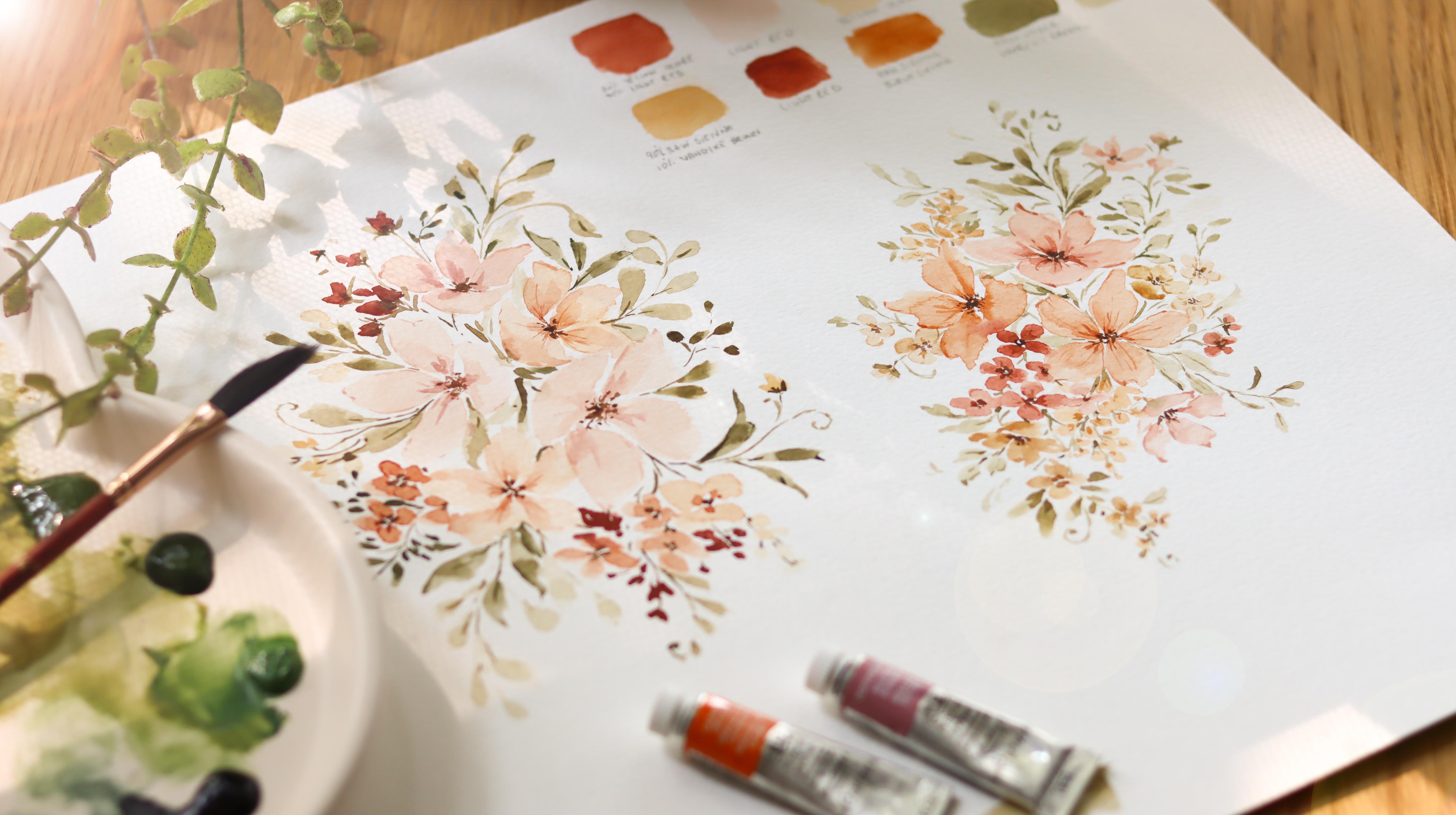
3. Materials: For this class, you
will need watercolor, paper, paints and brushes, along with two jars of water and mixing palette and
some paper towels. I will share the exact materials and brands that I'm
using in a minute. But first, I want to talk
about watercolor paper and give you some
information that will help you choose the
best paper for you. Watercolors give me a tough
time in the beginning, and I soon realized that it was the paper I was working on. Poor quality paper is often
the reason why students feel frustrated and why the final
result is not as imagined. When I work on to paper, I get harsh lines and the
paint dries pretty fast. So this makes it
really hard when using a specific
watercolor Techniques. Or let's say I got a new
brush and I want to try it out by doing a lot of
practicing with Brushstrokes. So I think that for all of
the things I mentioned, student grade paper is okay. But if you want to achieve
the desired result, Then I highly recommend
using 100% cotton paper. This is the best quality paper. It is durable and cotton fibers have good retention of
water and pigments, ensuring that the paint spreads smoothly and evenly
across the paper. So here is the
information you want to check when buying
watercolor paper. First of all, it comes in
different weights and textures. You can check the weight of the paper on the
cover of your block. And it is usually
expressed in grams, GSM. The higher the number, the
thicker and more durable the paper textures can
range from smooth to rough, giving different effects
to your paintings. We can find a rough
paper which is very texture and it is a great for dry
brushing techniques. There's hot press
paper which is a very smooth and it is a great
for detailed work. In between, we can
find cold press paper, which is the one
that I prefer and use for all of my paintings. It provides enough texture to capture the pigments and create interesting effects while still allowing for some
smooth at brushwork. Lastly, I always check if it's 100% cotton or if it's a student grade
paper for this class, I'll be using two
different papers. This one from Winsor and Newton, which is a student grade paper. And as you can see, it has only 25 per
cent of cotton. And I'll be using this paper
for over practicing lessons. So painting techniques,
Brushstrokes, exercises, and so on. For the final painting, I'll be using this one
from honey Mueller. It's 100% cotton paper. Alright, this is it for paper. Now regarding colors, I have my Winsor and Newton paints
said it's the Cotman series, which means that the
colors are student grade. I love this set. It offers many colors
to choose from. Anything that the
price is very good for what you get for Painting
both flowers and leaves, I'll be using some
round brushes. These two are the
Aquileia from Princeton, number 4.8, and this one
is the Neptune number six. Alright, we're all
set and ready to explore watercolor
painting techniques.
4. Watercolor Techniques: It's time to pick up
our paints and brushes. We're going to start
off by learning about different watercolor
painting techniques. There are many
painting techniques that you can use
with watercolors in order to achieve and create different
moods and effect. And for the purpose
of this class, I'm going to touch on
the ones that we will utilize if you are at the beginning of your
watercolor journey, this lesson will help you
get a better understanding of water and colors
work together. And you will also
understand when to use each technique to achieve
the desired effect. And lastly, the exercises
that we're about to do are just a great way to
practice water control, right? I have my watercolors
supplies ready, and I made a couple of notes and trace them circles on
my watercolor paper. This is just to keep
things tidy and to show you the techniques
in the most clear way. So the first technique
we're going to explore is the
wet-on-wet technique. And as the name suggests, it involves applying wet
paint onto wet surface. So let's start by getting a
specific area on our paper. Wet. The pencil circles here are just helping me to see where
I'm spreading the water. So feel free to mark
this area by using a different shape or simply just by going
in without any Sketch. So what's important here is to have a nice even layer of water, make sure that water
is spread evenly. And if you accidentally dropped too much water on your
paper, just some worry. You can always go back in with a dry brush to soak
up the excess water. Now unsetting a
one-minute timer. And while we're waiting, we can start preparing the
color with a clean them brush, grab a good amount of color and start mixing it on your palette. If the consistency
of your color is too dense and thick at a
tiny bit of water. And if the color is too watery, just add some pigment. Okay, the timer went
off and we can start applying the paint on
top of the wet surface, apply it very loosely
and just observe how the color is
interacting with the water. As you can see,
the wet surface is causing the color to
spread and blend. Now we're going to
repeat this tab, but with a longer timer, we're going to wait 2 min
before applying the color. The wet-on-wet technique creates unpredictable effects
and there are various factors that contributes
to affect the outcome. One of these is the time
between applications. This stage of wetness
of the paper determines how fast colors are
spreading and blending. Applying pain when
the surface is wet produces more fluid
and diffuse effects. While working on
partially dry areas allows for more controlled and the Fine brushwork
when using the wet-on-wet technique at
timing is pretty crucial. And this is why in order to
create South gradients and blends of color as it is
important to work fast. Another factor that influences the final result is
the color consistency. And by that, I mean how
dense the pigment is. Watercolor will tend to
spread very quickly. And on the other hand, if the color is dense and thick, it will be more
resistant to spreading. 2 min have passed, and now I'm going backing with the same color consistency that I use for the
previous exercise. This time, I can notice that the color is
spreading so the war, and this is because the paper is less wet and started to dry. This exercise can be repeated by varying the time
between applications, the amount of water
applied on paper, the consistency of
the color you picked. So by varying these factors and observing and
studying the effects, you will improve water control. And most importantly,
you will develop a feeling for the relationship
between these factors. And feel more confident
when it's time to paint. Right? Let's see, use the wet-on-wet technique
one more time. This time, I'm
starting by adding a soft wash to create this pink. I'm mixing just a tiny bit of light red with a
good amount of water Now I'm going baking
with the same color, but I've darken it up a little by adding
pigment to the palette. This is how we will
use the wet-on-wet technique for the
final project by first applying a light
color and then adding a second layer of a darker
or a different color, we can add depth and pop to a subject or create a
nice soft gradient. The next technique is the
wet-on-dry technique, which means applying wet
paint to dry surface. And this dry surface can
either be a blank dry page or just subpoenaed page
that has fully dried. So here I'm simply laying down a nice wash
on the dry paper. I'm going to filling
the remaining circles as I did with the
previous one because I'll show you how
to build layers and how you can mix both
Painting Techniques. The wet-on-dry
painting technique is used to build layers. So by adding multiple
layers of paint, you can add depth, richness, and complexity to the artwork. This allows us to build up
colors and Details gradually, just like I'm doing here. And that's way to make the
painting even more dynamic is to combine both painting
techniques together. So here we created a light
background and let it dry now adding a second layer of paint and before it dries, I'm going to soften the edges just by going back in with
a clean, damp brush stroke. This create a nice
smooth gradient and adds a lot of
dimension to the painting. I'm repeating this
app and I'm just adding more paint in layers. Generally when adding a color, you're either layering or blending the
wet-on-dry technique, which we just stayed, layers the colors and
builds up in intensity. On the other hand, we can use the wet-on-wet
technique for blinding, which helps colors harmoniously
bleed into each other, create a nice
smooth gradient and adds a lot of dimension
to the painting. So here's a quick
exercise that you can do, and that will help you
create a color palette and see how the colors you picked
and go and blend together. So just grab a color
and paint a circle. Then choose a different color
and paint a second circle. And just let the edges touch. Depending on the amount of
paint and water you're using, the two colors will blend and
create a soft transition. The way that these
colors interact when they blend together
can tell you if the colors you picked
clash or transition while into each other or right before we jump onto
the next lesson. Here is a crib
wrap-up of what we just learned, the
wet-on-wet technique. This technique involves
applying wet paint to a wet surface and we can use it when we want
to achieve a soft, diffused and blended result. The wet-on-dry
technique refers to applying paint onto
a dry surface. These technique allows
for greater control and precision and we can
use it to Add Details. And they mentioned
to the artwork, really helps with layering. And lastly, when it
comes to adding colors, we can either layer or blend. This first one is used
when the paint is dry and we can start adding
additional layers of colors. The second one involves using colors when
the paint is wet. These were all the painting
techniques that we will use. And it really hope
that this lesson was informative and a nice way
to practice water control. In the next lesson, we'll get to know our brushes. See you there.
5. Brush Control: Understanding your brushes and developing control
over them is very important when Painting and when we want to achieve
a specific result. Also, it allows you
to feel confident, improve your skills, and be more conscious when
picking a brush. Brushes come in
different shapes, sizes, and materials that you can take advantage of to create
different effects. For example, the tip of her
round brush is commonly used for creating fine
lines and detail work. And at the same time, you can use the belly of the round brush to make
wider and pull brushstrokes. Brush instead is
ideal for washes and Brushstrokes and are great
for Painting backgrounds. For this lesson, I'll
be using a round brush. This one is from Princeton. The exercises that
we're about to do, our designed to train
your hand movements, refine your control over the Brushstrokes and we're mob
before the final Painting. Alright to star will
practice creating lines that go from
thin to thick. Here, I'm preparing the color and once the
consistency looks good, I'm going to paint the thinnest
lines that I can create. This can be a little
bit challenging. So I'm holding of them brush
by keeping it very vertical. And I'm gently touching the paper only with
a tape of a brush. The next two lines just put a little bit more pressure to create medium-sized
Brushstrokes. For this last brush stroke, I want to say the biggest
stroke that I can produce. I'm holding the brush
vertically and putting a lot of pressure to get the belly of the brush to drag onto the page. I'm going to make a
few more thin lines which I find pretty challenging. And I'm experimenting
with starting both from the top and bottom. In fact, one direction can feel more comfortable and
stable than the other. Okay, let's move on to
this second exercise. This one will train your
pressure control because we will go from thin to thick
in a single brushstroke. Start with the tip
of your brush and then press down the
belly over brush, released the fresher, and go back to the TPP
and repeat again. Start light pressure and
then release the pressure. Okay, We're going to
repeat this practice, but we're going to raise
the bar a little bit. Setup moving horizontally, tries to move from
top to bottom, creating a wavy pattern. Now we're going to try two types of Brushstrokes that will be extremely useful for
painting petals and leaves. These two brushstrokes are
the C curve and S curve. Let's start with a C
curve. Brush stroke. Apply gentle pressure
on the brushes. You create a curved stroke, moving your brush in a semicircular motion to
form the top of part of the sea and then
gradually released the pressure as you
complete the curve We're going to
repeat this process, keeping mind to try different starting points from the top or from the bottom. And you can also
vary the pressure to achieve different results. So why am I making you practice this seeker of brush stroke? It is very important
because you will develop a good
understanding of how to manipulate the brush
to create a graceful and just a very smooth
curves comes to your botanical watercolor
paintings and the S curve, it will also help you in this. So start by placing the tip of your brush onto paper and
begin creating a curve at pressure and
gently release it when you are towards
the end of the S shape, remember to do
slow movements and be aware of the pressure
you're putting in. Okay, We're almost towards
the end of this lesson. And I want to conclude by making a few more Brushstrokes to try out just a smaller shapes and warm up my hands
a little bit more. Feel free to try something different or follow along here. I'm just creating some
brushstrokes are very intuitively. This shape resembles a teardrop, and I use this a lot
to create Leaves. I'm holding the brush
vertically and I make it touch the paper
starting from the tip. And then I press down. Here, I'm painting some
dots and I will use them later to paint the
center of the flowers. I really hope that you are
enjoying this practice and feel free to repeat these
exercises as much as you want. I really hope you're
enjoying this practice and to repeat these exercises
as much as you want, and also to try them
with different brushes. The different shape of the bristles can really
affect the outcome. And by just using
different brushes, you really get to
know them better. You will becomes more
comfortable when painting. In the next lesson we're
going to start painting leaves and flowers.
I'll see you there.
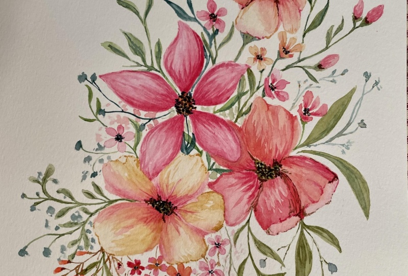
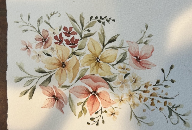
6. Botanical Brushstrokes: In this lesson, I will guide you step-by-step from painting
leaves and petals to creating branches and flowers
are subjects will be plain and simple because we'll be focusing on shapes
and they mentioned, so don't worry about
adding details or creating depth and adding
contrast because we will learn this
in the next lesson. Okay, let's start by Painting
Leaves on my palette. I'm mixing hookers green light, and burnt sienna to
create a warm green color with your brush, with the color. And let's start making some simple Brushstrokes
to create Leaves. I'm starting by using
the tip of the brush. I press down the brush
and release the pressure. When I leave tap the brush, I just tried to make this
leaf and with a gentle curve. Now let's see us the shapes we practice in the previous lesson. Let's try to paint a leaf with to see curves facing each other. The white line in the middle
can be a nice detail, but you can also make the
to Brushstrokes touch. Feel free to make
the leaves using a single brushstroke or
combining two brushstrokes. Here, I'm continuing
painting the leaves, and I tried to paint them from different sides and
varying the directions. Going slow and being conscious of the
movement of my hand. Leaves can have many
shapes and they mentioned, so I'm making some
of them smaller and rounded while others
elongated and point to. Here we're just focusing
on the directionality, shape, and dimension
of this Leaves also, if you're a subjects, are not looking
interesting yet and the paint is drying,
forming harsh edges. Um, no worries. We are going to learn how to Add Details and death the sun. And we will switch to
a professional paper and we will achieve
a better result. Okay, now that we're
confident Painting Leaves, Let's practice painting
a few branches. Let's start by your
painting as first, to add some leaves to it. I start from the stem
and I paint a thin line. Then I put pressure on the
brush to create the leaf. As you can notice,
for these leaves, I'm always starting
with a thin line and then I press
down on the brush. For the next branch, I started with a vertical
stem and I make sure to wiggle a brush a little to make this them
look more natural. Now I'm painting a small
oval leaves on both sides where the following stem, I'm painting an S curve. And this time I'm varying
the shape of the Leaves. I paint them symmetrically, starting with bigger Leaves
for the bottom part. And as I work my way up, I paint them smaller. Okay, one more branch before jumping into painting
petals and flowers. For our next subjects,
switching Color. And I'm picking burnt sienna. The restaurants that I make
for the pedal shape are very similar to the ones that we
use for Painting Leaves. Pedot PSS can have
different shapes as well. But for my basic flowers, I would normally
keep them simple with a round shape,
just like this. Of course, feel free to make
different petal shapes. Maybe when I get it ends. When creating. When creating
floral compositions, we will want our Flowers to
have different perspectives and also be tilted in
different directions. This means that not all petals, we'll look at the same. For instance, if I
want to paint a flower with the perspective
of looking down at it, one of the petals will
be flatter for that. The Brushstrokes that
helps is a seeker. So it will start very
lightly, press down, and then release the pressure
to finish the shape. Let's repeat this one more time. So when we combine petals
together into a flower, it will become more apparent how these different shaped petals come together to
form a perspective. Start with a C curve shape
petal on the bottom, and then add a three
regular petals. You can start from the
middle and then you can add one pedal on the left side and the other one
on the right side. Help you keep your
flower balance. And to better
illustrate this idea, you can imagine painting along this arch shape that
I'm showing here. And the three outlines
that you see are just guideposts for positioning
the remaining petals. We can also repeat
the same steps, but till the wall shape
towards the left. We can start by changing the position of the
first brush stroke. And a, you can imagine the same guideposts that
I showed you earlier, but this time they
are rotated to create a flower that is facing
in a different direction. Once you feel comfortable, you can try to add more petals and vary the shape even
further if you wish. For the final composition, we will use the
flowers are facing sideways but also
facing towards us. So to paint a flower
that is fully facing us, you can just imagine
a circle and paint the petals
going all around it. Okay, I'm adding one more flower facing us and I'm varying
the petals shape. Now we can add the centers
who all of our flowers. I'm picking a severe Color
which is a dark brown. And I talked with a tip of the
brush to create some dots. You don't have to be
too accurate here we just want to
complete the flowers. The focus of this lesson was to practice different
types of Brushstrokes and to understand how to paint tilted flowers from
different perspectives, we have one last practice
lesson before learning about composition and starting to
work on the Final Project. And I'm very excited to
share with you how you can meet these flowers and
branches we just painted. Look more interesting by adding depth and contrast in Details.
7. How to Add Details: In this lesson, I will show
you how to add contrast and that the both to
flowers and branches. My suggestion is to start by watching this lesson
and see how I work. Then you can decide if
you want to follow along. You can either paint
the botanical elements from scratch as I
we'll be doing, or you can use the ones
we just paint a couple of minutes ago and layer on
top of those, it's up to you. I preferred painting the
elements from scratch to show you every step I take to
get to the final result. Also, I will show you
how to Add Layers to several different
branches and flowers. But since this can be a somewhat
time-consuming process, you can choose to
paint just one branch and one flower for practice. If you already feel comfortable
with the technique, just listen to yourself and
whenever you feel ready, you can move on to
the next lesson. Alright, Enough talking
and let's get started. So the first Seville to keep in mind is that once
you pick a color, you like making a lighter
or darker version of that color is important to get a layered look using the same green as before. It's a mix of raw umber, sap green and
hookers green light. And I already prepared
the light and dark version of this color
to make a color lighter, you just have to add more water. Once that's ready. First, going with
the live version of the color you picked on, starting off by
painting a brand. I paint a two here just because I want one
of them to serve as a comparison for how much
difference layering can make. Okay, So for this branch, I'm picking the darker
color I have here, my palette and what I do is added in some
areas of the branch, focusing on the undersides of leaves without fully
covering them, just with tiny brushstrokes. I also like to drop this
darker color in spots where the leaves are attached to the SAM and to the
bottom part of the stem. If the first layer of
paint is not dry yet, it doesn't matter for now. It should add a
soft gradient and start adding depth
to our subject. You can see there are
parts of the branch where the first layer is dry and
the color we just dropped in. This not blending
smoothly and it's creating a striking
contrast instead. So to soften the edges, I picked a smaller brush, which is a clean and
has no paint on it. I dumped it slightly, making sure it's not too watery. I'm going to use this
brush to go over the dark paint I just laid
down and smooth it out. Once the paint dries, we can return to this brand. But while I'm waiting, I'm moving on to
creating another one. Okay, the first branch we
painting is fully dry. So to add more depth
on my palette, I'm darkening up the green because I wanted it
to stand out more. And keeping mind that
when the watercolors dry, they look a little bit lighter than when you see them wet. So as I did before, I'm working with both brushes. The main one that has the
color in it and clean, damp one to soften the edges. I'm also going back
in with paint in the same spots so I can
increase the contrast I like to use the damper
brush soon after Layering down the color because
once the paint dries, it will become harder
to smooth the edges. I know it's a lot
of back-and-forth and switching brushes
continuously. With time. It will
come naturally. Okay, the first branch
is looking good, and now we can repeat the same
steps for the second one. Before I keep working with both brushes and I'm dropping in the darker green
on some areas of the stem and some areas
of little Leaves, I'm repeating the same
steps as many times as a need until the branch has
enough contrast and depth. Alright, we're going to move
on to painting flowers, but if you need to practice a little more, Take your time. I've added three more
branches just because I wanted to pay more it and
feel all of this page. But whenever you
feel comfortable, you can move on to Flowers So we're going to practice
with three flowers. Let's begin with the first one. I want it to be a
left facing flower is start with a light color. Here I picked a pill, orange, which is a
mix of yellow ocher, burnt sienna, and burnt umber, and a good amount of
water to make it light. I'm starting with
a C curve pedal, which will be our
point of reference. Then I'm adding
three petals above. So it's like we did in
the previous lesson. While the paint is still wet, I'm grabbing the green to
add a tiny stem following the direction of
the flower facing left as vivid for
the branches above, we're going to start
adding layers to the pedals as further
darker color. I want it to be more
orangey and I'm just adding more burnt sienna to the color we used
for the first layer. Let's drop some color of
the base of the petals. And whenever you see
the color is not blending because the first
layer has already dried. Go back in with a
second brush and soften the edges of
the brush stroke. Let's leave this
flower dry for now, and let's paint a second one while we wait for this flower, I pick a color I already
had on my palette, which is a mix of burnt
sienna at tiny bit of light, red and yellow ocher. I'm starting light
and I'm painting a flower facing us
with five petals. While the paint is still wet, I'm going back in with a darker
value of the same color. Okay, Now we can paint
our last flower. Painting, this one facing
to the right side. I'm using the same color as
the first flower we painted, but we just a little bit more burnt sienna, right? Recreate it a gorgeous base of paint for our three flowers. Now we can start with
the first one and add more layers of
paint to make it pop. Since the beans of the
flower is a pale orange, I'm going baking
with burnt sienna. I added just a little bit of brown to the
saturate, this color. I'm going to add contrast to
the base of the petal and on the upper part to accentuate the outline for the upper part, the brushstrokes look
better if they are thin, the overlook will
be more delicate. As I drop in the darker paint, I make sure to smooth out the edges to create
software facts. Okay, this flower
is looking good. We will let it dry before adding want this layer of paint. In the meantime, I will
repeat the same steps for the next two flowers
will speed up the video, but you didn't have
to rush the process. Just take care of time to
work at your own pace. We are ready to add
the last touches to this flower for the
last layer of thin to, I keep the color even
more intense and darker by mixing burnt
sienna and brown. This time I'm using
a little water, just the bare minimum
to still allow me to mix the colors with
my smaller brush. I'm going in and I create very thin and interrupted lines. In this case, I really liked the effect it's
had on the flower. And the contrast we
got some not softening the color with the second brush like we did in the
previous steps. I'm adding another layer
to the third flower as well by using the color that
is already on the brush. For the center of the flowers. I'm picking a sepia color and I keep it very
fake, an intense, which means that I'm using
the least amount of water possible to create the center. I'm simply tapping the tip
of a brush on the paper. This way can create
some tiny dots. If you notice these dots are
very close to each other, but still far enough
apart to leave some whitespace so that the center doesn't turn
into wondered flop mark. Alright, it just completed all Painting practice
lessons. So huge. Congratulations. You've learned about
watercolor Techniques, brush control, pressure control, and layering to create
depth and contrast. I truly hope that you
feel more at ease now and you acquire new
skills along the way. And before we move on to creating the Final
floral composition, Let's ensure that we have
a solid foundation in composition for creating a captivating
floral arrangement.
8. Composition: When Painting and
arranging flowers, composition plays a vital role in capturing the
viewer's attention. However, if you're
just starting out, it can be confusing
to navigate among all the rules and principles
that you could apply. So let's dive in and
discover the key elements that will help you create a
well-balanced composition. First, I will introduce the
principles of composition and how the specificly apply to watercolor floral
arrangements. After that, I will discuss
how I approach composition by sharing all the
actionable steps that you can take as well. So the principles I'm
about to introduce you are guidelines that you
should always keep in mind when starting
a new painting. These principles
will help you paint, organized, and arrange the
elements are more easily. Okay, let's begin with a first principle which
is bonds balanced, referred to the distribution of visual weight within
a composition. Watercolor, floral arrangements. Attuned balance
involves distributing the botanical elements in a way that painting
feels right and stable. Consider the size, color, and placement of your flowers to create a sense of balance can be achieved both
symmetrically, asymmetrically. Unity refers to the
visual coherence and harmony of a composition. It is achieved by using
consistent elements, styles, or color schemes
throughout the work. The principle ensures that all the individual
elements come together to form a unified and
bonds composition, we have contrast. So contrast occurs when
two different elements are placed next to each other
and form a juxtaposition. It can be achieved through
variations in color, value, size, or shape. So overall contrast helps create focal points and add depth and dimension
to the composition. So for example, here
in this painting, the spine is not being
fully finished yet. You can still clearly tell
that this is the focal point. The focal point
stands out because the different sizes of the flowers are
placed side-by-side. And these create contrast and make it look towards
this point here, where we have the
three beaker flowers. Next we have
repetition and rhythm. Repetition involves
the repeated use of certain elements and motifs
throughout the composition. It makes the
composition visually interesting and creates
a sense of unity. Rhythm refers to
the movement or if law created by the
repetition of elements, such as the lines or shapes getting the view reside
throughout the work. So back to this example, I repeated these flowers
and as you can see, it's giving movement and a sense of unity to the composition. Also, I did the same by
repeating these branches. Emphasis or the focal point. It's an area of the composition
that it is visually dominant and draws the
viewer's attention. It is the main
point of interests, and as I mentioned before, it is often achieved
by contrast. Lastly, proportions
are super important. So proportional refers
to the sizes and relationships of the elements
within a composition. It involves ensuring
that the sizes of the objects or subjects, or visually bonds
and in proportion to each other when creating
fluoro Composition, be conscious of
the proportion of the botanical elements in
relationship to each other. Be sure to vary the sizes of your Flowers to keep
things interesting, but also be aware of where you place the bigger
and smaller shapes. Here's a quick sketch to better illustrate this
principle to you. You can see the
same three flowers are arranged in the same order, but in the first Sketch. So the flowers all have
the same proportion, while in the second one, flower on the bottom
is a much larger. This one difference completely changes of where the weight
of the composition lies. The larger flower or the bottom. Just draw your
attention away from the center and makes the whole composition
feel unbalanced or right? These were all the
principles that I always keeping mind in general. Now I'm going to show
you all the steps I take to create a
floral composition. From sketching to
the Final Details. You'll see me sketching
and other Sketch. I will explain my thought
process and give you my best tips for you to create a floral
arrangement it yourself The first step is
to decide whether I want a portrait or
landscape composition. Right after that, I decide the position of the
botanical elements. I imagining a focal point or an area where I want the viewer's attention
to be drawn toward. And that's where I first started
laying down the Flowers. Specifically, I always start by putting down the
bigger shapes first. And then I place the
other botanical elements, the smaller flowers and the branches in relation
to this focal point, medium or a tiny flowers and
foliage or elements that will help you fool your composition and
provide a sense of balance. So pay attention to the
placement and direction of these elements to create a natural and
flowing arrangement. Another thing that
can help you get started with the arrangement that is picking a
shape that will help guide the flow
of your elements. Princeton's I like using
an S curve than choosing a focal point and placing my floral elements
along this shape. You can also use other
shapes, such as triangles. When sketching and also when painting my floral composition, I always make sure to
leave some whitespace. Negative space refers to the blank spaces between
the flowers and foliage. It helps create breathing room and balanced within
the arrangement. So once I have my sketch ready, is obviously colors I want
to use and I start painting. When painting, it
is important to step back from time-to-time to assess the overall balance of colors and values in
your composition. During this tab, you can do a little adjustments
and just ensure that no single color or area dominates the
composition excessively. Last step, the final
touches and Details. So when my painting
is almost completed, I add some final touches. This may include
enhancing color of refining edges or
increasing the contrast. Pay attention to the
smaller details here that will make your
arrangement pop and visually captivating are right now all the principles of composition and the steps
I take to create one. Now feel free to
take some time to practice what you
just learn through sketching new compositions or follow along and Sketch
the composition I picked. Since I know that it
can be hard to see. Pencil Sketch from the video. I've included the
exact Sketch in the class Resources so you can download it and keep
it right next to you. You can even trace it on
your watercolor paper. For the final painting, I'm switching to a
professional or paper. This is from honey Mueller and it's 100% cotton. For sketching. I'm using an HB
pencil and I make sure that I keep the
pencil marks a very light. There's more detail that
I want to mention about the sketching process
is that it's not really necessary to
make your sketch super detailed or to make it look
like the finished product. Much of the sketching
process is meant to help you guide
when you're painting. I often plays a
very simple shapes, such as lines and circles. These shapes dictate
the general outlines of the elements
that I will draw. This is usually enough to
give me an idea for the flow and bonds of what the
painting will look like without being
too time-consuming. As you can see here, I
started this Sketch with an S curve and then I
started to place circles. I have bigger circles, smaller circles
within these shapes. I will place my flowers later. Okay, so I will
keep sketching and I'll see you in the next
lesson for the Final Painting.
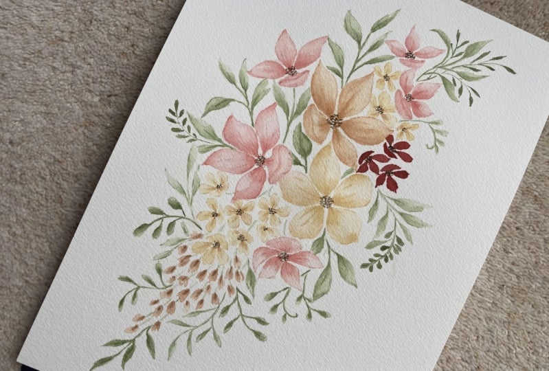
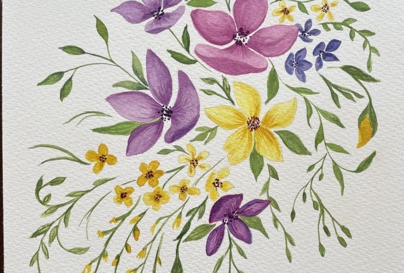
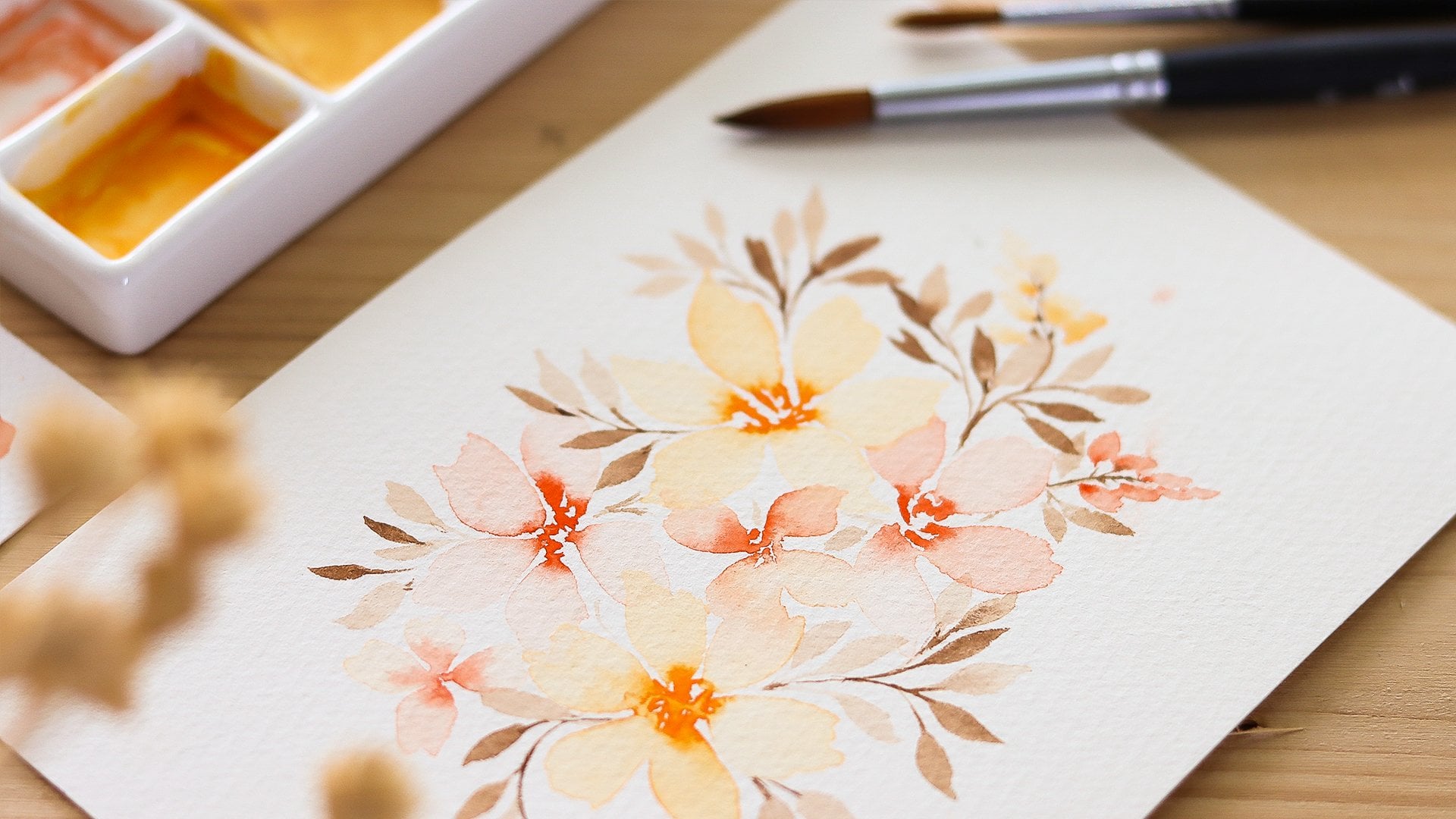
9. Final Project: Painting Flowers: We're all set to start painting
the colors I'll be using further floral composition are these that you see
on the palette. Here is eye color
turf for reference. And I will tell you the names of the colors that I'll
be using as well. So you can easily find the
same colors and use them. There are actually
no rules here. So you can pick the colors
that best align with your style and personality
or follow along. I just have one tip which is 2s, a few key colors
that will be used consistently throughout
your composition, considering the
principle of unity, along with additional
colors for accents and highlights for the
principle of contrast, also remember to
consider the mood and atmosphere that you want to
convey with your arrangement. Alright, I'm going to start
by picking the light red and I'm diluting it with
water to make it very light. I started by painting a C curve, and then I add the petals above. So this flower is facing left. Now let's apply the wet-on-wet technique we'll learn in
the previous lessons. I'm thinking the same color, which is light bread, but I'm keeping it darker. So when I drop it in, it's going to be visible. All you have to do here
is to tap the brush on the wet layer and let the
watercolor do their thing. Don't overwork it. I'm going to leave this
flower to dry and I will start painting the
second 1 s flower. I'm picking yellow
ocher and burnt sienna. And I'm mixing these
two colors together. Again, I'm using a very
diluted color to make sure that the base of
this flower is light, the first layer of color has
always have to be white. Since the base of this
flower is a pale orange, I am going back in
with burnt sienna. For our third flower, I'm mixing raw sienna with a little bit of yellow
ocher and burnt sienna. The amount of pigment is very small because I'm using a lot of water to add variation
and movement. I'm painting this
flower fully facing us. As you can notice, the paper
already started to dry here and it's not absorbing
the painters readily. So what I do here
is top the brush on the paper towel to
soak up the excess water. And I tried to go back in and I tried to spread
the color evenly. And I'm going back in with a darker value where
I see the wet paint. What I want to say
here is that if One of your flowers, look a little bit messy
like this one here. Just don't worry, by
adding layers and details, we will cover mostly
everything else. Alright, it's time to
start adding layers to create depth and
make these flowers pop. My suggestion is to
pick the color of the flower and lower the
volume to make it darker. So for example, let's start with the first of
flowers we painted. I use Live read for the bees. It was very diluted. So the color of assemble
like a pink color. And I'm going back in this time, I will make it more pigmented. I'm spreading the second
layer of paint on the petals and I make sure
not to cover them fully, but to leave out some areas, soften the edges and
spread the color. I'm using a second brush
that has only water on it. While working on this piece, I just realized
that the proportion of the petal that
is at the base of these two Flowers
is a little bit unbalanced because the
pedal turn out too big. So I had the idea of adding a brush stroke at the bottom to make it
look like it's folding. Okay, Now moving on
to the smaller flower that has the same color
as the first one. So we can start adding a second
layer by using light red. Once again Back to the first flower. I'm going to add one more layer and I'm using light breath. I think this flower has a good amount of
depth and contrast. And my goal here is to make the other flowers that
look similar to this one. I might add a third layer of
color to it, but for now, I'll keep moving forward by following the same steps
we just went through. I will speed up
the video because this part of the process takes a lot of time and you
just need to be patient. I actually find it
very enjoyable to see a flower coming to live
when building layers. So I really hope that this
won't be boring for you. The rush the process, and you can pause the
lesson and Take your time. Okay, I'm back. We can start painting the small size flowers to add contrast and a sense of
balance within the color, I will make three flowers just by using a flat wash
off, light red. The color here is very intense, fake as they want it to pop. Okay, I'm quickly adding the final touches
to this flower. The tiny flowers that
I will place here, I'm going to go in with the colors I have on
the palette already had to look like a very light
yellow that you can simply, I'm replaced with raw sienna. I'm painting the flowers here
with five rounded petals. And before the paint dries, I dropping the color burnt
sienna because you can see I'm dropping in the Color very close to where the center of
the flower will be. Okay, I keep going here
and I make sure to face the flowers in
different directions. I also make sure
to roughly follow the pencil marks that
a traced previously. To finish the bottom part
of the floral arrangement, I'm going to fill in this
area that makes a cone shape with uneven rounded brushstrokes that can reassemble
tiny flowers. These flowers are just a
little bit more abstract. I'm using yellow ocher here
and I'm alternating value. So I go from light to
dark in different areas. We'd like Brene, we
can start connecting the bottom part of the composition
to create this stance, I recommend using a
brush with a fine tip. This is the flowers are
very light and delicate. Thin lines will match with
their style the best. Okay, We have filled in
all of the pencil marks, so we previously sketched and I'm taking just
a step back to check how the flowers are looking and how
everything is flowing. I think that something is missing in the top
part, especially, I feel the need to add some tiny or
medium-size flowers to balance with the bottom
that has many tiny flowers. Also, I'm noticing that we have plenty of room where we
can painting greenery, and I think that a couple of
more flowers will look good. Here, I decided to
add one more layer of color to this flower to
increase the contrast. I write, we can now create the center of all the
flowers we painted, and we can move on to
painting the leaves
10. Final Project: Painting Leaves: We're just one step away from finishing this
floral composition. So for the leaves, I'm mixing sap green
and row number. Then I added just a little
bit of hookers green light until it reaches
this olive green shade. I'm keeping this color
very light for now as we will add more
layers of pain later on. When painting the leaves, I generally look for spots
that needed to be filled in. And in this case, the area around the focal point seems just a perfect
place to start. I keep in mind the
structure of the base, which is the S curve that
we traced in pencil. And I tried to make the branches follow that dental shape. The final composition will look better if you give
movement to the branches. So avoid painting straight stems and instead try
to waive them to make them look more realistic and natural also makes sure that the Leaves point in
different directions and you vary their
sizes and shapes. Our focus here is the paint, all the branches we need first, and in the next step, we'll focusing on adding
depth and contrast. Okay, I think that I have
almost all the leaves in place and the composition
is looking good. Now we just have to
bring it to live by using a darker value,
that dark green. I'm adding a branch here. With the pain left on my brush. I just start to go over
all the other branches. I'm following the steps we
did for the flowers and in adolescence where
we learned how to add layers and details. So I lay down the color in some parts of the
stem and the leaves. And with a clean them brush, I'm going back in to soften the edges of those brushstrokes. And I just repeat these steps
for every single brand. Some Leaves, it will be darker, while others say glider. As I mentioned that earlier, this step takes some
time to complete. So does play a nice song
and enjoy the process Okay. I'm going to
stop here because I'm happy with the amount of
Details and contrast. Take a moment to step
back and evaluate your completed floral
composition for any areas that may need
refining or adjustments. For instance, I just
flip the paper because I found some areas I wanted
to add more branches to. During this step, I always make the necessary corrections
just to ensure that the composition is well-balanced and
visually appealing. And this can include
adding new elements, more layer of paint, or adding tiny details. Alright, this floral
composition is completed, and I'm very happy
with how it came out. And looking back on
where we started, It's just an incredible journey. So great job for making it through all the lessons with me. I hope you're happy with
the final result as well. And if things didn't go quite
as you have envisioned, that's okay to Watercolors
take a lot of practice. So if you are at the beginning of your
artistic journey and just give yourself
some time to practice, experiment, and play
with this medium. Alright, that's it for now. And let's meet in
the next lesson.
11. Thank you: I just wanted to take
a few minutes to thank you-all for being
here with me today. And I truly hope that this
class has helped to grow your skills and confidence when it comes to working
with watercolors. Before setting out to
create each class, I tried to think what might
benefit my students the most. The creation process
is a bit like going on a roller coaster with all
its apps and downs it right angle my ideas and
trying to figure out all the details for how I can present everything
the best that I can. But the most rewarding part of this entire process
for me is Senior Art. So don't forget to head over to the Projects and Resources
tab to upload your work. Feel free to share any
part of your project and I will be thrilled to
provide feedback and support. I truly love seeing
everything you come up with and being
part of your journey. If you encountered
any challenges or have questions along the way, don't hesitate to use
the discussion tab. I'm here to assist you and offer guidance
anytime you need it. Also, if you enjoyed this class, your review would be an immense help to let more
people know about my course. Thank you again for
joining and I hope to see you again in one
of my future classes.
 Altea Alessandroni, Artist and Designer