Transcripts
1. Introduction: I've always been particularly
drawn to watercolor. There is something magical
and unique about it. I love how it creates
organic effects and you can never quite
paint the same thing twice. Hi, my name is, and I'm an artist and graphic
designer based in Italy. I enjoy creating
dedicated botanical art, as well as playing with abstract designs and
using different media. You can find my
work as templates or as a graphic collections
that you can license. Today, I'm gonna be teaching
you the basic techniques for creating a loose floral
arrangement, using watercolors. To get started, I'll
walk you through materials and tools
for this class, you will need watercolor paints, paper and brushes, as well as
a pilot and a paper towel. After that, we will learn about the interaction of
water and pigment, the wet on wet technique. Next, we'll learn how to
sketch basic floor almonds that literal blue translate
into our botanical paintings. Together, we'll get creative
with botanical shapes, allowing nature to inspire us. We'll move on to
practicing painting. Every single element that will be part of our
final composition, flowers, leaves, and branches. From there, I'll give
you all my tips about composition to help you
create your final project, a loose watercolor
floral arrangement. This class is designed
for anyone who would like to begin exploring
the world of watercolors. And I've done my best to make each lesson easy to follow while also packing it full of all the information you
need to get started. The skills you will
develop in this class can be applied to many art projects, from just a simple
botanical painting to graphic design projects. So if you're curious
to learn more about this painting style and
about pleura compensation. Join me in this class.
2. Class Project: Welcome to the Skillshare class. Today we're going to
learn how to paint easy, loose watercolor flowers and arrange them in a beautiful
floral composition. The methods and skills you will develop in this
class can be applied to many art projects from
just a simple floral design, too complex for
watercolor botanicals. If you're a beginner, this
class is a great place to start because it will take
it one step at a time. I know how tricky
this medium can be, especially in the beginning. And this is why I
wanted to focus each lesson on
practicing each element. The final composition
separately, going for modern, simple
and looser style. Okay, now let me just give you a more in-depth
look at discourse. We'll get started by learning how the
wet-on-wet technique works through a playful
and relaxing exercise, will get to understand how
colors and water interact at the same time will create a beautiful color palette that we'll use for the
rest of the class. Then we'll learn how to draw simple botanical shapes by hand. That later we'll translate
into watercolor paintings. Being able to draw
botanical elements will be essential in
starting painting. Watercolor as a medium. It's unpredictable and
sometimes hard to control. That is why it's important
to have confidence in your strokes before
starting painting, drawing, and sketching elements solidly
with a pencil first will be a great step in allowing you more control over
the watercolors, will then learn how to paint
each botanical elements, flowers, leaves, and branches. In this lesson, we will isolate the unique features
of each element, and I will teach
you step-by-step how to paint each element and get you feel more
comfortable when it's time to paint our floral arrangement. Before moving on to
the final project, I will share my tips to create a well-balanced
floral arrangement. I understand that composition
can be a tough topic, but I made this lesson very
easy and simple to digest. And with the key things
they'll be sharing, you'll be able to create a beautiful floral composition without feeling any pressure. Lastly, we'll combine
everything we've learned so far to create our final
floral composition. Your project for this
class will be to apply the tips and techniques to
create a floral arrangement. Make sure to watch
until the end of this course because I'll share it even more project ideas that you may want to
try it in the future. Under the projects
and resources tab, you can find the
resources for this class. I've included a printable
sketching sheet that you can use to practice throwing
the botanical elements as little guide with the list of materials and brands
that I suggest a PDF with botanical references to help you complete
your practice. A sketch of the composition
of the final project. By clicking on the
Create Project tab, you'll be able to upload your work and share
it with others. Let's feel the gallery with colorful flowers and
lets inspire each other. In the next lesson, I will share the materials
and tools full need to complete the practice
and the final project.
3. Materials and Tools: In this lesson, I'm
going to walk you through the materials
and tools will meet along with the list of
things that we will be using. I'm going to give you some
important information about each material. Alright, let's start
talking about paper. Watercolor paper can be divided into student grade
and artists grade. The first one, it's cheaper, but of course it has a
couple of downsides, like it buckles
and works easily. It's less resistant. European would likely dry
with some harsh lines in it. I do use the student
grade paper, but I keep it for painting ideas or things I wanted
to experiment with. So it's basically
my practice paper. The artist grade paper is
where I do my final paintings. This paper is usually a
100% cotton and acid free. It's more durable and
winter yellow over time. And when your colors dry, it creates a nice
smooth gradients. In terms of paper textures, we can find rough, cold press and hot press paper. Rough paper, as
the name suggests, is very textured and it's great for dry
brushing techniques. On the other side
of the spectrum, we have hot press paper, which is a very smooth and
it's great for detail work. Cold press is right in-between. And I guess this is why it
is the most popular choice. With this paper, you can create fairly detailed work with a little bit of texture as well. This paper is also considered to be the best one
for beginners, as it is pretty
easy to work with and allows a variety
of techniques. For this class, I
recommend using cold press paper as it is great for loose
painting and also great for everyone who's
new to watercolor. Another thing I look for it when I choose my paper is the weight. Because we're going to
work with watercolors, the weight of the paper
should be quite thick. So I recommend using a paper starting with a
minimum width of 300 GSM. Okay, let's move on to brushes. Brushes come in different sizes, not to mention the variety
of shapes and her used. If you're new to watercolors, It's easy to get lost among
all the options available. So I would recommend
starting out with 23 good synthetic round brushes. Brown brushes are the
ones that use the most because they're really
versatile and I love them. You're able to paint
a white brush stroke, but at the same time, you can add details by just
using the tip of the brush. Next will need
watercolor paints, which come in three
different formats. Liquid pens and tubes. I got started with 12 pen set, and this one is from
Winsor and Newton, and it's the Cotman series, which is their
student grade paints, like we discussed
before with paper. Watercolors can also be
student grade or professional. I'm still using this set
along with this figure one. And even though these
are students series, I think they're
awesome and they are great to get started
regarding tubes. I have some of them and I
got the professional ones. I've been loving the richness, the vibrancy and density, and I can definitely tell
that the quality is higher. Additionally, they're
very handy if you need to paint on larger surfaces
because you can just squeeze the color on the palette and easily
deep your brush and have more room to mix the colors even with
bigger brushes. There are liquid watercolors, which I haven't tried yet. But from what I've learned, they are very vibrant and you just need a few drops of
colors to work with them. So they definitely sound interesting and I will
try them in the future. Next, we need a jar of
water and a paper towel. Lastly, we will
need a pencil and eraser and a pen or a fine liner to get started sketching some easy botanical elements
just to wrap things up, start with anything you have, anything that is a
budget friendly for you. You didn't need to start
with fancy materials, but if you do want to keep painting and you
like watercolors, I recommend you to invest good-quality supplies because
they do make a difference. I had been using my first
set of supplies for a long time without
realizing how much these were
impacting my paintings. And switching to good
quality paper and brushes helped me achieve
better results. All right, You can
find that PDF with the list of materials
and brands that I personally tried in the
projects and resources section. Now let's move on to our
first watercolor lesson.
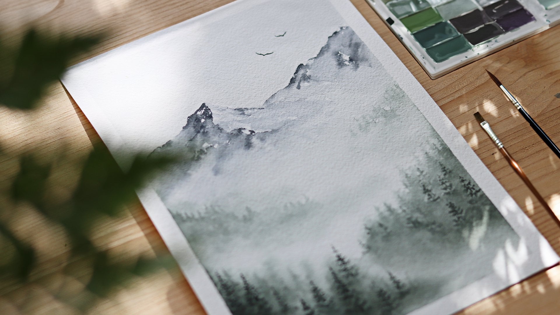
4. Wet on Wet Technique: There are many techniques you
can use with watercolors, but because we're
going to paint in a very loose style creating
soft and delicate flowers. I'm going to show you how the
wet on wet technique works. This technique is very flowy
and you will see water and colors mix in a very unexpected
and unpredictable ways. Trying this method leads to surprising and unique paintings. And I came up with a very relaxing and
playful exercise that will also help you let go of control and embraces
and predictability. The colors I'm gonna
be using today are yellow, orange, and red. These worms summery colors
inspired me and I will keep using them for the rest
of the following lessons. But just feel free to pick the colors for this
exercise that speak to you. The paper I'm using
is from RNN fly, and it's a student grade
paper, very cheap, but it's perfect
for this kinds of experimental exercises regarding brushes
that you can use. Any type of brush, whether it's round, flat, or mop brush, just
make sure you're using a medium or
larger size brush. So to start with, dip your brush into clean water. Once your brush is
loaded with water, just applied on the paper. Spread the water evenly until
you see a nice wet area. If you're not sure about
the right amount of water, you should see a
nice visible layer of water on your paper. If you've accidentally dropped too much water and you're
seeing a puddle form. You can always go back in with a dry brush to soak
up the excess water. So when you have a nice glossy
wet area on your paper, you can pick a color and lay the pigment on the wet surface. You will notice
that the water will start to pull the paint out and that the edges of
your brushstrokes will get really
soft and delicate. I find this technique really amazing and fascinating
because they can spread and spread the water in really interesting
and unexpected ways. So far, It's my favorite
watercolor technique because it highlights the
best quality of watercolors, its ability to create a
wonderful bleeds in Bloom's. Another way you can use this wet on wet technique is to lay down a color first and then going with water or
a different color, It's up to you. Here. I'm laying down the
orange color first. I'm making sure the
area with paint stays wet and doesn't dry out before I apply the
second one, now, grab some water or a new color with your
brush and move it to the bottom edge where you applied your first
color, like so. As you can see when I
move my brush down, the color diffuses
down my stroke. So you can just go with the
flow with this exercise. Actually there's no right
or wrong way to do it. The point is to understand how the wet on wet
technique works. Be aware of the amount of
water and pigment you're using and observe
how the paint dries, how the color and water
spreads is really going to vary depending on the
type of paper you're using, the amount of pain you drew, but on the amount of
water you have on your brush or on the page. So there are many
variations here. And every time you paint, you'll actually get a
different result each time. So just let the
watercolor do its thing. Just play around with the
amount of water or paint or the time between applications,
experiment and observe. I find this process very relaxing and I love
how the combination of pigments and water can create a gradient within a
color or between two colors. You can explore how
colors softly blend. And that's why I do
this practice very often before I start
a new painting. It allows me to warm up
and at the same time, I can build a color
palette. I want to use. One more way you can use
this technique is to drop a darker color on
top of a lighter color. This is a great way
to add depth and contrast three or
watercolor paintings. And they're built to
remember is to start with a light color first and
then drop the darker one, building the body of the
pain from the bottom-up. Okay, we have a
beautiful color palette. We've learned about the
wet on wet technique. Now we're ready to
start learning how to draw botanical elements
that will pay later.
5. Sketching Botanicals: For this lesson, I've prepared a lovely fluoro sketching
shapes that you can print. The flowers you see within the borders are some
paintings I did a while ago and I didn't use
the wet on wet technique, so I really hope you like it
and that you're excited to learn more about
it if you're not able to print this
page, no worries. All you need for this
lesson is a pencil and eraser and a pen
or a fine liner. In this lesson,
we'll learn how to draw flowers and
botanical details. I want you to focus
more on getting creative with the
general shape and outline of these elements without getting too hung
up on specific details, will adopt the drawing
you experiment with here. With a loose watercolor style. Sal only require
basic, simple shapes. Let's start off by
learning how to sketch basic shapes
to create a flower. And easy way to get started
drawing flowers is to build a simple scheme
that will guide you to trace the shapes that
make up the flower. So start off by
drawing two circles, one inside of the other one. Then draw two lines in a shape of a cross
from this scheme, start drawing petals starting at the tiny circle in the center. The cross lines should
help you distribute the petals evenly
throughout the circle. I'm repeating this
process one more time, but this time I'm
adding one more line. So this way I have a
guide for each petal. You can add as many
guiding lines as you want to try your flowers. Once you get acquainted
with this process, you can skip the helper lines. And this time I'm only
drawing the circles and I'm arranging the petals
without referring to the lines. I'm also drawing
bigger petals and I'm starting to explore
more variations of the flower as a next
step and start tracing the flowers that you drew
with a fan or a fine liner. And lastly, whenever
you feel ready, you can draw the
flowers we hand. You can repeat each step
as many times as you want until you feel
comfortable moving forward. When I draw flowers, I like to start from the center. And then I like to
draw the petals and experiment with
different shapes. Whenever I need to
come up with new ideas for the types of
flowers I can draw. I liked her referring to one
of my books about plants. This book features different
types of flowers and leaves. And as you can see
next to each plant, I can find the icon. And this really helps me to get a better understanding of the
basic shapes it is made of. I also like to refer to photos
I can find on the Internet or just heading outdoors and
see what nature can offer. Okay, now let's move on to
leaves and easy outlined for leaves is drawing an oval shape and then a line
through the middle. The oval serves as a border, so they just stay
within the area. And as we did for the flowers, you can play with the
various leaf shapes. As you can see, I'm keeping all the drawing is very simple because the focus is
on the shapes that make up our botanical subjects. All right, Next, we're going
to learn how to sketch simple stems with leaves
attached to them. The outline for this is exactly the same one we use
for sketching the leaves. Once you have the
pencil outline ready, you can go over this
straight line with your fine liner and
draw this time. Then start drawing
some tiny leaf shapes on one side
of the stem first, and then on the
other side as well, make sure to stay
within the line of the oval shape you drew. And this will ensure
that the leaves along your stem are evenly
placed and balanced. Okay, now, let me show
you how you can modify your outline to help you draw
not only straight stems, but also curvy ones. Start by tracing
a C-shaped curve and now draw an oval shape
all around the line and make sure to keep the bottom
half of the oval a little bit larger and the
top tied to the end of some. Now, so drawing the
leaves on both sides, the bottom leaves
are bigger and as you work your way out,
they'll get smaller. I think this outlines
are very helpful if we're getting started
with botanical drawings. I really hope you can
find them useful. And once you feel ready
and just go freehand. Here, I'm just quickly adding illustrations for different
types of friendships. So we went through all the
botanical shapes we'll paint. And now let's get
to the fun part. Prepare your brushes,
paint, and paper. Because in the next lesson, we're gonna learn how to paint.
6. Painting Leaves: In this lesson, we're going
to learn how to paint leaves. There are many ways
to go about this, but since the style of this
course is simple and modern, will keep the leaves are very
minimal and let the colors, hues, and shapes
speak for themselves. We'll be focusing on
capturing just the essence of the subject without worrying
too much about the details. So I will keep the sketching sheet
close-by along with them. Guide with the botanical
references that you can find in the projects
and resources section. To reference the kinds of leaves that I want
to experiment with. Alright, let's get started with a quick brushstroke
exercise that will help you get acquainted
with your brushes. The point of this exercise
is to get to know your brushes and learn
what shapes they can make. It is also a good
practice to warm yourself up and I still do it
myself from time to time, especially when I get
a new brush and I want to see how it
feels to paint with it. Okay, so load your brush with
some water and the color. Start with the tip
of your brush. And then lightly
press down, lift up, and try to repeat this with a losing contact with the paper. I'm going to draw
the next column of this exercise with
another brush. This one has a very peculiar
shape and I just got it. And yeah, I just want to see I'm curious to see what shapes form. Okay, here we are varying the
pressure we are applying on the brush to create a
theme or full strokes. These will also be the method we're going to use to
create our leaves. I'm doing one more line
and this time I'm moving the brush in a wavy motion,
creating this button. Okay, now that we
have warmed up later, I'm going to show you
how to paint leads. But feel free to try out all of your brushes and keep
going with this exercise. If you would like
to keep playing around with pressure and shapes, to paint the leaves, I'm
gonna go with a round brush. This type of brush is
the one I use the most. I just love round
brushes because you can get to paint white stroke
so when you apply pressure, but they are also
great for thin lines with a pint of your brush, press and then gradually release that pressure
until you get a thin tip. Then do the same thing
for the other side. Pressure, meet your
point and lift up. Keeping mind that the
directionality of your brush is going to determine the
direction of the leaf phases. So I'm keeping a straight
hold and the direction of the painted leaf matches
the direction of my brush. For the next leaf, I'm keeping a slanted hold. I'm also moving the wrist
to make the lift curve. I'm doing another one, and I'm also trying to
accent with the whitespace. I want to leave in the middle. To add more depth to the leaves, you can apply the wet-on-wet
technique we just learned. So I'm starting with
a light color and I make sure the leaf
is evenly wet, and then I go back in
with a darker pigment. During this practice,
don't forget to bury the hue of your color. It's good practice
to create contrast. Also, experiment with
different shapes and keep the sketching sheet
close-by for reference. Until now we've been practicing how to paint leaves
with two strokes, but there's also an
easier way to paint a leaf using just
a single stroke. I use this method
when I want to paint a thinner leaves and when
I'm using my smaller brush. Another trick I use
to create contrast within the leaves
is to start with a dark color and then add the water and let the colors
spread and softly blend. Alright, I'm gonna
add more leaves, but when you feel comfortable
painting these ones, you can move on
to the next class where we'll learn how
to paint branches.
7. Painting Branches: Now let's you know
how to paint leaves, painting branches that
requires just an extra step. Before we get started, I just wanted to remind you
that we're painting loosely. So take off the pressure. If the branches don't come
out exactly as mine do. As we saw in the
beginning of this course. The wet on wet technique
is unpredictable. And also the materials you're using can affect
the final result. Okay, Let's keep practicing
and let's feel the shooting. Experiment with different
branches and leaves shapes. And also remember to
use different hues intensity to add contrast and avoid the flat
look on your painting. We'll start our first branch
by painting the stem first. I'm grabbing the brown color
and I'm diluting it with water so I can start
with a very light shade. I'm starting from the
bottom and I'm making a curved line as
I work my way up. Now, I'm going to leave here. Remember the practice you did painting leaves in
the last lesson. So to make the leaf, I start with a thin
line and then I press the brush down to get
a nice oval leaf. I repeat the same step to create the other
half of the leaf. You can use the tip
of your brush to add a little point for find the leaf or district
with the paint. When I paint branches, I liked very this shade and
intensity of the leaf color. So for example, I start by
painting a couple of leaves with a dark hue of the brown at the bottom
end of the branch. But as I move along the stem, I add some leaves with
a lighter shade of brown that I just get from
adding water to the color. I tried to create a nice
contrast to make my subject stand out and
look more interesting, using the same color hue will
make your painting look. And you want to avoid this. Now, as you can see, I'm making a couple of leaves, a very light now most of
reducing the size of them. And in this branch with
the smaller leaves. Now I'm going back in with a darker shade to add a
little bit of contrast, dabbing the brush on some
of the wet leaves and applying the wet on wet
technique we just learned. All right, For the next brand, I'm referencing the
sketching sheet for ideas. And I picked this
branch with leaves, just some one side. To recreate this brand. First, I'm tracing the
curved shape of the stem. I'm adding a tiny
leaf at the tip. Next I'm adding a
single strokes leaves, starting with bigger leaves
closer to the end of the stem and reducing
the size of the leaves. As I move up towards the tip. Sometimes with the
wet on wet technique, you might see tiny puddles forming at the tip
of your leaves. When this happens,
I tried to move the fall to the bottom
or where the leaf is attached to the stem because it looks more natural and
the color gradient of the leaves starts with a darker color at the bottom
as opposed to the top. Now I'm just changing my brush
and picking a smaller one. The third branch we're
going to paint is very similar to the first
one I painted here. The main difference
is that I'm adding more leaves to the brand and
I'm making them thinner. This is why a smaller brush helps me achieve
a better result. Here, I'm going back in with a dark brown to add contrast. And I'm dabbing the brush
on some part of Sam. Alright, so far you've learned
how to paint branches by first establishing a stem and
then adding leaves to it. However, you can get more creative with the way
you paint your branches. In this example,
I'm going to show you how you can paint the branch and leaves
simultaneously together to create a botanical elements. First, I'm choosing a
very dark brown color. Then I'm painting a
very thin and long stem that directly leads into
slightly wider leaf. Next, attach another leaf
and then a third one. To keep balance
within these brands, I'm adding some more leaves
on the buttocks side. Okay, Let's keep practicing
and let's fill this **** in. Experiment with different
branches and leaf shapes. Also remember to use
different hues and intensity is to add contrast. Enter by the flat look
on your painting. Alright, I'm taking
some more inspiration from our sketching ****. I'm picking this French. I started the painting by
making two lines in a V-shape. Then I paint in the leaves the width, three small bridges. You can notice the
painted version doesn't look exactly like their
version I sketch, but I just wanted to
get creative with how the leaves were shaped. Okay, We're only one step away from finishing
our practice. And now let's see how to paint
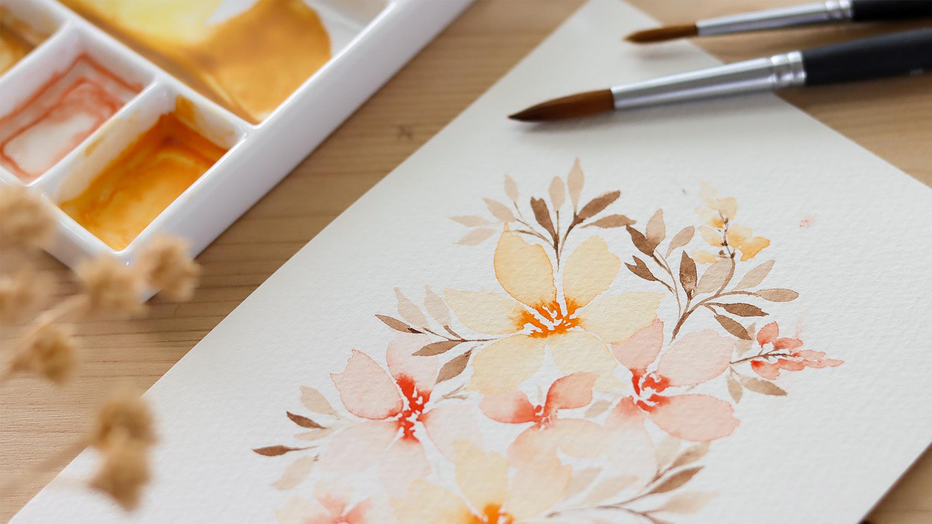
delicate, loose flowers.
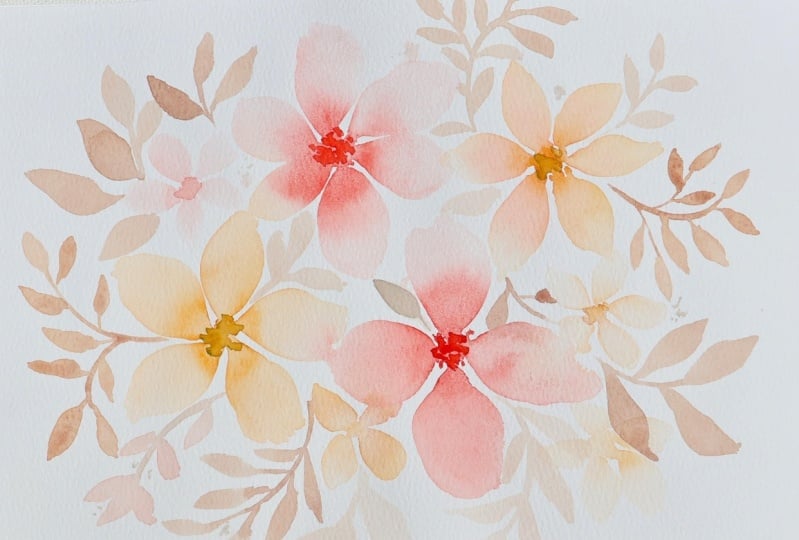
8. Painting Flowers: There are two ways of
painting loose flowers. And let's start with a method
I love using them most. So let's start by
picking a color and let's load the brush
with pigment will use a concentrated amount
of this color and dilute it with water together
for a fight or flight. Once you've chosen the color, just supply a dance and
they come onto your brush. You don't need to be using
a lot of water quite yet. Now start by painting four
dots in a closest circle shape where you place the dots will become the center
of your flower. Now rinse your brush fully and make sure it's pretty
loaded with water. Now you can start at each dot of color and lay your brush down, apply some pressure
to your brush, and then gently
move it away from the dot to create
the n of the pedal. When the brush
touches the pigment, the color will
immediately spread in the direction of
the wet surface. Now, you can repeat this process for the remaining dots and make sure to have enough water on your brush for each petal. Whenever you need to, you can learn more
water on your brush. Now I'm showing you a second way you can achieve
this loose style. And basically we have
to do the opposite. So start with a very diluted
and light color and paint the petals first and picking the orange I already
have here my palette. And I'm just adding water
to make it lighter. So here we're painting
the flowers freehand. Just remember the
practice with it before keeping mind to lay the
pedal stone in a circle, each petal should
have water evenly distributed throughout it and
the color should be even. So. If you notice some
parts paint dry to stop your brush to release
some water onto the page. Now pick a darker pigment and layer it on
top of the petal, near the center of the flower. Here I'm adding just a
little bit more water to make the colors
spread even more. Okay, Now let's
add more detail to the center of the flower
and grabbing a third color. And this time the red. And I'm cutting my brush quite thick lead
with the pigment. The thicker pigment
will allow me to have more control over the
movement of the color. And it will also allow me to create some contrast.
As I go in. Here, I'm painting
some really fine lines that connects the pedals. And it is really
important to leave whitespace between the lines. So I personally love using the first method
I showed to you. So I'm going to keep
painting with that. Our focus in this lesson is to practice the list of
style with this flowers. Keep it simple and play with different shapes and see
what methods suits you best. Remember that getting it at a new painting technique
takes practice. So if you don't succeed, try to give yourself time. Be patient, and keep practicing. When I first started
using watercolors, I remember I was trying to find some pretty complex
floral arrangements. And I had to know
about composition. I had to know how to paint flowers from different
perspectives. And when it came to the
final painting fields, I was always getting
afraid of messing it up. I was afraid of we're
seeing the materials I was using and I fell a lot
of frustration in the end. So from my experience, breaking down the process of
learning watercolors into small steps is very important to stay
motivated and keep going. This is why I
created this course. And I wanted to focus on
just a few simple projects, keeping things easy and giving more weight to practice
and repetition. Alright, I'm going
to change with brush and I'm using
the number four, I'm going to fill in
some of the gaps and the page with some
tiny flowers so we can practice with a different brush size
and flower dimensions. There are mainly using the first method
to pay my flowers. I'm still trying to
vary the way pinned. One of the things
you can do to add some variety is to keep
the sheet that contains your botanical sketches
near you and get inspired by the different
types of petals you sketched. In addition with this class, I've included a guide with a bunch of references
that you can look at. You will find a few extracts from one of my favorite book. You will also find some press flowers
and some photographs. So when you're painting, you can consider varying
the number of petals, but also their shapes. You can paint jagged
ends, pointy, wavy, round thing and
everything you can imagine. Now that our page is full
of beautiful colors. We are at the end of
our painting practice. And I really hope that
after this practice, you feel more comfortable with your own painting skills before jumping into her final project. In the next lesson, I'll be giving you some tips. You can apply it to create a
well-balanced composition.
9. Composition Tips: In this lesson, I want to
share some key things I keep in mind when sketching
my floral compositions. Start off, I will show
you three examples of wrong composition so you can get a better understanding
of these mistakes. Next, I'll give
you tips on how to create a well-balanced
that floral composition. In this first example, you can see two
big flowers at the top and two tiny flowers at the bottom that they
mentioned other flowers and where they are placed
is really important. And this composition
feel some bonds because there's too much
weight on the top part. The second example features three perfectly aligned flowers with a bunch of
leaves all around. There's no variation in
the size of flowers. There room for this
composition to breath due to the
quantity of leaves. So the overall look is
really flat and crowded. The third example has
bonds within the flowers, but the stems and leaves don't create movement
with harmony. The stems are straight and
they're assemble arrows, and they make the
composition very unnatural and without harmony. Now, let's see what we
should keep in mind when sketching our
floral arrangement. So the first thing to consider is the
dimension of our shapes. To determine the
size of the flowers, I use a simple circle shapes. Sketching out different
sizes helps me to get an idea of my floral
composition right away. So I placed the circles
on my paper and I tried to keep them around the
center of the composition. In addition, I tried to think about where I'm
placing each flower. So for example, if I have a
big flower on one corner, I tried to balance it out by
drawing another big flower or two tiny flowers
on the opposite side. The point is to
balance the weight. Once I have the flowers and
they look bonds to my eyes, I arranged the leaves
and branches all around. When it gets the branches, I make sure to create
movement within the elements. One thing you can do is to draw current flowing branches and draw leaves pointing
different directions. Negative space is
also important. So if you have areas where
you just see a few stems and basically not
all the elements are touching, it's fine. The whitespace that
contributes to give binds to the composition wellness tip of a composition is using contrast. We already touched
on this when we practice painting all
the botanical elements. But again, every time you paint, remember to use the
different colors and intensity of use or right? These were all the tips I wanted to share
with this in mind, let's dump into a final product.
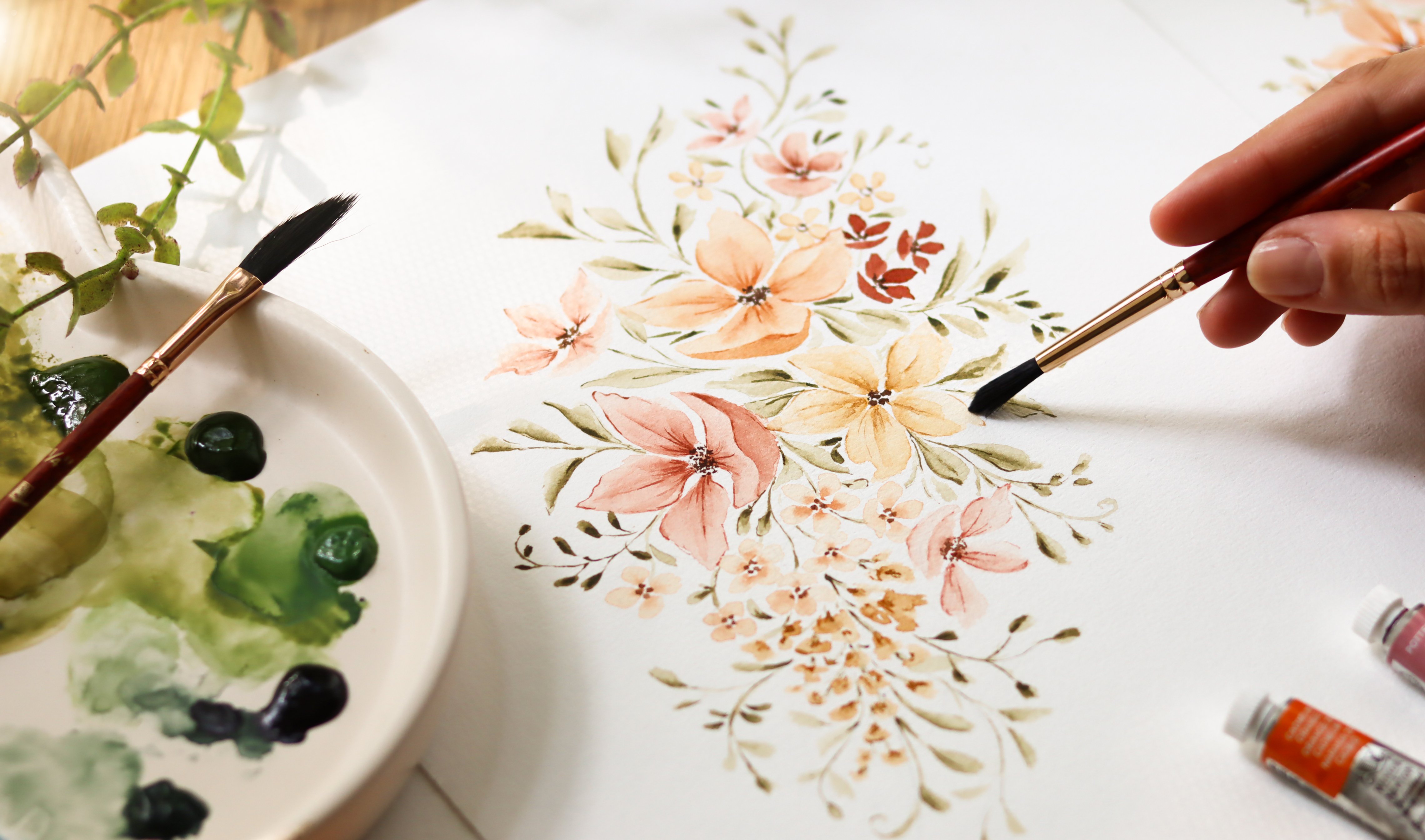
10. Final Project: Right, we're ready to
create the final project. I'm going to keep the sketch of the flora composition close by. So I can take a look at where I should
place the elements. You can find the
same sketch under the projects and resources
section if you want to print it out or open the file and keep it displayed on
your laptop for reference. So I'm starting with
one of the big flowers. I'm creating the center
of the flower by painting several lines using a thick
consistency of color. Now I'm rinsing the
brush and I'm loading it with border like we did
in the practice lesson. I'm painting the
petals by touching the wet tip of the brush to
the dense color on the page, then applying some pressure and moving the brush
away from the center. I continue painting
several petals around the circle in this way. As you can see, the
first flower is placed in the upper
right-hand corner. So to balance the painting, I'm adding the next flower diagonally opposite
to the first one. So it's gonna be in the
lower left hand corner. Alright, from here on out, we'll be varying the
shape and the size of the flowers to make my composition feel more
alive and more natural. The third flower, a pink, for instance, only
has four petals. I'm also playing with
the shape of the petals, making them more round
and less pointed. Lastly, I varied the
Howie's colors a little after creating the
center would think color, instead of going back in with a clean brush loaded
with just bought her, I went in with a brush that had a small amount
of orange in it. This gave the flower is
slightly more intense finish. Okay, next, I'm going to
paint another flower up here. And again, I'm starting
off with the color red. This time I'll only use
water to paint the petals. If you picked a
different color palette, just feel free to mix and
match the colors you picked. All right, To complete
the composition, I'm adding two
tiny flowers here. Okay, The flowers
are looking good and now it's time to add
leaves and branches. So what I do when
I have to start adding this next elements is flip the paper and try to stop the areas that need to
be filled in first. So this area on the left
looks a little bit empty, and I think it's a good
spot to add some foliage. So as a good rule of thumb, Let's start with a very light and they alluded
shade of brown. Next, let's use the
wet on wet technique. We learned to make
this branch look more interesting
with a dark brown. I'm going back in and just lightly dab in the
brush on some of the leaves and some parts of the stem with the remaining
paints I have on the brush, I'm adding just a
few more leaves. So as you can see, I created, I created some contrasts within the colors and I varied
the size of the leaves. Some of them are tiny while
others are a little bigger. Now keep in mind
that our main goal here is to announce the
flowers as they are our main subjects by
adding branches in a way that feels harmonious
and balanced, we can make the flowers
really pop and stand out. Just a quick tip to give
you a composition centered, try to maintain an equal
distance space from the borders. You can also trace some benchmarks to help
you visualize the border. So for painting,
if this can help, I know that placing the leaves and the branches can be tricky. But with time and practice, you will develop
a sense of bonds. And does it really don't
be too disappointed if your final painting doesn't turn out exactly like your sketch. The sketch, It's just a rough
representation to help you guide the approximate size and placement of your
botanical elements. So remember to have fun with the unpredictability
of watercolors. Because the flowers are
very delicate and soft, make sure to keep
the overall look of the leaves very delicate
and light as well. I would suggest that you not paint all of your leaves using a very dark and
thick brown color because you're going to end
up with a flat painting. And also the leaves will take the center stage and
become the main subjects. Another thing to keep in mind is to make your
painting feel alive. As you can see, I'm
adding movement by pointing the branches in
different directions. As a little reminder, if you feel that this
lesson is going too fast, pause the video and
work at your own pace. I always feel like to remind all my students not to
rush the creative process. Feeling the pressure of finished quickly has often caused me to. Make additional
careless mistakes or ends up with a painting
that I wasn't happy with. So if you feel that the
video is moving too fast, always feel free to pause, replace certain sections, and just being in the moment
and enjoy the process. Right? I continue adding the
leaves and the branches, keeping in mind all of the tips I shared in the last lesson. Hi. If you've filled
in pretty much all of the areas of
your composition, just take a quick step back to look at it and
see how it flows. Remember that you always have time to keep adding elements, but you can go back if you have too many elements
already on your paper. Okay, I'm taking
out my painting. I think it looks good. I can see any areas
where I would want to add more and it
looks well-balanced. I can wait to see
how your final work looks and I really hope
you're happy with it. If this is your first one, be proud of yourself
for sticking around until the
end of this course. We went through many steps, will learn a lot. And let's be honest, watercolors are not
easy to master. So congrats for
getting this far, make sure to watch
the next lesson for even more hideous and
for the final Rob.
11. Conclusions: We've reached the
end of the course, and I hope you enjoyed
it as much as I have. Now before I leave, I went to wrap things up
and I want to give you some more ideas on
what you can create with this delicate
loose flowers. First that we played
with colors and water. And they're the wet on wet
technique than we explored botanical shapes from sketching
to painting each element. Next, we went through
composition and learn the secrets to creating a well-balanced
floral arrangement. With them combined
everything we've learned to create
our final piece. The skills you have
gained can now be applied to create many products. And here are a couple of ideas you may want to
try in the future. This is a simple and I kept for bookmark and it was
very easy to create. I made the borders by taping the edges of the
paper to my desk. Then I started painting loose flowers on
the entire surface. When the pain was
completely dry, I just remove the tape and
this was the final result. This is a bouquet I created to design some wedding invitations. I use a very full color palette, paint this piece items candidate to make it into a PNG file, and he used it to
decorate the invitation. I also made this painting that I'll be using
as a greeting card. Here I arranged the
flowers, the branches, and the leaves, creating
a rich decoration. So I really hope you're
encouraged to try these ideas and I can't wait to see your work in the
project gallery. As always, feel free to
post any part of your work, whether it's the practice
or your final painting. If you have a minute to spare, I would love to
hear your feedback. I always do my best to
create classes that are easy to digest and accessible
to all student levels. I really hope that
this class helps you feel more comfortable in your painting skills to discover something new
and to create a PCR. Happy with. Thank you so much for
joining me today and I hope to see you again in
my next Skillshare class.
 Altea Alessandroni, Artist and Designer