Transcripts
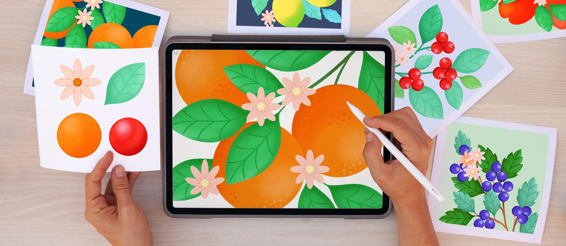
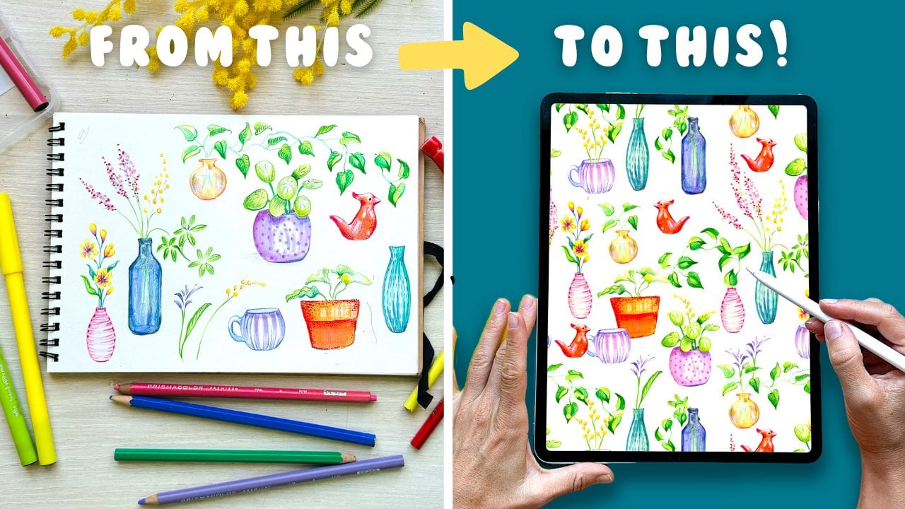
1. Introduction: Imagine packing a
whole art studio with all its painting techniques inside an iPad that
you can take anywhere with you, that is procreates. In this class, you
will learn, practice, and master all the essential
painting tools and functions necessary to create beautiful
digital illustrations. Whilst illustrating I
said a botanical assets, you will learn how to
use all the drawing, painting, and
transforming tools. Lastly, you will use
all of your elements to create an infinite number
of standing plants. By the end of the
class, you will feel comfortable using
Procreate and you will be ready to transfer
what you have learned into any other
subject of your choice. Working with Procreate means
that everything that you create is already in
a digital format. Your artworks will be ready
to share it on social media, sold on print-on-demand
websites, make repeating patterns,
print stickers, decorate your walls, sold
to clients and more. Hi I'm Silvia Ospina, I am an artist and
graphic designer, and I have been working as a creative individual
industry for about 15 years. I am such a big fan of drawing and painting that since
the start of my career, I enhanced a number of projects
with my illustrations. I lived in London for
seven years and I used to have a
beautiful art studio. I used to work on
pain from there and I designed hundreds of beautiful hand printed
patterns that went into stores such as Sarah, Mango, and other similar brands. Now I live in Barcelona
and I do all of my work from my iPad without
the need of getting messy, and I feel more
efficient than ever. I love taking it with
me to different places, as it allows me to get creative instantly and work
from wherever I am. Mastering Procreate has
been the best thing that I have done in recent
years, and guess what? I will teach you
everything I have learned so far starting
with this class. This class is perfect for absolute beginners with no
experience on art or design, and also welcomes more
experienced artists. If you want to check my work, you can follow me
@silviaospina.art on Instagram, and for our tutorials
and tips and tricks, you can subscribe to my newsletter and follow
me @socreative.art. This is the place
where I often share inspiration on how to use
different creative techniques. All you need to
take this class is an iPad Pro, with
Procreate installed. If you don't have the app, you can buy it for only 0.999, which is pretty good for
such an incredible program. Just so you know,
with this class, I will be hosting a giveaway. Read the description of
this class to enter, and you will get a
chance to win a year of premium Skillshare
membership. Get your tools ready,
and see you in class.
2. Your Project: [MUSIC] Your project is
to digitally illustrates at least one botanical
plant using Procreate. Whilst creating a set
of botanical assets, you will learn, practice, and master all the
necessary tools and functions to create
digital illustrations. As the class moves along, we'll explore the brush library, and I will show you how to use the drawing and painting
tools creatively. You will see how
easy it is to draw and fill up shapes with color. You'll understand
the importance of using layers as
much as possible. How to draw a flower
using symmetry, which is like magic, various way of adding texture
or creating gradients. How do we erase backgrounds
and how to transform all of these assets into
numerous standing plants? Please upload your
initial botanical assets and your final plants or plants if you did more than one, the more you make, the
more you practice. In your final composition, I will be looking for the
same elements repeated across a plant in different
sizes and tones of color. This will show that
you've mastered the move and transforming tools, which are very important. As the class moves along, I will show you how to combine various geometrical shapes to
create other illustrations. If you decide to
make any of these, there are also welcome
in your final projects. If you share your project
on social media you can tag me @socreative.art, so I can look at it and share it with my
followers as well. In this class projects
and resources tab, I have left a PDF with some information that
might be helpful to you. I have also left are link to
Pinterest and some images that might give you some ideas on how to make the most
out of this class. I've designed this class
so that each chapter covers a specific tool and
it's named accordingly. Suppose you have already some experience using
Procreate, in that case, you can just watch at high-speed the chapters which cover
tools that you already know, do this instead of
skipping it in case I mentioned a shortcut or trick, which might be helpful to you. If you have any questions or doubts or need extra
guidance along the way, don't hesitate to
reach out to me using the discussion
panel below. I am excited to see what
you create. [MUSIC]
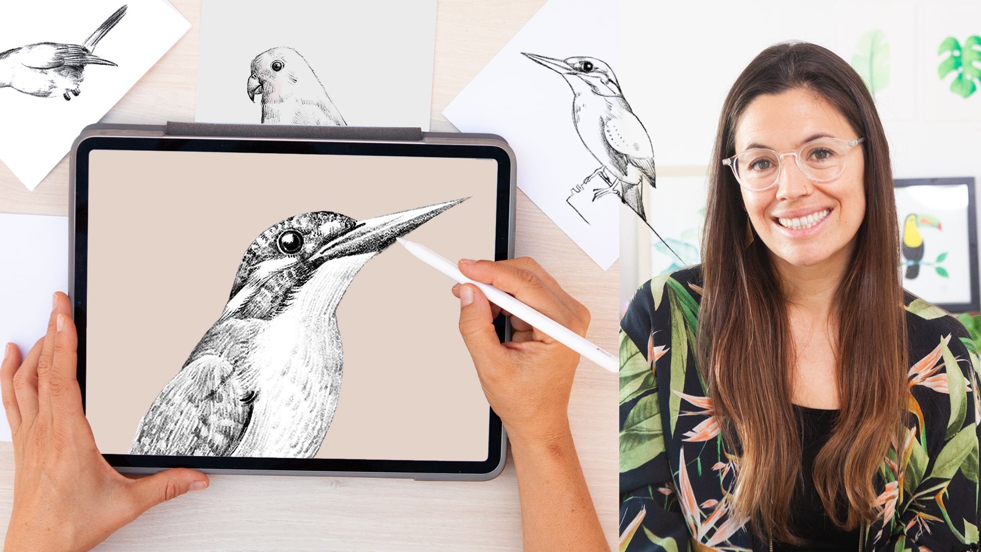
3. Gallery Overview: [MUSIC] I like to use
Procreate to work on all sorts of projects. I love to sketch my
hand-painted murals in here. During the past years,
I have done a ton of botanical assets
that I have been using on my patterns
and illustrations. I love to keep my files organized in groups
and in this lesson, I'm going to show you how to
do this in case you want to start organizing your gallery
as you work in Procreate. When you open Procreate, this gallery is the first
thing that you will see and it will be empty if it's your
first time using the app. Depending on the size
and storage capacity of your iPad and the Procreate version that you have installed, you might see your screen
a bit different to mine. That's alright. Even the older versions
of Procreate have pretty much all the same
functions covered in this class. To organize or move
one of your files, you have to touch and hold it, move it and drop it
wherever you want it to be. When you want to move
two or more files, you will have to tap on the "Select" word
from the top menu, tap on the artworks that you want to choose and you'll see these blue check appear
on the ones that are selected and move them
across your gallery. To exit this mode, tap on the "X" symbol here on the top right
side of the screen. If you swipe left on
top of an artwork, you will see this pop-up menu
appear and you can share, duplicate or delete an artwork. If you wish to rename it, then you will have
to tap on its name, change the title, and press
"Enter" when you want to exit. If you want to
preview an artwork, you can spread your
fingers on top of it, swipe left and right to
flick through the gallery. If you want to open it, double-tap on it and you
will see the window change. To go back to the gallery, I'll have to tap on the "Gallery" word on the
top left of the screen. As I said earlier, I tend to vary my
style quite a lot when working on different projects
and different clients, so that's why I like to keep
my files grouped in folders. I'm going to show you
how to do this in case you want to organize
your files as well. I will tap on "Select"
from the top menu and tap on these two
artworks to select them. You will see that when two or
more artworks are selected, the top menu changes. Now I can stack, preview, share, duplicate, or delete these artworks
at the same time. I'll tap on "Stack" and now the artworks will
appear within a group. To enter a folder, tap on it and to go
to the main gallery, tap on the word located at
the top left of the screen. If you want to add a new
artwork to the folder, touch and hold it, place it on top of the group
that you want to put it into and when you enter
the group, drop it there. If you want to take an
artwork out of the stack, you will have to touch
and hold the artwork, drag it to the top
left corner and once you are in the main
gallery, drop it there. You can select various artworks
at the same time and move them in and out of the stack or folder following
the same steps. Have in mind that the gesture of swiping left also
work with folders. If you want to rename it, you will have to tap on top of its title and give
it a name in there. That's it for the
welcome gallery. In the next lesson, I will show you how to open and personalize our
documents [MUSIC].
4. Opening a Document: [MUSIC] Procreate comes with a
few templates by default, such as an A4 or a 4x6
photo and some more. Even so, it's good to know specific technical concepts
to make your own templates. Ensuring that you're working
with the right type of document from the beginning
is very important. There have been numerous
times where I haven't been so careful when choosing
the right size and resolution of my documents. Sadly, after working for
hours on an illustration, I haven't been able to
print it because of it being too small.
Let's dive in. To create a new document,
tap on the plus icon here at the top corner and you'll get access to
this drop-down menu. Here are the templates
that come by default. You will see that I have made a couple of
new ones down here. I have templates for making
patterns in different sizes. I have saved an A2 and A3 templates for making
bigger illustrations. To create your own
custom size document, you will have to
tap on this black rectangle icon with a plus sign. You'll enter this window. In here, you will
be able to choose all the technical specifications
of your new document. You can tap on "Untitled
Canvas" to add a name to your file or
template if you want. In these boxes, you
will be able to define the width and height
of your document. Down in here on the left, you can choose if you
want to use millimeters, centimeters, inches, or pixels. When working on documents
that I want to print, I tend to use centimeters as I can visualize the
actual size in my head. For social media, I use pixels. In the DPI box, you will be able to
define the resolution. 300 is generally good for when you want to
print your designs and 72 is enough for when you want to
display them on screens. But having said this, I advise you to always use at least 300 DPI as you
never know when you want to print your designs
in the future and also the quality of your drawing
will be so much better. The maximum layers
box will show you how many layers you
can get access to. It is the only option
that I can't modify. The bigger the document, the less layers you will get. If I make my document larger, let's say 60 per 60
centimeters with a 300 DPI, the number of layers
will decrease to 9, which is not a lot. These numbers might
change depending on the version and memory
capacity of your iPad. If I reduce the size to
half, 32 per 32 centimeters, then I will get
access to 49 layers, which is more than
enough to work with. Depending on the project
that you're working on, you might prefer to
sacrifice some layers to have a larger document
or vice versa. In the second tab,
you can choose a color profile
for your document. CMYK is used for printing. When you select this option, the colors on your screen will look a bit muted as they're trying to resemble the intensity of the ones which
can be printed. RGB is used for digital
projects displayed on screen. The colors often appear much brighter and more
saturated than in print. I pretty much always
design in RGB. I like the colors to look vivid and bright
whilst I design. I can adjust the colors if necessary when it comes
to printing my artworks. Let's tap on "Time-lapse". Procreate records
a time-lapse video every time that you design, which, by the way, can
be a lot of fun to watch once you've
finished your artwork. Here you can see an example. In this time-lapse tab, you can choose the size and a quality in which you
want them to be recorded. Lastly, in canvas properties, you can choose to have
your background hidden or keep it white,
which I always do. For this class, I'm going
to open an A4 document. It's a good size for the exercises that
we're going to do and it will give us enough
layers to work with. In the next lesson, I'm going to show you a few
things that you can personalize to start working comfortably in Procreate
from the beginning. [MUSIC]
5. Hand Gestures & Personalizing the App: [MUSIC] Procreate is all about using specific hand gestures to access or use different
menus and functions. In this lesson, I will
start showing you a few. I will also cover the actions panel and
how to personalize the interface so
that you can start working comfortably
from the beginning. Whenever you open a document, you will enter
these main window. Use a pinch to zoom in
and out of your artwork. This is really good for
when you want to work on details or when you want to have a bigger picture of
what you're doing. If you want to
rotate your canvas, you can pinch and
twist your fingers. This is really good
to draw comfortably. Whenever I work on a
physical illustration, I tend to rotate my paper a lot as this helps my hand
to stay relaxed. When working
digitally, instead of having to rotate my
iPad constantly, I just rotate the artwork
with this hand gesture. If you want the document
to fit the whole screen, give it a quick pinch and lift your fingers from the screen
at the end of the gesture. When you want to
focus on your artwork without any interface or menus, tap four fingers on the screen. This gives you a
full screen mode where the interface disappears, giving you a clean
view to your canvas. To bring the interface back, do a four finger
tap again or tap the full screen indicator in the top left corner
of the screen. Before diving into
the fun drawing part, I'll explain some
technical things that will help you personalize the
app to your preferences. There are two sets of icons at the top area of your screen, one on the right and
one on the left. You also have this sidebar. I will start by explaining the first icon which
looks like a wrench. Tap on it to access
the action menu. Under the Canvas tab, you can crop or
resize your canvas. See that these
bounding box appears and I can adjust
any of the corners. Notice that when I
resize the canvas, the width and height
is displayed, and at the top of the screen, you will see how many
layers there are available. If you're working on something, just be aware that
when you do this, everything that is
left outside of your canvas that you
crop will be lost. In video, you can see
the artistic process, which is always a lot of fun. Just make sure that
the time-lapse recording switch is on. If you ever want to stop recording temporarily,
you can switch it off. If you don't mind
losing the video which has been
recorded up until now, you can press Purge. But if you just want to
stop it temporarily, then don't press purge, and turn the button
again whenever you are ready to
start recording. In Preferences, you can personalize certain
things of the app. You can switch the interface
from light to dark. I change this mode often, depending on the type of
project that I'm working on, but I generally prefer to
use the light interface. With the second option, you can choose where you
want the sidebar to be. These bars define the size
and opacity of your brush, and it is practical to move them with the hand that
you're not drawing with. If you're left handed,
you might want to send the controls
to the right. If you're right handed, you might want to send
them to the left. The brush cursor switch is for seeing the stamp of the brush
that you're painting with. I'm going to choose a
painting brush and increase the size so that you
can see this better. You can see that
as I move my pen, I can see the stamp, and if I turn it off, then you won't be
able to see it. In the Project Canvas, you can share the screen
with a second monitor. The rest of these options
are more advanced, so I would leave them as
they come by default. In the next lesson, I will
cover various ways to select colors and how
to make color palettes. [MUSIC]
6. Color Systems & Color Palettes: [MUSIC] Color is one of the
most essential components of the visual world
and it is good to start experimenting
with different ways of selecting them as
much as possible. In this lesson, I will
show you various ways to select colors and how
to make color palettes. Tap on the colored circle
here on the top right corner. This circle shows the
currently selected color that you're going to
draw or paint with. Then you have these
two little squares used in certain brushes to
create special effects. The first icon on
the bottom menu is the disk and this mode is the one that
comes by default. You can select the
base color with the outer here ring
and adjust how light, dark, or saturated you want it to be by using
the inner circle. To have a wider range of
color choices you can zoom in on this middle
circle by spreading two fingers over it and pinching on it to close it and
select another color. When you're in the disk
mode, you can double-tap on different areas of the circle
to select pure colors. This way, you'll be able
to achieve a pure white, a pure black color,
and brighter hues. Let's tap on the second
icon which says classic. The classic mode has a more traditional approach to color. You will find that programs like Photoshop share this way
of displaying colors. At the bottom, you
have three sliders. The first one adjusts the hue. Here you can choose
the base color that you want to work with. The second bar is for choosing the saturation which
defines the brightness of a color and in the
third bar you can define how light or dark
you want your color to be. For any color that you choose, you will also be able to define the saturation and lightness
within the top square. Play around with these ways
of choosing colors as you work on your illustrations and see what you like the most. These other two modes are
a bit more advanced and I never use them so I
will leave them aside. Another way of choosing colors
is using the color picker. It allows you to
select colors that are already on a
photo or artwork. I will open one of
my illustrations to show you how this works. If I tap and hold my finger on the screen, the
eyedropper tool appears. This tool lets you select a color already
displayed on the Canvas. It appears as a ring
surrounding my circle. In the bottom half I can see the primary color
that I'm already using, and on the top, I can choose the color that I
want to replace it with. Then if I lift my finger, the primary color will change. As you can see when I
tap on the color circle, the colors that I have
been using appear under the history
row of swatches. In here, you will see all the colors that you've
been working on recently, but after 10 colors used,
they will start disappearing. If you tap on the
palette icon, you will see some palettes
which come by default. As you can see, I've created a few and I like to
try them across different projects
or I use them also to test the colors
in a very quick way. To create a new palette, tap on this plus icon in here and then select "Create
new palette" from the drop-down menu
and you will see an empty set of squares
at the top of the panel. You can rename it by tapping on the Untitled word and If you go back to the
disk or the classic mode, you will see that this new
empty palette appears in here. I'll start choosing a couple of colors so that I can
show you how this works. I will choose a nice orange
bright color and once I'm happy with it, I will add it to the palette by tapping
on the first square. I will now choose a
lighter orange and tap on this second square
to add it to the palette. I will also add a
darker orange and then I will tap on the third square
once I'm happy with it. You can also switch to the
classic mode to choose some greens and experiment with this second way of
picking colors. This way, you can see
which one do you prefer. You can organize these colors
by touching and dragging their swatches to another place in the palette and if you touch, hold, and lift your finger,
you can delete any color. Don't worry as these
colors are not the definite ones that you
have to work with and at any point you can start
adding new colors to the palette deleting them
or reorganizing them. All of your palettes
will be saved under the palette
circle and you can reorganize them the same way
as you organized your colors. You just have to touch
and hold the palette down and then drag it to
wherever you want it to be. If you tap on these three
dots, you can share, duplicate, or delete
the palettes. I can also select "Set as default" so that when I
go back to the disk mode, it appears in here. In the next lesson, we will keep exploring hand gestures and I will show you how to undo and re-do recent actions. [MUSIC]
7. Undo & Redo Recent Actions: [MUSIC] One of the best things
of working digitally is that you can undo and
redo recent actions. In this lesson, I will show you the finger gestures that
you need to do this. I'm going to make some marks
in my canvas to show you some basic finger gestures that you should
start memorizing. When you're painting
and you want to quickly undo one or more recent actions, tap the canvas with two fingers. A notification will
appear at the top of the interface letting you know which actions the undo affected. To undo a series of actions, tap and hold two
fingers on the canvas. After a moment,
Procreate will rapidly step back through your
most recent changes. To stop, lift your fingers
off the canvas again. Something important to know
and remember is that if you exit your document and
return to the main gallery, all the undo available
actions will be cleared. Closing a document
behaves like a 'Save' and your changes
become permanent. It's important to remember this. To redo any actions
that you have undone, tap the screen with
three fingers. As with the undo gesture, you can redo a series of actions by holding three
fingers on your canvas. Two fingers to undo, and three to redo. In the next lesson, we will
explore the Layers panel and I will show you one of my illustrations so that you can see the benefits of using
layers as much as possible. [MUSIC]
8. Layers, Layers!: [MUSIC] Now that we have seen how to use basic drawing tools, I'm going to show you how
to use the layers panel. If you have some
experience using Procreate or any
other design program, you're probably
already familiar with how to use layers and
what they're for. Using layers gives you a lot of control and freedom when
it comes to designing, it allows you to move your
objects separately and try out other effects or textures without affecting the
image as a whole. Tap on the fourth icon to
access the Layers menu. As you can see, this panel
contains two layers. The one on the bottom contains
the background color, and it works as an opaque sheet of paper that you're
going to work on. Everything that you draw or paint will appear on the top, if you want to change
the background color, all you have to do is
tap on the thumbnail, choose our color using one of the methods that I showed
you in the previous lesson. Then click on "Done." Click on the plus icon
to add a new layer. I'll explain the brush tool
in depth in the next lesson. But for now, choose one from the library and draw a circle. If you are overwhelmed by how many branches
there are in here, you can follow me in selecting the dry ink brush from
the inking collection. Move up the top bar on the sidebar to increase
the size of your brush. Choose a color and
draw a circle. We're going to create a
new layer by tapping on the plus symbol on the
panel stops right side. Any drawings you
make on the canvas will appear on your
currently selected layer, which by the way is
highlighted in blue. It's essential to develop
the habit of checking which layer you're standing
on before drawing. Make sure you're standing
on the empty top layer. Select a new color and draw another circle covering
the circle on the bottom. Let's do this once more. Tap on the plus icon
to create a new layer. Select a new color and draw another circle overlapping
the other two. Now let's try switching the
position of the layers. Tap and hold on
one of the layers and move it up and
down the stack. See how even if the
circles overlap, each of them is still complete. The checkbox allows us to turn off specific layers
without deleting them. When making illustrations
is very common to leave things for later or
discard them temporarily. Being able to make them
invisible is very handy. If I would have
drawn these circles all in the same layer, I wouldn't be able to move
them or discard them. You've add any point
on this glass, you spot any unwanted marks or strokes and you
can't erase them. It's probably because you're
standing in the wrong layer. Go to the layer stack and
start making them visible and invisible until you find the layer which contains
the unwanted mark, you will have to
select the layer first to be able to edit it. Remember that the selected
layer is highlighted in blue. If at any point you see
a screen like this, it means that you
are working on an invisible or turned off layer. Easy. Just go to the layer panel and turn it back on
or make a new one. To make a layer transparent, you will have to
tap on the N layer and move the opacity slide. I will explain the bottom
options later in class. If you want to
rename your layer, you have to tap on
top of it and select the first option from the
list, which says Rename. If you swipe the
layer to the left, you can lock, duplicate, or delete a layer. Locking layers is
excellent when you want to maintain the
contents visible, but you want to make
sure not to modify it. I'll tap on the lock and you will see this
padlock appear in it. To unlock it, I'll swipe to the left again and press Unlock. This information is enough
for now and it will give you confidence and autonomy
in the following lessons, where we will start exploring the drawing and painting tools. Before ending this session, I'm going to give
you a quick sneak peek at one of my
illustrations so that you understand why layers are so important and great
when working digitally. I'm going to open this
door illustration. As you can see, I have used quite a few number of layers
to create this artwork. Instead of drawing everything
on the same layer, I have chosen to use different ones for
different objects. For example, I decided to
create the door in two layers. In the first one, I
just drew a rectangle. In the second one,
I drew the details. Drawing the details in
our second layer allowed me to try out different
decorations for the door. I even tried adding
some texture, which I probably wasn't sure of, but I didn't discard it in case I decided to
keep it for later. In one layer I drew the basic
shape in the second one, some shadows, and in the
third one, the details. The same for the plant hunger. I wasn't sure which flowers to use when creating
the illustration, so I decided to use
various layers. I did the basket in one layer, the background in another. In-between, I tried out
different foliage and flowers. I'm going to start making each layer visible and invisible so that you can see the benefits of doing
things in layers. In the first one, I drew blue flowers, in other purple roses. Then I decided to try a new
foliage design altogether. To maintain my layers
fairly organized. I grouped the
foliage and flowers. I will show you how to do this in the layers advanced lesson. I also placed the bicycle
into its own layer. This allows me to move it around and work on my
composition freely. If I had drawn everything in the same layer as I would
do in a real painting. I wouldn't be able to choose which flowers I want to keep, where to put the bicycle or make minor changes
to my illustration. I hope that sharing
my process helps you understand the importance
of working with layers. In the next lesson, we're going to start exploring the brushes.
9. Exploring Brushes: [MUSIC] One of the
things that made me fall in love with Procreate was the massive library
of brushes and how real they look and feel
when drawing and painting. I showed you how to use the
layers in the past lesson, but just in case, here
is a little reminder. If at any point in this
lesson you feel like your Canvas is getting full
and you want to empty it, you can either undo the
steps that you've done or swipe your finger to the left on top of the layer
and select "Clear". If you don't want to
discard the layer, you can tap on the checkbox
to make it invisible, and then tap on
this plus icon at the top right of the
panel to make a new one. If you tap the brush icon, you will see this
drop-down menu appear. Procreate comes with
a great library of hundreds of
versatile brushes. You will see that they
come in collections which cover different
mediums and style. So, in sketching, you have pencils and pastels. In inking, you have
different types of pens, and painting brushes and so on. On the sidebar, you
will be able to modify the size and
opacity of your brushes. By dragging the top slider up, you will increase the size of your brush tip for
a thicker stroke. To make it smaller and
achieve a thinner line, you should drag the
top slider down. Our brushes come with
a size by default, and it's good to try each
brush in different sizes. With the bottom bar, you
can change the opacity. By dragging it up, the opacity will be opaque, and to make it transparent, you should drag the
bottom slider down. These arrows are for
undoing and redoing actions and they work the
same way as your fingers. We will try a couple
of brushes so that you can start understanding
how they work. Go to the ink collection and
select the Mercury Brush. This brush is quite
sensitive to pressure, so move the size to 10 percent. Make a wobbly line and try to apply very little pressure
at the beginning, and increase the pressure of
the brush as you move on. Then if you want,
release the pressure and start seeing how the
brush changes its size. If you want, you can
change the color to make it more fun and try
again on the bottom. Increase or decrease the
size and see how it feels. As you can see this
brush, for example, has a lot of texture on the
borders when I zoom in. Let's try another brush
from the inking collection. As I said at the beginning, you can undo these lines by tapping the screen
with two fingers, or if you want to
keep this layer, open the layer panel, make it invisible by unchecking this box and tap on the plus
icon to make a new one. Go to the inking collection
and select a "Syrup" brush. Choose a different color and do the same exercise of applying very little pressure at the beginning and increasing
it as you move on. If I zoom on my image, you can see that this brush
doesn't have a lot of texture and it has a
much more defined style. By trying out different brushes, you can start seeing which are the ones that suite
your style the most. Undo these steps and let's go to the sketching collection
and select the 6B pencil. Pick a dark gray so that
these pencil looks more real. I love how these
pencils resemble the texture of real
ones when I draw. With this and some
other brushes, you can not only apply
different levels of pressure, but you can also tilt your
brush to create shadows. If you start by making a line, applying very little
pressure at the beginning, and then increase it
as you move your pen, you can see that not only the
size changes a little bit, but the opacity changes as well. Now tilt your brush and
make the same movement. Try making a shape. I'm going to make a
triangle for example, and make some shadows tilting
your pen on the borders. I do this a lot when
drawing in real life, and it's incredible
how Procreate has managed to mimic
this difference. I'm going to undo these steps. I'll try the last one with you, and once you've
finished this lesson, you should try new
ones yourself. Tap on the charcoal
collection and select the carbon stick brush. We're going to make a
gradient using this brush and you will see the
beautiful texture that can be achieved. Let's select the classic
way of using colors. Bring the second
and third slide to the right so that we can get
the purest color possible, and move the first handle
to select a yellow color. Starting on the
left of the screen, make a big mark. Now, open the active
color and move the first handle to the right
to select a light orange. Starting on top of the
yellow, make a mark. Start by applying
little pressure and increase it as you move on. Then go back to the color and move the handle a
little bit more. Make another mark and
always start by applying little pressure and increase it as you move along your paper. Look at this beautiful gradient. The best part for me at least, is how real it looks when
you zoom on the image. Playing around with
these brushes is key to understanding them and
finding your favorite ones. Since the brush
library is so vast, searching for the
brushes that you like the most every time you want to use them can be time-consuming. This is why in the next lesson, I will show you how to make your own collections so that you can gather
your favorite ones, so that they're ready
to use. [MUSIC]
10. Making Your Own Brush Collections: [MUSIC] As you try to brush, I am sure that you will find which ones do you like the most. I will show you how to start creating your own
collections of brushes. Instead of searching for your
favorite ones every time, you can group them and
have them ready to use. You can create your
own collections of brushes by scrolling down on the list and tapping on this plus icon when it appears,
highlighted in blue. When you do so, you will
see a folder up here. You can change its name to favorites or whatever you want. Now I'm going to
go, for example, to the inking
collection and move a brush to the new folder
that I've just created. From this collection,
I tend to use the studio pen and
the dry ink a lot. They're both opaque brushes and are great for
making silhouettes. Dry ink has a lot of texture and studio pen is a little bit more
defined and clean. To prevent from messing with the initial brushes
that come by default, you should always duplicate the brush that you want to
save into the new library. Go to the studio
pen, for example, swipe right on top of it, and tap on Duplicate. Now touch and hold
the new brush. When you see that
you can move it, use a finger on your other hand, tap on your new folder
and drop it there. If you want to delete a brush, swipe to the left
and tap on delete. I will go to the inking
collection again, search for the dry ink
which is down here, swipe left and tap on Duplicate, tap and hold on the Pen, tap on the collection with my other hand and
then drop it there. Take the time to try
these brushes out and start saving the ones that
suite your style the best. In the following
list, you will find some of my favorite brushes. If you want to save them, pause this video and
gather them into your new collection
before the next lesson, where I will show you how to fill up shapes with
color. [MUSIC]
11. Filling Shapes with Color: [MUSIC] Now that we have seen
how brushes work, we will draw a leaf
and fill it up with a solid color using the
color drop shortcut. I will also solve some
challenges that you might find when using
textured brushes. Let's start by selecting
the studio pen from the inking collection or your favorite brushes collection and adjust the size
to draw a leaf. The quickest way to fill it
up with a solid color is to tap on the circle located at the top
right of the screen and drag it to the
center of the shape. When you drag a color to
an area in your canvas, this one spreads until it hits a boundary such as an outline or an area
of a different color. It basically fills
the areas containing pixels that share the same
color or tonal value. In this case, the
color is contained inside the leaf because
the shape is closed. I'm going to undo this
action and draw a new leaf, leaving a tiny gap
in the silhouette. If I drag the color
inside the shape again, you will see that the
paint will escape through the tiny hole
and fill the background. So you want to make sure to close your shapes
before coloring them. Since I've been using a clean brush with a
very defined border, everything has been fine. But let's see a
challenge that you might encounter when using
textured brushes. I will select the dry ink
brush from the library, which has a nice texture, and draw a new leaf. If I zoom in the image, you can see that the border
isn't really too defined. It has some lighter
pixels lying around, which might not be
included when I fill in the area due to having a little
bit of a different color. When I drag the color, you can see that a
little border has been formed in-between the
silhouette and the inside area. A way to fix this is
by using something called swatch drop threshold. I will undo this action, drag the color to the
center of the shape, and this time, I won't lift
my pen from the screen. This message at the
top of the screen appear saying
ColorDrop Threshold, followed by a percentage number. If I move my pen to the left, the percentage number
will decrease, and if I move it to the
right, it will increase. At lower thresholds,
only the pixels with the same or similar
information will be filled. At higher thresholds,
the color will bleed and break through the outlines feeling neighboring
areas of color. I'm going to zoom in so that
you can see this clearly. See how the border disappears if I've moved my
pen to the right, and if I move it to the
left, the separation between the inner part of
the silhouette and the filled area will
be more noticeable. When filling up shapes this way, the paint spreads until it hits a boundary or an area
of a different color. I will draw a new leaf and this time, I will
separate it in half. If I drag the paint, this one will stop when
it hits the line of pixels in the middle and
won't affect the other half, and if I select another color and drag it to the other half, it would stop when it hits the boundary of the color
which is different. In the next lesson, I
will show you how to add texture using a function
called Alpha Lock, so that it only affects the inner part of your leaf. [MUSIC]
12. Adding Texture with Alpha Lock: [MUSIC] Being able to add
texture to drawings is one of the best features
that Procreate offers. Textures can make
illustrations look less digital and have a
natural feel to them. Later in this class, I
will show you how to use masks to add texture
to your illustrations. But for now, I want to sprinkle an easy trick so that
you can enjoy making textures straight away
and feel more confident when using the smudge
tool in the next lesson. Let's go to the
Sketching Library and select this Soft Pastel, which has a very nice
and soft texture. If after using it, you like it, you can add it to
your collection. I will alter my green a
little bit and start creating some texture on the
borders of my shape. When adding texture,
you usually want it to appear inside your shapes, not all over the canvas. I could start being cautious
not to go over the border but this would be
totally inefficient. Check out this trick. Open the Layer Panel and swipe two fingers to the right on top of the layer
that contains your leaf. This hand gesture activates the feature called Alpha Lock. By the way, you can also activate and deactivate
this option by tapping on top of the layer and selecting Alpha Lock
from the drop-down menu. This option locks the
transparent areas of the layer so that
you can't modify them. Meaning that you can
only paint where the opaque areas were already when you activated the
Alpha Lock option. When this option is active, you will see a
checkered background in the thumbnail
surrounding the shape. You will only be able to modify what's inside
the existing shape, in this case, the leaf. Now let's say I want to add
a stem in the same layer, then I would have to deactivate the Alpha Lock with
two fingers first. See how the checkered
background disappears and draw anything in
any part of the layer. I bet that you will
turn this option on and off quite a lot when
creating your illustrations. If you're still struggling to understand it, that's all right. Just play around with this option and see what
it does for yourself. I will grab a pastel from
the Sketching Library, increase its size,
select a darker green. Making sure that the Alpha Lock is active on the layer panel, I will start moving my
brush around the leaf. See how these beautiful
gradient full of texture starts
appearing on the border. One trick is to increase
the size of the brush quite a lot and
pass it outside of the shape to only paint with the borders of the brush
which are already faded. As a result, the gradient
will be much smoother. In the next lesson, I
will show you how to smoothen this texture
with the smudge tool. After these two lessons, you can choose which
visual outcome you prefer, if the smoother gradients
or the texture shapes. [MUSIC]
13. Smudge Tool: [MUSIC] Smudging is like rubbing a finger on top of
your paint or pigment. If you have ever
painted with chalk, pastels or charcoals,
you know the feeling. I barely use this tool, but it's good to
understand it and know what it does
so that you can start experimenting with it and see if it suits your style. This tool shares
the same library as the brush and eraser and
it's used to blend or mix colors or smooth out strokes and every brush has a
different visual effect. Let's start trying out different textured
brushes so that you can see the effect that
these two has. For example, go to the charcoal collection and
select the charcoal block. Let's turn off the
Alpha lock options so that you can see
this effect clearly. Increase the size of the brush and start rubbing the leaf. You will see the brush texture
is stamped on your image. It creates an excellent
effect but somehow it would be fantastic for it to
be inside of the leaf. Unless you're painting a
sky or something like that. Now activate the Alpha
lock and do it again. Let's try a different brush. Go to the airbrushing collection and select the soft blend. I'm going to adjust the
size of the brush and start passing my pen on top of
the light green line. This lesson is for you to play
around with this tool and see what it does so that you
can fully understand it. If you discover a brush to
smudge with that you like, I would love if you
can share it with me. You can leave a comment when
publishing your project in this class or you can leave
one in the discussion panel. As you can see, the
more I rub the line, the smoother it gets and some beautiful gradients
start appearing. I don't use this
tool a lot because I prefer my illustrations
to have texture. Still, I advice you
to play around with different brushes and see if smudging switch
to your style. If you find a specific
brush that you like, you can create a whole
new library to keep them. I'm going to make some
lateral marks and smudge them so that you
can see the results. As you can see, I
haven't mastered this tool but since I
don't use it that much, I still have to experiment
before fully understanding it. This is true for
every tool and brush. It's good to pick the ones
that you like the most and use them as much as possible to
make the most out of them. In the next lesson, we will
explore the eraser tool and I will show you some tricks to increase your
workflow. [MUSIC]
14. Eraser Tool: [MUSIC] Now we're going to look
at the eraser tool. This tool helps us to
paint away mistakes, remove pigment,
amend our shapes, or get rid of them entirely. It shares the same library as the brush and the smudge tool, and you can select a
different brush from the one that you're already
using to paint with. You can adjust the size and the opacity using the sidebar. When drawing, I like
to use the same type of eraser as the
brush that I'm using, as it helps me to create
a seamless style. Instead of having to go through the library to match the style, you can hold your finger down on the eraser icon
and it will match the style of the brush
that you're using. See that when I do this, this notification
appears up here saying erase with current brush. You must select the brush first and then tap on the eraser icon. Here's another trick. When creating sketches, I often switch in between
the brush and eraser. Tapping on the icons every
time I need to do this can slow down my process
quite a lot. But check this out. You can exchange the brush for the eraser by tapping
your pen twice. See how if I tap my pen twice, I can select the brush. If I tap twice again, I can select the eraser. I use these a lot. It allows me to erase mistakes really quickly when drawing, so it not only
improves my drawing, but it makes my workflow faster. Sometimes when
drawing digitally, it can take a lot of effort
to achieve smooth lines. It's easy to apply
too much pressure and cause unnecessary
hand paint. Thankfully, Procreate
has thought about this, and in the next lesson, I will show you a couple
of functions that you can tweak to help you a
lot when drawing. [MUSIC]
15. Drawing Made Easy with Pressure & Smoothing: [MUSIC] Depending on the
brush we're using, it might be challenging
to achieve a smooth line. I don't know about how you
felt when drawing your leaf, but sometimes when making
silhouettes, I struggle. There are days when my hand is a bit trembling and I
find myself making a lot of tension to achieve perfect or not so
perfect smooth lines, and as a result, my hand hurts. Thankfully, Procreate
has thought about this, and there are some
features that can help us easily achieve
smoother lines. Let's have a look at
the Brush Studio. If you tap twice on
top of any brush, you will see this
window up here. As you can see
there are a ton of tabs in this menu
with many options. If you're curious and
would like to play around with these options
to see what they are, you're welcome to do so. You can draw in this drawing
pad to preview the changes, and when it gets
too messy and full, you can clean it
up by tapping on this pen icon and selecting
"Clear drawing pad". If you're not sure about
what you're doing, you can tap on "Cancel". But if you change the
brush and want to reset it to what
it was originally, you can tap on "Reset". You can reset Procreate brushes to how they were initially so it doesn't matter too much. But if you purchase brushes, I advise you to not
change these things, as you might end up altering the initial brush completely. If you still want
to play around it, duplicate your brush first. Remember that you can
do this by swiping your brush to the left and
selecting "Duplicate". Tap twice on top of any brush, you will see this
window up here. Tap on the second tab
that says Stabilization. Let's start with the
streamline option. This option has been available in the app for quite a while, so you might be
familiar with it. It removes any minor
imperfections or unsteady movements you
make whilst drawing. You can draw on that path to
see how it feels and looks. You can create snake lines, wobbly ones, or even a circle, to see how these options affect the lines when moving
the different bars. In the amount bar,
you can decide how strong you want
the effect to be. In the pressure bar, you can determine if you want
the effect to be active all the time or only appear when you apply
pressure to your brush. The second feature
is stabilization, and it has a stronger
effect than the streamline. It makes your lines
a lot smoother and straighter
automatically when drawing. This feature might change
up your lines or shapes completely when pushing
the bar too far, and the faster you draw, the stronger the effect will be. I suggest that if you
want to use this feature, you turn the bar
only a little bit. The third option,
motion filtering, is the strongest of all. This option removes all your unstable hand
movements completely. In the amount bar, you
can select the intensity. I usually keep these
under 25 percent, but it might change for you. The expression bar makes
it even straighter. If you move it to the right, the motion filtering effect
will be more substantial. Only the current brush
is affected when making changes in
the Brush Studio, and it might get messy and feel daunting
to start modifying brushes separately every time that you need to
draw smoother lines. Thankfully, there is a way of modifying these
options to affect all the libraries simultaneously without directly
affecting the brushes. If you tap the wrench icon
and go to preferences, you will see this option that says pressure and smoothing. Tap on it and you will access a simple version of the advanced
options we already saw. You can move these
bars whenever you need to create smoother
and better lines, knowing that the
smoothing effect will be applied to all the
brushes you're using. Turning these options on
and off in here is much quicker and safer as you won't be modifying your
brushes directly. I usually move all the
bars to the right, making sure that I don't
surpass 25 percent when wanting to make smoother lines, and then turn them
off when I'm done. In the next lesson, we
will have some fun and make a few leaves from the
one that we already have. If you don't like the
leaf that you have made with the smudge
tool, that's fine. But I do recommend
that you create a new one and use a
style that you want. By this point in this class, you already know how
to create texture, draw details, and
achieve gradients. So start thinking about which
visual outcome you like the most and use it to develop your project
for this class. You will begin defining your
own visual style this way. [MUSIC] Make sure that you
start the next session with a leaf that you like ready. [MUSIC]
16. Using the Eraser as a Sculpting Tool: As I already said, the
most obvious way of using the eraser tool is to
eliminate mistakes or shapes. Well, you can also
use the eraser creatively and almost use
it as a sculpting tool. In this lesson, we will carve at least two new leaves from the one that
we already have. Let's start by duplicating
our leaf layer and make the one on
the bottom invisible. I'm going to start
erasing part of the silhouettes of
this leaf and carve a new one using the
brush studio pen from the inking collection. Remember to move the
stabilization and pressure bars if you're struggling
to make smooth lines. I'm going to move them myself as my hand is getting tense. It's incredible how by moving
the bars just a little bit, drawing certain things
become so much easier. You can also rotate the paper by pinching and twisting
your fingers as you curve your leaves. If you feel that your
hand is hurting a bit, this might help a lot release the attention and
draw comfortably. Whenever you want to
create a new leaf, you should create a new layer and make the bottom
one invisible. If you can't see the
changes that you're making, it might be because the
layer on the bottom is still visible and since it's an exact
copy from the one on top, you can't see the changes. See how if I make the layer
on the bottom invisible, I can see the changes I've made. I will erase this layer, create a new one, and make the one on the bottom invisible. I teach how to do
something similar in my botanical scenes
in Photoshop class. If you want to get
some ideas on how to carve many leaves
out of a single one, I highly recommend watching it. I do this a lot when creating my illustrations and designs. I love to be creative
when using my tools, and I'm a fan of carving
shapes out of existing ones. Sometimes I do it just for fun, and sometimes I
do it to increase my workflow and be
more efficient. If you need some inspiration
for shapes of leaves, I'm leaving you an image in the description of this class. By the end of this lesson, you should have at least
three different leaves in three different layers. In the next lesson, I will
show you how to create perfect geometrical shapes
using hand gestures, and we're going to create a
fruit or a berry [MUSIC].
17. Geometrical Shapes: [MUSIC] Creating perfect
geometrical shapes can be very practical when
making illustrations. You can use them individually
or combine various ones to create complex silhouettes. Let's see how to create a
perfect geometrical shape. Make the rest of your layers invisible and create a new one. Try making a straight line. It's pretty challenging to
make it perfect, right? Now try again but don't lift
the pen from the screen. See how after a second or two, the line becomes straight. If you move your
pen up and down, you can decide the inclination. Suppose that you want it
to be perfectly aligned to our iPad's horizontal
or vertical edge. In that case, you have to tap the screen with a finger
of your other hand and you will see that
this one starts rotating in perfect
angles of 15 degrees. Once you lift your pen, you
will see this message at the top of your screen
saying Edit Shape. If you tap on it, you can see
these blue dots appear on each side of the line and you can move them independently. I will end these actions by holding 2 fingers on my screen. Now let's do a circle. I'm going to choose
another color. Same as the line,
it's challenging to create a perfect one. So I'm going to draw one
again and keep my pen down. You will see that the
circle line smoothens and if I tap the screen with a
finger from my other hand, the circle will be perfect. As it happens with the line, once I lift my pen, I will get this option on
the top of my screen saying, Edit Shape, which allows me to have even more
control of my shape. Each of these blue dots can
be moved independently and I can choose if I want to
do an ellipse or a circle. The same things
happens for a square. Create a new square, leave your pen down, and
it will become perfect. Once I lift my finger, I can edit the shape
with these dots. I can choose from these top options if I
want to create a square, a polyline, an ellipse,
or a rectangle. [MUSIC] You can also do
triangles and stars. [MUSIC] Now let's combine various
geometrical shapes. Draw a triangle
without closing it, edit the shape, and then draw
half a circle at the bottom. This, for example,
could be turned into a slice of watermelon. [MUSIC] Now make half a circle, make it perfect by keeping your pen down on the screen, and close it with a straight
line from side to side. There you have a slice of fruit. [MUSIC] Combining a square
and a triangle can help you draw a house, and half a circle with
two straight lines can help you create a door. Getting creative when combining
shapes can help you a lot when drawing if you
don't have much experience. If you make a drawing out of combining geometrical
shapes in this lesson, I would love you to share it in the project section
of this class. You might want to create
a new document to experiment with and then
return to this one for the next lesson where I will
show you how to use masks for adding texture to your images in a
non-destructive way. [MUSIC]
18. Clipping Mask to Add Texture: We've already seen
the Alpha Lock option to add texture to our assets. When using this method, the texture is added directly
to the illustration, meaning that you can't
edit or discard it. It changes it permanently. This isn't bad necessarily, but it doesn't always work. In this lesson, I will
show you how to use masks to add texture in
a non-destructive way. You can change it, discard it, or save it for later. In this lesson, we're going
to make a berry or a fruit. Not that they're are different things,
but you understand. What do you want for your
final illustration to be? Think about this and choose
your color accordingly. Here's a few examples. If you want to create an orange, then make a circle larger and pick a solid orange
color as a base. For our lemon, you can use
an oval and a lighter green. Cranberries, blueberries,
cherries, or red currants have more like a red or burgundy
tone, you choose. I left a couple of images
on the Pinterest board that appears in this
class description in case you need
some inspiration. Let's start by making a circle or oval and filling it
with a solid color. I'm going to make a red
currant or cranberry. I will choose a red color. Create a new layer and select a different tone of the
color that you chose. If there is a color
that you really like, remember that you can easily
add it to your palette. I'm going to select a
darker tone and add it to my color palette by tapping on an empty square if it's
not already there. I will choose the soft
pastel brush from the library as it has
a nice smooth texture, but you can select a
different brush if you want. This time, I will create a
texture on a layer on top. I will start drawing it, and as you can see, it
appears all over the place. That's why we need to turn
this layer into a mask. Go to the Layers menu, tap on the "Texture layer" and select "Clipping mask"
from the drop-down menu. When this option is active, the top layer will show the content based
on the layer below. It will have it as a reference
to control the visibility. This adds texture in a
non-destructive way. I can activate, and
disactivate the texture, change its opacity if I want by tapping on the end letter
or even discard it. Down here, you have all these
blending modes available. These controls how the layer on top affects the
one on the bottom, and as you can see, they
all have different effects. Let's now add a
new layer and add a bit of light to
our berry or fruit. Activate the Clipping
Mask option and make a soft circle up in here. I will select a new color
and maybe even a new brush. [MUSIC] You can try smudging your lights and shadows if you don't
want any texture, it would work
beautifully as well. You can add as many textures on light areas or dark
areas as you want. You can start developing your own visual style by
trying out these things. Do you like texture, do you
prefer smooth gradients, or do like hand-drawn patterns? If you feel that your gradient is too strong or noticeable, you can smooth it by
erasing it softly. If you match your
eraser to your brush, you can create a seamless style. Remember that you
can select a brush first and then keep
your finger down in the eraser icon until
you see the erase with current brush appear
on the top of your screen. You can also change the opacity
or pass the pen smoothly. These brushes are
sensitive to pressure. So if you move
your pen smoothly, you should be able to
soften the gradient a bit. I will zoom on my image
and in my original circle, fill this line of pixels
using the same color. I already showed you how to fix this when
filling your shapes. But even so sometimes
some pixels are left out when using
the dry ink pen. Take the time to refine the silhouette of
your shape if needed, as it will form the
base of your fruit. Since we already have
a good number of layers in our documents,
in the next lesson, I will show you how to
organize them using advanced features of the
layers panel. [MUSIC]
19. Layers: Advanced Functions: It is very common to manage many layers when
creating an artwork. Since we already have a few, we can start seeing advanced features such as how
to organize them in groups. I already showed you how to move your layers up and
down the layer stack. But just in case you do this by holding one and when it's
highlighted in blue, you can move it up or down. To group various layers, you have to select them first. To select a layer you
have to tap on it, and to select multiple layers, you have to swipe on each
of them to the right. See how the ones which are selected are
highlighted in blue. If you want to deselect them, you will have to swipe
again to the right. Swipe right to select various layers and swipe
again to discard them. Select the circle that
forms your fruit and the textures that
you have created on top of it and details
if you have any. As you can see when I have
more than one layer selected, Procreate gives me the
option of grouping them or deleting
them all at once. I'm going to tap on group. Working with groups can help you organize documents
with many layers. You can tap on top of the
group to change its name. I never name my layers, but I do name my groups. If you swipe to the
left, you can lock, delete, and duplicate the group. If you want to make it
visible or invisible, you will have to tap
on the checkbox. To expand the group, you have to tap on
this little arrow located by the checkbox, and to contract it you will
have to tap on it again. Unfortunately, there isn't a specific function
to ungroup layers. You will have to
select the layers manually and put them
out of the group. The only way to get rid of the empty group is
by deleting it. You can swipe to the left
and then select on Delete. Start grouping the layers
which form your fruits, and make another group
with your leaves. I usually like to keep a
group with my assets in layers and then have a copy
with the layers merged. Let's duplicate the
group by swiping it to the left and
tapping on Duplicate. To merge a group
into a single layer, you have two options. Either you can tap on it and select Flatten from
the drop-down menu, or you can pinch the
layers with two fingers. See how they merge into one. When you tap on a group you also get the option of combine down, which will put the layer that is below the group inside it. In the next lesson,
we're going to decorate our assets a
little bit more. [MUSIC]
20. Decorating Your Assets: [MUSIC] In this
lesson, I will refine my assets by adding
some details. You can do this with the help
of the Alpha Lock option, or by using layers and masks. I will leave this down to you as there's no good or wrong. When using Procreate, I like to paint as I would
do in real life. I start by blocking out
the main shapes and colors and once I'm sure that I like the
proportions and colors, I start working out
the tonal values, which are the shadows
and light areas. Lastly, I make the details. This works for anything
that you want to do. If you're working on
a house, for example, don't start by drawing
a very detailed window. Start by blocking out
the walls and roof and then work on where do you want the door and windows to be. Once everything is in place, you can start enjoying
working on the last touches. Since various tones
have many details, I'm going to leave it as it is. But just in case you did
an orange, or a lemon, I will leave you with
a high-speed video and give you some examples of
things that you can do. I'm going to start by giving
volume to the orange in a separate layer that I
have set as clipping mask. With a large textured brush, I am painting some
shadows on the bottom and using a smaller brush
and a lighter tone, I'm giving some
light on the top. [MUSIC] In a new layer, I'm going to use the
dry ink brush and draw some small dots across the
fruit burying the tone. This is another way of adding
texture to your objects. As you can see, I'm
using a darker tone on the bottom and a
lighter one on the top. For the lemon, I'm going to
follow a similar process. I'm going to block the shape first and this time I'm going to use the airbrush
to give volume to it. I do this to give you
an example of how different brushes can be
used in similar ways, it all depends on the style
that you want to achieve. I constantly use the color
picker with my finger, to select a tone which is
already on the canvas, as this helps me to maintain a cohesive color tone
across all the fruits. By the end of this session, you should have at
least one leaf and a berry or fruit
full of texture. Take your time refining
your assets and if you don't like the ones
that you have done so far, feel free to start
again and replace them. The more you draw,
the better you will understand all of these
tools and how to use them, so don't worry if you have to draw your assets a few times. In the next lesson, I will show you how to create a flower in the easiest possible way using assisted drawing. [MUSIC]
21. Making a Flower with Assisted Drawing: [MUSIC] In this lesson, I will show you how
to create a flower in the easiest possible way. We will use a function
called Assisted Drawing, which mirrors whatever is
drawn into one section of your Canvas in other areas
to create perfect symmetry. It's like magic. It's up on the wrench icon
under the Canvas option, and you will find a switch
for the drawing guides. Drawing guides can help you make better
compositions generally. If you tap on "Edit Guides", you will see that you
can change the color of how they are displayed
on this top bar. These options below, you can modify the opacity of the guides and thickness
to see them better. You can also change the
grid size if you want. By tapping on the blue dots, you can move the grid
across the Canvas, and if you tap on the green dot, you can rotate it. To reset these options, just tap on these dots
and select "Reset". Down here on this menu, you can select if you want
your grid to be squared, isometric, perspective, and the symmetry option
which we're going to use. The symmetry option allows us to mirror everything
that we draw. In the vertical option, all the drawings that
you do on one side of the canvas will be
mirrored in the other one. In the horizontal option, whatever you draw on top will appear on the bottom
and vice versa. In the quadrant,
the drawings will be repeated across
the four squares. Finally, the one
that we're going to use is the radial one. Activate this option
and make sure that the assisted drawing
switch is on. Tap on "Done" and now
whatever you draw in one of these slides will be
repeated across all of them. If you want to use these
lines as guides to draw in your petals and you want them to appear
across all of them, turn their rotational
symmetry switch on. If you rather draw
your petals in the blank slides, turn it up. Experiment to see the difference in between these options, tap their rotational symmetry toggle to switch between
the two behaviors. Before we continue
with the flower, let's see some
challenges that you might encounter with
assisted drawing. First of all, if
after activating this option you
create a new layer, assisted drawing
will stop working, even if you can still
see the guides. If you open the layer panel, you will see the
word Assisted on the layer in which you
first made it active. If you want to turn it
on on other layers, you will have to tap
on top of them and select "Drawing Assist"
from the drop-down menu. You will see the word
Assisted up here, which means that the
mirroring option is now active on this Layer 2. Now let's go to
the Canvas option again and switch the
drawing guide off. You might think
that by doing this you've turned
assisted drawing off, but if you open the layer panel, you can still see the
word assisted there, which means that the
option is still active. To turn it off, you will
have to tap on top of the layer and switch
drawing assist off. Let's start our flower. I'm going to maintain
the rotational symmetry on as I want to use
the lines as guides. You can create a flower with rounded petals or you can
make them a bit pointy. You can also leave your
pen down to create some perfect ovals and
it will look good. If you're struggling
with your lines, you can move the pressure and smoothing bars and
these will help. Just so you know,
when doing this, there might be a
delay in-between the line that you create
and the other ones. See how when I move the
pressure and smoothing bars, when drawing my line goes faster than the ones
that are mirrored. If you don't like this,
then you have to move the bars to the left arm
pressured and smoothing. I encourage you to create
your own flower and try different styles of decorations and combinations of color, but if you want to
follow what I do, I will describe the steps
I take to make mine. I will leave my pen down and use an oval to create my flower. As you can see, the
"Edit Shape" option is also available when I
use assisted drawing. This allows you to
move the blue dots individually to adjust
the size of your petals. I'm going to decorate
the petals of my flowers using the same layer. If you wish to use
different ones, you now know how to turn the
assisted drawing on and off. I'm going to select
the dry ink brush and a darker shade of pink and draw some fine lines
on the side of the petal. Since I struggled to
create a smooth line, I will move the
motion filtering bar under the pressure and
smoothing option a little bit. Using a lighter shade
of pink, almost white, I'm going to create
a couple of lines starting from the
center of the flower. I'll smudge them to soften
things a little bit. Using a darker orange with
a smaller size of brush, I will draw a few lines on top. To create the center, I will create a new layer. With a darker orange, I will draw a circle and leave my pen down until
it becomes perfect. As you can see, I had
to do this a few times. I switched the dry ink brush for the studio pen and
decreased the brush size. Since I want to use the assisted drawing to create some texture in the center, I need the circle center
to match the guides. Using a yellow color and increasing the
size of the brush, I'm going to draw Sample A. [MUSIC] Take your
time playing with this option as I am sure
that you will enjoy it. Make sure that you've finished this lesson with at least
one flower already. If you feel like making more
than one, that's awesome, you can share them
in the project and resources gallery when
uploading your project. In the next lesson,
we're going to flatten all of our
elements and I'm going to show you how to export your layers into
PNG files. [MUSIC]
22. Saving Layers as PNG Files: [MUSIC] I like using
my hand-painted assets across various projects. The same barriers can be used to create a repeating pattern, a greeting card, a composition to be printed as
wall art, and so on. This is why saving layers as PNG files with a
transparent background, is one of my best discoveries
when using Procreate. Storing these images within files in Procreate
isn't bad at all, but it's hard to visualize them individually when you
go to the main gallery. Sometimes there are hidden
in invisible layers, and you end up
forgetting about them. That is why keeping
our assets in PNG images within our photo
library is excellent. We can flick through
them and import them back into Procreate when
we want to use them. We're going to merge all of our assets into a single layer. If you wish to keep them
separate in layers, that's fine. Just duplicate the group and
make one of the two flats. Remember that you do this
by tapping on top of it and selecting "Flatten"
from the drop-down menu. You can also pinch your
fingers to do this. When you're done, turn on all the layers you wish
to export as PNG images. Only the layers containing the flat images
should be active. Since we want our images to have a transparent
background, we're going to make the
background invisible. You should see this
checkered background surrounding your image. This means that it
is transparent. Let's export the
images as PNG files. Tap on the "Wrench
Icon", tap on "Share", and down here under
the share layers, tap on the "PNG files". When you get this menu, tap
on "Save X Images option", the X number will be defined by the number of images
that you have visible. Now if you go to your
gallery on your iPad, you should see all of
your images in here. They will be ready to
use whenever you want. Before closing this document, you should remember that the
undo actions will be lost. If you flatten your groups into a single layer and you
are sure about it, great. But if you did this and wished to maintain
the separate layers, go back to what it was
before closing it. Remember that closing a
document behaves like save and you won't be able
to go back after doing it. In the next lesson, we
will open our new file and import some of these images
back into Procreate[MUSIC].
23. Importing Images Back into Procreate: [MUSIC] In this lesson, we will
open our new file and import some of these images
back into Procreate. Go to the main gallery and
open a new A4 document. There are two ways of importing images back into Procreate. The first one is using the
import photo function. Tap on the wrench icon, tap on the first icon, and tap on insert a photo. Choose one of your images
and tap on the arrow highlighted in blue
to finish the import. This arrow is used to move
elements across the canvas. I will show you how to use
it in the next lesson. The other method of
importing images is splitting your screen
into two parts. Swiping your finger at the
bottom of your screen, selecting the photo icon, and dragging it to one
side of your screen. Tap and hold one of your assets and drag
it into your document. It is super easy doing
things this way. To finish the import, tap on the arrow icon
highlighted in blue. You can also import various
images at the same time, which I find easier. You can select all of them. Tap and hold your finger down and drag them to your canvas. You should see them
appearing in here. To exit the split view, you'll have to tap on the division black line
and drag it to the right. In the next lesson,
I will show you how to use the move and
transforming tools so that you can display all
of these elements in a single page to share them in the project and resources
gallery of this class. [MUSIC]
24. Move & Transforming Tools: [MUSIC] Let's see
how to use the Move and Transforming Tools to display the initial
elements across our Canvas. I'd love to see the leaves that you carved out of a single one. A fruit or berry, a flower, and if you did more assets, you can display them as well. Towards the end of the lesson, I will show you how to
export this image as a flat JPEG that
you can upload to the project gallery along
with your final project. Open the Layer panel,
and as you can see, each image has been
placed on its own layer. One of the great things about working with layers
is that you can individually move and transform them to create a composition. Tap on the arrow icon
and you should see a bounding box surrounding the image that is on your
currently selected layer. Now I can move my selected
object anywhere on the Canvas. Something important to
remember is that if you move your objects outside of the
Canvas and exit is small, everything left
outside will be lost. In other programs
like Photoshop, this doesn't happen, but in Procreate it's good
to remember this. If I select the arrow again
and move the object inside, you will see that the other
half that I left outside has been erased so just
keep this in mind. When the Move tool is active, you will see a menu in
the bottom center of your screen with different
transforming tools available. The first option, Freeform, allows you to alter the objects proportions
freely in either direction. If I tap on one of the
corners and move it, you will see that I can
transform my shape and change the horizontal
or the vertical scale. If I tap on the green handle, I will be able to rotate it and if I tap on
the yellow handle, I will be able to adjust
the bounding box. The second option, Uniform, allows you to transform your shapes and maintain
their proportions. In Distort, I can move
each corner separately, which is excellent for
achieving a bit of perspective. You will see that in the
first three options, the bottom menu
remains the same. If you type in Snapping, you can activate magnetics and snapping and you will see some guides appear when
moving the object. I can stick it to one of the borders and
when I rotate it, I can do it in angles
of 15 degrees. I use this option a lot when creating repeating
patterns in Procreate. You can flip the image
horizontally and vertically, rotate it at perfect angles of 45 degrees and fit your
artwork to the Canvas. The next icon goes for the Interpolation settings
and with these three options, you can define in which quality you want to transform
your images. Nearest neighbor is
the fastest method, but the one with the
poorest quality. Bi-linear takes more
processing time but maintains the
quality a bit better. Bi-cubic is the one that
keeps more importance to pixels when
resizing your images, so it preserves a
higher-quality. It is also the slowest of
all the three methods, but I like to keep it in here to preserve the quality
of my assets. The Wrap tool gives
you the most freedom and control when
transforming your objects. It allows you to move not
just each corner separately, but each of the
squares within it. Now open the Layer panel
and start moving and transforming each element so that they all fit in this page. Once you're done tap
on the "Wrench" icon, tap on "Share" and this time
select the JPEG format. Tap on "Save Image" and you should see your assets
in your photo gallery. Please upload this image along your final composition into the project and
resources gallery. Towards the end of the class, I will show you how to do this. In the next lesson, I
will show you how to use a selection tools and copy paste and duplicate
your assets menu. I use these functions a lot, so I want to explain this using these images before moving into our final
composition. [MUSIC]
25. Selection Tools and Cut, Copy Menu: We already saw the
benefits of using layers when moving elements separately, but what happens when they're
all in the same layer? This is when the selection
tools come in handy. Let's go to the layer panel and merge all of the
layers with our fingers. If you tap on the arrow icon, you can see that the
bounding box now appears surrounding all of
the content of the layer, so I can move all the assets at the same time, but
not separately. Tap on the third icon on
the left of the screen, which looks like
an S or a ribbon, and you will see
this menu appear on the bottom center
of the screen. The first icon is automatic, and it is used to select
areas of your artwork which share the same color. I use this option primarily when I need to erase the
background of drawings. If you go to the layer panel and make the
background invisible, you can see that the area surrounding the assets is empty. Let's keep a white
background to our assets so that I can show
you how this works. Make a new layer, fill
it up with white, and move it to the bottom. Now, merge the two layers. Select the ribbon icon
and tap on automatic. Tap on the white background, and you will see
that it turns black. If your flower is very light, you might see it being
selected as well. Do this action if
this happens and tap, leaving the pen down. Move it to the right and
to the left as this way you can control how
many colors are being included in the selection. Move it until you see only
the background selected. When it turns black, it means
that it has been selected. You will see the black because it's the opposite
color of white. But in every color you will see the opposite of the
one that is selected. By the way, if you
ever leave this mode and want to enter
these menu again, you have to tap and hold your finger down on
the ribbon icon. Go to the layer panel,
tap on top of the layer and select "Clear" from
the drop-down menu. You will see that the
background has been removed. As you can see, this option is great for removing backgrounds. The second selection
mode is called freehand, and it allows you to do
the selection manually. This is the option
that I use the most. You can select things by
enclosing them with your pen. Let's select one
leaf by enclosing them and let's tap on the arrow. As you can see, I can move it individually and
even transform it, so whenever you have barriers
elements in a single layer and you only want to move one, now you know how to do it. But what if you want to put an element back
into its own layer? Select an element first and then swipe three fingers
down on your screen, you will see these wonderful
hidden menu up here. With this menu,
you can cut copy. With the copy all option, you will copy the image
that you'll see on the screen without taking
in account the layers. The duplicate option makes a
copy of the selected image and paste it on a layer on top. We'll practice these
loads in the next lesson. The cut and paste option, will place the item
into its own layer. When using these options, you have to check that you're standing in the right layer. If you see a weird cut, it might be that
you're standing on an invisible layer or something, so always go and
check the layer panel before copying or
cutting your assets. These options are
very practical for when you will draw mistakes and want to get rid of them or when you draw elements on
the same layer by mistake, and you want to place them
onto their own layer. It's also practical when you
want to duplicate elements across the same composition as we will be doing
in the next lesson. Practice and place each
element into its own layer using the cut and
paste the option. Before moving into creating
the final composition, I have one more fantastic
tool to show you. In the next lesson, I will show you how to use
the transform the color and contrast of your assets
using advanced tools.
26. Color Transforming Tools: [MUSIC] Before we move on
to our final composition, I will show you how to adjust
the color of your assets. Sometimes depending on
the background color that we're using our
leaves or flowers can look a bit desaturated although and adjusting the contrast
can make them pop out. In this lesson, I will
show you how to use a Hue and saturation tools
and the curves function. Tap on the icon which looks like a magic wand and then on Hue
saturation and brightness. These three sliders
give you control over the general quality of
color in your image, when you move them, all the
layer contents is affected. Hue determines the color
tone using the image. With this lighter, you can make your leave look more terminal and dry or have a vivid
green or look more summary. Same with your
fruits and flowers. You can tweak the colors
of your berries to look more like a blackberry
or a red current. Saturation determines
color strength. Move this slider to the left, to desaturate the colors
down towards gray and right to make the colors
as vibrant as possible. Brightness, say the
overall lightness or darkness of the image. To commit to your changes
and leave the adjustments, tap the Adjustments icon again. Curves are the most
advanced way to adjust colors and
contrast in your image. Tap adjustments curves to
enter the curve interface. These tool represents
the tonal values of your layer as a
straight line or graph. You will see a blue node
on each side of the line, which you can move
independently. If you drag a node up, you will affect the
lightness of your layer. Drag a node down to affect the darkness and if you drag
a node to the left or right, you can affect the contrast. If you tap anywhere
else on the line, you can create new nodes. To delete them, you must stop on top of them and
select Delete. The best way to understand
how curves work is to experiment with them and
watch your own layer changes. By default, when you
start using curves, you're changing
the overall Gamma, which means that
you are adjusting all the three color channels, red, green, and blue
simultaneously. The awesome thing about
curves is that you can adjust each color
channels in isolation. Adjusting curves on
individual color channels allows you to achieve an
immense variety of colors. As I said before, the best
way to understand how curves work is to experiment with them and watch how your
layer changes. It might be that you don't
want to modify any color now but if when composing
your final image, you feel that you are
lacking a bit of contrast, now you know how to adjust it. Great, now we have seen all the necessary tools and functions to create
illustrations. In the next lesson,
we will start our final compensation
and practice then move transforming tools and copy and paste menu a lot. You will see how
easy it is to create a final composition
with just a few assets.
27. Composing Your Final Plant: [MUSIC] It's time to work on
your final composition and make one plant combining the elements you
have done so far. You will play with all of
your elements and move them around your Canvas until
they fit well together. You will be amazed at how much you can do
with just a leaf, a single flower, and the fruits. We're going to open
a squared document. Depending on the size and
capacity of your iPad, you'll have to decide
which size to use. The important thing
here is that you work with at least 300 DPI and you get access to at least 20 or 25 layers
to work comfortably. I'm going to open up 30
per 30 centimeters Canvas. With an iPad Pro, I can access
49 layers with the size which feels more
than enough to work with but it might
change for you. Twenty per 20 is also a lovely size and it will make
an adorable greeting card. Designing in a squared
format will give us a bit more flexibility
when creating our plant, as it will not constrain us
vertically or horizontally. The first thing is to import our images from
our photo gallery. Import three items
to your Canvas, one leaf, one fruits,
and the flower. We need to ask them to hold
these elements together. I will select the studio
paint and a darker green, but you can choose another
brush and color if you prefer. Draw a curvy line, which will be the
main branch and then smaller ones
coming out of it. Make good use of the Canvas and don't just stay
in one corner. Make your leaf layer visible and place it on top of the branches [MUSIC] You have two options
to duplicate your leaf. Either you tap on top of the
layer and select Duplicate, or you swipe three fingers
down and tap on "Duplicate." You will see that the
move tool has been activated and you can place
it wherever you want. I find the second way of working faster and
more efficient. Once you have placed a couple of leaves here and there,
activate your fruits. If you did an orange, you might only
need two or three, but if you did a berry, you might need to
duplicate it more times. I'm going to use my berry, but towards the
end of the lesson, I will show you two
images with how I create plants using
oranges and lemons. I'm going to draw a tiny star on one side of the berry to
make it look more natural. I will start duplicating
the berry and placing it in different
parts of the plants. You might have to move your elements constantly
and just so you know, this is part of the process, I find it really enjoyable. If something doesn't look right straight away, be patient, and move things around
until the arrangement of the elements start making sense or looking natural to you. If at any point you run
out of available layers, don't be afraid of merging
various layers into one. You can always import the initial asset from
your photo gallery, and this way, you will
be able to control the number of layers
that you are using. This is one of the
best things of working with PNG files with a
transparent background [MUSIC] Since I already have
a good amount of berries displayed
across the plant, I'm going to create a new layer and with a smaller
size of brush, draw some little stems to
connect them to the main plant. One thing which I find very helpful when it
comes to working on the composition is to constantly zoom in and
out of the Canvas. I also like to rotate it as this gives me
another perspective. In this case, I
think that having four sets of berries make
my plant look a bit stiff. I will remove one and
erase this stems from the layer using the cut and paste option from
the hidden menu. I could also very well
use the eraser tool. I'm going to group
all my berries as this will help
me stay organized [MUSIC] Here is when you might find that your
leaves could look better with a bit of contrast or
at least some of them. I will use a color
adjustment tool to modify their color and
make them a bit darker. I will also place a couple of more
leaves here and there, and using the
transforming tools, change their size and shape. See how I'm using the
flip vertical and horizontal to give a new
perspective to my leaves. Finally, I'm going to place a couple of flowers
here and there [MUSIC] As you can see, there's a lot of moving around when composing an
image this way, but putting a good amount of effort into creating
the initial assets means that you
don't have to spend so much time on the
final composition. It looks clean, neat,
and very professional. I think that the final
result is stunning. The best part is that you can
start building a library of elements to create new
plants in a super easy way. Two example of plants I did
using oranges and lemons. As you can see, to create this, I only used a couple of fruits. See how in the orange plant, I sent some to the front
and some to the back. You do this by moving the layers up and
down the layer stack. If you make more than
one composition, please share it in the project
and resources gallery. I would love to see how you make the most out of your assets. Working this way can
make you very efficient. I use this method when
working in Photoshop, and if you have enjoyed
this way of working, I highly recommend watching my class botanical
scenes in Photoshop, incorporating watercolor
into digital design [MUSIC]
28. Exporting Your Artwork: [MUSIC] In this lesson, I'm
going to show you how to export your artwork. I will talk about the different formats
and what they are for. Once you have finished
your art work, you should go to the
actions panel under the wrench icon, tap on "Share", and where it says Share Image, you will see various options. The Procreate file will allow
you to open a document on another iPad with Procreate installed and
preserve the layers. PSD is for Photoshop and
this type of file can be opened in this program, maintaining the layers
and the resolution. Complementing Photoshop
with Procreate can help you create more advanced designs
if you're a designer. To understand the
rest of the files and what to use
in each occasion, it's essential to note
the difference in-between lossy and lossless
compression file formats. When we save our files
in a lossless format, our image will get smaller
without losing its quality. This is generally
better for printing. A lossy file will
sacrifice some of the information like
colors and details, but it will make the
file much smaller, which will be helpful
when uploading your images to social
media or websites. JPG is a lossy format, and it is perfect for
when we want to share our artworks across social
media or on websites. To share images in the project
section of this class, you should upload
your files as JPG, so we're going to tap
on this option for now. You should see the exports successful message
on your screen. If your export is unsuccessful, try again and don't interrupt the process whilst
the image is saving. If you go to your photo
gallery on your iPad, you should see the image
saved in your gallery. The TIFF and PNG
formats are amongst the highest quality
graphic formats available and they will
preserve the quality of your image over time. They are lossless formats. That is why when
printing your artwork, these are the best
formats to go for. Now let's see how to export
the time-lapse video. Under the actions panel, you will see an icon with a
triangle that says Video. Tap on it and you will
see these three tabs. If you tap on replay, you will be able to see all the things that you did
to get to where you are, which is really cool. If you tap on export
time-lapse video, you will get two options, full length or 30 seconds. I usually export my
video in full length as I love to see it
from start to finish. If it's too long, I can always shorten it with a
video editing app. Tap on "Save Video"
and you should see it saved in
your photo gallery. Sharing a video with a
time-lapse on social media as a reel or a story is
great to gain followers. If you do, I would
love if you can tag me on @socreative.art, so I can see your process and share your video with
my followers as well. In the next lesson, I'm going
to show you how to share your project in the Project and Resources Gallery of this class. [MUSIC]
29. Sharing Your Artwork: [MUSIC] It's time to
share what you have done in the project
and resources gallery. Please share an image with your initial assets and
your final plant or plants, if you have made more than one. The more you make, the more you will practice, and the better prepared
you will leave this class to approach more
complex illustrations. If you took the chance
to play around with geometrical shapes to make
watermelons or houses, I would love to
see those as well. Nothing motivates
me more to make more classes than seeing my students projects
come to life. On this class project
and resources tab, you will find a green button that says, ''Create Project''. Tap on it and you will
enter this window. You can add a title to
your project in this box. Under the project description, you can upload
photographs and texts. I love when students post their images and share
some thoughts along them. You can either tap
on this button that says "Image" and select
it from your computer, or you can drag it
directly into this box. Below, you can share some
thoughts about the exercise, if you struggled or
particularly enjoyed something. Reading a bit of texts can
give me a broader idea of your process and it will help me to leave a more
accurate review. You can make your
project private by ticking on this
box that says, make this project private. Lastly, add some texts. Botanical illustration,
procreate, digital art are some which would work great
with this project. Once you're ready, you can hit the green button up here
that says ''Publish'', and your project will appear on the gallery
of this class. If you decide to
print your project, you can take a photo with your phone and upload it onto
the gallery of this class, as I would love to
see it. [MUSIC]
30. Reasons for Starting an Image Library: If you have seen
my other classes, you know how much I love
making my own image libraries. Saving layers as PNG files with a transparent
background is one of my best discoveries
when using Procreate. I want to explain why
this way of working can be incredibly beneficial, especially when creating
certain types of illustrations. I like to illustrate my botanical assets
in one document and then make my final
composition in another one except for when I'm making
scenes or drawing people. But why? I do this for three
main reasons. First, I tend to use my hand-painted assets
across various projects. The same berries can be used to create a repeating pattern, a greeting card,
or a composition to be printed as
wall art and so on. Storing these images within files in Procreate
isn't bad at all, but it's hard to visualize
them individually when you go to the main gallery. Sometimes they're hidden
in invisible layers and it's easy to end
up forgetting about them or losing a
lot of time having to open each document to
see if they're there. Keeping our assets as PNG images within our photo
library is excellent. We can just flick through
them and import them back into Procreate whenever
we want to use them. The second reason is very specific to working
in Procreate. I don't like getting access
to a limited number of layers when working on large documents. There's nothing more annoying
than getting a message saying you've reach your
maximum number of layers, whilst working. By illustrating
my elements into, let's say, an A4 document, which is not too big, I can access a good
number of layers and enjoy refining my
assets as much as I want. Once my assets are saved
into my photo gallery with a transparent background, I can import them into
a larger document. Let's say that I want
to design a poster. I can import the assets that I have already made
and start transforming them and duplicating
them as much as I want or until I reached
the maximum number of the layers available. In that case, I just have
to merge some of them, knowing that I can always import the original element to keep
working on my composition. The third reason is to
maintain the best quality of the original botanical
elements in which you've spent so much
effort and valuable time. When you transform the
size of your assets, they tend to lose their quality, even if it's just a little bit. If you make them smaller
and then enlarge them, you will see them looking a
bit blurry and less defined. When composing an image using the method that I'm showing you, it's common to transform
the size of your elements until they fit well together. If you're working with
the original images, you can damage them
in a permanent way. By importing them
back into Procreate, you're working with a
copy of the element. The original is still intact
in your photo gallery, so you can play as
much as you want, changing the size, shape, and color without the fear
of losing or damaging it. I hope that with
this explanation, you start understanding
why it can be beneficial to start
saving your images with a transparent background
in your photo gallery and start building
an image library. If you are illustrating
scenes, spaces, or landscapes, this concept
might not be so helpful. But when working in
patterns and designs, believe me, this way of
working can be the best.
31. Final Thoughts: First of all, thank you so much for taking
this class with me. Sharing my creative
skills with others is invaluable and if it weren't
for students like you, I wouldn't be able to
keep doing what I love. I hope that you leave
this class feeling happy, empowered, and excited
to keep using Procreate. I hope that you
saw how easily it can be to create
botanical artworks. Have in mind that all
the tools I've shown you can be applied to
other styles and subjects. If you want to take
these concepts further, I highly recommend taking my class Botanical
Scenes in Photoshop, incorporating watercolor
into digital design. I teach not only
to create plants out of a single sets of assets, but how to create breathtaking, complex botanical
compositions with them. You will learn the logic
behind creating flowers in different positions to make your compositions
look more dynamic. You can use the same logic I use in Photoshop, but
using Procreate. Surprisingly, I have already
had some students who have shared that they use Procreate to complete
the class project. Besides, you already know how to erase a white background. If you want to learn how
to digitize watercolor, I invite you to give it a go. If not, you can just paint
the petals and leaves with the tools that
we have seen in this class and take
it from there. I would appreciate if you
could review this class. A single review even
if short goes a long way and motivates me to
keep creating more classes. Knowing what my students
think means a lot to me. This is the first of a series of Procreate classes I will teach. By the way, you will be ahead with the skills that you have learned in this class. If you want to get notified
about those upcoming classes, don't forget to press that
little button up there that says "Follow" and you will get notified when the
new one is out. Let's be friends
on social media. For more Procreate
on art tutorials, you can subscribe
to my newsletter. I am leaving you a link in the
description of this class. For video tutorials,
you can also follow me @socrative.art on
TikTok and Instagram. I often feature
student projects, share tutorials and
bits of inspiration, especially around art
and design subjects. If you love botanicals
as much as I do, you will see many of those
things around there. If you'd like me to
share your project, leave me a comment
with your username along with your
project description. This way I can tag you and share your work with my
followers as well. If you want to get to
know me a little better, you can check my website or my personal Instagram,
silviaspina.art. You will see me making murals,
watercolors, procreate, ceramics, maybe
singing sometimes, and doing other creative things. I would love to meet you
there and follow you back. Remember that I will be hosting a giveaway
with this class. All you have to do to enter
is read the description below and you will
get a chance to win a year of Skillshare membership. I hope that you
enjoy this class as much as I enjoyed creating it. Thank you so much.
Let's stay in touch and see you in my next class. Bye.
 Silvia Ospina, Artist and Graphic Designer