Transcripts
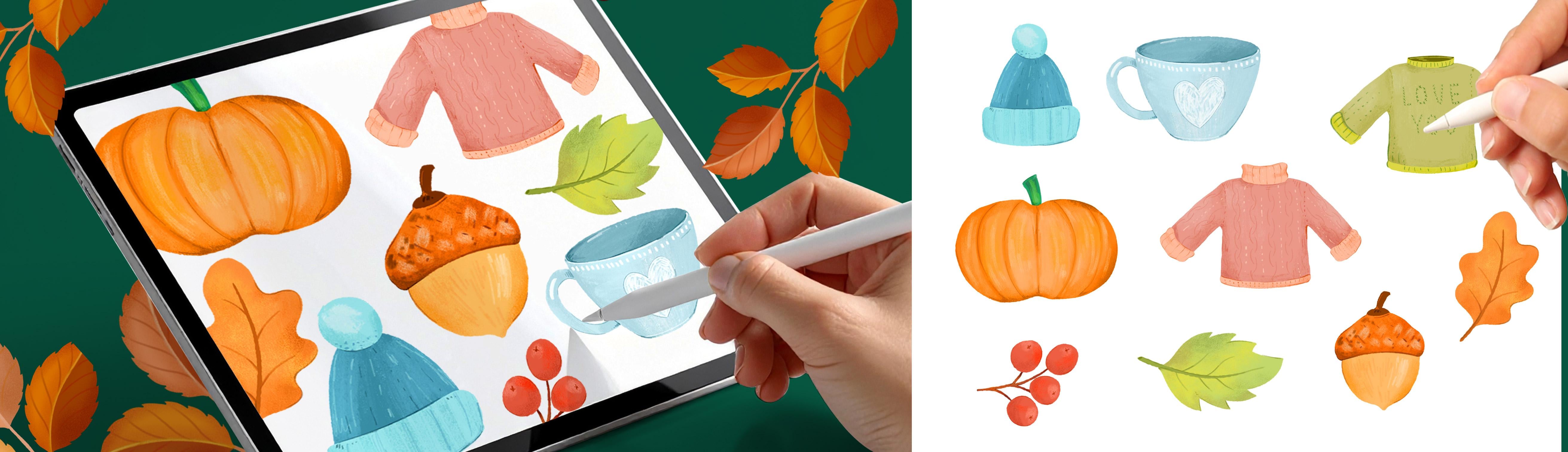
1. Introduction: I am launching a
new series where we'll paint themed
illustration sets together, and we're starting with a cozy autumn collection Iprocrit. We're going to be painting all those things that
make autumn feel special. Now, in this series, we're not just painting illustrations. We're building you a
personal design library to grow over time. That means every leaf, pumpkin or illustration
that you create becomes something that you can reuse again and again. I
am Sylvia Spina. I am a full time artist and designer living in
Barcelona, Spain. I adore traditional painting, but Procreate completely
changed the way I work. Having a full art studio on
my iPad means that I can create anywhere and that everything that I paint
is already digital. Nowhere scanning
every single time and cleaning the artwork. It's ready to go. Building
my image library with illustrations that I can reuse again and again has
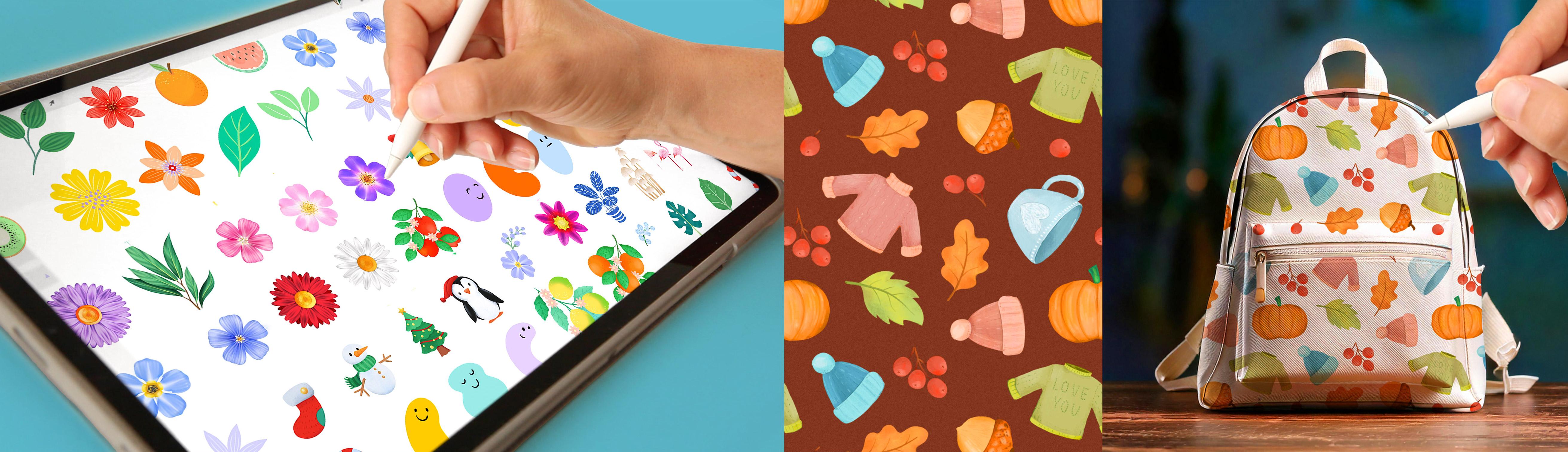
become such a joy. By the end of this class, you're going to have a set of autumnal illustrations ready
to use in future designs, patterns, or print products. Now you might be
wondering, Sylvie, how do I turn these
into finished pieces? Well, here's where the
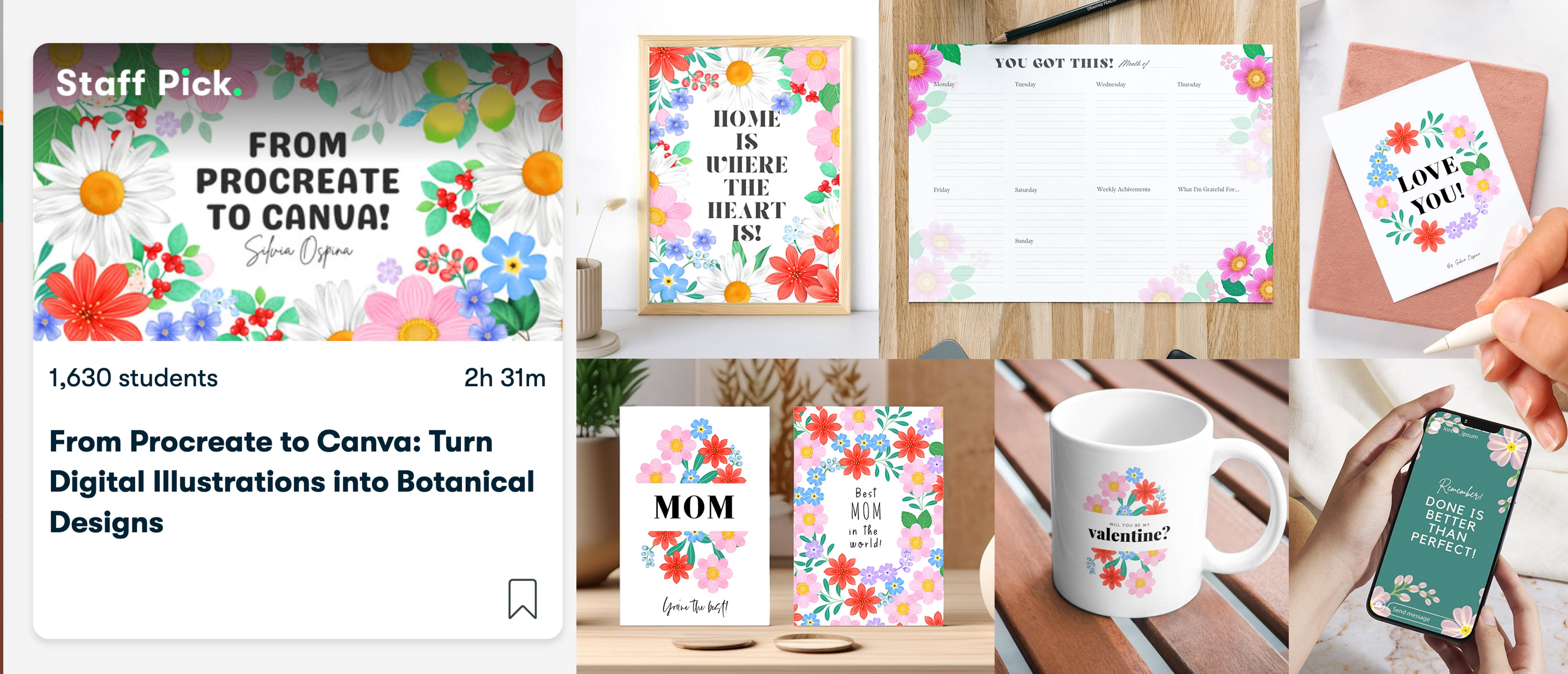
things get really exciting. If you want to turn your
illustrations into wall art, greeting cards, social
media graphics, printable calendars,
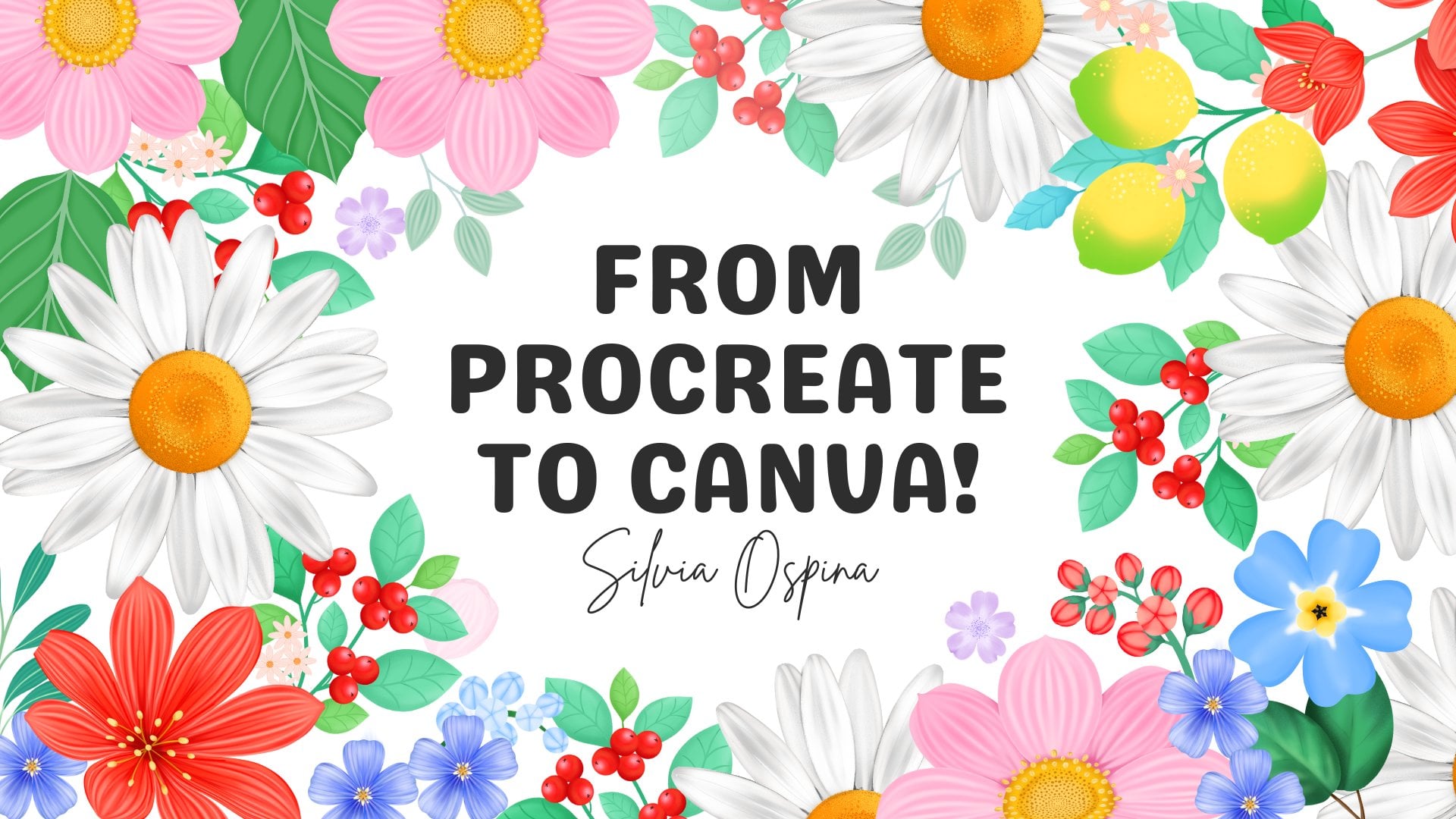
whatever you can think of, check out my class from
Procreate to Canva, turn your illustrations
into digital designs. If you're interested
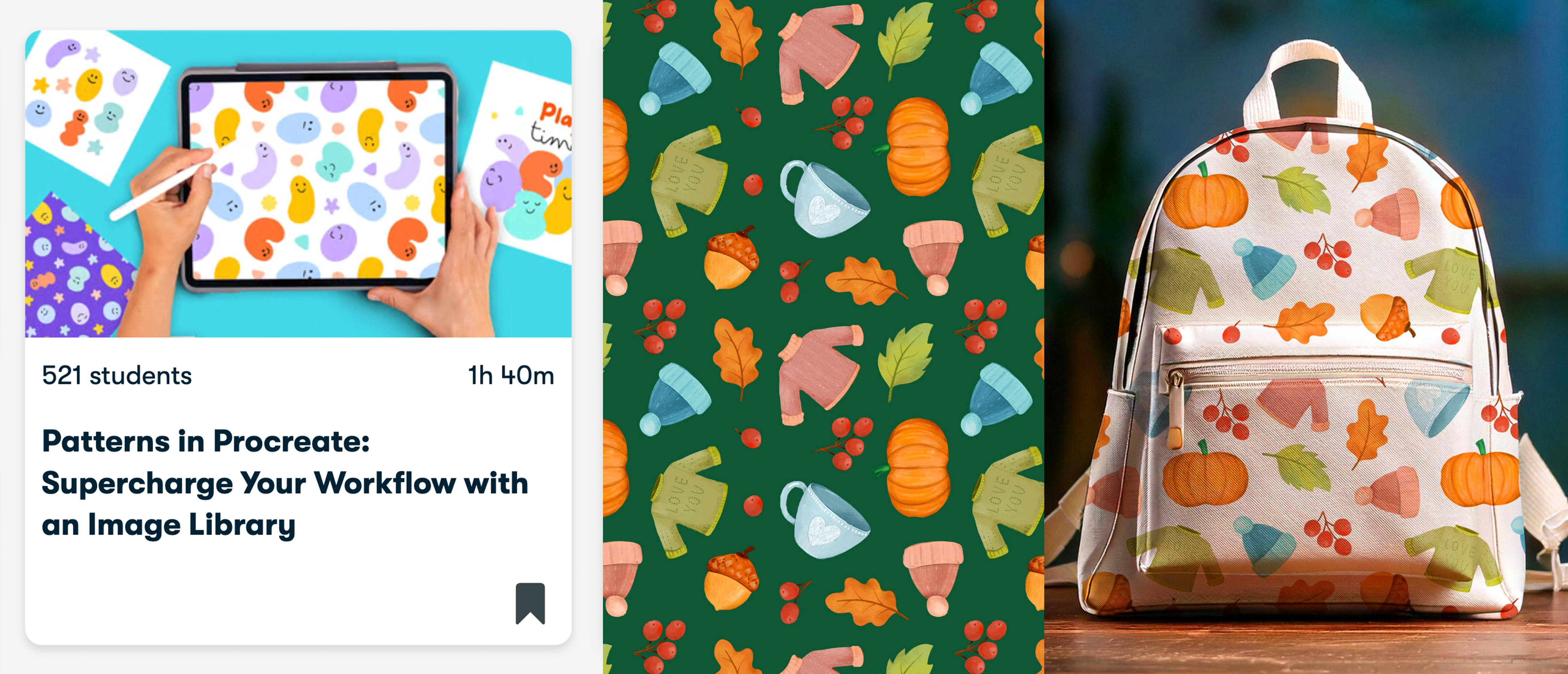
in Sim des patterns, I also recommend taking my
class patterns in Procreate, supercharge your workflow
with an image library. You will learn a simple
method for building repeats, the key fundamentals
for designing successful patterns and how to visualize your work on products. To make things easy,
I have created a learning path you will find
in the class description. This class assumes that
you're already familiar with the basics of Procrit using
layers, brushes, colors. If you feel that I'm moving
too fast in this class, I really recommend
taking my class, digital Illustration, a beginner's guide to
mastering Procrit first, then coming back to this one. It will make the process so much smoother and
more enjoyable. This is the first of a series of seasonal Illustration
collections. So make sure you follow me here on Skillshare to
catch up the next one and join my newsletter
through the link in the description of this
class for extra resources, freebies, and behind
the scenes updates. You can also follow me on Instagram and YouTube
for Extra Content. All you need to
take this class is an iPad with procreating style. So make yourself a T, find a cozy corner, and let's start painting
our illustrations.
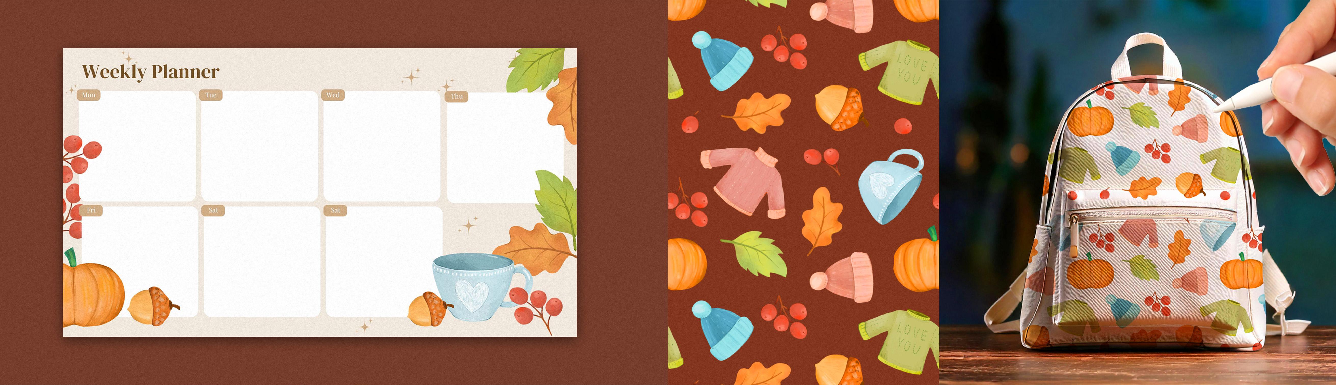
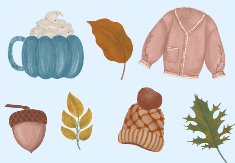
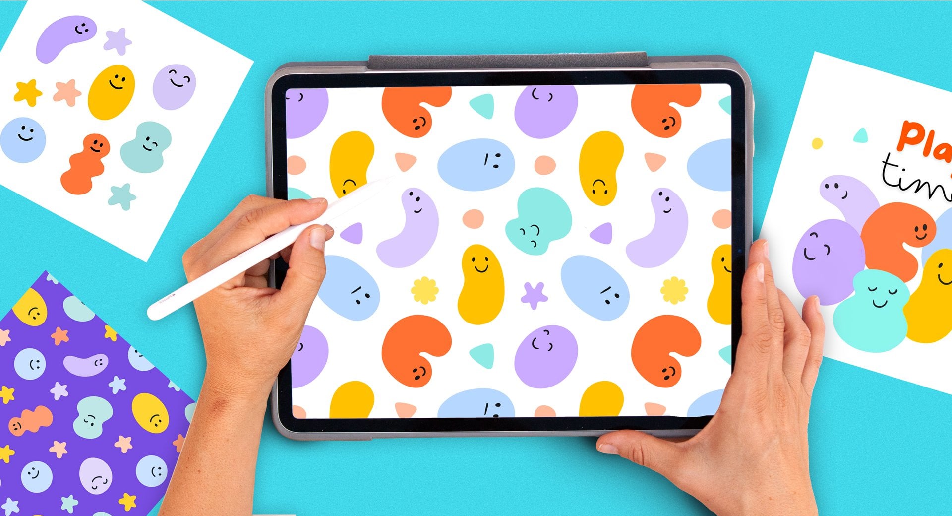
2. Your Project: Your project for this
class is to create a small set of autumn
illustrations that feel warm, hand painted, and
full of character. It can be three, five, or even more if you're
feeling inspired. You're welcome to follow
along with the ones I paint or choose your
own autumn favorites. To keep the process enjoyable
and not overwhelming, we're going to start simple. I will show you how I break each subject into basic
shapes and how to use Procreate transform tools to refine your drawings
before adding color. Once you're happy
with your sketches, we'll turn them into polished illustrations
using texture, volume, and light with my go to brushes and
layering techniques. You will also learn how to fix transparency issues so that
your illustrations can work beautifully on both a light and a dark background without
losing that painterly feel. If you struggle
making your drawings, you will find my
initial sketches and color palettes and
some paper textures you can blend into your artwork. To download them, just follow the link in the
description of this class. When you do so, you will also join my newsletter,
but don't worry, I will only send occasional emails with creative
resources and updates. I would love to see your collection in
the project gallery. You can upload your
illustrations one by one or present them
together on a single page, whatever feels natural to you. The bigger goal of
this class is to start building your
image library, a collection of
usable illustrations that you can return to
for future projects. Everything that
you paint here can later become greeting
cards, prints, stickers, social media visuals, or even seamless patterns
if you explore that path. If you go to create designs in Canva or patterns using
my other classes, please share those here, as I would absolutely love to see where you take your
illustrations next. Inside the class resources, you will also find a
learning path guide, a simple document that
shows you exactly how to continue from this class into
my other procreate class. After finishing this
class, you enjoyed it, learn something new and want to support me as a teacher,
please leave a review. Reviews help my class
gain visibility. They also help me know what I'm doing well or
what can be improved, and it always makes my day to know what my students
think about my classes. So please if you enter this
class, leave a review. And if you share your
work on social media, you can tag me at
sylvispna dot art, so I can see it,
celebrate your progress, and even share it with
my followers as well. I can't wait to see
your autumn collection.
3. Brushes & Color Palette: Before I start this lesson, I want to remind you
that you can download the class resources using the link in the
description of this class. You will find the
brushes that I will use throughout the class and
this autumnal color palette. When starting a
project like this, I like to spend a little
time testing brushes and picking a color palette. I've been building
my own library of brushes over the years, but with the latest
Procreate update, there is now an amazing new
set of brushes to explore. So I'm going to
use this class as an opportunity to refresh my collection and
try at what's new. Okay, so now I have
updated my library, and let's see what
this has to offer. I see that this is
my old library, and this is the new one. So I'm going to go ahead
and open the new one, and already this
is very exciting. I'm not going to go
through all the brushes now, but, wow, I'm actually really excited to try all these brushes.
They look amazing. Trying out a few
different brushes helps me decide the
look I want to go for, whether that's something
more polished and graphic or a softer
painterly feel. For these autumnal
illustrations, I'm leaning towards a more
painterly and loose style because I think it
really suits the theme. But of course, you can adapt this to your
own way of working. Throughout this class, I'll be using mainly these four brushes, the shear water and
lofty to create the silhouettes and the Lota and hi polite to create
texture and volume. So you can follow with
these brushes or explore the collection and choose
some that you really like. I also like to set a
limited color palette. So I'm going to open
the color panel, go to the palette icon, and tap on this plus icon up here and tap on Create Palette. I'm going to rename my
palette to autumn season. Go back to the color disc and start adding
some colors to it. I like setting up a limited
color palette because this keeps my
illustrations looking cohesive and saves
me time later, since I don't have to stop and think about
colors all the time. Of course, I give
myself the freedom to adjust and add to
the palette as I go. But having that
base to start from makes everything flow
much more smoothly. Just, you can upload
this palette along other resources using a link I've left in the
description of this class. In the next lesson, we're
going to do a little bit of brainstorming before
starting our illustrations.
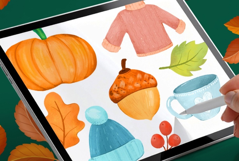
4. Brainstorming Autumn Ideas: I'm going to write my ideas
on an A for document, but you can go ahead and select
any format that you want. To make the drawing
process easier and avoid getting stuck
on what to create, I like to start by writing
a quick list of ideas. It doesn't have to be
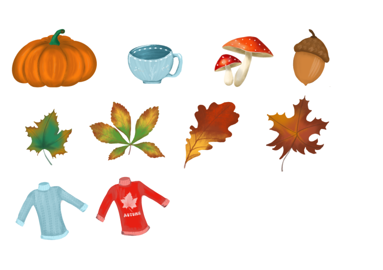
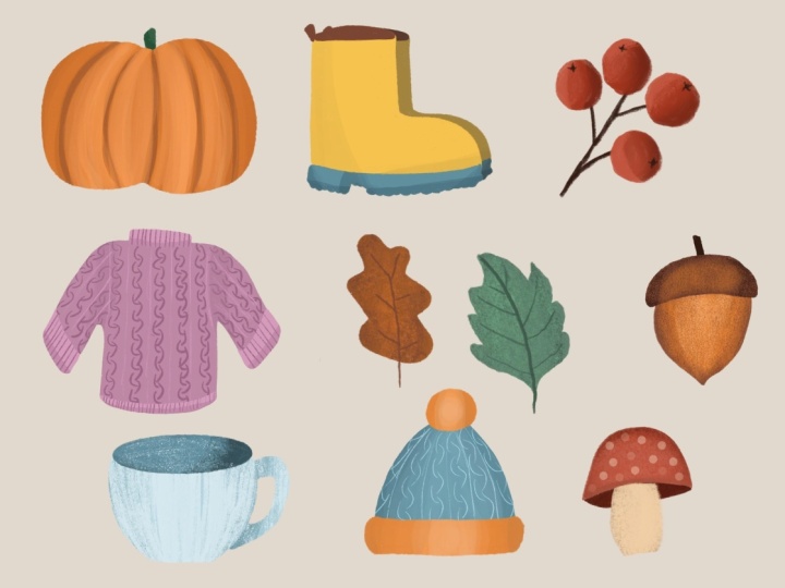
long or complicated, a few autumnal objects that feel fun or appealing to draw. The first thing that
came to mind was a pumpkin probably because
of the Halloween season. And then if I imagine myself going for a
walk in the mountains, I can picture things
like a warm jumper, I would definitely
have a mug of tea, if that's what you
say a cup of tea, after or before a walk. Autumn leaves for sure, maybe some nuts and berries, definitely a hat for the cold, some boots, and you can keep adding things to
the list if you want. I'm going to stop in here because this class is
meant to be short, but please feel free to add
things such as mushrooms, birds, or anything you want. In the next lesson,
we're going to start our initial sketches.
5. Building Base Sketches: For each of these drawings, I'll be simplifying
the objects into really basic shapes so that you can easily follow along at home. Drawing feels much more
approachable when we break down complex
forms into simple ones, and that's exactly
what we'll do here. I'm going to create a new
layer to draw my sketches and use the lofty pencil
from the pencils collection. So for the pumpkin, I'm going to start by
drawing an oval, and I'm going to leave my pen down to make the oval perfect. If I tap the screen
with a finger from my other hand,
it becomes a circle. I'm going to leave
it as an oval. And after doing
it, you can tap on this editing word up here
and modify it if you want. I'm going to create
a little triangle on the top and on the bottom, draw a line in the middle, and then on each side, create a few curvy lines. So now the body of the
pumpkin is finished and I'm going to finally create
a stem on the top. I'm also going to simplify the jumper with
geometrical shapes. So I'm going to
start with a square. Half a circle and two
inclined rectangles. To start creating the
sensation of volume, I'm going to create three
horizontal ovals on the hem and on the sleeves and the curviline on
the back of the neck. I'm going to open my list and see what else have
I got in here? A Mg of T. Let's go
ahead and simplify it. I'm going to start
with a circle, then draw an horizontal line, erase the top half. And then I'm going to draw an horizontal oval where these two points are going
to be exactly in the middle. By leaving my pen down, I can make the oval
perfect and even tap on edit ellipse to position
the lateral points. By modifying the
height of the oval, I can even change
the g perspective. You can make your
cup look more in a frontal position or in
a more like from the top. I actually have a g
here with coffee. So if the oval is
more pronounced, it gives a sensation that you're looking at the
mug from the top. But if you tilt the mug, then this oval will
become much flatter. So it would mean
that you're looking at the mug from the front. Okay, I'm not a fan
of this mug of drawn, so I'm going to start again and repeat the process quickly. Draw a circle, split it into two halves with
an horizontal line, draw the oval and align it
to the horizontal line. And lastly, I'm going
to erase the top part. I'm also going to
erase this line, and there you go.
That's much better. To make more space to draw
the rest of my elements. I'm going to tap on
the selection tool close my G using the
free hand option, tap on the arrow to activate the transforming tools,
make it smaller, and then tap on the
free hand option from the bottom menu to change
the Mg proportions. And lastly, I'm going to draw the handle with
two half circles. Maybe I can add
detail down here, and I think that
looks like a mug. I'm going to move it a little
bit and make it smoother to create more space and move
on to the next drawing. Let's open the list to
see what I have in here. I'm going to go ahead
and draw the hat, which is also very simple. I'm actually going to be using a very similar drawing process, but this time is
going to be inverted. I'm going to start with
an oval, make it longer. And this time, I'm going to
draw two horizontal lines. I'm going to erase the
bottom part of the oval, select the hat to move it a tiny bit so I have
more space on the top, and lastly, draw a
pump pin on the top. Lastly, I can draw a few details to give the sensation that
this hat is knitted. There you have a
cozy winter hat. Let's move on to
drawing the leaves. You can start with a curvy line and then for the
shape of the leaf, you can do several things. You can do something simple like that or draw a wobbly line, which I really like because
it looks very automy. Then I'm going to draw
the lateral veins and follow a similar process
for the second leaf. Going to draw the central
vein and vary its shape. By having different
shapes of leaves, my compositions and patterns
will be more varied as well. I'm going to keep on
making some space in here. I'm not going to be
using these drawings for anything other than having
them as references. So I don't really mind them
getting blurry or undefined. The berries, which are
very simple to make. And lastly, I'm going to make up some space again to draw a nut. Now, I'm not very
sure how a nut looks. So I'm going to
search for one on the Internet and
analyze its shape. I can see that it has
an elongated body and then a hat on top, looks like a winter hat. And it has this point
bit on the bottom. You will see how this process is very similar to the
hat and the cap. I'm going to start with an oval, then draw a few lateral
horizontal lines. So kind of like a
little hat in here. This pointy bit on the bottom, I'm going to erase all these
lines that I don't need. I'm actually going to also erase this division because
it looks like a hat, but it's not actually a hat. Draw the stem on top
and a few lines, a few dots to create
some texture. Okay, so we have finalized
our initial sketches, and now I'm going to polish
a few of these drawings. Polishing this
jumper and giving it some character is
much easier now that I have already laid down the foundation with
simple geometric shapes. Right now it looks a
bit squared and stiff, but the proportions are correct and that makes it much more fun and much easier to refine the shape and
start adding details. I want this to feel like
a warm winter jumper, so I'm adding two
thick cozy cuffs, a border along the
hem and a high neck. I'm going to keep on
refining these drawings, and I'm going to invite
you to take your time, enjoy it, and do the same. And if you're struggling
with your drawings, know that I'm going to
leave these ones as part of the downloadable resources
that you can access by following the link I've left on the description
of this class.
6. Painting a Pumpkin: Now that we have our
initial sketches, it's time to move on
to the illustrations. Instead of working small, we're going to
enlarge each drawing and use it as a guide
for our final artwork. When we scale them
up, the sketches will lose quite a
lot of resolution, but that's perfectly
fine because they're only serving as guides. To stay organized, I'm going to name these layer
initial sketches. I'm going to tap on
the selection tool and making sure that the free
hand option is selected. On the bottom menu, I'm going to enclose
the pumpkin, as this is the illustration
I'm going to start with. I'm going to swipe three fingers down and tap on duplicate. So to begin, I have
created a copy of the drawing and placed
it onto its own layer. Next, I will tap on
the transform tool that's the arrow icon and make sure uniform is selected so the shape doesn't get
distorted, at least for now. I'm going to place it in the
middle and now I can tap on free form to distort the
proportions of my pumpkin. I can even tap on
the last button which is rap and
keep playing with the proportions of my pumpkin until I find until I like it. I think this way of
working is pretty cool because you can start from
a very simple drawing, then adapt the
proportions to something that you're happy
with and from there, create a more polished
illustration. Okay, now, I'm going to lower
the opacity of my layer. Tap the letter and set the
blending mode to multiply, which is at the top. Now we're going to lock
this layer and create a layer below where we're going to develop
our illustration. I'm going to open
the color palette, select the orange tone, and make it a little bit later. Before we start illustrating, I have a quick
recommendation for you. If you sometimes
struggle to create smooth lines and your
hand feels a bit shaky, Procreate has a feature
called pressure and smoothing that can help. To turn it on and off, you will have to tap
on the wrench icon. Tap on preferences and tap
on pressure and smoothing. By moving these
bars to the right, your lines will look smoother, which is great for larger
shapes like the pumpkin. For smaller details or textures, I suggest lowering the sliders again so your strokes
feel natural and organic. So you can turn this
option here on and off. I'm going to start using the nowhere else brush
from the inks collection. I have already tried a few. I've already tried a few,
and I really like this one. So I'm going to start
by tracing the shape of my pumpkin and filling
it up with a solid color. Now, you can see that
there is a level of transparency in this
border, which I don't like. I want to be able to use these paintings over
dark backgrounds, and so I have to get rid
of this transparency. The way I like to do this
is by duplicating my layer multiple times and
then merging them all. See how now if I turn my
background color to black, I can see that there
is no transparency. So this is a great way
to check if your figures are fully opaque or they have some
transparencies on them. If so, just keep duplicating the layer until
they're fully opaque. Okay, now I'm going to activate the alpha o option by swiping two fingers to the right
on top of the layer. And this time, I'm
going to go to the gouache collection and
use the Loi Tia brush, which I've tried and
I'm already loving. I'm going to use a slightly
lighter tone and start creating some vertical texture following the curves
on each side. Look at this beautiful texture. I think that Procrit has done a really good job in
developing these brushes. They feel so real. Now I'm going to
use a darker tone, a bit of texture towards
each side of the pumpkin. When you have a
rounded figure and you put the lighter areas in the middle and slightly
darker areas on each side, you will achieve
volume instantly. Okay, now I'm going to
create a layer on top. Make my drawing visible, and I'm going to go ahead
and create some details. Using a slightly darker color and a smaller size of brush, I'm going to start
drawing my details. Oops, I forgot to activate
the clipping mask option. A clipping mask
makes your strokes only show where there's
content on the layer below. It's very similar to Alpha lock, but because you're working on a separate layer,
it's non destructive. You can easily adjust
the opacity, edit, or even discard the layer if you don't like
what you're drawing. I'm sketching some
darker areas on the side of each line to give
some texture and volume. Now I'm going to
create a layer below. And with a dark green, I'm going to paint the stem. This time, I want to try to fill the stem up by coloring on it instead of dragging
the active color to it to keep testing
these brushes. I'm adding some volume with
different shades of green, and at this point, I'm going to make my drawing invisible. I feel comfortable to merge
the layers which compose the pumpkin and using the smudge tool with the
hypolite brush selected, which is under the
charcoal collection, I'm going to soften
these details that I added previously. Using a darker color on the
brush and I'm still using the highlight or high quality or however you
pronounce that word. I'm adding some shades
on the edges of the pumpkin to keep adding
texture and volume. And then using a lighter tone, I'm going to keep building up some texture and volume towards the middle
of the pumpkin. Okay, lastly, I'm not very happy with the silhouette
of my pumpkin. So I'm going to use the eraser
as a tool to modify it. I'm going to use the
shear water brush from the inks collection and polish the silhouette
a little bit. Finally, I'm going to open the layer panel and merge the layers that
compose my pumpkin. In the next lesson, we're going
to start painting or mag.
7. Painting a Mug: I'm going to erase the
pumpkin sketch since I don't need it anymore
and activate my drawings. We're going to repeat
the same steps that we did for the pumpkin
but for the Mug. So with the freehand
selection tool, I'll enclose the sketch, swipe three fingers down, tap, duplicate, and then
enlarge the element. I'm going to deform it slightly as I feel that it
looks better that way. After lowering the opacity and setting the blending
mode to multiply, I'm going to lock my layer. I'm going to create a layer below and start my illustration. Until now, there have
been the same steps. For the base color, I
want a soft cooler tone, but you can use any
color that you want. Using the shear water
brush at full opacity, I will trace the outline
of the max front section. Having a sketch
prepared beforehand, even if it's rough or slightly deformed
is really helpful. It gives you a
structure to work from. So when you move on to
the final illustration, you don't have to
waste time figuring out proportions or composition. I'm going to fill it
up with a solid color and adjust the threshold so that my color stays within the silhouette
and doesn't repass it. To check the opacity edges, going to switch the
background color to black. If I zoom in, you can see
this transparency and fix it by duplicating my layer several
times and merging them. Now, I can see
that my silhouette is looking a little bit wonky, though I'm going to use
the eraser to refine it. I don't just want to refine it. I actually want cleaner
borders as well. I want to keep a
slightly organic edge that is not too textured, but it is a bit more polished than the one I already have. And for that, I'm using the
brush in a smaller scale. So that way I get
the organic borders, but they're a bit more defined. I'm going to move on to creating the back part of the mug
on a different layer so that I can
modify it if I need to and using a darker color. So I'll start by
drawing an oval. So I'm going to leave my pen down to make the oval perfect. And this way, I
can easily adjust the sides so that they meet
the frontal part of the mug. Fill it up with a solid color,
adjusting the threshold, duplicating the layer, a
few times and merging them, always the same process. And lastly, on a layer that's going to go below
the frontal part, I'm going to create the handle using a slightly lighter color. I'm going to
deactivate my drawing to see it better, fill it up, and then go through
the same process of duplicating and merging. Very easy. Now that the
mug structure is ready, I can start decorating it. So I'm going to activate the Alpha Lock option
on each layer by swiping two fingers to the right and using
the Lota brush, which is under the
gouache collection, I'm going to start adding
some texture to my mug. I'm going to enlarge my brush
as I want this texture to look as if the base was
painted with brush strokes. I'm adding very little pressure to my apple pin, by the way. I'm not intending to cover
fully the first layer, but instead giving some texture. I want to create
some more volume. So I'm going to start trying
out different lighter tones, although I think this
is way too strong. Instead of changing the color
or adjusting the opacity, I'm going to try adding less
pressure to my apple pen. And there you go. I can use this brush in a transparent way. Okay, I'm going to move on to
the inner part of the mug. Using the color picker, I'm going to select
exactly the same tone, make it a little bit lighter
and repeat the process. So I have added some texture
with a lighter color, and now I'm going to darken half of the inner part of the
mug to create some volume. So we started by
blocking the main areas, and then we added some texture to give it that
hand painted feel. Lastly, I'm going to
create a new layer and using the lofty pencil, which is under the
pencil collection, I'm going to enjoy adding
some final details. You can have fun decorating your mug in lots
of different ways. By using separate layers, you can experiment freely. For example, right now, I'm drawing this
sketchy scrubby heart, which I really like. But because it's on
a separate layer, I can always hide it, delete it, or try a different
decoration on a new layer. And if I like both versions, I can even save them
as separate images. We will be doing something
with the jumper, where I'm going to show
you how to transform the base and create variations just by changing the details. Okay, I'm happy to just
keep the decoration, so I'm going to
merge my layers and also get rid of the drawing on top as I'm not going
to need it anymore. Once you have finished your mug, join me in the next lesson. We will start
painting the jumper.
8. Painting a Jumper: Now I'm going to move
on to the jumper, making sure that the
initial sketches layer is selected on the layer panel. I'll isolate the jumpers
sketch onto its own layer. Using the freehand
selection tool, I'm going to enclose it, swipe three fingers
down, tap on, duplicate, and
enlarge my drawing. That, I will lower the opacity and set the
blend mode to multiple. I'm going to lock the layer
and create a layer on top. For the base color of my jumper, I'm choosing a
neutral earthy tone. These are the colors that I love to wear during
the autumn season. But of course, you can choose any other color that
suits your style. To keep consistency
across all illustrations, I'll go back to using the
shear water brush which is under the ink
collection for the ciloid. This time, I will use my
brush in a smaller scale. After adjusting the size, I'll start tracing
over my sketch, leaving out the neck
and sleeves for now, since I will develop those
on a separate layer. For the borders of the jumper, I want them to feel
slightly irregular, which adds a hand
drawn textured look. Feel free to experiment here. You can try out different
colors, brushes, or line styles to make your jumper illustration
uniquely yours. Be careful not to leave
any gaps in your lines. If the silhouette isn't
completely closed, when you try to fill
it with a solid color, the fill will leak out
into the background. So always make sure your
outline is fully connected. Once the silhouette is closed, I will fill it with
a solid color, set the background to black and duplicate the
layer four times. This removes any transparency
from the brush texture and gets rid of the division between the filled area and the
edges of the stroke. Now I'm going to
create a new layer on top to draw the neck
and the sleeves. I'll choose a lighter
shade of the same color, make the sketch visible and
trace over those areas. Now that the main
areas are blocked in, I'm going to activate
the Alpha lock option on both layers by swiping two fingers to the right so I can start adding volume texture, and details to the jumper. This time, instead of looking for my brush in the
pencil collection, I will go to the reason
step at the top. All the brushes you've
used recently are stored here which makes
it quicker to find them. This is especially practical when you're working on a set of illustrations and want to maintain a consistent
style across all of them. I'll begin by adding some hand painted texture to each area with the Lota brush, which I'm really
enjoying, by the way. These procrete brushes do
a great job of mimicking the analog textures
I've always missed when painting digitally with
a slightly darker tone, I'll softly brush over certain areas to build
up texture and volume. For example, I'm adding
shadows towards the bottom of the sleeves and underneath
the neck and the hem. Then with a lighter
tone of the base color, I will add highlights on
the top of the sleeves. This will create volume. At this stage, I can deactivate the sketch layer and continue building texture on each area. I'm going to repeat the
same process with the neck and hems to keep
everything consistent. Now that I have added texture, I'm going to move
on to the details. I'm going to create a layer on top and use the lofty pencil, which I can find on
the recent collection. Using a darker tone, I would draw some
dashed lines to suggest the look of
knitted stitches. I will also draw a few curvy lines along the body of the jumper
to mimic large braids, which are very typical
in knitted sweaters. These kind of details really add to the cozy feeling
of the illustration. See how I'm following
the direction of the leaves to draw the
braids on these areas. I'm creating all of these on a separate layer so that if
I don't like the result, I can simply hide or delete it and try
something different. On the neck and the hem areas, I'll keep adding details
with the pencil brush. You can control the
width and strength of your lines by adjusting
the pressure on your pen. Notice that I'm
not drawing all of these lines with
the same strength. I am keeping my
strokes very soft, applying only light
pressure to the pen, so the lines stay thin
and slightly transparent. These details add
interest to the jumper, but I don't want them to
become the main focus. Above all, I want to preserve an organic painterly effect
that feels soft and cozy. You can build dimension not
only with texture or shadows, but also with the details
that you draw on top. Finally, I'm going to add a few dotted lines
on the hem and test some extra highlights with a lighter color between the braids to see if
I like the effect. Using a separate
layer, I'm going to add some extra highlights with a light color between the braids to see if
I like the effect. Since I'm not sure whether
I'll keep these details, I'll keep them on
a separate layer. That way, I can toggle the layer on and off to
compare the versions or even lower the
opacity or play with it at least if the effect
feels too strong. That is the great thing
about working with layers. This time, instead of
merging my layers, I'm going to group them. In the next lesson,
I will show you how to use the adjustment,
selection, and transforming tools to
create a new variation of this jumper reusing the building blocks
we've already made. See you in the next lesson.
9. Creating a Jumper Variation: I will start by duplicating
my group, make one invisible, and remove the layers
I no longer need, such as this sketch and the final details
that I plan to change. Next, I will open the adjustment panel and
tap on hue saturation and brightness to modify the color of my jumper with
the bottom bars. You can modify the hue, the saturation, and
the brightness. Now I'm going to move on to modifying the neck and sleeves. Before adjusting the color, you can adjust the shape. You can either use the
eraser to get rid of parts or use the selection
tool which I'm going to use. Swipe three fingers down and
tap on cut to remove it. I'll use the selection tool
again to move this part upwards and redraw
the bottom section to complete the new neck line. On a separate layer, I'm going to draw an oval to create the back
part of the jumper. Fill it up with a
darker solid color and duplicate the layer several times to get rid of
any transparency. Finally, I'm going to merge
these layers and adjust the colors of all the areas together so they match
the body of the jumper. Feel free to experiment here. You can create any color
combination that you like. Okay? This jumper
is already looking quite different from the
first one I created, and I've just been using adjustment tools,
which is pretty cool. See how now I'm using
the eraser instead of the selection tool to modify the shapes of the
calves and the hem. Finally, I'm going to
create a new layer and add some details to make my
jumper even more unique. This time, I'll add a slogan. Love is always nice. First, I will write
out the text, lower its opacity, and position it at the
center of the jumper. I'm going to create
a new layer on top and draw small s over each letter to give the effect of the words being
stitched onto the jumper. Finally, I will add
a few extra details, maybe some subtle shadows or dotted lines just to give
the jumper anter finish. This part is all about enjoying the process and decorating
in your own way. By keeping these details
on a separate layer, you always have the
option to keep them, hide them or replace them
with something different. Now I have two groups with two very different jumper
designs and I really like both. I feel confident merging one
of the groups while keeping the other in separate
layers in case I want to experiment
further later on. I am also going to delete the initial sketch because I don't need it anymore.
You know what? I'm actually also going to
flatten the second group. In the next des, we're
going to start our hat. M
10. Painting a Hat: Since we've repeated the same
steps a few times by now, I'm going to leave this
lesson without voice over. Instead, I will zoom in on the process so that you can really follow each
step visually. Repetition is a great way
to memorize the workflow, and this will help
you get comfortable applying the same steps to
any subject of your choice. Once you're done,
illustrating your hat, meet me in the next lesson. We will keep on developing the
rest of our illustrations?
11. Painting Leaves: Now I'm going to move
on to the leaves, and since they only take
up half of the canvas, I can create both
on the same layer. I will start by selecting
the first sketch, resizing it so that it fits
the height of the canvas, and then repeat the process
with the second one. Once they're in place, I
will merge the layers, lower the opacity, set the blend mode to
multiply, lock the layer. On a new layer below, I will use the shear water to start tracing
their silhouettes. For the first one, I'm going to use this terracotta color. This time, I'm not
going to follow exactly the sketch below. Using a green tone, I will draw the silhouette
of the second leaf. I don't love this green.
I think it's too bright. To tweak it without affecting the color
of the first leaf, I need to select it first. This is because they're
on the same layer. I'm going to use the
selection tool to enclose it and using the hue
saturation and brightness, I'm going to desaturate the green and shift
the tone a bit. I'm also going to tweak the first leaf's color slightly until I'm
happy with both. Then I will set the background, duplicate the layer
four times to remove any transparency
along the edges. And finally, switch the
background back to white. Next, I'm going to
create a layer above and select clipping mask
from the drop down menu. I'm going to go ahead and
test a different brush. This time, I'm going to
use the Hippolyt brush. I think I'm pronouncing it well under the
charcoal collection, which has a grainy textured look that works beautifully for lis. I really love this
grainy texture. I'll vary both the color and the pressure on my
brush to create a more natural effect
and start just trying to blend a few
colors within the leaf. I want to mimic the look of autumn leaves where the colors shift and blend across the surface as the
leaves begin to dry. I'll keep adjusting the tones
to bring in that variety. Then I'm going to repeat the same process
with the green leaf, building gradients and textures with subtle changes in color. Now that the base of
the leaves is ready, I'm going to turn
the sketch back on and create a new layer. With the shear water brush, I will draw the central veins. This is looking
too thin at first, so I will enlarge the brush and try again. I
like this better. Using the color picker, I'm going to choose the
darker green and redraw the vein a few times until
I'm happy with how it looks. This is way too thick, so
I'm going to try again. I think it could be better, and this is better. I'm going to duplicate
this layer to make it fully opaque and
merge the layers. I think that now this is
feeling a bit too dark, so I'm going to make
this vein slider using the hue saturation
and brightness option. Next, I will add the lateral
veins on a separate layer. After testing a few brushes, I'm going to go
with the lofty pen, at a slightly larger size. I'm trying to keep the
width of these veins consistent so that
they look balanced and I will make the
bottom of each vein a little thicker where it
connects to the central vein. I'll repeat the same
process for the green leaf, again, keeping the lateral veins similar in width for a cohesive. Finally, I will merge my layers and separate
the green leaf onto its own layer by swiping three fingers down and
tapping cut and paste. Now my leaves are ready, and in the next lesson, I'm going to move on to painting
the nut and the berries.
12. Painting a Nut: I'm going to move
on to isolating the drawings of the
berries and the nut, repeating the same
process that you have seen multiple times by now. Selecting the two drawings, swiping three fingers down,
and tapping duplicate. Then I will make the
bottom layer invisible, scale the drawings up
to take the full space, lower the opacity,
lock the layer, and set it to multiply. Finally, I will
create a new layer underneath to begin
my nut illustration. This workflow is
always the same, so it quickly becomes
second nature. I feel that I haven't memorized
how a real not looks, so I might have to look for
a reference photo later. But for now, I'm going to start by color blocking each area. First, the base, filling
it with a solid brown, duplicating the
layers to get rid of any transparencies and then I will add a layer on top for the cap or hat in
a darker brown. I realized the base
looked a bit too dark. So I'm going to make
it lighter using the brightness bar under
the adjustment tools. If the base is too dark, the top would need to
be even darker and I don't want to go into
that range of colors. Now it feels more balanced and it is already
looking very cute. On a layer underneath, I'm going to draw the stem
on a deeper, darker brown. Once again, I'm duplicating
layers to build up opacity and get rid
of any transparency. At this point, I'm
going to switch to Alpha oc instead
of clipping mask, as I think that the
details I'm going to create for now
will be permanent. Right now, I'm using
the hipolyt brush under the charcoals collection. I'm going to start painting directly on the
bottom of the nut. Notice how I'm darkening
the sides of the nut. This gives it roundness because by shading the edges and
leaving the center lighter, the eye perceives it as curved. Also notice how I'm
having to give it a go a few times before
liking what I'm doing. I'm going to make the top
brighter as this will allow me to use a wider variety of tones to give
volume and texture. For the cap, I will also darken the lower part where
it meets the base. That shadow instantly
makes it feel like the cap is overlapping
and sitting on top, giving it depth and volume. To add some texture on the top, I'm going to change my brush for the loitea which
I used previously. To build up texture, I'm
going to enlarge my brush and make some soft diagonal
strokes on a darker tone, almost like cross hatching. To create this gentle texture, I'm keeping very little
pressure on my pen. I'm not applying a
lot of pressure to my apple pen because that would make the color
much more opaque. At this stage, I feel the
knot shape could be a little bit longer
and also that I need a clear idea on
its natural look. But so I'm going to open the Internet and
look for a reference photo, which I'm sure it's
going to help a lot. Sometimes it's cool to
paint from imagination, but having Internet on your iPad and being
able to search for a reference photo immediately
can be very helpful. And by observing
reference photos, you can also learn a lot. See, I didn't know how
to draw a nut before, but now because I've actively gone through the
process of painting it, I'm sure that next
time I painted, I'm going to remember its
shape, colors and textures. One detail I noticed is that the real nuts have a little
bump right under the stem. So I'm going to add it. Now, I have to deactivate
the Alpha lock option first to be able to add
an area to my drawing. Choosing the shear water brush, I'm going to add
that and maybe erase a bit of the top to give the
sensation that it's on top. And then repeat the
same process of duplicating the layers to
get rid of any transparency. Then on a separate layer
with a clipping mask option, I'm going to add some light
areas using a very soft, large brush so the highlights
aren't too opaque. And finally, on a layer on top and using the pencil
on a darker tone, I'm going to go ahead
and add some details. I feel that this nut is missing
a little bit of volume. The bottom part, especially, I remember it being
shiny and rounded, and at the moment,
mine looks flat. So I'm going to open
the reference and I can see a lighter
vertical texture in the middle and this
tiny shiny spot in the center area of the nut, which gives it that
final touch of volume. This nut illustration took a bit longer than the others,
but that's okay. I'm really happy with
how it turned out. Finally, I can open
the layer panel and merge the layers
that compose my nut. I don't need to keep them,
so I'm happy to merge them. Take your time finishing
your nat illustration. And when you're done, meet me in the next lesson where we're
going to start the berries.
13. Painting Berries: I've narrated these steps so many times that
I think you're probably getting
bored of hearing me speak the same things by now. So instead, I'm going to leave a little bit
of nice music, and I'm just going
to leave you to watch the steps I'm making. And when you're done, meet me in the next lesson, where I'm going to show
you how to export all of these images into your
library as PNG files.
14. Adding Extra Details: In this lesson,
I'm going to spend some time polishing
my paintings. I'll make sure I'm
working always on the right layer for
each illustration, refining their silhouettes
with the eraser, and adding a few
extra details or touches of volume and
texture with the pencil. This is a slower,
more careful stage, so I invite you
to take your time too and really
enjoy the process. One recommendation I have
is to make sure you're adding all these extra
details on the correct layer. That way, everything stays
organized and easy to adjust. Since this is quite a personal
process intuitive one, I'm going to leave
my camera recording and play the video
at a higher speed. But I invite you
to take your time, enjoy the process, and
when you're ready, meet me in the next lesson, where I will show
you how to export your illustration into
your image library.
15. Exporting Your Illustrations: Okay, now we have our
beautiful illustrations, one on each layer, and we're going to export
them all at the same time. So it's important to make all the layers that you
want to export visible and make the background color invisible so that they export with a
transparent background. Then you're going
to have to go to the wrench icon, tap on share. And under share layers, you're going to
tap on PNG files. You'll see this
exporting message. If you tap on save images, they're going to be saved
on your image library, but you can also save them onto the Cloud using a
program like Dropbox. For now, I'm going to
tap on save nine images, and now if I open
my image library, you will see that my images
have been saved in there. Now, to avoid all
these images getting mixed up with all of
my other photographs, I have a dedicated folder which I named the image library. So I'm going to add them
into here straightaway. I'm going to tap
on this plus icon. Select my images and tap on AD. This way, all of my images are organized in this folder and I can access them
whenever I want. I want to mention
something important. When cropping my images, using my image library
editing tools, my images have lost their
transparent background. This is not ideal when
I want to use them in Canva without having to erase
their background there. To be able to do
so, I would have to pay for the
Canva pro version. So don't crop them in here if you want to keep their
transparent background and rather crop them on Canva or use another program
like Photoshop. Before finishing this lesson, I'm going to show
you how I like to organize my image library
directly in Procrit. At the moment, you see that
all my images are stacked on top of each other
and it's actually difficult to know
what's in the file. That's why I like to create a preview for each of the files. I do this by selecting all of the images by swiping
them to the right. I group them and then
duplicate my group. Now, I am aware that you
might not be able to do this depending on the
capacity of your iPad. In that case, stay
until the end of this lesson and I'll show
you a way to work around it. So you have two groups
containing the same layers. With the top group selected, tap on the arrow icon to
display the transform tools, make your illustrations
smaller and start moving all the images around your canvas so that
you can see them all. Then collapse the group, tap on it, and tap on flatten. This will merge your
group into one layer, and this will allow you to
see what illustrations are contained on this file when you go back to your
Procreate gallery. Now, if you don't have
enough layers to do this, let me show you a way
to work around it. On my procreate gathering, I swipe the file to the
left and tap on duplicate. Then I open one of
the two groups, and now I can do the
process of making my images smaller and displaying
them around the canvas. Once I'm happy with
how my images look, I like to flatten my group. Then I tap on the wrench
icon and under share, I tap on JPEG to save this
image in my image library. I don't like having
duplicated files, so I'm going to swipe to the left and delete this preview. Now, be careful
to not be erasing the file which contains
your illustrations, but the one which
contains the preview. And now I can open
my file and just import this photograph by
tapping on the wrench, I can tapping on, add and tap on insert a photo. So I'm going to
insert the preview, and I can always leave
this layer at the top of my layer stack so that when I go back to my Procreate gallery, I know exactly what's
contained in this file. In the next lesson,
I'm going to share some final thoughts and
say goodbye to you.
16. Final Thoughts: Thank you so much for
joining me in this class. I truly hope that you
enjoyed slowing down, painting these atom pieces, and maybe even discovering
how comforting it can be to build an
illustration library you can return to
again and again. If you're ready to keep going, I really encourage you to
explore the learning pathway. In from Procreate to Canva, I'll show you how to turn your artworks into
printable designs, mixing your illustrations
with text to create wall art, greeting cards, social
media graphics, printable calendars, Christmas gifts, and
stuff like that. If you're interested
in seamless patterns, I also recommend taking my
class patterns in Procreate, supercharge your workflow
with an image library. You will learn a simple
method for building repeats, the key fundamentals
for designing successful patterns and how to visualize your work on products. This is the first of a series of seasonal Illustration
collections. So make sure you follow me here on Skillshare to
catch up the next one and join my newsletter
through the link in the description of this
class for tray resources, freebies, and behind
the scenes updates. For more casual tutorials
and art blocks, you can also find
me on YouTube at Silvia dot art and on
Instagram using the same tag. If after finishing this
class, you enjoyed it, learn something new and want to support me as a teacher,
please leave a review. Reviews help my class
gain visibility. They also help me know what I'm doing well or
what can be improved, and it always makes
my day to know what my students think
about my classes. So please if you enjoy this
class, leave a review. It's been a pleasure
to paint with you. I can't wait to see your
autumn illustrations and watch you grow
your image library. See you in my next class. Bye. Mm hmm.
 Silvia Ospina, Artist and Graphic Designer