Transcripts
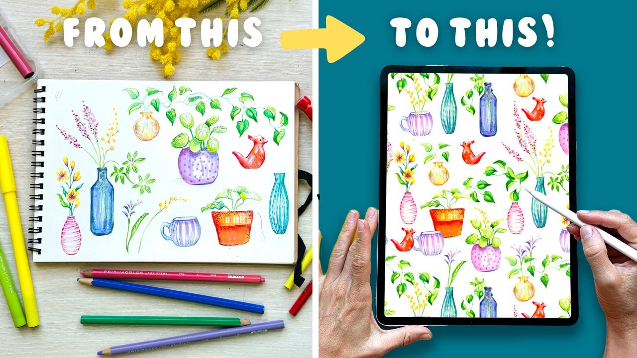
1. Welcome! : In this class, you're going
to learn how to create beautiful seamless patterns in Procreate using a
super easy method. And the best part is that
they will all be made from illustrations that you
can use again and again. If you enjoy starting from
scratch, that's great. But having a library
of illustrations at your fingertips can
truly be a game changer. Hi, I'm Sylvia Spina, my friends call me Sylvie. And with over 20 years
in the visual arts, I have built a library of
illustrations that I've turned into patterns featured
in brands such as Zara, mango, various
independent labels, and my own personal projects. But here's what I love the most. These illustrations
aren't just for patterns. I use them to create wall art, murals, and even animations. In this class, you're
going to learn how to organize
your illustrations, turn them into
beautiful patterns, and take your designs further
using tools like Canva. By the way, the same
worklo works with design programs like
Photoshop or Illustrator. I'll show you how to explore
different color ways and visualize your designs on real
life products using Maps. It's so exciting to see
your patterns come to life. While you can follow along in creating simple
illustrations, I encourage you to bring your
own artworks to this class, no matter their style or how complex they
are, their gold. And if they're done
physically, don't worry, a link to a tutorial on digitizing them so that
you can use them too. Everyone is welcome
in this class. If you're a beginner, you
will find the illustrations easy to follow and you will learn the steps to
make a pattern. And if you're a more
experienced designer, you will love this workflow. It will give you
ideas on how to reuse your work and expand your
creative possibilities. This class comes with
all the free resources you will need to kickstart
your pattern making journey. But if you're eager to take
your skills even further, I have created an amazing pattern bundle
designed to support you on your journey as a surface pattern designer
and set you up per success. Available as a separate
digital product, it will save you tons of time, help you showcase your
work more professionally, and even reach out to
potential clients. I can't wait to see the amazing patterns
that you will create. All you need to
take this class is an iPad with procreating style. So grab your iPad and
see you in class.
2. Your Project: First of all, thank you so
much for joining this class. I'm very happy to have you here. Your project for this
class is to create one or more patterns in Procreate using the method
you will learn in this class. The key is that your
pattern must be made using illustrations that you have exported as PNG files
into a library. Once they're saved,
these illustrations will be there for you to
use whenever you like. I encourage you to bring
your own illustrations to make the project
uniquely yours. There's nothing
quite like seeing your personal work
transformed into a pattern, and there are so many things
that can work for it. I will dedicate one single
lesson to inspire and prompt you with ideas that can be
turned into a pattern easily. Now, if you're a total beginner, short on time or here to just learn the
method and workflow, feel free to follow along
with me as I create a fun collection of simple
creatures for my pattern. Having said this, there is something important that
you should keep in mind. If you follow along and your final pattern ends up
looking too similar to mine, please don't use
it commercially. And if you share it
on social media, please mention that it was something made as
part of this class. I'm sure that once
you learn the method, you will feel excited to create more patterns
in your own style. Here's what I would love to
see in your final project. Your original reusable
illustrations. These will be the building
blocks of your pattern. Share them however you
want, screenshots, crop them, put them on a slide using Canva or show
them individually. If you started your
image library, you can take a screenshot if you like and share it with me. All good if you want
to keep it private. I want to see your
final pattern in two scales at 100% and at 50%. Show the pattern in
various colorways. This will show that you have mastered Procrits
adjustment tools, your pattern on a
real life product. Use the mockups
provided in this class to visualize your pattern
on an actual product. It's a great way to imagine how your design would look
in the real world. As a bonus for this class, I'm going to show you how
to reuse your illustrations in Canva to create a
placement graphic. Combining a pattern with
a placement graphic is a very common practice in the surface pattern
design industry. Imagine a pyjama set
with a pattern on the bottom piece and a placement
on a matching t shirt. So as part of your project, I would love to
see how you reuse your illustrations to create a standalone placement graphic. If you don't want to use Canva, you can also do it on Procreate. I just love Canva because it has so many stunning fonts that creating graphics
takes no time. Once you finish your project, share it on the project
gallery of this class. And if you share it
on social media, please tag me at
sylvispina dot t so that I can see your process and share it with my
followers as well. Now let's talk about
the class resources. This class comes with all the free resources you will need to kickstart your pattern making journey. Layout template. I don't think you're
going to need this, but since composing patterns
can be tricky at first, I have left a directional
template to help you out. With this template,
you can simply place your illustrations where
shown to achieve a balanced, well composed pattern
from the beginning. You don't have to use it, but if your pattern doesn't
feel quite right, give it a try and
see if it helps. Three mockups.
These mockups will help you visualize your
pattern on real life products. You'll find all of these
resources available for download in the project and resources section of this class. And just so you know,
by downloading them, you will be accepting to
be added to my newsletter. You will only hear from me when I have
something to announce, such as a giveaway or
valuable resources to share. After watching the
class, you enjoyed it and learn something
new, please review it. It would mean a lot to me as reviews help me know
what I'm doing well, what I can do better
in the future, and also what my
students enjoy the most. Okay, now that you know
what your project is, let's get on with the
rest of the class. In the next lesson, I'm
going to talk about inspiration and tricks to get those creative
juices flowing. I can't wait to see
what you create. Mm
3. Finding Inspiration Around You: Welcome to the first part of the class where we'll focus on creating illustrations
and building your very own image library. As a designer or creative, having an image library is going to be an
invaluable resource. After you finish this class, I encourage you to go through your hard drives through your
computer and through your Procreates gallery and grab all those illustrations
that you have been creating in the past and put them on your image
library folder. This way, you have them ready
to use whenever you want. The more you add,
the more options you will have for
future patterns. And if you don't have a huge
collection yet, don't worry. This class will get you started, and you can keep expanding
your library as you go. Finding inspiration is
easier than you think. In this lesson, I'm going
to share some tips to spark your creativity and a list of ideas that can easily be
turned into patterns. First and foremost,
if you find yourself overthinking or feeling stuck about choosing a
theme, don't worry. Just follow along with
the rest of the class and save the brainstorming
session for later. You can always create
a second, third, or even fourth or so many more patterns after
learning the method. The beauty of the workflow that you will learn
in this class is that any illustration you create can be turned
into patterns. So once more, if you're
feeling stuck on ideas, you're short on time,
follow along in creating my simple and
fun illustrations. Enjoy the process of
learning the method, and I'm sure that
your creativity will shine through the process. There are so many fun things you can draw for your patterns. If you need some inspiration,
I have a trick for you. Just look around where
you are right now. You're in a desk, I bet you have some pens around,
maybe some plants, you can peter, and
if you're like me, one or many cups of coffee
and tea laying around. Those drawings can
make a great pattern. Okay, here's another example. If you recently
went to the beach, you can draw an umbrella, flip flops, people sitting down, a boat or two, you get me. If Christmas or
halloween are coming up, you might want to try some
themed illustrations, and the same goes for birthdays. Any other special occasion
like a newborn in your family could be a great source of inspiration
for your drawings. I would absolutely love
to see the gallery of this class project full
of different patterns, telling different stories, and showcasing various
personalities and styles. Let me give you more ideas to get those creative
juices flowing. Galaxies and zodiac signs, winter landscapes and winter
animals, alpacas and cactus, halloween icons, makeup items, delicious junk
food, beach items, sushi, bakery and coffee. Dogs and cats, of course, old school tattoo icons, St. Valentine's Day,
Christmas, Halloween, back to school, a day in the
park, a day in the forest, a day in the street, house plants and the
list can go on and on. Now, with this being said, you can always follow along with me and create these
fun characters. You can personalize them with your own touches like
different faces or colors. Now take a few minutes
to think about what inspires you and
write down some ideas. You don't have to start
drawing straightaway, but having a list will be super helpful once
you have learned the method and you're
ready to create personalized patterns with
your own illustrations. When you're ready, meet me in the next lesson where
we'll dive into creating some ready made templates for both your illustrations
and your patterns. See you in the next lesson.
4. Creating Ready Made Templates: In this lesson, I want to
show you how to create ready made templates for both your patterns and
your illustrations. Having these templates on
hand is incredibly practical. It ensures that
you're always working with the right
resolution and size, saving you a lot of
headaches down the line. I've had times in
the past when I've spent hours working
on a illustration, and then I found out
that it was too small or I didn't have enough
resolution for printing it. And that was quite
frustrating, to be honest. In this lesson,
we're going to open a document of 20
per 20 centimeters, but you can create
your template in whatever size you
want. Sounds good. Let's go ahead and
create some templates. To create a template, tap on the plus icon on the top
right corner of your screen. Then tap on the black box
with another plus icon. This opens a window
where you can set your specifications
of your document. I'm going to select
centimeters from the bottom menu and
enter 20 per 20. I find it helpful to have a
measuring tape by my side. It gives me a real sense of the actual size
that I'm using. For example, 40
centimeters feels too big, whilst 30 centimeters
is a good size. However, 20 centimeters is definitely big enough for
most of my illustrations. Next, I'll set the
resolution to 300 TPI, which gives me a
maximum of 116 layers, which is more than
enough for me. Keep in mind that the
number of layers might vary depending on the capacity
and size of your iPad. For color profile, I'm going to stick with RGB
because it's going to showcase my colors
really bright and I can always change it
for CMYK in the future. To save this template,
just give it a name. I'm going to call
it asset template. And tap on Create. Now, if you go back to
the main gallery and tap on the plus icon
and scroll down, you will find your
template saved in here. If you want to bring it
to the top of the stack, you just have to long hold
on it and slide it up. I already have a template, so I'm going to delete this one. To get rid of a template, you have to slide it
to the left to edit, and there you can change any of the specifications or
you can delete it. You will see that alongside
my illustration templates, I have also created
three pattern templates, 32 per 32, 24 by 24 and
64 per 64 centimeters. I got used to these three sizes whilst working on the
fashion industry. But depending on your location, you might be more familiar with working on inches
or with pixels. Also keep in mind that there are sites like Spoonflower that require files at 150
DPI instead of 300. So if you're thinking
about uploading your patterns to these sites, it's worth checking their
technical specifications and creating a template
specifically for them. Already, now that our
template is ready, we can start creating our illustrations
in the next lesson.
5. Creating Your Illustrations: Now that we have our
templates ready, we can start our illustrations. But before doing so, let me give you some
recommendations. This is not always necessary, but having items on different sizes is a
good idea and will help you a lot when it comes to composing your pattern
and placement graphics. Start by creating a few
larger illustrations. These are often called the hero illustrations
because they're the building blocks of
your pattern helping you to set the overall
structure and theme. Think of them as the
stars of your design. Once you have your
hero illustrations, it's a good idea to create some medium and
smaller ones that will be perfect for filling
any empty spaces, adding balance, or making
your pattern look more dense. Use the space. When creating
your illustrations, try to avoid creating
more than one per layer and use all
the available space. If you want to add
volume using masks, you're welcome to use more than one layer
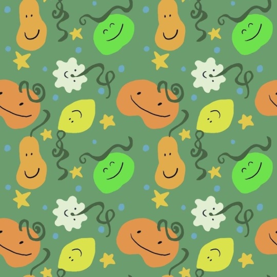
per illustration. But in any case, just use space. I'm going to create a series of funny creatures that will
take no time to draw, and I'm going to use this
pretty fine color palette that I've put
together previously. Feel free to follow
along or go ahead and create more complex
illustrations in your own style. They can be conversational
or they can be botanical. So with my 2020
centimetry document, I'm going to select
the dry ink brush from the library of brushes, which is one of my favorites. If it's your first time
using procreate, though, I advise you to go for
the studio pen instead. This way, you won't
experience problems with the texture and
color threshold, which I won't explain
in this class. If you're curious to know
what this means or does, you can always go and check my beginners to procreate class. I'm going to create
a funny shape. This looks like a
potato or potato, depending on where
you are based, and I'm going to
add a funny face. Now, on a separate layer, I'm going to select
a different color, and I'm going to
start experimenting with a different shape. If you're following along, try to vary your shapes
as much as you can, as this will help you practice your composition skills when
you create your pattern. The reason why I'm
adding faces to these bubbles is to make the
illustrations directional, and also they look
much more fun. I'm now going to
polish the sloutes of my illustrations and see if
there's anything I can amend. Now that I have a few big
items, more than four, but it's fine, I'm going to go ahead and create
some smaller items. So something really
simple like a star, making the edges
rounded instead of pointy so that they fit
the style of the monsters. I want to create a flower, so I'm going to open
the symmetry tool so that it's easier to create. Okay, I think this number of large items and
medium items is fine, so I'm going to stop for now. Once you're done with
your illustrations, meet me in the next lesson where I'm going to
show you how to export your images and start
your own image library.
6. Exporting Your Illustrations & Starting a Library: Once your illustrations
are ready, we're going to export them as PNG images with a
transparent background, and I'm going to show you
two ways of doing so. Right now, I have
a document where each final element is
on a separate layer. There are no masks or texture layers lying
around separately, so I can just export all of
my images simultaneously. To export layers as PNG files, you have to deactivate
your background first. See how now my creatures appear on this
checkered background, which means that there
is nothing there. Then you have to make the layers that you want to export visible. In my case, all of them. Then I'm going to tap on the
wrench icon scroll down to share layers and tap on
share layers as PNG files. If I tap on safe and then
go to my photo gallery, my images will appear in there. Now let's see a second scenario. I love to work with texture, so having each object on its own layer is
very unusual for me. If I open this Christmas
illustration file, you will see that my
illustrations are within groups that
contain loads of layers. I could just merge all
these layers into one, but I don't really
want to lose them in case I want to make any
changes in the future. So in this case, I have to
export whatever appears on the canvas as a flat image
and discard all the layers. Let me show you another example. I'm going to go to
the main gallery and open these berries, which are part of my class
digital Illustration, a beginner's guide to
mastering Procrit. As you can see, this
plant is composed by loads of elements which are
placed on different layers. In this case, I have to
export whatever appears on the canvas as a flat image
and discard all the layers. Let's see how to do this. First of all, I'm going to make the background layer invisible, and then I'm going to
go to share and select the PNG file format from the top menu under
the sharing options. This is going to export
whatever appears on the canvas as a flat image
and discard all the layers. I'm going to tap on
save on my iPad. If I go to my photo gallery, you're going to see that
the image has been saved. It appears with a
white background at first, but if you tap on it, the background will turn black, indicating that
the image has been saved with a
transparent background. Let's get your library started. After exporting all
of your images, they're going to
start mixing with your everyday life
photos and downloads. So to keep your
library organized, you can create a new album dedicated to storing
your illustrations, and this album will become
your very own image library. To create a new album,
scroll down your library, tap on new album, and name it something like a set library or
something that you want. Tap on add and start moving all your illustrations to
the newly created album. This way, you're going
to start building an organized library of images, which is super powerful
because you'll be ready to design anything
in no time in the future. Now let me show you how to organize your library
in procreate. When you have worked on
various sets of illustrations, it might get quite
confusing to know what's contained in
each of the files. You can solve this by making a preview of all
the elements and maintaining that
layer visible at the top of your layer
stack, something like this. I usually do this by duplicating the groups or illustrations
within my files, flattening one of the groups, scaling the illustrations down, and then merging all the
smaller illustrations into one layer that I leave visible at the top
of the layer stack. This way, when I go
back to my gallery, I can see exactly what elements are contained
in each file, even if they're on
separate invisible layers. This is very helpful
if you want to revisit a design to make changes or reuse these elements
in the future. By organizing your
assets in this way, you can start building a
well organized library of different assets within
Procreate and save the final images with a
transparent background in your photo gallery on your iPad or on a
folder on the cloud. Alright, now that
your illustrations are saved into your
photo gallery, we're going to start
our pattern. Okay.
7. Part Two: Designing Patterns!: Welcome to the second part of the class where
we're going to start building our pattern tile using our reusable
illustrations. If you're joining
from another class, then a special welcome to you. I'm so glad you're here. Let's go ahead and do a
quick recap for everyone. So far, we have
created illustrations on a 20 per 20
centimeter document, but feel free to use
a different size if that suits your style. Make sure it's large enough and that you're
using all the canvas space. Once your illustrations
are ready, export them with a
transparent background into your iPads photo gallery and organize them into
a dedicated folder. This will be the beginning
of your image library. If you need help
with this, check out the exporting your Illustrations lesson for some guidance. Now, in this part of the class, I'm going to guide you through
the process of turning those reusable illustrations
into a pattern tile. Whether your illustrations
are digital or physical, like hand drawn or
hand painted pieces, you can use them to
create patterns. If they're physical, you're going to need to
digitize them first. If you're not sure how
to do it, don't worry. I've included a link
to a tutorial in the class description to help you with the digitation process. Once they're ready, come
back and join us here. One thing I want to emphasize is the importance
of making sure that your pattern tile
is always aligned perfectly without any
unwanted caps or white lines. And if you do find any, go back a few steps
and start again. That's perfectly fine.
You've got this. I can't wait to see
what you create.
8. Design Smarter: Pattern Basics to Keep in Mind: Before we jump into
creating your pattern, I want to share some important concepts that will help you make thoughtful decisions when it comes to creating
your designs. I'm going to talk about
the size of your tile, the size of the elements
that you design with, and the different
layouts that you can use when composing
your pattern. Patterns can seem a bit
tricky to create at first. When they cover larger surfaces, they might look super complex, but the cool thing
is that they're actually made from just
one repeating tile. One of the fundamental steps of creating a repeating tile is to understand the basic different repeating systems and
how to make them. This will educate your
eye when it comes to creating more complex,
seamless patterns. In this lesson, I'll show you
some pattern examples and explain with a couple of slides the different
repeating systems. Let's dive into sites. When you're designing
in Procreate or Photoshop, for example, it's super important to
think about what you want to use your pattern
for and design accordingly. It's not the same designing for a wallpaper than
for baby clothes. One scale is much larger
than the other one, and so the tile sizes should be kept in mind
from the beginning. Throughout my career,
clients have requested patterns in specific
formats of eight per eight, 16 per 16, 32 per 32, and 64 per 64 centimeters. These sizes are based
on the circumference of the printing cylinders
some factors use, but they can vary depending
on where you are. Might be used to thinking
on inches, for example, or even pixels, which, by the way, is totally fine. We're going to refer
to them as small, medium, large, and huge. The size of your canvas not only impacts the characteristics
of your design, but it can also make the design process much more efficient if you choose wisely. For example, if you're creating a simple design with
just one small element, a smaller canvas
makes more sense, like wise spend
loads of time when the repeating system can do
the heavy lifting for you. Now, if you want to
include three elements, then a medium canvas would
actually make more sense. Choosing a canvas
size that matches the look you're aiming for
will boost your efficiency. For example, I created
a moon and star pattern a couple of years back
and went straight for a big canvas thinking that it would look
more professional. Looking back now, I would definitely have chosen
a medium one instead. It would have taken
half the time. Plus, when you
compare both prints, you can't actually
tell the difference. It's also crucial to consider the scale of the elements
that you're designing with. Take this cat
print, for example. Even though it uses
the same canvas size, the scale can look quite different depending on how
you arrange the elements. In this class, I'm going to use a large canvas of 32
or 32 centimeters, and my elements are going to be fairly big around 10
centimeters each. I want to be able to use this pattern in a
wallpaper, for example, and downscale it to
half or third of its size to fit stationary
items or even baby clothes. Down scaling a pattern to
have its size is fine, but I don't recommend
scaling it up. It will become blurry
and lose its quality. Okay, now let's explore some different
repeat fundamentals. Block pattern repeat. This one is one of
the simplest systems. It takes the original
repeat block and arranges it in a grid format to
cover the whole area. Half drop pattern repeat. This is often found in
more casual designs. You created by stacking
the repeating unit in a column and offsetting it
by half in the next column. Brick pattern repeat. This one is similar
to the half drop, but it is stacked horizontally instead of vertically
like brickwork. This helps to break
the design and gives it a more relaxed vibe. Now let's talk about direction. One way or directional patterns
feature strong lines of elements running vertically,
horizontally, or diagonally. Two directional
patterns are similar but reversible running
in both directions. Multidirectional repeat can
be viewed from any angle. When the elements are placed
in various directions, the design doesn't have
a specific orientation. This is great for
fabric printing, since it can be cut and used from any point
reducing fabric waste. In the pattern bundle, you're
going to find a set of fantastic cheat sheets for
creating one directional, two directional, and multi directional patterns
in different systems. They're great for
practicing these concepts, and when actually
using them as a guide, they can help you save
some time and make smarter choices when it comes to placing your illustrations
within the pattern tile. The next lesson, we're going
to bring our illustrations back into Procreate and
start our pattern tile.
9. Importing & Resizing Your Images: Okay, now it's time to bring those reusable
illustrations from your image library back into Procreate and get them
ready to start your tile. As always, I have a
few recommendations. When you resize your images, especially in
Procreate, they tend to lose a little bit
of their quality. If you resize them down,
it's usually fine. But you resize them up and down and rotate them and
all that, not so much. Remember that your
original images are safely stored on your photo gallery just waiting for you
to use them again. So if at any point during
the designing process, you're like, Wow,
this looks so blurry. Don't hesitate to import your
images back into Procrit. Resize them directly into the final size and
discard the blurry one. That's the beauty of
designing this way. You will always have a crisp, high quality version
ready to go. Here I am on my Procrit gallery, and I'm going to select the 32 per 32 template
for my pattern, but you can choose any
size that you want. The first thing that we're
going to do is import our illustrations back
into this document. You have two options to do this. One is to tap on
the wrench icon, then add insert a photo
and select your images. To finalize your input, you have to tap on
the arrow icon again. This method only allows you to import one image at a time. Now, there's an easier way
to import multiple images. You have to split your
screen into two parts. To do this, I like to slide my finger up on the
bottom of the screen, tap on the gallery icon and slide it into one
side of the screen. If you can't see
the photo gallery, icon is because you have
to open the app first. Then tap on select, select all the images
you want to import. And drag them onto your file. If you have any
layer restriction, you don't have to import all of these images at the same
time because they're all saved in your
gallery and you can just import them
whenever you need them. This method is great when you want to import several images at the same time and
see how each of them is imported
into its own layer. It's important to
resize the images down and decide first how big you want your
illustrations to be. It's key to have in mind that it's okay to downscale images. But if you were to enlarge
these images back in prograde, they're going to lose
their resolution and look really blurry. Now, how do you
take this decision? It's hard to visualize how large the images
are in this canvas. I have my measuring tape
by my side, and in here, it's really easy to take a decision on how large I
want my illustrations to be. I might want to use this
pattern in homework. So for example, seven or 10
centimeters is fine for me. But how do I know how big these illustrations
are on the canvas? Let me show you a
trick to find out. Tap on the wrench icon. Tap on Canvas, turn on the drawing guide toggle and
tap on edit drawing guide. This is going to display a grid that we're going
to use as a ruler. We're going to
modify the third bar which defines the grid size. See how when I move the
bar, this number changes. At the moment, it's
showing the pixels, but if I tap on it, I can
change it 2 centimeters. I'm going to tap undone and
with the grid size bar, I can decide how large I
want these squares to be. 10 centimeters is
perfect for what I want. I can reposition my grid
with these blue dots, so I'm going to align
it to the start of my canvas and set it
to 10 centimeters. With this top bar, you can change the
color of your grid, and with these bars, you can change the opacity
and thickness. I don't want it to
be that visible. So I'm going to tap on them. And now when I
resize my elements, I have a much better
sense of their size. See, I thought
they were smaller, but now using these guides, I can scale them down into
around 10 centimeters. Now that I have defined
the size of my assets, I can go ahead and make
my grid invisible. Once you've imported
and resized, your images meet me in the next lesson where
we're going to start our parent tile. I.
10. Starting Your Tile: Central Composition: In this lesson, we're
going to start creating the central composition
of our pattern. At the moment, all of my images are aligned in the
central of my canvas, so it's hard to see them. I find it very
helpful to display the images in a way where I can see them all
at the same time. I usually put them
within a group. I'm going to get rid of this one because it's repeated and then make them invisible
to have more canvas space. So my pattern is going
to be multi directional. So I'm going to move my assets around and start organizing
them in the central area, making sure that none of
them surpass the border. Be mindful of the space that
you're living in between your elements and try to keep a similar distance
in between them. You can activate and deactivate
the rest of the layers to start deciding which
element you want to use next. I am also making sure that my elements are facing
different directions. If you have two elements of the same color like
these two purple ones, try not to put
them side by side. If this happens,
it's not a big deal, but be mindful not to repeat elements too much in one area. So keep these top tips in mind. Keep a similar distance
in between your elements. Avoid placing two of
the same colors side by side and always keep in mind the direction
of your pattern. Okay, I'm going to work with
these five elements for now. Depending on how
many elements you have and the space that you
want to keep in between them, the central composition might take you a little
bit longer than me, but that's totally fine. Take your time, enjoy it. Be mindful on how you
place your elements. And once you have your
central composition ready, meet me in the next
lesson where we're going to start working on
the horizontal repeat.
11. Creating the Horizontal Repeat: Okay, let's start working
on the horizontal repeat. To make this, we
need to merge all of our illustrations
into a single layer. I know that I could import
these illustrations again, but since I have changed
their size already, I want to keep a copy of
them in separate layers. For this, I'm going
to group them first and then
duplicate this group. So I'm only going to flatten
one of the two groups. This way, I can keep a copy with all the separated
downscale illustrations, including this yellow
creature that I haven't used and merge the other
one into a single layer. I'm going to tap
on the arrow icon. Now, pay attention
to the bounding box. See how it's only surrounding the drawings instead
of the whole canvas. If we were to do the repeat
with this selection, nothing would fit, and it
would be a bit of a disaster. There are lots of
methods out there that involve creating
new layers and groups, but after trying a
couple of methods, I have discovered the one
that I'm about to show you, and I love it because how simple and
straightforward it is. So I'm going to
exit the move tool, and in the same
layer of my assets, draw four marks, one on
each corner of the canvas. Don't worry about the color as well erase these marks later. Just make sure that
they're not too small and that they're
touching the corners. Now if I activate
the move tool again, the bounding box will include
the whole canvas area. Col right, no extra
layers or groups needed. Now let's duplicate
this layer to create the horizontal repeat so that our layers are aligned
perfectly in the middle. We need a little
help from Procreate. When you tap on the arrow icon, you'll have to enable the
snapping and magnetics toggles under the
snapping option on the bottom central menu. Keep these bars quite high as they will
help in the process. This setting turns the
images into magnets, aligning them perfectly to the central edge of the
canvas or to other images. See how when I move my
layer to the left is snapped into the middle of the canvas and
this line appears. Now I can open the layer stack, select the bottom copy, and move it to the other side. It is key to always zoom in to check for any white
lines in the middle. If you see any, you have to go back a few steps and try again. And if the problem persist, you may have to increase the distance and velocity bars so that the magnet
effect is stronger. The problem of
having these lines is that if you create the
rest of your pattern, your final pattern is not
going to work because you will be able to spot that line
anywhere in the repeat. So if you see any, just
go back and try again. If everything is looking fine, open the layer panel and merge the two layers by pinching
them with two fingers. Now we have to remove
these black marks. Instead of using the eraser, which could leave some
pixels lying around, I'm going to use
the selection tool, which is the third ribbon icon on the top left of the screen. I'm going to select
the free hand mode from the bottom menu, surround the top
mark to select it, tap on the Add button
from the bottom menu and enclose the bottom area
to add it to the selection. Then I will tap on add again. Then swipe three fingers down and tap on cut to
remove them altogether. Now it's time to fill and
polish the central space. This process might be
super easy or might take some time depending on the type of pattern
that you're creating. In my case, it's quite easy. I just have to add
this yellow creature into the central area. You might be wondering why
it's being so easy for me. Well, first of all, I have a lot of experience grading patterns, but I have also had in mind the brick composition that I taught in the pattern
fundamental lesson. Knowing these fundamentals
will help you create a balanced composition
from the beginning. Okay, back to the pattern. Now I'm going to
activate the group which contains all the
elements in different layers, and I'm going to select the yellow one because
I haven't used it. So I'm going to duplicate
this layer to keep the original for layer and
take it out of the group. I'm going to collapse the group, and I'm going to put the
yellow creature in the center. To be able to move it freely, I'm going to deactivate the snapping tuggles and
there's a sensation I have. This image seems a bit
smother than the other ones. I could increase it
slightly in here, but since inprocrit, images tend to lose a resolution
when they're resized. I'd rather get rid
of it completely and import it again from
my image library. And this is precisely the cool thing about
working this way. You are always going
to have your images in full resolution
ready to be used. Now, there's a trick I
still want to show you if the loss of resolution
is not terrible. You can go to the
adjustment panel and select Sharpen from
the drop down menu. By sliding your
pen to the right, you can bring the borders back. But if this doesn't
resolve the problem, then it's better to
replace the image with a saved version
from your library. You can check how your
assets look facing different directions by rotating your canvas with your fingers. This will help you check
how things are looking, especially when working on
multi directional patterns. All right. Now that our
horizontal repeat is done, we're going to move on to
creating the vertical repeat. See you in the next lesson.
12. Creating the Vertical Repeat: Now we're going to work on the vertical repeat to
complete our pattern. Once more, if I
tap on the arrow, can the bounding
box only surrounds my elements instead
of the entire canvas. I'm going to create my
marks in the middle, one below the other,
just to show you that you don't always need to
place them on the corners. As long as there's an element touching the border
of your canvas, you can make the marks
anywhere you want. I'm going to duplicate
the layer to create the repeat and making sure
that the snapping is enabled, move one to the bottom
and one layer to the top. After confirming that
there are no lines, I'm going to merge
the layers and remove the marks using
the selection tool. Now, there's space to add
another element in here. I think the blue
element fits well here. See how all the surrounding
colors are different. I'm going to deactivate
the snapping and magneting options to
move the object freely. It's easy to think that this pattern tile
is now finished, but there's something missing. Let's test this
pattern and make it smaller to see if the
problem is revealed. I'm going to merge the layers
and duplicate this layer. I'm going to make the
bottom one invisible as I want to keep the
original scale intact. To test my pattern, I'm going
to tap on the arrow icon, activate the magnetics
and snapping toggles and move the corner of my tail
until it fits the middle. Look how these horizontal
and vertical lines appear. Now I'm going to swipe
three fingers down, tap and duplicate, and move
the copy to the right. And now the problem
is very clear. There's one element missing
in between these two tiles. Now, I had spotted this
problem from the beginning, but I wanted to show
you how important is to test your pattern once in a while when
you're designing it. When testing it, you
will also be able to check if the tiles
aligned correctly or if there's any unwanted
line that you need to go fix before you keep on
designing your pattern. I'm going to get rid of these copies because I
don't need them, and I'm going to create
the vertical repeat again. And whilst doing so, I want
to show you something else. I'm going to start by
duplicating my tile, tap on the move
to, and this time, I'm not going to move the
image to the exact center, but instead, I'm
going to leave it at a random distance from the edge. Here is fine, and now notice how when I
move the other layer, it snaps into either
the center of the canvas or to the
pixels of this new layer. This is to show
you that you don't always have to align
everything to the middle. This information will
be valuable for when you're creating more
complex patterns and need to move your images based on pixels
across your canvas. I'm going to merge these layers and choose an element
to place in the gap. Looking at the
surrounding colors, I think that the yellow
element works well in here. I'm going to deactivate the snapping options and
adjust the position by flipping the image vertically or horizontally
until I see it fits. Once I'm happy with
the placement, I'm going to merge my layers. Although you have
already kind of seen it, in the next lesson, I'm going to show
you how to test and amend your
pattern if necessary. See you in the next lesson.
13. Testing and Refining Your Pattern: When making patterns, is key to test them
before exporting them or adding smaller elements to make them look more dense. Let me show you how to do this. Open the layer panel and
duplicate the pattern tile. You should always keep one of the layers at its original size, and I suggest that you
make it invisible. Making sure that the snapping
options are enabled, resize the layer until it fits
the middle of the canvas. After that, swipe
three fingers down, duplicate the layer, and
move it to the right. Now you can merge
these two layers, duplicate this layer again
and push it to the top. Now merge the layers and zoom in a little bit to see if there's anything
that needs fixing. If there's nothing to adjust, you might still
want to duplicate your pattern once more
and make it even smaller. Sometimes visualizing a pattern in a smaller scale can help you spot things that need
amending or spot any gaps. In this case, I'm very happy
with the patterns layout, but I want to show you how
to amend it if necessary. Sometimes there are things
that might not work well. Maybe one of your assets
is looking blurry or there are too many elements of the same color in one
area of your canvas. Okay, let's say that this
yellow creature here is giving me problems and
I need to amend it. The first thing I need
to do is memorize where this item is placed in relation
to the other elements. This will help me spot
it on my original tile. If it was placed somewhere
inside the canvas, I could just enclose it using the selection tool and
move it a little bit. But in this case, this creature is on the corner of my tile. Let me show you how to
fix something which is on a side or on the
corner of your canvas. Now, before I go ahead and
create a second version, I like to keep the
first version as well, just in case I prefer it after
finishing the second one. Not only is good to
be able to compare the different layouts
to see what works best, but it's important
to be able to go back to the first option
if you like it more. So I'm going to group the
original tile and the tests, and I'm going to duplicate this group to create
another version. I'm going to make
the bottom group invisible and get rid of these two layers because
I'm going to create a new version and I
don't need them anymore. Now let's see how to amend an object which
is on the corner. The first thing
I'm going to do is duplicate this layer and move each of them to one side to create the
horizontal repeat again. See how this has joined already the two parts
of this creature. Now we need to do
the vertical repeat to complete the figure. So I'm going to merge my two
layers, duplicate it again. Send one copy to the bottom, the other copy to the top, and Valla, we have our
creature complete. Remember to zoom in to
spot any unwanted lines. Now I can go ahead, merge my layers and move this
yellow creature around. So after amending your items, you have to test your
pattern tile again. So I'm going to start by
duplicating the initial tile and make the bottom one invisible to keep the original tile intact. To keep things fun and varied, I'm going to show
you a second way of testing your pattern. I'm going to
duplicate my pattern four times until I
have five layers. The bottom one is going
to be the original tile. Tap on the move tool, activate the snapping options and start moving the corner of each layer until it
meets in the center. Now I can merge my pattern and compare it to
the previous option. You can do this by making the bottom group
visible and checking on and off the layers that
contain the pattern at the same scale to be
able to compare them. In this case, these patterns are very similar and both work well. I quite like the new option, but I have noticed that both of the yellow
monsters are looking up, even if when it's flipped,
it's quite similar. So being a little bit
picky as I am normally, I'm going to create
the repeat again, flipping the
creature vertically. Once more, I'm going
to test my pattern, and that's better.
I like it more. So once you've completed
your pattern tile, using your big elements, meet me in the next lesson where I'm going to show you how to use the medium elements
to make it a bit more dense.
14. Filling the Gaps: Adding Smaller Assets: O. In this lesson, I'm going to show you how to
use medium elements to fill in the gaps of your
pattern so that it looks a bit more
dense and varied. I'm going to open my
photo gallery and select the medium elements that I illustrated along
the characters, drag them to the canvas, wait until they import, and close the photo gallery. I want these four elements
to be smaller in scale than the main creatures to fill in the gaps
in between them. Whilst placing each of
the elements on each cap, I can check the size and be mindful always of the
color that I'm using. This flower has too
much detail and I feel that it doesn't fit the style of the rest of the elements. Let's see what happens if I
cover the caps. Much better. I'll keep moving the
smaller elements around and recoloring
them if necessary. In this case, for example, I like this dot here, but it's yellow, and the
creature above it is yellow. So I'm going to change
it to this light pink. I don't really like it, so I'm going to turn the flower yellow. It doesn't matter always that the colors
are side to side, but it's good to be mindful. Sometimes it can be very
helpful to visualize your tile at a smaller scale whilst you work on the pattern, and so there is something
I want to show you. If you tap on the ren
icon and tap on Canvas, you can activate the
reference taggle. This is going to
open a small preview that you can move
around your canvas. If you tap on it, you will
get the full preview, and you can adjust size by dragging the
bottom right corner. I'm aware that this iPad pro
is larger than other ones. So if you feel like
this preview is taking too much space on your
screen space, just close it. When seeing the small preview, I can see that maybe I could add another triangle here
or another star, but the triangle seems better. Now, I need to fill
these other gaps, but before doing
so, I want to keep a copy of these elements to
filling the rest of the gaps. So before merging them
all in one layer, I'm going to select one of each shape, group those layers. Duplicate the group and take one of them out
of the main group. This way, I know that these shapes will
be saved for later. I'm going to make the
group invisible and merge all the layers
that compose my pattern. So now I have two layers, one with the tile and the group containing the medium elements. Now we're going to
create the repeat again and you already
know how to do this. I'm going to create two copies of this layer tile just in case. Move one to the left, the other one to the
right, and merge them. I can see that this triangle
here is not well placed, and the lilac is the same
as a creature on its side. So I'm going to
change it to orange. This color is a bit too strong and I can see it on
the small preview. I'm going to use
the other purple, which looks softer, but
still has some contrast. Okay, now I'm going to make the vertical repeat and
fill the rest of the gaps. I'm going to deactivate the reference view because
it's taking too much space. Take your time filling
up the empty gaps, and if after
resizing them a lot, you see they've lost
their image quality, import them back from your photo gallery and
resize them again. This yellow one is a bit
too big for this space, but since there's a bit
more space down here, I'm going to exchange
these items. I'm going to fill in
this empty cap with another triangle and change
the color once more. As you can see, when you're in the process of
making a pattern, there's a lot of
testing, a lot of trial, and I wouldn't say error, but there's going
to be things that you like more than others. If there is an item that is merged with the other layers
that you need to move, use the free hand selection
tool to move it around. Okay, I think this is
looking fine for now, so it's time to test my pattern. I'm going to duplicate my
layer and create the repeat. Okay, at this point,
my pattern is well composed and all the gaps
are filled with shapes. But there's something
I want to show you. Sometimes, especially when
the patterns are simple, I give myself the
freedom to start drawing things here and there, funny words, more geometrical
shapes and stuff like that. Now, before doing so, it's
important to make sure that you're keeping a layer with
the original tile intact. This way, if you don't like the drawings that you
have made previously, you can always discard
them and go back. And as we did when we were testing our patterns,
towards the end, you can compare which
of the patterns is your favorite or save the two tiles. In my case, I like both of them, but I'm not going to keep
them on the same file. So I'm going to go back to my gallery and
duplicate this file. I'm going to open
this one and erase one of the patterns
so that only one tile is contained in the two sizes and do the same
with the other one. So open it and erase
the bottom one. I don't like having
more than one pattern per file because it can
get really confusing, and I have spent hours
in the past looking for a pattern because of having too many tiles on the same file. In the next lesson, we're
going to test some colorways.
15. Exploring Colorways: Being able to turn your artworks into different color
ways is not just fun, but it can be a
great way to expand your portfolio and reach
out to a wider audience. The same pattern with
different colors can fit different collections
and be used across different seasons
or even markets. In this lesson, we're going
to modify the colors of our patterns using
the adjustment tools available in Procreate. Many of these tools are used in photography to enhance artworks, but I love using them to
explore new color palettes. Okay, before we start playing around with the
adjustment tools, start by modifying the background
color of your pattern. If you tap on the
white thumbnail, you can see how your pattern looks over different
background colors. I love how different
it looks over a dark background or
over a white background. Okay, now let's test
the adjustment tools. Always start by duplicating your initial pattern tile to ensure that you keep
the original colors. Tap on the magic one, icon to
open the adjustment spanel. We're going to explore
these four top options, starting with the first one, hue, saturation, and brightness. With these bottom bars, you can explore
different color ways. The first one goes for. Moving this bar, you're going
to start discovering how your pattern looks over
multiple color variations. I have to say that
this option works better when you have a
limited color palette. The combinations tend to be
more cohesive and prettier. When the palette
is more varied or your items are full of
volume and texture, the variations can have some clashing colors that
might not combine so well. With the saturation bar, you can make your colors
look saturated and full of life or more opaque
and black and white. And with the brightness bar, you can adjust if you want your pattern to be
lighter or darker. Before I move on, if there's any color combination
that you really like, you can tap on the
layer panel to commit to the changes and save
this color combination. You just have to go
to the layer panel and make the layer that
contains the combination that you like invisible and duplicate the initial one to start again and explore
new combinations. Let's open the adjustment panel
and tap on color balance. You have these 3 bars on the bottom that
you can play with. The changes you can explore with these bars are more subtle, but still very interesting. If you tap on this sun
icon on the right, you can select if you want the changes to
affect the shadows, meat, tones, or highlights. Without getting too technical, I invite you to play
with these options until you achieve color
ways that you like. There's nothing right or wrong. This option can help you
achieve a tunnel pattern with colors of the same spectrum
that work well together. One thing is that not a lot of the colorways work over
the same background. And whilst it's
practical to change the color directly on
the background layer, when you have loads
of colorways, you might end up losing
a lot of time and cool combinations because of not saving the background
color as well. A way to work around
this is to first explore the color in real time
using the background layer. But once you find
one that you like, create a layer directly below the tile and fill it up using
the color that you like. In this case, white. Lastly, you can create a
group with this colorway, make it invisible, and keep
on exploring new colorways. Okay, let's duplicate the
original colorway once more and explore the
third option, curves. In the Gamma option, you
can adjust the shadows, midtones, and highlights
individually. If you move on the
top blue node, you will affect the brightness, and with the bottom node, you'll manage the saturation. Now, you can create new
nodes by tapping on the line and moving them
individually up and down. Below the Gamma option,
you have the red, green, and blue channels where you can also modify the
nodes individually, and this will give you a myriad of different color combinations. I love this way of exploring
color combinations as I feel that I have more
control over the changes. Every time that you
like a color array, remember that you can duplicate the initial layer to save it. And lastly, let's open the
adjustment panels again, and you have the gradients
map, which I also love. When you're in this function, you will see lots of
gradients down here, and by tapping on
different ones, you'll get a new option. Now, the cool thing
about this tool is that you can create
your own gradients. If you tap on the plus icon, you'll get a boring
black and white dull bar that you can customize. To change the colors, you'll have to tap on the
squares and pick a color. You can create as many colors as you want by tapping
anywhere on the bar. I'm going to put this blue
here and a black here. Now, if there's a
color which you can't see like this
blue one in the middle, I suggest that you start moving
the colors side to side. If you want to erase any color, you will just have
to tap and hold on one of the squares
and select delete. You can even change the order of the colors by moving
them side to side. And in real time,
you'll see your pattern in different combinations.
How cool is that? Sometimes this way of
changing colors might have unexpected results
like this red border, but you can use it as
an exploration tool. All these tools allow us
to achieve thousands of different color ways out of a single repeating pattern tile. This will ultimately expand the possibilities of where
you can use your pattern. The same pattern used in soft pastel can be
great for baby clothes, and when used with bold colors, it can be used in more adult
clothes or stationery, a jacket or anything you want. In the next lesson, I'm
going to show you how to export your pattern in
different file types so that you can start
saving as many colorways as you want. Mm
16. Exporting and Backing Up Your Pattern: Now we're going to
export our pattern, and I'm going to show you how to do it in different formats. Tap on the range icon
and tap on share. The files that I
use the most when making patterns are the PSD, which goes for Photoshop. I export my patterns
on this format when I want to pass it on to
Photoshop and keep the layers, masks, and all that. JPEC, which is great for sharing online or social media
because how compressed it is. And PNG, that is
a losless format, which means that your file won't lose its
quality over time. Also, in the PNG format, you can save your patterns
with a transparent background. On websites like Red Bubble
are print on them on website where you can print your items and
start selling them, allow you to upload
patterns with a transparent
background and choose the background color
on different products. So that's really cool.
You already saw this, but when you want to export your pattern with a
transparent background, you have to make the
background layer invisible first and then export
your file as a PNG. I'm going to save this
image on my iPad. Now, if I open my gallery, you will see my artwork
now appears in here. You can also save your
file in a procreate file, and this will help you open this same pattern in another iPad with
procreates installed. You can go ahead and save as many color rays as you
want, take your time, test them over
different backgrounds, as in the next lesson, I'm going to show you
how to visualize them into real life products
using mockups. Before doing that, let me
show you how to back up your pattern properly onto a second hard drive
or into the cloud. Anything can happen to
your iPad, hopefully not. Hopefully, it doesn't break
or you lose it or something. But if you do, knowing that
your patterns are saved onto another space will
give you peace of mind. So I like to save my
patterns on dropbox I have my dropbox in here
where I have created a folder named Procreate
Artworks backup. So I'm going to open it, and here I have loads
of my patterns saved. I haven't done this in a while, and this is a reminder
for myself to backup all my patterns instantly
after publishing this class. I'm going to split my
screen into two parts just so that you can see the
saving process in real time. I'm going to open this pattern, which is the one that I
created in this class. I have the tile at
100%, 50% and 25%. I'm going to tap on
the wrench icon, and save this pattern
in a PSD format, which I could open on
Photoshop later on. So I'm going to tap on Dropbox, search for my folder,
and tap on Save. Now, look what's happening. It is asking me if
I want to replace this artwork which is
called untitled artwork. If you tap and replace, you would be replacing one of your artworks which are contained already on
your backup folder. So I'm going to tap on Cancel, and I'm going to show
you how to fix this. I'm going to go back
to the main gallery, and before exporting
my patterns, I need to give them unique
names so that they don't overwrite patterns which are contained on my backup folder. Oop, I pad storage fold
time to backup my patterns. I'm going to tap on the
tiles name and give it. And I mean here,
you can use a code, your name, or anything you want. For now, I'm going
to use pattern one, Pattern two, and Pattern three. Once in a while, I like to save various patterns at the same
time onto my Dropbox folder. Let me show you how to do this. Tap on the select word up here and select the patterns
that you want to backup. Tap on share, and
I usually like to backup my patterns in
the Procrit format that allows me to open the file on another iPad with
Bocart installed or in PSD that allows me to
open my patterns in Photoshop and keep the
layers, masks, and all that. So I'm going to tap on PSD. And in here, I'm going
to select Dropbox. I'm going to make
sure that I'm in the procreate backup
folder and tap on upload. You can now see that
these three patterns have been uploaded to
my Dropbox folder, which not only gives
me peace of mind, but now I can access
these patterns from my computer
or other devices. Ideally, you would do this every time that you finished
designing a pattern, but this is not
realistic sometimes. So I advise that you
backup your patterns at least once a month
or every two weeks. In the next lesson, I'm
going to show you how to visualize your pattern
over real life products. There is nothing more
exciting than that.
17. Part Three: Elevating Your Patterns and Artworks: Before we dive into the
third part of the class, let's do a quick recap of
what we have covered so far. In the second part of the class, we talked about
the importance of considering the size of
both your document and your illustrations
and how keeping the final product in mind can help you make
smarter design choices. You also started building
your own image library of reusable illustrations and use them to create a seamless
pattern in Procreate. Along the way you
learn how to create the repeat, fix any errors, replaced elements if they
lost their image quality. We also explored colorways
using the adjustment tools, and I showed you
how to export and backup your pattern
files. So, guess what? You already know how
to create patterns. Now, this third part of the class is a bonus
section that I have added to make your learning journey even more exciting. I'm going to show
you how to visualize your patterns on real
life products using Mups. I have included three
free Mups that you can download using the link
in the class description, and I'm going to also give
you a sneak peck at one of the mockups from my
first ever digital product, the Ultimate pattern bundle. I'm so excited to show you this. Usable illustrations are not
just for creating patterns. I also use them a lot
for placement graphics. I have added a special lesson where I'm going to
show you how you can start experimenting with placement graphics using Canva. Lastly, I'm going
to show you how to publish your project in
the gallery of this class, and I'm going to share some additional learning
resources to help you continue building
the skills you've gained in this class.
Let's get started.
18. Visualizing Your Patterns with Mockups: O. One of the most
exciting parts of designing a pattern is seeing it come to life on
a real product. But let's be honest, getting it printed isn't always easy, and it can take time
and cost money. That's where mockups come in. Mockups allow us to
visualize our patterns on real life products without the hassle
of printing them. It might not be exactly
the same feeling as holding your own printed
fabric in your own hands, but trust me, it's
still pretty amazing. And the best part is that
mockups can be super helpful for a few key
things testing patterns. Visualizing your patterns on different products can help you decide which fabrics to use when it comes
to printing them. Maybe you'll discover that a certain design looks better on a pillowcase than on a toadbg or that it pops more with
a colored background. You might even find that you prefer your pattern
at 100% scale, or perhaps it looks better
when it's reduced to 50 or a 25% scale, building
pattern collections. Testing various patterns
on the same Map scene is a fantastic way to see how they pair up and how
they work together. This, in my opinion,
makes it so much easier to start building
cohesive pattern collections. Mocaps are also
perfect for getting feedback from clients or even your social
media followers, even before you go
into production. This can ultimately
save you time, money, and some
potential headaches. When it comes to presenting
your pattern to clients, showing the tile
along a mocap gives them a better sense on how the design works
in the real world. So it's a great way to get your clients excited
about your work. I've included three
Maps for you to download in the Project and resources gallery of this class. I'll walk you through
how to use two of them, but since they all
work in a similar way, you'll get the hang
of it quickly. Plus, I'm also going to
show you how to use one of the more advanced Maps from the pattern bundle
available for purchase. This is a bit more
complex to use as it lets you test out multiple
patterns in a single scene. It is perfect for
experimenting with your designs and start showing them to the
world as collections. Okay, with all that said, let's type and see how your
pattern looks on Maps. So I'm going to open
the notebook Map, and you will see that
there are three layers, the background color,
then you can see that you can add any
color to this background. The background table and the
shadows of this notebook. I'm going to open
my photo gallery, and I have decided to
make an album with all my patterns so that they don't start mixing up
with all my photos. I'm going to import
the pattern that I did in this class and
drop it in Procrit. Once it's imported, I'm
going to move it to the bottom layer and
resize it if I want. I actually quite like how this pattern looks
in a large format, but I also like how it looks when it's
in a smaller scale. Now when it comes to testing
your patterns in Procrit, I do advise that you save various scales of
the initial tile. What I mean by that is if
I go to my initial tile, I have the pattern at 100%, at 50% and quickly, I'm going to scale this down
to have its size again. The reason why I'm asking you to do this is
because this will help you test your pattern in different scales when
you're in the Maps. I'm going to merge this. Go ahead and save this with a transparent
background so that I can test the background
color directly in the notebook. Save image. Going to go back to my
mockup folder. And in here. So I'll find them here, and I can import this pattern in a smaller scale and
keep testing its size. Visualizing patterns on mockups is incredibly useful because it allows you to see how your designs will look
on real products, helping you take
decisions on the scale, the background color, and the overall impact
of your designs. It also provides a
professional presentation, making it easier to showcase
your work to clients or potential buyers and increases the chances of
licensing your designs. Okay, I love how this looks, so I'm going to open the
stain battle mockup. This mockup works
in the same way. It has different layers. I'm going to get
rid of this pattern and import another one. Once more, I'll
place this layer at the bottom of the layer
stack, and there you go. As easy as that, I'm going
to go back to the gallery, and I'm not going to open
the cushion because it works the same way as the stained
bottle and as the notebook. Instead, I'm going to
open one of the mockups that come in the pattern bundle
to show you how it works. So when you download
the pattern bundle, you will find these
three folders, one with the pattern templates. The other one will contain
the presentation and email and lastly, the
Procreate mockups. I'm going to open this
file because it's a little bit more complex and you
can add three patterns, one on each product. So this is the preview, and I need to import the
one that says Procreate. You can do this tapping on Import and selecting the file in here or you can also drag
the file to import it. I'm going to slide the finger to the left to close this
and tap on the new file. Now, if I go to the layer panel, you can see that this file
has many layers and groups. I've designed these
mockups so that each group contains an object, and you should take
the time to go through each object and understand the way I've
organized the layers. Everything has a name and
it's very easy to navigate. Let's start from the bottom. If you tap on wall, you
will see color your wall, so you can either
select a new color and drag the active color to your wall or use the
adjustment tools, which sometimes I find easier because I can
see that changes life, and this helps me take
better decisions. If I tap on table and wall, I have decided to leave you
two surfaces for the bottom, so you can choose the one
that you like the most. And then I'm going to start
on the plant spot, this one. When you open the folder, you will see a layer which is empty and says at your pattern. So I'm going to open the folder which
contains my patterns, and I'm going to open this
pattern which I created on my previous class where I teach a similar method
to create patterns, drawing the doodles straight in the pattern tile instead of
using reusable illustrations. You can add a different color to the background of
the pot if you want. And after testing a few, I'm going to leave mine white. Now I'm going to open
the Tad Back folder. There's this layer here
saying add pattern, so I'm going to select it and split my screen into two parts. I'm going to import the pattern
that I did in this class. I'm going to commit
to the changes by tapping on the arrow icon and then import the one which is at a smaller scale,
so I can test both. To close the photo gallery. And you can see that in here, you have two shadows. One is a little bit stronger
than the other one. The difference is
quite subtle but. You can start activating and deactivating these layers
to see what you prefer. If your parental has a
transparent background, you'll be able to test the background color right in here. Okay, I think I'm very
happy with this blue. The handles of this bag are
also on separate layers, so you can change their color. And lastly, with
this makeup back, you'll just have to
repeat the same process. You can test as many
patterns as you like in these products
and start also checking which of your patterns
combine well together and could be presented as
part of the same collection. Now, one recommendation I
have is that if your pattern is looking a little bit dull
or needs more contrast, you can fix this by
duplicating the pattern tile, place the copy on
top of the object. Create the clipping mask so that it only appears
within the product, and play with the opacity
and blending mode. Some of these blending modes
will help your pattern get the contrast and
bright colors back.
19. Maximizing Your Image Library with Canva: Now that you have seen how powerful reusable
illustrations can be for creating patterns, let's take it a step further. One of the things I love
the most about having a library of illustrations is that they're not
just for patterns. I also use them a lot
for placement graphics. During my time as a designer
in the visual industry, I often found myself
needing to create both a pattern and a complimentary graphic
to go along with it. Great way to create
cohesive collections that work across
multiple products. Whilst I'm not going to explain
in depth how Canva works, I decided to add this bonus
section to get you started. You're going to see
how easy it is to take those same illustrations
and use them in Canva to create beautiful
placement graphics. Canva is free, super user
friendly, and accessible, making it a great tool
for anyone who wants to expand their design
possibilities beyond Procreate. So let's dive in and
explore how you can take your designs to the
next level using Canva. I have my assets in here in
a PNG format on my library. They're all in here. And I'm
going to open my Canva up, whilst I'm not going to explain
how Canva works in depth, for that you can take
my from Procrit to Canva class where I make a
proper introduction to Canva. I'm going to show
you around quickly. After creating an
account in Canva, you will enter this window, which is the homepage and contains everything that
Canva has to offer. Then you have this menu on the left side hand
of the screen. Here are your designs, all the designs
that you have made, and we're going to tap
on this second icon that says projects. You have this menu here
containing these tabs. Under the image folder, you will find all the images that you have ever
uploaded into Canva. In designs, you will find the
designs that you have made. And on the folders tab, you can create folders to
keep your images organized. I'm going to tap on
add new to create one, tap on folder, and give
it a name in here. I'm going to write
Procreate class, but you can use any name you
want and tap on continue. Here's my new folder, so I'm going to tap on it, and we're going to upload
our images in here, just so you know,
you can also upload your images when
creating the design. But for now, let's upload
them onto this folder. Tap on the at New button
and tap on upload. You can select the
photo library and start selecting the images
that you want to upload. Now, when you upload your images using this method,
for some reason, the PNG images are important without a
transparent background, and that's going to be a problem
when designing anything. Canva DAS has a function
to erase backgrounds, but that's not included
in the free version. So I'm going to show
you how to import your images with a
transparent background. Slide your finger up and split your screen
into two parts. Now select the image you want to import and slide it into Canva. You can see that
for some reason, they're the same image, but one has been imported with a transparent
background that you can recognize with this
checkered background, and the other one has
the background white. I'm going to get
rid of this one by tapping on these three
dots and selecting move to trash and import all of the other
images at the same time. I'm going to tap on the
select button up here, select them all and
slide them onto Canva. Now I can go ahead and
close this window. These images are going to be
here forever until I have my Canva account ready to
be used in any design. And the best part is that you'll be able to use them
from your phone, your desktop, or your iPad. Now I'm going to go back
to the homepage and tap on create design to
create a design. In here, you will find lots of amazing templates made
by other designers. You can filter them
by things to print, presentations, social
media, videos, and more. I'm going to go to social media. And create an Instagram
post, which is square. Once more, you have
different tabs in here where you can
filter your designs, and this is going to
take me onto this page. On the first, I can
hear that says designs. You have loads of amazing
free unpaid templates. You can take your time
scrolling down through them. If I go to projects
and scroll down, you can see here
the folder that I created named Procreate class. To import these images
onto my Canvas, you just have to tap on them and they will
appear in here. Now you can also upload your images by splitting
the screen and sliding your images into your canvas directly.
Both ways are fine. I just like to import
them onto a folder to keep my images organized
from the beginning. So you can do it either way. If you tap on your items, you can scale them
using the bounding box, rotate them with
this icon down here. With these arrows up here, you can redo or undo
steps. If you tap on edit. You can access
different filters here, effects and really cool
features that you can explore. The background remover
is a pro feature, but now you know the how to import them without
a background. You can animate your assets
with ready made animations. I'm going to remove animations down here because I don't
want my items to move. And you can start
adding more assets and placing them around to create a cool design
that you like. Now there is something
that I want to show you. I'm going to import
this creature, and I want it to be
behind the others. For that, you have to tap on
the position stub up here. And then you have
two tabs, arrange, where you can arrange your
items or layers where you can access the layers and send items to the
front and the back. These creatures are having a little bit of a party
here. It's really fun. If you drag an image on top of the bounding box of another, you will just replace it. I'm going to go back.
See this in action, I'm going to slide it on top of the other images and see
how it replaces them. So this is a reminder
that to import an image, you just have to tap on it. It's as easy as that. Now I want to select all
of these images to make them smother and place them
at the bottom of the canvas. I have to select
one of the images, tap on these three dots, tap on select multiple, and start selecting all the
images that I want to select. Then I will have to
tap on D up here. Then I can group them
together in here, and now I can resize
them all and move them freely in the canvas,
all at the same time. You can tap on and group if you want to move them
separately again. And now let's add some text
by tapping on the text, icon. Down here, you have
loads of cool templates. Some of them are paid, but
loads of them are free. Let's see if I can find
anything that I like. This coffee break has a
beautiful font, but it's paid. So I'm going to scroll down. Oh, my God, look,
play, I can believe. This is perfect. Playtime.
My class from cade to Canva, I show how to modify text, add it separately,
search for fonts, decorate all type
of designs with it. But in this class, I just
wanted to show you how cool Canva is to work with your
reusable illustrations. Okay, this is nice, but
I think I can enhance it a bit more with my
medium illustrations. So I'm going to open my
photo gallery and just start dragging these triangles, stars and dots I made to decorate the whole thing
as if it was confetti, as if it was a real party. If at any point you experience problem selecting
things is because probably one of the top layers is overstepping the one below. Each of the items in Canva has its own bounding box that you
can modify independently. And in this case,
the bounding box of the time word is way too big. You can either tap
on position and reposition the time word so
that it's on the bottom, or you can adjust the bounding
box by making it smother. I'm also going to shrink
the play bounding box, and now I can select the
medium acids freely. Okay, so once you're done, I'm going to show
you how to download this image onto your iPad. To do this, you have
to tap on share, tap on save us, and in here, you can choose
any format that you like. I usually use the PNG format because as I already explained, is a type of format that won't deteriorate
my image over time. You cannot save this image with a transparent background unless you pay for a pro account, but this will allow
you to test loads of ideas and create
social media posts. For that, I'm going to tap on the JPEG format and tap
on download in here. I'm going to allow
Canva to access my photos and save the
image onto my iPad. Now if I go to my photo gallery, you will see my image
saved in there.
20. Publishing Your Project: Thank you so much
for your hard work throughout this class and
for getting this far. The best way to learn
is by actually doing, and I really hope
that you have created one or more patterns using
your use of illustrations. I know how daunting it can be to share your
work with the world, but it's through putting your creations out
there and receiving feedback that you'll start to see your creative world expand. So I encourage you to publish your project and showcase
your amazing work. Now let me guide you
through the process of publishing your project in
the gallery of this class. Once you finish the class, head to the project and
resources section and tap on the purple button
that says submit project. Enter a title for your
project in the provided box. I'm going to write
my fun pattern. And very importantly, don't
forget to add a cover image. Otherwise, your project will
appear with a dull gray box, and we definitely
don't want that. You can use your
pattern at 50% scale, full scale, or even a
mockup if you prefer. Next, under the
project description, you can add as many
images as you want. Tap on the image icon below, select your images from your
device, and upload them. I'm going to start by
uploading this slide, which I have put together using Canva to
present my patterns, and I will also add some text. I would love to hear your
thoughts on the class. What did you struggle with? What did you enjoy the most, and what inspired you
to create your pattern. Sometimes I take a bit
of time to respond, but I always go through each
and every student project. When someone share their thoughts on
their process with me, I can leave a more
thoughtful review. Fading your insights along your project helps me
to know you better. I really can't wait to see
what you have come up with. You also have the option
to make your project to make your project private by
checking this box that says, Make my project private. Once you're ready, hit
the published button, and your project will appear in the gallery for everyone to see.
21. Presenting the Pattern Bundle: Making patterns is so much fun. It's easy to get caught
in creating them, and I have definitely
fallen into the habit of making
patterns just for fun, letting them sit
on my iPad or on the hard drive for
months or even years. But the key to really
growing as a designer is to turning those designs into something useful and impactful. That's why I have built
these resources to help you go from the creative
idea to a finished product, the Procreate pattern kit. You can purchase this bundle as a digital product here on Skillshare or
through my website. It is designed to help you turn your patterns into something
truly professional, whether you're presenting
them to a client, adding them to your portfolio, or even launching
your own collections. The bundle includes 12 mockups to visualize patterns
on different products. 20 pattern layouts to help
you compose your pattern harmoniously from the beginning
and without much effort. You can use them to create
conversational patterns in various directions,
floral patterns, and I've also added a few
geometrical tribal templates for you to have fun and
expand your pattern skills. A Canva presentation
template that you can use to showcase your
work as a professional. When you're done with your
patterns and mockups, just upload them
into Canva and drag them into the Canva
presentation as you see fit. I've included a few
optional covers so that you can pick the
one that you like the most and the sections
that I think that every great
portfolio should have. Plus I've even added an
Emil template that will help you start sending your patterns to
potential clients. I know that sending an
email with your patterns to potential clients can
initially feel intimidating, but having the right tools will really help you taking
the first steps. Personally, having
these resources have been a game changer for me. I'm in the process of licensing a few of my pattern collections, and having everything ready in one place has made
such a difference. Being able to easily pair patterns together
has helped me decide which designs go in which collection and which
colorways work best. And honestly, working in
Canva has been such a treat. Having everything in the
same template and using the drag and drop feature makes the process so simple and fast. For anyone who decides
to grab the bundle, I'll be doing a full
demonstration on how to use these resources so that you can make the
most out of them. I want you to feel confident and ready to share your
patterns with the world.
22. Expand Your Skills with These Classes: Before we wrap things up, I want to share a few class
recommendations that will tie in beautifully with what
you have learned in here. If you're looking to
expand your skills and dive deeper into
Procreate Illustration, or even into other
software like Photoshop, I highly recommend taking
the following classes. Let's start with my
digital illustration a beginner guides to
Mastering Procrit. To take your pattern design
skills even further, mastering digital Illustration
in Procrit is key. To make the most of
this amazing app, you need to know all the essential painting
tools and functions. In my Procrit beginner class, I'll teach you procrete inside
out, and whilst doing so, you'll create a beautiful
set of botanical assets that can be transformed into an infinite number
of stunning plants. Thise skills and workflow
will not only enhance your pattern design abilities
and expand your library, but also open up new creative
possibilities in your work. And I don't know if
you have noticed, but fruits always
seem to be on trend. So there's your next
creative challenge. For those of you
who love flowers like me and enjoy drawing
or painting them, you're gonna love my class
from Procrit to Canva, turn your illustrations
into digital designs, and don't let the
class title fool you. Half of that class is
dedicated to creating beautiful floral elements that can be easily turned
into patterns. Plus, I'm going to
show you how to create Maps directly in Canva, making it easy to visualize your design in real
life applications. If you're looking for more
fun pattern making classes, my fun patterns in procret from doodles to designs
in minutes will be a great way of practicing
the concepts that you have learned in this class with a different application. Advanced Photoshop classes. Now, if you're serious about
design and want to mix handmade illustrations
or watercolor paintings into your digital world, I have two photoshop classes
that you're gonna love. Procrit is an incredible tool, but Photoshop opens up a
new world of possibilities. Repeating patterns in Photoshop, incorporating sketches
into digital design. In this class, I'm going
to teach you how to digitize hand drawn
sketches, polish them, color them using a
limited color palette, and the method that I use to create repeating
patterns in Photoshop. Then there's my botanical
scenes in Photoshop. Turn Watercolors
into digital design. One of my most loved classes. I'm going to teach
you how to paint a simple set of
watercolor assets. You can even paint
them in forcrit and turn them into intricate
floral designs. By the end of the class,
you're going to have a whole library of stunning
botanical illustrations, all made out of a simple
set of petals and leaves. And the best part
is that you can use all those botanical
illustrations into stunning patterns or into
placement graphics using Canva. This class will truly expand
your creative skills. In the next lesson,
I'm going to share some final thoughts and
say goodbye to you.
23. Final Thoughts: Thank you so so much for joining me on this
creative journey. I really hope that you enjoyed this class as much as
I enjoyed creating it. If after watching the class, you enjoyed it and learn
something new, please review it. It would mean a lot to me as reviews help me know
what I'm doing well, what I can do better
in the future, and also what my
students enjoy the most. I love to keep in touch
with people through emails. Although I only send one a
month or one every few months. I love sharing news behind the scenes of projects
I'm working on. You will hear about new classes, get access to discounts
on my digital products, hear about giveaways
and what comes next. If you want to check my
other personal projects, which include patterns, murals, paintings on
different techniques or just behind the scenes, I would love you to follow me on Instagram at silvispina dot art. Also, if you decide to share
your patterns in there, please tag me so that I can see your process and share it
with my followers, as well. I have some exciting
news for you. I have just launched
a patron page where I will be hosting two live
drawing sessions a month, sometimes using Procrit,
sometimes exploring other tools. Patron will be a great way to connect on a deeper level
and to create together. And the best part is that many of the things that
you can draw in the live drawing sessions can be turned into stunning
patterns later on. Some of these sessions will
be posted on YouTube as well, so be sure to subscribe
to my channel. I encourage you
to keep expanding your image library every
time that you can. Take the time to enjoy drawing and painting for
the sake of being creative. Try out different
styles and techniques, and once in a while, make sure that you take
the time to export and organize your illustrations
in your image library. Keep expanding your library
as you grow as an artist. And if you ever create patterns using this
method in the future, you can come back and
update your project. And that's all. Thank you
once more for being here. Enjoy your creativity and
see you in my next class.
 Silvia Ospina, Artist and Graphic Designer