Transcripts
1. Welcome!: Hey, I'm learning Procreate. That was made in Procreate. And by the end of this class, you'll know exactly
how to do that. We'll create a small collection of Mediterranean
inspired illustrations. And whilst doing so, you'll
learn a set of tools and workflow you can keep using long after
this class is done. To remove the What
do I draw barrier, we'll start from a
reference image, something online or even better, something you
photographed yourself. Means that every
time that you're out and about becomes
an opportunity. You take the photo, you go home, you open your iPad, and you make something
fun with it. Okay, but what's
the real fun part? At the end, I'll
show you how to turn your illustrations into
stickers, patterns, social media content, or
design assets because your illustrations are Too beautiful to just
sit on your iPad. So make sure that you
stick until the end of the class because that's
where the real fun happens. Hi, I'm Silvia. I'm a designer, artist, and top teacher. Living in Barcelona.
This class is open to absolute beginners and
more experienced artists. Before we start, make sure to follow me here in
Skillshare so you don't miss any of
the feature classes, giveaways and freebies. And if you're curious
about more work I do, you have many links on the description of
this class where you find me online and you can become part of my
online commity. Okay, grab your iPad,
open, Procreate, get cozy or comfortable
and see you in class.
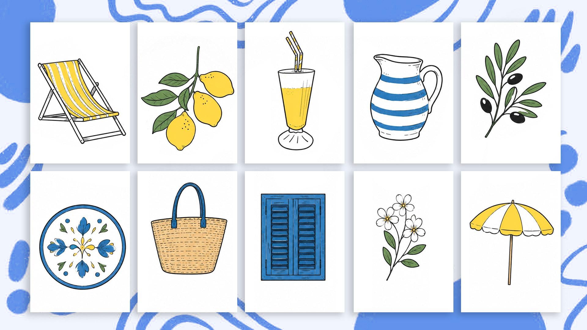
2. Your project: For your class project, I would love if you can create
your collection of illustrations using the workflow and tools that we
build together. I would suggest creating at least three objects
because that's when it starts feeling like a collection rather than
some loose drawings. And just in case you
want to keep going, I have left extra reference
images for you to trace. The more you build
up your collection, the more fun stuff
you can do with it. If you're a complete beginner, I recommend following along
with the exact objects. I'll be drawing first. If you have a bit more of experience, then, please make this
project your own. Of these objects is designed to teach you specific
tools and techniques. And once you've got those down, you can take the
workflow anywhere, your own photos, your own
objects, your own references. And the world becomes
your sketchbook. And I warn you once
you get the workflow, then this becomes
pretty addictive. Later in the class,
I will show you how to recolor your
illustrations easily. So if you experiment with
different color combinations, I would love to see
those in your project when you finish
your illustrations, please share them in the
gallery of this class, and you don't have
to wait until you finish all of your
illustrations. You can create your
project after finishing the first one and then update
your project as you go. If you turn your illustrations into WhatsApp or
Instagram stickers, which I'll show you how to do, you can share that part
of your project by taking a screenshot and uploading
it to the gallery as well. Even better and way more fun. You can post a story on
Instagram and tag me because I would get so
excited to see your stickers, and I would share them
with my followers, too. If you enjoy the
class, you learn something new and you want
to support me as a teacher, I would appreciate if
you can review it. It doesn't have to be long. Reviews help my class,
gain some visibility, and they motivate me to keep creating more
classes like these ones. This is part of a series of classes with more
coming your way. So if you like this class, make sure you're following
me here on Skillshare, and that way, you
will be the first to know when the
next one drops in. Alright, that's it. Let's open Procreate and let's start
creating our illustrations.
3. Opening Your Canvas: Before we start drawing, let's quickly create a
canvas that works well for both digital and future creative
projects like patterns, stickers, prints or
social media graphics. Don't worry too much about memorizing all of
these settings. This is probably the
most technical part of the class, and honestly, once the canvas is ready, we can fully focus on
the fun creative part. When you first open Procreate, you will arrive at
your gallery view. This is where all of your
artworks and projects live. You can organize
artworks into stacks, which basically
works like folders, but don't worry too much about organizing everything
perfectly right now. Let's create a new
canvas together. The little plus symbol on
the right corner and then tap the smaller plus icon
to create a custom canvas. For this class, I'm going to create a square canvas that is 3,000 by 3,000
pixels at 300 DPI. This is roughly ten per 10
" or 25 per 25 centimeters. The reason we're working at
this size is simply to keep our illustrations looking crisp and high quality later on, especially if you want to
reuse them for patterns, prints or other projects. For the color profile,
make sure you select the regular RGB profile
instead of display P three. RGB tends to work much more consistently across
devices and platforms. Once your settings are ready, you can name this
untitled Canvas with the pixels
that you're using. And this way, it will be
saved as a template and will be ready for you to use for any other future projects. So tap on the blue check here on the right
corner of the screen, and this document will open. Now, if you tap on
the gallery word, you'll go back to the
main gallery, and now, if you tap on this plus icon
and scroll down this menu, you'll see your new template
here at the bottom. You can send it to the top by holding it down and move it
to the top of this menu. Next time you want to create
this type of illustrations, you will know that it's up here, ready to be used, and that
it has the right settings. Let's keep our document open. Alright, now that
our canvas is ready, let's start gathering
some inspiration and references for
our illustrations.
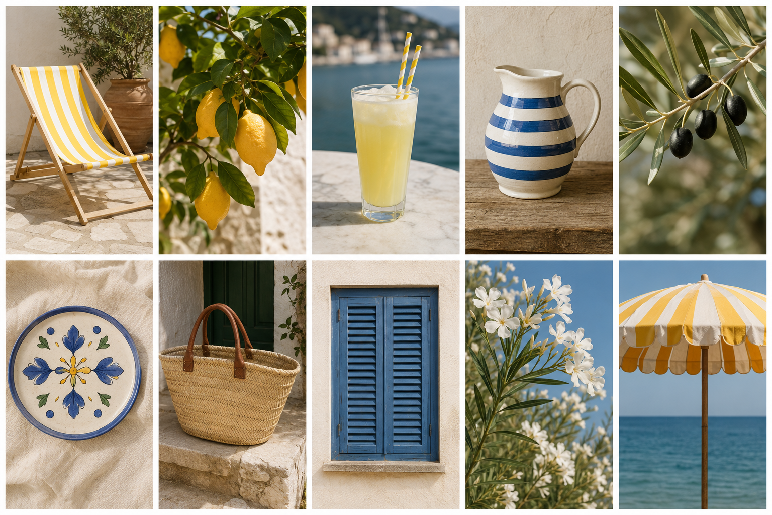
4. Gathering Inspiration: If you want to start
your project right now, read the description of
this class and download the ones that I
have left for you and move on to the next lesson. But if you want to
create something unique, let me show you a few ways
to gather reference images. Let's start by finding
images online. You can search for inspiration
almost anywhere online. I personally like using
sites like Google Images, Pinterest, Excels, and splash. And if you're looking for
objects or furniture, brand websites can actually
be amazing references too. I sometimes browse
places like Ikea, Slum, or Cave Home because
their product photography is usually clean and simple, which works perfectly
for this technique. Start gathering a
few Mediterranean inspired references
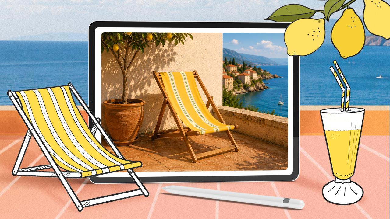
for our collection. I'm going to begin with a
lemon tree branch because lemons always feel very summary
and Mediterranean to me, and lately, they always
seem to be on trend. Even so this image has a
tiny checkered background, I think that it could work
and I like its composition. The limes are isolated from the background, and
so it should work. So in this case, I
can simply tap and hold the image and
choose safe two photos. Easy. Let's look
for another object. I associate Mediterranean
with going on holidays, and when I go on holidays, I really like to take some sun. So I'm going to
look for a lounger. I really like these striped
loungers because they can instantly create that
relaxed holiday feeling. Sometimes websites don't let
you save image directly. When that happens,
you can simply take a screenshot instead. On the iPad, you
will have to press the top button and the volume
button at the same time. Before the screenshot
disappears, you can tap on it and crop it
tightly around the object. You can even save
multiple screenshots or similar objects
on different angles. That becomes really
useful later on if you decide to create patterns or larger illustration
collections. Also, in this case,
I can see that this lounger has different
options for patterns, and that is already giving me ideas on things that
I can paint on mine. So whilst you search
for reference images, keep your mind active. We on your creativity? If you see a chair
that you like, maybe you can start thinking how you can modify that chair. What color do you
want to change or what patterns do you want
to add to the fabric. Let's see how to choose reference photos that
you take yourself. You can absolutely use
your own photographs, too, and honestly, this
is where things become much more personal
and interesting. Your own photos hold
memories, moods, places you've been,
objects from your home, or moments from your life. Those little details can give your illustrations
much more personality. Here, for example, I have
a photo of a drink I had during a weekend
trip near Barcelona, a simple image and
honestly not the best. I didn't take this photo with the intention of
painting it later, but since it holds
a nice memory, I'm going to try and use
it for this also fits perfectly into the
Mediterranean mood and creating for
this collection. I wanted to introduce a new way of finding inspiration that
I've been using a bit lately, and it's called AI, whether that's HAGPT Cloud or
whatever tool that you use. If you're curious,
you can also prompt HAGPT to create images for you. So for example, I have the
photo of the pinacada, which I'm aware that
is not the best photo, but it served as an example. So I uploaded it to
HAGPT and I said, Can you refine this photo and
create something similar? And this is what it dropped me. So you can prompt
HAGPT to create images that you can also
use as a reference photo. Your time collecting some images that you want to illustrate. I'm going to leave you these
exact three images I'm using on the downloadable folder that comes with this class.
5. Importing References into Procreate: Okay, so now comes the
fun part and honestly one of my favorite little tricks for working with references. Before we start
importing our images, I just want to do a super
quick introduction so that you can follow this lesson a little bit better if you're
a complete beginner. You have two menus here, one on the left, and
one on the right. In this icon here, you will
find the layer panels, which we're going
to be using a lot. Whilst importing our images, we're going to start pasting
them here into Procrit. And to do so, you have to
swipe three fingers down, and then this menu will appear, and in here, you will
find the paste option. All of these other buttons we will use as we move
through the class. So for now, let's swipe
a finger app from the bottom of the screen and tap on the photo gallery icon. I'm going to open
my photo gallery again and tap on one of my reference images and isolate the object
that I want to draw. If you're using an iPad, watch this because
it's a lot of fun. You can tap and hold
your object down and see how this isolates the
object from the background. In this case, it's
super easy because this object is photographed
over a white background. Then you can let's do that
once again, tap and hold. Then this menu will
appear somewhere. Tap on copy, swipe your finger from the
bottom of the screen up, tap on the procrete up, swipe three fingers
down and tap on paste. You're going to
tap on a low paste and the object is going
to appear on your canvas. You can see a bounding
box surrounding it. Here at the bottom,
you have this menu, select the uniform
option so that the proportions of your
object remain intact. And if you slide any
of these corners, you will be able to enlarge and make your objects smaller. You can also move your object. Just be careful not to
move it outside because then it will be cropped and then you will lose
part of your image. And then to exit
this transfer mode, you have to tap on the arrow
icon up here on the left. If you want to
transform it again, tap on this arrow icon, which is the move and transform tool and transform it again. You can see that
this object has been imported onto its own layer with a transparent background, which is pretty cool. I remember the first time I discovered this and feeling
like it was a bit of magic. Don't worry, if it doesn't work perfectly with every image, it usually works best when the objects have clear
contrast with the background. So when your images are not too cluttered and they're
separated from the background, even on this case that it has a checkered background,
let me see. Coping. Paste. It works, it works. It works. It's great. Now, in this one, it might be a little
bit more difficult, but in the end, it also worked. I'm going to tap and hold
on this baby coping. And paste. That's
pretty cool, isn't it? It didn't work though
with this Bermud class. Maybe it's because it's
in the background, but in that case, if for whatever reason, you cannot copy your images
as stickers, don't worry. You can also tap on the
range icon, tap on add, and here you can tap on insert photo and you can
just tap on the image, you can adjust the size
so that your object covers a good portion of your canvas and then it
will be pasted in there. Why is this sticker
thing so cool? Since this is a
beginner's class, we're just going to create some stylized illustrations
using ink. But the cool thing
about working with stickers is that you can
also start composing scenes. Let's say that this is a
branch and a rosemary branch, and then this would leave
maybe on the floor, and then I'm on the pool, and this is where I'm
going to come back to. Just giving you some ideas here. For now, import your
references onto your document, and in the next desen
we will turn them into our own stylized
illustrations. M.
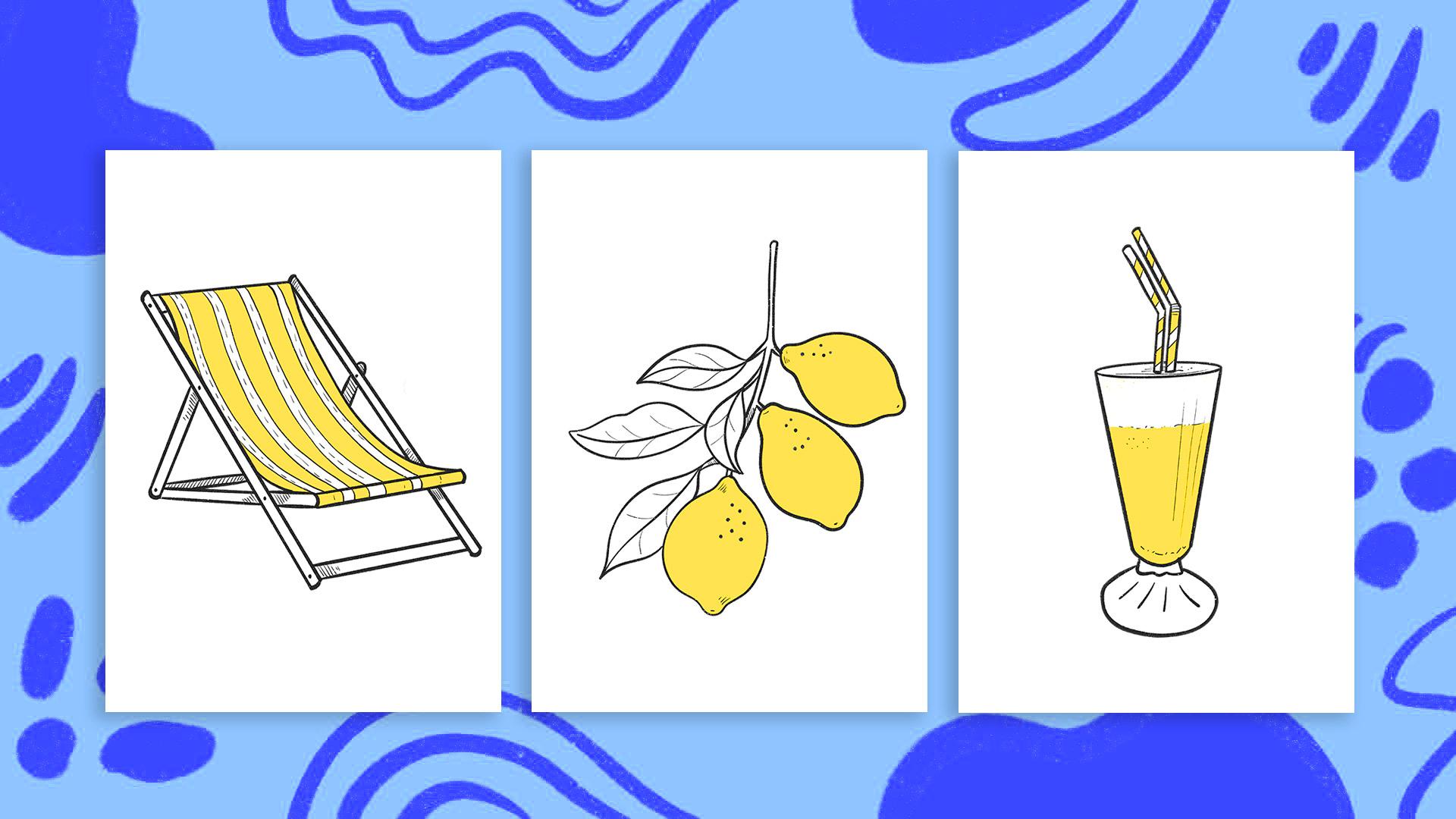
6. Drawing the Sun Lounger: Okay, let's turn our reference
into an illustration. The first thing I'm
going to do is lower the opacity of the
reference image so that it becomes
a bit lighter and less distracting while
we draw on top of it. Then we're going to create
a new layer on top, where we will draw
our illustration. To create a new layer, simply tap on the plus
icon in the layers panel. You will see the new layer
highlighted in blue. If you swipe a
layer to the left, you will find options like
delete, duplicate or lock. You can also make
layers visible or invisible by tapping the
little checkbox beside them. For this class, I'm going to use the dry ink brush because it creates clean,
confident lines. But please feel free to use any other brush
that you enjoy. The important thing is
finding something that feels comfortable and
you can keep consistent. Just in case you're
new here, let me show you a few useful tools. On the left side of the screen, you will find these sliders. Use the top one to
regulate the size of your brush and the bottom
one to regulate the opacity. And remember, procrete brushes
are pressure sensitive, so pressing harder
creates thicker lines. To finger tap to undo and
three finger tap to redo. If you struggle creating
straight lines, here's a trick that
will help you. Go to actions, preferences, search for pressure and
smoothing and increase the stabilization and motion
filtering bars a little. You will see how your lines
instantly become smoother. When you move into
smoother details, come back and turn them off if these effect starts
feeling too restrictive. Okay, time to start our drawing. This lounger has a lot
of straight lines, and let's be honest, drawing straight lines perfectly
can be a bit painful. So here's a super helpful trick. Draw your line and keep your pencil pressed
down at the end. Procreate will automatically
straighten it for you. And by the way, you can do the exact same thing with
circles and other shapes, too. When developing your drawings, always try to focus on
the larger shapes first. You can always come
back and enjoy drawing the little
details later on. Here's another useful
trick to zoom in, pinch your fingers out, to
zoom out, pinch them in. If you pinch and
twist your fingers, yes, you can rotate
the canvas too. This makes awkward angles
so much easier to draw. I'm going to rotate
my canvas slightly to make it easier to close
the legs of my chair. Before I forget, always try to close your
shapes properly. This will make the
coloring process much easier and much
more fun later on. If you're copying
this chair with me, you're going to be a master at creating straight lines in
procrete by the end of it. Mm. I'm going to use this part of the chair
to show you a new tool. This part of the chair
goes on top of the leg, so I will just draw
two straight lines on top of it and use the
eraser to fix it. At the moment, I have a very
random eraser selected. And to keep the style of my
illustration consistent, I would like to erase with the same brush
that I'm painting with. To do so, you'll have to
tap and hold on your brush, and you will see this erase
with current brush message. I don't know about you, but
when I draw traditionally, I'm constantly rotating
my paper around. Certain angles just feel much more comfortable for
the wrist and hand. Now, technically, I could rotate my whole
iPad the same way, but that would probably
look a bit ridiculous. So instead, I rotate the canvas all the
time whilst drawing. For example, drawing
this curve with the canvas completely straight
feels a bit awkward to me. So I'm going to twist my canvas until the movement
feels more natural. Even so I don't like this line, it does feel more comfortable.
And you know what? Redrawing lines multiple
times is completely normal. Thankfully, Procrite gives us
the magic of undo and redo, which makes experimenting
way less stressful. See how I am focusing first
on the larger shapes. Once I've got this
right, it will be so much more fun to start
playing with the details. Talking about details,
I remember seeing some really cute fabric
decorations for this lounger. So I'm going to go
ahead and try a few. For decorative details, I like creating additional layers. That way, I can test different ideas without
affecting the main illustration. If you're going to draw stripes, it definitely makes sense to leave the photograph visible. Remember to rotate your canvas. I don't want you to end up this class with
paint on your wrist. Okay, how cute is this drawing? The great thing
about having done this in a separate
layer is that I can turn the layer off and test a new decoration
on a new one. Feel free to try as many
decorations as you want. To keep things nice
and organized, we're going to place all
these layers into a group. To select multiple layers, simply swipe them to the right. And if you accidentally
select one you didn't want, swipe it to the right
again to deselect it. Once you've selected all
the layers you want, tap group at the top, and a, everything is neatly
organized inside a folder. If you tap on the folder, you can rename it and
group the layers or flatten everything
into a single layer later on if you need to. Once you're done, meet
me in the next lesson, where will turn our
lemon tree branch into a beautiful illustration. When you finish
your illustrations, please share them in the
project gallery of this class, and you don't have
to wait until you finish all of your
illustrations. You can create your project
after finishing the first one and then update
your project as you go.
7. Drawing the Lemon Branch: Once again, I'm going
to lower the opacity of my reference image and
create a layer on top. To keep a cohesive visual style across all my illustrations, I'm going to continue
using the dry ink brush, but feel free to experiment
with any brush you enjoy. Having said this, I would advise to keep a consistent style
across your illustrations. The goal here is not to copy
the reference perfectly. Instead, we're
simplifying shapes and turning them into
stylized illustrations. In fact, it's actually
a really good thing if your drawings start drifting away slightly from
the original photo. That is where your own
style begins to appear. Think of the photo more as a guidance rather than something you need
to trace exactly. Sometimes certain
areas can feel too complicated or visually messy
like this branching here. If that happens, you
can simplify them. You can remove details, change proportions,
adjust curves. You're the artist here,
and you don't need to stay loyal to
the original image. We're just borrowing
the composition and overall shapes
as inspiration. One thing I do
recommend, though, is making sure your shapes
are properly closed. Try not to leave small
gaps in your outlines. Closed shapes make
it much easier to drag and drop color into
your illustrations later on. You will notice that
this process becomes surprisingly fast once you stop worrying about perfection. We're creating playful
stylized assets, not hyperrealistic drawings. Now that my shoid is done, I'm going to add a
few tiny dots and marks here and there to create a little
texture and movement. These small imperfections
actually help digital illustration feel a little bit warmer
and more organic. I didn't mention
this, but I created the branch and these little
details on a separate layer. So I'm going to open
the layer panel and show you how to
merge your layers. To do that, simply pinch the
layers with two fingers. Procreate will combine
them into a single layer. If your illustration
contains multiple layers, you can select several at once and pinch
them together too. This will keep your files organized as your
collection grows. In the next lesson,
I'm going to show you how I draw this pina cola.
8. Drawing the Piña Colada: Time to draw the pina gelada. As always, I'm going to start
by lowering the opacity of the reference image and creating a new layer on top, just
like we did before. To keep my collection
visually cohesive, I'm still using the
same dry ink brush and roughly the same brush size. I'm going to begin with
the larger shapes first, starting with these
two diagonal lines and using the trick
of leaving my penda. I'm going to loosen things
up a little bit for this bottom part and simplify
the basic structure. Now, as I said before, the trick of leaving
your pendum also works when drawing
circles and ovals. So for this top part, I'm
going to draw an oval, leave my pendum and see
how it has become perfect. You can take this further and
tap on the ellipse word up here to align the sides of your oval to the
lines of the glass. When drawing the straws, I'm going to give
myself the freedom to invent them a little bit rather than copying
them exactly. For me, it is more
important that the glass feels sturdy
and believable. Of course, if you want a more exaggerated or playful style, you can absolutely push certain proportions or
simplify shapes even further. Okay, now that the
main structures of our illustrations
are finished, we can move on to the most
fun parts of the process, adding little details,
texture and personality.
9. Adding Details & Personality: At this point, our
three illustrations already start feeling like a
small cohesive collection, which is honestly really
satisfying to see. Of course, feel free
to keep creating more objects and expanding your collection as
much as you like. But for now, these
three illustrations are already enough for us to
start practicing the tools, experimenting with details, and having a bit more
fun with the style. This is the stage where
the illustrations slowly stop feeling like traced references and start feeling much more like
your own artwork. Since we've just finished the main structure
of the pina cola, I'm going to start adding
some extra details to it. Using a smother brush, I'm going to add little dots
of texture here and there, a few extra lines and
small decorative marks. This stage of the creative
process is really fun as there is no stress
on getting things right. By focusing on the larger shapes first and moving on
to the details later, you can start infusing
your personality onto your illustrations. And look how with just
a few tiny additions, the illustration already starts feeling much more
interesting and alive. Okay, to keep things organized, I'm going to group my layers and move on to the lemon branch. Using the same smaller brush and making sure I'm working
on a different layer, I'm going to add a few details. At this point, I'm starting
to feel like the pressure and smoothing settings are making
my lines a bit too stiff. So I'm going to quickly turn the motion
filtering down again. Remember that you can do this by going to the action spanel, going to preferences and tapping on pressure
and smoothing. Lower the effect and
you're good to go. One thing you'll notice
is that I'm no longer keeping the original photograph
visible all the time. I've mostly turned the
reference off now, and this gives me
much more freedom to invent small details and experiment a little
bit more naturally. And this is really the moment where the illustrations
stop feeling like traced images and start feeling much more like
your own artwork. Okay, this is looking very cute, so I'm going to open
the layer panel, group these layers, and
move back to the lounger. I know that we had tried a few decorations
on separate layers, but I think that we can
still work this a little bit further so that it style fits nicely with the
other illustrations. As always, I'm making
sure to be working on a separate layer so I can experiment without affecting the main illustration
underneath. For example, I quite like the dash line in
between the stripes, and I'm also using little
groups of lines in areas where the objects overlap to suggest
shadow and depth. Usually the elements
sitting behind another one will naturally
appear a little darker, so adding a few simple lines is an easy way to
communicate that. You know what? I'm
starting to notice that these decorative lines feel slightly too thick compared to the rest of the collection. And when line thickness change too much
between illustrations, the overall style can start feeling a little
bit less cohesive. So to keep everything
feel visually connected, I'm going to lower the opacity, create another layer on top, and withdraw them
using a thinner brush. As you can see, this
is one of the reasons why working on layers
is so helpful. It gives you the
freedom to adjust, refine and experiment without having to restart
your illustration. And another great thing
is that then you can activate the layers to
compare the difference. In this case, I actually
prefer the thinner lines. Okay, now that our
drawings are ready, I'm going to show
you how to start adding a few areas of colors, and I'll keep sharing some
extra procreate tricks and features along the way.
10. Adding Colour to Your Illustrations: Okay, now that our
illustrations are finished, I'm going to show you how to start adding some color to them. We're going to keep things very simple and continue
working with layers. By doing so, we can keep experimenting without
ruining our drawings. At this point, I like
cleaning up my file a little bit and deleting
any layers I no longer need. I'm also going to duplicate
this lounger group just in case I want to test
different patterns or decorations later on. If you're following along,
please flatten one of the two. Now, to start coloring, we're going to
create a new layer. At the moment, it's difficult
to know which layer is containing the
drawing because we did it with a dark gray. You can rename your layers if you want to by
tapping on the layer, selecting rename, and you
can give it a name in there. We're going to add color
on this new layer, and I prefer keeping it
underneath the drawing. To color your
illustrations in procret, you simply have to drag your active color
onto the canvas. Right now, the color is flooding the entire canvas because
this layer is empty. What we want is
for Procrit to use the drawing above as a guide
whilst we color underneath. To do that, tap on the drawing layer and
select reference. This will tell Procrite to detect the closed
shapes from that layer, even if we're coloring
on a different one. So now when I drag the color in, it stays nicely contained inside the illustration without
affecting the original linework. Now, when you drag a
color into a shape, keep your pencil pressed down
on the screen for a second. You will notice that if you slide your pencil left or right, a percentage bar
appears at the top. This is called the
color threshold. Basically, it
controls how much of the surrounding area
procret fills with color. If the threshold is too high, the color might slip
outside your shape. And if it is too low, you might end up with little
white caps around the edges. So usually you just want
to slide your pencil left or right until the
fill looks nice and clean. See how now if I open my layer panel and make
my drawing invisible, the layer below has taken the drawing as a reference
to keep the color contained. Once you have filled one area
and adjusted the threshold, you can continue filling and quickly color multiple
sections using the same color by
tapping always adjusting the threshold so that the color is contained where
you want it to be. That's all the color I'm
going to give to my lounger. So I'm going to open
my layer panel, group these layers, and
why not rename my group? Since I'm starting
to lose daylight, there is something
I want to show you. I'm going to quickly
switch my interface to light mode by going to the actions panel and
under preference, toggle on the light
interface switch. Since we're simply
repeating the same steps, I'm not going to narrate the
process for these lemons. But while coloring
the pina colera, I run into a small issue that
you might come across too. After setting the drawing
layer as a reference, I started filling some areas. On the straws, I only want to color part of
the straw pattern. But when I drag the color in, procreate fills the
entire shape instead, and that is happening because my drawing is split
across multiple layers. If this happens to you,
you simply have to open the layer panel and merge the layers that
contain the linework. Now when I drag the color in, it stays nicely contained
where I want it. You can also use the
eraser tool if there are any small colored areas you
want to clean up or remove. If you want, take some time organizing your
layers into groups. And once you're done,
meet me in the next one, where I will show you a
few easy and fun ways to experiment with
color in procreate.
11. Easy Ways to Recolour Your Artwork: My goal with this class
is to introduce you to as many useful procre
tools and tricks as possible without making
things feel too overwhelming. In this lesson,
I'm going to show you a few really easy ways to recolor your illustrations and experiment with different
color combinations. Before we start
experimenting with colors, I recommend duplicating the procret file
from the gallery. To do so, tap gallery, swipe left on your artwork
and tap duplicate. This will allow
you to freely test different color
combinations without worrying about ruining your
original illustrations. You can still drag
the active color to recolor your illustrations. But what if you want
to quickly change an existing color without repainting the whole
illustration again? This is where the alpha
lock becomes really useful. To activate the Alpha log, either tap on your layer
and select Alpha lock from the dropdown menu or simply swipe the layer to the
right with two fingers. You will notice a little
checkered background appear behind the
layer thumbnail. That is how you know
Alpha Lock is active. What Alpha log does is the transparent
areas of the layer, meaning any changes you
make will only affect the artwork that already
exists on the layer. If I tap on the layer
and choose fill layer, Procreate will instantly recolor only the visible artwork instead of filling
the entire canvas. I had pink as my active color, but you can choose any
color that you want. This makes experimenting with color combinations
incredibly fast and fun. The fun part is that
you can also recolor your linework the
exact same way. So you can start
testing colors of different styles and
moods very quickly. Another really
useful way to modify colors is through the
adjustment panel. Tap on the little magic one icon and open hue saturation
and brightness. With the hue lighter, you
can quickly shift through different colors so you can visually decide on
the one you like. Saturation controls how vibrant
or muted the colors feel, and brightness lets you make the artwork lighter or darker. This is one of the
easiest ways to test different color palettes without repainting everything
from scratch. Now you can also combine the
alpha lock with brush tool. I'm going to activate
the Alpha lock option of my pina colata. And, for example, I can select a slightly darker version of the same color and
start painting certain areas to add a little
more depth and variation. One important thing to remember is that when Alpha
lock is active, you can only paint on
areas that already exist. So if suddenly you
notice that you can't grow outside of
the existing shapes, simply deactivate
Alpha lock first. See that now, I can go back and paint in areas that
weren't there before. One last quick tip. If your color drop suddenly
starts behaving strangely, it's because probably
another layer is still set as reference. So always make sure the
correct drawing layer is selected as the active
reference before coloring. In the next lesson,
I'm going to show you how to add a
white background to your illustrations before exporting them into
your image gallery.
12. Adding a White Background to Your Illustrations: I hope that you had some fun recoloring your illustrations. I'm going to go back to my
original ones because I really like how simple and graphic they look at the moment. Right now, these illustrations have a transparent background, which is completely fine. But sometimes that can become
a problem if you want to place them over darker colors
or different backgrounds. So let me show you
a really quick way to add a solid
background behind them. For this, we're going to use another useful Procreate
tool, the selection tool, tap on the selection
icon up here and make sure the automatic
option is selected. Now, tap on the background area. You will notice it becomes
highlighted in blue. Just like when using color drop, you can slide your pen left or right to adjust
the threshold. The higher the threshold, the more areas Procrit selects. So simply adjust it until the whole background
is selected cleanly. You can also tap on
additional areas if needed. Right now, the
background is selected, but we actually wanted to
select the illustration itself. So tap invert at the bottom. And now our illustration
is selected instead. Next, open the layers
panel, create a new layer, choose white or any
color that you want, and tap Fill layer. This instantly fills the selected illustrations
with a solid color. And now simply drag this layer underneath your artwork,
and there we go. We now have a version of the
illustration that works much better on darker backgrounds
or colored surfaces. I'm going to repeat the same process with
my lemon branch. Automatic selection,
adjust the threshold, invert the selection,
create a new layer, fill it up and place it
underneath the artwork. Once you understand the logic, the process becomes really fast. And now that our illustrations
are properly prepared, we're going to export them and start using them for patterns, stickers, mockups,
Canva projects, or any creative
project that you like.
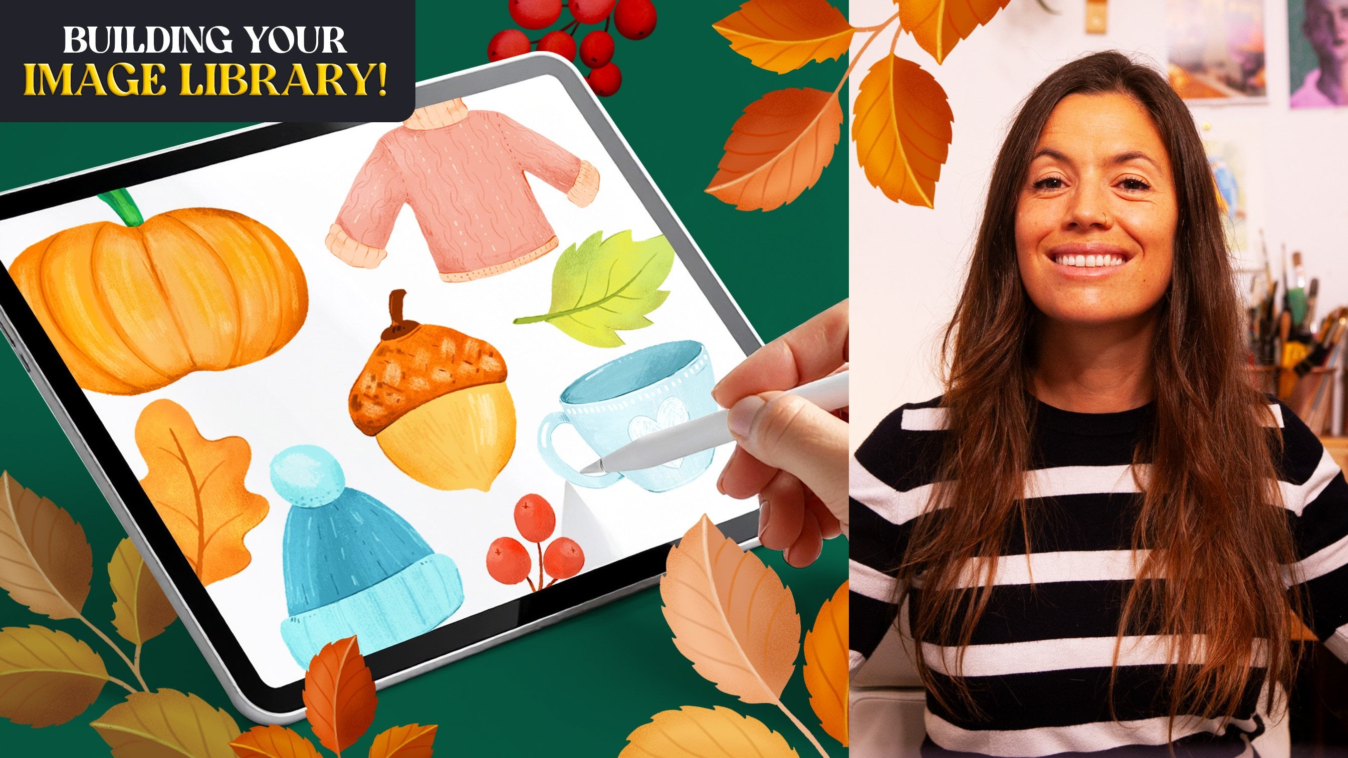
13. Exporting Your Illustrations: In this lesson, I'm going
to show you how to export your illustrations and start building your own image library, basically a folder
where you keep reusable illustrated assets
for future creative projects. Let's start by exporting
our illustrations with transparent backgrounds so we can later use them
in Canva patterns, stickers, social media, and
lots of other fun projects. First, you got to make sure
that the background layer is turned off so the background
becomes transparent. Then making sure you
have the version of the illustration that you
want to export visible, open the actions panel, go to share and select PNG. Then simply tap Save image. I'm going to repeat
the same process with all my illustrations before heading over onto
my photo gallery. PNG files preserve transparency, which makes them perfect for
reusable illustrated assets, and a great thing is that they preserve their
quality over time. And now if I open my photos up, you can see all my exported
illustrations saved in here. One thing I personally
love doing is creating a folder
called Image Library, where I store all the
illustrations I create, whether they're for
professional projects or simply just for fun. Over time, this becomes an incredible useful
collection of assets that you can reuse
across all sorts of projects. You also don't have to export only one final version
of each illustration. Sometimes I export
colored versions, linework only versions or slightly different
color variations. Experimenting with
multiple versions can lead to really
fun results later on. So feel free to export as many variations as you like and upload them as part
of your class project. I would absolutely love
to see what you create. In the next lesson, I'm going to show you a few fun ways you can start using your illustrations
in real creative projects.
14. From Illustrations to Stickers: Okay, so by now, you should have your beautiful
illustrations exported as PNG files with a
transparent background sitting nicely in
your image library. And today, I want to show you a few fun ways to actually use them because
here's the thing. Your illustrations are way too beautiful to just be
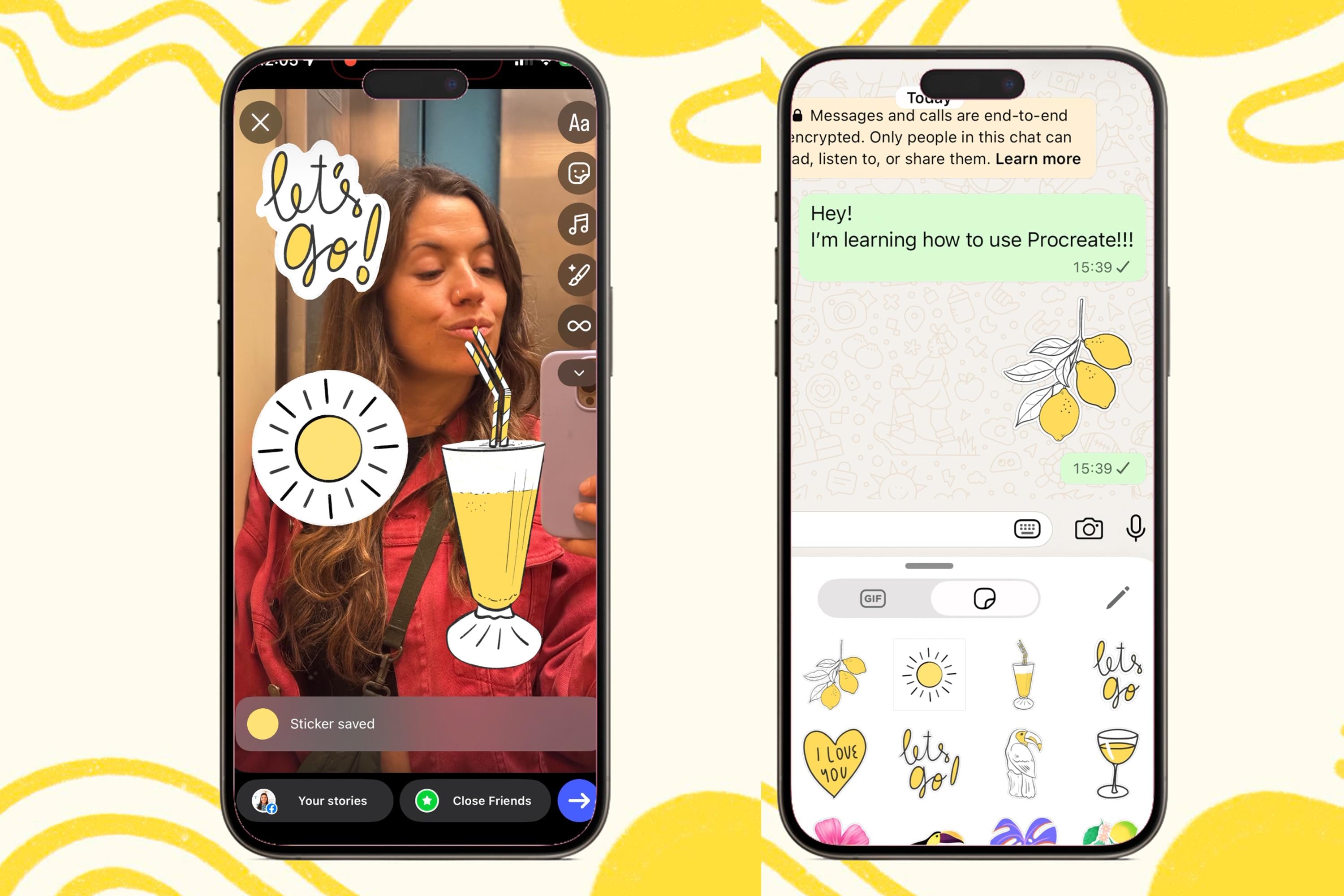
sitting on your iPad. Let's start by opening WhatsApp. Open a chat and tap
on the Imog icon. Usually, you will open your recently used Imoges which appear under an icon
that looks like a clock. On the left hand, you will find an icon which looks like a
folded circle, tap on it. Will open this window where you can start
creating your own stickers. To do so, you will have
to tap on this icon here and you will access
your photo gallery. If you've imported
your illustrations into your iPhone, they
will appear in here. Tap on the illustration
that you want to turn into a sticker and
tap on the plus icon, and this will add
your illustration to your Whatsapp
emojis collection. Now, I have found
some illustrations to work better than others. If it's a complete object,
it usually works well. But if you're importing text or illustrations like this sun, which has single sticks, it doesn't work that well. So I invite you to
experiment with different illustrations and
see which ones work well. You can add a few effects to your illustrations by holding them down and tap on at effect. Down here, you can
add an outline, you can add a puffy
effect or a shiny effect. Now let's open Instagram. I'm going to tap on
story and select this silly Selfie I took the
other day on an elevator. In here, you have to
tap on the icon that says stickers and
then tap on Katats. This will take you
to the photo gallery where you can select
your sticker. Tap on use sticker, and this will appear
on your story. Some stickers tend
to work better on Instagram What's
Ap, but once more, I invite you to experiment with the ones that you make and let
me know what do you think. If you make Instagram stickers, it would be so much fun
if you can tag me at sylvispina dot art or
slaspina dot creative, so I can get excited, see them and share them
with my followers as well. Many of my classes, I
teach how to create standalone illustrations that
you can turn into stickers. As you can see, I have been adding loads of them
into my gallery, and I love decorating my stories or sending them to
friends once in a while. If you're ready to keep going
in from Procreate to Canva, I'll show you how to turn your artworks into
printable designs, mixing your illustrations
with text to create wall art, greeting cards, social
media graphics, printable calendars
and stuff like that. You're interested in
seamless patterns, I also recommend taking my
class patterns in Procreate, supercharge your workflow
with an image library. You will learn a simple
method for building repeats, the key fundamentals
for designing successful patterns and how to visualize your work on products.
15. Final Thoughts: Congratulations on
finishing the class and for getting all
the way until the end. I'm really grateful for that. I hope that this project and class helped you feel
more comfortable using procreate and showed you
that creating this type of illustrations doesn't have to be overwhelming or
overly complicated. One thing that I personally love about digital
illustration is that every single drawing
that you make can slowly grow into a collection of
reusable creative assets. So a small sketch can
later become much more. It can become a sticker. As I showed you in this class, I can become a pattern, a social media graphic, a Canva element, or part of a larger
illustration collection. I would really encourage
you to continue building small Illustration collections
inspired by places, objects, travels,
holidays, nature, or anything that
captures your attention. The more you create,
the more naturally your own visual style
will begin to develop. If you enjoy this class, don't forget to upload your
project to the gallery. I absolutely love
seeing your work, and it also inspires other students to start creating
their own projects, too. And if you like to
continue learning with me, you can also check out my
other Procreate classes, illustrations, and pattern
designs here on Skillshare. Thanks so much for
taking this class, and I will see you
in the next one. M.
 Silvia Ospina, Artist and Graphic Designer