Transcripts
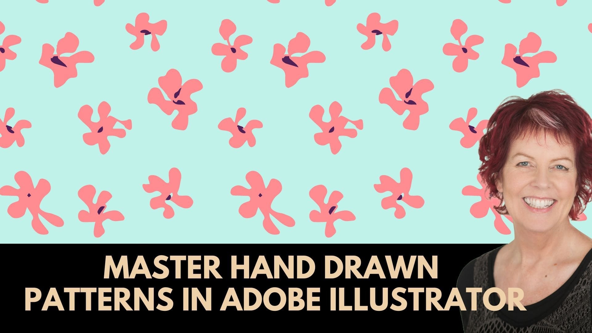
1. Intro to Diamonds and Crystals in Illustrator: Hello, and welcome to
this class on creating diamond and crystal patterns
in Adobe Illustrator. My name's Helen Bradley and
I'm a Skillshare top teacher. I have over 280 courses
here on Skillshare and over 178,000
student enrollments. In this class, we'll look
at drawing diamonds and crystals and creating seamless repeating patterns from them. As well as drawing
these designs, you'll learn handy ways
to color them using the live paint tool gradients and the recolor
artwork dialogue. I'm willing to bet that
there's a technique used for the crystals pattern
in the very last video that's going to surprise you. Did you know that you can adjust saturation and brightness globally in Illustrator where you can and you're
going to see how. In summary, you're
going to learn how to use the pen
tool to create shapes, how to manually trace a drawing. How to use the live
paint feature and create custom color schemes. You'll learn how to
adjust saturation and brightness for an entire design, to invert colors
inside a pattern, to edit gradients in the
recolor artwork dialogue, to use brushes for highlights, make patterns in Illustrator, and edit those patterns. In this course, I'll
take you through creating each design
step-by-step, and I'm going to give you
starter sketches to use too. So that by the end of the class, you'll have a range of
finished designs ready to use. Of course, along the
way you're going to have learned handy tips and techniques for working in
Illustrator every day. Without further ado,
let's get started making diamond and crystal patterns
in Adobe Illustrator.
2. Pt 1 Select Colours and Draw the Diamond: To get started with the
first of our patterns, I'm going to click to
create a new file, and just make a document 1,000
by 1,000 pixels in size. Now, I want some
colors to work with, so I'm going to open
up my swatches panel. I'm going to swatch
libraries menu. I'm going down here to nature, and I'm going to
choose landscape because here in landscape, is an interesting set of colors. It's this set here. If I simply click on it, you'll see that it's added automatically to
my swatches panel. I'm going to increase the
size of my swatches panel, so I can see what's going on. I'm going to grab this mountains color
scheme that I just got. I'm going to drag and drop
it onto the plus sign. I'm going to do it
a couple of times, but I'm actually going
to just move them, so they're underneath
each other, so they are going to
be a little bit easier to see and make use of. I've got the exact
same color scheme here in my swatches
panel four times. I'm going to make
sure that if I had anything in my document,
it's not select. That's really
important that nothing is selected in the
document right now. I'm going to click on the color group little
folder icon here, so that selects all the colors. I'm going to click
"Edit Color Group". Now, once I get into here, I'm making sure I'm
in the edit area. Right now, my colors are locked, so I'm watching them up here, and I can drag them around, so I can change how
these colors look, so I could make
them, for example, a lot more pink. Now, I could also break
out individual colors by clicking here on
"Unlink Harmony Colors", and then I could go and drag out individual colors into
different places. It is of course, a
little bit tricky sometimes to pick
up these colors, so you might need to click on
a color in the color group, and that will indicate
in here where it is. You can also drag on
the color sliders here, so you can see that I'm actually pulling the color out
where I can find it a little more easily before I go and tuck that back in
where it came from. When you've got a color
group that you like, you're just going
to click "Okay", and you're going to say yes, I do want to save
changes to this group. I've used the mountains
color scheme to adapt it, to create a different
set of colors, but still in these same tones. I'm going to do it again. Click on this one. Click on "Edit Color Group". Again, come back here. My colors are locked right now. I do want to head to these
pinks and mose in this area. I don't really particularly
want a lot of these gray, so I'm going to
try and find them. Let's just increase
the saturation until we can locate them here and pull them back
into the colors a bit more. Again, I'm going for this one. Increase the saturation
a bit on that. I can also change the hue here. When I'm happy,
I'll click "Okay", and say yes to changing
the color scheme. I'm ending up with slightly
different color schemes. This one's pretty close, but not exactly the same. I could do it again
and I could make it, for example, into the greens. Let's just take this one. Let's move it into
the greens here, maybe picking up one of these and making it
a little bit greener. Maybe picking this one up here and making it also
a little bit green. When I'm happy,
I'll click "Okay", and say yes, I do want
to save a copy of that. We have different
color schemes now that we can make use
of in our document. To see what's going on, I'm going to add a
rectangle to my document. The size of my
document in this case it's 1,000 by 1000 pixels. I'm going to square it
up on the art board. I'm going to make sure that I'm targeting the fill
here as black, and I'm going to
remove the stroke. Again, that's pretty important. I'm going to the layers panel, open up the layer here, and I'm going to lock this down, so I can't select it, can't move, can't do anything
with it. That's just fine. Now, I'm going to start working
with white as my color. I'm clicking in here making sure it's 255 in the RGB
channel, so that's white. I'm going to use the pen tool, so I'm going to click
on the pen tool. Of course we want that to
be a stroke and not a fill, so I've flipped those across. We're looking at
the white stroke, and I'm going to create
a diamond shape. Now, for this one, I want it to be six sided at the top, so I'm going to click,
and I'm going to draw something that
is roughly six sided. Now, I don't want
this to be perfect, and so I'm going to
make sure when I say the smart guides appear, then I'm actually
not going to use that particular
position because I do want this to be a
little bit whimsical, a little bit less than perfect. Now, I've got my six
sided figure for the top of my diamond. If I'm going back
to the pen tool, I want to start attaching
something here, but I don't want
to click on that. At any stage if you
want to attach it, you just going to click
to make your point, hold your left
mouse button down, use the space bar to move
your point into position, let go of the space
bar and then continue to click and create your lines. Now, I'm going to create a line that follows
this one around. I'm just going to
start out here. I'm going to click
underneath this one here, underneath this one here, and finish off as if we
had a line drawn here, and I'm going back to
my starting point. I'm going to press "Escape"
because I don't want to complete this shape at all. Now, I'm going down here to the bottom of where my
jewel is going to be. I'll click once, and
I'm going to click up here to finish that line. I'll press "Escape". Might need to do that twice. I'll click away from the line just using the selection tool, which I can get to by
pressing the letter V, to disentangle
myself, if you like, from that line, just make
sure I click away from it. I'm going back to the pen tool. I'm going to make this point. I'm actually going
to start it up here. I'm going to click up here. I'm going to come
into this point here, and then back down to here. Press "Escape". The next line is going to come here, click. Press "Escape" twice
if you need to, and then I'm going
to finish off here. I need to make sure that all of these anchor points are
in the exact same place, so I'm going to select over them with the direct selection tool. Choose "Object Path",
and then average. Make sure it's set to
both, and click "Okay". What that does is it makes
sure that every single one of these points is in
the exact same position. I'm going to select
over this entire shape. I don't want to do it with
the direct selection tool, I want to do it with
the selection tool. Sometimes the
result of selecting these tools can be different depending on which tool you use. I'm going up here to the
stroke option there. Sometimes that stroke
option just disappears, and you can't see it. If that happens to you, go
to Window and then stroke, so you can open up
the stroke panel, and so you can
force it to appear. With this selected, I want to make the caps rounded, and I also want to make
any corner points rounded. That's just going to
mean that the ends of any individual line
is going to be rounded and all these corners
are going to be rounded. It's going to give us a
better looking effect. Now, at this point, if you want to change anything, you can. I'm just going to
lasso tool here. I want to change
this anchor point. I'm just going to lasso
around this anchor point. It's a little difficult to see the lasso at work because I'm working on a black background, but I can see the result of it. You can see that
any anchor points that are in this position, are all selected because
they're filled in. All the others are hollow,
they're not selected. I'll go to the direct
selection tool, and now I can just drag
on that anchor point. Any of the lines that run through this point that have this as
an anchor point, whether they start or end, or that's just on the path, they're all going
to be adjusted. Can do likewise down here, just select over that bottom
point and I can change the look of my shape up here. I could for example, just grab these top
two anchor points, and just reshape the
top of my shape. You can see there's a fair
bit of flexibility in terms of altering these shapes
once you've drawn them.
3. Pt 2 Fill the Shape and Make the Pattern: Now that we've got
our diamond shape, we're ready to do
something with it. What I want to do
is to color it. The simplest way to do
this is with live paint. I'm going to the Selection tool, I'm going to select
over my shape. I'm going to Object, and then Live Paint, and Make. It's important that you actually
make a live paint shape. Then I'm coming over
here to the Tool panel, and I'm going to select the
Live Paint Bucket tool. I'm also going to
double-click on this tool because I want to see
what my options are. Now, we don't want to
paint the strokes, we've already got white
strokes. They need to be white. We're going to leave them as is. But I do want to
paint my fields. I have Cursor Swatch
Preview turned on, and I've got a
highlight showing. It's going to show red in the areas that we're about
to drop our color into. I'll click "Okay". Now I'm going to
the Swatches panel. You can see I've got my Live Paint Bucket Tool selected here. I'm going to use this
set of swatches. I'm going to click on
one of these colors. When I hover over this shape, not only are we
seeing red around the areas that we
can drop color into, but the little pallet preview is also showing us three colors; a dark one, a middle
one, and a light one. The one in the middle
is going to be applied to this
shape if I click. I'm going to click now. If I want to apply
the one on the right, I'll just press the
right arrow key, and then that becomes
the selected color, and so I can drop
that into my shape. I can go to the left, and, for example, drop in
this much darker color. You'll actually see yourself
circling around these colors here as you press the
left and right arrow key, so you can see what color
is next up if you like. I'm just going to drop
some colors into my shape. When I'm finished, I'm going to just click away from everything. Now, while this looks fine, and I'm really happy
with the colors, there is a slight problem. If we have a look in
the Layers palette, we've got what's called a
Live Paint object here, and all we're seeing
is a series of paths. We're not seeing the colors
or anything like that. That is telling me that I have a live paint object
in front of me. That's not the way I want
to leave my document, and really particularly if
you were selling these, you would not want to
sell a live paint object. What you're going to do is go
back into the Object menu, go back down to Live Paint, and there's an option
here called Expand. When you run that, you
end up with a group, and it's got two sets
of objects in it. One is the lines and
one is the colors. Let's just say the colors
come back, no lines. Let's see this.
This is the lines. Put them together, and
we've got our object. Now it's a group, and now it's just got
individual shapes in it. We can't see these shapes
because they are white, but you can see that
they are selectable, and they are individual shapes. All of this group contains
one of these shapes. We can select it, go to the Selection tool, move it, add the
Alt or Option key, and that gives us
a duplicate shape. It's exactly the same shape. It's just a duplicate of it. If I use the Direct
Selection tool, I can reshape it a little bit. Just select over
these anchor points, and make it look a
little bit different. You will just want to make sure that you're selecting over all the anchor points
that are used at that point because there could be anchor
points underneath. For this one, I want to
select this one in here. The easiest tool to do that
with is the Lasso tool. I'm just going to lasso
around this anchor point. You can see that this
point is now selected. I'm going to switch to the
Direct Selection tool. Would be really helpful to learn the keystroke
at this point. It's the letter A. That allows me to just move
it. I can come back here. I'm always going
to click away from the shape before I start
out with the Lasso Tool. I've got my anchor
points selected. I'm going to press the letter A to get to that anchor point, and now I can adjust it. I'm looking at slightly
reshaping this shape, so it looks a little bit less
like this one over here. I'm going to select over it, and I'm going to
change its color. I'm going to the Recolor
Artwork tool, Advanced Options. Here are the colors
in use in the shape. Now, if I wanted to
continue with just pinks, this is something I could do. I could come down here, and randomly change
the color order. I'm going to do that now.
I'm just going to click, and you can see that
the order of the colors in this shape are
now being rotated, and so I can continue
around until I get something that is a little bit different to this one up here. When I'm happy with
what I've got, I'm going to stop. I'm pretty happy with this
one, I'll click "Okay". Now I've got two
different shapes. I could continue this by
Alt dragging this one away. Let's recolor it. Go to Advanced Options. Again, rotating the colors until I get something
a bit different. Not really happy with this, but I'm going to
fix it another way. I'll click "Okay". I'm going back into my document, I'm going to click
on this shape here because that allows
me to select it. You can see it's selected
in this color group, so I can go up to
the Swatches panel, and I can actually select the
color I want to use here, so I could make it
a different color. I could also make this
one a different color. By splitting these colors up, so that these two colors here
are not always the same, I'm again, building in a little bit more
variety into my shape. We could also do it up here. There's nothing to
say I can't change some of the colors in
these shapes as well. I've got three shapes. Let's go and see how we'd
make a pattern out of them. I'm going to select
over all three shapes, and I'm going to choose
Object, Pattern, Make. I'll click "Okay". You can see the black
has disappeared, and that is as it
should be because that black object
was locked down. It's not brought into
the pattern's dialog. I'm going to hide the
artboard with View, and then Hide Artboards. I'm going to set this
search showing 9*9, so I can just see
things a little bit more clearly, more object. I'm going to zoom out. The tile edge is marking out the three objects that
I can actually move. Now, I think I might want
to make another duplicate, so I'm just going to Alt
drag one across from here, and I'm going to reflect it with Object, Transform, Reflect. I'm just going to reflect
it over the vertical. This shape is actually going to be flipped over the vertical, just give me a slightly
different look here. Now, I don't like to operate with widths and heights
that look like this, so I'm going to increase or decrease the width so that
it is a round number. I want it to be an even number, and I want it to
be a whole number. I'm going to do the same
thing with the height. Even number, whole number. Now, at some stage, you might find that you want
to make them even smaller or you may want to increase the size of your tile, it doesn't matter,
but do try and stick to even numbers
and whole numbers. I can rotate these
shapes a little bit to break that very
obvious vertical. I don't want that to
be seen in my pattern. If I do want it to be
seen, that's fine too. To see my pattern
without this tile, I'm just going to
click on "Show Tile Edge" and click away from it, and so I can get
a better look at my design to see if
that's what I want. I'm a bit worried about
the lack of a background, so let's go and put
a background in. This is another
very good argument for using whole numbers here, because I need a rectangle
that is this size. My width and height right
now is 744 and 750. I'm going to click on
the "Rectangle tool", click once in my document, make a shape that is 744*750. At the moment, it's filled
with this pink color. Going to the Swatches panel, let's go and find black
to fill it with black. I'm going to place it behind
everything with Object, Arrange, and then Send to Back. Now, I'm going to zoom in. It's still selected,
so that's fine. I'm going to show my tile edge because
that's going to give me an indication as to
where my tile edge is. Then I'm going to
move this around with the Selection tool until all
the gems are showing again. Now, the position for
this is possibly and vector effect in this case probably not going to
be over the tile edge. That's fine. It doesn't matter that it's not over
the tile edge. It does matter that I am not seeing any of my
jewels being cut off. Also, be really careful that you don't have a
stroke on this shape. If you have a stroke such as a white
stroke on your shape, you're going to see things
like this in your pattern. That's a problem in the pattern, and that is a problem
that is yours. It's not Illustrator
being a nuisance, it's not Illustrator showing
those fracture lines. It's actually a
border on your box. Just be really
careful about that. I'm not seeing that any of my gems are being cut off here, so I'm thinking I'm
in a pretty good way. I'll just click away from this, turn off the tile edge, zoom back out, double-check my pattern
looks all right. I'm really happy with it. I'll click "Done". I'm going to go and grab the three shapes that
I started off with. I'll press "Control
0" to zoom in, and I am going to show my
artboard again with View, and then Show Artboard. Of course, Control 0 is on a PC, Command 0 on the Mac. In my Layers panel, I'm going to just turn off, and hide the entire
contents of this layer, and add a new layer
for my pattern. In my Layers panel here, I'm going to come down here
to this bottom rectangle, and just get rid of it, because it is going to
throw me off a little bit, because my pattern does
have a black background, and I really want to use
my pattern background, not anything that
was a legacy of setting this document
up in the first place. I've turned everything off, and I have locked
down that layer. I'm going to add a
brand new layer. This is where I'm going
to test out my pattern. Create a rectangle, 1,000*1,000, which is the size
of my artboard. I'm going to square
it up on my artboard. I'm focused on the fill. I don't have any stroke. I'll open up the Swatches panel, and let's just drop
in our pattern. Object, Transform, Scale will allow me
to scale my pattern. I don't want to change
the size of the object, so I'm going to disable that. But I do want to uniformly
scale down my pattern, 60% is a pretty good value here. I'll click "Okay". This is my pattern as
I have designed it. At this stage, I can
also recolor it. I'm going to click
on this rectangle, I'm going to the Recolor
Artwork dialogue, I'm going to Advanced Options, I'm going to Edit. Here, I can just drag
my colors around. I could take it from
a pink pattern into a turquoise blue pattern just by dragging around
on these colors. They're locked at the moment, so they're all
traveling as a group. If you don't like
one of these colors, if you think maybe this
color is a little bit dark, go into the Assign option here, and find the color.
Here it is here. I'm going to double-click on it, and that will allow me to
edit that particular color. I could make it a little
bit lighter, for example. You can see that that
has been changed. I'll click "Okay". Here in the Swatches panel, we have the original
pattern that we created, and now we have this one that
has updated colors in it.
4. Pt 3 Create Flat Jewel Shapes: For this next pattern, we're going to make some
flat diamond shapes. I'm going back to my 1,000-pixel
by 1,000-pixel document. I'm going to add a
rectangle to the document. It's going to be filled with
black with no stroke at all. I'm going to allow the panel, I'm going to locate it
in the layers panel. This here it's the only thing there and I'm just
going to lock down the shape leaving the rest of the layer intact and
free for me to work on. I'm going to switch
my colors here, make sure that black at this stage is the
stroke color and then just switch it for white so that I can use my pen tool. I'm going to create a shape
which has eight sides, so basically it's
going to be a square, but all the corners are
going to be cut off. Let's just see how
we're going to do that. We're going to draw a
side as if for a square, but we're going to cut
the corner off here and then do another long side, cut a corner off,
another long side, cut a corner off, another side, and cut a corner off and
finishing off where we began. Now, inside this shape, I'm going to make a shape
that's exactly the same shape, but not with dead accuracy. Let's just go and
make this same shape with the parallel edges
and the cutoff corners. Again, not trying to be accurate because these are supposed to be somewhat whimsical shapes. When I'm finished, I
can just press the V key to go to the selection tool. Next up, I'm just going
to join these edges, so everywhere I have a point, I'm just going to join it. Press "Escape", once I've done, I probably need to press
"Escape" a couple of times to stop drawing and then I
can go on to the next one, but I don't want to
take that line with me, so I don't want this to happen. I need to press "Escape"
until it has disappeared. Now I can select over the entire shape and just
move it to one side. If you think that your
points aren't lined up, you can zoom in and
just line them up. I think mine are all
looking pretty good there. The next shape is going to be a six-sided shape and it's going to have some
interesting corners, so in this case we're going
to have points at either end, but parallel sides, so here's our point at the end, a couple of parallel sides, another point, parallel side
and a point back up here. In the middle, we're
going to create that exact same shape just
a smaller version of it. Again, our six-sided shape. Now at this point, we're
going to join these two, so I'm going to click
up here and click here to join, press
"Escape" twice. I'm going to click
here and click here to join these two as well, but how I'm going to join these corners is going to
be a little bit different. I'm going to go
just a little bit one side of this bendy point here and I'm going to come into the actual point here and
then come just out here, press "Escape," so you can see we've got this
pointed edge here, but we're just adding a
little V-shape around it. Let's say here
we're going to find this point and go a
little bit away from it. Hit this point in
the middle exactly and then a little away
from the bend here. We're just going to do that
in all four locations. Make sure everything
looks all right. If you want to change anything, you will need to select the
points at that location. I just think I want to bring
this over a little bit, so I'm just selecting all the points in that
location to move them. I'm a little bit worried
about these points in here. Let me just show you
what I'm saying. Well, firstly a couple of these aren't lining up
very well at all, so let's just go and find this one and line it up
a little bit better, but you can see we're getting
pointy points on this. I'm just going to click on
that one and then shift-click on this one and this
one and this one, and I need to do something
about that corner that bend, so I'm going up to the
stroke panel here and let's just do a round join on those and that's going to remove those pointy bits which weren't
looking very good at all. I think this one can be
a little bit larger, so let's just select it and
make it a little bit larger. Now I am working with
one-point strokes here. If you find that when
you resize your shape, your stroke is no
longer one point, then you are going
to have to select over your shape and
make it one point. The reason why that
will be happening is a setting inside Illustrator. On the PC I would go to
Edit and Preferences. On the Mac, I would go to
Illustrator Preferences, and then I would go to General and this is
the option here. It's called Scale Strokes
& Effects and I don't have mine enabled which means that when I make a shape bigger, still if it started off with a one-pixel stroke or
one-point stroke it, then it's going to end up
with a one-point stroke. If you've got Scale Strokes
& Effects selected, then you make it bigger then the stroke is
going to get wider. If you make it smaller,
the strokes are going to get narrower, and in this case, we want the stroke weights to
be the same because we want these designs to have
that same look and feel, so we don't want variations
in stroke weight. Just trying to find
a really good size for this one where it
looks similar to this. The next one we're going to do is going to be a teardrop shape. What we're going to do is we're going to start with an ellipse. We'll draw out a oval shape. Go over here to the pen tool and here is a tool called
the anchor point tool. We're going to click on that and you're just
going to click at this topmost point
and click "Once" and what that does is it makes that a pointy
point instead of around point and so now
we've got our oval shape. Now you can somewhat destroy your oval
from being perfect by just locating and slightly
moving these anchor points. It's going to have four
anchor points around it. Now we're going to do
the same in the middle, so let's go back and
again drag out an oval. For me to move it, I'm just
holding down the space bar. I'm again going to go to
this Convert Anchor Point or this anchor point tool and click "Once" on
this topmost point, go back to the direct
selection tool and now I can just
reshape this slightly, so it looks a little
less perfect. Let's zoom in. I'm going
back to the pen tool. The way I'm going
to join this is joining from this tip
to this tip here. Then I'm going to zigzag
around the shapes, so I'm going to click
here back on the shape. At this end, I want to
come to a point down here, so I want to stop a little
bit short of the midpoint here so I can hit
this as a mid-point. Come back here and
then just create this zigzag pattern
around my shape. Now, if I come here
to the endpoint, you can see that I'm saying a minus sign which means I'm about to
knock out that point. I'm just going to undo that. I don't want to knock
out that point, so I'm going to click not
quite on that point and then I'm going to
hold the spacebar and just move it into position. What Illustrator is
trying to do is join it up and that is
part of the shape. This line here, so it
wasn't able to do it, that's why I was going
to lose that point. Now, here if you're not
really happy with it, you can come in and just select these anchor points and just
reshape them a little bit. I do want these to spread a little bit evenly around my shape but
not really evenly. Let's just see how
we can go here. The next thing we're going to
do is to fill in the gaps. Let's come here and
we're going to click on here and then we're going to go halfway between everything
all the way around. We get this really
interesting shape. Now you want to zoom
in and you'll want to check that your anchor points
are in the right place. I can say that I've
missed in a couple of places here probably, but also some of
these are going to be because of the
edges on my shapes, so I'm going to the
selection tool, select over everything, come back up here to the
stroke panel and just adjust these corners and if the corners are slightly round, I'll say that I
haven't missed nearly as many as I thought I had, but I have missed this one here, so let's just go
and grab it with the direct selection tool
and just bring it in. The final shape is going
to be based on a circle, but I'm just going
to make this one a little bit smaller, so it's a bit better sized
compared to the others. This one is going to
be based on a circle, so let's just drag
out our circle, go to the direct selection tool, the A tool, and then just reshape
this slightly, so it's a little
bit less perfect. You can adjust the
handles a little bit, maybe tip them a little bit, maybe make them a
little bit shorter and that will ruin your
perfect circle. Now I'm going to
make a copy of this, so I'm just going to select it. I'm going to Alt-drag
a duplicate away, hold down the Alt key as I do, make it a little bit smaller, and put it back in the
middle just for now. I'm going to use
this as a guide. I don't want to actually put
this in as part of my shape, but I want it as a
guide for creating a shape that has 10 sides. I want it to be
approximately a circle, but not exactly a circle, so what I'm going to do
is click here and just count 10 steps around 1, 2, 3, 4, 5. I want to be about halfway
at that point, 6, 7, 8, 9, and 10 is back to
our starting point. I'm going to press the
letter V to get my shape. Just drag it out
of the way while I select and get
rid of the circle. Put this back into position and then we're
just going to work around our shape
with a zigzag line. I'm going to start halfway
between one of these sides on the outer edge and just
come round in a zigzag shape. Select over your shape, go back to your stroke. If you don't see your
stroke options available, select window and then stroke so that you can display
the stroke panel. Click this little icon to open it up and you're going to select the rounded join and then just double-check to make sure everything's in position. I think I've missed out
again once on this side. Once you're happy with that, you're just going
to select over it, re-size it if it needs it making sure that if you
had that scale stroke and effects settings selected
that you reset it back to a one-pixel
or one-point stroke. I've got my shapes now. In the next video, we're
going to color them. We're actually going to
use a gradient in a couple of places next time and
then make our pattern.
5. Pt 4 Colour the Shapes: For us to be able to
color these shapes, we need some colors
to work with. I'm going to open up
my swatches panel and I'm going to clean it up. I'm going to leave in these
first four colors none, the registration in
black and white. But I am going to click on
the first of these colors, Shift click on the last and
just click the trash can. That's just going to clean
up the Swatches panel. Now I can add my new swatches. I'm going back down to the nature ones and
I will go back to landscape and grab that
exact same set of colors. Might also grab this set too. I also want some
pastel gradient, so I'm going to Gradients
and I'm going to Pastels. I can add these pastel
gradients as well. Let me just click on one, Shift click on the last one
and then we're just going to drag and drop them
into the panel here. I think that's going to give us a good selection of
things to work with. I'm going to select
over these shapes here. We're going to choose
Object, Live Paint, Make to make our
Live Paint shape. Then we're going to
the Live Paint Bucket tool, select it again, double-click if you need to to make sure that your settings
are going to be sticky, so you should have just
paint fills selected. You do want a Cursor
Swatch Preview. You do want to highlight
the areas you are about to add color to. Now, I'm just going to focus
on this blue right now. I'm going to add some
blues to my joule here. Again, you can watch over here
and see what's happening, see what colors are
coming up next, see what colors you
may want to use. For the last color I'm going to use one of these gradients. I'm going to look for something that is going to be adaptable. Then I can change its color to match the rest of the shape. When I'm happy with
what I've done, I'm going back to Object
and then Live Paint. I'm just going to
click here on Expand. We'll come back into the shape, I'm going to select over it. I am going to the Recolor Artwork tool because
that will allow me to find and isolate the colors that are
slightly wrong here. I think it's probably going
to be these blues here. But if we click here on this icon here and
then click on a color, we'll be able to identify it because you can
see it showing up. That is in actual fact, one of the colors
on that gradient. This is another color
in the gradient. That's not, but this is. These first three
colors here are colors that are actually
in the gradient. You can test using that tool, really handy tool to use. At this point, I
could actually make these colors the other
colors in my design. I'm just going to drag one
color onto this one here. I'm going to drag
this one onto here. I'm going to drag this
one onto the darker one. At this point, I
need to work out how exactly these
colors are mapped up. Map this color to this, but it's going to be an inexact, it's going to be a scale tenth. We're actually not getting
that darkest color in here. I want to actually use exact. I'm going to click
on Exact here. Then here for this one, I'm also going to
make sure that that's exact and make sure that
this is exact as well. That means that the
gradient that I added into the middle here is now using the exact same colors
as the rest of the joule. I'm going to go ahead and recolor each of these
other objects as well. I'm going to speed the
video up as I do it. It seems like the Live
Paint Bucket tool isn't picking up a distinction here between these two shapes. I'm just going to
leave that for now. Let's select over
all of this and go to the Recolor
Artwork dialogue. This is one of the
colors in the gradient and this is another
color in the gradient. I'm relatively happy
with that color. I think it works pretty
well with the others. This one the one that
I'd like to rework. Now, at this point, I'd like to also have a look at these
really dark colors. I am going to go
to the Edit tool. I'm going to unlock my colors. I'm going to look at
these darker colors. I'm just going to
bring them back a bit. I know these are
the darker colors because they're
stretching further into the edge of
this color picker. Think that's a bit better. I can also change it globally by going
here to this set of three bars and clicking down
and going to Global Adjust. I could drop down
the brightness. I could also bring down the saturation of these
colors a little bit. I'm looking at this against
this one and thinking that maybe decreasing the saturation might help it a little bit, maybe increase the brightness
a little bit just to get something that tonally is going to work with that a
little bit better. I'll click Okay. Then I could reuse these
colors over again. I'm actually going to add
them as a new color group. They're no longer
this set of colors. I'm going to click here
on New Color Group. I'm going to choose selected artwork so that it's actually based
on this artwork. I don't necessarily
need global colors. I'm going to disable that
and I'll just click Okay. This is the color swatch
for this particular joule. Which means that now
when I select over this one and make a
live paint object out of it and go to the
Live Paint Bucket tool, I can use these same colors, so they're going to match this particular joule
in terms of its colors. The center piece,
I want to go and borrow this particular
color here. For now I'm just going to
fill it with anything. Once I'm done with
the Live Paint, I'll choose Object and then Live Paint and I'll expand it. I'm going to just double-check. I think that I didn't
expand this one either. I didn't. I'm just
going to expand it too, which means that
I can now select this object in here that
is filled with a gradient. You can see the gradient here. If I open up the Swatches panel, I can add that gradient
to my swatches. I can use it down here. Because it's a gradient, I can also turn it around so
I could have it coming in an opposite direction
or I could make it a radial gradient or
something a bit different. But I am using the exact
same gradient colors just in a different way. We're going to select over
this one and do this. Again, filling the
middle of this with just anything for now. I'm going to select over it. Let's burst out our live
paint object with Object, Live Paint, Expand. Let's go back to this
shape here and let's borrow the gradient from
the middle of this. I want to make sure
that I just have the Direct Selection tool selected so I can get into this. This is my gradient here. I'm going to click plus to
add it to my swatches panel, which will allow me
now to come back here, grab it, this shape, grab the shape and then
add my gradient to it. Because it's a gradient, I can use my gradient tool
here to have it go in a different direction or
behave slightly differently. These are the shapes that
I'm now working with. If I have a look
in the last panel, Illustrator has been
really kind to me and it's ended up grouping
everything together. Every one of these joules is a separate group and so I don't have to worry about
making them into groups. Now, you would want
these to be in groups. That's going to be
pretty important when you're making them into a pattern because you
want to be able to just grab them and move
the whole thing. You don't want it to
be splitting along the way and becoming
multiple pieces. Just be aware of that, that that's actually a
really helpful thing. Now that we've got all our
shapes created and colored, we're ready to go ahead in the next video and
make our pattern.
6. Pt 5 Make the Pattern: We're now ready to make
the pattern because our shapes are
prepared and colored. To make my pattern, firstly I'm going to disable my background rectangle because if it's going to have
a color background, I want that to be
in the pattern, not in the actual document. I'll select over these shapes and I'll choose "Object",
"Pattern", "Make". I'll click "OK", and I want to hide my art board, so I'll go to View, Hide Artboards and grab my
Pattern Options dialog. I want to make this
around number, but it's also really wide, so I think it would be
better if I was working in something that was a bit
square and a bit smaller. I'm going to make it
say 600 by maybe 500. I'm going to show
my tile edge so I can see where my shapes are. Here are my shapes, they won't all be selected. You'll need to work
out which ones of these are selectable. Showing the tile edge will give you a good start for that. Let's show nine by
nine of my shapes. Now at this point, it is also possible
to duplicate things. I'm going to take a duplicate
of this shape here. I'm going to the
Recolor Artwork dialog. I'm going to click on
"Advanced Options". I'm going to open
up this panel here. I do have access to my
color group so I could, for example, use the mountain's color on
this particular shape. You can see that the
gradient has been retained. What Illustrator has
done is it said, she wanted these colors, but because she had
a gradient in here, then I have to replace the lightest and
the darkest colors in the gradient and
the middle colors in the gradient to give
her the same result. Here, we're able to instantly
recolor these shapes. Take this shape. I'll drag a duplicate away. Let's go to the Recolor
Artwork dialog. We could apply this
color group to it. Again, you can see that the
gradient is being retained. It's not quite the
gradient that we had, but it is being retained. I'm going to do that again here. I'm not really happy
with this one, so I might actually just
recolor it as I'm here. It doesn't have enough
dark colors in it, so I'm going to go
to the Edit option. Let's just go and grab
one of these colors. I'm thinking one of
these colors that's really similar to each other. Let's just increase
the saturation so I can see where it is. That's allowing me to
bring it out a little bit. If I unlock these colors, I would be able to
pick another one of these colors and maybe
take it into the purples. Let me take it somewhere
where I can find it, and then let's take it
into the purples a bit. To tone it down a bit, I'm decreasing saturation
so it's less bright, and then I'm bringing down the brightness to
make it a bit darker. I'm looking to tone it in
with these other shapes. I'll click "OK", so now I have lots of shapes
to work with. I think it would
benefit me to have a few extra pixels of width and height to
work with as well, so I'm going to take this
back up to 650 by 550, and then I'm just
going to arrange my jewels in my design. You could also rotate these
shapes if you wanted to so that you don't have them
all looking quite so upright. I actually think I'm going to stick with the
upright look here, but I'm going to try and vary their placement a
little bit so I don't have everything that is the
same shape in the same place. Let's turn off the tile edge. Let's zoom out to have
a look at what it looks like zoomed out. Make sure that things
aren't too tight. I think there is one
shape that's a bit tight. I think this one
here is a little tight and certainly needs
to be moved a little bit. Perhaps these two as well. I think that's looking
a whole lot better. I know how big my
rectangle needs to be, so I will turn my
tile edge again, go back to our rectangle tool, and I need something 650 by 550. At the moment it's
filled with a gradient. I'm going to fill
it with my black. I'm going to place
the object behind everything with object
arranged send to back. I'm going to select it and
move it now into a position that is going to show all my
jewels without bits cut off. The thing gets in
the right place. Now I'm just going to
have a quick look and make sure it looks okay, I'm pretty happy with that. I'll click Done. Let's bring back our artboard. Let's take these shapes and just move them
out of the way. I think I've got into Outline
View there for a minute. Don't know quite
how that happened. I need a rectangle, 1,000 by 1,000, and let's fill it
with our pattern. Of course, like all patterns
in Adobe Illustrator, this can be easily recolored. We'll just go to the
Recolor Artwork dialog, go into Advanced
Options, go into Edit. I'm just going to close
this extra window. Now if we just drag this around, we're going to change
the color scheme in use. Everything is being dragged in the same relationship to
each other right now, so just dragging around
is moving everything. But I'm liking these colors
and not so much these, so what I'm going to do is
then break this slider. Then let's start bringing
these other colors into the same palette area and see if we can get something that looks a little different. I'm really happy with that. I'll click "OK", and so we have the pattern
that we just made that was recolored and this is
the original pattern. We could continue to make recolored versions
of the pattern, either selecting this one as a starting point or this
one as a starting point.
7. Pt 6 Reworking the pattern and adding sparkles: As I'm looking at this design, I'm thinking there's
one other thing I want to do with it. I'm just going to select on this shape because that's
going to tell me in the swatches panel which of the patterns is
currently in use. This is the one I want to edit. I'm going to drag
and drop it onto the plus sign to
make a copy of it. That means that I
get to keep the original here and
I can edit a copy. I'm going to double-click
on the Copy to Editors. What I'm thinking of doing here is removing these
flatter shapes. There's four of those. I'm just going to rearrange
the ones that are left. I'm going to zoom out
to check this pattern. I'll turn off the tile edge, and I'm just going to click away from the currently
selected shape. Now, I'm not sure if
you can see this, but I can see the artboard here, it's just a black line. It's really disconcerting and it's really not
helping me at all. I'm going to choose
view Hide artboard, so I can't say it any longer. Now, I need to work out
what I can impact here. Obviously, only the elements that are actually inside this
tile edge are selectable. Nothing else is selectable. Sometimes you might have
to turn your tile edge on just to be able to
see what's going on. I'm happy with that right now. That's ratio, the tile edge
and let's zoom into it. The other thing that I'm
thinking of in terms of these tools is that if there
was light shining on them, they were big glistening. What I want to do is
to add a highlight. I'm going to draw that using
a brush that's shipped in Illustrator just to
make life super easy. I'm going to the
Paintbrush Tool. I'm also going to the
Brushes panel here. If you don't see
the brushes panel, choose Window and then Brushes. I'm going to click the
Drop-down list here. I'm going to Decorative and I'm going to Decorative Scatter. There's our scatter
brushes that are actually shipped
with Illustrator. The one I'm looking at
is this four-point star. As soon as I click it,
you can say that it's been added to the brushes panel. Now there are a couple of others that you
might want to use. You could probably use
this 16 point star. You might be able to
adapt the snowflake. You might be able to
use the star here. Just feel free to choose
something that speaks to you. Don't worry about the color because we're going
to sort that out. Before we use this brush, because it's a
scatter brush this is how it's going to paint. It's not going to change color
and it's different sizes, and it's all over the place. Let's just delete that
and let's double-click on the Brush so that we can
change its settings. We want to turn it into
a lot more static. I'm going to fix everything
that is currently random. I'm going to leave
the size at 44%. I think that's going
to work just fine. The spacing, I'm just going to put 100% doesn't really
matter right now. Scatter, I don't want
any scatter at all, so I'm going to zero that out. When I click, I want
the brush to settle down exactly where I click. The rotation, I'm just
going to leave that as fixed at zero. I don't want it to be rotated. It's just going to be upright. If you want to change
that, feel free. The rotation is not going to
affect anything more than how it is rotated around its
axis when you click on it. You could leave that set
to something different. In terms of coloring right now, what's causing it not to be recolored is this option none. We're going to open this up
and choose Tints and Shades. That means that when we
choose tints and shades, we're going to be
able to re-color our brush as we paint it. I'm just going to click "Ok". We need a color to use, and I want to borrow this pink. The problem with borrowing
the pink when I use the eyedropper tool is that I'm borrowing the pink
of a filled shape, so it's becoming the
fill and not the stroke. You want to make sure that
you've flipped these before, you use the pink. I'm also going to target that pink and keep
an eye on it because Illustrator's bit
notorious for just forgetting all
about that and just making it any color it wants to. Let's go to the Paintbrush Tool. Let's go and make sure that we have our brush
selected, which we do. We still have pink
selected here, so that's looking good. I'm just going to click
to add a sparkle. I'm going to add one to
each of these tools. I'm going to choose a
place where we've actually got faces on these jewels
that are intersecting. I wouldn't put it in the
middle of one of these sides, but I'm going to
put it on the edge. If you want to go whole hog, then you can add some extra. I might actually add a couple. If I zoom in, I'll be able to select and move these so
you can just go to the Selection Tool
and if you need to adjust their positioning,
you can do so. Let's zoom out. Turn
off the tile edge. Now our design has got a
slightly different look to it. If you want to save
the before and after, let's just open up
the layers panel. I'm going to do is
just run down here and turn these off at once. That's what it
looked like before. Here's the after. I
like that effect. It's nice to be able
to borrow brushes. It's nice to be able
to re-color brushes. I'm done with this.
I'll click "Done". Now I'm told that
this pattern contains active content and symbols, effects, plugins,
brushes and that thing. I'm told that if I edit
the pattern again later, the expanded content
won't be active. That's just fine. They're only just
little dots of color. We could remake them
if we needed to, but that's just going
to be fine here. I'm just going to click "Ok". Back in the document, let's just show our artboards. This is the new pattern and this is the pattern
we built it on. It's got a totally
different quality to it. But really nice to
be able to reuse and recycle our patterns to create
different things from it. Of course, it's super
easy to just recolor. Recolor Artwork, click
"Advanced Options". I'm going to stay in the
edit area here right now. I'm actually going
to choose one of these other color groups
to replace the colors. I think this is really nice. I like that a lot, so I'm
just going to click "Ok". That'll give us a second
look at our new design, a brighter oranger look. Of course, you can
continue to recolor that artwork as
much as you like.
8. Pt 7 Draw the Crystals: A very close relative
to joules crystals. They have flat facets on them
and for this next design, we're going to be
making crystals. I'm going to click
to make a new file, 1,000 pixels by 1,000
pixels in size. I have a reference
image for you, so we're going to
choose file place, and you're going to
grab this file called crystals.jpg and
just click "Place". I'm going to drag
it into your image. Now if you know how to make a template file in Illustrator, go ahead and import
this as a template. I am really struggling with Illustrator right
now because every time I try to draw
around these crystals, it kicks into outline mode
and just basically crashes. I'm a little concerned
this might be an issue, so I'm going to show you how
to set this up manually. We're going to open up the
layer that we have here, make sure our image is targeted, and up here we're just going
to drag down the opacity. We're going to get
the same effect as we would with
a template layer but this is working for me today and the other
one is certainly not. I'm going to lock this layer
down so that we can edit it so it's not able to be selected
or anything like that. I'm going to make sure
I have the pen tool selected and I'm going to
flip the stroke and fill, double-click on the
stroke and select a red color for this. I'm going to make it two
points so we can see it pretty clearly. I'll zoom in. That's just pressing
the letter Z and just dragging
over the shape, go back to the pen tool. We could of course go have got there by pressing the letter P, I'm going to click
around this shape. Firstly, I'm going all
the way around the edges. For the next line, I want to come across here. You need to watch what
happens when you hover over an anchor point because
you can see here that when I hover over
this anchor point, there's a minus in the bottom
corner of the pen tool. If I click it, I'm losing
that anchor point. I don't want to lose that. What I can do is just click
to start off my line. I've got my left mouse
button pressed down. Nothing else is happening. I'm holding down the space bar. I'm just going to place my anchor point over
the other anchor point, let go the space bar, and now I can continue
to click along. I've got my rubber band attached so I'll
just press "Escape". Now I'm going down here. You can see here this
time I don't have that minus showing in
the bottom-right corner. I can just go ahead and draw. You just want to have your wits about you
and particularly with that first anchor
point that you put down, just make sure that
you're not going to compromise your
path in doing so, I'm going to press "Escape" here I'm fine to
draw this one in. Press "Escape" twice
if you need to. I'm just joining up
these anchor points. We're good there. I'm
going to continue and draw around all of
these shapes and come back once I'm done. Here, I'm making this a separate anchor point because it's going to make it easier to
align everything else. Once my shapes are created, I'm going to group
these objects together. I'm going to select over this set and choose
object group. There's a shortcut
key Control G, which you can use that would
be Command G on the Mac. When you're done, just check in the last pallet and
you should have four groups for four individual
crystals and of course, you've got your reference image. I'm going to turn that off. I don't need it any longer. I'm just going to drag
it onto the trash can. I'm going to take
this one down here, which is this one here and
I'm just going to rotate it. It was just drawn that way for
a room in the sketchbooks. It doesn't have
to be lying down. To make these black lines, I'm going to select
over all of them. You'll see that
this is the stroke. Because it's showing up as red and without question
marks or something like that, it means that every
single one of these shapes is
using the same red. I'll double-click on it
and just make it black. Black is down here in
the bottom corner. It's also over here, and it's zero in all of the red, green, and blue channels. If I zoom in here, I can say that I've
got some points on the end of my lines. I might also have a line or two that's not in
the correct place. I'm going to select
over this one. I'm going to the Stroke
panel and I'm going to round off not
only the ends of my lines but also the corners and just check and make sure that everything
looks alright, it looks fine there. Now I'm going to do the
same on all of these. You'll notice that because
they're in groups, I don't have to select
over everything. I just have to select
over the group in general and then that gives me access to everything
in that group. Now, there is a line
here that is a problem, so I'm going to the
Group Selection tool. I'm just going to click
in here because that allows me to isolate that line. Now I need just the
anchor point at the top. I'm going to the Direct
Selection tool now. I'm just going to click
on this anchor point. You can see now that
it's filled and all the others on the
same line are hollow. That means that only
it is selected. If I move it into position, I'm not ruining the
rest of my line. Double-check this shape,
everything looks fine there now. Back to the Selection tool, select over this, and go and fix
these stroke lines. Still got a problem in there. We'll sort that out
in just a second. Let's just fix this one. Everything in this
jewel looks okay. The top of this one doesn't. Just clicking on it with the Direct Selection tool you
can say that it's filled, but these others are hollow. It does mean that I
can adjust this one. It's also got a very
weird top to it. It should actually have
no handles at all. I'm just going to put
its handles back in. I think I might have clicked
and dragged at some stage. That's why it would
have handles. These lines that are
supposed to be just click, click they shouldn't have any handles out of your
anchor points at all. Let's put that back
where it belongs. I'll zoom back out and
just see how it's looking. Everything looks
fine at this stage. I'll go ahead and
save this document. We'll come back in
the next video. We're going to make
a black-and-white pattern out of this, but it's going to have white
lines, black background.
9. Pt 8 Create the Crystals Pattern: Now that we've got our crystals as line drawings we're going to make a
pattern out of this. I want this to be white
lines on a black background, but there is a problem. If I make these lines white, when I go to make the pattern, we won't see them at all, so let's just see
how that would look. You can see for a start, I can't see the crystal designs, but they are there. If I go to Object, Pattern, Make, and click "Okay" and even if I turn off
my art boards, I'm just left with
white on white. That's not going to work, so I'm just going to
cancel out of there. Let me show my art board again, and let's go and
get these shapes, and we're going to
make them black again. For a white on black pattern, we're actually going to make
it using black on white. I'm going to select my objects and choose Object,
Pattern, Make. I'm going to turn
off my art board with few hide art boards. I'm going to shrink
everything down, so go to the zoom tool and
just shrink everything down. I'm going to in my pattern
options dialog select 9 by 9, so I'm seeing lots
more of these jewels. I'm going to increase
the width quite considerably and
increase the height. I obviously want round numbers. Now for this pattern, I'm actually going to use hex by column because that's going to give me a more interesting
arrangement of these shapes. But you can see that
my width is way off, and it needs to be much
wider to do a hex by column. I'm just going to
arrange these shapes and then we'll have
a look at them. You can see that the tile
edge here is a hexagon, the actual swatch
itself is much larger. In this case, the swatch bounds and the
tile edge are very different. They're totally
different shapes. Let's just zoom out. I'm going to click away from
the shape I had selected and just double-check that my
pattern looks pretty good. I'm happy with that. I'm going to show
my tile edge again because I need to
know where it is. I'm going to zoom a
bit closer to it, not really close,
but a bit close. Now I want a white background, but if I put a white
background on this, I'm not going to be
able to see things, so we're going to offer a different color
background right now. Let me click on the
rectangle tool. I'm going to flip
my stroke and fill, I'm going to target my fill and I'm going to
choose a light color, a lightish yellow, doesn't
matter what color it is, it's only going to be temporary. Now the size rectangle
that we need for this pattern is
this width and height. Even though we're working with something that's a hexagon, we're not going to make
a hexagon background, we're going to make a
rectangular background. I'm going to click here
in this general area, and type 790 as the width, and 880 as the height. I'm going to choose
Object, Arrange, Send to Back, to send my
rectangle to the back, and then I'm just going
to find the place for it, wherever it needs to be, where it's not hiding
all of these joules. Now I've found that with
these particular shapes, these hex by columns, you want to be quite always away from being over the shapes. You can see that this is going
to be where my rectangle is and this is where my
actual swatch is being built. I've gone quite a
distance to get here. I'm just double-checking
to make sure that none of my crystals is being cut off, and none of them
appear to be cut off. Hide my tile edge
and just click away, make a final check that
everything looks all right. I'm really happy with that. We're just going
to click "Done". I'm going to bring my
art boards back again. I'm going to take
these shapes and just move them to one side. I'm going to fill my
document with a rectangle, the size of my document, which is a 1,000
by 1,000 pixels. I'll square it up
on my document and I'm going to flip
my stroke and fill. It's filled now, and I have the fill targeted. Now I can go to my
swatches panel and find my pattern and just
add it to my document. I'm going to press
"Control and Zero", that's Command zero on the Mac. I'm going to choose Object, Transform Scale because
I wanted to see my pattern at a smaller size. I'm going to choose 60% here. But of course, I only
want to scale my pattern, not my objects so
I'm going to disable Transform Objects
and click "Okay". Now we came here to make
something that was white lines on a black background and we have anything back right now. What we're going
to do is click on the recolor artwork tool and
choose Advanced Options. Right now, black is
not being mapped, you'll see that there's
no color in here. At first to be able to make
that white, first of all, we're going to have to click
in here and choose "Yes", and that's going to give us
an arrow and a black color. Black is being mapped onto
black and yellow onto yellow, exactly as it should be. I'm going to double-click on this color and I'm going
to make up my white. White is 255, 255, 255 in the red, green, and blue channels,
we'll click "Okay". Now we have a pattern that is a white background
with black crystals, but we wanted that
the other way round. What we can do is
we can just drag this yellow onto the black, and then we can drag the
black onto the white. In doing that, we've just
inverted our colors. We've mapped everything that was black in the original
image onto white, and everything that was
yellow is now black. Everything is just
fine right now, so I'll click "Okay". In the swatches panel, we still have our
original design, but now we've got
our white on black, which is what we
came here to do.
10. Pt 9 Color the Crystals and Make a Pattern: For the next pattern
that I want to make using these crystals, I want to fill the shapes. I can't do that inside the
pattern options dialogue, so I'm just going to
take all these crystals. I'll copy them with Edit, Copy, and of course you could press
"Control" or "Command C". I'll create a brand new document and just paste them in, Edit, Paste or Control or Command
V. To be able to color these, we're going to use the
Live Paint Bucket Tool. I'm going to select over
each shape in turn and choose Object and then
Live paint, Make. I want some colors to use, but right now my swatches
panel is pretty untidy. I'm going to click on
the first color shift, click on the last, and just send everything to the trash can. You won't ever be able to delete none and
the registration, and this is sometimes handy to have black and
white still there. For the colors that
I'm going to use, I'm going to use some gradients. So I'll click here on the
"Swatch libraries menu". I'm going to gradients and I'm
going to select "Brights". I'm going to take
all these gradients into my swatches panel. I'm selecting all of them and
clicking "Add to Swatches". Close down that dialogue, I don't need it any longer. We can apply gradients using
the Live Paint Bucket tool. I'm going to select
over this shape here. I'm going to the Live
Paint Bucket tool which is selectable here. I have my fill targeted, and I'm going to
select a color to use. Hovering over this shape
is going to allow me to identify which facet I'm going to be putting
my color into, and then I'm going to
press the left or right arrow key to move
through these colors. I can go as far as I like. You can just choose whichever
color you want to use. If you prefer to shortcut it, if you know that you want
to use a particular color, then just go and click
on it to select it. I do want a purple in
here or a violet in here, so I'm going to
use that as well. Then of course, the left arrow key will take you
back the other way. This gives me a very
bright colored crystal, but I also have the ability to make it less bright later on. Once it's finished,
you'll see in the last panel that I
have a live paint object. That's the colored one here. It's in a group and it's
a live paint object. Inside that are just lines. Obviously, we need to
do something with that. What we do is we
go back to Object and then Live Paint
and we expand it. That expands it into
two sets of objects, the lines and then the colors. They're separated
within this group. It's a group within a group, we don't need that. I'm just going to drag it out. This is this entire object
and inside it are two groups. These two groups do need to stay together inside
this group because this group is the entire
object, makes logical sense. I'm going to go ahead and do the live paint using similar colors with all
these other shapes. So I'll select the object
and choose Object, Live Paint and then Make. Go and grab the Live
Paint Bucket tool, go to the Swatches panel, hover over one of these
areas that are colorable, select the color and then
click to drop it in. Once I'm finished, I'll
select back over the shapes, choose Object, Live
Paint and then Expand. In the layers palette that's going to give us a group with a group inside and the
objects inside that, we've already determined
we don't need groups inside groups so I'm just
going to break it out. [NOISE] Now that my shapes are all colored, we can make a pattern from them. I'm going to select
over the shapes and choose Object and
then Pattern, Make. I'm going to choose a
different design type this time so I'm going to
choose Brick by Column. I'm going to increase
the width here and increase the height
a little bit as well. I'm going to show
9 by 9 display, again that has no impact
on the pattern itself, it just controls what
I see on the screen. I'm going to hide my art boards, and I'm going to shrink
everything down quite a bit. At this stage, you can move things around and
if you want to, you could also
rotate these shapes. I am going to rotate mine. I'm going to take each set in a slightly
different direction. I'm also thinking the width
could be a little bit wider. Anything that's not
a basic grid shape is going to be a little bit tricky in terms of
trying to get things arranged so be aware of that. I'm thinking these might be better arranged this way though. To check everything,
turn your tile edge off and zoom back out even further. Click away so you don't
have anything selected and so you can have a really
good look at your design. If you want to change something, you probably will need to
show your tile edge so you can work out which are
the selectable objects, because nothing
else in this design is selectable except
these four objects. You can see I can't select
over any of these other ones. I'm pretty happy
with that right now, so I'm going to zoom in. Let's pick up my tile edge here, get closer to it. I'm going to set my
design so it has a fill and no stroke because I want to make a
background for this. I can choose black or I can
just choose another color, I might go for a dark blue
at this stage at least. I need a rectangle, 570 by 860. Let's go and draw that. I'll place it behind
everything with Object, Arrange, Send to Back. Then I'm going to
move it until I can see all of my crystals
and nothing is cut off. You may want to hide
your tile edge, and click away from the shapes so you can double-check that
everything looks all right. I'm pretty happy with that. I'll click "Done". I'm going to bring
back my art boards. I'm going to move my
shapes off to one side and add a rectangle that is
the size of my art board, which is 1,000 by 1,000 pixels. I'll square it up
on the art board. I don't want it
to have a stroke, so I'm just going to
turn off the stroke. I'll target the fill and
let's go and get our pattern. To re-size it,
Object, Transform, scale, I'm going to
bring it down to 60%. Don't transform the object, just the pattern itself. I said that when we were coloring this initially
that it would be really easy to make this
a whole lot less bright. To do this, we're going to
the Recolor Artwork tool. I'll click "Advanced options". There's a tool here
that we can use to make all of these
colors less saturated. I'm going to click here and
choose "Global Adjust". I can drop down the saturation
of the colors which is going to make them less
saturated, more muted. If I want to make them lighter, then I'm going to
increase the brightness. That's killing the background, which I'm not
totally happy with, but the other colors
I'm fine with so I'm just going to live
with that right now. If I want things to be
warmed up or cool down, I can adjust the temperature. Dragging to the right is going
to make things more red, more warm, and to the
left is going to make them cooler in the
blues and purples. I really like that, so I'm going to settle for that. I'm worried about the
background color. To fix that, I need
to find the color that is being used
for the background. I'm just going to
scroll down here, and I'm looking in here to identify what was the
background color. It's this one here. It's been mapped onto
a lighter version. We can test that by clicking on this icon here and just
click on this color. Now that we know
which color it is, I can just click again
here and I'm going to double-click here and I
can change that color. I could make it back to a
darker blue or nearly a black. I think that might be
a bit overboard there. When I'm done, I'll
just click "Okay". Taking that pattern and thinking that I might
like white lines, it's going to be
very easily done. I'll click up here on the "Recolor Artwork" tool
go to Advanced Options. We're going to locate the black. It's all the way down here. It's not currently being
mapped onto anything. I'll click here,
so we are going to add a new color and
it will be mapped. I can double-click on
this and just go and select White, click "Okay". Now we have white
edges to our crystals, so all I need to do is
just to click "Okay". This is the original
very colored design. This is a version that is muted. This is the muted version, but with white lines
instead of black.
11. Project and Wrapup: We've now completed the video training portion of this course, so it's over to you. Your project for this
class is to create one or more of these diamond
and crystal patterns in Adobe Illustrator
and post an image of your completed design
as your class project. I really hope that you've enjoyed this course and
that you've learned lots about creating and
coloring drawn objects, making patterns, and
harnessing the power of the recolor artwork dialogue
in Adobe Illustrator. If you did enjoy this course
and when you see a prompt that asks if you would
recommend this class to others, please would you do
two things for me? Firstly, answer yes, that you do recommend
this class. Secondly, write even
just a few words why you enjoyed this class. Your recommendations will
help other students to see that this is a course that
they might like to take. If you see the follow
link on the screen, click it and you'll
be alerted when I release new classes. If you'd like to
leave me a comment or a question, please do so. I read and respond to all of your comments and
all of your questions. I look at and review all
of your class projects. My name's Helen Bradley. Thank you so much
for joining me here for this episode of
graphic design for lunch. I'll look forward
to seeing you in another class here
on Skillshare soon.
 Helen Bradley, Graphic Design for Lunch™