Transcripts
1. Introduction : A. Hi, I'm Fu MS is from
designer based in Finland. I works as a freelance designer, and I mainly create buttons for platforms
like Spoonflower, Happy world, as well as for
my own projects and classes. Over time, I've joined quite a few Spoonflower
challenges, and I found out that they're actually one
of the easiest way to stay creative and consistently come up with the
new desired ideas. But I also know that when
you are starting out, it can feel a bit overwhelming, not because you don't
know how to draw, but because you don't
know what to design. So in this class, I want to show you a more practical and
realistic way to approach pattern design by using real flower challenges
as your starting point. Instead of guessing
what to create, I will follow a clear process
from reading the brief to finding inspiration to designing and applouding
a finished pattern. I'll walk you through how I personally approach a
challenge step by step, including how I make decisions about style,
motives, and layout. We'll be working
with a real example, a boho costal challenge, so you can see exactly how
everything come together. This class is not focused on drawing basics or
software tutorials. I'll be focusing more on the thinking process
behind the design so you can apply it to
any future challenge. By the end of the class, you have your own repeat
pattern ready to submit, and a clear workflow you
can use again is again. So if you are ready,
let's get started.
2. What Are Spoonflower Challenges?: Before we start designing, I want to quickly
talk about what Spoonflower challenges
actually are and why they're so useful, especially if you often feel stuck not knowing
what to design. Spoonflower challenges are
quickly themed design contests where anyone can submit a pattern based on
a specific prompt. Each challenge comes with a
clear brief including themes, suggested motives, and
sometimes even color direction. But instead of thinking
of them as conversations, I like to think of them as creative prompts with
structure because one of part part of being
a designer is not a technical site is
deciding what to make, and that's exactly what
these challenges solve. They give you a starting point. You are not designing
randomly anymore, you are designing with
a clear direction. Another reason I find challenges really
helpful is consistency. Since they happen regularly, they naturally encourage you to keep creating and building
your portfolio over time. And of course, there's
also visibility aspect. Designs submitted to
challenges can be seen, voted on and
discovered by users, which can help bring more
attention to your work. But for this class, I want you to focus
less on winning and more on using the challenge
as a design framework. A way to guide your ideas, make decisions more easily and actually finish
your designs. Now that you understand how
Spoonflower challenges work, let me quickly show you where to find them
on the platform. From the Spoonflower homepage, go to artists corner and then
click on Design challenges. The first section you see is the challenge that's
currently open for voting. If you have an account, you can scroll through and vote for your favorite designs. This is also a great
way to get inspiration, especially if you are not familiar with the specific styet Next, you see the results
from previous challenges. If you participated before you can take your ranking here. And even if you didn't join, this is the great place to study the top designs and
see what worked well. Finally, this is the
most important section, the current challenges that
are open for submissions. At the moment, as you see, there are a couple of active challenges
you can choose from. For this class,
we'll be focusing on this boho coastal challenge, and I'll walk you through exactly how I approach
it step by step. In the next lesson,
you can see exactly how to turn a brief into
a clear direction. The
3. Reading the Challenge Brief : Now let's take a closer look at the challenge brief and break it down into something we
can actually design from. This challenge is about blending boho with
cross topic wives. Instead of just reading
that and moving on, I like to pause here and really understand
what each part means because this will guide all of our design decisions later. So for boho, I am thinking about something
that feels relaxed, a bit artistic and
not too perfect. It often has a
slightly hand quality where things don't feel
overly clean or crooked. And for crystal, I'm thinking about something
light, airy and calm. For overall, we are not designing something
bold or heavy here. We're aiming for something
soft and easy to look at. Just from these two words, we already have a
clear direction for the mood of the pollen. Now let's look at the motives
suggested in the brief. We have flors, mandalas, waves or spirals and sun motifs. What I like to do here is
not just list them out, but think about why
these are included. For example, florals can bring that soft organic fill waves connect directly to
the coastal theme, and some motifs add wealth and a little bit
that boho character. So these aren't randomly IDs, they are actually clues. They are showing us
that visual language will fit this challenge, which means we don't have
to guess what to draw. We just need to interpret these elements
in our own style. Next, let's look at
the color direction. The brief such as this
comes like watery blues, dan blue, Sandy
beige and Tip digo. Again, instead of just
copying these colors, I like to think about
what they represent. These are all cool, slightly moody tones, nothing
to write or saturated. This tells me the overall
palette should be feel calm balanced
and a bit softened. In a way, this is almost
like a really made palette. We just need to interpret
it and make it cohesive. If we put everything together, we have a theme that
defines the mood, a set of motives that
guide what we draw and a color direction that
controls how it feels. And once you break a
brief down like this, designing becomes much easier because you are no longer
starting from a blank page. In the next lesson, we'll use
this direction to explore inspiration and start shaping how our pattern
will actually look.
4. Understanding Boho Style : Before we start sketching, I want to take a
moment to understand the style we are working
with, which is boho. One important thing to
know is that boho in a set of rules is more
of a mood or feeling. So instead of trying to
define it perfectly, I like to think
about how it feels. It usually feels relaxed, creative, and a
little bit imperfect. One key characteristic of
boho style is imperfection. Les don't have to
be perfectly clean, shapes don't have to be
completely symmetrical. In fact, when things
are slightly imperfect, they often feel more
natural and more human, which fits the
style really well. Another important element is
the use of organic shapes. Instead of sharp
or geomestc forms, boho styles often use softer, flowing shape and feel
inspired by nature. This is why motifs like florals, waves, and sun shapes
work so well here. Boho compositions also tend to feel more relaxed and not
overly structured or rigid. There's usually some
space between elements and the layout feels a bit
more open and breathable. At the same time, boho
designs can feel layered. You might have
different types of elements combined
together like florals, object, shapes and lines. But even with multiple elements, it still feels balanced
and not overwhelming. So instead of just understanding
this as a concept, I want to translate it into
actual design decisions. For this pattern, I'm going to keep my line
slightly imperfect, use simple organic shapes, avoid making the
layout to dans and keep the overall feeling
soft and relaxed. The goal here is not to
make something perfect, it's to make something
that feels natural, balanced, and easy to look at. In the next lesson, we'll use this understanding
to start shaping our design direction
more clearly. Okay.
5. Designing with Purpose : Now that we have a better
understanding of the style, there's one more important step before we start designing, and that is asking a
very simple question. What is this pattern
actually for? Because the purpose of
your design will influence almost every decision you
make from your motives, your scale, and your
overall layout. So let's start with scale. If you're designing for
something like fabric, the motifs are usually
smaller and more softer because they need to work up close
and be wearable. But if you're designing
for wallpaper, the motifs can be larger, more visible since the design is often viewed from a distance. And for home decor, pillows or bedding is usually
sits somewhere in between. The purpose also affects the
types of motives you choose. For example, if you want a design that feels
calm and versatile, you might go for softer elements like florals or organic shapes. But if you want something
more bold or graphic, you might stronger shapes or
higher contrast elements. Spacing is another
important factor. For fabric designs tend to be less thin so they
don't feel overwhelming. For wp, you can sometimes go a bit denser or
more structured. But for a style like Boho, we usually want to keep
things more open and relaxed. For this class, I'm
going to create a burden that feels
balanced and versatile, something that can work for both wall labor and
more home decor. That means I want to make
a motives too small, but also not too
large and I'll keep the spacing open but still structure enough to
feel intentional. Instead of designing randomly, we're making decisions
based on purpose, and this makes a
whole process much clearer because every choice
had a reason behind it. In the next lesson,
we'll start gathering inspiration and shaping how this design will actually look.
6. Finding Inspiration : Now I'm going to start
looking for some inspiration. I usually go on Bintst and I keep it really simple
with my keywords. For example, I'll just type
something like boho button, and as you can see, there are lots of different
styles here already. So feel more earthy, some more graphic and
some more minimal. At this stage, I'm not trying
to find something to copy. I'm just trying to
understand what this style looks like
in different variation. Then I might try something
like Boho textile. This helps me see how
patterns actually look when they are applied on
fabric or home decor. Sometimes I look if I see
something interesting, I'll salve it or collect it
into a small mood board. But to be honest, I don't always do that. So for something like this, I almost just observing. I'm looking at how the
motifs are drawn in a boho style and just
remembering that visually. So you can definitely build a moodboard if that helps you. But I'm not going to go
too deep into that here. Since this challenge
is more hostile, I'll also search something
like boho Beach pardon. Then here you can see a here you can start to see more specific
motives like shells, waves, and sun shapes. Instead of just scrolling, I like to break things down into a few simple observations. First, I look at the shapes, are they soft or organic
or more geomestic. Most of these feel
quite soft and flowing, which fits really well with
the boho coastal vibe. Then I look at the lights. Some are very clean and precise while others feel
more hand draw and imperfect. For this project, I'll stay
closer for the softer, slightly imperfect look. Next is color. When I search something
like costal boho, you can see a lot of moody tons, blues, beaches, soft neutrals. Something too bright,
everything feels quite calm. And finally, I look
at the composition. So burns are dense and
some feel more open. For this style, I'm noticing things are usually a bit
more sp and breathable. What I'm doing is not collecting designs,
I'm collecting ideas, small things like shape, spacing colors and then I use those to guide
my own designs. The goal here is not
to copy anything, it's to understand
how the style works. And once you start looking
at inspiration this way, it becomes much easier to design because you are
no longer guessing. In the next lesson, we start
designing our pattern.
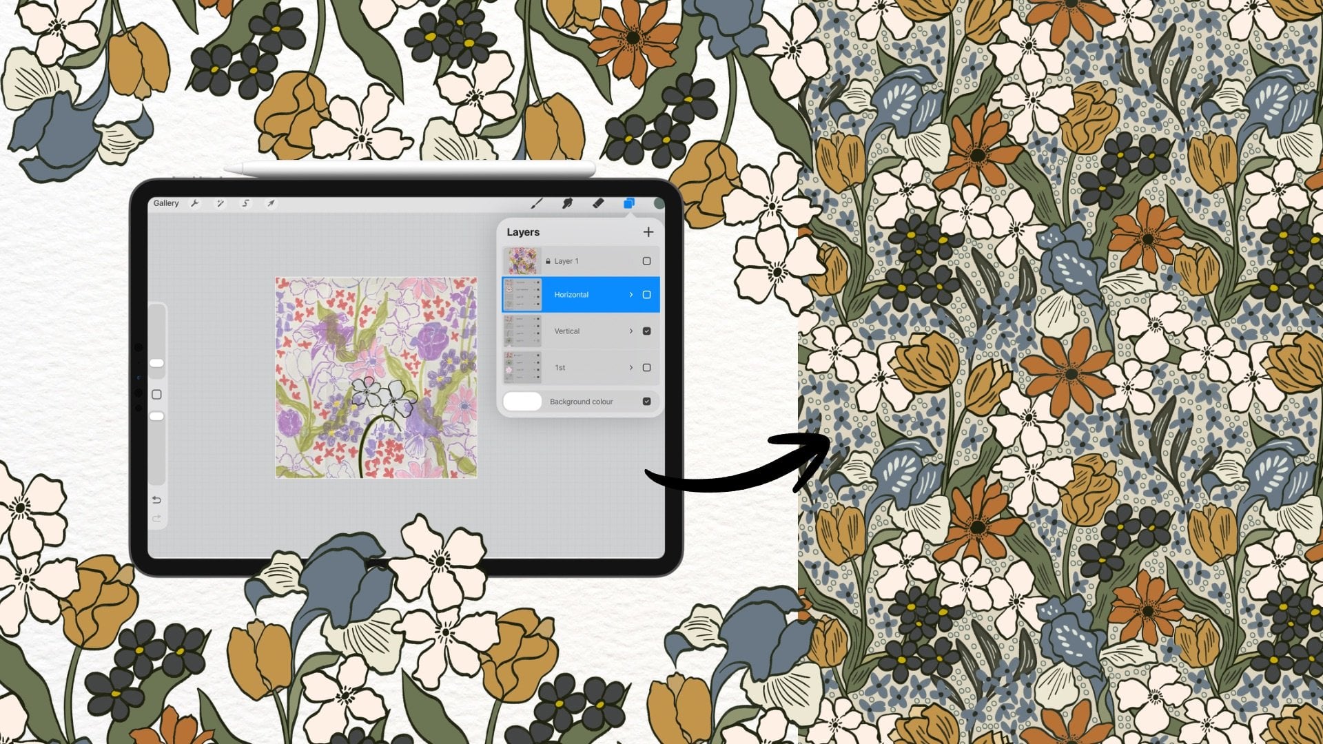
7. Sketching the Motifs: Before I start sketching, I usually already have a
rough idea in my head, especially after
looking at inspiration. So this part is not a very
strict planning step. It's more like a loose direction
that I'll reify as I go. One thing I have already
in mind is the layout. I'm thinking of using a
scallop or arch repeat. I feel like it fits
really well with this theme because it reminds
me of seashells shapes, which connects nicely
to the cost wipe. For the main motif, I want to create a flower shape, and I'll probably use
a symmetry tool for this something similar to what you see when drawing modals. That way, the flower feels more balanced and structured
but still soft. I also want to add some small details that
feel like sun rays, just bringing a
bit of wealth and tie back to the sun
motif from the brief. For the colors, I'll just start with the
warm tone for now, something like warm brows
and soft earthy shades. I'm not thinking too
much about it yet. This is just to help
me visualize things, and I can only change it later. I'm starting in Procreate
with a canvas that is 4,000 by 4,000 big cells, then I'll go into drawing guide and
choose radio symmetry. This is to help me build a
more balanced flora mosf, especially since I
wanted to have a slightly mandala inspired feel. I'll quickly pick a brush
and color at this stage. I'm really not to worry about the exact
brush or color yet, because this is still just for testing and
exploring the ships. I'm going to start
from the center circle first and then build out
the barrels to out it. With this symmetry setting, four of the barrels will
mirror each other exactly, and the other four will follow their own
mirror direction. So it already gives the flower
a nice sense of balance, but still leaves room to make it feel a
little more unique. This is the part where you can really let yourself experiment. You don't have it look
exactly like mine. Just a shapes, petals or
small details in whatever way feels natural to you and really just responding to what
comes to me as a row. Once I have the
main flower shape, I can start adding a
new smaller details for these two flowers. I'm going to add some
little radiating marked that feel a bit
like sunlight or halo. These taps connect the
motive back to the brief because the challenge
mentioned sun motive so well. If I want to test another
flower variation, I can just hide it there and
sketch the different one. This is really just
a sketching stage, so I like to keep it flexible. You don't need to decide
everything right away. Now I'm going to work
on the scallop frame. To do that, I'll hide the flower layers for now and go back to
the drawing guide. But this time, instead
of using radio, I'll switch to quarant symmetry. Then I'll create a new layer. The curve to see is really
just a guide for placement. I'm going to draw one curved
line from the top center point down toward
the middle point of the outer left side. Then I'll hold for a moment, so the line becomes
smoother and if I want, I can adjust the curve a
little bit after that. I'm happy with one side. I'll copy that curve
over the right side. Then I'll duplicate
the two halves and move them down
to be the next row. So the copy from the
right side goes down to the left and the copy from the left side goes
down to the right. As time I move something, I make sure magnetics
is turned on. That makes everything
snap into place more easily and helps the
repeat lineup better. Now we have the basic scallop
structure at this point. It's really just framework. If I want to use it
in the final design, I usually like to redraw
it more intentionally. I think for the design, I'm going to use dotted brush and redraw the scallop frame. I'll make a new layer, turn on drawings and
redraw the arch symmetry. This just helps keep the structure balanced
while I sketch. M you can see it already starts to feel more little softer
and more decorative. It also gives the arches a
soft shell life feeling, which the cost really nicely. You could also make the arch shape more wavy or
more dramatic if you want. But for this baron I think keeping it simple works better. Then I'll do the same
thing as before. I'll duplicate the new
art twice and move them down into the next round one on the left, and
one to the right. Again, I'll keep checking that everything snaps
neatly into place. To see how this is
working as a repeat, I want to make a quick test. In for grade, I can
swipe that with three fingers to bring
up the quick menu. Then I'll choose copy all. I'll swipe that again
to choose past. This gives me a flatten copy of everything I currently
see on the canvas. It's also useful way to
test how the repeat is starting to come together without committing to
the final version yet. Now I can look at the smaller scallops together and check whether the
rhythm feels right, whether the spacing
is working and whether the arches sitting
nicely next to each other. And if everything
looks good so far, you can keep decorating
inside the shape, add more details or stop
here and keep it simple. I'm not trying to
finish the pattern yet. I'm just building the structure and seeing what feels like. In the next lesson,
I'll start refining these sketches and turning
them into the clear pattern.
8. Planning & Making Repeat Pattern: Before we move on,
I just want to a little more detail
inside the scallop. I'm going to draw a smaller art here just to give it
a bit more character. It is the same
technique as before, so I'll spit this start up, and then I'll test how
the flower fits inside. Now I'm going to
start heading how my motif works inside
the scallop layout. I'll turn the flower
layer back on, duplicate it, and place it inside one of the
scallop shapes. At this point, I'm just
checking how it looks, the size, the spacing, and how it sits
inside the frame. Once I feel like the
composition works, I'll redraw the flower at the larger size because
when working with raster, scale is really important
from the beginning. It's always better to draw
big and scale out if needed, rather than drawing small
and trying to scale later, which can reduce the quality. So now I'll place the flower in the scallop right in the
center of the canvas. Once I'm happy with it, I'll duplicate the
scallop frame and the flour and merge
them into one layer. Now I'm going to start
building the repeat. I'll start this combined
motif, the scallop, plus the flower and more copies of it to the edges
of the canvas. Specifically, I'll
place them into four corners so that the edges start connecting
with each other. The goal here is to push
parts of the design outside the canvas so they can repeat seamlessly on the offside side. To make sure everything
aligns perfectly, I'm going to use placeholder. I'll create a new layer, fill it with the solid color
and reduce the oposity. Then I'll group this layer
together with my motif. Now, when I duplicate
the group and move it, it is much easier to see
how everything lines up. I'll duplicate the group and move it vertically up and down. Then I'll merge those layers together and remove
the placeholder. I'll repeat the same
process again and again. So this time horizontally,
duplicate the crook, move it to the left
and right sides, and make sure everything
snaps into place. At this point, you
should see that all four corners of the
canvas are now connected. In the center, there's
an empty scallop shape. This is exactly where
the next motif will go. Now I can place another flower
into that center scallop, and this helps complete
the repeat structure. Before moving on to coloring, I like to quickly
test the button. I use the three finger wipe to open the menu,
then choose Copia. Then I pass it onto
the new layer. Now Ace is tied up
and I'll duplicate it multiple times and arrange
them next to each other. This allows me to review
how the burn repeats. Here I'm checking spacing,
alignment, overall rhythm. If something feels soft, this is the best time to fix it before moving onto the color. Once everything looks balanced, we are ready to move on
to the coloring stage. Now that I've had the repeat, I want to take a moment to
look at the overall burn. Sometimes at this stage, you might notice that things feel a little empty or
not fully connected yet. If that happens, this is where you can start
adding extra details. For example, I just had the idea to add stump
on the flowers. This wasn't something I
planned from the beginning. It just came naturally while
I was looking at the button. And this is really important. You don't have to follow
exactly what I'm doing. Just respond to your own design and whatever feel right to you. After adding details
to the sender, I'll check the
second scallop shape because now that the corners
are already repeated, the button is
actually connected. So I don't need to use the
blaze holder method anymore. Instead, I can move the repeat corners back into the center and
reveal the next scallop. This helps me see how the second flower will
look inside the repeat. Now I can add another motive onto the second scallop area. And again, I will adjust
it slightly if I need it, so everything feels balanced. Once that's done, I'll quickly test the repeat again using
the same method three finger, swiped out, copy all, paste, scaled out, and
duplicate the tile. This helps me check spacing flow and how the details
connect across the repeat. If everything feels good, I'm happy with the result, then this is a good point to move on to the coloring stage. At this stage, your
structure is really working and now color will help
bring everything together.
9. Coloring and Exporting the Design: Now that everything looks good, we can move on to
coloring the pattern. I don't really have
a color palette prepared for the design, so I'll start applying
colors to the motifs. First, I'll group all
the layers I don't need and just keep the
outline tile visible. Then I'll create a
new layer underneath the outline and make sure the drawing assist is turned on. Now I'll tap the line layer
and turn on reference. What this does is
allows Procreate to use the layer as the
guides for filling colors. So instead of having to
stay on the same layer, I can fill colors on the separate layer while
still following the line. It makes the coloring process
much faster and cleaner. Now, I'll start adding color. I'll drag the color
into the shape and you see this option
called continue filling. Once that's active,
I can just tap on the other areas to fill them with the dragging
the color again. I'll group areas with the same
colour on the same layer. I use one layer for
the same color. For smaller areas, I'll jom in a bit to make sure the color
goes exactly where I want. And every time I
switch to a new color, I'll create a new layer and
repeat the same process. For the scallop, I want to
create a two ton effect, so I make a new layer and
redraw the scallop frame. Since this will be a part
of the final design, I'll take a bit
more time to draw it cleanly and accurately. Then I'll hide the other
layers duplicate this scallop twice and move them w one to the left and
one to the right. And then I fill them with
color at this stage. You don't need to
overthink the colors. You can only adjust them later. When I change the
background color, you can see that the
scallop now has two turns, which makes the born feel
a bit more interesting. Now, I'll continue filling
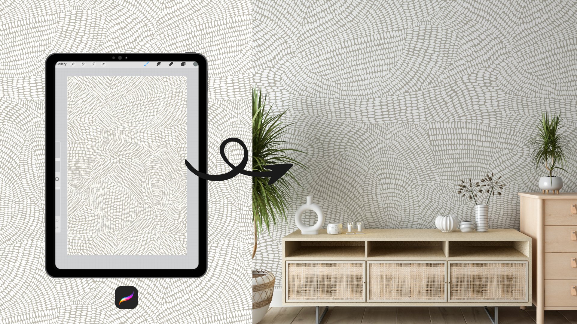
the rest of the design. This part is quite repetitive, so I'll speed this up. Once everything is colored, I'll turn off the drawing guide and test the button again. I'll wipe out with three fingers to open the menu and
choose copy all. Then I'll pass this
onto the knee layer. After that, I'll scale
the tie down and duplicate it several times to
see how the button repeats. This helps me check if
the color feels balanced, if any looks off or if there
are any visible seams. If you notice any eases, you can always go
back and adjust them. This is a normal
part of the process. It doesn't have to be
perfect on the first try. When everything looks good, you are ready to export
your final tile. I usually export a GBC or B&G for platform
like Spoonflower, but always make sure to check
their file requirements. You also want to keep
a high resolution on in case you need to resize
or use the desi layer. I usually scale
down my button by re importing the
imported file back into the canvas
multiple times and then resizing it to about 50%. I do this to make
sure the scaling stays clean and
consistent and to avoid any loss of
quality that can happen when resizing multiple
layers directly. Take the moment to check
the repeat one last time. Zoom out and look at
the overall rhythm, make sure the spacing flow
and connections feel smooth. That's your final pattern. What I really like
about this design is how it combines
structure and softness. From distance, you
see the clear layout. But when you look closer, you can notice the
flower details and small variations and that gives it a more organic
and handmade feel.
10. Recoloring (optional): Before uploading the
pattern for submission, I actually feel like I want
to change the colors of it. For this part, I'll show
you a simple way to recolor your desI
using a clipping mask. If you want to change the
color of a specific layer, just create new layer above it, tap on the layer and
select clipping mask. Then you can drag a new
color into that layer and it will automatically apply
onto the areas below. This makes it really easy to just colors without affecting
your original drawing. But for this version, I'm going to shift
the palette from warm tones to something
a bit cooler. It's a pretty simple process, so I'll speed up this part. After recoloring, I also want to add a bit of
texture to the design. This step is
completely optional. You can skip it if you
prefer a cleaner look. I have a few texture brushes here and I'm using a
neutral gray color. I'll create new He choose a large precise and
lightly paint over the canvas. Since the texture itself
is already seamless, you don't have to worry
about the repeating. Now, on top the layer, go to the blending options
and try different modes. I'll turn out the opacity
of these layers and then move it into color
burn and linear burn. So you can see they can create a really nice
softer texture effect. You can experiment here and see what feels right
for your design. Once you're happy
with the result, you can export your pattern. And if needed, you
can also scale it down using the same
method we used earlier. In the next lesson, I'll
show you how to app and submit your desire
to spill flour.
11. Uploading and Submitting : So once your pen is ready, now I'm going to show
you how to actually app it to Spoonflower and prepare
it for the challenge. First, go to
Spoonflower websites, then go to Artists corner
Design challenges. This is where all
the challenges live. And this is also where you
eventually submit your design. Before you can enter
the challenge, you need to applod
your design first. So here I look on aplot design. If you're not logged in yet, Spoonflower will ask you to
login or create an account. I won't go too deep
into this part, but you need to have an
account ready before loading. Once you are logged in, you can upload your
Biden file here. I'll just select my design
and agree to the terms. Make sure this is
your original work because Spoonflower is quite
trick about copyright. Now this part is actually more important than this
looks, naming your design. A good title helps your
design get discovered, not just in the challenge, but also in search later on. I usually keep my titles
clear and descriptive. For example, this one I'm
calling coastal Bloom Arches. So instead of something vague, this makes it really clear
that the design is about. Try to include the
theme of mood, the motive type, the
layout or structure. This helps both people and the platform understand
your work better. Next, we have the description. This part is optional, but I highly
recommend not keeping it because this is
not just for people. I also helps your
resides show up in shot. I like to keep my description
simple but intentional. Usually I include what
inspired the design, the key motives, the
overall mood or style. If you want to make
it more effective, try to naturally include kios that people
might search for. Boho, coastal, flower porn, wallpaper, you don't
need to force it, write it in a natural way. Think of it as describing
your design clearly. So both people at platform
understand it better. Next, talking, this
is actually one of the most important parts
for this cover ability. Spoflower already gives
you some categories like style, warrant type, color. I'll just select the ones
that match my design. And then here you
can add your own tx. I usually include theme,
boho costal modes, floral, mandala, use case
like wallpaper, home decor. Try not to overthink it
just dec your desires. Now let's talk about the scale. This is something you really
want to check carefully. When you adjust the
scale for fabric, you notice that home decor
products updates as well. And then for wallpaper, you might want a
different scale. For whatever, I
usually check it in the mockup because that
looks good on screen, might feel very different
in the real interior. Always zoom out and ask, does it feel too
busy or too empty? Before you can enter
this challenge, you need to proof your design. So here, I'll click on Proof. This step basically
checks your repeat. Spoonflower will show you this
review with the pink line. This is your repeat tile. What you want to look for
is any visible seams, misalignment, anything
that fails off. I usually zoom in
and move around a bit just to make sure
everything connects smoothly. If everything looks
fine, just looks good. Once it's proofed, you see your design is
now marked as proof. Before we can enter
the challenge, we need to set the
design for sale. So I switch fit from
private to for sell. Now B flower will ask where
you want to sell your design. Since we desg this button with the clear purpose for both
wallpaper and home decor, I'm going to enable both wallpaper fabric and
home decor products. Then click South. Now we're ready to
enter the challenge. Here, Spoonflower will
ask you a few questions. First, select the challenge
you want to enter. In this case, I choose BG Boho. Then you go through
a few confirmations. This part is just
confirming that your reside is
original and doesn't use clip art or AI
generated images. I'll check this. Next, you confirm if your desire
reflects the theme. This is actually
the good movement to pause and ask yourself, did I really follow the brief? Then Spoflower will show you the title and
description again. This is why earlier we
took time to write them clearly because this is
what voters will see. Once everything looks
good, just submit Andy. And that's it. Your design is now officially in the challenge. After submitting, you receive a confirmation email
from Spoonflower, and you can also see your
design here on the Mendes. Honestly, this is always my favorite moment because
no matter the result, you've taken your idea all the way to finished
published design. So now you've seen the
full process from idea to design to actually enter a
real Spoonflower challenge. And the next lesson, you brp everything up, and I'll share a few fine
thoughts with you. And
12. Tips for Joining Spoonflower Challenges: Before we wrap up,
I want to share a few tips that can really help you when John spf challenges. These are things I
have learned from experience and they are
simple but very effective. It as a creative
prompt, not presser. First, try to see challenges
as a creative prompt, not something you
have to win because once you put too much
pressure on the results, it's become less fun and
honestly, less creative. Think of it as a direction, a theme, something to report to. Stay close to the brief. This might sound obvious, but it's actually one of
the most important things. Make sure your desire
clearly reflects the theme. When people volte,
they usually choose desires that instantly
fell on brief. So clarity is more important
than being overly complex. Keep your desire readable. Another thing I've
noticed is that simpler, more readable desire
tends to perform better, especially because people
are folding quickly. You pattern should be easy
to understand cleans, have clear shapes,
not feel too crowded. Think about the scale. Scale makes a big difference. If your elements are too small, they can get lost. If they are too large, it might feel overwhelming. Always preview your desire, especially in the wallpaper
or product mockups. Use vding as inspiration. Even if you don't
join the challenge, you can still learn
a lot by olting. Just go through the designs
and notice what stands out, what feels clear, and what
matches the theme best. This is a really good way
to understand what works, especially if you are still
exploring your style. Don't over research. Sometimes you don't need to
collect a full mood board. For me, there are designs
where I just look, observe and remember
the feeling. That's already enough
to guide the design. And finally, consistency is more important than
any single result. And the more you how challenges, the more you
understand your style, your decisions, and
what works for you. And one more thing, voting is also a way of caring. You're supporting
other designers and being part of the community. So even if you don't
submit every time, just showing up and
voting really matters. So don't overthink it. Start simple, stay
close to the theme, and enjoy the process. That's really what these
challenges are about.
13. Class Project & Final Thoughts : That's the full process of
how I approach designing for flower challenge from
reading the brief on the way to applauding
the final button. I hope this class helps you see that designing doesn't help to feel overwhelming or random. When you break things down, starting from the brief,
understanding the style, and making small
intentional decisions, the whole process
become much easier, clearer and more manageable. Now it's your turn. I love for you to choose to challenge either
the one we used in this class or any current one and create your
own repeat pattern. Don't worry about
making it perfect. Just focus on following the process and doing
something with intention. When you're ready, you can share your project in
the class gallery, and you can include
your final design, a screenshot of the challenge, and even a bit of your
process if you like. And if you enjoy this class, it would really
meant a lot if you could leave a quick review
in the review section. It helps me understand
what you fought helpful and also helps other students
discover this class. I also enjoy seeing how different everyone's
design turn out, even when we start
from the same brief. So feel free to share your work. I really love to see it. And thank you so much
for taking this class. I hope this helps you feel more confident designing
for football challenge, and I'll see you in the
next class. Bye bye.
 Phuong Lempinen, iPad artist| Surface pattern designer