Transcripts
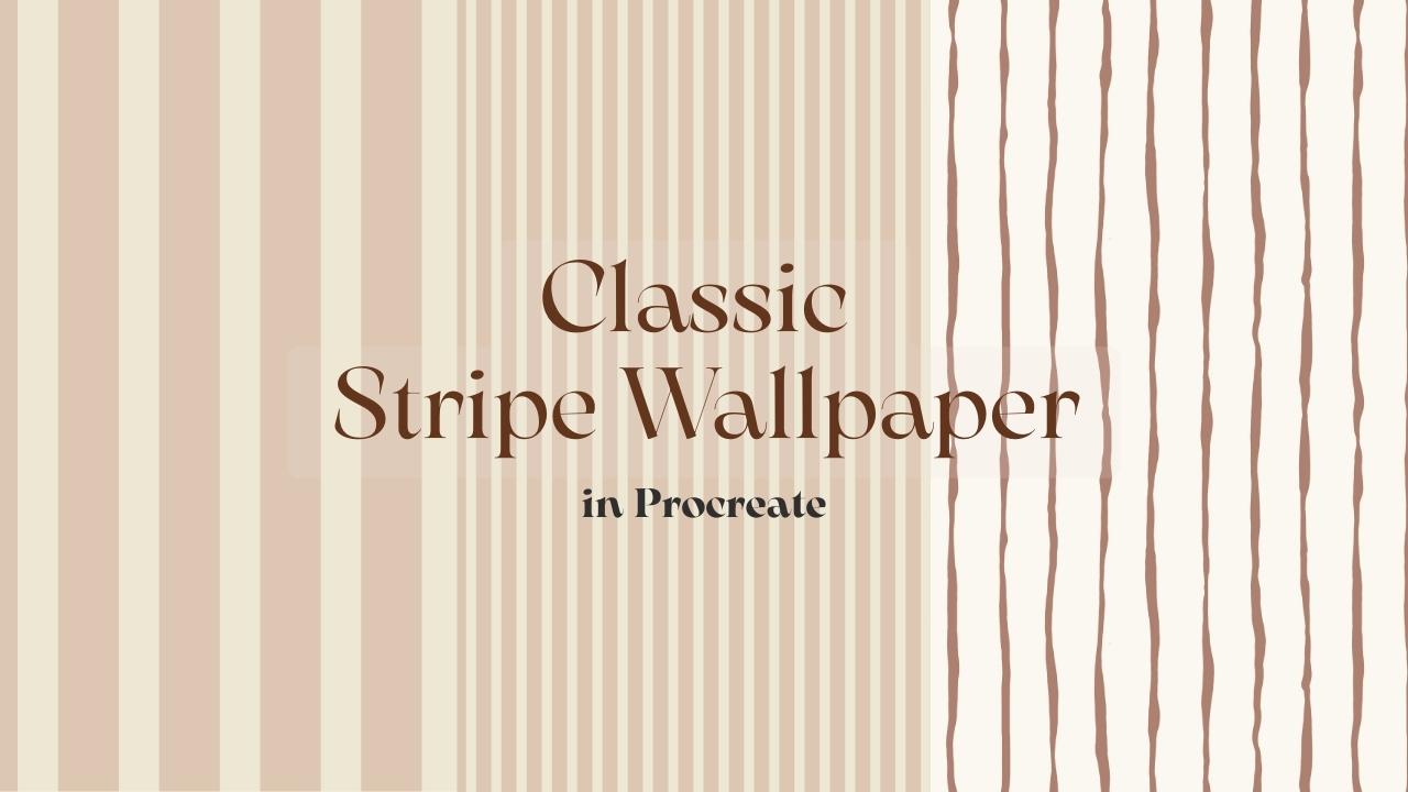
1. Intro: High influence am a surface pattern designer
based in Finland. Today we are going to design harmless stripe
wallpaper in procrete. Strips are one of those
buttons that look simple, but they are actually all
about propulsion and balance. A small shift in width or contrast can completely
change the mood of the space, and this class will create three stripe variation together, a clean structure stripe. A sort of bean stripe that
feels almost like texture and a softer organic version
with a bit more movement. Everything we make is
the art to feel calm, refined, and ready
for real interiors. Alright, let's open Procreate
and start building.
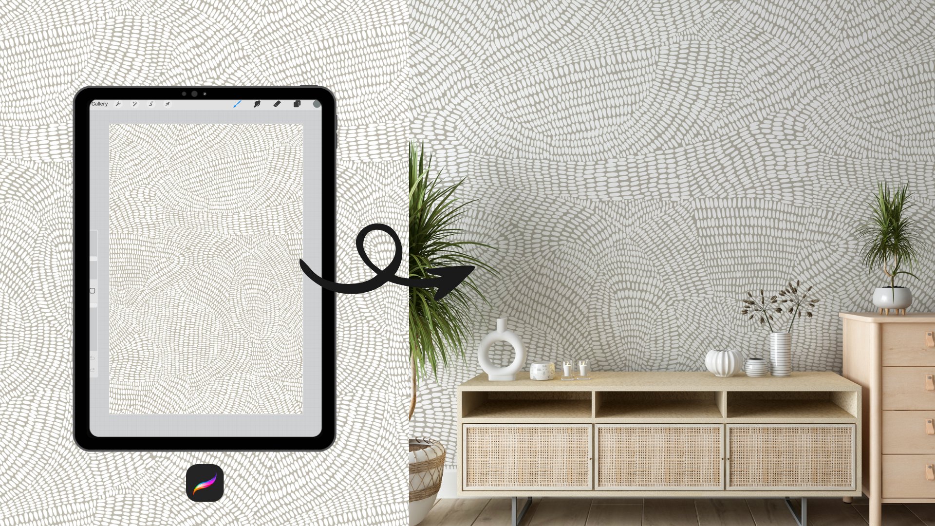
2. Class Project : For this class, I
would love you to design one times
stripe wallpaper, repeat and procreate,
and then create one variation within
the same stripe system. This could be a change in width, spacing, collatn or sus texture. Once your repeat is ready
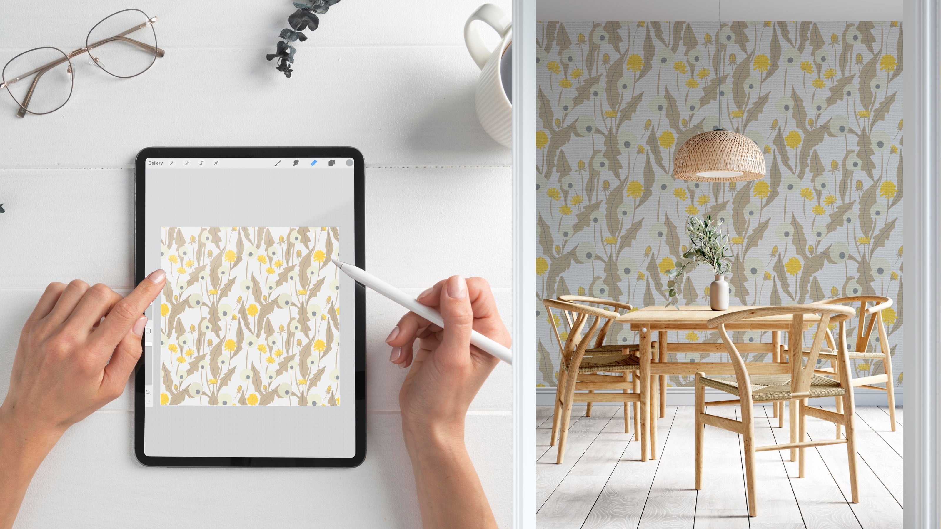
places into simple wall mockup, so we can see how it
feels in the real space. If you don't have
your own mockup, you can use a spot
flower mockup for free. Just block your design, go to the Wallpaper
preview section, and then take a screenshot
of the room mockup, or you can download
the photo of it. It's a quick and easy way to see your partner on the wall without building
a complex scene. After that, hit over
the project and resources tap on Skillshare
and click Create Project. Upload your wall mockup
screenshot and write a short note about your stripe and the do broom
you imagine it in. Keep it simple,
feel like enough. I really encourage you
to share your project. Even the small differences
in your propulsion and contrast can create completely
different moth fares, and it's always inspiring
to see how everyone interprets the same
structure in their own way. I can't going to
see what you create
3. Stripe Proportion & Scale: Before we start
building our stripes, I want to take a few minutes to talk about propulsion and scale. Stripes may look simple but
small adjustments and width spacing and contrast can completely change
how the room feels. So understanding this first will make the design
process much easier. For this class, I'm
working on 4,000 by 4,000 Big cell
Canvas at 300 DPI. This size gives us
enough resolution to build a clean repeat and
test it properly in Mups. It's a practical site
that works well for wallpaper design with the
being to have it to manage. Now let's talk about
if your stripe white around 400 to 600 big
cell on this canvas, it's going to feel more structured and more
architectural. It becomes a clear visual
element in the space. On the other hand, if
your stripe is very thin, around 50 to 100 big cells, it's almost like texture. From a distance, you won't
really see individual lines. It just softens the wall. With a lot already ships
the mood quite a lot. Now let's talk about contrast. In world labor,
we always have to think about full world coverage. If the contrast between your stripe and the
background is too high, the world can start to
feel harsh or busy. Instead of strong
color differences, stripe keeping the
tone closer in value. Moody, low contrast balls are usually more livable
and feel more timeless. Such a contrast
give you longevity. Spacing is just as
important as width. If stripes are too
close together, you can get visual vibration, especially on the large
surface like a wall. If they are too far apart, the part can feel disconnected. What we are arming for
is steady written, something that feels
calm and balanced. Before moving on, always
zoom out and ask yourself, do this feel comfortable
on the full wall? A stripe that looks
quae up close might feel overwhelming when repeated
across an entire room. Testing at 50% Zoom is a simple way to
simulate that distance. All right, now that we
understand propulsion, scale, and contrast, let's start building
our first stripe.
4. Pattern 1 – Balanced Architectural Stripe: All right. Let's start
building our first button. First, I'm going to create a new canvas by tapping
this plus icon. You can name your
canvas now if you like, or you can rename it later. Both work perfectly fine. I'll set the size to 4,000
by 4,000 big cells and make sure unit is at
two big cells and the resolution is 300 TBI. You see that at this size, we get the round 37 layers, which is more than
enough for this project. Also make sure your
color per file is set to a RTB, then tap ten. Now that we have our canvas, let's open the layers panel. You can change the background
color if you want, but I'll keep my white for now. For this pattern, we're creating something timeless
and architectural, so I'm using neutral tones, colors that feel calm
and close in value. I already have a neutral palette that I often use for wallpaper, but feel free to choose
tons that you like. Just try to keep them close to each other and the
contrast stays refined. Once I've chosen my first color, I'll drag it directly onto the canvas to fill
the first layer. Next, I'll use the
transform tool, the arrow icon to
select this layer. I'm going to scour it so it covers all the
half of the canvas. When you are transforming, make sure the snapping and
magnetics are turned on. As you move the layer, you see yellow
guidelines appear. That's what helps you align
perfectly to the center. Once it snaps into
place, release it. Now I'll create new layer and repeat the same process
with a second color. I'll continue building
the structure this way, creating four layers total, two darker tones and
two lighter tones. Instead of duplicating layers, and creating new
ones intentionally, this helps reverse resolution and keeps the edges
clean when we scale. Then I scale each pair so they form two balanced vertical bars. One lighter stripe and
one darker stripe. You can see on the screen. Now, I'll duplicate
those 2 bars and place them side by side to build
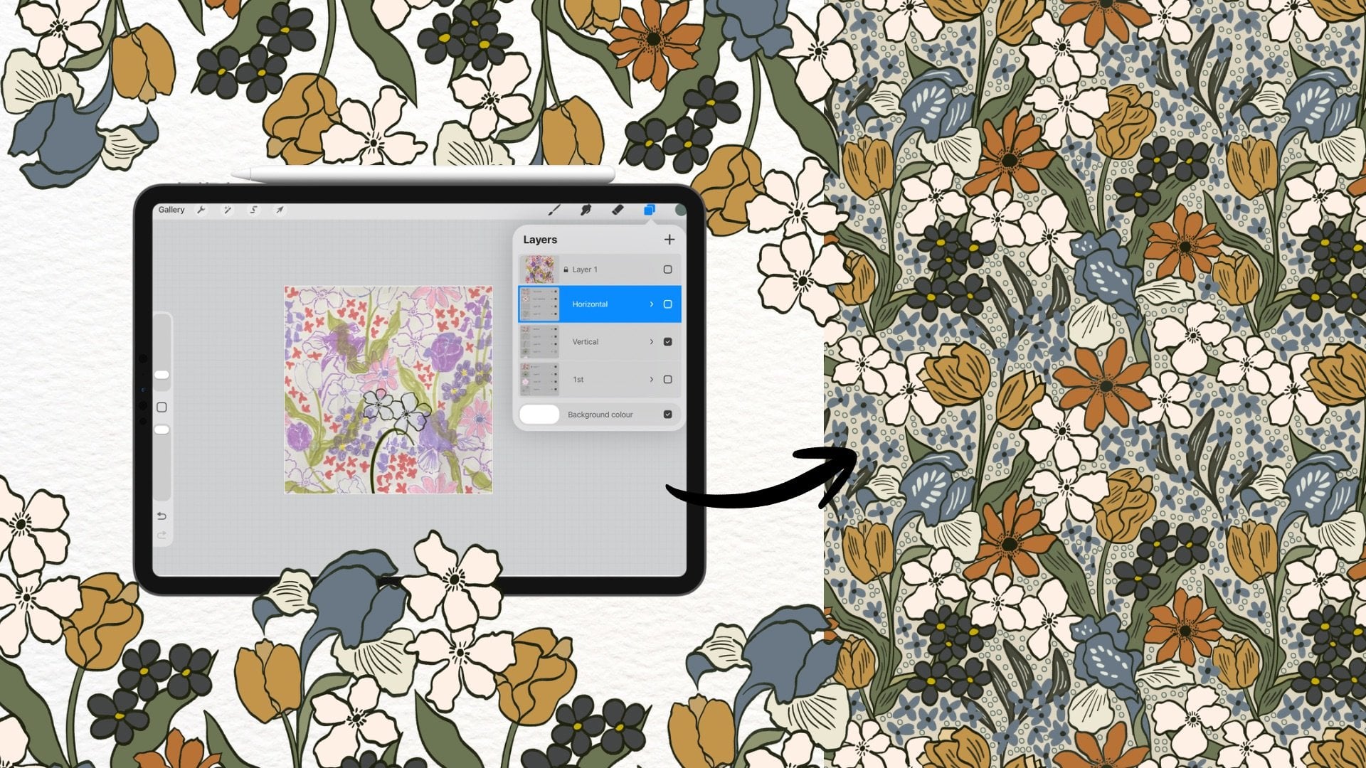
the full strive system. At this stage, our group players by color so they are organized. Ol. If you like to experiment with color
later, he's a quick method. Add a new layer above
your stripe group, turn it into a clipping mask and fill it with a new color. This lets you HS tens without
rebuilding the structure. For now, I'll switch back
to my original colors. Once the tile feels violent, I'll export it as a BNG file. BNG preserves quality and
keeps the edges clean. Now, let's create a
smaller scale version. I'll insert that B&G tile
into the Canvas four times. The reason I insert the
exported BNG is to ensure every repeat instance had the same resolution
and edge quality. After placing four tiles, I'll use the transform toll
again with snapping and magnetics turned on and
scale them down evenly. If I want to reduce
the scale further, I repeat the same process, export the new tile, reinsert it and scale again. This method maintains structural clarity
while adjusting scale. For my final export, I save the tile a GBAC
because I usually upload my desire to Happy World and they
require GBACFles. Depending on where you
plan to aplod your work, choose the file for MT that
fits their requirements, and when it comes to
scale, choose your eye. Stripe scale changes the mood
of the space dramatically, feel free totest smaller or larger verson
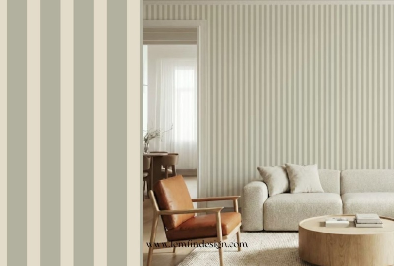
until it feels right. That's our first button, clean, structured and tireless. Now let's go to the next lesson.
5. Pattern 2 – Micro Pinstripe: For this micro
pinstripe, technically, we could use the method
from the first button, But stripes, move them
together and scale. But in this lesson, I want you to learn a
different technique in Procreate, follow along. First, go to actions, then Canvas, then drawing
guide and turn it on. Then tap edit drawing guide, choose to decrete and set the grid size to 100
big cells, tap done. Now you can see we
have 4,100 Bg cell columns across the
4,000 Bglls canvas. You don't have to copy
my exactly proportions, you can calculate
your own rhythm and create something unique. Now let's create
the first stripe. Select the selection tolls, the icon here and
choose rectangle. Draw a vertical rectangle that extends slightly above
and below the canvas. This ensures the stripe fully covers the 4,000
big cell height. Now drag your color into the selection to fill it to
adjust the stripe width, top to transform toll, t to the rectangle and
you see the apo appears. You can see a small chain icon between the width
and height values. This is the expect
radial content. Tap it to d
proportional scaling. This allows you to adjust only the width without
affecting the height. For the first drip, I'll set
the width to 200 pixels. Then I'll move it all the way
to the edge of the canvas, make sure the snapping and
magnetics are turned on, so it aligns perfectly. Let's create the second strike, create a new layer, repeat the same technique, but this set the weight
to 300 big cells. Now we have the 200
big cells stripe and 300 big cell gap or we
also can call it stripe. For this composition, I repeat this alternating rhythm 200 then 308 times
across the canvas. Now I duplicate the original 200 big
cell stripe seven times. Please note that always duplicates from the
original layer, not from the transformed copy. This reverse edge,
quality and resolution, then duplicate the
original 300 big el stripe seven times as well. Now, I simply arrange
them in alternating order 200, 300, 200, 300. Until they fill the canvas, you already know these
alignment techniques. I've moved through
this part quickly. Once finished, we have eight light bars and
eight darker bars here. I'll cook them and turn
off the drawing guide. Yeah. Before exporting, I want to test the repeat. Swipe that with three fingers
to open the quick menu. Choose copy all, swipe out
again to select Paste. You see a flattened copy of the artwork in the layers panel. Since this is only a test, we don't need to worry
about resolution here. Now, I'll scale this layer down and duplicate
it four times, arrange them into a crit
and merch the layers. Mate and check the seams. If everything aligns correctly,
the repeat is clean. Everything looks good.
Now we can move forward. If you like to
experiment with color, use the clipping mask just
like in the previous lesson. Now, I'll export the tie as BNG. If I want to adjust the scale, I'll re insert that BNG back into the canvas
and scale it down. This ensures every tile instance has consistent resolution
and edge sharpness. You can repeat this
scaling process again if you want an
even finer strive. For my final export, I'll save it as GBC
since I usually applaud my design to heavy wall
and they require GBC sie, always export according to
the platform you plan to use, and that's our micro pinstripe. From a distance, it reads
almost like tact on the wall, soft, architectural
and very livable. All right. Let's move
on to the next lesson.
6. Pattern 3 – Soft Organic Stripe: Soft organic stripe. For this soft organic stripe, we approach things a
little differently. First, select your
brush because we want the stripe to feel organic
and slightly imperfect. Choose a brush
with soft texture. The key here is balance. You don't want the brush to
be fully open and solid, but you also don't want
it to transparent. Ideally, the brush
should respond naturally brush and
have a soft edge. The stripe doesn't
feel digitally sharp. You can test a few strokes
directly on the canvas. It may temporarily change your background color so you can clearly see how
the brush behaves. I'll use the
ringerun brush here. Is a nice brush response and just endo variation to create death without
clocking messy. To save time and keep
our space inconsistent, I'll reuse the first
stripe button we created. I'll insert the first scaled
verson for my gallery. Once it's on the canvas, I'll reduce the layer
oposty I can still see the dark stripes but they are faint enough
to use as a guide. I'll create a new
layer above it. This will be my
organic stripe layer. On the new layer, I'll
start drawing over the dark stripes in
the reference layer. You don't need to force
perfectly straight lines, let the hand movement
feel natural. Occasionally vary the breast slightly to create
softer shift in width. The key is controlled imperfection intentional
but not chatic. Continue filling
each dark drip area with your organic strokes. Once finished, turn off
the reference layer. Now we need to make
sure the top and the bottom edges
repeat seamlessly. This is where we use
placeholder layer. The blaze holder c is a
visual alignment guide. It helps us check
whether the top edge and the bottom edge connect
perfectly when repeated. Make a new layer, then fill layer
with solid color, then turn down the
opacity of this layer. Now group your
organic stripe layer together with the blaze
holder, duplicate the group, move one group upward
and the other downward by exactly half the canvas
height. 2000 big cell. And using the transform tool, make sure the stepping
and magnetics are turned on so the movement
locks briskly. The placeholder lights from both halves should meet
cleanly in the center. If there are no
visible misalignment, it means your top
and bottom edges will repeat seamlessly. At this point, the placeholder has done his job,
you can delete it. Now merch the two
halves together, zoom into the center
seam area using the eraser tool gently
remove any uneven overlaps. Then redraw that
section carefully with your brush to blend
the seam naturally. Take your time here.
This step makes the difference between a clean
repeat and visible line. Now, let's test the pattern. Wipe out with three fingers to open quick menu
and choose copy all. Swipe out again to select pest. You now have the flattened
copy of your tile. Scale this down and duplicate
it four times to create two by two create
reach those layers and zoom in to the seams
to check alignment. If no visible lines appear, your pit is working correctly. If you like to change the color, use the same method as before. Add a new layer above your stripe layer and turn
it into a clipping mask, fill it with a new
color to adjust stripe while keeping
the texture in stock. For scaling, export tile as BNG and reinsert
it to reside cleanly. Just like in the
previous lesson, once everything look balanced, export for your final versin and that's our soft organic stripe. Is feels structures
from a distance. But when you zo in, you can see the soft
hand draw texture, which gives it warmth
and character.
7. Final Thoughts: We've now created three
stripe systems structured, softwa and softly organic. Even though stripes look simple, but you can see how
small changes in width spacing and scale
completely shift the mood. That's really the key
refinement over complexity. Before you finish, I encourage
you to test your design at different scales and always
review it in the space. Strives behave very differently once they cover an entire wall, take your time, your eye and don't underestimate
sostal adjustments. I'm really looking
forward to seeing your projects and how you interpret these strive
system in your own way. If you enjoy this class
and would like to see more wallpaper focused
tutorials like this, I would really appreciate it if you left a review in
the review section. Its truly helps and gives me the motivation to create
more classes for you. Thank you for joining me and I'll see you
in the next class. Bye bye.
 Phuong Lempinen, iPad artist| Surface pattern designer