Transcripts
1. About this project: Working on the design of
magazine articles is one of the most exciting and
creative editorial projects. It's where design
meets storytelling and every page becomes an opportunity
to captivate readers. In this project,
we will start by looking at some
inspiring examples of magazine layouts and break down how they are built
inside Adobe design. We will explore how
design decisions like typography,
image placement, and layout structure
come together to create professional,
visually appealing articles. Then we will roll up our sleeves and jump right
into Adobe design, creating a stunning layout for a travel magazine article about the beautiful
country of Greece. From a blank document,
we will build everything step by step so you can follow
along at your own pace. We will cover all the
essential elements of a well crafted magazine
article, headings, subheadings, deck,
Byline, body copy, captions, credits, running
cats, and so much more. You will also get hands on with advanced techniques like
grab styles, parent pages, and inline icons to
elevate the design, giving your layout that
professional polish. I can't wait to get started, so grab your creative gear and let's explore
Greece together while mastering the art of magazine layout in
Adobe design. Let's go.
2. Inspiration - Men's Health Magazine article: The Perfect Curry: This video, I want to show you two really great examples
of editorial design. Both of these are articles from the Men's Health publication that was published
here in the UK. I got these from the
publishing house directly. So these in design files are the actual finalized
versions that went to print. We will be able to see all
the parent pages and styles that they used and the structure that they
put together here, and there will be a lot of valuable knowledge that we can
get out of these examples. But before we get started, I just wanted to also mention
this website called Ready, which is an amazing resource of inspiration for
editorial design. So if you are interested
in creating magazines, this is where you will find
some amazing examples. For a small monthly
subscription fee, you get access to the digital version hundreds of magazines from all
around the world. You can filter based
on languages and, of course, your interest. But I recommend this
resource because there's just a really diverse set of magazines that
you can find here. And then when you
choose a publication, you can see the previous issues. So you can also see the
consistency throughout the issues and how certain
magazines develop in style. If we just jump in maybe
to the most recent one, I just wanted to show you
that here at the bottom, we can flick through very quickly jump over
these adverts at the beginning and then get to the more interesting
parts of the magazine. So yeah, like I said,
brilliant resource. We can zoom in really close, have a very close look at all the little details that
they used in the magazine. And this is just
so much better and more real than
using websites like Pinterest or Behans to find
inspiration and references. Like I said, I highly
recommend this website, and besides setting favorites
magazines that you like, you can also bookmark
specific pages. Like here, for instance, I created a category for creative examples of
tables in magazines. So if I go in here, we can see an example for this, or if I just go back, we can maybe find the table
of contents examples. So there is one here. Again, if we zoom a
little bit closer, can see how they done
their table of contents, the fonts that they used, and generally the layout
that they use for it. But we can again, jump back. And I think there's a couple of additional table of
contents examples. But then there is also the Men's Health table of contents, which we can see how nicely it's separated
into these categories, and then we can see all the
illustrations that they died. And yeah, here is another
example of a featured article. Really great design. I love how the bath is separated between the left and the right side
of the spread, also how the text is divided, and it's really nice
and symmetrical, and then we have the
additional contents of this featured article. Ridley is brilliant,
highly recommended. Even if you just subscribe
for a month or two, you will be able to get a lot of amazing inspiration
out of it. And just like with everything
in graphic design, the more references and examples you collect
and you look at, the more creative and
interesting layouts and ideas you will have when you start designing
your own magazines. Jumping back to in
design, first of all, I just wanted to show you
that in most editorial setup, you would be using
a lot of guides. You would have your
column guides, which are these
vertical lines in here, and we can check for
this specific page. If we go into
margins and columns, they are using 14 columns. We will actually be
using the same setup for our magazine project, and then we have 4
millimeters Gua. The top margin and the bottom
margin is almost identical, and then the inside
and outside margins are slightly lower. We have a baseline grid. Again, we can check the
baseline grid setup here. So we have an increment
of 10.5 points, starting from the top margin. And most likely the text here on this page is not going to be aligned to the baseline grid. It will most likely just be
used on the body copies, so we can move on
to the next page. And let's just see if they actually follow
the baseline grid. This is actually still not
following the baseline grid. And maybe these here
at the bottom, no. Even these are not
following baseline grid. So for this particular article, it seems like nothing is
following the baseline grid. So having grids in place doesn't mean that you have to
utilize it for everything. So it might be used for
specific type of articles, which might be a little
bit more text heavy, but in this case,
it is not used, so none of the text
is aligned to it. I can tell straightaway
although there are several various parent page designs like this one called A spread, then we have the B agenda, then B agenda left,
B agenda right. That's just the same
thing we just broken up. Then we have another one here, another one, and one more. These are more like
just variations, I guess, for the main design. It seems like for this article, they only used A spread, which is going to
have the information here in the footer with the folio and the magazine title on the rectal or right side, and the same thing on
the Verso or left side. And then in the middle, we have the gotta credit on both sides. And then all of these lines
that you can see here are additional guides
that they placed in, mainly to align the footer
and the header, I believe. And if we jump back
to the first page, we can see we have
a running head, eat healthy ish Indian summer, which then continues on
here on the right side. And I love the fact that they actually have the text
underneath these chili. And that's a beautiful design. And by the way, in
all of their layouts, whenever there is a
floating image like this, they actually have two instances of the same thing plays in because they are using
a different blend mode to get the shadows, the cast shadows
looking more realistic. So for instance, this
image right here, if I go into the
transparency settings, we can see is set to
normal blending mode. But then if I move this
away underneath it, we have the version
with the shadows. So it still has the
objects inside it, but it also has the car shadows. And that versions transparency or blending is set to multiply. Now if I set that to normal, it won't really show
much difference here because we have
just a gray background, but in case there's
colored background, it would make a big
difference switching between normal and multiply. And it's especially
more important once we get to the print stage
for this article. Yeah, you can see, we have a completely masked
out version which doesn't include the shadows and then a masked out version, which has the shadows
still visible. And the two are placed
on top of each other. So I'm just going to
drag that back there. And yeah, once again,
I love how there is an interaction between the
running head and the chili. That is looking really good. I love how these lines are also going underneath
the chilies. We can still see
exactly where it's pointing at, but
it's just again, another nice play on
depth and interaction between the typographic
elements or graphical elements
and the images. And in terms of alignment
in this magazine, we either have
right aligned text, like in these cases
here on this side. Or left alignment, depending
on where the text is. Whether it's closer
to the left side of the page or the right
side of the page, we can see the
alignment is changing. If we look at the
horse spread together, we can see that they are
not using justified text. They are using left align text, but there is no hyphenation, or at least I can't see hyphenation being
used on this spread. Let's just see maybe
the next spread. I believe they are not
using hyphenation, and that is because
it's not necessary. If you are not using
justification, it's probably better not
to introduce hyphenation. It's just unnecessary because you won't be getting rivers. You might get more ragged
edges, like, in this case, because you have
very narrow columns, but it's not a big deal, apart from maybe this
little instance here, which doesn't look
great, the rest is okay. I feel like we have a quite
good edge of the text. And it's also a
great example to see how rules are being
used in the layout. So we have a vertical
rule running down here. Then we have a horizontal
rule that divides the intracpyer deck from this sidebar text
that we have here. Then we also have rules
within the design, dividing these columns, so we
can call them column rules. There is another thick
rule here, again, that is interrupted by
the image and it's again, a beautiful example of how
nicely masked images can create this amazing interaction between text and the layout. So the images can extend beyond the boxes that are created
for them like this pan, as well as covering the other
books that's underneath. So they are not so rigidly separated into the top section
and the bottom section. And then we also have a
rule being used here to separate this heading from the rest of the text,
another rule there. And there's even these
little rules here. If I zoom a little bit closer, we can actually see this better. We have these horizontal rules
between the ingredients. And since we are
here, it's also worth mentioning that we have
also this arrow that is pointing to the
next page just indicating that there is more
contents for this article, so it hasn't finished yet. And if I go back one spread, we can also see the same
arrow being used there. And then let's just go
to the last spread, which is another
beautiful layout. It almost feels like
an infographic, but it's actually a
couple of recipes and the ingredients with another sidebar
here on the right. This time, it's a guide for
preparing the perfect rice.
3. Inspiration - Men's Health Magazine article: The Best and Worst Drugs: Let's take a look
at another article from the same magazine,
Men's Health. We can see they are
using the same arrow, even on the first
spread or intro spread. And then we can also
spot the byline, which is up here on the top. If I just zoom a
little bit closer, we can see the words By text. And as we go into this article, we can already see that there is an established style
for this magazine. That they continue using. Here, we have, again, quite a lot of rules
dividing these elements, the images are all floating
with cast shadows on them. In this particular article, I really like that
they have a key or a guide on understanding what
each of these colors mean. And if we zoom in, we
can see that each of these refer to one of these
aspects or properties, and they can actually be seen here next to each
of these drugs. And also on the top,
we can see all of these colors put
together, which is great. It's like a little chart, and then we can go
through this and so these were the good things or the good or useful drugs. And then we have
these new colors introduced for things that
are actually not good for us. And it's great how the colors
are used already to set the tone of what's more positive and what's
more negative. So we can see the red one
is used for false claims, grays waste of cash. Black is downright dangerous. So if we see black somewhere, that actually means
it's very bad. And again, I love how they've done the
masking on these images, and it's just incredible how much information fits on a spread when it's
well designed. So without making
it overwhelming, they managed to
fit 25 paragraphs, 25 images, at least. On top of that, we have
the key as well and quite a lot of negative
space here under the key. And then, of course, the
heading and the subtitle. And even though we have so
much things on the spread, like I said, it still
doesn't feel crowded. It's still very easy to find
what we are looking at, and that is definitely one of the hardest things to do in
magazine design to be able to fit so much things on
a spread and still make it look interesting
and easy to navigate. And this is probably
the end of the article. We can actually see a little indication here at the bottom. This circle is an
anchored object. That basically indicates that this is where this article ends. The way this is set up is that
this is an inline object. If I right click on
this, I can show this anchored object options
in line or above line. And this is actually
something we will be using in our
project as well. And I just want to
show you if I delete text that is moving up
and down within the text, so it can jump even
between lines. So it's a very useful
way of setting up that last little indicator
where the article is ending. It's also worth mentioning and checking that for
this publication, they are using five layers. They have a margin guide layer, which can be turned on and off. And by the way, I can
see that they actually added the background
rectangle on that layer, which is not supposed
to be there, I guess. It should be maybe on
a background layer, but it seems like they are using the same layer for
two different things. They also have the
credit element here, which is inside the
gotta area or creep. You can also turn that on and
off just so we can see it. And we have a layer
called cap height. Now, this is another guide
or grid that we can add, and maybe I can just turn off the baseline grid
just so we can see this. So they generated
this by creating all of these horizontal guides. And if we zoom closer, we can see this is how it
looks without and with. So they are using
that for cap height. But again, because the text is not aligned to
the baseline grid, it doesn't really
matter in this case, so I believe they are not
using it for this spread. They have a separate
layer for pictures. Once again, not 100%
consistent because this image, for instance, is on the
page content layer. And I believe that is because all the other pictures are below the text while this one is
hovering on top of the text. So the page content actually holds all the copy
on the spread. And like I said, in this case, that's the only image that is actually floating
on top of the text. So if we zoom closer, that's the one above, while the other layer, the pictures layer,
all of those pictures go below the text or
underneath the text. Other thing worth checking is the way paragraph
styles are set up. I'm just going to
close object styles. It seems like they
are not really using object styles in
this publication. I'm just going to drag
character styles down. On the other hand, they are using a lot of paragraph styles. So we can see they have
categories for them as well. But I believe mostly they are using this one, the redesign. So that, I guess is the
most recent formatting that should be used. And we can see if we select
one of these paragraphs, it's actually using
this body copy here. It's in another category. Let's just select one
of these subheadings that is coming from
this other category, and then we can maybe
find a title like this or subtitle or heading that is
actually using body copy, modified version of body copy. So even though it is a
professional publication, we can tell that
they are not always 100% consistent
using their styles. The styles are there to save time and to assure consistency. But in certain cases,
like we can see it here, many of these
elements are actually just variations
of the body copy. They tweaked it, but they didn't set it up as
a separate style, or they were maybe not following the default style that is normally used
for these elements. In case you work as a freelancer
for a publishing house, they will be quite strict
on making sure that you utilize all of their templates and settings that they
would normally work with. While if you are an
in house designer, especially if you're
a senior designer, you have a bit more levy. You can get away with more inconsistencies or you
could say sloppiness within in design when you're not using the right paragraph styles or maybe you're not relying on the templates
that are set up already. This really, again,
varies between publishing houses
and creative teams. And now, although I
could spend hours just talking about and
analyzing these articles, I feel like it's time to get
started with our project. I hope these examples that I showed you here made you more excited and inspired to get started with your
own magazine design.
4. Setting up the document: Like with every project, we
start with a new document. So go to Fine Manu,
choose new document. And then for this
particular project, I will be using 210
millimeters for the width and 278
millimeters for the height. I will keep the orientation
of the pages set to portray, and I'm going to need eight
pages set to facing pages, which means we will
have four spreads. And for the start page number, I'm going to just
type in 34 to make it look like this is somewhere in the middle of the magazine, which we would normally
call the feature well, where most of the
regular departments of a magazine can be found or
the featured article itself. I'm going to use this
particular size because it works quite well
for magazines, and many magazines out
there use this setup. But of course, there are
differences, so it's the Oni standard. There's many different sizes
that you can work with. But the reason I like this
one is because it works quite well with the
14 column setup. So that's something that
we will be using here. And it will be using
four millimeter gutter. So that's the space
between the columns. These will be the
vertical guides that we will align
a lot of things to and we will be using
mainly the baseline grid as our horizontal guide
within the pay structure. Now for the margins, I would like to have a lot of negative space on the
top of our spreads. That's why I'm going
to use 34 millimeters as the top margin, and I will turn off the chain. So I want to make
sure that I can use different margin sizes
for each of the sides. For the bottom margin, it might be a bit strange, but I'm going to use
29.2 millimeters. This is going to work well to align with the baseline grid, which we will set up short. The inside margin, I will
set to 28 millimeters, and the outside margin, which is around the edges, I'm going to use 17 millimeters. For the bleed and the slug, I always use the same setup. Just going to turn on preview
in the background so we can already see the pages
being populated there. But yeah, so for the
bleed and the slug, I'm going to use
three millimeter around all the edges and also 13 millimeters around
all the edges for the slug. We won't specifically
need to add anything on the slog
for this project, but it's always good
to have it there in case we want to
communicate something with the printers like full marks or
additional information. Now, this is the setup
that we will start with, but we will make a couple
of changes as we go along. Now, I am happy with this setup and we
can click on Create, and we can already save this document as well just so we have this setup in place. But one other thing that
I would like to set up straightaway is
the baseline grid. So for this, we have to
go to the preferences. If you are on a Mac, it's
under in design preferences, and then you will
need to go to grids. If you are on PC,
this is something you will find from
the edit menu. So edit preferences, grids. Now here, the first thing
that I would like you to change is the grids in back. This means when
this is disabled, all the grids that you use, whenever they are
turned on and visible, they will always be on top of all the other elements
in the document. So they won't be
hidden in the back. Prefer to work like this, so I like to see my grid
whenever I have it turned on. The next thing I would
like you to do is to set 0 millimeters for the start
position for the baseline grid. The increment should
be 10.5 points, and the relative options
should be set to top margin. So once you have these
selected, you can click Okay. Then you just have to go to
the view menu and choose grids and guides,
show baseline grid. Now, if you've done
everything correctly, this is what you should see. So we have our column guides, these darker purple ones, the pink ones are the margins, and the blue ones are
the baseline grid. So they are the
horizontal lines, and it's perfectly aligned
here at the bottom. And of course, we have our bleed that runs around
the document edge, and then the blue one
there is the slug. So if I zoom back, that's how the document
should look like. And of course, going
through the spreads, it should be consistent
because we've done these changes at the beginning when we set up the document and the preference obviously is going to apply to
this document only. By the way, if you
change preferences when you have no
documents open in design, then those settings will become the standard or the
default setting. And they will apply
to every new document that you create
from that point on. So for instance, with
the baseline grid, if this setting is
something that you like, then you can just do this without having
any documents open, and then from then on,
it becomes the default. I recommend saving this
file already at this point. I go to File Save, and I'm just going to put
it here in this folder. We will create a
package at the end. So far, I just would like to make sure it's already saved. And by the way, you can also
save this as a template, which might allow you
to start a project, a new magazine project without having to go to these
settings again. So that would be file
save as a template. That's, again, something
that's going to always start as a
blank document. Of course, we don't have to
do this for this project, so I'm just going to continue working in this in design file.
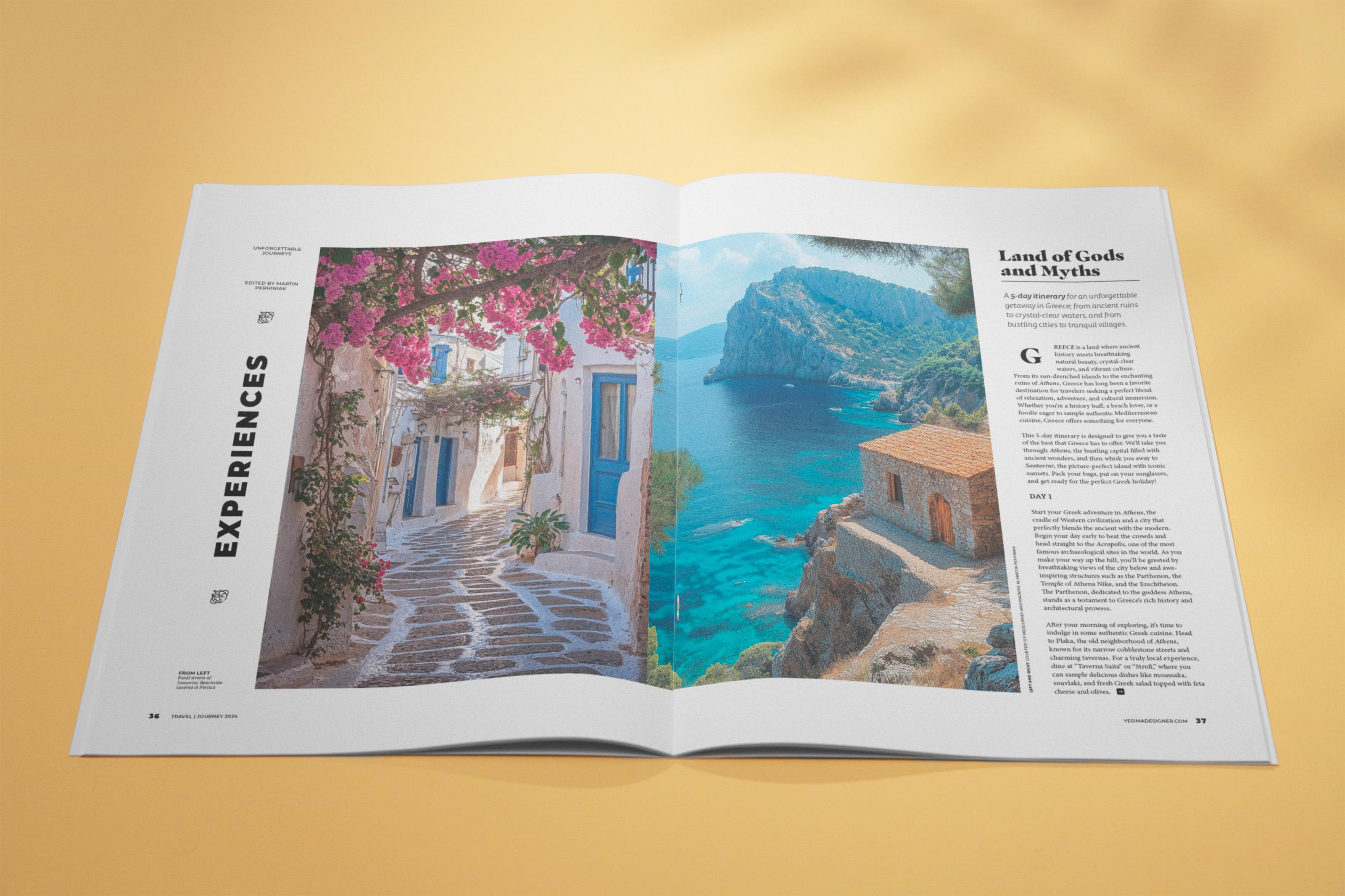
5. Preparing the opening spread: First spread for this article is going to be our cover spread. So that's the one that
leads into the story and that really separates it from
the rest of the magazine. So this has to be a very
eye catching design, both in terms of typography
and also the image itself. I am going to place in
the image already here. So I go to File menu
and choose place or Commando Control D. And
then from the exercise files, you should be looking for
this particular image. I'm just going to place this in, and I will make sure that
I use the bleed edges, so the red edges. Come all the way down here. The aspect ratio
should perfectly fit the page. That's
how it looks. If we press W on the keyboard, we can hide temporarily
the guides. I'm also going to press
Commando Control R to hide the rulers. So that's the image that
we will be working with, but we will do some
tweaks to it later. Now, I'm going to already
start defining my layers. So first of all, I'm going to
call this layer as images, and then we will have another
layer for the copy or text. So these two are useful to have. We can also have a
background layer in this particular project.
We might not need it. So I'm just going to
start with these two, and I'm just going to
select this image, and I can see it it's
already on the right place. Now I'm going to lock it, and I'm going to
select the text layer. And here I'm going to use
the type tool that's T on the keyboard and
then click and drag and type in the perfect maybe with P. And then if you double click on a corner
point of your text frame, by the way, I pressed escape
as well to stop typing. And if you double click
on a corner point, you can make your text
frame smaller or bigger, and you can also hold down
Commando Control Shift and drag one of the corner points to quickly increase,
decrease the size. And I am just going
to copy this. That's option or old click
and drag and type in again, with G Getaway, perfect getaway. I'm going to keep the
text here for now, and I'm going to come back
to this later because I actually would like to have the text integrating
into the background. So creating some nice sense of depth and perspective with the typography blending
into the image. And that is something that's
better done using Photoshop. So I just prepare
these two parts of the article's title
or the headline, but we will be
refining this later. So I'm just going to
save this for now, and I don't even worry about the formatting of
the text just yet, and we will return
to that later.
6. Adding the main elements to the second spread: Moving on to our second spread is where things get
more interesting, at least at this point. So I'm going to turn off the
locking on the images layer, and we will probably start placing the main two
image frames down here. So for this, I'm going to use the frame tool that's
F on the keyboard. And you can draw
the first frame, starting from the spine of
the document and drag it out aligned to the margin
on the top and the bottom. And I'm actually
going to move it in a little bit further
here on the right side. So I wouldn't want
to have the edge of the frame exactly
on the spine. I'll move it in a little bit, and you can actually see the X and Y positions and the width and the
height for this frame. If you want to copy exactly
what I'm doing here, but notice that I am not using
exactly the column guide, which would be this one
here on the left side. I'm using the exact center point between two column guides. So if I move this frame here, that would be one of
my column guides. This is the other column guide, but I'm using the exact
center point between the two. And that is a common practice. So you don't have
to be restricted to just utilizing the column
guides themselves. You can also use
fractions of them. So this would be considered half a column space or distance. This is our first frame, and then I'm going
to alt or option, click and drag to duplicate this and drag it
onto the other side. But here, I am going to drag this right edge until it's aligned to the
actual column guide. So the two frames are
not identical in size. The one on the left is slightly wider than the one on
the right is narrower, but it's also
overlapping the gutter or the center point in
between the two pages. Let's just place in
already the images. I'm going to first start
here on the right side, select that frame and then
press Commando Control D. And the image I'm going
to use here is this one. So I will just
drop that in here. And once it's selected, I will make sure that it's set to feel frame proportionally. It seems like by default that was already
set up like that. And I'm going to select
the other frame now. Again, press Commando
Control D. And on this side, I would like to have
this street scene. So I will place that in, and I'm going to
again make sure it's set to feel frame
proportionally. And then using the content
grabber in the middle, I can start moving
this left to right, just to check which
angle works better. I think something like that
looks nice, at this point, I can press W just to see how these two images worked
together as a pair. Maybe we can select this one on the right and just
drag it a little bit further to the right so we see a little bit
more of that tree, or we can make it move
more to the left. I feel like a bit more of the C looks quite nice,
something like that. Going to press W just so I can
see my margins and guides. I'm going to use the type tool now that's T on the keyboard and create the main text frame that we need on this spread. So that goes all the way from the top margin down
to the bottom margin, aligned to the right margin. And here it's aligned
to this column guide. So I leave out a full column
plus the gutter between the image and the text that is going to be the
space between them. And then now we can
move ahead and already place in the main copy
for this document. Similarly to placing in images, we just select this text frame, and I'm going to press Commando Control D
on the keyboard, and then the file
that you will need is called Grease Article Copy. It's an RTF file, which is a rich
text file format, and I'm just going
to choose open, and it loads the text in
already with a default setting. So we have a couple of
important things here, like the stand first or deck, which is a first
intro paragraph. Then we have the
headline or heading, and then we have the body
copy continuing here. Now, there will be quite a lot of formatting options
we will use here. But for now, the good thing is that we already
have the copy, and of course, it's
overset at the moment. There's much more text here than what fits in
this text frame. We will be threading
this text as we go along creating the
additional spreads. So it's good to have that
already in place for later. But besides this text frame, we will also need a couple of additional text frames
here on the left side. So let's just zoom here
a little bit closer. I'm going to use the
text frame tool, and I'm just going to
create a frame this big. So starting in the gutter
to the next gutter area, it takes up two columns
and three gutters, this frame, and I'm using two baselines for
the vertical size. And here, I'm just going to
use the type tool and type in the following text on
four Gutterb journeys. Like that. And this would
be considered the kicker, which is a text that usually is on the top left of the
page or the spread, and that really kicks off the conversation or the article. And then we will have the
byline based on this. I'm not going to copy
this just yet because I would like to have the
formatting set up based on that. But to be honest, we can already set this up a bit
further down here. I'm just going to
leave out two lines, and then I'm just
going to type in edited B and then
type in my name, Martin Bernic. Like that. Again, we don't have any
formatting set up yet. We are just setting up the main components or
elements of the page. Now we can also create
the department title. That's the section
of the magazine, like a recurring section that would appear every
time in this magazine. So that's something
that we're going to go here on the left side. And I'm just going to duplicate this text frame and change the text and call
this one experiences. Like that. Then this actually, I'm going to rotate 90
degrees counterclockwise. Holding down the shift key, you can make sure
that it's going to align to 90
degrees like that, and we can make this
text frame much bigger because we will have
this text much larger. Once again, I'm going to
align this properly later on. But for now, I'm just going to select the text and
change the size. So under character formatting, maybe up to 90 points. Let's see if that
fits in here if I make this bigger. Yeah,
something like that. For now, I'm just going
to keep it like this. Let's make it a bit
longer like that. Now, if I turn off
the guides with W, it's starting to
take shape already. So even without formatting, I like how everything
is balanced out. So we have some text
on the left side, and then we have
text on the right, and in between, we have
this nice pair of images. We will have the credit here at the bottom for which I can just copy again this text frame and
just type in image credit. For now, we can type that in later and format it properly. Then that's essentially
all the main components or elements that we will
need for our first spread, and then we can move on
formatting it in the next lesson.
7. Defining Paragraph Styles: Be able to work properly in in design when it
comes to formatting text and especially setting up your paragraph and
character styles, you want to make sure
that these panels are open and all visible
at the same time. So you don't want to switch
back and forth between them. You want to display
them side by side. So as you can see, I
have paragraph style on top and then below
that character styles, and at the bottom, I have object styles. So I always like to see
when I select something, what is applied to this
out of these three panels. Because we haven't set
up any styles yet, you should see that the
basic paragraph is selected, but there's already
a little plus sign, which refers to the changes or overrides that we
applied already to that, and there shouldn't be
any character styles, and also it should just say
it's a basic text frame. Again, a little plus sign
could mean that there's already something that is different from the
default settings. We will start with the
department title formatting, which is here on the left side. And for this, I'm going to
show you a useful technique. If you have this spread
selected in your page spanel, you can just right
click on that. And then from the
page attributes, you can choose Rotate
spread view and choose the first option 90
degrees clockwise, and then we can
just move up here. So now we can read
it much better. So this just temporarily
rotates the spread around, so we can do the
formatting here. And I will select
the whole text, and I'm going to
choose the font called Montserra now if you don't have this yet installed
on your computer, you can go to Find More, and then you should be able to install this from
the Adobe fonts. So the full name of the
font is this Mansa. And the one that I'm
going to use for this particularly
is the black one, but you can install
the whole font family because it's a very versatile
and good font to work with. So I'm going to use this one, and I'm actually going to set
it to all capitals as well. So it's not the
Monsa alternatives. It's just a normal
Monsablack and for the size, I'm going to use 33 points. So this is how it
should look like. But one additional thing
I would like to change is to space out the
characters a bit. So for this, I'm going to use the tracking option
and type in 100. So that's going to leave more space between
the characters. And it works well,
especially when you have text on an angle. It allows better legibility. That's, I think,
all that we need. Now we can just double
click on a corner point of the frame to snap the
frame to the text itself. And then we will find the
place for this later, but more importantly,
we want to make sure that this is defined
as a paragraph style. So I'm going to go to the
Paragraph Styles panel, and while having
this text selected, I'm going to hold down
the Alter option key and click on the plus sign. This makes sure that you create a new style based
on your selection. But you also want
to make sure that the apply style to
selection is turned on. So when you create the
style or define the style, that doesn't automatically
apply to the selection itself. So you just want to make sure the two things are connected. And I'm going to type in 01 department title.
And then click Okay. So that's our first
paragraph style ready. And the cool thing about this is that if I select
any text now, I can very easily apply it. Just going to make
this text frame bigger just so you can see it. And of course, we
can also get rid of the page rotation because that's the only text
that needed it for now. The credit will also be
set in the same direction. But for now, we can just
turn this back to normal. So I can right click on the little rotation icon and
just choose clear rotation. Then we will go back to normal. All right. So that's
the department title. And the reason I use 01 in the name of the
style is because I like to have consistency in
the numbering of my styles. That helps me to quickly identify and
find where things are. So I'm going to create
already an order. It's like a hierarchy
between the styles. This is obviously
the biggest title, and then we will
have the headline, which is going to be this one, the land of goods and
myths, in this case. So that's going to
be 02 headline. So this numbering already sets up that hierarchy
between the styles. That's a personal preference. Obviously, you can name your
styles to whatever you wish. That's just something that
I came up with and found effective when working on
editorial design projects. So let's move on and highlight this first
line in the body copy. And for this, I'm going to use another font called
Mascuo Mascualleo. I'm not sure if I
pronounce it correctly. And from this, I am going to
use the extra black version. So this is, again, something
that you can download or install from Adobe fonts
from the find more option. If you don't have it already, I'm going to choose
this one right here. And I'm going to set the
size to be 22 points. And then the leading
can be reduced here. I will probably go
down to 22 points. It's a general rule that
when you have a larger text, you use less leading, and for smaller text, you use more leading than
the default settings. But obviously, that's again, just something
that's specific to this certain style of editorial design that
we are doing here. So every genre or type of magazine might have
a different setting, but I prefer to have
less leading or spacing between the lines
for the headline formatting. And then I would also make sure that there is no hyphenation. So from the paragraph
formatting controls, you want to turn off hyphenate. And by the way, if you don't see these settings
here on the top, you want to make sure that the control panel is turned on. So window control is on. You can also use
the property panel to change these settings, but I still prefer to use the
control panel on the top. I just got used to it. It's been around for much longer than the
property s panel. And after having the
hyphenation turned off, we want to make
sure that there is space after this
paragraph style, and I'm going to
use 7 millimeters, type in 7 millimeters there. And then we also will add
an additional styling. But at this point,
I prefer to already save this as paragraph style. So I will click on
this icon here. Under, again, the paragraph
formatting controls, the little paragraph icon and then choose new paragraph style. It's the same thing as Alter option clicking on the
Create New Style option, as we've done before. So I'm just going to go
through here just so you can see another way to
get to the same setting. And I'm going to type
in number two headline, and it should already show
the settings that we used. But while we are in
this dialogue box, I want to make
sure that you have the preview option turned on. The add to CC library option you can turn off because
we don't want to end up populating your CC libraries with these formatting options. Of course, that's
something that you can use if you want to continue working with the same
styles in other projects, but in this case, that's
probably necessary. But what I would like to
change here or add to this formatting is the
rule paragraph rule, and I would like to
use the rule below. Let's just turn
this on so we can see it already there
in the design. Now, I will keep the
weight on one point, the text color can be
used for the color, but I would like to use
3 millimeters offset. So that's going to just
move it a bit further down, and you can decide
whether you prefer the width to be
aligned to the text. So that means that
it's going to be aligned to the last line. Or if you choose column, it's going to just fill in the full text frame from
left to right edge. I will go with this
one and click Okay, and then we can just
take a look at this. I feel like that looks
quite nice already. We can always tweak this later. But what I'm going to
also do is to drag the headline a bit further down so we have the right order. So when I select this text, it should say already that
that's using the headline. And of course, we have
the other paragraph style here on the left side for
the department title. Now we can move on and set
up the stand first or deck, which is the first paragraph. You can also call
this intro copy. I just prefer the
term stand first. I'm going to select this
paragraph, but of course, you can just put your cursor
in it as well anywhere, and that's going to apply
the same way because a paragraph is automatically set up to have its boundaries, the starting point and endpoint. So once I have my
cursor in there, I can just alter option, click on the new
paragraph style feature. And this time, I'm going to
set up everything from here. So that's another
thing you can do. If you are confident in the settings that
you wanted to use, you don't have to
do the formatting first and then save the style. You can just define a new style and then start
assigning the changes. So what I'm going to
do here first of all, is to go into the basic
character formatting option. And the font family
that I'm going to use for this is
called Tisa San Pro. I really like this
because it works well in combination
with our body copy, which will be Minion Pro. Again, this is an
Adobe font family, so I'm just going to use that, and the font style is
going to be light, italic, which is going to create a nice contrast and separate it from the
rest of the text. The size is going
to be ten points. The leading here can be slightly more than
the default setting, something like 14 points maybe. I think that's going
to work quite well. And once again, I don't
want to have hyphenation, so just make sure
that hyphenation is turned off if it's
not already turned off. And then let's call
this 03, stand first. Or you can call it intro Copy or deck or whichever
term you prefer, and then we can click
Okay, and by the way, in the general settings,
just make sure the applied style to
selection is still on. Let's click Okay.
So there it is. That looks quite nice. Maybe the space
between the headline and the stand first might
be a little bit too much. So this is something that
we might change later. But for now, I think
it works quite well.
8. Additional Paragraph Styles: The next thing that
I would like to do is to define the body copy, and this is the most important
style in a magazine, so we have to get this right. For this, I'm going to
just double click inside this first paragraph
after the deck. So I'm going to
double click in here, and I'm actually going
to click a couple of times until the whole
paragraph is selected. I had to click four times. Double click will select a word, triple click selects a line, and then four clicks
consecutive clicks, we select a paragraph,
full paragraph. It's also a good way to quickly
identify and find where a paragraph ends when sometimes it's not
clear, in this case. So I have this full paragraph selected and now we can
start formatting it. So first, I want to
change the font. And by the way, whenever you select something in the text, if you quickly want
to change the font, you can press Commando
Control six on the keyboard. That will highlight
the text selector or typeface selector. So here, I would like
to use Minion Pro. And if you have the
full font family installed from Adobe fonts, then you will have a lot
of options for this. Again, an amazing
font to work with. I like to use regular
for body copy. I think this is a very
legible and readable font. Yeah, I think it
works really well, especially in combination with the other fonts that we
already established in here. So I'm just going to
keep this text selected, and then I am going to set the size to eight
points like that. And you don't have to worry
about the leading because we will have this text aligned
to the baseline grid. So that's actually something that you can ignore
at this point. But instead, if you switch to the paragraph
formatting controls, you want to assign the space after option and set
it to 2 millimeters. And you can use the same for space between
paragraphs as well. So 2 millimeters there. And just like before, make sure that the
hyphenation is turned off. And at this point,
you can already save this as a paragraph style. So let's choose new
paragraph style and type in zero for body copy. So that's already
looking quite good. So let's just click Okay. And if I want to go back and make changes to
any of my styles, what I normally do
is I press escape, make sure that nothing is
highlighted in a text frame. Then also click somewhere
outside once again to make sure that no text
frames are selected, and then we can zoom closer to this text frame and then either double click on the
body copy style or right click and choose Edit. I actually prefer this again. It's a bit more controlled
way of making changes, so you are less likely to accidentally change a
setting by double clicking on these are all just
things that I picked up by doing a lot of
editing in design. So once we are in here, I find it easier to set the keep options up once
it's set up as a style. This is to make sure that
throughout the article, we won't have the
lines separating at the beginning or at
the end of a column. So when you choose keep options, you wanted to make sure that the keep lines together
option is selected, and I prefer minimum three
lines to be kept together. So that's what I'm
going to set here. This is something
that we will see the results of later
while we are editing. But we can already test
this out if I click. Okay. So this should already
be applied to the body copy, and I am actually
going to select all the text in this text frame. And don't worry that's going
to change the formatting of the first two elements in
the design because that's already saved in the formatting so we can come back to it. But for now, I just double click inside the text
frame and then press Commando Control A that selects even the text that's currently
overset and not visible. And then if we
click on body copy, we can start to see how
it's going to look like. And what I meant about
the keep options is that if I start
changing my text frame, notice how once this paragraph, the first three lines of the paragraphs is
visible is still there. But as soon as I
have less space, all of that paragraph will be moving to the next
frame automatically. So that's quite a
useful feature. And the same applies to the
last lines of a paragraph. So for instance, here, if I start moving up a
little bit more, not only the last line will
jump to the next frame, but all the three
lines move together. So that's why it's called
keep lines together at the beginning and at the end
of each of the paragraphs. So that is looking good. Now one thing I'm going
to get rid of already here is this extra line break. We don't need that. And I can see also extra
line breaks here. We don't need that and we
don't need this either. So that already helps. One additional thing
that is, of course, very important is to align the
text to the baseline grid. So we want to make sure that the body copy is going to
follow our baseline grid. That's to assure
again, consistency throughout the article and, of course, throughout
the magazine. So this is something that
we want to make sure. It's edited here in the body
copy formatting option. So let's just go back there. And first thing you
want to make sure is the leading is set to auto, otherwise, this feature
won't work correctly. So make sure first
that is chosen. And then from the indens
spacing category, you want to choose a
line to grid all lines. You could choose to have
only the first lines of each paragraph aligned. I've seen that sometimes
being used by publications, but in our case, we will go
with the all lines option. And if I click Okay, this
should already work. However, sometimes I notice
this happening in design that the baseline grade will
skip a line in the text. It's just a strange thing that
you have to fix manually. So if you click
inside the paragraph, you can just use the
clear overrides option. So this icon here, I don't
know why this is happening, but once you do that, as
you can see it fixed. Now, the other paragraph
seems to be fine. It was only the first
one that got affected. But, yeah, we could
very quickly fix that. And then when we select
these text frames, they should all be set up according to the
body copy formatting. So as long as we don't see
a plus sign next to it, that means the
styling is in place. And now we can go
back and select the first paragraph and reassign the headline
formatting for it. And then the second paragraph
can be the Stand first, and notice how within
the same text frame, you can have text that aligns to the baseline grid and some text that doesn't
align to the baseline grid. I normally only align the body
copy to the baseline grid. I don't use it for larger copy like the headline
and the stand first, but that doesn't mean that they can't be in the same text frame. So they can be working
nicely together like this, and only the body
copy is going to be aligned to the baseline grid, which is exactly what I wanted. Now, one thing that I
notice here is that between the stand first
and the body copy, there is not enough space. So I'm just going to assign this here in the stand first.
I'm going to go back. And under Idense spacing, I want to include space after. Probably 1 millimeter is enough. We don't want to
have too much space, maybe 5 millimeters and that way we will have two lines left out. So let's click
Okay and zoom out. We can have a look at this. Yeah, I feel like that works, but we can refine this later. For now, I am happy that we
have our body copy setup. But moving on, we
will need to have an alternative version
of this body copy formatting for the first body copy paragraph because
that will need a drop cap, and we have a couple
of additional styles that we will have to handle, like the subheading and also these additional text
here on the left side, like the bylines, the kicker, and the image captions. This is actually not the credit. This is where the
captions will go. So yeah, moving on, these are the ones that we'll be
setting up together.
9. Defining Character Styles: Besides paragraph styles,
we also want to work with character styles for more
localized formatting changes. And one good example
for this would be this five day itinerary here
in the first paragraph. We can assign a character
style for this, which is going to make
sure that we are using a slightly different style
from the same font family. And for this, I'm going to
have this text selected. And from the character
styles panel, I will alter option click on the plus sign to
define a new one. I'm just going to call this
medium italic and go into basic character formats and find medium Italic here as well. I won't even change the
font family, and that way, I can use this formatting
or character style on any other font family that will have this
formatting in it. I'm going to make sure it's also set to apply
style to selection. So already, we'll
be applying there, and we can preview it as long as the preview option
is also turned on, and then let's just click Okay. So essentially, all that this character style will do
is wherever it's applied, is going to change the existing style within the formatting to medium Italic. It could be any other font
and the idea of the style, it's always going
to work as long as the font family has
medium Italic option available. All right. Now, I'm just going to
remove this from this word. That's the only one
I wanted to select. And then now we can
start to work on the drop cap and the alternative version
of the body copy form, I think, for the first instance of the body copy paragraph. So I'm going to create
a separate text frame, and by the way, normally, you can just do drop caps with having to set up
a separate text frame. But I would like to use a bit more sophisticated
setup here. So you will see once we
create the final result. But just to show
you, if I select the first paragraph and go into paragraph
formatting controls, here, this icon is for
the drop cap feature. So if I increase this
up to, let's say, three, we can already
see how this would work. But what I like to do is to have this setup
in a separate frame. So I'm going to
use the type tool and just create a
separate frame. For now, it doesn't
matter where it is. I can even move it here
on the right side, and I'm just going to double
click inside it and press Shift G. So that's
going to be for Greece, which is the first word, or first letter of the first
word in this paragraph. And then for this,
I'm going to use the same font that
we used up here. So that's the mascaleoblack. Just going to select that. And I will set up maybe
30 points for this. I think that's a good size. Yeah, 30 points. And then what we can do is to also set this to the
center of the frame. So align center, and I think that's already
working quite well. Now, what we will need for
this text frame is text wrap, which is something
you can find in the window menu, text wrap, and then choose
the second option, wrap around bounding books. And we can already move
this here on the left side, just to see how it looks, and maybe without
the chain being on, I can increase the right offset just ever so slightly,
maybe 2 millimeters, just to keep a little
bit extra space between this text and the
first character. Now, don't forget
to remove the first G. You don't want to
have G here and G there. That's just a duplicate. So that's essentially
what I wanted to achieve. But normally what I like to
also do is besides having first the initial being a really big character
like this one, and in different formatting, I also like to change the remaining characters
for the first word. And for this, we will be using
a nested character style. So this is what I'm going
to set up first of all. I go to the character
style spanel without having any
text selected, and then I'm just going
to create a new style, double click, and we can
call the style first word. And then double click on it. And what I would like
to do here is to choose from the minion pro font family, the bold italic subhead option. Again, for this to be available, you have to make sure you have the full font family
installed from Adobe fonts. And besides this, I
would like to also have the case set to all capitals. And that's all I
wanted to use here, so I'm just going to click Okay. So that's our second character
style that we created. And now we can create duplicate for our body
copy paragraph style. So right click
duplicate the style. And I'm just going
to call this body copy first paragraph or intro, body copy intro is also
a good way to call this. And you can actually
choose to have this be based on the body copy. That simplifies the
style settings. As you can see, it's going to
have all the same settings, and it will only show you or state the changes
or the differences. So if you are changing
the body copy in any way, it will automatically be
applied to this variation. But it will still
be able to keep any overrides that you set here. So it is exactly like a
parent child connection between the two styles. The body copy is going
to be the parent, and in this case,
body copy Intro is going to be the child. So what I want to change
here is to go to Drop Caps and Nested Styles
and then choose new nested style and
I would like to have the first word style applied
through the first word. And then once you click Okay, you just have to make sure that this first paragraph is going to switch from body copy
to body copy intro. And there you go. We
have our drop cap, and then the first word
format it differently. And it's a nice way
to connect these two. So there is some connection
between the two, even though it's not
the same formatting, but it just stands out
from the rest of the text. So the drop cap
has more contrast because it's a completely
different font, while the rest of
the first word is still using the same font
family as the body copy, but obviously it's different. It's all capitals,
it's set to Italic, it's also set to bold, if I remember correctly. So there is visibly
enough difference from the rest of the
paragraph that is also going to show
even from a distance. Now, at this point, I
wanted to explain why I created this separate text
frame for the first character. And I'm going to just
put this aside from now, and I'm going to
actually just save the formatting that I created
here as a character style. So create new style, and let's just call
this drop cap. And then click Okay.
So we have that setup, and I'm just going to
put the G back here. So we have the first version or the intro paragraph for the body copy style working
the way we set it up. And then I go back and edit it. And under drop caps
as nasty styles, we can actually assign this new drop cap character
style on the first character, and we can sync it in, maybe make it two lines
or three lines bigger. But what you will notice
is that it's going to be hard to control exactly
where it's going to be placed. So if I wanted to
go further down or if I wanted to have more space
between the text and that, that's going to be tricky, especially depending on the
font that you are using. So no matter what you do here, you can refine this in
the character style. It's just never going to
give you control that you can have if you have it set up in a separate text frame. So instead of changing this, I'm just going to delete
that G like I did before, and I'm just going to pop this frame back here
the way it was. And remember this is using
the text wrap around it, and now it's actually using
the drop cap character style, which is perfectly fine. So that's not a problem here. It doesn't actually need
any paragraph style, so you can just click
away from that, or if it accidentally have
a style assigned to it, what you can do is to go to the Paragraph Styles panel menu and choose break link to style. So then it's not going to be associated with any of those. And that's all we
needed for this style, and we can just
save our document and take a look at
it from a distance. And it's starting to take shape, starting to look quite nice, the formatting of the text. Of course, we still have
a lot to set up here, but the most important
elements are already in place.
10. Formatting the subheadings: Next time that we will
set up is the subheading, which we will be applying to the days within the body copy. So day one up to day five. I'm going to select the
first instance here, and the first thing that we
will change is the font, which will be Tisa
pro ball this time. Now, you might
recall that this was already used for the
deck or stand first. And I'm going to keep
it the same size. So it's going to
be eight points, but it's going to
be all capitals. And with that, we can already
save it as a new style. So I'm going to alter
option click on the plus sign in the
paragraph size panel, and I will type in 05 subhead. And at the moment, it's based
on the body copy because the text that I selected was already using
the body copy style. So if I save this style
with the current settings, it's going to be connected
to the body copy formatting. And what that means is that if I change anything
to that style, it's going to have a
ripple effect or, like, change effect to make changes
to this style as well, apart from any overrides like the font and style
and the caps feature. Those won't be affected
because that's defined within the
subhead formatting. Now, it's good thing to use the Based on feature
in certain cases, but in this case, I actually prefer to
keep it independent. So it's almost like breaking
the link between the two, because the subhead and the body copy should be
independent from each other. They don't really
have any connection. So I'm going to say based on basic paragraph or
no paragraph style. So these are the generic
options that you can choose. And immediately,
you can see that the style settings now lists all the features that are still relevant to
this paragraph style, but these were originally
defined in the body copy, like the space after and the space between
paragraphs option, the key lines option, and so on and so forth, and also including
the baseline grid, which again, will be
used for this text. So that's actually a good
thing that it's already there. And I'm just going to make sure the applied style
to selection is on. One other thing that I'm
going to do here before I save this is to apply
a shortcut for this. So it's good to know that
you can apply shortcuts. I normally use Command or
Control key and then a number. So Command one or Command
two, whichever you prefer. I will use Command one for this, and the cool thing is that whenever you use a
keyboard shortcut, it actually shows up
here in the panel. So that's easy way to
remember what you used. And the reason I only used a shortcut for the subhd
because this is something that we will have to reapply a couple of times
throughout the copy. So as we go along, I will be applying this a couple of times. While the body copy, we only had to apply once. So that's already in there. And these other elements
like the headline, department title,
stanfor, again, they only appear
once in an article. So although it's good to
save them as a style, it's not really necessary to set up a keyboard
shortcut for them. One thing worth mentioning
is that for things that are easy to find within
a copy, like in this case, the subheads will
all be applied to the same kind of
combination of words, day one, day two, and so on and so forth, it's actually possible to apply it in a slightly different way than just finding
it in the copy, highlighting it, and
then applying it. You can also use the edit
find change feature. It's Command or Control
when you use this, you can type in the words
that you are looking for, and you can be even more
specific and press space. And then from this
it'll drop down. You can even use a
special character, a wildcard saying any digit. So it's day space
and the number. So that's what we
are looking for. And if I say fine next, we can already see
that it found it somewhere in the
overset text area. We can't see that at the moment. But if I go to the
story editor, again, that's something you can
find in the edit menu, that will be able to display the overset text.
So there's Day two. And then if I say find next, it's going to find Day three, and then find next is
going to find Day four, and fine next should find
Day five, the last instance. Now, what you need to do
to apply a style to all of these instances is to go
to the change format icon. And then from here, you can just choose the subhead
paragraph style. Notice that you can even
apply a character style at the same time as applying a paragraph style
to these instances. But I'm just going to
use the paragraph style. Click Okay. And now all I have to do is to
click on change all. So if I want all of
these instances within this story and it's
important that's selected, so not throughout
the whole document, just within the currently
selected story, I can change all of these instances to
be using this style. And by the way, in
case you wanted to make changes to the
copy, for instance, you wanted to include day 01, day 02, and so on and so forth. You could even do that by
copying the same text here, so day space and the number, but then you put
a zero in there. Then it will even
update the copy, not only apply the style, but also make
changes to the copy itself for all of the
subhead instances. Now, of course, that's something I'm not going to
do in this case. It's just worth mentioning. And if I click on change A, we can see that the
search is completed and five replacements were made. If I click Okay and done, now we can see that even here
within the story editor, the text is now set
to all capitals. But here, of course, we can't really see the
formatting properly. This is something we
will see once we have the additional spreads
in our article. Going to close the story editor, and I will come back here. And maybe just to see
what we've achieved, I'm going to temporarily
create a text frame by clicking on the Red plus sign and drag a text frame out here. You can see day two
and day three already formatted with the
subhead paragraph style. Just to show you the
shortcut as well, if I come back here and
have this paragraph selected and I set it
back to body copy, now I can just use my keyboard
shortcut to apply it. So once again, switch it back, and I use the keyboard
shortcut and it's applied. By the way, it's
probably better to use Alter option number
for the shortcut. I actually changed it in the
meantime because Command or Control one is associated
to a specific Zoom, the 100% Zoom ratio, while Command or Control zero is the fit the page
to the screen, and Command Option
zero in control zero is the fit the
spread to the screen. So yeah, option or old key plus a number is probably
the best if you want to use the keyboard
shortcuts when it comes to applying paragraph
or character styles. But the fine change
feature is also something that is definitely
worth remembering.
11. Adding GREP to Paragraph Styles: Before we move on to add
additional paragraph styles, I would like to refine
my body copy a bit, and I'm going to show you
another amazing automation that you can do in in design. So we will be using grab. And this is almost a bit
like programming within in design or scripting because it's using a scripting language, but it's actually
very simple to use. So I am going to double click
on the body copy style, and it's best if
nothing is selected in your layout while
you are doing this. But as long as you have
the preview option on, you will be able to see
the changes that we make live happening
in the background. So the category or the section that you need to
select is called Grab style. GREP, and there you will be able to define
a new grab style. So if you click on this,
you'll notice that what this can do is to apply a
character style to a specific text
within this story or within those paragraphs wherever body copy
is already in use. Now, even if you haven't already created a
character style, you can actually specify
it right within here. So you don't have to leave
the paragraph styles options. So if you click here, you can just choose
new character style. And for this, I'm
going to create one that I'm just going
to call highlight. This will be the words
highlighted within the body copy. And this doesn't need to
be based on anything, so I'm just going to say none. And I'm going to go to
basic character formats. And then from the font family, I would like to use
semi bold Italic. I think that's all we need
here, and then click Okay. And then this is where you specify what you want
to apply this to. Now, in this case, I
would like to apply it to these locations within
the copy like Acropolis, Athens, and maybe a couple of
other ones like Santorini. So what I'm going to
do is to first type in Acropolis and then if I
click somewhere else, as soon as we find
this in the copy, we will see it updating, but I don't actually see
it here at the beginning, so I am just going to click Okay and move down a
bit, and there you go. There is one instance of this. And as soon as we edit
this in in the grab style, it automatically assigned
that formatting. So I'm just going to Zoom
closer so you can see it. It's definitely applied. And it's all
automatically happening. So if I go back to
my body copy again, I'm just going to go
back to grab style. What you can do
is to keep adding additional words or places in this case that you would
like to be highlighted. So what you will need to use
is this long vertical line. It's actually called
vertical bar or pipe. So once you have that separator, you can type your next word. And in this case, I'm
going to type Athens. And as soon as I click away, see how it automatically
updates here. And then let's do another pipe and then type in
Santorini, as well. For now, I'm just going
to use these three, but you can keep adding
additional words. And then once you click
Okay, we can just check. I think there will
be a mention of Santorini somewhere
further down. Maybe if we drag this
down, we might see it, might need to again
preview the overset text here to see an instance of
Santorini, there it is. So it's working, just like how we automated
with define change, the application of the subheads. Now, this grab nested
character style within our body copy is making sure that anytime
these words appear, they will automatically
be formatted according to our
character style. This is an extremely
useful feature. And while we are talking
about the grab feature, there's actually one
additional thing that I would like to set up. And that is to avoid these things that normally
we refer to as runs. So if you have a
very short last line in a paragraph, it
doesn't look nice, just like as we used the keep lines together
feature for our body copy, avoiding orphans and vidos. So a single line of the beginning of a
paragraph separated from the rest of
the paragraph or the last line of a
paragraph again separated. That also doesn't look nice. The same way, these things
also don't look good. So the runs are something
that we would like to get rid of and there is a very
quick and easy fix for this. If we go back to the
body copy style, we can go back to grab style, and you can actually create multiple grab styles for a single paragraph style
for different purposes. So in this case, I'm going to use this for avoiding the runs. And once again, I will have to define a new character
style first. So this one is going to
be a very simple one. I will call this
simply no break. Doesn't have to be based
on anything again. The only feature it needs
is this option under the basic character formats
section called no break. So once that is on, we can click Okay, and then
we can type in this code. So it's full stop curly bracket. Let's just do maybe
15 and then close the curly bracket
and then $1 sign. Now, if I click away, you can already
see this working. And what this specifies is that the minimum amount
of characters we want to see at the last line
of a paragraph should be 15. So that's the minimum
amount we want to see. So if I reduce this down
to ten and click away, notice how that line
immediately got shorter. But if I want it
to be even longer, I can even type in 20, for instance, and then we get a much longer line straightaway. Now, the way in design achieves this is by restructuring
the words. And because we are not
using hyphenation, it's going to move quite a lot of things around
when this happens. So I'm just going
to do it again, go back down to ten. You can see how many
words move around. And then again, 20
for this to work, we have to move the
words around again. I probably will keep it on 15. I prefer to use that. I don't think it needs to
be any longer than that. So that's normally at least
two or three words already. I wouldn't consider
that to be a run. So that looks already
quite balanced, and we can click Okay. And now that body copy
is nicely set up. And by the way, all
these grab features that I applied to my body copy, are automatically already
assigned or applied to the body copy intro
paragraph style as well. So notice how we already have
Athens showing up there. And also, if there
was any run here, it would also be fixed. That's thanks to the fact that we use the based on feature. So remember, if I go
back to Body Copy intro, that is based on the
body copy style. So anything that we
specify and change there will automatically
be applied here as well. And while with the subhead, I didn't want to use
this based on feature. Between the two
instances of body copy, it definitely makes sense to have them connected
to each other.
12. Formatting the byline and captions: Now we need a couple of
additional paragraph styles and formatting for the text
here on the left side. Remember, we have our kicker, we have our byline, and we also have the
caption at the bottom. This is a text that I edit here. You can type these
text in yourself or you can copy them from
a separate text file, which is created for the
captions specifically. So once you have that in here, you will be able to apply the styles that
we will be using. Now for the Byline
and the kicker, I will be using the
same formatting, so they can be just done
with the same style. I will select this one first, and I am going to go to the paragraph style spanel and
I will create a new style, so old or Option click. And then I will specify
the name first. It's going to be 06, Byline. I can maybe type in kicker
as well just so I know I'm using the same style
for both of these elements. And from the basic
character formats, we can choose the font. Here I'm just going to type in the name Monsa for this font, and I will be using
medium style. The size, I will set to
six points, the tracking, I was set to 40 points, and the case, I was
set to all capitals. Now I also want these
to be centered. So under Identen spacing, I will choose center alignment. And then if I click Okay, we can see how this looks, and then we can just sag
this other text frame, and we can just apply this new style. Let's
just click on that. And actually, one thing
that I want to make sure is that there is
no hyphens used here, and as you can see, there is still hyphenation
in this style. That's something that I most of the time like to
eliminate from my style. Of course, it's a
useful feature, but in this particular case, I want to avoid it, so I'm going to turn it off. Let's just zoom back a bit, maybe see it in full screen. Yeah, so it's definitely
a nice setup here. And by the way, Montserra is a font that I will
be using for all of these smaller text elements like the caption and
also the image credit. So you will see this font showing up a couple
of times now. We will also use it in the
footer and the folio section. So I am going to now
select the caption. And here, what I would
like to do is to use a slightly different format for the navigational
part of the caption, which is just saying from left. So that specifies that the
image on the left is this. And then after the semicolon, we have the description of
the image on the right. It's a nice thing to group your image captions
where you have multiple images on a
spread and have them in one place instead of
having them scattered around. It just simplifies the design, keeps it more clean, and
it's actually easier to use. So if you know you are
looking for a caption, you will find it
in the same place. Let's just come closer to this text because
I wanted to show you with the hidden
characters visible. It's something you
can do from type, show hidden characters that
there is a line break here. So the from left is
the first paragraph, and then this here is
the second paragraph. And this is important because I will create an automation of applying two styles within this text frame using
the next style feature. And in this case, I will also
introduce an object style, and you will see
why we need that. But first of all, we need to
set up two paragraph styles. So I'm going to
create a new style. I don't have anything selected
at the moment, by the way, I'm just going to create
new character style, and I'm going to type in 07, and this is going to be caption. Let's just call it
caption navigation. And I think we can
probably base this on the Byline and kicker because they are
using the same font. But since these elements are not directly connected
in the design, it's probably
better to define it even if it looks
similar separately. So if we base it on
basic paragraph, then it has no ties to that. So I'm going to go to
the font family first and choose Monsera
bold for this one. The size is going
to be five points. The tracking will
be also 40 points. And I will use all capitals. And as you can see,
it's almost exactly the same as the previous style, apart from the fact that
here we are using bold. But like I said, it's
still best to save this independently
from the other style. But the next style that we will create will definitely
be based on this. So I'm going to click Okay. And let's just move
this down here. And now we can
create a new style. So once again, alter option, click Create New style, and I will type in again, 07 caption, and this time, it's going to be description. So that's the rest of the
text within the caption, the actual names of the images
or descriptions of them. And notice how in design
automatically offers this feature based on the
previous paragraph style, which in this case, I'm
going to keep there. And the difference here is
that we will actually be using Tisa P. So the font that
we already used before, Tisa Sun P and this time, I will be using light
italic formatting. The size can stay the same. So five point size, 40 tracking, and this one should
be normal case. So not all caps. And then if we go
back to general, we can see now the
style setting will define that although it is
based on the previous style, there are some changes. So it will say the
formatting will change and minus the capitals, and then we can click Okay. But now that we have
these two styles created, I would like to go
back to the first one, the navigation one, and there, I'm going to make sure that the next style is set
to the second one. So in the first paragraph, it will be the navigation style, and then after the line break, it's going to move on to
the second paragraph style.
13. Refining the captions: Now we can set up
an object style to make it easier to apply both of these
styles at the same time, and that's going to be just
a very simple setting. So within the object styles, I can alter option click
on the new style icon, and I will call this
one caption frame, and then we can go into the
paragraph style section. And here we want to have the caption navigation
style selected. But then also we
want to make sure the apply next style is
turned on or enabled. So this will allow in design to create this chain of styles. So when this object style
is applied on a text frame, it will automatically not
only apply the first style, but it will allow
the next style to be also implemented for
the second paragraph. So we can click Okay. And now that we have everything set up, we can just select this
caption right here, and all we have to do is to
apply this object style. I worked really nicely
in terms of the text, but one thing that I
didn't want to see is this outline
around the frame. And of course, I'm going to adjust the width of the frame. But first, let's make sure
that we remove the stroke, so we can just double click
on the caption frame and then we can go into the stroke
settings and set it to none. That appeared there because
I believe this was based on the basic graphic frame or maybe that was selected when
I created this object style, but that's something that
we could easily eliminate. And by the way, we can also
apply a shortcut for this. So just to make it
easier to apply it later on on the additional
spreads in the magazine. So I will use Option or
Alt number two this time. Let's click Okay. And again, that shortcut is going
to show up here. So now we can zoom back a bit and we can see
how this looks. Yeah, it looks good. And in terms of its
placement or location, I'm actually going to bring
it all the way down here. So I would like it to be
sitting maybe on this position. So I have it aligned
to the bottom margin, and I also have it aligned
to the second column guide. And just to be
clear, this is where the first paragraph
style has been applied, and this is the second
paragraph style. And before we move on,
I just wanted to show you an additional
really nice technique. In case you have more complex
captions or maybe you have an interview where you have always a question
and then an answer, and you have this repeated loop of switching back between
two paragraph styles. You can use the
following technique to chain them even more
effectively together. So remember how we have the caption navigation
going to the next style. But if I go into the
caption description and say next style to B
capture navigation. So in a way, it's
going to loop back, create this infinite loop of switching back and forth
between these two styles. That means if I come
into this text frame, and I press Enter, defining a new paragraph, and I type in maybe from top. You can see automatically the formatting switched
to the navigation style. And then if I press Enter
or at the line break again, and I start typing something, you can see how it automatically again switched to the
description style. And it would keep on
happening the same way. So if I type in from
bottom and then something, you see it works perfectly. So it's a really cool feature, and it actually doesn't
cause any harm to have this setup as long as you always have only two
paragraphs in the caption. So I'm just going
to keep that there just as a reminder
that we can do this. But I'm just going to place this back down here and we can zoom back and we can take a look how everything
is working now. Maybe one quick fix here is
that I would like to have this aligned in the
middle right there. So if we zoom back, that is more centered to the other text in that left side of the spread. And there's actually only
one thing missing here. I wanted to include two icons, which will create
a little bit of a frame for the
word experiences. So I'm going to use
the place feature, Commando Control D, and then let's bring in from the links folder this SVG icon. It's a vector format icon, and then I can just click and
drag to paste it in here. But by default, it
comes in cropped, so I will use the field frame proportionally option to make
sure it's fully visible. And I actually wanted
the width and height of this to be 6.2 millimeters. I will just make the fill frame proportionally feature
applied again, and then let's align it to the word experiences
and the text above. Maybe have four of
these baseline grids in between the
text and the icon. So I'm just going to add the frame here just
so you can see it. So that's the distance
that I would like to use, and we can just duplicate
this frame on the other side, just to make sure it's
easier to measure it, and then let's click and
drag the icon down there. Now we can remove these additional frames and
just take a look at this. We can align it a
bit more precisely. And then if I zoom back, turn of the guides
with W. We can also maybe press Shift W to
see a full screen preview. That fills up the
space really nicely. So we have the kicker
on the top, the byline, the little icons with
the department title, and then we have the
caption on the left. And now the only things
missing for this page are the page numbers or folio
and the footer details, but we will be adding those once we start working on
the second spread.
14. Defining the layout of the third spread: After working for a long
time on this spread, finally, it's time to move
on to our next spread. I call this the second spread
because I prefer to call the first one the cover spread than the first and
now second spread. So here we already have
everything set up for us to work, but we will just have to
first define the frames. I'm actually going to create four text frames and
five image frames. But let's start with
the text frames. So let's create a
text frame up here, and I will refine these later. But for now, I'm just
going to place them in roughly in the place where I wanted them to be like that. So I'm just going to select
all of them together. And actually, I will put these frames already on
the text frame layer. So notice what happened here, I drag first over all of these to make sure
that they are highlighted. And then from the layer s panel, dragging that little icon
onto the text layer, make sure that they
are moved there. And the good thing is that
these are easier to notice. So if I have the
frames selected, I can see them better because they have
a different color. And by the way, this is
something that we most likely have to fix
on our first spread. So if I go back the text frame, if I select it, I remember that this wasn't moved
onto the text layer, and also these
additional frames here, apart from the icons should
all be on the text layer. These images can be on the images layer and the
icons can be there as well. So if I just open up
the images layer, I can just double check.
Everything is correct. Apart from the G,
the drop cap that we used should also
be in the text layer. So that's just a
little bit of tiding up here before we move on. So let's just jump back
to our second spread. And actually, we can already
just scroll up a bit and thread the text from
this text frame down. So using the plus sign, clicking on this frame, we can click on the next frame
and then plus sign again, click on the next
frame, plus sign, click on the next frame, and plus sign, click
on the next frame. We have the threading
working nicely. The formatting is
already in place. The baseline grid is being used. Yeah, it all looks perfect. Now it's time to add
the image frames. So I'm going to use
F on the keyboard and then create one
image frame up here. Again, I will be more precise. For now, I'm just going to drop the three frames in
roughly where I imagine the images to go and then two additional frames we will need here
on the right side. And we can already
bring in all of these five images
at the same time. So I will press
Command or Control D, and then let's select
the following images. We will need this one, this one, this one, this one, and the one with the columns. If you can't see which images I selected based on these icons, just continue watching
and you will see them once I place them
in the composition, so I can open them and then they should all be
loaded into my cursor. So this first one, the
nighttime in Santorini, should go in this frame. I just click on it. Then
this one will go here. The columns will go up here, the cats will go down here, and then we will have this
table with the food here. Now, before moving on and refining the placement
of everything, I would like to
make sure that we have an object style created for our image frames because there's one feature that I would like to automatically be
applied all the time, and that's the field frame
proportionally feature. So I will create a
new object style, and it can have a shortcut,
maybe option three. I just make sure that
it's not based on any existing styles and also
it doesn't use a stroke, and I'm just going to
call this image frame. And all I want to use here is
the frame fitting options. So I select that and set this to fill frame proportionally. Align to the center
of the frame. And we can also turn on
the auto fit feature, which will allow the content, the image automatically resize whenever we change the frame. So if I turn that on, that will also be useful. So now I can just select
all of these images, or I can just click on
the images layer icon, and as long as you placed these image frames
in that layer, it's an easy and quick way to automatically select
those without selecting the text frames. And then I'm just going to
use the shortcut we defined for this new object
style option three. And straightaway,
they should all be now filled in their frames. But not only that, they will
also automatically resize. So when I change the frame, notice how they
resize themselves. So that's a really cool feature, and we can use this to decide which part of the
images we want to see, how big we want them to be. So yeah, it's a neat
little feature, makes it easier to work
with images in general. Now, let's refine this
first frame up here. And since this is close
to the edge of the page, first and most important
thing is to make sure to drag the top edge all the
way out to the bleed. So that's going to assure
that when this is printed, there won't be any white gaps
at the edge of the page. Then let's utilize the column guide here
on the left side. Maybe drag this up a
little bit like that, and maybe we can drag it
out a bit to the right. I will be actually using the center line between
these two column guides. Feel like that looks good. And yeah, there's
no pun intended, but there's two columns here, just like our column guides. But that looks really good in terms of the
full page as well. It looks quite
balanced and really neatly aligned to the
structure of our page. Now for this image, I
actually would like the frame to go all
the way to the spine. Then I would like
it to come a little bit further in maybe up to this point and then go a
bit higher right there, and then go down maybe around that looks
already quite good. And if you want to reposition
the image inside the frame, you can just click and hold onto the content grabber and just drag it up a
bit in this case. I want to make sure that
these chairs are visible. Going to press W on the keyboard just so
we can see it better. And yeah, that's a nice
placement for this. And of course, this text frame will have to go a
bit further down. But in general, again, that's a nice balance between
these two images. And now moving on
to the third image, again, I would like to go
all the way to the bleed. Then maybe go all the
way here on the right, and then let's utilize
the margin on the bottom. So let's just take
a look at this from a distance in context and together with the
three other images. Yeah, I feel like that is
nicely balanced and also it shows the right
portion of the image.
15. Refining the layout: Let's fix this text
frame on the page. First of all, we can
move this a little bit further out and then also make sure that we have space between the
image and text frame. We will fix the flow
of the text later. But for now, roughly, that's the text frame I
would like to see. It might be able to
come a bit further out. For now, I'm just going
to keep it right there. And of course, it's
important to keep an eye on the measure that's
the line length. So this is again, something
we will fix later. But for now, I just want to make sure that the lines
don't get too wide or don't get too short so we
get a comfortable measure. So that's the line length or amount of characters in a line. But yeah, that looks
quite good so far. And for this text frame, I just would like to make it
come down a bit like that, and of course, it shouldn't
go over the margins. Yeah. I think that
looks quite good. Again, we have enough gap between this image
and the frame. There's also enough gap there. Of course, it can come a bit
higher if you wanted to. But for now, I feel like
this is a good spacing. I think that works quite nicely. We can move on to the
other page and first, let's fix the images. So this image, I want to go all the way
to the bleed on the top. Then come a little
bit further out, maybe up to this point and maybe a little bit
further down there. And now we can just
click and drag the content grabber
and maybe move it to the right to this point
where we can see a bit more of the C. For this
other image frame, we have an easy task. It's almost already
in the perfect place. I wanted it to be. I'm just going to make
it slightly smaller, aligning to the grid like that, and then we can move it maybe
a little bit to the left. Yeah, I think that
looks quite good. So let's take a look at these two images next to each other. Yeah, that feels
nice and balanced. For the text frames, I'm going to make them a
little bit smaller, especially this one.
It can go down. And this one right here, maybe can go a little bit higher, maybe up to this point. Again, we will
refine this later. For now, I just roughly want to have it aligned
to the margins, of course, and the
column guides. And in case you want to keep consistent measure throughout
the story, of course, one thing that you
can do is to specify the text frames so if
I select this one, for instance, I can see the
width is 72.4 millimeters. So if I select the next one, I can just drag this out until it gets into
the same size. So that's a good way
of checking that. You can even copy this
measurement and apply it. So if let's say this text
frame is narrower like that, we can just type this in, and then once we apply that, we can position it in the
place we want it this assures that the
line length is the same between these
two paragraphs. However, in this
particular case, for this magazine, I don't need this to be so
rigid and strict. So I'm just going to
play width a bit. Some text frames
might be a bit wider, while others might
be a bit narrower. That just gives a little
bit more variety and a bit more rhythm to the
composition or page layout. But like I said before, we will be refining
our text frames later once we see
the whole copy, once we have all of our spreads in place because of course, Things like this we
want to avoid to have a subhead separated from
the next paragraph. That's definitely not a good
way to thread the text. And we have to also make sure that here on the first page, we will have the text
filling out this frame, not to keep it so empty. That doesn't look
nice and organized. And at the end, we will
actually be placing a couple of page turner icons
that indicate that the story or the article is continuing on the next spreads. So this is something that we will be setting up at the end. But for now, good news
is that we have all of our images and text
frames roughly in place. Maybe one additional
elements that we are missing here,
and that is the map. So I'm just going
to make sure that the images layer is
selected and then press Commando Control D and bring in this map
Illustrator file. So let's open this and
then click and drag. And paste it somewhere there. For now, I am happy with
the way this looks. It already has the text
inside the Illustrator file. It's the same font that we
already used in this document. So there is a nice consistency
or unity already there. But in case you want to make amends or changes to this file, you can alt or option, double click on it,
and it's going to open it up in Adobe Illustrator.
16. Setting up the Parent page design: Now that we have enough spreads with their general layout ready, it is time to concentrate
and set up the parent pages. They used to be called
master pages before. Now, the technical term they use in design
is parent pages. So these are the ones
that we can use for repeated or recurring
elements within our layout, such as page numbers or folio, header and footer section, and any additional elements that show up in the header
and footer section. So we already have by default, parent page called A parent, and this is automatically assigned to all of
the existing spreads. We can see that by looking at these little icons on
the page thumbnails. There's the AA, and for now, I'm just going to increase
the size of these icons. From the pages panel
menu drop down, we can choose panel options, and then we can change
the size of the icons. I'm just going to make
them extra large, and even the parents ones I will make large just so we
can see them better. And I'm just going
to drag this up. We can just hide
the links for now, and this way, we can
see them much better. So what we need to do
first is to double click on a parent to
make sure we are there, and a good way to check
that is if you zoom out, you won't see any other pages. So it's almost like a
completely different world or dimension when you work in the parent pages that is obviously going to be connected
to the pages themselves. But when you are editing them, you are only seeing
the parent pages and not the additional actual
real pages in your document. You can also switch between pages here at the
bottom, by the way, and that's also a good way
this status bar to check whether you are working on the parent page or
on an actual page. So that is fine. We are in the right place. Now, I want to make sure that
the text layer is selected, and I'm going to define
my first text frame, and this is going to
be the page number or otherwise referred
to as folio. So this is going to be
somewhere around here. Going to create a
text frame like that. But to be more specific
about its placement, I'm actually going
to use guides. For this, I'm going to
turn on the rulers, Command or Control
R on the keyboard, and then we can drag
a vertical guide, and I will place this maybe here on the center point
of the first column, and then I'm going to drag this to make sure
it's aligned there. And then I'm going to use a
horizontal guide as well, which I will drag down here. And I will set this
to maybe 261.5. That's a good placement.
And then I will align this frame
to that position. So notice what I've
done here is to keep my folio a little bit further in from the left
side of the page. So it's not aligned to the
copy. It's a bit further in. And it's not in the center
of this negative space here. It's a bit closer to the margin than to the
bottom of the page. That's a nice
comfortable position for the page number,
in my opinion. And when you use a
guide, by the way, horizontal guide, notice how it only shows up on the
left page by default. But if you want it to run across the spread,
which in this case, would make more sense, you will have to do it
the following way. You have to drag the
guide from the top, and before you let go, you have to make
sure you hold down the command or Control key. But just to make sure that
we don't have two guides, I'm going to delete
the previous one which I can do by going
to the view menu, and then I will
go into Grids and Guides and turn off the
log guides feature. So I can delete that one and I can drag this
one further down, align it to that
frame like that, and make sure once again to hold on command or control key. So that way, it runs
across the spread. So that is looking good. Let's just put another
guide in here on the right side again in the
center of the last column. And we can put this frame on the right side once we have it set up properly. For now, we can
just keep it here. And I am actually going
to double click inside here and already place in
the page number marker. So for this, we
use the type menu and choose Insert
special character, markers, current page number. So this is a special character that will be placed in here, which will
automatically change to whichever page number
it needs to be. So for instance, on this page, if I double click there, it's already going to show 36. Here is going on next
spread going to show 38 and on the last
spreads going to show 40. So we can jump back
to the A parent and we can set up the paragraph style
for this page number. So I'm just going to
highlight it and then go into the paragraph style panel and alter option click
on Create New Style. And let's call this 108 folio. And although it is similar
to the caption formatting, I don't like these to
be chained together. I like to be able to
change them independently. So I'm just going to
choose basic paragraph. And then I'm going
to set things up. So I go to the basic
character format and I use Monsera for this. I will use black style. I will set the size
to eight points, and I am going to use
40 for the tracking. And I believe that's all
what we need it here. So we can just make sure that the applied style
to selection is on. Yeah, we can just click Okay. Now we can align this
text frame to make sure it's aligned to the
guide that we created. And I like to keep
this text frame wider than what is necessary
for one character. So it's good to have space for at least two digits because of the page numbers are higher
than just single digit. In case your magazine is
longer than 100 pages, then of course, you will need to make space for three digits. And I just forgot to include one additional thing in
the name for this style. I like to have L there, which refers to left
alignment because we will have an instance of
this on the right side. But for that, we will have
to use right alignment. So I'm just going
to alter option, click and drag this
on the right side. So let's just move it all the
way here on the right side. And align the same frame right
there to the same guides. But this time, I'm going to
create a new paragraph style, and I will type in 08 folio R, R. It's based on folio L, which is definitely a
good thing here to use. But the only thing
that I'm going to change is the alignment. I want that to be right. So if I go back to general, we can see that that's
the only difference. If I click Okay, we can already
see that happening there. So we have one style for the left page and one
for the right page. We can see how this looks
on our first spread. We can scroll down, zoom in. That looks quite nice. And by the way, there's
a useful shortcut. If you quickly want
to zoom out and zoom back in and move between
different parts of your spread, you can press and
hold the H key on the keyboard and click and hold the mouse button
as well and then reposition this frame on
the other side and let go, and it will zoom back in. So it's the bird's
eye view technique with which you can very
quickly jump between different parts of the page
and pen and Zoom backing. Now, it's important
to mention that any parent page elements on your actual pages by default
won't be selectable. I can see it right here, but I won't be
able to select it. And the same applies
to the guides as well, since those were placed
on the parent page, even though I have the guides
not logged at the moment. You can see it's not selected. I still can't select
them because they are parent items or
parent page elements. Of course, you can
override these elements. There's a shortcut Command
shift or control shift click, which will unlink this
from the parent page, and it will bring it into
the realm of the pages. So it's going to
change dimension, and it's going to end
up in this world. But that's always something that I don't want to do in this case. However, it can be a useful
technique in certain cases, and I think we will utilize
this shortcut later. For now, I'm just going
to undo that step and keep this connected
to the parent page.
17. Footer and header elements: Now let's move back to the parent page itself where we can make changes to these
repeated elements. And I would like to create another text frame here
next to the page number. I'm going to make
this a bit wider. But it can be the same height. And I'm just going
to type in a URL. I'm going to use
our website URL, but you can use
whatever you wish. I'm going to use'm designer.com. And for the formatting, I will probably
use the same what we used for the
Byline and kicker. But I might change
this slightly. Probably can be a little
bit smaller than that. So I have this frame selected, and then I hold down
the or option key and click on Create
New paragraph style, and I will actually
type in 09 Puta. And I will be based
on the byline and the kicker because that's
a very similar element. I'm just going to change
this to be five points. So slightly smaller. I want it to be aligned
left instead of center. I believe that's all we
need for this style, so I can just click Okay, and I can align it a
little bit further down, make sure it sits on the margin, and then we can also bring it in and probably line
it somewhere there. Yeah, I think that's
going to look good. And now we can just
copy this text frame and move on to the left
side of the margin. I'm using that bird's
eye view shortcut, paste it in here, bring it down. It can be aligned to the left edge of
that frame, I guess, but maybe we can
just align it to this column guide and
just bring it down, holding down the Shift key. And on this side, I'm
going to maybe have a little bit more space and
type in the following travel, then we can use the pipe icon, then type in journey, and maybe have the date
2024, something like that. Okay. Now we have these
elements in place. We can check how this
looks on our first spread. So we have the page number and then the footer and also the footer on the right
side and the page number. I think this looks great. It's nicely positioned as well. Now we should also have something here on
the header section, which will help to tie
the article together, and it's going to
be used to indicate the department title
throughout the article. Because, of course,
on the first spread, we have it written here. So that's the department
within the magazine or this recurring article
is called experiences. We don't have to
indicate that here, but on the second spread
and the third spread, it should definitely be visible. So for this, I'm
going to go back to my a parent page again, and we will be defining
this here on the top. And just like
before, I'm going to set up a couple of guides. First, the horizontal guide. I'm going to hold down
Commando Control key, and I think I will set
this up to be 15 or 16. Yeah, somewhere around here. I think 15 millimeter is
a good position for it. So the Y value, you can select your guide
in case you didn't set it up correctly and just
type in 15 millimeter. So by the way, this is
a quick and easy way to adjust your guides. You can also use up and
down arrows to increase, decrease the size or
position of them. And then I will use
a vertical guide set to 8 millimeters
right there. So closer to the
edge of the page, further away from the margin. And I would like to
make sure that we have the same distance
from the right edge. So here's another
useful technique. If you put a vertical guide on the exact edge of the page. So I placed it right there. It's hard to see it, but if I click and drag it, you
can see it right there. This is 420 millimeters. But what we can do is to type in minus eight and
then press Enter, which will automatically create the guide for us in
the right place. So that's 412 millimeters, exactly 8 millimeters from
the edge of the page. Now that we have
our guides in place for the running header
or the header section, we can, first of all, borrow that icon that we used
on the first spread. So this little globe icon,
I'm going to copy this, go back to my parent page, all the way to the
top of the spread, and then paste it in here. So let's just position
this in this corner. Right there. But I'm going to make this even smaller here. So I am going to go down to
around 5 millimeters in size. If you hold down Commando
control and shift together, you can make sure you resize, but keep the
proportions the same. So yeah, maybe around
5 millimeters is good. Now, if you want to
be very specific, you can also set this up by constraining the
proportions and actually type in five and then just make sure the field frame
proportional is turned on. And then if we zoom closer,
this is how it looks. I just have to make sure it's aligned to those
guides properly. Okay. So that is looking good. Now we can create a text
frame underneath this. And then I will just
type in E. And then this can be based either on the department title
or the headline style. I'm just going to
show you this is how the headline
style looks like, or this is how the
department title looks like, that's even bigger. I feel like here, the
headline would look better, even though this is actually referring to the
department title, I feel like this style
works better here. It's just a little
bit more interesting. So I'm going to
use the headline, but I will create a new
paragraph style for this. And we can call this 109
header or running header. I'm just going to
call it running head. That's normally the term
I use for these elements. And yeah, so it can be
based on the headline. But first of all, we don't
want a paragraph rule here, so I will turn that off, and probably the size is good. However, maybe we can
make it slightly smaller. 18 points is enough. Yeah, I believe that's good. And then maybe we can
have this centered, and then we can just
align the text frames with to the icon above it, and then we can
just double click at the bottom edge of the frame, so it snaps onto it. And I think that
looks really nice. Now we can just copy this and paste it on the other
side of the spread. So we just go all the way here and then paste
it here and just align it again exactly the same way as it was
on the left side. So that is looking really good. Let's just drag down
the running head all the way at the bottom. So we have a nice
structure there.
18. Adding image credit placeholders: We are almost ready
with the parent page. There's one additional element that I would like to include here and that is the
credit text frames, which we will have for
both left and right side. But before we create this first, temporarily, I am going
to rotate the view. So I will right click on the parent page title
and go to Rotate spread view 90 degrees
clockwise. There it is. And we will be placing
these close to the spine or within the
gutter of the spread. So first of all, I'm
going to do like before, I'm going to use a guide to define the distance from
the margin in this case. So I will drag this down and place it there first to
the edge of the margin. And while this is selected, I can say plus 10 millimeters. I think that works
really nicely. And then we can just
duplicate this alter option, drag it down to
the other margin. And then, in this case, I will type in minus ten. So now we know exactly
it's the same distance. And then I'm going
to use the title, and I'm just going to
create the text frame here. Once we have the text frame, we can maybe zoom a
little bit closer. We can make sure that
it is also aligned to the margin there by
creating one more guide. So let's just drag this out. Hold down the
Commando Control key, and then it's going to go
on both sides like that. Okay, now we can just place
this in here. All right. So this guide is just
necessary because we don't automatically get an
alignment to that margin. It might be because we have
the spread rotated around, but there is no harm in
having additional guides. These are obviously known
printing elements by default, so they won't show up
in the final print. And I actually have the copy already prepared
for the caption. I'm just going to paste
it in here quickly. It's left and right, courtesy of Mid journey and magnific
AI, Martin Perhniac. So all of these images are AI generated using these tools, Mid journey and magnific AI. But of course, you can have in your captions whatever
you wish to include. You probably can use
your name there if you want to have this project
included in your portfolio. But the formatting for this, I would like to
actually be different. So I will be creating
a new paragraph style. So we can just change this
to basic paragraph for now. Having this frame selected, I will alter or option click on Create New Style and we
reached our tenth category, and this is going
to be the credit. Now, for this one, I want
to use Montserra again. Probably I will use
the regular style. The size will be very small, so it's four points. The tracking should be 40 again and the case
can be all caps. That. And for this
paragraph style, I'm going to use a nested style, and this is something that
we use already before for the drop cap setup
in our first spread. In this case, I'm going to say, I want a new character
style applied here. Maybe we can use
the medium Italic or one of our other ones that
we already specified here. But more importantly,
I want it to go up to. And instead of words, I would just put a
column in there. So that's that character
that separates the two sides of this credit. So this is looking good. But maybe instead
of medium italic, this can be the highlight style. Let's see how that looks. No, that doesn't
work with this font. Maybe we can use the first word. No, that's very
different in style. Maybe semi bold italic. Yeah, that doesn't
work with this either. So in this case,
I'm just going to create a new character style, and I'm just going to choose the font family and
maybe set this to bold. So that should be
something available here. You just type in bold. And click Okay. Yeah,
that looks really good. But in some cases,
when you do this, it actually not only applies that paragraph style
with the nested style, but the whole new
character style is also applied to the whole
text that was selected. So what you need to do
to fix this is to go to your character styles
panel and just say none. So that way, it's going to
work the way we wanted it to. So it's going to start
with the character style, which by the way, I
didn't give any names, so I'm just going
to change this. I will call it simply bold. Like that. So this is the character style
applied on top of the paragraph style that we defined within the credit style. Yeah, that's how
this looks like. We can maybe make it a little
bit narrower like that, and let's just duplicate
it and place it down here. Now you can change
the rotation back by right clicking on the name
of the parent page again, page attributes rotate
spread view, clear rotation. And then we are
back to this setup, and that's all the elements that we needed for
this parent page. And we can check how this
looks on our second spread. It's looking really good. But this is where the
shortcut will come in handy to override
certain elements. So while on the right
side of this spread, it makes sense to say left and right because there's an
image on the left or right. Here on the left side, it should instead say
something like A. So we can just press
Command or Control Shift click on this element
that overrides it, and now it allows us
to make changes to it, so we can just
change this to all. I think that way, the text will fit
here under the image. That works well, and
then we can check this obviously already showing
up on the last spread, which is currently still empty. But they also show up
here on this spread. However, here we can't see them. So we can see the running
headers on the top. We can see the folios and the footer elements
at the bottom. But because these images are
overlapping the credits, they are not visible right now. There is actually a quick
and easy fix for this. What I normally do to
make sure that always these parent
elements are visible is to actually define a
separate layer for them. So if we go back to
the parent page, we can select everything here. So currently, they are spread out between the
texts and images layers. But I actually prefer to have a separate dedicated layer
for all parent elements. And I like this to be on top. So now we can just drag
all of these elements from the existing layers
to the parent layer. So now they are sitting there. And then if I go back
to that first spread, we can see that the credits
are now visible here. However, here we only need one of these credit text frames, so we can command
or Control Shift, click on the left one, delete that, and then we also command or Control
Shift click on this, and just move it a
bit further out. Here, and that's probably
a good placement for it. So I'm just aligned it in
the center of that column. And left and right makes
perfect sense here, so that works really well.
19. Creating a Parent page variant: Now one final thing
that we have to do here is that we
need a variation or variant of this parent page where there are no
running header elements, and that is for
this first spread. Like I said before,
here we already defined the department
title on the left side, so there is no need for
this to show up here. It's a little bit of an
overkill if it's there. However, on the next spread
on spread two and three, that's definitely
useful to appear. So you might think the best way to create this variant would be to just simply duplicate
our existing parent, which of course is an
option we can choose, and it's just going to create a completely independent
parent setup called B parent by default. The only issue here is that
these two won't be connected, so there won't be any link
between the two styles. And in case I change my
mind and I want to change some common element like the
folio or page number style, it will have to be
updated in both of these. Now, the only difference I want here really is that I don't want the headers to show up here on this version
of the parent page. So for this, instead
of duplicating, the thing to do is to
create a new parent. So you right click here in the parent page section of the pages panel,
choose new parent. And then the prefix, I normally like to have it tied to the original parent design. So I will call it A and
then a lowercase A. Defines that this is a variant. And if you have
multiple variants, the next one could
be lowercase B, and so on and so forth. And more importantly,
this has to be based on the A parent. So there is going to be that connection or
link between the two, and then we can just say, number of pages has to be two, of course. It's a spread. Let's click Okay.
Now notice that this automatically has
all the elements on it from the previous design. But also we have
these two little A icons here within
the parent page, identifying this to be connected to the
other parent style. So the same way page design can be connected to a
parent page design, even between parent pages, you can have the same relation like parent child relation. So this is the parent
and that's the child. It can be a little bit confusing at first when you do this, but it will make more sense the more you practice
using parent pages. But more importantly,
for this variant, I would like to remove the
running header design. So just like on pages, this is not selectable
by default, but if you use command
or Control Shift, drag over these elements, you can then press backspace
or delete to remove them. So let's do the same
thing on the left side. We can use command
or Control Shift, drag over these two frames,
and then delete them. So now this variant
looks exactly the same. It's identical, apart from the fact that we don't have
these there on the top. And then if I come back
to this first spread, what I can do now
is to right click here and choose apply parent to pages and change this from the original design
to this new variant. The AA parent, let's click Okay, and there you go.
Those are gone. So the running header
design is gone, once again, because it would have
been an overkill on this particular spread. And of course, we shouldn't forget about our cover spread, which again, doesn't need
most of these elements. It actually only needs the
footer, including the folio. But since on the cover spread, we most likely will always have a full image in the background. It probably makes more sense to have this text set in white. So what we will do again, just to practice this
technique is to create, again, a new parent. And this can be called A, D, and we will base this again on the original A parent.
Let's click Okay. And then we can come
here and hold down Command or Control Shift and select all of
these elements, lead them, so we
don't need those. We only need these
elements at the bottom, but these will again
have to be selected with the shortcut command
or Control Shift, click and drag over them, and just update the
color of the text. So go up here in
the control bar, select the text formatting
and set it to white or paper. And that is all what
we needed to do. And now we just have to select this first spread,
right click on it, choose apply parent to pages, and choose the A, B parent. Let's click Okay,
and there you go. I already looks perfect. So it's the same style, but now it's set in
white on both on the right side and also
here on the left side. It's a little bit
hard to read maybe there around that flower pot, but I feel like
it's still legible, so I think it should
be fine the way it is. And, of course, we will come back to the cover page later. For now, I just have the
elements ready there. But now that
everything is ready, all our parent pages are set
up and working properly, we can move on to add all the elements for
our loss spread.
20. Adding jumpline icon and end mark: Save time, I already placed in the text frames and the image
frames on this last spread. And by the way, if you
want to save time, you can also find these
in the exercise files, the one that doesn't
have anything else, just these essential
main elements for each of the spreads. So yeah, you can
either choose to copy it based on what you
see on my screen. Or you can just use the prepared template and copy those elements
into your composition. And what I will need to
do here is make sure that these text frames are
connected to each other. So I'm going to create
the thread between them using the little
icon on the bottom right. So make sure that they
are all chained together, and then to connect it into
the rest of the story, we can just use the plus
sign on this page and then connect it to this one
here on the last like I said, in some cases, the styles
can get tangled up. And in this case, I can see that this paragraph
definitely has an issue. It's not using the
correct setting. So if I select this, I can see that there is a
plus sign on the body copy. We can just remove that
say, clear overrides. Then I'm going to
do the same for this one as well,
clear overrides. And to be honest,
we can just make a selection on this text here. Again, clear overrides, first part as well,
clear overrides. Like that, and then just continue doing the same
with the rest of the text. So we want to make sure that this is all set up according
to the original style. Maybe if we just temporarily
switch to the story editor, it's easier to select
everything in there. So yeah, all of these
texts should be also having no overrides
on the body copy, and then we can switch back. Okay, there's a
little bit more here. Let's just remove any
overrides there as well. All right. That was
a fairly quick fix. And what I'm just going
to also do is that I have one additional instance
of the subhead here, which because it's not
saying day one, two, three, four, five, it's
not automatically styled. When we use the fine
change feature, I'm just going to use
the shortcut option one that we defined here, and then the subhead will
be correctly formatted. Now, more importantly, once we have all the text
in the article, so the whole story
is now visible. We should go back and check the other pages and see how
we can refine the alignment to make sure that we don't
have things like this where day two is separated
from the next paragraph, or, again, we have too much empty space here at the bottom. So this is where the little
refinements come into place. Now, the first thing I think we can do here,
let me just check. If I drag this down,
it actually appears. I don't know why it
wasn't appearing before. So we just had to update that, and now we can see
the rest of the text. So that looks fine. Yeah,
first page looks good. And let's go on the second page. And here again, it seems like that little adjustment on the
frame fixed this paragraph. So day two has its first
paragraph visible there. Then the text continues here, two paragraphs looks good. Then we move on, and then here we have a
little bit of an issue. So day four shouldn't be here. So I'm just going to
drag this text frame up until that moves
onto the next spread. And let's check this.
Here, it looks great. It starts with Day four. Then day five is
perfectly aligned. It's not actually
ideal to have them in the same place
because it might direct the viewer's
eye from going from here straight to day two
instead of continuing up there. So maybe what we can do is to drag this down
just a little bit. And maybe give it a little
bit more space down here. So that way, the last section with the subhead can still be
together on the right side. So yeah, now I feel like
it's not misleading. So whoever starts
reading here will most likely continue up there
before moving on to day five. It's still a little
bit too close to each other for my liking, but it's definitely improved. So yeah, I feel like that's something
that we can work with. Maybe this can come down
just a little bit even more. I want to separate it even
more from each other. Let's see how that feels. Yeah, I feel like that
works already much better. So once again, let's
just go back to the first spread and double check that all the
threading looks good. The subheads are nicely connected to the
paragraphs after them. And of course, we have to double check that the
text actually fits in. So there's no overset text. And within the pre flight
here in the status bar, it should also say no errors. Now, before we move on, one thing that I don't
want to forget about is the little page
turner indicators and end of article indicator. So for this, I have these icons prepared that I'm going
to just bring in here, Command or Control D, and we can select
these two icons. Let's just bring
them in. Click and Drag to bring in the first one, and then I will just click and drag on the
other one for now. I will actually replace the initial icons so we don't even have to
place this in right now. Instead, let's just
focus on this first one. So that's the page turner icon. Now, this can be aligned
to the size of the text. Probably around 2.75 millimeters
is a good size for it. And what I would like to do
with this is to move this first to the first spread
where it needs to appear. And let's just paste it in here, move it down, and let's find this position where we
feel like it works well. I feel like somewhere
there, it looks good, so it's as if it's
part of the text, but it's just to
indicate that there is more text on the next
page or next spread. So what I like to do with these elements is to have them somehow
connected to the copy. So in case there's
a subtle changes in the copy and maybe some
words will flow up or down. I want this arrow to always
be in the right place, so I don't want it end
up being overlapping the text or being too far
from the text like that. So have at least some
kind of alignment in the horizontal positioning of the last character
in this text frame. So the way we can
do this is by using the anchoring feature
and the way you do this is by click and dragging
on this point here, this little control
point that's for anchoring the image
or icon in this case, and drag it to the
end of the paragraph, so just right after
the full stop. And then it's going to show this little anchor icon
here now. So that appeared. And if I start
changing the copy, you would expect this to
move, but by default, it's not going to
work because first, what you need to
do is to make sure this object is still selected, or the icon is selected and
then go to the object menu. And under anchored
objects, choose options. And here, there is one setting
that we have to change. The X relative to, instead of have it
set to text frame, you need to choose
Anchor marker. And after this, you can
specify the offset. So I probably will
use minus five, but you can increase or
decrease this depending how much space you want
between the icon and the text. I feel like minus
five is quite good. And then we can also prevent
menu positioning if we want, but normally I just
use it like this. So let's just click Okay. And I just want to demonstrate
this to you now. If I add some copy here, maybe an additional word, you can see how that marker
is being moved to the right. Or when I delete these
characters and go back, it nicely always
follows the text. So that's a very nice setup. And there's only one
thing worth mentioning here is that even though this is an image or a graphic and you would normally want to place this on images layer, you won't be able to do that because it's anchored
to the text, so they have to be
on the same layer. Just wanted to show this to you. If I try to move it on there, it will say that that
will mean you have to ungroup these and you will lose the anchored
object feature. So that's obviously not
what we want in this case, so we will be just keeping
it here on the text layer. Now, let's copy this and
move on to the next spread. And again, I'm in
the last text frame, and here I'm just
going to paste. Let's move it in place, align it to the frame,
and then again, drag that little
icon right there and then go back to the
anchored object options. And you can either set this up one by one or to save time, you can use an object style.
So let's just do that. So I will have this icon
selected on the first spread, and then I will hold down
alter option key and click on the create New style icon
in the object Styles panel, and I will call this
one page turner. Or continued on or next page, icon or whatever you
prefer to call it. And I'm just going to
make sure that it is saving the anchored objects
options that we used. Yes, that's all we need. Let's click Okay, and then
jumping on the second spread, let's just find out icon. Now all I have to do is to just assign that style we created, there you go, and then
we can just test it out. Yes, it works. Before. Perfect. And now I'm just
going to copy this and go on the last spread in the
last frame, and paste it in. Let's move it into position. Around there. I think a
something like that looks good. And then here it already
has the style applied. So if we do the anchoring,
it should already work. Let's just test it
out. Yeah, it works. But this icon is where
the article ends. So here we actually are
going to change the icon. Having this frame selected, I will press Commando Control D, and I'm going to use
the pin instead, which is like a
final destination. That's where the article ends. And yeah, it works perfectly. That's all we needed to
do for the body copy, just like a final element or refinement for the body copy.
21. Finalising credits and captions: Then before I forget, on the third spread credit, we can just change this copy
instead of left and right. This should say top
and bottom. Like that. And now let's not
forget to also add the captions for the images on the second and
the third spread. So we have the first one already here on
the first spread. And based on this, we will
create the other ones. And remember, we created a
caption frame object style. So that's what we will
be using here as well. And by the way, before
we add the captions, I just noticed two mistakes here in the object size panel. One is that I accidentally had the same keyboard shortcut
assigned to two styles, the Page Turner icons
and the image frame. So there's a conflict here. We can fix this by going
into the page turner style, so choose Edit Page Turner and then change this to option four. And then click Okay, so there shouldn't be
any conflict now. But there is also another
little icon here, this one that indicates that this page turner
style currently is the one that will be
automatically applied to any new graphic frames
that we create. Now, what is a graphic frame? So if you use the F keyboard shortcut and you click and drag, that is just an
empty frame, right? If you use the T
keyboard shortcat, that's the type tool. And with that, you are
creating text frames. So that is going to use the
basic text frame formatting. If you are using one
of these tools like the rectangle tool or ellipse
tool or polygon tool, these will be graphic frames, and these will automatically
use the page turner style. So that's not really
a good thing. So normally what I would do is to drag this little icon and drop it back onto the
basic graphics frame. And also the basic text frame, this icon should be here. So instead of that
being somewhere else, make sure that is
moved back there. So these two icons you
don't want to move around. But now that we fix this, we can just use the type tool, create a frame here. Just make a bigger
frame like that, and then we can also
make another frame down here for now, maybe
something like that. You can probably move
this map a bit to the right side just so we have more space for our text here. First let's just
bring in the text. So from the Grease article captions text document
or text file, select this text on
the spread to verso, which means the left
side of the spread. So that's the text that
should be coming here. We can just paste it in. That's Commando Control
V. Now once you pasted the text in Make
sure you select all. So double click inside, press Command or Control A, and then make sure that there is no character style
on the text and also choose basic paragraph
and remove formatting. So it's a completely raw text. There's no formatting on it. And if that's the case, once the text frame
is selected and you choose the caption
frame object style, it should work like a charm. It should look already perfect. But it's important
whenever you bring in text from text editors
to do these steps because especially if it's
a formatted text that already has bold formatting
in it and others, it might cause problems. However, here is
a good technique. If you ever use Word
files or text files, one useful feature actually
is the plain text option. So having it safe without any
formatting will help you to avoid these formattings being carried into in design when
you copy and paste the text. So this is how I have this
text file saved for you. But I just wanted to mention
this that sometimes if you copy text from rich
text format documents, the formatting
will automatically be carried into in design. And that can cause
problems because it will have conflicts
between your styles. I'm just going to make
sure that this looks good. The text, something
like that feels good. But I guess it can
go all the way out like that, as well. Yeah. Now let's do the same thing
here on the next text frame. Once again, I'm going to
paste in the text first. So this is the right side or
rectal side of spread two. Copy the text, paste it in, highlight this, say
no character style should be applied here. So it shouldn't have
any formatting, basic paragraph, no
character style. And then if the whole
frame is selected, we can just choose
caption frame. Once again, that
is looking good. We can adjust it a little bit and feel like
that looks nice. Maybe it can come down just ever so slightly around there. Yeah, that is looking good. The map can go up a little
bit further somewhere there. And then we can move
on to the last spread, and we're just going to
repeat the same steps. I'm just going to place in the frame here on
the left side first, get the copy that we need. Paste it in and then have the text frame selected
and choose caption frame. And let's just correct
the alignment of this. Yeah, I think that
is looking good. And then the last
frame will go up here, use the text tool, create the frame, then
bring in the copy. Have the text frame selected
and choose caption frame and then just adjust
this a bit this way. All right. This probably
can go a bit to the right, maybe align it to this image. The good news is that we have all the three spreads
completely ready. So this spread, the second
one, and the third one, they are all looking good, captions are in place, credits are in place. We have the body copy
looking really good. Everything should be
following the baseline grid. The threading of the
text is good, too. Now, the only thing left
to do is to come back to the cover spread and
get this one fixed.
22. Designing the headline for the opening spread in Photoshop: Create a compelling and
engaging cover spread, I want to make sure
that the type is nicely integrated
into the image, so there will be a
good interaction between these elements. So what I'm going to do is
to use Photoshop for this. And the quick way
to access an image and open it up in Photoshop directly
from within in design, you can do that by holding down the or option key and
double click on the image. So there's our
image in Photoshop. And first things
first, I like to save this as a new
Photoshop file. So we will save it into the links as a
Photoshop document, and I'm just going to
call it cover tutorial. And then let's save it. Then, the first thing
I want to do here is to just tidy up a couple
of things on a new layer. So I create a new layer, and then I will be
using the removed tool. So once that's selected, we can go a little bit closer. And by the way, I like
to use this feature without this option turned on. So to remove after each stroke, I have that turn off. And this allows me to be able to draw on a couple of
things like these rocks. I don't want to
see in the image. I think there's a few more maybe here on the right. We
can remove as well. I think we can just
remove this for now and then just press Enter
to accept these changes, and that looks
already much better. There's a little bit more here. Let's just remove that and
then let's focus on this side. I actually don't want
this sign on the door, so I'm going to draw around it, draw around the edges, and then press Enter again. And the generative AI
usually does a good job, but if you feel like the
lines are not straight, you can just draw
on them once again. And I feel like that is it for now in terms of
tiding up details. Now we can bring in the text. So let's use the Type two, press T on the keyboard, and then we will type
in Greek, like so. And I'm just going to increase
the size of this until it fills in really
nicely the space here. And I actually would
like this to go slightly behind the rocks here. It can crop to the side, so as long as still
the ca is legible, can go a bit further there. It should also go behind the building here
on the left side. But one thing that
we should avoid is to create a tangent with the top of this capital letter
aligned to the horizon. That's not a good
or ideal thing. So I'm just going to
drag this further up, maybe move the whole
thing up a bit. Let's try to make it
slightly even bigger. Yeah, ideally, it should
be something like that. So we actually see a little bit of the horizon under here. Just to show you once
again, if it's like that, I think it's aligned too
much to the horizon, and this is something
we would call a tangent in our composition. So that's something
I want to avoid. However, I am aware of the fact that now this
letter is not going to overlap the cliff or at
least it's not overlapping it enough to create
that illusion of depth, but that can be easily
fixed, as well. So I'm going to show you a
couple of useful techniques. Now, first of all,
what we need to do is to make a selection
of the water. This can be done in a
couple of different ways. What I would normally do is to use the Object Selection tool. And with this, I can
click on the water, and it did a quite good job. Of course, it won't be
perfect around here, but it is still quite nice. And then I'm going to create a new layer group and I will save this selection as
a mask on that group. And then once the
mask is in place, this can be used for
our text layers. I just drop this
into this group, and I can call this one title, and that is looking good. But now we can select this
mask in the layers panel, and we can use our
brush tool and paint over this top section
with white like that, making sure that is visible
and also this part here. And I feel like the rest of
the details is looking good. Now, of course, the masking here is not perfect or
far from perfect. So what we will need to do is to draw over this
just very crudely, draw over here and also
there the flowers like that. And then this actually,
I'm just going to go over completely maybe to here, and you will see
why I'm doing it. So heavy handedly
because there's a good technique that I like to utilize when it comes to
creating these composites. So just make sure we
go over the edge. This doesn't look bad already, but definitely can be improved. I would just go back to
that layer underneath, and I'm actually going to
remove this flower from here with the removed tool,
just like we did before. And then let's put
the text back on. Now what we can do is to use the Lasso tool and go and create a new layer on
top of everything else. So this should be outside or
above the title layer group. And then here I'm
just going to create a selection like that. And then using the
contextual task bar, which you can find
in the Window menu. So that's the one
that you will need, you will be able to click on Generative Fill and
you can just type in leaves and pink flowers. Let's try to do that. And that looks
already quite good. But of course, we get
two additional options or variations to choose from. I actually feel like this
first one is perfect. So that created a really
nice edge for us. And we can actually
try to utilize this here as well around the
edge of these rocks. So if I just make a selection
around them like that, let's just try again
using generative fill. And this time,
either you can type in rocks or you can just keep it as it is empty and press Enter and
see what happens. But this time, unfortunately, the AI decided to make this
much smoother and straight. So it filled in those gaps, which is quite funny, so we
actually don't want that. So I feel like our mask on this detail looks
already quite good. If we wanted to refine this, maybe we could create smaller selections and
then use generative fill. But like I said, I'm
happy with that part. I think that looks quite good. Maybe we could add a little
bit more flour around here. Let's just see what happens. If I just type in pink flowers, and, yeah, that's looking good, but maybe this one
is even better. The third version. Yeah, I think the third version is good. So that was without and with that edge just didn't look
as neat as the other ones. And I am happy with this result.
23. Completing the headline in InDesign: Now we just have to achieve the same thing
here on the rocks. Now, instead of relying
completely on generative AI, of course, you can use the
Clone Stamp tool as well. So I can just create a
new layer once again. I would just call
this layer rocks. And what I'm going
to do is to use the Clone Stamp tool and just make a selection
maybe here, Alt or Option,
click on that rock, and then let's
just draw it here. Like that. Okay, let's just
connect it nicely, and then we can maybe use
some details from here. So when we merge
these two together, maybe we could just add
some more details from another part of the
image just so it doesn't look so repetitive like that. And then what we
can do is to use the eraser tool and just erase from this or even
more professional if you use the pen tool
set to path mode, and we draw over the
edge of the rocks, creating a nice sharp edge
and make sure you avoid the blue details in the water So you want to make
sure it's organic enough. It has lots of little
turns and twists. So sharp edges, some
more curved edges. And then when you are ready, you can just draw around this whole section and then close the path and press
Commando Control Enter, and then press Delete. So that removes all
of those details, and then we have a quite
nice little detail there. And if you feel like it's
not realistic enough, you can now use the
remove tool and just paint over maybe this section here doesn't look that good. And then I press Enter. Let's just see what happens. That blended them really nicely, and then we can also maybe
draw around the edge here. Let's see what happens.
Yeah, that looks good. Maybe we can just
cut into this a bit, or we can extend it again, with the clone Stem
tool if we wanted to there at the bottom,
just a little bit. Looks a bit more realistic. Yeah, I feel like
that looks like a really nice detail
for the rock, and it might be a little bit too obvious that we use
this section here, but I don't think most
people will notice that. So if you want to
refine this further, you can combine more elements together to make
it less repeated. But from a distance, I feel
like this looks really good. So now we can save our Photoshop file and we
can jump back in design. Having this image
frame selected, we can use the
Command or Control D shortcut and bring in
our Photoshop file. And just make sure
the field frame proportionally option is used. So we can see how it's aligned to the bleed and everything
is looking great. Now we just have to make
sure that this text, the perfect getaway,
uses the same style. We actually have one of these styles that's already
using the same font. I believe it was
the running head. That's the one. But of course, we want to have a new
style created for this. I'm going to just create
a new paragraph style, and I'm going to say it's
not based on anything. It's going to be the 11th, and this is going to
be the cover title. It's actually could
be the 00 style because that's the first
one in the article. And I will be using
the MascalleoFont for this set to extra black. The size can be bigger. I feel like can probably use
something like 35 points. We can refine this later, but for now, I think
that works quite well. And then I just
want to make sure that the color is set to paper, and then the
alignment can be set to left instead of center. Let's just click Okay. Yeah, it's looking really good. You can just bring
it a little bit closer. Let's zoom out. Okay. And then let's just apply this style to the other
text frame as well. And let's move
that to the right. I feel like this text
can be slightly bigger. So let's just click away and update the
cover title style. Let's see what happens
if we go up to 40 points or maybe even 50. I think 50 points is
going to be the best. Let's click Okay, and I'm just going to
increase the size of this frame and move it up a bit. Again, I don't want it to
be aligned to the horizon. Something like that looks good, just slightly going
over the horizon. And then this one here is
just right next to the boat. And nicely overlapping
the rocks. It's very legible, easy
to read everything. But there is a
beautiful interaction between the type and the image. So let's just save it like this and let's see
it in full screen. And by the way, the reason I ddt these additional words in in design and not in Photoshop is because anything that
can be done easily just by placing in the text
should be done in in design, only for elements where you
want to do composite or masking between text and image is the one that should
be done in Photoshop. So even though the word Greek I had to create in Photoshop. The rest of the text
I still prefer to set up here directly
in in design. And the good news is that now we have the whole article ready. So all the four spreads
in their final form. And now we reach
the final stage of this project to get
everything ready for print and also make it easy to create additional articles
based on this style. So this is what we will be doing in the next
couple of lessons.
24. Archiving the project by saving a Package: So first of all, before even
creating a PDF for print, what I would always
recommend to do is to archive your project
as a package. The package is the best way of making sure that
everything will be kept together that was necessary to create this layout. So this is something that you
can do from the file menu. Before creating the
package, however, you want to also
make sure that there are no errors so there's no overset text and no usual
problems like missing links. But as long as you
have no errors, you can go to the file
menu and choose package. And then here, again, you will get a review of what you have in
this publication. So we have 13 fonts used,
nothing is missing. And then we have 20
images or links, zero modified, zero
missing, zero inaccessible. And yeah, that is
looking all good. Now, the color spaces are RGB, but this is something
that will be converted to CMYK once we create our PDF. And if you want to see additional information
about the fonts, you can just see
them here in a list, and that is looking good. Then you can also
review your links. Formats are visible here and whether they are
linked or embedded, but they should all
be linked here, and then you can also
see the colors and inks, and then you can
also see addition options like print settings. But this is not something you have to worry
about at this point. Just have to save
this as a package. And I'm going to save it in the same folder where I
have all the other files. And when you are
saving the package, you can also decide whether you want to include
a PDF inside. This is actually a
good idea to include, and you can use the
high quality print. This would be just for
preview purposes, this PDF. But if you want, you can
also use other standards. And there's another
useful option, the IDML file, which is the in design markup
language format. This is to allow the
actual working file to be opened in all the
versions of in design. So it's useful like legacy or backward compatible format
of the working file. And the rest of the options you probably don't
want to change. So you can just
say package it up, and then this is going
to be ready for us. And it's a great way to save your work and move between
computers as well, but also to back
it up and also to make it available for other
designers to work with. So yeah, that is the
essential format that you would want to use for finalizing your project when
everything is ready, and when you know that
you are not going to make any changes
to it anymore.
25. Exporting a PDF: Now even though you
can create a PDF together with your package file, I always recommend to
export the PDF if you are tasked to create the print
ready version of this article. So this is something that you
can do from the file menu, and I would normally recommend
to go into Adobe PDF preset and choose the
PDF X one A, 2001. This is a very widely used
standard or PDF standard, and I'm just going to save it right here in
the project folder. And once the settings comes up, one thing you want
to make sure is that all the pages are exported, and you most likely want
to export them as pages, but there is
obviously the option to export them as
spreads as well. It depends on the printer
which option they prefer. And in some cases,
they might want separate PDS for
each of the pages. That's again, something
that you can do here. So it's going to create a batch process creating
multiple PDF files, which is a quite useful and fairly new
feature in in design. I'm going to just keep the
original settings here. But what I'm going to change is the marks and bleeds section. Here, I want to make sure the
crop marks are included and that the document bleed settings and the slug
area is also used. And besides this, the rest of the settings can
usually stay the same. So I can just export this. And by the way, if you want to use this as a preset
in the future, you can save your version
of this standard. But I will just click on Export, and then you will see the export indicator
here on the top. And when it's ready,
you can open up the PDF in Acrobat where you can choose the view option
page display two page view. And this way, we can go through the whole document and we
can see all of the spreads. And since we save them
as individual pages, gutter area will be repeated because they will
be independent pages. Again, this is
something that you will have to check
with your printer, whether they prefer to keep
them as spreads or pages. It's usually an option that they would specify for you
before you export the PDF. But to be honest,
in my experience, most printers would
prefer to work with a PDF with the settings
that I showed you here.
26. Saving the layout as a template for future issues: Last but not least,
if you were the one who came up with
this new style or new layout and style that will be used in the following
issues for this magazine, then it is also a
good idea to save this as a template
file in design, which will make it easier to get started for the next issue. So, of course, we have
all the formatting already set up the correct way. So we have our paragraph styles. We have our character
styles and object styles, and we have our parent pages. But right now we have all of
the content here as well, the images and the text and that shouldn't be
saved into a template. So let's just tidy things
up here, first of all. Now, you can decide to keep the image and text
frames in place. You just want to take out
the content from them. So what we can do is to click
inside this first frame. So click on the
content grabber area and then press backspace. Notice how the image
frame stays in place. Going to do the same thing
here on the left side, just delete the image, but keep the frames in place. And then on the left side, we can most likely keep
the department title, the experiences in place, since this is going to be
connected to this style, and if it needs to be changed, it can just simply be updated. For the kicker, again, that probably can stay there, and even the byline
can stay there. However, if you want
to avoid confusion, you can just delete the text
and keep the text frame there because the style and formatting we
already in place. So whoever is going to work with this template can
just start typing. So if I just go in here, can just start
typing and already, the styling is there,
and let's just move down a bit and we can
remove the caption. Again, the styling will stay. The footer can stay in place, and then we can obviously
remove the text. So completely remove that. The drop cap can be
removed as well. And the text frame
probably can stay there. So that's again, already
something that's set up to start working with. And before you go any
further than this point, I would already advise to
save this as a template file. So if you go to file, save as, you can choose the
template option, and I'm just going
to call it template. Save. This way, you don't
accidentally mess up your actual document where everything's been
already set up nicely. Now for the cover page, most likely, you would
want to remove everything. So this one you
want to keep free. So I would take off
these text frames, and I'm just going to probably
keep the image frame here. So I still have the image frame. I just remove these contents, and then moving on to the third spread or second spread depending
on how you look at it. I'm just going to remove
the images but keep the frames in place like that. The map I can probably
remove completely. The text from the captions, I can remove as well. And then that's
all there is here. We can move on to
the next spread, again, remove the contents, the images, and
then the captions. But all of the frames are there together with their
styling, and of course, we have all our parent pages as well and styles ready to go. So now I'm just going to
update this file, save it. That's saved into
the template file. And I'm going to show
you quickly what happens if I close this
template file and if I go to File Open and
open this template file. So the INDT file format is
what you're looking for. Once that opens up, it will open up as an
untitled document. So it won't have any ties to
the template file itself. So that won't be
accidentally changed. It will always stay the
same the way you saved it. Instead, it's going to start
as a blank new document, but with everything already
in place for us to work. So, of course, for
a template file, you want to make sure
that everything is really nicely tidied up,
perfectly neat, having the shortcuts in place, the layers in place, the parent pages set up, your frames, if you
want to include them. But again, that's
an optional thing. So if you want to give flexibility for the designers that will work with
this template, if it is restricted, that you want to have
the frames always in the same place, you
can keep it like that. Or you can just have this
as a starting point and, of course, allow them
to make those changes. Now, in case you
want to practice everything that we've
learned in this project, as an additional exercise, you can try and test
out this template file and fill in all the contents exactly the same way
we had it before. But now everything
should be much, much faster because all the
styles are ready to go, and you literally just have to drag and drop things into place. So recreating the
whole thing shouldn't take more than half an
hour, maybe even less. Maybe one additional
important note about using templates in case you go through the template and you find
a mistake like here, if I zoom closer, I
can see this frame was actually not perfectly
aligned to the margins. So I can correct
that right there. I can maybe check the
other frames as well. This one seems to be fine. Yeah it's a line in
the right place. But yeah, so you just fix a few things that you notice
in your template file, and then you wish to update
the original template. Remember, this is right
now an untitled document. So the only way you can update the original
template is to actually overwrite it by
going to File Save As, and then make sure you
choose the template option. And then you use the
same filename in that folder or place where
you store your template file, and then you can just say Save it will ask
you to replace it. Yes, that's what we want to do. And now we updated
the template file. So by default, using
template files are great ways to avoid
overwriting accidentally, the original template itself, because you want to keep that in its original like raw form without any contents inside it. But in case you notice that your template file
has some issues, like in this case, that
little fix I've done, and then I intentionally did an overwrite on
the template file, and that's how I
could update it.
27. Conclusion: Well done for
finishing this course, I hope you had just as much fun going through it as
I had recording it. And, of course, don't forget
about the class project. Because remember,
practice makes perfect. I can't wait to see your work, so make sure to submit it. And in case you like this course and you would like to
learn more from me, then there's plenty of other courses that
you can find here. Go and check them out now, I can't wait to meet
you in the next one.
 Martin Perhiniak, Graphic Designer, Illustrator & Educator