Transcripts
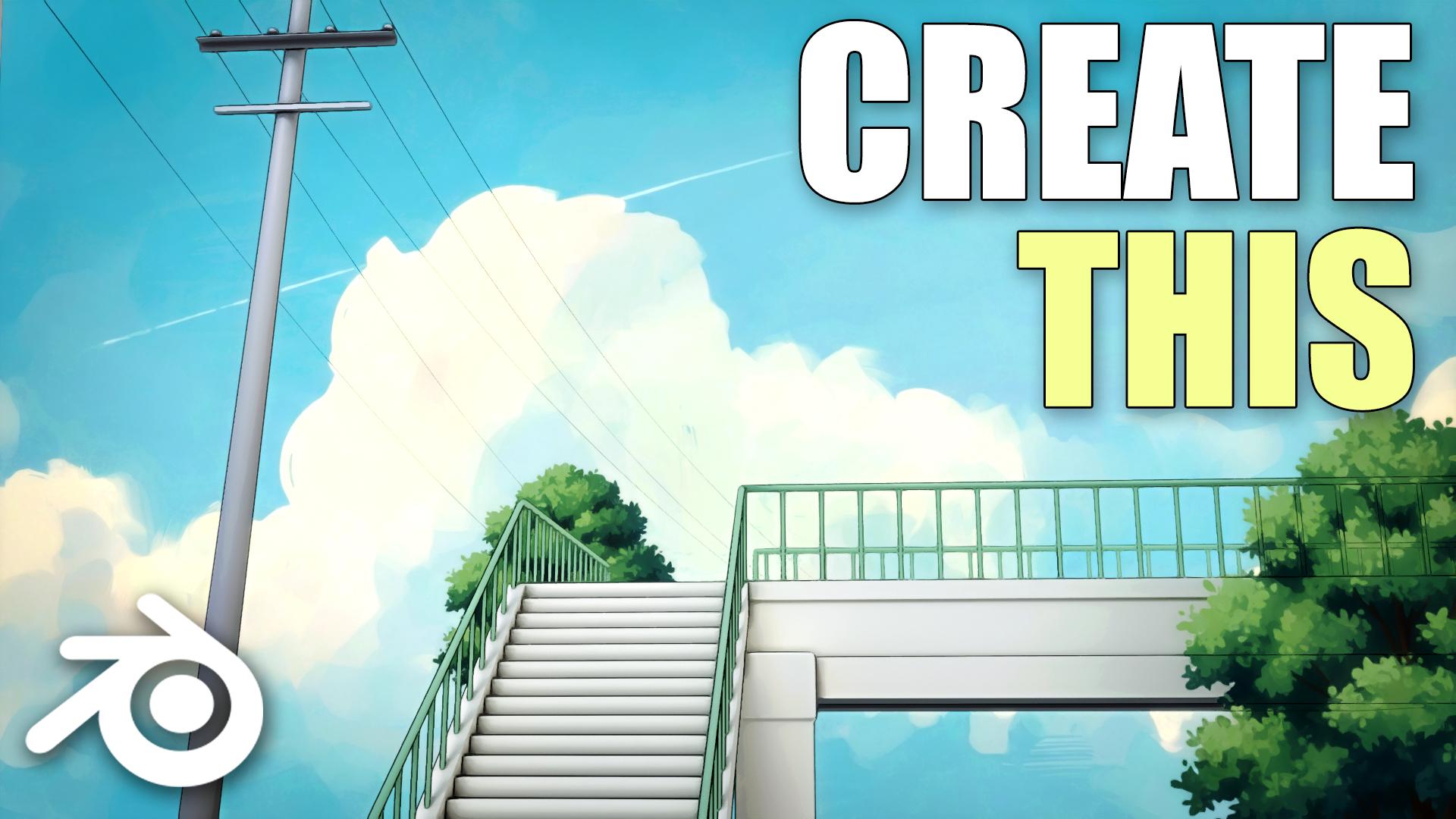
1. Introduction to Class: Hello, everyone. In this class, you will learn how to create an anime style environment scene in blender completely
from scratch. The class is just under 45
minutes long and follows a complete simple workflow
with no steps skipped. All project files are included, so you can follow along easily. We will start by blocking
out the scene and composition to set up
a strong foundation. Then we'll model all the main environment assets step by step. Next, we will focus on creating clean animus style lighting and simple but
effective materials. You'll also learn how
to set up the camera and optimize the scene
for the final vendor. To finish, we'll go through
the basic compositing to polish the final look
and add atmosphere. This class is suitable
for all types of end users who want to
learn how to create clean, stylized anime style
backgrounds and environments. By the end of this class, you will have a finished scene and a solid workflow you can
reuse in your own projects. So I hope to see you there
in the class. Thank you.
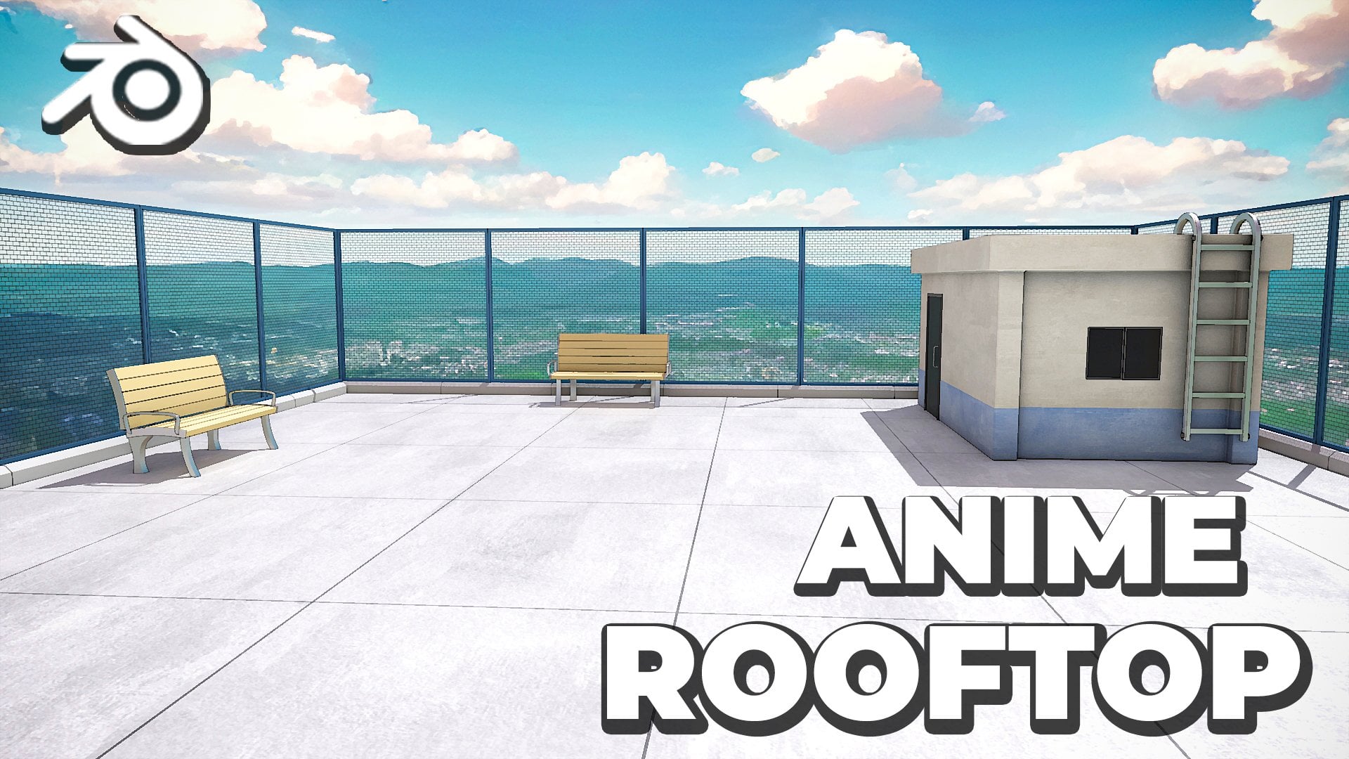
2. Modelling the Scene: This entire anime
style scene was made in blender using
just a simple setup, no complex nodes or anything, and I'll show you
exactly how to build it from scratch. So let's start. All right, so now in
a new blender file, let's start by creating
our stars right over here. So press Shift A, add in a cue. We can press N to bring up the side bar and
then just put in the dimensions to somewhere
around 2.6 for the Y, 0.2 for Z, and 0.3 for the X. Now we have a somewhat
ser looking like object. We can go into the
modifier section and add array modifier
to duplicate it. Let's increase the Z offset
to somewhere around one. And then we can just push
back the X offset on the negative axis like
this to create our stairs. We can increase the count
to somewhere around 20. And yeah, with that, we
have created our stairs. You can also add in a
bevel modifier to this. Make sure to select the
object press controller and apply the scale. With that, we can just
adjust the bevel amount. Enable hardened
normals, and let's just bring it back a little
bit inwards like this. Yeah, that's pretty good. Next, we can create these
supporting structures that are right
beside our stairs. So press Shifte, add in a cube. Let's scale this cube down and bring it towards the
left side of our sir. What I will do is I will also
add a mirror modifier to this and select the mirror
object as our stairs. Now we can select the Y axis so that we can easily
duplicate it as well. Now let's press one for
the side view, press tab, let's enable Xray,
and we can just quickly move this one
towards the top like this. A here, now, let's just
adjust them up a little bit. And with that, I think, our supporting structures
also look pretty good. Now what I will do is I
will first select this, make sure to press Control A, apply the scale, press tab, and we can select
this phase, press E, and extrude it like this so that we can create the
further structure as well. Press tab, press three
for Phase select, and we can just
select this phase, press X, and delete it so that
we can join them together. Enable clipping, hold Alt
and select this loop. Now just press E to extrude it. You can press Y to log on
the Y axis and bring it in. That's pretty good. I will select my steers, maybe add one more so that it
fits seamlessly like this. Yeah, that looks
pretty good to me. I will also add in A, we will modifier to
this structure as well. Make sure to adjusted. Yeah, that's pretty good. Next, what I will do is I will press three to view model from the front so that we can
press Shift A and add in a camera so that it gets added, like perfectly aligned
in this direction. Press G then Y and move it back. Let's see. I think
somewhere around here is pretty good.
Let's move it up. You can also press zero on your number pad to view
through your camera. And now, basically what I will
do is I will first go into the camera settings and just decrease the focal length
to something like 35. We can also come over here,
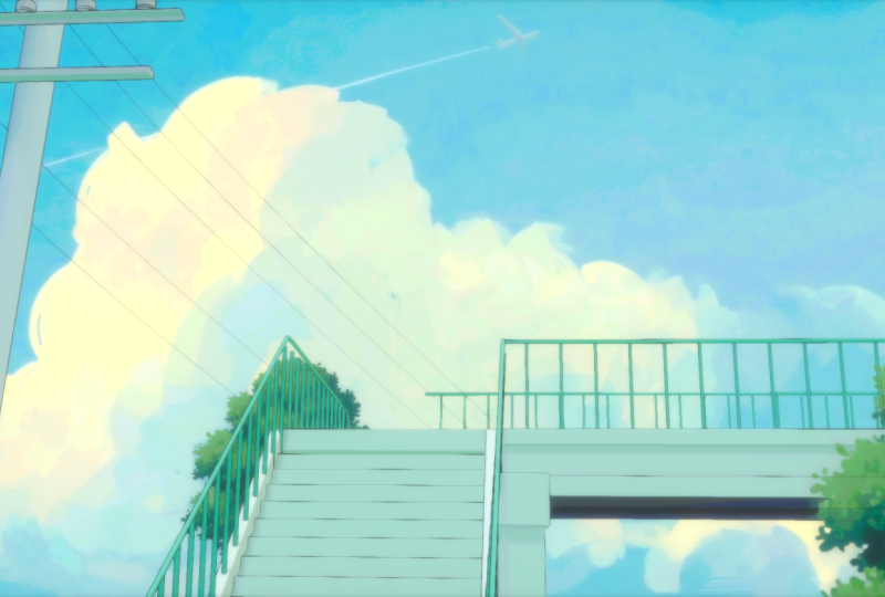
enable background images, and just select the
reference image itself as the background
for our camera. I have also added all of
the files that I will be using in the link in description so that you can
easily follow along. So now that we have
the reference image behind our camera this way, we can easily place
our scene around. So first, let's
select our camera, press R then Y to rotate it on the Y axis and just
rotate it this way. So that it gets a bit flatter, and then we can just press G then and move it up like this. We can also rotate it
up a bit like this. And now we can just
select our camera press G then Y and move it towards
the right side like this. Now you can see we fit the scene much better
and we can continue. All right. So next, we can create the bridge
like thing over here. So just press Shift plus A, add in a cube. Let's press seven for top view. Let's place the cube
right over here. We can press tab, enable Xray, and just move it till here, and also let's extend
it over here as well. Let's press zero on
the number pad to view through our camera
and let's move it up. This way we can easily place the objects around our scene by matching it with
the reference image. Also, just make sure that you have X ray
enabled over here. This way you can easily
select all of the objects. All right. Next,
I will once again press Shift, add in a cube. Let's place it right over here in the corner so that we can create this pillar like
thing, scale it down. Again, press zero on the number pad to view
through your camera. Let's bring it up. Let's move it a little bit on the left. Now just press Tab and
scale it down like this. I will select them both, press Control A, apply the scale. And also, let's select this
press tab, press Control R, and add one edge loop over here, and maybe one edge
loop right over here. Just to add a small
bit of detail, press three for phase select, hold Alt, and select
this entire loop. Now press Alt plus E and extrude faces along normal and just
push this inwards like this. We can also add an A
Bbel modifier to this. Yeah, that's pretty good. Next, I will also
select this press tab, enable Xray and press
Control R and add a edge loop roughly around here to once again create
this extrusion. Again, just hold all,
select this entire loop, press Alt plus E,
and again, extrude. You can also just scale it
down on the z axis like this. Yeah, I think that
is pretty good. Let's add in a Bewl
modifier to this as well. I think it's a bit too much, so I'll scale it inwards once
again. Yeah, that's better. Alright, let's have a
look through our camera. So we do see a little bit
of an issue where there is a small space between
the stairs and the bridge. So we can just
select the bridge, press tab, and enable X ray, select all of this, and you can just move it towards
the left this way. And you can also just select the bridge, press G, the next, and move it back so that they
do not overlap over here. Press zero again to view
through your camera, and now it looks pretty good. I will also select the
camera and just rotate it up a bit like this on these Z axis, to better match it with the
reference image itself. Now you can just
press G, then Y and move it towards the
right, like that. All right. With that, I think the stairs and the
bridge look good. Let's work on the
pillar right over here. So press Shift,
add in a cylinder. Let's scale the cylinder
down. Press three. Let's place it right over here, press tab, and enable X ray, press one for what
you select and select the top part over
here and just move it up. And this way we have our pillar. Just press zero to view through your camera once
again and we can just quickly match it with the
reference image itself. So I'll scale it up, and I'll press tab,
select the top part, and just move it
right over here and scale it down so that the top gets thin and the base is a
little bit thicker like this. And with that, I
think the pillar also is looking pretty good. You can also go into the
wireframe mode so that you can see the actual image
a little bit better. Yeah, I think now it
fits pretty good. All right, so next
we can work on the railings for,
like, the stairs. So for that, let's just press three or one for the side view, press shifty and go into
curve and add in a path. Rotate this path
around according to the slope of the stairs and just place it roughly
somewhere around here. Let's go into the
object data properties in the geometry section, increase the depth so that
we get something like this. Press tab, and let's just select these vertices
that are in the middle. Press X and delete them. I will select this one, press E, and extrude it a little bit. Again, extrude it
a little bit and just make it go down like this. Similarly, just
select this press G, then X and press X two times to move it in the
local direction like this. Move it towards the top,
once again, press E, E, once again, and
again, press E, the next, and move it
straight like this. This way, I think we have
created R railings as well. So just move them
towards the left like this. To match over here. Let's press zero to view through our camera ones and
see how they look, although they do not really fit perfectly with our
reference image, but I don't think we need
to worry about that. It does not really
have to be perfect. As long as it is roughly
matching up, that's fine. And now let's just
extrude it over here and just move it down. I'll select both
of them press tab, enable Xray and just move them towards
the back like this. All right, so now
let's try and make it match a little bit better
with the reference image. First, I'll just
increase the depth. Maybe somewhere around 0.03. Press tab, and we can just
select this part first. Maybe press G then
z, move it down. Select this right over here, press G, the next, move
it a little bit ahead. Yeah, that feels a bit better. Let's press one
for the side view, and it does, like, skew up a little bit over here. Let's just try and fix that up. All right. I don't think it
will get better than this, so yeah, I'm pretty
happy with this.
3. Finalizing the Layout: So now let's just duplicate
it over to the right side. We can select this
pressure plus D, then press Y, log on the Y axis and bring
it right over here. Press seven for top view, and then we can just select this part entirely
and delete it. So press X and delete it. Just select this verte, press G then Y, and move it
on the Y axis like this. We can also select vertex snapping from over
here, press G then X, hold control, and snap it with this vertex so that they
perfectly stay in line. Let's press zero to view
through our camera. Stab and move it up
just a little bit. To match with our camera, I think we can take a little
bit of liberty this way. And with that, I think our scene is starting
to come along nicely. Let's just add these bars now, which are on the side over here. I will also select them both and maybe increase the
thickness a bit more so you can hold alt and increase the thickness of
them both at the same time. So maybe around 0.04. Next shift add in a cylinder. Let's scale this down. I
just make it pretty thin. Now we can press STN Z,
scale it up like this. Next, we will go into the modifier section and
add an array modifier. You can also use the Gizmo over here to adjust it a little
bit more intuitively. Let's place it like this. Just duplicate it now. Make sure it is not
poking around like this, just decrease the value a
little Yep, much better. I'll select this
press shift plus D and duplicate it over
this side as well. I think we do have to
put in a little bit of different values because we have extended this
up a little bit. So first, let's increase
it on the z like this. And, that's much better. Let's select this once again, press shift plus D
and move it ahead. Set the z to zero, so that they are
completely straight. And And now just once
again increase the count. Let's do the same thing
over here as well. Press shift plus D,
bring this over here, rotate it 90 degrees. Let's rotate it -90 degrees. So that inflects like this. Press seven for top view. Let's place this
right over here. And once again, just increase
the count a bunch of times. Again, let's view
through our camera. I think we are at a
point now we can just turn off the background image as well so that we can
actually see scene. And yeah, I think our scene is starting to look really nice and I'm pretty happy with
it. Let's just hit Save. And what I will do next is,
I will select this part. And as you can see, we do see a little bit of the balcony
appearing over here as well. So we can just select
these two objects, press Shift plus D and duplicate them and move them to this side. What I will do is I will
just select this part, presstab, enable ray, and we can just select all
of these extra vertices. We can select this one
and delete this as well. Let's press zero to view through our camera. I think
it looks fine. We can just select this,
probably just extend it a bit, press E, and then z
to bring it down. And, that's pretty good. Make sure to just increase
the number of count over here and also increase the length of this
railing like that. Now if we see
through our camera, I think it looks pretty good. Let's once again just quickly
enable the background. I think that's fine. We don't
have to fit it perfectly. With that, we are pretty
much done with the modeling. Okay, a couple of things
that are left are over here, the pillar, so let's do them quickly. I'll select the pillar. Let's first press right click and shade all
to smooth this. Press Shift plus S
and cause that to select it. You can
press Shift A. Let's add in a simple
cube, move it to the top. Let's just place it like
this, scale it down. Again, press zero, and I think we need to enable
the Bground image. Let's move this down and adjust it according to
the reference image. Yeah, that's fine,
I think. Again, I will just select this
press Shift plus D, press, and move it up. And let's see how we
can create this one. First, what I will do is
I will just press tab, press two for select
and select this edge and press X and delete
the edge itself. Or we can delete the vertices so that we get
something like this. Now we have a similar shape. I think I will just simply
add a solidify modifier to this so that we can give
it a bit of thickness. Add a solidify modifier. Make sure to just apply the scale and now we can
increase the thickness. Enable even thickness.
Yeah, that's pretty good. Maybe add a bevel
modifier to smoothen it out and enable harder normals. Select this press Shift
pluses cursor to select it so that any of the new objects we add get added
right over here. And now we can just simply add a small cylinder to
create these parts. Let's move it over
to the corner. Again, right click and
shade or to smooth this. Let's see. We can press control, apply the scale
first, press tab. Let's add a edge loop
right over here. Select this top face, press
Control B, and bevel it out. Maybe to give it
this type of look, and then we can
select this edge, hold on, select this edge, press Control B,
and bevel it out. Just give it one segment,
press three for phase select, plus E and extrude
phases alarm normal. I think this is fine. Now we can just select this and add a array modifier so that
we can duplicate it. Let's increase the count to four and just
adjust it properly. Yeah, I think
that's pretty good. With that, the only
thing left is to create these wires like things. Again, for them, I
can press Shift, add in a curve and select path. Now let's see how we
are going to do that. Press seven for top view, and first let's just
give them a good bit of length, somewhat like this. Move them up somewhere
around here. Now just move them according to the reference image itself. Like, let's press tab. Obviously, we need to bring
this in a little bit. It does not have to
be that far off. See, I'll place
this one over here, move this a little bit, and move this over here. And as you can
see, it is roughly matching with the
reference image now. Again, duplicate this,
place this one like that, press tab, and just move
the word Cs around. That we can just place
them over here this. Yeah, I think
that's again, fine. Let's duplicate
this one directly. Again, duplicate
one another time, maybe rotate it up a bit and just try to place it with
the reference image. The last one can go over here. And yeah, I think
I'm happy with them. They don't have to be,
as I said, perfect. They can be roughly similar
to the reference image. All right. Now we can just
select all of them at once and you can go over here, hold all, and just
increase the depth. Obviously, they will be
really, really thin. So let's go with something
like 0.02 for now. The only issue that
I might have is that all of them are ping
below the tower. So I might have to select them all and just select this point and maybe move it up like this. Select them all
once again and move them above the tower itself. Then we can just
rotate them all and kind of place them a bit better. Alright, guys. So yeah, now
everything is pretty good. They are going above
the tower itself, and they also roughly match up with the
reference image as well. Now we are done
with the modeling, so we can finally move over to lighting and adding the
background. So let's do that.
4. Materials and Lighting: Okay, so first, let's
just select a camera and then we can just disable
the background image. And now we can move over
to the rendered view tab. Let's press Shifte and
add in a simple Sun lamp. You can just press R then X, then R then Z and
rotate it up on different axes to get a
little bit better lighting. We can also go into the object data properties of the Sun lamp and just increase
the angle over here, which will basically make
the shadows a lot softer. Like, basically at zero angle, you will see the shadows
are really harsh. But I think for this type of stylized anime style of scene, I will be going for
softer shadows. Also, I will just switch over
to cycles. And select GPU. You can also render
it with EV as well, but I will be using cycles to get a little bit
better lighting. And yeah, I think this
looks pretty good. Next, what I will be doing is adding the cloud background. So press Shift and go
into image mesh plane, and now just select this
Cloud background too. I have added this within the files that I've
provided for this video, so you can follow it along, use this one and maybe just rotate it up a bit,
rotate it like this. Make sure to move it quite
far back and now scale it up. Now, you might notice
that it looks a bit weird and kind
of, like, washed out. So let's go into the shader
properties over here, and we can select
this, go into object. And instead of plugging this
in into the principal BSDF, you can directly plug
this into the surface. This way, it looks a
lot more brighter. Next, what I will do is I will go over here in the
render properties and change the color management
from AGX to standard. I think the standard color space works a lot better for
these type of scenes. So yeah, I will be
going with that. You can also increase the
look to medium high contrast. And yeah, that's pretty good. And now I think the
overall lighting of the scene is a little bit flatter compared to
the background itself. So you can go into the world, shade a type now,
and let's press Shift a and add in
environment texture. So yeah, we will be using
an HGRI to make our scene look a lot more brighter and
get some natural colors. You can use any HGI you
want to it does not really matter because it is
not even going to be visible. So I'll just select one of
mine. I'll select this one. And already you
can see the colors look a lot better. All right. So now you might notice that
because of the HDRI added, we do get a lot of
this green color, added below our bridge. And if you look in the
original reference image, it is pretty dark over here. So what we can do to fix
this is the reason this is happening is because there
is no ground in our scene. So you can just
select your stairs, press shifts further
to select it. Press shift a add a simple plane and just increase
the size of it. And now, even though
this ground won't be really visible in our
scene or in our camera, you can see the effect it adds. Just select the ground itself
and now press H to hide it. You can see we get all
of this green color due to the HDRI bleeding
onto our models, which does not really
look that good. So press Alt plus H to
bring your ground back. And yeah, this
looks a lot better. All right. Next, what we will do is we can also add these trees. So press Shift A and once again, go to Image mesh plane, and I have added these trees as well in the
Lincoln description, so you can download that
and get these textures. So let's just place these trees. And I think they
look pretty good. I'll just place them right over here according to the
reference image itself. So maybe somewhere around here, increase the size of it a bit. Let's bring it close
to the camera. You can also go over here
and enable render region. Basically, this will help you to only show you the
region that will be rendered itself and none of the extra stuff so that you can only focus on
the render itself. All right. That's
pretty good. Let's just duplicate this and move it back and place it
somewhere around here. Yeah, that's good. Seen is
starting to come along nicely. Next, what we will
do is obviously add a small bit of outlines, so you can press Shift, go to Grease Pencil and
just select scene line art. And instantly, you will see all of these outlines appearing. So now go into the
modified section of this, increase the line thickness. And we get something like this. Now, this is a bit too much. So first, let's try to fix this. Select your line art
object and you can first go into the edge types and disable crease threshold. And this will instantly remove all of these extra outlines, obviously, we need to
decrease the thickness. We don't want it that much. I think somewhere around
here is pretty good. Next issue that you
might notice is that all these images are also getting
this faint outline. So there is a simple fix
for this, select them. Go over here in the object
properties, scroll down. Under the line art section, you can just change the usage
from inherit to exclude. As soon as you do
that, you can see no more outlines for this tree. Select this tree as well
and go over here and just select Exclude.
All right. Much better. Now we can just come over
to our render properties, make sure denise is enabled, and just set the samples
to a small number for now, like 100, press F 12 and let's see quickly
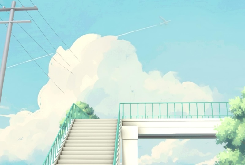
how our render looks. All right. So this is what
our render looks right now. I think I'm pretty happy with how everything
is turning out. Next step is to basically
add some materials and also just add a bit of compositing for the
finishing touches. All right. With that,
let's just close this and start working
on the materials itself. First, I will select
my line art object, go into the modifiers
and turn it off in the viewpot because sometimes it can make it really laggy, so just make sure
to turn it off. And now we can
select our stairs. Let's go into the
object Shader type, click on New, and let's rename
this material to stairs. Alright. Let's change the color to something random for now. And now I basically
want this material to be copied to the
rest of the objects. So select them all, this one. And now at last, you can
select the syers themselves, press Control plus L,
and link materials. And this way you can copy
the material to everything. All right. So now the material itself is going to
be, very simple. What I will do is
just press shifty, add in ambient occlusion node. And basically, if I
plug this node in, you can control the shadows. So it will be a nice
addition to the material. Press Shift, add in
a mixed color node. Plug this in to the base color, and you can plug this
into the factor. And now you can change the
B color, I think, yeah, change the B to something like gray or Big
something like this. Me somewhere around here. And now we can just make the
A color a lot more darker, which will basically
be the shadows. And now you can control this
from the distance value. Maybe somewhere around here. I think I will make it a
little bit less saturated. Somewhere around here probably. Yeah, I think that is
fine for the material. Select this one now,
again, click on new. Let's rename these two railings. And again, this can be like
some type of green for now. Now just select all of
the other railings. And now select this one at last, press Control plus
Link materials. Let's change the color of them. Obviously, I will make it a lot less saturated,
bit more brighter. I think something like this
would look pretty good. Now we can select
all of the cables. I'll probably just pest control J and join them into
a single object, click on Nu, again, create a new material regions to cables and these can be
basically just black color. Nothing really too much. We can also adjust now the thickness
of them at the same time. Let's play around
with this later on. First, select pillar now, click on Nu, in this
to metal maybe. Let's give it like
one metallic for now. Again, copy it to all
the other objects. Select them all, now
select the pillar at last, press Control plus L,
and link materials. Again, for this one as
well, I will press Shift A, add an ambient agglusion node. We can just select the stairs, select this simple setup, press Control C to copy and
paste it right over here. Now plug this into
the base color. Let's reduce the distance. I'll just set this
to zero completely. Now we can increase the
roughness somewhere around here. Yeah, I think something
like that is pretty good. Yeah, with that, I'm pretty
happy with the materials. Let's press F 11
to view R render, press J, and now
you can press F 12. Basically, this way you
can render both of them at the same time
in different slots so that we can compare them too. Let's wait for the
render to finish. Now the render is done, you can press J to
compare between the two. I think I'm liking how
the render is looking. One thing that I'm
noticing is there are not really any outlines
on the pillar itself. That's why it looks
a little bit weird, so don't worry, we can fix that. Let's just go back into
solid shading and first, I will select my camera once again and enable back
the background images. So what we need to do
is we basically need to place this pillar
close to the camera, and then the outlines
will start to appear. So just select it
all, press seven for top you and just
place it right over here. Next to the camera
itself, scale it down. Now we can once
again just match it with the reference image. Yeah, I think that
is pretty good. Let's press F 11 once again. Now you can press J
and press F 12 to give a new render so that we can compare the newer
and the older one. It's a tad bit bigger than the earlier one, but it's fine. And yeah, you can see the
outlines work a lot better now because it is closer to the camera, the
outlines are appear. With that, I think I'm
pretty happy with the scene. Overall, we are now done. Now we need to work on compositing to give our
scene those final touches. I'll just close this
one other thing that I want to do is, if you can once again
see the bottom part of the bridge is pretty dark, so we can also do that as well. First, let's select
our bridge, press tab, press Control R, and use your scroll wheel
to add two edge loops, hit right click, and
add them in the center. I will just select
this bottom face, and you can go over
here and select extrude manifold and
just extrude it inwards. To create this
type of structure. And after we have done that,
basically what I will do is, let's come back to our
rendered view mode. Let's just hide the
ground for now. Select this, presstab, select all of the bottom
faces, select this, select this, select this one, and these over here as well. Come over in the
material section, click on T plus icon, and you can create a new
material and just hit a sign. Basically, now this bottom
part has a separate material, and you can give it a
darker color like this. So I think this way we can much better control
this bottom part, so we'll just make it like
a tad bit darker like this. Now press A plus H to
bring back your brown. Let's sit save, and I will just finally give
it one last render, so press F 12 so that we can render it one last time and then start with the compositing.
5. Compositing the Final Render: All right, guys. So the
render is done now. I will just hide this
reference image for now. Let's close this come over into the compositing tab and
you can click on this new and go over here in the corner and you
can just divide it like this. Can also remove this part.
We don't really need it. And yeah, just
change this window from compositor to image editor, and you can select
your render result. Basically, this way, whatever we do right over here
with the nodes, we can directly see
the results as well. Can come over here
and just press V to kind of zoom out this image. Start off, you can
just go in the Options tab right over here
and select GPU. For some reason,
it is set to CPU. So, just make sure
to set this to GPU because it is a lot faster. The next thing to do
is we basically want painted type of edges because if you will
zoom in right now, we get these really
harsh CG edges which do not look that great. So we want really soft edges. So for that, we will be
using the Kuvahara filter, so press shift a and
search for Kuvahara. And you can just plug this into here and plug this
one over here. Instantly, you will see that you now get a lot more softer edges. You can select any of the node, and you can just
press to basically mute it and you can see
the difference it creates. Instantly, we can see we get a lot better painted type
of feel in our environment. So next, you can play
around with the size. Basically, if you increase it, it will get more
like a painting. If you keep on increasing
it, and if you decrease it, it will get closer to them,
like the real render. So I think the default value
of five or six is fine. So six was the default
value. Let's go with that. Next filter that I will add is you can press
Shift and search for the pasteurized Basically, that helps us to add
this type of effect. First, I will plug this
in directly over here, and it will create
something like that. You can adjust the steps and
you will get varied results. If you keep on increasing
it, it basically, again, gets closer
to the real render. So we need to keep it at a low number and kind of try to mix it with
the Kua hara filter. So how we can do that. So first, we need to add a mixed note, press Shift A and search
for mix color, this one, and plug this one into A, plug this one into B and plug
the result in over here. Instantly, you will see we
will get a mix of these two. And select the node and press G to move it around. All right. Yeah. Now, basically, both of these nodes are being
mixed at equal parts, so it is set to 0.5, so half of the Kua hara and
half of the pasteurize. If you set this
completely to one, it is basically entirely
the pasteurized node. If you set this to zero, it is completely the Kua hara node. So obviously, we want
a little bit less of the pasteurize effect because
it is like a bit too much. So I will set it around, let's say three to get
this type of vibe going. And then we can just keep
on decreasing the factor. To a point, it is very subtle. So let's say
somewhere around 0.1. Basically what this is
doing is if you zoom in, this is the effect that the
pasteurized node is creating. I don't know if it is
that apparent over here, but you can just select
it and press M to again mute it and you can see
the difference it creates. It adds these different
shades of colors, basically, which again, give
it a painted type of look. Otherwise, it will be completely
flat one single color. But with the pasteurized node, you can add some
of these effects. And if you want
more of it, you can basically start to
increase the factor. Start to get more and more of these different
colors and shades. But again, it starts to
look like pretty weird. So yeah, I think a value of zero point even
15 would be fine. Or honestly, I think
I would go with 0.1 because it starts to look a little bit weird over
here in the sky. So you can then just
play around with the pasteurized value to get the best type of results
that you want to go for. I think somewhere around P
would be fine. All right. So next we will be adding the glare node that
will basically add gloom into our render and give it that dreamy
hazy type of look. So you can press Shift A
and add the glaar Again, plug it in over
here, and now you can change the mode from
streaks to fog glow. Let's just decrease
the threshold to zero for now and increase
the size to one. And you can see we
get all of this glow, but now the scene is
pretty overexposed, so you can press Shift and add a exposure node and
now turn this down. Again to somewhere around here. So now you can
clearly see we get this dreamy hazy type of look. You can select both
of these nodes and press to mute it and
basically see the difference. But I think it is
a bit too much. If you do like this look, you can definitely go for it. But basically, I will increase the threshold to somewhere
around 0.6 and again, increase the exposure to get, just a little bit of
bloom, not that much. Now I think it is,
like, really subtle. I think somewhere around
here is pretty good. So now you can select
just all of the nodes, press M, and see the
difference we have created. Again, it's really,
really subtle, but it definitely adds a
lot to the render itself. You can see now the edges do
not look that harsh anymore. If you want, you can even
increase the Kua hara filter at to further get that
painted type of look. But it can get a little
bit too much very quickly. So yeah, just make sure of
that. I will undo it back. And one thing that
I'm noticing is that the wires look like
pretty thin now, so we can definitely increase
the thickness of them. And also the outlines look
a little bit too much, so I will definitely
be decreasing the thickness and opacity
of those as well. So go back to layout, select your wires and
maybe increase the depth to something like 0.013. Just a little bit and select
your line art modifier, and maybe we can decrease
the line radius to 0.008. And decrease the
opacity to 0.8 as well. Let's come back to compositing press J to switch the slots, and again, press F 12 to give
it a new render. All right. So the render is done now
and we can just close this press J to
basically compare, and you can see the wires are a little bit more thicker and the outlines are a little
less dominant than earlier. Yeah, I think
that's pretty good. We can add a couple
more effects. Basically, you can
add the vignette, press Shift, search
for vignette. And basically, it will
add these darkening of corners to create more
focus in the center. You just need to decrease this factor. Like
somewhere around here. As you can see, it will darken up the corners
just a little bit. You can also add something
like, let's say, if you press shift add
the hue saturation node, we can also increase
the saturation a bit. You see? That looks pretty good. Yeah, so we can definitely
increase it a bit. You can also add all
of the normal nodes like brightness or contrast
to adj that as well. I think this already
is pretty good. We have made our render from
something like this to this, and I'm pretty happy with
the overall look of it. Maybe just push back on the contrast a bit to
somewhere around three. You can also add, like a bit of chromatic aberration or
noise if you want to. Just plug this in over
here and you can see we get all of this small noise. You can control it
from over here. But I think I will rather keep my render completely clean. So I'll just remove
this. You can also add chromatic aberration. Basically, it will create
these splitting of edges. It really only looks good if you add just a little bit of it, but I don't think it will go well with our scene over here, so just remove this as well. So yeah, these are all the
different things you can do. Obviously, you can experiment
with the scene a bit. And with that, we are
pretty much done. So this is our final render. I think it looks really good. And yeah, thank you
guys for watching. If you like the video, please
like subscribe. Thank you.
 Aniket Rawat, 3D Artist