Transcripts
1. Introduction to Course: Hello, verone and welcome to the Anime Environment
Masterclass, where you will learn to create a fully stylized anime
inspired room environment from start to finish using both Blender and
Substance Painter. With over 7 hours of content, this is a complete
masterclass in creating stylized
anime environments, covering every step from concept to final
polished renders. And by the end of this course, you'll have the skills to create environments just
like the one you see in this trailer and even build your own scenes
in a similar style. We'll walk through the entire
workflow step by step, starting with blocking out the
room and adding the doors. Then we'll start building up all the major assets,
the cupboards, chair, fan, table, Boombox, the Tami mats, et cetera. After that, we'll start adding all the smaller props like
the blankets, utensils, calendars, cardboard
boxes, the details that bring the room to life
and make it feel lived in. After we finish up
with the modeling, we'll unwrap all our models and export them into
Substance Painter, where you will learn to texture the entire room piece by piece. Throughout the process,
we'll create a variety of stylized material sets designed specifically to match
the anime athetic. After Texturing, we'll bring
everything back into Blender and apply all the exported materials cleanly
and efficiently. Then we will enter the
stylization phase, adding more small props,
refining the lighting, adjusting color space,
adding outlines and special effects to achieve that signature to D anime look. We will also create multiple lighting variations,
including daytime, evening, and night
versions of the scene to create different
moods and atmospheres. We will finish the course
by adding final touches in blenders compositor
and Photoshop polish. Whether you are a bigna or an
experienced Blender artist, this course will guide
you through creating a detailed anime inspired three D environment
completely from scratch. So I hope to see you there
in the course. Thank you.
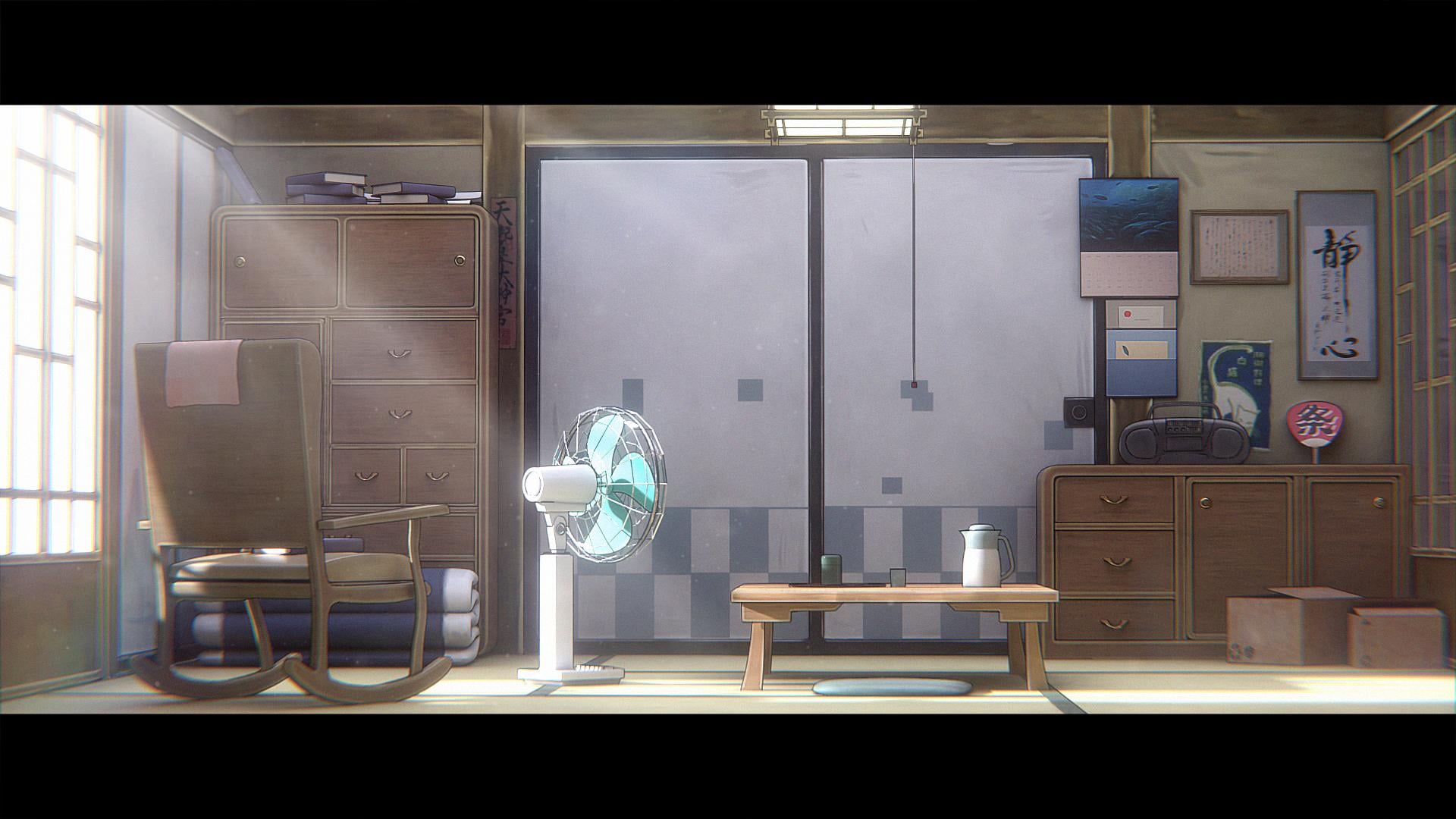
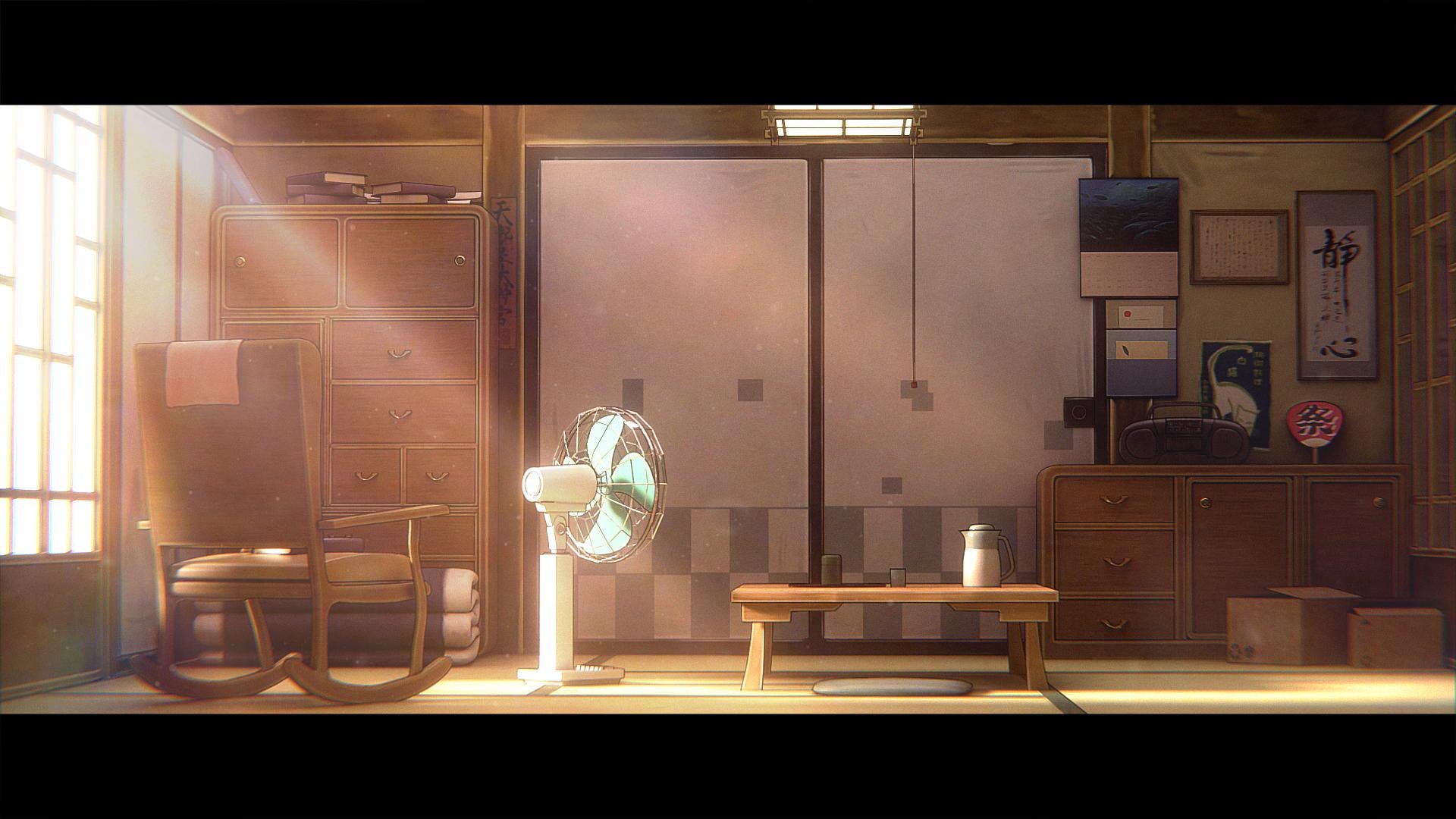
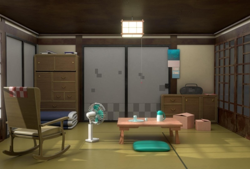
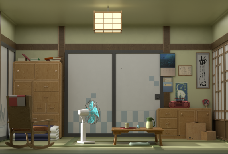
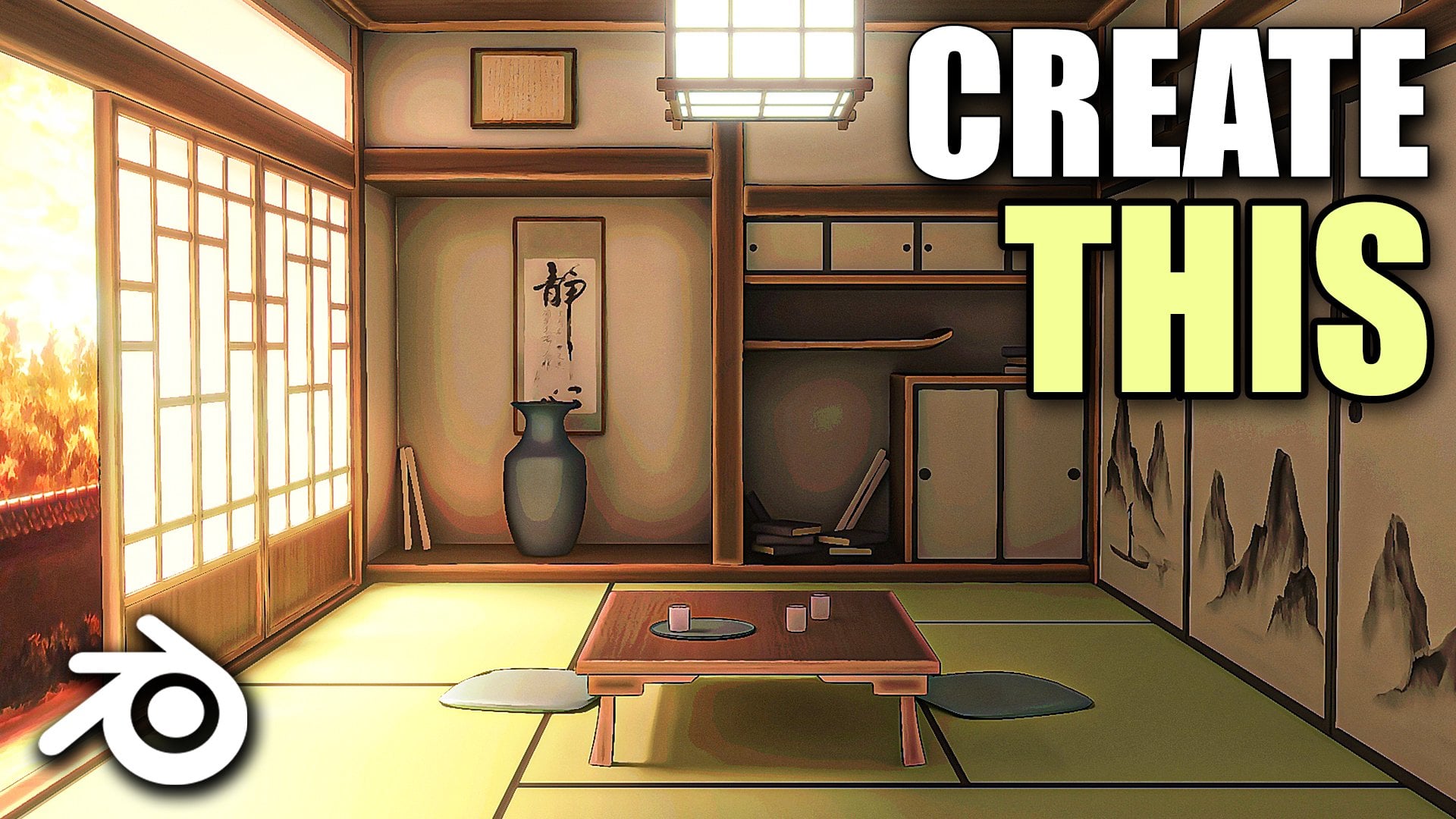
2. Blocking Out the Room: Hello and welcome guys to this new course where
we will be creating an animne from scratch using blender and
substance painter. So if you will open up
the course files now, you will find all
of the required files to complete the course. Just open up the reference
images and textures folder. Hey, you will find all of
the required textures that we will be using to
create our assets, as well as the reference images that we will be using
to create our scene. So this is like a real anime that our
scene is based off on. So these are all, like frames
from the anime itself. I think the anime is called
Jos the Tiger and the Fish. I haven't watched it, but
I really like this frame. So yeah, we will try and
recreate it in Blender. Obviously, we will give it
our own touch a little bit. So yeah, let's just start now. We can first go into Google, and I would suggest
you guys to download a free program called PureRef, which will help us
with kind of managing our reference images and look at them while we are
working in Blender itself. Otherwise, you have
to, like, kind of, switch between the
reference images when you are in a normal
image viewer like this. But if you download
something like PureRef, so you can just
search for PureRef over here if you don't
have it already. Search PureRef. It's
a free program. You can hit Download and just select this,
select your OS, and you can donate them, donate to them if you
want to or you can just put in zero and hit
download from over here. I already have the program, so I'm not going to
download it again. You can download and
quickly just install it and then just open up
PureRef from over here. Open it up and you will get something like this,
like this black screen. You can hit right
click on your mouse, so just hold your right click
and you can move it around. And the great part about this is that it will stay on top
of your window at all times. Like you can work in blender
while your ref is over here. So if you open up
the images now, let's just select our reference images of the scene itself, not the rest of them because we will be needing them
in blender only, not pure ref and just drag
and drop them like this. This way you will get all of the reference images like this. And I think that's really
helpful because you can view all of them
at the same time, as well as you don't
have to, like, constantly switch between
blender and like your image. If you just have
a single screen, you can place it somewhere over here in the
corner or wherever, and you can work
around with blender. You can also decrease the size of this by
adjusting the window. So yeah it's really helpful. There are a couple of shortcuts which you can use for PureRef, you can just hit
Double click and it will focus on that
one single image. Another thing is you can right click and select the
different modes. So obviously, right now
on top is selected. If you disable it, then, basically, it will go away. Whenever you select
any other window, it will minimize itself. So just make sure to
enable always on top. You can also save your
scenes, which we will do. So just go to save and save
and you can save it in art. To folder only over here, let's just save it
as anime scene. And it save. So that next time whenever you
open up PUR Rf, you can just quickly
load the scene, you don't have to add in
the images again and again. So yeah, basically PUR Rf is like this program to
create your mood board. Right now, we don't even
have that many images, but sometimes in projects, we have a lot of
different references that we have to manage and
work around with. So yeah, for those situations, it's like, really helpful. Also, if you want to minimize it when always on
top is enabled, you can just click on
here in the task bar. And just click on it over here and then it will
minimize itself. All right. So with
that out of the way, we can finally start
working in blender. So now I will just move over the reference images to
my second monitor so that they don't take up the space in the video whenever I'm
doing stuff in blender. Obviously, we will keep on referencing them
to create all of the assets and keep the similar
structure of the scene. But yeah, I'll just move it
over to my second monitor. All right. So now we can
finally start in blender. I've also enabled
a software through which you can see
all of the shortcuts that I'm performing
so that you can easily follow within blender. So now let's just start. We can first start by creating
the blockout of the room. So as you can see, it is
a pretty simple room. With something like this, we can start by adding in the room, then adding in more simple
shapes like the door, these wooden planks,
and then we can slowly start to add the assets one
by one to populate the room. All right. I'll move
it back over here, press A to select everything
and delete everything, press Shift A, and then we
can simply add in a queue. What I want to do
is I will press Tab and press three
for phase select, and we can select this
phase right over here, press X, and delete this phase. So the reason we are deleting
this phase is because it will be just easier to move
in and out of the room, and we can place it
something like this. Like this will be the short. And it's similar to
this, we can just make it a little bit
wider like this, and we can place our
camera right over here and add all of
the assets like this. So this way we can work
in from this angle, and we will just keep this phase open so that we can easily move in and out of the
room and place all of the assets. All right. Let's continue. So the next
thing that I will do is, you can see right
now the origin point is set at the
center of the room. So we just want to move it at the center of the bottom face. So to do that, you
can press tab, press three for phase select, select this bottom face,
press Shift plus S, and then select
cursor two selected. This will bring the
cursor point right over here in the center of
the selected phase. Then you can just press Tab
to come out of the edit mode, go to object set origin and
origin to three D cursor. This will set the three Dcursor at the bottom of our cube, and this way we can press G then Z. G is for
moving Z to lock it in the Z axis and then
hold Control to snap and we can easily snap
it at the world origin. So this usually helps
when you have to, let's say, adjust the
height of the room. So I can select
the room, press S then Z to scale
it on the z axis, and you can see it only
moves upwards like this. So it is really
helpful when you are creating rooms or
buildings in buildings, it is very helpful to
move the cursor point at the bottom of the like at the bottom part of the
face of any of your cube. Because let's say this cube has the origin point
in the center. If I press S and Z
and scale it up, you can see it scales like this, which can cause some issues. It is scaling in
both directions, but this one only scales in the upward direction
only because the origin point
is at the bottom. So let's remove this,
select it back again. I will also go over here and
enable shadow and cavity. Basically, this will help a little bit with
the visibility, as you can see the edges are
a lot more prominent now. We can see them a
little bit better. So yeah, let's keep that
enabled and press in to bring up this side bar so that we can see the
dimensions of our room. So now I have, kind
of already decided on the dimensions when I was
like, preparing the course. So I will be selecting that. You can select mine or you
can adjust them accordingly. Whatever you want to. That's totally up
to your preference. For the z axis, I will set
this to something like 2.25 meters because Japanese
houses like this one, are kind of, like,
traditionally low in height. So that's why we are going
with something like this. And for the Y, maybe we can extend it up to
something like 4 meters, and I will set it to 4 meters
on the X axis as well. And yeah, I feel like those are pretty good dimensions
for this kind of room. And obviously, we can change it at a later on stage as well. But yeah, I feel
pretty happy with it. Now let's just press Shift A, and we can start to add more of the simpler shapes in our
environment that is basically the cube and these
wooden bars that we have over here in the room because they're pretty
simple to make. They're basically
just cube shapes only. So let's start with that. I'll press Shift A, and
let's add in another cube. Let's move it up
right over here. And for its dimensions, what we can do is the height can be down to
something like 1.75, and this is the Y.
Y is finite two. X is obviously going
to be really thin. So press then X to scale
it down on the X axis, make it something like this. Just move it back now over here. And maybe we can add more detail to the room at a later on stage. For now, let's just
keep it like this only. And yeah, I think it
looks pretty good to me. What we can do next
is you can select the cube and press Shift plus
S then cursor to select it. What this will do
is this will bring the cursor point right
over here at the door. So this helps us to add objects, press Shift A and
add in a new cube, and it will be
exactly added over here at the center of the cube. This basically helps us
to add the objects around where our scene is
present because if you hold Shift and
use your right click, you can move the three
D cursor around. So let's say I
place it over here. Now if I press Shift
A and add in a cube, it will be added
right over here. So yeah, I think
it is best to keep our three D cursor somewhere
close to the scene. Select the door prehifS
then cursor to select it. Phife and add in another cube, and these can be our bars. So let's scale them down a lot. Let's move them
close to the door. You can also press
the dot key on your number pad to focus
on the objects like this. It's pretty helpful when you have a lot of assets
in your scene. You can just select on anything
and press the dot key. It will basically focus on
that particular object. Yeah, pretty good. Let's
select this once again. And let's see how much
thickness we want to give this. So for the thickness of the bar, which will be mainly visible. So basically this part, you can set it to something like 0.145, and the Z would be
basically according to the height of
the room itself. So we can adjust
that accordingly. And the X axis is basically
the thickness like this, which does not really
matter that much. We have to just give it a little bit of
thickness like this. And yeah, I think
we will be fine. Let's adjust the bar now, give it a bit more height
to fit the room properly, make it close to
the door like this, and we are basically good to go. We can maybe bring it out a little bit more supress
G to move it around an X to lock on the X axis
and bring it out like this. What you can do is you can
also add in something like a mirror modifier so that you don't have to duplicate
it again and again. Select your door, make sure to go to object set
origin and origin to geometry so that
the origin point is perfectly at its location. Now you can select the bar, go into Modifier section
and just click on Add Modifier and search
for the mirror modifier. What this will do is it will
help you to mirror objects, but it basically works
according to the origin point. So right now, the origin
point is right over here. That's why the mirror modifier
is not really working. So now what we basically
want to do is we want to mirror this bar on
both sides of the doors. So one is over here, we want to mirror it over here
on the left side. As you can see on the like
reference image as well. Obviously, you can just select it and duplicate it as well, but I think it is best to
use a mirror modifier. So to make the mirror
modifier work, again, you can either change the
origin point of this bar or you can just use the mirror object option from over here. Just click on this dropper
and select the door. Make sure to remove it from X
axis, and I think on the y. And yeah, now you can see
it is working perfectly. So the wooden bars are being mirrored according to
the door object now, which you can see if you select the door object and move it around you will notice that the bars move along
with it. All right. So if you check the
reference image now, we have to add a
couple more bars, one over the top
right over here. And I think these
bars go along on the left and the right hand
side of the wall as well. Yeah, as you can see, in
the other reference images, we have the bars going all along like this. So
yeah, let's do that. You can select this
bar, press Shift plus D. To duplicate it, press Y, we just place
it right over here. And for this one, we don't need a mirror modifier
because as you can see, it is just on the top
right over here like this. So yeah, we can just remove
the mirror modifier now, press R to rotate
it around and then press R then X to
lock on the X axis. You can type in 90 in your number pad to give it the perfect 90 degree rotation. And let's just place it right
at the top of our door. As you can see in the
reference image as well, it is placed just along the
door like this. All right. Select the bar, and we can set the thickness for this
exactly as the room. So set this to 4 meters. And I think that
should be pretty good. Yeah, that feels right to
me. Let's move it down. And you can notice that there is some Z fighting going on. Basically, the faces
are overlapping. So just select
this bar, press D, then X and move it a
little bit behind so that we don't get that face overlapping anymore and we
get something like this. Let's move them down. And yeah, I think that is pretty good. Pretty similar to the
reference as well. Select this bar once
again, press Shift plus D, press R, then Z to rotate it
on the Z axis by 90 degrees. And let's move it over here. There's G then X and move it. Just along this edge. Make sure to fit it perfectly with the length of
the room like this. You can just overlap
these 2 bars. I think that works fine. You can now select it, add a modifier and search for the
mirror modifier once again. And this time, we want to mirror it according to the room itself. So you can select the room. Sorry, you can select this
object and go over here to the mirror object and select
the dropper and in here, just click on the room like
this. Select the Y axis. And yeah, again, you can see it mirrors perfectly along
the room itself now. Alright, so we have created
our wooden bar structure. Let's just hit save on a file first because we have
worked quite a bit. So just make sure to go in
the blend files folder, and I will save it
right over here. I'll save it as anime room. Let's just hit save. And I think this much is pretty
good for this first lecture. What we will do in the next one is we will detail that door, obviously, and then we need to, I think duplicate it
right over here as well, as you can see the door is
present on this section, and then we will create a little bit of the
designer doors. And yeah, we will keep on adding more details and assets
to our environment. So, thank you guys for watching. Just make sure to hit
Save and save your files, and I will see you
in the next one.
3. Adding the Doors: Hello, and welcome, guys. So let's just continue
working on our environment. And in this lecture,
we can start by giving our door
a bit more detail, and then we can further add more wooden bars or a couple
of doors over here as well. So yeah, if you will see
in the reference image, we just have a very simple door. We just need to,
like, insert this a little bit and then
extrude it inwards. And yeah, we will have
something like this. All right. So to start off, you can just select
your door and click on the slash key on your
number pad like this. You select it and click on here, so you will go
into a local mode. So this is a mode where you can kind of isolate
any of the object. Like, you can select any object, then slash on your number pad, and basically isolate that particular object
so that you can work on it without any of the
other objects interfering. And if you click on
Slash once again, you will come back to your
normal perspective mode. So yeah, let's just select
our door, pre slash. Then you can press tab to
go into the edit mode, press Control R. Control
R is to add edge loops, and we want to add this edge
loop exactly in the center. So just hit right
click and it will be placed exactly at
the center like this. So next, you can press
three to go into the Phase select mode so that we can just select
these two phases, press I to insert
them like this. But before that, I just want to quickly go over one
simple concept. So press Tab to come
out of this cube, and we can press Shift A
and add in another cube. And place it right over here. You don't have to
follow me for this. I'm just trying to
demonstrate it. Basically, I'm showing you the
concept of applying scale, which is really, really
important in blender. So I have gone over this a lot of time in my other
courses as well. I will just quickly
go over that. So basically applying
scale means is that whenever you change the scale
of your object in any way, let's say I scale
this up like this, I have to press Control A and then apply the scale
from over here. I just want to show
what difference it would make if
you don't do it. So let's say I select this cube, press S the Y to scale it up
on the Y axis by four times. So I'll type in four like this. Let's move it a little
bit to the side, and let's select
this one as well, press S the Y and type in four to scale it
up by four times. Now, basically both of
them are same objects. They have been scaled up
four times each of them. Now I will select
one of them and press Control A and
apply the scale. So this one has the scale applied while this one does not. So if you press tab now, and let's say I try to do any of the blender operations like I press A to select
everything and then press Control plus B to
bevel the edges out. So make sure you're pressing
two for ESelect and then press Control B and bevel
them out like this. Let's bevel it out this much. Press tab and see how it looks. You will notice that the edges appear to be really
stretched out over here like this because we have
scaled it up in this direction, that's why the edges are really stretched out over
here like this. But let's say I select this one, prestab A to select everything, and then press Control
B to bevel it out. You will notice
that this one has the bevel completely uniform, like we have equal
distances on all edges because we have applied the scale for this
particular object, and this one does not
have the scale applied. That's why it is
appearing like this. Let's undo this now, and let's try to do
some other operation. So press three now for
phase select and select this phase and press
I to insert this. Now, usually, when you
inset any of the faces, it should be equal
from all directions. But over here, you
can clearly see that this part is really wide while
this one is really thin. And if I try to inset this one, this will be completely
fine as it is completely uniform
from all four sides. So this is the point
of applying the scale. Basically, the rule of thumb is whenever you change the
scale of your object line, you scale it up in any
of the directions, press simply controlling
and apply the scale. You just have to memorize this, so I will select them
both, delete it. And now with that
out of the way, make sure to select your door, press Control A and
apply the scale, and then we can start doing the operations inset or bevel anything,
whatever you want. So let's select these two faces and press I to insert them. And you can press I once again to make sure
you're inserting individually like this because you might also insert
it like this as well. So press I to insert this so that you can insert
them individually. Let's just insert
this still here. I think this much
is pretty good. Then what I want to do is that this middle part is really, really thick, so I want to make this a little bit thinner. So enable Xray from over here. We can press one to go
into the vertice select. So with the help of
Xray, basically, we can select the vertices that are behind
the face as well. So we want to make sure
that we select everything. So now that everything
is selected, you can press S and then Y and just squeeze
this in like this. So that it becomes a
little bit thinner. And now you can press
three, select this phase, select this phase, press E, and extrude this inwards like
this, just a little bit. And we have our very
simple shape of the door. It would kind of look
a little bit weird because the edges are
really harsh right now. So to fix that, we can
just simply select it and add in something
like a bevel modifier. So go into your modifier
section and add modifier and just search
for the bevel modifier. And yeah, already, it looks
really good and better. Make sure to apply the scale. Reduce the bevel amount. We don't want this much bevel. Let's go with
something like this. Enable harder normals and make sure right click and
shade auto smooth this. Select this smooth
bi angle modifier that is added after
Shade Smooth, and you can click on here on this pin icon and just
move it to the top, and this will give
you the best shading. I will press Tab once
again on this door. Sorry. Enable Xray once again, select this part, and
I just want to make it a bit more thinner
in my opinion. Yeah, this feels pretty good
to me and you can already see with the added bevels
and a couple of extrusions, the door is appearing
a lot more better. If you want, you can
add the bevel to your like the wooden
bars as well. Make sure to press
controle apply the scale. You will see as soon
as we apply the scale, the bevel changes a
lot because it kind of adjusts itself
according to the scale. I will just decrease the
number from over here. Now we can add it to the
other wooden bars as well. Just make sure to decrease the bevel amount and
apply the scale for them. Press control apply the
scale again and reduce the bevel amount.
Yeah, pretty good. With the added bevels,
the wooden bars look really nice
because in real world, there are no very
sharp or harsh edges. So that's why it is nice
practice to just add a bit of bevel to your
models. All right, guys. If you will look over in
the pure f once again, we just have this
small bit of square and cylinder added on our door. I think basically to help
open the door by holding it. So yeah, we can just
quickly add that as well. I'll select the
door and we can go once again in the local mode, so press slash, press
one for the front view. So by pressing the different
keys on a number pad, you can go into different views. So one is for front, which is basically
giving us this. So I think we need to press three for the right side view. And yeah, we are good
to go over here, press Shift A and add in a
cube, scale this cube down. I think this much is pretty good and move it
right over here. Now, scale this down on
the x axis like this. Maybe we want to
move it a little bit downwards till here, maybe. Also, I think I'll press stab, select these two faces and just decrease the
extrusion a little bit. So press G, then X to move the pace a little
bit upward still here. Select the cube and
bring it out as well. This feels pretty good to me. Now you can select this
cube, press Shift, cursor to select it
because we want to add the cylinder right at
the center of this cube. So that's why I will bring the three D cursor right over here. So basically, you need
to select the cube, press Shift plus, then
cursor to select it. Press shift A and add in another cylinder,
scale this down, press R then X, for R then Y and type in 90 to
rotate it like this. Right click and shade
how to smooth this to remove all of
these harsh edges. And let's press S the next
to scale it down like this, maybe scale it up a
little bit like this. Pretty good. Just
select the cylinder, press tab, press three
for phase select. Make sure to apply the scale
first for both of them. So press Control,
apply the scale. And I think I will just
select both of them, press Control plus J to join
them into a single object. You might notice that we get a little bit of shading issue, so just select it and we can fix this by adding in a
bevel modifier first, adjust the bevel amount. Right click and harden normals. Then add a shade auto smooth and again move this to the top. And, now you can see
the shading issues are pretty much fixed. Press tab, press three
for phase select. Let's select this phase, press I to insert
this once again, and just extrude it
inwards a little bit and scale this down. Maybe have something like this, and I personally think
this looks good to me. Let's press slash to come
out of the local mode. All this whole shift and right leg to move the
three D cursor away, and we cannot really
see it properly, so bring it out a little bit. Yeah. That's a lot better. I kind of think that the square is looking
a little bit too big. Let's compare it over here. I'll just decrease the size
of this overall a little bit. Press tab and you can select the square by hovering
over it and then pressing L. So you
can press L to select any of the objects by hovering over them like this. Make sure you are
in the face select, so press three and
then hover over it, press L like this
and scale it down. Again, hover over the cylinder, press L and scale it
down a little bit. I think this is better.
Yeah, I'm happy with this. Press Control plus has to save your files and let's
continue further. Let's look at it in some of
the other reference images. We also have a little bit of wooden bar going
over here as well, and then we can add
another second door along with it. So let's do that. I'll move it over here.
Maybe let's select this only press Shift plus
D and move it to the side. You can remove the
mirror modifier for now. Bring it out right
over here, press R, then Z to rotate it on the z axis by 90
degrees and type in 90. Let's move it in.
Just like this. Yeah, I think this
is pretty good. Select it, and we can go over here and add
a mirror modifier. And this time, select
the mirror object as the room and just select Y axis and remove
the X. Okay, perfect. Select the door,
press Shift plus D, bring it out, press R, then Z, type in 90. And again, move it back over
here and in with this door. Now, what I want to do
is I do want to decrease the thickness of this
door because I think it is covering a bit too
much space over here. So just select it S and Y. You can just press S and X
and scale it down. Let's see. Maybe I think this much would
be pretty good for now. So I'm going with Y 1.75 and just move it a little
bit inwards once again. Select this press Shift
plus D and then press X, move it till here as well. And we have something like this. I don't want to mirror it
over here on this side, so just select it and remove the mirror modifier
for this one. And this way, we have a pretty
good setup of our room. If we look at the reference
image, we are going fine. I think we can next create
these doors as well, but I think we will
be doing that. In the next lecture.
I think this much is pretty
good for this one. So let's just save
thank you as watching. I will see you in
the next one. A
4. Modelling the Wooden Doors: Hello, and welcome, guys. So let's continue working
on our environment. And if you will look over
here in the reference images, we do have these doors over here on the right
and the left hand side, which are a bit different
from the doors over here. So these doors are, I think, called the Fusuma doors, and these are the
Shoji doors because these ones let light pass through them
because they're like, as you can see, kind of
translucent material. So yeah, we will
be creating them. And let's just start
by pressing three. And you can press Shift A and
search for image reference. And if you will go over in
the reference images folder, you will find a reference
image for the door over here. I've added two images in one, so this one is for the light that we will be
creating from the top. But let's just work on
the door right now. It's pretty simple and basic. You will find a lot of
these reference images on Google as well if you want to create
some other design. But yeah, I will be
going with this one. I will select the
image press Shift plus S then curse select it. Bring the curs over
here, press Shift A, and let's start by
adding in a cube. Let's move it right
over here, enable Xray. And basically just press SN Y, scale it up like this, and just match it with the lines
in the reference image. Press SN Z and scale it
up like this as well. And now basically we have
got the shape of the doors. Let's bring it out over here, press S then X and
scale it down this way. I think a better way
to do this would be to just press tab to
go into the Edit mode. Press three for phase
select, select this phase, press X and delete the vertices so that we just
have this single plane. We can work with this,
I think, much better. So now press Tab enable Xray, and just press Control R, and we just need to add these edge loops
that you can see. Pretty simple stuff, just add the edge loops wherever you see them in the reference image. For pressing Control R, let's add one over here. Again, press Control R and
add one right over here. And, this is the reason
I deleted the backside. Yeah, now you can just
press sweep of phase selectable X ray and select all of the pass that
need to be extruded out. So like this one,
this one, sorry. You can hold Shift enaugt and select them at once as well. So just hold Shift
enaugt and select this complete loop
like this, like this. And as you can see, these are only the faces that
we need to extrude. So press E to extrude it out and extrude it out like
this a little bit. Yeah, I think this is
fine. We can add in a bevel modifier and just make sure to apply
the scale for this. Yeah, that fixes the bevel, adjust the bevel amount, and enable hard noms. Now, next step is to
create these designs, which I think is pretty simple. I will press three and select
these two phases. Press P. So B is to separate
the selection, so press B and separate
the selection like this. Basically, it will
create a separate object out of the part that
you have selected. So now this is like
a separate object. Now I can select just this part and then select the image. Let's press slash to go
into the local mode. Press tab to edit these planes. Let's enable Xray and
see what we can do. What I will do is I will
select this right side, press X and delete the word Cs, and the origin point is
already at the center, so it will work perfectly. We can just add in a
mirror modifier and set it on Y axis. Perfect. As you can see, now it
is mirroring over here. We can just edit the left side and the right side would be done on its own. What I will do is I will also enable clipping and you can just select these two u word Cs, press G, then Y and join
them at the center. So basically what
clipping does is just to explain it, if you
disable clipping, if you move past the center, you will see they will go
like overlap each other. They will overlap
each other like this. But if you enable clipping, they will basically join at the center and not
move past each other, which I think helps us a lot. So we just want to join them together and create
one single plane, press control R and add
edge loop right over here. You don't have to do much just
add edge loops like this. So one over here, again, one over here like this. You don't have to worry about the thickness
and stuff like that. Add edge loops. Like
this and over here, again, one over here and just try to add them in the center
of the edge like this. And with this, I think
we have added them at all of the areas where we
want to create the design. And now we just need to delete the extra word C. Let's
say select this one, press X, and delete the
word C. As you can see, we do not really need that one, we can select this,
select this as well, press X and delete the word C, this one, and I think
this one as well, yeah pres X and delete it. This one, pres x, deleted, these two And now we
just have these faces. So we can select these phases
that we need to delete, press X and make
sure you delete only pass because if you delete
the complete phase, the word Cs and edges
would be removed as well. So press X and
delete only faces. And what we have is
basically we have this design that we can
easily extrude and create. Make sure to delete
this edge as well. PresX and delete the edge. I think we need to
remove a couple more. Yeah, this one as well. These two, press X and delete the edge.
And yeah, perfect. Now I think we should be able to create the design that we want to press A to select everything and press E
to extrude it like this. Press X to lock on the X axis and just give
it extrusion till here. We have something like this,
which looks pretty weird. It does not really have any kind of thickness or anything. It's just this design. It
does not have any thickness. So to add thickness to it, just add in a solidify modifier. As soon as you add a
solidify modifier, you will notice that we can
give it thickness like this. It looks really weird because it is not adjusted properly, but don't worry, we'll fix that. But we have got our design. So to fix this, make sure
to enable even thickness. So first step is to enable
even thickness and go from simple mode
to complex mode. And you will see as
soon as you do that, all of your issues are fixed. One last step that I will do is, instead of using the offset
at minus one or one, you can set the offset to zero. Basically, this will put
this exactly at the center. Offset is nothing much. Basically, it will move around your model inwards or outwards. So as we place the edges
exactly at the center, we can set this to zero, and it will be
centered like this. And now we decrease
the thickness. And we get the perfect
design that we want, and you can see how easy it was. Press S then X and scale
it down like this, press slash to come
out of the local mode, and maybe we move
the Bbel modifier at the bottom to actually
add the bebel to it. Press control, apply the scale, bring it in and just
decrease the size of it. And maybe we give our door a little bit more thickness.
Select these areas. It's a little bit difficult
to select the door part now because we don't have a face. So just
select it like this. Make sure to enable
X ray and just select the back faces
or the word Cs. Now press G, the next and
move them behind like this. And now we have increased
the thickness of the door. Make sure to press tab, select these three faces, and
just bring them in. We don't want that much
thickness for this part. Yeah, I think this is fine. And now what we need
to do is we need to place this in our room. So press R, then
Z type in 90 or I think R then Z -90 to
flip it like this. Let's bring it in.
And obviously, decrease the scale a
lot. I think this much. Try to fit it
perfectly within this. And yeah, I feel like
this looks pretty good. As you can see in
the reference image, we have a couple of
doors over here. So I think I will be
going with two, maybe. Make sure to just bring
it out a little bit. We will fix this later
on. Don't worry. Select this press Shift
plus D and press G, the next and move
it right over here. And I feel like this is
pretty good. It looks nice. I can select this wooden edge, a wooden bar, again, press Shift plus D and then press X to move it
along right over here. Perfect. I think
this looks nice. Again, select these two, and we need to add the door
over here as well. Now you will see because
of the mirror modifier, this wooden edge is being
copied up over here as well. Let's just fix it after a while. I'll select the door
first, press Shift plus D, press Y and bring it
out over here, press R, then z type in 180, rotate this by 180
degrees and just push this in like this. A idea. This is pretty good. Now we need to move this
bar right over here. So instead what we
can do is we can just go over here and apply
the mirror modifier. So right now, we
cannot really edit out this part because
if we move it around, you will see both
of them will move. But what we want is we just
want to move one of them. So for that, we have
to apply the modifier, making it permanent in a way. So just go over here and
apply the mirror modifier. Now, you will see both of them are kind of separate objects. So if you move one
of them around, it won't affect the other one because we have applied
the mirror modifier now. So just select this one, reis G then X and move
it right over here. Alright, guys, I
think our layout of the room is starting
to come along. But now what we want
to do is because we want the light to pass
through these areas, like, as you can see, we do get some light coming
in from over here. And also, this glass type thing is transparent or translucent. So we don't really
need the wall of the room because this whole
face is like the wall. So we need to remove that part. So to do that, nothing
much just press control. Enable Xray. First, press Control R and add
edge loop over here. Just make sure it is added in the wooden bar so we
cannot really see it, add one edge loop
right over here, and add one edge loop right
over here at the top. Similarly, do this
over here as well, press Control R and add one
edge loop on this edge, press Control R, and add
one edge loop on this edge. This way, what we can do
is now we can isolate these faces that are behind the door and
just select them. Again, select this and
select this, press X, and delete the faces, and
we get something like this. This is much better as we can now add our own
planes over here, which we can maybe give
the glass material or maybe emissive material so that we can show
light coming through, and we get a different
material from the walls over here because these planes would
be the walls of the room, and we can add a separate
plane over here in the doors. I will select this
image, press M, and move this to a new
collection and rename these two reference images
so that we can just kind of, you know, turn it off
when we don't need it. I will select this door press S then Y and scale it down
a little bit like this. Maybe just select the door part. Yeah, this feels better. I think this is a
bit too much thick, so press S Y. Select this again,
scale it down. Bring it out like this. Maybe push them in just a little bit so that we can actually
see the bars. Yeah. That's pretty good.
Let's just hit save. And with this, we have added our wooden doors
as well over here. I think this money is pretty
good for this lecture. I will see you in
the next one, guys. Thank you for watching.
5. Creating the Big Cupboard: Hello, and welcome, guys. So in this lecture, let's start working on
some of the props. If you will look over
in the reference image, we have basically done the
basic layout of the room, so we can start
working on some of the assets to detail
it up even more. So I will be starting with
this cupboard right over here. And if you will open up
the reference images, you will find this reference image for both the cupboards, this one and this one as well that we have
right over here. So let's just bring
this into blender. I'll press three for
the right side view, and you can use your
shift and right click to use your three D gaza and bring it somewhere
around here. Press Shift A, and let's add in image reference image and go into our folder and
just bring that in. All right, so it is pretty
simple creating this. Let's start by pressing Shift
plus A and adding a cue. Let's move this cube
right over here, Enable Xray, and I'll scale this down according to
the reference image. Scale it up on the z axis, so press SN Z and just
scale it up like this. All right. So first, what I
will start by doing is, okay, let's just decrease the
thickness over here, so press Athens and scale
it down. All right. So I'll press tab to
go into the edit mode, first make sure to press
Control A and apply the scale, press tab, press Control R and create the main three
partitions that we have. So as you can see,
the reference image has three sections
for the cupboard. So one of them is the top one, the other one is
the second part, and third one is the bottom
part right over here. So I'll create the three
sections, so press Control R, and you can use your
scroll wheel to increase the number of cuts like
this. So give it two cuts. And I will just select
this one and press G and Z and move it right about
like somewhat around here. So this is the first
section of the cupboard, and this is the second
section of the cupboard. So this one and this one can
be like the third section, is to make it clear these three sections of the
cupboard I'm talking about. So that's why I've created like three different
loop cuts for that. So before we actually start to model and
detail things around, I will let's just undo it. Yeah. I will press tab, press three for phase, select and select these three phases. And now you can press Shift
plus D to duplicate them, and then you can press X to bring it out
just a little bit. And then we can press B to
separate the selection. So the reason I just created
them a separate object is because we will be editing
this as the main cupboard. We will be extruding these
faces inwards, and later on, we can edit these faces out to create the
actual compartments. So yeah, that's why I've created a duplicate of them and
created a separate object. So now I will just
select this plane and press H to hide it so that we can work
freely on the cupboard. So now press three, press tab, and then we can start
working on the cod. So let's just start by first
rounding out these edges. So you can press two
and select this one, this one, this
one, and this one. Press three once again,
press Control plus B to bevel it out and just give
it to bevels like this. I think this much
is pretty good. If you want, you can make
it even more smoother, but that's totally up to you by increasing the
number of segments. I will be going with two to keep it fairly low poly as well. I think that's fine. And then next step is to select
this front face. So just select all
three of them. And then I will enable
tray once again, press I to insert this and
just insert this till here, where it is in the
reference image. Yeah, perfect. And
now we can just completely extrude this
in words like this. Perfect. Right click,
shade or to smooth this and let's just add
in a couple of modifiers, add a bevel modifier, move the smooth
biangle modifier at the top and make sure to
enable harder novels, and then just adjust the
bevel amount like this. Pretty good. I think
it looks fine. I think with this, the basic shape of
the cupboard is done. So yeah, that's why I created like a duplicate of these faces. So you can press d plus H now
to bring those faces back, and now we can just push them in over here
and start working on them one by one to create the actual
compartments of the cupboard. So the way we are going
to do that is press tab. These are now three
separate pass, so just select them
all one by one and press P and
separate the selection. So all of them are
completely separate objects now, so one, two, and three. Okay, let's get on
with the first one. I will select these two and
press H and select this one, enable Xray, make sure
to press control, apply the scale, now press tab, and just simply move the edges where they are in
the reference image. Just like that,
press control R and add partition over here to create these
two separate ones. And then what we can
do is, let's see. Let's start by selecting
this and selecting this one, press Control Shift and B. So control shift and B is
to bevel out vertices. So to bevel out edges, we can just directly press Control plus B and they will bevel out like this. So
this is for edges. But if you want to bevel
out single vertices, you can just press
Control Shift and B, and it works kind of in
the same way you can add more segments
like this, yeah. Let's go to once again because
the bevel is pretty small. And these two vertices
are fine like this only because they are harsh in the reference image as well. If you want to bevel
out these as well, it's completely fine
and totally up to you. All right. Next, let's just press A to select everything and press E
and extrude it backwards. You actually give it
some kind of thickness. We can extrude it till here because it won't even be
visible, so that's fine. Press tab, enable
Xray and let's see. Make sure to select the
front faces over here. Select these two faces, and then you can again enable
Xray and press I press I once again to insert them individually and insert
them till here like this. Press one for Wort C, select, just select a couple
of these edges and just move them upwards according to the
reference image. And yeah, I think rest
is pretty much fine. You can notice that these
vert Cs are what do we say? Like smoothened out or
beveled out as well. So just select them all one
by one and press Control shift in B and
just bevel it out. Make sure to not add
too many segments. I think one is fine
because it might make the geometry a little
bit too dense over here. So I think this is pretty good. It gives the same look as the reference image.
I'm happy with this. Select these two faces
and basically just now extrude them in a little
bit inwards like this. This way we have created our compartments to make
them look even better. Simply just add a bevel modifier because right now the
edges look too sharp. So if I add a bevel modifier, you can see it smoothens out a lot and this looks pretty good. Apply the scale right click,
shade or smooth this, move this at the top, and you might notice a
few shading issues, add harder novels, enable
harder novels, sorry, and just adjust the bevel amount to a little bit lower number. And yeah, pretty
good. I'm really happy with how this is looking. Let's press three to go into the right side
view enable Xray. And if you want, you can try
creating the remaining two on your own as a type of
small exercise as well. But yeah, I'll just continue
making the cupboard. You can press plus H now to bring the
remaining faces back. And let's select this one now, and I will just quickly hide it. Press tab on this
pace Enable Xray. But first, just
make sure to press Control A and then
apply the scale, and let's select these word Cs, bring them in over
here. And selling. These ones as well, and just adjust them all according
to the reference image. Press Control R and add
one right over here. Then I can select this phase, press P, and separate the
selection once again. For that, again, these
two are separate objects. I will select this edge and bring this in right
over here like this. All right. Let's see,
select this phase. Press A to select everything, and then you can press
Control Shift and B to bevel it out all of the edges
or like the word. Just bevel them out like this, press I to insert and
insert this till here. Again, press A to
select everything, press E to extrude it backwards
to give it thickness, and then just press and
then just right click, shade or to smooth
this, press tab, select this phase, and again, press E to extrude it inwards. Similarly, let's make
this one as well. I'll select it press three again and go into the edit mode. Let's see. We can
press Control R and add two edge
loops like this. Let's increase the scale of them and move them
down like this. And now press Control R and add one edge loop
right over here. What I will do is I will
select these two and press F to just make them a single phase only and
select these two as well, press F and make
them a single phase. You can select these
two word Cs, press X, and dissolve them so that
we get something like this. We don't want the extra wort
Cs or edges in between. That's why I just remove them. I'll select these two faces, press I to insert them, and insert them till here. And similarly, select
these two as well, press I and insert
them like this. Perfect. Now just press to select everything
and extrude it backwards and just select
all of the faces one by one and extrude them just a
tad bit inwards like this. And we basically have our second compartment
created, as well. Let's just add a Beviel
modified to it and adjust the beviel amount and also
enable harder novels. Do the same for
this one as well. You can copy the Bebel Modifier
as well if you want to if you don't want to do the same settings
again and again. The way you do that is select this first and then
select this one, press Control plus C, and
you will find this menu, go to copy selected Modifiers, select them both and hit Okay. And you will see now the
Beviel modifier is copied. If you don't find this menu appearing up when you
click Control plus C, you can go into Edit
preferences and just search for the copy
attributes menu. Over here. In the add on section or I think you can find it
in the get extension one. If you don't find it over
here in the add on section, just search for it in
the extensions one, you will find the copy
attributes menu and you can just basically very easily
install it from over here. That way you will get the copy
attributes menu uppear up whenever you press Control plus C. All right. Pretty good. I will now press Shift plus
S then curse to select it. Let's press Shift
A and ad in a cube and just bring the cube
right over here to fill out the pass in between these What do we say?
The compartments. Make sure to adjust the
size appropriately. Let's is Control, apply the scale and add in a
bevel modifier first, adjust the bevel amount, and obviously enable
hard normals. Make sure to always apply the scale whenever
you change it. Now you selected
press shift plus D, pre Z to lock on the Z axis and bring it right over
here at the bottom as well. And then once again
selected pressure plus D. And then I think rotate
it on the X axis by 90 degrees like this and just move it right over
here in between these two. Move it up and just decrease the scale of it on the z axis. If you want, you can just move
it a little bit backwards so that we don't get this
overlap right over here. Yeah, move it a
little bit backwards. In this down on the
y axis, I think. I'll just bring it out
a little bit like this. I think this looks pretty good. Let's just it safe first, and then we can
continue Presal plus H and bring out the
final compartment. This one is pretty easy. Just quickly select it and
select all of the word Cs one by one and just
adjust them accordingly. Press Control R at two edge
loops and just adjust them a little bit like this to fit properly with the
reference image, press Control A, and
apply the scale. And then we can first
select these two vertices, press Control Shift and B, and bevel it out
like this till here. Then select all three
of the faces and press I to insert till here. Maybe just move this one down a little bit more.
Yeah, that's fine. And now just select it all. So press A to select everything extrude it backwards like this. Then we can select this phase, press E to extrude it. Again, backwards to create
this compartment inside. And for the front two phases, just press E and move them back just a little
bit, not that much. And yeah, that looks
pretty good to me. We can add in a Bbl modifier, shade or to smooth
this and just do the usual settings Make
sure to just select it, go to object set origin,
origin to geometry, so that the origin
point is placed at proper locations
for all of them. You can maybe just
select it all and then go to object set origin
and origin to geometry. This will fix the origin
point of all of them. And with this, our first
compartment is basically done. Next, we can start to
work a little bit on the these handles, obviously. So these are going
to be pretty simple. Press Shift A add in a plane. And what I will do is I will just select the plane
and select the image, press slash to go into the local mode so that I
can work a bit more freely. Select your plane
and press R then Y, rotated by 90 degrees. Scale this down and
just scale it this much like the amount where you can cover these two edges within
this handle like this. This way I can add in a
mirror modifier to it. So press Control R, add edge
loop right in the middle. So hit right click and just
delete the right side part. Press X and delete the
word Cs like this. Now, press Control
apply the scale and just bring in something
like a mirror modifier. Set it on Y axis and
remove it on the X. Press tab, press A to
select everything, and don't enable clipping from over here so that
we can disconnect them and just scale them down and place them
over here like this. This way now we have a
mirror modifier working, and we can just work on one side of the handle and the other side would be done
by the mirror modifier. So simply just let's go up over here,
extrude it like this. Maybe select this part,
scale it up like this. Select this part, press E, and just kind of rotate
it a little bit. Let's move over
here in this view. Let's move this down, scale
it down a little bit. You don't really have to follow the reference image exactly. I'll just rotate
it one more time. Now make sure to enable clipping and just connect them
both in the middle. We will get something like this, which does not look
that great at all. Let's press slash to come out of the local mode and bring
it out right over here. But don't worry
we'll make it work. Enable X ray once again, press tab and select this part and just move it
down. Select this as well. Move this down right over here. Sorry. Let's unto it and this down once
again, select this edge. You can also just hold
odds, select an edge, press G two times to slide them back across that same edge. I just bring it out
a little bit more. We have something like this.
Now we can just simply add in a subdivision
surface modifier. If these two subdivisions, go over here and apply
the mirror modifier, press tab and
enable X ray first. And you might notice that
there is a phase in between. Press X and delete this phase. This is important
because this will give us the curve right
over here now properly. Earlier, it was
looking very sharp. So just delete this phase first. Make sure to enable X ray and select the phase
right over here, press X and delete the phase. Now we get it much better. And we'll just try and make
it look a little bit better. I'm just holding
shift enu selecting the respective edges,
moving them back. Now what do we say the handle
is starting to look nice, but we can add in
a couple of edges, sorry, like edge loops, suppress Control R, add a
couple of edge loops like this. Maybe we can add one
like this as well, and one over here in the bottom. I think I'm pretty happy
with this shape. M Xray. Yeah, the earlier one is a
little bit too much downwards, but I think I'm going to go
with something like this. I think this feels a little
bit more natural and nice. Maybe I do want to reduce the
size of these faces behind. So just select them
all like this and make sure to go over here and select individual origins and then
scale them down this way. Select these two as well
and again scale them down. I think this handle
looks pretty good to me. So I will now just duplicate it onto the rest of the model. Select it, press Shift
plus D, bring this down. Again, press Shift
plus D right over here and right
over here as well. All right. With that, I think our model is looking
pretty nice. The handles look nice, as well. I will maybe just quickly
select them all once again and decrease the size
of them just a little bit. Make sure you are in
individual origins only. If you are in bounding box, it will scale down like this. But instead, we
want to just scale them on the individual origin. Scale them down this way. All right. Pretty good.
Let's just finish it up with adding these small
little handles as well. I'll just select this
part, press Shift plus cause it to select it,
add in a cylinder, rotate this by 90
degrees on the Y axis, scale this down, bring
it right over here. And again, scale
it down like this. Right click and shade how to
smooth this press Control A, apply the scale, and then
you can just press Tab. What we need to do is
we can just select this face on the top, press I to inset.
Instead, we still here. And then just simply
maybe we can extrude it inwards and then
press I once again and extrude it outwards
create something like this. Finally, we can add
in a Bbel modifier, which will help in
smoothing out the edges. I will press tab, press
two for Select Hold dot, select this complete loop, and then press Control B
and bevel it out like this. And yeah, I think this
looks pretty good to you. So now, once again, just
selected and duplicate it over here and over here as well. And with this, we are basically
done with our cupboard. I think it looks
pretty good to me. You can disable the overlays
and just check it out. Let's just save on our files, and I think it's a
pretty long lecture now. So I'll continue from over
here in the next one, we will be creating
the next cupboard and also we will be placing
them both around NRC. So thanks for watching. I
will see you in the next one.
6. Modelling the Small Cupboard: Hello, and welcome, guys. So in this lecture, let's start by creating the next cupboard. So by using kind of
the same principles, we can create this one as well. So press three for the
right side view, pre shift, and let's add in a cube, and let's just quickly scale it according to the
reference image. And then we can also
just press S then X and scale it down on the X axis like this to decrease its thickness. Somewhere around here,
I think is fine. Next, what I will do is
simply I will just press tab, create a very simple
partition right over here. Nothing too much right now. So press Control R, add a edge group somewhere
around here, and then we can just press
three for phase select, select these two phases, press Shift plus D
to duplicate them, and let's bring them
out a little bit on the X axis like this
and just press P and separate the
selection so that later on we can edit out these phases. I will press H to
hide this phase, and again, just select
this object back again. And simply, let's see, we can select this
edge right over here, press Control B
and bevel it out. You might notice that the bevel is not really working correctly. It is working in
a non uniform way because we haven't
applied the scale yet. So just press Control
A, apply the scale, and then when you
bevel this out, yeah, now it is working fine. I think this much amount of
bevel and segments is fine. So yeah, I'll be
going with this. Now very simply just
select these two faces. Press I to inset and we can insert this right
about till here. Press one for word C select
and just select the word Cs, and you can just adjust it according to the
reference image, obviously, so that we
have something like this. And now let's just
extrude it backwards. Press three for phase select, select the two faces, press
E and extrude it till here. And we have the basic shape
of the cupboard ready. Right click and shade
to smooth this, and then we can add in
the bevel modifier. And now let's just move the
smooth biangle modifier to the top and we can adjust the bevel amount.
Yeah, this is fine. Next, let's press
Alt plus H to bring back our hidden
faces and press tab, press three for phase select. Let's select this
phase, press P, and separate the selection so that we can further
separate them both out. I will once again just press
H on this one and hide it, and let's select this
and move it back. So let's see now.
It's pretty simple. We just need to create
these compartments. So first, let's select
all the word Cs and place them according to the
reference image like this. Press Control R, add
one right over here, and then maybe I
think we can just press three and
select this phase. Again, press P and
separate the selection. So that we have two
different phases now, select this one and just move the edge right over
here like this. From over here as well,
just bring it in closer. Now we have these two faces. Select them both at once, press tab to go into the
edit mode. Enable Xray. Okay, make sure
to press Control, apply the scale first,
and then press tab, enable Xray and
select everything, so press A to select everything, and then just press
Control Shift and to bevel it out like this. I think two segments is fine, and now we are
beveling it correctly. So just do it like this,
extrude it backwards. And now press three
for phase select, select the two faces, and let's just insert it according
to the reference image. I will press S and
Z and scale it down a little bit on
the z axis like this, the face, and then just
extrude it backwards. Just a little bit once again. So yeah, with this pretty much, these compartments
are also created. I will again select them both
and then press Control J to join them together because now we have finished them up, white click, shade
how to smooth this, and let's add in
a bevel modifier. Let's move this to the top
and enable harder normals. Maybe adjust the bevel a
little bit. Yeah, that's fine. And I'm pretty happy with it. Let's just I will select this part only like
this we have over here, press Shift plus D and
bring it right over here. Press R and then type in
90 to rotate it like this, and then we can create
this part using the cube. Press S the Z and scale it down. Press S Y and scale
it up like this, and again, just match it
with the reference image. Now come out of
this and just try to fit it with the
actual model properly. Make sure there
isn't too much space between any of the faces or the edges over
here at the top, or over here as well,
between these faces. But I think it's fine. We can work with
something like this. Then I will just select
it press Shift plus D, press Y, and just bring it
right over here like this. Pretty simple press fault plus edge to bring
back the hidden face. Let's enable Xray, and let's see how we can create
something like this. So once again, I will press
tab enable Xray and first, let's bring it close to the edge over here to
create the actual drawers. I'll select this
edge as well and bring it just about here. Press Control A,
apply the scale, and now press Control R to add two edge loops,
one over here. Once again, press Control R, and we can add one
edge loop over here. Yeah, that's fine. Then I
will select this vertice, press Control shift in B, and bevel it out like this
to give it the smooth edge. And with this, our raw
compartments are also created. Just press Tab, press to select everything and extrude
it backwards like this first and then we can
just add in a bevel modifier. Make sure to apply the scale, adjust the bevel amount a little bit so that we can
see the bevels, in the corners and everything. Enable hardened novels for this. And yeah, pretty good. Now we can just basically, let's just select
this cube only, press Shift plus D. And then press R then type in 90 to rotate it by 90
degrees once again. Scale this down. Enable Xray. Let's pace this one over here. Press Shift plus D, press Z, and bring it down to over here. Yeah, I think
that's pretty good. Et's move them
back a little bit. I think the drawer
compartments also look fine. I will select the handle now, and now we can just press
Shift plus D, duplicate it, place it right over here, maybe increase the scale for
this a little bit. Now, let's just come out of X ray mode and move
it back like this. Press Shift plus D, then
press Z and bring it down. Match with the reference
image once again, press Shift plus D,
preset and bring it down. Make sure you are
roughly in the center of the square. I will
select this one. I will move it up a little bit and maybe off center
it a little bit because it does
not really have to be exactly perfect
in a straight line. Maybe we can select this one as well and off center it a little bit so that we get some type
of variation like this. Yeah, I think that's fine. And then I will
select this part. And pressure plus D,
bring it over here. Enable X ray press Shift plus de duplicate it and just place it right
over here as well. Select them both and push them back into the
cupboard like this. And with this, both our
cupboards are ready, and I think they
look pretty good. So the next step to do is to obviously place them
around in scene. So first, I will select the
reference image, press M, and move it to the reference
image collections, and then select both of
the cupboard maybe we can just move them both to the
cupboards collection as well. So press M, create a new collection and rename
these two cupboards. Maybe with this, we get a little bit more
organized Blender file. And yeah, we can just enable or disable any of the parts
whenever we want to. I will just select
all of this and maybe we can put this
in the room collection, so click on New and create a new room collection where we have all our models
related to the room. So yeah, let's close this. And now before we actually place both of the
cupboards in our seam, what I will do is it
is very difficult to, like, again and again,
select all of the objects, and it will get even more
difficult when we have more objects around it because let's say I want to select
the cupboard entirely, I cannot really select it properly because we have
other objects as well. So either you have to, like, painstakingly select each and every single object like
this by holding shift, or you can maybe select it all, then press Control J
to join them together, which I don't think
is the better option. I think the best way to do
is just select it all first, press Shift puss
cursor to select it so that the cursor is
roughly in the center. Press Shift A and add
in an empty object. So empty object is
basically nothing. We have this empty
plane axis object, which we can use as the
parent of this object. So basically what we will do is, let's increase the scale of it a bit so that we can
actually see it. We can move it to the top maybe. And now what we do is make sure you select
all of your cards. So only select this big
card and not the small one. And now the next
step to do is to select the empty axis at last. So you can hold Shift
and just click on it once again so that it
is the active selection. So by active selection, you can see all of the
other objects that are selected are in this
orange color outline, while the active selection is in this yellow colored outline. So just make sure that the empty axis is the
active selection. Then you can hit right click and go to parent and hit Object. You will see these dotted lines appear that are connected to your axis with all the
objects of the cupboard. Now, when you select
just this one, you can move it around
easily without having to select all of
the other objects. We can just select the parent
object and move it around. We can even scale or
rotate it like this. Perfect. Let's do the same
thing over here as well. Select everything press Shift
plus because it's selected, pre shift and add
in a plain axis. Let's move it to
the top as well. And now just select everything, make sure your axis
is selected at last. So just select it like
this and then right click parent Object. All
right. Perfect. Now we can let's press three. First place this one
right over here. And obviously, we need to
scale it down like this. Maybe a little bit more. I'm just checking
the length of it. So somewhere around 1.15 on
the Y axis for this thing. So just a little bit more. And yeah, I think this much size is fine
for a small cupboard. Now we can just move
it at the back of our scene. Just like this. Make sure it is not
really overlapping with any of the other objects, but I think it's looking
pretty good to me. I will select this one now. Again, press three, move it right over here, scale it down. Scale it up a little bit more. Somewhere around 1.5 meters for the overall height
of the cupboard. So just scale it
down a little bit. Yeah, somewhere
around here roughly. Yeah, that's fine. I'll
place it like this and just move it in. And
yeah, pretty good. Let's move it at the
back of our scene. Maybe I will decrease the thickness from
the back like this. So press tab, enable X ray, and just select this backface. Press seven for top you
and you can just select the top part like this
and just move it in. So press G, the next and
move it in a little bit like this so that we don't have
too much thickness over here. Now we can just move it
back till here like this. And yeah, I think
this is pretty good. Maybe, I think I will decrease the thickness a little bit more. Obviously, these things are
totally preference based. If you want to make the cupboard look a
little bit bigger, you can do that, or even the card that is
present over here. But yeah, I think I'm really happy with how this
is turning out. So yeah, let's just save, and we will continue from here
on out in the next video. So thank you for watching. I will see you in the next one.
7. Creating the Chair: Hello, and welcome, guys, so let's continue working. In the last lecture, we
place both our cupboards, as you can see in the
reference images as well. We have placed both our cubods correctly in our scene as well. I think what I might want
to do is that we can just select this part and just
move it a little bit upwards. As you can see here in the
reference image as well, there is quite a bit of
space in between over here. And I will just select
this press S and Z and just scale it down
a little bit like this, just a little bit, not that much so that we
can move it down. So we can somewhat match with the scale of the
reference image. And now I think the space
over here looks fine. Maybe move it a
little bit upwards. And yeah, I will just select
this once again, press S, then Z and scale it down a bit more and just move it down
on the floor like this. And with this, I think it follows along with
the reference image a bit better. All right. So to start off in this lecture, we will be working on the rocking chair that we
have right over here. I think that is also a very much important asset
in our environment. So let's start by creating that. I'll press three for the right
side view, press Shift A, and let's add in a
reference image, and we can go into our
folder and just bring in the reference image
for the rocking chair. So let's bring this in.
It is also pretty simple. We don't have to do too much. I will move the reference images now onto my second monitor, and then we can just press Shift A and you can
add in a single word. So if you don't find the
option to add a single word, you can go over here
to edit references, and then you can
just go into the add on section and search for extra. And enable both of these
extra curve objects and extra mesh objects. If you don't find these add ons over here in this section, you will find them in the
Get extensions section. So you can just search
for them over here and then download and
install them into Blender. So you're pretty simple.
Let's just close this now. After you have enabled them
both, you can press Shift A, and you will find all of these extra objects in your menu. So I will add a single
word and press one for word C select and just move this word C and we can place
it right over here. Now, very simply,
just press E and start extruding it out and racing out the
reference image. We have already done this type of thing a lot of
times by now so we can just quickly press E again
and again and extrude it out to completely
trace the image. Y All right, guys. So we will be going somewhat
like this over here, and we will be creating this leg separate so we can just
extrude it like this. Like we will be going
over this area. So just avoid the first leg. We have to make it
a little bit curve. That's why we'll be creating
it as a separate object. So let's just create
this part first. And also, guys, if
you want to use some other type of reference images for the rocking chair, you can definitely go for that. There were a lot of
different reference images available on Google for
any type of rocking chair. But if you will notice,
I have gone for exactly the same one
that we have over here in our original
reference image. And that is because
I have created this chair on my own to, like, match it one to one with the reference image so that
we can, exactly follow it. So I have created this
design on my own. And then created the
reference image out of it. But if you want to go for some other type of design
for the chair, you can definitely
do that as well. All right, so let's continue. We are almost done now. So let's just extend
this till here. And now you can just press
F to connect them both. Select them both, select
both of these words Cs, press F to join them together. You can press Control R. Let's add one word
C right over here, and we can place it like this. And with this R, one section
of the chair is done, I will move the image
back over here. Alright, so now you can just
select the chair object, press Dab to go
into the edit mode, press F to fill out the faces. And obviously, we know that the chair is a
symmetrical object, so we can use something like a mirror modifier to also duplicate it on the
left side as well. But right now the mirror
modifier won't be working properly
because as you know, the mirror modifier uses the origin point to
mirror anything, but right now it is exactly
placed in the center. So to fix this, it is
really, really simple. What we basically
want to do is we want to keep the origin
point here only, but we want to move our model
to the right like this. But the problem with this is, let's move the three D
Gaza right over here so that it does not
block our vision. So the problem with this is whenever you move
around your chair, the origin point
moves along with it. So there is a really, really simple and easy fix for this. You press tab to go
into the edit mode. Whenever you move something
in the edit mode, the origin point
stays exactly there. So you can press A to select
everything, press G, then X, and move it to the
right like this, and you will see now the mirror modifier
is working perfectly. Basically, the mirror modifier
uses the origin point and then it will mirror it across
both the axis like this. But because our origin point was exactly in the
center like this, it didn't really know
where to copy the stuff. So if we just select it and move it a little bit
apart and offset it, then the mirror modifier
is working perfectly. And yeah, you can see now we can just extrude it like this and connect them
to create our chair, and it would be really
easy. All right. So with this out of the way, let's just work on it
a little bit more, you can press N to
bring this sidebar view up so that we can actually see the dimensions of the chair. I will select it, press S, then X and scale
it up like this, and I will be giving it
dimensions something like this. Which I think is pretty good. Then press Tab, press A
to select everything, and now press E to extrude it a little bit to give the chair
legs a bit of thickness. Make sure to press Control
A, apply the scale, right click and let's
share how to smooth this, maybe a little bit more. And also, what you can do is
you can also go over here in the edit mode and
enable edge length, which will help you to see the length of any of the
edges that you select. This way, you can adjust them. If you have decided
on some dimensions, you can decrease this if you feel like it
is a bit too much. All right. I think this
much is pretty good. I will just disable back the edge length so that we don't have to see
it again and again. And what we need to do
is the chair legs are fine like this and we need to
connect the upper part now. If you see in the reference
image, over here, we have something
like this only, but over here, the part
is completely connected. So we need to connect
the top part, so we can do
something like this, press tab, and let's see. We have one edge
right over here, so you can select
this and select this, press J to join them together, and then select this and
this press J to join them together so that we
have a pace like this, and then we can just
press E and extrude it and connect them
both in the middle. Make sure to enable clipping
for this enable clipping. And first, press X and delete the pace so that we don't
have a face in between. And now you can just hold
on, select this loop and press G the next and join them both in the center
perfectly like this. Yeah, now it is matching with the reference
image a lot better. Let's add in something
like a Bevel modifier. Let's move this smooth
bi angle to the top. And now chair is starting
to look pretty good. I think personally, I
do want to increase the thickness of these legs right over here a
little bit more, so I will just press tab and then we can press seven
for top you enable X ray, and just select this part
right over here like this. Carefully just
select this part so that we can adjust the
thickness like this. I will also enable edge length from over here so that I can actually see somewhere
around here maybe. Yeah, I think this
feels pretty good to me a lot better than before. So let's just disable edge length now and
continue working. Press three for the
right side view, and next we can create the seat. So let's select this press shift pcess
further to select it, press Shift A, and
let's add in a cube. Let's create the bottom
part of the seat first, press tab enable Xray again and just bring
it out right over here and bring this
back till here. I think this is fine. Then let's just increase the scale
of it on the X axis. Selected press control
apply the scale, and first let's work
on the top seat, and then we can edit it
out a little bit more. So press shift A, add in another cube again
scale it down. Or I think it would be better to just select this one only, and then we can press
Shift plus D and duplicate it and move
it right over here. Let's enable Xray and
try creating this one. First, let's move it down
and move it up till here. Then we can press Control R, add a bunch of edge loops,
one right over here. Let's move this part down. Let's add one over here. And again, move
this bit more down. So I'm just doing
basic manipulation. I'll select this
part and move it up. Make sure you have enabled
X ray for this so that you select all of the word sees
that are behind as well. And then what we can
do is maybe we can first add in something like a subdivision surface
modifier to smoothen it out. Make sure to apply the scale
and shade smooth this. And let's add in two divisions
of subdivision surface. Let's add in something
like a Bewl modifier as well and move it above
the subdivision surface so that we get a bit more
form on our like the seat. Add the bevel modifier
before the subdivision, press tab and let's edit it out a little bit
more. Let's see. First, I will select this part, and then you can
just press Control plus B to bevel
it out like this, give it a couple of segments and smoothen it out this way. Yeah, I think pretty good. We get a little bit of shading
issues right over here, but don't worry, we
can fix them easily. Give the Bel two segments, and yeah that pretty
much fixes our issues. I press G twice and
then just slide them across like this to make
it a little bit smoother. We do see a little
bit of shading issue, so we can just select this
phase, select all of them. Make sure to select
this side as well. And then just press I and
insert them like this. Let's insert them till here, and then we can manually
fix this shading issue. Yeah, perfect. As you
can see now we don't really see any other
shading issues up here. Let's fix it right
over here as well. So just move them down
and move this one up. All right. With this, I think our seed is also
looking pretty good. Maybe we can select any of the back edges and then just
bevel them out like this. If you want to make it
a little bit smoother. That's totally up to you. I will decrease the thickness of
this just a little bit, make sure to press
control apply the scale. And yeah, that's pretty good. Oh let's set the segments to one only because we have now fixed the issue that
we had earlier. If you want, you can disable clamp overlap and adjust the
bevel amount on your own. Like how much you want to
add it, as you can see. Just make sure you don't
add it too much where the things start to
overlap with each other. But I think the seed is
looking pretty good this way. Let's edit out this
part as well now. So select this and let's add
in a bevel modifier first, apply the scale, adjust the bevel amount,
Enable harder normals. Again, I will just smoothen out this bottom part like this. Just for design
purposes, obviously, and we can select maybe this
as well and smoothen it out. Make sure to move
this at the top, because as you can see,
we get shading issues. So just move the
smooth Bangle to top. And yeah, now they are fixed. I think with this, the chair is starting to look pretty good. Let's add in this part, so the chair arms,
add in a cube, enable Xray, press tab, and let's move this right over here and move
this right over here. Then we can select
the top part and move like this and this one can go over here. Pretty simple. Press seven for top view,
and let's bring it out. Right over here like this. And then we can once again
add in a mirror modifier. To obviously mirror it on
the other side as well. So now we can either adjust the origin point of it or we can directly use the mirror object and select the seat
or maybe the chair, and then it will be
mirrored perfectly. Press control apply the scale, Stab to go into the edit mode, I will enable edge length,
and I just want to see. Yeah, I think 0.15
meters is fine. So now press press control R, add edge loop in the
middle like this roughly. And first, we can
able X ray press one, select this press Control
B and bevel it out. To give it the
smoothened out shape. Let's disable edge length. And then what I will do is to
give it a bit more design. You can press Control R, add edge loop over here. Let's select this edge to press
two and select this edge, press G, then X, and move
it in completely like this. It will make it look
something like this, and now we can just hold on, select this op completely, and press Control B and bevel it out while giving it
a lot of segments, and it will smoothen
the edge out like this, giving it like this
kind of shape, which I think kind
looks pretty good. Sorry, let's press G twice and slide it
a little bit ahead. And with this, I think we get a really nice look on
our chair arms as well. Let's add in a bevel modifier,
move this to the top, just the bevel amount.
And yeah, pretty good. The chair is looking
nice. And let's create the last part
that are these legs. So maybe I can just select any
of the objects, press tab. Let's select any of the word Cs, and then you can just
press Shift plus D and now press P and
separate the selection. And the reason I
did that is because this object already has
the mirror modifier, so it will be automatically
added over here as well, and we don't have to set it up. So I can just select
this word C. Let's move it over here and start
extruding it out. We can go into the
wireframe more so that we can see
the image clearly, like the reference image, and now just phrase
it out quickly. So for this one, while
you are extruding it out, what I would suggest you
guys is to make sure that you keep the
number of word Cs, same on both the sides because we will be
connecting them both. And the reason for
that is earlier we were not really
connecting any of the word Cs over here like
that because we weren't using the subdivision
surface modifier, but we will be using
the subdivision surface modifier for this. And for that modifier
to work perfectly, we need to have
all quad topology. Otherwise, it does
not really work and gives us a lot of issues. So yeah, just make sure you are having equal number of
vertices on both sides. As you can see, I have kept Same word sees on
both sides like this. So I just make sure to do that. Yeah, now that I have done this, I can press F over here and start pressing
F again and again. So that you can just
fill them out like this. You can just keep
on pressing F and it will fill it out
automatically completely. We just show you once again, you just need to select
these two edges press F and then keep on pressing
F again and again. It will fill out all the faces
automatically like this. With this, now if you
add in something like a mirror modifier or a
subdivision surface modifier, you can see it works perfectly
giving us smoothness. Just along these top
and bottom parts, you can add in one edge
loop over here and one over here to tighten it.
Let's move it in. And what we want to do is if you will see it's kind of
connected over here, but we will just make it
go past over here and we will just overlap it a little bit to keep things like simple. So press tab and let's
select these two edges, and you can enable
proportional editing, which will help us to move
all of them like smoothly. You can see.
Proportional editing is basically whatever you select
and you move it around. We have this circle that we can control through the
scroll wheel and whatever is in this circle part will be affected
whenever you are moving, scaling or rotating
things around. So if you want more parts of
the geometry to be affected, you can increase the
size of the circle and you can see now the
whole model is moving. But we just want a small
parts to just decrease it, and now you can
press G, the next and move it back like this. With this, we kind of
get overall smooth look and we don't have to do too
much effort, obviously. I'll move the top part as well. And create something like this. Right click and shade
or to smooth this, and now you can just
add in something like a solidifier modifier, increase the thickness on this. And you might notice that we are getting a couple
of shading issues. So first, let's just move it above the
subdivision surface, or I think we should move it above the bevel
modifier as well. Yeah, I think this gives
us the best results. You can also add
in the edge loop right over here like
this if you want to tighten out these
edges as well. But with this, I think the chair legs are
looking pretty good. I'll move them in
a little bit more, and let's just hit
Save and I think our rocking chair has
turned out pretty nice. I'm liking the
overall look of this. So I'll select it all, press Shift press further
to select it, and then you can press Shift A and add in an empty object, so add in a plain axis. And then once again, select everything and make
sure to select the empty object at last like this and then hit right
click parent and object. And with this, we have connected the chair to this empty so that we can easily
move it around. Select it all, press
M and move this to a new collection and rename
this to rocking chair. A yeah, basically, we are done. With this, we can just finish up with this lecture, and
in the next lecture, we'll just quickly
start by placing our chair and then
creating the next assets. So thank you guys for watching. I will see you in the next one.
8. Modelling the Fan: Hello, and welcome, guys. So let's continue working
on our environment. And first, we can start by scaling down the
size of our chair, and then we can just start
working on some more props. So I'll select press three
for the right side view, and let's place it
right over here. I think we need to
scale it down a lot. So I'm going for a height
of around 0.9 meters. I think that much would
be fine for a chair. So yeah, somewhere around here. We can select the
empty object and just move around the
chair using that. I'll just roughly place it
somewhere around here for now, and then we can later fine tune the position and the composition
according to our shot. So yeah, that's fine. I think. I'll select the image now, press and move to the
reference images collection. Let's press three once again, press Shift and start by adding in another reference image
and go into our project. Let's see. I will be adding this one,
the fan on the table. So let's create these
two things next. So we'll start with the fan. It's pretty simple. We can press Shift A and add in a cube. Scale this cube down and let's place it right
over here like this. First, let's scale it down to match with the reference
image this way. And then you can press SN
Z, scale it up like this. Make sure to press Control
A and apply the scale. Then you can press
tab, and now we can kind of start to edit
out some other things. Make sure to turn off
proportional editing. We don't need it now,
so just turn it off. Let's move it up, press E, and scale it up like this. Yeah, pretty basic.
Let's select this part, and then we can press E and extrude it like this and
then press E once again. I will select this
image and press G then X and move it
back right over here. Let's select our object and add in a mirror
modifier to this. Sorry, not a mirror modifier, but a bevel modifier to
smoothen the edges out. Something like this and make
sure to enable hard noms. Press tab and hold all and select this loop and then hold Shift and aught, and
then select this one. Then you can just press Control and bevel it out like this. Yeah, I think this
looks pretty good. Right click and shade
How to smooth this. We do see like a couple of
shading issues here and there. So let's try adjusting them by playing around
with the bevel value. Make sure to move the
smooth bi angle to the top. And that fixes,
most of our issues. Next, we can add in something like a weighted novel modifier. We do get a couple of
issues right over here. I will press G two times on this edge to slide
it across like this. And now, as you can see
that fix the issues. Basically, these issues can
appear when the edges are too close to each other
causing some kind of overlap. You can also select this pace, maybe press I to
insert this to add, a couple of supporting loops. And yeah, now I think the
object looks pretty good. Let's press three once
again and continue. I will select this
now, press Shift plus S then cursor to
select it to bring the cursor right over here
so that you can directly add in our new objects, and they get added exactly
in the center of the fan. Scale it down until
here. Obviously, we need to scale it up like this. I will also just select these two and then select the image, press slash to go into the local mode so that we
can work a bit more freely. All right, let's
select this press S then Y as the next story
and scale it up like this. But then we can press tab, enable X ray, and then just move it right over here
and over here as well. Maybe a little bit
more on the axis, select press controller,
apply the scale. Let's see. We can maybe first add in a
bevel modifier obviously, apply the scale and
adjust the bevel amount. Shade out to smooth
this and move the smooth Bangle
modifier to the top. Now, I'll press tab, select
these two edges once again, and then just press
Control plus B to bevel it out to give it like
this kind of shape. You can look over in the
reference images as well. It is not quite visible, but the shape is kind of like smoothened out along
the front edges. The back ones are pretty sharp, but the front ones are like
smoothened out like this. So yeah, I'm kind of trying
to create that similar look. The fan is not really
visible properly, but yeah, we can work
with this for sure. And obviously, we don't
have to create everything exactly same as the
reference as well. We can add in our own touch
as well to the things. Let's move this
down a little bit, then press E to extrude
it. Enable X ray. Yeah, that's pretty good.
I will just press tab, select this edge,
press Control B, and bevel it out like this. I think this shape looks pretty good for the
base of the fan. So let's continue upwards
and then create this part. So for this, basically, again, press shift A and
add in a single word only because we need to
just trace out the shape. And if you remember,
if you don't find this single word option in
your shift plus a menu, you just need to enable
the extra mesh and extra curve objects add
on from the preferences. I've already shared about this. I'll go here. And start
facing all the ship. Let's bring this down to
here, select them both. And now I want to
make sure they are both in the same line. First you can select
them both and press F, then you can select them, press
S and Z and type in zero. This will flatten
them out like this. Basically, if let's say
it was something like this and you wanted to make
them both the same height, you can just select
them both press S and Z and type in zero. This will flatten them
out on the Z axis. So yeah, now we have
created this shape. You can basically press
F to fill it out. Let's press E and extrude it somewhere around
here, I think. Now you can go to object, set origin, origin to geometry. And now, basically what I want is I want this object to be exactly in the center
of this our fan model. So select this, press Shift
plus, cursor to select it, and then select this
one, press Shift plus, then selection two cursor. This will bring it exactly
in the center like this. Perfect. Right click
and shade or smooth this and let's move it up a little bit and move
it back like this. Now you can press tab and
select the bottom face, and then just press I to
instead and then move it down, and then press E to
extrude once again. Let's add in a pebble modifier and move this
modifier to the top, the smooth bigle one. Enable harden novels. Yeah, I think we are good to go. Yeah, that's fine. Let's
select this part now, press shift process, then
again, cursor to select it. We bring the cursor right over here so that we
can add this cube. Let's move it right over here, press tab, enable X ray. Now just scale it down
on the x axis like this. Also we need to create
this little thing. So again, add in
another cylinder, scale this down, and
rotate it by 90 degrees. It's pretty simple.
Just make sure to have it poke through
through both the sides, and then we can just press tab, press control, add He
loop right in the middle. So hit right click to add
it in the middle and delete this other side so that we can now add in something
like a mirror modifier. Set it on the Z axis,
and that works. Let's select this phase. And first, we need
to just inset this. Is it one more,
just a little bit, and then just move
it backwards like this and now scale it down. Yeah, I think this is fine. I will add in a bevel modifier and just adjust
the bevel amount. Yeah, this is pretty good. Let's select this part only
pressure plus D and Z, lock on the z axis
and move it up, enable X ray and
first move it down, bring it back, and just match with this shape
of the reference image. Something like this.
I do want to make it a bit thicker like this. So if you see in the
reference image as well, we have this kind of shape. So yeah, I think we are
doing fine over here. I will select it press
Control and apply the scale. And now just finally
we can add in a cylinder rotated
by 90 degrees, enable X ray, and scale it down. Just match it with the
reference image over here. Press tab and select this part, move it back, scale it down according to
the reference image. We can add in edge loop
right in the middle over here and just scale it up a little bit in the middle. Right trick and shade
or to smooth this. If you want to select
it press Control B and bevel it out as well so
that it feels gradual. And then let's add
in a bevel modifier, apply the scale, and
now just adjust it. And I think we need to create this backside part.
So let's see. For this one, I think I will just smooth it back
first till here. Press I to inset. E to extrude it inwards. Then press I once again and let's just bring
it out like this. Let's suggest the bibleon because I think it's a
bit too much right now. You can hold t and select this loop and then
select this one as well. Hold Shift and At and
select them both. And now you can press S then
Shift plus Y to scale it on the red pin like this,
something like this. Then just select this
one, move it back. Press S then shift plus Y
and scale it up like this. I will select this now
press Control plus B to give it that smooth edge. And now I think our
fan looks pretty good. From the back side as well,
I will select these two, and then press Control plus J to join them and we can
add in something like a bevel modifier just
the bevel amount. Press tab and select
these two edges and maybe just press Control
B on them as well. Make them smooth like
this. Smooth this up. Yeah, I think everything is
coming along pretty nicely. We just need to create this
part and the fan as well, which is surprisingly easy. So yeah, let's just select
this, go to object, set origin and
origin to geometry, and then press Shift plus
S because it to select it so that it gets added
exactly in the center. You can add in a
cylinder and just make sure to open up
this part right over here and set the word Cs to 16 because we need to create
this wireframe like pattern. So that's why we don't need
too much geometry for that. So just decrease
the word Cs to 16. Press R, then Y
rotated by 90 degrees, enable X ray and move it out. First, scale it down like this. Press tab, select this part
and move it in the Y axis, and select this part, move it in like this as well. Now
it's pretty simple. You just need to
select it, press E, and extrude it till here to match, and then
scale it down. Again, press E to extrude it till here, and scale it down. Select this part, press E, and move it down like this. Then just give it a couple more extrusions and scale them down. You have something like this. What I will do is I will also create a few more edge loops
on the back side like this, select this part,
press I to inset, and then press I once again
to insert it like this. And then maybe select the
front face as well and then press I once again to
insert it this way. And now it gives us a
pretty good fan shape. So now the super
easy step to just create it into this
mesh like pattern, you can just click
on Add Modifier and add something
like a wireframe. Search for wireframe and add it. And yeah, now you can
see how easily we have created the mesh like
pattern of the fan. Selected and apply the scale. Maybe something like
0.015 would be fine. We can always adjust
that later on as well. And now you must have noticed
that why I was trying to create less geometry
because let's say if we have a
lot of geometry, you can see it will show up
in our wireframe as well. But yeah, obviously, if that was the look that
you were going for, you should totally
do that as well. But I will be going
with this type of look. And yeah, I'm happy with
how the fan is looking. Let's create the
actual fan blades now. Also just select this
part, press shift process again and add in a cylinder, scale this down, rotate it by
90 degrees and scale it up. Press tab now, and I will
just select this pace, press X and delete the pace, and then just select
this backface as well and press X
and delete the phase. So that we are only
left with this strip, and now we can just add a solidify modifier
and give it thickness. And personally, I think
I will also add in a subdivision surface as
well to make it smooth. Just give it two segments
and scale it up. Yeah, that's pretty
good. All right. So to create the actual fan
blades, it's really simple. You start by adding in a plane. So just add in a plane, rotated by 90
degrees the Y axis. And now we actually
don't have to trace out the entire shape because
then we won't be able to, like, kind of deform it to give it like the
curved shape on the fan. So instead, what I will
do is I will simply directly add a subdivision
surface modifier and we get something like this, give it like three levels on the viewboard and the
render as well to add, like a lot of geometry,
press control R and add one edge loop
over here in the middle. And now we can just
move this part. Now just press one for
Word C select and select every individual word C and just adjust them according
to the shape of the fan, you will see how
easily we can create this shape just by using
a couple of Word Cs. As you can see, we
have pretty much created the exact shape of the reference image just by using some words Cs and a
subdivision surface modifier. Obviously, when we
apply the modifier, we will get a lot more
geometry in our shape, but we don't really have
to apply it right now. We can just keep it in the
modifier stack only like this because we don't really need to use that much of the geometry. I think we are done
with the fan shape now, and I will now next add in something like a
solidify modifier. To obviously give it
a bit of thickness, and then we can add
in a bevel modifier. Shade or to smooth this and
just move this to the top. Enable hard normals over here. And yeah, our fan shape
is pretty much created. Now the last part to do is to, as you can see, it is a
bit more curved like this. So we can do that
by just selecting it and adding in a modifier
called the simple deform. We can add the simple deform and you will get this
type of twisting. So make sure to
select twist only. We need that, and you can change the amount by
adjusting the angle. So how much twist do we
want in our fan plate? And you can also change
the axis we want it on. So it's definitely not z, either X or either Y. And that is totally up
to personal preference. I think I will go
with the X shape. Oh, no, I think this
shape looks better. I'll just go with this. It does not really matter that much. You can set the angle
to something like 20. And I think our fan Blade. And I think our fan blades
look pretty good. All right. So to create rest of
them, press three, and let's start in by
adding in a cylinder. Press R then Y, type in 90 and rotate it on the Y
axis by 90 degrees, move it right over
here, nab X ray and just place it
exactly in the center. And now you can just
select this part like this cylinder pressure plus
cursor to select it so that we get the three D
cursor in the center of the fan so that we can easily duplicate them
around this point. And first, I will select this. Right click, Shade
O to smooth this, add in a bevel modifier,
apply the scale. We bevel this out as well. Yeah, this is fine. Now
you select your fan blade, press tab, press A to
select everything, and you can press T to bring out this toolbar menu and
select the spin tool. Now press N to bring out
this sidebar and go under the tool section and select the X axis so that you can spin it
around the three D cosm. Now when you spin it
around like this, you can see we have
duplicated the fan shape. Obviously, it looks
pretty weird. So open up this section. And first, we need to select use duplicates so that each and every fan is like a separate one and set the steps to
something like four. Or maybe three, I
think. Yeah. And now we can set the angle to 360, increase the step to four. And yeah, now you can
see it's perfect. Basically, the use
duplicate command, what this will do is if you
enable it back on, sorry, disable it, you can
see all the fans are now kind of connected. But if you enable it, they are all now
separate objects. So that's why it is the
use duplicates command. Set it to four and
set the angle to 360 and we have easily
created our fan. One thing that you have to
make sure that you remember is whenever you use the use
duplicates in the spin tool, you will notice that you
get duplicate word Cs. As you can see, this fan
has a duplicate word Cs. So make sure to just select it all after you have
done your operation, select it all press A, then press M and select
merge by distance. You will see remove six word Cs. Basically, it will remove all of the like duplicate word Cs. And yeah, now we don't have
to worry about anything. We can select this, press, then Z, type in 90. Move it back right over here. Let's press Control
plus one to view it from this side and
just move it down. Press three noble back. Yeah, pretty happy with
how the fan is looking. I will select this
part, press Shift pluses further to select it, and then just add in another
cylinder, scale this down. By 90 degrees, again, scale it down and just
bring it right over here and scale it
up till this part. Cannot really see our
cylinder over here, so just bring it
back. Now it's fine. Right click, Shade Smooth this and it's safe on our
files obviously. With this, our fan
is basically done. We also have a couple of
buttons right over here, add a cue, scale this down. Move it right over here and add in something like
array modifier to search for array and just adjust the factor and duplicate
it a couple of times. Like, these can be like
the different speeds and you turn it on and off
or like the different modes. And yeah, that's pretty
good. Apply the scale. Let's add in a Bbel
modifier to this as well. Adjust it And with this, our file is also basically done. Let's save on our files, and this is now a
pretty long lecture, so I will continue from here
on out in the next one. Thank you guys for watching.
9. Creating the Table: Hello, Ann. Welcome, guys. So now that we are
done with our fan, we can next start to
work on the table. But first, let's just
select all of the fan, and then you can
again shift process cause you to select
it, press Shift A, and let's add in
an empty object, and then we can just
again select it all. So make sure to
only select the fan and then at last select
your empty object, right click and parent and
select Object. All right. Next, I think we can start
to work on the table. Okay, first, I will just
again select it all and press and move this to a new collection and
rename this two table fan. Or I think just a
simple fan. Yeah. All right. Press three
for the right side, you select this plus
shift, and let's add in a. Let's scale this down and
scale it up like this. Enable Xray and just adjust it according to the reference image.
Yeah, pretty simple. And now for the scale like this, I think we can go with
somewhere around here, so around 3.5 meters. Obviously, we will scale all of this down overall according
to the environment, but I think the dimensions feel fine for the
table right now. So creating this
is fairly simple. Let's just select this
part, press shift process because it's
selected once again, and then we can shift
a add in a queue. Let's move it right over here. Press tab, select this part, remove it over here, press Control R, and add
edge loop right about here. And then again, you can press
E and extrude til here, and then just select the
top word C and adjust it according to the reference
image. Let's bring this down. Y, pretty simple. Let's scale it down this way as well and move it to the
edge of the table. And then we can just
select it and add in a mirror modifier and make
sure to select the table, go to object, set origin,
origin to geometry. And yeah, it is already there. Now we can select the mirror
object as this table. It is copied up over here so we can set it on
the Y axis as well. Yeah, and then we get
something like this. I think this is pretty good. I will add in a bevel
modifier to both the table as well as this section of the
wood that we have created. Make sure to apply
the scale once again and adjust it like this. We are pretty good. Let's create the
table legs, as well. Again, pretty easy to do. I will just add in a
plane to start off, scale it down, and let's
place it right about here. Press tab and scale it down
according to the table legs. And what I will do is I will just first move it
right over here, and I will select
these two word Cs, press M and merge them at the center to create
something like this, like this triangular shape. And now we can press tab, press E to extrude
it out like this, and now just adjust it according
to the reference image. Again, press E and adjust
the word C like this. Place this over here and
this over here like this. And we get our triangular
shaped table legs. Let's move it up.
Make sure to go overhead to object set origin
and origin to geometry. And I will just press S and X and scale it up a
little bit like this. Press tab, select this top face, and just press key to extrude
it to the top like this. Again, we can add in
a mirror modifier and select the table as the mirror object and copy it up on all
four sides like this. Next thing to do is to, let's just simply add in a shade smooth
modifier or sorry, a subdivision surface modifier, and then we can press tab, add in a couple of edge
loops. Here as well. And our table legs are created. I think everything
looks pretty good. And now I will just press Shift A ad in empty
object once again. Let's move it up
right over here, and select all of your table and then select
the empty object, right click and
parent it to object. I will press M and move this to a new collection
rename this two table. Alright, guys, with this table and the fan is basically done, I will be creating
the props as well, obviously, but we will
do that later on. I think right now, I
just want to create, all of the major
props in the scene, and then all of
the smaller props will come at a later on stage when we are actually done with building out the main
layout of the scene. So yeah, we'll worry about
the smaller props later on. I will select this in press and move this to the
reference images collection just for
now. All right guys. So now let's place
both our assets that we have just
created into the scene. So I'll select the table first, move it right over here, and you can just scale it down. A lot, actually, somewhere
around here, I think. Let's move it down on the floor. Let's move it back. And if you look over in the
reference image as well, we have the table, the fan, and then the chair
right over here, so we have to create
some sort of like this composition right now, we can just place them
around roughly, but yeah, later on, we will be creating
an accurate composition. But yeah, let's just place
them around roughly right now. I will select the table fan now and move it right over here. Let's press three for the right side view so
that we can actually see. So we can kind of see the
fan is obviously going to be smaller than the chair. Let's see. So I think somewhere around
here would be good. This feels pretty good to me. We can also just press R then z and kind of rotate
it on the axis like this. It is something like this. I'll select the
chair and maybe move it a bit back and over here. Yeah, that feels
right right now. So let's just hit save. And with this, we
are starting to get the general sense of the room. In the upcoming lectures, we can start working on things
like the light over here. We can also create the blanket. And yeah, we have a
couple more props. Obviously, there
is the boom box, which is the kind of main one and a little
bit more detail. So yeah, we'll be creating these props, and
then after that, we can start working
on a little bit of the smaller props like we have the Talendar and
these things over here, then we have a
couple of props over here, some books over here. So yeah, we will be
creating those as well. And with that, yeah, I think, guys, this much is
it for this lecture. Thank you for watching. I
will see you in the next one.
10. Modelling the Boombox: Hello, and welcome, guys, let's continue working
on our environment. And if you will look over
in the reference images, we do have a couple
of big props left. So that is the boom box. Then we have a
blanket over here, and we have a cushion as well. And the rest of the props are
kind of the smaller props. So let's start by
working on the boombox, and then we can add on more
props as well later on. Alright. So what I will do is, let's press three for
the right side view, press Shift plus A and
go into image reference, and we can select
our reference image. Et's select the boom box, and creating this is going
to be fairly simple. I will press ash to go into the local mode so that I
can work a bit more freely, press Shift A, and let's
start by adding in a cue. Nable X ray, press tab, press Control R, and add edge
loop right in the middle. So hit right click
and now press one, select the right side,
and now just delete it. Delete the word C,
and then we can just duplicate it by the
mirror modifier. Set it on the Y axis, and now we need to
bring this down first and bring it
right over here. Now just roughly create the
shape of the boombox as we are going to add the
subdivision surface modifier, so it will smoothen out itself, so you don't have to create it exactly like very
smooth as well. So you can just do it kind
of in a very rough way. I stab, once again, just select it and do it
one more time like this. We have our boom box created. What I will do is you can see a little bit of space
is left over here. So just press G then Y and move it to the right like this, and then you can press
S and Y to scale it up and then just match it
on both the ends like this. Next, what we can do is first, let's just select
it, press S the X, scale it down this way. We don't want it to be too wide. I think this feels good enough. Right click and shade
how to smooth this, and let's start by adding in a subdivision surface modifier. Let's give it a couple of levels I don't know,
maybe three is good. Then we can add in two edge loops to kind
of support the shape, then one over here
and one over here. You can also just
select the loops to hold all and select them, and then let's say I move
them far away to make the edge over here a
lot more smoother, as you can see, like this. Maybe I'll place it somewhere around here. I
think this is fine. And now we have the basic
shape of our boom box. So let's start adding
in a bit more details. So the way we are
going to create all of these sections is
that I'm going to use the Boolean
modifier because that will give us the easiest
way to create them. So first, what I want you
to make sure is to go into edit preferences and search
for the Bool tool add on. So make sure Bool
tool is enabled. So just enable it
from over here. When that is
enabled, we can use, some of the shortcuts directly, and we don't have to
do, too many steps with the Boolean modifier. If you don't find it over here, you will get it over
here, maybe, yeah. So just search it in the Gate extension section and just make sure to install it and
enable it in blender. When you have done that,
you can let's say, I want to create
this section over here in my cube or
sorry, in my boom box. So I'll start by pressing in Shift A and add a cube first. But before you do anything, make sure to just select your
boom box and just go over here and we will apply
the mirror modifier. So the reason we
are doing that is because right now we
just have half of it. So if you use something
like a boolean modifier, it can mess up with
the mirror modifier. So I think it is best
to just apply it first. So just apply it right now. And now we have the
entire boom box, and now we can use the
boolean modifiers freely. So let's bring this cube down, and now let's just place it according to the
reference image. And make sure it is
something like this. It is overlapping it on both sides to make
sure to scale it up. And now there are a couple of different boolean operations. So if you select the
first and then select your main boombox and then
press Control plus minus, you will see the boolean
modifier is added automatically, and then we can create this
cutout which we can move around freely to create any kind of complex
shape on our boolean. But this is not what we
want. We basically want like a cutout created right
over here, so let's undo it. So instead of the
difference operation, we want to use the intersect. So using the intersect
operation of the Boolean modifier is kind of tedious and kind
of confusing as well, because you have to select
both of the objects and then add the Boolean modifier
and do all of those steps. But with the Bolt add on, it will be made really quick. So you can just select
this, then select this, press Control plus slash on
your number bat like this. And you will see we have
created this cutout in our boom box. But now to make it look
a little bit better, we can do a couple of steps. The first thing to
do is to just select your subdivision
surface modifier, go over here and add
in a bevel modifier. Make sure to move the
bevel below your Boleon. So the boolean
should be over here, not above the
subdivision as well, in between the subdivision
and the bevel. This will give you
the best results. And now make sure to
select this as well and then add in a bevel
modifier over here. This will kind of make like this partition, which
looks pretty good. And the next thing to
do is to obviously improve the shading that we can see over here
in the corners. So make sure to enable
hardened normals. And yeah, that will
fix. Over here as well. And now you can see we get
these really nice edges, and we have created this
cutout onto our boom box. So the intersect
modifier is really nice as it can help you
create these nice designs. It is also really
helpful when you are creating something like Sci Fi designs because you have to do, like, a lot of these
panel type of designs. So yeah, now using
the same concept, we can just create the
rest of the stuff as well. So press Shift, add in a cube, move it right over here. Scale it in, so press STN, scale it till here like this. Just match it with these
two points like this, so just move it over here. And yeah now press tab, select the top part, and press STV, scale
it up like this. Now with this created, you can first make sure to
just apply the scale. And then select
this, then select this press control plus minus. And we have created
something like this. All right, guys. So now the
intersect operation is done, and you will notice
that we have run into a small issue that
I also overlooked. So what we have to do is basically we have
to undo it because I think it is a
better practice to create the bigger object first, and then we can
use the intersect operation later on on that. So I will undo it all.
Sorry about this, so I'll just quickly undo it. And instead now what
I will do is I will use this Enable Xray. And instead of creating
this smaller shape first, we will create the
bigger shape first, and you will understand the
reason for it really quickly. It would be really
easier this way. So I'll just do this.
Scale it up till here. He daughter smooth select
this and then select this now press Control plus slash to
create the intersection, and now just quickly add
in the bevel modifier, enable harder normals, and
do it over here as well. Add the bevel and enable
hardened normals. Now all of the things remain
the same as you can see. The Pollan modifier
stays in between the subdivision and the
bevel in both of the areas. Now, the good part about this is because we have created the bigger intersection first, now we can just add
in the smaller cube and we can easily use
the intersect operation. Not on the boom
box. So this time, do not select the boom box, but instead select this cube and then select this object
right over here, and then you can press Control
plus slash once again. And now you can see the
intersect operation works perfectly. So
again, select this. Make sure to drag it
and move it above the bevel modifier
and then select this as well and move the bevel
modifier above the boolean. And then move the
Boolean modifier above the bevel like this. Now we get much better results. Make sure to apply the scale
for all of them. All right. Now to create this piece, again, add in a cue, move it down, scale it up, scale
it down till here, press tab, and again,
bring this down over here. Now we can just apply
the scale first. Press tab, select this
edge, select this edge, and then we can maybe just bevel them out to smoothen
them out like this. Perfect. Shade out
of smooth this, select this, select this cube, and then select this one, then
press Control plus slash. Now, again, after always using the Boolean
modifier just quickly, adjust it by moving it above the bevel
modifier like this. Alright, so let's
just continue now. What I will do is I will select our boom box and just turn down the levels of the
subdivision surface modify it to two
because as you can see, it does improve our bebels a lot because it adds a lot
less geometry now. Just make sure to
select all of them and turn down the subdivision
levels to two. I think for this one,
three is fine because it messes up a lot if
I set it to two. Let's keep them three
for these ones. Yeah, I think this
one is fine at two. And I think now the bebels
look a lot more nicer to me. Alright, so let's continue. So now we have to
create this shape. So let's just press Shift tape
and simply add in a plane, rotate this plane
on the y axis by 90 degrees and just move
it right over here. So very simple, you just select all of the
other wordss and let's just delete them so that
we can easily extrude this out like this. Again, I'll just
quickly select it all and trace the
reference image Now, when you are done, you can just select both of these verses at the endpoints, and then just select them both and press
F to connect them. Also add in a mirror modifier so that the right side is
done automatically, and we can select the boombox
object for mirroring it. Let's select the Y axis. Let's select it first,
sorry. Where is it? Okay, over here, just
select it and bring it out. Press alt plus H to bring
the hidden objects back. And here. Now the mirror
modifier is working correctly. Let's press tab, press A, press F to fill it out, and I will just press E to extrude it backwards like this. And what I will do is, as you can see, like in
the reference image, I don't think you can
see it quite clearly, but I do want to make the
area a little bit curved. I do not want to make
it completely flat. So just select this
backface and then press Control plus B to bevel
it out like this. Make sure to not be it too much. I think this much
is pretty good. So this way, we get a
really smooth background and just duplicate it now, suppress Shift plus
D and bring it out and now select
this, move it back. Select your cutout and
select the boom box, then press Control
plus minus this time to create the
difference operation. So not the intersect operation, but the difference
operation this time because we want
to create the whole. Make sure to select it and move it above the Bevel modifier. And yeah, now the reason I duplicated them is
because we also need something to fit in within
these speakers like this. But instead just select
this S and Y or sorry, S and X and type in minus
one to flip them like this. Move them in, let's
scale them up a bit. Move them back, press, then X, and squish them in like
this so that they appear a little bit more flatter
or something like this. I think this looks pretty good. And now we have roughly created the shape
of the boom box. Now we just need to add a couple of buttons and the handle. So press Shift, add in a cube, scale this cube down, and let's
place it right over here. I'll press tab,
and maybe what we can do is, first,
let's bring it out. Let's select the top part
prese to extrude it like this. Now, just move it up like this to create a
switch kind of thing. Let's add in a Bbel modifier
to it and apply the scale, adjust the beviel amount, and enable harder novels. Yeah, pretty good. Let's simply add in something like
an array modifier now and set the X factor to zero and instead set
the Y to one, I think. And now we can just
easily duplicate. I don't think it is visible. So instead, let's just
go into the wire frame where it is a little
bit better visible. Something like this and
duplicate them till here. Perfect. Let's just select it, place it right
over here as well, and now just decrease
the count till here. Press shift plus
cursor to select it so that we can bring the
cursor around this point, press shift A and
add in a cylinder. Rotate this by 90 degrees and
place it right over here. Let's scale it up a bit. Right click shade order
smooth, scale this down, apply the scale, press tab, select this, press E to inset the face and
extrude it a little bit. Again, press E to
insert it once again, and then just extrude
it out like this. Maybe we can bevel
the top a little bit. I will just decrease the size of this press tab and enable Xray. Let's press seven for top you
and just select this part. And let's just move
it a little bit in. I think it looks
pretty good to me. So I'll just duplicate
it now over here. So yeah, again,
press Shift plus D, then press Y and
place it over here. With this, our boombox
is basically done. Let's just add the last
thing that is our handle. So let's add in a plane. Let's delete the right side. So first, press Control R, hit right click and
just delete this side, add in a mirror
modifier on the Y axis. Let's just first decrease
the size of it like this. Now we can roughly place it
in the middle around here, press tab and just
try to extrude it. Make sure you enable
this as well. This way you can see
the right side of the mirror modifier as well so that we can place it
kind of correctly. Now when you extrude
it like this, we can see that it is
not fitting perfectly, so just move it
to the right like this and then just press
SN Y and scale it up. This way we can easily fix that. And I think this is pretty good. Now what we do is we can
just simply add in something like a solidify modifier
and just give it thickness. Next, you add in something like a subdivision surface modifier, you obviously give
it smoothness. Let's give it two
levels, maybe press tab, add one edge loop
over here over here, and maybe a couple over
here and over here as well. Okay. So yeah, the mirror
modifier was added, so we don't need to
add it on both sides. Shade or smooth this,
move this to the top. And with this, our handle
is also perfectly done. So what I will do is
I will select it all, select these things, press
Shift plus c to select it, and let's add an empty object. Let's move it to the
top, scale it up a bit. Now select the rest of
the remaining items. Right click parent
and Select Object. This way we have created this empty object
that is the parent of all of these smaller
objects so that we can easily move the
boombox around. We don't have to select all of these extra objects as well. I will select this,
press M and move this to the where reference
images collection, and all of this, again, press and move this to
the boombox collection. And with this boombox
we also done. Let's just sit save, press slash to come out
of the local mode. Let's select this,
scale it down. For now, let's just roughly
place it over here. Move it back. I think the size of it is still
a little bit too big, so let's just scale it
down, something like this. Maybe rotate it up
a bit like this. Yeah, it looks pretty good. Maybe a tad bit still too
big, scale it down again. Yeah, I think now it
feels pretty good to me. So let's just say with this, another one of our
major props is done. Let's try creating, like, something like the blankets and the pillow that we have over here on the table and some of these smaller
props in the next video. So thank you guys for watching. I will see you in the next one.
11. Creating the Tatami Mats and Ceiling Light: Hello, and welcome, guys. So let's continue working
on our environment. And now that we are
done with, like, most of the major props, we can start working on
some of the smaller props. So I think we can
start by creating the light that we have over
here on the top of our room. Also, we have a bunch of utensils that are
placed on the table. So, yeah, we do have a
couple of rocks left. So yeah, let's work on them. First, what I will do is, if you look over here on the roof, we do have a wooden frame
on the roof as well. What I will do is I will
just select the stop face. So select our room, press tab, and just select the stop face. So select all of these faces. Press Shift plus D to duplicate, press to lock on the Z axis, bring it down a little bit. And then you can
press P and separate the selection so that it is like a completely
separate object. I will just select this and I will select all of these phases, and I will just
press X and delete them because we don't
really need them, so I will just delete
any extra geometry. What I will do is now
I'll press tab and select all of them and press F so that all of them are
like a single phase only. Right now, you can
see we have all these edge loops added. So just press F to fill it
out into a single phase. Press slash to go
into the local mode. And if you will press one,
now you will see that all of these extra vert Cs are left
from the earlier edge loops. So just quickly select them all on the left and
the right side. Press X, and instead
of deleting them, just select dissolved
vert Cs so that they all get deleted
without deleting the edge. So now we have only four
vertices and a single phase. Press slash to come back
to your normal mode, and then you can
press Control A, apply scale, press tab, and I'll just extrude
it upwards like this. And then press tab, again, press three for face select, select this face, and press I. Inside this, it's
inside this still here to create this sort of wooden frame and then
just extrude it inwards. I'm not really going to add, all of these extra wooden beams. I'll just keep it this way only. I'll select it now, add in a Bbel modifier and we can give it like a wooden
material in substance painter. I think that would
look pretty good. But if you want to add all of these extra wooden beams,
you can definitely do that. It's totally up to you. It's not even that difficult
to do as well. You can just add, like,
a bunch of cubes, or you can just duplicate
these ones as well. But I think I'm going
to go just with this. I think for the floor as well, if you will look over in
your reference images, you will find I
have added, like, a reference image for all
of the floors as well. So you can follow
these different tatami mat patterns
that we can use. I think I will be
going with this one. I think this one fits
our room the best, so we can go with
either this or this. These are like square
shaped patterns that we can simply adjust. But if you want to add, a little bit more complex ones,
you can do that, as well. But I'll be going with this. So let's just do that as well. So I'll select my bottom face this time. So
just select it all. I think I'll just directly press P and separate the selection. That's why now it is
a separate object, press slash to go into the
local mode, press tab. And again, a different
way of doing it. Just press two for E select, select all of these edges, press X, and dissolve
the edge loops. So now we just have
this single phase only. Press seven for top view, select it go do object
origin geometry, and then just select it pre
shift plus to select it, preshift A and add in
a reference image. And we can select our
reference image of the max. Scale it up and just
match this one. Like this. Okay, so
it fits perfectly. Now we can just select
our plane, press tab, press control R over here
and over here as well. And now to remove all of
these extra edge loops, either we can just select these faces and then press F
to make them a single one. These two, and again, press F. I think this way, we get, only the
edges where we want, and you can select all
of these extra ver Cs, press X, and dissolve
the vert Cs. All right, perfect. And now you can just press A to select everything and press
I to insert the faces and press I once again to make sure you are inseting
individually like this, create an inset like this. This much is pretty
good. And then we can press E and extrude
them downwards like this. And we have what ourselves
are like tatami Mat pattern, add in a bevel modifier, apply the scale and
adjust the bevel amount. Let's press slash to come
out of the local mode, and I think it is
a bit too much, so let's undo it quickly. And I don't think I want
to insert this too much. So make sure to just
press Control A and apply the scale first
and then select everything, press I and I once again to
insert this individually. And I think somewhere around
here would be pretty good. Now, just press key and
extrude it inwards and just a little bit of extrusion
downwards, not that much. Yeah, now we can add in
something like a bevel modifier, and I think this is pretty good. Maybe I'll just move
it up a little bit more because we don't
want to create, like, too much of extrusion
over here on a floor. Yeah, I think this looks
much, much better. I will also just
select this image, press M, and move it to the
reference images collection. And we can also delete this Boolean cutters
collection now. So just press delete and
delete this. All right. I'll select my flow once again, press slash to go
into the local mode, press tab and you can
select this outside edge, so hold all and select
this edge completely. Press Alt plus E and then just press extrude edges like this, hit right click and then scale
it out towards like this. I'm just doing it so that there is no light
passing through this, so I'm just extending it
up a little bit like this. Alright, so now I'm
pretty happy with how the floor and our
roof is looking. So let's work on the light now. So press three for
the right side view, you can hold Shift
and right click and bring your TD
cars over here. Press Shift A and start by
adding in a reference image, and we can select this
door reference image because it has the
light as well. All right, so we start, let's press Shift A, add in a cue, and we can enable Xray and just scale this cube again according
to the reference image. I'll just match it with these
wooden lines that we have. Precess in Z and scale it
down on the Z axis as well. All right. Let's
see. I'll select the image and move
it back over here. Press tab, and I will
select this top face, press X, and delete it to
make it hollow like this. I think I will just
precess the X and scale it up a little bit
on the X axis this way. Yeah, I think this
is pretty good. Press three, again enable select this press shift pluses then cause it to select it. And now we can start adding these wooden bars that we have. Press shift they
again add in a cube, scale this cube down and place it right over
here on the top. Let's just scale it up in here first and bring
it out like this. Now just select your cube, make sure to go to object set
origin origin to geometry. Make sure to apply the scale, and then we can select this, add in a mirror modifier and select the mirror
object as our. Set it on all of these axes
so that we can duplicate it. And yeah, that's pretty good.
Now we can just select. Again, this wooden
bar, duplicate it. And for now, I will just
remove the mirror modifier, rotate it by 90 degrees like this and place it
right over here. Scale it down according to the reference image and
place it like this. Let's see. I'll move it a
little bit over here or no. Maybe I'll just select them and extend them up a little bit like this and then just select this one and move it to
the right like this. Yeah, I think this is better. Now we can again select this, add in a mirror modifier and select the mirror
object as this one. Set it on the Y axis as well. And yeah, I think this
looks pretty good to me. Again, I will select this
pressure plus D, duplicated. Let's remove the mirror modifier and rotate it on the
Y by 90 degrees. We scale it up like this. We can kind of
extend it outwards. Let's move this
down a little bit, press tab and just increase the thickness over here,
create something like this. And then we can just add
in a mirror modifier, set it on the Y and the z. And yeah, I think this
looks pretty good. Maybe what I will do is I
will select this part and just extend it
outwards like this. Now, I'm just trying
to adjust them all up. Select the main box
and just select all of these top verses and just
bring them down till here. And with this, I think the
light is looking pretty good. Now we can just select
any one of them, give it a bevel modifier, make sure to apply the scale
and reduce the bevel amount. And now I want to just copy up this bevel modifier
to all of them. So select all of it. So you
can just select it like this. And then select at last the one that has
the bevel modifier, press Control C to bring up
this menu and go over here, copy selected modifiers and just select the bevel, hit Okay. And this way, the bevel modifier is copied upon all of them. You just need to now
apply the scale, and now it works perfectly. Also, if you don't
see this Control plus C menu appear up, basically, you have to enable
the copy attributes add on. So in your preferences under the get extensions
or the add on section, you can search for
copy attributes, and you will find it over here. So just enable that
and then it will work. Alr. So next what I want
to do is I do want to improve the look of these
wooden pieces a little bit. If they look fine to
you, that's fine. But I think I will just make
them not overlap that much. Select this phase and move
it inwards like this, select both of them,
and press S then Y and scale them in like this. I think this feels a
lot more cleaner with, not all of them
overlapping this way. Yeah, this feels fine to me.
So now you can press three. Press tab once again, and what I will do is I will
just select this phase, press Shift D again and press B and separate the selection so that I can bring
it out over here. Now just simply press tab again, enable Xray, press Control R, add edge loop over here, add one over here, and
add one like this. Delete all of these extra
words Cs at the corner, just select them, press
X, and delete them. I think I will delete
these two edges as well. So press X and delete the edges. I think we have done this earlier as well when
we were creating the door. Press tab, press to
select everything, and extrude it out like this. Just a little bit, make
sure to apply the scale and then just simply add in
a solidify modifier. Give it a bit of
thickness and set this to complex and just set
the offset to zero. So with the offset set to zero, they will be placed in the
middle of your edge loop, and that is exactly
what we want. Like if you had
them at minus one, they would be like this,
at plus one like this, but at zero, they would be
perfectly in the center. And now we can just
adjust the thickness. According to the
reference image. Yeah, I think this is fine. And let's just move
them in over here. Make sure to obviously
decrease the thickness. Sorry, not this thickness,
but like this one. Press S then X, and
scale it in like this. Apply the scale. And,
that's pretty good. Select this and add in a mirror modifier and set
the mirror object as this. Similarly, just select it, press R the Z type in
90, rotate it like this. Remove the mirror modifier from the X and set it to the Y. You can scale them up
like this only and place them right over here. Let's select the bottom
face and move it up. Let's select all
of them as well. Enable X ray, select it
all and just move it up. I think the light is starting
to look really nice. I will also create something similar on the
bottom face as well. So just press tab,
select the bottom face, press Shift plus D, pre z, and then you can press P
and separate the selection. Make sure to apply the scale, and we can add in, like, again, a couple of edge
loops for this one, I will add two like this, scale them up on the Y. Add two this way, and
then scale them up on the X. I press control R, and again, press control R and create something like this. Now I think this is pretty good. I will be using
something like this. So what we can do is again just press A to
select everything, press X, and just delete
only faces, I think. This will keep only the edges,
and that is what I want. I will extrude it
upwards like this once again and add a
solidify modifier. Set it to complex, move
it above the bevel, and set the offset to zero. I think this is pretty
good. Give it a bit of thickness and just move it up. I think I will select this space press tab and just select this space and move
it up a little bit so that we have a little bit of, like, more space over here. And, yeah, I feel like
this looks pretty good. Maybe we can increase the solidified thickness
a little bit more. And with this, our light is
starting to look really nice. The last thing to do is to just add in a couple of cylinders. So add one cylinder
over here for the roof so that we can show some sort of
connection to the roof. And again, press Shift plus
D place this one over here, and this can be the switch
to turn it on and off. Again created like this. Press
Shift plus c to select it, press Shift again add in a new cylinder and place
it right over here. Press tab and extend
it like this. Select them both, move
them back. And let's see. We can place them inside this little piece,
just like that. And with this light and
everything is basically done. So select it all, press
shift process C select it, press shift, add in empty. And now, again, just make
sure to select empty at last, right click and parent this. We have done this a
lot of times now. Press and move this to
the light solection. Press seven for top
view enable Xray. I think I will place it
somewhere around here. I feel like this is pretty good. Maybe we can scale
it down a bit more. I'll select these two
and just move them down because I do want to make the switch a
little bit longer. Like that. So that anyone can kind of switch it on while sitting around
the table itself. And if I look at it now, I feel like the room is
starting to look really nice. Let's just sit save, and I think this much is pretty
good for this lecture. We did like a couple of things. We adjusted the floor,
the roof, and lights. So yeah, we'll keep
on adding more props. Thank you, as for watching. I will see you in the next one.
12. Modelling the Utensils and Blankets: Hello, and welcome, guys. So let's continue
working on environment. And now I do want to work on
some of the smaller props. So let's start by the
props on the table. Then we can add the
blanket, as well. Alright. So let's just start. What we can do is, I
think we already added the reference image for
the utensils on the table. So you can enable back the
reference images collection, and I will just select this one. Press M and move this
to the scene collection so that it comes out of this
reference images collection, and then turn off the
collection entirely. We can select this image
and then press M and move to the collection back again so that it just gets disabled, and now we can start working. I'll press three for
the right side view, and let's select our image, press Shift plus then
cure to select it, press Shift A, and let's start by adding in a simple cylinder. Enable Xray and scale this down. And these are pretty
simple and basic shapes. So let's just press tab and
extend this up till here. Make sure your Xray is enabled. And then you can just
press Control A, apply the scale first,
and press Control R, add one do bright over here, and then select the top one, hold At and select it entirely, press Control B and
bevel it out like this. Yeah, I think this
is pretty good. And then to create this kind
of inset type of thing, what we can do is, let's right. I in shade, smooth this. Now just select this loop, so whole dot and
select this loop, press Control plus B and
bevel it out like this, but just give it a single
segment in between and make it, like, really, really
tight like this. And then you can select the
middle edge loops, whole dot, and select this middle
one and press O plus S to shrink
the size like this. This way, as you can see,
we created that division, and now it would
look better if you just add in something
like the bevil modifier. Sorry, I'm just going to move
this image back over here. Yeah. Now, you can add something
like a bevel modifier. Just the bevel
amount. And enable heart and normals as well. All right, so this
is done. Then I will just select this thing
that we have created, press shift plus S, again,
cause it to select it, and then we can add
in another cylinder to create this plate. Let's scale this down like this. Then you can press S
then Shift plus that to only scale it on the
XY plane like this. As you can see, we
are scaling it up. So now when we press
S then Shift plus, it is basically scaling
it on the XY plane, leaving out the z axis. So this way we can scale
it up like this and just make it the size of our
reference you mentioned. Just scale it up till here. Let's move it to the side. Yeah, I think this
is pretty good. Now we can just first select it, press control, apply the scale. Right, and shade to smooth this and let's just
select this top face. So press tab, select
the top face, press I to inside, and then just press E to
extrude it downwards and maybe just scale it up inwards a little bit, create
something like that. Maybe we can select this
edge as well, so hold art, select this edge loop,
press Control B, and just bevel it
out a little bit. Now we can add something
like a devil modifier, move this on the top, and
enable harder normals. Add something like a
weighted normal modifier to fix all of the normals. Yeah, now it looks pretty good. I will select this
part, enable X ray, select it all and just extend it till the
bottom like this. Yeah, pretty simple.
In a similar way, let's just add another cylinder, scale this down and place
it right over here. Match it with the
reference image. Press Control A,
apply the scale, press tab and select this part, and press Control
B to bevel it out. Create something like
this. You can press S then Y and scale it inwards just a
little bit to make that kind of taper going
through for the glass. And you can press
select this phase, press X, and delete it. Rightly shade all smooth and I will just add
in something like a solidify modifier to give
it a bit of thickness. Yeah, I think this
is pretty good. Next, let's work on, what
do we call the kettle? So press shift. And let's add
in a cylinder once again. Let's move it right over
here. Scale this down. And for this, what I'm
basically want to do is that we can start by
creating it really low poly, and then we can just add in the subdivision surface
modifier to smoothen it out. Press tab, and just select
this part, scale this down. Bring this down right
over here, again, scale it inwards, press E, and again, scale it
down a little bit. And now press E, extrude it out. Let's go here maybe then again, press E, extrude it till here, scale this down, maybe add one in the middle
and scale it up. You just keep the
overall form and shape. I'll extend this one till here. Again, press E and move this one over here, scale this in. Press E, and just
extrude it outwards. Now just press E and
extrude it till here. Don't create these parts
by extending it like this. We will create them
a different way by selecting the couple
of word C over here. We don't have to create this entire face like this or this entire loop
scaled up like this. So let's just keep it like this. I'll select this one, and I will add one edge
loop right over here so that later on we can create this division that we
have right over here. Just scale it down a little
bit, move this down. And yeah, I think
this is pretty good. Now what we can do
is just simply add in something like subdivision
surface modifier. But let's see. We get
something like this, right click, shade
to smooth this and add in a bevel modifier
on top of this. So make sure to move the
bevel modifier on the top. This will increase This
will improve the shape of our kettle lot and also move the smooth
biangle to the top. I will press tab,
select this phase, press X and delete the faces. And for this bottom,
one just select it, and to resolve these
shading issues, you can press I
to inset and then I once again to
inside it like this, then right click and
just poke faces. This way we get proper shading
on the bottom as well. Alright, so now we can
just create these parts that are a little bit extended
on the front and the back. But before that, I will select my cylinder pressure
precess to select it. And let's just add
in a cylinder. And we can create
this shape first. Press tab and bring this
down right over here. Press control I apply
the scale and then press Control B and
bevel it out like this, so that we get the actual
shape on the tops, right click and shade
to smooth this. Now what I will do
is I will select R, like the juvPress control R and add one age right
about here somewhere. Yeah, and now I will just
select the top one, so hold, select the top one entirely, and I will just scale
this in like this. Oh, yeah, something like that. I can select this, press S, then Shift plus there
and maybe scale it up a little bit and scale this
one outwards like this. And yeah, I think this
looks pretty good to me. Next, what I will do is to create this lip on the
front and the back. You can press seven for the top and let's just
select this lender, hide it for now, so
press H to hide it. Select this, press tab. And basically, we need to select the word C that is
right in the middle. So basically, this
edge right over here, and we don't really need
to select it entirely, select the top word C and then select one word C on
the left and the right. Like this and we can
select one more, I think, on the left and the right like this so that we
keep equal parts on both sides so that when we extend like this, it
stays symmetrical. So yeah, now you can
press three, press G, then Y and bring it out
till here like this, bring this down, enable Xray. And now we can just select the corresponding word Cs
that are just at the bottom, select them all as well, press three again and just bring
them out as well like this. And now we are getting kind of a smooth shape
right over here. What I will do is I
think I'm going to remove the bevel modifier and we can select the
smooth biangle modifier and move it below subdivision. I think that gives us, like, really smooth shading.
And yeah, I like that. And we can increase
the levels to two, so that we get, a little
bit more geometry and it like smoothens
everything up. And yeah, I think I'm pretty
happy with how this looks. We can now press tab and select the Back side as well
in the same way. So just select the middle word C that we have right over here, and then you can select one word C on the left and on the right. And now just press G, then Y and extend
this one until here. Again, select the word
Cs that are exactly at the bottom of this
and just bring them out as well by
pressing G then Y. And this way we
have created like a nice little shape for our gov. Press plus H and bring this
like the cylinder back. And with this, I think our
jug is looking pretty good. Let's press tab on over here. Let's just enable X ray, and then we can hold on, select this loop entirely. Let's press G twice and
move it up a little bit. And this time just
press Control B and bevel it out like this. You just need like
two edge loops, nothing much. Just like that. And then you can
press Alt plus E and extrude faces along
normals and just extrude this inwards like this to create this
division in between. We can add a couple
of words Cs over here and over here because we have
removed the bevel modifier, so we do need to tighten
them up on our own. And if you want, you
can add a couple over here and over here as well. If you want really
sharp edges this way. But yeah, it is not really
that important because this particular
object is going to be very small in our scene. But, as you can see, if you
add all these word sees, it will look a little bit
more sharp and polished. And yeah, I think
I'm happy with this. Let's just create
this handle now. So the way we're
going to do this is just press Shifte
add in a plane. Let's press tab and
scale this down first. Okay. Make sure to enable Xray and scale this
down like this first, and then we can press
three press tab, bring it out right over here, and bring this part over here. And now just press E
and extrude it out. We don't really need to extrude it like inwards as
well over here. We can simply add something like a solidify modifier
and give it thickness. I think that will
work the best for us, increase the
thickness like this. And yeah, as you can see,
that works perfectly. You can see there
is a little bit of overlap right over here. So just select one of the edges and just move
them apart a little bit, and that will fix
most of our issues. If you want, we can add in a subdivision surface
modifier to make it smooth, press control R and add one edge to right
over here and here. Let's add one over here
as well and over here. Right click and shade
how to smooth this. We can maybe bump it up to two. And yeah, as you can see, we get a pretty nice looking
handle as well. And this way we have
done all our rocks. So let's just select them
all and I will let's see. I will just select this
part over here carefully like this and just hide
it on this as well. So hide everything
except the table. Now, select these, move
them on top of the table, obviously, and scale
them down quite a bit. Two. And let's see
what we can do. We can either just parent
them with the table only or we can parent them to a separate empty objects so that we can control
them individually. But I think what I'm going to do is I'm just going to
place them on top of the table like this and not really going to parent them to anything right
now because I'm not really sure about
the scale of them. So let's just keep
them like this only, press salt plus H, and
bring everything back. Scale seems fine to me. So yeah, let's add the blanket
that is placed over here, as you can see in the
reference images as well. You can create
something like this. So the blanket is like
a fairly simple shape. I think we can do it
with the same technique by let's say using something
like a plane, add a plane. And what I will do
is I will press tab, enable Xray, select this part and just move it
right over here, and extrude it out like this. As you can see, we
will just give it a couple of folds this way. Just keep on adding words C, keep on pressing E and
extruding it like this to create a blanket
looking shape like this. Maybe one more, you just
add one more like this. Now we have something like this, which does look like a blanket, but it does not have any
kind of thickness right now. So what we can do is
we can just simply add in a solidify
modifier once again. Now, you will notice
that when you scale it around it won't really
work perfectly. It won't really give you the best thickness
that you want. And the way to fix that
is first set this to complex and just set the
offset to something like zero. Because right now the
offset is two minus one, which as you can see,
does not work the best. It is overlapping over
these areas and over here. Even if you set to
something like one, then it starts overlapping
right over here. But if we set this to
something like zero, it will center it
center geometry in the middle of the
solidify modifier, and this will give us the
best kind of thickness. Obviously, there will be still some overlap going on if
we increase it too much, but I think there is a
much more margin of error. So we can maybe increase
it something like this. Then we get a much more
blanket like shape, and then you can add
in something like obviously a subdivision surface modifier to smoothen it out. Let's share to smooth this. Let's see now how we can make it look a
little bit better. Let's just increase the
solidified thickness first and see where it gets us. You do get something like this, then I will increase
the subdivision to two. I think this looks pretty good, but we can just pretab
and maybe add in edge up right over here and
one over here as well. And yeah, as you can
see, right away, we get really nice
looking blankets. And I think they fit
our scene pretty well. We don't have to do too much. So yeah, just create a plain with this kind of
shape and then add a solidifyer modifier and
then a subdivision surface. And yeah, with that, we have the perfect looking blankets, and I will just place
them right over here. I will select this
flow and select the let's just
select what is that? The cupboard on the back, press slash to go into the local mode, press seven for top view, and let's press R then type
in 90 to rotate it like this and just scale it
down to match it with the size of the cupboard and
place it right over here. I think I will
scale it down a bit more then press S the Y and scale it up on
the Y axis like this. Press Alt and apply the scale. Okay, so applying the scale increases the solidify modifier, so just decrease it to
the earlier thickness. I think this much
is pretty good. Let's press slash to come out of the local mode and see
how everything looks. Yeah I think I'm pretty happy with how everything
is turning out. You can press Tab and maybe
just select this loop, so hold on, select
this loop entirely, and move it a little
bit on the left so that we do get
some smoother shapes, and we don't get
everything harsh. Similarly, select the loop
right over here as well, and press G then Y and
move it till here. A, with that, I
think a blankets are looking really nice.
Let's just it safe. A a, I think this much is
pretty good for this lecture. Thank you guys for watching. I will see you in the next one.
13. Adding the Calendars and Cardboard Boxes: Hello, and welcome, guys. So let's continue working on up environment and add
some more props to it. So next we can start by creating this pillow or cushion like thing that is
kept on the floor. Also, we have something like this small fan that
we can create. So I've added the reference
images for these. For the pillow, I think we can just let's just
select the table, press Shift plus
cause to select it, and we can press Shift plus A and add in something
like a cube. Let's scale this down
and try to create it. I think this much size, like somewhere
similar to the table. So I think something like this, press Control A,
apply the scale, and now we can add
in something like a subdivision surface modifier. Let's increase the
levels to two, right click and shade
all to smooth this. And let's see. We
can first press Control R and add two
edge loops like this. So use your scroll wheel
and add two edge loops, and then we can press S then
X and scale it up like this. Yeah, I think that looks fine. You can add two edge loops
like this as well, or no. I think that makes it look a little bit too
much like a square. So I will undo this and
keep it like this only. Let's place it on the
floor, press tab. And now let's just
select this phase, press I to insert this. Let's try scaling
it in a little bit. And yeah, this kind of gives it that kind of a little bit of a messed up look
for that pillow. It does not look like
too much perfect. You can increase the levels
to three if you want to. To make it even more smoother. But now I think it looks
very much like a pillow. I think we can go with two
levels only. This looks fine. All right, so let's just hit save now and then
we can continue. I will press three for
the right side view, and then we can hold
Shift and right click. Let's play SVD C over
here, press Shift t, go to image reference, and we can add in our
reference image of the fan. So I've added this
simple fan image. We can also use this later
on as a texture as well, and right now we can use
it as a reference image. I will just press S then
Y and kind of squish it in a little bit.
Yeah, that's good. Let's just press Shift
press because it was selected and press Shift A, add in A single word. Let's press G and place
it right over here. Let's just quickly
start extruding. And now we can just connect
these towards Cs like this. Just select them
both and press F to connect them. So pretty simple. Now we can select
our fan, press tab, press A to select everything, and press F to fill
out this phase. Let's add in something like a solidify modifier and give it a little
bit of thickness. Or I think we can just
directly press tab, press A to select everything and then just extrude
it like this. Right click and shade
how to smooth this, and let's just add
in a bevel modifier. Make sure to apply the scale
and adjust the bevel amount. Now to create this bottom part, we can again add in
something like a cylinder. Scale the cylinder down. Let's enable X ray, press tab, and move this at the top, press E to extrude it
downwards and scale it in. And then once again just scale it completely
downwards like this. Then you can also
press Control B and bevel it out like this
to give it like that, smoother part at the bottom. Now, what I will do is first
right leg and shade or to smooth this and then just
press S then Y or sorry, STN x and then completely
squish it in like this so that we can fit it
in with our fan. So let's just move
it up like this. And yeah, I think
this is pretty good. I'll select them both, press S, then X, and again, just squish them in a little
bit more to make them, like, really thin,
something like that. Make sure to select them
both and apply the scale. I will just select this edge, hold, select this
edge, press S, the X, and scale it up just a
little bit so that we can actually see this line. Now you can select them both and scale them down like this. And let's just place
this right over here. You can also press
the dot key on your number pad to focus
on any of the objects. Let's place it right
over here at the back. Press R, then Y, rotate
it up a little bit. I think we can place
it somewhat like this. I think it looks pretty good. Maybe scale it up a little bit. Anya, I think this is fine. Make sure it is touching
the wall and not like this flying off the ground. And yeah, let's just say save, and now we can continue. I will check PureRef and what more things
do we need to add? I think we can add
something like these calendars that we
have present over here. So once again, press three, press Shift A and add
in a reference image. Also, I will select these two, press M and move them to the
reference image collection. Go to image reference, and let's add this one first. So let's see. We want to make
them somewhat like this, resist the Y and scale it
up a little bit like this. And yeah, I think something like this would be pretty good. So you can just press
Shift puss cause it to select it, add in a plane, and just roughly created
the same size of this because we are going to use it later on as a
texture as well. Just create it like
this. Move it back. You can select this and
move this to the side. Now, to make it a
little bit better, I will just add in something
like a solidifier modifier, apply the scale and adjust
the thickness, obviously. Give it like a tiny
bit of thickness, and then we can select
it and just duplicate it like a couple
of times and just, like, you know, move
it down like this. Again, duplicate it. Again, just move it down a little bit, so that it kind of looks
like there is like a layer of pages stacked
behind this calendar. I'll select all three of them. Just select all three of them and you can press
slash to go into the local mode so that we can work a little
bit more freely. We can add one like this. And yeah, I think this
looks pretty good. This makes it look that we have a stack of
papers behind this. Select this press shift
process because you selected, let's add in a cube at the top. That is kind of like
holding them together. I Yeah, I think something like this
looks pretty good to me. Just press slash to come out of the local mode. And
again, select it all. Now you can just hold
Control and deselect any of the extra objects
that have been selected, and now just move
it back till here. Now, let's just press three
once again, press Shift, add in another reference image, and this time select this one. Scale this down and this one can go somewhere around
here like this, a little bit smaller
than the earlier one. Et's just quickly check
the reference image. So we have this one over
here at the top like this. And yeah, this one is
just above the boom box. So something like
this, I think is fine. Maybe I'll just select this whole control and
deselect the extra objects, press S then Y, and maybe scale it up a little bit like
this and scale it down. Then I will just duplicate it, move it down, and make it roughly the same
size of this one. Yeah, I think this is fine.
You don't have to create it, exactly the same size
because we can just adjust those textures in substance painter when
we are texturing. Select this and move
this to the side. And this is pretty
much all we need. So now what I want
to do is that I want to be able to
quickly select them because right now
there are a lot of these small objects that we
cannot select them properly. So we have to just select all of them and then
press Control J. But make sure to just apply the solidify modifier
before that. So just select all of
them carefully first and just hold Control and
deselect the extra objects. And then you can first
press F three and just go to Convert to mesh. This will basically directly
apply all of the modifiers, and now we can just
safely press Control plus J to join them together
into a single object. Similarly, do that for
the bottom one as well. Now hold Control and
deselect the extra things, press F three, and just
select Convert to mesh, and then you can
press Control J. Now they both are
like a single object. We can also add in something
like a bevil modifier if you want to to make these
edges look even better. And you can breast tab, and let's just say I select a couple of these
vertices and move them like this or a little bit in the front to make that layering
effect look even better. Again, we select
these two press G then Y and move them
to the side like this. And this will kind of
make it look really like a calendar and all these
pages hanging from behind. I think this looks pretty good. Similarly, I will do
it over here as well, add in a bevel modifier. Make sure to apply
the scale, press tab, and just select a
couple of these words sees and just move them around a little bit, not too much. All right, all done. Let's
just look at it now. All right, guys. So the
calendars are also done now. Next, we can maybe add in something like small
cardboard boxes that are present
right over here in the corner of the room.
Let's press Shift A. First, let's select our flow, press shift process
cause to select it, press Shifte and add
in a simple cube. Let's place them right
over here in the corner. So they are not present originally in the
reference image, but I just want to add
them to kind of, like, fill out the space a little bit, like we have a little bit of dead space present
right over here. So you scale them up. To kind of roughly give them the
size of a cardboard box. All right, so now
let's just press Control A, apply the scale, press tab, and we can select
this top face, press X, and delete the faces, and we
can maybe select this edge, press E, and extrude
it like this. Once again, just
select this edge, press E, and extrude
it like this. I maybe overlap
them a little bit. Now press G and Z and move it upwards to create the flaps that we have for
cardboard boxes. I will rotate it a
little bit like this. G then shift, place
it right over here. And yeah, I think this
looks pretty good. Now, select it, go into
the modifiers and add in something like a solidifier maybe to give it a
bit of thickness. Maybe we'll set this to complex, and now we can just
adjust the thickness to a pretty low number. So
yeah, something like that. Maybe a little bit
more so 0.002, and now add in a bevel modifier. Make sure the scale is applied, reduce the bevel amount
to 0.001, or even less. So triple zero, then one. Now I'll just
increase it slightly. And yeah, I think this
looks pretty good to me. Enable hard and
normals and yeah, we have created our
cardboard box as well. I will move this one a
little bit over here, press Shift plus D, press G, then shift plus Z, and place this one over here like this. Scale it down, try to give it a little bit of different
scale than the other one. And also just move the flaps
like somewhat differently, just to create a bit of
randomness in our scene. Yeah, I think I'm
pretty happy with how the box is looking.
Let's just say Save. And with this, I think we have
added, most of our props. Obviously, we will be
adding a couple more. But what I want to
do now is that I want to texture all of
these assets first, and then we can just look at how our scene looks
and then later on, add some more props
wherever we feel like. Like, we have a little bit of empty space right over here, so we can add some over here. So yeah, what I want to
do with the next lecture is we will apply all
of the modifiers, UV and wrap this and export this substance painter to finally start with the
texturing process. And yeah then we can later on worry about the
other small props. So thank you guys for watching. I will see you in the next one.
14. Lighting and Adjusting Layout: Hello, and welcome, guys. So before we actually
start to UV and wrap and export our models to
substance painter for texturing, what I want to do
in this lecture is that I want to set
up a bit of lighting and camera composition to actually see how our
environment looks like. So to start off, I will just select
these two plus and move them to the
reference images collection. We can switch over here to the rendered mode so that we can see right now we don't have any kind of lights in our scene. So let's just come over here in the render properties and
first switch these two cycles. Also, go over to GPU. And you can enable the
noise from over here to enable the de
noising in view booat. Next, I will press Shift A, and let's start by
adding in a sun lamp. We can move it around. It
does not really matter. What matters is when
we rotate it around. So we can press R then X and
rotate it just like this. Then maybe we can press R then Z to rotate it a little bit
on the z axis, not that much. Next, what I will do is I will select the sun lamp itself, go over here in the
object data properties, and we can increase the strength to something like two for now. And also, I will
increase this angle. So basically what this
angle does is it will control how sharp or
soft your shadows look. So right now it is
really, really sharp. But if you keep on increasing this angle, they
will become softer. So we can go around
somewhere like two degrees so that we
get fairly soft shadows, maybe a little bit more.
And yeah that's fine. Next to add a bit of overall light in our scene because right
now it is pretty dark. You can press Shift and
just add area lamp. We can move this area
lamp up over here, so press G then tea and
move it really close to your upper wall and just
place it like this. Then we can just scale
it up on the Y axis first and then press STX and scale it up
like this as well. I will also increase the power of this to something like 15. And obviously, we
can do all sorts of things like giving the lights different colors to create a bit of mood and
atmosphere in our scene. But I think it is
better to just set up a basic lighting
setup right now, and then later on when
we texture everything, then we can focus on
these things a bit more. All right. So next step is
to come back over here. So now let's press Shift
A ad in the camera. And it is added right over here. Also, we can just
delete this camera, press three first,
and then press Shift A and add in a camera. This will make the camera
align itself with the view, so it is a little bit
easier to place it. You can press G and then X, move it back right over here. Let's press zero to view through the camera and we
can just move it up. Now you can go into your
View tab right over here. You can press to bring this
up and go into the view tab, enable camera to view. And from over here, you can
just easily zoom in or zoom out into your camera and move it around just like you would do your scene normally. I've placed it
something like this. And first before we
actually start to, like, set up everything, and now in the
render properties, just set the max samples
to something like 100 and then we can press
F 12 to see how it looks. So right now, our scene
looks something like this. This way, we can easily compare it later on how we
have changed it. So right now we have
something like this. Let's switch up a couple of things to make it look
a little bit better. So first things
first, right now, the focal length of
the camera is a little bit lower because in
Anime, as we all know, things feel very flat as if
everything is a bit too d, and right now it looks pretty three dish to me
because as we can see, we can easily figure
out that all of this is three D.
So now what we can do to fix this type of issue is to just increase the focal
length of the camera, which will make everything
look a lot more flatter. So we can set this
to something like 80 and enable camera to view once again this time
move this back. Move it down a little bit. Now if we press F 11, we can view our old
render and we can press J to switch to
a different slot. So right now we
were in slot one, and now we are in slot two. And again, press F 12. This way, we can render
two different images and press J to compare
them like this. And you can instantly see this
feels a lot more three D, while this feels a lot flatter. You can obviously increase the focal length a
bit more as well, but I think this much is
pretty good. All right. Let's keep on moving, and
I will select our camera. Let's move this
down and also press R then X R then Y and rotate it upwards
like this a little bit. Then again, move it
down. Like this. Yeah, this feels
pretty good to me. Let's come back right over here and you can turn off the overlays from this
icon, so disable them. And first, I will select this. And let's just build G then Y and move it a little
bit to the side. Also, I will select my light that we have right
over here, so you can see, this is the reason
we added all of these parent objects because it gets a lot easier
to select them. I will now maybe increase the
scale of this a little bit. We can come back
to our solid mode. Just increase the scale a
little bit now and press G then Z and move it down
to somewhere around here. Let's select these
two and move them up roughly around here. I will also select my table, and before we do that, we can select this
one, one, this one, like all of these utensils
that we added on the top, and then select our parent. That is for the table, right click and go to
parent and select Object. This will also connect these utensils as well to the table. Let's select these
two and press G then Y and move this to
the side a little bit. Also, maybe let's decrease
the scale of them just a tad bit and let's move them inside
this tatami mat flooring. Let's select the pillow and maybe off center it just
a little bit like this. We can select our fan as well and move this
right over here. We'll also select this
cupboard right over here, maybe decrease the scale
of it just a little bit. Move it down, and also select our boom box
and move it down as well. So I'm just doing small
little changes here and there to kind of fix the
overall look of the scene. Let's select our chair
and move it back. Also, we can quickly
just open a pure ref. I forgot to open that, and we can actually take the reference from
over there as well to kind of make our scene look similar
to the reference image. So we have something like this. Yeah, we are pretty much
going in that direction only. We do not see the
light popping up in our scene in this one, but don't worry, we can add
that because we want to show the light that we have created.
So we will go with that. I will select the camera and move it down
just a little bit. Let's move the
table to the side, again, maybe just a little bit. And with this, our scene is
starting to look pretty good. You can press F 11, and we can quickly give
it a render once again. And this way you can see earlier it was
something like this. Now we have made
it look a lot more flatter and give it a little
bit better dimensions. And we can see it is very similar to our original
reference image. Let's see. I also want to fix up some other things
like this space right over here looks
a little bit too much. Fan is kind of flying because I think decrease
the scale of this. So let's fix that first. Select our fan and move it down. Press tab and select this wall that is at the back, press G, and then X and bring
it a little bit in the front like this. Now we can just select our door. We can just select the room itself and hide it
by pressing edge, then select the door part and also bring it
out a little bit. Press alt plus H and then we can bring all of
the hidden objects. And now it looks better. What I will do is I
will select the room, press tab, and we can press Control R and add one
edge loop bright over here. And press Control R, add one
edge loop private over here. Then we can select
this phase and basically just delete
it completely because obviously we do not really need this pace because behind this
pace is the door itself, so we don't need extra geometry. So we can just
hide it completely or sorry, delete it completely. So just select that pace,
press X, and delete it. In the same way, you can delete the pace right
over here as well, because over here as
well, we have a door. So press H to hide that door, press tab to go
into the edit mode, press Control R, and let's add one edge loop right over here. Add another edge group
right over here. And for this one, we do not
really need to add one. We can just select
this phase, press X, and delete it so that we have an empty space
right over here. Now we can press plus H and bring in our door
to fill that out. This way, we also save up a little bit on the
geometry as well, and we fix up the issue of that phase
showing up through our door. You can maybe now
select your door and just increase
the scale of it just a little bit so that
we do not really see any of these black
shadows popping out. And I think that's fine. I will also select the door, select these two phases, and then just bring them out. To make it look
something like this. We do not want the extrusion to go that deep.
Again, bring it out. Somewhere around here. One other thing
that I also want to fix is you can clearly notice
that in our reference shot, we can see the door over
here in our camera view. But in our scene, we cannot really see
the door poking out, so it will be a little bit difficult for us to
show this nice lighting that is coming out of this window because we cannot
really see it in our scene. So I think a way to
fix this is I will just select these
two plans and I will just delete them because we don't really need
them so that I can now just select this door and move it to the
side like this. I will also press then X and just decrease
the scale of it just a little bit to
squish it in like this and move it
right over here. I will select this one,
this one, and this one, and just press G then X and move it to
the side once again. Make sure to select these extra faces and
press X and delete them. I will also select
this door, press, then X, and squish it
in just a little bit. And this way, if we press
zero now, I think we do see, a little bit of door
poking through, and next we can just select our camera and move
it a little bit back. So that we get a lot more of that door in the field of view. I think that is pretty
good. I will also just select this loop
or sorry, this edge. It's enable X ray
and you can select it individually like this
and then just press G, the next and move
it in over here. Can also just, I think, delete these faces
in the corner, press staab and just
select this phase, press X and delete the faces. Elpres slash to go
into the local mode. And yeah, we do have a
little bit of issue. Just select this word C, press X and delete
the word C as well. You can see that
we do have a lot of double vertices popping
up for some reason. So to fix this quickly, just press A to select everything, press M, and merge by distance. This will collapse all of the duplicate
vertices that are on top of each other
and fix our issues. And yeah, now we have
everything perfect. We can also select
these edges that are in between because they aren't
really helping anything. They are just extra geometry. So you can select them, press X, and dissolve edge loops. This way, we get a lot
more cleaner geometry. And yeah, I think our room
is looking pretty good now. I will also fix up the
bottom part of our room, press tab and just hold Alt and select this
loop that is outside, press X and delete the word Cs. Now we can again, hold Alt, select this outside loop, and press E first, press Z, and move it down
just a little bit, and then we can press Alt plus C and extrude edges like this, pay right click and
just scale them out. The reason I did
this is this way we get a little bit of
extrusion present, which was earlier not there. And now we can just scale it outwards a little bit like this. Press three hold out, select this entire face
loop, press G, and Z, and move it up a little bit to match it with
the thickness of the other extrusions. And
I think this is fine. We can press zero
and press F 11, and let's give it
a quick new render so that we can once
again just compare it. You can see earlier it was looking like a lot more three D, but now we have kind of made
it look very similar to the reference image where
we get something like this. All right. I will
close this for now. And if you can see, we do get a little bit of
shadow issue, but don't worry. After we texture everything, we can just select these walls, and later on we can simply just extend them like this so
that won't be an issue. We can just ignore this for now. Let's select the chair and
move it a little bit out. I will also select the fan and maybe increase the scale
of this just a little bit because it does feel a little smaller compared to
the rest of the items maybe. Let's select the table as well, scale it up just a
little bit like this. And, this way, I think we
are doing pretty good now. Let's just press save
on a files and give it one last render to see
how everything looks. All right. So yeah, I
think I'm really happy with how our scene
has turned out. Okay, one more thing,
I will just select these boxes and move them to the side and also select this as well and move
it a little bit to the left. Sorry to the right.
And with that, I think we are basically
done with creating scene. Now we can finally focus on UN wrapping and
texturing them all. So yeah, thank you for watching. I will see you in the next one.
15. UV Unwrapping and Exporting to Substance Painter: Hello, and welcome, guys. So now in this lecture, let's add materials to our objects, and then UV unwrap them to start exporting into
substance painter. But before that,
let's just quickly fix up a couple of
issues, as you can see, the door is not correctly
placed right over here, and that is because we deleted some wooden
blanks from this side, but we forgot to fix up
the right side as well. And also, we can just
select this one, and you can see both
of them are connected. So let's just press tab, and then you can hover over this one and press L and
just select it, then press P and separate the selection so that we can
just separate the selection, and then we can just
select all of these doors. And move them right over
here in the corner. I will also just select this prestab and select
this face from our room, press X and delete the pace. Now let's just select this wooden plank and
move it over here. Once again, just
select your room, pretab enable X ray
and we can just select these word Cs and
just move them in like this. One more thing that you
should just check before you start to UV and wrap
and export your objects. Go over here and enable
face orientation. What this is basically, this will show you the
direction of the normals. So all the objects that
are appearing like normal, as you can see,
the table is fine. But the objects
that appear in red basically have
their normals flip. So we need to fix them up. So the normals are facing
in the incorrect direction. And the way to fix
that is pretty simple. You just select like any of
the object that is incorrect. Press tab to go
into the edit mode, press A to select everything, and then you can
press Shift plus N. And if that does not fix it, you can just enable
inside from over here. As you can see that fixes that. Let's select our
chair, press tab, press A to select everything, press Shift plus N, and you can see that
already fixed it. Let's select this
part, press tab, press A to select everything. Again, shift plus N. If that does not fix that,
just enable inside. So similarly, now we can just quickly select them all at once. We don't need to
do it one by one. Let's select all
these, press tab, press A to select everything, then press Shift
plus N. And yeah, now the shading appears to
be fine over here as well. Select these two, press tab, select everything,
press Shift plus N. Alright, now everything
appears to be fine. You can see that we do see a little bit of red
appearing over here, but that is because this object is just like single sided. It does not have any
kind of thickness. I don't think it would cause any problems to us because
it is a pretty small object. But still, if you do want to fix this, you
can just select it, go over here, and your
modifier section, you can add in a
solidify modifier. As you can see, as
soon as you do that, it will fix this issue. But I won't be doing that.
I'll just remove it. All right. Let's
hit Save now and quickly see if there are any kind of shading
issues on a model. I don't think there are
any, so we can just finally apply all
of the modifiers. So by applying all
of the modifiers, what will basically happen is that all of the changes would be completely permanent and you won't be able to
make any change. So let's say right now
I can select this part, I can control the
thickness of the solidify. But after I apply the modifiers, so let's say I apply all of the modifiers
right over here, now the effect is permanent. You can see in the geometry
as well, it is hard coded, and we cannot really make any
changes to the modifiers. So make sure you are
happy with everything before you actually apply
all of the modifiers. Because let's say if
you want to change the positioning of
this Boolean modifier, you can do it right now,
but after you apply it, you won't be able to
make those changes. So the best way to tackle
this type of issue is that I always make a copy of my blender file before
applying the modifiers. So this file right now has
everything like intact. All of the modifiers
are not applied, so we can keep it this way only. I can just quickly set
all of these objects into a separate collection. So select all of them,
and you can press M and move them to the
small props collection. And yeah, what I
basically was saying is that we can create a
duplicate of this file now. So you can go to file. First, hit save on this,
go to File, Save As, and we can create
a separate file where we are going to
apply all of them. So we can just rename
this modifiers apply. Hit Save as so now
you can see we are in a separate file where
we can apply all of the modifiers freely without worrying about the
original models. So what this will do is, if we ever run into a
problem after applying them, we can always go back
to that original file and get that model from
over there. All right. So to apply the modifiers, you already know you can just
select any of the object and you can just click on
this arrow and hit Apply, but that will take really long if you select
each and every object. So the shortest way
to do that is to just press A and
select everything, press F three and search
for Convert to mesh. You will find this
option right over here, Convert to mesh.
Just select that. And as soon as you do
it, you can basically see now all of the modifiers
have been applied, and basically that means all of the changes
are permanent. So let's say if I try to move
around this Boolean object, you can see nothing
really happens. And yeah, now we can
just select them all and delete them as well
because we don't need them. So make sure to select all of these Boolean objects
and delete them. And let's see if we do have
any other object left. Yeah, that is all we have. Now we can just simply add the materials and start
to UV and wrap them. First, just press A
to select everything, press Control A and apply
the scale to be safe, make sure to apply the
scale on all of them. You can see as soon as
we applied the scale, these two objects for some
reason flipped around. So again, press Tab, press
A to select everything, press Shift ten, and just
fix the normals for them. Over here as well. Yeah,
now that is out of the way. We can go over here
and just disable this face orientation
mode because we don't want to see this red color
popping up every now and then. All right. Let's say, now I will just go over here
in the overlay section, and we have all
these extra things, so you can just
disable this extra. This way, you won't
be able to see all of these extra objects and also disable the relationship lines. This will make the
blender file look a lot more cleaner and we
can freely work around. All right. So to
divide these objects, what we want to do is because
in substance painter, there are like texture
sets and the texture sets, we can create them
in blender only by adding different materials
to different objects. So let's see, we can start
by creating this first one. So the first one is going
to be our entire room. So select the room,
select the top part, select this bottom part, and then select all of
these like wooden planks. So this will be our first
material or texture set. That means that all
of these objects are going to be UV
and wrapped together, and they are going to be
textured together as well, and they will have
the same texture. We cannot really put everything on a single texture
map only because that will reduce the resolution a lot and everything will be
really low quality. So you need to, like, carefully and properly assign
different materials to them. So what I do is I basically put similar objects
together with each other. Like we can create
a set for the room. We can create a set
for these small props. We can create a set
for the bigger props, that is these two
cupboards, a chair, and then we can create like a separate texture set
for these doors. So this way we can create like four or five different texture sets and texture them freely. Alright, so just select
this, select this, select the top part, and you can select all
of these planks. And now just press
G to just move it around once to see if you've selected everything correctly. Then you can hit right click to place it exactly over here. Go to the material section, click on New and
rename these two room. Now this will add
the material only on the object that is currently
selected, which is this one. It won't really add on
all of them like this. So what you need to do is
while everything is selected, make sure to select the object that has the material at last. So like this, then hit Control
plus L link materials. This way you can see this
nine appears right over here. That means this material is being used by nine
different objects. Now you can see all of the room objects have
the room material. Yeah, as you can see.
So now we can just select any of the object
that has the room material, we can press Shift plus L.
So remember this shortcut, this is going to
be really useful. You can select link. So
if I select material, all of the objects that have the same material
would be selected. Now I can just press H
to hide them so that we don't accidentally
re select them. All right. Next is going to be like just these four doors. Select all of these, and then you can just
select any of them, click on new rename
the two doors, and then press Control plus L
and L link materials first, and you can see this
eight, and then you can press select any of the object, press Shift plus, select
material, and then hide. And now we have
basically created two different material or
texture sets you can call them. Now I will select this, like all of the parts
of our cupboard. Carefully select them. Let's select this
cupboard as well. Select the chair, and I think
we can select the blanket. And I think these would be
enough for our big props. So we can now click on New and rename these
two big assets. And then you can
press Control plus L and Link materials and
just press H to hide them. I think the rest all of them can go in the
smaller size props. You might notice now that we have done a small bit of error. We forgot to select this part
into the doors material. So just select this now, go over here and select the
doors material, and then you can
press H to hide it. And now you can just press
A to select everything and click on New and rename
these two small assets. Press Control plus L and
then hit link materials. And now we basically have added a material to
all of our objects. Then you can press Alt plus
H to bring everything back. And now it is time
to UV and wrap them. Let's move on to
the UV editing tab from over here on the top. Over here as well, I
will just go in here, disable extras and
relationship lines. All right, so to start off, let's start with
the small assets. You can select this
first press tab, and there are a couple
of things I want to enable this thing. What this will do is it
will basically select the same UVs which you select
over here in the edit mode. So let's say I
select this word C, you can see it is selected right over here in
the UV panel as well. Same way you can enable the UV angle stretch from over here. This will basically show you if your UVs are stretching
at any point, as you can see, if you stretch them around, you
see this green color. So we don't want
this green color. We basically want this
blue or light blue color to appear all over our UVs. That means they are
not really stretching. Alright, so to start off, you can select your table
and then press Shift plus L and select all of the
materials connected to it. So basically, it
will only select the objects that have the
small assets material. Now you can press Tab to
go into the Edit mode, and we all see these UVs. Press A to select everything, then press U, and then
just hit Smart UV Project. And you can hit Unwrap, and it will give you,
all of these UVs. Then you can just go
ahead to fix all of this empty space issue and go into UVs and then
select PAC Islands. So what PAC Islands
will do is it will pack all of them
properly like this. I will go over here, Pack
islands and just set the margin to zero
and then hit pack. And yeah, now you can
see all of our UVs are unwrapped and packed properly
onto a single texture. Now you can just press H to hide them all together
so we don't see them. Then we will select this
one, press Shift plus L, to select all of
the bigger assets, press tab, press A to select
everything once again. Press U right over here and hit SmartUVPject, and hit unwrap. Once again, you can go UV. You can also average
island scale, which would basically average out the scale of them according to each other and then
select PAC islands. All right, pretty
good. Once again, just hide this one,
select your room, press shift presel materials
press to select everything, and then you Smart project. It something like this, tabase them out and then pack islands. Alright, let's
avoid averaging out the scales and just select pack islands directly like this. Yeah, that's pretty
good, I think. We do get a bit of empty spaces, but I don't want to add any
other objects over here. I think it is fine like this. We can maybe pack islands
and set the margin to 0.01. Or, no, I think the
earlier one was fine. So yeah, let's just go
ahead with this, hide it. And now we just get the doors. Select your door,
press Shift, pL, select the linked
materials, press tab, ready to select everything
and Smart we project. And I think in this one, we will get a lot of empty spaces. So we get something like
this after packing them. So I think a better way
to do this would be, as you notice, if I just
bring everything back, press AL plus H. So now if
I just select this table, press Shift plus and material, press tab, TNC, it is pretty much like Jam
Pap, so we can, I think, move some of the
objects from over here into our doors material set just to make it a little bit easier and we can
also fill out the space. So I will select maybe
this one, these two. What else can we select? I think I will select
this blanket, as well. And now just select your door, press Control L and
link materials. To add the door
material to these, it will automatically replace the older material so
you don't have to worry. And now I will select
this press Shift plus L, select the linked materials, press tab, and now you can just press A to
select everything, go to UV and select PAC Islands. If you don't want to
do this extra step, it is totally up to you. I will add a bit
of margin as well. I'm just basically
doing this to fill out the empty spaces in our UV maps. I will once again
go to PAC Islands and set the margin to 0.001. Yeah, I think that's better. It is still not
completely filled, but I think it is
fine than before. Now I will hide this one, select this press
shift plus L material. I think this one is fine, this
way only. Again, hide it. I think we need to repack these ones because
now they have, like, a bit of empty space
in between them as we moved some of the objects from over here to the other one. So simply just
select pack islands, and it will fix them all. And now we basically get a
bit more extra texture space for these other acids, which I think could
work in our favor. Select this one as well.
Again, shift Presl material, select everything, and then
just select pack islands. All right, so now I think
that's pretty good. We can now come back over
here and the layout hit save, resolve plus H, bring
everything back. And we have added
all the materials. We have also UV and
wrapped everything, so we can finally just export it to substance painter to start with the
texturing process. Quickly just check for
the face orientation. I think everything is
fine. And let's save, press A to select everything. I go to file export, and we can select FBX, and then we can go in the
exports folder right over here. Make sure to select
selected objects. This will only export the objects that are
currently selected, so not anything extra. And you can only select mesh from over here because we don't want to export all of the empty objects or the
camera or the lights, we only want to
export art models. And now we can just
rename these two. Yeah, the file name is fine. I will just add one
right over here. So that if we later on fix some of the issues and we can
always rename this to two, three, and four to always know which file we are working with. So I'll just add a little
one and then hit Export Bx. Now we can open up substance
painter so that we can add the export file over there in substance Painter and see if
everything is working fine. Alright, so now Substance
Painter has opened up. Go to File New, over here. Select your export
file that you just created and then hit Okay. Now quickly just go through your entire model and see
if there are any issues. You can also disable or enable them from
the texture set list, so you can disable
all of them and just check for one of the texture sets and
quickly see if you see, any shading issues or anything. We can check for the doors. But I think everything
appears to be fine. Fine view, small acids. All right. Everything
looks pretty good to me. Let's bring everything back and you can see the materials that we created in blender are the texture sets for
substance painter. So now if you don't see
any of the windows, you can go overhead to
window views and you can enable or disable
any of the windows, like the texture set
lays properties, layers or texture set
settings, all these things. Alright, so now the
first thing we always have to do after we
import anything into substance painter is to bake the mesh maps
because to use like all of the nice features of substance painter like
the smart materials, smart mask generators, we
have to bake the mesh maps. So go into texture set settings and you can click
on Bake mesh Maps. If you are running an older
version of substance painter, you might see a
different window, but don't worry, nothing
much has changed. You will see this kind of
dialogue box appear in front of you where you can adjust the settings of the bake. We don't need to do too much, just sent the
output size to four k. You can also work
with two K as well, but I will be going with Fouke. You can enable this applied
diffusion and enable use low polymesh as high
polymesh and finally, just set the anti aliasing
to something like 16 x. And here are all of the mesh
map that we will be baking. We can disable the ID map because we are not really
using the ID map workflow. So yeah, these are all the
setting that you need to make, and then just hit Bake
selected textures. It will take a little
bit of time to finish, so just wait for
it. Alright, guys. So the bake is done now, you can just click on here, return to painting mode. And with this, all of
our mesh maps are big. Just quickly look through for
any kind of shading issues, but I think we are good to go. All right, so we will finally start with the texturing
process in the next produce. So let's just hit Save
one of files first, and I will just go over here and save it in the
substance painter files. I will name it as anime Room, and then just hit Save. So yeah, this is it for this lecture, guys,
thank you for watching. I will see you in
the next month.
16. Texturing the Room: Hello, and welcome, guys. So finally, we can start
with the texturing process. I have opened up our
substance painter file, and I think I will start
by texturing the room first so we can start by
adding the textures over here, and then slowly, we can add in more details to
texture it completely. So select the room
texture set and also just make sure all of the
required windows are open. The property stab,
the layer stab, texture set list,
and the assets. So these are like
the important ones. You can go over here in
your window menu in views, and you can just enable or
disable them from over here. All right. So with
that out of the way, just select your
room texture set, and there is already a
paint layer added to it. We don't really
need a paint layer. What we need is a fill layer. So a paint layer is different. You can see you can easily
paint on top of it. You can change the
colors as well, and you have different colored strokes in the paint layer. But a fill layer is
different as a fill layer would be a single color only. So just click on the
fill layer icon, which is this, this
fill layer is added. You can see if you
change around the color, it is being added completely
to your texture set, which is what we need for now. All right. So let's see. I will create a folder so that everything
stays organized. I will click on here.
You can create a group. Let's rename this folder
to let's say walls because we are
going to be adding the textures to the walls, and you can just drag and drop
it into the walls folder. Rename this to base color. And let's see. For our walls, I think I will go with
something beach or yellowish. I will also open
up the PureRef as well so that we can kind of reference it
from over there as well. So, we have this white
or beach kind of color. I will click on
here and let's see. Something like this probably. And now you can notice that the color is being
added on everything. So which is not what we want, we only want it to
appear on the walls. So there are multiple ways to do this in substance painter, like the way you can just
separate out the layers. But I think the easiest one right over here is to
just click on this, which is the geometry mask. You can click on here and right click and select exclude all. What Exclude A has done is the texture is now
removed from everywhere, as you can see, the
zero is written. So the zero basically
means it is not being used by
any model right now. You can click on
here, and once again, you go into this
geometry mask mode, and I can easily just
select this one. So these are the walls and here I want the material to appear. And you can see how easy it was. All right. So let's
create another folder now and rename these
two tatami mats, which will be our flooring. Click on this fill there icon once again and rename these two, let's say base color
for the tatami mats. So this way we can keep
everything organized. And again, for this one as well, I think the color is
kind of similar to them, maybe a little bit
of green, but yeah, I will just click on
here and let's see. There just a tad bit green. I think this is pretty good. Obviously, we can change these
things later on as well, so you don't have to
worry too much about it. You can just freely or roughly
place them around for now. Also, once again, I
can click on here, right click and
exclude all because we only want to add this
material on the floor. And this way, you can
see easily how we have created a differentiation between the different materials. Let's add another filler, and this time rename it to
something like dark lines, whatever it is, because I have to create the
color for these lines. And for this, I think I will go with something like greenish, Okay. Maybe something like this. And then you can again
this time click on here, and now you will notice
that we run into a small problem where we cannot really use
geometry masks now. So the geometry mask
can only be used when there is different
geometry involved. So as you can see, we have three different
geometries over here, the flow, these wooden
planks, or the wall. But now I want to add this
dark lines material on these faces that we can
see on the same geometry. For this type of thing, we are
going to use a black mask. So a black mask is also similar
to a geometry mask only where we can use it to decide where we want to
show a certain material. In this case, we want the base color
material to appear on everywhere of our floor, but the dark lines material to only appear over these lines. But the black mask
will basically give us much finer control than
the geometry mask. So select your layer, go over here and select at black mask. You will see now everything has disappeared because
in substance painter, you can consider it like this. You might know it already if you have worked with Photoshop. In masking terms,
black means like totally invisible and
white means visible. So right now we have
added a black mask, so it has totally disappeared. So let's say if you
use your brush, and now I have this white color selected
and I start painting, you can see that green color
layer is appearing back. And the reason for that is because we are painting on our mask right now,
as you can see, the mask is selected, and we
have selected a brush tool, and I'm basically painting on
that mask with white color. So as I said earlier, black means totally invisible
and white means visible. If I from over here, change
the color back to black, you can see it starts
to get erased. But obviously, this is not
the way we are going to add the color because it
is too imperfect. We cannot really just sit around here and painting it like this. I will take ages for
us to cover entirely. So just undo it, and there
is a much easier way. You can click on this tool, select your mask and
select this tool, which is basically the
polygon fill tool. It has four different modes. So one of them is triangle fill, which I don't think I
ever use that much. Triangle fill is
basically it will divide your face
into two triangles, and you can see
it will fill them like this in two triangles. The other one is simply the entire pace, like
the polygon film. You can select the entire
phases at once like this. The next one is similar to
the geometry mask itself where it is the mesh film
where if I just click on here, you can see entire
mesh is filled out with the green colored. And the last one is
like the UV chunk film, which has specific
use case scenario. If you press F one right now, you can see all of your UV start to appear right
next to your TD mode. So the UV chunk
fill will fill out depending upon the UV islands
that you have created. So this is also pretty
helpful sometimes. And as you can see over here, we have the lines created. So you can do it like two,
three different ways. You can either select the
polygon fill and then click on each and
every single phase that we have over
here to fill it out, or you can just
select simply the UV chunk fill and click on here. And yeah, you can see how easily we have created
that differentiation. Press F two to bring back your three D view once
again and click on here. And you can see we have added the dark lines material over
here onto our tatami mats. So yeah, that was pretty simple. I just wanted to explain a
little bit about masks first. Let's select it, and I will make the color
a little bit darker. Yeah, I think this is fine. Next, let's work on our wood. Or I think before
that, I will just simply add a new layer. So add this layer
outside of the folder. So select your folder and
click on the fill layer icon. This is going to be
our simple dust layer. You can double click on here
and rename this to dust. Give it a darker color. And now this time, once again, we will be using a black mask, but we will be
using a smart mask. Smart mask is like a feature
in substance painter, where you can directly use
all of these smart mask. You can click on
here on the smart mask section and you can see you will find all these different
smart masks for edges, for dust, like for paint shipping effect or like
the surface rust effect, I will be going
with a simple one, which is the dust oclusion. So just drag and drop
it onto here like this. And right away, you
will see our room is entirely covered in this
dust or grime pattern, which I think does not really look that good right
now, but don't worry. You can now click on
this mask from overhe, I will come back
to my paint tool. And from this mask, you can
select on this generator. So this generator is basically which controls the smart mask. As you can see, we
can control it. So the way we are going to do this is we have all of this, grunge appearing, so you can adjust the grunge
amount from overhead. I don't want any kind of
grunge, so set this to zero. And then next, just decrease the dirt level to maybe
something like 0.26, I think. To add a fair bit of dust or dirt around the areas which
it would be collected, you can enable or disable it
and see the effect it adds, although it is really subtle, but you can see it will add like dust under the chair or under the table around
these blanket areas or around in the corner. And now we can control
the overall opacity of this layer from over here. So we can set this to
maybe something like 65 to give it like
a subtle effect, but I think it
looks pretty good. Let's save one of files. And another thing
that I want to do is I will just quickly open up
the walls and this folder, select this base color, and
I have noticed that right now only the base color
channel is opened up. So the channels are different
information channels. Like, let's say, if I click
on this metallic channel now, I can increase or decrease
the metallicness of the wall. Obviously, we don't
need that so I will disable it because it will
be by default set at zero. So disable this one, but we
need the roughness channel. So the roughness channel
basically decides how much light will surface
would be reflecting. If I disable the dust for
now to show it properly, select your base color and
set the roughness to zero. You can see we get a
very shiny surface. So zero means like
completely shiny, all of the light
will be bounced off. You can hold shift and
use your right lick to move around the light
in substance painter, and we can see the
perfect reflections. And one is completely like no
light is being bounced off, so that's why there
are no reflections. So we can set it to somewhere
in the middle like 0.4 for the walls for now. I will also select the
base color over here. Click on the roughness. I
think 0.3 is fine for it. And for this one, as well,
I think 0.3 is fine. Because later on, we will add a bit of roughness variation. At that point, it would become important for these channels
to be enabled. All right. Let's come back over
here, enable back the dust and let's
create another folder. This time, rename this to Wood, because we are going to create our wooden planks
that we can see. Now for this one, to start off, I will be using a base material, so you can search
for wood plane. Now, it might happen
that you don't have this particular wood
plane material in your substance
painter because it might be a older version
which does not have this one, so you can go into
your resource files and in the substance
painter files, I have provided you with both of the substance painter materials or features that
I will be using. I will be also using the stylization feature,
which is a newer one. In substance painter,
as you can see, it will help to add
like stylized effects to our like materials, which will give it
that animal look, so I will be using that. So yeah, just make sure to
drag and drop them like this. Into substance painter
and over here, you can see already
base material selected. You can import your resources to either your current
session project or permanently to your library. So you can select
permanently in your library. That way you will
get them forever. And for this one as well, just drag and drop it and use it as a filter over here and
just import it permanently. I won't be importing them
again as I already have them. So just do that and I will now select the good
playing material. Now drag and drop it
into this folder. And now, once again, click
on the geometry mask. I can right click, exclude all, and just select your wooden
planks because we only want the material to be
appearing over there. Sorry not like this,
remove this for now, and I want to use
it as a base layer. Yeah. Now drag and drop
it into the folder. Alright. So that is pretty good. Obviously, the
wood looks really, really bad right now, but don't worry, we'll make it work. First, set this to
try prana projection, which will basically
help you cover up any of the UV seams if there are any
due to the UV projection. And let's see if we can
maybe increase the tiling a bit to something like that. And also, you can
come down over here, select your wood plain material, and make the color a
bit darker like this. Alright, so now our base
material for the wood is done. Let's add a bit of, what do we say damage or extra effects onto our wood
to make it look better. So I will be adding some
kind of edge damage. So create a new layer,
rename these two edges. And for this one, I'm going
to be using a smart mask. You can come over here in
the smart mask section, and I will be using
simply the edges strong. You drag and drop it over here, and you get something like this. As you can see, all of your
edges are being masked out by the edge strong like smart mask. Obviously, I will change the color for this to
something like, again, let's say, golden,
something like that. And now select your mask, select the mask editor, to obviously play around
with it a little bit. It is looking like
really sharp right now, so decrease the
contrast to zero, and also you can remove
this sharpen filter, which will obviously
smoothen it out a bit. Let's increase the
global balance to somewhere around 0.5, and it will give us something
like this. Don't worry. I think the rest of it is fine. I think now adding a
stylization filter will make it look really good. So you can search
for the stylization and just drag and drop it
onto your wood material. Now, right away, it won't
really look that good, but you can see we have, like, a lot of different
presets from over here. So you can select
the wood preset. Next, I will go over here in the texture set settings,
increase the size. You can see the size
set to one k right now. Increase it to two k. That will give us a little
bit better quality to work around and just
look at our material. And you can right away see by adding a stylization filter. It instantly looks so much like anime or stylize and it
makes it look pretty good. Now, a couple of things
to just improve that. Also, the wooden plank material
should go over the roof, so click on here and
select this as well. Yeah, pretty good. Let's see. I will select the
stylization filter, and you can see we have a lot of different settings over here. You can go around over
them changing them around. But I will just set the
gradient and the baked lighting to zero because we
don't need that effect. You can control the overall effects from the top over here. Like, let's say, I don't
want the brush strokes, or if you want to reduce
the stylization a bit, you can decrease the overall
stylization from over here. You can control how
much you want to add. But let's just set
this to one only. You might notice that we get
these white spots over here. These are because of
the brush strokes, just decrease it a bit
and they will go away. Now our good looks, I think it looks pretty good. Now to show you how we can make certain changes in our material
to make it look better, you can go here in
your mask Editor, just click on this
mask and click on this add effect and add
a paint layer. By using this paint layer, we can edit our mask now, so we are editing
currently the edge mask. So you will notice that we don't get proper edges
right over here, so don't worry, we can
fix that on our own. Just use your brush,
select your brush, make sure the color
is set to white, decrease the brush size so hold control and use your right click and move it left and right to decrease
the brush size. Now when you start painting, you will see you are adding
the edge damage on your own. P I will also just
disable everything else because it is kind
of getting in between. And if you now press X, it will switch to black
color where you can remove some of the areas if you don't want them like this. But I won't be, I will just
undo it and bring it back. I will control the
stroke capacity a bit. I will decrease the stroke
capacity and then maybe make these areas a little
bit fainter like this. You can also click on here and select any of the
different brushes. So let's say I select where
is the dirt brush over here. This will give you a little bit of pattern when you
are working around. You can also see we
have a bit of spot. So press X once again. Make sure to reduce stroke opacity and just cover
up this area a little bit. You can see how easily by
adding this paint layer, we can edit out the mask. I will press X and maybe remove a little bit
from this area as well. Increase the stroke
opacity a little bit. Yeah, that's good. I All right. Now I'm liking the way
our wood is looking. If you want to edit it out, you can edit some of
these areas as well. But overall, I think the look of the wood is pretty good now. We get that stylized
animal look now. You can also cover up
these areas where you get, no edge damage, increase
the stroke capacity a bit, and then you can easily just paint around with your brush. Maybe a little bit
over here like this. A All right. Let's come back
now and with this, let's look at our wood material. I think it looks
pretty good now. You can see how much effect
the stylization filter adds. I just make sure to add it. If you have the latest
substance painter version, it will be added by default. But if not, I have
given you the SBzRFle, you can just drag
and drop it into your substance painter
and just use it directly. All right. Now let's
just hit save. I think this much is pretty
good for this lecture. We will continue
obviously adding different materials to all
of the other assets as well. Thank you for watching. I
will see you in the next one.
17. Texturing the Doors: Hello, and welcome, guys. So let's continue
texturing our environment. And first, what I will do is, as you can see the walls
and also the floor, as well, look a little bit less stylized as compared
to our wooden planks. So it kind of looks like a
little bit of a mismatch. So we can do, like, a couple
of things to fix that. So right now, as you can see, if you open up this wood folder, so select your room texture set, and if you open up the
wood folder, right now, this stylization filter is only contained to
this folder only. That means only
the wooden planks. So what we can do is we can just copy this
stylization filter. So just press Control
C and paste it outside the folder and just bring it down over here below
the wooden one, so that it only affects the tatami mats and
the walls like this. As you can see, as
soon as we do that, we get a little bit of
the stylization effects. Obviously, it looks a little
bit weird, but don't worry. Next, what I will do is I will
also copy this dust layer, so copy it and just
select over here and paste it so that it gets
pasted right over here. So what this will do
is it will add these small like dust in the
corners and the crevices, as you can see, which gives it a lot more of
the stylized effect. Obviously, to fix all
of these brush strokes, you can select your
stylization filter, and let's go over here and
select maybe painterly, or maybe we can try
the hand painted one. I think this looks a
little bit better. If you get this weird
color right over here, just decrease the
baked lighting, and that will fix automatically. And next, we can go under the brushstrokes section and first start by increasing
the stroke amount. To a huge number, maybe around somewhere
around 3,000. And you can see that
already fixed a lot of the issues with the strokes and they are a lot
more smaller now. And now I think you can
notice that the walls look a lot more stylized now,
even though it is, like, really subtle, but we have added a little bit
of that effect, and I think it looks
pretty good now. So yeah, let's continue. I think we are done with
the room texture set. I will select the wood folder, so just select the
wood folder and copy it and come over to
the doors texture set. And now we can paste it over
here, so just control V, and I will remove this old
paint layer and click on here. And we can select
this part, this part, this one, this one,
and these two as well. And I think the wood material looks pretty good
for them as well. I think it fits right in. All right, so now it's time
to texture these doors. Let's create another folder
and rename these two doors. Start by adding in a fill layer, and let's give it some
random color for now. And you can right
click over here and exclude all and
just select this, this, and also this
small object. All right. With this, we have
separated it out and start let's
rename the two base. Now we can just make this
base color like a dark color. Something like that,
I think. And also, you can increase the
texture set size from one k to two K, just so everything looks
a little bit better. Yeah. Let's come back
to the layer stab now and we can add
in another filler. This time, just
rename this to white. And for this one,
we will just add a black mask and again, go over here and select this tool and select
these four faces. And yeah, with this, we
have the black borders over here and this white that will act as the
front of the door. Yeah, I think
that's pretty good. I will select the layer
and maybe increase the color to a little bit more white somewhere
around here. I think that's fine. Let's add another layer and
rename these two edges. Again, go over to your
smart mask section and we can use this smart mask. I think, once
again, edge strong, so just drag and drop
it right over here. I think this one is pretty good. I will remove the
sharpen effect. We don't really need it and also decrease the
contrast as well. Let's see. For the balance, maybe we can stay somewhere around here to give it a little bit
of chipped off effect, as you can see over here. Maybe let's go with
something like this. Now we can once
again just quickly add in a stylization
filter as well. Just click on here and just drag and drop it on top of this. And get something like that. So once again,
just click on here and maybe change
it to painterly. Try out a couple of them. I think this one is again,
fine. I will go with this one. Remove the baked
lighting effect, and also do the same
thing over here, increase the brush
strokes so that they are a lot more smaller
and not as visible. Yeah, I think this
looks pretty good. What you can do is you can
go over here and decrease the overall opacity of the brush strokes so that
they are not as much visible. I think this feels pretty good. Also for the edges,
as you can see, now they feel like a
lot more brighter. So just go over here and
decrease the opacity, maybe something like
30, 25, whatever. But just to keep
it really subtle. Yeah, now I think it
looks pretty good. If you want, you can also
click on here and add in, like, a paint layer, select
your paintbrush tool. Make sure to decrease
the size of it, so just hold control
and decrease the size. And you can paint on here
like this if you want to. Just to add a bit more of
the edge damage if you want. Yeah, something like that, but I don't think I want to do that, so I will just
remove it for now. And yeah, with this, I think our door is starting
to look pretty good. Let's add one another layer. I will select the base layer
only and copy paste it, so just duplicate it and
drag and drop it on top of this and just rename this
to something like dust. And for this one, add a black mask and go
into filter section. And in the effect menu, this time add enough fill layer. So this time using a
direct smart mask, we can use like a grunge map. So go in the texture
section and you can search for black
and white spots. And I think these
sometimes give you, very nice results,
so we can drag and drop it onto here like this. And you can see if we get
this smudgy effect because of the stylization
layer that we have added. Now it's pretty simple. What we do is we
basically just select it and decrease the opacity of it because we don't
want it this much. We just want a little
bit of shade of it. So yeah, I think
30 would be fine. Because we want the effect to
be really faint. All right. So now we have done the
basic setup of the doors. But if you open up your f now, and I will just show you we have kind of a special
type of design. So just load your scene. And if you notice the doors
look something like this, we have this kind of
pattern over here. So I think I will try
and replicate this. So how we can do
that, make sure to select your stylization
layer and then add in a fill layer so that it
gets added on top of it because we don't want to add the stylization effect on here. So that's why we will add
the layer on top of it. Renamed this to
something like pattern. And for now, we can switch
the color to anything like maybe something like
this, like, completely red. Now, add in a black mask and we can basically use a paintbrush
tool to start painting. So how we are going to create
these square shaped things first Turn off everything so
that we can easily focus. And you will see we are
currently in a perspective view, so we cannot make
the door completely flat as we do in blender, but you can't do
it from over here. Change the perspective
Veto orthographic. And this will make
it flat like this. Now press F to focus. And if you now, let's say you hold At to move
around your scene, you can hold at and shift, so hold At and shift, and then use your
mouse and you can snap it in different
views very easily. So just bring it in
the front view like this. Alright, pretty good. I will just place it
somewhere around here where it is not as
much bothering. Okay, so now to create
these, what do we say? Like these patterns, we
have to use the Alpha. So for Alpha, you can
search over here. Click on this once again
so that you can search in the entire shelf and
search for square. And you will find this
square rectangle Alpha, which is present in
every substance painter, it is added by default. So just double click on it, and it will automatically
be added on your brush. Let's undo this. And if you scroll down over here in the property
stab, you will see. You can also adjust the size
of your like the rectangle. So if you decrease the X, now you can see we get a much
longer rectangle like this. So adjust the X size. So maybe something like 0.7. And this is like a little bit of trial and error
where you have to, like, now place these this way. Like this, like this. But now, as you can see, there is a little
bit of space left, so I will just quickly undo
it and you have to do, a little bit of trial and error. But I have already done like I have found
the perfect value, so I will just quickly set them up and you can also do the same. You might have to
do it a little bit differently if the scale of
your door is something else. So now you can just set the
X size to something like 0.6 and also increase the brush size to
somewhere around 6.8. I think this will give
me the perfect values. And you can just quickly go into the corner,
stamp one of them, and stamp one on the edge of the another and just do
it repeatedly like this. Yeah. I think something like
this looks pretty good. Now we can just continue
this over here as well. Do the same thing. Yeah, as you can see, we have created a
similar pattern over here as well on our doors. If you want to fix, a
couple of the areas, as you can see in the bottom, we do see like a
little bit of space, so you can just decrease
the size of your brush now and just carefully
stamp it like this. So it is like a little
bit of manual work, but we have to do it
sometimes to create things like these.
So yeah, do that. Y. I think it's fine. Just fixing up the
corners over here. I think the rest is fine
just to this one. E. All right. With this, I think
the pattern looks fine. Now you can just set
the X size to one and decrease the Y to create
the smaller lines on top. And you will notice that we get a much thinner
rectangle this time. So hold control
and use your right click to increase the
size of the brush, and you can just stamp it over
here on the top like this. But I think this line
is a lot more thinner. So just decrease
the size to 0.01. Maybe a little bit
more to 0.0 075. We just make it
very really thin. Now I think this is pretty good. And we can do the same
over here as well. Once again, just
increase the size of the rectangle and quickly
fix up some of the areas. I think in the corner
over here as well. You can also press X. So by pressing X, you can see the color will change to black, and now instead of painting,
you can remove it. So we want to remove
it from these areas, make it, really, really small and just remove it
from this black part. Yeah, I think that's
pretty good and just remove it from over here
as well. All right. So yeah, with that, we
have created our pattern. Now we can just select
it and maybe change the color to a similar color. You can also use
your dropper and just place it over
here and select it. But I think the
color over here is like a little bit bluish, but because of the light, it is coming out as
brown over here. So change you to somewhere
around here, I think. And I will decrease
the saturation to better match it with
the color over here. I think this feels a lot better. Yeah, I'm pretty happy
with the color like this. Also, now we can create these random square patterns that we have on the top as well. So once again, just
click on your mask, increase the size of
it, and for this one, we can maybe stamp one
over here like this, press X to switch back to white
color, add one over here. Maybe change the
dimensions a little bit. Once again, again,
change them up, stamp this one like this. Okay. You like this. Yeah, I think
that's pretty good. Maybe I'll do a
smaller one over here. And with this, I think,
yeah, it looks pretty good. Now just press X to switch to black colour and
remove the part from this. And yeah, perfect. I think we have created pretty nice looking patterns,
and I'm happy with them. Let's see. Let's come back to
the perspective view and I will move the pure ref out and let's bring
everything back. And yeah, I think with this, I'm pretty happy with how
everything is looking. I will also select
the dust layer, copy paste it once
again and just bring it on top of
the pattern as well. And this time, remove the black and white
spot fill layer. And again, I will
just directly use this dust Oclusion smart mask. We have to edit it
out a little bit to select the dirt layer and
decrease the grunge amount, decrease the contrast as well. And just increase the dirt
level to somewhere around 0.3 or 0.25, somewhere
around here. Just to create these smaller
dark spots in the bottom. I will increase the
opacity a little bit somewhere around 60. And with this, I think our
doors look pretty good. And yeah, I think this is
pretty much it for this video, we'll continue from here
and create more textures. In the next video, we will
be texturing the cupboards. So yeah, thank you for watching, I will see you in the next one.
18. Texturing the Cabinets: Hello and welcome guys. So let's continue
texturing our environment. And in this video, we will be adding the textures
to our cupboards. But before that, what I want
to do is, as you can see, this door right
over here is, like, pretty empty, so it does
not look that good. This one has, like, this
pattern right over here. So for this one,
we can add maybe some sort of painting
type of design, which is pretty common in
Japanese style houses. So if you open up a files in the reference images
and textures folder, you will find these two
painting alphas that we can use to just tamp onto our door and give it a little
bit better look. So just select them both, and now you can drag and drop them into substance painter, so onto your shelf
and make sure to select them both and
import them as Alphas. Now you can import them
to wherever you want, either to the current session
or to just this project, or you can import them
permanently in your library. I will be just selecting
this particular project and then hit Import. Alright. So now you can
start by just disabling everything in the
texture set list and just enabling your door. Let's select the doors taxi set, and we can start by adding in a new filler and rename this
to something like painting. We can change the color to
something random for now, so just set this to red, and now just add
in a black mask. And now if you start
painting around, you will see this red color
will start to appear up. But now just double click on your Alpha that is
added right over here, and you can see you
will easily be able to stamp it on your door like this. So you can hold Control and use your right click to increase
the scale of this Alpha, and we can maybe just maybe
use the orthographic view. Or no, I think it is better
to stay in perspective and just increase the scale of
it like this and stamp it. I think it looks pretty good. The only issue we have
is that the color is kind of leaking onto
this blanket also, which is placed in front of it. But I think there is a
really easy fix for that. You can double click
on this one and select that and now go here and place it just about here like this
and stamp it once again. Now, again, the color of the mountains is appearing
onto our blanket. So to fix that really easily, what we can do is we can just move this painting
fill layer into our doors folder so that it will stay contained inside
this doors material set only, which is only being added
to these two doors. So yeah, that works
perfectly for us. Now you can select
the color for them. So just select the layer and we can play around
with the base color. If you want, you can go
with something like black. Which will also work fine. But you can also go
with this color also, which we use for the
doors over here. Just make it a little bit
saturated and a bit bright. So, now it's totally up to you which color
you want to go for. I think this also
looks pretty good. I will just quickly select
the base layer once again and make the color
maybe a tad bit darker. Yeah, I think this is fine.
We can go ahead with this. If you want, you
can maybe tone down the opacity to
something like 85. And yeah, I'm pretty happy
with the look of it now. Let's move ahead and select
the big assets stack you set. Let's just select this
layer and delete it and click on this ad group icon, so add a folder and rename this to Wood underscore cupboard. We will be creating a
separate new wooden material because I don't want to
reuse the same one that we created for the planks
because then it will look like really too much
of the same wood material, so we have to create a little bit of variation
here and there. So yeah, let's create
this one from scratch. We can add in a fill layer and rename this to
something like base, select it and click
on the base color, and we can go for something like kind of brownish
wood type of color. Yeah, I think this works. Obviously, it looks
really, really flat right now, but don't worry. We will be adding some layers on top of it to make
it look better. So yeah, just click on
the fill layer icon to add another one
renamed to as usual dust, and we can give it
like a darker color. Let's remove this filter and click on the Smart mask icon. And again, I will just use the
dust occlusion one because it works really well to add the dust in all these corners. Select the mask and turn down
the grunge amount to zero. We don't need any
kind of grunge, decrease the contrast a
bit and also decrease the dirt level maybe like 0.25. And, you can see all
this dirt is added. Maybe we can tone down the
opacity to something like 65. I think that's fine. Now to give it that
proper wood look, what we will be doing
is we'll select the dust layer and
just copy paste it. So press Control C, Control V. I'll just rename this
to something like wood. Lines. So generally,
wood materials will have this kind of fiber
like lines going through. So we can create something
similar to that. For that, we need to select the mask and remove
the generator. And instead, we will be using something like a fill layer, so select the texture
cycon and go into here. And now just make sure to select your mask and add a
fill layer to it. Now, you can search for something
like directional noise, which will give you
that similar effect of these lines that
I was talking about. You can just drag and
rob it over here. And you can see we
get those fiber type of lines that wood usually has. And now the problem that
we might face is that the lines are not in
proper orientation. Like, for example, over here, they are going horizontally, but over these areas, they are going
vertically like this. And over here as well, we get the same issue. In some areas, they
are horizontal while in some areas
they are vertical. So to fix this very easily, just select your mask, just make sure to select
your mask and change the projection from
UV to triplanar. That will give it like
one uniform projection, and you can see now on all
sides of the material, we are getting the
same horizontal lines. You can also
increase the size to two plate so that we can
actually see the lines properly. You can also change the rotation of them if you
want to have them. Vertically, instead
of horizontal, that's totally up to you which direction you
want to go for. But I think this
looks a lot better. Now, you can select the mask and play around with something like the contrast and the balance to make those lines more contrasty or if you don't want
any contrast at all. You can also play around with
the tiling if you want to. Maybe we'll increase a bit, not that much to
something like two. Somewhere around 2.4, 2.5 to add a little bit
more of the lines. Now you can decrease the opacity to something like
50 and with this, we are starting
to get somewhere, and now I will just
add edges layer. So for this one, we can
directly copy it from the doors or the room
texture set we have created. So just open up the wood
folder, select the edges layer, copy it, and come back to
this big assets texture set, and you can just directly
paste it right over here. We get something like this,
select the edges mask, and we will start by just
decreasing the global valence. We don't need it that much, we will be fine with something like I think somewhere
around here. Now, just tone
down the opacity a lot to maybe something
like 35 men. And you can see, we get a different
type of wood material, which I think also
looks pretty good. If you turn off all the layers, you can see how they
build upon each other. So this was the
base, then the dust, all these lines,
some edge damage. And yeah, this gives us a
really nice stylized look. You can also add the
stylization filter on top of this if you want to. I'll just also first remove this paint layer.
We did not really need it. Search for the
stylization filter. And just drag and drop it
on top of here like this. You might have to play around with the
settings a little bit. I think I will
change this to wood. Set the brush strokes to zero. We don't really need that. Not the gradient,
all these things. I don't think I want them. Increase the smoothness a bit. And yeah, I think
now this is fine. Yeah, I'm happy with that. I will maybe push back the
opacity of this to even 40. Yeah, with that, I think our wood material is starting
to look really nice. Now obviously, for
all these handles, we will be not using
the same material. So just search for something
like a gold material. And now you will find this
gold damaged smart material, which is added by defaulting
substance painter, so you can just
drag and drop it on top of this wooden material. First, let's just turn
it off and select the wooden material and deselect it from
all of the handles. Oh here as well, just
deselect all of it. Now, select the gold
layer, bring it back. First, I do want to edit this gold material a bit
because it is a bit too dirty, remove the dirt layer.
We don't need that. This as well, roughness stains, roughness grains,
surface grain as well. So yeah, I think this
is fine. We don't want, all of those details. Maybe you can enable the dirt and just tone down
the opacity a lot. Or I think, no, I will just
turn it off only completely. Now let's just click
on the geometry mask, right click and extrude all and carefully select
all of the handles. Yeah, that's pretty
good. I think the material looks very nice. What you can do is you
can copy this dust layer, so copy it and paste
it over here on top, just to add a bit of dust
effect into this gold material. You can increase the dirt level. And yeah, with that, I think I'm pretty happy with
how this is looking. Let's just say Save. And with that, I think we
are done with this lecture. We'll continue from over
here in the next one. Thank you guys for watching. I
19. Texturing the Table and Chair: Hello, and welcome, guys. So let's continue
texturing our environment. And in the last lecture,
as you guys know, we did the texturing for
these two cupboards. But also the wood material is appearing over here
on the chair as well, the cupboard wood material. And that is because
they are part of the same texture set. So what we can do is
we can just select our wood folder over
here that is for the cupboard and click on the geometry mask icon and just remove it from
the chair like this. What we will do is we will use the same wood material only, but we need to make a few
changes here and there to make it look a little bit
different to the cupboard. So just select press
Control C and Control V, and you can move it
right here at the top. We can rename this two
wood underscore chair. And then just again, right
click on the geometry mask, exclude all first, and then
just select the chair parts. Make sure to deselect the seat. We do not really need the
wood material over there. And yeah, that is pretty
much it. All right. So now what I want
to do is I basically want to edit out the
color a little bit. So instead of editing out all
of these different layers, what we can do is there
is a really easy way. You can add a new fill layer. So now for this
particular fill layer, we do not really need
any kind of channel, so you can disable everything. Basically, this layer
is totally empty. But what we will
do is we will just rename this to color change. And you can add a
filter to this, add a filter and search for
the filter HSL perceptive. And now using this filter, you can change the hue,
saturation and lightness. It won't work right now because the blending
mode is set to normal. But as soon as you send
this to pass through, you can see that
the color change is starting to show up on your wood material
now and you can play around with the
sliders to change it. Basically, the pass through blending mode will
help this filter to pass through and affect all of the layers
that are below it. That's why we can have this
just one single filter to control the colors
of this entire layer. So yeah, we don't
want to do too much. We just want to make it a
little bit different than the original color of our
wood covered material. So first, we can just
bring back the hue to 0.5. So 0.5 is the default value, so maybe we'll push it to
something like 0.51, two. Yeah, I think this feels a little bit different
than the original color, but still feels
like wood as well. For the saturation,
we can increase it to 0.55 to make it a bit saturated. And the lightness is, I think, fine over here, maybe
a little bit more. And yeah, now, as you can see, if you enable or
disable this layer, basically we have this color
change layer that will affect its color and
make it a little bit different than this original
wood covered material. And I think I'm happy with it. I will select the edges layer
now and maybe make it a little bit desaturated and just increase the
value a little bit. Make it appear like
kind of white and also decrease the opacity of it from over here to maybe
something like 25. And, I think I feel this
looks a lot better. Select the stylization
layer and just check if it looks better,
enabled or disabled. I think it looks fine like this. Maybe I will decrease the
opacity of it a little bit. I think this was
fine at 0.5 only. With this, I think
I'm happy with the hair material as well. Let's create another
folder and bring this folder out of
the wood material and rename this to seat. This is going to be
pretty simple as we are going to create
a seat material. So quickly just open up your ref and we can see how the seat or the wooden chair
looks right over here. So we have something like this. Let's try to create
something similar. Make sure to right
click on here, exclude all and just
select the seat. For the space
color, you can also just use the dropper tool to drag and drop from over here, and we have something like that. Maybe just desaturate
it a little bit and make it a
that bit darker. I think this would be fine. Next, we can just add
those simple layers like the dust layer and give it
the dust occlusion mask. Make sure to just make
it dark in color. I will set the grunge
amount to zero, and I think the rest is
fine like this only. Just tone down the opacity. Let's add another edges layer. This time maybe we can go with something like
the edges blur. It will give you
this type of result, select the mask edita, maybe increase the
contrast a little bit and decrease the balance, just a tad bit, decrease the contrast as well.
I think this is fine. Now I will select
this color only, copy this X code so that I can use the exact same
color for the edges, and then make it a
little bit darker or brighter to give it
color variation as well. Maybe we'll make it
a tad bit darker. And just desaturate
it just a little bit. I think this looks pretty good. Decrease the opacity just
a little bit to something like 80 and let's create
another edges layer. But this time, change the
color to almost white and change the mask to
something like edges strong so that we can have
this type of layering effect. Select the mask editor, remove the sharpen filter, set the contrast to zero. And this way we can have
some layering of damage. Make sure to decrease the opacity to something
like 60, I think. Yeah, I think this is fine. And now I think the
seed looks pretty good. So you can see we
have added like four very simple layers, a base layer, some
dust, some edge damage. And yeah, I think
this is pretty good. We can also add some layering of dust over here as
well with grunge maps, but that would make it
look a lot more realistic, which I don't want to go for. So yeah, I think
this is pretty good. Let's just hit safe, and we should move on to the
small assets texture set. First, I will select
the room one, and we can copy
this wood material. So just copy it and bring it over here
in the small assets, delete every layer
and just paste it. I will select geometry mask
icon and add it over here. So this can be the same wood
material as the room one. I think this is fine. Now
for the table, I think, again, we have an
option to either copy the wood material from the
cupboard or the planks, or we can create a
newer one for this. I think this is going
to be the last one, so let's quickly create another wood material
for the table. So rename this two
good underscore table. And we can start by
adding in a filler. Not a filler. This
time let's go into the base material section
search for wood plane. And if you don't
find it over here, I've also added this in
the course files as well, so you can directly use
it from there as well. Just bring it in your shelf
and you can use it directly. So I'll drag and
drop it over here. Let's remove this filler. First right click on
the geometry mass, exclude all and just
select the table parts. Now, we need to play around
a bit with the settings. First, I will set
this to triplanar, I think, and let's
increase the tiling. Let's go with
something like this. Now I don't really want all
of these fibers to show up. So I'll just decrease the
fiber spread to zero. And also, what I will do is
I will set the ans density, which is this to zero as well. So we get this
type of look which already makes it look
a lot more stylized. And now I will just open up the three D projection settings. Let's set the tiling to two, and what I want is I don't
want this part to show up, so we can adjust
it by offsetting it a little bit like
this on the z axis. Yeah, I think this is fine. For the wood color, maybe
I'll say this to point to. And yeah, I think this is fine. Let's select our filter. For the filter, I will make the wood a little bit brighter, so increase the lightness and also desaturate
it just a little bit. Yeah, I think this
is pretty good. Let's select it back once again. Move it around and yeah
I think this looks pretty good to me.
Now we can continue. I think the base is fine.
Let's add another layer, and this can be the
directional noise. To add all those wooden lines. Let's send the color to black. And now we can open up
the texture section of the shelf and search
for directional noise. Let's drag and drop this one. First, add a black mask
and just add a filler, and now you can drag and
drop it over here like this. Let's first just set
this to triplanar, and yeah I think
that's a lot better. Let's increase the
tiling a little bit. Yeah, that's fine. And also now just decrease
the overall opacity. Maybe something like
60, I think 60 is fine. Obviously, we'll add the
stylization filter on top of it so that will
make it look like better. Let's copy this
directional noise and just copy paste once again
to duplicate it. Instead, rename this
to color variation. And for this one,
we are not going to use a dark color like this. Instead, we are going to use
a similar color to wood. So just select
something like this. Yeah, I think this
is pretty good. Now we can just select the mask and maybe first offset
this a little bit. So move it around like this. And now you can
increase the balance for and also increase the opacity from over
here to 100. Let's see. Yeah, as you can see,
now we have added some type of color variation
on top of it as well. So this was our base layer, then the directional noise, and then some more
directional noise, but with a different
color so that we can add some color variation
on top of our material, and also it will kind of help us to break up this pattern
of the directional noise, which already looks pretty dark. So that's why we can add this
lighter color on top of it. So yeah, I think
this is pretty good. We can just finally add
something like edges layer, which I will just
directly copy from the other texture set only. So you can just copy
the edges layer. So press Control C and come back over here in the small
assets and just paste it. And I think something
like this is fine. Let's see how much opacity
we want to go for this. I think 50 between 50 or
60 would be pretty good. Let's finally search for
our stylization filter. Just click on here
once again to search in the entire shelf and
drag and drop it on top. And let's see what
preset we want to use. We can choose wood or we can
choose the painterly one. Yeah, I think this
looks pretty good. As you can see. So this changes the realistic feel of the wood material to something
a lot more stylized. And yeah, I think
this looks really good now. Let's just sit save. And with this, we
have created all of the wooden materials
that we were going to create for
this environment. Also if you want to use any one of them as
a smart material, like if you want to reuse this wooden table material
later on in any other project, first always make sure to put it inside a group or a
folder like this. Then just select the
folder right click and you can create
smart material. This way, it will
start appearing in your shelf right over
here, as you can see, wood table, so you can
just drag and drop it easily and use it
anywhere you want to. So this will make it a lot easier for you to,
like, reuse materials. So yeah, just make
sure to, like, create smart materials
out of all of the cool materials
that we have created. And yeah, with this,
only the smaller assets are left to texture, which are going to
be relatively easy. So thank you for watching, I will see you in the next one.
20. Texturing the Fan and Boombox: Hello, and welcome, guys. So let's continue
texturing our environment, and all that is left
are these props. So first, let's
start by texturing these calendars, which
is pretty simple. Select your small
acid texture set, and we can start by
creating in a new group, rename this two calendar. And we can go into our
reference images and textures folder and just drag
and drop these two ones. So this one and this one. So just drag and drop them into the shelf and make sure to
import them both as textures. I will select my
project and hit Import. Now with this, you can just
simply add in a fill layer, and then let's just drag
and drop in this first one into the base
color like this. And now you can maybe
just add in a black mask. Go in here, select the
polygon field tool and just select these faces. So make sure select only
these and not the top part because we only want
the texture over here. And then we can again
select our layer. Now you need to press F one. By pressing F one, you will
see this UV window will pop up so that you get both the three d view as
well as the UVs as well. So if you now move
around your texture, you can see you can
easily move it around. And let's say I place it
somewhere around here and just hold Shift and
scale it down like this. One thing that you can do is currently the texture
is repeating, so you can set the UV
wrap repeat to none. What this will do is it will
only make the texture appear once in your model. As you can see, the rest
of the area is empty. So this way we can
easily place it. So right now, as you can see, it is flipped around, so hold, sorry, hold shift and
just rotate it like this. And now you can easily just
scale it according to the, like the UV island. With this, now it is
placed perfectly, and we can now set the
UV wrap back to repeat. So that it repeats back at all of the other
areas as well. I'll increase the scale
of it just a little bit. And yeah, I think
this is pretty good. Now you can add another filler and drag and drop
the second one. And this time again,
add in a black mask. Make sure to select
these faces only. And once again, let's just
scroll out, move it around. I will set the UV wrap
to none, scale it down. Make it fit with the UV island. You can hold shift
and just again, rotate it around and just
scale it accordingly. Alright, guys, I think
that's pretty good. Let's set the UVA
back to repeat. And with this, we have created
our calendars as well. Let's rename this
two calendar two. Sorry. This one can
be calendar one. Make sure to add filler and add it at the
bottom of all this, and you can just make
it entirely black. So that the top part automatically
gets this black layer. And as you can see,
the fill layer is added to all of the
other assets as well. So you can just click
on this folder icon, right click, exclude all,
and just select these two. With this, we have created
calendars as well. Rename this two base, and let's add in a stylization filter so you can search for stylization and drag and drop it on top of
all this like this. Instantly we get
something like that. We don't want it to look
like too much stylized. So first, send
this to painterly. And then, even though I think we can work
with this because the background details
in an animacne are pretty like washed out as well. They don't have too much detail, but you can adjust it by adjusting this
stylization like slider. So if you set this
to completely zero, you can see now we get
our old textures back. But as we keep on increasing
it, they kind of fade out. So maybe we can set it
somewhere in the middle like 0.5 to give it that
painterly kind of look. Yeah, I think that
looks pretty good. I think I will set the brush strokes to zero so that we don't
get this layering. Yeah, I think it is
fine without it. I'm pretty happy with the
textures. Let's move ahead. Next, we can texture
this fan part over here. So let's create another folder. Make sure to place it outside. And let's rename this
two just simply plastic. Add in a fill layer,
rename the two white. And also now we can
just press F two once again so that we are
back in our three D view. Select this white
layer and you can also enable the
roughness channel. And first, let's make the
base color a bit more bright. I think this much
is pretty good. Then we can also decrease the roughness a little bit
to make it like reflective, something like maybe 0.15. And then we can click
on here, right, click exclude all and
select this part, this part, this,
this, and this thing. We can also give the same material to
the buttons as well, as we can also see in the PureRef reference
image as well. So I think this much is pretty
good for the base itself. Let's create another layer outside of this and
rename this to iron. We don't really need
a folder for this because it is going to
be a single layer only. So what you need to do
is you can just enable the metallic channel
and the roughness as well and just set
the metallic to one. Now it looks like a metal, and we can decrease
the roughness to something like maybe 0.2. Also make it just a
tad bit more bright. One other thing
that you can do is to make it look a
little bit better. You can select your
iron layer and go over here and
add in a filter. And let's search for the
filter matte finish. So basically, these are
different material finishes, you can select them. So this is like the
matte finish galvanized. So it will give your material
like different kinds of looks so you can just experiment through with
them if you want to. But the one that
I'm going to use is the simple one
matte finish rough. It will basically give our iron a little bit of worn
out or rough look, which I think is pretty good. You can adjust the scale or like the scale
grunch from over here. This is pretty good. The
overall intensity can be controlled with the
brushing intensity like zero. It's pretty light, we can maybe set it somewhere
around here. Also, we can increase the size
of the texture to two k in the viewpoard so that it is a
bit more better to look at. Yeah, I think this is pretty
good. I'm happy with this. Now we can just select our iron material
right click and exclude all and just
select this part, this part right over here. I think this as
well and this one. I think this much
is pretty good. For the plastic layer, we can maybe add in a fill
layer and make it like a dust one. Add a black mask. And come over in your
smart mask section and we can just drag and rob this dust oclusionH
something like this. Make sure to enable
roughness for the roughness
channel for the dust as well so that we can increase it a little bit like this. As you can see if the dust is
really reflective as well, then it would start to
look a little bit weird. As now the dust is
also reflecting back a light which
you don't want, so make sure to increase
it somewhere around 0.5, and then we can select
the dirt layer, set the grunge amount to zero, and adjust the dirt level
to something like that. Then just overall decrease the opacity to maybe
something like 50. Yeah, I think
that's pretty good. It's really subtle,
and it looks right. Let's rename this to dust. Also, if you look over here, we have like this a little
small outline along here, which we have also created
in our model as well. So we can create that as well. Just duplicate the white
layer soups Control C, Control V and just
make it black. Make sure to disable
everything else. Now select the small assets. Add a black mask.
We can set this to orthographic view and
press F to focus. So basically, orthographic
will make it completely flat. Hold Alt and Shift,
snap it like this, and then we can just
select the mask, select our polygon fill tool, and just select these
polygons like this. You can now press X and just make sure to
select anything extra. Just deselect that part. I think we should also
deselect this part as well. Again, select it and just make sure to
deselect it like this. I think that's pretty
good. Make sure to select any of the
faces that are left. And we can rename
this layer to black. And, yeah, I think
that's pretty good. Let's send this back to perspective and bring
everything back as well. In this we are pretty much done. Just have to add the
fan material now, so create another folder
and rename this to fan. Let's add a fill layer,
rename this to base. And now for the color
of the fan wings, we can go with something similar as we have in
the reference image, which is kind of
this kind of color. So you can also just use your dropper tool and
select it like this. But maybe we'll make it look a little bit
more like bright. So increase the value
and the saturation. Because we are going to add a little bit of dust
on top of it anyway. So yeah, I think this
is pretty good now. We can go with
something like this. Right click on the fan folder like the geometry
mask over here, exclude all, and just select
this part and this part. I think the base looks
pretty good this way. Maybe just desaturate
it just a little bit. And now we can add in the dust layer that
we have created. So press Control
C and just paste it right over here
in the fan folder. Yeah, as you can see,
it will add, like, a little bit of dust buildup, which I think looks pretty good. And finally, we can
add in something like a edge damage layer as well just to show a bit of
edge discoloration. And for this, again, I will
just use this edge is strong. You can see we get
something like this, which looks pretty
weird, but don't worry. First, we'll just
remove the sharpen so that the edges are
not as sharp and set the contrast to zero and maybe increase
it a bit like this. And now you can just adjust the opacity to a
really low number, something like this, which will make it look as if the edges of the fan blades have
faded out with time. Yeah, I think now I'm pretty happy with how the
fan is looking. And now we can texture
maybe our boombox. So let's just select this
and add in a new group, and we can rename this to boombox and simply let's
just add in a fill layer. Click on here, right
click and exclude all and just select
the parts of this. Yeah, let's rename
this two base. And this is going
to be fairly basic. First, let's just set the
color to something like pretty dark, maybe something like that. And now you can just add in
another layer on top of this. Make sure to enable
metallic and roughness for this and set the
metallic value to one so that now we can
just simply add in a black mask and drag and rob maybe something like
the edges blur Smart mask. So just drag and rob this. And it will give you
this type of result. So what we need to do is first, I will just select
the mask itself, decrease the global balance and also increase
the texture value. To add a bit of unevenness,
as you can see, if you set the texture
value to zero, it is completely like uniform. But as you increase it, you will start to see a little bit
of breakups here and there. So I just increase the
texture value to one, and then maybe we can
increase this a little bit. And I will decrease
the overall opacity of this maybe something like 25 Let's select this. Maybe make it a little bit
brighter, just a tad bit. And now, as you can see,
it looks pretty good. All right, so now we have
something like this. Make sure to set the metallic
value to one for the edges. If you set this to zero, it will look like pretty weird. So just make sure to set
the metallic value to one. You can maybe decrease the
roughness as well to something like 0.25. I think that's fine. And then make sure to just
rename these two edges. And then I will
also just duplicate this layer so Control
C and Control V. And this time, select the mask and remove the mask editor. And basically, now
I just want to add the metallic material
overall on this part, like this part right over here. So instead, we can just select the polygon fill tool
and select this part and maybe these three sliders as well to give them a little
bit of material variation. And with this, I
think I'm happy with the look of our boom
box. It's fine. The switches look a
little bit weird, so we can maybe
create another folder inside the boombox folder only, rename these two switches, and maybe just add in
a fill layer inside. And let's try adding something
like the dust oclusion. But make sure to click
on the geometry mask, right click, exclude all, and just select the switches only so that we get some kind
of breakup on top of them. Not just the dirt level. Or instead, I will remove
this and use something else. Maybe try this dust surface and now increase the
level, so you decrease it. I'll remove this one as well. Let's try the edge strong mask. I'll remove the sharpen filter and also set the
contrast to zero. And I think this one is fine. We can work with
something like that. And with that, I think our boombox material is
looking pretty good. So yeah, let's just hit Save. And with this, I think this much is pretty good for this lecture. We will continue from
here where we are going to texture the
remaining of the assets. So thank you for watching. I will see you in the next one.
21. Texturing the Remaining Assets: Hello, and welcome guys. So let's continue
texturing our environment. And in this lecture, let's just texture all of the
remaining smaller assets. So I'm just going to start with the cardboard boxes
that are over here. So select the doors texture set. I think it is in the
doors one, yeah. And then you can go into
the starter assets, and then in the base
material section, you can search for cardboard. So this paper cardboard
material should be present in all of the
substance painter versions, so you can just drag and drop it onto your cardboard
box like this. And then we can create a folder. Let's rename this
folder to cardboard. And just drag and rob your paper cardboard
like layer into here. Right click on the
geometry mask, exclude all and just
select these two only. And then you can make some changes over
here if you want to, like, changing the
color, the roughness. I will maybe set
the grain intensity to zero because I
want it to look flat. And I think rest
everything is fine. So basically, it is a bit
too detailed right now. We don't want it
like this detail. So we can search for
the stylization filter. Now make sure to come back to all libraries and also click on here once again so that you can search in the entire shelf. Rag and drop the stylization
filter on top of this. And I think instantly
it will make it look a lot more animes. We can select maybe painterly
version from over here. Yeah, I think this
is pretty good. We can now maybe
add another layer. So just add another layer, rename these two edges. And now in the
smart mask section. Sorry, in the smart
mask. Let's see. Maybe we can once again just use this one edges scratched
or edge is strong. Yeah, I think
that's pretty good. Now you can just set
the color to something dark and then just control
the overall opacity of this. We just want it a little
bit subtle edge darkening. And I think this
looks pretty good. If you want, you can
add another layer. This can be like surface dust, and you can drag and
drop this dust surface, which will look something
like this, once again, just adjust the opacity
somewhere in between like this. I'm pretty happy with how
the boxes are looking. Another thing you can do is
to add a bit more detail. Add one layer on top
of this on top of the stylization filter
so that it does not get any of the
stylization effects. So I will add a layer on
top of this like this and rename this to just Alphas. Basically to add some stickers, give it completely dark color,
like, completely black. And then we can go over here, I think in the Alpha section. And you will find here a
lot of different alphas. You can go into
the starter acids. So I only select the ones
that are present with substance painter and not any of the ones that I've
added like myself. Yeah. And then we can
add in a black mask, select your brush
from over here. So just select the
brush, and then you can select any
of the alphas. Let's say we can
select something like there are a lot of symbols. Like we can select this
recycle recycle symbol. So just double click over here. Old control, use
your right click and drag left and right to
decrease the size of it and just stamp it over here to give a bit more detail
to these cardboard boxes. You can use different
type of signs. We have a lot of
different ones over here. We can use this as well. I know, maybe something else. Let's just use these
random hexagon signs. Yeah, now I will just reduce
the opacity a bit or no. Rather than reducing
the opacity, I will make the
color a bit lighter, not that dark and then reduce
the opacity just a tad bit. Yeah, I think this
looks pretty good. Then maybe we can
use this arrow. Make sure to select
the mask first, then double click on this
arrow, stamp it over here. Or I will just rotate it like this and now just
stamp it on the top. Just set the rotation to
90 degrees perfectly, and then we can place
one over here like this. Let's scroll down and maybe
we can find something else. We also have these
caution signs one. We can use maybe that in
the corner over here, set the rotation back to zero. Maybe one other recycle sign. Yeah, I think
that's pretty good. It makes them look a lot
more like a cardboard box. If you place them under
the stylization filter, you will see they will get
all scribbled up like this. So just make sure to put them on the top of the
stylization layer. With this, our cardboard boxes
are looking pretty good. Let's just move ahead
with the fan now. Let's select your
small assets texture set and open up the reference
images and textis folder. We will find this fan image. We can just directly use
it as a texture as well. So just drag and drop
it over here and make sure to import it as a
texture and hit Import. All right. Let's
see. I will press F one so that we can also view the UVs at the same time and
then create a new folder. Make sure to just put it
on the top like this, rename this to paper fan. Now, create a new fill layer
and just drag and drop your texture into the base color like this. It will
start appearing. Just right click
over here, exclude all and just select the fan, top part of the fan, and you can see it is
right over here. Select your layer,
and then you can move it and place it just about here, whole shift and
then scale it down. To place it perfectly
with your fan. I think we need to rotate it. So wild holding shift just rotate it like this
by 90 degrees. Again scale it down. Yeah, I think
that's pretty good. Yeah, that fits pretty well. We can once again use a
stylization filter on top of this to
maybe make it look a little bit painterly style. Select painterly from over here, or let's try something else. I think the default
one was fine, so I will just go with
this only, as you can see. Also, I will select the layer. Let's rename this to
base and also add in a filter where we can select the HSL perceptive filter to adjust the saturation
and stuff like that. I will definitely decrease
the saturation a bit. And also decrease
the lightness as well to make it look like a tad bit desaturated and match it better with the
overall look of the room. Yeah, that's fine, I think. Add another layer and this time, also make sure to add
this over here as well. And then we can right click and exclude all and just
select this part. Yeah, this way we can create
the differentiation and also select the color for the handle. I think something
like this is fine. Maybe a bit more orange. Yeah, I think that's fine. We can move ahead.
Let's just take sure the utensils and we have the
pillow over here as well. You can press F two once again to bring back to your
like three D view. We don't really need
the UVs anymore. So the pillow as well is
in the doors texture set. So let's select the Doors
texture set once again. Create a new folder, rename this pillow and add
in a fill layer, rename the two base. Let's see. For the color, we can
go with something like green but
pretty desaturated. Something like that. Yeah,
I think that's pretty good. And then we can further
add a couple of more layers on top of this
to make it look better. So create a new layer, rename this two dust. And also, I will just
duplicate this layer twice, so press Control C and
Control V once again. Select the bottom one, and you can turn off the
top one for now. Let's go into the
smart Mass section, and then we can
use something like the edges blur and just make
sure to make it like dark. Also, right click on the pillow, exclude all on the geometry mask and just select the pillow only. Then we can control
the mask editor bit to only add it on
the edges like this. Let's set the opacity
down to something like 60 maybe to make it look
a little bit worn out, and then we can enable
the dust layer on top. And for this one,
I will just use the dust surface
to make it a bit discolored in the center where people would sit around so that it looks
something like this. And I think overall this pillow
like material looks fine. We can once again just add the stylization filter on top of it to make it look a little
bit stylized overall. Just like this.
Let's try paintally. I think the earlier
default one was fine. So let's just go
ahead with this. Make sure to hit save, and let's continue now we can texture all of
these utensils, come back to small assets. Let's create a new
folder once again, rename these two utensils. We can take the reference of the colors from
over here only. We can make them look
a little bit similar. And then first, just
right and exclude all and select all of the utensils
that we have over here. All right. Let's create
the first layer. We can rename this two plates. You can bring in your
pure Rf image and just select the eyedropper from over here, the
dropper tool, sorry, and then select maybe
this color or whatever this color is like this. And in here now we can once again use a geometry mask to
create the differentiation, exclude all and
just select this. I think I will just adjust
the color a little bit, move it towards the right
side a little bit Yeah, I think overall
rest it looks fine. Let's create another layer. This can be last one. And let's once again use the dropper and
select this color. Rightly exclude all
select this part. I will also enable the roughness channel and
set the roughness to 0.1 to make it look
a lot more glossy. And also let's change
the color as well. I don't want it to look
something like that. Maybe something like this. I think this looks a
little bit better. I will make it a bit brighter. And yeah, I think that's fine. Let's just duplicate this
layer, so press Control C, Control V, exclude all and
just select this part now. Once again, we can use the dropper for the
initial reference. Let's rather go with a
little bit bluish color like this. I think this is fine. Let's create the jug at last, create another layer, and
this can be the jug base. Right click, exclude
all, select these three. Enable the roughness channel. Again, I will set
this to zero point. One for this as well. For the base of it,
we can go with, again, a similar color
that is present. Just make it a bit desaturated. Like a tat bit greenish. Yeah, I think
something like this. And then we can add
a different color on top of this to add
a bit variation. So now just create another
layer, so duplicate it. This time we can just hit include all because
we are going to use the black mask instead of using the geometry
mask because as you know, we cannot really create the differentiation
over here now, we have to use the
black mask feature. So first, let's set the color so use the drop a
tool and select this color, whatever
it is for now. And then you can add
in a black mask. And the way we are going
to do this is select the polygon fill tool and
first select the mesh fill, and we can directly select these two meshes and then select the polygon fill mode where we can select a
single phase like this. You can go into the orthographic
view and then just drag select it entirely till here and around here
at the bottom as well. This way, you can see we have created that color
differentiation as well. And now for the color, I will go with something a
little bit different. I think something like this, and now for the base, I will just desaturate it a bit more. Yeah, something like that. Let's come back to perspective, press F to focus
back on our scene. Let's sit save. And with this, basically, everything is done. Now, the only thing left to
texture is these blankets. We won't be texturing
this part because this part we can just simply add in a material in blender, that is going to be
like emissive material. So we don't really
need to texture this. And yeah, for these parts, maybe we can texture
these parts. Just create a simple new layer, make it black, exclude all and
just select this top part. And for this, I think the
white string is fine. I will create a new layer, make it like red. Again, exclude all and
just select this part. Yeah, I think this is fine. Select them both and just
put them in a single folder. And we can name this just
simply light so that we know. And with this, basically
everything is done, these blankets are left. So let's select them.
I think they were in the doors six set only. So select your doors tiki
create a new folder, make sure to put it on top and
rename these two blankets. So let's just start by
adding in a base layer, you can click on
this fill layer I can rename this two base, and let's just right click
on the geometry mask, I can exclude all and
just select that blanket. For the base, I
will keep it white only maybe make it
a tad bit brighter. And then we can add in
another fill layer, just a simple dust layer. So we are again going to use
our dust occlusion mask. So go into the smart
mask section and just drag and drop
your dust occlusion. Sure to obviously make the
color of the dust darker. Then we can select
the mask itself, set the gringe amount to zero. We don't really need
that and just adjust the dirt level a little bit. Wait for it to save. Yeah,
I think this much is fine, and then we can just decrease the overall opacity so that it does not
appear like too dirty. Let's go with 50. And this way, the
blankets look fine. We can select the base, enable the roughness channel, because obviously,
as you can see, it is reflective right now, so increase the
roughness because we don't want the blankets
to look deflective. Yeah. Now it's pretty good. And to add a bit of
color variation, we can maybe add
in another layer, make it just some color
like blue for now, and just rename this to blue. And then we can add
in a black mask. And what I want to
do is that I want to let's just disable
everything first. Basically create some kind
of texture like this. Let's say if I said
this to orthographic, and use my brush just to
show what I want to do. Like, just color this
much part and keep the borders white
for my blankets. But it is pretty weird or
tough to do it with the brush. So instead, we are going
to use some other method. Let's remove the black mask
first, so remove mask, select your fill layer,
and from the projection, change the UV projection
to planar projection. You will see that
you will get this box that you can control. But right now it is
overall blue everywhere. So set the UV wrap
from repeat to none. This way, when you
press W E and R, you will get all these gizmos. So you can press R and just scale it down
overall like this. Now, you will see that the texture is not
really appearing. Everywhere, it is only going to appear wherever you
place this box. So this way we can place
it very comfortably. Let's set this to
orthographic and hold Alton shift to snap the
view on the top like this, press R and scale it up this way and place it
roughly in the middle. Again, press R and scale
it up this way as well. And I think now it
looks pretty good. But I don't really like the
softened up like edges. So you can decrease
the hardness, so increase it and make them
completely sharp this way. And now we need to adjust
them up a little bit more, suppress R and scale this down. Maybe here would be pretty good. Then on top of this,
we can maybe add in a stylization filter just to add some brush strokes
to give it that look. Select the filter and set the set the preset to paintly.
I think this looks fine. Just decrease the brush
strokes a little bit. And then we can select
the blue color itself, maybe make it a bit desaturated
and a bit darker as well. I will select the layer again. Maybe decrease the hardness a little bit so that it is
just a tad bit softer. Not a lot, but I
think around here. Press R and maybe scale
it up a bit more. And now I think I'm pretty happy with how the
blankets are looking. Let's enable everything back on. And with this, I think we have pretty much textured everything. So yeah, this is pretty
good for this lecture. We'll finish it up over here. And in the next one, what we are going to do is we
are obviously going to export all our textures from substance painter to
blender so that we can finally start with the
rendering lighting and the final phase
of the course. So yeah, thank you
guys for watching. I will see you in the next one.
22. Exporting Textures to Blender: Hello, and welcome, guys. So in this lecture, let's export all our textures from
substance painter to blender. But before that, I just want to do a quick little addition. If you look over in the
reference images folder, you will find this wall
texture PNG that I've added. You can just drag and
drop this into the shelf, and we are just going
to use this quickly. Select as texture
and hit Import. If you look over in the
reference images as well, you will find it has been added over here on the
side of the planks. We can use it over here as well, just to add a bit more
detail to our environment. So what we can do is let's go over in the a room texture set. So just select that and we can add in a simple paint
layer this time. We don't really need a fill
layer, add a paint layer. Let's move it below
the dust layer. And now to paint
this wall texture, what we are going
to do is we are going to use the
projection tool. So just select your
paint layer and select the projection
tool from over here. You will see this white thing pop up and now just drag and drop your wall sticker in
here in the base color. This way, you will see it will appear right over here and you can just paint it like this. Just wait for it to load, and
you can see you can paint it over your like
texture set this way. Now, the way we can control
this better is you can press S and use your left click to rotate this and you
can use shift to snap, and you can use S and right
click to scale it down. So first, we need to
obviously scale it down. Then maybe I will place it
right over here like this. We can set this to
orthographic and just disable everything
else except the room. Let's increase the scale
of this a little bit, and now we can just easily
paint it over here like this. But instead of painting it like this, we can
do one other thing, just quickly undo this and instead disable all
of the channels now. So just keep the color
channel enabled. The great thing about
the paint layer is that you can adjust
it however you want. So this way you will get a little bit of
a different loop. Let's say I enable everything back on just to show
you the difference. Because this one has, like, the roughness, metallic,
and all those channels, you can see it appears
a lot different than the other one that we have, like use only with
the color channel. So yeah, just disable
all of the channels and just use it with the
color channel just to get a little bit better colors
because we don't have any of the roughness or the
metallicness added onto it. And now, this way, we can just maybe stamp it
over here as well, send this to perspective and
place it right about here. One other shortcut that you
can use is you can press S and use your middle mouse button to move it around
like this as well. So along with S, you can use all three of your mouse
buttons to move it around. So left click is for rotation, and then the middle mouse button is for moving it around and
the right click is for scale. So yeah, it's pretty simple. Let's just place it like this, maybe scale it
down a little bit. Again, add this sticker
over here as well. And with this, you can see how easy it was to add
all of these things. You can enable
everything back on. And with this, our texturing
is pretty much done. If you want, you can add in
maybe like a filter to this. Let's say we can add
something like maybe like a wop filter. What this will do
is it will make it a little bit woppy like this. You can definitely
decrease the intensity. And this will make it a little bit uneven and
broken up like this. Maybe we can add
this at tad bit, and you can also add
in one other filter that is the HSL
perceptive filter, which you already
know, which is used to change the color on
anything if you want to. If you want, you can play
around with the hue if you want the color of
the texture to be something else or if
you want to increase the saturation or the
lightness, all those things. But yeah, I think it is fine
the way it is right now. So let's just hit Save first and we can also open
up our blended file. So open up the blender
file from over here only. And then we can come back
to our substance painter, and if you press
Control Shift and E, which is the shortcut
for exporting textures. So there are a lot of different tabs and everything, but you don't have to worry. The only thing we need to change is the settings over here, which is the output
directory first, then the template file
type and the size. You can choose whichever texture
sets you want to export. Like if you want to just
export these three or if you want to just export one
of them, you can do that. But obviously, we want
to export all of them. You can also change the
particular settings of every single of the texture set. But we
don't want to do that. We want to influence the
global settings only, which will affect all of them. So yeah, just stay in the global setting
stab and the first, we need to set the
output directory. What I will do is I will create a new folder
right over here. Maybe in the substance
painter files folder, you can create a new folder with the name textures so that
everything stays organized, and now you can click
on output directory. Go in your the folder
wherever you have saved this and just select the
textures folder like this. Select folder. The output
template is very simple. You already find like a blender principle
BSDFOput template. We can directly select
it or if you're using something else like
let's say nrLEngine, you can select Unreal
Engine as well, or if you're using Unity, yeah, those are different all
these different programs like for key shot or
Lens Studio, anything. But we will be
selecting blender. The file type we can
go with something like PNG and eight bits is fine. The size we can go
with four k for all of them just to
get the best quality, but you can work
with two k as well. Now just hit Export and wait
for the export to finish. As it keeps on going, you will see like all of
these textures will start to appear in
your textures folder. Yeah, as you can
see, the textures are appearing right over here. So now what we need to do is we basically need to use all of these textures and plug them into our materials in blender, which is going to be
really easy as well. So while it exports all of them, I will just quickly go over here and edit preferences and tell you guys to enable one of the add ons which we
are going to use. So make sure node wrangler
addon is enabled over here. So just search it in the add ons or the Get extension section and just make sure to enable node wrangler because we
will be using it a lot. Wildlife adding all
of these textures. So now the export is done. Let's cancel and
check over here. Yeah, all of the
textures are added. So come back to blender and we can switch over to
the shading tab. And the way we add all of the textures is
really, really simple. What you do is let's just
say I select this first. So this is like the
room texture set. So you can select
your principal BSDF and we can easily use
a direct shortcut, which is Control Shift and So Control Shift
and T will help you to, like, add all of the materials
or the textures at once, and you don't have to
set them up one by one. Go over here in the folder. And as you know, we are
in the room texture set. So make sure to select
the room textures only. So just select all of them and hit principal texture setup. And you will see
it will give you this very nice
setup already done for you and you don't have to set up all of
them on your own. You just need to select
each and every material one by one and then
hit Control Shift ten T while selecting the principal BSDF and this
one is the big assets one, so just search for big assets so that you only select
these textures only. And then again, hit
principal texture setup. And this shortcut only
works if you have enabled node wranglar add on, so yeah, make
sure to do that. Again, select your principal SDF Control Shift and this time, select the small assets. Again, select it all, hit
principal BSDF one by one, all of the textures
are appearing. At last, let's select this, again hit Control shift in and
this one is the doors one. Select all of them, hit
principle texture setup. And yeah, with this,
as you can see, all of our textures
have been added into our what do we say,
the blender file. Let's sit safe
first, and we can go overhead in the
render properties or in the output properties. I will just enable
render region. What this will help
us to do is it will only show us what we
are going to render and not any of the
extra objects or like the extra view that we
get. So just enable that. Whenever you press zero to
go into your camera view, you will only be
shown this part only. Now we are basically
done with everything. The only thing is left to do
is to add a bit of lighting, do a bit of compositing, obviously, to make it look a lot better because right now it
looks really, really flat. It does not look good at all. And then we will add, like, a little bit of small
props here and there to add a bit more
detail to our scene. Like, we can add, like, a
couple of books over here, maybe a small cloth on top of the her like we have in the
reference image as well, as you can see, and we can add, like, a couple of
books here and there. And with that, we can finish
up with the course finally. Let's just save and this much is pretty good
for this lecture, and we'll continue from
over here in the next one. Thank you guys for watching.
23. Adding Small Props: Hello, and welcome, guys. So in this lecture, let's just quickly add a couple
more props to our scene so that
we can finally be done with the modeling
and the texturing part. And after that, we can just
easily focus on lighting, rendering, and composing.
So let's just start. As I mentioned earlier,
I will be adding a couple books over here just to fill out
this empty space, and we can add in like a
cloth right over here, as is present in the
reference image as well. So yeah, let's start by adding in the books.
That's pretty simple. You can just start by pressing
seven for the top view, and just press Shift plus
A and add in a cube. Let's bring the cube
right over here. And you scale it down and scale it up on
the y axis like this. Then what we can do is we can
just scale it down as well. This way, then press tab, select these three faces, and you can press X
and delete the faces. This way we get the
cover of the book. And now to make it look
a little bit better, press Control A and
apply the scale first, press tab, select
both of these edges. You can now press Control
plus B to bevel them out, just to make them
a bit smoother. Again, right click, shade
all to smooth this, and then you can just
add a solidify modifier. Maybe give it a bit
more thickness. I I think that's fine. We can add in a
bevel modifier as well and enable harder normals, reduce the bevel amount a bit. And we have pretty much
got the book cover. Now press Shift plus
cause to select it, press Shift A and add in a cube. You can press tab, select
the top and the bottom face, press X, and delete the faces. We don't need them and just
scale it down like this. And this can act as the
pages for the books. We don't have to model
out every single page. We can just create
a block like this. This is fine. Let's go
into the rendering tab. Maybe give it a tad bit more
thickness, so maybe 0.022. And then we can just select
the cover part first, add in the material,
rename this to book cover. Let's go with some color
light. Maybe purple. Let's make it a lot
more desaturated and a bit darker as well.
Something like that. Yeah, I think this is fine. The roughness can be
somewhere around here. For the pages, once
again, selected, create a new material and
rename this book and pages. Instead of keeping
it entirely white, I'll just make it just a
little bit yellow like this. Yeah, I think this
is pretty good. You can just select these
two scale them down. And let's select our
cupboard, as well. We don't have to select
all of the parts, the top part as well.
And then press Slash. Let's come back over here. Select the book, press
seven for top view, place it right about here. I think we need to
scale it down a lot because it is pretty big
compared to our cupboard. I think this much
is pretty good. You can select these
two press control, and apply the scale. Now we need to adjust the
solidify modifier once again, just do that and adjust the
bevel modifier as well. Now I think this
one is pretty good. Maybe I'll scale them
up just a tad bit more. Then we can just rotate them and try placing them
around on our cupboard. Press Shift plus D to
duplicate press Z to lock on the z axis and
rotate it this way. I will also just quickly
select these two, and we can just press F
three and convert to mesh. And now we can just
press Control J. Do the same over here as well. Press F three, convert to mesh, and press Control J so that
we can join them together, and also all of the
modifiers are applied because we don't need to
keep the modifiers intact. Let's rotate this this
duplicated right over here, rotate it, maybe add one
more book in the stack. Yeah, this feels
pretty good to me. Let's look at it in
the rendered view. I feels right. Maybe I will make the book pages material
a bit more darker. And the book cover as well, just a tad bit more
darker. Let's come back. I will select one another book, duplicate it, and let's
rotate it this way. We can place it somewhat
like this along the wall. I like that as well. I think this fills out the space like this empty space right over here pretty nicely. I'm happy with that. Maybe
we can add one more prop. Let's just select our cupboard, press one for the
right side view, and we can add some
kind of paper rule, like a scroll type of thing. So to create that, we can first select this
presifPl curse select it, add in a plane and you
scale this plane down. And you can just press
tab enable X ray. Select both of the word Cs, press one for Word
C. Select mode, select both of them, and just
create a scroll like thing. So you can just press
E repeatedly and create this kind of scroll
like a paper scroll. I think doing it this
much is pretty good. Right now, it does
not look that great. First, let's shade
out of smooth, scale it up this way
to make it longer. And then we can let's add in a subdivision surface
modifier to make it smooth, and now it looks much better. Let's give it two levels. We can also add in a
solidify modifier if you want to to maybe give
it a bit more thickness. Press tab press
Control R and add one edge loop right
in the middle and I'll just scale it down. Is to give it like
this sort of shape. You can press S then
Shift plus Y, I think, to just scale it
on the exit plane and make it a little
bit more thinner. And now it feels like a scroll. So let's come back in the
rendered view press slash, and let's place it
right about here. The material, like the white material is fine for this one. I think it works perfectly. And we can just place
it right around here at the back of our books. Maybe we can place one more This one is kind of flying
in the air a little bit, but that does not matter because it won't
be even visible. Maybe I'll duplicate
this one and place it right over here as well. Scale it down on the Y axis. Oh, I think I should
just delete this one. It's fine right
over here this way. I think it looks pretty good. Now let's add that cloth like thing that I
was talking about. So for that, we can use a
simple cloth simulation. So let's select our chair, press slash to go
into the local mode. Shift plus a cursor to select it to bring the
cursor right over here, press Shift A, add in a plane, and let's scale this down. T it up a little bit, move it right over
here at the top. Place it just like this.
Press, then X one more time. Press S then X, the
next one more time to scale it locally
this way and maybe scale it just a little
bit this way. Like that. Now we can press Control and apply the
scale first, press tab. And we need a lot more geometry for the clot simulation
to work properly, right click and subdivide it and give it ten
cuts like this. Do one more subdivide
and give it ten guts. And now we have a lot of
geometry to work with. Maybe I'll go with nine guts or eight because it's
a bit too much. I think this much is
fine. Now press tab, go over here in the physics
tab and add in a cloth. Now if you press space, you will see it will fall through. But what we want is
we want the clot to wrap around this chair, like the top part of the chair, select the chair now
and add in a collision, like the collision property over here in the physics staff. Now when you press
space, you will see it will fall off like this. Maybe I'll bring it
right over here. Make sure to come back
to the zeroth frame. And just move it a
little bit back and make it a little bit more
longer like this, I think. Apply the scale now press tab, and it will fall
off just like this. Press space wherever you
like it, just press space. I think I'm happy
with this. Press F three and convert to mesh. Now it won't change around
when you move the frames. So let's come back
over here, right click and shade or to
smooth this first. Let's move it down to match
it better. And let's see. We can start by adding in a subdivision surface
modifier to make it smooth. Let's move this one now and
add in a solidify modifier. Give it a little bit thickness to make it look like cloth. And now I will just give
it two levels and apply this modifier as well because right now it does not look
that much like a cloth. Sure, it is like wrapping
around our chair this way, but we want to make it look a little bit more like a cloth. So first, go to
object, set origin, origin to geometry, and just
scale it down this way. Make sure it does not overlap. And I think this is fine. Now we can move over to
the scloting tab. And over here, you
can just use, like, a couple of cloth brushes to make it look a
little bit better. So over here in the bottom tab, if you scroll
around at the last, you will find all of
these cloth brushes. And now, first, I
will just hold Shift and like move around
over my cloth, just to smooth it out like this. Basically, holding shift
is the smooth brush, and you can just smoothen
everything out quickly. And now you can just select this brush right over
here, bend boundary cloth, so you can hover over the
boundary over select it and just move it inwards
a little bit like this to make it look a
little bit more like a cloth. Let's say you can just use
any of the brushes like let's say you use this move
around a little bit. It will add some wrinkles
here and there to your cloth to make it look a
little bit more authentic. And then you can hold shift over them just to
smoothen them out. And already, I think
it looks fine. Maybe we can do a
couple more things like this grab cloth to
move around some of the areas like this so that we don't get the perfect boundary
right over here. If any of the areas,
get a bit too weird, you can just hold shift over them and just smoothen them out. I think this way our
clothe model looks fine. If we can hold some
of the corners and push them down a
little bit like this. And yeah, I think
this is pretty good. So let's come back
to our layout tab, maybe move it a little bit upwards so that we
don't see any overlap. And now we can just go to the shading tab to add
some materials to it. Now we can just click on
New, create a new material. And if you look in
the reference image, if you want to create
a similar material, we can do so press Shift A
and add in a checker texture. You can just plug this
into the base color. Select the checker texture
and press Control T so that you get this mapping
and texture coordinate node. This shortcut would only work if your node wranglar
add on is enabled. So make sure you go into
edit preferences and just enable node wranglar from over here in the add on section. And then you will
just see this, like the shortcuts
working. All right. So now you can just
change the color to something like red as we see in the reference
image as well. Now you can just adjust
the scale from over here if you want to add
more squares this way. Or if you want to
add more like this. So I think this looks fine, but instead other thing that
we can do is we can also use something like a brick texture to get a little bit
different looks. So add in a brick texture, plug this into the base color. And now we get
something like this. Instead, now just
select this press Control T. And instead
of using generated, use the UIs, then it
should work fine. Now what we will do is, first, let's adjust the brick width and the brick height like this. Now we can just
decrease the scale. For the color, I will just use my dropper tool
and select this one. And over here as well, we can just play around with
any of the color we can maybe give it a little bit white orange
color, something like this. And now we see this mota
size, just decrease this. So mota size is basically
this black outline. If you want, you can keep it at a very low number like 0.001. So we just get this small line, but I think it's
fine at zero only. And we can create something
like this as well. So it's totally up
to you what kind of texture you want to go for. Maybe I'll just make it
a little bit more white. Create something
like this. Make sure to also increase the
roughness of this. I think something like
this is pretty good. It's totally up to you what kind of texture you want to go for. Either you can use the checker texture or the brick texture. But yeah, with this, we have our clothe
material done as well. We can also just select
one of the books. Let's select this one
pi plus D to duplicate. And let's bring this
one out right over here close to chair as well. Maybe rotate it up a little bit to sit well on the
curvature of the chair. But yeah, with this, we are
done with the texturing of our texturing and modeling
as well of our small props, and now our scene
is basically done. Let's just sit save, and I think this much is pretty
good for this lecture. In the next one, we
will finally start to do some lighting and
composting to our scene. So thanks for watching. I
will see you in the next one.
24. Lighting, Compositing and Adding Outlines: Hello, and welcome, guys. So now in this
lecture, let's add some lighting and
compositing to our scene. So first, let's move over
to the rendered view mode, and if you press zero to
view through our camera. I also made a couple of
changes to the cloth material. You can just follow
them if you want to. I just added a huge
saturation node to make it a tad bit darker this way and also make it a
little bit desaturated and also adjusted like the brick width and
the row height. So if you want to
check out that, you can see from over here. All right. So let's
continue now. I'll move back to layout. And to start off, the first
thing that I'm noticing is that this part over here looks pretty weird because we
are not getting the shadow. The room kind of
finishes abruptly. So either we can just select
this and select this part. Let's enable X ray, press seven for top view. And just select this
part right over here. And now we can just extend
it up like this till here. And now, if you
will look over in the in your rendered view mode,
now it looks pretty good. So yeah, this is
much much better. But instead, we can do
one other thing if you don't want to mess up the
geometry of our room. Just press Shift
add in a cube and simply we can use this cube
as like a shadow caster. Obviously not that big, so just decrease the
scale of it and make it over here only around
the area that we needed. So over here like this. Perfect. Now we can press zero to just view through
our camera once again. Next, what I will do
is, if you remember, we had added like area light
right over here at the top. You can go here and just enable extras so that you can actually see everything like
all of the lights. So we have this area light. If you want, you can just add it once again and just
add in the area light. I'll just quickly show you
guys how we can do that. If you want, I'll
just delete this one. Let's select the room
press shift puss c select it so that
it is centered. Press shift they add in a area light from over
here, move it to the top. Now increase the scale of it
to fit the room perfectly, press seven for top view, enable X ray, and just make sure it covers our
entire room this way. Now we have the
area light working. We definitely want to
increase its intensity. So if we come over here in
the object data properties, we can increase this to
somewhere around 45 yeah, this feels pretty
good for the room. One thing that I'm
noticing is that the reflections over here around the room
look pretty weird. And this is happening
because we did not adjust the roughness value
back in substance painter. So don't worry. We
can just quickly fix it over here as well. So what we want is we want to increase the roughness
of the room part. So just select your room, and over here we have
the roughness channel. If you disconnect it and you play around with
the roughness value, this way you can see you can increase it to one completely. But instead, we can do
another thing as well. You can press Shift and
search for a mass node. And just plug this math
node in between them. So this is like a add math node. So it will add 0.5
roughness to all of them. So this way we can keep
the roughness map in play as well and adjust the
roughness from over here. As you can see if we go to negative, it becomes reflective. But if we keep it
somewhere around 0.5, it will give us nice roughness. You can select the ad
node press M to mute it, and you can see the difference
it creates right now, the valves look
pretty reflective. If I just enable it
back on by pressing M. Now they are not reflecting
light back anymore. And this is exactly
what we want right. Next thing that we
want to do is we can go over to render properties. Under the color
management section, make sure to change the
view transform from AGx to standard because for
stylized type of scenes, AGx does not work that good. AGX or even filmic as well, we'll be going with
something like standard and set the look
to medium high contrast. All right. Next, we
can select this part. So obviously we need some type
of light right over here. So go into the material section, click on New and you can
remove this old small asset, so click on the minus icon like this and then click
on New material, rename this to emissive. So this is going to be
our emissive material. We can delete the principal
SDF instead shift and search for emission and just plug this in
right over here. Now we get something like this, just make it like a tad bit
yellow. Something like that. And we want to do the same thing over here
around the door as well. So select our door pre
shift plus because if you select it psite add in a plane, rotate this plane by 90 degrees and bring it in like this. Maybe increase the scale. Also decrease the
scale like this. And you are perfect. We
can select it once again, give it the same
emissive material. But instead, click
on this two icon because we want to make it
a little bit different. So click on this two, and
we're just going to go with completely white
color for this. Now we have a little bit of emission over here
and over here as well. This will make it seem as if light is passing
through from over here. One little problem that we
have is that now we don't get any light coming through the window that was
coming earlier this way. So just select your like
this panel or the plane. Go ahead in the object
properties under the visibility section,
disable shadow. So if you disable shadow, it won't be casting any shadow anymore and we get the
light passing through. Perfect. We can similarly
select this door as well, press Shift plus S
because it was selected, press Shift A add
in another plane, once again, just rotate it
like this by 90 degrees. Once again, just adjust
the scale of this, fit the door perfectly. For this one, I won't be using the emissive material
that we were using earlier because I
don't want light to be pouring through like from
both the sides of the room. So instead, we can use a
glass material overhead. So again, click on
new rename this to Glass and remove
the principle SDF and instead adding glass SDF. Just plug this in and we
get something like this, you can adjust the roughness, maybe increase it a bit
set the IOR to 1.33, which is the IOR for glass. And I think this
works pretty good. I will also just select
my where is it? The sun. And right now, its
intensity is like at two. I'll maybe bump it up to five. And you can see instantly we get a lot more light
passing through over here, which is the type of
contrast we want to create. So yeah, just set
this to five so that we get a lot more light. And now our scene is honestly pretty well lit.
I think I'm liking it. I will select the books as well, maybe make them a tad maybe
just make them a tad bit more darker and maybe
the pages as well. I think the scrolls, as well, click on New to give
them a new material, make them a little
bit darker as well. Now what we can
do is we can just press F 12 to give our
scene a quick render. And just wait for it to finish. And yeah, already, you can see our scene looks pretty good. I'm really happy with
how it is turning out. And with some added like compositing in Blender
and in Photoshop, we can take it to the
next level as well. So let's do some composting. Our raw ender is
pretty much done. We can now move over to
the compositing tab and first enable use nodes. You'll
get something like this. You can hover over
here in the corner and just make this a single
window like this. And you can hover over here in the corner and give
it like two windows. Change this one to image
editor so that we can send this to the viewer node. What this will do is it
will help us to see all of the changes that we are making to our nodes right over
here in real time. So for example, the one
node that we will be using a lot is reshift A and
add in a glare node. So glare is basically
right away you see the streaks popping up wherever
light is shining through. But we don't want to
use a streaks mode. In anime, we often get
that dreamy soft glow, so we are going to
go with fog glow. Now to make it
work a lot better, you just need to
decrease the threshold. And as you keep
on decreasing it, you will see the areas where
light is pouring through, those areas start to glow light. And you will notice
that as you keep on decreasing this value,
like the threshold value, the areas where you get
a lot more light from, those areas will start to glow. So we can set this to
something like 0.1. And you can select
the glare node, press to turn it on and off. And you can already see the
type of effect it adds. It already looks very nice. I will increase the
glaer size to one only to get a lot more
of that glare effect. One other thing that we can
do is you can also search for press shifty and search for
a lens distortion node. So we don't want to do
any of the distortion. We just want to do
some dispersion. So dispersion is
chromatic aberration, which is added in like
animes a lot of the times, but it should not be adding in but we should
not add in excess. Let's say if I said this
is something like 0.5, you will see we get, like, a
lot of chromatic aberration. Even like 0.1 is, I think a lot. So we can go with
something like 0.01. That is, I think, pretty low. So maybe let's try 0.02. And I think that's pretty good. It's like, really
subtle, but it will, like, you can see
around the edges, it will kind of, like, disperse them into different colors, making it give that anime look. So yeah, we definitely
want to go for that. Next, also, we can
add something like a exposure node to control the overall
brightness of the scene. So you can increase it to
make it a little bit more bright or just decrease
it to make it darker. Let's try setting it at 0.25. Yeah, I think that's
fine. You can also press Shift and search for a color balance node and
plug it right over here. You can play around with all of the three values that is the
lift gamma and the gain. So the lift value is
basically for shadows. As you can see, it is
correction for shadows. Lift is for midtones and
gamma is for highlights. So if you increase or
decrease the lift, you will see the shadows
will get darker, or if you increase it,
they will get brighter. Similarly for gain, you will
adjust like the highlights. Highlights are the brightest
points of the image. Lift is for the darkest points, and gamma is
basically mid tones. So maybe we can set
the gain to like 0.9. Because the highlights are getting a little bit too bright, so we can maybe set them to 0.9 just to counter that effect. And you can also play around
with the color of them. So let's say, if you want to change the color of the
shadows a little bit, you can change the color
of the left, let's say, if you want to make
them a little bit red tinted or green tinted. But I think we can handle these things a lot
better in Photoshop, so I will save them
for that part. And now if you select all
of your compositing nodes, press to turn them on and off, you can see the difference
are certainly subtle, but they do add a
lot more of that, like final look to
our environment, making it look a little
bit more polished. So yeah, definitely,
we will be doing a lot more of the compositing. Next, what I will
do is, obviously, we need to add, like, a
bit of line art as well. As we all know that we do get some outlines in animal
type environment, so we'll definitely do that. Let's come back to
layout. It save. And now we do run into a little bit of a problem that
I will just show you guys, press Shift A, and you can
go into grease pencil. And this is one of
the easiest ways to add outlines in Blender now. You can select scene line art, and instantly, you will
see all of these outlines. Obviously, they look really,
really bad right now, so you can just select
the Line art object, go into the modifier section and decrease the line
thickness to something like five or maybe even
less something like three. And now we get a little
bit better outlines. We can even decrease the opacity 0.65. To get
something like this. You can also play around
with the edge types. I always disable this
crease threshold. It basically gives me a lot more cleaner outlines
because right now, if I enable it back on, you will see that
we get outlines basically everywhere.
We don't want that. We don't want it on
most of the areas. So if we disable it, we only get outlines in some of
the important areas, which makes it
look a lot better. So I definitely disable that. But one issue that I
was talking about, we are going to run
into is that I do not want outlines to appear
on some of the areas, like I do not want
outlines to appear on this particular
part of the fan. So how we can do that
or how we can tackle this issue it is pretty simple, but we do have to change a little bit of the
things in our scene. So if I just delete this
line art object right now, press Shifty, once again, you can see, we have three different lin arts scene line art
collection line art, and object lin art. So we can either just add the linear to all
of the objects in our scene or we can add them to a certain collection or
to a certain object. The best way to control
them is to use, like a collection linear. Basically what we can
do is we can put all of the objects that we want the line art to affect
in the collection. In one of the collections. And in the other collection,
we can move all of the objects where we don't
want the line art to appear. But for that, we have to change delete all the
earlier collections. So yeah, instead, just quickly select the
collection, delete them, delete them, delete
them, delete them, delete them, delete
them one by one. This won't affect your objects. This won't delete the objects, but instead it will just
delete the collection itself and delete
this one as well. Now just select all
of the objects. You can just select all of them in the outliner like this. Press and move this to
a new collection and rename this two Line art. Close this, once again, just
select all of these objects, press M and move them to
the Line art collection. Now you can press M
once again and create a new collection and rename
this two, no Line art. Sorry, I like by
mistake, selected them. So don't select them, press right click and create
a new collection, rename this two, no Lin art
so that it stays empty. Now press Shifty, add in agrees pencil and select the
collection in art this time. Instead of selecting
the in art collection, select the Line art collection. And now you will
see the difference, set the line thickness
to five first or three, sorry, and decrease
the opacity to 0.65. Now I can just safely
select this object. Sorry, not this, but
instead this thing. And just press and
move this to no inart. Now instantly, if you
select your Lin art object, just turn it on and off once, you will see that
we don't get any of the line art now
appearing over here. You can open up the edge types,
disable crease threshold, and intersection as well, because you will see
it will appear on some of the intersection areas, so just disable that as well. And now we get a lot
more cleaner outlines. So press F 11. This was our old render, press J to switch slots, basically, you can
switch between two different slots so that
you can compare renders. So now in the empty
slot, press F 12. This way, you can just compare between the renders,
it's really helpful. And yeah, now the
rendering is done, you can just press J and
compare between the two. Basically, this was
the old render, and this is with all
the compositing and even the added line art that you can see
around the edges. Obviously it is totally up to your preference if
you want to increase the line thickness to maybe four or five if you feel
like it is a bit too thin. We can definitely do that. A all of the areas where you don't
want the line art to appear. Like, let's say around
this calendar part, I just want the line art to appear on the front
part and not on the behind on all
of these pages. So I will just select
this front page, press L and select it press P
and separate the selection. Select the top part as well. Again, press L and press B
and separate the selection. Now we can just select
this behind part, press M and move this to
the no lin art collection. This way we won't
get any lin art over there because
it was getting pretty dark and smudgy
over that area. So that's why I removed
it from over there. Also, if you select
the inart modifier, it can make your blender a
lot sluggish and slower. So just make sure to disable it from over here in real time. So that we only see it in our renders and we
don't see it in our viewpot because it can
make our blender very slow. Let's just save. And with that, we have done a lot of things. We have added some
lights to our scene. We have also added a
lot of compositing. The scene looks pretty good now, but we are going to also create some variations of the scene like different times of the day. And also, we are going to do a lot more compositing
in Photoshop, as well to take it
to another level. So I think this much is
pretty good for this video, we'll continue from over
here in the next lecture, where first we'll do like a bit of composting
in Photoshop, and then we'll create another
variations of the scene. So thank you for watching. I will see you in the next one.
25. Compositing in Photoshop: Hello, and welcome, guys. So in this lecture, let's do
a bit more compositing in Photoshop to give our
environment that final polish. And we'll also be working on a couple more variations like evening and a nighttime
variation for an environment. So first, let's just
go ahead and you can also just change the
resolution of your renders. So right now it is
set to 1920 by 1080, which is basically
HD resolution, but you can also increase it to, let's say, 25, 60 by 14, 40. Or even four K resolution,
whatever you want to. And from over here, you can
control the Max samples. So the more samples you have, the more quality
you will get within your renders and also just make sure to enable
denoise from over here. I did not mention this
in the last lecture. But yeah, just enable
this, and maybe we can increase the number
of samples to something like 500 because we are taking a final render to take
back into Photoshop. And if you want,
you can increase the resolution from over here, but I will just keep
it at this only. HD is fine. So let's just press F 12 and wait for
the render to finish. Let's see how it looks and we might change a couple of things. Alright, guys. So the
render is done now, and there are a couple of
things that I want to change. I just don't want the shadows to appear right over
here on the fan. This is like, totally up to
your personal preference, but I just want to make
them completely clean. And also, I will just
increase the brightness of the light a little bit,
like the sunlight. So click on here on
your light icon select the sun and I'll just
increase this to six. And also, as I said, I don't want the shadows to
appear over this, select this part and you
can come over here in the object data
properties and open up this visibility section
and just disable shadow. With this, we'll get
this clean look, which I like a little bit more. Press F 11, to view
the old render, you can press J now to switch
the slots and press F 12 once again and just wait for the render to finish.
All right, guys. So once again, the
render is done. You can just press J to now
compare between the two, and we can just clearly
see the difference. It's very subtle, but yeah, I just want to keep it
entirely clean like this. And now you can go over
here into image, save. And I'll just
create a new folder right over here in the
blender files and rename it to renders and just
save this file as one. Make sure to set it to JPG
and increase the quality 200. Save as image, and
I will now just open a photoshop
and drag and drop my image that I just like
save over here. All right. So now we are obviously going to do some things to make
the image look better. If you know a little
bit about Photoshop, you can obviously do those
things on your own, as well. Like we have all these different adjustments that we can do, changing the brightness,
contrast, colors, everything. So yeah, let's just go over the things that I want
to change one by one. First, I will just
disable this log icon, right click and click
Convert to Smart Object. Basically, what this will
do is it will save all of the changes or any of the adjustments
that I'm doing over here, which helps us a lot. So first go to filter, sharpen and set
this sharpen more. As you can see, instantly, it will give environment a lot more detail as the edges
are a lot more sharp now. You can just enable and disable them from over here and
see the difference. Next, what I will
do is I will go to image adjustments
and select levels, and the levels will
basically help us to, like, control the look
of the image this way. So I'll just push
it in a little bit from over here and a little
bit from over here as well. You can enable or disable the preview and see
the difference. So it makes everything look
a little bit more contrasty. And yeah, I think I'm happy with the look. We have over here. Hit Okay, and next, you can go to image
and once again, just select this
one, Photoflter. So photo filters are
like different filters, as you can see, warming filter, which will add a yellowish tone on top of this, but
I don't want that. I instead want a cooling filter. So let's select this one and set this is something like 15. So you can see it will
kind of neutralize all of the yellowness in
our environment because right now it looks
a little bit too yellow. So that's why I added, this cooling filter
on top of this to kind of adjust that thing. And now our render, I think, already by adding a couple of these adjustments looks
a lot better. All right. Next, you can go into your over here in the
reference images and textures. I have added all of these
different overlay files, which we are going
to use in Photoshop, so they are going
to help us a lot. First, I will use these bars, so just dragon drop
these bars over here. And this will help us to, like, create a bit more cinematic
shot for our render. So select the layer, select the bottom
layer, the image, and you can use your
arrow keys to move it upwards like this to
place it perfectly. And you can see these
black bars help us to give that cinematic
look to our scene. So yeah, I think that
looks pretty good. Next, we can drag
and drop this one. So this one is also pretty nice. You can just scale
it up like this. And now you can change
the blending mode to something like screen. And you will see it will add this kind of overlay
on top of your render. Obviously, this is
a bit too much. So we'll decrease the number
to something like 20. We want to keep it, really, really subtle, but
we do want to add, little bit of imperfections
and things like that to sell the
authenticity of our frame. Now select these
two and just create a new group so that we can place them all in a
single group only. I'll add another photo
filter and just go over here to image adjustments
and add color balance. So with this, you can
again, change the shadows, midtones and highlights like
we had in blender as well, that color balance node, where we had lift gama and gain. So it is pretty similar to that. So I'll change the mid
tones a little bit, maybe making them a
tad bit more bluish. Let's set this to something
like 15 or maybe like 12. Then go into shadows and maybe I'll make them
a little bit red, not this much somewhere
around six or seven, I think. And you can just enable
and disable this. And obviously, it is totally
up to your preference. If you want to go for this
kind of look, that's fine. But yeah, I do want to add a little bit of red
and blue like this. And yeah, I do think it looks a little bit better
than earlier. You can also change the
highlights as well. Highlights is basically the most bright points
of your scene, and shadows are shadows and midtones are whatever
falls in between them. But I think this is pretty good. You can add, whatever variation of color you want to go for, but I'll do this only hit Okay. And these are some of the very small changes,
but definitely, they do add up and make our environment or the
render look a lot better. Alright. So yeah, let's
keep on moving ahead. Next, I will add
this Godrey type of like overlay on top of this, just increase the
scale of it like this, maybe move it down this way so that we can see the
light coming through. And now you can set the
blending mode again screen. And it looks pretty weird, but don't worry, we'll make it work. Make sure to put
this in the group. Go over here and go
into adjustments and set the UN saturation,
I think, yeah. And now you can just
set the saturation completely to zero so that it will turn white
because obviously having that yellow color
looks pretty weird. So we'll make it
completely white. And right now it is a little
bit too much in our faces. It takes away from our
environment or the ndom. So again, I will go over here, select levels and try to, like, crush these
values a little bit. So moving this point
will make it a little bit brighter
and moving this point, we'll just keep all of the brightest spots only
and not everything. So maybe I'll move it till here, increase the brightness
a little bit. And now already it looks
much, much better. Just decrease the opacity
to something like 75 because we don't want it
to be too much in our faces. And you can already see
even these two overlays add a lot more effect
into our render. A couple more of them, we can add like this thing as well. So again, these have to
be really, really subtle. Just move them below over here, set the blending mode,
anything to light and screen whatever you want.
All of these would work. I'll set this screen, and again, set the opacity to
something like 20. Select it once again,
press Control T. Let's move it down a little bit. And, again, it's
really, really subtle, but we do want some of these imperfectness
to show through. You can also select your main
image and go over here to filter noise and add noise. Again, it will be like,
really, really subtle. You can see it will add
this type of noise. You can set it to
something like five. I think even five is a little bit too much,
maybe something like three. And it's not going to
be super apparent, but it does add a lot
of noise in our scene, which makes it a bit more
authentic, I would say. So you can definitely
add that if you want to. One last thing I will add
these Not these ones. I think I will instead
use something like this. So first, I'll remove them. These are a bit too sparkly. If you want to go for
them, you can use them, but I'll be using
something like this. Let's increase the scale of it. And once again, set
this to screen. Let's select the levels
and move this over here. Is somewhere in the middle so that we only get the
brightest points. Yeah, and now just set the
opacity to something like 25 to make them like,
really, really faint. And you can see we get,
like, these nice sparkles. What we can do is we can select this press control T and just keep these sparkles around
the area where we have, like all of these, like lights. Yeah, we will just add it
over here on the left side of the room where we have all of this light pouring through, and on the right
side of the room, we won't add it at all. And yeah, now I think
with all of these, added effects are like render looks a lot lot
better than before. You can just disable all
of the smart filters and disable all of
these things as well. And you can clearly
see the type of, like, Things compositing can do. It can make your render
look from, like, somewhat good to,
like, really, really polished and final. And I'm really happy with
how this is looking. If you want, I can also
add this Photoshop file into over here only
in the render, so I'll just save it as
daytime. Save. Okay. Let's come back to our blender. And with this, we have
basically finalized our first, variation or the
main environment. So let's just save this file. So this will be
our main setting, hit Control Shift ens to basically create a
duplicate of this file, and we can just rename
this to anime Room. Underscore variation one. And this one is going to be like some type of evening scene, and then we can create
one another one where we will create a
nighttime variation. So yeah, I think this is
pretty good for this lecture. I'll wrap it up over here. In the next video,
it's going to be the final course for
this lecture, where, as I mentioned, we will be creating two of the variations, the evening and
the nighttime one. So thank you guys for watching. I will see you in the next one.
26. Creating Evening and Night Variations: Hello, and welcome guys to the last lecture of this course, where we are going to create two more variations
for our environment. And now it's going to be like really simple and
straightforward. I could have done the changes over there in the
earlier file as well, but I created like a
separate file for this like this anime room variation one because I want to keep
the settings intact, so that one is going
to be the daytime one and this one is going to
be the evening variation. Although there won't be much
changes in blender itself, we will be doing most of the editing in
compositing itself. Like we'll change the
look of the environment completely just through a
bit of settings change. But over here in blender, just to make some changes, select your area light, which is like the light
inside the room, and we'll just decrease it
overall to something like 35. Just to make it like a tad
bit lighter or like a darker. Next I'll select
this emission panel, and I will increase the
emission of this because I do want a little bit more light shining through as
it is the evening time. So we'll get a little
bit more glow over here. And the next thing
that I will do is I will just select the sunlight. And if you see this
angle property, this basically controls how sharp your shadows
are going to be. And over here you will
see this angle property, which basically controls how sharp your shadows
are going to be. So earlier it was set to
select something like 2.7 at zero it's at zero, it will be completely
sharp like this, so we can set this to
something like ten so that the shadows are
a bit more faded out. And now you can just press F 12 and give it a quick
little render, and we'll just save
it then and bring it back to Photoshop.
Alright, guys. So the render is done now, and although it is
fundamentally not that different from
our earlier render, we did make some changes, but most of the
changes would be done through compositing
in Photoshop itself. So yeah, let's just go to Image, save and in the renders folder, save it as two, set this to JPG and set the
quality to 100. Although we can make these composting changes
in Blender itself, like we have all of the nodes
over here as well to do all of the composting stuff
that I did in Photoshop. But Photoshop is a
little bit easier and straightforward as it is a
photo editing program only. In blender, it would
be a little bit more tough to do all of
the composting with nodes. So that's why I kept it
fairly simple over here, and most of the, a little
bit more advanced stuff we'll be doing over
here in Photoshop. Alright, it's good to file open. Or instead, what we can do is just select your
daytime scene only, which we created in
the last lecture, hit Control Shift in S, and basically just
rename it to Evening. And now we can just collapse
this one, this two. And now just
dragonrob the render, you just export it from
blender over here. So select the second file and drop it over here like this. Bring it below this group, and just use your arwkes to
move it upwards like this. Just Make sure both of them are exactly in the
correct place. Yeah. Now we can already see they are a lot
more different because we don't have the added effects over here
in the second one. So now just select
the second layer. I will turn off the group
one for now and select it first so to filter sharpen
and select sharpen more. I will also just quickly
enable the group one and just keep this black bars enabled and just disable
everything else. Yeah, that we looks much better. Select your image once again, go to image adjustments and
this time, select levels. And let's just move this
one a little bit over here to make it a
tad bit darker. So moving this one towards the left will make the
bright spots more brighter. So we can definitely
just move it a little bit over here
like this and just move the middle part towards the right to make the overall
seem a bit more darker. Because as I said,
this is going to be a lot more of evening
type of vibe. So we definitely
do not want that, like a bright look. So yeah, I think something
like this looks pretty good. It okay. And next we can
maybe add in a photo filter. So earlier, if you remember, we added the cooling filter, but this time we are
going to be adding a warming filter. Again, okay. Let's see. Next, we can add
a bit more of color balance. So I will be adding a bit of red to all three
of the values, the shadows, highlights,
and the mid tones as well. So I think something like
this. Again, hit Okay. And you can already
see we have made a lot more difference
in our image. Finally, just add in like
a brightness contrast, decrease the brightness by 15, and also decrease the
contrast a little bit because right now it is
a little bit too contrasty, so maybe set it to
something like this. You can enable a
disabled preview to see the effect that
particular node adds. All right. So now let's open up the group once again.
We can enable this. This as well, and this will
be the light passing through. But just having this white light feels a little bit weird. So instead what we
can do is just come back to your reference
images and textures. Again, drag and drop this once again and just delete
the older one. And the reason I'm doing that is because we get the
colors for this one, so just increase the size of this and bring
it down like this. Now, once again, go to Lighten. So once again, just set the
blending mode to screen. And now what I'm going
to do is just go over to image and
select Autotone. This will give us a
lot better look than earlier because earlier we were having completely
white light, but now we get, like,
a mixture of white and a little bit of yellow and
orange in there as well, signifying that kind of
evening time a lot better. So yeah, we are basically
done with this. We can set the opacity
to something like 80. And for these as well, I think I will just
push it back to 20 because I don't want them
a little bit too visible. You can also add the
noise over here as well. So go to filter noise
and just add noise. And three is fine, my opinion. And yeah, now we are basically done with the evening
variation as well. You can go to File Open
and open this daytime one, and we can basically
compare the two. You can hold Control and tab. And this way you can switch between the two photoshop tabs. And you will see just by doing a little bit of different
way of composting, we have created a completely different look
for both our scenes. So this is going to
be the daytime one, and this is going to
be the evening one. I'm pretty happy with how
both of them have turned out. So let's just hit saved
and this is going to be, as I said, our second variation. Let's come back over
here in blender. And hit save over
this, and again, hit Control Shift ten S, and you can create
a variation to. So yeah, set this
to variation two, and this will be basically
our nighttime scene. So yeah, let's do this one now. So first, we can just start
by selecting our Aerial, and I will decrease the
intensity for it a lot. So something like maybe ten, just to make the
scene a lot more darker to give that
nighttime vibe. I will also select the color, and we can just increase the
hue and the saturation to something like this
type of blue color. To give it that little
bit of nighttime. You can also select
the sunlight as well and just change
the color for it as well to somewhat of the similar values
you set over there. Again, something
like that. You can also enable the temperature
option from over here. So temperature is basically
if you decrease it, it will be more yellowish, as you can see over
here and you can increase it to something
like a larger number, and it will turn like Bluish. So you can maybe set
this to something like 14,000 and yeah,
it's fairly blue. You can select the door as well. Sorry, the emission like panel that we have
added and make the color over here as
well, something similar. So like 0.6 on the hue and
0.5 on the saturation. For the stoplight, what
I will do is I will just take away the
overall saturation, making it like a
little bit white, and then just make it
like a tad bit bluish. Yeah, I think something
like that is pretty good. With that, we will be pretty happy with how it is looking, and then we can
just do more stuff while we are compositing
in Photoshop. So let's just press F 12 and wait for the
render to finish. All right, guys, with that,
our render is done now. So now I do want to make some more changes in blenders
compositing, as well. So let's go over to
the compositing tab. And over here, you can just select your
color balance node and make the lift gama and
gain values a little bit more. Like with a bluish tint, and that will give it a little bit more of
that nighttime feel. So first, let's just
You can also just select your color
balance node and press M to enable and disable it and see the type of effect it
adds for the lift as well. I'll just make it a
little bit bluish. Decrease the saturation
for the gamma as well. Yeah, I think something like
this looks pretty good. As you can see, earlier it was
looking like daytime only, but now it looks pretty much like nighttime and we can do, a little bit more compositing
in Photoshop as well. And one other thing
that I want to do is that right now we don't get that nice glow
from our glare node. We do get, a little bit of it, but I want to get more glow and bloom for our lights over here. So what you can do
is you can just press Shift and add
another glare node, and this time just
set it to bloom. Maybe we can decrease the threshold a little
bit to something like 0.85 and now increase the strength to
somewhere around two. From over here as well, let's
increase the size to one. Now if you press M to enable
or disable this node, you can see, we do have added
a lot more of that globe. If you want, you can
make this change in the other versions as well. But I'll just keep it over here. Also set the dispersion to
0.025, just a tad bit more. And yeah, with that, I'm pretty happy with how
everything is looking. One more change that
I want to do is I noticed over here in the
evening time scene as well that this boombox overhea is looking like,
really, really dark. So I'm not quite liking
how this is looking. So to fix this, we can quickly just make the changes
to the textures as well and we can come back
to our Blinder file. And see overhead it
looks pretty dark. We can quickly open
up substance painter and just make a few changes, and then we can just update them in the other variations as
well. It won't take long. Let's just sit save
and first open up substance painter and open up your anime room
substance painter file. Just select the
boombox texture set, which is the small acids one. You can disable everything else. And I think what we need to
do is if we notice we have like two of these edges parts. Let's wait for it to load. Yeah, over here. I think what we need
to do is just make them have a lot more
of that opacity. So we can set this to
something like 50. Earlier, it was set to 25, and I will also just
disable this one. You can see we made this one
look a little bit different. I think I'll just
disable it and keep them all entirely
the same this way. Now let's just hit Control Shift and E to export it once again. You can disable everything
else and just keep the small assets
enabled and hit Export. Now if we come back to
blender, come back to layout, press F 11, press J to switch the lot and press F 12 to give
it a quick render. And we can just quickly
export this one. You can already see it's a lot more different and a little
bit brighter than earlier. So now, I think it would
work a lot more better. Yeah. So this is like our final version with all
of the added composting. Go to Image, save and
in the renders folder, just save it as three. Set it to JPG, increase
the quality, hit Save As. I will close substance Painter, as well, and hit safe. Back in Photoshop,
you can again hit Control Shift in S because this is the evening time scene, so we need to make a
nighttime variation, so just set it to
night and hit safe. Open up the renders folder
and you can just drag and drop this JPG over
here, bring it down. And first, I will just
move it up to match with the correct alignment over here. Yeah, that's pretty
good. Also, I will disable all
of these things. Just keep bars enabled, and you can just disable
all of these things. All right. Now, let's see what filters do we need to
add to make it look better. First, obviously, go to
filter Sharpen and select sharpen more to make the
details a lot more sharper. I will also just enable
all of these effects. We can enable the overlay. What I will be doing is I
will not be using this one. I think for the
nighttime variation, we can just keep this one out. We can work with
only these three. So yeah, just keep
that disabled. So now I think the overall
image looks a bit flat, so we can select
our image and add in a levels adjustment. Then just move it
over here like this. But just this value as well. And you can just constantly
enable or disable preview, and you can already
see earlier it was pretty flat and
less contrasty. Now it's much better.
Move this slider over here to make it a
tad bit brighter as well. And overall, I think this
now looks a lot better. Yeah, you can see the effects added as well, work very nicely. Enable all of them. And yeah, we do get a nighttime
variation as well. You can select your render and maybe add in a color
balance as well. I don't think we
need to do too much over here because we have
already added a lot of, like, bluish tones
already in blender only. If you want you can play around with them just a little bit, or maybe add some
other colors as well and see how they react. But yeah, in my opinion, I think I'm happy with how
our render is looking. You can maybe add in a noise
filter on top of this, just three amount is
fine, and it okay. And with this, we have created three different variations, the nighttime, evening,
and the daytime as well. I don't think we need to keep these two overhe so just
delete them from over here. Hit save, and let's quickly open up all
three of our files. So the daytime, evening, and the night one so that we can quickly
see how they all look. I will also delete this
layer from over here. This is basically
the daytime one. In the evening file, so I
just keep them all clean. Only one image over here, one over here, and
one over here. All right, now we
can just easily compare between
all three of them. You can hold Control and tab and just switch
between the three. And we have totally different looking variations
between our environment. One little small change
that we need to do update in our daytime
and the evening versions is that we haven't got the render with the
textures updated over here on the boom box in the daytime and the
evening versions as well. So I'll just quickly show
you how we can do that. In the nighttime one, we
have already done that. So let's just hit
save over here, and we can open up our file. Let's hit Save and we
can just close this one. Open up the blender files over here and you can open
up the daytime version. First and quickly just hit F 12. Now you can see the textures are updated over here as well. So yeah, that works for us. Let's just go to Image
save I will save it as daytime underscore raw. So this is our raw ender so
that we know select JPG, set the quality 200, and now just drag and drop this raw file over
here in the Photoshop. Move it down, and what we need to do is we don't need to make all of those changes or add
all of those filters again. What we can do is we can just drag and drop them very easily. If this is not a smart object, right click and convert
to Smart Object, and then just hold Alt and
you can hover over here, just click like this and dragon drop the smart
filters at once. And you can see we have made the changes to our
boombox over here. And personally, I think
from this black look, a little bit of this
silver look looks much, much better, and I think
it works perfectly. I delete this older
file and hit save, and these two of them are done, let's open up the
evening version as well. The variation one. And again, just quickly
hit F 12. All right, guys. So the render is done
now go to image, save, and this can be a
evening underscore raw. Save the image, again, come back to Photoshop
and just drag and drop this one as
well, like this. Just quickly adjust
its position. Perfect. Now drag
and drop all of the filters while
holding Alt like this. And yeah, as you can see, now the boombox actually appears
and it is not really dark. So yeah, that works
perfectly for us. Let's delete this old file, hit save, and with that, all three of our
variations are done, and we are done with
our course as well. So I hope you guys
enjoyed the course. We ended up creating a
beautiful looking environment. And what I will suggest
all you guys is to, like, maybe add more props, create more variations
of the scene, and you can play around with all of these filters
over here as well, like creating different
types of composting or even maybe just changing
the things over here. You can get, lots of
different variations with it. And, yeah, I will suggest
you guys to maybe take some different
angles of the room. Like, you can add more cameras
and take different angles, try different focal
lengths from the camera. Yeah, there are, like
many different ways to make it unique and
make it your own. And yeah, with that,
we are basically done. Thank you for watching. I
will see you in the next one.
27. More Small Props: Hello, and welcome, guys. So although I know I wrapped up with the course
in the last lecture, but I was looking at the renders and I was kind of feeling that this area right over here in the corner feels a
little bit too empty. So I'm just making this. You can consider this like
a bonus lecture to quickly add some props right over here and to
fill this area out. So if you go in the reference
images and textures folder, you will find that
I have added, like, a couple of new textures like these certificate
and scroll textures. So we can just add,
like, a couple of frames right over here that
are hanging on the wall, which will fill this
area out nicely. And we can add like a small
little wall texture as well, right over here in the corner. We can do that directly in
substance painter only. So first, we just need to
model out two small frames. So press Shift and start by
adding in a reference image. Let's select this one,
place it right over here. Press Shift plus S
cur to selected, press Shift and add in a cube. Just scale this cube according
to the reference image, obviously, because this is
going to be like our frame. Now let's press S then Y and scale it down on the
Y axis like this. Press Control A,
apply the scale. You can press tab to
go into the edit mode, and I will also enable edge
length from over here. This just kind of helps me to see all of the
lengths of the edges. Now you can press A to inset and just insert this
somewhere around here. And now you can press
E and extrude it inwards to create a
frame like structure. And then, basically, let's
just add in a bevel modifier, apply the scale, reduce
the bevel amount. Let's go with something like this and enable harden novels. Press one for the front
view enable Xray, and let's just
increase the scale of it a little bit like this. Yeah, that is perfect.
Press Shift A, and let's add in another
reference image, and you can use whichever
school you want to, I will be going with this one. Let's place this one
right over here, press Controller and
apply the scale first, press Shift plus D and bring
this one right over here. So now there is one little issue if you just select
your frame, press tab, go to edit mode, and
bring them closer like this to fit it with
the reference image. The one issue that
we will run into is that the relative size of
the frame will change. Like this frame
looks really thick while this one looks thin. So instead of changing the size like this,
just delete this one. Once again, duplicate this, bring it out right over here. So instead of changing the
size of the frame itself, I will select the
reference image and increase the size of that
to match with the frame. This will keep the
relative size of the inner and the
outer frame same. And yeah, basically
just do that. Make sure to match it with the left and the
right side overhead. Then you can press tab
and now select this, move it up, and now select
this, move this down. Okay Perfect. Now you will see that
the relative size of this outer frame remains
the same on both sides, and that is exactly
what we wanted. I will select both of
these reference images and we can just
basically delete them. We don't really
need them anymore. Press tab on both of them, maybe bring out these
faces a little bit. And yeah, basically, that's it. I think I will just
quickly take them into substance painter to
start with the texturing. It's going to be really easy. Select them both
first, press Control, apply the scale, press F three, and convert two, mesh. Now you can go into
the material section, create a new material, and rename these two frames. Make sure to select
this one as well and give it the same
frames material. And with this now,
we can just directly bring them into
Substance Painter. Okay, first, we need to
UV and wrap them as well. Make sure to check
their face orientation. Yeah, that's fine. Select them both,
go into UV editing, press A to select everything, press U and SMATUVPject, and now just go over
here and pack islands. Yeah, pretty good. Make sure to select only these two
and not anything else. File export, select FBX, and now in the Exports folder, rename this two frame. Now just enable selected
objects and just select mesh. Hit Export, and with that, we can open up
Substance Painter now. All right, guys, substance
painter has opened up. Let's create a new project. Select and we can select our frame file that we
just exported. Hit Okay. And this is going to be
really, really easy. Just bake mesh maps and quickly just enable
these settings, set this to 16 x,
disable ID map, and we can set the output 22k only because this is a
relatively very small texture. Hit bake selected textures and just wait for it to finish. Return to painting more or guys. So the first thing that we
need is a wood smart material. So what I'm going to do is
we already have created like a bunch of wood smart
materials in this course. So obviously, I'm not going
to create that again. You can first save this, so save it in your substance
painter files as frames. And now just open up the old anime room
substance painter file that we had created earlier, and we do have a lot of different wood smart
materials in here. So what we can do is
we can let's say, let's go for this one,
the big assets one. So just disable everything,
come into the layer stab. Select your smart material, which is yeah, this one. And now you can just hit right click and create smart
material from over here. As soon as you do that,
you will see it will start appearing over here,
wood cupboard material. Now you can come back
to your frames file. Let's discard. We don't
really need to save anything. And we can just drag and drop this wood covered material
over here like this. And yeah, now, as you can see, it starts appearing
over our frames. What I will do is, though, I will just first delete
this layer and select the base and just make
it a tad bit darker. Yeah, like that. And now you can open up your
reference images and textures folder and just drag and drop all
of these textures, not this one, these
three, Dragon drop them. Ma sure to select them all as texture, and now hit Import. So it's pretty easy to
place them all around. I think you guys can do
that on your own, as well. Add a new filler and dragon
drop this first certificate. And add a black mask. Make sure to select this face only because we only need
the texture right over here. Press F one, and this UV screen will also pop up side by
side with your three D view. And now you can just
move it around. So just make sure to place
it like this. Let's see. Scale it down, so whole
shift to scale it down. What I will do is right now
the texture is repeating. So set the UV wrap repeat to. None. Now again scale it down. And I think it is
facing upside down, so whole shift and
rotate it like this. Now you can just match it with the UV island or
the face this way. And yeah, it fits perfectly. Next, what I will do is I
will add another filler. Let's rename this
one to certificate. And this one can be scroll. Let's drag and drop
this scroll to texture. Add a black mask once again
and just select this phase. Now you can move it around. Obviously, we need to
scale it like this. So just place it along the edges and scale
it down accordingly. I think we need to hold shift
and rotate it like this. We it up a tight
bit from over here. And yeah, with that, basically, both our textures are done. Now you can press Control, Shift and E. And let's select the output directory to textures folder only
that's present over here. So select that folder, set the output template to blender. This can be BN G
eight bits is fine. And I think two K
or even one K would be pretty good for the
size of this texture. I'll go with two k
and then hit Export. All right, so the
export is done. Come back to your blender. And let's start by clicking over here and select
the shader editor. Now, as you know,
you can just hit Control Shift That is
a shortcut to set up the principal texture setup and make sure to enable no
wrangular add on for that. So hit Control Shift and T
in your textures folder, select all of them and hit
principal texture setup. And as you can see, our textures are appearing right over here. What I will do is I'll select this press shift process
cursor to select it, press Shift A add in a plane. Rotate this plane like
this, scale it up. And scale it up
this way as well. And this will be
our glass texture. So rename this to glass. You delete this press Shift
A and add in A glass BS DF, plug this in, and I will set
the IOR to once again, 1.33. And I think the roughness
is fine this way only. Now, select this
press Shift plus D and duplicate it
over here as well. Press then Z, scale this down. Come back over here
and just make sure to bring out the glass like plain, a little bit outwards like this. A, I'm pretty happy with
how this is looking. Let's just sit safe first,
and I'll select them both and press Control
J to join them. Select these two as well,
press Control J and join them. Now, let's scale
them down and bring them into our room, obviously. Press R then Z, type in 90. And the way we are going to
place them is we can place one over here and one
over here like this. Move them back
close to the wall. Let's scale them up a bit. Move them back like this. I will also select them both press R then Y and rotate them up a little bit on
the Y axis like this to make it feel as if
they are hanging off the wall and not just
completely stuck to it. And yeah, I think that
looks pretty good. As you can see, already it
adds a lot better effect, like filling out the
entire wall over here. And if you want, we can try out the different
scroll texture as well. Let's just drag and drop it
over here in this like this. And now we just need to press F one and just squish
it in accordingly. Or also instead of doing this, you can just select this
layer press Control C, Control V, and it
will duplicate it. And in the duplicated layer, you can place this one. And now you can
adjust the scale. This way, we will have both of them in different
layers and we can just easily turn them on and off to see which
one we like better. What I will do is I
will just a second. I will also add a
filter to this, maybe the HSL perceptive, and I will also
change the color for this one to something
like blue itself. Maybe increase the saturation a bit and now increase the hue. Decrease the
saturation a bit and also decrease maybe the
lightness a little bit. Press control shift and E, hit Export, and we can
come back to blender. And if we switch it
back and forth, yeah, now we can see our render
is updated right over here. Our textures are updated. And in my opinion, I think this one
looks a little bit better as this one is filled
out a little bit more. Over here, we do get,
a lot of empty spaces. But yeah, it's totally up to your preference which
one you want to go for. You can also just quickly add in a stylization filter
on top of this. Just drag and drop it like this. Press F two now to come back to your normal
three D view mode, and maybe I'll set
this to painterly. Obviously, I'll, I think, reduce the brush strokes. We don't want them
this much over here. And also let's decrease the stylization effect
just a tad bit. Mm hm. And yeah, as you can see, you can go for something
like this as well. Let's hit Control Shift and
E and export once again. And yeah with that,
I think I'm happy with how the frames are looking. You can again switch back and forth and it will
update the textures. Yeah. Let's press F 12 and
give this a quick render. And then we'll also add that wall sticker I
was talking about. Yeah, guys, I'm pretty happy
with how this is looking. It definitely fills out
this area really nicely. So now let's just hit Save
and save this file as well. And we can close this one and open up our anime room file. Open up the reference
images and textures folder and just drag and
drop this wall sticker, which I'm going
to use over here, set this as texture
and hit Import. Now, come over in the
room texture set. Let's just create
a new folder only, rename this to Wall sticker. I think we need to add
a paint layer for this. And now you can
select this tool, once again, the projection tool. Come down right over
here and just drag and drop this wall sticker
into the pase color. Disable all of the
other channels. And now, if you remember, I mentioned all
of these controls earlier like pressing S and using the right click
to scale this down. Left click to rotate and your middle mouse button
to pan it around. Let's place this
roughly around here. I think this much of size
would be pretty good. Now press S and maybe rotate
it up just a tat bit. Now we can just paint
it over this way. Perfect. Now we can add a couple more things to it to make it look just
a tat bit better. So first, I will add a filter
to this, and this time, I will add the Wop filter as I did with the earlier
wall texture as well. So add the wb
texture, or, sorry, Wop filter and decrease the intensity to a very low number, like
something like that. To showcase that the sticker is a little bit damaged
from the edges, so not too much,
maybe like 0.01. And then we can add in a HL
perceptive filter as well, just to control the colors
a little bit better. I will just decrease
saturation a bit to make it
really desaturated. And also, I will decrease the lightness to make
it a tad bit darker. An yeah, I think with that, I'm pretty happy with
how this is looking. Let's just press Control Shift N E and make sure to only enable the room texture set only
because we don't want to export all of the
textures again and again. Hit export and wait for it
to finish. All right, guys. So the export is done now, let's come back to blender, switch over to our
rendered view mode. A ya you can see our like the sticker is
appearing right over here, press F 11, once again, press J to switch
between the slots and press F 12 to give
it a quick render. Now, I do feel like that the warp effect is a
little bit too much, so we'll definitely decrease that because it is
looking a bit distorted. So let's decrease that
first and wait for it to finish so that we can
actually compare. Yeah. The sticker fills
out really nicely. I think it looks pretty good, but we do need to decrease
this warp effect. So let's just go with
something like 0.008. Press control shift NE,
and export once again. All right, guys. So the export is done, come back to blender. And let's give it one
quick render once again. Press F 12. All right, guys. So the render is done
now, and I think I'm pretty happy with how
this is looking overall. And as I said, it has filled
out like this space nicely. Maybe let's just
select this frame, and I will increase
the scale of this just a little bit
and move it down. Perfect. Now what I
will do is I will move the render to Photoshop to actually update it
over here as well. So let's give it
one final render, and then we will copy all of the frames to the other
versions as well. Copy them to the other variants, and then we can
take final renders for our environment and be
actually done with the course. All right, guys,
let's go to Image save in renders folder. I have already created
two different versions like a raw version
and a final version. So I'll just replace it
over the raw version only. So just select it,
select it as JPG, set the quality 200, and it will automatically
replace it. Hit Save as Image. Come over here and now just drag and drop our new render,
which is this one. And we will clearly see
the difference, as well. I'm just trying to
match it perfectly. Yeah, now just hold
Alt and dragon drop all of the smart
filters like this. And now you can clearly see that we have very nicely filled out this empty space that was kind of looking
pretty boring and dead, and now it looks I think very
filled out and interesting. So yeah, I think this bonus
lecture was a success. So first, let's save. And what I will do now is
select both of these frames, press Control C,
and copy objects. If you don't see this copy
attributes menu popping up, you can go to edit
preferences and search for the copy attributes add
on, and just enable that. Now you can select
them both press Control C, copy objects. Come over here and open
up the variation one. Paste it, do nothing
just paste it. Check once if the texture and everything is appearing
here, it's appearing fine. Now presFtel, wait for
the render to finish. While this is rendering, I'll open up the variation
two as well. And once again, press Control V to paste it over here as well. Let's quickly just take
everything is fine. Yeah, computer is
a little bit slow because we are rendering at
two different locations now. Alright, so let's wait for
this render to finish. It's done now. Okay, so the render is done,
go to image, save. And once again, I
will just save it over the evening underscore raw, save it as JPG, and set
the quality 200, hit save. And now I will just close
all of the other files to make it a little
bit less messy. So close this one,
the variation one, and we can also close
this one as well. Let's take the final render over here for the
nighttime variation, so press F 12 and wait for the render to finish.
All right, guys. So the render is done, hit save and save it over this
file, night underscore raw. And I'll just close
blender together. Come over here in Photoshop, and we just need to basically drag and drop our new blenders. So first, drag and
drop this one. Bring it down, move it up
using your rokeys Perfect. Hold art and drag and drop
the smart filters like this. And yeah, perfect.
As you can see, the textures are appearing
now over here as well. I delete the older file, like the older image so that
we just get this one only. And over here as well, I
will delete this older file. It save. Open up
the night version, and now just drag
and drop this one. Okay, just quickly move it up. Hold Alt and just drag and
drop your smart filters. Let's delete the
older file hit save. And with this are like, versions are now fully complete. As you can see, we
have filled out this empty space right
over here as well, and I think now the
environment looks even better and more
interesting to look at. I will also just quickly
show you how you can export your final renders from
Photoshop into JPGs. So just hit Control
Shift Alt plus W. And then you will see
this dialogue box pop up. You can control all
the settings like the image size or the
format of the file, and then just hit Export. And now you can just save
it wherever you want. I will replace it
over the older file only hit save and hit, yes. And yeah, basically,
we have exported our render from
Photoshop into this JPG. So yeah, with that,
we are done with this bonus lecture as
well, and the course. I hope you guys enjoyed it. Thank you guys for watching. I will see you in the next one.
 Aniket Rawat, 3D Artist