Transcripts
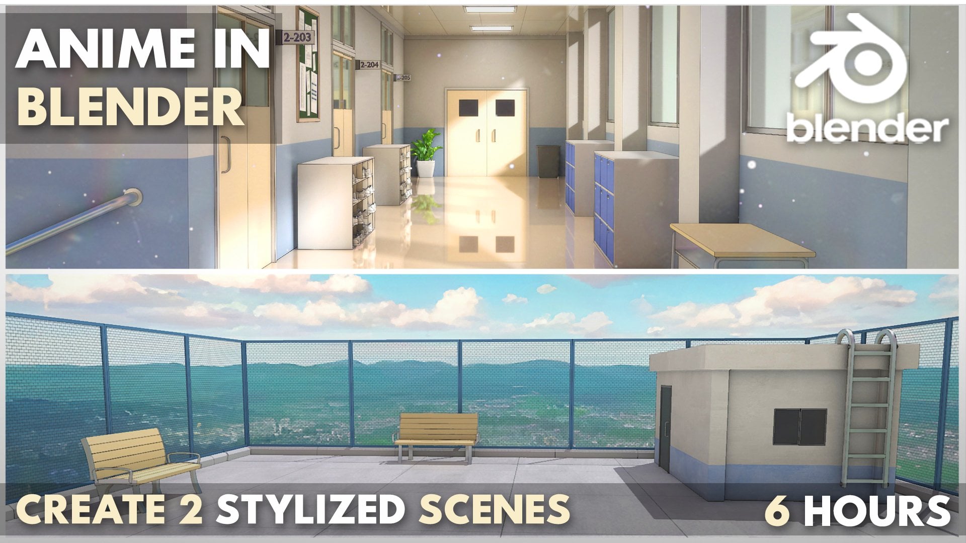
1. Introduction to Class: Hello, everyone, and
welcome to this new course, creating a stylized fantasy
environment in Blender, where you will learn to create
a beautiful fantasy scene, heavily inspired by Genshin
Impacts loading screen from start to finish
just using blender. This course includes
over 4 hours of information packed content, along with all the
required files like the blend files, textures,
HDRIs, everything. We will cover every step of the process from
blocking and modeling, to texturing, lighting,
and final rendering, learning how to achieve
that stylized fantasy look along with the immersive
atmospheric effects, while also creating multiple
variations along the way. We will start by modeling
the main assets of the scene using some references
from the game itself, creating the central
fantasy gate, the bridge, and a lot of different
pillars that surround and support the scene
designed to add scale, structure, and visual rhythm. Once the main
elements are built, we will set up the initial
layout and lighting, creating the foundation
for our environment. Then we will dive
into texturing, designing materials
for the gate, pillars and bridge with a clean stylized look using blenders
material node system. After that, we will work on
the final stylization phase, adding volumetric
fog, cloud layers, and cinematic lighting to
create a bright ethereal mood. These elements give the
scene its amy anime inspired feel and truly bring
the fantasy world to life. Then we will create
two additional time of day variations
for our environment, a warm, golden evening version, and a cool, mystical
night version. Finally, we'll do a bit of compositing and post
processing using blenders compositor
and Photoshop to push the visuals
even further, adding effects like glare, color grading and subtle tweaks to enhance the final output. And then we will wrap up
the course by rendering out portfolio ready shots
of our environment. Whether you are a beginner or an experienced blender user, this course will
guide you through the process of
creating polished, stylized fantasy
environments that stand out. So I hope to see you there
in the course. Thank you.
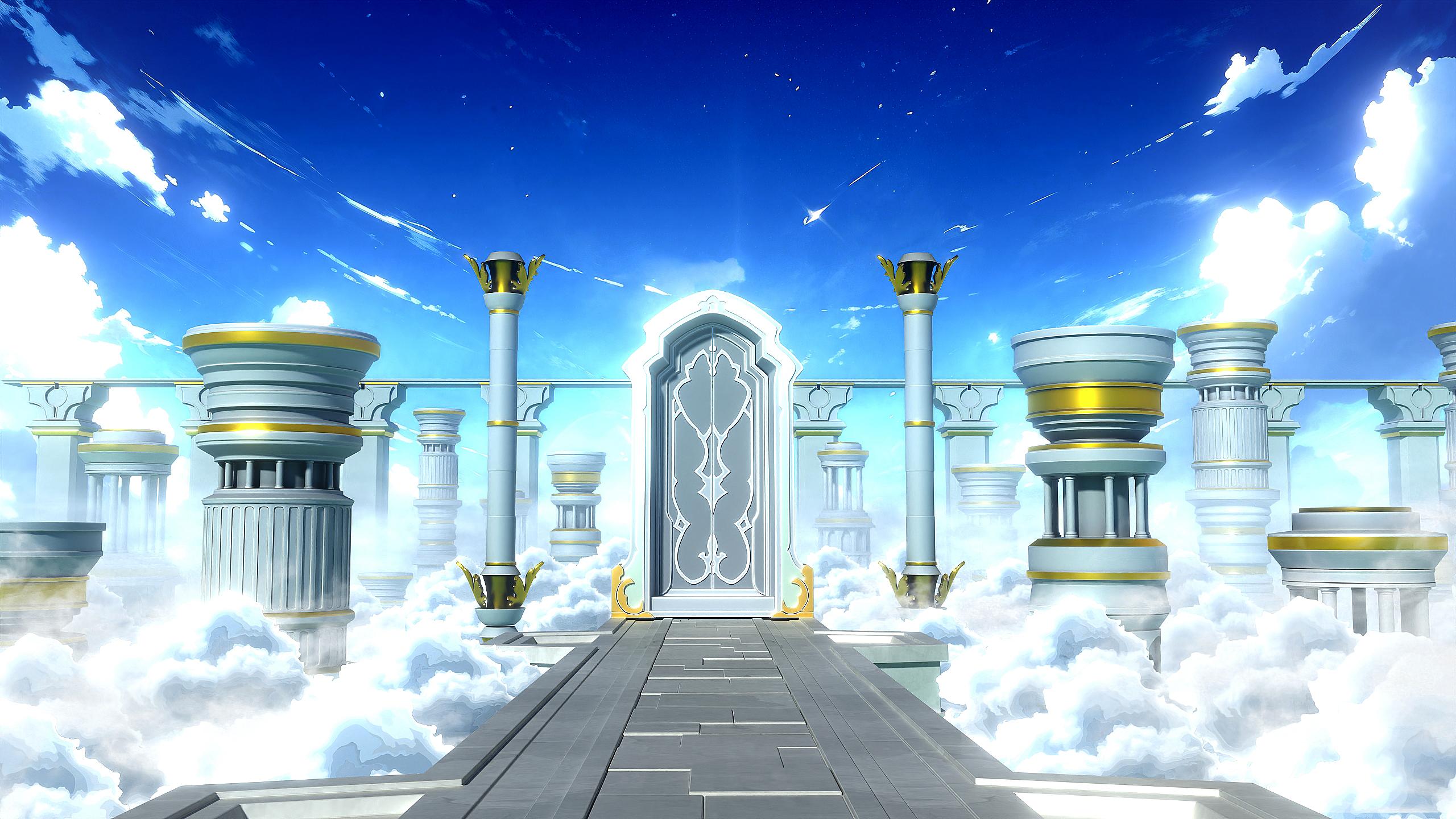
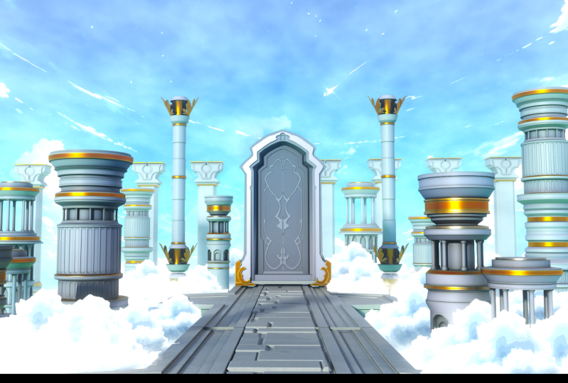
2. Blocking Out the Gate: Hello, A, welcome, guys to
this new course where we will create a stylized fantasy
environment in blender. So I'm sure you
guys have seen in the trailers that
the scene we will be creating was heavily inspired by the loading screen of the
video game Genshin Impact. I also have it currently open right over here, so
let me just show you. So, I always like the atmosphere and the
ambience this scene had. So I tried to recreate it in
blender with my own style. And another thing that
I really liked was that the lighting of this scene would change according to
the time of the day. So it is currently like
morning where I live. That's why we have like this
type of bright lighting. So if you open up the
reference images, you can see that
I've added, like, a couple of more reference
images of the same scene. If you open the game at a different time of the
day, let's say at evening, then you will get this type
of orange yellowish lighting, or if you opened it up at night, you will get a totally
different look. So yeah, I really
like that thing about this scene that it has various different
endless variations depending upon when
you open up the game. So, we will be
using this scene as our reference and try and
recreate it in blender. I'll just close this now and we can just start with
working on the scene. I have added, like a
couple of reference images of different things like
the door that we will be creating and some
other things like the pillars that I created myself trying to match with
the style of the game. So yeah, we will be creating
some of these things. Other things are
like textures like the cloud texture
or the fog texture. I will be adding some
more things over here, obviously, as the
course progresses. So let's just start by
working on the door because that will be our focal point of
the scene kind of. So let's start working on
that in this course lecture. So now back in Blender, I have opened up a
new blender file, and I've also turned on
my screencast key add on so that you can see all of the shortcuts that
I'm performing. As you can see,
they will all pile up right over here so that you can easily follow all of
the steps that I'm doing. So I'll press A now to
select everything and then press Delete to delete all
of the default objects. So now we need to bring in the door reference image into blender so that we can
start creating it. As you can see, I have added two different reference
images for the basically, both of them are
exactly the same door. The design is exactly the same. The only difference
is of visibility. The night version, I think, has a bit more visibility along the edges, as
you can see over here, while the day version kind of line blows them
out a little bit, making them like kind
of hard to distinguish. It's totally up to you
whichever one you want to use, I think I will be going
with the night one. So we can just also drag and drop it like
this into blender. But you can see it will be
added at this weird angle. So the best way to
do it is just press one so that you can go in
the front orthographic view, then press Shift A, go
into Image reference, and then select your Door
reference image like this. And yeah, now you can see it is added in
blender perfectly. You can select it, press G, and then Y and move
it back a little bit. Press one once again
for the front view, and to start creating it, we basically need to trace out the shape of the door.
It is pretty simple. It has, like, a lot
of elements to it, but if you break it down
completely part by part, it would be like, really simple. So we can start by just pressing Shift plus A and
adding in a plane. Press R then X and type in 90 on your number pad to give it the exact rotation
of 90 degrees. Once again, press one for
the front view, enable Xray. And what we will
do is we will just move this plane around and just try to match it with
both of these edges, the one on the left and
the one on the right. Press S then X,
scale it up a bit, and just match it perfectly. Along with the edges like this. And you can see it is pretty
much fitting perfectly now. Now press tab, go into the Edit Mode press
Control R and hit right click so
that the edge loop gets added right in
the middle like this. You can see it is exactly
in the middle of our door. We can select this right
side of the plane, press X, and delete it. And the reason we are
doing this is so that we can just simply
add in a modifier, go over here and add in a
mirror modifier so that you can easily duplicate the right side so that now you
create the left side, the right side would
be done automatically. And I will select this
edge, so press two, select this edge, press X, and delete the vertices. So you only have
this edge right now. We can select this, and now it is just
really simple. You press E and just move it around to match with
the reference image. We press E to extrude the vertice and then match
with the reference image. And we just need to do it constantly to match it with
the image that we have. So press E and just
extrude it out like this. You can also press E, and while
you are moving it around, if you hold shift, you can
see it will move really slowly so that you can place it perfectly wherever you want. So it is like a nice little
thing to know about. Whenever you are moving things
around, if you hold shift, they will move a lot
more slowly than normal, helping you to make
a precise movement. And now just keep on pressing E and match it over here
right at the center. You will notice
that when you try to touch it over
here in the center, they kind of go past each
other. So we don't want that. We will enable clipping now and when we connect
them both at the center, they will join and not
go past each other, which is exactly which
is exactly what we want. And I think the door over
here is looking fine. Let's move down, press tab, select this part, and just
move it around a bit. Again, press E,
extrude it downwards. And right now, you
just keep on pressing E to extrude the base
design of the door. We don't really
have to worry about all these designs,
indentations, everything. We are right now just creating the very basic
shape of the door. Press E, once again, press
X to lock on the X axis and move it till here and
connect do here like this. Now you can see we have
got the shape of the door. Press tab, and maybe
I'll select this part. Add vertice right over here. If you want to add a vertice wherever you want, in between, you can press Control R and just add a single
vertice like this. You can also use your scroll
wheel to add multiple, but I will be just
adding one and just move it a bit up like this to create a little bit
of smooth like edge. And you are perfect.
Now you can press Tab, press A to select everything. And if you press F, it
will fill out this phase, and it will give us the very
basic shape of our door. I'll undo it right now. We will keep it this way only. What we want to do next is we basically want to
create this part like this inside
part of the door because currently the
door is completely flat. So now to create this inside
part, let's just press tab. And once again, we can
select any of the vertice, press Shift plus D to duplicate it and place
it anywhere you want. I will place it just
along this edge. Right over here. And you will notice that if I
just select it now, press E, and let's say I extrude it once again
along this inside edge. So this time we are
creating this part, it will automatically copy
using the mirror modifier. So once again, we can just
quickly trace this out. Press E then Z and move it downwards because
it's completely straight. Just move it a little
bit on the X axis, press E once again and again Z and match it exactly
right over here. Then you can press E then X and connect them both this way. And now you can see we
have created the sorry, the top part is still left, select it once again, press E and extrude it
over here as well. I'm not going to worry about
this small shape right now. I'll just connect it simply
this way. And yeah, perfect. As you can see, we have created the inside part of
the door as well. We just need to now fill
out the space between them. So how we can do that, you
just go into the edit mode, and now you just select
this vertice and this one, then press F to
connect them both, you can hold Alt and
click over here, and then you can select
this complete loop, press F to fill out this space, and you can see how easily we filled out the
space between them, creating the shape of our door. What I will do is this vertice right over here looks pretty
sharp, so you can select it. Press Control Shift and B
to bevel it out like this. As you can see, you can use your scroll wheel as well
to make it smoother. But I will just add two vertices and make
it something like this. This feels a lot better to me. And yeah, now we can
select our door, press Tab, press A to
select everything. Maybe we can press E and
extrude it backwards like this. To create the actual
shape of the door. You can right click and
shade or to smooth this, and we can go over here
and just enable cavity. Cavity will just help you
view the edges a bit better. As you can see, it gives, like, help with visibility. And yeah, I think that door
is looking really nice. We can maybe add in
a bevel modifier, as well to smoothen out
the edges even more. Select this move
by angle modifier. Click on this pin icon and
just move it at the top. Then you go over here and you can see we have
these shading issues. To fix them, just go
under your bevel modifier under the shading tab
enable hard normals. And yeah, now we get
this perfect shading. If you want to improve
your shading, a bit more, you can also add
in something like, let's say, a weighted
normal modifier. That will also improve
the shading a bit. And yeah, I think now
it looks pretty good. So let's press one for the
front view and check it out. As you can see, it currently goes completely straight
down like the door. So just hold At and select
this complete loop of yours. Press one, and then
you can press S then X and scale it inwards first. This time, we are matching it with this line right over here, this inside line. So
just make sure of that. So you can press
maybe something like STN Z to bring it down to
match it right over here, then press SN X, and you can see it is not
really working properly. And the reason for that is, I think because we are in the
mirror modifier currently. So let's try just moving the mirror modifier to the top and you can go over
here and hit Apply. And now what will
happen is basically, you can see now you can edit the complete object like
the right side as well. So just hold Alt and
select it like this, then hold Shift and Alt and select this
right side as well. And now you can press STN X, and you can see now it is
working perfectly. Press STN Z. And now we can easily match
it with the reference image. Enable X ray, press STN Z and match it with
this line right over here. As you can see, it does
not really work perfectly. But what we can do is we can now manually edit it like ourselves, select these two edges
and move them down. We don't really need them
that high up anyways. So you can see this edge
is fitting perfectly. It goes wrong right over here, so just move it one
by one like this. A And yeah, now you can see the left
side is pretty much fitting exactly like how we want it in the
reference image. But the right side
is still pretty bad because we have applied
the mirror modifier, now the right side is not
really working automatically. But there is, again, a nice
and easy fix for that. You just press Tab, press
A to select everything. You go into mesh and
then select symmetrize. Basically symmetrize is a manual mirror modifier
and you can see, as soon as you did that, it has fixed the right side
as well automatically. Just one thing, I
will undo it to show you if you go to mesh
symmetrized once again. Make sure to select
the proper direction. So currently, we have the right direction right
now from minus x to plus X. If you selected
plus X to minus x, you can see now the right side is being copied
to the left side. So make sure you are selecting the correct axis because you
might have something else. I'll select minus x two plus X, and that gives me
the best results. And we can see now if I disable my X ray mode that the door is
looking pretty good. You can select it press
controll and apply the scale as well to make sure there are no issues with bevel
or any other thing. I'll press tab, and I see a bit of shading
issue right over here. And I think it is
because there are like vertices very
close to each other. As you can see, we have a couple of vertices right over here. There is a very simple fix for this enable X rays,
select them all. That we have right over here, and then you press M
and merge at center. This will make sure that we only have a single vertice
right over here. These things can happen
sometimes when we have miral modifier and whatnot. We had a couple of
modifiers that we applied. So that's why we get a couple more vertices
at the center, which can cause some issues. But now I have selected
them all and basically press M and merge
them at center. You might or might
not have this issue, so yeah, just make sure to fix. Let's see if we have something
over here, any problems. Yeah, everything is
fine right over here. It was just around this corner
that we have the problem. And rest everything, I think
is looking pretty good. Maybe select these
vertices, press G twice. So by pressing G twice, you can slide them
across like this. The reason I'm doing that
is to kind of, like, smoothen out this area a bit. As you can see
earlier, the shading was feeling a bit too weird to I think this edge
goes right over here, and then we can just move them
all downwards accordingly. We just press G twice to slide them along the edge
and just fix it. And, personally, I think this looks like
the perfect shape. Here it was feeling
a bit too weird. Now all of the edges are
going straight and properly. And this is what I like. Now I'll press Tab, press A to select everything
and go to mesh and select symmetrize so that we can fix up the
right side as well. And now you can see our
door is looking very nice and everything is
coming along pretty well. Let's just hit Control
plus to save our file. I will go in my blender
files folder and save it as fantasy underscore
environment. It's save and I think this merge is pretty good for
this first lecture, we'll continue
working on our door and detail it up even
more in the next lecture. So thank you guys for
watching. I will see you in the next one. But
3. Detailing the Gate: Hello, I'm welcome, guys. So let's continue
working on our door. I'll press one enable Xray. And let's see. We can
create this part next. We have a little bit of
extruded part out of the door. So once again, we can just
select maybe the door itself, select any of the word Cs, press Shift plus D
to duplicate it, hit right click and press P
and separate the selection. This way we get this
separate vertice, like as a different object. I'll select it and
place it somewhere around here and maybe we can
start extruding it up a bit. I will go into the
wireframe mode so that we can actually see
the image clearly. And also, yeah, we need to add the mirror modifier as well to copy it up on the other side. Because we use this
object for the verticee, you can see the origin point
is right at the center only, so the mirror modifier
will work perfectly. Just go over here and add a
mirror modifier and you can see it's working exactly
how we want it to. So we just now press P and
extrude this out completely. Once again, make sure
to enable clipping. I'll move the mirror modifier
to the top and enable clipping so that we can just connect the vertices at
the center like this. Let's see. Let's move
down right over here. And honestly, you can
just skip this part ahead because it is pretty much
a very repetitive task, so you guys can finish this
up on your own quickly. I won't be creating this thing. I don't really like this design, so I'll just keep it like in the shape of the
like this arc only. Now just move this down
along the straight line. Make sure it's
fitting perfectly. Yeah, press E then Z
move it down straight. Then again, we have a
bit of curve right over here, and then let's see. We cannot really see what
goes on right over here, but because we will be
creating this design anyway, so it does not really matter
what we create behind it. So what I will do is I will
just extrude it out like this and give it a general
shape of the door, move it down till here, and then press E and X, move it over here, and then E and Z and move
it back again on this line itself so that we can trace
out the inside part now. Just move it straight
up like this. Just create this section
now and we only have to create the inside part of this trace out this the shape we have
right over here, and then we can finally
just connect it in the center. I like this. And yeah, now this
shape is also done. Let's move back to the
solid mode, press tab, press A to select everything, and then fill out this phase. This one is fairly easy. We just press E and extrude
it out a little bit. And yeah, perfect. I think
it looks fine the way it is. We also have already added
the bevel modifier as well, so it works perfectly. Make sure to just
select the object and press Control A and
apply the scale. So that the scale
is fixed for it, and then we can just maybe
extrude out a bit more, and then just press G then Y and push it in the
door like this. And yeah, you can already see this detail adds a
lot to the door, and it is already starting
to look really nice. Obviously, this part over
here looks a bit weird, but when we will be creating
a design on top of this, I think it would look fine. Let's just hit save, and what I will do is I will select the door and make sure to decrease the
bevel amount for it. So from 0.1, we can go
to something like 0.001, maybe, not that small. 0.01. Yeah, that feels good. Also, I think I
did not mention in the last lecture about
applying the scale. I just want to quickly
explain the concept. You might notice
that whenever I, change the scale of the object, I always press Control
A and apply the scale. So let me just quickly
show you why I do that. It is really important. I have these two cubes, so let's say I have
these two cubes. You don't really have
to follow me for this. This is just for explanation. So let's say I select
this cube, press, then X and scale it up by
three times on the X axis. So yeah, press S then
X and then type in just three on the number pad to scale it up by three times. Once again, then X and scale it up by three
times like this. So yeah, now, both of them are scaled up by three
times on the X axis. So for one of them, let's
say I select this one and press Control
A, apply the scale. But for this one, I won't
really apply the scale, so you can see the
difference between the two. Now if I select this
object, press Control B. Control B is to basically bevel like any of the
edges you have selected. So let's say I press A
to select everything and then press Control plus
B to bevel it out, you will notice that the bevel right over here is
really stretched out. You'll see the difference
when I do it over here. Now, once again, do the
same step for this cube, if you remember we applied
the scale for this, select everything, press
Control V, and bevel it out. And as you can see, the bevel is a lot more uniform
right over here, but over here it looks
like really stretched. So the reason it
looks stretched is because we scaled
our cube like this, that's why it appeared stretched and we did not apply the scale. So you should remember
this that a lot of blender functions depend upon
the scale of the object. So whenever you
change the scale, so let's say if you increase the scale or if you
decrease the scale, make sure to always press Control A and then
apply the scale. Another thing that I can
show you with an example, there are a lot of
different functions that can be affected with this. Let's say if I try to
insert this phase, so press three,
select this phase, and press I to insert this. You will see the inset as well, is not really accurate
on all sides. Over here, it is really wide, while over here it
is really thin. And if I do the same over here, you can see the inset is
totally uniform on all sides. So yeah, this is just a
quick explanation to always remember to apply the scale whenever you change
it of any object. So let's just delete
it now and we can continue working
on our dough. Let's see what we can do next. Let's just add this simple
cube right over here, press shift and add in
a cube, scale it down. Scale it up like this,
move it down over here, and then move it
inside the dough. Perfect. Next, what I will do is we want to create the
inside part of the door, so as you can see this
edge right over here. So really simple,
I'll press tab, press one and hold At and hold Shift andaugt and select
this entire loop. Because as you can see, it is
following this completely, so it will really help us a lot. We can easily create this part. Press Shift D, as we
have already done, hit right click and then press P and separate the selection. Now we have this as
like a separate object. Press tab let's enable X ray. I will delete this part
because as you can see, this edge that runs
along over here, we don't really have
it at the bottom. It finishes over here. So you don't really
need this part. So select it and make sure you press X and
delete the vertices. All right, so now to
give it thickness, like we have right over here. So first, we can
just press three for the right side view and then press E to extrude
it out, press Y, and just give it a
little bit of extrusion, and then you can press S
to scale it up and match it with the alignment
of the door this way. Perfect. Now what I do is I will just simply add in
maybe a solidify modifier. Select this strip
that we have created. Go over here and add in
a solidify modifier. Move the solidify
modifier just below the smooth modifier like this, and then you can
increase the thickness. And now you will
notice that we are facing a little bit of an issue. If you press slash
on your number pad, you can isolate any object. So you can select any of
them and press slash on your number pad to easily isolate them so that
you can work freely. You can once again press slash to come back into
your normal mode. I will select this press slash and let's see what is
the problem with this. So basically, whenever you
get something like this where one thing is going over here and one thing is going
in different direction, that means the normals are
incorrect for the object. So just to show you
this in action, you can go over here and
enable face orientation. Just quickly disable the
solidify modifier for now, and you will see
half of the side has red over here and half of
the side has blue over here. That means the normals
are incorrect because we should have either red on both sides or blue
on both sides. So to fix this, press tab, press A to select everything, and then press Shift plus N. And yeah, now,
as you can see, the normals are fixed
because we have blue color entirely on one side of the strip and red color
entirely on one side. Now enable the
solidify modifier, and you can see it is
working perfectly now, exactly how we want it to. Obviously, we need to
decrease the thickness. Now, make sure to enable even thickness and also
set this to complex, and now it is working
exactly how we want it to. Let's press ash to
come out of this. And also let's select
this, press tab, press A to select everything, press Shift presen once again to fix the normals
for this as well. And yeah, now everything is
blue colored on all sides. That means the normals are
correct for everything. Let's disable the face
orientation mode now, and we need to adjust
some things for this. First is we decrease
the bevel amount so that it does not look like really fluffy as it is looking. Press one, enable X ray or
just straight away go into this wireframe mode and
you can play around with the solidify value and see how much you
want to extend it. You can see it is pretty much fitting exactly
how we want it to in the like what do you say,
the reference image as well. So I think I'm happy with
how this is looking. It's come back. And yeah, this part of the door
is looking really nice. And yeah, with that, we have
created this part as well. What we can do next is
I'll select this press tag and just move it totally till here to the
backside of the door. Then we can start working on
this inside part as well. So once again, I'll press tab, press one, hold out, and let's say we select
this edge completely, press Shift plus D, right click and press P,
separate the selection. So that we can get this. Now just scale it in. We might have to do a bit of fixup here and there ourselves, but that is not
that big of a deal. So just scale it down
till here maybe. Let's do it till here, and then we can press tab. Quickly select
everything, move this up. Move this part up
over here as well. I think this feels
pretty good to me. Obviously, we have to
fix up the right side, maybe we can just delete it all. Let's just delete the
right side, completely, press X and delete the word C, and we can simply add in a
mirror modifier for now. That will make our
lives a lot easier. Let's remove the solidify
modifier from this. We don't really want
to work with that. Right now, let's just
keep these ones only. And now we have ourselves
like the outline of this. Let's see what we can do. Maybe we can press tag, press A to select everything, and then let's just press
F to fill out this phase. It is not really filling
correctly because of this edge. Select this vertice, press
E and X and join it. Make sure to enable clipping
and join it like this. Then you can press A and press
F to fill out this phase. We basically now
have to just detail the like inside
part of the door. Maybe I will just scale it up a little bit so that
we don't really see any space between the
doors. Just like that. Pretty good. Once
again, selected. And the next thing
that I want to show you guys is enable X ray. You will notice
that we have this partition in the center. So for this, I think
we have to disable the clipping so that we can actually disconnect
them over here. So just select the cent
apart and move it apart a little bit so that
we can actually create a little bit of
space between them. As you can see, if
we don't disable clipping they will join at the center and connect
together with each other, so we have to create a
bit of space in between. That's why I have
did that. And yeah, I think this merger is pretty
good for this lecture. We still have a bit more
to do with our door, but we'll continue over
here in the next lecture. Thank you for watching. I
will see you in the next one.
4. Adding More Details to the Gate: Hello, and welcome,
guys, let's continue modeling our door. I'll
just select this part. So we'll be working on this first and then I'll
select the image, and I will press
slash to go into the local mode so that we
can work a bit more freely. Press one for the front
view Enable Xray. Now as we know, we need to
create this extrusion first. So how we'll do that
is I'll press tab, and what we can do
is we can press Control R to add a single Word C. So just press Control R and add a WordC over here. Just bring this up, so press G then z and bring
it right over here, just close to this part so that we can
match it like this. And now you can press
K. K is for knife tool, so knife and now you can press K on your
keyboard to use the knife tool. So basically with
using the knife tool, we can cut out this part
onto our model like this. There are a lot of
different ways to do it, but I will be doing it this way. So yeah, just press K, and then you will
see this knife tool. Click on this
vertice that we have just placed at this point. Click on it so that you can
start creating the cutout. And then one by one,
just place the vertices. It is very simple, and I
will place it like this, this over here, then
we can go over here. And now maybe if you
want to move around your screen a little bit,
you can hit right click. So you will see it
will disconnect now, and then you can move around your scene and
place it over here. Then once again, click on this, click on the last
thing where you left off and you can just
easily continue. It is very handy. And
now if you like press, you will see it will lock in the z axis that you can bring
it down in a straight line. Let's say till here,
then hit right click. Once again, click on here so that we can
continue bringing it down till here. Again,
hit right click. Now, once again, click on here. You will see it still
coming down like this. Press. Press once again, and it will turn off the lock on the axis mode and you can once again just
freely click around. I'll hit right click again, so that I can move
my screen and once again click on here
and just continue. And then just finally connect it right over here,
hit right click. And now when you have
created this entire cutout, hit Enter, and as
soon as you do that, it will be added
onto your model. You can see this
by pressing three. You can select this phase
by clicking over here. Yeah. And now we can
easily extrude it out. Let's just undo it first. Sorry not undo it, but
undo the extrusion part, press one once again
and enable X ray. And maybe you want to
if you want to move around a couple of wordss just to make it a
bit more precise, you can do so right now. Because using the knife tool, it might not be like
completely accurate. So you can later on
just move around them. If you want to fix up
some of the areas, we can do that for sure. So I'm just tightening
up the vert Cs. I'll select this one press X and dissolve the wert C. We
don't really need it. Place this one over here. Maybe we can select this
press Control Shift and B to smoothen
it out like this. I'll remove this one. Yeah,
this feels much better. Let's check if the
straight line is fine. You can also, I think it
is looking good to me. Yeah, now everything is fine, so we can press slash to come
back into our normal mode. Let's disable X ray and
select this press tab. First, press A to
select everything, and then you can
press E to give it overall thickness to extrude
it as a whole object. Then you can just
select this phase. So press three,
select this phase, and now press E to extrude
it out outwards like this. And you can see it looks
pretty good to me. I'll maybe select
this part and move it down just a little
bit, not much. And I think I will
just select this, move it out a little bit,
and select them both. Maybe just press
G then Y and move them a little bit further along the and I think we might have to scale them up a little bit as we can see like
empty spaces here. So just select them both and
just scale them up a bit so that you don't see any
empty spaces along your door. And now I feel like the door is starting to look really good. I'll maybe select this part, so press tab, enable tray. And let's just select
this part and maybe we can move it up a little bit. Select this whole
bottom part and just move it up so that
it does not really, you know, collide with this box right over
here at the bottom. I think it is fine.
Obviously don't have to follow the
reference image exactly. I think even this looks
pretty good to me. One thing that we
can also see is that in the reference image, we also have square
shape over here. So press Shift, add in a cue, scale it down and just
make it the scale of this, scale it down like this and
scale it up on the X axis. And then what we do is we just
move it behind like this. Make sure we just move this space in so that we cannot
really see it like that. And I think now our door is
starting to look really nice. I'm pretty happy with how
everything is turning out. I'll maybe select
this and we can just increase the bevel amount of tad wig for this to
something like 0.01, or maybe a little
less 0.008, I think. For this part, you
can select this, and we can see there
is a little bit of tightness over here, so just enable X ray. And I think it is
because there are a lot of edges close
to each other. So just select this edge and also select this edge over here, press X and dissolve
the edges so that we can kind of smoothen
it out a little bit. I think this looks a
little bit better. And now the door is
looking pretty good. Let's just hit save,
and next we can start working on this part
right over here. So now I will just
select this part, press tab, and maybe we can
select any of the wort C, just press Shift plus D to duplicate because it also has the mirror modifier as well, and I can place it over
here in the corner. And as we have done already, press P and separate
the selection. So we have this vertice,
select the image, like the reference
image, press slash to go into the local mode, and let's start
creating this now. Select your vertice, press tab, and place it right over here. Press E and extrude it out like this and start tracing
out the image. Something like this. I think I will create this move
like shape separately, select this biz
and move it down. Let's move it down to here, press E and X and move it out. Now what we can do is we can just move this part
till here like this and press Control R and
connect it together to this. Select them both press F so that we can create
this part separately. What I will do is I will
select this all press P and separate the selection so that this is a
different object. Now select this and just
press E and extrude till here and now you can
go along this edge. Perfect. We have created like three different separate
sections of this design. Select them both press F
to join them together. All right. I think
that's pretty good. I'll select this now,
press tab and we can select this completely
like this loop. And then press Shift plus D. Sorry, make sure to
select this as well. And then press Shift plus D, hit right click, press P
and separate the selection. Once again, just
select this part. They cannot really select it. Yeah, let's move it
apart a little bit, and then I can just select this edge that we
have just separated. Press tab now and just trace
out this section as well. Pretty simple. We are just following really basic
modeling techniques, just trying to extrude and just connect them so that
we can create these shapes. I think it is
something like this, so I can connect
these two now so press F and just
join them together. Cannot really make out
the shape that well, but I think this is fine. It looks pretty good to me. I'll extend it up a
little bit like this. Yeah, it looks
pretty good to me. Now I'll just select
all three of them, press Control J so that we
can just join them together, press tab, press A to
select everything, and then F to fill
out this vase. You can press E to extrude
them out to create your shape, press lash to come out
of the local mode, and now just bring them out like this so that you can see
them on top of the door. I'll select this part and move
it a little bit like this. Now you can see when
I move it around, it is also moving
on the right side. So instead, press tab, enable X ray, select everything, and then move it
on the left side. So press G, the next. When
you move it in edit mode, then it is working
as we want it to. But if you move it
in the object mode, so if I press tab, now
I'm in the object mode, if I move it to the left, you can see it can
be placed weirdly along the right side because
of the mirror modifier. And the reason for this is
because the origin point moves along whenever you are
moving in the object mode. You can see the origin
point is also moving. But if I press tab and then just select it all, and
then move it around. Then the origin point
is not really changing. So that's why the middle
modifier can work properly. So just move it on the left
like this so that you can actually see a little bit of
it on the outside like this. And I think it is
looking pretty good. I'll maybe just press
tab and we can select the backface of these two
also for this as well. Let's just press slash to
go into the local mode. I think that would be better. Yeah, select this back face, press slash again
to come out of it. Now let's just press G then Y
and move it back till here. That we have this going
through entirely. And now our door is starting
to look really, really good. Hit save, and let's
take a look at it. I'm pretty happy with how
everything is looking. The only thing that
is left to create is this whole entire design
that we have in the middle. And I think that is also
going to be really simple. I'll select these
two press control J to join them together, and we can add in a bevel
modifier to them as well. And as you can see,
the bevel is kind of stretched over here because
we haven't applied the scale. Press Control A and apply the scale. As
looking pretty good. Let's adjust the bevel amount, enable hard and
normals, and yeah. That's pretty good. Had save, and I think this money is
pretty good for this lecture, we'll continue from over here in the next one,
Thank God watching.
5. Finishing the Gate: Hello, and welcome, guys. So let's try and
wrap up our door modeling in this lecture.
So let's just start. The only thing to create is this a little bit of complex design that we have in the middle. So let's just select this
object right over here, press tab, and once again, we can select any of the
word Cs press Shift plus D to duplicate it and just
place it right over here. Then once again,
press P and separate the selection so that we
have this separate object. Now we can just go into the wireframe mode and make sure X rays
enabled over there. Press tab and start
just extruding it, so press E and trace out the
outline for this as well. Personally, what I will
do is I will select this and I will select
this reference image, press lash to go into the local mode so that we
can work a bit more freely. Press tab now and
just start extruding. Because we copied it
from the other object, it already has the mirror modifier and the bevel modifier. All the modifiers already set
up properly like we want. So we just have to trace
the reference image out. Maybe we can select this part, press control shift in B, and just bevel it out a little bit to smoothen
it out like this. A You can go something like this
over here to create the hole in the shape like this. Then just press to
bring it straight down and just make sure it is like matching the reference
image correctly. Press again, press
and bring it down. Honestly, I would just
suggest you guys to, like, quickly skip through
this part and create this thing on your own because it is not really
even that difficult. And we have done this a couple
of times in this course. Let's just extrude
it up till here. I think me personally,
I will just go straight away
something like this, not like creating this
design over here. I think this would look better. Yeah. If you want, you can just follow the reference
image completely, but I will be editing out a couple of things
here and there. Again, press in and extruded
straight upwards like this. Over here as well,
what I will do is instead of trying to create
something like this, I'll just go straight away like this to create a bit
more simple design. Yeah, we are basically done, move it up like this. Then we need to go over here. All right, guys. So
now we are done, bring this close to the
tic where we started off and now just select them both and press F to connect
them like this. And we basically have created a design on the front
right over here. Press tab, select this vertice, just duplicate it
quickly and just create this very simple circle or
semicircle type of shape. And now we can just instead, we can just select these two, press F and join
them. All right. Now we can just press tab, press A to select everything, press F to fill
it out like this. And let's come back to
our just normal mode, able Xray, press slash we
have it right over here. Let's select this, bring it out. One thing that we have is
press one enable Xray, and we have a little bit
of hole right over here. Let's go back into
the Wireframe mode, press k for knife tool. So first, press tab to
go into the Edit mode, press k, and then you can just quickly
create this like this. It's very simple. Just
join these two now, hit right click, disconnect, and then enter to
create your whole. Press three for face select, select this phase, press
X, and delete the phase. And now we are basically done
with our door. Let's see. We can select this
now, press Tab, press A to select everything, and press E to extrude it out. Just move it a bit inwards. And yeah, I really like how
the door has turned out. I think the design looks nice. One thing that we need to worry about next is the
bevel modifier. So first, right now, the bevel modifier, I don't
think is working that well. You can see it is just
working like a little bit. We are only getting
a little bit bevel. And the reason for
that is there might be some vertices that are
too close to each other. So you go into the
geometry section and disable clamp overlap. And now we have something
like this because there is no clamping on the
overlap of geometry. So we need to adjust the
bevel modifier manually now. But because we do
this, we can kind of adjust and find out where
the problem areas are. So you can see it is
somewhere around here. So select this press slash
to go into the local mode, and then we will
just figure it out. Press tab, enable Xray. And let's see. We can quickly just move around a
couple of edges. So select them press g twice. And when you move them around, you will kind of figure out where some of the
problem areas are. We currently cannot
find it, but let's see. Let's try this. Yeah.
So as you can see, as soon as I move this
single edge a little bit, my whole model has fixed up. So this was like
the problem edge. You can just move it a bit upwards a lot of the
issues are fixed, not all of them, but a
lot of them are done. As you can see, we have a
couple of problems over here. So let's try. Not
this one, maybe this. As you can see, if I just
move it a little bit to the downward side, it has fixed issue. Next, I think it is obviously this one because it is
too close to this one. Like, these two
edges are too close, so just move this
one right over here. And basically, that
were all the edges. Just quickly see
if you are getting any kind of shading issues
as we have over here. Maybe we can press
X and dissolve the edge so that we can
create a lot more space. I. All right, so now it is a lot better
over here as well. Obviously, we won't be
using this much bevel, but now the bevel modifier
is working a lot better, and we can adjust it a
little bit more freely. Maybe I'll be going with
something like this, 0.004. We can always adjust these
things later on as well. So press slash and come
out of the local mode. And I think now the
bevel looks much, much better. Let's
just select them all. So select it all, press and move this to
a new collection. Rename this collection to D so that we can kind of
easily classify this. Last thing to do is to just create a very simple
shape right over here. For this, I will again, select this vertice,
press Shift plus D, move it at the top
and just extrude it like this and make sure to enable clipping
in your mirror modifier. Join this and extrude it till
here and join it like this. Perfect. Select it.
Make sure to select it, so hold on, select
the loop, press B, and separate the selection so that it is like a separate
object because otherwise, we won't be able to use it. So now select this. We have just created and select your
main frame of the door, press slash to go
into the local mode. And personally, what I
will do is I will just scale down the size of this and move it up right over here. Okay, I'll just press
slash to actually see how it looks with the
rest of the stuff. Maybe we can place
it right about here. And once again, we need to use
the knife project command. So to do that, I'll move
it just a bit down. Yeah. So first select this press tab to go
into the edit mode, hold control and select this
like select this object. Yeah, make sure it has
this orange outline. Now press A to
select everything, press F three and search for
Knife project and select it. Now we can just basically
select this object, delete it because we have
already created the Katab now. Press three and select
these two faces, and we can press E to extrude them and push it inwards
just a little bit. Scale it down a bit. Maybe we can just reduce
the bevel a little bit. And yeah, I think the door
looks really nice this way. I'll just select this now, maybe increase it a little
bit to something like 0.003. Yeah, that's fine. With this, we are basically
done with the door. So let's just sit save. And yeah, this much is pretty
good for this lecture. We'll continue from
here, so thank you for watching. I will
see you in the next.
6. Creating the Bridge: Hello, and welcome, guys, let's continue
working on our scene. The next thing
that you will look over in the reference images, we can see that we have to create the bridge and
the pillars next. Those are the next main things
important in our scene. So let's start with
the bridge first, and then we can work
on our pillars next. And after that,
obviously, we will be working on the
environment a lot, adding, like all the fog, clouds and everything
to make it look good. So yeah, in this video, we'll be working on the bridge. So let's just close this
or I will just move it to my second monitor so that I can actually see the reference
image while working on it. So what you guys
can do is if you don't have a spare screen, you can install the
program called PureRef. So PureRef is really nice
where it will just give you like this hovering
screen over your blender. So if I just let's say
close my image right now, I can drag and drop this
reference image into PureRef, and the great thing
about PureRef is you can just hit right click and hold this screen around and place it
right over here, and I can actually look at the reference image while
I'm working in Blender. So we don't really have to
switch again and again. I will float on top of
the blender window. So this is like a free program.
You can just download it. It is called
PureRef, and you can download it from Google
and install this. And yeah, it is
very simple to use. You can adjust the
window size and move it around by using
your right click like this. So yeah, if you
want, you can just place your reference
images over here. Maybe I'll just keep
it over here only so that is also recorded
in the video as well. We can place it maybe
over here somewhere. All right. Let's start now. So obviously, I'll first
select this reference image, press and move this
to a new collection called F Images so that we can just turn this collection off and we don't have to really see this
image again and again. I'll select the door, maybe move it up a little bit over here. Press Shift and just
simply add in a cube, move it down just about here. And as you can see, the bridge width is just about
the width of the door. So I'll just obviously make
it the same size as the door. Place it accordingly and make it roughly the
same size as the door. For the length of it, maybe
we can go with something like straight up 10
meters, that's fine. And we can just place it
right over here like this. Next thing that I
will do is I will obviously decrease the
thickness over here. So let's just roughly
place it like this. We can worry about
this later on. I think something
like this is fine. Next, what I will
do is I will press press Control R and hit right click to place the edge
loop right in the middle. Enable tray, and you can just select all
of the right side. Because once again, we
are just going to delete the right side so that we can
add in a mirror modifier. That way we can work
really easily on this without having to
worry about the left side, we just need to work
on the right side. All right, so I think
it is pretty simple. We don't really have to
create it like very detailed. Press Controller first
and apply the scale, as you know, we have
changed the scale a lot. So I'll just press Control
apply the scale first. Press tab now, and we are
creating this section. So press tab, press Control R, and add edge loop
somewhere around here. What you can do is
you can also go over here and enable edge length. So this will help you see all the measurements
appear on your edge. Whatever edge you select, you will see the
measurements pop up. So that kind of helps. I'll place this one over here. Press Control R, add one
somewhere around here. Like this. And then we can press three for phase select and
just select this phase, press E and extrude it out like just we have
in the reference image, and let's see how much
we want to go for. Let's extrude it
till here first, then press S then Y
and scale it down. So I'm going with somewhere
around 1.9 meters in the width for this
section. And let's see. Let's move it a little bit back. Somewhere around here. I
think this looks pretty good. Next, what I will do
is I'll press tab and select this phase
and select this phase, press X and delete the phases.
We don't really need them. And as we will be
using array modifier, because we'll be just creating this one single
section of the bridge, and then we can simply add
in like array modifier, set the factor from X to zero, and set it one on the Y. Or maybe minus one, that would be a
little bit better. Yeah. And you can easily
create this bridge like this. And you only have to
work on the first one, and it will automatically
copy on the rest of them. So yeah, modifiers
like mirror array help reduce your workload a lot. I'll remove it for now because we are just
working on one. We'll add it later on.
Selected press control, apply the scale press tab, and let's select all
of these phases. And now I'm just trying to create kind of a similar design. We won't be going
for too much detail like we have in the
reference image. First, select all of the
phases that we have, and then you can start by pressing I to insert this phase. And you will see that when
you are inserting the face, it is appearing
over here as well. So to avoid this, you can
press I to insert the faces, and then while you're inserting, just press B to
turn boundary off. And you can see this
will not appear on all of these edges where we don't
want the inset to appear. So this way we can like
insert it much more freely. I think this much is pretty
good, something like this. And now, while all of
these phases are selected, just press E and extrude
this downwards like this. And yeah, you can see we have a little bit of
detail on our bridge. I don't really like how
these faces are looking. So I'll press slash first, and you can just quickly select them all, select this select. This right over here and
select these two as well. On the front and the back,
press X and delete the phases. Yeah, this is much,
much better. Let's see. Next, we can just add in
something like a Bewl modifier, apply the scale
and just decrease the bevel amount, enable
hardened normals. Let's see. Next
we can press tab, press Control R and add
Hub right about here. Somewhere around here.
And now you can press Control press B to
create two of them, you can use your scroll wheel to increase the number,
but we just need to. So somewhere around
here, let's see. I'm pressing G then
X and moving it a little bit to the right,
sorry, to the left. And then we can just press
E to extrude it upwards. To add a bit more
detail to our scene. What I will do is I will add some kind of brick
texture in between here. You just add a little bit
more detail to the bridge. You can enable extra
right over here, press seven and just select
it all, and let's see. I want to place it right about here. I think rest is fine. We just need to delete this phase and this phase
that is popping up. Next just to add some random
details here and there. You can select this
phase, press I, press I once again to insert it again and just
extrude it downwards, scale it up a little
bit inwards like this, read something like that. We can select this pace to hold all and select this entire loop, and press E and extrude it
outwards just a little bit. Press control at two
edge loops in between, hit right click and just scale them up a
little bit like this. Select all three of
these pass and we can insert them downwards
just a little bit. Now just select these two faces, press X and delete them. Let's press slash to come
out of the local mode, and I feel like the
bridge looks fine. Maybe I think I will
remove this part, this extrusion that we created, so hold on and just select it all press X and
delete the vertices. And now you need to
just connect them. So hold again, select this, hold Shift ends like this, press Controllee and you can
select bridge edge loops. So we'll basically
fill the hole. Then this looks a little
bit more cleaner. And when we will add a couple of bricks over here in between, I think that will add a nice bit of breakup to our bridge, and we can now add
in array modifier, set it minus one on the like Y, set zero on X and
minus one on Y. And we have successfully created a pretty nice looking bridge. And if you want, we can also
set up the camera as well. So press Shifte and
add in a camera. And now, if you press zero, you are basically looking
through your camera right now. So this is what the camera sees. It is really important to
place your camera correctly because obviously
the final renders are seen through
the camera only. So if I move it around
you can press zero, and currently this is
what the camera sees. So you can always switch
between your camera view and your normal view that we have this perspective
view by pressing zero on the number
pad like this. So there is a really simple way to place your camera around. Obviously, you can move it
around, rotate it like this. But I think the best way is to just place your scene in
your normal view like this. Let's say I'm just
moving it around. I want my camera to look
exactly like over here. So you place your
normal view like this, then hold Control Alt and then hit zero
on your number pad. And you will notice
now that the camera has automatically shifted back to that location where
you have placed your view. And now you can just press
N to bring up this tab and go into the view section
and enable camera to view. What this will do is it will basically make your camera view permanent and you
can just move around your camera freely in this view. Like, you can place
in Zoom in Zoom out, do whatever you want. And when you are happy with it, just disable it so that you can now come back
out of this mode. And I think this is pretty good. I do feel like the camera
is a bit off center. Yeah, I think that's better. I will anyways, be fixing it
up a lot later on as well. But yeah, this is pretty good. This way we can
quickly switch into the render view to quickly see
how everything is looking. But yeah, right now,
let's just switch back to it because it's
compiling the shaders, it will take a bit while. Let's just sit save on a files, and I think this merger is
pretty good for this lecture. We'll continue from here in the next one. So
thanks for watching.
7. Adding Bricks and Basic Lighting Setup: Hello, A, welcome, guys. So in this lecture, first,
let's wrap up with our bridge, and then we will be working on the environment a little bit, like adding some
light, some background to make it look a
little bit better. And then we can finally
start working on the pillars and other
things. All right. So for the bridge, first, what I will do is if you press zero to go in your camera view, we can kind of see it
under it over here. So just select it
and press G then Y and move it a little
bit back just like this. Yeah, this is fine. And then next what I will do is I'll select
this press tab, and then you can
press Control R. Use your scroll wheel to add two
edge loops and hit Enter. Then you can press S and Z
to scale them up like this, and maybe somewhere around here. This way, we can
just press three, select all of these faces, press Alt plus E, and
extrude faces along normal, and just extrude them
inwards a little bit. I think this merge
is pretty good. We will see this weird
phase popping up over here, so just disable the array
modifier and we can press tab, select this phase, and select this phase
while holding Shift, press X and delete the phases. Enable back the array modifier. And yeah, I think our bridge
is looking pretty good now. The last thing that I
want to do is I want to add some kind of bricks
over here in the middle. So obviously, there are
multiple ways to do it. But I think there is
a really easy way to add bricks in blender. So if you press Shift
plus A and go on mesh and just look down
over here under extras, you will find this wall factory. But it is possible
that you don't see this option appearing
over here in your menu, and that is because you haven't enabled the extra
objects add on. So go into edit preferences, and then you can just
go into the add on section and search for extra. And just make sure
to enable both of these extra curve objects
and extra mesh objects. This will basically
add some really nice and helpful extra objects in your Shift plus A menu. If you don't find these
two add ons over here, you can go in the Get extension
section and over here, search for the extra. And you will find them
over here as well. So if you don't find them
in the add on section, just search them in the
Get extension section. So I will close this now, just enable them
both install them, and they are available
by default in blendi so don't have to
download or anything. And now you can press Shift A, just go over here in extras
and select Wall factory. We get something like
this type of wall, so we need to obviously edit
this out to our liking. So first, obviously, we don't
need this window thing. We can just disable the top
arc and opening section so that we get a flat wall. Next thing that I want
to do is I don't want these bricks to poke out
of the wall line, this, so just decrease the edging
to zero so that it is perfectly square or perfectly straight over here on the edges. Next, obviously,
we need to scale down the wall according
to like the bridge. So we just need this
wide like this much, so decrease the start and you can decrease the end as well so that we get
something like this. Now we have a little
bit weird looking wall, but don't worry, we'll fix this. So next thing that you can do is you can
decrease the depth. And obviously, we need to create some partitions in
between for the bricks, so you can decrease the width. Something like this.
Yeah, that's pretty good. And we can see, a lot of
space between these bricks. So the next thing is to decrease the thickness of the grout. And this will help us give
this type of looking bricks, which I think look pretty good. Obviously, you can
play around with these settings however you
want and get the results. I'll play around with
some of the settings. I'll decrease the
variance for the depth. I think something like this,
I'm pretty happy with. You can just go ahead now
and add in a bevel modifier, and this will really improve
the look of the bricks. Decrease the amount of bevel
or something like this, and let's press R, the next, type in 90 and just
lay them flat. Just push them in
into your ground. Let's press zero and
see how they look. We need to scale them
down like this and press the Z and scale them
down like this as well. I. I do feel like that the space over here between the
bricks is a bit too much. So I'll just delete this part. I'll delete this press shift
A and add it once again. And the settings
won't be like reset. We will get them from
over there only. So just decrease the
grout thickness to zero, sorry, and decrease the
variance as well to 0.01. I think that's better. And
now we can just simply add in a bevel modifier and decrease
the amount of bevel. Yeah, this looks pretty good. Press R then X, type
in 90 and laid flat. Decrease the scale of
it like this and press STN X and scale it down
like this as well. I'll decrease the bevel amount
to something like this. And yeah, I'm really happy
with how this is looking. Yeah, I think it
adds a nice bit of effect onto the scene. And you can add
in array modifier to this to duplicate
it over here as well. So just set the X factor
to zero and Y, no, the Z. Yeah, set the z to one and you can easily duplicate it however
many times you want. If you want to increase the size of a bridge, you can
do that, as well. And yeah, with this, we have got ourselves pretty nice
looking door and a bridge. Let's just it safe. And with this, I
do want to work a little bit on the environment, and then we can start
adding more stuff to our C. Alright, so let's switch to the
rendered mode now. You can click over here, and
right now we have something looking like this
because obviously we don't have any kind of
lights in our scene. So now let's switch to
the render properties and change the render
engine from EV to cycles. Obviously, it is
totally up to you which render engine
you want to go for. EV is like a real
time render engine. That means it will give
you really fast results, but they won't look as realistic
and physically accurate. While cycles is a lot slower, but it will give you really a realistic and physically
accurate results. Obviously, this is like
a stylized environment, so it does not really matter if you want to make it
look realistic or not. So it is totally up to you which render engine
you want to use. I'm going to use
cycles because it was giving me better
results, so yeah. Now that we have
switched over to cycles, you can already see that
when you have selected EV, we do not get any kind of, like, bounce lighting or shadows
or ambient eclusion, but in cycles, even
without adding any lights, we do get a bit of shadows
and ambient eclusionOall, like the corners and
crevices of the model. So first, let's start
by adding in, like, a very basic light, so p shift
A and add in a sunlight. Let's rotate it to a little
bit more interesting angle, so you can press R then Y and
rotate it maybe like this. Press R then z, and
somewhere around here, I think should be pretty good. Let's press zero to look
through our camera view. Next, let's select
the sun over here and go over here in the
object data properties of it. And over here, you can
obviously adjust things like the strength of it
if you want to make it look even brighter or darker. Let's set it to something
like two for now. And the angle is basically the softness or
hardness of the shadow. If you said this to zero, you will see that the edges of
the shadow are really sharp. But if you keep on
increasing this, you will see they get
softer like this. So I'll go with somewhere
around five or six. We definitely want a bit, like softer shadows
like we have over here. So I think four or five
degrees would be pretty good. Next, what I want to
do is, obviously, I don't want to do much
of the changes right now. We just want to add
a little bit of basic lighting and HDRI, and then we can add the
rest of the models. So yeah, next step to do is to add an HDR to give
it like background. So move over to the shading tab and you can enable the
rendered view mode. Press zero, and from
over here switch from object to world so that you can change
the world settings. You'll see we have
a background node, and if you change the
color of the background, the color of the
world would change. You can also control
the strength. Let's keep it at default
only and come over here, press Shift A and search
for environment texture. Select your environment
texture, click on open. And if you go in the course wise that I've provided to you, you will find a folder of HDRIs where I've added
like a couple of HDRIs that have this
stylized animal look that would really go
well with our scene. So let's just select this
one, HDRI daytime one, and now just plug
this color channel into the color
channel over here. And as soon as you do
that, you will see that the Azure is appearing in our
environment press zero to look through it,
and this is what we get. Obviously, this background is kind of like a little bit basic. Later on, I will be adding really nice and cool
looking cloud textures that we can use in the
background of our image. But for now, let's
work with this. You can select the HDRI node, press Control plus and by
pressing Control plus you will automatically enable
this texture coordinate and mapping node
connected to this. If this Control plus T shortcut
does not work for you, that means you haven't enabled
the node wrangler add on. So once again, you need
to go into preferences, and in the add on section, just search for node wrangular. And make sure to enable this. This is a really useful one whenever you are working
with materials and things. So yeah, just enable this. It would be available in the add on section or in
the Get extension section. So I'll close this now, and
when you have enabled this, this Control plus T
shortcut would work. All right, so the basic use of this mapping node is that when you rotate
it on the z axis, basically this HDRI would be rotating like
this and you can find a nice looking
view for the scene. But first, the colors are
looking like really washed out. If you go into the
render properties right now move over into
the color management tab, so open this up,
and now just change the view transform
from AGX to standard. As soon as you do that,
you will see that the colors are a
lot more popping. You can see AGX
was really washed out and standard looks
really nice and copy. And I found out for stylized
and animate type of scenes, the view transform
standard works the best. And you can set the look to, like, medium, high
or high contrast. I think medium, high
contrast would be fine. Yeah. Maybe we'll
select the sun and then we can just tone down on
the strength a bit to 1.5. Maybe a bit more. Yeah,
somewhere around here, 1.8, 1.9. Later on, obviously, we will be doing a lot more light
color corrections, adding contrast and
things like that when we are compositing
our final scene. But for now, this
looks a lot better than having it at AGX. So yeah, let's just set this to standard and try to
set up a nice looking, view for an HDRI. One thing that I will show you that looks really good is if you decrease the scale of
the HDRI on the Y axis, it will kind of be a
little bit more compact, giving you that very wide look like the scene is really huge, kind of, not too much, so just set it to
something like 0.5. And yet, this looks a lot
better than having it at one. Because this way, it
feels like small. We want to give the scene
a kind of a grand look. Yeah for that reason, I will just set the scale
on the Y axis to 0.5 to kind of make it
look something like this. I think this looks a lot better. You can even decrease
it a little bit more. But then the clouds start to stretch up over
here in the corners, which can kind of look
a little bit weird. But yeah, let's just go
with this for now and we can set the z to
something like 40. And we have this first. Next, I will select my
camera and we can do a little bit more
adjustments to kind of uh make it look a
little bit better. And now I will just
decrease the focal length 50-35 because decreasing it will increase our field of view. So if we are at 50, or if we keep on increasing
it to something like 80, our field of view would
keep on, like decreasing. So a high focal length is
really good for close up shots, but we want a wide shot. We want to get as much of our scene as we can
get in our view. So we definitely want to go
for a lower focal length, but we cannot decrease it
even too much as well, because then the scene will
start to stretch like this. So set it to
something like 35 40. That will give you the
most realistic results. And press N, go into view, enable camera to view, and just try to play around
with the camera a bit. And I think this
looks really nice. You can disable
camera to view now. And next thing that I will do is you can come over here in
render properties or no, I think output properties
and enable render region. Basically, this will only
show you the area that is going to be rendered and
none of the extra stuff, so that you can only
focus on this part. Having all this visible
makes it a little bit difficult to kind of focus on it, so you
can enable this. And as soon as you come
out of your camera view, it would be, again,
everything visible. But in your camera view, only the render region
would be visible. I'll just select the camera
now first, press R then Z, and maybe rotate it
a little bit like this to kind of give it a
little bit better framing. And, I'm really happy
with how this is looking. I'll maybe increase it to 0.45 only and see how that looks.
I think that's better. And yeah, with that,
I think we are done with the basic setup of
our lights and our scene. You can also give
it a quick render, so just decrease the max samples or something like 100 Make sure to enable denoise from over here on
both of them so that the render gets denoise
and select render image. Alright, so this
is how our render currently looks right now, not much to look at, but a really great starting
point that we have. Obviously, it looks kind
of weird because we can see all of the
bottom part of the sky, like all of this horizon. But don't worry, we'll be
adding a thick layer of fog and then some clouds on top of it to give it like kind of a
heavenly kind of loop. So yeah, I think this much is pretty good fog This lecture, I'll see you in the
next one, thanks watch.
8. Modelling the Pillars: Hello, and welcome,
guys. So let's continue working on
our environment. And in this lecture, we'll
be working on the pillars. So let's just press one
for the front view, press shifte and we can add in our pillar
reference image. So I'll go into the
folder and add this one. Let's move it over
here to the left, and let's just start
working on them one by one. You can select this and
press Shift plus S, then cursor to select it. Basically, this will bring this cursor point
right over here. That's just because wherever this cursor point is placed at, whenever you add a new object, it will be created over here. So to change the location of it, you can hold Shift and use your right click
to move it around. Or you can just
press Shift plus S, then move it to some
specific locations like cursor to world origin or the cursor to select
it, anything. So yeah, just do this and press
Shift A ad in a cylinder. I'll start by working on
this one maybe first, and let's see how we're
going to do that. Enable X ray, press S then z and first scale it to
match the both ends. So this line should be
matching just about here, and this one should
be just about here. So we need to move
it a little bit up, scale it down just a little bit. So I'm just trying
to make it fit. Yeah, I think this
is pretty good. I'll just go over here and disable edge length now. We
do not really need this. So I just match
both of the ends so that we can properly add
in a mirror modifier. So press Tab, press Control R, and hit right click, to
place it at the center, and you can just select the
bottom vertices, press X, and delete them, and then just
add in a mirror modifier. Set it on the Y or the z axis, I think on the Z and
disable it on the X. All right, so now the
mirror modifier is working correctly. Let's see. Let's place it roughly
at the center, and then we can just
start working on it, press tab and select this part, press X, and delete
the vertices. I think it is best to just
start from this loop. So the way we are
going to do this is first let's scale it up, press S to scale it up, and just match it
with like this. Now press E and
extrude it downwards, scale it up, again, press E. And now just
keep pressing E and S to scale it in or outwards like this to match
with the reference image. So what I will do
now is I'll again go into the wireframe
and just make sure X ray is enabled that we can just see everything a
little bit more clearly. Again, press E and
now extrude it completely inwards and
start extruding it. So press E and
just scale it down like this to match with
the reference image. Honestly, these type of designs you don't really need
a reference image for. I'm just doing it to
create the exact design. But for these type of pillars, you can kind of
freestyle it as well. And you'll also find a lot of these pillar designs
on Google as well, so you can get some
reference images from there if you want to create
something of your own. Scale it down or scale
it up like this. Now, press E and just scale this completely
inwards to create something like this and
then scale it down, maybe a little bit more.
Yeah, something like that. All right, guys. With
that, this is done. Make sure to enable clipping, press E, and just join them
at the center like this. And we have our
first pillar done. Let's quickly check it out. Sable X ray, right click and
shade how to smooth this. And now to create these
partitions that we see over here. Like these ones. For that, you can
just press tab, press three for face
select and hold all and select this loop completely, then hold Shift and ought
and select this one as well. You can press I to insert them. Okay, make sure to press tab, press Control A, and
apply the scale first. Now press I and insert them. Now it is working properly. So press I once again. So this will help you to insert the faces individually
like this and just insert this a little bit and now I will just
press Control Shift and B. So press Control, Shift
and B to bevel it out to give this
smooth kind of shape. Just bevel it a little bit, and you can give it maybe like three or four vertices
to give it the smooth look. And yeah, I think
this is pretty good. And now we just need
to select all of these faces and
extrude them inwards. So obviously, you can just hold Shift and select
them all one by one. But I think there is a
very easy way to do it. You just select a couple
of them and then press Control Shift and the plus
key on your number pad. And this way you can select
all of them by hitting the Control Shift and plus key on your number
pad, like this. So you can see how
easily we selected this. If you want to see this option from the
menu, it is over here. You can go to Select
Menu and over here, select more or less,
select next active. And this way, you can just
select all of them one by one. I'll just undo it. And again, I whole shift,
select this as well, then press Control Shift
and again, the plus key, you select them all. Yeah. Now just press Alt plus E
and extrude faces along normal because you
want to extrude them all inwards in their
normal direction like this. Yeah, we have this.
Now let's add in a simple bevel modifier to make it look a
little bit better. And this is our first pillar
ready. Let's just hit save. And the next thing
that I want to do is that I want to add a subdivision surface modifier because these pillars
will be really huge. So we can clearly see that
they are kind of low polly. So just first move this at the top and enable
harder normals. Next, add in a
subdivision surface, and this might lag up your
blender a little bit. And, you can see now all of the pillar area
is pretty smooth, but these look
really, really weird. So the best way
to fix this is to just exclude them
from the object. So I'll turn off
bevel and subdivision for now is to make it a little bit easier
to select them all, enable Xray, and just
select this part clearly. Like this. Make sure to select
these top word Cs as well, hold Shift and select
them all this way. And then you can select
this part as well. Now, once again, let's press
three for phase select, and then you can press P
and separate the selection. This way, this object
would be different, so we can just
select it and remove the subdivision
surface modifier from this and just give it the bevel modifier because
that is what it needs. I'll select this back
now and you can turn back on the subdivision
surface and the bevel. Make sure to press tab,
select the top face, and select the bottom face. And you can see we get a
little bit of shading issue. Okay, sorry. So this is
the mirror modifier, so we just need to
select the top face, and you can press to insert this to add
a bit of supporting loops so that you don't see any kind of shading
issues on the top, as well. I think it is best
to just turn it off, turn the subdivision off in
real time or in the viewport, so that it only shows up when
you are rendering things. So like this way,
Blender will stay fast because we have it
disabled in the viewport, but it will enable itself back on when we are
rendering things. So that works the best for us. Let's just say it safe. And now, one more thing that we
have to add is that we need to create these
pillars right over here. So first, you select your
cylinder press Shift plus S c to select it so that we can
add a cylinder at the center, add in a cylinder,
scale it down, bring it out a little bit. Move it up over
here where we have this empty space or scale this down and
scale it up like this. Let's press one for the front
view enable X ray and just place it right over here to make sure the scale is perfect. You can also press S, then Shift plus Z to only
scale on the X and Y plane. So basically, when you
press S and press Y, so it only scales in the Y axis. But if you press Shift plus Y, then it will exclude the Y axis and scale it on the Z plane. So similarly, we just want
to scale it up like this, only on the XY plane. So we can press S,
then Shift plus Z and scale it up
just like this. So that way, its height
does not change. Enable X ray just presses, then shift plus Z,
scale it up this much. Press press control
first, apply the scale, press tab and press Control
R to add two edge loops, hit right click, press Z, and scale them up like this. We could have added
like a mirror modifier for this as well, but
I think it's fine. We can just quickly hold on, select this loop for Shiftenaut
and select this as well. Press plus E, and extrude
faces along normal. Scale them both on
the z axis like this, and we have something like this. Again, I will press Control art, add two edge loops,
scale them up, and maybe we can select
these two as well in the same way and extrude them
inwards just a little bit. Let's add in a bevel
modifier to this. Right click, shade
or to smooth this. And yeah, that's fine, I guess. Move it in over here. And now the next step to duplicate it over
here in a circle, I think the way that I'm
going to do that is just by simply using a spin tool. So press seven, press tab, enable X ray so that
you can see it, and just select it
all and make sure your cursor point is in the
center of the cylinder. So just press tab, you can hold all and
select this loop. You can basically,
select any loop, so hold all and select
this press Shift puss, then cursor to select it. This will bring the cursor right at the center
of the cylinder. So now we can press seven, press tab, enable X ray. Sorry, make sure to
select This Linda. Now press tab, press
seven, and select it all. Press D to bring this tool bar up and you can select
the spin tool. So the spin tool basically
works around the cursor point. That's why it is important
to place the cursor at the center to wherever you
want to spin it around. So now you can go into
the tool section. So press N and bring this tool section up and make sure to select
the right axis. Because let's say if you
are doing it in X axis, which is obviously
the wrong one, it will spin
something like this. So yeah, let's undo it, press seven for top view once
again and select Z axis. And you can just spin
it around this way. This menu will appear,
so just type in 360 so that it is fully rotated like
this around our cylinder. And for the amount of cylinders, I think we are going
to go with this only. I think 12 looks fine. Let's just check it
out how it looks. Yeah, in my opinion, I think it looks fine. Make sure to select
it, press tab, press A to select everything
and press M and select merge by distance because sometimes it can create duplicate of them. So just make sure to always do that whenever you
use the spin tool. I'll scale them in a little bit, select it now and add in a
mirror modifier to this. So to mirror it right over here, we can either change
the origin point of it or just simply select the mirror object as the cylinder and set
it on Z axis, yeah. This way, it has
mirrored up properly. Yeah, now our first pillar
is looking pretty nice. Let's just select it
all press shift plus cursor to select it to bring the cursor
roughly at the center. Press shift A and we can
add in empty object. And now select all of your pillar and make sure to select the empty object at last. The empty object should
be the active selection, which can be seen by this
yellow colored outline. The non active selections have this orange colored outline
and the active selection, which is the most
latest selection, will have this yellow outline. So now just right click and go to parent and parent Object. This way, this empty object is now connected to all of them. Basically, it is the parent of all of the objects
of this pillar. So you can select the empty
and just move it around. The pillar will
move along with it. You don't have to select each and every
object one by one, select the empty
and move it around. Perfect. Let's just save. And with this, I think
this much is pretty good. For this lecture, we'll continue from here in the next one.
9. Creating Pillar Variants: Hello, and welcome, guys. So let's continue
working on our pillars. I will just select this one
that we created earlier, select it all press
M and move it to a new collection and rename the collection to
pillar underscore one, just so we keep everything
a bit more organized, and we can maybe turn
off this collection as well so that it does not
interfere with our work. Press one for the front view, and let's start
creating this one. Press Shift and let's
add in a plane. Press R, then X, type in 90. Let's enable Xray.
And once again, just try to match both
of the edges over here. With the edges of the plane. I think something
like this is good. This will help us find
the middle point of the object and we can
use the mirror modifier. Press tab, press control, hit right click to
add it in the center, and select the right
side, press X, and delete the vertices and just simply add in
a mirror modifier. I'll delete everything.
So let's select it all press X and delete the
vertices, this one as well. And we can just select
this one single vertex, place it over here, press E, the next, bring it out. I just quickly trace
the shape out. Make sure to enable clipping, and now you can preste the necks and join them in the
center like this. And similarly, just trace out
this bottom part as well. Press the next, and again, join them both in the center. And this is like a top
part of the pillar. Press tab, select
any of the word Cs, press Shift plus
D, duplicate them, and place them over this
shape that we have, and we can trace out
this one as well. I like this, and again,
move it over here, press X and keep on extruding. Again, join this in the center and we are done with
our basic shape. We just need to fill
out the faces now. So once again, we can do
something like maybe using the Knife Project tool or we can connect them
like this as well. So just select this vertex
and select this one, press F to connect them, and select the bottom two ones, press F to connect them. Just do these two
only do not connect these ones in the
middle because it will create a weird phase. So just select this
one and this one, press F and select these two
press F. Now you can hold Alt and select this entire loop and press F to fill
out the phase. If you have done it right, you should get a hole in
between over here, and then we can fill this
hole out separately. So now you just need to select the inside part of the loop. So if you hold all
and select it all, it will not really
work correctly because we have selected
now all of the word C, so just select the inside part. You can press C, C for this
selection tool where you can control the circle of selection
using your scroll wheel. So whatever is in this
circle will get selected. This is really good to
work with when you have, when you need to quickly
make a lot of selections, so I can just drag them over and easily select this
loop like this. Now, press F and the face
will fill out automatically. We can go over here to
the selection tool only. We do not need the
spin tool now. So yeah, press A to
select everything and press E to extrude it
backwards like this. Press tab, press Controlle
and apply the scale, and we have the
shape of our pillar. Now let's press tab I'll press N to bring
out the side view. And just to check how much thickness we want to give this, let's select both
of these phases. So press three,
select them both, and just move it a
little bit backwards. Yeah, I think this
smudge is pretty good. Then you can press tab, select this front face and
extrude it out like this. Now if we add a Bewl modifier,
it should work correctly. Right click, shade
a smooth this. Let's adjust the
beviel modifier. Move this smooth biangle at the top and enable harder
normals for your bebel. And next press tab, select this phase and press I
to insert it like this. If you insert it a bit too much, you will see that there
is some geometry overlap going on so we need to fix this. Press one and enable X ray, and we can insert
this accordingly. Basically, what we need to
do now is we just need to fix up the mess that we have created over here.
It's pretty simple. We just press one for vertice, select these vertices
and press G, and move them around
to kind of solve the puzzle and just make sure they are not overlapping
on top of each other. I this way, as you can see, it is pretty much fixed. We don't get the weird
overlap of geometry anymore. The rest, I think is
pretty much fine. We don't really need to match with the reference
image exactly. You can select the edges, suppress two for select, press G twice, and
slide them down, press G twice, and slide
them down like this, just so you can create a bit
more space for all of them. And now, I think the
shape is looking fine, so press three for phase select and just
select this phase, press E, and extrude
this inwards. Or something like
this. Yeah, select this press Shift plus
S c to select it, and we can start by
adding in a cube, scale this cube down and
place it right over here. Again, enable X ray press tab, select this part,
moved right over here, and select this and
move it over here. Now just press three, select this packface and move
it till here like this. Then we can just
simply duplicate this. Select it, add a mirror
modifier and select the mirror object as this one so that it
mirrors properly. Also add in a Bevel
modifier, as well. Apply the scale and adjust
the bevel modifier. I'll select this phase and maybe bring it out a little bit. Let's enable edge
length from over here and see the
thickness of this. I'll apply the scale press
tab for both of them. Select them both
ptab Enable trays, select all of this
at the backside, and just move it till here to give it a
bit more thickness. Now we can just
press Shift plus A, add in a cube to scale this cube down according to the
size of our pillar. Just make sure it is somewhat fitting
the pillar like this. Now press tab, and
scale it accordingly. Move it up, press the next, scale it up, press E to extrude it downwards
and scale it in. Yeah. We have
something like this. Again, just press Control, apply the scale and add in a Bbel modifier as well to this. Now, this bottom part
is fairly simple. We just add in a cue. Scale it according to
it first and just make sure it is like fitting
a pillar properly. Supres STN Y and scale it down. I think this mach
is pretty good. Press tab now and just
bring it down till here. Now, press Control A, again, apply the scale, press tab and just select all
four of these edges. So again, there is a
shortcut for this. You can hold Control and aught and select all four
of them like this. Press one, enable X ray and just press Control B to
bevel it out like this. Make sure you have
only two divisions. So if you use your scroll wheel, it will be a lot smoother.
But we don't want that. We just want to
create two of them and just bevel it out till here, and it will give you a
pillar this kind of flow. Be I'll select them both and scale it up just a little bit. And with this our pillar
is pretty much done. Let's just add in a
bevel modifier to it and reduce the bevel amount. Enable harder normals, and
let's create the bottom part. So I'll select this
first go to object set origin origin
to geometry to fix the origin point and press
shift plus cause it to select it and press shift
a add in a cylinder, so that the cylinder gets
added right in the center of this so that we can
properly create it. Enable X ray and bring
the cylinder down. Press tab, select this
bottom edge loop, press G and Z, and move it
up and scale it outwards. Now pressE and just scale it
inwards like this and just keep on pressing extrude and scale it according to the
reference image like this. And this way, I think the
pillar looks pretty good, and we have created it. So right click and shade
out to smooth this as well. We can maybe scale it outwards a little
bit press control R, add a edge loop, press three, and four lots this
complete loop, and extrude faces along novel. Yeah, I think this
is pretty good. Let's just finally add a
bevel modifier to this. Apply the scale and adjust the Bel amount and
enable hard abnormals. With this, our second
pillar is also done. I think both of them
look pretty good. Yeah, I'm happy with it.
Let's just press Shift A, add in plain Axis empty as well. And let's disable this
one so that we can select this freely and make sure you select
empty at last, so hold your shift
and just select the empty so that it is
the active selection. Right click and go to
part and select Object. This way we have
created the empty as the parent object
for all of them. Now just select
it all, press and move it to a new collection
pillar underscore two. And yeah, guys, I think this was is pretty good for this one. We have created a second pillar and we'll continue moving ahead, creating the rest of them.
Thank you for watching.
10. More Pillars: Hello, and welcome, guys. So let's continue
working on our pillars. I'll quickly just disable
the earlier ones and press one to go into
the front view, and let's just start quickly. Press Shift, and you
can add in a cylinder. Let's place the cylinder
right over here and just try to match it with the
reference image. Yeah, that's pretty
good. Press tab, select the bottom vertices and move them up
right over here. Now, press E,
extrude it inwards. And this one is, I
think, pretty simple. We have already done this
a couple of times now. So let's just quickly
work this one up. Yeah, I'm not really talking much because we have done this, like, a lot of times by now. So in this video, let's try and finish
up with the pillars. Gain risky and extrude
this quite a bit inwards and just extrude
it downwards like this. Maybe I think a bit more. Yeah. Now extrude it
outwards and down like this. Let's select this
loop, presal plus C, and extrude faces
along normals like this and just select
the bottom word Cs now, so hold all and
select these ones, and now once again,
we can just continue. Y Yeah, we are basically
done with this one. This one was pretty
simple in my opinion. We just have to add
a couple of details, right click and shade or
to smooth this first, and then we can add
in a beviel modifier. Obviously, first,
apply the scale, adjust the bevel amount, and enable harder normals. Let's scale it out
towards just a bit more so that we
get a hard angle. Okay. I think this is pretty good. So let's press one now
for the front view, select this and go to object
set origin origin geometry. Press Shift plus because
there to select it, and now just press Shift plus
A and add in a cylinder. Let's scale the cylinder down. We can go into the wireframe mode and just scale it up on
both ends like this. All right, so now
let's just press Control R and add two
edge ops like this, hit right click and press S
then Z and scale them up. You can maybe just match
it like this only. Now again, press Control R, add one edge loop over here, and again, add one
right over here. Press three for face select, hold select all of this
and select all of this, so hold Shift naught and
select both of the loops. Hold just a bit up like this. And now you can press T plus E, extrude faces along normals
and just extrude it out. Now, once again, just hold
t and select this loop, then hold Shift en aught and
select this salt plus E, and extrude them
again like this. I think this is pretty good. Let's press G and Y
and bring it out. Right, click in shade
or to smooth this. Also add in a Bble modifier. Apply the scale and
enable harden nomals. Now press tab and
press two for select, hold on, select this loop. Let's just move it
downwards a little bit like this and maybe this one as well. We can add one more edge loop over here and extrude it out. Just to add a bit more detail. But yeah, I think this
much is pretty good. We can once again
just select this, press seven for top view, press tab, and enable X ray
press A to select everything. Go into the spin tool and just make sure your
Z axis is selected. So press N and make sure
in the tool section, Z axis is selected. And now when you
spin this around, you will see duplicates
are created. But make sure you put in the
angle as 360 so that they totally rotate
around like this and definitely reduce the number
of them for this one. I think I'll go with eight Yeah, I think it is the actual number in the reference as well,
so I will be going with it. And yeah, this wheels
pretty good to me. Again, enable Xray, and
let's create this part now. So for this one,
just add in a plane, rotate the plane by 90
degrees so press R, the X, in 90. Let's scale this down and
move it right over here. I'll just select the plane and
select the image pre slash to go into the local mode so that we can work
a bit more freely. We just match it with a
reference image like this. Press Control A, apply
the scale press tab, press Control R, and add edge
loop right in the middle. So hit right click and
select the vertex and just move it up over
here somewhere. So that when we
select this edge, so we can press two, select
this edge, press Control B, and bevel it out, and
you will see it will create a similar
curvature that we want. So do something like this, now select it all
and just move it up. Perfect. So the reason we are
doing this is because I'm trying to create a cutout. So to do that, first, let's come back to our Select tool and press E and extrude this
still here so that we can, use a Bullion modifier to
create a cutout out of this. So now push this in. And
the way we're going to use the boolean modifier
is obviously we can go in the modifier stack, but there is a nice
shortcut for this. So first select this and
then select this one, then press Control plus minus. And you will see
now we have created this cut out inside
of our object. So basically, this is the
boolean difference operation. Now, I'm sure, for
some of you guys, this shortcut might not be working where you
select this one first, then select this one,
press Control minus. This might not work because you haven't enabled another add on. So go into preferences
in the add on section search for
Bool to add on. So make sure to
enable Boto add on either from the add on section
or the get extensions one, enable the Bolt add on, and this shortcut
will start to work. So yeah, I'll just select this and press
Control plus minus. Select this first, then select
this press Control minus, and we have created cutout So now to create something similar like we have in
the reference image, let's move this out over here. Then we can enable X ray, press Shift plus D to
duplicate this and scale this down and maybe just once again, simply use the Boolean modifier. Select this, select this,
then press Control minus, and we have created this cutout. Now you might notice that we are getting some shading issues, so let's try and
fix them up first. Select your model, and let's try moving the bevel
modifier at the bottom. Yeah, as you can see, this
fixes up most of our issues. So with the Boolean modifier, you should always remember that the bevel modifier will
stay at the bottom. We can also add in maybe a
weighted normal modifier to fix up some of the areas. And with this, I think
it's pretty good. Maybe I'll select this and
move it out a little bit. You don't want that
deep of a hole. And yeah, this is
pretty good, I think. So once again, just
select these two. Press press A to
select everything, press seven for top view, and we can just select the
spin tool and spin it around. It might get a bit laggy and give you some
errors, but don't worry. We'll first set this to 360 and just reduce the number
of them, obviously. So maybe something like
six would be pretty good. Press tab now, and I think we are done with
our next pillar as well. We do get some shading
issues over here, but you can fix them up by pressing Control R and
adding a edge loop just like really close over
here so that it can kind of contain
the shading errors. But with this, I think
this is pretty good. We do get some shading issues still around the
edges over here, but I don't think these will be even visible in the render. You cannot even see them
from this distance. And when we add, like
all the materials, fog and everything,
I don't think they are going to be that
visible by then. So yeah, I think we can
definitely work with this. So let's just sit save now. And now we can just again, press Shift A in empty. Select everything,
so make sure to select everything
and then at last, select your empty, and
then hit right click, go to parent Select Object. And this way we can easily
control this object by moving just this single
parent object around. You can even scale
and rotate this. Maybe I'll select
this press statab and create a bit of hole
right over here. Yeah, I think this
is pretty good. So let's just sit safe
and select it all, press M and move this
to a new collection and rename this to pillar
under score three. You can delete this Boolean cutters collection
that is created. It is basically for
these extra objects. So when we apply all
of the modifiers, then these two won't be needed. That's why they do get in a different collection
so that you can easily delete them later on. But we have just
moved everything to a single collection only
that is the pillar three. Well, later on, like we
apply all of the modifiers, then we can just simply
delete these two, then they won't really matter. So yeah, we'll worry
about that later on. Head save, and I think this much is pretty good
for this lecture. Thank you as watching. I will
see you in the next one.
11. Finalizing the Pillar Designs: Hello, and welcome, guys. So let's continue
working on our pillars and try finishing them
up in this video. So let's work on this one. We can start by
pressing Shift plus A, and let's add in a cylinder. Let's move this right
over here, enable Xray, and scale this
down, and just try to match it with this
one right over here. You can go into the
wireframe mode as well. I think this is pretty good. Let's press S then Z
and scale this down. Now press Tab, press one for what C select,
select all of them, and move them up over here, press E and then press S
to scale it up outwards. Then press E and just move
it downwards like this. Then we can just keep on
pressing E to extrude it out, and then press S to
scale it inwards or outwards depending upon
the reference image. All right. So now that
we are done till here, just select this bottom loop, select it all,
press Shift plus D, then press Z, lock
on the z axis, and just bring it
down over here. You can scale this down
just a little bit, then press E, and again,
do the same thing. We can create the pillars in
between over here later on. First, let's work on this. All right. Once again, just select this bottom loop
and press Shift plus D, press Z, and bring it down. Scale this down a bit. Press E, and extrude
it downwards. Just like this. All right. We can maybe just hold on and select the top
part and again, extrude it upwards as
well because we can see like there is a little bit of extrusion
upwards as well. And yeah, this is
pretty good, I think. Now what we need to do
is we need to create all these windows type of structures in the middle.
So let's do that first. Select this right click
and shade out of smooth, and let's just add
in a Bevel modifier as well. Move this to the top. And you can also kind
of see that the shading is really weird around
some of these edges, and I think it is because we haven't really
applied the scale. So just select press Control
A and apply the scale. As you can see, this has fixed the shading and then let's
adjust the bevel amount. We can maybe disable clamp
overlap so that we can just adjust it a bit more accurately. Yeah. That's pretty good. Let's just select
this press Shift plus S and cause
her to select it so that the cursor
is brought over here right in the
center of the cylinder. Okay, first I'll select it, go to object set origin
and origin to geometry. Then you can press Shift plus S, then cause her to select it, and let's start by creating these Window like
designs in the middle. So press Shift A, and let's start by
adding in a plane. Press R, then X, type in
90 and scale it down. Let's bring the plane right
over here in the front. I think somewhere around
here would be good. Press one again for
the front view, let's bring it down over here. Enable X ray, press tab, and just scale it up according
to the reference image. I think this much
would be pretty good. Yeah, I think this feels
pretty good to me. So let's scale it up a bit more. We can obviously hide the area with adding
a cylinder on top. Press control, apply
the scale, press tab, and let's just select
one of the word C, so just select this, press
Shift plus D and duplicate it. Let's bring it right over here. Go into a wireframe
and enable X ray, and let's just trace
this window shape out. We can also add in a mirror modifier as
well to do that quickly, but I think it is a
pretty simple shape, so it would be
really fast to just do it like this only instead
of adding a mirror modifier. A, we are done as well. Just select them both and
press F to connect them. Press S the Z and type in zero so that it
flattens it out. Basically, whenever two
vertices are, let's say, like this, you select them both and press S and Z, type in zero. You will see that it will
basically flatten them out in a same line. So just bring it down over here. Ana, it is pretty good. Hold, select this complete loop, press P and separate
the selection. This way, it is like
a separate object. I'll just select these
two and press slash to go into the local mode. And let's see. We basically want to create the Window cutout now. So now just select the object we have just separate it out, press G then Y and
bring it out over here. And now to follow my steps to use the knife project
tool properly, press one for the front view
and select the plane behind. Press tab to go
into the Edit mode, and now just press one so that you are in the
vertice select mode. You can hold Control and click on anywhere right
over here so that your window object is
selected and you will see it is being highlighted in
this orange color outline. So when it is
selected like this, then you can press A
to select everything, press F three and search
for knife project. Enter, and you will see that the cutout is created over here. You can now select this
one and delete it. And let's select
this, press tab, press three for phase select, select this and press E to extrude it
backwards like this. And you are pretty good,
press tab and you can select these two faces and press I
to insert them like this. Maybe we can press E
as well to extrude it backwards a little
bit like this as well. Right, shade or smooth this and let's add in a bevel modifier. Adjust amount of bevel. We don't want it too much, set it to 0.0 007 maybe. Yeah, I think this feels good
and enable harden normals. And now what we need to do
is we basically need to copy this window in
the circular fashion. So let's do that. I'll
select it, press Tab, press A to select everything, press seven for top view, and make sure you
select the spin tool. It was already
selected because I think we were using
it earlier as well. So select the spin tool and make sure you go in the tool
section from over here. So press N to bring up this tool section and
then select the Z axis. Or whatever axis is the correct
one for you, obviously, we should be spinning
it in the Z axis because then it will give us
the right results like this. So yeah, just press seven for top you and rotate it like this. And now we have
something like this. So select the angle and
set it to three 61st, and make sure to enable use
duplicates because that will, make them not connect
with each other, so we will get the proper
shape and now start reducing the steps according to
how many windows we want. So ten or 11. Now, as you can see
when we use 11 steps, there is a little bit of space that we can
see in between. So if we increase it to 12, then it starts to,
like, kind of overlap with the other windows. So we don't want that.
Instead, what we can do is let's just undo this and
press one for front view, enable Xray and just select this left side and select
the right side as well, and press S and X and just
scale it up a little bit. Just a little bit
so that when we use 11 steps, it fits perfectly. So press A to select everything now and again, use
the spin tool. Let's type in 360 over here. Enable use duplicates
and decrease it to 11. And now it is almost
fitting perfectly, which I think is what we want. Press tab now, and we can
definitely run with this. I think it looks pretty good. If in your models, a little bit of space
is left in between, you can use another modifier. That is pretty
good. You can go to Add Modifier and
search for weld. So what weld
basically does is it will connect the vertices that are really
close to each other. So as you can see,
these vertices are really close to each other. So if you increase this
distance, yeah, as you can see, when it increases past that
distance between them, it will connect them
both like this. But I don't think I need to use that because it looks
fine this way as well. So I will remove the weld
modifier, press one, and let's scale this
down obviously, according to the
reference image. Press asthin Z and
scale it up like this. Perfect. Now we can just
press Shift plus D, duplicate it over
here on the top, and then select them both and duplicate at the bottom as well. Yeah, that's pretty good. Let's just press Shift plus
A and add in a cylinder, scale this cylinder down and
place it in between them, it kind of does
not fit properly, so just select all of them. And I think the
reason for that is because the origin point
was not at the center, so let's just undo it quickly. So now we can just go to objects set origin, origin to geometry. That way, the origin point
is right at the center. So when we scale it down, I think it would stay
at the center only. This way, it won't
cause those issues. So if I now press Shift
A and let's add in a slinder You can see that now it fits perfectly because the origin
point is correct now. Yeah. So let's delete this and first duplicate
all of the windows. Press shift D and
place it over here and again select them both and duplicate it
right over here. Now press shift A, add in a cylinder and let's create
this part right over here. Press control apply the
scale, Sought to smooth this, press tab and select both of the bottom
and the top faces, press I to inside this,
press salt plus E, and extrude faces along normal
to extrude it this way. Let's add in a bevel modifier to this and not just
the bevel amount. I think it is a bit too much so I will scale
it down like this. I'll just move the
window downwards. We obviously just enable X rays, select it all from over here and kind of increase the height of it according to how we want. Yeah, that's pretty good. Enable X rays, select
the bottom part and just increase it like this.
And that's pretty good. Let's add another
cylinder, scale it down. Scale it up like this,
and press ist in Z, and scale it down on the Z axis. Again, shade, smooth this. For this one, I will just
press Tab, press Control R, add to edge loops like this, apply the scale first and
scale it up like this. Press all T and extrude
faces along no. Yeah, that's fine. Again, add in a bevel modifier to this. Let's select this
one, press shift D, and press Z and bring
it down over here. And yeah, with this, our
window part is basically done. I think it looks really nice. So let's work on the pillars
on the top over here. Press Shifte add in a
cylinder, scale this down. P it like this and press
a thin z and scale it up. Press controller apply
the scale to stab, and let's add one edge loop over here and one edge
loop right over here. Press three, hold gt,
hold Shift enough, and select both of these loops, presalte and extrude
faces lung normal. I'll just scale them both
downwards like this. And in my opinion, I think
something like this is right. You can maybe add a couple
more loops if you want to. But this part won't
be that much visible, so we don't have to, like, put in too much of effort into it. Just to add a bunch of
loops and extrusions, and I think it would look fine when we add the bevel modifier. Just apply hardened normals and decrease the
bevel amount as well. Let's bring it out over here. And once again,
seven for top view, press tab, press to
select everything. And you can select
the screen tool and just rotate it like this. Let's set this to 360. And obviously, I will
reduce the number of steps. I think six or seven is fine. So I'll go with seven.
This looks fine. One thing, make sure to select your windows that
you have just created. Also, we can do see, like,
a little bit of space. So I'll just select
this press shift D and duplicate it and place it
right at the top over here. So now just select your
windows, press tab, and press A to
select everything, press M to merge, and select merge by distance. Basically, this command removes all of the duplicate vertices. As you can see, it shows
removed 80 vertices. That means some of the vertices like overlapping on
top of each other, and that can happen sometimes
when we use the spin to. So just select all three
of the windows, press tab, press A to select everything, press M and select
merge by distance. And you can see it shows
removed 240 vertices. That means we did have
overlapping vertices. You should do it
over here as well, but I don't think it will
happen on the pillars, so press M and select
merge by distance. I think it happens
when let's say, if I add in a cube, I'll
just quickly show you. Let's place the three
Gaza right over here. So shift and right click
place it over here, press dab and you spin
it around like this. So when we are spinning
it normally like this, it does not really happen, but when you enable
use duplicates, let's say I put the
angle in at 360, hit Enter and you will see this cube has doubled vertices. The rest of them would be fine, but the initial cube
that we had has these double vertices because we use the use
duplicates option. So yeah, for
situations like this, just press A, press M, and select merge by distance. This will fix your issue, and all the overlapping
vertices would be removed. So let's delete
this now and with this R, this pillar
is also done. Let's hit save and continue
on creating this one quickly. Press Shift A and let's
add in another cylinder. Let's move it right over pillar five and just scale this down according to
the reference image. Let's eng a IFrame mode and scale it down
till here like this. Now you can press tab, press one for Word C
select, select this, press E and extrude it in, and then just
extrude it upwards. Let's just go till here only, and then we can
press C, and again, press E, and just keep on tracing out the reference image. Yeah, something like this. Let's go downwards as well. Select this part, again, press E and S to scale it down, and just press E and Z
and move it till here. Scale it up, press E, and again, scale this down and match it
with the reference image. Perfect. I think
this is pretty good. So now I will just
select this loop, press Shift plus D, press Z, lock on the Z axis and
move it right over here. And now press E and now press S to scale it
down just like this. Let's do the same right
over here as well. Select it all,
press Shift plus D, press to lock on the Z axis, and now just scale it up, press E and scale it down. With this, the basic shape, and with this, the basic
shape of the pillar is done. So let's just press tab, select this part, press Shift
plus D, and scale it down. To create this section
right over here, we just extrude it towards the top like this
and scale it up. And then there is a really
simple way to create this. Just press Control R to add Edge loop
right in the middle, hit right click and just
scale this down like this. Do it something like this,
and then you can just press Control B
and bevel it out, maybe a little less
to scale it up. And now press Control
B and bevel it out. To create something
similar shape. Yeah, I think this
is pretty good. If you want, you can
press L. So you can press L to select individual objects
within a certain object. So if I press L over here
while hovering over here, this will be selected if I
press L right over here, so this part will be selected. Scale it up a bit and
now press Shift D, press Z and lock on the Z axis and bring it down
right over here as well. Maybe I think we
can press R then type in 180 and
rotate it like this. Or I think it is fine this way. Yeah, I think this
is pretty good. So hit right click, shade out of smooth
and press Control A and apply the scale as well. So yeah, that fixes the issue. Let's add in a Bbel modifier to and let's adjust
this part as well. We can just create something like this by pressing Control R, add one edge loop
over here over here, and one over here and over here. So press three, hold,
select this loop, hold Shift and aught, and
select this phase loop, and just press I to first insert this a little
bit, and now press S, then shift plus z to block on the XY plane and just
scale it a bit inwards. Something like this. Maybe a little bit more so that we don't get any kind
of shading issues. Just make sure to enable hardened normals
from over here now. And we can also add in something like a weighted normal modifier. And yeah, with that, our
pillar is looking pretty nice. So yeah, now we can start working on this leaf
like shape over here. So now for this leaf design, if you look in the
reference images, I've added this reference image. So let's just add
this into blender. We can press one
for the front view, use your shift and right click to place the three D
cosa somewhere around here and press Shift A and
add in a reference image. Let's add this and
let's scale it down. Press Shift and add in a
plain, press R, the next, type in 90 and rotate it like this. Let's
scale this down. Press tab, press Control R, and add edge loop
again in the middle. So hit right click and you
can delete the right side, and simply we can add
in a mirror modifier. Also, let's choose the tool like the normal selection
tool so that we don't have the
spin tool showing up. You can press P for this
tool bat to bring it up. All right, so let's
start creating it now. I'll delete all of this. Let's select it and
move it down over here. And I won't be creating
this bottom part. I will be just working on the leaves over here at the top. So if you want to add that, you can go for it, but
I won't be adding it. I'll just creating
this part only. I like this and now just extrude it. All right, guys. So now enable clipping and
just connect it in the center. If you press A, select it all and press F
to fill out this phase, we are basically
done with the shape, but the problem with this is that we kind of want to, like, smoothen it out because we want to create a curved
shape for the leaf, but we cannot do this because this complete phase is engon, so we'll get something like
these type of results, which look pretty weird. And also, if we add in a subdivision surface modifier to it to kind of
smoothen it out, it will give us
really weird results, as you can see, because basically it is like
a complete engon. So engon is a shape which
has like a lot of word Cs, more than four vertices, but this is a complete
single phase only. So it has all of these word Cs. So what we need to
do is we need to turn it into quad topology. Basically, all of
the pass should not have more than four word Cs. And how we can do
that, let's see if we have these four word Cs, so you can just select these two and press J to connect them. Now, this is a simple quad phase where it only has four
vertices over here. So now we need to do this
thing on all over our leaf. So just select this
and this press J. And this is also a quad. Select these two press J. Let's select these two. Let's
do the simple part first. So just select these two again, press J over here as well. We can select these
two and press J, and press Control R and
add Edge do or sorry, a simple word C right over here, and we can connect
these two and press J. Again, I will add another one, sorry, and just connect these
two as well and press J. Clip these two press J and join them over here as
well. It's the same. And now we need to work it
out from the top over here. So just go over here and
apply the mineral modifier, press tab, and now select this word C
and this one press J, and join them, and now select this one,
this one, press J. Again, these two press J, and just keep on
joining them like this. And basically, it will create a quad phased topology
that we want. Let's do it over here as well. These two and these two press J. Now we just need to fix
these ones right over here. So press control and add
edge group over here. Let's press K and just create a cut like this
and connect it over here. And now it right
click presenter. Click over here now and
a cut on this word C, it enter, and we have
something like this. Now, I think it is
almost pretty much done. Just select these
two and press J. And with this, almost
all of the word Cs, I think are quapology. A little bit of gone here and there would not
matter that much. We just need to copy it all to the right
side, so press A, go to mesh and exhibitize so that it gets copied up on the
right side as well. And now you will totally
see the difference when we add in something like a
subdivision surface modifier. You can see it is
working perfectly now, like how we want. And yeah, with this,
our leaf shape is done. Now we can add in something
like a solidify modifier. Make sure to move the
solidify modifier above the subdivision one. Brightly and shade
or to smooth this. I think something
like this is fine. If you want to add in a
bevel modifier as well, it's to it below the solidify
and above the subdivision. It will give us
something like this, which I think looks pretty good. All right, so now to create
a bit of curve in the leaf. So press tab, and let's say we select this loop over here. So hold Alt and just
select this completely. And if you move it like behind this, it will
look pretty weird. So for this to work properly, we can enable
proportional editing. What this will do is it will
move the other areas of the leaf as well,
along with this part. It totally depends on the area of effect which you can adjust by
using your scroll wheel. So whenever proportional
editing is enabled, you will see not only the parts that are selected will move, but the area around
it will move as well, and you can increase or decrease
that area depending upon this circle that you can
adjust with your scroll wheel. So let's just select
this loop, press G, and Y and adjust the circle somewhere around here
and move it like this to create a bit of curve. Then you can press tab and just select all of the peak points of the leaves like this. That we can just press G then
Y and move them backwards. Decrease this area of effect, just want it a little bit. It looks a bit weird
right over here, so let's try turning
off the bevel. I think with the
bevel turned off, it looks a bit better.
So I'll just remove it. Yeah, I think this way
it looks pretty good. So let's just scale this down. Type in 90, now let's just bring
it down right over here, rotate it up a bit. Let's just select it
and simply add in a mirror modifier and select the mirror object as
this so that we can duplicate it on the
right side as well. And just select it now
press Shift plus D, pre Z to lock on the z
axis and bring it down. Maybe for the bottom one, we can just increase the
scale of this a little bit. And with this,
honestly, I'm pretty happy with how the
pillars have turned out. What we can do now
is just add in like a parent object for these two and move them to a
separate collection. So let's just select this
first and this image, press M, and move this to the reference
images collection. Let's turn off the
first three pillars. And select just this one. Make sure to select all of
the parts pre shift plus S cause to select
it and pshift A, and let's add in empty. And once again, just select
it all and just make sure to select the empty object at last so that it is
the active selection, right click and parent
and Select Object. And yeah, it is done,
select it all once again. Press and move this to
a new collection and rename this to pillar
underscore four. Let's turn this off and
select this one now. Press shift test cause
it to select it, press Shift A and
add in a plain axis. And once again, select it all, select the empty at last, right click and
parent it as well, and then press M and move
it to a new collection, redeem this two pillar,
underscore five. And with this, basically, all our pillars are done. And I think they turned
out pretty good. They're looking really
nice, so we can finally start to add materials
to our environment. After we add materials
to, like, all of them, we can start placing around the pillars around
our scene to kind of, like, populate it a little
bit and add details. I'll select all of the
pillars and just move them behind over here, our camera so that it does
not interfere with our scene. Let's just move them
right over here, maybe scale them up a little bit because they are going to be pretty big anyways
and hit save now. And this is a
pretty long lecture now, so I will end it over here. Thank you guys for watching. I will see you in the next one.
12. Texturing the Bridge: Hello, and welcome, guys. So now that we're done
with our modeling, let's start with
texturing environment. So first, in this lecture, let's start by texturing bridge. So what I will do is, let's just extend this and we can
click over here and change this to the shader editor so that we can add
our materials. So let's just click on New
and rename this two bridge. And before we actually
start texturing it, there are a couple of very simple things that
I want to go over. Probably most of you
know this by now, but yeah, just a
couple of things. First, you should go to edit
preferences and just go into add on section and search for node wrangler and just
enable it and turn it on, because we will be
using a couple of shortcuts in the Shader editor that require node
wrangler add on. So yeah, you can just find
it over here in the add on section or in the Get
extension section. So yeah just enable
it over there. I'll close it now,
and the first thing is if let's say I add a
simple noise texture, press Shift and search
for a noise texture. You can connect this
to the base color. We get something like this,
which is pretty weird because it has not
been UV unwrapped. So we can change the
texture coordinates of this texture by
selecting it and then hitting Control plus which is one of the shortcuts of
node wrangler add on only. So just hit Control
plus and we will get this texture coordinate and mapping node
connected to it. So now right now it is
selected generated. So plug in the object one. So now we are using object
texture coordinates, and you can see they are
much better and uniform now. Mapping node, we can control the location rotation and
the scale of the texture. So let's just select
the scale completely, and let's say we
decrease this to 0.5, so that the texture is a little bit bigger over
here as we can see. Next is if we press
Shift A and add in something like maybe
a color ramp node, and we can put it between
the noise texture like this. So basically the color ramp, we can control the hardness between the white
and the blacks. If you just increase it, you can see if I'm
increasing the black slider, it starts to increase, and
if I increase the white one, the white parts
start to increase. If you kind of meet them
both in the middle, we now get pretty
harsh fall off. And earlier we were getting
really soft fall off, so we can really use color ramp to control
all of these things. You can also change
the color for them if you want to, like this. And we can also click
on This plus icon. With this plus icon, you
can basically choose, like, a totally different color. So we can add it in between our black and white color
or between these sliders. And you can add as many colors and create some very cool
effects with your materials. So yeah, that is all
about color ramp. Let's just undo it. We will be basically
using it to kind of control the fall
of our texture. That is mainly what I
will be using it for. You can hold Control now
and use your right click to create a cut like this to just disconnect it,
and let's move it up. Next is if you press Shift A and search for something
like a mixed color node, so just add a mixed color node. And as the name suggests, it will basically mix two
colors or image inputs. Basically, it can
mix two textures. So if I plug the
result right now in the base color, we
get the same color. So let's say I set the A two completely red and B two blue. So basically what
is happening is it mixing both red
and blue colors and giving us this purple color because the factor
is set to 0.5. So 0.5 factor is basically mixing equal parts of A and mixing
equal parts of B. If I set this to zero, it is basically completely
taking from the A input only, and if I set this to one, it is completely taking from
the B input only. And anything in between is
like a mixture of them both, as we can see the
gradual transition. From zero that is red
to B, that is blue. And now, what will happen
if I plug something like our noise texture that we have right over here
into the factor. So currently, the factor
is just a numerical value, but we can also use it as a mask by using any of the black and white
textures that we have. Let me just show you once again. So right now we have
something like this where our noise texture has these very harsh black
and white spots. So if I just plug this into the factor over here and now plug my result
into the base color. You will see basically
what is happening. Now, instead of directly
mixing the A and the B color, it is mixing them
both according to the black and white color
of the noise texture. So that is what I mean
by using this as a mask. And now, basically what
is happening is that this noise texture is
driving this mixed color. Wherever we have
the white color, we have this blue
color and wherever we have the black in our noise texture, we
have this red color. And we can see that we
can control it as well using the sliders or we can play around with
the noise texture itself. And if let's say press shift A and go into textures and
search for something else, let's say, a brick
texture, and I plug the brick
texture into my A. Now, the A input is totally like the black color
is the brick texture, while the B, that is the blue color is
still the blue color. So the white color
is the blue color, and B is the brick texture. I think it would be
better understood if I use something else
instead of colors only. So yeah, now you can see the black is basically
the brick texture. While the white is the worn
texture that we have used. So yeah, I think it is pretty self understood now
that you can use any of your black and white textures as a factor for the mixed
color to basically drive that particular node and control where the A and B inputs
should be showing up. If you don't use
the factor at all, it is basically overlapping
them completely. And we have this very linear way of mixing them by overlapping
on top of each other. Zero means A and one means B. And anything in between is like mixing them both like this. But when we use
it with something like this type of texture, it is like mixing them in
a very controlled way. We can control it
however we want to mix these two textures. So, these are some of the basic things that
I wanted to go over, so let's just delete this
now and finally start by texturing our what do we say? The bridge. So
let's go over here. And let's see if I just select the base color and make
it a little bit darker. I do want to go for something
like a grayish type of color if I look over in the
reference images as well. The color of all of the pillars
and the adored bridge is kind of grayish or kind of beach depending upon
how the environment is. I will be going
with this type of, like, grayish type of
color. So let's do that. I'll select this and we can
just decrease the value, and we will be going with kind of like this type of color. But we do want to add
a couple of things to this texture to make it
look a little bit better. So let's press Shift tape and search for ambient
occlusion mode. So ambient occlusion is
basically it will add shadows on all of the corners
and crevices of your model. So if you plug this in directly, you can see it has added, like all these shadows and stuff over here
in the corners. You can enable insight
from over here, and you will see that
you can even control the distance where you
want to add these shadows. Something like this or if you want a little bit darker
like this as well. But we won't be using insight, so let's just
disable this and set the distance to one for now. And the way we are going
to use this is once again, press shift and search
for a mixed color node, and just plug this into the factor and the result
into the base color. Now, basically,
if you set one of the colors to white
completely, you can see, we have created
these highlights, which are being controlled
by the ambient occlusion. So if you want to create
shadows in your model, you can turn it completely down, making it black,
and you have added some ambient occlusion or
some shadows onto your model. But instead of that, I will
be making it completely white so that we can add these
highlights onto our model, giving it that stylized look. So yeah, this is what
I will be going for. Even by doing
something like this, which is very basic and simple, our material looks
a lot better than just giving it like
this totally flat look, as you can see, just adding a bit of ambient
clusion and giving it like these totally
white highlights gives that stylized look
that we are going for. So let's do that.
Next, what I want to do is if you go back
into your textures, I have a very simple
bridge texture that I will be basically
overlaying on top of this. So let's just bring this
in into our material. So just drag and drop
it and hold control, and let's just disconnect
this first and plug our bridge texture
to see how it looks. So this is how it
looks right now. As you can see, it does not
even, like, work properly. It is stretching up
all over the place. So first, let's just select press Control A apply the scale. And what we want to do is
we quickly want to go to UV editing and press A to select everything and just
press U and give it a simple UV and wrap maybe
something like a projection, so that we have a little bit of UV and wrap instead
of its stretching. So now if you go back to layout, I think it would
be a bit better, as you can see, the
texture now feels a bit more uniform and
better than earlier. You can select press
Control plus T, and using this, we can basically control
the scale of this. So if you want to, like,
make the texture smaller, you can increase the
scale from over here, which will make the overall
texture smaller like this. Or if you want to make
the texture look bigger, you can decrease the
scale to something like 0.75, something like this. I think this looks pretty good. So let's see how we are going to overlay this
texture on top of it. So the first thing
that I want to do is obviously the
color of it is very, like brownish, which
we do not really want. So press Shift and search
for a hue saturation node. So you can plug this
in between over here, and the hue saturation is
basically as the name suggests, you can control the hue or
the saturation of the color or the value which is
like the brightness or the darkness. Let's
undo it all back. And first, we want to make the texture look a
little bit brighter, so set the value
to something like two and decrease the
saturation to 0.5. And now just press
shift at search for a color ramp and bring
it between over here. Adding the color ramp will basically make it
black and white, so we don't really have to play around with the hue at all, because if you have any
kind of, like, let's say, color info, if you
plug the color ramp, it will turn like black
and white because the color ramp is being controlled by two
sliders only like this. If you want to change the color after adding the color ramp, you can play around
with these values, and then you can change the
color to whatever you want. But in our case, obviously, we want the grayish
type of color only, so it works the best for us. I think it looks pretty good. So now we have our texture that we have and we
have our highlights, which we basically want to mix. So as the name
suggests, once again, press Shift A and search for a mixed color node
and plug this into A and plug this one into B and just plug the
final into base color. And yeah, now, as you can
see, it works perfectly. We have our highlights as well as we have our texture
overlaid on top of it. Now, if you want to control
what you want to add more. So if you set this to zero, it is basically all like
this ambient occlusion part. And one is basically
all this texture part. We definitely want the
texture a bit less. So I will be going with
something like maybe 0.4. Let's go with
something like 0.35. And next, I want to
play around with the scale of this a little bit. So let's try setting it to one. I think one looks fine. Don't have to change
this up too much. Let's select this
part and give this the same bridge material only and select it, press control, apply the scale, press tab, press to select
everything, press, and as it is in a similar shape, it is a cube only to
select cube projection. And now it works a little
bit better as we get like the texture properly
projected on top of it. You can see if you undo it without the UV and wrapping,
it looks really weird. But after we have just press and selected cube projection,
the texture feels fine. Let's hit Save. And
I think this is pretty good for our like bridge, I think it looks really nice. You can, play around with
the colors from over here. If you want to, like,
if you want to make the overall look of the
bridge a bit darker, you can go with this, or if
you want to make it brighter, you can go with
whatever you want. And you can control
the overall look of the bridge from over
here, like the colors. If you want to change the
color of the highlights, as you can see, or if you want to change
the color of the bridge, we can play around
from over here. Changing the color of
this will give you the control of the texture
on top of our bridge. But I don't think I want to
change it around that much. Let's keep it like this. I think it looks pretty good this way. Let's just select the color of the bridge and make
it a bit darker, I think, so something like 0.4. Yeah, I think this
feels pretty good. Let's press F 12 and quickly
see how our render looks. And yeah, this is how our
bridge is currently looking. I think I'm pretty happy
with how it has turned out. And yeah, let's just hit save. And I think this much is
pretty good for this lecture. In the next lecture, we'll
start by texturing our door. So thank you for watching. I will see you in the next one.
13. Texturing the Gate: Hello, and welcome, guys. So let's continue adding
materials to our environment. And in this lecture, we
will be texturing the door. I will also open up the reference
images and just look at the door reference image so that we can kind of create a similar
looking material to this. I will just move it over
to my second monitor, and yeah, then we can start. Let's select this
part right over here, and we can click on new material
and rename Distrut Door. So what I want to
start with is to give the material a kind of
like a stylized look, we want some kind of way or a method to mask out the edges. So in blender, there is a
really simple way to do it. Just select the material. So
select this door material, press Shift A and search
for a bevel node. And along with this, press Shift and search for
a geometry node. And now we will just plug the combination of both of
them into a dot product. So just track this node
like this and search for vector mat dot product
and you'll find it over here. Now take the normal part
of the geometry node and plug this in over
here in the second input. So this very simple
setup of nodes, we will just plug this in
into a final node called the map range node so that
we can map the values. And over here, you just need to switch up the
values a little bit. This values, the
from min value will kind of stay in
between 0.9 and one. You can play around
with it a bit more, but I think a value between
0.9 and one would be pretty good and set the minimum
to one and max to zero. And with this, we are
basically done just plug the result in
into the base color, and you will see as
soon as we do that, we have easily masked out the edges of our
model like this. So the edges have the
white color masked out while the rest of the
model has the black color. You can also control this
by playing around with the radius value of the
bevel node, as you can see, and with the from min value, I think you can kind of
control the opacity of this, as you can see if you
want to make them a little bit fainter
or like brighter. I'll keep it at 0.9 for now. I think that's fine. So how we can use this
to our advantage. Basically, we plug this result
not into the base color, obviously, because we don't want the black and white color. So let's hold control
and right click to cut this press shifty
and once again, search for a mixed color node. And plug this in into the factor and plug the
result into paste color. Right now, nothing
will happen because both of them are
basically the same color. But now if you start playing
around with the A value, you can see the A value is the color of the
rest of the model, while the B value is the
color for the edges. So using this, we can create a pretty good looking material that has that kind
of stylized effect. Next, let's select this
and select this maybe, I think, yeah, over here, and this small one. And then at last, select this so hold shift and
select the part which has the material so
that now you can press Control L and
link materials. Basically to copy the materials on the other objects as well. Maybe I'll select this two and select the material and
give it the door material. Because this part
and this part in the reference image kind of
has a bit different material. As you can see, this
one is a bit darker, and this one is kind of like a little bit brighter
than the rest of them. Obviously, this part
has the gold material, so it is totally different. So yeah. Now let's
just select this. And now, obviously, we
need to select like a proper color for the A value. You can play around with the hue and kind of give it
whatever color you want. But I will be
directly plugging in a X value so that I get the
exact color that I want. You can copy my value
if you want to, or you can just
play around with it and find the perfect
color that you want. So the value that I will
be using is this one. I'll just copy paste it, and you guys can also use
this one if you want to. It is d2d5, DA FF, basically, hit Enter, here. This is the kind of color
that I will be using. I think it looks pretty good. And now, basically
we are done with the very simple
material of a door. You select this part and give
it the same door material. But instead, click
on this five icon. So this five icon
means this material is being used by five
different objects. If I click on it, basically, now it has created a unique
material out of this. So if I change the color, it is only being affected over here because it is now
a separate material. Otherwise, if I had
earlier done this, you will see the color of all of them changes. So I
don't want that. I just want to
change the color of this so I'll click on here to make it like
a unique material, and we can rename this
door underscore dark. And very simple, we have nothing to do make the
value over here a bit darker so that we kind of get that dark look like this so that we can get a bit of
variation in our environment. I think that's pretty good. Somewhere around here
is, I think, fine. And for the last one, I will just select this
one and once again, select the door material. And for this, we can do something
a little bit different. I will just set the metallic up. So now, again, as you can see, if I increase the metallic, it changes for all of them. So before that, click
on here again on this five icon and rename this
to door underscore metal. And I can increase
the metallic of this and let's play around
with the color a bit. I definitely do want to
make it a bit darker. And yeah, something
like this, just to create a bit of variation
in the material. I think it looks pretty good. And now at last,
just select this, click on here and select the door metal and
just rename this two. Before renaming it, just
click on this two icon. So that is a unique
material and rename this two door underscore gold.
And nothing much for this. Just select this and let's try giving it like a
gold colour material. And I'll definitely go over here and decrease the radius so
that is not as much over here. I think this much is fine. We can set the
metallic value to one. No, I think 0.8 was fine. Let's decrease the
roughness to 0.4. Ana, I think our door is
looking pretty nice now. Let's just hit safe first. And what I want to
do is press F 12, and you can give it a
quick render to see how it looks and if everything
is, like, going well. The render is done, and this is how our environment looks. I think it is coming
along very nicely. We do get that stylized look because we have kind of
masked out the edges. You can play around with
the materials a bit more, but I'm really
happy with the look of the door and the bridge. I'll just select the bridge, and maybe if you want
to make it a tad bit lighter, you can do so. So it was 0.4 earlier, so maybe something like 0.45. One thing that you can also
do is if you press F 11, so you can see your old render. If you press J,
so by pressing J, we can switch slots. So I'll press J and press F
12 to create a new render. Basically, what this
will do is this way, I can compare the two
different renders. One of them was the older one and this one is the newer one. So if you press J now, you can kind of see we
can switch between the two and see which
one fits better. So this one has the
lighter rich color and while this one has darker. So I think keeping it a
bit light looks nice, so I will be going
with this only. So let's just sit save now. And with this, we are basically done with the door
material as well. And in the next
lecture, we will start by texturing our pillars. And then we can just start
placing them around. And, yeah. So thank you for watching. I will
see you in the next one.
14. Texturing the Pillars: Hello, and welcome, guys. So let's continue
adding more materials. And in this lecture, we'll be wrapping up with
adding the materials, so we will be texturing pillars, which are going to
be fairly easy. Once again, we just
need two materials. One is for the base pillar, and the other one is
for the bold material. So let's just select
this first pillar, and I will be once again just selecting the door
material only. And make sure to click
on this five icon and rename this two pillar. Next, we can maybe select
this one as well and give it the pillar material so that this complete pillar
has the same material. Now, I do want to change, like, a couple of things
for this material. Okay, so the first
thing that I'm going to change is the outlines or like these edges that we get are a bit too
bright for the pillars, so I will just turn
them down like this, so you can change it
from the B input of the mixed color and maybe set it to something like 0.8
somewhere around that, so that it is not as bright. And the next thing
that I want to do is I want to mix in a bit of ambient occlusion
with the pillars to make them look a
little bit more darker. So first, just select this and
select all of the pillars. So just select it like this and make sure you only select the
pillars and nothing extra. Now when you've selected
all of the pillars, make sure to select the pillar that has the material at last, so hold shift and select it once again so that it is like
the active selection. Then you can press Control L
and select link materials. And now you will see
the pillar material has been copied to all
of them. All right. So what I want to
do is I want to add a bit of ambient
eclusion as I said, so press Shift A and search for ambient eclusion
and just add it. And now, basically we can just press Shift A and search for another mixed color
node because we want to mix our bold material with
the new ambient dclusion. So the amide iglusion
will go into the factor and it will
go in the base color, and this one will go in
the A or the B input. Let's see where. Change
the color of this. Okay, so we need to plug
in this result into the B. Now when we change around the A, you will see around the shadows, we get the ambient seclusion
that we can control. So make sure you set
up this correctly. And now if we set the A color
to something like black, you can see how we have
kind of highlighted or accentuated the shadows to make it look like really
dark and dramatic. If I turn this mixed node off, you can select any node and just press to turn
them off like this. You can see the effect, adding this
ambienteclusion node adds. So it is a really nice bit
of addition to our material. Obviously, we won't be
going that harsh with it. We can go somewhere around, I think 0.35 or 0.4, that would be a
nice bit of effect. So yeah, as you can see, keeping it like this looks
a little bit bland, so adding the shadows
makes a lot of difference. Another thing is
you can also play around with the distance of the emit ilusion how much
you want to control it. You can see if you set it
to a really low number, you can control it as well to how much you want
to add the shadows. But we'll be going with
something like one only. And with this our basic setup of the pillar material is done. So next what we want to go for is we want to add
a gold material. Select this so that we can add some highlights to our
pillar because right now, giving it just one material
looks a little bit weird. So select any of the pillars
and just go over here in the material properties and
click on This plus icon, and you can click on either we can just click on New
or we can maybe once again select the pillar material only and click on here on this 26 so that it becomes a separate material and
rename this to gold. First let's just quickly
increase the metallic to 0.8 0.85 and change
the color for it. To something random for now because we just want
to see the effect, you will notice that the
material is not really being added anywhere because the pillar material
is on top of it, so we need to assign
the gold material, specifically where
we want to add it. So how we can do that.
Let's say if I select this press tab to go into the
Edit mode, and let's see. Let's say we want to add the gold material around this loop. So hold on, select it and make sure you are
selecting the gold material. And while in the edit mode, just select this
loop and hit assign. You will see as soon
as you do that, now the gold material is being assigned over
just this area. So we need to select the areas where we want to add
the gold material. So now, obviously, we need to
play around with the color. Yeah, I think something like
this feels pretty good. I can maybe decrease
the roughness to 0.4. And I will also just reduce
the radius from over here to something
like 0.3 or 0.4, I think, so that we don't get that much of all those edges. And for the ambient illusion, maybe we can make it
a bit darker than the pillars for
this gold material. I now what we want to do
is before we proceed, let's just select all of
the pillars once again and select the pillar that has
the gold material at last, hit Control L and link materials so that we can just copy the gold
material to all of them. So that way we can easily add it. All right.
So let's start. We just want to cover
some of the areas and give them the gold material so that we can create a bit of, like, coin of highlights and just a bit of breakup
in the material. You will see this one
has the mirror modifier, so the gold material is automatically copied
on the bottom part. So yeah, let's just start,
press tab and we can select maybe just random
loop somewhere around here. Then maybe this part here, maybe I'll select this as well, and then you can just go to the bold material
and hit assign. And you can see
just by adding this the material or the pillar,
looks a lot better. Let's do it for the
other pillars as well. I'll move here, press
tab and select. This parts a whole lot, select it completely and make sure to select these
loops as well. Let's select this
bottom loop and then hit assign on the bold material. Yeah you can see it
looks pretty good. Let's select this and maybe hold Shiftent and select
these two loops as well. Hit assign, maybe
this one as well. And I'm just randomly selecting the areas
which would look good. I don't think I want to add
it completely over here. So again, select this one,
once again, this one, and select the pillar material, hit assign so that it only
gets added to the bottom blue. And yeah, that's good. Maybe I'll select this part as well and somewhere around
here and it assign. Yeah, that's nice. Let's
move on to this one. Hold on, select this one, and let's select
one loop over here. This one, one at the bottom, select the gold
material, hit a sign. And that's looking
pretty nice. Let's see. For this one, I don't know. Maybe I'll select the top part and sign the gold material
around the edges. Maybe somewhere
around here as well. And a little bit around here. A solid. Over here, this one needs to get
completely the gold material, so you can just
select the pillar and remove it by clicking on by clicking on
this minus cycle so that it only gets the
gold material because we don't really need the
pillar material on that. So yeah, that's fine.
And for this pillar, press tab and you
can just hover over the faces and press
L to select this completely and press
L over here as well. Select the gold, hit a sign. And let's see where else
maybe over here as well. Hit a sign. I'll add it over
these two edges as well. Shift enaht hit a And, yeah, that's pretty good. And yeah, I think with this, our pillars are also ready. I think they look really nice with the gold material added. You can play around
with, like, settings, like changing
around the metallic or changing the roughness,
changing the colors. You can do all sorts of things. But yeah, from my side, I think it is looking really nice. And with this, the materials are basically done. So
let's just hit Save. And what we will do
is in the next video, we will start placing
these pillars around to actually set up the
environment a little bit. So yeah, thank you for watching. I will see you in the next one.
15. Placing the Pillars: Hello, and welcome, guys. So now that we are done
with all the modeling and adding the materials
to our environment, let's just start placing around the pillars to actually,
set up our scene. So obviously, one
way is to just, like, select the pillars, and then we can place them around like this,
then duplicate them. But I think it is a bit more tedious, and it would take up, a lot of memory, like, duplicating all of these
pillars again and again. And it might slow
down our scene a lot. So the best way to
handle this type of thing is that we can just
add collection instances. So now, as you know
that we have added every single pillar into
a different collection, there was a reason for that so that we can just, you know, press shift go over here
in collection instance, and now we can select any
of the collection instance. Let's say we select pillar
one. It is added over here. The best part about
adding objects like this is by using
a collection instance, it does not really take any
kind of memory or anything, and it is really fast. So blender will
stay pretty snappy. And you can add all of these
collection instances easily. Another thing if you make any of the edit to
the main object, you will see it
will be updated in the instances as
well. All right. So let's undo this and the
first problem that we have to tackle is whenever we add a collection
instance, let's say, if I add pillar four, it
is being added over here, it is being added over here and the origin point is far off. The reason for that is
because the actual, uh, like the real collection
is placed right over here. So there is a very
simple fix for this. If you just select them all and press slash to go
into the local mode. And basically, what you have
to do is you just need to place all of the pillars
close to the origin point, so close to the world origin. So let's turn all of them
off and enable Pillar one, select it, and just move it roughly close to the
origin point like this. You don't have to be
accurate with this. You can just place
it around this way. Now disable it,
Enable Pillar two, select this and place it right about here
at the world origin, and do it for all of them. The last, that is
the pillar five, we aren't really going to use it as a collection instance. I don't think we will be
duplicating it a lot. I'll just place it over
here with the rest of them. And we can start by placing this one first
because as I said, I won't be duplicating this one, so we can just directly use the real collection
only for this one. I will place it right
about here. Like this. Like just behind my door
to create two of these, nice, fancy looking pillars. You can select this press tab, press A to select everything, shift plus D, press Z, and bring this down
to duplicate it. And now we have this
type of pillar. I'll select this and go
into the mirror modifier. And select the mirror object as this part and duplicate
it right over here. You can select these two
leaf objects as well, press Control J to join them
together, and once again, add in a mirror modifier and select the mirror
object as this. And now we have, these two pillars
right beside our door, and I think the addition
of them looks pretty good. I won't be really duplicating
them around in the scene. That's why I didn't really like, create a collection
instance of them. And now, as far as the rest
of the pillars are concerned, if you press Shift A now and let's say I
add a pillar one, you will see it is being added exactly where the three
D cursor is present. And it is not being added far away from
the three D cursor, so that fixes a lot of problems. We can easily add all of the instances right at
the three D cursor only. If I use my shift and right click to place the three
D cursor over here, if I press Shift A and
let's say pillar three, you can see it will be added
right at the three D cursor. And the reason for that is
why it is happening now is because I have placed all of the pillars at the world origin. So just to clear it
up really quickly, if you enable Pillar two, let's say, right now, as you can see, it is
at the world origin. So whenever you
press Shift A and add a collection
instance of Pillar two, it will always be added
at the three D cursor. But if I undo it right now and
I move it right over here, now if you press shift and add a collection instance
of pillar two, you can see that this time
the collection instance would be added at a offset. So this offset is equal to the distance between the
world origin and over here. So yeah, that's why
it is necessary to place them at
the world origin, so that they always get added at the three D cursor
and we don't get like this offset because
it will create problems when we are trying to rotate it around or
try to scale it up. So I think it is best to
place all of the pillars at the world origin so that we can add them
easily like this. Now you can see how easy it is. All right. So Enable everything back on and
disable the pillar two, obviously, and enable
the door, as well. And yeah, press zero
for the camera view. Use your shift and
right click and let's bring the three D cosa
somewhere around here, and we can press Shift A and just start by adding
in the pillar one. Now, let's see how we are
going to place the lids. Let's just place it close
to the camera like this, scale it up just a bit. And right now, I'm just
roughly placing them around. I haven't really thought
of an exact layout. You guys can also maybe just
open up the game and look at the loading screen and
find any of the setting of the pillars that you find good looking or visually appealing, and you can kind of follow that. I think I will be just trying to P it like a random
layout right now, and then we can kind of
polish it up later on. So press Shift A and let's just randomly add the
pillars here and there. This one I won't be
using over here. This one will be
at the background. So let's delete this
one, press Shift A, and add collection
instance of pillar three. Let's see. Let's place this one over here, scale it up a bit. Also, make sure to enable
Pillar five because these two are the ones that we are just going to
add over here only, so we don't need to
do too much for them. Maybe I'll select them and move them inwards just a little bit. Yeah. Let's press Shift A
and add in the pillar four. Yeah, let's place it over here. Select this press
shift plus D to duplicate it and let's
move it far back. And we obviously have to create a layering of these pillars. Like, we need to put them
all at varying depths so that whenever we later on
add the fog or the clouds, we kind of get a depth effect where the far away pillars are kind of fading into the fog. So that's why we can't
really place them all at a single line only. We just need to place them
at varying depths like this. So let's just select this and
try to place them around. I'll move this one
right over here, scale it up and move
it a little far back. I'll select this PresifPlusD and just increase the size of it. Yeah, that's good. Let's select this
one presi plus D and press it somewhere
around here. So I'm just trying to kind of fill out the blank
spaces that we have in our environment and try to create a bit of
layering effect with them. Let's move this one
as well over here. You can see automatically they
are all put at at random, distances from the camera, so that will create
a nice effect when we later on add the
fog and the clouds. Currently, it does not
look like that great because obviously we don't
have proper compositing, proper effects or like
the clouds or the fog. That's why it's
looking pretty bad. But don't worry.
We will be fixing all of this up in the
upcoming lectures, but right now, let's just focus on placing around the pillars. You don't have to worry if some of your pillars are just kind of flying around in the air.
Don't worry about that. Because we can
kind of hide it up with adding the fog
and the clouds. So yeah, don't worry about that. Is place this one a little bit like this. This
one over here. Let's silt this. I'll
select this one, duplicate it and place it right over here in
the corner like this. Duplicate it one more time, and it somewhere around here. Let's select this
one, and again, I'll place it somewhere
a little bit far back. Obviously, you don't have to
follow me exactly for this. You can create your own setup of the pillars, how
you want to do that. That's totally up to you. I don't need this one, I don't think that one is good. Let's select these two and move them a bit inwards like this, select this one and this
one, move it over here. Maybe, let's duplicate this and place this one
at the bottom. And I think this match is pretty good for now
because we can't really place them all around
properly without kind of having a bit of fog so that we can actually see
the fog and effect. So yeah, for now, I
think this much is pretty good. Let's
just hit save. And in the next lecture, we will be adding
a bit of fog and compositing to actually make our scene a little bit better. So yeah, thank you for watching. I will see you in the next one.
16. Adding Fog and Compositing: Hello, and welcome guys. So in this lecture, we will
be adding a bit of fog and doing some compositing in our scene to make
it look better, because as you can
see, right now, it looks like really washed out. The colors don't
really look that good. So yeah, we'll be
adding a bit of fog and then doing
some compositing. So to add a fog, we will be using a volume
node in the shaded tab. So to do that, presshift A, and let's just add in a cube. So good mesh, add in a cube. And now we need to scale this cube up a lot
because what we want to do is we want to totally enclose our scene
within this cube. So that the volume
or the fog is added, like over all scene. So that's why we
have to do this. Press seven, and let's just press to scale it up and
enclose it like this. You will notice that the scene
has kind of disappeared, and that is because the
cube is really big. That's why the camera
cannot really, like view it properly. So go under this view tab, so press N and select
this view tab, and the end part that
we have over here, just increase it to
like one more zero. So it is 1,000 meters, so just
set this to 10,000 meters. Yeah, as soon as you do that, you can see, we can
view the cube now. Which is actually pretty huge. It is bigger than
our entire seam. So that's why the clip start
and clay and is important. If this was at a low number, we won't be able
to see our scene. So I'll just make
sure to increase this, and let's press one. Let's come over to
the normal mode. We don't really want
to see everything. Let's just decrease
the size like this. Yeah, I think this
is fine for now. Let's just go back into
the rendered view more, press zero, and this
is what we get. Obviously, it is
totally dark because no light can pass
through the cube, so that's why it is completely
dark. So select the cube. Let's rename this to
something like volume. And now click on
the new material and we can rename this
to something like Fog. Select the principle SDF,
and you can delete it, press Shift and search for a
principled volume this time. And now plug the node into the volume node
right over here. Make sure to not plug it into the surface node, but
in the volume one. So now that we have plugged in, nothing really happens right now because the density is too high. So just start decreasing
the density slowly, and when we reach
around this 0.01 mark, we get something like this, which is a little bit
too much of a fog. So we still need to decrease it. So let's go with something
like 0.005 per now. And now you can just select the volume object that is our Q, press G then z and
just move it down so that we don't get it
over our entire scene, we obviously want it just
about till here, I guess. Yeah, I think this
is pretty good. So yeah, as you can see, we have added a lot
of fog in our scene, and that helps us
to hide like this. Bottom part of the HDRI, which we don't
really want to see. We kind of want to
make it look as if we are on the top of
clouds or something. So right now, the fog that we have looks like really dirty, does not really look like
heavenly clouds type of thing. So we need to fix
that. And for that, we need to increase something
like the emission strength. But you can see we cannot really increase it too much because even a little value will make it totally like completely white. So we need to set it to
a really low number, something like 0.001 for now. And as you can
see, that improves the look of our
fog a little bit, so let's increase it
a bit more 0.0 025. And now the clouds
look pretty good. Let's change the color to maybe something
like this for now. All right. So now we have a pretty basic looking
fog, but it works. To make it look a
little bit better, let's shift A and search
for a noise texture. Make sure to select your Q, press Control A, and
apply the scale for it, press tab, press A to
select everything, and just press U and
give it a Q projection, UV and wrap so that now we can plug in our noise texture
into the color channel, and nothing might really
happen right away. But if you press Shift A and add in a color ramp
node in between, let's say we increase
the scale of this a lot and now try to do
something like this. Sorry, make them both meet
at the center like this. You can see we get, like, a lot of noise in
our like fog now. It does not really look
like really uniform. If I just disconnect it. You can see it is pretty much
entirely uniform right now. Everything is the same. But if we plug the noise texture
into the color channel, we start to get like a lot
of variation in our fog. Maybe it is not really
visible that way, so I can just quickly
show it like this. Let's just disconnect
it right now. Press F 12 to give a quick
render to our scene, and let's just wait for
the render to finish. And then we can simply use the trick that I showed earlier. We can press J to switch
the slot of our render. So this is the first
render that we have, and now you can press
J to switch the slot. And then connect this
now and now press F 12 so that we can get two different slots
of renders like this. And when this
render is finished, we can compare the
difference between the two. Let's wait for it to finish. And yeah, now the
render is finished. So if you press J now to
compare between the two, you can see that we get, like, a lot of variation
in our fog now, and it is not really
totally flat or uniform. So this gives it a lot more
look like the actual fog, and this is looking
pretty weird. So yeah, we will be going
with something like this. So you can play around
with this scale to see how much of the
noise you want. If you decrease the scale, the size of the
noise will increase making it look like a little bit less flaky or more flaky with how you adjust the
scale of your noise. As you can see if you set
it close to zero or one, we don't really get any kind of, like, noise at it. But as we keep on increasing it, the size of the
texture decreases. So that's why we get a
lot more noise particles. If we increase the
number over here a lot. We can go with somewhere around 35 40. I think that's fine. But now what we actually
want to do is if you press F 11 to
view your render, this is how the render
currently looks right now. It looks pretty good. It's starting to come
along, but I don't think that this washed out
look is what I'm liking. The colors and everything
don't really look nice. Nothing is really
popping in our scene. For that, we need to
do a little bit of compositing in our scene to
actually make it look good. So let's switch over to
the compositing tag. And for this enable
use nodes first. And what I will do is, you can go over here in the
corner and this way, you can split the screens up. If you split it up like this, we have two different
three D windows. We can switch this
one to something like the image editor, go over here and select
the render result. So the reason I'm
doing that is so that whenever we add any
node over here, let's just press end to collapse so ya we can
properly see the nodes. Basically now whatever change I make over here in the nodes, we can totally see it update
in the render in real time. I will also just collapse
these two and these two as well so that we get a little bit more area to
work with. All right, guys. So now let me just show you just by adding a
couple of nodes, we can make our render
look a whole lot better. So press Shift A and search for something like a
color balance node. So let's add the color
balance node and just plug this over here in
between this and this. So if you change around
the lift gamma again, you will see it is updating right over here in real time in our render. But we
don't want to do that. We just want to go
over this lift section and just decrease the lift. And you will see as
you decrease that, that white washed out
look that we were having in our seam kind
of goes away as well. And the colors start to
look like really a whole lot better in comparison
to the earlier parts. Sure, like some
of the areas like the bridge or the fog is
looking a little bit worse, but we can definitely
improve on that. So now we can just select
the color balance node and press M to mute it. So by muting it, basically, you can see the older
render that we have, and this is the new one. So you can see
earlier the look was really washed out and everything was looking like really white. But now the colors are
starting to look really good. You might want to fix up the bridge a little
bit and the fog, but don't worry, we can
definitely work on that. Now the render is starting
to look pretty good. A couple of more things
before we do that, press Shift and
search for something like a hue saturation value. Plug this in over here, and now we can vase
the saturation to make the colors. Even better. Increasing the
saturation will make it look a little
bit more stylized, so we should definitely
be doing that. You can select both
of them and now press M. You just kind of see
the effect that it adds. So before we proceed, let's just fix up the
bridge a little bit, and this gold color over here also is looking a
bit too saturated, so we can just go into our
layout tab once again. And there is a nice little
feature as well that you can enable the compositing
in the viewboard as well. So you go over here and
just select the compositor. It is currently set to disable. So you can set this to camera so that you can see that
in your camera view, and you can also
set it to always. So basically, while it is disabled, we
cannot really see it. If we set it to camera, we can see it in the
camera but not in the viewpoard and if
we set it to always, we can basically see
it at all times. So we can set it
to camera maybe. So press zero and select the bridge and basically
just go over here. I think over here, yeah, in this B input and just
increase the brightness. So that the bridge
is, like, not ready. This dark. We want
something like this. I think this looks a lot
better. So I'll just do that. With this, we can come
back to our compositing. And now you can just press J and then press F 12 to give it like a quick render so that we can again see the
difference between the two. All right, guys. So the render is done now. Let's close this. And now if you go
over here, press J, you can kind of see the
difference we have in our bridge. This is looking
like really dark. This looks pretty good and
fits well with our scene. So yeah, we will be
going with this. Let's add some more nodes to
make it look even better. Press shifty and search
for a bloom node, or I think it is called
the glaer search for the glaer node
and add it over here, and we can set it to
something like Bloom. Now we just need to
adjust the values to add the bloom effect
into our render. So bloom effect is
basically wherever we have the areas that are being affected by light like
over here, over here. If you disable it, you can see it is affecting these parts. We need to make this effect
a bit more pronounced. So just decrease the threshold. And you will see as you slowly
decrease the threshold. Sorry, I decreased
it a bit too much. Basically, more and more areas would be affected by the bloom. So if you keep on decreasing it, everything is totally bright, but we don't want it that much. I think we can go with
something like 0.6. And you can see with
this added a lot more of the areas are kind of popping and showing that light reflection
really nicely. So yeah, that looks pretty good. We can now come back
to a layout tab, and I just want to edit out the fog a little bit because the fog is starting
to look really dark. So just select your cue, so the volume object. And the way we can fix this is go into the color
ramp over here and decrease the black parts
and increase the white ones. And you can see as you slowly
increase the white part, now the fog is very glowing. So not that much. Decrease it a little bit once again and
increase the black part. So this is kind of
like you have to fine tune it a lot,
adjust the scaling. To find the perfect to find the perfect scale
for the noise texture. Yeah, I'm just trying to
adjust it to get a good combo. Let's decrease the
white a little bit. Yeah, I think this feels
a little bit better. So you can again, come
back to compositing, just select it press J, and give it another render, so press F 12, so you
can render it again. And basically, this will
help to kind of, like, work it out your render by comparing it with the old one
and just making it better. So let's wait for the
render to finish. And you can see earlier
the fog was really dark, but we have adjusted
it a bit and make it look like this
glowing effect. So I think it looks pretty good. And now you can see that
we are kind of starting to get a little bit of that layering effect
with our pillars. Obviously, not that much. We need to, like, adjust it
a little bit on our own. But we'll do that. Close this and fix up a couple more things. You can press Shifte and search for something
like a filter. And we can select
the box sharpen and plug this in over here. Basically, it will
sharpen all the edges. Obviously, we don't
want it that much, set it to something like 0.1. This will faintly sharpen
our edges, as you can see. It's not that
visible, but it does add a nice bit of effect
to our environment. And now if you select all of the nodes that we
have added right now and just press
to turn them off, you can see just by adding
all of these composing nodes, we have created like a whole lot of difference in our random. So let's come back to
layout Hit say first, and now I'm just going to
select my sun, select the sun, and I will just change around the color of the
sunlight a little bit. So I want to make
it just a tad bit yellowish so that we do not get like this
bluish kind of effect. Instead, we get just a little bit yellow
to our environment. Not that much just a little bit. So make sure to degrease
the saturation, and I will next increase the strength of the sunlight
to something like 2.5. You might need to accordingly adjust the rest of
the things as well. So we can come back
to compositing. Press J, once again, hit F 12 and wait for the
render to finish. All right, guys. So the
render is done now. Let's close this and you can see now the bloom effect
is a bit too much. So come down over here and
increase this threshold, maybe to something
like 0.75 0.76. And now if you
just go over here, press J, switch between the two. Earlier, it was
looking really blue, but now we get a bit more
yellow in our environment, and I think that
looks pretty good. Obviously, if you like
the earlier one better, you can totally go with that, but I will be going with
something like this instead. And also, now the fog is looking a little
bit weird and, like, really dark because we decrease the threshold
of our bloom, now the fog is again, back to a little bit darker. So you can come back to
layout and just select the volume object and we can increase the emission
strength from over here. So maybe go with
something like 0.0 027. 0.003. I think it is
a bit too much now, so maybe we can go
somewhere around 0.0 028. And now just play around
with the scale a bit. And now I feel like we have got ourselves the perfect
looking fog and everything, and the compositing is really
starting to take shape. Let's just give it
one final render. So Press J and render
it instead over here. All right, guys, the
render is done now, you can press J and compare it with the older one and we can see the fog is really bland
and really dark over here. But we fix it up by increasing the emission and
adjusting the noise pattern. And we also get the
really nice noise effect within our fog. All right. So next what we have to do is we basically need
to place around the location of the pillars
a little bit better to get that even better
layering effect with the fog. And yeah, after that,
we can start to add the clouds and a
couple more things. So yeah, I think this much is pretty good for this lecture. I will see you in the next
one. Thank you watching.
17. Finalizing the Layout: Hello, A, welcome, guys. So let's just continue
working on our environment. And in this lecture, we
will be adding, like, a couple more pillars
here and there just to finalize the
layout of the scene. But before that, what I
want you to do is you might notice that when you just try to select any
of the pillars, you cannot, click
on them directly. They won't really
be selected easily. And the reason for that
is because we have, like, this huge cube like this fog cube which totally
encapsulates are seen. So it kind of makes
harder for us to select some of the objects because whenever we click on it, this cube gets selected
instead of the pillar. So we have to click like
two or three times. To avoid this from happening, you just select the cube,
select the four cube, go in the object
data properties, and under the
visibility section, you can just turn
off selectable. So when you turn it
off, you won't be able to select it
in the viewboard. So yeah, that makes it easier for us to select
the pillars now. You can see now I can just
easily click on them and select them at
single click only. If you want to adjust some
of the things off the cube, you can just select it from
over here in the outliner, and then you can just play around with the material
if you want to. But if you want to
move it around, you have to enable
selectb back again, and then you can just
select and move it around. But yeah, for now, I think
the position of it is fine. So I'll just disable selectable. And yeah, now we can start
working on the pillars. Alright, so first thing
that I will do is I will just select this pillar
and move it far back. And the reason for
that is I want it to be kind of
submerged in the fog instead of staying in
front of everything. So just increase the scale
of it and move it back. And yeah, as you can
see, now it feels like it is submerged in fog, so that looks better. This one, as well
as you can see, this one looks pretty clean. We don't really see
any fog on top of it, so just move it back
so that it kind of gets faded away in the fog. This will help us to create a
bit of layering in the sea, and I think that looks good. Select these two as well
and move them back. Let's increase the scale a bit, move it down, maybe a bit ahead. Yeah, and this one can
stay in the front. Like this. This one as
well as you can see, we can kind of see this
one flying around. Actually, that is not that
big of an issue because we will be adding a lot
of cloud planes as well, so that will mask it out easily. But yeah, just move
it behind so that it kind of gets faded
away in the fog. And this one can
be a little bit in the front so that we can
see it a bit more clearly. Yeah, move it down or
something like this. I think over here as well, this one is, like,
nicely faded in. So I'll just maybe
select it, duplicate it, and just bring it out,
like another one, a little bit in the front. That we can get
something like this. Honestly, now I think everything looks a little bit much better as all of the pillars are
kind of now faded in. Next, what I will do is, if you remember we haven't really used
the pillar number two, so just enable it back
and I will select it. I think some other objects
are also selected. So make sure to only select
the pillar two, sorry, the pillar two, select it
and move it right over here. Let's increase the scale of For some reason it
is flipped around, so just rotate it like
this and move it back entirely at the back of the
scene. Something like this. Place it somewhere around here. Now just increase
the scale of it a bit to make it feel
really massive. I think this is fine. What I will do is, let's just select, press the dot key on my number pad to
focus on the object, and I will just join
all three of them. So we cannot really just
join them directly because they have modifiers which
will get messed up. So to join them easily, you need to apply all
the modifiers first. So just select all
of the objects, and then you can press F three and search for Convert to mesh. Basically, the Convert
to mesh option will apply all of the
modifiers automatically. There is another way to do it. You can just select each and every single one of the object. Go over here and hit Apply
like this one by one. But this is a really
tedious process. So the best way is to
just select it all press F three and search
for Convert to mesh. And this will directly apply all of the modifiers,
as you can see. So now we can just
select them all press Control J. To join
them together. And now we don't
even really need this empty object because earlier we had multiple objects, so that's why we needed an empty object to
parent them together. But now we don't need
it, so you can you cannot directly delete it because that will mess
up the transformations. So a better way to do it is just select both
of them like this, right click and go to parent. And you will see two
options over here. So one is clear parent. We don't want to select
this because again, it will mess up the
transformation. So select clear and
keep transformation. Select this and now you can select the parent and
just delete it easily. All right, so now we
have our pillar with us. And what I will do is I
will add array modifier to it and we can adjust the array modifier,
something like this. Now just increase the
array count entirely to kind of make something
of this sort where we have a lot of
these pillars far behind in our scene to give it a really
sense of massive scale. Yeah, I think this
looks pretty good. A I'm just trying to find the best possible
position for all of them. Yeah, I think this
looks pretty good. And the last thing
that I will do is, let's press seven for top view, press Shift, add in a
cube, place it over here. Scale it up obviously to match with the
size of the pillars. You just scale it up like this to go on top
of the pillars. Let's just make it look
a little bit better. By the scale for it and we can maybe press control at
edge up bright over here. Hold out and select
this lube press alt and extrude
faces along normals. Add a Bevil modified
to it, as well. Make sure to apply the scale. I don't know if if the scene looks better with that added or with it removed. Let's just keep it like
this for now and we can remove it later on
if you don't like it. We can select the pillar and give it the
pillar material only. Okay, let's just go ahead
with this and we can render it out and see
if you like it or not. Couple more things,
I will select this gold material and go here and just decrease the saturation because it is a bit too much. Yeah, that's better, I think. Because we are adding a lot of saturation later on as
well in the compositing. So it is best to keep it a
little bit low over here. And now I think I'm pretty happy with how the pillars and
everything is looking. So let's just press F 11 to view the render and press F 12 to give it a quick one
so that we can see. All right, guys. So the
render is done now, and I think, yeah, it's
looking pretty good. I'm still a bit skeptical
about the thing that we have added over here
on top of the pillars. I'll just remove it and give
it a quick render once again to see which one we like better. So just select it and you can go over here
and disable this icon. So this will disable
it in renders. So just disable from over here, press F 11, and press J and press F 12 to
give it a quick one. All right, guys. So once
again, the render is done. Now you can just press
J to compare honestly, I think with this added, it looks a bit better, I guess, because it kind of gives the grand look to
the environment. So I'm just going to go
ahead with this only. So yeah, just enable it back on. And now, if you want, you can add a couple more
things here and there, like some of the pillars. If you want to fill out
the scene a bit better. But that's totally up to you. Yeah, I'll add this
one over here. Maybe we can add one
over here as well. Just make sure to move them
all at varying depths so that you can create a bit of that layering effect
with the fog. Otherwise, it will start
to look like really weird if they are all
really close to each other. We want to have
that fading away of the fog effect that we get. So I'll move it
again pretty far. Yeah, I think that's fine.
It can be like that. Make sure to add some objects right at the corner to give it like kind of a feel that the scene is
going to be extended. And with this, I'm happy with how all of the pillars and
everything has turned out. So with this, we can finally
finish up with this part, like adding all of the
pillars and everything. And the next thing that
we can focus on is like adding all of the cloud
planes and things like that. So I will delete this one,
hit save and press F 11, and let's just give it a quick last render so that we can actually
see how it looks. And then we'll finish
up with this lecture. What we will be doing from the next lecture
onwards is first, we will be adding all the cloud planes
that I'm talking about. And then after
that, we'll try to create various different
variations of this scene. So yeah, now you can press
J and kind of compare. And yeah, we have added, like, a couple of pillars
here and there. But with this final scene, I think it's starting
to look really nice. So let's just hit Save and yeah, this is it
for this lecture. Thank you guys for watching. I will see you in the next one.
18. Adding Clouds: Hello, and welcome, guys. So let's continue working
on our environment. And in this lecture, we
will be adding clouds, fog, and changing of the background to kind of finalize
the environment. And then after
that, we can start working some variations
for our scene. So if you will go over in the reference images folder now, you will find this cloud
and this fog image that we can use as textures
in our environment. And also, I have added, like, a couple of different
cloud backgrounds. These are not HDRIs, but basically just
flat images that we can use in different
scenarios for our scene. So I'll just show
you how obviously, HDRI is like a completely
three D image. So if I just switch over to the world shade type right now and if I just try to, like, rotate it around you can see we can kind of rotate it completely because it is a three D image. But we won't be able to
use these ones like that, but instead, we can just
directly use them like this. So let's just undo this one. So I'll set this back to 40. And now what you can
do is you can just press Shift A and go to image and add as a mesh plane because
we need a mesh plane. So add that and you
can just go here. And in this folder, let's just select maybe
let's select this one. So the daytime one,
I'll select this, and you can see it
is added like this. So we'll basically
just scale it up and move it behind the
pillars in our scene. And this way, we can use
it as a flat background. If you just want to use the HDRI only, it
is totally fine. It's up to you how
you want to do that. But I will be using
this background because I think it
looks a lot better, and it gives that stylized or anime kind of
vibe that we want. So the first problem is that we cannot really
see the background, and that is because
it is really far off, so the camera is not really
set for that far distance. So select your camera.
And if you remember, we changed that thing
in the end over here, like we said it
to 10,000 meters, the clip and, we
need to change it over here as well
in our real camera. So press zero. To camera view and just set the end to 10,000. And then you will able to see your background that is
added, really far away. So let's scale it up and we
get something like this. Obviously, it does not look that good right now because
it is very saturated and all. So let's just select it
and we can go to object. And I'll just delete everything from over here. Sorry, not this. Just delete the principle BSDF, press Shift A and search
for emission node, and now plug the color into the color channel and plug
the emission into surface. We get something like
this, and now we can kind of control the
emission of the image. But the main issue right
now is that it does not suit very well with our
scene because of the colors. So press shift A and search for a huge saturation node and
put it right over here. Now, we want to decrease
the saturation a lot to kind of fit with
our scene properly. So I think somewhere
around you can see 0.6 looks really nice. One was, like, really crazy saturated, so it
does not look good. But yeah, somewhere around
I think 0.6 would be good. So we can go with 0.6.
Maybe if you want, you can decrease the value
as well a little bit. And yeah, now you can see we get our very nice
looking background, and you might notice that if
you just turn it on and off, I think it suits really
well with our scene, it goes well with
the colors as well. Yeah, I think it
looks pretty good. You can control the emission
from over here if you want to make the clouds
look a little bit glowy. So we can set this to maybe 1.1. But I think that's too much. 1.05 would be fine, I think. You can play around with these
values however you want, and maybe I'll set this to 0.55. If you change the hue around, you will change the overall
color of the image. We don't want that. We just
want that blue color only. So we'll adjust the
saturation and value. And with this, we have a pretty
nice looking background. Let's press F 12 to give it a quick render and
see how it looks. All right, guys, the
render is done now, and I think I'm pretty happy
with how it has turned out. It's really starting
to look nice. All right. So let's
just close this now. Next thing is, you might have noticed that I have
had a lot of images, so you can just select this one, press Shift plus D and click on here and let's select something
else like daytime one. And now plug this
into the color, and now we get a
totally different vibe and mood for our scene. So just by changing a couple
of these backgrounds, we can get a totally
different scene. You might have to adjust some of the values like
maybe the emission or the value or saturation here and there
for different images. So what you can do is
you can select this, duplicate this by
pressing Shift plus D and plug this one over here and
now plug this in over here. And now you can adjust the
values according to this one. This way you don't have to
do it each and every time. As you can see, we
have this as well. Now you can plug this one
directly if you want to use this one or
this one, whatever. I have one more, I
think for the daytime. So it is the second,
so daytime two. C plug this one as well. And see how it looks. Plug this indirectly over here. And, this one will give you
a different type of vibe. So you can also search
through Google to find different cloud
backgrounds if you want to. But I have added, like, a lot of them for different
types of scenarios. So yeah, let's just
move ahead now. I will maybe plug in. The first one that we used,
I think that one was fine. So I will be going ahead
with this one only, and we can just start
to now at the clouds. So press Shift and once again, add a mesh plane, and this time, go back and select this
cloud right over here. You will get
something like this. Let's scale it up a bit. And I do want to stretch it a little bit
just like this as well. So we get something like this, but I don't want to
use it like that. So just select your principle
BSDF and delete it. We'll use the
emission obviously to select the emission and
plug this in over here, but we will be
encountering one problem, which is that we get this
black background as well. So we need to remove
that somehow. So for that pressure,
and this time, instead of adding a mixed
color, add a mixed shader. So we'll be using
a mixed shader, plug this in over here, and plug this in over here. For the factor, we
will be using directly the image only because
the image is a PNG image. So press shift a
search for color am, and just plug this in over here and plug this into the factor. Press shifta and search for transparent PSDF and this
will be our final thing. So plug the transparent
over here like this. Okay, we just need
to do the opposite, so the transparent will
be going in the top one and the emission will
be going in the bottom one. And now you can see we have easily created what we wanted. We can now simply
just use the emission to control the power
of the gluing, and we don't even get
the black borders that we were earlier getting. One more thing that I will
do is I will just take this white point in our color
ramp and just push it back. So what this will
do is it will give us a little bit of
more color value. So earlier it is very
much transparent. I don't want that. So I'll just push it back
somewhere around 0.4 so that we get a bit
more of the color details. And now it looks very nice. Obviously, it is still bit
saturated for my taste, so press shift and again, add the hue saturation node and just push back
on the saturation. We need to turn down
the emission as well. I think I'm happy with this. Let's put it right over here. I'll decrease the
saturation a bit more. A little bit of
the value as well. I think the emission
is fine over here. Don't want it to
increase too much. This looks pretty
good. Obviously, we can switch up these
things later on as well. And now what we need to do is we basically need to just
duplicate it again and again to kind of layer it with
our environment like this. Now, make sure to first
select it all on this thing. Just select all of
your cloud images, press M and move them to a new collection and
rename these two clouds. This way we can easily turn them on and off
whenever we want to. Also, I'll select all
of these instances, press M and move them to a new delection rename
that two pillar instances. Kind of organize everything
over here a little bit. This one can just go directly in the pillar instances only. And what do we have?
This is the cloud plane, and this is the volume. Yeah. So yeah, these
ones can stay like this. Now, open up your cloud collection and just
select all of it, press Shift plus D and place
it right over here as well. Make sure to increase or
decrease the scale a little bit, rotate it around, so press R rotate it a little
bit here and there. This way, we'll get a bit of variation as well
with the clouds. Like we don't want
everything to look the same. And we get something like this, maybe I'll just move it
a little bit downwards. Turn off the volume for now because it does
get a bit distracting. Now we have the
clouds over here. Obviously, we don't
have to, like, you know, duplicate them all over environment because that
is just a bit too tedious. We'll try to place them around
roughly wherever it is, like, visible in our scenes, maybe somewhere around here. Kind of difficult to
select them properly. So maybe I can just select
it from over here like this date place like this,
one of them like this. This way we can just
place them around, move them back a
little bit to kind of create a bit of layering
as well with them. Also, just make sure
I forgot earlier, select them all and
you can go over here under the object data
properties in visibility. Make sure to disable
shadow for them. We don't want them to
cast any kind of shadows. If you disable shadow,
you will notice that you only disable
it for one of them, which is like the
active selection, the rest of them
will still have it. So select them all once again, hold Alt and just enable it
back and now disable it. So holding Alt will do it for all of
them, as you can see. So it is a nice little shortcut. You can hold At and just disable it for all of them at once. And now, if we just
enable back our volume, obviously, the volume will be doing much of
the heavy lifting. The clouds are just for kind of to increase the
visual appeal, and they will be only
really close to the camera. You don't want to put the
clouds very far back over here. We just want them very close to the camera only because
if it is very far back, only the fog would be right. And with this as well, I think it's starting
to look nice. Maybe I'll move them
up only a little bit. With this, I think the scene is starting to
come along nicely. You can move a couple of them far back as well
just a little bit, add them roughly here and there. Maybe we can move
over to this one, which is like the
material preview. I think it would be
a bit faster and a little bit easier to
see all of the shaders. All right, so this is
how it looks right over here because
it is using EV. That's why things are looking not that great, but it's okay. At least everything
is properly visible. So yeah, we can just quickly
place around a couple of clouds over here, over here. Maybe one over here like this, place one like this over here. Grab one and move it back
and maybe we over here. And with this, I think
it's looking right. We can move over to
the rendered view and let's just quickly
see how it looks. Obviously, we just
have to give it like a render, so press F 11, and this one was the
old one press J, and now we can press
F 12 and wait for it to render and see how
the scene has updated. Alright, guys. So the
render is done now, and if you press Jane
out to compare it, I think it looks pretty good. It does hide some of our
stuff that we have added, so maybe we can move
it a little bit up. But, yeah, I think overall,
it looks pretty good. Maybe the bloom
is a bit too high because everything is
glowing a bit too much now, so we can turn so we can
definitely tone down on that. But besides that, yeah,
it's coming along nicely. Also, it helps us to fill out this empty space that we
kind of have over here. And yeah, I think it
looks pretty good. Right now, the edges of the clouds are like
a bit too harsh, so we will be adding
some fog alpha on top of it just to mesh it a little bit better
with our overall seam. But yeah, now I think I'm happy with how this
all is looking, and we are very close to,
like, finishing it up. So we can move over to
maybe the compositing tab, and let's just increase
the threshold of this. And you can see as soon as
you increase it a little bit, all the bloom has disappeared. Definitely, don't want to
increase it that much. So it was earlier around
7.5, sorry, 0.75. So maybe I'll go with 0.8. Yeah, this definitely
helps as now the areas are not that
bright as they were earlier, and I think this
looks a lot better. We can come back
over here t's F 11. And yeah, now I
think it looks a bit better as it does not
like glow as much now. So you can adjust
all of these things, and I'm really happy with
how the scene is looking. So let's add that
one final object. Alright, so now
let's press Shift A, go to image and add in a mesh plane and
select the fog image, and everything has gone black. And I know the reason for this. This problem might
not happen for you, but it is happening
because if you remember when we created
this volume object, so let's just undo it right now. So we have this volume object, which is like basically
all the fog in our scene. And the name of this
material is fog as well. So when we press Shifte
and add in the mesh plane, the name of this
image is fog as well. So when we add it,
the material clashes and they basically join
those two material. That's why we get
the fog image on top of our volume
object that we created. So the simple and easy fix for this is, let's just undo it. We can select the volume and rename this from fog to
maybe something else. So let's just rename the
two volume material. Because this one has
the principal volume. It is basically this material that is adding all
the fog in our scene. But let's just not name
it as fog material. Press It add a mesh plane
and now select the fog JPG. A, you can see
everything is fine now. So once again, we have to use the same setup to
remove the black parts, select this and maybe just
select all of the setup, press Control C, select
this now, come over here. We can delete the
principal SDF and taste. And now plug the shader in to surface and plug the color
and the color over here. And now we get
something like this. So first, let's just adjust
the color ramp back to over here so that it does
not really cause any issues. And now it really
looks like four. The next is to just bring
it right over here, just on top of our clouds. All right, so now this
one issue that we face is that the fog is looking
a little bit black. So the very simple fix for
this is we don't really have to use any kind of color input
this time in our emission, so we can hold control
and just disconnect this over here and just remove
the hue saturation node. We basically want to just use the shape of the fog
and we can just control the overall emission like this because we just want this
white wispy like structure, we don't want, like, a
lot of details in it. So we can set it somewhere
around, I think, 0.8. And this will give it like
a nice what do we say? Easy way to blend in
with the environment. We can just put it right over
here and over here as well. I definitely decrease the
emission to something like 0.84. Yeah, that's better. Let duplicated and maybe don't really see anything
properly in this mode, so I'll just move
back to this one. And yeah. Let's just first render it out and
see if it even looks good, or we are just doing
it all for nothing. Because even this way, I think the clouds look fine, but we can just give
it a quick render to see how the fog looks
and if we have to, like, work on something
for it. All right. So the render is done now, guys. Let's press J to compare
between the two. And yeah, I think the fog
does add up to our scene. It helps it connect a little
bit better with the clouds, but we haven't really, like, placed it
around well enough. And what I will do is to
make it feel a bit better. We can just select our
clouds and just tone down on the saturation for them to something
like maybe 0.25. Because right now, I think the clouds are a bit too bluish, so that's why the fog kind of, like, stands out on top of them. I'll just disable this
volume thing so that you can look at the rest of the
stuff a little bit better. Et's press F 11 and give
it one more render. Okay, I forgot to enable
back the volume on. Make sure to just close
this and enable both of the board and the render display for your volume
and hit F 12 once again. All right, guys, so the
render is done now, and if we now compare
it with the older one, and now I think it feels a lot better and connected
with the overall scene. Maybe we can remove one
or two of the fog items, but yeah, besides that, I think it looks
pretty good because it gives it a little bit of
connect with the environment. As you can see, the edges
are really harsh over here, but this fog type of
thing helps it to kind of blend in with
the scene better. So yeah, I think I'm happy
with how this is looking. Let's select this one and move
it a little bit over here. I'll select this one and
we just delete it not this, but fog one. Stilet this one. Saltage
to bring everything back. Yeah, I think I'm happy with
how the scene is looking. You can, like, fine
tune the settings and play around with it a bit more. But I think I'll just
wrap it up all now. Let's press F 11 and press F 12 to give it, one final bender, and then we can
just start working on a little bit more variations. As I talked about, we will be creating a nighttime scene and a evening time scene
as well for this. So let's just finish up
with this daytime one. And yeah, now you can see
the fog looks pretty good. You can press J and
compare it and it basically helps our clouds to nicely connect
with the scene. And I'm really happy with how
everything is turning out. You can add it more around the behind areas as well in our scene
if you want to. But yeah, I think this
much is pretty good. We don't have to,
like, go ahead and add clouds over here as well. That would look a
bit too much and hide, all of the
details as well. I think the clouds are
fine staying in the front. Let's just close the
render now. Hit Save. And yeah, thank you for watching. I will see
you in the next one.
19. Scene Variations and Final Renders: Hello, and welcome, guys. So now that we are done
with our main environment, let's create, like, a bunch
of variations for it. But first, what I will do
is you can just select your fog that we had
right over here. So just select it. And
what you can do is you can also change the color of
the emission a little bit. So we have this blue
cloud background, and we have some blue
clouds over here as well. So we can just select
the emission and maybe first increase the
hue and saturation a bit. And we will see if
we get this type of color and just turn the saturation around to find the blue color
that you want. And this is a bit too much, but now you can just
select it and tone down the saturation so that we get a little bit of a
blue tint in our fog. As you can see, this
is completely white, and you can just increase it
just a little bit to have that very little blue
tint in your fog. And yeah, I think
this is pretty good. I'll just hit save,
and now you can press Control Shift NS to basically
create another variation of it and we can rename it to fantasy environment
underscore evening. Alright, so now, as you can see, we are in the separate file, so we can make
changes over here. And it is really simple. To create a separate variation, we just have to switch
out a couple of colors, the cloud background, and we can change the HDRI, as well. Alright. So first, I
will select these fog, all the fog items, press M and move them to a new collection,
rename the two form. We can also move in this
huge volume cube as well. So all of this is our fog. So yeah, we have
created that all in the single collection. And this one ya this one
is the Cloud background. First let's just turn it off, and the first thing that we will be doing is changing the GGRI because the HGRI also contributes to the light
that is coming in the scene. So we can go into the world. And if you click over
here and you can go in the HDRIs folder that I've
added in the course files, and maybe we can select
the evening one. So when you select
the evening one, you can see we get
a little bit of a different look and we get some different
lighting in our scene. So the next step
to do is you can enable back the
cloud background, and we need to switch this out once again, so just select it. And now come back to object. So Object shader type. And over here, we have
all these image textures. So you can just click
on this and instead, you can select the evening one. And now we have switched out the like the cloud
background as well, and now we just need to change
the color of the clouds. So just select them first.
Let's just select our clouds, select any one of
them because all of them have the same material. So now as we need to change
the color of the clouds, we need to play around with
the hue saturation value. So all you need to do is first just decrease the hue to zero so that you get this
yellow colored tint that we want in our clouds. And you can play around with
the saturation a bit if you want to maybe
you can increase it just a bit,
something like this. Next step is to select your fog. And once again, just click on the emission color and change this hue value to make it like this orange
or yellowish tint. I'll decrease the
saturation a bit more to something like this. And the last thing to
do is select your like the huge cube that we have
like this huge volume cube. Obviously, it is like
this white color. We can see in the
background as well. So this time we'll just select this emission color over
here in our volume material, and again, play around
with the hue value. To get something like this. And you can see, we changed a couple of
things here and there, and we have a totally different environment
from the earlier one. We get a new variation of our environment in
this evening time, and yeah, I think it
looks pretty good. One last thing that
I will show you is you can select your
cloud background, and I will just kind of
experimenting with things. And I found out right now, we have plugged this in
into the emission channel. So this is the image,
and then we have the huge saturation value node to control
the colors of it. And then finally, we
have the emission node to control this part, like how much we want
the image to glow. But I kind of found out when we press Shift
A and search for the principle BSDF which is the basic node that is
added with every material. And instead of using
the emissions, so let's delete the
emission and plug this BSDF into the surface output and
plug this into the color. For some reason, we get way better color
results with this one, as you can see, if
I once again add back in the emission and
plug this in over here. So this is what we were getting the results with
the emission node, and this is what we get
with the principle DSDF. So yeah, I don't know the
exact reason, but yeah, we do get a little
bit better colors, and I think they
look really good. So we won't be
using the emission. So if you want to
make your image glow a little bit, obviously, you can open up the emission
tab in the principal DSDF as well and increase the emission from
there if you want to. And you can also play around with this value
right over here, this will also control
kind of the emission only. It's similar to that, but I
won't be using it that much. I'll just decrease it
just a little bit, decrease the saturation as
well, just a little bit. And we have something like this. I think I'm pretty happy
with our new variation. I think it looks pretty good. So let's just hit Save
and you can press F 12 to give it a quick
render. Alright, guys. So the render is done now, yeah, I feel like this variation
as well, looks really nice. It's totally different
to the earlier one. This one has a different type
of mood and ambience to it. So you can, notice how just by changing a couple of
things like the background, the color of the clouds, we can totally change the look
of the environment. And not only this, we can do, lots of other things as
well, like let's say, if I select my son, and I change the angle
of the lighting. You can see even by changing
the angle of the lighting, you can get some really
nice and different looks. Obviously, you have to fine tune some things a little bit. But yeah, there are a lot of different possibilities
that you can do with this. Let's just hit Control
process to save it, then hit Control Shift NS to
create a newer variation, and this one will be
the last one and rename this two fantasy environment
underscore Night. So we will be creating a
night variation as well. Alright, so once again, let's
just start by switching out the cloud background
that we have over here. So we
can just select it. And what I will do
is, let's just delete these older ones
because they are not even related to
the night variation. So I'll just delete them all. Let's keep this one
only and click on here, and let's just select the night one JBG and we have the
background in our scene. Let's switch out the
rest of the things, and then we can kind of
fine tune them later on. So let's start by selecting
clouds and we can once again just increase the hue to make them kind of
bluish once again. Let's decrease the saturation
to kind of make them a little bit more like kind
of white or unsaturated. I think something
like this is fine. This, like setup would
be kind of, like, closer to the first one only
like the daytime variation, but we will be changing
out a couple of things to make it look a little bit
more like the nighttime. So next is the fog, so I will once again go
with a little bit of bluish hue. Something like this. But just decrease
the saturation once again because we don't
want it too much. All right, so now we have this. So the final thing is to
select your main volume, that is the main fog thing, and then just once again, play around with
the emission color. Yeah, I think this is
pretty good. All right. So now the thing is
we have switched out all the things we have added
the background as well, but it still looks
like a daytime only. We do not really get the
nighttime type of look. So the way we can fix this is we can go into our world tab. And this time, instead of
switching out the HDRI, what I will do is I
will just tone down the overall strength of
the HDRI from this node. So we have this background node, and you can just
decrease the strength, and you will see as you
keep on decreasing it, the scene becomes darker
and darker because it now does not really have
the HDRI lighting in it. So you can set this to 0.1. And now you will
notice that we get really harsh lighting,
and that is what I want. So to make it look a little
bit more like the nighttime, what we need to do is we need to select the sun and essentially, we will try to create
some type of moonlight. So first, we need a
little bit more light in our scene so to
increase the strength. But now instead of going with this yellowish type of color, we will be going with like a
bluish this type of color. I'll play around with the
saturation or hue a little bit. But yeah, I think something
like this looks pretty good. Obviously, we need to change around a lot of more things to make it look good
because I don't think it looks that
appealing right now. Let's comp over to
the compositing tab and I'll just press
F 12 and give it like a quick render
so that I can see what all things we
have to switch around. All right, guys. So now we
have something like this. Overall, the scene is starting
to look like a nighttime, but it still feels
like that it's not really properly lit
up. So let's do that. I'll close this now and we
can go back to our layout. And first, let's start
by selecting our sun, and I'll increase the
strength a bit more. And now other thing that
you can do is you can kind of add a bit of emission
to your lights as well, making all of the areas
glow where it hits. So you can click on
this use node icon. And basically, if you go back
to the object shader type, we now get this emission node
connected with our light. So this is basically
connected to our light, and we can increase or decrease the overall emission
of the scene. So we can set
something like 1.2, and we get something like this, although it is really blown out. But now we can just come
back to compositing. Let's press F 11 first
and press J, and again, press F 12 to give
it a new render, and let's wait for it to see how it looks. All right, guys. So now you press J and you can kind of compare
it between the two. So basically, we just need
to go back to compositing, and now we need to just
adjust this mixed value, and then we will start to get a little bit decent results. Yeah, I think this
is pretty good. But I think we do need to decrease the overall
strength of the sun. So I'll go with somewhere
around 3.8 or 3.7. And now, if we
look at our scene, yeah, I think it's
starting to look nice. I'll select the volume that
is the main fog of our scene, and it looks a little bit dark, so we can increase the emission strength
from over here to 0.003 maybe 0.0 031. This will make the
overall fog that is behind the scenes
a little bit lit up, and then you can select
the cloud background. And let's see how we
can change this around. Maybe increase the value of bit, make it, as you can see, glow. I'll decrease the saturation
as well just a little bit. I think with this, it is starting to look
pretty good now. If I press F 11, and now just press F 12 to
give it a quick render. Let's see how it looks, and we can just compare
it with the older one. Okay, I think it is removed
because sometimes when you undo your old render also
gets undoed, so it's okay. We can just look at
the new one only. Alright, so this
is our new render. And although it
is really bright, but it still looks like
a nighttime scene, and I think now it
looks pretty good. Maybe we can still tone down on the sun value just a little
bit. Send this to 1.1. And I think 1.1 is pretty good. Yeah, I think these
values feel a lot better. So let's just go
ahead with that. Let's just hit Save, kind of happy and satisfied with
how the scene looks. You can play around with
the compositing values. We have already discussed
them a couple of times. So yeah, you can play
around with them. But I think I'm happy.
Let's just hit Save. And one more thing
that we will do with this scene is that we will also add like a moon PNG
to add a bit more detail. So now just go into
your reference images, and over here, you will
find this moon dot JPG, so you can press
Shift A and let's add a image mesh plane and
just select the moon. And we need to create
a similar setup that we had with the clouds. Select your clouds and
we can just copy it copy and paste it right
over here in the moon, hold control, and we
can disconnect this, delete the principal BSDF
and plug the mix shader in. And instead of this cloud, we will be plugging in the moon. All right, so now we have
something like this. Although the saturation
is pretty low, so you can increase
it because we do want the bluish
tint on our moon. We can also increase
the emission a little bit so that the
moon is glowing like that. Now just move it far back in your scene so that it does not really cast
any type of shadows. It increases the scale I'll increase the value a little bit and the emission
as well because I do want to make it a little
bit glowing in our seam. Select it and move it way back. I increase the scale for it. I think we moved it a little
bit too much far back, bring it out in front of your loud background and
just bring it close to it. Select it and pin it down
and this is pretty good. So let's just hit save, and if I press F 11, I'll just quickly give it a
new render and finally we can compare the final
renders. Alright guys. So the render is
done now. I think the nighttime variation is
also looking pretty good. I'm happy with it. Maybe we can do a couple more
things here and there. I will select the clouds and increase the
saturation for them just a little bit
because they are feeling a bit too desaturated and
kind of dead over here. And I will also
increase the emission for them just to
make them appear a little bit glowy because
they do fall a bit flat. So yeah, I'm going to increase
the emission for them a little bit and also
increase their saturation. If you want, you can do the
same for the fog as well. Just a little bit. I'll select the main volume and just increase the emission
sprend by one point. And yeah, all these settings are totally based up to
your preference. You can do them
however you like. You might not like some of
the things that I'm doing, so yeah, it's totally up to you how you want to play around
with these settings. I'll just give it one last quick render to
see how it looks. And yeah, I think then we
can wrap up with the course. We'll do a bit of compositing in Photoshop. All right, guys. So now the render is
done, you can press J, and we can see
already the clouds are popping up a lot
more in this new one. Over here, they
look kind of flat, and now they feel pretty nice. So, yeah, I think increasing the emission on them
was a pretty good idea. I think it looks
pretty good now. And with this, I'm
really happy with the final variation as well. So let's just sit safe. And what we will do now
is we can press F 11, and we can just go to image and save our renders
that we have created so that we
can composite and edit them a bit more in
Photoshop if we have to. But even as they are right
now, they look pretty good. So maybe I'll create a new
folder over here and rename these two renders.
Wename the two. Let's just rename this tonight. Select it as JPG, set the quality to 100 and save. Let's save on environment
or the blender file, and I will open up
the second variation. And once again, just press F 12 and give it a quick render. All right, guys.
So the render is done now, let's
just go to Image, I save and do the same steps, save it as the evening. Finally, we can do it for
the first one that we did. So now, once again,
just hit F 12 and then we can wait for it to
finish and then save it. Okay, so the render is done now, let's just hit Save and
save it as daytime. And now we finally have our three different variations
that we have created. I think all of them
look pretty good. So now I will just open all
three of our renders in Photoshop. All right, guys. So here are our three renders
opened up in Photoshop, you can just press Control plus tab to kind of switch
between all three of them and see how all
three versions fare out. I think they all have their
own charm and look really different from each
other with the help of the different backgrounds
and the lighting setups. So obviously, I don't know,
much about Photoshop, but we can do a couple
of things here and there to improve
the overall vendor. You can go to image
hit Autotone and this will help you kind of fix the tone of
the environment. Sometimes it works,
sometimes it does not. I don't think it really
works for this one. What you can do is you can
go to image adjustments, and in the level section, you can just play around
with the sliders over here, and you will see if you
push them in we kind of improve the image
a little bit where the contrast of the image
is a little bit better now. You can just enable and disable the preview to see
how it has improved. If you adjust this one, it
will increase the highlights. I usually just push this
one in and basically, it will improve the contrast of the image. And we
can work with this. Yeah, I think this is definitely upgrade over
something like this. This feels washed out. So, we'll be going with this. Another thing you can do is
another thing that you can do is obviously you can
play around with all of those other settings like
the brightness contrast, or maybe giving it some type of color tint using
the color balance. As you can see, you can give it different moods by doing that. One other thing that I
usually do is I will go into filter noise and also add a bit of this random
noise into our scene. It makes it look a little bit more authentic and
does not look like very fred renderish because right now it looks a bit
too perfect this way. So you can add a very
small amount of noise. As you can see if you add it
too much, it looks weird. So we can definitely work with something like,
which is under five, I think, somewhere around three or four. Let's go with three. And although it
is really subtle, but it does add a bit of
effect to your renders, if you just zoom
it up over here. Earlier, it was something
like this, totally clean, and now it's something like
this with the added noise. So I think it
definitely does a bit. Another thing that you can do
is you can go into filter, sharpen and select sharpen more. And basically, this will sharpen out all your edges,
but obviously, it looks a bit
weird for this one because it is sharpening
it a bit too much, so undo it and you can instead select something
like the sharpen edges. Which is not really
visible this way. But it is really subtle. It will sharpen out
the edges a bit, as you can see, and make the
details pop out a bit more. So you can definitely
use something like that. And yeah, these are some of
the settings that I use. I don't do much in Photoshop. We have already done a bunch of compositing in
blender as well, and then we are doing
a bit in Photoshop. So yeah, you can just play
around with these things. Similarly over here as well, I will just play around
with the levels. You can see increasing this level slider will improve the image a little bit,
making it look better. So this was it earlier,
and this is it now. And yeah, these were the
couple of setting that I wanted to share with you guys. You can play around with the
levels over here as well. Or we do something like the
autotone or the auto color. It sometimes helps, but I don't think it is
helping over here. So yeah, we'll go
with this only. I think our final environment
look pretty good. So yeah, with this, I'll just
hit Save on these vendors, and we are basically done
with the force guys. You can obviously do a lot of more things to
experiment with the scene, add some of your own props, add more pillars or
variations of pillars. You can use different
cloud backgrounds, different types of
cloud PNGs or playing around with different types
of lighting scenarios. But yeah, I think it is pretty
much done from my side. So yeah, thank you
guys for watching. I will see you in the next.
 Aniket Rawat, 3D Artist