Transcripts
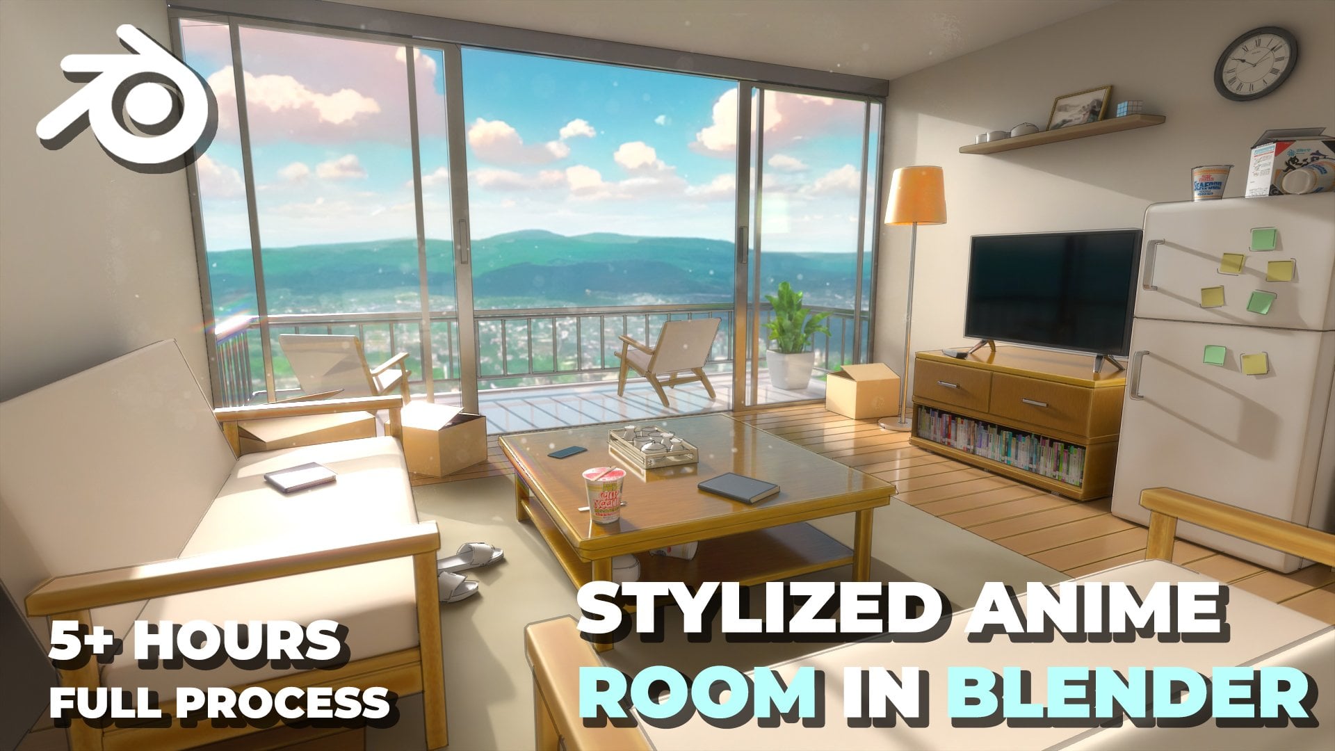
1. Introduction to Class: Hello and welcome everyone to this new course
Anime and Blender, where you will learn to
create two unique anime inspired environments from start to finish just using blender. With 6 hours of information
packed content, we will create the
school hallway and the rooftop scene along with the variations you
see in the trailer. All the resource
files used would be provided with the
course like cool HDRI, textures, reference images,
blender files, everything. We will cover it all from
modeling and texturing to lighting and
rendering so you can bring your stylized
scenes to life. We will learn how to achieve that signature animal
look using shaders, lightings and
different techniques like adding outlines
to your renders. First, we'll create a stunning
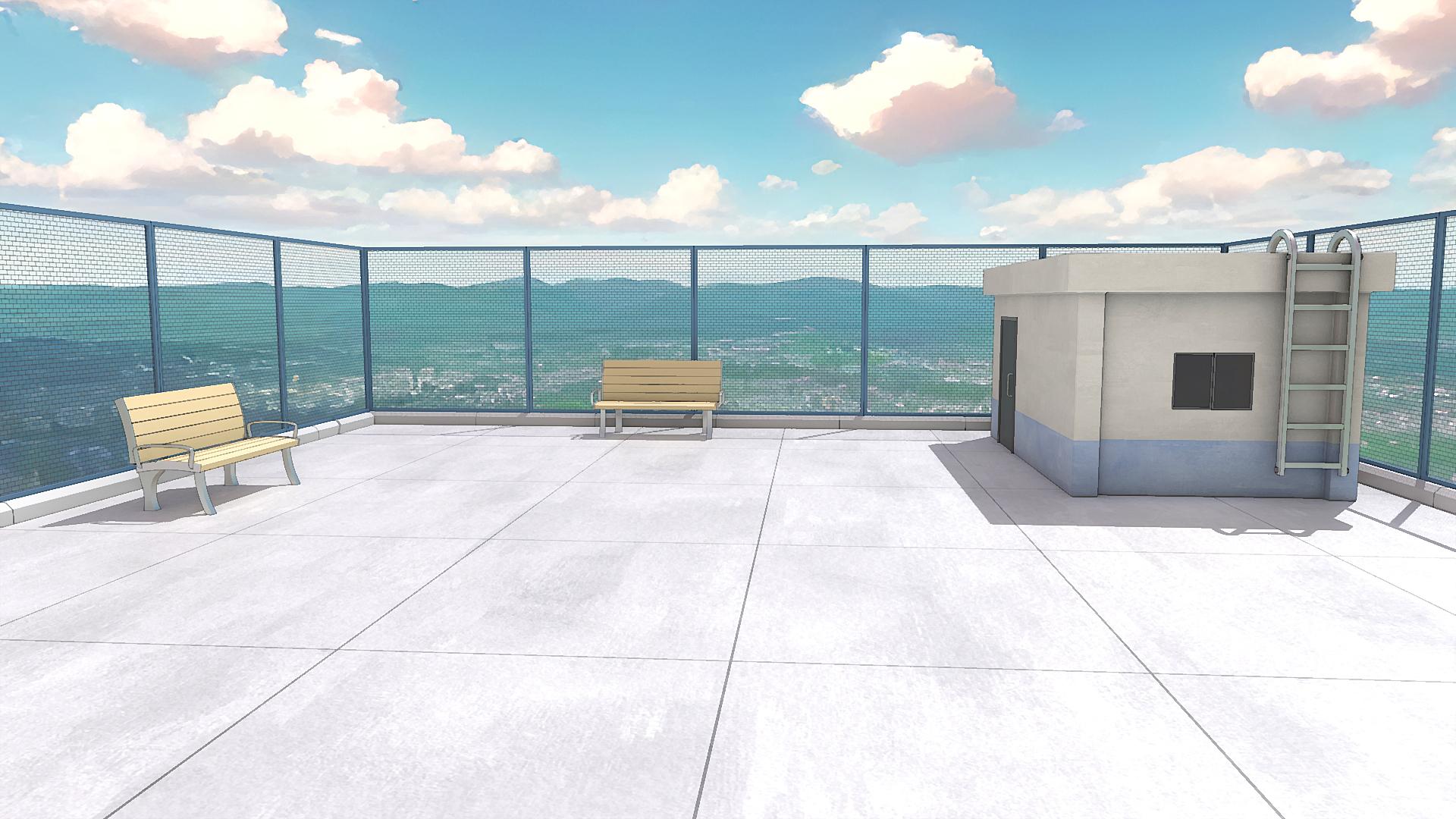
anime style rooftop scene, starting with modeling
the entire scene, setting up the fence, building, adding the benches,
ladder, et cetera. You will learn how to
model all the elements, adding materials, lighting, and set up composition
for a cinematic look. Plus we will also create a daytime and
nighttime variation showing you how to
transform the mood of your scene with lighting
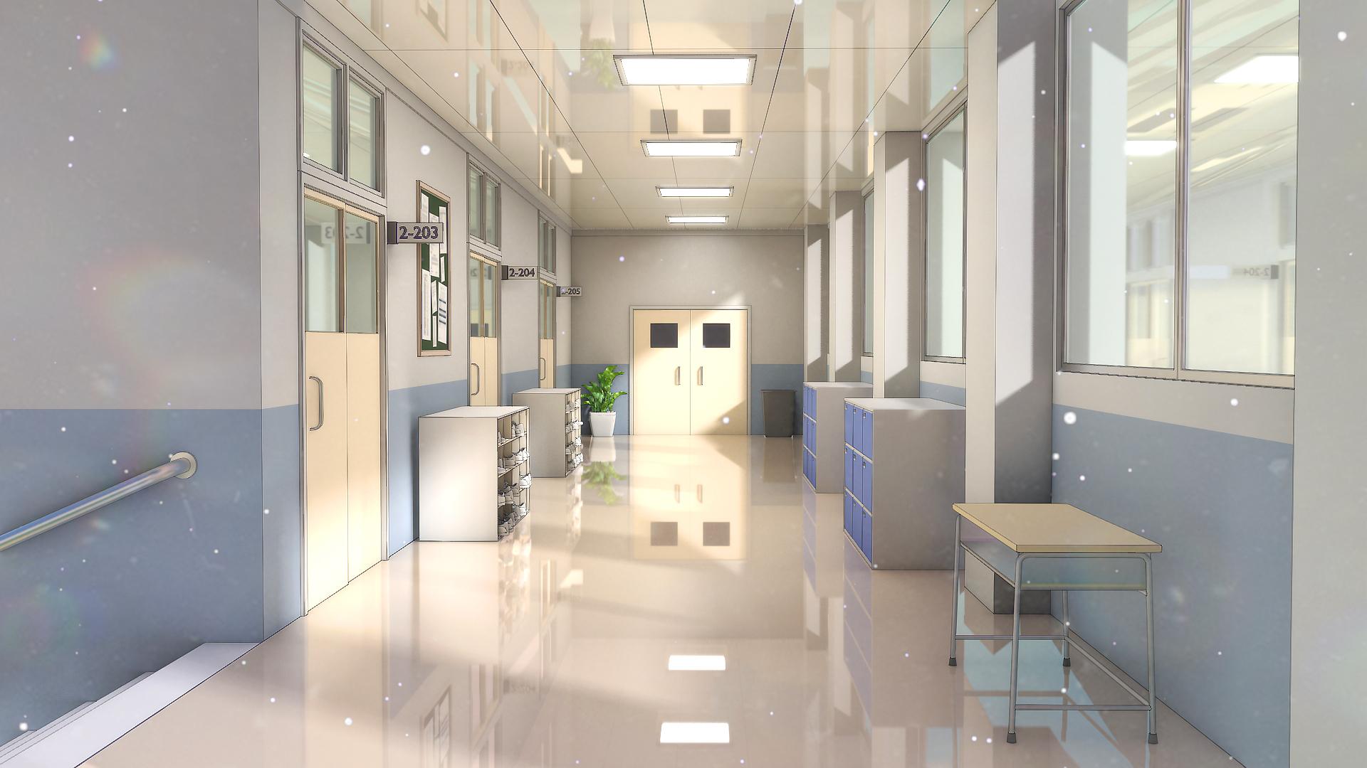
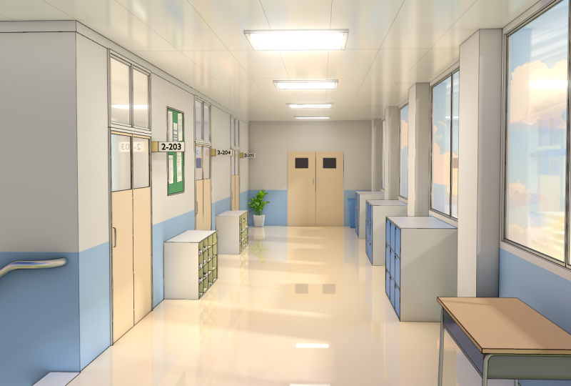
and sky adjustments. Next, we will create a classic anime school hallway scene, modeling everything
from windows and classroom doors to
props like the desks, shoe racks, lockers,
and a lot more. After that, we will
texture our entire scene, learning to create various
different stylized materials. We will also explore anime
style lighting and how to add outlines to our renders
for a true anime aesthetic. Later on, we will add
some color variations, helping us to customize the
mood and style of the scene. To enhance our renders, we will composite both
the scenes in blender and Photoshop using effects
like the glare node, the Kuvaha node, and adding overlays to give finishing
touches to our scene. Whether you are a beginner or an experienced blender user, this course will give
you the skills to create eye catching
stylized anime scenes. So I hope to see you there
in the course. Thank you.
2. Going Over Reference Images: Hello and welcome guys to
this new course where we will be creating two anime
inspired scenes in Blender, one of them being
a rooftop scene and a school hallway scene. So in this very first lecture, we will be just going over
our reference images, and I will be showing you
a free program called PureRef and how we can use it to arrange our
reference images. So you can open up
the course files. Over here, you will find
all the required files that are needed for this course. So let's just open up the
reference images folder. And here I have added
all of the images that we are going to be
using in this course. As you can see, we have a
couple of reference images for the rooftop that we
will be using to create it. And we also have a lot of hallway images that we can
use to base our scene off. So now what we want to do is
basically we want to, like, place them all onto, like, a mood board
type of thing. So for that, we will
be using PureRef. So you can go to Google and just search for PureRef quickly. And it is free program, so you can download it for free. Just open up the first link, click Download, and
if you scroll down, you can select your operating system and then just type in zero as the donation
amount over here. But if you want to
donate over here, you can do so, but it
is a free program, so you can just type in
zero and then hit Checkout, and it will give you
the download file. You can install this
program for free and then open up PureRef
from over here. As I've already installed it, I'm not going to do it again. So just open up PureRef. And you will get
this black screen open up in your like window. So let me just quickly go over some of the
basics of PureRef. You can resize the
window like this. It's pretty easy.
It will also be floating over all
the other windows. Even if you click over here, you can see it does not go away. And what we can do is we
can just select all of these images and then just drag and drop them
onto the PureRef. And as you can see, it will create this type of
thing over here. You can hit right click and
then go over to images. And I think in normalize, we can set normalize the
scale or the size, I think. What this will do is it
will kind of make all of them of equal
size, like this. And then we can just
select it once again, right click and go to images
and arrange them by optimal. And now you can see they
all have a similar size. And this way we can just look at all of them at
the same time only. The great thing about
this is that it will always stay over your Windows, so you can always just work on your reference images while
you are working with blender. So we can just
quickly place all of the rooftop scene
over here together. And then we can place all
of the hallway scenes over here so that we can always easily look at all our
reference images at once. This way we don't have to, like, again and again, check
between different windows. You can also double
click on any image, and it will quickly
just focus all over it. These are some of the other
reference images that we will be using to create
some specific items, so we won't be using them
directly from over here. Rather than that, we will be
using them in blender only. So now we have all our
reference images over here. And with this, we can
finally start working. So the first scene
that we will be working on is the rooftop scene. As it is a fairly simple one, we can easily create out
the model and then add the materials and then give it that anime or stylized
kind of look. And afterwards, we will be
working on the hallway scene, which is a little bit more
complex than the earlier one. So yeah, in this lecture,
I really just wanted to go over pure ref and going
over the reference images. We will be starting
with blocking out and modeling in
the next lecture. Also, you can just
hit right click and go to Save and just
quickly save your scene. And I will save it in the
reference images folder on You can just rename
this to moodboard. It save. And we also have a lot of other different
settings in Pure Rp that you can quickly just go
over by hitting right click and looking around. Also, another important
thing is that hold your right click on your mouse to move it around
on your screen. You can place it over
here in the corner and then you can easily keep working while also looking
at the images. If you have a second
monitor like me, you can move it over to the
second monitor as well. You can resize it from
over here if you have a smaller screen to
make it more optimized. We can also hit right click
and you can change the mode so you can see currently
always on top is enabled. That's why it will
always stay on top of your each and
every application. But if you just disable it, then if you click
on your blender, it will go also, you can always keep
always on top enabled. It's really helpful. But if you want to
really minimize it, you can just click over
here in the start bar, and it will basically
minimize it like this, even though always
on top is enabled. So I just wanted to go over
a couple of settings of Pure ref and just wanted to
go over the reference images. Now that we have
done this, I think this is pretty good for
this first lecture. I want to keep it
short and simple. In the next lecture,
we will be working on blocking out and creating the models for our
rooftop scene. So thank you guys watching. I will see you in the next one.
3. Creating Roof Blockout: Hello, A, welcome, guys. So in this lecture, we will be starting with the modeling
of our rooftop scene. So I've opened up a new
blender file over here. We can just start
by pressing A to select everything that
is added by default, and we can just delete it. I've also turned on screen
cast keys, which is an add on, and it will show you
all of the shortcuts that I'm performing
right over here, and it will help you to
follow me along easily. Alright, so I will just go over here and open up our PR file. And then we can just
right click and open up the scene that we saved
in the last lecture. So now let's just click on it to open it and we have
a file over here. So as we will be starting with the rooftop
scene over here, so let's just focus on that. And as I said, we will be just setting up the models
in this lecture. So let's start by
adding in the ground. So I will place it right
over here in the corner. Later on, I will just move it to the second monitor only so that we have more
screen space over here. So press Shift A, and
let's just add a simple, and we are first creating
our ground over here. So you can press N now to
bring this side bar view up and you can see we have the dimensions of
the cube over here. So we can increase this to
something like ten by ten. And let's just decrease the
z because we don't want it to be that thick at all.
Yeah, something like that. So this will be like the
base for the rooftop, and over that, we can just add these curbs and fences first. So let's just press Shift, and we can start by adding this like stone slab like thing that is covering
the boundary. We can press seven for top view, and let's just move
it right over here. Press then X to lock it
on the X axis to scale it down and we can scale
it right till here. Press S then Z. These are
some of the basic shortcuts. You just press to scale it, and then we can press X Y or Z to lock it in that
particular axis. Let's see. Press then Y, and let's just decrease
the length like this. If you want, you can see the measurements that I'm
using from over here as well. All right, let's just make it
a little bit more smaller. Yeah, I think something like that feels pretty good to me. Now we can select it and press Control A and apply the scale. So if you're not aware
with this concept, whenever you change the
scale of your object, you always need to press
control it to apply the scale. And I will just
quickly explain it with the example
that I always use. So if I add a cube right over here and let's just
say I duplicate it, so now we have two
different cubes. If I select this cube, press S then X and scale
it on the X axis by three. So I will type on
number pad just three, to scale it three
times like this. Then once again, I
will just select the same cube and press S
then X and type in three. Now this way, both
of these cubes are scaled by three
times on the X axis, but for one of them, I will press Control A and
apply the scale, and for the other one,
I won't be doing so. Now if you just select
it, select both of them, Press tab, press A, to make sure everything
is selected, and then press Control
plus B to bevel it out, you will notice that
both of them are beveling in a very
different manner. If I just give it a
nice bit of bevel, and let's just use a scroll
V to make it smoother. Press tab. And you
can clearly see the bevel over here
is very uniform, whereas the bevel over
here looks very stretched. So that is the reason
that we applied the scale because
this particular cube has like a uniform scale. That's why the bevel over here looks perfect and
it looks uniform, whereas the bevel
over here looks pretty stretched
because we did not apply the scale for this after scaling it up in the
X axis like this. So that's why the
bevel is like this. And this goes for a lot of different blender operations,
not only just bevel. If you don't apply the
scale for your models, it can cause a lot of issues. Let's say if I inset this now, press I to inset this, and you can see over here, the inset is working perfectly, whereas over here, the
inset looks stretched. So that is what I just
wanted to quickly go over. I will delete it now and we
can come back over here, select this press Control A, and make sure to
apply the scale. We can maybe give
it a little bit of detail by pressing Tab. Press two for select. So if you know one is
for vertice select, you can select vertices. Two is for set, and three
is for face select. I will press two now, select
this edge, press Control B, and bevel it out just like
this and just give it like one bevel like no
segments in between. Just to make it
something like this, to give it like a that
stone curve like look. Now what I will do is
I will just finish it all by adding in like
a bevel modifier. Go into your modifier
section and add in a bevel. Make sure the scale is applied, and let's just decrease
the bevel amount now to something
small like this. Go into shading and
enable harder novels. And this way we get this perfect looking stone curve that we can use to fence along
our, um, boundary. Now, I will go
over here and just quickly enable shadow
and cavity as well. So these options will just make your visuals a little
bit better in blender. They won't really
do anything else, but it will just make your edges look a little bit
more prominent with cavity enabled and
shadows just for showing up shadows in
the viewboard as well. If you add in something
like a light, which we'll be adding later on, it will just show you
some basic shadows just to get a
little bit of idea. And yeah, now I will just
move it back over here, and then we can start by
first just moving it right to this corner so that we can now duplicate it
and fence it along. What I will be doing is instead of duplicating
it again and again, we can just simply select it, go into the modifier
section once again and just add
in array modifier. Set the X factor to zero
and increase the Y factor. To maybe something like this. Let's just decrease this to one. Yeah, I think one is fine. They are closely
connected like this, and then you can just increase the count to get
something like this. I will select it
overall and scale it down so that it kind of, like, fits perfectly
with our length. And yeah, I think something
like this is pretty good, and I think it looks all right. Now we can
just select it. And once again, I will be simply adding another modifier
to copy it over here. You can add in a
mirror modifier, and mirror modifier works
according to the origin point. So we want to use
the origin point of this big cube or the ground
that we have created. So go into the mirror
object and select the cube as the mirroring point. And now you can see
it is mirroring perfectly across
this cube over here. And this way we have created this pens on these two sides. Now we just need to select. Once again, move it like this. We can disable the
mirror modifier for now, so you can turn it
off from over here, press R, then z and type 90, or I'll just type in -90. Press seven and move
it right over here. Now this time, instead of
mirroring it on the X axis, we will be instead mirroring
it on the y axis so that it covers all of the four sides of our ground or the
rooftop, sorry. I will also press then X to press the next and
just scale it a little bit so that it extends still over here because it does
not really matter if the scale is a little
bit off for both sides because it is not really
even that much noticeable. We have something like this. And yeah I think
that's pretty good. I'll just select them all and move it a little
bit down like this. And moreover, I will just select it for now and just turn off the mirror modifier
for this so that we can work it something like this. We will be adding our
camera over here, right over here, and then
we can create the scene. So I'll just press Shift A and just add in a
camera quickly. Now, if you press zero
on your number pad, you will see we can view
through the camera. For now, I will just hold
right click and move it to the second monitor,
the PureRef scene. And we want to make this camera like properly
fit across our scene. So we want it to place it
somewhere around here. So what you need to
do is basically just place your blender how you
want your camera to be. So I will just move around my view and place it
perfectly like this. Then you can press
Control all 100, and you will see as
soon as you do that, the camera will change
its location and it will perfectly fit along
your blender view. Now if you press zero, you
can see through the camera. Go into view, so
press N and bring the sidebar view up and go into this view section and
enable camera to view. Now you can just hold control
and use your scroll wheel, L you can basically
use the camera, similar to using blender. And you can just zoom
out a little bit. To view everything like this. Now we have pretty much
everything in our scene. I will disable camera
to view so that I can come out of the
camera view right now. I will also just press zero and go into the camera,
select the camera, and you can go into
the properties object data properties of the
camera and just decrease the focal length
something like 35. That is totally up to your personal preference
what you want to go for. And then I will just zoom in a little bit,
something around here. And this is like, kind of the view for our
scene, as you can see, we are looking at
from this side, and then I will disable this. Basically, now we
can just add in, like, a cube, and over here, we will be creating
our building like thing and we will be adding the fences and
all those things. So this is like the basic
setup for our scene now. Will delete this cube for now. And also, as you can see,
the shadows are also showing up because we enable the
shadow option from over here, which is quite helpful. So yeah, I will just
delete it for now, and the next step to do
is to add these fences, which I think we will be
doing in the next lecture. I think this much is
pretty good for this one. We added the ground and
we added the fences. So let's just hit safe first. So I'll go ahead and hit safe, and now just move back
in the Blender files, we can hit right click
and first create a new folder and
rename this folder to Rooftop so that we have
a bit of organized files, and I will save this
as Rooftop scene. Now, it's save Blender file. So yeah, I think this
much is pretty good guys. We will continue to
work on the modeling of our rooftop scene
in the next lecture. Thank you guys for watching. I will see you in the next one.
4. Adding the Fences and Building: Hello, and welcome, guys. So let's continue modeling
our environment now. Let's start by adding these
metal fences right over here. So let's just press
Shift plus A, and we can add in a simple cube. Let's press press three. For phase select, let's
select this phase, press X, and delete the vertices so that we have something
flat like this. Let's just move it
back right over here. Press seven for top you and just place it along
right over here. What I will do is just press zero to check the size of it. And I think a two by two
square looks fine over here. What we can do is press
Controller, apply the scale. Press tab, press three for phase select and
select this phase. Press I to insert
this like this, to create the boundary for it, then press X and
delete this phase. Now we have something
of this kind, and then we can just give
it a bit of thickness. So multiple ways to give it thickness, we
can just press tab, press A to select everything, and we can also
extrude it like this, which will give it thickness. But I think a better way
or a non destructive way to do this would be to just
add in a solidify modifier. So search for
solidify and add it. This way, what we can do is
it is still a plane only, but we can adjust the
thickness from this modifier. So let's keep it something like this, bring
it out over here. Let's type in 0.04, I think. And now we have our fence
right over here ready. Press zero, and I think
it looks pretty good. Then we can just add in once
again an array modifier. Type in zero on the X factor, and I think increase it
on the Y. Let's see. We can definitely keep a very small bit of
gap between them. Or just type in
minus one and add in a bevel modifier so that
we can actually see that boundary and just decrease the bevel amount to
a very small number. Something like this,
Enable harden novels. And I think this is pretty good. I'll just move it
up a little bit. Then we can increase
the count of this to something like five. Then once again, select it. And as you know, we
can once again add in a mirror modifier and just select the mirror
object as this round, so that it perfectly
duplicates right over here. Now you can see we have
created R fence over here. Now, once again, just select it, press seven for top view, duplicate it like this and remove the mirror
modifier, press R, then type in 90 to rotate it by 90 degrees and just place
it right over here. Now, what I want is that it
kind of attaches over here. So let's just make it touch Would you select it now, press S then X and just
extend it till here. Now I'm just trying to, like, fit them properly
across the corners. Yeah, I think
that's pretty good. Press zero to just quickly check through your camera view, and I think it's looking
pretty good to me right now. I'll just place the
view right over here, press Control Alt
and zero once again and enable view from over
here, camera to view. I think right now, something like this looks
pretty good to me. We'll definitely work on
the view and camera angle, all those things a
lot more later on. But right now, I think
for now it is fine. Okay. Alright, guys, I think our fence is
looking pretty good. Now, you will also
notice that we also have this barbed wire kind of thing added in between the
fins. But don't worry. We won't be adding it using models because it would
be too, like, high poly. And what I will be doing
is we will be just basically creating a
material for this part. So we'll be doing that later on. So for now, let's just focus on creating the building
right over here. So for this, once again, let's just press Shift
plus A and add in a cue. We can place it right over
here in the corner for now. And what I will do is I will press slash on my number pad, and what this will do is
it will take this cube into this local mode so that
we can work on it freely. If you press slash once again, you will come out
of the local mode, but you can just press it
once again and go over here. Now, to start off,
I'll press Tab, press three for phase select
and select this bottom face, press Shift plus S and
cursor two selected. Now what I want to
do is right now the origin point is currently
in the center of the cube. So the origin point
is responsible for all of the transformations. So if I just scale
it or rotate it, you can see all of
those things are happening through
the origin point. But if I just place the three
D cursor right over here, so what I did is just
selected this phase, press Shift plus and
then causa to select it. And then I can go over to object set origin and set the origin point to
the three D cursor. Now, what this will
basically do is whenever I try to rotate it or scale it. You can see this time it is happening from the origin
point at the bottom, and how this will help us
if I just quickly press slash to come out of
the local mode and go over here and enable
face snapping. Press G and first,
let's bring it out. Then press G and hold control, and I can easily snap it onto the face of the
ground very easily. And it will also help us
when we are trying to scale, let's say, the height
of the building, so I selected precis thein Z. I can easily scale it on the
upward side like this. But earlier if we had
a cube, let's say, if I just duplicate
it right now and I go to object set origin, origin toemetry now the origin is back at the center only. So this one has the origin
at the bottom face. So when I press STN Z, I can scale it very easily
the height of the building. But if I press S and Z, you can see it will scale
in both the directions, which can cause some issues, not really issues, but
it's a lot more work. You have to place
it then once again. But this way, it gives
us much more control. And yeah, with that
out of the way, let's just scale our
building accordingly. I will press STN Z and try to decrease the
height on the Z axis, go to item so that we can
actually see it over here. I think I will be
going with something like yeah, 1.89, one point. Let's send this to 1.85. These it on the Y as well. And on the X. Yeah, I think the size
looks pretty good to me. What we can do next is we can just take any
of those buildings, so I will be following this one and just try to kind of, like, add in a little bit
of extrusions and things like that to make it
a little bit more detailed. So I will just place it right
over here and let's start. If you want to copy the dimensions over
here, you can do so. And now let's just press
slash once again to go into the local mode so that we can freely
work over there. Press Control A and make sure
to apply the scale first. Press tab, and one other
thing that I will show you is you can go over here
and enable edge length. Basically, what this will
do is it will show you the distance or the length
of all of the edges, which makes it a little bit easier to follow the dimensions. Press Control R to
add like a edge loop, and we are creating
this top piece. Place it right over here, so you can follow
right over here. It's 0.3 meters exactly
the distance from the top. Then we can press
three forhas select, hold Alt, and select
this completely. So hold Alt and select
this complete loop, press Alt plus E, and
extrude faces along normal. Then I can just extrude it
out, something like this. Yeah, I think this much
feels pretty good. Press tab, once again,
press Control R, and you can use your
scroll wheel to increase the number of these cuts added,
so I will be adding two. And this time we are
creating this portion. We basically need to add one edge lob over here
and one over here, and then push it inwards. Add two like this,
hit right click, and then you can just press
S and X and scale it up on the X axis. Something like this. Then I will just
select this phase. And now, as you can see, we need to press E to extrude
it and push it inwards. But what this will do is it will add this extra phase over here, which looks pretty weird. So what we want now
is that we want to extrude it a little
bit more cleanly. So if you go in here in the extrude toolbar
or the tool menu, you can press T to bring this up like this and
then hold over here, and then you will find
this extrude manifold. To select this one instead of extrude region, select
extrude manifold. And now, once again,
select this phase. And this time when you select this yellow icon and
push it inwards, you can see, like, now we can extrude it much more cleanly, and it will give us
really nice results. So yeah, with this, I think our building is
looking pretty good, like the blockout phase
is looking really nice. I will select it and we can start by adding in
a bevel modifier. You will see that as soon as
we added the bevel modifier, nothing really happened
because sometimes, like, the vertices are too
close to each other and the bevel modifier
can't really work properly, so we need to make it a
little bit more manual. So under the emtr section, just disable clamp overlap. And as soon as you
do that, basically what this has done is it has removed the limits of
the bevel modifier to control the geometry. If you increase it, it
can go totally crazy. But what we need to
do is we just need to decrease it just that much that we can get nice
looking bewels and it does not really
interfere with anything. You just need to
make sure there are no overlapping edges anywhere. And yeah, I think
we are good to go. So with that, you can
just hit right click and shade autosmooth and just disable the
spin icon and make sure to move the shade
autosmooth on the top. And then enable harder normals. This will give you these
good looking edges. As you can see earlier, they
were looking pretty weird. But if you enable
harder normals, and then we can get these nice
looking edges and corners. And with that, I
think the basic shape of our building is
looking pretty good. Let's press slash come out of the local mode and see how
everything is looking around. I will also select the
camera quickly and we can just go in over here under the camera settings and increase the sensor size to something like 50 then go back to view, enable camera to view, and just zoom in a little bit more. Yeah, I think this
camera setting feels a little bit better. All these settings are
totally up to you how you want to adjust the focal
length and things like that. Yeah. I will also select this, and I think it looks
a little bit too big, so I will just
decrease the size of it, something like that. The seven for top you and just move it over
here in the corner. And yeah, I think that
looks pretty good to me. We can also quickly just take a look at how
everything is looking. You can go in the
viewport shading and just make sure to
set this to EV and we can press Shift
A and add in like a simple light that is
going to be our sunlight. And this will give us very
flat looking results. So press R two times while
selecting your sunlight, press R two times
and rotate it like this to make it a little
bit more interesting. It does not really matter
if you move it around, but it would matter if
you rotate it around. And we can select the
sunlight and we can increase the strength
to two for now. And if you go over here
in the render properties, everything is looking
really dark right now. But as soon as you
enable this rate racing, you can see we get
much better results. But for this to happen,
you need to make sure that you are in the latest version
of blender that is 4.3. So yeah, make sure you do that. There you will get these nice rate racing features
even in EV as well. You can go over here and
increase the resolution to one by one to improve
these lightings, and over here also just set
the rate to one by one, which will improve
the quality a lot. For now, I think
that's pretty good. We can definitely work a little bit more on the lighting
and materials later on. But if you just press
F 12 right now, this is kind of how our
render looks right now. Which I think is a
pretty nice start. So let's just continue
working on it right now. I will close it
now and it's safe. And with this, I
think this smudge is pretty good for this lecture. In the next studio, we will be further working on the building, even more adding these
more details like windows, doors, and we will be creating some other
small props as well. As you can see, we also have
a little bit of ladder like thing going on on
the building or like a bench like
thing on the rooftop, which will give it a little bit more detail in our scenes. So yeah, I think this smudge is pretty
good for this lecture. Thank you guys watching. I
will see you in the next one.
5. Detailing the Building: Hello, A, welcome, guys. So let's continue working on our building right over here. So, again, if you will look
in the reference image, I'm following this
building right over here. So we'll just create a section for the windows
and the door as well. So let's just start.
Come right over here. Let's press tab to go
into the edit mode, press Control R and you can use your scroll wheel to once again add two edge
loops like this. And I will also quickly enable edge length so that I can
see all the measurements. Then press Control A once
again and just scroll it to two times and add two
edge loops like this as well. And this can be window in
the center right over here. Like that, I will
just select both of these loops and just press G
then Z and move it upwards. Then you can just
select this pace, press E and extrude it
in words like this. I will also just
select the camera, go to view again,
camera to view and you zoom in a little
bit and bring it down. This shot feels a
little bit better. Yeah. So disable
camera to view now, and let's come back
right over here. Press tab, we can
just hold all and select these two loops once
again and move them upwards. Okay. This does not work
now, as you can see, it will kind of make the
window looking weird. So enable Xray, press one for the front view like this and just select it all
right over here. This way you can easily select everything and just move
it upwards altogether. Press tab to come out of the
edit mode, disable Xray. And yeah, I think this
feels pretty good now. Let's continue and
press tab once again, and we can add another
two edge loops. Press G then X, sorry G then Y and move it
right over here. Hold all and just
select this loop, press G, then Y once again
and move it inwards. Let's see how big we
want to create a door. We can use these
two faces as well. But I think that's
a bit too small, press control R and
add another edge loop. I think something like
this is pretty good. Once again, just press E
and extrude this backwards. This time, undo this, go over here and select
extrude manifold. Just hold over here and
select extrude manifold, and then again, push
it back like this. And this way we have created the sections for the window
and the door as well. And now let's
actually create them both. So it is pretty simple. I will press tab, and
now we can just disable the edge length as well so
that everything looks pretty. So that everything looks
a little bit cleaner, and let's select this tool, select these three phases, press Shift plus D to duplicate
this phase like this, then hit right click so that it is exactly at
this location only, you can press P and
separate the selection. What this will do is it
will basically create this separate object for this door that we
can easily use. So you can see right now the origin point is
placed right over here, so go to object, set origin
and origin to geometry. Move it back. And
this can be a door. What I will do is I
will press tab and we can just press two for select, select these two edges, press X and do not
delete these edges but dissolve them so
that the shape stays, and we just remove
those edges completely. If you would have deleted them, it would have created
something like this. So instead, we
will just dissolve those edges so that we still
have the shape of our door. And this way we can
get this door we can go to modifiers and quickly just add in a solidify
modifier as well, increase the thickness for this, and you can notice that the
shading is pretty weird. So first, let's just move the solidify modifier above
the bebl and that fixes it. Decrease the Bbel amount and
we have something like this. Another thing that
I want to do is press staab and once again, just select this complete
loop for the door, press Shift plus D to
again duplicate this, bring it out over here, press B and separate the selection. Once again, we have a
separate door over here. For this, I will just press Tab, press three for phase
select, select this phase, press I to insert this, insert this a little bit, press X and delete the phase. So that we have something
hollow like this, and we already have
the solidifier and the Bel modifier
and just move it back in so that we can
create a door frame. You want to create it
a little bit thicker? You just select this loop and press S to scale it
inwards like this. I'll just move this part
downwards so that we only get these three
edges and not this one. This way, I think that door
frame looks pretty good. All right, guys, let's move
over to the Windows now. Once again, I will be
using the same thing. So just select this phase,
press Shift plus D, right click and press B and
separate the selection. Select this right over here, go to object set origin or to
geometry, and bring it out. This time, I will
just press Tab, press Control R, and add
loop right in the middle. Hit right click and we can create two different
separate windows. So just select one of them, press B and separate
the selection. So once again, now we
have these two windows. So what I will be
doing is again, pretty basic select them both. Apply the scale, so control
A, apply the scale. Let's add a solidify modifier
and move it above the l. Similarly for this one, as well. Now, just make sure
that the values for the solidify and the
Bewl modifier are equal. So 0.004 on the bevel. And, now both of them are same. What I will do is once
again, I want to create. Let's just select them both, press slash to go
into the local mode, and we can just duplicate them, bring them out, press tab, select both of these faces, press I to insert and press
X and delete the face. Project. Another thing that you can do is right
now I want to decrease the bevel amount for both
of them at the same time. So if I just decrease or
increase the bevel amount, you can see only one of
them is being affected. So if I hold at, and then I decrease
it, you can see I can affect them both at
the same time now. Just like that. Now just select them both and move
it inwards like this. And this can be our pretty
simple looking windows. I will just select these
two and bring them out a little bit and select these two and just move
them backwards. Sorry. Just like this. I think that looks
pretty good now. Let's just hit
Save on our files. And with this, our
building model is also pretty much done. Now, as the environment looks
like quite a bit empty, I will be adding a ladder
over here on the building and also a couple of these
benches that we can use to fill out this empty
space over here. So yeah, let's just it save now, and with that, we are pretty
much done with this lecture. We will be continuing
from over here. So thank you guys for watching. I will see you in
the next one. H.
6. Creating the Bench: Hello, A, welcome, guys. So let's continue working. And now in this lecture,
as you can see, we are almost pretty much
done with the modeling phase. We will be also adding something like over
here, like a bench. So let's just add
that in this lecture. So for this, I have
added a couple of reference images that you can see the front view
and the side view. So we cannot really use
them from over here, like, from the a pure Rf, we just need to bring
them into blender. So I will press for the
front view like this. You can hold your shift
and use your right click to place the three
D cursor right over here, and then press Shift plus A, and let's just simply add
in a reference image, and we can go into
our resource files. So open up the
reference images folder and just select the front view. Let's just moved.
Back a little bit, then you can press three
for the right side view. Don't worry, we'll
just isolate them. Then you can just add
in a side view like this and move it
right over here. Let's just select them both
and press slash to go into the local mode so that we can work on them a bit more freely. And with this, we have the front view and the side
view of the bench, and it should be pretty
easy to create it now. So press one for the front
view and press Shift ta. Let's just simply add
in a mesh and a cube. Scale this cube down and make it the size of this plank
right over here. And scale it up till here. Let's press three and make sure to fit it accordingly from
the right side view as well. So just move it back and just scale it down
on the y axis. Now you will notice that we have this curve like thing going on where the planks are being moved up in this curved fashion. So first, I will just add
in the array modifier. So one way we can do this is just duplicate
it again and again, press shift plus deuplicate it, and then rotate it like this. Which would honestly work fine, but I think there is a
much better and like a quick and automatic
way to do it. So let's just delete it all. Press three for right side view, go into the modifier section for this cue and add in an
array modifier once again. Let's set this to zero and
increase the Z, I think. Just move this down
till here and now you can just duplicate it
I think five times. Now to just make it bend, we can add in simple modifier. So just search for
simple deform. And add that you can see
using this modifier, you can bend or move around your object and just
select the bend option. And with this, you can
see we pretty much get something like that. We get something like
the results we want. Press Control and make
sure to apply the scale, and that would
pretty much fix the. Earlier issue earlier
it was kind of skewed, so press control
apply the scale, and this will give you this
perfect curve going through. Now you can just play
around with the angle like this and we will kind of get the perfect
look that we want. And now you can see we have this like curve
look going on, and the bench is
looking pretty good. Let's just next add in a bevel modifier and
decrease the bevel amount, just a little bit, not much and add in the harder normals. And with this, I think this
is looking pretty good. Next, we can just simply
add another cube, scale this down and we can kind of add in
a covering over here, again, just scale it up. And make it like the
same size of this. Now for this, you will
notice that when we add in the bend modifier, like the simple deform modifier, once again, because once again, we want to make this cube in the curved shape of this object. So we can select this and
add in a simple deform. But you will notice no
matter what you do, I don't think it
would work properly. Select bend. You
can move it around. We will get something like
this. You can change the axis. And nothing really happens. The main reason for
this is because right now, if you press tab, this cube does not really
have any kind of geometry in it for this to
move around properly. For this over here, we
had these multiple cubes, which it curved around properly, but this one is only
a single object and we don't have
any geometry in it, so we can press Control R first and add in like a bunch of edge loops so that the modifier can actually use some
geometry to move it around. Now when you add in
the simple deform, select bend, apply
the scale first. And still, now, if you
just move it around, you can see, we get like
much better results. Now it is bending properly. We still not get what
we are looking for, and the reason for that is that the simple deformed modifier always works along
the origin point. So for this object to take
the proper curved shape, we need to place
the origin point right at the bottom over here. So even though it is
curved, if you press tab, we can see we can
still see our old straight because we haven't really applied the
modifier right now. If you go over here
and hit Apply, then if you press
tab, you can see now it is prominently curved. Let's just undo it. This
is like the point of modifiers to keep it everything
like non destructive. So now I will just press tab, press three for phase,
select, select this phase, press Shift plus and
cursor to select it to bring the cursor right
at the center of this phase. Then I will go to object, set origin and origin
two, three decoso. This way, now you can
see the modifier has changed and the bending is
taking over from this point. Now if I just
decrease the angle, we can properly match the
earlier shape of this thing. And this, I think,
looks pretty good. I will press tab,
select the top part, and just move it
up a little bit. I can see we have
something like this. Let's just select
this and once again, add in a mirror
modifier and select the mirror object as this so that we can successfully
duplicate them both. I will also just select it
and make it a tad bit wider. Last is to just add
in a bevel modifier. Apply the scale, decrease the bevel amount to
a very small number, and enable harder normals. This way our bench, from the front
over here is done. Let's just select them both. Select both of these objects
that you just created. Press three for right side view, press Shift plus D, and now you can just
rotate them like this. You can see they are
not really rotating properly because currently, I have selected individual
origins from over here. So they are rotating around their individual origin points. So if you want them
to rotate together, we can select something
like bounding box center. What this will do is it will treat them both as
a single object, and now it will rotate them much more like in
the way we want. So we can use the transform
options up over here to transform the object
in whatever way we like. Sometimes we want to
use individual origins, but right now, we want them
to rotate as a single object. Now our bench is
looking pretty good. Now we can just start working on the legs and the side bars like the handles
right over here. So the legs is pretty simple. We have something
like this over here. So press three for
the right side view. We can first create
this simple one, which is once again just
adding in a cube. All right. Just place it right over here. Enable X ray, press tab, press one for words, see select, and just bring them
down till here. To like the length of
the legs of the bench. Press one for front view
and just move it right over here and give it the
appropriate thickness. With this, I think we
can once again use the bend modifier or like
the simple deform, sorry. Select the bend, press tab, and add in first like a
couple of edge loops. And now just move it like this. Tab and select this bottom part. And I'll just try to make it match with the reference
image right over here. So that like the bottom
part is kind of flat. This way, we have the
legs of the bench. I will just decrease the
thickness a little bit. Obviously, we don't
really have to follow the reference image
entirely like accurately. It's fine if you just make some changes according
to our n. And now, again, I've used
the mirror modifier and use the mirror object as this to mirror it across
both the axis over here. Now we can create the legs on the back side for which I will just simply press
Shift A and add in a plane, rotate the plane like
this by 90 degrees on the y axis, enable X ray. You select these two vertices, press X, and delete them. Select these two place
one right over here, and select this one, press G, then Y and move it
right over here. Now what we do is as it
is in a weird shape, I will select this vertice
from over here and just press E to
extrude it and keep on pressing E again and
again and just place it where I want to
place it exactly, and trace out the
reference image. I'll just keep going like this. Alright, guys, we
are kind of done. Just select the
last two words, Cs, press F to join them like this. Press tab, press A to
select everything, and press F to fill out
this phase like this. Now you can just press one for the front view and add in like a solidify modifier or just give it like thickness
directly as well. But I'll just use the
solidify modifier. Move it like this and just place it according to the
reference image, a just thickness and the last thing is to just
add in a mirror modifier. Select the mirror object as this and just duplicate it
over the right side as well. With this, our bench
is pretty much done. You can add in like a bevel
modifier as well to this. I will select the smooth bi
angle and move it to the top. Just make sure to enable
hardened normals for this. Et's just hit safe first
and work on the handles, which is once again
pretty basic and simple. I will add in a cube, scale it down, place it right over here. Try to roughly match
the reference image, move it over here, bring
it out, scale it down. What I will do is I will first scale it up on
the y axis like this. Press control, apply
the scale press tab, press Control R, and just hit right click so that the edge loop is added
in the middle. Enable Xray and
delete this side. Delete the right side, select it all press X and
delete the word Cs. Press tab and go into the modifier section now
and just select the, as you know, mirror modifier. And you need to right now we don't really need to
select any mirror object because we want to duplicate it across its own axis only
or own origin point only. So just select the
correct axis like this. And now, this way,
we can just work on the left side of the model and the right side would
be done on its own. What I will do is
I will select it. Again, there are a lot of
ways to create this shape. We can also use something
like a spin tool, but I just quickly
press E to extrude it out and then just rotate it. Press R and E repeatedly to kind of
roughly create this shape. You don't have to match it exactly because to
overall smooth it out, we can just add in like
a subdivision modifier. Scale it down and now press one. This time, rotate it
inwards like this. Sure to press one to go
into the front view, and then you can just scale
it down and push it into the seat of the bench. And this way we have
something like this. I will first right shade
or to smooth this, and it looks fine overall. It does look like a
little bit blocky. So first, I will add in
another mirror modifier. And just duplicate it over
here on the left side. The last thing is to
just simply add in LA, something like a
subdivision surface. You can see it will overall smoothen out the entire shape. So what we can do is
we can now press tab, press Control R, and we
can just add in, like, a couple of edge loops to
obviously make it a little bit, sharper because right now, this looks like a
little too smooth, so you can add in
edge loops like this to just make it up
a little bit tighter. You can also use
creases for this, but I just like to use
the edge loops like this. I will add one over here. And this way, as you can see, it does retain its old shape, but it is not as
blocky, as you can see, if you turn it off, like turn off the subdivision surface, you can see the effect it adds. You can increase the
levels to make it even more smoother to get
like this, nice finish. And yeah, with this,
I will just hit Save and our bench
is pretty much done, and I think it looks very nice. Let's press slash to come
out of the local mode, and I will just quickly select all of this
bench, scale it down. And what we can do
first is we can just select this
piece over here, press Shift, puss
cursor to select it to bring the cursor
right over here. Press Shift A and
add empty quickly. So plain Access, basically. Now select all of this bench. Make sure to just select
the bench only, like, only the parts of the bench and then select this empty at last. So the reason we are
selecting this at last is because we want to make
it the active selection, as you can see, it is kind
of yellowish in color, and the rest of them are orange. So we want this empty to be the active selection so that
we can parent it to this, right click and parent
and go to object. So what this has done is basically all of
these objects are now like children
objects to this empty. So whenever you
select this empty, you can just move it around. Without having to select, all of them again and again, which is kind of like a hassle. So you can just select this
empty and move it over here. You can also scale it down
and it will work perfectly. Let's decrease the size
of the benches for now. And I'm not really trying to, like nail everything
exactly right now, like the composition or the size of the benches
for that matter. You can just roughly sorry, you cannot really duplicate it. I forgot. If you
duplicate the parent, you won't really duplicate
all of the children as well. So just delete it. Instead, you can just select the parent, and then you can
press Shift plus G, I think, and select
children from over here. What this will do is it
will just select all of the children of that particular object
that you've selected. Make sure to select
the parent as well. Then you can just duplicate it, and maybe we can create
two benches like this. I'll just select
them all quickly, hold control, and deselect
all of the extra objects. Press seven for top view, and duplicate them like this. Press R, then type in -90, place it right over here. And we have all these benches to fill around in our scene. And for now, I think this looks pretty good.
Let's just hit Save. And I think we are pretty much
done with the molding now. In the last lecture, I will
just basically add in like a ladder over here on top of
the building to just add in, like, a little bit more
detail to our building. And with that, we are pretty much done with the
modeling part. From that point onwards, we can, start with the texturing, adding all the materials
and everything and the lights as
well to our scene. So let's just hit save now, and this is pretty much
it for this lecture. Thank you. As watching, I
will see you in the next one.
7. Adding the Ladder: Hello, and welcome, guys. So in this lecture, we will try and finish up with
the modeling part of our course so that
we can start with the materials and the
lighting from the next one. So if you will just quickly look over in the
reference images, we have this ladder like
thing over our building. So we can add it over here
as well in our scene, just to add a little
bit more detail, and I think it would
look pretty good. So what we will do is, let's just add the
ladder in this video. And first, I will select both
of these reference images. Now just press M to move them to a new collection and rename
this collection too. Under spore images
so that we can just easily turn
them off for now. Next, I will select the building and press slash
to go into the local mode. So now, once again,
if you will just look over in the pure
reference images, you will find that I've added
a ladder reference image, and I've just added
for the sake of it, we can also create the ladder
without the model as well. It is pretty simple. But yeah, I've just added it for the exact measurements if
you want to use it. So we'll just
quickly add it into blender and we will
roughly use it. So just select your building,
press Shift plus S, then cursor to
select it to bring the cursor right over
here, press Shift A, go to image reference, and then we can just
quickly head over to our folder for the reference
images and then just add. So we have something like this. And the reason I
added this building is because I want to place the ladder
somewhere around here, and I want to, like, kind of scale it according
to the building. So that the reference
image is that of the size that we want the
actual ladder to look like. So I think something like this would look pretty
good over our building. So now we can just select the building and
press slash to come out of the local mode
and then just select the image now and then press slash so that we can easily work with
the image only. Let's press Shift plus A or
sorry, press Shift plus S, then cause her to select it to bring the cursor
right over here, Shift A and then add a cube, and then just try to scale
this cube like this. This way, just make the
thickness equal to the ladder. Now what we can do is just
press tab, press Control R, and you know that we can add a simple mirror modifier to copy the things onto
the right side. So just select the right
side and delete it, and then we can use
the mirror modifier. And now to create the
ladder thing, first, let's scale it down
on the YAxis as well. And if you press tab
now on the object, you can select the vertices
that are in the middle. And if you just press G
then X and move them apart, you can see you can also create like distance
between them. If you enable this
clipping option, then they will be
totally connected in between and you won't be
able to move them apart. But if you disable
this clipping, you can disconnect them. So just select all of the word Cs in the middle and just move them over here so that we can create the
ladder like this. You will see that we have
this space in this phase, so just select it all, hold all, and select this complete loop, and then press F to fill it out. Now we have our ladder
like thing going on. Just press tab, enable X ray, select it and extend
it till here. And the top part as well, we can select extend it
roughly till here as well. All right. Now we have the basic looking
shape of our ladder. Once again, I will press
Shift process c select it to bring the cursor exactly in the center of our ladder. Then press Shift
A, add in a cube, scale it down and give it the size for
this one single ladder. Scale it up like this and
bring it down over here. All right, so now
I'll just select this ladder and scale
it down like this first. Somewhere around here. Next, let's cut
just this as well. I will increase the scale
of this a little bit. And then what we can do
is we can just match it with the reference
image first and then simply add in array
modifier to it, set the X factor to zero
and increase the Ye the z. And for now, first, let's just match in the
reference image. Something like this. And, we have the basic looking
shape of a ladder. But definitely, I
don't really want to add this much amount of stair, so I will just
decrease it to six and then increase the amount of
space between them for now. Let's select it from the
bottom and move it a little bit upwards as well
like this, the overall object. And this looks pretty
good to me for now. I will also just
select this piece, add in a bevel modifier to it, and apply the scale first. Adjust the bevel to a low number and enable harder
normals. Press tab. I'll select this phase,
press I to insert this and just extrude
it out like this, just to add a tad
bit more detail. We can do the same over here, add in a bevil modifier, apply the scale and
adjust the amount. All right, this looks
pretty good to me now. For now, I will just select
the reference image, press M, and move it to the reference
images collection, just to work freely. Press tab, and now
what I want to do is if you press
slash to come out of the local mode and just select both of these pieces of
the lider, bring them out. Over here. So this
looks pretty good. And now what we need is we just need a way to connect
it to the top part, so I will just create
this curvature thing to connect it over
here onto the roof. So how we can do that,
again, it's pretty simple. I will just quickly show you. We have a nice
little tool for it. So first, I will just press
tab and select this top face, and I will just press
X and delete the face. And we can select
this phase as well, and we can delete all
three of these like this. Press one and select
all of it from the top, press S then Z and type in zero, just to make them
completely flat. The reason I'm doing this is because we will be
extending this part. That's why I've made
it completely flat. So make sure to do that.
They are all uneven, so just select it all
press S and Z and type in zero on your number pad,
flatten it like this. Press three for the
right side view and press tab and make sure only
this top part is selected. Then use your cursor, so you hold Shift and then right click to move
it around like this, and you can place it
somewhere around here. Uh, the reason I'm
placing it right over here is because
you'll be using it as a center point to create a circle like thing
using the polygons. And for that, the perfect
tool is spin tool. So press tab and press T
to bring this tool bar up, and you can select this tool right over here. That
is the spin tool. Now, if you will see as
soon as you do that, we get a tool around
our three D cursor. So if you move it around, you can see we can kind of spin it. But currently, the axis
is set to the wrong axis. So if you go into
the tool bar option from over here in this side bar, so that is the N side bar. If you press N, it
will bring it up. Select the tool from over here and select the X axis, I think. So if you press three now,
and now if you select it, you can see we can very nicely create this curvature like
thing which looks pretty good. Obviously, it is not
really accurate right now, so we can use this
bar over here or this like dialog box to
control the settings for it. So if you type in 180, first type in the angle as 180 so that it
extends like this. And then you can
use these gizmos control the length and
the curvature of it. So I think something like
this, looks pretty good. You can also increase
the number of steps, which will basically
kind of smoothen it out. If you decrease it, it will become low poly,
as you can see. But if you increase it,
it will become smoother. We can add something
like 25, I think, to make it really
smooth and press slash to come out of the local mode just to see how
everything looks. And yeah, I think
that's pretty good. So press dab, select it now
and move it down like this. Yeah, I'm pretty happy
with how that's looking, but I just feel that it is a little bit more outwards,
than I would have liked. So I'll just quickly undo it. Press slash to go
into the local mode. Do it once again. Type in 180. This time, just bring it back a lot more so that this curvature is
a lot more small. We can also reduce the
number of steps to 20 because the curve
is pretty small now. Now, let's press
slash to come out of the local mode and just move it down and a
little bit outwards. And this feels much much better and a little
bit more natural. Alright, now you can see that this part is not really
shaded properly, so right click and try shade, smoothing it and also try shade auto smooth because the shading is not really
correct right over here. Let's see how we can fix that. Let's just done off
harder normals for now, and then right click and
shade at to smooth this. And yeah, I think now
it looks pretty good. All right, so I'm pretty happy with how the ladder is looking. I will also just
press tab and select the top part of this
building to just select this part and leave out this like extended extrusion
that we have created, and then just extrude
it downwards like this so that we have some sort of like a
little bit of the roof part. And press zero to just
view through your camera, and I'm pretty happy with how the overall view is looking. Et's just select
this press slash, press Shift and add
in another cylinder, rotate this by 90 degrees, scale it down, and just
place it right over here. Just to add, like, a
small bit of detail. I'll press tab, press
three for face select, and insert this and extrude
it out a little bit. We something like this. Then we can just simply
use the mirror modifier, which is duplicate it over
to the right side as well. Let's select the mirror
object as this only. Yeah, it works perfectly. Slash to come out
of the local mold. Maybe we can just
select duplicate it, press G then Z and move it
over here to the top as well. And with this, I think the modeling part is
pretty much done. Last thing is, I will also add a bunch of planes right over here
because if you remember, we are going to create
a material over here, like a transparent
material to create all those wires
in between these. So you select it, press slash and go to object set
origin origin geometry, so that the origin is
exactly in the middle. Press shift plus
cursor to select it, press Shift A and add in a plane and rotate this plane by
90 degrees like this. Move it back a little bit. Oh Then we can just similarly add
an array modifier, type in zero and increase the offset on the Y and then
just repeat it like this. Make sure it fits
properly over here. Sorry, type in minus one. We have to set it to
something like -1.05. Sorry. Yeah. -1.015, that fits perfect. Just make sure it's
covering everything, and now it is working correctly, I will select it now and add in a mirror modifier and then just select the mirror object as this so that it appears
over here as well. Then just select it once again, press Shift plus D.
Remove the mirror, rotate it by 90 degrees. Then just quickly place it
right over here like this. Make sure, once again, it fits all of the
faces correctly. If it does not, we
just need to adjust the value over here
because we have, I think, tweaked around with
the scales a little bit. That's why it is
not really fitting. Type in minus one and let's see if we can
go from over here. -1.020 0.022, I think, that fits pretty accurately now. All right, guys,
let's just hit Save. And yeah, with
that, we are done. Let's just press zero. Hit save, go into
the rendered view. And right now it is looking
something like this. Obviously, because these
are totally opaque so light is not really
passing from them, and it is creating
all these shadows, but we will be adding
a transparent material to them to create a
wire kind of look. So yeah, we will
be starting with the materials from the
next lecture onwards. So thank you guys for watching, I will see you in the next one.
8. Adding Fence Material: Hello, and welcome guys. So in this lecture,
we will be starting up with the materials
part of our course. So let's first create this
fence material over here, something like this, and then we can work on
the ground material. But before we do all of that, let's just quickly add in some kind of lighting
in our scene. So right now, as you know, we have just added
this sunlight. So if you miss this
part, just shift and add in a simple
sunlight from over here, and then you can increase the intensity to some
number like 2.5 or two. And then if you just
rotate it around, you can see this
sunlight will move. I've already added one,
so I will just delete it. But obviously, as you know, we also need a
background in our scene. And if you will just
quickly look over in the resource files that I've
added with the courses, you will find this
HDRIs folder in which I have added three different
anime HDRIs that you can use. So all three of them have the complete stylized
look, and we can use them. They will also give
a nice background to our scene and also
add some nice colors. So go into the shading tab and we can switch to
the rendered view. Let's switch zero for
your camera view. Switch to the world shader type and just simply press Shift plus A and search for
environment texture. So we can add in an
environment texture, plug this into color, and it will make
everything pink because we haven't really selected
an environment texture. So click on open, and
I will just quickly head over to the HDRIs folder and we can try all
three of them. So the first one is this. So obviously, this
is like a nice HDRI. You can select it now
press Control plus It gives us these nice
clouds in the background, but it is not really
that much visible. You can press Control plus
D. If you miss this part, you can just select your
environment texture, press Control plus It will link this texture coordinate
and mapping node. And if this does
not work for you, that means you haven't enabled
the node wrangular add on, so go into the
preferences and then go into add ons and search
for node wrangler. Then you can just enable
it from over here. Also, if you don't find
it in this section, they have created two
different sections for add ons and extensions. You can go into extensions
and then search for the node wrangler
over here if you don't find it in
the add on section. You can just search it and then just enable it by default. And then when you select your environment texture,
press Control plus D, or if you select any texture and then press Control plus D, the mapping and texture
coordinate node will be automatically added. Now if you rotate
it around the Z, you can see we can rotate
the complete HDRI, we can place it right over here. Now if you press F 12,
it will be rendered, and you can see we get this
nice background in our scene. Obviously, all these fences over here would be kind
of transparent, so it will look much better. So now that we have
tried out this HDRI, let's just try something else. You can cross this
and hit open and go back again in the same folder and
select the second one. And the second one is
something like this. Again, it is kind
of similar looking, but it will give you
some different visuals. You can also compare between
the two by pressing F 11, and you can see this
was our old random. Now you can just press J to switch between the
different slots. So when you are in an
empty slot, press F 12. And now you can press J again and again to compare
between the two. And now you will see not only the background HDRI changes, but the colors like
the subtle colors over here, you can see, over here, there are yellowish, but over here, they
are kind of bluish. So yeah, HDRI also adds a secondary source of
lighting into your scene, and it adds, like,
nice subtle colors. So we have, all these
different HDRIs. Let's try the last one, which
I think I'm going to use. So HDRI three. This one I find really nice. When we add the
transparent material onto our fences over here, I think it would
look even better. Something like this. You
can see these clouds, I like them a lot
more than these ones. But yeah, it is totally up to you whichever one
you want to go for. You can, again,
compare between the two and choose
whichever one you want. And now that we
have done all this, I just want you to discuss
this a little bit. You can experiment
with this and try out different rotations and try out different
variations of them. You can also play around with the location factor on the X, which will kind of zoom
in or zoom out your HDRI, but don't do it too much
as it will kind of make it look very weird or stretched out like
this, as you can see. So I will right now
keep it at zero. And before we actually start to fiddle around with the HDRI, let's just finish up with
the environment first, and then these things
can come later on. I will switch back to Object
shaded type and select the fence and click New and
rename this material fence. All right. Select these ones also over here and give
them the same material. Let's just see if I
change the color, you can see all of them
are changing at once. Let's just select this principle BSDF and delete it for now. You can see it is totally empty. So the way we are going
to create something like this is and it's
actually pretty simple. It is not even that tough. We basically are going
to use a mixed shader, and we are mixing it with a transparent shader and
a normal principle BSDF. So press shift A over here and just add
in a mixed shader. But obviously, we are
mixing the two shaders. As I said, one of
them is transparent. So once again, press
Shift A and add transparent and plug
this in over here. And then press
shift A and add in a principle BSDF which will control like the
rest of the things. And plug it over here. Right now, it is basically mixing them according
to this factor. So zero means totally
transparent and one means totally like
this principle BSDF, whichever color or anything we add over here would be given. But we don't want that.
What we want is that we want both of them to mix
according to a mask, and that mask will be
creating something like this. So for that, we can
use the brick texture. So press shift and
search for brick, you'll find this
brick texture node. And let's just keep
it all aside for now. Just plug this brick texture
over here in the surface. You see, we get
something like this. Now, basically, what happens is, whatever you plug in
this factor output, so the white colors would
be treated as the first, like the shader one, and the black would be
treated as shader two. So first, what we
need to do is you can see we have all these
gray colors and everything. So I will just select this
and set it completely white, select this and set
it completely white. So that we only have
black and white colors in our brick texture. And now we can simply
use it as a mask. I will just show you you
can plug this in into the factor and plug the
shader into the surface. So it is right now
doing the inverse, so that means we just need to plug transparent
into the shader two. So you can hold control and
just cut it like this to disconnect them both and plug principle BSDF
into shader one, and transparent into shader two. And you can see right away, we get the desired
look that we want. So we are basically using the brick texture to
drive this mixed shader. And what this brick texture is doing is if you plug this
in back into surface. So the brick texture
is white over here in the middle and
black in these lines. So it is using this mask to
run this mixed shader node, and the white part is being totally transparent because we are using it as shader two. So it is showing up
in the white areas and the principal BSDF is showing in the black areas of
the mask. So pretty simple. And with this, we have, kind of, like, the fence like look
going on, which we wanted. Obviously, it does not
look that good right now. So once again, I will select the Brick texture
press Control T to first add in a mapping node, and I think we need
to rotate it on the Z by 90 degrees to first
get it like this. I think this looks much better. And then we can increase
the scale, I think. Because obviously these fences
are kind of pretty small. So maybe we can
round it up to 15. Press zero. And yeah, I think that looks nice. And now what we can do is we can select the principal
BSDF because the color of this fence
is white right now. If you press F 12, it
looks something like this, which I think in
itself looks fine, but we can definitely select this white color and make
it a little bit darker. Now if you press F 12, I think that looks pretty good. Also, one other thing
that you can do with this material is to make it
look a little bit better. You can come over here in
the material properties and just enable rate
raise transmissions. You directly won't see
the effect it adds, but it does make your material appear a little bit better. And yeah, this is how
it appears right now. I think the fence looks
pretty good right now. So we can close it and
let's just hit Save. So we are done with
the first material. I think it looks pretty good. We can next select
this metal rail. So create a new material, and we name this two
simply like metal for now. And again, select this and add the metal material
over here as well. And we can give this
color something like. Let's see what kind of
color we want to go for. But All right, so I just directly have the X code for the color
that I'm going to use. It is kind of something
like this color only. So you can paste this
X code if you want to. You can copy it from over here. It is 81 A to B DFF. So this is the color that
I will be going for. And then we can once again
press F 11 to view our render. So this was like the old one, then press F 12
to render it out, and this is something
how it looks. So slowly step by step, we will keep on adding more
materials to our environment. With the addition of this fence and the color over here
on the metal rail, I think it looks pretty good. You can also give it a
little bit of metallicness. Obviously, it is
a metal material. So we can give it
something like 0.45. And what I like to do
is I constantly like to compare the renders
with my old render. And yeah, I think it's fine. Let's just hit Save. Let's just hit save now, and I think this much is
pretty good for this lecture, we'll continue working
from over here. In the next lecture,
we will be working on our ground material and the rest of the materials of
this environment. So thank you guys for watching. I will see you in the next one.
9. Fixing Colors and Adding Outlines: Hello, and welcome, guys. Although we were
working on materials in the previous lecture,
in this lecture, we will be covering two of the most important
things for our course that will help us in getting that anime or stylized look
that we are going for. So in this video, we will be covering how we can
change the color space of blender and also learn how to
add outlines to our model. So first, let's start by
switching up the color space. If you press F 12 right now, the scene will render
out, and this is how our render looks right now. I will also create a space
over here so you can go in the corner and you can create
two different windows. And the reason I'm doing
that is so that we can actually see the
change in our render. So select Image Editor and just go over here and
select render result. So this is our render result, and I'm doing this
so that we can see the change over here when
we change the color space. So go into the render properties and open up color management. So by default, the view transform is set
to something like AGx which works pretty good
for realistic results. But this time we are
going for something stylized and like the
normal animal look, so click over here and
change it to standard. You will see instantly
the colors pop out a lot more and in general,
it just looks better. You set this to AGx and you can see how flat it all looks. So you can switch this
back to standard, and you can see the colors
pop out a lot more, and it looks much, much better. You can also go over here
under the Lo dropdown menu, which is set to none currently, and you can set
this to something like medium high contrast, which will give you even more
contrast in your render. So yeah, that is basically it for changing
the color space of blender to make it a little bit more suited
for our project. You can see earlier it
was something like this. And now it looks like a lot more flatter when we
directly change it. So we will be going
with standard and medium high contrast. You can play around with the
settings from over here, like, changing the exposure
or things like that. But yeah, for me, I think
this much is pretty good. Now we can close this off, and I will show
you how we can add outlines to our
render or our models. So there are a couple of
different ways to do it. There is like the
inverted hull method where we add a
solidify modifier, and it's like a little
bit more complex where we add extra thickness to our models and change the
color of it to black, basically giving it
that outline look. But I think it is a lot
more tedious and it will also add a lot of extra
geometry in our scene. Which we don't
really want, and it is a lot more
difficult to manage in general because
you have to add it to every single
model separately. Then the other method is
this freestyle method, which you can just
enable from over here, and I will just quickly show you you can enable it
from over here. So enable freestyle, and you come down over here
in the view layer, scroll down and you
can see we have all the freestyle
properties over here. First, let's just press
Ftwelve and see how it works. So you press Ftwelve,
you render it out, and after a while, you will see freestyle
stroke rendering. And yeah, instantly, you will see outlines are
added to your model. Now there are a lot of
different settings where you can control where you
want to add the outlines, change the color,
change the thickness. You can come over here
and you can change the thickness from
over here to like 0.5. If you now render it once again, now the strokes would be a lot more thinner,
as you can see. And yeah, this is basically
it for the freestyle method. Obviously, there are a lot
of different settings. You can try to, like, experiment with them if you want to go for
something like this. But as I won't be really
using this method, I won't be diving too
much deep into this, so I will just quickly
disable it from over here. Because the method that we will be using is the
grease pencil method. And that method, I think is a lot more visual and dynamic, and we can actually see it change over here in
real time, as well. So yeah, we will be using that. So come over here in the
corner once again and just collapse this to a
single screen like this. Press Shift and we can go into the grease pencil and search
for collection inart. So just add the collection
in art like this, and you will see we will get
an object added for inart. Instantly, you can
see all the outlines have been appearing
in your scene. Now you can just click
on Line art, press zero. So this method works only
through your camera. So make sure you are in your camera view
because if you're not, you can see it will start
to look weird like this. But it does not really
matter because it will work perfectly as long as
you are in your camera. So it will work perfectly
in your renders. So press zero, and you can
go into the rendered view or the viewpod shading and we can see the
outlines over here. The reason I like this
method a lot more is because it is a lot more
dynamic in real time, as I can easily change the line thickness and it
will all update in real time. All these things
you cannot really do with the freestyle method. And yeah, it is a lot
less complex as well. As you can see, it was really
easy to add these outlines. So let's set the thickness
to something like five for now and we can also decrease
the opacity to 0.5. For now, I will just disable
this from the viewport and the render as well
and then press F 12 to see how
our render looks. Then if you remember, I showed you this in
the last lecture, you can press J to switch between different
slots of the render. So this slot is empty,
as you can see slot two. So press J to switch
between the slot and you can just enable it
back and then press F 12. Now, this is a
render along with, like, all the outlines. Now you can press J to
compare between the two. And you can see just by
adding the outlines only, it gives a lot more effect of that anime or that comic
book style effect, and it looks a lot better. Obviously we will
be experimenting with this line art a lot more, and I will show you some of it. So you can open up
this edge type, and you can see if you
disable some of these things, the outlines, you can adjust them where you want to add them. Like, right now it is
appearing up everywhere, but you can disable
this and it will appear only over
some of the areas. Then if you disable
intersection, it will remove the outline from some of the
intersection areas. So, we will be definitely
experimenting with this. For now, I will just keep
it enabled everywhere, and I will show you some of the modifiers that you
can use with this. So go into Modifier and
search for the noise. You can see we have
this noise modifier. And as soon as you add that, you can see your like the outlines a lot more
like disperse right now. They have added like this
randomness or noise into them. Obviously, it is like
a lot more right now, so you can adjust
this position and you can see you can add
randomness into your strokes. You can also add noises
onto different factors. Right now it is just
adjusting the position, but you can adjust the strength
of the strokes to make them thicker in
some of the areas and lighter in
some of the areas. And then the
thickness like that. I think it is a pretty
helpful modifier, and that will help
you in creating this very comic book style like strokes as it
won't be uniform. You can disable it, and you can see earlier it is
completely uniform, but now it is like a
lot more broken up. You can again,
press F 11 to view the render and then press J to switch to other
lot press F 12. And now you can once
again just press J again and to compare
between the two. So earlier it was
something like this where everything was
completely straight. But now if you press
J and look at it, everything is a little bit more dispersed and more sketchy. So it is like a nice bit
of effect that we can use. O now we can just turn it off and I will show
you something else. There is also this dot dash, I think, search for dot
dash and select this one. It will basically create this dashed line
effect, as you can see. Earlier it was
completely uniform, but now it is in
this dashed format. And you can control these dashes by increasing or decreasing
like these values. I don't think I'm really
going to use this one. It can remove the outline from some areas
completely and then add them back according to the dash and gap
values you choose. Yeah, once again, if
you want to use this, you can definitely go for I will give you this kind of look. But I think I will only
be using the noise one. You can also change the color of the material or the outlines. Right now, you can see the
material is set to black. It has automatically created
this black material, but you can change the
color right over here, and it can give you different
colors of outlines as well. Obviously, we will be
going for black only. So I think this way, we can add really
dynamic outlines that we can see in real time all
the changes that we make. One last thing that I
want to go over is, let's say we don't
really like these, outlines over here, so I
disable this threshold. So we remove all of
these extra outlines and we make it like
a lot more cleaner. You can see disabling
it, it will remove all these extra
outlines and just keep it over some of the areas. But now for some
specific object, let's say just for
this building, I want to add the
grease outlines, but not for the rest of them. So what I can do is I will add another
modifier and once again, just add this line art
modifier once again. Currently, it is not
really using anything, and the source type
is set to collection. So change the source type to object and select the
object as this building, and then change the material to black and set the layer
to the current layer. And you can see, what
this is doing is this separate line
art modifier is only controlling the outlines
for this particular object. So this is for the complete
scene, the top one, as you can see, we are
controlling, like, all the outlines over here, but this one is just for
this particular building. So this way, you can, like, add separate outlines for some of the areas or objects
that you want to create. So you can add, like, multiple
line art, uh, modifiers. So right now, this one
is set to collection. So whatever is currently in this collection will
only have that outline. You can also change it to
complete scene where it will be affecting
the complete scene or like a particular object, like we are doing
right over here. So yeah, as I said, it
is a lot more dynamic. And yeah, it is
really easy to add outlines to your scene with
this particular modifier. But this one, I will just remove it for now because I
was just showcasing it, and I will select the line art modifier and enable the crease
threshold checkmark. Just because right
now we are not really adjusting it too much. So let's just keep it that way. I just wanted to show
you how we can add it. We can tweak it around at a later point in our course when we have done,
all the materials. One last thing that I want
to tell you guys is that you should be just disabling
it from over here. Not from over here. Like, do not disable it from over here
because it does not matter. But if you disable
the modifier from over here in the viewpod, it will basically turn it off in the viewpoard as it can
make the things very slow. So you just disable
it from viewpod but keep it enabled
in real time. So that whenever you render it, so BrasFtwelve, your
outlines will show up, but you don't really
have to see them all the time in your viewpod because it can be kind of
distracting as well as it makes your scenes
a lot more slower. But sometimes if you
want to see the changes or you are making any
updates or changes, so at that time, you can enable it in your viewpod
and work with it. But after you're done,
you just disable it so that your scene stays snappy, and things don't really get like laggy because of this
lineart modifier. And yeah, basically,
these were the couple of things that I wanted to
discuss in this lecture. Let's just sit save, and
in the next lecture, we can continue working
on our materials. So thank you watching. I will
see you in the next one.
10. Creating Ground Material: Hello, and welcome
guys. So let's continue to work
on our materials. And in this lecture, we will be working on the
brown material. So if you will just quickly look over in the
reference images, the roof material or
this brown material over here is pretty much
similar in all of them. We have the style type of texture or like
a brick texture, and over it, we have some
type of grunge or dirt. So we can simply create
this in blender, as well. Let's just go into our
shading tab over here, and then we can switch
to viewport shading so that we can actually see
like all of the colors. And then just click on New
to create a new material, and let's rename this
material to roof. So now, as I said, we will be creating a tile type of texture. So again, let's just bring
in the brick texture. So for now, I will just press shift and search
for brick texture. And we can just directly plug
this into the base color. So now to create something
like the reference images, as you can see in
all of the images, all of the tiles perfectly
match up with each other. But here we have a
little bit of offset. So first set the offset to zero so that they are matching
completely like this. And then next I will just
turn the color to complete white for now so that we
have something like this. And now we just need to
adjust the brick width and the row height to
make it a little bit more squarish. Let's see. Let's increase the brick width Then we can increase
this row height as well. So that we get
something like this, let's adjust the scale as well. Something over here, I think. And also, we need to
decrease the motar size, which is the distance
between these bricks. I think we need to
put it pretty small. Let's try 0.01 or 0.005. This feels a bit better. Let's look at it through
our camera. And here. Now, the scale and, like, the rest of the things kind of match with the reference
images over here. I will also just select
the motar color, make it a little
bit like grayish not completely black. All right. So now what we basically
need to do is we need to add like a bit of, like, dust on top of it
just so it is not completely white like this because right now it looks
kind of like jarring. So now if you will go over in the course files and in
the textures folder, most of these textures are pretty much that we
will be using for, like, the compositing
phase of our course. But this ground
texture over here, we can bring this
into our material, and we can kind of
layer it on top of our brick texture to give
it that dust kind of flow. So it is pretty
simple. We will again, just simply using
the mixed node. So first, let's just directly plug this in before
using the mixed node. So right now it looks
something like this where the texture is
very much stretched out. So to fix this, just press Control plus T on
your brown texture, and we just need to
increase the scale. So just drag and
select all three of them and type in
something like three. Maybe we need to
increase it a lot more, something like ten maybe. Yeah, I think this
feels pretty good. Now the texture looks fine, and we just need to mix it
with the brick texture. So bring it in like this, select the mixed color node. Now plug this into the B and plug the result
into base color. And yeah, as you can see, as
soon as we mix them both, earlier it was
something like this where we just had
the brick texture. Now we can just plug in
this ground texture as well to have this
overlapping look. Now, if you will press F 12, we get something like this, and I think it looks pretty good. So what you can also do is now if you look over here
at the mixed node, we have this factor value, which is currently set to 0.5. So that means it is
mixing equal parts of this ground texture
and the brick texture. So if you set this to zero, it will totally be the A input, which is the ground
texture, as you can see. And if you set this to one, it will totally be the B input, that is a brick texture. And somewhere in middle,
it will mix them both. So it is totally up to
you if you want to have more parts of the brick texture or more parts of
the ground texture, if you want to make it look
like a bit more grungy. We can set something
like let's try 0.4. Or we will be just going with the perfect value of
0.5 only for now, and we can I think play
around with this later on. I will also just shift and bring in like
a color ramp node. So search for color ramp and bring it over here in
between your brick texture. And the reason for
that is so that I can control the overall
color of our bricks. Right now, if I
change the color, so if I remove this color ram, so if I change the
color of my bricks, because it has these
two different colors, so it will give two
different variations. I don't really want that. I want to keep a uniform color. So I will bring in
this color ram, so bring it in between
the brick texture and your be input over
here in the mixed node. And now if you select the white color and change
it to whatever you want, it will affect like all
of the bricks at once. So I just want to make it a
little bit like less white. Currently, it is set
to completely white. Just bring it a little bit down. So something like 0.85
or sorry, 0.9, I think. Yeah. With this,
let's just hit save. And the next thing that I'm
going to do is I will add a little bit of height
information into our node. So you can press Shift
A and search for a bump node and press
shifty once again, search for a noise texture. So to view any of the nodes, I know I'm just plugging them all them one by one like this. But if you have enabled
the node wrangler add on, you can just directly
use a shortcut as well. So select your noise
texture node and just press Control
Shift and left click. And you can see as
soon as you do that, it will just directly
plug itself in the material out and show you
the results of that node. And now if you want to, again, view your original material, you can just hit Control
Shift and left click on the principal BSDF and now you can see the
material again. So we do these
things like to just quickly view how a
specific node looks. If I just want to see how
this brick texture looks, so Control Shift and
left click and I can see the specific brick texture or this ground
texture over here. So this is like a
really nice shortcut. But for this, make
sure you have enabled node wrangler add on
from preferences, add ons and search
for node Wrangler. Alright, let's close this off. I will select the noise texture. And the reason I'm
showing you this is because this is how the noise
texture looks currently. So you can adjust the scales
and things like that. Before that, let's just plug this factor into
height over here and then just plug the
original material back in. And we can plug
this bump node or the normal node into the
normal of the principle BSDF. And you will see what it does, it will basically make these fake bumps into your ground it is actually
not doing anything. It is basically like playing around with your
light information, and that's why we get
these bumps in our ground. Now, to make them look a
little bit more realistic, what we need to do is we
need to obviously like first decrease the
strength of this, and we also need to
increase the scale of our noise texture because I want the bumps to be
very, very small. So just keep on increasing
it to a pretty large number, maybe something like 200. Now we get these
crazy small bumps. Now to make them look
a little bit better, just tone down the
strength to something like. Let's try 0.2. I think 0.2 is also a lot, so let's try 0.1.
Something like 0.05. Now, what this will do is,
although it is pretty subtle, let's increase this
to 0.08, sorry, 0.08. You can disconnect this
and see the difference. A, obviously, it is
really, really subtle, but you can compare it by rendering two of
your renders so press J. And this is like our old render. And you can see the
color also changes, and also it will add these
small pumps over here. So I think it is like a
nice bit of addition. If you want it to
look more apparent, you can decrease the scale and also increase the strength
from over here of the normal. But I will just keep
it, pretty subtle only. So let's just hit save now, and I think this is pretty
good for our ground texture. One other thing that you can do with your material is as we are controlling this brick
texture using the color ramp, you can also control
the ground texture using your color ramp as well. So if I just control
shift and left click on the ground texture,
select this color ramp, press Shift plus D to
duplicate it and just plug this in over here so that you can
actually view that. So using the color ramp, you can control the color, obviously, but you
can also control the gradient between the
black and the white values. So if I push in the black, you will see what will happen. Basically, it is trying to increase all of the
areas which have black as I am increasing a
black slider from over here. If I do this for white, You will see the wide
areas will increase. And if you try to mix
them both at the center, it will create this very
contrasting texture. So now instead of
plugging this in, I will just plug the
principal BSDF back in, and now just bring
this color ramp over here into your mixed node. And then you will see
you will start to see the effects of the
mixed node or sorry, the color ramp node as well. And now we are getting a completely different
ground texture. Obviously, we are
not going to use this because it does
not look that good. But the basic point of
this is that you can also adjust the grunge or the
dirt of the ground texture. So right now this is
completely a default because both of the
sliders are at their ends. But if you like, increase
the black portion, you can kind of make
it a little bit more dirty if you want to go
for that kind of loop, and you can make them a
little bit contrasty as well. So that is totally up to
you how you want to use it. You can also change the color. If you want to add, a little bit of yellow
tint like this, one other thing
that you can do is you can click on this plus icon, and basically, it will add
more colors in between. It will be more apparent
if I change this to red, then we can change
this to constant. And now if you will
start to push this in, you will see like we get
all these different colors. You can add in more
colors like place one over here and
change this to green. And this way we can mix in a lot of different
colored noises. Obviously, we'll set this back
to something like linear, which gets us a little
bit more of a gradient, as you can see, and
it is not as harsh. But the reason for this is you
can create color variation as well in your ground because now you are adding
in different colors. And you can kind of create like this a little bit more
detailed looking noise. Instead of having it flat
out white and black. And you can also
control the harshness of all of these
using these sliders. So I think adding this color
ramp node is pretty helpful. I will right now just
go over here and reset the color ramp because I will be keeping it
default like this. But yeah, I just wanted to go over this that we
can do this as well. Let's just sit save now and continue to work
on our materials. We can create the simple
material for these benches. So first, let's select
this part, click on New, give this like iron material
or something like that, set the metallic
value to one for now and decrease the roughness
to something like 0.3. And then we can
just select all of the objects that we want
the iron material added on. Select this, select this. These two, all of the parts
of the benches over here. And now at last, select the piece where you
added the iron material, select this at last, then press Control L and
L link materials. Basically, this will add the iron material to all of them. You will also see this
if you click over here, you can see 12 is written. That means this material
has been copied to or this material is being shared
by 12 different objects, and now we have added the
iron material over here. I think we should
probably add it on these pieces as well
that are on the sides. So you select all
four of them and then select any of the object
with the iron material, press Control L and link
materials. Let's see. I think I will be going for
something simple like this. Maybe increase the
roughness a tad bit because otherwise it
will get too shiny, so maybe something like that. And then select this one, again, create new rename to bench. And for this one, I'm
not going to do much. I'm just going to
copy a color code and you can copy that if
you want to use the same. Just click on this base color and go into the hex
and paste this value. You can copy it from over
here if you want to use mine. It is F two even
double B and double F. So it will give it something
like this type of color, kind of like woodish color. I won't be doing too much with this texture because
when I was like, experimenting things
out, I just found out keeping it pretty
basic looked the best. So just select it and
now select all of the seeds or the parts where we want to add
the wood material, and then select it at last, press Control L and
link materials. Let's press zero and see
how everything looks. And if you press Ewel right now, this is how our render kind
of is looking right now. So it's starting to
come along pretty well. I think the basic texture of the like wood and the
iron looks pretty nice. I'm surely going to select the line art because right
now the line art is, I think, a little bit too much,
so I'm just going to turn off this crease
threshold for now. And you can compare it as well. If you press F 11, this was
our old render, press J, and press F 12 once
again to render it out, and you can compare it. And in general, it looks
a lot more cleaner. You can see the
benches over here. They kind of look pretty dark
with all these outlines. But this way, I
think they matched the comic book style a lot more with these light outlines. And yeah, I find it a little bit better keeping it this way. It is totally up to you how
you want to go fall with these outlines as I've already discussed in
the last lecture. Let's just hit Save now. And yeah, I'm pretty happy with how the
materials are going. In the next lecture,
let's just finish up with the building and the
rest of the materials. So yeah, thank you for watching. I will see you in the next one.
11. Adding the Building Materials: Hello, A, welcome, guys. So once again, let's continue
working on our materials. I will switch over to
the sharding tab first, and then we can go over to Viewport Shading and start by working on the building
material right over here, select the building, click on new and rename this
material to just building. Now, once again, I will
be just simply using the ground texture again
that we use right over here. So just press Shift A and
search for image texture. And on this Image texture, just click over here and
select the ground texture. So if you plug this
in right now into your base color of
the principle BSDF, we get something like this, which is not the
desired result at all. So how we can fix
something like this. First, what we can do is select D press Control plus D to bring the mapping and
the texture coordinate. And you will notice that if
you change the scale to let's say something like five
or all three of the axes, the texture does get fixed
up in some of the areas. But over here, as you can see, and over these areas, it is looking pretty
stretched and weird. So it is not working
right at all. So we can either try to
fix it by, let's say, using some different type
of texture coordinate, let's say if you generated. So we are getting
something like this. So obviously, this won't work. We can try normal and
so on and so forth. We can try different
texture coordinates, but I don't think any of
them are seem to be working. So let's plug this
back into UV only. So now the only way that we can fix this is that we can manually UV unwrap this to get the proper UVs for this
particular object, and then it would be able to
get proper texture mapping. So go over here in
the UV editing tab. And for this, it is
pretty basic and simple. I won't be doing too much. You don't have to do any advanced UV manipulations like adding seams or
anything like that. As it is a simple cube object, so just select it,
press Control, apply the scale, and we
can just simply press tab, go into the edit mode, press
A to select everything. And these are like the
current UV islands. So press U to UV unwrap this, go to Unwrap and select
Cube projection. Because as this is like
a cube type object, I can select cube
projection for this, and it will work perfectly. Now, if you look
at your material, it is uniform all
along the cube. And we are getting
proper textures. There is no such thing as the stretching of textures going on and everything is
looking pretty good. So we can come back to
shading now, and first, let's start by rotating
it on the z axis by 90 degrees so that we
have something like this. And then I will also reduce
the scale to something like, let's say, first, let's try one. So one is definitely too
big, so we can try it. To Yeah, I think two
feels a lot natural. Yeah, even three feels
kind of repetitive, so I will go with two or maybe
something in between 2.5. But yeah, for now
two is, I think, pretty good. Let's
just sit safe. And we have our
basic ground texture now properly working
with the building. So that is like the first step. The next is to obviously adjust the colors a bit
better because obviously right now it is matching like not at all with the
overall environment, vibe and the loop. It is looking pretty weird, as it is looking like really
dirty and we need to, like, kind of make it lighten
up a little bit so that it matches with the overall vibe of the environment, which is kind of like
looking pretty clean. So we definitely want, like, some grunges here and
there, but not this much. So to fix this, we can
either use this with a mixed color node or we can simply use it with a
color ramp as well. I can show you
with both of them. It works in pretty
much the same way. So let's just first plug
this into a color ramp and plug this into base color and now to make it overall, lighten
up a little bit. So now just select
this black pointer and we don't really
have to move it around. Place it over here on
the left side corner only. Just click on the color. And as you make this
color a bit lighter, you will see the
overall lightness of the texture is also changing. So we can set this to
something like 0.5. And you can see it will make the overall texture
look pretty light. And we can also get
similar results by using a mixed
color node as well. So if I plug this into
a mixed color node, this time, I just have to
plug this into the factor. And we can choose the
same A and B colors as they were over here
at the both points. So set this one to
completely white, and this can be at
somewhere around 0.5, which is already
there by default. Now plug this into the result. And we basically get
the same results. So we can do the
same thing by using the mixed color node or
the color ramp as well. So now the only difference
between the two would be if you want to make this texture more complex, like, let's say you want to add in something like a noise
texture as well, and you have to plug
this into the A and B over here of
the mixed node. Make it even more
detailed, as you can see. Now we have this texture and we have layered
the noise on top of it along with a
tint of any color, any chosen color from over here. We can do these sorts of things with the mixed node
as we can plug in, like, different
image inputs or like node inputs into the A
and B slots over here. But with color ramp, we can just basically
use this as colors only. We can add in multiple
different colors over here to make it even more, uh like kind of diverse and have a little
bit more color variation. You can do these sorts of
things using color App. So now what I will do is I will be going with the
mixed color node only, as I think it gives us a lot more options to
experiment with our material, so we can just hold all and
disconnect the color ramp, and we can just keep it in our material only but
not really use it, delete the noise texture, press Shift and search
for mixed color node. And just plug the color into factor and plug the result into base color and just choose one of the colors as
completely white like this. And the second color
should be at 0.5 value just to make it a little bit lighter,
as you can see. Then to add a bit more variation into our material,
select the mixed node, press Shift plus d to duplicate, and again, plug
this in once again. Now, what this will do is
this will be acting as the overall hue
for our material. We can easily, control what type of color for the paint we
want to go for this building, and this mixed color node
would be responsible for that. So I will be going
with something like light yellowish
B type of color, and I think this would
work pretty well. And now we can
control the factor. So if we set the factor
to something like zero, that means it is totally
taking the A input. So that's why we are getting
the earlier material only. Nothing really is
being added on. But now if we keep on
increasing the factor, this B input would also be
mixed in with the A input. So basically, if we
set this to one, it is completely like
the solid color, whatever we have chosen
like right over here. So I will be going
with something simple, so I can just quickly,
copy up the g code. If you want to do the same, you can copy mine
from over here. So this is something
that I would be going for and we can set the factor to something
pretty light, 0.2. So this was like earlier
material, and this is it now. So just to make it a little
bit lighter as well, and to introduce, a
little bit of color. You can increase the saturation
to add in more color. Maybe I will increase
it a little bit more. And for now, I think
this is pretty good. Let's press F 11 to
see our older render. So this was something like it. Press J to switch between
the slots, press F 12. And this is something that we have got going on right now. I think it fits the overall vibe of the environment a lot more, and obviously we will be adding some more things to it to
make it fit in a lot better. Saturation can be
fine at 0.3, I think. Let's save and continue working. Now, one other thing
that I will be adding in this material is that it is kind of lacking a little
bit of ambient occlusion. So I will show you
what that means. So basically, press shift A and search for ambient
eclusion node. And now plug this
color into surface. I have taught you the shortcut so you can hold control shift and left click and we
have something like this. The ambient occlusion
will basically darken up your corners
like you can see if you adjust a distance you can
see it is kind of trying to darken the areas like
around the bottom and wherever we have objects
close to each other, kind of like trying to replicate wherever dust
would be collected. So it is like a
really nice thing, which adds a nice
bit of dust effect into your like material. So how we can add this thing into our material,
it's pretty simple. Once again, we will
be press Shift D on the mixed color node so that we have another
mixed color node. And plug the result
of this one to A and the ambient
occlusion into factor, and then plug the
result into base color. And then obviously plug this into surface to
see how it looks. So right now,
everything is yellowish because I think we have
flipped the A and the B. So disconnect it from A and
plug this into B rather. And now we get
something like this. Let's just set this to
completely black so at least we know that it is
working. So now you can see The ambient occlusion
is working as we are getting this dirt like
thing in the corners and over these areas of our building wherever things
are close to each other. You can see the ladder part
is also reacting to it. If I just select the ladder
and kind of move it away, that dust thing goes off. So I think it is like a really nice addition
to our material. So we can set the distance
to something like 0.75 maybe because obviously we
don't want it to be too much, and the color once again can be a little bit more
lighter than black, not totally black like this. Yeah, I will also select the
ladder that we have over here and bring it a little
bit more towards the out. So press G and Y so that
it does not create, like, a very huge dark
spot right over here. Now let's press
zero to go through our camera view, press F 11. So this was like our older
render from which we want to compare to suppress J so
that we are in this one. Now press F 12 so
that this render gets replaced and now you can press J to compare between the two. And as you can see
the amid illusion, although it is pretty subtle, it does add a nice bit
effect into your material, giving you that
dust kind of look, which I think is a
nice bit of addition. And with this, I think
the building is really matching with the overall
vibe of the environment, so I think it is
looking pretty good. Let's just hit Save and one
more thing that I want to do is select the building
press tab, press Control R, I will enable gelen and press control and add edge loop right over
here at the bottom, just so we can make it
of a different color. This way, we will add a little bit of color variation as well
into our building, and it will like machine with the environment
really well. So first, let's create
a separate material, so add a new material slot and give it the same material
as this building only. But make sure to
click on this two, basically making it a
separate material from the earlier one because we will be changing
the color for this. So let's just rename
this building Underscore blue because I will be giving it
like a blue material. Now, select it,
select your building, press tab an old ult, and select this complete loop. We can disable edge
length and just select the building underscore
blue and hit a sign. This complete part has
like a separate material. Right now, we cannot
really see it because both of them
are exactly the same. But if you remember, this particular mixed
node was for changing the hue or the overall
color of the material. So we are changing the tint
of the material using this, and you will notice
when I change this, it is updating right over here. So this adds a nice bit of variation into
our environment. So if it is not really show, you can just change
the color of it first, and then press tab wool, select it all completely,
select the building underscore blue material and
make sure to hit a sign. This way, it will have this
completely separate color. And for this one, as I said, I will be going
for, like, Mm hmm. Bluish kind of color. Yeah, something
like that. And you can see it is kind of like
pretty faint right now. So if you increase this
factor value from over here, make sure to not increase it to one or maybe a high
number because it will totally take away
all of the details as well. So if you want to
keep in the details, but add in more color instead of changing
the color over here, change it up over here. This way, you can add more
color variation or add in more color without
actually removing any of the details of your environment. But I won't be doing
that because I think this fits in a lot better with the overall
vibe of the environment. And I like this a lot more. Let's press zero. We
look at it, press F 11. And once again, this
was our current render, and this is our older render, so press F 12 for this one. And now you can just press J to switch between the renders. And I personally think
it is like a nice bit of addition with added
color variation. I do think that the blue
is a little too faint, so I will switch it up. The. Definitely
not for this one. Let's over here a little bit. Yeah, something like
this. Now let's once again compare
it with this one. And yeah, as you
can see, now it is like a lot more prominent. Earlier was looking I think
a little bit too faint. So this feels a lot better. So yeah, definitely
switch up the colors over here as well to get the
proper result looking. Now let's just hit
save, and I think the building is looking
pretty nice as well. For the ladder, I will be using the simple
iron material only. So select all of the parts
and select the iron material. Press control and
link the materials. And with this, I
think we can just hit save and we're pretty much done. Let's just work on these
materials, which are, I think, pretty easy to create,
select the window, create a new material,
rename this to glass. And for this one,
what I will do is basically set the
roughness to zero, increase the
transmission to one, so that we get this
sort of material. And then maybe we can
change the color of it to a darker color and also first
add it over here as well. Let's increase the
roughness to something like 0.05 and decrease the
transmission to 0.8. Make the color a bit lighter and see what kind of
fits the overall vibe. All right. So yeah, I
think that's fine for now. For the other parts over here, we can just simply again, click on New, rename
this to Window, and just give this like
a darker base color. Copy it over here
as well, similarly. Is this F 12 wants
to see how it fits? I'm not quite sure. I will select the windows
and make sure to enable trays
transmission for them. And then just select them. Let's try to switch up
the color a little bit. I don't think personally, the bright color would
really fit this. I think I will just put the
transmission back to zero. And yeah, I think this
looks a lot better. Let's just press F 12
to see how it looks. And yeah, that's
fine. Let's select the window pieces and make
them a little bit brighter. Yeah, that's good. I will similarly use the window material over here
as well, I think. And I think we can use it
for these two as well. Just select all of them and at last select this press control
and link the materials. And with this, finally,
let's just add the material to the door,
create a new material. We name this two door, and we don't really have
to do too much, just create like a Paper colored door. Let's see. First, let's press
a far to see how it looks. Yeah, I think that feels
pretty good. Et's just save. And I do want to, like, detail up the door a little bit more, so I will just go to the
layout section once again, press three for the
right side view, go to object and set
the origin to geometry. Shift plus cursor to select it to bring the
cursor right over here. And let's just press Shift A
and simply add in a plane. Rate this by 90 degrees, I will just quickly create a very simple looking
handle for this. How we can do that, I've
created this plane, scaled it down, apply
the scale, press dab. Let's select this
press control R and add Edge Loop
right in the middle. Hit right click and just select these two whereas
press and delete them. And now you know that
by now just add in the mirror modifier
so that we can just extrude it over
here like this. This way, we get a very
simple looking handle. Add a solid five modifier to this to obviously
give it thickness. You can see it is not
really working correctly, so we can enable
even thickness from over here and said too complex. Press tab, select this edge, press Control V,
and bevel it out. And yeah, you get Liga very simple and a solid looking handle that should work
for the most part. I think it is over there on
the other side, where is it? Yeah, just bring
it out over here. Rotate it by 180 degrees. Let's place it right like this. Let's see how it looks once. Scale it up a little bit. And I also give it like
the iron material. Let's just save, and quickly, let's just render
out our scene first. I think everything looks
fine for the most part. We can definitely
do some wigs for the colors and everything at
a later on stage as well. I just want to make
it up and running. Let's try placing it over
here if that looks better. Press J, and now press F 12
to switch between the two. Personally, I think the handle looks a lot better over
here on this side. Yeah, I'm pretty happy with
how it is looking now. I think we have done pretty
good with the materials. I think overall, everything is coming along pretty nicely. And yeah, I think it is
a pretty long video now. So we are pretty much done
with the materials as well. We will be working
a little bit on compositing and rendering
out the final renders. And we will also be
creating a variation of this scene where we will be
creating it in a nighttime. So yeah, I hope to see you
there in the next lectures. Thank you for watching.
12. Taking Renders and Compositing: Hello, and welcome, guys. So now that we are done
with the materials and the modeling of
our environment, in this lecture, we
will be focusing up on the compositing and taking some renders of our environment. So let's just start. Let's press zero to view through our camera, and we can first just look at how our render
looks right now. So if you press F 12, this is how something it looks. There are, like, a couple of changes that I want
to make first. So first, I will just select
this bench and just move it out of the way and I will
select this one and make sure you select just
the bench only so hold control and deselect
everything else. Just select the bench
and delete this, and we can delete
this one as well. I think I'm going to go
with two benches only, and I will just try to place
them a little bit better. I'll select this one and
just move it over here. You can press F 11
and then press J to switch between the renders and you can render this one out. Again, this is totally up to your preference if
you want to go with two benches or the earlier one only where
we had four benches, but I think it feels a little
bit too much over here, and this feels a lot
better in my opinion. But yeah, once again,
that is totally up to you how you want to
place all of them. I will just move them a
little bit like this. And yeah, I think this
feels a lot better to me. I will also just quickly
select the camera. Select your camera, press N, and go to camera to view. I'll just move it a little bit. Yeah, I think that's better press N and disable
camera to view. And yeah, let's just move ahead. And now we can just
save our files and then move on to
the compositing part. Can go over to the
compositing tab, make sure to enable use
nodes from over here, and you will see these
two nodes pop up. I will also just go
over here in the corner and create a
partition so that we can select this and select it as the image editor and make sure to place the render
result over here. This way, I can see the
changes that I make over here. So I will show you
what I want to do. So there are a couple of nodes
that I will be going over. So first, it's pretty simple. I will show you a very
important node that is very useful in making
these type of renders. So if you press shift
A and search for the Kuwahara node and displace
this in between over here, you will see as soon
as you do that, it will give your like render this overall very
paintbrush style of effect. Obviously this is a
little bit too much, but that is basically
what this effect does. It will make your renders
look very like watercolor. So what you want to do is you just want to
decrease the size of it because we want to use this
effect, but not too much. So we just want it
somewhere around, like 1.5, where we still keep a fair
bit of information in our render and we don't lose it all because of the
watercolor effect. You can select any of
the node and press M, and you will see what
kind of effect it adds. So you can just
press M to mute it, and it will show you the render without the effect of this node, and then you can press
M to enable it back on. So I think 1.5 or around one, I think is a nice
bit of addition. And then what we can do is we can add a couple more nodes, press Shift and
search for filter. And we can select the soften and place this
somewhere around 0.5. And then once again,
duplicate this soften, so press Shift plus D
and place it again. And this time we can
select the box sharpen. It will basically,
as you can see, sharpen it up, but obviously
we don't want it this much. We want it somewhere around 0.2. And now you can just select
all three of these nodes, and you can also just
zoom in over here. And when you press M, you can disable all three
of them at once. So now by default,
whenever you press F 12, whenever the render is finished, all three of these node effects would be added automatically. And yeah, I think it is
a nice bit of addition, so we can definitely do that. This is totally up
to your preference if you even want to
add them or not, or you want to change the values for them, that
is totally up to you. There are a couple of more nodes that I will be going over. One of them is bloom, so press Shift A and
search for glare. And earlier this used to be in here only in
the EV settings, but now it has been
added to this node. So from this glare node, we have all these different
types of glare types. So if you zoom in overhead, wherever your light
is shining a lot, you can see these
streaks are added. If you turn this glare node off. This is basically
the doing of this. So streaks is currently the modset that's why
it looks like this. If you change this to
something like bloom. Then it will give you
this glow effect, which I think looks pretty cool. But right now it has been
added to the small part only because this is where the
light is shining the most. So what we can do
is to make it so it appears in a lot more
areas in our render. You just need to
decrease the threshold. So the threshold is
basically the value. Like whatever pixels have a
value brighter than that, only those pixels will
be getting that effect. So if you decrease
this, a lot more pixels would be starting
to get effected. As you slowly keep
on decreasing it, you can see now if you
decrease it to 0.8, the clouds are also getting
this bloom effect over here. Now, if you keep
on decreasing it, more and more areas of your render would
start to get effected. And slowly it would start
to glow everywhere. So we can set this to
something like 0.6. And what I will do
is basically now, I will decrease the mixed value. So what mix does is if the
value is at minus one, it will totally give
you the image that was earlier without any
of the bloom effects. And if it is at one, it is only now giving you
the bloom effect only. So wherever the bloom
is being added, it is only giving you that,
as you can see over here. So you can place it at a value somewhere around
zero and minus one, and it will give you
kind of like a mix of both and you can control
the bloom very well. So if you said to something
like let's say -0.9. We get a decent bit
of bloom and we also get it in a lot more
areas in our render. If you just turn it on
and off, you can see. So you can see it
is very subtle, but it still adds a
nice bit of value. You can decrease
the mixed value. So by decreasing, it means
you can set it to -0.8, and you will get a lot
more bloom effect. And if you keep on
decreasing it to zero, the bloom will keep on
increasing like this. So I think somewhere
around -0.8 and -0.9 would look pretty good. But I will be going
with -0.9 only because I just want to keep
everything a bit subtle. So now you can see
we have added, all of these compositing nodes, and you can turn them on and off to see the effect they add. You can search through them in the compositing tab over
here if you press Shift A, there are a lot of different
nodes that you can go over, mainly over here in the
filter where you will find a lot more nodes relating to adding these filter
effects like the blur over here or the ante
Lasing all these things. One other thing that you can do is press Shift A and search for color balance and just
place it right over here. Basically, using
this, it is like, a kind of color correcting
node where you can add these color effects
to the lift gamma and the gain of the image. So what it means by that is the lift is basically
used for the shadows. So wherever the dark areas
are, it would be affected. If you like, make it a
little bit more darker, you can see the shadows are
getting a lot more darker. Let's just set the
color back to normal. And the gama is
for the mid tones. So what it means by
mid tones is whatever, lies between the shadows
and the highlights. So the highlights are all the
areas that are a lot more brighter and the shadows are obviously the shadows,
the darker areas. So gama is for mid tones, as you can see when you
play around with it. Only the mid tones
are being affected. And then gain is for highlights. Whatever, there are a lot of bright areas in
your environment, it would be affected by gain. So yeah, you can
play around with all these three color wheels to adjust the color
balance of the image. But we can do these sorts of
things in Photoshop as well, and there is a lot more control over there,
in my opinion. So I will be using that only, so I can just delete
this color balance note. But yeah, you can definitely use it from over here
if you want to. And with this, we
can just hit Save, press F 12 to look
at our render. And this is how it looks. I think it looks pretty good, and we are getting that anime or like comic book
style of and effect. Let's just go to image and
hit Save and we can save it in our renders to
glow into blender files. In the rooftop, I
will just right click and create a new folder
with the name renders. Rename it as one and save it as JPG and set
the quality 200, and now it's save as
Image. Alright, guys. With this, we have
covered all of the things that I wanted
to go in this lecture. You can also add a couple more
cameras and place them in a few different new
angles and get like few different shots
for your environment. In the next lecture,
what we will be doing is we will be
doing a bit more compositing where
I will be taking these vendors into
Photoshop to just show you, like, a couple more things
that we will be going over. And also, I will create a
variation for this environment by adding a nighttime HDRI and making it like
a nighttime scene. So we will get like two different variations
of our scene, one in the daytime and the
other one in the nighttime. So yeah, I will see you
in the next lecture. Thank you as watching.
13. Creating Night Variation and Compositing: Hello, and welcome guys. So in this lecture, we will be working on a nighttime
variation for our environment
and also be doing a little bit of
compositing in Photoshop. So obviously, we
won't be working in this file because this one
is done like perfectly. Our ender is
finished, and we have done all the
compositing as well. So we are done with
this environment. So let's just hit
Control Shift in S to create a separate file, and we can save it as
rooftop underscore night C, to create a duplicate
of this file. And in this one, we can
make all of the changes. All right. So now
it's pretty simple. What we are going to do is we
will be changing the HDRI, also changing the color of
the sunlight and just doing a bit of compositing to give
it that nighttime look. So let's just go over into the shading tab and press slash to come
out of the local mode, press zero on your numpad, and then we can move over
to the world shader type. And now, if you
will look over in the HDRIs folder,
in the coast piles, I specifically added
this HDRI four, which is like a nighttime HDRI, so we will be using this one. So we cannot really drag
and drop it in over here because the HDRIs texture don't really
work like that. You will see. It won't really give you proper
looking results. So let's just
delete it and press Shift and search for the
environment texture node. And then click on
Open and now just select the specific HDRI
that we want to add. Now, if we plug this in we
get something like this, which is kind of like a
nighttime looking scene, so we have to kind
of make it work. You can select the
GRI press Control plus T to link the
mapping nodes, and then we can first,
move it around. And then I kind of
don't really like this orange look that
we have at the bottom, so you can move the
location on the z axis. I think, just a little bit, just so we have
something like this. So that we do not really have this orange part at the bottom. So now let's just
first press F 12 to see how the
render is looking. Definitely, does not really look like a nighttime
scene right now, so let's work on
the colors a little bit more to give that effect. You can select your sunlight
and then you can click on the color option and
then just move it towards a little
bit bluish color. You know, somewhere around here. And then what we basically
need to do is rest of the things we need to edit
in the compositing tab. If you press F 11
right now and just compare it so now you can just press J to compare
between the two renders and definitely giving
it this bluish tint makes it look a lot better. But now we can just go
into the compositing tab, and this is our
render over here. If you want to just
create another window, you can do so like this. If your compositing
tab looks like this, you can just go over here
in the corner and divide it and click on here and select Image Editor and
select the render result. This way you can see the render result over here and you can, make changes in your nodes
and see the results update. So I'll press Shift A and
add in a color balance node. And this way I can just
make it look a little bit more suitable for
the nighttime view. So now over the
lift color wheel, just move it towards
the bluish tint. And as you do so, you can see all our shadows will get
like this deep blue tint, which is exactly what we want. So just make it a little
bit darker like this. I'll click on over here
and somewhere around 0.65 saturation can be 0.12. Yeah. Now you can just select
the color balance node plus and just see
the effect it adds. As you can see, just making
it a little bit bluish over here gives it a lot more
effect of that nighttime view. We can do the same thing over
here with the gain as well. Not that much, definitely
a pretty low number. And you can also make
it like brighter. And this way, you will
see the highlights will all shine through. Obviously, not this much, but we can definitely make it
at bit brighter over here. Let's set this to something
like 1.1 maybe or 1.15 and now you can just select the color balance node and press M. We just see the
effect we have added. This was our old render, and this is what we
have created just using simple tweaks in
the color balance node. So yeah, it is definitely pretty powerful and
you can create, various different and you can create various
different ambiences and moods just by using simple nodes in the
compositing tab. And I think this looks pretty good for the nighttime view, and I'll just hit Save. And now you can just press F
12 to get the final render. Go to Image, save, and save it in the renders folders let's just save it
as two underscore night. Save it as JPG and
give it 100% quality. And with this, we are pretty much done with the first scene. Now I will just open a Photoshop and show you a bit of
compositing over there. So although both the variations of our environment
look pretty good, I will be just going over some optional and
additional compositing in Photoshop just to see
what else we can do. So if you don't have Photoshop, you don't have to worry
too much about it. Let's just quickly
open it up and I will open up the two renders
that we have just created. So let's come back over
here in the renders folder, open up both the scenes
right over here. Alright, so now we already
know that we can do, like, a lot of different photo
editing in photoshop, like changing the brightness or the contrast of our
end making simple, like, color balance
adjustments or, like, changing the
exposure, things like that. I will be just
showing you how we can add some overlays
on top of this. So if you will go over
in the textures folder, you will see that I've added, all these different textures. These are basically all
overly textures that I will be just showing
you how we can use them. So let's say I drag and drop
this leaves type of texture, and I will just
scale it up to cover the entirety of my
render like this. So it is just to add, that extra bit of anime effect. Obviously this is totally
up to your preference. You don't have to add it
if you don't like it. So yeah, now, how we
are going to use this, right click on this and
go over blending options, and Photoshop has all these
different blending options. All right. So currently we are in
the normal blend mode. So the photo is appearing
as it originally is. If you click over here
and just start to, like, hover over the
other, blend modes, you will start to
see different type of blending between
the two layers. And the best I think that works is this section
right over here, the ten and till here,
the lighten color. So you can see we have this
lighten and then screen. Then we also have
color Dodge. And this. So now, I think, in my opinion, screen works the best for
these type of things. So I will just select
the screen blend mode, and you will see
what basically is happening right now is we have totally masked out the earlier black color if
you go back to normal. We have masked out the
black color completely, and we are just getting
these leaves textures as an overlay on top of our random. Alright, so now, in
my personal opinion, this particular leafs
texture is not that great. I have added this
another one as well, so I will just drag and drop
this one now and scale this up once again to the size
of my image. Hit Okay. Also, if you want to know
the shortcut for this, it is Control plus When you
select any layer or image, you can press Control
plus T to transform it. Then you can just scale it
accordingly and once again, just change the blending
mode to screen. So now, if you want,
you can just click on this eye icon to turn
off the older layer. But if you want, you can keep
them both enabled as well. As you can see, it gives
us this nice kind of look where the leaves are
kind of flying over our roof. So I think it looks pretty good and has got that
anime vibe to it. Also, you can select any of the layers and also control
the opacity of them. If you think this is too much, you can select any
of the layers. Instead of disabling
them completely, you can set the opacity
to something like 30 or 50 so that they are
very faint, as you can. But these two, I think,
look pretty good and are like a nice bit of
addition to our render. And we can create separate
variations as well. So yeah, I'm just showing you
different things that you can do with the renders
to make them look better. Obviously, it is totally up to your preference if you
want to add them or not. And also, you can look through
Google and you will find, various different
like these types of overlay textures
that you can use. Like, you will literally
find thousands of these and you can definitely
experiment with them, and we have separate
other ones as well. You will be also
using them in the Other scene that we
are going to create. So that's why I've
added lots of these. Like, let's say we have
something like this, and we can change the
blending option now to let's say something
like once again, we have lighten and you can see that screen works pretty
good over here as well. So you can select screen, and we can get the sun rays
on top of our render. You can control the opacity of this if you don't
want it too much. So you can definitely do
these sorts of things. I will now just delete
this particular layer. And this way we have, lots of different textures or overray
textures that I added. And as I said, you
can definitely search through the net and
find some of your own as well. And they all would work in
a pretty much similar way. Like, you can use this
particular blending mode as well and just
turn the opacity to a very low number and then get this type of some
color variation or camera effects going
on in your render. I think this also
looks pretty good. So yeah, I just wanted to
show you like these things. Also, you can select
the background. So make sure whenever
you are making changes or any color changes
to your render, you select that
particular layer. If you have selected
like any other layer, then all those changes
would be done to them. So select the layer zero. If you go to filter, sharpen, you can also select
sharpen more. I think it will sharpen
the image a lot. You can see the edges are pretty hardened up
now and everything is, like, a lot more crisp. If you don't like
this, you can, like, tone it down a
little bit by just using sharpen edges or
just simple sharpen. I think that also adds
a nice bit of effect because it makes the edge look a little bit more crispier, and it looks pretty good. Chabott Moore is, like, a
little bit too much right now. So yeah, let's just undo that. You can also do,
obviously, I've mentioned, all sorts of simple
color manipulations. I'm not really too
well versed with this, but you should definitely
experiment into this as well. But yeah, I just wanted
to show you like these particular tricks of adding overlay on
top of your images. You can copy all three of them and just paste
it right over here. Press Control and you can
place it accordingly. I don't think personally, it looks that great over here for this type of
nighttime render, but maybe you can, like tone
down the opacity a lot. And make something
work that way. But I don't particularly
think it goes well with this. We can add this type of overlay, as you can see, this one works pretty well with
our nighttime one. You can select this and increase the opacity
of this a bit more or like maybe change the blending mode from color dot to screen for this, or maybe lighten works
a little bit better. So yeah, you can definitely experiment with
all these things. You can see with adding
this type of layer will give us these like lens or camera effects on
top of our render, which looks pretty good for this nighttime and
for the daytime, these leaves textures look
pretty good as overlay. And yeah, now you
can experiment with the textures I have
given you can also go through Google inventors to find some more overlay images and
try something with them. And with that, we
are pretty much done with the first
scene of our course. From the next lecture onwards, we will be working on the next scene that is the hallway scene. So yeah, thank you
guys for watching. I will see you in the next one.
14. Creating Hallway Blockout: Hello, and welcome, guys. So in this lecture, we
will be starting up with the modeling of
our second scene. That is the hallway scene. I've also opened a
PureRef right over here where we can see all of the hallway
reference images. What we will be
doing for this is, we won't be following any
certain image exactly. We will be just taking
certain elements from each of them and trying to create
like Von hallway scene. So let's just start. I will move PureRef out of the way and move it
to my second monitor. And then we can just press A to select everything in our
new blender file and then press Delete to delete all of
the like, default objects. So now let's just press
Shift A and add in a cube. And this cube will be acting as our hallway that
you can see over here. So let's just create that first. We will basically starting
by blocking it out and slowly start to add in more
details into it. All right. So first, what I will do
is I will just press Tab and press two for select and select this
edge right over here. Press Shift plus then
cause her to select it. And then just go into object, set origin and origin to three decosorT move the three
Dussor right over here. Then you can press G then Z and hold Control and snap
it right over here. And again, press G the next
and snap it right over here to like the origin
point right over here. Basically, it will
make it easier when you press like let's say, press N to bring this side
Be and I am scaling it up, you can see, it gets pretty easy to adjust the scale of it. So, yeah, that's why I've placed the origin point
right over here. And now let's just press tab
to go into the edit mode, select this phase
right over here, press X, and delete this phase. And the reason I'm
doing that is because obviously we will be placing
our camera right over here, and this will be
like our hallway. So we will be just
keeping this end open. You can see almost all of the hallway scenes are
something like this only. So we will be creating
something similar where we have place like the camera right
at the start of our hallway, and then it goes like this. So we will just select this and increase the length
of this on the X. For the Y, we can set this
to something like 4 meters, and z can be somewhere
around 3.25. And yeah, now you
can just see we can place our camera
right over here, and we will kind of get
the similar scene going on like we have in the reference
images right over here. Obviously, I think
we need to make the length a bit
longer over here. I will go with 22.5. So yeah, these are my exact
measurements for the hallway. So if you want to copy
them, you can do so. All right, so now we have the basic hallway model
right over here. Let's press Shift and
add in a simple camera. And now to move the
camera right over here into your view right now it is over here if you press zero. But let's say I want
to move it like this, it can match with
my blender view, so press Control or in zero now. And yeah, as soon
as you do that, you can see the
camera will switch its view and match it
with the blender view. You can go into this
tab right over here, so press N and go into View tab, enable camera to view, and then you can just place
it exactly like how you want to let's just roughly
place it right over here. We don't have to, like, make too much changes
right now, save this. I'm just placing it
so that we can, like, press zero and quickly check our scene how it looks
through the camera. And with that, let's
just move forward. And as you can see, in
most of the scenes, we have some kind of windows on the right or the
left side, as you can see. So for that, what I will
do is I will just press tab and select this right
side face over here, press X, and delete it completely so that we have something open
like this and over here, we can create our windows. All right. So now to
work on the windows, let's just press Shift
plus A and again, add in a simple Que. We can press seven for top view, enable ray, place it right
over here, and scale it down. Scale it down on the
Y axis like this. And then let's
see. Obviously, we want to make it, the
same height as this. So set the Z to 3.25 and then you can
just match it exactly. You can also go over here and
select vertex snapping so that when you press
G then Z and you can hold Control and
snap it like this, so it fits perfectly. All right. Now what
we need to do is we need to set the
thickness on the X. So what I will be doing for these windows is I will be
just creating one of them, and then we will duplicate
it again and again over our entire
hallway like this, just using simple
array modifier. So let's just add
array modifier first. And if you move it
right over here, just for checking
some things out, and then we can increase
the count to five. So basically, what
I want to do is I just want to go
over five windows. So it is totally up
to your preference, like how many windows
you want to go for. You can, choose a little
bit more as well. Or you can go with
whichever number you want. But I will be going with five
windows as when I was like, creating this scene on my own and experimenting
with things, that was the number that
I was finding to look the best because if you
increase it too much, like, the scene looks
pretty repetitive and it gets cluttered with, like, all these walls and windows over here
on the right side. So I will be keeping it
pretty, like in the middle. So I will be just going
with five windows only. So obviously, now we need
to adjust the thickness of them according to the
length of the hallway. So the hallway length is 22.5, and we need five windows. So what we can do is we can just Turn off the array
modifier for now, and we can put in
over here 22.5. But as we want five windows, so we can divide this by five. And this is like a nice
thing with blender, you can put in math
operations right over here. So I've selected the window, and 22.5 is the length
of the hallway, and I want five windows, so 22.5 divide five. And this will give us a
thickness of 4.5 meters. So if I now place it exactly
over here like this, so press G, the next, hold
Control and snap it over here. Let's turn back on
the array modifier. And if I said the
factor two minus one, you can see it fits perfectly. So this is what I wanted. Now we have five windows, and they are fitting perfectly right over here
alongside my hallway. And now, whatever change
I make over here. So let's say I
select these faces, press I to inset them, press X to delete the face. And yeah, now you can
see whatever you do on this first window would be like copied to all five of them, and we have the RA modifier working perfectly. So
let's just undo this. And let's see how we want
to create our windows. I will bring in back the pure f. And what we can see
is it's pretty simple. We have these wall extrusions
along the hallway, and then we have the window. So we will be creating
something similar because we have this type
of thing in a lot of them. You get a wall extrusion, and alongside that, you
get a simple window. So let's create
something similar. Once again, let's
just press tab. First, I will go over here
and enable shadow and cavity, just so we can see
the edges properly. Also, I will press tab
and enable edge length. Then you can press Control R and add edge loop
right over here. And now you will notice that the edge length measurements that are written
right over here are very wrong because it is showing this edge
to be 2 meters, but we know that we set the height of this
to 3.25 meters. So this edge should
be 3.25 meters. And the reason it is
showing this wrong is because we haven't really
applied the scale. So select this press control,
they apply the scale, press tab and you can
see now this edge is showing up to be 3.25 meters. So now the measurements
are correct. So now you can just hold Alt and select this
entire loop like this, hold Alt and select it entirely, press G, the next and move it
towards the left like this. Somewhere around here, you can follow my measurements
if you want to do the same. I will be going with
something like this. Then press three
for phase select, select this phase, and
press E to extrude it out. And you can see now we get the same things over here copied up using the ray modifier. So I think that
looks pretty good. And you can see the
reason I went with five windows because it still
gets pretty repetitive, but if you had, like, more
windows like eight or nine, then these wall extrusions and windows repeating up again and
again, looks pretty weird. But right now I think this much is pretty good
and it looks nice. All right. Now to create
the actual window. So press tab, press Control R, and add the edge loop
over here first, like this because we
definitely don't want to create the window over the
entire like this wall. So first, let's add in a
edge loop right over here. Let's see, somewhere
around here, I think. Then we can press three,
select this phase, and we can select
this phase as well. So hold Shift and
select them both, and then just press I to
insert them like this. Let's see. I think we
can insert them till here around 0.1 meters, press X and delete
both of the faces. And then what I will do is, you can see we have this
hollow space right over here, so to connect this, press one, hold Alt, and select this
loop, hold Shift en ult, and select this loop as well, press Control plus E and
bridge edge loops like this. And you can see they
will be connected. And now we have our
perfect looking windows along with the wall
extrusions right over here. So we have kind of like the hallway look going on with
our model right over here. I will select the
camera, go to view, enable camera to view, and just place it
accordingly a little bit. Maybe like that. For now, disable camera to view now and we have
something like this. Then we can press tab and
let's press Control R now. Also make sure to apply
the scale right over here because I think the measurements are wrong over here as well, as you can see, this whole edge is showing up to be one meters, but it is definitely
longer than that. Spress Control A and apply
the scale and press tab, and now the correct
measurements are showing up. Hold Alt and select this
loop, press G, the X, and move it back,
and you can place it at somewhere
around as you can see the measurements
right over here. So somewhere around I think
7.4 or 5 meters like this. The reason I'm creating this is so that I can
just press three, select this phase, press
X, and delete it first. And then you can just
select this loop entirely, so hold all and click over here, press E to extrude it out, press G, the x and
extrude it like this. You can see we have created this pathway right over
here because I think it looks a little bit
more interesting this way instead of having
a straight wall, we have this pathway
right over here, or we can create some
stairs right over here. As you can see, we have
something like this in this hallway or over here as
well or over here as well. So as I said, I'm just
taking certain elements from each of them and then
creating our very own look. We won't be following a
certain single image exactly. So with this, I think
it is looking pretty good for our starting blockout. So let's just hit save, and we can create a new
folder in our blend of files. So right click and
create a new folder, rename this two hallway. Open this folder up and
let's save the blend file as hallway underscore C. And
yeah, let's just save it. And I think this much is pretty good for
this first lecture. The next lecture, we
will continue to work on a hallway and add
more details to it. So yeah, thank you for watching. I will see you in the next one.
15. Fixing Colors and Adding Outlines: Hello, and welcome, guys. So before we continue to model our environment, in
this quick lecture, I will be just
adding some lighting and outlines. So
let's just start. We can shift to the
viewpod shading over here. Let's just press
Shift plus A and then add in a simple sunlight. And you can see nothing
really happens because the angle of it is currently
straight down like this. So just press R then X to rotate it on the
X axis like this, and we will find a
nice angle for it. So something like this,
and then we can press R and Z and rotate
it on the Z axis. M I think something like
this looks pretty good. Let's press zero to view
through our camera ones. And right now, everything
looks really dark, and that is because we haven't really enabled rate racing, so let's move over to
the render properties and enable ate racing
from over here. You can see instantly we get, like, a lot more
light in our scene. We can also set the
resolution to one by one, just to increase
the quality for. And we can also increase the precision to one
over here as well, set the resolution
to one by one, and increase the precision. And yeah, with that, we have some type of
lighting going on. I think it looks
right right now. You can press F 12 to render it out and see how
everything looks. So we have something like this. Let's just add some HGRI to add a secondary
lighting in our seam. So let's move over
to the shading tab. Set this to word and just move
over to Viewport Shading. Let's press Shift
A and search for environment texture node,
and we can plug this in. Click on open, and once again, I'll just go into
the HDRIs folder, and we can select this
one, the HDRI one. We will get something like this. And you can see just by
the addition of this HDRI, we get a lot more
secondary light in our scene making our
scene look pretty bright. So let's plug this in
now and we can select press Control plus T to
add the mapping nodes. We can maybe rotate it around. It does not really
matter that much with the lighting when we rotate
it around, as you can see. But if you want to change the
view outside the windows, then you can do so. All right. I think this is
pretty good for now. If you press F 11, you
can press J now and then press F 12 to render
it in different slots, and then we can
compare it and you can see it already looks
much better like this. All right. Let's
close this now and let's make a couple
more changes. First, I will go over here
in the render properties. And if you remember, we also need to switch the
color management because right now
the color management must be set to the AGx only. So let's change
this to standard, and you can see instantly things look a lot more brighter. And then we can also set the look to medium
high contrast. All right, so now select the
sunlight that we have just added right over here and go into the object
data properties. And I will just increase
the angle over here. So what the angle
does is basically, if you will see, right now, the shadows are pretty harsh, but if you keep on
increasing this angle, they will become softer
around the edges. So we can set this to
something like 4.5 maybe. And yeah, I will also increase the strength of
the light to two, just to make these spots
a lot more brighter. And then we can finally
just pressure plus A, and let's just add agree
pencil collection line art. And you can see instantly we get the outlines appearing
in our scene. So let's go over in the modified
tab for this, and first, let's just set the
line thickness to five opacity to maybe
something like 0.5 for now. Et's press F 11 once again. Press J to switch
to this render, the older one, then press
F 12 and render it out. And with this, now you can
press J once again to compare. And you can see already
the lighting and the ambience of our environment is starting to look pretty nice. And with the added outlines,
it looks pretty good. You can switch the settings for the line art as you want to. It's totally up to you.
You can also, like, add the modifiers that I showed you when we
were going over, like, the rooftop scene, like something like a noise
modifier, you can see. It will give you
like these breakups. You can adjust it accordingly
on different parameters. You can also use the dot
dash one, but right now, I will just keep everything like this only pretty uniform.
Let's just it save. And with this, we have
adjusted the lighting, made some couple of changes in the settings like
enabling the rate racing, also making changes to
the color management, which definitely
improves the visuals of our scene a lot more. And then we have added
the line art modifier. I think this is pretty
good for this lecture. In the next lecture,
we will continue to model and add more
details to R scene. So thank you for watching. I will see you in the next one.
16. Creating Doors and Windows: Hello and welcome,
guys. So let's continue modeling
our environment. And before starting, I
will just quickly disable the inart modifier that we can
still see in the viewport. So just select it and turn
it off from right over here so that it gets
disabled in the viewport, and we can only see it
when we render our things. So I've also opened
up PURfR over here, and the next step to do
is we can just quickly create very simple looking
windows right over here. So first, let's
just select this, and I will just quickly turn off the array modifier for now. We can press slash to
go into the local mode. Then let's press tab and press Control R and add in the edge loop right
over here in the middle. Hit right click so that we can add edge loop
right over here. Press Shift plus D to
duplicate this edge loop and then once again
hit right click so that it gets placed
exactly over there. You can now press B and
separate the selection. So what this will do is
it will basically create a separate object out of that
loop that we just created, and then we can
simply, let's say, press tab, press A to
select everything, press F to fill out this phase, and press Control R and add edge loop right
over here like this. I will now enable X ray and just delete
the right side vertices, so press X and
delete the vertices. Make sure to first set
the origin properly, press press two, and
select this edge, press Shift plus S, then
cursor to select it. As you know, the mirror modifier only works according
to the origin point. So if I right now add in
like a mirror modifier, you will see it won't
really work correctly. So let's undo this
and we can go to object set origin and
origin 23 Dcursor. To set the origin
point right over here, now if I add in like
a mirror modifier, it will work perfectly. Press tab, and I will just
separate them out a little bit just so there is a tad
bit space between them both. Now what we can
do is, let's see. We can press tab. First, press
Control, apply the scale. Now press tab, press three fora, select this phase, and just
insert this like this. We can insert it till here, maybe 0.06 meters, press
X and delete interfaces. Now, we get something like this, press tab and just extrude
it out to give it thickness. And yeah, we have created a very simple
looking windows now. Let's place them
right over here, and maybe we can add in like
a bevel modifier as well. Add that, apply the scale, adjust the bevel modifier
to keep it, very small. Like this, enable hard normals. Let's press tab, enable X ray, and select all of
this right side and just make sure
they are a little bit more closer like this. And yeah, that works
pretty good in my opinion. Let's just hit save, and we can come out of the local mode. Let's select this and enable
back the array modifier. And for this one as well, we can once again use
the array modifier. You can see it was already added because we have duplicated
it from this object. So that's why it's still there, so we can just use this
one only, enable it back. And what we need to do
is we need to set it properly because obviously
it won't be fitting exactly. So let's just
increase the factor. We can select both of these
objects, press slash, press one so that we
can properly see. So let's go over to the last one and select this,
and now let's move. So let's decrease it to -1.27. So it is somewhere
around between that. So let's set this to 0.275, a little bit more. So 77. And yeah, that is appearing to be fitting
pretty perfectly to me. Let's just sit safe, and let's come out of this. Press zero a. Now we have added windows. I think it's looking
pretty good. And later on, what we will
be doing is we will be adding a simple plane in
between these windows, and we will just give
it the glass material. So let's do that
later on because if we do it right now,
we aren't really, setting up the materials, so it will end up
blocking all of the light that is
coming from over here. So yeah, let's just
do that later on, and now I will close this
and we can move ahead. Next, what I will be doing is if you go back into pure ref, the one thing that we have
over here is, obviously, we have a lot of
different classrooms and, like, doors on the left side. So we can do something
like that over here, adding a couple of doors over here just to give it
a bit more detail. Because obviously, right now,
everything looks too empty. Maybe we can go with something
like this where we add like door at the
end of the hallway, and then we add,
like a couple of doors on the left
hand side as well. So on right hand side,
we have windows, and on the left hand side, we can add some doors like this. So let's do that. What I will do for that is I
will select this first. So our walls, breast
slash, and press tab. Now you can press Control R and add two edge
loops like this. Use your scroll wheel
to add two edge loops, hit right click and place
them right over here. Let's press S and X
and scale them down. So I'm going to give them
a width of around 1.9, 1.92 meters like this. And the reason I'm doing
that is so that once again, I can just select this phase, press Shift plus D
to duplicate it, hit right lick and press B
and separate the selection. So what this will do is it will just give it the exact geometry. What we need, we have the
perfect height for our walls, and we can work on this to create our door and
windows right over here. So first go over to objects
set origin origin, geometry. Let's move this right over here. And we can select this
press tab and we can just remove these edge loops for now, we don't
really need them. So press two, hold, and hold Shift enautT make sure you only
select the edges only. So make sure you are
in the edge mode. If you select the vertices, you will see that everything in between gets selected as well. So make sure you press two and you are in the select mode, so hold and hold Shift tenut, select them both press X and remove the edge
loops. All right. Now we can just
select this phase, and we can press slash
to first come out of the local mode and then select this press slash to go into
the local mode once again. And the way we will be creating our doors is we will be
doing something similar, where the top side has two windows and the bottom
part over here has the door. So we can create
something similar. As you can see, most of these reference
images have the same kind of thing. Let's just do that. All right. So now
let's just select our door, press Control A, and apply the scale
first, press tab, press Control R, and let's
start by adding in edge loop. And let's see how much you
want to give the door. I think somewhere around here probably is like
a nice division. So this part can be like the door and the top
part can be the window. So let's press three, select
this one, and once again, press P and separate the
selection so that this is different and the door part is different. So let's see. I'll select this
first press tab, press Control R and once again add in edge roof
right in the middle. Then we can press three and
select both of these faces. Press X and delete only faces. This way, we will delete only the faces and
keep all of the edges. Press A to select
everything and press E. Make sure you are in
the vertice, select mode, so press one, and then press
E so that we can extrude the vertic like this and just move it in the
Y axis like this. And the reason I did
that is obviously, it does not have any kind
of thickness right now, but we can add in like
a solidify modifier and then control the
thickness of it using that. So we have something like this, you will see the
solidify modifier is not really working properly where we have some issues like this. So first, change the
mode from simple to complex so that we get
something like this. And then we can
switch up the offset. Let's see. Maybe
something like this. And then what we need to do
is we need to obviously, first adjust the size for this. So let's move it in. We can just select it all and just
scale it down like this. First let's set the thickness to something like 0.055 maybe. Maybe increase it a bit more. And then just now, first, let's go to object set
origin origin to geometry, and let's scale
it up a bit more. Like this. So that
we also fit it perfectly while getting
the proper thickness. All right, so now I will
select the door object. And first, what we
need to do is we need to create the door frame. So press tab and just select
these three edges like this. Press Shift plus
D, hit right leg, press B, and separate
the selection. Once again, something
similar, and now select them, press tab, A to
select everything, extrude them out on
the Y axis like this and let's just
move this back for now and we can give this again thickness with
the solidify modifier. You can see, once again, the thickness is not
really proper where the bottom is thick
and it is going like this in a
slanted direction. So change the mode from
simple to complex, and now you can just
adjust the thickness. I think something like
that is pretty good. We can add in, like,
a Bbel modifier as well and adjust the bevel
to very small number. Let's do it right
over here as well. Add in a Bbel modifier yeah, as you can see, we have
our door and our windows. Now, we just need to create
the actual door as well. First I'll press tab,
and on the door, press one for vertice select and just enable vertex
snapping from over here. So make sure vertex
snapping is selected and select both of these
vertices, press G, the next, and snap them right over
here, and select these two, snap them right over here, select the top ones and
snap them right over here. Just so the door is
within the door frame. Earlier, it was like
spilling out of it, but now we have it perfectly, go to objects set origin
origin putometry once again, press tab, press Control R, and add edge loop
right in the middle. So, these are pretty
repetitive tasks, but we just do them a little bit differently to get
the proper results. I will press X and delete the vertices over here to delete the right side and just add
in a simple mirror modifier. Let's add in a solidify once again to give
the thickness to our door and make sure the thickness is in the
negative direction. Because if it is in the
positive like this, if you press tab, you
cannot really see your face because it
is at the backside. But if you give it in
the negative direction, you can see your face
on the top, yeah, it's basically the same thing, but it will make it a little
bit easier for you to edit. Let's press slash.
Actually, our door is in the opposite direction, select it and rotate it
like this by 180 degrees. And you can also see that it is not really fitting over here, select it for slash, and we need to fit that
over here as well. Let's select this
and scale it down. Maybe I will just
select the door and scale that down
as well a little bit. No bit over here. Yeah, I think now
it's pretty good. Select them all and
move them back. All right, guys.
Now let's work on our actual door. So press tab. I think the door is not really visible
because of this wall. So over here, let's bring
it out a little bit. And now we can actually see it. So I will next add
a bevel modifier. Select these vertices and
just move them apart a little bit so that that door actually is looking
disconnected in between like this. All right. So next what I will do is
I will select the door, press Control R, and add edge loop. Somewhere
around here. Then we can select this face, press I to insert this. And the reason we are
doing that is so that we can create a window. Once again, somewhere
around here, press X and delete the face, and we get something like this. And yeah, I think that is looking pretty much like a door. Maybe I will insert it a
little bit more than earlier. Yeah, now press X and
delete the faces. I will also select this and set the shading to
hard and normals. And yeah, with this door and our windows are
looking pretty good. For the window part, what I
will do is I will select it. I will apply the
solidify modifier so that we can
actually, edit it. And what I will do is I will
press Control R over here. Let's press slash to go
into the local mode. And, I will add a Hub over
here and over here as well. Hit right click
for both of them. And now just hold
Shift and naught and make sure to
select both of them. Then you can once again
press Shift plus D, hit right click, press B, and separate the selection. Now let's select the object that you've just
created over here. Move it ahead a little
bit, press tab, and just proceed to
select everything and extrude it on the
y axis like this. And the reason we are doing
this is because using that we can create smaller
looking windows inside this larger frame. You can just simply add
a solidify modifier now, move it above the bebl and
give it thickness like this. And you can see we get
nice looking windows inside are bigger window frame, and we can control the thickness
of them pretty easily. All right, guys, so
let's press slash now, and I will just press
edge on this to hide it, select it all, and just
move it out first. Press alt plus edge. And what we basically need to do
now is that we need to, like, incorporate it a little bit better into
our wall like this. So what I will be doing
is I will basically just try to delete this part of the wall so that
we can simply fit in our windows and
door in between here. You can see now everything
is looking pretty good. Obviously, we need
to, like, as I said, incorporate and fit it
a little bit better. We will obviously, once again, add a similar
material over here. We will add a plane, which will be acting as a glass
material over here. Maybe we can do that as well, selected press shift
pluses because it selected and just
add in a plane, rotate this by 90 degrees. Make sure to scale it down. Move it back over
here, scale it up. Let's pab, enable X ray
and just move it till here because we will be ding the glass
material throughout this. Now we just need to fit it a bit more properly. Let's
just move it back. And move this thing
a little bit ahead. Alright, let's just hit Save. And yeah, with this, our glass and windows are
looking pretty good. What we need to do is we just
need to fit them a little bit more properly over
here within our wall, and we will also be creating multiple copies of
them to have like two or three different doors and windows over here on the
left hand side wall. And with this, yeah,
I'm pretty happy with how it is looking.
So let's just hit Save. We can also quickly,
let's just shake the render ones. This
was our old render. Let's press F 12. This is
something how it looks. I think this is a
nice bit of addition. When we have the glass
material right over here, I think it will pop
out a lot more. A. Right now, it is kind
of hanging off the wall. It is like too much outwards. We just need to fix
that a little bit more. And yeah, I think, guys now this lecture is
a pretty long one, so this much is pretty
good for this one. Let's just continue
from over here. I will see you guys
in the next one. Thank you for watching.
17. Adding Classroom Doors: Hello, and welcome, guys. So let's continue from
where we left off. In the last lecture, we created this door right over here. So let's just try to fit in it a little bit
more with the wall. So first, what I will
do is I will select it all and hold control and make sure to just
deselect the wall, and first, I will just
move it back over here. For now, also, I will just
select this plane that we added to which we will be
adding the glass material. I will just delete it for
now because then it would be a little bit easier to see how we are placing
it within the wall. All right. First, what I will do is I will
select this wall. I will press tab,
and I want to add in like a wall molding
on top of this. So let's just press Control R, and you can just add edge
loop right over here at the top. Something like this. Press three, hold At and select this complete
loop like this. Then you can press
Alt plus E and extrude faces along normal to extrude it like
this outwards. You can hold shift
so that it moves a little bit slowly and just
extrude a little bit, give this kind of thickness to the wall to make it
a little bit better. Yeah. I think it is a
little bit too outward, so I will just undo it and
extrude it once again. Alright, let's move ahead. Let's bring in back our door because now we need to
adjust it a little bit. So bring it out over here, select these two top items. And once again, just
hold control and deselect the wall like this, press tab, enable Xray, and just select it
all from over here. Then you can just disable Xray, make sure your
vertex snapping is selected from over
here. Press G, then Z. You can hold control and hover over this vertice
right over here, to snap them at the
perfect height. You can see as soon as you
like you're moving it and you hover over this vertice and you can just
snap it over here. This will give the door like the perfect height of
the wall that we want. And yeah, everything is
looking perfect. All right. So now let's just
create a hole in the wall so that we can fit
in our door right over there. I will select the
door and the wall, press slash to go into the local mode so we can work
a little bit more freely. All right. So now
let's select the wall, press tab to go
into the edit mode, press Control R and scroll and add two
edge loops like this. And now we need to
scale these edge loops down to match with the
width of the door. And if you remember,
if you like, select the door or this thing right over
here, the door frame. And over here, you
can see, like, clearly the edge length is 1.92 meters as we created the
thickness for the door. So for this as well,
we can scale it accordingly and place it
somewhere close to 1.9 meters. It does not necessarily
have to be the exact bits. Even 1.9 would work pretty good. Now what you can do is, uh you select this phase, so press three,
select this phase, press X, and delete the phase. Now we have something like this. We can press Tab. Let's press
one for what you select, Enable Xray and just move it right over here close to the wall right over here. And over here only, we will just move in our door as well. Select all parts of the door and just move them like this. You can also press G the next and hold control
and snap it over here. Then just move it a little
bit towards the left like this to make sure everything
fits in perfectly, and it is not like poking
in from anywhere else. Now you can just
move it backwards. And now this will give you the perfect looking
door and the windows. Let's select the door. I will come over here and reduce
the thickness for this. And now let's just
move it backwards. Now as you can see, we can
fit in our door a lot more properly within the wall just by creating this cutout
within the wall. So yeah, that works pretty good. Now what I want to do is now we can add the plane that
we deleted earlier. Let's just select
this press Shift plus S cur to select it, press shift A and just
add in a plane R, the next rotated by 90 degrees. Move it up and just
move it backwards. Scale it down to match
with the width of the door and we can
just enable X ray. And match it perfectly. This way, we can use this
thing as the glass material. So yeah, with this door
is now perfectly created. As you can see, we have, like, a little bit of space
right over here. So let's just press tab and
we can just enable X ray, select this edge
loop completely, and just move it inwards a little bit so that we
don't have this problem. All right. Now it
fits perfectly. So yeah, thickness
or the width of the two edge loops
should be somewhere around 1.85 or 1.9, so that now we can
replicate this. So press tab, press control R, and add four more, I think. And this way we can create
another door right over here. Oh let's just add two first. So press control R and add
two edge loops like this, scale them down, give
it something like this. And now we can just press G then X and move
it right over here. Somewhere around
here. And once again, press Control R and add
two edge loops again. Scale them down, press S
then X and adjust them to give the exact width
right over here. So around 1.87 meters. And then we can roughly
put in this one also at. You can see the distance between the two doors is 3.28 and 3.19. So you are somewhere around this much distance would
be pretty good. You don't have to be too
exact or precise with this. Press three and select
both of these faces, press X and delete the faces. This way we have created two different tools
over here as well. And now we will just
select the door. Let's just select all
the parts of the door. Press slash to go
into the local mode. And first, what I will
do is I will just press Shift A and add
in a empty object. So add the plain axis and now
select them all once again. Make sure to select the
empty axis at last, right click, and then parent. So now we can just select the empty axis and
move it around easily. Like move all parts
of the door easily. We don't have to select them all one by one again and again. This makes it a lot easier, as we can just
select it all now, press Shift plus D, press X
and place it right over here. Press Shift plus D, press X, and place it right over here. Press slash to come
out of the local mode. Now just select
the empty only and you can move your
door accordingly and place it perfectly within the cut out of the wall
you have just created. Make sure to look at
it from all angles so that you don't have
any empty spaces left. But yeah, I think we
have done it perfectly. Let's select this one and
move this one as well. All right, so now let's just
go into the viewpot shading. Press zero for your camera view. We can press F 12 to
render everything out. And if there are any issues, we will be able to see them much better in the render itself. But in my opinion, everything is appearing out
to be pretty good. Maybe I want to move like this glass object a
little bit ahead. So let's just go over here. Sorry. Make sure to select all of the glass objects in three of the doors and just press G then Y and move them
a little bit ahead. Let's select this part,
again, in all three of them. And I will just move it
a little bit backwards. Let's press F 11, press J to switch between slots, press F 12, and now we can
compare between the two. Yeah, I think this looks
a little bit better. These things are totally up to your preference, how
you want to place them. But now we can see
that our render is looking out to
be pretty good. One thing that I
don't kind of like is this light angle is kind of like looking pretty
weird right over here. So let's just select our sun. Okay. Press R the Z and
rotate it on the Z axis. So either we can go
completely like this so that we don't get any
light on this pillar, just moving it like this, or we can just move it a
little bit till here. So that we kind of
get a bit more light. Earlier, it was looking a
little bit weird this way. I think this feels a lot better. Select it once again, R the X and move it a little
bit upwards as well. And, I think this setting
looks pretty good. Let's press F 11. And once again,
we can just check out the different vendors. Yeah, in my opinion, this feels pretty good to me. Alright, guys, let's
just hit save. And with this, our render is coming out to be pretty nice. Next, I will just select
the door once again. And what I want to do
is I also want to, like, place it right
over here in the front. So just select this piece, this piece, and the glass. Press Shift plus D and
move it right over here. Rotated by 90 degrees, sorry, rotate it -90
degrees on the Z axis. Move it back right over here. And you might
notice that we have these lines going towards this. What this means
is basically like this object like the empty axis is connected to these as well. So we need to remove that,
select all three of them. Make sure you select
only these three and hold control and deselect
everything else. Just right click and go to parent and you can
select clear parent. But select clear parent and keep transformation just so we don't mess up any of
the transformations. I will select this
press tab and just move the glass piece over here and just select
all three of them, hold control, deselect
everything else, and move it right over here. Just press zero. You can also press the dot key on your number pad to focus
on any object quickly. Let's save. Alright, guys. So for this one, what I want
to do is I want to make these windows a little bit
smaller, just to have, like, a different kind
of door to enable Xray and just select this part right over here
and scale this down. Let's see how that works. Maybe we can make it
something like this. I think this looks much better. Let's go into the render view. And we can just press F 11 and press F 12 to compare
it with the old render. I think the door looks
fine for most part. I think it just looks
a little bit tall. Over here, it looks
fine, I guess, but over here, I kind of feel like it looks
a little bit tall. So what I will do is, once again, I will just
select all of it. Hold control to deselect all of the extra
objects, press tab, enable X ray, select it all
and just move it downwards. Let's check it out once more. Yeah, in my opinion, this feels like a
lot more natural. Yeah, I will be going
ahead with this only. Maybe I will just increase
the length a tad bit longer. All right, so yeah,
you can press Jane now to compare
between the two. And in my opinion,
this feels like a lot more natural and a lot
better than this one. So I will be going
with this. Again, it's totally up to your preference, how you want to, like,
do these things. With this, as you can see, like, the hallway scene is coming
along pretty nicely. So let's just hit
save. And with this, we will continue on
in the next lecture. Thank you guys watching. I
will see you in the next one.
18. Adding Stairs and Lights: Yes. Hello, and welcome, guys. So let's continue
modeling our environment. And in this lecture, what we will be doing is
we will be, like, modifying our hallway to add a stairway component
right over here. Right now what we have is we
kind of have this connected hallway where it goes from
over here onto this left side. So what you can do
is if you want, you can add like a couple of classroom doors
over here as well. If you just want to keep it
straight like this only. Like if you want, you can have
a hallway right over here, and then it connects over
here on the left side onto another hallway where you can add more classrooms
right over here. But instead, what
I will be doing is I will be doing
something like this, as you can see in the
reference images as well. A lot of reference
images have stairways connected to the
hallway as you can see, over here as well,
there was another one. Yeah, like over here, we have the stairway connected
within the hallway. So I think that looks
a little bit more interesting rather than
having something like this. You can see. Right now, we have something kind of this where we have
the straight hallway, and then it connects
over to the left side, and then we can add some things like on the left side,
whatever we want. But yeah, what I
will be doing is I will be adding some stairs.
So let's just do that. Select this, select the room, press tab, and basically
just select this edge, press G, then Z and move it downwards to give it
this slanted look. And that is basically
pretty much it. Now we just have to add a couple of stair
objects right over here. So for that, let's just press Shift A and add in a simple Q. Let's press seven for
top view Enable X ray. Let's scale this down. Somewhere around here, I think, then we can scale it up to cover the entire part over here. Let's see. We can adjust it
a little bit more later on. First, let's just add in array modifier and set the X factor to zero
and set the Y to one. So or Y two minus one, I think, and then just
decrease the z like this. We can set the z to -0.5, and then we can just
increase the count. If you want, you can adjust
this according to the stairs. This part really does
not matter that much. It won't be visible. Let's press zero and we have
something like this now. Let's go into the
viewboard shading. We can just quickly
render it out as well. And I think this feels a
lot better and dynamic. Earlier, it kind of felt like a little bit
boring where we have, just another hallway
on the left side, but now we have,
like, these stairs. So I think that looks a little
bit better, in my opinion. But again, as I said, this is totally up to your preference, how you want to, like,
work on these things. All right, so now what we
can do is we can also add something like a pole, something like this to
what do we call this? Like a railing to hold onto. So yeah, let's just add that. It's pretty simple to create. So press Shift A, and
let's add in a cylinder. Open this up, and
let's just decrease the radius for this
to somewhere around 0.35 let's press slash and rotate it on the
X axis by 90 degrees. Shade how to smooth
this. Let's press tab. I will disable the
edge length for now, press Control R, and add
edge loop in the middle. And once again,
just delete one of the sides so that you can use
in like a mirror modifier. And now, basically what we will be doing is we will be just using a spin tool to add
a curved part to it. So just select all
of these vertices. You can hold Shift and
right click to place your three D gaza
somewhere around here, I think, and then just
select the spin tool. Make sure you have
selected the proper axis. So go into tool and
select the proper axis. For me, it is z, but for you, it might be something else. So press seven now for top view and just rotate it like this. Now let's kind of adjust it to make it a
little bit smaller. And also, let's set the angle
to 90 maybe. Sorry, -90. All right. So yeah, I think
this feels pretty good. Let's just come out of it, select the bowl and place
it right over here. You can press tab and kind of
increase the length of it. Make sure to enable clipping
because if you don't, what will happen is if
you move them apart, you will see there is
like a gap between them. But if you enable clipping, this part would be like, kind of stick together in the middle. So you can easily, like
extend it without worrying. Extend it till here.
And let's see. Let's just rotate it to
match it a little bit more properly and then rotate
it on the X like this. Yeah, I think this feels
pretty good in my opinion. Rotate it on the X axis
to kind of match with the dislantedness of the stairs. You can press three, press tab, and now you can
adjust it freely. So now if you just
select it all press G then Z and Z, once again, you can extend it in
the direction only, like the direction
of the rotation like this. Move it back. All right. So yeah. This feels pretty good. Let's just press F 11 and press J and render it out once
and see if it looks good. Yeah, I think it looks fine. What I will do is I
will kind of add, like, some kind of
base right over here. Select this phase and
then just duplicate it, scale it up, and now just
extrude it like this. Just so you have something like this to make it feel a
little bit more connected. I'll select it, press, then Z and Z once again, try to fit it a little bit
more better into the wall. Yeah, I think now it feels pretty good, Let's
just hit save, and then we can continue working on something
else. Let's see. What I will also do is
I will also add, like, a couple of lights
over here on the top, something simple,
nothing too much. As you can see in most of them, we have some sort of light
on top of the hallway. So, we can create something simple like this
where we add like a square shaped tile and then just addeissive material to it. Yeah let's just do that. Let's press shifte
and add in a cube. I'll delete this
for now and first select this and select
any of the faces, press Shift plus S cursor
to select it so that the cursor is added over here in the center and now press
Shift A and add in a cube, so that it just gets added
in the center like this. Let's scale this down. I
think something like this. So nothing too fancy. Let's just apply
the scale for this, press control, apply the scale, press tab, and first press T and come back to your
normal selection tool. Let's select this phase, press I to insert this and
then just extrude it inwards. Maybe scale it
down a little bit. And, we have a very
simple looking lights. Et's select this
and move it back. Then we can maybe just add
in like array modifier. Duplicate it a couple of times. Et's press F 12 and
render it out once. And yeah, I think that
feels pretty good. What I will do instead is I
will select these lights and maybe move them ahead a little
bit so that it kind of, like, does not cut
off with our camera. And then let's just see Yeah. Now I'll just also add in like a bevel
modifier to it, just to give it
like this extra bit of smoothness over
here on the edges. Go into the shaving tab and
just enable hard nobels. And yeah, I think that
looks pretty good, and the lights are also done. Let's just sit save.
And I think with this our basic modeling of the
hallway is pretty much done. Obviously, we will be adding
a lot more models as well, like the cupboards over here or the shoe rack
or things like that. So we'll definitely
adding a bit more models. But first, what we will be
doing is we will be trying to add the materials to the things that we
have already created. So in the next lecture,
we will try to texture this environment completely
what we have created for now. And after we have done that, then we will work
on some more models like small drops to add
in a bit more detail. So yeah, I think this much is pretty good
for this lecture. Thank you guys watching. I
will see you in the next one.
19. Adding Materials: Hello, and welcome, guys. So in this lecture,
we will start to add materials to our models. So let's just go into the
viewport shading and first, let's just press F 12 and
render our scene out. If you will closely
notice right over here, the shadows look like
really choppy and have these jagged edges over here and a little bit
over here as well. So there is a very
simple fix for this. Select your light source. So in our case, we have the
sunlight as the light source, and then just go into
the shadows section. Over here, you can see if
you enable or disable it. The shadows would be
enabled or disabled. You can enable Jitter from over here, and
just by doing that, now if you press F 12, the shadows would be a lot
better, as you can see. If I disable this right
now, sorry, not this, disable Jitter and press F 12, you can see we get
these jagged edges. I will press J to replace this
replace the slot and then enable Jitter and then press again F 12 so that we can
render in the new slot. If you press J now, you can clearly see the shadows
look a lot better now. We also had some light
leaking right over here, which is also kind of fixed. So just enable this
option. It is pretty good. And then we can now move
on to adding materials. So let's just start
from the ground. So press tab. And first,
what I will do is, let's press slash, and first, I will just separate
them all out. So select all of the
faces on your ground. Make sure you only select the faces that are at
the bottom like this. Then you can press P and
separate the selection. Although we can add materials
over here as well and add different materials and give them like assign them
to different phases, it would make it a
little bit easier if we just separate them
out like this as well. Next, we can just select
the roof as well, and we can separate that out. Like this, press P and
separate the selection. So now we have the walls as separate and the roof
and the ground as well. Let's press slash once again, go into the shading tab
so that we can also see our nodes right over here and
go into object shader type. So first, let's
select the ground and click on New to
add a new material, rename this to ground.
And let's see. I won't be adding to
complex materials. All of them are going
to be pretty simple. So let's just select the color. So I've already
selected my color. You can fiddle around with
this and find the exact color that you want to go for or the kind of color combination
that you want to choose. You can also take some ideas from the reference
images as well, like what kind of color
combination you want to go for. I've already decided mine, so what I will do is I will
just copy the color code. And if you want to copy that,
you can use that as well. So I will just click
on Base Color and paste it over here
in the hex code. You can copy it if you want to, Al presenter, and this is the color that I
would be going for. Now what you need
to do is just set the roughness to a low number. Let's set this to
0.05 maybe for now. Yeah, for the ground, we will be going with
something like this. I think I will just set
the roughness to zero only to get these nice
shiny reflections. And then we can select
the roof object, add a new material,
rename this roof. And for this one, we
will be going with something like very
simple brick texture, so press Shift and add
a brick texture node. Plug the color into
the base color. And right now we have
something like this. Let's just try to adjust the settings and create
something nice looking. I'll set the offset to zero so that we don't
have, this kind of offset. All the brick lines are matching with
each other this way. Then we can also decrease the scale For the color for now, I will just set the color
to completely white for both of them so that it is a little bit easier to look at. Next, we can also
obviously decrease the motar size because we
don't want it to be this much. Something very small, 0.001. I think that works nicely. I will also decrease the
roughness for this as well. And yeah, I think this
looks pretty good. Next. What we can do is we can just adjust the colours,
maybe a little bit. So just make it a
little bit yellowish, just to add, like, a
bit of color variation. Let's press F 12 and see it. And yeah, I think it
looks pretty good. You can press J to compare
it with the old render. What we will also do is we will be adding lights to these, obviously the lights
we have created. We will add like
emission material to them to make them look
a little bit better and also to get a little
bit more light in our scene because right now
it is kind of dark. So what we can do is we can
first add the lights to them. So select this and just go into the material section,
first create new. And this one can be the
base material and then create another slot and create new and this
one can be a emission. Because we only want to add
the emission to like this, this phase. Phase
right over here. So let's select the emission and change the color
to something else. You can see nothing
really happens because all of the objects right now
have only the base material. So press tab, select this phase, and select the emission
material and then hit a sign. And now you can see
only this phase has the emission material, and the rest of them
have the base material. So this way, we can easily
differentiate between them. So now we can select
the emission. The rest of them already got the same material because we are using the array modifier. So yeah, now for the emission material, it's pretty simple. Let's just select the
principle BSDF and delete it, press Shift A and add in emission shade.
I'll plug this in. So if you go back
to your render, and you won't see the changes right away because
it is set to one. But if you increase
the power for this to let's say
something like five, let's press F 11, press J, press F 12. And you can see we have added like a decent bit of
light in our cat. Obviously, we have
added some noise as well, but we can, I think, tackle that by increasing
the samples to maybe 256. As you can see, the light
noise has decreased by a lot because we have increased the
samples for our render. And yeah, I think this
looks pretty good. We have a decent bit
of light in our scene. Let's hit Save now and continue. Next, what we can do
is we can add, like, the material to these walls. So let's select the walls, create new and create
the wall material. And it's going to
be pretty simple. Nothing too complex, but the way we are going
to add a bit of variation is we can
add like a edge loop. So press Control R and add
edge loop right over here. Hit right click to place
it like this or wait. What I will do is press
Control R, press E, to flip it like this,
to make it straight so that it follows the
loop on the top like this. If you press F now,
you can basically flip between the bottom side
loop and the top side loop. So press F and make it
straight like this. And then we can press
Control R and add edge loops like all over them and just try to match them in a straight line so
how we can do that. Select this one, press G then Z. Make sure vertex
snapping is selected. Press G then Z and hold control. Select this one, press G then Z, hold control right over here, and hold Alt, select it all, press G then Z,
and hold control. Now, all of them are at least in a straight line like this. So for this wall material, I'm just going to keep it
like the base material only like what we have right now.
I'm not going to change it. Add new material
and rename this one to something like a blue wall. And the way we are
going to do this is press dab and just select
all of these faces. First, let's select the
blue wall and change the color to something
random, anything for now. And now select only the faces at the bottom that you have
just created like this, and then hit a sign. Select the blue wall
and then hit assign. This way, like bottom part
will have a separate material, and we can create some kind
of variation going on. Obviously, I think it
is too high right now. So just select all
of these edges, so hold Shift and
naught and just select them all and move
them down like this. We can also do it right
over here as well. So press tab, the height
for this is already set. Sorry, first, let's
add the materials. So this time, don't
click on New because we are going to add
existing materials. So just click on over
here and select the wall, and then add a new slot. But instead of clicking on New, just click on here and
add the blue wall. Now you can press Tab on this and just select these
faces right over here. And then select the
blue wall, hit assign. I think in my opinion, I will just undo it and I will only select this pace and
then select the blue wall hit assign because I think this
way it adds a nice bit of variation with the
pillars having different colors and the
walls having different. Now to just fit it all together, select the complete loop
over here, press G, then Z and snap it
right over here. So all of them match perfectly. But I do think that
it is a bit too high to select both
of them at once, press tab, deselect this
and just select this edge. Right over here, and then you can press G and Z and move it
downwards like this. Yeah, in my opinion,
this feels a lot better. And now to obviously
set for the color, again, I have already
selected on a color. You can choose whatever color you want to, you can create, various different combinations, and this is the nice
thing about it. The one that I will
be going for is this, so you can copy my
code if you want to. And, yeah, I think this
gives it a nice bit of combination with the yellowish and the blue tones
right over here. Alright, guys, let's
continue. Save on this. Select the doors now, click on you and create a new
material for the door. For this as well, it
is pretty simple. I will be going with, like, a yellowish beach
kind of material. So you can select the
color for that as well. I'll just copy paste the color. If you want to choose
the code, you can do so. This is the very simple color for the door that
I will be going. Now just select all
of the doors and select this one at last to which you added the material just now, and then press Control
L and L link materials. This way, all of them will
have this same material. And you can keep on a you can see we can compare the difference
between the two. And you can once again press F 12 and compare the difference. You can see the scene is
coming along pretty nicely. The materials that we have
added look pretty good. Obviously, you can choose
whichever colors you want to. I will also be creating a nice color variation later on when we finish the
course completely, then we can also create another color variation
for this scene. So that would be pretty cool. Let's just sit save now. And I think this match is
pretty good for this lecture. In the next lecture, we
will obviously continue and add the remaining materials like the iron material over here. We also have to add the glass material and
things like that. So let's just continue
from over here. The next lecture. Thank you as watching. I will see
you in the next one.
20. Creating Glass Material: Hello, and welcome
guys. So let's continue working on our environment
and adding the materials. So let's just go into the viewpoard shading
and if you press zero, and we can see that we get quite a bit of noise
in our viewboard. So I have found out like
an easy way to fix this. If you go over here under the rate racing section
in the render properties. So open up rate racing in
fast GI approximation. You can just increase
the number of rays, and if you slowly increase them, you will see that the um,
noise would disappear. So you can set
something like eight, and I think that would
be a lot better. I've also found out that if
you just increase the steps, for some reason, the scene gets a lot brighter,
as you can see. I don't really know what
the exact reason for this is maybe the light is
bouncing off a lot more. That's why. And if
you decrease it, it gets kind of darker. So by default, it
is set to eight, and this will give us
results like this. Let's just quickly
render it out. And if I now
increase, let's say, the steps to something high, you can see in the
viewboard as well that the render is a lot
brighter for some reason. So maybe we can use
this to some extent. Obviously, this is
like a lot brighter. So we can set this to something
like maybe ten for now, just to get that
extra bit of light. Let's just hit save,
and let's continue. One thing that I have noticed is that I've kind
of forgot to add, like door handles
on all the doors. So first, let's just
quickly create that. So I'll go back into the layout, and let's just select
this press Shift plus cursor to select it, press Shift A and add in Let's add in a plane
instead of a cube, so press shift, add in a plane, rotate this by 90 degrees
and scale this down. What I will do is
I'll press Tab, press Control R, add edge
loop right in the middle. So hit right click and just delete the bottom
vertices and then you can just add
a miror modifier on the Y axis like this. By the scale. I think something
like this is pretty good. Now, I'll just press
two, select this edge, press E, and press G then Y
and move it down like this. Just to create a very
simple looking handle. And what we can do is we
can just select this. First, add in like a
solidify modifier, apply the scale and
make sure to enable even thickness so that you get proper thickness
around the corners. Then you can just press
tab, press two for select, select this edge,
press Control B, and bevel it out to smoothen it. Right click and
shade auto smooth, and we get a pretty
nice looking handle. I'll just select it
now and once again, add a new mirror modifier. Let's see if you want to
go for a double handle. Yeah, I'll just remove
this and instead, we will just go for a single handle right
over here like this. I think that fits our
scene a lot more. I added it at the wrong side, so let's just move it out. Rotate this by 180 degrees. Let's place it right over here. I think that looks pretty good. I'll also just select this door, and what we can do is we can just apply the mirror
modifier for this. Let's apply the mirror modifier
for all three of them. I'll select all three of them. Press tab and you can just hover over this
right side, press L, and just select the right side and just move it a little
bit backwards like this. Also move this glass a
little bit backwards. Let's select the door
handle now and just duplicate it through
all three of the doors. I I'll just move them up a little bit. And one last time
duplicate it and just place it over here, so rotate it by 90 degrees, move it back right over here. And for this one, we can
create a double handed door. Place it right over here, add another mirror modifier and select the mirror
object as this. And now we get
this kind of door. And I think that
looks pretty good. Let's just press F 12
and render it out. What I will do is I
will just decrease the render samples just to make everything a
little bit faster. Yeah, in my opinion,
this looks pretty good. Also for now, let's
just set the steps back to eight only and
decrease the samples to 64 and press F 12 just
so we get fast rendering. Setting the samples to 64 gives
us pretty fast rendering. All right, guys, I think it
is looking pretty good now. Let's just hit save,
and we can work on the glass material on the
right and the left side. So first, let's press Shift A. Okay, first, I'll
select this press shift plus causer to select it. Then press Shift A, add
in the plane rotate it by 90 degrees and move it back
and then just press tab. And select this press G
then X and move it to the corner so that we can
create our windows now. Obviously, if you
just look through, now we don't really get any of the light from the
sun or anything, but we just make the
glass transparent. Obviously, it is a glass. So let's just go over
here, add a new material. Rename this to glass and let's go into shading
to start working on it. So first, we can just select this principle BSDF
node and delete it. And although what we
can do is we can, let's say, add in
like a glass SDF, and just adjust it around like, let's say, kind of make it work, you can adjust the IOR value and adjust like the
roughness for this. And you can see we get this very simple looking glass material. You can also go in
the material settings and enable rate raise
transmission to, like, as you can see, improve the reflections a
little bit more. But what I will be
doing is instead, I will be creating a
custom glass material. So just select the glass BSDF. Also, first, let's select this
plane. All three of them. And we can just join them. So press Control J to join them, and then select this one. Select this first, then
hold Shift and select this, press Control L and
link materials. All right, so we get this
class shader on both of them. So the kind of glass
shadow that I want to create is because obviously, behind these doors, we
need to have a classroom, but we cannot really do that. So we'll get this
transparent looking sky, which is honestly
not the best look for our scene because it will look pretty weird to
have this empty sky behind the classroom doors. So we'll make something
to fix that up. First, what I'm noticing is because the classroom
door is behind, we get like this small, like, lightly kind
of thing happening. So what I will do is, I'll
just select the ground, press tab and we can maybe
just select these edges. And press E and then press G then Y and
extend them like this, just so we get this
extended floor so we don't get that window, small window right over here. Alright. So as I said, I'll be creating a custom glass, so just select the
glass BSDF delete it. And the way we are
going to create is we are first press shift. And the way we are
going to create the glass material is obviously a glass has transparent and
translucent components, so press shift A and
just simply add in like a translucent BSDF again, press shift A, add in
a transparent BSDF. Now we'll just plug
them both in to a mixed shader to just
mix them both like this. And then you can plug this
mixed shader into the surface. And right now we get
something like this. Even this looks pretty good. Also, you can see we start
to get our light back. Earlier, we were not getting it. And with the glass shader, We did not get a light earlier, but using this, we can get our
light through the windows. So yeah, that is a nice start. Obviously, we get these
noisiness all over our glass. Don't worry, we'll
fix everything. So right now we are using the mix shader and we are mixing the translucent and
transparent nodes according to this factor value. So if we set this to zero, it is completely translucent. And if we set this to one, it
is completely transparent. All right, so let's
set this back to 0.5. And the next thing
that we have to do is right now we have the two
components in our glass, the translucent and
the transparent, but we need to add
another thing that is the roughness of the
glass because obviously, as you know, the glass
has reflections as well, and it is pretty shiny. So to add roughness,
we can press Shift tape and search
for a glossy BSDF. So using the glossy BSDF, we can introduce roughness
into a glass and set the roughness to lets
zero to make it shiny. And now let's see how
we can mix them both. So earlier, we use the
mixed shader because we needed the factor value
to control the inputs, one and input two, the
translucent and a transparent. But this time, instead of
using the mixed shader, we'll shift and search
for a add shader. So what is the basic difference
between mix and add is they're both used for mixing
two different shaders, where the mixed shader will mix the two shaders depending
on this factor value, whatever the factor value is. And what add shader will
do is it will basically overlap the shader one and shader two on top of each other, and the resulting
value will have both the full effects of
Shader one and Shader two. So this is really useful when
you don't really want to control the shader inputs
using a factor value, and you want both of the
inputs at their full effects. So you can plug
this in over here. Like these two
like this and then plug the final result
into the surface. And now we get
something like this, which is really bright. And the reason for that
is I just told you, because it is adding them
both on top of each other, at their full effects,
add their full values. That's why we are getting
this bright color. So first, let's set
the roughness to zero, and then you will
see we will start to get reflections onto our glass, and now we just need
to adjust the colors a little bit to make it
look a little bit better. If you select the
translucent BSDF and just make it a little bit darker and then select the transparent as
well and once again, make it look a
little bit darker. You can see we get a
nice look in our glass. But the problem with this is, as we make the
transparent BSDF darker, the light that is entering in our scene also gets pretty dark. So there is, like, a very
simple fix for this. Let's say if we make the transparent BSDF
completely black. Now it is completely
like opaque, in a sense, we are not getting
any light through this. So to fix this, just
simply select it, go over here in the object
data properties under the visibility under ray
visibility, just disable shadow. That means it won't be
casting any shadow, so it will fix our
issue totally, and we will also get light. At the same time we will get
these nice looking glass. You can maybe increase the transparent to
somewhere around here. And you can see this will
also fix the issue for this side glass right over here because it kind of
looks pretty dark, and it looks as if there
is a room inside this. So you can see we created this very nice
looking custom glass, which kind of gives
the look over here that there is
like a room inside it. If we had earlier just
simply used like let's say, glass VSD and then plug this in, set the IOR to let's say one. It will give us very
weird looking glass with the clouds and everything that are visible
through over here. But now we have created
this custom material, which will kind of give
the look that there is a room behind this door. And over here as well, it
kind of looks as if there is a parallel corridor
that is along with this. So I think this
looks pretty good. We can also select the color of the glossy BSDF and
make it a little bit bluish like just a tad bit. You can make the transparent and the translucent values a little bit brighter, if you want to make the glass
look a little bit brighter. You can also control,
kind of like the darkness of the glass using
the mix shader. You can see if you
set this to one, it will also get like
a lot of transparent. So that's why we are getting the HDRI visible
through the glass. And if we set this to zero, we only get the translucent. I think we can also
work with this by just plugging in the translucent
directly right over here. And I think this will also give us a pretty nice
looking material if we totally want to remove the transparent BSDF component. Let's press F 12. And, yeah, I think it
looks pretty good. We are getting nice looking
glass right over here, and we don't get any of the weird looking HDRIs
poking through our glass. So I'm pretty happy with how like this all has worked out. We can maybe select
our camera and just move it back a little
bit if you want to have, like, more of the glass from over here and the
stairs as well. I think this also gives the
scene a nice bit of look. Yeah, I think I'm
pretty happy with it. Let's just hit Save and our material is now
looking pretty simple. As I said, you can add in the transparent node as well along with the mixed shade
up. If you want to add in. Sorry, not this mix,
but the mixed shade up. If you want to add
in the component of transparent as well. You can see if you set
this to completely white, we again get our HDRIs
and as we make it darker, it gets less transparent. Disable camera to view. So this is just like if
you want to introduce a little bit of HDRI
within your material, and then you can control
it using the factor. So maybe we can set up the nodes like this only setting
the factor at zero. And if at later on stage, if you want to add in a little
bit of transparentness, or if you want to,
like, directly use the HDRI only for our glass, we can do so with relative ease. So let's just keep
the same node set up. We can set the mix shader
right now to zero, make the translucent a
little bit brighter. And we can introduce, like, a little bit of bluish
tint to our glass. So give it like that blue
colour hue and just decrease the saturation. So
something like that. Press F 11. Let's press J, and then press F 12 to compare
it with the old render. And yeah, you can
see this blue color looks pretty good,
in my opinion. All right, guys. So I think
it looks pretty good. Now, let's just hit save. In this lecture, we worked
on a glass material, and now in the next
one, we will just quickly finish up with
the remaining materials, and then we can focus on creating some of the
smaller props in our scene so that we
can detail it a little bit more and finally just
finish up with the environment. So thank you guys for watching. I will see you in the next one.
21. Adding More Props: Hello, and welcome guys. So let's continue working
on our materials. In this lecture, we
will quickly just wrap up with the remaining
materials and then start to add more
props into our scene like some small models
to detail it even more. So let's just go into
the viewport shading. And I think the only
materials that are left to add are over here on the window frame and
over here on the door handles and also over here on the window
for the door as well. So it's pretty simple. Most of them have the same material. So let's just select
the window first, like the frame over
here, click on New and rename this
two window frame. Or we can just rename
this to iron material because we will be giving
this like iron material. So just increase the
metallic to one, and maybe just decrease the
roughness to something like 0.25 to give it that
shiny kind of look. I think that's pretty
solid for that. Let's just select this, and then we can select this handle,
all three of them. This one as well, and
this one over here. And we can also select
this railing, as well. Then at last, select
the window frames, and then you can press Control
L and link the materials. This will give it
the iron material on all of these areas. So yeah, I think
that's pretty good. You can render it
out once to see. Also, I'm just kind of feeling like like the outlines
are pretty harsh. So what I will do
is I will select the line art and maybe
tone them down to 0.4, and then we can work on
this right over here. So let's move back to the
layout tab now and you can just press the dot key on your number pad to
focus on the door. And I think we added like a plain object
right behind this, y over here to act
as our windows, let's just move it
out right over here. And then we can just first
scale it down a little bit. We can place it right over here, come back to our shading tab, give this a new material, and just make this material
like metallic first, like, decrease the roughness
a little bit, and then we can give this, like a darker color like this
to give this kind of look. I think that looks pretty good. You can press F 12 once to see how it looks in the render. Yeah, I think
that's pretty good. And I think maybe I'll select the line art
modifier and also decrease the line thickness to four and opacity to maybe 0.35. Again, these things are
totally up to your preference. Yeah, I think this
feels a lot better. I will be going with
something like this. And with this, we have basically
added all the materials to our basic models
right over here. So now we can just start
to work on some of the more smaller props to add in further details
into our scene. And now we can open
up PureRef and we will be just adding
some of the props. So if you zoom in
right over here, we have a small trash can. We can add in these lockers. We can also create
some shoe racks right over here to add
them into our scene. We can also add in, like, a small notice
board like we have. So yeah, these things
are pretty good. We can add these
details to further, make our scene look
more interesting. So let's just move
it out of the way. And yeah, I'll come
back to layout and come over here so that
we can add more stuff, press shifty and let's just
start by adding a cube. So I'll scale this
down roughly first, and I will be placing the
shuax right over here. Let's press, then X and
scale it up on the X axis. I I think something like this feels pretty good. We can also just select it and we can right away
add in like array modifier, move it right over here. To see how it looks. Yeah, I think something like this
would feel pretty good. I don't think we can just
increase the count to three. I think setting it at
two is much better because I think three
feels a little bit more repetitive, so
I'll keep it at two. And yeah, we can have
something like this. And then you can just select it, press slash to go
into the local mode, and then we can just edit it
out to add in more details. First, just select
it, press Control, apply the scale, then press tab and we can
create some partitions. So press Control R and
add three edge loops like this and press Control R, add three edge loops
like this, yeah. Just to create a
four by four grid. And then what I will
do is I will just select all of these front faces. And then I will press I
to inset them like this. Let's inset this roughly it
here and move it like this. Then you can once
again press tab, press I once again to insert it. But this time, press I two times to insert them
individually as well. And then you can give
it just a little bit more inset like
this and then push it again inwards to create
these nice looking racks, where students can keep their shoes or some
stuff as well. I'll just quickly undo it and I will insert
it a bit more. Yeah, I think I'm
pretty happy with this. We can select it and also add in like a bevel modifier
if you want to, apply the scale and
adjust the bevel amount. It's press F 12 to
see how it looks. And when we add in our
shoes right over here, I think it would
look pretty good. You can select these to delete them press
F 11 and press J, press F 12 to render
it out without them, and then you can compare
how the scene looks. I think even with this addit, it adds a nice bit of
effect to our scene, and right over here,
it looks pretty empty. So yeah, we have
to add a couple of different objects to
fill it out a lot more. Quickly undo it right over
here so that you can have your lockers or like
the sho rack pack. Then once again, press Shift D, and let's add in a cube, and we can add in a couple
of lockers right over here. I Somewhere around 1.8 in length like this. I kind of want to make them like the same size
of the shoe rack, but just a little bit different so that we can have
kind of a variation. You can just bring this
out right over here. It Sorry. Let's apply the scale for this press control,
apply the scale. Once again, just add in array modifier and move
it right over here. If you want, you
can add three of these. Here something like this. Let's press F 11, press J and render
it out over here, and it will look
something like this. And yeah I think it fills
out our scene a lot more. And now let's just quickly
detail it out a little bit. This time, again, press control R. If you just quickly see
in the reference image, it's pretty simple with once again created like
a couple of partitions, so we can do something similar. Add two edge loops like this and add two edge
loops like this. Again, we have
something like this. I'll just select
the front faces. Press I once again to
insert them all together. Just push it back in. I then you can press I and I once again to insert
them individually. Yeah, to create
something like this, add a Bible modifier. Enable hardened normals
and just the amount. Press tab and just select all of these faces in the front. Okay. And then you can press I create a small
inset of a face. Make sure you go
over here and change the transform pivot point
to individual origins. So what this will do
is right over here, you have selected all the faces. If you scale them
down, you can move them all on their
respective axes and scale them down
like this as well. If let's say something
else was selected, like the median point which
was selected earlier, if you're moving it
around, it's fine. But if you try to
scale it, you can see it is scaling
up pretty weirdly. Let's undo this all and we can select individual
origins from here. Make sure you have
applied the scale, and then just press I
to insert them out. You might notice that
some of them again, are inserting pretty
weirdly where the centerface is pretty large compared to the other
ones on the sides. So just make sure you
disable offset even, and this will make them
all equal like this. And then you can just scale them down and move them over
here in the corner. Create something like this
and just push it inwards. Create a space to,
like, open the lockers. I think this is pretty good. I think for this as well, I will be just going
with two only. You can press F 12
to render it out. And yeah, I think
this makes our scene, look pretty populated
and filled up. And yeah, I think this
looks really nice. Let's just sit save, and I
think this is pretty good. For this lecture, we
can continue working on adding some more
props in the next one. So the Is watching, I will
see you in the next one.
22. Modelling the Desk: Hello, and welcome, guys. So let's add some more
props in our scene now. If you look over in
the reference images, I have added a couple of more reference images
to create the table, just so we can add a table lying around in our hallway just
to add that school vibe. So let's just press one for the front view and press Shift plus A to bring in our image, select the reference
image and just go into the reference
images folder, and then we can select
the front side over here. Move it over here. Let's
move it back a little bit. I'll just go ahead and
press slash to go into the local mode so that I
can work on it easily. Press Shift plus
cur to select it. Press three for the right
side view and once again, add in another reference
image and add in the side. So it's pretty simple to create it using the
reference images. Let's just press one and
we can start by let's see, we can simply add the
top part of the table, so just add in a cube, place it right over here. We can enable X rays
so that we can see the image as well
and scale it up. Press three and make sure to match it with
the side view as well. If the object does not match
with the reference image, like you can see, it is kind
of a little bit skewed. Instead of moving the object, if you move it a
little bit upwards, and now if you press
one, you will see it is kind of skewed in
the front view now. So instead just select
any of the images. So right now it is skewed
off in my front view. So instead of moving the object, I will just select the
image and just move it upwards a little bit to perfectly fit the
object and the image, both in the front
and the side view. Now we can just select it and press then I scale
it up like this. And match it perfectly with
the scale over here as well. Pretty simple. Let's apply
the scale and add in a bevel modifier to give
it that roundedness. We can maybe increase
the segments to make it a little bit more smoother and enable harder
normals as well. Then we can shift a
add in another cube, and this time it can be
this part right over here. Again scale it up to match with the reference image
and bring it out over here. Let's ptab and match it with the reference
image like this. Again, just press Control
A and apply the scale. And what we will do is
press tab, enable X ray. And you can see, once again, we have this curved part. So just select these two edges, and we can press
Control plus B and bevel them out and use
our scroll wheel to give them a little bit of segments to make it
a bit more smoother. And then we can just right
click shade or to smooth this, press tab, press three
for face select, select the front face and press
I to insert this inwards, and we have something like this. Make sure to enable
offset even from over here to fix this issue. And then we can just press X, or instead of deleting the face, let's just extrude it
in words like this. Extrude is still here so that we have our
basic table part. I will select this and I
will decrease the amount of bevel because I think
it is a bit too much. Over here as well, we can add in a bevel
modifier if you want to make sure to apply the scale and adjust
the bevel amount. We also have this little
part right over here, which is basically like it's basically a small
little cylinder that is added over
here at the backside. We'll just add that later on, enable X ray and we can start working on these
parts right over here. So let's just select
this like this part, go to object set origin, origin to geometry, and then we can press Shift
test cursor to select it. Let's just simply add in
a cylinder and rotate it 90 degrees like this and
place it right over here. It's just one for the front view and just make sure to move it in
the front view as well. As you can see, it
does not match, quite properly, so it does
not matter that much. You can just make it match
in one of the views, like the side view
is more important as we will be creating
it from the side view. So just match it over
here, press tab, press Control R, add edge
loop right in the middle. So hit right click and just
delete one of the side. So make sure Xray is enabled, selected all press X and
delete the vertices. Then we can just add
in a mirror modifier. On the Z axis like this, just extend this till here. Now we can either just
select this part, extrude it and rotate it, extrude it, rotate it. Do this multiple times
or we can again, obviously just use
the spin tool. Select the spin tool,
use your shift and right click to place the
right about here. Let's go into the tool
option from over here. So press N to bring
the side bar over here and select the tool tab. I think it is the X, select the X axis and just
rotate it around. Now you can see we can kind
of fit it just by using our Gizmo right over here. We can also move it
like this as well, like how much angle
we want to add Yeah, I think something
like this is fine, and then we can just
kind of adjust it. Press E now, extrude it, and just move it
down at the bottom. You can press S then Z and
type in zero to make it flat. And we can just
select this part, move it a little bit
on the right side, move this a bit downwards. I
think this is pretty good. Obviously, we do not have to match it with the
reference image exactly. It's okay if we kind of
follow it roughly as well as it is just a
side prop in our scene. I'll select this now and add another mirror modifier
and this time, select the mirror
object as this so that we can mirror it over here
on the right side as well. And now I think
we're kind of done. Let's just add in like
a couple more things. Press shift and add in a
cylinder first select over here, press shift, add a cylinder. First, let's just
select this press shift pluses cause to select it, and now we can add
in a cylinder, rotate this by 90 degrees, scale it down and place
it right over here. Then we can select
it, duplicate it, rotate it on the z axis by 90 degrees and just move it
between these legs as well. Press tab, select this phase, and just move it in over here so that we have
something like this. Just move it a little bit
in right over here as well. Also right and shade
or smooth this. Then we can select
this cylinder, add a mirror modifier, and once again, select the
mirror object as this. I'll select this cylinder piece, res shift plus D and
move it right over here. Sure to just move
it in a little bit. Yeah, just like that.
I will select this. I will decrease the scale
of this a little bit. So that it fits a
bit more better. I think this is pretty
good for our table. Let's just it save. And with this, we have
created a table as well. I'll just select it
all and press Shift A, add an empty plain axis,
and now select them all. Right click parent
and object so that all of the objects get parented to this empty axis object. I'll scale this down and
we can select these two, press and move them
to a new collection, rename these two.
Reference images. It's save press
slash to come out of the local mode and
make sure you click on your plain Axis object
and move it right over here in your hallway. Now we need to scale it down. One thing we forgot, let's slash once again, select it all whole control to deselect the parts you
don't need press slash. And if you enable back
the reference image, we have these small
cylinder parts. So we don't really need the
reference image for that. We can do it pretty easily
without using the images, select this press Shift
plus to select it, press Shift A, once again, add in a cylinder, and let's
move it right over here. I'll bring it out. Head
out to smooth this, press tab, and enable X ray and just scale
this down from the top. And yeah, we have done it. You select it now and add in a mirror modifier and just
select the mirror object as this and mirror it on
all four axis like this. Head save, and now
what we need to do is we need to add it
into the painting. So what I will do is I
will just select them all right click and clear parent
and keep transformation. And once again, just
select them all, make sure my plane axis
is selected at last, then right click and go
into parent and object. And now we can move
them around freely. Let's press slash to come out of the local mode and move
this table down over here. I will move this in
the corner like this. I think the scale for
this is pretty good. I think this feels right to me. Let's just sit,
save. Alright, guys. So now let's press F 12 to
see how our ender looks. And this is how the
scene looks right now. I think it looks pretty good, and the addition of the table also is looking pretty nice. It gives the overall
environment a lot more kind of like that school
vibe that we are going for. The only problem that
I'm noticing is that we get this kind of shading
issue right over here, which I think is not exactly like a shading
issue as well. This is just problems
with our outlines. So if I just quickly
go over here in the inart modifier
and we can just disable it from the
render as well. And if I press F 12 now, so this render is basically
without the outlines. So you can clearly see that
we do not get any issues. So that thing is basically
being caused by the Outlines. So how we can fix this, I
think it is pretty simple. What I will do is this
line art modifier or our outlines currently
works on the collection. So the source type is
set to collection, and it is using this particular
collection as the source. If you rename this, it would
be much more understandable. So I'll rename this to outline. So currently, the source type is set to this outline collection, so it is adding outlines to whatever objects are
in this collection. So we can just select
the legs of the table, press, and let's create a new collection and
rename this to no outline. And if you press F 12 now, you will see these
particular table legs do not have any kind of outline while the rest of
the things have. But again, this
looks pretty weird. So to fix this, I think
instead of having no outline, we can rename this
to outline two. And what I will do is basically select my line art modifier, add another line art modifier
to this, and this time, set the source type
two collection only, but this time, select the
collection as outline two. Select the layer as layer and select the material as black. And you will see we are getting outlines over here as well. Don't worry, we can kind of see the outlines on the
other areas as well. So just select your edge types, and I think disable
intersection, and it will remove from
the rest of the areas only keeping it on the legs, which are the part of the
outline two collection. So now we get these
new outlines or like a new line art modifier
through which we can only control the outlines of
this outline two collection. So it is pretty
handy. We can set the line thickness to
five or sorry, four. And 0.35. So if you
press F 12 now, obviously, we get
the same thing only because we haven't done any
changes to the settings. So what we need to do
is we just need to disable Crease
threshold so that it removes all of those
annoying outlines and just keeps the
nice outlines. So press F 12 now and you can see we get
everything perfectly. We get the nice outlines, and we don't get anything
extra right over here. So this is exactly
what we wanted. Now we have two different
line art modifiers that are being controlled by, like, two different collections. And we can, like, swap them or create more collections
as well as the number of objects increase or we
want some separate kind of setting for some specific
objects, we can do that. So now just disable
this line art modifier as well from the viewport so that we only see it in
the like render only. And with this, I think
this much is pretty good. For this lecture in
the next lecture, we will continue and add some more props into our scene. So thank you for watching. I will see you in the next one.
23. Creating Some More Small Props: Hello, and welcome guys. So let's continue adding some
more props in our scene. If you look in the
reference images, we can add maybe something like let's say, a notice board. We can also add
these class plates that are over here in
front of the rooms, like something like this, just
to add a bit more detail. We can also add some small
props like adding a dustbin. So let's do that. I'll just first press Shift, add in a cue. Let's place it right over
here in front of this wall. I also turn on the
keystrokes quickly, sorry. Let's just move it right
over here and increase the scale somewhere around 1.2 meters on the X and
1.3 maybe on the z. Something like this
would be pretty good. Then we can just add some
details to it, select it, press control, I apply
the scale. Press tab. Let's select this front face, press I to insert this and
extrude it a little bit, and then just push it
inwards like this. I will also add in
Beviel modifier to this. So yeah, I think this is pretty good for our Notice
board right now. What we will do later
on is we will be also adding some
notices on top of this, so we can just simply add some small planes and give them like a image
texture to add them. We'll do that later on for
now, this is pretty good. Let's just press Shift A now. Let's select the
door press Shift plus cursor to select it, press Shift A, add in a cube. Now we can create that.
Class plate kind of thing. Maybe something like this. Then press tab,
select this space. Press control first
apply the scale and then just extrude it like
this and extrude it out. Yeah, I think this
is pretty good. Let's just select it and add
in a Bevel modifier to it. Then we can select it,
add in array modifier and just duplicate it to all the
other classrooms as well. Okay. Increase it a little bit. Perfect. I think it looks pretty good. Now we need to add
some text on top of this so we can maybe
add some room numbers. So select it once
again, press shift plus because if you select
it, it is pretty simple. Press Shift and add
in a text object. So we have this text object now and rotate it like this by 90 degrees and then rotate it by 90 degrees on the
z, scale it down. T it according to your
glass plate object. And now when you pressTab instead of going
into the edit mode, you can change the text of this. So we can change the text
to something like 203, like this can be
the room number. And then we can go over here in the object data properties
under geometry section, increase the extrude for this, and this will give
it like thickness. Yeah, it's pretty handy. Like if you look over here in the reference image as well,
we have something like this. So maybe we can write it
this way only select it. I think we can follow
naming it like this. Maybe two is for
the second floor and then this is
the room number. Now this way we
can just select it and duplicate it and
move it over here. And this can be 04. Now duplicated once again. Press tab and this time 205. Yeah, I think it
looks pretty good. We can press F 12 once to
see how everything looks. Also, I think we can move this from the
Outline two collection. In the outline two, we only
need to keep this object, so we can select
the rest of them. Press M and move them too. The outline
collection over here. Press F 12. See how
everything looks. Yeah, I think our scene
is starting to look more and more like a
school type of scene, and I think it
looks pretty good. Next, as I said, I will be adding dustbin right
over here in the corner. For that, I've also added a reference image
that we can use. So use your three Gaza just hold shift and right click
and bring it right over here. Let's go to image reference. Now in the reference images,
just select this one. Just to follow it
roughly and quickly, although the shape
is pretty simple. Enable Xray Now, just try to match it with the reference image by just kind of scaling it up or
scaling it down. We should also duplicate
the reference image and rotate it like this
by 90 degrees and just place it right over here so that we can match it with the top view as well. Select it. Et's extrude it like this, and then we can just scale it outwards and then
extrude it down, and then once again scale it outwards to create
something like this. Press tab, press three, select this pace, press
X, and delete it. Now we have something like this. Now we just need to
add something like up. Bevel modifier to
completely smoothen it out. Increase the number of segments
and decrease the amount of Bevil I think I will press tab and select this bottom face and just decrease the scale of
it on the X axis or sorry, on the Y axis as
well a little bit, just to give it
this kind of shape. Maybe we can try adding in like a subdivision surface
modifier as well. Move it on top over here on the bevel to see how
it smoothens out. Add a couple of edge loops
like this and like this. Et's just remove the
bevel and instead, we can add in a
subdivision surface, increase the levels, and right click and
shade or to smooth this. I think this looks a bit better. Then we can just press zero
and move it right over here. Let's scale it down a bit. Let's save, and I think
this looks pretty good now. Again, move this cube to the Outline one collection
and just select it by default so that all
the objects get added into this one instead
of getting added over here. And now, if we just render
scene one more time, I think everything
looks pretty good. We just need to add materials to the new objects
that we have created, and then I think scene would
start to look pretty nice. Alright, guys, let's
just hit Save now. And with this, we have added all the new props
that we wanted to add. Now what I will do is I
will just use a couple of extra props to detail
our scene even more. So if you go over here
in the coast files, open up the blender
files folder. In this extra props blend file, I have basically downloaded
these two props, which are like kind of a little bit more difficult to model. So we will be just
directly using them to add a bit more
detail into our scene. So we can just add
this simple plant at the cornet over here. And then we can use
the shoe model to basically fill up the shoe rack just to add
a bit more detail. So just for these two things, I will be directly using a prop. Also, select these
two images, press M, and move them to
reference images. Now you can go over here in the extra props blend file and basically just if
you just select it like this and then
press Control plus C, you will see this
copy attributes menu. And if you don't
see this, you can go over here into
edit preferences. And in the add on section, search for copy attributes, and you can enable this up. When you enable
this, you will get this nice handy add on. Pressing Control C, you can copy things in blender as well. If you don't find it
in the addon section, maybe you'll find it in the
Get extensions section. So just make sure to
check over there as well. And now, when you get this, you can just copy this
and press Control C, copy objects, come
back over here, press paste, and you will
just paste them easily. And you can just move it right
over here in the corner. I think this looks pretty
good right over here. Maybe I will just select this and decrease the scale
of this a little bit. Yeah, I think that
looks pretty good. And next, you can
just select the hue, press Control C, copy
objects, come back here, and let's just select our sorry, our rack first and press slash
to go into the local mode. Then we can press Control V to paste it and just
bring it right over here. And right now, the
size is too large, press First, let's
just rotate it, supress R, then Z, rotate
it by 180 degrees. Let's scale it down and we can try to match it with the
box right over here. And I think a size of
this much is pretty good. Next, just duplicate this,
place it right over here. And now you can see they both are for the right foot only. So just select one
of them, press, then X and type in minus one
to flip the scale of it. And now we have shoes
for both the legs, right and the left foot. Now you can just copy it and
paste it right over here. Now we can just
select them both, move them up right over here. What we want to do now is
just we need to select them, duplicate them and make sure to move them around a little bit just to add a bit of randomness. Like move them around up or down or just rotate
them a little bit. You can also keep some
like this as well. For this one, first select
bounding box center, press STNx type in minus one
to flip them completely. And we get something like this. Wherever things look a
little bit too much similar, just make sure to break
it up a little bit. What you can also do is there
is a nice little trick. You can select them
all. Make sure to deselect your hurac, press F three and
search for random. Like we have this randomized
transform, select that, and then you can give it random just a little bit on the X, a little bit random rotation on the Z, a little bit on the X, maybe And this will add
randomness into your shoes. So this is like a nice trick. And now I will just
select them all, press Shift plus D and
duplicate them right over here. We can maybe select them all, press SN X, type in minus one, so that all of the
shoes are appearing in different places as
compared to the other rack. And with this, I think our scene should feel
pretty complete. All right. Now what I will do is I just quickly select them all. So make sure you just make this selection
like this and then hold Control and deselect
the objects you don't want. Same for this whole
shift, select it all, then hold Control
and just deselect the extra objects.
Pretty simple. And now let's just press G then Y and move them out a little bit so that we
can actually see them. The ones that are poking
out a little bit too much, just push them in a little bit. I think something like
this is pretty good. Let's just say safe, press F 12 and render it out once
to see how it looks. And yeah, I think our scene
is looking pretty nice now. We can finally just
start to texture all of the remaining objects and then just finish up with
this scene as well. Thank you for watching. I
will see you in the next one.
24. Texturing the Props: Hello, and welcome,
guys. So let's texture the remaining
props in this video. Let's go into the
shading tab and we can move over to
viewport shading. Let's simply one by one,
texture them all out. I'll just select this
table right over here. Let's add a new material, rename this to iron
underscore table. And then we can basically give this one for
the metallic value, decrease the roughness to
maybe something like 0.35. And then I will just make
the color a bit darker. Yeah, I think something
like that is pretty good. Then you can just select
the rest of the objects off the table and then
select this at last, press Control L and
link the materials. Then we can select
these bottom parts, click on you, and just rename these to
table legs or something. Then just basically give it like a dark color so
something like that. And over here,
again, click on New and rename this two
Boot underscore table. And for this, I will just
directly use a color, and you can copy my
value if you want to. So I'll just paste it
right over here in the hex code and you can
copy it up from over here. I think this is pretty
good for the table. Let's move over to the class
plate signs over here. So let's just select
it and click on New and this can
be like the base. And then click on this plus
icon and add another one. So click on NU, and this can
be the class plate sign. Because what I want to
do is I just want to keep this part right over
here as white material only. But over here on this part, we can add in a different
color material. So just select it
and then click on the class plate sign material
and then hit on assign. And now you can change
the color for this, and it will be a
different color. Let's press tab and select these faces as well and
then hit assign over here. And yeah, I think I
will be going with, like, some kind
of grayish color. Obviously, all these colors and everything are totally
up to your preference. You can do whatever
you want with this. I will just select all three of these like the text and then select this at last
press Control L and link the materials. Now, make sure you select
this and just remove the base material so that they get the class plate
sign material. And now we have
something like this. Maybe I'll just make it
a little bit darker. I think this looks pretty good. Let's press F 12 once to
see how our ender looks. And yeah, I think it is
coming along nicely. Let's move over to the
shoe wrap over here. So again, I'll just
select it press slash to go into the local mode. And what I want is, again, I just want to keep
the outer area with this white color only, and the inner shelves, I want to change the
color for them. So again, click on new and
just rename these two shelves to score outside. And this can stay at
the default only. Click on plus and
add a new material and then shelves inside. And then let's just change the color first to
something random. And then what I will
do is I'll press tab and you can just hold
Alt, select this completely, and then select all
of the back faces and hold Shift and Alt
and select this loop as well so that you can now
press Control plus I to inverse your selection
because now you want to add the material over here. So I selected all of those areas because it was easier
to select them, and then I just pressed Control
plus I to inverse this. And now I can select this
material hit on assign. Now you can see we have added the material on the inside part. So for this, once
again, I'll just directly use a very
simple looking color. You can also copy the
X code if you want to. So yeah, I think
something like this with this Bich kind of color
would look pretty good. Let's just press slash, and yeah, I think
it is looking nice. Let's just move over to
the lockers, select them, click on you, and pad
a lockers material. I'll add it. Now what I will do is I will keep the
normal white color only, but give it like 0.5
of metallicness, and then maybe decrease the
roughness up a little bit. So something like this. And then what you can do is
you can click on New and rename this
material to just blue. Give it like this blue color, press tab, and just select
all of these front faces. Hold Shift and all and
just select them all, just to add a bit of variation. And now I'll hit assign. Now let's just change the
color to something good. Once again, just select my code and you can again copy
it if you want to. This kind of light bluish color looks pretty good
for our lockers. And yeah, I'm quite
happy with that. If you want, you can, like, also add a bit of metallicness, if you want to in
this, like 0.5. I think that would
look fine. Let's just sit save now and
continue on working. I'll select the Notice board next and click on New and
rename this to Notice Board. For this, once again,
we can just use a simple greenish color. Something like that.
Obviously, we want the borders to look
of different color. So click on this plus icon, and now click on New and we can rename this to Wood,
underscore Notice Board. Press tab, and what you can do is you can
just select this part. So this front face.
Only this part we want to add the
Noicebard material. So now press Control I to inverse your selection and
then select this material, the Wood Notice board
material, and then hit assign. This way, we can easily
separate it out. Click on this base color
and we can give it like a Once again, this light beach kind of color. Hit save, maybe I'll select the notice board material and decrease the saturation
just a little bit. And, this looks pretty
good, in my opinion. Let's just hit Save. Now let's select our DS Bin, click on New, rename this
to the Dusbin material. And let's just increase the roughness for this
to something like 0.8. Now, click on base
color and we can just give it like a
grayish type of color. Something like that.
And now with this, we have textured
almost everything. The only thing that is
left to do is just to add, like, a couple of notices
on top of our Notice board. So first, what I will
do is I'll press F 12 and just see how
the render looks. So yeah, as you
can see, our scene looks pretty good now with everything like textured up
and with all the materials. One thing I have noticed
is that these shoes are like kind of flying off,
like, off the ground. So just bring them in just to make sure they
are all touching. Like, this thing might
not happen with you. I just kind of forgot to
place them correctly. So I'll just do this quickly. I think this might
have happened when I added the
randomized transform. I might have added
it on the Z as well, so that's why this has happened. Maybe. I'll fix it
over here as well. Alright, guys, pretty
good. Let's just hit Save. And now we can start working on adding some of the
notices right over here. So if you will open up the course files and in
the textures folder, you will find that
I've added, like, a couple of notice
textures, and once again, you can use any type of image texture that you
want to for these notices, you can find of different images of Google and then use them. I will be using just
the simple ones. So the way we are
going to do this is I can come back to layout, and what I will do is I'll press Shift and just add in
a reference image first. So go into your textures folder and just bring
them in one by one. And the reason I'm doing
that is so that I can just press Shift pusss
cursor to select it, add a plane, and make sure this plane is properly scaled
according to this plane, or sorry, according
to this image. And now that I've done this, I can just go over
here in the plane, go into material properties, click on New and
rename this two. Notice one. You
come over to shade And then you can
simply just shift a search for image texture. And right here in
this image texture, you can select the Notice one and then just plug this
into the base color. And this way, we can use
this texture on a plane. Because right now it
is added as an image, so it does not have any
kind of editing properties. For this plane, you can edit it or extrude it, do
whatever you want. This plane is just
added like image, so we can just
select it, press M, and move it to a new collection, rename these two notices, so that later on we can
just simply hide it. And just similarly do this
for all five of them. So let's just move this aside, press Shifte and just add
in another reference image, and we can add in
the notice too. Press Shifte once again, add in a plane and just
scale it accordingly. Come back into shading, and then we can just just give it the notice
material only. But this way, both of
them will be same. So what you will do
is just click on these two icon so
that they are like a unique material now and click over here and select
the Notice too. Come back to layout once again and just select them
or move them aside, add another reference image, and this time the three, press
shift they add in a plane. And let's just quickly do this. Select the Notice three now. And yeah, with this, just
one of them is left. Let's just quickly do
that and then we can add all these notices on top of
the Noicebard in our hallway. Select the material, click over here and come back to shading and just select
the Notice five now. Yeah, with this, we
are pretty much done. We can now just
select all of these. Just select all of these, press M and move them to the Notices collection and
just disable it altogether. Obviously scale them all down. Let's bring them all over here. And first, I'll just select them all and select
the Noiceboard, press slash to go into the local mode so that we can just work a little
bit more easily. Rotate them like this,
place them right on top of nticeboard And now we can just give them like a nice
bit of, like, arrangement. You can also just select them, rotate them up a little bit, just to add a bit of randomness. Obviously, if they
are all completely straight, that
looks pretty weird. Notices are generally
not like that. We can maybe duplicate one
of them and make it smaller. Select this one, duplicate it, and just make it a
little bit smaller. Yeah, I think this
looks pretty good. Let's press slash and just
look through right over here. Yeah, I think I'm personally
pretty happy with it. We can now just press F 12 and finally see how
our ender looks. I think everything
looks pretty good. And the notices over here
also look really nice. One thing that I will show you is if you come over here in the render properties under
the rate raising section, we can just increase
this far value as well. So earlier, I think by
default, it was set to 45. But if we just increase it a little bit to something
like let's say 60 or 65, it will make everything
a lot more brighter, like down our hallway. So we can set this to
something like 65 press F 12. It will give us a
nice bit of result. Another thing that I'm
noticing is some of the objects have quite
a bit of outlines, which kind of does
not look that good, as you can see over here, if I go into my inart modifier, and let's say I disable the crease threshold
for both of them, both the modifiers
and press F 11 first, and then press J so that I
can actually compare it. And now this new render is with decrease threshold
option disabled. So you can see the amount of
outlines decrease by a lot. So it is kind of up to you which kind of loop
do you want to go for. If you want this kind of loop where there are still
a lot of outlines, as you can see over
here or a lot of areas, the outlines are still present, but they are not as
much in this one. But they are not as
this much in this one. Or what we can do is we
can do a mix of them both. So I will select this
particular object and press and move this to
the outline two collection, and then just select
my line art modifier right over here and make sure to enable crease
threshold for this one. And now we will kind
of get a mixture of them and now what will happen
is particularly this object and this object
right over here will not have those extra
outlines which I kind of was not liking because now they are part of the
Outline two collection, and the Outline two collection
is controlled by this, another line art modifier. We have already covered all of this in the earlier lectures. So if you want to
reduce your like the amount of outlines
from any of the objects, you can just select it maybe over here if you
want to do that, you can select all
of these shoes. Maybe what I will just
quickly do is now we can just select
all of these shoes, so just quickly select them all. Press Control J to first
join them together, and we can do the same
over here as well. Let's just select it like this. Hold control to deselect
any of the extra objects. Again, press Control J. And now we can just
select them both, press M and move them to
the outline to collection. And this way, I
think press F 11, I think it would
look a bit better. No pres J and give
it a new render. And you can see the amount of outlines has decreased
a lot in our shoes. And personally, I think, overall, this looks a lot
better than the earlier one. So again, all these things are totally up to you how you
want to proceed with them. But now our materials and everything are all done
for this scene as well. I'll maybe select the camera, enable camera to view, and maybe move it
back a little bit. And let's give
this a new render. I think personally
just zoomed it out a little bit to make
it a little bit more wide. I think this looks a lot better. So yeah, all these
things are totally up to you how you
want to do them. And with this, basically, we
are done with the materials, texturing, lighting, everything for this particular scene. What we will be doing in
the next lecture is first, we will try to create
a new variation for the materials,
basically creating, like, a different color
combination for our scene, and also we will
be doing a bit of compositing over here as well
as in Photoshop as well, like we did for the last scene. So yeah, now we are nearing towards the end of the course. Thank you guys for watching. I will see you in the next one.
25. Creating Variations, Taking Renders and Compositing: Hello, and welcome guys to the final lecture
of this course. In this video, we will start
by compositing our render, and then we will
spend some more time creating a new variation
for the environment, like just working on the colors, switching them up a
little bit to get a different feel and
why for our hallway. So let's start by working
on our current render. If you right now press F 12, and we can see this is how
the render looks right now. So what we will do is
we will be switching up the camera settings a little bit to make the scene
look even better. So you can go over here, first select your
camera and go in the object data properties and then set the focal length from 50 to maybe something like 36. So what this will do
is this will give us a wider field of view, and then we can just
enable camera to view and zoom in till here. And now if you will press F 11, and then press J to
switch between slots and then press F 12,
and render it out. You will see this will give us a totally different
look for our hallway. You can press J now and compare
between the two renders. So this is with the
50 MM focal length, and this is with 36. So with 36, our hallway looks a bit more stretched
out and a bit more long, as you can see over
here around the doors. Kind of hair, they look
like pretty squished. And over here, I think it
feels a bit more natural. So this is totally up
to your preference. Which type of render do you want to go for if you want
to go for, like, a 50 MM or like a 35 MM, or you can even increase to
something like 80 as well. It will give you pretty
narrow field of view, so you have to, like, zoom out a bit to get everything
in, like, a perspective. Now, once again, press F 11, go into slot three this time, and then press F 12. So you will get something
like this with ATM. I think it looks pretty weird. The slot one, which is 35
and then 50 and then 80. So I think 35 and 50
look pretty good. You can choose between the two. I will just quickly undo. So what I will be
doing is I will be going with 36 MM only. I think it looks pretty nice. So yeah, you can switch between
whichever one you want. And next, we can move over
to the compositing tab. Before that, I will just select this part right over here. Press tab and just
select this phase. Press three and hold all, select all these phases,
and then just scale it up. To make it look a
little bit bigger. I think this looks better. Then we can go into
the compositing tab, enable use nodes. And again, create a partition
right over here and switch to image editor and
search for the render result. So this is our current render. You can press F 12 to give it a new render so that
you are absolutely sure we are working in
the current render Olea. This is the one that we
have. And now we can add our nodes to make it
look a little bit better. So as we did with
the last scene, I will start by adding
in a glare node. So search for glare
and add this. And right away, you
will see we will get all these streaks on
our lights on the top. I don't think we want the
streak type of glare, so we'll switch this
from streaks to either fog glow or you
can go with bloom. So we can choose
between the two first. Let's set this to bloom and
set the quality too high. And then we can first
start by decreasing the threshold because I want this bloom to be added
on more areas as well. As you will see when
we decrease it, it gets added over here
on the other parts of our render as well
along the sunlight. We can decrease it to
something like this, and then we can just decrease the mixed value to make it fit in a bit better
with our overall scene. You can decrease the size now. You can set it
somewhere around here, and then later on, let's say, add a exposure node and
decrease the exposure a bit. Now you can see we get the
nice bit of bloom effect. You can select
them both and then press M to see kind of
the effect they add. As you can see, this
was our earlier render, and now this is the
added bloom effects. So yeah, I think it is like
a nice bit of addition. It definitely gives our
render more character, and it looks pretty good. Maybe we can increase the size over here a
bit more for the bloom. All these settings are totally
up to your preference, how you want to, like,
play around with them. I'll set the threshold
to maybe 0.35. I think two was
fine. You can also press Shift A and
search for filter. And then maybe we can add in a box sharpen and decrease the value to
a very small number, maybe less than 0.1 as well. I think 0.05. You will notice that adding
box sharpen will sharpen all these small
edges, as you can see. Maybe we increase it
a bit more So yeah, these are some of the
nodes that you can add to your render to make it
appear a bit better. In the last scene as well, we went over all these notes. So yeah, we have already
covered them up. So if you want, you
can add some of the other nodes as well
that we discussed. The last time, something
like the Kuvaha node, which kind of makes
everything give this, like, painterly style look. You can definitely decrease the size to make it appear
a bit more realistic. So as you can see, all of the seen right
over here as well, definitely looks a bit
more pixelated and gets that like cartoony or comic
book style of effect. But, yeah, it's totally up to you if you want to go for that. In my opinion, I will be removing it. I
won't be using it. If you want, you can
definitely use it. Let's just delete it, and
then we can hit Save. Let's press F 11 to view our render completely come back to layout press F 11. And yeah, this is how our
render looks right now with all of the
compositing effects added. We will be also doing a bit of compositing
in Photoshop as well. But let's just keep
that for later on. I will hit Save now
and we can start working on the other variation of our environment as
I was talking about. So you can hit Control
Shift and S to create a new saves
file for this. So we can save this as
always underscore variation. And then we can start updating the colors right over here. So I won't be doing much. I will be just switching up
the colors for, let's say, the walls, the doors, maybe the floor, yeah,
that's about it. It will give our
environment like a totally different look just
by doing these things only. So let's select this wall. Go over here in the
material properties, first select this top one. So now you can either add new
materials or you can update the existing ones only
as we are working on this environment in a completely
different blender file, so I will be just updating
the existing materials only because we have this
complete environment in another blender file as well. So we can freely work on
the existing materials. I'll click on this
color and I will be going for a different
kind of color. So I'll just copy the code, and I'll paste the hex
code right over here. So once again, you can choose the one that I'm going for and
then select the blue wall. And for this, I will be going for this greenish
kind of color. So this is like the color combination that
I would be going for. Right now, it does not
match at all, but we can, select the doors now and then give the color for the doors. And then things would
start to look better. At last, you can select the ground and then just
switch this to completely white and remove the saturation
and the hue completely. So now we get
something like this. If you press F 11 right now, we still have our old render,
so that's pretty nice. Now we can compare
it with the old one. So press J and now press F
12 to render it right now. And this is like our new scene. You can see just by doing
a couple of changes only, we have completely changed
the look of our scene. So over here, we have like
this different type of look, and over here, we have a completely different
type of look. So yeah, this is a
really nice thing about this environment. You can create various
different color combinations totally up to your preference, and you can see how
easily we created like uh, two different
combinations. But yeah, it's important that the colors are like meshing
well with each other. Like right now over here, all of the colors kind of go with each other. That's
why it looks good. So yeah, just try to find the perfect combination
of colors of, like, the walls, the
doors, and the ground. These are the things that you
should be taking notice of. And yeah, this is like the
variation I was talking about. I think it looks pretty good. So we have now two different color variations for
our environment. And what we can do is we
can go over to image, save, and then just
save our renders. So we can just create a new
folder right over here, rename these two renders. I just save this one as
variation under score one. JPG set the quality 200
and save image, press J, and then again, go to image, save, and this one
can be variation two. And now we have basically saved both our renders for
the environment. We will be now quickly doing some compositing in
Photoshop as well, just to make things look
a little bit more better. So now I have opened up both our renders in
Photoshop as well. And as we did with
the last scene, we will be adding some overlay textures to make it look better. So if you will go
in the textures folder, once again,
you will find, like, a lot of these
overlay textures that we used for the
first scene as well. So for this one, let's drag
and drop this at first, and then we can scale this up. And then you can go
into blending options. So right click blending
options and switch this to something like
maybe ten or screen. Screen looks pretty good. And you can see this
overlay looks pretty nice, but right now it is a
little bit too much, so just decrease it to
something like let's say 60 or maybe 40. Yeah, I think the 40 value for the opacity
looks pretty nice. And you can see it will give a nice bit of addition
to your render. And this way, you can add all these different
overlays that I've added, and you can also
find some of your own from Google or Interest. I think these look pretty good. Not this one, I think. Maybe we can try something
like this where we add some sparkles
in our scene. So again, just go into
blending options and change this to Lighten, not screen this time because you can see it gives off
the purple color. So either the lighten
or the lighten color, you can choose
whichever one you want, and you can see
you will get these nice sparkles in our scene. Once again, you can adjust
the opacity for them if you don't want them too
much in your render. Also, let's say I do not like this diamond shaped
thing that is floating over, it's pretty big as compared
to the other sparkles. So just select it
and you can select your spot healing
brush tool and then just first click over
here and rasterize it, and then just remove
it like this. Pretty simple. You can add, like, a couple more
of these overlays. You have something
like this, which is basically overlay
noise, I think. This one is also right. You just have to
decrease the opacity a lot because we definitely
don't want it too much. This is like some
camera defects, as you can see over here. Obviously, they do not need
to be too much in your faces. So even with something like
this, it looks pretty good. Let's just add this one only, and we can increase
the scale for this. And now, definitely not screen, maybe something like ten. As you can see, now
the scene looks pretty good with all
these overlays added. You can turn them
off if you want to, and you can see the kind of effect they add when
they are enabled. Remove the lock
from this one and select this layer
and go into filter, and you can also
select sharp and more. And you can see sharp and more will harden up all your edges, and they all look
pretty crisp now. So you can see the difference. If you don't want this too much, you can just go
for sharpen edges, which will only add
it a little bit. So I think that is pretty good. And we can also do a couple
of adjustments over here, increase the
brightness a tad bit and decrease the contrast, you can enable or
disable the preview. I will decrease the contrast or, sorry, brightness, I think. And you can see a little bit of added contrast
looks pretty good. I think 35 is pretty nice. So you can do all of these
adjustments with your render. And I think our final
render looks pretty good. You can copy all
of these layers, press Control C, and then paste them in the
variation two as well. Press Control T, and
now adjust it by moving it around because it might not be
placed perfectly. So I think over here, now you can see all of our overlays added in the
other render as well. I think they look pretty
good over here as well. Also, if you want to
increase the effects of a certain overlay, you
can just select it, copy it and paste it, and then just press
Control T and move it around or maybe rotate it to, like, place it in
a different way. Maybe let's say if you just want to increase the sparkles, you can do that type of thing. For this one as well, we
can just go to filter, sharpen and sharpen edges. Sorry, make sure you
select your background first and then do any of
the adjustments to it. I will also go over
to image adjustments, select brightness and contrast and increase the contrast
a bit for this as well. Maybe something like 25. Yeah, I think
something like this feels pretty good.
Let's just hit. Okay. And now I'm pretty happy with how both
our renders are looking. So what you can do is you
can just save these files. They will be getting saved
as Photosha files only. So I'll just save them both. And now you can save
them as JPG, as well. Just hit Control, Shift and Alt, and then press W. So all
four of these keys together. You will see this export option and then you can
just hit Export. I'll save this as
final underscore one. And let's do the same
right over here. Again, hit Control
Shift Alt, and then W, hit Export and make sure you check the format
from over here as well. Like if you want to export
it in some other format, you can do it from over here, hit Export, and then
this one can be. Final underscore two. It save, and now we are pretty much done with
this scene as well. If you come back to blender, what you can do is
you can also like, let's say, go over here
in the output properties, increase the resolution
and the samples. We rendered it at a
pretty low samples. You can increase the quality
of this render by increasing the resolution and also
increasing the samples. That will increase the
quality, definitely. And also, what I will suggest
you guys to do is now the course is finished and
both of our scenes are done, you should definitely
spend some more time, creating some variations, working on different
color combinations. You can also work on
different lightings. Like, let's say, even if I rotate this sun a little bit up, it will give us like
very different look, and you can also change the
color for your son as well. That will also switch
up things a lot. So yeah, there are a lot of different things that you can
do with these environments, and definitely, you
can also do things like switching up the
camera angles like, let's say, if I press
Shift, add another camera, press Control Alt in
zero or make sure to first over here is a camera. So make it as active camera. So right now, this is
the active camera. So if you change the position of any camera by pressing
Control Alt and zero, this camera would be effective
and not the new camera. So first, we need to
change the active camera, so you can just select it
and press Control plus zero. And now this is
the active camera, and you can see
this is denoted by this icon overhe this
filled out black triangle. Overhe it is like hollow. So this is not the
active camera right now. So if I just go over here now, press Control Alt and zero. Now we are in a new camera view with a different angle setup. You can press F 12 and
see the new render. So, you can definitely
do these sorts of things where you can add various
different camera angles, work on different focal lens, and we still have our
old camera as well. So I'll delete this one
and select this one and press Control Zero to
make it the active camera. So yeah, I think this
is pretty much it for this video and
the course as well. I hope you guys learned a
lot. Thank you for watching.
 Aniket Rawat, 3D Artist