Transcripts
1. Introduction: Dave, this is Chris Barron,
adobe certified instructor. Welcome to this project, where I'm going to
show you how you can create great content for the Instagram without
having to break the bank or slave away
for hours on end. We're going to explore
various tools and techniques that's going to
allow you to boost your social media profile, and I'm not talking
about, you know, buying bots, buying
followers, stuff like that. No. For me, it's all about working smarter and
making choices, that's going to
free up your time. I'm going to show
you how I create 60 posts in a method of hours, how I schedule them, how I upload photos from
my computer, and so on. Now more importantly, we're going to go through
the design process and we're going to have lots of projects that cover
various scenarios. I'm going to cut
through all the noise, and I'm going to show you how
I see things as a designer and the business
owner because I do actually have a profile
for my company. Now, all of the
projects are going to revolve around a
single image post. We're not going
to design stories or videos for obvious reasons. This is all about photoshop, static images. So let's get to
2. Instagram Content Creation Hack: There, this is Chris Barron. Let's talk about
making content for the Instagram and photo shop. Now, before we get to work, I want to set the scene. I started a healthy food company in my own country
that makes desserts. Now, all of a sudden,
after making it, I have to create a lot of content for my social
media profiles, which is a must in
this day and age. You got to post on social media. Now, the issue is
I'm incredibly busy. I'm stacked all the time. So even though I'm
great at photo shop, the lack of time is killing me. Now, I set a minimum goal, so I would know how I need
to adjust my efforts. So I decided two posts on Instagram per day
every day for a month. Now, that may be a lot. That may be a little
depending on how you see it. I want to post that
seven in the morning and then maybe 3:00
in the afternoon. Now to schedule things, I have several options
later.com or pally.com. And some of these are
quite affordable. So have a free plan as well. But, yeah, that's the plan. 60 posts per month. Make them in a few hours and then be done with it
for the entire month. Ideally, I'd like to be able
to work on these 60 posts, no more than maybe 4 hours,
something like that, and then be done with it
for the rest of the month, and that would be fantastic. Then each month,
rents and repeat. Now, this plan is quite bold, but it's actually quite
difficult to achieve. How can you come up
with so much content in a timely fashion, right? Now, I'm happy to say I
think I found a solution, at least for this
specific company. So here's what I
did. First of all, I e mailed photographers. So my request was quite simple. I needed great photos
of my products. I tried snapping them myself, and I actually did
post some of them, but they were a seven out
of ten, nothing special. I needed something better
for this plan to work. I got various quotes,
but in the end, I hired the guy
that was asking for about seven bucks per
photo, finished photo. And that's a decent price. I ended up buying two sets, one in isolation mode, so without any background, so I could integrate it
absolutely anywhere, and another set with
acute background, though I did make a mistake
with the aspect ratio. I went for portrait mode. Landscape would have been that much better for the Instagram. Anyway, with these
isolated photos, I had amo, and I started
putting them to good use. Now, the perspective wasn't
perfect to work with. This was my first go at it that something I later realized. But to cut it short, I got the isolated photos, and I put them into
different backgrounds into various other scenarios
in photoshop. So that was half the key. And that's the thing with
these clean images that were taken at a certain angle
and the photographer set, we could use any free
website, for example, Splash, or even a premium
one like Free Peck, to integrate those jars, those products, into
various scenes. So what you're seeing
here is then result. Most of them are
quite realistic, though they're not
perfect to be honest, but they get the job done. Now, if I didn't tell you that these were photoshopped in, that this was an isolated jar, and I put them inside
the new background. I'm not sure you
would have called on. Lus, keep in mind,
on a mobile phone. On Instagram,
you're not going to see any small imperfections. Those are going to fade away. Now, this may not sound
like a groundbreaker, but this was the best approach. We actually tried
taking real photos in various situations in the grass during the cooking process, in the fridge, on
a desk and so on, but there were always issues. We wasted a lot of
time, energy and money, and basically, we gave up and we decided to
go for this route. So again, for physical products, this is what I strongly suggest. You get high quality
isolated photos, so PNGs taken at a
certain angle that's going to allow you to insert those products into
various scenes. And we're going to use
photo show for that. Now, the second half is a
bit more controversial, but I think it's a good
idea for some companies. And that's means. You
heard that right. Means. Now, I'm not sure if
you're a big fan of imager, red it, or even Nine gag. But this is one of the best
ways to go viral nowadays. Means are a fantastic way
to get your brand out there in a funny relatable way
without too much effort. Most of them have
some witty texts that truly makes them shine. But yes, some are just funny
from a visual standpoint. So this is how I came up with 60 posts for an entire
month and just a few hours. 30 fake shots, and
then 30 means. Now, this second approach it
means may be a bit risky, but I believe a lot of companies can benefit
from it quite a lot. It can attract new
employees, young customers, it can cut down on the amount of time spent on content creation. Honestly, it's a good
idea for some businesses. Now, even big ones are actually doing some of these
things, some gal stuff. For example, Ryanair,
which is a huge company. Now, to be fair, they
mostly do this on tech Tok, but yeah, overall,
it's quite good. And you can browse read it
for lots and lots of means. Now, I had no idea how
many big businesses are actually leveraging this
culture, this niche culture. But yeah, it's one choice. So I encourage you to
keep an open mind. But yeah, overall, that's my Instagram content
creation approach, and I hope it's going
to help you as well. Now, let's get to work, let's open photoshop and
create some stuff.
3. Clean Product Presentation – Part 1: Welcome back. Let's
kick things off with an Instagram post for the physical product
that I want to promote. So I have a good high
quality photo of the product without a background and a few bits of texts
I need to include. So launch photo, shop and
create a new project. The settings 1080 by
1080, no art board. This is the recommended
size for Instagram. They are changing a few things, but this is a great
starting point. Now, this style, I have in
mind, is actually quite clean, VD product oriented, and it relies on typography
and striking colors. So let's get to it, drag
your image inside the canvas and scale it down to
about 380 pixels. This is the first thing
that's important. You got to keep it
small. Don't overdo it. Don't try to occupy the entire
canvas with this product. Nine out of ten times
that becomes unbalanced. It's not pleasing to look at. Okay, sent of the product, both vertically
and horizontally. Use control late to select
the entire canvas and then use these alignment
tools. Okay, great stuff. Now, let's add the text, which I've already prepared, and you have it attached. But the main headline, we got to use incredibly tasty, nothing all that fancy. Now, before we format
it, here's a kat track. So we have the type
tool active, right? While still here, focus on the options bar and
choose centered text. It's this icon here, or you could use the
property spanel. You can also find it
here. Okay, great stuff. Use the check mark or the
numerical enter to finish. Now, let's use Control A
and the alignment tools. And here's the thing.
Here's why we did that, why we centered the text. Now, say we want to
make it bigger, right? Maybe 130 pixels or
something like that. The layer stays
centered on the Canvas. So this means we don't
have to constantly go back and realign it every
time we make a change. Now, for the font family, I went ahead and I looked
for something handwritten, that's actually easy to read. And I ended up using relation, which is available
on Adobe fonts. If you don't have it
filed up Google Fonts, have a look and look
for something similar. Remember, you got to
make your own version, so no worries if you can't
use this specific typeface. Okay, for the weight,
make it bold. Then for the color, let's
actually make it orange, something that
really stands out. The colored code
is the following. It's FF 3c00. Now, this is the brands color. So even though it's quite harsh, it's quite in your face, it is the brands color, so it is going to fit. Though the product's name
is visible on the label, I think we got to be
aware that on a phone, you're not going to
be able to see it. Most people on Instagram
aren't elite snipers, so let's add another text here. And this should say Kia
pudding with whatever, Goji berries,
something like that. Center it on the Canvas,
that's super important. And for the size, let's
go with 70 pixels also. Give a take of course. Now, when you're dealing
with a handwritten font, the rest of the design needs
something fairly standard. Now, in this case,
the brand's website relies on something
called Nunito. So this is a type face
that's quite interesting. So we're going to
stick to that line, but be aware that are a couple of variations of
this font family. This is the one
that we're looking for in its black weight. And here's another
important thing regarding negative space. Though we are not touching
the sides of the canvas, this is still not
very nice to look at. Each element needs to have
enough breeding room, and our size is getting
in the way of that. So take it down to
65 pixels or so, which should give us a bit
more of a balanced look. And yeah, think this
is a bit better. As for the color, we can't go overboard with that orange.
It would be too much. Now, we could use a dark
gray, something like 333, but I'm going to steal as many colored codes as possible from the
company's website. Now, this is how I ended
up using 212f, or nine. Okay. Good stuff.
This is a dark blue. Okay, we have a few
more text items that we have to include, and that's price, that's weight, calories, no sugar,
and then the location. Now, that seems a bit much, especially for the
Instagram post. However, with a lot of
attention to detail, we are going to create
a visual high key, so it won't be off putting. So let me paste the
disclaimer that says the product
doesn't have any sugar, any preservatives, or chemicals. This has to be placed
underneath the products flavor, but it doesn't need to
attract a lot of attention. So change the way to regular. And for the size, maybe about
40 pixels maybe even less. Now, from time to time,
you can take matters into your own hands and
change up these values. On your first go, I suggest
you do follow my steps, and when you're happy with
it, make your own version. Okay, when you're done, take a step back and
see what's going on. So with using two
different type faces here and with using
various weights, get the message across in an
aesthetically pleasing way, in a way where it flows nicely. Now, for the shop's location, it's going to be
hard to visually separate it from this line. Ideally, we would use a
big chunk of empty space, but that's at a premium. So what we're going to do is we're going to do our best to rearrange some of these elements after they're all placed, but know that we can't rely
on negative space alone. Now, if this were a website, I would simply add the
one pixel grade divider. Unfortunately, those
types of separators aren't really all that
popular on Instagram. So for those reasons, I'm going to add an orange bar. So get the rectangle tool and click to put in your values. It's going to be 1080 by 120. Now, this is going to be
quite shouty, so to speak. It's going to beg
for the tension, but that's going to make sense in the grand scheme of things. Please bottom line it because we'll need it to be
perfectly positioned. Now, for the text, paste it
in and format it like so. We're going to keep the
same font, Nunito Black. Okay. Now, for the size, I'm thinking about
50 pixels put white. This is orange, so I
think that works best. As always, center it
horizontally and vertically. We have to do that at
every single point. Now, I always use the rect
angle as a reference point. So this is why you have to
have it in the right place. So here's the scoop. The star of the show
is the jar itself. The handwritten fondo
is quite flashy, but it's there for decorative purposes to make it look nice. That doesn't really help
the user all that much. The flavor is important
because it provides an essential bit of information because if you don't know
what's inside the jar, obviously, here's
the explanation, here's what it is,
it's chia pudding. And for my money, I think that's the
second thing that needs to stand out
after the jar. Then the third thing
to set up a hierarchy. The user needs to notice the shop's location because
that's how sales are done. If you're not in that city, obviously, this won't matter. Considering all that,
we're in a good place. Time for the quick break
so you can catch up, and I'm going to see
you in a second.
4. Clean Product Presentation – Part 2: Welcome back. This
post is clearly a challenge in terms
of organizing content. If you're not careful, it's going to seem
busy, cluttered. Now, the thing is, we
still have a few things to add price calis and
weight. Let's get to it. So my plan is to place these
on either side of the jar. On the left side, I'm going to paste the first two elements. 15 bucks and 300 grams. These should use the
same blue as before, but we're going to format
each line differently to show that there's
a clear hierarchy here. That's a difference. The price needs to be
fairly big, say 55 pixels. For the weight, let's go with black to really have a standout. By the way, I know that
this is a bit confusing, but I'm talking
about the weight, the style, not the actual color. So you can remember black
like being double bold. Okay. Now, the
second line is key because it needs to show
it's less important. We can achieve that by scaling
down the weight to bold, maybe even less
and then changing the size under 40 pax ols. By the way, never go for
something like 50 for the first line and then
44th for the second line. The difference
needs to be clear. It needs to show this is a conscious choice on your
end and not a mistake. If they're too similar, it may be a mistake. Now, like I said, you may even consider regular
instead of bold, but I'm planning on adding
a decorative element. That's going to require
a bit more contrast, so it is what it is. Okay, now, the left
side, this is done. Let's create a copy for the calories and place
it on the right side. You can use Alt drag or can throw J J as in James
to make a copy. Okay. Type in 469
for the first line, and then calories
for the second one. Again, use the type two. Doing it this way is going to keep formatting, our styling. Now, you may have
noticed that I actually didn't tell you to sent these
three items vertically. And that's because the jar. Well, it looks like
it's floating in space. Now, we could potentially
add a subtle drop shadow, but on Instagram, I don't think that would be the best choice. You're not going to see it. So instead, we're going
to use a rectangle, a good looking rectangle. So grab this tool and click
to put in your dimensions. Now, I'm going to go with
something very specific. It's 965 by 170. That specific width
is going to make our kia pudding line up
perfectly with this shape. Okay. Good stuff. Center it horizontally and place it appropriately
in the layer s panel. I actually didn't mention this, but the stacking good is
important from time to time. It should be the first
layer from the bottom up specifically
underneath the jar. Now, for the color, we're going to stick to this navy blue. I am tempted to use
some type of shade of brown to show that this
is based on chocolate, but a third color would
be a bit too much. So no brown. Now, you
may want to use orange. But again, that may be a bit
over the top considering this handwritten font and the location at the
bottom of both orange. It's a fine balancing act when you're dealing with
so many components, but this is why we're
working on this project. I found that a lot of
business owners are trying to cram as much information as possible into one single post. And if your client
wants the same, this is the project for you. Okay, now, let's start
putting things into place. Select both text layers
and make them wide. Okay, Good stuff, Control
click, by the way, directly on the Canvas to
pick up those elements. You got to have the
move tool activate it, and this auto select
feature disable. Okay. Good stuff. Next, select the rectangle and
center it vertically. The entire element should be placed near the
bottom of the jar. So it's going to seem
like the product is resting on top of it,
which is awesome. Now, to further
illustrate that point, let's leave about ten
pixels in this area. This is a fine touch that
works wonders in most cases. This is attention to detail. And speaking of margins, the first line of text should be placed somewhere near the top. Not too close, though, as that's going to
make it look weird. I suggest anywhere
70-100 pixels, and you can use the control key to check out the
current measurements. And here's a great
technique that will allow you to quickly select and
move all of these items. The old fashioned
way would be to use the layer panel and multi
select through the control key. Whether here's a
better way that only works when you're dealing
with a locked background. You can tell that's the case by checking out this icon here. In case you don't have it, it's quite easy to enable. Go to the top of the layers
panel and hit this lock icon. Okay. Now, I'm on the move tool. I don't have auto
select checked, right? Hold the control
key and drag out a selection that's going to give you all the layers
that you want to move. That's it. Did you get it? So let me deselect and go again. So you're going to hold down the control key that's
the command key on the mac and drag out an
imaginary box, if you will. Everything that's
inside that box is going to be selected. And you can see all those layers are going to be lit up
in the layers panel. Now, I didn't release
my mouse click, so I can show you how based
on the size of the box, various layers light up
in the layouts panel. Try it out for yourself, and you're going to fall in
love with this technique, the box selection technique. The only problem is it
requires a locked background, and sometimes that's
not an option. In case you want to check
out my measurements, you're going to have
the finished PSD attached to the course. There's no magic here. I just want the top margin to be somewhat the same
as the bottom one. For that to happen, all of
these elements have to be close enough that they're
perceived as one unit. Not too close, though, because we're going to fall into that busy category,
that clutter category. Okay. Pass forward
so I can show you another suite technique
that's going to make this shape layer
look a bit better. So select it and changes
color to a V gray. This is a tempo y switch, so you can better
understand the process. When this layer is selected, photoshop will help you snap
any guide to its center. So here's how this goes. Use Control R to
activate the rules. If these don't show up, go to the top menu to view. From here, choose Rulers. From the top side, click and
hold and drag out a guide. And as you're moving it
closer to the rectangle, you'll see it's going to snap into the exact middle
of this shape, and this is going to become
important in a second. Please keep in mind the snapping only works if the
layer is selected. Okay. Next, grab the direct
selection tool, hot key A. It's this tool right here with a white arrow, not
the black one. Now, let's make a
selection like so, and that's going to reveal the shapes path
and anchor points. Now, we're not
interested in those, but we do want to add
more anchor points. So switch to the pen W H key P. It's this
one in the toolbar. Zoom in and go over
this specific point. We have the guide intersects
with the rect angles path. You're going to see the
cursor is going to change. You're going to
get a plus symbol. And this means you're going
to make a new anchor point. No worries, you're going to
see what's what in a second. Click it and we're good to go. Without doing anything else, hold shift and tap the
right do key four times. Things are going
to become crystal clear after you do that. So see where this is going, we are making a
ribbon of swords. I'm not a fan of
this rounded look, so hold down the old key, that's the option key on the mac and go over this anchor point. The cursor is going
to change it again. Bear in mind, you don't
want the minus symbol. No. If this shows up, that means you're not
holding down the old key. This is what you actually want. And that's going to
straighten things literally. Okay, now for the other
side, the same procedure. With the pent we go
over that intersection. If you're seeing an asterisk, you're not where you should be, or you don't have
the path selected. In which case, you need to use the white tattle yet again. Okay, now click, hold shift, and tap the left
do key four times. Hold down Alt, of course, and then click again, and we have golden. If you need help, go back rewind and watch
it one more time. Now, to get rid of the path, simply hit enter, and that's it. We've done a lot
in this lecture, and I hope you
managed to keep up. Of course, you got to change the color back to
that specific blue. Now, regarding the guide, you can drag it away. One thing about
these text layers, they're not centered
in the ribbon. So select one of them, get the Marquee tool, hot key, and drag out a box. Then switch to the move tool
and the line it correctly. Finally, D select with control D and do the
same on the other side. So again, we are making a
box with the Marquee tool and we're telling photoshop to place the text in
the middle of it. That's fast and efficient. Okay, let's talk
about this design and how we can test it
in the next lecture. I'm going to see
you in a minute.
5. Instagram Mockups – Easy!: Welcome back. We've made a first Instagram design,
but at this point, you should know
you should always test your designs
through a markup. Lucky for us, Instagram has a great tool that
helps us do just that. It's called creative Hub, and it gives you
an Instagram feed mark up that's intuitive
and easy to use. This is obviously tied into Facebook since they have
the same company Meta. Now, let me show
you how this works. The first fields are
there to provide an extra dose of
realness to the markup. Now I'm going to skip
them because what we actually want to see
is the design itself. Click here and you're going
to be able to select a photo or upload one from your computer, and
that's what we want. I didn't mention it, but use Alt Control Shift W to
export your design as a PNG. So that's Alt Control Shift
W. If that doesn't work, go to file, export, Export as awesome
stuff. Okay, right. So after that's done, it's going to show
up here and you can analyze your design. Now, in this case, I'm very
happy with the layout, and I think this is a flexible
style that allows you to quickly switch out
this chia pudding jar with a wide variety of products. Now, this post would
have been even better if we had a website on
this orange rectangle. But those were the
specs of the project. So that's what we executed. We put in a physical
location, and address. Now, regarding the
white background, I think that's a smart choice. Now, even a neutral shade of gray is going to muddy
this navy blue text, which actually looks
like it's pure black, and any other background, any abstract one, would
have crowded the design. So I stand behind my decision. But you know, you can
always prove being wrong. Try something else, and
if it's better looking, I'm going to own up Now, for the number of
calories and weight, there is something
to be said about using regular instead of bold. I think it's worth a shot, but again, I'm going to
leave that up to you. On the other hand, I
don't think making this shape orange would
have been a smart choice. It would have been
two in your face. And the entire thing
would be way to orange. My advice is cleaner
is always better. Now, regarding the product size, that's one thing where your
clients might fight you. In this particular case, we could have made it bigger. Maybe say about 450 pixels wide. Now, I think that would be
the absolute maximum limit. As you can see, this eats up a lot of precious
breathing room. What, it can work. Try out this creative
hub tool and see what works best from
your point of view. As for the difference
between this markup and one that I would create for
myself to a screenshot, I think that would be minimal. It's worth making
one from scratch, just so you can
practice your skills. But here's the cool thing. After you put in a
URL for this post, you can actually preview
it on your phone. That's fantastic. Save your
mockup, give it a name, and you'll see this sent to mobile button is
going to light up. It will take a few moments, but then you can
check out your phone and make sure it's spot on. So yeah, overall, this sent to mobile feature seems awesome. Obviously, you got
to be logged in. But yeah, overall, that's
how you can create Instagram mockups and just a
few clicks to the platform. If that doesn't work,
you can always make one in photo shop. Happy design.
6. Inspirational Content – Part 1: Come back. In this lecture, we're going to make an
Instagram post that's quite popular and timeless,
an inspirational quote. As long as you stick
to certain rules, you can make tons
of these designs without too much effort. The first thing that we
need is obviously a quote. Now, let's fire up Google
and let's start looking. You're going to be flooded by websites that offer
this type of content. So that's actually
anther problem. Now, the number one rule when
you're creating this type of post is to stay consistent
through and through. This means all of
your design choices have to point towards
one direction. I'm going to give you a few
examples as we move along. But for now, let's use this
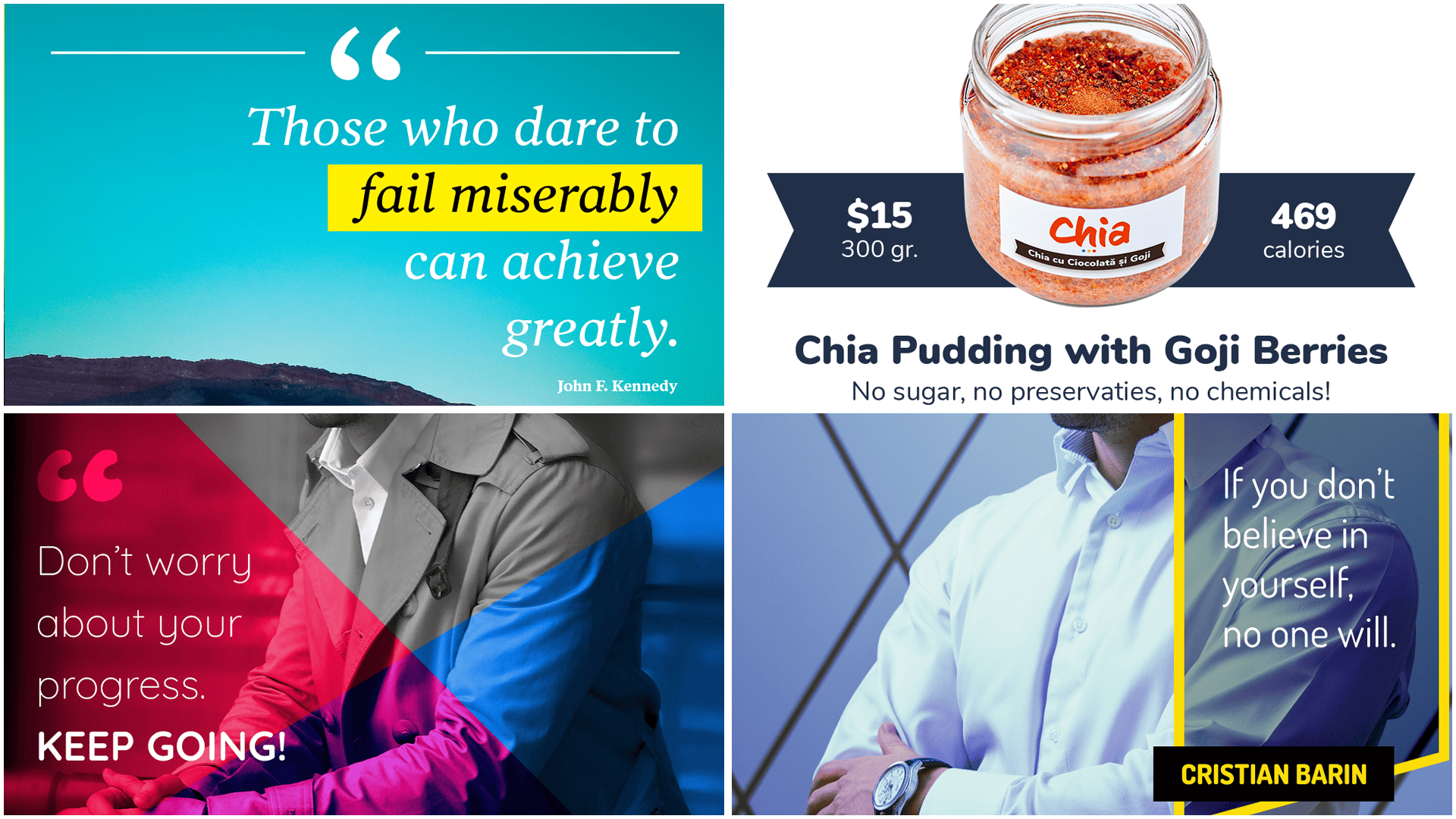
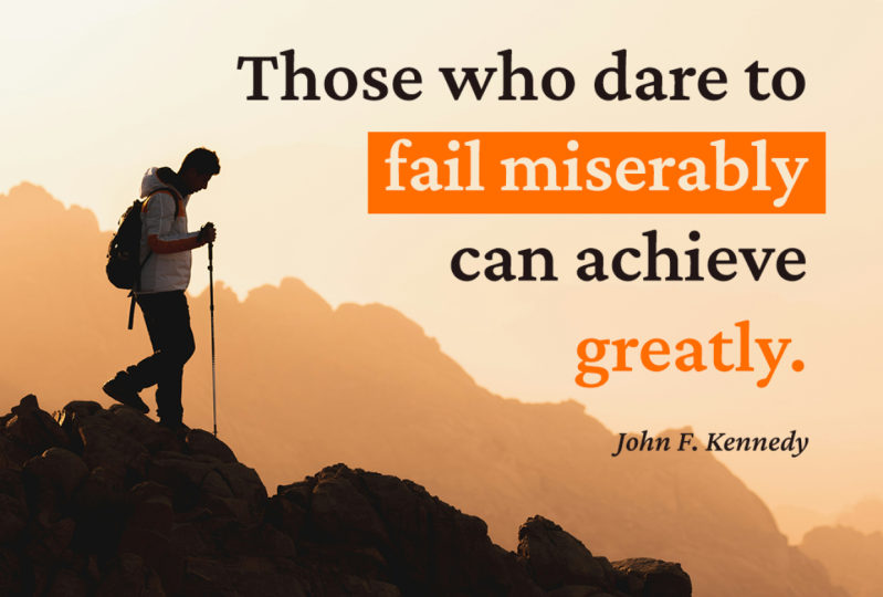
quote by John F Kennedy. Those who dared to fail
miserably can achieve greatly. Okay, a lovely quote.
No question about it. Start photoshop and make a new project as
always 1080 by 1080, and then grab the type to
hot key t and paste it in. But now, make it pure black,
no particular styling. Make it big, maybe
100 pixels also. Again, that's tempo. Okay.
After the consistency, typography is the next
big thing on my list. For these types of
posts, it's essential. Quotes have to be shown
in a gorgeous typeface. That alone brings up your
post quality quite a lot. This means you should
never ever resort to random fonts that you
have on your computer. Instead, file dobe fonts and take your time to look
for something special. You're going to
have to log in with your adobe information,
of course, the same e mail
and password that you use for your
photoshop subscription. Needless to say, you do
need a valid subscription. Otherwise, you won't be able
to access this library. If you can't manage, use Google Fonts, a nice
and free alternative, Okay. The very first thing I do is I replace the sample
text with my own. Next, I use the filter system. Now, this brings up my
point about consistency. John F Kennedy is a very well respected
historical figure, right? He was the president of the
United States of America. Now, these traits
demand a certain look. Let me show you a
few examples of what you should avoid,
what not to do. So, have a look here at Gala. Now, do you think that
this is appropriate? Would the United States
president use such a typeface, or how about this
one called Bastly? Now, this has a totally
conflicting vibe. It's way too creative. It's way too out
there, too whimsical. It's certainly not a good
look for this project. On the other hand, Jello
light is a decent choice. It's elegant, it's sophisticated without being pretentious. It has character, but
in a decent dose. So here's what I
mean by pretentious, by the way, Quita. This is a type face
that's a hard to read, but more importantly, B, it is far too in your face. It screams for attention. So when you're browsing around, keep in mind the person
behind the quote, but also the message itself. Another way you can fool yourself is by
selecting something that's super difficult to read
on your desktop computer. For example, Timber line
regular is a key example. Though it looks great, when you actually try to use it, you'll see it requires a
good level of concentration. I especially like the
details on the T character, but that's all for nothing because when you shrink
everything down on your phone, barely be able to understand it. After much searching, I ended
up with Pointer Old style. This type face has three
weights. It's interesting. It's in line with
both the author and the actual quote itself. So for me, this is the winner. Now, let's start to search for an image that's
going to fit. Unsplash.com is my first
go to Source Totally free, but it does have some
premium photos as well. Now, those who dare to fail miserably can achieve greatly. It's about challenges. It's about overcoming
obstacles by being fearless. A mountain or a deserted place would work best for the
backdrop for this quote. Now, here's what I selected. You do need to take some time with it and find the right one. Now, this is consistent with the vibe that I'm
trying to put out, but it also allows me to use
white text in this top part. So drag it into photoshop
and position it correctly. Remember, use the coordinate handles to resize it if needed. When you're happy and the
layers panel is sorted out, obviously, this should
be placed appropriately. Make the text it, and let's
use that specific typhas. That's pointed with
a y, by the way. Okay. This is going pretty well. As for the size, I think
80 pixels should be okay, but here's how I
want to arrange it. So see the curvature
of this mountain. I think the best
way to complement it is to write align the text. By the way, it's really
a flip between using italic versus the Roman
or the regular one. See what you like best. I think I'm going to stick with the Italic one for
the quote itself. By the way, we forgot
to add the author, and that would be a shame. So write the President's name, but this has to be
much, much smaller. I would say maybe 22
pixels this time in bold. Write align it with the text, though we still have a
bit of editing to do. Now, I want to remind you that it's fine to offset
your do element. You don't have to
place it exactly in the middle of the photo. No. The rule of thirds says it's totally okay to place
things to the side. Okay. Back to the quote, I think I want to increase
the line height, this part right here, to
about 100 pixels or so. So we have more than
enough breeding room. This really helps a lot. Now, the default value
was pretty good, but I think this is better. As for the right margin, something the likes of 70
pixels is going to be great. But here's the kicker. Break up the text into lines
that make sense. So here's how I would do it. But the first line, I
would keep those who dare to And then the next line
would be fail miserably. Then the next one can
achieve, and finally greatly. Now, this subtle track can improve your design
dramatically. And that's because I formed
an imaginary diagonal line. This flows nicely, and it's aesthetically
pleasing to look at, even though you may not
notice it immediately. You have drawn to it,
though instinctively. This is why I chose such a small size for
the author's name. I wanted to maintain that
line, that diagonal line. Now, there's a second reason, but I'm going to cover
that in the next lecture. Take your time with it, pause
as often as you need to, and I'm going to see
you in a second.
7. Inspirational Content – Part 2: Welcome back. Another thing
that I want to achieve with this formatting is to
underline certain words. Now, by placing fail miserably and greatly
on separate lines, those are going to stand out. Those are the keys
behind the quote. There's a jetaposition here, a high level of
contrast between these two Keeping them as they
are is pretty subtle, but it gets the job done. Now, you could trust them even further by
changing that color. For example, F F, F zero, zero, zero, works quite
well with this background. Now, for me, that's a bit
too much in your face, but I know that this is
a popular technique. Another way to go is to add the rectangle behind the most important
part of the quote. And I would say that's
the second line that really catches
your attention. So get the rectangle to w and then click anywhere to
put in these values. So I went with 560 by 100. Place it underneath
the text layer, and then when you're happy
with it, change the color. We're going to use the
exact same colored code. That's F F, F zero, zero, zero. This, of course, means that these particular words
need to be changed. So go to pure black. This is one of those few cases where pure black
actually makes sense. And here's how we need
to align this rectangle. This is a bit tricky because
if you approximate it, you're just missing the mark. It's not going to
be good enough. Now, if you try to use
the alignment tools, they won't work because this content is placed
on a single layer. While you could
potentially break up this text layer into
multiple parts, that still wouldn't be ideal. Instead, I recommend
the reverse approach. So instead of aligning the
text layer to the shape, you arrange the
rect angle based on the text position.
So here's the thing. Select it, the shape that is, and then activate
the marquee tool. Hot key M, M for the marquee. Hizontally, there's
nothing special. Start from the left side of the F all the way to the
right side of the Y. Switch to the move pool and use the appropriate
command. This one here. Now, regarding the height, repeat the process by
selecting the first character. Now, in my first
years of designing, I really struggled
with these cases. When I discovered this solution, I was blown away
by its simplicity. But yeah, awesome job. While this is all fine and well, notice the width of the
rectangle breaks up our imaginary line, the
right of this quote. Though that's not a huge deal, it's still a slight imperfection
as far as I'm concerned. Having said that, you should never shrink it down like so. This is a terrible look
and a clear cut mistake. Was the previous scenario
had a slight imperfection. Okay, moving on, I'd like to enhance the feeling
that this is a quote. For that to happen,
I'm going to add some decorations in the
form of quotation marks. Give the type tool
and add that symbol. Use the same phone family, but keep it in the regular form. Now the fun stuff for
the size, 300 pixels. Huge, I know, but it
has to stand out. Place it in the horizontal
center of the screen, and about maybe 40 pixels
or so from the top. Next, a little fine touch
by way of a rectangle, activate the rectangle tool and click to put
in these values. So we're going to go
for the width of 940. And then for the height, this is going to be a thin line. Let's go with four. Both of these should be white.
No question about it. Now, after you align them, you'll notice that
they actually overlap. This is a chance to work with a mask, so here's the thing. So let's add another rectangle. But this time around, this
should be 180 pixels wide. The height really doesn't
matter. Put whatever value. Now, we're going
to use this shape to create a gap in our line. And here's the process. So you have to control, click the rectangle thumbnail, and this makes a selection. Notice the marching gans.
This is a selection. Then go to the layer spanel and hide it and move
to the line layer. So again, the line layer
has to be selected. Then hold the old key, that's the option key
on the mac and click on the Layel mask button at the
bottom of the ayel spanel. This one here. And that's it. That's the technique.
We made the gap. We can change its color, we can resize it, and so on. This is the correct way to work. You can't just use the eras
of tool and remove it. That would not be
okay. All right. Now that we have the top part, we can use the lt drag technique to add another one
at the bottom, basically with making a copy. If you don't like t dragging, just use control J, and that's going to
make a copy as well, though you're going to
have to move it manually. And that about wraps it up. An inspirational post that
follows all the rules. It's consistent in every way. It features a
beautiful typeface. It's well organized via
the rule of thirds, and it has great contrast. Overall, this is a winner. Now I want to see your concepts. Make a few and upload them to the platform so you can get
feedback. Have fun with it.
8. Black & White Content: Welcome back. This
lecture is about interesting techniques that you can use to spice up your posts. The end result is going to be a black and white Instagram
post with a grungy feel. Stick with me and
you'll see what I mean. Now I'm going to use another
quote to kick things off. The only journey is the one within a shoe in for
an Instagram post. Now, when you're planning on doing a black and white effect, the photo is essential. I honestly spent a long time on Unsplash trying to find the
right image for this job. And I finally ended
up with this one. Like I said in a
different video, the vibe of the photo
has to match the quote. In this case, that's very much aligned as far as I'm concerned. I couldn't find Duter, so that strips away one
component from the project, Dauter himself, but
I'm fine with that. Back to the photo, the stair is what really makes this work. Now, drag it inside the canvas, and you're going to have
to resize it quite a lot because we don't want to see too much of the coat
in the composition. Whenever you can't see the coordinate handle because of the zoom level, you can do this. Select the width field, hold, shift, and
start to scroll. As long as the chain icon is pressed, you're
going to be golden. This is how you resize if you don't see the
coordinate handles, or you could just zoom
out with control zero, and that does the same thing. Okay, now move the
photo down to a point where you're barely cutting
a small part of her hair. Something like this
should work well. Now, for the Black
and White effect, there's nothing to it. We have an adjustment
layer that does just that. So click here at the bottom of the layout spanel on the
Sing ang looking symbol, and you're going to see it
right here in this list. Now, you do have various sliders in this properties panel. You can adjust the effect. But we're going to skip that since it's really a
subjective thing, which is something that
you can play with. Now, let's add the text, but we're going to break
it up in two layers. I'm going to quickly handle
that with the type tool. But here's a good thing to know. You can quickly remove all of the previous
formatting from the character panel by
using this tiny icon here. From this list, choose
reset character. And that's going to bring all of these values to the defaults. That means you're going
to see myriad pro, regular, 12 pixels, pure black. The vibe I'm going for needs a strong yet a worn out look. Luckily, I know a typeas
that features a bit of texture without requiring
any type of effect. This is called Pulpo Rust. This is actually quite popular, and I know it by heart because I used it in several projects. This is only available
on Adobe fonts. So unfortunately, I
can't really share that with you directly.
Now, here's the thing. You can always use
Google Fonts and replace it with something
somewhat similar. Now, for the first line,
we're going to use Pulpo rust 70 pixels,
give or take. And what's interesting
is that we don't have weights the way you would
normally expect to find. No. Instead, we have the amount of distress shown in the text. So 25 makes it look fatigued. That may be a bit too
much for this scenario. 100 features a low
dose of texture, and I think we're
going to go with that. But now the color
really doesn't matter. Just make sure you can see it, and of course, center
it on the canvas. Okay. But the second line, we're going to use
the same font size, but we're also going
to enable the all caps transformation
with a bit of variety. Okay, change the style to 75. So far, we're looking good, but there's nothing too special that's going on.
Here's the thing. Launch free pick,
if you have it. If not, no worries, I'm going to attach the
resource to the course. And then search for the grunge. Again, you can find grunge all over the Internet for free. I already made the
selection off camera. I chose this particular set. Now, double click on the
text element to select it. And once you have it, remove it. Now, make a copy of this
thing with control C copy, and then switch
back to photo shop, and here's the thing, use Control V. But here's the thing. In general, I always
recommend smart object, not this time though. Choose shape layer. This has a lot of implications. To begin with,
this works because the element has
one single color. It doesn't feature any details that might get lost in
the process of pasting. If you want to try to
paste the detailed vector, It wouldn't look good.
It would look awful. Now, photoshop
strips away all of those details to import
it as a shape layer. So that's why it
would look terrible. Now, being a shape layer is
great because you can resize it infinitely without
losing any quality. Now, you can also double click a stubnail to change its color. However, because it has
so many anchor points, you might feel
photoshops slow down. If you want to see what
I'm talking about, just drag a selection with a direct selection
tool, Hockey A. And yeah, you're going to see the program is really
going to slow down. But yeah, still,
the point remains. If you're dealing
with a simple object, importing them as a shape is, in most cases an advantage. Now, there are other
reasons in the mix, but I don't want to bore you,
so let's keep this short. Now, if you want, you could
potentially rasterize it or convert it to a smart object
if photosa becomes unusable. So if it's too slow, just click it and the lay a
spanel and make it happen. Smart object or rasterize it. Okay, now I'm good to go here, make this shape
white and place it underneath our text layers.
Now, here's the thing. Make the text black, and then sent of it horizontally
and vertically. But be aware you
might want to tone it down if you're looking for
something a bit softer. You could use 333333. That's a dark gray that
has a bit of warmth to it. So a bit softer. Now, the background
element isn't wide enough, so we can fix that with control, T as in transform. And I usually like to hold down the old
key when resizing, so this can go a bit faster. So that's control T and then
the option key, the old key. Now I'm going to move this
element towards the right, even though I'm a big fan
of centering everything. Now, offsetting it makes sense because the
shape is irregular, plus the whole vibe is
rugged and imperfect. Now, for the second line, for the sake of variety, I'm going to use a
different ribbon from Illustrator.
Specifically this one. Though it has a slightly
different height, that's fine considering all the previous reasons
I just mentioned. So paste it and
increase the width, so the text is going to fit. Now, one of my concerns
is legibility, being able to read the text. But you can experiment with various levels of texture and
see what feels best to you. Okay. Now, I want to mix it
up by adding a bit of color. I was initially tempted to leave the second background
element set to black. But I changed my mind. Here's what I decided on using. The colored code is 3d05 CC, and this is a much better
option from my point of view. Now, considering this
particular style, I think we should shrink down the second font to
about 60 pixels or so. And that's going to occupy
the space much better. I've said it 1,000 times
in all of my courses, but I'm going to say it again, elements need space to breathe, especially when we're talking about a button like situation, meaning there's a bit of text
inside the shape of sorts. So you need breathing room. Okay. Take a few moments
to button up everything. Make sure everything is nicely labeled and organized
in the layout spanel. The distances are correct. The sizes are spot
on, the works. I want to give you
one extra technique, adding texture to
pattern overlay. So here's how this goes. First, the number
one, go to site for patterns is
subtlepatterns.com. They have updated the
website a few times, but hopefully you
can still find it. They have lots of
beautiful patterns, and it's easy to use.
Here's how this goes. So first of all, I've selected this particular pattern for
that first background layer. This is called Gravel pattern. So you've got to download it, and you're going to
get a zip archive, extract it, and you're going
to find the PNG inside it. This sep is essential. Open the file by using
control, no other technique. Now, if you can't
manage with control, you could go to the top menu to file and then open,
it's the same thing. But don't drag and drop it. Now, in this tab, the layer
should be locked like so. Now, this means you've used the correct method of
opening. This is a good sign. Next, go to the
top menu to edit. Then from this huge list, choose the fine pattern. You're going to be asked for the name, write
whatever you want. And then when you're ready, hit k, and that's that. Okay, let's go back
to our project, select the wide shape, and then enable a
pattern over layer fat. By the way, in case
you don't want to use the F X icon from the
bottom of the layer spanel, you can actually open
your layer styles window by double clicking next
to the layers name, not on the name though,
because that's how you rename it, but next to it. Okay, so I said Pattern Overlay. Click here, and
you're going to get a bunch of options
from your library. The Vy last one is
what we just made. Click on it, select it, and this is going
to be good to go. This is how you create
patterns and photoshop. In this case, the default
look is the right way to go, but you could experiment with the blend mode with the
opacity, and so on. Now, that may be something
interesting down the road. Okay, try it out and see
how you do. Good luck.
9. Personal Branding – Part 1: Come back. In this lecture, I want to create some
Instagram content without having to do
any serious editing. So here's a simple
photo of myself, and then we're
going to go through some simple steps to
make it look nicer. Now, we'll then add
a bit of text that can be customized to
promote something. Now, in most cases, this approach is best used to showcase your own
personal brand. Use it to share who you are, what your values are,
and what you stand for. Okay, drag the photo inside
a 1080 by 1080 canvas and resize it by using lt
and resize it as needed. Remember, use alt on a coordinate handle
to keep this going. It's fine to cut out a
small part of the hair, but not too much though. Okay. The colors are quite
washed out and dull. So here's a great technique
that's super flexible, but it produces great results. Go to the bottom of
the layers panel, L on the Yen ang symbol
to get this list, the adjustment layer list. Choose solid color. Now, I'm going to go with
a specific shade of blue, though you don't have
to be this precise. I'm going to use
this code 07 30a4. Drop the opacity to 50% so
we can see what's going on. By the way, this is a
very safe approach, but feel free to
use yellow, orange, green, or any other color
that suits you of style. Okay, in this default
blending mode, the image is still
very much plain, but the secret here is to
experiment with these options. Go through them one by one and see how dramatically
things change. Now, the idea here is the
color fill layer is going to interact with your
background image and produce something
totally different. And every time you change
the photo or the color or the blending mode
or the opacity, you're going to
give something new. For me, color dodge really
makes an impression. Now, as a tip, if you want to quickly change the
opacity level, -50% at the moment, you can use the numbers
on your keyboard. Three means 30%,
seven means 70%. And when you type in 53 quickly, that's going to give you 53%. All right. This is
all fine and well. But there are two more
adjustment layers that are super easy to use, but they often improve the look. Now, start with vibrance. Vibrance is great.
Now here's the thing. Amp it up all the way to 100%, but note the difference. Now, all adjustment
layers affect all the layds underneath
them in the lay of spanel. So this means the dv is
incredibly important. I found it best to keep the color fill layer
with that cul of dodge blending
mode at the top of the stack or at least above
any other adjustment layer. Okay. The second
thing I want you to do is increase the contrast. And that's done through
the same procedure. Only this time, I'd like
to keep it at about 50. In general, you have to be
careful because increasing the contrast too much
may reveal noise, may reveal imperfections
in the image. You're going to get
some strange artifacts, which are going to
destroy the project. But yeah, this so
far is looking good. But remember, the essence here is that this concept
is very flexible, and you have a lot of
options with minimal effort. The next step is
to add some texts, and we're going to use
a rectangle for that. The sides I often use
tends to follow this rule. The height should be
about twice the width. Now, in this case,
I'm going to go with 400 for the width and about 700 for the g. For whatever reason most people
prefer this portrait look, even though it does
limit your options regarding the amount of content
you can actually put in. Still, since this is the
most popular choice, that's what I'm
going to show you. Make it pure black and drop
the fill to 0%. The fill. That's quite important.
Now, as you can see, it becomes totally transparent, but this is a great technique. Here's how it works.
Enable a stroke from the layout styles window. Now, the stroke has to be
this gold yellow, F d, dd07. This is the difference between
0% vopacity and 0% fill. If we use the opacity field, 0% opacity, then the stroke
would not be visible. The entire thing
would be transparent. But because we chose 0% fill, that means our layer
styles are excluded, which means they're visible. Make a note of that, since this is one of the
best ways to create empty shapes that have a
border around them, a stroke. Now, another thing
you should be aware of is this position drop down. First of all, increase the
size to about 15 pixels. If you set it to outside, notice the corners
are fairly rounded. You might be surprised by
that considering that we use the regular rectangle
and not a rounded one. To prove it, I'm going to
quickly disable the stroke. Now, see the square edges. But if you place the stroke outside the shape and
you make it fairly pick, photo shop automatically
rounds it out. This is why I prefer
to set it to inside. Ok, and now it's time
to add some texts. Now, get a type tool, hotkey t, and I'm going to
go with a classic. If you don't believe in
yourself, no one will. Okay. Now, let me show you another thing you have to avoid. The layer is selected, correct? Now I'm going to
get the type tool, but notice its
path has appeared. This means you're
about to confine the text layer to
that specific shape, and that's not what we want. Now, as you can see,
this looks odd, plus it limits your flexibility. To avoid this, no worries. If the shape layer is selected, simply hit enter before you
click with the type tool. And that's that. Notice
the path went away. So that means you can type and
you won't have any issues. I'm going to do
something else, though. Instead of clicking and typing, I'm going to drag out
a box to keep my text inside it and subsequently
inside the layer. You might think
it's the same thing from a few seconds ago, but this is actually
called paragraph text, and a lot of designers use it. Now, I'll quickly paste my text, and I'll format it. I've decided to use a Google
font that I absolutely love. It's called doses. Now, this typhas has
a lot of weights, but it's also sleek and
interesting in the right doses. Make it pure white, 60 pixels for the size. Obviously, you have to break
it up into several lines, but that's not the
focus right now. Instead, I want to center
it inside this shape. Nothing too difficult, right. Select both layers and use the alignment
tools from up top. Well, if you've seen
some of my other quotes, there is no surprise. It doesn't work.
To find out why, please watch the second
part of the project. I'm going to see
you in a second.
10. Personal Branding – Part 2: Come back. Let me explain what's up with the
alignment tools. They actually work just fine. The problem is with using
a paragraph text layer. If you activate the type
tool and click on it, you're going to see
that photo shop did exactly what you ask for. The layer is in the
middle of the rectangle. It's just the fact that as
the program is concerned, this is its size. Now, to get around this problem, you could use these handles, but even then you might
not get it right. So what I propose is this. You go to the layouts
panel and you rich lick. From this list, look for
convert to point tax. That means the box is going
to be thrown out the window, and then the size of
the layer is going to be accurate as far
as we are concerned. So now you can repeat
the alignment command, and we are going
to be good to go. By switching from
paragraph to point text with not losing anything
because it goes both ways. At any point, you
can switch back, albeit the constraining border won't be as big
as it was before. Instead, it's going to
hug the edge of the text, but that's fine since it has
handles for easy resizing. By the way, the contrast
here is quite poor. So let's increase the
fill to about 20, maybe 30%, something like that. Knowing the difference between these two really pays dividends, to take it even further, change the blending mode
to something that's a bit more interesting,
that's going to darken it. Now, the mouse scroll is by far the best way to
explore these options. Now, in my case, I'm going
to stick with linear burn. But yeah, take a moment to
sort out the layo s panel. And then when you're ready, when you've made your decision, we can move on to a
different element. Now, this can hold the website, a certain discount percentage, or in my case, my name. So get the rectangle
tool and click. Now we're going to add a
shape that's 350 by 80. After the certain point, you're going to begin to nail these proportions
without any issues. Now, I'm calling out
these values just so you can see the width
in relation to the height. That's always a
specific aspect ratio that I'm going for. Okay. Back to w, yellow works
great with pure of black, especially when used
in decent mounts. Regarding its placement, align it with the bottom left
side of this shape. Then use your ado keys
and shift to move it a little bit outside
this rectangle. I would say anywhere from
30 to maybe 50 pixels, just enough, so it's a bit more than
interesting to look at. Okay, put in my name, and in most cases, you're going to see
that I like to use the all CAPS transformation. But keep in mind, you should only use it for text items that
are fairly small. Sort. For example,
this quote here is just about the maximum length that I would be
comfortable with. And why is that? Well,
for whatever reason, our eyes actually prefer reading something that's actually
regularly formatted. It seems like we're not actually reading
letter by letter. Instead we're
looking at the word, and we're identifying
it based on its shape. But if you have it in all caps, it's a bit more
difficult to recognize. So that's why
legibility goes down. Now, the only exceptions are those big famous slogans
that everybody knows, like just do it from Nike. So yeah, short slogans
or catch phrases, those work well in all caps,
but that's about that. Okay, this is sorted. By the way, this is doses
40 pixels, extra bold. Okay, take a moment
to handle it. And then when you're
ready, we can continue. Overall, this is great progress, but I want to whip out the
direct selection tool, hot Key A, to spice up this
rectangle. So let's do this. Select both anchor points
from the right side, and we are going to
change this layer. Hold shift and tap the up
to key until you're happy. We want a dramatic effect, so somewhere about ten
taps should do the track. All of a sudden,
this transforms into something much more visually
interesting to look at. Now, all of these
small details add up. Though, to be fair, we do
have to adjust our elements. But the label that
holds my name, we need it far enough
from this bottom left corner so we can see
a little bit through we. Not too much, though, as I wanted to overlap
with this edge here. This is where those ten taps
really make or break it. But yeah, we can always
change our mind. We can always work
on it some more. Like I said, flexibility is a big part of these
projects because the goal is to be
able to produce content around the clock
without too much effort. Okay, you may want to rest of
your text layer, yet again, take a step back and have another look at the
entire project. As always, test it out, see it on Instagram, use a markup, and see
how it would look like. Now, there are no
surprises here, so I won't waste time. Instead, I'm going to take a moment to tell you you should always avoid the drop
shadow for this text layer. This approach is much
better to look at. Tramatically, this
shade here matches the overall blue tent that's applied to
the original photo. And another point, we already raised the fill
value for this layer. In case you're not happy with the contrast, raise
it a bit more. But yeah, overall,
this is our project. You have the PSD
attached just in case you want to check out some
values. Have fun with it.
11. Food Content: Welcome back. If you're
posting on Instagram, chances are you're going to post something that's
related to food. So here's a simple template that's highly
customizable that you can use for just about anything visually appealing.
Food included. Now I'm going to kick things
off with a nice image of a pizza that I found
on unsplash.com. Obviously, if you are
hired by a restaurant, you should use that own product. Well, yeah, open a new project, 1080 by 1080 and have the photo covered the entire thing,
the entire canvas. Make sure you explore
the best image, by the way, before deciding what part you want to feature. You should avoid showing
the entire thing like so. What you want to
do is leave a part out and include some
of these decorations. Okay, this is fine. The idea behind this
template is flexibility. So I want two layers of content. I want a hash tag at
the bottom left side, which is best used to
show the company's name. And in the top right coordinate, we want a few words, maybe something
about a discount, maybe something funny, maybe inspirational,
something to that end. Let's handle the hashtag as that's pretty
straightforward. Type in a Dagio pizza, which is a random Italian
name off the top of my head. For the styling, it's
important this is as legible as possible
without any decorations. So here's what I chose,
Monsat and black. This works well just
about everywhere. Now, for the color, pure white, because this is
quite easy to read, and with the size of
about 50 to 60 pixels. Now, regarding the placement, I would say about 40
pixels from both edges. Now, to get exactly 40 pixels, you can use your add of keys and shift to
make that happen. Now, this technique is actually
required in most cases, because you could try to
use your small guides. But because the background photo is much bigger than the canvas, your measurements may
not show up correctly. So those ping measurements, they may not be correct. Now, as you can see
here, this is wrong. Now, the easy part is
handled for the top area, get the rectangle tool and click to put in the
following values. 1080 by 550. Now, the width always
stays the same, but the height can be adjusted. Use control A and use the alignment tools to
align it to the top edge, and then to one of the sides. Now, to make this
easier to follow, I'm going to change this
color to a light gray. And that's because
we're going to work with a path. So here's the deal. Grab the direct selection tool, that's the hot key A, that's the white arrow,
not the black one, and then grab the
bottom left corner. You can tell it selected
because it turns blue while the other
ones remain white. Now, this is what you want. Okay, now, hit the delete key. Photo shop is going to ask
you if you're sure that you want to do it because
this is a live shape. Okay, that's totally
fine, hit ok. And now with this shape,
we can get to work. Make it pure white,
but don't worry. We're going to add
another shape. That's going to have
the brands color. Here's how this goes. Create a copy to control J and move it towards
the top right side. You might not see
what's going on, so double click a stum nail
and put in this colored code. It's going to be 66 15b9. Okay, see what this is going. You can adjust the thickness of this wide strip by
moving the top shape. You can make this thinner, or on the contrary
wider, thicker. Now, another option is to grab both layers and drop
the width and half by using control T. When
you get to 609 pixels, 609 pixels, you're going to feel
photoshop point that out. Now, in this particular case, this element is
covering the pizza, but we can click while we're still in
free transform mode. And then from this list, we can choose flip horizontal. Now, in this case, this
makes much more sense. But the goal here is to get
used to these techniques. And if you can flip
it horizontally, you can, of course,
flip it vertically. This means you're going to
have to bottom align it. But I wouldn't add the design element for
the hashtag alone. Press escape to
remove these changes. Now, this purple might
be a bit plain for some, but you can always
add the pattern. Though B warned, there's a good chance your users
may not be able to see it. After all, all the best sets for patterns is called
subtle patterns, right? Subtle. But yeah, I already have one installed that's
called full bloom. So I'm going to enable it, and I'm going to change
the blending mode to linear burn, for example. You're going to have this
attached so you can work along. Now, this doesn't really
tie into the pizza motif. But the idea here is to
customize the template. If you want something
food related, just look for the food pattern, and you're going
to be just fine. Though, in most cases, you're going to see that most
entries on subtle patterns, at least aren't all
that descriptive. They're mostly abstract. But yeah, here's one
closer to that subject. Download it and open the PNG
that's inside the archive. As always, open it in
a different project. Control, that's totally fine. Or you could potentially
just drag it, but again, drag it inside the new tab, not in an existing one. Okay, good stuff. Now, go
to the top menu to edit, and then you're going to
define a new pattern. Again, for the name, you
can use whatever you want. Now, the newest
pattern is always going to be placed
last in the list. Now, you may have noticed that the pattern has a
peach background, which really doesn't fit on
negative, but not a problem. Try out various blending modes
and see what works best. Another thing you may want
to use is the scale feature. For example, 200% is going to make these symbols a
touch more visible. Yeah, even so,
they're not exactly in your face, but that's fine. The point still stands. Overall color dodge seems to be a decent choice as
far as I'm concerned. Another cool thing you should
know is that you can move the pattern simply by
clicking and dragging. That might come in handy. For example, if you want to
feature a certain part of it. Finally, let's add some texts. I'm going to go with
something classy. The answer is pizza. That's pretty cheesy, but I
think it gets the job done. As for the formatting, I think I'm going to
use something that's quite popular down on Instagram. It's this one Amatka S C. I'm not sure that's how you pronounce it, but
you have it here. Regular form, 100 pixels. You also have a bold style, but this is a bit more popular, albeit at a much bigger size. Now, have another look and see if this is all buttoned up. The goal is to create a template that you can easily customize. A, you can change the color by using the color
picker like so. Simply move up and
down and see how the blending mode
changes your element. And then B, you can choose another pattern if you
feel that adds any value. And of course, C, you can flip this triangle and place it to a
different corner. And that's it. Have some
fun with it and enjoy.
12. Content Striking Colors – Part 1: Welcome back. I have a sweet
project, and as always, you can quickly replace
a few elements, and you're going to
get brand new content for your social media. So start with a decent
photo of yourself. In this case, I'm
going to use this one, which already has a
black and white effect. Remember, there's
an adjustment layer exactly with this look. Now, drag the image
inside the 1080 by 1080 project and make
sure it fits just right. So far, we've used the rectangle to for
most of all shapes. But I want to show the
pen to Wilson Love. Though it might be intimidating, you're going to see it's
actually quite easy to use. Now tap the P key shot for the pen tool and make sure
you're using the correct one. Now, the options bar
is the key here. Specifically, this drop down, where you want to
have shape selected. Now, the color isn't very
important as we can always double click the thumbnail and change its color to
the color picker. Now, the stroke, it
has to be disabled. While you could use this
field to nullify it, it's best you click
here to the left of it, and you can choose
this symbol with the red diagonal line
that's going across it. This means the stroke won't show up no matter the value
that's written here. Okay, for practicing
purposes, let's do this. Click anywhere once
on the Canvas. That's the first anchor point. Then click again in a different place, and
that's the second one. The thing is, any shape
requires at least three points. Otherwise, it's
just a line, right? So click to the side
and there you go. Now we have a visible shape. We're not done yet because it's best practice
to close the shape. That means you have
to circle back the original anchor
point to the first one. Now, look for this
symbol. See the circle. That means you're about
to complete the shape. You're going to close it off. And there you go.
This is how you use the Pen tool to create
any shape whatsoever. And like I said, you can double click here and then
changes color. More than that, you can actually switch to the direct
selection tool, hot key A, and now you can reposition any
of these points. Just make sure you don't
select all of them like so. This is very easy
to do by mistake, especially if you're using the other do tool,
the Black one. What you have to use
is the white one. And yeah, when in doubt, hit enter and start over this
time with the correct tool, and only select the anchor
points that you want to use. Okay. As you can see, this is
actually quite easy to do. Though, here's the
thing, you could potentially click on an
anchor point directly, and then move it around. But my advice is you
actually dry out a small box that's going
to include that point. It's much easier to
select it that way. When you're dealing
with a couple of them, this doesn't sound
like something you should keep in mind. But for the complicated shapes, that behavior is far
superior, the box technique. Okay, hit the lead, and I
can show you something else. Maybe you don't want
straight lines, right? It's not a problem. Set the initial anchor point, and then move to another one, but here there's a
difference. Click and hold. That's the key. And
as you move around, you're going to get
two handles that help you control the
shape and find unit. Hold the control key, and that's going to change
a cursor to a white arrow. With it, you can play
around with these guys. Now, I won't lie to you by
saying that you're going to create incredibly complicated
shapes and photo shop. No, when you need something
that's fairly complex, that are websites filled
with custom shapes and various resources that you
can use as a shortcut. But even so, it's a good
idea to get a hang of the pen tool at least
for simple shapes. So click and drag a few more times and see how
we're creating, well, this is a
blob in this case. But yeah, that's the
general principle. Believe it or not, that's how I actually use it for
these types of elements. We might do something
with them in a different lecture,
stay tuned for that. But in the meantime, in
case you messed up and you want to remove an anchor
point, just go over that. Just make sure you're seeing this minus symbol
on your cursor. Click once, and that's it. And to add one, simply go over the path and look for the
plus symbol. Here it is. Please be aware there's yet another symbol that's
available, the asterisk. Now, if you're going to use it, this is going to
make a new shape, and chances are you
don't want to do that. Okay, Trash that and
let's create some shapes. I want two triangles
that intersect. So start from the top left side and here something curious. You can actually click
outside of the Canvas area. Okay, move down and set
another anchor point. But if you want to have a straight line,
don't approximate it. You can just hold down
shift. Great stuff. Now, move towards the right,
but not too much, though. I don't want to dag on a line across the
middle of the photo. Just fall short of
this order. Okay. Now close it off. All right. Now, for the second shape, start on the right side, somewhere around
my shoulder level. Great. Move to the other side, around the bottom corner.
Beautiful, good stuff. Now, circle back and wrap it up. And yeah, believe it or not, this is the base of a
very interesting project. We're going to refine it in the next lecture, so stay tuned.
13. Content Striking Colors – Part 2: Come back. I know this
doesn't seem striking, but a dash of color is going to completely
change things up. So select the left shape and
enable the color picker, double click on the thumb nail. Now, I went ahead and I
selected something interesting. Here's the colored
code, e90 945. This is a hot shade of pink, which is probably the total
opposite of what's going on here up top with this
black and white effect. I'm going to leave it like
that for now because I want a big reveal
in a few seconds. Grab the second object and change the color to a
nice shade of blue. The colored code 09 78e9. I chose something that
would balance out the luck. Pink is considered
a feminine color. So this blue would
counteract that. Now, here's the thing.
Select both layers and change the blending modes. Most designers have a couple
of favorites from this list. In my case, that's overlay, and boom, there you go. Our composition has been
injected with live. Still, it's a bit empty, so let's add a quote. Though it can be
just about anything. I decided to use, Don't worry about your progress. Keep going. Something
super cheesy. But yeah, it works well. Place it on the left
side of the screen, and let's see how we
can make it look nice. One lovely type face from
Google Fonts is Quicksand. White text on this vivid
pink is gonna look lovely. Okay. For the size, about 60
pixels should do the track. Thin fonts require these
types of circumstances, high contrast,
saturated background, and the generous size. If one of these
elements is missing, go with something with
a bit more weight we. Speaking about the
weight, change the last two words to bold, and then enable the all
caps transformation. I didn't say a lot about
the text placement because it's really up to you. Just make sure that
it's far enough from the edge without going too
much over the subject. In this case, that's me. Another nice touch
is a quotation mark, though, don't use two of them. In these situations,
one is enough. Use the same quicksand bold, but raise it up to something
dramatic, 300 pixels. Okay, take your time with
it and left align it with the text and move it
somewhere around here. Leaving it pure white is going to attract a bit
too much attention, but you should stay
away from other colors, especially yellow, which seems to draw a lot of
beginners like asi. Yellow is no good here. We have more than enough color. So here's what I propose. Change the blending mode
to overlay as well. What's great about it is the symbol interacts
with the background, and you can see that this
gives a unique look. It's all about these small
details that add up. And consider how much time we
actually invested into it. To be fair, I did spent the last lecture teaching
you about the pen tool. But yeah, this is fantastic. It's actually super quick. Now, overall, you've learned
how to use the pen tool. So that's a big bonus. But yeah, before we go, let me give you another
technique that you can use, especially on the left
shape. So here's the thing. Add the layer mask without
using any modifier keys. So just click and that's that. No ult, no control, no ship. Okay. Now, hit G to
activate the gradient tool. G for the gradient. Now,
back to the Canvas, swipe and this is going
to give you a faded look. Of course, you can
adjust it as needed. Simply take your
time and, you know, make it look exactly
like you want it. But yeah, from a bright, incredibly saturated pink, all the way to
fully transparent. Now, you can have an
abrupt transition or something that's
quite smooth. It's really up to
you. By the way, I like to hold shift
when I'm dragging because that's going to
give me an even fade. What you could do is attack
it at an angle like so. That can work too,
especially around the bottom area where these
two shapes intersect. See how nice this is. And because we're using a mask, these edits are not permanent. So if you want to
change in mind, you can simply disable the mask. R click it in the layout s panel and use the first
option from the list. Or if you want to start
over, just delete it, but don't use the delete key because that's going to
trash the entire layer. Instead, click again
and use it from here. Okay. Before we
wrap this one up, this is a perfect example of how a high contrast level
can ruin the photo. So let me enable a brightness and contrast
adjustment layer and crank it all the way up. Now, I'm not sure if you're
watching this at ten ATP, which is what I
strongly recommend, but hopefully, you
can see the problems. Notice these strange lines. These artifacts are not okay. The information in the
photo gets distorted, and all of these
imperfections jump out. So while increasing
the contrast, a little bit is
fine, in most cases, you have to be aware of
these ugly little spots that may show up if
you go overboard. I'm going to remove it so we can have one last
look at the project. Remember, swap out the photo,
change up the colours, play with the blending modes, and you have an Instagram content machine
at your disposal. Obviously, you can't post
them one after another, but you can always cycle
them at a certain interval. Use this template once per week, for example. And that's it. This is how we can create content for the Instagram
in no time at all. This is Chris signing out, and I'm going to
see you real soon.
 Chris Barin, Certified Photoshop Expert