Transcripts
1. CV (Resume) Designs in Today’s Market: Dev, this is Chris Barron. Let's talk about CVs. Are they still a thing in
today's digital environment? Do people actually rely on CVs resumes to get a
job inside the company? Well, as a business
owner myself, who has interviewed hundreds if not thousands of applicants, I have to tell you that this
is still a valuable tool. A gray looking CV can make you stand out and give you
that extra edge when it comes down to getting
a job interview or being offered the position.
Now, here's the deal. In this part of the world, there's this thing
called Europass that has completely
monopolized the way CVs look. Basically, this is a
template that you fill out. That's become a staple in
most countries in Europe. Now, the problem with
it is it looks like it was created in
Microsoft Word 1997. Well, it's functional
in the sense that it gives you all the
necessary information. It's not exactly
beautiful, is it, right? Now, I'm going to say it's modest at best. Now,
here's the thing. Even if the Europass plague hasn't arrived in your
part of the world, I'm sure that our
generic templates are somewhat in
the same ballpark. They look cheesy, standardized. They lack any sense of design. So my question to you
is the following. Would you go to a bar
dressed like everyone else? How are you supposed to find your soul mate if you're lost amongst lots of people that are looking the
same way as you do? It's the same thing with
getting a job interview. When you're looking
for the new position, you got to stand out somehow. You need to attract attention, and then based on your skills, of course, you can
seal the deal. But if you get looked over, it really doesn't matter
how great your skills are, right? Presentation
still matters. Imagine being in
charge of hiring people and you get handed
a stack of 100 CVs. 95 of them are based on that template, the
EuropaS template. Five of them are completely
custom designed. Which one are you
going to remember? Which one will get
more attention? The answer is super obvious. Listen, I'm going to go
out on a limb and say some things that you may not agree with. That's totally fine. Let me give my $0.02. Now, I think with emotional
beings, and as such, not all of our decisions are
based on logical arguments. You may think that LCV is carefully analyzed
in minute detail. You may expect companies
to judge you based on your years of experience or
your past responsibilities. Sure. But from my experience, as the person behind the desk
that's doing the hiring, that's not exactly how it works. People that hold interviews
are just like everybody else. Whether it's the CEO, a person from HR, or someone else that's
in charge of hiring, we all get bored. And when you get a
stack of identical CVs, whether they're printed out or you're just going through
them on your computer, you tend to burn out quickly. About seeing the
same thing over and over again for the 8
hours every single day. When that happened to me, what I did was I tried to
take shortcuts. I quickly scanned every
CV for key things, whether it was age, location, previous position, and
sometimes even the photo. I'm not ashamed to say
that I've hired people in my IT company based
on their looks. Don't get me wrong.
I didn't hire a person because
she was attractive. No, it was more about
the vibe they put out. It was about the
quality of the photo, their surroundings, the way
they smiled, and so on. In a word, it's how they
presented themselves. Based on that, I selected
them for an interview, and I rejected
other for example, no photo in a CV was a
strong negative for me. So based on a few things, I made quick
decisions so I could make the most out of
my day out of my time. You may not agree with this
approach, totally fine. You may think I was
a terrible CEO. But I know a lot of business owners that do the same thing. Not just making a
decision whether to invite someone based on a photo, but every person
has some type of scandi that allows them to
quickly make a decision. Again, you might think
that's unprofessional and that my business
culture isn't appropriate, and I think that's totally fine. This is just an insight into how people behind the desk may act. So because of that, you
should adjust your approach. Again, with people, and
when we're overwhelmed with a ton of choices or when we see the same thing
over and over again, we look for the shortcut. For those reasons, I
strongly believe that a custom CV is 100% needed
in today's environment. A well designed resume
can make the difference between getting that
interview or being ignored. And even if you're using
a job platform that requires you to put
in your information in a standardized way, when it's time to have your
first interview face to face, show you the custom CV
that you design yourself. Even if you're not a designer, even if your job
is in accounting, plumbing, what making spoons. This is not design related. Showing that you care
about your image, showing attention to detail is a good way to score a lot of points in most people's eyes. To me, this is a no brainer, especially since
once you've done it, once you've done the hard work, you can use the same design for lots of years
without any issues. Overall, I strongly encourage you to go through these lectures and make the most out of your CV and get the
best possible job. Let's get to it.
2. Deciding on a CV style: Come back. Before
we design any CV, we need to explore our options. The first thing you have
to consider is the medium. Are we talking about a physical printed CV or a digital one? For example, here's
a design that's not suited for the printing due
to this gray background. This is going to eat up
a ton of printering. But even if you don't
care about the cost, this black text is not
going to stand out as well as it should on
this off white background. So from my experience, light grays are notoriously
hard to print because you won't get that same level of contrast that you see on
your screen in Photoshop. Sure. It's all about how
you proof your colors, but it's also how the machine, the printing machine is
going to be calibrated. Now, that's a bit tricky. So for those reasons,
I would stay away from a printed CV that has a light gray background
in large quantities. Speaking about ink,
here's another one. This definitely stands out, but I'm not super happy about the condensed light gray text laid out on a black background. Now, as an exercise and
in a digital setting, sure, this looks pretty
good. This is fine. But I'm actually presenting
it in a job interview. Well, I'm not so sure this
would make a good impression. Here's another one.
This is very creative, striking and overall,
pretty lovely to look at. However, printing
it is going to be a challenge because you'll need a professional
machine for it. Now, that's not
really a bad thing, since you get to choose a higher quality type of
paper and finish maybe, but you have to factor
it in the costs. Again, on a display, this is beautiful, right? But on a piece of paper, this shine is not
going to come through. It's not going to
translate well unless you really go upscale and you print on a special
type of paper. This is not appropriate
as a physical CV. Now, the second factor
to consider is the size. Now, here's a lovely
presentation of a resume that
features four pages. And for me, that's a bit much. I understand why you would
need more space to show off all of your credentials,
work experience, and past projects, but I strongly recommend a
single page resume, front and back maybe. Here's another
designer that made a small book well,
extremely impressive, sure. Most business owners don't have the time or the patience for it. Of course, as you're
going higher up the food chain and we're talking about six
figure salaries, these, of course, makes sense. But for 95% of cases, I suggest you keep
it pretty simple. That's pretty vague. So
let's look at some examples. This one is a strong eight
out of ten in my book. It's clearly designed by someone who has a good degree
of attention to detail. Notice the lovely patterns. This one at the top of the page. And then another
one at the bottom. Certain words are highlighted. But notice that I have
several styles sprinkled in, as well as a couple of colors. I like that. Still on the
small details chapter, we can see how she used several fonts to make her
typography really stand out. I especially like
these percentages due to the fact that they
match the icon style. Now, these doodles and circles also help create a friendly, feminine vibe, and I
appreciate the fact that we have a fairly big photo
of her front and center. I'm not happy about the
line height that's been left at auto for
these paragraphs. I think that could have improved
the look of this resume. But yeah, overall, this
is a positive example, a positive example on how
a CV should look like. It shows the personality of
that person. It stands out. It's lovely to look at. It
shows attention to detail, but it's also functional. And here's another one with
a more professional look. Again, I can't say that
I'm a fan of using half of your ink cartridge
on this dark region. But if you're fine with the
cost, the printing costs, I think this is a great model in terms of a clean, sober design. Notice the typography
is spot on. We have all sorts
of styles here, from all caps to bold
headlines to italic captions. The colors are also varied. There's a good amount of line height throughout the design. So this is fantastic
all across the board. Well, this isn't
all that suited for the designer because of its soberness and
lack of personality, I think this is a very
well executed CV. Leaving its typography aside, notice how the color scheme
is kept on a short leash. We have a very dark shade of blue that's coupled
with red accents. This is a winning combination in the corporate environment. The icons at the
bottom are quite elegant and in tune with
the rest of the style. If there's one thing I
don't like is laziness. We can tell that this isn't
a real CV because all of these paragraphs are filled with dummy text, AKA Laura Epsom. Changing these titles or these dates would have made for the much more pleasant design. Five more minutes for the
nextra 10% visual impact. Yes, please, it's
totally worth it. Now, to sum it up, this is
what I propose we create. Let's go for the sober
professional resume, and then another one with
a bit more personality. Single pages in both cases. The first one will
surely be able to print. As for the second one, we'll see what's what
when we get there. Okay, let's get started.
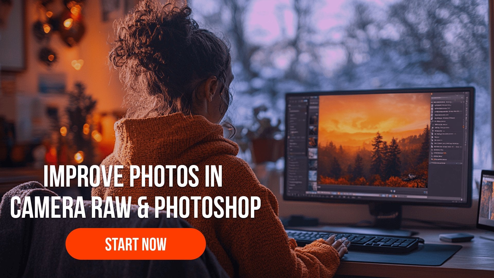
3. Setting the foundation of the CV: Welcome back. Let's start Photoshop and create
a new project. This time, we'll use the print category
because we'll design a one page CV that's going to fit on an A
four piece of paper. This is pretty much standard
in my part of the world. Okay, from the start, I have to tell you that
this is going to be a time intensive
project that's going to require a lot of
attention and patience. Please work with
me on your second viewing by pausing as
often as you need to. The first time
around, just watch and try to understand
my thought process. Okay. Now, here's the thing. We're going to need layers
upon layers of refinement. And when you're going to think
that we're done with it, we're going to do
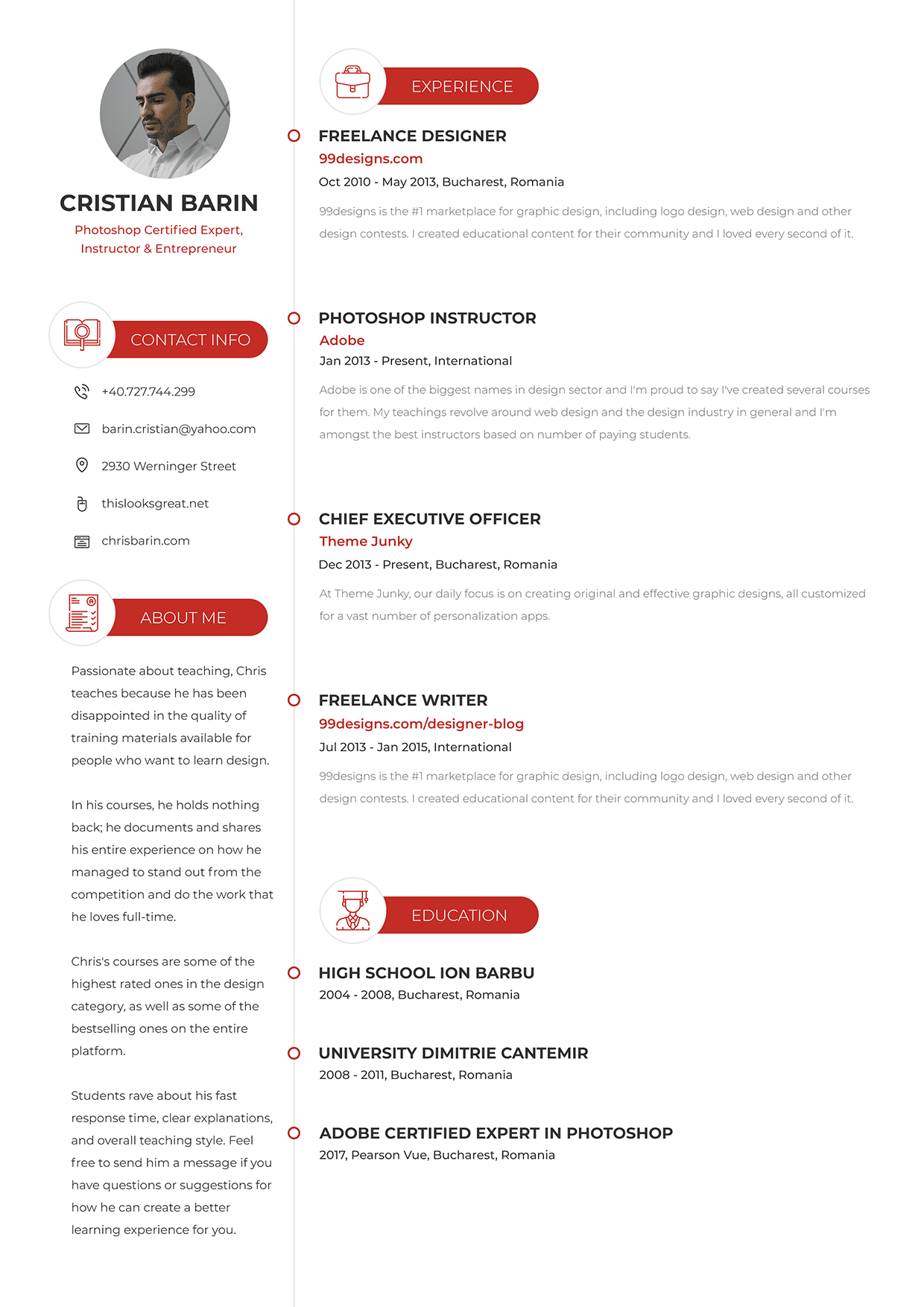
some more tweaking. So again, please have patience. Okay, to begin with, any CV
needs a healthy size photo. Grab the EllipsTol, hot key, and then click to put
in your measurements. Please don't get
the rectangle tool. It's the Ellipse tool. I'm thinking 350 by 350,
that should be enough. This is one of those
places where you can experiment and choose a different size until
you're happy with it. But right now we're at
the foundation stage, so we'll keep moving
at a high pace. Now position it somewhere in the top left
side of the page. Immediately underneath
it, I'm going to add my name and my
current position. Please go to the
caratter panel and use this small icon to reset it because I want to work along
step by step with you. Okay, now, here's my name, and it's really
tiny at 12 pixels. So let's make it to a healthy 62 pixels so
we can actually see it. Now, you may think Y 62, and that's because I use shift and my mouse scroll to actually increase this size by ten
pixels in ten pixel increments. Okay, now for the text, let's center the line because there's a very good
chance we'll change it. We'll change the size
of the type face, and I really want to make sure that's centered with the circle. While we're at it, select
both of these layouts and use the alignment
tools from up Remember, you have to have the move tool activated and no auto
select, by the way. Now, duplicate this headline because we need to add
the second bit of text. Here, I'm going to say
my current position. Let's say Photoshop certified expert, instructor,
and entrepreneur. I have everything set
up in the notepad. You can use my text, but then
make sure you change it up. Okay, this needs
to be split up in two lines, but that's optional. Now, the idea is, this
is a one liner that best describes who I am
in my current position. Okay, now, this can also say senior web developer or junior recruitment
officer, whatever. What matters is, you have something associated
with your name. Shrink this down to
about 42 pixels, something like that, and then let's move on
to the next segment. Now, for me, the
contact information has to be immediately available, and this area
underneath the photo seems the best
possible spot for it. I already have
something prepared, and this is really
going to depend on where you're at in your
part of the world. For me, the phone number and email are incredibly important. Third on my list comes the
location because, you know, if an employer is from a
different part of the city, it doesn't make
any sense, right? Now, in certain situations, companies have several offices, and then the potential employee may not know where the job
is supposed to take place. So again, location is pretty
important in my case. Moving on, I included two websites because in my
case, those are relevant. Keep in mind, this is
meant for the printing. Considering that, I chose two links that are
short and sweet. If something is really
difficult to type, if your link is huge,
don't include it. It stands, this looks
great.net is pretty clear. And for the second one, again, it's fairly short, so you could potentially
manually type it in. Notice the formatting
of the phone number. This is a Romanian phone number, but I'm sure you have something similar than your country. The thing is, this makes it much easier to dial
the correct number. I can't tell you
how many times I've seen phone numbers that
look something like this. I know it may not
sound like a big deal, but I'm talking from the
perspective of an employer. Believe me, this matters a lot, and I appreciate those
candidates who are smart enough to plan ahead and
make things easier for me. Okay, the next thing
I want to include is an About me section
where I can see a few words about my
goals and ambitions. Please don't click
and type because we're looking for the
paragraph text layer. This means you have
to click and drag so we can keep the text
inside a certain region. We'll play with the styling. But, yeah, it makes sense to
create a solid foundation. This doesn't need to be
catered to a specific company. It's not a letter of intent. No, it's more about
letting the person reading it into my own personal
world, if you will. This is where you can let your
personality shine through. This text isn't anything fancy, but I hope to it, you get a sense of
what I'm about. I'm not a copywriter, and I didn't take
this very seriously. But yeah, this is a ballpark thing that you should include. Okay, so far so good. I want two more things. I need my work experience
and then my education. I'm certain my
previous positions. I'm going to take up a large
part of the right side. So I'm a bit unsure about the placement of the
education section. It could be laid out
underneath the about me part, but in terms of importance, I don't think that
would make sense. After all, the A me section is probably the last thing any potential employer
is going to visit. So I'm going to start
to pace my past jobs, and we'll see what
what at a later stage. I'm going to keep the center of the line text formatting for now because we can mass update it at any
point in the process. Now, the content I've prepared is exactly what I like to see in a resume from the perspective of the person that's actually
doing the hiring, right? I want to know your job title, the company where you worked. When did you start
and when did you end? And of course, the location. Again, location is more
important than you think, even though I'm only including
the city and the country. And that's because
it's one thing to be the director of a
branch in London, and it's another thing
to be the director in a very small office in a city
that nobody knows exists. So that's why location is key. I also want a couple of lines regarding your thoughts
about the experience. I've seen CVs where candidates write mini
novels about it. But yeah, I don't think
that's appropriate. It has to be short and sweet. And I love reading that part. It didn't matter if I was
hiring a product manager, an Android developer,
a graphic designer. I wanted to see something
short, sweet, concise. For example, you say that you've created lots of UI designs, including websites and apps. Okay, if you don't mention
them, that's for nothing. You say you know whatever
motivial design. Okay, every designer says that,
especially app designers. You have experience
with Android Studio, Github and Cotlan, whatever. Okay, again, that's nothing new. Most candidates say
the same thing. What I'm trying to say is this, if the text doesn't provide
a certain type of insight or a unique personal perspective,
then don't write it. Don't be vague. Lastly, my education and other
notable points. Considering the size
of my work experience, I'm going to place it
immediately underneath that. As long as we're organized, we can flip these components around and figure
out what works best. But from my point of view, this is a great starting
point for any resume. The project might take
a couple of hours, copywriting included, but it will serve you well
for a couple of years. I was on the fence about adding a section about my skills, but we'll see how this goes, and we may include
this somewhere probably underneath about me, or even better between it
and my contact information. For now, let's take a break.
4. Choosing a typeface – really important!: Come back. Choosing
a typeface is one of the most important
parts in any CV, and that's because over
90% of it is text. As such, the fon family
you choose has to reflect your personality while also being appropriate for the
position you're applying. You can't go ultra
serious corporate and professional if you're applying to be, I don't know, a clown, a kids entertainer, nor
can you use comic sans while applying for the position
of art director, right? This is one of the
biggest decisions, and as such, you have to prepare your project
accordingly. Here's the situation. Hierarchy
is supremely important. The job title needs to
be shown in one way, the date in another way, ditto or the description. That means we have a
decision on our hands regarding how we want to
display all of these things. Now option one is selecting
all of these text layers from our project and moving our attention to the
character panel. From here, we can experiment
with various typefaces, let's say, whatever
the open sands. Trouble is we're going to apply the same font for
every single line. So if we go for the
open sands bold, that's going to be
applied everywhere, even though we're
not going to want the same styling on
every single line. Still, this is a decent
way to quickly go to several typefaces and
narrow down your choices. Now option two requires a bit
more work in the sense that every single line must be placed on a different layer.
That's not a bad thing. Job title separate,
company name separate, date, description, so on
out of a single layer. These need to be
broken up into four. Now, that may not
sound like a big deal, but you have to do this
over and over again. And as you can imagine,
it can become tiresome. But after you do that, you can select all of the
descriptions, for example, and try out various styles without affecting any
of the other items. And that's super important
because hierarchy means styling every single item
based on its importance. So that means four
different stylings. I'm going to go for
this option because it gives us extra flexibility
down the road. Especially considering
that you're going to have this PSD attached, and you may use it to
create your own resume. While I work in the background, I'd like to clear up a point
regarding the terminology. Is it typeface, font
or font family? Why am I interchanging them? So here's the
scoop. Typeface and font family are the same thing. There's no difference
between them. We have two terms depending
on your background. Font family comes
from CSS from coding. It's the same thing with line
height or little spacing. If you ever talk
to a coder or if you do any type of
CSS work yourself, those are the terms
you have to know. But in Photoshop, their official names
for the same thing, are tracking and living. Now, they describe
the exact same thing. They just have different names. The way I look at it
is like the difference between American and
British English, subway versus tube,
French fries, versus chips,
elevated versus lift. One family and tias, they are the same thing. So that's out of the way. Great. But what about a font? Well, a font is one specific
instance of a thy phase. For example, open Sands bold, 32 pixels is a font. Open Sands is a family. So in a literal sense, we're talking about the
father, mother, and two kids. These are the Johnsons, right? If we're talking just about
the father, Michael Johnson, though he is part of
the Johnson family, he is an individual that has certain
characteristics, right? So that's a font
from a font family. Actual project, I split everything into
individual text layers. In case you haven't
done so already, please select most of them
and activate the typed towel. By the way, I can
Mark E select all of these text layers because
the background is locked. Now, there's no magic here. Whilst on the moved toll, you hold down the Control key and you click and
drag out a box. Everything that's inside that box is going to be selected. But again, Auto Select from the options panel
is not checked. Okay, back to the type tool. I want us to change the
orientation to left line. The name and the title should be excluded from this action. Okay, now we are ready to experiment with
different typefaces. The goal is to find
something appropriate for my specific personality
and my niche, though everything is going to be quite subdued in
this clean version. You should never ever
start to bruss around the collector panel
of random fonts, by the way. Don't do that. Instead, open up Adobe fonts
of Google fonts and have a good look at the inventory and see what suits your style. The truth is, unless you
apply them to your project, you won't get the
complete picture. I know for the fact that I
want to use a San serapont, which means my text layers won't have any
additional decorations. This works best in
the tech industry, and I would say that
San serifons have favored maybe nine to
one versus Serafons. But this may also mean the fact that it may
pay off to go for a completely different look for the Seraftiface,
something like this. But yeah, for now, let's
carry on with Sanseraf. And Monsat is a clear
choice in my book. I've used it on many occasions, and I'm very familiar with it. Railway is also interesting
in its lightestyles. Mouli may work well considering it's a bit
quirky and different. Quicksand and doses
are lovely tie faces that have a strong personality without being over the top. With four or five solid options, you need to try these out. I'm going to show
you how this goes, and then I'm going to
leave the rest up to you. So let's take Quicksand
as an example. So first of all, select
all the text layers. And what I like to do is, I like to use the filter system from the top of
the layouts panel. Hit this T symbol from the
top of the layouts panel, and then you're only going
to see your text layouts. Now you can select
the first one, and then with the help
of the shift key, click on the last one, and you're going to
get all of them. But here's a hot key. It's Alt Control A
Option Command A. This hot key selects
all the layers inside the layouts panel,
and that's beautiful. So that's Alt Control A. Now, please, one
thing, let's change the anti aliasing to smooth. The default option is sharp
and that's a bit too harsh. It's a small thing, but it
does make a difference. Next, let's change the color
for all of these layers from pure black to something
a bit more subtle, a bit less jarring. For me, a lovely dull
gray works best, especially for large
amounts of text. So that's 33, three, three, 33. By the way, you
can actually type in only the first
three characters, and Follow shop is going
to fill out the rest. Okay, now you can apply quick
and regular to all of them, even though we'll want to use different weights
for different parts. But I'm going to go with
regular to begin with, because the description
and the About me section are probably going
to be shown in that style. But yeah, so far so good. Next, you have to rely on your
dexterity, on your speed. So select all the
job titles one by one by Control clicking
them and holding Shift. So Control Shift click. Right now, the filter is still activated in
the Layouts panel, but remember to disable
it when you get a chance. Okay, choose Quicksand bold for the titles and see
how it looks like. Then for the contact
information, go with Quicksand medium. On and on it goes. You
don't have to be perfect. You just have to play
with the weights and see which one works best
in every single case. For example, for the
about me section, we could potentially
try quicksand light. I'm not sure it's
going to work well, but unless we see it, we can't actually
make up our minds. And indeed, I don't think it
works. It's far too light. But we could apply this treatment to the dates
from my work experience. So this is the entire flow. It's a very time intensive process because you have to try out a lot of options before
you can make a decision. And here's a solid tip. Say that you're done
with quicksand, but you have four or more type faces that
you want to test. We don't want to
lose this work by overriding everything,
by changing everything. So here's a simple solution. You select all the layers from the layouts panel and
you group them together, Control G. Then rename that folder to maybe Quicksand
or something like that, and then make a quick
copy to Control J. Basically, that's it. Hide the original one
and then get work. For example, try out
doses Montserrat with any other typeface
that fits your style. And after you have four
or maybe five folders, toggle the visibility and see which one works
best for you. This is a personal choice. Pause the course right now
and get back to it when you've gone through
at least three type faces, three
different ones. Please get to work.
It's really important. I'll see you in a second.
5. Rocking Typography: Welcome back. Did you
get a chance to try out several typefaces
in your own project? If not, please pause the
course right now and check the resources folder because
you have this PSD attached, so you can work on it without having to paste dummy text or go through the
process of creating every single layer one by one. Okay, so that was
your chance to pause. Now I'm going to carry
on with the project. The first thing that I want
to set up is my margin. Depending on where you're
going to print this A four CV, you're going to need something
that's called a bleed. This is the part of the
design on the edges that's going to get cut off
during the printing process. Now, there's no one particular standard you have to abide by, even though most companies in my part of the world
say 3 millimeters, but I'm going to teach you
how to set up a margin and stay consistent in
every single place. So grab the rectangle tool and click the PudNuo
measurements. Let's go with 130 by 130. Though, again, you
may need more or less depending on the
printing company and the actual
size of the paper. My advice is before you take your design
to a printing company, simply give them
a message and ask them about the specs,
the specifications. In most cases, they'll have that information already
listed out on their website, so it's pretty easy to figure out what you need to give them. And they might even
give you a template. Okay, now let's make
this shape a bright color and begin to move
it all around the canvas. Let's start with
the top left side, top align it with Control A, and then move the avatar
placeholder so it touches it. We're only interested in the vertical alignment for
this particular component. Okay, move on to the
contact information, and the great thing about it is that once you set
up the left margin, you can use this text layer as a reference point for
the about me section. So select both of them
and use left align edges. And you'll quickly done with it. Move the red square up
and to the next column. Reposition these text
layers until they touch it. Though this is not
the final alignment, this is how you can stay
consistent in your project, which, in turn, will give
you a pleasing look. Now, I'm going to pause for
now because I want to format my text layers with my typeface of choice, and
that's Montserrat. So I'm going to take
them one by one, starting with the
titles that should be big and bold,
so they stand out. These are my name, my job titles, and the first line from
my education section. While we have them selected. I also think we're
going to enable the all caps transformation, since these are the most
important things in the resume. After all, if you want to scan
it in a matter of seconds, this is what you would
like to see pointed out. Okay, let's take care
of the next part, which should be pretty
straightforward, the job descriptions. This is the complete
opposite of the headline. They don't need to stand out. And as such, I'm thinking
of the following styling, Montserrat, and
then for the size, let's go with 30 pixels, 30, which is fairly small for
the A four piece of paper, but that works well to my point. These are not essential
bits of information. But the line height,
I never ever leave a set to Auto because
it's not a good look. Audo usually means it's going to be compressed
vertically. In this case, I'm going to
use a two x multiplier, which means I'm going to
double the size of the font. So that means 60. Okay. Regarding the color,
let's think about it. We have four elements
per job entry, title company date
and description. To make these look interesting, we need a cleared hierarchy, and this means we'll have to play with its size and color. We don't want a
rainbow on our hands, so we'll probably use a lot of grays and then only
a splash of color. To me, 333 is a dark gray
that's best suited for titles. So the description should
be something different. Pure black is never
the good choice. Plus, it would add
emphasis to the text. We want the complete opposite. So let's wash it out with a
very light gray, 66, six. This is very much
in the danger zone. You really have to
be careful with this style because
in other situations, this text may not be readable. Moving on to the company's name, I think this is where a
splash of color is needed. Select all of them and
apply the following font. Montserrat semi bold. We want a decent balance with
the headline from above, so let's introduce a bit
of color to our design. So after the love of thinking, I decided to use the
following colored code. It's c52 803, which
is a brick red, and this works well
in this setting. By the way, notice how
easy it is to make these changes in
mass by working with the character panel
and control selecting layouts directly from
the canvas. Good stuff. Back to it, the size is another important factor
in terms of hierarchy. So let's see what's
what? I believe we left the headline at
42 pexels giv or take. Now, that wasn't a
conscious decision, but it actually worked out well. But the second line,
let's go with 366. The difference between the
two should be noticeable. And I think we're spot
on with these settings. We've already done a big
chunk of the hard part. Now it's all a
matter of following this style and applying
it everywhere. Please don't be
fooled by the fact that I'm editing this recording. Choosing a typeface is a very
labor intensive process. What you see here is based on
the fact that I already use Monster at for several
years in loads of projects. So I had a strong
starting point. If you don't have a
favorite typeface, you're going to have to
experiment quite a lot. After you choose one, apply the same logic as you
see here line by line. Think about its importance
and how you can style it in a way where it doesn't clash with all
the other components. Back to work, we have the date. Here, let's go with Montserrat, medium, 32 pixels 32. We can keep it in the
same dull gray TT, since we have that washed out description immediately
underneath it. Plus the top part of this sandwich is made out
of this red semi bowl text. So all in all, we're
right on the money. There's still a long way to go, but we're steadily chipping away at it and we're
making good progress. It's time for the break
so you can catch up. I'm going to see
you in a moment.
6. Gorgeous icons for your CV: Welcome back. We've
made great progress, and we're about to move on to the contact information area. Before we get there, let's apply Montserrat to these parts,
starting from the top. The name is already sorted. Montserrat Bold, all caps, 62 pixels, T for the color code. Nothing special, but
it's appropriate in size, weight, and importance. Moving down, let's
style this by using Montserrat medium, 32 pixels. Basically, what I'm
trying to do is take something from other
parts of the design. Tweak it a little bit
and then apply it here. For example, that red
colored code, c52 803. Okay, for the line height, 60 is going to be too much. So let's go with 50. I understand that you don't want too many colors in your design because it's less professional. Okay? Well, it's the same
thing with your typography. If a typeface has 20 styles, you don't have to
use all of them. Sure, you want
distinctive elements, but you don't want a
soup of styles, right? So whenever possible, use the same sizes and weights
throughout your design. Right, let's move down to the contact info part.
Apply the following. It's going to be Montserrat
regular 32 pixels 32. Though it may be tempting to use red to make it stand out more, I'm thinking of something else. We're going to emphasize
it by making it occupy a larger space and adding
icons to the left side. First, the line height. Let's go with 100 pixels. That's very generous, I know, but it's one of those tricks that you can use to draw
the user's attention. More than that, we also giving ourselves room for bigger icons, two birds with 1 stone. Okay, we'll try a flat
icon in a second. First, let's handle the
about me description. That's going to be
MonsatRgular 32 pixels. And to mimic the line
height from the right side, we'll use 60 pixels, of course. Looking at this
column as a whole, we do have quite a lot
of variation variety, but all in all, I think
we're on the right track. Now, let's look for
some gorgeous icons. I previously showed you how you can search for an icon, say, email, click on it, and then see if it's
part of a bigger pack. That approach is
far more flexible, especially when
you're dealing with less common icons, like, I don't know, a
nuclear power plant, a dumbbell, a truck, and so on. But if we're talking about a social media pack or contact
information set, sure, we're far better off
using this dropdown and changing our search to
PACs instead of icon. So look for sets for PACs, not for the individual ones. Let's type in contact and
we can see what we get. And as you can see, there's
loads to choose from. And we have so many
different styles. We could go for black icons
with one single color, filled ones, linear
ones based on strokes, you name it, lat icon has it. Now, to me, this stood out, but there are many more, so
feel free to experiment. Now, I know that these
are just basic icons, but I really get excited when I see something that's
coming together. Okay, now, back
to it one by one, I'm going to download
them as PSDs, and then I'm going to drag
them inside my project, starting with the phone. Be aware there's a
high chance that even these packs won't give you exactly what
you're looking for. In that situation, you're better off using a partially
matching icon than trying to find
another similar one from a different pack. That's
going to be difficult. You'll see what I
mean in a second. Now for the size, I want
something very elegant, and this style really
works to my advantage. So limit the bigger
size to 40 pixels. In the phone's case,
that's the height, but that may change as we
move along to the pack. And while we're working on it, let's change the icon to the
following colored code 333. Now, the difference
may not be obvious, but it's still worth keeping consistent,
staying consistent. Now, I'm going to
speed up the process while I work on
these other ones. Speed is one of the biggest
factors for my success. When I was making website
designs as a freelancer, I would sometimes
finish a project, but I would not submit it. I would wait for a
couple of hours, so the client would
not be suspicious. When I was in my stride, I could create a beautiful
homepage design so fast, maybe about 2 hours that the client would be skeptical about paying me the full amount. And that's because
there was a doubt about the originality of the actual design
or the fact that I didn't sweat actually
create something special. I was talented enough to
make something special. But yeah, I just
did it really fast. Now, again, the question on
the client side was actually, you know, pretty reasonable. How could I create something
so lovely, so fast? The truth is I was super fast, but I also reuse components from different projects
that fell through. For example, I reuse footers. I reused headers and so on. But yeah, the fact is, speed is a fantastic skill
to have at your outside. Even if you make mistakes, at least you're going to learn from them at a faster rate. Okay, it out my icons. But notice the second one for my website isn't exactly ideal. It's more of a business card
icon than anything else, yet I decided to
use it because it seemed the most appropriate
out of the entire pack. The alternatives were far worse. Either drop this pack entirely and look for
the different one or search for an icon from a different pack that sort
of matched this style. A compromise had to be
made, and this is it. This is what I recommend you
doing this type of thing. Now, when you're
in this situation, please don't left
align with icons. Instead, center them
between themselves. This is more
pleasing to look at. As for the alignment
with each line, I think you should
know the drill by now. Use the Marquee tool. Basically zoom into one
of the lines and make a selection that's astall
as the characters. Then switch the move to AHT KV and use align
vertical centers. Then Control D to
D selective ars. Rinse and repeat. Though you could do this. You could use the same
procedure on the last icon, and then when you're
done you could potentially use this
command to distribute them. Okay, to wrap up this lecture, grab the initial
red shape that we use to set up the
margins and place it to the left of
these icons so we can position this
entire thing correctly. I know our grouping
hasn't been perfect, but we'll sort all
that out later. But now this is
of design so far. Let's take a moment
so you can catch up.
7. Staying consistent in your design: Welcome back. Let's
keep the momentum going while still
refining our design. I want to add a title for every section and pair
it with this icon. This makes sense
because otherwise, this description might
seem a bit out of place. Same thing for the
education part. So let's start from
the top left side by writing contact info. Regarding the styling, we
have lots of options here, but the biggest challenge
is on the right side where we already have
several formats going on. Now, to that end, let's do this. Grab the rectangle tool
and drag out the shape. Place it underneath the title in the layout s panel and
double click its thumbnail. To me, there's only one clear
choice in terms of color, and that's c52 803, that red that we've used for the company name
on the right side. Now, this means the text
has to be pure white, and I would like to middle of the size from the right
side of our design. So that's Monsaat
bold 42 pexels. Now, don't arrange it with
our rectangle just yet, because that needs to
be resized, as well. Go with 550, so that's 550, buy 100 pexels, which should provide ample
breathing room for the title. Okay, next, you can grab
them both and center them. But we're about to add an icon, which is going to
change the arrangement? Q things first, file a
flat icon and search for a pack that contains something about compact info about me, work experience and education. That's quite a tall task, but I already did it off
camera to keep things going. This is the pack
that I selected. It's called Academy icon Pack. To be fair, it's not perfect, but it should give
us a decent look that's in tune with
the previous icons. These will be much
larger and pure white, so we won't have a
hard time making them fit alongside
those other ones. Now for the first section, this open book with
the magnified glass seems like the best
choice out of the lot. Download it and bring
it inside of project. Hmm, there's a bit of a
problem with its format. Though I downloaded
it in a PSD format, it seems this is
not a shape layer. This is a rasta layer, which is not ideal. Another thing is the size. If we were to shrink it down in order to make it fit
inside this rectangle, the icon would lose
a lot of its beauty. This is why I said I
wanted it much bigger, specifically the logit value should be capped at 100 pixels. Now, to integrate
it in the design, let's add a circle
above this shape. I'm thinking 180 by 180. That should be
enough considering the 100 pixel icon size. Okay, move the
ellipse underneath the icon in the layouts panel, and, of course, make
it the same brick red. Back to the icon,
we'll have to apply a colored overlay effect
because it's not a shape layer. That's quite unfortunate. But not a problem,
use the Effex icon or double click next west name. Okay, for the colored overlay, make it pure white and
see how it looks like. I strongly encourage
you to alternate between Control one
and Control zero. This is how you reset
your perspective, and it's like getting
a fresh pair of eyes. But you know what? I
actually don't like it. So let's do this instead. Keep that colored overlay style, but make the icon red. Yes, I will invert it. As for the circle,
change it to pure white. This will obviously get
lost in the background, but we can enable a
stroke effect that relies on a very light
gray to define the shape. Set the layer style
to inside with a thickness of about four
pixels give or take. For the color, a nice shade
of gray is the following. The code is e9e9, E nine. Now, I'm not 100% convinced that this
is the best possible, but it's far better
than the previous one. Okay, take a moment
and center everything, the icon inside the
circle on both axes, and then the text layer
inside the rectangle. For that second part, again, we're going to have to use
the Marquee tool because the left part is hidden behind the circle. Okay, good stuff. After that's done, you may want to round out these squares. These are not all that
great in terms of design. My advice go with a corner
radius of 50 pixels. We'll apply this component
to all four sections, but never be afraid
to change your mind. By using Photoshop properly, you can make tons of edits
in a matter of seconds. For example, I'm not happy
with the weight of this title. The red background already
gives it a ton of importance. So I feel the bold style
is basically an overkill. Thus, change it light and
see how it looks like. And I think, yeah, this is much better from
my point of view. It's more elegant, but also
more in tune with the icon. Things may have gotten crowded, but we're going to
clear up the PSD in a matter of minutes after we go through the motions
and replicate this element all
across the board. Give me a moment to handle it. It's nothing impressive
that's worth out time. I'm just replacing the icon and changing the text
for every category. That is a question
whether to leave the text alignment to
left or center it. Both options are valid, but I like to stay consistent
with the shapes width. I believe that's more important. To that end, leaving
the title centered, I think is a better idea. What I like most is the fact
that based on this PSD, we can create all sorts of variations with minimal effort. Believe it or not, the
hard part is done. We're just going through
the necessary steps so everything is
buttoned up nicely. As I said at the beginning, designing a resume is sort of like creating a
sculpture, if you will. You chip away at it, and with every action, you get closer to
the end result. The thing is, you
need to keep going, even though it may look
basic to begin with. Refinement comes from
these small details like the roundness of
these coordinates or the position of these titles. But yeah, we're just
about done with it. Let's take a break, and
then when we come back, we're going to
organize everything.
8. Negative space in a CV design: Welcome back. Negative
space is basically the empty space that surrounds all of your
design elements. It's essential you take it
seriously because overlooking this small little thing is going to completely
flip your outcome. So far, we've made
the structure, but at a fairly high pace. Now it's time to slow it down and carefully
consider our margins. To put it differently,
every single element and every single section must have
sufficient breathing room. Let's take it from the
top with my avatar. Select that ellipse and find
a good photo of yourself. Needless to say, it shouldn't be an image with a
blurry background, a selfie or you at a party. You might be surprised to see how often that actually happens. This is the type of photo
you're looking for, a clear image of your face. Aanother funny
thing is that with all these filters on
Instagram and whatever, I've had countless interviews
where I had to triple check the person's name because the photo didn't
match their face. They were directly
in front of me and they look like a completely
different person. Are you Christina Adams? Yes. Christina, Maria Adams? Yes. Is your current
address yada ya, da yada? Yes, am I not in
the right place? No, no, no, I was fine. I was just checking. You don't want to make the
situation awkward, right? Don't use a bunch
of filters and use a real photo that's
fairly recent. If you just shave your head or maybe you grew an
impressive beard, you might want to
change your photo. Okay, now we're going
to select all of these elements and group them
into one dedicated folder. One by one, this needs to
happen for all sections. A fantastic tip is this. Move your elements around to see if you made
the right selection. Then use Control
Z one, do. Okay. Then when you're ready,
use Control G to group. As you go through the motions, you may want to
segment, for example, the red headline element
from the rest of the layers, that's an optional
thing, especially for the about me section. Take your time with it
and make sure that you use both hands to
maximize your speed. Again, this seems quite obvious, but a lot of people
fail to work at a desk in an upright position with
both hands ready to rock. A lot of them work
with one single hand, and that doesn't make any sense. Okay, going to the
experience section, here I want two things, a large folder that encompasses everything and then a separate
folder for every entry. The way I like to label them
is based on their position. So one, two, three, four is the best way to go
from my point of view. Labeling them any other way is going to make
things happier for me. This process is very much
needed and there are two paths. You can either organize
your project as you continue to create it or
the way we are doing it, after you hit a
certain threshold, you stop the creation process, and then you
declutter everything. You basically clean it up. I've gone back and forth between these two approaches because
every project is different. Where I'm unsure about
the structure of the project or what content
needs to be presented, I tend to leave the grouping and labeling towards the end. If it's a type of project
I'm very comfortable with, if I've done it countless times, of course, I prefer
the other way. Okay, now everything is sorted. Now, let's take care
of our negative space. To begin with, let's use the initial red shape
to set up distances, and we'll see if
that's good enough. Make it so it touches the
bottom of this layer. Now, select the
contact info group and reposition it so the
circle touches the square. Your smart guides should show up and help you in the form
of those pink lines. Repeat the process
for the left side, just to be sure we have
everything buttoned up. You might want to
zoom in and make sure the stroke
doesn't fool you. We have an interesting
decision on other hands regarding
these icons. Do we left align them
with a white circle? Or do we try and get creative? I prefer the second option. What I'll do is I'll select all these layers and I'll
ma key the one from above. Basically, I'll
use it as a guide. Again, nothing is
written in stone. You may want to deviate, especially if you use a different type of
headline for your sections. To me, this looks
nice, so I'm happy. As for the text layer, I'm going to continue with this
creative approach. I'm going to write align it with the edge of the red rectangle. Interestingly, this creates a nice imaginary
line right here. This is great. Moving down, let's align the
about mean section. But here's how I'm
going to do it. I'm going to move it inwards
quite a lot so I can then use the left align command based on this wide circle. Basically, once you
set up one point, you can then use
it as a reference. Regarding the text, what I propose is we left
align it with the icon, not with a circle, but
with the icon itself. The width is one of those things that we're
going to have to revisit once we handle the
work experience component. But for now, keep
it fairly narrow, maybe match the width
of the red rectangle. When that's done, use
that layer to set up the vertical distance
between these two sections. We're making good progress. But I'm sure this is a bit
more work than you expected. That's the deal
with these projects that have a ton of content. This is why after the while
of freelancing, you know, I started to avoid UI projects
that revolved around, you know, a dashboard or
large amounts of data. It's quite tedious, right, and it makes your
life a living hell when the client requests
various changes. Obviously, you can use Pigma
or various other tools, but yeah, that's something
to keep in mind. What about done with
the left column? Wrap it up, select the
avatar elements and use the Map key tool to center them based on the width of
these two sections. Image might move as well, but that's an easy fix. No worries. We're near the
end of this initial version, but I really hope
you're following along. I'm sure you're understanding
everything that's going on, but it's one thing
to watch it and it's another thing to actually
do it and gain speed. You need to reach a point where your mind already
knows the next three, four steps, and it's just a matter of you
executing those commands. Then it's all about your stamina and, of course, dexterity. Let's take a break, and I'm
going to see you in a second.
9. Creating a timeline for your CV: Welcome back. What I want
to do next is create a timeline element that will
complete the entire package. First of all, we need
to take care of all of these layers that
are all over the place. Top align that red
rectangle and get to work starting with
the experience headline. While I handle that, let me
tell you that investing in 20 or 30 high quality prints
of SCV is a fantastic idea. Get a good quality paper. While that may cost
you a pretty penny. If you have job hunting, this is going to make for
a nice first impression. Even if you send it
in a digital format before you get to the interview, please show up with it and give it to the person
who's hosting you. Don't go for the glossy
material, though. The best ones that I've seen are printed on a thick
cardboard type of paper that has a mat finished to it and a moderate
amount of texture. As you place your hand over it, you can feel the
weight of the paper. That's a pretty
remarkable experience, especially if the person
doing the interviewing has ten out of candidates
scheduled on that day. One thing that I didn't
sort out is the distance between the headline and the first layer
immediately underneath it. I would say about 40
pixels should be enough. Give or take of course. Take a quick look and use the control key to measure
out your existing distances. If that's off, use the Addo keys with or without shift to
quickly sort things out. Shift, of course, changes
things in ten pixel increments. By the way, this is
one of the reasons why it's worth upgrading
to a CC version. If you're using an older
Photoshop version, your smart guides won't
be well all that smart. This is a fairly
new improvement, and I think it's
really worth it. But in case you can't manage, just use the Marquee tool
to measure everything out. Okay, now let's handle the
margins for these text layers. Here's a different approach. So select the second one and move it up
close to the title, so it barely touches it. Then tap the down arrow key three times while
holding down Shift. By doing it this way, you won't have any issues with low hanging letters that
might fool the smart guides. This happens quite a lot. You can check once
and you might see a 34 pixel gap or
something like that. But then you press the Dando key four times, and then what? You're getting a 26 pixel gap. That doesn't make sense,
but that's because Photoshop sees text
layers a bit different. But yeah, as long as you're consistent in your measurements,
it's totally fine. A 30 pixel gap between these three text layers should show they form
a single component, and we're all good with that. As for the description, that
can be slightly separated. So let's go with 50 pixels. That should be enough. That also middles the top
part, by the way. Depending on how things look, we might increase that value. We'll see what's
what in a minute. But the right side use the same red square
as before, though, in most cases, I pay close
attention to the top, left, and bottom edges. The right side, not so much because the content
obviously varies in length. Okay, now, between every entry, I want more breathing room. So this 130 pixel shape
just won't do it. Create a copy, and let's ramp
it up to say 200 pexels. Now, I'm going to speed
this up as it's just me tapping the down arrow key a
bunch of times and mashing, the control key to
check my distances. Not that eventful or glamorous, but it's a big part of
being a graphic designer. The movies make it seem
like with quirky people, creative people, you know, that work in industrial
buildings with hardwood floors, with paint all over the place. But, yeah, this is
what we actually do. This is the cold, hard reality of being a
graphic designer, mashing the down arrow key. By the way, after the while, it's best you mass select all of these text layers and you
left align them yet again. Please don't grab
the groups as well because that's going to give you a completely different result. I hope you can understand why I'm speeding
certain parts of the recording because it's really boring stuff
after a while. If you have any questions, just message me on the
Facebook group or on the discord chat where I'm
there almost all of the time. Okay, fast forward,
and here we are. The timeline, get
the rectangle tool and click to put
in these values. Four pixels for the width, and then fold the
height 3508, 3508. Now, that may sound
like a strange number, but that's the height
of the A four piece of paper and pixels. Okay, for the moment, make it a bright color so we can
see where it's at. Use Control A to select the entire canvas and then
use align vertical centers. Okay, when you're
going to print it, you may get a warning about how certain parts of your design are going
to get clipped, meaning hidden, cut away. But that's not a problem here. As for the horizontal placement, go to the Markey tool and make a selection that spans between the right edge of contact info and the left side of experience. Once you do this a
couple of times, this becomes the most
obvious solution. The key is to be
able to pan around from side to side,
zoom in, zoom out, without any hesitation, get
comfortable with the program, and then you're going to have a better time, a
better experience. Okay, now that it's
placed correctly, change the color code
to a really light gray. I suggest the same one that we previously used
for the stroke, and that's E 9e9e9, and we're almost done with it. Beautiful stuff. To
show that this is a timeline and not
just a simple divider, grab the Ellipse tool, key U. It's underneath the rectangle
tool and add the new shape. Click to put in the
values or click and drag. And for the size 34 by 34 is
probably going to be enough. Make it pure white and
then enable a stroke. This is the best way to mark
an entry on a timeline. It's so simple yet so effective. Now for the settings, place it on the inside of the shape. And for the size, I think
five pixels should be enough. And then for the color,
go with the same red. You can sample it from
any of these elements. I really don't sample
from text layers because the anti aliasing
might throw you off. You may get a different
shade of red. Yeah, use a solid
color, a solid patch. Okay, now, this is done. Activate the Marquee tool and center it with the title
freelance designer. Repeat the process for
every single entry, including the education part. And basically, yeah, we're
just about done with it. As I'm working in
the background, I have to stress how
much work this took. To me, this wasn't a
surprise because I know how many things you have to take care of in this
type of project. But if you ask a new B, a beginner, this seems like
the easiest job in the world. Just add some text,
and that's that. But, yeah, don't be fooled. We took the time to make it look quite nice. And
here's the thing. 20% less effort means it's
going to look 50% worse. That's how it works, actually.
So keep that in mind. Don't cut corners in terms of quality or
attention to detail. Now, at this point,
I really encourage you to try out different
colored schemes, different typefaces, icons,
and maybe different layouts. What matters is you check
all the boxes and you go through the same steps
methodically one by one, giving yourself ample time to check and recheck
your design. Thanks for watching, and
I look forward to seeing your own version of
this clean CD project. Have fun with it.
10. Final Thoughts for the Clean CV Project: Come back. I hope you
enjoyed the process of creating this clean CV design
and that you learned a lot. The next step is to
make your own version based on your information. If there's one project
in particular that you need to make from
scratch, it's this one. I teach a lot of
things in Photoshop, but yeah, this one
is super important. I believe this type of work
pushes you to the limits, and it's going to make you
become a faster designer. In my freelancing days, I use frustration as a tool. It motivated me to
wrap things up faster. I knew what had to be done, but my execution was too slow. So what I did was I
pushed every single day, and I really focused
on this aspect. Like you saw in the
previous lectures, we spent quite a lot
of time sorting out the margins and placing every component on
a dedicated layer. That apparent simplicity
is deceitful, and that's where
frustrations arise. You expect to
create something in like 20 minutes or
something like that, and then you realize it's
going to take you five times as much just because of
those small details. So yeah, make sure you have the right mentality
going into it. Now, to finish this section, even if you don't recreate
this from scratch, at least use this
template instead of the Europass one or whatever else template
you may find on the web. This is printer friendly. It's easy to modify. Plus, you can customize
it fairly fast by changing the color
scheme and the typeface. Just in case this is not flashy enough for you,
well, not a problem. We can make another one. That's a bit more
visually exciting. Stay tuned for that.
Thank you so much. This is Chris Barron
signing out for the moment.
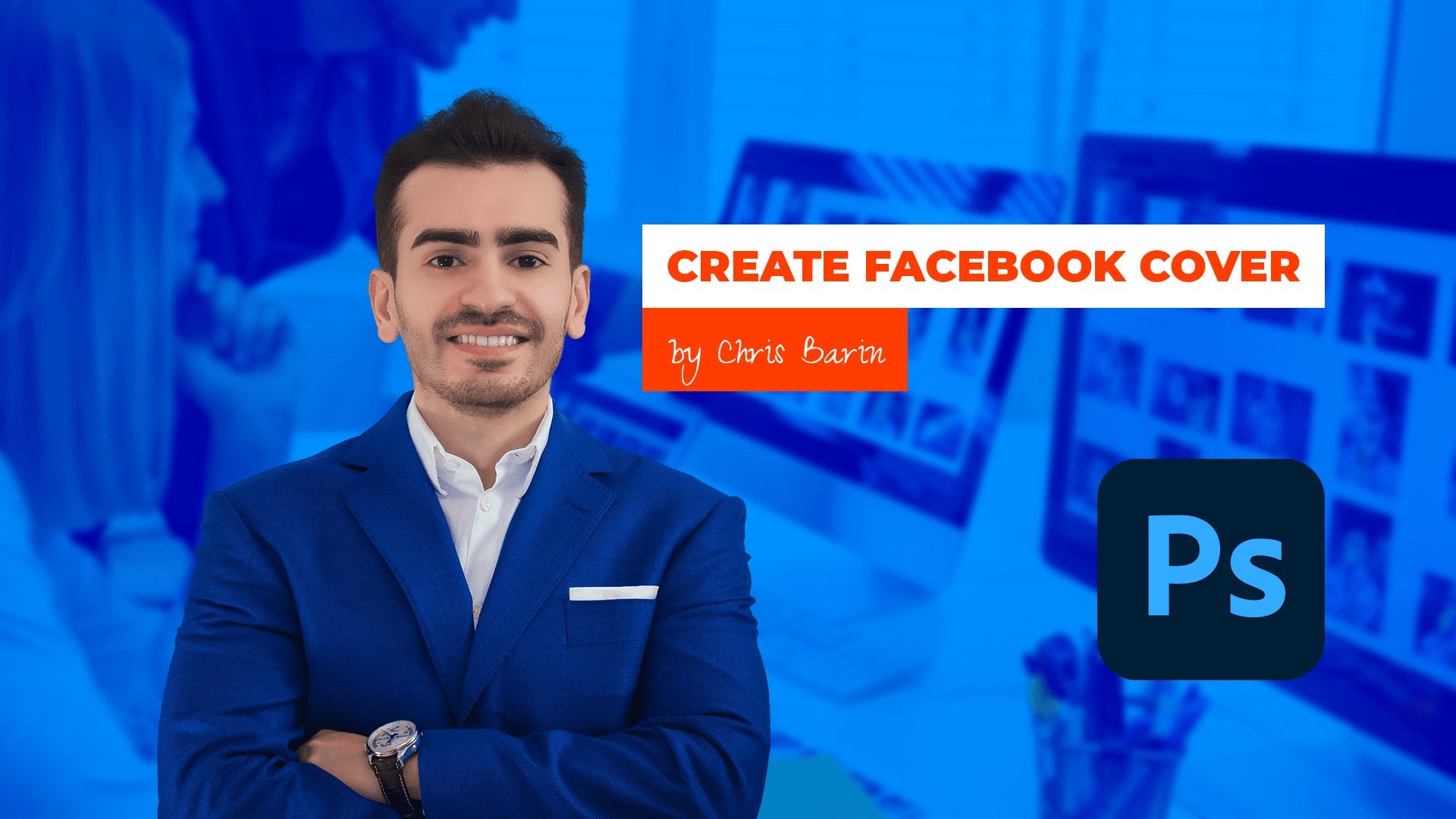
11. Creative CV Design: Come back. This is Chris Barron. Let's make a beautiful CV
that's bound to impress. A clean one is fine and dandy, but if you want to show off, then this is the right
project for you. While it can be printed through
a professional company, I recommend you share
the CV as a PDF, send it to your potential
employer and post it as a PNG to various
places across the web. Let's get started
by making a copy of the previous PSD. You
have it attached. This will help us focus on aesthetics and list
on the foundation, the margins, how we organize the project
into groups and so on. I'm going to treat this CV like a sort of web
design project, specifically a landing page. To that end, the first
part has to pack a punch. So remove the Avatar, but please leave my
name and the title. On the right side, select the entire experience folder and move it down considerably. Do the same for the
timeline folder. We'll try to repurpose most
of these elements while making the entire package
much more visually appealing. Okay, get around
the rectangle tool, and we're going to use a
20 pixel corner radius. So click and go
with the following. So for the width,
2,220 pixels wide, as for the height,
650 should work well, and again, 20 for
the corner radius. Now, this new shape has to
be centered on the canvas, but please reposition
it at the bottom of the layer of stack just
above the background layer. That's going to help us.
In case you're curious, I opted for the margin of 130 pixels on either
side of the rectangle. To match that on
the vertical axis, I suggest you use the Y field
from the properties panel. Manually type in 130 and
we're off to a great start. My information won't be left
there for too much longer, but I want to make some
progress with the main graphic. Instead of starting
from scratch, I'm going to use a
previous project of mine, a Facebook cover project
to save a bit of time. You have it attached as
well, so let me open it up. Here we only interested
in two things, and that's the background
and then my photo, Dodded elements are not needed. Here's something
that's worth noting. The photo has a vibrance
adjustment layer, but we'd rather have these
combined into a single item. If you plan on
changing it later on, you may want to convert
these into a smart object. If not, if you're
completely happy, you can use Control E and that's going to
merge them together, and the result will
be a raster layer. Less flexibility, but the
PSD will be a bit lighter. I'm going to do
just that because I can always circle back to this particular PSD in
case I want any changes. Select both layers and drag
them inside of project. You'll notice the
background layer won't fit. But there are two things
that work to our advantage. So, number one, this
is a smart object, so we can make it 20% bigger
without losing any quality. Then point number two,
much more important. The background actually has
a Gaussian blur effect. So resize it without any
hesitation and hit okay when Photoshop is going
to tell you about the effect being turned
off at the moment. Okay, clip the background to the rounded rectangle
with Alt Control G. That's a clipping
mask, Alt Control G. Then do the same
with my photo, but I'll place it somewhere on the left side of the screen.
So that's towards the left. I feel my name is much more important than
this specific case. At this point, we can change these two text layers to pure white so we can
see where we stand. Move them to the top right
side or they're about. We won't use the same fonts, but I'm trying to see how
this top would look like. Although the blur is providing a decent amount of contrast, I'd like to increase the effect so we can get a
boost in legibility. That's quickly done. Click on the down arrow to expand
the layers effect. In this case, it's collapsed and double click
on Gaussian blur. The current value
is five pixels, but I want something like 15. We might lose a lot of
detail in the photo, but with gaining legibility, before we continue
with this area, I want to redo the contact
information section. Though this look is
very much standard, I want something more creative. Select its folder and
hide it for the moment. Or if you're not bothered
by gross overlapping, move this section down. You might need to do the same for the experience
column as well. Once that's done, get
around the rectangle tool once again and click to
put in these measurements. Two, two, two for
the width, again, 2,220, and that's where we
can match the top shape. As for the height, a mere 150 pixels is
going to do the job. This needs to be centered on the canvas that goes
without saying. But since I want it positioned immediately underneath
the hero area, these corners need to be
squared off. Not a problem. Make sure you disable
the chain icon and then bring these
two values to zero. This process needs to be
repeated on the initial shape, only this time around, you should target the corners. Why do we have to break this up into two different shapes? Well, to begin
with, I didn't know exactly what I wanted until
I started the top art. Secondly, a dedicated rectangle will hold all the
contact information. So that's going to help us
center the line things, especially a text layers. Right, one more thing. Let's add the phone number, email address, and
website in this section. I want them on separate layers. Now, the alignment
really doesn't matter at this point because we haven't
decided on a typeface, so I'm just going
to speed things up. As I'm working, I hope
you get the picture. We want a top heavy
design that stands out, colorful, bright, creative. We add some jazz to this part, so it will really seem
like a designer's resume. Stay tuned for that. Right now, let's take a break so you
can catch up. Thank you.
12. Modern Typography for a Creative CV: Welcome back. There are tons of typefaces out there on
Google and Adobe fonts. So what should we use for
this new version of my CV? Well, here's the
thing, considering we saw a handful of them
a few lessons ago, one in particular stood
out, and that's Doss. It's sleek, it's modern. It has a quirky vibe to it, so I'm quite fond of it. I propose we select a bunch of layers controlled
shift by the way, and let's see it in action. Let's start with work
experience from the top. Grab all the headlines, but make sure you use the
visibility controller. Otherwise, you're going to have a difficult time sweating
through all of these layers. When you're ready,
type in doses. What I love about the
Character panel is that as you move your
cursor above these fonts, you get to see the
preview on the canvas. This is great because you don't have to blindly
make a decision. Now, to me, extra bold
seems like the way to go, but considering we have ample
space on the right side, let's increase the font
size to at least 45 pexels. Give or take, of course. Okay,
to get it out of the way, let's quickly do
the descriptions. For them, we'll
use Doss regular, which is already very light. Any lighter than that, and it's going to be
impossible to read. When in doubt,
print out a version on your own printer and
see how it looks like. Even the size is a bit
in the danger zone. 30 pixels with a
color code of 666. Now, that's risky, but it does
look great, to be honest. Okay, moving back up
for the company text, grab all of them, and we'll initially change
the colored code. Though that red was pretty okay, we have an abundance of
blue in the top area. So I went with the
following code. It's 193b, BE. As for the font, let's go with docs, bold, 36 pixels,
the same as before. And this is catching shape. As I said in the beginning, this type face is great for
the modern creative design. Right, for the date, wrap them, and I can see we previously
had this set to medium. We'll stick to that as it
should provide a balanced look. But again, doses. Okay, yeah. The previous hierarchy is
still very much solid. Now, let's remove the experience
and contact info heads, as they won't do us much
good in this new layout. In case you hit that section, you may actually just
delete it entirely. I'm sure we'll find new icons, especially since we saw
so many gorgeous specs. So yeah, no worries on that end. For the About me section, go with doses regular
for the body text. The current font size is 32, but I think we should
lower it to 30, just to be in tune
with the other column. It won't make a big difference, but I would rather stay consistent whenever
I get a chance. Okay, by the way, remove
this headline as well. We still want the
title for this region, as it would be
confusing without it. So let's grab the type tool Hot keyT and type in the following. A few words about me.
Okay, good stuff. Enable the all caps transformation and change
the way to extra bold. As for the size, we'll say at 45 pixels for the reasons
mentioned a few seconds ago. In terms of color,
we could use blue, but I'm not 100% sold. But now let's go at 333. That should be
interesting enough. Let's move our focus to the ido area, starting
with my name. Here we have a lot of room to play so let's use the following. Let's go with doses extra light, and then enable the all
caps transformation if it's not already activated. And I think this looks a bit too thin, but
here's the deal. Let's increase the size to
something huge like 160. Okay. Now, of course, you may want to reposition my image to get some
balance in this area. Nothing too crazy, but the left side of the screen isn't going to be used at all. You might be tempted to add
a photoshop logo there, but believe me, it's a bad idea, especially considering we're
still working on a CV. Okay, horizontally,
center of the headline through the use of the
Marquie W hockey by creating a selection that
spans from the right side of my photo all the way to
the edge of the rectangle. Unfortunately, we won't be
able to keep that long title, so let's trash the second line. We're going to be left with
Photoshop certified expert. So let's adjust the
look. I'm thinking Doss extra bold with the same size as all the titles 45 with the Alcaps
transformation as well. Leaving it as it is
doesn't do it for me. It's a bit too simple
and lack luster. So here's what I propose. Let's add a touch of color to this overwhelmingly
blue section. In the past, I used orange
with great success, so let's now reinvent the wheel. Get a rectangle tool and
click to put in these values, 927 for the width, 927, and then 100
pixels for the height. This will make the shape as white as the text from above it, which should give
us a nice look. As for the colored code,
I know it by heart, it's FF thc 00. And, of course, take a
moment to do the basics. Group everything in
the layers panel, make sure the layouts
are properly stacked, center everything with the
alignment tools the works. I'm happy to say we're making
great progress so far. We have a few more
text layers to cover. But once we have
this train rolling, everything is going
to fall into place. For the contact information,
let's use the following. Let's go with doses extra bold, and then for the size 40 pexels. I'm thinking of adding
details in that spot, but for now, I'll keep
the rectangle as it is. Plain and uneventful. Okay, now back to it. Let's add the education
section back to our project, and I'm thinking above the About me section is
the right place for it. Yeah. Now, remove the headline, and let's apply Doss
extra bold to the title. So that should be pretty good. And then for the next
line, Doss medium. I think that's going to
work. Now, here's the thing. The current split
isn't working for me, but we'll increase
the left columns width in another lecture. But now it's all about
wrapping up the typography. And yeah, so far, I'm very
happy with my choice. I think dosis is a great typeface that
deserves a lot of love. To be fair, it doesn't shine
through in paragraphs, but for the headlines,
it's fantastic. Okay, time for the quick
break. Stay tuned.
13. Use Freepik to make your CV stand out!: Welcome back. As designers, we have to be extra
careful when it comes down to using elements from
free Peck and CV. After all, this has
to represent us, so the bar has to be set really high in terms of
non specificity. Meaning we have to
use design elements that are not easily
identifiable. Don't grab any flashy
vector and slap it on. Instead, be smart about it. If lots of people use
the same graphic, you are going to be in trouble. For example, for the top part, I selected these
abstract triangles. I'll only use a handful of them, and I'm going to disperse
them here and there. And through that approach, nobody can point any fingers. Even if someone from the
hiring committee somehow recognizes these shapes as
being part of a freebie, they used as a small
decorative element, not as the main attraction. So when you fireb the
illustrator file, please take your time with
it and see what works best. If you don't have Illustrator, not a problem, look for PNGs. Now, the only way to approach
it is through trial and vv. For the right side, I want
something fairly small. Ideally, anywhere 2-4 triangles. This shade of blue
would have been closer to the one that's
in the head of image, but we can sort it out
through some Photoshop magic. Now, when you're
placing smart objects, make sure you're dropping them at the top of
the layers panel. This is key, especially when you have these
nice drop shadows. You really want to see how they interact with the
rest of the design. By the way, in case you
end up printing this somehow and the
edges are cut off, simply compress
the entire design. Instead of 22, 20 for the width, drop it whatever value the
printing company mentions. Okay, now, overall, I'm quite
happy with the right side. Now let's do the
same for the left. Though here, I think we can
add a bunch more ideally, I'd want a single smart object instead of a bunch of them, but it depends on how well you can select
these triangles. Again, if you don't have
Illustrator, just use PNGs. But yeah, don't be
afraid to resize them, rotate them, or even
move my photo around. You can even use a mask to place a part of this
graphic behind me. This only works in those cases where the photo is
perfectly isolated. So you can control, click the thumbnail to
make a selection. Then you move to
the vector layer. You hold down Alt or the
option key on the Mac, and you click on
the layer mask icon from the bottom of
the layered s panel. Again, this is optional, and it really depends on how you want to
arrange of stuff. In general, it's a good, and it have thousands of similar vectors out
there on Free Peck that can save you a lot of time while also spicing
up your design, making it look more
than interesting. This is why I considered this
project a sort of template. While it's not
filled with a bunch of dummy text and
generic content, you can still adjust it
with minimal effort, and you can get a ton
of value out of it. Instead of triangles,
use circles, ellipses, use whatever else. The concept is the
most important thing. Okay, now we're going to
consider this part done, as I'm sure you get
the gist of it. Now for the contact
area, let's do this. I'm going to use another
abstract vector, but this time
around, I think I'm going to use a different
blending mode. To that end, we're
going to have to change the color code because we need something a bit
more than interesting. And here's what I selected. It's 052668. Now, I honestly played around
with the color picker until I got to a blue that sort
of matched everything else. As for the vector, this is it. The idea is this,
our rectangle is fairly short and that's
not by accident. When I'll place this
design on top of it and play around with
the blending mode, maybe even with the opacity, the end result will be hard to pinpoint as being
from free Peck. That's exactly what I
want. Non specificity. I want to integrate it into
my project seamlessly. Now, before I paste, I always like to make sure that I have the layer selected. But in nine out of ten
cases, I'll want to clip. By the way, when the
graphic isn't big enough, I like to enable the chain icon if it's not already
pressed and then increase the percentages
through the use of my mouse scroll
and the shift key. That changes it in ten pixel
increments, 10% increments. Okay, easy stuff.
Once you place it, it's time to check
the blending mode. After we see a couple of
them that make sense, which will take a bit of time, but I'm, of course,
editing the recording. Only then do we start to move this graphic up and down
to see what works best. Truth is, this is similar
to choosing a typeface. Selecting an abstract
vector from free pick takes me at least five
tries, something like that. So I try it, I experiment,
I see how it looks like. Then I rinse and repeat. I look for another
one and another one. I may end up downloading 20
vectors and see how they fit. But yeah, in this case, I think the blending mode
should be linear Dodge ad. I think that's the best choice. The other ones don't really
match the rest of the design. As for this position,
you may want to move it up and down while
holding down Shift. That's through your data keys. You can also resize it in case some parts
don't look right. To me, what I want is enough
detail on both sides. You might notice the transition
isn't exactly stellar, but here's a great track. Add a contrasting thick line
to separate these two parts. So get the rectangle tool and click to put in
these measurements, 22, 20 for the width, and then for the
height, six pixels. Now, a stroke couldn't
be appropriate. So while we're increasing
the layer count, we're keeping things
fairly simple here. Now, to place it correctly, zoom in and make sure you're
exactly where you want to be at the edge of
these two areas. Okay, now let's make it to
orange and basically do it with hiding the fact
that these blues are not exactly the same shade. Well, we could play
around with them, I don't think this
looks like a mistake, so I'm going to
leave it as it is. Okay, let's wrap this up and
move to the final part of the design that relies on free
peck. And that's the foot. Here I wanted
something different, but still in the abstract realm, and here's what I chose. I'm not sure that you're getting what I'm
trying to achieve, but give me a moment, and I think this is
going to look awesome. Now, in Illustrator, this might be a bit
tricky to isolate because the author of this resource really grouped
everything together. You have the file
attached by the way. The layers are also clipped, so this foot complicates things. What I suggest is you double click to drill down
to the levels, and then you try to
move your selection towards the side and
see what happens. Another great tip is to remove the white rectangle from the design since
that's not needed. I like the third one, but the other two may
work just as well. I know it's red and that doesn't match our
blue and orange, but we'll figure it out. For now, I want to make sure
the shape is going to fit. So please don't get
frustrated with Illustrator. I know that grabbing
certain parts of a vector is sometimes difficult, but as you're about to see, it will help of
design quite a lot. Okay, back to it, paste it as a smart object and move it in the bottom left corner to a point where the dark
part gets cut out. Next, make a copy
through Control J, Ds Command J on a Mac. Move it to the side
and hit Control T. Then right click
and use this command, flip horizontal, and that's going to show
you what I'm trying to do. Basically, this
shape wasn't wide enough to cover
our entire canvas, and enlarging it would have been impossible
without distorting it. So I decided to create several copies of it,
and by flipping it, the design won't
seem repetitive to a point where it becomes
an obvious mistake. No, you're going to
notice the peak of the graphic doesn't
overlap perfectly, but I have a trick up my sleeve. Change the blending
mode to darken. So that's darken. And
this is going to give us a seamless transition without
having to do anything else. And I love it. Do you
see the difference? So, here it is, again. This is how the shape
looks like in normal mode. And now here's darken. It's not a huge deal, but I do love these
one click fixes. Right. For the last third, select the initial vector
and place another copy here. There's no funny business,
make sure they touch. Simple as that. Sometimes
a one pixel gap totally ruins a design. But, yeah, that's about
it regarding free pick. We'll talk more in
the next lecture.
14. How to adjust vectors and add detailed icons: Welcome back. I hope you're working with me on
your second viewing. If not, please pause the
course and catch up. This is important work. In this video, I want to show you how we can easily adjust these abstract shapes so they match the rest
of the color scheme. While it would be easier for
us to change the text color, I would rather welcome
the vectors so they'll be even less recognizable,
if that makes sense. Here's my quick fix. So select all three smart objects from the footer and group them into one single folder, Control GF. Label it whatever you want.
The magic comes next. So add a hue and saturation
adjustment layer from the bottom of
the layers panel. And here's the thing. In this new panel, we're going to check the
colored ize option, and this is going to be awesome. First of all, please clip
the effect by using Alt Control G. I love the fact that this command
works on groups as well, so only this group will be affected by this
adjustment layer. That's what this means. Now
for the saturation slider, I want a fairly large value
at least around plus 65. Now, you could go up to 90, but you have to be careful. You don't want to
oversaturate it. Now for the hue, this is where the matching is
supposed to happen. I'm going to move
it to about 200. To easily see what's going on, I suggest you use Control Zero. To me, 220, I think
is a great value. But of course, feel
free to experiment, especially since you have to create your own version
of this design. For these other vectors, apply the same treatment. I suggest you use a copy of
this adjustment layer and clip it to a separate folder that's going to hold these two. To be fair, you'll notice some colvization on the
white triangles as well. But as long as you don't
go overboard with it, it shouldn't be a big deal. Here you might also
experiment with the lightness value in case these blues begin
to blend together. I'll keep things
moving along so we can focus on another
component of off design. And that's my skills. Please take your time with it
when you're working along. This top art will make
or break your project. Okay, now, this is a section that's beginning to gain
traction all over the world. The idea is to show
a percentage of a progress bar that shows
youth skills in various areas. This is a good
opportunity to add some detailed icons
in our project, especially since so far we've used monochromatic
ones, black ones. I want to show off my
Adobe suit knowledge. To make it relevant,
I want to show what I excel at while also
showing my weaknesses. I believe that's important
to any potential employer. For example, I don't know
a lot about Illustrator, but most companies
might assume I do. Hence why I think it's a great idea to show
off your weaknesses, this entire area
should rely on icons, so openflaticon.com and change
the drop down to packs. Here you can look for the Adobe, and that's going to
give you some results. Now, we can see that
are several styles, but some of them are a bit
too cartoonish for my taste. Now, the black ones are
a bit more elegant, but since this is the creative
version of the CV design, I'm going to choose this pack. I prefer it over
the long shadow one just because that style
isn't popular anymore. Okay, so download the first
icon and open it in Pvoshop. Drag it into our project. Make sure you place it
correctly in the layers panel, especially since
we've been working with those adjustment
layers and groups. For the size, we're looking for somewhere under 200 pixels, but definitely over 150. That'll be up to you and how much space your text
layers are going to need. I'll repeat this process
a few more times, but I'm going to keep it simple. It's going to be four icons, two strengths and
two weaknesses. I would never go
for more than five, as that would introduce
way too many colors, but it would also
increase the columns width or drastically
reduce the icon's size. So bear with me for the moment while I handle these resizes. In terms of the
distance between them, somewhere around
70 should be fine, but it really
depends on the size. Don't hesitate to try out different looks in case the first one isn't
to your taste. You can also come
back to a section, even though you
may want to hurry things along and
wrap it up faster. A high level of refinement
requires multiple passes. Don't assume
everybody recognizes these programs
based on the icons. A label is 100% required. But speaking of percentages,
let's add them in. Get the type tool and start
to put in your values. For me, Photoshop is at 90%. Yes, even though I'm
a certified expert, this is where I think I stand. I don't know a lot about the
three D side of Photoshop. I'm not a big fan of retouching. So again, I'm at 90%. For the formatting, doss bold 60 pixels in the
same dark gray, 333. That's the way to
go. Center the text from the Options bar and, of course, center it
with the icon as well. One thing I forgot to
mention is the fact that we've used a couple of clipping
masks in the ido area. This means our box
selection technique might pick up some of
those layers as well. Now you have two workarounds. Either you select all your
layers through Control clicking and holding down
Shift to select multiple ones, or you lock them by using the dedicated command from
the top of the layers panel. Edther version works. It depends on your preference. I think it might be
better to log them in this case because we still have quite a long
road ahead of us. The hot key is Control
forward slash, but you can also use
the lock icon in case you don't want to
remember another hot key. Now, back to it, my
stats are the following. Photo shop 90%, AdobxD 75%, Illustrated 40%, and finally, after the facts, a mere 20%. All these text layers need to be centered with their
respective icons. As for the label, grab the rectangle tool and set the coordinate radius
to five pixels. Click to put in
with measurements, and here it's a method of
matching the width of the icon. As for the height, 70
pixels should be enough. This is another point
where you can deviate. You could skip the
shape altogether and rely on the text layer to
occupy the space efficiently. I think that's not ideal, so I would rather
introduce another element, even though it increases the risk of making
this design look busy. For the color, let's
go with orange, even though it may be a bit overwhelming right
next to these colors. We can change our minds at any point, so let's keep going. After you center
it with the icon, let's add the text later. For this look, use
doses, bold, 26 pexels. Quite tiny, I know, but the
shape requires a low value. I'll speed this up while
I handle the other ones. As an exercise, try and see
if you can manage to add five icons in total and see how that's going
to change the layout. I'm curious to see
how much space you'll be able to
set between them. As you know, margins
are very important. Back to the project,
make sure you select all the percentages and
through the M key tool, you sent them vertically between the icons
and the labels. Overall, even though
things are sped up, I think this area is crystal
clear in terms of execution. Okay, with winding down, but let's keep our focus because we need to
fine tune the CV. I'll see you in a moment.
15. Fine-tuning the CV: Come back to our
creative CV project. We sorted the stats. Now it's time to
fine tune some of these areas, starting
with education. Create a copy of the timeline and left align it with
the main rectangle. In case your smart guys
don't help you enough, zoom in and drag out a regular
guide through the rules, Control R. As I said before, I tend to keep these
hidden because I want to maximize
my canvas space. Next, we got to
change the stroke. We got to make it orange. This is much brighter
and happier, and I found lots of companies use these types of
colors nowadays. Copy that layer style
by right clicking in the layers panel and then
paste it all across the board. Or you could potentially delete out of circles and
create duplicates. That works just as well. Just a moment so I can handle that. Now, here's the thing. No matter how you do it, you'll still have to reposition
them based on the titles as well as resize
the long gray rectangle. I tend to rely on the Marquee
tool just because when you're trying to vertically sent two shapes that are
similar in size, but they're pretty far apart, Photoshop will try to mediate the problem by
repositioning both of them. In our case, that's
to be avoided because these items have already
been spaced out accordingly. As for the long rectangle, control T may not be the
ideal hot key for the job, as the height is
quite substantial, you would have to
zoom out quite a lot to be able to grab the handles. So what I propose
is quite simple, use the properties panel. This is why I always
keep it around. Change the height value to
something like 400 pixels, and of course, most
of the work is done. All that's left is to
position it correctly. Please be aware that the circles must be aligned with
the top rectangle, the icon, and the label, not the thin element. Regarding the distance between the circles and the entry points from the education section, I think anywhere 30-50
pixels should be enough. With that edit, we can now set the width of
the right column, which will surely
enhance the tab design. You should have
separate folders for the timeline and the
experience column. So select those and move them towards the
edge of the canvas. Previously, our split was something along the
lines of 30% 70%. But here, considering
the width of these icons and the long titles
from the education area, seems like we're going to
go for the 50 50 split. In these cases, it
doesn't make sense to unevenly distribute
the canvas, something like 45, 55%. That would look
strange and unnatural. Thus, here's what I propose. Select the timeline and center it horizontally on the canvas. So completely center it. This will throw off our
paragraph text layers, but that's not a big problem. We can quickly resize them. Okay, good stuff. By the way, I hope
you're getting used to using the
alignment tools, control A, and then control D. It's something we often
use in Photoshop. Okay, now, move the
experience folder to a point where you have a decent
margin from the timeline. This can be anywhere
80-120 pexels. You have to change the
width of the paragraphs. Try to create an imaginary
vertical line on the right side with the
top blue rectangle. Another option is to
drag out a guide to the right edge of
the main rectangle and use that to set the width. Take a moment and line up all
the dots on the timeline. The good thing about it
is that Photoshop will help us with those smart
guides, the pink lines. So take your time with it. I hope you're pausing as
often as you need to. Though, to be fair, I think
I messed up with my spacing. I think this alignment
was for nothing. I think we should
have all the entries have the same empty
space between them. Because I made folders for them, we can select all four and then use the
distribute command. That's going to help
us save some time. Though make sure the
paragraph text layers are not too tall. That may give us a false result. Okay, then we do
have to re center the circles on the timeline
yet again one by one. We could potentially add
them to every single group, so this won't happen again. But I think overall,
this is just fine. For the about me section, this needs a bit of attention. So take a moment and
handle that as well. The thing that's bothering me is not the lack of detail
in the contact section. I have something
planned for that, so don't worry about it. It's the amount of space between these three sections
on the left side. While we could use
the same method as before at the square
to set our margins. I'd rather do something
different, and here it is, create a new text layer
and mash the minus key. The amount of characters
doesn't really matter, but we'll use it as a divider. Change it to 45 pixels. As for the weight, doses
light is subtle enough. The little spacing, bump it
up to 200. This is the key. Okay, here's what
I'm looking for. For this color, we can
sample the timeline gray, though this might
be a bit too light. Try it out and see
how it looks like. Any excess characters can be hidden on the left
side of the screen, so don't worry about it. The margins, use 60 to 80 pexels both above and underneath
this text layer. To be fair, we could use a rectangle and obtain
the same dotted effect, but I prefer to use a text
layer simply because I have so much control over it
through the character panel. At any point, I
can change any of its settings and mass
update a bunch of them. In our case, we only
need two of them, but the point still stands one here between my
skills and my education, and then another one just
above about me section. I'm pretty sure the color
font is working against us, and this line is
going to be nearly invisible when the project
is going to be printed. This is a difficult decision in my book because if
we change its color, we're going to
break consistency. That would we update
the timeline as well. But I have strong
reservations about that, since it's already quite strong. I think it's needed, though, to apply the following hex code. It's C 3c3c3. This is just a bit darker, yet it makes a big difference. Okay, it's time for
the quick break so you can catch up fiddly work, but this is much more impressive than the
initial version, though, to be fair, this
is mostly for digital use. Hence why we're bringing
out the big guns. Okay, let's take a quick break.
16. The last 10 that makes all the difference: Welcome back. We've just
about done with our project, but I want to give it
an extra 10% effort to improve it by 40, 50%. That's the type of math that's specific to the design world. To begin with, let's do this. Hold the control key and select every icon one column at a time. The idea here is twofold. A, we can use align horizontal
cents to double check. These are perfectly aligned. And then, B, we can group
them into a dedicated folder, which will allow us
to distribute them so they'll better
occupy the new width. My tip is to label them
one, two, three, four. While it's true,
you have to be more precise with your clicking
in the layers panel. This maintains a high rhythm. As a reminder, if you double click next to
the group's name, you're going to
open up the layer style window effects, basically. This tends to happen when you
want to rename something, but the short name
throws you off. Anyway, move to the last icon, and after you're happy
with this new position, select all four and distribute
them through this command. Yeah, okay, great stuff. I can't imagine how I'd
work without these tools, and I hope you
love them as well. Now, for the timeline, top align the first title
with the skills section. Take your time with it and
check your existing margin. In case it's not enough, take a moment to zoom out
and move everything down. I'm sure you've seen
the value of locking certain layers
from the Hido area right now. It does help. To make sure you've
selected everything, move it a bit and then undo with Control Z. I often do that. I tend to alternate
between using my carefully organized
layers panel and mass selecting
layers from the canvas. This way, my skills
remain sharp. Getting bogged down into a
certain workflow isn't ideal. You got to be flexible. While it may
increase your speed, it may also limit
your abilities. I've seen countless designers epically failed
in interview with me because they only knew one way of doing a certain task. Now, at this point, I hope I've shown you how flexible Photoshop can be and how you can do the same thing in
a number of ways. My courses are a
testament to that. But yeah, back to the project, all that's left is to align
the circles with the titles. That's the good old
marquee tool for you, or you could control the text layer thumbnail
to create a selection. Then you can switch
to the move tool and use align vertical centers. So there's two ways of
doing the same thing. As a matter of fact, think
about these circles. You could use a layer
style like we did, but you can also
use Ellipses and apply the command
subtract shape. A third way is to
use a custom shape. Now, you might think that all of these alternatives
are redundant, but these are things that
can give you freedom. When you no longer think about how something can be
done and you just do it, you feel like
you've grown wings. And the only way to
get to that point is through discovering
new techniques. And that's part of
this course objective. This is why I'm
constantly reminding you to work along on
your second viewing, even though I'm quite
sure you're understanding just about everything that's
happening on your screen. Right, for the long
gray rectangle, adjusted size to a
point where it gets lost in these abstract shapes
from the bottom of the CV. You can call it a footer if
you begin to web design, but that's not exactly
accurate in this setting. You should avoid
overlapping the layer with these blue vectors
because we change the middle one's
blending mode to darken. This is why our gray might get a bluish hue in
the lower region. We could attempt to fix that, but I would rather wrap up the project by tending to the icons from
the contact area. Here before I do anything, I'll use a circle as
the base for my icons. Get the ellipse tool and
put in these values. 100 by 100 pexels. Okay. When you're ready,
drop the fill to 0%. And the next step is a
classic enable a stroke, a pure white one
that's fairly thin. I would say three, maybe four pexels,
something like that. The position really doesn't
matter at all that much. And then when you're
ready, center it with the Marquise tool because the clipping mask
may throw you off. We want three of these, so make a few copies
with Alt and Shift, but only after
you've scented them. By the way, even though
they appear hollow, you can actually select them
by control clicking them. To us, that area may
seem transparent, empty, but as far as Photoshop
is concerned, that's still a solid layer. Okay, when you're
ready, open flat icon and look for the beautiful
contact icon pack. I already have something prepared that's in tune with
the rest of the design, something that's modern,
sleek and based on a stroke. For the size, considering the size of the
circle is 100 by 100, I think we can use 50 by
50 without any problems. From this point on, you
should know the drill. So I'm going to quickly
go through the process. Here are the essentials. Between the circle and the
text layer, leave 30 pixels. Because we have
three components, each of them should
have its own group. This will also
help us distribute them accordingly.
Here's what you can do. After the middle component is
consolidated into a group, center it with the alignment
tools and Control A. Then select either side and hold the control key to check
the distance between them. Set a certain value,
say 220 pixels, and then intued way forward bit by bit
through the to keys. At the end of the day, this
is a magnificent project. I'm very happy with it, and you should be as well if
you've been following along. Flexibility is key. I'm sure you can
find a good photo of yourself and replace mine. These triangles that have hundreds of other
options on free pick. I'm not even going to
mention the icons from the contact section or
from the skills part. Of course, you can
find other ones. As for the footer, that can
be replaced with a pattern, another abstract image, or
just about anything else. Believe me, this surpasses Europass in every single metric. You're going to make a much better impression
with this resume. After that being said, I look forward to
your own version. You could upload
an exact replica, but that's not going to
be all that helpful. What I'm looking for
is your own version, but you should definitely
create a replica from scratch to practice
and gain speed. But when it comes down
to getting feedback, comments from me
or other students, please upload your own personal
version in a PNG format. And with that, our
resume is done. Thank you so much.
This is Chris Barron, and I hope to see you real soon.
 Chris Barin, Certified Photoshop Expert