Transcripts
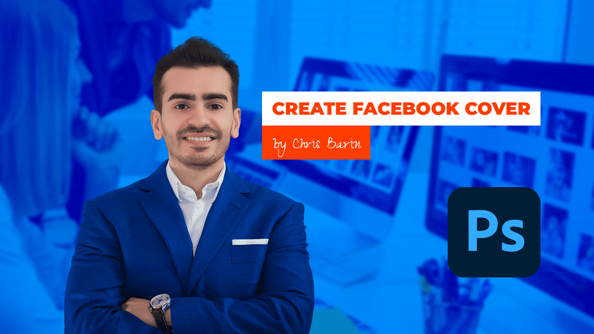
1. Introduction to the course: Hello, and welcome
to this section, where we're going to
talk about creating Facebook covers in photo shop. We're going to talk about
using the correct size and template, design
concepts, placement, and have it all tied
together to form the face of your business or maybe
your personal profile. Now, in this project,
we're going to recreate my personal
Facebook cover, and we'll dissect that to
see what makes it deck. We're going to
analyze it in depth. Now, as we go along, we're going to talk
about all sorts of photoshop techniques. So you're going to learn as we design. That's
the great stuff. You're going to learn
design principles that form the cornerstone of any
project, the foundation. Now, the thought process applied in this section can be used in just about any other scenario that's related to
any type of brand. Now, this is quite
important because putting a face to name
is super important. More and more people
are doing it. Now, I'm sure you've heard
the term influencer. Now, whether you like it or not, this is the world as we live in, and you got to be able to
execute something like this. A Facebook cover, any type of cover in general,
is quite important. So keep in mind that
you don't have to expose all of your personal
information on the web. You don't have to show
everything about your life to actually have a decent
social media following. All that you have to
do is show whatever you want to show in a
professional setting. Plus, more and more
companies are checking out public profiles of their potential employees
or business partners. So this means that you
may benefit quite a lot, even though it seems like
quite a small thing. A Facebook cover is not going to completely change
your career or life, but trust me it does help. So because this is quite
important and fairly easy to do, we should jump in and get
started. Let's get to it.
2. Best Project Settings & Aspect Ratios: Come back. The first
question is this. What type of document
should we use? Well, let's create a new
project by any means. You can use the button, or you can use the Hot key Control n, or you can go up top to the main menu to
file and then new. Now, all of these options
are going to bring you here. Now, here's the main idea. But the resolution, we
want 72 pixels per inch. This is the standard,
nothing else. GB colored mode, eight bed de and then
a white background. These are the standard
settings for any project, and they shouldn't change. Regarding art boards, no, we're not going to use them. They're not useful for
these small projects. These are best used for
web app design projects. So leave that unchecked. Okay, now about the size. This brings up an
interesting point. The short answer is this. Facebook recommends 820 by 462. In case this changes, I'm
going to let you know. From time to time, Facebook
does update D settings. Now, this is going to give us a Facebook cover that's
going to look great both on mobile devices as
well as desktop computers. But I'd like to design
that a bigger size either 12 80 by 720 or all
the way up to Full HD, 1920 by 1080, because this gives us a lot of flexibility
and it improves quality. Now, these are
tremendous advantages, but this brings up a
concept you have to understand right from the
get go. Aspect ratio. So here's the deal. I have
another photo shop project. Where I have a few art boards. If you're not
familiar with them, don't worry, that's not a focus. They're just here
to prove a point. Now, say that I create
a design, right? In this case, I'm going
to use a random photo. But imagine we spent a
lot of time on it, right? Now, I used Facebook's
recommended size 820 by 462. Now, these numbers are quite interesting because they give us an aspect ratio of 16
to nine, 16 by nine. Simply put, we are dealing with a wide canvas that's
fairly short. Now, let's consider the Facebook
cover is now completed, and then we want to handle other social media
platforms, different ones. But most of them are
asking for 1920 by 1080. Now, could we upload
our design at such a small size?
No, no, really. And enlarging a project is never a good idea because the
result is going to be blurry. It's going to be
pexeltd, suboptimal. So let me just show you a
super exaggerated version. So this in short is why
we never enlarge a work. Instead, we use the
principle of aspect ratio. So we design at a larger size. Instead of 820 by 462, we're going to use 12 80 by 720 or even better 1920 by 1080. That's because when
we scale it down, the quality is still
going to be perfect. Here's how I got these values. Here's how I know it's a
good idea to use them. Fire up a calculator and
divide these numbers, A 20 by 462. That's 1.774. But then if we go up a level, 12 80 by 720, that's nearly the
exact same thing. 1.777 What about Full HD, a big size, which can
be used just about everywhere, 1920 by 1080. Again, that's 1.777. It's 16 by nine. It's the exact same thing. So let me show you what I mean. First, I'm going
to use the correct aspect ratio by
using this photo. If we enlarge the project while maintaining
the Aspect ratio, the result is going
to be perfect. Great stuff. So this
is the great thing about understanding how
aspect ratio works. You can use bigger numbers because the fit is
going to be just right. Now, to make it even clearer, I'll input my measurements
manually. So let me undo. Okay, I'll do that with
the help of control T. I'm going to right click
here in the Options bar, and I'm going to change the unit of measurement to pixels. This has to be done
for both fields. Okay. Now, right now, I'm going to type
in 12 80 by 720. Check the chain icon if
it's pressed or not. Then I'm going to make sure the image is nice and centered, and it occupies the
space beautifully. Now, let's do the same
for the other size, which is called Full HD. We're going to increase
its size yet again. You don't have to work
along, by the way. The important thing
is you understand the principle behind
aspect ratio. As you can see, the image
doesn't get cut off, we aren't losing anything. Now, this is ideal. But look what happens when
you don't follow this rule. So let's say that you
know that design is supposed to be wide
and fairly short. So you create a canvas
size of whatever, 1,500. You work your hands
off for hours on end, and then you want to upload your design to
various platforms. So let's try this image here. Create a copy and left a line, top align it as well, and you're going to
see there's a ton of white space that's not
being used correctly. So if you upload it
to various platforms, you're either A, you're going to cut off a big part of it, either the top bottom of. Well, somewhere in between, so that's not ideal because you're going to lose
precious space, or B, the image is
going to be distorted, which is a huge problem. You should never ever
distort an image. Something like this.
This is a no go. Now, all of this, just because we use a different aspect ratio, two to 11000 by 500. So to recap, aspect ratio is important because
it allows us to design at a bigger size
without fearing that design won't fit at
a smaller scale. Now, you may ask. But
why should we design at a bigger canvas size if Facebook is happy with
only a fraction of that. Like I said before,
quality and flexibility. We'll start with the latter. 1920 by 1080 is a
very popular format. So this means you're
going to design once, but then you can use it for
all sorts of platforms. So that's a fantastic thing. But the bigger factor is
quality because you want sharp, nice graphics, dal crisp. You should never allow
these platforms to play with your dimensions
and change them and whatnot. Design at the highest
possible size, and then export it as a PNG
to get the maximum quality. Okay, I know that aspect
ratio isn't all that sexy, but I hope it's going
to help you in lots and lots of projects.
Let's continue.
3. This is how you create great text for your projects: Come back. It's time
to get to work, and we're going to
need some assets. Let's start with
the text, the copy. Now, in this situation,
I'm the client, so there's no one else to ask. Now with that in mind, I'm
going to take you through my entire thought process so you can do the same thing
in this position. Now, the objective is to create a Facebook cover image
for my personal brand. Now, the first questions
are quite simple. Who am I? And how do I want
to portray myself. My full name is
Christian Dodo Bain. I'm an entrepreneur.
I'm a teacher. I'm a photoshop user, and I'm a certify
adobe instructor. I teach photoshop, DB XD, Pigma, the works, mid Journey, Facebook ads, Po
cads, and so on. I'm on YouTube, as well
as other platforms. I have various social media
profiles, I have a blog. I'm a content creator. So there's lots and
lots of things. So right now, what I'm doing is I'm listing everything I can, and it's a good idea
to take a few notes. You can use a pen and paper, you can use a note
pad, whatever works. Now, these are raw ingredients. You simply list them out. Now, don't mistake all
of this information as the final bit of text that needs to be included
in the cover. No. These need to be refined. Otherwise, we're going to
have lots of paragraphs, and we don't want that. Not only are they not
approved by Facebook, they also look terrib. Now, as a pointer, Facebook typically
recommends 20% of your design should be text, no more than 20% Dough. Now, we won't waste
time doing any math. Instead, we're going to focus on aesthetics and solid
design principles. So back to the text element. Now, I have to decide what's the critical point that has
to be there no matter what. Clearly my name fits
into that category. And that's because
I can't expect people to recognize my face
and that's that, right? Now, regarding my name, despite what's popular
in my country, I'm going to think about
my target audience, which is international. And typically, the first name is you guessed the first one. So in my country,
that's different. But again, it really
doesn't matter. And I'm not going to
use my second name because that's not all that common. So that's
the first thing. I'm going to change my
name just a little bit. Christian is very
much well known, and it's very familiar
to most people. Now, Chris is even better. It's short. It's easy to write. It has a nice ring to it. Super simple. So I'm considering this
point because again, I have to think
about my audience. I have students from the USA, from the UK, Canada, but I also have
people from Pakistan, India, Singapore, and so on. So overall, after it's
all said and done, Chris Barn, it is nothing more. We don't want to confuse anyone. Now, by the way, in case
my name was John Smith, so super super common. Maybe I would add
my second name, but again, that's not the case. Now, the second most
important point, what do I want to highlight? Is it my ten plus
years of experience? Is it my certifications,
my diplomas, my 300,000 students from
all over the world? I think that's a bit
egocentric, right? I think that's not ideal. I really don't want to be
perceived as being arrogant, right? I don't want to show off. I need to be reliable and
trustworthy as a teacher, but not ego driven. So I don't want to
push people away. Now, the next thing,
I don't want to crowd the design with lots and
lots of information, like all of my stifications
and whatnot, or my reviews. I have 40,000
reviews or whatever. Again, I don't think
that's essential. So I'm focusing on the
most important bit. And I think photoshop training is one of the best things that
I can say about it, right? Because again, the
initial impression is what matters most. Now, because I say
photoshop training, it's no longer about me. It changes the power
dynamic tows the visitor. He gets something by visiting this page.
What does he get? Well, it says right here, Photoshop training
by Chris Barn. If I were to say that
I'm a photoshop expert, some people may scoff at it. They may perceive that as a negative. Now, let's continue. What else should I include? Well, this is a personal brand, so I definitely need
to show myself right. So a picture is 100% needed. Now, I could keep
the avatar for that. But my face is a key piece
and establishing trust. People want to see you, even if you don't like being
in the spotlight. Believe me, I totally
know the feeling. We'll talk about imagery in
a different lecture, though. Now, the last thing we could include is some type
of call to action. Now, a website is
the ideal situation. I would never put
a phone number or an e mail address because I don't think
that's very professional. Now, in my case, I don't have one specific website
I operate on. Even if I did teach on
one single platform, I would probably not
include the huge link here. That's not professional, again. It has to be short and sweet. Keep in mind, this is a photo. People are not going to
be able to click it. So that's not an actual link. If you think that
people are going to actually start typing
in little by little, a very long URL that
you add in a photo, you're wrong, you're mistaken, people are not going to do that. Now, for the other situations where you have a physical store, for example, or you want
to show off an address, of course, with that in, right? Now, for my brand, we
have enough to go on So let's focus on the image
assets in the next lecture, and we can start building
it. Thank you so much.
4. How I select images that fit my project: Welcome back. In the
previous lecture, we took care of the
text component. Now it's time to switch over
to the other one images. The star of the
show has to be me, or better put a photo of myself. Now, I gather the
few viable options and we're going to
analyze them one by one. So I need something fairly
serious and professional. I have fun ones, but you should never
use pictures from your vacations or parties or anything in an
informal setting. Now, going through
them, you're going to notice that some are
in portrait mode, while others are
in landscape mode. Now, both are valid options, but we're going to have to experiment and see
what looks best. So in photoshop, let's
see what's what. I'm going to use a
1920 by 1080 project with the artboards feature
not checked unchecked. Okay. Next, I'm
going to drag all of them inside the
Canvas, like so. Now, in the ayos panel, disable them one by one, so we can see what's what. Now, this first one occupies quite a lot of space vertically, but the image is bright. My skin looks okay. It's well saturated.
I think overall, this is a pretty good option. Click on this i icon to
hide that for the moment. Now, this image is
a bit more serious. It's a side photo. It's a bit grainier. It's not as vibrant. So overall, it's
not my favorite. So let's hide it.
Now, number three. Well, the quality is spot on, and I like the suit, but the
hands are a bit problematic. Right here, you can see
the light is hitting my fingers and that
a bit too bright. Leaving that aside, if I don't
include the entire thing, I think it's going to look off. It's going to look weird. There's no decent cutoff point. Now, for those reasons,
let's move on. Okay. This is pretty friendly, and it fits the project. But I'm a bit too tanned, right? This is actually from an
event in San Francisco, and the sun was merciless. It was super hot. Now, we could try
to correct my skin, but I don't think
it's worth the time. Now, in the first picture, I'm smiling, but my
posture isn't ideal. You can see that this
shoulder is higher up, and the left part The left part of my face is pretty dark. Not to mention my nose. It's giving Rudolph
vibes, right? I think we can delete
photos one and two, hold the control key to select
them in the layouts panel. And when clicking on them, make sure you don't
hit this area. Make sure you hit this area here and not this part
on the thumb nail. In case you're going to
click on the thumb nail, you're going to make
a selection like so. Notice a line has shown
up on the Canvas. These are called
the marching ants. This means you have a selection. Disable it with Control D, D as in D select. Now, with these two selected, let's use the delete key. Now, do the same
with number three. Now it's a battle 3-5. You'll notice they have
specific backgrounds, but they don't cover the
entire width of the project. Now, again, we could use some photoshop trickery
to extend them, but I don't think that's needed. Even if we do it quite
fast with generative fill, I'm not sure these backgrounds would be ideal for
the Facebook cover. This means we have to
remove the background so we can work with
an isolated photo. Cutting out someone
from the background could be a tricky task. The Internet is filled with
all sorts of materials, but let me tell you, if
you have a small photo, it's going to be hard work. If you have a large photo and you're using the latest
photoshop version, things are going to
be, much easier. Now, in this case, number
three is quite big, 18 65 by 2027 26. The other one is much bigger,
and that's a better one. Now, there's another
thing to consider. My blue jacket makes for a strong contrast between
myself and the wall. So this means photoshop is going to do a much better
job because of it. Now, for the other one, it's actually the complete opposite. The colors are
somewhat the same, so it's going to be
a bit trick here. So considering these points, the size and the contrast, we're going to drop this one, and we're going to focus
on the blue jacket photo. I'm going to attach it just
so you can work along. Now, we won't get into removing the background into
detail because again, you can do it fairly fast if you have the latest
photoshop version. Just click and it's going
to do a fantastic job. Now, just in case
you can't manage, I'm going to attach the PNG all by itself, already isolated. The focus here, remember
is the Facebook cover. Now, back to the assets. So I want to gather
a few more things. So I think the photoshop
logo may come in handy because it's
something that people can immediately recognize, so we're going to find one. Now I'm going to spare
you the trouble. You can just google it. You can just find it
on various platforms, p. I'm going to attach it so you can have an
easier time with it. Please be aware that photoshop has been around for a long time, so you're going to see
lots of variations. When in doubt, just look at the current icon
from your task bar. Okay, awesome stuff. By the way, using an older icon
would be a big mistake. I'm a photoshop expert, but I have an icon
from ten years ago. That would definitely
be a mistake. Now, finally, I'd like
something for the background. Now, to cut it short, I already tried various
things on my blog, so I have a pretty clear
idea about what I want. I need a photo with some
type of office setting, something with desks,
with slick displays, with a few monitors, a few displays, maybe
a person or two. Now, for this case,
I'm going to use free pick or unsplash.com, though I do prefer
the first one. This is a great platform to get all sorts of images,
but it's paid. Unfortunately, there's
no other way around it. If you can't manage, use Splash, they have a premium
plan as well, but a good part of their
images are completely free. So again, if you want
premium, go for a free pack. If you want free, use Splash, but make sure you
choose the free ones, not the premium ones. Here I'm going to search for
something like designers, and it's going to be lots
and lots of results. I'm going to cut it
short and I'm going to show you exactly
what I chose, and it's this one here. Now, of course, you
should always look for different ones because obviously a lot of people could
use the same thing, and it would not be ideal to use something
that's very common. Now, obviously, you're not going to find
something unique here. But again, it's best
that you choose a few other ones just so you
can see what's the best fit? By the way, this is a great
chance to use these filters. Now, obviously, if you don't
have adobe illustrator, you should probably
not use vectors. In this case, probably
photos works best. Now, there's two ways
you can go about it. You can just simply
select five, ten, 15 photos and then try
them out one by one. Now, this doesn't require any analysis, any
thought process, bang them out, just go
through them one by one, process of elimination,
nothing else. O the second thing option B, we can think about the
composition as a whole and how the image would
relate to my own photo. So I'm going to use this one. But just so we don't
neglect the other option, I'm going to download
a few other ones that might make sense. Overall, we have several images. We have one great
photo of myself, the photoshop logo, and a set of images for
the background. We're going to try them, and we're going to see what's what? You have them all attached. I'm going to see
you in a second.
5. Arranging the Assets on the Canvas: Come back. In this lecture, we're going to use all
of our assets to create our Facebook cover for
my personal brand. You have all of these
resources attached, so please work along on your second viewing.
Okay, let's get to it. First of all, grab
this P&G of myself and drag it inside the
project, 1920 by 1080. Right now, I'm taking up the entire height of the
Canvas, that's fine. Next, add that photoshop icon. This one is again far too big, but we can make
it a lot smaller. Now, you do that
by going to one of its corners, clicking
and dragging. Now, if something isn't right, just hold down the shift key, or check the chain icon from the top from
the options bar. The chain icon helps
protect the aspect ratio. If you don't use that feature, you may distort the icon. Again, when you're resizing something and you see
it's not going right, hold shift if needed. Okay. Now, place it anywhere, say in the bottom right side. Now, to wrap up the images, grab any of these photos and place them inside photo shop. But now I'm going to
go the first choice. Now, notice how it tries
to fill my canvas. This is a nice feature. Photo shop wants to help us out. But this only happens when the image is bigger
than the actual canvas. Now, it doesn't work
the other way around. It doesn't blow up small
photos, just to be clear. Even so, we can see we have quite a lot of empty
space on the edges. And that's because
the aspect ratio of the photo doesn't match the
aspect ratio of the Canvas, which is again set by Facebook, with the following
da guidelines. Now, we know our options. We can distort it, which we shouldn't do, of course, or we can
cut off a part of it. So that's the only
viable choice. So let's make it happen. Hold the ult key and grab
any coordinate handle. Now, drag outwards
up until the edge of the photo matches the
edge of the canvas. So resize it and make it fit. Now, I usually go a little
bit further just so I don't risk having a
vertical white line or even a horizontal white line. That would be again,
a big mistake. Okay, when you're done resizing, just hit there, and
we're going to be great. Now, of course,
there's a chance that with covering all the elements, but not a problem, use
the layer spanel and reorganize things just
in case that's needed. Now, in photoshop, all layers are arranged from top to bottom. So the layer that's on
top of the layer spanel is always on front of the
other ones on the canvas. So this means that if I move the photoshop logo above
my photo on the canvas, of course, it will be
in front of me because of the or the here
in the layu spanel. But if I raise myself like so, then of course,
the order changes. That's simple enough. But here is where it gets interesting. Sometimes the order in the layer spanel
actually doesn't matter. So if I separate
these two elements on the canvas and
they don't overlap, they don't intersect
on the canvas. The stacking in the layers
panel doesn't matter. It's irrelevant. So again, the layers panel really
matters if they overlap. If they don't
overlap, no worries. Now, let's add some texts. Make sure you have the
character panel opened. This is from the top menu
window and then character. Okay. Now, I want us to
follow the same steps. So click right here in
the top right corner. Now, a list is going to show up, and we're looking
for reset character. This is so we can work along. Now, everything is at
the default values. So this means you should have
Myriad pro regular here. Now, activate the type tool by hitting T, T for the type tool. When in doubt, go
to the tool bar and check that you're
using the right one. There's actually a
few options here. But of course, this is
the one that we need. Click anywhere on the Canvas
and type in res Baron. Now, when you're done,
hit the numerical enter, the one from the right
side of your keyboard. Not the regular one
because that's going to move you to the next line.
So we don't want that. If you can't manage, just use
the check mark from above. Oh, by the way, in
case you click, and you got some text
that said Laura MPsm, no worries that can easily be changed by using preferences. Control K is going to give you this panel that's
command K on the Mc, and, of course, you can disable that setting. It's
really up to you. This is going to stop
photoshop adding that dummy text when you create a
new text layer by default. Okay, let's move along. Let's click again and this time I'm going to write
photoshop training. Good stuff. On the Canvas, this should be placed above my name because I feel
it's more important. Okay, so these are all
components laid out in a very decent fashion,
nothing too fancy. In the next video,
we're going to start designing things to color, typography, and
proper placement. Let's take a quick break.
6. Designing the Cover: Come back. Here, we have
all our elements laid out, but it's a bit of a mess. So the question at hand is, how do we arrange them? Well, though I'm the
star of the show, you never want to
be the hero element placed in the middle
of the composition. No. I know that sounds
counterintuitive, but here's the deal. There's a fairly
well known principle called the rule of thirds
that says that you should divide the image in nine equal parts by using two vertical and
two horizontal lines. Going to use rectangles with a stroke and set the fill to 0%. This technique really doesn't
mat at all that much, so don't worry about
replicating my steps. You can just use
the PSD if needed. Instead, let's focus on
the actual principle. So the rule of thirds says
that you should place important design elements at the intersection of these lines. So this means my face
should be placed somewhere around here or here. I have a tendency to go
towards the left side. Now, there are several examples of the rule of thirds in action. But even if you're
not a fan of it, it's still very much practical. If I were to place myself in
the middle of the screen, all the delements would
fade in comparison. They would have to be shrunk down and scattered to my sides. So that's not a great l.
So with that being said, I'm going to keep my
photo on the left side. Now, regarding the
size, use control T, that's command T on the MC and focus on the options bar up top. Now, by default, you're
going to see percentages, but you can always right click, and that's going to
give you a list. We're interested in pixels. Okay, now, make sure the
chain icon is pressed, so the image is going to
resize proportionally. So this means I'm
going to type in any number in one
of these boxes, and the other one is going to automatically
change. Great stuff. So the value I ended
up using is 875. That's for the WIF, 875. Now, this in turn makes the
height quite reasonable. 1,000 pixels also give a p. Now, why this specific size? Well, again, I am the
star of the show, but I don't want to overpower
all the other elements. I don't want to span the
entire height of the design, nor do I want to cut my hair. Now, this is a moderate size, and it's going to give
us a good balance. Next, let's talk about text. Now, to quickly select the layer directly
from the Canvas, you got to make sure
you're on the moved wool. This is unchecked.
It's disabled. And then you hold control, that's the command key on
the mac and you click it. So control click,
and you're golden. Now, as you click
on various layouts, you can see this highlight. Plus, you can always
check the layouts panel. As you go over various layouts, you can see there's a highlight. Plus there's also a highlight in the layouts panel when you
actually select something. Okay, Grace Now,
resize both items to about 80 pixels so. Here's
an important thing. In case you use my
rectangle technique for the rule of thirds, you got to make sure that
you group all of them, and then you hide them. That's quite important because obviously these are transparent, but photoshop recognizes them. So when you control,
click a layer, maybe a text layer,
you're actually going to get one of
those rectangles. So again, you should hide them. Okay, so we have
all text layers, but they're not
formatted in any way. Now, the problem with them
is that even though we have a decent amount of contrast from the
light background, I'm not really happy
to use black text. It doesn't fit my personality or the feeling that
I'm trying to convey. So no matter the color, it's not going to great
in this situation. The background is too detailed. Thus, here's what I propose. We can apply a colored overlay. This is actually
the exact same name you're going to find here by clicking on this F X icon at the bottom of
the layouts panel. Color overlay. Make sure you select the
background the Bij Do. Okay. Now, the default
settings, I'm going to cut it. The easy way to go
about it is this. We can use pure black, and then we can
lower the opacity bit by bit to maybe 50% or so. By the way, you can type
it in or you can use your mouse scroll
and hold shift. With shift, you're
going to change the value in 10% increments. Now, black can work.
It's universal. But again, I want something
that's a bit friendlier. In the end, I went with blue. The color code is the following. Click here and put
in 00 for A D zero. This is going to improve
the project's look, even though the change is
actually quite subtle. Now, instead of playing
with the opacity, I decided to go back up to 100% and experiment with
various blending modes. Now, these are a
bit unpredictable. So I suggest you simply try them one at a time by using
your nouse wheel. So again, this is a method
of playing with it. Just click once and
then use the scroll. Of course, you can adjust the
opacity or even the color. But again, you should nail it down to about two or three
choices from this list. Now, to keep it short,
I was strn between hard light and then the
second one linear light. Now, this second one is
a bit too saturated. So in the end, I went
with hard light. Now this is better. Now, there's a
slight danger that we might be using too much blue, but we're going to
count of balance that through the use
of all text layers. Thing is, I'm not very happy about this guy that's behind me. So what I'm going to do
is I'm going to apply yet another popular
technique, a Gaugan blur. Again, make sure the
background layer is selected, and ideally, it has
this icon here. This tells us that we are
dealing with a smart object. In case you don't have that, you can right click
and look for, convert a smart object. But again, it should be a smart object if
you're following along. Okay. Now, go to the
top menu to filter. From here, go to Blur, and then finally,
choose Gagan blur. A new window is
going to show up, and immediately, you're
going to see some results. Now, we want a small amount. We could crank it
up quite a lot, get a diffused l, but I want something
fairly subtle. So five pixels, give or
take, should do the trick. Get okay and look
at the yos panel. The reason why I
mentioned this symbol is important is because we can always come back
and change the blur. We can double click it, and we can change the
settings as we want. So this gives us flexibility, and we can change our mind
as many times as we want. The thing is, you can still
see quite a lot of his face. So let's change that. I'm going to hit z to
activate the Zoom tool. Then I'm going to
hold and I'm going to get this minus
symbol on my cursor. So this means I'm
going to zoom out. If you're not a fan of hockeys, simply activate the Zoom tool, then click and move towards the left or towards the right, and that's how you zoom
in or how you zoom out. So again, zoom tool, no hockeys, click, move towards the left, or
towards the right. Okay, great stuff. Now,
let's use control T, and we're going to increase
the size of this layer. Now, photoshop is
going to tell us that the blur is
going to be disabled. But that's fine,
it's just temporary. When you're using a blur, we can make the image
bigger because any potential issue
is going to be covered up, any
imperfection whatsoever. Again, it's not
going to show up. So my idea is to bottom
line the picture, so you can see a big part of the displays above the monitors, but cut out the
part of his head. Now, take your time with it. Don't rush it, but you want something that
looks like this. Overall, I'm quite happy. Moving on to the photoshop logo, we got to resize it.
About 300 pixels. I think that's a good fit. Now you can always
play around with it. You can go 250, you can go
320. It's really up to you. But the most important part
is the typography, the text. Based on that, we can make
further adjustments if needed. After you resize
it with Control T, you may want to reactivate those rectangles to see
those intersections. Now, if you want to
follow the guide, we should place it about here. Now, initially, I wanted to
place it more to the side, but now it's fine. Yeah. There we go. So overall, we've made good progress. Let's take a short break, and I'm going to see
you in a second.
7. Typography for the Facebook Cover: Come back. We need to
take care of the text. Now, we wanted to stand out. The first question is, what
typeface should we use? Well, we have two choices. We can go for Google
fonts or adobe fonts. Now, Google sons
are totally free, so you have unlimited access. For adobe fonts, you do have
to pay for the photoshop. But if you're watching this, hopefully, you do have
a valid subscription. If you're paying
photoshop, for example, $11 per month, give a take, Adobe fonts is going
to be included. Now, both libraries are massive. You have thousands
to choose from. So how do you choose?
Well, here's the thing. Now, you want to think
about the overall vibe of the covered photo, right? Now, in this case, though
I'm fairly friendly, I am an instructor
and a teacher, and that does impose some type of authority and respect, right? Now, I'm also pretty
big on working out, and I do have a strong stance and even a strong look at times. I'm not whimsical, I'm not
into drawing and whatnot. So this excludes certain
typefaces right from the get go. So in Google Fonts, for example, we can definitely
take out handwritten, and you can actually use these filters and look for
something that's powerful, that's clean, robust,
and fairly thick. I'm in tech, so San
SerreF is the way to go, and that's how you
quickly narrow it. Then you're going
to find a bunch of lovely typefaces that are a bit more appropriate
for this setting. Now, again, some of these
may be a bit too elegant, maybe a bit too
fancy for my taste, but you just got to go through the motions
and see what's what. Again, there's no right or
wrong way to go about it. It just has to fit what you're
trying to put out, right? Now, overall, you do
have to keep in mind that some of these
are quite over used, and a lot of them
look way too basic. For example, Roboto,
it's super super basic. Lato, again, super basic. On the other hand, everybody
knows Oswald or Bebas. These type faces are
again quite condensed. They look interesting,
but they're so over used. So you got to make sure that's
something you're aware of. Monsat, again, is very popular, but I've seen it
1 million times. So that's why I said it's
really up to you what you like. It's like what you like to eat. This changes from time to time. So again, make sure
you experiment. There's no right or wrong make sure that it
represents you itself. Now, overall, I'm going
to go with this one, and I already have it
installed on my computer. But just in case you don't, you can quickly
install a font from Google Fonts by simply
downloading a zip archive, extracting it, and putting
it into C windows fonts. It's really as easy as that. Sometimes photoshop
needs a restart, but yeah, most of the time,
it's as easy as that. Now, back to photoshop, make sure again, those
rectangles are disabled. Select the first line of text. Now, let's focus on
the character panel. That's what we'll
use. Click here, and let's put in Monsat. You only need the
first few letters, that's MO N T. Okay, so Monsat, let's go with
Monsat black from the get go. Now, regarding the
size about 82 pixels, maybe 80 give or take. The next thing, I want
to enable the all caps transformation because I really want this
part to stand out. We'll see if this is
the right way to go, but yeah, I think
it's a good look. Now, as for this position, now, let's enable the
rectangles and try to place it somewhere to
the right of my ear. Well, it looks kind of big. It might overpower
the entire thing. So let's take a step by step. For the colors,
let's go with white. That's fairly safe and
standard, but here's the thing, but I do love one particular
color, and that's orange. I've used it so much that I
know it's color code by hard, and that's FF d00. So this is bright. This is strong, it's very saturated. But here's the thing. Using it directly on
this blue background, that doesn't work.
This is a no go. So here's what I propose. On one hand, we can keep this
white version as a backup. Okay. And for the second one, we're going to use orange,
but here's the thing. We're going to place it
inside the white rectangle, so it's really
going to stand out. So get a rectangle tool, click anywhere on the canvas
and put in these values, 1050 for the width. And then for the height,
let's go for 125, 125. So this needs to be pure white, and it has to be placed underneath the text layer
in the layers panel. Okay. Now, for that orange. Now, as I'm arranging
everything, you might have an idea. How about we make the rectangle orange
and the text white? Yes, that works as well. At the end of it,
you should look at both options and choose
the one you like most. But yeah, both options
are quite nice, so it's really up to you. Now, remember, use
those rectangles, if you're unsure about what
to place your elements. If you run into
trouble with them, just leave them off and
then just eyeball it. Now, for the text underneath, I'm going to duplicate
this y rectangle, and I'm going to
shorten it a lot. Maybe 450 pixels also for
the width. So about half. Make sure that's placed
correctly in the layout spanel. Now, here's my idea. I want this shape
to be orange to create some variation
in the design. So double click it thumbnail
and use that orange. You can sample it
from the canvas, or you can manually type it in, or you can grab it
from the tool bar in case you have it
there. Okay, right. Now, we could use
Monsat yet again, but I want to mix things up. This time, I want the text to look like it's hand written. I want to balance that
strong text that's above it. So the way I look at
it is like a cake. I like chocolate.
I like caramel. I'm open to moose, to ganas, but here's the thing. Too much sweet is not enjoyable. You get to a point
where you get saturated and it becomes unpleasant.
You need balance. You want something to cut
through that sweetness, so you can enjoy
the whole thing. And it's the same thing here. Too many powerful elements, are going to take the
project over the top. It's gonna be shouty. We don't want that. We want
diversity to balance it out. So I went ahead and I looked quite a lot
for the type face, and here's the one I chose. This has great legibility. So I wanted a type face. I could easily read. Handwritten, yes,
but easy to read. This took actually
quite a while, so that's why I
didn't include it. But yeah, I went with a
type face called Zada. I'm not sure that's
how you pronounce it, but you have it written here. Make it pure white, and for the size, probably
65 pixels give or take. Now, I think it's also a good idea to add
another word here. By. I think it not
only sounds better, it also looks great
due to the Y glyph. This character actually
has a lot of character. Now, take a moment
and center it, but you're going
to notice it may be vertically offset
due to this y. Now, here's how
you get around it. You actually select it, you remove it, and then you commit. Then you realign things
using the tools from top, the alignment tools, and that's how you center
it vertically. Then you get the
type tool and you put back that letter.
And that's it. It's a quick work around
for the nasty problem. Okay, let's take a moment and we're going to
continue in a second.
8. Fine Tuning the Cover: Fine tune R design to make
sure that it's well sorted. To begin with, I think the text element
is a bit too much. The font size should be
dropped to about 70 pixels. Then the second one to about
55, again, give or take. You're going to
have to reposition them inside their rectangles. But I think even them, they may be a bit too much
on the heavy side. To quickly resize them, you could potentially use the property spanel
instead of free transform, also known as control
T. But again, you got to check the chain icon, because again, when
you change something, if the chain icon is pressed, the other value is going
to get updated as well. Now, again, take your
time with it and make sure that this looks right
and it's well sorted. In case you don't have
the properties panel, go to the top menu to window, and from that, you're
going to find properties. Okay. By the way, the list is alphabetical just in
case you're wind ring. Okay. So we're looking
to resize it to about 900 by 110,
something like that. So 900 by 110. Take
your time with it. You got to experiment. There's nothing that's
written in stone. But once you've done,
select both layouts, either from the Canvas or
from the layouts panel, and then use the alignment
tools from up top. We always want two things, align horizontal centers,
and align vertical centers. Okay. This is
looking pretty good. Of course, there are a ton of variations that you can
apply for the first line, but let's keep it simple. Moving down, the second
text is 55 pixels, but the rectangle
should be resized. The value I finally ended
up using is 350 by 110. Having the same height
is quite important. Give me a moment while
I handle everything. Now, as a rule of thumb, you should never place
two rectangles that have the same color immediately
next to each other. Instead, you should leave a
gap of at least two pixels. Because we have different
colors, that's not needed. Now, these two layers
obviously need to be aligned as well.
No question about it. Actually, in general,
you got to align everything in every
single design project. That's one of the main things. Now, regarding the
specific rectangle size, I chose it based on one thing. I wanted my two text
layers to be left aligned. When I see any design, I always try and picture imaginary lines
going through it, both vertical and horizontal. If you have layers of aligned, the whole thing is much
more pleasing to look at. Now, here's that simple
trick that will allow us to vertically align text layers that have low hanging letters. In this case, why? Now, here's what you do.
You get the type tool, you remove that letter, then you arrange
everything correctly with the alignment tools. Of
course, take your time. Watch this cools twice, make sure you're
able to work along, pause as often as you need to. Then once everything
is centered, get the type tool and
add that letter back in. Okay. Fantastic. Now, this isn't the most
elegant technique, but it gets the job done. Right? Let's have another look and see if we can
improve anything. Always take a few
moments and zoom out to control Zero to have the
project fit your screen. Okay. Now, what I'd
like you to try is maybe a different position
for the photoshop logo. I want to right align it
with this white rectangle. So select both layers and
use the appropriate command. Now, this creates yet another
imaginary vertical line, but I want to elevate
that even further. First of all, hold
down the control key whilst you have the
photoshop logo selected. Hove it over the background, and you should see some
pink lines show up. You're also going to
get some measurements. This is what we're looking for. Now, I want to match this value here
underneath the layer. Now, to do that, simply use the added keys
from your keyboard and add shift into the mix, and that's going
to help you move things in ten pixel increments. Now, as you make progress, constantly tap the control key
to check the measurements. So this is going to show you
how far away this layer is. Now, in case you're
not happy with this technique, you
can do the following. Look at the property spanel, specifically in this field. This controls the
vertical position of this layer,
starting from the top. Now, what's important
is you have the same amount of empty
space on both sides. That's going to make
it lovely. Okay. When you're done, I want
you to do one final thing. I want you to slightly change my skin tone because
I'm a bit too pale, at least in that photo. Now, we won't get into
any advanced stuff. Instead, I'm going to show you a technique that
I've always used. So the first step is to
select the correct layer. In this case, it's this one. Next, go to this Ying Yang looking symbol and click on it. From this long list,
choose vibrance. A new panel is going to show up, but the things are
quite straightforward. What we want to do is
we want to crank up this lider to 70 plus 70, and notice how my skin
immediately looks better. This is what vibrance does. It gets those colors that
are a bit washed out. In case you want to
see a before shot, just click on this
icon to hide it. Now, here's something
you have to be aware of. I'm going to draw back
this lider back to zero, and then I'm going to
change the saturation to plus 70 just so I can
show you the difference. So as you can see, this
affects all of the colors, not just the washed out ones, and this isn't all that great. In this specific case,
it's way too much. So that's why we want to use vibrance because that gives
us exactly what we want. Only those colors that are a bit washed out. Keep that in mind. Okay, let's get back to it. So again, for the vibrant, we want plus 70. The saturation should
remain as it is. Now, I'm going to see you in the next video to wrap things up.
9. Conclusions: Make sure everything is nicely
organized and buttoned up. So I recommend you keep the four layers that make
up these two elements grouped because that's going to allow us to quickly
try some variations. Now, before we get into that, let's export this
project as a PNG, so it's going to
be nice and crisp. You can go to file
export, or of course, you could potentially
use the big Hot key ult control shift W. Again,
it's quite long. But if you can't manage, again, file export, export as. Now, you have a few
options in this new panel, but we're only looking
for the format. PNG and that's it. Save it, and this is
virgin number one. Now, in case you
want to try it out, file it on Facebook,
and you can upload it. You can see it in place,
and it's quite nice. Now, my Facebook group
is already set up, but yeah, this looks good. Now, overall, here's the thing. The idea is, does it check all the boxes, and
I think it does. It's professional,
it's powerful, it's bold, it's bright. So overall, I'm
really happy with it. You might also notice one thing. The photoshop logo doesn't feature that margin
that we set up, but this is the regular version. When you click on
the cover image, you're actually going
to get the bigger one, and in that case, it's okay. Now, here's the thing in
case something feels off, go back to photoshop and
make any adjustments. For example, let's
try something else. So identify the group that
has the text component, and let's make a copy. You can do that with Control J. Okay. Now you can double
click its name and change it to something like
alternative or iteration, variation, whatever you want. Now, here, I'm going
to quickly change the top rectangles
color to orange. Double click the thumb nail and sample a color straight
from the Canvas. You don't have to memorize
any color code, by the way. Now, I'll quickly
handle the second line. But in the meantime, I do hope you've enjoyed this
course up until this point. Photoshop is infinite. We can do all sorts of projects, but yeah, here's the thing. Some parts have to
be slowed down. You got to use the space
ball key quite a lot. While other times it's
simply fine to plow ahead and go through it quite
fast. Now, here's the thing. If you have any
questions whatsoever, that's totally fine,
please ask away. Okay. Now this is done. What's your take
on this variation? Honestly, I'm not feeling it. The first line is a
bit too in your face. It's a bit harsh. It's too bold. But the bigger issue is
with this second line. That elegant text becomes a
bit fuzzy and unpleasant. Now, in essence, the
quality hasn't changed, but the perception
is what matters. So for that reason, I'm going to stick with the
initial version. Select this folder and trash it. You can use the delete
key, with simply hide it. Yeah, overall, with
pretty good to go. This is our Facebook
cover image. Now, what I want you to do is create your own
version. Make your own. It doesn't matter
if you don't have a need for it. Just try it out. In case you don't have
a nice photo like mine, you can go to unsplash.com
and select a random one. If not, use a celebrity or
whatever other photo you want. I'm going to include
a few photos just so you really have
something to work with. But again, ideally,
use some of your own. Now, no matter the case, work on your own
version and post it as a PNG in the
comment section. Load it to the platform. First of all, create a perfect replica of what you just saw, exactly what you see
in my photo shop, and then make your own version. Now, don't upload
the copy because obviously it's going to
be exactly the same. Only upload your own version. Choose a different color, a different typeface,
maybe a different layout. Have fun with it. That's the most important part. And again, I hope to see you in a different project of
mine. Have fun with it.
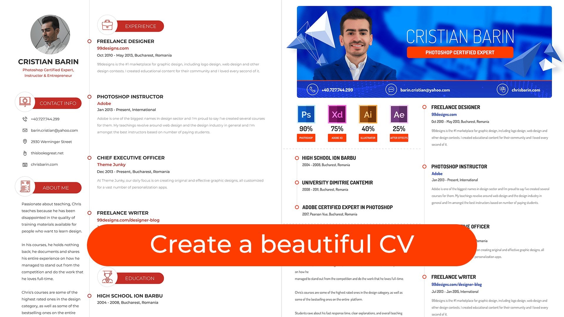
 Chris Barin, Certified Photoshop Expert