Transcripts
1. Introduction: Tired of using the
same free mockups that everyone else is using,
let's change that. I'll show you how to create
your own custom mockups using free images
and Adobe Photoshop. Hi, I'm Khadija, but
you can call me Dija. I'm a brand designer, an art-directed and a top
teacher here on Skillshare, specializing in branding
and packaging design. In this class, we're creating high end lifestyle
custom mockups using free images
in Adobe Photoshop. But more importantly, you learn how to think like
an art director. These mockups are
designed to tell a story to show how the brand looks and
lives in real life. So think of it as a day in the life of your brand in
your design presentations. And remember, using free
mockup templates is great, too, and I still use them often. But for moments where you
want your presentation to look and feel unique
and intentional, these custom mockups can
make a huge difference. The best presentations use both. I'll walk you through my
favorite image sources, my system of how to filter
and pick the right images, and then we'll dive
into Photoshop, where I'll show you step
by step how to blend, retouch, and polish
your mockups. If you're a designer
who's looking to elevate their
brand presentations but can't always buy
mockup templates or just want more custom look, then this class is for you. If you previously took my branding essentials
presentations class, then this is the
perfect next step. We'll elevate those presentations
with high end mockups. What's even better
is that this process is scalable and reusable. Once you build a few mockups, you'll create a custom
library of custom Photoshop mockup files that you can tweak and adapt for future projects. It's a skill that
grows with you. Ready to create
mockups that tell a story? Let's jump into it.
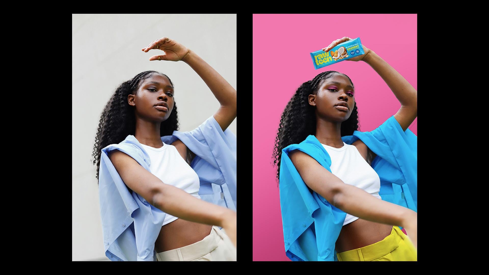
2. Meet Rawteen: Meat Rawteen. To walk you through this class, I'll be using a real
lien project called Rawteen a protein bar brand designed for Gen-Z demographic. The vibe is bold, loud, and slightly
rebellious, and that meant that mockups had
to match that energy. I'll be recreating and expanding on some of the mockups
I designed for this project and
walk you through the exact Photoshop
process I use. Mockups aren't just decoration. They're how your brand
lives in the real world. They help your client visualize their product and context. It's also where a
lot of WOW factor comes in during presentations. They're intentionally style to feel editorial, not templated. Now, something important
before we dive in. In my brand presentations, I typically use a mix of bespoke lifestyle mockups and high quality free mockups
templates that I find online. For example, if a client asks me to include business
cards in the presentation, I'm not going to hunt down the perfect or directed
photo of a business card. In that case, a well
made mockup template does the job beautifully. But when I want to show
off how the brand lives, its vibe, its quirks, the world it belongs in, I build custom mockups
using lifestyle imagery. Both approaches are valid. In fact, I think mixing those
two approaches together creates the most layered and
richest brown presentations. This class is all
about the custom side. So let's start hunting for the right images and I'll
walk you through my process.
3. Finding the Right Images: Now, let's talk about finding the right images
for your mockups. This is where we're
training your creative eye. You're not just searching
for any random photo, but you're searching
for the right image that will serve your brand for the project
you're working on. There are tons of free
image sources online, but for the sake of this class, I'm going to stick to my
favorite and my go to website for free image sources,
which is Unsplash. I always find the best editorial and lifestyle
images on here. Unsplash has a mix of free images and paid
images with Unsplash plus. You'll find a watermark
on each image indicating that is under
their paid subscription. So let's say, for
example, I type mockup. You can actually filter
from here the top the type of license
for the image search. So I'm going to pick free. And you can also
pick the orientation if you only wanted landscape, portrait or square, but I'm
going to leave it at all, so it expands our image
hunt as much as possible. And you can also have categories here at
the top if you're not sure what to type or if you're needing a
little inspiration. I always find that street photography and
three D renders have a really great
collection that can open up ideas when don't know
exactly where to write. And that sometimes
happens with me. So I just go through those
categories for inspiration. Before we start searching, I want to give you a
quick checklist of what makes a good image
for a custom mockup. These are always
things I look for, and they save me hours
of editing later. Number one, is the
lighting good? Natural lighting works best. Nothing too shadowy
or blown out. Clean lighting, soft shadows,
no crazy reflections. Number two, is the
surface clean and clear? I avoid patterns,
heavy textures, or overly complex creases. Look for minimal
creases or folds, especially for fabric
like t shirts or hoodies. Number three, is the
perspective workable? Can I realistically place a design on this object
without it feeling off? There are some minimal edits you can do to fit
the perspective, but you don't want to work
with a really difficult angle that would just look
flat out photoshopped. Number four, is the background clean or brand appropriate? Ideally, something minimal or fitting to the
brand personality. Neutral backgrounds are ideal or backgrounds that
fit your brand's vibe, and then you can easily
swap for another color. Number five, is there
space to place my design? Look for breathing room
and natural areas or spaces where you can place a logo or maybe a brand pattern. Beyond the technicals, I want you to think like
an art-directed. Instead of just asking,
can I place the logo here, ask, would this image tell the
right story for the brand? Does this feel like
something you'd actually seen a
launch or campaign? Does it elevate or dilute
the brand message? Does this person in the image reflect the brand's
type of consumer? These are all questions
that level you up as a designer because you're not just editing photos
on Photoshop, but you're putting yourself
in your client's shoes and visualizing what the
brand could potentially look like for them in
a way that makes sense to them with relevance
and in context. Now here's the mindset shift. I always look for
images that require the least amount of
manipulation on Photoshop. Now, I know that sounds
counterintuitive for Photoshop class,
but trust me, the less you have to warp
and fix and skew and edit, the more believable and
realistic the mockup will be. That doesn't mean we're
skipping Photoshop. We're still going
to edit, polish, and clean up our images, add some colors, place our logo, but it means that we're
not forcing a logo onto a crumpled T shirt or adding
shadows that don't exist. This method is meant to be fast, repeatable and scalable for every brand presentation
that you do. Now that we know where to look and how to spot a good image, I've divided our image
search into five categories. You can use the same categories I use here in this exercise, but this process is meant to
show you that you can apply this method to any image or
category of your own choice. So let's go through
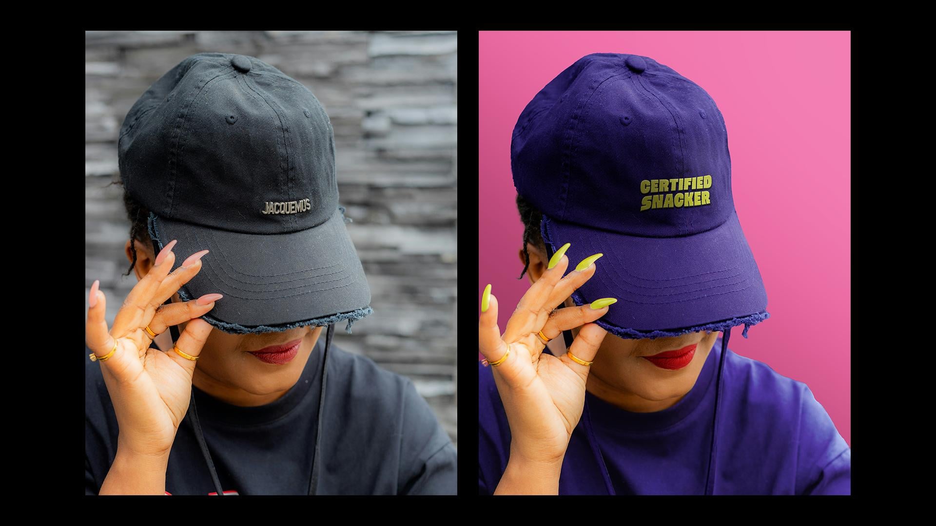
them one by one. So my first category is a CAP. This type of mockup is
very much on brand, and it resonates
with many brands, especially if they're tailored
to a young demographic. Let's say I will type
CAP in my surge bar, and let's say I want it to be gender specific because the brand's main
consumers are women. Okay. And then let's
take those two images, for example, that are made
by the same photographer. What I like about these is how it fits with
the brand setting. The type of pose with the cap
is relevant to the brand, and it could be an
interesting way in how the brand expands its campaigns to younger people by making custom merch and caps. This is much more exciting than just a plain cap mockup
on an empty background, and it feels like it could be a part of a
brand photo shoot. From a technical standpoint, the cap is pretty plain. I can just easily remove
this logo on Photoshop, and all that's left to do is
change the color of the cap, maybe put some
color in her nails, place the logo or a
cool brand message, and play around with cropping
the image so there aren't any distractions in the
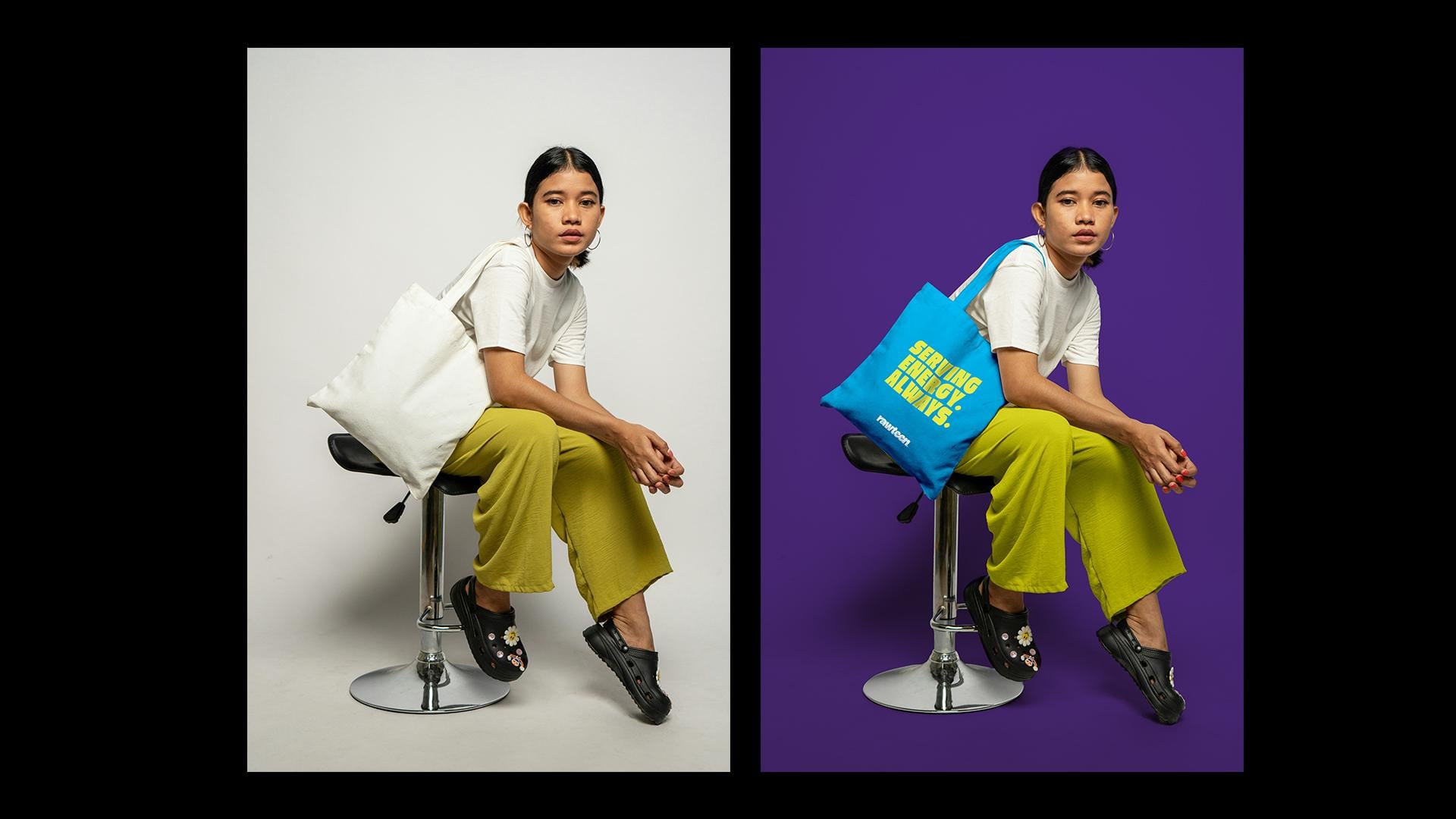
background or around the cap. Another popular mockup choice. It's a great way to showcase how the brand can expand
its activation efforts, and a toe bag is very much on brand with a
younger consumer. So this image caught my
eye for several reasons. It hits all the checklist
boxes of being clean. The background is neutral, so I can easily add color to it. The pose and the
type of model in the image fits with the
brand's consumer type. And the toad bag is
completely plain with a very minor crease that we can totally edit on Photoshop
and make it look natural. And Btus points for also
being able to color her pants and t shirt to match the overall color palette
of the brand. Now, more often than not, if a client asks specifically for a mockup of a store front, you won't have the
budget to create a high quality three
to render for that. And though there are
a lot of free and ready made templates
that you can use, I sometimes like to hunt for a more bespoke
store front feel. It's important to pick an image though that you can easily edit because you don't
want to overly edit it where it looks
borderline tacky. So take this image, for example, There's a clear space
where I can place my brand's logo and mimic
the same shadow angle. It's also easy to recolor
the storefront color. And for the window, I
can also cover it up placing a poster that says
opening soon or something. And then I can resize
or crop the image and remove the person
in the background to make it look more intact. Next up is human versus product. So part of the
presentation mockups, I like to include
images of people who look like consumers
interacting with the product. This one takes a bit of
time to find as there aren't any specific keywords
that just hit the spot. But in this case,
I type something like Gen-Z if I'm looking
for a specific persona, and it would also be
ideal in the pose itself if they look like
they're holding something, so I can place the
product on there. So in my case, for my
protein bar brand, these two images work because they both look like
the brand's consumer, and they look like they're
holding something. I can then recolor
the clothing and the background to match
the brand's color palette, and it will look
like a cool campaign or photo shoot for the brand, where the client can see
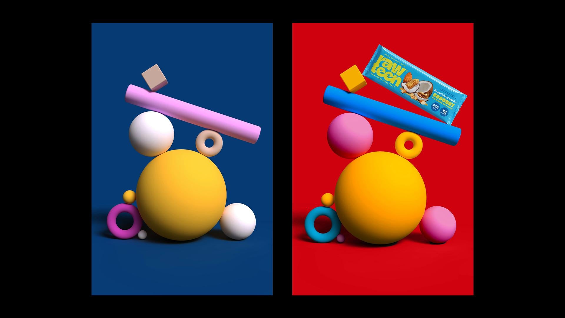
their product in action. And last but not least
is your wildcard option. Now, this category will differ from each brand
you're working on. This is where you can do
something unique and different. Maybe you can browse in the
three D render section or type abstract props where you
can place the product onto a cool setup and make it look like an
art-directed photoshoot, or it can be any other type of mockup that you feel
fits your brand. Maybe if it's a restaurant, then it can be a cool image of a coaster on a table or
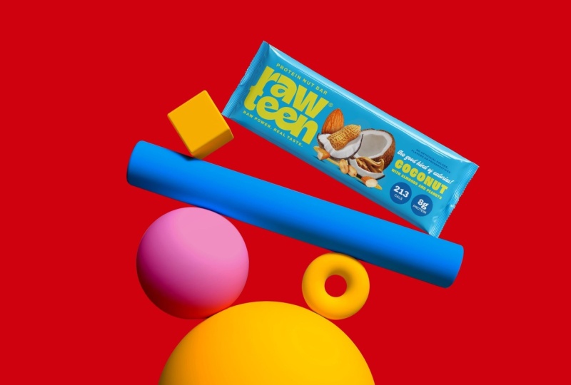
something like that. In my case, I found
this image of three D rendered shapes of cylinders
and balls and squares. It looked very playful
and bold and interesting, and I thought I
could place one of the protein bars tilted with an ankle onto
one of these shapes, and I can then easily recolor the background and
the shapes to match the bar. This is just a cool way to
showcase the product in a different light instead of
what you can typically see. Alright, now that we have
our image lineup pretty, let's head into Photoshop and start bringing
these mockups to life.
4. Mockup I: Cap: All right, so this is the first category of our
image references, the cap. And first thing that
I'm going to do is that I'm just going to double
click on the background, and I want to remove
this logo here. I'm going to go to
my Rectangle Marquee tool, select that logo. Edit, fill content aware. And that's gone,
looks nice and clean. Then next, I want to remove this background over
here because it's a little bit too distracting and I think a solid color
would work best. So to do that, we're going
to go up to select subject. And that's just going to select the main subject in the
photo if it's clear enough, which in my case, is the model. And what I want to do next is I'm just going to
invert that selection, Command I, and delete it. And then we're going to
add a solid color from our fill and adjustment
pop down menu here. Go to solid color, so
that's interchangeable. And I'm just going
to select any color for now. I'm going
to change it later. Let's go with orange. Great. And then, as you can see, when I selected
the subject tool, it doesn't really cut everything so perfectly,
and that's okay. It just removed 95% of
the hard work for you. So in order for it to
look a little bit clean, I'm going to have to
go in with my pen tool and just manually clean up these areas so that it's nice and smooth and
everything is clean cut. All right, great. Now that's all cut and smooth, I'm just going to convert
my main layer here into a smart object
because I want to add some levels and lighting to it just to brighten
up a little bit. We're going to turn this
into a smart object so we don't make any unredeemable
damages to our image. Again, in my adjustment layer, I'm just going to go to levels or you can click Command L, and I'm just going
to play around here with the levels
a little bit just to brighten the shadows
and highlights a little bit because it's a
little bit dark for my liking. And I'm also gonna add a
tiny little bit of curves. And just add a clipping mask
to that image. Okay, great. Now instead of adding
a logo to the cap, I think I'm going to add a cool phrase from the brand
messages that I made for this brand because I think that no one is going to buy
a cap with a logo on it. Instead, I just want to put a cool message from the brand
phrases that we have here. These all reflect
the brand's tone and voice and witty character, and I think that's just going to suit something like
a cap so much more. So let's say I take
one of these phrases and I just type in
certified snacker. I think that's just something a lot of people are
going to relate to. It's going to be a cool
thing to put on a cap. As for the cap color itself, I think I'm just going
to go with purple, copy the hex code, and then jump back
into Photoshop. So in order to add the
color onto the cap, I can either draw manually around the
cap with my pen tool, or I can just go up ahead
onto select focus area. Give it a minute,
and it's going to detect the sharpest
part of the image. Now, you can play around here
with a slider until you're satisfied with the
selection that it made. I will have to eventually
go back in with my pen tool when I'm
editing the mask, but this just streamlines
the process, as you can see. When you're happy
with it, click Okay. And while the selection
is still active, we're going to add a solid
color from our fill layer again and paste the hex code that we copied from Illustrator. And then I'm just
going to select a blending mode that
matches my image. Whatever looks the most natural and just
what makes sense, you can play around with this. Okay, and then make
sure to select the mask window of your
layer here with my pen tool, I'm just going to draw around everything that's basically not the cap that has
the purple color on it in order to delete
it from the mask. Once you have your selection,
just click Delete. And on the opposite
hand of that, I want to add color
to the strap. I'm just going to draw
around it with my pen tool. And then hit X on your keyboard
to invert that selection, and that's just going to
add color to the strap. So I'm going to repeat that
for the remaining straps on the left and behind
her hand up top. I'm going to go back
to my Illustrator file because I want to change the background color to one of our brand colors since orange
isn't really a part of it. I think I'm going to go with the bubblegum pink
as I feel like it might be complimentary
to the purple cap. Copy the hex code,
go back to the file, and just double click
on the orange layer. It's that easy and
paste the code. Okay, great. Now that that's done, I want
to go ahead and move on and start putting our
phrase on the cap, which I typed earlier
certified snacker. Now I have pre downloaded this mockup
from Graphic Burger. It's also free. I just wanted it to have this
embroidered effect. It looks a little bit more
natural on a cap rather than just paste the flat typography
on the cap straight ahead. It's just going to look like it makes more sense when
it's embroidered, and it's a free mockup
that's readily available. I should just plug in my phrase and copy it back onto my mockup. Now, as you can see, the
mockup already comes with a skewed angle that doesn't
suit the angle of our cap, we're just going to have
to do minor adjustments using this que and warp tool just to make sure that it suits the angle of the cap that's
skewed a little to the right. I'm just going to go ahead up to edit, transform and skew. I'm just going to play around
here with the angle until it makes sense with the
placement of the cap. Then I want to use the
warp tool here to create these irregular waves
and creases onto my phrase because the cap naturally has these creases when it's worn because nothing is ever naturally
super straight. If you're ever unsure of the
angle or if you feel stuck, you can always put back
the original image on top of your mockup and see exactly where the
original logo was placed and you can mimic
this exact same angle. For example, if I were to lower
the opacity of the image, I would see exactly where
the Jack Mus logo was placed and I would go off
of that as a reference. And if you notice the cap is sort of darker
on the left side, there's sort of a shadow
hitting it from the left. So I want to mimic that
same shadow onto my phrase, so it looks like it's blending
in with the cap better. So I'm just going to
create a new layer and select my certified
snacker layer below. Then with my brush tool, I'm just going to
select a darker color of that lime yellow. And ever so slightly
just brush over it, lower the opacity, and add
a multiply blending mode. Then likewise, I'm going
to add some highlights on the right side where
the light hits it. Pick a lighter lime yellow
shade and brush over it. And select an appropriate
blending mode for that as well. As an extra tiny little step, I want to add an extra
shadow on top of the phrase. I'm just going to
add a new layer. Again, with my brush tool, I'm going to select just a
darker shade of the purple. So the shadow actually
goes over the phrase itself and not just within the
word, if that makes sense. I'm just doing
this very lightly. I don't want it to
be too overpowering and I have a light opacity. And with the same
line of thought, I want to add a highlight
on top of the word itself. So I'm just going to pick
a very light purple shade and with my brush tool, also apply that on the right
side where the light hits. Okay, and then I want to add just a little bit more
dimension to the word itself. So I'm going to go to FX down below and create a drop shadow. You have to be very
careful with this, so it doesn't look too tacky, so I'm just going
to do this very, very light handedly as well. Click multiply,
adjust the distance. So it just shows that it's slightly protruding off the cap because when it's embroidered, it's going to seem
slightly lifted. So there's naturally going to be a little bit of a shadow, but nothing too much. Okay, great. Now that
looks good to me. Next step is that we want
to recolor her t shirt, her nails, and start matching the aesthetic
of the overall mockup. So what I'm going to do is
I'm gonna pick colors from my Illustrator palette
and add them as solid colors and then
start editing their masks. Okay, so after I added the blue, I realized it's way too
many colors in the mockup. I just prefer to be
more monochromatic. I'm just going to copy the purple color and
change the blue to purple. Super easy to change your mind and increase
the opacity a little bit. Okay. And then we can tackle
the color of her nails. I think I want them to be this
lime yellow color just to add a little bit of
symmetry here and there, and I think that it's going
to make it so I'm just going to go over to Illustrator and copy the hex code of that shade, create a solid color
layer, invert the mask. Then with my pen tool, I'm just going to draw
over each individual nail. Now that the nail
colors are masked on, I'm just going to
go ahead again in the blending mode and
select the one that fits the most Oh. You can always add another
blending mode on top of the one you have just to make that seem even more realistic. Now, this is me
being nitty gritty, but the color of her
lips is actually one of the primary brand
colors in Rawteen, which is that fiery red. But I want to make it
pop a little bit more. It seems a little bit faded. I'm going to go back
to my Illustrator and copy the color code of
our primary brand color, head back into Photoshop, create a solid color layer, paste the code, And
then with my pen tool, I'm just going to draw over the natural shape of her lips, fill in that color and go in and correct it if I need
to with a brush, just so it looks a
little bit more natural. And then as a last step, we want to create
a new layer and select that color
layer where we can add a shadow to the inner corner
of her mouth on the left because that's where the shadow naturally hits her
face beneath the cap. Set the blending mode to
multiply and adjust the opacity. Okay, great. As a
very final step, I just want to add some
dimension to the image by adding a very slight gradient
behind the model. So I'm going to go to my
gradient tool here and select a slightly darker pink
shade than the background. And at the endpoint, I'm just going to select
the background color. I'm going to draw
the gradient from the bottom left
to the top right. And go to my blending mode and select multiply and adjust
the opacity accordingly. That's just going to give
it a nice little dimension instead of a solid background. And then, likewise,
I want to add a little bit of highlight
at the top right corner. So with my big brush, I'm just going to do that
and adjust the opacity, soft light and really
lower that opacity down, so it's very subtle. And there you have it. This is the final outcome. The great thing about
this exercise is that you now have a customized
mockup in your library. So in your future projects, you can just go in, plug in the new colors,
replace the logo. I'll take 5 minutes
and you'll have a really nice unique mockup for any project that
you create afterwards.
5. Mockup II: Tote Bag: All right, so next
up is our toad bag. We're going to go about it
the same method as the cap. First thing that we
want to do is go up to select subject, and then we're going to
hit Command Shift I to select that background layer so we can isolate
a color for it. And while the selection
is still active, we're going to go
to our fill layer here and click solid color. And then change the
blending mode to multiply so that it preserves the natural shadows
that are already there. Then we can go to our
Trustee file over here and select a color from
our brown palette. Maybe the purple again, for the background this time. I just paste the hex
code. Alright, cool. Now, like the previous mockup, the subject tool doesn't really cleanly delete the
subject that you want. So I'm just going to go ahead and clean up these lines with my pen tool so that it's not
so squiggly and sloppy here. I just wanted to look a
little bit more clean. So this is where you
can manually go in with your pen tool and start
deleting these wide areas. All right. Now that that's nice
and clean and crisp, we want to now start adding
some color onto our toad bag. I'm going to go back to my
Trustee Illustrator file, and I think I'm going to go
with this turquoise color as it's a nice contrast
with the purple. G to copy that hex code, go back to Photoshop, add a solid color
layer, paste that code, go to my mask, invert
it, Command I, and now we can zoom in and start coloring that color code with our pen tool onto the mask. All right. Now that
the whole tote bag is selected and
inverted with a mask, you can go ahead and pick the blending mode that
makes the most sense. But because the tot
bag was already white, this is just going to make
things so much more easier. So I'm just going to
select linear burn, which is the most
suitable option as it preserves all the
shadows over here. Now I just want
to adjust some of the levels and the brightness
of the toad bag from here. I'm just going to select
my original image and then select the toad bag
part of it from the mask. I'm going to add a levels layer, clip mask it, and then adjust some of the layers just so it's
a little bit sharp. Alright, super. I'm
happy with that. Now, the color of her pants
are already the slime, yellow green that we have from our brand palette here,
which is this one. So I could leave it as is, but I just wanted
to be a little bit punchier because this brand
is already super loud, super bold, super saturated. So I think all the elements
in the mockup need to have that same flavor
and character. So I'm just going to
copy the hex code, and I'm not going to
make it as bright as this yellow here because I think that's a
little bit too much, but I do want it to just have a little
bit more of a punch. So I'm going to add a new
solid layer, paste the code, invert, and then I'm just going to select
my pants over here. Okay, now that I have
my color selected, obviously, this looks
crazy right now. I'm just going to go
to my blending mode. And I want to select something that's very, very, very subtle. So I might do something
like color and then duplicate that and go
over to soft light. And then I'm going to
lower that opacity down. So if we just hide these two layers here,
you'd see the difference. You see how that just
gave it a slight punch. This looks a little
bit faded out, whereas this looks
much more in line with the brand. Alright, cool. So next up, I want to add what's going to be written
here on the toad bag. So kind of the same
thinking like the cap, no young person wants to carry a toad bag that has just
a brand logo on it. People want to carry
cool toad bags. So that's the kind of direction thinking you should be
thinking about your brand when you're creating
these mockups of how you can push the brand
further forward. So I'm going to go to
my Illustrator file here of cool brand phrases
that I've already created. And the one I like the most for this toad bag is serving
energy always because it sort of has a double meaning on the protein bars actually
serving energy literally. And it also has a
figurative meaning where Gen-Z Z audiences use this phrase serving as
part of their culture. So that blends that
tangent point perfectly. So I think I'm just going to copy this whole
phrase on its own. I do want to make always the
same font as serving energy, just to keep it
nice and uniform. And I think instead
of this warm yellow, I'm going to make it
that lime yellow green. So it sort of has asymmetry
with the color of the pants. Again, I don't like too
many colors in the mockup, so it's not super distracting. And same exercise as the cap. We want to twist and lay that phrase in
accordance to the angle of the toad back and
pay attention how the toad back dips here in the middle where
there's a slight wave. This is where we're going
to use the warp tool to create that wave in our phrase. So you just want to
keep zooming in and out of it and adjusting
as necessary, but I think that wave
is good enough for now. And next thing I want to do is I just want to add a
slight shadow that just cuts through the phrase over here just like it
does on the toad bag. Okay. Always zoom out and adjust,
but as you can see, that shadow already made it look a little bit
more realistic. Okay, and the very last
thing is that I just want to add the logo here at the bottom, just so there's a little
bit of a brand presence. And there we go. That is the final outcome. I'm going to leave
her T shirt as is. I think the white is a nice
break between all the colors. If I add another color, it's just going to
be way too much, and I want the focus
to be on the bag. That's the hero. And
I just wanted to show you how easy and simple
some mockups can be. Don't have to spend
tons of hours on it. This is just to the point. But everything about the
composition and the choice of the image initially is what
made it this successful. So that's it. This mockup in a brand presentation
would elevate the brand so much
further and create a much more complex and
richer vision for the client.
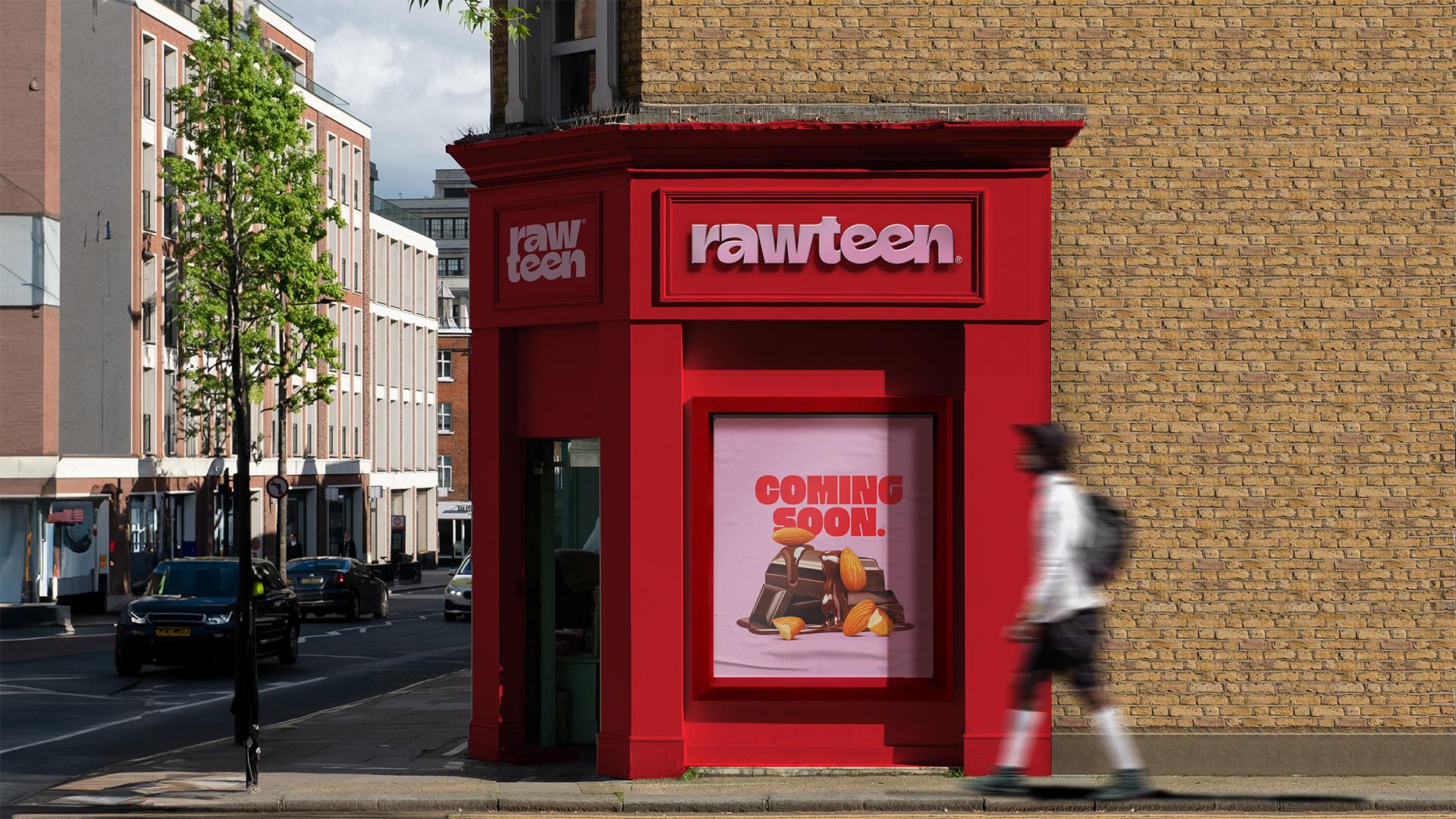
6. Mockup III: Storefront: Alright, welcome to the
storefront mockup section. I'm really excited to
show you how we're going to transform this image, as it's not very
typical for a mockup, but it's a great way
to help a client envision what their store
would look like without actually having to render or outsource a three D
designer to do that. So first things first, I'm just going to double
click on my image. And I want this image
to be the size of my presentation slides,
since it's landscape, so I'm just going to go here to canvasize and I'm going to scale this to a 1920 by 1080
pixel presentation slide, but while still preserving
the image pixel, so we don't downgrade it. Okay, great. And then
we want to start removing some of the things from the image using generative fill. So again, the visual hero of the mockup would
be the storefront. We don't want any more
distractions than that. You're going to go to your
rectangle Marquee tool here, and the first thing I'm
going to do is I'm going to remove this person
in the background. So just select that person. Go to Edit, generate a fill, and leave the prompt empty.
Then click Generate. And I'm going to do the same thing for
the bench over here. And then I'm going to just click on my original layer here, and I just want to
fix this sidewalk. So I'm just going to go
to my selection tool again and select this
part of the pavement. I'm going to copy it and then Shift Command
V copy in place. I'm going to move the sidewalk. To the left, and
I'm just going to take my brush and
just very lightly delete over the parts until it kind of smoothly matches
the rest of the image. It doesn't have to be perfect. This is just for
realization purposes. But it does need to
look somewhat neat. And there we go. We just have a nice clean sidewalk
for our storefront. Okay, great. Then I
think what I want to do is I want to complete
this brick wall all the way over to the
right so we don't have this massive brick pillar here obstructing the
view of the store. I think I'm also going to
cover the sign over here. Again, with my layer selected, I'm just going to select
this part of the brick wall. It's sort of like
clone stamping, but this is sometimes
just easier. I'm just going to select
this part of my brick wall, copy, paste in place. Take the layer on the top, and you just want
to move the layer. And we can also do the same
thing on the right side. And then we can do the same
thing over here on the right, so the entire image just
extends to the right. Copy brick part of the image, paste in place, take it
to the top and move it. Okay, so that's just
setting up our image and just deleting any extra obstructing things
in the background. So all I did was just take the brick pattern over on the
top and some on the right, and I just kept duplicating the brick patterns till I
covered the entire wall. And I also did the
same thing with the trim of the wall
and just adding extra pavement just
so we can have a nice clean view of the storefront without
any obstructing elements. Alright, I just flattened
out my image here just to clean things up a
little bit in the sidebar. I'm going to go ahead now and select the logo on the shop. With my rectangle Marque tool. I'm going to go to edit
and generate a fill again. And that's going to
be nice and clean. And you're going to want to do the same thing for the rest
of the things on the store. So these two icons here and this little button
here on the store front, leave the window as is for now. Okay, great. And now we
want to start adding color to this front
of the store. So same process as before. I'm going to go to
my Illustrator file. And because the
primary colors for Rawteen are these pale
pink and fiery red colors, I think those should be
the primary brand colors on a store front as it
represents a brand. So I think I'm going to go for this light pink color as
the main store color, and then we can have the logo and the coming soon
poster in red, so it's a little
bit more catchy. So I'm going to do a
solid color layer. And invert the mask just
so we have the color on. And then to select the store, I'm going to go to
my original image here and I'm going to go
to Select and subject. And it's going to somewhat
select the store for me. We're going to clean up
those areas manually later. So with that selection here, I'm just going to
go to my color mask and delete it so it
applies the color on it. I'm gonna go to my
blending mode and select the blending mode
that makes the most sense. I think, in this case, it
would we color. Okay, perfect. And then still
selecting the mask, you're gonna delete everything
that you don't want to be pink. Okay. Okay, next up, we want
to start adding the logo as like a metal sign here
and again on the left. So I already pre downloaded this free mockup signage that I'll use just to plug
in my Rawteen logo. Again, this is just to
streamline your process. It's for free. It's available. So I'm just going to
plug in my Rawteen logo here and then take it back
to my store front mockup. M Okay, great. And then we can open up the
effects that have already been pre made in
the logo effect. Okay, so I think the shadows
are a little bit too blurry and harsh for what
the picture was originally. So we can go into the
shadow folder here, go into effects, and they have multiple drop
shadows already placed. So we can play around with the effects and the settings
of the drop shadows until we kind of reach the outcome or the look
that we're looking for. Same tip like before, if you ever feel
lost or you don't know exactly which direction
the shadow should be, you can always refer back to the original image and try to complete it
as best as you can. Okay, great. Then
what I want to do next is I want to
go to my logo here. And onto gradient overlay, this is where they laid over
the gray silvery effect. But I'm not going
to make it metal. I want it to be the red color
of the brand color palette. Okay, cool. So that's basically
the gist of the exercise. You're just using
the same settings that were available in the logo mockup here and you're adjusting
them to your image. I'm probably going to go back and spend more time crafting and polishing and making sure I'm comfortable with
how the signage looks, but this is for now
a good place to be. I also want to add my secondary
logo here at the front. So if your logo has an icon, this would be perfect
to place here. But in my case, the logo is just a vertical
stack of the logo. So I think I'm going to copy that onto the front
side of the store. Now, the next thing I want to do is instead of having
an empty window here, we can actually put, like, a coming soon poster. So I already prepared in advance a poster that I
want to put on the window. So this is actually one of
the product shots that I created for one of the
chocolate almond bars. So I'm going to copy this poster onto my mockup. No. Okay. We can lower the
levels a little bit. And then we can also
add an inner shadow because there's already a
shadow inside the window, so that would be a natural
shadow that covers poster. Let's go to my settings here. And then we can also add a poster effect onto the
poster very slightly. I don't want it to be too much. I got this from Unsplash. It's for free. Okay, cool. And then as for this
frame around the poster, I think it looks a
little bit shabby. So I went ahead
onto Unsplash and I grabbed another window frame that I will use for the mockup. These are very,
very small details, but when they're put together, they really do
make a difference. So I just want to
copy the frame, not the window,
not anything else. And then go back to my mockup. Okay. And then we can
just recolor the frame, and let's just throw on the same shadow that's existing here on the frame so it
matches the lighting. Okay, I'm just playing around
here with the frame colors, and I added an extra white, lowpase layer over the poster just to give a glass effect. And I'm just going
to keep exploring the different frame
options until I'm happy with how
the store looks. So you're basically acting like the designer
of the store front. You're just going to see
which colors work best. Maybe you can change the poster. Maybe you can add
different things until you're happy
with how it looks. You're essentially just
showing the client what will make people
stop and enter the store. So I'm just going to keep
playing around with the colors. Until I reach
something that I like. But before we get to
the final outcome, I do want to just show
you the last thing that I want to add to this mockup, just to make it even
more realistic in a way, to fill up this
space on the right and just make it seem
a bit more realistic. I downloaded this
image off on Splash, as well of just a passerby
person walking past the store. Just want to add a walker to
the mockup and then create a motion blur to
it just to make it seem like it's literally
captured in real life. So I'm just going to
go to select subject, and I'm just going to literally
just cut this person out and add him to my mockup. And I'm just gonna duplicate
the person, Command J. And then I'm going to
create a silhouette of him, which is gonna be my shadow. I'm just going to
go to distort and just throw his shadow in
front of him on the sidewalk. Go to filter, motion blur, make the ankle zero,
so it's sideways, and I'm just going to blur
him out like he's walking. And then as for the shadow, I'm just going to blur that shadow out as
well, not too much. You can flip the perspective if you want it to
be from behind. And there you go. It's just an extra little step that'll just make the mockup
even more believable. Okay, and that's pretty much it. I'm just going to
keep spending time just refining the
shadows under the logo, maybe playing around more
with the colors of the frame. Maybe I'll interchange
the pink and the red of the storefront until I'm happy
with the outcome. Okay, so I've played around
with two color combinations, the pink store with
the red signage, and the red store with
the pink signage. And I think I prefer this one. It just looks a lot more neater. I think maybe the red store will be more attention
grabbing in the street, the logo looks like
it has more presence. And I just kept the frame around the window monochromatic, just darkened it a little bit. And that's the great thing about these mockups that it's
just easy to change colors and sort of decide for yourself after laying
out everything, what makes sense,
and what doesn't. Alright. And then there you go. This is the final outcome for our customized store mockup.
7. Mockup IV: Human vs. Product: So this category
of mockups is less about putting your logo
somewhere just to showcase it, and it's more about showing the creative part of the brand, how your customers
interact with the product. And it's more about creating a mini photo shoot in the presentation just
so your client can envision the brand
further beyond the logo and the packaging
and all the collaterals. So I'm just going to
double click my layer. And what I want to
do here is the pose of the model is sort of as
if she's holding something. So I just want to lay
here the product, and I want to change the
color of her clothes to the brand colors as well as change the
background color. So let's go ahead and
do the ladder first, and then we're going
to place the product in her hand at the very end. So same exact process as
all the previous mockups, we're going to go ahead
to select and subject. Solid color fill and pick a
blending mode. Alright, cool. And then next up, I'm going
to pick one of the colors for her shirt. Invert the mask. Go in with your
pen tool and start drawing over the item that you want the color
to be applied to. Next up, we can start
picking a color for her pants onto the pent tool. Just a nice pop of color there. I think I'm going to leave
her tank top white as it is. It's a nice neutral color
to break up all the colors, and I don't like to have more than three colors in the mockup or else
it's just too much. So I think I like it
so far, like this. I might adjust and
tweak after we place the bore and
assess afterwards. Okay, so now that we
have the base and the brand colors in place,
all interchangeable. I have here the mockup
of my protein bar. This is what I use to
present the client, and it's also a free
mockup that I found. It's very basic. I
don't need to go and find a bespoke for this. It needs to be functional,
and that's what it is. But the great thing about
this is that I can just reuse this bar here
onto my bespoke mockup. So I'm just going to drag
this over to my file here. And I just have now
a reusable bar. So I want to place the bar in between her hands in a way
that she's holding it. Now we just need to mask
her fingers properly onto the bar. Okay, cool. And now we can just throw some highlights and shadows on the bar just so it pops more. We can do that by
creating a new layer, select the bar itself, and I'm just going to use
a white brush, honestly. Nothing too fancy. Okay, cool. And now we can
actually take some time to play around with the colors.
We're basically done. We just need to figure out
which brand colors work the best that serve the product and the bar and the
packaging most. Okay, so maybe I like
this color combination a little more just
because I feel like it makes the bar pop better with the pink against
the turquoise blue, and I like the pop of lime
yellow down below better. It just feels a bit
more balanced to me. So feel free to
keep playing around with your version
until you feel like it looks balanced and easy on the eye and
aesthetically pleasing. So the last thing we're
just going to do, we're just going to add
some shadows or a gradient behind the model just to give the image a little
bit more dimension. Okay. Okay, and to just add a little bit
more drama to the image, I just added some eyeshadow, the same color as
the background, just to have a little
bit more pop and a little bit more
intension with the image, just to see like you
thought about it for a little bit and that everything is placed there intentionally. And we're done. It's really that easy and quick and simple. It's all about the choice
of your initial image in the beginning to make sure that it's easy to work with, easy to select and
change the colors. And then something like this
is easy to reuse afterwards. If you have a beverage brand
that you're working on, you can place the
beverage over here. It can really be
any other product as long as it can
fit in her hand. And if it's not that,
then you can pick a similar image that has
sort of the same function. Putting this image in a
presentation next to, like, a brand message or on a poster or a billboard or
something like that really helps the client envision
their brand and gives them ideas beyond the
typical logo suite.
8. Mockup V: Wildcard: Okay, so the Wildcard
option is one of my favorite kind
of mockups to do because you can literally
be so creative. You're the ones
putting the rules. It's not something the
client will expect to see. I always like to
include at least one of these mockups in every
brand presentation I do, and it differs for sure
from brand to brand. Essentially, what
we're going to do, we're not going to
do anything except change the colors
of these shapes and the background and just place our bar onto this empty
space right here, and we're basically done. So I'm going to go
to select subject. And shift command invert
to select the background. And just to make the red
a little bit brighter and not this crimson shade, I'm just going to adjust
the brightness of the original
background by hitting that layer and selecting
the mask part of it. And there you go.
Background done. Of course, we're going to go in, like before to clean
up those layers here. In between all the balls, you can just do
that with the mask. But for now, I'm just going
to quickly color the rest of these shapes until I like
a certain color combination. What's left is to just drag
onto this bar onto my mockup. And I just want to twist it and angle it in a way that it's just balancing
on the other shapes. And I'm just going to
select my whole image. I'm just going to slightly center it in the
middle a little bit. Super simple, super
easy, interchangeable. You can do this with
other projects as well. You can swap the product
with a different one, or you can take the same concept and just run with it
however you want. Think of this as just like a very unique factor aspect
that you're putting into your presentation alongside
all the other mockups that do make sense and that
are expected to be there. When you combine all
of these together, you have a really rich, complex visual presentation
of your brand.
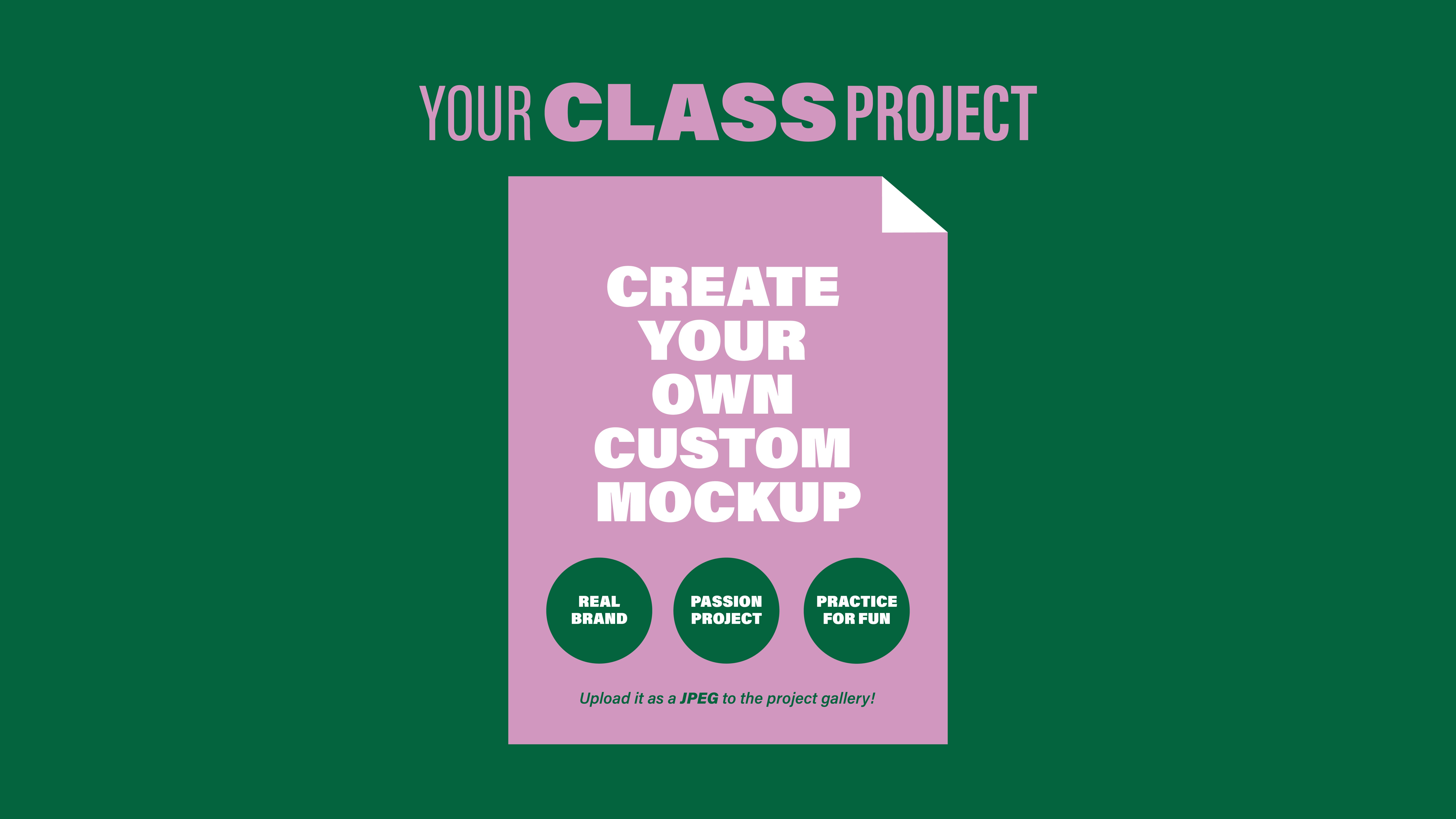
9. Class Project & Final Thoughts: For your class project, I want you to create at
least one custom mockup using the techniques
we covered in class. It can be for a real brand
that you're working on or just a fun personal
project. Up to you. I'll also link the
exact Unsplash images that I used in the resource
section down below. So if you want to follow
along and replicate some of the same mockups that
we did, feel free to do so. Or if you want to venture out
and pick your own images, then go ahead and do
that and make sure to upload them in
the gallery below. Remember, this is a skill that becomes easier and
faster with practice. So the more that you build
your mockup library, the more streamlined your
process is going to be, and you're more likely
going to be able to think and see like
an art-directed, which will completely transform
your brand presentations. If you found this class helpful, I'd really appreciate it if you could leave
me a review down below as it helps more
students discover this class, and it helps me continue creating more classes
like this for you. I can't wait to see your
custom mockups in the gallery. Thanks again, and I'll see
you in the next class.
 Khadija El Sharawy, Independent Designer & Art Director