Logo Redesign Challenge: 3 Creative Styles in 15 Minutes
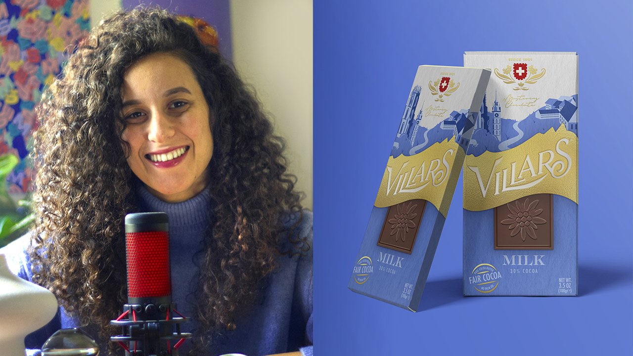
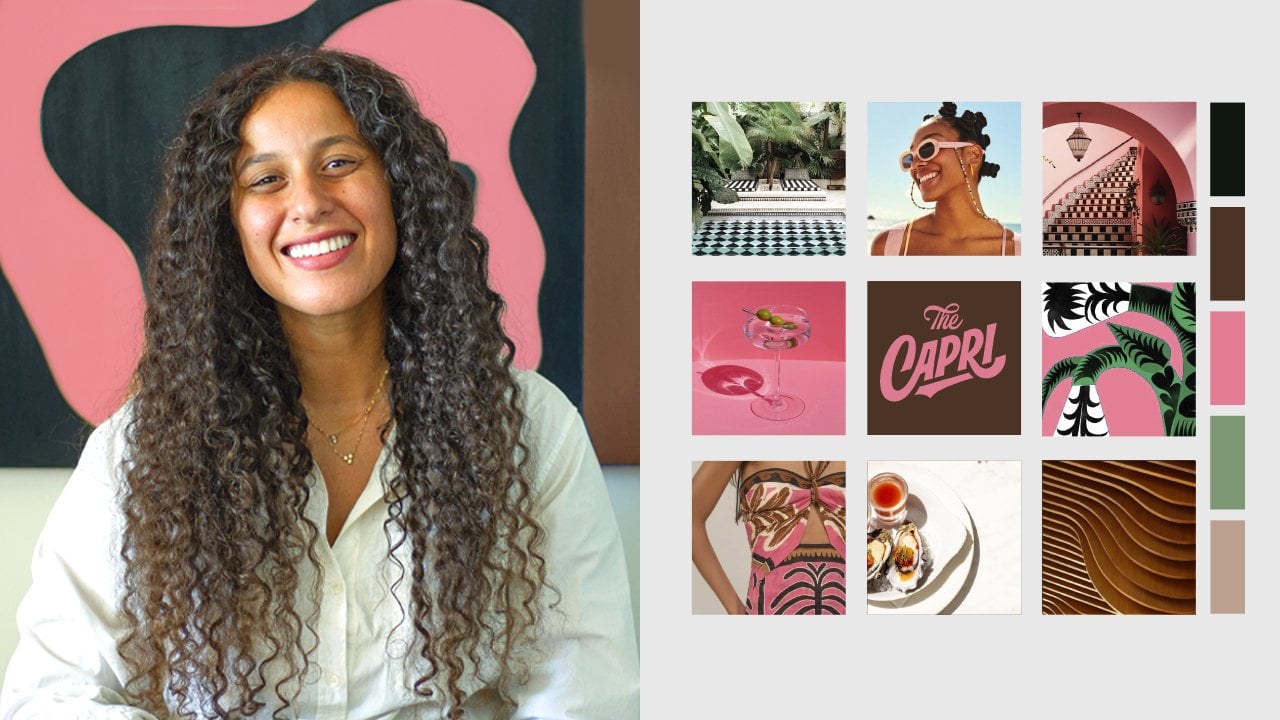
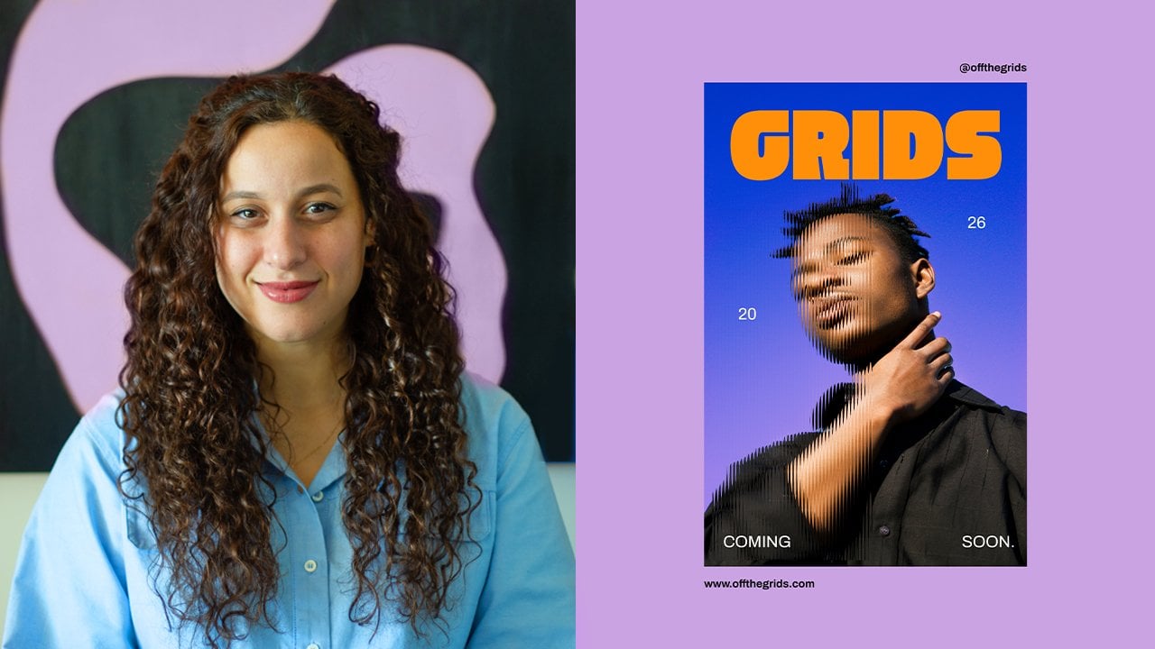
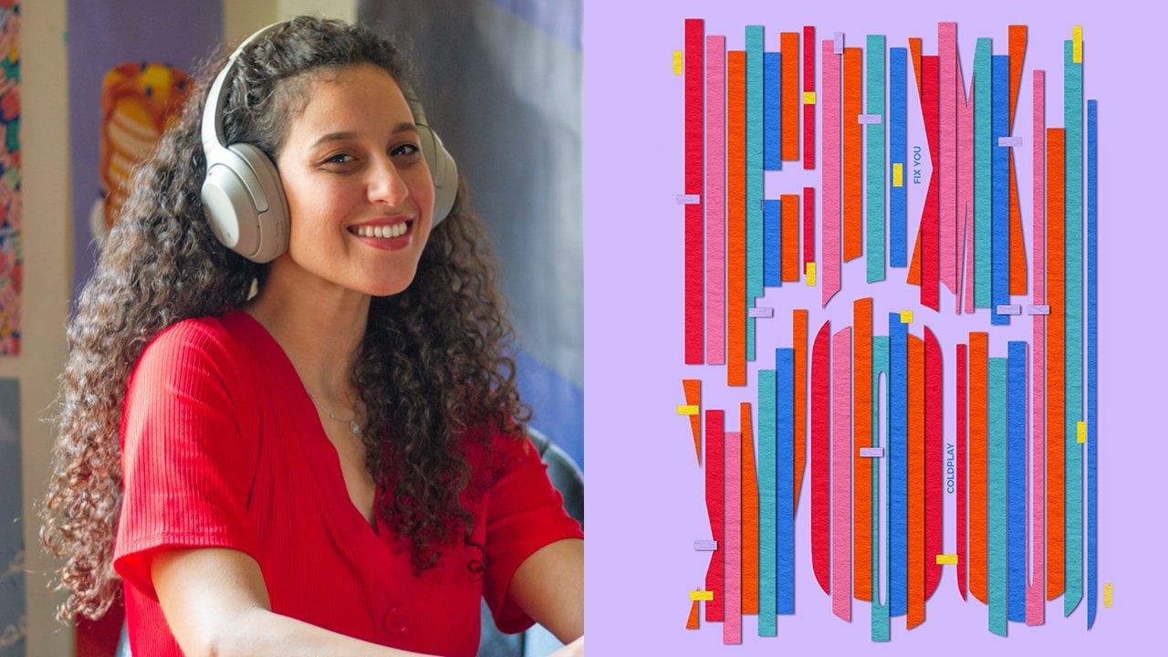
 Khadija El Sharawy, Independent Designer & Art Director
Watch this class and thousands more
Watch this class and thousands more
Lessons in This Class
-
-
1.
Introduction
1:03
-
2.
Logo Style 1: Vintage
5:01
-
3.
Logo Style 2: Retro
4:44
-
4.
Logo Style 3: 80s Action Figure
3:56
-
5.
Class Project
0:20
-
6.
Thank You
0:15
-
-
- --
- Beginner level
- Intermediate level
- Advanced level
- All levels
Community Generated
The level is determined by a majority opinion of students who have reviewed this class. The teacher's recommendation is shown until at least 5 student responses are collected.
237
Students
15
Projects
About This Class
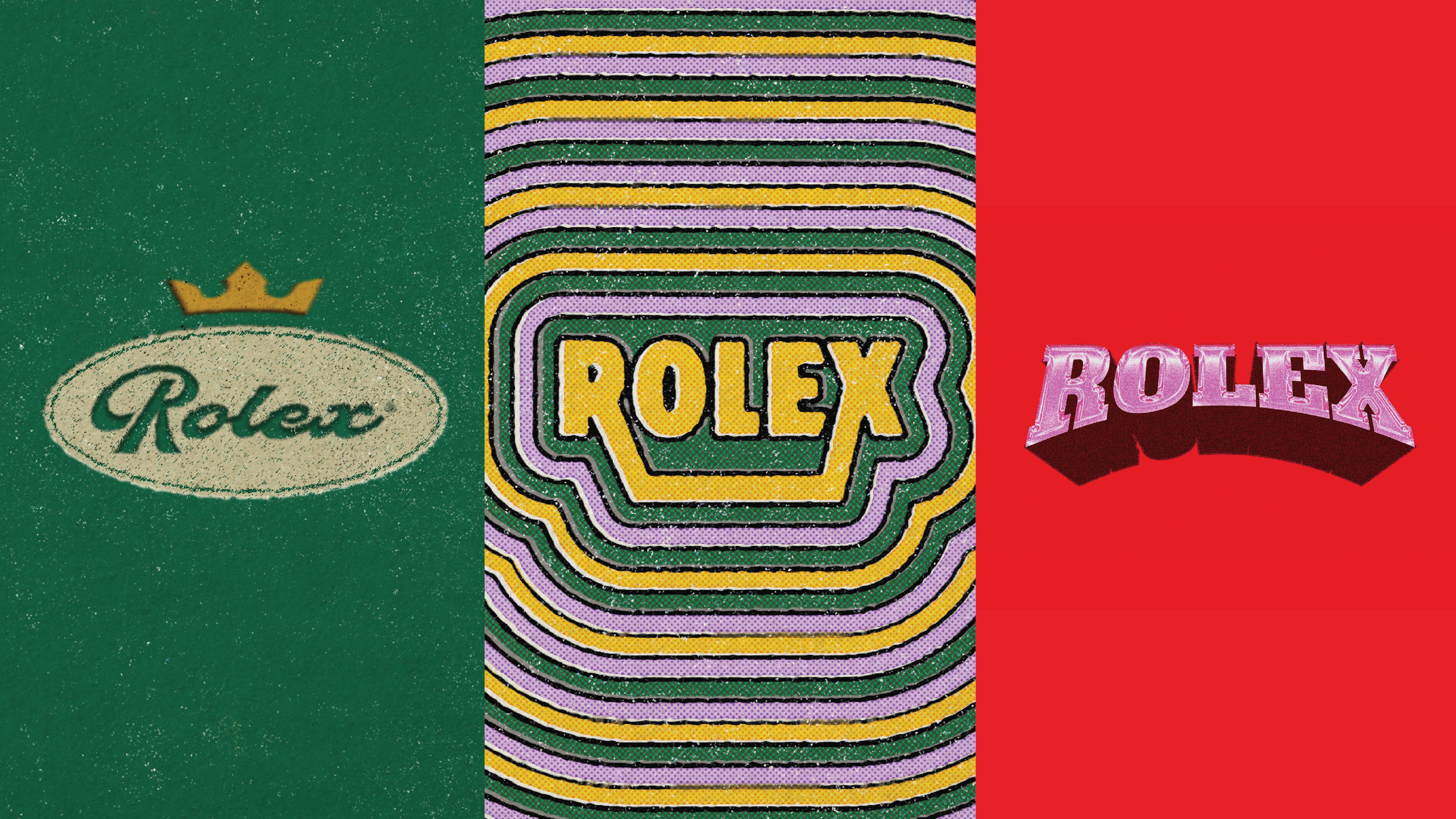
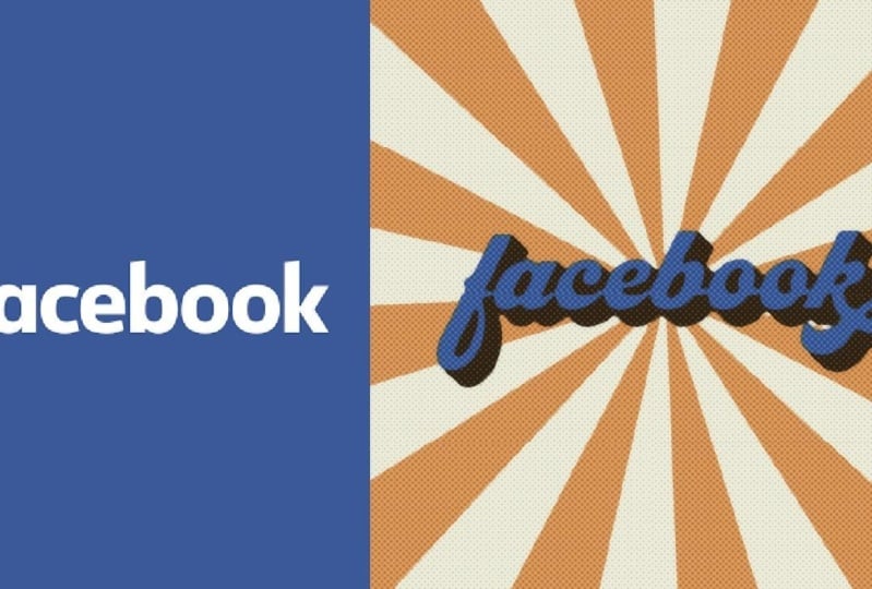
Ever wondered what would happen if you took a world-famous logo and gave it a completely different personality? In this fun and fast-paced class, we’re taking a classic logo like Rolex and flipping it on its head — reimagining it in a vintage, retro, and 80s action figure style. Whether you’re looking to sharpen your design skills, break out of a creative rut, or just want a playful creative exercise, this class is for you.
What will I learn in this class?
- How to reimagine classic logos using three distinct visual styles:
- Vintage – think classic typography with textures and aged aesthetics
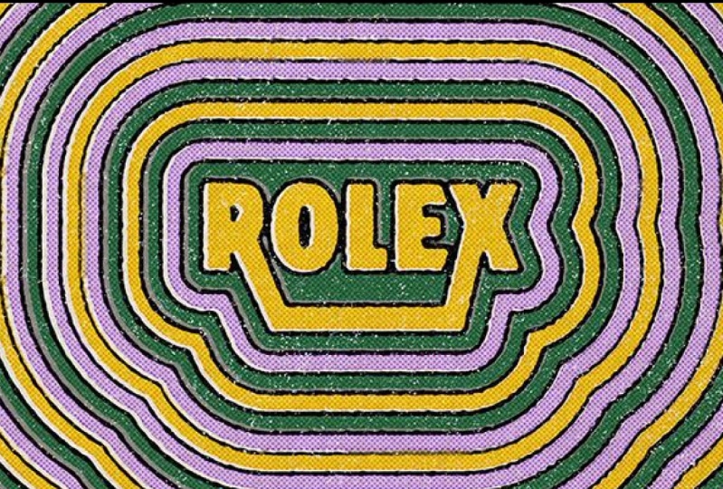
- Retro – bold, playful colors and nostalgic design motifs
- 80s Action Figure – high-energy gradients, chrome effects, and over-the-top typography
- Easy, effective tools and techniques in Adobe Illustrator & Photoshop
- Quick typographic treatments, textures, and effects to transform simple logos into standout designs
- You'll also get a downloadable Logo Redesign Workbook to follow along with step-by-step instructions, shortcuts, and extra resources.
What tools do I need for this class?
- Adobe Illustrator
- Adobe Photoshop
Who is this class for?
This class is best suited for intermediate designers or anyone with basic familiarity with Illustrator and Photoshop. The pace is quick — so you’ll get straight to the good stuff — but the techniques themselves are accessible, making this a great creative warm-up for pros and an inspiring, low-pressure exercise for newer designers.
If you’ve ever felt intimidated by logo design, this class offers a fun, playful entry point into the process. For experienced designers, it’s the perfect way to break out of creative habits and discover new tools, textures, and ideas to refresh your design approach.
Why should you take this class?
In a world where so many brands are moving toward minimalist, stripped-back “blanding”, this class encourages you to bring personality and character back into logos. You’ll not only walk away with three distinct logo redesigns, but also a toolkit of creative techniques you can apply to future client projects — all in just 15 minutes.
Meet Your Teacher

Hey you! I'm Khadija El Sharawy but everybody just calls me Dija (it's shorter and easier to pronounce). Born and raised in Cairo and currently based in Dubai. I'm an independent multidisciplinary designer, art director and design educator. I previously worked at a leading branding agency for 3 years but decided to fly solo and embark on a new path in 2020. I love building brands from the ground up, telling their stories and bringing them to life through brand identities, animation and packaging design. My most notable clients are Coca Cola where I had tons of fun designing their limited edition cans. My love for branding really stems from storytelling; I've always been a storyteller ever since I was a kid. My newest love is animation. Making things move in di... See full profile
Hands-on Class Project
Your project for this class is to pick any famous logo you like and reimagine it in a brand new style!
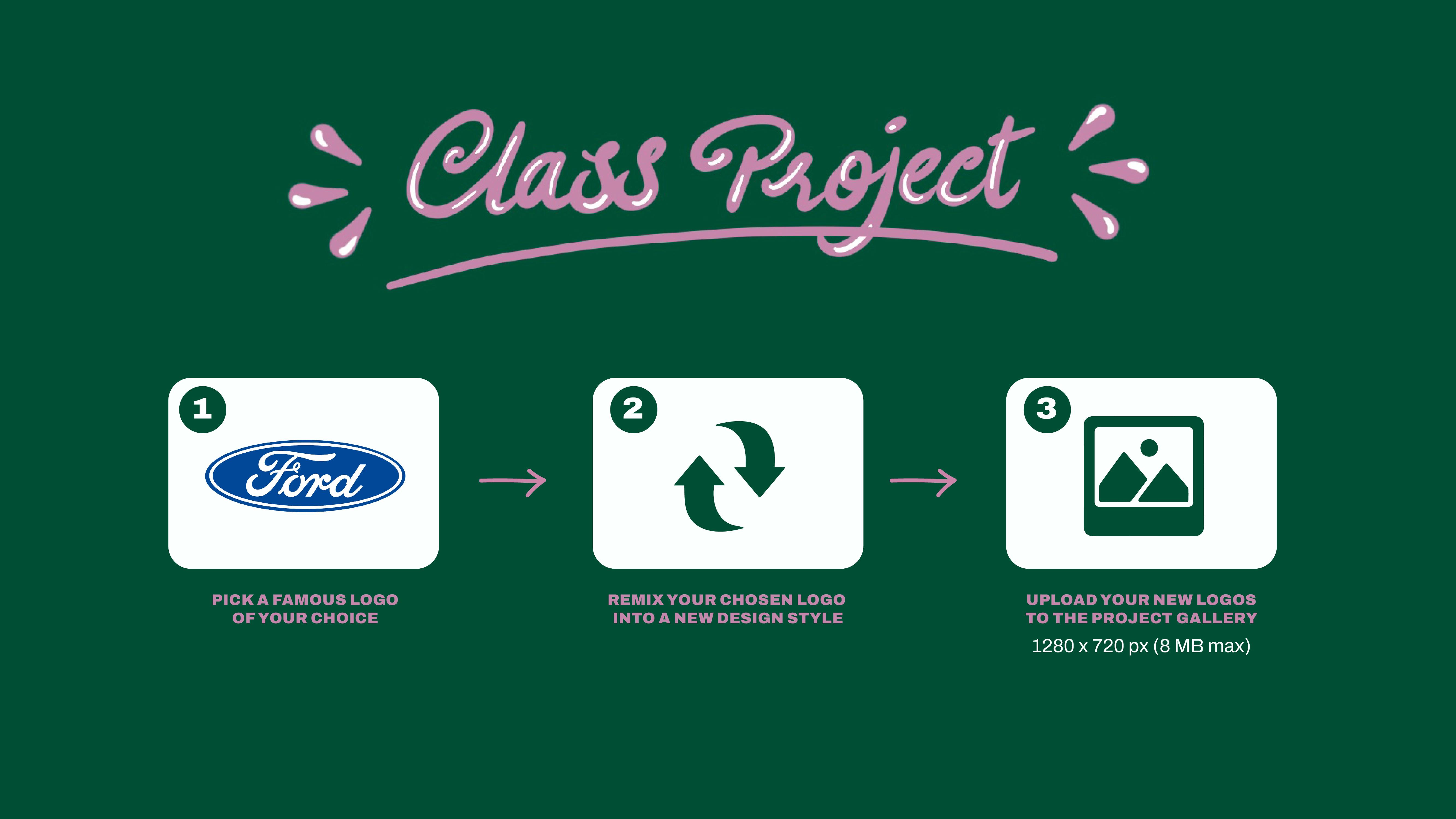
To make things easier, I’ve uploaded a PDF of famous logos you can choose from — but you’re also welcome to pick your own if you have a favorite brand you’d love to remix.
Choose one (or all!) of the styles we covered in class:
• Vintage – for that timeless, classic charm
• Retro – for bold colors and nostalgic flair
• 80s Action Figure – for that over-the-top, high-energy vibe
To help you follow along, I’ve put together a comprehensive Logo Redesign Workbook with step-by-step instructions, shortcuts, and links to helpful resources. Be sure to check it out in the Resources tab!
Grab your free textures from SpoonGraphics here!
When you’re done, upload your project in the Project Gallery as a JPEG file (1280x720 pixels) and a cover image (690 x 388 pixels) — and don’t forget to show a before and after so we can all see your creative transformation!
This is a quick, fun challenge designed to spark creativity and help you practice new tools and techniques in Illustrator and Photoshop, so have fun with it and make it your own!
I can’t wait to see your logo makeovers!

Class Ratings
Why Join Skillshare?
Take award-winning Skillshare Original Classes
Each class has short lessons, hands-on projects
Your membership supports Skillshare teachers
Learn From Anywhere
Take classes on the go with the Skillshare app. Stream or download to watch on the plane, the subway, or wherever you learn best.