Transcripts
1. Introduction: Glassmorphism. Yeah, that sounds
like something I definitely ignored
in biology class. But thankfully, it's actually just a really cool effect on Photoshop to create
stunning posters. And the best part is, it's surprisingly easy
and quick to learn. Hi. I'm Khadija, but
you can call me Dija. I'm an independent
designer, art director, and top teacher
here on Skillshare, specializing in branding
and visual design. In this class, we're creating a modern poster design using the glassmorphism effect
using free images and combining it with typography to elevate your poster skills. But beyond just learning
the effect itself, I'll also show you how to
make it feel intentional and well designed because small
choices like typography, spacing, and restraint are what actually make trendy
effects look professional. We'll start by creating
a simple texture in Adobe Illustrator, taking it into Photoshop to
create that glass effect. Refining the colors
into our image, then building a composition
for a modern poster on Illustrator using typography,
layout, and color. This class is
beginner friendly and perfect for creative, students, designers who want to
experiment and elevate their poster design skills without needing advanced
Photoshop techniques. What's great about
this technique is that once you learn
the fundamentals, you can transfer the skill to any other project
that you're working on, whether that's a music
poster or social media post, or even an album cover. The sky's the limit.
Ready to design your own glassmorphism
poster? Let's jump fight in.
2. Glass Texture: So to start out, I have
gone ahead and pre downloaded these three
images from Unsplash, which is a really high quality free image resource website. We will be using
these images to apply the glassmorphism effect on them and turn them into cool
lifestyle posters. Before we jump in a Photoshop, I want to take you
on to Illustrator, where we're going to build
our fractal glass effect. It's really easy and
simple, so don't worry. Okay, now that you've
opened Illustrator, I want you to go ahead
and click on File. And I want you to make the
size 1080 by 1920 pixels, and we're just going to name
this file glass effect. Okay, cool. So you have
your artboard setup. What we're going to do is
we're going to go ahead to our rectangle tool
here and click on it, and then we're going
to click once on our screen to prompt the size. So for the width, I want you to type in 25 pixels by 1920 pixels so it fits the height of the
artboard and click Okay. Now, the bar here
is set to a fill, white color, and a black stroke. We want to delete those and
stay on our fill color. And then we're going
to click on gradient. And you want to click once on
the slider to activate it. I want to pull this
black color a little bit right about there, like, a little bit more
than halfway through, and then you're going to
go to this little icon here where it says
reverse gradient. So the black is from the left going to white on the right. And then you're
going to just go to your selection V here so
you can have a precursor. Now we want to align this
bar to the very left of the artboard and neatly
tightened on the top. So you're going to go
to a line and click horizontal line left and
then vertical align top. That way, the bar is neatly pushed to the side and to the top where it fits perfectly. And then, essentially,
what we want to do is we just just
want to duplicate the bars all the way across our artboard so we just have multiple lines
next to each other. Now, we're not going
to do that one by one. We're just going to
duplicate 1 bar. We're going to click
on our bar here, and we're going to hold down
Option on our keyboard. We're going to find these
double cursors come out, and we're just going to
slide the bar to the right. And as I'm sliding, you want to hit Shift
on your keyboard, and you just want to nestle it right next to the
bar and then let go. When you let go, you're
going to go ahead and press down Command
D on your keyboard. And then keep pressing Command D. Until all of the
bars fill up the ardboard. And that's pretty much
our glass effect done. For now, you want to want
to go ahead to File, Export Export As,
name it glass effect. Go down to format
and click Photoshop. And then Export. Make sure it's RGB, 300 PPI, keep it selected in right layers,
and then click Okay. And that's it. Just keep this file saved
somewhere where you can access because we're
going to pull it on to Photoshop in the next bit.
3. Poster 01: Okay, and now you want to go
ahead and open Photoshop. When you open Photoshop, I want you to open
the first image. First thing we're going
to do is we're going to double click on our
background layer. Now, before adding
the glass effect, I just want to
brighten and recolor the background a little bit because it's a little bit
too dark for my liking. It's really easy and simple. What you're going to do is
you're going to go up to select and click subject. So what that did is it selected the object or the subject
that's in focus in the image, which in this case,
is the model. And we want to select
the background. So we're just going to
invert that selection. By clicking on our keyboard, Shift Command I, and that's just going to
invert the selection. Then we're going
to go down here to our fill layers and we're
going to click Solid Color. It just filled in the
background for me. I want to select a fun, bright blue sky color. This is completely up to you. I'm going to
go with that one. And then what I want
to do is I want to select both of these layers. And by clicking or holding
down Shift on my keyboard, I'm just going to drag
this down because I want to crop the image a little
bit, just like that. And when you're happy
with the selection, I'm just going to click Enter. And I like this composition
because I want to put on a big chunk of typography
right above the girl. So I want that empty space here, and I want her to fill
up the lower space here. Now, when you're happy
with the composition, we're going to flatten out
these two layers together by clicking Command
E on our keyboard. And now we add the
glassmorphism effect. So we're going to go on to Filter and click Filter Gallery. Now the window here
is super zoomed in, so you can't really
see anything. So you're going to go down to the minus sign here
and you're going to zoom out so you can
see the full picture. And then make sure
you're going to distort here on the side and clicking
on the glass effect. And then here we have
the glass effect, sliders and settings. So right now the texture
is selected to frosted. You want to go ahead and
select it to blocks, and then we want to insert the texture that we created
on Illustrator earlier. So what we're going
to do is we're going to go to this
dropdown menu here. And click Load texture. Then you're going to pull out
the file that you saved as a Photoshop file and you're
going to click Load. And you can play
around here with the settings of how
distorted you want it to be. So if you want it
less distorted, you can always
decrease the value here and play around
with the smoothness, but I like it pretty distorted. So I think I'm just
going to keep it at 19 and Smoothness ten, scaling at 50% and click Okay. And just to add a little bit
more flavor to the image, I'm just going to increase the saturation
just a little bit, so the blue pops out
a little bit more. The red is a little
bit more prominent. To do that, I'm going to
click on my keyboard, Command U, and I'm going to increase the saturation
ever so slightly. When you're ready to go, I'm
going to save this image. Now, we want to take this
image onto Illustrator, where we're going to add
some cool typography to it and a cool layout, some fun colors and turn it
into an elevated poster. So you're going to want to
open Illustrator again. But this time, I
thought I would change the dimensions to fit
to an Instagram post. So I'm going to
keep this at 1080, but change the height to 13 50. Now, I could make it the size
of the artboard and just, like, scale it up and
crop it like that. But I think it's going
to look much cooler if we center it in the middle
using our align tool, and we have a contrasting
color in the background. So to do that, we're going to go to our
rectangle tool here, and we're just going to
deselect the black stroke. I'm just going to plug
in the dimensions of the artboard 1080 by 13 50. And I'm going to
center my color onto the artboard and
then just send it to the back Command
open bracket. So there's a little
contrast between the blue and the lime
green and the red. Then I want to add a really cool typography up
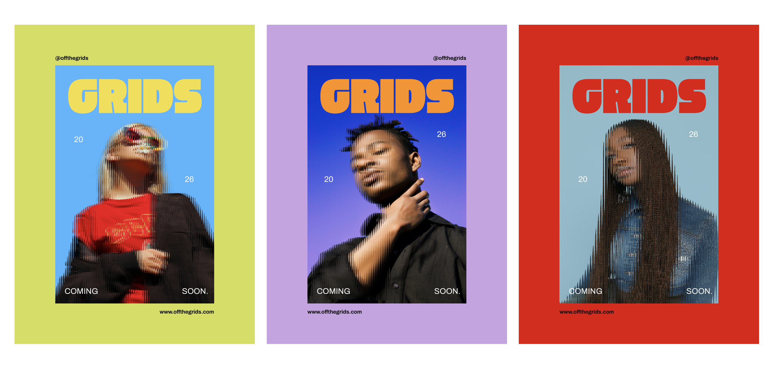
top here like a title for it. I'm going to grab my type tool and just drag it across here. Let's say this poster is
for a lifestyle brand, and let's say this lifestyle
brand is called grids. Then I'm going to
go to my type bar here and go to Convert
to point type. And holding down my shift tool, I'm going to just drag it
down so it increases in size. I really want to
pick a nice, chunky, thick font just to make it
really bold and eye catching. So I really like this font
that I have called Wker. You can open this window
by clicking Command T. And then maybe I want to
change the color to, like, a warm yellow So now what we want to
do is we want to add just very minimal
supporting text in little areas
around the poster. So let's say this
is a poster for an upcoming lifestyle
brand called grids, and it's like a teaser poster. So I want to write coming
soon and 2026 somewhere. So I'm going to grab
my type tool again. And again, using point type, I'm just going to increase
the size a little bit. So I think maybe
I'll have coming on the left and then
soon on the right, so it's a little bit more
interesting composition wise, instead of writing coming
soon all on one line. And then maybe we can change the font to something
a little simpler because when you're working
with subtext or body text, you don't want it to
compete with the title. So something like very simple, like a nice samsara font. Okay, so I'm gonna go with
Kibo. Same thing as Blow. Instead of writing
2026 all on one line, this just makes it a little
bit more interesting. And to add a little
bit more interest, I'm going to make
it a little bit asymmetrical by
pushing up 20 and pushing down 2026.
All right, cool. And then as a very final touch, we can maybe add the
website down below here, and let's call it off the grid. A little fun wordplay
on the brand name. Maybe make it a
little bit bolder. And then to balance that up top, I'm going to align the same
text to the top right. And instead of
repeating the website, I think I'm just
going to write at off the grids like an Instagram
handle situation. Alright, and that's
our first poster done.
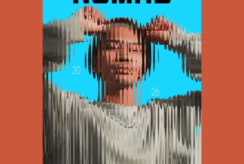
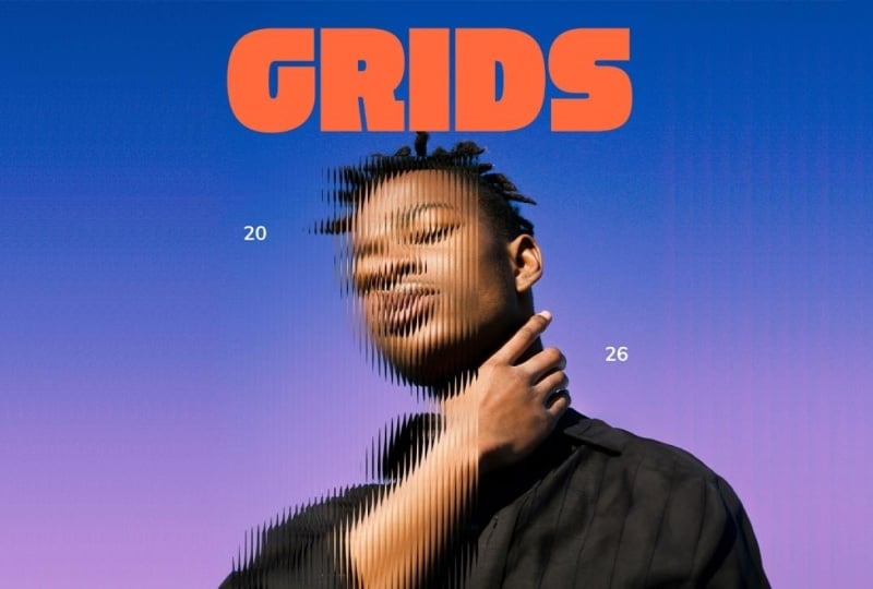
4. Poster 02: Alright. And for
my second poster, I'm just going to pull
up the second image onto my Photoshop file, and seem like before, I'm just going to double click
the background layer. And I also want to play around a little bit
with the background color. I like that it's sort
of like a gradient, so I don't want to change that. But I do want to push
the colors a little bit. So I'm going to go to
subject invert my selection, go to my fill layer
to solid color. And then I also want to play around with the blending mode. Instead of having it
like a normal color, I'm going to go play around
with blending modes here. Okay, so I actually
added two colors here, one purple overlay color, and I played around with
opacity a little bit, and then one reddish
color a little bit, and I made it into
an overlay and played around with the opacity
just so I can have this, like, nice blue to
purple gradient. Now, if you are happy with the colors that
you make on Photoshop, but you're not completely 100% sure and you want to always
go back and change it around, you can select all
of your layers here. And instead of flattening them, you can right click and convert
them to a Smart Object. Okay? So that's just going to flatten your layers together. But if you ever want
to change your mind, you can always
double click on it, and you can play around
with your colors again. So it's definitely
reversible that way. And it's just always better
to stick with a smart object. And now we add the
glassmorphism effect again. But this time, we're going to do it a little bit differently. Instead of adding
the glass effect across the whole image, we're just going to do
it in a specific area. So we're going to head to
rectangle marquee tool here, and this is, again,
completely up to you. I'm just going to select, like a portion of his face
going down on his arms, and I'm going to
leave the second half of the image in focus. I think that's just going
to give it a little bit of a stylistic flare. So I'm just going to
select this part here. And again, we're going to go
to gallery, filter gallery. And now the glass effect is already installed
from the last round, so you don't have to do
the same thing again. I'm just going to zoom out. And I'm going to click Okay. Now, I do want to increase the purple a little
bit in my image. So thanks to the smart objects, I can just click on it
and play around with my purple here. Okay. And now when you're
happy with it, just click Command S, so it saves that and then go
back to the original image. And that's it. We are
ready to save this image. Now, you want to go
back into Illustrator, and we're just going to
use the same file as this poster because
we're just going to duplicate everything
and use the same fonts. So I want you to click
on Artboard here, and holding down the option key, you're just going to
duplicate the artboard. And you want to click on this image and go
to Window inks. We just want to replace the
highlighted image here. So in order to do that,
we're going to go to this icon here where it says
Relink and click on it, and you just want to go
to where your image is. Just click Place. And
now for the fun part, you get to pick different colors that suit the colors
of the poster. And maybe for grids, I'll go for a nice
bright orange, complimentary color to the blue. And I'm going to keep everything else as is just so there's just, like, some uniformity
between all the posters. But just for fun,
I'm just going to, like, switch these two up. And then we can also change the position of the websites
and switch them up. This is already looking really interesting just by using
this Photoshop effect, putting on some colors
and very basic type, nothing too crazy
and you already have a very elevated
editorial style poster.
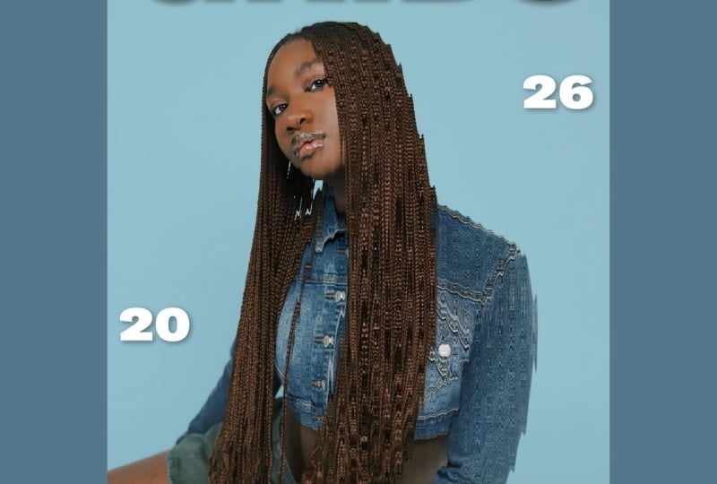
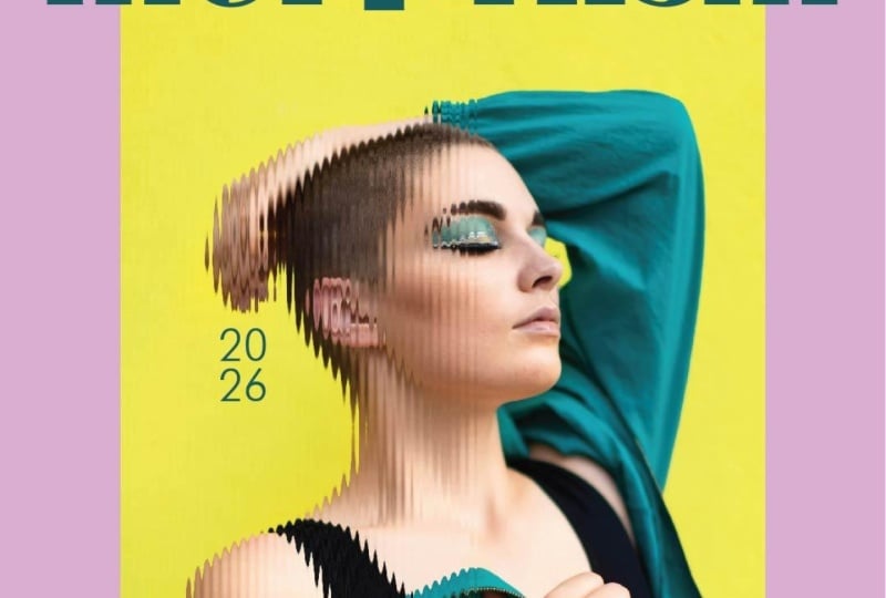
5. Poster 03: Okay. And for our V last
image, you know the drill. We're going to double click
on the background layer, and we're going to go ahead to select subject Shift Command I, we invert the selection, go down to our fill
layer, solid color. And for this image, I kind of want to
go a little bit retro 90s style
since she's wearing, like, denim, and it
kind of reminds me of, like, a 90s R&B album cover. Something like that, and I'm just going to set my
blending mode to multiply. I'm going to select both layers and click Convert to Smart Object just in
case I change my mind. And then I'm going
to go ahead and add the effect to the image. I'm going to slightly decrease the distortion this time just because I think
it's a little bit much, so I'm going to keep
it at 15 and ten. And then just for fun, I
think I'm just going to add another solid color here. And maybe make the
blending mode to soft light and decrease
the opacity a little bit, just to give it
that little vintage faded R&B album cover look. And when you're happy
with the image, just go ahead and save it. Go back into Illustrator, and we're going to do
the same exercise. You're going to go to
your artboard tool here, drag it out, click on the image, go to Window Links and
insert your new image. All right, and then you can play around with the
colors again this time. To make the light then
and blue pop off, I think I'm just going to
choose a very bold red. Now, the only thing
that I want to do is, I think I want to
adjust the scale of both of these models to be at the same
level as this one, just because I feel
like their heads are hitting the title a little
too close to the nose. So I'm just going to go
ahead and do that and just make sure they're a bit
lower, so there's, like, breathing space between the
model and the title up ahead. And there you have it.
Three different posters using the Glassmorphism effect. I just wanted to show you
how a very simple tool, coupled with simple
color picking and simple typography can
make really cool, easy, fast editorial posters in essentially very little time. A.
6. Class Project: Now it's your turn.
We're a class project, I'd like for you to create your own glassmorphism poster using the technique we
covered throughout the class. You can either follow
along exactly using the free images I included
in the class resources, or you can personalize your design by experimenting
with different photos, typography, colors, or layouts. The goal here isn't perfection. It's about experimenting with
a new technique to create something visually striking
using a simple workflow. Once you're done, upload your final poster to the
class project gallery. I genuinely love seeing how different students
interpret the same techniques, and I'll be checking out your
projects as they come in. I can't wait to see
what you create.
7. Thank You: And that's it. You
officially created your own Glassmorphism poster. I hope this class shows you that creating visually
impressive designs doesn't always require
advanced techniques or complicated workflows. Sometimes just a
few simple effects and thoughtful design choices
can go a really long way. If you enjoyed this
class, I'd really appreciate it if you
left me a review. It helps other students know what to expect
from this class, and it also really supports me as a teacher here on Skillshare. Thank you so much for watching, and I'll see you
in the next class.
 Khadija El Sharawy, Independent Designer & Art Director