Transcripts
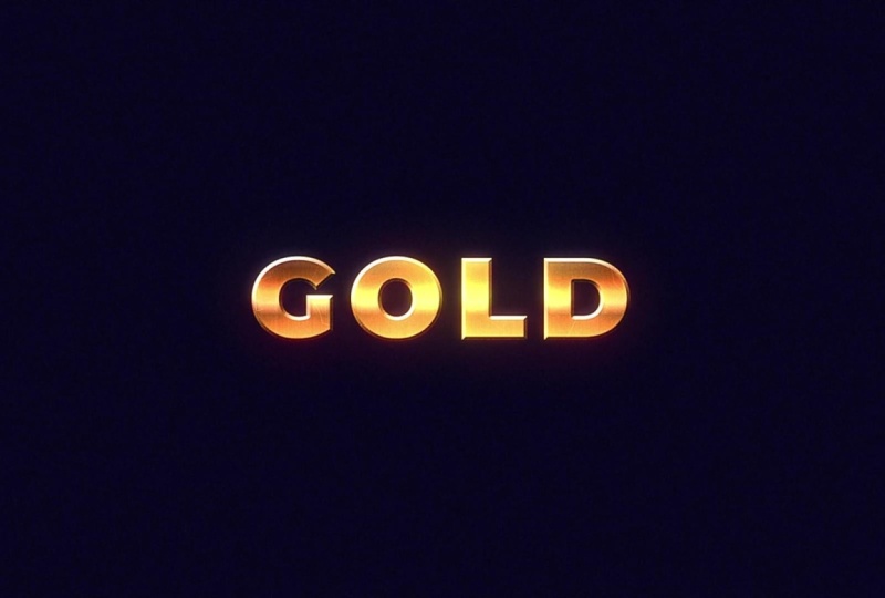
1. Introduction: In this learned five, we
will be creating gold text. We will start off by creating text with a basic
bevel layer style. Then we'll create a
gradient over our text, and we'll be remapping that gradient's colors with
an effect called Cloama. Finally, we'll bring
it all together with some texture
and light effects. Can't wait to see
your animations.
2. Getting Started & Class Project: Getting started with this class, you'll need Adobe After
Effects to follow the lessons. Your class project
will be to follow along and create
your own gold text. I'll provide a completed
version of the project file. On the project and
resources page, it might help if you get
stuck on one of the lessons, feel free to post your project
to the project gallery. I always love seeing
what you create.
3. The Main Lesson Part 1 - The Text Layer: Mm hmm. We can start things off by
creating a new composition. I'm going to use a preset
social media landscape, 30 frames a second. Let's head up here and grab our type tool and
type out some text. We can center to the center of the composition with
the align panel. And we can go ahead and
search for our first effect, the gradient ramp effect. We'll move the
beginning and end of the ramp to just above
and below our text. And once we're finished
that, we can begin to remap our colors using
the Colorama effect. So we'll add the Colorama
effect to our layer. And under the output cycle is where we can change the
colors of our gradient. Lucky for us, there's actually two gold color presets
in the preset panel. I'm going to choose golden one. And if this is your first
time using colorama, essentially what is happening is this circle represents
our gradient in a clockwise motion. And as you change the colors
on our circle on these tabs, it changes the colors
on our gradient based on where they are
relative to the circle. It's a little hard to wrap
your head around at first, but it begins to make sense
the more you use Cloama. We have our golden
colors plugged in, we're still going
to have to do some work to really sell the gold. Look. One thing we can do is add a Bevel layer style to our text. We could head up to Layer
Styles, Bevel Ln and Boss. We'll toggle down the menu. Besides technique, we'll
choose chisel hard. And we'll turn up
the depth to 200%, and then I'll just add
some depth to our text. If you zoom in, you can
notice a little bit of weird artifacting around
the sides of our text. That will go away
with a simple fix by adding our next effect,
the set MT effect. We can leave the set mat effect
at the default settings. Now we can bring a couple
additional effects to reshape and add some
texture to our gold. The first of which is the
fast box blur effect. I'll change the blur radius to five and move it above
our colorama effect. At first glance, it doesn't
look like it's doing much, but it'll make more
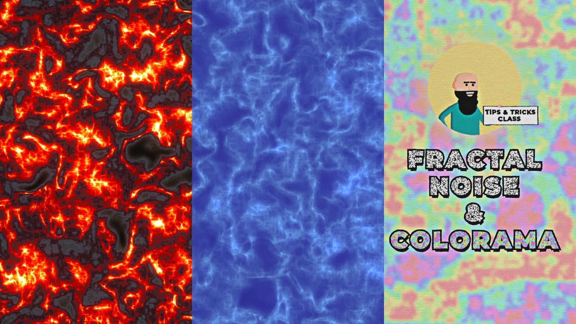
sense when we go to add our next effect, fractal noise. We'll move our
fractal noise above Cloama and we'll change our
blending mode to color burn. Opacity down to 35, complexity to one,
contrast to zero. Now we can go down the
fractal type menu and see how the different fractal
types affect our text. You can really go with
any look you want, but I'm going to go
with dynamic twist. Now we can turn our fast
box blur on and off again, and you see it does have an effect on the
shape of our text. I also want to reiterate the importance of
our set MAT effect. Our set MD effect is essentially gluing all our effects
to our text layer.
4. The Metal Texture: If you would like to skip this lesson, it's
understandable. Just download the metal texture from the project
and resources page. After you import,
make sure you select the metal comp composition and drag it into
the layer stack. Change the blending
mode to overlay, use the Track Matt pick whip, and then turn the layer
back on and you're done. Now, to create the metal look, I first started off by
creating a new composition. I created a solid layer by
going to layer new solid. And I added a fractal
noise effect, and then I dialed
in the settings. Now, I probably spent
a good 5 minutes dialing in these settings to
get it to look like this, but I'll just zoom in
so you can copy them. Make sure to unlike
uniform scaling, to be able to edit to scale, height and width separately. Then I added a tritone
effect to change the colors. I'll put up the color
codes on the screen. Next, I created another
solid layer with a different fractal noise
to create the dots, and I dialed in the
settings as hum. And I copy and pasted the same tritone
effect to this layer. Then I changed the layer's
blending mode to screen. Now, to create the
lines in the middle, which simulate
cracks in the metal, I created a new composition, created a solid layer again. But this time, I used an effect called lightning to
create these lines. I'll zoom in on the settings
if you want to copy them. And then I changed the
start in endpoints, and then I duplicated them,
so there's six of them. And I kept them all
towards the center of the composition because that's where our text is going to be. I forgot to mention in the
original recording that this layer's blending mode
is also set to screen, and the opacity is
turned down to 75%. Then I dropped that composition
into our metal comp, and I also changed the
blending mode to screen. Now we can drop our
metal texture comp into our main composition, turn the blending
mode to overlay, and use the track mat pick whip to make sure it only
shows up on the text. We'll have to turn our
text layer back on.
5. Additional Effects: Now we're going to add
some additional effects that will really tie the
whole composition together. First thing I'm going to
do is add a background. Got a layer, new, solid, rename it
BG for background. I have a color
picked out already. I'll zoom in so you can copy. We'll move that to the
bottom of our composition. Now I'm going to create
an adjustment layer. Right click New
Adjustment layer. We'll rename it grain
and Glow effects. With our layer selected, we'll search for the
noise HLS auto effect. We'll change our noise type to grain and turn up the
lightness to five. This will give our
whole composition a little bit of grain. Then we can add a Gauging blur. Change it to something
subtle like 3%. This will just soften
out our composition. Then we'll add an unsharp mask and we'll bring up
the amount to 300. And this will re sharpen
our composition, but it'll give it more
of a low fi look. You can really see the effect when you turn the
layer on and off. And finally, we'll
add a glow effect because our gold
text just wouldn't look the same without
a little bit of glow. I'm going to change
the glow threshold to 80%, the radius, I'll change to 25, and glow intensity I
can turn down to 0.5. To give it a more radiated look, we'll duplicate our glow, and on glow two, we'll change
our glow radius to 125. You can see the impact
all these effects have when you turn our
adjustment layer on and off. And as a final touch, why not animate some light
moving across our gold? We'll start things off by
duplicating our gold text. We can go to the
effects controls and delete every effect that we have leaving only our
text with the bevel. I forgot to mention in
the original tutorial that you'll need to have your
fill color for your text set to pure black in order
for the blending mode to work properly that
we're going to use later in this tutorial. We'll move that new layer
above the metal comp. We'll head to the effects and presets and look for CC glass. Right away, I'm going
to change the height to zero to get rid of
that weird effect. We're only going to
be using this effect for the light controls. We'll go to the light type
and change it to point light. Now we can change
the lights position. Toggle open shading, we'll
change ambient to zero, diffuse to zero,
and metal to zero, leaving only the
specular and roughness. Now we'll head back
to our light control, and we'll change our light
position to shine across. We'll start on this side of the text, press the stopwatch. Now let's move over
on our timeline. We want it to animate slowly. So why don't we go
to around 5 seconds? Now we'll change the
lights position to the other side of the
text. Now let's preview. I think that's a good
enough animation. Now let's bring in some color to our light by adding
the tritone effect. I'm going to change the
color of the midtones. I already have a
color picked out. I'll zoom in so you can copy it. We'll change our blending
mode of the layer to screen. This will get rid
of the black text while leaving our highlights
and our light effect. You can always change
the light intensity. Alternatively, you can
change the specular, and of course, you could also
change the light position. And that just about
concludes this lesson. I want to thank you
for taking my class. I hope you enjoyed
it, and hopefully see you in the next one. H.
6. Outro: Congratulations on making
it to the end of the class. Now you can post your project
to the Project Gallery. I always love seeing
what you create.
 Tyler Bennett, Motion Graphics Designer & Photographer