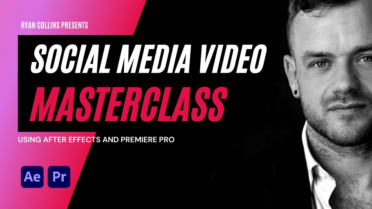
Transcripts
1. Skillshare Intro Video: Hi guys, My name is Ryan. And in this short and sharp cause we're going to be making an animated social media posts that looks like this. Ready for you to post on social media, it's sharp still friends also attract new clients to your work. We're going to start out by designing your project. So we're going to plan a script. We're going to find the elements in the photo that goes into your design. Next, we're going to bring that all into After Effects, ready to be animated. And finally, we're going to animate everything together with some basic animation techniques and some advanced techniques. If you're a beginner, this is going to be a pretty direct costs. I try to teach the basics along the way, but it's going to be more of an intermediate course. If you're an intermediate, aftereffects, use it, you get a lot out of this course. So thanks for joining and I look forward to seeing you in the project.
2. Introduction: Welcome guys, thanks for joining. This is going to be an awesome, awesome lesson and it's really going to be applicable, relevant information that you can use right away. We're going to be making our own little promotional poster. We're not actually going to make a square story. I was, I was going to use story. But then I decided I want to actually make something that I'm going to be using for this course. So you're going to be watching along and following along, making your own product self promo will work on a script, something that you can actually post and use. So by the end of it, you've actually got something out of it whilst learn in some intricacies of our animation, some effects and how you design this thing and get it all coming together. It looks really complicated, but it's actually not when we design it the way we're going to design it. So first we're going to write a script. We're going to plan how things are going to look on, what is going to say. And I really would love you to follow along, devote Just a few hours to get this done and post in your results in the group because I really can't wait to see how everyone does their own thing. So there's gonna be a few rules you're going to require to create a background. We're going to need shapes with an effect on them. Animated. Going to be using Trim Paths. We're going to be using the text animator. And we're going to be learning about ease in and add an animation. So if you have a look at this button now there's little bit of anticipation. It goes up and then it wiggles. So we're going to learn all of these things while screen and something awesome. Your, your poster should have a call to action. So mine says get instant accent access today. So we're even going to touch on a little bit, copyright him for the social media posts. This is going to be an all inclusive project. And I really, I'm really excited about it because I can't wait to see what you guys do in the group. So in the next video, we'll get to part one where we're going to just be planning what we're gonna do, how it's going to look. So that being said, I'll see you in the next video.
3. The Master Plan: All right guys, so I hope you are ready. Here we go. In the first absolute, Let's just make a new project. So we've got advanced certain project here. I'm going to make a new project and make sure you save your project straight away. So we could call this square social media ad. I already had some similar squares. Social media ad will be fine. You could do a story if you want. By the way, you can make a story whatever you like. The difference is the width and height. So square is one-to-one, so it's an even number, width and height. Story for Instagram is 9 16, so it'll be like nine hundred, sixteen hundred. But I'm gonna go with square. I'm going to go 1, 0, 0, 0, 0, 0, 0. The mass really simple. And I'm going to call the main composition main. And we're just gonna make it. And to meet my nine seconds, I think that's fine. And what we're gonna do throughout. So if you can see my background is actually a bit of a different color, is just because I've got it selected there. So I'm going to make it black just so you guys have the same. And so we're in After Effects. This hopefully you're familiar with After Export now there should be a bit later on in the course, so It's not going to be so much skids, going to be more advanced. So if you get stuck at any point, maybe go back to one of the previous training videos and we'll have a look at it that. So the first thing we're gonna need to do is this is how I like to approach it first. I like to just get all the assets into the screen. We're going to make it like a graphic design. That's, that's goal number 1. So right now we're going to meet this rough. So let me give you an idea. I'm going to get a document up. Let me get a notepad up. So here's like a little formula that I think you should follow. So for the script, in fact, let me get a Google document up. It'll be much easier to see. So we're gonna write a script for a video. So it's going to be simple. These, these are the requirements. These are going to be the requirements for a square video ad. So visible for the script, we're going to have a bold headline. And then we'll have more information. And then we'll have CTA, which is called to action. All right, and now bear in mind facebook on a face, on a Facebook post, you can only have 20 percent taxed. However, when it's animated, the thumbnail needs to be less than 20 percent. So I think if you animate it, basically you can get away with more than 20 percent texts. This is when you'll pay in for an adverb, right? So if you're running an advert, paid yeah, an organic post, you could have taxed all over it, but on Facebook, you can only have 20 percent when you pay. And so anyway, let's focus on these for now. So let's go for script. We can keep will actually put Paid Post. You can only have 20 percent text. So this might be a good way around it. But don't quote me on it. So bold headline. So you could have your name. You could have sale. You can have new version, or you could have the name of a product. It could be anything. You could be working with, a pair of shoes, anything like that. So you could have name, sale, offer, anything like this. So whatever you wanna do, the more information you could say or new in something like that, more information you could have small attacks. So you could say, for instance, my name, your name is involved, and you could say editor, animator, entrepreneur. That's kind of what I say when, when people, people say, you know, what are you, editor, animator, entrepreneur. And then call to action is going to be like a button. And we're gonna say, contact me today. So what I want you to do right now is go and maybe open up a video. Don't open up a video. Open up a document, write in your script. So you bold headline. This is going to be because there's a hierarchy, right? To design. You might know design, you might not, but there's going to be something more bold scroll stop in something a bit shorter. Some show attacks too. Add to what that title saying. And then a call to action to tell you what to do next. So the first thing we wanna do is going to there. So let me, let me show you what I'm gonna do. So I'm going to say animated social media post project. And then I'm going to say more, more, more information now available in the video, add master class. And then the call to action is going to be joined today for just the $7 and then smaller text offer ends soon, right? So we're going to actually be making the ad for this video. That's what I'm gonna do, but I don't want you to do this. But what you could do, I'm going to leave an affiliate link. If you want an affiliate link for this course, let me know because it's just an idea I had. You could promote this course. So essentially, if I give you the link and someone buys the course, you got half the profit. So if it's the seven and you share the link and someone buys a, they'll get for your gap, like 780 bucks. And this course is gonna go up in prices while over time. So bold headline, more information, call to action. And then we go smaller text. So this is, this is how mine is going to look. And then what about the image? So what about the image? So we're going to need an image in here as well. So the image, I'm just going to put my face so yours could be anything by now. You could have. Let's do an alternative example so you're not stuck. So it could be, it could be like this. It could be sail on now. And then it could be limited edition. Gets offer today. And then you could just put a picture of trainers or anything like that, right? If you just need somebody to do or you can promote this course, you can do whatever you like. So the image, my face, it could be shoes, it could be smiling woman in coffee shop. It could be anything. So make sure you write it down. Now, your plan and our economy, bold headline, more information, call to action. Maybe some extra text. And let me just put this up. Maybe some extra text. And now we set up for a result. So obviously I'm not going to use this. It is going to be my face. I already you've already pretty much seeing what I'm going to make. And then what about elements? So you could have squares, circles. So these are the requirements. And you could have squares or circles. I'm going to have squares for, for Ryan, I might even have both. So put squares and circles and then effects. And I'm just going to have Venetian blinds. You could have anything you want, you can make those low pluses. So go ahead and plan out what your scripts going to be. Your call to action, the image, the elements in the Effects. And then when we get into the next video, we'll start actually bring in all this into After Effects.
4. Time to Design: Okay, so now we are in After Effects and I just want to show you something really quickly, just how I like to make a color palette. I've done it in my group, but maybe you haven't been in groups, so I'll just show you again. So what I'd like to do is if we, if we're in After Effects to our main composition, we double-click the rectangle tool. It fills it the size of the screen. And we haven't got a fill at the moment. But what I'm gonna do is I've got a branding branding guidelines here. So you can either color pick, or you can do it however you like. But essentially what we need to do, we need to go down to the color picker and make a square with our color. But what you can do is if you click on the color picker here, you can actually just click anyway, even if you're on a second screen and you can collect that color. So then what I'm gonna do is I'm going to press S and just scale this down to 50. And I'm going to align it to the top left. Then I've got my color palette again, my hot pink. And I can just duplicate this layer and align it to the right. Phil, Control and V, control V, the hot pink. I might use the blue as well. Let's get the blue. Now let's get the purple. I like the purple. Go back in, Duplicate. Click the fill, and then goes to the bottom. And then we'll go back in. And maybe we could use a bit of the orange or maybe we'll just go for the light gray. Whatever you do, you can always add colors later on. This is just a cool little trick that I've learned. And of course somewhere, again, the sum of these courses they tell you, they don't tell you, they just do things. And I think if you put a little bit more alpha and that is really valuable, so palate that this actually just saves me a lot time. So I can delete palette from the timeline. But now if I click pallor, I can just color pick off there. So the first thing we're gonna do is set everything up so I'll sign up. So let's go layer new solid and pick your background. So make sure you've got your colors in here. We can color pick our background. This is our background. And I'm going to hit Lock on NES at the bottom. And now we go, I might actually unlock this and just rename it to be J. And I hit Lock. And there we go, the background is locked in. The next thing I need to do is get my text in and I'm not going to be too fussy about I'm going to go to hit the tax layer, and then I'm going to go to Gotham Black, gotten black, regular, regular. And then I'm going to start typing and not taxed. So I've got my document here. So it's gonna say animated social media, post project. Animated. Except we're gonna do is I'm going to do each line separately. All right, so duplicate the layer. Don't worry about being too fussy here. Suddenly I do like to do is have it aligned the way you're going to write it so that they're already lined up when you duplicate. And then I just press Shift and dropped down a few layers animated social media. And then I can go post post projects, something like this. So yours could be anything and it could be any size. But for now what we're doing is we're just create an hour graphic design, right? We're not stressing over whereas or anything like that. Just make sure the text is in there. And then Let's go to our next an expert attacks. So I'm just going to do is I'm just holding Shift to make sure these are selected, moving them up. And then we're going to write again, I'm going to get another set tax, but this time we're going for like Gotham book. Maybe. I can pull project now available in the video at masterclass. I'm just going to write the same quite rough. Bring it down. Maybe I'll align this to center, kind of like a hat and story project now available in the video add master class. I'm going to select it all. Oops, and just delete it all and ruin everything. Now, so select all. And I'm going to use these buttons at the top to kind of evenly space in 10. That looks good. Remember, you can have yours wherever you want. So don't just copy me. You could make if you had sale, for example. I'm just going to make another mockup just so you don't just think about me. You can have it like you could have it like this. You could have sale now on and you could be having your picture on the other side of the screen. And then you could add more text down here. Get your offer today, something like that, or no limited edition in stop. And then scale this down. However you're going to do it. Just design it like graphics, design and get your text and images and just don't want you. I see a lot on my probably do it a lot. You follow along with someone and you want to make that thing. But really what I want you to do is make your own thing, but we'll use the same principles. So then the CTA, I'm just going to go to the top here and hold the rectangle tool, the rounded rectangle tool. I'm not sure if she should now get the normal rectangle tool and just going to draw a rectangle. Maybe I'll go to fill and color pick. So what I need to do is click my palate that top, go to fill and color pick my pink. Because that is the, I watched a video recently on the color hierarchy and it should be like the most eye popping color is like the CTA, the call to action. That's what you really want people to pay attention to. And then we'll bring this up. A little bit and I'm kind of yeah, I suppose I can't I won't lie. I am Jurgen about with the with it right now. So but I'm not obsessing over a definitely fix it up after the space in issues and things like that. So project now available and the video add master class. So we're going to get some text. I'm going to hit text and get more texts in here and just check my Google document for is going to say joined today for just $37. Bargain. Joining today for just the seven bucks. And I can play with the phone and everything as well. And now what I'm gonna do is I'm going to select the font like the text and the shape layer, and animate to selection so that they're all together nicely. And then if I hold shift on both, I can move this around all because we're only allowing in horizontally. I can just align. Sorry, I can align horizontally to get them Central. Now, here's a little thing that I like to do. So don't use the rounded edges of the rectangle tool. I go into the Shape Layer, my drop down the rectangle path, and I'll just bring up the roundness to it. I think it caps out a kind of 50 ish. But then that gives me the wrong button. Whereas I don't find you get the same effect in the other one. So I can play around with my fonts after. Again, like this. This fonts a little bit too big. I think I'd want a bit smaller. I'm not sure if I want that bold. We'll we'll have a look about after. Maybe I want this, well, maybe I'll want these in caps. Or maybe I'll put get instant access for the $7. That sounds more appealing than joined today. Get instant access. And we can do the same thing, can just align them. Oops, we can align them together or did it sort of composition, but we can just drag them down. So the main thing is we're getting all the elements in here. And I think, yeah, I think it looks better on the button with caps. And I'm starting to think that maybe we want to just bring this down to one line. I kinda want it to be substantially smaller than the nest taxed. So I like small tags. A lot of people want big, horrible tax. I think small is good. Leave it like that for now just to get to the point, but you can see what I'm doing. Then we need to get our image in. So you should have your bold headline sub-headline button. And then we get the image in the video. So I'm just using the picture me, but you could put a picture of shoes. You can put whatever you like in here. Let's have a look. I've got a download somewhere where it's like a kind of low-res picture of me. And obviously this is just too big. It's all over the screen. So what I like to do is the first thing I'll do is pre-compose my image. Because then later on, if you ever want to change the image, you can move all attributes inside. And I'm going to call this profile picture. And I do an underscore because if you ever just render this out, you might, if it's got a space, might screw up the file. So nano bring that up just above the background. So it could be like that. I mean, that doesn't even look too bad. I'm not sure why I get instant access is gone. There we go. I also like to arrange things, kind of how they look on the screen. So I might have post animated social media, post project. There we go down there in order of how they are on the screen. So I could do this. Here's a cool trick. If you want to get yourself in a circle, just go down to the ellipse tool. When you are precomposed and square and double-click the Ellipse tool. So now what you can do is scale up and down. And if anything is actually changing in this circle. So if we scale up our picture inside and I go like this, It's just going to scale up inside the circle. So it gives it a keeps move in a little bit and it keeps things moving. Maybe I can scale up a little bit more just so we can say. So for Gullah deaths, that will be moving like that. And a good thing to do is just keep things moving a little bit, especially when it's like a still seen. But you can see we're kind of getting somewhere. There's a bit of a design in here. So, but part of me really liked that. I think that looks quite good. And I'm wondering now whether see how things change. You just need to get it in there. So for now, let's get all our assets in. And I did say a shape. I'm starting to feel like I just really like how this already looks. But you can see the animated social media is kind of maybe it's getting a bit lost in that white background. So what we could do is maybe we could use our shapes here to get a rectangle. If we click on the color palette and fill up with the purple, I might bring this behind the text. Maybe I could do something like this, you know. And this is all just again, soldiers design. Let's just have a look at how this looks. So right now, just, just be working on fiddling around, getting your design look and how you want it to. But make sure you bring everything in here if you are going to use a shape. So I might do the slump me. Get my, yeah, now, now I've lost the purple. I think it definitely look better before. So let me do this another way. If I get my ellipse tool and I do put me there, scale myself down like this membrane. It's the top right corner. That looks pretty cool. Then what I might have is I just have just to fill up some space. I could have like a circle up here. However you want to design things, but try to get two elements in that. So you've got the button and we've got another shape, so we've got more stuff to move. But again, if it's not if it's not required, then don't put it in there. So what I don't want to do right now is I don't want to show you me fashioned around with it until I'm happy with it. So what I want you guys to do is to go and get everything in order and pre-compose your maybe pre-compose your picture that will come in handy later. I'll show you a few tricks you can do with that. But the main thing is get everything in, get your design in. You could, you could just give you some inspiration. You could, if you want little pluses, sorry, a lot of people do this was the Forget the text layer. I see this a lot. These kind of we could go Gotham block. You can just make these little pluses, you know, see these little designs quite a lot. But again, it's like a, you add in or you taken away from the experience. So we could animate them later on. We can make them flash, whatever it is you're going to do. I don't actually like them. You might like them. Them, no judging, no judgments made. So whatever you might do, you might have a picture in the background, text with the boldness behind. Basically go in a range of graphic design. And in the next video, we'll come back all have fat around your mind, will come back, and then we'll just start anime. And so I'll see you in the next video.
5. Trim Paths: Are those the one thing that I messed out in the last video is does the trim paths. So just want to show you quickly essentially what I'm talking about. So this little circle on the edge you can see is cut in through. And all I've done here is I've created a new ellipse like this with just with our fill. And then I've gone to, I've aligned it to the profile picture and align them together and I scale that up. So right now I've got this around the picture. But if I want this to cutoff, so I wanted to cut off. So it doesn't go through animated social media posts project. What I'm gonna do is I'm going to, let me just rename this circle outer, something like that. So you can do this with a circle or a square. I'll show you squares. Well, you could have a square like this. And it looks pretty nice. Maybe I'll keep it. So here's the thing. If you click on the, will click on the circle, I'll delete the square for now. But you click on the circle and then we dropped down. You can see down here we go Add and we're going to add trim paths. So if you've got a circle or square Picture, sometimes this can look nice around it. So we'll go to Trim Paths on the bottom. And if you look, if we move start and end, It's going to change the start and end of the circle. So if I bring the n down, you can see that it goes, it cuts off. So what we're gonna do is I'm going to bring this up. But then we want to just move the offset the second number and just play with these just until you get where you need to get. So I've got this I'm still not a 100 percent sold on whether I actually want it to look good on the other one, but I'm just not show here what you guys rock and direct and keep it. Or do we ditch it or not? A 100 percent. So maybe if we get rid of this, this one, then what we could do is I could, I could actually just select a stroke, double-click and it's going to put a square. If I double-click the rectangle plus square on the box and then just scale that to like 98. Maybe. Let's actually go down bit more. There we go. That's looking pretty cool. What we'll do is, I'll say, I think that's good. So just wanted to show you the trim paths or less, just show you again here. So add dropped on Shape Layer, Add Trim Paths, and it adds it under this rectangle here, right? Because if here's another thing for select on a shape layer, we select the square. We draw another square, actually draws in the same shape layer, which is useful, but we don't want to go down that route right now. So you can see we could just trim this. We could turn this off. We could maybe try to trim this off where that circle is. So if we bring the offset back, play around with this slope, we could potentially could look like that. She think I actually like to over the circle for anyway guys, just though, that would be a useful tip. And finally, we're not going to animate this now, but I may as well get the Venetian blinds in. So if I click on the Shape Layer, this is just 100 fact, there's loads of effects. You can go through all the effects and find which one you like. But if I put a Venetian blinds on the shape layer and turn, turn up or down. You can see we get these Phoenician blinds and we can change the width, we can change the height. We can make them look how, how we like. What do you want them skinnier? Again, it's just a, just a minor design as well. But here's how it's looking so far. I think it's good and I will see you in the next video.
6. Animate your Image: Okay guys, Welcome back. In this video, we're going to just animate our profile picture. So there's a few things you can do. And I've been, I get inspiration. I go on sites like motion array and Envato, and I just have a look at the Instagram stories and how they animate them. And I've picked up a few cool tricks just from watching and trying it out myself. So I just want to show you some different things you can do. So the first one for circle, really easy. Let's just go. For instance, let's just go, I'm just going a couple of frames in just over 1 second I usually find is good. And I'm going to keyframe at 1 second, 12 frames. You can do however many you like. I'm not even sure what this composition SATA, a donor fast, but 24 frames a second, right? So actually I'll just go to 28 frames here. So I've got two keyframes. So here's the thing. When we start animating, now, should have said this. We're going to animate everything from the start. We're not going to move anything in time. Everything is just going to animate at the same time. And then later on we'll offset them. And that is how you really get you animate methodically. And then you can really start adjusting by just moving layers up and down and things like that. But right now we're just going to look at anatomy and the profile picture, right? So because it's in a composition as a few cool things we can do, select press F9. And to get my easy ease and just drag it back on, I kind of like this animation for, for the picture. Just to show you some different ways things you can do here. What we could do is duplicate and just offset the top one little bit. And now if you put a tent on the bottom one, if we go to 10 or you make any changes, the bottom one, you can see that the gray comes first. And this can be used for squares or have you wanna do it any sort of shape. You can get that. Sue, I mean, so it gives a quite a cool, a cool effect. Now another thing you could do is you could press S on the last keyframe and scale this one just a bit bigger than the picture. So you actually got a border. And then finally what you do is if you wanted to, you could just fell, just add fell to this. And it's just a really easy way of GAN a border around your picture and get an SFI it, which I think looks pretty cool. So there's just a few things straight off the bat that you can do with your composition. I'm just thinking whether I can think of anymore. I'm not a 100 percent on what I'm going to go with. And I don't think I want to sit here and just gas while you're here, got to work out what's best. So here's another cool thing as well, if you had any sort of layers. So suppose we had a rectangle like this, we could draw a rectangle, just make it white. Scroll down, stroke down, sorry. And then you could make the, this composition. You could build a sort of shape, shape layer here. Have you like. And then see this is the shape layer we could call this map. And then just make the, make sure you've got this toggle open. And you can make the alpha matte of the, of the shape. And then you can just animate the shapes end. So obviously it looks bit weird like that. But what you could do is if you go to the shapes here and you go to rectangle and transform rectangle. You can play around with the positions. If you want them to slice through. You could animate that as well. So they got up here and then let's just go to the Start. Go to 1 second in animate the rectangle in here. And then you could do that for each rectangle. And that's how you can get some really kinda crazy lock-in effects. But that was just to show you, I'm not going to just sit here and mumble. I just wanted to give you some ideas. So the first thing, if you want to stick to a scale like that, that's cool. If you want duplicate offsets it tenth bottom one, or add a fill color, make the bottom one a little bit bigger. That's going to give you like a border. Can make it white. You can color drop it, make it pink. You could make it blue. You can make it whatever color you want. I actually think that looks pretty cool. So then all I need to do is scale this down a little bit. If I want a thinner border. And I actually quite like that. So that is the profile picture. So in this one, go and play around with the profile picture, play around with layers. So you could reveal it however you want. You can have things flying in. You could duplicate this again and offset this again. Let's go below. I always do this. Try it on way too much. Let's make this scale but smaller. And you could fill this. And then you could add like blue or purple. We go, You can do whatever you like. But to make life easier, sometimes you've already got the scale property so you can just do it however you like and just ruining everything now. So there we go. I think I'm going to start with, I think that looks pretty nice. And I'll see you in the next video where we will start anime in the text.
7. Let's Talk About Text, Baby: Okay, so I've made some graphic design changes to the text because I felt like it wasn't really sticking out too much because the white was sort of getting lost on the shoulder. There was a bit messy going of the paint. So all I've done is I've created three shapeless using the methods in the viral style text. If you haven't already done that about projects or that. Cause I've anchor point to the left on these two. I didn't do on that one. And then just got the scale, dragged it up, duplicated, and made shapes below each one. So I've got animated social media posts project here, and I've got the three shape layers down. So there's a few ways we could do this text. So the first way is we could do like the reveal where we see Lascaux to like 1 second, go to Shape layer here. So we could do, do the way that we showed before where scales up. But I don't think I want to do it like law because we've already done that. So let me show you a few different ways we can animate this text. There's actually a couple of things and it covered here. So if we go to animate it versus just focus on this one but attacks. So I'm going to show you principals and you can do them however you like. So when we drop down the enemy, and this, Here's the key thing. We don't animate the position of this tax. Just get out of the habit doing our straight away. Because what happens is if we animate the position, let's say we go, Let's say we put the position here, go back and just animate, animate up. So if we go like this, yeah. And then later on we like, are we just want it to move over, you make an another keyframe. So it would say you want to drag it overbite or you've moved the text is going to start doing all this. So junk. So let's now animate the text layer because like I can even change this text layer tax later. But it doesn't change this because this isn't, this isn't the actual text. So changed by to animate it just for reference. But when we drop this down, Let's drop down this menu. Go to animate and position unless go to 1 second forward. And here are position key frame. And then when we come back to the start, we can move the position or the range selector. There's a few different things we can do, but for now, let's just show you how to. If we drag this down, you can see it's moving like desperate. Then if we move the text, still animates up and down, right? So that is why we animate with the animator. So just again, the whole principle here is what we're going to be doing is we're going to go to 1 second. And we're going to animate our one piece of text. And everything will be animated from the start when we start going out here and trying to make everything get in time. It's a lot harder than when you get it all working together. The star and then Offset and Again, golden advice I've taken loads of course is I spent hundreds, if not thousands of dollars on causes and they never just tell you this. So what we're gonna do is I'm going to easy, ease these keyframes F9. And I kind of like this effect when I drag the handle to the left. So see that it starts off quick and it slows down an easy ease in. Now what we could also do is we could go to Range Selector. No, sorry. We could go to animate and we can animate something else. We could animate opacity. And it's going to add the opacity animator on it as well. So then what we can do is click Opacity at 1 second because we know we wanted to finish on a 100 percent and then go back. It's a lot easier to animate. It's a lot easier to animate if you put the keyframes and the end result and then go back, and then you can change it wherever it's going to end up in the right place, rather than starting here, going to 1 second and then try and get this in the right place. It's easier to do it backwards. So again, I'm going to go F9. And I like that, I like that, that sort of look. And then check this out. You can just drop down these two animators. I'm just pressing Control and C. And click on social media and press Control and V. Boom, I'm pasting the animations. Check this out. Doing an animated social media post project 2 on all three. Let's go up. Let's actually do them in reverse order. Because what happens is because we're going along, we actually want the top one at the bottom, then the middle than the other one. So what we can do is we could go and pass on Page Down to go forward a few frames. Go forward a few frames. And now, wow, look at that. Last really starting to look like, like it does in the movies, you know. So what else could we do here? So something about I don't want to happen is I don't want to be able to see post project coming up by here. So there's a few things I could do here. So what I'm gonna do is I'm going to get all my shape layers together. And I'm just going to precompose these and call this text box like this. And then I'm going to duplicate it and put it above the text. Then I'm going to pre-compose all my text and call this Text. And then this is the plan right at the moment, you can see that still going up. But if we make this the alpha matte of textbox that we duplicated, it's only going to stay in the text box. And then what we could also do is we can animate the opacity of the text box so that the text box isn't just always there. Okay, sorry, Let's do it for the bottom one. So figure to t and we go to capacity because a star, then the text down to 0. We get this sort of thing. Which looks kind of nice. So that's one way we could do things. Or we could do a similar animation with the shape while we're dragging the shapes up. And I feel like going up is the right to that trajectory for this. So now what I'll do is I'll go down to the I'm going to leave that. I think it looks nice. I don't see any point in ruined ruling, ruin, ruining it. So now if we go down to now available in mass class is going to come next. So I know I said we won't start off certain things to the end, but this is just the way it's transpired. So now we'll go down to assemble secondary texts. And what I wanna do is show you as many little nuggets as I can about how I do things. So what we could do now is like Lascaux to animate position. And let's drop the position down. It's really hard to explain how this works. But essentially if we dropped the position down, in fact, let's do this first press Control Shift and N and draw a mask. Now, if you want to make that mask a little bit bigger from the bottom, what you do is press V to get the selection tool and we'll double-click on the mask and just bring it down a little bit. So the one they come up, we've got a little bit of leeway. And then we'll also click on now available in the mass class down here. And we can go to Mask and just bring the feather up just the tiniest bit. Actually less expand the box just a little bit. So when you press Control Shift and N, you get a perfect mask. But we just want to make it a little bit bigger. Or you could just draw a mask. You could draw a mass simply by clicking ness click on the Rectangle tool and it's going to draw a mask. But ultimately we want to mask with a tiny bit of feather. I input like us just even just for 5 phenyl, five feather. And then what we're gonna do is we're gonna go to animate position. And we're going to bring this down out the box and see the feather just gives you a little bit of a gradient when it, when it comes in. Now if we animate it down, so we've gone animate position down and then we hit range, select the star, go forward to 1 second. And we can drag the range selector up. And what that's doing is it's going back to the original position. And again, we could hit F9, drag this back. And you can do this in a few different ways. So we can and will offset this after as well, get it all in time after. And just, this is just a little text subclass, if you like. Now, I might not like all the, all the texts coming in at the In a line with characters. So you might do is go to animator, animated to buy words instead of characters. And what that'll do is bring it up by words, which looks really nice. And then with the button, while I'm going to do with the button. So I'm going to combine the button. If we get, get instant access today, less, less animate pizza price ends soon first. So what I might do is draw another mask around, be a price on zoom. And then I'll do the same. Go to 1 second. Go to animate, an animate position down. And what we'll do is go to range selector will go to the stop 0 and then go to 1 second and just put a 100. But then we'll drop down the advanced and will go by words again. But you know what? I don't think I even want to do it by words. So what I might do is I could just go forget about the Range Selector and just go animates a one position down, and then go to 1 second and bring it back to 0. Same thing, same principles apply. Drag the handle back and we just get that. And then if you want to add low-fat or on the mask as well, you can do that as well. Just put 55 on that. And then you can see there's a little bit of feather and X2. And thus all hunky-dory. And then finally, just to set up this button with get instant access. Now, what we can do is we can press Shift on both of these. Right-click, hit precompose here. And then we can just call this bug button. And then hit, Okay. And now button is precomposed and we can animate the button separately. And you can see now because we hit precompose on the buttons, so instant access and the button a precomposed together. But the composition is this big, huge composition around here, right? So what we need to do is come down to here and press this little icon. And it's actually going to bring the, it's going to collapse the transformations so that the, the bounding box is called a bounding box is around the button because if we actually click into this composition, this is what it looks like. So there's a few different things we could do here. So if we click this composition, now, the first thing we need to do see the anchor points. Then the middle needs to bring this endpoints, the middle of this composition. So I'm just holding, I clicked y to get the anchor point. Now I drag it down, I hold Control and it gets thought in the middle of the composition, which is great. And now what will happen is later on when we animate button, which there'll be a separate lesson on its own. Because this thing is turning into a meaty, meaty project. We can animate the button on its own. So the principles that we'll use when we animate that but an applied. So like everything. So it's a really good exercise. So I think for now, if we go back and go to Fit and we've animated everything individually, apart from the button. We've actually got quite a cool animation. So what we might want to do here is we could offset this a little bit, so we can bring this back. And then we could also offset the price and soon so we get more like that. See what I mean about look how much easier it is to go on our last common in too soon. I think that looks really nice. And then also we could animate our shape as well. You know, we've got the shape at the top. So let's just go to 1 second again, press S. And then we could go to 0. And the first key frame, same thing again. I'm just using the same ease in. You could do this any way you want. It depends on the style of your animation. So we go to there and see how everything just comes to 1 second. But we can then we can start offset in it. And you can just play around with that until it looks right. So now what I might do with the button as well is I'm going to add two. I'm going to hip position and I'm going to hit T for opacity. And if I hold Shift and press pay as well, It's going to open up position or posture new, but to 0. I'm going to turn the opacity down on, I'm going to drag it down. So I get that. But then obviously I'm going to do, you know what I'm famous for? Press F9, grab both of these and bring these handles back. And now we've got a lot going on. I think I, I would like the button to actually start. Just, just be the end of the animation. See how subtle that is. And I'm not a fan of this, a common name word by word. I think it looks all right. But by now you should have things popping off. So I really hope you're enjoying this. So we could do, we could take the slow step further just to finish off, if we wanted to animate our shape layer, we could do this in a few ways as well. We can go to 1 second, press S on the scale, go to 0 and F9. The thing is I'm being consistent with these animations. I'll offset them. You know, you could get that. I'm not sure. We need that though. I think what you could do is go to Trim Paths. So I'm going to add a trim paths here. Well, we've already got trimmed paths. So I'm going to go down, stop my click. Hit start there. So 0, go back. A 100, hundreds of 0. I don't know how that works. Go figure. So we can drag the spot now. We could get the, I think I like it. I don't really want that animation already. And I think there's enough going on to be honest. So this is pretty much does. There's a love animation things that we're learning, a lot of animation principles in here. So in the next video, what we're gonna do is we're going to add some finishing touches. I'm going to animate the Venetian blinds and we'll animate the button on our get into using the speed graph in a little bit more detail. So by now, all your animal elements should be animating in one way or another. And I'm really looking forward to seeing what you guys come up with. I'll see you in the next video.
8. Shake That Button: Okay guys, so this is where things could get a little bit tricky, but it's going to be fun, so don't worry about it. So we've got a button fade-in here. So if I think about this and like timing wise, I think comes in 234 and then maybe like a little wiggle here, I'm thinking a little rotation. So what I'm gonna do, I'm gonna hit R and then I'm going to go forward like 123456 key frames. Essentially what I'm doing, I'm making this up on the spot. How, how I'm thinking about this. But what I wanna do is I want to bring it up a certain angle than I want it to go like bootable. So I want to bring it up to give it some anticipation, like it's loaded up, ready to like go crazy, right? So logic would say it goes 123456 and then it goes quite fast. So let's go 12345. And you can see that the rotations at minus six, so I'm going to go forward to plus 5, then I'm going to go 1, 2, 3, 4, and then I'm going to come back to the minus four. And I'm going to go 1, 2, 3, then I'm going to go plus 3, 12, minus 2, 1, 0. All right, so all I've done is I've gone. And I kinda feel like I wanted to another, another. I think I want it to go 53, Lascaux, 2 minus 3. And then let's go two frames to minus two to two. And then last codes or minus2. And unless go to 0. All right, So we've got, we've got a little bit of a wiggle here, but obviously it's there's no answers. Patient is just looks, looks bit awkward. So I've done a lot of, there's a lot of keyframes here. So what we'll do, and we might not need them all. What we'll do anyway. So when we've got this basic just, we just want a bit longer and then we want it to slow down with a wiggle, right? So what I'm gonna do well with ME and just going a bit crazy, right? So last press F9 and easy ease these keyframes. So here's the speed graph as it is at the moment. And it actually doesn't look too bad. But that looks all right because of how well we've keyframe them to slow down. But if you want a bit more anticipation here, then what I would do is I would drag. So essentially what this is, is this is when, when it's going down, it's slowing down. What's going up? It's speeding up. So it's really speeding up by this point. So what we could do is click this handle and drag this forward. So we actually get more of more anticipation. And if we bring this left one, you can see we've made this longer. So this is really going to take some figuring out, But essentially this curve, at this point in time, it's going fastest and we know that's after it starts rolling. So. But here's the thing. When we get to this one is o is going faster at this point, which just wouldn't be the case, right? So if we drag the keyframes out and space them out, It's going to make the slower. So if you look, it'll slow down like more sensibly now. But I still feel like the second one still goes too fast. So what I might do is I could grab all these keyframes, press Alt, and drag them out a little bit. And maybe I want to drag this one out a little bit. And I feel like this is too long here. It's, it's kind of, I want more of a ripple effects. Why do is I just bring these keyframes closer together. Like this. I do think the keyframes need to be close to the close together the faster they go. But as long as they aren't getting taller than each other, we know that there's soda and this might look crazy. It does just take practice. There we go. It I feel like that that anticipation looks perfect. And then if I hit the maybe we need to go inside. Come again. A motion blur on this, please. So I'm gonna go inside in turn. Motion blur on in the composition. And smoke given me. Yeah. So we've got a little bit of motion blur now, but I don't like the way it is now available InVideo Ad mass class. So I might bring this up a little bit. And now we go. So these keyframes, if because we're slowing down while I'd like to do is there's the anticipation. Thus the main thing. You've got this CSAC keyframe there and set a keyframe at the highest point and then gradually decrease the keyframes. Distance between each other, and then also the distance between the rotation. Go and left and right. Surrogates luck, it's going minus six, minus five, minus three, minus three, minus two, minus 20. And that gives us, there's pretty awesome. The only thing, the only thing I'm not liking a moment is spit static. So what I might do here is I want to keep things moving a little bit so I'm going to go into my profile picture. And is this the right one? So I'm going to go into this one and I'm going to hit Scale. And I'm going to go for E3, but I'm going to scale Apple logo. I don't really want to cut my head off, but I just wanted to I wanted to keep moving. See how that still move in. And then what I might do is with these Venetian blinds, I'm going to click up here. I could click enter and put lines here. Remember, you could have, there's tons of effects. I'm just not going to go through all the effects in After Effects. There's so much in here. Have a look around and play with what you like. But make sure you get something in their life. If you're stuck, just use Venetian blinds. So what I might do is go to, if I click on the blinds, the shape layer here, this is what we want. Oh, looks like a named the wrong one. Right was this one line. Okay. This is the border. So if I go to my shape layer for the blinds and make sure that's behind the board. Abbas. Call these blinds. I'll go to one and output transition completion. I hit my keyframe, I'll go back and put 0. And I might actually drag this out to like two. So I'm going to drag the transition completion out so it keeps it moving a little bit when everything else is stopped. And then what I might also do is hit a position keyframe and then go to the end and just drag that across 10 pixels. So I'm just trying to find ways to keep things move in a little bit. Right? And to be honest, I think that's pretty much it. My other idea is to put an animated texture behind, but I'm not sure if they'll be too much. So what I'm gonna do is I'm going to try it. And if I think is good, I'll show you the video. And if I think is rubbish, then I'll see you in class, please. If you have made projects so far and if you enjoy in this post in the class your work, let me know what you've learned. If you want to learn anything else, what you want to learn next, what you, whatever you need. I'm here. Just shout, post your projects in a group and I love you guys. Thank you. Keep this thing going and grow and thanks for being here. So like I said, if there's a texture one and just watch the next video. If not, then just everything I just said. All right, Cheers. I'll see you in the group.
9. Texture, Render, Congratulations!: Okay. Yeah, We're back with a bonus video and you wouldn't end. So the only thing that this thing is lacking is texture. So I've done two absolutely bonkers things and they've actually turned out. All right, so I literally took a photo of my wall, my wall, That's just my garden wall. So want to play with this? Maybe like this. And then I want to put it over the background. So right now, yeah, that doesn't look gray. It actually looks pretty cool though. I do love the wall texture. But I found by turning down, maybe we can play around. Now I've done this on Santa, feel like I just want the wall. We could we could totally go with the wall, but that would mean adjusting the tax and things like that. But look, all I'm doing is I'm pressing Shift and I'm scrolling through the blend modes to find different ones. I'm sorry, but this just looks too cool now. Maybe we'll have to maybe we'll have to change. So I'm just scrolling through the blend modes, looking at the picture will look at that, that looks insane. So now we can press T and I could bring this down. So we've got like a little bit of texture like this, which looks great. Um, I put black and white on it, make it black and white. And then we could also go to Levels. And I'm just going to hit levels. I'm just going to play around with these until I get the texture I'm looking for. And I think knowledge, pretty sweet. Honestly. You've just got to play with this sort of stuff. Just call it delivery. Not sure if you heard that knock at the door, but yes. So we've gone from Let's go up here, Let's drag this touches the top. Let's turn off black and white. Let's turn off levels. Unless it's a normal and put the opacity up. So we've got this, we've dropped it to 15 percent. Put the mode on Divide does no reason I put it on divider, just went through them until they look good. So as divide, divides here, put on divide, and then we made it black and white at some levels into the mix. And now we've got a really nice texture. So we'll put this one to the bottom. Part of me did want to keep the white version. I thought I'll a great let me know in the group, did you prefer the white version or do you like this version? I feel like with the white vision, I would have had stopped playing with texts and I just don't want to do that with you guys on the phone for watching the video, not on the phone. So one thing I'm going to do here, right? I'm going to precompose this. Here's the thing. The anchor point at the moment is here. And if I want to scale this up, I don't want it to scale from the anchor point. So might want to get a slow scale on S. I can hold Control and get the anchor points to the middle, so that's fine. So I'm going to hit Scale and go across. And I'm going to start bringing this up and go to 24. So now we've got this nice. Move in social media posts. It was just so amazing. Okay, So the final thing we're going to do to keep it move in because this is scaling quite nicely. How the few nice surprises making nests, because I didn't think this texture was going to look super good a much keep it a little bit more subtle like that. So we've just got this seat. Don't really know what it is. And now I took a photo of the floor as well. I thought while I'm at it, I'll take photo of the flow. So this is my other idea. And again, this is bonus. This is, I am winging it and we can just see what happens, right? So that's good. Black and white, again. Black and white. And what I want is I want the white to show through more than the black surfer go to here and then hit levels as well. So I'm going to put some levels on levels, just adjust the black and white. Now there should be a way I want to make the level so that the white comes through. I might not be on the right blend mode for that. So let's flip through and see what gives the best results. You know what I might do just for now. Let me just get a new composition here. Because there's so much going on. I'm just going to drag my photo in of my wall. And I'm just going to put a hypothetical black background in. Let's just put that in. And if I scroll through the blend modes, I want the one that gives me the white. So I suppose if i, and this is how you learn, just literally just just wing it. So let's go back to school, back to normal for now. Okay, I'll just click Normal. Let's get back to normal. Let's go to the levels and less pump these levels. And if I just flip through, there we go. Now I know I'm kind of game where I need to be. So I just want specs of this would show in essentially like this. And I'm going to keep going through the blend modes. And I know one of them is going to give me something like what I want. Maybe I need to pump this. Here we go. Now again somewhere and I'm just trying to get specs. So in trying to get specks of the word, I want to turn this black and white. This is gonna make sense eventually. Now I'm going to change the blend mode. Here we go. Let's start with just a nice See how would just work it out so that I've just got the scrapes. That's all I want these little scrapes. But I actually want I want it on the black. There we go. So I'm on darken. And I'm just trying to get the scrapes. Teslas go through, make sure we've got the best one. It's just a really light texture I'm trying to get. Okay, so on dark and I've just got a couple of scrapes and you can barely see him, which is perfect because that's what we want. So now I'm gonna do is I'm going to just copy that, go back into my main and put this over the top, and then change this to add. And now I think you should be able to see. You can see I've got this kind of overlay here, this white overlay. So I'm going to do now is I'm going to hit P for position and asked for scale. Actually less get them both open. And I'm going to toggle these to hold keyframes. And then I'm going to go two frames and I'm going to hit the position. Let's actually get rotation in there as well as for shifting, ah, and get rotation keyframes. Lascaux two frames out. Thus rotate this texture scalar up. Just make sure we've got hold keyframes. So just getting hold keyframes and hold keyframes just means that there's no animation in between. And then if we move it back, spin it round a bit more. We go forward again. Bring the position over, rotate and Gauguin, bring it down. You can see we've got this really gentle texture going over the top. And then what we could do is let's just go across, rotate again and move the position. And now we've got this kind of texture over the top. And now what we can do is press Control C. We can go forward two keyframes, paste them again. Control C for two keyframes, paste them again. And you can see the texture starting to go over the top. And there is an expression for loop out. And I'm just not sure if we would need to do that for each one. So I'm just doing it this way. Oops. So if we go across here and then we just select everything, we go forward two keyframes. And we paste again. Now, you can see we've got that texture Flickr and over the top. And that was made with a photo of my wall. And it might have been a little bit painful to watch because honestly, IMR doing a bit of learn and as we go here as well. But this is starting to look like a pretty cool bolster. And we've probably covered just about everything I love about aftereffects. So hopefully you enjoy this. I hope I've, I've helped and I look forward senior projects in the group. This is the actual end of this project now. So thanks for watching. Hope you've enjoyed it and I'll see you when I see you.
 Ryan Collins, Video Ad Veteran