Transcripts
1. Introduction to Digital Neon: Neon signs and Art,
Art everywhere, from restaurants to weddings,
theatres to museums. You may even have a neon
sign in your home or office. In this class, I'm going
to show you how to create your own
digital Neon sign. In Procreate,
you'll learn how to choose the text or design
for your neon Art, How to actually
create the effect. And we'll even display
them on a digital wall. Make sure you watch the
next video about how to access all the
class Resources. And then we'll get started.
2. Class Resources: Let's take a look real
quickly at How are you going to access the
resources for this course. The link for this is provided
in the course description. I'm going to put it on
screen here as well. When you go to their page, this is what you're
going to see. You're going to be
able to get plenty of free background images at
either Unsplash or Pexels. I've put a bunch of the
common search terms that I've used right here. And this link will actually
take you directly out to Pexels with a bunch of brick walls already
setup for you here. Just make sure that
when you're here, you're grabbing the
ones from Pexels, not these ones that
safe from I stock because those are
ones that you're going to have to pay for. But there's plenty of free
ones here that you can use. As you scroll further down, you'll see this
graphic that says, Let's talk about the
elephant in the room. This provides some
information and a free resource for you
regarding topography. If that's something that
you're interested in, you can go ahead and grab
your free guide here. All you need to do is just enter your email address and then that will be sent to
you automatically
3. Setup & Best Practices: Now let's go ahead and start working on our neon
art in Procreate. Come over to the plus icon and we're going to
create a new canvas. You can do any size you'd like. I'm just going to grab a square. And as far as best practices
for neon art in procreate, the first thing we
wanna do is have a dark background or overlay. And we're gonna do
that in a little bit. So we'll just start out with, we're just going to grab black. Go ahead and double tap
close to black to grab it. And then you can just color
drop that onto the page. This is going to
allow us to view our neon effects
as her making it. The second thing to
remember is that we always want to use
bright colors. This flourish palette
that comes with procreate is a good
starting point. Just wanted to make sure that you're grabbing
these colors that are right up in this upper
right-hand quadrant here, they're going to be highly
saturated and really bright. And those are going to
look really good for now. In the next lesson,
we're gonna go ahead and add our text and some artwork
4. Neon Art Sample Project: For this sample piece, I'm going to use some text as well as some hand-drawn Art. I'm also going to show you a
couple of different colors, if Neon and the reason why we're going to do those
on separate layers. Just start off with,
we're going to come to our Layers panel and add a new layer above this
black background. Choose whatever color we
want to start out with. I'm going to grab a bright purple and to add text for rent to
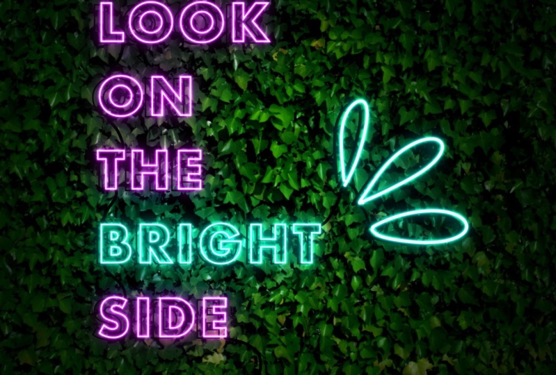
come to the wrench icon. That's our Actions menu. Choose Add, and Add Text. The quote I'm using is
look on the bright side. I'm just going to
type the first word until I decide
which font I want. Double-tap on that and
go into the font menu. You can actually
find fonts that are designed for Neon as well. But one cool trick is
to grab a font that you like. Make it bold. And then come over here to this, oh, this is going to
outline the font. And that's going to look
really nice for neon. I think that'll work. Double-tap in there again. And I'm going to
finish this off. I'm gonna go ahead
and do all caps. And I think that he's
gonna run off the page. So let's shrink this down
until we get it all on. Here. We go. I want the word bright
to be a different color. I'm going to double-tap on that. Come over here and change this to maybe a bluish turquoise. As long as it's up here in this corner, we
should be good. The next thing I wanna do
is select all of this text, grab this little handle here and drag it up until
it's all selected. And I want it to
be left justified. And I'm going to spread
it out a little bit. These letters are a little
close together for me. I'm going to go to the
kerning menu here. That's the space between letters and just spread
them out a little bit. If the lines themselves
are too close together, that's under letting. And we can spread those apart
just a little bit more. Alright, that's
looking really good. Now I can come to
my Transform tool. Drag this out. To fill more of the page. I'm going to add my
artwork on a new layer. I'm going to use that blue. I'm gonna go ahead and just
sample that with my finger. Use a monoline brush,
something fairly thin. That's a pretty good size. We're just going to add
these little droplet swirly. I'm not sure what
those are called, but that's what we're
going to add there. Alright? Now remember
I said we want different colors on
different layers. We need to get this word bright on the same layer
as the drawing. First thing I'm going to
do is take my texts layer, swipe to the left to duplicate. Take one of those
and drop it down underneath this black background
and just turn that off. It's going to be a
backup in case I want to make any changes
to my texts later, this will still
be editable text. This top layer we're going to rasterize and turn
it into shape, tap on the layer and
choose Rasterize. Now we can come to
the selection tool. Choose free hand. Grab this word Bright, tap the circle and
choose Copy and Paste. Now bright is on its own layer. We can drag that down, take two fingers and
pinch it together. But that artwork from is we still have bright on this layer as well. So we
need to take that off. Select that layer, come back to your selection menu.
Circle it again. And now we're going
to take three fingers and just scrub the screen. That's going to clear
whatever we have selected. There we go. Now we have these on
two separate layers. We're going to group these. You have one selected swipe to the right on the other
one and choose Group. Go ahead and collapse it. And we're going to
duplicate this twice. Always want to duplicate
the bottom one. Because you're going to have less image degradation that way because Procreate is a
raster based program. In order for you
to follow along, we're going to
rename these groups. It's going to make
it a lot easier. This top one we're going
to rename to light The middle one will be bloom, the bottom one will be shadow. For now, you can go
ahead and uncheck this box and we're just going to hide the shadows for now. We'll work on them later. Let's open up the light group. We need to brighten
these up quite a bit. This is going to be the actual
light of the Neon bolts. Select the top one. Come
to your magic wand, which is the
Adjustments menu and choose Hue, Saturation
and Brightness. We're going to take the
brightness up quite a bit. You want this to be
almost to white. But where you can still see
a little bit of the color. For this purple, I'm
getting up to about 93%. Looks pretty white on camera, but you can actually
in-person still see a little tiny
bit of the purple. We're gonna do the same thing
for the blue Adjustments, Hue Saturation, Brightness,
and bump up the brightness. This one's going
quite high as well. I'm at 96%, 97%. Alright. The other thing we
wanna do is change the blending mode on these to add tapped Russell and here. And change it to add
on both of these. Now we can close that, open up the bloom group these into be a blending
mode of add as well. Anything you're doing
with light changing it to an ad Blend Mode
generally helps. When we get into the blue menu, you'll see there are a few different things we can change, and they vary depending on the base color that we're using. Today is trial and error. When you get in
there to play around with what looks good with the artwork are the
texts that you've chosen as well as your
actual base color. But I'm going to put a
graphic up on screen now. And you can go ahead and
screenshot this and save it. It gives you a good starting
range for each of these and things that generally work
to get the bloom effect. Let's start with
this purple layer. Come up to your adjustments
and go down to bloom. For purple, we're going to
set our burn at about 83%. We're going to set our
size to around 24. Transition to 45. Then we can turn our burn on. This is going to need
to come up quite high. Just keeps sliding to the right until you see an
effect that you like. I think we're going to end up
somewhere in the ad range. You can zoom in to
see how it works. Alright, so I am at
about at right now. And I don't like that it's filling in the letters
quite so much. So I might take the size
down just a little bit more. Basically, I want it to
be outlining the letters, just giving the hint
of a neon sign glow. So my sizes down to 14. Everything else is
staying the same. So I'm at at 02:45, 14 and at two. I think that's looking
pretty good for the purple. And then we're going to do a
similar thing for the blue. Select that layer, come to your adjustments and
go down to bloom. For this one, we're
going to set the burn at 35, which is where it is. Size, we're going
to start at around 24, transition at 37. And then we're going to play with the bloom and
see where we get. Probably around 50%. Are starting to see
that Effects show up. That's at 48. Let's zoom in here and adjust the size down so we don't have quite
so much overlap. That's looking better. That's it. 17. So my balloon was at 48, Transitions at 37, sizes
17, and burnish 35. Right? And if one of these effects doesn't look strong
enough to you, you can always duplicate that layer and it's going
to make it a lot brighter. Now we're going to
add a little bit of a wider dispersed light effect. To do that, go ahead
and close your Bloom. We're going to add layers
above and below the shadow. Let's go ahead and
rename these. Glow one. And glow to hello one. We're also going to change
to the add Blend Mode. For this one, we want to use a slightly darker color than the lights
that we have here. We start with blue because
that's what we have selected. And I'm going to just drag
that down a little bit darker. We want our brush to be
a little bit thicker. See how that,
That's pretty good. We basically just want to really outline what we have here. I'm going to go through these
and just follow this line. And that's what I want,
is I want to just get some color outside of all of
the lines that I have here. Doesn't have to be perfect because you're
going to blur this. But you don't wanna go too
crazy outside the lines. I'm going to finish this
up and be right back. For the purple are going
to do the same thing. A little bit darker
and do the outlines. Now we've got all of our Art outlined are going to
blur this by going to our Adjustments menu and Gaussian Blur and just
slide across the page. We're starting to see a
really nice glow effect. We can tap this little
a here to reduce the opacity down to about 70%. I'm going to take my eraser
here and choose a soft brush. This can be found in the
airbrush set of Procreate. My opacity is at about 50%. I'm just gonna go in here
and clean up a little bit inside these letters
where I don't want quite so much light
to be showing. Brush size down quite a bit. The next lesson
we're going to add our digital wall to our Art
5. Adding a Wall: This Neon sign is looking good, but a lot better if we put
it on an actual wall, right? Let's go ahead and do that. Come to your Layers panel. And we're going to add a layer right above this
black background. Comes to your wrench icon. And depending on
where you saved it, you're either going to insert
a file or insert a photo. Then you just need to
stretch it and make sure it covers your
entire canvas. You can use a brickwall of
wood wall IV like this, moss, anything you'd
like, Unsplash and Pexels both have a lot
of great free resources. Now there's definitely
not enough contrast here. Neon sign to show up very well. There's a couple of different ways we're
going to fix that. First, let's come over to our Layers panel and make sure
that our wall is selected. Then we're going to come
to the Adjustments, Hue, Saturation and
Brightness again. Let's take this brightness
down quite a bit. I'm at about 40%. That's already looking better. Now we're going to add one
more layer above this Wall. Change our color to
black by double tapping. And we're going to grab
that soft brush again. Opacity can stay about 50%. And we're going to use
a pretty good size. Basically, we're going to create a dark vignette shadow on this. Just going to create a
little bit of a circle here. And then fill in the corners
by layering up that black. Don't worry, we're going
to blur this so it doesn't have to
be super precise. Just make sure that you get all of those edges really well. Now come to your
Adjustments down to Gaussian blur and slide over until you have really
nice soft edges. And then come over
to your layer and adjust the opacity until
you have a nice shadow. That's looking great.
The next lesson we're going to add our final
Effects to our Neon Sign
6. Final Effects: Our Neon sign is almost done. There's just a few more
things we wanna do to make it look really realistic. Let's go back to
our glow to layer. We're going to change
the blend mode on this one to color. Now there are a
bunch of these that have the word color in them. Color, Burn, Color, Dodge. We want to go almost all
the way to the bottom, to the one that says
color and nothing else. For this one, we're
also going to use the colors of the lights. And we're going to go a little bit darker than we did before. You should see in your
history whether it's darker colors where
you use previously. Let's grab that dark blue. We're going to use an
even thicker brush. For this one, we do want to
have a really blobby outline. Don't have to follow the
actual lines of this anymore. We're just going to make sure we outlined the whole shape of the word. For these. I'm just going to basically get the outline
and fill them in. Then we'll switch
over to purple, go a little bit darker,
and do the same thing. Never going to come to our Adjustments menu
to Gaussian blur. Slide this across, have a really nice color
dispersion effect that's blending in
to the background. Now let's go ahead and
reveal our shadows. Open up that layer. And
these were actually going to be able to combine because they're going
to be the same color. Take two fingers, pinch
to combine those layers, and we need to turn
Alpha lock on. You can either tap
on the layer to do this or swipe right
with two fingers. You should see a
checkerboard pattern behind your artwork. Select black. Fill the layer, and turn
alpha lock backoff. Now we can come to
our Transform tool, that's the arrow up here. And just slide those
shadows over a little bit. Now we have shadows
of our lights. The last thing we're going
to do to add some realism to this is put in the
electric cords. Going to add one more
layer above glow to make sure you still have black selected and choose a
pretty small brush. Then you just want
to think about where the cords would actually go,
what would be connected? We can draw them in. Now you have your very
own digital Neon Sign
7. Sharing Your Art: I hope you found this helpful. I love showing people how to combine creativity
and technology. If you enjoyed this class, I would really appreciate
it if you took just a couple of minutes to
leave me a teacher review, I can't wait to see the Neon Art that you're going to make
with this techniques. So make sure you
share it with us and the project area of this class
 Laurie Russell, Digital Artist | Illustrator | Educator