Transcripts
1. Introduction: Paper Art has always been
one of my favorite things. And ever since I got my iPad, I've had so much Ben creating realistic Papercut
Art in Procreate. In this class, I'm going to
walk you through creating your own papercut landscape with realistic
shadows and textures. All you need is your iPad
and the Procreate app. I'm going to show
you how to choose your color scheme and theme. Create your layers, and add the 3D and Paper texture
effects to your scene. Make sure you watch the
next video on how to access all of the
class Resources. And then I'll see you
for the class project
2. Resources: Let's briefly go over how to access the resources
for this course. The link to the
course resource page will be in the description, but I'm going to put it
on screen here as well. Once you follow that link,
this is what you'll see. You can get the free
Paper texture and the Procreate color palette that I'm going to use in our sample. By clicking this button below. It's just going to take
you to a Dropbox folder. You can download
that to your device. Below that, you'll
see information about the Pinterest board that I've set up for the course. There's a bunch of
different samples on here. Some are more basic and
some are more advanced. And you can take inspiration
from whether that's a theme, color or a layout, and just create your
own unique Art. Tapping this button
should take you to Pinterest and
open up the board. I've interpreted
the word landscape a little broadly here. Basically is something
that incorporates different layers and
something to do with nature. Looking out into the distance. As you can see, we have some different ones
with the clouds. We have some underwater ones. This one's in the desert. Some of these are a
little more basic. Some are more advanced. Is different color
palettes and themes here. I just want you to see
what speaks to you and what you might be
interested in creating. Of course, you
never want to copy someone else's Art exactly. But drawing inspiration from
them, It's absolutely okay. Below that, we have similar
resources regarding color. I have a couple of
different options here. This one here is a free guide
to basic color psychology. It says, use color
in your marketing, but basically has
color psychology that is helpful for anyone. You can put your
email address in there and it will be
sent to you right away. If you want an easy button
for choosing colors, I do have a new eBook
that just came out. It's called from
pixels to Palettes, and it has 50 curated
professional color palettes that you could use right away
in any creative project. You can't learn more by clicking
the button right below. It will take you to the
information page for this book. You can get all of your
questions answered there. I have a little
video explaining it and all of that
information is here. Now let's go ahead and
dive into this project
3. Setup and Colors: Here we are in Procreate. Let's go ahead and set up a new canvas by
clicking the plus sign. I'm just going to go ahead
and use my screen size, but you can use whatever
size you'd like. Remember that you can either
follow along with my example or you can go check out the curated Pinterest
board that I've set up, or even just look for paper cut landscape and
see what inspires you. Make sure you think about
your color palette. Usually five is a good amount. We call this a limited
color palette and it has a lot of benefits
for art and design. The first one is that by
limiting your colors, you ensure that your viewers
eye isn't distracted. And this creates a more focused and visually appealing
piece of art. In addition, since colors can
evoke different emotions, you can control the mood or feel of your piece by limiting
the colors you use. Remember I provided a couple of different color resources for you on the course resource page. The last thing you need to
do is choose your theme. You want to have a
basic idea of what your design is going to be
before you get started. For this one, I'm
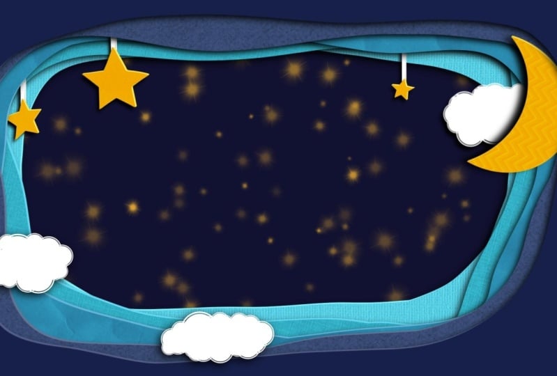
going to use shades of blue with some yellow
highlights and white, and my theme is going to be
Moon and stars in the sky. In the next lesson, we're going to sketch
out our design.
4. Sketching: Now that we've got our theme planned and our color palette, remember this is available in the class Resources as well. If you want to follow along, it's time to start
sketching our design. It's really important
because we want to mark up the general layout of it and plan out our
layers ahead of time. I'm just going to grab the regular Procreate
pencil for sketching. Just draw a few rough layers. You can decide if
you want them to be equal or if they can
overlap a little bit. So it'll be something like that. Then I'm going to have a moon. And three stars. Wanted big one and the
couple of little ones. And these are going
to be hanging. The last thing I'm
going to have in this layout is some clouds. This one will be
behind the moon. And a couple of these
will be in front. You don't need to take a lot
of time with your sketch. It's really helpful to
see a layout of where everything is going to
be right from the start. The next lesson, we're going to actually set up our
papercut Layers
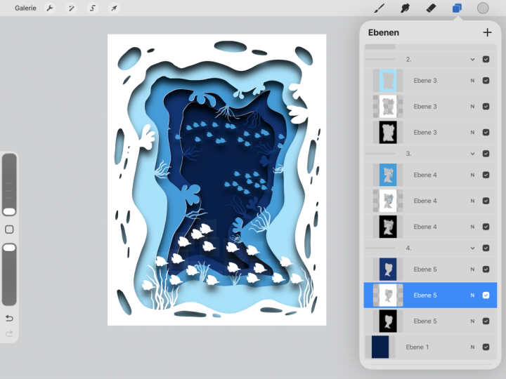
5. Papercut Layers: Now that we've got our sketch, we're able to move on to
setting up our papercut layers. Let's rename this
layer sketch and turn down the opacity
to about 30%. Go ahead and add a few layers underneath that depending
on how many you want, I'm going to add about five. I think I want five
layers for my frame. This is where we're
going to start building that outer frame. I'm going to grab this
darkest blue on the top here. And my monoline brush. And just roughly make
an organic shape here. Doesn't have
to be perfect. Just wanted to have a
clean edge on the inside. Then we're just going to
color drop on around. It. Can take your transform tool and stretch it out a little bit. If you feel like it's not
close enough to the edge. And go to the next layer below it, the next lighter color. And continue that process. However you want that to look. And then color drop on the edge. If I isolate this
layer by pushing, holding on that check mark,
you can see what we have. So I'm going to repeat this for the other three layers
and I'll be right back. Alright? Because I'm using some
darker colors here. It's a little hard
to see my sketch. I'm actually going to invert it. Tap on the layer, choose Invert. Now I can turn that opacity up. We're going to change the
color of the background. I'm actually going to do
it on its own layer rather than changing the
background color. There's actually a
color right here. It's hard to tell in
my dark interface, but it's a super dark blue. We're going to drop
that on the background. Now we can see all
of our sketch. And we're gonna add
one layer above that. Grab this yellow. You may not have a
star brush like this, but you can do a similar effect by hand
if you wanted as well. I'm going to change this to
add, to brighten those up. That's changing the blend mode. And then I'm just going to
group those taco first layer swipe right on the
second and group. Change this to background. Then I can close that group. Now we've got the layers of our frame and we want to
build these other elements. And I like to put them all on
top and then move them down later so I
can see it I'm doing. Let's go ahead and add
a layer for the moon. I've already got my
yellow selected. I'm just going to
roughly draw this shape, fill it in, and then
take my eraser, pushing hold to erase
with the same brush. And just clean up this edge a little bit
so it's a bit sharper. Now, we can go ahead
and make our stars. I'm gonna do these each on their own layer so I can
move them around later. I think I'm going to use
a smaller brush for that. I'm gonna go into
isolation mode and clean these up and
I'll be right back. Next thing we need to add is
the chords for the stars. I'm going to put these
on separate layers to start and then I'll
combine them after. I'm going to do these in a
very light gray for now. We might lighten those up later. I want you to be
behind the stars. That's why I'm doing them
on a separate layer. When I'm happy with the
placement that I can take two fingers and pinch
them and combine it. Making these kind of long
because I'm not sure yet how far down
they're going to hang I'm going to rename these. So when I'm moving them around
and know which one moving. Last thing I need to
add is the clouds. I think these two can probably
be on the same layer. This one will have
to be on its own because it's gonna
go behind the moon. So I need to layers. I actually have a
different brush that I'm going to use for this, but you can enforce just
draw these by hand as well. I have this circle with an outline that makes
really nice cloud shapes. It looks like you used
a paper punch on it. Alright, Those are looking good. I'm going to rename
those top clouds. And clouds. Let's go ahead and make
this one real quick. Slow the c1c2, but
we're going to make, make it the right size. I think we can go ahead and
get rid of our sketch now. You can either hide it with the checkmark or just
swipe to delete it. So we've got all of our
layers set up now you to decide what order
they're going to go in. This Cloud obviously needs
to be behind the moon. And all of these need to be at some point behind the frame, except for these
clouds are at the top. Let's just start moving
the frame around. We know this one is to be
right under those clouds. That's already looking cool, having those hanging back there. I think those stars should all be maybe on a different layer. Let's grab the left
one, drop it here, the middle one here, and the right one here. And we obviously need to
move them down a little bit. Left one is looking pretty good. Maybe it will nudge
it over a bit. Smoother. One needs
to come down. And then we just need
to move our moon and the other Cloud back. So just thinking about what
layers they would be behind. Sometimes you just have
to play around with it. This one should probably
go almost to the back. And then maybe this
one above that. I think it needs
to go up one more. We want to see the
top of the moon. Maybe it's nudged him behind this wedge there.
Yeah, like that. So you just gotta kinda
play around with it in the Layers panel until you get the layout
that you'd like. Now that we've got
all of our layers that we're gonna move on to the next lesson where we're
going to turn this into 3D
6. 3D Effect: Now that we've got
all our layers in here and ordered how we want. We're going to do some magic
and make this into 3D Art. The process is pretty simple. We're going to start
with the frame. Swipe to the left to duplicate. When you do that twice, always duplicating the bottom layer. Then we're going
to swipe right on the other two and group them. Let's go ahead and
name this top frame. And go ahead and
collapse it for now. The word going to duplicate and group all of these
layers in the same way. This is going to keep
us nice and organized and help us as we're
making our 3D effect. I'm gonna go ahead and do
that and be right back. Alright, Now what
about everything? Duplicate it, and need to go ahead and
open these up. Now. You can see what
this many layer is, why it's really helpful to have them grouped and organized. For the bottom layer
in each group, we need to alpha lock
that and turn it black. Can either tap on the layer
and choose Alpha Lock. You can see that checkerboard
pattern in here. Or you can tap on the layer and swipe
right with two fingers. Now we need to fill all
of these with black. Come to your color
wheel and double-tap close to black to
select solid black. Starting at the bottom, we're going to tap the
layer and choose Fill and then turn
alpha lock back-off. These are going to
be our shadows. Now we need to make
a highlight layer. It's ultimately going to be the middle layer of each group. But I think it's
easier to see if you actually start at the
top and then move it down. Grab the top layer. Come to your magic wand,
your Adjustments menu, and go to hue saturation
and brightness. For white, you're just going to turn the brightness
all the way up. We wanted to be
solid, bright white. Then you're going
to take that layer and drop it into the
middle of the group. Come to the next group down to hue, saturation
and brightness. And you want to bump
it up maybe 60 to 70%. Somewhere in that
range. There shouldn't be a noticeable difference
between the two helpers. Slide that down to them, and
move on to the next group. We're going to continue that
for all of these groups. Now that we've got all of our highlights and
shadows setup, it's time to move them
and create the 3D Effect. Make sure that you can
see your whole Canvas. Then we're going to use
multi-select again. Start at the very bottom with
your first highlight layer. And then swipe right to select all the other middle layers,
all of the highlights. Now come over to your arrow. That's your transform tool. You're just going to tap a few times right off this
top right corner. You can start to see a little bit of the
edge showing up here. That's going to be the
edge of your paper. It doesn't take very much. You can decide how thick or thin you want your paper to be. The shadows we're going to go
in the opposite direction. Starting at the top. Select your first shadow, and swipe right to select
all of the other shadows. Come to your transform tool and come off of this
bottom left corner. These can be a little bit more dramatic and we'll adjust
them individually later, but we want to get them at
least started altogether. You can already see this is starting to look
3D, pretty cool. Now we need to tweak and adjust the shadows and blur
them individually. So here's the top clouds.
That's These ones. If we want them to look
like they're a little bit further away from this frame. We can come to our
Transform tool. Move that shadow over a bit. Now come to the Magic Wand to Guassian blur and
slide that over. We have a really nice
3D shadow effect. We're just going
to continue this for all the other shadow layers. And you can adjust how deep the shadow is and how much blur. You can even come
over to the layer and change the opacity by touching this little
end right here. If you think the
shadow is a little too harsh, can play with
that right there. Once you're happy
with that, go ahead and close the group so that
you know that it's done. I'm going to do the rest of
these layers and come back. And now we've got a really
nice 3D effect on our layers. In the next lesson,
we're going to add a Paper texture
to our design
7. Paper Texture: Now that we've got our
Papercut Landscapes setup with our 3D Effect, last thing we need
to do is actually added the Paper
texture to our piece. There's two different
ways to do this. We can add one Paper texture that covers the entire piece, or we can add different paper
textures to each section. I'm going to show you both ways. First way is to come to the
very top and add new layer. You can use the texture that's
provided with this class. I'm to add and either insert a file or insert a photo
depending on where you saved it. That's going to
import the image. And you just want to stretch
it and make sure it's covering the entire canvas. Now we're going to come
to the N here and change the blend mode to overlay. As you can see. We have this beautiful
Paper texture throughout our whole Canvas. That's the quickest and
easiest way to do this. As you can see, the
shadows don't look quite as realistic when
you do it this way. The alternative is to add different paper
textures to each layer. It does take a little
bit more time, but I think the effect
is really worth it. Let's go ahead and
turn that off. Now the way that you'd do this is you'd open up the layer, tap the top layer in that group, and add a new layer above that. Click on that layer
and tap clipping mask. Now you just go through
the same process. You would import your texture. But now it's only going to show up on that particular layer. You can see this is just
showing up on those clouds. So now you can resize it. You can rotate it, do whatever you wanna do. Then change the blend
mode to overlay. You would just go through
and do that for every group. And you could use
the same texture and just rotate and resize it. You could use
different textures, but I think it
gives it a lot more realistic look that way. I'm gonna go through and
do that for these groups. And then I'll come
back and show you what the final piece looks like. Now you can see
what it looks like. Having different textures
on different pieces of yard gives it a
really nice effect. Now you have your completed
digital papercut landscape
8. Sharing Your Art: I hope you found that helpful. I love showing people how to combine creativity
and technology. If you enjoyed this class, I would really appreciate
it if you took just a couple of minutes to
leave me a teacher review, I can't wait to see the
papercut landscapes that you're going to make
with this technique. So make sure you share
them with us and the project area of this class
 Laurie Russell, Digital Artist | Illustrator | Educator