Transcripts
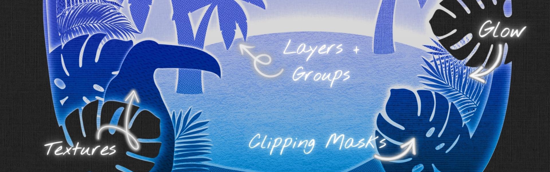
1. Introduction: Hey there, My name
is Lorie Russell. I'm a graphic designer
and illustrator, and I am so excited to bring
this new course to you. Today, we are going to create a digital lightbox in procreate. These are super fun and really give you a great
outlet for your creativity. You can literally create
anything that you can think of. I've got all kinds of fun resources packed into
this course for you, including a stamp brush kit, inspiration board on Pinterest, where you can get some more great ideas of things
that you can do. And I'm just so excited to
jump into this with you. We're going to learn how
to create our frame, how to add different
elements to it, attaching them using clipping, mask textures, different layers. We're going to talk
about how and why we use a gray scale
color palette for this. And then how we actually bring color and light into
this at the end, adding all sorts of fun, really realistic glowing
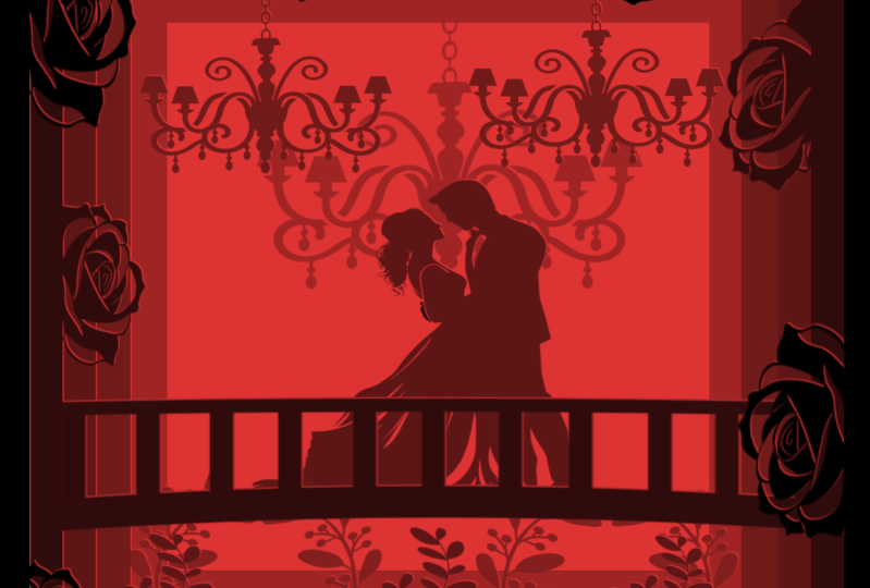
effects to our light box. Creating a traditional
light box, or a shadow box as
some people call them, usually requires cutting out really intricate designs in
different layers of paper. Putting them in a three D box and then adding some
light behind that. We're going to be able
to replicate this kind of effect today
digitally in procreate. I can't wait to see what you
create with this technique. Whether you choose to follow
along with me and create our course project of this
tropical light box here, or you want to go ahead
and create your own theme. I would love to
see what you make. So make sure that you follow the instructions in the sharing
your art video at the end to export your design. And then upload it
to Skillshare as a project so we can all
see your beautiful work. I'll be in there as well giving feedback and answering any
questions that you have.
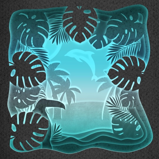
2. Class Project: Your project for this
course is going to be creating your own digital
paper cut light box. In procreate, you
can follow along and create this tropical
seamed light box with me or create your own. You'll be provided with all the resources you need
to create this light box, including stamp brushes and
a great scale color palette, as well as a paper texture. If you want to create
your own theme, you can draw it by hand. Or I'll talk about
some other ways that you can find the
resources to create that. Once you've created
your digital lightbox, follow tips in the
sharing your art video to export it and share it in the
project area of this class, I'll be there providing feedback and other students will
love to see your work.
3. Resources: I've put together a bunch of resources for you on this page. You can get here by
following the link on the course page or just type in the address you see
on screen right now. The first thing you'll
see here at the top is a button that allows you to
download the stamp brushes, gray scale, color palette, and the paper texture. This link takes you to a
Dropbox folder where you can download the zip file
with all of these resources, save this to your ipad, and then just to install the brushes
and color palette and procreate and save
the paper texture to your photos or files. And don't worry, you don't need a Dropbox account or to be logged in to download
these files. Next you'll see that
I've put together a curated Pinterest board
just for my students. This has inspiration
photos that you can use to spark new ideas for your
digital lightboxes. Some of these are more basic
and some are more advanced, but you can take inspiration
from the themes, certain elements, or layouts to create your own
unique lightbox. These are mostly images of
actual paper light boxes, but the ideas and designs
will work just as well, if not better in
a digital format. As an extra bonus
for this course, I've put together a
sampler set of four of the most popular brushes
in my paper texture kit. If you don't want to use
the paper texture file or photo insert method, you can use these
brushes on a layer with a clipping mask and the
blend mode set to overlay. This is an easy way to add different textures
to your layers. Set your brush color to a medium or dark gray
for best results.
4. Frame Tips: There are a couple of
different ways to create the frames for your
digital light box. You can draw them yourself like we do in a regular
digital paper cut. Where you're just creating the outline and filling
it in with color drop. Using multiple layers, you can create an actual shape and
cut it out of the background. For this one, what we're
going to do is create a basic frame and add
some shapes to it. And we're going to do that on multiple levels in
different ways. Before we get into this project, I want to show you the
alternate way to set up your frame in case
you want to do your own project with
a different theme. For this, I'm just
going to use a square. Let's go ahead and grab black. We'll just use this
gecko for now. If we wanted our frame to
be shaped like the gecko, we can come to our
layers panel here, tap on it and choose select. Come down to invert back to our layers panel and add a
new layer and choose fill. Now we have a frame with the shape of our
gecko cut out of it. And you can do
this with letters, with any other shape or
anything that you've drawn. That's how I got the outline for this light box with a letter L and these ones
with the letter. Just an alternate
way to do this. I want to make sure that I showed you that before
we got too far going.
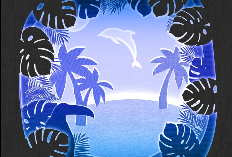
5. Sketching: This is the one that we're going to recreate in this class. Let's come to our gallery
and create a new canvas. By clicking this plus icon, we're going to use a square. I always recommend sketching
out your design first, just so you have a better idea of where everything's
going to end up. You can use any pencil,
doesn't really matter. Going to have a basic
layout here for this one. I know we're going to have
multiple layers of frames. That's what this is
symbolizing to me. We're going to
have a beach right here with one palm tree. We're going to have a pair
of palm trees over here. Your sketch can be super rough. This is not for
anyone else but you. You don't have to
share this. This is just for you to get the
layout of your piece. I'm going to have my
Dolphin right here. Probably spray sun or moon, depending on what time
of day we think it is. We are going to have our
two can hanging out right here then attached to the frame, that's where we're going to
put all of our leaves in. The farther back, we're
going to have more of the palm frond leaves. These are all going to
layer on top of each other and create that really
nice shadowy frame. And then closer up
layers on the frame. We're going to have
those monstera leaves. Some of those will be covering over and crossing
over other things, not completely, but just crossing over and creating
a really nice look here. That's just a really
rough sketch, but gives us an idea of what our finished
piece is going to be. Let's rename this
layer to sketch. We're going to reduce
the opacity on this. We can either tap the little
n here and use the slider. Or we can take two fingers tap on the layer itself and then
just slide on the screen. I'm going to take this down to about 20% In the next lesson, we're actually going
to create our frame and start putting these
elements together.
6. Frames Part 1: Now that we've got our sketch, we are ready to start
putting this frame together and getting some of our design
elements into this piece. Let's add a new layer and drag
it underneath our sketch. Now I know for this piece I
want at least four pieces of the frame plus the two
can beach the palm trees. I'm going to add a few layers under here
just because I know we're going to need
them and we can always delete them later
in a light box. We're actually going to build
this with just white paper, but we're actually going to use a gray scale color palette. In a real light box, you
would see the paper start to look a little bit darker as it got further away
from the light. These layers that are
closer to the back, closer to the light, are going
to be these lighter grays. And as they get further back, we're going to make them darker. For the outer frame, we
want it to be pretty dark. I'm going to come probably in the middle of this row here. I'm going to use a pretty thick
monoline brush and create just an organic shape
around the edge there. I'm going to clean
up this edge right here just a little bit. The outside part doesn't matter, but this inside I want to
keep a little bit cleaner. I could always put a leaf there, but I'm going to
clean it up for now. Then we just color drop
on the edge of that. We're just going to
repeat this going down with a little
bit of a lighter gray each time for however many layers you
want your frame to be. Let's come down here
to the next layer. This can cross over and
under whatever look you want, the next layer. And let's go a bit lighter. You can always use
your transform tool to adjust these as well. Using it on warp with advanced mesh turns
on gives you a lot of control over
especially these organic shapes, where they go. Okay, that is five
layers of a frame. I think that is pretty good. Next thing I'm going to do is add in the sand and
the background. I know the background
is going to be the lightest gray in
this color palette. Let's drop that on there then. The sand can probably be one or two shades
lighter than that. For that, I'm just
going to draw an arc. Make sure you cross over
the edges of your page, you can adjust that as needed, and then you'll be
able to color drop. Now we're going to
add a layer here for the single tree
and the double tree, I'm going to label these so I know what's going to
go in there later. I like to stay nice and
organized in my layer panel. While we're doing this,
let's go ahead and rename this top layer monster one. The next one, monster two, because that's what we're
going to add to these eventually Palm
one and Palm two. This is going to be Sky. Now we've got the
basic elements of our frame and our gray scale
color palette laid out. In the next lesson,
we are going to start adding the leaves to our frame and adding in our trees and our
dolphin and sun.
7. Frames Part 2: We've got all the pieces
of our frame in place and we've got our layers set up to add our other elements here. The only one we are
missing is our two can. That's going to be pretty
close to the front. I think it's probably
going to be between these two layers of monsters. Let's save a spot for him. Let's go ahead and add
our trees on here. You can either draw
them yourself or use the stamp brushes that are
included with this course. For this, I'm going to sample
the layer that's right above the double palm
tree and go just slightly lighter than that can adjust the size of
the stamp over here. That looks pretty good. I think I want this to
face the other direction. I'm going to switch this back to uniform and choose
flip horizontal. We're going to do the same
thing for the single tree. We're going to go even
a little bit lighter. Let's turn our sketch
off temporarily. I wanted to see if
there's enough contrast with the sand. I think there is. But I'm going to go ahead and turn this brightness
down ever so slightly for both of these trees in order to create our
dolphin and our sun or Moon, whichever one you want it to be. We're actually going to use
the eraser on our sky layer. Come to your eraser, You
can use this with any of the regular brushes that you
have in your procreate app. I'm going to go find
my Dolphin here. Just the size, then I'm just
going to tap on this layer. Then I'm going to
use the eraser with just a really big
monoline brush that I have and see if I can
get a nice circle here. Let's add our two can as well. He's going to be pretty dark because he's
close to the front. We can sample this color here. And just the size he needs to
be a bit bigger than that. It looks like I drew
him the other way. So we're going to
flip him as well. I'm going to take his brightness up just slightly so he
has some more contrast. We'll move him into his
approximate position. Once we get the leaves on
here, we can readjust. Now we've got all of our
main elements in place. I'm going to go ahead
and hide my sketch. You could also just delete it. If you don't think
you're going to need it, then we can start
adding our Monstera and our palm leaves to these
first four frames. I'm going to start out adding these two new layers until I get them all positioned
the way I want. And then we'll combine them. Let's sample the color that
we want to start with. Grab our monster one stamp. Check the size. Still
a little small. You always want to start
out bigger and use a transform tool to make
it smaller if you need to, rather than having it be too
small and stretching it out. Because then you're
going to get it looking more pixelated. I think that is a
pretty good size. We're just going to
start placing this up, touching the edge of
the frame a little bit. We're just going to
duplicate this and start arranging these
in different spots. I'm going to use a
combination of the monstera one and the monster two stamps, because the leaves are
slightly different, just for a mixed look. These will go on the first and the second
layer of the frame. Duplicate this a couple
times, always the bottom one. And then I can start
moving these around. You can resize
them down a little bit if you need to,
for some variety. I'm going to repeat
this process for the first two frames
and then we'll be back. I've gone ahead and combined the monstera leaves on the
first layer of the frame. Here's what I have
for the second layer. Now that I've got them all
placed where I want them, I can take two fingers and
pinch these all together. We're going to
repeat this process for the next two layers, but with the palm leaf stamps. Let's sample this third color. We have three different versions
of the palm frond stamp. You can mix and match and use these however you want to
make the look that you like. I'll go ahead and get
these next two frames set up and I'll be
right back now. We've got all of our palm
fronds where we want them. I'm going to go ahead and
pinch these together as well. This is what our
frames look like. Now we've got our first
layer of Monstera leaves, our second layer,
our first layer of palm leaves, and our second. Now it's time to go ahead
and add some glow effects. I'll see you in the next lesson.
8. Adding Glow Effects: We've got all of our frames set up and our elements
where we want them. Now let's go ahead
and make this glow. In order to do this, we're
going to need to duplicate and group all of our different
elements to keep everything nice and clean
in our layers panel. We're going to slide to
the left on our layer and choose Duplicate with
one of them selected. We can slide to the right on the other one and choose group. Let's name this so we
know what it is later on. The bottom layer, in each
group we need to turn. So white, you can either
turn on alpha lock in the menu or with two fingers swipe right and
fill it with white. Or you can do this with the hue saturation and brightness in the
adjustments panel. And turn the brightness
all the way up to max. Let's go ahead and do this
for all of our layers here. Now we've got all of
these groups set up. We're going to take our white
layers and move them up a little bit to create the
edges of our digital paper. Tap on one of your white layers and slide to the right
on all the others. To multi select, zoom
out a little bit, choose your transform tool and tap a few times off
the top of your canvas. You can choose how thick
you want your paper to be. Now we need to duplicate all
of these white layers again, to make a glow layer, I'd like to start at
the top or bottom, so I know that I haven't missed
any swipe to the left to duplicate on the one that you've duplicated,
the bottom one. We're going to change
the blend mode to add. Let's repeat that for all of these groups in a
real light box. The paper that's closer to the
light is more illuminated. We're going to reduce
the opacity of some of these layers a bit as they get further away from the light. This is going to happen on the middle layer of each group, the top white layer. We're going to go ahead
and start at the bottom. The ones that are
closer to the light. We're going to leave the
sky as it is for the sand. We're going to take the
opacity down to 95 and we're just going to
keep reducing it by 5% Every time we go up a group, the tree will go down to 90. The double tree will
be at 85, so on. This will just give a
more realistic look for our digital lightbox. In order to create that glow, we're going to come to
the bottom layer of each group and add
a gauge and blur. Generally you're
going to have more, the closer they
are to the light, tap your adjustments,
menu, gauge and blur. And just slide across the screen till you get as much
glow as you'd like. These top a few layers
that are really dark. You can also reduce the opacity of the glow just a little bit. And it looks like on the trees, I might need to move
these up a little bit. I don't really want
the glow to be showing through the bottom
of the trunk there. If you want to soften the edge
of your glow a little bit, you can use solid white
double tap there. Just use the soft brush from the air brush
set in procreate. Make sure that it's on
a pretty low opacity and a good size. You can come in and just soften up the edge of
this glow a little bit, then you can blur that
even a little bit more. It feels like it's too harsh. You can also take the pacity
down on that one too. You just have to
play around with it till you get the
look that you like. In order for the glow to show up for the moon and the dolphin, we actually need to have a different color
in the background here. Let's add one more layer here. Grab this lightest
gray, drag it on there. And then I'm actually going to lighten it just a
little bit more, just enough that we want to
be able to see the glow here. It looks like I
took that too far. I'm going to delete that. Duplicate this again. Change that to add.
Now I can redo that blur now that
we can see it. Our next step is to
add a little bit of a shadow to the top
of our box here. Come up to your top group,
that's monster one. We're going to add a layer
between the two white layers. Zoom out a little bit. We're going to
change our color to solid black by double tapping. For this, we're going to
use the selection tool, make sure that you
are on rectangle. We're going to draw a small
rectangle at the top here, drag the black on to fill that tap on your selection
tool to deactivate it. Then we're going to do the
same thing at the bottom. Now we can use our gagen blur to create a really
nice gradient here. You can go up to
about 50 or 60% here. If it's still too strong, you can turn the opacity
down a little bit. The next step is to add some
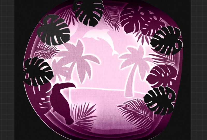
color to our light box. Add one more layer above
your gradient here. We're going to change
this blend mode to color. It's almost all the
way at the bottom. It just says color,
nothing else with it. Now you can add either a solid
color or another gradient. You can grab a really
nice warm yellow here and drag that on and
see your glow effect. We are going to use
some tropical blues and greens and create a little
bit of a gradient here. Let's grab this turquoise. Come back to our selection tool, we are going to put
this in the top and the bottom and change this to a little bit more
blue for the middle. And in order to blend this, we're going to go
back to Gagen blur. In the next lesson
we are going to add some digital paper
texture to our lightbox.
9. Adding Paper Texture: Now you have your beautiful tropical light box in procreate. It already looks really good, but if you want to add another
layer of realism to it, we can put some digital
paper textures on this. There are two ways to do this. The first way is to add one paper texture
over the whole thing. If you add a new layer at the entire top of
your layers panel, you can either add a photo or a file
that's a paper texture. Or you can use a brush
if you have one. There is a paper texture included with this
course that you can use. If you go to add
and insert a file, make sure that it's covering your entire canvas and then change your blend
mode to overlay. Now you have a
digital paper texture over your entire piece. That's the quickest and
easiest way to do this. But I really do like the look of having individual textures
on different layers. And then you can
change up what texture is on each piece as well. Let me show you how to do that. In order to have different
textures on different layers, you just need to use
a clipping mask. Pull it inside of a group, tap on the layer, and
choose clipping mask. Now, all these other layers have no texture, this top one does. That's pretty dark. I'm not sure if that's showing up on camera. Let me show you on one
of our lighter layers. Tap inside the layer
and add one above it. Choose clipping mask and either paint on or import your texture. Now you can see that texture
is just on that one layer. In the next lesson,
we'll walk through how to export and
share your artwork.
10. Sharing Your Art: Now that your artwork is done, you probably want to share it. Come over here to the
wrench icon, go to share. Then you can choose
either a Jpeg or a PNG. This will pull up
the sharing menu, where you can do things like
airdrop it to a computer, send it via e mail, or save it as an
image to your ipad. Note that PNG file is going
to be a much larger file. This one is 10.2 megabytes, where a Jpeg is going
to be much smaller. The same artwork is
only 3.1 as a Jpeg. That will depend on the size of your canvas and your resolution and other settings like that, but that's just something
to keep in mind. Make sure you export your
artwork and share it with us. In the project area
of this class, I'll be there giving feedback and other students will
love to see your work.
11. Thank You: Thanks so much for joining me in this class. I
hope you had fun. I can't wait to see the digital light boxes that you're going to make
with this technique. Make sure that you
share them with us in the project area
of this class. If you enjoy this class, I would really appreciate
it if you took just a couple
minutes to leave me a teacher review
here on skill share. This helps other
students know what to expect from me and
this class. Thank you.
 Laurie Russell, Digital Artist | Illustrator | Educator