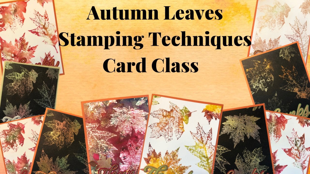
Transcripts
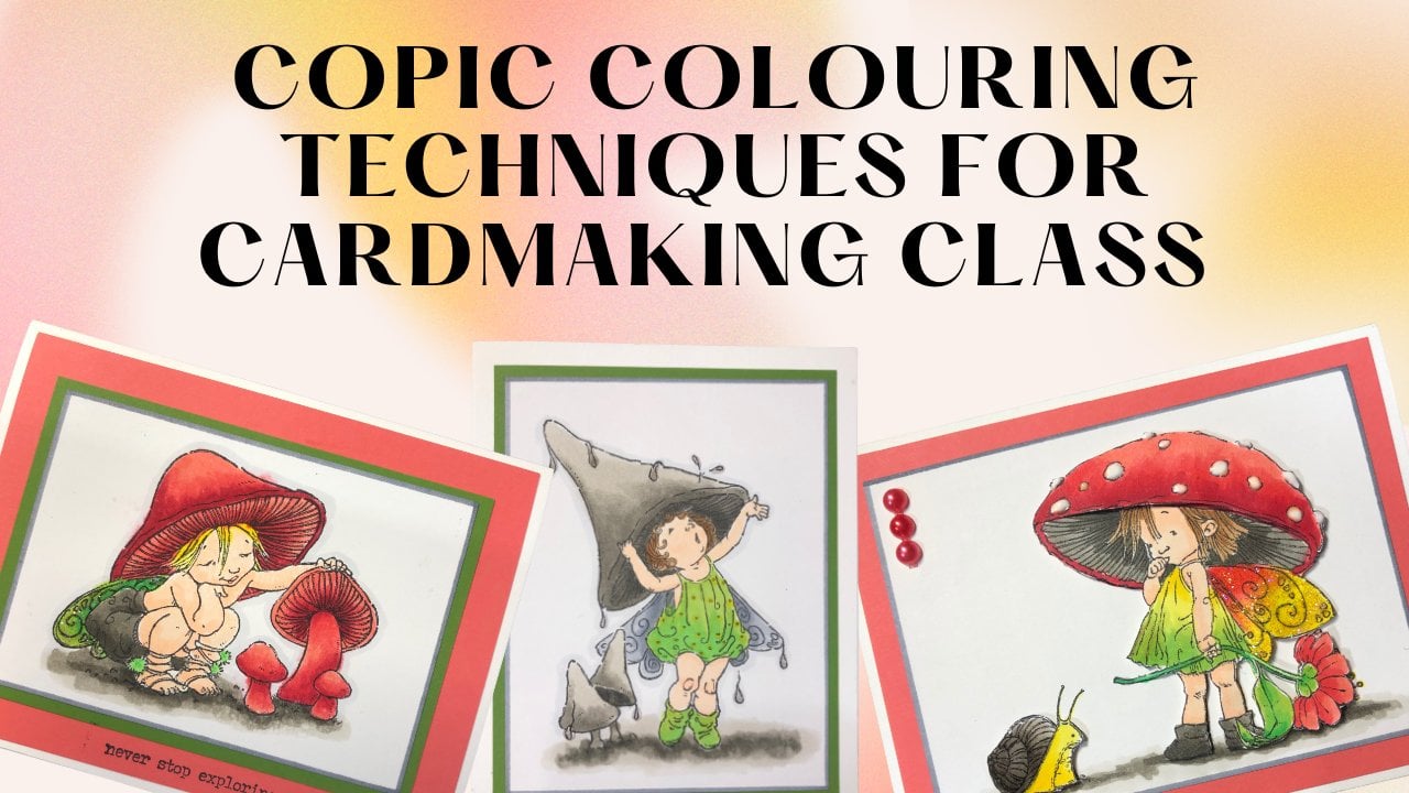
1. Copic Tips, Tricks & Techniques Introduction: Thank you so much for joining me for the coping tips, tricks, and techniques class. I'm Cheryl. I'll be putting you through this class. I have worked with copings for, I want to say about 15 years now. They're my favorite way of coloring. I just love a lot of the things that you can do with these markers. I did the coping certification probably about 13, 14 years ago. The intermediate certification about 12 years ago. So I've used them for quite a long time and I'm quite familiar with the markers. I will be using the 36 B sat for most samples that I am showing you today. But it doesn't really matter what colors you use. You can just use whatever markers you have. This class focuses on Copic markers. A lot of the techniques likely could be transferred to other alcohol-based markers, but I don't actually own any other ones. So I couldn't tell you if they work exactly the same. What I would suggest if you are starting to collect Copic markers is print off a blank Copic chart. If you just Google blank COVID chart, you're sure to find one printed off on the type of paper that you'd like to color on. And then as you collect your markers and buy them, you can fill in the squares of the markers that you've bought. This is going to help you not duplicate the markers or by more than one of each marker. They're quite expensive to start out with. So it's kinda nice when you're not accidentally buying more than one of these will be going through the lots of different techniques throughout this class. I think I counted about 15 plus different techniques, different tips and tricks throughout the class. So your sugar to learn a lot, especially if you are a beginner, new to carp Copic markers and are just a little bit intimidated and one a little bit of help starting out once we've run through all the different tips and tricks and techniques, we will be making a car together. I will link the image that is used for this card on the supply list. The supply list also will have all sorts of other tips and tricks, as well as links to where you can find some of the products that I have been using throughout the class. If you have any questions throughout the class, please don't hesitate to reach out to me and ask, I'm happy to help. Let's get coloring.
2. Copic 101: All right, so let's get this class started with basic information about Copic markers. So first of all, there are four different types of markers. There is the white marker, the original one, which is a square shape. There is the Chow and then there is the sketch. Now, the wide one has this huge tip to it. So it's great if you do a lot of filling in large areas. If you're wanting to use it for smaller images or wanting to use copings for smaller images or things. This one really is far too big for what you need. And to be honest, I never actually use it, which is why it's completely dried out on me. It's been sitting in a drawer for probably about 10 years. The original Copic marker, there's one that's the square shape, has a chisel tip on one end and a fine tip on another end. So this is great if you have fine areas to color in. And then the chisel tip is also great for bigger areas as well. This one I tend not to use a whole lot because these sketch and the chow have a brush tip and a chisel tip. And I typically like the brush if that's my favorite tip to use, I have a couple of the original ones simply because I went to an event and they were given away with it was a kopecks certification course. And they were given away with that. So that's why I have those guys. So the only difference between the Chow and this sketch is the barrel shape. They both have a brush tip on one end and then a chisel tip on the other end. Shows or the cows are around. So they tend to roll around on your desk little bit more, whereas the sketches or oval, they don't do that. The sketches hold more ink than the Charles, but the child does tend to be a little bit less expensive. When I was first starting out, I wasn't sure if I was going to love alcohol markers or not. So I started by getting sets of cows because they were more economical. And then the sketches, I ended up absolutely loving them. So I, as I have elaborated on my collection, the ones that I don't have in sets of channels, I've been buying them in this sketch markers. The thing that makes Copic markers great, the alcohol based ink. You can sit and you can color the same area over and over and over and over again and your paper is never going to pill. Whereas with a dye based market, this is a Tombow marker. Within a few seconds, really my papers already starting to kill. And what I mean by pill is it starting to break down. And some of the paper fibers are coming up, whereas this here is still completely smooth. I can go over that as many times as I want and it's never going to start peeling. And so to do blending with the diabase markers, you have to end up working quite quick. Otherwise your papers, they're going to start to break down. Whereas the Copic markers, you can take your time doing your blending and you're highlighting and that sort of thing. And your paper is never going to start breaking down. But one thing to keep in mind though, is with the Copic markers, they do bleed to the other side of your paper. So you'll notice throughout this that'll be working on some scrap paper so that the paper underneath absorbs the ink that I'm using. The other thing you'll notice is when I'm placing my paper down, I'm going to be a little bit careful. I'll just do this just to show you say for instance, there's Watch of Burgundy on my scrap paper. If I were to go and start coloring yellow here. You'll notice after a little bit, some of that Burgundy starts to pull up and it starts to bleed into here. And of course, while I'm demonstrating it, it's probably not going to happen. So you'll want to make sure yeah, it's not happening. It's this was not bleeding in as much as the burgundy did. But you'll want to make sure that as you work on different projects, you're moving them to a different area of your scrap paper so that you're not pulling up colors when you're Scott paper accidentally. The other thing to notice as you're coloring is your if you're working inside a stamped image, you want to work just shy of the line of the image because the Copic ink, the alcohol, does tend to go out a little bit as it is drying and as it's settling is one of those things that's a learning curve. As you get used to the ink, you'll have an easier time with it. You'll know how far away from the ink to the line to go. If you go right to the line and it pools outside of it. Sometimes you can fix it, sometimes you can't, depending on really on the ink color, the darker colors are harder to fix it. Then. The lighter colors, but I will show you how to fix that in an upcoming segment. The other thing, when starting out, start out with images that have thick lines to them that's going to give you a little bit of forgiveness and just make it a little bit easier on you. So for this class, I'm going to be using a bunch of clip art from online that I printed onto the paper that I like to use. You want to make sure that you're using it on paper. That is good for kopecks. This one here is really nice and smooth. You don't want to use it with something that has too much tooth to it. Otherwise, the ink is going to spread more. Then you're going to want it. You're going to have to play around with a few different papers to find out what works for you. It's a personal preference thing. There is that coppa gets to themselves, they do make their own paper, tends to be a little bit pricey. So you might want to just see what you have around you. Test papers that you already have and just see how those markers work with it. The other thing you want to make sure that you're using, if you're using stamped images, using inks that are compatible with kopecks to just stamp and then color. I like Momento tuxedo, black. If you're going to stamp end emboss or use either one of these. One is versicolor, ultimate pigment, and then the other one is brilliant graphite black. These ones here I embossed with clear embossing powder. You don't want to use colored in Boston powders simply because if you use the alcohol markers with them, they can start to break down the powders. And you want to be a little bit careful with that. We don't want to ruin your markers when we're playing. The other thing with alcohol-based markers, with the Copic markers, is there a little bit more expensive when you're starting out? It is a bit of an investment, but the great thing about them is you can refill them and you can also change the tip. So if you happen to have a tip that goes Anki or goes dry or what not, you can replace. In order to change a tip. You're just going to take a scrap of paper, pull your tip out, and then you're going to replace it with the new one. I don't know. I'm pulling up the chisels happen. I don't have any shows low tips to replace, but you just slide the new one in. Copic does have a pair of tweezers that you can use for this. I find just using a scrap piece of paper works. Typically when you're doing this, you're gonna do it on a dry marker, not one that is full of ink. So you're not going to necessarily get ink all over. The other thing that I love about kopecks is that you can refold them. So when they run out of ink, when they're a little bit dry, you simply refill them. Typically while I'm coloring with them, I'll just do what I just did there and put a few drops of ink on the tips. If I'm not coloring with him anymore, what I'll do is I'll pull that tip out and I'll put some ink rate into the barrel. And then I'll let it sit and let the ink dispersed throughout the marker. And that is going to make it so that it's good for the next time that I want to color with it. So that is all I have to share with you right now. Next video we're going to go in to talking about the Copic blender pen. Most people think that it's meant for blending and it's not. And I'll show you why. We'll see you in the next one.
3. About the Colorless Blender...: All right. The Copic colorless blender. So I've worked in a scrapbook store for many years. And so many people assume that the colorless blender blend different colors together and nothing could be further from the truth. I have several different murder pens out here. I've taught many classes in them, so it's always good to have extras of your supplies when you're teaching classes. So the thing with the colorless blender, it doesn't actually blend color. It removes it. So I'm just going to show you on this blue here. And I tried to have dark colors here so that it's easy to see. But you see how it's taking the blew away. It's not blending anything, it's removing color. So when we are blending colors and we'll go a little bit more into blending. We're going to use two similar colors or three similar colors in order to blend them together. We're not using the colorless blender. And I wanted to cover this before we got into blending because I wanted to dispel this myth, this myth before we even got there. So the colorless blender removes color. But we can create some really, really cool effects with it. And I'll show you some of them now. Some of them will wait until a different section because it fits into that section a little bit better. So there I just use my brush tip to remove the color there. I can also just use the end of the chisel tip and create kind of like a brick pattern. Let's make this a little bit down so it's a little bit closer. And the longer you leave your tip on there, the more the color is going to pool out from your tip there. So I tend to go through a lot of Blender. So I have a big refill bottle. Know, it's not easy to refill a marker from this particular tip. So I have just a little pipette that I've gotten from the craft store and I just took some out and I refill my marker with that now because we're using it to remove color. Trying to find, you're going to find that your tips will start to, there's one. So they will start to stain and color. But as long as when you are scribbling it onto some scrap paper, you don't have color coming out with it. Your tip is fine, it's just stained. So don't worry about it. If your tip gets stained, that's totally fine. It's not ruining your marker at all. And remember, if you do end up ruining a tip, you can replace it so you're not completely ruining your marker if you happen to and use a tip so much that you end up needing to replace it. So because this removes color, this is where we can start using it to fix mistakes. And the way I do that is I use my chisel tip. Let's try get a little bit closer here. And I'm just going to scribble a little bit, not going all the way to the line, just doing a little bit. And then I'm going to let that dry but see how it's lighter. So it's more difficult with darker colors to get it completely gone. But often you can get it faded enough so that you don't necessarily see the mistake as much. Now, obviously, if this entire flower was colored, it would be a little bit easier to hide as well because the focus is more on the flower then on the mistake or where we went out to the edge. But this is a way that you can fix your mistakes or if you've gone onto the edge or whatever. But the important thing is to be patient with it so you're doing it. And what you'll notice right now, can you see that there's a little halo around where the incus wet that will dissipate and it will completely evaporate into the air. And as it dries, you're just going to keep doing it more and more. And you're basically pushing the ink back into the flower, as well as pushing some of it to the back of your card stock here. But the important thing is to be very patient with it. You're not going to keep going at it, going at it, going at it. Because if you do keep going at it, all you're doing is just adding more ink and it's just going to spread out some more. So you'll end up getting a little bit of a halo kinda like this within your flower if you're not patient enough. And you don't necessarily have to wait for it to a 100 percent dry, but you want it as close as possible. It can you see how much lighter that is then the flower? So by doing that, you're helping to remove some of the color and fix your mistake. But the other thing about this here, I'm gonna do it with the brush tip while we're waiting for that one to dry, is if you have say of lighter blue color for a sky, this is a great way to get some clouds in there. And I'm just doing the brush tip with a little bit of a circular motion. You can make them as big or as small as you want. But a nice trick to have in your back pocket. If you happen to make a bit of a mistake or if you want to remove color from some areas. So I'm going to leave it like this. I'm not going to keep working at it because otherwise, it'll be like watching paint dry, ink dry. But you can see that that is much lighter than the actual flower. And if this entire thing was full or colored in and it was a whole card front, and we barely see some of that. So that's just something to keep in mind. If you have a colorless blender, It does not blend, it removes color. So just keep that in mind. Next video we're going to start doing some basic blending techniques. So we'll see you there.
4. 3 Basic Blending Techniques: All right, so in this video we're going to go over the three basic types of blending. But before we start getting into that, one thing I want to recommend for you as you're going through and making samples and playing around with different tips and tricks and whatnot. I would suggest you create yourself a book like this. So this is just a little photo album. Um, I use my topic paper and I cut it into quarters, which is four and a quarter by 5.5 and they slip and they're really easy. Anytime I'm trying out a different technique, I'll make a little sample and then I'll just put some notes in here. So it's great thing to go back. And, you know, if you're thinking of wanting to try something a little bit different that you haven't tried or trying to remember what you've learned. A sample book is great because then you can also put the colors that you used so you don't have to actually try to remember any of this stuff. I know myself, I am horrible with my memory, so I appreciate having a sample book that we can go back and reference when we're trying to remember how to do a different technique and whatnot. So I can put this. So the most basic type of blending is with two colors from the same family. And the general rule when starting to learn how to blend is to choose two colors that are two to three numbers apart. So I've got a 33 and E3, E5. And what you're going to do, and to start off with, I always do a circle. You're going to color the light color in a circle. Then you're gonna go in and put where you want, the shading, where the darker color is going to be. And these colors are quite similar. So they're going to be really easy to blend once you've got the shading in there where the dark color is, you're gonna go over the two little circles and then you're going to go over the whole thing again. Now, that dark doesn't pop as much as I would like it to. So I can go back in and I can add some more of the dark. When the colors are very similar, you'll find that they kinda tend to blend on their own as they're drying. But if need be, I can go back and I can use my lighter color and go back over that again to blend it some more. Now, like I said, to start off with best to choose markers that are two to three numbers apart. As you get used to it, as you get to know your markers, you can go against that rule. These are two of my favorites to blend, G21 and G 1909. There are quite a bit different. So it does take a little bit of work to get them to blend and not have a line between the dark and the light. But best to go with the rule first, as you become familiar with it, as you become familiar with your pens on their colors, then you can change and you can go against that rule. The other way to blend is tip to tip. So I've got two opposite colors are different colors. And I'm going to take and put some of the purple onto my blue tip. And then I'm going to blend. Now the only thing with this is I don't really have control over when that purple ends and when it's just the blue. So even as I turned my marker, I still have a little bit of purple on there. So it is a way to blend, but you don't have as much control as would be. It would be nice. The other thing is, you want to make sure before you put your markers away that you go and scribble onto some scrap pieces of paper that I know that I don't have any purple sitting on this marker because I wouldn't want to go and work on a project and all of a sudden have purple in with my blue here. The other way we can blend is by feathering. And I was going to use this, but I see that my markers a little bit on the dry side, so I'm going to choose a different color. So I'm gonna go this way with my purple. Let's choose yellow because it's the opposite color. And we built this way with my yellow. And I'm just going to go back and forth. And as you go over it more and more, those colors are going to blend a little bit easier with each other. Now the place that I like to use that particular technique is when coloring and butterflies. So let's take it right to my butterfly wing. So this is one of my jpegs that I printed onto the card stock that I like to use with my kopecks. I will put on the supply list, the website that I go to to get some of these, they are images with Creative Commons license, which means that you can use them however you wish. If you get images elsewhere, you want to make sure that you know what is okay, it's okay to use them for you. You don't want to use anything for commercial use though is not allowed. So definitely look into that. So I've got my purple and I my yellow there. Let's try it with two other colors here. Let's do some green and some thing. And if I were to put this in my binder, I would just write down exactly what colors that I used for that. Because it's always nice to go back and know exactly what shape that was. Especially if you're working on a project, you're thinking of a project and you really like those two colors together. Whereas have to double look at my markers to make sure that I'm using the right side, the brush tip, which is why I was putting them down so that I would stop doing that. But and I see that I've gone outside the lines here just because I'm blending super, super quick. If this was a card project, I go and fix that with my blender pen. If this was a cart project, I'd probably be a little bit more careful. Careful, and try not to have that situation in the first place. But there you go, We've got a couple of different opposite colors. They're blended. But those are the basic ways to do some blending. There are some other different techniques that we will go into in the next video. What we're going to do is we're going to go and blend with three colors. I will show you what to do with that.
5. Blending 3 Colours within the same family: All right, so now we're going to blend with three colors and I've got a little bear image here that I'm going to use for this. So first thing I'm going to do, and I don't need to be super, super careful with this because we're going to go back over it with several other colors, is I'm going to put a layer of my lightest brown and down. And this pen is on the dry side, so I'm just going to add a couple drops of ink. Typically would not put drops of ink on it on top of my project that I'm working on. Especially if I was using it for say, the front of a card or whatever. But this is just for demo. So I'm not worried about like that line there. I'm not really worried about it running it. So I've got just a basic base coat on my bear here. I'm going to put some of them medium color right down there on the bottom of his face. And I'm going to pause this and wait for my furnace to turn off the furnaces stuff so we'll continue. So I've got my medium brown here and I'm just putting weight on the side of the cheeks right where his shoulders are. A little bit by the IRS and assuming there's a line there for the top of his head, then I'm going to go back. And I'm going to soften the lines between the light and the dark and go back over the whole thing. Again, I really should have completely refilled my my light one here. I should have done it properly, but I didn't know I've got too much on my on my brush now, but that's okay. So once I've gone over my light to medium, I'm gonna take my dark color and I'm going to put it where I want the dark color to go a little bit by the nose here. Basically the same spots I put the medium except I'm making a smaller area, the dark color because I'm not trying to make him dark. I'm just trying to darken the shading. And this particular type of blending only works when you've got three from the same family. It wouldn't work to do three different colors. So from there I'm taking my medium color and I'm blending between the dark and the medium. And then I'm going to go back and I'm going to go over the entire thing again. I'm using kind of a circular motion to do that and that ink will be pretty much all the way through here. And then I'm gonna go back. I keep doing my chisel end. And then I'm going to go back and I'm doing over the entire thing. And I just realized I didn't put initiating on that here and there. So I'm going to do that and do a little bit of the dark color, especially within here and there because there would be some shading there. This is one of the things I love about kopecks as I can go over places that I missed. And I don't have to worry about the paper breaking down. If I find like right there I'm thinking I'm going to do a little bit more shading right here. I can easily go back in, add a little bit of that shading. And bears being furry. I'm not really worried about it being perfectly blended. I don't really want that. If it was something that I needed that perfect blend, I would take the time to do that. I would also make sure that my markers were completely inked properly before I even started. But I'm going to be using this guy later on to show you a simple technique to create the texture of her. So I want to make sure he's all colored. It has time to sit and dry before I show you that. Up, there we go. Now I completely color of the eyes in. If you wanted them not colored, you could leave them not colored or you could just take a blender pen and you could start removing some of the color. I didn't take the time to Google what color bears eyes are, otherwise, I would color them that shade. Assuming. I'm assuming there's a bit of a pink nose. Again, I didn't do boil it. Then has a little bit too hot pink. I want I would likely do actually is take some of that light brown and just put it lightly over top of it just to kind of because it stands out too much. And it's nice and easy to just blend those two together. It gives it a bit of a pink tone, a little bit in the ear there, but I'm not wanting to make it actually pink. I'm just wanting it to be a bit of that pink tone. And you can see how that brown now has a little bit of the pink tone to it. It's not completely pink, but it has a bit of that tone to them. So there we are. We've got our bare colored. And once again, I could go back in and make it completely covered. But I want them to have a bit of a texture, so I'm leaving it like that. And we'll go, So we'll see you in the next video. I don't even remember what I'm teaching in the on, but I'll see you next.
6. Colouring Skin Tones: All right, So this section is about coloring skin and skin tones. And in all honesty, I don't do a lot of coloring and facial images. I tend to stick to nature. I tend to stick to like flowers and butterflies and that sort of thing. But this is where a sample book comes in handy. What I have done as I have explored and seeing different skin tone colors that I've liked. I've created samples and then written down what colors were used. So that if by chance I'm making a card or a project where I do want to have a skin tone in there. I can add that too. I can just check my sample book for a reference and go from there. So I'm gonna do this one here. This again is another JPEG that I have downloaded. I will put this site on there. And from that site I only I just looked up faces and I downloaded the JPEG and when I printed it, I have made it prints well, that I would have nine on a sheet of paper. You can change that to whatever size your sample book is. You can even keep it as an 8.5 by 11 like this, and then have your sample book as an 8.5 by 11 binder that you just have sheets that you fill in, your bits and pieces. So once again, I am being very, very quick on the first layer. I'm only adding just a touch of the color. Now I'm going to go in with my next color and put some by the hairline, somebody outside of the face, basically all around a little bit on the side of the face by the IRS and then below the chin there. Little bit by the nose again, I don't do faces very often, so there'd be a little bit of a shadow, the load lips. For this one, I'm just going to go in with a darker color right along the hairline. Basically, I'm doing it the same spots that I put that medium color, just putting less of it then I put up the medium color. And yeah, I'm aware it looks kind of odd right now, but it will look a little bit better in a bit. I'm just going to dot some of the pink for the cheeks. When I go in with my lightest color, I will blend that out a little bit. And then there is a purple tones and I'm just going to add there this color combination. I got it from a tutorial at some point. Again because I don't do a lot of faces. I just trusted that they knew what they were talking about. Now I'm going to go over with my lightest color and I'm going to blend them all in. So I'm going to blend that cheap tone in. Never looks pretty well. You're doing it a little bit in that year. That very first color that you put down will be a lot lighter than what it ends up being as you add extra layers of ink. So if you put that first layer down and you're like, Oh, that's really, really far too pale. Don't worry about it. It'll be a little bit darker. But even at that, as you keep adding some layers to it, you'll find that they blend together. And it will even all the skin tone it out. So I did find a nice blog post about skin tones. And for beginners is just, it has a light and a medium and a dark color palette. I will put a link on the supply sheet to that blog post because it's a good one to reference as a beginner. And once again, as you come across different people's projects and see you skin tones that you love. Go and copy what this skin tone or write down what the skin colors that they used. Often people will share that. And then from there, create a sample for yourself and see if you like it. It's a good way to practice. It's also a good way to have a reference. What different skin tones look together? What are the different color combinations look together? There we go. So what I typically do, as you saw in my book, fair is I'll put just a little swipe of each color and I will write down what those colors are. So to remember that I have a reference and I know exactly what those color combinations are. There. It's one of those things as you keep doing it, you'll get better and better. Because I don't tend to do a lot of a lot of skin tones. I could sit here playing for a while correcting things, but I'm going to leave it as it is because it's just intended to be a sample. And when you look for an image, you want to have finite image that has a lot of open space that you can do some practicing and you don't want to have one that's appreciated or anything. Because otherwise, you're not going to be able to practice, get better at doing your shading. And by doing these practices, that's how you decide or how you figure out what you like to use your markers for, whether you like to use a more for nature things, whether you like to use them for scenery, whether you, you know, whatnot. So I'm going to leave that at that there's one called color combination. I will put in the supply list some of the other color combinations I've come across so that you can try them. Good way again to figure out what it is that you'd like to use. I'll see you in the next video where we're going to talk about here.
7. Colouring Hair: All right, so this next part is about here, and I do the same thing with here as I do with skin tones. I have in my book, I've just stamped a few different pages with the top part of the same stamp. So I have the same reference point. And then I practice different color combinations that come across, write down what they are. So there are good reference if I'm coloring and image and I want to have some here, I have a reference here. So I've got another image here that I printed out. Once again, I'm going to lightly do the first layer of copic. I'm always really light with light handed with my first coat. It's one of those things. It's much easier to add color than it is to take color away. So I always am careful to only add what I need to so that I can layer color up rather than taking it away because I've got two heavy on there. So the nice thing with here because no other way to say it, because it's a little bit streaky. You don't have to worry as much about blending. So I am making the darker parts, greed behind your face and under this part here and I'm making the darker parts rate in there. But I don't need to worry too much about blending it out. Because hair tends to, you see the strands of hair, so it tends to be a little bit linear on the line side. And again, making a sample a good way to practice it. Get your hand at it a little bit in there. A little bit of the dark color. Much or as little as you want, you get to choose whether you want this to be on the darker side or whether you want it to be on the lighter side. Again, no right or wrong, It's your project. You want to say Miss going this way. So I'm going to dot like that. And I went from dark to light here. But once I've gotten from dark to light, I can easily go back. If I want to blend those a little bit further, I can go back and just go with my lighter colors and blend those colors in a little bit more. Here seems to be one of the most forgiving ones. And now with all the different funky hair colors, you can have a lot of fun with it. You hit you at green paint, purple, whatever folder you want. We can have a lot of fun with it. A little bit more of my lightest color. And then I'm going to leave it at that. And once again, I would put a marking boat which colors I used for each of the samples just so that you don't have to remember, try to figure out what it is. Good reference.
8. Colouring Glitter: So back in the blender pen video, I said that there was only one instance where the blender pen actually blends the Copic markers, and this is it. So I've got some double-sided tape. I put it on a piece of paper that has my butterfly image on it. You can do this for whatever image you want. You can also do this with peel off stickers, but they're coming becoming harder and harder to find. So I decided to do with an image rather than a sticker. You could do it with a stamped image as well. You can stamp an image onto some card stock before adding your double-sided tape, you're going to want to have the image on the card stock and not on top of your glitter because you need that image Ink to stay in place. So if you were to glitter your cards doc and then add the image, chances are the blender pen would start to smear your stamp damage. So this way, you know, that is protected under the tape. It's not going to go anywhere. And taping the, taking the double-sided tape background and just burnishing that glitter on there so flattens the glitter, it gets it really good contact with the adhesive items that went over it because it's got some glitter all over it. So here's what I'm gonna do. I am going to take the brush side of my marker. And I'm only going to put a little bit of it on right where I want this dark color to be. And then I'm taking my blender pen and you're going to blend the color out. So it doesn't matter what image it is, you only put the marker way you want the darkest shade of that color to be. And then you can blend your Copic marker out. So you are gonna get some color on your blender pen. You are gonna get some glitter on your band, your blender pen. It's not going to hurt it up before you go start working on a different color. You want to make sure to scribble your marker on the side of your scrap paper to clean it off. So I'm going to do yellow on the top of this one here. And I like doing this with my brush side of my marker. It's got some more flexibility and it's just a little bit less rigid than the chisel. And 99 percent of the time I'm using the brush side of my marker and another one right there. Now, typically if I was doing this for the front of a car, they would have made sure that I have a really nice size for the front of a card or whatever. I could just take this and cut it out. That would work as well. But typically I'll do it for a card front or just a whole panel of a card. So it'll be a rectangle shape. Now, I think I'm going to color, should I do? They're going to do some foreign shown here. Every single time. I'm only putting the color where I want the darkest of that shade to be. And I'm using my blender pen to blend it in. And because this is alcohol based, even though glitter is a non porous surface, it's going to dry rate on there. I've tried to do the same technique with Tombow markers, which are diabetes marker. And the marker color Never dry. So for weeks afterwards you can use your hand and you can pick it up, which is not what you want. You want to be able to put your hand on there and not bring up any of that color. So I'm gonna make the center of this brown looks a little bit too close to the orange, but that's okay. I'm like that. So there we go. We've got a beautiful colored image, polar glittered image. And like I said, that marker is not going to go anywhere, It's not going to transfer anywhere because that alcohol base will dry rate on the glitter. But it's absolutely beautiful for the front of the card.
9. Custom Colouring Embellishments: So because Copic markers are alcohol-based marker, they are permanent. So what you can start doing is creating embellishments to match your projects. So say, I created a card that had some flowers or something, and I wanted a two tone ribbon. I could easily do that with this blending the two together created and whatever color you want. And the color will be permanent Tony ribbon. But one thing to note though, is it does stiff in your ribbon up a little bit. So it'll just be a little bit harder to tie a bow. But it absolutely works perfectly and it's permanent once it's dry, it's not going to make this part here is all dry. It's not going to rub off on your project. The other thing you can do is take embellishments and color them to match your project better to choose a darker color that's going to show up. So I would typically start with white embellishments. If I was doing a lighter color, I can take that. Brad and I can color it's a match my project. I can also take gemstones. These ones are a little bit of a pale yellow color, but I can color them the blue to match my project. So once you know this and once you start having a collection of Copic markers, it's a great idea to just buy your embellishments in light colors and then you can customize them to match whatever project you are working on. I'm not going to color that one. I've already done one. This button here is a light gray color. This particular pen is very, very translucent. So another really good one to demo with. So let's try a darker color with that. A little bit of a rust color here. So let's create a rest colored button. So I'm not a great idea then I'm holding it with my finger there because it was on the wet ink, so I'm just lifting it right back up. But what you can do is take bit of tweezers or a thumbtack or whatever, and use that and then you can color your embellishments to match whatever you're wanting them to match. Well, great way to be able to customize your projects.
10. Applying Liquid Mediums: So because kopecks are alcohol-based and are permanent, you can go ahead and you can put glossy accents are sticklers or something liquid on top, a medium that's liquid on top and it's not going to affect the ink. So this one here is tomos. It's a dye based ink. And you can see how putting the liquid on top really affected especially that red color. It tends to go on the pink side. The other thing is, it ran between the colors. But with the Copic, it didn't affect the colors in any way. And the colors didn't rent run. So you can create a scene where you've got something that you wanted to have shiny or something that you want to have glittery. And it's not going to affect the color. It's just going to add that texture on top of it, which is fantastic. Nothing worse than doing a project and having chosen your colors really, really carefully. And having something affected or having a couple of colors that you want together and you want to have that medium on top and having them blend together and start to run. So that's the other thing that I love about kopecks is you can add mediums on top and they aren't going to move anywhere on your card stock.
11. Creating Textures & Patterns: Now we get to a point where we have a little bit of fine and create some texture with kopecks. And I'm with Blender solution. So I've got my blender solution here in a bottle. I've got a piece of a face cloth. I've put a little bit of the blender solution on it. And just by pressing down on my colored space there, I had created some texture. Now this is a great one to use with or that variable. Use them with the bear and create a little bit of a fur texture to it. And you can really have fun playing around with different fabrics. So I've got a little bit of data on here. I've got some burlap. Those would create a little bit, a different texture as well. But now you can see just by using a little bit of the blender solution on the cloth. And I've got a bit of a fur texture on my bare. Now you can use that same cloth or a different piece without blender solution on it. And you could use it with refill and create texture as well. The only thing is, is you're gonna get that ink on your hand. So you just want to be a little bit careful with that so that you're only getting the inquiry, you want it to go. So I'm going to just put a little bit of blending solution on my burlap. So it was quite so quick lender solution, so it kind of seeped out a little bit. But you can have a lot of fun with different fabrics, different textures in creating that texture there. The other thing you can do is take your Copic markers. And the cool thing about Copic markers are alcohol-based markers is if I tap the tip of my pen down on the color, it doesn't blend together, it's pushing that color away. So these dots that I'm created, creating are the same as the brown pen. Let's grab this, grab a yellow because we know that yellow and red make orange. But by dotting them down on the piece of paper here, I'm actually getting yellow dots on the paper there when it's grab. Let's grab blue. So you can have a lot of fun with the different colors and create different textures. My guess would be really cute if you were a coloring, an image that say how to dress or something, you can create a polka dot address. Have a lot of fun with that. You can take that. Oops. Chris, a little bit, little bit on the dry side. Stu this one here. To have fun with the shape of the marker and create a flower. I could do that tip to tip blending that I showed in the blending video. And you can create a flower that has more than one color to it. I can take this flower and then tap the center of it with the yellow marker and give the flower a yellow center. And I could take my red marker and use that same teardrop shape and create hearts. So I can make a heart print. Just the blue one. I could make little raindrops and really help them with it. I showed the blender pen doing bricks at the beginning of the blender pen video. And I can take just the red marker on a different colored card stock and I could make red bricks. And then like before I showed that you could use the blender pen and remove color. For tennis is a blue sky. I could make a little bit of a cloud here. Once again, you want to make sure that you're cleaning your marker off between colors. A little bit of a part print like that. So you can have lots of fun with the shapes of the marker and what the different tips and stuff like that I can create different textures within your images. So next video, I'm going to show you how to create custom embellishments to go with your projects.
12. Colouring on Vellum: So another fun way to color with capex is coloring on vellum. Now, I know I told you a bunch of different inks that you can use to color with vellum. For this, I am using stays on. And the only reason I'm using stays on for this one is because I'm going to stamp on one side and color on the other side stays on. Does not work with coloring with kopecks because the alcohol in the marker was told to break down the ink and you'll end up having streaks of your stamping ink all over your service. So you definitely don't want to use. This stays on, on a project that you're going to color right near the ink. For this, that works perfectly because my my mental incompetent dry properly on the velum. So I wanted to make sure that I was using an ink that was going to dry. And I'm going to be coloring on the backside. Now because velum is a little bit of a non porous surface, the inks, we'll get a little bit streaky on it. So the blending is a little bit different. I'm going to do a little bit. It's going to be kind of like the feather technique for blending that I showed at the beginning. So I'm putting my darker one on the inside here and then I'm going back over the lighter one. But you can see that how it starts to pick that up. So it just blends differently then on the front of the card stock when you're actually just blending him or coloring and an image. But it looks really, really pretty. When we pull this over, you just get a very subtle effect with it. So it's just something a little bit different. And I'm doing a very simple image with just two colors. You could do something with more colors if you want. You don't have to keep it with just two. This is just for simplicity sake Really. And you don't have to be super, super careful with blending it because when you turn it over, the frosting us of the velum is a little bit forgiving if it, Let's try it on that background that we combust. And you can see the colors of the embossing powder underneath there. But just gives it a little bit of a different look, a little bit softer, a little bit more faded look. But just something different that you can play with with your Copic markers.
13. Colouring on White Embossing: All right, So when I was talking about embossing using Capex, I was saying to only use clear powder because the capex would start to eat away at the embossing powder. And that is absolutely true. But if you're quick, There is a fun technique that you can do with white embossing covered. So I've got a stamp here that just has a bunch of Christmas texts. I just interrupt with some versa mark, which is good for embossing. I am going to pick up my card stock here. You do this with any stamp that you want. I just think it looks really, really cool with this text one. So I've got my powder on there. There were missed but it looks like it just wasn't super, super well, so I am going to embossing powder. Now we'll do the other side. And that's the excess powder back in the container. And there is imperfections and there, but I just left them in there. But what you can do now is if you wanted to highlight some of the words, you could use your Copic very quick. Now again, you want to use it quick because if you look at the tip of it, did start to break down the embossing powder so you don't want to take your time with it. You wanna do it very quick. But it's just a fun technique. Only works on black powder beak or a black card stock because you're coloring Copic rate onto the card stock and because of the black and because copic is translucent, it hides it. But, um, it's just a fun technique to do just for something a little bit different. So I'm gonna do one more. Let's just do this one here. But what a thought about it a little bit more. I would have swapped those two, which was defined technique to do. You could cut these out and use them on the fronts of cards. You could use this as a background of a card. You could use an image if you wanted. But again, you want to make sure that you're working quickly so that you're not breaking down the embossing powder and ruining your coping tips. But just a little fun technique that you can do in your graphs.
14. Lets Make a Card: Now let's put some of the skills that we've been learning to the test and color in an image. So I've got this hydrangea image here that I'm coloring. I am going to color one flower at a time. Doing that light color first. Then I'm going to go in and put the dark color in the center of the flower. I'm going to go back and I'm going to blend rate over that, right where the dark and the light meat. And then I'm going to go. I finished the flower off. Another one right here. The fun thing with the hydrangea is because there's so many different color combinations you can practice with different colors within the same petal width of this. Our sorry. And smaller areas are definitely a little bit easier to be practicing your blending on, especially when you are starting out the hair. Let's have a little bit of fun with it. I'm gonna do the feathering technique and we're gonna go pink on the inside. And then we're going to go the outside n and we're going to do the flu. He has a brother saying it's fun to deal with hydrangeas because within the same flower There's a few different, combine, a few different looks within the pedals, back and forth as much as you want. And as it dries, it's going to land a little bit more as well. Let's do another one with this one. For the feathering. It really doesn't matter which color you start with, whether you start with the pink or whether you start with the blue. It doesn't matter. You're going back and forth between the two colors and we're going to blend together. Anyways. Just get one more of the pink and blue and then I think I'm going to leave the rest of them, just the blue homers. And I'm doing a simple color palette with this, you could, if you wanted, choose a bunch of different blue shades within the same color family. To add a little bit more depth with the flower. And I'm just try and keep it as simple as possible for starting out. Go back to the previous one here because these petals go underneath those other ones playing and add some shading in there because those would be a little bit darker right there. And then same right here. These would all be a little bit darker, the court because they're going behind another dark color in between these flowers because I definitely wouldn't be just weighed in there. And you may have noticed I just went and just at the dark color with this one, instead of doing the light 1 first. You can do that. Might take a little bit longer to blend it and a little bit. But when you're doing two colors with the same color family, you going to do it. And as it drives, the colors tend to blend together a little bit more as well. Motivator. This image here with these lines that kinda tells you where the shading is going to be. Where does make it a little bit easier? You don't have to really figure it out for yourself. Just a couple more, we've got the flowers done and then we'll do the leaves quickly. And then we'll assemble it into a quick card. Few little white spots in there that will just color again. Although here I remember correctly there, I do have more white bits inside hydrangeas. All right, so I've got two different greens here that I am going to color in my leaves aware of 1 second, I'm going to get my brush tips. And again, same as the flowers, the leaves with the lines it comes tells you exactly where the shading is going to be. And that's going to be the logo for the leaf goes under the petals. And I'm going to take my light color. Circular motions where those dark and the light meat in order to blend those together. Funny thing is I tried these markers before doing this, making sure that they had enough Incan it and this will look like it did, but it clearly doesn't. I would recommend if you get into Copic markers to purchase the refills for the ones that you use a lot because there's nothing worse than being in the middle of a project and having your marker go dry. We happen to have a place in town that we can get them refill that so colors that don't necessarily get used regularly. Maybe I can get the refilled there, but I have a stash of all the colors that I use quite often my favorite colors. Because it's so handy to be in the middle of a project. Have a marker go a little bit dry and just be able to refill even if it's just a couple drops while you're working, just makes it so handy. So those leaves won't clearly went a lot quicker than the flowers. I'm going to just little bit of a dark green and the stem and a little bit of dark green on this leaf here. And one little tip that I tend to do on my images is I take this C1, which is a cool gray. I just outline it. And it's this color here. It's once it dries, it's very, very subtle. You can't, physically, someone has to tell you it's there for you to actually really see that it's there. But it tends to make, it puts a little shadow behind the image. And it tends to make the image just kinda pop on your card. And again, it's one of those things that until someone tells you it's there, you don't even really notice it. And typically I would end up, but you would usually be a little bit more careful than that better. You can go over the colors of your image and it's not going to make a difference because it's such a light color. It's not going to change it, but it tends to just pop the image right off of the part. So Ben, I'm not going to glue it right now because this video is getting a little bit longer than I'd like to, but I'm going to glue my card together like this. And then my last step is I'm going to put a little bit of stick holes. And each one of those flowers, just so that there's a tiny little bit of sparkle in the card. Once it dries, it's gonna go down. It's going to be a little bit more subtle, but it's just going to add just a little bit of sparkle. For the front of the card. You could add like a ribbon around there if you wanted to, but I'm just going to leave it as is. And there we go. Finished card with our CAPEX.
15. Copic Tips, Tricks & Techniques Thank You: Thank you so much for joining me with the class. I hope you enjoyed making the card at the end. If you have any questions again, please reach out, ask them. I'm happy to help. Otherwise, we'll see you in the next class.
 Artsy. Island Girl, Teacher