Transcripts
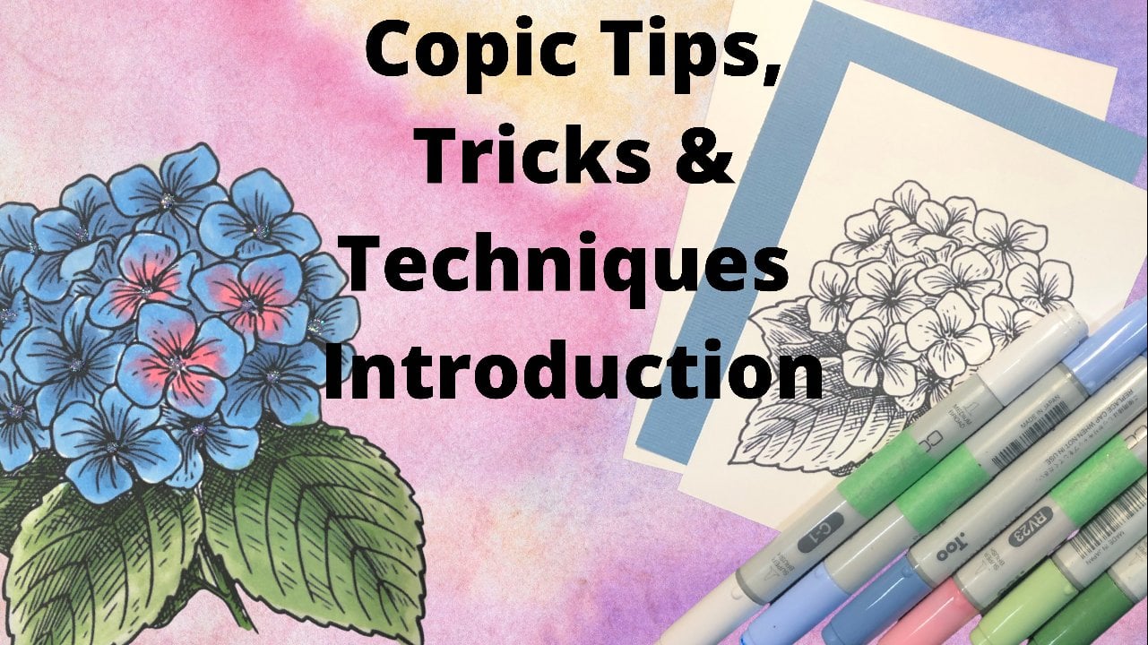
1. Copic Colouring Techniques for Cardmaking Class: Hello and welcome to cope it. Coloring techniques
for card makers. I'm Cheryl and I am
teaching this class. Copic markers are one
of my favorite ways of coloring and images
when I'm making cards. Now, I'm using kopecks in this class and you
could use other alcohol markers as well. I know there's others
on the market. Kopecks are the ones
that I've always used. And they were out before
some of the other ones. So they're just
what I stick with, but you can absolutely
use other more. Let's go take a look at what we're going to cover
in this class. These are the three
cars that were going to be creating in this class. We'll start with the
first one is fairly flat. We're just using two
different shades of each color in order to blend. And I'll show you how to
do that with that one. And I'll also show you how
to get a little bit of shine and dimension
with an added product. For the second one, we're
going to level it up. We're going to use three
different colors for our shading and just get a bit
of a deeper shading with your coloring. And then I'll show
you how to add some glitter to your furious
to make them sparkle. In the third card,
we're going to combine all the techniques that we've learned in the first few cards. We're also going to add
some extra dimensions. So we're going to color
some extra images, pop them out a
little bit and get a lot of dimension in our cart. We're also going to color
some embellishments to coordinate with
the card as well. Now like I said, I'm using
Copic markers for this class. Every color that I'm
using will be listed on the supply list that
is with this class. And those supplies are linked to where you can purchase them. And like I've said,
I'm using kopecks. Other alcohol markers
will work as well. And then if you chose
not to do fairies, you could use other lined
image stamps as well. You just want to pick
an image that is, has got some good
area to color in. Now, let's go start coloring.
2. Lets talk about Copics: Alright, so before
we start coloring, Let's talk about
kopecks a little bit. So Copic markers are
alcohol-based markers. The ones that I'm using
in this class or chose. They also have
sketch, an original. Original has different
tips to them, but the sketch has the exact
same tips as they chose. The only difference
is the pen shape. The chow is our circle. And the sketch, I have an oval shape to them so they
don't roll on your surface. And they also hold
a lot more ink. So these ones here have a chisel tip as well
as a brush tip. For the most part, it's
the brush tip that I typically use when I'm coloring. There's a few techniques
in a few different things that I'll use the
chisel tip for. But for general coloring, I don't really use
the chisel tip. Now the nice thing
about the capex is you can get refills
to refill them. And typically if I'm in
the middle of coloring, I will just drugs ink on the different tips to suck it in so that I can
continue coloring. If I'm not going to be
coloring for awhile, I will pull the chisel tip out and I will put some
ink in the center. And if you look online, there's someone that has
figured out exactly what the weight of each pin
should be when they're full. That's an easy way to know how much ink so you don't want to
put too much in there. I typically will do
tend to 20 drops depending on how dry it is. And then if my tips
are super dry, I'll also put some on
the tips of the pin. Know I only pull out the chisel tip because
the brush tip, there's a little core in
there and sometime in it. So this is a lot squishier. This is the chisel
tips a lot more dense. And sometimes if you
pull on the brush tip, you'll just pull the
outside part off of that core and you'll
ruin your tip and you have to replace the tip. Now speaking of replacing tips, the nice thing about kopecks is that if you have a tip that goes bad and the odd time
that does or breaks down. And if you do a lot of
coloring, that's possible. You can get replacement
tips for your pins so you don't have to throw a pen away because the tip has gone funny or broken down or whatnot. They last a long time. They're really, really
good qualities, but sometimes it does happen. So it's really nice
to know that you can refill the ink and
the *** in the pins. And you can also replace the tips so it makes
it more economical. They're definitely more of
an investment to start. But compared to diabase markers, they will last a lot longer. And in the long run they end up being more economical because you can refill them. Now for stamping. And this refill here is an old-style they've
done the packaging, so the new ones are a
little bit different. The refill inside is exactly
the same for stamping. If I'm just stamping
and then coloring, I'll use Momento, tuxedo, black or whatever color. If you wanted to use a color, I typically will just do black. If you want to
emboss your images. I like to use
brilliance graphite, black, and then clear powder. You have to use
clear powder because the alcohol in the
marker will start breaking down that
embossing powder. And you don't notice it
with the clear powder. But if you're using some colors, it can start to streak
in your project. If you're wanting the embossing
to look like a color, you can use a color of
brilliant sink and then emboss it with the clear powder and get the same
effect that way. But this is the one I use
for embossing with it. Now speaking of ends, one of the pens that has a clear top cap is called
the colorless blender. This is not how you blend
two colors together. To blend two colors together, you take a light color
and we'll get more into it as we're
coloring and images. You take the light color. You add some shadow
with the dark color. And then you go back
with the light color. And I use a circular
motion rate where that light and dark meat and then use that light color
over the whole thing. That is how you blend
two colors together. And this is just quickly done so it's not
colored beautifully. To remove color, you're going to use
the colorless blender. Now, I've got a dark, darker red here with
the dark colors. It's not going to
remove it completely, but it's kinda faded enough that it's not nearly
as noticeable. So if you happen to color
outside the line or whatnot, this is how you can help fix it. So for this, I definitely use the the chisel tip on my marker and you can see how that's changed
the color there. So I will use my chisel
tip to color it over the color Over the ink
that has gone outside the lines or wherever
you want to remove it. I will do that. Let it dry completely and
you can tell when it's dry, when the paper is
completely dry. So I can see with a wetness of where the paper is wet still. From the marker you
need to wet tilt, wait until it's
completely dry because if you keep doing it
while it's wet, it's just going to make that
area bigger and bigger. It's like the it's it's
almost like a thing of water. It'll just keep going
out and out note. And if you want to remove a
color just in a certain area, you need to do this,
let it completely dry. It's not totally dry, but I
think it's dry enough that I can you're gonna do it again. You can see how that's got
less color than that there. So it does take some patients to fix an area that happens to have color
that you don't want. But you can get it light enough so that it's not
nearly as noticeable. Lighter colors you can
pretty much remove totally. There may be just
the odd little bit, but typically the person that notices most is the person that's doing the coloring
or the creating. So just remember, the colorless blender doesn't
blend, it removes color. So now that we've gone over
those few basic things, I'll see you in
the next video and we will start
coloring and image.
3. Find Joy in the Ordinary Card: Colouring Part 1: So for the first card, we're going to do this
little image here. So I've got my stamp here. I'm just going to stamp on this scrap that I was using
for the earlier video. I've already got
my image stamps. I like to stamp it and
then let it sit for about ten minutes or so so
the ink is completely dry. I don't want a chance that
the ink hasn't totally dried yet and possibly smear. It. Makes sure that you've got
ink over your whole thing. Once you put your
image where you want, I like to hold it in the
center and just press gently around to
make sure that I have a really good clear
impression. And there we go. So this isn't going
to go to waste. I'll color it and use
it for another project. But like I said, I
like to make sure that my ink has a really good chance to completely dry before
I do anything with it. Now the first thing
I'm gonna do is not actually even coloring. See how I've got this
gray around the outside. I like to do that. It's kinda like a full mat. I'm gonna do that on a
scrap piece of paper. Now the reason I like to do
this ahead of time is a very, I'd chance that
your marker slips and you have to re
stamp your image. Better to do it now, then once it's
completely covered. So I'm using the long
side of my chisel tip. And I'm most of the pressure
is going off of my piece. And I'm just running it
alongside the paper. If your paper is heavier, you'll have an easier
time with this. If it's lighter, That's when it's got a better
chance of slipping. But it's a great way to add
the illusion of a mat on your image without needing
another piece of card stock. And it also just
makes it pop up off of the Greenpeace in my opinion. Alright, so let's get that scrap piece of
paper back again. I like to color with a scrap
piece of paper underneath because you'll see here, your ink will go underneath it, soaks right through the paper. It's meant to do that. It's supposed to do that by having a piece of
paper underneath. You have somewhere
for that to go. It's not going to go onto
your surface and then have the possibility of
absorbing the ink. Because if I, if it sinks into the paper or
onto the surface and I've moved it and say I'm coloring with yellow and
I've got green underneath. There's a chance of
rehydrating that green. I want to make sure
that I'm on a piece of paper and I typically try not to move my image as
I'm coloring it. The very first layer
of color I put down. I'm just kind of light. It's almost like I'm using
little feather strokes. It's very, very light. It's a very small amount of ink. There's not gonna be a whole
lot that goes through. I'm going to use my darker gray. And all of the colors that I'm using will be listed
on the supply sheet. I'm just adding the darker color where I want to have the shadow where I want it
to be a little bit darker. And typically that's when
it goes behind something. When I'm coloring, I'm kinda pretending that the light is
coming from the top here. Now I'm going to in
a circular motion, I'm just going right where
that light in that dark meat. Then I'm going over
the whole thing again. These are fairly small areas. I'm usually pretty light handed with it and
I'm just going to these little water droplets. I turned them this
color as well. Just to give them a little
little bit of color. I think I've got them all. I'm going to need
this one later. Alright, now let's do the
mushroom on her head. I've got the lightest color. This one is like a grayish
or gray brown or gray beige. But I thought it was perfect
color for a mushroom. It's one of the neutral
colors of copic is W. This one is W1. It's a warm gray. But I thought it was
perfect for the mushroom. So for these ones, I'm just using two
colors or two shades. When I'm doing my shading. In some of the future cards, I'm gonna do 33
shades of a color. Sorry, I'm having a
hard time coloring. At the same time. It's actually kinda funny. Alright, so I've got
my darker in there. And now I'm gonna go back
a little circular motion. Just blend between the
dark and the light. And then go over
the entire thing by using two colors
to blend for. When you start,
it's a little bit less intimidating than
three colors to blend. But once we get to that, and I think it's I
can't remember whether I did the three colors in the
second card with the card. It's not too hard,
but it'll just give you a deeper shadow. So for the underside
of the mushroom, I'm using the medium
gray and then the darker of the warm grays. Just so that that's a little bit darker than the top
of the mushroom. I'm going to do the darker
color right where her hair is beside the bottom
of the mushroom there. And then go back with
the medium color. Blend between the
medium and the dark. And then go over
the whole thing. And you'll find when you
go over the whole thing, it just darkens
the entire color. And it just deepens that. Alright, so we're
gonna do the same on these tiny mushrooms here. I'm gonna do the lightest
up the warm grays. Then the medium tone. This is one of those things that it seems like it's so much harder when you're
when you're new to it. But as you get used to it
or there's a pattern to it. So when you're blending
with two colors, it's light dark, and then back over with the light
with three colors. It's light, medium,
dark, medium light. But you'll see with
just the two colors, you get a decent amount
of shading in it. I'm just going to do the
medium and the dark with the underside of that mushroom. There's really not a whole
lot of area to blend. We still do it anyways. Alright, now I've got
some browns here for her hair because there's not a whole lot of
area for her hair. There's not really a whole
lot to do shading with, but I will still add some dark areas closer to where her hair
goes behind her face. It's funny how just
a tiny little bit of a darker color just gives it more depth, more interest. Next, we'll look a little
bit more realistic. And I just realized that I missed this
part of the wing here. The nice thing about cope x2 is if I wanted to go
back into this mushroom, say I wasn't as shaded
as I wanted it to be. I can absolutely
go back into it. It's not a one and done. When you're working
with dye markers, you are very conscious of how much time you're
coloring on that image because sooner or
later that paper is going to start to
peel and to break down. That doesn't happen
with Copic markers.
4. Find Joy in the Ordinary Card: Colouring Part 2: Okay, there we're now I'm
going to do her skin. I'm just using this
as E0 and y12. Very, very pale. I'm not adding a lot
of color or a lot of shading to her skin. I have another class on
here and it's Copic tips, tricks and techniques that goes cover skin a little
bit more as well as gifts. Different color choices to get different skin tones for
different ethnicities. The other thing you
can go online as well. There's a lot of
different information about kopecks online to get different color combinations
for different skin tones, which is great, as well as different hair colors
because there's so many different
hair colors as well. I just did the darker
part on the outside. Underneath her chin,
underneath her arms here. A little bit where her
shorts meet her legs or her outfit meets her legs and a little bit underneath
her boots there. Now let's do her little outfit. So lightest color of green. Now, there's a thick gray line there and then
there's none here. The thick gray line
is this brush side. And it's I always get it mixed up in my head that that
should be the chisel side. But it's not. But for some reason I always do the cap from
the chisel side first. And I've been using
kopecks for over 15 years. I want to say it's probably
closer to 20 years now. And I still do it. There we go. Add a little bit of shadow
with the darker green. There is an image there to show the brush or
the chisel side. So often you'll
see me rolling it around and I'm looking
for that image. Put a little bit of darker areas in the creases of the fabric. Now, as I said before, with the coloring
or with the using the colorless blender to fix. I was talking about how if you color over and over
the same area, It kinda goes out. I keep that in mind while
I'm coloring as well. If I'm heavy handed with
the marker is just adding more ink to the paper and it's gonna go outside the lines. So I'm careful to be fairly
light handed with it, especially when I'm coloring smaller areas because I don't want that ink to
go outside the lines. Now the other thing that
is fabulous with kopecks, similar to using the
colorless blender to remove color when you take an opposite color or
a different color from what you've just colored. Fur in this instance,
I'm just using the, doing the polka
dots on her skirt or on her little Ron per thing. By tapping down that marker, I'm getting little yellow dots and it's pushing the green away. So I see yellow, I don't see yellow-green. So you can play with the
markers and get some really, really pretty looks out of them. You can do the same with say the chisel and create bricks. You can use chisel and stamping it onto
a different color and it moves that color and
creates the look of bricks. Little last thing I want
to do for coloring, and I'm using all three
of the warm grays, is I'm going to give her a
surface to be standing on. Otherwise, it kinda looks like
she's floating in the air. So I am using a bit
of a circular motion. I don't want this to
necessarily be like a line. I'm trying to give
it some shadow, give it just a little
bit of movement. So I did the lightest
color first, medium color, and then I'm just
going to go in with the darkest color in
the middle of it. And this is a great
way to kind of practice with those
three colors. Now I'm going with
a medium color back over to blend it out. And then I'm gonna do the light color and blend it out further. And kopecks take a
little while to dry. So you may notice you're
not really super happy with something while you when we've just
finished coloring it, let it sit and dry because often in the drying time it
continues to blend. It'll just look nicer once it's done and once it's dried up. Alright, very last thing and you might not even
be able to see it. I've taken my lightest gray C1 and I like to
outline my markers. And this is something that
people don't actually see until you
pointed out to them. But what it does is it gives it a little bit of
a shadow and it just makes your image to jump off the page a
little bit better. So I use the brush tip and you don't have to be perfect
with this at all. That I just outlined the image. And when I say you don't
have to be perfect, perfect with this at all, your brush tip is going to have a little bit of
flexibility to it. It might be a little bit wider in some areas and
lighter in some areas. That's fine. Like I said, this is such a light color
that most people don't even notice it until
you've pointed out to them. And I've done many COBIT classes and worked in a store where
I had a lot of samples and would regularly
need to point it out to people because they would ask about something or whatever. And it wasn't until I pointed it out to them. They even noticed. Alright, so our images color, I'm going to let
them dry for Letter dry for a few minutes. And then I'll see you
in the next video and we'll put our
cards together.
5. Find Joy in the Ordinary Card: Assembly: Hey occurred has dried and we're ready to
glue it together. So I've already got my
pieces cut and ready to go. The measurements for these
will be on your supply list. This one here, it
goes up a little bit, leave some room for a sentiment to be
stamped on the bottom. And in all honesty, the reason there's that space is because when I
was doing my sample, how I was talking
about the outline for this and how it's
better to do it at the beginning because you might accidentally have your
markers slip and color in. Well, that's what happened. So I ended up
cutting a piece off. And then using this for the
sentiment on the bottom. All about creative
problem-solving. Alright? So I'm using a white ink
pad to color on there. I'm going to put some
magnets down here so that my card doesn't move. Just that the off chance that I have to stamp it a second time. If by chance when you're
inking your stamp, you see it go around
the edges of the stamp. Then wipe those off
before you stamp it because there's a good chance you're going to transfer
it to your card. So this one here, I'm
actually going to do it twice just so that I get a little
bit of a darker white there. This is a white dye ink. You could use a white
pigment ink too. I just wanted I didn't want
it to pop out too too much, but I did want to be able to see it. So
I stamped it twice. Now, very last step. With Copic markers, with
the alcohol markers, you can put things on them and that ink is not
gonna go anywhere. So I'm taking some
Glossy Accents and I'm just going to put it on my little raindrops to give them a little bit
of shine and dimension. And it's not going to change
the color underneath them. I mean, this one, I don't have a lot of color underneath it. But you could go over
to different colors in the same amount or in the
same thing of Glossy Accents. And it's not going to affect
the colors in any way, whereas die markers that
sometimes changes it. So there we go. Our card is done with
these wet Glossy Accents. You want to set it aside to dry and don't touch it
for a little while.
6. Never Stop Exploring Card: Colouring Part 1: So this is the card
that we're going to create for the second one, I've already got
my image stamped, grabbed my piece of paper
here to go underneath, and we are going to do color
blending with three colors. So first I'm going to go
in with the lightest of the colors and just create a base layer of color. If I wanted to, I
could do all of the light colors for all
of the mushrooms at once and then do the shading
at once as well. But I tend to like
to do one image at a time to make sure that
I don't miss any steps. Now we've got the medium color and now let's go in
with the dark color. Just darken that sheet
a bit or shadow a bit. Alright, now we go back in with the medium color and rate where the medium and the dark meat. We're going to blend with the medium color and not
with the light color. First blend where the light and the media meet and then
go over the whole thing. And then same here. Like I said before, it will continue to
blend as it dries. Now, I did go out
of the lines here, so let's go grab our colorless blender
a little bit there. Let it dry completely and I'll continue to color while I'm
waiting for that to dry. It really depends on the image. Sometimes I'll just leave it because if the color
that I happen to make that mistake is light
enough when I go and color around it
with the light gray, sometimes that's
enough to hide it. But typically if
it's darker colors, I will go in and fix it. It's especially easy if
you're in the middle of coloring because you can occupy yourself with coloring
the different parts of the image while you're waiting for that
to completely dry. Anytime you go behind something,
there's a shadow there. So I've got the shadow right around that tiny mushroom then. And then also at the bottom, once again, I'm pretending that the light is coming from above. The shadow is in the inside
here. Read up there. Technically there
doesn't necessarily need to be one there, but I always tend to
join them together. Let me go now with
the medium one. And these images
are small enough that does circular motion. There's not really
enough room to do it. So you'll see sometimes I don't even do the
circular motion. I tend to do it with
the lightest color, just because that is
usually the whole image. We go. Red color is done. Now let's do the
green for her wings. And the fun part about fairies is the sky's the limit really, when it comes to colors,
you can have fun with it. You don't necessarily have to
color everything the same. Exactly that I'm doing. You can just have fun. Now I didn't do too much for shadow, for these little
palm palm things just because they're so tiny. Darkest of the greens right
behind her back there. The difference
between doing shadow with one color or two colors is really
personal preference. Some of these areas are just so small that it doesn't even, it's not even really worth it to go in with a third color. Then for her hair, I'm giving her some blonde hair, but I'm only doing two colors
because there's just not enough area really to do. Three. Really. This is quite
a yellow blonde, but I was trying not to
do them all brown here. I tend to do brown hair
simply because it's a little bit more natural than some
of the blonde yellows. Alright, now let's do her skin. I realized I just miss
this area of the mushroom. Just did a quick jerk in the medium color basically
because it's behind her. It would be darker. I'm assuming it's history. A little bit of
shadow by her hair, my chin, I'm in the arms again. You'll find that coloring with alcohol markers
are pretty forgiving. And the more you practice, the more you get to know
how much ink to put down. How much is too much. Even take a little bit of
the pink and lightly dab the cheeks to give her a
little bit of a rosy cheek. You have to make sure
that the color you use is quite light though, because sometimes it ends up just looking like
dots on the cheeks. All right, let's go
back and just add a little bit more blender
because that's completely dry. I realized that I forgot
to do the outline. And like I said before, I
usually like doing it before actually coloring
the image in just at the off chance that
there's a bit of mistake. You have the chance
to Marie stamp.
7. Never Stop Exploring Card: Colouring Part 2: But that worked out. Okay. Alright, now lastly
we're gonna do a little shorts and the ground. The ground, they do it exactly
the same as the other one. I don't really want lines. I just kinda use a
circular motion. You could, if you want, completely color the
whole background, give it a sky, give it
some grass or whatever. I wanted the focus to
stay on the image, so I chose not to. But it is your project. If you want to
color in the whole back on, you absolutely can. And go back with
the medium color. Blend the dark one out
just a little bit. And then with the latest no shorts, little bit of shadow where
the pooled is there. And then on the bottom, I've seen tutorials
where some people, rather than do the light
medium, dark medium, light. They just do the dark,
the medium and the light and have beautiful results. I've always been taught
and doing it this way. And so that's what I always
do and I'm quite comfortable. So you'll notice that
is quite a bit lighter. I could take the time and
make it even lighter, but I don't think it's actually even
going to be noticeable or very noticeable by the
time I go and do this with the latest if the grays. So I'm just going to leave it I don't outline the
ground part just because there's not really
an outline to that. You can see how
very simple and how quick it is to outline it, but it just it just makes it pop off the
page a little bit. All right. There she is done being colored. I'm just gonna wait for a
moment for all the ink to dry. And then I'll see you in the next video and we'll
put the car together.
8. Never Stop Exploring Card: Assembly: Our image has sat for a
moment and completely dried. Now let's glue or layers down. So first though
civil coral layer, and then the green one, and then the image piece. But you see how much ink
went through the back. That's when it's nice to have
that scrap paper underneath to suck up any of that
ink if there's excess. I know there's so many people
when they're new to capex, they panic that it's
gone through the paper. It does that. It's
supposed to do that. Nothing to panic about. Alright, I'm going to actually, I'm going to open this
up just to make this a little bit less thick. I put my magnets down
to hold it in place. Got another small sentiment here that I'm going to put down. Make sure your stamps are clean when you're putting them
down like this because we don't want to be transferring ink while
we're positioning it. Going to use the
same black that I used for stamping the image? Once again, if you get anything on the
outside of the stamp, make sure to wipe it
off before stamping. Otherwise you're gonna
get something like that. Just little ink mark
that you can't remove. There we go. Let's move
this out of the way. We're going to add one
more element to this. So last time I added glossy
accents to the raindrops. For this one, we're going to add some
stickers to her wings. Just to make them a
little bit sparkly, make them a little bit pop. I always love doing that because especially
with coping projects, because I know the
ink is going to move as well as the fact that it just adds a little different
layer of texture to it. I'm just going to
add it to the love poem pumps do because why not? I didn't do it on the
sample, but why not? I'm going to set that
aside to completely dry. It does take a
little bit for it to dry depending on
how much you add. And then once it's dry, it reduces in volume. But you get left with the
little sparkly their associates and sparkly wings. I'll
see you in the next card.
9. Fairy & Snail Card: Colouring Part 1: So this here is our third card. So we're going to build from the techniques that
we've learned. We're gonna do a little bit of coloring with or shading with three different shades
of the same markers. But then I'm also gonna
show you a different way of blending colors. And this works
especially if you have two completely different
colors rather than shades of the same color. We're also going to color
this image multiple times and then layer it up and pop it up just to give some
extra dimension to the card. So I'm only going to color
it one time onscreen, the other two times, I'm going to color
it off screen. That way you're
not watching me do the same thing over
and over again. Technically, two of them need to be colored completely in the third one. The third layer is just this top of the mushroom and
then this flower. So technically you could
just color just the top of the mushroom and
just the flower and the leaf and
stem or whatnot. I typically want them doing this technique will
color completely, and then I will choose
my favorites as to which ones to
color or to cut. But your choice if
you don't want to color three images completely, you absolutely don't have to. I typically love just
sitting in coloring. I find it very therapeutic,
very mesmerizing. So I really like doing it. So I don't mind coloring something incompletely
three times. For this, I'll probably
just be coloring the mushroom and just the flower just because I'm already doing, going to be doing to completely. But your choice. Alright,
so first of all, we're gonna do the top
of the mushroom cap. This is exactly the same as the last mushroom with the
three colors for shading, the only difference
is this one has little warts or whatever you wanna call it on the
top of the mushroom. So I am going to
avoid coloring those. You could color
them in and we're gonna be using a product on top of it that is opaque so
you could color it in. But I just typically don't. It doesn't take much
to go around it. And technically for
the first two layers, you can go right
through it because you're not actually
going to see it. I'm just going to
realize what it was. So this is the bottom layer,
It's totally covered. So I'm just gonna
do the whole thing. Technically don't even
need to do the shading and this one simply because
it's covered twice, but I'm gonna do it anyways
just so that you can see it. I know some people
when they're doing things like this where
they're layered, they don't even bother coloring
the layers underneath. I always do because it
bothers me when you can see the line of the image
underneath that is not colored. But it's entirely up to you. In my opinion, it's very
good practice for coloring, but if you really
don't like it or don't want to be doing the same thing. You don't have to. It's one of those things that's completely
a personal preference. For this one, I'm just
flicking the color up to blend it up a little bit. Technically, I didn't
need to do the, the medium and the light
color on this ring around. I just did to blend it up. I'm just flicking it up same
as I did the other layer. That will do it completely. Ready, go with the same color. We're gonna do a flower. Obviously. I mean, you see, I'm putting the colors that I'm using
on the supply list. You can absolutely
swap out the colors. When I chose colors, I typically chose them two
dash three numbers apart. So I've got our 32 or 3537. That's the general rule for picking colors is
in the same color. Family two to three apart. Especially when you're starting out once you've gotten used to that system and get
familiar with your colors, you can break the rules and change which colors you
want to put together. But for beginners, it's a good system to follow is just a couple of numbers apart. That way, you know,
you're not going to have colors or shades that class
would clash with each other. There we go. Or flower is done. Now let's do the wings here. So for the wings, we're doing two opposite colors. So I'm doing the pinky
brownie color to the yellow to blend
two opposite colors. You start with the top, flip down, and then I start with the bottom
and then flick up. And those colors start
to blend in the center. And then I go back
and do it again. You can do this as many
times as you want. I typically do two to three. I find as good. But as those inks dry, they blend even more. I'm gonna do the same
thing for the dress, but I'm gonna go
from yellow at the top and green at the bottom. Then for this one I
am going to go, well, I ended up grabbing the
medium shade if the greens, but I'm gonna do a little bit of the darker yellow on the top. This isn't the one
that I actually know. I'm not gonna do
that on the bottom just because I have
the darker color as my stem. I don't
really want it. I want it to pull or to pop out. I don't want it to blend
into the color of the dress. I'm gonna go back with a
lighter yellow it down. Try this with different
colors because it's just fun. A fun way to blend
colors together. And you get some
unexpected blends between two colors,
doing it that way. Alright. You do the rest of the
leaf and stem here. I always love that
you can go back in and go over it again if by
chance you missed a detail. I love knowing that I
can keep going over the same area over and over. My paper isn't going to start
to break down and pill. Alcohol markers are
definitely my favorite for coloring for that reason. Now, having said that, there's other alcohol
markers on the market, the only ones that I
happen to own our kopecks. But the other markers will
work very similarly to this. I ended up or I had kopecks when some of the
other ones came out. So I've tried them at trade
shows and stuff like that, but I was happy with what I had. I've kept with that. But you can absolutely do
these same techniques with other brands of markers
at alcohol markers. Let me clarify that because diabase markers work a
little bit different. I didn't want it. That was not supposed
to be the mushroom that we're supposed
to be her skin. That's okay. I find coloring.
These are perfect for like you put a little
movie on and then just sit there and color to your
heart's content and you be amazed at how quickly time passes when you're
just just coloring. So when I'm doing this skin especially I tried to keep
it very light because I don't want it to get too dark
and saturated with color. Because sometimes, especially
with these colors, attempts to look a
little bit peachy. It sometimes.
10. Fairy & Snail Card: Colouring Part 2: Let's do the correct color. Then the medium shade back and blends the
medium with the dark. And then finally the
medium with the light, or the light with all of them. We go, Let's do a little boots. I'm going to do the little
ground around them too. While I'm doing the boots. While I'm doing it might as
well do the snail shell. With a snail shell, I
do it at the bottom, keeping track of
the light source. And I also do it
where those swirls of the shell meet out a little
bit of shadow in there. Man will deepen the shadow. You can see on the first
couple layers, I'm not super, super careful because I know that I'm gonna be
going back over it. I don't wanna get too
much ink in there. A little bit more
careful when I do the final layer because
that's going over everything. It's blending
everything in place. There we go. And last
but certainly not least, I know it's not really
a normal, solid color, but I wanted to add another
copy, yellow in there, which is interesting for me since it's not
my favorite color. Just tied in the colors from
the little girl's image. This a little bit more. Alright, so this is done. I'm going to go off
screen and I'm going to color this image completely. And then I'm just going to color the top of the mushroom
and the flower. And I forgot to say, Oh no, that's, that's
just got two layers. That was confusing myself
for a second there. So I'll see you in the next video and we
will start assembly.
11. Fairy & Snail Card: Assembly Part 1: Alright, so our pieces are
colored and ready to go. I need to do the
detail cutting still. But before I start that, I wanted to show you how you can customize
embellishment colors. So this is one of the reds
that I used on the mushroom. I just have some pearls here. I do at wallets on the
sheet and I do this with ones that have a
sticky back to them. If you have loose ones, it's a lot harder to try
to hold them in place while you are coloring them. So I always do it with
adhesive fact ones. You can also do it with breads. You can do ribbons to
color match your project. The only thing with ribbons
is if you're tying a bow, you kinda have to tie it
while the alcohol ink is wet because when
the ribbon dries, it ends up being
quite a bit stiffer than it was without the
alcohol ink coloring on it. So just be forewarned of that. Alright, we got
those pieces down. Now it's time to what? I'm going to speed up the
cutting here so that well, just because cutting is
like watching paint dry, really speed it up and
see you in a moment. Alright, or pieces are cut out. You'll notice that I
cheated with that one rather than poking
the scissors through, I cut through it. Yes. I cut I poked through
and cut those bits out there. It's annoying to do, but it looks so much better
when it's done. So let's start gluing these on. I use foam pop dots. I like to use ones
that are fairly thin. Because I wanted to
mention to this, but I don't want
the car to end up being like a half an inch thick. These ones, the tops
are fighting with me. There we go. And then it's like it's just piecing
because you're just matching the pattern exactly
where it is on the card. And why such a large
piece like this? I do like to put
a lot of them on there so that it doesn't
cave on some parts of it. Press them down first and then let's take
these backings off. Kind of necessary to have nails to take these
backings off. It makes it easier for sure. If you don't, then just take a pair of tweezers
and that will help you pull the tape
backings off as well. Alright, and then I do like
to put a little tiny dab of glue where this stem is, and I'll show you what I do
with that in just a second. Alright, so once again, this gets glued exactly
over top of the image. I like to hold this down. It just gives it a little
bit of a flow to it. Then I do a similar thing
with the top of the mushroom. I'll put the one flipped
and stuck to me. I'll put the foam
dots in the center. And then I'll put some glue
on the sides to flatten that. And it just so this is
glued to the second layer, it just gives it a little
bit more curve to it. One of those things, It's
not absolutely necessary, but I just liked
the way it looks. I think it gives
it more interests. And hold that down for a second. So what does glue down? And then I do the
same thing with this stem from the flower here. Just a couple of
Pop-Tarts to hold it up. And then I'll put some glue. Sorry, half a sentence there. Put some glue on the end of
the stem here to glue it down. There we go.
12. Fairy & Snail Card: Assembly Part 2: Alright, or pieces are cut out. You'll notice that I
cheated with that one rather than poking
the scissors through, I cut through it. Yes. I cut I poked through
and cut those bits out there. It's annoying to do, but it looks so much better
when it's done. So let's start gluing these on. I use foam pop dots. I like to use ones
that are fairly thin. Because I wanted to
mention to this, but I don't want
the car to end up being like a half an inch thick. These ones tops are
fighting with me. There we go. Then it's like it's just piecing because
you're just matching the pattern exactly
where it is on the card. With such a large
piece like this, I do like to put
a lot of them on there so that it doesn't
cave on some parts of it. Press them down first and then let's take
these backings off. Kind of necessary to have nails to take these
backings off. It makes it easier for sure. If you don't, then just take a pair of tweezers
and that will help you pull the tape
backings off as well. Alright, and then I do like
to put a little tiny dab of glue where this stem is, and I'll show you what I do
with that in just a second. Alright, so once again, this gets glued exactly
over top of the image. I like to hold this down. It just gives it a little
bit of a flow to it. Then I do a similar thing
with the top of the mushroom. I'll put the I wanted to
flip ten stuck to me. I'll put the foam
dots in the center. Then I'll put some glue on
the sides to flatten that. And it just so this is
glued to the second layer, it just gives it a little
bit more curve to it. One of those things, It's
not absolutely necessary, but I just like
the way it looks. I think it gives
it more interests. And hold that down for a
second so it does glue down. And then I do the
same thing with a stem from the flower here. Just a couple of
Pop-Tarts to hold it up. And then I'll put some glue. Sorry, half a sentence there, but some glue on the end of the stem here to glue it down. There we go. Alright, last steps are to add the
remaining details. So I'm going to cut through
the adhesive strip. This is already space, so I'm just gluing
it straight down. For the little warts
on the mushroom. I've just got some
Nouveau drops. This is a white one, so it's just going to add
dimension is going to make those dots draw glossy. Just give the mushroom
a little bit more life, a little bit more interest, a little bit more dimension. So sometimes there's a little sticky string at
the end of this. If you lift it straight up, that usually detaches
and it just goes right onto the job that
you just put there. If you happen to go like this, then sometimes you'll
get a little string that goes to the side. I just get into the habit
of lifting straight up. Now let's give her
some shimmery wings. My opinion, fairies
needs shimmery wings. There we go. I'm also going to add a
little bit of shimmer to the stamen on the flowers, but I want to give them a
tiny bit of color underneath. Just a dotted yellow there. And then for the snail, Let's make us shell shiny. I put it all over a shell. I didn't put it on his body. And then let us give
them a little bit of a slime trail underneath
and behind them there. So there we go. We're going to set that one
aside completely to dry. And once it's dry, this is what you have there. So some 3D dimension popped up plus the dimension
from the sticklers, the glossy accents and
that sort of thing.
13. Copic Colouring Techniques for Cardmaking Class Thank You: Thank you so much
for joining me for cobalt coloring techniques
for card making. I hope you enjoyed learning the different techniques and it's inspired you for
some future projects. Now remember I use
Capex in this class, but you can use any other
alcohol marker as well. And any line stamp image will work instead
of the furious. If you want to do
something a little bit tough to see you
back in class soon. Please take a moment
to review the class. It's very, very helpful.
Have a great day.
 Artsy. Island Girl, Teacher