Transcripts
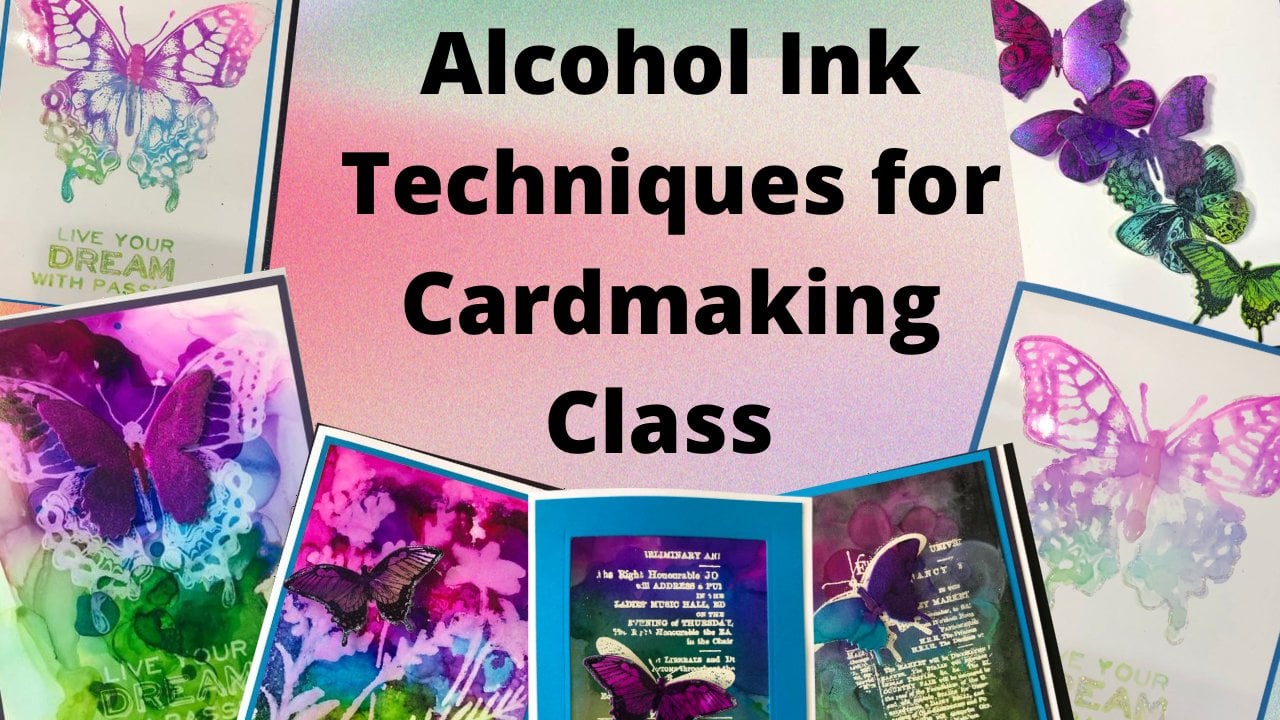
1. Autumn Leaves Stamping techniques Card Class: Hello and welcome to the autumn leaves stamping
techniques card class. I'm Cheryl and I'll be
teaching this class. Let's go take a look at what
we're gonna be covering. So these are all the
cars that were going to be creating in this class. There are a lot
of different cars that were going on doing. We're going to cover six
different techniques, but we're not going
to limit it to that. We're also going
to do spin-offs of each technique now because
I'm doing a bunch of different techniques rather
than having all sorts of different dyes and all sorts of different stamps for each
and every single technique. I kept it simple that way. I'm using the same stamps
for the whole class. No, I haven't cleaned
them off, but I'm using some leaf stamps that we'll be doing all the
different techniques for. And then I just put things
die on the bottom of each card just because
it's full Thanksgiving. I just thought it
was a good blend. This way we can really concentrate on the
different techniques and how they are done without needing all new stamps
for each and every one. Now, I've been using leaf stamps that you can absolutely
change up the stamps. They'll, this will work
for many different images. Some will work
better than others. So I encourage you to
experiment with what you have, just to play around with the different techniques and
see what you come up with. Sometimes things don't
necessarily work out, but you come up with
something really, really cool that
you and you learn something that you
didn't know before. So the very first
technique that we're gonna be doing is just
very simple stamping, but we're gonna be doing
it with multiple colors. And then I'm going
to show you that in two different ink
choices so that we can do a light background
and a dark background. From there, we're going
to move on to embossing. And Emboss resist and
create some cards this way. So I've got some
metallic papers and I've mixed up
metallic embossing. And I've also got some glaze, which is a clear embossing. Then we're going to
work on creating some backgrounds with
some color sprays, some color Micah
sprays, I should say. Those have some shimmer to them and they're
absolutely beautiful. And I'm going to show
you how to do it with colored Micah sprays. And then I'm also
going to show you a way to do it if you
don't happen to have the colored micro
sprays because they are limited edition item. But there is a way to
get a very similar look. We're going to use
some magical is powdered pigment powder that reacts with water and create
some beautiful backgrounds. I'm going to show
you how to create two different versions of cards with those backgrounds. Now, you can see
there they've got some beautiful mica to them
and have some lovely shimmer. The next technique we're
gonna do has Micah powders. It's a fine mica powder that has a binding agent in them
that's activated by water. So I'm going to show
you how to use those. We're going to do them with
the metallics and the colors, as well as the
interference colors, which are a different
way of using them. They just react a
little bit different than the other powders. And then last but not least, we're going to use some
watercolor crayons, and I'm going to show you
a few different techniques with those as well. Now, this class comes
with a supply list that list the supplies used
for each of the cards, as well as showing pictures
of each one as well. Those supplies are
linked to where you can purchase
them if you choose. But you definitely don't need to use just the supplies that are used to create cards with the different
techniques that are taught. So definitely have
fun and explore and experiment with
what you have as well. Now let's curl,
create some cards and learn these different
stamping techniques.
2. Stamping with Multiple Colours of ink on Dark & Light Surfaces: Alright, so the first
cards we're going to make are these ones here. And we're going
to use a bunch of different ink colors to
create some fall foliage. Now you could do one
color at a time and just create a yellow leaf
or a green leaf or whatnot. But it just looks more authentic to have the colors mixed up, but there is a right
or wrong way to do it. So I've got four colors here. First one we're going to do
is on the light background. And we want to start
with our light color first and work our
way. The darker color. If you were to go dark to light, if you went with a yellow and you've got some of
these colors in there. It's pretty hard to get a nice true yellow
stamping after that. So by going light to dark, if I get a little bit of
yellow in my burgundy pad, it's really not going to
affect the pad a whole lot. So you do want to go
from light to dark just to make sure that you're not contaminating your pads. So did the orange there. Now, these are distressing. They are dye ink, so they are transparent. This only works on
lighter colors of paper. The next one we're
gonna be doing will be on a darker card stock. And I'll show you in a minute why we use
different inks for that. I've got my stamps all inked. Now, some of that yellow
and the green ink may have started drawing by the
time I'm ready to stamp. So what I'm gonna do is I'm
going to take my Mr bottle, just a couple of light sprays just to rehydrate
any of that ink. And the extra bonus part
is that is also going to start blending some of
those colors together. I'm holding my stamp firmly in one place and then
moving around. Very, very pretty. I love how those colors start to blend. Nice, full background. I'm going to set that aside
to dry and then I'm going to clean the excess ink
off of my stamp. Now, like I said, you can't use those distress inks
on a dark card stock, but you can use
distress oxide ink on a dark card stock
or any pigment ink. The pigment is going
to make it opaque. You can see right away
as I'm making my stamp, that this is a lot more, right, a lot more opaque ink. I'm gonna do the same process. I'm going to go
from light to dark. I'm just doing little bits on different areas just to get a color blend
between the colors. I'm trying not to get lines from the edges
of the ink pad. Trying to pay attention
to where I've inked to make sure that
it gets full coverage. Then the last color
is my burgundy color. And this one I really
like putting on the edges of the leaves. I just think the leaves look
really pretty when they've got the red tips to them. There we go. Now
to rehydrate that. Chances are most of
this ink is still wet. Pigment ink dries a
lot slower than die. I'm just kinda missed it twice. That's going to
rehydrate anything that might have started drawing. Once again, it's also going to help blend the colors there. So the funky thing
about the oxide and because it oxidizes as it dries. So it goes from being
these bright colors to these muted tones. We're going to need to let
that to dry for a few minutes. So I'll put that aside. Move my ink pads out of the way. Move my stamp out of the way, and I just want to get
off of my surface there, make sure I've got a
clean area to work on. Then while we're waiting
for those to dry, we're going to die
cut our sentiment. Now I am using this
thing sentiment on all of the cards
for this class. Just because it's the only real full
sentiment that I have. Obviously, you can put whatever sentiment
you want on there. The only stamp I have with
false sentiments are really, really tiny and you
won't really see them. And I really want the
focus of these cards to be the leaves and the technique
used to create those leaves. I left the design for this,
these cards very simple. I, I kept them all pretty
much the same design. Just so the focus
would be on Technique. And then what I did
for each one of them. Because most of the techniques, I think all of the
techniques actually are two different versions
of the same technique. 1 s. I need it once again, I need to cut the
breast. Will note. What I'm doing for the
sentiment is I have two colors of card stock that match both of them are
coordinate with both of them. And then you can see this one here is green on top of the bronchi color
or coppery color. And this one here
is the bronchi, coppery color on
top of the green. Once again, just to keep
it nice and simple. But you can do whatever colors work with whatever
inks you were doing. Because of the oxide is
actually change color as they dry it with a little
bit more challenging for this particular one. To choose what color. Do the sentiment in. Here we go. Die pick is one of
your best friends when taking die cuts out of dyes. They all have those holes
in there and it just helps you poke those pieces
out a little bit easier. One is out. You want to make sure that
all those little bits are out before we glue
anything together. I'm going to put that one on top of that one, this one
on top of this one. I'm using some distress
collage medium. Once again, the reason
why I love distress calls medium is it dries completely
clear and it dries matte. If anything comes out, you're really not
going to see it. Now this one, because
the card stock here is metallic and it's
got some shine to it. You probably would see the
difference in the finished. You'd see a mat
area, if you will. But it's gonna be a lot less noticeable than something
that is that dries glossy or that dries
white. There we go. I'm just going to take the block here and hold that on there. That way I don't
have to hold it. You can see I don't put
glue on the entire thing. I put it on any piece
that sticks out in any long area and that's enough. There we go. Put that under their clothes, my glue up so that it
doesn't dry on me. Now, I'm going to put leaf
print on the background. This one is dry, that one
There's a little wet spot, so I'm just going to let that
dry for a few more minutes. I kept my cards in
this orientation, but you could absolutely
change them and put your sentiment there as well. That would also work
really, really well. And every single one of
these techniques are really, really simple techniques perfect for people that are just
starting out with stamping. You don't have to
be an expert to do any of these ones here. It's also fun to do, to learn a bunch of different techniques
with the same stamp. Now I'm using fall leaves here. You could do Christmas foliage, you could do pretty
much anything. For a lot of these, you just want to have some, some solid space and
some open space. Just makes it look a little
bit more interesting here. That corner is still or that
little area there still wet. So I'm just going to
dab the excess off. I'm always fascinated with the oxide inks that how the
color changes as they dry. So interesting to me
how it does that. And it's also really cool
that there is an ink, as in pigment ink
that you can use on dark colors and see them. Because if I were to take these inks and stamp them on here, but you won't be
able to tell there was anything on there. There you go. Two cards down. We just need to let
them completely dry. But very, very simple
techniques there. We'll see you in the next one where I show you another one.
3. Embossed Stamping & Emboss Resist Technique Part 1: All right, For our next card, we're going to do some embossing on card stock using
the same leaf stamps, but we're gonna do it
two different ways. The first way we're
going to do it is with opaque metallic
embossing powder. So I have my stamp here. I'm using versa Marque Inc. It's a nice sticky ink
and that will help the embossing powder stick to the image while we're
melting it with a heat gun. I'm making sure that I have
this covered really nicely. Once again, I've put it on some white card stock just so I can see where I'm stamping. I'm also going to be pouring the embossing powder over it while it's on this card stock so I can take any excess and put it
back in the container. There we go. Now I've got a few
different metallics here. I've got a rose, gold or gold. And it's called bronze, but it's also kinda coppery. So what I'm gonna do
instead of pouring, typically if I pour, if I
embossed with one color, I'll just pour it
right on the area, poor whole lot and then
dump off the excess. But because I'm trying to
mix a few different colors, what I'm gonna do
is take a pinch of each one and sprinkle it on. And that way we're
gonna get a mix of the different metallics and create an interesting
backing background that way. Now because I'm mixing them, obviously you can't put
them back in the container. So I do keep a container of all the mixed metallic ones
when I've poured them. That way I can reuse like
just a mix. If I need to. I'm going to do here. I'm going to tap
the excess off now before tilting it, I'm
just gonna do this. So it kinda just jumps around and sticks to any exposed ink. Look off the back to get
some of the excess off. Now, before putting this back, I'm going to just take my mixture just at the off
chance that there's an area that has ink on it that wasn't didn't doesn't have
any of the powder on it. Just going to pour the
whole mixture over there. That's just going to
stick to anything that might not already
have powder on it. Just flicks off
the excess off of anywhere that doesn't
have any ink. For our mixture back
in the container. I labeled the top of my little containers just
so I know what's in there. Now I'm going to melt
it with a heat gun. So this is a heat gun I've used. I've had it for about 30 years. It works really, really well. The thing with using a heat gun is you don't want
to go like this. You want to direct
it and just slowly move around while the
powder is melting. Anything that's not stuck
to a stamped image. If you don't flick it off or take a brush and brush it off, It's just going to melt
right onto the paper. Just so be aware if
there's something you don't want on their brush it off before you start melting. So often when you heat emboss, the paper starts to warp. To even that out. I'll put some heat on the bottom as well. Not going to completely
eliminate it, but I do find it takes some
of the excess warpage. Oh, but once you glue this
down to your card front, that's going to go away. So there we have our
mixed metals there. This would also work on
any colored card stock. The metallic embossing
powder is opaque. So it's going to work on any type of card
stock no matter what. Next one we're gonna
do is this one here. So this one we're gonna do on
a light colored card stock. I know it looks like it's
on dark but it's not. We'll show you how
you would do that. Now, I'm using embossing glazes. For this embossing glaze is a transparent embossing powder. So if I were to have, say, a printed paper and to stamp and emboss with the
glaze over top. You would see that print. Through the embossing powder, it would still be
tinted the color of whatever glaze you use. But you'd still see that
print underneath there. There's some fun things that
you can do with it that way. So my paper is
obviously not printed. It's just a solid
piece of card stock. We're gonna do a very similar technique to what
we just did with the metallic embossing powder. But we're gonna do
it with the glazes and then we're going to make our card stock have a dark
background once we're done. So it's basically the ink that we're using
afterwards is going to be resisted by the embossing that we're
creating right now. You don't have to
make your background dark after putting
your powder on there, you could keep it
light if you want it. Alright, so same process, doesn't matter what
color you go first. I'm just going to
go one at a time. It takes you pinch of each of
the colors and sprinkle it as if you're sprinkling sugar
or salt and you're cooking, wipe off your fingers
between time. We don't want to get different colors within
the different jars. I've just chosen some
fall colors for this. If you chose like if you
had stamps that were say, winter foliage or whatever, you choose, whatever colors are appropriate for the
stamps that you have. This would, this would
work with basically any stamp, best one, that, ones that have a little
bit of solid next to them, they don't need to
be completely solid. But if it's just
an outline stamp, you're likely not going
to see a whole lot of the different colors with
it. But play around. I mean, it only
takes a little pinch of each of the powders. And those powder or those containers really have
a lot of powder in them. There we go. So same as before. What I'm going to do is pour
my excess rate on my paper here. Pick up the paper. And I think we can also
do it this way here. I'm going to say I think
there's an area of my stamp damage there that
didn't get any powder on it. I also keep an mixed
in Boston glaze. One here. This one has got
more than these colors in it. So here we might
get a little bit of other stuff in there. But it's just to
fill in any areas of exposed ink that don't
have any powder. Powder can go read into
the container again. Let's move these over here. Melt the powder. Flip the card stock around, make sure that when you're
doing, you're in Boston, you're using your heat
away from your hands. It does get quite hot. There we go. So just tilted in the light, anything that's not melted will not be shiny and the light. Just going to check
this break here because there we go.
4. Embossed Stamping & Emboss Resist Technique Part 2: Alright, now I am turning
this black or dark, background dark, but
you don't have to. You could do it like this
and leave it like this. You could ink it and
whatever colors you wanted. But the cool thing is the embossing powder is
going to resist the ink. So I can take a paper
towel or a napkin or whatnot and I can wipe off
the ink off the powder. You can start anywhere
on your paper. We're just trying to make this
as dark black as possible. So you'll see I'm
going into my ink pad often to rethink my brush here. This is a distress
blending brush so you can have it so that the end is like this and there's a lot of the brush exposed or you can move it and that's
what I'm doing right here. So that's a little bit stiffer and the ink is a little
bit more concentrated. When I flip it over,
I'm going to use my paper towel to hold
where the ink quiz, just so that I don't get
any color with my fingers. I do change the direction
that I'm brushing, especially around
the stamped images just to get it into those
nicks and crannies. And once again,
this will work with any colors of transparent
embossing powder. I wouldn't do this
technique with opaque embossing powder
simply because opaque, we'll just cover whatever paper you're using any
way. So there's no point. Now a paper towel and
just wipe this off. If you find that some ink
has dried on your embossing, you can take a baby
wipe and wipe it off. But because this ink that we're using here
is a dye based ink, the baby wipe or re-wet
that ink as well. So you just want to be careful because otherwise we'll
start taking away some of the dark
background there. Alright, let's put
that to the side. I'm just going to take a wet baby wipe just to
clean that off so that I'm not working on ink
when I'm putting this together and trying to get some of the excess
off my fingers. If it bothers you to
getting ink on your hands, you can absolutely wear gloves. So once again, the card
designs are super simple. They're the same
as the last one. So we're just going to
take our background here and glue it down. I've just chosen orange
card backs for these cards, whatever color you
want will work. Obviously. I just have an excess of orange and
it works with the season. It's not really one of
my favorite colors, so I don't use it a lot, so I figured I might
as well use it. Use a bunch of it up. There we go. I'm just putting acrylic
blocks on here just so that that can hold that down while
I'm doing the next step. I've already got my sentiment. Dicots cut here. Just coat, chose a couple of colors that coordinated with
both of the cards, with the ink or with the embossing colors
as well as the season. Because obviously
there's no red on the metallic one there, but it works with the season. Glue those in place. And actually I think I'm going
to glue this right down on the card so that the block
can hold that as well. And like I said before, I'm doing this at the bottom here, you could obviously change the orientation and have
your card go like this. That would absolutely work. It wouldn't change anything. Let's do this guy here. Perfect. And now let's glue that one
down to the other card. Dicot shifted. They're a bit well,
I was touching it. That's the great part
about liquid glue is it's easy to move it back. Alright, to put the acrylic
block on there to let it dry. But once they're dry, you've got another couple full cards. They're very, very pretty. Now, if you wanted to use the glaze embossing powders on dark card stock and not go through inking it afterwards. What you could do is use a white pigment inks to stamp and then emboss
over top of it. But this is just an easy, easy way to do it as well,
but that is an option. We'll see you in the next video.
5. Stamping with Sprays: Alright, these are the next two cards that
we're making here. We're gonna do the one
on the black background first and then I'm going
to show you how to adapt it a little bit
to be able to do it on the light background if by chance you don't
have the sprays. Now, these ones are colored Micah sprays from Ranger the distress
make a stains. Now, they are a seasonal item and that's why I'm
showing you how to adapt it if you
don't happen to have them or can't get your
hands on them anymore. They're doing these
every second year. They're doing they had one set last year and then a
new set this year. And they're planning
on alternating back and forth between
the two sets for as long as people love them and keep buying
them, basically probably. So. First colors that I'm using
here, There's burning, ember, Harvest Moon
and wicked elixir. So like I said, these are colored Micah, I'm just shaking
them to make sure that the mic is
well distributed. If it's still on the
bottom of your bottle, there's a good chance
you're gonna get it up your sprayer and you're
going to clog it. You'll want to make
sure that you will have mixed it
really, really well. And then I'm going to
spray it on my mat here. And we're actually going
to stamp with this. So I'm only spraying
a thin layer. I'm not putting puddles on there because I want to be able to get some of
these colors in there. Now, the thing with
using sprays to stamp with is you're not gonna
get a crisp, clean image. If you want a crisp clean image, we want to use a stamp pad. So I've got that
on my stamp there. And now we're going to stamp it. The nice thing about this is the mica and the color
they're fused together. So you can easily do it on a dark surface and
have it show up. That pretty. So it does take a few
seconds for that to dry. So I'm going to let that
dry while that's drying. I am going to clean this
up here for the next one. Now because the mica
and the color or fuse, like I said, you can get a you can do it on
a dark surface. If by chance you don't have
access to those sprays, there is a way to do it with other things and get
a similar result. You're not gonna get
the same result. It's gonna be a similar result. And that's with
using mica sprays. These are part of
the regular line. They're available all the time. Once again, they have the mica that settles
to the bottom. You want to shake them to make sure that gets mixed in there before we do
anything with them. So these are Micah sprays. They only have mica. They don't have any color. So you can't really
stamp just with them because I tried it. I'm not sure where the
piece of paper where I tried it. You didn't
oh, here it is. You really didn't see
a you've lost a lot of the detail and
it just wasn't very exciting to look at
what you can do. And I'm doing this
on a light surface. I'm using colored spray stains. These are distressed
brace deans. They are transparent, which is why I'm working on
a light surface. Can't do it on a dark surface because transparent it's
not going to show up. You might get a little
bit of to show up from the the mica, but not enough to get a nice image like you did with the black
on the other ones. If you wanted it to show
up on a dark surface, you could use the distress
oxide stains or spray stands. The only thing is just
like that very first card, where are we where we
stamped it onto the black. It's got some over
spray on there. Just like the first card where
we stamped onto the black. It's going to change
a little bit. The sprays are going to oxidize
a little bit as they dry. But it is a way to
get a similar look. So the MIC is that
I'm using here are tarnished brass
and antique bronze. I chose them just
because they were more full colored micas. The third one in that
set is a silver. So I didn't show it.
Choose that one. Probably have a little bit
too much spray on there. So I might get some pedaling, But that's okay with
these particular stamp, but I don't necessarily mind if some of them some of the
detail fills in with them. There we go. So we're going to let
both of those dries. I'm just going to
pause the camera. And when they're both dried, we will put our hearts together, alright, or pieces are dry. So let's assemble our
cards once again, I'm keeping it
super, super simple. By keeping it nice and simple. Do more techniques
and more Kurds. But you absolutely could
change the layout. If you so choose. Already got my dyes or
my sentiment die cut. So obviously those Micah, Micah sprays the colored ones, could easily go onto
a light surface. I chose to do it on a
dark surface just to show you that it looks really, really cool on a dark surface. But you can absolutely
do that on a light one. It's just so fun how bright
and colorful they show up. Once again, work for any season. Best to have some
stamps that have some solid next to them. They don't need to
be completely solid because these ones aren't. But just ones that have
some solid next to them. You wouldn't want just the
outlines down because you'd lose some of the detail
of that outline stamp, as well as the fact
that you may not be able to see the
mica quite as well. All right. Let's put this down on here. Well, that's drawing what
we put this together. My light background there, it's mostly dry but
it's not 100% dry. So the papers just as
still a little bit damp, so it's just as
touch worse still. There we go. Adhesive on the back of that. It's funny, I totally don't
tend to do a whole lot of full cards where there just
wasn't a mood this fall. Just to do some nice colorful, colorful fall foliage cards. Alright, there we go. I'm just going to put this
on here for that to dry. There we have this one and
then I'll show you the one that's a sample
that's already dry. So really pretty to be able
to see the mica, the shimmer. This one because it's
fused to the color, It's more of an
all over shimmer, whereas this one, it
is in bits and pieces. There are some areas that don't have as much tumor as others. But still really, really
pretty and a nice way to elevate a stamped image and just give it a little
bit more interest.
6. Leaf Backgrounds with Magicals Part 1: Alright, for our next technique, we're going to do this
and we're gonna do it with some magical powders. They are colored powders that
are activated with water, and they have a bit
of shimmer to them, which is quite fun. So the first one we're
gonna do is this one. And then we're gonna be working
on this one in-between. I'm first step is to emboss one of the things
or one of the backgrounds. And then we will carry on. So I've got my leaf stamp here, piece of scrap paper. And my bosses. I'm just
embossing with clear powder. And I'm working on
watercolor paper here. So this technique that we're, these techniques that
we're doing for this one, we're going to use
quite a bit of water. So you need to use paper
that can handle that water. And nothing better
than watercolor paper. Because it's meant for water. The other thing you could
use is mixed media paper. That would work as well. Just because you can use
moisture on that as well. But I do like
watercolor for this. Watercolor, especially
the kinds that I buy have a bit of texture
to them and I just like what it adds to the the
leaves for this technique. Right now, because I
use clear powder a lot, I have it in a container. So I like to just skip the
powder and then run it over the paper and it will stick to any of
the ink that's there. You probably can't see it a whole lot on camera just because it's clear powder
on a light paper. Tap off any excess. I
ended up getting a line from when I dropped my ink pad. But this paper is bigger
than what I actually need. So we'll just cut that off, I'll leave that on
there and emboss. And it will affect the
background, you'll see it. But this paper is big enough
that I'll just cut it off. Once the paper is dry again. Heat gun to melt that powder. It's tilted in a
light. You'll be able to see what the shimmer. If there's spots that
have not been embossed. Think that's good. Alright, so now I'm
going to do the magical is on both
of these pieces of paper at the same time. What I like to do is spray my surface and spray the card
stock, watercolor paper. Even though it's
meant for water, it starts to move and bend. And I find that spring my
surface and kinda suctioning it down kinda helps
to control that. Hurling a little bit. I've got my colors here. I'm using a fan brush to
drop them on my background. And you can see
how it moves when there's an area that's
got a pool of water. So this is from an autumn set. And I'm just using, There's another color in here
in this set that's blue and I'm just using the red, the orange, the green, and
the brown, the fall colors. Basically. If you want to learn
more techniques with the magical is I have
a class on here that I just posted
recently that sum is called fault magical fall
cards or fall magical. It's got those two things
in the title there. I do want to try get the color all the way to
the edge of the paper. And obviously the water has
absorbed into my paper, so it's not moving
as much anymore. In order to get it to move. Just missed again. Now I'm going to add
some of the brown. The brown has a little bit
of a copper shimmer in it, which is really, really cool. Now obviously the background
with no embossing, you're not going
to see the color is going to go over
the entire background. The background that's
got some embossing here. It's going to resist
those magical. So anywhere you see this beating here is
because it's resisting. I've got a watercolor brush. I'm just going to
break up some of the powder in some of the
areas just to move it around. I want that color
to go all around the card stock so that I can pick and
choose where to cut off. Because like I said
before, this is bigger than what
I actually need. I'm trying not to
mix it up too much because I do want to see
individual colors as well. But I also don't want to have basically clumps at
the pigment in areas. And I'm just tapping
it up and down to move that around there. If you wanted to, you could
clean your brush between I just don't have a thing of
water here to clean it. By in-between. I mean between. So there's an area that's green here and I would
like to tap into there and move that
around a little bit, but it's just going to I've
got red on here because most of the stuff that I've
been breaking up as the red. So if I do that right now, it's going to end up being brown in there and I don't want that. So I'm just going to leave that. I don't mind it. Now, we need to let
this completely dry before we move
on to the next step. Now, some of those areas where I have the embossing
and where it's beating up. I'm just going to
pull some of that up just because some of the excess water
sometimes likes to soak into the paper and go
underneath the embossing. I'm not doing anything
to the background. I'm just pulling up some of the excess where the
embossed leaves are. I mean, you could
do more. You could do the background
too if you wanted, but I don't really
want to effect that. I want to let that
dry naturally. Alright, so this needs to dry completely before we move on. And I'll warn you right
now, depending on how much water you use, it's going to take
several hours. You could use a heat tool like this to speed
up the drying. This is meant for drying
paints and stuff like that. I just let it dry naturally
and go on about my day, do some to other chores. But if you wanted to speed it up, you could use
something like that. A heat gun like we
used to emboss it a little bit too
intensive heat in order to dry it so I
wouldn't use that. Something more gentle is totally fine. We'll see
you when it's dry.
8. Leaf Backgrounds with Mica Pearls Part 1: Alright, so this section
here is one that I actually had an intended
to include in this class. But when I was doing the
section with the mica sprays, I was like, Oh, I
bet you, I should do one with perfect pearls. To show you that you can get
some similar looks to it. It's not gonna be nearly
as fluid looking as the pearl sprays
or the makerspace, simply because it's not fluid, it's a powder, but you can get some fun shimmery
effects with that. So I'm going to do, I'm actually going to do
four different samples here. I don't have samples to
show you ahead of time, so you're just we're just
going to do it altogether. So I have a light surface
and a dark surface. I'm going to use these
four colors here. We've got perfect cup
per perfect gold. This one is forever red and
this one is for evergreen. And then I've got a light
and a dark surface here. And for this one I'm
going to show you interference red and
interference green together. Just because those
are different ones, they do slightly different
things than the other ones. So let's go. So the very
first one I'm gonna do is on the light surface here. We're gonna do that same stamp with the verse of Marketing. This is the same ink
that we're doing that we use for going to turn that over. I've got some something on there but my dicot will cover it. This is the same sticky ink
that we use for embossing. And what we're doing with
it with this is we're going to stamp with the
first-to-market ink and then we're gonna desk
the perfect pearls powder, and it will stick to
where the ink is. Now. Perfect pearls powder. It's a mica powder that has a binding agent in it that
is activated with water. So you have to mixed it with water to activate
that binding agent. And we'll do that at the end. So I've got a very
fluffy brush here. I can use the same
brush with all of the different colors.
Perfect pearls. Once again, you could do these
all one color like I could take this perfect copper and do the entire thing,
just the one color. And it would work beautifully. I just, for this class, I wanted to do a bunch
of different colors together because part
of the fun to me, a fall leaves is the mixture of color
you get on each one. I just think it
looks really pretty. And I just, for this class, I wanted to show you a bunch of different ways you could
emulate that effect. In card making. Using one stamps it basically that one
there is forever red. Then the last color
is for evergreen. Just get a little bit
of green on there. You can desk or you
can swipe your brush on a paper towel
while you're working, if you're wanting
to clean a color up off of it between colors. These two, I didn't really
matter too much because they're within the same
color, family color tones. But I definitely wanted to do
that before the green one. So in order to get all of this Micah off of the
background of your card. Swiffer duster is
your best friend and you can use that same
one over and over again. I've been using this one
for a very long time. So that is what it looks
like before we spray. Now to spray it.
I'm just going to take my distress sprayer. I'm just gonna move this
out of the way just so I don't miss those. And I'm going to move my paper to the way
so I don't miss that. Just a couple of light sprays and then set it aside to dry. If you find that
it hasn't sat in the way you would find that I would just after
it's completely dry, you would just rub it if
you get some on your hand, I tend to get a little
bit on my hand, but sometimes
missing it a second time and letting that dry or even a third time if that
makes you feel comfortable, will just help set those
powders a little bit better. Now, as far as I'm aware, perfect pearls are
the only Micah powder that has a binding agent in it. There are other Micah
powders per Alexis, one of them, it doesn't
have a binding agent in it. So in order to do
this same technique, you would need to add one. It's called gum Arabic. And it says the instructions
read on this side of it as one part gum arabic to four
parts of the Micah powder. So if you have those, if you have poor Rolex or Prima also has Micah powders as well. If you have a
different brand and it doesn't have a
binding agent in it, you could add one to
do this technique. So you don't necessarily
need to only get these if you already have
some makeup powders. So these four here that I'm using are kind
of metallic powders. So they show up similarly on the light background as they
do on the dark background. And what I mean by that is the metallic in them
looks fairly similar. When we get to the
interference colors, you're going to see
a big difference between the two backgrounds. Which is why I wanted to show both of them and I
wanted to show them. Separately so that you could see the difference
between them. You probably can't
see on the camera, but I can kinda see where
my stamped image is. And you can't actually collect
any of this excess powder. So anything excesses just gets
wiped off with the Swiffer and the Swiffer
cloth and tossed. But really the powders
go a long, long way. I've had some of my pots of mica powders are these
perfect pearls for years. So you don't have
to really worry about wasting them because
they go a long, long way. The other fun thing because
of the binding agent in them is you can actually
mix the perfect pearls with water and create
shimmery watercolors with them to the side. So there we are on
the black background. Show you both of them at close. Both of them
absolutely beautiful. And you can see that
those make us look very similar on the two backgrounds. So this one again, I'm going to miss it to set the powder. And you want to have a Mr.
that makes a nice fine spray. I realize I didn't get too
much spray on this side. I'm going to take this
and I'm going to set that aside to dry
while we're working on the next one's want to make sure to clean my brush
off before the next one so that you can see the difference
and I don't get residue from that particular
one on there. Now because we're we're doing
the mica is we have excess. I definitely recommend
working on a scrap piece of paper just to catch
that excess powder. The interference colors, they
only come in a few colors. I think there's
also interference. There's violet, might be blue. They don't come in
very many colors. There's this fun for something
a little bit different. So I'm gonna do the
white background first because it's really not very
impressive on the white. But it's really, really
cool and the black. But you definitely
have to try them on both backgrounds to be able to see the difference in person. On a light background. You'll see a tiny little bit
of shimmer in the light, but you're really not
going to see a whole lot of, whole lot of it. It's gonna look kinda
like pastel colors. Exactly the same
processes before. I'm going to leave
that open just in case I want to grab
a little bit more. There we go. I
think that's good. I'm going to close this even though I want
it for the next one, I want to make sure to have it closed when I'm missing water. I don't want to miss
water in my pots. Once again, get
the Swiffer cloth. They're sort of the
way. So it loops. A very pretty, but a very subtle background
with that one there. Let's miss this one
and let it sit.
9. Leaf Backgrounds with Mica Pearls Part 2: And now let's do the
black background. It's going to take some of
the excess powder offers this just because it gets a little bit gritty
underneath the paper, it's not going to harm anything. But you can just kinda feel
the gritty this underneath. They're moving that stamp to the side. I'm gonna have this one
here just so you can see. The difference between
the two of them. Doesn't matter which
color you start with. See how it just really pops
on the dark background. You really see the powder on it. I just love how that
interference does that. Alright, Thanks. Sure. Whole background is
covered. There we go. And I'm going to
close these pots, tuck them to the side, wipe off my excess. Wipe it off the surface there to look at how different
those backgrounds look. Both really, really pretty. These colors, I think, would be really, really pretty. You could do say a
baby card with them, not necessarily with leaves, possibly with a
different I mean, you could do leaves if
it was born in the fall. You wanted to recall,
incorporate fall cards with it. But just really, really pretty and subtle and
pastel with that one. And the colors show
up so much more vibrant on the dark background. I got it. I got a couple of
blotches there. So these have to dry
completely and because I hadn't planned to these out ahead of time, I
don't have samples. So while I'm letting them dry, I'm going to pick out
some colors and die cut my thanks sentiment
and get that already. So I'll see you in a moment and we'll put
the cards together. Alright, so I've got my
sentiments done here. My paper or by stamped
images are dry. Now, one thing I
wanted to mention is I said earlier that I hadn't planned this and I thought of it in the
middle of the class, but you'll see these at the
beginning of the class. Because I actually film
my introduction last. That way, if I had intended
to do something and I change the plan in between or
something didn't work out, or I added something, it will be included in
the introduction video. So if anyone was
confused by that, That's why it's in there. But also still here
and it wasn't planned. The other thing I wanted to mention is I didn't
use any regular or any special card stock
for for doing these, I just use regular card stock. This is just regular
black, that's just regular white, and
it's just smooth. I wanted something
smooth to work on. We're adding moisture and
paper doesn't like moisture, which is why it has
curled a little bit. But we're not
adding a whole lot. So it's not going to change
the paper tremendously. When we go and glue these
down onto our basis. All of that warping
is gonna go away, especially because I put
a block on top of it while it's drying to
help flatten it out. I was gonna do all
orange card basis for this whole class. Just use up my
orange card stock. But these two here, they just really didn't suit it. So I had some sage card stock here that worked lovely
or that matched lovely. So we're using that.
So this one here. I really liked curling there, but I'm just going to
try to position it. I'm going to add this
block because I can see through it a
little bit better. Sometimes when I position it and put the block on it
and then move it, it likes to move on me. So I just need a
little extra weight. Little thing with beads like
that is perfect for that. And then I also
altered my colors for my thinks die
cut for this one, just so that they would have
colors that matched on here. What's to the app? Put that on there. Alright, now so what you
have some orange basis here. Another thing you
could do is put your image peace between a
few sheets of newsprint. And which one do I want? I'm gonna do this one. And this one. You can put your image
piece on a few pieces of newsprint or between
a few pieces of newsprint and then Iran to
flatten your piece out. If that curled was
just fighting you too much when you're trying
to glue them together? Typically, I find though, using an acrylic block to
hold him down does the trick. Typically it has
enough weight to it. We go and I don't
have a third block, but this one probably
is dry enough by now. Alright, I'm going to
let these dry and then I'll be back in a
moment once they are, to show you them dry. Alright, our cards
are mostly dry, although I think I'll
put the weights back on them once we're done this. So this one, these two here are the ones with the
interference colors. Very pretty, but
also very different between what
background you choose. And then these ones here are
the regular metallic colors. Once again, both very pretty little bit similar
to the mica myths, the colored myths, but you
get a little bit more detail. So if one of the things that perhaps was
not your cup of tea about the mica missed is that you lost some
of that detail. Maybe the perfect
pearls might be a better choice for you
because you keep all of the detail of any stamp
that you're using it with and you can use
them with any stamp, whether it's a silhouette one or just a detailed outline one, it will work just as well. We'll see you
in the next video.
10. Leaf Backgrounds with Watercolour Crayons Part 1: Alright, so for our
last technique, we're going to use some
watercolor crayons. So I'll show you how to do
it with just the crayons, not putting anything
on top of it. And then the spin off, we're going to put some
clear embossing powder on it and emboss it and give it
a nice, beautiful shine. And then for a second spin off. I'm going to show
you what frosted crystal embossing
powder looks like. It just gives it a really
pretty frosted look, almost as if the leaves got
hit by an overnight frost. First one we're gonna do is the one without any embossing. So I have a little
dish here with some water and I've got
four different crayons, green, brown and orange and red. I'm going to start with
the green and this one, he must have broken
it some time. So it's quite soft
and very bendy. So all I'm doing is I'm dipping my crayon into the water and then coloring
it on my stamp. Now, likely could do this with watercolor pencils depending
on how soft they are. I had originally
wanted to do this. I Tim Holtz just came up
with watercolor pencils, and I had originally wanted
to do that with that, but my package has been stuck in customs for
nearly two weeks now. So I figured I'd do this with product I
already had on hand. It's just not
nearly as exciting. Sometimes it's playing
with something that's new. So I'm just gonna make sure I didn't get any green
on this guy here. So a little bit more, I'm just going to make sure that my whole surface of all of
the stamps are covered. And you can see that I'm
dipping in water frequently. That water just helps that crayon to stay
a little bit moist. And that just helps
me to be able to spread the color on the stamp. Now obviously the
green color is a lot easier to see in
the other colors. The other colors are quite
similar to the stamp color. Once again, I'm
doing fall leaves. This would be really,
really pretty especially with the
frosted crystal, with some winter greens. And then do the frosted crystal. So it kind of like frosted Pines or something not
that would look really pretty last color, red. So you're definitely
not limited to just fall cards with this. Have fun with it. It's always fun to have different ways to use the
products you already have. And just same as before, I like to do the red
on the leaf tips. There's no rhyme or reason. If you go out and look
at the fall leaves, they're not all
on, just the tips. So before I stamp it just at the off chance that
my green is dry, I'm just going to do a
couple of light myths with my sprayer and then stamp it. There we go. I'm going to
set that aside to dry. And then we're going to work
on another one right away. So next one we're
gonna do is the one with the clear
glossy powder over top. So I'm repeating the
exact same process with coloring my stamp. Should it be slightly easier
after the first time, just because your
crayons are already wet. And I'm trying to color
in the same areas with the same colors
that I did before. But there's no big deal
if you happen to go over or do it in
a different area, you're not going to ruin
your crayons in any way. If you happen to get a
different color on them, they can easily just be
rinsed dry or rinsed off. Again with my orange. I'm
trying to do any open space. And then I just go with my
read and do some of the tips. Didn't do any yellow in here, but you can certainly
add yellow to this. That would be really,
really pretty. Then last one is the red. Alright, once again, I'm
going to light messed with the water just to make sure
that everything is wet. There we go. Very cute. And then I've got my container of
clear powder here. Now the one thing when
you're embossing this, because there's some
moisture under it. Those places that have
some extra moisture to take a little bit
longer to emboss. If it doesn't work
quite as quick as irregular embossing,
just don't panic. It'll happen. Here we go. Tap off the excess this aside to dry or not drive
this aside to emboss. There we are just tilted in
the sunlight just to make sure that everything is embossed or the few
spots that I missed. There we go, That's
better. I think I said tilted in the sunlight. I meant tilted in the light. So I'm just doing this on
regular smooth card stock. So it does work a little bit with the technique because
there is some water, but it is going to get
dried fairly quickly. And once we glue it
down on our card, you never even going
to notice that. But if you feel
more comfortable, you could use mixed media paper.
11. Leaf Backgrounds with Watercolour Crayons Part 2: Now for the third one, process is exactly the same. Now, there might
be some residue. Residual. English is hard today. Crayon from before and I bet you if I just sprayed
it and stamped it, I probably could get somewhat
decent color out of it. But I don't really want to rate now, experiment with that. But if you've got an extra
piece of scrap paper, just try it and see if you've got enough color on
there for a second. Stamping and embossing. And you can see between these, I don't bother
cleaning my stamp up. I will do that at the end
when everything is done. But that's not to say that you
couldn't if you wanted to, you absolutely could
clean your stamp between there's some
stamps like this one here. Every single time I do it. It kinda pools with water, but it's also a
more solid stamp. So there's more surface. Some of these the water
goes into the areas. But because of the type of
stamp that we're using, I'm not really minding it if it loses some of
its open detail. I think it looks really
pretty no matter what. Then last one, the red. And you can tell that
I'm not being super, super careful with my coloring. I'm just making sure that there's color over
the whole thing. Missed lightly and then stamp where we are. You got to put some paper down for this one
because I don't have container to pour back in. Well, I have a container
to pour back into you, but I don't have a container
like my clear one. So I'm just going to this is
a really big container to, so I'm just going to pour
a ton of the powder out. Tap the excess off. Now because this one is frosted crystal appearance is
more of a frosty look. So when you emboss it, it's going to look different
than embossing powder. We're not looking for that clear shine that we
get from embossing powder. It's going to have
a frosty look, but while you're embossing, it does kinda bubble so you
can tell that it's happening. There is a change but you
just have to notice or HF to watch it and notice it
while it's working. You can see right here
is what's embossed. The color stays the same. It just gets a little
bit more clear. Rounds are embossing
away from my hand. Alright, there we are. This one is embossed. So my first one is still barely has got some
fairly big wet spots. So I'm just going to pause, let this dry completely and then I'll be
back to assemble. The first one is dry
so we can continue. And you can actually
use your heat tool to speed it up if you want as well. There's nothing wrong with
that. It is going to make the paperwork a little bit more. But that's okay. Like
we've said before, once we glue it
down to our curves, we're never going to know
that the paper was worth. I'm going to leave the lid
off of that for a moment. All right. I've got it on there. I'm just going to put
the acrylic block on there to hold it in place. I've got my sentiments
already die cut and glued together. Exactly the same way as every
single previous card here. So there's no surprise there. I'm actually going to
take my little tin. Let that dry for a
moment and hidden back. The end of that sentence
was silence my dog. If I forget to close
the curtain upstairs, she likes to bark at
anything that moves. So hopefully we've got it fixed. Alright, once again, just gluing the thanks
die cut at the bottom. And again, you could change your sentiment to whatever
you want it to be, as well as your stamped
image for the technique. This would even be really,
really pretty much just like some flour
silhouettes, I think. Or as I said before,
some winter greenery. I think it'd be
really nice as well. Last one. Here we are. Put this back over top
of that to let that dry. And then once they are dry, very simple but
very, very pretty. And I love how the colors
all combined together. And that every single one is
different from the other.
12. Autumn Leaves Stamping Techniques Card Class Thank You: Thank you so much
for joining me for the autumn leaves stamping
techniques card class. I hope you enjoyed learning
the different techniques and then it's inspired to use
for some future projects. Please take a moment to review the class and let me
know what you thought. When you do have a chance to
do some of these techniques, I'd love to see
pictures of them, so please upload
them to the gallery and share them with everyone
that takes this class. Thank you so much.
Have a great day.
 Artsy. Island Girl, Teacher