Transcripts
1. Lecture 1: Course Preview: My name is Harry and I'm
a professional 3D artist with over a decade of
industry experience, including time spent as
a studio director of an award-winning architectural
visualization studio. In my course, you will learn
everything you need to know about seamless textures in
a beginner-friendly format. Seamless texturing is one of the most important skills
that 3D artists can learn. Successful seamless textures
form the backbone of any great video game or architectural
visualization artwork. Unfortunately, a poorly
made seamless texture can completely ruin an
otherwise great work of art. This course is here to make
sure that doesn't happen. We will go through
the entire process of making a seamless
texture from scratch, step-by-step with
follow-along lessons. Each practice lesson includes a downloadable resource so
you can work along with me. This course is meant
for beginners to seamless texturing, however, advanced users will find
useful tips throughout along with a new perspective on how to approach seamless texturing. To participate in this class, you will need to have
Adobe Photoshop installed. However, Photoshop experience is not required as I
will be teaching you all the necessary skills in an optional Photoshop
basic series included in this class. What will you learn
during this class? You'll have a complete
understanding of what seamless texturing is and what makes a successful
seamless texture. You will learn where to
find great free images online to make into
seamless textures. You will create six seamless
textures from scratch while overcoming unique common
obstacles along the way. You will learn about
the importance of texture variance,
material libraries, along with the inclusion of a downloadable seamless
texture library of over 70 seamless textures. Lastly, you will
learn the basics of supporting map creation
for maps such as normal, bump, reflect, and roughness, including the purpose of each
in a texturing workflow. For our final class project, you will create your very own seamless texture from scratch, utilizing all the skills you've learned
throughout this course. Your final project should
use an image that you find for free online or a photo
that you take yourself. Your seamless texture can be
posted to the gallery for my direct feedback on
what could do some help, as well as what you did amazing. I hope you join me on
this journey so you can stand out from
your competition and elevate your artwork with this comprehensive course
on seamless texturing. I'll see you in
the first lesson.
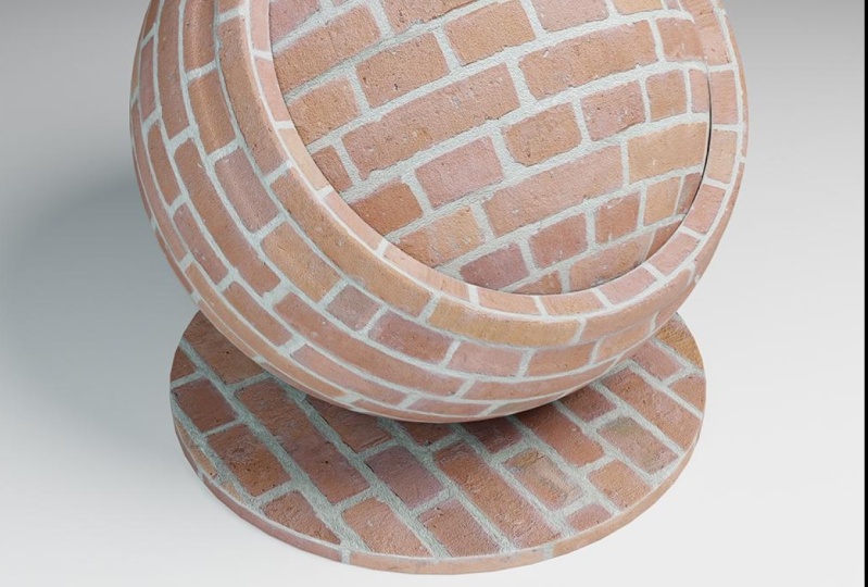
2. Lecture 2: What is Seamless Texturing?: Let's begin with
an explanation of what seamless texturing is. On my screen here
you see a picture of brick that is not seamless. Which means if I
tile this image, so if I laid this
image next to itself, the right side will not
match up to the left side. Now, in this current
configuration, it's not particularly
easy to tell that, so I have a version of it
where I've offset it 50% to the left and 50% down and
that's this version here. What this has done is taking the corners and move
them to the center. This gives you an example
of how this image, if laid next to itself, would not allow
the image to tile. There will be an obvious seam between this side and this side, which is the original
right side of the texture, and the original left side of the texture which
has been offset. As you can see here, it also doesn't match up in the middle, doesn't match up in the
vertical or horizontal. The whole goal of
seamless texturing is to eliminate this seam to allow you to use a
single image such as this, and then tile it infinitely
to the right and infinitely up or down and give the illusion that it's a single large scale image that's covering
this entire object. On my screen now is
that same image, how it's been created
into a seamless texture. Now at first glance, it might not look particularly different. To compare it to the last image, the non-seamless one, there's this image which is not seamless and this image that is. You might notice a little
bit of color difference, might look a little flatter
or a little straightened out, but otherwise it's
the same image. To do that same
offset filter again, where we've offset the right to the left and the
left to the right, that's what this texture looks
like now when it's offset. As you can see when we zoom in, there is no visible seam. It looks as if these
bricks continue on and just keep going
past the seam. To give you an idea of where
that seam actually is, so the seam on this image
is right here for the vertical and right here
for the horizontal. As you can see when we zoom in, there's no obvious difference
between these two sides. This would allow us to take this image and lay it out
infinitely to the right or infinitely up and down and
you wouldn't be able to tell the difference
between where one texture started
and another ended. To give you a more
clear example of what the offset filter from the
last example was doing, I've set up this example. Here we have the same
non-seamless texture from the last example and I've made the Canvas twice
as wide and twice as tall. This would be four tiles that I've made room for
on this image. If I go through one-by-one and make a duplicate next to
each of these images, you can see that if this
texture was laid out on a wall or an archway or
the side of a building, there would be very obvious seams where these
textures lineup. This is the same exact example
we were seeing before, except on a larger scale. You can see here that the tops and the bottoms don't line up, for x don't line up here, same thing with the
left and the right, where the alignment of the
texture is a bit off as well. On top of the fact that some of these bricks are twice as wide, some are half as wide. To show you what
this looks like with the seamless texture instead, as you can see here, I have the seamless texture now placed up at the top left. When I go through and add
each of these quadrants in, you'll notice that
the seam that we noticed before isn't
visible in this texture. If we zoom in here, we don't see any difference
between these, the left and the right side. We can't tell where one
starts and one ends. If we turn this off, the seam
was actually right here, however it's hidden, which is the entire point of
seamless textures. As we zoom out now, you can see that this
wall would be much more convincing than the last
wall would have been. Compare this a seamless texture to this a non-seamless texture. Here we can see
images repeating, there's this dark
brick repeating, the bricks don't
line up and there's overlaps here where the
bricks start to angle down, whereas these remains straight. In the most simple sense, a seamless texture is
a texture that can be tiled infinitely in
both directions, up or down, left or right. Our goal when creating seamless textures is
to effectively remove this scene by cloning out bricks that don't
need to be there, lengthening bricks in this
case that are too short, or adding a seam between two
bricks that are too long. It would also be to remove dark repeating bricks
and also value and color adjustments
to make the texture overall less varied
and more flat, allowing it to tie over a
larger area without notice.
3. Lecture 3: What Industries Use Seamless Textures?: Now that we know what
a seamless texture is, where can we expect
to find them, and in what industries? The most obvious
example to most people taking this course
might be video games. We would see it in games
such as Fortnight, in the environment textures. We would see it in possibly
the grass textures, the rock textures in Fortnight. The brick textures
on the buildings, such as the last example, that would be a good
place to find it. Concrete, pretty much any
hard surface or areas that would have textures
over a large span. Places like I said, such as the sides of cliffs or even metal textures
on the bridge, say down in the bottom left. Another place that we
might find textures would be in a more
realistic game, such as Forza Horizon 5. This again would be similar
to the last example where we would find
it on the asphalt for the roads say cliff sides. Possibly you would find it on the trees in this game as bark. You would find it on the
cars as well actually. You would find the
seamless textures used for the clear
coat on the paint to give it a subtle ripple that a normal car would
actually have in real life. It would be used on the
carbon fiber of these cars, such as the red
car in the front. We would also find it in games
such as World of Warcraft, which is an older game. Tileable textures have been used for almost as long as
texturing has been around. Tileable textures would be in this case visible
on again, the terrain. You'll find it most common
in most games on terrain. It will also be on buildings, say stone buildings in Stormwind or dirt
pads in Oklahoma. We would find it
across many locations. Both the original game
all the way up through the most recent expansion would include seamless textures. This wouldn't be
something that they used to do and no longer do or started not
doing and now they do. This would have been
used throughout the entire lifetime of that
game and going forward. We would also find it in smaller budget games
such as Valheim, which is a survival game. Again, we will find it
again on the terrain. It's possible that say
the back of the shield on that character there on the right would have a wood
plank texture that seamless. Something about Valheim is that it's a very stylized game. It uses a very low
resolution and low poly look but that doesn't stop you from using
seamless textures. Seamless textures can be used in the most realistic of games, as well as the most
stylized of games, as we've seen in the
last few examples here. Forza is an example of an
incredibly realistic game. That'd be striving for
realism and then say, the likes of World of Warcraft, which is incredibly stylized as well as significantly older so it has a lower graphical
fidelity to begin with. They would both use
seamless textures, just as common as each other. The next industry that would use seamless textures is obviously one that I'm pretty
familiar with. Architectural
visualization would use seamless textures extensively, just as much as
video games would. Seamless textures
tend to make up the bulk of the texturing for any project typically unless it's a character project. In the case of architectural
visualization, which is entirely about
the building itself, seamless textures would be
used all over the place. In our example here, on the left with the wood, that wood on the curved walls there would no doubt
be a seamless texture. That texture would
be able to repeat in as many directions as they
need to in order to make the building as
large as it needs to be without having to make a unique texture for the
entire span of that building, as well as the floor on
the bottom left as well. The tile itself is a tileable texture which allows them to have
a group of say, six tiles, eight tiles, 10 tiles that they then
clone and tile across the entire floor and
minimize the amount of work that they need
to do for texturing. They wouldn't go
in there and hand texture each one of those
tiles individually. The image in the middle has a pretty clear example
of a seamless texture. In this case, some stucco or concrete material
on the white walls. It actually gets very
close to the camera here, so you can see a good
bit of detail on it. We would see it on the floors
in the case of the tile, again, like the last image. We would also see it on the
grass outside the window where a seamless texture
would most likely be placed underneath the 3D
graphs that they're using. Possibly a dirt or even
another grass texture to fill in any gaps where they
couldn't have 3D fill in. On the image and the right, you can see that they would
have used seamless textures on the rough concrete walls. Seamless textures would be
used on the wood planks, on the floor, on the ceiling, and on the walls, as well as seamless
textures being used on the chain link inside
that window area. The next industry that we
would see it in is movies. An obvious example, because
it's similar to video games, would be 3D animated movies
such as Finding Nemo. But we would also see it
on more realistic movies. Movies that you wouldn't even
realize have 3D in them, such as Hercules
here in the center. This is an example
of set extension used in big-budget
Hollywood movies. Those green screens, as
well as the sky area above, would eventually in
post-processing be entirely replaced with what is
most likely a 3D scene. An example of that
would be this. All of these buildings
in the back, the top half of the statue, the large mountain in the back. These are absolutely going to
be using seamless textures. This would be true
of all the buildings in the background
with the pillars. That would be some sort
stone brick texture, as well as the mountain in
the background that would be a tiled stone textures
so the side of a cliff or large
boulders or rocks. The grass at the base
of that mountain would also most likely be
a seamless texture. It's interesting in the
case of movies that it parallels video
games as well. Where we would see it in stylized situations such
as Finding Nemo for seamless textures such as
the bottom of the ocean with sand or a large
boulder underwater. But we would also see it in
more realistic situations, especially ones that
people might not realize actually
use extensive 3D. This Hercules movie, people might have assumed if they're
not familiar with 3D, that all of this was
built out and it took an incredibly long time to build out this entire
city when in reality, a lot of this, most of what you see
beyond the stairs in the center, is entirely 3D. For our last example, and possibly the
most invisible of all the examples we've
given so far, are products. Most people might not know this, but a lot of product photography
is actually 3D renders. In the case of these headphones, this is entirely 3D. None of this is real. Aside from possibly the images used to create these
seamless textures. This is not a photo of
an actual products. This is a 3D render made to look like a
studio photograph. For example on these headphones, the leather texture as well as the fabric texture
on the inside, the crisscross stitching
on the leather, as well as the plastic, and even the metal would all be using seamless textures
for the most part. Now that we know where we
can find seamless textures, let's go over an example of what makes a good versus a
bad seamless texture. In this case, as you can see by the tag at
the bottom right, this is a bad seamless texture. What makes this texture bad? Right off the bat, you can tell that there is
a repeating shape, this U-shape here that's darker. You can also see
this curved line that's repeating that starker. What this is doing is it's revealing the tile
of this image. You know exactly how
large this tile is. You can tell it starts here, goes up underneath
this, and stops here. We can see on this image we
have about six tiles across, maybe half tiles at the bottom. But these value differences that we're seeing here are totally ruining this texture by
making the tile very obvious. In real life, you wouldn't
see a road that has a dark spot continuing all the way down the road
that's identical and it goes in straight lines. This just doesn't happen. In the case of our textures, we want our textures to be
as invisible as possible. A good seamless texture is one that you don't even
realize a seamless. Our goal is to not point out the fact that we're
using seamless textures. It's the fact that we're
hiding our seamless textures. We want people to not even
realize we're using them. That's the clue that somebody
did a really good job. In this case, this bad texture, if it was good, would
look more like this. You can see all of those
dark spots are gone. The texture has been evened out. You can't really tell where one tile starts
and one tile ends. If you saw this on a road, it would look like
a really clean, brand new road but you wouldn't know
where the tile start. You wouldn't see some some
repeating line across it. Now for this brick
example, for this brick, we're suffering from somewhat of the similar issues that
we had on the asphalt, although they're a little
bit more masked because this texture has so much more visual
noise than the last one. That's another thing
to take into account. Sometimes it's easier to make a seamless texture that is
very monotone and very plain, but any small imperfection will pop out immediately because
there's so little to mask it. In the case of this
brick, while this isn't a great brick texture, it's a little harder to
notice than the last one. The things that make
this a bad texture would be this dark repeating
line that we see here. There's also some repeating
shapes that I'm seeing here, so this small brick I'm seeing it over and
over and over again. Now it's possible
that that might be a style of this brick. There are some brick layouts, they're called bonds
that allow for that, so it's an intentional choice to have these
repeating patterns, because it looks good
on a building when it's not a seamless
texture in real life. Also, in this case, I'm seeing some light spots, so down here I'm seeing
some repeating light spots. What these value differences
and color differences do, is it makes it that
much easier to pick out the pattern of the
seamless texture. If we remove all these
value differences, we might be experiencing some of the same repeating images, such as these small bricks, so this dark brick here. But it's so much harder to discern them
because you don't have all these additional
clues that are even more obvious
than the small ones. In the case of this,
making it a good texture, this is what it looks like. You can see that we still have some of the same
repeating elements, and that's a necessity
for seamless textures. If it didn't have any
repeating elements, it wouldn't be a
seamless texture, that means you
would have textured this entire brick wall with unique bricks
all the way across. Our goal is to minimize the amount of those
repeating images. In this case, you can
see that we've removed most of the value differences, as well as the
color differences, and we got rid of
some of the more obvious repeating images, so to flick back and
forth between these two. You can see this area
here has been darkened. You can see this area here, this dark line has been made more in line with the
rest of the values. Overall, the brick texture is just in general a
little bit flatter, which is helpful in
this case because we don't want anything
sticking out. The nail that sticks up gets
hammered down in this case, which is very true with
seamless textures. You want a very uniform, I don't want to say bland, but it needs to be uniform for the texture
to be successful. In this example of concrete, we have some very obvious
repeating images here. We have this slanted line, this darker line, repeating over and over and
over and over again, and it looks like it's
actually been cloned. This exact shape seems to
appear multiple times. This little U-shape here
I can see again is here, and then once it tiles again, it just shows up again. This has some incredibly obvious repeating
patterns in it. The first step to making
this a good texture would be to break up
some of this repetition, get rid of some of these
large obvious dark areas in comparison to these
large light areas. That's what's giving
us a clue as to where the tile of this image is. When we transition it
into a good texture, this is what it looks like. We've removed most of those larger areas of dark and light and we've made
it in general more uniform. We've split it up, we've dispersed the dark and the light a
little bit better, so that at a glance
you can't exactly pick out any particular
shape in here, not without really struggling
and trying to find it. This would be a pretty
successful concrete texture because you wouldn't
really see the repeat. Now that we know what makes a good and bad seamless texture, and what are the
pros and cons of using seamless textures
to begin with? The first pro would be that overall it's a
lighter way texture. It requires a single
image tiled over a much larger area than any one single
texture could cover. It's a lot lighter on
the system to tile a single, say, 2048 texture, 10 times vertically and 15 times horizontally
than it is to make one large texture and then
have the software load in that huge texture and
use it for the entire area. To piggyback off
that last point, we're able to cover
a much larger area much quicker as well
with seamless textures. In the case of some of those architectural visualization
in the examples, we had huge atriums that
needed stucco or a concrete or tiles on the floor to cover an atrium that's 100
foot-long by 200 feet wide. We don't have to go
in and hand place every single tile if we're doing it with
seamless texturing. The way we're doing it
with that is just, again, such as the last example, is we're making a single area, say 10 foot by 10 foot, and then just tiling at a
certain amount of times to cover the vertical and the
horizontal of that area. Another great thing
about seamless textures is they're really adjustable. If we find out that
we need to make our seamless texture for the tile on the
floor half the size, that's a really simple change, we don't need to remake
that entire single image that we're using for the floor. We just adjust our unwrap, make it half the size or double the size depending
on what we need, rotate the tiles, if they're not square tiles and they're rectangular
and all of a sudden, now our tiles need to run vertically rather
than horizontally. It's just a matter of
rotating our texture. That'll be carried out in
across the entire floor. We would be able to
adjust things like color, so if we want a warmer
or a cooler tile, concrete tile, or if it needs
to be bigger or smaller, like I mentioned before,
or the rotation of it. There's also other things
you can change, such as, now we need to add
cracks to it to make it more of a worn texture, or if we need to add
dust in the cracks. We don't have to do that
for the entirety of the floor across one mega image, we can do that on a single 10 by 10 section of it and then repeat that
across the entire floor. Now we need to do it well, so it's not obvious that
we're repeating it, but we still only have to do
it on that 10 by 10 section. Seamless textures are also significantly more reusable than a more traditional
unwrap and then specifically texture
as entire image. Because the way we're making
these seamless textures, they're very often for
very generalized areas. It would be for things like an entire sidewalk or concrete, or brick or wood. The things that would be easy to transfer to another location
without people realizing that it's the exact
same seamless texture from the last image or the last video game or the last animation
that you've done. There's a lot of re-usability
in their generic nature. That's not a bad thing at all. In this case, it's actually a significant pro because
you can start making a library of textures
that you intend on using for the
next years to come. For the last pro, the unwrapping of your objects can be somewhat less
important and less stressful because we know
that we're just going to be tiling this texture
infinitely in all directions, we don't need to make
sure that it runs exactly to the edge of a table, or right to the
corner of a wall, or right to the bottom of the stairs on the bottom
floor of a building. We're just going
to let it tile for as long as it needs to
to fill up the area, and then we can
leave it at that. The cons of seamless
texturing would be a bad seamless texture can
absolutely ruin your image, your video game, your
animation, your movie. If it's something
that's really obvious, people can pick that
out immediately. Humans are just hardwired
to pick out patterns. The second they're able
to pick out a pattern, that's the only
thing they can see. They also tend to feel
bland in larger areas. If you put a seamless
texture across, say in the case of a building, the entire side of a
building is now a very flat, very normalized, very
unintrusive brick. That's not really how an actual building would
look in real life. It's up to you when using a seamless texture
to take that into account and add in some
variation after the fact. That might be done by overlaying another
texture on top of it, say a dirtier texture, and then blending that together, or maybe in post-processing, you go in and if
it's a still image, you could hand paint some
dirt for some variation, put some grunge on it, because even a new building
has some dirt on it. Unless the building was
built literally that day, it's going to have some
wear and tear to it, some streaking from rain or
dust settling on the edges. These are things you
have to think about doing after the fact because the entire point of
a seamless texture is to be not obvious, very flat, very uniform, and backing somewhat
takeaway from the final product if you
don't take that into account. It can also take an
incredibly long time in some situations, depending on the complexity
of the texture to actually remove those tiles to
make it super uniform, which leads to con Number 2, but it's a necessity
for seamless textures. Sometimes you'll be making
a texture and you're realizing you're 30 minutes in, 45 minutes in, an hour in, that it might have been
easier instead of making this perfect seamless texture to have just unwrap
the side of an object, made a quick, unique texture for that side and
then proceeded on. It's not always worth making every single thing into
a seamless texture. There's definitely a
time and place for it, but it's not every
place and every time.
4. Lecture 4: How to Identify Good Images: Welcome to Lecture 4: How
to identify good images. Today we'll cover what makes an image good for
seamless texturing, what issues are common in
images we might want to use, and lastly, what should we consider when making
a seamless texture. Let's start off by showing you a side-by-side comparison of a bad image versus a good
image for a seamless texture. In this case here, we
have a gray fabric. The image on the left,
I would consider to be a bad image and the
image on the right, I would consider to
be a good image. Now they're very
obviously different, but the key distinction
between these two is that this image on the
right is a very flat, very uniform, very even image. It's taken straight on. There's no shadows across it aside from maybe a little bit of darkening
at the bottom, and that's something
we can't fix. However, on the left
side, the bad image, while it is a good photo
of this and it shows good material properties of what this fabric
might look like, it would be very
difficult to pull out enough detail out of this in order to make
a seamless texture. Basically, this area here would be all we could work
with and I can also tell that the grain of the fabric is running
diagonally here, so we would already have
to straighten this out, which would lower the amount of area that we could
work with to begin with. The amount of highlights and shadows in this just
wouldn't be useful to us. For our next image
here, we have wood. This is somewhat similar
to the last image where this wood hear is
just simply too zoomed in to make much use of. We'll have a hard
time using this because there's just not enough grain here
for us to work with. If we make this into
a seamless image, it's going to be very obvious that this wood is
zoomed in way too far, and then when we make a
seamless texture out of it, it's going to have a
very obvious repeat because there's just not enough
image to work with here. The texture on the right side, this wood here, is obviously
zoomed out further. It's not the exact
same type of wood. However, there's enough
of this wooden veneer here to work with that
we would want to make a successful repeat
out of this to use, say on a cabinet door
or a wooden chair leg. Now that we have
a few examples of good and bad images for
the same style of texture, what issues are we seeing here and which ones
are the most common? One of the most common
issues you'll run into is identifiable shapes. What that means is, in an image, you'll see a shape
that is so specific, so unique, that if you try to incorporate it into
a seamless texture, it's basically
impossible to hide it. In the case of this brick here, we see, one, there's a lot of
different colors here and if we don't remove those colors, this yellow triangular patch is obviously going to
repeat across it unless we include significantly more
yellow in this texture to obscure the fact that there is a yellow triangle on
the middle of it. Another situation here is
this half circle here, this black half circle, and we also have this
curved line here as well, as well as this light white
circle surrounding this. All of these shapes
here would be really, really easy to pick out
unless they're entirely removed or so many more
identifiable shapes are added to this that it essentially nullifies the
ones that are there by making it so much
more noisy that it's impossible to pick out
any one specific shape. On the texture on the right, there's a few more
obvious ones that aren't quite as cluttered as
the image on the left. We have this lighter chip here, we have this crack that
runs down the center here, a white spot here, and this dark pit as well. As well as some of the
other more subtle ones. These might be a little
bit easier to incorporate. However, these ones here, the ones that I mentioned,
those are going to be very difficult to hide. For another set of examples
for identifiable shapes, this one you might look
at off the bat and think this isn't that
bad, and really it isn't. Many of these issues that
we'll be covering here, it's not to say that these are
impossible and if you find an image with any
of these issues you're going to have
to avoid it entirely. All of these things can be fixed and later in this course, I'll be explaining
how to fix them. But if you're able to
decide between two images and one of them has one of
these issues and one doesn't, you might be better
served going with the one that doesn't
have the issue. On this third example here, I see a couple of these rocks here that are pretty
identifiable, so we would want to
remove these as well as a light spot here
and up here as well. Just some of these
areas have very little in the way of
stones and gravel, and some are very heavy
with stones and gravel. These areas here, we
would either need to remove the amount of
stones that it has in it, or we need to add more stones in the areas
that don't have them. In this particular case, I would probably find
it easier to remove the stones rather than add more. On the right side, we have an image
of stone bricks. This one is a little
bit harder to pick out because at first glance
it doesn't look too bad. However, there are a
few large bricks here. These large stone bricks
would be pretty obvious if it tiled over a large area: This
one here, this one here. These four bricks, if I was fixing this image, I would want to break these up. I would probably find smaller bricks to break
these four larger ones up. There's also some pretty
obvious bricks here with this rust color one and
this bright white one. This large area here is almost the same
color as the grout. From a distance, this is going to look like
there is no brick here, so we might want to pick out some slightly more obvious
bricks to fill this in. But in general, this
is a fixable texture. All of these images
have been fixable, it's just some which are going to be a little bit
easier and some that are probably going
to take more time that possibly it's not worth. For our next issue, we have value differences. A value difference is a very obvious light versus dark
spot within a texture. It's not necessarily
a different color. It's typically caused by shadows being cast
onto the texture. A very, very obvious
example here, and I would argue
that this image is probably not worth our time, would be the brick on the left. This has a pretty obvious
shadow of a building nearby, cast onto this wall. The only usable portions really, of this texture would be to use all of this area here
that is in the light, or all of this area here
that is in the dark. We wouldn't be able to select this dark shadowed area
and brighten it up to the same extent as the
area that's still in the sun without some
pretty significant work and at the end of the day, it's not going to
be that convincing. It's just not worth our
time for this image. This image of grass on the
right side is a little bit less obvious than
the image on the left. However, it's still suffers
from the same issues. This is taken from a good angle. Both of these images
are actually taken from good, nice flat angles. However, you can tell that the dirt underneath
this grass is pretty hilly and the
sun is relatively low, so it's casting large
shadowed areas, as well as large highlighted
areas where the sunlight is missing certain parts of the ground and hitting others. Our next issue is
color difference. This one is typically much more subtle than the
value differences. However, they can be almost as difficult to repair if
not more difficult. The image on the left, we're seeing a concrete
texture that is significantly warmer
on the outsides than it is on the center. There's a bit of value
difference between these. Value and color differences
tend to overlap. Sometimes it's more
obvious than others. However, if you have
a value difference, you often have a
color difference, and if you have a
color difference, you often have a
value difference. This image on the left,
we're getting both. We're getting both a value
and a color difference. But the main
difference here we're seeing is warmer concrete on the outside of this
image and cooler, lighter concrete on the center. On the right side,
I wouldn't say this is particularly
value difference, so this is an example of almost
a pure color difference. On this wall image here, there's a yellower brown
texture or color on the bottom right and then this really warm pinky
color in the middle, and then an orangeish
color up top. For our last common issue,
it's misaligned elements. Misaligned elements,
I would say is one of the easier
ones to repair. All it takes is
just straightening out the texture
for the most part, as long as the
misaligned elements, you have enough to work with. In the case of this
texture here on the left, it's a fabric with
striping on it, this would be a pretty easy fix. All we would need to do is straighten out this texture and make sure that both the top and the bottom of the
stripe meet up. Same thing with the red
and the left side as well. The right side here, we would need to straighten out these metal panels so that both the tops and the
bottoms match up as well. In this case, we would probably need to lose
some of these panels, so these panels
on the far right, we would probably just crop
those out of the image. The panels on the far left, I would probably
also crop out of the image because we're missing the top of this panel here. We could recreate
it if we needed to, however, it's easier just
to remove it in this case. Then in the case of
this specific image, we would need to remove this windowed portion here so that we have just metal panels. The last thing we need to ask ourselves when
finding an image is, what is the application
of this texture? Will it be featured on a
small area where if it has a few repeating elements it's
not the end of the world because there's just
less area to see them? Or is it going to
be in the entire side of a building where a large pattern of it
will be noticeable, so any single defect in the texture is going to
make or break the image? The next question
we need to ask is, are you blending the texture? Do you plan on overlaying one
material on top of another? In the case of the
image on the left, if you were looking for an
asphalt texture, however, you knew that you
were going to be overlaying snow on top of it, the image for the asphalt
is less important. It wouldn't need to be
an absolutely perfect blemish-less asphalt texture in order to accomplish this
effect because most of the snow is going to be covering any of the repeat that you see. In the case of the statues on the right, if you're
looking for, say, a stone texture but you
know you're going to overlay a lot of moss
on top of the statues. The stone texture
beneath becomes less important that it has an
absolutely perfect repeat. If it has a few
blemishes, a few cracks, it's probably okay in this
case because the moss and the grass and the
leaves on top of it will be obscuring
a lot of that detail. The last question we need to ask ourselves is would this
tile in real life? Meaning, would there
be an obvious pattern, an obvious repeat, of this texture in
real life anyway? If that's the case and this is the image that we need
to find for the tile, it doesn't matter that there's only one complete tile because we know that every single one of these tiles is identical anyway. All we need to do is crop out just this single tile and then we can make
our texture from that. Another real-life example of a repeating obvious pattern
would be on clothing. On this woman's dress here, we can see that this
flower pattern is very obviously repeating
across her entire dress, so it wouldn't
matter that we have a obvious repeat in our texture if the
intent is to use it, say for fabric, for clothing, or even for say a
sofa or a chair. This is also obvious in the plaid on this man's
jacket on the right as well. It wouldn't matter that we
have such a small section of this plaid to work with
because we know that overall, this is going to be
a visible repeat even in the real world. In summary, we know that we
need to find uniformly lit, straight-on images to
get the best textures. We know that the
most common issues are identifiable shapes, value differences, color differences, and
misaligned elements. Lastly, we know to keep the application
of the texture in mind when choosing our images. I'll see you in the next lesson.
5. Lecture 5: Where to Find Images: Welcome to Lecture 5. Now that we know what a good seamless texture
image looks like, where can we find them? In this lecture, I'll be
going over where you can find both free and paid images
for seamless texture. I've also included links to each one of
these websites were visiting today in the
External Resources section. The first resource we'll be
discussing is textures.com. Textures.com includes both
paid and free images. To use textures.com, you'll be going up to the
Library tab at the top. Then from here, you can type in either the image that
you're looking for, such as wood, concrete, fabric. Or you can use the filters on the left end sections to find the images
you're looking for. If you have a very
specific need such as fossils, they have fossils. They also have more mundane
things like bricks, so we can look at blocks. We can look at fabric. They have leather. The thing you'll
notice as we scroll down through these is they give you a brief overview of what you're looking
at for the image. We know that this
image is already seamless, which is great. Textures.com is specifically
made for 3D artists. You'll find a lot of seamless
textures on here already. Some of them vary in quality, some are fantastic, some
could use a little help. In general, the resolutions
will be at least 2K, some go as high as 4K, maybe even as high as 8K, depends on how old the image is. If the image has been
on the site for awhile, it's more likely going
to be in the 2K range. Some of their newer
stuff such as this tufted leather here is 4K. Let's start by clicking
on one of these images. After clicking on this leather, we see one, the leathers name. We also see what sizes
it's available in. This is a texture that's offered both a seamless as
well as non seamless. As a free user, you'll
have to make an account where you'll get 15
free credits per day. You can see here the cost
in credits per image. For the small sized on this one, it'll require one credit. For the small size on this, it'll also require one credit, but they also offer
a two credit option. For this one, since
it's already seamless, they're only going
to let you download the smallest resolution size. This is where you're
limited as a free user. It's less than 1024, which is a relatively
small texture depending on what your use is. However, if you're willing
to make it tilable yourself, which I would argue this is a very easy tilable texture to make since it's such a repeatable
pattern to begin with. You're able to download
a larger image, such as this two credit image
which is 1,600 pixels wide, which if you were using
the seamless one, you would need to be a premium member in order to download. The premium subscriptions for
this site are a bit pricey, but you really do get a
lot of bang for your buck. If we go up to this
pricing tab up at the top, the textures.com pricing model
comes in one of two ways. You can either have a
monthly subscription, re-subscribe for a
certain amount per month, and then they give you a certain amount of credits per month. Or you can just
buy bulk credits, which are valid for three years. If you know that
you're not going to be using that many textures, however, you want to have
some in your back pocket, you could say buy
500 credits for $44 and then not have to worry about a recurring
subscription. Or if you know
every single month you'll be using textures, maybe the 1,000 plan
is correct for you. One other thing to point out
about textures.com is if you do decide to use a seamless texture
that's already created, even if you plan on
editing it yourself , if you click on this, you'll notice that a
lot of these come with normal maps and roughness maps, height maps, ambien inclusion
maps already included. Now, there'll be an additional download
cost for each of them. If you want to
download a normal map as well as the diffuse map, that'll require you using 50 of your monthly credits if
you're a paid member. If not, you'll
have to use one of your free credits
as a free member. Textures.com is a
fantastic resource, mostly as a paid member. However, as a free member, you can still get a fair
bit of use out of it. You just have to be
willing to, one, make your own seamless
textures out of the images they provide that
aren't already seamless, or you ought to
be willing to use the smaller resolution
seamless textures, which might be fine
for your project. Not every project
requires 4K, 8K textures, some would be perfectly fine
with 512 or 1024 textures. The next resource
we'll be going over is an entirely free resource. This website is
called pixabay.com. Pixabay is meant mainly
for stock photography. This is a great place to go
if you need stock photos. They also offer videos
if that's useful to you. If you wanted to make
a texture on a TV, you could use one of their
videos as an animated texture. However, what we're
interested in is the images meant for
seamless texturing, which they don't have a section specifically made for it because it's not made exclusively
for all 3D artists. It's made for anybody that
needs a royalty free, commercial use available
image for the projects. Let's start out by
making sure that this is set to images here
on the right side. Then we'll type in wood. [NOISE] As we scroll down here, there's a bit of an ad at the top here that
you have to be careful of. Any of these images
you see here in these darker areas are actually ads out of Pixabay
to Shutterstock. Just be careful when
you're on the website. It won't hurt you if
you click on these, it's just going to take
you to Shutterstock. You'll just have to go
back on the webpage to get back to Pixabay. But these images at the
top here are not free. You can tell that they're
on a darker background and they usually include some
coupon code at them. The images we want
are around the white background further down. We can see that there are
plenty of wood images here. Not all of them are great for seamless textures such as
this one with a butterfly. But this image here, these orangeish
wood planks here, would be great for
a seamless texture. There's also images
of more planks here. There's more of a rustic wood. These images aren't made
exclusively for 3D artists. There's a lot of variety of
what we're looking at here. We'll have images that
just happened to include woods such as this or the bird picture
down at the bottom. But we also have great
images such as this one or this one with wood planks. It's really about
searching through these images and then finding one that works for your needs. Let's scroll back up and go back to that original
orange plank wood here. If we select this, this is the page
we'll be brought to. We can see who created
it and who uploaded it. We'll also see down here
the Pixabay license, so it's free for commercial use and there's no
attribution required, which is important for
us because we don't want to have to attribute
every single person that we use an image to
make a texture on if we use 100 images
to make a texture, or 100 images to make a render. We don't have to attribute
every single person, so it's important
that we have free use to use these with
no credit required. If you click Free Download here, you'll be shown all
the different sizes that you can download them at. You can download it as small
in this case as 640 by 426, or as high as nearly 4K by 2500. Now these sizes here are determined by the
person that uploads it. Some images might have a
maximum of only 1920 by 1080, others will go as high as 8K. It takes a little
bit of sifting, everything on this website requires a little bit more work, but it's entirely
free and you can get really high-quality images. They're not a whole lot of images on here that
are already seamless. You can find them
if you specifically look for the words
seamless in your search. However, what we're using it for is to get high-quality images that are also high resolution and don't cost us any money. Another example for this, we'll just type in
concrete. [NOISE] As we scroll down
here, we can see the same situation that
we had with the wood. Some of these images
would be great for textures such as this
one on the right, others are useless to us, such as the tunnel above it. It just takes a little
bit of sifting through this website to find
what you're looking for. The next resource
I'll be showing you is called Pexels.com. This website is very
similar to Pixabay. However, the images here are
a little bit more stylized, they more often feature vignettes because these
are more image meant for, say, social media
or video projects. However, we can find good
images here as well. If we again type in wood, we can see here that we have great images right off the bat. We also have just as many, not great images such as this
wooden counter-top here. But this image
would be great for a seamless texture
as with this one. As we scroll down
here, we'll see very similar results
as what Pixabay had. However, it's just
another resource to find free images that
are commercial use, no attribution required, and costs you nothing. We can scroll down,
this would be a great image in here as well. Let's just for the
sake of example, try concrete, and here a very similar story to
what Pixabay had as well. This image here of
the building not particularly useful
to us other than, as an example, say if we were
modeling a building that looked like this or texturing and building that
looks like this. This would be a useful photo. However, the image below
it is probably more useful for our purposes in
making seamless textures. Same with this or this. The categories on here
aren't quite as strict as what say textures.com
would have been. However, you'll find
great images regardless. Let's just, for the
sake of example, let's click on this image here, and then we can go up here to the free download and if you
click this down arrow here, you get to see all the different
sizes that they offer. Here we can see that this
image goes as high as 10,000 pixels by 7,000 pixels. You can make an incredibly
high resolution texture out of this image and
it's entirely free. There's free for
commercial use if you're going to use
it for paid project. It's also no
attribution required. Pexels is a great resource. Our next resource
is Unsplash.com. Unsplash.com is very
similar to the last two of Pixabay and Pexels. Let's just try an image here. These are stock photos as well. If I type in wood like the
last one, in this case, we get another
iStock at the top. Make sure you don't
click on these, these aren't free images. However, if you scroll down, we'll start seeing more images
that we're looking for. This image here would be a good image for a
seamless texture. This one is a little less
because of the things we discussed in the last episode
with the value differences. However, there's still plenty
of good images on here. As you can see, it's
similar results to the last two websites. In this website, we're actually getting a little bit more. If we click, "Load
more photos" here, we're getting a little bit
more of these flat on photos. We're actually locking
out I'd say on this website maybe
more than the last. We still do get images that are not particularly useful to us, but we get a lot
of great images. Even this one will be great. Just like the last two,
let's tell type in concrete. See what we get, another iStock at the top. Let's avoid that. As we scroll down, there's some fantastic images
here on Unsplash. Again, these are
all entirely free. For the sake of example again, let's click on this. It'll bring it up very
similar interface to Pexels. If we go over here, there's a Download free
button and click this, and then we can see the different
sizes that it comes in. This comes into as high as 2,400 for the large size or for the original
size of the photo, we can download a 4,000
by 3,000 pixel image, which is fantastic
for a free image, especially one of this quality. The last online resource
that I'll be showing you is Wikimedia Commons. This website is a
bit different than the last ones and it takes a little bit more
filtering to find images that we are allowed to
use because not every image on here is available
to use commercially. If we go up here and we type in, try wood again, so
we can search wood, we get all of these
different images. However, we need to
focus on this area here. If we switch the license
to no restrictions, this will filter
out any images that have a restriction on
it that wouldn't allow us to either use it for
free without royalty or to not have to attribute
to the original artist. If we switch it to
no restrictions, we can see that we have different results
than the last one, possibly not quite as useful, but some of these are great. I would say that this image
is particularly good. We can see down here
that it is listed as a public domain dedication creative commons zero
image, which means, just like the last few websites, we don't have to attribute to the original artists
and it doesn't cost us anything
to use this image in a commercial capacity. As we just keep scrolling
down, we can see that again, this website is a last resort, but sometimes you'll find
great images on here. We can scroll down here. Now, we're starting
to get into portraits of people possibly with
the last name wood, which is why they're showing up. We'll get a systems like
Atari and that just have a little wood strip on it and that's why
it's showing up. We're getting a little
less useful images as we scroll further down. But some of them are useful. This might be useful
in some situations. Let's scroll back up to the top. Let's try concrete. Again, make sure no restrictions
is listed here, and then scroll down. This image might be useful to us as a side-walk, possibly. Here's another image that
might be useful to us. Let's click on this image here, and then click on
the name at the top, now we're led to the downloads
page where we can see all the resolutions that
this image is offered in. This image in
particular is offered in a size as high as 4,000 by 2,800 which is pretty
high resolution and this wouldn't be
hard to clean up to be usable as a texture. It would just be a matter
of removing some of these more obvious holes
and cleaning it up. Overall, Wikimedia Commons is possibly less useful
than the others, but it's still another
free resource that if you've checked the
others and you can't find what
you're looking for, try out Wikimedia Commons. The last resource we have
access to is yourself. If you have a camera phone, or a DSLR camera, or even a point-and-shoot, you have access to a camera that you can take your
own photos with. All of these photos you
see on the screen here are things that I've taken
with my own camera phone. It doesn't need to be
a very fancy camera in order to take good photos. Most camera phones nowadays will take resolutions
high enough, at least in the 2k range, to make textures
out of and you have complete control
over these textures. You can make sure that
they're perfectly lined up, you can adjust the
lighting if you need to. If it's outside, you
could bring a flashlight or turn on the light on your phone to
illuminate the texture. If it's inside, you can
set up a few lights. You have complete control over what these textures look like. You don't have to
worry about, oh, there is a shadow at
the bottom left corner, how can I get rid of it? You can just plan it yourself. Don't forget that you
have access to a camera to take your own photos for
your own seamless textures. I hope this was useful to you and I'll see you in
the next lesson.
6. Lecture 6: Photoshop Basics - Part 1: Welcome to Lecture 6, Photoshop Basics Part 1. In this five part series, we'll go over all the tips that a beginner in
Photoshop would need in order to create
a seamless texture. I've included a
downloadable resource containing all images
seen during this series. Please download
this for your use. I also recommend that you save your PSD files between lessons, as you may find them
useful in future lessons. The first screen you
see when opening Photoshop should look like this. This is where we'll
be opening our file. There's two methods
to opening a file. The first method is go up to this "Open" button
here at the top left. Click on "Open", and then navigate to the image
that you'd like to open. In our case, let's open
this asphalt here. That'll open the image for you. Alternatively, if we
close this image here, we can instead just
drag and drop an image into this screen and it
will open it for us. If I open up that same folder and I click and drag
this asphalt image, here you'll see it says copy. Then I let it go and it
will also open it for us. This drag-and-drop method
also works on this screen. If we open that folder again, and we choose this image
here of a brick wall, and we drag this up to
this bar at the top, this darker bar and let it go, it will also open the image. You'll find however,
if you don't drop it on the darker bar at the top, it will instead drop
it into this canvas, such as like this. If I drop it here, instead of this dark bar on
top of the brick, it'll drag that image in and place it on top of
this image of brick. Let's close this brick image for now and go back to the asphalt. Now that we're back
at the asphalt, we'll go over how
to save the image. There's three different
methods of saving. If you go up to the
top left and click the "File" button,
and move down, you'll see that there is save, which is currently grayed
out, and I'll explain why. Save as and then save a copy. Let's start with save. Currently it's grayed out, and that's because save
will only save over a file if it's realized that it's
made some changes to it. Currently, all
we've done is open this file and made no
adjustments to it at all. That's why save is grayed out. It won't let you
save over a top of an image that hasn't had
any changes made to it. Let's fix that. Click
off of that menu here, and then let's go
down to the layer panel at the bottom right. You can see here it
says background, and there's a little
lock icon next to it. Let's double-click on
this word background, and It'll pop up this window. We'll rename this asphalt
and then hit "Okay". What we've done is
rename this layer and also unlocked it as
a background layer. Now that we've made a
change to this file, we can go back up to file, and you can see save is now not grayed out because
we made a change. Even though it was a
very minor change, such as just renaming a layer, Photoshop realizes something
has happened and it will let us change it. Let's
click "Save". Now, it'll bring up this box. This is where we can choose the file type to
save the image as, as well as what
the image name is. Let's name this as Asphalt_01. Then over here we can
see the file type. Currently it's set to PSD, which is probably the most
common thing you'll be saving out of the save menu, but we'll go down here and see what the
other options are. For these other options here, they're pretty limited in
terms of their usefulness. I'd say the most useful
ones we see here are Photoshop PSD documents. There's a Photoshop PDF, which isn't super
useful for texturing, however, PDF is just
a useful file format. We also have PNG
and we have TIF. For now, let's just save
this out as a PSD image. We'll select PSD, and
then we'll hit "Save". It'll ask us to maximize compatibility with older
versions. Let's just hit "Okay". There's very rare instances where you would need
to uncheck this, but most cases just leave
it checked and hit "Okay". Now, we've saved our first PSD. It's named Asphalt 01, and it's a PSD file. We can see up here
the name of the file. Let's try the other
options for saving. We can go back to the file
and we can do save as. You can also see that
there's key binds next to these to tell you
what the key bind is if you'd prefer that. Save is control S, save as is shift control S, and save a copy is alt control S. We'll
do save as this time. What save as is going
to allow us to do is saving another
version of this file. It'll save another
version of the file, and then it'll
switch to that file instead of lingering
on the old file. Here we could change the name. Say we want to make
a second version of this asphalt or we'll say change the color of it or maybe it's the
seamless version of it, so we can change
this to Asphalt 02, and then we can check
our save as types. Again, we're listed with the exact same file types
as we had last time. PSD, there's PDF again, PNG, and TIF. Let's save this out as a
second version of this. We'll do save. Again, we've maximize compatibility on. If you're getting
tired of seeing this, you can just check this box, don't show again, and then it just
won't pop up again. Now we've saved out a
second version of it. If we go back to file, you can see we aren't
able to save over this because we've made no change
since it's been saved. However, if we make a change, say renaming the layer at the bottom right
to Asphalt_02, or if we make another layer, save will now be not grayed out and then
we can save it again. Save will save over the
current file that is open. Save as will allow you to save a new version of that file, and then switch to editing that file while
closing the other one. The last option we
have is save a copy. If we do save a copy, it looks very similar
to the last view. However, we'll notice that the save file types are
much more expanded here. In our last options, we
didn't have access to JPEG, which is one of the
more common things you'll be saving
out of texture as. We had access to JPEG 2000,
but that's not the same. I believe this is
actually a video format. The only way for us to save out a JPEG from one of our textures, is to do save as a copy. If we switch to JPEG here, you'll notice it grays out
a lot of these boxes here, but it's allowing us now to
save out of JPEG of this. We can change the name. We don't have to
leave the word copy in because it won't overwrite the old PSD because
this is a new JPEG. We can leave the same name. We don't have to worry
about it overwriting it. We can do save. Now, we'll get the JPEG options. In most situations,
unless you're really pressed for file size, you want to leave this on
12, which is the maximum, which will give you
the highest quality, and then leave the format
options to progressive. Then we'll hit "Okay". Now, we've saved out a JPEG
version of our texture. However, you can see
at the top left, it didn't switch to the
JPEG as the current file, it left the PSD. Save as a copy, will save out a copy of it of whatever
you've just saved. However, it will leave
you on your current file. Now that we know how
to save out a file, let's open another file and
begin discussing layering. Let's start by
opening another file. We'll open up this
brick file here. Now, at the bottom right,
you'll see that we have a layer here and it
says background again, like it did before we
renamed the asphalt. A background layer is
the layer that will open up first when you
open up in a flat image. This background layer is locked, and you won't be
able to reorder it. If there were
multiple layers here, the background layer
would always remain on the bottom until you unlock it. The way to unlock it, would be to double-click on
the word background here. It'll bring up this
window again and we can type in the name of the layer. We'll try brick this time. We'll hit "Okay" or you
can also hit "Enter". Now that this layer is unlocked, we'll be able to
add new layers and put this layer on top or below, we'll be able to reorder them. Let's start by making
another layer. We can do this multiple
different ways, but for now, let's just
drag in another image. We'll go down here and we'll find another image to drag in. Let's pull in this cement. Now that we've drag
this layer in, we have a few different options
for what to do with it. First, we can resize it by grabbing these little white
squares at the corners, and making it the same size. We can pull it here at the bottom right corner
to make it larger. Now, there was scaling
it uniformly, however, if we grab just the sides and
we hold the shift key down, we can scale it and stretch
it to meet the edges. Now that it fits, we can hit this little
check box at the top, or we can also just
hit the Enter key. Now you can see we
have two layers here listed at the bottom, the brick that we renamed, as well as the cement
that we haven't yet. Let's rename this layer cement. To rename this new cement layer double-click on the name, then we can type in
cement and hit Enter. Now we have two layers in here
and they're both renamed. Since this brick
layer is no longer a background layer,
we can reorder it. We can move these layers around by clicking and dragging on them to change their layering. You'll notice that when
we switch the order here, the image in the center of
our screen also changes. That's because the layers are
working from the top down. Whatever is on the top, we visible above things
that are on the bottom. If we reorder this again, we can see that the brick
will now pop to the top, because the brick is
the highest most layer. Let's go over
duplicating a layer now. The way to duplicate a layer would be to select the layer. In this case, let's
select the cement layer, which we currently
already have selected. If you hold the Alt
key on your keyboard, the left Alt key, and then you click and drag the cement layer and
place it above the brick, you'll see that you've made
a copy of that cement layer. Now you have three
layers in your file. You have a cements
on the bottom, a brick, and now a new
cement copy on the top. If you decided that
you no longer need the cement layer that you've
just made a duplicate of you can delete it by
clicking the delete key on your keyboard, like this. Alternatively, you can also
right-click on a layer and then go up to
the top and choose Delete layer. Like that. If we realized that our
last few edits were a mistake and we'd like
to go back we can hit Control and Z at the same
time to undo our last change. If we hit it again,
it will bring back the cement layer that we had
deleted prior to the brick. The next tool we'll
discuss is grouping. Grouping is done in
the layer panel. To begin with, let's make another copy of our brick layer. We'll select our brick layer, hold the Alt key, and then drag this brick layer. We can see that we've
made another copy of the brick and let's reorder
these images as well. Let's move this cement
layer to the top, move this cement layer
here so that we have both cements next
to each other as well as both bricks
next to each other. In order to group a layer, select multiple layers
at the same time by holding Control and then
selecting the next layer. Now we have both of
these layers selected, and you can see by the gray
highlight that they have. If we can hold Control
and hit the G key, you can see that
it's made a group. It looks as if these
layers have disappeared, but in reality, if
you untwirl this, so this little triangle here, you can see that the
cement layers are now inside this group. You can tell that
because they're indented underneath this group
to let you know that this is the parent of
these two child layers. Just like a layer and we
can rename the group. Let's rename this
[NOISE] Cement Group and also like a layer we can drag and drop
this to reorder it. When you move a
group, it will remove everything that's inside
that layer as well with it. We can move it here. I'm going to move
it between these. Since we know what's
inside this group, we can close that group
so we don't have to see the extra clutter
that it adds. Now that we have these
items in a group, let's go over what the visibility
means on the left side. If we want to just hide this
layer without deleting it, we can click this eyeball
here on the left. This will leave the
layers where they are. However, you can no
longer see them. This is useful
sometimes to compare two images or if you're saving an image within your layer panel that you plan on going back to and you don't
want to delete it. However, you don't want
to see it right now, you can click these
eyeballs on the left. You can also hide individual
layers within a group, and you can also hide
multiple layers at one time by clicking
on this eyeball, and while holding
down the left-click, moving your mouse
down and it will hide anything that your
mouse goes over top of wall you're
left clicking. We can also turn layers
on that way as well. If we left-click to
turn this layer on, our fingers are still holding
down that left-click, we can just slide our mouse down to turn on the
layer below it. Rather than having to click
each one individually. It doesn't seem
like much right now when there's a few
layers in here, but if we have a layer stack that's much more complicated, being able to just click and drag and move your mouse down quickly to turn on or off
layers is very useful. The best thing about groups
is that they're not static. We're able to move items
into and out of the group. We can select this brick
image here and move it into this group by
dragging it between two layers that are
inside the group already. We can also remove this brick
image from the group by grabbing this layer
and dragging it outside of that group
to a layer below. Let's cover opacity now. The opacity refers to how opaque or how
transparent something is. If we select this cement
group on our layer panel, will notice the word
opacity here and it's currently set to 100%, which means that this layer
is currently 100% opaque, which means you cannot
see through it. However, if we highlight
this number and we type in 50 and hit Enter, and it's now set to 50%, which means that
this whole group, so both of these cement
layers with inside it are currently only
set to 50% opacity, which means you can
see through them and 50% of that image
is transparent. Now you'll notice as I click
through these layers with inside this group
that is set to 50%, each one of these
layers, however, say that they're set to 100%. It doesn't matter that
these layers are set to 100% because the group
that is currently their parent layer
is set to 50% and the group dictates everything
that's inside the group, that's because it's
set to pass through. If we wanted to
adjust the opacity of one of these
layers independently, we would need to remove
it from the group. Let's drag this cement
copy outside the group. We can set this to 75%. Hit Enter. Now you can see that these layers have separate
opacity layer levels. Now you can see
that these layers have separate opacity levels. This is something that's useful for blending textures together. Let's begin discussing
blending modes. To begin our discussion, first, let's set this back to 100%. Alternatively, for
adjusting opacity, you can just select the word
and you can see your hair, your hand turns into a hand with two arrows
on the left and right, and if you can click
and drag on that you can see that
you can just slide the opacity up or down. Let's slide it back up to 100%. Let's select this cement group and turn the visibility off. Now we currently have
just this cement copy and then the bricks below. Let's start discussing what
blending modes even are. You can see here on the left
side of the layer panel, we can see the word normal, which is the default
blending mode for any layer that you import. Normal is just allowing the
image to display as intended. As it was brought in, if it's set to normal,
that's what it'll look like. If we click this drop down here, we can see there are many
different blend modes. It's not important that you know what each one of these two, because some of them are very nuanced as to their
differences and others are incredibly
complicated and you won't find much use for
them in most cases. Let's just go over some
of the most useful ones. Normal is, like I said, is just how the image is
meant to be displayed. No adjustments are made to it. If we go down to multiply, this will take all of the
black parts of your image. Anything that's
being read as black or the darker parts of your image and it will overlay them onto
the images below. However, it will knock
out all the light parts. It will only keep the darkest
parts of your texture and it will remove all the lightest
parts of your texture. You can see that this is
not a destructive things. If we don't like multiply, we can just go right
back to normal. It hasn't actually deleted
any pixels from the image. It hasn't affected
the image at all. Your images still safe. These are just ways
to display the image differently over top of
the other layers below it. Like I said, multiply is a way to knock out all the
light values, however, remain with the dark values and then overlay that over
to the images below. If we move down here. Screen is sort opposite
of multiplying. This will take all
the dark values, remove them from the image, and only leave the light values
and overlay that instead. You can think of multiply
and screen as opposites. Screen is for light and
multiply is for dark. As we move down here another useful one you'll
use a lot is overlay. It works similarly to a combination of both
multiply and screen. It will take both the light and the dark parts of your
image and overlay that, which it's conveniently named overlay on top of your image. It will also take the
color information from your image and overlay
that on top of it as well. Overlay will typically make anything that it's
overlaid on top of, more saturated and
more contrasty. Brighter, brights, darker darks, and brighter, more saturated colors depending on
what you're overlaying. The last blend mode
that you'll be using somewhat frequently
would be color. Color will replace all
color from the image below with the image that
you're overlaying on top. If you set this image to color, because our cement is very gray and has very
little color in it, it's making this brick below it also very gray with very
little color in it. It's not overlaying the texture necessarily the lights and
the darks and everything. It's just taking the color of this layer and overlaying it
on top of the brick below. If we turn this off, we can see that this
brick has lost all of its orange color and
it's instead inherited the gray and you can see there's some
speckles of yellow in it that are being inherited from the cement color layer as well. This was the last tip for Part
1. I'll see you in Part 2.
7. Lecture 7: Photoshop Basics - Part 2: Welcome to Lecture 7, Photoshop Basics Part 2. Let's continue our
exploration of Photoshop. The next tool I have to show you is called clipping layers. What a clipping layer is, is it will allow you
to clip the influence of one layer to the balance
of a layer below it. Let's set up an
example for that. I'm going to drag in
an image of stone, and we'll drag and drop it
into the center of this image. Let's resize this a bit,
so it's a bit bigger. We'll just drag that one
corner up at the top right, and then we'll drag
the bottom-left corner out as well, so
it's a bit larger. Then we can either hit
Enter or the checkbox at the top and then now let's
bring in another layer. I'm going to bring in
this blue black stone. We'll drag and
drop that as well. Instead of making
this layer larger, let's just move it
off to the side. We're just going to click
and drag it and move it to about the corner. We can again either hit Enter or the checkbox to place it. Let's start by clipping this blackish bluestone to
the warmer stone below it. What we need to do is hold the left Alt key and then click between the two layers that you'd like to
clip to each other. The layer above will be clipped to the layer
on the bottom. You can see that your mouse
actually changes while you're holding the left Alt key
to the clipping icon. Let's hold the Alt key down
and then click between these. We can see now that we've clipped this layer to the
bounds of this layer. If we hide this layer
here, the blue layer, you can see that the blue
is running exactly to the edge of the layer below it that it's
currently clipped to, which is the warmer stone. If we click this move
tool at the top-left, so this little cross sign here, we have this layer selected. We can move around
this blue layer. However, it's being clipped to the influence of the
layer below it so it can't be shown anywhere that that current layer
below it isn't already. This is very useful if you have a shape that you'd like
to maintain below, however you want to apply say, a new texture to it. We can move this around and it doesn't go off
the bounds of it.
8. Lecture 8: Photoshop Basics - Part 3: Welcome to Lecture 8,
Photoshop Basics Part 3. Let's continue
learning Photoshop. For our next set of tools, let's start by opening
a brand-new document. The way we can do
that is by going up to File at the top-left. Then choosing new. That'll bring up
this option box. We can either choose
from different presets of images that
we've opened up in the past or we can hand
type in our own sizes. For our size, let's type in 2,048 by 2,048. Then we'll hit "Create"
down at the bottom right. Now we have a brand new document with a new background layer. By default, it filled it in with a
white background layer. For now, we can
leave that as is. To zoom in on your document, you can hold the
left Alt key and then use your mouse wheel
to zoom in and out. If you don't have a mouse wheel, you can click this
little magnifying glass at the bottom left, it's magnifying glass tool, and then click to zoom in
and out of your image. If you'd to pan around your image to move
it left or right, if you hold down the spacebar, your mouse will turn
into a little hand, and that'll allow
you to click and drag to move your image around. Now this is only moving
around this little Canvas. It's not actually moving your
image within the canvas. It's just allowing
you to reposition your view so that if you're
zoomed in a certain spot, you can move to the left or
the right to see more of it. Let's start by importing
another image. We'll do the
drag-and-drop method. Let's drag in this bluestone
from the last example. Let's click and drag this image, and we'll move it
up to the top left. As you move it close, you should notice that
it snaps to the corners. If for some reason
yours isn't snapping, go up to "View" at the top and then scroll
down and choose "Snap". Make sure that's checked. Now that we have the image
placed in the corner, let's switch to our move tool. The move tool is the
first tool on the left. When we have that selected, this will allow us to
move around to layer. Whatever layer we currently have selected will allow us to move. Right now, we only have one
layer that we can select and move because of this
background layer is locked. Let's select this black marble. We can click and drag on this
image to move it around. We can place it
wherever we need to. These little pink guides
that you're seeing pop up are showing you different
snapping points. When it's the
horizontal pink line, that means that it's snapped to the midpoint of the Canvas. If it's the vertical pink line, that means it's snapped
to the vertical midpoint. If you see both of them, that means you have a
dead center in the image. There's a few
different things we can do with the move tool. We already know that we can
duplicate a layer by holding Alt and dragging in
the layer panel. However, if we
delete that layer, we can also hold Alt
and drag the layer inside the canvas to
duplicate it as well. You can see that it made a duplicate on the
Layers' panel as well. There's multiple ways
to duplicate a layer. We can duplicate around
a couple of copies if we needed to fill up an
area and randomize something, we could
do it that way. Let's select some
of these layers here and let's delete them. If you select the top layer
and you scroll down to the last layer you'd like to
delete and you hold Shift, you can select every layer between the top layer
and the bottom layer. Now we can select all of
those and delete them. Let's move this image up to the top left corner with
our Move Tool turned on. Let's just lay this out for images to fill up this canvas. If we hold Alt and
drag this image, you can drag it over so
that it snaps to the right. We can hold Alt
again and drag it down to snap it to
the bottom right, and then again to
the bottom left. At the top left here,
you can see that there's a checkbox that
says auto-select. Right now, if we just
use our move tool, even if I'm hovered over the top right corner
and I use it, it's going to move
the bottom-left, and that's because that's what's selected in the layer panel. Let's move this back
down to the bottom left. If we select
auto-select instead, you can see I still have the
bottom-left layer selected, however, with the
auto-select checkbox on. Now when I click and
drag at the top right, it's going to
automatically select that layer and then start
moving that layer instead. If you have a lot
of different tiles laid out and you're
trying to move around individual ones and
it's getting hard to figure out which one it
is on the layer panel, you can switch to auto-select and use that to move around. I don't typically leave this one all the time because
sometimes you'll end up moving something you
didn't intend to move because you most likely are going to be moving and
selecting things from the layer panel so you know exactly what you're selecting. Especially if you have images overlaid on top of each other, it's hard to select the
exact image you want with auto-select unless it's a very
simple example like this. Let's learn a bit
about selection now. We're going to switch off
over our move tool into the Rectangular Marquee
tool. Let's select that. What a Rectangular
Marquee tool is doing is when we click and drag, you can see it's making a
dotted line that moves. These lines here are referred
to as marching ants. It's an odd name, but that's what most people will call them because
they look like little ant dots moving around the perimeter of
what you've just selected. Whatever we have inside this dotted line is
currently being selected. It's not selected in the
sense that it's selected in our layer panel so much that we currently have
these pixels selected. So the cumulative image, we currently have
these pixels selected. What would be the
reasons why we went to select a portion of an image? If we select just a
portion of an image, allows us to do things
like copy and paste. If we click down here, and we select just the sensor of this bottom left quadrant, then we hit Control
C to copy it, and then hit Control
V to paste it, you can see now that we're
having new layer at the top, this layer is not a smart object because it was created
within this document. It is a rasterized version of just the center pixels of this bottom quadrant
where we had selected. If we switch to our move tool, we can turn off auto-select now. We can move around just
this small portion. Maybe if we wanted to
clip out something from this image and we only
wanted from here to here, we could select
from here to here. Make sure we have the
correct layer selected. In this case, it's this layer. Hit "Control C" and then
"Control V" to paste it. Now we have a duplicate of just those pixels in the center. We can switch to our move
tool and move those around. Let's delete all the layers except for the top
left quadrant. If we click the top layer, we scroll down and hold Shift, and click the
second-to-last layer, so we're leaving
the top quadrant, if we highlight everything in between and then we
can delete those. Now let's switch back to our
rectangular marquee tool. Let's highlight a
selection in the middle. We'll highlight this
selection and there's different key binds
while you're selecting. If you hold Shift, you'll be able to make a selection that is
a perfect square. If you hold Alt while
you're making a selection, it will instead select
from the center. You can see that it's
similar controls to how the Transform works. If we hold Alt, it's from the center, but
it's non-uniform. If we hold Alt and Shift, it's from the center
and it is uniform. Let's make a uniform
square selection from the center of this. Then once we have
that selection made, we can let go with the click. We can click and drag this to
move around our selection. If we know what is
needed exactly the size, but we don't know exactly
where we pull it from, we can just slide our selection around and choose
where we want it. Alternatively, while you're
making the selection, so if we again click and hold Shift to make
it a square selection, while we're making
this selection, we can hold the space bar on top of the Shift key as well. Shift and Spacebar to slide it around while we're
making the selection. We might be able to
slide it up into the corner and then
readjust the size so that we get just
everything except for the outer pixels and then
make that our selection. Let's go over how you adjust the selection once
you've made it. Let's make a small
selection here, and let's say we want to
remove just this corner. We want to make an L shape
out of this selection. If we hold Alt, we can click and drag a new selection box and
whatever the overlap is, you can see the little minus
next to our marquee tool. Whenever the overlap is
between these when we let go, it will remove from
the selection. We can fine-tune
exactly where we want the selection to be from. Also, we can add to a selection. If this is the
selection we want, but we realize we want this
edge to be a bit longer, or a bit wider, we can hold the
Shift while we have the selection tool on and you can see there's a
plus sign, now. We can select an overlap here that will add
to that selection. Then we can go back to
the minus by holding Alt and delete portions
of it if we need to. Then we can add to
it. A selection is pretty fluent and you can adjust it as needed to make
the exact selection you want. Now this is an example of a pretty craziest
selection here, you wouldn't normally
be selecting something so specific as this. Let's say you are
selecting out fence posts, or something, it might
be this detailed, but usually it's
just going to be you selecting a certain
portion of a texture and then maybe you realize that this spot up here is a
little too identifiable. Maybe we will get rid
of that. Then that would be your
selection, instead. We can Control C and then Control V to paste
that as a new layer, switch to our move tool and
then just slide it over. The marquee tool isn't
only for rectangles, you can also click and hold on this section here to choose
the elliptical marquee tool, which will give you a
circular selection. This uses all the same
key binds as before. If you hold the Alt key, it will be from the center. Alt Shift is uniform
from the center. If you hold Shift while
you're scaling it, it'll be a uniform from
the corner as a circle. Then once you have
your selection, you can move it around
just like the marquee, you're going to Alt to cut
out a center out of it. It's make a donut out
of it if you need to, or you can add to it
by holding shift. The other way we
have to select on an image is by using
the lasso tool. If you select the
little lasso up here, it's below the marquee tool, which currently is
circle, might be square. We select the lasso and what
the lasso allows us to do is free-hand a specific selection that we want by drawing it
directly onto the image. We could find a
specific spot that we like and just select that. This has the same exact addition and subtraction
methods as the last. If we don't like
a specific spot, you can hold down Alt to delete a portion of this
by overlapping a part, or we can add to it by holding
down Shift and selecting a spot that we want to add
to the selection like that. Then this works the same way
with the Control C. We got this error here because
I didn't switch back to the layer that I'm
selecting from. Photoshop realizes that
there are no pixels where I've put the selection
because I currently have just this layer selected. It won't let me copy anything
because there's nothing there. We'll hit Okay. I'll switch back to
the layer that I'm actually selecting
on, hit Control C, Control V. Now I can go into my move tool and move just
this little piece down. If there's a specific spot
in the texture that you need to continuously add
across the texture, say a specific brick, or a crack in a
concrete texture, you can hand select that
portion of the texture, and then clone it around. I can add this piece here, up here if I needed to. Now you can see I have
a duplicate of it. The other form of lasso
that's the most useful is if we click and hold
on the lasso tool, we can choose
polygonal lasso tool. This lasso doesn't allow
you to freehand draw. Instead allows you to click and make points to
outline something. If we hold Alt to zoom in, so Alt and then up
when your mouse wheel, you can zoom in on this
portion of the image and then hold space to pan
the image around. Let's select just
this area here. If we click once, you can see we start
dragging this line around. Now until we click, it hasn't actually made the next point. If we click here,
it's made a point. We can keep clicking to add new points to
outline this image. Then once we get back
to the original point, you'll see a little
circle pop up, that's letting you
know the next click is going to complete
the selection. Now, I've made this selection, and it works just as
well as the other one. In this case, I'll
have to select this top layer here because I'm selecting over
top of these pixels, not the pixels to the left. I can hit control C, control V to make a new layer. Switch to my move tool
with this layer selected, and now I can move it around, so I could put this shape
somewhere else if I needed to. For the next tool, let's select
this layer at the bottom and make a duplicate
and place it at the top by holding
a halt to drag it. Now, let's hit control
T to transform it, and we're going to
scale it up so that it fills the entire Canvas. We'll scale it to
the edge, hit okay. I'm going to teach
you how to use the color range selection. The first thing you'll
need to do is go up to select at the top, and then go to Color
Range, and select that. It's going to bring
up this option box. We can move it off to the left. What select color range
does is it'll allow you to eyedropper a specific
color in the image, and then adjust the fuzziness of that selection to try to
select just that color. Let's select the color of
this veining down here. You can see when we select that, this preview on the
left side changes. Since our fuzziness is so high, the tolerance for that
selection is really high. It's looking very far beyond the color that
we actually selected. The lower we make
this fuzziness, the more strict it is
with its selection. If we set it to around 100, you can see that the selection
is a lot more specific. It's only choosing
from the color that I selected and a little bit
outside of that color. If I set it to zero, it will only choose that color, which in this case
there seems to be a single pixel of that
color that I've chosen. I can turn this up
just a little bit, and it'll start widening its range of colors
that it's selecting. This is a really good way to select just a portion
of a texture. In this case, just the
veining of this texture if I wanted to either remove
it or change its color, make it darker, anything I wanted to do just to a single specific
color within an image, this is an easy way to do that. We can also select
more than one color. If we hold Shift and
select another color, this will add an
additional color that's going to use
to get the selection. Maybe we choose another color from a different part of
the painting over here. This might allow us to lower our fuzziness to say 50
and start sampling further outside of the color
that we originally had to update it here to get a more specific selection to just the veining
without the fuzziness, bleeding into maybe some
of the bluer areas. We can keep adding to that
selection by just holding Shift and finding new
spots to sample from. This looks like a
pretty specific selection that we have here, and then we can hit "Okay", to get that selection, so you can see all of our
marching ants now are just on top of the areas that we
selected with the color range. We can hit "Control
C", "Control V", so we can hide all the
layers below it to see what this selection
actually looks like. Let's click on the "I" here, and while we're still
holding down the click, we can just slide down to
turn off all these layers, and let's turn back on
the background layer. We can see here this is
what we actually selected,. So by holding Alt to zoom in, I can see how specific
our selection was. It did a pretty good job of
only selecting the veining. There are some areas
here that you can see it's selected a little
bit outside of that, but for the most part, it was a pretty good selection on just the veining of that marble. The next selection
method I have to show you is selecting via
the layer panel. To do this, let's
begin by leaving this layer on the vein
layer that we had selected. Let's leave that one, let's turn on this small selection
layer here that I have. This layer and this layer. So we are able to
select layers and pixels through this Layer
panel by holding Control, Alt and Shift in
different combinations. If we just hold Control
down and select a layer, you can see my mouse changes, when I hold control, it puts a little selection
box next to it. If I click on this, it'll select all the pixels that are
associated with that layer. You can see it went through
and re-selected all of those veins that I had
selected with the color range. To de-select an object, to de-select these pixels
that we have here, hit "Control" and "D", the letter D on your keyboard, and that will deselect them. Let's hold down Control to select the pixels on this layer, this top right corner. We can hit "Control"
and "Alt" at the same time to de-select another layer
out of the selection. If we hit "Control" and 'Alt", you can see it turns into a selection sign on my hand
with a minus sign in it. Then if I select this layer, it's going to
de-select any pixels from this layer out of
my current selection. It's now chopped out that chunk of this layer
that was overlapping it. I can also hold Control Alt at the same time to de-select the veining that I also
made a selection of. So up here, I hit
"Control" "Alt". You can see now that
it's also de-selected. It's removed from
this selection, any veins that are
overlapping this section. Let's hit "Control D" to
de-select all of that, and for this example, let's select this layer
up at the top here. We have it selected, we
have our Move Tool one. Let's move it over top of this. Let's just have a little
bit of it intersect with this top quadrant
we have here. If you hit "Control"
and select this, it will select these pixels. Then if you hit "Control" "Alt" and "Shift"
at the same time. Three buttons, Control
Alt and Shift, you can see my hand has a selection box next
to it with an x in it. What that's saying is
it's only going to select the intersection of this. So when we click this, you can see that it left
the selection for the box, but it only allowed it to select the overlap between
these two objects. Are each of these
selection methods seem somewhat complicated and you're not sure when you
would need them. There is a time and
place for all of these I would say that the most common is the control click
on a layer to select, its element, so select
all the pixels for that, as well as the Control and
Alt to minus a selection. However, the overlap selection, which is Control, Alt and Shift, does come in handy sometimes. This was the last tip for Part
3. I'll see you in Part 4.
9. Lecture 9: Photoshop Basics - Part 4: Welcome to lecture 9,
Photoshop Basics part 4. Let's continue our
discussion on Photoshop. For our next tool, let's
make a new document. I'll go to file, new, and we can just recreate the same
document that we had before. We can do 2048 by
typing it in here, or just choosing a recent
document that we've created. Let's choose this. Hit "Create". Now we'll go over masking. Masking will allow you to have two layers sitting
on top of each other. However, you'll
be able to choose what portions of the layer above show over top
of the layer below. To begin with, let's
bring in another image. Let's bring in an asphalt. We can hold shift while
we scale this image up to fit and we can scale it right to the corners
and it'll snap in there. We can hit the
checkbox to confirm. Let's bring in another
image, something different. This time, let's bring in this warm stone that
we've used in the past. We'll drag that in. Same thing. Let's hold shift, drag it up to the
corners to fit, and let's hit "Okay". Now that we have
our layers placed, let's go over masking. Move down to the mask
icon, down at the bottom. It's next to this fx button. It's a rectangle with a black circle in the middle
of it. We'll click that. Now we can see that
this white box has popped up next to our layer. This is our mask layer. You can switch back and forth
between the selection of them by clicking on
each of the icons. Let's select the mask layer now. What the mask layer will do is by just clicking
this icon down here, we'll place a white
mask on this layer. White means that this entire
layer is currently visible. There are no parts of this
image that are masked out. The way we can mask out this image would be to
switch to our brush tool on the far left and then if we just draw
anywhere on this image, while we have this
mask selected, as long as we're
painting with black, so down at the bottom, if you click on this
icon down here, you can make sure that your
color is set to black. You can also just
click this icon here and this will switch
it from white and black, and if you click this
little arrow icon here, it'll switch the foreground
and the background color. Let's make sure black is
the foreground color, which is what we're painting
with and then as we draw, we notice that we're
now painting out this image that's on top and revealing the
image that's below. This would be a way that
if you wanted to remove a certain part of a texture
and overlay it with another, you could go in and selectively
paint out portions of this image to allow just the parts that you like to be overlayed
on the images below. If we zoom in by holding alt and zooming
in on this image, we could selectively paint
out specific parts of this. Let's right-click with our
brush tool selected and make the size smaller by clicking this slider to make it tinier. Now, we can click on
here and paint out just specific parts
of our image. This will allow us to remove just key portions of this
image that we don't want. Also allows us to make compound materials such
as these if we needed to have stone or an asphalt blended together
for some reason. The best thing about masks is
that they're very editable. If we hit the X key
on our keyboard, that will swap between black and white when we're in here. It'll swap the foreground
with the background color. Now that we have white on, anywhere we paint we'll
be re-adding back in that warm stone
that we had before. If we just need to adjust our selection and change
what we're masking, we can go back in here
and paint back what we didn't mean to remove or what doesn't need to be removed now. Masking allows you to determine what portions
of the image are worth keeping and which
ones you need to remove in a
non-destructive manner. If we decide that we'd
like to see what the image looked like prior to
us adding a mask, but not deleting the mask, we can hold shift on
our keyboard and then click on this mask
layer and it will put a red X across this mask. This is essentially turning off the visibility of the
mask without deleting it. We can see what
this image looked like prior to us masking it. Then if we hold
shift and click it again we can see what it looks like after we
started masking it. One thing we can do with a
mask is to invert the mask. If we decided that
we actually want to flip what is shown
versus what is hidden, we can make sure
that this mask is selected and making sure that these little white brackets are selecting it and hold
"Control" and hit "I" on your keyboard and that
will invert the selection. You can see down here now that the visible portion,
which is white, is now what we had painted in, and the invisible portion
is what we had left. That would be a way for you
to flip back and forth, there might be a situation
where you want to see what it looks like if you paint out the cracks versus
leaving the cracks in, or only adding the
cracks for a texture. This will allow you
to flip back and forth easily between them. Let's delete this mask now. We can right-click on the
mask and hit "Delete Layer Mask" and that will remove it entirely rather than just hiding the visibility
like it was before. When we add a mask layer, rather than just clicking it, we can hold alt while we click this and it will make
it a full black mask, which means it's entirely
invisible to begin with. You just have the option
between starting with it entirely visible and then
choosing to paint things out. Or you can start with it
entirely invisible and then choose areas where you want
to paint it in, such as this. We can just paint in small areas of that stone on top of
the asphalt rather than having to erase away the
stone above, on the asphalt. Again, let's delete this mask and show you another
method to add a mask. We'll right-click, "Delete". With this layer selected, let's go back to our
selection tools. Let's choose the
marquee selection. We can go with the
rectangular this time. If we make a selection on this, so we'll make a
selection like that and maybe we'll try to remove this white portion in
the middle by holding alt to get the minus
sign on the symbol, and then clicking
and letting go. Now if we click the mask button, you can see it's
created that mask from the selection that we had. Those two areas that
we had selected out, those too long rectangles now automatically
become the mask. We can start out by immediately populating a mask with a
selection that we have. If we delete this
layer mask again, we can make another selection. We'll just make a
line down the middle and this time if we hold alt while we click
the mask icon, it will instead do the opposite. It will make the selection, the area where we're currently erasing the image
with the mask on it. It's a way to start out
with portions of the image either immediately erased
or immediately shown. Another trick we
have for masking is the ability to move a mask. We can just click on
this mask here and drag it to the asphalt instead, and it will take that mask from this layer and position
it here instead. Or if we hold alt
while we drag a mask, it will instead make
a duplicate of that. Both of these layers
retain that mask. You're also able to
place masks on groups. If we select both
of these layers by hitting "Control" or holding "Control" while
selecting another layer and hitting "Control G", at the same time to
put them into a group, we can place a mask
on this group. With the group selected, we can choose the mask icon at the bottom to place a
mask on just this group. Now this works just
like these other masks. We'll be able to switch to our brush tool and we can
paint out a specific spot, so make sure we're
painting with black. I'm going to hit "X" to switch, so I can paint out just areas on this mask. I can do that. I can also invert this. If I invert this selection, it inverts the same way. These masks are working in
tandem with each other. If I adjust this mask
down on the bottom and I paint in more
white in the middle, you can see that it's combining itself with a mask on
the group as well. There's some pretty
complicated things you can do with
overlapping masks to allow them to mask out
certain portions but leave others unmasked. All this in conjunction with each other and
combining them, you can get some relatively complicated
things where you're masking out only certain
portions of an image to say, grab a crack from one area
and place it on a brick from another spot and cloning in the shadow from one area
to hide a seam on another. This was the last
tip for part 4. I'll see you in part 5.
10. Lecture 10: Photoshop Basics - Part 5: Welcome to Lecture 10, Photoshop basics Part 5. In this final installment, we'll learn the last few tips
that we need in order to create seamless textures
inside Photoshop. For our next tool,
let's start by making another new document. Go to File, New. We'll go with a 2048 again, or we can just choose
it from a recent items. Let's go over the brush tool. Make sure you have your
brush tool selected, and we'll go down
here and make sure your colors are black
and white for now. Select this little button here to transfer it back
to black and white, and make sure black
is in the foreground. If black is not the
first color here, just choose this
little arrow icon to switch them back and
forth until black is. The brush tool we've used
a few times in the past, but I haven't really gone
into much detail on it, and it's something
you'll use pretty often. Let's start by making a new empty layer to
use our brush tool on. We do that by clicking
this little square with a plus inside it. That will make a new
transparent empty layer for us to draw on. We don't want to be drawing
on this background layer. We want to draw on a
nice new layer that we can turn on and
off if we need to. Let's start by just
clicking and dragging here, and seeing the brush tool. This is how we've
used it in the past. We're just able to draw a line. If you want to make your
brush tool larger or smaller, first let's hit ''Control Z'' to remove the line we
just did there. [NOISE] So that'll just undo
the last action that we did. If we had done multiple lines, and hitting Control Z, we remove each
line individually. Let's change the size
of our brush tool. We'll right-click
on the ''Canvas''. You can see here we have
a few different settings. We can adjust the size
in pixels of our brush, which you can see
it's larger here. We make it smaller. It's now a smaller icon. That'll just change the size
of the line that we draw. You can see it make
it much thicker, almost the entire Canvas. Let's Control Z that. Let's choose something
on a lower range. We'll do this. In this case we'll do a 100 pixels
so it's a nice number. Right now our brush is
also set to 100% hardness, so it has a perfectly
crisp, clean edge. As we lower the hardness, you'll see our edge gets softer, so it's a bit of a blurry edge. If we right-click and
lower down to zero, it's a completely fuzzed
out, blurry edge. There are situations where
you would want to use a nice hard edge to
make sure that you're getting the exact spot
that you want to draw on. There's other situations
where you want a very soft, very graduated reblended edge to hide the adjustment
that you're making. Another way that we can adjust our brush size is instead of using this right-click
menu to adjust it, we can also instead use the
brackets on your keyboard. This is the two
keys that are next to the P on your keyboard. The left bracket will
make your brush smaller, and then the right bracket
will make your brush larger. If all you're doing is
adjusting the size of your brush and you're not
messing with anything else, this is a quick way to do that. Let's set our brush back to
a bit more of a medium-size. Let's make a new layer. We're going to hide the layer
that we were just drawing on, so we can hide that. Then let's go over the
different types of brushes. You can just choose from
a preset brush down here. If I choose this, you can see it changes some
of the presets up here. It's going to make it
automatically 150 pixels, and I'll make it
100 or 0% hardness. If I choosing this,
it's the opposite. It's still 150 size, but it's the hardness of 100. Then there's different
variations of brushes here. These are the general ones. There's also brushes that are of different sizes,
or rather shapes. There's also brushes down here
that are not just circles. If we choose this
and we draw with it, we can see that it's a chalky or a pencil look that it has. There are situations where
you might need to use a brush that is not quite so
circular and perfect. You might want to
brush that's a little splattered to blend
two textures together, and hit "Control
Z" to remove that. There's other brushes down here. You can find brushes online. There's a lot of
free brushes online. There's already some pretty
decent ones loaded up, but there's thousands and thousands of brushes that
you can find online. This is a wet medium brush. This brush looks a bit like
an ink bleeding on a paper. You can see that it's
actually adjusting. This is some dynamic brush that Photoshop comes
with by default. But there are situations
for all of these brushes. Most of the time
you're going to be using the circle brushes, either a 0% hardness, a 100%, or somewhere
in the middle. There are situations
where you'll use some of the
more fancy brushes, but I would say 80-90% of your time will just be spent
using circle brushes. Another thing we're
allowed to adjust on our brushes is the opacity. Remember before from the
layer discussion that opacity is essentially just
how opaque something is, how much you can see through it. If we go up here and we select the word opacity while we
have our brush tool on, and we slide it down
to say near 50, when we draw, you can
see now that it's only a 50% opaque brush. It's not entirely covering up what we're
drawing on below it. If we overlap these 250 areas, you can see that there's
some addition of these opacities on
top of each other. It's a way that you can overlap things and feather
things together. If you work with a
really low opacity when you are painting things, you can feather
together and make some transitions on
things a little bit more gradual or a
little bit more to your liking if you know exactly what you
need to be doing. This is just a combination of low opacity and
clicking over an area multiple times to make a
feathered softer edge on this. This is a relatively
low opacity. You might be working more in the 25-30 range so it builds
up a little bit faster. But you can see how
you can soften an edge on something just by
clicking multiple times with a low opacity and painting
over areas to add it together. Let's hide this layer
and make a new layer. Let's turn our opacity
back up to 100%. Let's set our hardness so by right-clicking
on the canvas, we can set our
hardness back to 100%. Now I'll show you how to use
something called smoothing. By default, when
you click and drag, your brush tool draw exactly
where your mouse is. Contend you're lying, making
it a little bit jittery, so if you don't have
really steady hands and you're not drawing it
exactly straight line, it's pretty easy to see
where your hands wavered. If we control Z there if we
go up to this area called smoothing and we turn this
value up to say about 30%. Now when we draw, you can see how the
brush lags behind where my brush icon is. However, you can see how much smoother and more
flowing that line looks. The higher I have this value, the longer behind
that it'll lag, but it essentially removes a lot of your
micro-movements out. It allows you to make a
nice slow sweeping line. You can move it faster
than that, however, it's going to start cutting corners in order to meet
the area where you're at. Control Z there. This is what it looks like
when it's set to 100. However, if I turn this
down to something lower, closer to 20%, this is how much more
wiggle you're getting. You can see it follows
behind a lot faster, it allows me to get a little bit more expression in the line. Whereas if I had it set to 100, and redid those lines, it evens everything out. It requires it to be a lot
flatter because it's towing behind so much slower than
it was on a lower value. Let's set our smoothing back to zero so we don't
forget about it later. Let's delete these
last three layers, so select the first one, hold Shift to select the last, and then hit "Delete"
on your keyboard. Now let's bring
in another image. This time, let's bring in
this brick wall image. Place it on the canvas and
then let's scale it up by holding Alt and clicking on this corner to scale
it from the center. Let's scale it up so that
it fills the canvas without stretching it and hit "Okay". The next tool we'll go over
is called the Clone tool. This is going to be one of
your most widely used tools when making seamless textures. The Clone tool is
located directly below the brush right here and it
looks like a little stamp. The purpose of the Clone tool
is to choose one portion of your image and then clone it to another portion of your
image by painting it on. It's a demonstration of that, let's make a new layer
that we can paint onto. The first thing you need
to do with your Clone tool is there are a few settings up here that are pretty important. The first thing we need
to do is make sure your sample is set
instead of current layer, which is, I believe the default. You want it to set to
current and below. The reason you want
it to do that is because if it's set to
current layer and you're cloning on a new
layer in order to preserve the layers below
it without destroying them, it will only sample
from that layer itself. We wouldn't be able
to clone here because there are no pixels
on this layer. By setting it to
current and below, it will allow it to
look at any layer that's on the current layer
that you have selected, as well as any layer below it. In our case here,
that will allow us to select pixels from
the layers below and paint them onto
this new safe layer so that we don't destroy
the image below it. Another thing you'll want
to make sure that you have selected is the
aligned checkbox. First, let's show you what it looks like with
aligned turned-on. Let's zoom in on the image. If you hold the Alt key down, you'll see your mouse turns
into a little cross-hair. This is where you're
choosing where you're going to be cloning from. In this case, let's
choose this corner, so if we hold Alt down and click on that bottom left
corner of this brick. Now when we move
our mouse around, you can see it's dragging
these pixels along with it, showing a window through our mouse as to where we are
going to be coming from. In our case, let's move down to this brick down
here on the bottom. Now when I click
and start painting, you can see it's
painting the brick from above where I have
my mouse moving, so you can see that I actually
have two cursors here. The bottom-left where
I'm actually painting, that shows me where
I'm painting at. But where I'm painting from
is that small cross-hair, you can see right along
that this little crack, this ridge that I'm putting
on this breakdown here. I'm cloning these exact pixels from that brick above
to this brick below. You can see if I start
painting further and further, I'm just pulling from more
and more areas on this brick. Then when I let go,
I can reposition, find a new spot that I'd
like to start painting from and that small
cross here at the top where I'm cloning from has moved to the
new part on that brick. However, if we go back up to the top and switch
it off of aligned, so we uncheck this. Now let's try again, so let's hold down Alt to choose our new cloning area
that we're cloning from, so let's click on that
same bottom corner again and in this case, let's start on this brick. Let's start painting, so clicking and holding, so we're painting this area. This looks pretty much
the same as it did before nothing seems
that different. However, when I let
go of my brush, you can see now that it's
choosing this corner again, it's not choosing
where I last left off, so I believe I stopped
painting here. With the aligned tool on, it would remember that I stopped painting here and
it would mean now cloning from this area right
around here on this texture. Instead without
aligned turned on, it's going back to that
original spot every time, so it's going back
to this corner. Now there are situations
where you might want to always clone
from the same corner, but in terms of making
a seamless texture, that's somewhat dangerous
because you're reintroducing this exact same corner over and over again every
single time you click. If I click here and
start painting, you can see I've now chosen
from that exact same corner, so every time I go to a new brick and paint
in from that corner, I'm making this light spot and this crack on every
single one of them. If I go back up here
and I choose Aligned, now if I say, let's choose from this
corner here so if we hold Alt and then click on this corner to choose our
new area to clone from, now when I paint, I'll start
painting from this corner, so that all seems normal. Then when I let go, so when I stop painting, you can see that
as I move around, it's sampling from new areas, so it's not always
just showing me the same corner again
everywhere I mouse over, it's actually mousing over with the cloned area
from new positions, so it's remembering where I left off and then keeping
that in memory. If now if I start here, you can see that this
corner doesn't line up. If I wanted to paint
another corner, I could choose another
corner down here, move up to this corner, and then start painting
from that one. This would allow me to go through and start painting out specific areas that
I want to get rid of. I can move around
by holding pan. By the way, if you hold pan. Your space bar to pan around the image that allows
you to remain zoomed in. Without having to zoom out every time and
then zoom back in. You just hold down the
spacebar to move around. I can just start picking out specific bricks and
painting from the corners. The reason I'm choosing
the corners is because it's an area that's
easy to register. Like if I choose this area here and paint on
this area here, I know that this
brick should end roughly the same
time as this brick. Since they're both about even
with each other on the top, I know that I'm going
to run into the end of that brick around the same time. However, if I just chose an arbitrary point in the
middle of this texture. If I chose this area here, then I started painting on
the middle of this brick. It might seem fine at first, but eventually I'm going to
get to an area where since I didn't start from
a place that was easy to register and
know where I'm at. Now I'm just starting
to paint and I haven't run into the
edge of that brick yet. It hasn't happened until here. When you're painting really
irregular shapes like this, it's the best practice to choose a spot that's easy to
register to the next one. In the case of this brick, choosing corners is usually the best place to begin
with your cloning. If you haven't figured
it out already. The clone tool also use the same parameters
as a brush tool. We're able to choose
our size from here. We can adjust our
hardness of our brush. We can also choose
a different shape for the brush down here. Just like the brush tool,
we can use our brackets to make our brush larger or smaller while
we're moving around, so we don't have to go
into this menu each time. This is how I typically
change my brush size. I usually just use the brackets. I don't often go into this menu unless I have something
else I want to change. In the case of using
the clone tool, you often don't want to
work with something that's 100% hard or 100% soft. You usually want to work in
the 60-ish, 70-ish range. It will make sure
that your edges aren't super soft and feathered. But it also makes sure
that your edges aren't really hard and easy to spot. The next tip to show you are the shortcuts for
filling a layer. Let's zoom out here. Let's delete this layer, the layer that we've
been cloning on. We can select the layer and
click the little trash can. We can hit delete
on our keyboard, or we can right-click and choose delete layer
from this dropdown. Let's start by
adding a new layer. We can go down here and hit the plus sign to add a new
layer that's empty. What fill means is filling an entire layer or a selection
with a specific color. In our case, it'll be
filling from the foreground, which is currently black, or the background
which is white. To start with, let's just hold Alt and then hit backspace. What that's going to
do is it will fill this entire layer with
our foreground color. Alternatively, we can
hold control and hit backspace to fill it in with our background
color, which is white. If we delete this layer now, we can add a new layer and zoom in to say this
brick here on the right. Let's switch to our
selection tool, the marquee square, our
rectangle selection. Let's select just
this area here. Let's select over top
of this entire brick. We can hit alt and backspace
to fill it with black. Or we can hit again control and backspace to
fill it with white. Because there are foreground
and background colors. Were also able to do this
with our Lasso tools. We can make another new layer. You can pan over to
this brick instead. Let's choose our
polygonal lasso tool. Let's make a little bit more of an accurate selection
around this brick. Now that we have a better
selection around it, we can fill this with
either black by holding alt and backspace because
it's our foreground color. Or hitting control
and backspace to fill it with white because
it's our background color. Now these alt and backspace and controlling backspace would flip if our colors were flipped. If we hit x and then
make another selection, so now that we've hit x, we flip these colors and
make a selection. Now alt and backspace
will be white instead. Don't think of alt and
control as black and white. Think of them as
foreground and background. This would also be true if these colors weren't
black and white. If we make this red
instead of white and make a selection and hold
alt and backspace. It's now red fill instead
of black or white. This is another reason to
think of it as foreground for alt and background for control. The reason why you
would need to use these fill key binds is
because it's often very useful to be able to fill either a selection or an entire area with
a specific color. In this case, let's
hide these two layers. Select both of them
and hide them. Let's make a new layer
and this time let's fill it with a color
that's more obvious. Let's do blue. Since blue is my foreground, I have no selection made, so it's going to fill
the entire layer. I'll hold alt and hit
backspace. Now it's blue. You You need to
change the color of this brick to a different color. In which case we could
use our blend modes from the previous lessons and
switch it to color instead. Now this blue layer set the color is tinting
all of these blue. If I wanted to quickly change
that from blue to yellow, could just choose a new color. Click okay, hold
alt and backspace, and I can fill it with yellow. It's a quick way to just
immediately apply a color to a specific area or a specific section or
across the entire document. In this case, I could just highlight this area here
with my selection tool. Quickly select that. Now I could fill it
with a different color. In this case, rather
than swapping my yellow, I'm going to hit X to move
my yellow to the back. Let's select the black, and let's choose the blue again. Now I can fill this blue, just this brick
specifically with blue, by holding alt and hitting
backspace to fill it in. This is a pretty
wacky example here of making yellow brick
with a single blue one. We can see how you would
be able to use that to an effect to make more
subtle adjustments. The difference between a
slightly yellow orange versus a slightly red orange. For our last tip, let's make a new document. Go to file, new. Again, we can keep 2048. That's fine. Make that. I'm going to be showing you
a way to save out images that it's a bit more
advanced than just the file, save, save as, and save a copy. Let's start by bringing in
a few different images. Let's bring in this blue stone that we've used in the past. We can scale that up. It's okay. Let's bring in the stone. Scale this up by holding Shift to make sure
it snaps to the edges. Hit "Okay. " Let's just
get one last image. Let's bring in this brick again. Just for the sake of example, let's just stretch
this out to meet it. You wouldn't normally
want to stretch an image, but let's just fill
the canvas with it. Hit, "Okay." Now we have
three images in here. Let's go through and
rename each of these. We rename them by
double-clicking on the name. Let's call this blue stone, let's call this warm stone, and let's call this brick. Now we have these
three images in here. We're able to select all
three of these layers. Select the first, hold Shift, and select the last. Alternatively, if you want to, you can hold Control and select each of them individually
while holding Control. While holding Control,
you can also deselect a layer that's been selected by just selecting it one more time. Now we have all three
of these selected. Let's choose right-click and
then we're going to go up to the top and do Export As and then it
has three dots after, that typically
indicates that it's going to pop up another window. If you see something here
that has three dots after it, that usually lets you know
that once you click this, it's not just going to do
something immediately. It's usually going to
pop up another window and then there'll be
more options after that. Let's choose Export As. Now that we have this
window popped up, we can see that
there's a few more things that we can adjust. The first thing we see is
we have all the layers that we had originally selected
down here in the layer panel. There are also over here, it shows how large the layers are and how large
the pixels are. It also says PNG next
to these images, and that's because each of
these images by default, has been set to format as PNG. This works the same way
as the layer panel. If you select, you can select each one
individually or you can select the top one and hold
Shift to select the bottom. We can change what these
are going to Export As. We can choose JPG
instead of PNG, you also have the
option for GIF, although that wouldn't be
particularly useful to us. Let's try JPG, then we can choose the quality. Let's go to excellent. That'll be the highest quality. What this option box
allows us to do is allows us to save each
one of these layers out, all at the same time
using their exact names, so brick, warm stone, and blue stone to a
folder of our choice. Rather than having to
say about each one of these images individually, we can do it all at one time. We can also change some
things about them. We can add a suffix
to the end of them. A suffix will be
something that's appended to the name at the end
of the layer name. In our case, the first layer
would be called a brick, we can also have it just
called texture as well. Now when we save these out, it'll be called a brick_texture, warm stone_texture,
blue stone_texture. There might be a situation
where you want to name exactly what
these things are for. If we know that this is for, say, the kitchen of a building, we can name these kitchens, so this would be
brick_kitchen, stone_kitchen. We can also change what size these images are saving out at. If we authored these images
at a really large scale, but we wanted to save them
out as a smaller size, say for a video game, we can change that here. There's a few different
options we can choose from that
are just defaults, or you can choose your own. If we wanted to save this
out at 50% size and we didn't have to adjust
our PSD to match that, we could just save these images out half the size
that we started with. Now that we've done that, we can hit "Export" Down
here at the bottom. When we choose Export, it'll ask us where we
wanted to save them. In this case, we just
going to save them into a folder and we can
hit "Select Folder". Now that we've saved them out, we can go to that folder and see that it's
saved out each one of those layers by their name with the underscore kitchen
at the end of them. This is a really
quick way to save out images that are smaller. In this case, we can
right-click on this and go to properties and details and see that this image is
actually 1024 because we told it that save
it out at 50% size. We've saved out smaller images with correct names
all at once from Photoshop and we've given them another suffix at the end of them to give them a
better identifier. If we didn't use the
Export As option and we wanted to do the same
thing we had just done. It would require us to
re-size this image. We'd have to go up to
image, image size, and actually switch this
image from 2048 down to 1024. We would be losing
that resolution in our original PSD file. For the sake of example,
let's go ahead and do that. You don't have to follow
along if you don't want to. We'll switch this
to 1024, by 1024. This little link icon means that these sizes here are
linked to each other, so anything that
adjusts this one, it will proportionally adjust the bottom measurement as well. We hit "Okay", this is
now a 1024-size document. Then I'd have to go to File, Save a Copy because we
want to save out as a JPG. Choose a new place for it, and then hand type in
the name that we want, in this case, this is a brick. We'd have to go to brick_kitchen and then just so it
doesn't overlap it, I'm just going to put an
01 at the end of this. We'd have to save this. Make sure it's set
to 12. Then we would need to hide this. Save this again, save a copy, I always going to save
what's currently visible. It won't recognize that
there's other layers below it. We'd have to hide the brick
after having saved it out, leave the warm stone on, and then go through that exact
same operation each time. You can see how much
slower this is, just to save out specific images that you
know what size you want. If you know the specific suffix that you want at the end
of them as an identifier. The Export As option
is a lot faster. I won't go through
with the last one, but you can see the difference
between the two and how one might be significantly faster depending on
what you're saving out. This is the last tip for the Photoshop basic
section of this course. Throughout the rest
of the course, you can expect more tips
with more obvious context. The series was meant
as a foundation for your future instruction. I'll see you in the next lesson.
11. Lecture 11: Getting Started - Part 1: Welcome to Lecture 11, getting started with an
ideal image Part 1. In this lesson, we'll be
going over how to start your very first seamless
texture. Let's begin. To start let's make
sure you've downloaded the downloadable resource
for this lesson. It's called Concrete_start.jpeg. Let's begin with
opening that image. Our first step now
that the image is opened is to check
the resolution. To check the resolution, go up to image at the top left, then go down to image size. Here, we can see the
resolution of this image. It's 4,500 by 4,500. For our purposes to
start this texture, let's convert this
to a 4096 image. We'll type in 4096. To make sure that your images
are scaling proportionally, make sure that this little
link icon is checked. If not, you'll have to type
in 4096 in both fields. Once you have that set hit Okay. Now that we've resized our image , you might be wondering, why did we resize it at all, and why to such a
specific number? Why couldn't we have
just left it at 4,500? 4096, as well as all the
numbers you see now on screen are textures and the resolution
known as power of two. The power of two is a number multiplied by itself to
create a new number. In the case of 64, that would be eight times itself to equal 64. While knowing exactly
what a power of two is, it is not incredibly
important to an artist. It is important that we
utilize them and we know why. The first reason why we
use power of two textures, is because older GPUs
were optimized for calculating power
of two textures for more efficient processing. The GPU is the Graphics
Processing Unit inside your computer responsible
for calculating all visuals. Additionally, some
video game engines are still optimized for power
of two texture sizes, though not all
currently required. Though it is not
universally required, it is still considered
the industry standard. Now that we know a
little bit more about the texture sizes
available to us, what should we consider
when choosing one? The first thing to consider is how complex is the texture. We'll require a lot of detail in the form of pixels
to make sense. An example of this might be a simple solid color fabric
versus an ornate floor tile. Our next consideration is how close is the texture
to the viewer? If it's further away,
we might be able to use the smaller texture size. If it's much closer, you might have to use a higher
texture size. Is this texture the focal
point of your artwork? If so, you might want to
use a higher texture size. Next, we need to consider how this texture will be
displayed to the end-user. Will it be used in a
1080P animation where the camera is locked
and you decide how close the viewer
gets to the texture? Will it be a 4K
still image where overall the resolution of
the final product is higher, however, the camera
is still locked? Or will it be used in
a video game where the end-user can get as close to the texture as they like? The last thing to
consider is whether or not we need to worry
about file size. If the texture will be
used in a video game, you might have to worry about file size and keep your
texture size smaller. If it's going to be used in
architectural visualization, where we're most likely
producing still images, file size might not be
as much of a concern. In the next lecture,
we'll finish creating our concrete seamless
texture. I'll see you there.
12. Lecture 12: Finalizing Our Texture - Part 2: Welcome to Lecture
12, Finalizing our Ideal Texture
Part 2. Let's begin. Now that our image has
been resized to 4096, we can begin the process of turning this into a
seamless texture. First, let's unlock
this background layer. We double-click on
the word Background. For this case, let's
name this layer, base. Then you can hit either
Okay or hit Enter. The first thing we need to do
is apply the Offset filter. We'll go up to the top where
filter is listed and we'll scroll down to Other and
then we choose Offset. What the offset filter does is offset pixels of the image, a certain amount of pixels to the right and a certain
amount of pixels down. In our case, we need
to type in 2048 because that's
exact half of 4096. We'll type in 2048
for the horizontal. You can see our image
behind here moved. Same thing for the
vertical, so 2048. Now we can hit Okay. But make sure before
you hit Okay, you have Wrap Around checked. I believe this is the default, so you shouldn't need to change anything, but if it isn't, make sure you have Wrap
Around checked before you hit Okay. Now we'll hit Okay. Now we can see on an image
that there's are pretty defined sort or a plus sign
in the middle of the image. The reason that this
occurred is because the edges of this image prior to off-setting it was slightly darker than the center pixels. The offset has moved what
used to be on the right side across and wrapped it around and moved it to the
middle on the left side, and then vice versa with
the top and moved the top down so that the top is now on the bottom
side of this image. This allows us to see what
this image would look like if we had four of them
laid next to each other, even though it's
only a single image. As we zoom in here, we
can see that there's a somewhat noticeable line between where the edges
of the texture meet up. Again, to zoom in, it's just Alt and Up and Down on your
mouse wheel to zoom in. Then hold spacebar to turn your mouse into a hand
to pan around the image. Our goal now that we
see this scene on the image is to remove it
to make the image seamless. To start, let's
make a new layer. We'll do that by
going down here and clicking this square with
the plus sign in it. Now we have a new layer. We can rename this
layer to Remove Seam just so we know
exactly what the layer is doing, and then hit Enter. Now we need to switch
to our clone tool, which is on the left side. It looks like this stamp.
It's below the brush tool. Then just to make sure that we have all the
settings on correct, make sure you have
Current & Below, and you have Aligned checked. Those are two important
things in this case. Current & Below is important because the new layer
that we just created, we need to make sure
that we're pulling all the pixels from
any layer below it, as well as on the layer that we have so that we can
use that for cloning. Now that we have our
clone tool selected, let's make sure that the
parameters are set up correctly. Let's right-click on the
screen with the clone tool selected to bring up this box. We can adjust the
size from here. We're going to
want a size that's a little bit larger than this. Let's try in the 200 range. Then for our hardness, we want to set this
around 60 percent, 65, 60, 70, somewhere
in that range, because this gives us
a good balance between a brush that it's hard enough to not leave really
soft feathered edges, and it's also not so
hard that we can see the exact edge as to where
we were painting out. If we had it at zero, this would be probably
too soft in this case. If we had it at 100 percent, it might be too hard. For our case, let's
just set this to 65. We can make sure that we
just have a circle brush on. We don't need one of the more fancy brushes at the bottom. Now that we have our
clone tool set up, let's pick a place
to clone from. If you hold down
your left Alt key, your mouse will turn
into a cross hairs. Let's choose an area
here where it's not near this seam in the middle. We'll choose up here by holding left Alt
and then clicking. Now we can let go. Now we've chosen this area as our
new cloning source. Now we can go down to this
part of the seam and we can just start painting over top
of this seam to remove it. As we paint, we need to make
sure that we watch that small cross hairs
above our painting. It's showing us where
we're cloning from. If we go too close to this edge, we'll actually start cloning
the seam from above. Before we get to that
point, we need to stop, hold Alt, and then choose
a new cloning source. In this case, let's choose
somewhere from the bottom. Now we can resume cloning
to clone out this seam. One important thing when
using your clone tool is, you want to always be hopping around with your cloning source. You rarely want to stay in
one place for very long. In that case, that was
probably fine for that area. But if I'm moving
here, I might choose here to clone from
to begin with. I'll start painting
out this central seam. But before I get
too far into it, I want to stop and choose
a new clone source. This ensures that
I'm not cloning any large repeatable area. I want to constantly be hopping around and choosing new
spots to clone from, just always remembering
to choose areas that won't run into the seam or
the edge of your image. I'll just continue
moving around, cloning out this seam, choosing areas that will allow me to get rid
of this dark area. It's also important when you're
cloning out these seams, that when you choose
a cloned area, you don't run over the
edge of your canvas here. If I continue painting and I paint over the edge like this, and as I'm painting this, I'm creating essentially
a new seam in the middle because
these pixels here that I've just painted and cloned in will not be replicated
on this side. It's important that
when you're doing this that you don't go so close to the edge that
you end up creating a new seam once
you re-offset it. I'm going to Control Z that to undo that change where I just painted to the edge
because it was too far. I'll hit Control Z,
I'll choose a new area, and this time I'm going to paint up right close to the edge, but just before it. I want to make sure that I
don't actually paint right to the edge pixel because I don't
want to create a new seam. We'll continue moving around, choosing new areas with Alt and clicking to choose
our new clone source. We'll continue
painting out the seam. We can make our
brush a little bit larger if it seems like this brush is too small
by using the brackets. The left bracket will
make it smaller. The right bracket will make
it a little bit larger. Let's make our
brush a bit larger so we can accelerate this. In some cases for textures like this that
are relatively simple, you can use a bit larger brush. For more complicated textures, you're not going to be able
to use a very large brush because you don't need
to be more specific with your painting. Now
we can zoom out. Let's check and
make sure we don't have any more visible seams. It seems like there is maybe a little bit of a
dark area here, so I'm just going
to choose a new spot to clone from pretty frequently and then just make sure that I've actually
cloned out all the seams. I can see here by looking down at the bottom left
on this thumbnail, I didn't paint very
far on this left side, so I can tell that the
middle left side of this, I didn't quite get the seam out. I'm going to zoom in
here and then just make sure that I actually
successfully remove that seam. Now that we've
painted our seam out, we're going to take
both of these layers, so we can select this layer and then hold Control and
select our base layer. Now that we have both
layers selected, hold your Alt key
on your keyboard, click and drag these
to make a duplicate. Now I have a duplicate
of these two layers. With both of these
layers still selected, hold Control, and hit the E key. That will combine these layers
into one flattened layer. I've essentially combined
these adjustments that I made on this previous layer
on top of my base layer. Now this is the new seamless
version of this texture. However, I'd like to
re-offset it back and make sure that I didn't
create any new seams. With this texture selected, I'm going to go
back up to Filter. You have the option
to either reapply your offset from the
last time or you can just go back down to
Other and then choose Offset. Then we want to
re-offset it back 2048 by 2048 because that was the
original value that we used. Now we can hit Okay. Then we can just zoom in
here and make sure that we didn't create any new seams
without realizing it. Looking around this image, I don't see any new seams. I think we did a good
job. Let's zoom back out. Now that we've finished
our seamless texture, we can go up to File
and we can do Save As. Let's save out a PSD of this in case we
need to come back to this to make any adjustments. It's a good idea to save
a PSD of your texture, as well as the flattened JPEG, which is your final texture. In this case, I've already
saved my concrete finished, but go ahead and go
down here and type in finished for your texture
and save out a PSD of this. Now that you have
your PSD saved, Let's save out a JPEG. Go to File, Save a Copy, and here we can type
in concrete_finished. This case, I've already saved out a finished version of this, and then choose JPEG
from your drop-down. You could also choose a PNG, a Targa, a TIFF. However, in our case, since this is a relatively
simple texture, I think JPEG is fine. We'll choose JPEG and then
we'll save our image. While this was a
relatively simple start, you've now successfully created your very first
seamless texture. Congratulations. In
the next few lectures, we'll be going over
more complicated images with less ideal conditions. We'll be going over the
different obstacles that we face in each of them
and how to overcome them. I'll see you in the next lesson.
13. Lecture 13: Getting Started with Non Ideal Images - Part 1: Welcome to Lecture 13: Getting Started With Non-Ideal
Images Part 1. This is the first lecture
in which we'll be tackling the obstacles we discussed
in previous lessons. Please make sure you've
downloaded the resources for this lesson named
Sand_Start.jpeg. Let's begin by
importing our image. We can click and drag the JPEG Sand_Start on to this screen here and
it will open it for us. Now that we've
imported the image, you'll notice that
this image isn't square like the last one. Let's crop this down to a square so it's easier to work with. First, let's go up to our rectangular marquee
tool and select this. Now, let's hold Shift as
we click and drag so that we're making sure
that we're making a perfect square selection. We'll hold Shift on our keyboard and click and drag from
this top left corner. As we drag down, once you get
to the end, you can let go. Now, we have a square
selection, however, we might not want it
exactly where we have it. Once we have our selection made, we can click and drag this
selection from the center, we can slide it around
to see if there's maybe a better spot to
crop our image from. Let's slide it to the
right a little bit. We stop at right about here on the left and about
here on the right. Once we have that
selection made, we can go up to
Image at the top, move down to Crop, and
when we click this, it's going to crop our image
based on our selection. Once we click ''Crop'',
you can see that it's now a square image. Now, we can hit Control and
D to deselect our selection. Now that we have
our image cropped, let's size it down
to the correct size. We can go up to
"Image", "Image Size". We can see what size it is. Right now it's 3,433 by 3,433. Let's check this
little icon here in case it's not
checked on your end. That way when we
change one number, it will change the
other as well. For this texture, let's
make this a 2,048 texture, so 2,048. The reason that we're
changing it to 2048 is, one, because this texture is
not quite close enough to 4,096 to warrant sizing it
up and then sharpening it. In future lessons, we'll go over how to do that
in case you need to, however, in this case we know that this is
a ground texture, it's most likely not going to be the main ground texture, it'll probably be feathered
into something else, so let's go to 2,048
for this texture. Then we can hit ''Okay'',
when it's set to 2,048 for both height and width. Now, we can zoom
in a little bit on our image with holding Alt
and using your mouse wheel. Now that our image
has been prepared, cropped down to a square, and resized, let's discuss what issues we see
with this image. This would be an example of an image that has
repeating shapes, so obvious repeating shapes. Let's go around here and
just see what we see. We see this shell here that's
pretty bright and white, that's going to repeat,
we have a dark spot here, we have some areas here with
more bright white shapes, there's also larger
areas where there are no pebbles and stones, there's a pretty
defined shape here with this darker stone, with a white stone
in the center of it. One way that we can make it easier on ourselves
to identify things, so images that are a little
bit more subtle than this. There's a few different ways. There's a digital way to do it, and then there's a more
physical way to do it. We'll start with
the digital way. An easy digital way
to see repeating shapes is to zoom
out on your image. If you hold your
Alt and then zoom down or scroll down on
your wheel to zoom out. As you zoom out, you get less visual noise and
the things that you're seeing that stick out still are the images repeatable shapes. As we zoom out, it becomes more obvious those objects
that I pointed out. We can see here there's
that dark spot, here's that rock with the white rock sitting on top of it, here's the shell, here's that white line
down at the bottom. As we zoom out, it knocks away
a lot of the visual noise, the things that aren't
necessarily repeating, but it's hard to tell
from a distance. When you zoom out, it leaves only the most obvious
examples left. Now, if we zoom in on our image, let's go over another way to
pick out repeating shapes. What the zoom is
doing is essentially blurring details that are less identifiable
and only leaving behind the objects
that are identifiable. Another way you can do that just in a more physical sense, is to just squint your
eyes a little bit. It might make you
feel a little silly, you might look a little bit ridiculous to people around you, but it does really help. If you squint your
eyes a little bit, you end up getting that
same effect as zooming out. It might not be as pronounced, but it's a way to just
quickly squint your eyes, see if anything pops out to you. If it does, you
know that's an area that you might need effects. They both accomplish
a very similar task, there's just a
different way to do it. You can either zoom
out like I said, to digitally squint your eyes by making things less obvious, the smaller details fade away and only the
large ones remain, or you can remain at
a higher zoom level, something zoomed in
closer like this, and just squint your
eyes and look around, does anything pop out
when you do that? Again, while it might make
you feel a little silly, it does work as a way to pick
out identifiable shapes. Now that we know that
this image mainly suffers from repeatable shapes, what are some things
we can do about it? The first thing we can
do is the most obvious, which we've learned in the
past is the Clone tool. Let's try that out now. First, we need to
make a new layer. We'll call this
Remove Shapes Clone, that way we know what we're
doing with this layer. We can also unlock
the layer below it, so we'll double-click
"Background''. We'll just call this
base and hit, ''Okay''. Now, we can switch
to our Clone tool and make sure we have our new layer selected that we were cloning
onto the new layer, not onto the base layer. Double-check that
you have aligned and current and below
selected at the top. Now, let's just zoom
into this image and start picking out
some of the areas. First, let's find an area
that we can clone from. Let's try to remove
this shell here. Let's choose this area here. It doesn't really have
any specific shapes, it's pretty nondescript, so we're going to hold Alt, click on this area to
choose our clone area, and then we can zoom
in here and make our brush a little bit
bigger with the brackets. Let's just start
painting this out. As you can see, just a few seconds of work there and we've already removed that shell. If we go over here,
we can turn off this layer by clicking
the eye just to turn off the visibility and you wouldn't even know
it was there just in a few simple clicks. That's one way we can go through here and remove some
of these shapes. Let's go down here, let's choose an area here with
this blank sand area. Let's make our
brush a little bit smaller here so that we don't paint over stuff that we
might not want to remove. We can just quickly
paint this out. Maybe if the sands seems
a little bit too obvious, we can choose an area
that has a little bit of these pebbles and shells
in it to paint in here, so maybe that fits in better. Again, you can see
we've removed that. Let's zoom in down here. There's a lot of this
smooth sand area here with a large patch
of this rocky area. Let's choose an area up here. Maybe we can extend
that rocky area a bit. We can just paint in here to remove that bright white stone that might be sticking out. As you can see, the Clone
tool is a way to very easily pick out small areas that have very identifiable
shapes or something that's relatively to just paint out over top of the shape. For our next tool,
let's make a new layer. Let's call this, again, Remove Shapes, except let's
call this one Healing Brush. Now we're going to go
over a tool that we haven't discussed in the past. It's over here. It's called
the spot healing brush tool. It looks like a little band-aid with dotted lines
circled behind it. We're going to choose
spot healing brush Tool. Now, if we zoom in. This one doesn't
really require you to choose an area to paint from. You want to make sure at
the top here that you have sampled all layers selected. This is a similar situation
to the current and below. This is this tool's
version of that. Sample all layers means
that it will look at all the pixels from all
layers below it and above it. Let's zoom in here and try
to find an area to remove. In this area here, we're just going to paint
over top of this. We don't need to
choose a cloning area. We're just able to paint
directly over top of it, and what Photoshop is going
to do is look at areas around it and try to guess what that
might be filled in with. You can see when I
painted over it, it made a dark spot. It's making a dark area to let you know where
you've painted, and then when you let go,
it tries to guess what might be in that area if it was going to
fill it in itself. It's using some
sort of algorithm or artificial intelligence in the background to
guess what might be around it and it's
using content aware. There's different versions at the top here that
you can choose. If you choose proximity match, it'll go through a
different method. It's not important
that you know, each one of these
methods exactly how they work so much as that, you just know that
they exist and if one isn't working,
another one might. Let's try to maybe get rid of this little dark stone here. If we click on this, now
we're on proximity match. In this case, is just
looking at a stone, you can see it chose this
stone and put it here instead. The difference between
content aware is, content aware is trying to
make a new thing to put there. Whereas proximity match
is taking something from around the area that you've painted and putting
it there instead. It's working a little bit
more like the clone tool, except you're just letting the computer figure out what it should be
cloning in there. In this case, maybe that
didn't do a great job. That's one thing with
these automatic tools, is while they're very quick
is just click and drag, and it's done, so to speak. You're at the mercy
of whether or not the computer knows exactly what should
have gone there. In this case, you can
see it keeps picking a flat stone texture to
fill in these areas, and that's because it
thinks that that's the easiest thing to
fill this in with. Now in our case,
maybe that works here because there's
other flat stones. But for painting in
an area here and we want to make sure
that stays as sand. We might not always
want it to just fill it with more flat stone, so the spot healing brush is great for just little blemishes that you want to
remove on an image. If we zoom in here. Now, this isn't a great example for making a better
seamless texture. But if we just want to remove just this little stone here, we just paint over that
small little stone. It does a fine job. It's faster than
using the clone tool because we didn't have to
choose where to clone from. We don't have to worry
about it cloning in like this exact little dot here. But on larger scale spots or things that are more complex, these automatic tools, so the spot healing brush is going to struggle
a little bit because it's a computer
guessing what you want. It doesn't know
exactly what you want, it's just trying to fill it in. You're going to have
the best results in almost all cases if you do it manually yourself
with the clone tool. If I know that I want this to be sand instead of the shell, I can choose the
exact spot of sand, shrink my brush down,
and then paint over, so I know it stays
exactly as sand. I don't have to wait and
guess whether or not Photoshop is going to know
that it should be sand. Let's try another
healing brush tool. This one is a little
less automatic and it tends to work a
little bit better depending on the situation. We're going to click on the new layer button at the bottom. We'll rename this remove [NOISE] shapes and we can call
this healing brush again. Technically the last one
was the spot healing brush, and this one is called
just healing brush. We're going to go back over
here to this Band-Aid icon. Click and hold on
this and instead of choosing spot healing brush, choose healing brush tool. Again to make this menu pop up, so you can see the
other tools here is just click and hold
on this button, and then it'll show
you this menu. We're going to choose
healing brush tool instead. Now we can zoom
out a little bit. Let's find another spot
for something to remove. We'll zoom in down
here in this case, and you don't have to follow
along exactly with me. Don't worry about
finding the exact stone that I'm removing. Just find another
stone that fills in the same need that
we're discussing here. Just find an obvious stone and just try to
remove it yourself. Now we have the spot healing, sorry, the healing brush
tool, not the spot. This one is a little
bit more manual, a little less guessing. We can go up here, make sure you have aligned, checked on. Make sure you choose sample. Choose this to current
and below so that you can see that this is very
similar to the clone tool. It has some key
differences though. Now that we have that selected, let's choose an area. Again, this is going to be
a lot like the clone tool. Let's hold Alt and we get
to choose a cloning area. Let's choose this area here that has just a
bunch of sand in it. Now we can zoom in on this, make our brush a bit smaller and then let's start painting. We can start painting here. You can see it's not
leaving a dark area behind. Instead it's actually painting the pixels on just like
the clone tool was. But something that's
maybe a bit more subtle. It's maybe hard to tell
here is as we're painting, you can see that this area here is slowly updating itself. You can see we're actually
painting this rock here is painted directly
from that area on the left. However, every time
we add new pixels this whole area is
lightening and darkening, it's getting a little
warmer, a little cooler. What this is doing is
it's sort mix between the clone tool and
content-aware fill. It's cloning these exact
pixels and placing them here. But it's trying to match the
color of things around it, so it's adjusting the darkness, the lightness, the color, whether it's a little warmer
or a little cooler and it's trying to do its best to
blend it in with the area. You might think
that sounds great. That just sounds like a better
version of the clone tool. But sometimes it
guesses it wrong, and you end up getting
areas that are like weirdly warm
or weirdly cool. They'll be too dark or too light because it just guessed wrong as to what your
intentions were. Let's try to remove this
little dark shell here. Let's pick may be an area that's a little bit more complex. Let's choose this area down
here and paint over this. You can see there,
did you see how it shot up in brightness really quickly and then shot down so now if I stopped
painting now, this is a really bright, it's one, it's the exact
same pixels as down here. But it's even more obvious
because it's so much brighter, you can actually get a glimpse
as to what the difference is is that as I move my
mouse over top of it, this little circle is a
window to this area down here and you can see the brightness
differences between this. Because it's
guessing incorrectly as to what my intention is here. It's using these pixels, but it's brightening it up a bunch to match the
sand around it. You don't have quite
as much control over this as you
do the clone tool. It does in some
cases help you with blending areas that might be a little bit color different or a little bit value different. But you're entirely
at the mercy, again, with the other
automatic tools as to what Photoshop thinks
you're trying to do. If I try to paint out
this area here with a little bit more
complex area here with these stones in them. As I start painting,
you can see right away it made it too bright because it's trying
to make these stones as bright as the sand around it. The more I paint, the
better idea it gets. But it's forcing me
to add more context, which I might not have wanted. I might've only wanted to
remove just that one spot. I don't want to add
all this extra stuff. There are some pretty
key downsides there. That's a pretty obvious
one so this made an incredibly bright spot
on this rock because it's just guessing it's probably
picking up the lightness of these rocks up here and this
circular area at the top, and trying to brighten
this up to match those brightness because it thinks that that matches better. But we know just by looking at it that this isn't helping. Let's just undo that. I'm going to hit Control Z. That way I don't have to
deal with that later when we actually finish this texture. Again, this was the
healing brush tool, not the spot healing brush. That's on this menu here. The spot healing brush
is the one we did first. Right now we're working with the healing brush tool.
They work differently. They have similar names, but they're pretty
different tools. For our next tool, let's
add another layer. This one we'll call again remove shapes and let's
call this patch. Now we're going to
learn the patch tool. This is another amalgamation of a bunch of different tools that add together
to make a new tool. This is inside the
Healing Brush Tool menu so the same banded area. You click this and you
go down to patch tool. Let's zoom out on
our image a bit. Let's find an area to remove. I'm going to zoom into
this area at the top. This dark area here with
these few light shapes. What the patch tool
does is it allows you to lasso select an area, such as this grouping here
and then choose to either replace the area you selected or clone the area you
selected around the image. Once you commit your cloning, then photoshop will try to
do something similar to what the Healing Brush tool being the one that's more
similar to the clone tool, the regular Healing Brush tool. It will try to
feather the edges and adjust the color of the
area you are either cloning or replacing to match the pixels around the selection. We've made a new layer and
we've made our selection. However, we will notice the
second we click and drag this to move it an error
pops up and it says, could not use the patch tool because the selected
area is empty. One caveat of this tool, and it's a pretty annoying one when you're
making a texture, is that you can't just use an empty layer and make all
your adjustments on this. This requires you to
have a layer that has pixels in it and then
adjust from there. Let's hit "Control
D" to de-select. We're going to have
to actually make a new layer for this
that isn't empty. Select your base
layer and then hold "Shift" and then select your last Healing
brush layers so the last three layers
we've made plus the base. We're going to hold "Alt", to click and drag this above. We've made copies of all these. Then we can hit
"Control" and "E" together and that will flatten
them into a single layer. Now we can rename this layer, remove shapes, patch,
and hit "Enter". This is the layer we're
going to have to work on. You can see it's a little less forgiving than the last methods. You can't just have a new layer
and if you don't like it, you can turn it off or you
can adjust the opacity. You have to work essentially
on the base layer, the flattened layer of it. Now let's try this again. Make sure you have
this layer selected, the new flattened layer with
all the pixels into it. Let's now solve our
selection out here. Now we have this area selected. We're going to have
source up here selected for the first one. Now if you click and
drag on this area, that you have made your
lasso selection around, and you click and
drag and move it, you can see you're moving
your original selection, you have a duplicate
and you can choose a new area to put pixels into, so that area that
you have selected. Let's choose an area
here that's maybe a little less obvious. When we let go, you can see that Photoshop now is
done a blending around it. Let's hit "Control D". Just try to remember where
your selection is so you can see the edges of it. You can see that Photoshop tried to blend these edges here with a color adjustments and value adjustments and
making it a little warmer, a little cooler so that it
matches this area better. Let's try it again.
You can see it, but it actually moved this exact rock from here to
here so that's one caveat. It suffers somewhat similarly to the way using the Clone
tool a bit sloppy would, is that if you're not careful, you'll start cloning around a really obvious object and then you have a bunch of
things to remove. Let's just move around on our
image to find another area. I'm just moving a
little bit to the left. We're going to try
to get rid of this rusty colored rock here. This one will just mouse
over it, make our selection. Then let's move it down here. We're going to click and
drag on this selection. Again as you move it around, you can choose your new areas. I wouldn't want to
go here because I don't want that rock again. Let's choose an area that's
a little less obvious. Let's maybe go down here below. When I let go, you can
see the colors update, they shift and it does its best to blend it with
the surroundings. I hit "Control D" so that
I can see it a bit better. That time it did a
pretty good job. I don't really have
much complaints there. It was on me to
choose an area that wasn't really obvious so
these three little rocks, I don't think they're going
to be super obvious when we zoom out. I think
that was fine. Let's try a different
method here. This one is called destination. At the top here, you
click destination, and now it's flips
the operation. In this case, let's start
by finding an area, just by painting around
holding our space bar to pan. Let's find an area that's
pretty non-descript, pretty easy to clone around. This area here is pretty good. There's not a lot
of stones here. It's mostly just sand so
we've now selected this area. We're doing the
opposite here we're selecting an area that will
be good to clone around, rather than selecting an area
that we want to cover up. Now that we have this
good area selected, we can click and
drag on this and instead of replacing the
area that we selected, we're moving this
area around and placing it on top of
areas we want to remove. Let's remove this stone
down here at the bottom. Now if I move it over top of
it to my best to position. If I let go, you can see it dropped
those pixels from here, on top of this and instead, now it's just doing its best
to blend the edges like before so we can hit "Control
D", see how it turned out. In this case here, this was just an accident, but it's cloned this rock, which I guess at some point
we cloned on top of this as well and now we have it three times in this small area. We'll highlight this. We'll switch back to source, which is the original
method we were on. We'll just click around on this, find a new area. Let's do maybe
something down here, the bottom-left,
actually move up to the top-left. We'll place that. You can see this was pretty
warm compared to this. However, it did
its best to color match this to the areas around. We can hit "control D" and see that it did a pretty
good job of removing it. Now that we've discussed some
of the tools available to us to remove these
identifiable shapes. Let's go through and
just remove some of them. Let's zoom out. I'm trying to remember where
those worst spots were. We've already gone
through and remove some of these just
in our testing. First, let's make a new layer. Name this, remove shapes. This is important to give
it a name because we're probably gonna be using
multiple tools here. I encourage you to go through this texture here and you
can follow along with me or you can just go
along and pick out shapes you find
that you'd want to remove and use a few of these different tools,
get a feel for them. Try out the spot Healing tool, try out the regular
Healing Brush Tool, try out the Patch tool, and also use the
Clone Brush tool. My personal favorite, if you're looking for
a recommendation, is the Clone brush tool. That's mostly because I just
like having the control. I like to be doing
everything manual in my case because I know exactly what I'm intending
on happening there. I don't want the program to decide for me what's
going to happen. There are situations
where the patch tools, perfect, it works really well, or the Spot Healing Brush
tool is great for just moving a little scratch or something on like
a metal texture. But in most cases, I prefer using the
Clone brush tool because it's the
most direct control that I can have over the image. But again, please just
go through each of these tools and use each one
of them in different spots, see which one works
best for this area. See if there's a spot
where the Patch Tool does a great job and it
would have been more difficult with the Clone tool. These are going to be
spots that you'll be able to find
throughout the image. Just get a feel
for them and let's just go through this and you can follow
along like I said. I'm just going to start
removing some of these spots. I'm just going to remove
some of these dark shells here and you'll see that if you clone over an area and one, you get rid of the shape, but then you realize
you made a spot that is not looking as good as
you thought it would. There's nothing
stopping you from just cloning over top of it again, if I think this is a
little too obvious of an area here where I made a big bare spot just choose a new spot
clone over top of it. That's the whole point of
working with these layers here. If you make a particularly bad adjustment and
you want to go back, just turn your layer off
and make a new layer. That's the whole point of moving or working with these layers, is that you have a lot of control over the
adjustments you make. Maybe in some cases you might select your layer and
lower the opacity. Maybe you don't need
to remove it entirely, you just need to remove it like 50%. That's another method. In this case, that's
not going to help, but it might help in some of these bigger areas
if we want to add the indication of some
more stones and some of them more flatter sandier areas. We'll just move around here and just start picking out stuff. As I'm cloning some
of this stuff out, I'll let you watch me do it
in real-time for some of it, but I won't make you watch
it all in real time. I'll probably be speed ramping this so that you
can see me work. You'll see everything that I removed and where
I removed it from. But you're not going to
have to sit here and watch me do it for 15 minutes with nothing for me to actually tell you
while I'm doing it. As we zoom out, just try
to remember these areas. Constantly be zooming
in and out of your texture to make sure that you're catching
all these areas. Because when you're
zoomed in really far, you might be picking out
things that are unnecessary, like this rock here might
seem really obvious to me when I'm zoomed this
far end, but as I zoom out, it might blend into the
background and I'm wasting my time removing something
that isn't that big of a deal. You can zoom in
here, in this case, this rock might need
to be removed and you don't need to remove the
entirety of something as well. The most obvious
thing of this rock was actually the shadow
line at the bottom. In this case maybe we just remove the bottom of the shadow, zoom out, check it, that might not
stick out anymore. It's a lot of just
different situations. The white on this rock as well as the shadow
are pretty obvious. In this case, I'm going to
remove that entire thing. This big dark area, I can tell it's pretty obvious. It's surrounded by
a lot of stone. In this case, let's
try to find an area to clone that have some stones. Let's zoom down here and
maybe pick this spot. We can pan back up. You can see it
doesn't matter that the clone area that I'm
choosing is off-screen, photoshop still knows
where I'm picking from, so I don't have to
worry about that. I'll just paint this out. Try to get rid of
that dark spot. You can see as I clone up, I'm introducing a new shape that I'm probably going
to want to get rid of. I'll just pick a new spot. Just continue cloning. It's all just painting
over your own work essentially to get rid
of these big shapes. This area here is particularly
obvious, I think. As I zoom out, this yellow stone in this sea of pebbles
is pretty obvious. Let's zoom in here and try to get rid of some of
this stuff here. Again, we might not need
to remove all of it. We just want to
remove the stuff that is sticking out to us, things that will be
an obvious repeat. I'm just clicking around. I'm using the Clone tool
the entire time right now. Again, this is just a matter of preference feel free
to use whatever tool you find the most useful
in this situation. Or if you just want
to get practice with the other tools that way. In case there is
a situation where your clone tool is
not the best option, you're ready to switch
to another tool. We're going to just continue painting out this
area of stones. I think that's pretty good
and we can zoom out now. You might have noticed
that we haven't actually offset this image yet, like the previous example, and that's because I
find it a lot easier to just worry about one
thing at a time. First, let's just try to get rid of all these
repeatable shapes, anything that sticks out to us. While, before we've even worried about making this
texture seamless because if we need to
clone off the edge to remove this stone here, say if we want to paint directly
off the edge like that, we don't have to worry about
it because we haven't put any time into making
it seamless yet. I tend to fix issues, big issues such as
repeating shapes or value differences before I've even committed to making
the texture seamless. Because if I make the
texture seamless, as well as adjust the value
differences and I find out that the texture is just
a little too far gone, it's a little too difficult
or it's not worth the time, I've only wasted
time on the initial, just like the exploration
of whether or not I can adjust the value
differences on this image, or in this case, the
repeatable shapes. I don't end up wasting
time making it seamless, worrying about all
these things around the edges and then
try to fix my issues after the fact and find
out that I can't fix them. I just personally prefer
and I would recommend that you in the future try to
fix your issues first, find out if they
are fixable within the time-frame allotted
that you've given yourself. If they are fixable,
then you know, it's worth going to seamless. I can see here that this stone or shell has
been cloned around. This is just something that I might have happened
by accident. I'm guessing it did
when I was cloning out something and I just
accidentally cloned in an area. But that's the point of just
zooming out and checking. I'm going to remove
both of these because they're both
pretty obvious. It was obvious that I had two, but it's even more obvious
when they're bright orange. For the rest of this texture, I will show you what I'm doing. However, I'm going
to be speeding this up so you
don't have to watch me just go through and pick
out stones the entire time. When we come back,
make sure that you've removed all
of your shapes. Now that I'm back, you can
see what I've removed. One way to pick out whether
or not you've gotten everything is to go to the layer that you've been
painting all your adjustments onto and you can just
turn it on and off. First, you can see what we
started with in this case. This is what I had before
I started working on it and just turn it
on and off quickly. When you turn it
on and off, you'll start noticing areas like here. This is an area
that when I have it all off I would have assumed
that I've gotten rid of. But when I turn it back on, I can realize that I didn't
get rid of it at this point. This is another way to just
double-check your work. Make sure when you have this on, just scan around the image
and then turn it off. Did anything that you thought
you would have gotten rid of remain when you
turn your layer back o?. This is a way to pick this out. Down here I can see there's a shape I probably
should get rid of, there was a shape up here
that I can get rid of. I can just do that now, so with my layer turned back one, just quickly paint
over top of them. I don't need to be super precise in the case of this texture because it's already a pretty
noisy texture visually. There's a lot going on. There's no pattern that
we're trying to replicate. It's not a fabric or a tile. I don't have to worry about
making sure that all the lines line up. It's not a brick. I can just, anything
that sticks out, just pick a new area, paint over it, make sure
it doesn't look weird. If it looks good, then
we can just move on. Now that we've cleaned
up our image and removed most of the identifiable shapes, we're going to call it
here for this lesson. However, in the next lesson, we'll be going
through and finishing this texture and
making it seamless. We'll also be doing more
checks to make sure that we've gotten all the
identifiable shapes before calling it done. I'll see you in the next lesson.
14. Lecture 14: Finalizing Our Texture - Part 2: Welcome to lecture
14, solving issues, repeating shapes part 2. In this lesson, we'll finish up our sand texture from the
last video. Let's begin. Our first steps now are
to collapse our image. First, let's select
the top layer, scroll all the way down
to our base layer. We're going to hold shift
and select all these. We can now hit "Control G" to put all these
layers into a group. We're just going to
name this source. In case we need to go back
to this for any reason, we have a re-layer
that we use to get to this point and it's just
in this group here, so now we're going to hold Alt, click and drag this
group here above itself, you can see there's a double
blue line and let it go. Having made a copy, while we have this
source copy selected, hit control and E
at the same time. That will flatten that
entire copied group down into a single layer. Let's rename this
base and hit "Enter". The next thing we need to do to this layer is run it
through the offset filter. Let's double-check that we
have the right image size. We go to image, image size and we'll need to know
this for the offset filter. It's 2048 by 2048. We can hit "Ok''. Now let's run this base layer through
the offset filter. Choose filter at the top, go down to other, and then choose "Offset". Now you type in
your numbers here. In this case, we need to
type in 50 percent of the horizontal and 50
percent of the vertical. In our case it's 1024
because that's half of 2048. Then 1024, make
sure you also have wrap-around selected.
Then we can hit "Ok". We'll go down to the bottom
here, make a new layer. Let's rename this layer
by double-clicking on it. Remove seam, hit "Enter". Now we can zoom in on this image and see what we need to remove. There's going to be obviously a plus sign seam down the
middle of the texture. We can zoom in here and just get an idea of what our
scene looks like. It's nothing too bad. Just move around, just
double-check our seam. Get an idea of what
it looks like, and then let's choose a tool. In this case, let's just
use the clone stamp. Choose your clone tool here on the left, it's below your brush. Let's just start
removing the seam. This should be a relatively
easy thing now that we've removed most of the
identifiable shapes. You might find that after
you've offset this, that you find a few more
identifiable shapes. That's totally fine,
pretty normal as well. If that's the case, instead, above this base layer here, so select your base,
add a new layer. Let's type in, remove
shapes. Hit enter on that. Now let's just go through here quick and remove some
of these shapes that were probably near the edge of the frame and it wasn't as
obvious to pick them out. Like this shape here.
Pretty obvious. Let's just remove it. It is also pretty close to the seam. You can combine these
steps if you want. You could do removing seams and removing these leftover
shapes in one layer. But just say it for the sake
of example here I'm going to do it on two different layers.
It's a little cleaner. Just go around here, just pick out any shapes
that are leftover. Again, this is something that's pretty common
when you're removing identifiable shapes
once you offset it refreshes your eyes, gives you a new perspective. You might find some stuff
that was sort of tucked away in the corner on the texture and it's just
something you just didn't notice that's pretty normal. Just go through
here, just pick out anything that we might
want to remove this time. There's a lot of stuff
here in this corner. This stuff that I
probably should remove. Again, this is pretty
close to the same. This could just
all be done during the seam step where
we're moving the seam, but we'll just do it now. We'll zoom out, make sure
there's nothing else. Maybe pick out some
of these light rocks at the top that I forgot. Then we'll zoom out again. We're just going
to check our work, make sure there's nothing
that's sticking out. Here I can see that there's a lighter spot
here where there's less stones and then
there's a dark spot here. Let's try to get rid
of some of that. Maybe there's a little
less stones up here, so it's not quite as
bright from a distance. I'm just checking to
make sure that I'm sampling from areas that are far enough away
from the seam, that I'm not going to be
cloning that seam elsewhere. Just try to pick somewhere
in each of the quadrants, don't get too close
to the middle. Let's just paint out
some of this stuff here. I'm pretty happy with that. We can always adjust it after
we've removed the seam. Maybe when we're
going through here, we might go out a little
wide when we're removing it. Let's switch off of the
removed shapes layer and then go instead to
the remove seam layer. Now we're going to do a similar operation of what we just did except we're just removing
the seam now specifically. Let's zoom in here and maybe
we'll start at the top. Then just start clicking. Just choose your source
from the left or the right, whichever seems better
for your image. Just start painting
down through it. When you're removing the seam, a bit of a trick is to follow, follow like in this case, the rocks that around it, any shapes that are around
it to help make sure that you don't make an obvious
painted out seam in the middle. You don't want to just paint
straight down the middle, cut all these rocks in
half and essentially make a seam where there isn't a seam by making it a
very obvious paint out. We're going to want to try to incorporate some of
these rocks that are nearby into the new
painted out seam. We pick out. We're just going to
choose an area here to the right with a little bit
of stones and some sand. Nothing that's too obvious. We might just paint around
this rock here rather than painting out the whole thing or just going straight down
through the middle, we'll just shape
around the rock. That we're not making a
really obvious clear path right down the middle
of the texture where it's not necessarily a seam, but it still visually sticks out as much as
the seam would have. We're going to fill
in this area here if we find any spots where it's a lot of sand
surrounded by a bunch of rocks. We could put a little
bit more rocks in there, or we could add a
little bit more sand in the area that have the rocks. We got to make sure. Here I can see that I've painted in a little
bit of a dark spot. I'm going to get rid of
the original dark spot and then get rid of
the one that I added. We're just going to keep
moving down the texture. Painting out our seam, making sure that
we're not cloning in anything that's too obvious. Get rid of that little red rock. Just keep moving
down the middle. Don't worry about the
horizontal one yet, just get rid of the
vertical one first. In this case here, these two rocks next to each
other is pretty obvious. Let's just remove one of
these rocks entirely. Can leave the other
one behind because I don't think it's too bad. We're just going to keep
moving through now. Make your way down the middle. Just constantly moving
your cloning point. Here's another situation
where I'm just going to shape that rock. I don't want to
remove it entirely. I don't want to just run a
line straight down through it. I'm just going to shape it off. Make sure what you're
cloning onto is logical. If there's a whole
bunch of stones here, I want to clone more
stones on top of it. I don't want to just put
a line of sand right down the middle of it. Because then you're
going to have that sort of faux seam that I
discussed earlier is you'll have a spot where you've gotten rid
of the seam technically. But you've just introduced
a really bright sand patch. Ina straight line right
where the seam would have been into the middle
of all these rocks. Try to avoid doing that. Just make sure
you're what you're cloning in seems logical. You don't need to
make an assessment every single time you
move down the line. But if you start cloning and then you realize
you're cloning in a lot of rocks
into a sand area, or vice-versa, stop, choose a new spot that
makes more sense, and then go back to cloning. This is a situation here where I might just try to
shape this rock, not remove it entirely. Then again, don't go
off the edge on this. Now we're trying to
make this seamless. We don't want to introduce
a new seam right away. Try to pick a good spot
for it and then just right it up to the edge,
not over top of it. If you go over top of it, just a pixel or two, it's not something noticeable, but you don't want to just
run a line straight down it. I think we've removed the central seam pretty
successfully. Now we can zoom
in here and let's start removing the horizontal. Same concepts. Just try to shape
around the rocks. Make sure you're
cloning in things that are obvious and
logical for that spot. You don't want to just put a bunch of sand
in the middle of it. Then we'll just
finish this out here. I'm going to fast forward
through this part so you don't have to watch
me do something that you've just watched me do. Now that we've
successfully removed our seam we can
just see that here. We can click this on and off. This is the adjustment we
did to remove our seam. Just give it a look over and make sure you
didn't make any of those sort of faux seams
that I talked about before. Actually, there's not
a straight line of rocks or sand anywhere. If you're happy with what you see and what you've created, select your top layer, hold shift and select your
bottom layer called base. We can hold alt to
duplicate these, drag them above
these three layers. You'll see the two blue lines. Let it go and then hit "Control E" to merge all of those
copies into one layer. Now that we have a
merged copy here, we can run this through
the offset filter again. Do filter in either you can do just the offset filter
you did before, or if you feel more
comfortable going down to other offset, just make sure your
numbers are correct, 1024 in this case, since it's a 2048 texture, I hit "Ok", now our
texture is ready. We can go ahead
and save this out. We can go to file, save. Then you can save out your PSD that we have all this stuff to work with in case you need to make an adjustment
in the future. Again, save that
out. Whatever name you feel comfortable with. Then we can go to file, save a copy, and then we can save out a
finished version of this. In this case, you might
call it sand_finished or sand tiled, sand seamless. However you want to
name it. Then we'll save it out as a JPEG. But you could choose
PNG if you prefer, or a turgor or a tiff. In this case, we'll
just use a JPEG. Then you can save
out your texture. Over the last two lessons, you've overcome two
different obstacles. You've taken an
image that was not square and cropped
it to a square. You've also taken
an image that had many repeatable shapes in it and removed all of them
before making it seamless so that it's a
more successful texture. In our next lesson we'll be
overcoming the obstacle of value differences within an
image. I'll see you there.
15. Lecture 15: Fixing Value Differences - Part 1: Welcome to Lecture
15, solving issues, value differences, Part 1. Before we begin, make sure you have all the
resources downloaded. This would include
fabric_start.JPEG, as well as high pass
filter_start.JPEG. Let's begin. To start, let's import
fabric_start.JPEG. We can do that just
by clicking and dragging it right
into Photoshop. Now that we have
the image imported, you should notice two
things right off the bat. First, you'll notice that
this image is not square, similar to the last one. This one's relatively vertical. Then also you should notice
that there's different parts of this texture that are
either lighter or darker. That's what we're going
to be fixing today. You can see the right side of this texture is pretty light, and then it gradiates over to a darker part of the
texture on the left. You also notice that in general, there are dark and
light spots throughout this texture that will most likely show up once
it starts to repeat. That's what we're going
to be fixing today. To begin with, let's switch to our Rectangular Marquee Tool so we can crop this
image to a square. Go over to the left, choose
our Rectangular Marquee. We're going to start
our selection in the top-left corner and hold Shift while we do it so that it comes
out as a square. That's a uniform square. We can just drag all the
way over to the right side. Now that we have
our full selection, we can go up to Image, Crop. Now our image is being
cropped to a square. Let's zoom in here, hit
Control D to deselect. Let's rename this base layer, so double-click on
the word Background, type in base, and
then hit Enter. Now, let's check the image size. We go up to the image
at the top-left. Move down until you see
image size and click that. We can see here
that this image is 3846 by 3846 now that
we've cropped it. The purposes of this example, we're going to size
this up and then sharpen this image because I think this is close
enough to 40, 96 that we can probably
get away with going to 4096 rather than having to go all the way
back down to 2048. Let's type in 4096 and make sure it's for
both fields that way you're keeping the image square. You can also make
sure that you have this little link icon checked. Once we have 4096
typed in for both, we can hit Enter or hit Okay. Now that our image has
been resized to 4096, let's zoom in a little
bit on the image by holding Alt and scrolling
up on the mouse wheel. We can see that the image has lost a little bit of resolution. It's a tiny bit
soft, but overall, I think it's enough to work
with in order to sharpen it. What sharpening is going
to do is try to add back in a little bit of the detail we lost when we scaled it up. It's not actually
adding resolution. It's just trying to make do with the best details that we can get out of the
resolution that we have. There's a few
different ways to do it. We'll go through them now. First, let's start by making
a copy of this layer. Hold Alt, and then click
and drag to make a copy. Let's just call this
sharpen. Then hit Enter. The first thing we need
to do is go up to Filter, and then go down to
the word Sharpen. Then we can just
choose sharpen here. When we click this,
Photoshop is just going to sharpen the
image a certain amount, however much it thinks it
needs to and then that's it. We won't get any
control over it. It's just going to sharpen
it just a little bit. Let's click this button here. Let's click Sharpen. Photoshop will do its
action. We can zoom in here. You can see it was a
very subtle change. It really did very little. If we turn off
this Sharpen Layer and turn it back on you you see that it's probably such a
subtle change here that you might not even be
able to pick it up in the video to do the compression. On your end, you'll have
to be able to look on your side and see
the difference. The more you zoom in, the more the difference
should be apparent. But it just makes the details just a
little bit more crisp. It makes the edges
a little harder, makes the brights
a little tiny bit brighter and the darks a
little tiny bit darker. This is a really subtle effect. If you're just going for a really subtle
sharpening effect, just using sharpen might work. Let's zoom back
out a little bit. Let's make another copy
of the layer base. Hold Alt and drag this up above the sharpened layer
because we're going to go through a few
different examples so you can compare them. Let's name this unsharp mask. That's the name of the next
filter we'll be using. Since we copied this base layer, we're copying the
unsharpened version of it. Make sure you don't copy the sharpened version
of this because we don't want to be stacking
our sharpenings up. We want to make sure
that we're copying the base so that we're only sharpening the
unsharpened version to see a good comparison
between them. Select your filter
button at the top, go back down to Sharpen, and then click Unsharp Mask. You can see here that this has three little dots after it, which means it's
going to bring up an option box after we've
clicked this button. We'll get some more
control over it. We click that, and now
we get this box here. You can see right away this made some pretty
big differences and it's probably not for the best because it's
really higher now. This little button
here says preview. If you uncheck preview, it will turn off
these adjustments. Just for the sake of a preview, if you turn it back on, it'll show you what you're
actually doing. If you uncheck preview,
but then hit Okay, it will apply all these changes even though you didn't
have previously selected. This is just the visibility for the changes
that you're making. You can quickly just see, did these changes help
or did they hurt? First, let's go down to the
amount and turn this down. Ninety-six percent
is pretty high. We'll turn this down. This is just the overall amount
that it's sharpening it. Let's turn this more
down to maybe a 25%. We can zoom in on
this image by holding Control and then clicking on the image. It's
a bit different. You can't really use
your mouse wheel on this because it has
this option box up, so it defaults to a
different zooming method. Hold Control and then just click on your image to zoom in. Now we can get a better
idea of what this is doing. If you turn off the
preview button here, you can see that it's adding
a bit more sharpening. This is probably
more intense than the last one was even at 25%. We can adjust the radius here. We can see that it's
making some adjustments. As we go higher it's making the image a
bit more contrasty. It's picking out some more of the darks and some
of the lights. Maybe we can turn this down. We can also mess with the
threshold down here as well. The higher the threshold here, the less its overall
going to be sharpening it because it's spreading
that sharpening effect out. Let's just mess
with these sliders here until we get something that looks more sharp than what
we had, but not too much. We don't want it to
look, some people might refer to it as crunchy. If an image is really
dark in the dark spots and really bright and
overall really sharp, sometimes people will
call that image crunchy. It's just a term for that. We can turn the preview on
and off, see how it looks. In our case here, we have 25 typed
in for the amount, four, for the pixel radius, and six for the threshold. I think that looks
good. You have to check this on your
end because I doubt that these changes are going to show up in the video due to
how subtle they are. But just type these settings in here on your end and see how it looks on your screen.
Let's hit "Okay." That's our unsharp mask. Then we have one more method here that we're going to use. Let's zoom out a
little bit again by holding Alt and
using our mouse wheel. Then let's duplicate base again, the unsharpened base layer. Let's double-click this and
rename this camera roll. This is the last method
I'll show you to sharpen the image and this is
probably my favorite method, but it's also in
a filter that is significantly more complex
than any of these other ones. In our case here, for now, we're only going to be
worrying about the sharpening within this filter.
We'll go up to Filter. Then we'll go down to
Camera Raw Filter. It's not down here
with the other ones, it's a little bit higher
because it's an odd filter. Choose Camera Raw Filter. Now this is going
to pop up a new window that's much bigger than the other ones and
you also see now we have a duplicate of
our image in here. The only thing that we're
going to worry about for now is this detail panel here, yours is probably going to start up with everything closed. Just open up the detail
panel by clicking on this this little v arrow shape. Let's start by zooming
in on the image and in this window we can just use the Alt key and the mouse wheel, like we have been before,
to zoom in and out. Let's just zoom in
a bit on the image, something similar to
the zoom level we were before so we
can see our changes. In this one here we have three sliders that
we can mess with. We have sharpening, which
just as we turn this up, it just makes the image
more and more sharp. As you can see, as we
go higher and higher, It's just getting more and
more crunchy, as I said, where it's getting very bright, very dark, and very sharp. Let's turn this down a bit. Let's turn this down to
about maybe the 30 mark. A way to preview these change is the Preview button that
we had in the last one, is just clicking
this eyeball here. If we click this and hold this, it'll turn off the
settings just for now that we've set up
and then if we let go, it'll turn them back on. If we zoom in a little bit
more here, click and hold. You can see that's off now
so this is what we had before and when we let it go,
you'll see the sharpening. We're getting, I'd say, a pretty decent amount
of sharpening here, maybe a little too much, but one thing that we can use is noise reduction to
help smooth out some of the sharpening
so it's not so noisy and aggressive. Let's turn this up to about 10. As you can see, when
we turn this up, it starts smoothing
the image out so then it's going to be sharpening on top of this noise reduction. It's not sharpening all
those little speckles of noise and grain that
we had in this image, it's sharpening
the after effect, which is this smoothed out
noise reduced version of it. If we turn it all the way up, it gets a painterly look, which isn't really
what we're going for. If we were making a
more stylized texture, this might actually work for us, but in order to keep it a
little bit more realistic, let's turn it down to
maybe about the 10 mark. At 10 it's just
knocking out some of this graininess that we're
seeing in the image. We also have color noise
reduction, where in this case, this image doesn't have a
whole lot of color noise, but in images where
you've taken a picture, like a portrait or something, so not in this
case of a texture, but if you turn this up, this will reduce some of that pink and green and
yellow noise sometimes, that you get in images, and this will
desaturate that noise. It'll try to emit those pink and green noisy
dots within an image and it'll try to pull all
that saturation out so that it's not as colorful
noise as it was before. In our case, this really
doesn't do a whole lot for us so let's just turn this
down, it's not necessary. Let's leave this on 30 and
10 and then we can hit Okay. That was the last method I'll
show you for sharpening. For our purposes here, let's continue with the camera raw version
of the sharpen. For now, you can either put these layers into a group
and then just hide them, that way we don't work
with them anymore, or if you know you're
not going to use them either, you can
just delete them. In my case, I'm just
going to delete them. Let's start correcting some of the value issues we
see in this image. The first thing I'm noticing
on this image overall, is there's a lot of these little dark patches throughout
the texture. Essentially, they're
repeatable shapes similar to our previous lessons, however, in this case they're specifically repeatable
because they're just a darker shade or a darker
value of the same color. In this case, they
are essentially, simultaneously a
repeatable shape as well as a value issue, so let's correct these. First, let's make a new layer. Let's call this Remove
Dark Spots. Hit Enter. Our goal is to remove
anything that is significantly darker than the
mid-tone we're seeing here. We're going to try to make
sure that this texture all falls into this sort that
we're seeing right about here, where I'm circling
with my mouse. Our goal is to make sure
throughout our adjustments here, that we're always pushing
the image towards overall being more similar
to this medium tone now, that I'm circling here. You can see there's a few
instances of it here. Right here is probably
the largest patch of it. Let's start by switching
to our clone tool. On the left, make sure you have your empty layer
selected with aligned, and current and below
selected as well on the top. You can zoom in
on our image now. Let's just check our
brush parameters. Let's right-click on the image, make sure our hardness
is set to about 65. Your size, that's
more up to you. We need to have a circle
brush with 65 hardness. The size I'm going to
use right around 70. I might go a little
higher or a little lower depending on
what I'm doing, but I'll be doing
the size adjustments with my bracket keys. I'll let you know when
I'm switching sizes and the reason why
I might need to, but for now let's just
stick with 70 size as well as 65 hardness
on a circle brush. Let's just try to
find some areas. We know over here to the right, this is the area I was
saying that this is the good values that
we're looking for. Let's pick a sample here and
we can see that this texture has some verticals and
some horizontals in it. That's what we're going
to try to match up when we're cloning out
these dark patches. Let's find a spot.
Let's click on the right side of one
of these horizontal, brighter threads on
this right side. Alt click on that. That's my cloning source now. Now let's move over
here and try to find the beginning of this dark spot. Let's focus on this
top left one first. Try to line up your
clone source to match as much as
you can the threads that you're trying to replace. Try to overlay this
little horizontal thread that I have inside
my mouse right now, inside that clone area, try to line up roughly
where there was one before and then just start
clicking and dragging. As you move around, hopefully, the alignment of your threads
remains close enough that it's too hard to pick out from a distance given how noisy
this texture is in general. We can see just by turning
this layer on and off, that we overall, have
removed that dark spot here. We turn it back on. You can see that
it's mostly gone. There is a little bit of
lightning that we caught, so we might have caught a spot
that was a little lighter. In this case, let's just
grab a spot from above. Try to line it up
the best we can. Try to paint out some of these
light spots that we added. Now let's tackle this
larger spot here. Let's choose a spot
over here to the right, to our best to line it up with the threads horizontally
and vertically, and then just start
painting it out. Given how noisy this texture
is overall visually, you don't have to be super
precise with your alignment on this because overall, from a distance, this
is just going to look like a mess of
different threads, you're not going to
be able to pick out one individual threat
at any one point. So just do your
best to line it up, but you don't need to
agonize over whether or not every single thread meets
up with the one above it. Let's zoom out. We can
turn this layer on and off just to double-check that we've actually accomplished our goal. I think we did a
pretty good job there. Let's look around the
image and make sure there's nothing else
that we need to remove. I'm seeing some
areas down here to the bottom right
that we can remove. Let's just sample the
areas directly above it. Just paint down, trying to move some of these
worst dark spots. There will be methods
later on in this video that will help get
rid of some of the really subtle ones, but let's try to do
our best now to get rid of some of the
worst ones off the bat. Let's zoom out and
make sure there's no more really dark spots. There's a big patch
here that I'm seeing that's generally darker. You'll probably notice it
on your texture as well, but this is probably
subtle enough that using the clone tool is not going
to be enough to repair this, so we will have other methods
further on to repair that. Let's just
double-check our work, turn off this layer, and make sure we got everything. That's what we had before, this is what we have left. There's an area down here,
let's try to get that. There's a little
speckle over here. I think that's good
enough now for the clone tool portion of this. The next adjustment
we'll be using is an adjustment layer. So to create an
adjustment layer, go down to the bottom here where your new layer button is, and to the left, you'll see
a circle that's cut in half. It's dark on the top and
light on the bottom. Click and hold on to
that to bring up your "Menu" and then as you move up, you'll see
"Brightness/Contrast". Click on that word once
you have it highlighted. That will create an
adjustment layer. This adjustment layer
will adjust the image, given whatever type of
adjustment layer you chose, in this case, brightness
and contrast, and it will come pre-packaged
with a mask layer. So first, let's just adjust this brightness up a little bit. We can see it makes the
image overall brighter, or we can pull it down to make
the image overall darker. Our intent with this
adjustment layer is to just darken the right
side of the image. Let's pull this down
to about negative ten. Let's select the mask
down here on the right, and then we'll go over
to our "Gradient" tool. If for some reason you don't
see your "Gradient" tool, it's below your "Eraser" tool. If you click and hold on this, you'll see the "Gradient" tool, it also might be selected as a "Paint Bucket" tool in your case, so if
that's the case, select your "Paint
Bucket" instead, click and hold onto it, and then choose "Gradient" tool. The "Gradient" tool is going to allow us to make
a solid gradient, in our case using the foreground
and background colors. If you click up here, there's different
types of gradients. We want the one
that's going to use, it's the top left one, it's all white on the top left and all black
on the bottom right. So select that, and now
with your mask selected, click on the right
side of your image, click and hold, and then hold Shift and drag a straight line. If you're holding Shift,
it locks it to an axis so it's only going to
move just left and right. Drag it all the way over to
the left side of your image. You can see down here
on the bottom right, it's made a white gradient all the way to the left side of the image where it
fades out to black, which means this adjustment is only affecting the right
side of the image. If we hold Shift and
click on this mask, we can see what it looks
like when we turn it off. It makes the left side of this image darker
because we're allowing it to go over the top of the whole image and not
just use the gradient. Let's make sure we don't
have the red X on it, so it should be white on the
right and black on the left. Now, when we turn
this on and off, what we're trying
to do with this is just darken the right
side of the image, but do it gradually
because this is a relatively gradual darkening that the image gets
from left to right. So by darkening just
the right side, and doing it gradually, we're trying to match
the darkness of the left slowly enough that you don't
notice that we're doing it. The next adjustment will make is another adjustment layer. Let's go back down
to the circle. Half black, half white. Click and hold on it and then
you can choose "Levels". Now, we have the levels
adjustment layer, so "Levels" is working somewhat similarly to brightness
and contrast, except it just gives you
more adjustment overall. Brightness and contrast
is just going to overall make the image
brighter or overall make the image darker
and then you have a contrast slider to make
the image more contrasty. What "Levels" is
doing is it gives you a better readout on
what exactly is happening. It's doing the same thing
just with more control. This thing here is
called a histogram. This is showing you
the distribution of your lights and
darks within the image. On the left here
you can see there's very little over here. The white area is what
values it's seeing. It's seeing very little dark, it's seeing very little white, and it's seeing a
lot of mid-tones. You can see there's little
spikes in this mid-tone. These little serrations on the top of this
little hill here, those are spots
where it's seeing just a little bit
more of that value. If you pull this little
handle here to the right, it's trying to pull more
blacks into the image. And then if you pull this
handle on the right, and move it to the left, this is trying to pull
more white into the image. And then by using
this middle slider, we're adjusting the
mid-tone of the image. To start with, let's
move this to zero, let's move this back to 255, let's type in one
for this sensor one, that's the default for it. It's zero, one, and 255, those are
your default values. The slider at the
bottom is a clamp, so if you move this up,
it's removing white. It's not allowing the image
to get as dark as it was. As you push this up, the image gets more
and more washed out by removing the
black from the image. So it's clamping the value
that the black can reach. If you pull this down,
it's the opposite, it clamps the value
that the white can reach so it can
only get so bright. For our adjustment,
let's type in 1.05. What that's doing is bringing up the
mid-tones a little bit. You can see if we just move
this around a little bit as we move it to the left and
the number gets higher, it's brightening the mid-tones. If we move it to the right
and the number gets lower, it's darkening the mid-tones. Let's type in 1.05. Then we can go down to our mask layer down here on the bottom. When we select this, we're going to flip this to a black adjustment
or a black mask. Click on the mask, hold Control and I, and that will invert the color. We've inverted it
from white to black. Now we can start painting
white into this mask. Switch to your brush tool. Right-click on your Canvas. Right-click on the
image and make sure your hardness is
set down to zero. In this case, we want our
painting to be very subtle. We don't want it to be
super hard and chiseled. We don't want people to
know what we're painting. The less hardness we have, the more subtle that will be. We also want a
relatively large brush. In this case, let's
do about 300 pixels. Click off that with your mask selected and make sure you're painting with white. We're going to zoom
in here and try to paint out some of
these areas that we're seeing that are just
subtly too dark. Since we made this
adjustment layer, make things brighter,
we're going to want to paint on things that
are a little too dark. Let's just go around
here and just start painting on the image. This might be a little too
subtle for you to see in the video so you're
going to have to notice this on your end. Paint on this image and
just paint into the areas that seem like
they're a little bit darker than the
rest of the image, but not so dark
that we could have fixed them with the
clone tool very easily. Just move around. Just paint on different parts of
your image that seem like they're just
a little bit too dark. We can go around here. Just try to find
those spots that are a little bit darker than
the rest of the image. I can zoom out a little
bit just to double-check, see if we can find
any more spots that are just a
little bit too dark. Let's start painting those out. This is a relatively
subtle adjustment. If we feel like our adjustment
isn't strong enough, since this is an
adjustment layer, all we have to do is go back to that histogram and we can
make it brighter or darker. Paint over all these areas. Now that we have
those painted over, Let's select the
levels adjustment, so this little
levels icon here on the left that'll show
our histogram again. If for some reason
you're not seeing this histogram at the top-left, make sure you have the
Properties tab selected. You might have adjustments or library selected
for some reason, but make sure you have
properties selected. So with that selected, we can click and drag this
middle point and we can see what the areas we painted are and whether or not they're
blending in well enough. So one way to do it is just picking a number that you
think at the beginning. In our case, 1.05, that
we thought was enough. Then if it's not, once we've
painted on all our masks, we can just move this
around until it meets up. Our goal is to make
those spots we painted on disappear back
into the image. I want it to blend in with everything
else surrounding it. In our case, they were
a little bit too dark. If we set it to one,
that's what it was before. So we want to
brighten this up just a little bit to about there. In our case, maybe 1.1 was actually the value
that we needed to use. It's hard to know
that beforehand, so 1.05 is a good starting spot. It was good enough
for us to start painting and then we
can adjust from there. Let's try 1.1 for the
final adjustment for this. The next adjustment will make is called the curves adjustment. Go down to your
adjustment button again. Click that. Then choose
the word curves. It's below levels and below
brightness and contrast. Select curves and
that'll pop this up. In this case, we're
going to leave our mask completely white. In the first one,
we did a gradient to try to affect just the
right side of the image. In this one, we hand-picked areas with a levels adjustment. Then the curves, we're
going to allow it to affect the entire image. But the reason we're
allowed to do that is because curves is
pretty good at picking out very specific parts of your image in terms
of the value. If you make this,
you can click and drag this little border
between these when it turns to a vertical arrow to make this a bit larger,
as you can see more. Curves is going to allow us to click a point on this line, and this works similar
to the last histograms. You can see here
this is your darks on the left and your whites on the right and this
is showing you where your values mostly false. In this case, we have a lot of about 50% between the two. If you click on a
point here and you move this point on this line, it's adjusting the values of the image that
fall into this range. If we pull it up, it's
making it brighter. If we pull it down,
it's making it darker. You can see why it's
called Curves is because as you can move
these points around, it's trying to
equalize that line. You're not just making a good point that
moves straight up. You're making a
nice smooth curve. We can pull this
down a little bit. If we put a point up
here and we pull this up, this would brighten. This is just making the image
more contrasty overall. You can see how you
might use this to adjust the visuals of a texture, not necessarily correct it. In our case, this is probably not what we're
going to be doing, so we could go in here
and try to pick out individual values and
move these around and try to flatten the
texture out and probably go through a bit of hardship doing that without making it look odd. So there's a different
way for us to do this. Go up to the top right here
with these three lines. Click that and then
go to Reset curves. That's just going to set it
back to the default values. In our case, we want to click this little hand with the
arrows up and down on it. Once you select that, this will allow you to
hover over your image, and anywhere you click and drag, you can see as you
move your mouse around the image on the curves
on the right side. It's moving that little
nodule up and down the line. It's showing you where the area you're mousing over
falls within that line. Let's try to find a darker area. Let's select right about here. There's like a little dark
spot in the middle of my texture and you can find
this anywhere on yours. It doesn't have to be
this specific one. Just try to find a
particularly dark spot. I'm going to select about here. Once I select it
and click and hold, don't just click it,
click and hold it. Then you can slide it up or down and you're adjusting
all of that value directly from your image so it's doing the exact same thing
as we were doing before when we were clicking
in the Curves window. However, this allows us to pick directly off of our image. We're now having to
guess roughly where on the graph this value falls
that we're trying to target. We can just target
it right from here. Let's brighten this
up just a little bit. You can see it's making the
whole image a bit brighter. Now let's try to find the brightest part of the
image that we can find. Maybe down here on my image. Looks this, let's pull this
back down a little bit. You can see these adjustments
are trying to make the image overall a
bit less contrast the a little flatter. We're trying to
knock out some of these really bright areas. Let's find a midpoint
in this image. Let's pull this up a little bit. It's easy to get carried away with these adjustments and then you end up with an
odd looking texture. Don't get too carried away
with these adjustments. We're going to be doing
a final step after this that will tie
everything together. Our last adjustment
is a bit more involved than the previous. First, let's make this
layer panel a bit bigger, we don't need to see
all the curves anymore. Let's select your top layer. We can select all of
this by holding "Shift". Let's make a duplicate, hold "Alt", drag above. You see the double
blue lines above. Now, we've made a copy of all this and we can
hit "Control" and E. Now we've made a collapsed copy with
adjustments we've made so far. This adjustment is called
the high pass filter. However, we can't do it in the same file that
we're working in now, we're going to need
to save out what our current progress is
into a separate JPEG, then we'll open it up
in Photoshop again, and then we're going to
run the high pass filter, save that out, and then bring it back into
this master file. It sounds like a lot of work but the benefits of this filter
are usually worth the effort, especially if
you're working with a texture that's particularly difficult to pull the
value adjustments out of. First, let's save this image. Do File, Save a Copy, and then we can save this out. I've already saved mine,
and that's some of the images that you saw in
the resources were this. You can save it out as
high pass filter_start, or just something
that you'll recognize when we're bringing it back in. I've already saved mine,
I'm going to hit "Cancel", but make sure you
save yours instead. Now we can open up this high pass filter start image that you just
saved by clicking and dragging that image out of your file manager and drag in onto this top
bar where it's darker. Make sure it says copy
and then let it go. Now we've saved
out that image and we've re-imported it
back into Photoshop. The first thing we need
to do is go up to Image, and then go down to Mode. We're going to switch
it to lab color. By default, pretty
much everything you open unless it's a
file meant for print, is going to start in RGB color. We need to switch
ours to lab color specifically for this filter. Once you click Lab Color, now we're in a
different color space. It's not important that you know the difference between
RGB and lab color, just know that in order to
use the high pass filter, you're going to want to
switch to lab color. The reason why we saved out a version of this
file that's flattened and brought it back in is because
the lab color doesn't play well with the adjustment layers that we had in the
previous file. It will try to collapse
them into your image, or it'll delete your masks, or it'll just delete
the adjustment in general because lab color doesn't support
those adjustments, in order to avoid destroying
our original file, we just save out a
collapsed version of it into a new file, open it, switch it to lab color
when it's empty, when there's nothing over here, and then we can save
this back out and move it back into
our original file. Now that we're in lab color, we're going to switch to
channels over here on the right. This is the main reason why
we switched to lab color, because this has
a channel called lightness and this is what we're actually
going to filter. We're going to run this
through the high pass filter. In RGB, you wouldn't
have a lightness, you would have a red, green, and a blue channel. Here we have lightness a and b. Select your "Lightness", go up to Filter, go down to Other, and then choose High Pass. Now high pass will pop
up an option box here. We can zoom in on their image. Just hold "Control", and click on your image
to zoom in a little bit. Here we can see what
high pass is doing. If we turn it all the way down, it's going to make the
image entirely uniform, it's just making it
a big gray blob, if we turn it all the way up, it's doing essentially nothing. We can zoom out a
little bit by holding "Alt" and clicking on our image to see that it's essentially the same
image that we had before, not much has changed, but as we lower this value, you can see it's
slowly starts to make the image more
and more uniform. We don't want to go
too crazy with this, so we turn it all the way down
to about nine in our case, it's too much, it looks alien. It totally removes any
life that the texture had. Let's turn this up, let's
see what 50 looks like. Once we type in 50, you can hit the "Preview" button
here on and off. We can see that it's
removing a lot of this dark area and
it's darkening a lot of this light
area to try to move it all towards the middle
of the texture. It's trying to keep everything
right in the middle, right all in the same range in terms of value so that you're pulling out a lot of this
dark and speckled light. We just want to make
sure that we're not going too high with this. Too high on the right side, too high of a number,
we're not doing anything, we're probably not doing
enough, and too low, we're doing way too much, it's going to make the
texture look really bad. Let's try 50. We can
click this on and off, just to make sure it looks good. Once we're happy with
it, we can hit "Okay". Now we can select the lab at the top here and
channels to like lab. We can zoom out and
we can see what it did to our texture. Overall it made the texture
a little bit brighter, but in general, it's
a lot more uniform. Before we save this
out, we need to switch it back to RGB. We're going to go to Image, Mode and switch it
back to RGB color. Now you can see up
here it says RGB. That's how you know what
color mode you're in. Now, we have an RGB,
you can go File, Save a Copy, and then
save it out as a JPEG. I would just save this out as high pass filter
and we're finished, or however you want
to refer to it, but this texture isn't
entirely done yet. We need to make sure that we're saving out a
version that we know is after the high pass filter but before our final adjustment. You go ahead and
save out your image. This can be just a JPEG. Now we're going to need to
go back to our first file, the file we were
originally working in, go back to your layer panel, and now we can drag in that
image that we had just saved. In this case, I will drag
in high pass filter, and I can just drag
this directly on top and that'll fill my Canvas now and I can hit the little check box at the
top or just hit "Enter". Now you can see the
difference here between them. This r
16. Lecture 16: Fixing Value Differences - Part 2: Welcome to Lecture
16, solving issues, value differences part 2. Let's pick up where we left
off in the last lesson. Now that we have all of our
value adjustments made, first thing we're going
to want to do is put all this into a folder
and then collapse it. Let's select the top layer. This value is a
value adjustment we made to darken the texture. Select the base layer
by holding Shift. Then we can hit Control G. Let's just call this source in case
we need it for the future, then we can make a duplicate of this by holding Alt and dragging it then we'll select that duplicate and hit
Control and E to collapse it. Let's rename this base. Then we can make a new layer. Now at this point we just
need to remove the seam, which hopefully should
be pretty easy. Let's make a new
layer. Let's call this remove seam
and then hit Enter. Now that we have
our new layer made, select your base layer. Go up to Filter Other Offset. Then let's offset this by 50%. We can type in 2048
and then 2048, so that we're
offsetting it 50% to the right and then 50% down and we can
hit Enter, or Okay. Let's go back to our remove
seam layer and switch to our clone tool. Now
we can zoom in. Let's just try to remove some of the seam that we're seeing here. The seam is going to be hard to pick out because it's so noisy. It's going to take a lot
of just zooming out, double-checking that
you're actually repairing the seam
and then zooming in. Let's just pick a layer,
or a stitch down here. Let's go up to the top try to line it up the best you can. Now we can just start
painting this out so I can tell that the seam
is right about here. In our case here, just try to vary your stroke up
and down a little bit. Try to make it a
little bit zigzag, a little bit uneven. You don't want it to be
a perfect straight line. It will make it easier
to pick out in case any of these seams
don't line up, or any of the stitches rather, just varying, or stroke up and down a little bit
will help with that. Be careful not to
go off the edge. Paint out that scene there. Let's zoom in here so we can see we have a seam
right about there. Let's pick out a stitch here
and start painting it out. We keep moving right
along the side here. Just continuing to zigzag
up and down like I am. That'll help hide your painting. Your brush should
still be set to the 65% that we had last time but if it
isn't, make sure it is. It's going to be
working at 65% hardness and roughly 70 size seems
to be working well for me. Pretty happy with that. Now we can select our removes seam
layer once you're ready. Select your base layer, duplicate them by
holding Alt and drag and then hit Control E
and this is your final layer. This is your finished texture. Now that it's finished just
like the last texture, we can first save your PSD
if you haven't already. Make sure you save your
PSD by doing Save As. Then you can save out a PSD and then name it
Fabric finished, or fabric, or whatever
you'd like to call this texture just
make sure you save it. Once you have your PSD saved, go to Save a Copy and then just save out a copy
of your texture let's say, fabric_finished like I
have and then you can save it out as a JPEG and
then hit the Save button. In these two-part series, we've gone over how
to resize an image and then sharpen it
to add back detail. We've also figured
out how to remove value issues within
an image through multiple means such
as filters as well as adjustment layers and
using the Clone tool. In the next series of lectures, we'll be going over how to fix color differences within an
image. I'll see you there.
17. Lecture 17: Fixing Color Differences - Part 1: Welcome to Lecture
17, solving issues, color differences, Part 1. Before we start, make sure you have the resources downloaded. You need to have
containers_start.jpeg downloaded for this lesson. Let's begin. The first thing we need to do is
import our image. Let's import containers_start
into Photoshop. We can just click
it and drag it in. You'll see that this
image is already square. We don't need to crop it. However, we do
need to resize it. Let's check the image size
by going up to image size. We can see here the
resolution for this image is not very close to 4K. We're going to have to
size this down to 2048. Let's type that in now, 2048. Make sure both height and
width are set to 2048, and make sure that
you have the lock icon on so you
don't have to type it in twice. Now
we can hit "OK". Now let's zoom back
in on our image. The most obvious thing
you'll notice about this image is that it has a lot of different
colors in it. Let's assume for the sake of this example that our intended
goal is to make all of these storage containers have yellow doors so we don't
want to see any red, this light blue or
this dark blue. Throughout this
lesson, we'll be going through and figuring
out how to make all of these different color doors into this same yellow color. To start, let's rename
this base layer. Let's double-click
on background, type in base, hit "Enter", and let's make a new layer. I'll click the New Layer
button down here in the bottom right and let's rename
this clone tool. The first thing we're going to do is we're going to try to use the clone tool to remove at least one of
these containers. The container we're going
to remove is this one here because it's the most
different to the rest. One it's a different color,
which that's obvious. However, the darker squares here that doesn't show up on anything else on
these containers, so all these containers
have words on them, they have stickers, they have different symbols,
some spray paint. However, none of them
have this very obvious repeating square
rectangles on it. The first thing we're
going to do is remove this whole container
and we're going to use the clone tool to do that. Let's switch to our clone
tool over here on the left. Make sure you have current
and below and aligned, checked, and let's zoom in. First we need to figure out
which of these containers we're going to use to
replace this container with. Let's choose this top-left
or the top-right rather. This top right corner, let's zoom in here and try
to find a good spot to register it to the
bottom left one. Hold Alt and click here so the bottom-left corner of this yellow container.
Let's zoom out. Now we can go back
down to this one here. Let's make our brush
just a little bit larger and zoom in. I'm using the brackets
on your keyboard, the right bracket
to make it bigger or the left bracket
to make it smaller. Let's try to line this
up the best we can so that the overlap of these square areas
with the circles in them meet up roughly
where the blue one is. I think that's good. Let's just start painting this in now. You can see we're painting the container from the top right, which was yellow, over top of this container,
which is blue. Let's quickly just zoom out
a little bit we can make our brush just a little bit
bigger with the brackets. Let's just quickly paint
out this container. Now the bulk of that is gone. There are some repeatable shapes here that maybe we
want to get rid of, so maybe this little LP, we only want it on the top one, so let's just make our
brush a little bit smaller. Let's just quickly
paint out this LP. Because that's a somewhat
identifiable shape. Cheer lining up these
lines a little bit. That one's gone now. Let's just repair these corners here. I think the bottom
ones turned out fine. Those lined up really well so
we're going to leave those. However, these top ones, you can see they're
a little cut off, mostly because this container ran right to the
top of the frame. Let's just try to find a square
area here that matches up relatively well with
what we have leftover. Let's prioritize using one of these yellow ones since
it's already yellow. Let's start here on this
bottom right corner by holding Alt and clicking so it's a
good spot to start with. Let's go up here then just try to line it up the
best you can to what you have. Then you can just paint
over top of this. You can see that it
basically just removed that little edge we
were dealing with. We can make our mouse just
a little bit smaller, a little paintbrush
then paint in here. Be careful that
you don't get too much of this yellow here, so we might not be able
to use that spot there. Maybe we just sample
from this black. I'm going to hold Alt, sample from the black right
here as my clone source. Then I can just use
this to fill in a little bit of these gaps. I want to make my brush
a little bit smaller. Sample here directly
to the left. I'm just going to quickly paint this black
line all the way across so we can
assume that this is probably just a shadow here. I just want to get rid of this
little blue line that was leftover from the
other container. Then once we get
to the other side, we'll fix the other
corner and then we'll be good on this I think.
Let's paint that out. Maybe get a little bit of that, and then let's try
to find a corner to replace that one with. I think this corner
down here looks nice so let's use this. I'm going to register it on
this bottom left corner. I'm holding Alt and clicking
that. Going back up here. Now I can try to find where
this would line up logically. I think right about
there. It looks good. We can paint over this
to complete that corner. Again, we might need
to paint a little bit of black in
here so I'm going to sample from this,
from the black, make my brush a bit smaller, and then just paint
this black in here to mimic that shadow. Then let's complete
this. The color of the yellow here is
a bit different. I'm just going to
paint right up to the edge here to bring back this more desaturated
yellow that it was. Now we have this
entire container that was blue, is now yellow. And we fixed this little
LP that was down here. It's okay to have it once, but to see that multiple times, especially considering
we're already cloning this container down here, we probably don't
want to also clone one of the more
recognizable shapes on it. That's how we could use the
clone tool in this case to help make all of
these containers yellow. The next color we're going to tackle are the red containers. For this change,
we're going to make an adjustment layer
called selective color. We go down here to this
circle and cut in half, that's our adjustment button. Then we're going to choose
the very bottom one called selective color, so go
ahead and create that. Now before we do anything, let's put this into
a group because we want to eventually
put a mask on these red ones so
that we're only affecting the red and
not the other two blue. Let's select the
selective color. Hit "Control" and G, then let's rename
this red containers. That way we know what the
purpose of this group is. Another thing we
can also do is to right-click on this
hide for this group. We can actually change
the color of this layer, just as a reminder
is what this is for. This is a way that you
can use for labeling, you can mark layers in red that are affecting red things, you can mark layers in red
that are obsolete layers. This is just a way
that you can adjust just the visuals of your layer panel to help make it more readable
at a glance. For our purposes, let's
just make this red. You can see here it
just makes these buttons on the left red. These are just left
as the default gray. Anything inside this group, since I changed
the group to red, it'll change every single layer
inside the group with it. As we add new layers
to this group, we may need to make
them red as well. The point of this
selective color is it allows you to change
a specific color. You're selecting the color
that you're adjusting, and then you can
adjust the cyan, the magenta, the yellow, and the black of that color. In our case, we're
trying to adjust red. Let's select the red from the drop-down up here by
default it's set to yellow. Let's choose reds. [BACKGROUND] Now let's zoom
in a little bit on our image. You might have to hit
"Enter" so if you tried to zoom in and
it's not doing anything, you'll notice that over
here in this red column, there's a little bit of a
blue highlight around it. That means it's still
trying to select this, this drop-down menu so
if you just hit "Enter", it will confirm
that selection of red and now you can
go back to zooming. I'm just going to switch to my rectangular marquee toolkit here because eventually we're going to put a mask on this. Let's zoom down to
about here that way we can see a little bit
closer and we're seeing the yellows that
we want to affect, as well as the reds. Now if we move these
sliders left and right, you can see it's
adjusting just the reds because we're telling it to
only affect the red colors. What this slider is doing is either adding cyan to the color, which in this case
cyan and red are opposed so it's making it
darker and desaturated. Or we can pull cyan
out of the color which is making it more saturated
and a little brighter. In our case, let's pull the
cyans out a little bit. Let's pull the magentas out of this color as well so we
can either add magenta, which is the wrong direction in our case or we
can pull it away. You can see as we
slide this down, it's affecting these reds and pushing them a little
closer to yellow. This one's getting a little
closer than the others. Then here we can either
add or subtract yellow. In our case, let's add a
bit of yellow to this. You'll notice it's
not exact right now. This isn't the exact
correct yellow color, but we're at least
pushing it closer to it. It's going to make our further
adjustments easier and easier as we get closer
and closer to yellow. Let's add a bit of
yellow to this. We can probably
just make this max. Our initial adjustments
here are going to be pretty strong because we're not doing any subtle
adjustments yet. We're really just trying
to push everything as far yellow as we can and
then we'll start doing more minute
adjustments after that. We can also adjust
the black levels. If we add black, it's
going to make it a bit darker and if we pull black out, it's going to make
it a bit lighter. In our case, we probably
don't need to mess with that too much let's just leave
it there, it's zero. The next thing we're going
to do is actually duplicate this exact same layer so that we're doubling up the effect. Because we've already gone
as far as we can here, up to 100 percent, we
can't go higher than that, but we're still
not close enough. If we hold "Alt"
and duplicate this, we've now doubled
the effect of this. We've brought it
up to 100 percent here and then we've made another copy of this
that's bringing it up a further 100
percent on top of that. We can see that just
by moving these down so we're having
the same effect, but it's now
referencing the color that this left, the red. It's now making
the adjustments to that more orangey color and going even further
closer to yellow. Before we add our next effect, we should add a
mask to this layer, as I mentioned before. Let's select the red
containers layer and we can hold Alt as we click
our mask button, and that will make
it black mask. You can see it's removed
all the effects we've done, but only because the
mask is entirely black. For now go up to your rectangular marquee
tool and we're going to make selections around
these red containers. Let's select around this one. Try to be relatively precise. These effects that
we're doing are mostly affecting red so it's not a huge deal if you go over just a little bit into
the next container, but if you can be a little
bit more precise, tried to. We have those two selected, now we just need to
select this bottom one. To add to your selection
don't forget to hold the "Shift" key as you're
adding selections. As you make the first one, and then hold "Shift", and then you can make the
second one and it will add it to your selection. If you need to make any
adjustments to your selection, say you went too far
into another one, you can hold the "Alt" key and then drag out a
selection and it will chip away at the selection you
had made before so I'm going to control Z that because
that was just an example. Now I have selections around the three red containers and while I have my mask selected
for this containers group, I'm going to hold "Alt". Actually in this
case, I'll need to hold "Control" so
this will depend on what colors you have in
your foreground or background. If you have black
in your foreground and white in your background, you need to hold
"Control" and hit backspace to fill
this with white. If your colors are flipped
and you have white in your foreground and black
in your background, you'll need to hold "Alt"
and backspace instead. Now we can hit
"Control" and "D" to de-select and we
can see now that our effects are back
just as it was before. Once you have your mask made, let's add our next
adjustment layer. The next thing we need to add is a hue saturation
adjustment layer. Click your adjustment
button down at the bottom, the circle that's cut in
half and then scroll up to hue saturation then
add that layer. This works a little bit like the selective color with a
little bit less control. We're going to go
up to here where it says "Masters" so by default, you would normally
use this by just adjusting the
saturation entirely. If we hold "Shift" and click on the mask that we just made on the red
containers group. Click that and that'll
hide the mask. [NOISE] Then we can select
our hue saturation. You can see that if we
just turn this up or down, it's just going to make
the image entirely more saturated and that's not necessarily what we
want in this case. Let's set this back to zero, let's "Shift" click
back on our mask again. Now we're re-enabling it then we can select our hue
saturation layer again. In this case instead of master, which means it's affecting
the entire image, every color within it, we can target specific
colors again. In our case, let's
target just the yellow. Select yellow. Now we
can zoom in a bit. Again, if you have the issue where it's not allowing
you to zoom in, just make sure you hit
"Enter" and that'll select the yellow and make sure it's
not trying to affect that. Now let's zoom in a little
bit to this top right. We can see the
difference now that we have between our yellows. However, now we can adjust that. Let's make the saturation higher on the containers
that used to be red. We can raise it up so it's more similar to this container here. In our case, our containers
a little bit too dark so let's brighten the
lightness up a little bit. If we move the lightness up, it's going to make that
yellow a bit lighter. We can raise it up
to about there. I think the warmth of these
are a little bit off. I think our texture might need
to be a little bit warmer. We're going to select
the hue slider and it's only going to adjust the
heel of just the yellow. It's going to shift it towards one color or away from another. It's more and more yellows up a little bit by
going to the left. I think negative two is okay, and we might need to make it
a little bit brighter now. We raise our lightness
up a little bit. We can adjust our
saturation as well. It's a lot of just
hopping around between these sliders and dialing it in. It's all very minute
adjustments that we're making. I think that looks okay so in my case I have
negative two for hue plus 38 for saturation and
plus 29 for lightness. Let's zoom out. I'd say these two containers up here doing a pretty good
job of matching. However, this one
down the bottom in the middle is not as close as these were and
that's because of this red with a little bit
different to begin with. Let's zoom in just on this
container on the right. We're going to make
another adjustment layer. In this case, what we're trying to adjust on this is actually the brightness so let's
make a levels adjustment. We'll make a levels
adjustment layer. We're going to hold
"Control" and hit "I" with the mask
selected and now will invert this mask
so that it's all black and then we can
make another mask so that it's only affecting
just this right container. We're going to select the
rectangular marquee tool. Move our selection around so that we're getting
a pretty good, nice close selection
just on this right side. I think about there looks
good and now we can fill this with white
so in my case, since I have black
in the foreground and white in the background, I'm going to hit "Control" and
backspace to fill that in. Now we can zoom out a little
bit to compare these. Our goal is to make this
one about as bright and saturated as this so
let's adjust our levels. Select the levels
adjustment icon here. Then we're going to pull this
right part of the histogram up so we're trying to make the brights brighter
on this image. As we pull it up, you
can see right away it starts looking more
similar to the others. Let's pull it up to about
here so in my case, it's about 236 maybe. Let's see if maybe we can
move the middle slider as well to make it a little
closer to the others. About 1.10 for the middle, and about 236 for the
far-right slider. [NOISE] Now let's zoom out. Is there any
adjustments we need to make further to this one? I think this one now, these
a little bit more saturation as well to meet with the others. Let's make a hue
saturation adjustment. Click the button at the bottom, hue saturation, and this
mask starts out white. However, we can copy this mask onto it so we don't have
to redraw it again. Select this levels
adjustment mask where we made just a
selection for this. Hold "Alt" and drag this
mask on top of this one and you'll just duplicate
this mask directly on top of it so now we
have a duplicated mask. We can select this, switch it back to yellows again, we don't want to be affecting all the saturation
because we don't want to affect this blue
or the gray bars, or the white, so we only
want to affect the yellow. We've switched it to
yellow now and now we can just bump up the
saturation a little bit more so that's a little bit
more in line with the others. Maybe we'll mess with the
lightness a little bit. I think that looks
good. In my case, I did pl17 for saturation
and +5 for the lightness. Let's zoom out, look at all
the yellows that we have now. I've just collapsed
this layer here. Once I'm pretty
certain that I've done what I needed to on this. I can collapse this
just by clicking the "v" downward arrow. Click that and
just collapses it. I can turn this on and off. We can see where
we started from. One thing you'll notice
as I turn this on and off is the yellow
is a lot closer. However, I actually change the color of some
of these stickers on here. If we didn't want to change
the color and the stickers, and we only wanted to change
the color of the pain, there is a way we
can affect that. Select your mask for the
red containers group. Then let's zoom into
this sticker here. Let's make sure you have your rectangular
marquee selection. We can make our selection here. Hold the space bar to
slide it up a little bit so you can fine-tune
the position of it. Let's try to get a selection
just where the sticker was. I think right about
there looks good. Now, with our mask selected, I'm going to hold Alt and hit "Backspace" to paint black
into this mask here. Now, I'm saying this entire mask is not allowed to
affect the sticker. Again, if your
colors are flipped, make sure you're
using control and backspace instead if you have
whitened your foreground. Now, we can hit "Control
D" and zoom out. We can see now that
that sticker has remained red if I turn
this layer on and off. Now everything else is yellow
except for that sticker. Another sticker over
here that did change pretty significantly
was this one. This sticker here was orange. Let's make sure that remains orange By
doing the same thing, we're going to zoom
in, make sure you have your mask selected. In our case, let's switch to
the polygonal lasso tool. The Lasso tool is below
the rectangular marquee, click and hold on this, and then choose polygonal lasso. Let's zoom in, and
then let's just try to get a nice
selection around this. Doesn't need to be super exact because this is a
relatively minor detail. But do your best to just hug the edges of where
this sticker was. Select around it. Now, the same thing in my case, I'm going to select this mask, hold Alt, and hit "Backspace"
to fill it with black. I'm saying this mask
is not allowed to affect this area that
I've filled with black. Now, if I zoom out, I have
that orange sticker back. Doing it this way, so if you Alt-click on your
mask over here, you can actually see the black and white that you filled in. It's a more clear picture of what you're allowing
to be affected. Anything in this
case that's black is not getting any adjustment, including these two stickers
and anything that's white is getting a
fool adjustment. If for some reason we wanted to have just a half adjustment, we can paint this stuff
in with like a 50% gray. The closer it is to white, the more adjustment
it's getting, and the closer is to black, the less adjustment
it's getting. To get out of this
black-and-white version, just hold Alt and click
on your mask again. Now, let's correct the colors on the bottom right container,
the light blue one. Let's switch to our
rectangular marquee tool. Because we're going to
be making a mask right away. We can zoom in here. Let's make our
adjustment layer first. First adjustment layer
we're going to make is a hue saturation
adjustment layer. With this adjustment
layer select the new one, we can hit "Control" and "G"
to put that into a group. Let's rename this
light blue container. Again, we can change the color of this if we feel like it, so we can right-click
on this "I". Then, in this case, let's just choose the blue. However, there aren't too blues, so once we get to
the darker blue, we might have to choose
a new color for that. We'll choose blue for this. Select your group at the top, the light blue container group. Apply a mask by holding Alt
first, so it's all black. Now, let's select just this bottom right corner
so that all of our adjustments are only affecting this
bottom right corner. We can click and drag
with our marquee tool selected from the
bottom-right corner. Let's just try to get
a good selection on this as best we can. That's only affecting this
bottom-right container. Once we have that
selection made, I'm going to hold
Control and hit "Backspace" to fill
this area with white. You can see by Alt-clicking
on my layer here, I fill this in with white, which means all of
our adjustments are only going to affect
this bottom area. Now, I hit "Control
D" to deselect. Now, our goal is the
same as the last one, except for starting
from a different point. We have to start with
different adjustments. In this case, we have our
hue saturation created. Let's go up to the word
master at the top. Let's switch this to science. In this case, since this is such a light blue and it has
a little bit of green in it. It's actually closer to
cyan than it is blue. We'll choose cyan in this case. Our goal here is now to shift this as close
as we can to yellow. We're going to do this with
the hue slider at the top. As we move this left and right, you can see it's actually
changing all that cyan color to a totally different color based on where the
hue slider at. Our goal is to slide
it as close as we can to something that
resembles that yellow. Might be a little bit warmer. Maybe not quite orange. I'd say about there is okay. In our case, I switched it to -135 from the blue rather
to this yellow color. Now, our next adjustment
we need is we're going to put another selective
color adjustment on this. We'll choose selective color. So in this case I already
have yellow selected. If you don't already
have yellow, just make sure you
select yellow. Again, if you have
this blue line around here, around
the word yellow, just hit "Enter"
to make sure that it's confirmed that selection, and it won't prevent you
from making other actions. Now, we can just start
adjusting this yellow to meet up with this
yellow to the left. This yellow right now
is a little too green. In our case, cyan is
the closest thing, the green one we have here. Let's pull a little bit
of the cyan out of it. As we pull it out, it's
getting closer to orange. Let's mix with the magenta. I think making it
around -8 is helping. My cyan right now is at -58. I have -8 for magenta. Let's see what the
yellow slider does. Sometimes you can
just slide it back and forth and see which
one feels correct. You don't need to
know immediately, I need to go this
way or this way. In this case, we know we want to probably add a
little bit more yellow so we can go to
the positive direction. But usually when you
grab these sliders, just slide them quickly left and right and see which one
is going the right way. You don't need to
know immediately, I need to go to the right. A lot of these color adjustments
are just feeling it out. Let's add a little bit
more yellow to it. In my case, I did +14. Then how about the black slider? In our case, I think
it's pretty good. I might need to go
down a little bit. I'm going to do -8. To match all my
settings I did here, I did -58 for cyan, -8 for magenta, +14 for yellow, and -8 for black. Let's add another
adjustment layer. In this case, we'll add
another hue saturation because it's not quite
the same yellow yet. We're going to try to dial it in just a little bit closer. We get onto our adjustment
button, hue saturation. We're going to switch it
back to just yellows. We don't want to work
on the master level. Now, I think this yellow, let's see if the hue
maybe is the issue. As we slide it left and right, you can see if the hue
starts matching up. It doesn't seem
like it's our hue. It might need to go
a little bit warmer. I'll try to do -1 for mine. Is it possibly the saturation? When I think in our
case we need to be a little bit more
saturated, possibly. Maybe +2. Just a tiny bit. Then we can adjust the
lightness, slider. Let's pull that lightness
down just a little bit. Now, I can zoom out a little
bit and check our work and see how it's feeling
compared to the other yellows. You can see that these
yellows aren't all exact, but in most cases, some of these containers
would have faded a little bit differently
than others. Some would be a little older, some would be a little dirty,
some are a little newer. It's not important that
every single yellow is a carbon copy of
every other one. They just need to all
look yellow in our case. Let's zoom down here and turn
off this layer just to make sure any adjustments we
made aren't too weird. Let's select this. Let's just turn this
layer on and off. One thing I'm noticing
is it actually adjusted the color of these
stickers here. They should have been blue, but now they've been
adjusted to a green color. Just like the last
one, we can select, like the red layer, we can select this mask.
Let's zoom in here. Rather than using
a selection tool, let's just switch to our brush. Then we can zoom in here and let's just start
painting out stuff. If you notice as you change
the size of your brush, that it is not showing up, it seems to just be always
this little crosshair. Try hitting your
"Caps Lock" button. Caps Lock we'll switch it into, I think it's what it's
called a precision mode, which will allow
you to see exactly where you're painting with the center here because you have a more defined area
you're painting. You don't get to see the size of your brush when
you're doing that. If you ever run into an
issue where you just can't see the size of
your brush at all. Hit your "Caps Lock" button. Now, we can make our
brush a bit smaller. Let's just paint
out these areas on the words that used to be blue, and make sure they stay blue. Then we can do this one. Try to make sure you
stay pretty close to the sticker here you don't want to paint too
far into this because then you'll start turning
it back to blue. Let's just paint this
out so that way it stays mostly blue
as it was before. Unless you were pretty big fan of shipping container companies, you probably won't know what color these
are supposed to be, but in our case, we
knew they were blue, so it's pretty easy to
make them back to blue. The last container we need to adjust is this blue
one in the middle. This one's going
to be a little bit more of a bumpy ride in terms of the color to
color transitions. Let's zoom in down here. Now that we're surrounded
by yellow and we don't need to focus anyone specific yellow, we can just have it
surrounded by it so we know how well it's fitting
in with the group. Let's make a hue saturation
adjustment layer. Let's immediately put this into a group by holding Control G. We'll call this
blue container, and then let's apply
a mask to this by holding Alt and clicking the Mask button down
here to make it black. Then we can zoom in, make sure our selection meets up
just with the blue one, try to make it as exact
as you did the others. Slide it left a little
bit by holding space. I think that looks good. Now, make sure your mask is selected and then fill
it in with white. In my case, Control Backspace, then Control D to de-select. Our goal for this blue
is we need to move it down the steps and get it
closer and closer to yellow. To begin with, we're actually
going to make this green, to start it's going to
be a blue-green color. Select your Hue Saturation, go up to where it says Master, and then switch to blues in this case because this
is a lot closer to a more standard blue than it
is cyan, like the last one. We'll select blue, and now let's start moving our
slider to the left. We're looking for more in
that bluish green color. Maybe it needs to be
a bit more saturated. Let's adjust the
lightness as well. Let's get it brightened up. Say about there it looks okay. You can see we're not turning it yellow right away
because this color is just so far removed
from yellow to begin with. Let's turn our
saturation about here, so maybe about plus 50
for this saturation. I think our hue is pretty good, so we'll do -130 for the hue, and then for our
lightness, let's just do a nice round number we'll do 80. If we also wanted to change this layer color to be
color-coded like the others, in this case, since we
don't have another blue and it's currently green
let's just choose green. Now we can see that
they're just color-coded by what each of
them is affecting. Our next adjustment is going
to be a selective color, and then let's make
sure you have it set to cyan in this case. We're trying to make this
more of a yellow-green so we're trying to
get as much of blue out of it as possible. Let's pull the cyan down. You can see it's starting to move a little bit more green, it's pulling some of
that blue out of it. It's pulled the
magenta out as well, so making it -100
for the magenta, and you wouldn't normally
always have to go to the 100% mark on every
one of these sliders for selective color it's just in
our case that we're making such drastic color swings that usually requires
us go into 100%. Let's add a bunch of yellow
to this so it's more of a yellow-green and we need
to adjust the black. Doesn't seem like in this
case that the black really helps or hurts so let's
just leave it at zero. Now we'll go back down to
our adjustment layers, choose Hue Saturation again. In this case, let's switch it to green because that's
mostly what this is. Now we can actually start
shifting more towards yellow, at least a color that is
going to read as yellow. We can adjust this hue slider. Sliding it left, you can see if we can find an actual relatively
yellow color within this. Let's go back here. Let's increase our
saturation so we can see what color it
is a little bit better. Maybe it needs to
be a bit warmer. Then how about our lightness? I think in our case the
lightness is probably okay all it's really
doing is desaturating it. Let's leave our
lightness at zero. Can the saturation
possibly be a bit higher? I think so. Let's leave it here. In this case we have it set to, it's affecting the greens, the hue is -66, the saturation is +40, and the lightness is zero. The next adjustment we make will be a selective color again. You can see we're just
doing a lot of stacking of these adjustment layers so
each one has a purpose, even though we're using
the same adjustments back-and-forth from those case, each one has a
specific purpose where it's pushing it closer
to the color that we want because each of
them is a little bit better at affecting a
specific part of the image. We have selective color now. Let's go to our yellows first. Let's pull some of the cyan out of it because right
now it's reading as green and since cyan
is a green-blue, as we pull it out, it
gets more and more. Let's pull down to maybe let's
try about this -73 mark. If we pull the magenta out, it's going to get a
little less orange, so let's pull that out a bit. Then do we need to add
more yellow in our case? I think we can add a
little bit more yellow. Let's see what the
black slider does, is that helping us at all? It doesn't really seem like it we might want to pull it down a little bit
just to lighten it up, and you can see we're
getting closer to the yellow but it's
still not correct. Let's see, maybe the greens
is something we can effect. As we slide this, we're
saying that we're not really getting
a lot of effect on the greens because even though the image currently
looks a little green, as far as it's concerned, it doesn't have
much green in it so most of the effects
that we're getting are in the yellow range as well. We can again add
another selective color to see if we can
try to pull this closer and closer to
the yellow that we need to make sure you're
affecting the yellows, you can again pull
more of the cyan out. Let's pull a little bit
of magentas out still, and then the yellow seems like we're probably
right on the money I think with the yellow. Now let's try to add a levels adjustment to brighten this up. Right now it's darker
than the rest of them. The rest of them have a bit
more brightness in them. Let's try to bring
this one up to match. We're going to grab
the right slider, and add a bit of brightness to this and you can see
it's starting to feel a little bit more
similar to the rest. To brighten it up, we can adjust this middle point
to adjust the mid tones. I don't think the mid tone is
needed too much adjustment. In our case, I think we
can just leave those. Let's zoom out and
see how it compares. It seems like it might
be a little too bright now, pull this down. I think in the case of this blue and that's probably about as close as we're going to
be able to get it initially. One last adjustment
we can make to this blue container that it has some weird green areas where the color correction got
a little out of hand. Let's add a hue saturation
layer and in this case we can just leave this on master
and let's pull this down. Let's desaturate that. It's pulled down to basically, let's do like -80, we don't want to pull
all the color out of it, the most of it and
we're going to flip the color of this mask so
we'll hit Control and I, with the mask selected
to make it black then we can switch back to our
brush tool and zoom in here, make sure you don't
have your Caps Lock turned on if you do,
just turn it off. We can zoom in and
let's just paint this desaturated hue
saturation layer, one to this area here. Let's get rid of some of
this weird green color. We also got a lot of yellow
in some of these stickers. That probably isn't intended. Let's just go through
here and just softly paint this out, bring them back more to just like a white
and black sticker. There are some spots
here where there's a little bit of this
greening that we're getting. Those
18. Lecture 18: Fixing Color Differences - Part 2: Welcome to Lecture
18, solving issues, color differences, Part 2. Let's begin. In this lesson, we'll be learning an
adjustment called match color. This works a bit
differently than the last adjustments
we've gone through. The first thing we
need to do is make a duplicated collapsed
version of what we have. Select your top layer, hold Shift to select your bottom layer and that'll
select everything between. Hold Alt and drag above to make a
duplicate of everything, and then we can hit Control
and E to collapse that. Let's rename this layer
base and hit Enter. The goal of match color is
to take the colors from one portion of an image and apply it to another
portion of an image. In our case, we're going to use this bottom center container
as our source color. We want all the other containers to match this color
as much as possible. To do this, we need to make
duplicates of each one of these containers
specifically because we want to color adjust each
one of them individually. To start, make sure you have your Rectangular
Marquee Tool selected. We're going to zoom in
up to the top left, then we're going
to drag down from the top and try to select
just this container. Do your best to make sure you're getting just that container
without too much overlap, which you have a good selection. Hit Control C and then Control V and
that will make a layer here that's a duplicate
of what we had before. Now we have just this
top layer selected. Now select your base layer. We're just going to
go down each one of these and make a duplicate by doing control C and then
Control V. I'll do control C, control V. Make sure every
time you do that though, you have to select your base
layer else you're trying to copy out of a layer that might
not have any info in it. Again, Control C, Control V at the top here. Once we have this selected Control C and Control V.
Now I have a third layer. I'm going to go
through each one of these and make a duplicate. Go ahead and follow
along as well. Now that you have all
your duplicates made, select the duplicate
that you've made that is the bottom center container. In my case it's Layer 8. If you were following
along in the same pattern, yours should be about
the same place. You can see by the thumbnail, I can see that it's the
bottom center of the Canvas. I'm going to name
this layer match. I'll double-click on Layer 8
in my case, type in match. I'm just doing it all caps so that it's easy
for me to pick out. Because we're going to
need to know once we get into the match
color interface, which of these is the
actual good layer that we're wanting
to match from. By naming it ahead of time, it's easy to pick out each time. To start with, select the
very first copy you made. In this case it's
the top left for me. Then we're going to go up
to image, adjustments, and we can scroll down to match color and it has
three little dots after it, which means once we click it, it's going to bring
up an option box. Once this option box
has popped up for you, go down to Source, click that, and then
you're going to need to choose the PSD you have open. If you have multiple PSDs
open at the same time, you'll have to choose the
one you're pulling from. In my case, I only have one so I'm just going
to choose this PSD. Then here's where
you choose the layer that you're sourcing from. This is the layer that we're
going to choose as match. You You see it's a lot
easier to pick this out now since I've
named this as match. I'll choose match.
Then once I do, you can see at the
top left here, this layer has now adjusted its color to best match the
colors in this bottom center. You can see that by
turning on this preview. Turning it on and
off, you can see the adjustments it's made. It's not a huge adjustment, but in this case it made
it a little bit more saturated and it made
it a little warmer. That's what we're
going to do for each one of these layers. We'll go through here. Now that we've made this adjustment,
we're going to hit Okay. Don't worry about these
sliders just yet. Hit Okay, then select
your second layer. Go up to Image, Adjustments, Match Color. You can see it's a bit of
a slow operation here, but the results you
get are pretty good. It's worth the effort. We're going to choose source. Again, choose the PSD, choose the correct
layer named match. Then once we select it, you can see these color's now updated. If we turn this on and off, we can see the adjustment
that it's made. In this case again, it made
it a little bit darker, a little bit warmer.
We can hit Okay. Go through and do each of these layers except
for the center one. The center one,
we're going to have a bit of an issue with. Don't color match
your center one yet, until you go through
each of these. You also do not
need to color match your match layer because it's
already the right color. You don't need to run
the color match on it. In this case, I'll just move to the next one and then we're
going to go through here, do every layer except for
the match and the center. At this point, you have
now matched each of these layers going around in a horseshoe
shape in this case, so the bottom-left, going
up around, then down. We have not matched the center
and we have not matched the match layer because it's already the right color,
we don't need to match it. For the center layer now, let's make sure you select that. In my case, it's Layer 5 but you can also tell just
by the thumbnail, I can see that it's just a
couple pixels in the middle. We're going to go up to Image, Adjustments, Match Color. Make sure you choose your source and choose the match layer. You can see when you
choose this, when it gets a little off, it's because this center
one is probably the least close in terms of yellow
as the rest were. To adjust this, we're
going to adjust the fade. What the fade is doing
is it's actually going to fade between zero. Zero is the entire effect
of the match color, 100 is 100 percent faded, which means it's basically
just how it was. In our case, I think the 50 percent mark actually
works a bit better. There's also other sliders
up here you can adjust. The luminance will just make the layer a bit darker
if you lower it, maybe a bit brighter
if you raise it. In our case, maybe it doesn't need to just be
a little bit brighter. Maybe we'll do
with the 110 mark. Then the color intensity
is the saturation of this. If I turn it all the way down, it's going to make
it all one uniform color and then if I
turn it all the way up, it's really going to
pump those colors up. You can see it's really
accentuating the yellows, any blue it sees, any pink it sees. In our case, we can
just leave this at 100. In an ideal world, you wouldn't really have to mess with any of
these and you can see that on all the other
ones, it worked pretty well. It did a pretty good job
of matching the color. That's because you didn't
have to touch these. In our case, for the center one, the color was a little bit
further off than the rest, so we have to make some
adjustments to it. Again, make sure you have
luminance set to 110, color intensity is at 100 still, and fade is at 50.
Now we can hit Okay. To keep our layers
a bit cleaner, let's add all these to a
folder or a group rather. We can select the top one, hold Shift and select our
base layer and then we'll hit Control G. Let's just
call this match color. We know what the point
of all these layers are. If you click this
layer on and off, you can see the difference
that we had before. We did match color and after. You can see all these yellows
are a lot more uniform now. They're all in that warmer, more goldenrod yellow tone. It's a relatively
easy operation. It was a matter of choosing the one that we
liked the most and then applying that to each of these duplicated layers that we made for each of the containers. If we turn it off,
you can see that there's some variation
in these yellows. Some are a little bit cooler, some are a little warmer, some are a little green, some are a little
darker or lighter. Afterwards, they are
a lot more uniform. That's the last change
we'll make in this lecture. For our next lecture, we'll finish this
texture up and make it seamless. I'll see you there.
19. Lecture 19: Fixing Color Differences - Part 3: Welcome to Lecture
19, solving issues, color differences,
Part 3. Let's begin. The last remaining
thing we need to do, now that we've fixed
all the color issues, is make this texture seamless. Let's start by making
a duplicate of this match color layer by
holding Alt and dragging it. Then we can collapse
this down into a flattened layer to
rename this base. Then we can add a new
layer above this. We can call this Clone Seams. We know that this texture
is a 2048 texture. When we offset this, we
need to offset it by 1024. Make sure you have your
layer base selected. Go to Filter, Other, Offset. Then make sure you have 1024 and 1024 typed in and you have
Wrap Around selected. Now we can add Okay. Let's
move our seam to the middle. At first glance this
is a pretty good seam. We will run into some issues here with the lining
up of the corners. But overall, this is a
relatively easy fix, I think. Let's go back to our
Clone Seams layer and zoom in and see what
we have to work with. In our case, the horizontal seam seems to be the worst of them. The vertical seam
is just a matter of removing this little
sliver that we see here. Let's start with removing
the horizontal seam, which in our case is going
to be the more difficult. Switch to your Clone
tool. Let's zoom in. Let's make our brush
a little bit bigger. Double-check that we are
on the right hardness. In this case I'm at 65
and I'm at 25 size. Although the size
is less important, hardness of 65 is. We also have current and
below and align checked. We need to repair this
corner here where we're missing the top
half of this one, were a little too
far over on this. Let's zoom around
and see if we can find a spot to clone from. We're looking for a
corner that matches the situation that
we're in here. We have these that
are a little spread apart and then
these are touching. Up here we can see that these
two are spread apart on the top and then these two are touching. Now they're rusted. However, the rust doesn't seem to matter in
this case because a lot of these have
one rusted corner and one that's painted, so we don't have to
worry about that. Let's zoom in here and make
our selection from this. I'm going to select from
this corner with my Alt key. Clone tool selected, I'm choosing this as
my clone source. Then I'm going to
go back down here. I'm going to do my
best to align this up. You can see that we're going
to have to get a little bit creative here with
how the line up is, because this one is particularly offset. Let's start here. We'll click here to line it up, and then we can just
start painting down on the bottom half of this. We're only focusing on the bottom half because
we're going to have to do this in two
different operations. We'll fix this one, make sure this gets completed. Now luckily, this one
here we can just complete it by painting in a
little bit of this black. We're going to hold Alt to select this as our clone source. Let's just fill in this with black because it's going to look like a
shadow either way. We can fix this. We round this off a little bit so it's not quite so sharp. But at first glance, this just looks like a shadow
between the two. We'll go back and
fix this later. But let's complete
these corners here. The bottom half of this one, we might be able
to actually finish off with a shadow as well. Let's finish this off
as a shadow and then we might be able to
just round this off because we can see
the bounds of this. We know that it roughly
stops about there. I just keep having to
select back in the black here to make sure that I'm
not running down into this. I just have to keep readjusting
my selection there. Alternatively, if you wanted
to use your Brush tool, you could just switch
to your brush, copy this black color because it's might not be exactly black, we want to be painting
with this specific black, and then you can just go in here and paint this out as well. We could just do that for this. I'm using my brackets
to make my brush a bit smaller and then I can just quickly paint
without having to worry about constantly resizing. It's more or less, do you
want to have to worry about switching tools and make
it a little bit easier, or do you just want to stay on the same tool and just quickly sample from that black
over and over again? Over here, I'm not convinced
that we need to fix this, so to speak, because
this essentially just looks like the
top of this container. In our case, let's
just make sure that this rounds
off a little bit. It's not too sharp. I think we can leave this as is. You don't always need to
fix every single seam especially if the seam is
essentially imperceptible. In this case here, I think
this one we're probably going to want to paint out
so that it's all black. But the one on the left, I think works fine. In this case, let's just
switch back to our Brush tool. I'm just going to
paint this out. I'm using this black
specifically by holding Alt and
selecting this black. I don't know if I've
mentioned that before. By holding Alt, you can choose
any one of these colors. I could choose a yellow up here. Just by holding
Alt and clicking, I can choose any one of
these colors that I want. In this case, I'm going
to choose the black, and then just keep
painting this out. I can make my brush
a little bit larger. We don't want to make as
many strokes to fill it in. I'm going to paint right
up to this edge here. Now this just looks
like a shadow line. You wouldn't even know
something was missing there. Let's fix this one now. We might be able to use
the last one we just used, or we can look around
for another one. In our case, I think this
looks okay right here. Let's use this as
the clone source. I'm going to switch
back to my Clone tool, hold Alt, and I'm going to
choose this top left corner. That's my new clone source. I'll make my brush a little bit larger so I can see
what I'm lining up. Then I can paint
right about there, I think, and just
finish this out. Luckily above this
one, in my case, it's actually a shadow
so I can just use that essentially as the black to make the shadow
line between these. Let's zoom out and
see if we can find one just to complete
this corner. This one is actually
relatively good. In our case, maybe we
just paint this out. I'm going to switch
back to my brush, sample this black, make my brush a bit smaller,
and just paint this out. Now I can zoom out. This is a situation where the top of this over here looks correct, however, this thin little black line here I
don't really like, so I'm going to paint
just this part out. Just to remove that it might
look like a dent here or something where the metal
drops down for a reason. Let's just paint out
just this little spot here because it
seemed a little odd that felt more like a seam
than the rest of this did. But by not fixing over here, I'm saving myself some time, especially when it doesn't
seem like it's necessary. This is a situation here where
I'm probably just going to paint this out as
well using my brush. I'm just painting black
over the top of this. Now we need to repair
the tops of these. Switch back to my Clone tool, see if we can find
a spot that is a good place to clone from. I think this one might work. I'm going to choose right
here and then zoom out, go back to the one
I'm trying to fix, make my brush a bit bigger so I can see what I'm lining up. I'm just going to start about here and then just start painting right down
and right away. Because I don't want to paint up because this doesn't
line up here, but it does line up relatively
well for the bottom. I can fill that in. If I made any issue here, I can just make my
brush a little smaller, sample from this, and then
just quickly paint that out, a little black line that I made. I just complete this. Let's fill this in with black. I'm going to switch
back to my brush. Fill this in so that it
looks like a shadow. Let's see if we can find
one to top this off. I'm going to switch
back to my Clone tool. I think this works. I'm going to sample from
this top left corner. It's either the lineup. I can zoom out. Let's fill this in. Brush is a bit bigger so
I can line it up better, and we'll just paint that in. Like I said, don't worry about the fact that this
one is rusted. There seems to be rust that's scattered across
this entire thing. I'm not worried about
this remaining yellow. It's just needs to be
a complete corner. Now we've completed this
entire horizontal seam here. Now we just need to get rid of this tiny little vertical
seam that we have here. It's just mostly just a sliver of a container to the left. I'm going to switch to my Brush
tool in this case because a lot of this is just going
to be painting black. I'm going to make my
brush a bit smaller. Then we're just going to
paint by holding Shift, I'm just going to paint a
line straight down into this. I'm just removing this
little thin pixel that was left behind. You might find you don't need to get rid of it everywhere, Some places it might just look like a shadow of
something behind. But in our case, just get rid of anything that looks
like a single pixel here. That's just a little line that gives away where
that seam might be. I'm going to zoom out a bit, make my brush a bit
smaller or a bit larger. Then we can just keep going down this and
removing this little line. Again, I'm holding Shift to make sure that this line
is nice and straight. I don't have to worry about
keeping my hands very steady. I can zoom down here. I think all this
looks fine here. This is just a shadow between
these two containers. I don't see anything
to fix there. Down here, and I'm
going make my brush a little bit smaller. When I round this corner off a little bit. We'll
just keep moving. I think that's it. I don't see anything to fix on these sides. That all look pretty good to me. Now, we have all of
our seams painted out, everyone that needed to
be removed in this case. We're going to select
our Clone Seams layer, hold Shift and select
our base layer. We'll make a duplicate by Alt drag and then
Control E to flatten it. Now we're going to re-offset this so that it's
back to how it was. We can go to Filter and we can just click this
Offset at the top. If you click this, the last
filter that you've done will show up at the top here and this will just re-perform
that exact same action. You can just click this
Offset word at the top. That'll just do that same 1024 offset that we did before, and our texture is ready. You can just go to File, Save As, and save your PSD. Make sure you save your PSD
that we can come back to it. Then we can go to File, Save a copy, to save out the JPEG
version of this texture. We can switch this to JPEG. Then you can save it out as a Container_Finished or again, whatever name that you prefer. Throughout this three-part
lecture series, we've learned how to adjust different colors to make
them match each other. We've used hue saturation, selective color, as well as the clone tool and
the match color. In the next series of lectures, we'll be covering the last
of the common obstacles, misaligned elements.
I'll see you there.
20. Lecture 20: Fixing Misaligned Elements - Part 1: Welcome to Lecture
20. Solving Issues, Misaligned Elements, Part 1. Before we begin, make sure you have all the
resources downloaded. You'll need brick_misaligned, elements_distorted, downloaded. You'll also need
brick_misaligned elements_distorted and warped. To begin with, let's start by importing brick_misaligned
elements_distorted. Once we have this file open, just double-check at the top
to make sure it just says distorted you don't want the
distorted and warped yet. We will be going
over that later. Let's begin by renaming
the base layer. You can double-click
on background, type in base and
then hit "Enter." As the name of this
lecture implies, will be fixing some misaligned
elements in this lesson. To begin with,
let's just look at this texture and see
what is misaligned. Right after that, we can see
that this brick texture has some pretty severe perspective distortion that
we're getting here. This picture was most
likely taken at an angle, possibly from a low
angle or a high angle as well as from a little bit to the left or a little
bit to the right. It's difficult to tell
without any context, but it's clear that this isn't obviously not very straight
on the tops and the bottoms. You can also see that it
leans a little bit to the left so if we
see this line here, as we follow it down, it gets further and further
away from the edge of the Canvas so it's
a vertical line. We can see that at the
horizontal, at the top here, there's a lot more space
here than there is here. Then it's a little less
pronounced at the bottom, but you can still see
that there's more space on the left than there
is on the right. As we discussed in
previous lessons, the reason why this
misalign element is such an issue is because as we lay these textures
next to each other, this very obvious line
here will not lay next to itself once we tile
it so this brick, we'll have a break
in it as it gets tiled infinitely to the
right or infinitely down. It's our job now to make
sure we straighten out all these lines that
way when it comes to offset this texture so
we can make it seamless. These lines are a lot
closer together and it's just a matter of a simple
clone stamp to fix the seams but we're not
going to have to redistort all of these lines between
the bricks, the mortar lines. Let's go over our first method to correct this misalignment. First, let's make a duplicate
of this base layer. We can hold Alt and
drag it to make a copy. Let's double-click
to rename this. We're going to call
this Camera Raw Filter and the hit "Enter." You might recognize this
name Camera Raw Filter from previous lessons and
that's because this filter actually has a lot of different
functionalities in it one of which is to straighten out an image that is misaligned. First, make sure you have your camera raw filter layer selected and then we'll go up to Filter and then down to camera raw it's up near the
top here, so we click that. Now that the Camera
Raw Filter is open, make sure that you have the geometry section
opened up here. You can use these little
arrows to twirl it down. This is the only one we're
going to use right now so just make sure this is
the only one you have open. Then we can collect these line right over here on
the far right where it's four different lines that are all
crisscrossing each other. Once you click this,
now we're going to be drawing guides on
our image to tell camera raw what the horizontals and the verticals of this image actually are and then it will redistort this image to
make it more straight, both horizontally
and vertically. To start with trying to find a line that you know
is the longest you can get that is horizontal and it's the closest to the
edge of the texture. In our cases here we're
going to be using this horizontal line
and then we'll be using the two furthest
vertical lines to determine what is straight, essentially on this texture. To begin with, put your
mouse directly above, we'll go into the top
of the shadow line of the mortar so I'm going to
click close to the edge here. Once I click, now I'm
clicking and dragging here you can see that it starts
dragging out this guide. As I move it over here, I can line it up, do my best to line up those
green dotted lines and make sure it follows the top line
of the shadow of the mortar. If you're having trouble
getting this placed exactly while you hold Alt down, you'll get a little
magnifying glass that allows you to move away slower and allows you to get really detailed and
where you're placing it. So while holding Alt and I'm still clicking and
dragging from the first click. Once I lined it up, I can let go and now I have my first
horizontal line placed. Now you'll notice it hasn't done anything yet because we
haven't told it where the other horizontal line
is so once we do that, you'll see some distortion
being corrected. We're going to go
down to the bottom. We can hold Alt when we place
the first one if we want. Although I find this one's
a little bit more difficult to place because it hasn't
slowed the mouse down yet. I'm just going to place this
one first with no Alt hold down and place it on the top
of the shadow line again. Move it all the way over here and now I can hold Alt
to slow it down and get a little bit
better magnification and then I can let go. You can see now that
it's straightened out these horizontal
lines pretty well so this top one is pretty well horizontal as well
as this bottom one. The verticals are still
a little bit messed up that's where we're
going to fix next. You can only have a maximum of two horizontal lines
drawn on here. Now we can do the two
vertical lines and that'll help get an idea of what
is square on this texture. Let's start with the
leftmost vertical line here so these breaks
in the brick. We're going to start up on
the top and let's focus on the right side of the shadow so the right side
of this motor line. Click first, and
as we drag down, we can see it's a pink line now, that's letting you know
that it's a vertical line that we're drawing out. Then we can hold Alt, slow it down and get a little
bit better magnification, place it there. We
can hold space. If your mouse went off the
edge of the screen like mine did just hold space to
re-center your image. Then let's place the last one. Again on this one,
stay on the inside of the shadow lines
so the left side of this shadow line instead. Let's place our first
one, you can hold Alt. Then we'll just
place the last line. You want to make the
lines as long as possible because the
more info you give it, the longer you tell it that
this line is vertical, the better job it's going to do at guessing what
actually is supposed to be vertical and then distorting your image back to square. You make these lines
as long as you can and as close to the
edges as you can. Once you have all these
images or these lines placed, you can see that our image
is a lot straighter now, once you have these placed and you think this
looks pretty good, you can hit "Okay" and
that'll commit the changes. Now if we just toggle this layer on and off this
camera raw filter, on and off, you can
see how much of a distortion that image had. Camera raw did a pretty good
job of straightening it out. To check and see, make sure
that camera raw actually did get these lines pretty
straight on all occasions, not just the edges
let's try to use our rulers around the
edge to check that. If you don't see this ruler around the edge of your screen, you can hit control and
Alt at the same time, and that's the key bind to
turn your rulers on and off. Set your rulers on, switch to your Move Tool and then we can drag
from this ruler. I'm going to drag from
the top horizontal ruler and as I pull this down, you can see it's
leaving a guide. Wherever I click and
drop this guide, it will leave a blue guide and this guide is
perfectly horizontal. This is a way for me to just
double-check that makes sure that this guide falls directly
down the middle of the mortar of this brick. As I scroll across, I can see that it lines
up pretty well on both sides so that to me, it tells me that this mortar is very straight so that's good. We can just go down here, just click and drag from the top. We can place guides and each one of these
and just make sure that there wasn't any weird
straggler in the middle that wasn't quite corrected based
on the edges of the texture. As we pull this down, we should find that most of
these are really straight, they should be a
really easy fix when it comes time to make
this texture seamless. As we pull this down think
that all looks pretty good. This one here is just
a little bit off, but that's nothing we can't
fix with the clone stamp. After you place your guide, if you're on the move tool, so you have to be
on the move tool in order to move a guy
that you've already placed you can just move your guide around
and replace it. If you want to just use
a single guide here, slide it down and just visually check it and not
leave the guy behind, you could just move
a single guide all the way down your texture
and then just get rid of it. There's two ways to
get rid of a guide, you can either click and drag a guide and then just
drag it back on top of the ruler and it will disappear so you
can see those are both gone now or if
we replace these, you can go up to View and then
we can go to Clear Guides. When we do that,
it's going to clear all the guides off
the entire image. Before we do that
though, I'm going to hit Control Z to bring
my guides back. Now let's check the
verticals quick. We're going to grab
from this side now, to the left ruler
instead of the top. Let's just quickly drag these and check each one of
these verticals just to make sure that there wasn't
any weird thing where camera raw misinterpreted
any part of this image. Since this image had a
pretty uniform distortion it shouldn't be too hard
for Camera Raw to fix it, but it's always good idea
to just double-check make sure you're not going to
run into any issues when you try to make this seamless. I think that looks
pretty good. I don't really see any issues with that. If your guide here in the
middle seems like it's not allowing you to place
it where you want to, it's because it's snapping to the mid point of the texture. You don't really have to worry about that
as long as you can place a guide here and just visually look and make
sure that the guide lines up. It won't be an issue that
it's not perfectly centered. One thing also to note about these guides is that they will
not show up in your image. These are purely just visual
aids for you in the file. When you save this image out, you won't see a bunch of
blue lines all over this. If you want to leave
your guides there just as a way to remember that this texture wasn't
straight or if you want to always make sure any edits
you make to it are straight, you can leave your
guides on and you don't have to worry about them
being saved into the image. You don't have to
clear them out every single time if you
don't want to. If you want to just hide
your guides just for a second so you can see
what the image looks like without all
this clutter on it, you can hit "Control and
H" at the same time, and that'll just
hide your guides. They're still there,
they're just hidden. It's just a visibility toggle. There is one thing to
note though, that, that will actually hide your Marquee selection and
Lasso selections as well. If I make a selection
and I hit "Control H", you can see that my selection appears as if it's not there, but if I hit "Control H", again, it's back. There's just one
thing to note that when you hide your guides, it's also hiding these matching
ends for your selections. It still exists, you
just can't see it. Let's switch back
to our move tool. I can hit "Control D" to
get rid of my selection. Then one last thing we can do
with these guides is you'll notice that sometimes
things like to snap to these guides. If you're trying to go
down here in pain or use your Lasso tool, things will tend to
snap to these guides. Or if we're going to be using
a distortion or a warp, the guides will get in your way. If you go to View, go to our guides, you can do lock
guides and that'll just ensure that you don't
accidentally move your guides. You can see here it's
selecting right through the guide and it's trying
to move the image instead. I'm just going to
hit "Control Z". That just allows
you to make sure that you can put your guides in and then they won't be
moved around by accident. I'm going to unlock
those guides for now. That was our first method for correcting distortion
on this image. You can see it was
relatively easy, an automatic process
aside from just drawing the guides
within camera roll. Our next method is going to
be a little bit more manual, but you get a lot
more control over it. You're not at the whim of what Photoshop thinks it
should be straightening out. To begin with, let's make another copy of this base layer. Hold "Alt" and drag this out and we're just going
to call this transform. We can also clear guides
now by going up to the top, we do View, Clear guides because I want
this to be a fresh from scratch fix for this so that you know how
to do it just in case you didn't want to use camera roll or camera
roll wasn't working. We can zoom in here. The thing that we're going be
doing with this image is by using the Control T with
this layer selected. We're going to be
using these transform controls that we
discussed in the past, where you can hold
"Control" on the corners and click them and you can
actually read the image. I'm going to cancel
that transformation. Before we do that, let's convert this
to a smart object. We've made this layer,
it's called transform. We can right-click on this layer and then do
Convert to Smart object. If you remember from
the previous lessons in the Photoshop basic section, when we convert something
to a smart object, it will remember these transformations that
we've made to it. It's a little bit smarter. If I do that and then hit "Enter" or click this
little checkbox, and then I hit
"Control T" again, it will remember that I left this point here skewed
off to the left. When you're doing
transformations, it's a little bit easier to make something
a smart object. If you know you're
just going to be doing some transformations
like this to straighten the image out
making it a smart object, just makes your life
a little bit easier. I'm going to Control
Z these changes just for my purposes, go back to the beginning. Now we have a transform, it sets a smart object. Now we can just start
dragging on our guides. We're going to look
at this texture and figure out which part
of this texture is actually the most
accurate to what we want the end product to be. The left side here is really distorted and it's
squished on the left side. You can tell it's
going back in space. The right side is a little less, so it's a little bit
more straightened out. There's a little less room
here at the tops and bottoms. We know that we will
be able to distort to this and it's a little
bit more accurate. Let's use the right side as our guide for what the straighten's texture
should look like. We're going to start
out by placing our guides and
we're only going to worry about whether or
not we can line it up within the middle
of the right side, disregard the left side for now. We can zoom in a little bit so we can see a little bit better. Let's slide down and put
guides in each one of these. In this case, you
don't want to just use a single guide and check them, you will actually want
to place these guides because we're going
to be using them. Let's slide down and
then put a guide inside each one of
these horizontals, right in the middle
of the mortar. Now let's do the same
thing for the verticals. However, some of these verticals we might not be able to place. We'll see how close
we can get them. Let's start by grabbing
the left guide. Let's place this vertical. This one's pretty close. In this case, let's
use the bottom. The bottom, I think, is actually a little bit straighter
than the top. On the bottom here, let's only concern ourselves whether or not this guide winds up just in the vertical of the bottom most brick here that we see. Again, the reason we're using
the bottom in this case is because the bottom is actually a little bit more
uniform than the top is. The top, you can see
is a lot more skewed, it really dives down here. It seems to be skewed
sort left a little bit, it's leaning to the left. On the bottom, it's a
little less severe. We're going to use this as
a better guide for that. Then the last guides we need to do are just these ones here. You can see we have just a grid across
this entire image, but what this grid
is doing is telling us what is straight
on this texture. Once we start distorting this, our goal is to make
sure that in this case, this corner right here, this intersection, we're trying to distort
it out so that it's actually here and then this intersection is going to be moving to this point here. We're giving
ourselves an idea of where these motor lines ideally should be lining up compared
to where they are now. Let's start by selecting our transform layer if you don't already have it selected. We can hit "Control and T" at the same time to enable
our transform controls. Now we're going to go
up to these corners. In this case here, we can select this corner by holding
Control and clicking. Then as we're dragging this, hold "Shift" while
you're moving it. You'll notice it
starts snapping to either horizontal or vertical. In our case, we wanted to
move it up vertically. You can see as we move
this up vertically, we start getting closer and closer to being
straight on the top. Let's move this up so
that it's straight on the top so you can
see it right in the middle of the mortar line here and then pretty close
on the left as well. Let's slide down
to the bottom of the image, do the same thing, hold "Control" and then hit "Shift" so that we're
snapping it just vertically. Now we're distorting it just
vertically on this side. Our goal here is to stretch out the left side of the image
while leaving the right side as close as it was as we can because this is what
we're trying to match. Let's zoom out and
see what we have now. I think most of our horizontals
lined up pretty well. This is horizontal
here is pretty good, this one's not too bad for at least a clone
fix in the middle. Then I think this looks okay. This one's a little bit off, but I think that's probably
fixable with a clone tool. It might just be a matter
of moving this one up, just a pixel or two because a small difference
up here can make a large difference in the
middle of your image. If it seems like there's
more of an issue in this middle quadrant here
compared to the very top, just try edging this
one up a little bit, just a pixel or two and see if that fixes the most of your issues you're
having in the middle. I think that looks pretty good. Now let's see if we
can fix the verticals. Now we have the verticals to
fix down here at the bottom. Let's start by going up to
the top of this texture here and grabbing this top
corner, holding Shift. With Control and Shift selected, now we can move it
just horizontally. Let's see if we can line
up just the side here. That's getting pretty close. It's also possible in some cases that these bricks
just aren't perfect, so this might not be
even in real life, a perfectly vertical line. As long as we can get it
as close as possible, we can fix that stuff with
the clone tool once it comes to making this a
tillable texture. Let's hold "Control
and Shift" and select the bottom corner and slide this just to the left keeping it locked to
that horizontal axis. I think that looks good.
As we move up and down, this looks pretty straight now. Let's do that on the right. Control and Shift, moving it just left. Let's try at the bottom. This
one was pretty straight. There's not as much of an
adjustment to make on this one. Let's just
double-check, make sure everything here lines up still. As we look around, these two edges are
really straight. These are a little bit harder
to tell if they're straight because they're now
off of our guides. That's not necessarily
a huge issue as long as they're
still vertical. First let's commit our change. We can hit this little checkbox
here or just hit "Enter". Now let's zoom in
to this texture and start moving
these guides and trying to realign them back to where they should
be on this texture. That was our best
guess originally with the guides as to where
they should have been. We can zoom in down here and just check each one of these guides,
line them back up. Once they're lined
up, we'll be able to tell if our texture
is actually straight. Now as we zoom out, I'd say it did a pretty
good job lining these up. So this horizontal one
is a little bit off yet. Let's see if we move this up. I've moved this up to match right in the middle
of the mortar. Does that look the same on
this side as well? It does. If we do the same, so we'll move this up so that it matches
on the right side, scroll over, its middle in the left and just double-check
each one of these. It's not important that we
match the guides exactly. It was more important that
the corners were correct. But as we got the
texture more straight, we knew that the guides
were well close, they weren't perfect,
which is fine. You just straighten
them back out, just put them back where
they should be and see if everything
lines up still. Let's go up to View, Clear Guides to get rid of
the clutter of the guides. We can turn this
layer on and off. We can hide this camera
raw filter first. We can turn this on and off
just to see how it looks. You might have
noticed when you had the camera raw version on, and we turn this on and off, that our bricks actually we had to shrink them a little bit to match the guides
that we had set up. If that's the case and
you want this texture to fill out the frame a bit better, we can hit Control T on our Transform layer
and then while holding Shift and selecting
this midpoint here, you can see we just
get a horizontal line, we can pull this so that it
matches just a little bit better to the distortion
that the Camera Raw did. The Camera Raw used a little
bit more of the texture, I think it's zoomed
in a little bit as it was fixing the distortion, which we didn't do in our case. If we just stretch this out a little bit while
holding Shift. Make sure if you're holding shift when you're moving these. Otherwise, you're
actually uniformly scaling the whole thing. I think that looks
pretty good. Now we can hit the checkbox again. Now we can turn these off, so there are a lot closer now. In our case, I think
the Camera Raw possibly did a little
bit better of a job. But the Transform is something
you can do on any image. It's good to know how to do it manually if for some reason the Camera Raw is
just guessing it entirely wrong because
the Camera Raw, like we've mentioned in
the past with other tools, is it's doing it based on
what it thinks is best. However, it doesn't
always gets it right, so it's good to know how to do it by yourself if you need to, and that's what the
Transform method was doing. For our last adjustment, we're actually going to
bring in the other image. Now you want to bring in the
distorted and warped JPEG. We can just drag this right into this frame because it should be the same size image,
so it doesn't matter. We'll just drag this in, now we can hit the checkbox. You see on this image it's
a lot more distorted. It's wavy, it's distorted both
horizontally and vertically, there's also some skewing
left and right on the inside, it's got some bowing to it. In this case, I took that texture that
we had in the past, the one we were just using, so I took this texture and
then I further applied even more warping to it just
as a worst-case scenario. What is the worst
version of this brick that you could be
dealing with that would still be fixable? That's what I came
up with, with this. You can see the
difference between these. There's a twisting
that's going on here as well as a
ballooning in the middle, so it's bowed down on the
bottom and up on the top, and it's twisted in the middle. In this case, we're
going to have to use a different method to fix this. We'll start out by using Transform and then we're
going to have to switch to Warp to rework this back
to a mostly straight texture. This one in the
end will probably end up being just
a little bit worse than the other one
because it started from a significantly
worse place, but we can still
straighten this out. Since we dragged this image
directly in to this canvas, it started out as a smart
object, which is good. We can just leave this
as a smart object and our first steps are going to be similar to the last one. We're going to drag in guides. We can drag in these guides now and we're going
to again focus on the right side as our horizontal and the bottom
side for our verticals. Just drag them in
like you did before. Now that you have all
your guides placed, make sure you have that
layer selected still, and then we're going
to hit Control T to turn it into the Transform, and we're going to do a little
bit of transforming here, but we're going to be quickly
switching to the Warp because the Transform is
only going to get us so far. We can hold Control and Shift and grab this top left point, just slide it up
just a little bit. We're not trying
to get the entire texture straightened out, because if we move
this up so that the left side of this
mortar matches up, then the rest of it
is pretty far off. Just side up to about here. You can see I'm focusing
on the middle of the texture here to try to get that as straight as possible. I have mostly up to about here pretty straight and then
it starts deviating down. That's okay. We can hold
our spacebar to pan down. Let's do the same
thing down here. This one's a little
less warped, but again, only really focus on
the middle of it, try to just get the bulk of the texture straightened out, it doesn't have to
be the whole thing. I think that looks good. Then we have to look, is
there anything we can do with the verticals to help initially? I think up here we can grab
this top right corner, Control and Shift,
slide that over. Then we can do the
same thing up here, Control and Shift, and
slide it to the right. Now we have the edges
and the tops and the bottom probably about as close as we're
going to get it. Once you're satisfied with
the transforms you've made, we can right-click,
don't hit Enter yet, just right-click and then
we'll go down to Warp and now we can see that our
guides here change so that the guides on the edge
of this Transform window, the handles have changed. There's different ways that
we're going to be using this Warp in order to
straighten this image out. The one way we can
do it is just by grabbing the corners
of this image. We zoom in holding Alt and
using our mouse wheel. We can just grab
this corner here, and we don't have
worry about holding Control because this just by default is always warping
just a single point. We can pull this up so that
it matches a bit closer. We want to try to
move it just as vertically as we can
because we want to try to keep this vertical
line that we already did an okay job of straightening
out with Transform, we want to keep that
still straight. So be looking at this one
as you're moving it up. I think there looks pretty good. So you can see we
have a little bit of a bow upward in the middle. That's where these points in
the middle come into play. So these are sort handles, so they work like a curve. If I grab this little
tiny dot here, you can see I'm adjusting
the curvature of this line. As I move this down, again, I can slide this left and
right or up and down, so I'm going to try to balance this vertical out as well
as straightening this out. A lot of cases here,
we're going to need to be focusing both horizontally and vertically
to fix some of this. We're going to grab this
other little handle here on the right side and
do the same thing. We can slide this down. The horizontal now
is pretty lined up. This vertical is still
deviating a bit. The next thing we
can do, so we have the corners and we have
these Bezier handles, we can also grab
right in the middle of the texture and
that's going to use these light blue
intersections you're seeing here. There's an intersection
here, here, and then there are an
intersection here and here. When you grab anywhere in
the middle of this texture, it's going to find the
closest intersection and start warping that one. We're going to grab right
about here and you can see it makes a huge difference
when you're moving this one, so you have to be pretty
subtle with your adjustments. We can just grab here
and just start deviating the texture a little bit left to help straighten this line out. We're getting a pretty big
bow here on this texture, and it's bowing upward. We might be able to grab
this area down here, this faint blue intersection, and pull this down to help
straighten out that middle. But you can see now it's
messing up the top. A lot of using this Warp
is going to be fixing one area as subtly as you can and then going back to the
last area you fixed and just try to edge it
back to where it was. We can see it pulled
it off a little bit, but as we fixed it, now the bottom here is better and the top is
back to how it was. If you find you're
struggling with these guides getting in the way and
accidentally selecting them, don't forget that you can
lock them for this purpose. Just go up to View, and then go to Lock Guides, and now I don't
have to worry about accidentally grabbing my guides, I can only grab
the Warp handles. Let's continue around the image, it's just going to be a
lot of nudging the image. It's just pulling specific
spots of the image up or down, left or right, in order to match the guides that we
have laid out for ourselves. Some areas are going
to be a little bit more difficult than others. Don't worry if it
takes you a few adjustments to get
something straightened out. It's a lot of two
steps forward one step back until eventually
you get it all lined up. Every time you move something, it's moving other
parts of the image, which can be rather frustrating, but it's something
you'll need to learn how to do in order to
salvage these images. If you work in, say, the architectural
visualization field, if a client gives you a picture
of a brick and they say, we want exactly this brick, and that's the
only photo you can find of it even online, or from the manufacturer, or anything, you're basically
forced to use the image. Anything you can do to salvage that image and make it
usable so you don't have to recreate it or risk
trying to find another brick that
looks as close as possible and not
upsetting the client, you're going to want
to be able to fix the images that they give you. I'm noticing here that right
here at lines up really well on the bottom and
then same thing here. However, on this side it
seems to bow outward. That's a situation where we can grab these little handles here, the little round ones. Just kick it in just
a little bit on the left to help
straighten that out. Now you can see that that lines up but just a little bit better. Make an assessment of our image. We can hit the little
checkbox here because we know that since this is
a smart object, once we commit this change, we can always go back to it. Because the smart object,
we'll remember where all these Bezier handles
and corners and things are. If this was a rasterized
image we were working on, as soon as we committed this, we'd have to go back to it
and it would be warping it from scratch essentially
to begin with, even for the second adjustment. Smart object, we're good and
we can hit the checkbox. Let's go up to View, then we can do Clear Guides. With this layer selected, we can hit "Control T" and
then just hold our "Shift" key and we can pull this out
to better fills this Canvas. Because I think as
we're adjusting this image to straighten it out, we're also slightly
squishing it. That's another benefit of making these things smart objects
first is you don't have to worry about losing resolution by squishing and image and then
stretching it back out. It will remember what the
original resolution is. As long as you
don't go past that, you can always go up back to the original resolution without worrying about sizing it down, committing a change, and
then sizing it back up. We're just going to stretch this out so that we get most of the texture filling in the Canvas because
we're not going to be able to use all of this anyway. Don't worry about things
getting cut off on the edge. We're going to have to crop
this down before we make it into a seamless texture anyway. Now we can commit the change. Let's zoom in here
and see how we did. You can see it's a
little bit wiggly here. Let's pull a guide down. It's actually not too bad. Visually it's a little wiggly, but it's still
matches up on this. Let's just check the bottom. We did a pretty good job here. I think all of this
horizontal stuff looks okay. The center of the texture
is a little bit deviated. However, given what
we started with, this is a pretty
significant improvement compared to what
we had beforehand. Let's go ahead and get
rid of these guides. Control Z. Actually, these guides are still locked. It's locking any guide
that's placed out here, so we have to unlock your guide. If you had this
issue, same as I did, you should remember to unlock your guides and now
you can pull them out. You can do it manually by
clicking and dragging them. Or you can just do
the View Clear Guides and it'll just clear everything. You'll notice up to this point, we haven't actually checked
the size of the texture, nor have we check
the crop of it. The reason we didn't do that, because we needed to straighten this image out first and
we didn't know what we were actually going
to have to work with prior to cropping it. You don't want to check
the size of your image, resize it down to say 2048, and then start fixing the
distortion and then find out you need to further
crop it below 2048. In our case, we've
fixed the distortion. We can go up to image size. Just get an idea of what
the size of the image is. It's 3856 right now by 3856. It's a square and it's
relatively high res. However, we can't use
this entire texture. We're going to hit
"Cancel" and we're not going to resize it yet. First thing we
need to do is make a duplicate of this texture. We'll duplicate the one that
we just fixed with the warp. We can right-click on this texture and then we're going to go
to rasterize layer. The reason we're
rasterizing this now is because you can't actually crop pixels
out of a smart object. If we do our normal
marquee selection, hold Shift to find the
square and then we crop it, it'll crop the image, however, it will leave all of these
pixels along the edge. It'll just be outside
the bounds of the Canvas and then when
we use our offset filter, it'll mess up the offset
because it hasn't actually cropped it to
where we expected it. We want to make sure that we
make a version of this that is rasterized so that it
does crop those pixels out. Once you have your
rasterized version, let's try to figure out where our best selection
of this texture is. Usually with brick
and things that have very obvious horizontals
and verticals, the best place to hide your original scene that
you're going to be cloning out is actually inside these shadowed areas
between the mortars. Let's start here on the top. We can just drag out a quick
selection and then hold space while you're
dragging that selection, it allows you to reposition it. Do your best to reposition it right in the middle of
the vertical and right in the middle of
the horizontal and the closer you get
this now the better it will be when we go
to make it offset. Now, once I have it lined up, I can let go the space bar, but I'm still clicking
and dragging. I'm going to hold shift
to click and drag this out and we want to get as much
this texture as possible. If I drag it up to
this point you can see that I'm pretty
close to being
21. Lecture 21: Fixing Misaligned Elements - Part 2: Welcome to Lecture 21, solving issues -
misaligned elements, Part 2, let's begin. To start with, let's take all of our layers beneath this top one, let's throw them into a group, Control G, then we can just rename this
group by double-clicking it. Let's call it
source, hit "Enter". Now we can just turn this off, we're just keeping it just in case we need it in the future. We can rename this layer
Base and then hit "Enter." The first thing we
need to do as always is to make sure we
have base selected, go to Filter, Other, Offset, then we're going to want
to offset this image by half of what the total size is. In this case, we
know our image is a 2048 image so we need to
offset it by half of that. That's 1024 for both
horizontal and vertical. Make sure you have Wrap Around selected and then hit "Okay." Now we can make a new layer, rename that new
layer remove seams, hit "Enter", and now we're
ready to clone out our seam. Let's switch to our clone tool, right-click on your Canvas
just to double-check to make sure you have
65 percent hardness. Our brush right now is, for me at least, pretty small so I'm going to make
it a little bit bigger. Let's say in about
maybe the 70 range , that looks pretty good. Now we can zoom in and see
what we have to work with. Right off the bat
you can see that this seam really isn't
that bad for this texture. Mostly because this texture
is so uniform to begin with, it's all this tan-colored paint across these large bricks. It's making it pretty
easy for us to remove. The worst part is probably
right about here, and that'll be
pretty easy to fix. Let's start with
making sure you have your Remove Seams layer checked, current, and below for your
sample and then aligned. Then we can just start
cloning out this seam. You have to be careful up here, you don't want to get rid of
this area right here where we're seeing just a sliver
of the bottom of the brick, which is actually on the bottom
of the Canvas right now. Be careful when you're
cloning this out, that you leave this
little sliver. If you remove this and just
replace it with mortar, you're going to have a really
sharp cut on the bottom of one of these bricks once
we fix the offset again. Just be really careful around this little sliver
that you're getting at the top of your Canvas
if your image has that. We're just going to maybe resize our brush down a
little bit using the brackets so the left bracket because I don't want
to get too close to that. Let's just clean this seam out, you have to make our brush
a little bit tinier. Zoom in here, and then
let's just get rid of just this little
line, that's good. You can zoom down here, there's a little bit
of a seam you can see, but it's not too bad here. I'm going to hold Alt, let's just get rid of this little spot that we're seeing in the
middle of this brick. Here's the part where it's
probably the most offset. Let's first fix this area
because this looks the easiest. We're just sampling from
this area to the right. We're just going to
click around here, try to paint out just
that little offset here. You can see that that
vertical offset, that shearing that we had, that was because we didn't get the texture 100
percent lined up. But it was close enough
that you can see it was really not a huge issue, pretty easy to fix. In this case, I
accidentally cloned out this little tiny notch. Just try to get rid of that, you don't want to be duplicating that little
notch everywhere. Just make sure you get
rid of all those things, and now we need to repair this. In this case, we're
actually going to just find another brick. Let's choose this corner
here so I'm going to hold Alt and choose this
top left corner of this rightmost brick. I'm going to select
that, and I'm going to go back up here and make
my brush a bit bigger. I'm just going to
rebuild this corner. I'm going to make my brush
large enough that I can see the left side of the
brick across from it, and I'm going to line that up so that all these
things match up. Once I have that
size matched up, I can size it down so I
know I'm in the right spot, and then I can start
painting this. I'm reconstructing this corner using another
corner as my guide. You can see it's a
little bit off here so we can just keep painting out until these shadows start making sense
with each other. You can see there now
we're transitioning to a spot where the shadow
starts making more sense. I ran off the edge
of the Canvas there, I'm just going to
make my brush a bit smaller and fix this
little line that I left. Now I can paint that out, fix these little markings that I made by cloning a little
chip in the rock. You can see that this
area now not too bad. I turn this on and off, that's how I was
able to fix that. This brick tapers
down a little bit, but it's such a small amount that it's really not noticeable. It's no more than any other of these other bricks would naturally have
even in real life. They're all going to
be slightly imperfect, none of these bricks are
absolutely identical. You can see that just by
the little pockmarks and the little dots and
bumps they have on them. To have a brick that's
just a slight hair bit out of square, that's really not that bad. We're going to do
something similar down at the bottom left. Let's try to find a corner
that somewhat matches this. You want to try to
avoid choosing a brick that you're already using
directly next to each other, try to find another spot in the image that just has a
brick that you can use. I'm going to use this
bottom-left one. Go back up here, and just do
again what we had before. Just line it up, and then just try to
rebuild this corner. You can see that one
was actually even easier because this
was a little bit closer of a situation that I was sourcing my cloning from. In this case that one was
really pretty easy to fix. We can zoom in here, we don't really see the same that we had here because we've already cloned out
from another brick. We don't worry about the
vertical seam between this, we do have to just double-check, make sure there's no obvious
seam along this brick, which we can see a little bit. For now, disregard
the horizontal, we're just focusing on
the vertical for now. Then this one here. So these
bricks actually line up. None of these bricks
got cut near the edge. We just have to get
rid of this seam right in the middle of the mortar. For that, we're
just going to find another mortar that's probably
about as dark as that one. I think this looks good. We're just going
to sample as close as we can from the middle of this mortar using our Alt key. I'm going to make our
brush a bit smaller, then let's try to line
up so you can see this has that same diagonal shadow. Let's just use that as a guide. I'm going to start there
and then we can just start painting down
and you want to make your brush pretty small
here because you only really want to get rid of
just this line. We've painted that out now. We'll just keep going
down through this. I'm going to finish
this vertical seam, and then I'll be back
for the horizontal seam. You should now have
your vertical seam corrected using the methods
we were using before. Now we're going to fix
the horizontal seam. In this case, this works
similarly to what we were doing with the vertical in
the areas between the mortar. In some cases we'll
probably be able to just clone it out based
on what's nearby. Other cases, if
we run into them, we might have to borrow from another brick to
fill in a corner. But from what I can see here, this should just be a matter
of cloning in the mortar. Let's start here in the middle, and we're just going
to go to the left. Let's just try to
clone from areas. In this case, we're going
to use a small brush, clone from areas that
use similar colors. I'm cloning from this
area just a little bit below the paint in this. We're just going to
try to get rid of just a small of a seam as we can because most of
this area here we really don't want to be
messing with too much. You can see the more you paint, the more you run into
an issue of where you're probably painting
the wrong color. Let's just try to soften
that edge a little bit. Just keep painting out just
this little scene here as little as we can possibly do because there's not
much to fix here. We don't want to
be over fixing it. Here, let's start
here and try to meet our way back to
where we were at. Sometimes it's easier to
jump around the line. You might find it a
bit easier to work in one spot and then move to
the right or the left, rather than always going
the same direction. We're just going to
keep moving down this. Then based on what I
saw in this line here, I think you're going to
be able to do this method all the way across this. For your purposes,
go ahead and just finish out this line like
we see me doing here. If anything looks weird, just try to find a spot
to carry over a color. In this area it got
a little light, so I'm just going
to clone in some of this dark stuff here to add back in that little shadow
line that it had on the bottom so that it
looks more natural. I'm going to fast-forward
through this so you can watch what I'm doing, just do it on your end as well and then we'll meet
up when we're done. If at some point during the cloning out of
this small seam, it seems like your brush is
little too hard and you're fighting the hard
edge of your brush, go ahead and switch it down to a 0% hardness for
those situations. You don't always
have to work at 65. Sixty-five is usually just
a nice middle ground, it's a good place to start. But if you find that the
edge of your brush is making a noticeable seam that when you're trying
to clone it out, it's just keeps being more
noticeable as you clone, just lower the hardness
of your brush for situations where you
can't seem to get the 65 to work and you'll
get a little bit more of a gradual cloning
as you're doing it to help soften up some of these edges
in the small spot. Alternatively, we can
switch our brush back to 65 and enter. We can also zoom out and if
there's a spot that's just particularly difficult based on where this line is placed, feel free to just choose another brick so we
can maybe choose this corner and just register that to the bottom left to try to line it up
as best you can. Click once. Then we
can make our brush smaller and just start painting in based on
that brick above. In some situations when
there's not enough shadow, so if the seam is in the shadow and you're
trying to get rid of that, but there's just not a lot
of shadow to work with, this might be a little bit
easier in that situation. We can just keep painting here and we're using the brick from above that we sampled from
as our new clone source. Use the combination of a
softer brush or just choosing a new spot to clone
from in order to fix the remainder
of your line. Now that you have both of your horizontal and your
vertical seams cloned out, we can select the remove
seams layer, hold ''Shift'', select your base layer, hold ''All'' to make
your duplicate, ''Control E'' to flatten them and then we can just
re-offset this layer. Make sure you have
that new layer, select the collapsed one, back to filter and we can just re-select this
offset at the top. It's just going to redo the
same filter we just did. Now to re-offset it. Now your texture is complete. We can save out this
texture both as PSD as well as a JPEG
for your use later. We can go up to
''File'', ''Save As'', and then save out our PSD file so that we have all
these adjustments for later in case we
need to come back to it and then we can
also do ''File'', ''Save a Copy'' and
then switch this to JPEG or whatever your
preferred file format is, and then save out a
finished version of it. This is the last lecture in this solving issues
series of this course. Throughout the
solving issue series, we learned how to fix
repeatable shapes, value differences,
color differences, as well as misaligned elements. This should give
you all the tools necessary to take any image regardless of its issues and
salvage it to make a good, successful, seamless
texture from it. In the remaining
lectures in this course, we'll be going over some additional steps
you might want to take now that you've made
some seamless textures. We'll be going over how to make different color variants of seamless textures
you've already made, as well as how to generate additional maps for your
textures such as normal map, bump map, reflect map,
and roughness maps. I'll see you in the next lesson.
22. Lecture 22: Creating Color Variants: Welcome to Lecture 22,
creating color variants. Before we start, make sure you have the
resources downloaded. You should have
tile_colorvariants_start.jpeg downloaded. To begin with, let's define
what eye color variant is. A color variant is when you
take your diffuse texture, so the textures
we've been making in the past few lectures
and then you change the colors
on it to make it appear as if it is actually
a different texture. You're breathing new life
into an old texture, you're able to take a
brick and make it more tan if that's what it requires or you can make it
more of a red brick, for in the original it
started out as more of a desaturated brown. This applies to
things like fabric, so you could start with
a green leaf fabric and then you can make
it a little bit more tropical by changing
the colors to more of a pink and some more yellow
greens and some purples. Or you can make it
a bit more abstract and make it entirely purple, deviate from the
original entirely. You can also do it
with say tiles, so you can start with
a more terracotta tile and then change it to
a blue tile instead. All you're doing really is
just changing the colors of these textures
to make them appear as if they're entirely different
textures and they give a totally different impression for the space that
you're texturing. However, really, all
you're doing is just re-coloring a texture
that you've already made. You save yourself all
that time of having to make a brand new blue tile. In this case, all you're
doing is just taking the original terracotta
tile that you made and then
re-coloring it to blue. The main reason why
you might want to make a color variant
for a texture you've already made is to save yourself some
time in the future. In this case, if we've
already painstakingly made this fabric here into a
tilable texture, however, we want it to work better
with a color screen that has more bright
warm colors in it, it's a lot easier
for us to just take this original texture and
then color correct it and change some of these
colors inside this texture to match better with the
new color scheme rather than having to find an
entirely new texture that has these warmer colors that we want and then make it seamless again. Now that we know
what a color variant is and why we might
want to use them, let's start by learning
some tips on how we can create our
own color variants. To begin with, let's
open the resource for this lesson;
tile_colorvariants_start. Let's zoom in a little
bit on the texture. Then let's rename this
background layer base. The first adjustment that
we're going to be going over is using the color
balance adjustment layer, which we haven't used yet. Go down here to your
adjustment layers, click on that symbol and we can look for color balance, which is here in the middle. Now let's put these
into a folder, so a group to begin with, so we're going to
select both of these, hit Control and G, then we can rename this color
balance, then hit Enter. Then we can just twirl this open so we can see
what's inside it. We can now select our
new color balance layer. When you select this,
make sure you're selecting the icon,
not the mask. If you select the mask, you'll see different
properties up here. We'll select this. What the color balance
adjustment layer does is it allows you to change the color based on
the value of the image, so it starts out by
default on mid tones. If we adjust the mid tones, it's going to target mostly
the middle values of your image and you
can either pull cyan into it or
pull read into it. You can just slide
these back-and-forth. Mid tones is going to do the
bulk of your image because most images have a lot
of mid tones in them. However, if you have to
adjust your shadows, so the darker areas, you can use this and
it's going to do a little bit better job of
targeting just your shadows. In an image like this that has a lot of mid tones and
then a few dark areas, you're going to notice
that most of these have a lot of adjustment
on most of the areas. However, if you had an
image that was a little bit more broken up and a little bit more delineated
into its highlights, mid tones, and shadows, you'd be able to adjust them individually and make
your shadows a little bit cooler and make your highlights a little bit more yellow
or a little more red, so it allows you to balance
your image that way. To begin with, let's use this color balance to pull some of this warmth
out of this image. In general, this image has a
warm filter over top of it. We can use this color
balance adjustment to pull that warmth out of
it and bring it back to a more
balanced white tone. Let's just start
with your mid tones. Right now, like I said, there's
a lot of just a yellow. When looking at it
at first glance, you might not
notice that some of this area is pretty
warm in general. Again, if I just
tried to zoom in there and it didn't work and that's because this
area here is selected, so you see that little
blue circle around it. If you just hit Enter, it'll get rid of that and then
it allows you to zoom in. In general, this has just
kind of a warm tone to it. Let's start pulling
some of that out. Let's add a little bit of blue. Right now everything that we're trying to get
rid of is warm. To get rid of warm we need
to add cool, essentially. Let's add a little bit of blue. These are going to be
relatively subtle adjustments. You can see as I edge this
blue up a little bit, it starts taking some of that yellowy filter that
it has over top of it off. Then we can pull in maybe
a little bit of cyan, not too much of the cyan. Some of these you might
just have to play with, moving them left and right
and see what helps the most. You know that you're
trying to cool it down, so you need to add
some cool colors. But it might not be
green that you need, maybe you just need blue and a little bit of
cyan in this case. We're not going to adjust the
green too much or the cyan, so it'll be negative
three for cyan, plus one for green, and then plus 38 for blue, so the bulk of this was blue. Let's switch to the
highlights because this area here is what we're trying to
get the closest to white. This already actually
had a little bit of an adjustment on it
from the before, so let's slide this down. I think where we had it
before was pretty good, maybe a little bit more, so negative 25 for that. Then the blue you
can see is a lot more powerful on the highlights. We might not need a ton of blue. We'll do plus 12 for that. I don't think we need
any green in this case. We can leave that as is. For the highlights we
have negative 25 for the red and then plus
12 for the blue. Then let's just
check the shadows. In general row the shadows here I don't think they're
going to need a lot. Shadow is usually
the one that you typically don't
mess with as much. Usually, if I'm using a
color balance shadow, I might not touch it at all. I might use mostly mid-tones
and then some highlights. But we'll see if
shadow helps at all. I think in this case, it's actually deviating
it a little bit too much. Let's just pull it
down to maybe negative 5 on this column. Then how about the blue? I think the blue does
actually help a little bit. Glad plus 10 to the blue. Again, we're going
to leave the magenta and green where they are. This is probably also
the least common slider for me when I'm using this. I'm mostly adjusting the cyan
red and the yellow blue. The magenta green tends to Lena texture towards
making it pink, which you don't usually want, and towards making
it green which you don't usually want depending
on what you're adjusting. But in terms of white balancing, usually it's the
top and the bottom. Let's confirm all those
changes. We can zoom out. Then we can turn
this on and off. That's the change
that we've made. You can see not a
drastic change, but it does change the
feel of this texture. I'd say overall, just
a general sense, the more white that this is and the more clear
the colors are, the more white balanced it is, the more knew that
this texture feels. When it has this yellowy film over top of it where everything
is just generally warm, it gives it an antique or
an older or worn look. Well like I said, it's
not a huge difference. We really didn't
change the color of anything here
for the most part. It does change the
feel of the texture. It makes it feel a
little bit more modern. That's just a way that you
could use color balance. We could also make another
color balance if we wanted to. You can follow along
if you'd like. Let's make some of these
values pretty crazy. Let's pretty
significantly deviate this and don't worry about
matching my exact values, this is purely just for
demonstration purposes. Maybe we'll do that,
something really garish. That might be terrible
across the entire texture, however, we can change
this mask to black. If I select it and
then hit "Control" and I to invert the white to black. Now I can zoom in on my image. Maybe I'll switch to my
polygonal lasso tool so I can get a nice
clean selection. Then I can just apply
that color change if I want to specific
areas of this image. If I wanted to go
through every one of these yellows and paint that in. Now I can turn these yellows
into this bright poppy red. Maybe you don't even
do it to all of them. Maybe you would just go
through and just pick out a couple random ones that way it adds red into your patterns. You have this yellow, you have gray, you have white, you have these
neutral earthy tones and then some really
bright pops of red. Since this is just
an adjustment layer. Maybe we didn't like the red, we could just adjust the sliders and change these
colors as we want. Doing it this way allows you
a lot of freedom in making your colors be
whatever you'd like them to be once you
have your mask setup. Maybe we prefer more
of a green color. We could do it that
just as simple as just changing your sliders
on this masked layer. For now, I'm just going
to turn this off. We don't need that for now. For the next adjustment, let's duplicate our base layer. We'll duplicate it
above this group so that it populates it
outside the group. I'm dragging it outside. I've made a new copy. Let's
put this into a group. We're going to name
this selective color. You'll recognize most
of the names from here on out in terms of the
tools I'm teaching you. I'm just showing you a
different way to utilize them that you might not
have thought of until now. Now that we have
our base copy layer and we have our group made, we can make a selective color. Let's switch this
drop-down up here, to yellows so that we're telling the selective color to focus just on the
yellows in this image. Then again, hit "Enter". It's very frustrating that
it tends to stick on this, but if you just get into
the habit I guess of hitting Enter after every time you you have to worry about it. But again, if you can't
zoom out after doing that or you can't pan or
it starts beeping at you, it's because it thinks
you're trying to make those adjustments to
this drop-down panel. Just make sure you hit "Enter" especially if you notice
the blue around it. Now that we have a
targeting just the yellows, we can start sliding
these sliders around and see what
changes we can make. This is trying to do its best to only affect the
yellows and the image. We can start, just
sliding these around, seeing what we can do, how far can we deviate it without
it looking weird. In this case, maybe
we tried to go more for our crazy poppy, modern, pop art pink. I did that by doing, because I can make
these nice even numbers here so I can do 80. Let's do 65. Negative 80 + 65, -100, and then plus
20 in this case. Then if we didn't
like this color, we could also add another
one on top of it. Maybe we like the pink, but we are going to
further adjust the pink. We can add another
selective color on top. Now, this selective color is looking at the
result of these two. Now instead of using the
yellow dropped-down, we're going to actually
switch it to magenta because that matches
this better. Now we can adjust
it further with another selective color up here. We can start pulling magenta
out of it or adding more. We can mess with the yellows. Maybe we add a bit of yellow to it and pull some magenta out. We can also adjust the
amount of black within it. Maybe we'll add all of that. We'll leave the cyan at zero. In this case, I did
negative 100 for magenta, plus 100 for yellow, and then plus 100 for black. That made it more
of like a salmon, a light pink blush color. Maybe this is a little garish. In this case, it's
maybe a little bit more useful depending on
where you're using it. That's just a
combination of adding two selective colors
on top of each other. First one deviated the yellow
to a really bright pink. Then the second one
toned that pink down to more of a salmon color. Now we've basically totally
changed up the look and feel of this texture just with two really quick adjustments
in the selective color. Let's make another copy
of our base layer. Copy it outside of this folder. We'll hit "Control G"
to make this a group. This one we're just going
to call hue saturation. Then select your base
layer here and we can add a hue saturation to this, so adjustment layer
hue saturation. Now we can start messing with it the same way we've
done in the past, where we go up here
to this slider or the drop-down rather
change it from master. In this case, let's
choose yellows because that's the predominant
color in this image. The rest of it is
white and gray, which are a little
bit harder to adjust so we choose yellows. Now we can start sliding this around and this pretty significantly change
the colors right way. Let's make this more
of a blue color maybe. Let's slide it all the
way over to the 180. We can tune down the
saturation a bit, it's a little bit too much. Maybe we can mess
with the lightness. Let's leave it and I guess that's probably fine
just to leave it zero if we didn't change
it that much so I did positive 180 for the hue. Again, I'm on the yellow drop-down and then the
saturation is negative 65 so I pulled some
of the saturation out and then similar to
the selective color, I'm going to add another
hue saturation on top of this one and this time I'm going
to target this green. Maybe I want this green to be closer to what the
blue is on this. I'm going to switch this
to green now instead, because that's what
we're targeting. Then I can slide this green
around until it meets more in that aqua blue, green color. I'd say about be about there. You'll notice we're getting
some weird yellowy red stuff and I'll show you how to
fix that in a second. We can adjust the
saturation so that it meets the saturation
a bit closer. Maybe we increase the
lightness a little bit, so it's a little bit
closer in value. To get rid of some of this, I'm going to hit Enter here
because I'm still selected on this green thing so
now I can zoom in, there's some of this area
around here is oversaturation and over adjustment of other colors that
existed within this. I'm going to start
by switching it to, let's see if the
reds will help that. I pull the reds down, you can see it's removing
some of the little red dots. I think this might
be actually yellow. I'll select yellow and that's
the bulk of it actually, so if you switch
it to the yellow, you can just desaturate
the yellows and that'll bring it more in line
with that gray blue color. Now it gets rid of some of
that weird oversaturation, over color correction that
we had. Now I can zoom out. We can see that
overall the texture, again, has been pretty
drastically changed. You might be saying that these
textures still look like the old texture and that's the point so we're not
drastically changing. We're not moving tiles around, we're not changing
the flower inside these stars or making these
square instead of circle, we're just trying to
deviate the color enough that if for some
reason the yellow that this texture was to begin with doesn't fit with our color
scheme and we really needed it to be blue or
pink or no color at all, we can make it desaturated. We're just helping
edge this texture and nudge it towards the
color that we want it to be rather than trying to find a whole another
tile and make another tile that
just happens to be blue and have to go through all the hassle
of making that seamless, especially if this one
is fine in general, the pattern works, it's just
the color that was wrong. This the way that you can salvage some of
your old work and I'd have to make a brand
new texture for that case. For the next adjustment, we'll select the base layer, make another duplicate
like we have been, make another group with
that base layer in it. We'll name this group levels. We've used this in the past. This is the one that
has the histogram. I'm going to select
my base layer, go down to my levels
adjustments here or my adjustment layers rather and I'll choose the
levels adjustment. Now that I have this
levels adjustment, we can adjust the brightness or the darkness of this texture. We can also almost turn
this texture on its head. What I'm going to do
is I'm going to grab this middle slider here. I'm going to keep sliding
it all the way over here and the texture is going
to start looking odd. Maybe we slide it to about, say about there so in this case I did 0.10
for the middle. Now let's maybe brighten this
the right-side up a bit, so we're making it
a little brighter. I did 248 for this right number
and 0.10 for the middle. Let's add a hue
saturation on top of this and then we're
going to go to the reds, so switch from master to reds. I'm going to pull all
the red out of it. Now we have a texture that
at first glance reads as if it's like maybe a black
glass or a black stone, maybe like a volcanic
stone and then it has this goldfish inlay. In this case, this might be what you want to do
with this texture. It's a way to really
significantly change with this
texture looks like. If you apply this across like
the backsplash of a kitchen or on the tile floor of a
lobby or something like that, this texture would
probably look fine. If you zoom in on it, it
might be a little bit odd, some of these
textures in here so maybe we're getting a
little too much green. Let's switch this to green.
We can pull that out. We can desaturate
some of the greens. Maybe we adjust the hue of the yellows so we make this yellow maybe a
bit more coppery. Now this one so far has been the most drastic changes to this texture and
this is still a way to make a texture variant. This is using the exact
same seamless pattern. Nothing has changed,
not going to have to change anything about making the seam or it's not going to leave a seam after
having adjusted this, it's just a way to totally upend this texture and make it into
something else entirely. You can use your
levels adjustment to really heavily clamp a texture
in one way or the other. Maybe pick out a specific
value that you like. In this case, I wanted to
accentuate the white areas of this texture and make it into a black and coppery texture now. Let's copy our base layer
for the next adjustment. Put this in a group
like the last. We're going to call this
one curves, then hit Enter. First, let's make a hue
saturation adjustment and this time we're
just going to pull all the color out of it. We're just going to make it
black and white, that's it. Then we're going to make
a curves adjustment. Now that we have the
curves adjustment layer, we're going to switch to the little hand with
the two arrows on it that I showed you before so
we're going to select this. Then this will allow us to
sample a part of our image and then adjust the curves just on that sampled value of the image. In our case, let's
select the highlights. Let's pull our highlights down so we're making our
highlights a bit darker. We're going to try to
make this texture a bit more even maybe try
to bring out some of the detail that's hidden in this bright white and the dark black so I'm pulling it down. Now, I have these midtones for the white areas then I'm going to select
this black area, I'm going to pull that up so I'm making
this more gray now. I'm flattening this really stark dark and light that
we have in this texture. Then just keep finding parts in the image and seeing if
you can just level it out and make the texture have a little bit more detail
maybe than it had before. If there's any area
that's looking particularly flat so
like this area here, just select it and see if
you slide it up or down. Does it add any more
detail back into it? So making that darker
helps a little bit. Let's select these mid tones so we can brighten
those mid tones up a bit and just move around the image and
just play with areas, slide them up and down, see if anything looks better or worse. Some areas might reveal a
crack or reveal some speckles or some texture in this that you couldn't otherwise see until you had adjusted it. I can slide that up. Now we're getting almost a slate look. We've deviated this texture
pretty significantly from this original look,
this bright yellow. Turning these back on now it's
more of a gray slate look. If you needed a more muted, more tone-down version
of this texture, you could do this as well. Maybe we could add another
adjustment on top of this. In this case, maybe
we'll just add another levels adjustment. You can see in this
case, we're really utilizing a whole
bunch of different tools to get what we want. We'll use the levels adjustment and then maybe we
just pull this, so this bottom slider here, so not the histogram at the
top that we were using. Pull just this one
down so this is the gradient at the bottom and this will clamp the whites. It's only letting
the texture get so bright so if we
pull this down, we're making sure
that the texture never gets brighter than this value here that we're
determining with this slider. We can pull this pretty
significantly down. Now we have a dark slate
texture that never really gets above 50% white,
even its brightest. This is a totally different
look, much more muted, much more toned down than the original bright
yellow that we had before. That could be another way to
make a texture variant using curves and hue saturation
and levels altogether. For our last adjustment, select your base layer here. We'll make a duplicate
like before. Hit ''Control G'' to
put it into a group. We'll name this color
blend mode and hit Enter. We're going to start
out, in this case not by making an
adjustment layer. Instead, we're going
to make a new layer. We'll just click that
little new layer button. This new layer, so we're going
to switch our color here. Down here where I have
this yellow color. I'm going to select that. Let's make this blue. We'll select a lightish blue. You can choose whatever
color you'd like. In this case, blue is what
I'm using. We'll do blue. With this layer selected, now I can hit Alt
and backspace to fill it with my foreground color in this case, which is blue. Now I can switch this to the
color blend mode instead. Right now it's set to
normal, which just covers the entire
image with blue. However, if I switch
it down here to color, you can see it's re-color
this entire image. Instead of the original yellow, it's made everything a
shade of blue in some way. It's made this monochrome, but all the different
values still remain. We can have an entirely
blue texture if we want. We could change this
color if we wanted to, we could have it entirely red. I'm going to fill
this with red now. You can see that this would
be a really quick way to just recolor the
entirety of the image, one color or another, without having to worry about all the different variants in colors that we have
within the image. I'm just showing you a few
different values here. Some values seem to work
better than others. This texture tends to play
better with the cooler colors. Maybe we can make it green. This would be a way
that you could adjust the entire color of an image to something
if you wanted to. Let's switch it back to
this blue. I fill that in. Now instead of letting it be entirely blue like it is now, I'm going to put a mask on
this layer by holding Alt, and then clicking
this mask button, which will make the mask
start out as black, which is the alternative to
the default which is white. We have this black mask on now. I can go through with my brush
tool. I'll make my brush. Actually, in this case,
let's do 0% hardness, because we want this
to be somewhat of a subtle effect on the edges. We'll do 0% hardness. I wanted to see what the size
needs to be as we zoom in. Another thing we can
do is just paint this onto certain spots
that we want instead. Maybe we want just
this star to be blue, so that you can see this
will be a little bit of a tedious process, but we can go through
here and just paint in blue stars on this instead. We can go through here and just make a nice clean
selection around this and make it blue. One thing to note about the color blend mode is it
works better on darker colors. It's using the values
below this layer, this color blend mode layer, to determine how
vibrant the color is. We can be a little bit more
sloppy around the edges. You don't want to be too sloppy, but this blue area here, you can see this is what happens when
I paint on this area. It has a significantly
less effect on these lighter areas
of the image like this than it does on
the darker areas. If I painted here, you can see I'm painting
right down the middle, but this looks way more
blue than this does. This affords you a little bit of freedom when you're
painting to be a little less precise if you just need
to make it quickly blue. It's possible, if
this texture was a little bit lower resolution. In this case, this
is a 4096 texture so you're going to notice these subtle changes here on the sides a little bit
more than if it was say, a 2048 texture where there's
just less detail in it. I'm going to control Z those two changes that I just made. If you go through
your texture and you can go through here and paint in any spot that you want to really be
whatever color you want. If you want to be a little
bit sloppy around the edges, like I said, you can be. It doesn't matter if you go over just a little bit
because it makes a relatively minor difference
on the outsides here. You don't need to be surgical
with your precision here. But I would try not to paint
too far outside the lines. I'm just going to be a
little sloppy here so I can finish this
up for you, guys. Let's paint this in. I'm painting with
white on this mask obviously because it's
shelling this blue underneath. In the case here
where I went out of bounds on the bottom, I'm going to switch
this to black now. I've hit my X key to switch the foreground and background
colors right here. Now that I'm on black, I can just paint a way that mask in the areas
where I don't want it. If you want to be
a little sloppy around the edges,
you can do that. Then you can just
go through here quickly and just clean
up your mistakes. Have you went out
of bounds anywhere? Go ahead and just fix that. That's a way that you could
use the color blend mode to make a different look for your texture and you get to choose these colors exactly. It's not just what you
can actually deviate with your hue saturation or your selective color or
your color balance layer. With a color blend mode, you choose the color
you're painting on it. The only difference between
these is you have to be somewhat cognizant of
the values beneath it. If I wanted to change this
white to a different color, this color blend mode is
probably not the best way. In that situation, you're
going to want to use probably your color balance
would be your best bet because color balance is
looking less at the values. Also in this case, you can look at
just the highlights of the image and just adjust the highlight color and
then go through here and paint in just
on the white areas. That would be a way
that you could use your color blend mode to adjust the color of your texture to make a new color variant. During this lecture,
we've learned the power of color variants
for your textures. I hope these methods have
given you some ideas on how to make color variants of your own for the textures
you've already made. During our next lecture, I'll be teaching you how to make supporting maps
for your textures, such as normal maps, bump maps, reflect maps,
and roughness maps. I'll see you in the next lesson.
23. Lecture 23: Creating Supporting Maps: Welcome to Lecture 23,
creating supporting maps. Before we begin,
make sure you have all of the resources downloaded. Let's start by discussing
what a supporting map is. The supporting map will add different properties to a
texture other than its color. These would be things
like the bumpiness of the texture or the
reflectivity of the texture. The most common supporting maps you'll encounter are bump, normal, reflect, and roughness. Let's discuss what each of these four common supporting
maps actually do. Both normal maps and bump
maps will do similar tasks. In the case of this texture, the normal map and the
bump map would both be affecting the perceived
bumpiness of this texture. It'd be making the tiles
look like they pop out, it would be making the
grout look like it pops in, and it would also be making
the shadows where you see the pits and the gouges
in these stone tiles. This is an example of
what this texture would look like with no color added. This is purely just
the normal map and the bump map
working together to give the impression that these titles pop up and
the grout pops down, as well as all these scratches
and pits and the texture. Normal maps and
bump maps achieve this bumpiness in slightly
different ways, however. In the case of the
normal map on the left, you can see that it's this blue, purple color with some
pink and green in it. The normal map will
allow the texture to know which directions
are going up and down, as well as it'll
give it some idea of what the curvature
of the object is. That's what the point of some of these purples and greens are. It gives it more of a
roundness to the texture. The bump map, however, on the right you can see
it's just black and white. What the bump map is doing
is saying black goes down, white goes up, and gray is anything in-between, but it only tells the texture whether it's going up or down. It has nothing to
do with curvature. In the middle you'll see
the diffuse map that both the bump map and the
normal map were generated from. The bump map will almost
always be more visually similar to the diffuse
map than the normal map is due to the bump map
being mostly just a desaturated in higher
contrast version of the diffuse map. Because of the bump map looks so similar to the diffuse map, it's relatively easy to
create within Photoshop. However, the normal
map due to it looking so different
than the diffuse map, we typically need to use some external software
to create these. Now, let's discuss reflect
and roughness maps. The reflect map is what gives the texture an idea of what parts of it are reflective. Not all parts of, say, this metal that you're seeing here are as
reflective as others. The scratches might be less
reflective than the area around them because as the metal is damaged
and scratched, it breaks up the surface and it allows less light to
reflect off of it. What the roughness map will do is will tell the texture what areas have sharp reflections and what areas have
blurry reflections. You'll typically
use a combination of both reflect
and roughness maps together to tell the texture
where it is reflective, and then another to
tell the texture where the reflection is sharp and where it
is blurry and matte. Here we have an example of what a brick texture would look like with its reflect map
and its roughness map. You can see right off the bat they're inverses of each other. In the reflect, black is
saying that this area is not reflective and white is saying that this
area is reflective. Pure black means
completely no reflection. Pure white means
complete reflection. On the roughness, however, black is saying that this area
has a sharper reflection, so less blurry, and then white is saying that this area is completely rough, it has a completely
blurry reflection. You can see based
on the diffuse map in the middle that both of these would be
relatively easy to create within Photoshop, so we don't usually need to use external software
to create these. Let's begin by importing
wood_start into Photoshop. Now that it's imported, we can double-click on the
word Background. We can rename this
base and hit "Enter". The first thing we're
going to be doing is creating the reflect
map with this. We'll need to start by making a hue saturation
adjustment layer. Then once we have this set, we're going to pull all the
saturation out of this image. Actually all three, so
bump maps, reflect, and roughness maps are going to all be black and white maps. There are some
situations where you'd have a colored reflect map, but we won't be getting
into that today. We're first going to pull out
all the saturation out of this using the hue
saturation adjustment layer, then we're also going to add a levels adjustment down here. Then with this
levels adjustment, we're going to increase the
contrast of this image. Let's zoom in a little bit. If we turn these
off, this wood is sort rough wooden fence look. This wood wouldn't be
particularly reflective. Our map for reflect
is going to be mostly black with
some spots of white. There are very few things in the world that have
absolutely no reflection. I would say almost none unless it's some
space-age material. Even this really rough wood, you could get a splinter on it if you touch
your hand on it but it would still have
some reflection to it. Let's turn our maps back on. We have our hue
saturation turned on and then the new
levels adjustment. The first thing
we're going to do is the black slider on the left, we're going to move
it to the right. We want to move this
in until we get just shy of pure black in
some of these areas. As we move this in, you can see soon as we get into this
white area on this histogram, that means we're actually
hitting some pixels here. As we move it in, we're getting more and more pure black. Now, we don't want to go too far into the image with pure black. I'd say right about there. The only areas that we're
getting pure black really are probably just
between these planks. That's probably best anyway, that it's not reflective. Then overall I'd say this
is still too bright. We're going to grab this
slider in the middle, and we're going to slide
that also to the right. We want to slide it until we're seeing mostly dark values. There's still some
standout whites. In this case, we're
actually going to move this right to the edge
of this histogram, so right at the base of this little mountain
that we have. This one is controlling the blacks that
stopped about there, and then the mid tone slider, we're stopping right at the
right edge of this histogram. Now if we look at this, this plank here is going to be mostly matte and will have
little reflection on it. It'll still be
reflective though. But there are areas like this in the texture that will have
a polished look to them. Not necessarily polished, but these are areas that
maybe were against. If something frequently
rubbed against this fence, these are areas that
would have been more in a little bit more smooth, therefore making them a
little bit more reflective. The varied values of
light and dark across this fence will give
it the impression that it's been worn. There'll be areas
that are pretty non-reflective and then
there'll be some spot areas splotchy across
this that will add a little bit more
character to the fence by giving it some wear
and tear on it. To finish up and
organize our file, let's select these three layers, so selecting the top
and then the bottom, holding Shift so we can
select everything between, hit Ctrl G, and let's
just put these into a group and call this reflect. We can hit Enter. The next thing we're going to work on
is the roughness map. We're going to start by holding Alt and then click dragging this reflect the group up so
we can make a copy of it. Then we can hit Ctrl and E together to collapse
that entire group into a flattened object. As we discussed previously, the roughness map is like an inverted version
of your reflect map. Let's start by making
a new adjustment layer that we haven't used before. It's just called invert. It's here near the bottom. Then when we make this
is just the equivalent of clicking on this image
and hitting Ctrl I. But instead of doing
that, you can just make this invert adjustment layer and it does the
exact same thing. If you turn this off, it's back to how it was. If you turn it on,
it just inverts your black and your white. Now that the image is inverted, we can add another
levels adjustment. We're just going to
adjust the contrast to this image of it as well. This time we're just going
to grab the middle slider here just to adjust
the mid points. We're just going to pull
it down just a little bit. Moving it towards the right, making the image a bit
darker because we don't want so much of this
image to be pure white. Because if you remember before, if a roughness map
is pure white, that means it's entirely blurry. It has no sharpness to
its reflections at all. We don't want that
because we want these areas that in
the last texture, so if I hide these three layers, in the last texture we
had areas that we are designating as
somewhat reflective, and in those reflective areas, it would be nice if the
reflection was also a little bit sharper so it's
a little bit more shiny. It looks like
something maybe rubbed against it a little
bit more often. If we turn this back on, that white area, we want to be a little bit darker
than the rest. Now we're saying that the
area that is reflective with the reflect map is also a little bit more sharp
in its reflections, it's a little less blurry
in the reflection. This value here, I
think looks great. We also have these pure white
lines between these planks, which are actually the gaps between these, which
is what we want. We don't want these air
gaps between the texture to have any reflection or
even be sharp reflections. We want them to be almost entirely not reflective
if we can manage it. We also don't want them to have any sharpness in the reflection, they should be almost as mad as possible because these
shouldn't really reflect, they're actually just air
gaps between the planks. Now that we're done
with the roughness map, let's also select these three layers using the Shift key, Ctrl G, and then we're
going to put them into a group to keep
everything tidy. We're going to call
this roughness. For our next layer, we're going to be
making the bump map. In this case, we're
actually going to start with the base
texture again. We want to start
with the color one, because we've made
so many adjustments on these other images that these would be a
little bit difficult to start from as a base. We're going to open up the
reflect layer, hold Alt, and then click and drag
this colored base layer and drag it up to the very top. We can close this so we don't
need to see it anymore. Now we'll make a hue
saturation again. We're going to pull all the
saturation out of this image. We're again going to use
the levels adjustment. We're going to pull
the far-right slider which is the whites
in the image. We're going to pull that over. For the bump map, we want these planks to appear as
if they are pushing forward and be the grout lines if you
want to call them that or the air gaps between these planks to look
like they're going back. In that case, our boards
are to be mostly white and the lines between it
needs to be mostly black. We're going to start
by brightening up these boards without
affecting the blacks at all. By grabbing just this right
slider and moving it in, we're only making
the whites whiter. We can move this up
to right about here, we'll see if that looks good. Let's try to adjust
the midpoint now. We're going to grab
this and we're going to move it to the left now since we're intending on
making the image brighter. We can move this over. We're going to move
it to about here. Then we'll see if we
can pull this slider in to make these
lines darker again. We're going to grab
this one and move it right about there. Right at the bottom of this
little bump that we see here, we're moving our
black slider to. Our midpoint we might be able
to push again to the left. You can see that we're
just trying to make the planks as mostly
white as possible, not entirely white, because we want to have some
of this gray values in here. So anything that we see on this texture that are values of gray will not go either
entirely in or entirely up. It'll play in the
middle of that. In this area here, these
areas will pop out. These lighter areas
will pop out. But then as we get
to these grayer, darker grain of the
wood, it'll pop in. Then these cracks that we see in the wood will also pop inward. We're giving this wood the impression that
it has texture to it. You can actually feel this
wood if you touched it. It wouldn't just be this
perfectly smooth object I think what we have now
looks good for our bump map. We can select all three of these layers like we did before, put them into a group
with "Control G". We can rename this bump so that our file is
nice and organized. Now we have the three
main textures that we're able to create
within Photoshop created. Now that we have these created, we're going to want
to save our file. You can go to File, Save As, and then you can save out your PSD so that you can come back and work
on it if you need to. You can also go to File, Save a Copy, and then save out different copies of
each of these textures. In this case you can see
I've already saved mine out, so I have Wood underscore
Bump, Reflect, Roughness and then the
Start that I began with. Then we'll be getting
to the Normal map. Go ahead and go through each of these textures and
save them out. By default, when you're
doing Save a Copy, it's only going to save
what it sees on the canvas. Once you've saved out bump, you have to turn
off the Bump layer. Now you can do is
File, Save a Copy, and then you can save out your Wood underscore
Roughness as well. Then the same thing for Reflect. Make you turned off
the layers so that the correct one is visible
when you're saving it. Now that we've created
the three maps so we can easily make
within Photoshop, we need to start using
an external software to create the normal map. The first software we'll be
using is NormalMap-Online. This is a free resource that
you're able to use that will allow you to make normal
maps from your bump maps. You can find a link for
this website within the external resources section. The first thing we need
to do is click and drag our bump map onto
this square here. I'm going to click and drag, and then I can just drop it on this black and white
concentric circles here. Now that we've placed
our bump map into the website and you
can see that it's updated the different fields. This cube now, while it looks
a little bit messed up, you can see that at least has the impression of
being wooden planks. You can see in the
middle here, this is our normal map and that also looks like the wooden
planks we drew again. Let's start with by changing some of these settings
here on the right. To begin with, uncheck
this box here, and that's controlling the
rotation of this cube. I find it pretty distracting had this cube moving
around at all times. You can just uncheck this, and now your cube will stop. When it stopped, you can
click on the cube with your left-click to
rotate it yourself. You can find a place that
gets a nice amount of light on it, something about there. You can also use
your mouse wheel to zoom in and out on it. Then you can use
your right-click to pan the object around. Now we can also turn
off your displacement. The displacement
is what's causing these tears that you're
seeing on the edges. That's what's making this jagged around the edges as well. We're going to turn that off. We also want to turn off the AO checkbox
here in the middle. That's adding some
shadows to this that are going to compete
with us trying to figure out exactly what
the normal map is doing, so we're going to turn that off. You can leave this Specular box on and you can leave
the Normal box on. The first thing you want
to do with this preview on the right is zoom in
a bit and also rotate the cube around to a
point where you can get an idea of where the light
is coming on this texture. I can tell that one mine, the light is coming from the
top right corner of this. I can use my right mouse
button to move this around, to pan it around, and then I
can rotate it with the left. I'm going to get a nice
preview of this texture, I want to sort of fill this
up and get a nice idea of what this texture
looks like once I start playing with
these sliders here. Overall, this is a
relatively simple tool. There's only a few
sliders we can mess with, and there's a few
checkboxes and a dropdown. Let's start by turning
the levels up to 10. Right now you can see that a lot of different colors and this, it's not mostly purple. As we turn the
levels up, however, you can see that the image
becomes mostly purple. That's what we want,
we don't want all of these weird green and
red pixels in here. Because you can see it's
really starting to mess with the preview here on the right. A normal map is not meant to have so much of
this color in it. It will have these greens
and pinks and reds in it. However, those should be by far the least amount
of the color. In general, the 90% of your texture or more is going to be more of this purple color. As we turn this levels up, it adds more colors that
it has available to it, which in this case
we're adding 10 levels. That allows for a lot
more purple on this and a lot more subtle than
this in your normal map. The other slider we can move around is the strength slider. This one makes more sense
in terms of what it does. This is essentially just the
strength of your normal map. As we turn it up, you can see that the bumpiness on this texture if I zoom in, the bumpiness on this
texture it gets a lot stronger as it's higher, and if I lower the number, it becomes a lot
more smooth until the point where it's
almost imperceptible. In our case, we're going to want something more in the middle. As we just said before, we know what this texture
is in terms of it's a wooden fence and it's
an aged wooden fence. It's not a brand new,
pristine wooden fence. It would make sense for
this texture to be a little bit more on
the rough side. If we want to, we can maybe
have it around the two mark. I think any less than
two is going to seem a little bit too smooth,
a little too subtle. Anything much higher than
maybe two-and-a-half or three, you're starting to
get really into that splinter territory with this wood where it's
really aggressively bumpy. It's almost like
dilapidated or something. We're not going to want
it quite that rough. Let's move ours
down to about two. I think two looks good. You also have the option to
blur or sharpen your texture. Now in most cases,
you're not going to want to mess with this too much. If you turn this up, it'll
over sharpen your texture. We've actually talked about
sharpen and Photoshop, so essentially what
this is doing is doing that same thing within
here, except on a slider. We can really heavily sharpen
the texture and make it really crunchy and have
all these noise marks. Or if we lower the number, it starts blurring the
texture and making it softer. We don't really
want that either. I'm moving mine at zero. The filter drop-down
in the middle has two options, Sobel or Scharr. In most cases you're
going to want Sobel, which is what we're
currently using. That's the more subtle option. If you chooses the
Scharr filter, you can see that it
starts adding in a lot more of that green
value in here, even though we're at the
highest level value we can, and you can see that it's
made, our texture is significantly more
bumpy on the right. Unless you have a really subtle texture that you're
just not getting the values out of
it that you want to see like it's just not
getting bumpy enough, even with your strength
turned all the way up to five for some reason,
Scharr might help. But in most cases
we're not going to want to leave Scharr. We're going to just want
to default It to a Sobel. The last three
checkboxes you have access to are inversions. So the R the red
in your texture, which will make the
light look like it's coming from either the
left or the right. Then if you invert the green, it will change
whether the light is coming from the
top or the bottom. By default, you don't usually
need to mess with these. This would be a situation
where, you know, for a reason that
your texture needs to be flipped, which isn't always. Usually we can just
leave these off. There's also the height
slide are the checkbox. If we turn this on, this will invert the black and
the white on the image. Let's zoom out on our texture. Make sure that the areas
between the boards actually seem like they're going inward and the boards
are coming out. In our case here, we know that the light is
coming from the top right. We can see here that this is
the gap between the boards. However, we also noticed that the shadows don't make
sense if that's the case. Based on this, since the
light is at the top right, we shouldn't be seeing
a shadow on the left. The light should be coming
down this plank and then it should be bright
on this side of the plank. If we turn this
height inversion on, you can see that
it's flipped it. If we move down here, you can see that now this plank, the left plank is
catching light, and then the right plank casts
a shadow across this gap. In our case, this texture
actually needs to be inverted. The height needs to be inverted in order to accomplish them. Now that we've
inverted our height, you can see that the
texture looks more correct. These gaps in between are
no longer catching light. They're actually
occluding light. If I turn this off again, you can see now it looks like the gaps between
the boards pop out. We're going to leave on the height inversion
for this texture. Now that we have a normal map
that we're satisfied with, we can move around on
this preview here, and just make sure that
nothing looks too odd. We can pan around this. We could also change what
it's being displayed on. By default, it sets it to cube. However, you can switch it
to a plane if you prefer, and then you can
rotate this plane with the left mouse button so we can zoom in on that
and see how it looks. I think that looks pretty good. There are also spheres,
you can zoom out. The unwrap on this
is pretty large, so it's not great
for all textures, but it gives you an
idea what the light looks like when it moves
around a round surface. There's also a cylinder. Again, similar issues
to the sphere, the texture is
stretched and weird. There's also a teapot if for some reason
that's useful to you. As we can see what it looks
like it's a wooden teapot. Then you can also import a custom model if you
like as well and it's going to use the.obj
file format for that. Let's just set this
back to a cube. I can zoom out now. Just get a good idea of what
it looks like. The last thing we can
do on this right side here is we can load
up our diffuse maps, which is the color map that we've been making in the past. If we hit the "Load" button, we can load up our wood start, which is the regular diffuse
color map, and open. Now we have that map on
this texture as well. We can see what it looks like combined with the normal map. If that's something
that you find useful, you can do that as well. If you want to
turn it off to see what just the normal
map looks like, just uncheck this box. Now it's back to how
we had it before. There are a few other things
you can do on this website. As you can see here,
based on these tabs, you can create your
displacement maps, your ambient occlusion maps, which is the AO that
we turned off before. You can also make specular
maps on here as well. I won't be going over
these in this lecture, but feel free to play with these next time you're
on the website. Now that we have a map
that we're happy with, we can change the name and
then save out the image. In this case, we're going
to call this Wood_Normal. We can switch this from
a PNG to a JPEG or TIFF. I'm going to choose
JPEG for mine. We're also going to turn this to 100% quality so it doesn't
compress the image, and then we can just
hit "Download", and it pops up here on
your downloads bar. Now that we've explored how
to use NormalMap-Online, we can try out another
free software. This one is called
Smart Normal Map 2.0, and this also is included in the external resources links. You can see that this software looks a little bit different
than the last one, and it's also a
lot less complex. To use this software, we can go to Load, click the button at the top. We're going to again choose
our bump map to start with. In most cases, you're
going to want to start to create a normal map
from a bump map. We've already gone halfway to the extent of what
a normal map does. We've already told it
what the up and down are, once we convert it
into a normal map, then we're just giving it an
idea of curvature as well. It's a good place
to start with using your bump map to generate
your normal maps from. We can open up your bump, and that will import
it into this. By default, this thing
is zoomed in really far. In order to zoom out, the only way that I know
how to do it is by holding Control while in
your web browser, and then moving your mouse
wheel down to zoom out. However, that zooms
the entire webpage out in order to see your image, and that also makes your
controls really small. In order to actually
use your controls, you're going to have to zoom
back in by holding Control still and then scrolling
up on your mouse wheel. There's very few settings that we can mess with
on this website, however, it's just
another free resource. Sometimes this website does
a little bit better job with more complex textures than the NormalMap-Online
website does. However, NormalMap-Online
gives you a lot more control over things
that you can adjust and also gives you
a preview which Smart Normal Map 2.0 does
not give you a preview, it just shows you
your normal map. The things that we
can mess with on this website are mostly
just the string. We can adjust the bias, which lowering the
bias makes it weaker, and then raising the
bias makes it stronger. You can obviously go way
overboard if you go too high, but maybe in this case, for this texture,
maybe more like the 60-70 range
is probably okay. We can use our mouse wheel
to scroll up and down on this texture just to
look around on the image. You can also use the scroll
bar at the bottom to look for specific areas like
knots to see how they look. We can also adjust the
blur of the texture. In order to adjust that, you have to check this box on. By default, it has a
little bit of blur on it and you can see the
blur is really strong. At three, it's already
almost too blurry. We can turn this
down a little bit. If we wanted to add just
a little bit of blur, maybe something less
than one would work, so you could probably
set this to maybe 0.5. If you wanted to add
just a little bit of blur to your texture, you can turn it on and off with the checkbox to see
what it looks like. That's how you would
blur a texture on here. You can also adjust
the inverting the red and inverting
the green on this. You can see it's moving up and down if you invert the green, or left and right if
you invert the red. However, that's basically the extent of what
you can do here. You can also save
your image just by clicking the Save at the top. That will open a new tab with your completed image in it, and then you can right-click
on this image here and then just do Save Image As and save your image
where you'd like to. That's the extent of
the free software I'll be showing you
in this lesson. However, I wanted to
give you an idea of what else is available if you're willing to
spend money on it. The software that I have
the most experience with is a relatively old one, actually. It's called CrazyBump. Right on the main
webpage for CrazyBump, you get an idea of what
this texture creator does. It allows you to import
images and then it gives you a lot more sliders that you can adjust with your normal maps. It allows you to adjust
the position of the light, you can also adjust the
preview object on this. This also has the
ability to adjust other maps such as your
displacement, your reflect, your occlusions, as well as your diffuse
map if you wanted to use this to pull
shadows out of your diffuse map in
certain situations. This texture creator
isn't super expensive. You can go down here
to buy a license, and then you can see the
different prices here. If you're a student,
you can buy it for $49, and this is a perpetual
license, it lasts forever. Or if you're using
it for personal use, you can buy it for $99, or if you're a professional, you can buy it for $299. Another paid software that
you have access to would be Adobe's Substance 3D Sampler. This software is a
lot more modern, so it has a lot
more capabilities. However, it's also
a lot more complex. It can allow you
to take images and convert them into different
maps such as normal maps, bump maps, reflect, roughness, those things
just like CrazyBump as well as the free softwares and Photoshop that we
have access to. However, it does
a lot more things such as texture blending, it has a resource library built into it and just in general, this exists as part of the Substance ecosystem which has multiple
different softwares. There's Substance
stager, painter, sampler, designer, modeler, and then different
plugins for them. You can see that
this in general is just a lot more complex and a lot more in-depth than the other options
we've discussed. However, it is an option
and it's available for, I believe a subscription. We can see down here that for
a Substance 3D texturing, it would be $1,9.99 per month. It's not a perpetual
license like CrazyBump. This would be something
you pay for it per month. I hope you've found all
this information on supporting maps and
their softwares useful. I'll see you in the last lesson.
24. Lecture 24: Conclusion: Hello and welcome to the 24th and final
lecture of this series. In this lecture,
we'll be going over a few more things and
wrapping up some loose ends. Then I'll leave you with a
few more tips to continue your learning after this
course ends. Let's begin. Now that you have a
foundational knowledge of seamless texturing, I figured it might be useful
for you to see some of the professional work I've
created in my career. Most of these images use
primarily seamless textures, especially on the buildings. All of the images you
see now on screen were created by myself
and my team during my time as studio director at an architectural
visualization studio. All of these images
use seamless texturing extensively on the buildings
and the environment, as well as other
Photoshop tricks. Not a single image
you see now was created without the use
of seamless texturing. Now that you've seen
how seamless texturing can be used to create professional projects let's wrap up what we've learned
in this course so far. During this course, you've learned what seamless texturing is and who uses seamless texturing and
in what industries. You've learned how to
identify images that will make successful
seamless textures. You've also learned where
you can find them for both free and paid resources. We've gone through
a full five-part Photoshop basic series to teach you all the tools you need to make a seamless texture. You've learned how to make
a seamless texture out of an ideal issue free image. We've also gone over what the most common issues
are within images, such as repeating shapes, value differences,
color differences, and misaligned elements. We've also learned how to fix those issues when we find them. We've learned how to
make color variants to breathe new life
into old textures. We've also learned how to make supporting maps to give your textures new properties such as bumpiness and reflectiveness. What are some things
you can do to continue your journey
learning seamless texturing? The first thing you
can do is try to create more
complicated textures, such as images that have
multiple overlapping issues, such as value differences, as well as misaligned elements. The image at the bottom
left is an example of that. The pattern is misaligned because it goes
back in space and there are also severe
value differences present in this image. You could also try your hand in making stylized
seamless textures, such as a hand
painted wall texture, something like the image
at the bottom here. Lastly, you can just continue to make seamless
textures regardless of how complicated they are to add to your texture library
that I've provided. If you want to utilize
a more robust way of organizing these textures, you could use Connecter
by Design Connected, which is a software that
allows you to organize assets into tags to
easily find them later. To finish up, I'd like to thank every single one of you
for taking this course. I hope all the information
in this you found valuable and useful in your
careers in the 3D industry. I ask that you please leave an honest review in this course. I'd like to know all
of your thoughts on this course be they good or bad. As I'd like to continue to
improve this course over time. I want to make sure
that any issues are fixed so that both you and future purchasers have a complete and valuable course. If you have any questions
about this course, please make sure you ask. I'll be sure to answer them. Once again thank you very much for purchasing this course. I hope to continue providing valuable courses to
you in the future. Thank you and goodbye.
 Harry Helps, Professional 3d Artist