Transcripts
1. Introduction: Hi, my name is Harry and I'm a professional 3d artist with over a decade of experience. I've worked most recently
as the Studio Director of an award winning architectural
visualization studio, where you're seeing
on screen now are examples of my
professional work. In this course, I'll
walk you through the simple and beginner
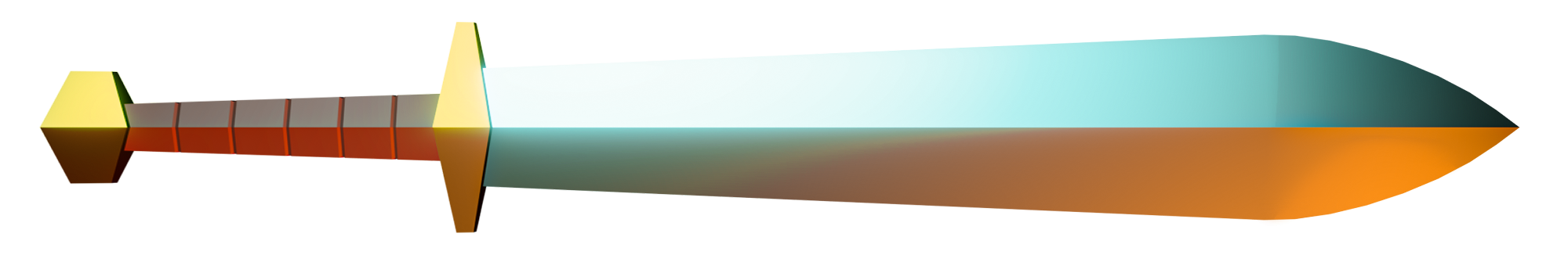
friendly process of creating a low-poly
fantasy sword in Blender will be going through the entire
process of creating this low-poly scene from a beginner's perspective to avoid as much
confusion as possible. That means I won't be
skipping any steps or going too fast for you
to keep up with me. We're using Blender
for this tutorial, which is an amazing and
totally free 3d software, the only barrier to entry is having a computer to
run the software on. In this class, you can expect to learn the Blender
Interface and it's tools. We'll be learning about the many basic interface elements within Blender while creating our
low-poly scene Modeling. To create our sword
or environment, we'll be using basic
modeling tools and modifiers such as
Bevel Lighting. We'll set up a dynamic
lighting scheme to highlight our low-poly
sword and tell a story. Shading. I'll show you how to make metal, stylized rock and more as we add color to
our environment. Lastly, Rendering, we'll
render our final image in Blender so you can share it with your friends and family
on social media. When we're done, you'll have all the skills you need to create a low-poly fantasy
sword of your very own. For our Class Project,
you'll be doing just that. I'd like you to create
a new sword with a unique design and
share it with the class. I'll personally review
every project uploaded to the gallery and give you feedback on what
you've done fantastic, as well as anything
that could use a little bit of adjustment. I hope you'll join me on this fund beginner's journey through Blender by making your very
own low-poly fantasy sword. I'll see you in
the first lesson.
2. Setting Up Our File: If this is your first time
taking a Blender class, I'd highly recommend
you start with my complete beginner's
guide to Blender first, this class was designed for the absolute beginner to
Blender and 3D Art in general, we cover every single necessary
topic in order to get you up to speed and running in Blender will accomplish this, but short and focused
lessons that cover each topic from a
beginner's perspective. Utilizing a well-organized
starter file, we end the class with an
easy project where you set up and customize your
very own cozy camp site. With that out of the way, let's continue with the lesson. In this lesson,
we'll be going over some settings to prepare a
file for future Rendering. Let's begin to begin with
on your splash screen here, we're going to choose the
general new file type. Now we'll start by
going over here to the render properties tab
and clicking on this. It looks like the backside
of a digital camera. And it's at the very top
of this list on the right. Throughout this class,
we'll be going back to this tab to enable
different Render Settings. But to start with,
let's just go through a few of the ones
that we're going to set up to begin with. But that's up here
and you'll see the render engine
that we're using. In this case, we're going
to be using EV, this one. Sure that we get the look
that we want for our image, as well as keep our render
times the lightening fast. Now if we scroll to
the very bottom, the list here on the right, when I go down to where
it says color management, twirl that open and then we'll
have to scroll down again. Then here where it
says view transform. You want to make sure that
you have it set to filmic, which should be the default. But if it isn't,
switch it to filmic. And then down here
where it says, look, we're going to switch this from none to very high contrast. This will just ensure
that for our render, the base level of contrast
will be very high directly out of blender that we don't have to do
any other adjustments. We know right away that
the image is going to have very bright brights
and very dark darks. Now let's switch to the
Output Properties tab, which is up here. It looks like a little printer printing out a little photo. So we can click on this. Now scroll all the way
up to the very top. We're going to change
the resolution. It's alright now it's
set to 1920 by ten at, which is a default
HD resolution, which is probably
what your monitor is. However, we're going to switch this and we're going to
make this a square image. So we're just going
to type in 2000, hit Enter, then
2000, and hit Enter. So both the X and Y are
now both to set to 2000. And you can see over here
that the camera is actually switched to a square
aspect ratio. But those few initial
settings out of the way, let's make sure we
save this file in a location that we can
find it again later. So first, go up here to File, and then go down to Save As. Alternatively, you can hit Shift Control and S at the
same time and that'll, that'll also do Save As. So I'm going to
click Save As here. Now you'll want to navigate to a location that you
can find again later. So we're gonna be
saving our file here, as well as saving
out the image that we're going to produce at
the very end of this class, we're going to save
it here as well. I would suggest either making a folder on your
desktop or saving it in your Documents folder or wherever else you
would typically save files that you want to get back to
relatively easily. You can use these
folders here on the left side here to navigate to the location that you'd like. Now before we save the file, let's give it a new name down here where
it says untitled. I'm just going to
highlight that. Now we can type in low
space, poly space Sword. And then I'm going
to put an underscore 01 at the end of this. The reason I'm doing
this is just in case where we get to a
point where we need to split the file and
we want to leave the original file untouched and then maybe try
something different, go in a different direction
for the new version of it, I can simply just
do another Save As and then change the
number to say underscore 02. And then I know I
have two different unique versions of this file. So just giving it a
number right away is an easy way to
differentiate between files that might crop up in the future of the name finished. Now we can just click this
blue Save As button down here. With these settings changed, we're ready to proceed
with the project. In the next lesson, we'll start modeling the Blade of our sword. I'll see you there.
3. Modeling the Sword Blade: In this lesson, we'll be
modeling our Sword Blade. Let's begin. Let's start by selecting the default cube
here in the middle. It's what is left-click on that. And then we can delete
it by either hitting delete or X on our keyboard. And then just choosing delete. Now we're going to hit shift and a at the same time to
bring up our Add menu. We're gonna go to Mesh
and then go back to cube. I know, I know that
seemed pretty redundant, but it's easier to delete
the original cube and then make a new one at an
exact size than it is to scale down the original
cube and habit at some arbitrary size
that may or may not match my exact
size and the tutorial. So by deleting it and then using this option
box down here at the left to very specifically
define how large this is. For the size here
we're going to type in 0.15 and then hit Enter. We know that everybody's cube following this tutorial
is exactly 0.15 m. It's not just kinda close to 0.15 or a little bigger
or little smaller. We know everybody following this is using this exact same size. If you don't see this
option box down here, it might be collapsed. So yours might look
more like this. And if that's the case, just
click this little arrow. That'll twirl that open and allow you to change these sizes. Now that we're done
resizing this cube, Let's go up here to the top
right where it says cube. We're just going to double-click
on that and we'll rename this Blade BL ADE,
then hit Enter. Now before we get into Adjusting this cube into a Sword Blade, let's get Our File organized. Start by making
sure that you have the new cube selected either in this list
or in the viewport. Either one matte doesn't matter. Now we're going to hit
M on our keyboard. That'll bring up the Move
To Collection option box. So we're going to choose
here new collection. Then it'll ask us what the
name of the new collection is. And we're going to type
in Sword and environment. And you can shorten
this up if you want, if you don't want to
type out the whole word, but sword and environment
and then hit. Okay. So we can see over
here on the right side that now this Blade object is now been moved into a collection code
Sword and Environment. Now we know going forward that all of our sword and
environment parts, all of the models that comprise those two elements will go
inside this collection. Now let's go back up here to the original collection that's just called
collection currently, that has our camera and our
default light inside it. We're going to double-click
on that and we're going to rename that Render Scene. And then hit Enter.
So we know anything that in regards to our render
scene will go in here. This will be things like
lights as well as our camera. Then the last thing we wanna do is click on this
little white box next to the Sword
and Environment collection that won't share any brand new model that we
create defaults going into this collection rather than the original render
Scene Collection. It just saves us a
step of having to drag things from one
collection to the other. Basically from now on, as long as this little
box is highlighted, anything we create brand new, we'll just go right
into this collection. Now we can begin shaping our
cube into a Sword Blade. So to start with, make sure
you have the cube selected. So you can either
select it over here on the list where you can just
select it in the viewport. Now we can zoom in here and we can see the
cube is much smaller, but that's because we want
to make this sword sort of somewhat realistic
in terms of its size. So we're going to be making
a very cartoony sword. But the Sword size over the
overall like World size, we want to keep
somewhat realistic. Now that we've zoomed
into the cube, we can hit N on our keyboard
to bring up our side menu. Then you're gonna wanna go
up here to the item tab, which is the very top one. Then we're gonna go down
to the scale section. And for the Z scale, we're going to type in
0.05 and then hit Enter. Now we can see here that
it's squished R cubed down to the thickness that we
want the edge of our Blade. So essentially right now we're, we're flattening this entire
cube out so that it's as thick as we want the Sword of the cutting edge on the
sides of our Blade. It's relatively thin right now. Now will be thickening
the middle of it up to make it
look more like a, kind of like a fantasy
cartoon style sword. But this is how thick
we'd like our edge. Now before we close
this side menu out, we're going to hit Control and a the same time to bring
up our apply menu. And I want you to notice
how the scale currently. So I'm going to mouse
over this first. So over here, right now
it says the scale for the X and Y is one because
we didn't adjust that, but our scale for our Z is 0.05. So Blender currently
knows that we squished this
object down really, really small and just the Z. However, if we hit control and a to bring
up our apply menu We choose scale. Will now see that
Blender now thinks that this is the original
full-sized one scale, like 100% scaled objects. So we've now told blender
to apply the scale and now consider this current
shape, the default size. Why that's important
is for further on, some things that you do
when you're modeling, such as beveling,
is going to take into account how much an
object has been scaled. So if it's been scaled
really heavily on one direction and you
haven't applied that. It's actually going to squish certain modeling
operations that you're doing and make them not really look like what you
expect them to look like. So to avoid that, after you've squished
something down, very often, you'd
like to apply it, the actual scale to it. So that Blender now
considers this the default size for that object with
the scale now applied. So these are all saying one, we can hit N to hide
that side menu. Now we can hit tab to enter
our edit mode for this cube. Then we're going to
hit Alt and Z tensor, our x-ray mode, so that we're able to select
through the model. Now, right now it's defaulted
us into the face mode, which allows us to
select the faces. However, what we want to
select all the vertices. So we're going to hit one on our keyboard so that it
switches to the vertex mode. Now I want you to drag select over the vertices
on the positive Y. So not the negative Y. This would be the
negative Y side. I want you just look up
here and then select the vertices on
the regular Y sin. We're just going to
drag select over these. Remember you have
to be an X-ray mode in order to select
through Model. If you can't see through the model like this
and you're not an x-ray mode with this little button
highlighted up here, make sure you switch
back into X-Ray mode. Now go over here
to your left side and select your move tool. So we can now see
the move gizmo here. I'm just going to zoom
out a little bit here. Now with these
vertices selected on the Y side and our
move tool turned on, we can just move these
just a little bit. It doesn't really matter how far you move these because we're going to be typing
in an exact value. Just move it a little
bit off to the right. And now we should
see this option box. And again, if you don't
see the option box, if it looks more like this, just click this little arrow here and that'll make it larger. So you can actually
type in values. In the value we want to type
in here is for the y-value, just type in one, hit Enter, and that will move at exactly 1 m to the right, or in this case the y-direction with that first move made. Now let's switch
into our top view. And there's two ways
we can do this. The first and easy way to
do this, at least visually, is to go up here and
then just click on this little Z bubble here. And when we click
that, it'll put us into a perfectly top view. This is an
orthographic top view. When you're in any one of
your orthographic views. However, the only thing
you can do as pan, if you try to rotate
your camera at all, you can see it immediately
pops you out of that orthographic view and goes back to your perspective view. So that's one way to get into any one of your
orthographic views. You can just click
on the corresponding bubble and it will look at your model from
that specific direction. The other way you can do that is by hitting the Tilda key, which is the key
above your tab key. And to the left of the
one key on your keyboard. It's a write-up the top-left of your keyboard below the
escape key as well. It's kind of in that little
plus sign area there. So we're going to hit that. That's going to bring
up a radial menu. And we can see
here that this has all the different views that we can just choose from
from this list here. If we wanted to go
into the top view after hitting Tilda
to bring up this, we can just mouse over the
top view and then click that. And that'll also put
us into the top view. I personally would
recommend that you try to get used to using the Tilda and the radio menu here to get into your
different views. It's just a lot faster
and there's a couple of different options here that
you don't get on this. But if you'd prefer just to click the bubbles because
it's a little bit easier to visualize exactly
which view you're going into. That's fine as well. To begin with, just make
sure that you're in your top view with all those vertices that we
just moves still selected. So if you don't
have them selected, it's the side here, the Y side. Just drag select over them to make sure you have
all of them selected. We're not going to switch
to our scale tool. And then we're gonna
be scaling this just in the x-direction. So we're only going to be
using this red handle here. If we just click and move this, we can see we start
scaling it this way. And again, we don't really
need to be perfect here. Just move it to just a little
bit so that it brings up the option box down here. Now that we have this
option box popped up, we're actually going to type
in two for the X scale. So we're going to
double the width of the top of our sword So we've typed in two. Now this top of the
Sword is nice and wide. Now we can hit two
on our keyboard here to switch into
our edge mode. So two, and now we can see up here and we've
switched to edge mode. And also the view display
here has changed. We don't see the vertex anymore. Now we want to drag select over the top center and the bottom
center here of our sword. So we're just going to drag
from the very top here, all the way down to
the very bottom. So that we drag, select
and select both of these edges as well as
both of these edges. Now we're going to add a
cut down the center of our Blade here so that we
can give our sword of point. And to do that with
both of these, top and the bottom edge is
selected, we can right-click. Then we're going to
choose sub-divide. When we do this, it's
already going to start out by adding a single
cut right down the middle, which is all we need. However, if for some
reason you needed more, if you were doing a
different projects, you would just need to
change this number here. We can see on our
sword that it's updated the amount of
cuts that it's adding. Now for this tutorial, make sure you're only
adding a single cut. In this case, just number
of cuts should be set to one with that single cut added. Now we can switch
back to vertex mode using one on our keyboard. Now we're going to drag
select this top center here. So we're selecting
these new vertices that we added to the top
center of our bleed. We're gonna go back
to our move tool. And now we can move these
up just a little bit. Then we're going to type in
the value that we went here. In this case, we're going
to change this y-value, 0.2 m and then hit Enter. Now we've added a
point to our sword. So if we zoom out here, it's starting to look
a little bit more like a sort of a
cartoon fantasy sword. Now that I was sword
has a point on it. Let's begin the
process of giving our sword a little bit
more dimension. Because right now it
doesn't really look a ton like a sword because
it's completely flat. Right now. It's
kind of paper thin. But it has the overall
shape of the Sword Blade. We're going to rotate here
into our perspective view. And you remember if
you're in the top view here and you just
rotate out of it, it will immediately pop you back into this perspective view. Now that we're in our
perspective view, we can zoom in here down
on the point of the Sword. So we want to see
about this much. Now we're going to
start using a tool called the knife tool. The knife tool ads
cuts to the model, but allows you to
very specifically place the cuts on your model. It's not like sub-divide
worth just kinda mathematically figures out
where the middle or the third, the fifth, or whatever
it is of your model is. It's actually going
to allow you to click your points here. So I'm gonna click from vertex, the vertex and tell
it to put a cut exactly from here to here. So start with, we're
going to hit K for knife on our keyboard here, and that'll switch us
to the knife tool. May can see your
mouse has changed now until a little knife. Now we're going to select one of these back vertices here. You'll notice as you
move this around, there's a little green box that follows the edge of your model. So what we wanna
do is as we mouse over right near
this vertex here, we'll see that little green
box gets a little red, red outline around it. It's pretty subtle, but you might be able to see
it on your screen. And we can tell it, snaps to it as it slides here,
just kind of pop. It's lapse rate to
this vertex here. We want to click
from this vertex with it's snapped on it. So the green box with a
little red outline on it, we're going to click once. Now we can see here we've
chosen our first point. Now we need to choose the
next point for this cut. We're gonna go all
the way down here. So this next vertex, wait until it snaps. And once that snapped onto
that, we can click again. And now we've placed
our first cut. Now that we've placed this cut, we can right-click to stop this chain of
cuts that were making. So that's our first cut
and we've made here, I'm going to rotate down underneath our model
because we want to see the bottom
of the Sword and, and mimic the same
cut on the bottom. We're going just gonna do
the same process again. It doesn't really
matter whether you start from the
back of the front, whichever you find easier. I'm just going to start
from the back here. Mouseover, this vertex,
wait for it to snap. Snapped onto it. Now I'm just going to
drag it to the front. Wait until it snaps
again, and then click. Now I can right-click
again to stop cutting on that same exact
contiguous line. Now with both of
our cuts placed, we can hit space on our
keyboard to commit those cuts. By hitting the spacebar retell the knife tool that
we're done making cuts. We're not going to
be making anymore. And now it should
actually apply those cuts to our model with
those cuts placed. Now let's actually give
our Blade some thickness. So first we're going
to switch over here to our scale tool. And we're going to drag select over these two new points
that we just created. With those two new
points selected. We can now scale this just
in the blue direction, which in this case is our Z. We're just going to scale
this just a little bit up in the Z until we get this
little option box down here. Then we're going to
type in an exact value For the Z scale, in this case, we're going to use 7.5
and then hit Enter. We can see here now that the end of the blade is
much, much thicker. However, as it tapers back, it goes back to being
perfectly flat at the end. Now at the end here, we're going to select
both of these vertex. So the two and the center
at the bottom of our Blade. Again, we're just going to
scale them just a little bit in the Z so we can
get the option box. For this Z value. We're going to type
in a smaller number. We're going to use 3.5
and then hit Enter. Let's now the back of our Blade does have a little
bit of thickness. It's not perfectly
flat at the back, but it is thicker at the front. Again, we're doing this to
keep this kind of stylized, video gamey fantasy
look for our sword. Now the final thing we wanna
do for our sword here is to make the front of it not
quite so boxy right now. It has the overall
thickness that we want and the general
shape that we want. But I'm not a huge fan of these hard corners
we have at the end. I want to make this
round so that's a little bit more soft
here at the edge. So let's switch to our Edge mode using two on the keyboard. So we're now in
edge mode up here. Now we're going to hold
down Alt on our keyboard. And then click on
this edge here. So hold left-click. And by holding down the Alt key, we're telling blender to select this entire edge loop
going around this object, had we not held
down the Alt key. So you don't have to
follow along here. This is just an example. If we didn't hold down Alt, it would just click and
select a single edge by, by holding down the Alt key. It tells Blender that
we want to select the entire loop going
around the model. Now that we have
this edge selected going all the way around
our sword here at the tip. We can begin something
called beveling. Into Bevel, we need to make sure we have
the edge selected, which in this case we do. Now we can hold down control. Hit B for bevel on our keyboard. Now that will allow us to
move our mouse and beginner, sort of beveling or rounding
out that corner there. As you move your mouse,
that'll make the Bevel larger. If you use your mouse
wheel to scroll up, it'll start adding more cuts, which will make the, the
overall curve smoother. So the more cuts we have, you can see the smooth
ER, this curve gets. So I'm just going to bevel
this out to, like I said, about an arbitrary value here, because we will
get an option box to type in exact values. So just make yours look
something similar to mine. And then we're gonna be
changing these values here. Now we have this option
box open for the width. We're going to type in
0.18 and then hit Enter. And then for our
segments, we're just going to add one
more in this case. So I want to have
seven segments. Now that we have the tip of
the Blade and rounded out, we can hit tab to exit our edit mode because we're done actually changing the
shape of the bleed now. Then we can hit Alt Z to
exit our x-ray mode so that we can see what
the Blade looks like more in the shaded, solid view. Well notice our Blade looks
pretty good at this point, except that as some lines going across it that look
a little bit ugly. So down here, you might notice them, they're
pretty faint. It has these kind of lines
here where we can see where we rounded out the blade will also notice them on
the side as well. Luckily, those lines are
pretty easy to get rid of. We'll be using something called auto smooth to remove them. The first thing we
needed to do is make sure you have your
Blade selected still. And we're going to right-click. Then we're going to
choose Shade Smooth. Now we'll see right away
that are Blade goes blobby and it no longer really looks like the Sword that
it did before. It actually used to look better. However, that's
because we haven't enabled the auto smooth yet. So right now, we've
just told blender to smooth the
entire thing out as if the entire sword is smooth and it's all
in the same planes, we basically removed all
these nice hard edges that we had that made it look more like a sharp Sword Blade. To add those back in, but maintain some
of the smoothness that we have here that
actually looks better. We're going to use auto smooth. So first, go down here to
the object data properties, which is this little
green triangle. We're going to choose that.
Now twirl open normals. Then we can see here
the only option within here is auto smooth. So we're just going
to check this on. Now we'll see that the blade
looks a little bit better, so it's a little bit closer
to what it was before, except we're still
missing some of those hard edges
that we actually liked on the last version of it. However, it did give us our
corners back on the sides. So the way auto
smooth works is it's using an angle
threshold to determine which edges are going
to be smoothed out entirely and which ones
that'll allow to have an, a hard corner, kinda like
the edge of our Blade here. Right now it's defaulted
to a value of 30 degrees. So the higher this value is, the more it's going
to be smoothing out, it's gonna get closer and
closer to the just right-click Shade Smooth that
we did before where it made the whole thing
looks kind of blobby. So if I turn this up, you don't have to
follow along here. But just for the
sake of example, eventually we get to an
angle point where it's, it just turns into that same sort of
blob that was before. However, if you go lower, the lower you make the value. If you make it all
the way down to zero, then it's essentially
what it was originally, where it's not
smoothing anything. Every single face is being shaded and smooth individually. We want to find a
nice, happy medium between them where it's
smoothing the parts that we want to
keep smooth while leaving the heart edges
that we still want to keep. In the case for this tutorial
and the Sword Blade here, we actually want
to use 14 degrees. The only way you would
know 14 degrees works here is if you just
slide it down and you just go down degree
by degree until you find roughly where every, everything that you want
smooth is turned smooth and everything you want hard edged is still hasn't hard edge on it. I've done this tutorial before, obviously in
preparation for this. So I know 14 degrees works. But if you were making
a different model or if your sword was
a different shape, you would have to find
the unique degree that works for your sword shape. With our Blade smoothed out, we're ready to move on to
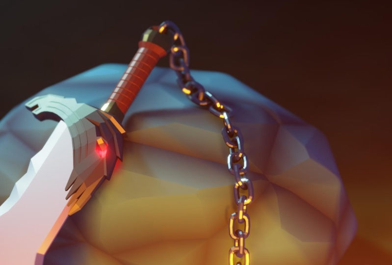
the handle for the Sword, also known as the Hilt. We'll be finishing
that last part of our sword model in
the next lesson. I'll see you there.
4. Modeling the Sword Hilt: This lesson, we'll finish modeling our sword by
creating the Hilt. Let's begin. We're going to start by making
the guard for the Sword. That's the metal
T-shape above the grip. We'll start by hitting Shift and a going to mesh and
creating a new cube. Down in the bottom-left
option box, we're going to set the
size of the cube to 0.27 and then hit Enter
with the size set. We can now go up here
to the top right. We're going to
double-click on the word cube and switch it to guard, and then hit Enter. Now let's go into our
top view by either clicking the little
Z bubble up here, or we can hit Tilda. It's bring up our radial
menu and then choose top. Now let's zoom in on this cube. Then we're going
to hit Alt Z to go into our x-ray mode
so that we can see through both
of these models. Now let's switch
to our move tool. We're going to slide this cubed down just in the
screen direction. And the Y. We're going to move it down here so that the center of the cube, this little orange dot, is right at the
bottom of our Blade. It doesn't need to be perfect, but just put it
roughly at the bottom. Now let's switch
to our scale tool. Over here on the left. With our scale tool selected, we can now scale this
just in the y-direction. We're going to make this
thinner so that it's not so thick vertically. So start by just scaling out a little bit in this
green direction, the Y. And it doesn't matter
where you put it because we'll be
typing in a value. So I'm just going to
scale it down to here. Then down here at the
bottom-left and our option box for Y, I'm going to type in
0.22 and then hit Enter. Now we're going to
go into our side view by their clicking this little negative X bubble up here or hitting Tilda and
then choosing the left view. So now we're going to our
left view and now we're going to again scale this down. I'm going to scale this just in the blue direction
or the Z direction. Scale this down roughly square. Then again, we're just
going to type in a value here and we're going to type
in the exact same thing, point to two, so that we
make this a perfect square. Now. Now let's switch back
to our top view again, or the Z button up here, or hit Tilda and then top. Now we can hit Tab tend to
our edit mode for this guard. And then we're going to
switch into our edge mode, which in this case I'm
currently in right now. But if you're not just to on the keyboard to
switch into edge mode. Now we're going to drag select over the middle of
our guard here. We're selecting the top and
the bottom of our guard. Then we can right-click and
then choose sub-divide. Again, we're only going to be using one single cut
for this because we want to match the cut that runs down the center of
our Sword Blade. We're mimicking that same
detail here on our guard. Now, rotate your view. We're back into our
perspective view. I'm going have to zoom
out a little bit. Now I can see my garden. And I'm going to hit three
to switch into my face mode. And then I'm going to select
each end of this guard. I'm going to select
right near this dot. So if you select near the dot, that will allow you
to select the face. If you select way off
away from the die, you actually select
through the model. So you need to select
somewhere near this dot. Then I'm going to rotate around. And now we need to hold Shift to make sure that I add
to the selection of I don't hold shift
is just going to select this and then
deselect the first one. So while holding Shift, select the dot on the
other side as well. Now I have both sides
of my guard selected. Now that we have both
of these selected with my Scale Tool still used, I'm going to select this little
floating red square here. So not the red handle. I don't want to scale
them just in the X. I want to scale them in
the little red box here, which is actually
going to scale them in the Z and the Y
at the same time. I'm just going to select
this little box here. Start scaling them down. And again, this just be, you can just make it an
arbitrary value here, just scale them
down a little bit. So we're actually able to
select both of these views simultaneously so we can change them both
at the same time. We're just going to
click and hold on why. And then quickly drag over top of Z and then let
go of our click. You have to do that
all in one motion. So click and hold on. Why hover over Z
and then let go. And that'll allow us to type
in a view or a value here. For our value, we're
just going to type in 0.3 and then Enter. Alternatively, if you find
that a little bit difficult, you can just click on each
one and then just type in 0.3 and just do it manually. Now with our guard
tapered on the ends. We can see here what we
were trying to achieve. So we have a guard that mimics the shape of our Blade because we can see our
Blade through here And it's also tapered
here at the end is just to make it a little
bit more interesting. So now we can hit Tab texts at our edit mode because we're
done editing our guard. Then we can hit Alt and Z to X at our x-ray mode because we don't need
that at the moment. Now we're going to move on to
the next part of our Hilt, which is the whole
bottom part of the Sword here we're gonna meet
making the grip next, which is the actual part
that you hold onto. So to start with, we're
going to hit shift and a spring Up Our Add Menu
and then go to Mesh. Then choose cylinder. We can see right away
it makes the cylinder huge and it's
covering the entire, entirety of the
Sword at the moment. And that's because the
default values here. So let's adjust some of
these default values. So we'll set the vertices
to six and then hit Enter. And the vertices
here is essentially just how many sides
the cylinder has. So we can see as we
lowered that value, the cylinder got a
lot more blocky. And that's, we're doing
that to help kind of mimic the overall low-poly look that we're going
forward for a sword. Now let's change the radius, which is how wide
the cylinder is. We're going to set
this much smaller. We'll set this to 0.05
and then hit Enter. Now for the depth, we're going to type in 0.32. And that's how long this cylinders with
those parameters set. We can now go over
here and we're going to rename this from cylinder. So we're just going to
double-click on that. We're going to call this grip
G rip, and then hit Enter. Now let's quickly
rotate this grip so that it's laying flat
along with the Sword. A quick way we can do this. So instead of just going
to our Rotate tool here, grabbing the red handle here, and then we can
hold down control. That's one way we can rotate it. So we can rotate it down to 90. You could do that
way if you prefer. Where am I going to? I'm going to Control Z this. So I'll undo that. And then a quick way
you can do that. It doesn't matter
which tool you're on. So I'll be in the
move tool here. I can instead just hit
R to start rotating and then hit X to bind it
to just the X axis. Now we can just type in
90 and then hit Enter. So that might have seemed
kind of slow to begin with, but it's actually,
it's relatively fast. So you just hit our X
90 and then hit Enter. And you can type in any
value you want there. You could type in RX1, 20, or our Z, 15, whatever you want. But it will allow you
to very quickly rotated an exact amount on a specific axis by
just doing that chain. So rotate axis and then the value you'd
like to rotate it with. Now that it's been rotated, let's slide our grip down. We're just going to slide
this one just the y-axis. We're going to
slide it down here. We wanted to intersect
just a little bit. About as much as I have there. Actually, it doesn't need to be perfect, but you
don't want it to. You don't want it to only
intersect in the middle because then you have this
gap here at the edge. You actually need to slide
it in until it starts intersecting on the far
ends of it as well. So the left and the right side. So right there is fine. You can slide it
in just a little bit more if you wanted to. Okay, It looks fine. Alright, so now let's
start shaping this handle. Will notice right now it's
a little bit too thick and that's because it's right
now it's perfectly circle. So we're actually
going to flatten this out into more of an oval shape. So first let's go up
here to our scale tool. And then we're going
to scale this just in the z-direction. So just the blue handle. We'll scale this down and just scale it roughly to
the right height. But we'll be typing in
a value here anyway. So for this C value
that we just scale, we're actually going
to set this to 0.4. So we're gonna make
it a little bit thinner than I just did there. Okay, so now I have
it set the 0.4. We can see here that
it's mimicking the same, the same sort of angled shape. So I'm trying to make sure that all these angles match up. They don't need to be perfect, but we want it to be visually sort of similar all the way
down through the Sword. Now that we have
it flattened out, what's taper the bottom of
it as a little bit as well. So we'll hit tab to enter edit mode with the
grip selected. Then hit three to make sure that you're
in your face mode. I was already in face mode. Now we're just going to select the bottom part of the script. So just this bottom face here. And then we're going
to scale it just in the x-direction to taper it and make it a
little bit thinner. So it's not quite as
wide at the bottom. So we're just going to
grab this little handle, scale it in a little bit. Then for the value here, we're going to type in
0.65 and then hit Enter. Now it just tapers a little bit. If we zoom out a little
bit, we can see it gets a little bit thinner
as it goes towards the back At this point we have
the general shape of our grip completed, but we can add a little bit
in more detail to mimic a simple wrap pattern that
goes around the grip. Similar to as if it
was wrapped with a chord or maybe leather. While we're still
in our edit mode, we're going to hit Alt and
Z to go into our X-ray. Now hit to, to go
into your Edge mode. And then drag select across
all the middle edges here. So we're selecting
all the way around the center of our grip. Now we can right-click and
then choose subdivide. This time instead of
just using a single cut, we're actually going
to make five cuts. So we can just click
and type in five. Or you can use
these little arrows and just click the
amount that you want. So we'll have our set to five. Now we can click
off of our model. We're just going to
click off so that it deselects all these edges. Then we're going to exit our x-ray mode because
we won't need this now. So I'll tie again to
exit the X-ray mode. Now we want to
select each one of these cuts that we just
made on the Modeling. To do this, we're going
to hold down Alt to make sure that we are
selecting the entire loop, but we're also going to hold
down shift at the same time. You should have Alt
and Shift held down. And now we're going to left-click
on one of these loops. Then we're just going
to go down the line and collect our click. Each one of these loops here. It's now we have all
five of them selected. And we have them selected
all the way around as well. I'm going to zoom in
a little bit here so we can see a little bit
better what we're doing. Now we're actually
going to bevel these edges that
we just selected. However, we're not
babbling them for the typical reason why you
would might usually use Bevel, which is to round off an edge. In this case, we're actually
going to be beveling this to add additional
geometry here that we're going to use later
to push into the model to make the look as if it's wrapped in leather or a chord. With all of these
I just selected, we're going to hit Control
and then be to start babbling and then just Bevel
them out a little bit. You can see here it has a whole
lot of cuts in it because it's remembered that the
last time you beveled, we had a lot of cuts in it. So instead of that, we're
going to switch this down to two segments. Now we have just a cut right in the center here of each of these bevels, which
is what we want. Then we're going to make
these a little bit, a little bit small. So we're going to
set this to 0.003. For the width that hit Enter. You should have
your width set to 0.003 and then the
segments set to two. But that Bevel set,
we can now again, we have to click off
the model because we want to make sure
we're only selecting the edges to be one before it had all those edges selected. Now again, we need to hold
down Alt and then shift. And now we're going
to left-click just on the center of each
of these bevels. So we just want this
middle line again, selecting this by holding
down Alt and Shift. Select all the way around
the model as well as add to each selection
rather than replacing it. Now I have every one
of these center lines selected on this group. Now with our scale tool, we're going to select this
little green box here. This will allow us to
scale them down in the z-direction as well as down in the
x-direction as well. We're just going to scale
these in just a little bit. And you can see
right as we do that, we're actually making
ridges in this grip. Now we move that just an
arbitrary amount here. But if you want to
follow along it with the exact values down here, we're just going to
click on each one of these and type in 0.95 and then hit Enter. So it's a very small
scale that we're doing, but it's just enough to add the impression that this
grip here is actually wrapped in something
or even if it was made of metal or whatever
it was made of wood, there's just some
gripped or grip lines here to either add a little
bit more traction for your hand or to just give it a little bit
of a decorative detail. We're now done with
the grip and we can hit tab to exit edit mode. Then let's finish our
sword by creating the end of the grip
called the Palmer. So to start and we're
actually just going to select our grip here, or rather our guard. So we're selecting the
guard here at the top. Then we're going to shift
in D to start duplicating. But we want to hit Y as well. So we're going to hit Shift
and D. And then once it starts duplicating it, why? To make sure you bind it
just to the y-direction. We want to slide this new, new guard here down
to the bottom. We just want to, I'd up and just put it at
the very bottom of the sword here,
right about there. And we want to make
sure that again, it's intersecting a little bit similar to how we
did for the guard. What we just did there
was actually duplicate the guard model to use as a
base for the palm role model. Because our palm oil
is going to look very similar to the guard. And there's no point
in us going through all these same settings
and scaling the ends down, putting a cut in the middle. When we can just duplicate
this and use it as a clone. And then just make
adjustments to this new clone to make it
more like what we want. We do want to remember
to rename this though. So Vernor list, we
have to go over here. We can see it gave it the
exact same name guard, but it added 0.001 at the end of it to let us
know it's a duplicate. So we're just going
to double-click that And we're going to
name this palm oil, which is P 0 M M E L. And that's what the name of this little cap at the end
of our sword is called. Now we can hit Tab tend to
our edit mode on the palmar. So we can begin to
Adjusting this. Now let's go into our
x-ray mode so we can select through the
model Alt and Z. Then we're going to add one
to go into our vertex mode. Now you might already
have the ends of your model already pre-selected because it's remembered what the last thing we did
on the guard was. But if they're not, that's fine. We can just I'll just deselect as if there
was nothing selected. So again, I'm in vertex mode. I'm just going to drag
select over this end. And then I'm going
to hold Shift and drag select over this ends that they add to the selection. With each end selected. Now we can scale this
just in the x-direction. So we're going to
scale this inward so that we make it a
little bit shorter. It doesn't need to be as
wide as the guard is. We're going to scale this in. Then down here,
we're going to type in 0.5 for the X scale. So we've made it essentially
half as wide as it was. Now let's switch
to our move tool, selecting it up
here on the left. We're going to rotate
our camera down a little bit so that we can
see from the top, we don't need to go in
the actual top view. We can just make
sure that we can see roughly from the top here. We're going to
direct select over just the bottom half
of this palm oil. Now. The bottom half of it selected and then the top
half remains unselected. We're going to slide this
down just a little bit. And then we'll be
typing in a value. Then down here, and
we're going to type in negative 0.02 and
then hit Enter. Now that'll move it downward. Negative 0.02 m, which are given a little
bit thicker shape. It was a little too thin before. Snouts a little bit thicker. It looks like a
little bit more of a substantial weight
here at the end. And with that last move done, we can hit tab to
exit edit mode and then Alt Z to X at
our x-ray mode. And at that point
the Pamela's done. We also have the entirety
of our sword completed. So if I deselect here and
we can rotate around, and I think it
looks pretty good. It's a pretty simple style, but it's definitely a low-poly and cartoony fantasy
styled sword. Now that we have all the
pieces of our sword made, Let's parent them
together so that we can move them as if they
were one single piece. This will allow us
to position and move and rotate the Sword
as if it was all attached together while
still maintaining the edit ability of them
all being separate pieces. Which means when we get
to the texturing stage, a lot easier to
texture each of these individually because they
are individual models. Start by making sure you have nothing in your scene selected. We're going to start by
selecting our palm oil here. The first thing. Then
we're going to hold down Shift and then
select our grip. Then we're going to
select our guard. And then lastly, we're
going to select the Blade. Now in this case,
it didn't matter the order of the
first three objects. We could have selected
a guard grip and then pano or grip, palm old guard. It didn't really
matter for that. But what was important is that the Blade
was selected last. The last object you
select in this chain here is going to be the
parent of the other objects, which means if I move the bleed, then it will move
the other objects. However, if I selected the
grip and then move the grip, the grip can be
independent of the others. Now with everything selected, we're going to hit Control in P to bring up the Parent menu. We're going to choose this
very top option here that just says parent object. Okay, So now we have it
all parented together. And you'll notice over
here on the right side, all of those objects
have disappeared. And they've moved up
underneath the blade here. So they're actually
in a little drop-down menu underneath the Blade. And so we know that the blade is the parent of all three
of these other objects. So you can either
leave this twirling open or if you'd like to, you can just totally
close again. And I believe this is
actually the default, is having a closed. It's now let's see if we
select our Blade here. By just selecting the Blade, we don't have anything
else selected. If we move the bleed, we can see that it also moves all the other
objects with it. I'm going to Control Z
to undo that movement. However, now if I
select the guard here, or rather the grip. So if I select the center
here and I move this, this will move by
itself and you can see that it's not moving
anything else with it. That's true of all three
of these smaller pieces. So if I select any one of these pieces and I
tried to move it, it's not going to move
the Sword with it. The only way I can
move the entire sword is by selecting the Blade. That's because the bleed is the parent of these
child objects. With our sword created, we're ready to create
the environment for it. Now, in the next lesson, we'll be modeling the
Rock Center scene. I'll see you there.
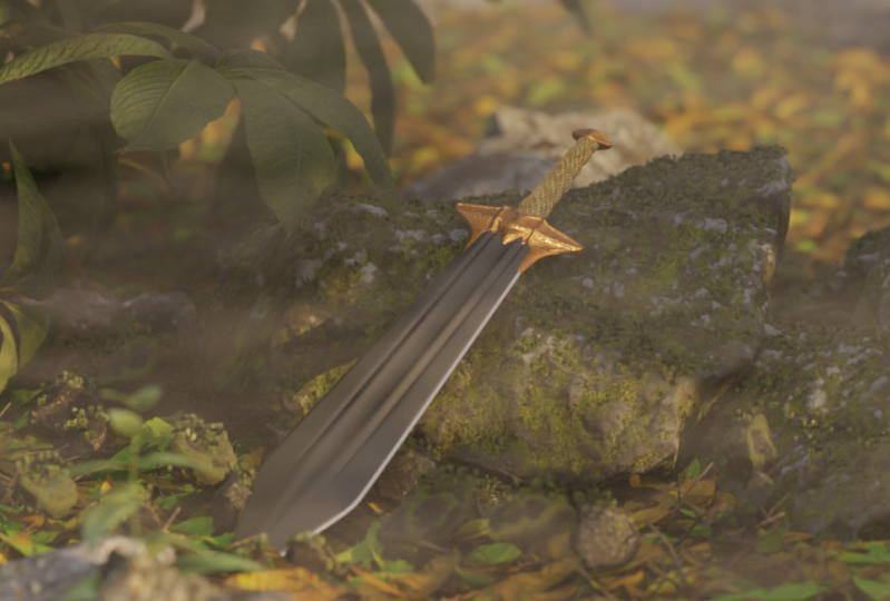
5. Modeling the Rock: In this lesson,
we'll start modeling the scenery for our
sword. Let's begin. We'll start by creating
the large rock that our sword is going to
be leaning against. So to start with, we're
going to be hitting Shift a to bring
up our Add menu. Then we'll go to Mesh. And then this time
we're going to choose Ico sphere will choose this. Now we can see here it
makes a triangulated kind of lumpy sphere essentially. And we're going to be
changing our parameters here. Two subdivisions
will have it set to, which may or may not
be your default. And then for our radius, we can just leave this at 1 m. If it's not set to one, you can just type in
one and then hit Enter. So subdivisions set to two and then radius set to
one of the top-right. We're going to name
this I ecosphere. We're going to just
change this to big Rock. So now we know this will be the biggest rock within our scene. And now hit tab to enter edit mode with our
big Rock selected. Then Alt and Z denser
our x-ray mode. Not begin shaping this Rock. We're going to be using
proportional editing. This will allow us
to move more than a single vertices at a time while utilizing a
falloff to make sure our edits are a
little bit more smooth. So we can go up here to the
top center and then just click this little bullseye
here so that it turns blue. Now let's go into
our front view. And to get into your front view, and you can either choose
negative Y over here, which is the front view, or you can hit Tilda
and then just use for hit the one key to make sure that
you're in vertex mode. Then we're going to drag select over the bottom vertex here. So the very bottom
pointed vertex. Now that we have our
proportional editing on, we're going to start
moving this up. We'll see here that we
have like a circle here. And now it's a little
bit hard for me to point to it, but right here. So we see this circle
here, and that's the falloff for
proportional editing, which right now the
default is probably fine. However, if you needed to
change the size of it, if you scroll down
on your mouse wheel, that will make the
proportional falloff bigger. And if you scroll up,
it'll make it smaller. Now in my case,
the ball was fine, learned about in this large. So I'm going to move this upward until it almost turns
flat at the bottom. So it doesn't need to
be perfectly flat, just needs to be similar
to visually flat. Right here, I've moved
this verticies up until it's now about
flat at the bottom. Now I'm going to
drag select over these newly flattened vertices. So I'm just going to track
select over all of these. So I have this whole
flat part at the bottom. Then I'm going to pull these up. I might need to scale up my proportional
editing a little bit. So I'm going to scroll down my mouse wheel just
a little bit, one-click. Maybe. I'm going to move these up until these turn, pretty much flat. So right about here again, this doesn't need to be perfect. We're gonna be pushing
this into the ground. We just want to have
a general shape here at the bottom
that's kinda flat. Now one last time we're going
to drag select over all of these vertices at
the very bottom that are pretty much
flat at the bottom. Then we're going to move them up in the z-direction
one more time. We're going to stop these just before it hits the
red line here. We don't want to go past the red line because the red line is where our ground is
going to eventually be. And we want this rock to sit in the ground as it gets
buried a little bit. So we'll pull it to about here. So it doesn't need
to be perfect. Just have this bottom line here just a little bit
below the red line. Now let's zoom out a little
bit and then we're going to select this
very top vertices. We're just going to drag
select over top of it. Then we're going
to pull this down to flatten out a little bit. So it's not so
pointy at the top. This doesn't need to
be perfectly flat. I would pull it down
to right around here so that there's just a tiny bit of
a point at the top. Now let's go into our top view. So we can either click
the little Z bubble or hit Tilda and then choose top. Now we can see from
the top view here are Rock is sort of just like a big, big circle right now and
we're going to change that. So to start with, we're
just going to drag select over this very
top vertices here. Then we're going to hold Shift and then select the very bottom. Now we have the
top and the bottom both selected the same time. Now let's switch
to our scale tool. Then we're going to scale these just in this green direction, which is the Y direction. Now as we start scaling this, we're going to want to change
our fall off here so that this circle that we're seeing going around
our model here, we want to make
this a lot larger. So we're going to scroll
down on our mouse wheel We want to scale this up at
the top left, right up here. Now you have to disregard
what my model is doing because I'm making
it go crazy here. But I love the way up
at the very top here, we see this number
here where it says 2.14 for the proportional size, you want to make yours
pretty close to 2.59. It might not snap
exactly to 2.59, but 2.62, 0.6, 555, whatever. It ends up being
just somewhere in the range of about
two-and-a-half. That's about how
big we want this. Then we're going to scale this
down to about, about here. This is really
just eyeing it up. I don't want to
scale it so far that the Sword starts poking
through at the bottom. So I'm going to stop a
little bit short of that. We'll make it somewhere
in this range. We can see down here, if
you wanted to match mine exactly, mine is point. We'll just make
us a nice number. We'll just type in 0.6
and then hit Enter. Your Y value should
be about 0.6. Then we're going
to scale this in just a little bit in
the, the x-value. So to start with,
we're going to drag select over just these two here. We want to try to avoid getting the vertices that are a
little bit further in. So just drag select over
these two flat edges here. And then hold shift. And again we're going
to do the same thing. Just drag select, see, only get these two edges here. Then let's just scale this in a little bit so the
rocks not quite so wide, we can leave it at
the same proportional editing size, which was 2.59. In my case. We're just going to
thin this out just a little bit around there. It's in my case, I'll
just type in 0.85. So that's a nice number. 0.85 scaled in the x-direction. Now with that done, we
can go up here and turn off proportional editing because we won't
need that anymore. Now let's go into
our front view, which won't remember is the
either negative Y bubble. We can either click that
Oregon tilda front. Then the last thing
we'll do here to shape this rock is we're going to
flatten out this bottom here. I'm just going to drag select over all these vertices
here at the very bottom. Then with my Scale
Tool turned on, I'm just going to scale
these in the z-direction. So I'm just going to scale
them as we scale them flatter or as we scale
them down rather, you can see that the
bottom gets nice and flat. We're just going to
scale it until it's nice and flat here
at the bottom. And just make sure that
wherever you scale it to, its still stays below this X, this X red line here. If it isn't, you
can just switch to your Move Tool and
then just pull it down a little bit
to make sure that it stays underneath this red line. With that done, we can now
hit tab to exit edit mode. And then Alt and Z to
X at our x-ray mode. Now we can rotate to go back into our
perspective view here. So now we can see generally what are Rock looks like here. And again, we're,
we're keeping with this low-poly style that
we add for our sword. In this case, it's
actually a little bit more pronounced with our
rock, but that's fine. We're going to add
a little bit of rounding here,
teach these edges. So normally you could go through here and you would just select
each one of these edges. You might just select all of
them and then Bevel them. However, there's a
little bit easier way to do this and it's
also a little less destructive because so if
we actually went through and beveled every one of
these edges rounded out, we can easily undo that. Once it's been beveled,
we'd have to either undo a bunch of changes to go back
to before it was beveled, which may or may not
even be possible. Or we'd have to go through and delete all those rounded edges, make them flat again
and then read Bevel it away. We can do that. That's much easier and
much less destructive than that is by using
a Bevel modifier. Get to our Modifier tab here, make sure you have
your objects selected, in this case the big Rock. And then go over here to this
little blue wrench icon, which is our Modifier Tab. Now we can go over here to
where it says add modifier. We can look at all the
different modifiers we can add, like I said before,
and we're going to be using a Bevel modifier. So let's select that. Now that we've selected
our Bevel modifier, you might have noticed
right away and that's some of these edges
got rounded out. However, it didn't
do all of them. We have a few different
settings over here. We can adjust to
make sure that it's beveling it the way we want to. The first one is just the size. So this is just how big are these bubbles. You can see here. It's not beveling
all of them though. And that's because of
the angle threshold. So right now it's
only beveling angles around the 30 degree mark. In our case, we want it to Bevel every single angle on here. We don't want it to
eliminate anything. We're just going to
set this down to zero, which means now this
threshold is including every single angle over a
threshold of zero degrees, which would be everything. Now we can go up here at
the top and then switch this amount from whatever
I hadn't drug it to. We're going to set this to
0.015 and then hit Enter. Now we can see here
that are bubbles are much smaller and they
just kinda ran out these corners except for getting some weird,
ugly edges here. And that's because our segments
here are only set to one. So if we turn this up to two, now we can see
that it's actually Through and actually
rounded out all of these different
edges correctly. It's add an additional cut here through the center to give more geometry so that these corners can be a
little bit more round. And then these
intersections where they all meet can also be round. Then the last thing
we need to do to make sure that
this looks good, it's just right-click and
then choose Shade Smooth. Now we get rid of
all those small little lines that we
saw between them. And we only leave these kind of nice rounded areas between
each of these flat faces. That sort of completes
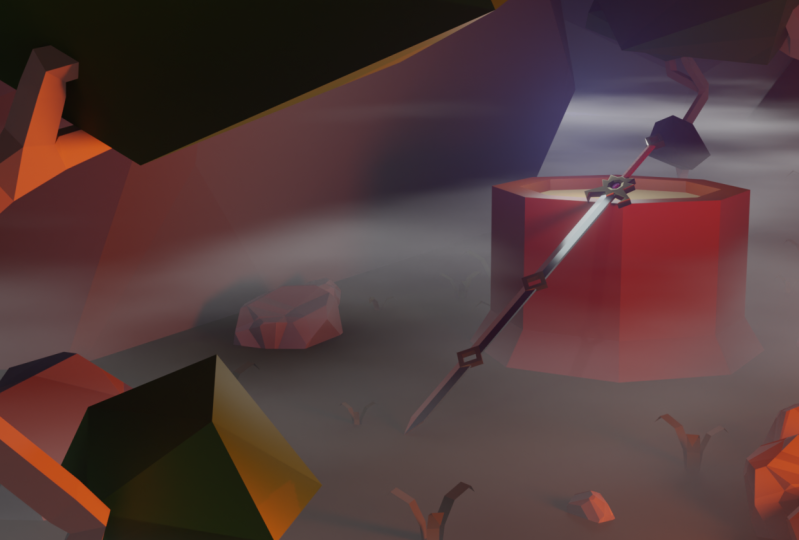
the look of our rock. With our Rock completed. Now let's actually lean our sword against the
side of the Rock. So let's start
with, make sure you select the blade of your sword. In this case, it's just kind
of poking out the side here. Or you could select it
here from the list. I have my Blade selected. Let's just move this
off here to the side. So I'm moving it to
the negative Y side, which is actually the
front of our scene. So right here we're
at the front of our scene. This
would be the back. So I've moved it to the
front side of the rock. Then we're going to rotate and
move this sword so that it looks like it's leaning
against the side of this Rock. So the first thing
you need to do is hit N to bring up
your side menu, which we've used before. Then we'll be using these
rotation values here. I'm going to give you the
exact rotation values that I plan on using
for this tutorial. However, you may find that your sword needs to be
rotated a degree or two after you've placed it to match your unique
version of the Rock, that's not really
going to be a problem. You'll just have to
start with the values that I'm giving you now and then adjust them using
the rotate tool or the Move tool to suit the
needs of your specific Rock. Start rotating. We're gonna go over here
to these rotation values. Then go to your x-value
and type in negative one. For one. That hit Enter, can see your sword
moved right away and they brought
everything else with it. So all the Hilt pieces came with it because we're
moving the blade. So anything we do
to the blade is going to be Adjusting anything
that it's parented to. Now go to your y-value. And then type in 1818. And then for the Z type in negative 20, and then hit Enter. Now you may be wondering where I came up with these exact values. This is similar to what we
did with the auto smooth, where I knew exactly 14 degrees
worked for auto smooth. In this case, rather than guiding you through
the tedious process of trying to find the exact values for all of these rotations. So the X, Y, and Z. I know for a fact that in most cases
for everybody's Rock, negative 14118 and negative 20 is going to get the Rock
are the Sword into the, roughly the correct
position for your rock? And then you'll just have
to adjust it from there. If in some cases you may
be you've made your rock a little taller or a little
shorter or a little wider. So now let's go
into our left view so that we can start
actually moving the Sword and placing it against
the surface of the Rock. So again, our left view is either the negative X bubble
or the Tilda, and then left. Now we can begin
moving the Sword. And so I'm just going to grab
this little red box here, which allows me to move it on both the Y and Z
at the same time. I'm just going to move it
roughly to where I want it. We'll put it up
out here for now. Then I'm going to
zoom in down here. I want to be able to see
the tip of this blade here. I want to still be able to see the Movement Gizmo up here. I'm just going to move it
on just the blue direction, just the Z when I
move it up so that just the tip of the Sword here is touching
this green line. Because the green line in
this case from this view, this is actually going
to be our ground plane. I don't want the
tip of the Sword buried really deeply
into the ground. And I also don't
want it floating off the engine of
the ground either. In this case, I just want
a little bit of the Sword intersect them the
ground to make sure that it looks
like it's touching it. Now that I have the height
set, you can zoom back out. And I'm gonna go
over here to where the Sword is going to
meet the rock itself. Then slide it back one
just the green handle, sliding it back until it just
starts to intersect here. In this case, we're probably
getting a false positive in the case that it looks
like it's intersecting here. But I don't think it is. So get it back to right
about where I have it here, where it looks like it's
starting to intersect. And then we're going to
be rotating our view to make sure that it actually
is touching here. Now we can rotate our view back into our perspective view. I'm just going to
rotate my camera around and I'm going to
angle my camera. I can see that small gap between these and I was in
this case, I was correct. It wasn't actually touching even though it looked
like it was touching. So it's important that this
actually touches here. We don't want it to
float off the edge. So in this case I'm just going
to grab the handle again, the green one, and
then slide it back. That gap starts to disappear. Now we can resume in, rotate around, and then just make sure that our
Blade is actually touching. We don't want to push
it in so far that it actually goes
through the Rock. So I think I might position for my sword pretty close here. Just want to zoom
in a little bit, make sure that the, the edge of my blade is and
also being cut off by being pushed too far into the Sword
or into the stone rather. I'm just going to rotate around. Just give everything a little
bit of a once over here. Because once I place
it, I don't really want to mess with it too much. I think that looks pretty good. Then the last thing
you wanna do is slide your sword
off to the right Right now it's kind of like the point is facing
off to the left. I want to point to be more
centered here in the middle. I'm going to slide this off
to the right side here. To about, right about here. Kind of put the ridge of the Sword over that point of the Rock that
was just below it. If I hit Alt, see
here I can see that the point of the Rock
was worried about here. So I'm kinda centering the
ridge of my sword along that. Now, let's just give
this a once over here to make sure that it's
still touching the Rock, it still looks like it's
actually making contact. In this case, it's not. I'm going to move it up just
the y-direction until it looks like it's touching
everything, they're looks good. Then again, if you
have any sort of minor differences for
my Rock versus yours, you can adjust these values here by either just clicking on them and dragging them to
slightly adjust your angles. I can Control Z to undo it. You can do that with any
one of these to make sure that it matches your rock. But in general, this is the
sort of the angle that you're looking for you and your sword to be off to the right side. You want it to be leaning
back onto the Rock. And you also want it to
be leaning down this way. So it's, the top of it is leaning more to the right
than the bottom is. Might look a little
bit odd right now, but it'll make more sense
once we've placed our camera. And speaking of our camera, finished our lesson by actually placing our camera
within our scene. So to start with, let's
hide this little side menu here and then hit N, tied that. Now we're going to
create a second viewport so that we can use that for our camera view and then we can work on the others viewport. Make another viewport. We're gonna go up
here to the top-left. And you can see as
I hover over this, my mouse actually turns
into a little plus sign. Once it's turned
into a plus sign, just click and then
drag to the right. We can see here now that I've
made a duplicate viewport, I'm just going to drag this
out until it's about half. It can be a little bit smaller
here on the left side. With this viewport created, we can now click this
little tiny camera icon I went that's going to do is let us view what our camera is seeing that's
already in our scene. So by default, the Scene
started with a camera in it. And that's because we chose
the general File Type. In this case, we're and we
have our camera right here. And this is actually
what our camera is seeing on the left side. Now we'll notice that
our camera doesn't have a very good view of our sword
and our rock right now. That's not a really big problem because we can just
move our camera. Now by default,
the way you would move your camera
would actually be using your move tool and you Rotate tool in your viewport. You can see here if I move this, we can actually move the
camera and it changes with the view on the left is
seeing from the camera. We can also adjust it with the Rotate tool that
would rotate the camera. However, as you can see, that's it's a little bit
tedious having to move, move it forward and
then rotate it left. And then you have
to decide, okay, maybe I'll move it down and
I have to move it closer. That's kind of tedious
and I don't really enjoy working with my
camera doing it that way. So luckily, there is
another way to do that. Way we can do that
is let's first, let's zoom in here on
the left side a little bit so we can make our
camera a little bit bigger. So we, our view of our
cameras a little bit larger. Then in the left viewport
and make sure you're on the left side where
we're actually looking through our camera. Hit N to bring up
your side menu. Now go over here to
view the view tab. Then I'm gonna make
this just a little bit larger as you can
read the whole thing. You don't have to do that. We're going to check
the little checkbox here that says camera to view. Now when I check this, I'm gonna hide this
side menu here, and I would suggest you
do the same as well. So N, to hide that. Now that we have that checkbox
selected and we can see we have a little bit of
a dotted line around here to let us know
that we're doing it. Now when I end my
left viewport here, if I adjust my view
from the left viewport, it actually moves my cameras. You can see my camera is moving over here
on the right side. So as I move my camera, I can zoom in and it's
actually moving the camera to mimic what I'm doing over
here on the left night. I don't know about you,
but I find that a lot more intuitive and a lot easier to place because I'm
already doing this naturally as a Modeling and
moving around in my scene. So this is very intuitive
to me. It's very easy. I can just zoom in here and position my camera
however I'd like. I don't have to worry about
messing with it over here, switching back and forth
between my Rotate and my move and having to do
everything one at a time. I can just kinda
do all this really easily using the controls that
I'm already familiar with. So let's get our camera
view over here on the left, looking like we want for the
rest of this tutorial here. I'm going to zoom out
just a little bit. I'm going to be quite
so tight on it. We wanna be a little
bit high on it as well so we can look down
on if we're too low, we won't see quite enough of the handle here that we
spent some time modeling. So do your best here to match a similar camera angle to
it I'm setting Up Now. It doesn't need to be perfect, but I would suggest
doing something similar to this
before you try to deviate too far off the beaten path here
because we'll be setting up some lights and things
like that that are specifically tailored
towards this camera view. Now if you, if you'd like to do your own thing
and you're not super worried about producing the exact same
result as tutorial, By all means can change it. But if you want to produce a result that's very similar to what I'm
showing you how to make. I would suggest setting
up a camera view that looks pretty
similar to this. We can just continue
fine Adjusting this, zooming in and out until we find something that
we're happy with. My case, I think something
around here, it looks fine. Now we're done
placing our camera. It's very important
that you bring back up that side menu on
the left viewport, hit N, It's bring up the side menu and you
uncheck camera view. So by unchecking that, and then I can hide this
menu by hitting N again. Now, if I move this around, I'm not moving my camera. You can see over here the
camera and remains in position. It's not changing anything. If I want to zoom in and out, I can zoom in on the
render to see something closer without actually moving the camera closer to the object. A really important step after
you've used camera view, because you don't want to find
this perfect camera angle that you're really happy with. And then you accidentally
zoom in or you rotate and you've completely busted up your camera angle and you
have to find it again. So it's important that
once you've placed it, you bring up your side
menu again and you uncheck camera to view
inside the View tab. And then you can add
end hide that again. Now that we have our
camera in place, we can focus on filling
out the rest of our environment with
Grass and more rocks. And the next lesson,
I'll see you there.
6. Modeling the Grass: In this lesson, we'll finished
modeling our scene by adding some Grass
and campfire rocks. Let's begin. The
first thing we'll do is hide our camera
within the viewport. Now that we have
our cameras placed, There's no need to have it
cluttering our viewport. To hide your camera,
simply select it within the viewport or in the list over here on the right. And then just click this
little eyeball symbol. I will hide it
within the viewport. But as you can see over here, it hasn't changed anything
about our camera. Now let's start with
a campfire Rock says there'll be
pretty easy to create. The first thing we're going
to do is on the right side, select your large rock here. So I guess we named it big rock. So select the big rock. Then you're going
to hold down Alt and D at the same time. And that will start
duplicating this objects. Then we can hit X to bind
it to just the X axis here. And then we'll
click to place it. Now you'll notice
that I said Alt and D naught shift and D, Alton D will create a duplicate that is an instance of
the original object, rather than a simple duplicate. Instance, duplicates share
all mesh information such as vertex placement
and materials. However, they can have
different object properties such as scale or placement. Essentially, by
using instances will make our life a little
bit easier when we start texturing are seen as all of the instances will be
textured at the same time. Now let me show you a
really quick example of how an instance differs
from a duplicate. You don't have to follow along, just watch what I'm doing. So first I'm just going to
make another duplicate here. Again, you don't
have to do this. This is just for an example. So I'm just going to drag
out another duplicate. This time you can
see I use to shift in D instead of ALT and D. I'm gonna move this up. The left one here is
a simple duplicate. And then this one over
here is an instance. If I make an adjustment to this, I'm just going to
grab the top vertices here and I'll pull it up. You can see that this
rock is changing all by itself and nothing else
is moving with it. However, if I make this same
change to this rock over here, I pull this up. You can see that
the original rock is now changing with it. And that's because these two
are instances of each other. That means that they'll share
any mesh data between them. Whereas this one doesn't,
this one is essentially an entirely unique object and I won't share anything
with the original. If I can Control Z to undo it. Now I can show you
that if I scale, this scale does not
affect the original. So this is an object property
here that I'm adjusting. So scale is something that won't be affected
by the original. However, again, if
I go in here and I pull up one of these vertices, even though this rock
is much smaller, it's still duplicating
that original chain or that change on
the original object. And that's because I'm
adjusting the mesh itself. So that's the main difference
here between these two, these two types of duplicates. I'm just going to undo all these changes here that I made, set the Rock back to
its original state, and then I'm going to delete my, my example duplicate here. Now before we turn this rock
here into a campfire Rock, Let's rename it as such. So go over here to your list. And then right here where
it says Big Rock 001, I'm just going to
double-click on that. And then they miss campfire. Rock, then hit Enter. Now we can begin
shaping this into a smaller and more
round version of Iraq that we're going
to assemble into a campfire ring here
at the bottom right. Let's zoom in here. And then we're just going
to scale this down. We're just going to hit S on our keyboard to
begin scaling it. And it's going to scale it
uniformly in all directions. So it's just making
it overall tinier. So we're going to scale
it down to about here. I guess once I
choose a size here, I'll tell you roughly
how big it is. So in this case here, it's basically a quarter of the size. So you can just assume
all of these are 0.25. So again, if I wanted
to change all of them, I can click on the top one, hold it, drag down to the bottom one and then quickly
release my click. And then I can just type in
0.25 for every one of these. Again, if I click and hold, drag down and then let go. That's what allows
me to hand type each one of these, 0.25. So now my rock is exactly a quarter the size
of the original. Now I'm going to zoom in here, and then I'm gonna also
scale this rock just in the x-direction to
make it a little bit more circular rather than the oval that the
original Big Rock was. So to do that, I'm just
going to hit S and then X to bind it
to just the x-axis. Now I'm just going
to scale it in just a little bit to make it
a little bit more circular. Now it's just a tiny bit different in shape than
the original rock was. It's not just a, a carbon copy, very tiny version of it. It's actually a slightly different shape
than the original. So as I said before, the intention of the
smaller Rock is to make a little campfire
ring that we're going to put it the
bottom-right of our frame. We're actually going to be using the right, right viewport here. And we're going to move
this rock so we can grab this little
blue symbol here, which will allow us
to move in both the X and Y directions while
leaving it on the Z I'm just going to be looking
at my left viewport so I can see what my camera is
seeing and then I'll just move it on the right. I'm going to place my
rock right about here. So it's sort of a
little bit off to the right of the
center of the frame. And I can tell that this is
the edge of the frame here. This is that dotted line. Then it's also a little bit, you can see it's
tinted on the outside, so it's a little bit darker. And then we have this
little dotted line. So anything on the inside here where it's nice and bright. And on the inside of
this dotted line, that's what our camera will
actually see once we render. Anything outside of
that will be cutoff. So now we know where our
first rock is going to be. I'm going to play in
that Our last rock, which we're gonna be making
about for rocks here. Last rock is going
to end over here. So we're just going
to see just the edge of this campfire ring. So first on our right view port, so where we were moving, we're gonna go
into our top view. We can either do
the little Z bubble or it can hit Tilda and
then just choose top. I'm going to collapse
this little option box down here because it's
kinda getting in the way. You can do that as
well if you'd like or if it doesn't bother
you, that's fine. I'm just going to click
this little arrow and that's just going
to make it smaller. Now on this side here and I
get a nice even top view. Then I'm gonna hit Holt and D. So remember we want
to make an instance not just a duplicate. So Alton D to make a
duplicate over here, I'm just going to drag it out and place it roughly about here. Eventually here we're going
to be making a semicircle, but it's more important and
what we see on this side. So we're really
concerned about what we see on the left
side of the frame, little less so on the right, because we're not
even really going to make a full circle here. We're only making what would
be seen in the camera. Again, we're going
to use Alt and D to make another duplicate. About there. I'm noticing now
that I don't have quite enough room
for a fourth rock, but I'd still like to get
another one in there. So I'm just going to drag
select over all of these. Then I'm going to
use the little blue symbol here on the rates. I can move it in
both the X and Y. Just gonna move it over
just a little bit. Then select this
last rock, Alton D. Now filling that
gap that I made. Once you have these
rocks placed, feel free to go through
each one of them and just adjust it to make it a little
bit more round if you like. It's maybe I'll move
this one in a little. We can just fine
tune this to make the campfire ring and look a little bit more round
within our camera. I think something
like that looks okay. At this point, we now have
a ring for our campfire, but won't also notice
here that as we zoom in, every single one of these rocks is rotated the exact same way. So this little
shape here that we see is rotated the
exact same way on every one of these rocks. And that's because we didn't rotate them as we
were moving them, we only duplicated
their positions. Now let's go through each
one of these rocks and just give it a random rotation. So since we're in the top view, we can just select the Rock and hit the R key to
start rotating it. It's only going to
rotate it on the X and the Y because we're already
looking straight down. So it's going to assume that the rotation that
we're looking for is the z-direction because we're looking from the z-direction. I'm just going to
give each one of these rocks just a slight, slightly different
rotation and tried to look at the last one
that you rotate it and make sure that
the new one you're rotating isn't the exact same. There's not that many positions
for these rocks to be in, but just try to rotate them and randomize them
as much as you can. There are pretty
symmetrical though, so you're going to find
it difficult to make every single one of
them super unique. But just doing a little
bit of rotation will help break up all these little
faces we're seeing here. I think most of these
rocks look okay. However, I'm noticing
that these two, if I zoom in here, these two are facing almost exactly the
same way in the camera. So even though they
look different here, because our cameras at an angle, they actually look the
same in the camera. So I'm just going to
select one of them and try to rotate it so that it looks a little bit different
than the other. So it looks fine. This is just a little bit of variation here to
help break them up. Now would also be a
good time to go through here and maybe
select one or two of these and just make them
slightly bigger or slightly smaller than the
others to give them a little bit of a size
variation as well. I'll make that one
a little bit bigger and maybe I move it
off to the side. Just helps these look a
little bit more varied. I think that looks good. I'm done tweaking them for now with all of our
campfire rocks placed. Let's move on to making
some low-poly Grass. I'm going to start by centering my camera here on
the left side again, I'm just going to use my
pan middle mouse button. And I will send through this. Okay? Now on the right side here, I'm going to rotate. Now we can start creating
the plane for the Grass. Will hit shift and a go-to
mesh and then choose plane. Now before we go any further, let's go to the option box
down here at the bottom left. We're going to change
the size of this plane. We're going to set it to
0.06 and then hit Enter. So we want this to be
really tiny because obviously Grass would
be relatively small. Now over in our viewport, we can pull this forward so
that we can actually see it I'm just going to set it
up right around here. Then let's go up to our
list and name this Grass. So just double-click on
where it says plane, then type in Grass.
And then hit Enter. Let's zoom in down here
on to our Grass played. Then we're going to
rotate this 90 degrees. We're gonna do this
the quick way again, but also you can use the
tool if you prefer that. But I'm going to use
the quick method. So I'm just going to
hit our X and then 90, then hit Enter,
that'll rotate it exactly 90 degrees
on the x-axis. Now we can hit Tab to
go into our edit mode. And then to, to go
into our edge mode. We're going to select
the top edge of this. We're going to select the
top edge of the Grass now. And we're going to
pull it up slightly. So we're going to make it
about twice as tall as it was roughly here. This really doesn't
need to be perfect, but in my case, I moved at 0.05. So as long as you're close
to that, that's fine. Now we're going to hit
E on our keyboard. To begin extruding. This is going to extrude more
geometry off of this edge. We can see here that
it doesn't really bind attending one direction. So we're going to
hit Z afterwards. Make sure that it's
only extruding this new face off
of the z-direction. And we're going to pull it up. So that's about the
exact same height as the bottom part of it. Essentially doubling it again. Roughly here. I'm going to zoom
out a little bit. We're gonna do this
two more times and do making sure that we make
each one of these segments here roughly the same size
as the last one will hit E and then Z again to make sure it only
moves in the z-direction. Pulled up route here to make sure it's about the
same size as each piece. And then E, Z, and then pull it up around here. Okay? Now after extreme
that last edge, I realized that it's now
clipping into the Sword. So I'm just going to hit
tab to exit my edit mode. I'm just going to move it
off here to the right side. You can do the same thing
if you found that you moved it too close to the Sword and
now it's clipping through, just move it off to the side
so that doesn't happen. Remember to be, you have to be out of your edit
mode to do that. So make sure you hit
tab before you move it. Because otherwise you'll be
actually moving the geometry, but not moving the
origin of that geometry, which we'll get into a
little bit later possibly. But for now and just
make sure you're, you're out of your edit mode, you're in object
mode, move it over, and then hit Tab to go back
into your edit mode again. Okay, so now that are crack
grasses in a better place, we're going to hit one
tensor, our vertex mode. Then we're going to drag
select over the top two. Now in this case, it already selected both of them
because I was the last edge. But if it didn't for you, just drag select over the
top two vertices here. Now hit M on your
keyboard for merge. We're going to choose
Merge at center. So what it's going to do
is merge both of these, these vertex is here into one single vertex and it's going to use the
center between them. So the midpoint between them, and that's the location of
all merge them to we merge these top two to make a nice point for the
top of our grasp Blade. Now let's go into
our x-ray mode using ALT and Z the same time. Then we're going to go
into our left view, which is either the
negative X bubble or Tilda. And then the left. Zoom in down here to
where your Grass Plato's, it might be a little
bit hard to see. We can see here we
have a black line and then we have
vertex at each one of the intersections here
that we made as we were extruding out
the Grass Blade. So our goal here
now is to bend this Grass bleed into a more
of a grass blade shape. Right now it's
perfectly straight. It doesn't really
look like Grass. So we're going to
start bending these, these vertices here to make it look a little bit
more Grass Lake. So let's start out with
the very first one. We're just going to drag
select over the top here. Make sure you have
all of them selected. And you can double-check your
work down here at the left. So if you want to,
you can zoom in a little bit and so you
can see what you're doing. But we're going to be
bending this over. And you should see that
result over here on the left. Let's bend this down all
the way down to here. Now we're just going to
go each one of these and make this a subtle curve. Make sure each one that you're
not just clicking on it, you want to drag select
over top of them. That's the reason
why we went into our x-ray mode as well. So that we could just drag select over because
we want to make sure we're selecting both
sides of the Grass Blade. Just start bending this. And it might take you
a little bit here to get the shape that you want. I'll drag select over all of
these now, pull them down. It's just a lot of just
little tweaks here to bend this plastic grass blade down
into a curved shape here. I'll just highlight my entire
Grass played here so you can see the general shape
that I came up with. So as long as yours looks kinda like this, you should be fine. So it starts out a little
bit straighter at the bottom and then it starts curving
a little bit faster, and then it curves
down at the very top. I would say this little part
here is the most important. You want to make sure that the, the last part of it, so the very tip
of it curves down lower than the
second highest one. Because that'll give us a
little bit of a tip here. If it's going higher, you might not actually
see the tip of the Grass. As I mentioned
before, we're going, if they low-poly
look for this Grass, we're going to keep it
kind of blocky or we can leave it just a
single polygon here. And it'll have some pretty
obvious corners in it. And that's to help accentuate this low-poly video gamey
look that we're going for. Now that we're done
editing the Grass, we can hit tab to
exit our edit mode, and then Alt and Z to
exit our x-ray mode. Now let's rotate our camera
here to see what we have. So here's our Grass played
right now it's pretty big. What? We can always scale this down. Now on our right view port here, we're gonna go
into our top view. So either the Z bubble
or Tilda and then top. You can zoom in here
and we're going to duplicate this three times, while two more times, I guess
so it'll be three total. We're going to make I'll
get a little bit of a grass clump and then we'll be cloning that Gleick Grass clump
around our scene. So let's start with just
hit Shift and D. So we're just making a regular duplicated here and
not an instance. Shift in D, make one copy and then shift in
D to make another copy. I'm going to take
this copy here. I'm going to move it down. Then we need to rotate it. So we need to rotate it about, maybe about a
45-degree angle here. It doesn't have to be perfect. So I'm just going to hit R on my keyboard to
start rotating it. If you hold Control, you'll notice that it
rotates in segments here, so it's rotating by
five degrees each time. I'm just going to hold down
control while I rotate it. Tried to get it about
the angle that I want and we can always
adjust it after the fact. I'm going to place
it about here. So I'm gonna make, I'm
essentially making an open triangle
here between them. So that one looks okay for now, I'm going to select
the next one. Hit R and then hold down control
to rotate it on a snaps. So it snaps to five
degree angles. That's pretty close here. Again, like I said, this
doesn't have to be perfect. Maybe I'll rotate
each one of these. I'm gonna hit R and then
rotate it one more, one more increments over
to the right a little bit, then same thing with this one, except I'll rotate
it to the left. So our hold down Control and then snap it
one more to the left. That angle looks pretty good now that think that was
the right angle there. Then just kinda push these
together so that they make a nice little open
triangle between them. Now that we have
all these places, we can rotate back into our
perspective view just by rotating our Viewport whenever
to zoom out a little bit. Okay. We're going to select
each one of these and just give it a slightly
different scale, kinda like what we
did with the rocks to help break them up a little bit so they don't look quite as much like copies of each other. I'm gonna select
the front one here, just hit S to start scaling. Going to scale this down
just a little bit smaller. Then maybe I'll select
this back left one here. Scale that one down just
a tiny bit smaller, not quite as much as the first. Just gives each
one just this very slight variations of the other. Maybe actually scale this one
down a little bit tinier. Now I have three slightly
different heights, even though they're
all the same exact Grass Blade that done, we can drag select over all
three of these grass blades. So I just want to have
all three selected, nothing else, just the Grass. Then we can hit Control
and J at the same time. And that will join them together
into one single object. It's now you can see
on my list over here, I, you just have one Grass. What used to be three
separate objects is now one singular object. However, we'll notice
when we join them that the origin of this object, this little tiny
orange dot here, didn't center itself out
between all three Grass bleeds. It just chose one of the grass blades and
use that as the origin. So it doesn't make a huge
difference in this case, but we're going to
center it out anyway, because if we rotate this, so
you don't have to do this. But just for the
sake of example, if I rotate this,
you'll notice that it's rotating off kilter. It's rotating from, from that, that orange dot rather
than the center of them. And we're going to fix
that by centering this orange.in the middle
of these grass blades. We're gonna go back into
our top view to do this. So again, the Z
bubble or Tilda top. We can zoom in here and we can see a little bit better
of an example here. How, how far off the center
of the grass blades, this is now the easiest
way to center this out for us in this
case is to go up here to where it says Options. We're going to twirl this down. And then we went our transform
to affect only the origin. When I click this,
we'll see down here my little gizmos changed. And now when I move, so if I move this,
I'm just going to move this in just
the y-direction. So just up in this case,
I'm gonna move it here. And we can see it
didn't actually move. The Modeling only moved
this little orange dot, which is the origin And we can just visually
place this in the center. It doesn't really
need to be perfect, just needs to be
more centralized. We'll place it about here. So now it's nice, nice and centered
here at least by I. And what that centered,
I can go back up here to the options and then
turn off this textbox. So turn that off. And now when I rotate
this, so just again, for the sake of
example, we don't need to follow along here. If I rotate this, now it
rotates around that orange dot, which is nice in the middle of the object and it rotates a little bit more
logically here. With our little Grass
object created, we can now begin copying
this Grass Blade grouping. Render our scene that
a little context. First, let's zoom out here on the left side so we can see
our entire camera angle. And again, this is the area on the inside of
this dotted line here. So this sort of brighter area. And then on the right
side here we can zoom out and we do want to stay
in our top view here. So if you're not in top view, makes you go back to top view. This will make your
job of cloning these around a lot easier. Now I'm going to use a
combination of my right, my left viewport to make duplicates of this
Grass around the Scene. And I'm also going to be scaling them a little bit larger, a little bit smaller to
help there either size, and rotating them to make
sure that they're not all pointing the
exact same direction. However, when we're making
duplicates over here, make sure you use Alt and D
to make instances of them. Reason being, when we get to the Texturing portion
of this class, if we texture just one
single grouping of Grass, it will texture every
single Grass and our scene. We don't have to go through each individual Grass
grouping and place the exact same Grass texture
on each one because we forgot to use Alt
and D in this step. So again, make sure you're, when you're making
your duplicate, hold down Alt and D to make
your duplicate rather than Shift and D. I'm going to speed this
portion of the lesson up. That way you can see
where I'm placing my Grass and how
I'm rotating them. But you don't have to watch
me place them in real time. I'll see you in a moment when
I'm done placing my Grass. Okay. At this point, I've
went through in place every one of my
Grass pieces here. You can see I tried to hide some here maybe between the rocks. I also put one here over on the left side corner and I tried to just dot them
around the Rock here. I didn't focus too much on putting anything
in the back here. Because once we get
to the Lighting step, this is all gonna be relatively dark because we're going
with a night scene. So it didn't really
seem worth the effort to go through in place Grass back here
because it's gonna be mostly in shadow anyway. So I would suggest you try to do something similar to mine. You don't have to
follow it exactly, but if you'd like to, you can just pause the video here and just look
where I placed my Grass and roughly how
large and the rotation of it. And you can follow
along with that. I would suggest, however, regardless of where
you place your Grass, that you do rotate them so that they're not all
facing the same direction. And you do scale some larger and some smaller
to help very it. With all of our Grass placed. Let's go over here to our list. Let's clean this
up a little bit, because now we have
a lot of these just duplicate objects here. They're all named Grass. And it's making this list really long and a little
bit unorganized. So I'm going to select the
very first Grass in this list. Let's scroll down,
find the last one, and then hold Shift while
I click this though, so select every Grass
between those two points. So if you select the first one, hold Shift and then
select the last one, it'll select
everything in between. Now this would work
regardless if I selected the big rock and then held
shift and it's selected Grass, it's going to select
everything between these. So it's not just looking
for the same objects. It's going to just select
every object between. Again, we want to only
select our grass. So the first Grass hold Shift, select the last Grass and I
have all of them selected. Now we can hit M for
move To Collection. And we can choose
here new collection. We're going to call this Grass. Then hit Okay. Now it's placed every one
of these Grass objects into its own folder here it's own
collection called Grass, which we can now collapse. So we don't have to see
every single Grass Blade. We just know they're
all inside this folder. But it also popped this folder outside of our sword
and Environment folder. So we can just click
and drag this. Oops, make sure
you have just the, just the folder selected. So click and drag
on the name here. And we're just going
to drag this into the Sword and Environment folder and so
dragging and on top, we'll place it inside there. Now I'm not going to worry
about the campfire rocks here. And you could do that same
situation that we just did. So you can select the first, select the last, and then
put those into a folder. But it doesn't bother me
having four of these here. I just didn't want to
see nine grass blades floating around in this folder. Then last thing we need to do
is we need to read default, the Sword and
Environment collection. So right now we can
see because we made a new collection and
made that the default. So it has this little
tiny highlight around it. So instead we're
just going to click this little white box here so that this is now the default. The very last thing
we need to create an arsine is the
actual ground plane, because right now is everything here is essentially
floating out in space. There's nothing really
saying that this is the ground other than the fact that they're all sitting
on the zero line. So let's rotator camera over
here on the right viewport. Now we can hit shift
and a go-to mesh. Then we're going
to choose plane. Now, open this little option box if it's not open already. And then for the size, we're going to type in 20. So to zero it enter, we're
going to make a really, really big plane here at to
use as our ground plane. Now if you notice, depending
on your camera position, this may or may
not be big enough. I can see right up
here at the top-right, that I can see a little
bit of sliver here where the plane is not
covering the camera. So I just need to make
mine a little bit bigger. So I'll type in say
25 maybe for mine. It enter. That works. You
can either make it a little bit larger that way or I can set this back
to 20 if I want to. I can just slide
it back as well. So in this case maybe
I'll just slide it back. There we go. So now I can see that this, this little orange
line is completely encompassed inside
the frame here. I don't have to worry
about anything poking out. Okay. So that looks pretty good. I'm happy with that. Now let's go over here to our
list and rename this plane. Double-click. I'm
going to type in ground and hit Enter
with the ground made. We're officially done modeling the Sword and the environment. The next lesson, we'll be adding some color to our
scene with textures. I'll see you there.
7. Texturing the Scene: In this lesson,
we'll be Texturing are seen to add a bit of color. Let's begin. We'll start by going to
our shading workspace located at the top
center of our viewport. So we can click this. It will switch us over to
the shading workspace. Now let's hide these
left two viewports by clicking at the top left
of our view port here. So the center, top
center viewport, we're going to click
and hold once we see the mouse turn into
a little plus sign. And then we'll drag
it to the left. It'll turn into an
arrow letting you know that's going to hide
that left viewport. We can not do the same
thing at the bottom. So hover over this
gray box here, this dark gray box. Wait until it turns
into a plus sign. Click and hold, and then
drag it to the left. We won't be using those. Love to viewport, so we'll just get them out of
the way so we have more space to work.
In our top view port. We're going to click this
little tiny camera icon so that we go into our camera
view for the top view port, we can now zoom out
a little bit on this camera so we can
see the entire scene. Now at the top-right
of the top view port. We're going to
select the material preview of Viewport mode. Now in this case it's
already defaulted to it. However, if it didn't, just click this
little box here with the circle with a checkers
sign on top of it. This will allow us to
preview our textures with temporary lighting
illuminating our scene. We're now ready to go
through each object in our scene and apply textures. Start by selecting the
blade of your sword. We can just do that right up
here in this top viewport. And we'll just click it
and it'll highlight it. Now, down at the
bottom, we're going to click this little new button. After clicking that will
notice that it's created a few nodes here that we'll be using to adjust the texture. Then we can also rename the
texture here at the top. Let's do that now. Where it says material a one, we're going to click that and
then we'll type in Blade, be LAD, and then hit Enter. If this is the first
time you're seeing the node system within Blender, let me give you a
very brief rundown. Each of these squares
we're seeing here, it is called a node. Nodes pass their attributes
from left to right. Each node has colored dots
on it called sockets. You can pass the
properties of a node on the left to the
node on the right. By connecting it's sockets with these little lines
here called wires. To add more complex effects, you'll simply add the
appropriate node and then connect it together with the
other nodes in the system. We're going to keep most of
our textures in the Scene very simple and stylized
for this project. So we won't be using
too many nodes. Now that you know a little
bit about the node system, let's begin texturing our Blade. The first thing
we'll want to change is the color of the Blade. And we can do that here
where it says base color. We're just going
to click on this. And that'll allow us to change
the color of the plate. When you click on any
of these colored boxes, you'll have a few
different options. So we have the hue,
which is the H, that changes the general color that we're going to choose. We have S, which is saturation, which is how vibrant
that color is. Then we have V, which is value, which is how light or
dark the color is. We also have a which is alpha, but we'll pretty much never
be using this for now. We have a few ways we
can adjust this color. So one we can just click
on this little dot up here and click and drag it. And it will move it to
wherever we want on this little color chart
here and choose that color. And we can see here as we
move it closer to the center, it gets more desaturated
and closer to wait. The more we move it
out to the edge, the more saturated it gets. We can also change the value of this color by adjusting this
little slider over here, by clicking this dot. Neither dragging
it down to make it darker or up to
make it brighter. The other option we have, and what we'll be using for
this class is just manually typing in these values here to pick a very specific color. Now normally if you're making your own project and you
want to just find the color, you'd probably
just be doing this and just picking out
a color exactly. But since you're
following a class here and you want to match
exactly what I have, we'll be actually just
typing in this value. For the hue. We just click on this and
we're going to type in 0.5 and then hit
Enter the saturation, and we're going to
set 2.25. Hit enter. Then the value We'll set
to 0.8 and then hit Enter. You can see here we're
just picking a very, very subtle blue color. Now let's make this Blade look a little bit more metallic because right now it just looks like we painted it very light blue. To do that, we're
gonna go down here on this principled be SDF node. And this here is pretty much
your standard material node. Most materials you make, you're going to start
with this and then you'll adjust your parameters here. Maybe we'll add a few more nodes here and connect them
with the sockets. But in general, this is the typical default node that you'll be using for
many of your textures. So we can zoom in here just
by scrolling in on the mouse, mouse wheel rather, we're gonna go to the metallic slider. And we're just going to set
this all the way up to one. We can see as we drag this up, the blade starts looking
more and more like metal. So once we hit it, one, that means that the blade
is now fully metallic. And we can see that
reflected here in that it actually looks
a lot more like metal. If it's set to one, it's
not metallic at all. And if it's set, or sorry, if it's set to zero, it's not metallic at all. And have it set to one. It's fully metallic. Anywhere in between will
be a blend between them. But in general, you don't
really want to choose middle values with
the metallic slider. You usually want to
be all the way it's zero or all the,
all the way at one. In real life, things aren't
usually half metallic. They're usually
completely metallic or non-metallic at all. Now let's make this metal a
little bit more reflective. And the way we can do that is by increasing the specular slider. So we're going to set ours
all the way up to one. And it's gonna be a
relatively subtle change right now with our
default lighting. But once we get to the class where we're going to be
putting the lighting in. It'll be a lot more
obvious that are Blade is much more reflective. Now, the way this slider works is if it's set
all the way to one, it's the most reflective
that it can be. And if it's set all
the way at zero, that means that's
entirely non-reflective. Now let's click in on
our middle mouse button here to pan down. So we can look down
further down the list. We're gonna go to the roughness. We're going to make
the roughness of our reflections a little
bit less than it is now. So first click on this,
the roughness slider, and we're going to set this to 0.4 and then hit Enter
the roughness slider, adjust the sharpness
or the blurriness of the reflections caused
by the specular slider. This slider here we'll make the object more or
less reflective. Then the roughness
slider determines how sharp or how blurry
those reflections are. If we set this roughness
slider to zero, that means our reflections
are completely not rough. So there's no roughness at all, which will make our reflections
as sharp as possible. They will almost be looking
at like a perfect mirror. If we set this roughness
slide are all the way to one. That means they're
entirely rough. There'll be completely
blurred out. They'll still be reflective. It'll just be looking
at something, maybe that's been sand blasted
or something like that. So it'll be really rough. You can't really look at it and like see reflection in it, but you can still tell it
the object is reflective. Those few changes made to this material or Blade
material is now done. Now let's move on to the guard and the Palmer material
for our sword. We just need to go
up here and then select the guard
which is right here. Then instead of clicking
the New button here, we're actually gonna
go over here to this little tiny drop-down, the one that with the little circle with
the checker in it. We'll click this. And then we're going to choose
the blade material again. So we'll select Blade. Now we can see right away
that this turns into that same sort of silvery
metal that we made the Blade. Now in this case,
this is actually an exact duplicate of the blade. If we made any adjustments here. Now you don't have
to follow along and says just for the
sake of example. But if I change anything
here you can see all of this changes because these are exact
duplicates of each other. So I'm going to Control
Z to undo that change. The reason we chose
the blade material as the base for the guard, even though we don't want
them to be the exact same. Because we started
out using all of the same material settings that we had set
up for the Blade. Now we just need to make this guard material unique so that when we
change this to gold, in our case, it won't affect the Blade and
make that gold as well. The way we do then is by clicking on this
little number here. This number here is telling
us that this exact material, this Blade material,
is currently applied to two
different objects. And that's why we see
the number two here. However, if we click this, it will make this
specific material unique. We lose the number here
because it's only applied to one single object and
it gives it a new name. So now let's rename
this from Blade 001. We're going to call this guard. And palm oil. Then hit Enter because
we'll be using the same gold material on
both pieces of the Sword. Now that we've renamed this and we no longer see the number, we're free to choose completely different
material properties for this and it won't
affect the bleed. Let's change the
color first for this and we're going to make it
a little bit more gold. So select the base color. Then we'll go to the hue. Click on this. We'll set this to 0.085 and then hit Enter. Now let's make it a
bit more saturated. So we'll click on the
S for saturation. 0.86. Hit Enter, and we're going to
leave the value at 0.8. Now we can see up
here, now the guard of our sword is nice and gold. We do want to change just
one more thing here. And we're going to make
the roughness a little bit more, a little
bit more rough. So we're going to make
the gold a little less mirrored as the blade is. We'll click on the
roughness slider here. And we're just going to
set this back to 0.5. So just a tiny bit more rough Now we have the garden
material completed. Let's select the palm oil, which is the very
end of our sword. Right here at the
end. We're going to go back down to this
little drop-down here. Click that. And then we can choose
guard and Palmer. Now it'll apply this
exact duplicate of this, this gold material that's on
our guard now to the Palmer. And that's completely fine. We're okay with these
being identical. So if for some reason you
wanted to change this to red metal or a blue
metal or a purple metal, we would probably want them to change in tandem
with each other so that this kind of symmetry that we have going
on your is maintained. So in this case, we're not
going to make this unique. We're okay with these both
being the exact same gold. Now let's select the
last piece of our sword, which is the grip
here in the middle. So we'll select that. We are going to
click new for this, we're going to make a
brand new material. Let's rename the
material up at the top. We'll type in grip. Then hit Enter. Now let's adjust the
base color for the grip. In my case, I think
red, we'll look nice. We're going to make
it a muted red. And I think that'll
play well with the silver as well as the gold. Since we clicked base color
and we'll get this menu here for our hue. We're going to make this a
really low number because we want it to be basically read. We'll type in 0.007,
then hit Enter. So it's just tiny bit slight, slightly off from red. We're going to set our
saturation to 0.74. Then hit Enter. Then for our value,
you can actually going to make this
a good bit darker. So we'll choose the V and then type in 0.3
and then hit Enter. Now we have a nice dark, almost maroon color here that pairs well with our
silver for our Blade, as well as the gold on our
guard and our palm oil. That's actually the only
thing we're going to change for the grip material. All the other defaults, in this case, 0.5
for the specular, 0.5 for the roughness and not metallic makes
sense for our grip. So we're not going
to adjust them with our sword fully textured. Let's apply a simple material
now to our grass blades. We can select any one of
these graphs because we used Alt and D to make them all
instances of each other. Which means when we
texture one of them, it will texture every
single one of them. So in this case I'm
just going to select this one because it's just
the closest to my mouse. Now I can click the New button. I'm going to change
the name to Grass. It enter. Now let's switch the
base color for this. We'll click on this little
box here next to base color. Go up to hue. We'll type in 0.25. It enter. Go to your saturation. It 0.8, hit Enter. Then we're going to make our
value much darker at this 2.15 and then hit Enter. We can see over here
now that every one of our grass blades is now green because they were instances. If for some reason when you
texture to this one Grass Blade or whichever one you chose and they didn't all change. That means that you
used a shift in D to make your duplicates
rather than Alt and D, which means they're
just regular duplicates and not instances. If that's the case, that's not the end of the
world, that's fine. You're just have to go to each
one of your grass blades. You have to select
any Grass Blade that isn't currently textured. Then you'll have to
go over here from your drop-down and choose Grass for every
single one of them. Sort of similar to what we did for the Guard and the Palmer. So it'll be a little
bit more tedious, but at the end of
the day, you'll have the exact same result. You just didn't
get it all done in one shot with the
Grass textured. Now we can move on to
the ground material, which will be the first material where we create an
additional node. The change the look
of the material. So first, just select
your ground plane. You can select it
anywhere you want. You just want to make sure
you have this plane selected. Now go down here to
where it says new, collect that to
make a new material will change the name
of the material to ground. Make sure
I spell it right. Okay, ground it enter. We're going to
start by changing a few of these parameters here, mainly the specular
and the roughness won't really notice
the difference right away because
it's all white. But once we add the color, these will be a little
bit more noticeable. So first set your
specular to 0.3. So we're making it less
reflective because in reality, the ground really
shouldn't be that reflective because
we're going to be making it more of a kind
of a green muddy color. Then we're gonna go
down to our roughness and we'll set that to 0.7, which will make it more rough, which means our reflections, any reflections that are
caused by the specular, which is already a lower value, will be a little bit more
blurry and a little less sharp. We don't want our ground
plane to look like it's made of wet mud or water or
something like that. We want it to be kind of nondescript and just kinda
pushed into the background. With those two settings changed, we can now make our
first brand new node. So let's zoom out a little
bit by using our mouse wheel. Let me can pan over because we're going to be
placing it on the left. Because remember
these nodes pass their information from
the left to right. So we're going to
make a new node and then plug it into
our base color. And then that will
pass that information to the material output, which is actually what
we're seeing in the Scene. Make that new node,
when it shifted a to bring up our
Add menu just like any other time in our search bar here, we're
going to click that. We're going to type in voronoi, which is an odd word. We'll type in V 0, R. And that should be enough to
make it pop up to the top. We see here or noise texture, we're going to choose that. Then we can just
place our node here. This Voronoi texture is a procedurally generated
noise texture that has different parameters that we can adjust to make it look
a little bit different. But the first thing we wanna
do is we're going to plug in the distance socket up here. We're gonna plug that
into our base color. We can see right away up here, now that we plugged
that in, we've passed, pass this parameter of the Voronoi texture over
into the base color, which is now passing it further over to the right into
the material output. We can see these black and white splotches across our scene. Now let's go back to our
Voronoi texture over here. We can zoom in here. And the only thing we're
going to change on this is just the scale. We're going to set
the scale here, which will change how
large this texture is. We're gonna set it to
44.3 and then hit Enter. We can see now that
we've done that, it's made this
much, much smaller. So it's made all these
little splotches that we're seeing a lot tinier. And then our case making
it look a little bit more like the ground that
we're trying to replicate. At this point, we have
the pattern that we want, but it's not green like Grass. Now we're going to add a
new node that will change this Voronoi texture
from black and white instead into the
green that we want. First select your
Voronoi texture here. We can move these nodes around
so we can reposition them. So I'm just going to move
this over here to make a little bit more room because we're gonna be
putting another node in-between this to help filter this Voronoi
texture into green. And then it'll put it
into the base color here, which will then actually
create the color that we want. So now let's hit Shift and a. To make a new node
will go up to search. We're going to type in color. Then we're going to
choose color ramp. So this top one here.
And then it'll start, it'll create the node, and
then it'll let us place it. And we notice if we hover
over this wire here, it turns the wire white, which means when we click
on top of this white wire, it'll automatically
connect all the wires to the correct sockets and output it directly into the
base color for us. Just a quick way to automatically connect
nodes into a system. So if you drag a node
on top of a wire, it will automatically connect any viable sockets into
any other viable sockets. Now let's just the colors on the color ramp to make our
ground match our grass. So first we're going to go over here In on the color ramp here. We're going to select this
little white slider here. That's a little small. It's kinda hard to select. You select it near the top. It should change this
bottom box to white. Now that it's white,
we know that we're adjusting this specific slider, which is going to change this
gradient that we see here. Now select this bottom box, just like we were doing
before for the base color. So we'll just click
on that. It'll bring up this menu that
we've seen before. Then in the hue, we
can type in 0.25. It enter saturation. We'll set it to 0.8, it enter. Then for our value, We'll set this to 0.15
and then hit Enter. So now we can see our
ground in the back. It looks a lot more like Grass. However, we're not done yet. We're going to
click off of that. And we're going to switch
this from pure black. And instead we're going
to make it a dark green. That way it's not quite so dark here where it gets the darkest. So instead we're going
to click over here to select this little
black node over here. Let me can click on the bottom
here to switch this color. We're going to set this to 2.247, 0.247 and enter. We'll set the saturation
to 0.7 for it answer, we're going to set
the value really low. We're going to set it to
0.031 and then hit Enter. Now if we click off here, we have a nice dark
green for the darkest. And then we have the
exact same green that we were using on the grass
blades for the lightest. This means that once we have some actual lighting
and within our scene, the grass blades and
the brightest parts of our Grass on the ground
should match pretty well. We'll be coming back to
this ground material in a few minutes to
add another node. But for now, let's make
the rock material. Now select your rock. We can just select
the big rock here. And again, this will be
the exact same thing with the grass blades. So if we texture this big rock, since we used Alt and D to
make the campfire rocks, it should be applying
the campfire. It should be applying
the exact same material to the campfire rocks as well. So we only need to
texture one of them. With our big Rock selected. We can now click New. Then we're going to change
the name here for material. We're going to name it
rock and then hit Enter. Now let's go over here to
our principled be SDF node. We're going to again change the specular and the roughness. We're gonna do the same
thing we did for the ground. We'll set the specular 2.3, then the roughness to
0.7, and then hit Enter. Now let's again, we're going to add another Voronoi texture. So we'll hit Shift a, go into our search bar and
type in V, our choose Voronoi. We can click in place that. Now drag the distance
again into our base color. This time we actually
are going to be changing more than
just the scale. Let's zoom in here to
our Voronoi texture. Now go to this
drop-down that says F1. We're going to change
this to distance to edge. So each one of these makes the Voronoi texture acts that
a little bit differently. In this case, we're
going to use distance to edge because that's the mode
that we liked for the Rock. Now that we've switched it to
the distance to edge mode, you can see right
away why we maybe have chosen this as the option. That's because this
already looks like a cartoony rock texture. Now we'll just be Adjusting
parameters on this, as well as the color ramp node that will be adding in a second. To make this look
even more like Rock, we do need to change our scale. However, we're going to
switch this from five. Click on that, set this to
2.6 and then hit Enter. It's going to make it
a little bit bigger so that the segments of this rock that we're
creating aren't quite so tiny. Now we can select
the Voronoi texture, slide it off to the left to
make room for the color ramp. We're going to hit shift
and a go-to search. Then type in color. Then choose color ramp and place it directly on
top of this wire here. Now let's go through
the process here of changing the color of the Rock. Will again select the
white one first because that's the predominant color
and we're seeing mostly, we're going to choose the white
one first because we know generally what the main
color will be of our Rock. So select the little
white slider here. Good, onto the bottom
click on this white box. Now let's change the color. We'll set the hue to 0.55. Hit Enter that our saturation
to 0.8 and then hit Enter. Then we'll change the value
2.37 and then hit Enter. In our case, we're going to
be matching that kind of fantasy video gamey look by going with a stylized
color for our rock. There's not too many
blue rocks in the world. But I think in this case, it'll make sense within the context of the
render we're creating. Now select the black slider. We're going to change
this from black instead to a dark blue, similar to what we
did for the ground. So select the black
bar at the bottom. Then change the hue to 0.6. It enter the saturation to 0.75, hit Enter, then the value
2.12, and then hit Enter. So by changing this from black, we've gotten rid of
a lot of that really harsh contrast that
we had before. Now the last thing
we're going to do is ramp up the contrast on this, this color here. For our Rock. I mentioned before
that these were called sliders and that's
because they slide. So if we click and drag this, we can move it to the left. And what we're doing is if
you look at the Rock here, we're introducing more and
more of this lighter color into the Rock and minimizing the amount of
dark that we have in it. So as we slide it further
and further to the left, the Rock becomes
more and more light blue and less and
less dark blue. The area we want
to slide this to, in this case is down here. We can actually
type in a number. We're going to
type in 0.3 Enter. Now we can see our
rock is predominantly this light blue and
it's made these, this darker sort
of crevice color, a lot less prominent, making it look a little less uniform as it was
before. Before it was. So you don't have
to move this here. We can see what it
looked like before. It was a lot more muted
and a lot less contrasty. The whole thing just
kinda had the same color. As we slid it
further to the left, we've made these cracks a
little bit more pronounced, but we've also made the larger, flat areas of our rock a
little larger as well. I'm going to set this back
to 0.3 and then hit Enter. By this point, you
should also notice that all the campfire rocks have
been textured automatically. If not, go to each one of them and then select them and
choose the material, the correct material
from the drop-down A really sell this cracked rock effect that we've created, we need to add a
node called bump. The bump node takes color
information like are cracked stone coloring and converts it into surface elevation
information. It essentially creates the
illusion of bumpiness on the surface without actually
adding any more geometry. It does this by reading light and dark values
and converting the white into high points and
the black into low points. This will give our Rock
the appearance that it has high points where the
color is the brightest, and cracks and crevices where
the color is the darkest. To really see this effect, we're going to need to add
a temporary lightener scene and switch our viewport to
the rendered mode instead. So first let's
switch our viewport and we're gonna go up
here to the top-right. We're going to
choose the furthest right circle in this case, which is the rendered mode. This will actually
change our viewport into what the actual render
will look like. So it's giving us a
little bit closer of an approximation of what the
true Render will look like. Now within our top view
port, we can zoom out. We're actually going to
rotate our camera here. That way we can pop out of the camera view and then do
a little bit of work within, inside the Scene here. You want to zoom out until
you find this light. If you rotate down a little bit, It's a little bit easier to see, or you can just select
it from the list. But we have this
light right here. So select your light and then
go over here to the left, you'll see this little
tiny arrow here. If we click that, it'll open up the sidebar that
we're used to seeing. Now by default, in this view, it doesn't usually think
you're going to be using the tools, so it hides it. But to open it back
up, you just need to click that little tiny
arrow up at the top. We're going to switch
to our Move tool. Now we're going to
move this light that was already in our scene. We're going to
move it down here. We're going to place it
roughly where our campfire is. It doesn't need to be perfect, but we do want to
center it roughly where are essentially
where the flame is, where we're gonna be putting
this where the flame for our campfire would be if this was actually a
complete campfire. I'm going to lower this down. It's right about here. So it's a little
bit off the ground. Then it's centered roughly where this kind of invisible
circle would be. If this circle was complete, this is roughly where the flame would be sitting in
the middle of it. If for some reason you no longer have this light in
your scene anymore, it's easy to add a new one. We can just hit shift and a. Then instead of choosing mesh, we're gonna go all the way
down here, choose light. And then we're going to
pick the point light. And when you do that, it'll pop a brand new
lightened your scene. And then you can just
move that light around. Instead. I'm gonna delete
that original light or the new light that I added. I'm going to use
my original light. I don't need this
the second one, so I'll delete that. Now. I'm going to go back and select this light that I just placed. Then I'm gonna go over here to the object data properties
for this light, which is this little
green light bulb here. When I click that. And then I'm just going
to change the power here. I'm going to set it down
to 100 instead of 1,000. Right now it's really,
really bright. So I'm gonna set this down
to 100 and then hit Enter. Don't worry about
the color for now. We'll change that
in a future lesson. We just need to make sure that
the brightness is correct. We don't, when it's
so bright nursing that it's kinda blowing
everything out. Now with our light
relatively correctly placed, then the power set to 100, we can go back into
our camera view by clicking this little
camera icon here. Now let's zoom in so that we can see the entire frame
for our camera. Now with some actual
shadows within our scene, we can now fully appreciate the bump node that
we're about to add. So go ahead and select
your rock again. We can see here it
brings it right back up. So the texture we were
working on MS just hidden because we didn't
have the Rock selected. Now let's zoom out.
We can hit shift into a and then go to our search
bar and type in bump. So BU and P, we can see it's filtered out. Now we have the bump node. So we'll click that. We're just going to
place this right here. Now, zoom in and click and
drag from this normal socket. So this little purply
blue dot here, we're going to click
and drag that. Now we'll start creating a wire. And we're going to
connect that right to the other normal socket on
the principled be SDF node. It's now we have our
bump node plugged directly into our
bass note over here. You may have noticed
that plugging this in didn't really do
anything up here. And that's because we're
not giving this bump node any color information. In order to make
this Rock bumpy. We're going to zoom
out a little bit here. I'm going to click and drag over these two nodes to
select both of them. I'm going to move it
down a little bit closer right about here. Because we're actually
going to be plugging this color ramp directly
into this bump as well. That way the color, the base color of our object and the bump of our
object are using the exact same color
so that the bumpiness and the color and
the placement of everything matches up exactly. Now let's zoom in down here, and we're going to drag from
this color socket here. We're going to drag
it right down here into the height node. Now we can click over here, or the color socket is. So we can just click
and drag on this. And we can drag this down into the height socket
for the bump node Now we can see that this
is actually updated. It doesn't look very
good right now. But we are actually
seeing some bumpiness here in this light is causing the Rock to cast
shadows where it thinks the Rock should
be the bumpy adjust. While Iraq is certainly bumpy, it's obviously a
little bit too much. So we can go down here
to where a bump notice and we can change the
strength of this bump effect. We're going to set this down
to 0.25 and then hit Enter. Now we can see that
the Rock bumpiness makes a lot more sense. It's not so incredibly high in really sharp and deep
cuts into the Rock. That's a lot more subtle,
a little bit more smooth, but we are still getting these
nice little shadows here. Make our rocks look a little bit more detailed than
they actually are. Now let's go back to
our ground texture and add this bump
effect as well. So we just need to select
the ground texture. Then that'll bring us back to the ground-up material
that we were working on. And we're gonna go through
a similar process, will have to shift into a. Let's bring up our Add menu. Go to Search, type in bump, create a bump node. Click and drag from
the normal socket on the bump node down to the normal socket on the
original texture here. Now let's hit Shift and a to create a new
nor Voronoi node. So we'll click Search VOR. We can choose a for annoy. Place that. And then again, we'll connect the distance
down into the height. In this case, we can see here that are render up here
has updated a little bit, but we're not done
Adjusting this yet. So let's go down to
the Voronoi here, and we're going to
switch it from F1. So we'll click this drop-down. Instead, we're going to
switch it to smooth F1, which is basically the
same thing as the F1, which gives us the
scale and the random. But if we choose smooth F1, it also lets us kind of blur this effect so it's not
going to be so sharp. So we'll go down here. We're going to change
our scale to 23. So 23 hit Enter. And then we're going to
set the smoothness here. So right now we can see the, the bumper is relatively
strong and we also haven't changed the strength
yet, which we will be doing. What we are going
to smooth that out. So we'll set the smoothing to point for and then hit Enter. So now we have nice
ridges on our ground, but they're not super sharp. Then the last thing
we need to adjust is the overall strength
of all this bump. We're going to set this to
0.5 and then hit Enter. Now with the ground
texture finished, we've successfully textured
everything in our scene. In the next lesson, we'll be telling a very simple story in our scene by significantly improving the
lighting that we see. Now, I'll see you there
8. Lighting the Scene: In this lesson, we'll
be Lighting are seen to tell a little
story. Let's begin. We're going to start by
setting up the depth of field on our camera
before we begin Lighting. Depth of field is
a camera property that allows you to
adjust what is in focus or sharp versus what
is out-of-focus or blurry. Before we begin, make
sure you're back in the layout workspace
help here, the top-left. Now on your left viewport, we're going to appear
to this top little bar. We're going to click in
our middle mouse button. And that'll allow us to pan
it to the left so we can see everything over here
on the right that was hidden when we made
this viewport smaller. Now in the very far right next to where the
viewport modes, we're going to click this
little drop-down here. We're gonna go all the
way down to the bottom. And we're going to enable the viewing of depth of
field within this viewport. So we're just going to check
that one will notice nothing has happened and
that's because we haven't set up our
depth of field yet. But this allows us, this little option
here allows us to actually view that
depth of field within the view-port without actually having to render
the image to see it. Now let's actually enable
depth of field on our camera. So we're gonna go over here
to our list on the top right. Image is going to click on this camera that we hit earlier, but we can still adjust
the settings on it. We'll click that. Now we can go down here to the object data properties
for the camera, which is a little green camera. We'll click that. Now we can check the little
box next to depth of field. When you check this
one, you may have noticed on the left side here, some things starting to
look a little bit blurry. That's because we haven't
adjust these settings yet. We're going to open
the settings by clicking this little
drop-down menu here. Tutorial it open so we
can see everything. The main things we're
going to be Adjusting are the focus distance as
well as the f-stop value. Start by setting
your f-stop value to a relatively low number here, we're going to set this to
0.3 and then hit Enter, which going to make a lot of
your scene really blurry. And that's because we
haven't set up the distance. So we've gone with a really, really shallow depth of field, which is having a
very low F-stop here. So the lower this number is, the more shallow
your focus plane is. Higher the number is, the wider it is. So you're gonna
see more things in focus and less
things out-of-focus. We wanna go with a stylized
look for this Render. So I'm making this
really, really low. So it's going to give it
a lot of depth of field. We can begin adjusting the focus distance to
make sure that things that we want to have in-focus
are actually in focus. So first I'm going to zoom
in on my render here. I'm going to zoom in roughly
where this guard is. So I can tell, even with
this being really blurry, hopefully you can
tell on your side as well that right here is
roughly where the guard is. So I'm just going to zoom
in right around here. Now we can begin adjusting
this focus distance. And right now I know
that this number is a little bit too high. So I'm gonna pull this down. So I'm just going to click
and drag on this and start sliding it to the left
to make the number lower. As I slide it further
and further to the left, you should start
noticing that this area and becomes a little
bit more in focus. So I'm just going
to keep sliding it. I want to slide it until this, this guard area here is pretty
much perfectly in focus. So if I zoom in a
little bit closer here, I'm looking for this sort
of intersection right here, these, these two parallel
lines that we have, I want them to be
nice and sharp. So I'm going to slide
this slider here. And if once you
start sliding it, if you hold down shift, it'll make the sliding
move a lot slower. So you can be a little
bit more precise with it. And I want to slide
it into all the lines here are nice and sharp. So right about here, I can tell that this line
here and this line here, these are all really
sharp and crisp. And then as it
gets further away, it starts blurring it. Now this is a situation
where everybody's is going to be a little bit different
that's watching this class. So you can't just
use the exact value that I'm typing in here. You're gonna have to start around two point for as
long as you went with a camera angles very
similar to mine and you've been following
along for the class. I would start around
2.4 and then start moving it and hold down Shift while you're sliding
it left and right. And then really zoom in here and try to find the spot where this line here is nice and
sharp and nice and crisp. So again, this is gonna be a little bit different
for everybody because we're using such
a shallow focus plane, gonna have to be
very specific to where exactly your sword exist within this scene in relation to how far away
your camera is from it. Once you get your
depth of field set to a position that
you're happy with. We can now go up
here to the top, and we're going to
switch this into the actual rendered view. We can click this here and switch this into
our rendered view. And again, this is
just the furthest right viewport bubble here. Up in this grouping,
we can now zoom out so we can see the entire
frame for our camera. We just want to make
sure that all of this dotted line was
within our view here. And then before we begin placing any additional
lights in our scene. Let's adjust the ambient
light that we're currently getting in our scene now from our world properties. To adjust this ambient light, we can go over here to this
little red globe icon, that's our world properties. Then we can see here, this is the ambient color
and the strength of that ambient color that it's projecting into
the entire scene. And that's why in
certain areas here, even though no light is
hitting it and we can still see some outline of our rock. And that's because
there's a very, very subtle kind of gray
light that's just being pumped entirely into our
scene from all directions. Let's adjust the color
that it is now so that it fits a little bit better with the other lights
will be placing. We can go over here and just click on this color box here. We'll go to the hue. We're going to type in 0.63. It entered. Now go down
to our saturation. 0.8, hit Enter. Then for our a value, we're going to set this to
0.3 and then hit Enter. Now we've created this
kind of soft blue, almost like Moonlight are skylight being pumped
into our scene, which fits a little bit better with the mood that
we're trying to go for. We're just going to be a
nighttime moonlets Scene. A really bright and warm campfire down here in
the bottom-right corner. Now we can begin actually Adjusting the real
lighting and our scene. The first thing
we're gonna do is go up here to our top right. We're seeing collections are. And let's click on
this little white box next to the render
Scene Collection. And that will make
this the default. So any light we add now
will go directly into this collection rather than the Sword and the
environment collection. First, let's select this light that we placed in our campfire here for that temporary
shadow lighting that we created in
the last lesson, we're going to rename
this campfire. So just double-click on this, rename it camp fire,
and then hit Enter. So now we know that
this light here specifically is for the
lighting from the campfire. Now go to the object data
properties for this light, which is this little
green light bulb here. And now we can finally change
the color for this late from white to a
nice warm orange. So go ahead and click
on this color box. We're going to set our
hue to 0.04. It enter. Then we're going to set the
saturation all the way up to one and then hit Enter
so it's fully saturated. Now we can see right away that this lighting is a little
bit more interesting because this campfire now is bright orange rather
than pure white. So it makes a lot more sense. At this point, the campfire
light that we just placed here is the only light that you should have in your scene
other than the ambient light, obviously, that's just being cast across the entire thing. So if you have any other
lights in your list here, make sure you delete
them other than the campfire light that
we're adjusting now. Now let's add a light
that's going to simulate a full moon. So we're gonna start
by hitting Shift and a over here on the
right viewport. Let me go down here to light. We're going to
create a spotlight. We can click spot. We can see it's greater to
the light right here and we can't see it yet because
we haven't moved it. Before we forget. Let's go up to the list and we're going
to rename this from spot. We're going to call
this moon light. That way we know what it's
for. We haven't renamed. Now let's change some
of the parameters quick before we adjust the
placement of the light. So the first thing we'll
change is the color. And click on this. We're going to make this
a subtle blue color by setting the hue to 0.5, then the saturation also 2.5. So now we have a nice
blue color here that will mimic something similar
to a moonlight. We're going to set
the power from ten. We're going to change it
all the way up to 800. So we're gonna make this
pretty bright. It enter. Then lastly down here, we're going to adjust
the spot shape. But before we do that,
let's actually get our light moved up a little bit so you
can see it that way. These settings here make
a little bit more sense. I'm just going to
move this up here. And this is an important
where you place it. This is just for the
sake of example. So the first thing we're
going to change as the size, which is measured by angles, which is essentially how
wide is the spotlight. The smaller the angle, the tighter and smaller
the spotlight is. So it's making it much
smaller, little cone here. Then as we make it larger, it will make the
code much larger, which makes the light go out a little bit
further as well. So we're going to
set ours to 35. So three-five, it
enter for the size. Then for the blend. So the blend is essentially how blurry or these edges here. So as we make the blend larger, we can see that this edge
here is getting a lot softer. And if we make it zero We can see we have
a really harsh edge here on this light. So this edge here is probably a pretty good one to
look at also down here. So we get a really hard edge
if we have zero blend on it. If we turn the blend up as
we make the number higher, it blurs that edge and
it makes it softer. Now it also makes the
light perceivable a little bit smaller,
but that's fine. We really just want
the softer edge on it. We don't want to really,
really hard edge on our moonlight
because that doesn't really make a whole
lot of sense. So now we have
this set to 35 for the size and then
one for the blend. Now let's begin the process
of placing this light. Let's go into our
front view here. So we can either
choose negative Y for the bubble or just Tilda. And then front. Let's begin placing this late
and we can be looking over here on the left side to
see what it looks like. We're replacing it. Let's slide it over to the left
because we want the light to
becoming from behind the behind left side
of this render here. We'll place it at about
somewhere about here. And you also wanted
about this high as well. So this is all relative here. It's really just kind
of eyeing it up, but it's about this high above my rock here and about
this far to the left. Now we can rotate this by
hitting our, on our keyboard. We're going to rotate
this towards our scene. We can see now that it's
looking a little bit more like the moonlight w1 will
rotate it about here. So we went pretty much the
entire rock here hit by this light as well as the Sword
and a little bit past it. And we can see the
bounds of this light here by following
where the cone is, anything inside this cone
here will be hit by the late. Anything outside
of it will not be. The spotlight differs from the campfire light in that the campfire light was
set to zero point, which a point light projects light in every direction
all around it. So it's essentially
like a little, a tiny little ball
of light that just projects light in every
single direction. Whereas in this case, the spotlight that we
have set the moonlight to only projects light in a specific direction
with inside the cone. Okay, so now that we
have our moonlight roughly placed from
the front view, let's go to our top view. Pay their clicking little Z
bubble or Tilda and then top. Now let's move this. We're going to slide this
backwards a little bit. So we're going to
move it back behind the Sword a little bit
more than it was before. Then we're also going to rotate this again by hitting our, on our keyboard and
then rotating it back towards our sword and the Rock. We'll move it about
somewhere around here. Just center it up
so that's hitting most of the Rock and
most of the Sword. In this case, I might want to adjust my angle a little bit. So at the top of
my palm oil here, I can see that as I
move it to the left, the top of the palms and really not catching any reflection. If as I move it further
and further to the right, the Palmer starts catching that reflection, which is nice. So we actually want to make
sure we get that reflection. I'm going to place
mine right about here. And right here is the reflection that
I was talking about. You want to make sure that
you see a reflection on this side all the
way down the side of the grip when the guard then also here at the
top side of the bleed. Now before we add our
last late to the Scene, Let's enable something
called volumetric. Volumetric simulate fog within our scene to allow the lights
to be essentially visible inside the air as
if we were shining a flashlight into a smoky
room or in the foggy night. To enable this,
we're gonna go back to our world Properties tab, which is this little
red globe icon here. We can twirl open volume. Then here where it
says volume none, we can click the word None. And then we can go over
here to principled volume. So we've chosen
principled volume. And now right away we
should see a pretty, pretty noticeable
difference here. Our campfire here is turned into a sort of a raging bonfire. And that's because this
campfire is really bright. And it's casting a
lot of light into this fog and it's kinda
dominating our scene. It's overpowering
everything we see. However, it does look cool. Now, luckily, we can adjust the parameters here to make it not so obvious that the
campfire is really, really illuminating all of
this kind of fog in our scene. The way we'll be adjusting that is through
these two parameters here called density
and Anisotropy. Density makes a little bit
more sense than the other. So if we lower the density, we essentially just make
the fog thicker or thinner. We're going to set our
density here, 2.1, which my magically just drag
the slider to in this case. So I'm just type in 0.1
and then hit Enter. We can see now that the fog is a lot less oppressive
in our scene. And we're able to
still see the Sword and the Rock and
some of the Grass. But we are getting a little
bit of this fog here. So you can see that the
fog from the moonlight is coming down and
then the fog from our, from our campfire is also present in the
foreground of our scene. The next thing we're
going to adjust is the Anisotropy parameter here. So essentially what this
does is it changes how focused and intense the fog
is around a light source. So the higher the number The more intense the fog will be closer to the light
source and the less of this kind of general sort of ambient fog, we're
gonna get an arsine. In this case, let's turn
our as up a little bit. We're going to set
this to 0.5, it Enter. And now we should
notice that there's, there's less fog
generally in our scene. So these areas that were
dark stay pretty dark. There's a little
bit of fog here, but the fog around the actual
light sources is much, much more vibrant,
much brighter. So we're getting a more
defined moon beam back here and a more defined fog around the campfire
glow as well, with the volumetric
turned on and set up. Well, notice that the
lighting and are seen as much more dynamic
and interesting. It allows us to essentially see the light filling the
air within our Render. Now let's add one last light to highlight the
Blade and our render. Over here on our right viewport, we can rotate back
out of our top view. We're going to hit shift and a, we're going to create
a brand new light. In this case, we want to
also make a spotlight. Will choose spot. Again, it's just going to
create a spotlight right here. Then we can adjust the
parameters of it by switching over here to the object
data properties. This little green light bulb. And now we can adjust
the parameters of this new Blade highlight light
that we're going to make. Before we change any of this, let's just quickly change the name so we don't
forget what this is for. We'll type in Blade. Highlight. It answer. Now let's adjust
some of these parameters. So first, we'll change the color and we're going to set
this to orange because we want an orange highlight on the bottom of our blade to help contrasts with the blue highlight on the
top of our Blade. We'll set the hue to 0.04. It entered. Make sure
I type it incorrectly. 0.04 hit Enter. Then saturation will change this to one to make it
fully saturated. It's now we have a
very similar orange to what our campfire was. Now we can go down
here to the power. We'll set this to 100. Just like our moonlight was. We have a nice bright light. Now we'll adjust the radius. We're going to make this
a little bit bigger. And by making this bigger, it's going to make the
light a little bit softer. So we'll set a to 0.7. Then for our size, we're going to make
this late, the cone for this light larger
than the last one. We'll set this to 66. Hit Enter. Then the blend, we're
going to change that, make it all the way up to one. So it's nice and soft like the moonlight was
as though as well. Now before we actually
place this late, I'm going to move
this up and show you one more slide or that
we're going to adjust. I'll move this light up here. This is just a temporary
placement for this. So as we can see when we
move this light up here, I get a nice sort of
fog glow off of this. So in most cases, this would be useful
because we would actually want to see
the light source. However, the location we're going to be placing this late. We actually don't
want to see this fog. We only want the light from it. The way to get rid of
the fog from the light, but still keep the
actual illumination from it as by adjusting this
volume slider here. So this affects essentially
how much volume or how much it's going to light up the volume and the Scene. If we turn this all
the way down to zero, we can see here, I no longer see that orange fog like cone that was
coming from the light, but I do still get the orange
light that it's emitting. In our case, we do want to have the elimination to create a highlight on the blade at
the bottom once we place it. But we don't want all that fog in front of the blady as well. Now let's begin the
process here of placing this light
where it should be to place a nice highlight here on the bottom of the blade. So let's go into our front view. So either negative
Y bubble up here, or tab or sorry, Tilda and then front view. So we can zoom in here. This one's gonna be a
little bit harder to place, especially given that there's a very narrow angle that this highlight will be
visible in the bleed. So you really going
to have to kind of somewhat match where I'm placing it and then
adjust it from there so that you're getting the
same highlight that in. So first I'm just going
to move this down here. I'm going to place
it about here. So a little bit inward
from where the Rock end. Then I'll lower it a
little bit as well. So it's a little bit lower. Are a little bit higher
than the Blade is. So it's about this much
high, higher than the Blade. And that's a little
bit further into the Rock than it is at the end. Now I'm going to rotate
this very slightly, a little bit outward.
So about here. And then now I'm going
to go into my top view. So either the Z bubble or Tilda. And then top. Then we want to slide
this way down here, pretty far away from the Blade. Then I'm going to
rotate this outward. The way I'm going to
do that is switch into my my Rotate tool here. Because right now it's
pointing basically directly down at the ground. I need this to be pointing towards the Blade at this point. With my rotate tool selected
and my light selected, I can grab this little
red handle here. Click and drag that. We'll start rotating and outward
towards the Blade. We can see over on
the left side now I'm getting this highlight on
the bottom of the blade. I'm going to rotate mine
out and you can hold Shift while you're doing this
to move it a lot slower. I'm going to rotate
it out to about, let's say about here. In this case, I moved
it roughly 70 degrees. You can move here as exactly
70 or just like I said, you're gonna have to
I this one up because it's gonna be a little bit
different for everybody. We have this rotated out. We can switch back
to our move tool. Then we can shift
this more left or right to focus where that
highlight is going to be. In this case, I want to try to primarily get to highlight just on the bottom side
of this Blade. I don't really want
it too much on the top because I'm trying to
get a nice contrast where I have a blue highlight on the top left side and then an orange highlight on
the bottom right side. Now that I have my light
pretty well-placed here, I can rotate on the right side so that can
see a little bit better. I can move it and all the
different directions. Now, I make moon to move
this down a little bit. I'll move it a little
bit lower so that the highlight doesn't go
quite so far up the Blade. I want it to be a little bit
more focused at the bottom. Then maybe I'll slide
it a little bit to the right to help make sure that I'm
not getting really any orange here
on the left side, at least as little as possible. Then also, I think
this light ray now might be a little
bit bright for my scene. So I'm just going
to lower this down. We'll set this maybe to 600
and see what that looks like. 600 is taken off a little
bit at the edge here. So it's still getting a
pretty nice highlight, nice warm highlight
on the bottom, but it's not quite
so dominating. And the Scene here, I realize this last light here
was a little bit more difficult to place
than the other two. But with the goal in mind, you should be able to place
your light roughly where mine is, about this high, angled down and then angled a little bit
away from the Scene slightly to the left with a goal in mind of keeping
this little highlight here, the bottom-right, with
our Lastly placed, we're done lighting are seen. In the next lesson, we'll be
Rendering our final image and then polishing it up
with some compositing. I'll see you there.
9. Creating Our Final Render: In this lesson, we'll be
Rendering our final image, and then we'll be
polishing it up with some simple compositing within Blender before we
save it out. Let's begin. Let's begin by going up to
the top center and we're gonna go to the Rendering
workspace within Blender. So we'll just click
Rendering up here. Let me zoom out a little bit. Now that we're in this
Render workspace, we can render our image. So there's two ways to do this. We can either go up here to the top-left, making choose render, and then render
image where you can simply just hit F12
on your keyboard. I'm going to choose
Render Image. And just like that,
within less than 4 s. And my case, I have a
complete Final Render. Since we're using
the EV Render Engine or render time should
be incredibly quick, just a few seconds. The
render looks great. However, there are a few
things we can add to make the image just look
a little bit better. The first thing we're
gonna do is go up here to where it says slot one. We're going to choose
slot t2 instead. That way we can compare and contrast between the
changes that we're making. Now we're in slot two, were able to re-render the image and then compare it to slot one. So first let's go over here
to our Render Settings. And if you're not there
yet, you can go to this little camera icon and then click on that and
that's your Render properties. Then we're gonna go
to ambient occlusion. And we're just going
to check that box on. Ambient occlusion is a
shadowing effect that add shadows to the areas
where two objects touch. This helps sell the effect
that the objects are actually touching and making
contact with each other. This is a pretty subtle effect, but it really makes the images
look a lot more lifelike. Because in real life, we also get these subtle
shadows between objects as they touch with
ambient occlusion turned on. We can go over here
and then choose render and then Render Image. Again, this should just
take a few seconds. It might be a little
bit longer with ambient occlusion turned
on, but not significantly. Now we can see here, we're getting a lot more
shadows here between these two. So we can go back
up to slot one. So I'm going to zoom
in a little bit so you can see a little bit better. If I go over here and
then I choose slot one. We can see we lose a little
bit of these shadows here. It's most noticeable
behind the blade and then down here at
the bottom of our Rock. So if I switch back to slot t2, which has ambient
occlusion turned on, we can see we're
getting a little bit more shadowing down here. And then behind our Blade, it's a relatively subtle effect, but it adds a little bit
more to the realism and makes things pop out
a little bit better. Now that we have our
base Render done here, Let's switch to the
compositing workspace and do some simple compositing
right inside Blender. To do that, we'll just
go up here to where it says compositing
and click on that. Now we can go down
here to the bottom, and we're just going to
click right between these two where this line is and then pull this down to
make the dope sheet smaller. We won't really be using that. Now we can hit N on this top view port to
hide that side menu. And then we're going
to click and drag from the top-right in this case. So top-right corner waiting to our mouse turns into
a little plus sign. And then just click
and drag over to the left to create a new viewport over
here on the right side. On this right viewport, we're gonna go up to this
top little drop-down menu here with these little boxes. We're going to
choose image editor. Now at the top center
where it says New, we're going to choose this
little drop-down here. And we're going to choose
viewer node instead. Okay, So that's everything
done on the right side. Now let's go to the left side. We can choose use nodes, which is going to bring
back that sort of familiar node system that we
saw when we were Shading. We can separate these
out a little bit. And now we need to create
a new node over here. We're going to hit shift and a, let me go to search. We're going to type in viewer. So V E. That'll be
enough to show. Viewer has one of the options. So we'll choose viewer. We can place that
up here at the top. Now click and drag
this image socket. I'm going to click
and drag that into the image socket on the
viewer node as well. Now we'll notice right away that the render that we've done, this showed up on the both
the left and the right side. And we don't want to see
it on the left side. So normally the way you
would typically do this as you would be working
with the viewer, the viewer node showing your actual render underneath all of the things you
are adjusting on it. I'm not a huge fan
of that method. I'm going to turn off
this by turning off the backdrop because I just want to see
the gray over here. Then on the right
side, the whole point of us making this, this new side viewport over here is to see the entire render without
anything sitting on top of it. So everything we do over here. Now that we've plugged it into this viewer node will also be displayed on
the right side here, because we told it to look at the viewer node for its display. Now that we have
everything set up, Let's begin adding some new
nodes here on the left. I'm gonna drag this out to
make a little bit of space between these like that. Now we can hit shift and
a on the left side here. And then the search bar,
we're going to type in glare. So G are And then we can see
here glare pops up. Then we can just drag this on
top of one of these lines. We're going to eventually
need to plug this into both, but just choose one and
drag it on top of it. That'll auto connected at
least for one of them. Then at the top here of the glare node that
we just added, drag this image socket to the image socket
on the other node, whichever one you
didn't drag it onto. In my case, it was the viewer. I'm just going to drag
it onto the viewer. Now I have my Render being output directly
into the glare node. And then the glare
node is outputting into both the viewer
and the composite note. Now that we have our
glare node setup, Let's go in here and start adjusting some of
these settings. So there's a few
different things we can adjust on the glare node. But before we see any of these, we're going to have to
adjust the threshold. And that's simply because the bright areas and our
render aren't that bright. So the glare node doesn't
even recognize that they are bright enough
to apply glare to them. In order to make that the case, we're going to need
to lower this down to 0.3 for the threshold. So this value right here. Now once we lower this, now we've told the
glare node that these areas as low as 0.3 are
bright enough to be having, having glare applied to them. Essentially. There's a few different
modes that we can switch between
for our glare. So by default it's
set to streaks. We can see here that
it's added these kind of like glow around this highlight. And then it's added
these little points, each streaks off of
these areas as well. It's a little bit
more faint up here, but we can see it down
here at the bottom left. There's a few
different modes here. We can switch to Ghosts, which adds this
kind of interesting faded echoey kind of
ghost D on top of it. Then there are simple star which is pretty
similar to streaks, which is the default. It's
a little bit different. It has some things that
you can adjust on it. But the one we're going to
use is called a fog glow. So we're going to use fog glow to essentially simulate
something called Blum. Blum is when an area is
really bright in an image, it will have this kind of
glowing halo around it, which really accentuates the
fact that it is very bright. Now, fall glow doesn't have a
whole lot of settings here. You can see it's really
limited down to three. We already have our
thresholds set to 0.3. We're gonna go up here to
where it says medium and just switch the quality
to high instead, it's a little bit more
accurate as to where it's placing this group, this glow. And then we can change
the size of the glow. And we can switch it up to nine, which is actually the maximum. So it's a slider
that goes from six, I believe at the lowest. So six is going to be the
smallest amount of glow. And we can see here it basically just disappeared
around the bottom. If we zoom in here and get a
little bit better an idea. So it's pretty much
gone at the bottom. Then if we make it
all the way up to the max which is nine, which is what we're
going to set it to. We'll see the render
takes a little bit of time to update, but there it is. So now we see some glow
here at the bottom. Now if you'd like to see more glow present within your scene, so more areas in the
highlights glowing, you're going to have to
lower the threshold. So if we say lower
this down to 0.2, we should start
seeing a little bit more of this glow
present in the Scene. Now we can see we're getting
a little bit up here. We're also getting
it a little bit more pronounced at the bottom, and then also in this highlight. So I think that's probably
a little bit too much glow. Maybe we'll do a nice
medium between the two. We'll do 0.25 for our threshold. That way it just adds a little bit more glow to our scene. I think that looks pretty good. With a little glow
added to our render. Let's add one more
effects to increase the distortion around
the edges of our frame. Now this is an optional effect. So if you don't like it, you don't have to follow
along with this. Maybe you can just watch this, see if you liked the
effect and if you do, just rewind the video a little
bit and then follow along. But I think it adds
a little bit of interest to the render, and it just adds two more of that stylized look
that we're going for. So we'll start by zooming
out over here on the left. We're going to drag
this glare node to the left a little bit to
make room for this new node. Then we can hit shift
and a go-to search. Then we're going
to type in lens. So L E N, S. We're going to choose
lens distortion. So we're going to place
this here and we're just going to place them
on the bottom one first. That'll automatically
hook that up. But then we'll just take
this image socket on the lens distortion and
drag it up here and replace the glare one so that it's
pumping it now through the glare and then also the lens distortion
into the viewer node. So by just hooking this up, it hasn't really done anything. That's because we
haven't adjusted any of the parameters yet. So you only good
thing we're really going to adjust here is Adjusting something
called dispersion. So if I make this a little
bit bigger, you can see it. So we have distort and then
we also have dispersion. So I'm going to set this down. I'm gonna set this a little
bit too high to begin with. We'll set it to
something pretty high. I'm going to set
this to just point to and then hit Enter. And then we'll look
at the render over here on the right side. This will take a little
bit of time to update and you can see as it's doing
it, it's updating it. But what this dispersion
is doing is it's kind of blurring and sort of fringing
the edges of our frame. So as it gets further
from the center, it gets more and more distorted And as it distorts it, it kinda starts breaking
those red, green, and blue channels within
the image and it makes it rain Bowie and
stretched on the edges. Now this isn't the
kind of effect you would want on every
single image. But in this case, we're
already going with a stylized video
gamey, low-poly look. And I think this
dispersion effects kinda looks pretty
cool on this image. Now again, this is optional if you don't
like it, that's fine. You can make yours
more distorted than mine or less distorted. But this just gives
you an idea at 0.2 what this effect is doing. Now I'm not going
to leave it at 0.2. I'm going to lower
this down a lot, so it's a lot more subtle. I'm going to set this down
to 0.05 and then hit Enter. We'll wait for this to update. Now we can see down here that rainbow effect is
much more subtle. We're just getting a little
bit of it or at the edges. And then it's just
a little bit of character to this image. With that last
compositing effect on, we're now done with our
actual final image. So this is the image
that will be saving out. The way we're going
to save this is just by going up here. So the top, make sure you're
doing this on this side. On the right viewport where
our viewer node actually is. And go to Image. And then we'll choose Save As. This will bring up the
option box where you get to choose where you're
saving this image at. By default, it
usually defaults to the location wherever the
blender file is saved. In this case, it just took me
right to the location where the blender file is going to
let me save the image there. If I don't like that location, I can just navigate
to a different file or a different location
using these files over here, or navigating through the
address part of the top. Over here on the right side, we can change what
the file format is. So we have a few
different options here. By default, it's usually PNG. But you can say about
a JPEG if you'd like. In my case, I'm going
to leave it on PNG. Then the only thing
I'm going to change is going to change the color mode. Right now it's RGB with alpha, which is color with Alpha. We don't have an alpha
channel in this. There is no transparent
parts of our image. So I'm just going
to change this to irregular RGB image to get rid of that alpha channel because we won't
really be using it. It's not, there's no point
really in including it. Then everything else here we
can leave as the default. So eight for the color
depth and then compression, we can just leave that at 15%. Then lastly, we just want to change the name of the image. So down here at the bottom, I'm going to highlight untitled. And I'm going to call
this low poly sword. Then we'll put an underscore
01 at the end of it, just in case I
wanted to render out a few different camera
angles of this or maybe a version where have different colors
or different lighting. I can give each one of those a different number and then
I don't want to worry about overriding
my original sort of dark campfire version of it. We're just going to call this
low-poly sword underscore 01 and then hit Save Image. Now that Our Final
Render is saved, we can share it with
all of our friends and family on social media. And our next and final lesson, we'll be discussing
our Class Project. I'll see you there.
10. Our Class Project!: You made it to the
end of the class. Congratulations. Now that you've learned how to make a
low poly sword with me, I'd like you to create
a new one of your own and share it with the class. To make your sword unique, you could try things
like adjusting the shape and the placement
of your sword parts, Changing the colors on your
sword or your environment. Or Modeling brand new objects
like a small potion Model, a little fairy companion, or a sword scabbard, which is the sheath that a sword is held in when it's not in use. If you'd rather not
create another sword, try your hand at another
classic fantasy weapon, like a warhammer or magic staff. For my class project, I made this magic crystal staff. I created it utilizing many of the same techniques we
learned during the class. After you've finished your
unique low poly weapon, post the render to
the project gallery and share with me and all
of the other students. I'll personally review
every project posted to the gallery and let you know what I love about your project, as well as anything that could use a little bit of adjustment. I can't wait to see what
you all come up with. Thank you all so much
for taking my class. I really appreciate it. If you enjoyed this class and want to know when I
release a new one, please click the Follow
button here on Skillshare. Please consider leaving an
honest review for the class so you can let
other students know if it's worth their
valuable time. If you liked this class, please check out my
teacher profile. You might just find another class of mine
that interests you, such as my cute Mushroom
Terrarium modeling tutorial. Thanks again, and I hope to see you in another class soon.
 Harry Helps, Professional 3d Artist