Transcripts
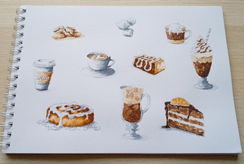
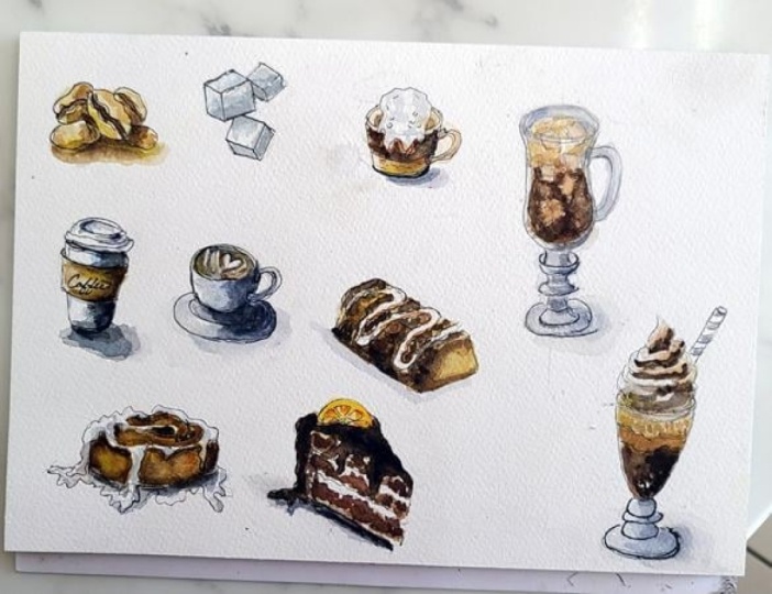
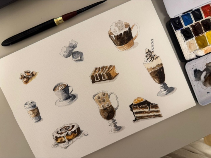
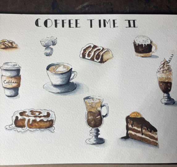
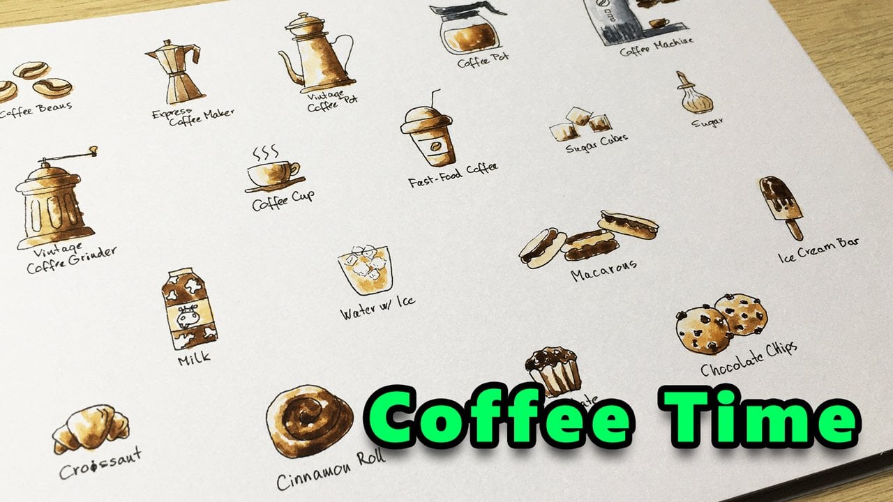
1. What's in This Class?: Welcome to my Coffee Time with watercolor class, part two. My name is Thomas, and
we are here to create some captivating coffee
related illustrations with ink and watercolor. This is the second part
of this miniseries. If you are an absolute beginner
at drawing or painting, I suggest you start with
P one, then return. This can be a great class for
you if you are a beginner, at drawing or
watercolor painting, and you like to
improve your skills. Or if you are not a beginner, but you are interested in making some eye
catching illustrations, you are also welcome in this
relaxing painting session. In Part one, we were drawing two D flagships and made them three dimensional
by painting. In this part two, you will learn how to make your
sketches more realistic. For this purpose, we'll be
drawing in perspective or in three D. We'll be adding
more details to our sketches, and we will be using some more sophisticated
watercolor painting techniques for the
more engaging outcome. I'll be using an inexpensive cold pressed watercolor paper. Here you can see its parameters. For the sketching
part, I'll be using a Pigma micron archival
ink size four. It's important to note that
this is a waterproof ink, so you can freely paint on. As for the painting
part, I'll be using a size six round brush and a very limited color palette
that you can see here. You can use any similar
hues, of course. Other than that, you will need the common watercolor supplies
like a water container, some paper towels,
and a mixing palette. Now I hope you are
excited to dive into the second part
of my coffee time drawing and painting session. I'll see you in the first video.
2. Coffee Beans in 3D: I'm glad that you are
taking this project. I'll be drawing and
painting relatively slowly, so hopefully you can
follow along easily, but you can pose the video
at any time and catch up. Now, let's dive into and fill in this empty page with some
exciting illustrations. Let's draw some coffee beans in a more realistic way
than we did in part one. If you look closely,
the coffee bean has a very interesting look
with those cracks inside. Let's try to reflect that variety that
these seeds can show. Not that I'm making very thin
inkstrokes on the paper. In this particular style, we will have the ink
drawing as a base, as a support in order to
provide some confidence for ourselves when we make our watercolor
painting brush strokes. So try to keep these ink strokes less dominant with
less emphasis on them. I'm drawing five coffee
beans in this composition. Two of them are facing us
with the inside surface. Two of them on the
sides are facing the ground and one of them in the background
facing more like upwards. So this time, we are
trying to draw in perspective using the opportunities
of the three D space. Our simple sketch is ready. Now we can prepare our
paints on our mixing pad. I'll be using my golden paint, which is a vivid orange tone. I'm cleaning my brush
on my paper towel. I'm rinsing my brush in the water and taking some
osiana from the pan. This will be used as a light brown tone
diluted with water. Here is my mass brown, which is a warm,
dark brown color. And I'm taking a
bit of paints gray. I'm taking the excess paint from my brush on the paper towel in order to keep my
rinsing water as clean as possible as
long as possible. Furthermore, I'll
be using titanium white to make my
colors kind of creamy. That will fit with the coffin
niche we are painting. All right. Now with
a clean brush, let's mix some light orange. I'm dabbing with my brush
inside the coffee beans, leaving some white
gaps here and there. We are assuming a
light direction coming from the top left. So we try to reflect this
on each of our subject. In general, the left
side will be lighter, the right side will be darker. You might ask, then why do we paint the right side
with this light tone? Well, I want some gradual
transition later with the dark. While dark shades
will dominate on the right side on the
final illustration, there will be spots
with this light tone, which will make the
overall look more natural. On the other hand, we can always cover our light tone
with a darker paint. As you can see, I'm also adding some paint below
the coffee beans. This will be the cast shadow. Now with our second tone, let's call it the middle tone. We can start adding a
second layer of paint. I try to be very gentle
with my brush strokes, focusing on the right
side of each coffee bean. You can be the most precise with your brush strokes by
keeping the brush in a vertical position
above the paper while you are stabilizing your palm
with your little finger. As the surface is still wet, the two different tones
blend nicely together, creating a natural
gradient transition. Now before we go with
our darkest tone, we wait for it to dry it. So I clean my brush, and let's move on
to our next sketch and come back to the coffee
beans in a few minutes.
3. Sugar Cubes in 3D: Let's draw some sugar cubes. This time we are
drawing them in three D. The first one
will look like this. And to emphasize the
illusion of Sri D, let's put the other one behind. Oriented something like this. Note that I also made it smaller than the
one in the front. The size difference also
suggests the viewer that these cubes are
located in the SD space. Let's add the third one behind. Something like this. Very good. I'm making some of the lines thicker to make the
sketch more interesting. Now, let's take our brush. And in the meantime,
I'm checking the paint on the coffee
beans if it's already dry. Well, it's not perfectly dry, but I guess it's
in an ideal state to add the dark tone
to the illustration. Let's see. I think it will work.
I fill in the gaps, the cracks with this dark brown. Wow. We also have some casado on this one, cast by the other beans. Now, let's get
back to our cubes. I'll be using a diluted paints gray to add the first
layer of paint. I'm tapping and
dabbing on the cubes, leaving some white
space here and there. Uh, Now, I'm taking a bit
of darker shade. Let's say mid tone and applying the paint on
certain faces of the cubes. I'm leaving the upside
facing sides intact. Those ones get the
most light from above. We have some cast
shadow here and there. The cube in the front might block some of the direct light. Very good. Ah, let's leave them alone for a while and start
making our next sketch.
4. Plastic Coffee Cup: Now let's draw and paint a plastic or paper coffee
cup, whatever you like. You might already know
this shape from part one, but this time we change
the viewing angle a bit, so the cup will be drawn in
three D or in perspective. This is the middle
part with the label. If you notice, the difference is that we draw these
bending lines, these curves, which will
support the three D look. Let's draw the lid. Which looks something like
this with a hole on the right. And we have the sketch ready. It's not that difficult, but you have to be
consistent with your curves and ensure some kind of symmetry as well around the imaginary
vertical center line. Anyway, let's make
some white paint with Raw Sienna add some water if you need to and start
creating the first layer. Yeah. I Now, I'm taking a bit
darker shade from this and adding it mainly to the
right side of the label. Notice that this cup is
a cylindrical shape. So as the surface turns, it gets less and less light. That's what we want to
convey to the viewer with this smooth transition between
different shades of brown. We can go even
darker on the right. Maybe a bit of extra
paint over here. Very good. Now, let's do the same thing with paints gray on
the rest of the cup. Oops, we have a bleeding here. This is what happens when the adjacent surface
is still wet, so I need to use
my paper towel to take off some moisture
and paint from here. We don't need brown
colour on the surface, so we'd rather wait
for it to dry. Until then, let's show
our next subject.
5. Cappuccino: Now, that's true, a
cup of Cappuccino. I'm starting at the
top rim of the cup. Drawing the side curves. The bottom curve. The saucer underneath the handle on the right, a This will be the coffee level behind. And let's complete the saucer. This is kind of a
challenging part. It's supposed to be
symmetrical vertically. Let's add some line
weight here and there. And I'm trying to draw a hardship on the top
surface of the Cappuccino, placing it in
perspective, if I can. H I guess we can start painting
with paints gray. I'm going with a very light
shade in the first round. As for the inner
surface of the cup, assuming a light source
somewhere on the top left, the left side will be darker because it doesn't
get direct light. A little chado on the table. And we can take a
slightly darker shade. We are gradually building up the tone structure
on the surfaces. The damp paper helps us to
achieve a smooth gradation. Let's move further
towards the dark. If you need to, you can lift off some paint with a
relatively dry brush. We can go even darker. It's time to get back
to the other cup. I'm pretty sure that
the brown surface is already dry by now. So I start creating the
shadow pattern there. Step by step, I'm taking a bit of darker shade from
my mixing palette. This way, the contrast is gradually increasing
on our subjects, and we are getting a nicer look. Yeah. We can add some dog to
the sugar cubes, too. I'm thinking through
which sections can get the least amount of light in the given
lighting conditions. We can take these cast
shadow areas even darker. Now, let's identify the darkest surfaces
on the cups, too. Very good. We are
making progress here. Now, let's clean our brush. And go even further
with the brown, too. I like to see the
contrast on my paintings. I'm cleaning my brush. And we can move on
to our next subject.
6. Cinnamon Roll in 3D: Now let's throw a
cinnamon roll in three D, pour down with some sugar
syrup from the top. Now, this one will be a bit
challenging three D form. So I'm making a pansy sketch
first for the base shape. Good. Now we can create the
outline for the sugar syrup, which will make
our cinnamon roll look pretty interesting. If you want to, you can
continue with your pencil, but I switch to ink now. Hopefully it will
work. So the syrup flows down on the side of
the roll here and there. Let's say we already have
some syrup on the plate. I complete the outline
on the other side. And creating the inner
structure with a pencil first. The difficulty here is that
we need a continuous surface for the syrup while we are maintaining
that raw structure. I guess I switch to ink Okay. This is a bigger challenge
than a labyrinth. This will look nice. Now, let's erase the pencil
marks carefully. The sketch seems solid, so we can start
the painting part. But before that, I think I'm adding some further
dark to the cups. You can do this in fewer steps, but now we are proceeding
gradually with our tones. Actually, three different
tones are perfectly enough to describe the shadows in a painting style like this. Anyway, let's clean our brush. And take some creamy orange for our first layer on
the cinnamon roll. Make sure you don't
touch the syrup surface. Now we can take a
bit more vivid tone. Let's move on to
the top surface, paying attention to which area
is reserved for the surf. A It looks good, I think. I still want to add some
darker gray to the cups. Maybe it's too much here, so let me fix it. With my brush strokes, I'm trying to follow the
curvature of the surface. All right. After cleaning our brush, let's take some rosiena and paint certain places
on our cinnamon roll. It nicely blends with
the orange base layer. I'll get back to our
cinnamon roll in a minute. Until then, let's
clean our brush. And move on to our next subject.
7. Wafer Bar: Now let's draw a wafer bar. Let's start off by drawing
a pencil sketch first because the white drizzle on the top will bring
some challenges. So I'm drawing a block shape first in perspective, of course. No, that's true, a
path for the drizzle. Um, something like this. And we can switch to
ink now, I guess. Let's add some
thickness to this path. Notice that when we
change direction here, the line switches
to an inner curve. Then auto curve again, and so on and so forth. Uh, um, Very good. Now we can draw the edges of the wafer bar with very
light thin ink strokes. Pass marks. And we can take our brush. In the meantime, I'm checking the moisture level on
the cinnamon roll. It's still wet, but that's okay. As the roll has curved surfaces, we need gradual transition
between our shades. So let's add some mid
tone to the illustration. Like so. Mm. On the side, we will have
a pattern like this, which is supposed to reflect the heating conditions
in the oven. We can apply some
dark paint too. A Now, I'm cleaning my brush. And let's get back
to our Cappuccino with some creamy light brown. Like so. We are building up the watercolor paint layer structure step by step. Let's add the first layer
of paint to the Wafa bar. Make sure you stay outside the drizzle area. All right. Now let's leave it alone for a minute and make
our next sketch.
8. Affogato Dessert: Now let's draw an
Affogato dessert. I need some more space here, so I put my mixing palate
aside for a minute. First, let's draw the
outline of the glass. It will look
something like this. Now, I'm drawing the outline
of the scoop of galleto. It started mad below where
it touches the hot espresso. Um, Now, let's complete the
top rim of the glass. Like so. Some shadow illustration
with the ink. The handle on the right. Something like this. So patterns for the
vanilla like that And I guess we are done
with the ink sketch. Now we can start painting. But before we are dealing
with the Affogato, let's add the third layer. So really dark paint
to the cinnamon roll. Looks good. Now with the mid tone, let's add the second
layer to our wafer bar. Again, let's leave some
gaps here and there. Looks nice. I think I'm mixing some white into my raw sienna in or to
get the creamy shade. Actually, we can use this
mixture on the Cappuccino, too. Now let's move on
to our Affogato. I'm painting only the And the bottom sections
with the creamy brown. Awesome. Now, let these layers try a bit and move on
to our next subject.
9. Greek Frappe: Sketch: Now let's draw and
paint a Greek Frappe, which is a foamy iced
coffee from Greece. I'm taking my pencil as we are about to draw a
challenging form again. Now, I suggest you watch me
drawing the base form first, then pause the video and
make your own sketch. Some design elements at
the bottom of the glass. The foam level at the top. And that's it. Now,
pause the video, draw a form like this by keeping proportions
as much as you can, and we will continue with ink. Good. Now, let's make our ink sketch. I'd like to show the volume
of the glass material, so I'm leaving some
space here on the sides. Et's complete the
bottom section. I'm trying to maintain
some symmetry over here. It's not perfect,
but that's okay. We don't aim photorealism
with this particular style. Now, let's draw some ice cubes, which will be the important
elements of this drink. They will make our illustration pretty interesting by the end. Okay. Good. Now I'm drawing a curve here, which will serve as a separator line between the
coffee and the form of both. I think this sketch looks great. Now we can remove
the pencil marks. Actually, I forgot the
coffee level on my Affogato. Let me fix that real quick. Now, let's get back
to our wafer bar and add a third layer of
paint to that, a dark brown. As usual, I'm leaving
some gaps here and there. Uh I find it satisfying how
these illustrations are getting closer
to the desired look. I'm taking some Mars
brrand directly from the pen in order to get the
darkest shade possible. I'd like to have a remarkable
contrast on the surface. I'm mixing some dark brown
with paints gray to get an even darker shade and start painting the
Affogato middle section. Like so. I'll look awesome. But I'm struggling with my hand. It's shaking a little. I guess the coffee that I had taken before the class
wasn't a good idea. Caffeine can produce
a symptom like this. Anyway, today, it will be the part of my style
and my brush work. Nonetheless, I'm using
my little finger to stabilize my
palm on the table. Now, let's clean our brush. And I guess I lift off
some dark paint from here. Do that. I'm using a relatively dry brush
and my paper towel. Some creamy mid tone
on the glass surface. A mixture of ton and dark on the top surface
of the espresso. It's slightly lighter
than the dark below, but it's darker than
the glass surface. Now I'm cleaning my brush. And with this wet brush, I'm taking a touch of paints gray and create
some shadow pattern on the ice cream scoop. Ah, let's clean our brush.
10. Greek Frappe: Painting: Take some creamy mid tone paint and create the first
layer on this one. A bit of darker shade. You can always take
some paints back with a dry brush while the paint
is still damp on the paper. In the meantime, I'm checking the cinnamon roll if
it's completely dry. It is, so I can take some light gray and add some
shadows to the syrup. Just a few touches of this very light gray
here and there. U. I'm going darker gradually. This shed will fade out
slightly as it dries. So this will look nice. Now, let's add some light gray
to the glass surface here, mainly on the right side. And we can take it
darker gradually again. I'm trying to follow
the curvature of the glass surface with
my brush strokes. Now, I'm cleaning my brush and adding a slightly darker
shade to the foamy section, mainly on the right or
directly below the ice cubes. Now, let's mix some dark
brown with paints gray again. To paint the lower
section with the coffee, leaving the ice cubes
intact, of course. Um, Oops, I forgot
about this one. Let me try to lift off some
paint here. You know what? It's not an issue
because we will have these ice cubes filled with
brown anyway by the end. So I just try not to
forget this cube later. I'm taking some dance
dark brown directly from the pen and paint the
lower section with it. Except the ice cubes, of course. Maybe it's too dark
on the top left. Now, let's add some
mid tone to the glass. Some shadows on the syrup. We We can go further towards the dock
on the cop as well. Something like this. Now, let's get
back to the glass. I'm rinsing my brush. Taking some darker brown. Let's shift the tone further
towards dark here as well. And we can start drawing
our next subject.
11. Chocolate Milkshake: Now let's make Pancas Kachabt
another form of glass. This will serve a
chocolate milkshake. The glass will be
a tall footed one. Something like this. The drink will be topped with a
swirl of whipped cream. A straw is inserted
into the drink. And I guess we can
switch to ink now. I'm making some corrections
on the curves if I need to. Very good. Now, let's
see the swirl over here. Like so. The straw. We can erase the pencil marks. And I'm placing my
mixing palate back. Our drink will be layered, so I'm start creating the first layer with a
milky light brown colour. You know what? Let's mark those
layers first with ink. The top layer is a whipped
cream that we already drew. In the middle, we
will have a lighter, frothy layer and the rest
will be a darker brown base. Now we can start painting. It's really up to you
what colors you mix. For me, the whip cream will
be a very light shade. The middle section will be
some kind of primi tone. We can also use this stone to illustrate the shadow
side at the top. The bottom section will
be relatively dark. Well, darker than this. Mm. Now, I'm cleaning my brush. Dipping it into the water, and using some light gray for the glass. And the straw. I'm rinsing my brush, taking some really dark brown. And let's drizzle the
whipped cream with chocolate syrup. Like so. I imagine the volume
of the cream, and I'm trying to follow. Very good. Some further dark to
the bottom section. A I'm cleaning my brush and adding some dark
gray to the glass and the straw. Similarly on this one. Okay. Let's clean our brush. Now, let's get back
to our Frappe, add some brown hue
to the ice cubes. Am tone like this
will work, I guess. And, Yeah. We can go even darker
in the bottom section. The ice cubes are
barely seen over here. We can add some further darkness as the cubes block the light
further on this dark area. Mm. I'm rinsing my brush. Taking some dark gray. Me dark brown on the milkshake. We are increasing the contrast
further on our glass too. Let's clean our brush and
move on to our last item.
12. Chocolate Cake: Finally, let's strew and paint
slice of chocolate cake. I'm starting with
a pancy sketch. This will be the base form. We will have a slice
of orange at the top. Place like this. And we will have an
interesting shape of chocolate glaze on our cake. Something like this. There's three layers inside. And we can switch to ink. We will have some cream
between the layers. And let's draw the outlines
with very thin ink soaks. Very good. We have
the sketch ready. Now, let's erase the graphite. I put my mixing pile back. I'm rinsing my brush. Taking some dens, Mars Brown
directly from the pen, so I can add some
more dark over here. I'm cleaning my brush. Now I'm mixing a very
light creamy brown, including some orange paint, too, and paint the cream
between the cake layers. Let's take some mit tone
for the chocolate coating. Actually, we can also paint
the rest with this one. I'm rinsing my brush and taking some orange paint from the pen for painting the orange slice. I'm cleaning my brush. Taking some slightly
darker brown and paint these layers inside. As usual, we are building up our colour scheme
layer by layer. Okay. With a bit darker shade, I'm dabbing with my brush, so the different shades
can blend nicely. With a very dark brown, I start painting the
chocolate glaze. Um, et's add some paints gray to the mixture so we can go even darker
with dark paint. Good. Now I'm rinsing my brush, taking some extra dark
brown from the pan. And adding a second layer
to these intersections. We can make the cake look very natural by adding more dark
brown paint like this. I would need an even
darker mixture. So I'm taking more Mars Brown and paints gray directly
from the pants. Let's add a very
dark second layer to the chocolate coating. But try to keep this section separate from the
surface inside, so the different shades
of brown donut blend. I'd like to keep
that thin white gap between the coating and the cake itself. Very nice. Now I'm cleaning my brush and applying a second orange
layer on the orange slice. With this dabbing technique.
13. Final Touches: Let's clean our brush and add a little bit of shadow with light gray at the
bottom of the cake. I think I'm adding some really
dark to the inside, too. I'm rinsing my brush, taking some darker gray, and increasing the
contrast here and there. Actually, we can go back to our coffee beans and add more
dark shade to them, too. I'm also applying
a dark brown shade on the top of the Cappuccino. So the hardship gets
more impressive. I'm checking all
my illustrations to see if I can
improve some parts. These are the final touches.
We are almost done. Basically, I'm just
increasing the contrast further by adding more
dark to my subject. I'm cleaning my brush and I'm taking some vivid
orange directly from the pen in order to increase the saturation on
the orange slice. I'm cleaning my brush again. And now I'm making
this white gap less dominant on
the chocolate cake. More dark at the bottom. Maybe adding a very light
shadow to these ones. Okay. I feel like it's hard to
stop with my brush strokes, but at some point,
I really need to. I guess now is the time. So I'm cleaning my brush, and I consider my
illustration done.
14. Final Thoughts: Oh, right. I hope you enjoyed this drawing and
painting session and created something special. I think it wasn't that
hard technically. We just needed to follow some well planned
steps patiently. I'd really like to
see your artwork. So please don't forget
to upload it in the project section
right below the video. Don't think that your
illustration should be perfect. For me, it's always a pleasure to see your interpretation
of the task. Even if you feel you
have made some mistakes. Look at those mistakes
as opportunities, something that can
give you signals on which areas you
can improve further. Now it would be extremely
valuable for me if you gave some feedback on my class in the form of review or rating. For you, it takes just a minute. For me, it would mean a lot. And if you like my
teaching style, I definitely have some
more classes for you. Make sure you check them
on my profile page. I hope you had a
good time with me. Be careful with your sugar
level after this class. Your health is important. See you in another drawing
or painting session.
 Tamas Benko, Drawing & Painting Classes