Transcripts
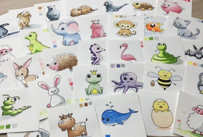
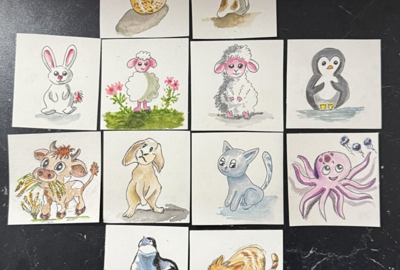
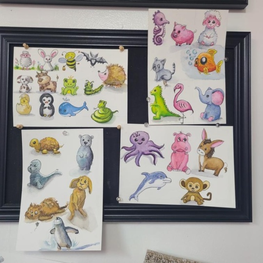
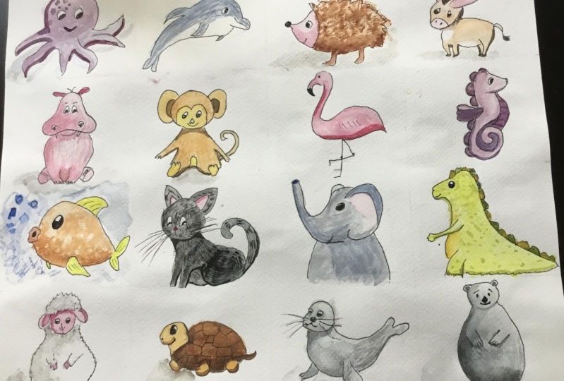
1. What's in This Class?: Welcome to my cute animals
watercolor painting challenge. My name is Thomas, and I have a great relaxing activity for
you for the following days. Initially, I just
wanted to create a fun class about painting
some cute animals. But after a few paintings, I've become so obsessed with these little creatures
that I just couldn't stop. So I redesigned the
individual painting sessions into a 32 day
painting challenge. If you are a beginner,
that's great. You will learn a lot about the fundamentals of
watercolor painting. If you are not a beginner, but you like to
paint cute animals, this chance can be
a great exercise for you. But who knows? It can be a great activity together with your kid or
grandchild, if you have one, and make your own unique
64th card memory game by painting each animal twice. We start with very simple forms, and I'm gradually
introduce you to the different techniques
of watercolor painting. You will also learn the
basics of color mixing and how to make exciting cues
from the three base colors, red, blue, and yellow. The individual painting
sessions are relatively short. They last 15-40 minutes. Each animal figure will be a bit more difficult
than the previous one. So if you are an
absolute beginner in watercolor painting, I encourage you to proceed
with the projects in order. In case you have
some experience, you can pick the animals you like and paint only those ones. You will also have
the opportunity to develop your drawing skills. Drawing is a foundation
for any other visual arts, so I'll show you how to draw these cute animal figures step by step just in a few minutes before we
actually paint them. We are going to proceed with the simplest watercolor
painting setup possible. Here you can see
the tools you need. I'd like to keep things
as simple as possible. Finally, I encourage you to share your artwork
with me and others. You can upload the photo of your painting under the
project and resources step, clicking on the Submit
Project button. I'll be happy to give
you some feedback on it. Now, I hope you are excited to start painting these
little creatures with me. I'll see you in the first video.
2. What Tools You Need: Let's see what tools you
need for this class. If you are an absolute beginner, make sure you watch this
video till the end. If you are not a beginner, just pause the video
for a few sec, review the tools on the screen, and you can move on
to the next video. As you can see,
watercolor painting requires a bunch of materials, but don't worry, you will get familiar with these
tools very quickly. First things first, we
need watercolor paper. It's a special kind. I'll be using this
inexpensive paper. I want to show you
that this will work perfectly well
for our purpose. This is a 190 GSM or gram per square meter paper
made of cellulose. Its size is A four, which is very close to
the US letter size. I'm going to cut it into
square shaped cards. Use a ruler to make
these guidelines. I've done some math, so we can utilize the entire surface by using seven by seven
centimeter squares. So we will get 12 cards
from a sheet of paper. This format works on a US
letter size paper too. If you count in inches, seven centimeter is
equal to 2.75 ". Anyway, I cut this paper
into pieces with scissors. Good. Let's say that we have these square shaped
cards that we are going to paint
the cute animals on. Now for each animal figure, we'll be drawing a sketch
with a graphite pencil. What pencil grade to
use, it's up to you, hb2b, two whatever
you have at hand. So we draw our figure
with a pencil. Occasionally, we may
need a pencil sharpener. We will need an eraser,
nothing special. And once we have
the pencil sketch, we are going to redraw with ink. This part is important. What kind of ink
will we be using? Watercolor painting requires
a certain type of ink. It has to be water resistant, at least once it has dried, because we will paint on it. What options do we have? This is a permanent marker
containing alcohol. I suggest a small size as this
has a relatively thin tip. As far as I know, a
marker like this can be purchased in any stationary
store or supermarket. Another option is this
that many artists use the pigma micron
archival ink. I use size four,
it's thin enough. The third option is this. Now, the point is that
this is a refillable pan. It has a small plastic
container that I can pull off and fill in with this
so called Indian ink. The label says it's made of natural substance and it's water resistant once it has dried
on the paper. All right. Now, let's say we
have the ink drawing. What tools do we need
for the painting part? Basically, we will use
the three base colors which are red, blue and yellow. Plus, we also use
black and white. If you only have
these five paints, you'll be able to paint
wonderful colors. But you probably already
have a color palette, something like this, which
is not a problem, of course, but I definitely want to use the base colors to mix all kinds of other colors and get a basic understanding on
how color mixing works. Also note that if you are
an absolute beginner, you don't need to buy an expensive collection
of paints like this. It's totally fine to have the cheapest color palette that you can purchase anywhere. The point is to have red, blue, yellow, white and
black paints in it. Palette like this, we work just fine for our cute animals
painting challenge. Now, as far as the
brush concerns, we'll be using a size
two round brush. You can see it's sized
compared to my fingers. The point is that when
this brush is getting wet, it will have a nice pointed
tip. Let me show you. So I have my size
two round brush. We will also need
a water container where we will rinse our brush. If I remove the bubbles
from the bristles, then I should get
that pointy tip. Well, this brush seems
pretty worn out. To be honest, I'm recording this video as the last
one in the series. This was the brush I used in painting all the
32 cute animals, including several test paints. But let me show you another brush that is in good condition. Let's see the size one
round brush. Uh huh. This is the tip you want to see for a good brush when it's wet. You can do very precise brush strokes with
a brush like this. Now if you only have a
bigger size of brush, try it and see if it works. We have our rains water. Optionally, it's good to have
a spray battle like this. I use this for activating
the dry paint. It contains clear water, so I don't need to use my brush to transfer water into the pans. So this is optional.
Alternatively, you can use your brush to
activate the pigments. Good. What else? We will also need a mixing
palette for mixing our paints. Now, this is a ceramic
mixing palette. I like this because it's
big. It's easy to clean. But if you don't have
this, that's okay. Color palettes usually come with a plastic mixing tray like this. It's perfectly good
for the purpose. You can mix your colors on
this tray with no problem. Good. Of course, I missed
something the paper towel. I use it to clean my brush and mop up the excess
water, if any. As an alternative, you can use a soft microfiber car towel. Now, if you have all this stuff, we can start making our
first animal painting.
3. The Lamb: Sketch & Ink Drawing: Today, we are going to
paint a cute lile lamp. As a first step, let's draw the rough outline of
our lamp with a pencil. It's a good practice
to start with the largest shape
inside your subject. So starting with the main body. I position the shape
inside my format. This will be the head aligned with the vertical center
line of the body. Let's place the ears. Note that we don't have to
be precise at this point. We are going to refine these
shapes a little bit later. Our lamp will have
two legs over here. Maybe I'm going a little
bit upwards with the legs, so I push the main body
a bit accordingly. This way, we will have some space for
painting the ground. Let's illustrate some wool
at the top of the head. I'm placing the eyes over here, and the mouth will be
located somewhere here. Very good. Now we can start
refining our forms. The outline of the head will
look something like this. W The ears will look like this. They don't have to be identical
or exactly symmetrical. It's enough to draw them approximately in the
same size and shape. Actually, you can play with its shape to make the lamp
look more interesting. Let's draw the curved outline of the top let's move on to the main body. I'm drawing kind of C
shapes in a row here. The outline still
doesn't have to be final because we are going to draw
over with ink in a minute. Let's place the two
legs somewhere here. Try to align them to
the eyes vertically. Good. We can go with the inkwork now. Let's try to draw different
parts with one single motion. If you accidentally miss the target, don't
worry about it. Let it be as it is.
We are practicing. You don't have to feel
any pressure on yourself. I'm starting with the head. Like so. The eyes. Actually, you don't
have to follow the existing pencil lines. If you feel like
finding a better curve, draw that one with ink. A little smile. One, two, the top of the head. Very good. Let's
continue with the body. You see, I don't follow
the pencil lines here. I'm just following a
natural rhythm now with ink and the legs. Now, let's fill in the eyes. However, I won't feel
the entire shape. There will be a small white dot left in the upper left corner. Well, the circle
doesn't have a corner, but you know what
I'm talking about. The reason we leave these
white spots in the eyes is that the eyeball usually reflects the light
source to the viewer. If the light is coming
from this direction, then the viewer will see this reflection in this
position in the eyes. Placing these so
called highlights in the eyes makes the facial
expression more interesting. It's a very tiny detail, but it can add a lot to your
final drawing or painting. Very good. We've got
the ink drawing. Now we are waiting a minute
or so to let the ink dry, especially in the eyes because I apply a little
bit more ink there. But over here, we can start
erasing the pencil marks. Note that if the ink
is not completely dry, we may smudge the outlines so we can start drawing our
lamp all over again. And you know what? It's not a big deal if some fancy and
mark stay here and there. We are just practicing
and playing. Now, I swipe the eraser
particles down from the paper. And now we have a nice ink
drawing with a little lamp. I think we are ready to
start the painting process.
4. The Lamb: Painting: Let me arrange the
painting tools on my desk. I'm taking the paint palette. Don't get confused
by all these colors. We'll be using only the
base colors like yellow, red, blue, white and black. Here comes the rings bow
and the mixing palette. I'll be using a size
two round brush like this with a nice pointy tip. This will ensure that
we'll be able to work as precisely as we can and
a piece of paper towel. As a first step, I activate my paints with
a water spray like this. We'll be using
cadmium yellow, red, cold Ruby, a blue, cold ultramarine, a
white, and a black. You can use any similar hues. Don't worry about the naming. Different brands have their
own naming convention anyway that doesn't necessarily
match with other brands. To begin with, we
are going to paint the face and the ears
with a light pink color. Now, how do we make light
pink color or pink at all? We are starting with red. I'm taking from this red. By the way, the consistency of the paint is good if
it's creamy like this. You need to add the
right amount of water. I'm placing the paint over here, there is no need
for too much paint. We'll be using very little
for our litle lamp. I clean the brush
on the paper towel. Then I go to the
water to rinse out. I'd like to leave
as few pigments in the water as possible. We want to keep it
relatively clean. This will ensure that we don't mix our colors on
the paint palette. We want to keep them
as clean as possible, preserving the original color. Now, if you see a water
drop on the brush handle like this, you
want to mop it up. Otherwise, when you keep your
brush in vertical position, the water drop will trickle
down to the bristles, and it may change the shade
of your colour there. We don't want that. So
let's keep the handle dry. I just want to turns
automatically, but I don't need that as
my brush is already clean. For pink color, we need to
add some white to the red. But I don't mix it
into right away. I'm just placing it over here. This way, I'll be
able to control the amount of white
I add to the red. Now we can start mixing
these two colors. Let's see what happens. I'm taking a very little red. If you feel that the paint is too dense on the mixing palette, you can take a
drop of water from the bowl and you can mix the two colors to
get a much easier. Okay. We have a nice light
pink hue already, but I'd like to take
it a bit darker. I pull a little red
into the mixture. It's important to know
about watercolor that the paint becomes slightly lighter when it
dries on the paper. We need to calculate with
this change of shade. This is not easy,
especially for a beginner, but the skill will come with practice. Don't
worry about that. We can see a certain shade
of this pink color now. But on the final painting, when it dries, it will
be a bit lighter. Okay. Now, let's paint the face and the ears
with this color. I'm trying to avoid
the ink marks. Very nice pink color. If you accidentally go
over the ink, that's okay. We can redraw that
section at the end. On the ear, I'm leaving
a white stripe at the top edge as if the light
is running through there. On the other side here, the top casts shadow, so I paint the whole area, and I'm painting the legs
too with this color. Very good. Now I don't need to rinse
out my brush because I will use a little darker
shade of this pink on the face to illustrate
some shadow parts. As we discussed, the light
is coming from this side. So on the head, which
is a spherical shape, this section will be in shadow. In order to get a darker shade, I'm adding some red to the mixture and some water
to make the mixing easier. Oh and we have a darker
shade of pink here. I have the right amount
of paint on my brush, so I can start
applying the paint. Unfortunately, I need
to paint over the eye now as the curve of the
shadow area will go over it. But what I definitely need
to make sure that the white.in the corner of
the eye remains intact. I draw a curve like this
and I feel this section in a little bit of shadow
inside the ear. Like so. Here on the left, the shadow will be smaller as the light comes
from this direction. And let's paint
over the legs, too. They are probably in shadow as the main body covers
them from direct light. Awesome. Now we can rinse the brush. Well, it would have been better to clean it
on the paper towel first to keep the rinse water as clean as possible,
but that's okay. You can always change
water in your bowl. Anyway, the next step
will be to create a shadow shape on the main body, too, with a light gray color. We'll be using black as a start, and as we are adding water
to it, it will become gray. So I'm taking some black paint. Now, the black is the
darkest color possible. So if there is something
you want to avoid, is that you rinse out your brush directly with black paint in it. So I clean the brush as much as possible on the
paper towel first. I'm pulling the brush like this, rotate and pull again. A very important color mixing basic in watercolor is that you can make a certain color lighter by adding
clean water to it. As you can see, as I'm adding some water to
this black paint, it's getting lighter, so
we are getting gray color. The more water we add, the lighter gray we get. Now you can do this on your mixing palette
or you can also dilute the pigments on your brush by pulling it
this way in your rings bowl. Similarly, the more water
you add to your brush here, the more lighter gray you get. In other words, by
applying more water, you basically remove some of the pigments from your brush, lighter shade of painting
you can make with it. I'm doing this mixing
on the palette now so you can see
what's happening. Now I'm going with
this shade of gray. And I plan to create
a curve like this. I'm trying to do this
with one single motion. And now I can fill in this area, making sure I stay inside
the contour lines. I add a little bit of extra water in order to let
the pigment spread nicely. Let's also add
shadow to the top of the head. Just a small one. Like this. I might go a little darker, though. Okay. Well, we can go even darker with the whole shadow area
because we need to calculate with the drying
process, as I mentioned. Actually, in watercolor,
to make things darker is always easier than
to make things lighter. So it's best to proceed with layers one after the
other until you are enough confident to go with the exact final
shade at first. H. I think this will be fine. Practically, we are done
with our little lamb. But to make the final
piece more interesting, let's paint some
background elements. We are going to paint
the ground over here, some grass with green colour. How do we mix green color
from primary colors? We are going to mix
blue and yellow. I'd rather use
this bright lemon. And you will see we are going
to get a nice green colour. Let's rinse out the brush.
I cleaned the handle. And let's take
some yellow first. I cleaned the brush. I take the ultramarine blue, but any blue will do
whatever you have. We are not aiming
color accuracy here. On the contrary, if you have your own special green
mixture, it will be better. Now let's see what happens
if these two colors blend. As you can see, the
green starts to appear. The more yellow I add, the more greener the
mixture becomes. If it is too dense, we can add a little water to it. I pull the mixture down over
here to have more space, a little bit more yellow. Now I'm playing with it until
I get a green shade I like. A little bit of extra
water more yellow. I'd like to get a light green. Okay, I'm going to try this one. Here, we will have our meadow. I also leave some white
space here and there. Now let's paint some plants
with some darker green. Oops. I paint one over here
with some leaves. And another one over here. I paint some grass. Like so. Before I paint the petals, I put some butterflies
next to our litle lamp. Look, you can take the
shade lighter this way. I dip the brush in the water and I push it to the
edge of the bowl. Et's put another one
on the other side. Note that we are not aiming any detailed or sophisticated
butterfly here. We are just putting
some little shapes on the paper that suggest
the butterfly. But in the focus on our
picture is the lamp. Everything else is less important and should
be less detailed. Let's add some darker shade. Now let's paint some
petals and make them pink just like the face so they can
harmonize with each other. I'm taking the pink
mixture I already have. I just need to add some
water to reactivate it. Just a few brush
strokes here and there. Something like this. We can add some darker shade. And that's it. I'm rinsing out my brush. What? Oh, yes. Remember that? We painted over the eye
with the darker pink, so we need to fix that with ink. The eye is the most
important facial feature on animals or human figures, so it has to look just right. I redraw the other eye too in order to have
the same darkness. And I redraw the mouth, too. And we have finished. Well,
I always forget something. Underneath the lamp, I wanted to show a cast shadow
with dark green. So I activate paint
on my mixing palette. And with some kind
of dark shade of green I paint a cast shadow. Like so. I'm shifting it to the right slightly because the light
is coming from the left. And our cute tiller lamp
painting is complete. I hope you have made that, too. Now, please take a picture
of your masterpiece and upload it on the project
tab right below the video. I can't wait to see
what you have painted, and I'll be happy to give you
some feedback on your work. You can also share your thoughts on how
you feel about it. It would be interesting to read. See you in the next video.
5. The Puppy: Today, we are going to
paint a cute puppy. It's going to be a
very simple form. Let's start with
the pencil draft. The head will be
positioned like this. The main body will form a triangular shape,
something like this. There will be a little
tail over here. Two ears. Feel free to choose your favorite
dog's ear shape. It will have two eyes
placed around here. You can play with
the distance between them or they're position
vertically inside the face. I'm drawing a nose, which will be a
triangular shape again, pointing downwards
and the small mouth. Good. Now let's refine the form. As you can see, I'm going a
bit darker with my pencil. The ears are something like
identical but not 100%. I don't like perfect
symmetry in drawing. On the outline of the main body, I'm using a curve like this. And a little tail. Good. I think we have the simple
outline of our puppy. Now it's time to
draw over with ink. I start here like that. The eyes, it's okay if
it's not a perfect circle. Actually, it will be more interesting with an
outline like this. I leave the usual white.in the corner or as we
call it, the highlight. You can leave a white dot on
the other side too, like so. Et's draw the nose. I create a highlight
over here as well. The line of the mouth. Very good. Let's continue with the ears. Feel free to use some curve
lines here and there. It will make the form
look more natural. Let's see the main body outline. Something like this. And finally, the tail
curving upwards. Very good. Now, let's wait for a few
sack for the ink to dry. And I start erasing
the pencil marks. As we did the head earlier, let's erase there first. But be careful around the eyes because we don't
want to smear the ink. That and that's it. I swipe the paper. Good. We can start painting. Simple enough, we are going
to be using only two colors. Light gray for the
shadow shapes. Let's assume the light is
coming from this direction. As you can see, we have placed the highlights on
the eyes accordingly. The shadow shapes will
reside over here. I moisten my brush, or before that, I'm
activating the black paint. I'm waiting for the full sack. I take some and put it
on my mixing palette. And as you already know, by adding some water to it, we can make the paint lighter. So we are eventually
getting light gray. Let's form the shadow shape now. On the head, it will be
something like this. Maybe I take this a
little bit darker. And on the body. Be
something like this. What's happening here is that
the light is coming from this side and because
this is a curved surface, both the head and body, we can show the curvature of the phone by the shape of
the shadow on the surface. And if the outline of the
shadow is going like this, it will broadcast a message to the viewer's brain about what spatial form
this puppy has. So on the two dimensional paper, the outline of the
shadow shape is extremely important to
convey the illusion of three D. I think I'm going even
more darker with the shadows. Very good. Well, it would have
been better to clean the brush on the
paper towel first. But anyway, our next color
will be some kind of brown, so it's not a big deal that our rinswaterGt some black pigments. Now, how do we make brown
color from primary colors? Actually, I have plenty
of brown colors in here, but I won't be using them. I'd rather be mixing one. The brown color itself is
basically a darkened orange. You can make an orange hue
by mixing red and yellow, which are primary colors. So let's work this out first. Let's take some red. I'm rinsing out my brush. And let's take some yellow. By mixing these two
colors together, you already see we are
getting an orange. Now we need to darken this orange to actually
get a brown color. The darken the color, we need to add a little bit of
black to the mixture. I already have black on the
plate, so I'm using this one. However, I'm doing this with great care because black
pigments are too dominant. Let's see what happens
if we mix this together. You see that? We already have a dark
brown color over here. A and if we add some water to this mixture, we can make it lighter. With more water, we can
make it even more lighter. We can also add some
more black pigments to it. Let's see what happens. More water to it. What happens? It starts getting a brown
shade that I imagined. This is fun. We are experimenting
with colors. What happens if I add a
little bit of yellow? Uh huh. This is the
color I like to use. Maybe some extra water. Yep, that's it. Now I paint some
patches on the puppy. Let's put one over here. And another one over here. Maybe I'd like to
make it a bit darker. So I add some black again. Yes, that's what I wanted. And because of the
paper is still wet, it's enough just to
touch the layer, and pigments will spread nicely. No need for actual
brush strokes. What if I take some
paint from here? Good. This is it. Let's put the shadow
shape on the ground. I think I'm adding
some darkness to it. Like so. Finally, let me add
some extra to the year. And our cute puppy
painting is complete. I hope you have made that too. Now, don't forget to
upload your painting, so I can give you
some feedback on it. See you in the next video.
6. The Chick: Today, we are going to paint a cute chick as it is breaking
itself out of the egg. Let's start off by placing
the chick's head in the format, somewhere
around here. The lower part of the broken
egg will be located here. I'm trying to form some
egg shape like so. The upper part will be
right above the head. Okay. Let's draw the
fracture line like this. Similarly, on the upper part. Maybe I take this
part a bit flatter. Let's refine the heads got line. I'm illustrating some
feather here and there. Like so. Let's say that its eyes are still closed. So I draw two curves like this. A little big over here, a simple triangle
shape like this. And the viewer will already
know what he or she sees. And that's it. Outline
is as simple as that. Actually, I would make the fracture line
a bit more random. We are done with
the Pansy sketch. Now let's continue
with the drawing. I start with the lower
section like so. Good. Now the top. And the head of the chick. Okay. Finally, let's draw over
the facial features. Very simple illustration. And we are done. I'm taking the eraser now and
remove the pencil marks. I swipe the paper. Well, I should have waited a little bit
longer at the beak. I managed to smear the ink
over here, but that's okay. I can live with that. All right. For the painting, we'll be
using two different colors. We are going to fill in the
check with yellow paint. And the eggshell will be some kind of light
brown or orange tone. We'll see what we manage to mix. We'll be trying to use
only base colors again. Let's start with
the yellow part. I moisten my brush
or as a first step, I'm activating the
paint on the palette. Let's put some yellow
on the mixing palette. To make things more interesting, I won't be using this
exact shade of yellow. I'm adding some water to
dilute the paint a bit. And also adding a
tiny red to it. Very, very little red. You see how strong
these red pigments are? Just by adding a tiny
amount of red has created an orange hue like
this, but that's okay. We can use this tone
later for the egg shell. I go back to my yellow and add a little bit
of orange to it. A little bit of water, we already have a
different shade of yellow that we'll be
using for the chick. U. You can paint over the beak if you want to. No problem. I plan to paint
it with a darker tone. So that's okay if you paint
it now with this yellow. You can always paint
over a lighter layer later with a darker tone,
not the other way around. It's important to remember that watercolor paint is a
transparent medium. So if you apply a
dark tone first, then a light tone
on top of that, the darker tone
will be dominant. It will show through
the second layer. Good. Let me play with
the mixture further because this is not the
tone yet, I imagined. Note that the head of the
chick won't be a flat wash. This is feather, so it's
okay to have texture on it. I I'm adding some darker
spots here and there, and as you can see,
these orange dots spread nicely because
the paper is still wet. Actually, this is the unique
beauty of watercolor. No other medium is capable
of behaving like this. On a wet surface, watercolor
pigments can spread with such a diversity that no other type
of paint can show. You just need to learn how
to control this behavior, and you will create
amazing paintings. Oops. Let's not
forget the buddy. Actually, I take it a little bit darker as it gets less
direct light from outside. And maybe I add some
bright yellow to the head while it is still damp to
make it more interesting. Now let's mix a color
for the egg shell. I'm using this orange
light brown shade by adding some
extra water to it. Let's see. This will be
perfect for the eggshell. I'm trying to work
fast enough at this point because the
paint dries quickly on this thin paper and I don't want my brush strokes
to be shown at the end. Right. Also, we can only play with the
pigments while the surface is
still wet or damp. I think I'm trying to mix a little bit darker
tone here. Okay. Let's apply it at
the bottom part. The light is coming
from the top. It's hitting this
part of the egg. This lower section gets only ambient light so we
can take this area darker. Very good. I think I want to make
the head more with it, let's play with
it a bit further. I'm doing this because the chick is supposed to be in focus. The egg is just the surrounding. Note that there are several
tools in the hand of the artist to create a
focal point on the picture. Now, we are using color intensity to drive the
viewers eyes to the chick. Well, we have an issue here. I haven't waited long enough for this extra surface to dry, so the more intense paint
bled over from above. This is a good opportunity
to remember this. If you paint sections that
are touch each other, you need to wait for
the previous section to dry before you move on
to the next section. The borderline has
to be perfectly dry. Otherwise, you will experience
this bleeding effect. Now, I could fix this. However, I should paint
this entire section again. I think I leave it as it is. Let's learn from this mistake. Finally, let's
paint a cast shadow on the ground surface
somewhere here. And I'm mixing some dark
orange for the beak. Like so. And our cute little check
painting is complete. I hope you have made that too. Now, don't forget to
upload your painting, so I can give you
some feedback on it. See you in the next video.
7. The Bunny: Today, we are going to
paint a cute bunny. Let's start off by
drawing its outline. The shape is going to
be very simple again. A circle like this
will form the head. The body will be a triangle
shape with curved corners. Like this. Let's draw the ears. Something like that. Our bony will have
a small tail too. Let's define the
outline of the head. Like so. Now on the main body, we
are not going to draw legs. We are just suggesting them
with some curves like this. And let's make the
tail kind of fluffy. The ears will look like this. They don't have to be identical, just roughly in the same size. This time, I place
the eyes over here, the nose, and a little mouth. Very good. I guess we are
ready to draw over with ink. Now here, the outline of the head will not be
a continuous curve, but I will break it
at the ear like so. H, similarly, on the other side. And I close the shape. Let's move on to the main body. The tail the eyes a I'm leaving the usual white
spot for the highlight. Let's assume the light is
coming from this side. The nose, watch this. Simply drawing the
mouth like this, we can illustrate a certain
expression on the face. It's awesome, isn't it? The inner curve in the ear. On the other side, And we are done with
the ink drawing. Let's erase the
pencil marks now. I'm starting over here. I'm careful around the eyes. No need for ink smudges, right? And that's why now. Very good. We can start painting. We'll be using pink colour for the
inner part of the ear. Tail and the nose. We will have the usual
light gray shadow shape over here and here. We will also have a cast
shadow down there and some grass illustration on
the ground. Very simple. Let's start with
mixing the pink, and as you already know, we'll be using red
and white paints. Now, this red is
extremely intensive, so I carefully clean the
brush before I rinse. Especially because white
paint will follow. I placed it over here
a little bit more. If you need to add some
extra water to your paint. Good. Now I'm trying to mix a
really light pink shade, so I'm using very little red. So water just to make
the mixing easier. And I'm feeling the ears. Like so and the tail. Very nice pink colour. This time, let's
put the colors we use in here for
reference like this. I cleaned the brush. Let's have the drying
process like this. By the way, if you turn your paper towards the
light in a certain angle, you can check if your
paint is still wet. I'm not sure if it can
be seen on the camera, but the left ear is
still shining here. The right one is already okay. Now the reason is that even when I started
with the left ear, the brush was having
more water on it. Anyway, we have to wait
for the paint to dry. Fortunately, we are working
with very little water, so it won't take
longer than a minute. Now, let's mix a
darker shade of pink. So I pull a little bit
more red into the mixture. This will work just
great, I guess. Let's say the light
is shining from here. I prefer this side as I'm
a right handed person. But we'll be doing
an example for the other side too
in another video. So the light is coming
from this side. Therefore, this part of
the ear will be in shadow. I'm painting a curve
shadow shape like this. On the other side, let's
paint a shape like this. Now, they don't have to be
symmetrical on the two ears as they are two
different surfaces with different orientations, each getting the light
from a specific angle. The shape of the shadow on a spatial form is
a complex topic. The best approach for a
beginner is to observe real life objects and check how
they interact with light. Anyway, we don't have to
follow the law physics here as we are just painting a simple illustration
of a cute animal. Let's move on to the tail. Like so. Let's mark this shade
too on the side. I'm rinsing my brush. Well, let's not forget the nose. Light shade. And the dark shade. Because the water has already evaporated from this mixture, it won't be a problem if I go with the second
shade right away. The two shades won't
mix this time. I'm rinsing my brush, and now we are done
with the pink colour. Let's move on to the
usual light gray. I'm activating my black paint. I take a little I'm adding
some water to it, more water. Well, this black paint
is more than enough. Actually, one of
the best things in watercolor is that it's very
economical, if I may say. The quality paints
are quite expensive, but they can last forever. Et's add some more water
to make it lighter. I'm starting on the head
with my shadow shape. Like so. I'm taking this a little bit darker. Good. Now on the main body, I'm painting a curve like this. Maybe another one on the ear. We can go even darker. I guess this will work. And let's not forget the
cast shadow over here. Something like this. Or even darker. Good. I'm placing this shade
on the side too. Very good. Our
bunny is finished. Now, let's mix some green shade, for some grass to illustrate. How do we make green? We mix blue and yellow. I'm activating my paints. Okay. I'm starting with yellow, the lighter one,
very little paint. I'm cleaning the brush
and unrinsing the brush. You'll be doing these actions automatically in a
very short time. I take some blue paint. Clean rins just to start the
mixing with a clean brush. I'd like to have a
light shade of green. So I'll be using plenty of
yellow and a little blue. A little otter. Very good. Exactly what I thought. H. I need a bit darker shade, so I'm pulling some
blue into the mixture. And let's make the
grass more interesting. Yep, let's not forget our
color scale on the side. Maybe I go over the ground
with this **** again. And some darker brush strokes. Good. I'm satisfied with the result, so I consider our cute
bunny painting completed. I hope you have made that too. Now, don't forget to
upload your painting, so I can give you
some feedback on it. See you in the next video.
8. The Cow: Sketch & Ink Drawing: Today, we are going
to paint a cute cow. Let's start off by
drawing the outlines. Let's place the head
somewhere here. The main body will be
located here inside you. The head will be in front of you as if it turns
its head towards us. Let's see. First, I'm drawing the jaw illustrated
by an oval shape like this. As far as the main
body concerns, we can start with a
rectangle like this. Pay attention to the relative
sizes of these two shapes. Also, the relative position
of these shapes is important. This will be the rest of
the head behind the jaw. Maybe the joke can be wider. It's closer to the viewer
so it can be bigger. Good. It will also have two
little horns somewhere here and two ears with
a shape like this. We can already see that this
will definitely be a cop. I'm placing the two
eyes over here. The two nostris and let's illustrate the mouth like this as it's open
with tongue out. Later, we will have to be
careful with the ink here, but I'll show you what I mean. Good. We still need to place the legs. Their illustration will
be very minimalist. The front legs and
the back legs. Draw the outline like this, the viewer can see
both the front legs. But in the back, one of the legs will be covered
by the main body. Let's add a curvature to the backside and a little
tail pointing upwards. Very good. Now let's refine
the shape of the head, something like this
for the jaw oh I'm squeezing this part a bit and I'm shifting the
eyeballs to the side. Like so. I'm fine with the ears. To make the final painting
more interesting, let's play some patches
or spots here and there. I'm trying to create
some random outline. Let's place another
one over here. These spots will
remain paper white. Other than that, the cow will be painted with some
kind of brown colour. Let's play some more spots. This time, I use the
eraser before the ink drawing just to make sure I
draw over the right outlines. All right. Let's
go with the ink. I have a feeling that the
outlines here are too regular. This line is too straight, so I plan to change this a bit adding some
natural curvature. It's supposed to look
like a hand drawing. Like so. The eyeballs. I pulled the horn slightly to the side as the head
was getting wider. Likewise, the ears. Very good. The nostris And the tongue will look like this. Let's see the main body. I'm adding some
irregularity to the line. The tail. Good. And finally, the spots. Something like that. And I fill in the eyes with ink. Let's assume the light is
coming from this direction. The highlights will
be placed like this. Just to remember this
is where the light is reflected on the surfaces
of the eyeballs. Awesome. The ink
drawing is finished. Now we can start erasing
the pencil marks. I'm trying to avoid
the ice at this point. Maybe they are still wet. I swipe. Some graphite remained. Good.
9. The Cow: Painting: We can start painting. As usual, I'll be using my
size to round brush. Note that it's perfectly
normal if it looks like this in a dry state with
bristles like this. I consider a brush okay. If I put it into water. I'm squeezing the air out. And it's taking a form like
this with the pointed tip. This way, you can paint
tiny details precisely. Now, if the bristles
were tangled, you can still use that
brush for other purposes. So you don't need to throw
it out into the trash. Good. So I mentioned
the brown shade. In the previous video, you have already
learned how to mix brown color just as a reminder. We started with red. We shifted the red to the orange direction
with some yellow, and if you darken that orange, which you can do by adding a
little black to the mixture, you will get a certain
shade of brown. Let's assume that we
already have that skill, so we don't spend time
with mixing brown color. I'd rather choose a brown
shade from my color palette. These are the browns I have. I'll be using the so
called burnt umber. Let's not forget to
activate the paint first. I'm waiting for a few sac This is a kind of
bright brown shade. It's a warm color, which
will be perfect for our cow. Let's see the actual hue
on the mixing palette. This kind of brown.
I'm adding a drop of water and I'm showing you how the different shades look as I'm gradually
adding more water to. Now, we will be using another technique just a step further in
watercolor basics. We'll be painting the so
called wet on wet technique. This means that we
wet the paper first, and then we put the
wet paint on it. You see how exciting
this technique is. I'm rinsing out my brush. And with this wet brush, I fill in this shape, the jaw. I'm leaving the nostrils
dry as well as the tongue. Now, I have some
limitation regarding the amount of water I
can use on this paper. Remember, this is a thin paper. If I used too much water on it, it would get bumpy in no time. But in case you use a
quality watercolor paper, like a 100% cotton, 300 GSM paper, you can apply
more water in this phase. If you turn your paper
towards the light, you should see the glimmer. That's when your paper
is ready for the paint. Now, depending on the relative
humidity of your room, the paper can dry
pretty quickly, so you may need to
repeat this first phase. I mean, adding clean
water to the paper. The point is that we have a wet paper surface now
so we can start painting. I'm taking some brown shade from here and see what
happens on the paper. I'm not doing any brush strokes. I'm just touching the
surface here and there. You can take some darker shade. Now you can see
the unique effect that you can achieve
with watercolor only. The pigment spread
according to their own law. And if you learn to
control this behavior, you'll be able to paint
amazing paintings. Here comes the concept. The light shines from the uplft. So this part remains brighter. By the way, it's a good
practice to tilt the paper a bit in order to give a direction to the flow of the
pigments by using gravity. Now I'm taking
some darker shade, and I can draw a curve like this for the usual shadow shape. Or I can just touch
the paper like this. But remember, your paper has to be wet enough
at this point, otherwise, the
effect won't work. Just as a reminder,
this lower part doesn't get direct light, so it can be darker. By using this wet
on wet technique, you can create a
nice smooth gradient between the light
and dark shades. I guess this looks wonderful. Now let's do something
similar to the main body. Remember that these spots
remain paper white. I don't clean my brush
on the paper towel, as we are painting with
only one single colour, so I don't need to go back
to my painting palette, and it doesn't really matter if my rinse water gets
some brown shade. Now let's paint the
shape with clean water. However, we need to pay
attention to one thing. I'm leaving a thin dry stripe
over here below the jaw. You see, this is what's happening
if I don't leave a gap. Pigments will infiltrate
into this area. Right now, this
is not a big deal as we will fill in the
shape with the same color. However, if I take the
shade a little darker over here and that dark shade
spreads over the jaw area, that's something
I want to avoid. We have two options
at this point. Either we wait for the previous section
to dry completely, or we leave a little gap
between the two sections. This is especially
important when you work with two totally
different colors. Let me check the surface
if it's shiny enough. It's not flooded with water. We're just making it wet, okay? Now we can apply the paint. The back will be
light over here, and as we are moving
to the bottom, it will be getting
darker and darker. As you can see, we have
a dry island there, so pigments won't
travel over to the jaw. Otherwise, pigments want
to spread on wet surfaces. A little darker shade. I'm going downwards. I'm leaving the patches white. As you can see, the
surface is still wet. And even I used a
little amount of water, the paper starts to curl.
But that's okay now. The amount of water you
can use is something that you need to test out on your
specific type of paper. As I remember, this is the cheapest watercolor
paper I could get. It's a 190 GSM cell loads. It's a very low
quality aquarl paper, but as you can see, it's
perfect for the purpose. We can practice
watercolor painting in an economical manner. By the way, GSM stands for gram per square meter,
just for you to know. Basically, the
higher the number, the thicker the paper is. For this kind of exercises, you don't need an
expensive paper like $1 per sheet or more. I'm moving forward step by step. I'm taking the shade darker. As the paper is still damp,
pigments spread nicely. The head casts a
shadow over here, so it will be darker. In the meantime, the paint
on the jaw has dried, so I can fill in the gap. I If you feel like pigments stop spreading, you can add some extra
water to the layer. More dark over here. It's up to you how far you
go with the dark shades. Note that our paper
is tilted slightly, so gravity pulls pigments down, which is exactly
what we need now. Lex, will be the darkest. And I think I'm adding more
dark below the jaw line. You can spend plenty of
time refining the shades, but I find it a very
relaxing activity. Now, let's do something
with the forehead. It'll be a similar process. I'm rinsing the brush a little. Well, it seems there is no more pigments left
in it, so I take some. I will paint this section
a bit darker than the jaw. Actually, you don't have to follow the law of
physics all the time. It's good to know them,
but you can always use the so called artistic freedom and do something else
that's not logical. The point is to get a result
that you are satisfied with. I'm taking a very little water to create some smoother
gradients over here. I think we are good. Now here, you can
see what I already mentioned in a previous video
that if the paint dries, it will become a bit lighter. I think that the
lower part could be a bit darker compared to the
shades of the main body. Actually, we can make
corrections accordingly. I'm rinsing out my
brush completely. I moisten this part again. In case you have
available and shades of brown throughout
the entire body, then it's best not to touch it. Now I'm adding
some darker shade. Oops. That's too much. Let's rearrange the pigments there by pulling
them away like this. And with a clean and
kind of dry brush, I can also remove some
pigment from the paper. No. A little bit of
further adjustment. And that's it. I call it done. Or let's bring a bit of
visual interest to the mouth. Let's fill in the tongue
with a pink colour. Red. Plus white. Mix them. And painted cap. M. Very good. One thing has left the usual
case shadow on the ground. We'd like a colour. A bit darker, I guess. Making sure the cas shadow
touches the subject. And our cute cow
painting is complete. I hope you have made that too. Now, don't forget to
upload your painting, so I can give you
some feedback on it. See you in the next video.
10. The Penguin: Today, we are going to
paint a cute penguin. As usual, let's start off by drawing a sketch
with a pencil. This time, we'll be building our subject from simple shapes. I'm drawing two ovals, kind of circles,
positioned this way. Look how I hold the pencil
with three fingers like this. And my palm provides support
at the end of the pencil. This pencil grip is ideal if you are struggling with
drawing oval shapes. The key here is that your
wrist joint doesn't move, just your elbow and
shoulder do the work. This way, it's much easier to draw a decent
circle, for example. By the way, this grip is
called the overhand grip, just a little drawing basic. Now I switch back to the traditional or so
called tripod grip, and I start drawing the
outline of our baby penguin. It will look
something like this. Here at the bottom, the shape will be kind of flat. Let's say that our baby penguin will be sitting in front of us, so this body part is
basically squeezed a little. Let's draw two feet
facing towards us. Like so. We have the rough off line. Maybe we can take
it a bit wider. I'm drawing the eyeline. And the two eyeballs. Let's draw the beak. Like so. Inside our shape,
I'll be drawing a curve that is so
typical of a pinging. It's like a hard shape, but we don't finish
it at the bottom. Instead, I continue
the curve like this. This gap is getting thinner
as we move downwards. Similarly, on the other side. Let's draw two flippers
pointing inwards. Something like this. Et me refine the curves. These two are supposed
to be symmetrical. You know what? Let's finalize it with ink. I'm starting with this curve. Now the lower part. 1 ft. The other foot. I'm trying to draw the
curve on this side. That's kind of symmetrical
with the left side. I'm drawing the flippers. They won't touch the
outline. Like so. The eyes kind of circles
with the same size. The big And let's go with these inner curves. Making sure we don't
cross the flippers. I think we are okay. This time, just to
practice some fine work. We'll be filling in the ice with black paint, not with ink. I guess the ink is already dry, so we can start erasing
the pencil marks. I swap it down. And we can start painting. In watercolor, you always have
to have a plan in advance. So what's the plan?
In watercolor, you leave the darkest
color to the end. And as the eyes will be black, painting them will
be the last step. We'll be painting
this outer kind of stripe with
bluish gray color, rather gray than blue,
but we will see. We'll leave the inner
shape paper white. The flippers will be
bluish gray as well. Down here, we'll be painting a shadow shape with
a very light gray. The beak will be orange and the feet will be
painted lemon yellow. We'll see how it will look. Let's start with the lemon yellow as it's
pretty light colour. Remember, in
watercolor, we proceed from light to dark as far
as the paint is concerned. Well, the shadow area
will be the lightest, but our yellow paint will be dry by the time we go
with the light gray, so it will be just fine. As a first step, I'm
activating my yellow paint, and I also activate this orange. In the previous video, you have already learned
how to mix orange. We were mixing red and yellow, so make things simpler. I'll be using this orange paint
directly from my palette. In case you don't have one, you mix red and yellow and
you'll get an orange hue. I moisten my brush. Well, a very little yellow
paint will be enough. A little water. And let's see. Too much water on the brush. This is done. We can continue with the
beak using the orange. Now you can see that there
is a difference between paint and paint out of the
box in terms of density. Even it's the same brand, this orange is not so
creamy as the lemon yellow. So you need to get to
know your paints and you add more or less water
to them accordingly. I'm painting the beak. I'm rinsing my brush. Well, let's paint
our value scale, too, just to remember
what hues we have used. Let's continue with the light
gray shadow area over here. I'm activating the black. I put some paint on
my mixing palette. I clean my brush, a little water to it. I clean the brush and I
choose a dark blue colour. Well, I'll go with
my ultramarine blue, or I could also choose
my cobble blue. Very little paint. I clean rinse and I
start mixing them. I plan to create a more
light gray than blue colour. M. Some more water. Let's pull the shadow
curve like this. I fell in the shape. Good. Now, if you want to, you can also illustrate the
shadow of the flipper, but it's not mandatory. I'm taking some extra water because my paper is
already dry here. I'm going over the whole shape again just to get a
consistent layer. I'm not sure why I got
this borderline here. I'm trying to reactivate
the paint with water. Maybe this is too dark. So I moisten my brush. And take away some
pigments like this. So the paper is somewhat damp, my brush is somewhat dry. This way, you can remove some
pigments from the paper. Very good. I guess this
is going to dry quickly. As I plan to paint the outer
section with a darker paint, I definitely want to avoid the darker
shade is bleeding in. So this intersection has to completely dry
before we move on. You can check if
the layer is still damp by turning it
towards the light. I think it's dry enough. We can move on with
the darker shade. Let's see. I think we can go even darker, a little bit more black paint, and we feel in this section. You can leave some white area here and there. That's okay. I ran over the outline a
bit. It doesn't matter. Finally, the flipper. And now you can decide if you like your shade or you
would go even darker. I think mine is just fine. I mark this color
on my color scale. And the lighter one was
something like this. All right. Now we can fill in the eyes
with this very dark hue. Well, we don't like to have water on our brush
handle, so I mop it up. And let's paint the eyes. I leave the usual
white spot over here. And feel free to leave a
white spot down there, too. I think I'll be taking
black paint directly from my color palette because
this was kind of pale. I want very dark eyes. We have to do this
very precisely. By the way, when
you need precision, hold the brush like this
in a vertical position, your palm is touching the
table, providing support. And this way, you can make very fine movements
with your brush. I think the eyes are just fine. I mark this black color. And the reason I left this place empty is because we are going to paint
a little shadow on the flippers over here. So I put some black into this gray mixture,
a little water. Something like this. And I
pull a short curve like this. Similarly, on the other side. Shadows are supposed
to convey the feeling of three D. Finally, let's paint a cast shadow on the ground plane with
the lighter shade. Like so. And that cute baby penguin
painting is complete. I hope you have made that too. Now, don't forget to
upload your painting, so I can give you
some feedback on it. See you in the next video.
11. The Bee: Today, we are going
to paint a cute B. As usual, let's start off by drawing the shape of
the B with a pencil. I'm starting with the head
with an oval like this. The main body, it
will be facing us. It's an egg shape. Two wings on the sides. It's okay to draw
several curves. This way, you can
find the proper one. This time, let's try to
aim some kind of symmetry. I think I should take
the wings a bit smaller. I don't want them to
dominate the whole shape. Along with that, I'm taking
the head a bit bigger. Let's refine the shape
of the main body. So we can place the little
sting at the bottom. Let's draw two arms with little circles at the
end, representing the hands. To make the beam
more interesting, let's put a bucket in one of its hands to hold some honey. I'm drawing two tentacles
at the top of the head. And let's add the
facial features. Something like this.
It'll be a happy bee. I'm drawing stripes
on the main body. Which will be painted
black very soon. The sting will also be black. The rest of the body will
be painted lemon yellow. And the wings will find out. Good. Now let's redraw our little B with
ink by starting with the head like so. The eyes. The mouth. It's kind of
interesting how easy to express emotions on the face
with some simple curves. Let's draw the tentacles. The main body elongated
towards the sting. The arm. The bucket. The other arm. Let's
draw the stripes. Try to follow the lower curve of the head. Very good. Let's do not fill in
these stripes with ink. It'll be easier with the brush. Let's draw the two,
not so big wings. Well, it would have been better to start
on the left side, as I'm a right handed person, so I can see the other side. But anyway, I'm trying to form a similar
curve on the left. I'm okay with this. Our ink drawing seems
to be finished. Let's erase the pencil marks. Of course, it's best
to wait for a few sac. By drawing our shape
with a pencil first, is helpful for finding the final outlines
without any pressure. You'll see if something is not right and you can easily fix it. You can feel more confident
with the ink drawing. And as you develop
your drawing skills by having more and more
shapes behind you, you'll be ready to go
directly with ink. Good. Et's take our size
two round brush. What shall we start with? We are going to paint the
most parts with yellow. These stripes will be
black, plus the sting. The honey over here will
be some light yellow. The bucket will
be kind of brown. And as far as the wing concerns, it will be kind of a
light grayish blue color. In reality, it's a
transparent material. So let's allow the blue sky
shines through the wings. Actually, we can start
painting this part first. We'll be using more
like dry brush strokes. So we won't fill in
the entire section with wet paint as we usually do, but we put dried brush strokes there to create some texture. Let's mix the colour then. Now I have some paints on my mixing palette from the
previous painting session, I intentionally left them there. Basically, we'll be
using the same colors. It's not necessary to clean
your palette each time. I like to save as
much paints as I can. Anyway, with clean water, let's activate the bluish
gray paint over here. Okay. I think we can add some
more blue to the mixture. So I clean the brush. I'm activating my
ultramarine blue. I put some over here and let's see what
happens if we mix them. Good. Let's add some water to it as
we want a very light shade. More water. More water. Now, as I mentioned, I won't go with this wet
brush directly to the paper, but I'm mopping up a bit on the paper towel and I'm making
brush strokes like this. Similarly on the other side. I guess this will do. Let's put this shade
on our color scale. What's next? Let's
continue with yellow. I'll be using this
cadmium lemon. Oops, I have already had some on my mixing palette. Never mind. It's up to you what shade
you mix for your bee. I'm adding some water
to make it lighter. More water, more lighter shade. And as I have some
orange over here, let me add some to the mixture. Just not to use the exact shade that I have on my color palette. Let me test it. I'm leaving the
mouth paper white. Also the stripes that
will be black soon. I guess it can take
a bit more orange. Like so just to get a
more interesting outcome. I'm cleaning the brush. Now let's paint a tiny
surface of the honey And with some kind of brown, we are painting the bucket. Oops, my brown has
just bled into the orange. No problem at all. I'm quickly making
my brush as dry as possible and I'm taking those
pigments back like this. We'll put some
orange a little bit later when this area
is already dry. Very good. Let's use the same brown
color for the tentacles. And for the hands. Now, this yellow orange section
hasn't dried completely, so I speed up the
process like this. And if I'm careful enough, I can paint the black parts. A. Well, I'd rather wait some more. I don't want the black
paint to flow through. That would be a disaster. I start from the bottom
as it seems dry enough. We need the dark is dark, so I take the black paint
directly from my paint palette. Okay Let's see. I mop up the water drops
from my brush handle. The sting. I'm holding my brush
vertically like this. Remember, this is the way to
go if you need precision. I'm providing support with
the lower part of my palm. This is a good exercise to develop control for
your hand muscles. It's not so trivial to make the brush strokes
as we imagined. That's perfectly normal. You have to develop this kind
of control with practice. Very good. I don't have black paint bleeding into the
yellow section. Vertical brush. I'm watching from the side what I'm doing. Like so. Don't be frustrated if you don't succeed in following
the curve perfectly. That's okay. I forgot to mark the
colors down there, so let me do that now. We have a black I clean. I rinse lemon yellow. With some orange and some brown. And we illustrated the honey with some orange
that we removed. So let's put it back. I'm sure the brown is already
dry below that section. Very good. H. There is one thing I forget with brown. I'm painting the mouth. Like so. B painting is complete. I hope you have made that too. Now, don't forget to upload your painting so I can give
you some feedback on it. See you in the next video.
12. The Frog: Today, we are going
to paint a cute frog. As usual, let's
start off by drawing the outline of the
frog with a pencil. This will be the head oval
like this, a flattened oval. The main body will
look like a U letter placed upside down or an arch, if you like, shaped like this. And let's refine the shape of the head. Our frogs eyes will
stick out like this. I'm basically throwing sea
curves positioned this way. The rest of the face will
look something like this. Let's draw the eyeballs. Big eyeballs. This time, I place the highlights over
here at the top right. Let's see the rest of the body. A frog will have two front
legs, placed like this. Here at the belly, I'm drawing a curve like this. We'll be using two different
colors on this area. The back legs will be
illustrated this way. The frog has very
strong back legs, so it can jump big. I'm trying to draw them
somewhat symmetrical. A simple curve will represent the mouth and two
dots for the nose. Finally, let's add the
crown to the head. Let's say we have
an enchanted queen. Like so. Now we can redraw with ink. Very good. The eyes. The highlights. This time, we'll be
painting the eyes. The crown Like this. Front legs. We are following a curve upwards. Good. The bottom part. And the back legs. Like so. Let's not forget the mouth. And the nose. Now, let's erase
the pencil marks. I swipe it down. And we are ready to paint. As usual, I'm taking my
size to round brush. What colours will we be using? Our frog will have a green
base color, a light green. That we will be mixing, just to practice color mixing. We'll be using lemon yellow
for this part and the crown. And we will fill in the
ice with black, of course. It sounds like a good plan. Let's begin with, let's say, the difficult part,
the color mixing, but it won't be that difficult. How do we mix a green? I'll be using my ultramarine
blue and lemon yellow hues. But of course, any blue
or yellow shade will do. Feel free to use
whatever you have. Pigments are activating and let's put some yellow
on the mixing palette. I'm cleaning my brush. I'm rinsing the brush. Let's stave the blue. Now I don't rinse my brush, but take a little water and let's see what
green we can get. I like to have a
light green colour shifted more like in the yellow direction
on the color wheel, so I'm taking some more
yellow into the mixture. This seems nice. I just need to add some water to
it to make it lighter. More water And this shade will work, I guess. Let's start filling
the head shape. Maybe I'm adding more water. Like so. I'm leaving paper, white patches here and
there at the top. The main body, the legs. This section will stay
paperred for now. Very good. Now I'm adding some
darker shade here and there just to make the frog
skin look more variegated. The paint is still
wet on the paper, so the different shades
are blending nicely. The beauty of watercolor. Here, it can be darker
as the head cast shadow. And we can make the lower
parts darker as well. Good. We have a nice
green base color. Let's not forget
our color scale. And now we wait for the
first layer of paint to dry. I'm rinsing out my brush
and I put it down. In the meantime, I turn the
paper towards the light in a 45 degree angle to
see its current state. If the paper glimmers,
it is still wet. This is a tough part for
a watercolor artist. I mean, waiting for a wet
or damp layer to try. So I will carefully start
painting the yellow sections, the crown, and the belly, making sure that there is a gap remaining between
the two colors. Basically we have
yellow over here, so we just need to activate
it with a little water. Or better said I dilute. I don't want a too
saturated yellow. Let's see. This
will work, I think. Good. Now, the belly, paying attention to the gap to avoid one color bleeding
into the other. Here, I already had some green, so I try to mix it
into my yellow. Now obviously, the yellow
cannot cover the green, but the moisture can activate the green pigments and they
can mix with the yellow. Fortunately, these two colors are next to each other
on the color wheel, so we cannot mess
it up too much. Very good. We have the
yellow hue as well. Let's put it on our color scale. I'm rinsing my brush. Let me check how the
green layer is doing. It's almost dry, that's good. So with the dark green shade, we'll be painting
some shadow areas. Let's put some close to the
ground plane here and there. I also put some below the mouth. And right below the head. Like so. I think that's it. My paper behaves
strangely over here. Maybe it got some grease
from my skin as I had. Anyway, I'm rinsing
out my brush. Now, let's put the
cassette over here. We need a little black. Water, more water. Good. And nothing else left than
filling in the eyeballs. Let's see. With the
darkest black I have. The paper has dried
completely around the shape, so it won't bleed
into the grain. More paint on the brush. A little water. So I actually
paint with my brush. I'm adding some more
paints to make it darker. Remember, in watercolor,
you have to calculate with the drying process that
makes paints a bit lighter. By adding an extra
layer of paint, you can increase the
pigment density, so the surface will
become darker. I think we are almost done. I clean my brush. I rinse my brush. I think I'm going to
draw over the crown because the yellow paint
faded the ink a bit. Like so. And as I'm looking
at the painting now, the yellow can be a
bit more intense. It has also faded
a bit as it dried. So I'm adding an extra
layer of yellow paint. Very good. Our cute little frog
painting is complete. I hope you have made that too. Now, don't forget to
upload your painting, so I can give you
some feedback on it. See you in the next video.
13. The Whale: Today, we are going
to paint a cute h. As usual, let's start off by drawing a sketch
with a pencil. It will look
something like this. There will be a head
somewhere here, and the rest of the body
will cur like this. So starting with a
circle, a basic shape. The line of the spine
will run like this, a slight curve
positioned this way. The outline will follow
the spine direction. The fin at the back will
be again a slight C curve. If you look at some
reference photos, the fin of the ve
looks like this. Good. Let's refine the outline now. Like so. The body gets thinner at the end. The side fin will be
located somewhere here. On the other side, let's say we see only a
small portion of that. Where do we put the eyes? This is the eyeline in three D. The vertical center line
of the head will be here, and this crossing will help us to place the eyes
in perspective. The one that closer to
us looks a bit bigger. This way, we illustrate
spatiality nicely. Let's also put the
mouse to the face. Finally, I'm drawing
some water drops as they are sprinkled
out from our veil. Maybe they can be
located a bit lower. Never mind. We will take
them down with ink. Let's redraw with ink then. I may change the
form here and there. The body thins like so. The left part of
the fin is a bit smaller just to follow
the rules of perspective. Good. The side fins. The eyes. The smile on the face. And I bring these water
drops a bit lower or something like
that. This time, I'm filling in the eyeballs with like so. Very good. We can take our eraser. Let's be careful at the ice. That's right. What's there? I don't know. It doesn't matter. We can start painting with
our size two round brush. The plan is as follows. Here at the bottom, there will be a light and almost paper white,
but blue stripe. It will run through
till the back fin. The upper section will
be a darker blue. But we'll leave a
thin white stripe over here for a highlight. You'll see when we get there. Let's go with the
light blue then. This time, I'll be using my
cobot blue from the palate. I moisten my brush. I'm pushing the brush to
the bottom of the bowl in order to queeze the air bubbles out from
between the bristles. Good. Let's take some blue paint. You see, this is a slightly different shade of
blue than the ultramarine. On the color wheel, this
cupboard blue is located rather on the cold side while ultramarine is a warmer shade. In watercolor, we usually
start with the lighter shade. I'm adding some water
to my mixing palette. I need to make a very
light shade of blue here. This will be almost
like water transparent. Something like this. Now I don't have
to pay attention to the form of this
lighter shape, as we'll be using a
darker shade at the top. We will form the curve
of the borderline between the two shades with
the darker blue later. I was thinking of
something like this. It's almost paper
white, but it's not. Good. Let's also paint the water
drops with the sly blue. I marked the shade
on our color scale, which will be quite
simple this time as it will contain
only two colors. Now we can go with
the dark blue. Well, before moving forward, it's important to wait for
the first layer to dry because I'd like to have a clear crisp contour
line over here. It will be run through
somewhere here. Let's speed up the
drying process a bit. This is the time when you
need patients in watercolor. You just gone and paint, but we definitely need a dry surface if we want a
somewhat sharp borderline. It is still damp. By the way, interestingly, this surface on your finger is very sensitive
to temperature. So you can use this feature to check if the paper
surface is still damp. If you feel difference in temperature between
the two surfaces, then it is still damp. Where it is damp, there
is evaporation there. A little physics here,
evaporation removes heat, so this surface gets colder. When evaporation is ended,
temperatures even out. So you won't feel difference
with your finger. Just a little trick for checking your papers
moisture condition. I'm still feeling a little
temperature difference. All right. I guess I can move on with
the darker blue color. Let's see a little water to it, and I'm taking some more paint. I'm adding more water just
to have a wetter mixture. The reason I need
this because this way I will have more time
to paint the surface. It remains wet longer, so brush strokes
can blend together. I'd like to get a homogeneous
layer of blue paint here. As I mentioned, there will be a thin white stripe over here,
illustrating a highlight. So I'm painting it. Like so. That's it. We can fill
in the rest of the body. More paint. Only while it's wet, brush strokes can blend,
so I have to be quick. Oh Or I need to add some more water to keep the surface
moisture level. Now, by adding more water, it's getting lighter
here, but that's okay. We'll be adding more
paint to that soon. I just like to form
that curve over here so we have the final shape
for this dark blue colour. The fin will also be dark blue. Something like this. Well, over here, the white
part could have been thicker, but now I leave it as it is. Anyway, I'm taking
some more blue paint. And let's take this
shape a bit darker. My paper is still wet, so brush strokes can disappear. We can also tear the paper
to have the pigments moving. If your pigments
don't want to spread, add a little water
to the surface. I mark this dark blue
shade on my color scale. Very simple illustration. Or cute veil painting is complete. Or is it not? I miss the other fin. And maybe I'm adding some
dark to the water drops too. Like so. Now it's done. I hope you have made that too. Now, don't forget to
upload your painting, so I can give you
some feedback on it. See you in the next video.
14. The Bat: Today, we are going
to paint a cute bet. This will be a bit
more complex form, but you will cope
with it, I'm sure. As usual, we start off by
drawing the pencil sketch. This will be its head, a
little oval like that. The main body will
be placed over here, a kind of egg shape. It will be facing us
with the wings extended. Initially, I'm drawing
two curves like so. We are going to form the
wing shape step by step. The bat has a very
typical wing form. But first, I'm drawing two ears. It has a relatively
long pointed ear as I saw on some
reference photos. Well, there are lots of
different bat species, but what I saw looked like this. Good. We are going to
refine its shape later. Two eyes, relatively big eyes, and we are just suggesting the nose and the
mouth like this. And two little legs over here. Now, let's get back
to the wing shape. Its lower curve will
look like this. On the top curve, there will be a tipping
point over here. Now, the wing starts to
look like a bat wing. By the way, it has a claw
over here so it can cling on. Its wing has sections, that we can illustrate with curves at the bottom like this. Let's draw something
similar to the other side. Something like that. I managed to place
the bed somewhere in the middle of my
format, which is good. I guess we can move on
to the ink drawing. Let's form the final outlines. I'm starting with the head, some kind of C curve. The ear a little bit of extra curve over here just to support
the three D look. Again, it would have
been better to start with the left side so
I can see what I drew. But anyway, I'm trying to form a similar ear
shape over here. Good. The top of the head. The eyes with the same size. Let's fill in. And the nose. Good. Not the main
body with the legs. And we can move on to the wings. Like so. Here at the bottom, there
will be two separate curves, a bigger one, and a smaller one. The divisions over here. Good. Let's draw something
similar on the other side. I think our sketch is done. I'll let the ink dry a bit. And let's erase carefully at the ice. And swipe down. Painting can begin. The base color will
be gray this time. There will be a
lighter gray section over here at the top, and as we are moving
onto the shadow areas, it will be getting
darker and darker. Of course, the inner
part of the ears will also be darker as
it gets less light. And let's create a highlight
on the outer rim of the ear. Let's assume the light is
coming from this side, so we leave this
section paper white. All right. Let's activate our
black paint quickly. Size to round brush as usual. I moisten my brush. By the way, you can remove air bubbles from the
bristles like this. I put a little black paint
on my mixing palette. We need just a little black. Sometimes I wonder
how great things can be made with a very
little paint in watercolor. Water, more water. You see, each time I dip
my brush into the water, I get a slightly
lighter shade of gray. Now we can pick the one that
we want to move on with. As a beginner, it's a good
practice to start with a lighter shade and adding an extra layer
later if needed. Let's start here and leave a thin white
stripe at the top. We don't need to go all the
way down to the bottom, as we will have a
darker shade there. Same thing on the right side. The main body. The head leaving some paper
white here and there. Like so. We can paint the
inner parts of the. The outer rim here
remains paper white. This one on the left
can be painted. Very good. Now, we need to wait for the
first layer of paint to dry. Let's have the drying
process a bit. I'm checking if there
is any glimmer left. Actually, we don't have to wait for a perfectly dry surface this time as I did in plan with gradual transitions
between different shades. So I'm moving on
to a darker shade. I may be going with this one. Where will we have
darker surfaces. As I mentioned, the inner
side of the ears over here, On the other side, too. Maybe I want an
even darker shade. You see, we have a
wet paper surface, so it's enough just to touch
the paper with the brush, and pigments start to spread. Awesome. There will be a shadow over
here cast by the head. The main body itself will
cast a shadow over here. Legs will definitely being
shadow on the wings. Let's create shadow
shapes like so. And similarly on the other side. Pay attention to the curves of the outline of the
shadow shapes. The orientation of
curves are important. That tells the viewer what
three D form he or she sees. We can paint the clo as well. I'm going over a second time just to make the shadow darker. H. Our final shadow shape would be something like this. Let's make the e even darker. Now we are at a decision point. Are we fine with this figure or we would add some
more details to it. For example, over here, we could go over again with
a slightly darker shade. But this time with a somewhat
dry brush just to create some texture on the surface
of the wings like this. Now I intentionally want to show the brush
strokes on the paper. Like so. I would take the shadow at
the bottom even darker. We need to stay inside our
existing shadow shape. Yeah. This is a good practice to develop your dexterity. It's a useful skill if you can paint with precision
in case you need it. Maybe one or two extra dark
brush strokes here and there. These are the parts that
get the less light. Finally, let's make the shades
that we were using. Some final touches. And our cute bed
painting is complete. I hope you have made that, too. Now, don't forget to
upload your painting, so I can give you
some feedback on it. See you in the next video.
15. The Caterpillar: Today, we are going to paint
a cute little caterpillar. The drawing part will
be a bit challenging. But remember, this is
how you can develop your skills facing harder and harder
challenges step by step. Let's start off by drawing
the spine for caterpillar. I imagine something like this. Its head will be located over here and its body line
will curve like this. It gets thinner and
thinner towards the end, or we can also say with the distance because this will definitely be
a three D shape. You see it in a minute. The body of a caterpillar
consists of spherical sections. I'm trying to place them
along the spine line. I'm drawing ellipses. They are slightly
touching each other, and they gradually get
smaller and smaller. In here, they are
transformed into more circle shapes connecting
together like chain links. Don't forget the curvature of the spine line,
something like that. We can go over again to
refine these shapes. First, ellipsis Then circles, linked together. Very good. We are over one of
the difficulties. It was to create this structure. Hopefully, you have
made that too. Now we can start
refining the form. Let's form the
shape of the head. Imagine a triangle shape upside down with
rounded corners. Something like this. I'm drawing two big eyeballs that thick out from the head. Let's also illustrate
two tenticles Like so. Our caterpillar, we look
to the right, upright. This section will be black, and this part will
remain paper white. A little smile in
here. Very good. Now, here comes the
second changing part. We are going to draw the
outlines of these sections. Keep in mind that
these body parts partially cover each other. So we have to be careful about which section of these curves
will be seen by the viewer. I'm showing you. This body
part covers the one behind it. So drawing this curve to make
things more interesting. Let's draw some legs
too, like this. Now the next body part
is partially in cover. So this curve will be hidden, so I start drawing from here. Like so. The leg in here, this section will be in cover, so we won't redraw this
short section with ink as the leg itself
covers that curve. I hope that makes sense. This one will be
more like a circle. But at the bottom, it will be flattened as it touches
the ground plane. The leg circles are getting smaller as they
are further away from us, and also the body gets thinner. Like so, there is no need
for perfect circles here. We are drawing an organic form. Let's draw the rest. And we have our
pencil sketch ready. Awesome. Now let's take the ink. I'm starting with the eyes. It's looking this direction. The highlights will
be placed over here and we can fill
in the eyes with ink. Good. Let's finalize the head shape. Like so. And the
additional features. Now on the rest of the body, pay special attention
to what I'm drawing. First, I'm drawing
the shapes that are closer to the viewer,
like this leg. It will make me remember
that I cannot cross it. The curve stops here and
it continues from here. We will have a super three
dimensional drawing one. Again, the leg first, And so the curve stops here, the leg, and the
rest of the curve. Let's say the leg
on the other side is in cover, so we
can't see that. Let's show the rest of
the body the same way. H Awesome. We have a nice three d
drawing of our caterpillar. It seems difficult to
draw something like this, but it actually isn't that difficult if you know
what steps to follow. I hope you also managed to draw a form that you are
satisfied with. While the ink is drying, let's discuss the plan. Our caterpillar will have
a light green base color. And with a darker shade, we'll be illustrating shadows
wherever it's necessary. Furthermore, some types of caterpillars have
dots on the back. I plan to paint them
with this lemon yellow. I think it's time to erase
the pencil and marks. Careful by the eyes. I swipe down. Now,
let's start painting. In a previous painting session, you have already learned
how to mix green colour. Just as a reminder, you can mix green from blue and
yellow base colors. Now you can mix a
green if you want, or if you have a green on your colour palette that you
like, you can use that one. I'll be using this
apple green shade. Officially, it's called May green by this specific
manufacturer. It's a beautiful, vivid, yellowish green color,
perfect for our caterpillar. I'm activating the pigments. As for the dark green
shade concerns, I'll be using the so called
sap green right next to it. As you already know,
in watercolor, it's best to start with
the lightest shade. I'm taking some light
green from here. Look what a magnificent color. I'm adding a little
water to it to make it a bit lighter and for
easier to handle. So this will be the base
color of my caterpillar. The eyes stay out on the head. The tentacles. The body Now in here on the backside, let's not forget to leave some paper white for the spots I mentioned. Let's move on. I'm leaving that white spot. Good. I'm cleaning my brush. I'm rinsing the brush. Let's take some dark green. As I'm adding some water to
it, it's getting lighter. This is also a nice green shade. It's a very popular one
among watercolor artists. You can find it with
this name sap green at Many manufacturer. I like to move on with a completely dry
paper surface as I plan to have crisp shadow
shaped contour lines. It seems it has dried quickly, so I can take my
dog green shade. To create believable
shadow shapes on an organic form like this, it's good to know how light and shadow work on a
spherical surface. That's kind of a
basic drawing skill, but in case you don't know,
don't worry, follow along. The outline of the shadow shape will follow a curve like this. Now, of course,
the orientation of this curve depends on
the light direction. Below the eyes, I'm painting
some cast shadows as well. I already see that I want to use darker green for the
shadows, so I take some. I'd like to have some contrast
on the final painting. Like so. We'll see. I might make
it even darker later. Paint a curve like this, assuming the light
is coming from here. We have a cast shadow over
here, cast by the head. This section is
probably in shadow. O. On this one, let's
make it like this. Now the reason I
don't explain the why behind these shadow
shapes is because it's a very complex
topic and it's way out of the scope of this
entertaining painting session. I hope you are okay with that. On the other hand, usually the goal is not to
paint perfect shadows. You just need to paint
believable shadows. Anyway, I think this
one looks believable, and we can take it even darker. The surface is still damp, so I just need to
touch the paper. Two things to note here. It's good to have the skill to be able to work fast
with watercolor, so you can utilize the
moisture on the paper. Of course, this is a
challenge for a beginner. You are thinking too
much about what to do. You are making more brush
strokes than needed. You are not sure what
shade to use, and so on. But you don't need to rush this. The skill will
develop over time. The second thing to mention is that you can
overcome this let's say insufficiency by using a more
expensive watercrl paper that is thicker or even more
better if it's 100% cotton. The quality paper can hold
more water without curling, and it can also keep moisture for a longer
period of time. So you have more time to work on your actual
layer of paint. Now, of course, it also
takes longer to dry, but you can live with that with some preliminary planning. Anyway, I still want
to make it darker. As I increase the contrast,
or in other words, as the distance is getting longer between the
light and dark shades, the painting is getting
more attractive. This is not true in every case, but now we can safely
say that it is. Of course, there is always
a balanced boundary. This is something that
you have to fill. You look at it and you are
saying, That looks nice. I think I have reached that point with this
one, so I stop. I'm thinking about those spots
on the back I mentioned, do I go with the lemon
yellow or something else? Let's test it. I'm starting with a clean brush. Let's activate the paint. Actually, I can test it on my
mixing palette if it works, how it looks right next
to the light green. Well, I'm not convinced. How about on the paper? Mm hmm. This won't work. These two
shades are too close together. They are almost the same. So I let go of this idea. Instead, I will go
with the darker green. Um, Oops. I missed this small
section. Let's fix it. And on the legs too. What if I make
some brush strokes here with this dark shade? It looks better. Actually, we are not
tied to two shades only. If you feel like you
got an idea, try it. Okay. Good. It's time to stop painting
this caterpillar. I'm rinsing out my brush. And finally, let's paint the case shade over
here with gray. But before doing that, let's mark the green
shades that we used. Three different green shades. Good. Let's make
some gray shade. I we'll be just
suggesting the shadow. Just a few brush strokes here and there. That's it. I'm raising my brush. I put this one there. But And our cued caterpillar
painting is complete. Not that I was using an inexpensive 190
GSM watercolor paper, and as you can see, it worked
perfectly for the purpose. I hope you have made that too. Now, don't forget to
upload your painting, so I can give you
some feedback on it. See you in the next video.
16. The Snake: Today, we are going to
paint a cute little snake. I'll be utilizing
the green colors on my mixing palette left from the previous
painting session. The phone will be a
bit challenging again, but I'm going to show you step by step how to make it real, it shouldn't be
an issue for you. The head will be
placed somewhere here. The rest of the snake's body will be curled up
something like this. This lower part will
be challenging, but we are going to
build it gradually. As a first step,
let's form the head. Something like this with
big eyeballs on the top. This time, I'm adding
eyelids to the eyes. Okay. Mouth. It straw its tongue
a kind of a curve. Now, let's see the challenging
twisting part over here. Let's start with an
as curve like this. That turns back
here to its neck. On this side, it's also an
as curve, but less curly. Let's refine the
outline of the head, so the shape of our
snake starts forming. This time, our cute animal
will look to the left. Two nostris. Let's say we have the
initial level over here. We are going to build
two other levels. One will look like this. A kind of sea curve lay down. And if you look
at this distance, and let's take this distance
by using a bit longer one, I'm drawing the
base level like so. As a whole, we are targeting a dome like shape with
these three levels. Something like this. Maybe I shifted a bit lower. The curve doesn't
have to be perfect. Remember, we are
drawing organic forms. Let's refine these outlines. D. Play with the float until you get something
you are okay with. I'm adding a tear
section somewhere here. Like so. Good. For me, this is an
acceptable sketch, so I start redrawing with
ink, starting with the head. The eyes like so. The eyelids. And I'm filling in
the ice with ink. The nostris, the
mouth, and the tongue. Good. I'm starting
at the bottom. The second level. Good. The neck. Like so. Let's not forget the tail. Now, let the in try. Here is only if there
is no smudging. As usual, I'm
careful by the eyes. A co Sometimes it's good to clean the eraser itself just to maintain its
original functionality. I think I'm satisfied
with my ink drawing. I hope you have the same
feeling about yours. Let's move on to
the painting part. What's the plan. Again, just as we did with the caterpillar, there will be a
light green shade, but this time we'll be
doing it a bit differently. I'll be adding some
yellow to the mixture, and there will be
places where we keep the paper white for
illustrating some highlights. Let's assume a light
direction like this where the surface
is in a certain angle, light will be reflected
towards the viewer. We are going to illustrate
this with paper white. Somewhere here, here,
maybe here as well. By applying these highlights, we are slowly getting to know the tools of realistic
illustration. Let's start off by painting
the lightest shade then. I moisten my brush. I'm activating the already
dry paint over here. And I'm adding a bit lemon
yellow to the mixture. A little water to
it. A little green. And keeping the previously
discussed plan in our head, we are leaving some areas
paper white here and there. Another white stripe over here. I'm not sure if
it can be seen on the camera as I'm applying
a very light paint now, but hopefully the idea is clear. Another paper white
curve over here. Something like this. I'm taking more paint, and let's paint the base
level with the same logic. Very good. Now,
depending on your taste, you can take the
layer a bit darker. Like so. It's going
to look awesome. Hopefully, now you can
better see where I left it paper white. All right. Perfect. We have the paste. Let's not forget
our color scale. Now, let's activate our
dark shade of green. But before we move on, let's wait for a few sac. Yep, it's still damp. Let me test the moisture to
see if the two shades plant. It seems okay. There
is no bleeding in. I can paint with
this dark green. Now let's think. The light is
coming from this direction. So on the left, only a small
portion will be in shadow. As we are moving to the right, the shadow area will
form a shape like this. Over here where two level meet, there will be a shadow. Like so. More paint, and the second
level follows the same logic. Here, the head and the
neck will cast a shadow. Let's paint the same
stripe over here. And the backside. What else? We are going to
have some shadows on the lower part of the head. On the neck as well. Which will follow a curve like this. For me, this seems to
be quite realistic. Let's not forget this
side of the head. It looks pretty good. The
challenging part is done. If you feel like you can take the shadow
area even darker. Let's test it here at the back. Uh huh. I'm adding some
extra water to it. Something like that. Let's
paint over the shadow shapes. The less brush
strokes, the better. Awesome. Let's mark this shade too. Finally, I'm activating
my gray paint and taking the light
direction into consideration. Let's place the cast
shadow somewhere here. It's not an issue
at all if there are some green pigments in
this case shadow area. Because if you look
at it, in reality, the colors of the
surroundings are always affected by the colors of the objects that
filling that space. Well, I guess our cute
snake painting is complete. I hope you have made that too. Now, don't forget to upload your painting so I can give
you some feedback on it. See you in the next video.
17. The Octopus: Sketch & Ink Drawing: Today, we are going to paint a cute sea creature an octopus. As usual, let's draw
our pencil sketch. I'm drawing the head in
the middle of my paper. Something like this. An octopus has eight arms, but because its head
covers some of them, let's draw six arms over here. Let's place them
inside this area. Basically, we are going to draw S curves diversely
as far as possible. I'm drawing the center
lines of the arms first, and we'll be drawing
the arms in a minute. Like so. It seems it's too early for
me to draw, but no problem. I'm going to define these
curves in a minute. Now, let's actually
draw the arms. The one that is further
away from us seems shorter. Some variety. I'm defining the head shape. I flattened it a bit. Good. We have the rough outline. Let's draw the s. On this curve. I and a little mouth. Now the first challenge was to draw these eskers for the arms. But let's say we have done that. What I'd like to step further with in this painting
session is that we are going to pay
a bit more attention to illustrating
light and shadow, especially on these arms. First, let's make a decision on where the light
is coming from. It will be shining
from the top right. So there will be
a highlight here. And based on this
slide direction, we are going to think through
where to put the shadows. The highlights in the eyes
will be located here. Very good. Let's redraw with ink. I'm trying to make this
curve with one single move. Like so. It doesn't
have to be symmetrical. Let's draw the arms. I think I'm changing the
curve of this arm. No. Now let's move on. Pay attention to which
curve overlaps the other. The tool for showing depth is commonly referred
as a T overlap. It clearly shows to the viewer which part is closer
in the three D space. Look, there is another
T overlap over here. The overlap again,
just upside down. Good. I guess considering it
seems quite organic. Let me it Sarmta belly
shahmnonaKife has a shank. He, you guess 'cause I'm
equally fetish, Barolo sat, Kiser yotta unocHs shed
bent, Kisha Alotko. Finally, let's draw the eyes. And the mouth. Let's not
forget the highlights. And we are done
with the drawing. We are going to fill in the ice at the end with black paint. Let's erase the pencil marks. I swipe down. Good. We can start painting.
18. The Octopus: Painting: I mentioned, you will make a significant progress in
this painting session. We already have a
relatively complex shape. We will put more emphasis on shadows on the
curved surfaces. Furthermore, you
are going to learn how to mix purple
from base colors. Just as a reminder, the
base colors are yellow, red, blue, also called the primary colors
on the color wheel. We are going to need two
of them for mixing purple. We start from blue. If we take the color wheel, let's place the blue here, the red here, and the
yellow at the top. So we start from blue, and by adding a
little red to it, we shift the blue into
this purple area. Let's activate the pigments. I'll be using
ultramarine blue and this intense red that is called ruby at this specific
manufacturer. Let's wait for a few sack
for the paints to dissolve. And I'm taking some blue paint. As usual, I'll be using
my size to run brush. Now, I was taking blue
with a dry brush. But it's good to wet
the brush first. Also to remove air bubbles
from the bristles. I need some more water here. I have the blue here
on my mixing palette. I'm cleaning the brush. As we don't want to move any
blue pigments into the red, I'm rinsing the brush
as much as possible, and I'm taking a little red. We'll see. By the way, we'll be working with
only purple color so we can use the
whole mixing palette. We'll be playing with
the shades in here. I'm cleaning the brush so
I can take some water. And let's see what happens
if I add red to the blue. You see, the purple starts
to appear. Beautiful. I'm taking some water
to make it lighter. Yep, this is the color we need, and by adding more water to it, we can make it even lighter. For the base layer, we are going to use a
nice light purple. More water. Very good. Let's not forget where
the light is coming from. So we are going to leave
a white stripe over here. And we can start painting
the base layer with a very light purple and with
a relatively wet brush, but in the meantime,
making sure that the paper doesn't get wet
too much as it's quite thin. So I'm leaving that
area paper white. Maybe this is too light, so I'm adding some more
pigments to the mixture. It's already getting darker. But I'm adding some more dark. That's it. Over here, we start to think
of the light direction. Let's say there is another
light reflection over here. Maybe a little
highlight over here. And this section is
probably in shadow. Maybe on this end, a
bit of highlight again. Good. Now you can decide if
you like this specific shade. If you want to, you
can play with it by adding some red to it
and see what happens. As the paper is somewhat wet, pigments
spread beautifully. We are getting nice gradations. I'm taking a bit darker shade. We can also tear to the paper in order to give some direction
to the pigment flow. As the light is coming
from this side, on a spherical shape, we are getting a shadow
curve like this. Over here where these two
arms meet, it will be darker. Surfaces facing downwards
will be darker as well. Very good. As you can see, I ran through the outline
of the eye over here, but it doesn't matter
because we'll be painting this area with a much
darker color with black. That will completely cover
this purple shade. Awesome. Let's mark the shade
on our color scale. What's next? Maybe I'm still playing with some darker
shades here and there, while the surface is still damp. Good. Now, we definitely need to
wait for this layer to dry. I'm rinsing my brush. I'm helping the drying
process like this. And soon we'll be changing this mixture a bit
for the shadow parts. Also, we'll be putting
some spots here and there, illustrating some
texture for our octopus. I'm checking the paper
by turning it into a 45 degree angle
toward my light source. I'm touching it, checking
the current moisture level. It feels like I can move on. The paper is quite dry. Let's mix a darker
shade of purple then. If your mixture
contains more pigments, it will be a darker shade. Rather blue will dominate
the shadow area than red. Now, let's remind ourselves to the light direction and think through how much light
a certain surface gets. The arms are curved surfaces, which makes our job
a bit difficult. But let's see what
we can achieve. I Here I'm painting a shadow shape like this. I need a bit darker shade. Maybe there is too
much water here. That's why this shade is
lighter than I imagined. I'm adding a little red. Let's see. Okay, this is better. Well, I was
inaccurate over here, but I leave it as it is for now. Now here, we could say that this side of the arm
is facing the light, but there is the head in
the path of the light. So probably the head
casts a shadow over here. I paint a bit thicker
shadow shape here. Over here, it's a question
what will happen. I'm going with a
thin shadow shape. This surface is not
facing the light, so we can paint a
thicker shadow shape. A bit darker. Similarly on this arm, and a little shadow over here. Good. I consider the shadows on the arm somewhat realistic. Now, let's deal with the head. Let's place a shadow
curve over here, taking the light
direction into account. A something like that. It's getting thinner
towards the top. If your brush is wet, it's quite hard to
paint a thin line. So I touch my paper
towel for a moment. Good. Now keep in mind that this is still a simplified
shadow illustration. But for a cute animal like this, we don't really need more. Now let's add some texture
to the skin as I mentioned. Kind of deformed circle shapes. Something like this. Very good. Let's not forget to put the
shade on our color scale. A And I think we are done with the purple. If we want to, we can paint some cast shadows for the
arms with a very light gray. Let's clean the brush first. I'm activating my black. Very little paint what we need. I'm adding water to it. Let's assume the sea bottom
is a somewhat flat surface. For this arm, there is a bit
distance from the ground, so let's place the
shadow over here. Maybe a bit darker shade. Now, this arm seems to
touch the ground plane, but there is also a curl in it. So its shadow will look
something like this. Based on the light direction, we won't see too much
shadow over here. A bit darker shade. Oh. For this arm, I'm painting a shadow like this. And another for this one. Good. I'm taking the cast
shadows even darker. I don't know. Maybe the case
shadow is too dominant now. So I'm taking some pigments
back with a dry brush, the surface is still damp, so I can remove some
pigments like this. As you can see, I relocate the pigments from the
paper to the paper towel. If your paper is already dry, add a little moisture to it, so pigments can activate
and can be removed. Good. I think I'm fine with
this exact shade of gray. We can also work on
the color balance by taking the shades
darker on our subject. My mixture is still wet
enough on my mixing palette, so I'm making the shadows
darker on our octopus. Like so. And the texture. Note that over here, the dark shade indicates
shadow, while here, it indicates texture. Okay. What's left? I don't know. Maybe I'm
adding some shadow over here. Okay, now I stop. Let's fill in the
ice with black. No worries. The purple
around is surely dry. It has to. Otherwise,
the black paint will ruin our painting. Actually, it's better to have my paper on a flat surface now. And our cute octopus
painting is complete. I hope you have made that too. Now, don't forget to
upload your painting, so I can give you
some feedback on it. See you in the next video.
19. The Dolphin: Today, we are going to paint another sea creature,
a cute dolphin. In this painting session, we are going to paint
our animal with a different watercolor
painting technique. But first, let's draw our
pencil sketch real quick. Our dolphin's spine line
will curve like this. Is head will be located here. So the spine The head, the nose, and the mouth. The outline of the body
will curve like this. And something like
this at the bottom. Feel free to check some reference photos about how a dolphin shape looks like. I'm refining the
form step by step. Yep, I didn't plan
the composition well. There is not enough room
left for the tail fluke. Anyway, I'm trying to adjust
it to the space I have. It looks something like this. It's quite similar to the
one that a whale has. Of course, it's much
smaller in size. I'm placing the so called
dorsofin over here. And let's place the
flipper somewhere here. On the other side, we can see just a little
portion of that. I'm trying to
finalize the curves. Like so. Let's place
the eye over here. Maybe you can see
the other one, too, maybe not. We'll see. Okay. Let's go back to the tail fluke. If you want to draw this
somewhat realistic, you need to follow the
rules of perspective. The part that is closer to
the viewer looks bigger. And the one in the
back is a bit smaller. Something like that, just to
create the sense of three D. Good. Now, let's redraw with ink. I'm starting over here. The eye the highlight
in the eye. This time, I fill
it in with ink. Let's assume the viewer
won't see the other eye, the line of the mouth. Let's continue the
back from here. The fin. The tail The lower curve runs like this. This curve might have been
narrower, but that's okay. The flipper By the way, over here, we will have a
separation between two colors. The lower part is
planned as white. The upper part will be
a light blue shade. The flipper on the other side, I guess the ink
drawing is ready. As soon as it has dried, we can start erasing
the pencil marks. I skip the I. And I swipe down. This may be a bit
more complex form, but one of the goal of this cute animal painting series is that you faced with harder
and harder challenges from animal to animal. This way, your drawing
and painting skills will develop gradually. I'm not fascinated
with this curve, but maybe we can identify
this shape as a dolphin. I mentioned that we are going to paint with a
different technique. Our size two round brush
remains, but this time, we'll be painting with a somewhat dry brush
on a dry paper. This technique is called
the dry on dry technique. What you will learn is how to achieve a certain
paint density on the bristles in order to create the intended
effect on the paper. What color shall we
use for our dolphin? I'm activating all
my blue paints and a black too because I might want a grayish
blue shade as a result. Well, I think this time I'll
be using the cubbod blue. Wet brush. I'm
taking some paint. And I'm adding a very little
black to the mixture. So I'm cleaning my brush. A little water on the brush. Oops, that's more than enough. I'm cleaning the brush. I'm rinsing the brush, and let's mix with a tiny black. I want to decrease the
intensity of mycobl blue, and I can do that by adding a tiny black paint
to the mixture. I'm adding a little
water to dilute. Good. We have a
grayish blue color. Now, let's see the so called
dry on dry technique. By using this technique, you can create a certain
texture on the paper. Let's take another paper where I'll be testing
the actual state of the paint on my brush. As you can see, by
default, it's wet. Now this is something we need. My brush is almost dry. Perfect. Yep, I need more paint. Now on a small and
narrow brush like this, it's not an easy task, but we are trying to achieve
the intended effect. As I mentioned, over here, there will be a boundary line, a curve, something like this. I'm testing my brush. And this is the kind of
effect that we should target. So there is very little
moisture on my brush. With the direction of
your brush strokes, it's a good practice to
follow the orientation of the body with the direction
of your brush strokes. Good. Let's not forget the flipper
with the same texture. We can darken the shade a bit by adding a little
black to the mixture. And I'm taking this
section a bit darker. Basically, I'm creating
some kind of shadow effect. The flipper on the other side. And that's it. The goal of this painting
exercise was to show you how you can create a texture like this
on your subject. You can refine the
shadows if you want to by using more dark. The challenge in this on dry technique is to control the moisture
level on your brush. So you can get the
desired effect on the paper. Very good. Finally, I'm rinsing my brush. And I'm placing the
shades on my color scale. Roughly, these are the
two shades we used. And our cue dolphin
painting is complete. I hope you have made that too. Now, don't forget to upload your painting so I can give
you some feedback on it. See you in the next video.
20. The Hedgehog: Today, we are going to
paint a cute hedgehog. Let's draw our sketch quickly. I'm drawing an ellipse
representing the whole body. It will be facing this side.
This will be its head. With two simple
curves like this, we can already show what
animal this will be. We are going to fill in
this area with spines, flattened lower part,
two little legs. At least what the viewer
can see inside view. The tip of the nose, it's big eyes somewhere here, and a little smile. Now let's refine the curves. Obviously, we won't be drawing
the spines one by one. Instead, we illustrate them
with zig zags for now. Inside the shape, I'm
drawing short straight lines in radial direction like
this, placing them randomly. Good. We have the pancy sketch. As you can see, you can easily make a sketch like this
in about 2 minutes. Let's redraw with ink. Try to make the individual curds with one definite and
energetic motion. So your final drawing
will reflect that energy. Like so. The mouth, the eye, with the
highlight. Let's fill in. The same with the
tip of the nose. The base the tiny legs, and the spines with a
quick motion like this. That's fill in the
main body shape, spreading these lines randomly, diversifying in placement, length, even in line weight. Y. Something like that. The ink drawing is finished. You can start erasing the pencil marks if you feel
like the ink has dried. I'm trying to stay
away from the nose and the eye just to avoid smudging. And I swipe down. Very good. We'll be using two different
painting techniques. The face will be
painted with pink and we'll be using the so called
wet on wet technique, meaning that we moisture the paper with
clean water first, then we add the
pink paint to it, creating a gradation between
dark and light shades. We will let the watercolor
paint do its job. The second technique
will be what you already learned in the previous painting session with the dolphin, the try try technique, which will be ideal for illustrating our
hedgehogs body texture. This is a relatively complex
red surface with do spines, reflecting the light in
many different directions, so it will be interesting
to illustrate this. Here at the bottom, we may mix two different
painting techniques. Good. Let's begin with the
pink color on the face. What base colors do we
need for mixing pink? We need red and white. I'm wetting my brush. I'm taking a very little red as we are going to paint
a very small area. I'm cleaning the brush. I'm rinsing the brush. You want to go into
the white paint with the cleanest
preserves possible. We are going to need
more white than red as I plan with a
very light pink shade. I'm taking a little
red from here. This will be the color of
our hedgehog skin tone. Feel free to create a shade you like according to your taste. As a first step, I moisten
my brush like this. I'm taking a test paper to see what brush
strokes I will make. Good. My brush contains a
well diluted pink shade. So I start painting
an initial wet layer. It's more like water than paint. I'm trying to stay
away the ink marks. Like so. Its legs
will also be pink. Now, if you look at the
paper from a certain angle, it's supposed to glimmer. I start adding the
pink to the face. Let's start at the
lower part and see how light or dark the
paint is on my brush. You can take the
paper in your hand, so by changing the tilt angle, you can control the flow of the paint to a
certain degree. I'm adding more paint
to the surface. The upper part will
be very light, Let's assume light
direction like this. As sunlight usually
comes from above, and I'm driving the
pigments like this. As the face is a curved
organic surface, the transition between the light and dark
areas will be smooth and we can perfectly
illustrate this with the wet on wet
watercolor technique. I'm making a bit
darker shade of pink. And I'm gently adding this to
the lower part of the face. Maybe there is too much
paint on my brush. Try to follow a curve
like this as far as the transition concerns
between light and dark. I can make it even
darker at the bottom. This looks pretty good, I think. If you don't find your
transition smooth enough, rinse your brush. And with a slightly
moistened brush, you can reactivate the
pigments on the paper. This way, you can alter the
look of your transition. You can drive the pigments
with gentle touches like this. Oops, I got a water drop on my handle. We
don't like that. You can add some more
paints if you feel like I Play with it, so you can experience how water and paint mixture
behaves on the paper. At this point, I'm okay
with this transition. I'm rinsing my brush. You can still drive
the pigments by tilting the paper
while it is still wet. Maybe there is a case shed
over here cast by the spines. Like so. Now, the body will
be painted with a brownish color with
the dry dry technique. Now I choose a brown color
from my color palette. I'll be using the so
called Marse brown hue. This is a nice,
deep, reddish brown. I'm showing you how it looks. Feel free to use
any brown you have. I'm adding some water to it so I can see
its lighter shade. More water. I'm
taking my test paper. I remove some of the
moisture from the bristles. And I start painting the
main body like this, leaving lots of paper white. I'm taking more paint. I remove some of the
moisture and continue. And as I'm moving downwards, I'm trying to make
the shade darker, as well as the brush
strokes more dense. Here at the bottom, I'm using more like the
wet on dry technique, meaning that the brush is
wet while the paper is dry. More dark at the bottom. I can remove moisture on
the test paper if needed. We can apply some darker
strokes on the top I'm using the ink drawing as a reference for the directions
of my brushstrokes. More brown paint. I'm creating a
gradual transition again between light and dark. Just like with the face, we can also use a curve like this as the light comes
from the same direction. So the transition will
form a curve like this. Maybe I need to
remove some pigments from here to align
to that curve. You can remove pigments by
rinsing out the brush and make it dry on the
paper towel and remove. Clean and remove. Me dark Nice gradual transitions and a pretty dark shede
close to the ground. Nice. We can even use a little black to reduce the intensity of our brown color
here at the bottom. Where there is less light, colors are less intense. Think about the sunset
when dusk begins, we see less and less colors. Now, let's say we have a
kind of dusk over here. I tear the paper to avoid these pigments traveling
upwards on their own. Like so. With relatively dry bristles, I can drive pigments
upwards myself. Very good. This is pretty close
to what I imagined. Finally, let's paint the legs. The front leg gets more
light, so it will be pink. And the one in the back
will be a darker shade. Now let's make some light
gray paint for the cashadow. And I'm painting it. Actually, we can use the
try on dry technique to create some texture that harmonizes with the
main body surface. Something like that.
Maybe a bit darker. Here, close to the paddy, it should be even darker. It's all logical. I
mean, how shadows work. We just need to
think through how much light a certain
surface gets. Less light means darker
shade is needed. On the sides, it
gets more light, diffuse light from
the surrounding, so the shadow
disappears smoothly. We Awesome. I guess our cute hedgehog
painting is complete. I hope you have made that, too. Now, don't forget to
upload your painting, so I can give you
some feedback on it. See you in the next video.
21. The Donkey: Sketch & Ink Drawing: Today, we are going to
paint a cute donkey. We take one step
further again in developing your drawing
and painting skills. This time, we will
put more emphasis to the three dimensional
look of our cute animal. Let's draw the pencil
sketch real quick. Our donkey will stand in
a three quarter view. I'm showing you what that means. Its head outline
will be an oval, and with the center line, we can show that three
quarter view orientation. When you place the
head, make sure you will have enough space for
the ears on the paper. Maybe I need to shift
it a bit downwards. The two ears. As you already
know, the one that further away from us
will be a bit smaller, the roots of perspective. So the center line of
the head runs like this. Let's place the eyeline
somewhere here. Now we can place the ice. And the nostrils. Good. Now, in case of a
fairy tale character, the size of the head is
usually exaggerated. So we will have enough space for the main body over here
as it will be smaller. The legs will also be small. And the body will follow
an orientation like this. A little tail over here. Let's refine our shape, starting with the ears. Our donkey has big ears. And let's also
illustrate the main. The outline of the head at the chin will be
a bit flattened. Let's finalize the main
body shape, the front legs, the hoofs, and we can convey the three d spect by choosing the right angle for
this bottom line. Okay. Good. We have the pencil sketch, so we can start
redrawing with ink. One continuous
curve for the head. The man. Like so. The ears You can cross the outline of
the head over here. Remember the term called T overlap that we learned in
a previous drawing session. It's one of the tools in your hand to
illustrate spatiality. Let's draw the facial features. The rest of the main. Like this. Let's see the main body. The legs. You can see another
T overlap here. Oh Finally, the tail like so. That's it. We can start erasing
the pencil marks. Now I don't have
to be careful by the eyes as I didn't
fill them in with ink. Actually, it's more practical
to do it after we erased. Now, let's do that
just as usual, showing the highlights
in the corners.
22. The Donkey: Painting: The painting part can begin
with a size two ram brush. What colors shall we use? Inside the ears, we'll
be painting with pink. Other than that, some kind of brown color will rule the
surface of our donkey. It will have a white area in the front that runs
through the belly below. This part will also
remain paper white. On the rest, we'll be
using light brown. And in this lower section, it will be a darker shade. Let's start off with the pink. Let's not forget to
activate our paints, the red and white that we
need to mix pink colour. Let's take some white We have a small area to paint, so we need a very few pigments. I'm cleaning the brush, rinsing the brush, and
I'm taking a bit of red. I'm cleaning the brush, and let's mix that pink. Et's add some water
to it to make glr And we are getting a
nice light pink colour. Grain of dust or
something. Get out. I leave this side white. And it gets darker
inside. Some dust again. The other ear, the other
side will be lighter, and we can go with darker shade. Let's wait for a few
sack for it to dry. I used very little water,
so this should be quick. Actually, in this
particular case, it's not a problem if
the two shades mix, as this is a curved surface, so the transition between
light and dark can be smooth. But I'd like to get a somewhat
less smooth gradation, which is also a question
of style if you like. So let me have the
drying process. Or if you don't have that
patience that I can understand, in the meantime, we can continue with another
section on the donkey. Let's paint the body with
that light brown color that I mentioned until that
pink paint dries. I'll be using this so
called Mars brown. I'm activating the pigments. I'm taking some paints
to my mixing palette. I'm adding a plenty
of water to it. Then let's paint. And as we
discussed, this section. This section, we
remain paper white. And here I start painting
with this light brown. This time, I'm making my
brush strokes like this. En we can paint the main too, as it will be a
darker shade soon. The main body, there will be
a white stripe over here. So I'm making a curve like this. Similarly on the other side. I'm holding my brush vertically so I can
work more precisely. Oops. Let's not forget the white
stripe over here at the belly. The legs are brown. The tail is brown. We might even take it
a bit darker in order to create some more contrast
compared to the white. Let's balance out the
head surface with the body. Like so. Very good. Now we can get back to the pink. I'm cleaning my brush,
rinsing the brush. With the cleanest
brush possible, I'm going back to the pink. A little water to
reactivate the paint. Adding a bit of red
to the mixture. Let's try this shade. Pulling a curve like this. Remove the water drop, if any, more paint on the brush. Something like that
on the other ear. Don't forget that
watercolor paints get lighter as they dry. So this shade may
seem a bit dark now, but it will be just
fine in a few minutes. Or if you feel like you can remove some of the
pigments with a clean, slightly damp brush like this. Rinsing out. Mop it up, or you can
add extra moisture to the paint on the paper if
needed. Then we remove. However, when you remove paint, you may experience
something like this. Let's say a side effect. Pigments gather at
the contour line. Now, either you can say
that it's intentional. It serves a purpose. Or let's see what
you can do about it. With a clean damp brush, we are going over the surface so the contour line
gets smoother. My brush is not too wet,
just slightly damp. We basically reactivate
those extra pigments on the paper and remove them. Let's do the same on
the other ear, too. A Now, of course, we have to wait for the surface
to dry completely. Sure. And then we can go back with
a less dark shade of pink. I think the brown is dry over here so we can get back to it. Let's see this dark shade. Well, I find it too intense. Let's make it a bit
duller with some black. With a clean brush. I'm taking a little black. Cleaning the brush,
rinsing the brush, and I'm adding a little
black to the brown. As you can see, the
intensity is getting lower. So I'm painting the main The tail. The hoofs. And let's illustrate some
shadows here and there. Maybe it's too much at the back. I can quickly remove some of the pigments while the
surface is still wet. Good. I was able to
undo without any trace. Let it dry now, so we can paint a
better shadow there. In the meantime, we
can paint a shadow here at the neck
cast by the head. Maybe another curve over here. Now, let's go back to the pink with a clean brush, of course. I'm adding a little water to the mixture as I'd like
to have a lighter shade. The surface seems perfectly dry, so I'm painting that curve. It can be a bit darker, like so. A very good. I guess this sheet
seems to be in sync with the other
parts of the donkey. Finally, let's paint a cast
shadow on the ground plane. As usual, I'm using light gray. One or two brush strokes. Very simple cast shadow. H. Maybe a bit darker. Awesome. I forgot the nostrils. Let's mark the colors we used. Two different shades of pink. Two different brown. And the cast shadow. And our cute donkey
painting is complete. I hope you have made that too. Now, don't forget to
upload your painting, so I can give you
some feedback on it. See you in the next video.
23. The Hippo: Today, we are going to
paint a cute hippo. Let's draw its
sketch real quick. Is shape will seem complex, but I'll show you
how to build it up step by step
from simple shapes. The hippo will be facing
us in a sitting position. This will be its head,
a triangle shape. At least that's what
we are starting with. I'm drawing a rectangle
for the main body. And I already start to bend
the lines on the sides. Like so. Let's illustrate
the two front legs. Something like this with
a V shape in the middle. The bottom is flat. Let's draw two ovals on
the sides like this. And you already know that these ovals will
illustrate the back feet. Watch their orientations with the center line
pointing that way. Now, let's refine the
outline of the body. Also, let's give a final
shape to the head. Imagine a pear shape. Just take it a bit wider. Down at the bottom,
with a bend like this. This curve will represent
the front face. I'm drawing two little ears. Like so. A little hair at the top, just to increase the
cuteness factor. U see, step by step, our hippo starts
to form its shape. Let's refine the
curves of the mouth. Two little teeth. Two nostrils with
unfinished curves. It and the two eyes like this. Light from the right, so the highlights will
be placed over here. And this time, we
are adding eyebrows to that will add to
the facial expression. Finally, some nails on the legs. And we have the sketch
for our baby hippo. Let's redraw with ink by
starting with the head. One continuous curve. The ears He's bending kind of downwards. The hair. The two eyes. You know what? Make it look this way. Okay. Good. The nostris The teeth and the lower jaw. Now, let's see the main body a symmetrical curve
on the other side. The v shape, the nails, and the back legs. Like so. And the drawing
part is finished. Let it try for a bit, and we can erase. I forgot the eyebrows. Let's continue raising
from the bottom then. Careful by the eyes. And that's why done. Awesome. Let's take
our size to run brush, and simple enough,
our color scheme will consists of different
pink shades only. I intentionally
kept the paints on my mixing palette from the
previous painting session, so I can reuse them. Maybe I need to add some white. So I'm wetting my brush. And as my paint is
still creamy from the previous session,
so I can take some. A little water to reactivate
the pigments in here, and I start mixing. And with a medium wet brush I'm making brush strokes
on the head like this. The light comes from
this direction. So brush strokes
on the main body. But let's leave the nails white. Good. We have a light pink base. Now with some extra water, I'm reactivating the
darker shade over here. One level darker shade of pink, and I'm making similar
brush strokes, starting from the bottom. Teeth remain white. And we keep moving forward with the shades layer by layer. Hops, more dark on this side. Similarly inside the ears. Now I start using
a bit more water. By adding some extra d pigments, I'm taking the
shade a bit darker and continue with my brush
strokes, something like that. The ears are facing downwards, so they can be darker. Maybe this outer
rim can be white. Let's move on with an
even darker shade. This side is probably in shadow. Because this is an
organic curved surface, you already know that the shadow shape over here
will form a curve like this. Let's move on to the head, thinking through what shadow
shape the light will create. Now I know this is kind of
intimidating for a beginner, and unfortunately, it's a more robust topic than I could explain the Is
Ni in a few words. So what do you do then?
Either you can use your observational
skills to create the shadow shapes based
on reference photos, or it's worth to take some lessons on this
specific topic. I mean on how shadows work on organic forms. Hope this helps. I think I remove some
paint from here, so I clean my brush. I mop it up and remove
those pigments. Good. I'd still increase
the contrast bit by adding more dark to
the darkest places. Like so. A. Maybe to the ear on the left. All right. If you feel like that some of the
contours are too sharp, you can make them
smoother by using a slightly dmp brush like this. Over here, for some
reason, I got some spots. Teeth remain paper white. Some finer touches
here and there. And if you feel like, you
can stop painting now. As usual, we are
adding a cas shadow on the ground plane with
a few brush strokes. Let's not forget to
paint our color scale. Okay. A very simple monochromatic
color scheme. And our cute baby hippo
painting is complete. I hope you have made that too. Now, don't forget to
upload your painting, so I can give you
some feedback on it. See you in the next video.
24. The Monkey: Today, we are going to
paint a cute monkey. Let's draw its sketch real
quick. This will be its head. And the main body
will look like this. Two arms on the sides, two little feet, as our monkey
will be sitting facing us. Maybe I'm shifting
the x to the sides. The arm will look like this. Sweet a tiny hand. Let's refine the head shape. I'm drawing a big ear. Similarly, on the other side. And an inner curve like this. Now, let's draw the face. With two eyes a little nose and a smile. Good. Also a little tail. Curling like so. Let me draw over the lines here that are supposed to stay. There will be a lighter
part on its belly. And our sketch is
ready for the ink, starting with the head. The ears. The inner section. The
outline of the face. The eyes the highlights on them. Like so. A nose. And a smile. Let's draw
the rest of the py. You can also illustrate
the toes if you like. I'm finishing the arms. Finally, the tail. Very good. We can start erasing
the pencil marks. Of course, I'm
careful by the eyes. Let's wipe down. Let's start the painting session with our size two round brush. What colors do I plan to use? The base color will be brown. The face will be a kind
of yellowish brown shade, as well as the ear lobe, the belly section, the
feet, and the hands. The rest of the body will be
painted with light brown. And we'll be using a darker
shade for the shadow parts. Let's start off by mixing
that yellowish brown. Let's choose a brown. As far as the light
one concerns, I'll be using the
so called osiena and for the darker shade, this one called Amber. And we will also need yellow. I'm taking a little
lemon yellow. And let's mix the skin tone. I'm adding water to it. I'm rinsing the brush, and see what happens if
we add a little rosiena plus water. Of course, as usual, feel free to use whatever yellow or brown color
you have on your palette. Now, let's test the mix. I'm painting the parts
that we discussed. I would add some more
brown to the mixture. Yep. Something like that. I'm rinsing my brush. I'm checking my paper. If it's still wet, yes, it is. But this time, let's
practice how we can paint adjacent surfaces so
paints don't bleed in. I'm taking some osiana
a little water to it. And let's see. It's kind of an orange brown
shade, but I'm fine with it. I'm making sure
that I don't touch the previously painted
adjacent layers. Inside the ear, oops, it's still damp over
there, so I let it dry. But over here, I
can already paint. Not that I'm using
the very same paint, but because this is
an additional layer, the outcome will be darker. What's happening here is that we are increasing
the pigments density, so the result is a darker
shade of brown on the paper. I'd like to have a
contrast between the yellow and the
brown sections. Let's not forget the tail. Let's check the moisture
level on the paper. I think it's dry enough. I'm rinsing my brush.
You know what? Let's paint an eyebrow with the slight Bancolur a Like so. Now we can take the
darker brown shade. I'm using this amber. But because it feels like mud. I'm mixing it with raw sienna. Just to harmonize with the
previously painted parts. I encourage you to mix your paints from
your color palette. You will get a more
exciting result, as well as a more
unique painting. Let's see. Uh huh. This shade will
work for the dog. Some shadows done here at
the bottom here and there. And let's darken the tail too. And below the head,
I don't know. Is it dry? Yep, it is.
So I can paint over. A cahadow right below the head. I guess this could be darker. So taking more dark. And little osiana let's see. Good. I intentionally
left this gap over here because on this
lighter yellowish shade, the shadow color
should be different. Similarly on the feet. Now, you can decide if you
are fine with the result, or you could go even darker. We can even add some black
paint to the mixture. But I'd also like to include that warmer, lighter
brown shade. Well, whatever you like. I would also increase
the intensity over here. So taking from my raw sienna. Adding a little water to it. I'm reactivating
the pigments here. And I'm adding that shade. Similarly on the body. But at this point, the dark
brown should be absolutely dry because I don't want to invite those pigments
into the lighter parts. So I'm extra careful not to create a bridge
between the two surfaces. Like so. We can also tilt the paper using gravity to drive
relatively more pigments on the lower parts. As long as the surface
is wet or damp, pigments can travel, and you can also drive the
pigments with your brush. Good. Let's paint
our color scale. And with a little light gray that I'm mixing with brown
in order to harmonize. Let's paint the cast
shadow on the ground. Something like that. Awesome. Our cute monkey
painting is complete. I hope you have made that too. Now, don't forget to
upload your painting, so I can give you
some feedback on it. See you in the next video.
25. The Flamenco: Today, we are going to
paint a cute flamenco. This time, the challenge will be to draw its special shape. It's going to include
several curves, and you will need to pay attention to several
different things, including sizes, orientations,
and relative positions. Anyway, we are here to cope
with these challenges, so let's draw the
sketch real quick. Let's place the head
somewhere over here. Our flamenco has a long neck, forming an S curve or a
mirror curve, if you like. And also, it has long legs. So we need to think ahead. We will need space for
those legs somewhere here. One leg will be in
straight position. The other one will
be bent like this. It is kind of in the
middle of walking. The main body will
be an oval shape with the tail feather
pointing this way. There are beautiful curves
there, if you look at it. There is rhythm in these lines. Wonderful creation. The leg could be even longer. The head can be a bit smaller. And what is so characteristic
on a flamenco is its beak. With a shape like this. Watch this a curve again. Let's place the eye. I'm adding
some details to the beak. Let's refine the
outline of the neck. Thicker at the top, then it narrows, then it's
thicker again. Now I take the opportunity
to shift everything a bit upwards to be able
to extend the leg. Like so. I'm also refining
this other leg. And we have the sketch
of far from ankle. Let's draw over with ink,
starting with the head. An as curve like. Another as curve over here. No. The beak. Looks good. We can fill in this section. The eye with the highlight. The front of the neck. The main body With a curve like this on the back. The outstretched leg. And the bent leg. Like this. And we can also illustrate the wing with some
simple C curves. Very good. Let it dry for a few sack. Then we can start erasing
the pencil marks. Careful by the
field in sections. And the drawing
part is finished. We can start painting. The base color will be a
reddish pinkish color. As usual, I'm using
my size to run brush. Let's wet the brush. Let's activate the pigments. We are going to need red
and white for mixing pink. I'm taking a very little red. I'm cleaning the brush, rinsing the brush, and
taking some white paint. Let's start mixing.
Some water to it. And with the lightest
shade, I start painting. We are going to leave
paper white surfaces, for example, on the beak, white curve under the eye. Moving downwards. Another white curve on
the back over here. Like so. Further highlights on the wing. Good. We have a first
layer of paint. Now, I can see that we can
make the shade a bit darker. Let's add some red to the
mixture so it gets darker. And we can start painting
the second layer. Let's make sure we leave
those white spaces. Very nice shade of pink. I was thinking of something like this. P ship. Awesome. Let's mark this shade
on our color scale. I'm adding a little
water to my brush. And by using mainly red, I'm creating a dark shade of pink that we'll be using
to paint the shadow areas. Of course, we need
perfectly dry paper. I'm still feeling a bit
humidity on the main body. I guess it's dry now. So let's move on with
the darker shade. I paint a shadow over
here. A curve like this. A very thin curve on the neck. I accidentally went outside the ink drawing, but
I can live with that. We don't have to be
too hard on ourselves. Another shadow curve
on the main body. Kind of a curve again. Like so. Finally, the features of
the wing cast some shadow. Good. Let's say the light is
coming from upright, that will create
these shadow shapes. And our cute flamenco
painting is complete. A very simple but still
spectacular painting that we got. The challenge was to practice
drawing these as curves. Plus we had to apply very precise brushstrokes as we painted on a
relatively small format. Now if you find this
test too difficult, feel free to use
a larger format. Let's say, two,
three times larger. And I'm sure you will successfully paint this
very same flamenco. Don't be upset. Your precision
will improve over time. This is something
that you can develop. You can train your muscles and nerve system to achieve those fine movements
with the brush. Now, of course,
there is a limit for everybody that one cannot
exceed, but that's okay. We are not the same. It's
best to accept our limits. You can use the format size
and painting technique that work for you the best. But if you are brave enough, you can try pushing your
limits from time to time. I hope you have made that too. Now, don't forget to
upload your painting, so I can give you
some feedback on it. See you in the next video.
26. The Seahorse: Today, we are going to paint another cute sea
creature, a sea horse. Let's draw the pencil
sketch real quick. I'm starting with the head, a circle shape like this. Its body will curve like this. A typical curve that we can see so often in organic forms. Here at the bottom, I'm drawing a circle again, a
bit smaller one. Now if you have the image
of a seahorse in your head, its body twists at the bottom. We are going to draw
it in a minute. This will be a bit
complicated shape, but we will deal with it. Our seahorse will
be facing right. Is snout will look like this. This is the curve
of the head that runs downwards in
an esker like this. And it twists this way. Like a snake shell. We are
going to refine final shape. This front section that is called the keel will
curve like this. Not an easy shape, right? The front face will
look like this. These see curves
create sections. An S curve again over here. Similarly on the
top of the head. Being able to draw all
kinds of S curves is a fundamental drawing skill as drawing is a
basis for painting, it's good to have that
skill for a painter too. Anyway, let me refine
these S curves. Over here, this body part
is called the cornet. They are getting smaller and smaller as we are
moving downwards. Let's place the eye over here with the
highlight, of course. We need the doors of
fin somewhere here. Okay. Like so. I guess we have the
pencier sketch, so we can redraw with ink. One continuous curve that
stops here at the dorso fin. And I keep drawing from here, like so. The lower curve of
the head. The eye. This time, we'll be painting it. And let's draw this front side. Like this. The door's open. Kind of an organic shape. And the so called coronet
by drawing a wavy line. Let's follow its freedom. It continues from here. Getting smaller and smaller. Very good. We've got
the drawing part. Let's erase. I guess
it's dry already. Good. Well, for the
sake of simplicity, I'm just filling in the
eye with ink anyway. Now, what color shall we use? We'll be using purple that you already know how to
mix from base colors. Remember the octopus
painting session. We were using red and
blue to mix purple. Let's wet the brush. I'm activating my paints. I'll be using this
ultramarine blue. And this vivid red called ruby. Now it's up to you which color
will dominate your purple. I plan to use more blue. I'm cleaning the
brush extensively. I'm rinsing the brush. You see, if you clean your
brush on the paper towel well, your rinse water will
barely discolor. Now let's take a little red. We don't need to
clean the brush as we are mixing. Let's see. The red pigments
that were left on the bristles are perfectly enough to make that purple mix. This shows that
this specific red is extremely intense paint. I'm adding some water to it. More water and see
if it works for the base layer. Let's try. Again, we can leave
white spaces here and there by taking the light
direction into account. This section remains white. It will contain
only a few stripes. I'm moving downwards, a white stripe at the
top of the doors of fin and we can leave some
on the twisting too. With the same purple shade. I'm painting these let's
say section lines. Try to follow an
orientation like this. That tells the viewer what
really surface he or she sees. Matter. Now we can move
on to a darker shade. I'm adding a little
water to the brush, a little blue to the mixture,
something like this. This wave form will be dark. Hopefully, the lighter
section is already dry. Otherwise, the dark
purple would bleed in. Maybe the tip of the
snout is dark, too. I'm reaching the bottom. What about the fin? Let's add some darker
curves like this. What else? I'm taking some paint, the same dark shade. Let's paint a shadow over here. And assuming the light
comes from the right, I'm painting a shadow
shape at the back. Like so. The fin is in the front, so it remains untouched. And we can also place
some shadow here. Well, I'm painting this
twisting part like this. H et me not analyze now how
light reflects here. We can make things
darker if you like. More blue, more red, more pigments mean
a darker shade. And we can paint over
the dark parts again. Not necessarily everywhere.
If you want to, you can show all
three shades of pink. Et's create our color scale. Our cute seahorse
painting is complete. I hope you have made that too. Now, don't forget to
upload your painting, so I can give you
some feedback on it. See you in the next video.
27. The Fish: Sketch & Background: Today, we are going to
paint a cute little fish. We are taking another
step forward in the mysteries of
watercolor painting. In today's painting session, you will learn what the term called negative painting means. Let's start off by drawing the outlines of our little
fish with a pencil. Like so many times,
as a first step, we are drawing an oval
shape, kind of a circle. The orientation of our
subject will look like this. The tail will be
located somewhere here. We are going to refine
its shape soon. Let's place the
dorsofin over here. The vertical center line
of the head over here, and placing the mouth in here, our fish will have a big eye. The pectoral fins
over here. Very good. Now, let's refine the
form of our fish. The top curve will
look like this. And a slightly less
curly at the bottom. Let's move on to the tail. A little bit longer upper side and a bit shorter lower side. We'll finalize with
ink in a minute. The dorsal fin will
curve like this. The pectoralin on this side. And on the other side,
we can barely see it. That's true open mouth and the relatively big eye. This time, the highlight over here will also be
bigger than usual, and we are adding a second
highlight at this spot. That's it. We have
our pencil sketch. Now, this time, we'll be painting some background
elements too. There will be air
bubbles over here. We will only be
painting these bubbles. I drawing them with very
light pencil strokes. Something like that. Now let's draw over our fish with ink. The upper curve. Like so, the lower curve should be in sync
with the upper one. Good. Now let's see the tail. The dorsofin like so. The pectoral fin, a
C curve down there, and then S curve at the top. We are just suggesting
the other one. Now the I Okay. Like so, this section
will be black. We are going to fill in
either with ink or paint. We'll see. Nothing else
left than the mouth. An irregular form like this. Let me fill in this
small area with ink. Very good. One or two
curves on the fin, just to suggest its orientation. Similarly on the tail, and something like
this over here. I'm waiting a few sack
for the drawing to dry and we can erase. Careful by the mouth. And let's remember
these bubbles later. Now I remove them. Let's wipe down. Very good. We have a nice fish drawing as a base
for our painting session. I mentioned the term
negative painting. What does it mean? This is when we start painting the background first
rather than the subject. So we are basically defining our subject by the surrounding. Practically, we'll be painting the water around our fish first. By the way, negative painting is a very useful exercise to trigger some areas in your brain in order to see things with
the eyes of an artist. We'll be using some light
bluish grayish color. And, of course, we'll be also defining our
bubbles over here. Let's start off by
painting these bubbles as there will be some details on them I'd like
to address first. What colors to use? Let me check my color
map. I'm showing you. Here you can see samples of my colors from my color palette. This map has several benefits. For example, can you tell me
what colors these ones are? Well, I can't. I
painted these samples, taking the shade gradually
lighter for each. I have the names on it. I can see what shade to
expect on the paper. This map is in front of me
when I'm choosing a color, trying to imagine what
works best on my subject. Now, of course, when
you mix these colors, well, the map is useful anyway to know what
to start with. Good. Now let's choose a base
color for our ocean blue. As we are talking about ocean, this cobalt azure blue
would be an ideal choice. But because this
color is usually not part of a standard
color palette, I ordered it separately
as I remember, so let's use a
more common color. This cobalt blue over here. This one. We'll be adding a little
black to it to decrease its intensity as I don't plan the background
being in the focus, more like our fish,
which will have some orange yellowish
color. Good. I'm activating my cobalt blue, as well as my black paint. As far as the fish concerns, I'm activating this orange
and the lemon yellow. But let's back to it
when we get there. In the meantime, the
pigments can dissolve. I'm wetting my brush, squeezing out the air bubbles. I have this point tip so I can work precisely
on the bubbles. I need more water here. I'm taking some
cobot blue paint. As I plan to fill in
the entire background, I make sure that I have enough paint on my
mixing palette. It will be a light blue shade. Let me clean my brush
before I go into the black. And a little black over here, I'm cleaning the brush, rinsing the brush.
And let's mix. Just a little black, and I'm adding water to it. As you can see, the black decrease the intensity
of Arcobol blue. Plus the water makes it lighter. Now let's paint those bubbles. I'm painting unfinished circles, kind of half moon shapes. Like this. With different sizes,
showing variety. Once they have dried, I'll
be adding some dark to them. Okay. But in the meantime, I'm adding some water here and we can start
painting the background. I'm using a well diluted
paint as you see. I'm painting the
space around my fish. We don't need to paint
a homogeneous layer, so I'm just touching the paper with my wet brush
here and there. I'm taking more water as needed. Depending on how quickly
your paper dries, you may need to be quick. I'm putting some paint. At the top, I'm trying
to keep the shade lighter and towards the
bottom, we can add more dark. It's getting darker
at the bottom. And as long as the paper is wet, blue pigments can spread nicely. I can still see my
bubbles. And that's it. I'm rinsing my brush. Now let's add the
second layer to our bubbles, a darker one. Something like this. I think I'm taking
some extra cobal blue. The lower parts of the
bubbles will be darker. It can be even darker. Let's tell the paper a bit in order to keep those dark
wigments at the bottom. Very good. For me, the bubbles
seem random enough. We can move on to our subject. However, the paper is
still wet here and there. Next to the outline of
our fish, it seems dry. So we can start painting
the fish itself.
28. The Fish: Painting: If I don't need these
shades anymore, but I need some space
on my mixing palate, I can mop it up like this. And I'll be able to use this extra space to
mix my orange shade. With a clean and wet Brush. I don't start with this,
but with the lemon yellow, I'm adding a little water to it. Now, let's take
some orange paint. I'm cleaning my brush,
rinsing my brush. Just as a reminder, you can mix an orange by adding red and lemon yellow together. And you will get
some kind of orange. But for the sake of
simplicity again, I'm taking that orange
paint directly from here. A little water to it to
see its diluted state. Now the plan is to have two
different colors on our fish. The fins will be painted
predominantly with lemon yellow, and the main body will
have orange color. Now, I'm adding a little
orange to the lemon yellow. Maybe it's too much. So with a clean brush, I'm taking some extra lemon yellow and making
a lighter mixture. Something like that. Now,
let's paint the fins. I'm making some brush
strokes like this. Good. Now, let's prepare the
mixture for the body. You can add a little
lemon yellow to it. I'm diluting the paint further. I'm rinsing the brush
just a little bit, and at the top, I start
painting the main body. I'm trying to follow
the orientation of the surface of the fish. I also intend to
illustrate some kind of fish care texture
with my bar strokes. Very light at the top, with lots of paper white. Now, let's take
some darker shade. I accidentally crossed
the eye outline, but it will be black anyway,
so it doesn't matter. Down here at the bottom, I'm leaving less paper white. And I think with a
slightly damp brush, I softened the texture. The mouth can also be orange. Let's take a one
lever darker paint. Like so. And let's play a bit
more with the shades. Notice that here, I'm using two different things to
create the overall look. One factor is the
lightness of the paint. The other is the density
of my brush strokes. Now I'm adding some lemon
yellow to my mixture. An even darker shade. Good. Now, what happens if we add
some black? Let's experiment. Oops. Paint on my
bowl accidentally. So at the very bottom, I'm adding this dull orange. I see nothing. So I'm
adding more black. I don't know. I let
go of this idea. I'm cleaning my brush. The surface is still damp a bit. Now, the plan is to add some lemon yellow spots to the orange section
here and there. But I wouldn't like the spots
get blurred completely, so I wait for the evaporation. Let's test. Like so. Good. I would still like to increase the contrast between
light and dark. So what if I'm adding a
little red to the mixture? A little water. Uh
huh. It will work. Now, we have a too sharp
contour line over there. So I'm cleaning my brush and with a clean
slightly damp brush. I soften the
transition like this. Oh Very good. We have the darker
shade at the bottom. And over here, I see a not so smooth gradation
that I'd like to fix. So by using the same technique I'm creating a
better transition. Like so. What else? I forgot the mouth. I'll be using a slightly
different shade. And a bit darker one
at the lower side. I'm rinsing my brush. And with an orange
lemon yellow mixture. I'm making one or two
brush strokes on the fins. Just to harmonize
with the main body. Awesome. I guess we can fill in
the eye with black now. However, now I can see
that I accidentally painted this white section with orange, which is not good. I need to remove that
paint as soon as possible. With a slightly damp brush, very gently I make
this section wet. I'm cleaning the brush, and with dry bristles, I remove that orange paint. I repeat as needed. This orange is a
quite intense color, but fortunately, I can remove
most of these pigments now. If you paint it with
indigo, for example, there is no chance to remove the color
with this technique. You need to literally cut
it out from the paper. So remember that
different paints are not equal in this regard. Anyway, I'm okay with
this section now. Now, obviously, we need to
wait for it to dry completely. To avoid the black paint
travels outside the eye. Otherwise, we will just make the situation worse than it was. In the meantime, we can refine the bubbles
with some dark shed. Just a few touches
here and there. Has it tried? I'm taking the risk. Black paint directly
from the pan. And with a pointed brush, here we need extra precision. So I'm holding my
brush like this. Supporting the position with this part of my
palm on the table, and with a vertical
brush position, I start painting the eye. I'm trying to make it
visible for the camera. So my brush is not exactly
in vertical position. Very gentle brush strokes. A useful exercise for
developing your muscle control. Good. I didn't screw it up. Let's also paint over the
tiny spot in the mouth. Note that at this point, we can't go near the
black surface anymore. Our ink is water resistant
once it has dried. But if our watercolor
paint gets any moisture, its pigments will reactivate, and some of them will travel across the wet paper surface. That's something we
definitely want to avoid. So this is the reason that
in watercolor painting, the odor of paints applied on the paper matters very much. You need to think ahead. You need to plan your work. You need to leave
the darkest paints to the end, especially black. Okay God, this is how you
can ruin your painting. Fortunately, I didn't this time. After working hours
on a painting, then accidentally dropping the brush, one of
the nightmares. But fortunately, in most cases, you can use the
technique you just learned to remove those smudges. The quicker you act, the better. Anyway, that's it for today. Our cute little fish
painting is complete. I hope you have made that too. Now, don't forget to upload your painting so I can give
you some feedback on it. See you in the next video.
29. The Cat: Sketch & Ink Drawing: Today, we are going to
paint a cute little cat. Let's draw the pencil
sketch real quick. Our cat will have a big head. The ears will be
located in here. For the main body, I'm
drawing an oval like this. Or cat will be in a
sitting position. The front legs over here, and the back leg on our side. And a tail like this. So this would be the very
rough outline of our cat. Maybe a bit bigger
here. Like so. And as usual, we are refining
our shape step by step. A little curve over here. Uh, another slide curve in here, S curve over here. A C curve. Another s curve. You see, organic forms build up from these
basic elements. This curve can also
be identified as a C curve just with a
very slight curvature. I'm taking this part
a bit narrower. Its neck seems too thick. Fortunately, we are drawing with pencil so we can
improve the form. I keep drawing these curves until I get the
one I feel right. Among these curves, we are going to find the
final ones with ink. Let's add some extra
details here and there. Stripes on the tail, a bunch of sea
curves if you like. Now, here comes
the changing part, namely correctly placing the
facial features on the head. Their placement should
follow some rules, the rules of perspective. As a first step,
it's a good practice to draw the center line of
the head as a guideline. However, I've already given the orientation of
the head by the ears. So the center line is supposed to be located
somewhere here. It's also practical to
draw the eye line on the head like this. These guidelines will help us to place the
eyes, for example. There will be one
eye on this side. And the other one over here, note that it's smaller and narrower as it's further
away from the viewer. This way, we are following
the rules of perspective. So the form of our cute
animal will be believable. Let's place the nose over here. The mouth will curve like this. Arcade, will have
an exhausted look. Let's intensify this with
the details on the eyes. Like this. Et's not forget the whisker
curving downwards. Right I guess we have the final form
among these lines. So let's find it with ink,
starting with the head. I intentionally deviate from the regular circle shape just to give some
character to the head. The ears et's see the main body. I'm trying to work with curves
wherever it's possible. And the back curving something like this. The tail. The stripes will be painted. Let's move on to the
facial features, starting with the eyes. The nose. And the mouth. Finally, the whisker. With some definite nose. I guess we've got the drawing. So let's erase. But remember to be
careful by the eyes. Very good. I like how it turned out. A
30. The Cat: Painting: Now let's start our
painting session with a size two round brush. I plan to use some
kind of grayish black or grayish, bluish color. However, it's not the color that will be in focus this time. I'd rather like to show you that by using only a simple hue, you can still paint
something great if you are using the
light and dark shades. In other words,
the values right. I'm wetting my brush. I'm activating the black paint, and we'll take some blue by using directly the brush later. Let's dilute with water. I'm rinsing my brush, and I'll be using my
ultramarine blue. Feel free to make
your gray color more interesting by adding
any other color. I'll be happy to see your
unique color mixture. I'm adding some water to
it to make it lighter. Remember that in
watercolor painting, it's a best practice to
start with the light shade then gradually moving
towards the darker ones. So I'm going to start
with a very light shade. Again, before we do
anything with our brush, let's think through what
we are going to do. Where shall we leave white
space for the highlights? On this edge, on the ear. On the top of the head. Some highlight on the
forehead here and there. This surface is facing
downwards so we can paint it. I'm taking some
darker shade of gray. Let's assume a light
direction like this. So this side can be darker. It's the dark side of the head. We can make the look more interesting to leave a
white strap over here. Let's say it gets some ambient
light from the other side. Similarly, on the other leg. On the back over here, And on the tail as well. Like so. Very good. Let's not forget to keep
those surfaces paper white as we move forward
with the darker shades. Good. We have our
first layer of paint. Let's mark the shade
on our color scale. Now let's move on
with a darker one. It's getting dry by now here, so I'm activating the pigments. Let's see. Oops, this is too much. Let's add some water to. I need an even
lighter shade. Good. Let's not forget to
keep the white areas. This part of the
face can be darker. Like this. Notice the curve between
the light and dark areas. A downward facing surface, so it can be darker. The neck below the
head can be darker. That's till the paper. So we utilize gravity. I just have limited
space on my table. The mixing palette is in my way. The inner section of
the ear is surely dark. A downward facing surface. Similarly, over here, Good. Let's not complicate things. I'm taking a last shade. Maybe I'm adding some duck
to it and some water. And let's darken the surface
a bit here and there. I'm trying to think through which surface gets
the less light. Uh Below the head. Inside the ears, over here. What else? It all depends which direction
the light comes from. Actually, there are
infinite variations to implement shadows
on a subject. There can be multiple
light sources. Shadows just have to be
believable to the viewer. Let's mark this third shade. Let's paint those stripes on
the tail that we planned. However, I'm not going to
start with the darkest shade, so I'm cleaning my brush. But I'm starting with
the lightest shade. Let's recall the orientation
of those stripes. Something like that. Let's wait for it to dry because in here at
the darker areas, I want to paint over
with a darker shade. In the meantime,
I realized that I missed the eyelids.
We can do it now. Something like this. Maybe it's too dark. I remove some of the paints with
a relatively dry brush. Good. Maybe I'm adding another
shadow over here. I guess the tail is already dry. So on this section, I'm
painting with a darker shade. Like so. Very good. What we
did on the tail is kind of a sophisticated
implementation of shadows on a
textured surface. We didn't paint those stripes
with just one single shade, but we took the local light
conditions into account. Just a little light
and shadow theory. Finally, let's paint a
simple case shadow on the ground plane for our m. Something like that. A bit of darker shed
close to the body. I'm refining the transition. And we are done. In summary, today, I wanted to show you the power of
monochromatic painting. We were using only
three different shades of the very same color, a light tone, a middle
tone, and a dark tone. And we got this result. What I'd like you to remember is that in drawing and painting, these different shades
are called values. If you learn to use
these values by placing a certain value to the right place on your
painting or drawing, then you will get a very
lifelike appearance. Actually, our brain uses these light and dark values to interpret objects
in the sweet space. So controlling the values on your artworks is a
fundamental artistic skill. By using different colors
on the same painting, we'll make things
even more complex. I encourage you to practice with monochromatic
paintings or to use maximum two or three
different colors. That's it for today. Our cute little cat
painting is complete. I hope you have made that too. Now, don't forget to
upload your painting, so I can give you
some feedback on it. See you in the next video.
31. The Pig: Sketch & Ink Drawing: Today, we are going to
paint a cute liu pig. The outline will be simple
and complex at the same time. Let's draw the pencil
sketch real quick. We'll see what we
get. I'm starting with a circle shape like this. Watch how I hold the pencil. Try to follow the
size of the circle, as well as its placement
inside the format. Let's extend the
circle like this. This shape is supposed
to be the head. The eyes, the ears, The pig is facing us. We can barely see the
back of the main body. Four legs, Some shape like that. A little tail over here. The difficulty lies in forming the curves of the
outline of our pig. In the meantime, let's
place the nose over here. Now, let's refine the curves. The top of the head
will look like this. I'm drawing this ear. Something like that. I'm sure the outline
will change later, but we have got to
start somewhere. The other ear There are pretty interesting
curves on the ears. Let's move on over here. It's curving like so. A kind of sea curve
at the bottom. At the back. It will look
something like this. The legs will follow an
orientation like this. I'm illustrating the close
if that's the right word. The other leg in the back. As far as the front
leg is concerned, let's project the ear down here. Note that this is not some
kind of general rule. It's just like that in this
specific viewing angle. Maybe a gap between
the two legs. Let's draw the center line. That will help us
placing the nose. Like so. And the eyes, very tiny eyes. Finally, a little curly tail. I think I'm shifting
things a bit to the right. Good. Let's redraw with ink. I'll be honest. I'm a
little bit afraid myself. This is not an easy form, but we have to deal with
it, so let's do it. Good. We took the first step. I intentionally
stopped at the leg. Let's draw the ears, kind of an S curve,
if you look at it. And the C curve over there. Everything is a bit smaller on the other side as it's
further away from the viewer. I'm trying to follow the curve of this line from the top of the head. All the way down. Very good. I think this will
be okay. The front leg. The belly, the back leg, the one on the other side. And the fourth leg. The claws. The tail with one quick motion. The nose. The nostris the eyes I'm filling it in. And basically, we
have the ink drawing. I'm kind of satisfied with it. Hopefully, you
feel the same with yours. Let's erase them. Yeah, I should be try by now.
32. The Pig: Painting: Let's paint. We de size to ram brush
what color a pig could be. We'll be using pink, starting with very light at the top and taking it darker and darker
in these directions. Down here at the bottom, it will be the darkest. What technique will we be using? Over here at the top? We'll be using more like
dry brush on the dry paper, down here at the bottom, and in the back, we'll be using the wet on wet
painting technique. So we make the paper wet, and then we add the paint
to the surface gently. How do we make pink colour? You already know we mix red
and white paints. Here. Let's stomatopsi Let's
activate the pigments. Let's see. The white, some more I'm
cleaning the brush. Rinsing the brush and
with a clean brush, I'm taking a very little red. I'm cleaning the brush. A touch of water. I still have red
pigments on the brush, but well, let's rinse it so we can control
the mixture better. Now, let's mix. Actually, we don't even need
this red paint over here. We need so little to our
paint mixture. Never mind. I'm mixing a very light pink, adding some extra
water if needed. I guess this is the
shade I will start with. I'm removing the moisture from the bristles
as far as I can. Okay I start making brush strokes. Well, this seems insufficient. So let's start over.
With the brush strokes, I'm trying to follow
the curve of the head. I'm filling in the entire
body with this shade. So that's our initial
layer of pink. Now, let's darken the shade a bit by adding a
touch of red again. Like so. We can even go darker. I'm painting the
lower parts first. A. And as the brush gradually loses moisture, I'm moving upwards. My brush is almost dry. I'm taking a little water. And as I mentioned,
I'm making the paper wet to prepare for the
wet on wet technique. There is a key concept in watercolor painting that
is called water control. It's about how damp or
wet your surface is, as well as your brush. There is a wide range
of outcomes that will depend on the moisture
level of your paper. Brush. This is something that cannot be explained as
there is no way I can measure the exact
humidity level of my brush and paper that you
could replicate exactly. So I can just give
hints on this, and you need to practice
experience and feel how different amount of water and paint
behave on the paper. I hope that makes sense. But remember, this concept
is called water control. I'm taking a darker shade. You see, over here, it's almost dry,
pigments won't spread. On the leg, pigments were
almost blowing away. It's best to spend quite
some time experiencing this Good. Brush strokes remain
visible over here, which shows that the
surface is nearly dry, so I'm bringing some
moisture to it. It needs more. But in the meantime,
I'd like to keep this light area light and the paper white
areas as they are. So it's not an easy task. It's also good to
experience what happens if you touch an already painted
surface with a wet brush? What direction the
pigments will follow? I'm taking it darker
below the nose. Mm hmm. I plan to use a curve like this for the transition
between light and dark. The ears inside are
supposed to be darker. To make the look
more interesting, I'm adding some
dark to the nose. And now we can play
with the shades. You can remove some moisture on the paper towel and you can
add some from the rings bowl. In the meantime,
it's good to check the moisture level on the
paper, how shiny it is. Note that this is an
inexpensive watercolor paper, 190 GSM, which means it dries
relatively quickly, while a 300 GSM quality paper would keep the moisture for
a longer period of time. So you have more time to act using the wet
on wet technique. Mine is quite dry, so I'm adding some water to it. Now you can see another
interesting phenomena over here. As I added too much water, pigments ran away
from this area. One of the reasons is
that the water has created a hump on
the paper over here, and gravity pulls pigments
downward that I don't want, so I need to remove the
moisture from this spot with dry bristles and give some pigments back with
a less damp brush. Okay. You see, I was
able to fix the issue. Another consequence
of making an area wetter is that pigments
together at the borderline. Sometimes it's good, sometimes
you don't want that. So you have to deal with it. With a slightly damp brush. You can disperse
the pigments like this so the transition
get smooth again. But I'd also like to
preserve these white areas. So on one hand, it's good to
have a plan before painting, so you don't need to fix things that would create
further issues. On the other hand,
it's good to have the skill to work
fast if needed. The quality paper can
also help your work, and it's beneficial
to learn techniques that can make things better
in certain situations. But let's get back to our pig. I'm making the slower
part even darker. I have a nice damp surface
here so I can work nicely. Here, it's almost dry, so I'm adding a little moisture. Maybe more dark to the ears. To the legs. Now, I took some
very dense paint from the mixing palette, and even the surface is damp, pigments don't want to spread. The result is the lack of
smooth transition over here, so I need to address this. With a slightly damp brush, I need to soften
that transition. I think I've got too
intense pin down there. It's almost red. So I'm
taking it back a little. I guess it's still too much. As the paper dries over here, undesired border
lines start to form. That we are going
to fix in a minute. I think here at the bottom
starts to look right. Now, let's fix those pigments
gathering as far as we can. I hope the camera can
show this borderline. I'm using a clean,
slightly damp brush. I'm making brush strokes
in a way that I pull the brisles from the light
area toward the darker side. Maybe I need more moisture. Now I need less moisture. Now, pigments are
reactivating on this area, and I can relocate some of them. So the border line disappears. Note that the brush
cannot be too damp, otherwise, pigments will run away again, as you
can see there. To fix something afterwards
is kind of challenging. So it's best to paint the
entire area in one row, leaving no space to error. But I don't mind we ran into this issue because hopefully
you learn something new. I still like the nose to differ from the
surrounding surface. Now, let's wait for
everything to dry. Or I would work further on the lower part by adding
an even darker shade. And let's soften the transition. Like so. Something like that. Okay. What if I'm adding some
black to the bottom? I'm careful at this point, because I feel like I'm going against the less is more saying. It's really hard to know when
to stop with your painting. But I guess now is
the time for me. Please, someone take the
brush out of my hand. Don't worry. I'm just marking
the shades I was using. All right. And our cute little big
painting is complete. Or did I forget something? Let's paint the
cashado real quick. Awesome. We are done now. I hope you have made that too. Now, don't forget to
upload your painting, so I can give you
some feedback on it. See you in the next video.
33. The Elephant: Today, we are going to
paint a cute baby elephant. Our form is getting
more complex again, but I'm sure you can make it, and by doing so, you gain more
confidence for the future. Let's draw the pencil
sketch real quick. We are going to have
a seated elephant. This will be its head, and
this will be its main body. Something like this. The ear that is closer to us will
be placed over here. And the trunk. Well, I don't
have enough space for that. Now, this is the
reason we have to plan our composition,
but that's okay. I can shift everything
to the right. So I quickly draw
each shape again. Like so with a little
tail at the end. Now I can draw the trunk. The forehead, the ear
will look like this. The eye will be
placed over here. The ear on the other side, at least the portion
that we can see the front legs,
illustrated like this. And the back leg will
be in this position. We may see the other foot, too. I'm refining the
curve over here. The tail, and the
curve of the trunk. A little smile. I'm shifting
the eye to the left a bit. And we have the
initial fancy sketch of our baby elephant. Let's redraw with ink. I'm starting at the trunk. The ears. Good. Let's also draw the ear lobe. Something like this. The eye. The highlight. Let's
fill in with ink. Let's finish the trunk. A simple mouth. The front legs with a small curve
at the bottom. The back leg, the toes The rest of the outline
of the main body. The foot on the other side. And a little tail. Very good. Now, let's remove
the pencil marks. I bup SDI, of course. I swipe down. Being careful by the eye, I guess it's already dry. Regarding colors,
we'll be using pink inside the ear,
plus on the feet. And we'll be painting the rest with some kind of bluish gray. So we keep things simple again. Our elephant will have
only two different colors. Of course, we'll be painting the shadows with darker shades. This time, we'll be using
the wet on wet technique. So we are going to prepare
the surface with water, then we are going
to apply the paint. There will be lighter
areas mainly at the top where the
light is coming from. And as we are moving downwards, we are adding more
and more pigments. Sounds like a good plan, a size two Run brush. For mixing pink, we
need red and white. And as far as the blue concerns, I'll be using my cobalt blue. Plus, we will need
a little black too, just to lower the
intensity of the blue. Let's start by
wetting our brush. I'm taking some white paint. I'm cleaning the brush. I'm rotating it, cleaning again, grinsing the brush, and
taking a touch of red. That's it. We can start mixing. So additional water
to make it lighter. As I mentioned, we'll be using
the wet on wet technique. So with a clean brush. I fill in the places with
water where I plan to apply pink colour. Something like that. I'm checking how
shiny the paper is. Let's not forget the feet. Later, we may need
to wet the surface again depending on
how fast we can work. If you have a thicker paper, feel free to add more
water to the surface. But I have to be
careful not to soak my 190 GSM inexpensive paper. We can start applying the pink. But first, let's think which
part will get more light? The light comes from above, but the ear lobe casts
a shadow over here. So this lower part will
get the most light. It will be lighter
and the surface gets darker as we move upwards. Keeping that in mind, I'm adding those pink
pigments to the ear. You see, Big men stay inside
the wet area. Very good. Now let's take
some darker shade. We can also til the paper to give direction
to the Bigman flow. We usually tape down the
paper to keep it tight, but this time, it's good
that we haven't done so. Or you can tap it down to a smaller drawing board that you can also move in the
desired position. Let's mix some darker
shade of pink. No. As long as the paper is glimmering on the
entire surface of the ear, pigments can travel nicely. I think I'm okay with
the ear as it is now. It seems that I haven't fill in the entire surface here
at the lower side. Let me fix that real quick. I forgot the feet, so I need to start over there. However, that flat surface is pointing in the
same direction, so I simply just fill
it in with this shade. Or we can add the bit
dark, whatever you like. That's it for the pink. Let's mark the shade
on our color scale. We can move on to the blue. But before that,
I mopped this up, so I have space for
mixing that blue. With a clean and wet brush, I'm taking some cobalt blue. We need to lower its
intensity that we can do by adding a touch
of black paint to it with a clean brush again. I'm taking a touch of black
and mixing pigments together. I'm tossing my brush. Let's start with this shade. I need a very light shade, but at the same time, I'd like you to see
my brush strokes. I'm intentionally leaving some paper white here and there. I need more water as my
paper dries quickly. The tilted position just
makes my job harder, so I place the paper back. Anyway, I'm trying to
keep my entire surface wet because as we discussed
in a previous session, pigments may gather at the
borderline of your wet area. So paint on the layer wouldn't
be nice and continuous. That's why I keep
adding some water to the entire surface until
I finish painting it. A. All right. I'm checking if there is any dry areas, so
I keep them wet. But I also want to
avoid my paper to curl because too much
water was added. Well, this is how it is
with watercolor painting. You have to pay attention to several things at the same time. Great. I have the entire surface wet so I can start playing
with darker shades. Now I tear the paper to
control the pigment flow. And I start adding
some darker paints to the shadow areas. I'm looking for downward
facing surfaces. Or surfaces that don't get
direct light from above. Well, in a hurry, I've painted these toes that I wanted
to keep paper white. I'm going to fix it in a second. I have to be quick with a
clean and also dry brush. I don't need to reactivate the pigments there
as they are wet. I'm removing the pigments like this and cleaning the
brush on the paper towel. Now, as the
surrounding surface is wet, pigments may come back. So once I remove the
pigments with my dry brush, I quickly need to take any
moisture out from the toes. It seems okay. Now I'm going to let this area
alone for some time. Do it. Now, let's take some
extra blue paint. Do it. And some extra plaque. Fortunately, my
surface is still damp, so I can continue working. So I'm painting those
surfaces that are facing downwards or don't get direclt. Something like this. We can also make the areas darker where two adjacent
curved surfaces meet. No Now, here comes the usual question
if the dark is dark enough, or you would enhance the
contrast between light and dark. I would add some more
dark here and there. I think this makes our
baby elephant look better. Note that my paper
is still damp, so pigments can spread, allowing a smooth transition between light and dark places. Very good. Maybe on the ear at the back, it's too dark, so I remove
some of the pigments. I Good. It's time to stop, I guess. I marked the bluish shade. And let's paint the cash shadow. H. Okay. Something like this. Wish. Wonderful. Our cute baby elephant
painting is complete. I hope you have made that, too. Now, don't forget to
upload your painting, so I can give you
some feedback on it. See you in the next video.
34. The Dinosaur: Today, we are going to
paint a cute dinosaur. Let's draw the pencil
sketch real quick. I'm going to place
the head over here. The main body over here. Its back and the tail
will curve like this. The muscular leg will
look something like this. And I'm placing a small
arm somewhere over here. We have the basic shapes. Now we can refine them. I'm forming the head like this. Let's diversify the curve at the back. The belly part. And let's complete the
outline of the tail. The eye, the mouth, the nostril. The arm will be
illustrated like this. We do little hand. The leg will look like this. We are going to draw the so called plates
at the back like this kind of half circles in chain that are getting
smaller and smaller. I'm going to finalize
them within. Let me alter the outline
of the face a bit. Some fine art
touches at the back. Good. Let's draw over with ink. Something like this. I stop at the arm
and continue below. Similarly at the leg. Now let's draw the leg. Like cell. The arm
with some curve. The eye. Let me
fill in with ink. The smile and the nostril. Finally, the plates. They are getting
smaller and flatter. Very good. We have the ink drawing. Let's erase. By passing the eye. I swipe down. And we can start painting with
the size to round brush. What color will we be using? I plan to have a greenish
base color for our dino, a lighter shade at the top and a darker one
at the lower part. It will also have a yellowish
orange bell section, and the plates will alternate between green and yellow colors. Let's pick a green paint. One of my favorites
is this light green. The manufacturer
calls it may green. It's an apple green shade, kind of a yellowish
green, a beautiful color. But remember, you can always mix a green from blue and
yellow base colors. And by adding water
to the mixture, you can make it lighter. Or if you have a dark green
on your palette for example, this one that is
called sap green, you can add a little
lemon yellow to this, and you will get a very
similar light green like this. I encourage you to
experiment with colors. Now, let's wet our brush. I'm activating my paints. I'm not sure at this point
which yellow I'll be using. We'll see. Anyway, let's
start with this light green. A little water to it to
see its lighter shade. I think I'm going to add
a little dark green, too. Let's see what happens. That's too dark. So
taking more light green. More water. And I start painting. Where do we want to
leave white spots? An edge on the leg? A similarly on the arm. More paint on the brush. And I also leave
some white spots on the face here and there. I'm filling in the
rest of the body. The plates over here will
alternate, as I said. So I'm painting every
second one with green. If you want to change the
shade, now is the time. So I'm adding a bit darker green that will
nicely travel around. I still have some
dust on my paper, so I'm trying to eliminate
it with a dry bar. I don't want to smudge the
paint outside the outline, so I think I'm going to deal with it once
everything has dried. Anyway, we have our base layer. While the surface is still wet. Oh, no, I messed up. I didn't leave the
belly section white. So I quickly remove
the pigments that I can with a relatively dry brush. Remember, the paper is damp, so pigments are active there, and with a clean and
relatively dry brush, you can take some pigments away. Okay. Or you can also remove those pigments with your dry paper towel like this. Fortunately, the yellow color is next to the green
on the color wheel, so having some green pigments
in here is not a big deal. Note that in order to do this paint removal
process effectively, a brush with harder
bristles would work better. Watercolor brushes,
including this one, have relatively soft bristles. Actually, oil paint brushes
have stiff bristles. Let me show you one. This brush would be
better for the purpose. But I'd like to keep the
number of tools we use low. On the other hand,
being flexible when you make mistake like
this is a good thing. So I'll be using a color on the belly that will work
in these circumstances. My original plan was to add some dark to this section
while it was still damp. So I'm wetting the area again. I'm taking a darker
shade of green. And start painting
the shadow areas. Actually, I like
to make mistakes. I look at each of them as an opportunity to
learn something new. Regarding shadows,
as you already know, we are looking for surfaces
that are facing downwards, away from the light source or body parts that are
covered from direct light. I think I also paint over the plates with
this darker shade. Or with a slightly less dark. Like so. Good. Let's not forget the arm. Okay. And you know what? We can also touch the
lighter part here and there, because dinos body surface isn't probably a flat
or smooth surface. So by adding these shadow spots, we can illustrate the
roughness of the skin. Or these dark spots can
also represent texture on. Very good. While the paper dries, let's mix our yellowish
color that we'll be using for the belly section as well as the rest of the
plates at the back. I need a clean brush. As you can see, I have a
green tinted water by now. Not that I usually have
two different bows. In one of them, I try to keep the water as
clean as possible. But because of the recording, I have a limited
space on my desk now. Actually, this spray bottle
is my second bowl now, so I can activate paints
with clean water. Anyway, let's test this
cadmium yellow medium first. A little ar to it. I guess this color will work. So where the paper is dry, I start adding this color. In the meantime, I'm checking
if this tone works well with the existing ones,
and I think it does. It has a very similar intensity, so this green and
yellow can harmonize. I think this section
is also dry by now. So let's paint the belly. I plan to have a curve
like this a curve again. That is everywhere.
I like it a lot. Okay. Very good. It nicely covers
the green below, and it's not an issue
at all if they mix. I think I take this
yellow a bit darker. Let's paint our color
scale real quick. By now, our paints have dried, and as you can see, the shades
have gotten a bit lighter. This is how watercolor
paints work. They get one level lighter
once they are dry. Keep this in mind. So
I'm adding another, a bit darker layer of paint. Something like that. Finally, let's paint a cast
shadow on the ground. Like so. A bit darker shade
close to the body. By the way, this is called
the occlusion shadow. This is the place where
light is completely or almost completely blocked
by the object itself. Let me make the
transition smoother over here and our cute dinosaur
painting is complete. I hope you have made that too. Now, don't forget to upload your painting so I can give
you some feedback on it. See you in the next video.
35. The Lamb (sitting): Today, we are going to
paint another cute lamp. This painting session is planned to be a quick and
short but great one. Let's draw the pencil
sketch real quick. Our lamp will be
sitting in front of us an oval shape for the head, and a rounded triangle
for the main body. Like this. Now for the face, let's draw
a half circle like this. The face will be surrounded
by a layer of wool. It will have two dropping ears. Like so. We are showing the
ear lobe as well. The top of the head. Two feet at the bottom. With the hoofs. Two arms, place like this. With wool on them. And the outline
of the main body. Two big eyes over here, the nose, and a little smile. You can draw the eyebrows and
the highlights in the eyes. Maybe the ears can be smaller compared to
the size of the head. Good. We have the pencil sketch. We can redraw with ink. I'm supposed to draw
the wood sufficiently diverse. Something like that. Let's form the face. The eyes The eyebrows, the highlights. Let's fill in the
eyes so it can dry. The nose and the mouth. Let's finalize the shape of the ears by taking
it a bit smaller. On. That's not exactly the same size, but that's okay. Let's continue the
outline on the main body. The feet, including the hoofs. The arms And this curly line above the face. Very good. Once it's
dry, we can erase. Being careful by the
eyes, of course. We've got our enjoying. We can start the
painting session. Our lamp's face will be painted pink as well as the
ears and the feet. On the rest, we are going to illustrate the texture
with light gray. We are going to
keep things simple, but at the same time, my hope is that it will look
something great. Let's activate the
red and the white. Let's wet the brush, a size to round brush as usual. I'm taking some white We are going to need
very little paint. I'm cleaning the brush, rinsing the brush, and I'm
taking a touch of red. Now, let's mix. A
little water to it. And let's paint our lamp. This time, we'll be making quick brush strokes.
The fewer the better. The ear the face, the other ear. The hoofs Very good. We are making progress in here. Now let's darken the shade. One or two brush strokes
for the shadows. Let's assume a light
direction like this. So on the face, we will have
a shadow shape like this. Inside the other ear. Some spots on the hoofs. I guess we can make
things even darker. So I'm cleaning my brush, raising the brush, and I'm
taking another touch of red. Let's mix it. And see. Good. It will work. Notice that we have three
different shades of pink now. Let's create our color
scale at the top. The darkest tone. The mid tone, And the lightest one. Now with a relatively
clean brush, let's take a little black. I forgot to activate it. Let's dilute a bit. And with this light gray, let's illustrate the texture
slash shadows on our lamp. Quick brush strokes again. The shadow shape will
follow a curve like this. A small shadow area on the head. Below the chin. In the meantime, I
need more paint. I make things darker over here. I dilute my gray further, making it lighter, and I'm placing some spots on
the light side as well. Like so. Below the ear. If you want to, you can make the dark even darker on
the shadow side, creating more contrast
between light and dark. But we leave this side alone, maybe at the bottom. Finally, let's paint a casado. The light comes from the right, so the casado will be
shifted to the left. A bit darker. With a dry brush. H. And that's it. Let's mark this gray
on the color scale. And our cute sitting lamp
painting is complete. I hope you have made that too. Now, don't forget to
upload your painting, so I can give you
some feedback on it. See you in the next video.
36. The Turtle: Today, we are going to
paint a cute turtle. Let's draw the pencil
sketch real quick. An oval shape, kind of an
ellipse for the main body. As usual, try to
follow its size, orientation and position
inside the paper. These are the three
key properties that you need to observe
when you copy a shape, another oval shape for the head. The lower edge of the shell
will be a bit flattened. Oh another two
ovals for the legs, or if this is a sea
turtle, the flippers. A little tail over here. The center line of
the head, like so. I'm placing one of
the eyes over here. Let's say we don't see the
other one on the other side. The outline of the head
curving like this. In this viewing angle, let's say we can also see the
third leg to some extent. Note that this will be a
simplified illustration. The upper curve of the
shell will look like this. Okay. I'm drawing two nostrils. As far as the texture
on the shell concerns, I'm starting with
the pentagon shape. And I'm trying to distribute the others, something like this. I just want to suggest them. No need for precision here. Very good. Now, let's redraw with ink. I'm drawing the outline of the head and the neck
with one single curve. A big eye with the highlight. I'm filling it in. The nostrils. Like so. I guess I'm going to change the curve
of the upper shell a bit. The lower curve, including the outline of the lower shell. But I'm not sure we need
this and a little tail. Finally, the legs or
flippers, if you like. And let's try to draw the
texture on the upper shell. Good. We have the ink drawing. We can start to erase. We are getting around
the eye, of course. Awesome. We can start the
painting session with the size two round brush. What colors are we going to use? I plan to use some kind
of darker brown color for the shell and some
yellowish brown for the head and the legs. So I'm activating these
two yellow paint. A cadmium yellow medium
and a yellow ochre. Let's say this will be the base color for
the lighter sections, and we'll be adding some
yellow ochre to darken the result in order to harmonize with the
color of the shell. I'm taking some cadmium yellow. Let's dilute with water
to get a lighter shade. And let's quickly
paint these areas. We can go even darker. Something like this. I'm cleaning my brush, rinsing my brush and see what
the yellow acre looks like. It needs water. Let's dilute the paint. Let's start painting
the lower parts. Let's tear the paper this time to keep those
darker pigments down. Moving on to the legs. We can take it even darker. Something like that. Just a
few touches here and there. I'm cleaning the brush,
raising the brush. And let's pick a
brown for the shell. I'll be using this so
called Mars brown. Oops, too much water in
the pan. Never mind. That will work, I guess. Let's dilute so we can start
with a light shade of brown. I'm making my brush
strokes like this. Running through the
surface quickly. Now I'm taking a
bit darker shade. The paper is wet so
pigments can travel nicely. But I'm careful not to touch the previously painted parts. More dark. Applying it at the
lower part. Okay. Maybe I distribute
this dark further. In the meantime, I add this
shade to the color scale. I guess I'd like to take it
even darker with some black. So with a clean brush. I'm taking a little black. Oops, that's too much. So my brush is clean again, and I start mixing
these paints together. And with this dull brown. Uh huh. Maybe it's too dark, so I get some more
brown into the mixture. Something like that. I remove some moisture
from the bristles. Okay, what we see here is that I touched the wet paper with
a relatively dry brush, and as a consequence, the brush soaked up some paint
from the paper. But it's good that
we ran into this. So I could explain
what just happened. No So remember, if your brush is relatively drier than your paper surface, then pigments will travel
from the paper to your brush. Actually, something
similar happens when we try to remove some undesired
pigments from the paper, you know, when we accidentally run through the
outline or something. Anyway, let's play with
the shades further. I'm adding dark paints
back to this area. Very dark at the bottom. Good. And I might use this darker shade to add
some shadows to the legs. I. However, this shadow doesn't seem good. It's too regular, aligned
with constant width. So changing its shape. Like so. Let's not
forget the tail. Finally, let's mix some gray for the caseo laying
on the ground plan. Something like that. Let's not forget
our color scale. The cadmium yellow medium. Yellow or cray. And the gray. And our cute turtle
painting is complete. I hope you have made that too. Now, don't forget to
upload your painting, so I can give you
some feedback on it. See you in the next video.
37. The Seal: Today, we are going to paint
a cute sea creature again. This time, a baby seal. Let's draw the pencil
sketch real quick. The head will be
placed over here. For the main body, let's draw a sea curve at
the bottom like this. Another one above. Like this. The hind fil purse over here, we refine it later. Let's say our baby seal rests on its front fil purse
something like this. Now let's start refining the
form, the different curves. A bit bigger chest. The hind flippers,
separated like this. The front clipper. I'm taking my pansy
strokes harder to see the chosen girls, the
winners, if you like. Let's form the head. We can see a well
known T overlap here, which conveys to the viewer that the head is closer than the
rest of the body behind. Let's draw the center line of the head so we can position the facial
features correctly. A seal is supposed to
face this direction. I'm also drawing the eye level Let's place the nose over here, a kind of triangle
shape upside down. The line of the mouth.
With a little smile. And finally, the
outline of the cheek. And the chin. Notice another T
overlap over here. And I'm placing
the s over there. Two eyebrows. The highlights. Our pencil sketch is finished. Let's red we in. I'm starting with the head. Notice the s curves over here. The nose with a
little highlight. The eyes with the highlights, of course, try to be consistent
with your highlights. In our case, the light
comes from the right, so the highlights will
be located over here, both on the eyes and the nose. I'm filling in the eyes. Drawing the eyebrows, the chin, a slide C curve again, the outline of the back. Try to draw a continuous
curve, not like me. In here, I'm drawing
the flipper, like so. On the other side, And let's finish
this bottom curve. Finally, the hind flippers. Very good. I guess it looks
just right as a three D form. I forgot these strokes. Good. We can start erasing the pencil marks once
everything is dry, of course. As always, being
careful by the ice, the ink there takes
longer to dry. Let's wipe down. By the way, one of
the advantages of ink drawing is that
it doesn't forgive. There is a pressure on
you to draw the strokes. Somewhere in the middle
of your journey in art, it's worth to get familiar
with ink drawing. It can greatly develop
your drawing skills, which is a foundation for
painting, as you know. Because by using
a graphi pencil, it's easy to take your eraser
if something goes wrong, but that's not the
case with ink. Anyway, let's start
our painting session with our size two round brush. I'm planning to paint with one single color with some
kind of grayish bluish hue, and we'll be focusing on the light and shadow
aspect of our painting, trying to support
the three day look of our cute animal
the best we can. I'm activating my black paint. And my cobalt blue. But we'll be using very
little blue in the mixture. Well, it would have been
better to wet my brush first. Now I need to take my
paper towel to start over. I missed to prepare the
paper towel because I was so eager to start drawing and
painting this baby's heel. Actually, it's not important
to clean our brush now, as we are going to work
with one single colour, so it's not a big deal
if our rains water discolor So I'm
taking a little back. And because I'm
planning to go into another pan with the
cobot blue in it, now I need to clean my brush. I'm rinsing my brush and taking a little cobot blue. A little water. And let's start mixing
a bluish gray colour. Use whatever ratio of
the two paints you like. Diluting as needed. This time, I'm planning to work with a more like dry brush. I'm showing you. Now I have a
relatively damp brush. Unless I'm making a
brush stroke like this, maybe I'm taking it a bit darker for you to
better see the effect. Again, as my brush is
losing the moisture, brush strokes are
changing like this. We are getting a
texture layer of paint. I have already talked about water control in another video. This is part of that. This is the texture I imagined on the seal, especially
on the head. Now let's take the paint. I'm testing the brush
on the scrap paper. Uh huh. It's too much
water and brush. Something like this. Note that it's
challenging to achieve this effect with a relatively
small brush like this. We have a short time
frame while it holds the exact amount of moisture we need for that
specific texture. But because I'm painting
on a small format, I'm using this small brush. On a bigger format, by using a bigger brush, this would be easier to do. Now, it takes more
work, but no problem. We are practicing at least. You can also rotate your brush to find the
desired moisture level. Good. I don't like it here
on the forehead. So how do I fix it? I'm rinsing my brush. I'm pushing it to the
side of the bowl. So the brush is just
slightly damp now. I'm reactivating
the pigments here. And with a dry brush. I'm trying to remove
some of the pigments. Like so. I may need to repeat. Good. Now I'm mixing a
bit darker shed. Trying to lose some
of the moisture. And let's paint
the shadow parts. We can leave the chest a
bit lighter over here. The light comes from the top, but the ground surface
can reflect some of that light that can reach
the chest making it lighter. Showing this reflected light can make your paint
more realistic. But of course, over here, we will have the darkest shadow. Now let's make the
dark surfaces darker. The light comes from
this direction, so this side is in shadow. And we are moving
downwards gradually. The back is on the light side. And as the surface bends,
it gets less light. This surface faces downwards. It's surely darker, one
of the darkest ones. Some final touches
here and there. The forehead faces partially
away from the light source. The top of the nose
gets direc light. You can improve your
shading skill by observing real life objects
or photos with awareness. Check how shadows look like
and try to find explanation. How does this surface bend? Which direction does it face? What shape does
the shadow takes? These questions can
help you improve. On a curved surface, the
light and shadow transition is generally smoother. Unless there is another object around that casts shadow there. However, there is
usually ambient light, which can also make that
transition smoother. A, there can be
multiple light sources. Lots of things to consider. Illustrating light and shadow
is a very complex topic. Anyway, I'm painting the
darkest dark surfaces in order to increase contrast. I'm checking the overall look, which part requires amendment. Mm. Okay. Maybe I'm doing something with the flipper because it seems too
homogeneous to me. Finally, let's
paint a cast shadow with a few brush strokes. And our cute baby seal
painting is complete. I hope you have made that too. Now, don't forget to
upload your painting, so I can give you
some feedback on it. See you in the next video.
38. The Polar Bear: Today, we are going to
paint a cute polar bear. The shape of our animal
will be very simple. What will be in focus
in this session is light and shadow that you
cannot practice enough. Let's draw the pencil
sketch real quick. I'm starting with a circle
in a size like this. Let's move on with an ellipse with the orientation
and size like this. I'm connecting the
two shapes with curves like this. Well. Legs at the bottom. The outline can be
completed in here. And at the top of the head. Let's form the legs. With a small gap between them. I'm placing the nose
somewhere here. The light comes from the left. The mouth, two dots
representing the eyes, two eyebrows shifted upwards, two little ears. Like so. The other two legs or
arms, whichever you like. Something like this. Let's
illustrate the clothes simply. And this would be
our pencil sketch. We can redraw with ink. I'm starting with the
head shape. Like so. As I'm a right handed person, I'm drawing this curve
on the left first. So I can draw a similar
one on the other side. The legs. The bottom of the belly. Close on the legs. I'm taking its arms
a bit smaller. The clows again. Now, let's move on to the head, the ears. The eyes, I'm drawing
two tiny C letters. This way, the highlights
are included. The eyebrows, the nose. Actually, I've chosen another light direction
with the eyes. So the highlight on the nose should be also
located on the right, just to be consistent. H. And a little smile. We have the ink drawing. Once it has dried, we can
erase except the nose. And I'm also careful by the
nose while I'm swiping down. We are ready to paint with a
size two Runbrsh as usual. As I mentioned, we are going to be practicing painting
light and shadow. We'll be mixing a simple
colour from black and blue. Let's activate the paint. Starting black, adding
some water to it, more water, 'cause we'll be
using a very light shade. I'm raising my brush.
Cleaning my brush. And I'm taking a touch of cobalt blue that I'm
mixing with black, getting a bit more exciting
color that will fit into the icy and snowy environment
where polar bears live. I'm diluting the paint further, turning its path this way. So I can easily choose
the shade I like as I said, light comes
from this direction. So this side will be lighter
and on the other side, we'll be painting shadows. Let's see the paint
on the brush. I'm taking it even
lighter at the top. I hope the camera can show that. It's almost like
I'm painting with fully transparent
water, but it's not. There are some
pigments on the paper. Okay. More paints on the brush. Here I can make it
darker step by step. I'm consistently trying to keep the upper
right side lighter. We are forming the
surface gradually by taking the values
darker and darker. We can go with a darker shade now starting from the bottom. The arm casts a shadow. The lower part of the belly
faces away from the light, so it will be darker. This area is on the dark side. On the head, we
are going to have a separator curve like this
between light and dark. I On the chest, there will be
something like this. This part of the arm is facing downwards,
so it'll be dark. Here at the bottom, the surface will be the darkest. We can add some moisture to the brush if we want to
get a smoother transition. Good. Let's not forget the ears. Let's make the paper dry. I guess I take the opportunity and paint the casado
on the ground playing. Let's take a bit
darker shade again. And paint the next layer
on our polar bear. We are keeping the shadow shapes that we have already formed. I guess we should
tear the paper now. We can make the
transition smoother again with a
slightly damp brush. Somehow I managed to create a lighter spot here,
so I need to fix that. Oops, that's too dark. In the meantime, I'm
refreshing the mix over here. And we are painting a
one step darker layer. What we are doing here
is that we are gradually stretching the distance between light and dark shades
on our painting. As a result, the contrast is increasing and we are getting a more
impressive three D form. Very good. And you play this until you think that you can
still benefit from it. H. Now I need to adjust the cache
though to the subject. And with a slightly dmp brush, I'm making the
transition smooth. Good. Now you can decide if you
are fine with this contrast, or you would enhance further. I guess I didn't work on the transition in the
previous, so let me do that. Actually, I don't mind if some of the brush
strokes are visible. Let's say, they will be part of the style
I'm painting with. Let's show the orientation of the surface of the arm
by making it darker. I think I'm going to take the
lower section even darker. Note that the sun is not the
only light source in nature. It's the strongest one, but the sky itself is a
light source, too. So this surface also gets some ambient
light from this side. However, over here, the surface
gets less and less light. So I'd like to communicate
this by adding more dark. Now, we've got a
sharp separator over here that I'm trying to soften
with drybush this time. Note that with a dry brush, you can take away pigments
from a wet or damp paper. That's what I'm doing here. Finally, let's mix
the darkest dark that we'll be using today. H. I'm just touching the surface here and there. As the surface is still
damp, pigments can spread. Maybe at the neck. I don't know. I've changed
my mind, so let's remove. Or I distribute it I'm sorry. In the meantime, I didn't realize that I switched
into intuitive mode, so I started to apply
different techniques in a sequence so quickly that I cannot follow
with the explanation. Anyway, try to act
in the same way and create some interesting
texture similar to mine. Some final touches
here and There. And our cute polar bear
painting is complete. I hope you have made that too. Now, don't forget to
upload your painting, so I can give you
some feedback on it. See you in the next video.
39. The Cat (lying down): Today, we are going
to paint a cute cat. It's time to raise
the bar again. So I thought this time, we will skip the
pencil sketch part. The goal would be to think
less when we draw and paint and give more
space to our intuition. Try not to be nervous. Just enjoy the process that
you experience something new, whatever the outcome will be. Today, forget to aim any perfection in
the shapes you draw, the brush strokes you make. Just let it flow. Draw
and paint by instinct. So let me draw the
cat with ink now. I suggest for you to sit back and watch me
drawing the cat. Once I finished, you
can take your turn. The composition will
look like this. The head will be
placed over here, and our cat will be lying on its belly in a
three quarter view. But enough talking, let me
draw the cat real quick. I'm forming the head
with swift ink strokes. The outline of the main
body curves like this. The legs will look like this. They are stretched and
pointing backwards. And the tail looks
something like this. Its eyes are barely open. Let's say our cat is sleepy
and not in the best mood. I'm drawing the whiskers. And I'm checking the big
picture if everything is right. I'm also adding a little bit
of texture to the main body, a few stripes like this. Keeping the curvature
of the surface in mind. I follow through on the tail. That's it. And this would be the rough sketch
of our cute cat. Nothing complicated.
How long did it take? Three or 4 minutes. The drawing is not perfect, but I'm perfectly fine with it. Now it's time for you
to give it a try. Try to use quick and
impressive ink strokes and try not to think,
let your hand moving. You're ready? You can pose the video now and
we'll be painting together once you
are done. Very good. I hope you enjoyed
the experience. Don't be too hard on yourself. This is just practice. The more you do this, the
better you will be edited. Now, let's start our
painting session with our size two round
brush, of course. The painting part is
supposed to be similar. We'll be making quick and
expressive brush strokes. Try to keep up with me. We'll be using two brown colors, a lighter one, and a darker one. Let's activate the pigments. I'm wetting my brush
and taking the paints. Cleaning, rinsing. Today, we speed up
a little, okay? Let's dilute the lighter brown. Sure, we are in a hurry, but let's decide on where
the light is coming from and what shadows it will create.
So light from the right. I'm checking my brown
shade. It's fine. We can start painting. Let's run through our cat
surface real quick. Like so. I'm leaving paper white
edges on the legs. And on the tail, too. White areas on the
face over here. And on the top of the head. I'm taking a bit darker
shade from the light brown. I'm not thinking too much, making those brush strokes. Like so. Let's step one level darker. Make sure you keep those
white areas paper white. Very good. Let's say we have
the base layer. Now we can move on
to the darker brown. But I'm rinsing my
brush before doing so. Let's dilute the paint a bit so we can start
with a lighter shade. And let's roll et's tear the paper surface
so dark pigments rather move downwards
than upwards. If you persistently painted
these cute animals with me, by now, you don't have to think much where to
place the shadows. Hopefully, they
come by instinct. If they don't worries.
Follow my lead. You already know, the
dark sheet can also illustrate texture or
pattern on a surface. So feel free to add some brush strokes to the
light side of the surface. Let's go even darker. I've run out of dark paint, so I'm taking some more. And moving on. Don't forget the curvature of
the body surface. You can also illustrate the fur with some of
your brush strokes. Okay. Yeah. Now, let's bring some
black paint into the picture. That's too much. So I'm mixing the darkest
dark for my painting. I'm trying to use the
least water I can, so it doesn't make
my paint lighter. Very good. It's pretty dark now. So let's add some more
contrast to our cat. Awesome. I'm rinsing my brush. Let's paint a casado
on the ground, play. A barely noticeable cashedo. Very good. And we are almost done, but I missed the eyelids, so let's fix that in seconds. Uh huh. I need a
lighter shade for that. Something like that. Some finer touches. But I have to remember myself. The point was not to overthink
things, so I stop now. Our expressive cute cat
painting is complete. I hope you have made that too. Now, don't forget to
upload your painting, so I can give you
some feedback on it. See you in the next video.
40. The Bunny (realistic): Today, we are going to paint a cute bunny again,
but this time, we'll be using a photograph
as a reference and trying to add a certain level
of realism to our artwork. Note that in visual arts, realism is a broader term, including various styles that strive for accurate depiction. While photorealism is a
specific style that seeks to replicate the exact
visual appearance of a subject or a scene. We don't target
photorealism today. What we are going to
do is that we take the reference photo
and we are trying to make a simplified but
accurate fancy sketch. Then we will refine it with ink. Finally, we will paint our bunny trying to create realistic
shadows on the three D form. This would be the
reference photo. Now let's turn it
into a pancy sketch. I'm starting with the head and the outline of the years. Note that as this is not
primarily a drawing lesson, I won't go into
too much details. It would take too much time. I'd like to keep this painting
session light and easy. Anyway, watch how
I hold the pencil. This is called the
overhand grip. This way, I can draw very
light and pale pencil strokes. I I already see that the placement is not ideal. The body won't fit
in my little format. But that's okay. I noticed it in time and I can start over. This is a very typical mistake when you draw bit
on a reference. You start with a
certain body part, you are focusing on its
shape and orientation, but you forget to see
the whole picture. So I'm shifting the shape a bit upwards and a little
bit to the right. Like this. This is the head and the
body will fit in this time. Two legs will be
placed over here. In the meantime, I
regularly look at the reference photo watching the direction of the lines
or curves if you like. I'm paying attention
to the sizes of the shapes as well as
their orientations. The eyes over here, I start refining the outline. I'm trying to forget what body
part I'm actually drawing. I'm focusing on its shape. This will help me switching
certain mechanism off in my brain that wouldn't help
the realistic illustration. This part of your brain
wants to draw a symbol of an ear that is different
from what's on the picture. So I try to forget
that this is an ear. I'm also regularly checking
the relative placement of these curves compared to the
other surrounding curves. This is not easy, I know. So don't be upset if
something goes wrong. Now that who will
look at your painting won't know how the reference
photo looked like. Watch this triangle like shape over here between
the front legs. In drawing, it's called
a negative space. It's a shape between
adjacent objects. It's a good practice to focus on these negative shapes rather than the front
legs in this case. It helps to trick
our brain and create a more accurate depiction. Very good. I think the form
turned out well. Now, I see that the placement
is right vertically, but horizontally, it's
not exactly centered. Let's say the case dough
will be placed over here, so the composition
will be just fine. I guess we can redraw with ink. The most important curves are the ones on
the head and ears. I'm trying to make them right. You can play with the
line weight if you can, but it's not mandatory. What did I say? Where does the light come from
this direction? So the highlight in the eye
will be placed like this. This is also an
important section. It's definitely part of
the gesture of our bunny. A little ear lobe over here. Kind of curve over here. The head looks good to me. Not that I'm trying to illustrate the muscles
with my curve. Yes, sir. The legs. Let's draw an overlap here. This front leg partially
covers the other one. Like so. Good. One curve has
left on the left side. Awesome. Maybe a little
detail to the nose. Like this. And to the mouth. Good. We can erase the
pensier marks now. Note that we didn't
draw too many lines. We just placed them
at the right places, and we've got a pretty
realistic shape for our bunny. I we dum. We can start painting the bunny with
our size to round brush. I'll be painting with a
brownish grayish color. I'm choosing the paints
from my palette. I'll be using this
light brown called Rosanna and black for
mixing some gray. I'm taking from the brown. That's a bit intense, so I'm planning to
add a little black to with a clean brush. I'm taking a little black. Let's dilute that black
to get some gray. Here, I'm making
some light brown. And I'm adding some
gray to the brown now to reduce its intensity
just a little. Let's start painting with
this shade of brown. Where does the light come from? So inside the ear
will be darker. This section is on the
shadow side, so it's darker. I leave paper white on
the top of the head. The left side of the
front leg remains white, similarly on this leg. The ear casts a
shadow over here. It will be dark. Paper
white on the ear lobe. This section is in shadow. Very little light between
the two front legs. I'm rinsing my brush. I mop it up and with
a very light gray, making sure they stay
separate in here. I start adding this gray
shade to the surface. Kind of mixing with the
existing light brown. Inside the ear, the
gray should dominate. More paint on the brush. U head cast shadow over here. Shadow side over here. Let's say we have the
initial layer of paint. I'm rinsing the
brush, mopping it up. Now let's take a bit darker brown and start forming the
shadows here and there. More paint on the brush. And the light and
shadow relationship starts looking
realistic on Ar Bonnie. Good. We are one step ahead. Note that this time, I
don't plan to create very smooth transitions
between light and dark. Now, let's apply a
bit darker shade. So I'm taking some brown again. And mixing it with a tiny black. Let's see. In the meantime, I
tilted my paper, so pigments will
travel downwards. And I'm making the
dark parts darker. Not that I don't really
make brush strokes. I'm just touching the already
damp paper surface here and there and let watercolor
paint do its thing. Over here with this
specific shadow shape, I convey the orientation of the surface in
the three D space. This is a downward
facing surface, so it can be darker. Like so. The cast shadow by
the ear over here, And as I'm looking
at the big picture, I guess a darker shade of
brown would make some good. I'm taking a little
from this burnt amber. We can even mix it with
the previous brown. And I'm adding some
touches here and there, where our bunny surface
gets the less light. Very good. In the meantime, we can paint the case on
the ground plane. Not that as we are getting
further away from the bunny, the shadow is getting lighter
and its outline is getting more blurred and even darker
shade close to the subject. And this time, it's okay that this dark shade is bleeding
in into the brown. It's too dark over here. So with a dry brush, I remove some paint. Something like that. But the casado is not
supposed to be in focus, so I stop adding
more details to it. Now, if you feel like you would increase the contrast
of your painting, you can make the dark darker. But by now, I'm very
careful with the paint. I'm checking the big picture. I guess I would add some light
brown to the light side. And some final touches
with the dark brown. A little smoother
transition over here. And I guess I like this painting now in its current state. So finally, let me
mark the colors we use A very simple colour scheme. And our cute bunny painting based on a reference
photo is complete. I hope you have made that too. Now, don't forget to
upload your painting, so I can give you
some feedback on it. See you in the next video.
41. The Penguin: Sketch & Ink Drawing: Let's practice realistic
painting some more. Today, we are going to paint a cute penguin using a beautiful photograph
as a reference. As a first step, let's
draw the pencil sketch. I'm starting with the head. Interesting enough, our penguin will be in a dynamic pose. The photograph was taken while
the penguin was walking. So today, you will learn about how to approach dynamism
on your painting. So this is the
shape of the head, and I'm drawing a so called
gesture line like this. Gesture line is used to lay
in the structure of a form. It describes movement
and direction. In order to do this right, you need to have
an understanding of the mechanism
of your subject, how its parts work together
for balance and stability. Here, you can see the
spine of our penguin, and I'm also representing the flippers with
this other curve. The angle of inclination
is crucial here. I mean, relative to
the picture frame. The main body will
look like this. On penguins feet, we
sink into the snow. The other foot will be in the air preparing to
take the next step. In the meantime, I'm checking
the reference photo, particularly where this leg is located compared to the head. It's roughly in line with
the eye on the right. And if I project the
other eye downwards, it will be outside of
the penguin's shape. This way, the viewer can
feel the sideways teared. The contour line of the
body curves like this. One of the flippers
is over here. The flipper that is closer
to us will look like this. It's interesting to see that our penguin has a longer
flipper than I would think. It happens often
that in reality, a body part has a different size than the one that we
hold in our memory. That's why it's important
to draw what we see and not what
we think we see. I'm comparing the angle of inclination of this curve
with the reference photo. We have to be very
precise in this if we want to convey the exact
gesture of our subject. There will be a
cached over here, which would be more important
this time than usual. Unfortunately, it won't fit into my square shape format,
but I can live with that. We will also show some
footprints behind the penguin supporting
the walking gesture. We have a nice rough
sketch of our penguin. Now it's time to refine the curves and add some
details to the drawing. Now, if you observe the head
on the reference photo, we see the face from
slightly below. I'm drawing the eyeline. And the beak, which
looks like this, it crosses the
outline of the head. A very important detail again, to illustrate the gesture right. Let's move on to the main body. The belly part with
a curve like this. The foot in the air. This part will be in shadow, so there is no need for
sharp outlines here. And the other side
of the main body, adding some irregularity
to the lines. I'm making sure that the two flipper like wings
align with each other. Of course, at the same time, they are different
in shape and size. Some irregularity
again on this curve. The shape will look
something like this. What is also important is
the stripe at the neck. I'm checking the
distance from the beak. Okay. Well, we have a pretty small format, so we'll see what level of
details we are going to show. Anyway, I'm drawing
the dividing line of the black and white area. Like this. Again, the format is small, but I'll try to illustrate
this thin bar somehow. A dark stripe over
here, and here as well. And we'll be painting
some texture over here. Similarly on the other side. Very good. I think the drawing shows the dynamic gesture of
our penguin pretty well. Let's redraw with ink. The head is challenging because there are tiny
details over here. Good. Let's follow the outline
of the main body. The curve doesn't have
to be continuous. I'm illustrating the feathers. Like so. Mm. Over here, the indentation in the snow. The other foot. The flipper on the left. Like so the back something like this. Let's follow this curve. Like so. Good. And over here, I'm illustrating some
falling pieces of snow. The cassette over here. But I'm not drawing it,
we'll be painting it. All right. Finally, we can add some
details if we want to. This is optional with ink. A very thin stripe on the left. And on the face. I'm filling it in for the sake
of simplicity. I'm checking the reference photo if I missed something. O. A little pattern over here. Maybe I'm drawing this
thin stripe with ink. But we'll be painting
the thicker ones later. Like so. I guess we have done
with the ink drawing. Once it's dry, we can
erase the pencil marks. Let's remember to paint
these footprints. I'm careful over here. Now, let's slide down. Good. I think ink drawing is nicely reflecting
the subject. I'm taking my size
to round brush. And as far as the
color is concerned, I'm planning to use a
bluish grayish color that will fit into a snowy
environment with a blue sky. But before we paint our penguin, we are going to paint
the background first, which will be very light. I'm activating my paints, the ultramarine
blue, and the black. I'm wetting my brush. I'm taking a little
from the blue. Diluting it. I'm rinsing the brush and taking a
little black as well. That's too much. I'm
cleaning my brush. Crinsing the brush. Let's see. Feel free to mix a
color that you like. I'm starting from the bottom. I can make it lighter
with some water, and I'm painting the
background like this. I'm leaving lots of white areas. More paint on the brush, starting again from the bottom, where the shade
is supposed to be darker and moving upwards. Now, I'm adding some
water to my brush. My paper is pretty damp now, so I can keep adding more paint. That's too dark, so I dilute. Okay. Mm. I want to keep the background
relatively light. We'll paint a shadow
over here a bit later. I'm checking if I managed to stay outside the
outline of our penguin.
42. The Penguin: Painting: I'm mixing a slightly
darker shade now. And let's paint the main body. I'm making brush
strokes like this. I'm trying to follow the
curvature of the body. Let's keep the
left side lighter. I'm using the photograph as a reference when I
formed the shadows. Let's try to forget the surrounding
darkest parts for now. We are focusing on
the front area. I'm checking the
reference photo and trying to create a
similar shadow pattern. The food remains
paper white for now. I'm wetting my brush as needed, and I'm gradually making
the shades darker. Okay. The lower half of the flippers can be painted. It's okay to paint
this section, too. It will be black anyway. Let's go one step darker. Now, my brush strokes is
clearly seen, but that's okay. I'll be able to
make the transition smoother later if I want to. Use a less damp brush if
you feel uncertainty. One or two brushstrokes on the flipper to make the
surface more interesting. And let's add another
layer of dark. Something like this. Good. Now I'm cleaning
and rinsing my brush. Now, if you can
leave the surface as it is, if you like it, or with a slightly damp brush, you can work on the transitions, blending the light
and dark shades. My brush is too dry now, but I'd like to keep
my brush strokes visible to some extent. Something like
this. What's next? Let's deal with the feet. I'm taking a touch
of orange paint. Now obviously, this would
be too intense, so on. So on one hand, I'm diluting it with water to
make it lighter. However, a light
shade is not ideal for us now as the
feet are in shadow. So I'm taking a touch of black and mixing very
dull orange shade. Let me see. That's too dull. I don't know. Let me add some intensity back. Something like that. Maybe I'm adding one or two
touches over here as well. It's not noticeable, but there are some orange
pigments there now. I think this section can
hold some light paint. Like so. Okay. And now while
this area is drying, let's work out this cast
shadow on the snow over here. I need some black. I'm
cleaning and rinsing my brush. Let's make something usable. And I'm painting
the shadow shape just as it is on the photo. Well, the composition
would have been better to include the
entire cache shadow, but it worked out that way. Anyway, I guess I would
make it even darker. Or is it too dark? Then I'm adding some water. Something like that. Yep,
that will work, I guess. What else? The footprints
in the background. They should be painted
with a very light shade, almost identical with
the background color. Like so. Fewer can barely see
them, but they are there. I can see that my paper is
still damp at the neck, so I have to wait
with the dark paint. Now we can wait or with a
perfectly clean and dry brush. I'm taking the moisture away. We are going to paint
with black now, but before we do,
every adjacent area has to be perfectly dry. Otherwise, black
pigments will bleed in which would
ruin our painting. In the meantime, this food
can be a bit darker, I guess. Actually, on the photo,
this is just a blurry spot, so it doesn't have to
look clearly like a foot. Maybe some dark
over here inside. Shall we risk the
black paint now? Let's give it a try. I'm reactivating the black. I'm taking the
paint directly from the pen because I really
need the darkest dark. Now, let's do this. I'm holding the brush like this. It's almost perpendicular
to the paper. The edge of my palm serves
as a support on the desk. My other hand holds
the paper firm, and I gently start filling
this section in with black. Like so. We can paint over the
already black stripe, just make it consistent. Likewise, on the
top of the head. But I'm trying to
be very careful not to break out of the
existing black shapes. Let's not forget the flipper. On the other side. Very good. And we have the beak, but it will be a
slightly lighter shade, maybe even lighter. Light is reflecting from
the snow on the ground. What else? If we want to, we can add some
more details to the body, some texture here and there. More dark over here. Just a few brush strokes
at the right spots. My brush is almost dry now. I'm very careful with water now. I don't want to reactivate the existing paints
on the paper. It's too light over here. A little more dark
at the bottom. This surface gets
the least light. And I returned to the neck. This is where we
removed some paints. Now it needs more dark as we have added more dark
to the surface below. So to be in sync, this
extra paint was needed. And I think our cute
penguin painting in realistic style is complete. I hope you have made that too. Now, don't forget to upload your painting so I can give
you some feedback on it. See you in the next video.
43. Final Thoughts: I hope you are having a wonderful time while painting
these little creatures. If you have painted
all the cute animals, you have done a tremendous
amount of work. Please accept my appreciation. If you are just having fun
with one or two projects, I'm happy for you, too. I'm curious, how are
you feeling now? Did you succeed,
learn something new, enjoy the painting sessions? Your feedback in the
form of review or rating would be valuable for
me. I'd appreciate that. And if you like my
teaching style, I definitely have a few
more classes for you. See you in another
learning session.
 Tamas Benko, Drawing & Painting Classes