Transcripts
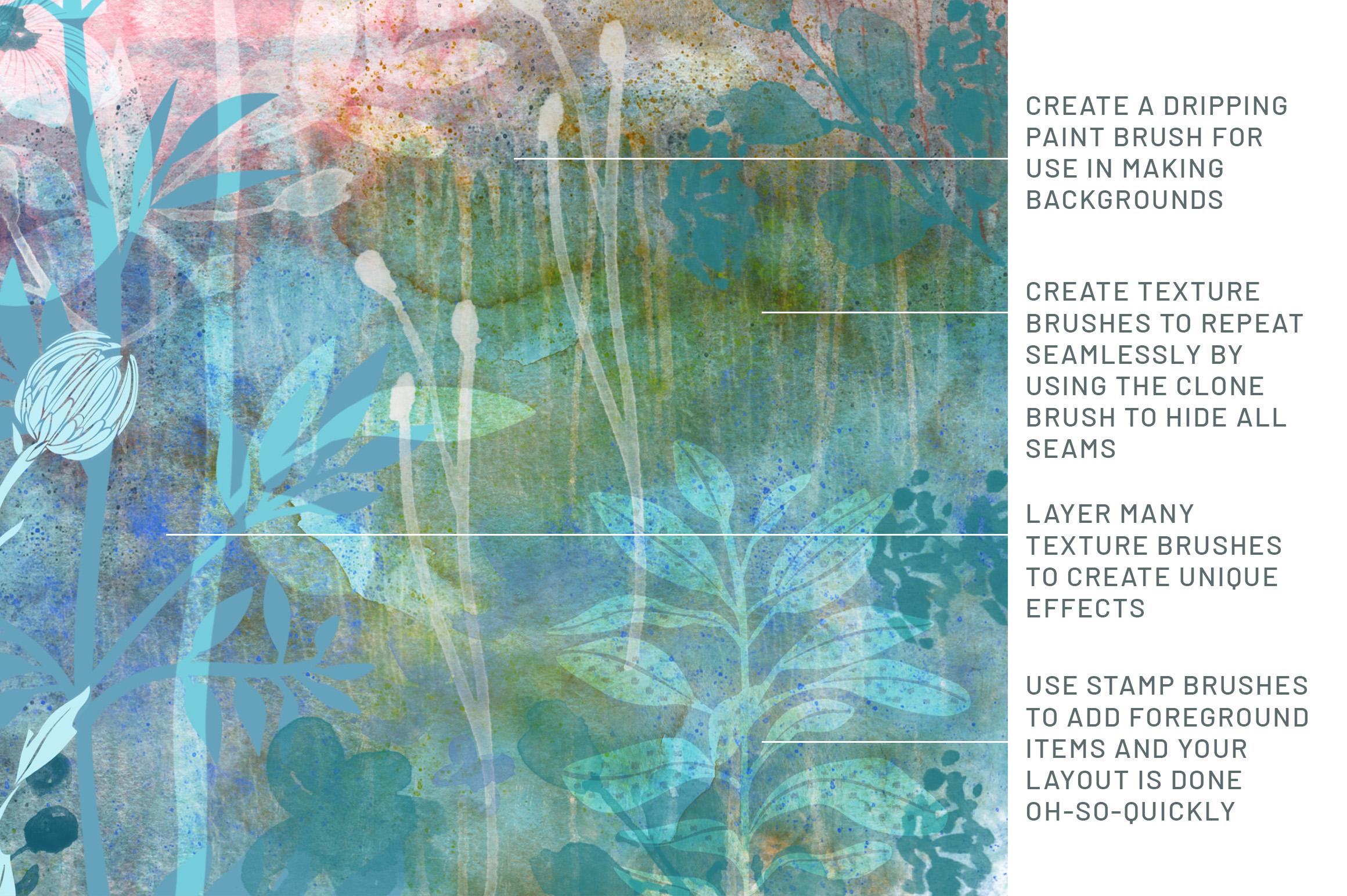
1. Intro to Clone Tool for Constructing Seamless Repeat Patterns in Procreate: Hey guys and welcome. My name is the largest mass grant and I'm coming to you from beautifully sunny, Manitoba, Canada. Today I'm bringing you a class that features the use of a really obscure tool. At least it was obscure to me up until now. In last couple of weeks, I've been experimenting with the clone brush. The reason I decided to do that was because I wanted to create some seamless texture repeats in Procreate. And I knew that I could do this in Photoshop, so I started to investigate. And sure enough, this is something that I am able to do a 100 percent in Procreate. So that's super exciting for me because and use of these sort of repeat patterns with textures or something that I will use a lot. I have used it a lot in Photoshop, so I know I will use it here as well. The seamless swatch itself can be exported and use for sites like Spoonflower or society six, any fight that really takes a repeating pattern swatch. So that's one good thing. And the other good thing is that I can use it to create brushes. Now these brushes are really cool for use in creating interesting backgrounds. I've used them exclusively for the last couple of weeks just to practice. And I have figured out a few really cool tricks that I'm gonna be showing you. So I'm hoping you're interested in this. I hope you're not sick of making brushes with me because this is such a powerful feature procreate that I really have to share everything that I learned. I'm thrilled to have seen so many of you joined me in my classes, and I love that in my reviews. A lot of you are saying that you will be watching all of my classes. That's just awesome because here we get paid by the minute. So the more the merrier. Now if you want to be hearing about my classes as they're released them, make sure you hit that follow button up there. That way you get all my information and all of my cold. And believe me, it's not too many. I used to try to limit it to the one day a week. I'm also encouraging you to go to my website at shop dot, dot, dot ca and check out my artists resources there. I'm adding them slowly but surely. And I'm hoping that you can make use of some of them. There's quite a few free items there, so make sure you check it out. I'll be adding to it as regularly as I can. While you're there, make sure you add your name to that mailing lists as well. And believe me, you won't be getting too many e-mails from me through the site. There's just not enough of me to go around. I could feel every waking hour and every sleeping hour with all the things that I wanted to do. So without further ado, are you ready to get started? All right, let's meet in that first lesson.
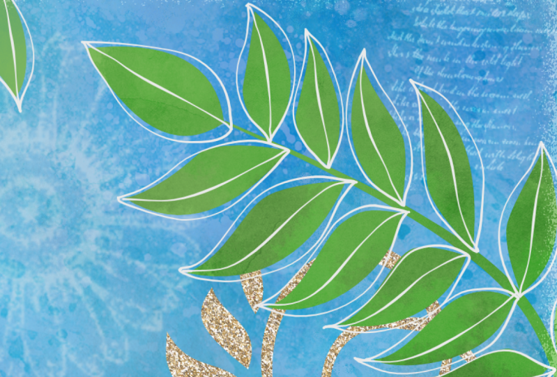
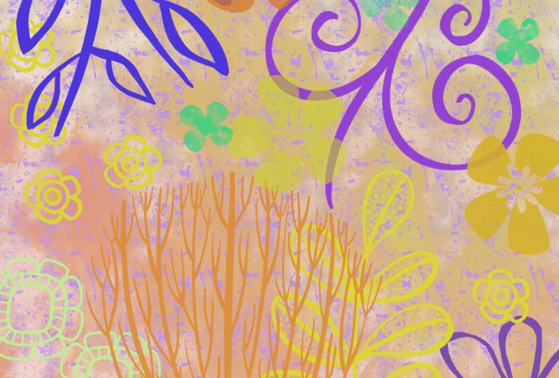
2. Ideas to Spark Creativity: Hi guys and welcome to. This first lesson is a little bit about inspiration, and it's also about sourcing the files that you're to be using for creating these different swatches. Let's get started. I want to reiterate when you aren't creating seamless repeat patterns or anything for that matter, that uses sort of a photographic source. If you haven't created it yourself, you have to make sure that it is a photo of that is not copyright protected. Now, I apologize if there's any noise in the background here. We're just about to get some kind of a thunderstorm. And the thunder is fairly loud here. So if you hear anything, That's probably what it is. So when I'm sourcing out an image, one of the things that I always do is I go to, of course, images here, went through in the Images tab, go to Tools and you can go to change things like the size and what not. But here if you go to usage rights, you can change it to Creative Commons licenses. Those are licenses that allow for you to duplicate the images without violating somebody's copyright. Now there are a lot of different sites that you can go to. Some of them, you may still have to attribute the artist, or you can pay a small fee to license it or to use it for free. You don't have to necessarily buy the license. It'll be just a $1 single use kind of a fee. And so I often try to look for things, let's say from Pixabay or from Unsplash. Those are sites that I've used before that are quite easy to work with. So let's say this is the image that we wanted to use. Now the fact that I know that this is a royalty-free image, I'm going to just make a unilateral decision here to download directly from this image here, it's big enough for what I'm going to be needing it, a good enough quality. And I'm going to be changing it so much that you'll never know that this was the original image that I was using, so I won't be violating the copyright. It'll be extremely different. So what I'm gonna do is I'm going to Control, click on the image, go down to Save Image As, and in my case, I want to save it to my iCloud Drive so it'll be available on my iPad easily. And this is the folder that I've been saving the backgrounds in that I'm going to use for today's class. So I'm going to hit Save here. And now I'm going to switch to my iPad. So here on my iPad, this is the stack that I've made with a few files that I planned to work with in this class to get that file that I just imported or saved onto my to my iCloud Drive. Here it is right here. That's what I like about iCloud. Is that easy? It is to actually get that file between my desktop and my laptop. So the other files that I've collected here, I've got just kind of this is the one I really liked as far as swatches and stuff goal. So I'm not sure exactly how I'm going to use it. I love this one because it's got a combination of water drops and some nice texture to watercolor blooms and things like that that I can incorporate into a repeat tile. I've also got a couple of other examples of files that could be used for that. Again, there's accommodation, there's some spatter in here, and some just really nice areas of watercolor. I'm not sure which part use. And on some of these I could probably use more than one part. A faster way to scroll through would be to open them like this so that I could come through more quickly from your gallery. Just do appear to enlarge and you can scroll through them much more quickly. You can't do anything with them here, but you can definitely look at them here. I love this area, so I might try and incorporate that. And really this whole sample here has great paper texture showing through as one just has fantastic blooms everywhere, all kinds of really neat edges that I could use. And so I've got more than enough here to create a couple of really good seamless repeats. I'm not sure that I will be able to use because it's got such a distinct striping on it. I added it to this set here, and I'm probably going to add a few more things as we go through the class. So in the next lesson, what I'll do with you is start with one of these and break down the whole process for you. How I actually use these to create that seamless repeat. The purpose for the seamless repeat a course is that I can take it into another program like Photoshop and use it to fill up complete background. I'll show you that at some point in Photoshop as well. And here in procreate, I use my repeats, repeats to create pattern brushes. You've seen a ton of those in my other classes. I use that process to create all of these, as well as many of these other ones here. So as we go through the process, you'll get all of my advice about the usefulness and really for me, how absolutely indispensable creating a seamless repeat tile is. And of course, the main thing that I wanted to show you in this class was the use of the clone tool. So that's something that will be really useful for us. And you'll see why in the next lesson.
3. Demonstration of Entire Process: Hi guys, welcome to lesson two, you. So this lesson is going to be all about me demonstrating the use of the clone brush. I'm going to go through the entire process with you. Let's get started. So I've decided that this is the file that I will use for this first demonstration. Let's just see. What I'm really hoping to do is capture more of this kind of a texture rather than the one with the real distinct blue in the background. Because I think really what I want is more of the drops and so on. So I think first what I'll do is some color correction and checking the levels and so on. So let's go into adjustments here. And the first thing I wanna do is go to hue saturation and brightness. Go to the Layer. And I'm going to take out all of the color. So all I'm leading here and dealing with is just the sort of gray. And I'm going to brighten it up just a little bit. That'll be kind of the first stage of brightening. Then I'm going to go into the curves here. And with the curves, you can also do a lot of brightening and adjustment. What I want to do, I guess, is get rid of more of the gray in this area that anything. But you can see that when I do, I'm actually kind of losing some of the detail in here. So before I make the adjustment, I think I'm going to make a selection. I'm going to use my freehand selection and I'm going to kind of select in this area here first, close the selection and then I'm going to feathering. Feathering it will give it a much softer edge where I am making the change. So you can see here that as I'm feathering it, I'm really expanding for the selection. And now when I go in and do that curves adjustment for the layer, you'll see that I'm really just at this point adjusting what's in the middle here. The outside part is being protected at this point. So let's do what we can to lighten and increase the contrast in this area. And you know, what sometimes happens here is that you end up with a nice area within here and you don't even worry about that other stuff in the end, I'm actually really liking what's happening here as I'm increasing my levels. So I've got a really good amount of darks and I've got a good amount of light. You can always go in, in the middle here to adjust some of your midtones. So I'm happy with that. I can click out of the adjustments here and I can click out as selection. I think that there a really good usable area right about here that I could use. I'm going to preserve this whole file though, Because I may end up going back and trying something different. So at this point, I'm going to concentrate on that. I'm going to make a selection here with a rectangle, a square selection, I guess. I think that's pretty good. I'm going to do my three fingers swipe down and I'm going to copy and then I'm just gonna get rid of it, this document completely and go back into my gallery. So in order to meet the repeating tile, what I wanna do here now is add a new document, my standards that they use for pattern pieces always 10 by 10. So I'll bring up a ten by ten document. And then I'm going to paste and finger swipe down and paste. And I'm going to fit this into the screen area here. So I'm going to go free-form is I didn't get the perfect square when I was enlarging. I did something here where I had a second bidder, the selection. I don't know what I did. Whatever. It's fixed now, just crop it a little bit differently. I think I'm going to pull it down a bit more to crop out what was in that corner there. That was a little bit too dark for me. So let's try something like this. Click out of the selection and this is going to be my basis for my pattern. So in order to do the seamless repeat, what I need to do is treat this as if I'm creating a new seamless pattern exactly like this. If not going to work because of the edges being also differ, but just bear with me and you'll see you how I correct that with the clone brush. First things first, let's go into the campus and go to the Drawing Guide. We want to have the grid on, but that grid is way too small. So we'll go into the grid size here and make it the maximum, which gives me four perfect quadrants here, which is exactly what I want. So I'm going to hit Done. And now what I need is four copies of this image. So I'm going to just hit Duplicate, Duplicate, Duplicate. Now, I'm going to shift each of these into the corners. So I usually do it methodically. I tried to go corner first, this corner second, third, fourth. And what I need to do is put on my snapping and magnetics so that I can perfectly snapping into place in the middle there. So if you've been in my other pattern classes, you know that this is the process that you need to do to make a seamless repeat. Doing this, we know that all of these outside edges will now match each other. The biggest problem now, of course, you can read on your screen is that this is a very obvious. Kind of line here. You can tell right away that it is not a seamless repeat. It's a repeat, but it's not a seamless repeat. This is where the clone tool is going to come into play. So first things first, I'm going to hide the drawing guides and not have anything selected. The clone tool, if you've never seen it before, is at the very bottom of the adjustments. Palette here are menu here, so hit Clone. And this little dot here indicates the spot where you're going to start or copy and brush into a different area here. So if I want this copy and paint along this edge, you'll see that as I'm painting this, It's going to move down. You can pick any brush and you can see here that that little brush icon has changed. And if you've never seen that before, That's because it's now for the clone brush and you can use any brush, like I said. So usually I pick kind of a basic brush. I'm gonna go into my brushes and I'm going to pick pastel, super soft. You can pick anything. Airbrush works great. Now that I've got it selected and I start painting, you'll see that as I'm painting, this is 01 mistake here. I got to pinch all those together first and I'll do that clone again. I'm going to move it over here again. And you can see that as I'm painting, that is moving. And it's painting whatever was in this circular area into this new area. So you can see what's happening here. I'm 30 to hide what's there. I tried to move this around three or four times so that copying different areas and blending them together so that for example, this big splotch that's here. If I want to get rid of it, then I'm going to go to another location and let's see up here that there, and then I'll use that and repeat a little bit of it and cover the spot that I wanted to get rid of. So I'm moving this around and you have to grab it either with your stylus or with your finger and move it. And so now I'm going to take this and use it to repair this seam here. And you see if I keep going straight across, I'm going to get kind of an extinct line because it's literally copying back strip there. So that's why I like to move this torus quite a few different times because I don't want really obvious repeats, uh, something that's recognizable. So I would then move this here and maybe get rid of that little bit. And I can do a little bit of that here, then move this and continue to embellish that line that's going through there. So here I might grab that to help get rid of some of this because this is a kind of a darker area. So using a darker area as a source works well. Maybe I'll move this down here and then use it here. And I'm always conscious of trying to have a really obvious thing like this. Not repeat somewhere else, not make sense. So randomizing it is what's going to make it really work. Now, I always do at least a couple of tests before I consider it guns. So I'm going to do the last couple of changes on this. And then I'm gonna do the exact same process again, because personally I can kinda really see this sort of our repeat thing in the middle like a almost like a cross. So I know that I've got to take, let's say some out of this area and put it into the middle to break up what looks like a cross there. And same with here. I might go like this. And the more I work hit is, the more that I can kind of get some of the obvious things out of there. Now if I am repeating something like that element, I make sure that they're really spread out and silicate a change that a little bit though, I feel like that's pretty obvious theorists. So I'm going to move over here and you can see that you can enlarge or reduce your brush as well. And sometimes that makes a difference in around them your pattern looks. So now I think I'm ready to kind of test this one out by doing the same process. Again, I'm going to do the duplicates. I'm going to turn my guide on again. My snapping should still be on. Yes, it is going to methodically move those corner to corner to test and see if it looks pretty good and it looks excellent To me, I'm not seeing any real obvious repeat here of anything, so I would now consider this done. So in the next lesson I'm going to show you how to make this into a brush. And then we're going to try out some of those other textures that we have imported first things first. Let's get those all together. And yeah, I'll meet you in the next lesson.
4. Converting Texture to a Brush: Guys, welcome to lesson 3. So now we're going to take the texture and we're going to convert it into a brush. So we're going to do a bit of a deep dive into the settings in the brush studio. Let's get started. Okay, so the next step that I want to show you was changing this into an actual brush. So to do that, what I'm gonna do is grab the texture. So I'm going to copy it. And I'm going to go into my brushes here, and I'm going to add it to my texture sampler here. And I've got these setup. Most of these were set up with textures that are already existing here in Procreate. So I'll show you how that works. Look at this big texturize your canvas brush. What I had done is gone to the grain category, hit Edit. I went to import and I went to the source library. And then I just chose this as my texture. And basically that's exactly what you're doing is you're going to be putting integrate. And in this case, if the grain that you've created yourself. So I know that all the settings for this brush have worked perfectly for creating a texture brush. So why don't we just duplicate one of those? And we'll go into this. And let's go to About this brush before we do anything else and rename it. So I'm crossing it off and I'm just going to type in dels spatter. Make sure that once you rename it, you hit done down here or it won't lock that in. And then now I'm going to go into crane and go through the exhausting process, New Import, and go to paste in this case, rather than going through the source library, hit Paste. There's buy grain. In this case it's not in negative form. So I'm going to also, I'm going to hit Done here. And for some reason you have to hit done twice here. Don't ask me why. This is giving me kind of a light spatter on a dark background. And that's kinda cool. So I'm gonna keep it, but I'm going to duplicate this. And this one, I'm going to call it del spatter light. You hear that it is pouring buckets outside right now. It sounds like you should be able to hear this on the soundtrack because it is so loud. Wow, pay anyways, I'm going to hit done for renaming. Now I'm going to go into grain and I'm going to edit migraine. And all I have to do here now is a two-finger tau, and it gives me the reverse of that image. And you're going to see what happens when I hit done, rather than having the light spatter on dark, I now have a dark spatter on light. So let's take a look at what those two will look like. We'll hide this layer and add a new layer. I can turn off my guides for a sec. And let's test that out. We'll just go to a straight black. And I love it. That's perfect. I mean, I can really see myself using this. I could have used this in the last couple of classes idea. And let's take a look at the dark one and see how fun that might be to use. So both of those, I think, are going to be extremely useful to me. Now if I wanted to have the grain show up bigger or smaller, I would just go back into it. So let's just get rid of this one. Let's go to this one here. So you can see the difference. I'm going to go to Grain and I'm going to simply change the scale here, a couple of new layers. And on this one, Let's go with that. Now. A slightly larger scale. And you can tell because see these two, how close they are together here and then how much wider they are apart there. And let's try that block one on this new layer. And this is quite a bit, a bit larger than the original. So if I went back and reduced it back down again and added a new layer, you can see that that's a much smaller green. Now, you can see that sheep that I've used by going to shape and taking a look at it here. So this is something you could also change. I find for the spatter brush, one of the ones that I really like it, either one of these really broken up ones or there's this one here, the splash one that also has kind of launches or one of these like the spatter edges. So spray edges or one of these. Let's try this one here. And just so I can show you what that looks like, what we would have to do here is some changes to the actual edges. If we don't do anything, this is what it's going to look like. And you can see it a really obvious pattern there, right? It's exactly the same everywhere that stamp is seen. If we scatter it, change the rotation, the stroke path for the jitter on it. And we'll add a new layer so you can see it here. And note that you can use any color at this point. So that's given a kind of an interesting edge there. That was just the first spatter there. You can see that maybe it's a little bit obvious still on the edges. There may be because it's a solid, but if we were to do that with the one that doesn't have a solid background. That's maybe try something like this. And again, let's do a little bit of scattering and rotating, changing some of this as well. And that's a lot less obvious because it doesn't have really enough to show you at the edge what that would look like, but it does give it a nice ragged edge, which I like. So there's a couple of really quick things that you can do to create something like this, a spatter brush. And I know that this is something that I will use again and again. So in the next lesson, let's give a shot to one of those other textures and see how we can incorporate maybe some watercolor blooms and stuff into a texture. All right. I'll see you there.
5. Perfecting a Challenging Pattern: Hi guys, welcome to lesson 4. So unless it for here we're going to be working with a much more challenging swatch. So the cloning is going to be a lot trickier, trickier but not impossible. Let's get started. For this next one. I'm thinking I'm maybe going to try doing something with this pattern here. Who gamble I tried to do is find a spot within this that has some interesting stuff that I want to try to incorporate. Maybe you'll try something like this instead. A kind of like this area in here. So I'm going to make a selection here, rectangular copy. And since I've got that document already set up, I'm going to use it again. It's already ten by ten and it's got everything that I need. I've already got the guide setup correctly. So here I would just paste to free form enlargement. It's really important that I haven't right to the edges. Let me just turn off the magnetics and snapping for now. So I'm actually going to go a teeny little bit over and make sure that there's no gaps or anything. And I should turn off all of that. Actually, I can get rid of this. And this is going to be what I'm going to use for my pattern. So I need to have my guides back on. And this is the beauty of doing a bunch of brushes on the same day or a bunch of seamless repeats on the same day. You've got the document is everything set up and you've got your head in the game. Before I do anything here, I think what I'm gonna do is get rid of that little dot there. So I'm going to use the clone to do the repair. And actually that spot was pretty good. And my class brush my spatter and that's not what I want to use. Let me try. Let's try and just a watercolor brush, a resident brush here in Procreate. I'll try that watercolor brush and see how that looks quite a bit smaller. Probably not a good choice because it's not opaque enough. So let's go to the painting. I wasn't the painting, so let's try something a little bit more opaque. Maybe this Tamar, and yeah, that works a little bit better, not the best match. So maybe I'll move back over to here, and there we go. That's pretty good. So just like the last one, same process, duplicate, duplicate, duplicate. Make sure you're snapping and magnetics are on. And then to start moving these top left, top right, bottom left, bottom right. Now remember last time what I did after pinch these together as I went through and I took all of the color completely out of my repeat. And in this case I'm not gonna do that in Procreate here, I will eventually need just the one color, the black and white image to use to make my brushes. But because I could also use this as a pattern swatch for creating an overall repeat pattern in Photoshop. I'm thinking I'm going to keep the color in it for now because I think I could probably use it with color in that case. So I'm going to do the same process, bone and this is the paper you're wondering if you could do this in Photoshop. That's where I 90% of the time you do it. And the reason I did it there was because of the rubber stamp tool and that's what helped to get rid of these seams. But now that I can do it here in procreate, well, procreates kinda take it over as my weapon of choice. Let's start getting rid of some of these obvious seams in an area like this. See how nice the colors match. I can actually use and paint in this area at no, I think I'm going to use an airbrush. And the reason I want to do that is because I can get a nice, soft edged one, which will do a better job of blending. And let's turn off those guides so you can see what's happening. So already look how great that little area looked in that was just cause that side match so well. So it's going to get a little trickier as I work my way down into something like this. But for now I'm just going to use that same one over here and the soft edge airbrushed is working out great. I'm thinking I need to get rid of that hard little thing there too, because that's something that would be really obvious in a repeat. Softly brush that out. And then maybe it would be a good idea for me to kind of use this on the way down. Now I know that we're going to need that second set of repeats to get these corners better. On the other one was really easy to hide that, but I think it's going to be pretty obvious on this one. So let me just continue on with what I'm doing here and then we'll move on to doing that. So in a case like this, I might want to bring this over here to a spot that has an old like a differentiation between the two colors just to give some kind of ending location. And I'm seeing here that this little, I don't know, blemish, obviously the same. So I'm going to go up here and grab a little bit and get rid of that. I liked this hard edge, but it needs to blend, so I'm going to take that color from that and then just kind of soften this end bit so that it will blend in a bit better. And we'll carry that red cross here, I think. Now this part's going to be tricky because I don't have any blue over here on this side. I do have some down here, so maybe I'll grab from here. I need more of that light greeny color. So maybe I'll grab from here for that just to make it a bit different. Now you see if I kept going here, I would end up repeating that there and I don't want that exactly the same, so I won't do it from there. There are maybe some of this green might work nicely and I am getting a little bit of a repeat there of this, but I think that might be okay. Another thing that I've done in the past is to take a selection of an area. So let's select this area. Well, let's do freehand here. So select something like that. Feather it. So, well, I got to close that selection first and then feather it. And you can see that It's making it bigger and that area is what's going to be feathered. So I'm going to three finger swipe down and copy three-finger swipe down and paste. Now I've got this, but I can have it in a different direction than what it is here, which will help to kind of disguise it. I can also make it a little bit smaller. So when we pull that into maybe this area in here, just to be different, we have to collapse that together, so we'll pinch those two together. And then we still need to finish this little bit here. So let's go back to cloning. And because we need to do up here too, so up here with the blue again. So I'm going to grab that. I think that'll be good. We're going to end up having to blend it over here. And we'll do that when we do the repeat. And I need green. So let's move that here to do here, and we'll use it for here as well. So I think overall, I've got everything I need to do here except maybe that little white spot. And just to make this look a little bit different than that, let's also try to copy over that little bit there just to have something different happening there. But this here, so that makes this one look a little bit different than that one. And I think we're ready to go for the next step. So let's do the duplication. And I'm sure you're sensing a pattern here. I do it the same every time. And this is just going to help us to get those blends between the scenes working properly. When you are moving things like this. It's really important that you don't hit your screen anywhere because that will move it over and it'll be just by a pixel, you'll hardly see it happening. But if it does happen, you're gonna get some lines within your repeat so you don't want that. I'm going to hit that again before I do anything else so I can ensure that I don't cause myself problems with any little strips or lines showing up on the edge. And you can see that if I hide my guides, that I've done a really okay job of most of the joins, except for this one here, that one's really obvious. So we need to fix that one up. And I think once we do, we're going to have a pretty decent repeat. I'm going to use my Clone again and let's clone from over here. Oops, rookie mistake. No matter how experienced you get, still make mistakes like that. Let's get that out again. I really like that. I think that that's worked great. Amongst other things that I've done in the past, would be to take something like this, which we know is also a perfect repeat and use it, combine it to make another version. For now, I'm just going to turn this off. We've got what we need here to make our brush. I usually duplicated at this stage to make it black and white for Procreate's use. So let's go to our adjustments. You're going to go and be saturate completely. I usually brighten a tiny bit in here. Then I go into the curves and make some adjustments here. And it's usually seems to be that I move this over by one to call one column or so. And then I move this over a little bit to get it later. And then I use this for the mid-tones. Now it's up to you. I'm gonna make it pretty contrast to here and click off of the adjustments and three-finger swipe down and copy. Let's go back to our texture sampler. I'm going to duplicate this top one. Go in here, go to Grain, Edit, Import, Paste. Now we know that this is the positive version of it. So two-finger tap will give me the negative version of it, done twice. And let's just do a test of that on a blank layer. So here, of course, with Procreate, you're only going to get the one color. But look how gorgeous for a brush like. That is amazing. I love it. I really love it. And there are a million different things you can do to change your colors. You can just go in now and do some additional colors on there. And you can make a color changing brush, but look how quick that one brush is going to create backgrounds for me on other projects. And the beauty of it is I've got this tile that I can use in Photoshop to make a full repeating pattern in color. So maybe let's hop into Photoshop for a quick lesson and I'll show you how to import that and use it there. In order to make it available to me, I'm going to do a quick export of justice tile here. So I'll just go to Share JPEG. I'm going to share it to my desktop. And so in the next lesson, it'll be available for me there. I could also have saved it, and I often do save it to Files. I can go back into those textures and backgrounds, rename this single blue green watercolor pattern, swatch and hit Done, and it's there for me. And in the next lesson we'll meet in Photoshop there. I'm going to demonstrate the use of that to create a seamless repeat pattern. All right, so I'll see you there.
6. Using the Swatch in Photoshop: Hi guys. In this lesson, we're going to be going into Photoshop is going to be kind of a quick overview of what we can do there. If you don't use Photoshop, you might want to entirely skip this lesson. It's up to you. At the end of the lesson, I also want to show you creating a combination swatch in Procreate. Let's get started. You guys. Welcome back. So in this lesson, I want to show you in Photoshop the use of that pattern tile. What I did is I have saved it into my assets folder here for this class that I'm recording, normally it would be in my downloads folder here and I would open it up or I would go to my iCloud Drive. And remember what we did is we saved it into the textures and background folder there and it would be there as well. So I'm going to open it here. One of the things I didn't mentioned in the Procreate class there that we were in, was that I create my patterns at 10 by 10, at 300 pixels per inch to make them a really good quality. When you look at it like this, it doesn't even look like a repeating tile. Doesn't look like it's possible for the history repeats, but it does. So I can test that out and it's really easy now in this new pattern preview that we have in Photoshop here. So I'll hit Pattern Preview. It's going to tell me about smart objects in this case, I don't need to worry about putting it as a smart object at the moment because I'm not going to be making any alterations. Now obviously, this is something that has a very obvious repeats you it because of the type of content that was in that original. But it does repeat seamlessly, which is what we need to do. And if we wanted to actually put this into our pattern files, you tell what I've been working on? Yes. Christmas. Let me just put all these into a folder. And what I normally do is if I've got a bunch of swatches I'm creating for a set, for example, I will make a new folder, or I can just add it to my texture patterns here. And to me this is what I'm gonna do. So I'll just highlight that folder. I'm going to hit Add, and let's call this water color blue, green. I'm going to hit Okay, and now I have this as a seamless repeat. So let's test that out on a new document. So I usually do a nice large test documents I was just recently working with. But to CMYK files, but I'm going to change this to RGB and do 30 by 30. I like Cassie, my patterns nice and big. And there's a couple of really easy ways to do this. You could create a layer and get a new fill layer with a pattern hit. Okay, it's going to come up with this random one. But we can go through, and we know it's in our texture patterns. Grab it here and say, Okay, and there's our repeat, Okay, That's the one way. So I'm going to hide that one. The other way is to just go down here to your adjustment layers and go to pattern is basically the same process and gives you the exact same results. And it looks exactly the same over here. So either way works. The cool thing about either of these is you can double-click on the layer icon and you can use this, adjust your scale. Alright, so in a case like this, like I said, it's a pretty obvious repeat, but I don't know what I'd be using this foreign, it might be perfectly fine. Let's see if it had some kind of other fuel here. What it should do here is a new layer. Fill this with, let's just fill it with white. So let's say this is a framework creating and it works perfectly for that. You don't really see the repeat what you do if you really know what you're looking for, but it's not super-duper obvious. And this one, we could also add a pattern overlay. And I'm going to go for my wind pattern. I also just created in my Christmas set here, hit OK and make this clipping mouse. So I'm option clicking on it and I'm going to make clipping mask. And that is clips just to that internal area there. And I can even go in and I would have to duplicate this layer. And let's add the stroke. I'm going to put it on inside so that it's not rounded corners. I'm going to make it nice and wide. And then I can reduce the opacity. Let's look at a clip this one to this one below it. And we've created the world's ugliest frame. I just wanted to show you a couple of things real quick and I always end up being sidetracked. Sorry about that, but this is just one of the uses you can have for a seamless repeat. And whether or not you can see the repeats doesn't necessarily mean that somebody else can see it. Just remember that as you're making these. And like I said, you can always combine them. And what I was going to show you in Procreate there was to do some combination patterns. And so I think we'll go back into Procreate and I can show you that. All right, So here I am back in my document and see I took a big break because this is the work I did last night. I went beyond what I talked about just a second ago, but I did. Several different alternatives and just tested everything else to be sure I can really show you the other objectives that I had in this class. So let's go back to that watercolor B. This is the one we want to work with. This is where this is the one that we completed. And I did it in black and white to use it for the brush. And I wanted to show you how I did the black and white for this one. So that's how it looks. And you can see I got some really great contrasts in here because I used a different method than I had for the other ones where we did the curves and use Hue and Saturation and take out the color. This one, I want to show you a different method and that's by using the gradient map here in Procreate. So with a gradient map, you've got a bunch of different choices here. These are all built-in for one that we're going to use is the black and white one. And just explain a little bit about what the gradient map does. It takes the different tones in the image so that different shades and tints and maps them according to white you decide here, so the darkest tones, this would be the darkest tones. This would be the lightest tones. You can add intermediate tones, and this is the way I did it, so I totally bumped up that contrast and that's how I changed it in this particular. So I've showed you three or four different ways now to do that. You can see that this one is even much more contrasty than this original one. So that was just a quick little aside that I wanted to do. And the next thing I had mentioned was to combine with other textures to create a seamless repeat. So because these are all seamless already, we'll test with one of these. So let's just grab this one here and I'm going to duplicate it actually acts. I want to keep the original. We're going to put those two adjacent to each other here. This is a seamless repeat that I created already. We can use the blending modes here and we can adjust things like the opacity tool, that's fine, one that really works. Well. I like this darker color because he can see those textures coming through. Another texture is tissue paper that was put onto a surface and went down with paint. I load it to dry and use a gel medium over top of it to make the texture and the texture that I've used on me somite to create some natural media, kind of mixed media art. So I wanted to experiment with that, like combining the two. So that's also lighten this one up a little bit. Maybe then we can go back in and darken this one a little bit. So that combination can be then combined by pinching Copy, go into our brushes here. This is the one that I use and that's fat crunched up tissue and duplicate this one, go in and paste our new textures. You can really see it coming through here. And you can, of course, try them both out, the negative and the positive. And I'm going to try the negative 1 first. And let's add a new layer for a test. And let's get a nice vibrant color to try out. So isn't that a cool background? I love that one. That's a great combination. You can even go one step further and add some spatter to it. And the cool thing about it is it's just super instance backgrounds. If you need something really quick, you've got them there in these sampler textures. I'm going to give you this whole set again, so you can just experiment and play around with them. The other one that I tried, of course, You'll see here I've got stucco advocates, a drip, that grounder. And those two, I'm going to show you how to create in the next lesson, the stucco one is actually super easy. I might not show you that one because you've seen the process before that the paint drip background or I thought was a really interesting one. It has some different challenges as far as creating it. And I used that original paint drip swatch that I had. So I'll take you through all the steps of doing that one because I think this is something that you might want to use again and again. Alright, So I'll meet you in the next lesson.
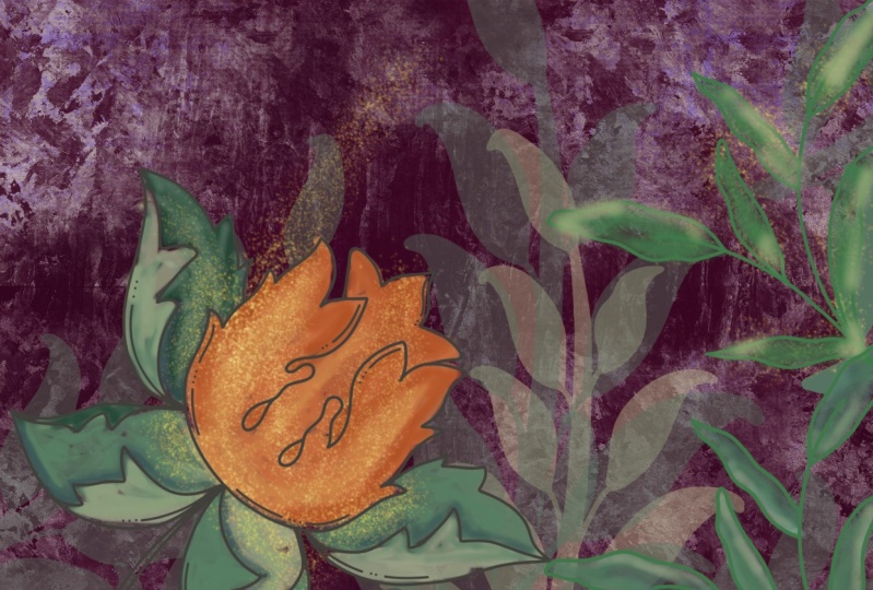
7. Another Challenging Swatch: Guys, welcome to lesson 6. So this one presented an interesting challenge. I'm going to walk you through the entire process. I'm going to grab, let me just delete this layer here. I'm going to insert the file which will be the original of this particular swatch. And there's no way to do it seamless the way it is with these dark and light areas. What I need to do here then is to figure out a different way to make it seamless. I guess you'd say, I know for sure that if I were to repeat this side and flip it over, it would line up quite nicely and the same thing with the top and bottom, and that's what I'm gonna do first. So I'm going to turn on my guides. And I'm going to turn that down in size so that I can line it up to the middle here. And I think what I'll do is I'm going to cut this section off because it's got a really obvious piece right there. So let's go into our selections. Use the rectangular selection tool. I'm going to cut that off. I'm going to reposition it here. And I think I'm just going to go over the edge a little tiny bit to make sure that there's no gap around the outside here. This will just ensure that that is lined up. So now I can do my duplicates. So that's first. And then in this case, I'm not doing the four corners. The way that we normally do. What I'm gonna do is I'm going to flip them to flip two of them, have two of them this way. But I'm going to flip this one horizontally so that, that edge lines backup to itself, right? And then these two piece of that was the top one. So these two, I'm going to first move up, then I'm gonna do the same thing. I'm going to move one over that one. I'm going to flip horizontally. I'm going to pinch these two together so that this one and this one. And I'm going to move this one down so that I can pinch it with this one here. So now this top row, I need to flip it, and in this case It's vertical flip. And so we've got perfect matches here. We know it's perfect because it was the reflection of itself. Now I'm going to pinch all of these together. I'm going to shut off those kinds for a second. And let's just take a good look at this. So I've got a little bit of a gap there. So maybe I touched my screen at some point. Let's just use the clone tool and we're going to fix some of the stuff up here. So I'm going to grab a smaller brush. I'm gonna go back to the airbrushing. So I kinda like that one the best as far as the soft edge and so on. So we've got the soft brush. Let me see what size my brushes That's a good size. So I can go in here now and maybe use an area like this to clone in. And I can pick out some of these things like, you see how obvious this little bit is. If you don't like that, you can go in and do some further patchwork to just kinda mitigate that issue. And I still want to fill in this even though there was no gap there, I still need to kind of fill that in so that it doesn't look quite as obvious, but don't need to take that out completely, but I'm just kind of working at we're going to still do that test where we figure out whether or not this all works. You can see this kind of an obvious thing going on here, this, and this is the same. So let's get some of that. Ok, and let's check this seem as well. So I don't like this little v that's formed here. So let's grab one of these nice big drops and put it down through here. And on the other side, we can do it from a different drip so that we don't have that same one with the dark top everywhere. So that's grab, let's see this section here and go through and do a bit of correction there. So it picks out again two, we're going to get this dot here that appears in a few spots. So I think that would be fairly obvious and less get the top of a couple of these neutralized, so to speak. And that dot over here to over here. And I think we probably have a pretty good usable section here. So let's duplicate. We're going to put our guides back on, make sure snapping is on, it is. So 1234. Now let's crush those together and it looks pretty decent. So this is obvious, but other than that, like I think this is worked out fairly nice. So let's just do the same thing here. We're just gonna get rid of some of this and we'll get the cloning tool again. It's going to remember the last brush I had chosen. So I'm going to go somewhere like here. Oops. And you can do like a crossover like this where you're getting these drips continuing across that center line. That kinda works too for neutralizing certain sections. And in a way, coolant neutralizing. But and I think we've created a usable piece here. So this is going to be a little bit different from my other one for sure. Well, you see one more thing I want to do here and we've already done that. Other tests, me, we could continue testing. And one of the ways that I sometimes do that is to, at this 0.1 of all, I'm going to copy it for use for my brush. What I sometimes do in this case is I'll take that one down into the corner and then do the duplicates. And then take and move each of these duplicates. And that's a way to test as well. So we'll pinch those together. And he didn't like his section. This is another way to go in and make some additional corrections. So maybe we'll do it this way just to have different look than my original. We'll go to clone, bring that over here and need to get rid of that section there ended up being really the most obvious repeats are part of the repeat. And I think this is a usable, absolutely usable for my brush. So I'm going to do the three-finger swipe and copy. Let's go into my sampler texture. Let's duplicate one of these. Go in for the green Edit, Import, Paste. And remember I did the full color one film. We're not getting a really nice image here. So let's go back and duplicate this. And let's go and use that gradient map again and see how that works for us. And probably those settings there, perfect. I mean, they would be definitely sufficient. So let's copy this one now and use it. Green Edit, Like how the brush studio goes back to the exact spot that you work. And do we want this in negative? Well, let's just try it out this way. Will make a new layer. We'll make the brush bigger. Let's grab a really nice color hand. Fed. We've got a very usable background. I would use just like a section of this. So I would probably enlarge, go into the properties here and enlarge it. Also with the grain here. You can enlarge it quite a bit and then brush. But if I was to use this with a couple of other things in the foreground, I think this would make a great and very quick background image. And now I have this for ever and ever. I can quickly add a layer or put a layer down and end up with a really good sort of base for my mixed media art. So in the next lesson, what I wanna do is just quickly show you a few the pieces that I've created using these backgrounds. I'll break it down for you and I'll show you some of the combinations. All right? Okay, I'll see you in the next lesson.
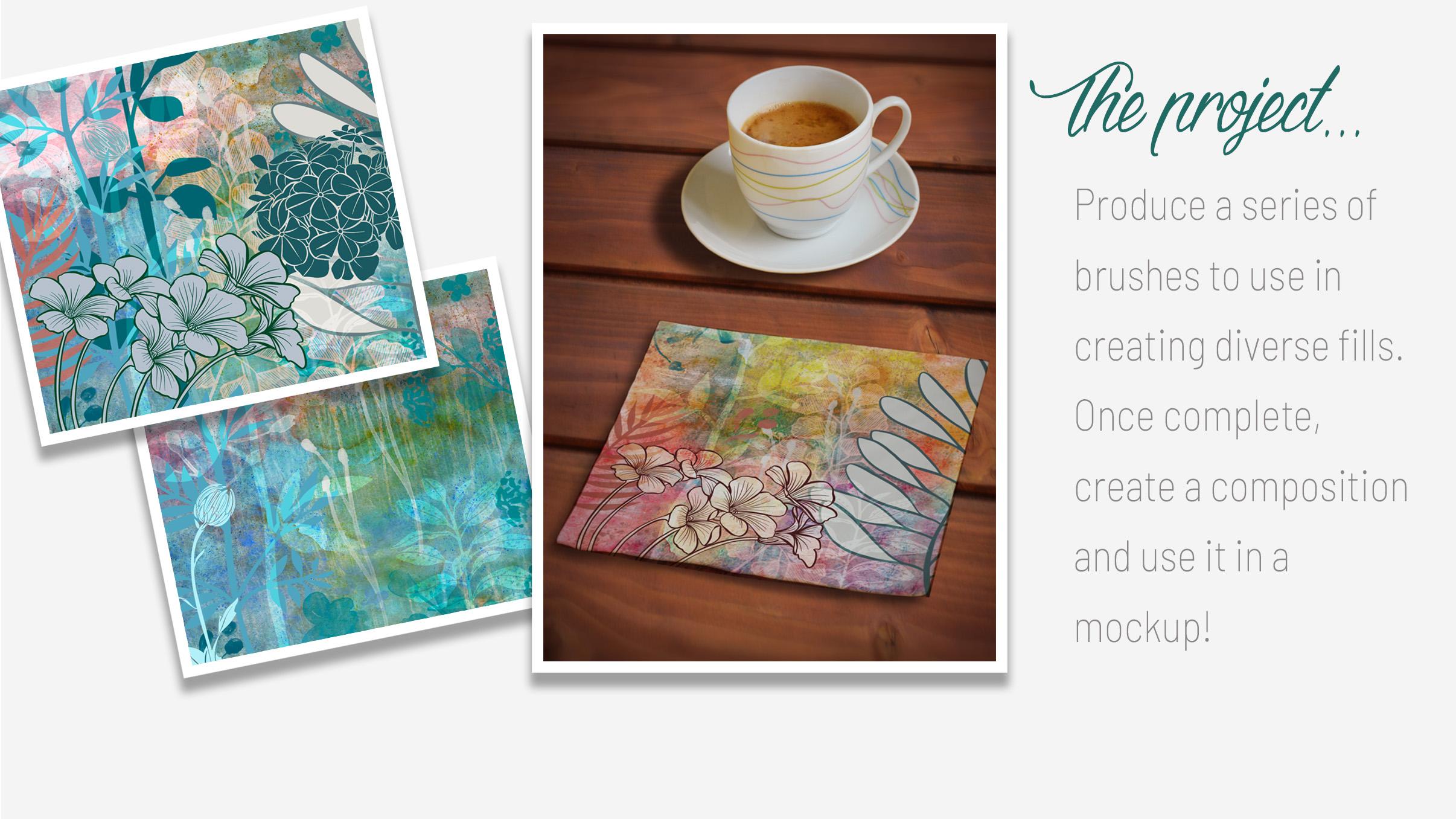
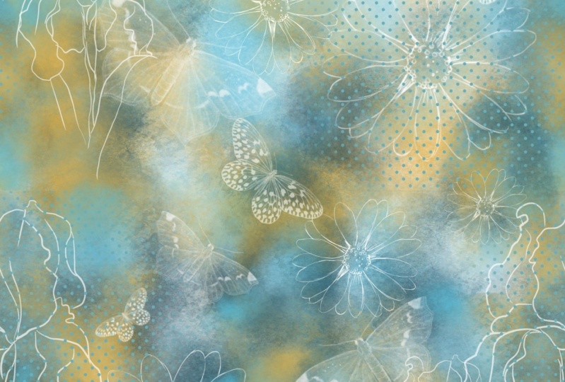
8. Using the Brushes for Finished Art: Hi guys, welcome to lesson 7. This is where we're going to start creating compositions using the brushes that we've created. I want to show you a really neat effect for having a brush that appears to be changing in color. Let's get started. Okay, so I'm gonna be showing you a composition now, but I want to show you a setting that we can do with that watercolor background that we had. Remember that one. And I wanted to show you a way that you can do some color changing. Okay, So let's go into the color dynamics here. And what I wanna do is change the hue saturation on each of these sections. So with the Apple pencil, you can just go in and put in a number. So I'm going to put in 33 and maybe to here 332. I find if you do too much, It's a little bit hard to work with, but you can experiment with this. Of course. A lot of this is just a guess. And you can control the color as it's added to your stylist by the way, you tilt or by how much you have at pressure. So each of these things can do different things depending on The kinda touched that you have personally with your stylist, your pressure, all that kind of stuff. But I keep it pretty low. And let's go into sort of a middle of the road colorless. Let's start with a red here. And I want to show you that depending, for example, on how hard I press, I'm getting a different color in here or the tilt. So the tilt could change the color if you would like it to have even more of a color changing of fact, you can go back in there definitely and you know, bump these all up a little bit, experiment with that lightness and darkness to, and what this does is, so for example, on the Q here is going to give us the color that we chose. And then it's gonna go 23% in a different direction on the color wheels. If you were to look at the color wheel here, this is the color that we chose and with the settings that we have, it'll go a 23 percent. So it could go that much of a change. So it could go from this color over to this color or over to this color. So I'm going to undo these that I have here so that you can see my new settings. So maybe I kind of overdid it on this one. Here I've picked yellow and this is what I'm getting. So if it's flipping all the way over this side here. So that's why 2003 might not be, the ideal choice was out. So let's go down to a lot less on some of these. And that one's actually quite lovely. It looks like we've just done a basic watercolor wash with a couple of different pigments in our water. So let's make this a bit smaller. And you know, you could do this and then you could go in here to your color wheel and change it and continue to be getting different colors in there. So can you tell that that wasn't an original watercolor piece I should count. So I really, really loved that. And now when we're working with our compositions here, we can do some really cool things like adding these different types of textures over and above our basic watercolor background. So I don't know if I like that one, but I like that one. That's pretty cool. So that's really a neat combination that's taken that I made a layer here with a sort of a roller texture that you'd have for the line of block rollers. And the spatter that I created a, put them into the same layer and created that effect. So I like that. Now, I've only got a regular blending mode set here. So gutsy. Other few you could do is go in and experiment with the blending mode to see if there's something that might be interesting. Ooh, that's really rich men. So those are pretty cool. And so maybe in a case like this one, we could just reduce the opacity on and then this other one which I thought I didn't like might be okay, if it was one of these blends. I see more than one setting here that works like, look how rich that is. That's gorgeous. I really love that. So there you go. And then you can just add some extra stuff on top. I just went nuts with my brushes here and added some foreground items. You can keep it all very subtle. So you can have less kinda nice to say outline with the art showing through. Actually, let's go back and let's see what overlay that was. Not this one, no. So this one here, which was the film that I had put on here, this one, I could also experiment with a blending mode that would allow, it would still give that fill effect, which is really nice, but it would allow a little bit of that water color to show through. So that's really pretty. So I've used various different methods here to do the fills on the flowers or to do the blending is just an experiment. Do whatever you want. At this point, you've got this fabulous set of background textures that you can use. So that was my one experiment, and this is the other one. Let's see what happens here. So I've got the watercolor and I did that color mixing very much in the same way that I just did. Then. I added tons of speckles on this one. And I thought this one would be great to experiment with that dripping kind of effect. I really like that. You could take it and enlarge it so that the dripping is happening. Right from the top. I did a blending mode there, so I've got it on hard light. You could experiment with different ones. Then I added, this one is a bit of stucco that gives us a little bit of running texture in behind here. What was this one? See a piece of that was just a little bit of extra line textures there. And then I started adding some items in the foreground. And again, I, in this case, experiment had much more with low contrast and lots of showing through to that background layer. So that makes a great background to then add those foreground items that we had in the other ones. So something like this. That was the just kind of a way to make this lighter so that it would show up better because if it didn't, I don't know, I found that was too dark. So I added that there is that plants that I had there on the right-hand side. But so quickly and so easily, I was able to show the use of this background in a couple of different ways. And that was just because I have all of these brushes. So that was my version one and version two. So, so completely different and yet so attainable and so quick. I was able to do those two artworks very easily. And I don't know, just maybe an hour and a half last night. And I am very happy with how those turned out and how useful those backgrounds are going to be. Thinking. At this point, we've got everything we need to either upload to a site like Spoonflower or to use in our artworks. As far as uploading to a site like Spoonflower, your repeats would definitely have to be that original swatch or the work done using these original swatches? Not that one. The ones that fill the whole background like this That's watch could be uploaded to Spoonflower or any other POD site that does repeat patterns. So you've got those multiple uses for that same swatch, either as a swatch for February, has a swatch to take into Photoshop to do some additional work with or to be using in your artwork that you're using or creating for sale on POD sites or whatever your purposes. Alright, so I guess that wraps up this lesson and I'll see you in the next one.
9. Conclusion, Mockups and Next Steps: So this is the conclusion. I just want to show you a couple of quick mock-ups here. You can see that these wonderful swatches that we've created are just fantastic for creating backgrounds. I really hope you're going to explore this even further. You're welcome to use my brushes and anything you create, even if it's commercial. And then you can create some of your own. Use. Some of my ideas. I'd love to see what you create. Also, I just want to remind you, especially if you enjoyed this class, to hit that follow button up there. That way you're going to be informed of all of my classes as they're released them. I want to thank you all so much for leaving comments in that last post. I want to encourage you to check out my other classes as well are really happy that so many of you looked forward to that negative space, three forests that I did in one of my previous classes. I never know what order you're watching these in. So I can't really say well in the last class or the next class. So I'm just going to try to be as general as possible with that. If you're interested in seeing any of my work, check out my stores. I've got one adds docile.com. I've got one at art of where here in Canada. And I'm on Society 6 under my own name, but also under the umbrella of out of the blue. So you can check out that site for myself and all the other artists that it represented there by out of the blue. I also want to encourage you to check out my Pinterest sites. Now that you've got these great ideas for backgrounds, checkout which any of fine art inspirations, boards, or even the lease and trees illustrated and photographed to get some ideas for some future projects of your own. You're probably building up a pretty darn good collection of brushes by this point. So I think that you can create a lot of these compositions really quickly using these backgrounds that I've given you and that you're going to go ahead and create yourself. Don't forget to use some of those textures that are already available here. In Procreate. You can probably create 20 brushes today in ten minutes. I'm not kidding. Well, I guess that's it. And I hear a train coming again. So I'm going to say bye for now, and I'll see you in my next class. Bye bye.
 Delores Naskrent, Creative Explorer