Transcripts
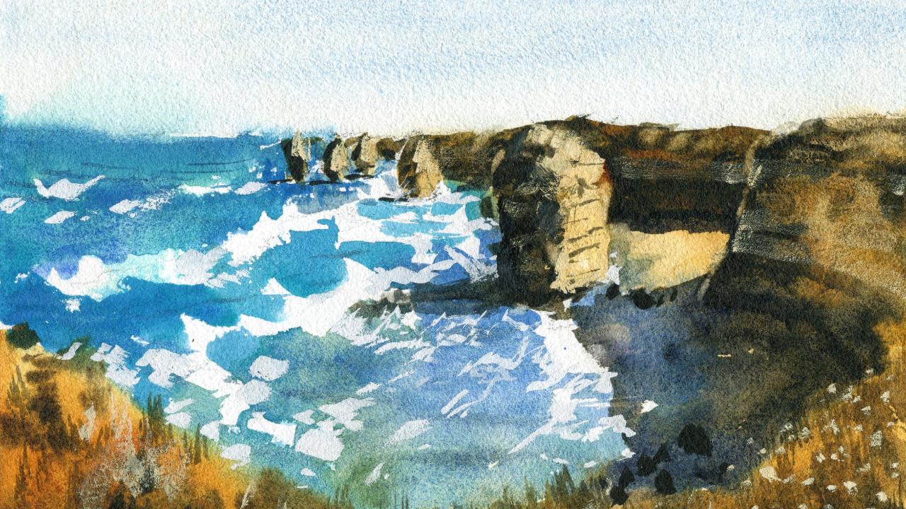
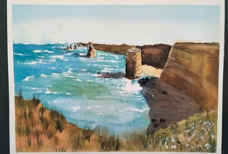
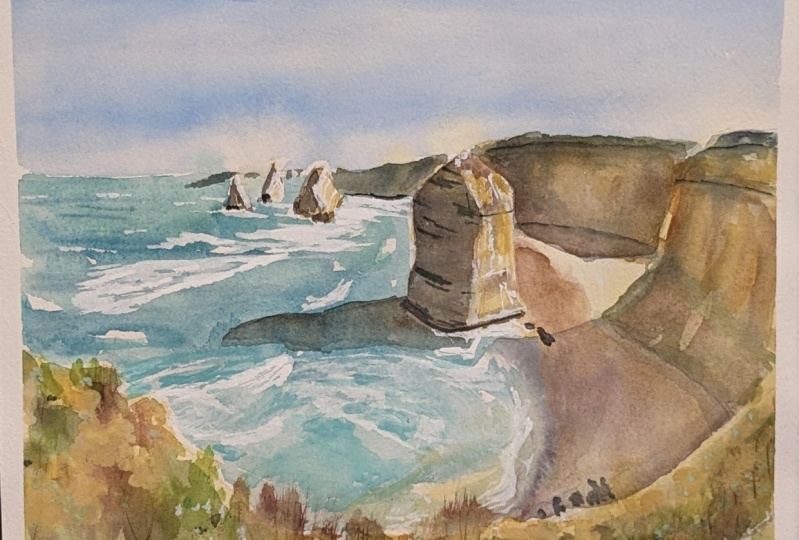
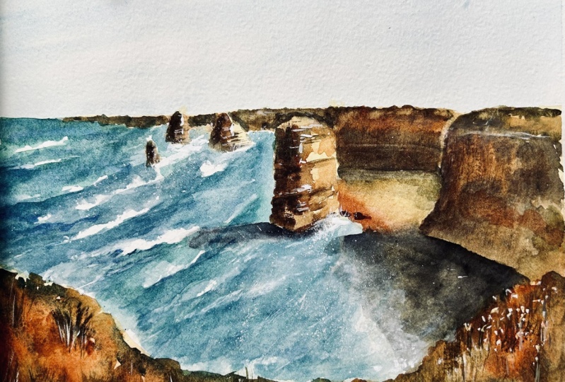
1. Introduction: In this class, we'll be
painting the 12 Apostles, a classic Australian landscape, using a variety of wet
and wet techniques. And wet and dry techniques, creating and combining
soft and sharp shapes can be tricky when you're
learning watercolors. Painting wet and wet is often associated with the
loss of control. Without understanding, timing can definitely create a mess. But don't worry, I'm going
to show you the importance of timing when
painting wet and wet. I will show you how to control
and labor effectively to create some soft textures
such as shrubs and grass, or painting sharp highlights
on the rocks and waves. It's easier than
you think. Wet and wet techniques brings out the natural strengths
of watercolor and is essential for
your watercolor journey. Creating fine details
to finish off your paintings are
crucial when painting. Trees, rocks, and grass
creates contrast and interest, But understanding when to
add them in is crucial. Before we start
with the painting, I'll show you how to simplify shapes and sketch in large ones, such as sky, water, shadows, trees and grass. Getting those large
components in accurately beforehand is essential for
your painting to make sense. Join me in this class,
looking forward to creating some beautiful
landscape paintings with you.
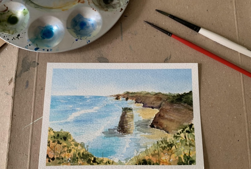
2. Materials Required: Alright, so before
we get started, I want to show you a few
materials that I'm using. Just go through them.
As you can see, not a whole lot that you
require for this class. The paper I'm using is cotton watercolor paper,
100% cotton paper. I find this is the best paper to be able to get in the soft, wet, and wet effects. And look at that, there's little transitions between
the light and dark here. Fantastic. When you're using
paper that's too flat. So if you're using something
like hot press paper, often you'll find the water
just pools in areas and it doesn't disperse
the paint properly. So landscape painting
always recommend using at least medium or
textured rough paper. That's what I've got here,
I've got a bunch of brushes, and here in the middle, I've got mop brushes. And the mop brushes
are great for getting in large
washes like the sky, even some details
like the rocks. I'll use a smaller mop brush
there to get in the shadows. Areas back there,
areas in the front. Basically, your bread and
butter of water color brushes. Anyway, these ones here are just some smaller
brushes that I use. Basically, a little round brush, I've got a little
flat brush here, so these are great for getting tiny little details like
shrubs here in the foreground. For example, if I
want to just get in some waves with a
bit of white guash. Another material that I use, which is basically
opaque watercolor paint. These smaller detailing
brushes are great for that. You can even get in some
little indications of flowers here in the foreground. A few other brushes
that you might need, and they're not
de, not essential, but I do use them
from time to time. A little fan brush, and these
fan brushes are great for getting in areas of little
grassy details like that, sometimes indicating
some textures as well. So just dry brush them on. I've got a little brush here, this is a Filbert brush. And Filbert brush is essentially a brush that's used to
blend and lift off. So I've used it here just to lift off some high
lights and areas. Even on top of these cliffs, a little bit here on the side of the rocks as well.
That's about it. In terms of brushes here, you can see my palette and we've got a lot of stuff
on there at the moment, but I've got two large
mixing wells important, especially with a scene like
this where we've got so much blue running through
the sky and the ocean. We've got this
large area of this grassy yellow, green color. Even these large shadows here, making sure that
you've got enough color is really important. It just means you don't have
to continue going back and mixing up that same
color again, water. I've got some
cerulean blue mixed in with some ultramarine blue. Got some yellow ochre here on the rocks, here
in the background. Yellow ochre again as well. Cerulean blue light in the sky. Just a lot more water for these mountains and
land Here in the front, I've basically used a
whole bunch of colors. Brown, a bit of burnt sienna, a bit of raw or
burnt umber as well. Use a bit of neutral tint,
also a bit of black. If I can draw out some
extra dark areas near the bottom of these
mountain areas of cliffs here as well. Just a bit of black,
darker colors, black here. A bit of green as well. Here, Just use a darker green. Something like a Hooker's
green or undersea green, which is just another name for a darker green that I have. A fantastic, the guash is a fantastic little
tool because it allows you to get in some
final highlights. I use them to get in these
flowers and I mix the white quash with a bit
of yellow to get these yellow tinge flowers. And bring back some of the highlights on
the rocks as well. Here in the water, I just use white guash. I think there's a bit of blue that ended up getting
mixed in there, but it's not too obvious. But it's a great little finishing off move that
I used right at the end.
3. Drawing: So what we're going to do is, I'm going to start firstly by separating the sky
from the water. If we look right up where
the sky hits the water, I mean, it's about a
third of the way through, maybe a bit less than a
third of the way through. We're just drawing
out the area where we've got essentially the sky. I'm going to go ahead and do
that just like that, really. Okay, I've got
enough sky in there, Probably the second easiest part is to get in this foreground. I'm roughly going to put
it again about a third of the way through the
scene like that. Okay. A bit of a
bit of sand there. You've got some
shrubs and things, I just being quite
loose with this. Okay, here we go. Something like that really. From here on in, it's
just marking out generally the coast line also where the rocks
and what have you are use a bit of the water
that's coming in over here. I know we've got about a third
of the way through again, we've got this cliff
coming up there. And it goes just above and disappears off like that. Okay. And this one comes all the way around and joins
up roughly here. This might have to be
a bit further up that. Okay. I'm just having
a look to see as well. Might actually extend it off
a teeny bit to the walls, to the front like
that there. Okay. Let's see what else we can do. There is a bit of just a lot of that land that comes in on all the way through
to the back as well. I'm going to start roughly here, put in a bit of that
area of land comes up, doesn't have to be perfect. All we want to imply is that it joins roughly onto this side, like that bit of
light coming through, peaking through there as well. Okay. But apart from that, that's really about
it for that land. We've got this larger
structure here, this bit of the cliff that I guess part of
it that's just eroded off going to just draw that in roughly like
this bit of detail. But as you can see, it's almost like a block, square or rectangular block
or something like that. Try to find ways to draw things to make it
simple in your mind. Okay? And you can
see there's also smaller darker rocks
here near in the water. Okay? The structure of
this is quite interesting. You can see the bands of
rock running through there. There's also bits of
green and things, moss growing on the
side or shrubs, trees, maybe up the top. I'm not sure you've got a bit more here in the
background here. We've got another one sticking out of the
water like that. Okay? They overlap
with each other, significantly like that, but
these ones are so small, there's really not a huge amount of detail you need
to put in there. Okay? This one is triangular shaped. Okay? There's a bit of shadow on the left
hand side like that, that cliff in the background
there as well. Okay. Simplification of what
is happening here. Okay, I think this one at the front is probably the
most important getting in some of these details as of the cliffs and some of
the bits and pieces, shrubs growing on the side. I'm just going to put in an indication of where the
water is roughly here. One of the things also you have to keep in mind is
that the water, there's a few different
colors in here. We've got white, we've got this nice teal turquoise color. There's even areas here where the sand overlaps with
the water as well. So I'm going to try to do
most of this wet into wet. And also leave out a whole bunch of white
and high lights in here. While, while I can make this a bit taller while
you're painting as well, you can also change the shape
of things here and there. You can also see there's like these waves that just come in. There's this large one that, as you can see, comes in. It's a large one. There's some
around the rocks as well. As they hit the rocks, you tend to get a bit of that white foamy water another bit here
as well coming in. And notice how it just follows the same pattern
of water coming in. This bit here is
going to be tricky. Maybe I'll use a bit of guash or something
like that later, but that's about
it for the sketch, so we can really get
started straight away.
4. First Wash: This smaller section
of my palette. Here on the left,
I'm going to be picking up the warm colors, a little bit of yellow ochre. The percentage of paint is about 10% paint and 90% water.
A lot of water in here. I'm going to go
straight in there to really over everything, I got a bit of this
golden color as well. It's Nace yellow, which I
will drop in a bit there. Another thing to keep in
mind is that you want to just go over pretty much all of the land features,
including the sand. You want to get that all in with this yellowy color first. And this is just going to form
the basis of our painting, the warmth in the background. Again, a lot of this will
disappear afterwards. Anyhow, what you
don't want to really go over is some of
this white in there, which is going to be
more of the highlights. I'm just going to do
a bit of painting over these little rocks. They may change
afterwards as well, the general location, but roughly where they are
in the water here. More of this yellow
again on that, this area of the foreground. Okay, It's pretty
straightforward. You're just using yellow. You can use a bit of
darker yellow as well in the foreground if you
want some more contrast. But this isn't the only step. We're going to add
some more bits and pieces, some
more colors later. I've just added in a
little bit of this is a bit of burnt
sienna through here. I think a touch through
here will be nice as well. Just like using some of these
granulating brown colors and dropping them in
and helps to make this, these rocks look
more interesting, get this granulating
effect in areas. But at the same time I
don't want to overdo it. Okay? But it's just a bit of brown color because there's a lot of brown and
things on here. Okay, That nice bit of
granulation happening, It depends on the paint
that you're using as well. I do use a lot of
granulating paints. Now let's go straight in. I think I'm going
to go actually, yeah, I think I'm
actually going to go straight in to the sky first. So I've got some cerulean blue just mixing up a light wash of it and
keeping it very light. By the way, I don't want
almost any color in here. Maybe 5% paint, 5%
paint, and 95% water. Okay. Just carry this nice
blue sky down the page. Some of it will
blend in a bit with the rocks and things like that. Okay. That's all. I don't want anything
else in there, Just something simple like that. What I'm going to do
now is I'm going to mix up a bit of turquoise. You might already
have some turquoise, or if you don't, you can mix a bit of green into your blue. I'm just going to create this turquoise light turquoise color. I think a bit of
ultramarine blue in here is going to help to just
darken it off the touch. I'm going to go straight into this right from the distance. Some of it's going
to go into the sky. It's going to blend
with the sky a bit. But mostly I won't
bother, no problem. What you want to do here is keep an eye on some of these
little highlights. Notice when I was talking
a little bit before about leaving some of
that white of the paper, this is really
important and what I'm attempting to do here, around the rocks, you'll notice
there is a bit of white. Okay, Bits and pieces. And smaller brush. I've got a small mop brush. This is going to help. Just
cut around a little more. Okay, That near the back,
it doesn't really matter. What I want to do is just get an indication of some of the, of white water coming around. Look at that, Some of
it's going into the sky. What you can do as
well is just pick up a little tissue and mop
up a touch of that. Not a huge deal. I'm
coming down further, I can just continue
doing this and I want to get this in
relatively quickly as well. Move down the page, here, we've got this larger
section of this larger wave. Then I'm going to blend it. Merge it a touch with the sand. And that's why I'm trying to be really quick
about this as well. There's bit of that
merging going on, okay? This stuff in the foregrounds
pretty much started to dry. There's not much
there to worry about. But I'm leaving some
more of that white of the paper carrying
myself further down. Might add in a bit of
green as well in here. You notice it got more green in the water
around this section? A little bit of green in there. Yeah, yeah, here. Just cut around
that rocker touch. Okay, Just move forwards. And again, I'm just going
to leave out some of that white here as well, but I'm going to touch
onto the yellowy, sandy area down there. We'll finish this up like that, all of these areas
joined together nicely. Soften this edge here. Trying to blend that
in and dried slightly. Okay, that's about it for the waves and things like
things like that for now. Another thing you can
potentially do is pick up a little
bit of darker blue. Put a bit of brown
in there as well. Just put in tiny little ripples across the surface of the
water like this as well. Bits like that,
hopefully they just melt in nicely to the water. Create this just a little
bit of extra detail. Suppose it does help with water when
you're just adding in some darker look like waves in the background I
think look a bit too sharp, so I'm going to spray
it to touch with some of this. A bottle of water. Going to go work a bit on these areas of the
cliffs and things. I've got some more of this brown color because this paper has
started to dry off. I'm going to just feather in a little bit of this
paint here and there. Just a little bit, because
I'm actually going to go over the top of it later anyway. Okay. Should have been
dried off already. I'm just gonna connect
these up a little. Okay, the yellow back there. Give this a quick dry.
5. Second Wash: A little bit of green and
things for the shrubs, and this area is still wet, so it allows you to do that. If not, you can get a
bit of water and just respray down in areas like
here just a little bit. Just touch and go really
with a bit of green here. Trying to follow that pattern of the, that reference a little. Okay, touch and go. Remembering to leave a lot of that lovely gold color
in there as well. That there are some
greens in there as well. Browns means not
completely green here. Just moving that around like
that. Just feathering it in. Okay, look here.
Spray this down. Better. Green. Like that, Yeah, but here, yeah. Okay. But keeping in mind this
area is still fairly light, so I don't want to use of a
too many colors in there. Okay. Some yellow even
just drop in a bit of yellow ocher and let that
sort of mix into everything. Let's take a look at
these areas here, just in the background,
the shadows. And I'm going to be
using maybe a bit of purple and a bit of
brown, purple and brown. Blue and brown works as well, but just a bit of ultra
marine in there as well. Here we go. So we've got
a pretty dark color. I'm just testing this
out. See how it looks. I think that's okay. I'm going to go over the top of this area. Just a bit of color here is where
it sticks out. It needs to be a bit
sharper there as well, so I'm going to go
darker here that there. I'm trying to also, if I can leave maybe
a little bit of that yellow or hint of yellow
in the background. The green on top of
these cliffs subdued. I don't need to
worry too much about getting a lot of that green in. Okay. But I do want some of that yellow showing
through more, going to like dark on top. I'm going to pick up a
bit of green and a bit of black and see if I
can get myself in a top part of that area
like that bit here. Okay, the rest of it just join on with a
bit of softer green. Might have to go back
to it afterwards. Let's go ahead and do this side, simplifying it down as well. I've got a bit other brown, burnt sienna, and I'm going
to try to just cut a cliff. This little rock here in
the foreground as well. Okay, Like that. Draw all these onto each other. If I can, even if we
get that background in almost one color, we should be good,
one large shape. The colors are so
desaturated out there, it's very difficult to tell
what's going on at all. Here's just some more
cutting around that. Okay, I'm gonna just darken
part of this side as well. This rock in the, in the center like that,
getting that shadow. There a bit of cool
color as well. This is just a bit of purple. Draw off that brush a bit. And I'm going to try to create some little textures I suppose
running through the rock. Just little lines to show these, these creations
and stuff in here. Especially with these rocks, the ones that are closer
to the front of the scene. I think you just need to add that little
extra detail in there. Okay, let's have a
look at the other one. Simplified down a bit of that. The left here as well, that we need a bit of extra work later anyhow, But that will be okay
for the time being. I'm going to just start
working on the shadows below. Now I'm going to be using some
purple and a bit of black. Okay, The shadows I'm talking
about are just underneath. So you can see here underneath the cliff, areas of darkness. Join that on to the
actual cliff itself. And then here you've
got a quite a large one that comes all the way
out into the water. Let me just try to connect that on with everything like that. Bring that all the way
down across the page. Yeah, a bit more purple. Okay. We got it just coming around like that and
disappearing to the left. We're using a thick
concentration of a darker paint. Just a bit of purple and
a bit of black, really. Okay, that might leave some of that yellow showing
through as well like that. But it's going to be
a nice sharp shadow as we're indicating like this and blended onto the
cliffs to the right hand side, you get areas here which
don't appear to be dark enough and I just need
to create more contrast. Add some more painting here, let it just seep in better that okay, some more little shadows
perhaps in the background. Not much notice how everything
just joins on together. Of course, I'll need to bring this shadow forwards and get it to look more darker. Obviously, here is a shadow
I've nearly forgotten about, just cast by this on here. I'm just going to combine that. Join that on like this. Okay, there we are, a bit of that shape it at the base so it makes
more sense like that. Okay, join that on that. I'm going to just
see if I can feather myself in little
details for the shrubs. Some green, just a
little light green. Do a bit, few bits
and pieces here. All the paint still wet. Of course, I think this is
going to be nice to add on, not in all areas, but just
some bits and pieces. I suppose we have
extra contrasts. You notice some of these
shrubs are a bit darker. They've got more texture
sharper as well. I want to imply a touch
of that even in here. You can see there's
actually quite a lot of dark areas that are not implied. What I didn't apply before. So I just want to go
in there and drop in a few of these tiny bits where
I feel it would benefit. I want to just add in
some more darkness at the bottom of
the cliffs as well, just to show where
exactly they are. But I think a lot
of this afterwards, we're going to have to add in again with a bit of dry brush. But if I can imply
a touch of it here, this would be ideal brown and green. I suppose here on the side of this rock drive that brush as well when
you get a bit of this effect like that. Okay, now, final steps. We're going to put
in the dark areas, contrasts and some more of the waves to finish
everything else. Maybe some of the little
rocks and things in there, a bit of brown, a bit of
black, maybe bit of purple. I'm going to put
in the boundary, roughly of where
this cliff starts. It comes around like
this, like that. Okay? And not only that, we can maybe dry brush a
bit of this color through the cliffs a bit like that here. This just helps to
separate it out a little bit from the shadow. I think what I'll do
as well afterwards is getting maybe
a touch of guash, little highlight here
and there that will help to bring it out. There we go, A bit of that
texture there here as well. We're going to do the
same thing, just a bit of darkness at the base. We really got some of it
up the top like that. Want to draw out some
further dark areas. Okay. Of course,
I'll leave in some of those previous marks as well, but just some extra contrasts. Okay, to join it on a bit
better on the ground as well, the ground, but in
the water you can see these little rock, the darker rocks here. And I'm just running that brush along and creating
some of these rocks. You can see some
of them over here, a little ones there, okay, More black and bit of purple in there. Maybe some extra contrasts
here in the background that just to draw out this rock further that some more here. Some little dark
bits on these rocks. Okay. Some of them might
have a touch of shadow was well running behind, so I thought I'd want to
add in a bit of that, darken that shadow slightly. I'm going to put in some smaller marks here
in the foreground just for some of the bits and pieces
like shrubs and things, Look at that, just indications this is a little fan
brush I'm using as well. If you've got a
small round brush, you can use that to indicate
some of these shrubs, but I just find it's easier
using a fan brush like this. I can get in more these
strokes at the same time. Okay. Just increasing
the variability of your brush strokes
so that you've got some sharp and soft shapes
running through this sin that, okay, use a quick wash of color in front of
this area here, because there is actually a
touch of water coming in that there to help join this
area up and create more of a solid looking shadow
here or area of light. Good. What I'm going to do
is I'm going to be using some gas and
also some lifting out techniques to add in highlights. I'm going to just
use a Filbert brush. If you've got a
small round brush, you can do the same thing. I'm just going to use
this in scrub in areas, a bit of water, just a little
bit of water, clean water. I can just scrub a bit over the top and lift off
some paint like that. This helps to bring a little highlight or just
an area on top of this rock. Can also use this
technique to blend edges. Like if I want to just
blend that edge a little bit there, that's possible. See if I want to lift out a little high light
here, for example. I can just do that a little bit of a high light
on top of that cliff because we've got so
much dark paint in here. I figure a little bit of
lifting out is going to help to create some small highlights. If I don't need to use too much or any guash
that will be ideal. For example, here is a
little edge of that cliff, perhaps I could
indicate soften off, just join that on
a bit to the top, bits and pieces where
I can just lift off in areas all over the place. But bits and pieces here, I just want to lift off a
bit there, for example, to create a softer edge
even here in the water. This is a great
little technique, it helps to, so soften
up a scene a bit. Soft edges when we've got a lot of things
going on in here. Another edge on top of the areas. Well, you've got a
bit of light hitting, hitting there, a bit of
scrubbing here as well. Just to lift off a touch
touch of that high light. Okay, I'm going to
be using guash now, some white guash to get in
some indications of waves. The remaining waves, anyway, we've got some already,
got some here, so I'm just going to rewet
it and go straight in. Okay, for example, these waves, I can just add in a touch of Touch of these indications like that to further bring
some of them out like that. Join them onto the waves
that already there. Okay, here, look at that. Just bits there as well. It's going to mix in a
little bit with the blue, so you get the
cooler white marks. But look, it's going
to be decent enough. All I want to do is
indicate this direction, this movement of
water into the scene. And just look at the angle
of it's coming off in this angle more here. Perhaps certainly missed out
a lot of this stuff here, which is tricky as anything
if we're going to get it in. But I can try to just put in a little bit of this effect
in the water like that. You've got a lot of
the bits and pieces of lines that join up almost
like tree branches together. Um, it gets quite
complicated for sure. It hits the shadowy area. Yeah, maybe a little one, something in here as well here. A bit of spray on the rock
perhaps like that as well. Let's put in a bit and put
in a bit of yellow with the guash lighter color. I'm going to just
feather some of this in, in areas to gain just a bit of light back in areas you can see maybe a little bit on
this side as well. Just some marks
running through there, a bit on top like that as well. Just a bit of yellow hit
in the top of that rock. Can get in a bit more here
as we get a highlight. Okay, be very sparing with the gas and you'll be fine
a bit more like that. I mean, there's not all that
much else that we need to, to add in here, Some of these indications of
striations in the rock, but it's not so
needed really there. I don't know what they are,
little flowers or something growing on the side here. So I can just dab in a few little brush strokes of this quash mixed in with yellow. That makes it look a bit
more three dimensional. I here some little lines
and brush strokes running through that just serve as a
mini highlights I suppose, creating a touch of
interest here and there, and that's finished.
 Watercolour Mentor (Darren Yeo Artist), Art Classes, Mentoring & Inspiration!