Transcripts
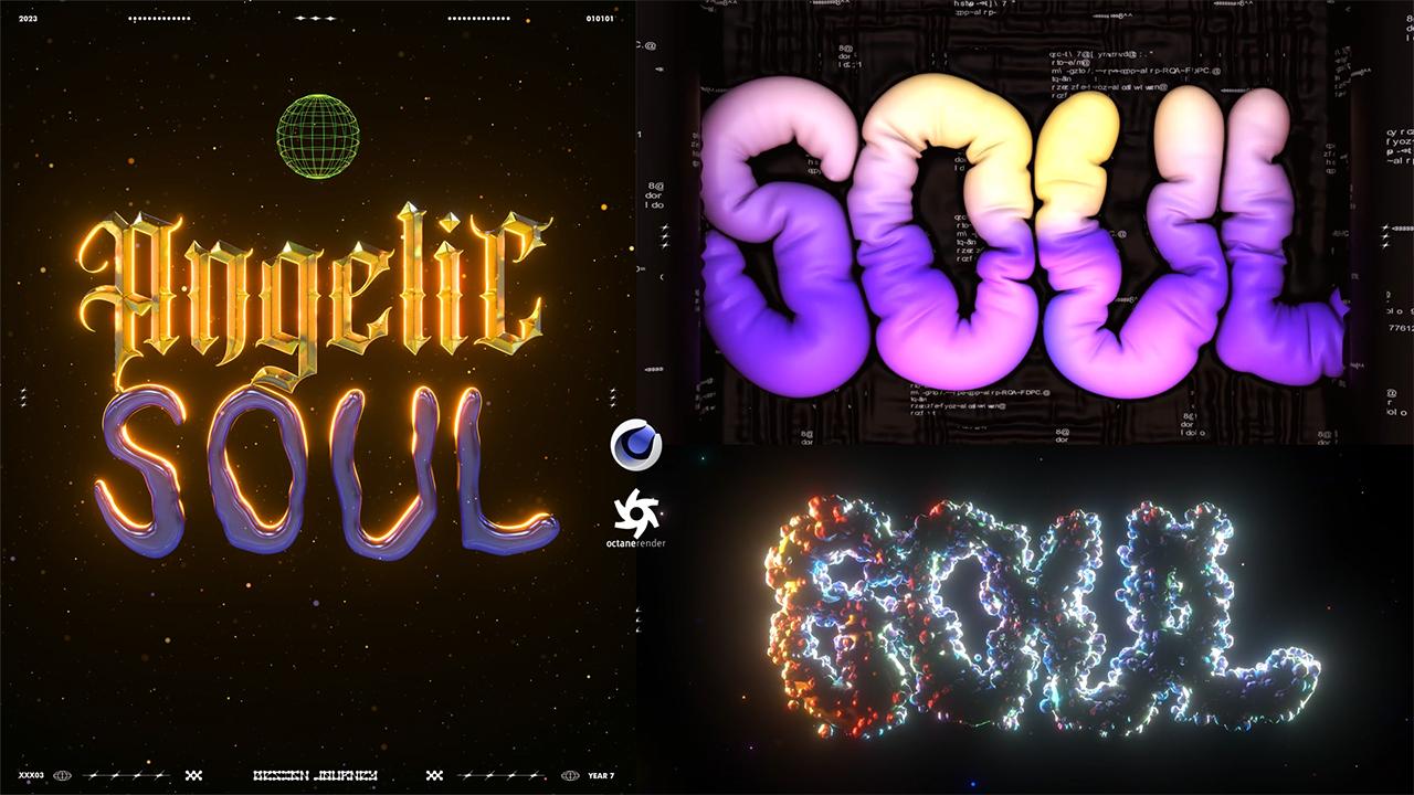
1. INTRO - Chromatic Balloon 3D Type in Cinema4D: Hello everyone, My name is Clarence and in this course
I will teach you how to create this balloon chromatic
three D text in cinema for D. I've been exploring this kind of style
for a while now, as it has been
trending a lot lately. And I thought I could show
you what I've learned so you can implement it
in your own workflow. We will start in
Photoshop to prepare the text files and then
move to Cinema or D to convert it to three D. First I will show you how to create this chromatic
style where we will also work with the
octane materials, the light settings, and then continue with the
balloon effect. Here I will show
you a different way of using this technique to come up with unique variations of three D text animations. In the end, we will finalize
everything in after effects. For this course, you will need
Photoshop Cinema for 2023, and up and after Effects. The purpose of this course is to teach you creative ways of using all these techniques
so you can find a way to keep exploring
and learn more yourself.
2. 01 Showing Examples and Inspiration sources: Okay, before we get started, just wanted to show
you some examples or some sources of inspiration that you can use for
your own creations. Here are some examples of what I've worked so far
using this balloon effect. For example, here, I've combined the balloon effect
also with this frame. And it pushes the text inside. And I put this text, I can breathe to make
more sense from it. Here I tried again the same effect but with the
chromatic background. Just try to do some
combinations here. I tried to create an
environment and also combine the balloon effect with
a static three D text. In this case, besides
the balloon effect, I've tried to add a
displacement on the texture. You can see that
it's not flat here. I converted chromatic
shape to a balloon effect. What I'm trying to
say is that there are different ways of
using this effect. And just wanted to show
you some examples. For example here, apply it to
a three D head, the effect. This is the result Also I've
found Instagram profile, some artists that have been experimenting with the
effect and that I'll share it with you so you can get
inspired from it first. There is this guy, I don't know how to
pronounce his name, but yeah, you can go through all these and take
inspiration from them. This other profile, you can
see all these experiments. I really like the graphics
that are created behind the, the three D text. You can see these for
inspirations as well. Of course, you can
also use Pinterest. You can just search balloon
three D texts or things like that and there are a lot of
results that you can find. I just wanted to show
you this because for me, whenever I want to
start something new, I always do some research and
see what other people do, see how they use these effects. I can combine everything
I know with what I see. This is why I wanted
to show it to you.
3. 02 Finding Fonts: Okay, so before we
start in Photoshop, I wanted to show you some funds that you can download
for that you can go to this website to download free funds for the
balloon effect. I guess you can go
with this category, fancy cartoon right here. And you can download
any of these. I'm going to download
a few as well, just to test it. Of course, if you will
use screen tablet, you can use the font and
then draw on top of it, just so you can have
it as a reference for the chromatic type text. You can go with this
Gothic category and see what you like. For example, I can
download this one, make sure that they
have the sharp edges because the three D effect will look better on these shapes. Okay, I'm downloading
this one as well. You can explore and
see what you'd like. You can also go
to other websites to download these funds. But just have in mind that
for the balloon effect, of course you need something
around for the other effect. Go with this look
with the sharp edges. Okay, now let's
move to Photoshop.
4. 03 Create and Export your Text: Okay, I just
installed the fonts, and now I'm creating a new
document in Photoshop. Now I'll just type two words
using two different fonts. So I can start with the one
for the chromatic text, and I'll go with this one. Let's increase the size. Okay, I just made the
first and the last one bigger just to create
more symmetry. Now I will use another font
for the balloon effect. Okay, now that you
have the text, the next thing that
you can do is to export this as an AI path. But before we do that, I want to create something
using my screen tablet. Just having this as a reference, I'll create a new
layer and now I'll use my screen tablet. Okay. As you noticed, I made the text thinner than the
example that we have. Because have in mind that in this text we will
apply the balloon effect. It will get bigger. It's good to start with
something thinner. Yeah, I'll create
a new layer Now, go to the paint bucket tool. Make sure to select this all
layer because we want to fill the space inside the text. If we do this now, it won't affect
the space inside. So we need to check this and make sure you are
on a new layer. Yeah, let's do this now. We can uncheck the layer below. Let's make a copy of this
because you can also, it go to filter
and go to Liquefy. You can use any of these tools. Let's increase the size. Yeah, I'm just showing you some effects that you can
use to edit your text. But of course that's
all up to you, what you'd like to use. I just want to show
you the tools. Okay. Now it doesn't
look really nice, but have in mind that we will
apply the balloon effects. Now I'm going to
show you how you can export these as an AI path. Let's make this figure. We need to select the text. For that you hold Control key
and click on the text here. Now it will be selected. Now go to Paths, go to
this icon right here. Work path from selection. And now we have the path, we go to File Export Path to
Illustrator. And save this. Okay, now let's undo. And I'm going to
do the same thing for the other text here. I'm going to select this, go to make work path from Selection file Export
path to Illustrator. And save this as well. Okay, now let's just
save this document and we will move
to cinema for D.
5. 04 Text to 3D Object: Okay, now we are in
cinema for D. And let's open the AI path that
we just created. Okay, I'm going to
position it in the center, so I'm going to make these zero. Now we can see that each
letter has its certain path. If we can start, yeah, it starts on path
one because there are some glitches that happen. For example, this doesn't represent any path,
is just one point. I can delete this. Same
for these other ones. Okay, These are all the letters. Instead of having
them separately, I can select them all and
connect objects plus delete. Now we just have one path now to convert this
to a three D object, we just need to go to
this extrude effect and we can hold old key. The path is below the
extrude effect and you can see that it is converted
to a three D object. What we can do is go to
object and here you can adjust the offset so
you can see the depth. Okay, I'm going to make
this three for now, and then we can adjust it later. Now the important thing
is to go to caps. We just need to adjust this
size on the both levels. As you can see, immediately
you get this effect, extrude effect that, as I said, looks nicer on fonts that
have these sharp edges. To make this more round, you can change these
segments right here. You can see if you decrease it, it is sharper and
if you increase it, we get more round shape.
That's up to you. The two main settings are
the size and the segments. Then of course, you can also play around with a
curve right here. So you can select this
and change it and see how the text is affected by it. That all depends on the
kind of look that you like. Usually, as I said, I just
change these two settings, the size and the segments. Okay, now I'm going to
convert this to an object. Let's make a copy
control and hold check. I'm going to keep
this just in case. Now select the whole thing, right click, connect
objects plus delete. I'm going to delete
these as well. Now if we see the polygons, we can see that they
are not regular. To fix that, we use the Volume Builder
and volume measure hold old key and go
to volume builder, make sure to decrease
the voxel size. I think 0.1 will be better. But first of all, let's apply also the volume
measure by holding old key. It is applied on top of it. As you can see this does the remash of the three
D object that we have. But first of all
we need to go to volume builder and
there we decrease this. The more details we get, longer it takes to calculate. Okay, As you can see with 0.1 and the volume measure here, 50% it works. Okay? I'll leave it like that now. I'm just going to add re
measure to make it more smooth. I'm going to make
the measured density 50% I'm going to select the whole thing and go to
this current state to object. As you can see, it
creates a new object. I'm going to group this by
holding olden G. I'm going to disselected so we can
have just one object. Now if we go to polygons, yeah, we can see that we
have regular polygons. Of course, you can also use this other one as an object if you want more
of these sharp edges. It's up to you personally.
I like this one. It seems more organic to me. I just wanted to show
you these options. It's how do you want your
three texts to look like?
6. 05 Chromatic Type Light and Materials: Now I'm going to work with
the lights and the materials. I'm going to open
octane light viewer. I'm going to create
an octane camera making the focal length 80. Now let's just
adjust the position. I'm going to make sure
that it is in the center. Same for the text.
I'm going to axis. Okay, Now I'm
creating a key frame. I'm going to create
an environment and as you can see
now it's all black. Of course, there are different ways of
creating the light. You can also just use an area
light that's adjust this. I'm going to put it from behind so it creates
a rim light. I'm going to make the
light itself invisible. For the material, I'm just going to create a metallic material. So let's increase
the metallic here. And now I'm going to increase
the roughness as well. The next thing that
I'm going to do is apply an octane sky. Let's check the light for now. There is this environment that I usually use for this works, that I like because it
creates the reflections on the text can see better. Then what I can do is
change that orientation of the environment so we get different reflections
on the text. If you want to render
it as an image, of course you can just pick one position that you
like and do the render. You can also work
with the power here. If you want to do an
animation like I will do, I will animate the Y X. First of all, let's
make this longer. I'm going to create a key frame in the beginning,
Now go to the end. Okay? Actually even
from the start, I'm going to go on
the other side. Just so we can create a loop. I'm going to make the
animation linear. Now if I click play, you can see the reflections that happen
on the metallic material. Depending on how you
adjust the roughness, you can see how sharp the
reflections look like. Again, this is something else that you can change based
on what you like more. Now, I can also apply the light behind it and I'm
going to decrease the power. I'm going to apply a
black background behind, just so I can see better
how it will look like. Let's make a copy of this one. I'm going to make this
a diffuse material now. Actually I need to
change this one. Let's make this diffuse. And I'm just going
to make it black. Okay, let's apply
it on the plane. Now we can see better
how this looks like. Of course, you can make post
production on octane camera, you can increase
the bloom power, make some adjustments here. If you want more light, you can just go to the
octane light and increase it here. Again, it's up to you. You can decrease the
temperature to make this in another color. Something else that
you can do is also play around with
this film layer. You can decrease it
here and increase the float and you can get these colorful reflections. Okay, I like this one. You can also apply a
color on the texture. Also, I make some adjustments
on the camera imager. I enable this and I can
adjust the exposure, usually I these different
color variations and see what I like
more, saturate to white. Hopefully, I'm not giving too
much information at once. But what I'm trying
to say is that there are different ways of editing the lights and
the color of the text, basically by changing
the material, by changing the HDRI, by changing the octane
sky, by animating it, by working with
different area lights, and also with the adjustments
on the octane camera. I think I like this look, so I'm going to
leave it like this. Yeah, Now I'm going
to save this as a project and move to the other project with
a balloon effect.
7. 06 Balloon Simulation: Okay, now let's continue with the other pact with
the balloon effect. So the first few steps are the same as the previous
workflow that I showed you. Let's start by opening the
AI pad that we created. Okay, I'm going to
do the same steps and then continue with the rest. Okay, now that we have the
text as a three D object, the next step is
to inflate this. For that we go to
the polygon object, right click, and we go
to simulation text, And we just click
on this balloon. Now we can click plate
to see what happens. You guys see that it falls because we need to
adjust the gravity. For that we click Control D, we go Simulation, Go to scene
and make the gravity zero. Now let's click play again. You can see that nothing
happens because we need to go to this balloon effect. Go to balloon, then we need
to increase the pressure. The more we increase it, the bigger the text will get. Let's try three.
The expansion time is when the inflation happens. Let's click Play. Now as you can see, the text inflates. Let's try five. Basically, with this
kind of effects, you just test different numbers and you see how it
affects your text. And then you decide
what looks better. I really like how
the is animated. Maybe I can try this to four. I'm going to increase
also the length here. Now, there are a few settings that you can, you can change. If you go to surface and you
want to see more wrinkles, you can increase the bendiness. Let's try this. Ten for example. Okay, let's increase this more. You need to change
the bendiness. Also the target length. Help? Yeah, as you can see in the beginning,
there are some wrinkles. I'm going to test different
numbers and see what I like more just changing the bendiness
and the target length. Okay, I think I'm going
with these numbers now. There are also some
other adjustments that you can do by clicking control D and going again
to the simulation here. You can adjust the collision. You can also decrease sub steps. The whole thing that
I'm trying to do is to get more wrinkles. This is why I'm doing this. Okay. Just trying to make the
wrinkles more smooth. But yeah. Again, this also depends
on the text that you have. Okay. Now I'm going to show you another adjustment that you can change so you can
have more control over your simulation. Basically, you can go
to this mix animation. If you don't want
your text to go like hold over the place, you can click on
this with force, you can see that it
will stay more static. Yeah, as you can see, it stays in place somehow, actually, because you just
check the force here. The more you increase it,
the more static it stays. So let's test it to 0.5 okay? Maybe 0.2 Again, that's up to you, but I think this is a really nice tool to have more control
over your text. I think I'm going
to leave it like that to simplify all of these
numbers a little bit more. Basically, you just apply
the balloon effect. Click control D to make sure
that the gravity is zero. Then on the balloon effect, you decide about
the pressure and the expansion time based on the inflation that you want to have and the time that
you want it to happen. Then to add wrinkles, you go to the surface and work with the bandiness
and the target length to make it more smooth. You go again to the
simulation tag, to the simulation to
adjust the collision, the sub steps and the damping. Then to make sure that the three D text
stays more in place, is more static, you just check this with force under the mix animation and
adjust the strength.
8. 07 Inside a Balloon: Now the next step to finalize
this one would be to work with the lights and
with the camera. Like we did on the
previous projects, you can also apply this
subdivision surface Yeah. To make the wrinkles
look better. But before we do that, I want to show you
something extra. I want to show you how you can mix two objects with the
balloon effects like I did. In this case, basically what
I did is created two cubes. Let's increase the
segments here. First of all, I'm also
going to adjust size. I'm going to make
a copy of this, Decrease the size a little bit because I want to
create frame for that. You need to apply this
effect right here. Bull, I don't know
how to pronounce it, but yeah, just drag the two
cubes and put them below it. How it happens is one cube
extrudes the other one. In this case, we want
the opposite to happen. We just change sides. Yeah, here we have it. Now what I can do is just make
some adjustments. Okay, now that we have this, we can make a copy of
it just in case we want this for any changes,
we can keep this. I'm going to do the
same step as I did with the text by using the volume
builder and remeasure. Okay. Now that I
have this frame, I'm just going to reposition it. Okay. Now that I did
all the positioning of the frame, the camera, and the text itself,
what I'm going to do is just apply the balloon
effect on the frame itself. Again, simulation te balloon here. The only thing that you
need to keep in mind is to check this with force
under the mix animation, because we want this
to be more static. The rest is basically just adjusting the same settings
as we did with the text. Let's click Play. As you can see because we haven't
checked the force option here. The balloon effect is too
dynamic on the frame. Of course, if you
like this effect, you can apply it,
It's up to you. But for me, I think
it's better if we have this more static Also, I'll try to create some
wrinkles again here. Okay, I like these
kind of settings. So at this point I'm just going to maybe animate the
camera a little bit. So I'm just going to zoom in, make sure it's linear. Now, the next step is just to work with the texture
and the lightings.
9. 08 Balloon Octane Materials: Now first of all,
I'm going to apply the subdivision
surface on both of them just so you can see how the
final look will be. But of course, while
you are working on it, you can uncheck it
because it may slow down your work process
with the materials. I'm just going to create really simple
materials. Actually. Again, for the frame itself, I'm just going to
make something dark. Going to increase the roughness. I think I can apply it and
then decide what looks better. I think I can decrease
the metallic look, make this all black
for the environment. You can add an octane
daylight here. You can play around
with the power itself, with the sky color, for example. You can go with something more. Also, you can animate the light again by using the
rotation tool. Okay, I would animate
it just from this axis. Now I'm going to make a
copy of this and just pick a color for the text. I can try to use a gradient. In this case, again, I'm creating really simple
materials because I want to focus more to be
on the effects rather than the materials
and things like that. Because, yeah, these
are things that you can play around with yourself. So just choosing some colors that I think would work
well in this case. Okay, What I don't like about this frame is that
it is too dark, so maybe I can just add some. I'll go to image texture. I have some PNG
Hacker type text. So okay, I need to change also
the projection to box. Okay. Yeah, now I
think it looks better. I can also work with
the UV transform, so I can scale this down. Okay. And also I can
decrease the power. Yeah, now I think
it looks better. Now I can apply the
subdivision surface. I can also make again, some color adjustments
on the octane camera. Yeah, now this is also
ready to render as well.
10. 09 Octane Scatter: Okay. So before we
render everything, I just want to show you
another tip of how you can use this effect to
create something creative. I'm going to delete
the frame now. Yeah, I just want to
have the text itself. Basically what I want to show
you is the octane scatter. What it does, it
distributes objects to a certain object that
you decide to use. In this case, we are going
to use the text itself. If we go to octane scatter,
go to distribution, change the type to surface
under the surface, just apply the text
or the object itself. As you can see, it creates
these spheres around it to show you that you
can put any object there. Let's check this for now. Here is a part that
you can get creative. Under the octane scatter, you can apply any
objects that you like. Of course if you have forester, you can apply flowers, grass, and create
something nice with it. But in this case I'm just going to use any random
geometric object. For example, I can
create a sphere. I can displace it a
little bit by holding shift go to the shading and
let's apply on Noise here. I'm going to make the
global size maybe 600. Okay, I just want
to make this random here on the objects, I can increase the strength or the height to make this random. Now let's convert
this to one object. I'm going to decrease the size. Now I can put this below
the octane scatter. As you can see, we get
this bubbly shape. Of course, under
the octane scatter, we can do some adjustments. For example, we can have
less of those objects and we get this look. We can increase the count. Also change the scale here
of the object itself. For example, we can go
with 0.3 on each of them. I can increase the
count a little bit to make these more random. You can also apply some factors, for example this
random effector. And make sure to apply it under the effectors
on octane scatter. We need to go to
parameter and check this position because this is what caused this
kind of explosion. Yeah. Okay, so basically you
can change the position, the rotation, and the scale. I'm just going to put some random numbers
and make sure to check this uniform scale and the
absolute scale as well. Okay, I just wanted to put some random numbers on the position and on the rotation
to make it more random. You can also apply shader. Again, make sure it is under the effectors here
on the shader. What you can do is
basically just apply, for example, a noise here. Based on the noise, you can see that it will effect on the distribution
of the object, increase the contrast,
and increase the scale. You can see the effects that it has on the distribution
of the text. You can also animate this
animation speed and period. Let's click Play. And you can see how
the objects are animated as well based on the animation that
happens on the shader. You can also increase
the count here. Okay, now I'm just
going to create another material for
these random shapes. Maybe I can keep
the gradient effect but with some other colors. Okay, I did a lot of
color adjustments, material editing,
because I really wasn't satisfied with
any of the combinations. But I'll go with this one. I think this one looks nice
even when it is animated. I think now I'm just
going to work with the renders and then
move to after effects. First of all, you can
go to octane settings. Something that you
can do is change that direct lighting
to path tracing. And yeah, you can see this
made a huge difference. I don't know why it didn't
change since the beginning. I thought it was a check, but sometimes it makes a
difference, sometimes not. Basically, it affects
the specular depth and the scattered depth
showing how much light affects the object based on the material and the
environment that you have. In this case, I think this looks better just adjusting
the samples. If you want to have a
transparent background, you can check this
alpha channel. Then in this case,
you would have to uncheck the plane. You would
get something like this. Now, go to Render
settings here again, I go with the same
ratio for five. Make sure to check
all frames to save. Again, if you want
to have it as a PNG, just check this alpha channel. Go to PNG and just pick a folder where you
want to save it. I'm going to do this with all three renders and then move to after effects to
finalize everything.
11. 10 Finalize in After Effects: Okay, I just rendered
the first animation, now I'm rendering this one. While these ones are rendering, I thought I would move to after effects to
finalize this one, as the process will be similar for the
other ones as well. Let's open After Effects. Under the project sections, I'm just going to double click
to open the PNG sequence. I just have to click
on the first frame. Make sure to check
the PNG sequence. Click Import and just drag
it to the new composition. Now we have the timeline. Yeah, this is the animation that we have In after effects, what I do is just really
simple color adjustments. For example, I
increase the contrast, the brightness depending on how your animation looks like, but I'll just do minor changes. Also with the color balance, you can do some
adjustments here. It's not that I have a formula, I just change these and
see how it reacts on the image and then
decide what I like more. Not any big adjustments
because also in Semper D, on the octane pulse
production section, also we have the
hue, lightness and saturation that you can change. But in this case, I don't
want to animate it, but in case you
want to animate it, for example, click on the
hue to create a key frame. Make sure you are
on the first frame. Go to the last one and let's
make this a full rotation. Yeah, you would get
this color animation. In this case. Something
else that I will add is grid that I
created in Photoshop. It is this frame just
going to adjust it? Yeah, I just put, I
don't know, numbers, these dots, these shapes
on the side here. I type design journey just
to have it more as a post. That's the only change
that I want to do. I'm going to test something else but I don't think it will work if I apply the
CC star burst here. Yeah, I can increase
the scatter. Let's make this to screen mode. Decrease the speed.
Decrease the opacity. Yeah, I don't know.
It's up to you. Okay, I think I'm going
to keep it like this just to make it more dynamic. Now, once the
animation is ready, you just go to
file export add to Adobe Media encoder Q K. Make sure the format is 26. We can have this as an video. Select the folder, and here I'm just going to
adjust the target bitrate. The estimated file
size is 17 megabytes. Usually on the target bitrate, I go with ten. The less the estimated file
size is, the better it is. Because in this case, Instagram
doesn't compress it more. In case you will use
this for social media, let's just check this as well. Click Okay. Now I
will just render. Yeah, this is what I
do in after effects. Even for the other ones, I'll go with the same things. Just adjusting the colors, maybe adding the frame. I hope you found this helpful. As always, my idea
for the courses is to try and show you the
techniques that I use, show you how you can use
them in a creative way. And of course, leaving
you the space to experiment with your own things and see what looks
better to use. As I didn't want to focus too much on the technical aspects. But of course, for any
questions just let me know. I'll make sure to answer. You can reach out
in social media or whatever you feel
more comfortable. Okay, thank you so much and I'll see you on
the other courses.
 Klarens Malluta, Visual Artist