Transcripts
1. Welcome and Introduction: Hi, everyone. I'm so excited to welcome you to this cozy
and creative class, chill and ink chilling
monkeys in winter waters. This class has
this five project, each one featuring expressive, playful monkeys,
snowy landscape, rippling water patterns, and
whimsical winter details. This project are
designed to be fun, relaxing, and highly creative. We will start our project
with very simple ones, and as we progress,
we'll be adding more elements and adding
more details to it. And this will be our
last project with lots of element,
hot spring heaven. Hi, I'm Michal, an
artist from India who teaches watercolor
ink illustration and oil pastel classes. This is my Skillshare profile, and these are some
of the classes that I teach on the Skillshare, oil pistils and watercolor. You can also find more of my art on YouTube and Instagram. We will begin the
class with tasting supplies in which we'll be
tasting the different kind of paints and the brushes
we have and kind of lines that we can create a
bit of basic techniques, hatching, cross searching,
stippling, then very simple, different kind of eyes in
the noses that you can create and sketches for few
of the additional elements. And then we will proceed
to the coloring, different colours
that we'll be using different techniques like wet and white technique, blending, a little bit of different technique in which
you can create fur and hairy texture
and few other elements that you can directly
create using the bras. And lastly, how you can create
gradient with the blacks, and then we will
move on to sketching out the different
kind of monkeys. I'll be doing one with only
the fine linen and other only using the
watercolor brusses and using the watercolors. And then we have
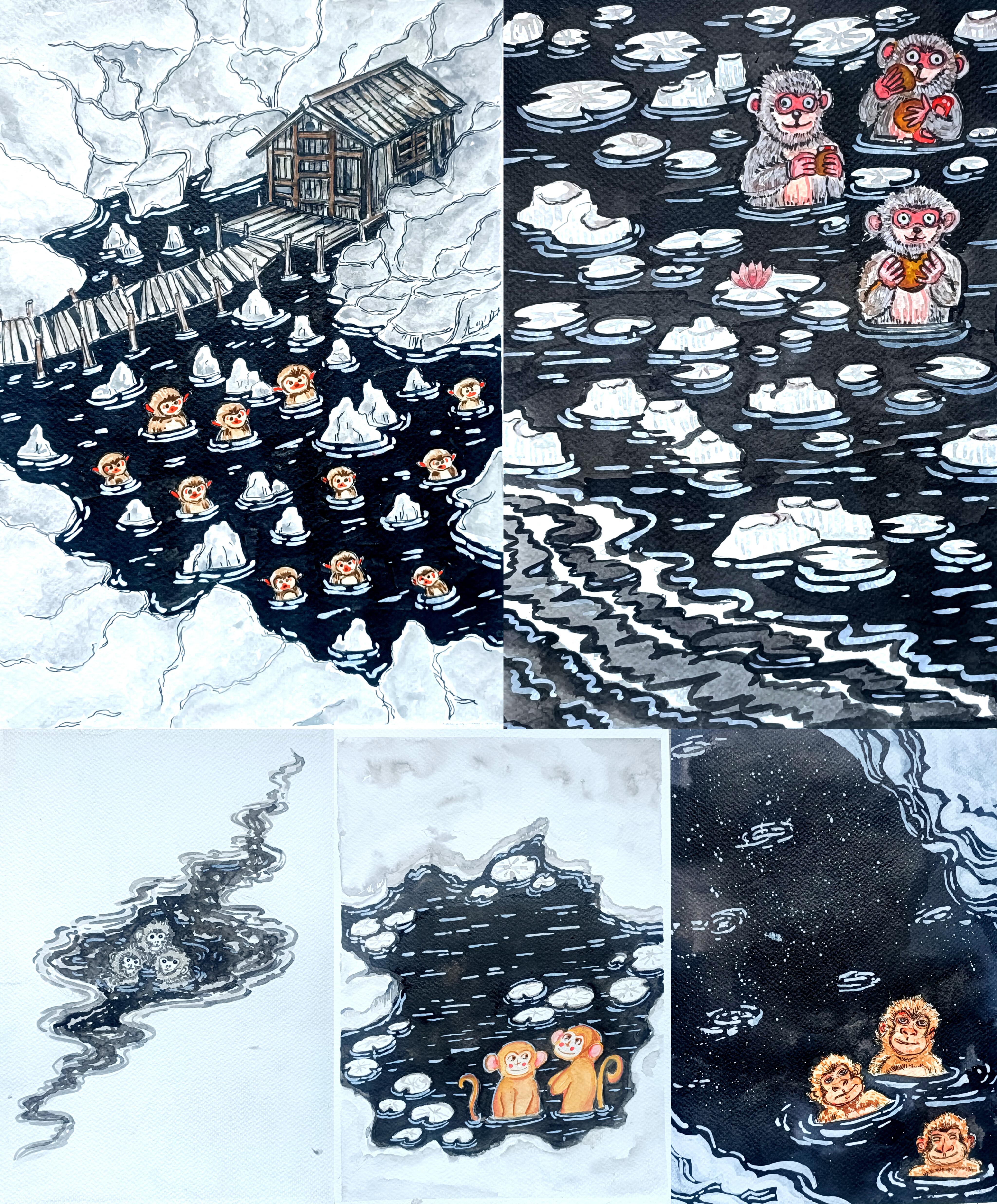
the f project here I'm sewing starting
from the last one, hot spring heaven,
floating treats, drifting calm in the quiet current winter spring
and gentle company, and the first one chilling
in serpentine waters. In this class, I'll
guide you through how to create clean ink illustration
using fine liners, different ways to draw
monkey characters, cute, expressive fluffy
and stylized monkeys, how to add movement and depth
to water using ink strokes, how to use watercolor
to build sados, highlight and fluffy texture, and layering technique to bring you icy landscapes to life. Once we are comfortable
with the basis, we will dive into the
full class project, each focusing on
different composition. This class is perfect
for beginners and intermediate artists. All lessons are
easy to follow and most demonstrations are
shown in real time, so you can paint
right along with me. I'm so happy you are here. Let's jump in and start creating this cousi winter monkeys
illustrations together. I'll see you in the next
video with a class project.
2. Class project: For this class, you
will be creating your own ink and watercolor
chilling monkeys in winter water illustrations, inspired by the five paintings we are going to
explore in this class. You can recreate any one of the paintings or try all five, whatever you enjoy the most. Once you finish, please upload your artwork in the project
and resources section. You can share your final
painting, your pencil sketches, your ink outlines, and colored taste or practice seats
that you have done, progress photos if you like. I love seeing how you interpret
the lessons differently. So don't hesitate to see
even if you are a beginner. You can also leave a
review of the class and share your thoughts,
suggestions or feedback. This really helps me to improve future classes and bring
more fun lessons to you. Feel free to ask me anything
in the discussion section, and I'll be happy to guide or
help you with your artwork. I can't wait to see
your chilling monkeys. See you in the next video.
3. Supplies: For this class, you will
need basic supplies, pencil, erasure, masking tip to
secure the people, watercolor paper, here, alum using 300 GSM watercolor paper. You can use any other
watercolor paper of 300 GSM, watercolors, I'm using camelin artists
watercolor paints, I'll be using fine liners, gel paints and normal
ballpoint paints. You can use whatever paints
you have apart from this. If you have additional
paints or white paints, you can use two to
add the highlights. Like here, I have
Zikuratakis white paint, and here's Zikuratakis
paint with gray seeds. Ink. I'll be using both
white and black ink. I have got this ikura takes Sumi black ink
and this white ink. I'll be using white to add the highlights and create
ripples and weaves on the water and black ink for the rest of
the water bodies. And apart from this, you
can also use gauze if you have instead of the watercolor
to do multiple layerings. So these are the basic supplies that you need for this class. I'll see you in the next video.
4. Basics fineliners and brush pens: Welcome to the first section. Here we'll be tasting
the supplies, the different kinds of paints you have, and the
other supplies, the breast paints and
the watercolor brushes, creating different kind
of thick and thin lines. Then we will move on to creating various kind of lines
like broken lines, small hatching lines, a bit of combination of both hatching
and crosshatching lines. After that, we'll be doing
some basic techniques, hatching, crosshatching,
stippling, and scribbling. Let's start with tasting
our supplies here. First time using this
gel pin that I have. I can create both lines thin and thick lines
for the thick lines, I'll have to just do two or three layers of
the pain to do it. And then let's use
the second one. Here we have got
different varieties of sakura micron pin. Mostly, I'll be using
the sakura micron to do the outlining and create
different techniques. Apart from that, I'll also be using a little bit of brass pins with the sakura micron pain depending upon the
thickness of the knee. You can create different
varieties of the lines here. I have got the Zikurataki
mangaka pin with this, I can create very thin lines. I'll be using it at
thin and fine details. Here, I got this red
colored gel pen. For some of the
project, I'll be using a little bit of red.
I can use that. Now let's try out
some bras pain. Here, I got this
Bristo breast pain. With this, I can create
both thick and thin lines. Here, the quality
is not that great, so I'll be using it to create this kind of rougher
lines if required. If you don't tap, you can
only use the water calibrs, you can create any kind
of lines with that. Here I have got another
breast pain with Zikorotaki. With this two, I can
create varieties of the line. I
won't be using it. Mostly, I'll be using this
Zikurataki breast pain to do the final outlining. And with this, as you can see, I can create varieties
of the line, both very thin and thick lines. And I'll also be
using this to do the outlining for
the smaller areas. Here's another Ziurataki pain. This has called greased. I'll be using it for the
grease monkeys, if required. Otherwise, I'll mostly using
the watercolors to do it. Now let's try with the
watercolor brushes. Here I have got the small
and medium sized brushes that I'll mostly using. With this, just by wearing
the preser and the angle, you can create
varieties of the line. For colouring the monkeys, I'll mostly using the smaller
and medium sized one, and to feel larger areas, I'll be using a bit larger size of the watercolor brushes. Earlier, I used the watercolor
to create the lines. And this time here, I'm using Sumi waterproof ink since we won't be doing
much detail work. So any thin or medium size of the watercolor brush
will do the work. You can clearly see
the difference. The intensity of both the
color are quite different. Now, let's create some lines. Fine lines. Here I'm
using gel pen to do this. For some of the sections,
I'll be creating this kind of broken lines
to do the outlining, as well as to create fur like textures and create a bit of fluffier texture for the for some of the smaller
sections of the monkeys. And this kind of outline, as you can see for
most of the monkeys, I use both broken lines and a little bit of this kind of line that I'm going to show you, small tiny lines,
a little bit of hatching to create
the line appearance. You can also vary the seed
in the sizes of the lines. Here, if you increase the sizes, you can create a bit
of hairy texture for the outline section. And for small hairy texture, you can create this
kind of small lines. Let's do one more example. This is a bit larger and all the lines are connected
to each other. These are some of the lines that I'll be using to
doing the outlines. Moving to some of
the techniques, I won't be using that much, but if you want, you
can do a little bit of it to create a bit
more detailings to it. Here we have got the hatching. Hatching is a technique
where we draw parallel lines close together
to create texture or value. The closer the lines, the
darker the area looks. Then we have this
cross hatching. It uses overlving sets of the hatching lines that cross
each other like an axe. This creates deeper shadows
and richer texture. Moving on, we have
this stippling, a technique where you create seeding and texture
using small dots, more dots more dots
lead to darker areas. Few dots leads to lighter areas. And lastly, we have
got scribbling. Scribbling is a loose
technique using random overlapping
messing lines to create texture for
rough surfaces. I'll be using a little bit of this hatching to
create a bit of sding. So as you can see, just by wearing the number of the lines, I can create different
kind of seeding for the area and the regions where I want to make it
a bit more darter, I'll be adding more lines. You can do the same with
this other technique, the stippling and
the scribbling. So adding more dots in case of the stippling and
for the scribbling, I'll be adding more
rough lines for the regions where I want to
make it a bit more darker. Adding more dots for
this stripling to make this side a little
bit more darker. Let's do the same
for the scribbling, adding more lines
on the left side to make it a bit more darker. So using the
different techniques, the hatching, crosshatching, stripling and scribbling
to create a bit of siding, I won't be using this a lot, but for some of the cases, I'll be using a little bit of hatching lines to
create a bit of siding. Now, let's do the outlining
for some of the simple eyes. Here I'll be showing you six or seven different kind of eyes. First, we have got
very simple eyes, two small circles like this. Here we have got the
second set of the eyes, a bit larger oval
seeps for the eyes. Let's create a bit
more detailed one. Same fine, circular seeps
and inside of this eyes, I'll be adding the
pupils and the iris, a little bit of white
spies for the highlights. A few lines that encircle the whole sp to create a bit
more weary and tired look. Now moving on to creating more
defined and detailed eyes. Here we have got
humanoid like eyes. For one of the project,
I'll be creating this, but for most of them,
I'll be creating the cartoonist and
funny looking eyes. Let's aerate the
feature of the eyes a little bit to create
this kind of bolder and enlarged eye here and using a bit of broken
lines to do the outlining, and a few more lines
for the upper and the lower section to make
it a bit more bolder. Let's do the sixth one. So we have got this mask like eye. I'll be using this for
the third project. Inside this region, I'll
be adding the eyes. You can create or add
any kind of eyes. Here I decided to add
the human like eyes for this Adding few lines in the middle second to resemble the presence
of the nose. And now let's do the nose. Here, I'll be showing you
four or five examples where simple noses starting
with two simple dots. So two simple dots to
create very easy noses. I'll be using this
for the small monkeys to create this kind of nose, and I forgot to add
this kind of eyes, so I'll be using this for our second project, simple eyes. Now let's create a bit
more detailed nose. Triangular C for the nose, two nostrils, and a little bit more
detailing for the mouth. This is one of the detailed kind of the nose that I'll be using. And now let's create one more. This is the kind of nose that I'll be using for
our fourth project. Apart from this, I'll
also be creating a much simpler version of
the nose in the S of cross. A, with these, we are
done with the nose. So let's create the leaves, the lots and the
lily leaves present. I'll be using the watercolor
to do the outlining, but in here, I'm just
creating this whole like see. I'll be dividing into
different sections. And to add a little bit of more characteristic
to the leaves, I'll be sewing some section of the leaf are missing
like this in here. A triangular portion of the
leaves is missing like this. To add more characteristic
and more details to the leaf floating
on the water. If you want, you can also create the simpler version
of the lotus. For only one of the project, I'll be adding the lotus
and only a single one. If you want, you can add lotus. You can also add
small lotus birds. So these are some
of the elements that I'll be adding
on top of the water, the leaves and the lotus. Then we have got
some kind of rocks. And here we have got
some different kind of the rocks that
I'll be creating. For our project, I'll be using both fine liners and the
watercolor to do the coloring. But in here, I'm
just showing you how you can create using
only the fine liner. Using a little bit
of sading technique, using the hatching lines to add more details for some
of the regions of this. So a little bit of sading. You can also try cross hatching stippling to make it a bit
more detailed and more darker. You can also vary
the thickness of the lines to add more
characteristics to this. Then here we have got
another kind of the rocks. This are a bit larger
one bit longer ones, and it same kind of lines, a bit of hatching lines. You can also vary the
thickness of the lines to add more characteristics
to those rocks. Instead of keeping all the lines of same length here,
as you can see, I'm wearing the length, a little bit of siding
and a bit of hatching. And for our last project, I'll be creating this kind of planks. For the hot spring heaven, I'll be using this kind of wooden planks to add the bridge, as well as for some of the
upper section of the house. Also, I'll be creating
this kind of pools for some of the submerged
section in the water. Let's do a few more examples
of the wooden planks. Where a simple outline
section and a few lines, a bit of broken lines to admit more details to
the wooden planks. These are some of the
additional elements that we'll be using
in our project. Apart from this, you are
more than welcome to add more elements
as you see fit. And with these, we are done
with the first section. I'll see you in the next one.
5. Watercolors: Welcome to the second section. Let's continue
where we left off. Here I'll be using the
watercolors and sewing different techniques
and different ways, I'll be using it. Let's start with the
simple definitions hue. So here we have got
this ocher hue. Hu refers to the pure color
itself without any mixing. For our project, I'll
be using ocher yellow, a little bit of red and green. Apart from that, I'll also
be using black and white. Now, next we have got tint. So tint refers to a lighter what's another color made
by adding more water. Earlier, I used a bit
concentrated form of the char to create
the first circle. In here, I'm just diluting it by adding a little
bit of more water. Primarily, I'll be using a bit diluted form of the
color to create the layering. I'll be starting with
a lighter color. And as we progress,
I'll be adding a bit more darker
colors and a bit concentrated one to
add more details. Then here we have got seed. Seed refers to a darker
version of that color made by adding black or
darker pigmentation. Here I used a little
bit of darker color, a bit of black to
create this seed, a darker straight of
this ocher color. Mostly to create
a bit darker sed, I'll be using the same color but a bit more concentrated color or a bit darker
tone of that one. Like for this occur one, I'll be using a bit
brownish color orbit of burned sienna to make it
a bit more darker inside. So this time here
I'm using burned Siena to make it a bit
more darker inside. Since the colors are wd, it will blend smoothly. I'm just spreading it to make this process
a bit more smooth. Et's talk about the value. Value refers to how light
or the dark color appears. So here I use the yellow
color and its value is a bit dark since I used a bit
concentrated yellow color. Here we have got light
value of the yellow. Here I diluted it
with lot of water, and so we have got
the different values. I'll be starting with the lighter values
for the coloring, and then we will move on to bit darker. Here I made a mistake. At a bit of color
was platted in here. And if this happens with you, you can use a bit more water to spread it and then use
Tissu paper to soak it up. I'm adding more waters
and spreading it. Since the color was
a bit more diluted, it has not that
much pigmentation, so I can easily remove
it most of the color. Going in with the tissue
paper to soak the color. As you can see, most of the
colors has been soaked up. A little bit of the
color is still visible, but most of them has tried. Most of them has been soaked
up either tissue paper. So if you make
mistake like this, you can use the tissue paper
or the cloth to remove it. Next, we have got a referred to smoothly of the watercolor
covering a large area. For our project, as I mentioned, I'll be starting with
the lighter scenes. In here, I was not
able to record it, but as you can see,
I'll be explaining it. Here I created three
different kind of the vases. So the first one is flat vas, one even consistent color
over the whole area. The second one integrated vas a vast that's lowly cenous
from dark to light, the upper Saxon is a
bit darker and the lower sexon as you can
see in a bit lighter. And the third one
is variegated vas a vas blending two or
more colors together. The upper region, the middle, and the lower region
a bit darker and the regions in between
them is a bit lighter. So we have got three
different kind of vases that I'll be using Now, let's talk about wet
and wet technique. Here for this one, I'm using a bit of wet and wet technique. I use a layer of water
to as primary layer, and on top of this, I'm using
this purple to spread it. In here, I don't have to start with the watercolor directly. Instead, you can start
with the water as the primary layer on top
of it, add the color, it will spread on its
own and you will get a bit lighter vs. Now, let's use the same thing
wetn wet technique. This time, instead of
using single color, I'll be using two colors. I started with the water
as the primary layer now. Here I'll be
blending two colors, using the wet and wet technique, starting with the purple,
adding the purple, a bit less pigmented
purple on the left side. As I added a little
bit more water for the wet and wet technique, I'm using this dry brush to
remove some of the water. This time, I'm using a
little bit of orange color, and now let's spread it. It will blend on its own. Mix the colors a little
bit by the brush, but it will mix on its own and create a beautiful gradient. Let's move on to blending
using wet on dry technique. Here, I used a bit
diluted form of the cher. And on top of this, I'll
be adding a little bit of burned Sian on one
side to make that side a bit darker so that region
is a bit darker and the other region where I won't be adding it
is a bit lighter. I'll be using this to do a
little bit of blending to create bit as well as to
depict light and the sados. Let's do one more example here, I'll be using a bit more
wet and wet technique. This time I did not paint
attention the brush was carrying a little
bit of the pigmentation, the ocher color. So try to avoid this
kind of silly mistakes. Here I'm using wet
and wet technique. This is our first
layer with the water. Now, on one side, I'm adding this bit
pigmented ocher. As you can see, I'm adding it in the top left side and on
the bottom right side, I'll be going with bit
darker sand. Ocher color. Here I'm using a
bit of burnt sienna and it will blend on its own. You'll have to mix the
colors a little bit. Till it dries, let's practice a little bit of fur creation. So here I'll be showing
you how I'll be adding how I'll be creating the texture and for some of the monkey. We'll be adding two or three
layers of different sets of the colour to create fur like texture and a
fluffy texture too. So I'll be showing you
four different examples. So this is going to
be our first layer. On top of this, we'll be adding a bit more darker
sites of the color. We will wait for it to dry a little bit, not
completely dry. I'll wait for it to die in such a manner that the next
layer of the colour that I'll be adding on top of it
will blend it not smoothly, but a little bit with
the first layer. Let's do a third example. Here, I'll be creating a
bit of fluffy texture. For all the three color, I've used a little bit of grayish color and on top of this since I had a little bit of
red pigmentation on the bras, so it turned out like this
a bit of reddish gray tone. Here too, I'll be doing two or three layers of the coloring. For all the three example, I'll be using different
sets of the gray to create the fluffy and here like
texture for our monkeys. For this one here, I
used a little bit of more red colour to our grade to create
this kind of coloring. In here, I'll be using red
to create fluffier texture. We'll wait for it to
dry a little bit, and then we will proceed
with the second layering. I'll be starting
with the first one, the first rectangular
C. Here I'm using a bit dilutc
consistency of the gray and creating this
kind of hatching lines. As you can see, I use less
pigmentation of the gray, and this one will be a
bit lighter in the tone. I'm using the same color
for this third example. For this one, I'll be creating a bit more texture on
the bottom left side. The top right side will be a little bit lighter
than the color, small strokes throughout
the entire region to create fluffier texture. As you can see, I have not
covered the entire sexton, created small strokes
throughout the entire region. It will blend on its
own a little bit since the first layer was
not dried completely. For this one, here I'm using
a lot of pigmentation, a bit darker side of the gray. For some of the monkeys, I'll be using this
kind of small lines, a bit of hatching lines to
create a fur like texture. Using the same color. Once
again, small strokes. Here, comparing to
the second layer, here, I'll be adding a
little bit less gray. Continue with
creating this kind of smaller strokes and overlaying it on top of the second layer. For the outlines, here I'm using a bit lighter
tone of the gray. We will wait for it to dry and then add another
layer on top of it. Now, moving back to
the first one, here, once again, I'm using a bit
lighter shade of the gray. And let's create a bit
more fluffier texture for the outline section, a bit of small strokes
with the brush to create here like
projections as the outline, very small brush strokes. On top of this,
I'll be going with a bit darker set later on. For now, let's
create the same kind of outline for this
second example. Here I'm using the red, a bit more pigmented red. Once again, doing
the same thing, creating small
strokes with this to create for texture for
the entire section. As you can see, as I'm
moving from left to right, the intensity is
decreasing a little bit since the aper has not
dried up entirely. Let's add another
layer on top of it. Small strokes for the
outlined section to create a bit more here
like projections. For our main project,
apart from the watercolor, we will also be using
the fine liners and the bras pans to add bit more texture and
more detail ins to create fluffy and to create fluffy texture for the entire
bodies of the monkeys. We will wait for it to dry,
moving on to the third one. So here I'm using, once again, bit more darker
tone of the grain, adding it primarily
on the lower section, small strokes with this, moving on to the second one, overlaying this on top of the
lighter side of the grain that we used earlier as
the outlining section, doing the same thing, creating small strokes to
create for projection. Moving on to the first one here for the lower section only, I'm adding this gray tone. I'm using this gray color. So using this to create a bit of outlined section for
the different layers of the fur for this. Here, as you can see, I'm
using small strokes and create a bit of outline section for
different layer of the fur. In this manner, we'll
be creating the fur and the fluffy texture
for our monkeys. Now let's create
additional alments that we'll be using
for our projects. So we have got leaves,
big and small ones. Here, I'm using broken
lines to do the outlining. For our main project,
we'll be using both the fine liners and the
watercolor to create this. But in here, I decided
to just only use the watercolors to
do it where a simple C. And to add more
characteristics to it, as you can see, I removed
one section of it, a small triangular section. So for some of the
leaves, we'll be doing this removing one or two
different sections of it. Here's another example,
a bit smaller one. We'll be surrounding it with the black water later
on when it dries. For now, let's create different
kinds of rock pattern, different kinds of rocks that are coming
out of the water, small strokes of the brush
to create this kind of line. The outlines would
be a bit darker tone and the remaining section, as you can see, it's
a bit lighter tone. I'm using the brush at an angle so that I can
create this kind of line. Here's another one. This time, I'm using a bit more lighter tone of the
colour to create this. So you can consider
this kind of bit on wit technique using
very lighter tone of the grid to
create first layer, and I am leaving,
and I'm leaving a little bit of a space in between different
layers of the rock. On top of this, when
it dries a little bit, I'll be going in with a bit
darker tone of the gray. So it's died a little bit. And here, I'm using a bit
darker tone of the green, and it will blend on
its own because of a little bit of the weight
from the earlier layers, creating a bit more
bolder and darker outlines for the different
section of the rock. And as I mentioned
for our main project, we'll be using both the
combination of fine liner and the watercolor to make this a little bit more detailed
and more defined. And now let's surround
it with the black water. You can use both the
watercolor and the ink. Primarily, I'll be using the ink to create
the water since it will be more uniform and will
provide more darker color. Let's do the same in here, too. You love to causes while
doing the outlining for this. For the smaller sections, I'll be using the bras beans
to do the outlining and then fill the rest
of the regions with the watercolor brushes. Here, as I mentioned, you can create a little bit of gradient. The regions the regions near the leaf can be a bit
darker or a bit lighter, and the other regions
will be of different sad. By different side, I
mean, if you are going with a darker set for the
region near the leaf, then the regions apart
from that will be of bit lighter sad and vice versa. So I'm not able to
really explain it, but you will see it in the next section of this
video where I'll be creating few leaves and create a bit of gradient in between
the different sets of the blacks and the grease. In here, I use watercolor to do the coloring for this water, but as I mentioned, I'll mostly using the
black ink to do it. Here, let me show you how
I'll be creating the ears. Here, I'm using a bit
different color combination, starting with the gray
as the primary layer. For our main projects, I'll
be using lighter sets of ocher or lighter
sets of the pink to create the reddish
orbit of pinkish ears. Adding a little bit of pinkish color for the lower region. Mm hmm. And now let's
create the outlining. So using a bit
pigmented pink colour to do the outlining
for the ears. This is just a rough example. For our main project, we'll
be making it a bit more detailed and we'll be using
other color combinations. The pink has spread a
little bit with the grey, but if you want to spread
it a little bit more, you can use water to spread it. But here's one more
example of only using single cant to
create the fluffy texture. Here I'm starting
with the lighter set of the orchard as
the primary layer. And now, I'm using
a bit darker tone, a darker set or you can say
a bit concentrated darker, creating small strokes
throughout the entire regions. And as you can see, I'm not completely overlaying on
top of the entire region. For the outline section,
I'm creating this kind of rougher versus strokes
to create for Aperion. Let's add another
layer on top of it, a bit more concentrated one. For the lower regions to let create a bit of rougher texture. Using the same color,
but just by wearing its intensity in the
pigmentation concentration, you can create for light
texture and fluffy texture too. Let's move on to
gradient creation. I'll be sewing you two
examples in this section. I'll be using different color
to create the gradient. For our third
section, I'll only be using black and the grays
to create the gradient. As you can see, I have already started with the orchid
to create the gradient. Apart from this
ocher, I'll be using ambul, yellow, light yellow, gray, and then once
again, yellow, orange, red, dark
red, and brown. Basically, a gradient
in a smooth, gradual transition
from one colour to another or from
dark to light. Here I'm starting with
the ocher color and then I'll be moving to a bit white or greystone
in the middle. And then once again from white or greystone to bit darker tone. Gradients are created by slowly
adding more water or slow introducing a second color while painting in one
continuous stroke. You can also use a bit of
wet on wet technique to create a bit more flow
and more smooth gradient. But here I'm just
using the colors, spreading this gray a little bit more to mix it with
the light yellow. Now, let's spread the grey
color a little bit more. And once again, I'm
going with this yellow. Let's mix it with a gray color. Since it does not dried up,
it will blend on its own. Generally, there are two kind of gradient that you can
create value gradient, starting from dark then medium, and after that, light tone, same color becomes lighter
as more water is added. In case of value gradient, we start with the same color, and it becomes lighter or darker as we add
more colors to it. Then we have the color
gradient like this one. One color blends smoky
into a different color. Here I'm blending this
red to the orange and the orange has already been
blended with the yellow. I'll be using this
gradient for the ears and a little bit of stomach and
the faces of the monkeys. A good gradient
should look soft, even and singless
without harsh lines. And yeah, with this, we are
done with the second section. In the third section,
I'll be showing you a gray and black gradient.
6. Gradient creation: Welcome to the third section. Let's continue
where we left off. In here, I'll be
creating value gradient of black and the graze. Apart from that, for
this value gradient, I'll also be adding
different leaves, the same kind of leaves that we practice in the upper part. So small and large leaves, I'll be creating four
different leaves, and I'll be using black
to create the gradient. We'll be doing a bit of flat v. To create gradient, it would be advisable for you to
use the watercolor. With the ink, it will be
a bit challenging since the intensity and
the pigmentation of the ink is quite high. Before creating the gradient, here I'm using the grade to do the outlining
for our leaves, a bit of broken lines and bating a bit more details
by adding the leaves into different section.
This is optional. If you don't want, you don't have to create the leaves or do this kind of outlining and
adding more details to it. And as I mentioned
for our main project, we'll be using all the
three, the fine liners, the watercolors and ink to make this project a
bit more easier and more simpler and to create a bit more characteristic and
more depth to our painting. Going over the outline
for this last key. And now let's add small lines to create different
sections of it. You'll have to wait
a little bit for it to dry so that it
won't merge with the blacks that we
are going to use to create the value gradient. Now, here as an ensign, I'm using watercolor carefully
going over the outlines. We don't want the grease
to mix with the blacks. Here you'll have to use a
bit more concentrated black to create this gradient. This tide will be a bit darker
and the right side too, the middle region will
be a bit lighter inside. Let's define the outline section in which we'll be
adding the color. I'll be using water to
spread the black for the middle region to
create a value gradient. For now, let's fill this
region with the black. Carefully filling the remaining
section with this black. Let's do the outlining
for this one. Creating the outline for
the remaining section. Let's do the coloring
for this side, and then I'll move
on to the right side and use water to create the
value gradient in the middle. Here, I use water to
spread the color. So as you can see,
the intensity of the color is decreasing
just by using the water. Once again, here I'm using
a bit concentrated black to do the outlining for our leave the small leaves in here. And on the right side, too, I'll be using a bit
more concented black. The above example is
the color gradient and this is the value gradient exercise
that we are doing in here. Let's make it a bit more larger. Here once again, I'm using water to spread the
colors and blend it. For this geno, a little
bit of gradient. And it will blend on its own. I used a bit more water
in the middle section. Otherwise, the middle section
will be a bit more lighter. Let's wait for it to dry. Until it dries, I'll be showing three different kinds of
flat passes that we can do. The three that I created
in the upper section, I was not able to record it. So let's do this. Here we have got the first one, the flat as only using a single colour to
create this layer. Then we have the second
one, the graded vase, a vase that slowly changes
from dark to light. And then let's create one
more the variegated vase, a vast blending of
two or more colors of different intensity. Here, I'm only using
a single color and I'm just wearing
the intensity. The top, middle,
and the bottom part are of higher intensity
in the middle sections, here I'm using water
to do color blending. These are the three
different kind of vases. Mostly, I'll be using
flat and graded was. Not that much of variegated was. And with these, we are done with the first three sections. I'll see you in the
next one where we'll be sketching out the different
kinds of the monkeys.
7. Monkey pen sketches: Welcome to the first part
of monkey sketching. In here, I'll be using pencil to do the initial sketching and then fine liner or gel pen
to do the final outlining. So here, I'll be showing you all the five different kinds of monkeys that we'll be
creating for our project. Let's start with a
very simple see circle for the see of its head, and I won't be creating
the entire body. If you want, you can do
that, but I'll be keeping things simple only
up to its chest. Let's add detail for its free. I'll be creating this kind of
see somewhat of fluffy YCA. Let's create the
same thing in here. Why CP in here too. This is one of the easiest monkeys that we'll be creating. Tiny ears on both sides. And this is just a simplified way in which
you can create it. Now, let's add the details. To create for tracture
I'll be creating this kind of line using the gel
pen or the fine liner. We have practiced this kind of line in our earlier section. So we'll be doing the
same thing in here. Later on, I'll be going
with the gel pen to do the outlining to make it more bolder and add more
details the eyes, where simple nose and the mouth. I'll be creating these small
circular saves for the eyes, two little dots for the nose and this kind of simplified
worsen for the mouth. So this is our very basic
simple pencil sketch for the two monkeys
for our first project, chilling monkeys in
serpentile water. Now, let's do the outlining. For some of the
sections, I'll be creating this kind of broken
lines for the others, I'll be creating
bit bolder lines. If you are using fine liner or gelpen and if you want to
make the lines a bit bolder, you'll just have
to go on the lines once or twice to make
it a bit bolder. As you can see,
just by going over the outlines and using this
black ink from the gelpin, these two monkeys are
looking quite good. So let's do the C for this one. YC for its face and
circular C for its eye. Small seeps for its nose and a little bit less
detailed mouth. If you want, you can play with different combinations of the
eyes, nose, and the mouth. Feel free to experiment
on your own. Now let's create
the furry texture. This kind of small
hatching lines, and they are connected
to each other. In this section, I'll be
creating six monkeys in total. So a total of three set
and in the next part, we'll be doing two more. After that, we'll only be using watercolor to
do the coloring. I won't be using the fine
liner to do the outlining, just to show you
that you can easily create both card of monkey, only using fine
liners in the ink and only using the watercolors or gauze or whatever
color you are using. Creating the outline
for rest of its body. And to create a bit more
furry texture and to sew a little bit of sados
below its head, I'm creating this kind of line
just below its neck line. To make it a bit
more interesting, you can just vary the sizes
of the lines a little bit. Let's make some of the
regions a little bit bolder, add a few more lines
below its eye. Creating ripple effect with
the lines for the water. And yeah, with these, we are done with our very
first simple monkey. We want to make adjustments, changes and play with the seep in the sizes
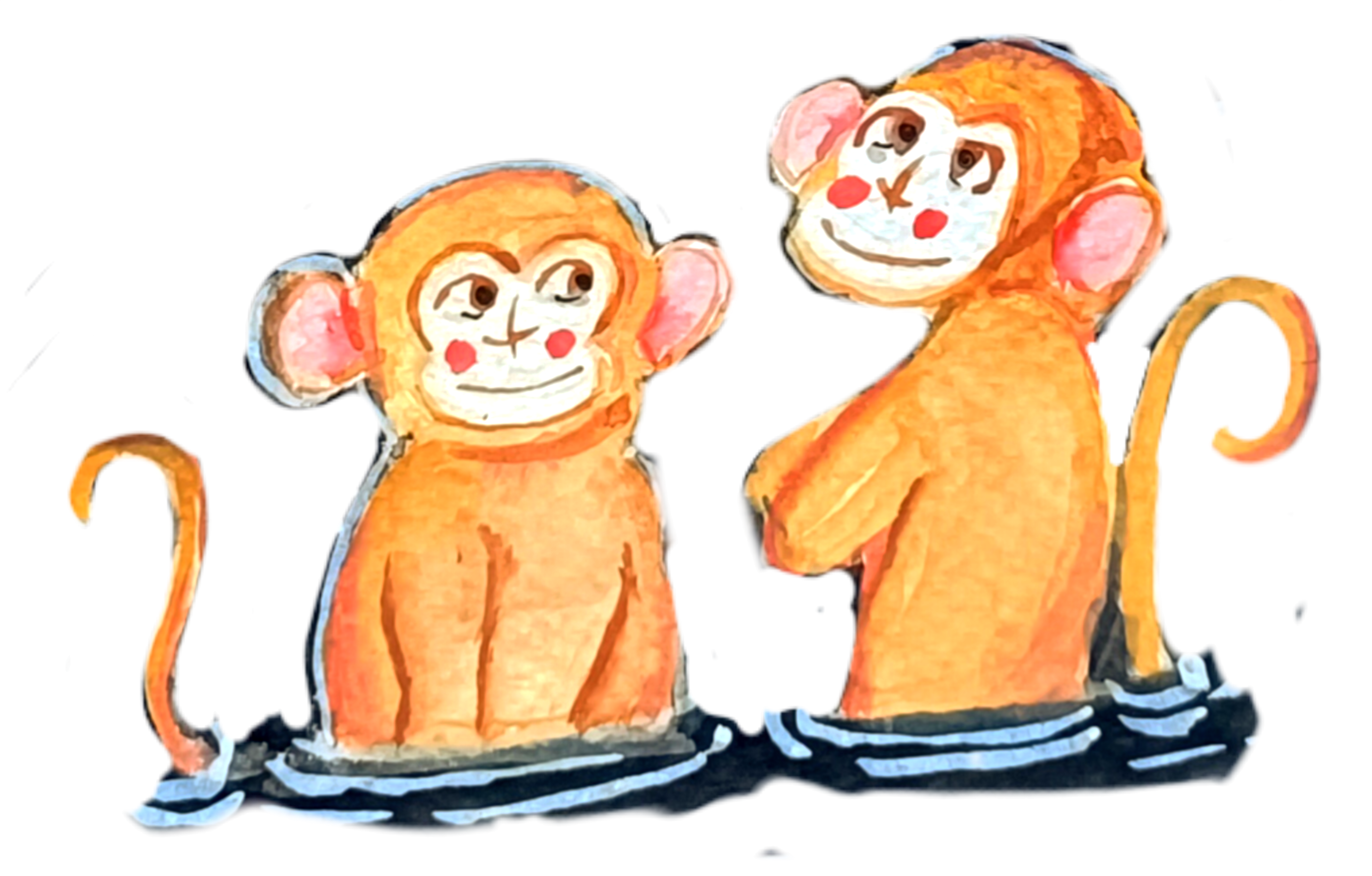
feel free to do that. Now, let's do our second one. So we have got these two playful monkeys from the second project, Winter Springs and
gentle companion. Here too, I'll be starting
with the basic sees. I'll be starting with a face. So the outline for the pace will be a
little bit different. Earlier, we used Y seep to
create the phase, but in here, the upper portion
is somewhat seen, but the lower portion is
a little bit rounder. Here's another way
you can create it. Start with two oval C for
the I and and for its mouth, I'll be creating this
kind of ellipcal C. So these are the
outline for its face. Now let's do the
rest of its face. I'm just encircling the
entire section with it. If you want you can make
it a little bit more oval, but here I decided to
create this kind of bit curve rectangular
C for its upper part. You can clearly see
it somewhat of curve rectangular or square
C for its entire head. Now, let's do the remaining
portion of its body. For these two monkeys, a little bit of its
hands will be visible. I won't be creating the fingers. Only the soldier
will be visible. Two or three lines to represent the hands are present in here. If you want to make them detail, you can even add
the palms, fingers. For our third project,
we'll be doing that, but for now, let's
keep this simple. Here, for these two monkeys, the ears are quite large as
compared to the first ones. Now, let's create the
eyes. Were simple eyes. This is the kind
of nose that I was talking about in our
earlier section, somewhat of cross
like C for the nose. If you want, you can play with other combinations of the
eyes, nose, and the mouth. But for the gentle companions, I'll be keeping things simple. With this, we are done
with the pencil sketching. Let's do the outlining. Here. Once again, I'm using the
gel pen to do the outlining. If you have more
paints, different kind of fine liners breast pins, I would advise you
to try them too and see what is more
comfortable to you. For some of the section,
as you can see, I'm doing the broken
out lines to create a little bit of more organic
peel for the monkeys. I'm also wearing
the line thickness. Let's go over the
outline for its eye, very simple saves for the eyes, and let's do the same
thing for the second one. Got very simple nose, a little bit of cross
C for the nose. Very simple smiling mouth
for our gentle companions. Now, we're moving on to the
remaining section here, too. If you want, you can create the fur like texture
like we did for our first two monkeys using
hatching lines to do that. But here I decided to keep
the lines a bit more cleaner, a bit of broken lines, but uniform and straight lines, otherwise, we have got
the big airs in here. Going over the outline
for rest of its body, a bit molder lines to
sew a clear distinction. Now let's do the same
thing for the second one. For the Arian here, its neck, I'm making it a bit
more thicker so that it's a bit more furry
or fluffy in here. So the reason in between the head and the
rest of its body, the neck line, I'm making
that region a bit fluffier. And this mill on the neck lines like we did for the
first two monkeys, I'll be adding few lines
to create and to sew a bit of clear distinction in between its head and the
rest of its body. A bit thicker lines or two
or three lines to make the list of its body a bit
more bolder and more darker. If you're using brasmin, you just have to
vary the piecer and you can get different
kind of line. Now, let's create
the ripple effect using the fine liner,
using this gel pen. For our main project,
mostly I'll be using whiting to create
this kind of effect. And with this, we are done
with our second monkeys, moving on to the third monkeys. For that project, we'll
have three monkeys, but in here, I'll be
showing you only the two. These are a little
bit more detailed, I would say, the most detailed
one of all the projects. The seep of the piece
is a little bit similar to the one we
did for the second one. But in here, the
lower portion is a little bit smaller as
compared to the second one. Let's create the outline for the Let's create the outline
for the second piece. A bit smaller section for
its lower part of its face. Here I'll be creating
fur like texture for its outline and for
most of its body. And yeah, as compared
to the second one. Is head is a little bit more fluffier and a bit more rounder. And as for its ears, I'll be keeping
them a bit larger, and I'll be creating the kind
of eyes that we practice, the goggles like eyes
and circular eyes, circular big eyes, a bit more
detailed nose and mouth. Let's do the outlining
for remaining section. Here I'll be creating the hands and the
hands will be holding. One of them will be holding a bottle and another one bread. For our main project, the
monkeys will be holding. The three monkeys
will be holding different things, but in here, I'll be showing you
a monkey holding a bottle and another
one holding a bread. I'm not creating that
much detail hands, very simple hand for fingers, and I'm not sewing the thumb, if you want, you
can do that, too. I'm just trying to keep things
as simple as it can be. For the second monkey, I'll be sewing both of its
hands for the first one. The second hand is
not that visible. It lies behind its body. These two hands will be
holding a big piece of bun or bread. These are optional. If you're not that comfortable, you don't have to create
this kind of hands. You don't have to
even add the hands. You can just create its
body up to its chest. The hands will be submerged
inside the water. I'll be dividing its body
into different sections. So the stomach will be of
different color and I'll be using a little bit
of fine liners to create a clear distinction. Let's do the outlining, starting with the broken
lines for the upper section, the eyes, the goggles
C for its eye. Here we have got a bit
triangular C for its nose. Let's add the mouth for it. Large circular
sees for its eyes. Inside the eyes, I'll be
adding the pupils and iris, a little bit of curve line, a little bit of curve line
for the contour of its nose. Yeah, let's create
the hatching lines to do the outline for
rest of its body. Let's create this kind
of hatching lines to do the outlining for
rest of its face. Apart from this outlining lines, I'll also be adding more lines, a bit of large and small lines
following the contour of its face to make it a bit more thicker and a
bit more detailed. In here, I'm not doing that, but for our projects,
we'll be doing that. This is a little
bit carved in here. Let's add the ear,
same kind of ears that we created for our
second pier of monkeys. We have got a
fluffy little feas. So here we have got
a fluffy little face for our third pier of monkey. Let's do the remaining part. For its hands, I won't be
creating the arching lines, very simple plain lines to create the outline for its hand. You can use a bit of broken
lines, but otherwise, I'll be using plain and
uniform lines to create its fingers and the remaining
portion of its arm. Instead of this piece of
bread and water bottle, you can add anything. For our current
monkey demonstration, I'll be adding orange on its
one hand and the other hand, we'll be holding a
large piece of bun, and same goes for
the second monkey. It will be holding
two pieces of buns. So feel free to experiment with different kind
of food items, vegetables, fruits and
vegetable for your monkeys. Going over the outline
for the second hand. So this is holding a bottle, a cold drink bottle. You can also add a straw
coming out from it. And we are thee with the
outlining for its bottle. Let's do the remaining section for its remaining part here, I'm using this kind of lines, a little bit of hatching
lines and a bit of broken lines to create
a bit of fluffy and fur like texture for its finger, creating this kind of
small lines to sew a little bit to add a little bit of more detailings to it. Now, let's do the outlining
for the second monkey. Here I'm starting with its hand. Make the fingers
a little bit more bolder and a bit more distinct. Going over the outline
for its second hand. As for the coloring
of this monkey, I'll be using two or
three seeds of the gray. I'll be starting with the
lighter seeds from the gray, and then on top of it, we'll
be using and on top of it, we'll be using a
bit of hatching, add another layer of
lines, and finally, a bit of darkened tone
of the green to add final layer of the hatching
to create fur like texture. And on top of that, I'll also
be using a little bit of bras pain to create a clear distinction between
different parts of its body, the hands, the neck
line, and its head. Continuing on with
the rest of its face, adding a little bit
of curvier line following the
contour of its head, triangular shape for its
nose and two nostrils. Let's create the
small mouth for it. Let's do the remaining
section for its head, a bit of a small hatching
lines to do the outlining. Moving on to the outer
section for its head. So this is a piece of
bread that it's holding. Now, let's do the remaining
part of its head. Finally, adding the ears. This ear is not
that much visible. And now let's do the remaining
section of its body. Creating clear distance and different section of its
stomach and finally, creating the wave like pattern
aipleeffect for the water. And with this, we are done with our third pair of the monkeys. I'll see you in the
next video where will be creating
four more monkeys.
8. More pen sketches: Let's continue where we left up. Here we'll be sketching
these two monkeys. This are somewhat a combination of the second and the third one. So let's start with
the pencil sketch where the simple
sees for its face. This is somewhat similar
to the kind of fees that we created for
all the upper part. The lower part, it's somewhat similar to
the second monkey. It's a little bit of elliptical
see for its load spot, and now let's do the
outlining for its head. Is head will be following
the contour of its face. Here, I won't be
creating its hands. If you want, you can do that. I'll be keeping this
a little bit simpler. So this is a very simple
see for its face. Let's create one more. So this monkey is a
little bit belted, so it's faces a little bit. So its face is hoisting
towards the top left side, a little bit of skewed face. Let's do the outline for
the rest of its body. Here we'll be using
combination of both broken lines
and a little bit of hatching to create
the for texture. The eyes will be a
little bit different. I'll be creating the
humans like eyes, a bit more detailed
nose and the mouth. Otherwise, the rest of
the things are somewhat similar to the third player
of monkey that we did it. Now let's create the eyes. Very simple eyes, human
eyes, a bit smaller eyes. Large nostrils for the nose
and this kind of mouth, this kind of mouth that we created for our first
pair of monkey. And now let's do the outlining. Here, once again, I'm using the gelpinFor some
of the sections, I'll be creating
the broken lines. For other section, I'll be using the hatching
lines to create a bit for texture or to make the lines a bit more
bolder and more darker. For the eyes, the upper
part and the lower parts, I'll be adding a few
more lines to make it look a bit more
weary and more tired. Small pupils inside the eyes. Large nostrils, few more lines in between the
eyes and the nose. Let's create its mouth, a bit more detailed mouth. Let's do the remaining section, a bit of this kind of broken line and a bit
of hatching lines. Let's make the sides a
little bit more bolder. Now let's do the outline
for the rest of its head. A combination of
both broken lines and a little bit of
small hatching lines. For the top I used a bit
larger lines to create here like projections going over the outlines for its ears. And we are done with the
feeds for our first monkey. Let's create distinction between its head and the
rest of its body, small hatching lines just below its snake line and the
remaining section, small hatching lines took
some more clear distinction. And we are done with
our first monkey. Let's do the same
for the second one. For this pair of monkey, I'll be using lighter
seats of the color. I'll be starting with a Camugio or ocher as the primary layer, and on top of it,
we'll be adding a bit more concentrated ocher. And then either I'll be
going with a brown or burned Siena as the
third and final layer, I'll be creating hatching lines to create for like appearance, and also for its eyes, nose and mouth, I'll
be doing outline with the burned
Siena or the brown. You can use the fine liner or the breast pin to
do the outlining, but I'll be trying to use the colour watercolor
to do the outlines. Continuing with the
remaining saxon of its face. A little bit more lines for this upper part two bit
more hires and here. More lines on top m lined to create a bit of weary and
tired looking appearance. To large nostrils for its nose. And finally, let's
create its mouth. Yeah, with this, we
are done with ours. Fourth pair of the monkeys, let's create the ripple
like effect for the water. And with this, we are done
with this peer of the monkey. Let's do the last one. This two is a bit simple one. So these monkeys are
from the last project, hot spring heaven,
and we'll be creating multiple monkeys,
multiple small monkeys. Very simple see heart
like C for its face. Sorry, this part is
not that visible, but show you how what
I mean by heart like C. Just this simple
see for its face, I'll be creating very
simple eyes and nose, lets around its face, following the seam contour. And instead of creating
the heart like seep, I'm just making it a bit more circular
for the upper part. Here, I'll be creating
a bit larger ears, larger as compared to its face and a bit larger
and curvier ears. Now, let's do the remaining
section for its spotting. Outline for its stomach. I'll be using a bit lighter seed of color for its stomach. Tiny eyes, small circular
see for its eyes, triangular see for its nose. And let's create very
simple mouth for it. We have got very
simplified version of the feat for this monkey. And yeah, we are done with
the basic pencil outline. If you want to add more details
to it, you can do that, but I'll be keeping this
simple since we'll be creating a lot of this smaller monkey for our last project. And here, I'm using
the el pen to do the outlining using both
broken lines and a little bit of small hatching lines going over the
inside of its face. For this region, let's make
it a little bit more darker, using a bit of
hatching and sanding. Curvier and larger ears, making the ears a bit
more molder and darker. Small eyes circular
see for its eyes. On both sides of its eyes, I'll be creating this
kind of curved sap. I'll be using colour
to do that for our main mouset but
here I'm just using the gelpin to create it going with the
outline for its mouth. And with this, we are
done with its face. Let's do the same thing
for the second one. And here, I'm not following the outline that I did
with a pencil sketch. I'm just shifting its face
a little bit below so that it won't be overlapping with the fourth
pair of the monkey. You don't have to stick with the pencil outline that
you have graded feel free to make changes and
adjustment as you see here. For this pair of
monkeys, here, too, I'll be using the lighter
sades of the color ocher browns and a pinky stone for its face and its stomach. If you want, you can use
other colour schemes. So after completing
this section, we'll be diving into
the next section, where we'll be creating the same five pairs of the monkey, and I won't be using
the fine linon to do the outlining Instead, I'll be directly starting
with the water color. So you can get comfortable
with creating the monkeys in both manner using
the fine lands or the breast beans and only
using the watercolors. Creating the remaining parts of its body and the ripple effect. Wave like pattern for the water. And when these we are done
with the monkey sketches. I'll see you in the next video, we will be greeting
colored monkeys.
9. Monochrome monkey: Welcome to the first
part of colored monkey. Here, I've already started with a gray to do the outlining for its face the same kind of monkey that we practice
in the first section. So here, I'll only using
monochrome colors, gray and a little bit of
black to create this monkey. I am applying very
low pressure with this watercolor brush
to create this line, a bit of broken lines. Now, let's create a
bit of furry texture. So small strokes to create this kind of lines following
the contour of its face. I'll be adding a bit of
more and darker lines on all the three
corners of its face. Now let's create a bit outline
for the rest of its head. Simple see for its ear. I'm just changing the angle
of the breast a little bit, and by wearing the angle, as you can see, I'm
creating a little bit. And just by wearing the
angle, you can see, I'm creating a bit of
lighter sad of the gray. Here, too, I'm just
wearing the angle and using this bit lighter
seed of the gray its body. Small strokes, a little
bit of hatching. We will wait for it to dry
a little bit and then add another layer on top
of it till it dries. Let's do the same thing
for the second monkey. Same kind of see a
YC for its face. Our first monkey
will be monochrome. Instead of using this
grease and the black, you can use any
other colors you can use orchards, browns, even red. That will be interesting
too to create varieties of the monkeys,
this monochrome monkey. Here I'm doing a
little bit different. I outlined its entire head, and now I'm creating
this kind of small brass strokes first
surrounding the AS beside it face and for those areas around the cornets I'm adding
a little bit more lines. Now here, I'm adding the lines
for the rest of its body, a bit more darker, a bit
more larger strokes. Now let's do the
remaining section, the upper parts of its head. The same kind of strokes. Just by wearing the
angle of the breast, you can create a bit
different kind of strokes, a bit lighter strokes, feeling the entire section of its head with these
smaller strokes. Just vary the
angles and you will get a bit different
kind of strokes, a bit lighter and a
bit darker strokes depending upon where
you are adding it. For the regions near its face, I'll be adding a
bit darker side, and as we move away from it, I'll be adding a
bit lighter side. Let's make its body a
little bit more larger. Let's create the eyes. So for the eyes to, I'll be using two layering. So this is our first layer. Doing the remaining sexton for its face, nose, and the mouth, two small parallel
lines for its mouth, and we will wait for it to dry. This has to dried a little bit. You won't have to wait
for it to dry completely. A little bit of dryness
will do the work. Here I'm using black, and it will blend on its own
a little bit with the grey that we
used earlier since the grid did not dry completely. So a little bit of weight on weight technique is
working in here. And now let's create
a clear distinction between the head, its face, and the
rest of its body. So the regions just
below its face, and on top of its neck, I'm adding a few more lines
with this darker side of the black A few more random lines here and there to make it a
bit more darker and bolder. Adding a bit more lines
near the corner regions. The color you are
using, the more strokes you create the
lighter at Pelgate. So I'm just using
the same color. And now here I'm using
a bit darker tone here, black to make the outline
a bit more darker. Now let's create the water
ripple effect for the water. Mostly for our main project, I'll be using white
ink to create the outlines the ripple
effect, but in here, I'm leaving the white
of the people to act as the outline or the ripple effect
on the highlights. With this, we are
done with the water. Wait for it to dry and then go in with a bit more darker and concentrated black to make some of the regions
a bit more darker, a bit more bolder and to read another layer
of the outlines. Like here I'm doing it for all the coroners and
just below its chin. I'll also be adding
a little bit of more lines for its neck line to create a clear
distinction in between its face and the
rest of its body. Going over the outline of the
eyes, nose, and the mouth. I'm not covering the entire
grease that I used earlier. A little bit of
green is visible. You'll have to admit causes while adding the small details. If you're not that confident, you can use the fine liners or the brasmin to create
the smaller details. Do the detailing and
outlining for the ears. When these we are done with our first pair of the monkeys, I'll see you in the next video.
10. Chilling in serpentile waters: Welcome to the first project chilling in serpentile water. This is one of the
easiest project and one of the smallest one. Let's start with the water body. Here I'm starting with
this intersecting lines to draw out the laptical
see for the water body. I'll be dividing into
four different sections. You can consider this
to be a eptical seep or somewhat of teperd oval seep. For both the upper and
the lower part of this, I'll be creating
serpentile like seep to represent the flowing
nature of this water body. For this project, I won't
be using the fine liner. If you want, you can use the
fine and do the outlining. Since this is our first project, and this is going
to be monochrome. The monkeys that
we'll be adding for this will be quite
simple and easy. So I think there is no
need to do the outlining. So we'll only be
using the blacks and the whites and a little bit
of gray to do the coloring. Creating this kind
of wavy lines to form somewhat of serpentile
like see for this water body. In here, I'm trying to so that the whole ground is
covered with snow. There is small water
body present in the middle and in
the middle of it, three monkeys are resting in it. I divided into four
different section, and the plan was that for
the different section, I'll be adding different
monkeys, but later on, I decided to keep
it bit simpler. So I'll only be
adding three monkeys for somewhat lower region
of this water body. Here I'm using circular sep to represent the heat for
the three monkeys. If you want to
increase or decrease the number of the monkeys,
feel free to do that. Creating basic saps to
outline the sap and the position for the three
monkeys, adding tiny ears. And with this, we are done
with the basic pencil sketch. If you want to make genius and adjustment, feel
free to do that. Now let's lightly erase
the whole pencil sketch. Try not to completely erase it. Some of the pencil sketch should be visible so that we can use it as the guideline for adding watercolor
on top of it. Now, let's do the coloring. Here, mostly we'll be doing
weight on re technie. Here I'm using a bit
concentrated degree to go over the outlines
for the monkey, creating small strokes to do the outlining for the monkey. The monkeys that will be creating for this
project will be a bit easier as compared to the one we did in the practice session, creating small strokes to create the furry
like appearance and the textion Let's do the
outlining for the third monkey. In here, too, we'll be doing
layering of the colors, one or two light layers of the green and then a little bit of black to add the
detailings and the outlining. Creating the outline for
the lower section of face. And now let's create
more smaller strokes to create the appearance of
the fur and the texture. Smaller strokes surrounding
the entire face. Right now it's not
looking that bright, but when we will be
adding more layers and a bit darker tone, then it will become a bit more clear and bit more crisper. Also create small
ear for the monkey. For this monkey, only one
ear will be clearly visible. The other will lie
behind its face, so it won't be
that much visible. Continuing on with creating
small strokes throughout the entire region of its
face to create its head. Instead of using only
grease in the black, if you want, you can
use other color screen. And with this, we are
done with a third monkey. And now I'll be roughly creating the upper
section of its body. Here I'm using a bit
lighter tone of the green, just wearing the
angle of the brush. By just wearing the
angle of the brush, you can create a
bit lighter tone. That's what I'm doing in here. And with this we are the
primary laying for our monkeys, we will wait for it to dry. Now, raising the pencil
outlines a little bit more. Now, let's continue. So here I'm using the same color that we use for the monkey. I'll be creating the
wavelike pattern for the serpentile water boding. We'll be using different shapes
of the gray to create it. And lastly, we'll be using
blacks to completely fill it. So create this kind
of wavy pattern to create the serpentile see
for this water boding. Wave like C for this
entire section. This ports on the right side of this water body will
be a bit larger. Instead of creating this
side a little bit larger, you can make it a bit
smaller or you can just convert it into somewhat of circular C. H. Let's make this region a
little bit more curvier. So this is our first layering. Now for the second layer, here I'm using a bit more
saturated form of the grain. Are we adding it on both the sides of this
lighter version of the grain. So on top and below it. Following the sip of the lighter grid that we used earlier, reinforcing the serpentile
like sep that we just created. Here, instead of
creating uniform line, I am creating somewhat of
broken curvier lines to add more characteristic to this serpentile sip of
this water body. Follow the initial seed
that you created with the lighter seed and feel free to make some
changes and adjustment. And as you can see, instead of adding two line
on both the side, I am wearing the
number of lines too, so feel free to make adjustment, play with the S in the siges. You can also do a little
bit of intersection and overlay it on top
of the lighter side of the gray that
we used earlier. And with this, we are done
with the upper section. Let few more lines
to make it a bit more curvier and
more interesting. Let's continue with
the remaining section. We'll be doing the same
thing in here too, following the initial s that we use for the
lighter side of the gray and creating
somewhat of broken lines. Now, let's continue with
the remaining section. Since we are using wet
on write technique, so you'll have to use a bit of more color to do
the entire section. Otherwise, if you are using
wet on wet technique, then you won't have to use
that much of the color. Now moving on to the
bottom section of this, this is the carvious portion
of this entire water body. And yeah, with these, we are done with the shade of the gray. Here once again, I'm using a bit lighter sad of the green and adding it just below
the darker seed of the green that we just used. Here as you can see,
the strokes are a bit more broader as compared
to the earlier one. Earlier, we created
with thinner strokes, but here we are creating
a bit broader strokes, and not only for the region
beside the darker side, I am adding a little bit of
it for the middle section two. Let's go in with the black. So here I'm using watercolor
instead of the watercolor, if you want, you
can use the ink to. But since this is
our first project, I decided that I'll only be
using the watercolor, so Carefully outlining
all the three monkeys. Try to preserve
the rough texture that we created with the grease, so create a bit of smaller
strokes and overlay it on top of the grease to preserve the rougher texture
that we created. So small strokes to preserve the rougher texture
for the monkey's hair. And now, we'll be filling
the remaining section. I won't be covering the entire
section with the black. I'll be leaving a little bit of empty spaces in between to add a little bit of more characteristics to
this batter body. I'll also be
surrounding the grease. Some of the larger strokes of the grid that we just added, as you can see, I'm
doing it in here. I'll be overlaying a little bit of the black on top of it, as well as surrounding it to add more details and add more
depth to the painting. Yeah, let's continue with
the remaining section. Leptom causes in
here since we have got very small and
career lines in here. Here too, you have to
insure that the intensity of the black that we are
using remains the same. What I mean to say that
as we use the color, the intensity of the
color decreases, so we have to renew the
color on the brush so as to maintain the same
intensity of the color. Otherwise, the more we use
the color that is on the Bus, the intensity of
it will decrease. Now, let's continue with
the remaining section. I'll be creating the
same kind of line. I'll be creating the same
kind of texture to fill the entire section
of this water body. Surrounding the larger
strokes of the green that we did earlier and
filling the rest of the species with this not covering the entire
sexon leaving a little bit of white
dips in between. Apart from this,
we'll also be using a little bit of whiting
to create somewhat of wave like pattern
or some kind of ripple effect that
surrounds the monkey. As you can see just
by surrounding the streaks of the gray
that we used earlier, it is adding more characteristic
to this water body. It shows that there is some
reflection in the water body, and it shows that the
water body is not still. It's in mosin. Let's continue with
the upper section, following the contour of
the water body that we just created surrounding some of the larger gray strokes and filling the rest
of the species, not covering the entire section, but leaving a little bit of
white species in between. And with this, we are
done with the upper part. Let's do the same thing for the remaining section,
the lower part. Insure that the intensity of
the black remains the same. And with these, we are almost done with the lower section. And now let's add it for
the remaining section, a small streak of the black. Now add more black wherever
you think it's required. For some of the section where the intensity of the black
has decreased a little bit, you can add a little
bit more black there. Also, as you can see, I'm surrounding some of
the larger streaks of the gray with it, using black to make the outlines of the
monkeys a bit more clear and to sew a clear distinction between
the three different monkeys. As you can see, I'm also doing the outlines for the
ear with this black, a little bit for the outlining a little
bit of this black to create a clear outline
in between its head and the remaining potion
of the monkey's body. Now let's add a little
bit more black for the curvier section and the
condon section of the monkey, just like we practiced in the earlier video for the upper section
and a little bit for the lower section beside it chin and a little bit for
the lower section too. Creating very thin line to do
the outlining for its face. You'll have to be cautious to create this kind
of smaller lines. If you're not that confident, you can use fine line to
do the outlining in here. H. Creating few
more finer strokes with the brush just below its neck line to
add more texture. Now, add more details wherever
you think it's required. I think we are done
with the black. Let's add the final detailing the nose
and mouth and eyes, very small dots for the nose, a small line for the mouth, and I'll be using
a bit darker tone of the black to create
the eyes for now. Let's create small
lines for its mouth. Here I'm going with a bit darker tone of the
black to create its eyes to small
circle for its eyes. If you want, you can
leave me a little bit of white space to sow the reflection or
the iris for the eyes. Carefully creating the eyes
with this buttercalibrs, you can use the fine liner
to do this small detailing, adding a little bit
of small black dots on top of the nose that we created to make it a little bit more prominent
and more distinct. Now, add more black wherever
you think it's required. And with this we are done with
the black for the monkeys. Add more black wherever
you think it's required for the water body
or the remaining section. When the coloring for the monkey and the water dries
a little bit, I'll be going with a little
bit of white to create ripple effect to create
ripple effect with the white. Here, as you can see,
I'm making some of the section a little
bit more darker. And the watercolor has dried. Now I am using whiting to
create this kind of pattern, ripple effect for
the water watting. If you don't have the whiting, you can use a concentrated
white colour. If you have gauze,
you can use that too, or you can use or you can
also use the white paint. Creating few more
patterns like this. As you can see, I'm also
surrounding some of the gray streaks that
we created earlier. Adding a few more
lines following the contour of this water body. Let's add a few more lines. Adding a tiny dot for
the highlight for its eyes, very tiny dots. And with this, we are done
with our first project. I hope you had fun
painting this one. Let's unmask our painting, and I'll see you
in the next video.
11. Colored companion monkeys: Welcome to the second
colored monkey. Here, once again,
I'll only be using the water color to do the
coloring and the outlining. Here I'm starting with
this color combination of ochre and a little bit of white
to get this lighter seed. Instead of this, if you have your skin tone,
you can use that. This is our primary layer for the face the same kind of seed that we did
for our sketch. On top of this, I'll be
going with the ocher, a bit concentrated ocher to do the outlining and a
little bit of blending. We now let's do
the second phase, using the same colour to do
the primary laying for it. This pace is a
little bit tilted. Let's make it a little bit more larger and a
bit more curvier, doing the same for
this one, a bit more larger, a bit more curvier. Until it dries, let's go in with a bit concentrated ocher
colour to do the outlining. Here I'm using a bit
concentrated ocher, and it will blend a little
bit with the rest of the field color that
we used for its phase. And that's what we are
aiming for in here, a little bit of
blending of the colors. Until it blends, let's do
the remaining section. Let's find the
outline for its head. So this is our first layer
using flat with this ocher to create this rounder and
curvier see for its head. I'm leaving a little
bit of white, I'll be adding more
layers on top of it, and it will be covered
by those colors. So as you can see, a little
bit of this color has blended with the peel color
that we use for the feast, doing the same
thing for this one, outlining the feast
with this ocher color, a little bit of this
ocher will mix with the other color because of the weight and
weight technique. And now let's define
the see of the hint. The left side of its
fest will' be visible. I'll be adding the ear later on because its head is tilted. This right side is a
little bit more larger. A small portion of its arm
will be visible in here. I'm using the same
color where I started. It's become a
little bit diluted. So if you want to use
a bit bolder color, you can just use the
ocher once again. Otherwise, you can
just continue on. Here, since I want it
a bit darker tone, so I'm using a bit thicker consistency of
the ocher once again. Let's do the outlining
for rest of its body, the fort monkey, a flat vase in here for the
rest of its body. I'll be using burnt Sienna to
create a clear distinction between its head and rest
of its body later on. But for now, let's create a flat vas for rest of its body. Let's create the
tail for this one, for the sketch person. I did not create the
tail, but in here, let's add the tail.
Curve your tail. And for this one, too, since there is not that much space, let's make it a bit
smaller and with thinner. This is our primary layering, we'll be adding more
layer on top of it, and as for the darker set, I'll be using the burnt sienna. Let's wait for it to
dry a little bit. And here, I'm using the burned SNA to do
the second outlining, a little bit of landing tube. I added burn SNA a bit
earlier for the body, but it was not that dry, so I waited for it to dry, and now here I am doing this. Adding burned SNA to
create outline for it sand Let's do the same
thing for the second one, going over the outlines. We'll be blending it with the ocher a little bit later on, but for now, let's
do the outlining. A little bit of
outlining its here. Let's do the outlining
for the tail. I'm threatening a bit of broken lines for the outlining of this Instead of this Burnsian
you can also use brown, a little bit of
brown for its ear. You'll be spreading it
later on, but for now, let's do the secondary
layering and then I'll be going with a wet brush
to spread the colors. The regions near the upper
its head and just beside its ears and a little bit near its ear will be a
bit more darker, adding bit more bursiena
near those regions. And now here I'm going with only water to spread the colours and blend
it a little bit. Only using water to
blend the colors. Spread the colour,
it will blend on its own because of the
wet in wet technique. Spreading the colours
the upper part, the upper part of its head. It will create a smooth
gradient on its own, but you have to
spread it a little bit so that it will
flow smoothly, spreading the colors a
little bit for the tail too. One side of the tail
is a bit more darker, that's what we are trying
to create in here. It's to the remaining
section for the ear. Here, once again, I'm using the same color that
I used for its pees. Here, I also used
a little bit of pinkish color to it to make
it a bit more lighter. And I'm using this to spread the brown that we used earlier, the burnt sienna for its ear. And we will wait for
it to dry to add the final details
until it dries. I'm using this black water
colour to create the water, a little bit of white space in between different
layers of the water. For our projects, I'll be using the whiting to do
that, but in here, so if you are going to use
the watercolor or ink, you can create this kind
of wavel pattern just by leaving a little bit
of the white piece of the paper to be visible. Now here I'm using a
bit concentrated but Sienna to do the final outlining
a bit of broken lines, making the ears a bit more clear and more
distinct with this. Some of the sexton
of the tails, too, let's outline some of the section and make it a bit
more bold and more darker. So using broken
lines to do this. We are waiting for it
to drain the face. I decided to make this region, the region below its
neck, a bit more target, so adding another layer of this a little bit more
burns info per part too. It will blend on its own because of the wet
and wet techniqu. I'll be blending it
later on, but for now, let's do a little bit
of more outlining. Let's create the ice with the same colour, the burned sienna, a bit more concentrated
burned sienna to do the ice, the
nose in the mouth. Instead of this, you can also
use the black to blow this, or you can use brown. Or if you're not that
comfortable with using the watercolor brushes to
create this tiny details, you can use the breast pans
or the fine liners to do it. Let's do the same for
the second monkey. Feel free to experiment with different kinds of eyes,
nose and the mouth. You don't have to stick with
what I am doing in here. You can experiment
with the other eyes, nose and the mouth and the ears, so feel free to do that. Oh adding a little bit more outlining for some of
the sections of the tails, a bit more broken
lines to do that. Making the lower regions of the tail and the other section a bit more darker with this
concentrated bond sienna. Yeah, let's add a little bit more to make it a
bit more darker. And now, once again, I'm
going in with the water to spread the colors to get a
bit more smoother blending, a little bit of water
to spread the colors. Gradually spreading the cover. Don't cover the entire
section with it. Just add the water
below the burn skin, and you just add it and
spread it a little bit. The rest will work on its own because of the wet
and wet technique. Here for the upper section, I used a bit of more water, so try to avoid doing
mistakes like that. Add more finer details or outlines wherever you think it's required for this upper section, I forgot to add the second
ear for this monkey, so let's do that outlining with this Now, for the insides, using the same
colour combinations, a little bit for the inside, if you want, you can add
a little bit of burned Siana for one
section of the ear. And with this, we are done with our second pair of
colored monkey. I'll see you in the next one.
12. Winter springs and gentle companions: Welcome to the second project, Winter Spring and
Gentle Companion. Let's start with a
basic pencil outlining. The composition for
this painting is that the whole ground
is covered in the snow. There is a small
pond in the middle. There are a few
floating leaves of the lotus and two monkeys
are chilling in one corner. Here I have already started
with a pencil to do the outlining to define the
set for this water body. Feel free to make
changes in adjustment. If you want, you can make it a bit smaller or if you want, you can just cover
the entire pen with this black water that
we'll be creating. Apart from this, I'll also
be creating wave like pattern with the whiting for the entire section of the water. Here I'll mostly using the water color to
do the coloring. If you want, you can
use the black ink to do the coloring
for the water. Now let's sketch out the
guidelines for the monkeys. I'll be adding two
monkeys in here, the same kind of monkey
that we practiced. In here, the monkeys will be a little bit more simpler
than we practiced. So circular C for its head. A small porsonats
body will be visible. Now let's make the feast a
little bit more defined. The same kind of feast
that we practiced. Sketching out the
guidelines for it head. A little bit more round
and near its neck. And now let's sketch out the remaining
portion of its body. A small portion of its
hands will be visible, both the hands for this monkey. And for the second monkey, he will have his hand crossed and looking towards us and
looking towards the skies. Let's do the second monkey. He's facing towards
the top left. And he's crossed his hands. A little bit curved
for its spine. A small portion of its
other hand is visible here. If you want, you can add
the fingers like this. Now, let's add the tail. Adding tail for this one, too. If you want you can increase or decrease the number
of them monkey, you can change their
positions and the placement. Adding eyes and the nose. This is just a
basic graph sketch. I'll be making
adjustment as I see fit. With this, we are done with
the basic pencil sketch for our monkey and the outline
for the water body. I'll be creating this kind
of floating lotus leaves. I'll also be wearing
the seeps inside of it. Near the corner and the
edges of this water body, I'll be adding few leaves a cluster of three
or four leaves. Apart from this, you can
also add few lotus and lotus bird adding few
more in here too. For the entire snow
covered landscape, I'll be using gray various
seeds of the grad, two or three seeds and
a lot of water we'll be doing both wet on wet
technique and white on dry. I'll be starting
with white on dry, and then I'll be adding more water to spread the colour
to get somewhat of green, a bit more darker side of the gray and other regions
with bit lighter side, and I'll be trying to create
a gradient in between that. So a bit green color and
then white of the snow. If you want, you can add
leaves in here like this. With this, we are done with
the basic pencil skit. If you want, you can add more details,
additional elements. Now, let's lightly
erase the pencil marks. Lightly erase the pencil marks. We won't want it to
be completely erased. A small section or small
portion of it should be visible so that we can use it as the reference to
do the coloring. And here. Now, let's
do the coloring. In here, I'm starting
with a gray. I'll be creating some small and larger strokes
with this gray. It's a bit diluted consistency, and then I'll be doing and then I'll be doing
the outlining. For now, let's create this
kind of random large strokes. I'll be using water
to spread it. As you can see, it's not
that much concentrated. It's a bit diluted. Now,
let's spread this color. So here I'm using water
to spread the color, and I'll be trying to create
a gradient using this. Use a lot of water to spread it. We don't want any harsh lines. We don't want any harsh lines, so use lots of water
and spread it. Just by spreading it, you can see that there will be some rigs that will be a bit darker and others will be a bit lighter. So that's what we
are aiming in here to create this kind
of uneven flat pass. Using a little bit of more
water spread the color. The intensity of this color will decrease a little
bit when it dries. Let's spit some of the
color a little bit more. The regions where there is more gray spread it a
little bit more. Now, let's do the outlining. So this time here I'm using a little bit more
concentrated gray, and it will blend with the rest of the section a little bit. And I'll also be using
a little bit more water to spread it later on. But for now, let's do the
outlining for this upper part. If you want, you can create
this kind of strokes to give a little bit more
depth to this person. For now, let's
continue with creating a bit thinner strokes with the breast to do the outlining
for this upper part. And it's blending on its own because of the ton
weight technique, the upper region
has not dried up. To make it a little
bit more smoother, I'll be blending it later on, but for now, continuing on
with the remaining section. If you want to make changes and adjustment to the seep of
this part, you can do that. Creating a bit of carve lines. If you want, you can create
straight and edge lines too. Adding a little bit more grey for some of
the regions where I want to so that's where I want
to create a bit of sados. So for those regions, I'm adding a little
bit more gray. Now let's give it a
little bit of thickness, another layer of line parallel to the one we
did for the outlining. Adding another layer
of line in here too. Also, you can vary the
thickness of this upper part. In here, I'm using
water to spread the colors and do a little
bit of partial blending. Using water to blend the
colors and spreading it, spreading this gray The regions where I added more gray
will be a bit more darker. And as you can see, I am mostly spreading the green for
the upper portions. Let's make some of the regions
a little bit more darker. Right now it seems a little bit more darker, but when it dries, it will lose a little bit of intensity and will become
a bit more lighter. Now, let's wait for it
to dry until it dries. Let's do another section. For this section in here, a small portion of
the top is visible. Let's do the outlining for
it in the same manner. I'll be making this region
a little bit more darker, so adding small and
finer strokes with this. Here I used a bit lighter
tone of the gray. Later on, I'll be adding a bit more darker tone to
do the outlining, but for now, let's continue
with this tone of the gray. And as you can see,
the upper portion has dried up and the
intensity of the gray has decreased a little bit and has created beautiful gradient
for some of the regions. Let's spread this colour to create another gradient in here. Et's make this region a
little bit more darker. Let's make some of the regions a little bit more darker
and a bit grainier. So adding a little bit of gray and spreading
it with the water, not covering the entire section, leaving a little bit of a
space for the outlining. Making the regions a
little bit more darker. So using a bit more gray, let's add a little bit
more grain here too. Now let's move on to
the bottom section. So kind of curvier
lines here too, if you want to make
changes in adjustment to the seeps in the sizes,
feel free to do that. Here I have used a bit more lighter consistency of the gray. I'll be using darker
color later on, but for now, let's
continue with it. Adding a little bit of
broader strokes and creating another parallel
lines following the same. And now let's do the same thing that we did for the upper part. Random strokes of gray, and we will be using
and we'll be using water to spread it
spreading the water. Here I won't be mixing this section of the water
with the outlined section. If you want, you can do that. But here, I'll be trying
to keep the porton near the outline section
a bit lighter inside. Adding a little bit of more
water and spreading it. I'll be adding another layer of little bit of gray and then use a bit darker tone
of the gray to do the outlining and a little
bit of partial blending. In here, I'm using a bit darker tone of the
gray to do the outlining, just like we did
for the upper part. This is a little bit different
from the upper part. So we used wit and
wind technique earlier and then
did the outlining, but in here, it's a
little bit different. We used water first, and then we used a later side of the gray first and
then used water. And in here, once again, I'm using a bit darker
side of the gray. Ding few random strokes
near the outline section. Now, let's spread
it a little bit. Adding a few more random
strokes for the lower part too. And now let's spread it to decrease its intensity
a little bit. Yeah, with these, we are
done with both a part. This sougon was
looking a bit lighter, so I decided to make it a
little bit more darker. Using a bit darker side
of the grade to redo its soutlining and make it
a little bit more darker. Creating some small
glass strokes to make this region
a bit more darker. And yeah, with these, we are done with the upper
and the lower part. Let's add a little bit of more definition for
some of the portions. With these, we are done with the upper and the lower part. Let's do the coloring
for our bunkey. So here I'm using a
bit diluted orchard to do the coloring for its body. If you're not that confident, you can do the outlining with a fine linen and then use the water colter to
do the coloring. Let's create its tail, a bit curvier tail. For its space, I'll be using a bit lighter consistency
of the color. Let's create the body
for the second monkey. Here, apart from this one, I'll be using the burnt sienna to do the outlining
in a little bit of blending to create
a bit of sados and give it a bit more
depth perception. Creating the tail for
our second monkey. And finally, let's
create its head. I'm just doing the
outlining for it. For the inside of the face, I'll be using a
bit lighter color. But now, let's continue with the remaining
section of its head. The side of the ear
will be a bit larger. Going over the outlines once again to make it a
bit more bolder, a little bit of
lending in between these two different
seats of the ocher. Since here I used a bit diluted
consistency of the ocher, we'll have to do two
or three layering. Creating very thin strokes
with the breast to do the outlining its remaining
portion of the face. Let's do the same in here, outlining for its head. This is the outlining
for its face. Now let's do the
remaining section, the remaining part of its head. You'll have to causes
and patient in here since we are creating some
small details for our monkeys. You add a little bit of darker tone of the
ocher to create a per separation in between its head and the remaining
section of its body. Outlining the second ear. For the ears, I'll be using a little bit of pinkish color
and a little bit of ocher, adding the ear for
our first monkey. And with this, we are done with the first laying
for our monkeys. Since the initial layer of
the color has not dried up, let's make some of the
regions a bit more darker. So using a bit darker tone of the ocher and blending it
with the initial layer, the primary layer, making the tail of the monkey
a bit more bolder. If you want, you can create
this kind of sado or reflection of the monkey using a bit lighter tone of the ocher. If you want, you can
keep it acetis and use a gray colour to do the
coloring for the water. But I'll be using a blacker
color complete black to do the water. Until it dries, let's create
the floating lotus leaves. A cluster of three or
five leaves floating around the edges and
the cons of this water. Some of the sections
of the leaves are torn or are missing. Outlining this poison
a little bit more. Now, let's continue with
creating more leaves. As you can see, I'm wearing the saves and sizes of the leaf. Not all the leaves
are of same size. And as I was mentioning,
if you want, you can add the lotus
and the lotus birds. You can also increase the
number of the monkeys. This video is in two parts. This is the first part. I'll be completing creating
all the leaves, floating leaves in here. And then in the second part, we'll be doing the
coloring for the water, adding final details to our
monkeys and a little bit of whiting to create wave like pattern or still
water like pattern. Moving on to this side. In here, I'll be grating three
or four leaves. Let's create a bit larger one. If you're satisfied, you don't
have to add more leaves, but I decided to add two or
three leaves in here too. A bit larger leaf in here. Another leaf in here.
One more in here. Apart from these
floating leaves, lotus and lotus birds, if you want to add others, if you want to add other
additional element, feel free to do that. And if you have added any
other additional element, please save your project. Now creating fine
lines to divide the floating leaves into
different sections. I'm using a bit
diluted consistency of the grade to create
these fine lines. If you want to make this
process a bit faster, if you have grey
colored brass pain or gray colored sketch pin, you can use that to do that. You can use that to treat
this kind of fine lines. Continuing on with creating more fine lines for
remaining leaves. To make it a bit
more interesting and add more
characteristics to it, you can vary the side of the lines and instead of using the same
consistency of the gray, you can vary its consistency, using a bit darker consistency
of the gray for some of the leaves and a bit
lighter set for the other one, or you can use a combination of the both for a single leaf. Some of the lines will be a
bit some of the lines will be a bit darker consistency and others of a bit
lighter consistency. Insure that the
watercolor has dried before placing your palm
on top of the paper. With these, we are
almost done with adding the fine lines
for our floating leaves. Adding a few more fine lines
for the remaining leaf and and with this, we are done with this
part of the video. I'll see you in the next section where we'll be
completing this project.
13. Water and final details: Let's continue
where we left off. I'll be covering the entire
section of this region, the water body with the black. Here I'm using black watercolor. If you want, you can
use black ink color. You can add the
color in two ways. Either you can create a kind
of variegated flat was. For that, you will have
to mix certain areas of bit darker intensity and others
of bit lighter intensity, thus creating a gradient
scale of blacks in the gray. To do that, you can add
the blacks near the edges, as well as surrounding the
floating lotus leaves. And then for the other regions, using a little bit of
water to blend the colors, you can completely fill the
entire region with a black. I'll be sewing both. If you are going to
create the gradient then doing it with ink
could be very challenging. So you're going to if you're going to do that,
use the watercolor. For now, I'm just surrounding the edges as well as
outlining the floating leave. To make this process
a little bit faster, you can use the
bras paints to do the outlining and then use the water colour to
do the coloring. Outlining small floating leaf. I'll also be outlining
the monkeys later on, and you'll have to admit
causes to do the outlining. If you make mistake, you
don't have to worry, you can use the whiting
to rectify it later on, but try to be causes and
carefully do the outlining. So we are done with
outlining the upper section. Now let's do the other part. Adding another layer of
watercolor just below this. Covering this entire region will take time because we have so many small elements that we have to do
the outlining for. So we piece in ten. Let's continue with filling the remaining section
with the black. If you want to
create a gradient, you can use the bit
diluted form of the black color and then use to create the kind of
variegated flat pass or gradient that we practiced
in earlier section. In here, I increase the speed since this is going to
take a little bit of time. So if you want to
follow along with me, you can pause the video or you can reduce the playbacks speed. Right now, I'm using
a little bit of water to spread the color
in the middle section. If you don't want to
create the gradient, you don't have to do this. You can just completely fill the entire section with
the concentrated black. In here, once again, I'm using concentrated black to do the outlining for
the smaller leaves, and I'll be doing the same
thing for the two monkeys. Since I'll be using
darker color in here, so I decided to
cover the seeds of the ocher color that I used earlier to create the
reflection for the monkey. Now let's do the
outlining for the monkey. Right now, it's not
looking that great, but when we'll be adding more
layer and a bit more color, then the gradient will
become a bit better. Let's do the outlining
for this one. Carefully doing the outlining, creating small strokes
to do the outlining. Now, let's feel the
remaining section. A bit of darker color the outlines of the monkey as
well as the floating leaves. The gradient that
I was trying to create was not turning
out that well. So instead of that, I completely
feel the entire sexton with concentrated black
and waited for it to dry. So this is how it turned out. And then here I'm
using the whiting. I'll be creating this kind of bit curvier dipper
effect near the edges. And for the remaining section, I'll be creating
straight line to so that the water is
still in the middle. This is following the
contour of the leaves and the edges and creating
this kind of carver lines. You can see that I am wearing
the lengths of the lines, and mostly I'm using
the broken lines. So we'll be surrounding
all the floating leaves, all the edges, and also be creating a ripple
effect for the monkeys. To make it a little
bit more interesting, you can use this whiting
to create the resemblance of some small fish that are
speaking out from the water. Yeah, let's continue
with creating this kind of outlines for
the remaining leaves. If you don't have the whiting, you can use the concentrated
white water color. Otherwise, if you have gauze, white gauze or white call
colour or white gelpin, you can use that to create this. Continuing on with
the remaining section of the upper part. Creating this kind of pattern for the leaves in the middle. So this is going to take
a little bit of time. We'll have to create lots of small and curvy
lines to do this. And after doing this, we'll be adding more details
to our monkeys. I'll be using burnt sienna
to do the coloring, adding one or two layers and doing a partial blending of the colors with the ocher, the primary layer of the monkey
that we used in sealing. Now for the remaining
section, the middle portion, I'll try I'll be creating this kind of broken
lines so that the water is still we have got still water in
the middle sections. Here, too, I'm
creating broken lines, and I won't be covering
the entire section. This kind of small lines for the remaining
section, the middle part, and a little bit near the
corner and the edges. This too is optional. If you don't want to
create this kind of line, you can keep the water
completely black. Continuing on with
doing the outlining for the leaves and the
remaining section. Now, let's do the
outlining for the monkeys. Ripple like different
surrounding the body of these two monkeys. After this, I'll be creating more lines for the
middle section as well as do the outlining for the curvier outlining for
all the floating leaves, four or five leaves that we
have on the bottom left side. Yeah, let's continue with
creating more fine lines, bit of broken lines
to create this kind of stonery look for the water. Moving on to creating
this kind of curvy lines for our
floating leaves. Some of the floating leaves, the lighter sets of the
gray that we used to create and divide the leaves into different sections
not that clean, so I'll be adding another layer of gray on top of it later on. Let's make the
outlines of the tail of monkey a little bit
more crisper and clear. I'll be using this white to do a secondary outlining for the silhouette of the
monkey's body for now. We'll be continuing with adding more lines throughout
the remaining section. Two lines in between
the two monkeys. And, yeah, with these, we are
almost done with the white. If you want, you can
add few more lines in between the empty species. Outlining some of
the other edges. Et's do the outlining
for the monkey. So here, too, I'm using a bit of broken line to
do the outlining, creating small las strokes
to do the outlining. This is optional. If you
don't want to do this, you can just leave it as it is, but I wanted to create
a clear distinction in between the water and
the body of the monkey. Adding a little bit
more curvier line for the upper section
of some of the leaves. And now let's colour the monkey. Here I'm using a combination of ocher with a little bit of pink. I diluted this color
combination to get this seed. So this is closer to skin tone. Adding this colour for all
the four ears of the monkeys. I'll be using the same colour for the inside of
the monkey's face. Here I'm using a little
bit of red for the ears. Now, let's spread it
spread it a little bit, and it will blend on
its own to create a kind of red looking
ears for our monkeys. Spread it a little bit more. The intensity of the color
was a little bit too high, so spreading into a little
bit more with the water. And now let's do the
coloring for the feas. The early color that
we use for the here, I'm using the same color. I added a little bit
more orchard to it. And using a lot of water
to spread this color. Using the same
color in here too. This is a little
bit more lighter as compared to the first one, completely covering
the entire section, doing a flat pass
with this color. And now let's wait for
it to dry a little bit. Until it dries, here I'm using
a bit concentrated cher. So we'll be doing a
little bit of seeding with this. For some
of the regions. For some of the regions, we'll be making it a
little bit darker. So here we are using
wet on dry technique. Now, let's go in
with the butter. Now let's go in with the
butter to spread this color a little bit and blend it
with the remaining layer, doing the same thing
for the upper section, the head of the monkey. Now for the tail, once again, using the ocher. Adding a little bit more
ocher for the one side. Making the sides of
the monkey as well as the outline edges a little bit more darker using this ocher, adding this tail of
the second monkey. Adding it for other hand. You have got the rough idea
of what I'm trying to do, trying to create a little bit of light and shadow regions for the parts of the monkey's body. Let's define this upper part of the head a little bit more. In here, I'm using a little bit of red that we used earlier for the year to create a blessing effect for the
cheeks of these two monkeys. The color will
spread on its own. And using the same color
to make the outline of the hands a little bit more
distinct and more pronounced. Let's use this color to do the outlining for the remaining
section of the monkey. Making the lower section of the tail a little
bit more darker. And in this case, for
the upper section, making it a little
bit more darker. Adding a reddy
stone on the side. Adding a little bit of redstone to the
side of the monkey. Adding a little bit
more for the head, let's make the head
a little bit redis. Doing the same for
the second monkey. Adding it for both
outer and inner edges. Now let's wait for it
to dry a little bit. It has dried up. Now, let's make it a little bit
more interesting. So in here, I'm using a
little bit of burnt sienna, and let's create the outline
for both of its hand. In here, I'm creating
comparatively larger strokes to do the outlining for the hands
of this first monkey. So this is our first hand, and here's the outline
for the second hand. I'll be making the
edges of the outlines a little bit softer
using water for now, let's make the outlines of the second monkey a
bit more crisper. Using water to spread the color a little bit to merge it
with the remaining layers, making this section
secon in between the face and the ears a
little bit more darker. And this side, too, so
so that the side is a little bit insano creating soft edges for
the outlines of the hands. With these we are done with the outlining for the hands and the remaining section using the same burnt Siena
to create its eyes, nose, and the mouth,
the same kind of eyes that we practiced. This monkey is
looking upward and the first machine is looking
towards this monkey. The first make is looking
towards the right. Instead of this eye, you can
create any other eye that we practiced or you can create your own interpretation
of the eye, creating small
strokes to create. Now let's add the eye Now, let's create the nose,
intersecting line for the nose. I forgot to add the circular
C for its eyeballs. I'll be doing that later on. Let's create its mouth a simple curved line
for the mouth. And now creating circular
C for its eyeball. Making the outline of its face a little bit more
distinct and more clear, doing the same thing for
the second monkey too. Outlining the eats to make
it a little bit more molder. Adding a little bit of
more lines to create a clear distinction between its head and the remaining
section of its body. Also adding a little
bit more lines, adding a little bit
of more colour, create a separation in between its ear and the remaining
portion of its head. And yeah, with these,
we are done with the burnt Siana In here, I'm using to create more lines for the different
sections of the line. And with this, we are done
with our second project. Let's unmask our painting. I hope you had fun
painting this one. And I'll see you
in the next video.
14. Yellowish colored monkey: Welcome to the fourth
player of the monkey, drifting calm in
the quiet current. So this will be somewhat similar to the third
project that we did, and we'll be doing
multiple colors and multiple layerings. Here too, I'll only be using the watercolor to
do the coloring. If you're not that comfortable, you can start with
the pencil sketch, and you can also use
the fine liner to do the outlining and
add the details. In here, I'm using
a bit pinky stone. I used a little
bit of pink and I added it with a green to
get this kind of color. Let's create the
seep of its fees, and then we'll be
using occurs and the browns to add the coloring
for the rest of its body. As compared to the last project, its fees will be a little bit
more larger and elongated. Let's create the second phase. Apart from this, I'll be using this colour
to create the ears and a small sexon of the
stomach that will be visible. The colored monkey for that, I forgot to use the white
for the eyes, but in here, I'll be using the
white to create some beautiful fine eyes
for these two monkeys. Let's create the small ears. Somewhat of ovalsy for the ears. In a small section of the
stomach that will be visible. A little bit of
flat mass for this. We will wait for it
to dry a little bit. In here, I'm using this ocher, so I mixed a little
bit of yellow with this ocher to get this kind of a bit lighter
tone for this one. And here I'm using
diluted consistency of this and creating
these random strokes. Since the color that
we used to create the face and the ear
has dried a little bit, I'll be blending a little bit of this color with
the feas later on, but for now, let's do
the remaining section. Continuing on with creating
the smaller strokes to create for like appearance and texture for the
entire section. And as you can see, I'm
leaving a little bit of space in between
the different strokes. We'll be covering it with
the darker sets later on. But for now but for now, leave a little bit
of empty space in between different strokes. Feel free to use any other color screen to create different kind of
coloring for the monkeys. Let's enlarge this
porton a little bit. Here I made a little
bit of mistake. A little bit of this color
was on top of the ear. We'll be covering it
later on, but for now, continuing on with
more smaller strokes to make it a bit more larger. And now we will
wait for it to dry till it dries. Let's
do the same thing. Put the second monkey in here. I decided to make it
a bit more bigger so another row strokes
on top of its head. We will wait for it to
dry until it dries, let's do the same thing
for the second monkey, starting with the
smallness strokes. If you don't want to mix
the two colors together, you can start doing outlining surrounding the piece
and then add the colors. Et's outline the ear to
avoid mixing of the colors. Since I'm using the same
color that I used earlier, its consistency is
decreasing a little bit. To make it a bit more
bolder and darker, you can use a bit more
concentrated color to do that. You can just use the
bit concentrated colour from the second monkey
and use it in here. Let's make some of the
regions a bit more bolder. So I'm taking a little bit of ocher from this monkey
to second monkey. Now let's make the fees a
little bit more defined. We will wait for it
to dry a little bit. Add more strokes wherever
you think it's required. Since the monkeys
are a bit smaller, the head is not
that much fluffier, but if you are making it on
different set of people, you can make the
heads a bit more fluffier and a bit more larger. Spreading the colours
a little bit more to make it a bit more larger. Now it has dried
up a little bit. Here I'm using a
bit pinkish color. Using this to do a second laying for some of the sections, the nose the ears a little
bit for its stomach. So small strokes with
this pink color. For the regions near its eyes, I'll be making this region
a bit more darker in color. So small strokes with this, also for its mouth, too, so small line with this. We will wait for it
to dry a little bit and then add the final coloring, doing the outlining
for the eyes, the nose, and the mouth. I'm using a little bit of water to blend it
with the rest of the colors to subdue
its value a little bit. A little bit of water
to spread the color, to do a partial
blending of the colors. You can clearly
see the visibility of a bit darker tone in here. In here, I'm using white to create the white for the eyes. If you don't have the white ink, you can use a
concentrated watercolor. Here I'm using a bit darker tone of the ocher as
the second layer. So once again, I'll be creating the same kind
of smaller strokes. Primarily, I'll
be adding it near the corner and the
edges of this face and a little bit for
the lower section of its head and
for its neck line. I also did a little bit of
outlining with this occur. A bit concentrated ocur and smaller strokes to create a
bit more furry texture for this So the second one key is a little bit of
lighter inside. And here, I'm using a bit
more concentrated color, more concentrated ocher. We'll
be doing the same thing. Let's make the outline of
this piece a little bit more clear using this ocher to do the outlining and
create the small strokes. Outlining the upper
part where this occur. The outline of the ears
a bit more pronounced. Moving on to the lower
section of its body. Another row of small strokes. Head a little bit more clear
and crisp with this occur. Outlining the ear for
the first monkey. Now add more smaller strokes wherever you think it's
required to make that region a bit more flafer or to create clear distinction between
different regions. After this, I'll be going
with bit darker said, a bit of gray or burned Siana. Mostly, I'll be using the
brown instead of the burn in. But if you want, you
can use that too. Let's create a clear
distinction between its stomach and the
rest of its body. And with this, we are done
with ocher for its body. Here, I'm using a bit concentra Here I'm using a
bit diluted ocher. So small details like for
the nose and for its mouth, a little bit of
fine line detailing for the region below
and above its eye, a bit of broken lines. We love to a bit careful while creating these
small and fine lines. Create another broken
line for its mouth, a little bit more
coloring for its ears. A few more smaller
strokes for its stomach, creating more fluffier texture
with smaller strokes for some of the section that has
become a little bit uniform. And now let's wait for
it to dry a little bit, and then we will add
the final coloring, final layering on top of it. It has dried up a little
bit, not completely. Here I'm using brown. So a
bit darker side of the brown. So here I'm using
brown, a darker side. And just like the other monkeys, I'll be adding this
darker set near the corner and the
edges and make the outlines a bit
more bolder and create clear distinction in
between different sections. Here. Once again, I'll be wearing the sizes
of the strokes. I'll be trying to
I'll be trying to create a bit more
smaller strokes. Since this colour is quite different from the other
two colors that we use, it's creating much more
clear and crisper outlines. Create a small strokes wherever
you think it's required, primarily doing the
outlining with it. I'll also be making
the outlines of the ears bit more pronounced
with this for now. For outlining for
some of the sections, use broken lines to make the
outlines a bit more organic. More smaller strokes. Let's make the stomach a
little bit more distinct. Moving on to the ear, a bit of broken lines to
do the outlining. And now we are moving on
to the second monkey. I'll be coming back to the
first monkey once again to add its eyes, the
nose, and the mouth. But for now, continuing on
with this second monkey, we'll be doing the
same thing that we did for the first
one, small strokes, adding more strokes near
the corner and the edges, outlining the ears, a little bit of outlining and smaller
strokes for the stomach. So yeah, same thing. Another of lines
for the neckline. Now, let's move to
rest of its body, small strokes with this down. You can also vary the size of the strokes to make it
a bit more interesting. Insure that the earlier
color has dried up, and then let's do the
detailing for its nose here. Let's do the detailing for
its nose, eyes in the mouth. Here, the color was
not that dried up, so instead of doing the
outlining for its face, I decided to add
more detailing to the stomach and the
rest of its body. A more detailing wherever
you think it's required. Now the face has dried somewhat, so let's add more details to it. Adding even more
lines for it here. Now for the eyes, you'll
have to with extra courses. And now let's do the mean I. I'll be using the broken
lines to create the I. If you're not that confident, you can use the fine line or the chains to do the
outlining for the eyes. Adding a bit more
finer lines to create a clear distinct between its fast and the
rest of its head. And now let's carefully
create its eyes. Marathon strokes with a brush to create the outlining
for its eyes. Yeah, with this, we
are done with ice, add more detailings wherever
you think it's required. Here, once again, I'm using the black water colour
to create the water. Let's add another two
or three more rows of this black water
colour to create this ripple effect
for the water. And with this, we are done with the fourth pair
of the monkeys. I'll be adding the ice later on. The whiting that I
used has not dried up. So in the next spot,
I'll be adding the ice. I'll see you in the next vlo.
15. Drifting calm in quiet waters: Welcome to the third project drifting calm and quiet current. For this project,
we'll be creating three monkeys and the monkeys will be a little bit larger. The same kind of monkey
that we practiced. This will be a little bit more detailed as compared to
the one we practice. Here, I've already started with a circular C for its head, adding details for its face. This is just a rough sketch. If required, we'll be making some chins and
adjustment as we go. For this machi, you can
also sew their hands. I'm creating this
hand just an example. I won't be creating hands
for our mean project. For this project, we'll
be using all the three, the watercolor, ink and paint, we'll be using fine liner
to do the outlining and add finer details
to our monkeys. We'll be creating a
bit more detail eyes, nose in the mouth and using the fine liner to
create furry texture. This project is going to be multi colored and multi layered. I'll be using yellow ocher and a little bit of
brown to create for, like, fluffy texture
for the monkey. Let's create the facial
feature for the second monkey. Put the background, the water, I'll be using witn
with technique, and I'll be using ink to completely fill the
entire section with it. Then I'll be using white ink to create this
splattering effect and create some random
small ripple effect. And on both the side, the top right and the bottom left side, I'll be creating some wave like pattern using
the white ink. So are we creating this kind of nose for all
the three monkey. Instead of this kind of
nose, eyes and mouth, we'll need to add
any other kind of nose eyes as we
practice or any other. And with this, we are done
with the basic pencil sketch. Let's do the outlining. Here, I'm using Sakura
Micron, fine liner. I'll be using both
the fine lines and a little bit of smaller
hatching lines to do the outlining a
combination of both lines. Go over the nostrils to
make it a bit more darker. For the two monkeys that
first and the second one, I'll be keeping their eyes open. For the third one,
I'll be creating closed eye for that one. And to create a bit of weary texture and look
for this monkey, I'll be adding few more lines
below and above the eyes. Let's create human
like eyes and add more fine lines
below its eyes in a rmit to give it a bit weir lo. Going over the
outline for its ears. And now let's do the
outlining for its head. Here I am using this kind
of broken hatching lines. Using this kind
of hatching lines to do the outlining
for its head. Going over the outline
for its second year. This project is also
divided into two parts. For this part, we'll be doing the outlining for the monkeys
and creating the water. And in the next part,
we'll be completing the monkey by coloring it and adding more
final details to it. Adding a few more
lines to make the face look a little bit more
weary and a bit older. A few more lines to create
a clear distinction in between the stomach
and the rest of its body. And with this, we are done
with our second monkey. Let's move on to the first one. So for this one, I'll be making few
adjustment and changes. If you want, you
can continue with the outline you created
and create the hands. But in this case, I won't
be creating the hands. I will just creating only small section of its body that will be visible
above the water, and I'm also changing the position of its
face a little bit. If you want, you can
just continue with the outlines you
created with a pencil, or you can follow along with
me and make some changes. I decided to make its face
a little bit more larger, and that's why I sept it
its face a little bit up. So we have got its
nostrils and the mouth, adding few more
line for it mouth. And now let's do the remaining
section of its face. The same kind of
broken lines and at curvier lines following
the contour of its space. And now let's create weary
and tired looking eyes. Two or three lines
above and below its eye to give it a bit more
exhausted and weary look. Adding few lines above its nose following the
contour of its face. Let's create its head
using the same kind of hatching lines to do the
outlining for its head. If you want, you can make its
face a bit more fluffier. I'll be adding more
lines later on, but for now, let's continue
with this kind of line, a bit more lines in mid, a bit more lines for the
middle section of its face. Adding a few more lines
just below its ear. If you want to continue with adding the hand,
you can do that. You will have to just keep in mind to make the
hands a bit larger, keeping it in proportion
with the rest of its body. So a bit larger hands. In here, I decided to cover the rest of its hand
under the water. We'll be creating ripple
effect later on, but for now, let's use these broken
lines to create the resemblance for its stomach. Yeah, with these, we add with the basic outlining
for our first monkey, the third and the final monkey. Here too, I'm making a
little bit of adjustment. Same kind of broken lines. Adding the nostril for its nose. And for the lower
succin of its mouth, I'll be making it a little
bit elliptical in shape. Adding the eyes, so this
monkey has its eyes closed. Adding more lines just
above and below its eye. And now let's do the remaining
section of its mouth. Simple curve line for its mouth, creating the outline for
the lower section of its mouth and now creating the outline for the
lower section of its face. Let's create a little bit of
resemblance for its eyebrow. Et's do the outlining
for its head. The same kind of
broken hatching lines. Adding the spine
lines near its ear. Enough for the
remaining section. Only a little portion
of its body is visible. Adding few more lines
for the freeze and the remaining section
for this section, adding few more lines the
middle section of its face. And with these, we are done
with the basic paint sketch. Let's lightly erase it. Ensure that the ink has dried Insure that the ink has dried
and then only erase it. If you want to make changes, add more monkeys,
you can do that. You can also change
the placement and positions of the monkey. Adding the eyeballs
for our two monkeys, moving on to the second monkey. And for this monkey, let's add a little bit more
detailing for its eye. Now, we'll be doing
the coloring here. I'll be using wet
on wet technique. If you have got a large bust, use that to do this
wet on wet technique since we have a large
space to cover. I'll be carefully adding it
in between the three monkeys. For the smaller sexon,
I would advise you to use the smaller birds
to add the water. And instead of
doing this, you can also use the breast pain
to do the outlining of the monkey first and then
use the ton wet technique. So we have covered the entire
section with the water. Now here I'm using the ink to do the background, complete black. Only two or three
drops of the ink will be enough to completely
fill the entire section. You can clearly see the
difference between the black ink and the water color that we
used for our last project, how intense and the
dark this ink is even after diluting
it with water, et's spread this thing
for the entire section. You'll have to wit causes and careful while adding
it me and the monkeys. Put the regions near the monkey, I'll be trying to preserve
its rough texture, the texture for its hair. So I'll be using
small strokes like this to preserve its
rougher texture. I'll be doing the same thing for the remaining two monkeys, this kind of small
strokes to preserve the hair like projection
of the monkeys. A small and fine line with this brush to do the
outlining for the Mikey. Instead of doing this,
you could have used the bruspin to do the outlining first as I was mentioning. But now let's continue with doing the outlining
for this first one. If you made small mistakes, you can cover it later on
with the white ink and use that white ink to
create a little bit of highlights on the upper
section of its head, or you can apply a bit more
white ink and on top of it, you can use the other color, the yellow and the browns
that we are using later on. Carefully spreading this ink in between these two monkeys. Now, let's do the outlining
for our second monkey, the same kind of small strokes. Carefully filling in between
ear and the first monkey. Now, let's feel
this lower region. Here, as you can see for
some of the regions, the ink is a little bit diluted. So if you want to
create a little bit of gradient, you can do that. You can use the weight brush
and soak up some of the ink, or you can use tissue paper
to soak some of the ink and then use brush to spread the ink to create
kind of gradient. Spread the ink for the
remaining section. Carefully outlining the
ear for the second monkey, doing the same for
this third monkey, outlining its ear, and then spreading the ink for
the remaining section. I'll be spreading the ink for the entire background to get somewhat of same uniform
consistency of the black color. For the upper regions where I dropped the ink that
region a bit darker, so I'll be spreading
the ink from there to the remaining portion. And after doing this, we will
be waiting for it to dry. Adding more blacknear
the monkeys. These regions are a little
bit lighter in seed, so carefully adding
the ink in here. If you want to
experiment a little bit, you can use a little bit of white ink and spread
it a little bit. On top of this wet black ink, it will create a
little bit of blurring effect as well as a little
bit of blooming effect. That will be interesting too. On top of it, you
can use white in to create ripples like
effect or you can create simple lines so
that the water is still making the outlines of its head a little
bit more distinct. Oh. Adding small and
detailed brush strokes near the monkeys to get a sharp and more pronounced
outlines for the monkeys. And now spread the
ink wherever you think it's required
the regions where the ink is a little bit less or where the intensity
of the black is less. And we will wait for it to dry. It has dried up, and for some of the section where I
used a bit of more water, it's a little bit
light, so we'll be covering it later on
with white ripples. For now, here I'm using whiting to create ripple
effect for the monkey, so So adding the curvy lines in the seep of water ripples
for all the three monkeys. As I mentioned, if you
don't have the whiting, you can use concentrated
white colour. You can use concentrated white
colour. You can use gauze. You can use acrylic white or if you have white jelly pen,
that will do the work too. And one more thing that
you can use to create the lines is white
oil piece too. So that will do the work too. Adding few more carb lines to
create this ripple effect. Enough for both the side, as I was mentioning for the top right side and
the bottom left side, I'll be creating the save
like pattern with a white. This is just optional. If you don't want, you don't
have to do this. Instead of this, you can create the floating lotus leaves like we did in the last project. I'll be wearing the
thickness of the lines. Some of the lines will
be a bit thicker, others will be a bit thinner. Tinning on with creating
this kind of curvy line. Small fine lines for
some of the sections. Now let's add one
more on top of it. So these lines are
a bit more finer. Let's make this a
little bit thicker. I'll be doing the same thing
for the top right side. So this part is not
that visible in here. But as you can see in
the final painting, I created the same
kind of pattern, a bit larger pattern
on the top right side. And as I mentioned,
this is optional. If you don't want, you
don't have to do this. You can also add this kind of pattern on the top
left side too. Using larger brussel strokes
to cover the larger areas. And now let's create
some finer lines. Following the contour of
the larger brussel strokes. And as for the additional
element, if you want, you can add the
floating lotus leaves. You can also add lotus
and lotus birds. Then we have got different kind of rocks that we practice. You can add floating
wooden planks or some of the wooden planks that is coming out
from the water. B you can also add some different kind
of floating leaves. You can create small
white fizzes that is biking out from
inside the water. And you can also feel
the entire section with more monkeys,
white monkeys. Adding a few more fine lines
for the upper section. It's not visible in here, but here you can see, I just
wear it does the strokes, some thin lines, some
thicker lines to create the wave like pattern
for the top right side. If you want, you can add
another layer on top of it to make it a bit more bolder and a bit more brighter. It's not looking
that much brighter. So if you want, you can go with another layer of
white on top of it. Here, as you can see,
for the upper part, I added a little bit more white, and it's becoming a little bit more brighter and more lighter. So if you want, you can do that. And now here, I'll be creating some small ripple effect for some of the
section four or five. You can also create the
same kind of lines, simple broken lines so
that the water is still or you can create the wave
like or serpentle like, or you can create
curve lines so that the water in motion like we
did in our first project, or you can do the
combinations of both. Here I'll be doing a little
bit of splattering effect. Before doing that, let's create few ripples like effect
for some of the sections. You can vary the seeps in
the side of the ripples. In here, I've just created some simple lines later on I'll be adding more curvier lines to create ripple
like effect here. I'm doing splattering
effect to create small dots throughout the upper region and a little bit for the
lower regions too. If you want to create
a bit larger dots, you will have to keep the
brush a little bit up, and for smaller dots, just place the brush
near to the people. Here I'm aiming for small dots, so that's why I am keeping the brush a bit
closer to the paper. And I think that's enough. Adding a few more
lines for the monkeys. And with these, we are done with the first part of this project. And as I was mentioning, making these lines a little
bit more curved to create a bit of larger ripple effect for some of the
sections in here. You can increase the number
of ripple effect if you want. And here, with this, we
are done with this spot. I'll see you in the next
spot where we'll be coloring our three monkeys. And
16. Colring the three monkeys: Let's continue
where we laugh off. And here we'll be
coloring the monkeys. This is going to be
multicolored and multi layered. Two or three layerings of different colour to
create the monkey. So we'll be using here, I'm using a bit lighter
tone of the yellow. This is Cambohue so this
is our first layer, a bit diluted consistency
of this camo hue for the fees and a little bit for stomach, spreading the color. And now here I'm going
in with a bit of ocher, a bit concentrated ocher
and overlaying it on top of it. Adding this ocher. It's a bit concentrated and adding it randomly for some
section of the monkeys, and we will be spreading it
using water to spread it. I did not add this ocher
for the entire region, as you can see, some of the
regions are a bit darker, others are a bit lighter. And now spreading this ocher
for the remaining section. The face is a bit of
yellow is colored, the remaining sexon a
bit of ocher color. Later on, when it dries, the distinction will
be a bit more clear. For now, let's
spread this color, the color on my bras, a combination of both camo
hue and Cambou and the ocher. Spreading the color
for the third monkey. And here with this, we
are done with can now. Let's go in with a
bit more darker tone. So here I'm using a
bit of red dishclur. Here I'm using a bit
of burned sienna. Here I'm adding this burned
sienna near its eye, a little bit for
its nose and mouth, and a little bit
for its stomach. Now, let's spread the
color a little bit. Adding a little bit of this
burn sienna for its ear. Adding it for the third monkey. Here I'm going with the water to spread the color
a little bit. Don't cover the entire section, and as you can see some of
the regions are a bit darker, the regions near the eyes, the nose and the mouth,
others are a bit lighter. Using the color on my brass to create small brush
or strokes to create fur texture for the remaining section
of the monkey's body. This is the first
layer of the This is the first layer of the fur that I'm creating on top of this, we'll be adding two or
three more layers of different color and
different intensities. Going back once again
with the bond Siena, a bit concentrated bond Sienna
and doing the same thing, adding it above the eyes and
a little bit for it nose to make the regions a
little bit darker in color, adding a little bit
for its lower part, the lower part of
its face, the chin. It will blend on its own, but I'm using water to
blend a little bit of it. I want to make these regions, the regions above
and below its eyes, the nose and a little
bit for its mouth, a bit more darker in sin. Spreading the color
for the third monkey. Now let's do the
coloring for its ear, using the burned scanner. While the small strokes with the burned scanner for its ear. Using the burn scanner to do a little bit of
outlining for its face, a bit for its mouth and yeah, the same thing the ears,
the same thing, the eyes, the nose and mouth, a little
bit of this burned sienna. Now, going back once again with the water to spread the
color a little bit. Once again, I'm using the
oriena a little bit more to make this a little
bit more darker, to create a clear
distinction between its face in the remaining
section of its body. Making the ears a
little bit more radius. And now let's do the coloring
for the remaining section. Here I'm using the ocher, creating very tiny strokes
with this and overlaying it on the black strokes that we used earlier to create
the fur like appearance. So very small and
tiny strokes with this following the seep of its head and creating more small strokes
when this occur. More we going to the second
monkey, doing the same thing, creating small
strokes and covering the top of its head and the
remaining pots of its body. Small strokes, a little bit of more strokes near
the top of its head. And we'll be doing the same
thing for the first make too. And when this dries,
we'll be going back with the fine liner once again to do the outlining for
some of the sections. And as for its size, I'll
be using a little bit of white to make the eyes a
little bit more brighter. So for the eres, I'll be
using the white later on. For now, let's continue
with the orchard to create the smaller brush strokes for the entire section
of this first monkey. Later on, I'll be adding
another layer of the color and make the ears a little bit more distinct and more pronounced. Adding a little bit of this aqua color for the same regions, the eyes, the nose, and a
little bit for its mouth. Spreading some of the aqua
color for this third monkey and adding it a little bit for its eyes, nose
and the mouth. And now here I'm going
with a bit darker color. So here I'm using a
bit of brown color. So overlaying this brown
on top of the ocher, a bit more smaller strokes. I'll be creating the same
kind of fur like texture. For some of the regions near
the edges in the corneal, I'll be adding a little
bit more small strokes. For the area below
its in the neck line, I'll be adding a bit
more strokes in here, as well as for the middle
section of its face, the upper part where we created more lines
with the fine liner. Create small strokes with it and do a little bit
of partial blending. For the eyes, as
I was mentioning, a little bit of white to make the ice a little
bit more brighter. You'll have to bit causes and ensure that the paper has dried. So for the two
monkeys, the first and the second one, I'll
be adding the white. For the third one,
the eyes are closed, so you won't be
adding any colour. But if you want, you can
create the open eyes. Use this white to create open eyes for the
third one, too. Color has dried, and I'm using the fine
leiner to make some of the outlines a bit more
clear, a bit more crisper. Oh Instead of this, you can also use the
watercolor brush or us bean to make the outlines
a little bit more distinct, a
bit more darker, doing the same thing for
the other two monkey, a little bit more detailing, a bit of small hatching
lines to create more furry like to create a bit
of more fur like texture, making the eyes, the nose, and the remaining section of its face a little
bit more clear, a bit more pronounced. Add more hatching lines
to create a bit of more furry like
appearance for its fur. So the monkey did not
turn out the way I hope. The monkeys that we created in the practice session
were much better. So if you want to make
genius adjustment or create the same kind of monkey that we practiced in the practice session,
you can do that. And with these, we add
with our third project. Let's unmask this one, and I'll see you in
the next project.
17. Pink and grey monkeys: Welcome to the
third color monkey. Here we'll be here we'll be painting the monkeys from
the floating trains project. So this is one of the
most detailed monkeys that we'll be creating
and painting. This is going to be multi colored and multi
layered monkeys. Here, I'm starting with this
pinky stone for the fees. I added a little
bit of white and a little bit of pink to the
gray to get this color. Grating the see for the feast. This will be our primary layer. F now, let's do the primary layering for the second monkey. And for the regions
for its eyes, I'll be going in with a bit lighter tone of
the pink later on. And we will wait for it
to dry till it dries, let's do the coloring
for its ears. Small ear. This kind of somewhat
oval see for its ear. Let's make it a bit larger. E For its stomach and the hands, I'll be using the same color. Here I'm creating the
fingers for its hand. If you're not that confident, you can start with
the basic pencil iske and then add the color. But since it's quite easy, I'm doing this and I have got the reference you
mean just beside it. If you are not that confident, you can start with
the basic pencil skechO you can also use the fine lining to
do the outlining and then add the watercolor. With these, we are done with the first laying for its hand. Let's do the coloring for
second pier of the hand. Here, as you can
see, I have changed the placement and the positions of the hands a little bit, and I'll be adding different
kind of crouts on its end. I'll be using three
or four bread buns and one orange or an apple. And, with these, we are
done with the face, the ears, and the fingers. Now let's do the
remaining section. Here I'm using a
bit diluted grey. I'll be creating the
same kind of strokes. Right now, I'm not blending
these two colors together, the color from the
face and the green. I'm leaving a little bit
of space in between them. Right now I am using a
bit more diluted gray. So let's blend the
colors a little bit. A thin lines to do
the outlining for the fees and a little bit of blending of these
two colors together. Paler tone from the fees and this lighter tone of the green. Creating the s kind of smaller strokes for
the entire region. This is our first
layer for its head, and the rest of its body on top of this
will be going with a bit more darker sets of the grease and a little
bit of black too, later on, for now, let's continue with this grease. Two or three different
layers of the grease to create this spurtl texture
for the entire section. Do the outline for
the ear so that you don't mix the colors together. Now, let's do another layer of outline for the second
layer of the coloring. Not the layer, but
another top layer. What I mean to see is
creating another row of the gre strokes to create the
fur texture for the monkey. We will wait for it to
dry and then expand it a little bit
more till it dries. Let's do the same
thing for this monkey, same kind of smaller strokes, a little bit of
blending of this grease with the paler tone of its face. We'll be doing two
or three rows of this grease to create the fur like texture
for the monkey. And on top of this, we'll be doing one or two more layers, a bit different, a bit darker, bones of the grease and
a bit of black too. Following the contour
of its sweeze and creating the same
kind of strokes. Carefully outlining the
fees with the screen. Until it dries up, let's
do the remaining section. So using the uri to do the
outlining for its hand. Doing the outlining
for its second hand. Only the lower
portion is visible, the the upper part, the soldier is behind its arm, doing the same for
the second monkey. In here, I'm using a bit
concentrated ocher to do the outlining for the
braid that it is holding, braids and the buns that it is holding a bit
concentrated ocher. With the concentrated color, you will get a bit more
precision and control, but with the diluted color, you will lose a bit of
precision and accuracy. As with the concentrated color, the brush does not
carry that much water, but in case of the diluted one, we have a lot of
water in our bus, so it's a bit
challenging to control and precisely at
the water color. So for smaller and nutetails, I generally try to use
the concentrated color. The monkey has taken
a bite from this man, so the upper part is like this. Creating another bun
for this first monkey, carefully outlining all
the fingers for its hand. For the finger, I'll be going
with the darker tone of the pink to do the outlining and add a little
bit of detailing. And also, for this burns too, I'll be going in with a bit of burnt sienna to make it
a bit more detailed. In this hand, it's
holding an orange. Instead of this orange, you
can create any other thing, like the earlier sketch, you can also create water
bottles or can of soda. Here I used a bit more
concentrated color. I'll be going with a bit
more darker tone later on, but for now, we are done with this the three buns
and the one orange. Let's create the
furry taxa for it. I'll be doing the same
kind of thing that we practice in the color section. So this is our first layer, creating this small stroke for the entire region
on top of this. We'll be adding more
layer, but for now, covering the entire
region with this. Ve a little bit of
a space in between the hands and the
rest of the body so that a clear discon can be
easily created later on. Oh. Here I added a little bit of pink tone to the green to create
this kind of color. A bit more closer to the pink is a bit more closer
to the skin color. On top, this will be
adding the grease. So that's why I use this kind of lighter
tone of the green. For this monkey, I'm
only using the gray. I did not add any
other color to it, small strokes for
the entire regions. Instead of this, you can also do a flat vase, but with this, you can create a
bit more fluffier and more furry texture
for the monkeys. That's why I'm doing this, even though it takes a
little bit more time. Leave a little bit of space in between the outline regions so that we can create
a clear distinction between different
parts later on. Carefully add it between
the burns and the rest of its body and the hand
for its stemmer. We will wait for it
to dry a little bit, and then we will add
another layer on top of it. The rise lets to the remaining section,
moving on to the upper part, the head of its monkey, using this create the
outline for the ear. Let's add another row
of small strokes. Overlying it on top of
it and just above it. For the second monkey, the seep of the head is satisfactory, so I'm not adding that much, but if you want to make it a bit more larger, you can do that. Now for the stomach, here I'm using a little
bit of pinkish color. I added a bit of grey to it. I added a little bit of
green and a little bit of white to it in this
kind of color. I will wait for it to dry
a little bit it dries, let's create the water. In I'm using watercl to do that, but mostly for our project, I'll be using the ink. For one project, I'll
be using the watercl, but for the rest, I'll be
using the ink to do it. Now here I'm going
with the pink. For this entire region, I'll be completely filling in the lighter tone of the pink. And when it dries a little bit, I'll be going in with
a bit more darker tone of the pink to add bit
more details to it. Following the contour
of the upper part of its head and filling the
entire region with this pink. Adding a little bit of pink
for the side of the ears, Blowing a theme for this pair of ear for the second monkey. A little bit of smaller
strokes for its stomach, small fine lines, a
little bit of hatching. And for its nose, too, a small triangular see
with this pink colour. On top of this, we'll be adding
the black bot phone now, a little bit more pink for the
lower section of its palm. And now here I'm using
water to spread the color, spreading the pink for
the rest of its here, doing the same for the
stomach and the hands, spreading the color a
little bit to create a bit of smaller gradient in
between these two colors. I waited it for it to
dry. Now it has dried up. Here I'm using darker
tone of the green, and we'll be doing
the same thing a bit more smallness strokes, overlaying it on top of the earlier two
layers of the grease. I won't be covering the entire
section with this screen, but only for the section that I want to make
it a bit more darker, primarily near the
corners and the edges. I'll also be doing
a little bit of outlining with this
for the upper part. And as you can see, I have decreased the size
of the stokes. I'm also using this to create a clear distinction
between different parts. Et's do the remaining section, the lower part of its head, creating a clear distinction between its head and
the rest of its body. Moving on to hands and
the rest of its body. First I'm doing the outlining, now let's add small
strokes for some of the regions to make it a
bit more bolder and darker. Small stroke to create for
texture for the outline. This is our second layer. On top of this, I'll be going
with the black later on, knowing the same thing for the
stomach on the other hand. For this region, this
will be a bit darker. Hitting the outlining for
the stomach with this gray, adding a few more strokes wherever you think
it's required. We'll be doing the same
thing for the second making starting so let's create
the smallest strokes. Adding more smaller strokes near the regions where there is curb sections where
there is curb section and for the outlining section
for its face and the mouth. Let's do the outlining
for its ears. And now for the upper parts
using this great to create another outline and to create a little bit for
texture for the outline. Adding a little bit
more near the ears. Let's add a little bit more in here to make this region
a bit more darker. Now, let's do the
remaining section, it's hand and the stomach. First time doing the outlining. And now let's feel the rest of the area with smaller
strokes with the screen. Right now, the hands
and the stomach is not looking that much
clear and distinct. But when we will be
doing another layer of the color to make the
outlines a bit more clear, then it will look far better. Moving on to the other
hand, doing the same thing. Row after row of small strokes. Let's add a few more in here, just above the red. I waited for it to
die a little bit, and now here I'm going
with this pink color, a bit concentrated pink color. And let's do the Let's make the outline of the fingers a bit more clear, a bit more crisper. You'll have to be
a bit cautious and careful and ensure that
the color has dried. Otherwise, it will mix with the other colors
which we don't want. And if you're not
that confident, you can use the fine
to do the outlining. Let's create a few
more lines for the stomach, moving
on to the other hand, doing the same thing, creating crisp and clear outlines
for each individual finger. Doing the same thing for
the last four finger on his left hand. Adding a little bit more of
this color for its ears. The courant has dried up. And now here I'm using the
black bras paint to make the outlines a bit more
clear and more crisper. So small strokes
with this brass pen. Doing the same thing
for the second hand. We'll be creating a little bit of more smaller
strokes for its head. Now, let's create the eyes. Creating this oval
seas for the eyes. I forgot to use the whiting to create the white
spece for its eye. If you have not
created the eyes, use a little bit
of white to create the white for its eye ring. Otherwise, just
follow along with me. Moving on to creating
its nose and the mouth, triangular C for its nose. As you can see, I'm not covering the entire pink that we
used earlier for its nose, so a little bit of
it is still visible. Following the
contour of its nose, adding a few more carbar
lines on top of it. Moving on to the second monkey, small stroke to create clear distinction in between
different parts of its body, creating the outline with this
black for its second hand. Let's create a clear
distancing for its face in the
remaining portion. So small strokes near the curve ar and corner portion of its mouth and the face. If you want, you can
also add a little bit of this to do the outlining
for the outer sections. Moving back to its eyes, let's add the eyeballs
inside its eyes. I added the eyeballs
inside its eyes. If you want, you can do a little bit more detailing with it, like for its ears, its mouth, a little bit near its neck
and a bit for the upper part. But I think I am satisfied
how it turned out, so let's add a little bit of more detailing and
coloring for the foods that it's eating and a little bit for its
rest of its spotting. In here, I'm going with
this burned Siena, and I'm adding it in
between its finger. I'll be making these regions
a little bit more darker. Put this bun in here. Instead of betting the finger, I add it in here. I'm using water to spread
the color and blend it, so carefully blending
it in between the sing and blending it with the rest of the ocher that we used earlier. So in here we are using wet on dry technique to do a little
bit of partial blending. The aim was to create
a little bit of sido region in between its
finger and just beside it, doing the same thing for
the orange it's holding. Here I used a bit
darker tone earlier. That's why our orange
looks that much darker. If you want to make
it a bit lighter, you can add a little bit
of yellow on top of it. Here I'm using water to spread the colors to do a
partial blending. With these, we are done with our third pair of the
monkey, the largest one. I'll see you in the next one.
18. Floating treats and monkeys: Welcome to the fourth project, Monkeys with the floating trees. In here, I was not able to
record the first monkey, but you have got the
rough idea how we practice in our
earlier sketch video. I'll be creating
the same kind of monkey using circular
saves to create the freeze of its monkey and then extending it
to create its head. In its two hands, it's holding
two different bread buns, and near its suler it's holding a packet of biscuit
or a water bottle. You have got the rough idea
and you can easily create it. If you want to make changes
and adjustment to its hand and the things that it's
holding, feel free to do that. Here I am creating the
outline for its finger. He will be holding
large circular bun. In here, I'll be adding
the water bottle or a packet of biscuit. Let's do the second
one, starting with a circular C for its head, Goggle like C for its eyes, adding its ear,
semicircular C for its ear. And now let's do the remaining
section of its body. And as for coloring the monkeys, I'll be making a little
bit of adjustment. The monkeys will be a little
bit different but will be comparatively easier as
compared to what we practice. And with this, we are done
with our second monkey. Moving on to the
third one, starting with the circular
C for its head. So for this one, I
decided to make it a little bit larger since
this lies in the front. Adding its ear, and let's add now let's create the
outline for its face. So this will be holding
a piece of bun with both its hand and it has
taken a small bite from it. Feel free to make adjustments. Instead of this buns bottles, you can add any other things, and you don't have to even
create the hands if you want, you can create only
up to its chest. And with this, we are
done with the sketching. Now let's create the
Addisonal element. Here I'm creating a
single lotus flower. If you want, you can
create multiple ones. I'll only be creating
a single one, and apart from that,
I'll be creating multiple floating lotus leaf. Besides that, I'll be creating small rocks that is coming
out from the water. So numerous small rocks, a combination of bone this two. And this is going to take
a little bit of time. Let's define the
outline section. For this section
on the right side, I'll be adding the lotus leaves and the small rocks like this. And on the right and on
the bottom left side, I'll be creating curvy wave like pattern like we did
in our first project. Creating lots of floating
lotus leaves and small rocks. If you want to vary the see
sides, feel free to do that. And this is optional. If you don't want you
don't have to do this. You can also increase the
numbers of the monkey. Instead of creating only
this kind of monkey, we can add varieties of monkey, three or four type of monkeys. Let's create a few more,
and then we will be adding that color
for our monkeys and the remaining section. This video is also divided into two parts. This
is the first part. And in the second
part, we'll be adding the final coloring for our monkeys and for
the wave like pattern. And with this, we are done
with the basic pencil skit. If you want to make changes
adjustment, you can do that. Now, let's do the outlining. Here I'm using Zikkuratake
Mangaka fine liner. With this fine liner,
I'll be able to create more smaller
and thinner lines. A bit of more thinner
and more precise lines. Since this is going
to take a little bit of time here I
increase the speed. If you want to follow
along with me, you can pause the video or
you can decrease the speed. So we will be doing
the outlining, starting with the monkeys and then the lotus flowers and the floating rocks
and the stones. Sorry, the first
monkey is not visible, but you have got the rough
idea how we'll be doing this. In here, it's in real time. So let me show you what I
did for the first monkey, starting with outlining its head and defining a seep of its body. Then let's go over
the outline for the gurgle like eyes
for the monkey. Adding large eyes
for the monkey. Here, too, if you want to
change the kind of eyes, you can do that adding
the eyeballs inside it. Creating a little bit of
detailed notes for the monkey. With this, we are with feast
simple feast for our monkey. And I'll be creating this
kind of a small line, small strokes with
this manga ca pain to create for texture for the
entire body of this monkey. Creating small and
large strokes with a paint to create
this kind of texture. And for outlining its body, I'm creating a little
bit of broken and bit of uniform line a
combination of both. Let's create its finger. I'm not creating a
detailed finger. If you want, you
can do that, but just simple fold in its
finger for the monkey. Here too, I'll be
adding lines to create a bit of
fur like texture. Since here I'm using a
bit thinner fine liner, some of the lines will some of the lines won't be
visible that much, so I'll be adding another layer of lines
later on if required. Otherwise, we will be
leaving it as it is. Let's do the outlining
for its second hand and creating for Tasca
for its other hand. Only a small porsona at
second hand is visible. Let's do the remaining
section of its body, for its stomach
and for its feeds, I'll be using the same colour a bit lighter sad of the ocher mixed with the pink
and a bit of white to create skin tone like color. Now moving on to
the third monkey, we'll be doing the same thing. Starting with
outlining its face. The same thing we did for
the second monkey and the first monkey and what we practice in the
sketching section. Instead of this, if
you want, you can only use the watercolor
to create the monkey. Now, let's create its nose. After this, as I mentioned, I'll be doing the outlining
for the remaining parts, the floating lotus leaves, the rocks, and a
single lotus flower. If you want, you can create
multiple flowers too. Apart from that,
you can also add additional element
of your own choice. And as for the coloring the entire background on the water, I'll be using the black ink. For the entire background, I'll be using the black, and
as for the lower left side, I'll be trying to create
wave pattern using the water color and a little bit of ink seem like
the first project. Now, let's do the
outlining for its finger. This monkey is also holding a piece of bread and it
has taken a bite from it, so it will be somewhat of
semicircular and same. Here we'll be using the
same color combination as we used in the
practice station, a bit of ocher as the primary
layer and on top of it, we'll be adding a little
bit of burnt sienna to make some of the regions a
bit more darker in the sand. Doing the outlining for
the remainder of its body. Let's create for text for
the remaining section. And with this, we are done
with the third monkey. I'll be adding for
texture later on. But for now, let's
do the outlining for the other elements, the rocks and the
floating leaves. I'll be using lighter states
the grade to create and add details to the floating
leaves as well as the rocks, the same we practiced
in the earlier videos. I'll be creating small parallel
lines as hatching lines, and I'll be using it to create a little bit of
sading for the rocks. And as for the leaves, I'll be dividing into
different sections, thin and small lines coming
out from the center. So this two is going to take
a little bit of time since we have got lots of floating
leaves and lots of stones. If you want to change
the color scheme, you can use the colors. You can use varieties
of the greens, two or three greens to
color the floating leaves. Then you can use greens in the
browns to color the rocks. And for the water,
instead of the black, you can use a combination of two or three shades
of the blue for the regions near the regions near the floating leaves in
the rock and the monkeys, you can add a little bit of
darker side of the blue, and for the other regions, use a bit lighter
side of the blue and can create a kind of variegated mass or a gradient in between different
sads of the blue. It will take a
little bit of time, but the project will
turn out very beautiful. In here, I've
increased the speed. If you want to follow
along with me, you can just pause the video
or you can reduce the speed. As I mentioned earlier, you can always increase or decrease the number of
additional elements that we are adding in here. Continue doing the outlining for all the floating
lotus leaves and the rocks that is coming
out from the water. I'll be using whiting
for this project to. I'll be creating the
wave like pattern. I'll be creating the
ripple effect for the monkeys and all the
floating leaves and the stones. And apart from that,
I'll also be creating some broken lines so that the water is still for
some of the sections. So small and parallel
broken lines for some of the sections
with the whiting. And with these, we are
done with the outlining. Let's lightly erase it. If you want to
increase the number of the lement, you
can still do it. Now, let's do the coloring. In here, I'm using a bit diluted
consistency of the pink. I'll be using it for its ears and as well as the regions
surrounding its eyes, carefully surrounding both its eyeball with this pinkish color, and I'll also be using it for its stomach and the fingers. This is our first
layer on top of this. We'll be adding two or
three layers if required. Adding the color for its finger. This is our first
layer of the pink To make the fingers and the stomach a
little bit more detail, I'll be going in with
a bit darker tone of the color to create a bit more detailed outlines
and add tiny details for it. I'll also be trying to
create a bit of fur like texture using darker
tones of the color. Adding a little bit of
this pink colour for areas surrounding its mouth and a little bit near its nose. Let's do the same thing
for the third monkey, adding this pinkies
colour for its hands. Now, let's dilute this color a little bit so that we can use it for the stomach and a little bit for the
floating lotus flower. So adding a little bit
of water to this tone, adding a little bit of
water to this color, and now let's use
it for its stomach. A flat pass with this color, primary layering for our
stomach of the three monkeys. Carefully adding it, we don't
want two colored stomachs, the darker tone of the
pink and the slighter one, moving on to the first monkey, adding it for its stomach. I'm also adding
this lighter tone for remainder of its face, so a very light vase
with this color. Let's do the same thing
for the third monkey, starting with its face. And now let's move to
the remaining section. It's a stomach, a flat
vase with a slighted tone. Adding a little bit more
color for its face. We'll be making that
distinction between its eyes and the remainder of its feeds a bit more
clear later on. But for now den with the spins. He here, I'm going with a gray, so a bit concentrated
form of the gray. For the remaining saxonats
body, I'll be using it. This gray looks a little bit
more concentrated in here, but when it will dry, it will lose a little bit of its intensity and will become a bit lighter and on top of it, we'll be adding two or three
more layers of the color, a bit darker consistency of the gray to create
fur like texture, and then a little
bit of ochre or brown to give it a little
bit of brownish color, carefully adding it near its finger and the
rest of its face, adding it for two ears Now, let's do the same thing for the second and the third monkey. Here, as you can
see, the consistency has decreased already
a little bit. If you want to use the same
consistency of the color, you can just dip your brush into the same color that you used
earlier. Otherwise, you can. Otherwise, you can
follow along with me and create a bit lighter
state of the monkeys. Moving on to the third
monkey, here, once again, you can see that the tone of the color has
decreased a little bit more adding it for the
remainder of its body. So the first monkey
is the darkest and the others are
a bit lighter. If you want to make this
monkey a little bit lighter, you can spread the
color a little bit, or you can use wet brass to
soak up some of the colors. You can do the same thing
with the tissue paper too. Let's do the coloring for
the remaining section, the floating leaves and
the floating rocks. And I'll be doing
the outline as well as dividing the leaves
into different sections. This is also going to take
a little bit of time, and we have practiced it a lot, so I won't be showing
you the entire section. And with this, we are
done with this section. I'll see you in the next video.
19. Additional details for the monkeys: Let's continue where I left up. As I mentioned, I
did the outlining as well as divided the leaves
into different sections and then the outlining
for the rocks added hatching lines to add a little bit more
details to it on my own. I believe that you can
do it on your own. That's why I did
not recorded it. Now here I'm using the watercolor to do the
outlining for the leaves. I'll be doing the outlining
for the leaves, the monkey, as well as the rocks,
and then filling the complete region
with the black. This is going to
take a lot of time since we have lots
of lement in here. You can also use brusmin to
do the outlining first and then use the watercolor or ink to field the
rest of the region. Carefully doing the outlining
for all the monkeys, the floating leaves
and the rocks. In here, we don't have to
preserve the rough texture of the monkey since the outlines of all the monkeys
are clean and smooth. Yeah, continuing on
doing the outlining for the monkey first
and then we'll be doing the outlining for the leaves and the rocks for the
bottom left section. I'll be creating the
wave black pattern using seeds of the green, black, and a little
bit of white pink. For this monkey, let's add a little bit of
texture for its head. So small strokes
with the brush to create a bit of rough
texture for its head. Now outlining one of the floating lotus leaf continuing on with the rest of the background
with the black. Instead of using black, if you want, you can
use other colors too. Let's do the outlining
first and then we'll be adding the color for
the remaining section. Since this is going to
take a little bit of time, I decided to speed up
the whole process. So if you want to
follow along with me, you can pause the video
or you can just reduce the playback speed. Oh. For the last project, we'll be creating
multiple monkeys, we'll be combining
most of the elements from all the other
four projects. The fifth project is going
to be a bit challenging. We'll take a little
bit more time, and we'll have a lot of
fun doing small monkeys. And yeah, let's continue with the remaining
section of this one. Outlining the rocks and the stones and the
remaining floating leaves. For some of the leaves, if you have problem doing
the outlining, you can just cover the entire section with the watercolor, carefully filling the watercolor for this smaller section. So with this, we are done
with the upper part. Now let's do the
remaining section. After completing the
background with the black, I'll be going in
with a little bit of white ink and create the seam ripple like effect for the floating
leaves and the rocks, also for the monkeys. Continuing on with the
remaining section. In here, I decided to do
the outlining first and then fill the remaining
section with the blacks. So outlining all the
elements in here first and then we'll be
coloring for this section. Continuing on with adding the black for the entire section. Also, if you want, you can
add small floating ducks, so you can use a little bit of white ink to create the
silhouettes of the duck and then use the yellows and
orchard to create the ducks. That will be interesting, too. We are almost halfway. We have got only a little
bit of the section, so creating the wave
like pattern in here. And with this, we
are almost done with the entire background
with the black. We have got only a single
leave to do the outlining for. And yeah, let's feel the remaining section
with the black. And now I have
decreased the speed to the normal and in here I'll be creating wave
like pattern using different sets of the
blacks and the green. So right now I'm
using the black. Mostly I'll be using the same just diluting it a little bit. In here too, as you can see, I diluted it a little bit, and for the remaining bottom
section of this left corner, completely filling
it with this one. When it will dry a little bit, its intensity will
decrease a little bit. Or you can also use
the wet rush to remove some of the pigmentation to
make it a bit more lighter. I waited for it to dry
and it has dried up. Let's add a little bit more
detailing for the Mu monkeys. In here, I'm using a bit
concentrated green and clipping small strokes to create
fur like texture for the entire body
of the monkey. I won't be adding this fur
like texture for its stomach, its face, and for its hand. Other than that,
I'll be covering the entire sexon small strokes. And yeah, let's continue
with the remaining section. And with this, we are done
with outlining the piece. As you can see, I added a
little bit of brown with this gray to get this
kind of brownish color, brownish gray. This is opson. If you don't want,
you can just use the simple plain
concentrated gray to create the fur
like texture using whereas to create small stroke and layers upon layers of small strokes to create
for like a period. You don't have to worry later on we'll be using
a little bit of brastpin to make the outlines
of the hands, the stomach, and the rest of its
body, the head, and the remaining sexon bit more clear and crisper with
a black bras pain. Moving on to the third
monkey, doing the same thing. This is our second layer. On top of this, I'll be
adding one more layer. Moving on to the first monkey. Making a lower section of the
eyes a little bit darker, continuing on with adding
more strokes to make it a bit more furry and
adding more texture. Moving on to the upper
portion of its soldier, a little bit near both
sides of its stomach. Tiny strokes for the bottom
section of its stomach, doing the same for
this one, too. And now we will wait for it to dry a little bit until it dries. Let's add the coloring
for the other section. Until it dries leads to the for reason for the first monkey
using the same color. Here, once again, I used
a bit concentrated one as the consistency of the
color has decreased a little bit when I used
it for the two monkeys. And as I was mentioning, when it dries, the intensity
will decrease a little bit. You can clearly
see the intensity of both the second
and third monkey. The color we used has
decreased a little bit. The same thing will happen
for this monkey, too, so we will wait for it
to dry a little bit, adding a little bit
more fine strokes to make it a little
bit more darker. Using this to create an
outline for its face, doing the same
thing for its hand, a bit of outlining
with this darker sad. And now let's add a little bit more detailing to
some of the rocks. So using this bit of brownish gray colour to add a little bit of detailing
for some fortune of the rock so that that section upright portion is a little
bit in darker shade. This following the
contour of the rock and adding a little bit mostly
on the upper section. If you want, you can use a bit more concentrated
color to do this. Adding a little bit more of this color for some
of the other dogs. We have not colored
the lotus yet, so we'll be doing the
coloring of the lotus. And with this, we are
done with the rocks. Let's do the remaining
section for the monkey. In here, I'm using a
bit concentrated color to do the outlines
for its finger. To create a clear distinction between each digits
of its finger. Carefully creating
small strokes with the breast to do the
outlining for its finger. Let's do the same thing
for the second monkey. And finally, moving on
to the fast marking, making the outline for its finger a bit more
clear and crispon. Adding a little bit for its
upper section of its face. Yeah, adding a little bit
more wherever I think it's required to make that region
a little bit more darker. Like in here,
making the outlines of the hand a bit more distinct. Now, let's use the same color, a bit of darkest
pink color to do the coloring for the lotus
leaves, lotus petals. So in here, as you can
see, I'm trying to make the lower regions of
this lotus a bit darker, the upper region a bit lighter. And you can also use this
colour to add a little bit of more contrasting color for some of the floating leaves. Now let's do the
coloring for the foods. So here I'm starting with the
ocher as the first layer. For all the four food items, I'll be using the ocher
as the primary layer. And we'll be doing a little
bit of partial blending with the darker set to create a bit of sadose and
a bit of highlights. For now, let's continue
with the ocher for all the remaining food items. Now, let's add the ocher
for the first monkey. In here, I'm using a bit of red colour for the upper part. And in here, I'm using red for this packet of biscuit
or cold drink bottle. I should have made
it a little bit more detailed and defined. It's not that much key in what
it's holding in its hand. Using this red or you can use
burned Siena too to create a little bit of seeding for
the other two fold items. It will blend on its own because
of wet on wet technique. But if you want a
smooth blending, you can use butter
to do the blending. Now in here, I'm
using a little bit of black to make the outlines
a little bit more distinct to create
a bit more contrast between different sites of
this black and the grey. And as you can see, I mentioned that when this black bride up, it will become a little
bit of less intensity, and it's looking somewhat
of grease color. Continue on with doing
the outline for this one. We'll be doing the same for
the other three streaks, the curvy lines and the
wavelike form that we created. And later on, I'll be using
a little bit of white to add a little bit more
detailings and to make this form a little bit more curvier using the white ink. Let's continue doing the outline for all the remaining sections. For some of the sections, I'll be overlaying
this black on top of this earlier color to add more characters to the
curve shapes of the wave. This is optimal.
If you don't want, you can just leave it as it is. Or you can also completely fill the entire section
with the black. With these we are done
with the first wave. Now, let's do the same
thing for the second one. Starting with doing
the outlining making this seep a little bit more curvier and creating a bit more contrast between
whites, greys and the blacks. For some of the section, adding a little bit more blacks overlaying for the
entire section. Let's continue
with the remaining section of this second wave. In here if you want, you can create a little bit
of a smaller rocks. And with this, we are almost
done with the second one. We'll be doing a little bit of same thing for the third one, but we'll also be doing a little bit of
parcele blanding and a little bit of water to spread the colors to get
somewhat of gradient. In here this time creating
a outline for this region. Let's create one more
outline like this. And now we'll be using water
to spread it a little bit. If you want, you can
add a little bit more black wherever you
think it's required. Now in here, I'm using a
little bit of water to spread this color a little bit to create somewhat of gradient. Carefully spreading we don't want the lines to
merge with each other. Let's do the same
thing for this one. Blending a little bit of
the colors with the water, spreading it a little bit. Now, we will wait for it to dry. So it has dried up. Now in here I'm using whiting
to create ripples effect. I'll be creating a ripple
effect for all the elements, the three monkeys, the
floating lotus leaves, the stones, and a
little bit near the waves that are in
the bottom left corner. Carefully following the seep
of the leaves, the stones, and the monkeys and
create this kind of pulse like effect using a bit
of broken hatching lines, using a bit of
broken curve lines. Since this was going to
take a little bit of time, I decided to speed this process. We'll be doing the outlining for all the floating elements and then create a little
bit of broken lines so that some section
of the water is still lines like this, parallel straight lines, at a bit of broken parallel
straight lines. Moving on to the lower
section with the white ink. The background that
I created with the watercolor did
not turn out uniform, so I made a little
bit of mistake. I should have used
a bit larger and used a bit more concentrated watercolor to create
the background. Or instead of using
the black water color, instead of using the
black watercolor, if I would have used the ink, that would have also created
beautiful background. And with this, we are done with the white for creating
this kind of lines, using this white to
add a little bit of highlights or
some home section. Using this white to create
a little bit of white, here's for our monkey, a bit of highlights for some
of the other section. A more white wherever
you think it's required to add or create a bit of
highlights or cover mistakes. Now, for the bottom section, using this white to
create the outline for some of the waves and
adding a little bit, following the seep
of the curved lines. A bit of broken curved line following the seep
of these waves. Adding it for the corner. Now moving on to
the larger waves, adding a little bit more
blacks for the black sections, regions where we
added larger brasisto adding a little
bit of more there. And, yes, I think we are
done with the white. If you want, you can
add a little bit more white wherever you
think it's fine. Or you can also add a
little bit more black. If you want to cover the
white sexon in between the different waves that
we have created in here. Now, let's move back
to the monkeys. Let's make them a little
bit more brownish. So in here, I'm using a
little bit of brown color. Creating another layer of
small strokes with this brown. This option. If you don't want, you don't have to
use this brown, you can just leave it as it is, or you can use a bit darker or lighter
side of the gray to create another layer to create another layer
of fur texture. Making the lower
regions of the eyes a little bit more darker
using this color. Yeah, let's continue with
adding the colours for the remaining
section a little bit for its nose and mouth, too, to make it a
bit more darker. Now, once again, I'm using a bit more concentrated
colour to make the upper regions
of the heads and the remaining section
of the monkeys body is a little bit more darker. So creating small
strokes for it, small strokes to
do the outlining and make the regions a
little bit more darker. We'll be doing the same thing
for the other two monkeys. Small strokes, doing a
little bit of outlining, creating a bit more texture. Adding it for the upper section, the head and a little bit for it and outlining its face too. And with this, we are
done with this painting. I was not satisfied
with how it turned out. So later on, I added a little
bit of more adjustment and So these are some of
the changes that I did. I used a little bit of more
pinkish color for its eye, the regions near its eyes to make that region a
bit more pinkish, add in the same color for ear, and then use the
black breast paint to do the outlining to create a clear and distinct outline for its heads and the remaining
section of its body, its hands and the fingers. So this is how the end
project turned out. I'll see you in the next video.
20. Spring haven: Welcome to the fifth
and the final project, the Hot Spring Heaven. This is going to be fun. We
have lots of tiny monkeys. We have a large wooden house
and a broken wooden bridge. In here, I've already
started sketching out the guidelines for the
hurt very simple hurt. These are all optional.
If you don't want, you don't have to
create the hurt. Instead of this
hurt, you can create house or you can
leave it as it is or just create the kind of rocks that I'll be creating
for the background. Instead of this simple hut, you can create unbroken
or abandoned hut or multiple ones that
will be interesting too. Single door in the front and a small window on
the other side. Okay. For the entire
section of the hut, we'll be creating wooden planks, and some of the wooden planks will be a little bit softer, some will be a bit larger. Some of them will be missing. So here, I'll be trying
to so that this is a bit rustic and old
house or old hurt. For the front of the house, I'll be creating
a small platform, and attached to this
platform will be old rickety wooden bridge with broken wooden planks and
supporting the wooden bridges will be a few wooden poles that are sticking
out from the water. Numerous small monkeys
floating around in the w and small rocks and stones that are coming
out of the water. Some section of that
will be visible. And on all the three sides, there will be ice
covered mountains or ice covered glaciers, whatever you consider it to be. In here, I'm creating the
guidelines for the doors. In here, I'm trying to
create a little bit more detailed does
in the window. Moving on to creating the
windows for the side. This side, the right side
of the hut will be a little bit covered
by the mountain, the snow covered mountain. Let's create the outline for the snow covered
mountain in here. For this project, we'll be
using all the three things, the water color, the ink, and the fine liner
to do the outlining, as well as adding manual
details with the fine liners. Dividing the snow
covered mountain in the background into
different sections. Just random lines dividing
into different sections, non uniform and curvy lines to divide into
different sections. Moving on to the front, here, too, we'll be creating
this kind of see. On both three sides, we'll be creating these kind of saves to so that snow covered mountain or snow covered
land is present in here. In the middle, we'll
have some small rocks and monkeys floating. This will be our old bridge, and these are the wooden
poles supporting it. If you want to make changes
adjustment or if you want, you can remove some
of the supports or create broken ones. Create the outlines
for our monkeys, starting with the
circular C for its head. In total, I created 11 monkeys. If you want, you can increase or decrease the number
of the monkeys, increase or its size, you can change
placement and position. Everything depends
upon your choice. Feel free to make adjustment. And since this is going to take a little bit more time
for some of the section, I have increased their speed. For those section, I'll be mentioning that I have
increased their speed. If you want to follow
along with me, you can pause the video or you
can just reduce the speed. Creating few more monkeys. Very simple seeps for the
monkey, just like we practiced, heart save for the space and
then surrounding the third save a little bit or tiny
portion of its body is visible. With these we are done with
the basic pencil sketch. I'll be making more changes
and adjustment as required. For now, in here, I'm using the sakura micron fine
liner to do the outlining. I won't be strictly following the outlines that I created, feel free to make
changes and adjustment. Continuing on with creating outlines for the entire section. For the edges and the corners, I'll be adding two
or three lines to make them a bit more bolder and to create a
clear distinction between different section
and different parts. So two or three lines. Instead of using this fine line, you can use the brush
paints and create thick and thin lines to separate
the different sections. Let's continue with
going over the outlines. I'll also be creating the Oden planks for the entire section. To show a clear a prison in
between different orden plex, I'll be adding two
or three lines in between the
different orden planks. And that will create a clear distinction
between each odenplank. Leads outline for the platform. Near I switch to the jail pen to create a bit more bolder and
a bit more darker lines, creating the
supporting beams for the rotten wooden
breach in here. Here, too, I'll be
creating the wooden blank. The wooden planks
in here will be a little bit more
rustic and old. Some of the planks
will be missing, some will be a little bit
softer or a bit larger. Adding a little bit of depth through the side of
the wooden plank. Creating the snow
covered mountain or the land in the background, dividing into
different sections. Fo I am just creating
single line. Later on, after coloring it, we'll be making it a
little bit more bolder and more darker and
need to go three line, moving on to the front and
doing the same creating the outline see for this snow covered mountain in this side. Back and dividing into
different random sections and adding this kind of
wavy lines so that too so that it's separated
and there are different section to this Now, let's create the wooden
planks for the front. Moving onto the top of
the hut for the roof, same kind of wooden planks. Some of the portions or
some of the wooden planks are a little bit
sot or bit bend. Here I am using combination of broken lines and a little bit of bolder lines to create
the wooden plank, doing the same thing
for the front. So this is what I
was mentioning, creating two or three
lines to create a clear to create a clear distinction between different wooden planks, moving on to the wooden ridge. Same kind of wooden planks. Some of them are missing,
some are a bit larger, others are a bit smaller. Completely covering
the entire section with this kind of wooden planks. And in here, I'll be
creating this kind of small stones and the rocks
coming out from the water. So only a small section
of this is visible. In here, I have
decreased the speed, so this is the normal speed. And let's do the outlining
for our monkeys, Harts for its face, and then encircling it, creating a bit larger ear
for our monkeys. Okay. So let's do the outlining for all
the remaining monkeys. You can increase or decrease
the number of the monkeys. You can make them a little
bit larger, bigger. You can make them a
bit larger or smaller. I'll adding all the
monkey on this side. If you want, you can add few monkeys on the other side too. And apart from that, you can also add few monkeys on top of the bridge or on top
of the t. Once again, since this is going to
take a little bit of time, I have increased speed, I've creating numerous
monkeys and small kind of rocks that are coming out or some portion of the
rocks that are visible. H. So yeah, let's continue with creating the monkeys and
additional element. Apart from this,
if you want, you can create the floating leaves. You can also create the lotus. You can also add other
elements if you want. So once again here, I
have decreased the spree. I did not recorded
the whole portion, and I added more monkeys and more rocks coming
out of the water. And this is the normal speed. Let's create the outline
for this section. So this side, once again, creating a bit of rough
and curvy lines to do the outlining for this side of the snow covered land
or the mountain. We have this snow covered
mountain on the three sides, and let's divide into
different section and a bit of curvy lines to divide it
into different sections. And once again, I have
increased the speed, and we are creating
two or three lines to make the lines a bit more bolder and add more
characteristics to this snow covered section. Adding few more rocks
for the middle section. And yeah, let's do the same
thing for all the sides. So two or three lines and
making it a bit more distinct. Creating wooden plank
for this side of the hut Oh now, let's create the
eyes for our monkey, two small dots for the eyes. For the background, I
did not edit the lines. I'll be adding them later on. And with this, we are
done with the outlines. Let erase the pencil marks, see out that the ink has
dried and then erase it. I did not check
that ink has dried and the gelpin take a
little bit more time. So some of the ink got smudged a little bit
near the bridge. So I'll be covering it later
on with the black ink. But to sure, ensure that the ink has dried
and then proceed. Now, let's do the coloring. In here, I'll be
using the blacking to create uniform water. Before doing that, in here, I'm using brass pane to do the outlining since we have got so many small section and we'll have to bit causes
to do the outlining. If you made mistake,
you can just cover the entire section
with the black ink. Cautiously adding this black
and doing the outline for the section and
then we're filling the remaining section
with the black ink. Following the curved seep of the Oden breach and adding
the ink in such manner, going over the outline of
the Oden supporting beams. This is the normal spin. After I finish this
area, this section, I'll be reaching the speed once again since we have a
lot of area to cover. For the background, I'll only be using two seats of the grey and we'll be using the
darker side of the grey first and then use
the water to spread it. For some of the
section, I won't be adding any water or
any color for others, we'll be completely covering it. For the others will be
completely covering it. As for the wooden
hurt and the bridge, I'll be starting with a
flat was of the green and use a little bit of darker
consistency of the gree for some of the sections
a little bit of the same colour that I'll be using for the
monkey to so that it's a little bit
of grainy texture. And apart from
that, I'll also be using the white ing to
create the ripple effect. So surrounding all
the monkeys and the rocks coming
out from the water. Once again, I've increased
the speed and will be completely covering the entire
section with this black, the water section, carefully
outlining the wooden beam, and then we will be filling this area with the black tube. Cautiously doing the
outline and then filling the remaining section
with a black ink. For some of the section in
between these wooden planks, I'm adding a little bit of black to convey that
porton is missing. And yeah, we are done
with the wooden breech, the supporting beams,
and the background. Now, let's do the
remaining section, carefully filling the black
in between the wooden beams, and then we'll be
outlining the monkeys and the snow covered mountains and the small stones and the rocks. So this is going to take
a little bit of time. You'll have to admit causes
while doing the outlining for the monkeys since these
are very tiny features, the tiny ears, doing the
outlining for this side, this side of the snow
covered mountain. Doing the same thing
for this side too. It took me around 10 minutes to completely fill the entire
region with the black, and this is how it turned
out when it dried. In here, I'm using whiting to create the ripple like effect. So the same kind of thing that we did earlier for
all the project. Following the cantoon
or the seep of this mountain and hating this
kind of broken curved line. I'll be surrounding all
the mountains, the rocks, the monkeys and the
wooden supporting beams, the pillars of the house. Let's continue with
this white ink. And as I was
mentioning this video is divided into two parts. This is the first part.
In the second part, we'll be adding the coloring for the background, the
house, and the monkey. And in here, I'll only be
completing up to the whiting, creating the ripples like effect for all the
elements in here. Apart from the circular or semi circular seeps
of the ripple effect, I'll also be creating some
straight and parallel lines. Let's do the outlining for
the small rocks in here. Two or three lines following the sep of
the rock or the monkey. Now, let's increase
the speed once again. If you want to follow
along with me, you can decrease the speed
or you can pause the video. So as you can see in here, I have created 11 monkeys. Let me know how many monkeys you have created
for your project. Apart from this, as I mentioned, you can create the silvet of small white fishes that
will be interesting too. You can use the white
to create white lotus, and you can also create
the floating leaves, the lotus leaves that
will be interesting too. Now we have got
only three or four things to do the outlining for. Adding a few parallel
lines in here and there. Add more white ink wherever
you think it's required. So this is the normal speed. And I think I'm done
with the white ink. With this, we are done
with this part of the video and see you
in the next part, adding will be adding the more colors and
more details to it, see you in the next video.
21. Coloring the tiny monkeys: Let's continue
where we left off. So the ink has dried up. Now in here, I'm using a bit concentrated green
for the background. We'll be creating some kind of variegated
gradient with this. Let's continue with
this side of the green. Apart from this, I'll
also be using a bit darker and a bit lighter
side of the grey. And we'll be using a
lot of water to spread this color throughout
the entire background. Okay. Let's continue with this using this
concentrated gray. So using this
concentrated gray and particularly adding it on one
side of the snow mountains, as you can see, I'm leaving a little bit of space
in between the drop, so after this, I'll be
using water to spread it. I won't be covering
the entire section. I'll be leaving the
lower section untouched so the white of the peer
will be visible in here. And I'll be doing the same thing for the remaining sections. Using this gray to do a
little bit of outlining, then creating a bit of larger stroke with it and then
using water to spread it. If you want to take
a step further, you can use a
little bit of black to do a little bit of gradient like we did in the
last project for the wave for the water wave. For now, I'll only using
this color combination to create the snow covered
mountain in the background. And for the foreground to, I'll be using the same
color combinations. As you can clearly see,
I'm adding it on one side, and I'm creating a bit of
larger strokes with a bras. If you want to do a
little bit more sading, you can also use the file liner using the file liner to do
a little bit of hatching or cross hatching to sort
that some section of the snow covered mountain
is a little bit more saded. Let's continue with
the remaining section. In here, I'm using a little bit of water to spread this color, spreading this
gray, a little bit of gradient cretion
with this gray. Leave a little bit of space in between a different section. Leave a little bit of a space in between different sections, especially near
the outlines that we created with the fine liners. After finishing the
water coloring, I'll be coming back with a fine and to make these outlines a little bit more deeper and
a little bit more distinct. Moving on to the upper
section, doing the same thing, starting with bit larger and
broader strokes with a gray, and then going with
water to spread it. Instead of using the same
brush to do both the things, you can use two different brush, one with a gray color and
another with the water. In that way, you can make this process a little bit faster. Adding a bit more
gray for this region. We have got lots of section
put the background. We'll be doing the same thing. The snow covered sections,
a bit of grease, and a little bit of darker or lighter sets and a lot of water. And here I decided to fill most of the section
with the gree first, and then I'll be going in
with the water to spread it. Adding a little bit
behind this small hut. The more color I use, the less intensity becomes
so you will have to use the same color
of grey again and again if you want to keep
the consistency same. In here, once again, I'm using the wt to spread the color. It's not looking great right
now, but when it dried, intensity will
decrease a little bit and the gradient will
become a bit more clear. After finishing the
water coloring, we'll be going back with
the fine and to make the outlines a bit more
crisper, a bit more wilder. Since this is going to take
a lot of time in here, I had decided in here, I have increased
the speed and we'll be doing the same thing
for this section, this side, the snow
cover mountain in here. Right now, I'm using water
to spread the colors. And as usual, if you want
to follow along with me, you can pause the video or you
can just reduce the speed. Moving on to the
front, using a bit of darker consistency of the gray and creating this kind
of broader strokes, using the water to
spread it a little bit, not covering the
entire sexion leaving a little bit of space in
between the different sections. Now the remaining section
for the foreground. Moving on to the other side, we'll be doing the same
thing, a little bit of larger strokes with the gray, and then spreading
it with the water. So with these, we are done
with the entire section. We will wait for it
to dry a little bit. Until it dries, we'll be adding the color for the small rocks and small stones that we have in here in the
middle of the water. For this, if you want, you
can do the same thing like we did for the snow covered
peaks in the mountains. But instead in here, I'll
be creating small strokes to sew a little bit of sided region for
some of the section. Small and minute strokes
on particularly one side. In this case, here I'm adding the strokes
on the left side. You can also do a little bit
of hatching with the brush, creating small strokes
with the brush to do a bit of hatching
or cross hatching to depict a little bitter to make the sados a little bit more detailed and a bit
more interesting. So for the larger one, add
a little bit more grease. Now we have got
four or five more. In here, we have got two or
three more in the front. After this, we'll be doing the colouring for the
house and the monkey. For the house, I'll be
using the same gray and do a flat vase and then using a
little bit of darker side of the gray to do the coloring
and then a bit lighter side of the yellow or the same color that we'll be using
for the monkey. In here, I'm doing a light
vase with some gray. In here, I'm doing a light
vase with the same gray, so lighter consistency
of the gray and completely covering the
entire section of the house, the hut, the pavement, as the platforms as well as the broken breach and
the wooden panels and the wooden
locks in the water. We will wait for it to dry
a little bit and then add another layer of the color for the peaks and the mountains. I'm using a little bit
more concentrated green. So till it dries, let's do
the coloring for our monkeys. In here, I'm using
a bit of skin tone. I'll also be covering the entire section with it, but later on, we'll be going with darker
sets of the color to add fur texture and add a
little bit more detail. For all the 11 monkeys that
I have created in here, I'll be covering the entire
section with this coloring. Apart from this, I'll be using
red to add a little bit of details for the eyes and create a big nose and for the ears too. Et's slowly add the color for
the remaining six monkey. Let me know how many monkeys you have created in the
discussion section. If you want to vary the
colors of the monkey, you can do that, or
some of the monkey, you can use a bit darker
seats of the color. For others, you can
use a bit lighter set, or you can just change
the color instead of this skin tone or
this ocher color. You can use grayish
color or pickish color. So the skin tone that I'm using in here is a
combination of ocher, a bit of pink, and a
little bit of white. Adding the colours
for the last monkey in here, the smallest monkey. And as I was mentioning, I'll be adding another layer
of color on top of this, so a very minute, so a very diluted consistency of this skin color on top
of the entire section. I'll also be adding it for the wooden bridge
and the wood panels, the locks that
support this bridge. Do you? Flat on top of the gray. The gray will blend a little bit with this color that we are adding right now since the
gray has not dried up yet. If you want, you can make it
a little bit more darker. So you can use a little bit of darker consistency of the ocher, but I'm satisfied
how it turned out. Let's do the coloring
for our monkey. I wetted it for it to
dry, and now in here, I'm using a bit darker
consistency of the ocher and creating small strokes for
the upper section of its end, so on top of its face and
on both sides of its body, for the stomach reason
or the stomach region, I'm not adding the
fur like texture, but for the remaining
section, small strokes. So small strokes will occur, we'll be doing the same thing
for the remaining monkeys. Tiny and minute strokes, a little bit for the
middle region, too, not covering the entire
section of the stomach, but a little bit for
the lower region to so that's asado casted wide. The remaining portion of
its body in the upper part. Here too, you can play
with different consistency and different tones
of the color. A bit lighter consistency of the ocher or a bit
darker consistency, or you can mix a little bit of brown or bunt Siena with it. And with this, we are
done with the fourth one. Let's do the colon for
the remaining seven. Here here we have got
another smaller monkey. This is going to take
a little bit of time. Here, once again, I have
increased eye speed. The same thing, small
strokes with this cher, a little bit more for
the upper region of its head and then for both
sides of the stomach, small strokes for the lower
region of the stomach. And when these fee are done with the cher for the monkeys. In here, I'm using a
bit concentrated red. So using this red
to create the ear, for the entire
region of the ear, I'm adding this red. Later on, I'll be using this
red to surround the eyes. For now. Let's add the
d for all the ears. So we have got 11 pairs of ear. Instead of using
this concentrated, you can also use pink color. That will be the
same kind of color that we use for all
the other projects. You'll have to be a bit
cautious since we have got very small ears for
the small monkeys. Adding the red ear for
the last two monkey. And yeah, this is
the last monkey. Now, I'll be creating
semicircular seeps on both sides of its eyes, Insure that the color
that you used for the primary learning
for its face is droid, and then when we
apply otherwise, otherwise, the two
colors will mix, and we don't want that creating very small and pine strokes
with this thrust with the red and small triangular seep somewhat of triangular
see for the nose. If you're not that confident, you can use the red fine liner if you have or you
can use red gelpin. Let's do the same thing for the remaining seven monkeys
that I created in here. I forgot to create the
tails for the monkey. If you want, you
can still do it. Use the whitening to create
the elvets of the tails and then use the lighter
or darker tone of the cha to paint over it. Since the intensity
of the black of the water will be a bit high. So two or three layers
of the whitening and then on top of it,
you can do the coloring. Adding the small
notes for this one. And now it's surround
its eyes with the t. Now moving on to the
three monkeys in the front. If you want to make the hurt a little bit more interesting, you can use this red to do the outlining for some of
the sections of the heart, like the outlines for the
doors and the windows and the different wood panels that divide the front of the house
into different sections. You can use this red in there. Sorry, I was not able to
record what I'm doing in here, but right now, I'm
using a little bit of darker consistency of the
gray, as you can see in here. For some of the
section on one side of the wooden planks,
I'm adding this. For the upper section,
I'm doing this thing, and I'll be using a little
bit of water to spread it to create a little
bit of seeding. So some section of
the wooden plank will be a bit darker seed and the remaining and the
remaining is a bit lighter sad. Using water, a little bit
of water to spread it. Carefully spreading it Insure that one side remains
a bit more darker, the other side remains
a bit lighter. Mere spreading the grease
that I just added. For the upper section,
I did the same thing. You have got the rough idea
of what I am doing in here. The same thing we did for
the background mountains, adding a little bit of smaller strokes with the
grease for one side, and then spreading it for
the remaining section, leaving a little bit of space in between the different
wood panels. Now you can clearly
see what I did. For the edges and near
the beam sections, I added a bit more grease
and then spread it. So this is how it turned out. Let's make it a little bit more darker and a bit more defined. I'm adding a little bit of darker consistency of the
green near this region, so just beside the
snow covered mountain and a little bit
near the platform. This side a little
bit more darker, adding a bit more green just
beside the window panel. So primarily, what I'm
doing is adding the so adding a bit darker
consistency of the grief for the regions where there are more wood panels or
the main section where there is division of the wooden panels into
different sections and near the edges and the corner
and just below the roof. I'm making a little
bit confusing, but you have got the rough
idea of what I mean to say. Adding a little bit more grief for the front of the platform to make the edge
a little bit more darker near the door and
the remaining section. A few more thinner strokes of the roof for the upper
section for the roof. And I saw saying, if you want, you can use a little bit of
darker side of the ocher or the brown to give it a little
bit more brownish color. Let's make this
region a bit more darker near the snow
covered region. Using water to spread
the colors a little bit. Later on, when it dries up, I'll be going back
with the fine on it to make the outlines
a bit more clear. I wetted it for to
dry a little bit. Now adding the finer details. So for the monkey in here, I'm using a bit darker tone, the brown redefining the
outline for its face, a little bit for
the central part. But central part,
what I mean is that the heart seep that we
created for the face of the monkey at that curve it ports on the upper
section of that curve part, here I am adding smaller
strokes with a brown. I got the rough idea
what I mean to say, very small and tiny
strokes for that region and using a little
bit of broken lines to do the outlining
for the seep of its face and a little bit
on both sides of its body, not for its summer. So we'll be doing the same
thing for all the monkeys, small strokes, small and
fine strokes with this. Instead of this brown, you could have also used the burnt sienna, or you can use the combination of both for some of the monkeys. You can use burnt sienna for others, you
can use the brown. Let's add the colouring
for the remaining monkeys. We have got seven or
eight more in the front. Creating smallness
strokes for this one. Also use this brown a little
bit of this brown to do the coloring for some of the wooden planks that
we have in the water. And also for the
supporting means, you could use this colour to add the coloring for the beams
that supports the house and the door panels and
for the windows tou adding it for
the last monkey. And now add more wherever
you think it's required. Small and fine strokes with
the brush using this brown. And we are about to
complete this project. So after finishing this project, I was not satisfied. So after finishing it, I went back and added more detail. So this
is the second part. If you are satisfied
with your painting, you can leave it as it is. Otherwise, you can join
me in the third part, the extra part in which
I added more deals, did a little bit of
more outlining and finished last project the
final project of this class. So this is what I was seen
using a little bit of brown to make some of the section of the house
a little bit more darker, a bit more bolder and a bit
more and a bit more defined. I'm not going to add this
brown for the entire section, but for some of the major
sections, that will help cream. So that will provide a little
bit more characteristics to this For one side of
the wooden poles, I'm adding it brown, very small strokes of the
brown, only for the one side. And if you want, you can use a little bit of
water to spread it. But here, I'm just creating
very small strokes. Adding a little
bit more brown for the other side of the bridge. With these d with the browns and the
monkeys and the hunt, if you want to add
more coloring, a bit more detailing,
feel free to do that. At that time, when I
was doing the painting, I think it turned
out pretty well, so I just removed all
the masking team. If you're satisfied
with your painting, you can it as it is, or otherwise, you can join
me in the third part. We will be adding a
bit more details, a bit more fine lining. I'll see you in the next video.
22. More outlining: So welcome to the last
part of this project. In after finishing the
project, I was not satisfied, so I decided to use fine liner and add a little
bit more detail. So I'm making the outlines a bit more crisper,
a bit more bolden. So I'm going over the outlines
since the intensity of the lines that I created
with the jail paints has been subdued a little
bit by the watercolor. Here I'm making the outlines
a bit more crisper. Apart from that, I'm also adding a few more fine lines for the wooden planks to
give it a bit more wooden to give it a bit
more wood like texture. Same thing for the
remaining planks for this old rickety
bridge that I created, and I'll also be doing it for some section of the herd
for the background, the mountain that we have
the snow covered peak, I'll be making them a
little bit more detail by going over the outlines
and adding few more lines, a bit more curvier and
more distinct lines. This is what I mean
to say, creating a few more fine lines and a little bit of small hatching
for some of the sections. And instead of creating single
line, as you can see here, I'm creating two or three lines to give it a little bit
more bolder look and create and to show that they are separate and distinct part in this snow covered mountain
that we just created. Dividing into a few more
additional sections. And for some of
the lower section, I'm doing a little
bit of hatching. If you want, you can do
a lot more of hatching or you can use cross
satching or stippling too. And to make this a
little bit more darker, you can go back with the gray, a little bit of more
gradient creation. Moving on to the upper section, doing the same
thing in here too, two or three lines to
the upper section, the background, here too. I'll be doing the same
thing for some of the rocks and the
stones in here to, if you can add few
more lines for them to make them a
little bit more distinct, to make them a little
bit more darker, or do a little bit
of seeding for them. Creating two or three, bit
sicky and bit curvier line to saw a clear
distinction in between different sections
of this background. Let's continue adding more lines and dividing into a little
bit of more section, adding few additional section
for some of the regions. Otherwise, you can
just follow along what outlines you have created
and just go over it, making them a bit more crisper. Now let's add few more lines, and then we will move to the foreground and add a
little bit more detailing. And for these
regions, the regions that are a bit more darker, you can add a little
bit of hatching lines, small and large hatching lines to make that region
a bit more darker. And with these, I am satisfied
with the background. For foreground in here, I'll be adding it to
some of the section. As when I was doing
the sketching, I already added a
few more lines for the foreground two
or three lines that is clearly visible. So there is no need for that. Adding a few more lines for some of the small stones
in the rocks in here. Small and tiny lines
for this section. Sorry for the brightness. Add more details wherever
you think it's required. If you want, you can
use a little bit of lighter tone for the heart to make it a little bit vibrant. Now, here I'm using black and going over the
outlines of the eyes, going over the dots that we created for the
eyes to make it a bit more distinct and
give it a bit more darker. You can also go
over the outlines of the nose to make them a little bit more distinct and create a small triangular
sat with the black. A little bit more detailing for this region
near the windows. It's not visible in here, but I'm adding a few more
lines for the background. If you want to add a little
bit more genus adjustment, you can do that. You can use a little
bit of white ink to add a little bit of highlight
for some of the section of the hut and you can add
few more pulse effect or more still water like effect by adding parallel
straight lines. And with this, we add in
with our final project. I hope you had fun
painting this one, and I'll see you
in the next video, the last video, the conclusion. And thank you for spending
your precious time with me. I'll see you in the last video.
23. Three chilling monkeys bonus : So Welcome to the first project. So this is going
to make exciting. The two bonus project are one of my favorites from
this whole class. So I hope you'll enjoy it. Let's start with the
outline simple outlining for the rocks on the
surrounding sides. Like we did for earlier project, we'll be creating this
kind of simple outlines a rough outlines for the
rocks on both the sides, as well as I'll be adding
few rocks in the middle too. You can increase or decrease the numbers of the rocks that
we are creating in here, and you can also play with the seams in the sizes of the rock, so feel free to experiment
a little bit on your own. Or you can just follow
along with me and create this very simple and basic
outlines for the rocks. For the bottom section two,
I'll be adding few rock. And as you have
seen that we also added few rocks on the top two. In here, we'll be creating
our first monkey. The second monkey
will be in here. Let's do the third
monkey at the top. And the fourth one in here. We have got lots of space
in the middle in here, so we'll be adding
few rocks in here, rocks coming out of the water. Just simple outlining,
we'll be adding a little bit of tailings with
the fine liner later on. For this one in here, I'm using the Sakura micron fine liner. Let's go about the outlines
and add a little bit of texture and detailing for the features of
this kind of rocks. Mostly we'll be using a
bit of hatching lines. First, let's do
the outlining for the rocks and then we'll
be adding a little bit of detailings make this
process a bit faster, you can use the breast pins. You can also use the water clear brushes to
do the outlining, and it will make the
process a bit faster, but you'll have to be extra causes to greet small
lines and add details. Continuing on with doing the outlining for the remaining rocks that we have in here. Moving on to this
sign. As you can see, I'm not creating any kind of uniform or consistent
client for the outlining. In here, I'm making the
lines a little bit rougher. By doing this, we'll be adding more characteristics to
the rocks that we are creating here and thus making it a little
bit more natural. So this process is going to
take a little bit of time since we have got lots of
rocks on both the sides, as well as we'll be creating more rocks, more than insides. You don't have to stick with the outlines that you have created, feel free to make
changes in adjustment. As you can see, I did not
go over the outline for the earlier pencil
sketch that we did for the larger portion of the rock, but instead of it, I
extended this portion and creating a little bit
of different kind of rock. What I mean to say
just feel free to do experiment and don't stick with the outlines that
you have created, M changes and make
changes as required. Now for the bottom sections, we have got one, two, three, four, and five rocks. So let's do the
outlining for these. This person is not
visible in here, but I just simply
did the outlining for two of the smaller rocks. Now moving on to
the right side and doing the same thing
going over the outlines, the pencil outlines, and
making changes as required. I'll be adding these kind of smaller rocks for the insides. I'll be wearing the
sines a little bit. For some of the
sexon I'll only be creating one rock
for other section, we'll be creating
cluster of rocks. Let's do a rough
outlining for our monkey. So simple seeps like this for the monkey's face.
This kind of nose. Now, creating the eye
socket for the monkeys, this kind of simple
circular see for the eye. What happened with this
monkey later on when I was doing the coloring
at the later stages, I did a little bit of mistakes, so I had to cover this monkey. So I would suggest you to be causes while doing the coloring so as to avoid the mistake
that I'll be going to do. Adding this kind of here. And as you can see, I
added lots of lines around his eyes to make it look
bit weary and tired. Our monkey is relaxing here. At few more rocks here and
there. Few rocks in here. So you can start with simply creating a rough
outline and then divide it into
different section to so that there are
numerous rocks. A bit larger chunk
of rock in here. Adding this kind of
smaller rocks in front of it to add a little bit of
more detailings to the rocks. Let's do the simple outlining
for this monkey in here. This monkey is facing
towards the left. So the right side will be
a little bit more curvier, the right side of its face. Making its jaw a
little bit larger. Very simple seep like this. The remaining section
of its mouth. Here, too, I'm not
greeting any kind of uniform or consistent line. Instead of it, I'm making
the outlines a bit rougher by adding no
texture and going over the lines to make it a bit bolder and to add bit of
more characteristics to it. Creating a rough
outlining for its hair. Later on, I'll be
making the lines a little bit more darker so to make the
freeze a little bit more distinct from the
remaining section of its head. A small section of its
body will be visible. So for all the monkeys,
only a small section of their body will be visible. Creating the outline
for the rocks in here. So a small section of its
body is covered by this rock. Here, too, I make changes to the outlines that
went in earlier with a pencil ski Just
beside its body, we'll be creating wave pattern using the white color later on. H adding one more rock in
here, simple single one. Now we have got
two more monkeys. For this one here this two
is facing towards the left. Same kind of outlining that
way for the second monkey. In here, I'll be making a
little bit changes to its face. For the second monkey,
we make the upper part, the area beside its eye
a little bit curvier, but in here, as you can see, I'll be making it a
little bit distinct. I'll be giving it a little
bit of square like same. So at this kind of same. If you want, you can make it bit curvier like the second one. You can just follow
along with me and lead the same kind of
thing that I'm doing. For all the monkeys, we'll be adding a bit more
lines to make the yes look a bit more real or a bit more tired or exhausted. By doing this, we are adding more fecal characteristics to the faces of the
monkey and yeah, I find that by
adding more lines, it looks a bit more realistic. Adding the ear, only one side
of its ear will be visible, other will be
covered by its here. Rough outlining with this
kind of bit hatching lines, small hatching
lines for its head. Now, for the remaining
section of its body, a large portion of
its body is visible. Creating this kind
of simple sy for its hand and one of its hand, the right hand is visible. And the remaining section in here will be covered
by the rocks. Et's cover the side too. Another set of rock in here. A small section of
its body will be visible in between
these two rocks. I'll be doing their coloring
with the browns later on. But for now, we are done with a simple sketch for
our third monkey. I'll be adding one more monkey. Let's do the outlining
for this one. So this is the only monkey in this project that is
facing towards the right. Same kind of simple
facial structure for it. Simple worsens for the
nose and the mouth. For all the monkeys that
we have created so far, their eyes are open somewhat, but for this one, I decided
to make its eyes closed. Adding the ear on
this left side. And yeah, now let's create
a rough outlining for its here, here on its head. So small broken
lines like this to create a bit rougher
outlining for its head. A small portion of
its body will be visible only up to here. Just beside this, I'll
be adding another rock. And with this, we are done
with a very simple sketching for our monkey,
small rock in here. Now for the empty spaces, wherever there are
large empty spaces, I'll be adding few rocks. In here, too, on this left side, we have got large area, so I'll be adding
one or two rocks. And as I was mentioning, I
will be making its size close, so adding a little
bit more detail in form of more lines and making some of the
lines bit darker so that the eyelids are
closed for this one. Insure that the ink has dried up and then
lightly erase it. So here I increase the speed. We'll be adding
more detailings for the rocks that we have created, as well as for the monkeys. So going over the
outlines that we have just created, adding
more lines to it, adding more texture
in form of some of the in form of some lines, a bit of hatching lines,
a bit of cross hatching. Mostly, I'll be using
the hatching to add a little bit
more detailings. I'll also be using hatching
to do the seeding. Just by wearing the spacing
in between the lines, we'll be able to give it
a little bit more volume. As you can see in
here, I'm not making the lines constant or uniform. I'm wearing the length
of the lines as well as I'm wearing the
spacing in between them. By doing this, we are adding a little bit more
characteristics, a bit more volume to it. We'll be doing the
same thing for the remaining rocks
that we have created, making the outline a
bit more distinct, dividing the rocks into
few different section. The sections will be adding a bit more darker lines by overlapping it
with more lines. And for the remaining section, as you can see, we
are adding the lines. More lines for some of the
sections that we want to sew a little bit of sados and
for the lighter regions, we'll be adding fewer lines and increase the
spacing in between it. For the rocks that are lying above the other ones,
for the upper part, we'll be doing this
kind of hatching, following the rough shape of the rock and adding
the lines in that manner. Apart from that, we'll also be doing this kind of bit
small hatching lines. For all the rocks, we'll
be doing the same thing. This process is going
to take a little bit of times since we have
got lots of rock. Yeah, be peasant and just
follow along with me. I'll also be using
gray colour to do the coloring for some
section of the rock to sew a little bit
of cidose and to add a little bit of more
contrasting effect to it. Simple broken hatching
lines of varied length like this to add the
retailings for our rock. Now moving on to this one, a little bit of this kind of smaller lines for the
detailing for the upper part. Now dividing into
different sections and we'll be adding more lines. Since this is going to
take a lot of time, here I have increased the spin, if you want to follow
along with me, you can just pause the video
or you can reduce the speed. Otherwise, just enjoy
the process and you can do it on your
own by pausing the video later on the process of
adding this kind of lines to add texture for all the rocks that we have created in here. This video is also divided into two sections. This
will be the first one. Since this is a bit
larger portion here, so I decided to add a
little bit more texture. So using a combination of hatching lines and
a little bit of cur lines to make a bit more detailed version
of the upper part, this side will be a bit more
darker so I add more lines. And now for the
remaining section. Simple hatching lines
that we have used so far. And here, I have
reduced the speed. So this is the normal speed. Let's do the same thing for
the rocks in the middle. Making the outlines a bit more distinct by making the
lines a bit bolder, doing the outlining, dividing the rock into different
section and making some of the section bit more
darker with more lines. And then for the
remaining section, we are just going to
add lots of lines, lots of hatching lines. The same thing as usual, we are wearing the length
of the hatching lines. If you want, you can use
the cross hatching too. It will take a little
bit more timing, but it will make the rocks a bit more detail
and a bit more darker, make the region a
little bit more darker, decrease the eye spacing, and to make it a bit lighter, just increase the spacing in between the different
hatching lines. Oh. I did a small
portion of it on my own, the upper rocks, I did
outlining and add details. As for the monkey, I just use simple hatching lines to
add texture for it here. Now, we are continuing on with the remaining rocks and
the remaining monkeys. You have got the
rough idea how you can create this kind of simple pattern and texture for all the rocks
and the monkeys. Once again, I'm going
to increase the speed, and if you want to
follow along with me, you can just pause the video and you can reduce the speed. Here, too, if required, I'll be making changes in adjustment to the earlier outlines that we did with the fine liner
for the rocks. So you don't have to
stick with the outlines. The large rocks in here, we have got three or four rocks. To make the distinction
a bit more clear, for the rocks that
are lying behind, add a lot of lines to make
those rock bit more darker, the sides to sew a little bit of shadow casted by
the smaller rocks. Now, what a monkey, adding
the eyeballs for the insides, making the eyes a
little bit more darker. Let's create fur
texture for its head. So simple hatching
lines like this, following the seep of its head. So making the lines a little bit curve for some
of the sections. We'll be making the area near its freeze a
little bit more darker. So we'll be adding
lots of lines there. And as we move away from it, we'll be decreasing
the number of lines. But for the outline section, the outline for its head, we'll be decreasing
the spacing in between the lines to make
it a bit more darker. But for the remaining
portion of its body? Simple hatching lines like this to cover the
entire surface. For the sides of this body, I'm adding another set of hatching lines and facing
in other manner to add a little bit more
detail for the fur like texture on the remaining section of its body that is visible, adding another layer
of hatching lines to make the upper part
a bit more darker, creating a clear distinction in the form of wave like pattern. This will be covered
by the ink lateron, but I'm just giving you a simple example how we'll
be doing the coloring using the white ink literon in
this manner to create wave like for more ripples
like effect for the water. This is option if you
don't want to do this, you don't have to
do this since most of it will be covered
by the black ink. Now, let's do the
remaining section. Once again, I have increased
the speed a little bit more. As usual, if you want to
follow along with me, you can pause the video or
you can reduce its speed. The third monkey in here
to avoid confusing, I'll be calling the
top monkey first one. Then the second monkey
is on the right side, the third monkey
on the left side, and the fourth monkey will
be the monkey at the bottom. We have got few more
rocks on the sides, a little bit of rocks on the
bottom, and a large monkey. So that's the only
thing that we'll be covering in this part
of this project. And in the next
part, we'll be doing the coloring using
the black ink, using lots of browns, skin colour for the monkeys
and black for the water. Adding detailing surrounding the rocks that we
have created now, let's focus on the large
monkey we have in here. Same kind of simple hatching
lines surrounding its face. Adding the lines in
different patches like this, layers upon layer to add a little bit more detailing
for the monkey. And as you can see, the
region beside its face, I'm adding more lines to
make a bit more distinct to make it a little bit more distinct and make
it bit more darker. And we are just adding layers upon layers of the
hatching lines. Also we making the distinction between its head
and the body a bit clear later on for now adding simple hatching lines for
its hand that is visible. Now for the back, once again, lots of hatching lines in here, I have increased the
side a little bit, adding it in here, the
region in between the rocks. We are done with this monkey, and we have got three
or four more rocks to add the linings
and detailing. So we have got two more rocks, making the outlines
a bit more distinct, going over it and dividing
different section. And now adding the
hatching lines. Lots of hatching lines. For the upper part, if you want to add texture
and detailing, you can use a bit of
smaller hatching lines. You can do that, but I'll be keeping these
rocks quite clean, so I won't be adding any
kind of lines on top of it. And with this, we are
done with the rocks. I decided to add one more
smaller rock in here. Now adding the texture for it. Hatching lines,
making this region a bit more darker and lots
of hatching lines in here. Add more lines wherever
you think it's required to make some of the
regions a bit more darker. And with these, we are done with the first part
of this project. If you want to keep it
on PN illustration, you can keep it as it is, or you can just
follow along with me and do the coloring
in next video.
24. Multilayered Monkey : M let's continue
where we left off. In here, I'm starting with
a combination of gray mixed with a little bit of pink to do the coloring for our monkey, use a bit diluted consistency
of the color so that the lines that we
created earlier with the fine liner
will be visible. This rough coloring with it, and I'm also using a little bit of water to spread the colour, also to decrease its
intensity a little bit, surround its face, and for
the remaining section, the hair just spread the color. We'll be doing multiple
layers of the coloring. This is our primary layering. Now for this monkey,
For the monkeys, we'll be using a different
color combination. For the two monkeys, I'll
be using this color, and for the other
two, I'll be making a little bit of
variation to its color. And now let's do the colouring for the other two monkeys that we have in here. And in here, I used a little bit of ocher
mixed with a gray color, only a little bit of
gray to the cher. Spread the color
now using water. Instead of it, you can make it a little bit more lighter by using yellow instead of the auger and mixing a
little bit of green. For this one, I'm using
camo jiu spread the color, using water to spread the color. Adding it castinar its fees. Now spreading the colours
for the remaining section. Pretty M for the
upper part, too. Now for the remaining
section in here, the region in between both the rocks adding
the color in here. Now we will wait for it to dry a little bit and add a
little bit more coloring. And until it dries in here, I'm using a little
bit of burned sienna to make the outlines a
little bit more distinct. The distinction in
between its head and the remaining portion of its
body and on the other side, and this region in here in
between the two rocks making a bit more darker by
adding this burned sienna. Also extending a little bit of this burned Sienna alongside its face to make it to make
that region bit more darker. Extending the color a little
bit for its hands, too. And, yeah, with this,
we are done with the primary layering
for our monkeys. Let's wait for it to
dry a little bit. Till it dries. Let's do the coloring for
the entire section. In here, I mean directly using the Zikkurataki plating to fill the entire region
with the black. So this process too is going to take a
little bit of time, and we'll have to a
bit causes since we have lots of rocks
inside this water body, as well as we'll have to do
the outlining for the monkey while preserving its
fur like texture. We'll have to be extra causes
while doing the outlining, while doing the coloring
near the monkeys. Put some of the section
in here, once again, I'll be increasing the speed since this is going to
take a bit of time. If you want, you can keep
it as it is white color and add black ripples
using the black. Or you can just follow along with me and feel the
black for the entire region. Just by adding this black, we will make the project look
a little bit more alive, and it will add a little
bit of pop line effect. So it will make the monkeys look a bit more distinct
and a bit more defined. As for the outlining,
as I was mentioning, I'll be creating this kind
of smaller brusse stroke to preserve the texture of here like texture for
all the monkeys. Adding it carefully in between
the rocks on this region. And as I was mentioning
that most of the ripple eff that we created with the fine n will
be covered by it. Also, I'll be
covering those lines. For the smaller region,
use the smaller strokes. And for the larger areas, you can just start with a bigger stroke and then
spread the color. And here as I was mentioning, I have increased
the speed a little bit for the upper region, the upper like texture
of the monkeys, creating this kind
of hatching lines, creating this kind of strokes to preserve its hairy texture. And yeah, with this we're done with outlining the first monkey, let's do the same thing
for the remaining one. If you were to follow
along with me, as usual, you can just reduce the speed
or you can pause the video. Carefully doing the outlining for the smaller rocks in here. And now let's feel
this region in here. Carefully creating this kind of smaller brush stroke to preserve the hairy texture for
our monkey's head and the remaining
portion of its body. To make this process
a bit easier for you, you can use the bras paints
to do the outlining for the monkeys and
the rocks and then fill the remaining section
with the blacking. Carefully doing the outlining for the monkey, the
third monkey in here. Yeah, same thing on the
other side, the right side. Now, let's feel the
remaining section between these two monkeys. Adding the colour
on the side too. With this, we are done
with the upper part. Now we have got only a small
section to do the coloring. Greeting smaller birds
or strokes to preserve the rough texture for
the hair of the monkey, doing the same thing in here for its hand and the
remaining section of its body and filling this entire section
with the blacking. We have got a small section, very small section
to do the coloring, and then we will be waiting
for the ink to dry and add a little bit more detailing for the monkeys and the water. I decided to cover this small
rock that we added earlier. And yeah, with this, we are
done with the blacking. Now I'm going with a
little bit of gray. For all the rocks in here, I'll be adding a little bit of green like this on
the upper portion, and then we'll be using a little bit of
water to spread it. In here, I'm using
a bit lighter tone of the green to do the coloring. If you want to make
it a bit more darker, a bit more bolder, you can use a bit darker tone of the gray. Extending the gray a little bit. For the section in
which we divided the rocks into different parts, I'll be making those
a bit more darker. And otherwise, for
all the rocks, the sides of the
rock we'll be adding a little bit of gray
and then extending it. If you want you can maintain the consistency of the color, or you can just use different sides of the gray to make it a bit more interesting. Using water to spread the color you'll have to wit courses here not to mix the two colours, the grease with the black
ink that we use earlier on, since it has not
dried up properly. Just extending the
gray a little bit. The upper portion of the rocks, I did not add any colors for it, but if you want, you can add a little bit of
grease there too. Adding the grease for
the rocks on this side. For some of the section
for the upper part too, where one rock slies upon other, I'm adding a little bit of gray. As I was mentioning earlier
that I won't be doing it, adding the grease
for the upper part, but I decided to add
a little bit of gray. And the color that we used
earlier has dried up, starting with this
fourth monkey in here, I'm using the burned
Siana and once again, using this burnt sienna
to create hatching lines. We'll be making the upper
part a bit more darker. This is our third color
for this fourth monkey. I'm also wearing this
piecing in between the lines as well as the seeps and the
side is a little bit, covering the entire section, almost the entire section with this kind of hatching line. This part of its soldier, I'll be trying to
keep it a little bit lighter now for its fees, making the sides a bit
more darker by adding a little bit of this burnt siana then we'll be doing
the hatching lines. But for now, it's to the
outlining for the fees. Now let's extend the lines like this using smaller
bruss strokes. And for the remaining
section, once again, heating hatching lines
create bit smaller and bit thinner hatching lines extending
the lines a little bit. And as you can see,
I'm not covering the entire section for
its face with this color. I'll be adding another layer
of color on top of it. Only covering some of the
section with this kind of small hatching lines
with this burned sienna. Making this region
a little bit more darkened with more hatching
lines on the side. And yeah, with this,
we are done with a burned sienna for
our fourth monkey. Now moving on to
the third monkey in here, I'm using brown. This is brown or you can see, it's raw umber and doing
the same kind of thing, small hatching lines to create
a bit clear distinction in between the head and the
remaining section of its body. I also decided to
use a little bit of this raw mud to make the distinction a bit more
clear in between its head, its remaining
portion of its body and the right hand
on the other side. So using it and overlaying a little bit of it on top of
the bunt an that we used, extending the hatching
lines a little bit. Adding more lines
in here in between the two rocks to so that
sado casted by the rocks. Extending the lines a little bit just beside the rocks, too. Let's add a little
bit of this round for the upper part to extending
it a little bit in here. Using a little bit of water to subdue its intensity
a little bit. So using water to sprit
the color a little bit, mixing it with the remaining
layers that we used earlier. With the water color, the
main advantage is it. When this dries up, we can
still see the visibility of all the other layers of the color that we used earlier. Now, using the brown to make the freeze a bit more distinct, using it to do the outlining, overlaying this on top of the
burned SNA I used earlier. And as you can see,
I'm not overlaying or covering the entire
section of the burned CNN, but only a small
portion of it so that the burned Sienna
will be visible too. Creating smaller birds of stroke to add a
little bit of hair like texture for the remaining
section of its head. With these, we are done
with the coloring, we will wait for it to
dry a little bit in here, using a little bit
of brown color. So using a little bit of the same grave that
we used for its fees. In here, I have increased the
consistency a little bit, a bit concentrated gray and
creating the same kind of feature and creating
the same kind of hatching line that we just
created for the fourth one. So in here, what
happened later on, this monkey become
a little bit muddy, so I covered it with a blacking. Because while doing
the coloring in here, if you want to make
changes in adjustment to the colors and the way
you are creating it, feel free to do that because
mine turned out pretty bad, so I covered it later on. For this monkey in
here, I'm using camo. The same kind of smaller brusstok to add
the hatching lines. Adding the hatching
lines just beside its fads and creating a little bit of
outlining using this. Adding it on the other side too. Once again, creating
smaller hatching lines for the remaining
section of its head. Once this dries up, it will lose its intensity a little bit. Moving on to the remaining
portion of its body, a bit larger hatching lines. Doing the coloring in here for its fur leg textion on the
right side and the left side. Spraining the color
a little bit. We will wait for it to
dry a little bit and then add another layer of
the coloring on top of it. Still it dries, let's do the
coloring for our monkey. So earlier we started with a brown to add
the hatching lines, once again, continuing
on with the brown. Starting with doing the
outlining for its face, and now we'll be creating
the hatching line. And now we'll be creating
the hatching lines, the same kind of hatching line
that we have used so far. Extending the hatching lines coming out from the sides of its face and following the
curved shape of its head, adding the hatching
lines in this manner. The lower portion is not that
visible, sorry for that, but I just simply added the same kind of hatching
lines that we have added so far,
making this region, the sides of its face a bit more darker by
adding more lines, using a little bit of
brown for this one, and using it to create
a clear distinction and separation in between its face and the remaining
portion of its body, doing the same thing in here, creating a clear
distinction in between its face and the remaining
portion of its head. A little bit of brown for
the outer regions, too. Another layer of
hatching lines in here. Now, I'm using
camo for the ears, a little bit of camo for all the ears of the monkey
that we have created, adding it in here too, spreading the color a little bit to decrease in intensity
a little bit. I use dated to
decrease in intensity. Now, adding another layer
of the color for the ear, a bit of orange color, a small tiny dots of the
orange for the ears. Now, for the fees. Now
for the fees in here, I'm starting with a skin color, a bit diluted color
for the fees. Now using the same color for the fees of all the three
monkeys that we have used. This is our first
layering of the color. Let's make it a bit lighter, so I'm using dry bras
and soaking up some of the water excess
water that I added, doing the same
thing in here too, for this first monkey. And for the fourth monkey,
too, I did the same thing. O. Let's add a little bit of detailing for the
nose and the mouth, so a little bit of orange color. And now, once again, going with the
water to spread it and decrease its
intensity a little bit. Just by doing this,
we have made the nose and mouth a little bit
pinkish or oranges. Now for the regions
besides its size, a little bit of aqua color,
small strokes like this, and also a little bit
on the sides, too, and going with the
water to spread the color and reduce
intensity a bit. In here, I'm using a bit of raw umber for this
darker monkey. Using the water to spread the color and
reducing intensity. Doing the same thing
for this first monkey. This is what I was talking about that this monkey become
a little bit muddier. Later on, I'll be covering
it with black ink. But for now, let's
do the colour. Bing a little bit of more fl texture for this monkey
by using the brown. So if your monkey
looks pretty good, then you don't have to cover it. Otherwise, I'll be covering it. And in here, I'm just
showing you as an example that how you can be creating
the texture for this one. Otherwise, I would have
just covered it right now. We will wait for it to dry
and then add another layer. For this monkey, I decided to make the distinction
a bit more ear, a bit of brown on the side
now using water to spread it. For this monkey, too, spreading
the brown a little bit. Adding a little bit of
brown for the insides. Besides its eye and nose, clearly seeds look a bit ugly, so I decided to cover it using the blacking a bit
and covering it. When this dries up, it will mix with the remaining
section of the blacking, and it won't be
that much visible. We will wait for
it to dry and then use whiting to cover it. Since I have a blow dryer, I can fasten this
process a little bit. If you have blow dryer, you
can speed up the process. After this, we'll
be using white to create triple effect
for the entire section. We'll be creating
a curved lines for the saxon near the
monkeys and near the rocks that are
present inside the water using bit
concentrated whiting, and creating this kind of curved lines for the
regions besides the rocks. If you want, you
can create uniform and consistent
lines or otherwise, you can just follow
along with me and create this kind of
be broken lines. With the broken lines, I find it a little bit
more interesting. So that's why I mostly
use this kind of broken lines to add more
detailing or more texture. This process is going to
take a little bit of time. We present and add lots of line. For the larger areas, mostly we'll be adding this kind of simple and plain lines, simple and straight lines for the regions beside the monkeys and for the regions
beside the rocks, we'll be adding a
bit curvy lines. I'll also be using a little bit of white for some
of the sections of the monkey to add a
little bit of highlights. In here, once again, I have increased the speed
a little bit. And as usual, if you want
to follow along with me, you can pause the video or you
can just reduce the speed. Adding bit curvy lines
alongside the monkey's body. In here, too, this
is beside its head. Let's add lots of lines, simple straight plain lines
for the remaining section. In here, I have reduced
the speed to the normal. And as I was mentioned a
bit of smaller lines to add a little bit more detailing for some of the
section of the monkey, adding it for the
upper part too. For this region, there was
a overlapping of lines, so I'm using a little bit
of white to cover it. Now, adding a little bit more lines for some
of the monkeys. Adding more lines in this region to cover the
mistakes that I did. And yeah, with these
we are done with the bonus project, I
hope you enjoyed this. This is one of my favorite. I'll be seeing you
in the next video. H
25. Mini Monkeys and iceberg bonus 2: Welcome to the second
bonus project. For this one, we'll be
creating lots of monkey, a total of ten cute
little monkeys. And this is somewhat similar to the last project that we it. In here, I'll also be
creating this kind of rocks. Simple
structure like this. For the last project,
we had multiple one, but in here we'll have
larger rocks like this. On both the sides,
we'll be creating a bit larger kind
of rocks like this. And as for the colorings, I'll be using the same type
of coloring that we used for the last project,
a little bit of grey. For the sites, we'll be
doing a bit of hatching, not for the entire section, but for some of the section to sow a little bit of shadows casted by the rocks that
are lying in the front. Doing the same thing in here, creating this kind of bit jagged and bit organic
seems for the rocks. So you can conside this
that the monkeys are in the glaciers and these
are large chunks of ice icebergs that
are floating in here. And inside for the
middle section in here, we'll be creating a little
bit different kind of rocks, a bit larger and conical
or you can say clindO you can say cylindrical like see
for the rocks in the middle. And as usual, I'll be
using the black in for the entire
section, the water. Now let's create
the side view of the icebergs that
we have created. For some of the section, make it a little bit bent
and mid curve to add a little bit of more
characteristics to the icebergs, the
floating icebergs. So we are viewing this
scene from the top. So this side is visible in here. The other side want to
be visible in here. Hitting the sides of the
icebergs in here like this. You can vary the seeps
inside of the iceberg. If you want to make it a
little bit more larger, you can just make the
sides a bit more larger. And for this region in here, we'll be creating
lots of smaller chins of icebergs that are floating
beside the larger one. If you want to keep
things simple, instead of creating this kind of multiple smaller section, you can just create one larger one or two or three
larger sections. Adding it in here for the upper
part, the top right side. So this will be the floating
ice workorgs that we have. I decided to extend
this a little bit since all the icebergs that we have created
are quite langan. So this will be our
simple floating ice bool, and as for the rocks
in the middle. So this kind of simple
conical same make it a little bit realistic by making it a little bit curved and bend. Mostly I created two or three. If you want to
increase or decrease the number or the
sizes, you can do that. Here, too, we'll be using
the hatching lines, curve and straight
simple hatching lines. And with these, we are done with the rocks and the icebergs. Now let's create the monkeys. In total, I added the rocks
in six different places. If you want to increase the
numbers, you can do that. And if you want to
create other kind of rocks that we have
practiced so far, you can do that, too. So starting with simple
oval seeps for the monkey, as I mentioned in the beginning, I'll be creating a
total of teen monkeys. Here, too, if you
want to increase or decrease the numbers,
you can do that. Or you can just simply follow along with me and
create the monkey. I'll only be
creating the head of the monkey as well
as a little tail. And with these, we are
done with a pencil sketch. Now let's do the inking. So once again, in
here, I'm using the sakura micron fine liner. And adding the minute details in the form of large circular
see for its size, two oval seeps for its nose
and simple smiling mouth. So this is the basic
sketching for our monkey. We'll be using two or three different
seeds of the yellows and skin colour to do the
coloring for our monkey. I'll also be adding small tea
coming out of the butter. But to create the outline for the fur like texture
for the monkey, use small hatching lines
to add the texture. So this is now we'll be creating multiple
monkeys in here. I have created the monkeys in a cluster of two
or three monkeys. Of this kind of simpler
version of the monkey, if you want to ching or use other monkeys,
you can do that. Now let's do the third monkey, starting starting with this kind of simple hatching lines
for the fur like texture. Now for the insides, a little bit curb and bend hart, like see or we can
a bit curb and fluffy Y see for the
face of our monkey, oval see for its nose
and simple is my mouth. Adding the ear And with these, we are done with this three
floating monkey in here. Now let's have a closer
look how I'm creating it. Starting with a simple seep
for the face of our monkey, this kind of heart like
seep or you can say, a fluffier version of the Y, Oval seep food and little nose, circular seep for the
eyes, smiling mouth. So this is the simple face
that we are creating, the same kind of fees
that we have created for other projects and as we practice in the
practice stations. In this section, I'll be
creating a total of two monkeys. And as I mentioned,
I'll only be creating the heads and a small
section of its lower body, a little bit of chest, but if you want to
make it a little bit larger, you can extend it. You can also create a small section of hands
that will be visible. I won't be doing it, but if
you want, you can do that. Creating this kind of bit
smaller broken hatching lines to create the outline
for the fur of its head. And yeah, with this, we are done with another two
heads for our monkey. A small section of
its body is visible. So only up to here, a little bit below its neck. That's what I'll onmic greeting. Four or five more monkeys. So two monkeys in here. If you want, you can also use uniform and consistent
line to do the outlining. But I find that when
I use this kind of bit broken and this kind
of bit organic lines, it adds a little bit of
more characteristics to the monkeys or the
painting that I'm creating. So that's why I
generally used to prefer this kind of
bit ragged lines. Adding the ears for our monkey. In a small section
just below its neck. For the entire section, we'll be completely filling in
with the black ink. I'll be creating
the ripple effect just beside the monkey, a little bit for the
floating ice bugs and for some of the rocks
that we have created. Creating the fur like texture
for the head of our monkey. As for the face, I'll be
starting with a skin color. I'll be also using a
little bit of red to create rosy chicks and use orchards and seeds of yellow or other color for the remaining section
for its head. I'll also be creating very
simple and small teals that will be visible
beside the monkey. Now adding monkey in here. This is going to be
a single monkey. If you want, you can also add
one more monkey beside it. In here, I don't have
that much spice, so I'll only be creating
this single one. Adding the Eats for our monkey. And with these, we
are done with this. Now, for the bottom
section in here, we have a little
bit of a spiece. So in here, I'll also be
creating two more monkeys. Creating a small hatching line for the head of our monkey, a little bit of furry texture. And yeah, we are
done with this one. Let's do the last monkey in
here for the bottom section. I'll be adding a few
more monkeys at top, but this will do the last monkey in here at the bottom section. Creating small broken
hatching lines for the head. Small ears. A little
bit just beloved snack, and, yeah, we are
done with this one. And as I was mentioning, I'll be creating the small tails. Very simple soap like this
for the tail of our monkeys. In here, too, let's
add small tail. If you don't want
to add the tails, you can just leave it as it is. And as I was mentioning, if you want to add the hands too, you can add their hands. So they are waving their hands, you can create things like that. Now, adding the tails in here, I was saying that I'm going
to add few more monkey, but then I saw that now, we
have created ten monkeys, so I won't be
adding any monkeys. If you want, you
can add few more. But I don't have
that much recipes, and if I add more monkeys, it will oversaturate I will oversaturate this painting,
so I won't be doing it. Adding the monkey
for this third one. Now, let's add the tail for
our final monkey at the top. So with these, we are done
with a simple sketching for our monkeys,
now for the rocks. So same kind of simple patterns, make it a little bit curve. We add a bit more
texture in the form of curved hatching lines
and a little bit of simple and broken
hatching lines for the bottom section to add a
little bit of texture to it, create a little bit of
bend sections and being that section a bit
more darker by more by adding more lines to it. Simple broken hatching lines
at the lower sections. So this is how we'll be
creating the rocks in here. And I'll be using lighter
seat of the gray to do the coloring for the section in which we use hatching lines. I'll be making those
sects a bit lighter, but otherwise, the
remaining section will remain a bit lighter. Doing the outlining
for this one, too. Two, three, four,
five, six, seven, eight, a total of eight more. Yeah, continue on doing
the same thing for the remaining rocks
that we have created. If you want to
increase or decrease the numbers, you can do that. Apart from that,
if you want to add other additional alignments,
you can do that. You can also add
floating leaves. You can add floating lotus or floating large
leaves of the lotus. Adding a little
bit of texture in the form of this kind
of hatching lines, bit broken hatching
lines and doing a little bit of seeding
for the lower regions, extending it a little bit more and making the
outlines a bit more bolder and in here, since this process is going
to take a little bit of time, I have increased the
speed a little bit. So if you want to
follow along with me, you can just pause the video
or you can reduce the speed. For the rocks in
here, I decided to make it a little bit more
darker on the sides, so I added lots of hatching line and did a little bit of sding. Now, let's do the same thing for the remaining rocks we have. Starting with doing the
outlining for the rocks and then using lots
of hatching lines for some of the section
to sew a little bit of sando and to add a
little bit of texture, I'm making some of the
section a bit more darker. I'm also using a bit
curved lines so that the stones or the rocks here are a little bit went
and a bit more curved. Adding a few more hatching lines at the upper part and here. Make the outlines a bit
more bolder and darker. And we are done with these
two sets of the rocks. Now we have got only
the two in here. Same kind of thing,
starting with doing the outlining and then we'll be adding the texture
and detailing. Once again, I have
increased the spin. Simple hatching line following the canto, the curved
sweep of the rock, as well as adding
a little bit of curve line for some
of the sections. Since this process was going
to take a lot of time, the icebergs that we created, and we have already
practiced a lot of it. So I did this on my own. So if you want to
follow along with me, you can just pause
the video and do the outlining of all the
icebergs on your own. Or you can do the
coloring first, and then later on, after finishing the monkeys
and the water, you can add the texture
and detailing for the icebergs floating
insberg In here, I'm starting with
the breast pain to do the outlining for
this iceberg first, and then I'll be adding the
black for the entire section. I can do the same thing
with a watercolor buses, but it will take a little
bit more but it will take a little bit more
time and I'll have to be a bit more
in extra courses. For this section, too, I'll be increasing the speed a
little bit later on, since we have got lots of
monkey in the stones to do the outlining for and then we'll have to fill
sides with the black. We'll be filling the entire
section with the black, carefully doing the
outlining for the rocks. Try to preserve the rough and the organic texture of the
rocks that we have created. So try to make the outlines
a little bit more organic. In here, I have increased
the speed a little bit. So if you want to
follow along with me, you can pause the video or you
can just reduce the speed. For the monkeys, use a
bit smaller brush strokes to preserve the rough texture
for the fur of the monkey. Small hatching lines to do the outlining for
the monkey's head. You'll have to be
bit cautious too to do the outlining for the
tails of the monkey. This is going to
take a little bit of time since we have to do outlining for lots and lots
of monkeys and lots of stone. Then we have got
the icebergs too. Doing the out running for
this section in here. Now, extending the
colour to feel the remaining space at the top. Doing the outrunning
for this one monkey, the lone monkey in here. Outlining still, and no carefully filling the entire section in between the monkey, the rock, and the icebergs. Doing the outlining
for this section in here, the icebergs in here. So I'll be doing the coloring in different sections so that the ink that we used for some
of the section writes off, and then we'll be moving
back to that section. Carefully doing the
outlining for the rocks, filling this entire
section with the black. If you want, you can use the watercolor brush
to do the coloring, but Indian I decided to stick with the bramin
that I'm using, and I'll be doing
the king with it. Now, let's do the outlining
for the monkeys carefully, outlining its small tail. But it also divided
into two parts. This is the first part and we'll be only completing
the inking in here, in the later part,
we'll be adding the coloring for the icebergs,
the rocks, and the monkey. We'll also be creating ripple effect by using the white ink, doing the outlining for
the two rocks in here. Now, feeling the space
in between the rocks. We have got to do the
outlining this small tail, carefully doing the outlining and feeling the remaining
section in here. Now, let's feel this
section in here. Moving back to the top
and adding the colors. And now let's complete
the upper part. Adding a little bit
of mon black in here. And with this, we are
done with the upper part. Now we have got only the
half of it remaining. We also have to do the
cooling for this section. So going back in here and feeling the color in
between the two monkeys, carefully adding
it above its head. And now let's do the
remaining section, starting with doing
the outlining on the sides of the icebergs, carefully doing the outlining
for the monkey's head. Try to preserve
the rough texture of the form that
we have created. Now carefully adding
the colors in between. Doing the outlining for
the two smaller rocks, extending the outlining
in this side. Now, filling the remaining
section with the ink. And now, let's do the
remaining section, starting with doing
the outlining on the sides of the icebergs. So let's fill this
section in here first and then we'll fill the
remaining section at the bottom, extending the ink a little bit to fill this entire region. Oh. Adding the color in
between the two monkeys, doing the outlining for
its head and its tail, carefully doing the
outlining for its tail. Now feeling this small
remaining section. Now we have got only two monkeys to do the outlining
and feel the color, starting with doing
the outlining for the monkey's carefully, outlining its tail, doing the same thing for
the second monkey, outlining its tail, and doing
the outlining for its face. And we will feeling the entire section
with the black now. And I'll only be covering
up to here in this project. In the next video,
as I mentioned, we'll be completing it, adding
the colors for the rocks, the icebergs, and the monkey. Carefully adding it in here, just beside it here. And now we have got
only a small section, so completely filling
this section. And yeah, with this, we are done with this
part of the video, and I'll be seeing
in the next part.
26. Using grey for the iceberg and rocks: Let's continue
where we left off. And here, I'm using gray to do the coloring for the
sides of the icebergs. I'll also be using
a little bit of green for some of the
section at the top. Just add this little bit of
gray for the upper side of the sins for some of the section in which we
added lots of hatching lines, add a little bit more graze, particularly on the left
side, the upper left side. And now using the
water to extend this gray and yeah,
spreading in. And spreading it unevenly for the sides by spreading
it unevenly, we are adding a little bit
more texture and a bit of more detailing for the sides of the icebergs that
we have created. I'll also be adding a little
bit of gray for the top, as I was mentoning a little bit of lighter side of
the gray in here, adding it in here to this part. So for some of the section, we have lots of lines or where
we have outline section, add a little bit of gray. Type prefer use a bit lighter side of the
gray for the upper part, extending the gray a
little bit in here. And yeah, we are
done with this side. Let's do the same thing in here, the other side, Insure that the ink that you have
used has dried up. Otherwise, it might
smug the painting, adding the grey in here on the sides of the icebergs
we have created. And then the side, I used a
bit darker side of the grey since we have lots of hatching
lines for the upper part. I'm using a bit darker
side of the gray, doing the same thing
for the rocks in here, adding this gray in this form. And we'll be extending it a little bit with the
water later on. But for now, just continue with adding it in
the curved manner, add a little bit for the lower section in a straight manner. Now going in water and we'll
be doing the same thing, spreading the colors unevenly For the section in which
we did a lot of hatching, those section will become
a little bit more darker. The other section will
remain like this. And right now it
looks a bit darker, but on this dries up, it will lose a little
bit of its intensity. Spreading the color a
little bit more in here. This revolt looking
a bit more darker. Now spreading the
color in here for the lower section for this section too, this
extended section. In here for all the
extended portion, I'll be using a bit
darker side of the gray. Now let's do the
same thing in here, spreading the lighter side of the gray a little bit
for the upper part. In here for all the
extended portions. Let's use now for
this upper part, a bit lighter seed of
the green, and, yeah. Now spreading it a
little bit in here, too. Going into the water to
spread the skull throughout the entire section,
different extended sections. And with this, we
are done with it. I waited for it to dry
and it has dried up. Now, we'll be doing the
coloring for our monkey. And here, I'm starting
with the skin color. So adding this skin color
for the face of our monkey, since it will lose its
intensity a little bit, so you don't have to worry about overlaying this on top of
the eyes and the nose. And as you can see, I'm using
very diluted consistency of the colour to overlay on
top of the monkey's face. Now in here, I'm
using a bit of dry to soak some of the excess
water that we added for the face of our monkey and also reducing the intensity of
the skin color a little bit. And with this, we are done
with the skin for our monkey. Now in here, I'm
starting with the ocher, a bit diluted consistency
of the ocher. This is going to be our primary
layering for the monkey, adding it for the monkey's head, monkey's ear, and the
remaining section. So we'll be adding
it for all the teen monkeys that
we have in here. Multiple colored monkey,
you can do that. Instead of coloring all the
monkey in the same manner, you can use other colors
that we have used for other monkeys and create varieties of different
colored monkeys. If we are done with a six
month, we at the top. Let's do the same thing for the remaining four
monkeys in here. I'll also be using a little
bit of red for the ears and as well as a little bit of small red dots for the
cheeks of the monkey, adding it for the
last monkey in here. Right now, it's not looking
that much colorful, but we'll be adding
more layerings to it. Now, let's do another
layering in here. I'm using camel Jim
starting with doing the outlining for the
fees of the monkey and adding it a little
bit on the sides. We'll be doing the same
thing for all the monkeys, making the outline the
outline of its feet a bit more distinct and a little
bit on the sides, too. Since we have very small
seeps for the monkey, I'm not doing that
kind of hatching line. But if you want, you can
also do hatching lines, small hatching lines
with the brush to add a little bit more for like
texture for the monkeys. I'm also adding this for
the tails of the monkey, doing the outlining,
a little bit of texture for the monkeys
with this emoji. The same thing, outlining
the fees of the monkey, adding a little bit on the side. Adding it for this
eighth monkey. Adding it for its stain. Now we have got
two more monkeys. The same thing, outlining
the face of the monkey, adding it a little
bit on the side, adding it for its stain. And with these, we had done with the last monkey,
the teen monkeys, with the Camuji adding it a little bit more
towards some of the monkeys spreading
their color a little bit. And now in here, I'm going
with a little bit of red. Adding small tiny dots
for the cheeks of the monkey to create
rosy checks for monkeys. Also adding a little bit of this y carefully for its ears. Add a small dot of the red. The color will spread
a little bit on its own since the earlier two colors that we have used
has not dried up, so it will spread on
its own a little bit. Small tiny dots for the checks and small tiny
dots for the ears. Adding the d for the
last two monkeys. And with this, we are done with the rate for all the monkeys. Let's add the ripple effect. So using this
whiting and creating this kind of bit
curves following the contour of the rocks, the icebergs, as
well as the monkey. So we'll be creating
multiple ripple effect for the entire section. I won't be adding
the straight lines to create the wave like pattern, but if you want, you
can do that, too. I'll only be creating
this kind of simple curve two or three
lines for the monkeys, the rocks, and the icebergs. I'll also be adding
it for the tails, too, small curved
lines for the tails. If you want to make it a
little bit more saturated, you can add other kind of simple straight lines
as was mansonin. I'll only be adding
the curve line for only the sides of the icebergs
that we have created. Here to increase the
speed a little bit. Adding it for the
last two monkey and now moving on to the
side of this iceberg. Adding it a little bit in here. And yeah, with this, we
are done with the whiting. And with this, we are
done with our project. I had a lot of fun
painting this one. I hope you enjoyed this. Let's do the favorite thing
and masking our painting. I hope you enjoyed this, and I'll be seeing you
in the next video.
27. Conclusion: Thank you so much for joining me in this chill and ink class. I hope you enjoyed
painting this cozy, relaxing little
monkeys as much as I enjoyed guiding you
through each step. We explore sketching,
inking, water texture, and soft winter colors, all while keeping the mood
calm, fun and playful. Whether you completed
one project or all five, I'm really proud of you for
taking this time to learn, practice, and create.
Now it's your turn. Don't forget to upload your class project in the
project and resource section. You can see your final painting, your ink outlines, your pencil sketches or
even your practice. I genuinely love seeing
your process and how each of you brings your own
personality to the artwork. If you enjoyed this class, please consider
leaving a review. Your feedback means a lot to me, and it helps other students
discover the class as well. You can also see a suggestion for what you did
like learn next. I always appreciate your idea. Thank you again for
painting with me today. Keep practicing,
keep experimenting. And most importantly,
keep enjoying your art. I'll see you again
in the next class.
 Vishal Munshi