Transcripts
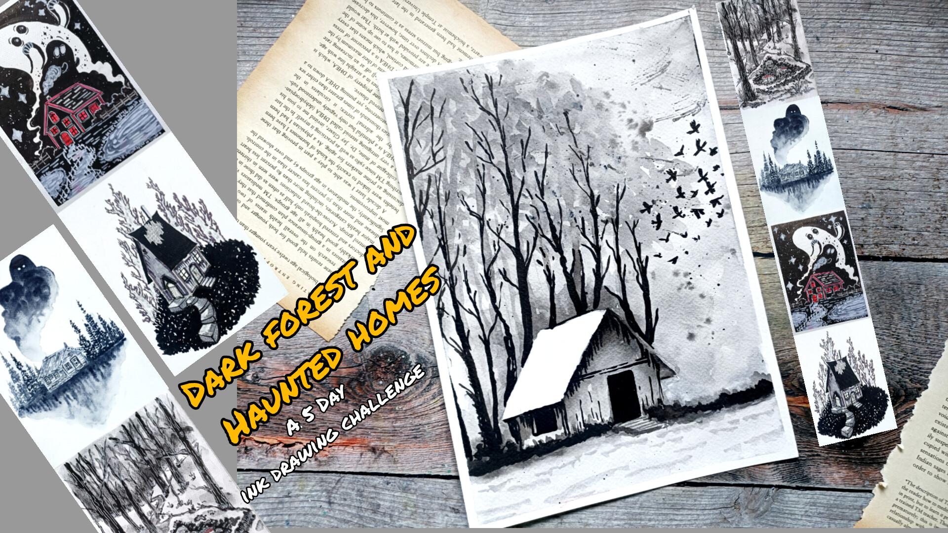
1. Welcome and Introduction : Hi even and welcome
to my new class, Dark Forest and Haunted Homes, a five ink drawing challenge. In this class, you will
learn how to create hauntingly beautiful and
atmospheric ink illustration through five unique projects. We'll be drawing a
variety of scenes, including a smoky ghost house, a Secluded Winter Cabin, a broken, abandoned home. Then we have Haunting
Under the star, and lastly, we have
the Night Visitor. We will begin with the basics, where I'll guide you through
essential ink techniques such as line work,
hatching, shading. I'll also walk you through the simple supplies you
will need a fine liner, and a bit of ink or watercolor is enough to get you started. And apart from
that, I'll also be showing you various
elements, houses, trees that we'll be using
for our three main projects, how you can easily create it in different ways and
different kinds. Hi, my name is Whale. I'm an artist from India, and on in skills here I teach beginner friendly classes
on ink illustration, oil pistols,
watercolor, and mod. You can also find my work on
my Instagram and YouTube. This class is suitable for both beginners and intermediate. This class is designed
as a five day challenge where I'll be uploading
one project each day. Most of the lions are
taught in real time, so you can draw along
comfortably at your own piece. The projects in this class
are under 20 to 40 minutes, so you can create one project
each day very easily. So join in this class and
let's create some dark, moody and beautifullyk ink
illustration together. I'll be seeing you
in the first lion.
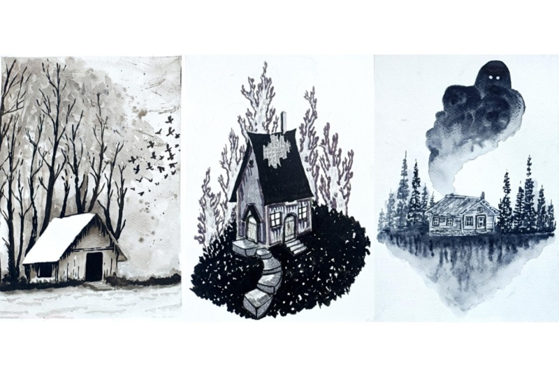
2. Class Project : In this class, you will be
creating a collection of five dark and atmospheric
ink illustration based on haunted homes
and forest scenes. In here, we have got
the Night Visitor. Then we have Haunting
Under the Stars, followed by broken house, we have got this Wood
Cabin's Smoky Ghost. Then we have Secluded
Winter Cabin. Apart from that, we have got
the three practice sats, one of the basic pen and ink
illustration techniques. Then we have got some
of the elements that we'll be using in our
three main projects. And then we have this tasting our supplies and
creating various lines. Your task is to complete all five illustration or
choose your favorite ones, focus on building mood, depth, and texture using ink, and take your time and follow
along at your own piece. Once you are done, upload at least one finished
illustration or your full set of the project. You can also include your
practice seeds and experiments. I'd love to see
how you interpret the scenes and add your
own creative touches. Enjoy the process, experiment
with your own strokes, and most importantly,
have one while creating.
3. Supplies : For this class, I'm
using simple pencil and erase it to do the
basic pencil sketching. Then we have got Sakura
microns, fine liner. Mostly, I'll be using black colored fine ans to
do the coloring, and we have got the
Stumbo brrst paint, gel pens, simple ballpoint
pen will do the work too. Mostly black and blue
colored wallpoint paint. I'll be using 300 TS
and watercolor paper. You can also use sketch pens. In here, I've also got this grey colored breast
pin, white gelpin. Apart from this, I also got this set of marker,
grey colored marker. For some of the section,
I'll be using this. There watercolor brushes, a small and large brush
will do their work. Black ink. I have got
tomb black ink from zukurataki TissuPaper and masking tape to
secure the people. Apart from this, I'll also
be using few breast paints. I won't be using all of them. But these are some of the
breastpains that I have got. These are Zi Kurataki breastpin
and Pentls breast paints. I'll only be using
two or three of them. You don't
have to use this. You can do all the work with
simple breast paints or simple fine liner or
using watercolor breasts. I'll also be using this
large breast to cover larger areas and to do
weight and weight technique. Apart from this for a
little bit more detail, I'll be using this
kind of brasses. These are optional
too. And instead of using the black ink, you can always use
the watercolors. To make the projects colorful, you can also use
colored breast paints. You'll also be using white ink. You don't need all the supplies, a normal black fall
point paint along with watercolor and
a little bit of ink. With this, you can
create all the projects.
4. Basics : Hi, and welcome to the basics. In here, I'll be
showing you some of the basic ink and pen
illustration that you can use. I'll only be using some of them. Let's start with a
basic line control. With the fine liner breast
pen or the ballpoint pen, we can create varieties
of the line in here. I'm just creating simple
directional lines. Then we have curve
sheets and loops. You can also create this
kind of broken lines. These are foundation
for all inquire. Practicing this kind
of line and various other helps improve hand
control and consistency. Now moving on to spacing, spacing means the distance
between the two lines. The wider the space, the lighter the
area will appear. The tighter the
spacing, the darker the areas will appear. The first one that I
created with more spacing, the second one in here
with less spacing. So depending upon
the requirement, we'll be using various kinds of spacing in between the lines. Next, we have line length, so we can create various kinds of lines from large to small. Generally, I'll be
using sort lines for root texture and long lines
for smoother surfaces. Apart from this kind of simple
and normal straight lines, you can we can create
other kind of curvy lines, too, of various
seeps in the sides. Then we have line weight. Line weight refers to the
thickness of the line. With different kind of supplies, you can create
different kind of line, and that will have
different line weight. Generally, with
the light freezer, we get thin lines and
with heavy freezer, we get thicker lines. And to make line a
little bit more thicken, you can just overlay more layers like this in here
with this till pin. Next, we have angle. Changing the angle
of the lines add variations and
direction which helps guide the viewer's eye just by changing the angle as
you can see in here, I'm making the lines a
little bit more lighter. I'll be using this
kind of angle line to do a little bit
of setting later on. With different kind
of mean you can create different kind of angles. So I would recommend you to do a little bit of
experiment on your own. Now continuing on, we
have got hatching. Hatching is one of the most important technique
in ink drawing. It involves drawing
parallel lines to create tone and texture. For most of the project,
I'll be focusing on hatching for some
of the sections. Here are some of the examples
of simple hatching line. The first one I used
vertical parallel lines. In here, we have
horizontal parallel lines. We have got angled
parallel lines in here. And the fourth one in here, we have got this kind of
decreasing order of lines. Apart from this, you can also create this kind of
broken hatching lines. Besides this, we have got even hatching in which the lines are evenly spaced and uniform. It's basically used for
clean and flat surfaces. Next, you can create
dense hatching in which the lines will be
placed very close together. It will create a
bit darker tone. Then we have loose
or broken hatching. The three that I
showed you in here, one with a little
bit of even lines. The second one with
more uneven lines. The third one with
the horizontal ones. Then we have got directional
hatching lines lines follow a directional
flow like this. Or you can say that these are curved lines that follows the principle of somewhat
closer to hatching. I'll be using a little
bit of this kind of curved hatching lines for
some of the sections. He things to focus on
while doing the hatching, keep your lines
consistent and control, maintain a steady
direction in each layer, and avoid random strokes. Each line would
feel intensional. Next, we have sading
using the hatching. Next, we have sding
with hatching. This is about creating a smooth pronation
from light to dark. And here I'll be doing
four different example of doing seeding using
different hatching technique. Start with the light
widely spaced lines. Gradually add more
lines closer together, increase density as you
move into the sados areas. In here, I'm making this region, the left side a
little bit darker. So I added more lines in here with less spacing
in between them. Now for the second
one, and here we are using angle parallel
lines to do the hatching. I'm going to make
the upper section, the upper left corner
a little bit darker. So more layers of hatching lines with lesser spacing to make
this region bit darker. Apart from the seating, you
can also create a gradient. The second example is somewhat of seeding mixed with gradient. For the third one, this is a
different kind of seeding. Instead of using large lines
to do the seeding in here I'm using rows and rows of hatching lines
to do the seeding, layering one on top of the other to do the seeding
in this manner. This creates a little
bit more texture and we create different
kind of appearance. Apart from that, you can also use the broken
hatching lines to do the seeding in the same manner like we did for the first
and the second one. Apart from this, just keep in
mind for the lighter areas, use fewer lines, for mid tone, use moderate is piecing, and for darker areas, create tightly packed lines and to create a different
kind of effect, you can always wear
the line piecing, line length and line weight. This will help you avoid hard transition and make the
seeding look more natural. Next, let's move on to
the cross-hatching. Cross-hatching is created by layering hatching lines
in multiple direction. In here, for the first one, we have horizontal
and vertical lines. In here, we have angle line. And here's a combination of angle line and
straight lines. Apart from this, to make it
a little bit more darker, you don't have to just
do the two layers of the hatching instead of it. You can do multiple
layers like this. This is our third layer. This is our fourth layer. With more layers, you
can make it more darker. And apart from the normal
and the plain straight line, you can always use the broken lines to do the cross-hatching. Like this in here with
the broken lines. Apart from this, there
are different types of cross-hatching
that you can do. For the light cross-hatching, just use two layers to get
a bit of soft setting. For dense cross-hatching, use multiple overlapping layers. With the green cross-hatching, you can create
evenly spaced line in perpendicle direction. It gives a little bit of
structure and control look. And for the loose
cross-hatching, it gives a little bit of
uneven expressive lines. It's great for natural texture. In here, we are
doing a little bit of seeding using
the cross-hatching. This is somewhat similar
to what we did for the sading using
the hatching lines. You start with a
lighter hatch layer. Add second layer in
different direction. Increase density in sadose
areas by adding more layers. And reducing this
piecing apart from that, slightly increased line weight. So in here, I made
the upper section, the upper left
corner, bit darker. With fewer layers, you will get a lighter tone
with more layer, you will get darker tone. Next, we have stippling
in the technique in which we use dots instead of lines to
build tones and texture. Ford stippling, just create
this kind of simple dots with your pen or fine liner or the ballpoint pen
that you are using. Simple plain dots with the
name of your pen like this. With a larger pen or
with a larger name, you will get bit more
darker dots like this. You can also do the
sealing using it. For this example, let's make the upper right side
a bit more darker. To do that, I'll be adding more dots for that tree
in the upper corner. The stripping is similar
to the hatching and the cross-hatching for
lighter areas, at few dots and speeds
them far apart. And for the darker areas, add more dots piece
close together. Like in here, I'll be
adding more dots towards the corner right corner,
the upper right corner. In here with this stippling, the density of the dots control the value, not the preser. So in here, the preser
and angle does not matter that much.
It's negligible. And to give it a little
bit of cleaner look, always keep your dots
small and consistent. Avoid turning dots into tiny
lines, keep them circular. Like earlier with the hatching, you can also do the
even stippling, cluster distipling or
gradient stippling. In here, let's create
a circular shape using this stippling and
we'll be doing the seeding corner
the lower section, the lower part of
the right side, more darker with more dot. Adding more dots,
increasing the density of the dots in here to make
this set admit more darker. I'll generally be using
it to create soft shadows or screen texture or for
background atmosphere. Apart from this
normal size dots, you can also create bit
larger ones like this. You can experiment
with this kind of smaller and larger dots with
a strippling technique. Apart from this, you
can also use it to do the outline or create lines
using it in this manner. With the stipping you can create a very beautiful illustration. The main disadvantage
is that it takes a lot of time when
doing the stippling. Be patient stippling
peaks times, but it gives very smooth
and subtle results. I'll only be using a little bit of stepping for some
of the section. Next, we have got scribbling. Scribbling uses free flowing, overlapping lines to create
texture and siding quickly. These random lines in any
direction will do the work. So these are just
random scribblings? And you can also get seeding using the scribbling like this. In here, we are going to make the left side a bit more darker. As the hatching and
the cross-hatching, scribbing can be divided
into light scribbling, dense scribbling, and layered scribbling with the scribbling, speed of the movement
affects looseness. It's also pressure sensitive. More pressure creates more
darkness and overlapping in here creates higher density
and create darker tones. Next, we have scallops
or repetitive pattern. Scallops are repetiting
curved themes, often resembling small
arches or waves, simple kind of
scallops like this, baby or curvy lines
in this manner. In here, here's another one. You can create many
variations for the scallops. In here, you can
create this kind of triangular saves
for the scallops, too, making it a
little bit pointed and giving it sharp edges. You can create even scallops for clean and
decorative elements. You can create
layered scallops for overlapping rows or to create
a little bit of depth. You can also create
mixed pattern, combining arcs with
knigag saves or lines. You can also create inverted
scallops like this. Evenly or unevenly pieced
scallops like this. The purpose for this kind of scallops is to create
a stylized texture. Mostly, I'll be using
it for the roofs. It also helps in adding rhythm and pattern
to your drawing. You can also use it to
create the scales for the face reptiles
or for the tree. You can create more stylized version of the
scallops like this. I would recommend you to
experiment on your own and create more designs and more stylized pattern
for the scallops. Now, some of the extra elements that I'll be using for some
of the section in here, we have got salt flack lines. It can be used to create
grass fur or rough surfaces. Mostly, I'll be using it to create smaller grasses
on the ground. You can also use clustertugs to create ss foliage like this. You can use this kind of V seeps to create a resemblance
of flying bird. You can use small
curves and dass to create water ripples and
wind effect like this. Apart from this, you
can use random marks to create background texture
and atmosphere like this. Feel free to experiment
on your own and create more different kind
of marks and more practice. So that's all for the basics. I'll be seeing you
in the next section.
5. Testing Supplies : Welcome to the testing supplies. In here, I'll be
showing you some of the supplies that I am. I won't be using all of them. I'll only be using
two or three of them. Mostly, I'll be using the
Sakura micron fine liner, the black one to
do the outlining, and I'll use a lot
of black watercolor, black watercolor or black ink, and a little bit of
breast pain if required. Apart from that,
I'll also be using white jelly pen and white
colored ink for the highlights. In here, I have got this five different colored
sakura micron pain. I'll only using the black one. But if you want to make
it a little bit more air for some of the sections of
the project, you can use red. You can also use a
little bit of blue to do the outlining or
add a little bit of coloring for the windows. Then here we have
got breast paints. But mostly in here, I'll be
using the Tombos bras pain. It's comparatively more darker than the Sakura
micron fine liner, and it has got
excellent control. Apart from this, we have gotten this from Pentls bras pen. With it, I can create
more varieties of line more thicker
and more thinner, a wide varieties
of line with it. With this kind of breast pain, you can create more dynamic
lines with varied thickness. You can create all the
different kind of basics. You can use it to
create hatching, cross-hatching, scribbling. So for some of the sections, I'll be using a little
bit of the breast paints. You don't need the breast pins. These are not essential. With it, I can also
create this kind of mitror texture by
changing the angle. Apart from this, I also have
this colored brush pins. The main advantage
with the breastpin is that it creates
more dynamic lines. I have also got the
sparkling brass pens. With it, I can create yellow and a little bit of sparkling
lines like this. I won't be using it,
but we want to use yellow for some of the
sections of the windows, beside it, you can also
use the normal gel pens. I'll be using the
steel Pismo some of the section, normal
ballpoint pen. So this simple normal
ballpoint pen in here I am. Here's another cheaper
version of the ballpoint pen. You can also use the
sketch pens to do the coloring or do the
highlights or do the outlining. So I have got black
and blue ones. Apart from this, I've got this gray colored breast pin,
for some of the sections, I'll be using it to
create gradient or to sew a little bit of cats for some of the regions. It's dual tip. With one, I can create thicker
line with the other side, I can create thinner
line like this. I forgot to include this
normal breastpin that I have. So this is a cheaper version. With a cheaper version
of the breastbin you can also create the
same kind of line. And then we have the ink. I've got this two Zikuratak
ink that I'll be using. As you can see with the brush, we can create more
varieties of the line, more thicker and
more thinner lines. I'll be using a large and a small size breast
to do the inking. You can use the inner side of the brush to create hatching, cross-hatching, scallops and other basic ink
illustration techniques. You can also use it to do
the flat pass like this. My flat was, I mean, completely covering the entire section with a uniform color like this. I'll also be using wet on wet technique to create the
ghost for one of the project. Start with the primary layer of the water and then on top of it, overlay the black like this. And you can also
use the black in to create the gradient
from dark to light. Just keep on adding
more water as you progress and diluting it. I'll be just expanding
the color in here by adding a little
bit more water to it, by adding a little
bit more water to it and diluting its consistency. Mostly for the background, I'll be using the
darker consistency and uniform consistency
of the plaque. And for some of the
section where it's required to create
this kind of gradient, we'll be using lots of water. And beside that, and to
create Ghost or the smokes, we'll be using weight
and weight technique. Feel free to experiment with other supplies
that you have. These are some of those
supplies that I sold you. I won't be using all of them. I'll only be sticking
to three or four of the supplies for
most of the projects. And that's all. I'll be seeing you
in the next video.
6. Tutorials Part - 1: Welcome to the Part
one. For the P one, we have the Ghost to the cabin, the first project, then we have the Secluded Winter Cabin, and the third one is
the Broken House. This part one is divided
into two sections. So this is the first section. These are the three
projects in this part one, and I'll be showing you
how you can draw out the basic sketches
for the trees, the houses, the doors, windows, and some of the
background elements. So so let's start with the
basic S for our heart. So the first and the second
houses are the hertz. So very simple and basic
seeps for the heart, simple geometric
rectangular seeps. This is a bit simplified
version for the main project, we'll be adding a
bit more details and And we'll be adding more characteristic
to this heart. So let's add a chimney in here, a total of three
to four windows, a ventilation on
top of that door. And yeah, that's the simple
and basic C for our heart. Here's a simplified way in
which you can create at, a large rectangular C. And now let's divide
it into two sections, a larger and a smaller one, a triangle undertp and few more lines for
the top of the heart. So here's a simplified way in which you can
create the heart. Now, let's ink it. So here I'm going
with a brush pen to make the process
a bit faster. If you prefer you can
use the fine liner. And yeah, let's
do the outlining. And then we will add
a bit more details to the huts later on, the doors, the windows, and the
ventilation on the top, and we have got chimney too. The ghost will be coming
out of the chimney. For the lower section in here, I'll be creating a bit of
texture pattern later on. So for now, let's only
do the outlining. Now, let's do the outlining for the doors and the windows. You don't have to
follow the same exact outlines that
you did with a pencil. Feel free to make adjustments
and changes as you see fit. So yeah, we are done with three windows. Let's
add a circular. Let's add a circle for the
ventilation at the top. Chimney on the right side. So this is our very
simple version of the heart for
our first project. Now, let's erase it, and I'll be showing you
very simplified version of the two kind of windows that
you can add for the art. Here I'm using the
fine liner to get a bit more detailed lines and using somewhat broken lines
to create the windows. For our main project, I'll be creating uniform
and thick lines. But here I'm just showing
you two different kind of windows that I'll be
using Never Project. Dividing the windows
into four sections. This window got four panels, and yeah, for the insides, I'll be completely filling
it with the black. So here, once again, I'm
using the brush pen. If you prefer, you can
use the fine liner or sketch pen or black
ink or watcle. And this is our very
simplified version of the four panel windows. Now, let's create a bit
more defined window. So this window will
have five panels. A very simplified
C for the windows, a rectangle, and on top
of it is a semicircle. Dividing it into four
panels for this section, and this will be the
fifth panel at the top. Here, too, I use broken lines to create the outlines
for the window. If you prefer, you can create uniform lines and if you
want straight lines, you can use the rulers, too. So the choice is yours. Here, instead of
using the breastpin, I'm using the fine liner to feel line sides
of the window. So with the fine liner,
I'll get more accuracy and precision for the
small and final details, but it will take
a bit more time. Depending upon the pre
season and the accuracy, switch between the fine
liners and the brush pins. I'll be mostly using
the brush pains for larger areas and the areas in which I'll need to create dynamic lines or some part
of dark texture or pattern. And for the smaller areas or to do the rough
outlines or the skits, I'll be using the fine liners. Initial outlines
will be done with the fine liners and the
finals with the brush pines. Now let's move on to the door. A very simplified
version of the door. So this door will be this
door will have two panels. Let's read the outlines. Very simplified
version of the door, divide it into two panels. So this son will be
incomplete white, and the other parts will be
covered with a black ink. So this is just a very
simple version of the door. For our third project, we'll be creating a
bit more detail doors with wooden planks. And for our second project too, the secluded ventral cabin, we'll have very
simplified version of the door and the window. With these, we are done with
the outlining for the door. Now let's ink it. Here, too, since
the area is a bit larger and I don't require
that much accuracy, I'm using the bras pane. Carefully filling the bras
pine for the outer outline. And now let's feel the
insides with this after this, I'll be sewing you the
brick pattern that I'll be creating for the lower
section of the hurt, the ventilation at
the top of the door. A few example of the trees, the black ghost and the surface. We have got four or five
things for the first project. And with these we are
done with the door. Let's do the ventilation. So here I am directly
using the breast pain. So if you are comfortable with directly using
the breast pain, do that. I take it will save
a lot of time. Here, once again,
I'm using somewhat of broken lines to
create the outlines. Now let's darken the
outlines a little bit more, and let's divide this listen into four different sections. To draw out the outlines, I find it a bit more comfortable when I
use the broken lines. Now let's fill nine
sides with the black. For most of the
windows and the doors, I'll be completely
filling the regions with the black or the
seeds of the grain. And now let's move on to the pattern for the base
layer or the Bs of the hut. So I'll be creating this kind of pattern somewhat of
brick like pattern. Here, too, I am
using the breastban. If you prefer or if you want more precision and
accuracy, you can do. You can use the fine liner. So the choice is yours, and I'll be creating
this kind of pattern for both the sides of
the hurt for its base. Let's move on to the hurt. Let's add a bit more details. So I'll be adding this kind of broken lines for
this front portion, for this front portion
of the roof of the hurt, and for the edges of the
hurt, I'll be adding lines. So straight lines. Adding straight lines
parallel to the main lines. And here, let's add
the base layer. So the kind of pattern
that I sewed in here, the kind of pattern
that I sewed just now. So since the piece is
a little bit small, the pattern is not
that much visible. If you want, you can use
the fine line it to create somewhat more precise
and clear outlines for the brick, for the base. Now let's do the windows. You can see since the space
is a little bit small, so I'm not creating that
much detail window in here. But for our main project, we'll be creating a bit more detailed and
defined windows. And if you decide to create
the windows in this manner, what you can do to make
it more defined and detail is to add another
outline or bond ring. So just by surrounding it, you can add more depth
and detail to the window. Let's do our final window, four corners for four panels. And yeah, we are done
with the windows. Let's do the door. A very simplified
version of the door, adding the black for the
upper and the lower section. And finally, let's
the ventilation, very small four dots
for the ventilation. And now let me show you
how are we creating the very simplified
version of the trees. So this jig jag like pattern to create the appearance or resemblance of the trees. So pine trees in the background. As we move down, just increase the stroke's length and make it a bit more
broader and more thicker. Very simplified version of the pine trees that I'll be
creating in our main project. And let me show you how
I'll be creating the ghost. Very basic simple outline. I'll be using wet on
wet technique to create the ghost to create a bit of
smoky appearance for that. So going over the
outlines and completely filling the entire
section with this water. And now going in
with the black ink. So filling the
entire upper section with it and let the
ink flow towards the lower section to
create somewhat of a smoky atmosphere
for this black ghost. You can create the same kind of trees using the
watercolor brush too. With the watercolor brush, you can create somewhat more
defined and detailed trees as compared to the one that I created with the breast paint. So feel free to use breast
pain or watercolor, whichever you feel
more comfortable with Let's define the seep of the
goose a little bit more, and then I'll spread the ink a little bit more towards
the lower section. For that, I'll be changing
the watercolibrs. And now here I'm using different
brush to spread the ink. So this brush did
not contain any ink. And yeah, we are
done with the ghost. Now for the bees of
the house or the hut, here, too, I'll be using
weight and weight technique. So covering this section with clean water and now
going in with the ink. So here, too, I'm creating somewhat seen smoky pattern or smoky atmosphere for
the bees of the house, spreading the ink toward
the lower section. Let it dry a little bit, and then we will get
somewhat of unique texture. And for the background, too, I'll be creating this kind of smoky texture or atmosphere. So a little bit of green to
create this kind of texture. And when the first layer dries, we will add another
layer to create somewhat of trees
resemblance of the trees. So here I'm using
the plucking to create a little bit
of background trees. Not that much defined,
just the appearance of somewhat of some trees that are present
in the background. Now let's add a bit more
details to our art. So let's make it a
bit more gray for the upper section of the heart and for the lower sexton too, for this region to a bit more
darker side of the green. And now let's create a few
more lines to create a bit of textured pattern for the remaining section
of the heart. And with these, we are done with the major element of
our first project. Now let's do the major element
of our second project. So for this, I'll be showing you the stairs, the pavement, the house, doors, trees, and the grass at the background. So let's start with
the hut or the house. So this will be a
bit larger one, not larger, bit longer one. So the upper section of the
hut is comparatively longer. Somewhat of rectangle seam for the front of this
house or the hut. And yeah, we are done with
a very basic simple sea. Let's add the
chimney on the top. This house will have two
door, one on the side, and one on this side, two windows for the
front of the house. And since it's a broken house, some section of the front of
the roof will be visible. Let's do the outlining and add more details with
this fine line here. Okay. Use pencil to create the rough
guideline and then add and then go in with the file and it to add
more details to it. And after that, use the brush paints to add the
final details to it. Now going over the
outlines of the doors. So this will be somewhat
different doors than that of the first one. Let's add the
windows. The Windows two will be a bit different. And I'll be adding one
ventilation on the top in here. Yeah. With this, we add with a very basic seat
for our long house. Let's create the stairs. Very simple seats for the stair. Start with this kind of
skewed rectangular seat for the stairs, divide it into
different sections, different equal sections, and let's add the lines to create the resemblance
of the stairs. And this is how I'll be
creating the stairs for the houses and for the larger
sections of the stairs. This pavement or this kind of stairs will be somewhat larger. And as we move farther away, the seep will increase
further, too. The steers and this section will be somewhat of
different length. Here, I made the
stirs a bit smaller, but in our main project, I'll be making them somewhat
of comparable length. Now, let's do the
outlining to make the stirs and this section a
bit more defined and detail. Feel free to make adjustment and try to ensure that
the perspective is right. And yeah, let's do the outlining for the
remaining section. We'll be covering
some of the section. Never mean project
with the grass. I'll be using the blacking
to create the grass. And now let's add the fine
lines for the strays. And we are done with
this. Now let's remove the pencil outlines. Here, I made a mistic The steel
is comparatively smaller. For our main project, we'll be making it comparatively larger. Now let's fill the entire region with this lighter
seed of the green. For our main project,
we'll be using seeds of the green and the
black to create the grass or the foreground for one section or one side of
the stairs and this section, we'll be adding a bit lighter or the darker seat of the gray
and for the other section, we'll be adding
bit darker tones. I'll also be using a little bit of stippling to greet bit of sading And here I'm just showing you the
rough demonstration. We'll be making it
more detailed and more defined for
our main projects. And with this, we
are done with the seeds and the remaining. Now let's move on to the house. So for the area here, the edges I'm using this
sad of the gray and now let's go in with the water to blend it with
the rest of the region. So spreading this gray to the remaining
section of the heart. If you want a bit more uniform
spreading of the color, you can use wet on
wet technique the way we used for our ghost. Now, let it dry, and then we
will add more details to it. Now let me show you how
creating the doors. The door will be
somewhat similar to the second window that we
created for our first project. So this will be our
wood panel door. We are done with the outlining. Now let's add the
wooden planks to add more details and more
characteristic to this wooden door. So for the outer regions, I made it comparatively darker, and for the inner regions, I'll be using single lines,
single organic lines. Like here, I'm creating the
wooden planks for our door. Now, let's create the
door knob and the handle. And with this we with the
first section of the spot one, I'll see you in the second
section of the spot one.
7. More Elements Part - 2: Welcome to the second
section of the part one. The color has dried. Now let's continue add now let's continue with adding more
details to our large house. So here I'm using the fine liner to add the details for
the windows, the doors, and the remaining
part of our house, the same kind of door that
I sawed you just earlier. And if you want, you can use the bras paint to make the
process a bit more faster. You will get a bit more
bolder and darker lines. Now let's create the front of the door to this kind of roof
for the front of the house, and there will be stairs for both the doors in
here and here, too. For our main project,
on the one side, there will be a stair
and for another side, we'll be creating the pavement. The broken structure, the
broken roof that I mentioned, simple lines to so that the roof is somewhat broken on two or three
different places. Here I'm using the
fine liner later on, I'll be going with the brush
paint to make the lines a bit more bolder and more darker and add more
details to it. For the upper
section of the roof, I'll be completely filling
it with the black. And for the fourth ground too, I'll be creating the
grass with the black. Using the black ink
to create the grass, creating this kind
of strokes with the watercolor brush to create the texture or the pattern for the grass or the foreground. So not completely filling
the entire section with it, majority section
with the black ink. Earlier, I mentioned that I'll
be using the brush paint, but I decided why not let's
use the watercolor brushes. With the watercolor brushes, the process will be
much more faster. With the watercolor
brush or the brush pins, you'll have to be a
bit more cautious and careful around
the smaller details. So for those area, first
surround them or you can use or you can use the
fine liner to surround it, and then later on, fill
it the entire region with the bras pin or the
watercolor brush. I have surrounded both the
broken sections of the roof, and now let's fill the remaining
section with this black. For this smaller roof, too, let's fill it
with the black. Now, let's do the outlining
for the doors, window, and the edges of
this large house to make it more bolder
and more darker. So you can see the difference. The fine liner, the breast pin, and the watercolor
brushes or the ink or the ink that I am using
is completely different. The fine liner the regions
where we use fine liner is comparatively less dark and the regions where I use the
breastpins is more darker. So depending upon
the so depending upon the requirement of the illustration or the
project you are doing, feel free to use the
different tools, the fine liner, the breastpin
or the watercolor brushes. And we are done with our house. We simplified version
of the large house. Now let's read the trees. So I'll be creating this kind
of tree for the project. This kind of jig jag texture or you can see
pattern for the tree, and I'll be using the
grey brrass paint to add bit more details to it. For the foreground
to, I'll be using the same kind of grass that I added in
front of the house, very simplified
version of the tree. This is the kind of trees that I'll
be surrounding the background of
the house with. Now, let's add the
grass in the front. And we are done with most of the element for our
second project. Now let's do the third
and the final one. For this one, we'll have to pay a bit more attention
to the background. For now, let's start
with the heart. So very simple heart,
just like the first one. It will be a bit more
simpler than the first one. Here I have directly started
with the fine liner. If you're not comfortable, you start with the pencil sketch and then add the fine
liner or the bras pen. Very basic see for our heart. The ground will be
covered in the snow, so I won't be adding that many color or the
grasses in the foreground, but the background will be
a bit defined and detail. The kind of background that
I fit it in the upper part. Now, here I'm going with
the lighter side of the green for most of the
section of the heart, completely covering the
windows and the doors with it. Let's make it a bit darker. The upper regions and the
regions near the edges. Now going with the blank brush, my blank brr I mean
this bruse does not contain any ink,
only the water, and I'm using this to
spread the and I'm using this to spread the darker
color from top to the bottom. Now for the background, using the bit lighter side of the green for the primary
layer of the background. This region was not
that much dark, so I decided to add
a bit more colour to it to make it a
bit more darker. Now, let's add bit more
details to the background, a bit darker side of the grain. So we'll have two or three
layers in the background. And then on top of it, we'll be adding the dark. And on top of that,
I'll be using the dark tone to create the
outlines for the trees. In here, too, let me
show you how I'll be creating the front,
the snow ground. So a bit lighter seat of
the green for the for now. And as you can see, some
of the spec is somewhat white and the remaining saxon is completely covered
with the gray. So this kind of texture or you can see this
kind of atmosphere, I'll be trying to create
for the front of the house. Spread the ink in this
manner and let it dry a bit. And here I'll be showing
you two different ways in which I'll be
creating the background. Primary layer with a gray color. So primary layer
with a grey color, and let it dry a little bit, and then we will add
the trees, the birds. Now let's move on to the heart. The ink has dried a little bit, and here I am using a bit
lighter side of the green and creating a bit more definition to the upper section
of the heart. The watercolor that I'm
using right now will blend with the remaining section of the green that we used, the green colour that we use, since the water has not
properly dried up and we create somewhat of beautiful
gradient in between them. Now let's go over the
outlines of the edges and feel the doors and the windows
completely with the black. If you want, you can
make the doors in the windows a bit more
defined and detail. Yeah, we de with the doors and
the windows and the edges. Let's define the outline for the upper
suction of the roof. Let's add a few more fine lines, make it a bit more detailed. And, we add her with the heart. Let's extend the grass
a little bit near the edges of the
stairs for this hurt. And yeah, we are done with
the art and it's surrounding. Now, let's wait for
the water to dry. And while the water dries up, let's create some kind
of grass in here. So simplified version of the grass that surrounds
this pavement. And with these, we are done with the grass that's around
the pavement in here. Now the ink has dried. Let's create the
seeds for our trees. So I'll be creating the trees in this manner using broken
lines to create the trees. So for the trees, too, we'll be creating two or
three layers of the trees. Front trees will be
a bit darker and the background trees and the background trees
will be a bit lighter. Here I'm just sewing with
the seeps for the trees. And for the other two examples, I'll be sewing with the foreground and
the background trees, the lighter and darker
shades of the trees. Let's move on to the
silhoutt for the birds. Very simplified son
for the flying birds. You can consider this to be
the crows or bats or pigeons. Simple seeps to resemble the silhouettes of the
birds that are flying. We'll be creating this
kind of pattern using the tapping method to create small dots that
surrounds the tree. And now, as I was mentioning that I'll be creating two or
three layers of the trees. So the background has dried. Here, I'm using a bit
lighter side with the green to create the
first layer of the tree. These trees are
not that defined, doing the same for
the trees in here. Simple shapes for the trees and the kind of texture
of the pattern that we use to create the grass
will be surrounding the trees with those
texture of the pattern. A few more trees here and there that surrounds the
background for the house. For the front, too, some simple lines to resemble a
little bit of mounds, snow mounds that are present
in the front of the house. Here I use a bit darker
tones of the green. For the main project, I'll be using a bit lighter
seats of the gray. Let's add another
layer of the tree, a bit darker side of
the gray on top of the lighter side of the
gray trees that we created. And yeah, let's create
very simple trees in here. So here I have shown
you three examples for the background and
the background trees. The first one, for
the first one, you can create just
simple silhouette of the pine trees that I showed
you in the upper section. For the second one,
you can create simple straight lines or somewhat curvy lines for
the trees and then use the kind of texture or the pattern that I
used for the grass. And on top of that, you can go in with the mid darker tone of the black to create
more detail and defined trees. L here I'm doing. And So feel free to use any of these
different kind of background for our projects. So let's add few more
branches for our trees, and then we will be done with the second video
of the first pot. And we are almost
done with the trees. If you want, you can add few more branches here and there. And yeah, we are done with this. I'll see you in
the first project.
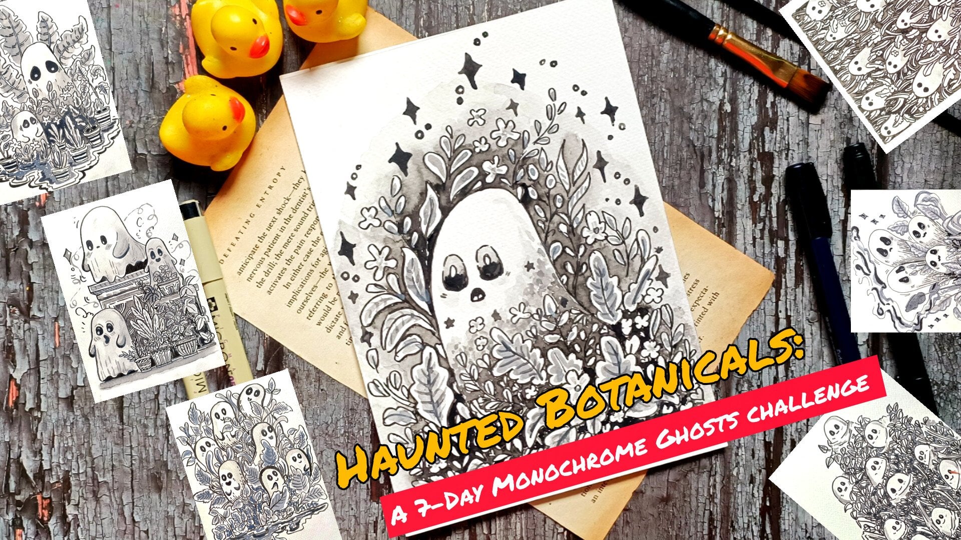
8. Wood Cabin’s Smoky Ghost: Welcome to our first project, the Wood Cabin's Smoky Ghost. So this is going to be exciting, so join me, and let's start. Starting with the
basic pasil skate, this will be somewhat similar to the one that we practice
in the part one, not somewhat, but very
similar to the first one. Instead of the small
and minimal details, we'll be adding more details, making it bit more smoking. The side of the ghost
will be much larger. There will be marine
trees in the background, and we'll be using
white ink to add more highlights to our
herd and the ghost. A very simplified set for our hot if you want to make adjustment with a
seep in the side of the hurt, feel free to do that, and I'll
be adding the stairs too. Let's add the outlines for
the doors, the windows. In the demonstration video, I did not add the
defined stairs, but here I'll be adding
the stairs like this. Here I'm not connecting the horizonal line to both the sides as I'll be leaving
a little bit of white space for both the sides. And here, we are done
with a basic sketch. Let's start coloring it. If you are not comfortable,
you can start with a fine liner to do the outline, but here I am directly
starting with the watercolor. A very light side of the green, and we'll be covering
most of the areas, and we'll be covering most
of the areas of the heart. A very light side of green, and let's cover the heart and the base layer
of the heart too. You don't have that much causes, even if you spill
some of the color, it won't matter that much since we'll be covering
the background with the tree Now, let's do the land a bit darker side of the
gree for this one. Here, I'll be using the
wet and wet technique. I just use this bit darker side of the gree so that
it will be visible. It would be advisable
for you to use the clean water to do this
wet and wet technique. Since we'll be using the dark
side, so I decided why not? Let's use the darker side of the grill and it will
be clearly visible too. So that's why I used it. Also ensure that there is no accumulation of excess
water in some places. Here, I added a little
bit of more water, so I'll wait for the people
to soak some of the water, and then I'll add the ink. So till it dries, let's do the coloring
for the background. So the same fate of the gray, and we will be covering some of the section for
the background with it to create a
resemblance of some of the trees that are present
in the background. So this is our background
for the trees. And once again, I'm using the Baton wet
technique to create the silhouette of
the giant goose that looms behind the house. So feel free to make adjustment to the seep and the
size of the ghost. Here I have only created
the sep of the ghost. If you want, you can
add the hands too. That will make it more funny or somewhat scary too. So
the choice is yours. And instead of adding the tail of this
ghost to the chimney, I added it on the other
side of the roof. But if you prefer,
you can do that, too. Let's add a little bit of more grayish color for
the background, too. Are we adding the trees in here, the pine trees in here later on. And I think we are done with this first layering
of the color. Now, let's add the ink.
Now let's add the color. Here I'm using watercolor, the black watercolor
for the ghost, and I'll be using the same
for the rest of the house. Primarily adding this black watercolor for the
upper section of the ghost and let it spread throughout the
rest of the section. And yeah, let's move on
to the lower section, a darker tone of the black
for the lower section, and we will be mostly adding
this black for this section, the upper section, and let
the ink spread a little bit. And if it's not
spreading that much, you will have to use the
brass to spread the ink. Like here, I'm going to. Like here, I have to spread
the ink a little bit for the lower section since it's
not spreading that much. But instead of this watercolor, if I have used the black ink, it would have spread
a little bit better. Here I'll have to use a
little bit more watercolor. So here I added a little
bit more black watercolor, and now I'm using the
water to spread it. Spread it in any
manner if you prefer. You don't have to do this the
way I'm doing it in here. You can create spiral patterns or bit of different kind of pattern to create a bit of different texture or
different atmosphere. Now let's move on to the ghost. Here, once again, I
use a little bit of more watercolor since the
colour did not spread evenly. Now, let's spread it. The upper sexon will
be a bit darker and the lower sexon will
be a bit lighter. And we are done for the
ghost and the land for now, here I'm using a little bit of black from the land to create a resemblance or
the silhouette of the trees for the foreground. And I'll be adding more details to the ghost
and the land later on. I'm waiting for it to dry. So spread some more darker
side of the green for the upper section to
create the resemblance or the silhouette of some of the pine trees in the background. Here you can see
I'm not creating that much defined
silhouette or the seeds. If you prefer you
can do that, too. Like I was mentioning earlier, that you can create some kind of pattern or texture
for this land. Here I'm using a little bit of black watercolor to
create this kind of straight pattern or
straight lines that is spreading from
top to the bottom. Instead of this kind
of straight pattern, you can create
spiral patterns or different kind of
texture or pattern. And if you want
something unique, you can sprinkle a little
bit of table salt. It will create some
beautiful spiral patterns. Let's add a little bit more
detail for this region. So here, once again, I'm going in with a
little bit of water to spread the watercolor
a little bit further. This reason was not covered, so I added a little bit
more black to cover it. For now, I'm satisfied with
the ghost and the land. I'll be adding more details
if required later on. For now, let's do the heart. So here I'm using a bit
darker tone of the gray. Let's start by doing
the outlining for it. Once again, here I'm using broken lines to do the outline. If you prefer, you can create
uniform or straight lines. And yeah, carefully, do the
outlining for the heart. If you want, you can also
use the breast paint. And apart from this black, I'll be using a little bit of white ink to add
the highlights to our heart and add the
eyes for our ghost. Here I made a little
bit of mistake. This side of the heart
is a bit more broader. Try to avoid this kind
of small mistakes. Now let's add texture
or pattern for the top of the roof for this
heart. So simple lines. I'll not be covering the entire section of the roof with it, but most of the section will
be covered with this Here, I just decrease the
intensity of the gray a little bit by diluting
it with the water. Now let's do the outrunning
for the rest of the t, and then we will add
more fine lines to create the more texture and
pattern look for the het. So this is what I
mean when I said it, I'll be adding
pattern and texture. So simple straight lines for the entire section of the het with this lighter
sad of the grain. Let's add a little
bit more fine lines for the upper section
of the roof, too. With this, we are done
with this lighter section. Let it dry a little bit, and then we will add a
bit more colors to it. Here I'm using a bit
darker side of the green, and let's make the lower regions of this heart a bit darker. Here I'm trying to create
a bit of gradient in between the darker side of the green and
the lighter sides. Let's make the outlines
a bit more bolder. Now I am blending the colors
a little bit to create a subtle gradient between the upper section and
the rest of the ht. So spreading the darker side of the gray a little bit with the pattern line
that we created. And once again, here I'm using a bit darker side of
the gray to define the outline for the
lower section of the base for the lower
section of the hot. Here I'll be creating
the brick like pattern that we practice
in the first part. Now going in with the darker
side of the black to do the outline to make the outlines a bit more
bolder and more darker. As I mentioned earlier, we'll have to do the
coloring in layer. We'll have to add few
more layers until we are satisfied with
the desired outcome. Carefully adding it for
the outline of the door. Let's move on to add the
outlines for the windows. The windows, one window in here, and two windows on
the other side. If you're not comfortable
with the watercolor brush for this tiny and minute details for the
windows and the door, you can use the brush paint. You'll have to wait for the
ink to dry and then use the brush paint to
do the windows, the doors or any other
minute or tiny details. Let's create the
four window panels. So adding black,
small squares for the four different window
panels for our windows. I'll be adding the blacks for the other two windows later on. Let's do the rough
outlining for the door for now and we will move
on to the stairs. Very simple straight fine
lines for the stairs in here. And if you want, you can
make it a bit more detail, but I'm satisfied with it
since the space is very small, and let's move on to the base. So brick like pattern
for the base. The patterns for the brick work. Very simple fine lines to create the resemblance for
the brick pattern for this lower
section of the heart. You'll have to be a bit
careful around here to create this kind of
brick like pattern, and we are done with
the lower section of the art with this
brick like pattern. If you're not confident with it, you can just completely cover it the darker side of the gray. The ventilation on
top of the window. So here I used a bit darker
side of the green to create the circular side for
the ventilation later on. I'll be using a bit
of whiting to create a bit more defined and detailed verson for
the ventilation. Adding a bit more detail and definition to the upper section of the roof with
these fine lines with a bit darker
side of the green. And now let's do the
trees in the background. So here I'm using
a bit darker side of the lack the
black watercolor. Let's create very simple version of the pine trees
for the background. Same kind of texture in the
pattern that we practice. So jig jack lines and increasing the thickness of the strokes as we move away from the top. Mostly, I'll be using the
darker side of the black to create the silhouette
for the pine trees. But for some of the trees, I'll be using a bit lighter
sides of the grad too. So feel free to
change the color, darker side and the
lighter shades too. I'll also be wearing
the sizes of the trees sizes and the
saves of the trees. Instead of the long
and straight trees, you can create a little bit of bend trees or a
bit slanted trees. For both the sides
of the houses, I'll be creating
five to six trees. If you prefer you can
create more trees or you can even decrease the
number of the pine trees. And you don't have to even create this kind of pine trees. You can create totally
different kind of trees that we practice
in the Part one. Apart from the
ghost, you can also add the silhouettes
of the birds. Here as I was mentioning
that I'll be using lighter sets of the gray
to create the pine trees, too, so you can see that I use a bit lighter sates to
create the pine trees. Let's add a little bit
of black in here to blend it with the rest of the
trees and the foreground. And, we are done with this side. Let's move on to the other
side to create our pine trees. Here, too, I'll be wearing
the seeps and the sides of the tree very simplified
versions of the pine trees. So let's continue with creating our long and
straight pine trees. And while we are creating
these pine trees, let's sprain storm
to make this project a little bit more creepier
and more haunting. To do that, instead of
this one giant ghost, you can create multiple black
silhouette of the ghost that is flying around or
encircling the cabin house. Then for the foreground,
instead of creating this kind of texture or pattern using
the ink and the watercolor, you can create giant roots that is coming out
from the trees. A from the foreground, you can create a little bit
of blackness structure or black silhouette of
the ghost that is coming out from the foreground
or from the ground. And then for the windows, too, you can create tiny
silhouettes of the ghost that is hidden behind the
doors and the windows. And instead of the pine trees, you can create other
small ghosts that are setting or that is
lying behind the trees. So for that, you'll have to
change the kind of trees. Instead of the pine trees, you'll have to create
different kind of trees that we practice
in the first part. So combining those two elements, the long trees and small
ghosts that are pecking behind the And with these, we are done with the pine
trees for both sides. Let's move back to the hut. So using a bit darker
side of the green to add more fine line to add more fine lines or more details for the upper
section of the roof. And let's move on to the
other two sides of the house. Adding some more finer lines and fine details to create a bit of rough and textured pattern
for the rest of the hurt. Let's make the outline
of the door and the windows a bit more
darker and more clarified. Here I choose to create a
simpler version of the door. If you want, you can
create the same kind of door that we practice
in the first part. Let's add the blacks
for the windows, very tiny small rectangle would see for the four
panels of the windows. Moving on to the final window. And we are done with our
windows and the doors. If you want, you can add few more fine lines or more details for some of the
section of the roof or the remaining
section of the hurt. Decided to make this section
of the door a bit larger. And for this upper section, too, let's add few
more lines in here. And I think we are
done with the art and the rest of the background
and the foreground. Here, now I'm going in with
the white ink to create the tiny little dots for the
eyes of this giant ghost. So here I'm using
Zikurataki white ink. If you don't have the white ink, you can use the bit thicker consistency
of the watercolor, or you can even use
the acrylic white. Now let's add more finer details and more highlights
to our heart. So I'm using this white
ink to do the outlining. And to do that, I'll
just add a little bit of white broken white
lines to create a bit more distinction in between the different
section of the heart. So here I have started
with the roof of the hurt, and now let's move on to
the sides for the edges, one or two lines to create a clear distinction in
between the foreground, the background, and
the rest of the hot. If you want, you can add
little bit smaller dots or strokes of the
white to create a bit more texture and pattern for the brick
layers, ventilations. Now moving on to the door. Now add more white wherever
you think it's required. I decided to add a little bit of more white for this
lower section. Let's do the outlining
for the stairs, too. Let's add a few lines in here for this
section of the roof. And I think I am
done with the white. If you want, you can add
a little bit more white. Now let's move on to at
the final details here, I'm going with a bras paint to make some of the section a
bit more bolder and darker. Here, I did not use
the fine liner, since I use a little bit of darker sets of the black
for most of the regions, and the intensity of the
black that I will get with the fine liner
will be bit lighter. And let's continue with adding more finer and
bolder outlines with this bras paint for the regions that are bit lighter
in the seeds. Here I decided to add a little bit more black
for the slower region of this hut to blend it with the background of the trees and the rest of the foreground. And with this, we are done
with our first project. So I hope you enjoyed
this first project, and I'll see you in
the next project, happy painting. Did
9. Secluded Cabin: Welcome to the second project, the Secluded Winter Cabin. For this project, I wanted
to create an atmosphere, a sad atmosphere for this one. So we have got a lot of
grey colors in here. So let's start with drawing
the horizontal line and let's sketch out the
guidelines for our simple heart. For this project, we'll have
to do a lot of layering, so multiple layers of the colors starting
from very light colors. And as we progress, we
will move on to adding a bit higher or darker tones
of the grease and the black. As I mentioned here, we
are aiming to create a sad and eerie atmosphere for this secluded winter cabin. So very simplified version of a hut in here, and
in the background, we'll have some barren trees, few crows or bats flying around, and the front and the
front will be barren too. Et's sketch out
the guidelines for the stairs in front of the door. Now, let's move on to sketch out the guidelines for the
doors and the window. There will be only a single
window, a large window. If you prefer you can add two windows instead
of single one, and you are free to make adjustment And with this, we are done with a basic
pencil sketch for the hurt. Now let's do the rough
sketches for the trees. So these are just
simple sketches. I won't be following the
same or exact guidelines. So feel free to make
adjustment in here, too. And yeah, we are done with the basic guidelines
for the whole project. Now, let's start with coloring. For this project, I'll be using both watercolor and brass pinto. Here, I'm starting with
a mid tone of gray. So let's spread this gray in here for the upper
section to create a resemblance of foliage or somewhat leaves for the trees
that are in the background. For the trees in the foreground, I won't be adding any leaves, so the trees will be barren. But for the background trees, I'll be trying to create
this kind of pattern or texture that there
is a leaf foliage. I'm doing the same
thing in here. This portion to will
be a bit darker in tone as compared to
the middle section, and you'll have
to be bit careful while adding the
color near the heart. I don't want to add any color on top of the surface of the roof, so you'll have to be a
bit cautious in there. And, let's continue with adding this middle tone of green for the remaining person
in which I'll be creating the
background for the trees. Different kind of background. You can use wen
weight technique. So you'll have to apply the
water for the entire section, the entire background section, and then a little bit of
darker or middle tone of the gray to create the foliage or the background for the trees. For this region, I'll not be
adding that much gray tone. A little bit of grease
will do the work. So a lighter tone
of the grease as compared to the one we used
in here for the trees. Here I'm only using the water to spread the little
gray that I added. Let's blend it with
the rest of the gray. Completely covering
this background with this watery consistency
of the gray. Ensure that the water
is evenly distributed. This region become a
little bit too light, so I decided to add a bit more
darker gray tone in here. Feel free to add more grease wherever you think
it's required. This will be our primary layer. I'll be adding two
or three more layers of the different tones of the green Andrews
is a second layer, a bit darker tone as
compared to the earlier one, and I'll only adding this beside the heart beside the heart or the house that we
have got in here. And for both the
sides of the hut, I'll be trying to
create small boses. So for the left and
the right side, small darker tone or dark black boses which
I'll be adding later on. Let me so what I
mean by the bosses. So this will be the small
presentation or silhouette of the bosses that will be covering the front section of
the house a little bit, or a small portion of the lower sexion
will be covered with this And for both the sides, too, we'll be continuing with this narker middle tone of the black that I
am using in here. The thing is I'm not separately using the
green and black. I'm just diluting
the black watercolor to get different
consistency of it. For this gray stone that
I used in the background, I diluted the black a lot. And here I did not dilute the black that much for the
bushes around this house. Now let's colour our cabin. Here, too, I am using a
very light consistency of the gray Bring the states with
this lighter consistency. And also, I'm spreading
the grey from the buses a little bit for the entire
section of this foreground. If you want, you can make
it a bit more darker, but I decided that I'll be using the same consistency
of the white that I use for the background, the right side of
the background. Here I'm using a bit
darker consistency for the regions near the
upper section of the roof. So the upper section of
the roof will be a bit darker This is our first
laying of the darker color. On top of this, I'll be adding two or three more layers to
make it a bit more darker. In here, I have used
wetn went technique, so the consistency of
the gray that I just applied in here will decrease
further as it dries. So that's why I'll be adding more layers on top
of it later on. The background has
dried a little bit, so I'm adding this second layer on top of the earlier layer, a little bit of it, not covering the entire section, but
some of the section. The buses in front of the
house has dried also, so it's spreading a little bit of lighter side of the green for the lower section of the hut or the house that
we have in here. Since the water in the background
has dried a little bit, not the entire section, so I'll be creating our
first layer of dough tree. So you can consider that I am
using wet on wet technique. Here, the consistency of
the gray is in medium. It will spread a lot since the background is not
completely dried. So I'll be just creating
some silhouette of simple trees, a
bit thicker trees. Here, let's create this kind of silhouet for the background. So these trees will
be a bit thicker. And after this, the
next layer of trees that I'll be adding
will be a bit thinner, but it will be in dark color. I'll be creating eight
to 12 large silhouettes for the trees in here, and then I'll also be trying
to create a little bit of foliage or representation
of small leaves. Instead of this
kind of long trees, you can create the pine trees. That will be interesting too. So the choice is your, feel free to experiment
and create different kind of scenarios or
different atmosphere for the second project. Here I am adding smaller trees. Now let's create the
foliage for this tree. Small strokes of the brush. So small brush strokes with
this side of the gray, and I'll be covering the
upper section mostly. So here I won't be covering
the entire section, but I'll be trying
to cover most of the section and surrounds the silhouettes of the
tree with these kind of brush strokes with this
shade of the grain. So let's move on to this right side and do the same thing, creating these random strokes
of the brush to create the foliage of the leaves
for the background. This is our second layer, and for the third layer, I'll be adding the darker tone. By darker tone, I mean, I'll be using the
black to create the trees and few
leaves if you prefer, but I won't be
adding the leaves. For this sexon, I decided to add a bit broader strokes to make this area a
bit more darker. This region will become a
bit lighter later on when the colour dries since we are using weight on
weight technique in here. We are done with the background, the foliage, and the
salvets for the tree. Now let's move on
to the foreground. Here, I'm using a bit
darker consistency. So let's make our bosses
a bit more darker. Here you will have
to weigh bit causes. Since the water
has not dried up, either you can wait
for it to dry or just follow along with me using a bit lighter
shade of the green. So here I defined the
rough outline for our stair and used fine lines to create
the different stairs. Now let's move on
to the foreground. As we move away from the bushes, I'll be just decreasing the
intensity of the color. And here, I'll only creating this kind
of small fine lines, a bit of jagged burquin lines to create a resemblance or the presence of
snow in the front. If you prefer, you can add few more elements
in the front, too. You can create fence surrounding
this secluded cabin, and you can also add other
elements like snow money, like a snowman or some of the branches that are fallen
in front of the house. Fourth layer here I'm
using darker tone of the blacks and overlaying it on top of the
other three layers. Now, let's wait for it
to dry until it dries, let's move on to the art. So as you can see, here I used a bit darker
tone of the black, and now, let's spread it. For the upper section, it
will be a bit darker and as we move towards and
as we move away from it, I'll be just decreasing in intensity by mixing
it with more water. You don't have to worry if
you even cover the doors and the windows since we'll be completely covering
it with the black. I'll be adding another layer of black later on when it rice. For now, we are done with this. Now, to create a bit of
atmosphere for the background, here I'm sprinkling
a little bit of tiny dots using the brush. I'm just tapping the brush to create this kind
of small dots, mostly on the right side. If you want to make
it more interesting, you can also use the
white ink to create this kind of small dots that
will be interesting too. Now, here I'm using a
mid tone of the black, and let's define
the upper section of the heart a
little bit more and make it a bit more darker. This time, instead of using
the mid tone of the black, here I'm using the darker tone, but I have just
dilate it a lot more. So let's redefine this
area a little bit more. So the edges and the corner of the roof
will be a bit more darker. That's what I'm doing in here, spreading the black
from top to the bottom, this decreasing its intensity as we move away from the top. Let's add a little bit of more black for the bosses
in here, too. So it's covering the little
bit front side of the heart. As I mentioned earlier, we'll have to do three
or four layers of the coloring till we are
satisfied with the buses. So we are trying to
create a little bit of dromatic and are atmosphere. That's why two or three layers
of coloring is required. Now, let's wait for it to dry,
and then we will proceed. And now it's dried up, and as you can see
the consistency of the black and the grease that we use has decreased
a little bit upon drying. Now, let's create the tree. So as an encenn, I'll be
using the brush pen in here. If you are comfortable
or if you want, you can continue with
the watercolor brush to create the
salutes of the tree. Here we'll be
creating some defined and a bit thinner trees
in the foreground. So I'll be adding numerous trees behind and beside the house. So let's continue with creating the trees for our background. You can add as many branches
as you want for the tree. Start with creating long and thin main trunk for the trees and then add small stems and the branches
coming out from it. Make the branches and the
stems a little bit curvier. If you want to speed things up, you can use the
watercolor brushes. Here I use here I use
the breast paint to get thin and crisp outlines for our trees and the branches. So if you want to get some
organic and dynamic lines, you can prefer the
watercolor brushes. But here, I'll be digging
it with this breast pane. For some of the trees, I'll be making them a
little bit curvier, but for most of them, I'll be trying to create
them a bit straight. And you'll have to bit
cautious while adding the trees behind the
roof of the hut, so as not to merge
it with the roof. So while we are
creating the trees, let's talk about
other things that you can do to make
this project a bit more complicated
and more traumatic. So you can create
small creatures that are sitting on the
branches of the tree. So small blobs of the ink, you can add small
blobs of the ink on the branches and use white
ink to create tiny eyes. Apart from that, you can make
the roof of the hut a bit broken like we did for
our demonstration video. Oh also for the
windows and the doors, you can create the
silhouettes of the ghosts or people that are lying behind the
doors and the windows. That is one thing
that you can do and what else if you have any ideas or suggestions that you would like to
add for your project, let me know in the
discussion section. Here I outline the upper section
of the roof so as not to get confused with the trees
and the outline of the roof. Let's add a few more
trees in between these two larger
ones, a small tree. To make it a little bit more dramatic
and more haunting, you can create large ghost
clades of the large black, smoky ghosts that I created
for our first project. You can create a bit
smaller versions of that that are picking behind
from that trees in here. Also, you can create
a little bit of ghastly snowmans that are roaming around in the
front of this house. And as I was mentioning, you can also play with
different kind of trees. Instead of this kind of
long and bony trees, you can create the pine trees or the other kind of trees that we practice in our
demonstration video. I'll be adding a few more
trees, three or four trees, and then we will
move on to adding details to our
bosses and houses. I'll be covering the
entire section of the door and the windows
with complete black, and then I'll make the stairs
a little bit more defined. Here I made a little
bit of mistake. As you can see, I smothe
some of the color while I was tasting whether
the ink is dried or not. I think we are done
with the trees. Let's add the small
silhouettes for the birds, the crows that are flying away
from this secluded house. I'll only be creating the
shotes of the crows in here. If you want, you can cover the entire sexon on the
right side with it. Ari the plan was to
cover the entire Saxon, but I thought it will
take a lot of time, and this is our second project, so I choose not to create or not to feel the
entire Saxon with it. But if you prefer,
you can do that. The whole project
is in real time. You can always follow
along with me. I think we are done with the
silhouette for the crow. If you want, you can add few
more, but I am done with it. Now let's proceed
with the heart. Let's darken the outline of
the roof a little bit more, and let's make it a
bit more lacquer. I'll be creating this kind
of fine lines all around the upper section and for
the lower sections too. If you want, you can use
the watercolor brushes too. But here, I'll be
using the fine liner, not the fine line,
but the bras pane. You can also vary the seats
and the sizes of the lines. Yeah, let's do the outline
for the edges of the house. Now, let's move on to the
windows and the door. As I mentioned,
I'll be completely covering the entire
windows and the doors with the black filling the entire
window with the black. Now here I'm dividing the upper and lower section of the roof with this fine line. Let's add a few
more fine lines in here to make it a
bit more detail. I was not able to record, but I completely filled
the black for the door, and we are done with
our second project. If you want, you can add more details or make
some adjustment, but I am satisfied with
it, how it turned out. Let's unmask our painting, and I'll see you
in the next third and the final project
of the part one.
10. Broken House: Welcome to the third
project, the Broken House. This will be a
little bit different from the demonstration video. We will be adding more
details to it and make it more wonderful
and bit frightening. Let's start with sketching
out the guidelines, for the house and the
states and the pavement. This is going to be fun. I have divided this video
into two part. In this first part, we'll be
sketching out the guidelines and going over it with a fine
liner and in the next part, we'll be adding the finer
details and inking it. Continuing on with the sketch, the long house that
we have got in here, I have extended the roof. I have extended the side
of the roof a little bit further as compared to the one we did in the
demonstration video. And instead of sewing two
or three broken places on the top of the roof as we did in the demonstration video, here I'll only sewing one broken place on
the top of the roof, and it will be quite large a small circular see
for the ventilation. Here we have got
a large chimney. Instead of this single chimney, you can add multiple went
that will be interesting too. And this will be the broken
surface on the roof. I'll be making it quite large. Two long lines. It's quite simple to create
this broken surface, two simple straight lines, and then we'll be intersecting them with another
set of two lines. In here, I decided to create
a little bit of pattern. And now let's add the doors. There will be two doors in here, one on each side
and two windows. For the door on the left side, I'll be creating pavement and
for the door on the right, I'll be creating the stairs. For this roof, we have an
extended small roof in here. And let's create the pavement,
the extended pavement. And as we move away
from the door, I'll be increasing the
size of the pavement. In the demonstration video, I was not able to properly
create the pavement in here. But in here, I'll be trying
to create it much better, and I'll be explaining
it much better too. To small windows on its side, this is somewhat
square and safe, not complete and square,
but somewhat squarus. If you are not comfortable
with darky using the pencil, you can use a ruler to
create straight lines. And here we have
bought a large door. Both the doors for
this illustration or the painting will
be wooden doors, and we'll be creating
wooden planks for them. Moving back to the
pavement for this door. And here we have
the smallest one. And as we move away from
the larger pavement, I'll be increasing the size of the pavement and I'll be
making it a bit curve, since it's coming
out from the door. Feel free to make
adjustment as you see fit and try to maintain
the perspective. Oh and we are done with a simple sketch for
our pavement on this side. Let's create the stairs in here. We simple set for the stair, like we practice in the
first demonstration video. Let's add the fine lines to create different steps
for this austere. Now let's create the
outline for the grass. So this area will be partially
covered with a black ink. I'll be creating
the grass in here, the kind of texture
for the grass that we practice in the first
demonstration video. And I have shown you the kind of tree that I'll be creating
for the background. Here, I'll be showing you
a few more examples or a few more ideas that you can
implement with this house. Instead instead of surrounding the background of the
house with a tree, you can play with
different kind of ideas. Like in here, you can
create small ghost, small and large ghost, this kind of simpler scenes. That are coming out
from the broken roof or from the ventilation, or you can even add them
coming out from the windows. Apart from that, you can
also make apart from that, you can also create cracks
on the surface of the wall, and from that, to ghosts
are emerging out. So this is one of the ideas that you can implement
with this one. And instead of this
kind of smaller ghost, you can create larger ghosts, the smoky ghosts that we
practice in the first project. Also, you can completely cover the background with a black and add a small circular
seep to represent the moon. Or even circular set, you can create an lbsed moon. That will be quite
interesting, too. So feel free to experiment
with this idea. And as I was mentioning
about the trees, let's create the outlines
for some of the trees. You can incorporate
both this idea, trees along with a ghost. And so let me show
you some of the trees that I'll be creating for the background that will
surround the house. So some large and small trees, it will be surrounding
the house. And as I was mentioning, you can incorporate the
ghost along with the tree. For that, you will have to
make the ghost a little bit smaller and
the ghost will be peeking out from behind
the trees as well as they will be lurking out from the stems or the
branches of the tree. And instead of creating
the barren trees, you can completely
cover the trees with black or a combination
of black and gray color, and you can create the ghost
picking out from that. You have got lots of idea, and so feel free to
use any of this idea, but I'll be sticking with
the plan that I had, and I'll be creating the barren
trees in the background. Let's add a little bit more
details to this sketch, and then I'll go in with
the fine liner to do the outlining and remove the extra details that I have added the ghost
and the trees. So here I'm using the fine
liner to do the outlining. If you prefer, you can
use the breast paints. But since this has so many
tiny and manutetittles, I decided for this project, I'll be using the fine liner. For this broken surface
on top of the roof, I only created the
long parallel lines, but now I'll be creating both. But now I'll be creating both the vertical lines
and the horizontal lines. So I'll be creating somewhat of cross-hatching in here
with these parallel lines. This is what I meant to convey. So this will be the
broken surface in here. Instead of this single
large broken surface, you can create multiple ones, like we practiced in the
demonstration video. The choice is yours. Two now let's continue with doing the outline for the
rest of the sketch. If you want to make a
little bit of adjustment or change some of the
seeps in the sizes, feel free to do that. You don't have you
don't have to strictly stick with the outlines that you have created with
the pencil sketch. For the corns and the edges
of the roofs and the walls, instead of creating
a single line, I'll be creating two
or three lines to make them a bit bolder
and more definite. Let's do the outlining
for the windows here too. I'll be making them a little bit more bolder and more darker. So instead of single line, I'll be creating
two or three lines. And here, I'll be making the shape of the
windows a little bit different the kind of windows that we practice in
the demonstration video. On top of the windows, there will be a
single straight line. So in the middle, we'll
have an extended portion. This windows will
have four panels. So this is the extended portion
that I was talking about. You can play with the design. Instead of this
extended portion, you can create other
pattern design and here I was trying to create a little bit of broken surface, but instead of that, I decided to create this kind
of pattern or design for the top continuing
on with our door. So as I mentioned, here, I'll be creating the wooden
planks for our door. So we have got
wooden door in here. We have got the door knob and
the lock on the right side. Now let's create the texture for the wooden planks for
this wooden door. So here I'm using the broken to create od like green texture. You can add a few
more lines to make it a little bit more grainier. And we are done with the dough. Let's move on to the other
side and the stairs. I decided to create the
stairs a little bit curvier. Let's add the fine lines to create the steps for the stairs. Making the side of the house a little bit darker by
adding more lines to it. So the seat will be more
definite and more bolder. The regions and the
place that you want to make it more bolder, you'll have to add a
few more lines to make it more distinct and have
more characteristic to it. Let's do the pavement in here. For the pavement, I'll be using a combination of stippling
and a little bit of hatching. The extended roof, the
extended small roof in front of this second door
that we have got in here. Let's add let's create the
outlines for the door, and then we will
add the details. This two will be the
wooden plank door. If you want, you can create
different kind of door, too. You can also create
a large window on the upper section just
below the ventilation, this circular ventilation
that we have got on the top. And above this, you can
create a little bit of cracks that will add more
characters to this house. Let's create the fine lines, the broken lines to
create the pattern for the wooden pattern or the wooden texture for
this wooden plank door. Here, too, this two
is the wooden roofs, creating some fine
resemblance for the wooden beams that
are placed on it. Now moving back to our pavement. Let's do the outlining. And try to follow this
perspective and make it a bit more coherent to
the rest of the pavement. So follow the contour, and yeah, let's
do the outlining. If you are not
satisfied with it or if you want to change
it, you can do that. Instead of this
kind of pavement, you can create the stairs. And we are done with this. Let's do the outlining
for the ventilation. And with these, we are done with outlining our main house. Let's do the trees. I won't be doing
the outlining for the coast or the foliage of
the leaves for the trees. Instead of that, I'll
be creating the kind of trees that I sowed in the
demonstration we knew. So trees with many branch, the main trunk of the tree
will be a bit broader. I'll be creating a total of four to five or
five to six trees in the background that
will surround the house. So these are bony
and barren trees. And to add texture
and pattern for it, I'll be creating somewhat of circular seeds for the
insides or some of the person to so that it's a bit older and have more
texture and pattern to it. Let's create more trees
on the other sides. This is going to be
a repetitive frozen, and it will take time. So if you have any more ideas or if you are trying something different for this project, let me know in the
discussion section. Also, you have the
option of using the other two trees
that we practice, the pine trees and the barren long and straight trees that we did for our
second project, the Secluded Winter Cabin. And apart from that, I was
mentioning about small ghosts. Instead of a small ghost, you can create two or
three large smoky ghosts that are peking from our. Let's do the outlining for our. I'll be extending the size of the grass a
little bit in here. You don't have to stick
with a strict outline that you created with a pencil. Feel free to make adjustment. For the grass in here, I'll be partially filling
it with the black. And on top of that, you can create small ghosts that are emerging from that grass. That will be interesting, too. Let's make the lines
a little bit bolder. Apart from the fine lines
that we added for the doors, I'll be adding more lines to
make it look a bit older. On the next part of this video. In here, I'll only be doing the outlining for
the major sections. Let's erase it, and then we will add more trees in
the background. If you want, you can continue
with the previous idea with the flying ghost and the
tree with the dense foliage. But as I mentioned, I'll be creating more trees
for the background in here, the same kind of trees that I showed you in the
demonstration video. I'll be creating
three or four more, and for the trees that
are behind the roof, I'll be making
them a bit larger. So as you can see there, the higher the trees goes,
the thinner it becomes. For the lower saxon
it is bit broader. For this tree, I'll be adding few lines and few
spiral patterns, and I'll be using
the dualtip market that I have got and create a
rough texture for the tree. For the house on the roof, I'll be completely covering
it with the black ink. And on the left side, I'll be using the bit
darker side of the green, since it is on the left side
and the light is following, I'm considering that light
is falling from the right, so that side will
be a bit darker. And on the right side, I'll be using a bit lighter side of the green and will
create a bit of rough texture for
the entire sexon. I'll be leaving the
windows completely white. And as for the doors
and the second roof, the small roof that we have
got on top of the door, I'll be using a combination of dark and light
grease to create that And as I mentioned earlier, the grass will be completely partially covered with a black. A small or tiny portion of the white of topiper
will be visible. And for the pavement
on the other side, I'll be using a combination
of light gray and the dark gray along
with stippling. So I'll be using the
stippling for the pavement. So that's how I'll be coloring. And for the chimney on the top, I'll be adding gray
on one side and for the other side
will be complete. And for the other side,
we'll have black. So we are done with the largest So this is the circular pattern
that I was talking about that I'll be using for our
lower section of the tree. So if you want, you can
use a lot of this kind of pattern or you can even use
different kind of texture. And if you want to make the
trees look a bit more old, you can add more fine lines and follow the contour
of the tree see. And this is the last trees that I'm creating that will
surround the house. And if you want, you
can add few more trees. The trees will be a bit salter since we don't have
that much space, or you can extend the height
of the trees a little bit. Yeah, we are done with
our last tree in here. Let's add a few more
patents for our trees, and then we will move on to
our next video where we'll be adding more details to our tree house and
we'll be inking it. Also, since we'll have a lot of blank space for the background, and that you can
create flying crews or flying bats or silhouette of
the moon in the background, and then we'll have lots
of bats flying around it or encircling it or encircling
the house or the tree. I'm only adding final
touches and making a little bit of adjustment wherever I think it's required. Adding few more smaller branches
that are coming out from the main trunk of the tree to make it look a
bit more denser. Yeah, we are done
with the trees. Let's add a little bit of
detail for this extended roof, the smaller roof that we have got on top of the second door. So I'll be adding the fine lines in here to
make it a little bit darker. And so let's add the fine lines. So we are doing
hatching in here, completely covering this section
with the hatching lines. Let's move on to the other
side and doing the same, completely filling the side
with the hatching lines. And I decided to
make the broken part of this roof a
little bit larger. So let's do that and doing
it on the other side too. And as I mentioned, instead of this large one hole or broken piece on the
top of the roof, you can create multiple one. So for that, you'll have
to decrease the size. And yeah, we are done
with this video. I'll see you in the next
part of this video. M
11. Broken House Coloring : Welcome to the second part. Let's continue
where we left off. In this part, we'll be adding the finer details and inking it. So let's start with
adding the fine lines to give more depth and dimension to the whole structure
of this house. Small fine lines
of varied length. And for the upper sexon in here, I'm creating a bit
smaller lines. On top of the fine
lines, later on, I'll be going in with
the breast paint to add a little bit more
depth and dimension. So to make it a bit more darker, so later on, I'll be adding a few more fine lines
using the breast pain. Let's move on to the other side. So doing the same fine lines across the two
sides of the roof. So for most of the surface, the upper and the lower
sides of the house, I'll be adding these fine lines. You can also experiment
with the tiling that will also give unique
texture to the house. So feel free to experiment with different kind of
tiling if you want. Now let's move on to the stairs, adding the fine
lines on this region to make it a bit darker. And as I mentioned, and as I mentioned, that
for the pavement, I'll be using the stiffling
let's do the stippling. It will take a little bit time. So if you want to make
this process a bit faster, you can use the
hatching technique. I'm using the stippling
on the sides, but for the upper sections
of this pavement, I'll be using hatching. Also, I'll be using
a color combination of two different
sides of the gray. Continuing on with the
remaining pavement. For the first concrete slab, I did a little bit of sading, but for the remaining of them, I'll be doing a
uniform stippling. If you want, you can
create a little bit of sading that one side
will be a bit darker. The other side will be and the other side
will be a bit lighter. We have got two more concrete
slabs of the pavement. And yeah, let's fill this entire region with
these small tiny dots. So I want to show you that you can create this project only using the fine liner and to add more depth and more details. For that, I'll be going
in with the breast pin. Instead of using the breast pin, you can also use the watercolor like we used for the first
and the second project. So this region, I decided to add a little bit more stippling on the first concrete slab to make it a little
bit more coherent. Now adding that stippling to the last pavement And we are almost done with
the stippling technique for this entire section. If you prefer, you
can create brick like pattern or texture for
the upper sections. Now, let's do the same for the stairs that we
have got in here. I'll only be adding
this stippling dots for the lower sections. And let's add it
for the last one. And as I was saying, that I'll be using the hatching in here, so just increasing the sizes
of the line as we move from, increasing the sizes of the hatching lines
as we move forward. Also, I'm following the contour of the concrete slab
of the pavement. You can also experiment
with the cross hatching to make this a
little bit darker inside. And we are done
with the last one. You can also do the same
thing for our roof. So instead of creating
small hatching lines, you'll have to create
a bit larger one, or you can experiment
with something different. You can use tiling or scallops. In here, I'm going
with a breast pin. In here, I'm going
with a breastpin to make one side a bit darker. So this is optional.
If you don't want, you can leave it as it is. But here I inside
to show you that a combination of breast
pain and the fine liner. For one side, that will be a bit darker. I'll be adding this. And I'm considering that the light is falling
from the right, so the sados will
be on the left. So the left side will be a
bit darker, like in here. And as I mentioned,
I'll also be adding the fine lines a little
bit of hatching in here. That's what I'm doing in here. Now, let's do the outlining
for the remaining section, the extended small roof
and the sides of the door. On this side, I'll be
completely covering it with a side of the gray. So here, I'm using this dual
tip marker that I have got, and I'll be completely
filling it. The seed is a bit lighter
than the earlier one. So if you don't have, you can
use the different seeds of the black just diluting it to get the consistency of gray. And if you are not
satisfied with it, you can stick with a fine liner and create pattern and texture. You can create green like text in or wooden
plank like texture. And as I was mentioning, you can also use the scaling. For the roof, you
can do the scallops, tiling, or just plain structure, plain lines to completely cover the entire upper
section of the roof, or you can also use
cross hatching. In here for the pavement, I added the gray on the sides, and now I'm adding it
on the upper section. So only one side, just covering the hatching lines
that we created. It is not clearly
visible in here. On your painting,
you can clearly see the hatching lines that you
created with the fine liner. In the video recording,
it's not that much clear. I don't know why, but on my original painting,
I can clearly see it. Move on to the front
side of the house. In here, I'm using a
lighter side of the gray. Now, let's move on to the sir. Moving on to the pavement.
So using the lighter side of the gray to completely
feel the entire section of this adding the gray for the wall behind this
small extended portion. I forgot to add it for the chimney on one
side of the chimney. For the other side, I'll be
going in with the black. Here going in with
a darker side, not the black, but darker side. Now let's do the broken
part of the roof. So for the insides of
the cross sections, I'll be filling in with this
light side of the gray. So I have got this
dual tip marker. So one side has broad
tip, and in here, I'm using the smaller fine tip to fill the square saves inside. And as you can see,
I'm not filling the white sections of the line, so I'll be leaving them white. And we are done with
all the sections. Now, let's do the doors. So using this darker
side of the gray, using this darker side of the gray for the
horizontal sections. Define the outline of the doors
and make it a bit bolder. So this time, I'm using
the zukuratake ink, and I'll be completely
filling the upper section. If you're not
comfortable with it, you can start with a fine liner and do the outlining area first. And then for the remaining area, you can feel the ink or you
can use the watercolor. Whatever you are comfortable with The ink that I got from the ik karataki is
quite bold and quite dark. It's comparatively more
darker as compared to the fine liner and the brass
paints that I have cut. Carefully feeling the black for this other side of the roof. If you're not sure for
the smaller section, you can use the breast pain. And to get the same intensity
as that of the ink, you can dip your
breast pain into the ink and then
do the outlining. Now, carefully
filling this black in between the middle portions of this broken section of the roof. Instead of completely filling the entire section of
the roof with the black, you can create a bit of gradient like we did
for our second project. So for upper section
will be darker, and as we move
away, the darkness, the intensity of the
black decreases using the watercolor or water to decrease the
intensity of the ink. Now we have completely
engulfed the broken section. Now, let's feel the rest of the upper section
of the roof. I was not satisfied with
the side of the chimney, so I decided to completely cover it with the
black on the side. Now slowly, let's feel the rest of the
space for this roof. And we are almost syn with us. We have got only a little
bit of the porton, the lower section of the
roof to fill the plaque. I'll be using the black
for the foreground, too. So for the foreground, I'll be creating the grass with a black, and I'll use the watercolor
brush to create that. And with this, we are
done with a black roof. Let's make this extended
portion of the roof black two. Black roof for the upper section and smaller roof the black two. That's why I decided to
add black for this one. Adding a little bit of black
for the pattern in here. I decided to add a little bit of black on side of
the door to make it a bit more bolder and to create a bit of shadows for one side. Go over the outline
of the windows with this black ink to
make it a bit bolder, since the intensity of
the fine linen that I used earlier is
not that black. So to keep the coherency
of the ink and to ensure that all the lines are of somewhat sam consistency
of darkness. That's why I'm
going over some of the outlines with this ink. Let's move on to the foreground. So before proceeding
to create the grasses, let's go over the outlines of the houses and most
of the sections. And then we will move on
to creating the grass. Let's do the same for the
concrete slab of the pavement, going over the outlines
of all the pavement, and then we will add the grass. So we have got two
more concrete slab of the pavement to do
the outlining for. Moving on to the
last one. So let's do the outlining for this one, and then we will
add the foreground, the grass for the foreground. Before doing that, I decided to make the staircase a
little bit bolder. So going over the
outlines of it, Now, let's do the grass, so For the grass, I'll be creating
this kind of strokes and filling the
foreground with it. I'll not be covering the
entire section with a black. I'll be leaving a
little bit of spaces in between each
individual strokes. Not for all the section, but
for some of the section, I'll be completely
covering it with a black, but for majority of the section, I'll be leaving a little bit of white space in between
different strokes. So let's continue with creating this kind of pattern
or the texture using this watercolor brass to create the resemblance or the presence of the grass in front of this. For the front of this house
and in here, specifically, I'll be completely covering
it with a black since this region will be a bit in
the shadows of the house. Now to avoid smudging of the
colors with the pavement, let's do the outlining
for the pavement, and then we will add
the grass later on. In here, too, I'll be covering most of the section
with the black. Only a little bit of
white will be remaining. But as we move away
from the house, I'll be increasing the number of white space that is available in between different strokes. Moving on to this side. Going over the outline
of the pavement and then filling the
rest of the spaces, and then filling the rest
of the space for this side. And with these, we had
done with the left side. I decided to extend this porton a little bit
to make it a bit more bigger and to also encompass the remaining
section of the pavement. And we are done with this side, let's move on to the other one. So as I move away
from the house, I'll be increasing the number of white spits that is present
in between the strokes. Let's do the outer
section first, and then we will add the strokes for the
remaining section. Creating these kind of
strokes is quite easy. Just ensure that
you don't smerge your ink using your palms. So lift your palm to avoid
smrging of the color and ensure that the color has dried and then add the later colours. Also, you can create
a different kind of grasses in here, too, a combination of a
darker side of the gray and combinations of the
grease and the black, that will be interesting too. And we are done with it. For this side too,
I also decided to extend it and make it
a little bit larger. So somewhat of a round C for the entire section
of the foreground, adding the black for
the ventilation. And yeah, we are done
with the foreground. If you want, you can make it. If you want, you can
cover the white spaces, but I decided to
leave it as it is. Now add a little bit of more black wherever you
think it's required. Now, wait for the ink to dry, and then we will proceed with the houses in the background. Most of the ink
is dried up and I am causes not to smudge
it with my hands. So in here, I'm starting
with the breast paint to go over the outlines
of the tree. So I'll be going over the entire section of the
tree with this breast pain. If you want, you can use the black to create
completely black trees or a combination of black and the gray
to create the trees. But in here, I'll be doing the outline with
the breast paint, then using the same gray
that we used for the sides of the house and fill
the entire section with So this is going to take
a little bit of time, and then we will proceed on
with adding the details, not the details, but the
color inside the trees. For the doors, too, I'll be adding a little bit of grease, and I'll be adding the grease in a manner similar to
that of the seeding. So the upper regions
will be a bit darker, the lower regions will be a
bit lighter or vice versa. For the insides of the doors, for the insides of the window, you can create small silhouettes of the people or the ghost. And we are done with
two trees on this side. Let's move on to the other side. The ink on the upper section
of the roof has dried. Ensure that it's dried. Otherwise, you will get
smudging on your palm. The lower section or the
foreground ink has not dried, so I'm not keeping my
hand on top of that, but for the upper section,
the roof has dried, so I'm placing my palm on top of that and going over the
outlines of the tree. Also, you can use the tissue
paper under your palm. In that way you can avoid
smudging of the color. Or if you have a blow dryer, you can use that to speed
up the process of drying. And we are almost done with this section of the trees trees. I'll also be going over outlines
of some of the pattern, the circular patterns that we created for the
insides of the tree. And if you want, you can add more circular patterns or
bit of cantoon lines to make the trees a bit
denser and to add a little bit of more volume and characteristics
through the trees. We have only got two more trees, not two more only a single
tree to do the outlining for. And then we will
proceed with inking it, not inking it, but coloring it with the lighter
side of the gray. And we are done with the
outlining for all the trees. If you want, you can
add a little bit of texture and
patterns like this. Now, as I mentioned,
I'll be using the same grid that I used for the sides of the front
side of the house. Yeah, let's completely fill the entire sections
of the tree with it. You'll have to mit causes while filling it for the
smaller branches. You can use the watercolor just diluting it and
getting this kind of lighter consistency of the gray and then filling it for the insides of the trees. So we have got two more
trees to fill the colorful. So as I was mentioning, for the doors two, I'll be
creating somewhat of seeding. So I added a little bit of
green for both the doors, and let's add the green for
the last remaining green. And with these, we
are done with the third and the final
project of the part one, let's unmask it and I'll
see you in the part two. So for part two, we have houses on the move. That will be interesting
and very fun to do. So happy painting and I'll
see you in the next part.
12. The Night Visitor : Welcome to the project
night Visitor. In here, we'll be
using lots of ink and we'll be creating
two large ghost. Let's start with
the reference line. In here on top of this, I'll be creating the house
and just below it. I'll be creating the path
and two water bodies. We'll be using simple square and rectangular seats to
create the house. The south is simple hut, two parallel lines in
here for the front of the house and one line a
little bit farther away. This will be the
side of the house. Extending the size a little bit. On both the sides,
I'll be creating a single door and
multiple windows, a triangular seat
for the front side. C. And this kind of parlogram for the top
the roof of the house, we have got a small chimney in here at the front of the house. If you want, you
can also increase the number of chimney,
you can add one more. Increasing the length
a little bit more. For this, we'll be
coloring with black and red and a little
bit of white later on. A simple door like this. In the front, I'll be
creating multiple windows, a total of five windows in
here. These are optional. If you want to increase or
decrease the number of seats and the size of the windows and the door, you can do that. On both sides of the house, there will be fence along with
this kind of small bushes. Silhouette of our large ghost. I decided to create
two small hands, so small projection
like this for the hand. Projection in here,
continuing on with the bushes on both
sides of the house. Initial plan was to create water puddles in
front of the house, but later on, when I did
the coloring using the red, it did not turn out
the way I expected, so I covered the entire
section with the black and use the white to create
water bodies in the fence. Circular shapes like this
for the eyes, large eyes. Smoke coming out of the
chimney, if you want. Instead of the smoke, you
can create smaller ghost like this small
projections of the ghost. Inside the silhouette
of the large ghost, I'll be using black to create another silhouette
of the black ghost. In here on the sides, I'll be creating a large window
and a large door. To these we are done with simple pencil sketching
for the main theme. Now, going in with the fine
liner to do the outlining. On the outlines of the
houses, I'll be using red. I'll be increasing the width
of the outlining later on. For now, just go over
the pencil outlines. If you are not
satisfied with some of the section,
you can change it. You don't have to stick with the pencils case that
you have created. Feel free to make
changes and adjustments. Doing the outlining for
the Buses on the sides. Sorry for the lights
for fluctuation. Creating these kind of
simple street seams, simple stick slide
sets for the fence. For the fence, I'll be using white and a little bit of gray. Outlining the mouses in here. For the outlines of
the bosses in here, I'll be using gray along
with a little bit of white. Creating this horizontal
line for the fence. Instead of this kind of fence, if you want to create
other variations or designs or pattern
for it, you can do that. Now for the ground
in here, later on, when I'll be covering the entire section of the
ground with a black, I'll be using white
ink and create broken lines to give it a little bit more
texture and pattern. For now, continuing on with the remaining outline of
the bushes in this manner, creating a second
outlining like this, extending the side of the
house a little bit once again. Now, the bottom
section of the roof, two lines to do the outlining. For the top, here too will
be doing the two lining, another line like this,
the remaining section, this side of the roof. This video is a
little bit longer. So I have divided this
into two section. In the first section,
we'll only be doing the outlining and in
the next section, we'll be doing the coloring
or you can see the inking, creating this kind of
see simple saves on top of the roof to give it a little bit of
texture and pattern. These are opsin
instead of this kind of texture and pattern
if you want to do other if you want to
add other variations or pattern or include scallops,
you can do that, too. For this, I'll be using gray and white to
do the coloring. Now, the front of the house, continuing on with the
fence on this side. The ground and remaining
section of the bushes in here, doing another
outlining like this. And with this, we are done with a simple outlining
for the house, coming back to it
and do the outlining for the windows and
the door later on. In here, I'm just
doing the outlining for the water petals
that I'll be creating. This is optional
instead of this, if you want to cover the
entire section with the black, which I'll be doing in
later on, you can do that. Or you can just follow along with me and
create this kind of water petals and do the
coloring later on accordingly. Now, moving back to the house, doing the outlining
for the door. If you want to add
a little bit of texture like this,
you can do that, too. Simple outlining like
this for the windows. We've got a total of four windows on this side
and on the other side, I'll be creating a large window. A little bit curved on
the top, like the door. Now, on this side,
a large window. For the insides of the windows and the doors,
I'll be using red. And to do another
set of outlining, I'll be using white later on. Going over the outline of the ghost silhouett the
large ghost that we created, giving it a little bit of
more curvy saps. Its hands. The hands are optional. Another set of outlining
for the hands. In here, I'll me adding
the black letter on. Doing the outlining
for the ghosts eye, simple oval seep or circular
seeps like this for the ghost I chimney on the top. If you want to add a little bit more detailing, you
can do that, too. In here, I was going to do the outlining for the windows
and the doors a little bit. But then I decided that later on I'll be
using white to do it. Raising the pencil marks. Now, going with the green and
adding the green like this, I'm not going to cover
the entire section. I'm adding only a little
bit of it like this, adding it for the inside of the doors and the
windows on one side, adding it for the buses. Now, adding it for the fence. And finally, adding it for
the water petals in here. That's all, and I'll be
seeing you in the next part.
13. Ghosts Silhouettes : Welcome to the second part
of the ninth visitor, continuing on where we left off. In here, I'm directly
starting with the black ink. We are going to cover the
entire background with a black. In here, I'm using
Ziuratakiblack ink and I diluted it a little
bit with the water. Instead of this, if you
don't have the ink, if you want you can continue
on with the watercolor. Or apart from that, if you don't want to do the
background black, you can use the black to do
the coloring for the ghost. In here, since this process is going to take a
little bit of time, I have increased the
speed a little bit. If you want to follow
along with me, can reduce the speed or
you can dispose the video. Carefully doing the outlining, following the curved tip
of the ghost's body. To get a little bit more
precison you can always use smaller brush or you
can use the fine liner or the brush paint
to do the outlining and add a little bit
of coloring beside the outlines regions
of the ghost body and then continue on with
the watercolor brush. And with this, we had
done with the upper part. In here, I decided to
use the us to create a little bit of
textured foreground. So I would be following the
outlines that I created, the water petals that I created. But if you want to
follow along with the outlines that you have
created, you can do that, too. In here for some
of the section in between the black salmi
using red later on. Continue on with doing
the remaining section, adding it just beside
the house base, covering some of the
outlines that we created with the pen uglier. This is optional, as I
mentioned, if you want, you can proceed with
the outlines that you have created and fill the
remaining section with the black instead of
creating this kind of trophor and denser
pattern like this. Or you can just follow
along with me and create this fill in some of the
spaces with the black. For the insides of the
doors in the windows, I'm going in with the
red, so you are going to completely cover the
insides with the red. If you're not that
confident with the brass to do the coloring
for smaller regions, you can always use
the fine liner or the brass pants you can always use the fine liner or Blass pens or the cage
pens to do the coloring. And as I was mentioning, I'll be filling the insides
with the red like this. Insure that the black ink has dried and then add
the coloring in here, the ink was not that
properly dried, so I'll wait a little bit, adding the color red for
the outlines of the house. As you can see, the
red has come out a little bit out
of the outlines. You don't have to
worry about it since we'll be feeling the insides
with the black later on. Going in with black once again, we do the coloring for the
buses on both sides of the houses and completely fill the insides with the black. Here's another silhouette
of the ghost using blacking to directly create the silhouette of the
ghost instead of it. If you want, you can proceed with the pencil sketch first, and then you can proceed with the pencil sketching of the goose seed and then fill
the insides with the black. This is optional. If you
don't want to create it, you can just leave it as it is. Giving it a little bit of curvy saves like
the earlier Ghost. You'll have to be a bit
cautious while adding the colour beside
the red outlines of the house and ensure
that the red ink that you used has dried
up or instead of it, you can always use
the fine line or breastbin to go over
the outlines of the red and create another
defined outlines or the boundary between
the ghost and the house. Carefully feeling the black
inside the outline region. Once again, I have increased the speed since this is
your repetitive process. So if you want to
follow along with me, you can pass the
video or you can reduce the videos speed. Doing the outlining for
the buses in here and then filling the remaining outlined
regions with the black. Carefully going over
the outlines of the house and feeling
the black like this. If you want to extend the p or size of the ghost,
you can do that too. Now, for the inside
of the house, once again, filling
it with the black. This is a normal speed. Try to preserve the red
outlines that we have created. You'll have to be
careful while doing the outlines near the
windows and the doors. We are also going
to do the outlines and feel the color
inside the fence and the smaller bushes that we created while leaving the white and the grease
that we used earlier, feel the remaining
section with black, like we did for the
earlier section of the bushes on the right side, creating simple pattern like this for the insides
of the windows, dividing into four
panels or six panels. And here I increase
the speed once again, we are going to fill the
entire section with the black, the front, the side, and
the roof with the black. Instead of it, if you want
to use other color or if you want to create
variations pattern or you can use hatching
cross searching to give it a little bit of tax shared
look, you can do that, too. Carefully doing the outlining for the windows and the door, as well as creating
the window panels by dividing the windows
into four or six sections. You can always use
other supplies to do the coloring for
this mono section. You have got brush pens, you have got fine
linar sketchbins. I would recommend you
to use sketch pens or the bras pin that will make
the process a bit more smoother and you will get more precision and
accuracy with that. Now for the top, you
don't have to with that much causes if you've covered some of the
section by mistake, you can always use
whiting to redo it. You can also increase or decrease the seeps
in the sizes of the rectangular seeps that we have created on
top of the roof. With these were done
with the front and the top now for the side, dividing the window into panels, filling the remaining outlined
region with the black, carefully recreating
the outline for the boses and now encircling
the door like this, adding a little bit of
texture and creating this kind of simple
pattern for the door, adding black for the
top of the chimney. And as I was mentioning, I was not satisfied
with the red, and I did not plan to continue adding the red for the inside,
so I'm going to cover. Instead of it, if you want to proceed with the red for grown, you can continue
on with that, too. We'll wait for it
to dry and then continue on till it dries, adding the color
for the ghost hand, carefully filling the
black for the insides. This is optional, too.
You can keep it plain and simple white or you can also use red to do the
coloring like this. Now for the second hand, the same thing, filling
nine sides with the black. Carefully filling the black
for the outlined regions. Now for the ghost eyes, completely filling the black. Here, too, if you want to use red or other colors to do the coloring for the ghost
eye, you can do that. You can also use a
combination of black, red and blue white, other colors to do the
coloring for the ghost eye. You can play with
the C side as well as the distance
between the ghost eye. You can also give it a little
bit of PCL expressions. Adding a little bit of more black for some of the regions. Now we will wait for it to
dry until it dries in here, I'm using sakura micron jelly
paint to do the coloring, not the coloring, but create the outlining for the ghost eye. It was not dried up properly,
so I'll wait for it. Till it dries in here, I'm using white ink, and I'm creating this kind
of simple star like pattern. I'll be creating multiple star like pattern for the background, and apart from
that, I'll also be creating this blattering
effect with the brush. In here, once again, I have increased the
speed a little bit since this is going to be a
repetitive process, you don't have to
create the stars in the same manner and in the same position in
which I am creating it, feel free to make
changes to the C side as well as placement of the
stars that I'm creating, adding the white for
the ghost eye for this black one. This is Open. I'm giving finger
to the ghost hand. Creating smoke coming
out from the chimney. In here, right now, I'm using a bit diluted consistency
of the whiting. Later on, I'll be using a bit more saturated tone to make it a little bit more lighter and
create a bit more contrast. Using white in here to create the path ahead of the house. Simple wavy lines like
this to create the path. Since we used layers
of red earlier and it was of high consistency or
you can see concentration. Some of the reds in
here are revisible just by adding this wine. We'll do another layer to cover. Using a bit more
concentrated white to create pins
surrounding the path. Create simple
straight lines like this following the curve
shape of the path. Now adding it on the other
side, following the same. Adding few more
fans on the side. Now we are going to connect
all the fence together. Instead of using
straight lines in here, I'm making the lines a
little bit angled or you can see a little bit curved following the curved
sweep of the path, doing the same thing
for the other side. Now for the base of the fence, I'll be giving a
little bit of texture, creating this kind of small
silhouette or you can see texture for the
grass on the sides. Creating small
lines like this to give it a little bit of texture. On both sides, I'll be
creating small water bodies. Adding a little bit more
detail for the curves of the path by adding
more lines in here, using a bit more
concentrated white. Now, another layer of white for the ghost eye does not
dried up properly. We'll wait for it to
dry and then redo it. With the outlines of the
doors in the windows, I'll be using chili
pen later on, continuing on with
adding a little bit of this kind of texture
for the foreground. Now for the water body, I'll be getting this kind
of allptical s. In here, since we use concentrated black, so the white in here is
not that much visible. We'll have to increase
the consistency, the concentration of the white
to make it more visible. So I'll be doing the coloring
in two or three layers. This will be the lightest
one, and on top of it, we'll be doing this kind of another layer on top
of it, one more layer. And after that, I'll be
creating curved lines, curved hatching lines to give it a little bit of swirly look, or you can see
curved sees to it to give it a little bit of
three dimensional see. Now, in here going
into the jelly pen and doing the outlining for
the windows and the doors, I'm using two lines
to do the outlining. This is optional if
you're satisfied with your windows and the doors,
you don't have to do this. For the entire section of the house, apart from the windows
and the doors, I'll be using this jelly
pen to do the outlining in this manner to make the house a little
bit more contrasting. You can do it with a white ink, but it would be a little bit difficult to get this
kind of thinner lines. That's why I proceeded with it. S. Adding a little bit more retailing
for the ghost eye. On the side of the water body, you can create small grasses using these kind
of small patterns. It's not working properly
in here because of the concentrated black
and multiple layers. So I decided to use
the whiting to create small grasses before doing that, adding a little bit more concentrated white for
some of the sections, like in here for the ghost eye and for the center of the star. Now, as I was mentioning, curved hatching lines in here
to give the water bodies a little bit of more
three dimensional seed and create this kind
of bater waves. For this section, too, some
of the rates are visible, but if you want, you can cover it entirely with more
layers of the white, adding it for the other water
body and creating this kind of small texture to resemble small grasses and the
stubs present in here. I was not able to
record a small section, but I used a little bit
of whiting to create splattering effect by tapping the breast with loaded whiting. And for the insides of the
large got silhouette I'm creating kind of
small starl pattern. Instead of the white in here, I'm using black, simple and small starl
pattern like this. Instead of this, if
you want to create other variations or other
patterns, you can do that, too. And as for the foreground, I added a little bit more detail surrounding the
water bodies with more smaller grasses and few more broken
hatching lines for the foreground to give it a
little bit of rougher roof. Continuing on with adding few more smaller star like soep as well as small
stippling dots. And with these, we are
done with this project. If you want to add a little bit more detailing for
the ghost size or add a little bit more detailing to other
sections, you can do that. I hope you enjoyed
painting this. This was a little
bit different from all the three projects
from the first section. And, I'll see you in the next section with
another project. One more thing if you want
to create silhouettes of the people or the ghosts inside the windows, you can do that. You can use the black
pile and black color to create the silhouettes of
the people inside the house. That will make it a
little bit more scary.
14. Under the Scars : Welcome to the hauntings
under the Scar. This is completely
different from all the projects we
have created so far, starting with this
triangular Sef the mountain. We have this kind of
bizarre landscape in here. We have a large
mountain in here, a big gown that is inside the mountain as
well as two small huts. And then we have lots of
large trees like this. These are comparatively
more larger. So the perspective is
totally different in here. When though the mountain is big, the trees and the
river that I'll be creating and the
background landscape will be more bigger. So we have got a complete
string setup in here. This will be the inside of
the mountain that is visible. I'll be creating a total of two small houses,
two small herts. And this will be
the ghost inside. We'll be making it
scary and terrifying. In here, you can increase or decrease the number
of houses and herds. Apart from these
two, if you want, you can increase the
number of the hertz, too. This is going to be the main
sketch for our focus point. Now for the background in here, for the trees, I divided this landscape
into different sections. So on both sides, we'll be dividing into
two or three section and a small aver that is
blowing out like this. Likely, it is the pencil marks. We'll be doing the outlining and then we'll be using lots of ink, diluted ink and concentrated
ink to do the coloring, starting with wet
and wet technique. For the background, we
are going to create a subtle gradient from back
to light rain to do that, start with lots of water and cover the entire
section with water. Now, using a bit diluted
consistency of the black ink, spreading the colors
a little bit. I'll be adding the ink or
the watercolor in layers. So this is the first layer. We'll be making it a
little bit more darker. I'll be making the lower
regions comparatively darker, and as we move away, I'll be making it a bit lighter. Sketching out our guideline
for the lowing river, as well as the different
sections of the landscape. Let's do outlining
for this mountain. Just use this diluted
consistency of the color and add it for the inside
section like this, the different sections
that we have created. Here, too, we'll have to do
a little bit of layering. This will be the lightest color, and it will act as the
primary layer in here. Adding the same
diluted consistency of the color in here
for the foreground. Adding it on the right side. Now a little bit more
on the upper section, spreading the color
a little bit. I also added a little bit
water inside like this. Because of a little bit of
fluctuation of the light, I have removed some of the
sections of the video. For those section, I'll be
mentioning it, how I did it. In here, right now, I'm using a bit more
concentrated black ink and adding it as a second layer, the color that we
use earlier when the water has not
dried up properly. So the two colours
will mix on its own and create a
subtle gradient, adding another layer of this color for the different
sections in here. Okay. Now, going in with the sakura micron pile and
to the outline for the huts, we have got two huts in here. And as I mentioned,
you are free to increase or decrease the seat
in the sizes of the hot. Instead of creating this
kind of simpler hurt, you can create
other variations of the house or the
building as you see fit. In here for the
huts, I'll be using a little bit of red for the
upper section, the roof. Apart from that, allowing
me using black and white. Creating roughs, leave it
for the ghost like this. Large hollow sockets for the eyes and open
mouth like this. Doing a rough outlining
for this section in which we'll be
doing the inking. We'll be filling this entire section with different sets of the black encircling the house with this kind of
rougher outlines. Now going in with the black. We're going to feel the
entire section with this diluted consistency
of the black. The seed of the black is
comparatively darker, but it's been diluted
since I added more water to it,
spreading the color. Is that the earlier layers
of the colours that we use has dried up and
then proceed with it. Otherwise, the two
colors will mix. Carefully encircling
the ghost space. I'm not going to cover
the entire section. I'll be leaving some of
the spaces like this. Later on, I'll be adding more layers of
black on top of it. So the lighter seeds
of the regions that I have left
will become a little bit more clearly
visible and will create a bit more
contrasting effect. Instead of it, if
you want to cover the entire section,
you can do that, too. Adding a little bit more black for this region on
the right side, we are going to make this
region comparatively more darker and a
little bit larger. Creating this kind of bitter
or outline this black, a little bit of
black on the sides. Extending this a
little bit more. I'll be creating
two more rows of this kind of line
rough line with a black adding a little
bit more black in here, a bit more concentrated
form of the black. As you can see earlier, the diluted black
that we used earlier, it has dried up somewhat
for some of the sections, and its intensity has
decreased a little bit. Now for the hollow
sockets of the eye, using a lighter consistency
of the black in here, adding it for the phase two, very light and diluted
consistency of the black in here. When it will dry up, it will
lose more of its intensity, spreading the color
a little bit more. Now for the trees in
the pyground using a bit diluted consist of
the black ones again. And the earlier two
layers of the colors that we use has not
properly dried up. The silhouette of the trees
that we are creating in here will blend a little
bit with the background. And this is going to be our
first layer of the trees. After this, we'll be adding a few more layer of the trees. Making the lower
regions comparatively darker with more
black like this, as well as using it to
create the limit of small trees and small
bushes and shrubs in here. Now, we are going to create small branches for
the trees like this. Very simple projections
like this for the branches. The black ink that we are
using in here will lose its intensity a little bit and will mix with the
background color. The silvets will remain visible, but most of the branches
and the stems of the trees will mix a little bit or blend
with the background. When this riser will be adding
more layers of the trees. Using the same seed of the black and creating small strokes like this with the
breast to create resemblance of small
grasses in the buses. Small and mini strokes
like this to create the resemblance for the grasses
and the bushes like this. For the region that lies behind, we are creating
smaller one and for the regions closer
to the mountain, we are going to make
it comparatively larger using it to do the outline for the
mountain like this. Wearing the lines
thickness a little bit to give it a little
bit more dynamic look. In here, this will
be the largest tree. And as we move away from it, we'll be decreasing the size or the thickness of the trees, giving the ground a little bit of textured look with
a dry like this. Now, for the front in here, using a bit more concentrated
black and creating rougher texture in here to create resemblance
of more grasses. Once again, choosing a
diluted consistency of the black and creating a little bit of more
detailings in this manner. I waited for it to dry a
little bit. It has dried up. Now using the gelpin to do the rough outlining
for the trees. We are going to create
multiple trees like this. For the front in
here, I'll only be creating one trees,
and as we move away, I'll be decreasing the thickness of the trees a little bit, but I'll be increasing
the number of the trees. You are free to create
any other variations, other types as well
as you can change the placement and the size
of the trees as you see it, creating numerous smaller
and larger trees like this. Now, let's do the colouring for the trees using a bit
concentrated black. It's concented but
not that concentrated since I used a little
bit of water with it. This is first layer
for the trees. Later on, for some of the
sections of the trees, we'll be using a bit
more concentrated for the blacking or watercolor
if you are using watercolor. Also use this to create more grasses for some
of the sections. We're just going to add it over all the outlines of the
trees we have created. You don't have to
strictly follow the g lines of the trees
that you have created. You are free to create and add more trees
wherever you see fit. I'm also making the thickness of the trees a little
bit different. Just by wearing the bros stres, we are creating bit of
dynamic sake for the trees. By dynamic sap, I mean lines or strokes of varied
thickness like this, giving it a little bit of prefer texture or rougher
outline for the trees. For the background, I am making the trees a little
bit thinner and a bit softer for the foreground
or in the middle section, we are making it comparatively larger and bit more broader. Also for some of the trees, we are making it
more thinner like this one in the middle in here. The trees that lies behind
the mountain in here, comparatively thicker
and larger green. Let's create small branches and more detailing like
this in this manner. Instead of creating this
kind of small branches, if you want, you can
create small bushes or other different
kind of texture. You can also create
a resemblance of small stones and rocks in here. The black that we used was
darker but not that darker, so this is a bit more
concentrated black. And for some of the sections, we are going to use a little bit of this concentrated black. In here, right now, we
are going to create multiple smaller branches
and stems for the trees, as well as add a little bit
more darker side of the black for some of the regions
of the particular trees. Just continue on creating multiple branches and stems
coming out of the trees, and for some of the section, the trees looks bit
duller or a bit lighter, you can add a little bit
more black for those region. You can also use
this darker side of black to create
multiple streaks along the length of
the trees to give it a little bit more textion
and bit older look. For the larger trees,
make the stems and the branches quite
thicker and bit larger. For the smaller, create small projections for the
stems and the branches. If you want to
increase the number of the trees, you can do that. You can add a few more
trees in between the trees to make it a little bit more denser and a bit more compact. This video is also divided
into two sections. This is the first section. In this section, we
are mostly going to cover the basics, and
in the next section, we are going to add
more details using the white chelly pen and a little bit of
coloring using red. Apart from creating multiple
branches and astons, I'm also creating small
bushes and grasses at the bottom of the tree or you can see at the
base of the trees. Now moving on to creating outlining for the flowing river, choosing to do the
outlining like this. One more tiny branch in here. Now, let's make the outline a bit more distinct
for the mountain. Now, adding the black, a bit darker side
of the black for the hollow eye socket snows in the mouth of the
ghost that we have created a little bit for
the upper section too. More darker side of the black to make some of the
sections bit more darker. In here, as you can
see, we'll have to add just the consistency in
the seeds of the black depending upon the
requirement to make it more contrasting
and more impactful. Since the seeds of the black
when s gets a little bit lighter and we are making it bit diluted
by adding more water, depending upon the requirement
and the surroundings, we'll have to add more black or increase the
concentration of the black, a little bit more detail on the sides using more
strokes like this. You can also make some
of the section bit more lighter to make it lighter. You'll just have to
transpor the other section and make it a bit more darker. Creating another streak
with a black in here, creating a bit larger grasses using this kind of
smaller brush strokes. Instead of it, if you
want, you can create multiple small branches in stems too or you can just leave
it plain and simple. Put some of the empty
sections in here and for the background,
create more grasses. Use this kind of
simple projection and small bratro to create the
resemblance of the grass. Me blacks for the inside. More black for the ghost. Since some of the
trees has dried up, add a little bit more
black for some of the trees that are looking
comparatively lighter. Extending the side a
little bit in here. One more section in here,
comparatively thinner section. Combining it with the
outline of the mountain. Now let's create a bit smaller grasses in
here for the front. For the base of the
tree, making it a little bit distinct and bit apart
from the foreground. This project is divided
into two sections. This is the first section, and I'll only be covering
up to here in this section. I'll be adding a little
bit more detail or a little bit more concentrated
black put some of the sections of the trees or for the foreground, if required. Otherwise, we are
mostly than went it. I'm just going to create a little bit more
projections for smaller sections of the
stems and the branches, giving the flowing revel a
little bit more pro per se, making the outlines a bit
more distinct between the foreground and the different sections that we have created. Doing the same thing on
this side too making the outline more distinct
and more prominent. Smaller projections
like this with smaller brush strokes to create
small grasses like this. Creating a few
more smaller trees and more branches
in the background. Also for some of the sections of the branches in the trees
making it more darker. Small trees like this in the background and making some of the sections like
this bit more darker. Later on, I will be
using jelly paint to add a little bit of texture and
detailing for the trees. And yeah, I'll only be covering up to in here for this
section of the project. I'll be seeing you in the
next section where we'll be continuing on
when it dries off.
15. Tree Texture : Welcome to the second part. Let's continue
where you left off. And here I'm starting with this. In here, I'm using this
gray colored breast paint to do the coloring for the roof, as well as add a little bit
of texture and detailing for the house using this kind
of simple hatching lines. Now, going back once
again with the gel pen to add a little bit of
detailing for the roof, adding more hatching lines to give it a little bit of texture and a little bit
more defined look to the roof in this manner. Now we are going to
create a little bit of detailing in the
form of windows, doors and ventilations
like this. Simple circular
seats like this for the ventilation at
the top of the hut. This kind of rectangular
set for the door. Square C for two
windows like this, filling the inside
with the black two. For this one, the lower regions
is comparatively darker. But on creating two
windows like this. Later on, we'll be
using white to make the outlines a bit
more distinct, going with the red to do
the coloring for the roof. This is optional. If you
want to keep it monochrome, you don't have to
add this black. Instead of it, if
you want, you can use different shades of the
black or the gray to do the coloring and later
on continue with the white to add the outlinings. And these we had
with both the roof. Now going in with a jelly pen, and we are going to use a
lot of hatching lines to do the detailing for our
ghost for its head, making it a bit more darker
with small hatching lines, the sides of its space, following the curved tape and
adding the hatching line in this manner for the inside of the eye socket,
encircling it. Adding more rows
of hatching lines for the top of the ghost head. And I let's do the outlining
for the house once again. Also doing the outlining for
the windows and the doors. And for the remaining
sections in here, we are going to create this kind of small
hatching lines to give a little bit of resemblance to the grasses present in here, small strokes like this
for the entire section, adding it on the sides and top and below of the
house like this. And apart from it, I'll
also be using white to add a little bit of
detailing for all the trees. Mostly, I'll be using this kind of broken hatching lines to give the trees a little bit of texture look for
most of the trees. The simple and train
hatching lines like this to give the
trees this kind of look. This is optimal. If you are satisfied
with your tree, you don't have to use
this or instead of it, if you want to give
it a little bit of different kind
of texture or look, you can use cross-hatching to or other kind of scalings or
patterns as you see fit. For the grasses that we
have created in here, I'll also be using white
and adding lines inside it. Continuing on with adding more lines for all
the trees like this. For the insides of the
branches and the stems, I'll be adding fewer lines, but for the main stem, we'll be adding multiple lines, multiple broken lines like this. Apart from the broken lines, I'll also be adding this kind of spiral pattern for some of
the sections of the trees, mostly for the broader trees
trees with more thickness. Continuing on with
the remaining trees, more lines like this. Since this process is repetitive and time
consuming in here, I'm increased the speed, if you want to follow
along with me, you can pause the video or
you can reduce the speed. We are mostly done with the
trees on the right side. Let's do the same thing for
the trees on the left side. Adding for the grasses too
for the largest tree in here, the same kind of broken
and curvy lines like this. Of it if you want, you
can also continue with white ink with white ink or wine tumbrapinT with pen and the white ink using
the watercolor, you can create bit
more dynamic lines of varied thickness that
will be more interesting. But with that, you will
have to be more precise. Otherwise, the lines will become more thicker and we
don't want that. Adding it for the background
and creating a resemblance of trees in the strps
like this, smaller ones. You'll have to clean the
tip of the pen, otherwise, the white will get
accumulated and it won't be easily
applied on top of it like For all the rows of black that we have
created in here, we'll be creating
this kind of texture, texture for the grasses like
this for the entire section. As we progress, I'm increasing the length, as you can see. In here, too, once again, I have increased the speed since this is a repetitive process. And as I was mentioning, for the entire section in here, mostly using this kind of
broken hatching lines. We'll also be using the
hatching lines to give the body of the ghost a
little bit of more defined s. Adding a little bit more detailing for some
of the sections of the trees and the stems
and the branches, as well as for the
grasses in here. Now going back with
the gree and adding a little bit of detailing
for the flowing riven. In here, I was not
able to menton it, but I added the grease for
the river like this and use different seeds of
the green a bit of different seeding to do
the coloring like this. Back with the il pen to
the make eyes, nose, and the mouth bit more darker, as well as cover some of the white section that
were a bit larger. Also, making some of the outlines of the houses a little bit more
darker with it. In here, I'm using
hail pen instead of the sakura micron
because with it, I can get more darker lines and of the gel pen won't
be that much affected. But with the micron pen, it will get affected
and it won't work. That's why I'm using the il pen. Continuing on with
the white once again, the same kind of texture using the simple hatching
lines like this. And with these, we had
done with our project. This was a little bit different. I was not satisfied
with it later on, so I gave a little bit of more definition to
its body like this. This is how this
project turned out.
16. Conclusion : Congratulations on
completing the Dark Forest and Haunted Homes
five day challenge. Over these five days
in the five project, you have explored how to create multi ink illustrations from simple structures to detailed haunted
scenes using hatching, cross-hatching and
texture technique. More importantly,
you have practiced building atmosphere and storytelling through
your artwork. I hope this class helped you feel more confident with ink and inspired you to experiment with darker, more expressive
composition. If you have not already, don't forget to upload your projects and practice
seats in the gallery. I'd love to see your
work and your progress. If you enjoyed this class, feel free to leave a review and follow me for more
creative challenges. Thank you so much
for joining me, and I'll see you
in the next class, keep creating and
keep having fun.
 Vishal Munshi