Transcripts
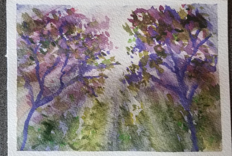
1. Capturing Light with Watercolor | Intro: Welcome everyone.
This is Jacqueline. Jacqueline, and you
are going to take a class on capturing
light with watercolor. In this class, I'm
going to take you step-by-step through all of the different
transitional phases of achieving a
watercolor like this. You can use these amazing
tips for so many things, from painting forests
to urban painting. We're gonna be using brilliant colors to make
our own custom mixes. Some cadmium on hand, from cadmium yellow
to cadmium orange, cadmium red, sap green,
and ultramarine, violet. Those are the colors
that will mix really easily to
do this painting. Plus some 100% cotton
watercolor paper and some great brushes. Whatever you have, I'm sure
we can work around it, even if we're using a piece
of paper to remove the paint, I'll be using a
three-quarter inches Skoda Auto flat brush, a twelv esco to Perla with a point and a size
eight wash brush. That's called a tint
to read from Italy. All three beautiful brushes linked up in the materials box. Mostly just find something
with a belly that will hold water and appoint as well
as a flat brush is really, really helpful for
doing a lot of these washes and color removals. All right guys, let's get into
the class and start going. I'm excited to show
you how to paint this beautiful forest scene with light washing
right through it.
2. Mixing your palette: So let's start by mixing
some of our colors. I'm going to take some
ultramarine violet. Kind of an odd color, I know. But it truly is beautiful
and makes such a lovely, lovely shade, especially
for this piece. We're also going to
take some orange. Your mother probably taught you never to mix these two together, but I have to tell you, they make the most beautiful neutral that easily wipes away. That's gonna be really
important because when we need to reflect the light, we want to have these
beautiful shades and shadows available to us that these two colors mix
together can provide. So just go ahead and mix some different levels of
your ultramarine with your cadmium orange
and see what you get. Next. Take a little bit of cad
yellow and mix it in. And you're going to see
that it's going to warm up whichever shade you
decide to paint with. So as you're moving
through your piece, That's another
beautiful, beautiful shade for you to enjoy. As you need something a little more warm or
green on that side. Adding a little red
to your mix is going to continue to warm
this up even more. So don't forget about
that cadmium red. As I add it to the wash, I get these lovely,
lovely warm tones. If you want something
a little darker, simply add more color. And your tones will
start to deepen. Your going to notice that
we're going to use a lot of these different
shades throughout the piece as we move
through things. So get used to mixing
these lovely colors. Before you even get started. Sap green is gonna be
used also within our mix. You can tell that sap green
is very bright on its own, but mixed with our palette here. It can give us some lovely,
lovely brown shades. Adding orange will
brighten it up and give us a little bit of that
warm tone orange. Adding ultramarine
to it will give us our neutral shade and
start to darken that up. Adding a little more ultra. Just continues to cool off our shade and give us even
more warmth as we go along. But you can see how
these lovely colors just works so well together. And then when you come back and you start adding the green, It's just what we need. Beautiful shades of green. It will make from olives, too bright sap green to
some bold light greens. And what could be even better. So can you believe we got all of these lovely shades out
of this set of colors. Cadmium are really easy
to use and so much fun. Because you can see
that literally it gives us such a great range of
everything to work with. I'm just showing
you a little bit of color mixing here on the page as we go through adding
these colors. Just because I don't
want you to be afraid to take risks with them. So just go on your bottom
of your page and start scribbling out some branches, some different things
using these mixes, adding a little
more ultra violet to it to see how you get darker. Adding a little more red to
that to warm up the color. I always say it's like adding a little bit of
fall to everything. Adding a little more yellow to bring some of that
warm sunlight in. So beautiful. You can see how they all
just work so well together. So just scribble across your page and mix
them all together. Then when you want a really, really nice shade of neutral, you can see just by adding
the ultramarine to this, it continues to change the color into different
weights of neutrals. If you go really heavy on the ultramarine than
you're actually going to reduce it down to
either a warm gray or a cool gray depending on where your color is at
that moment in time. Continue to add a
little bit more. So don't be scared and you'll
see it start to continue to cool off into different shades. Add a little sap green to that. And now you're
starting to mix in to some lovely leave shades. So you can see there's so much that you can do from
this limited palette. I mean, literally, I think
that if I were going to choose just a few colors to paint with all the time that I
knew were consistent. That they work together well, that they dried well. They were flexible and we could remove we could remove
the color very easily. It would be these shades
because I don't really think that I would need
to do anything else. You can see with a clean brush, just to clean square brush. That's why I love this brush. I actually can
very easily remove the color almost entirely
back to the white, which is what we'll be
doing in this tutorial. Look at that. If you don't have a brush
that can remove color, simply take your tissue
and wipe it clean. There you go. See. Now you have the ability
either way to either scrub the color off or just simply wipe it
away with your tissue. Beautiful. Then you'll be just
striking back in with your brushes and softening. Those are the fundamentals
that you'll be using in this course and the colors
that you'll be mixing. You can practice as long
as you want right now, I suggest you even watch
the course all the way through first
before getting started. And then you'll have even
more wealth of knowledge. But the best thing about this color range
with these cadmium, including sap
green, is that they are really easy on the paper. I'm using 100%
cotton Arches paper. Actually made this
little sketch book for myself because I love, love, love arches paper. And it's really hard to find any nice sketch
books made in it. But look at this beautiful range of colors we have to paint with, from moody greens to
really beautiful violets. And you can even go even
more purple if you want to, just by mixing the cad red and the ultramarine
violet and you'll get some really beautiful shades. But at the end of the day, this is a joy to paint a
forest or a tree with. And I think even like
having a neutral sunset, whatever it is that
you're painting, you're going to have a really good time
with this palette.
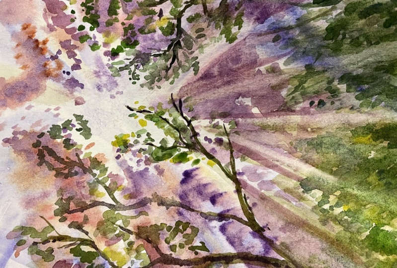
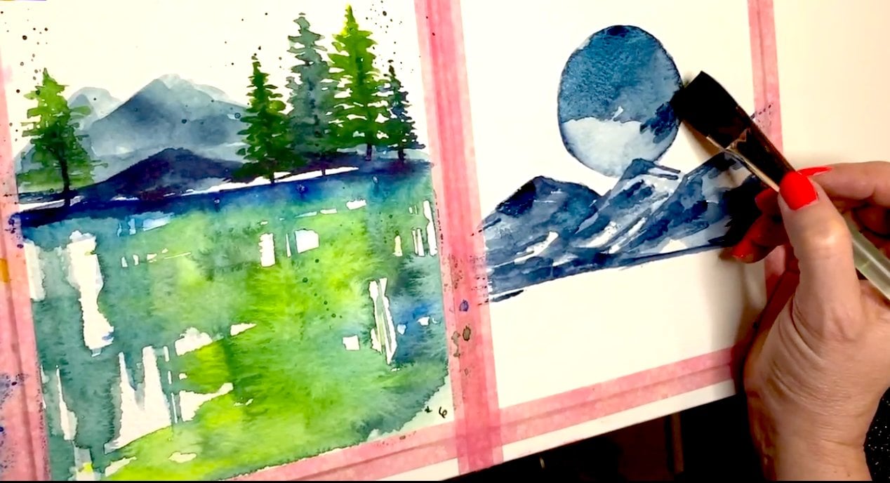
3. Demo Part 1 : The Underpainting: This is Session one of capturing
light with watercolor. We're gonna be starting
with a very easy mix of ultramarine violet and
a little cad, orange. These are really easy colors
to mix together to get a beautiful neutral
wash. And whether you want a little more warmth
or a little more cool, you can decide that
just by mixing in a little bit
more of each color. Next we're going to take
your wash brush and on a clean sheet of 100% cotton
paper that is slightly wet, you are going to
add your mixture and just draw some tree shapes. And remember to keep it
really loose because we have many layers to go here. So whatever you decide to do, it is going to turn out okay. We can always fix it later. This is an ultramarine cad, orange and a little bit of
yellow is going to be mixed in for a little warmth moving
forward in just a second. After applying that in
very easy brushstrokes, we're going to mix
a little bit of cad orange into our palette. And don't worry about
separating the colors out. You just need to keep adding
them and layering them, and then add a little bit
more ultramarine violet until you get this nice, warm, kind of deeper brown tone. A lot of this is gonna be backed off when we
start moving the color. So you've gotta kinda
added in there, adding a little more ultramarine to continue on with your shapes. And just have fun
with the color. Get a few little
darks and the lights. You don't just
want it all light. You don't just want it all dark. You want a nice mix of things to get your
drawing started. So this is a good time to play. Again. These colors come off
the paper very easily. So if you've messed up and you feel like you don't
really like the shapes. You can always remove them later because we
have layers to go. Or you can just take a paper
towel and before it dries, remove it now, it's up to you. So with my clean flat brush, I am using a paper towel and just removing
some of the color, peeling back some
of those edges. Because as this was applied
on damp paper to diffuse it, some of the edges are lost, but you can easily clean that
up with just a clean brush. That's what I love
about the flat brush. If you want, you can
also smudge it out with a paper towel or any brush that you have that has a little bit of snap to it. And that should
remove the color. Just try different things
until you figure it out if you don't have
this exact brush. Next, I'm adding some more depth of color back in, in layers. Notice there are some areas that are gonna be
left a really light and some areas that are
getting a lot more darkness. Now my paper is still very damp, so it is going to
bleed and that's fine. We do want to diffuse color. I just want to be able to build up some shapes so that I can
start removing the light. What I'm doing now with
my flat brush is I'm using it very clean
with some freshwater, dabbing it on a brush, dry it, and just wiping
the color away and trying to create some
strikes through what I drew so that we have that appearance of
light coming right through our paper and
diffusing out the shapes. Now notice that this point, the shapes are very, very rough. So I'm gonna put up
the finished product here just so that you can see it and not be so afraid of
this stage in the game. Next, I'm going to take my flat brush clean
with just water. And I'm going to keep
striking the page to try and get
this mix of wispy, kind of glowy events to happen. I don't know how to describe it, but you can see how I'm trying to get a mix of
the warms, the cools, the purples, and
some of the warmer, kinda like yellow shadows
out of my palette. Then I'm going to clean
my brush and go ahead and remove some of that
color out again so that we can further get even more brilliant and
dramatic light source onto the page. This is beautiful. You can kind of
think right now of all the different things and applications you
can use this for. You know, aside from
what we end up with in this particular piece. I mean, this could be the
sky for a moody ocean scene, or you can start just building
different perspectives. Foliage over
something like this. I mean, there's just a
lot you can do with it. Just add the colors back in
so that you have that mix, that really beautiful texture of different warms and cools. And if you can see my palette, it, it has all of that in it. I'm not really cleaning
my palette off. I'm just layering in the colors and that's what's great about the palette that I gave you, is that it's very flexible. It's not going to
really get ruined. You just add one cadmium
yellow or a little orange, or a little ultramarine
or little red. And it will change
the tonal values as you move through the piece. It's not something
that you're really going to get stuck with at all. You're going to love it. It's really fun to paint with.
4. Demo Part 2 : Adding Layers: Now it's time to take our mix of cadmium red and
ultramarine violet. And we're going to add
the base of some foliage. This is supposed to be a
mix of beautiful warms and moody shades of purple reds. That's what I'm using anyway, you can add more marine if
you want to get more blue, you can add more yellow
if you like that color. And you can pretty much
just take anyone of these cats and add it into
this mix and see what you get. If you would like to paint different shades of green right now, you can
be doing that, but I'm going to start
with a warm reds and the burgundy is because
I really loved the way this looks on this piece. I think that it
adds something just that much more unique
and different. And I love the way it just kinda looks on top of this first wash. The first wash provides us
with an underpainting and you can choose to see some of your underpainting or Seeing
none of your underpainting, that is entirely up to you. But in my washes, I typically follow this
trend once I establish it. And that gives me
that next step, that next guide to how
I want the light to go. This is the underpinning is kinda like a way to
warm up the paper, get everything prepared,
and kind of guide me into what I want to look
to follow after, right? Because that guide
of those washes definitely establishes
the light source. And then it kinda
gives me an idea for different peaks and
valleys that I can follow with my leaf patterns. Pay special attention
to the variety of colors and hues
that I'm adding here. I'm not just adding one color. I'm actually playing
with the mixes, grabbing some of the
more violet mixes and then getting some of the
more red mixes you can, even if you want to
add straight cad red, I just feel that these
Moody mixes make a much better backrest
for this whole piece. And if I brighten any one piece, it's actually going to
show a little too much. And then that doesn't
leave me with much to grow on and layer. We can always get brighter
but we can't really, we can't really back
out brightness. So just Take care
and figuring out exactly what you want your
piece to overall look like. That's why it's good to watch these courses all the way
through to begin with. So taking a clean brush with
water and as you can tell, I forgot it was not clean. I'm washing the brush, drying it off with a
paper towel and just very slowly going over these
areas that are still damp. You can do this even
if they've dried. It's a little harder and
the lines are not as soft. So if you feel like it's dried a little bit and it doesn't
look like what I have here, then you could take a spray
bottle and lightly missed. I'm not talking about
a spray bottle. Like literally torches
your painting. I'm talking about,
uh, Mr. Something that will just kind of give you a light misting to
keep the paper wet and damp. Nothing paddling
because if it puddles, obviously it's going to change
the effect of the paint. We want something
just slightly damp here so that our brush, when it is clean, can easily remove the paint just like you're seeing in
this demonstration. So I'm of following
that main light source. Remember the light source
starts in one place. And if you've ever looked at photography that shows
this kind of a fact, it usually radiates
from one or two spots. So I'm shows in one spot, the central upper middle
for it to radiate from. And that's going to be
the main light source. Whether or not you add
a yellow to it and make a yellow or an orange
background as your backwash, you know, your your underpainting and then
you layer on top of that, that is entirely up to you. I've chosen just the white of the paper just to make
it very, very easy. And probably an upcoming
tutorials will do something with a little more
color in the background. But for right now, believe me, this is going to a
very good place. So the washes are now
kind of intuitive. I'm using the point of my brush. This is a wash brush. It say a quill. And I love this quill because
it holds a lot of water. It's got a nice big belly. It holds a lot of paint
and when it's not too wet, it can get a really fine point on it and drop paint
exactly where I want it. I also find that on dry paper. So the drier areas, it makes these kind
of leafy shapes. And that is really, really handy depending on
how big your paper is. I mean, this is a
very small piece of a I would say for Bye. Let's see, this was nine by 12, so this is like four by six. I would say that if you are
using a full nine by 12, this would still be
fine for leaf shapes. You would just let some of the belly rest on
the paper as well. I'm just using the tip because if I let the belly
down on this size, it's literally going to be just too much water and
it's going to overwhelm it. So you kinda have
to exist somewhere in-between making decisions
intuitively as an artist, based on what you
have in front of you. Of course, you're not going
to have this exact thing in front of you because we all paint differently and we all lay color down
slightly differently. Our hands just automatically will lay it either
thicker or thinner. That mixes will be different. You probably are using
different colors or different a different
combination. That's all going to
determine something called like freewill for watercolor. And that's where
your creativity has to kick in your experience
level with this. If it's not working
out, just keep trying, maybe even back the washout
by removing some color and then letting it dry and adding in in areas that it's damp. Obviously the color
will disperse into a nice even kind of like a wash that you can add the light back into
just by erasing it. And then in areas
that either you dry with a paper towel or
you wait until it's dry. You will see the more defined
version of the abstract. Flowers are abstract leaves, whatever you want to
interpret these to be. But it's kind of a
layering process. And this part
extremely intuitive. As you can see, I keep adding different weights of
the color and mixing it together so that I still have the same
combination of colors. But I'm just using them
differently and deciding by I, where I want lighter
and darker values. I think really in
learning this piece, it's best to watch this
all the way through. So you can see what
this turns into maybe one or two times before
you tackle it yourself. Because I feel like watching
this is going to be a little confusing
until you really get a handle on what
the next step is, pass this and where this is going to lie in the
overall picture. Because right now I'm
just establishing layers. I'm establishing where
I want my light to be, how dark I want
these values to be. And it's less about the color
and more about the values. And what I can achieve. Just to direct the eye
around the piece of artwork.
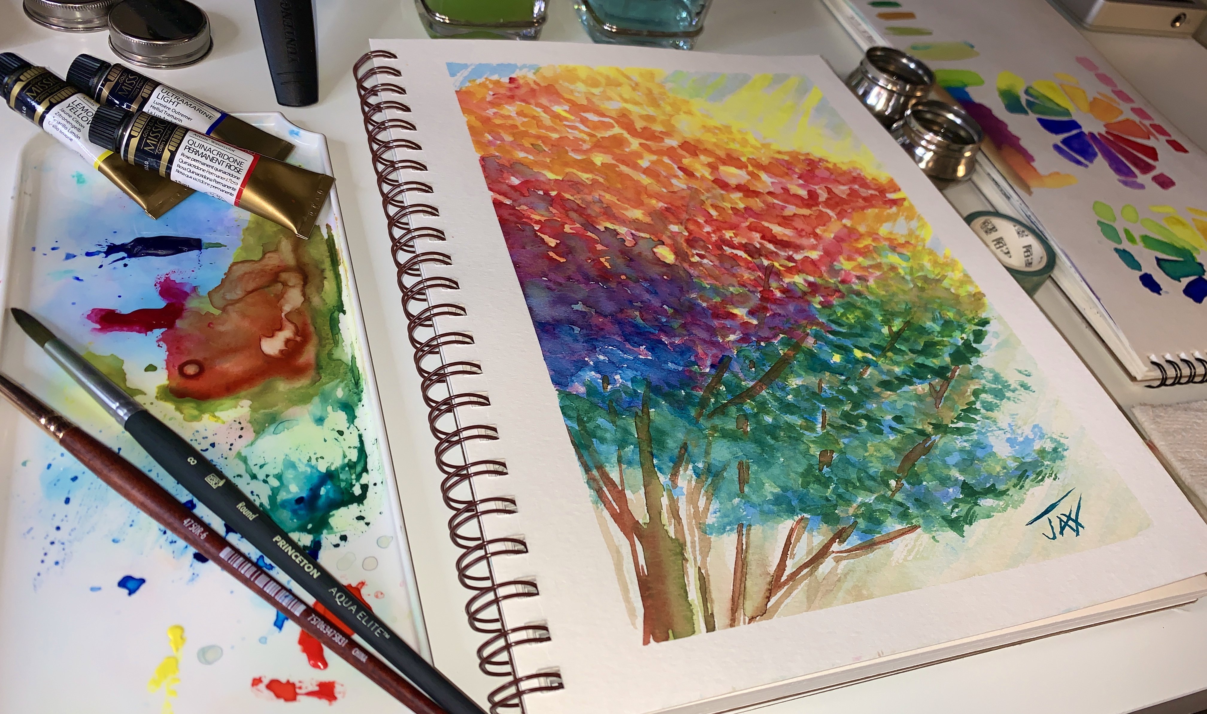
5. Demo Part 3: Mixing Greens: Now it's time to mix
some greens using the palette that currently has this lovely lavender
and purple shades. I'm adding cad Orange. It gives it a little more
of a depth of color, so it cuts through some of
the brightness. To that. I'm adding some sap green to increase the depth of the green into almost
an olive mixture. Taking my esco to
Perla size 12, brush, this one has a very
sharp point but has a nice size belly to
hold paint and water. I'm actually adding
some foliage. You can do this
either by striking little mock branches and
adding some dots for leaves. You could actually just splatter some paint in areas depending
on the size of your piece. But the whole point is just to start adding some
greens so that you can start adding another layer and really start to bring in the
greens into your forest. This is a great way to
switch up your colors, add a little more brightness because you've already got
this moody background. And once you add this shade
over the Moody background, you're going to notice that the clean crispness of the shape becomes a
little more moody. And there it just makes
such a great match. I often mix colors on top of colors that
have already used in a piece because I feel like it helps with the continuity
of the artwork. If I were to just use a
flat sap green on this, it might be too much too
bright and contrast. So by laying it over orange, which is also laid in a dirty palette of the
underpainting colors. Now, we're starting to combine
in a way that just adds a nice layer that the art
piece can really handle. It doesn't go in the
wrong direction. And it takes a lot of
the guesswork out. Right now I'm just
adding a very, very light layer of glazing, striking up towards in
the same direction as the light source where those
rays are coming out in kind of like these
like a, like a star. I'm actually following
that pattern and just laying in a
layer of this green. I'm actually going to
remove it in just a second. So you're going to see
how this ends up taking a clean, damp, flat brush. I'm removing the
color back so that I have some of those greens added to that underpainting
and those layers, it's a great way to just
re-establish that light source, keep it moving and
keep those strikes happening while adding some
of those colors back in. When it dries, you really do see these underpainting
and when you don't have them, there's
something missing. Sometimes you'll look at
a painting that's done by a beginner and
you realize that there was just no
underpainting and therefore it lacked
that dimensional value. Some of those moody
shades that add depth and color and a little more
wealth to the art piece. It keeps it from looking
so I wouldn't say bright, but there's a certain look to it when it doesn't
have an underpainting. And this just looks a
lot more professional. Let's just put it that way. So next it's time to go back to our palette and start mixing colors together that
are left in the palate. If you followed my instructions exactly and didn't
go out on your own, this is where I know
it's going to work, but if you have your own palette of colors
that you're using right now, maybe test this out before
you add it to your painting. What I'm looking for here is a deeper value combination
of what we already have in our painting that I can
use as a contrast to establish tree branches
or bush branches, whatever it is that's going
to be in the painting, that is going to add
that layer of value. So you can see right now, I'm using that deeper color that I've brought out of my
palette and just painting in some nice layers
of branches for my trees when I have painted them in to keep
them from looking really, really even what you're
seeing me do is just kinda pull back some of the
pedaling or excess color. And what that does is it makes it not look like
it's all one color. Because if you've ever looked
at a tree or a branch, a lot of times you'll
see them and of course they're not just
all the same color. In fact, there are a lot
more variety of colors and even I'm painting in
this particular piece. But for art's sake, I feel that sometimes when
you have so much going on, like in this piece, you don't need multiple colors happening in your
branches as well. What I'm looking to
represent here is. The values that
happened when you see a lot of light behind a piece. So in other words,
if I were looking at a tree and there was a very, very bright light behind it. The tree itself would
appear more shadowy, like it's sitting in the shadow, except for where the
light source actually is. That part would
show the colors of the tree and maybe even
wash them out a little bit. But this side of the tree is going to be the one in shadow. So I'm painting the shadow
side of the tree so that we are further reminded
as our eye looks at this, that there is a light
source coming from behind here and kind of just coming
right towards our face. Finishing off the branches. I'm just making them look
really natural and setting the pace for which I'm going
to add foliage to later. You can leave your
branches completely bare. Depends on your art piece and what you see
for your vision. But I'm going to
fill them in with this beautiful
olive color that is now developed in my
palette as a mix. Now remember we mixed
cat orange and sap green and put it over the
already purple palette. And that's how we
came up with this really neat moody shade. So what you're seeing
me do now with the esco to size 12 Perla brush. This is the one
with the big snap and very, very pointy tip. I'm dipping it in
the paint and just adding some layers of greens. I'm pulling back some
of those layers and getting them to lighten up in certain areas just by dabbing
some paper towel on it. If you've ever seen greens
on really good paintings, they're not all one
shade right there, like variety of shades. This is a really
easy way to get that without having to mix a
bunch of different greens and weight for each
layer to dry by pulling back just a little bit of each
layer with a paper towel. I'm getting anything from the original dark shade to lighter variations
of the shade. And also in some cases, you'll even see some
of the yellows or the burgundies or whatever it is that's in that
shade making it up. But this is a great way to
get up to color and just very quickly lay in your
greens without having, it looked like they're
all one shade. Right now I'm taking
a little bit more of the purple and adding some shadows to the
greens in the foreground. That further just
enforces the fact that if the light was
behind all of these pieces, we would be seeing a lot of different shadows and shades and just kinda
helps set the mood. Removing a little
more of the paint and cleaning some things up
with my clean brush. And then we'll move
on to the last step. As a final step, I decided to add a little bit of my ultramarine
violet and some cad red to the palette
just to mix up this beautiful kind
of pinky shade. Just so that I can
continue to highlight the trees and give a
little freshness and added like a little added pop of color as if there aren't
enough colors, right? But by taking this, I was able to further establish
those lines coming off, right, just to draw the eye from the light source
through the trees. I thought that this was
a really fun way to additionally keep
that theme going, something a little different
that I like to do. And maybe that's just me. You don't actually have to
add this layer of color, but I love to lay in unusual
versions of this, right? And I think that it
really just kind of gave me even more
mood, even more fun. And I really loved the
addition of the pink.
6. Capturing Light | Final thoughts: I hope you really
enjoyed this course capturing light with watercolor. There's a lot more to come and certainly a lot
of projects that had. But what we learned in this
course was really invaluable. You learned how to
mix colors from some basic cadmium colors. And not only did you mix colors, but you make some really interesting and
unusual moody shades. Of course you are going to
make slightly different shades than me because every
artist is unique to that. And that's the wonderful thing about mixing your own colors. You'll never look
like anyone else. I think that another good
thing that you learned here was how to recognize and
capture light in your artwork. This is just one way of doing it and I will
be showing you many, many ways if you stick
with me in my classes. Another thing is brushwork. There are certain
brushes that will do certain things so
much easier than others. I used three different brushes
here in this piece just to demonstrate what a fine
point can accomplish, what a great flat
can accomplish, especially when you
want to pull color out. And also even what a paper
towel can accomplish. And of course, a quill. They're all three of those are things that I just
can't live without. And I can't imagine painting a painting all the way
through with just one. If I were just
going to pick one, I would probably pick the flat brush just
because it removes colors so easily and I do a lot of that and my
personal painting. Aside from that,
I even recommend that you could take
cad orange and mix in to your green shade
and make it a little more warm for like
say it was fallen, you want it to reflect a
little bit more fall leaves because not all leaves are
just gonna be green, right? But for this, I just felt that I had so
many colors already on the page that maybe
we'll just leave it in green and not make it
really distracting. Still my idea in this
piece was just to create a situation where
it's all about the light. It's all about the
light coming through the piece and onto the page. And I didn't want
to fill it with so many colors because
they already had a lot of really neat rich purples and burgundies and winds
in the background. And that was like, happy for me. Now I'll, I needed
to do was just establish a little more
of a foreground so that you can tell the depth from the
light moving forward. I think one of the things that would have done so
much better with this piece is just not having
it be a sketchbook piece. But with that being said, it was done for this tutorial. If I were gonna do
this in real life, I would do this on a much
bigger sheets so that I would be able to
spread those trees open and have a little
more area space so it didn't feel so crowded. But for what it is, I love the technique. I love doing this
kind of painting. And this is definitely
something that you can build on
for so many things, from urban painting, too, landscapes, to even oceans, cityscapes, there's a
lot of value in learning how to establish depth of color, mixing your own palette
and those light sources. And this is just one
way to get at it. There's a lot more I have
to teach you for sure. Anyway. Congratulations on
completing the demonstration. I hope you enjoyed it. And I certainly can't wait
for you to come on over to my group page on Facebook and
show me what you painted. Have a great one, and
I'll see you again soon.
 Jacqueline Jax, "Creativity brings peace into your life"