Transcripts
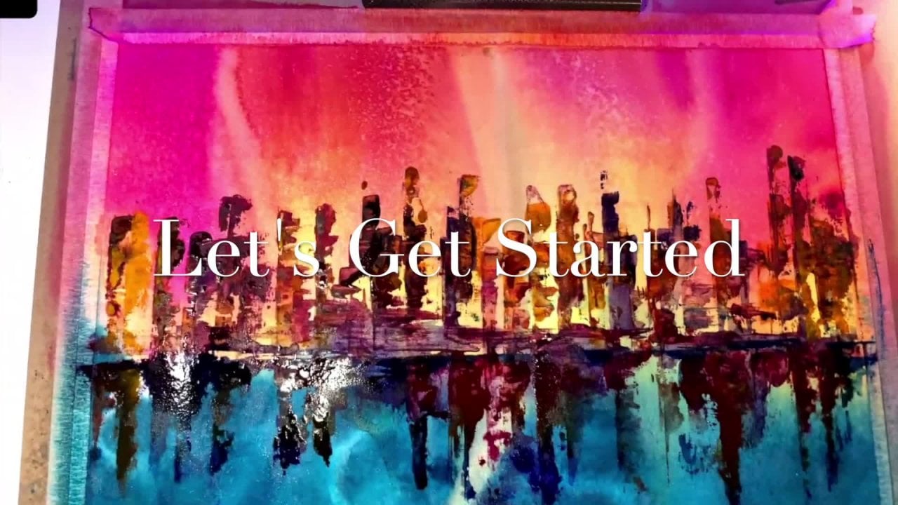
1. Painting Fall Foliage Intro Primary Watercolors: Hey there. So today we are going to do really cool tutorial. And this one is in celebration of fall, because fall is one of my favorite times a year, just because the cherry blossom trees are blooming. And when I'm in Canada, I hope to celebrate fall because all a beautiful leaves and the changes of seasons. So I did this this morning. And this is a really cool watercolor that I painted at my sketchbook. And honestly, it's just a draft because I knew I wanted to do this project for you. What we're gonna do is we're gonna take one amazing tree and do it in several different ways. Now as we go through this course, you're gonna learn about color theory a little bit because we're gonna be working with just three colors. You're also going to do a little experimentation with some color wheels so that you can learn how to map out a color wheel. You're also going to learn how to do leaves on trees and some in, and make these wonderful fault trees in different ways. And I think that is something that is going to be really fun to do. So take a look at some of the course information for this one and enjoy, because fall is here and we are getting ready to paint some really cool TVs.
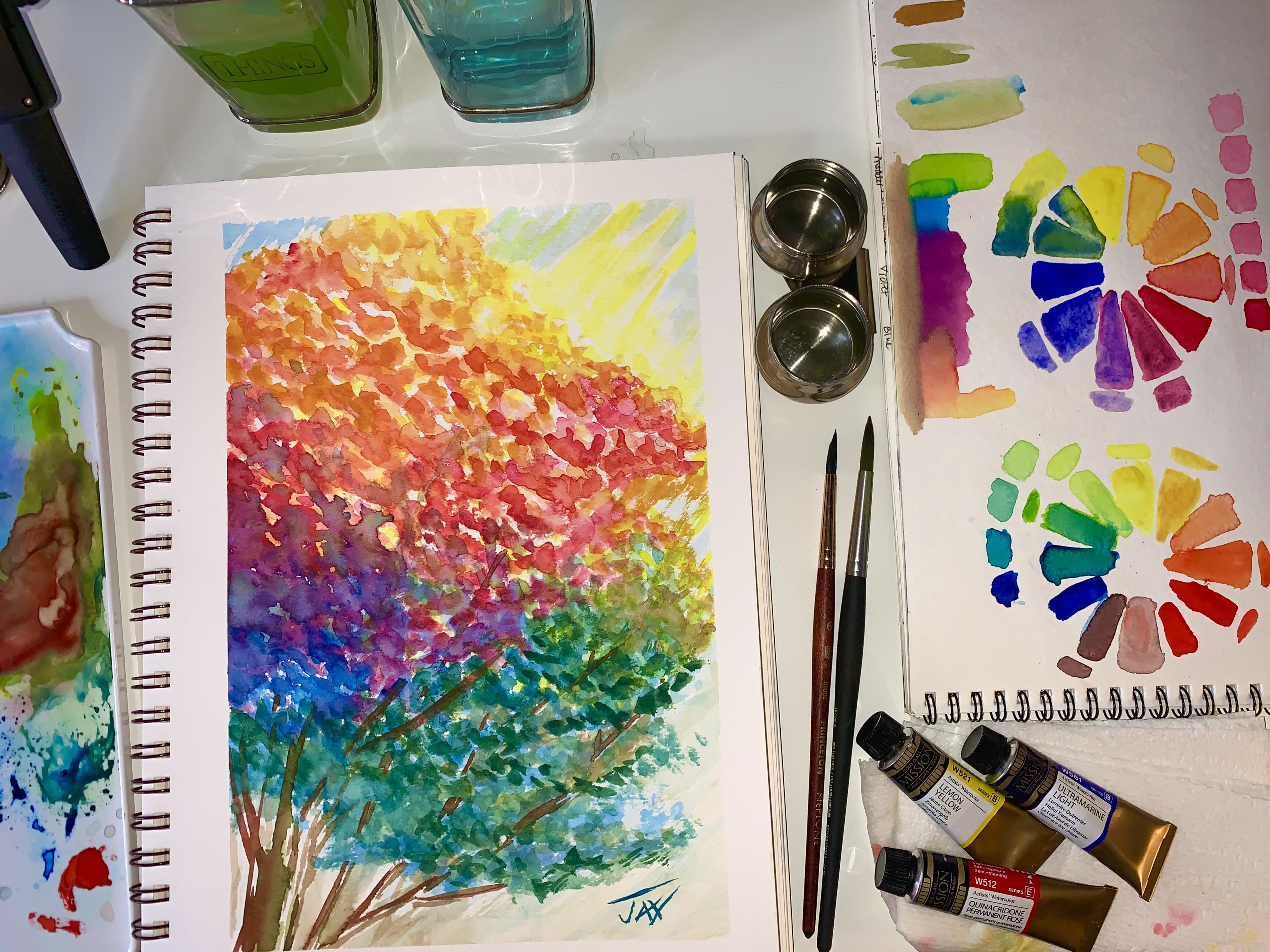
2. Painting Fall Foliage Materials: So as far as materials, here's what you're going to need. You're going to need some washy tape. You're going to want to have lemon yellow or a yellow in your watercolors. Most of you have at least these three, quinacridone, permanent rose, and ultra marine light. Now if you're using this is Mission Gold, but if you're using like other paint companies, there is always a basic red, yellow, and blue. So that's why I'm gonna do all of these trees in red, yellow, and blue and show you how to mix the colors to get this beautiful fall oranges. So if you're using white nights, then also ultramarine will work. There's a beautiful lemon 214 by white knights that works too. And also their red is Carmine 39. That ultramarine is 5-11. By the way, if you're using Daniel Smith, I mean, really in all of these little sets, there are so many basics in them. Like in Daniel Smith, there's a hand say yellow light, a quinacridone rose, and a French ultramarine, or you can use Thaler blue. Now, what else you're going to need is you will need a towel or a paper towel like that. You're gonna need a nice palate to put your paint on. It. Don't already have one. Maybe you're using life just irregular pellet where the paint is already in pants, that spine to some wash. Do you take to kind of map out your area on your sketchbook or your paper, some watercolor paper, I like 300 pound watercolor paper. There's so many great sketchbooks out there, actually, so many affordable ones. This is a really affordable company. Canson makes a great sketchbook, and this is the Mont ball watercolor paper. It's 300 grams or 140 pound paper, and it just really does a great job. Now that's what I sketched this end. This is watercolour. I've also done acrylics on it. Certainly, there's a lot of things that you can use this paper for. Another really great one is by Strathmore. So Strathmore makes a watercolor journal in all sizes. And basically the 400 series, I think, is just such a great series of watercolor paper. It's a 140 pounds as well, where 300 gm. And there's a really nice texture. This is the one that I keep all of my just my swatches of colors and I love this size, but you can get a journal as well. And this is a beautiful paper and now this is cold press. The 400 series is amazing. It's like really, really great paper for, for pretty much anything. But there's also a 300 series that works great too. So you can use either one of these. Definitely will get you to where you need to be. But again, just a sheet of watercolor paper is fine as well. You're going to need two things of water. So. One for our dirty greywater and then the other one for clean water. I love these, but you, of course, don't have to have them to take this class. This is just a great little thing that I picked up on Amazon for a couple of dollars. And this would actually click to this side of your watercolor paper and provide you with some clean water all the time. So that's a really great thing to have. I don't know. I just love it. It's got like these cute little caps so that they're like watertight cap so you can put it in, take it wherever you go. I just love as I think they're call, you're going to need a paintbrush. So you don't need all these, you just need one. Just one. So here's what do you have to make a decision though, right? You have to decide. And we've talked about paintbrushes before. In some of my other classes, you'll see specific paintbrush tutorials where I just kinda go through a whole section it within a tutorial on paint brushes. Personal favorite I'm paint brushes is Princeton. I really loved the brushes. I have brushes by like every other company, but I really, really do love the brushes by Princeton. I think that they have been just great brushes all around for me. The elite, aqua elite is a burst series that they have that is like synthetic, so it's got a really good snap to it. What I love about them though, is that if you're not a painter that needs to use a lot of water, this is a great series of brushes to get and they come in all sizes, all shapes. So I usually paint with this one. If I know I'm going to use a lot more water than I'll switch to Lake Neptune. Neptune are great for bringing in a ton of water onto paper and into your paint. There's a, this one is a six round and then this one here is an oval wash. And it's a half-inch of a wash. Again, I highly recommend you choose the brushes based on what kind of water colorist you are, how much water you actually want to use or mess with. Like if you find that you're working to wet your always dabbing it off on the paper towel, then maybe you should just or if your brush is giving you a hard time, just choose a different brush. Some of the cheaper brushes work fine too. I mean, basically it's the artist choice with brushes. I happen to love these, that again, you don't need these to take this course. You only need one brush, whatever that is. And with watercolor, you can really get away with a lot because you just mean you have to dip your brush more often if it's not a brush that held a lot of water, I do recommend those synthetic or natural bristle you don't wanna go with like goat's hair or anything that's like for acrylic painting or oils because it's just simply won't hold enough water, the brush. So you do need something that will hold water. This is one that's not necessarily made for watercolour. It's a low Cornell and it's just, I brought it because a lot of times when you're doing like tree stems, then these lake angular brushes are great. This one, it holds a decent amount of water, so it, it definitely will work for watercolor. I find that I just fill it with paint and I can get a really nice dark, dark. Tree trunk from it. But again, you can use tree trunks from any of these. You can do a wash trunk like I did here. Let me show you this just in comparison. So on these here that I did in my sample, either one of these round brushes will do. You basically are going to fill the brush with paint and you're just going to really kind of just go up. And then you're gonna stop along the way and pull. And that's going to create this like just random texture. As far as these like extra little streaks, I just use the tip of the brush for that. But again, like we're just kind of tapping here. We're going stopping, going stopping and then Brush up. When you wanna do smaller ones. And the distance though that's when a thinner rush will really do well. So you could do a 426. It just depends on the size of your paper. So like this piece of paper that I have here is a decent size. You see it compared to the brush. And I wanna see what size the sketchbook is. If I can open it. I have this taped, but I think it's the same size, right? Yeah. So this one is a nine by 12. So for a nine by 12, these sized brushes are plenty big and they are fine. If you were using a teeny tiny little brush, then your result would be teeny, teeny tiny little streaks of color. So that's the difference. So depending on how your brushstrokes are and how you want this to turn out. You can use larger brushes, V1, bigger pieces, bigger chunks of color, thinner brushes if you weren't very, very small streaks of color for regular sized brushes like this compared to this nine by 12 sheet of paper. And that will give you these kind of results. Now, we're gonna go through all kinds of Git is guys are gonna get to paint and so excited, so excited. Alright, so let's move on to the next section. So just to review, the only things you need is your paper. You need two waters, one for dirty water, one for clean water, you need only three colors. You can use more if you'd like to, but I am going to show you how to get the most out of just three colors so you can get some nice pains and not go crazy when you don't have every single color in the rainbow, you need a pallet to put your paints on and a cloth. And then if you want to use Washi tape, you can. So let's go ahead and just put our paint on the palette right now. This is ultramarine, That light, W5 81, and this is by Mission Gold. Once again, you guys can pick any company that you want to use at all, just whatever you like. And if it's a cheap just like fun palate that's already in pans or whatever, use that it will work. You can definitely get everything to work. Of course, the finer watercolors like these right now that I'm using this mission gold. These are amusing just because these are pure paint. In other words, these are the pure paint and that's a very cool set you can get on Amazon if you want the machine gold. And just this like beautiful, pure paint, meaning it's not, these colors are just one color. So they're not made from a lot of different colors, right? A lot of times if you look, it'll tell you what's going on on the paint like here. It says p Y3, light Fest is full light fastness, semi-transparent, semi staining. W5 21 is series B. It's a lemon yellow. This is a pure pigment. In other words, it's not mixed with different paint in order to make the yellow. It's just yellow saying with this quinacridone permanent rose, the light fast is the highest light fast, semi-opaque, semi stating. And this is just a rating where they tell you what's going on in the paint. And that will help you decide what kind of paint you'd like to use, as well as what the outcome will be. So I'm using semi-transparent paint. And when you, when you talk about the semitransparent paint, basically transparent would mean that anything you put over it, you can still see through it. Semi-transparent is going to be slightly see how it's slightly able to cover what's underneath. You can use either this defect, this is semi-transparent, has nothing to do with this tutorial. It just is a paint that I like to use. I think Daniel Smith probably is more transparent. So just depending on what you like, you know, you just do it, just use it. Now this is the arrangement that I really love right here. And as you can see, depending on the kind of paint you start with, this is what the outcome's going to be. So in this next section, we're gonna talk about the color wheel and what your paints will actually do. So let's go.
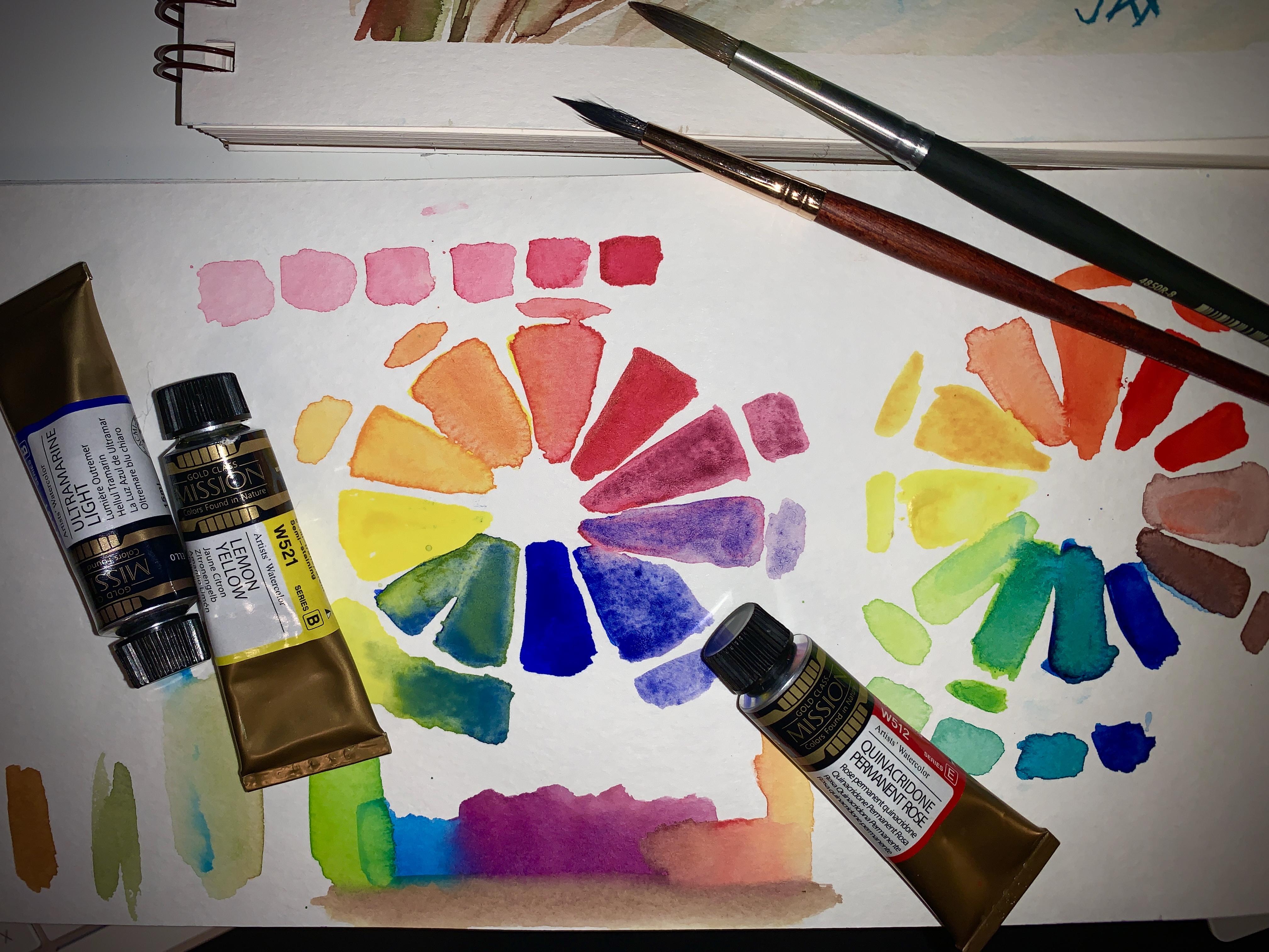
3. Painting fall Foliage Color wheel: Part 1: Alright guys, so moving on to our colour wheel. This is the paint that I chose for this particular lesson. When you take something like quinacridone rows, which is just such a beautiful color, you can choose to do a read where you can choose to do a quinacridone rows. You can even choose to do like a magenta if you want to. But if you notice the outcome that you're going to get to from the different paints is really going to depend on what you choose. Because if I were to go with the red and mix it with a blue, that's a cool blue and the lemon yellow, I would get this range of colors. If I go with quinacridone rows, and then I mix it with Cyrillic and blue and a yellow, lemon yellow. Then I get this range of colours and there are a lot more bright. If i go with quinacridone rose and the lemon yellow and I use ultra light, which is what I chose to use here. Then I'm gonna get this range of colors. So go ahead and make our own color wheel based on the colors that I chose. And you are going to do yours based on the colors that you tips. So let's get a little bit of water. Guild, little bit of paint. You're going to want to paint the full color right on one side. And remember we're splitting it in three. Now to make this faster, let me just show you a tip. I'm actually going to go ahead and paint half yellows. Right here as a go around my color, we'll reduce our brush out and the dirty water. Wipe it off. Go to clean. And let's go pick up our rose color to be the next color on the wheel. We're gonna put that right here. So it's going to be full strings on our rows. And you know, it doesn't have to be, mean if you want it to be really perfect, you can. We're going to start mixing that there. Let's put a little more. I'm going to be full strength here, but just paint half. And there's so many ways that really cool ways that you can, you can do this. I used a little bit of water just to liquefy it and I'm gonna paint a little bit less of the rows here. So now as you notice, we're already starting to color mix and this is the cool part. You see how this paint now some paints travel a lot faster than other paints. And this is why it's great to make a color wheel and Swatch out your colors because you can start to see how many colors you can actually get. Now just on the top here, what I'm gonna do is I'm going to show you how many different variations of this beautiful rose you can get just by adding some water. So I'm adding water and just dabbing my brush. Shade out, which is much, much lighter as we go along. And this shows you that just with one color tell many gorgeous light shades. And then we can take this, this is why I love quinacridone rows because it makes this beautiful, pastel pink. The like how many variations of color you can get just from one color. It's amazing. So now let's go back to our colour wheel because this really wants to mix up. And I'm gonna encourage it with a little bit of water here, stabbing As we go round and we're gonna start mixing. Now this is going to be the brighter of the orange, kind of like a pinky orange because I have most of it being quinacridone rows. And just, remember we put just a little bit, we put half in half. So that shows us what that half and half will do. And we're going to take just a little bit of our rows and put a lot less than here. That's nice and wet. And we're going to see what we get. So it's going a lot more peachy. Let's get a little bit more. And all I'm doing is just kinda working the water around, mix the colors together so I can see what I get now, I really think that this is the color that should be over here. But let's see what we get if we just go with the rest of the paint on our brush and some a gold that is very, very hard to find. I love to mix this color because you're gonna see it in a second. How pretty it is. Let me see if I can encourage a little more of the color. It's such a pretty color and that's so beautiful for fall. So this is really, really pretty. You can see you've got this beautiful, like pink, not as bright. This is going more to an orange. We can pick up a little bit of yellow and encouraged that orange a little bit more. For experimenting, we're trying to see exactly what our colors are gonna do. Don't be afraid of them. Just play with them and let the colors happen. This is a beautiful, beautiful calm. Now let's see what happens if I add a little bit more. Let's see how much orange brings out. Now that's a gorgeous orange. So I'll just buy my quinacridone rose and my lemon yellow. They are just encouraged if they mix on the paper to make that beautiful, beautiful orange, so pretty. And then this gorgeous gold and then the bright yellow. So now let's go and clean our brush. And we're going to we're going to wet these ones that we didn't previously. I'm gonna full strength this cuz I used a little bit of it. Let's grab this ultimate reign now here is something different. This is a really, really beautiful color. And they could how old it is. So, so nice. Now of course, in fall, you're probably not going to see this color on most trees, but we need this color in R. We'll be need in order to get to those gorgeous greens. You won't get green unless you have blue. So you can see this purple is really gorgeous to now. As the leaves start to change, if you look in shadows, there's a lot of blue in Shadows. And I think it's important to realize that as an artist, that shadows have a lot of purples. I always just make my purple. And I find that that gives me like this really beautiful range of purples by being able to mix my own. I also find that I end up with color palettes that nobody else has. Because if you just use stock colors all the time, then as an artist you really never get to a point where you're developing your own palate. Now look at this beautiful, beautiful like it's like a lavender it so, so pretty, very moody, very, very moody color. Now you get this Moody's shade because the, the mix of the rows and the ultramarine ultimately just create this gorgeous, moody, moody shades. Really easily. We're just going to kinda water down some of the, the blue and we're just going to feed it in to this and we're going to let it take over and see what it does. Remember, you're in control. So literally, you can decide what this color does and how crazy it gets. Now, because we were moved more towards the ultramarine as we go more towards this color, you're going to want more of the rows in this swatch and should be more rows than blue. And that's how you do these color wheels. You wanna make sure as it's closer to the color that originated with, you want to see what it pulls as you add a little bit, a little bit more and then more ultramarine blue. So it's kinda like titers. So now let's go this other way. Fester brush off. We're gonna pick up yellow. In this area here. I'm actually gonna go lighter with the yellow over is going to be a lot more blue. And we're gonna see what happens. So right now I'm starting to get this for any amazing degree. And this is why the color wheel again, is very important. And the shades that you choose to start out with are very important. And we're gonna do something else really quick before we finish here with our colour wheel, we're going to get out some of this other paint so that you can see now I'm gonna go ahead and take some of this. And we're going to add that yellow back in. And we're gonna see how bright the green can get by adding the yellow is giving you a little sample. So you can see how pretty it is as shades over. This is the green we're going to end up painting with for fall. This is actually very in right now. This, this kind of like army green, this is the big color that's coming in for this new season. And then as it goes over, we get more of a Lai Ni aligning green. This is very, very pretty, but you can see how many beautiful shades I have. Moving over to my, moving over to my yellow. And as opposed to this yellow, which is where we started, this is incredible, right? Such a beautiful, beautiful range of colors. Now.
4. Painting Fall Color Wheel Part 2: Now just out of curiosity, let's go to the Daniel Smith colors. But he has, this is, you know, many of you will be using all different colors for your painting today. So I'm going to get out the yellow, the yellow, the blue, and the red that comes in their kit. In this kit, she actually gives you a quinacridone rose to, but because we just did the rows here, I'm gonna go ahead and sample these three, four-year really fast. You can't what are the when do they give you they loved you. Let's do Thaler blue. That's fun. So just on my one thing about Daniel Smith as the many open these tubes, it goes everywhere. I know about you, but it is like liquid color. I mean, literally, you can't open it from Daniel Smith without just getting all over you. It's crazy. All right. Let's put that they're just gonna have to wipe it off. Yeah, literally, this happens every time. So funny. Daniel Smith, The reason why is because this formula is mixed with honey and I believe glycerin. So what happens is it just makes it like so fluid and it travels like crazy, which are going to see here in just a second. All right, so we haven't fan, you have fun doing, you're doing your killer whales. It's fun because before you start a project, you really want to see what, what these things can do. Okay, so full strength, here's this beautiful red. We're going to just kind of go like this really quick. And trends on Russia. This is a lot of paid guys. Daniel Smith, this Kellen may so much paint came out. But that's okay. Look how beautiful is Thaler blue is. Oh my goodness. So pretty. So I'm just going to kind of add just a little bit lightly here. This is full strength. Oh my gosh, it's crazy, but it's so nice. Really beautiful. So how bright this Thaler blue is? It's tempting, tempting. Okay. Rents are for a chef. This is a very fast way to color wheel. There's that beautiful gold. You'll get faster. This is notice that I am able to move a lot faster if I really want to. And that just comes with and that just comes with time. Mic's comes with time. Take me Russia. So pretty so I'm working the color and this is a really beautiful, a beautiful orange. This is going to be the full strength one. So we're just gonna go ahead and, and kinda wash this out so we can break up the color and get it flowing and moving. There's my Rashad pickup a little more this yellow. And we're just going to add like half, just a little bit to try and encourage that really bright orange. Look at how bright that is, that's beautiful. And again, if you add too much yellow to this one and you're not getting this really bright orange here, then just take a little bit and aren't going to up. And then you'll get to the strength that you need to remember this is your palette, this is your moment. This is your opportunity to have fun with your colors and find out what they can really do. It's like a little test drive for your, for your colors, right, for you to learn. So you can see I have this beautiful red and this is the Daniel Smith. Once. You have a really bright orange, this makes and like a peachy and more peachy tone, which is really pretty. And then it goes to gold and then the bright yellow. So let's go ahead and take some of this bright yellow. And we're gonna go ahead and mix it here. Look, there's that bright green. Now you can see how they do different things, right? See, this ultra marine makes more of a tally green. This, this Thaler blue makes more of a bright green. So it makes me even think that maybe for this project, maybe we'll use the Daniel Smith because, you know, I don't know, I'm kinda fallen in love with these colors right now. They're really pretty. So I don't know, it just depends on really what you want to do with your colors. Now I'm mixing a very, very fluorescent green. This is a very like Sap Green or spring green zone. Really beautiful color or like a lime CaO bright the lime is that's really pretty. Yep, I think I'm going to use Daniel Smith for this, this project. And if I wanna see how TLC we can make this screen. We can add a little more blue to it. And then you can swatch it out, see how I've just made another color. So you now have different shades happening out here and you can actually expand your colour wheel. So like if I want to, I can grab some more blue and I can make a really deep shade and paint that here. I can add a little more and make a really dark teal account beautiful, that dark teal is that's gorgeous. And then I've got my Thaler blue. So I'm kind of like showing you on the outside here how many beautiful shades you get. Let's take this read. And we're going to do what it down and just kinda give it, gave too much Daniel Smith. The strength of Daniel Smith watercolors, honestly, they come in these tiny little tubes, but you can see that it does not take much to to make these colors move at all. It really doesn't. They are so concentrated that they might be really expensive. But there are so concentrated, it's crazy. So now I'm going to mix their red. And this is why I use the Conakry Joan Rose, because I don't happen to be, I mean, it's good in some projects, but I don't happen to be a huge fan of the way red mixes for my palette because I tend to like very, very clean colors and red tends to make a very muddy type of mix. As you can see. I left this one really dark because it kinda contaminated it with the, with the grain. And it's like getting more of that teal color. So we're just going to like, kinda move over color palette here and let this be, let this be this really pretty teal with the green. And that's why I need to change my water because I'm now starting to contaminate things. Just clean it up, get going down to my my secret differ down there. Okay. So now as we move closer, it's really not gonna get much different. I can dilute out some of this beautiful color and then just kind of add it and see if I can get a little further away. But ultimately, you can see how very, very rosy and muddy it is compared to the kind of purples you get with these colors. This read is not going to give you like a purple. It's gonna give you more of this kind of shaded rose color. And this is fine if this is what you want. I don't happen to want this color in my fall tree this time, but maybe you do. Maybe you love this color and I'm diluting it so you can really kind of see what the color looks like. Maybe you've loved this like tea rose kinda colors. It's not going to give you the range of purples there like we did before, right? I do think it would be cool though to like, see what happens when I swatch this Thaler blue and swatch it with my quinacridone rose from the other company. And look at how pretty that is. Now, that is gorgeous. So I think I'm going to use the failover blue from Daniel Smith because that to me is gorgeous fall colors and love it. Amuse the thaler blue from Daniel Smith. And I can use either one. I can use either the lemon yellow because they're both the same. I can either use the lemon yellow here from Mission Gold with the Daniel Smith, or I can use the lemon yellow from Daniel Smith. It really makes no difference because the Tod's looming yellows are doing exactly the same thing. It's really the blue that is determining how clean the mix is and this is what happens with Blue a lot. It can really, really change your life and cause you a whole lot of trouble. In this case, I loved the mix of the Daniel Smith, Probably the Daniel Smith quinacridone rows will work just fine. But since I already have this on my palette, I'm gonna go with quinacridone, rose, permanent Venice. I'm gonna go with the lemon yellow. These are pure pigments by Mission Gold. And I'm just going to pull the blue from the Daniel Smith, and that's our color palette right there. And you can see this is what I'm going to be using for my fall colors for this tree, it's going to be beautiful and look at how nice they mix together. What I loved to is I always love to kinda like blend things like this and see what kind of bark color I can get. And this is really important because you're going to be painting trees. So you can see a mix of all three colors will give us a brown. And if they were really heavily concentrated, they'll actually go as far as black. So that's gonna be our bark color and that's how you get all the colors for fall from just three little innocent paint colors. So this slide re-used the how many shades were about to get. And like I said, I just fell in love with this yellow blue today. You can be in love with the ultra marine and really willing go this way depending on what you're getting at home. I suggest before you move forward, play with the paint colors and all the stuff that you have. Because this is definitely going to give you the best outcome with watercolor. And once you have a palette that you love, that you can count on, you really don't have to switch it that often. You can keep using those same colors and that's why watercolour artists tend to have their very favorite watercolors that they always survive and they always use, I try so many different kinds because I love to just have a variety and I love to play with paint. On my courses. You're going to see everything from well-known pink companies to mom and pop paint companies that makes their own pace because I just really love different textures. Different paint companies also will give you granulate at effects depending on what the paint is, depending on the transparency to and of course, there are things you can add to paint like salt and everything else that will give you even more granular mating effects. But this is what we're going to go in today. Alright guys, we are ready to pain. Let's get into it. Shall we take a little break and gets you pay reading because we are ready to go. It's time.
5. Pro Tips before you paint: Hey there guys. Alright, so we're ready to paint our wonderful fall trees. Now, depending on what colors you chose for your color palette project today, you can pretty much go any way that you want to go. It just really depends on you and what you're feeling. I went ahead and chose these colors right here. So as a result of this little experiment we did, I loved, right now I'm feeling the lemon yellow, the quinacridone, permanent rose, and then this Daniel Smith, Thaler blue. You can choose any colors you want for this next point. You don't have to go with just three. I'm just showing you how to get this result with just three colors. So the other thing you want to do is you want to pick your brush for this size paper. And for this project, I am mainly going to be using this eight Princeton round and love it. That's what I did this whole one with. But again, this is going to make a really cool leaf and I'll somewhere along the line show you what kind of leave that makes this thin one would be really great for the tree trunks and the stocks based on the size of this 99 by 12 paper. But again, I could still do it with this, and I could do with this. The, this angular brush is really nice as a shader. This really does trees really well if you want a very thin line. So if this is your style or maybe you like doing square leaves, then this might be the brush for you to, but again, it's entirely up to you. What kinda brush do you decide to use on this on this project? People always say you should do a wash. first. Now, i don't disagree with a wash. However, let me just give you fair warning. If you are new to watercolour, whatever you put on your paper as the first layer is going to change the colors from that point on. So if you want a very clean project, if you want something that is very, very clean, like the one you have, i have here. Do not wash the paper with a paint color before you start to paint. The reason being because the minute I wash it with any color, then all of a sudden it's going to change the next color that goes on it. So say I washed with yellow first thinking, oh, I'll just watch this whole thing with a light yellow and see what happens. And that way my backgrounds like got a tone. Well, the problem with that is that when we go and add the other colors, they're going to change. Because if yellow is there and I add blue to it, to try and get this nice blue, it's gonna turn green. And you won't ever get the true blue because everything is washed with yellow or whatever you washed. So on these, on this experiment, this project, I recommend that you don't wash and put down a wash. If you are a very loose watercolor artist and you wanted very loose runs of color and you just want to kind of let it go. We're gonna do another one that has more of that effect. But for this effect, once you give it a try to do the wet on dry technique without washing anything behind.
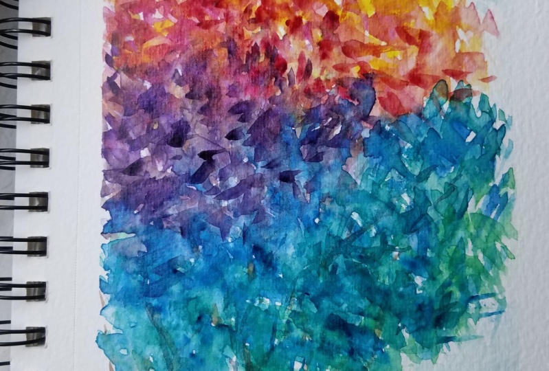
6. Painting Fall Foliage Time to paint p 1: So first color I like to start with is yellow. I'm just gonna kinda like add some water to my yellow so that because you don't have to use it full strength and getting him a brush. And then we're going to start just really loose with it. Because remember, this is just one tree here. This part is entirely up to you. I'm thinking to me right now, I'm thinking of the light coming in this way onto my watercolor. So the tree is going to reflect light coming down this way. So why don't we, just, for the heck of it, we're just going to paint three nice yellow streaks on our favorite is to remind me that we have some really nice light coming. And remember we're only working with three colors. So at some point, you are going to add variations and colors just by mixing the colors. So let's start there. Alright, rinse my brush out, get some clean water on it. And let's go with our second shade, which is the quinacridone rows. Now, the key to this is not to let all of the quinacridone rose mixed with all of the yellow. So you want to kind of like place some of these. And I'm just randomly doing this based on my vision, remembering that the light is coming down, so the lighter shades should be on the top and we can always go back and edit later. And I am not reloading my brush. I'm actually putting in just some nice body leaves now, some of these I'm touching the yellow that I just laid down because I feel now that it's going to change and give me more of that orange that we had in our sample. And now I'm gonna go ahead and mix right on my palette to get a little bit more of those goals. And you can see now I'm starting to add golden. So this is something, two things are happening here. One thing that's happening is I've got my magenta being added in. The other thing that's happening isn't going back and kind of swooshing And my leaves with a little more of the mix of gold. And that's just encouraging beautiful watercolor to transition. Now as I go over some of these little spots, I'm doing it because one, I want to leave a little bit of the whitespace to reflect light, but I also don't want everything to look like. It's just a dot on the paper, right? We don't just want dots now if that's your thing and that's your style, that's fine. But that's not really my style. Now if you are wanting, this is what I'm gonna show you different brushes is you're going to want to do more of this style. Then let's show you what this looks like. So this is more of a square. See them more square dots, which is fine. You can totally do what ever you like. You can put squares all over. Just depends on what, what kind of you loved to use if you're using a cat's tongue. Let's go ahead and take a little bit of the magenta with the capstone. The cat's Tang is obviously going to give you a little more points, right? And that's fine too. Let me get my colors so you can see. So it's got a little bit more sharper texture. This capstone is really cool. It's kinda like giving me these little leaves. Maybe, maybe you have pointy leaves on your tree. You want the cat's tongue to reflect that. And you've got now more pointy leaves on your tree. You can totally do that. It's pretty cool array or maybe you'd like a mix of different kinds of, of leaves and things that you use. That's also a possibility. Now remember, again, I'm going to remind you, leave some white space on your paper because it really does. These little whitespaces will look like brightness. And there's a lot of things you can do with them. You can you can not only go and add another color in there if you want, you know, in the end. Or you can leave them. And in some areas where they're brighter, you can see we're starting to dry these little whitespaces now will allow you to kind of define, define some of the color. Because if you have a whitespace and you just kind of like define a CRM, adding some more color here. What's happening is now I'm reflecting the light down. And this bottom part here, because it's watercolor, is going to be like the underside of my leaves. And it's kind of giving me a little more texture. You see what I mean? And then if I want to go back with a little more yellow and kind of touch down and let it be more gold. Now I have this other thing happening where I'm creating this beautiful, this beautiful lake reflection of light in this area of the tree. See, and it's mixed still with the nice, it's still got a lot of nice mixes of white in there. So this is just something that is the beauty of watercolor. And I really, really love to just experiment with the depths and the dimension of colors. So now this is glazing technically, and this is when you have color already laid down and you go back and you glaze. I'm using these little swishing, little swishing motions to just kind of increased the depth of the color on this project right now. So I'm adding a little more magenta and just going to relax and just have fun. So such a fun project to do. I can do this with anybody with any colors you want. You don't even have to be fall colors. You can you can just take anything. Adding a little more yellow up at the top. We're going to encourage this nice goal to come out because we're mixing some of these beautiful the yellow and the magenta together. I'm a palette. And now I'm just kinda leaving some whitespace again. I'm really encouraging this beautiful gold here at the top are really one. And I'm kind of like getting away a little bit from the little tiny dots if you notice. And I'm just kind of getting little splashes of color with a little more at the gold. And as I kind of move through, like I said, I just personally and thinking of how the light reflects on everything. And I'm going back in adding a little more color, which is something that watercolor just does so well. Okay, so now going back to our colour wheel, I just want to remind you guys that things that are on the opposite end of your color wheel, they cancel each other out. So if you are going to add blue, this is where we need to start thinking about what colors you can actually lay next to each other. Now we know based on our color wheel that we can definitely add blue to magenta. And all we're going to end up with is a nice mix of purple. So I'm not fearful of adding those two together, but I am fearful of adding blue and orange together because they're opposite ends. So ultimately that's what's going to make more of the brown. And that's why we want to be really, really cautious when we start to mix things. We don't want it to be too wet. So I am a big fan of abstract. I am not a huge fan of realistic paintings and love to see an artist vision in a mystical world. So I have no problem here in seeing leaves of all shades. Now of course, leaves are normally green, so mixing this Thaler blue with the yellow is totally not a big, big deal. What I'm finding right now is that if I this failover blue and I'm just gonna tell you right now, it is unusual for this beautiful color, this beautiful olive green to actually happen. By mixing the orange and the blue. Usually it will turn brown if the color is just not right. We just happened to have such a windy here with this color palette. I can't even tell you how excited I am about it. And this is an unusual case I'm telling you right now. Usually when you take your magenta, you can see it happening right here. When I take my magenta and then mix it with my orange, you see that crazy weird Brown starting to start right? And we're going to leave that down here at the bottom because we're going to need that later. But that's usually what you get. Right now. I'm able to manipulate it into a little more of a T allele and kind of an olive green, which I'm pretty happy with. But I'm just telling you right now, watch yourself because your colors might not do what my colors you doing right now, it depends on the consistency of what's happening and the paint that you are using.
7. Painting Fall Foliage Part 2: Okay, so I am just gonna kinda do some darker shadows here. And we're going to start layering in some purple. And being careful, like he said, I'm going over some kick some green and magenta areas. But I know that if I'm cautious, I'm just kinda probably going to get something that I still like right now I'm going over some really nice magenta. And because reactivating the magenta with the thaler blue, I'm getting this beautiful purple that in love. So pretty. And that is just gorgeous for this. Now this is what they call mixing on paper. And I do a lot of this in my work. I just, if you know what your colors are going to do, you don't have to be fearful of it. And you can really just kinda go crazy and mix right on paper and just see what you get like right now. And this is just beautiful home getting this non muddy color from our Thaler blue. Daniel Smith did us right? I have to say right now I'm kinda going through and you can see like this area, I love how that worked out. I love how that's just giving me so much beauty and texture just by using my brush. I don't want to wash it because if you just wash it and we just let it and we just let it all combined. You would get this beautiful, beautiful texture. Some going back in with a little bit of water just to reactivate this and let these colors kind of melt together just a bit. And then we're gonna move on to another section. As that Dries. I'm also kinda going against this, this area here. And this is where I'm doing a little bit of a texture wash. Now I know I'm ultimately just going to have a tree stock here. So I'm just kinda like blending this blue down because I just really love it. And we're just kinda go on with the flow rate. We know we're not doing anything with this area as far as having. So this is where I'm creating kind of like to stuff a crazy textured wash with some of the blue from my palette. And I know it's going to be fine because ultimately the only thing I'm going to have going on here is just a little bit of branches moving up. So I went ahead and just added a little bit of a textured wash. This again, I did this after. And the reason why is because I did not want this kind of a colour wash underneath all of these beautiful colors. This is just, it's so easy to add washes of color later to reflect sky. See like I'm just kind of touching it. What I'm gonna do here is I'm going to come in with a little bit of the blue. Now remember we painted some of the yellow here. Don't mix it because the sky is not green. So you have to be careful. This is just kind of giving it a little wash of color. And what I'm gonna do is because I have this beautiful yellow here. We're gonna go ahead and kinda like a line in yellow. We're going to tap this in some of the areas that they want it to be, have that brightness. But then I know it's a little more yellow and a little more greedy in this area anyway. Since I mix my paint, that's just gorgeous. So pretty. K, It's Windsor colors out. I might contaminate my colors a lot here. So let's move some of the shallow. I still think it looks a little bit green. Prince my brush out, get some clean water. And we have, we have this yellow R3. So if you accidentally contaminate your yellow and you're finding that it looks a little green or little bits orange. Then just go ahead. And in another area of your palate, clean your brush really well, and just start again. It's so much better to do it that way because you just feel regret it if you don't, you never really get that beautiful, clean, clear color that you're looking to get. So I'm adding a little more yellow to the top here. And the reason why is because I want to reflect a lot of this beautiful light. I'm going to add a little more water to it. And I'm just going to kind of push some of that yellow into this white area. And literally, I am just trying not to hit the blue that I already put in there. Don't want it to turn green. But I'm just kinda giving myself a little bit of, a little bit of yellow, very, very light yellow, not the Brightness. The brightness is here on the tree and kind of giving it a little bit of a wash. And the reason why I'm doing that. And also you can wait for everything to dry. If you're if you're having trouble on your colors and mixing and your pages to wet, just wait for things to dry, and then just kinda go and stippled things a little bit to give it a little bit of interests. That's just how I like to do it. I think it looks really cool. I want to add a little more dimension and depth to this. So let's take a little bit of our quinacridone rows. And on our palate, we're going to have that mixed in with a little bit of this yellow that's every year in this spot. And now we've created this really beautiful bright orange that we knew we were going to get because we did our color palette. So now I'm kind of laying it Now if the sun was coming this way, then you know, It's, you're gonna wanna go like just to the belly side. You're not going to want all of these to be really bright. You just going to want to kind of like do it kinda randomly and creates a nice textured shapes on the bottom of these already splotches, already wonderful splotches By the way, if you like, more of like a, an area that's not as defined in your trees. By all means there is no right and wrong and watercolor, everybody has their own look. And you should, you should have your own luck. So what you want to get to you eventually want to have something that is just yours. Okay. So I don't want to get it. So for me right now, this is a whole lot of orange, right? And went ahead and just did really the majority of this area of the tree in different shades of orange. So now I'm going to go and I'm going to start adding some more of the magenta. And I feel like this area here just flips a little bit light. So we're gonna go ahead and make this orange just a little darker. And one law, give it a little more depth of colour. Just didn't hear. Again, you can, you can choose to do this on your own. You can choose not to do this on your own. It just depends. Let your imagination flow. Now this area is for the people who love to have their watercolors just kind of melt into each other. And this is what I let happen there with that kind of like that teal color. That wasn't like it was kinda like a dirty teal. So now once that's dry, if you want to add more definition to an area like that. And this might be something that you end up doing on your own painting. You can go back and you can go ahead and just drop in some colour in different shapes, right? Just like that. As dark as you want. I'm using that squishy motion again like this. So I just feel like that just suits this really well. And again, like, don't be afraid if you know what your colors are gonna do and you want some purples in there. You can mix. You can mix right on paper like watch this. I'm gonna grab some of my quinacridone and I'm really gonna get crazy with the purple here. And when it just do its thing and really give me that d, the d beautiful purple. Because to me, right now this tree has its deepest shadows down here.
8. Painting Fall Foliage Part 3: Kay? So again, just keep working at it. Keep going over the areas until you get the depth and dimension that you want. As each layer dries. You can go over it again. Remember I went over this area here as it dried. Now I'm going to add a little bit of that Fe Lu blue and work that let that purple kind of work up. And you can even like, I mean, seriously, you want to get crazy. You can just go and splash the colors all over you do whatever you want to. Just depends on what, what kind of a painter you are. You can get random. That really got it wet, right? And you started to travel some color and create create some areas of flake, gray and brown there and my, and my beautiful oranges, but that's okay. It's all good trees that tell they look. So can really even dirty up your colors. I mean, if you like that right, it's all up to you. Alright, so as I'm going here, I'm just kinda like mixing the colors a little bit more together. Don't need to have a lot of light in this back part of my tree personally, because it's the back part of my tree and the light is up here. I feel like I could do I'm really gotten heavy here, so I feel like I could do a little more deaths under here. So I'm gonna go in with my fellow and just kind of figure out where the depth needs to be. Oh my gosh. Is this therapeutic to you? Because this so therapeutic To me. It's just it's 45 minutes of Heaven. Just beautiful. Alright, you've done some real-time stuff with me here and this is very, very long. We actually painted together. How cool is that? I usually try and speed up the video so that you don't have to paint with me in real time that this was kind of fun to do. I think this was a nice, nice, it's a good way to spend a weekend. You can do this with friends, hanging out, can even turn me off of you want to and just watch paints along with the television or some music. So I'm gonna take my magenta. Again. We're going to go for a little bit of that. Bright orange. Yeah, nice. I just want to kind of split some of this gold through here because I don't need as much white. And these back areas of the tree. I mean, it's fine, but this is just me going crazy with lots and lots of crazy color. And I'm gonna go ahead and finish off the top of the tree year with just some, some gold. Just to bring it bring it home. This is a really fun project to do and love. I love doing fall. False, phone. The colors and phi are just incredible. So what I'm doing here is I'm just kind of now getting just adding some texture and just having fun with this color because it's on my brush literally. And I'm just going to, I'm just kinda creating some little areas here with this. Okay? So I think I'm good, I'm pretty happy with this. We're going to let this dry and then we're gonna come back and we're going to paint in our branches. Good job guys. I hope you really enjoyed this temporary to wash at your brushes. You do not have to go crazy. Washing brushes. Remember, you don't need to use extra cold or extra hot water on watercolor brushes. They are very, very wonderful brushes and last your lifetime if you just rent them out really, really well, you don't want to use detergents on your brushes. You don't want to leave them Stuckey water or the tips will bend. You just want to wash them, really, really well, wiped them dry, and then reshape them in your brushes will last you forever. I mean, seriously forever. Okay. This is looking good. I like it. So remember, we're going the next time. I'm gonna show you, hey, this great brand for your trees. And we're going to go ahead and paint the branches.
9. Fall Foliage Part 4 Painting Branches: All right guys. So now we have our leaves and all of our far fall colors on the page, how to get your tree trunks. And I can only really do this once, right? If I do activity times, obviously have more tree trying. So I'm going to show you what happens. You can use any brush, right? Especially ones with nice fine tips because they ultimately are going to give you a variety of weights. If you have this one and you're gonna use something really thick and your paint, your paper, small, then obviously it might be too thick. Now this is the upper part of the tree. And kind of I'm not going to I don't have reminded page for the entire tree trunk. Right. So like you can imagine that the tree trunk is actually extending off of the page and you're kind of getting this thinner portion of the tree trunk and where those branches are going to lie. Now, I've painted this very, very thick and dense on this side. So you might not have done it that thick and dense, I don't know. Depends. So obviously the way I have done it, you're not going to see a lot of tree trunks and all of the branches. So basically just take some water if you're working with the three colors like Ridge originally, did, you just going to kind of blend all three in together? And this is the fun part about working with a limited palette. Basically, you just keep blending them and they will eventually drop down to a really, really nice shade of brown. Now, right now, I have shown you this is the beauty of that color where we did. We've got this really cool olive green, which I happen to think makes a nice little in depth shader color for some of my leaves. So I'm just going to go back in and glaze through a little bit of underneath to bring us more into that warm, that warm tone for the brown. And you kind of just blending. This is the fun part. You're blending in olive your colors together until you get your desired, your desired color. So obviously, yellow and blue make green. You want more brown, You're gonna add, bring down more of this quinacridone rows. If you bring down too much, it's going to go a lot more orangey. This is nice though. This is a nice one like this. So this is our, let's get this shape back. So you can see now we've got our tree trunk color. You want to get a little more deep than obviously to bring over similar that blew that another green here. This is really cool and as I am. Shading. Look at this, look at how many beautiful, beautiful fall colors are ending up here. So I'm gonna go ahead and just kinda like lions. So if this nice deep green, just to give my trees just that extra, something special. So now we're gonna go and go and mix to get a little more of that round. So you see as I am, bring it in this green And I'm mixing it in and getting even more of that texture. So I'm gonna go ahead and add a little bit of water to it. And we're gonna go with this because this is kind of a really cool color. And so taking my brush, I'm just kinda imagining where the center of my tree is. Now my a tree I think is growing this way. So I'm going to go ahead and lay the first one end and a little bit of water hole in a little side one and a little more. And this, can you see how it's getting the texture? Now what I did was I just kinda dip my brush into water. Can you get the excess off? And I'm creating like some little sidelines for my trunk. Now remember, I don't want it to be too thick going into my tree. And this is actually a little bit a little bit too green for my trunk. I think we could go even a little more, a little more gold. So I'm going to take a little more yellow, which brightens up the green a little bit. And I'm going to pull down my magenta into it and bring out some of those deeper oranges and memorise watercolors. So literally, you can pull that color right up and this is so cool, I think even looks better when I do this. So now I'm again, my abstract artist qualities are starting to come out. So I'm literally just not getting crazy here. Now this is a part that you have to make a decision on. This is the part where you have to say, okay, I am going to either go over my trees with this or I'm going to add a little bit of water, or I'm going to go under my leaves. What I'm doing right now is I'm putting one more in the background. As you can see by not painting over the entire thing, I'm skipping around. And the reason why I'm skipping around is because I want to kind of get that impression that there's foreground leaves and background leaves. And that's how we do that. We kind of like. Just skip around. You don't you don't paint over with one branch. You see what I mean? And it really is. So now I'm not going to paint a branch in here because this is really dense. We didn't leave a lot of, of space. If we would have left a lot more light in this area, then obviously what would happen is we would have seen the branches through. So this is part we're, a little bit of realism is coming in to take shape. I'm kinda going through here and I'm just adding a little bit of the shadow. And again, I did not leave a lot of room in these leaves, four branches because I just didn't feel like this painting right now was going to be that kind of a painting for me. You know, I didn't want it that way by leaving some whitespace and maybe going back and just adding some little like extra highlight areas. I also am varying the strength of the color that's in here. Like some of the color, I'm doing lighter, adding more water. So it appears to be more in the background like this one's very, very light. That big shadow back there, right? And you can even do some things like that where it's just kind of looks like trees. And if I add some water, it doesn't have to be, remember, this does not have to be white. You can completely texture arise, things like even create whatever it is that you want. You can wipe it down, creates some splashes of color. You can start working them into the whitespaces so that if you don't want pure white in there and you just want to add a little bit of depth and dimension. You can do that. And this allowed us to still get that washed look right. Like you can even add a lot more wash if you want to. You can even take it out just by dabbing it and rustling of the colors a little bit and then daddy or with your cloth. So now I still have that washed look, but I literally didn't muddy up the colors. Like if I would've watched the entire background, I wouldn't have had bright yellows. I wouldn't Eventbrite oranges. It would've been really hard to get the the end depth greens. Again, look how nice that green. All right, finishing off. So now that we've painted this tree, I will definitely be adding some more trees to this tutorial. So take a look around and see what else I added so that you can learn to do different kinds of textures, different kinds of trees. Remember, we've got so many cool things to choose from that we're going to be working with here. Lots of different color palettes. This was really pretty, this can you believe we got this much color out of just three colors? This is amazing.
10. Painting Fall Foliage Final Thoughts: All right, so to sum up what we did here, we used three basic colors in order to get this beautiful palette of amazing color in this piece, in this tree. Who would have ever guessed, you could get all of these colors, a full range of colors. I mean, I see at least 20 shades here, just from three colors. Now remember, when we did the colour wheel earlier on in this tutorial, we did it differently with a couple of different shades. We mixed Thaler blue from the Danielle Smith Line, and then we also tried it with the ultramarine blue. Ultimately, I ended up going with the flow because I loved the way the thaler looked in played off of these colors for fall. If you went with ultramarine or any other blue, maybe pression, whatever you did, you could use anything. It just depends on your color wheel and what you've got and what you love. So if you wanted not as bright colors and more muddy colors are more bronzes and more oranges and reds, then that's the colors you should use. And you can basically use anything. Even in this tutorial, you did not have to use just three colors, although I really wanted to see you experiment with three Fellers. So in this, as you take on this project and you share it with me, I'd love to see which colors you actually used. Maybe do a little bit of a color chart on the bottom of your painting so that we can see what three colors are, what five colors or whatever you did that you actually mixed in order to get the beautiful painting that you're gonna come out with, a lever moving the tape. It's like my favorite part, so I'm removing eerie Now. Another thing we learned was about not washing the background of your painting in order to get true colors and not have to fight with the mixing of your colors by having that extra wash in the back. So pretty and love, so freely. Love it when things turn out good. Another thing we learned were some different brushes and different things you can use in your brushes. Again, depending on what your brush is, you have a lot of choices. So if you want to go and glaze with this type of a brush, you are welcome to use Angular brush and just kinda like splashed things in. If you wanted to use a round brush, that is my version of choice. Usually unless I'm looking for more of a square shape leaf, you can also use a capstone brush. So there's a lot of different Vs. You can use, try and use watercolor brushes. Remember, if you do love watercolor and you want to get, maybe invest in good brushes, which I did very early on in my watercolor career. I really knew I wanted to paint. These aren't really that expensive, but they're so well worth it. You only really need around. You could get away with just like an eight round. If you want to get something a little finer as well, a second brush to get an around would be like a four or a six, even a two, depending on how small the pieces are that you paint. A cat Stein is always handy because it makes such amazing shapes and it's very, very, I love to use it. You can also get a quill isn't really cold brush to have two collection in Angular brushes always really handy too because it makes very thin brushstrokes as well as those square brush strokes. So those are some prey brushes maybe to put on your wishlist and to think about getting bed again, the very first one to get would just be something in the middle, which would be like an eight or ten round, depending on what it is. These are princeton elites and Princeton Neptune, which is my favorite brushes. Those two lines are absolutely my favorite. You also need some really nice watercolor paper. You don't have to get crazy expensive and go with arches because unless you're gonna sell the work, arches is really not necessary. I got some water on my paper. So we're just going to again, if you get water and your paper, all you have to do is just sop it up with your paper towel and it will go away. You can't really do anything wrong. As far as paper goes. These are just sketch books and this one is the the visual journal by Strathmore. Ok. This is my favorite sketchbook, comes in two different sizes. This is the nine by 12. I also have the small one that I just carry around with me and I use for like little things like little jock nouns. But this is the larger one. This is really cool journal because it actually has a cover on it. The paper is incredible. It's just a beautiful texture paper in Handel's watercolors so well, you can see there was no rippling at all. And we could have even gotten more wet with this and it wouldn't have mattered. This is also the Strathmore. So this journal here, just to review for you, is the visual journal, a 140 pound watercolor cold press paper. This one that I use for my swatches, and it also does come in journal sizes is a little bit more expensive. This one is the Strathmore watercolor Journal 400 series. There's also a 300 series that is excellent. And then if you want something really inexpensive, Canson has, I'm just a huge amount of journals that are so inexpensive. I mean, literally, I think some of them are like $12 for a journal. It's just amazing that they have such great quality paper. Everything comes out vibrant on all of these papers so you can't go wrong. There's also if you really like a flat journal, I know Paul Rubens makes a really small journal that I'm gonna be using for interlobar. But it's not like, I mean, I love it, it's beautiful but there's no texture on the paper. So if you are doing a lot of inks thing, great because you don't need a lot of texture, but it does handle water coming really well. And if you look at like some of my social media pages, you'll see just tons and tons of projects done on that little tiny book, which is really cool to take with you. Again, some other things that you might want to consider is something to keep really clean water in as a backup or just use two big jars. An overview of watercolors. You currently use whatever it is that you like. Pure watercolors are great to use. Mission Gold is a very, very good artist's quality water color, but it's not hugely expensive. Daniel Smith is one of the more expensive brands. You get these tiny, tiny little tubes, six tubes of five mLs for like, I mean, I think this is like $70 or maybe you can get on $750, but It's kind of precis, it really is. So, but again, as you saw in the earlier parts of our tutorials, you saw that literally this goes a long way and it just, it bursts out and it really like we put a tiny little dots and we just got a lot done with it. There's also like White Nights, which are very, very popular colors. And actually a set of White Nights is not really extensive. I think it's around $30 for a big set of 12 colors. And sometimes more, you can get them on sale. They really do flow nicely and they compare to very expensive, fine watercolors. The light fastness is also very good, So that's a great one to get. There's also watercolors in pans to, you could make your own palette of pins with tubes. I find that to school along way for me and I like the ability to put the tubes, the two color right on your palate and use it from one of these. But you can also fill pans with it and make your own colors. I'm using tubes, right? Because tubes will liquefy the add water to them or like this, we got this beautiful range of colors just from very few colors. Yes. So that's really the review. I hope you guys enjoyed it more to come and thank you so much for joining me for this great moment of fall leaves. This is Jaclyn Jack's. Thanks for taking my class. Please leave me review and share your work with me. I want to see what you guys ended up painting as a result of this fabulous class, I will add more trees and more Fall. Interesting things for you to paint to the tutorial. So keep a look out. Alright guys, have a nice fun. See you later.
 Jacqueline Jax, "Creativity brings peace into your life"