Transcripts
1. Modern Portrait Painting 1 Into: Hey there you guys. I'm Jacqueline Jacks. I'm an artist and welcome to my classes. I'm going to be teaching you some really interesting techniques that are great for beginners, but especially good if you want to look like a professional artists really, really quickly. I think it's important because watercolors and working with different medias can be really frustrating. And I know that when I was first getting started, I wish I had someone to kind of walk me through some certain situations that I would have been able to avoid them, especially with like muddy colors and things that you get really frustrated by. You can avoid them if you want to pay attention to my water, my watercolor classes and some of the different technique classes that I'm gonna be presenting here. And I think we're having a really good time. I'm going to walk through some of these classes in real-time. Some of them, if you don't need to paint with me will be sped up. I'm going to talk about the different materials that I like to use, as well as what the differences are in the different watercolors, the brushes, me just pretty much everything. So this is a pretty complete class. As we go through from exercise to exercise, I hope that you will enjoy it and please let me know in the comments below how I can make it better if you have any questions or even if you have some ideas for future projects, I want to remind you to, if you do want to my projects, please tag me up at Jacqueline Jack's anywhere on social media. I would love to see it. Of course, my Jacqueline Jack's artist's page is Jacqueline Jack's artist on Facebook and on Instagram. But you can always reach me through Jacqueline jacks, and I am excited to see what you come up with and just to review some of your ideas as you go through these courses. So this specific course we're looking at right now is about the power of three.
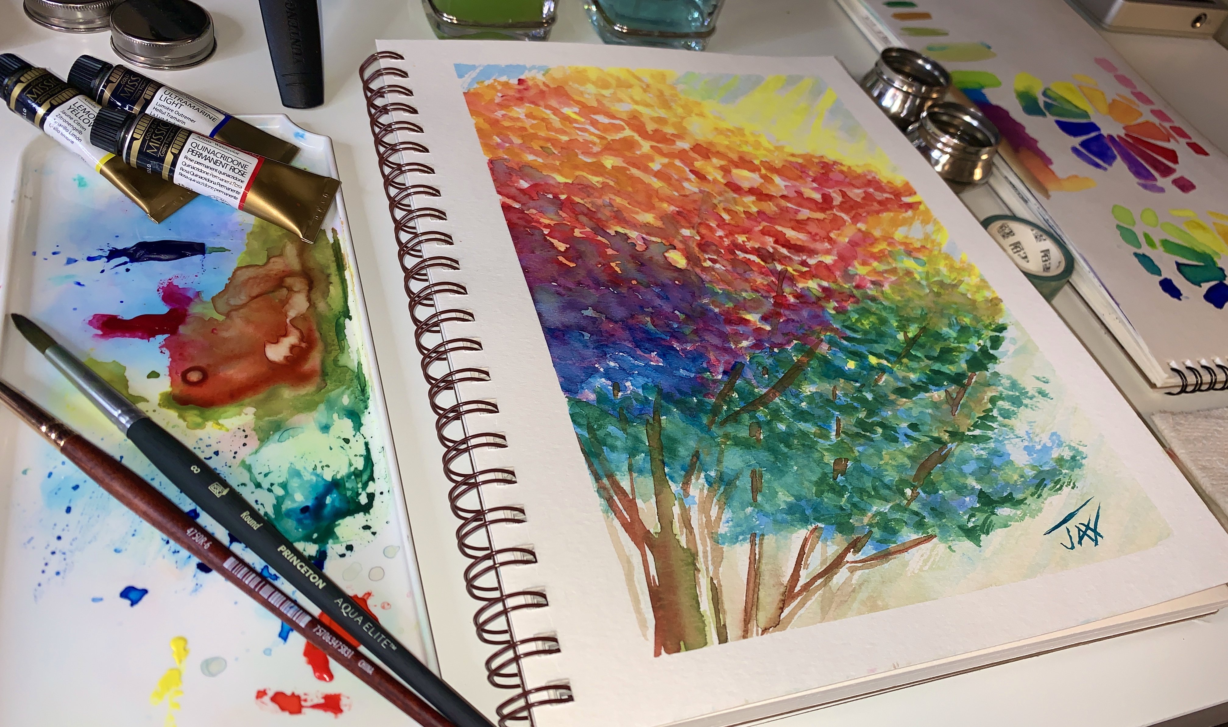
2. Materials: It has a little bit of color theory in it because we're going to be mixing some colors that won't turn to mud. It's also going to be especially highlighting three amazing colors that work really well together. And these are actually pure pigment. So what you're seeing here is by Mission Gold, which is a relatively inexpensive watercolor for what it is as far as professional-grade artist's colors, I really highly recommend that you just start using them right away. And Mission Gold is a great way to kind of dive in to watercolor because the picnic kinda stays where it is. It's not a highly moving pigment, yet it is light fast and is pure pigment, meaning that it's least likely to go muddy. So you can pick one of these sets up relatively cheap on Amazon. Just look for mission gold. They are from Korea. I really loved them because they are high and pigment load. And one thing about that, as you can mix this pure pigment and with a little whitewash and get some really amazing effects if you want to have a little more coverage. They're also really great with translucency. They have a little bit of texture and some of the colors. And they just, they just really are easy for people who are not used to watercolour to get started, I even find as a professional watercolour artists that I use them very, very often for certain things, especially this project we're about to do, which is more of a pop art project incorporating some colored pencils and the watercolor. So this is the three pigments were going to be using surly and blue, viridian and quinacridone, permanent magenta, three of my favorites. And you're gonna get to see how these are gonna come along. We're also going to be using ink tense pencils. These are by underwent, which is from England. They are, I think the best by far, pencils to use. Their, they have a watercolor version of the pencils, but I love these inks, pens, pencils because they're permanent. And when the difference between a watercolor pencil and an intense is intense, one is more permanent of a die. When you put it on the color watercolor paper, what happens is it doesn't really move as much. You can lift it a little bit, but not likely it's going to be pretty permanent. So you do kind of have to know what you're gonna do because you're not going to be able to erase it. But then again, this project doesn't really require a racing because you're going to mark it with a pencil first and then you're going to add the colors and it's gonna be fun adding water to those colors to see. And then you want to glaze over with watercolor. So that's pretty much what we're gonna be doing here. So I just picked a couple of intense pencil. As you can see, I've got this wonderful blue color and of course, feel free to use any colors you like. But this is what I think are gonna do great, great for this project. And I picked a beautiful kind of like a magenta color. So these two go best with the Mission Gold counterparts. And you're gonna see in just a second exactly how that goes through. As far as brushes, I use this wonderful Neptune's size 12 brush. It's a great brush to use just for projects because when it gets wet it does have somewhat of a point. It holds a lot of water. And you can always dab some of the water off on a paper towel so you're not really stuck with it. I think a lot of times new watercolour artists will try and use watercolor brushes that don't hold enough water and that can be really frustrating. It could also just give you so much pigment or be really hard to mix the colors because there's not enough water. And you also don't want to have too much water. So this one I feel is really great for just overall usage. And it's as far as cost than Neptune Princeton brushes, you have them for like a lifetime unless you've used your brushes. So if you wash them, I really loved the Neptune series. It's been one of my favorite. The elite series by Princeton is also really good, but it holds less water. And so that's more of a defined look. We'll probably go over brushes at some point in these courses. And I will definitely be demonstrating different brushes throughout as we go through all of these different wonderful little projects. Alright, so we've got our Neptune brush, We've got a pencil, some Mission Gold watercolor, or you are watercolour of choice. You can use Pan watercolors as well. It doesn't have to be from the tube. I just tend to love the tube. This is my basic setup. I have this great box by Medan, which I have really enjoyed. And this is the project.
3. Swatching your watercolors: So it's watched off these items for you. On the right, you can see there's the two pencils by HDR went once water is added to them. That's what happens. They kind of give you this beautiful watercolor effect. Then you have the three colors by Mission Gold. And I let them blend into each other. So you can see some of the additional colors that are going to be in this project. And as you look at the finished Pop Art portrait, it's pretty interesting, right? Pretty, pretty cool. So now one little note to you. If you're gonna switch up the colors, you wanna do a little color charting first and see what the colors look like that you're going to use for this project alone. What the values are. So add water to them and stretch them out and value and see exactly what kind of values you're going to be using. And you also want to see what they look like together. So you wanna do a wash of each color with another color that you're using as well as if you have three colors, make sure you put all three together and see what happens that way you can get an idea of what they're going to do if they do combined in water and you want to avoid Mudd. Now, I don't know if you've had any classes in color theory and that really does kind of need to happen. Eventually. I do tap on color theory a lot in these lessons, and I will at some point do an entire sloshing color theory type of thing for you. But this is a good exercise for learning about color theory if you're going to use these three colours. So really in blue, viridian, magenta, they are odd colors to use together, but as you can see, they make some pretty nice washes and they really do work. So instead of the traditional yellow and blue make green or purple made by magenta and blue. I added in the green in there because it's just so vivid and bright and it does really make for a great watercolor. So let's go forward and let's check it out. So first I'm using some pencil strokes to outline the pop art. And you can see that right here on the pop-art. It's just a basic face that we want to start with. Now you could draw this out yourself. You could take a lesson about how to draw pop art. But if you look, I didn't do a lot of detail. And the reason why is because this is not that kind of a peace. This is something very simple. So I love pop our portraits because so much fun to learn and you can put out something that looks really professional and really wow for your fans to look at with not a lot of time invested and also not a lot of skill invested if you don't know about shadows and shading and all the details. So you see right here on the page, this is watercolour paper, just my sketch book by Canson. And it's a watercolour paper, so it's 300 pound and it's, it's really, really a nice paper for a sketchbook. I think it's great to use. Now. Just put it in with light pencil. What I'm doing on the side of the screen is I'm starting to test out the swatches, so you're going to see me go through. So this is the first intent pencil, 07 to o, which is like that magenta color. This is the blue pencil that is 1210 if you're using intents. And this is by underwent. Next are going to swatch out the beautiful colors from Mission Gold and you'll see how smooth they are to use, which is a little bit of water. You end up with a really, really great crate watercolor. And like I said, this is awesome to start with because you can control the watercolor alot better. So I'm just taking them out of tubes and we're going to put them right on the paper just to swatch. And I highly recommend that as you're getting started and getting used to your watercolor, that you do, do it this way. You kind of just put some on the paper next to you. You have your swatches, you see what they'll do together. And it's a really, really great way for you to be able to get used to these beautiful watercolors and working together. So there I've swapped out the serenely in, here is the, the green which is so, so pretty. Viridian is one of my favorite greens and this is the quinacridone, permanent, magenta, beautiful. Now we're going to add some water to the door when you can see what happens as you add water and you kind of scrub it out a little bit, you can get rid of the lines. Now I put in pretty strong lines, but you can see they really can be rubbed out and that's the beauty of it. And then we're going to combine the three colors and just do a color check. Now this is what I always do to Contrast, see what colors I can make from my swatches so I can know what to expect to head and also see if there's any moneyness than I need to look out for. This is a great way to prevent moneyness in you. Watercolors.
4. Sketching your Portrait : So first I'm taking the underwent pencil and you're going to add it to start outlining some areas in your drawing. And this is the beautiful and love Halley's go on there. So pretty. So you can see we're just highlighting the eyes. I always like to start the eyes first because they kind of bring the life to the picture. And I feel like if I get the eyes right and I get that life in there, it's really, really wonderful. Next I'm adding some black Indian ink. This is a great pen that I have started using and it, it's like a paintbrush, but it's filled with ink in his refillable. They're just so nice to have. You can get them at your local arts or you can also order them on Amazon. And Saqqara makes them as well as fabric hostile. There's a lot of different ones out there, but just double-check that they are waterproof. That's the big deal. No matter what ink you're using. As long as it's waterproof for these things, because you're gonna be painting over them. That is really, really good. If you weren't going to be painting over them and you were just going to like doodle on top of watercolor. It could really be any pen at all. But I have found that just testing them out and making sure they're watercolor proof, waterproof is a really big deal. This one is really pretty too, because it's not shiny. It's kind of like a matte black. It's really dark. And I'm able to just put in a little bit of the detail, some of the lashes. You can see in pop art, you leave a little bit of white space for the highlight in the I, I also just highlighted some of the streaks. If you look at an eye really up-close, you'll see how they have this different variations. And of course we're not gonna get into high levels of detail because this is more of a pop art and it's more of a beginner to intermediate taper project, but you can be as crazy as you want. I mean, if you're really good at IES and you're taking an AI class right now, then maybe this is a good time to put some of those things that you learn those techniques to use. But for basic eyes, I usually just vaguely highlight them. I put in the area in the center where there is a highlight supposed to be from the light, as you can see right here. As I'm looking into the light, you can see a little highlight. I also put in a little darker line which tends to go along with my lashes because it just feels right and adds a little more drama. And then I don't do a perfect, perfect round inside the pupil. I kind of leave that as a shadow line and as you can see, I kind of make it imperfect because if you were looking really, really closely at an eye, you do have a round area, but you also have some little strikes that come out. And this is a great way to render them, to make it look a little less cartoonish. If you were just doing just the round pupil and solid black and then a round circle on the outside of the eye. It's going to look a lot less realistic and a lot more cartoonists. Now if that's what you're going for it, then absolutely keep it that way. But this is a great way to add a little dimension without a lot of work and a lot of technique. There's also a little area on the inside of your, I always want to put that little, little mark in because it kind of helps you. Now, the eye becomes less flat and it gives it a little bit of a curve. It's a little curve shape that's often done in popper. Now I'm moving on to the nose. Pretty simple. I'm not going to heavily due the nose because if you make the nose down out too much, it can get really prominent. So you kind of just want to be real minimum width your marks to accent where the nose is. And if you look right now and you kind of squint your eyes on my face. You can see that I have like a little darker area here and a little darker here. But aside from that, you don't really need a very, very dark line here. And that's what we do in watercolor. And a lot of times you don't need to put in that really heavy line because that would be more cartoonists than anything else. Now I'm taking the HDR, went pencil. And I'm going to start highlighting the hair. And the reason why I did this rather than putting in the black lines, is just because for this project, it's a lot softer. It allows the ice to stick out a little bit heavier, especially as we're going to have so much color on the rest of it that you don't necessarily need to go over it with black. And this is the beauty of having this ink, ten pencils involved in this project. This is the great thing about using different mediums that work really well together. So I'm just kind of blocking out some of the shapes. Try not to put in too much detail because it's a Pop Art Series. We want something really simple. Now if you're a more advanced artists, then you probably wouldn't need to go too heavy with the intense at this stage. You might want to wait and add in more details as you paint, rather than add a lot of detail on the initial drawing. Because after all, you want to go and have fun with the watercolors. You don't want to just be like crazy with the sketching and put in so much detail at this point that it's something that you can't remove back from. I love to glaze and add layers and watercolour, and that's something that's so much fun. But again, ink tense is gonna give us that great base. And with that base, you're going to have this wonderful ability to blend and add layers as you go along, as you saw in the finished drawing. And at any point you can stop. So right now we're at the stage where you're going to have the ink on paper and you have the ink tense, which is pencil and paper. You can have the option of adding water, or if you're just not wanting to play with water right now, you can leave it like this once it gets to that point. That's another great thing about these projects is there's literally so many ways to do them and you are not stuck either way. I can tell you that much for sure. Okay. So moving on, we're adding a little bit of the second color. You can see that the left half of the face is all of the blue and the right half of the face is all of the magenta. That's something that's really fun to be able to do if you were using a third color. I mean, we're doing the power of three here. So these are basically the only two colors. And then the third is going to be more of our hidden accent color, right? So here we go. And endurance. Now we're gonna put them away and dive into some water. Are you guys ready? I'm totally ready. This is always so much fun. So these are the brushes that I love to use. And let's just back up really quick on those two brushes because they are super, super-duper brushes and very, very important to this project for sure.
5. Painting with water and pencils: Now the brushes are, like I said by Princeton, which is the brush line than I like the best so far. One of them is from the elite series. So this black one, the aqua elite holds less water. Then the Neptune. And the aqua elite is a size eight. The Neptune is a size 12. As far as you and your preference if you're working on very small sheets of paper, here's a tip. Use a smaller brush. So you could use maybe a size 81 or two for detail. But for this, because we're gonna be doing large blocks of color and it's more pop art and not as detailed oriented, then. I recommend that you just use larger brushes. I think it's really easy and certainly something that won't get in your way by far. Alright, so right now we're starting to add a little bit of water. And if you notice I'm using the aqua elite brush. Now when you use Jaco leap verse, this is what you get. You don't get a soppy type of result. And I find that not sopping the paper with the underwent really does work the best. So I highly recommend that you use just a little bit of a dip for the elite brush. Or if you're using a Neptune brush, Davin on a paper towel. The reason being because if you have too much water at this point, you won't get as intense of a color and it'll be a lot less easy for you to control. And that's what you're seeing here. I have a lot of really good control as I go through. I'm also able to take, because the elite brush tends to like hold color really, really well. It doesn't want to like SOP it out or give it away. I'm able to take the color that gets onto the brush with the remaining water and move it to another area of Highlight. And that's something that is so awesome to be able to do. It's a very, very good technique. Taking the color from where you picked it up and putting it somewhere else so you can add highlights an accidents as you go along the way. So right now, I'm still haven't readapt to my brush. And because I'm still in the same color, that is working out really well. Now remember, this is where having colors that work really well together. It just, it, it saves your project because I can't even tell you how many times in the beginning I didn't plan my colors well. And as a result, what would happen is I would have this Muddy situation now right here under the chin where the blue and the magenta, or certainly to come together. This is a big, big deal when it comes to choosing colors, because this is where project can go horribly wrong. You can end up with a muddy mess if the colors weren't meant to go together or they make mud. And that's something like complimentary colors. So if you're using blue and orange, of course, they're going to get really, really muddy if you're using a gold, yellow, and a really cool blue, it is going to get money to, instead of making really nice green, it's going to start giving you let that more all of grain kind of thinks. So this is where choosing the colors carefully really do make a difference. And as you become a really well oriented and professional and experienced artists, you're going to have colors that you use together regularly. You're gonna get to know your palette really well and probably have a custom palette that you go to for all your projects. So again, I'm just kind of going through and I am going over the pencil and then I'm swiping up with nice, clean, easy brushstrokes. It's about confidence. It's about getting to know your brush, getting to know how much water's in the brush and getting used to that field. Of course, if I were using that Neptune soppy brush, which I use later in the project, it would be so much water that I would have petals and we want to try to avoid puddles. So if you are using a brush where you're getting a lot of petals, just simply take a tissue and debit off just a little bit before you add it to the paper and you'll get more of a feel for that. And then when you read it, just get in the habit of damning. But like I said, the elite brush is perfect for a beginner and so is the Neptune. If you can learn how to control them and how they work together, if you can only choose one, I still say go to the Neptune because it's going to give you the ability to get those sopping mixes as well as to stabbing it often piece of paper to get a dryer effect like this. I find that the elite is more of a professional series in Princeton. Even though having less water does give you a lot more control and that's what you're seeing here. It gives me a lot more intensity and the ability to just really work out those brushstrokes. Now, as you know, I could rub the brush against the word underwent ink is, but I chose not to because I want to remain I wanted to have that integrity remaining on this piece. I don't actually want to rub out the brush strokes. If I would have rubbed him out and not had the pencil there, it would like I would start to lose structure and I would also start to really sought out the painting. It has another effect and I'm sure that there's a reason to do that if you can think of something during your own creativity, but I chose to intentionally keep these lines there and not rub it out. So now I've added water. I kind of went through and with the extra color I added in some highlights. So you can see where I added some highlights for this area of the nose, which you can see right here, how there's a line. And then I added a little highlight for this side, even though it wasn't drawn and I just let the watercolor Do it.
6. Painting with Watercolors: Now we're going to add the watercolor itself. So this is me with the Neptune brush because it holds a lot more water. You can see it's very intense pigment. You can work with surreal Ian in Mission Gold, either full concentrated strength, which is what I'm doing right now. It doesn't derive much lighter. So there's actually a lot of room for you to be able to play with lighter tones. This is actually more of a heavier tone, not even like a mid tone of this color. I mean, there is a darker when it's like literally not bright blue. It's so deep and so intensive, it's almost looking like a black, but that is almost full concentration. Now I'm adding the viridian. Now the viridian, again, high pigment load because these are pure pigment paints. But if you notice they don't move very quickly. Normally, if you were to go over an area where it was wet like I just did right now from another pain, the paint would combine and maybe start to travel really, really quickly. The thing I love about the Mission Gold and the reason why I think it's perfect for beginners and intermediate artists, professional artists that really don't. They want things to stay put and they don't want all the colors combining so quickly, is you have the flexibility on these projects to be able to do that. Now of course, if you wanted color, that moved really fast, you can go with Holbein, you could go with Danielle Smith, watercolors. They move really quickly. Also n-gram move really quickly. White Night is a very inexpensive paint from Russia that has great like very, very good pigment load and its light fast. And they, they have a medium movement and I'll be doing some projects with those, all of those coming up. Well, I also live manga shimming is a great company that makes watercolor out of Germany one of my favorites, in fact, because the pigment load is wonderful, the light fastest, perfect. They work well with other paints. Also, you can make your own quash by mixing them with white and they move. So there's a lot of watercolors out there. You can also just do some, you know, like there's some cheap paints out there that I think have been really amazing for beginners, like the Camargo, I think it's can Marco. It's a Japanese watercolor that they sell for, I think it's like $30 and you get a big pan. Those are beautiful, high pigment loads and they move that well, but they're mostly just like such an easy pan to get. Also the cotton and set by Winsor Newton is very good. It's, it can be a little pricey I think, compared to for what it is, but it's got a high pigment load. It does dry a lot lighter though then the rest. But I mean, I don't know if you want to review on watercolors and what I see my collection, and let me carry you through the things that I like, the pros and cons and happy to do it. Alright, so right here, I'm not being afraid. Impart this is fun. You don't have to leave a lot of whitespace if you don't want to. So I'm taking the color and I'm actually going over with a glaze. So you see I'm glazing. And by the way, this is the Neptune watercolour brush that holds a lot of water. So it is soppy, yes, but it still has a point where I can get some control. And remember, this is a very, very big brush. What I'm doing is I'm going over previously painted areas, and this is what they call glazing and watercolour. And it adds depth dimension. It also allows you to start light like I did here with a very, very light wash a blue, and then I'm adding more color as they go along. I tend to love to be really heavy handed with my watercolors. I think it's so much fun. And as you can see behind me in all of my work, I just have very, very bright, bright watercolor projects that I love to do. So you're gonna get a lot of brightness for me for sure. Okay, so now we're headed over to the magenta and this is beautiful because again, working with Mission Gold is wonderful because it allows you to do this high pigment load glaze in areas. It's not like if you can see this blue is dry and I'm painting the magenta over it and it's not combining. So that's I'm the face did dry. Right. But it hasn't been long since I've been there. And that shows you that mission gold paint now all paid. It's not gonna work the same mission gold paint in this case scenario combines well in some areas to make the purple, the blue, and the magenta, or making that lovely purple. But I'm also able to glaze over it. And it's not carrying the color along because it's not got like the honey characteristics that like him Graham and Daniel Smith half which carry pate and keep them wet longer. This tries very, very fast. So another plus for if you're a beginning watercolor artist.
7. Glazing: So as I go through the piece, now you can tell you can stop this piece at anytime. I have some light areas, some dark areas, some glazed areas, and even I'm starting to go over some areas of color with another layer of color, creating another colour. So we not only have the power of three, but we're starting to get in the power of four, which is adding some of that nice purple cars, as we knew before the project. If we go magenta over green, it's going to make this really lush, like lavender, purple. Also the magenta over blue is gonna make a nother kind of purple. So we have the option here of gathering some extra colors in her project depending on how many glazes we want to do over other colors and how wet you want to. Now one good thing about this paint to, and you might want to check your paint for this depending on what you use is how easily it reactivates on the paper. So mission gold, as you can tell right now, and painting over the green with the magenta. When I go over the meridian variant in with magenta, It makes a beautiful purple color, but it doesn't reactivate the paint where that purple starts to NOW bullied through the last strike. This is where having a watercolour doesn't move is really valuable to your project. Again, if I wanted a color that moved quickly and combined, then I would choose something else. See the bloom that's happening right now or I just went over the wet magenta area with the blue. Now, the beauty is that if that were m gram or Daniel Smith, that blue would travel all the way up and we wouldn't be able to have that nice little area identified and the control over having that area or not having that area. So I'm adding more by choice. And now I've just gotten my purple because, and there's two shades of purple because one shade is coming off, the more blue, and one shade is coming off of the more magenta. And that's another benefit to knowing what your colors are gonna do before you paint them. Now as you can tell, I'm actually going over a previous area with more blue. And when I go over the magenta, it makes us lovely purple. Now this is an area that is partially dry. So you wouldn't need it very, very wet. And I encourage you in the beginning if you want more control not to work on wet big-time. But pay close attention because as I go through, I'm getting that lovely purple just by adding those three colors together. So now at this point on my palette, you can see, and I'll stop this for a second. So you can take a look. You can see on my palette that I've got the civilian, the viridian, they're running into each other at some point. And on the bottom where the magenta is, it's, I'm moving it up to mix those colors to get on my palette and making this lovely purple. The purple went through a couple of different shades. When I hit the blue, it goes a little more periwinkle. When they hit them agenda, it goes a little more purple and more Lavin dairy. So like there are different stages of lilacs and beautiful colors that I'm getting from the next. And that's why you don't necessarily. Need to have a ton of colors in any project. Because if you start out with three colors, you're really gonna get at least 567 shades. And you have to really think if you were going to swatch these colors out and you took some Lillian and you sweat it out. And I don't have my swatches here, but I I should get them for you. They will you'll end up seeing is you're gonna end up seeing the civilian at its deepest shade and then a bunch of other shades depending on how much water you add to it, all the way down to a very, very light, light pastel blue. That's all happening just within the one pigment. And that just shows you in watercolor how lovely it is that you can have so many different shades from one shade of color. It's not that you have to have every color in the rainbow because you can make them. And then if I added the blue and the green together, you get another shade. And remember, the green itself has a bunch of variance depending on how much water you add to it. And the magenta as well can go all the way to a very light pastel pink, which is just so beautiful, or it can be really vibrant. You add a little green to it. You get one form of the purple, you add a little blue to it, you get another. And that's where we're at and that's how we get all these really well, beautiful, true colors that work together. They don't turn to mud and they never really ruin your painting so you can't really go wrong. I think the worst thing for watercolor artist is not want mud. You want clear color. You want something that's just beautiful and subtle or supple. And if you want subtle, you can have it just by adding more water or you want that really depth of color. And you want to be able to glaze and layer and highlight and add shadows, but you don't want it to turn to mud. That is the worst thing for me. I mean, it's like death for my painting, so I can't even tell you. I just did a I just did a tutorial last night on colors, doing a peacock feathers, so keep an eye out for it. And the reason why I purposely made mud on some of it was and you can see how I could remove it and fix it, but also so I could point out why you don't want to use like warm and cool colors together. You wanna kinda choose all cool colors, which brings me to this point. On here, you'll notice that all of these colors are cool based colors. None of them are worn based colors. The reason why I do that purposely is because if I were to use a warm base, Lou and a cool base magenta, you would get a really odd color. And I find that if I am going to mix warm and cools together, I have to be really, really careful of the colors and what I'm going to end up, because they do end up a little more muddy every single time. So typically if I'll add like a warm yellow into a green project, I will get this like really mucky green. And if I add a warm yellow into a cool blue, I'll get like a really mucky green. So like that's why I use cool with cool and warm with warm and this is the reason why you should always watch your colors. You should always try different things, try different paints. And figure out what works for you. Now in this area, particularly where I have gone over it with so many different glazes. This is layer upon layer upon layer of colour. And under that, there's texture from the watercolor. Pencils, from the intents, pencils. If this wasn't a bunch of colors that can be mixed together, you would end up with is really a key Brown. And that would write, I would think that would wreck this project. So again, choose wisely and get to know your paint. Kata gets new pain. So at this point, again, stop this project at anytime. If you are happy with it. It's all about you, and it's all about being inspired and having fun with your painting. I love to paint and I love to just continue to mix colors. So again, I went over with a higher concentration and I did a fourth layer of glazing, which I find that mission gold handles very, very well typically. And you should know this. And watercolor for glazes is probably too much and you probably can't do it. You probably can't pull it off with most of the water color paints because they will slide into each other a lot, we'll move too much. But again, this is one of the benefits of something like Mission Gold. One of the things I can do with Mission Gold is this lovely fourth glaze and getting a little more depth in the color if I want to, this is something typically you would probably use a wash for, an acrylic paint for, and you don't see many watercolour artists doing. I find that as a watercolor artist, a professional watercolour artists will attempt to do this, but not all of them well, and some of them, It's like sacrilegious to do for glazes or five hits. Okay, it's headed that direction in some areas in this painting. But I really love to do it and I'm, I'm definitely heuristic or when it comes to painting. So you're gonna see me do a lot of really unconventional things with watercolor that you probably won't see from anyone else. So I hope you continue to watch my series and continue to really enjoy everything I have to offer on this channel. So finishing off this painting, remember we used three initial colors and found their counterparts to colors into went pencils. You could have just done the duet pencil part sketch and that would be a great RPs. You could also just do one glaze to glazes, and that would be another great art piece. I want to remind you as you go through your work. Video really is wonderful because if you video your work as you play around with stuff, you could actually go back and watch. And I find that I learn a lot about my style and also what works and what doesn't work. And at what point things went wrong from just watching back the videos. Another great way to do it is take a picture. I like to take high-quality pictures as I go along. And the reason why is because I actually can use them as prints. So I have offered this particular piece in three different prints. One, just the deer went pencil with the water. And then as I went along, I took some different prints, some different really good pictures for my social media. But also they ended up selling in Princeton, selling really, really well. So sometimes you can get a lot more inventory if you are going to do art for sale. And again, if you want to know more about our for sale, I am happy to let you guys know about it. Just ask me some questions.
8. BONUS Tips for All Levels: This has been really, really fun, and I hope you guys will continue to do watercolor because it is such a great medium of all the paints I've tried, and I've tried so many different things. I really love watercolor than most for this reason and so many more. And really, if you're having trouble and struggling with your art, just to remember some tips are never let the brushes or the paint gets in the way. So if you find that you're struggling with something, then look really deeply into the kind of brushes you're using, that kind of paint and the kind of paper you're using. Because perhaps what you're, you're imagining or your vision is, isn't working out because one of those three is just not meant to be used that way. And so you're struggling. A lot of times, as you can tell, you will struggle with your materials if you're not really familiar with them. So great exercises to do are things like just taking your sketchbook and using one color at a time and getting really familiar with the different levels of pigment of that color, finding out where the color was made, who made it and what the typical traits of that paint actually are really helped save you time and frustration along the way. Like I said, I know the different paints and what they're used for and how they were made and why they do certain things and how they react. And that all came from just diving deep into the way that they were made, washing reviews on them. And also by my own experimentation. Again, record everything like video your projects because it's great to be able to watch them back if you learn so much more, because there's a lot of things happening during the process that you miss as you're trying to keep up with the painting or keep up with the washes or the wetness or the drying and you will miss where you went wrong. That's the best way to learn about yourself and your own technique and figure out who. I don't wanna do that again. So this is what happened in this is where it went wrong and now I've identified it and I will not do it and hopefully not. Another good tip is watch the brushes. Some brushes, whether they're expensive brushes or not, we'll hold more water in different ways. Some will dump a lot of water and create puddles. You obviously want to stay away from brushes that do that thing I love about the Neptune Princeton brush. And there are a lot of other brushes out there that do it too. Is it holds a lot of water in that whole series, but they don't tend to leave a water load when you pick up the brush. So if you're going through and you're painting, and then you see a big puddle at the end and it hasn't removed the water as you picked up the brush, the burst is probably very cheap and doesn't, doesn't really work like it should. So you'll have to compensate with your technique on that. That's why it's well-worth shelling out a couple of extra bucks for a better brushed because you'll have it for longer. And if you take care of your brushes, they will always perform really well for you. Again, in this lesson, the difference between that Princeton black brush and the Neptune brush was that the Neptune's series by Princeton holds a lot of water and really sucks up the pigment and can deliver a great pigment load, can paint longer without having to rinse the brush. And the difference in the elite series is it is a more fine artists series, but it also, in watercolor particularly it holds less water, meaning that you will get darker pigments. So you do have to dip their brush more. If you are the kind of painter that needs to do long sweeping strokes, elite is probably not going to be the line for you. Neptune. The series will be a lot better for you anyway, in upcoming series, I will do some brush specific things for you so that you can see all the different brushes. And I have almost all of them, so it would be fun to go over them with you. I'll also be doing different paints in different series. So if you want to watch the rest, be sure to subscribe to me so that you can see all of these great projects. Alright guys, I hope you enjoyed it. Thank you so much for being here. And if you said today, and I am so glad be sure to tag me up with your project and can't wait to see it at Jacqueline Jack's Have a great day and always create are good for you. Keeps the soil half.
 Jacqueline Jax, "Creativity brings peace into your life"