Transcripts
1. Intro: Painting Intuitive Floral Watercolor: Hello, I'm Jacqueline jacks, and I am a watercolor artist. And today we are going to learn to do some of these really beautiful intuitive florals. I have so many people that asked me about intuitive florals and I absolutely loved them. It's part of my signature style. So I wanted to teach a class on it because I think that everybody should embrace their own style and what they love. You can get really vague with intuitive florals. You can get a lot more detailed with them. It's really entirely up to you and what your vision is. But first as a beginning watercolor artist, you have to find your vision. And I think that's half the battle. So it really just depends on what kind of artist you are going to be. And there's going to be a division between the kind of artists that you are right now, the kind of artists that you will be in the future. And maybe what your vision is as far as things you've been exposed to. Like maybe you admire some of the paintings of other people. But you can't quite do that and you don't want to mimic it. But at the same time, you do like some of the things that they do in their paintings. And that's perfectly okay because I think all of our styles kinda comes from a mix of things have been exposed to, things we've been brought up with or around, or things we've been taught by other people. So in any case, I hope that you will enjoy this class. I hope you'll take more. Please leave me a comment and let me know if you enjoyed it and how I can even make it better. Because I'm gonna do a lot of these. And Let's just go in and have fun. The first in the sections, you're going to learn about some brushes that will really be handy and what you need and what you don't need. You're going to learn about paper, just a brief about these things so that you can set yourself up for the best possible painting experience. And I think that is where we will start.
2. Choosing Brushes: Intuitive Floral Watercolor: So when we want to paint, Let's talk brushes because brushes are really important. But I have to say that no matter what the brush are really good artist can paint just as well with this brush as they can with this brush. It doesn't really matter as long as you have a vision and talent. So as you get on in your skills and as you develop your hand and your way of delivering paint to paper or whatever it is that you're painting on. You're going to learn that some of these things are very, very convenient to have and they make your job easier. But at the end of the day, you can pretty much work around just about anything. So as far as what brushes are for you, I have to tell you. It's been a process. I have collected so many brushes and I can honestly tell you that I never worry about the cost of brushes because they last for a long, long time. I have some brushes that I had when I was first in art school and I have some brushes that my mom gave me from when she was in art school and they're still amazing brushes. So if you take care of them, you clean them, and you develop a relationship with them, knowing what they can do and what they can't do, I think is the big thing, right? You want to know how much your brushes hold and how much they don't hold. And that really there is something that will come with time. So don't rush it. Just start developing some great brushes into your, your personal stash. And they will always, always feed you Well as far as ones that I really love, I tend to go with a lot of Princeton brushes, as you can tell, I just really love their brushes. They have the Neptune line that has some nice squares. All these are Neptune and they hold a lot of water. I tend to reach for these first when I'm doing watercolors, especially intuitive, because intuitive florals, this is actually one that my dogs, eight, this is like my favorite one, but I actually took one of those retractable brushes and I took out the brush and I put in my favorite watercolor brush. So now it's a travel brush. Brilliant, right? At least they didn't get it all the way. They just ate, they ate the wood. So anyway, that's a Princeton too. But as far as your brushes, the ad just do what works the best for you. The Neptune's, like I said, are my favorite go-to. They have a full range of sizes and everything. The size of the brush is really going to depend on the size of the paper you're working on. So if you're starting small in like a sketchbook and then moving to a larger or even a 30-inch, then you're going to obviously need bigger brushes for that, but you don't necessarily need very big brushes to do something in a smaller form. So just be careful that you have a little range depending on where you're going and as you graduate into bigger paper, gets some bigger brushes. These quills are also amazing to have. I tend to use these very, very often because they hold a lot of water. They usually have a great point. They are both synthetic and some are squirrel. So that again, is something you should test, order them on Amazon, give them a test out. If you don't like them, usually they will take them back if they're shipped by Amazon. So that's a great way to test out brushes if you can't go to the store. Princeton also makes velvet touch brushes, which I really loved, but these tend to be a lot more dry. And they're kind of mixed media brushes, but they're great for detail, which we're not necessarily going to use today for details. So we don't really need these ones. I'm going to be doing what paint on dry paper, because I figured that that is probably one of the easiest ways for you guys to start learning these intuitive florals before the paper carries away with you. And it will work on just about any paper that you have where a lot of the cheaper papers don't handle wet on wet, very well. So this is going to be a really good way to get intuitive florals into your daily painting style. The elite brushes are these ones right here. And one thing I really recommend is that you try elite brushes. The elite is by Princeton and it holds water, yes, but it's mostly about fine tuning. And as far as like having great points, keeping their points being synthetic and just have an a great range. I mean, look at the tapering on this brush. It's amazing and it holds water and still keeps that point. These elites are so good and they also have like squares, flat brushes and stuff, which I use a lot for the landscape art that I do that you'll see in other tutorials. Anyway, I recommend Neptune and lead. That's what I pretty much use throughout all of these stuff. I can always reach for those. And then you want to look for some rigors. Riggers are great to have because when you wanna do like these really long fluid lines, they're really handy. Never use your rigors for masking fluid if you're not going to be a watercolor purists and if you decide to do masking fluid, don't use your nice brushes. Just put it in a little bottle with a little spout and do that instead, you can get them online on Amazon. And pivots are also great to rewet paint. And yeah, let's go to pay next door, I paint and paper. Here we go.
3. Paint Choices: Intuitive Floral Watercolor: When it comes to paints, and you want a paint that is really vibrant, the best thing to do is use to paint. But that's not saying that you can't get vibrancy out of your pans either. I tend to take my two pain and dole out small amounts because when I put a large amount of paints, what happens is unless I'm doing large pieces that week, they really dry out and then I have to rewet them. But the problem with it is I'd prefer it to be just freshly out of the tube and then I wet it and maybe just have that for a few days. Otherwise it can get really KCI and you have to just kind of keep them moist. Now, really good paints, they do have some honey in them or some glycerin and that will keep them moist. But again, these are really, really good paints and I still find that rewetting isn't always my favorite thing to do. I love the fact, especially when you get done those smaller amounts. I loved the fact that I can just take it out of the tube. So I will often, often do my palette like this where it's got very small amounts of paint in it and I use it and then I clean it out and it gets him fresh colors in there. As far as really brilliant colors, Mission Gold is a great starter. There are some pure pigment mission goals. You can get really big sets for not a lot of money, and it gives you a really nice range. There also the colors are amazing. A lot of them are light fast, and I use them a lot for florals to tell you the truth, because I like the way they work. They're great with wet paint on dry paper. And they didn't cost nearly as much as some of the Daniel Smith babies that I've got right here, which are also beautiful as far as color. And then there's also some sun LEA that I use and I use a lot. So this is a preference, It's a personal preference. Go with what you can afford and just keep adding some colors that you like. Like if you love Prussians and blues, There's some amazing ones in Mission Gold that I use a lot. But then there's also some beautiful Prussian and blues that Daniel Smith has. So maybe you'll just order one pression in Daniel Smith and you'll experience it, you know, get the 50 ML or something so that you can just try it and see what you love and get to know the paint. Like do a lot of really good exercises of just splashing color and wedding, doing wet on dry, doing wet on wet in your sketchbook. Just do lots and lots of syllables. And Just don't be afraid to try different things because this is how you're going to get to know your paint, hygienic, get to know your brushes. How are you going to get to know your own hand and what you're capable of. And don't worry if it doesn't look good or doesn't turn out. That's not the whole purpose of watercolor as what the whole purpose of painting. The painting is a beautiful moment that you have. It's a journey and it's a lifetime of gorgeous paper paint brushes and these wonderful peaceful moments with music that you can enjoy it and then you can share with your friends, or you can hang the art, or you can even sell it. But either way, just embrace it for what it is. Don't worry if it turns out eventually you will get something that is all you and just yours alone. And it will look like your style. You'll keep consistently delivering that N. Having such a wonderful time painting, I think it's really important not to let the materials dictate how good you are. Because really it all comes down to what's inside, what's in your heart, and what it is that you have a vision for, and what makes you happy when you do it. Like a lot of people are really happy when they use Sophie yellow and quin rose, and they love mixing it together. A lot of people are really happy when they see a range of fluorescence or adding opera pink to everything. And you can even do a whole painting in one color. It doesn't matter. The point is, is that it comes from you and you're the creator of it. And in that moment in time, you spent that energy doing something that was fulfilling to you and that may be made your life a little brighter that day. And that's a whole purpose of art. It really is. It's just not as egocentric as you think. It really is, just that peaceful space where you fix yourself. So as far as colors we're going to use for this right now, if you really wanted to do exactly what I'm doing, then I am going to use a lot of lemon yellow. We might touch on the yellow deep like a little more orangey yellow. I probably won't do oranges today. If we're gonna do this one, we're going to do more red, violet or p rows. Bright opera, a little bit of violet would be good. Cobalt blue, peacock blue is nice Prussians, nice meridians, nice Hooker green, sap, green, yellow, green. All of these green tones are really beautiful in there and warm. And they kinda work together really, really well. Now to get paint to work together, that's a whole nother lesson entirely. So we're not gonna do that today. We're just going to go ahead and paint. And it really does come with experience. So get out your sketchbook and just start mixing colors together and you'll see what I mean. Some of them will mix really, really well together. You'll get a feel for it and you'll start to learn a lot more about the materials that you have and that you are going to buy from this point on in the future. Another good thing to have is I have three big things of clean water here. Just so I don't run out. I have some paper towels, I have a little mini water spray and I'm not going to use any cells or white or anything like that. Just keep in the paper towels handy so that if we need to do any cleanup, so if we have any puddles that we don't want, any washes because this is wet on dry. They get a little over zealous then we can just easily clean it up with some paper towels. All right, kids, let's get painting.
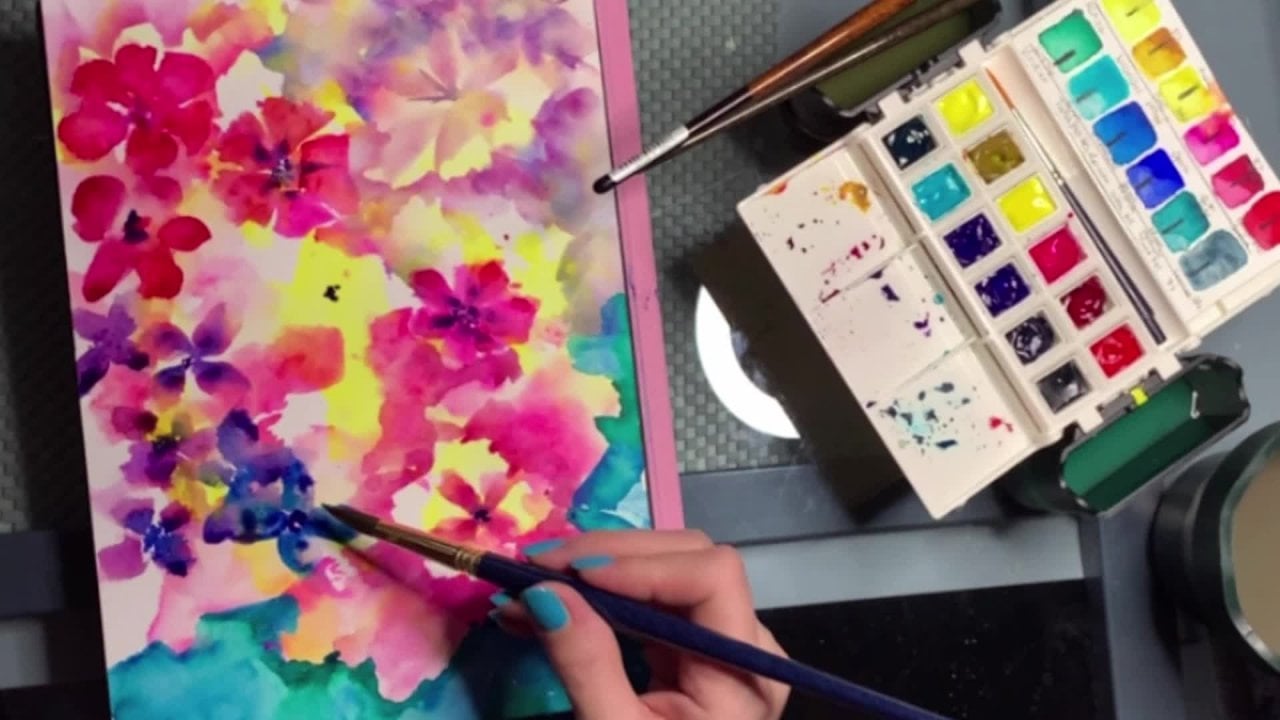
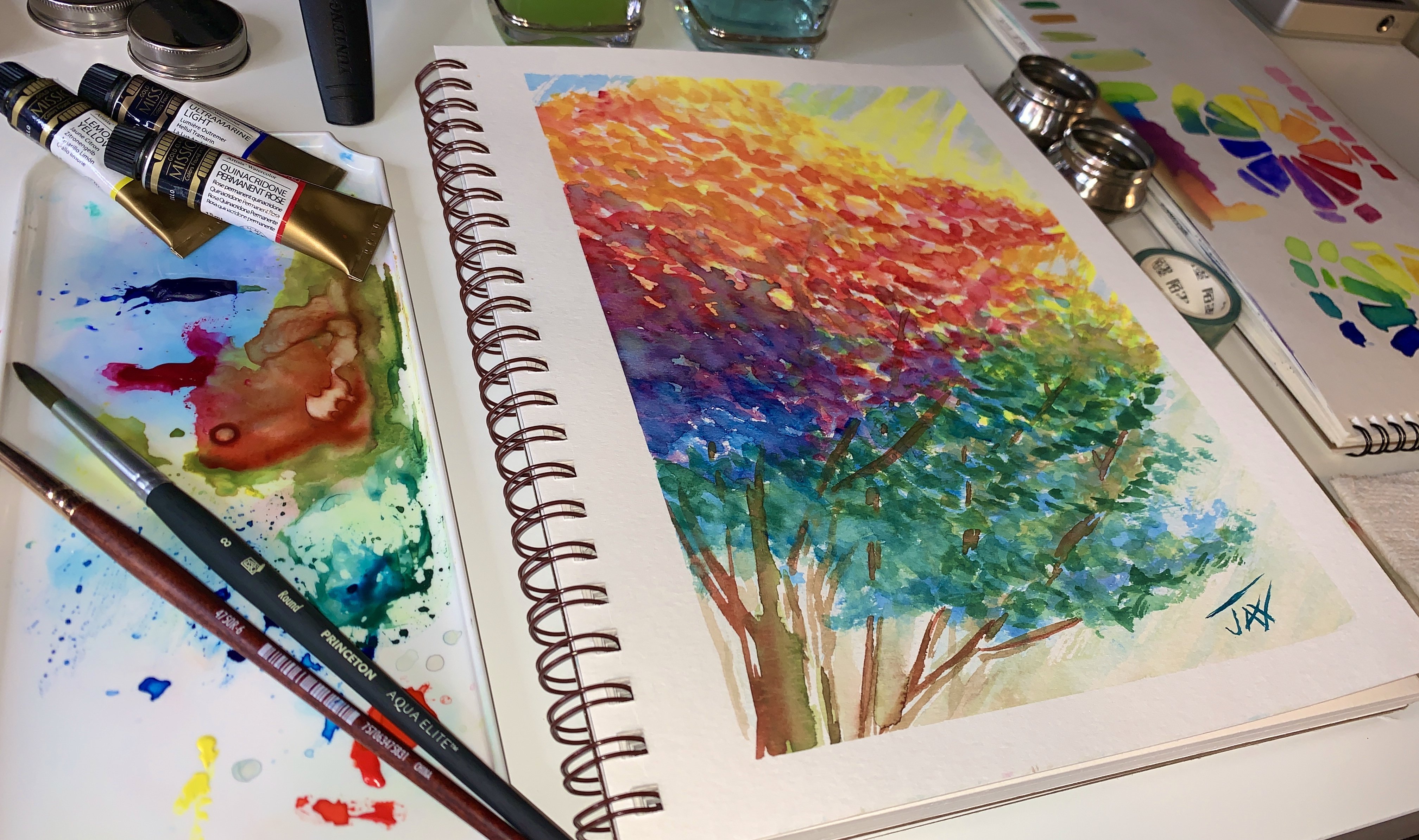
4. Getting started: Intuitive Floral Watercolor: So one of the things from my sketchbook is this one. And I really like how it turned out I was playing with it on video the other day. And I thought, let's do a bigger one of this for my collection. They actually hang throughout my home and I've been offering them in prints and different things. And I think we're actually going to be able to license them soon to a store, which would be really, really fun to see them out there. So let's just kind of activate the paint with some water. That's it. I like this little spray bottle for just to make sure it's all go in here. And this is dry paper. As far as the paper is a 100 percent cotton is what I prefer to work on. This one is by it's 300 gram, a 140 pound. A 100 percent cotton paper by Paul Rubin is actually really good size. I love the size that he offers. It's 15, 4 by 10, six. And what I did is for this series that I do with these florals, I just added a little pencil border. This paper had cut and wet and some paint dripped on it, which doesn't really matter. So we're gonna go ahead and fix it just by putting a border here and other border here. And then we're gonna do our paint and I'll just kinda fill it in as we go. So let's just get painting and we'll start. I'm going to start with a flat brush because I just tend to love the way it loosens up the florals when you're painting intuitively. And you really want to loosen up your hand. A flat brush will really do that. Just get some painting there. Good palettes. Some of these brushes. So I'm just gonna get some paint with some clean water and we'll just start loading of a rush. Now, when you're painting on dry, the color is going to be very bright. At first. You can see how bright it is. So when I start to drop paints on page, I have to kind of think to myself, do I want this really bright? Like how do I want it? When it dries? And I think a little bit ahead when I do these just because I'm used to it, but also because paint will dry a lot lighter depending on who you're using. And when that happens, you might not be getting the same result and you might feel like you need to go back and glaze or add paint, which is what I'm doing here. I'm just starting out really nice and light by adding water, getting into these areas that I that I wanted it in from before. And I'm going back in and adding some some brighter yellows just because this is my vision, right? This is where I am now. You can be sitting there and if you're painting along with me and using orange, are using blue, you don't necessarily have to use whatever you want. But I have like a little sample to look at that. I like, I don't always have a sample. Sometimes it's just from my head. I just go ahead and grab a big sheet of paper and start. But for you, I would really recommend that you just start with a sample and find something you like, whether it's, you know, from your own hand and your sketch book that you want to develop onto a bigger sheet or not, whatever, whatever works. So I've added some yellow down. This is just because a, my personal style. I really loved to have a lot of light in my paintings. And but I do want to remind you that wherever you add yellow, remember to be careful not to put a color over it that is going to turn to mud if the paper is still wet. So if you are scared about mixing color on paper, then let it dry before you add the next layer. Now I'm not fearful because I know my colors really well. Like I'm going to go ahead and take cobalt blue because I know that yellow and lemon make this beautiful green, which is great for referrals. So I've already tested this out on multiple, multiple test sheets where I just kinda splat the color around. So I just know that this is going to be fine when it mixes together. And I kind of really like the idea that it's going to be wet and mixing together like that. I'm also going to take some of this blue and this is where I'm going to start adding some color to the sides. Now, this little side area, I really did mess it up, so it's a little trickier. I probably not going to paint the entire thing on video because you don't really need to see me paint an entire side. But you can see my technique with the flat brushes. I'm just kinda laying the color in and being really loose with it. Remember, this is a loose florals, so we're not striving for perfection here. We're striving for a nice loose Picasso kind of feel. Something French and beautiful and just easy, easy going. I want in these loose florals, I really love to think of it in terms of what is it that this can show me within the painting? What is going to make it really interesting. Like right now, I'm adding a little cobalt blue and a little Peacock. This is cobalt blue and Peacock. See if I could put this here. So you can see a little better. I don't know. Maybe up there. You can put it right there. So I'm using cobalt blue and Peacock mixed together and keeping it nice and strong on my flat brush. And I'm just going to kind of shape out some of like a loose look to this vase. Now in some areas, if you find that it's still wet, it's going to bleed a little bit. Now, I love the look of that. If you don't want that, then certainly let your paint dry in between and you won't get as much of the blending look and the mixing. So I'm just kinda dropping and color and adding a little water as I go so that it's going from lighter to darker. And I'm kind of doing that on purpose just because I have a vision for it right now. I mean, literally member, this is just when you're painting. It's all about you. It's just all about you and this moment in time. Right now, I'm sharing this moment in time with you guys, but still I'm enjoying it. So I'm just kinda dropping in color, going with my intuition of what I really think looks cool. I'm going to add a little bit of Prussian here on the bottom, just because it's fun. And you can see how this is really beautiful. I'm getting some really nice mixes here. And they're much different than my original mix, which is fine. Because that's what intuitive painting is all about. And it's really interesting how when you do intuitive painting, you never know what the watercolor is really going to do. So right here, I started out lighter and I'm building up the color and as I drop it in, it's pulling it into the other color. And it's creating these bleeds, which are really, really pretty. And as I just dab in a little bit more color, the bleeds are carrying now some of it is still dry or has dried now. And so then I can create a little more sharper effect in those drier areas. And again, I'm kinda touching on it. I don't really know what's dry until I kinda go through. And this is where I'm just playing and just having a good time and doing some random patterns and just seeing what happens. You know, I don't want to over paint either. I do want to leave some of this light. I think it looks really, really pretty. So let's just wash out the brush a little bit. Get a little bit of the peacock color. And I'm just going to let it dabble in there just so that I have a little more of the shape and a little bit more brightness. Yeah, that's really pretty. And I love this bleed right here. It's a little more color. Remember it is going to dry lighter. Oh, that bleed is so pretty. It's beautiful and getting the green. So nice. So I kind of did this really neat glass effect and love it. All right, I'm going to take a stronger color and just swipe it there. Another thing I notice about watercolor is watercolor needs to connect. It's really nice when it does to. It always looks so beautiful. Connecting your watercolor to another watercolor I think, is one of the beauties of this whole media. Alright, so I'm going to wash my brush out a little bit more and I'm going to add something right here. Just some swipes to do some background. Let's take a little break and we'll come back and do more background.
5. Painting Background: Intuitive Floral Watercolor: Okay, So we're back. So what I'm doing now, what the background is, I'm taking some of the paint that I already started with and I'm just swiping it and leaving some white areas. Now because this is dry, I am it's a lot easier to leave white areas. And what I just did here is I encouraged a bleed. Now I this is just my style. It's not something that you have to do. I don't even recommend it if you don't like that, look right. This is your moment. So if you don't like bleeds, then by all means don't touch those areas because they will bleed out before they're dry. I just happened to really love the look of the bleeds. And it's just something that again, is my personal style and something that I love to do. But I thought it would show it to you so that if it's something maybe that you like, um, you can encourage them in the bleeds herself. So you can see I'm just playing. I'm laying in color and I'm using, still using my flat brush to do it. Because it's done. I'm adding a little bit of Prussian now as I go up and keeping it really loose, and I just dropped in the color right on there. Now this was more dry so it didn't lead as much as this because it was a little more wet. But look at how cool that is. I actually love that. I think it's really neat. And I'm going to encourage another woman right here. And this is what's great about the Neptune brushes as they hold so much water. Now, I have some puddles going on. There are going to create back washes like this. And like here. I happen to like those. If you don't like those, then just take a little paper towel. And to prevent these, you're just going to suck it up a little bit there. You can even get some texture just by laying the paper towel on and you can see how that's going to pull a little bit unevenly and create a little bit of texture. Depending on how long you lay it down, like it violated on here, It's going to start to pull it unevenly. And then that's going to create more texture. Okay, so that's background. Let's move on and just do a little bit more background over here. I really liked how is starting with the blue on this side. So let's go ahead and just swipe some in just crazy fashion. Nothing. That's a big deal. I have a big border to do. So. I'm probably going to start that soon. Right now. I'm just kind of doing this nice, like it's almost a dry brush effect. At this point. You can see how it's just kinda gotten texture. I'm just wetting my brush again, adding a little paint and I'm just hitting it on the paper and I'm getting it really neat. Dry brush effect, doing it in different ways. And then I'll probably take some of the colors that they have here in a little bit deeper shades. We will then right in here. Now this border is just again, it's part of my signature style. And there goes my my little one. He's a tear. Mary comes. He's adding himself to this video. Why don't we take a break and I'll be right back with some more border advice.
6. Making it Your Own: Intuitive Floral Watercolor: So whether you tape your border or you establish a paint for order, like I'm doing here. It's entirely up to you. This one, this piece, I have two borders going on. I have the one that is about a half inch on the outside of the paper. And the reason why honestly it's there is because I had some paper that is just a beautiful paper, but it got some extra color on it. And in order to fix that, I'm just using it as part of the design of the painting. So because I really thought it would look different and this is a great way to just kind of use what you have and not worry so much about your materials. Like you can work around anything to be honest with you. Nothing is ever a tragedy. So I'm taking some blue here and I'm adding it and just kinda glazing and over and just keeping it rough. I'm not worrying about whether it's going to look patchy or not because this is a very loose floral and I'm keeping it just keeping it real. I took some pression and I put there I usually when I do a border, I usually take complementing colors that look good together or and just take colors that have come right off of the palette here. And use them right in my borders. I'll love. If you look at my Instagram page, you certainly will get to see a lot of different things that I have done. As far as with borders and on different loose florals. I just happened to be a border girl on my hang loose florals. But again, this is not something that you out to acquire. It certainly has become somewhat of a signature for these paintings and they just work for me. I just like the look of it. Again, you can take your border so you don't have to. It's always really nice for framing, Especially if you do tape some kind of a border, maybe a half inch border, taped around or tape out, maybe an inch border, just depending. You also could start with a frame and see what it is that you want to have there as the end piece. And especially if you get good deals on frames, it's not a bad idea to start with choosing the frame first, then making sure the paper fits and looking at how it would look if you did a border to help with framing so you don't lose any of your painting. It, it really is. I, I never used to thinking about borders in the beginning that to be honest with you, now that I'm further along, I'm purposely choose certain papers to do certain things because I know that this dimension really works and it makes, it makes it so much easier when I go to hang all of these pieces together, they just look really, really, really pretty together. Okay? So, so we talked about borders, so we talked about paper, a 100 percent cotton paper is very, very important. I feel like it's so much better. You don't have to get crazy expensive papers. There are some that aren't a 100 percent cotton that you can paint wet on dry. But again, if you're gonna do anything That's what I'm wet or encourage any bleeds. A 100 percent cotton is definitely the way to go. For sure. This is just a little bit of glazing here. On some of it. It adds texture. And yeah, I like it. Let's go for the flowers next, shall we? I think it'd be really cool. What else can I show you in the border? Oh, before we go on the border, let me just show you an easy way. When you're moving around. Don't worry if you have to turn the paper really. And I'm just using my flat brush to quickly lay in the color. Like I said, you can do this any way you want. If you have a brush that you really love, the look of it, you want to do a wavy line. You want to do anything really. But if you notice this, Neptune flat brush is really cool for laying in colors and making patterns with it and even making a texture. I really love the way this is like leaving some dark areas and some light areas because it's so full of water. And see if I have enough cobalt in my palette to get all the way down. I don't think I do it and let's see if I use a different. Different Cobol, what happens? My bad, it's a little bit different. But looks very similar. Almost finished that border. So I'm just kinda moving around and like I said, I'm laying in the color. Some of my borders are going to bleed in a little bit just because that's this particular piece. But another thing you could do is you could also get painter's tape, just the Plano painter's tape that actually works really well or you can use the washi tape right now so I'm hearing. Yeah. So just like regular washi tape, they use these in scrapbooks. You can take off things when it's dry. I use a lot of this, which is just the painter's tape and get it in greens and blues and stuff. And it's just really good. It doesn't tend to peel the paper. I also noticed that the papers I use, if you go to Materials list, then I'm going to provide you. They don't tear very easily. And that's really helpful. Because when you go through this much trouble and you make a really nice painting that you brought up. The worst thing is when you're removing the tape and it it rips the paper. To prevent that, you can use a heating tool which could just be like a blow dryer from your bathroom. Heat up the tape a little bit. And what you wanna do is you want to peel it away from, very subtly away from the page. And only once it is dry mixture, it's completely dry because if it's wet, it will take your paper with you. But again, a good paper doesn't tear and can be worked pretty well. Now this is a decent paper that I'm using by Paul Rubens. And I found that I really like the texture. I like the way I can work with it. I do use arches as well for certain things, but for these intuitive florals, I've been really enjoying doing them in my hot press sketch books by Paul Rubin and also with this paper has been really nice for it. It just, I like some of the texture. It's not crazy rough. I have done a series of these that is on my Instagram and also on my website. Jacqueline Jack's dot com, that is done on arches, rough and those turned out amazing. I've also done some on Arches fine, which is a smoother paper. Another really beautiful one, have not used Fabriano yet. I hear good things about it, but again, I encourage you to get a pad of every paper that you want to try and just break it up. They cut it up into smaller pieces so that you have little pieces like this and just play. Because the more you play, the more you learn about your painting style, what you like, what you don't like. And that is how you're going to get really, really good at this. All right, let's move on. We're gonna do flowers next. Yay, Let's bring on the color.
7. Painting Flower Shapes: Intuitive Watercolor Flowers: It is time to lay in some flowers. Yea. So if you're not really great at flowers, this is a great time to practice. Just smudges. I mean literally you can take anything, a little sheet of sample paper and just start loading your brush with color, whatever brush you're using. I'm still using my flat brush by the way, it pretty much used at the entire time. And just kind of lay in colors. You don't I mean, I look at I definitely look at flowers a lot and look at them often online and host WHO in person. And I find myself studying them to see what works and trying to simplify them. So you might wanna do that. Like here's a nice quill and I just press it down and it's making kind of like a nice little star, like rolling it. Let's try it. Let's go ahead and just dive right in Xiaowei. So I'm going to load my quill here with some of this red violet paint. And yeah, I like that. Let's go ahead and get one of these stars going. So I'm just going to lay it like the pedal when it's there. That's kinda 90s. I think I kind of like the fat area of the base of the brush on the outside. So see how I'm doing that. Loading more color. Not worrying about it being wet because it's a very loose looking floral like that. So now let's move our card over so we have room. Let's take some more paint and go ahead and add a little water so that it's not just fresh out of the two paint. I'm going to go ahead and just get a little bit messy with it. Don't worry about perfection. I mean, honestly, loose florals are about implied design. They really are like I'm going to take just, just so that you don't get too crazy and get tied up. I'm going to take paper and I'm literally going to remove some color just like that unevenly. And I'm going to take a lot of color. And I'm just going to dab it right back in just so that it bleeds. Look at that. Just for fun, just so that we can do something crazy. So what I did is I removed some color. See if you can see it. It's kinda break. See that. And that allowed me that's like really wide. So let's move it over. And that allowed me to create a really nice uneven texture just by removing some. So again, don't be, don't be scared to touch it. Remove the color, and then go back in with a little bit stronger paint brush and just add it back in. That's pretty cool, Haas. And now we've got that really neat looking flower. And that's like a lot different than the last one. Let's try something else. So we're going to load our brush with color. I'm gonna get a little more depth of color on the tip of my brush is loaded with others really juicy. And I am going to do it this way and I'm going to roll. Let's get some room here. And I'm gonna go ahead and just roll a flower with this. Ready. Here we go. Row. Bu. So cool. That's neat. Yeah, that looks really good. And then we can roll backwards because I still have a lot of color on my brush. So beautiful. Look at how pretty that is. It's like tie dyed. Almost going to leave that one exactly like it is. How fun, and you know it. Now. Now I gotta do more because That's just crazy good. And I love how this looks down here. Removing some of the water and some of the color before it dries almost to create lake a print, an imprint right on this design. So I'm grabbing some really, really deep color. And I'm just going ahead and making it crazy so that we have that kinda look there. Now, if you notice this one turned out really good because what we did is we have yellow and we have blue and we laid this on top of it. And because this was a nice juicy quill, it made a purple. Like a tie dye. And that's the beauty of watercolor, where you have translucent paint like this. It literally never know what it's gonna do and I love this. So let's go ahead and get this really nice and wet. We'll get a lot of this beautiful color, which is, it's red, violet W 55 to buy Mission Gold suit. I mean, about the vivid colors is so much money and they mix really well together. Now if you had chosen the wrong combination, you might get more brown. And that's the thing you want to just comes with experience. You know, let's go ahead and create. I'm going to do some weird little rolls up here, just like little slats. And and you notice like some of the pain is flattening. Don't worry about it. Seriously. It's loose florals. We'll go back in and look at that later. I'm just doing this right now. And then I'm gonna come over here and I'm going to do some crazy lytic little rolls out a bunch of color. Here. Another, yeah, this quill is really working out and loved the way it's shaping these little petals. It's really pretty. Okay In the last one, Let's do another one of these is kinda fun. See how I just was really easy to stabbing. So now I'm going to go and pull some opera rose, which is such a fun color to play with. This is opera rose is like fluorescent pink color. And when I lay it in next to colors, you see how it kind of brings this fun, playful kind of kind of pinky tone to it. Ucl. It's giving us a variation, like a little variation in the shade. So I'm doing the other half of the petals or just a little bit added. With some of that. It's also really fun to take opera rose and I know you're going to make, some of you are going to freak out. But I'm not really worried. I'm just going to take some opera rose here since flats. Why not? See how it looks? It will work its way in. Okay, Over here, I'd like to develop some more like this. So what I'm gonna do is I'm gonna take some of that blue. Let's take some cobalt blue. So really and would work too, and we're going to drop in some color. This is color dropping and loved to do this when it's still pretty wet. It can't be puddle Lee. If it's puddle Lee, It's definitely isn't going to do the same thing. But if it's slightly wet, it will move. And if it's really wet, it will bleed and do like a background. And that is really pretty. Look at how nice that is. Now, I happen to know that these two colors work well together. And why do we know that? Well, using gentlemen, this is the beauty of knowing your colors and why a lot of people work with a limited palette. Because when you start adding a lot of color to a painting, you can really mix yourself into a corner where you end up with some things that you're like, oof, hate this, It's disgusting. So in order for you to intuitively work with that kind of freedom, it's really nice to know what your colors are gonna do and how to glaze over and be able to get these effects without changing the color dramatically and hating it. And I think that that's a big deal, right? You don't want to hate it. Now I love this color. So what I'm gonna do here on my palette is I already have these here, so I'm just going to add a little bit of water and I'm going to watch it back and forth. And I just created another color. Yeah. It's like a little compliment. Now when I make a third color from two colors that I already have them, a painting that works. It works amazingly well. I can literally go through and drop in some connective areas with these compliments. And it just, it looks beautiful. It really does. Just grab some more blue and I have to clean this out anyway. So we're just going to grab it. And I'm just going to go ahead and fill in some spots here with some roles. Just for fun. It's beautiful. Now I'm not going to fill in every area because I want to leave room for green. I think it's really important to leave room for green because green is such a gorgeous thing in a flora. She didn't ever want to run out of space and not have green. And the reason why you, why some of the white left in your painting is because when you have green and you start adding green over white or yellow, it works, but it won't necessarily work over some of the magenta or the purples. So you want to make sure this is a really bright, you want to make sure that you don't go crazy in, unless you know what the aftereffect is going to be, right? You don't want to lay green over too much, or you might not get this beautiful, most beautiful color. Let's add a little more of the opera because I really liked this little area here. And I have to squeeze this opera rose. This is the Mission Gold opera rose. I like it just as much as the Daniel Smith. To tell you the truth. I don't notice a huge difference in the two opera roses at all. And this is going to be really fluorescently. So let's cut it down a little bit by adding some water. There we go. And I'm just going to dab it in because this is very loose. I have some little dots here that are helping me guide my way through. And this is just kinda like an a little intuitive patch of opera rose that's going to translate to the eye like it's a, you know, like it's another little, little flower, a little bud coming out of a flower. And taking the end of my brush here and just kind of letting it splay out. This is pretty had a little opera rose to this tune and see what happens. It's kind of bleeding through and it looks really neat. So this is B. Okay. So I'm going crazy and I don't really need to overwork. Be honest with you. Opera rose is so much fun to, to work into your florals. It's hard not to. Some kind of like layering another little flower here. Oh, this is so pretty. Yeah. Opera rose is addicting, right? It is. We need to stop. Let me look at okay. So I'm just going to stand back a little bit and look at the composition. Now. Obviously we're going to fill in with green, which is going to make it a lot fluffier, but over here it's a little bit sparse. So maybe we're going to just go ahead and put one of those roles in there. Okay. Yeah, I like that. All right. Now, let's go and move on to the green.
8. Painting Greens: Intuitive Floral Watercolor: Okay, So in our painting we are ready to add the green. Now, you could have had a green before if you like. I tend to add it later. It just depends on you and your vision and what it is that you're painting. But for this particular floral, it's just easier for me to add the green later. I'd just like to do it. Sometimes I even add some stems while this is still wet in here. But again, it's all our stuff. So if you want to add a little water and spray this down, you can actually add some water and do a little bit of wet on wet smudging. If, if that's something that you really like to do, it's kinda fun. You never know. So for laying in your green leaves and you're, the different things we already know this quill worked out really well as far as getting some shapes and I like the way he delivered the color, the flat. I'm going to show you how to use a flat to do that is really kind of interesting texture. This is the Elite brush that has that really amazing tip. So it's a very firm tip yet it's a large brush because it's a size 12 and it holds a lot of water. So if you you won't run out of paint like you will on a rigger, but this is a rigor to you can load it up with paint and just kinda drag it around. So we're going to use these three so that you can get a feel for, for them. Let's start with the flat because the flats really fun to use. I'm just going to load my brush up with some paints here. This is just a sap green. It's a great place to start. And some water, this is the Neptune one. So it's going to have a lot of water. Probably dip it into a little bit deeper green to hookers so that we can, you can see it as I go along. And what I'm gonna do is if you notice I have the stems in here. I wet the paper just a bit to encourage a gentle bleed if I want it. And I'm going to start at what I think is going to be the base of a flower. And I am just tapping in the color. So you can also take some of the water out just by tapping it onto a paper towel and then you'll encourage less of a bleed. So little bit of Hooker's green because it's a neat, a little bored, dark. And I'm probably going to bring this flower here. And I often do more than one green as a kind of carry these things down, like going back to the sap green, mixing it with the hooker screen. Let's go ahead and do something with this one here. If you noticed I went underneath that flower. Now I'm going to dip into the viridian green. Just kinda fun to like have some different greens. And we're going to go up here for opera rose when careful not to go over my petals. So again, that's how you can use a flat brush for this. It's really neat. I have another opera as far as here. So if I were gonna go underneath it, then I could actually put a little bit there and then there come in here. Yeah, so the flat brush is kind of a really cool way to get Sunday. Maybe this is two flowers. I kinda feel like it'd be fun to have another one of these. Being careful again, not to go over a lot of the petals. So back off a little bit, take a look. There is a flower here. So let's go ahead and load up some more variety. And I really like the dark. Imagine that pedal kind of coming here. And maybe we'll build the stem for this one. Just something really off over on this side. And I believe in like maybe drag some some color over my thing to kind of make it look smudgy. Then the switch so you guys can get used to you another one. Let's try that rigor. Rigor, I'm going to load up with some of this sap green. And I'm going to imagine what it would look like just to have some of these. Like I need some more sap green to try a little bit of that yellow, green Mamie pieces coming off. And that's what riggers are great for. But you want to be careful with your rigor not to over wet it because you're on dry paper. And it's a careful balance between having it loaded with water and having the right rigor that loads with water well, and being able to do what I'm doing with it. You see what I mean? Like it. It kind of gets textured tree. When it runs out of water. Some riggers are going to be very dry, so try them out and you'll use them for different things though. I mean, I can honestly say that even if I've made a brush mistake. I don't really think there's any mistakes because there's never been a brush that I've gotten stuck with. I always end up using them every single time. And I'm going to dip into the Hooker's green. And I'm going to try and build something down with that. Now if you notice, I don't necessarily need to feel like I'm taking every single piece of this into here. I don't want to chunk it up too much. That's just my personal style. But for leaves, Let's turn our rigor on the side. And what we're gonna do is we're just going to do that. We're just gonna do some little floods. And I know what would you call these little, they're kinda of like splatters, but we're just going to fill in the white area with our rigour. Just kinda splashing some of the color out. Not being crazy. This is a loose floral. It is definitely get some of this. And like this bright green, It's definitely not sticking true to form. And what I'm doing is I'm just adding some color in where there's the little white areas because it just looks really, really nice when you start to add these little shots of color. I do think I need some more paint though. And in some areas, it can even bleed into the things. Now let's take this Elite brush so you can see and we'll load some sap green, maybe lighten it up a little bit with some yellow green because most out of it. And in here, I'm just going to drop in a few little beads of the color. Actually so much water here. Yeah, like how I see this one? Like I said, it it delivers a good mix of water, but also a good mix of color. We're going to go ahead and create Lake. The bottom of things here. I'm going to add some texture to the base and just kind of flick, flick my brush. See how I'm doing that. Just kind of flicking it on a little bit. Let's think. I'm going to create a base here just to give this a little more structure. Sometimes I'll do that, I'll, I'll create a little bit of a green base just to lead the eye. Because I'm kind of, you know, this is so intuitive that you want people kinda let there, I carried from place to place on these, you know what I mean? Let's take the rigor and just going to spread some of this color out very loosely and not worry. There we go. See what else you got here. And here my dogs running around. If I paint for long enough, you will definitely hear all three of them. I have to Haskins and a little Maltese are loaded. We are loaded with wonderful, beautiful animals. 0 yet so pretty. So I'm really loving this viridian green ray now. I'm kind of adding it in two different areas and letting it letting it bleed and create some different things for me. I'm looking for right now. I'm kind of looking through the different shapes and thinking about what looks like. It's the base of the flower. And where do we want to leave whitespace and where do we not want to leave less space? So I'm going to also take this brush. So you see, you can see because it's got a nice point and we're going to create some of those wisps. Which is just part of just what I'm seeing in my little yellow splotch kinda became a flower. So beautiful. Yeah, so pretty. Alright. Alright, love as well. I hope you enjoyed painting. Let's go and sum this all up. Shall we?
9. Final Thoughts: Intuitive Floral Watercolor: So we got to learn a lot about intuitive floral painting. And I hope that you, as you went through your painting or as you're about to go through your painting, use some of the little tips and tricks that I showed you here. Don't forget that this is your eye and your thing. So if you want to go back in and you want to just glaze over with pops of more color by home means there are no rules in watercolor. Honestly. Means some people are purists and they don't use white paint. Some people do use white paint and they love it. They love to play around with it. Some people love to splat. Others like the texture that certain brushes like me have to offer like I told you, you know, so as you can see, I'm just kinda going back in and I'm layering now this is called glazing is when the paint has dried and you go back in and add some more paint, I'm doing it because it really like the look of some of the brightness here. And I feel like while it's wet, it's kinda really neat to see the effects of how the paint changes when I add a little bit of like opera rose to it. And they can also see how I'm kind of creating more effects on the petals so it doesn't look one-dimensional. And I'm just kinda going through and taking paint left over from today, what we did here, and just going to drop it in and get this big block of mixed colors here that it bled. And I love it. I think it's so pretty actually. I'm just going to kind of fill in the white areas with the tip of my brush to create some little, little interest areas here. Again, personal style, personal choices, no big deal. Don't get hung up. If you don't like what you painted, start over. I guarantee that whatever you, whenever you paint, you learn so much that it's never wasted time. Ooh, look at that. So I just added a little bit of blue to the opera and I ended up with this really cool little thing going here. But we're going to control a little bit because they don't want it to take over my pink too much. So here we go, taking it out. So overall, guys, enjoy your painting time, enjoy all that time. It's wonderful to learn to paint with watercolor and it's even better when you get to have these wonderful pieces that you can share with friends you can give away as gifts. It's really amazing to be able to develop this skill is such a gift. So if you have an interest, please take more of my courses and really just enjoy your time with watercolor. Every single moment of it is special, and I am so blessed to have this in my life. I've had watercolor in my life, actually not too long. I've always worked with different kinds of mediums and this is fairly a new medium to me this year, So you're getting to see it at early stages. But I've learned a lot and I do have a lot of technique that I'm pulling from art school and from different things that I've worked with, even though it's different paints that I've worked with, but very similar. And I can say that once you're an artist, you're just always an artist. Euro is going to be creating. So you guys stay well, enjoy your time caning, and don't forget to sign your work color, should we send it in? I've got some time here, so let's sign right here. It's dry. I'll take that beautiful Prussian that I like so much because it's one of my favorite colors. And how I got yeah, I really like how this turned out and it's beautiful. I'll just sign it. And there we go. Yay. Oh, it's so yummy, Love it. I hope you like it to be sure to share with me what you did as well because I can't wait to see your work. And thank you again for taking my course. You guys are amazing. Have a great day, and I'll see you on the next one.
 Jacqueline Jax, "Creativity brings peace into your life"