Transcripts
1. Intro Negative Space Watercolor Floral Painting: Hello everyone.
This is Jacqueline. Jacqueline, I'm going to
be your instructor for this negative space
painting tutorial. I have always wanted to learn how to do this
and you know what, I struggled with it
for a very long time before getting some techniques
and tips of my own down. And now I have them. I thought it would pop it up on Skillshare and give you some of those really easy
ways that I have come to do this so that you can start developing your own style. Get ready for some negative space painting and
you know what? It's going to be so much fun. Now if you don't know
what negative space is, negative space is
the background or the area that
surrounds the subject that you want to have as the area of
interest in your painting. The terminology comes
from photography. Really, positive space
refers to the object that tracks immediate attention. And negative space
is the background. We are going to be going
back and forth between the positive space and
negative space as we paint. And that is all I'm going
to say for now until you get on into this class
and we start getting to work.
2. Materials and Paint for the class: Welcome everyone. So what you're going to need for this negative space painting
course is watercolor. Hope we're going to talk about the watercolor and
just a second, because that's
going to be really, really specific as to what
colors you're going to choose. But you're also going
to need some paper. So you can just do your
sketch book if you'd like. I recommend 300 GSM
or a 140 pound. A 100 percent cotton
watercolor paper always works best for me. This is just some Paul Rubens sketchbooks that I
really use up a lot. This is like a block, and this is a small sketchbook. I, you'll see me use these very, very often, but you
can just use paper. You can even just get
like small pieces of scrap paper as long as
it's really good quality, I recommend that you use
really, really good quality. There's even some like really affordable sketch
books out there. This is one that is totally affordable and I
usually use it for sampling. It's by Strathmore 400 series and it is a cold press
watercolor paper. It is not entirely a
100 percent cotton, so it's not going to give you all the effects
that they are. A 100 percent cotton do give. But as you can see, it really does a great job. I mean, the colors
are pretty vivid, I would say, you know, so I do a lot of
swatching in it. And I still love a 100
percent watercolor paper. But if you compare it, is or de-center
pretty good, right? This is a 100 percent cotton. This one is Canson Heritage. So you can see how beautiful and vivid colors are allowed to remain where these papers that are not a 100
percent cotton, they still do a great
job and the paper looks really, really
well defined. It's got some texture. It's got two sides. One that has one kind of
texture and another texture. And the colors do
still look really, really bright and nice. Just depends on what
you can afford. But you know how Rubens is not a bad way to go because
it is very inexpensive. Canson Heritage is
another really good one. They have a fine grain
and they also have a rough grain that is a
little more pricey though. There's also arches,
which is also pricey, and Strathmore, which is
probably the least expensive. But again, this one is not a 100 percent watercolor
or a 100 percent cotton. It's, but it's still
a great paper to use. So as far as paper, you're going to need
what you can have, what you can afford. You will develop
different techniques on a 100 percent cotton versus
anything else that you use. Just make sure it's
watercolor paper because otherwise you won't get the
result from this class. As far as your colors
and your brushes, Let's talk about those. Oh, don't forget water. Lots and lots of water
is always a good idea. But as far as your
brushes and colors, now, I have a thing for brushes. I mean, as you can tell, I have just about
every single company and watercolor brush out there. I have my Neptune's, which I absolutely
love because they hold a ton of water and they come in everything from really fine detail
ones to really, really beautiful squares and flats that I use a lot to
keep my, my style loose. They also have dagger brushes. There's a Skoda, which Skoda, it's just a gorgeous,
gorgeous brush. This is one of my favorites. It's a flat one bias go to and you just can't
go wrong with it. You really can't. Our quills, quills
are great to have. I'm going to use a
coil actually in this beginning of the watercolor
lesson because they're very floppy and I
like the way that they just kind of allow you to push the
watercolor around. Also, these are like, really nice kinda
floppy squirrel. These are synthetics. The Princeton Aqua Elite
doesn't hold a ton of water, so it's really good
for shaping and details with the squirrel holds a ton of water and they're very loose type of
watercolor paints. Paintbrush, squares and flats will help you stay a
little more loose. So that's another thing that
you might want to consider. In any case, use what you have. You don't have to buy a
specific brush for this course. I just happened to
collect brushes and I love them and
I know everything there is to know about pretty
much every watercolor brush out there on the
market at this point. Now for your paint, it's really important when
you choose paint that you realize that there are certain paint colors that will
work really well together, and certain pink
colors that will have different maybe
undesirable effects. So this is why I always
like you to start out any watercolor painting by picking the colors that
you're about to use, limiting your palette
to less than 12. I would say this is a
travel palette that I have, which is 12 basics
that I use more often. But for this particular piece, Let's pick three
basic colors, right? Three like one yellow, one red or pink, and one blue. Because that's going
to be the basics. Red, yellow, and blue will
make all the other colors. And then you can have up
to two convenient colors. So my convenient colors are
usually cobalt, turquoise. Turquoise by CALEA 1843. And viridian is also
really fun to have. So I'm this case I'm
going to be using the W 536 by Marcelo. Another possibility
is brilliant. This is halos are really in, and it's a really, really beautiful color
that manufacturers some moody tones as well as some bright tones depending
on what you mix it with. So that could be another
convenience color that perhaps I'll use
in this scenario. And my French ultra is
my basic blue that I typically use, my opera rose. This opera is a beautiful color. This one is by Daniel Smith, and it is just such
a really bright, pretty colored to
use in florals. It mixes out my purples. It makes some really
bright oranges. And the whole point of doing
this kind of thing is to see what's going to
make mud when you mix it together and what won't. So that way when
you start layering fallen colors on top
of the other colors, you will know the
desired effect. And that is so, so important for you remaining the brightness of the colors and
also not ending up with crazy browns that you
don't want to narrow it. You want your colors
to be vivid, bold, and have those layers be able
to be not only transparent, but when they start to cut like coincide or commingle on
the paper, you don't want, as you layer them
over each other, you don't want the
shadows to end up colors that you don't
need in this piece. So this is just a sample piece. The one that we're
going to be painting is incredible and it's
a pumping up on the screen as we speak. All right guys. So that's the deal
with the colors, the paper, the water,
and the brushes. Let's get in there
and start to do some work on negative painting. This is going to be so much fun.
3. Getting Started : Loosening up your style: So a big thing in this or any kind of watercolor
is just getting started. A lot of people are often
intimidated by the pains, intimidated by the
pressures in the paper, and you just don't
know how to start. Well, the best way to
start loosening up your style and really just not getting your head
wrapped around it too. I think just being too cautious is just to flick some
paint on the paper. So get a quill brush
or any kind of brush. It's really like loose and
get it really, really wet. Put your favorite color
on there and just start smack it and on
that paper, You know why? Because it's going to
loosen up what you do. Now. You can even do this with
a card and spray bottle. You can do this with your
fingers, whatever you want. Just put it on paper, leave some white areas and then stand back and
see what you have. The important thing is not
to have it makes sense. The important thing is
for you to get out of your own head and just start creating and letting
your juices flow. Because unless you loosen
up your style, it's really, really hard to tackle new
techniques and a new project. I always find that the
most requested thing that people say to
me when I share my paintings on Facebook or wherever is how you get
your style to be so loose. And you know what, we're going to do that and
accomplish that right here. So get ready for that. So once you get some
paint on paper, I did this on dry paper. I didn't do it on wet because what I'm what would
spread the color. But what I did do is I got my quill brush really
nice and damp, and I just started to smear
it by rolling the brush. I do this a lot. This is a quill by Neptune. And the thing I love about this particular brush is it
holds a lot of water, so it doesn't get really dry. And if you're going
to start smearing things around and picking up a little bit of extra
color to mix on paper. You definitely want to have the ability to hold a
lot more water than usual because of the brush
is too dry or it's too wet, it actually is going
to work against you. But again, this is the part
that we're just kind of going in and putting some
really cool colors down. And we're not thinking about
what we're going to get. I'm just turning it
around and I'm rolling. This is how I establish my background without
thinking too much. One of the things that
really challenged me learning how to do this and
what gotten my way was the, was just the design itself. I was always so confused
about where to start. This was my way of starting this negative painting and
being able to just capture some really great
textures and see through imagination where the
painting was gonna take me. So all I'm doing is I'm
using some opera rose, some beautiful cad yellow. I'm rolling in a little
bit of cerulean and a little bit of what's the
other color is French ultra. All great colors
that mix together. If you're ever worried about
mixing colors together, then just do it
on a sample sheet before and see how they go. Because most of the colors
that I use and I will include a list of these
particular colors in the, in our section here
on the tutorial. But these colors really mix well together and you'll
notice that they don't quite go to mud. They stay really clear. Now the next thing
I'm doing right now is I am starting to shape up what I think
should be flowers. And if you notice, I'm not
really doing the inside first. I'm doing the outside
of some of them. And then I'm going
in an establishing, maybe a center in some cases just to make it a
little more clear. I highly recommend you do it
this way because you will not only get some
really interesting pedal work on the outside, but if you feel like you're starting to get a
little bit lost, if you just establish
the center of the flower and maybe know
more details past that, then you'll be able
to get your eye back into what you're
actually trying to do. So if you notice I'm
getting some more color, I'm keeping my brush
damp and I'm just going over these dry areas and
pushing the paint around. The pink can't be sopping wet because if it's sopping wet, then what's going to
happen is you're gonna get puddles and it's going
to kind of backwash. I have damp brush with color. And I am just kind of going through and establishing
those petals. And now I'm going through and establishing some
centers just by pushing a little
bit of color from the center and molding
it and shaping it out. Now this is where
intuition comes. I find that at
first I didn't have the ability to really picture
many different flowers. But then I started
looking like on Pinterest and saving
flowers and just kind of starting to commit
to memory what some of my favorite flowers
looked like at also watch for the
position of flowers. So I studied them, you know, like if one's facing
you and you can see right into it versus
one on its side or, you know, going
another direction. I ran into one
lady that actually had a bunch of silk
flowers in her studio. And at any given moment, she could take a flower out and literally turn it
in every direction. Just to get her mind thinking about the three-dimensional
views of a flower. I thought that was
a really great tip because just by having
some flowers in your studio or maybe
some sample paintings that you did in
your sketch book. You'll get an idea in your mind for what flowers look like from different angles. And that really does help you when you go to do
a painting like this. Now I'm not going to say
it's going to come to you and come to
everyone right away. It just depends on your
experience level with flowers. Maybe you arrange them and maybe you've loved
them if you have them around your home and you've studied them, if you haven't, you're going to start
studying them now though, because at any given
moment in these paintings, you can see a lot of
different kinds of flowers. And you're going to
want to have that committed to memory
so that you can intuitively pull out what some
look like and you know it, Listen, if your imagination
is making up flowers, then make up your own
flowers, girlfriend. I mean, you do not have to go by what things really
look like because the true artist just goes
with their intuitive mind, just what they view
it to look like. And that has been in some of my favorite painters
and of all time, they've always shown me what their view of the world is
through their paintings. So don't worry
about it being too much like one thing or too
much like another flower. If you have it in your mind that this is the flower and
this looks like this. Then show it to us, show it to us through your
painting and that's all you really need to know
as far as that goes.
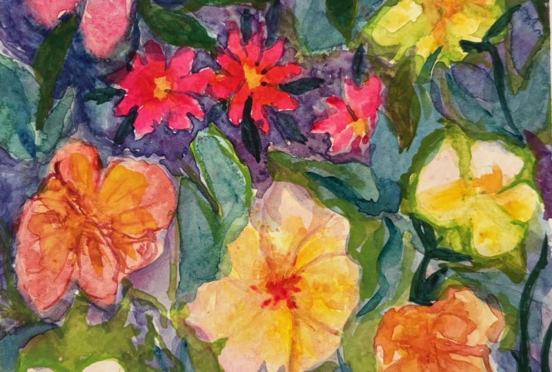
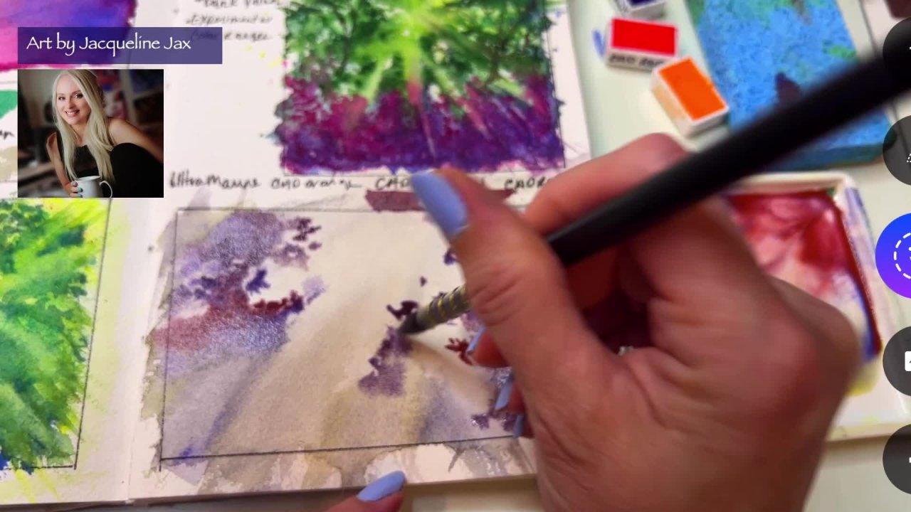
4. Establishing a Negative Space Background: So now that we have
the basics and I mean, we've got some flowers started. We've got a lot of
really nice opera rose and pinks, yellows. We've got the basics. I mean, we definitely have
some florals in there. Let's start doing some
of the background work. Now we've done some
initial background work around some of the flowers. But I'm going to get some green. This is viridian green. And I'm going to
start painting in some areas of green with some blues and some
beautiful greens now starting with just
some petal shapes. Now the reason why
I'm doing little leaf petal shapes is because
it's a floral design and it's just really
something that I feel I want to connect
with in the painting. You can do anything you want. I mean, remember, this
is your painting. So if you wanted to do just
simple brushstrokes or stripes or clouds or whatever it is you want
it in the background. You could do palm tree leaves. I mean, whatever, you can start adding that
into the background. Now if you noticed, I've kind of cut through
a lot of trouble for you. I've already established
some of the flowers. Now we're going to have
a lot more flowers, of course, in this painting, the one that I'm doing for you, but I just thought establishing a few flowers are first was always the easier
way to go for me. Then as I start to put in these other values in the background and these other
objects in the background, I will start to see other
areas of flowers popping out. I felt like this was really
the best way to do it. I've, I've taken lessons
where people have drawn in the background. They have tried to
leave spaces for certain things and make certain
shapes happen and appear. And to tell you the truth, it is painstakingly problematic. I mean, it is so difficult to do layering when you just really
don't have an eye for it. So this way, doing it this
way has been so much easier. Now, in order to
get this to happen, you're going to want to
play with the values right now if you notice, I'm mixing it up between a
hard edge and a softer edge. Now I'm mainly doing some very, very deep colors
like the viridian, leaving a little
bit of void space, but kind of going around
and adding a little more green over my blue and
then letting it dry. Now the reason why I'm
not doing this wet on wet is because if
it were to puddle, then it would really lose
a lot of his brilliance. So if you want brilliant color, try not to work wet
on wet too much. Tried to just go over the
areas once they are dry. Otherwise, it will kind
of sharon the pigment. And depending on the paper, it could be problematic, maybe even giving you
some backgrounds. Now anytime I go over an area, I make sure I have an
equal amount of color in it and I make sure that I'm
not really soaking wet. My brush at this
point is just damp. It's not sopping wet for
a coil, it's just damp. But I loved the softness
that this quill offers. I can push around paint and I can use the point when I went
to, but it's just a very, very soft, not stiff brush and I loved the way it leaves
his little watermarks. If you notice, see how when I'm just kinda
striping the paint on, it leaves this little
brushstroke remark. Now that's what I look for when I do some of
these paintings because it adds texture
to the painting, which gives it that really, really cool relief look without
having to do like many, many, many relief layers. And a lot of people
have asked me, because they see
in my paintings, these legs shear layers and
then these deeper layers. And they always are interested
in how I achieve that. Well, this is exactly it. I just do it all at
once pretty much. Now, the only time
I would go back over something is
when it was fully dry and it was maybe another
color that I added over it, which I'm doing right now. So if you see, I'm adding this green and this blue shade over some pink to define yet another area of which
are going to be flowers. And this is some of the really cool stuff that happens because it's
going to create another shade where
the area is that has the dried paint and
then I'm playing a wet paint over it.
It's like a glaze. And at the same time, I'm starting to define some
more flowers in this area. And that's really, really
a cool way to do it. So now I'm taking that pink
again and I'm just kind of intuitively shaping out
some more really cool flowers. Now I've already got the
background in here of a light pink and a
little bit of yellow. I've left a lot of white, and now I am inserting some more bold color and some flower shapes on
top of that background. So we've got a
background in first. And I did leave that shape of
the flower if you noticed, but I'm not following the
exact shape of the flower. I'm leaving it as a background piece so that you know that
there's a flower, but it has a little more
texture and dimension to it. And I love doing that as one
of the things that I came up with by myself and I
really, really love it. Now if you noticed, I
just switched and I went with a little bit
of a, a stronger brush. This is around by a Skoda. The reason why I'm using
this is because it's going to give me the ability to
define smaller shapes. And I loved the way
it concentrates the color so that I can press
petals down onto the paper. And this is just a
great petal shape or, you know, it's just
around is beautiful. And I've also been able to remove a little
color with this. So I would just kinda
wipe away some of the water and then I would go over it and just
remove a little color. And it's also a great way to add these little details into
the centers so that we have even more flour
recognizable flower shapes just kind of going
around at this point. And I'm establishing some
centers using a little bit of my ultra marine
French, ultramarine blue. And now I'm going to make some
kind of purplish flowers. So this one, what I did is I didn't rinse my brush out after I had the
opera rose in it. And then I added
some French ultra. And French ultra plus upper rose makes this beautiful
violet color, which is perfect for flowers. And that's how I'm getting this really nice tie-dye effect. So the value of knowing
your color combinations and what will mix well on paper is really showing
up here for me. This is how I get this
gorgeous purple and I'm confident that I can
lay in layers of these colors and just grab
a little scarily and grab a little ultramarine and put it all in together without
rinsing out my brush. Because I already knew that the colors mix well
together and I already had defined in my mind what I
could get as a result of knowing that the certain colors
make these other colors. So this is the value of doing those samples in the
very, very beginning. All right, How you doing so far? I hope you're doing well. All right, let's go on
to the next section, Shelley, and we'll talk more.
5. Adding Layers to your Painting: So now that the paper is dry, I am putting in some
additional layers. Now the reason why the
paper has to be dry is because if you were to lay
purple on top of yellow, then you would get
a different color. I wouldn't be as
vivid or as bright. And it could possibly
do some backwashing. So you want to make sure
it's dry in between layers, especially because you can see I'm using a
little more water this time and I'm doing
some loose petals. So just basically loose petal of a flower in the foreground with laying over
the previous one and a little bit of a center. And you could do leaves, you could do more
abstract flowers. You can just even do a splash
of paint at this point. As long as the back is dry, then you can pretty
much layer over it. And this would be at this
point about the third layer. Now, a lot of negative painters, they use different
variations of color, like some use just really, really super light layers. I prefer to have a
little bit more color and I'm not really afraid of those layers getting
really dark. At this point. I'm just kind of going over previous flowers and I'm just
doing it again intuitively, making just fun for myself. Just making it really fun. Don't get locked into any one design because you want to keep
your emotions fluid. You want to be able to just do some different fun
things on the paper and get as abstract as you want. Right now I'm using
the side of my brush to role in not only some pink, but also some French
ultra to make this really pretty purple kind of happen and mix
right on the paper. I often do that. I don't always mix my
colors in the palette. A lot of times I'll just mix
them right on paper with a damp brush and
it's so much fun to see that value come out. And then I'll take some of
that color and I'll spread it around the painting and other areas which you're
seeing right here. Now remember, if you go over something that
is already wet, it is going to have a different effect for
you than if it were dry. And that's what you're going to see in some of these flowers, like the one I just did, it had a little bit of
dampness stolen the flower, so it lost a lot of its shape and became more of
an abstract look. If you want that kind of look, then by all means, definitely do it that way. But for the most part, I kind of recommend that
you start with dry on dry. Like to putting the paint on dry paper because I don't
want you to end up with a big puddle or a big
old mess until you learn to control the amount
of water in your brush. And that is really, really a key thing to keep in, to keep in mind and keep track of when you're doing
this kind of painting. You have too much water. You can really lift
colors or anything else. But you know, that brings
up something that you see a lot in negative painting. You can actually go over
areas even after they're dry with a very firm
brush, get it damp, rinse it out and then
wipe it on your towel, and then go over that area
that you want to remove the color and you're actually creating some more
negative space. It's a pretty cool thing to
do actually in the painting. And if you like to do it
and it's kind of like an area that you want to see that happen or maybe
you made it too dark. You want to lighten
up and come up with a negative flower design
or a negative pedal. You might want to try
it in some areas. It's pretty cool. It's actually fun to do. In this next area, I'm adding some brilliant
cobalt turquoise, which is one of my
favorite colors. But this one does tend to be a little more granulated and a little bit more
opaque in some ways. So you want to really be
careful when you apply it. Always apply it onto lighter
areas and when they're dry, mostly using some cad yellow
mixed with the turquoise to get like kind of in-between a yellow green or maybe
like a sap green, a very, very light
shade of it or just to tint migraine just a bit. And now I'm going to
start adding some more of those deeper viridian. And if you noticed, I didn't
really rinse my brush out. I went ahead and put the
turquoise n and then I laid some cad yellow in
and then I went right into my viridian green. And that was so that I could keep the
continuity of the shape. A lot of times when you
use different shades, you might feel like they become distracting because the colors
don't really go together. So a really good way of establishing that is
keeping a paint that you know will mix with your next
paint on your brush and creating the pink color using the previous paint
plus the new paint. The reason why this
works is because it carries forward some
of the same shading, some of the same undertones. And so you're painting doesn't
really end up looking very distracting because you're still in the same color family. You're just adding
a new shade to it. So you know what I mean? It's not like you're going
warm to cool, warm to cool it. You're kind of just
getting something that was created from something else
that's already being used. Anyway, I really like doing
it that way because I feel like it adds some
continuity to my paintings. And it always ties
in the colors even though I have a lot of
colors and my paintings. But if you noticed, all the colors are really being created by just the
same core colors. We've got a yellow and opera
pink, a civilian blue, and ultramarine blue, and a viridian green
and the turquoise. So those are six colors, yes, but mixed together, they're giving us all of these different shades and they work really, really
well together. Not one of them
has given me mud. They're all giving me
very clean, clear colors. I often do that. I often will use maybe two or three basic shades and maybe one convenience color. So my convenience color in
this case is the turquoise. The, the the bright green. I could actually make
that shade just by mixing my civilian
and my yellow. And so that's why the viridian
is a convenience color, but it's not really outside of the family of the colors that I currently have in my palette. That makes a huge difference
when it comes to choosing the colors and getting
this effect to work out. Otherwise, if you start to
see a lot of muddy mess, then you know that
you haven't chosen the right colors and they're not really working together well. This is why we always want
to do that exercise first, getting to see what the
colors actually look like together as they
combine on paper. That's huge. I mean, basically
you can just take a little bit of all of them,
mix them all together, and just start seeing
what they are going to turn out to be because it's
not going to be differently. You gotta do a painting. It is actually exactly the same, if not worse than your samples. So just keep in mind
the careful with the colors and choose ones that work really
well together. And then kinda stick with
that as long as possible, adding in maybe just
one new color at a time as you progress on
your painting journey, it just makes it so much
easier and you'll have a lot fewer headaches and probably a lot more paintings
that you really love. Okay, that's it for our negative space tutorial for this particular
floral pattern. I hope you guys enjoyed it and you've got some
really great tips. I'm going to be posting some
more samples and demos in this class if you'd
like to continue learning how to do this
negative space painting, including one that I did with palm trees that I think
you're really going to enjoy. It's very, very fun. I hope you guys are
going to try it out and show me your samples. I'd love to see what
you come up with, even if it's just a little
sketch book version, don't go crazy. Just be happy and enjoy
your painting time. This is a journey and
it is completely yours. It is something that
you are here to enjoy. Work with the colors
that really appeal to you and just try to be
intuitive with at all. Now it's your turn. Let's see what you got. And don't forget to
share it with me. Thanks for watching everyone.
 Jacqueline Jax, "Creativity brings peace into your life"