Transcripts
1. Intro Field of Flowers Loose Watercolor Techniques: Hi everyone, This is
Jacqueline Dax and you're on my field of flowers lesson. I'm really excited about it because I'm gonna be
teaching you how to get this beautiful look
in your own art pieces. You know, they say that
the mark of a true artist is when the art is
not only unique, but encourages the viewer
to stop and study the work. I think we have
completely got that here. And I'm going to show
you how to do it in this lesson with just three
or four paint colors. Your paint brushes, and a
little bit of an imagination. Get ready to paint some
loose watercolor flowers in vivid colors. I cannot wait to jump in.
2. Materials: Field of Flowers Loose Watercolor Painting: Okay, let's go over a list of
materials for this project. So I love to work with very few watercolors and just a couple of brushes
for this project, I'm gonna be working with
these three brushes, a size 12 round by a Skoda, a three-quarter inch flat, and a number four
round by Princeton, that is from the Neptune series. I love these brushes. I recently got them,
but I have so many. You can pretty much just choose whatever it is that you
have and that you love. You don't have to get the
ones that I have for paper. Let's just talk about paper
for one brief second. First of all, if
it's a 100% cotton, it's gonna be so much
easier to work with. But I know a lot
of you are doing sketchbooks and that's fine too. Really. You get used to whatever
it is that you work with. But I highly recommend you try. This paper is by Canson, one of my favorites. It's called Heritage and
it's a £140, 100% cotton. It's not too expensive. I think as far as really good
quality watercolor paper, this is the rough, it
also comes in fine. But for this project,
I just thought, let's just go all out and
do something really cool. One thing I would
encourage you to do is while you're
just getting started, work out of your sketchbook, or get some good-quality
watercolor paper and cut it into four pieces per sheet that will really
stretch it out. Use the front and the back. Because you should really
get experienced with what the back is like on these really good quality
watercolor papers. I have often used the
back for swatches, but you can use them
for projects to, there's gonna be a little
bit different side from one side to the
other, you'll notice. But as you go in your
watercolor journey, there is lots to learn. And you could experience as much as you can during these moments
and just savor it, enjoy it, bring it all in. So other things that
you will need will be some napkins or a white towel, some water, fresh
Clearwater always have at least two cups of it on hand and let's pick your colors. I always start with a
lemon yellow or a Hansa, or even a sophie bison LEA, I love their yellows
are amazing, but There's also Nickel AZO by Daniel Smith are
so many yellows, pinks, or the reds. I usually go with quin rose. It always works out and I
rarely have muddy results, as you can see on my swatches, quin rose mixes with hansa, also red violet is a good
one to mix in fur color. And for blues, I'll
either go with a civilian or this one
which is cobalt blue. Another good option
is ultra marine. So depending on
what you have and what you absolutely love to use, Try your colors
on a swatch sheet and then also try and mix them together like I'm doing
here with a little bit of water and see what the
results are gonna be. Because ultimately,
when you start painting colors
over other colors, you're definitely
going to want to see what the outcome is before you get it on your actual sheet. Now this other color that
I'm using is an orange and it's called Ozzie
read by Daniel Smith. I love it for this project. It's a little bit out of most people's comfort zone
because it can be tricky. It's an orange and of
course you're going to get an orange if you mix the
Quin Rose and the yellow. But I love this variation for our son because it kind of
gives me a little more tone. And just I loved the quality of this Ozzie read
by Daniel Smith. It's got some
texture to it and I think that it's gonna be
just perfect in the project. So that's one that's just a convenience color
that you could use. You could just honestly
skip the Azi read if you're uncomfortable
with it and just do a yellow and a red. And then your blue and just
three colors is all you need. Now you can tell
that as the blue mixes with the pink or the reds, it's going to form a like a kind of purple which is
perfect for florals. As it mixes more
with the yellow, It's going to form
different greens. And as I mix all the
colors together, I'm looking right
now for clarity. I want to make sure that the colors don't go
to like a brown, that they go to nice, clean, crisp colors because when you start adding
them to your sheet, you'd be surprised they're
not gonna be this brilliant. Not unless you use very
high concentrations. They're going to start
muting out a little bit. And you want to make
sure that you're really happy with the results. So I highly recommend you
test your colors out on paper first and then you can see what they're actually
going to dry like later. It just saves you so much
guesswork and you're gonna be really excited with the
results if you do that first. Alright, so that's what
we need for this class. Remember, you don't have to
buy everything that I have. This is maybe just
upgraded things that you can think
about in the future. You can use what you have. Just pick a yellow, a blue, and a red, and try
them out first. This is my paint palette. Of course, it's always a mess, but these colors are always
in my palette as well as a lot of other
granulating colors and convenience colors, as well as the primaries. I think that it's, it's fun
to have a lot of colors, but it can be
confusing at first. So just stick with three and just do the basics
in the beginning.
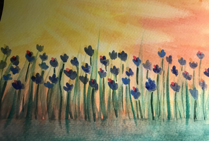
3. Painting Sunshine Field of Flowers Tutorial: Let's paint some sunshine. I love doing this part. I mean, I literally
will keep doing these kinds of paintings just so I can paint
the sunshine. So I always start with my basic yellow and
that is up to you. You can use a warm
yellow, a cool yellow, whatever yellow you tried
in the materials area. And that worked out for you. I love Hansa. It's really a beautiful yellow. It's somewhere in-between, like a lemon and a little
bit of a warmer yellow. But it doesn't have
a lot of like, it's not like a quin gold, but listen, you
could use Quin gold. You could use Nickel AZO by Daniel Smith.
Anything you want. I'm just going to
add a little bit of water I pre moistened to my palette already with
water and this is dry. So I'm just going
to start adding water and just adding paint. I want the paint to be as
concentrated as possible. So I purposely didn't need
to wet this paper for this because I want
a little bit of a like modeled effect. And once I scrub the
color into the paper, it's ultimately going
to get plenty of water because this is a very
thick juicy brush. Even if you're using a quill or whatever brush you're using, you can keep dipping it
into water and gathering it and just blend
out that color. I'm, I'm going kind
of rough with it. I'm not worried about
painting every single inch. If I leave some whitespace,
that's awesome too. That's really nice. It's kind of like very stylized. If you find that your paper, depending on what you've got, if it's buckling a little bit like this one
starting out bit, you can always
spray the back with the water and that
keeps it from buckling. Next, I'm going to take
the Ozzy Ozzy red, and that's by Daniel Smith. Now, those of you who
opted out of this, you can easily just
go right on to the red or the Quin Rose, depending on what you're
using, even opera rose. And go ahead and add the
red now and blend that into the yellow in the area that you want the orange to be. So you would just put
the red down here at the bottom over a yellow and you would easily
get your own orange. But I'm using this Ozzie red and you can see why it's just
so beautiful and it's warm. It kind of like when it
blends into my Hansa, it just makes this
almost like a quin gold, but it's got a little
bit of texture. This is a granulating color
as well by Daniel Smith. And Daniel Smith,
colors have some really beautiful,
beautiful results. They really do
because they do have a little texture and they
stay there light fast. I mean, this isn't
a Daniel Smith add, but let me just say I'm very, very happy with my results. So what I'm doing is I'm
dipping my brush into water. It's a nice kind of like
mildly soppy brush. It's not like heavy wet
but it's it does the job. You can see how it's
streaking it out. And I'm just scrubbing it
and mixing it together. Now at some point, if you do use too much
water, it will bloom. And if you add more
paint over it, it will start to
bloom and separate. So this is where
having a good sheet of 100% cotton paper and a £140 paper is really
going to just be so, so good for you and make
it so much easier if your papers buckling
and you're getting really big areas that
are pulling water. You can even wipe up
some of that water and what the back of the paper
to prevent the buckling. But what I'm doing
here is I'm kinda working not wet on wet just
yet. I'm working on dry. Wet on dry. And I'm keeping my paper
from being sloppy because I don't want the backwash
is yet I'm just want this. I just want to kind
of like a mix, a blend of color, keeping the paper slightly wet and letting some of it dry, but keeping it
kinda damp and just adding those beautiful colors and as concentrated as I can. The next one I'm putting
in is quin rose. For those of you who didn't
yet not use the orange, this is the application
you would be doing. The bottom just to
mix it all together. And you can mix this right
on paper just by putting the yellow and then
the quin rose over it. Now this I'm adding
water and I'm getting more of a wash as they
move up the painting. And I'm doing this
purposely because I don't need it heavily
concentrated everywhere. There's gonna be an area of which I do want
more concentration. Now as I mix my Hansa
yellow and my Quin Rose, that center area is starting
to get very, very watery. And as a result, it's going to dilute
the color and you see a little bit of
a backwash starting. If you don't want the backwash, then you want to work
a little more dry. If you Don't mind the backwash or maybe you want to work
wet on wet to begin with, then that will help you
control it just a bit more. But for this, I want this modeled effect
because remember, we're going to be layering
stuff on top of it. So it's not like it's
just gonna be this. I want different
textures in this work. If it's going to be loose, we don't want just a
smooth, perfect Look. We want something that's
really interesting. That's a signature of my work. It might not be yours
and that's okay. You can do something
that's a really, really great, beautiful
like perfect wash. I just happen to
really like loose choppy and things
that you have to look at a little bit
longer that you can't just take all in
one look, right? And one glands. Now
I'm going back and I'm adding a little more
concentrated yellow. And if you notice, I left the top left corner a little bit lighter
and it's still wet. The reason why is because
that is where the sun is, so we don't need that to be
the concentrated yellow. That actually can be more white, yellow, and light yellow. Now I'm dabbing in
trying to create a little bit of a backwash and create
a little more texture. This is where it's
a little bit more, not really beginner's
tip, right? This is a little more
intermediate or advanced tip. And I'm now taking water on the brush and I'm just
creating sunrise, right. So I start in the
center of where would my son would be in
the top corner. I let the water just kinda
drip down and then I start to guide
where I want it to go just by doing
these little sunrise. Don't worry again about carrying color forward
or it being Blache, it's going to be, things are gonna be layered
on top of this. You're not going to see this. Now, we've got this situation where we've got our sunrise in. And I know it doesn't
look like anything now, but it's going to look amazing when it starts to
dry and come in. I remember just
trust the process. If you are at this stage and you wanted to
add more color, you could, you
could still go in, just make sure that you take your cloth and you start
to take some of that yellow off where you
feel that you want it to be a little bit
brighter if you want it to reflect
a little brighter. If you even want a
little more brightness through maybe in
back of the flowers, you can even take some
of that color out just using your rag and a
little bit of water. If you really want to go crazy, you could even see
what it looks like. If you spray it with
a spray bottle, it'll kinda disperse it. And that would be
really cool to, or you can even
add a little salt. But don't go crazy with the salt because we'd have
to paint over it. That would be really, really a lot, a lot of
trouble, kinda hard to do. Alright, so we're
almost at the end here of our painting or background. So you get the idea, right? It's brighter where the sun will you look into the sun and then the rays can cut through
some of the other colors. So no matter what your
sky looks like right now, no matter what colors
you've got in front of you, you can take a wet brush and
just bring it on through. And that is going to
make a huge difference when you go to lay in
the rest of the colors. So let's let it dry and
we'll go on to the next and start painting
our foreground.
4. Painting the Forground| Field of Flowers: Okay, Let's paint some
foreground shadowy. Now, if you have dry paper and you didn't get to this
before your paper dried, then you can always
rewet your paper, add a little bit of color, and add the blue on top of it. If you see it's not mixing
two green for some reason, then you can always mix
it in your palette. But right now I'm
working wet on wet, so I'm adding the cobalt
blue and as I add it, it's mixing them with the
Azi red and the yellow and making these beautiful shades
of green because green, because yellow and
blue make green. And this is where
light color mixing is just your best friend. Because if you know
what kind of colors you're gonna get before
you start your project. It makes it so much more fun and easy because it's
like predictable. Now, in the loose style,
we don't care if, if some of the blades
are a little more green, some of them are a
little more yellow because it will reflect light. So I'm taking my
round brush and I am pulling flat brushed a
bunch of blue on the bottom. I mixed it in and while
it's still wet is damp, you can see how they're running. I'm letting the paint just
kinda move up and really, really quick strokes
with the round brush. This is the thicker round brush. It's got a point, but you
could use a liner brush. You could even do
this with your flat. This is all entirely up
to you and what you love. Now as I'm running my
paintbrush over the reds, you can see how it's
picking up some red. I'm not watering it down. I'm not washing my brush. I'm letting the red come
back into the stroke. And that's how that's happening. You can always
expensive experiment also with bringing some from the top down or even
dipping your paint in, your brush in a little
bit of red if you wanted, if you really like
the way this looks. But I think the
idea here is not to cover the entire
background with thickness, although that could
be your style. I like to let some of this
stuff peeped through. I almost wish that some on the left had peaked
through a little bit more because I really love how
the right looks where some of the orange is really
bright and peeping through. But of course it's going to, it's going to look
brilliant and crazy, good at the end anyway, there's enough colors in this. Just kinda rotating around between the whites, the yellows, the oranges and the pinks, as well as the different
shades of blues and greens, that it definitely
keeps your eye moving. It wouldn't even matter if I didn't leave any
of the whitespace. So as I mix in to
the other colors, you can see I'm getting a
lot of different variations. Sometimes I will dip my brush into a little
bit of the quin, rose just to bring in some more of the browns,
almost like a wheat. And sometimes I will dip it
into more of just the water, wash my brush off, and let the color from
the bottom carry up. Now in order to
get rid of some of these little ends at the bottom, what I did was I actually took
a little bit of the blue. I added a little more
color to the bottom, and that's why it looks very dark compared to this
during the process. So this is what I'm saying. It's like you got to
trust the process, right? Because when you're going
along in your painting, you realize that sometimes
it can look like a big old mess and maybe
not bright enough. Maybe it just looks like it's
just not coming together. But you got to remember
that as the layers dry, you can always go over it with more glazes and you
can keep going. As you keep going, you're just building
color on top of color. It don't be afraid that once
it's dry, it's pretty solid. You can honestly go back
in and add more color even do a whole nother painting
over your underpainting. This is entirely part of your process that you will develop as you develop
your own style. So don't be afraid of it. Try everything. Because unless you try, you're never going to learn what you can do and
what you can't do, what works and what you like. And this is how we go
in watercolor for sure. Alright, let's go start
painting some flowers. I can't wait. Can you? It's gonna be so much fun. This is like my
favorite, favorite part. Well, besides the sky, this is my favorite part.
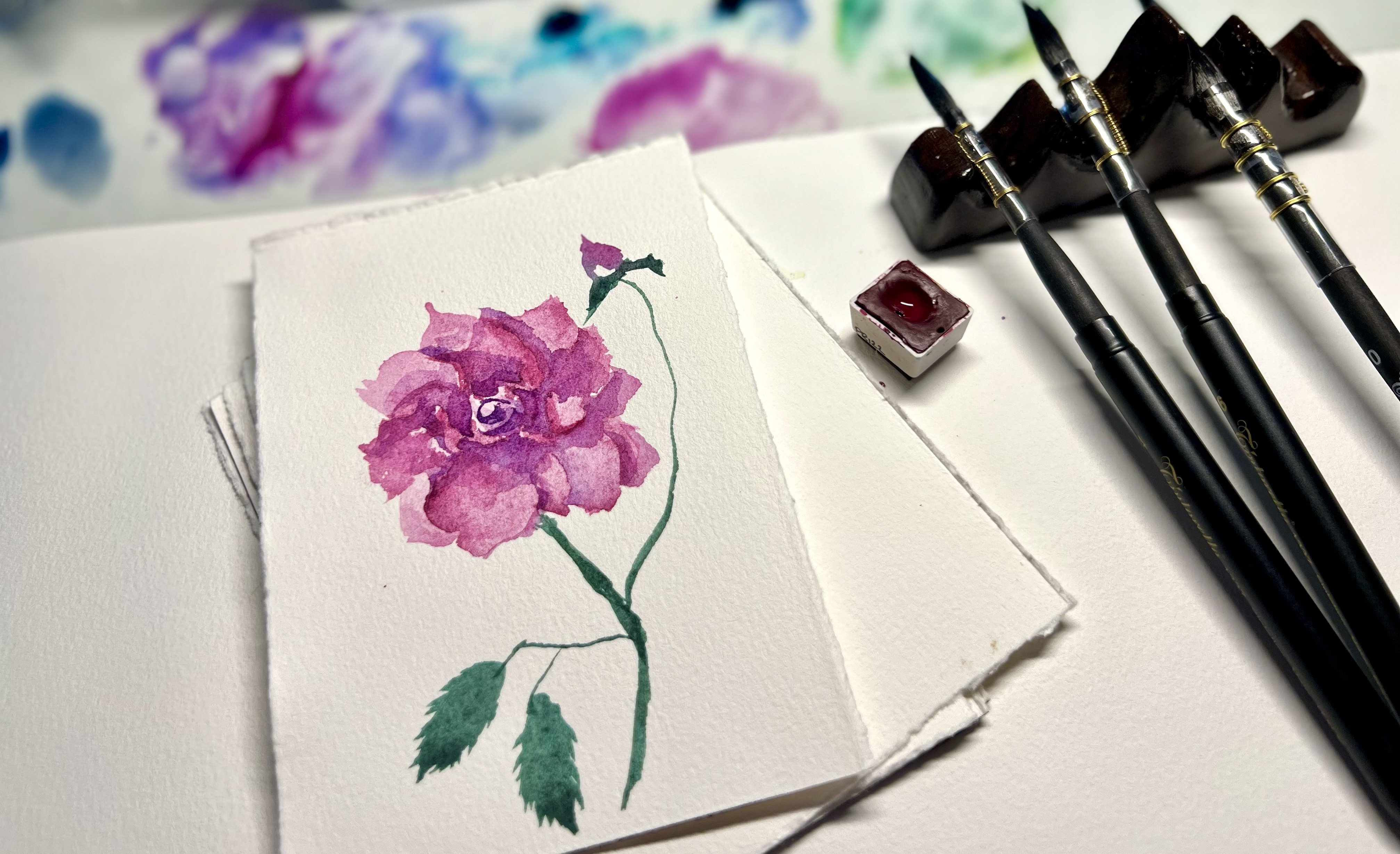
5. Painting Flowers | Field of Flowers: It's time to paint flowers, one of my favorite parts. So literally I was
thinking about doing a series of how to paint
different kinds of flowers, where we just do an exercise of just messing around with
different loose flowers. If you think that you want that, then let me know and I will certainly get that
tutorial up next. But right here, as my
painting is still wet, I'm actually taking
a napkin and just drying off a little area,
removing some color. And I'm able then to take some wet paint on the side
of a smaller round brush. And I'm just dragging the side of the brush
over the paper. Now the reason why I'm taking some color off
and drawing the area is because if you know
anything about color mixing and you
put blue over yellow, It's going to make
green and that's fine if you want green flowers. But I want more of
the blue to show. And I also want to highlight
the flowers individually just by having a little bit of non-color behind
some of them. Now, in the areas
that I just want the color to smear in with the background and
maybe blur a little bit. I'm not drawing that area, but see when I remove the color, I get a little bit of light. And I also get the
ability to have a little bit sharper
edge on my flower. So my petals can kinda
get a little bit sharper. So I'm just dragging
and experimenting with different shapes going in the same direction
for right now, just because that's
the composition that I'm working with. But it depends if you took a picture of some flowers
and they're going in different
directions or that's your vision then by all means, paint them any way you want to. This is about your style, not about my style. I'm just showing
you how to paint. You need to figure out just what is in your imagination
and try to get that on paper. That is a great journey
to be honest, it's fun. So what I did is I took
a little bit of paint. So this is the blue,
the cobalt blue. And I dipped it in a
little bit of water. And now I'm just
letting it be as diluted or as loose
as it wants to be. And I'm just kinda dotting
it through the paper. This is going to pose some background flowers as we
keep layering them on here. I sometimes do this
just to kind of get a range of
different flowers. Some of them will be a little larger and more in
the foreground. So those I'll be painting
on dry or paper. And the ones that I want
to fade into the back or just have that blurred look. Those ones are
gonna be wet on wet and they will blend
a little bit more. Now, because my paint
is very concentrated, you can still see
some of the area is actually getting a little
more green and blue. But as it dries, I can
always go back and add a little more blue to take
away from the grain. And then you'll have kind
of like a green shadowing, which looks really cool. But as you'll see in
some areas that it's green and I'm just not
crazy about that area. I'm just removing it just with a little paper towel.
Oh, that's a good one. And I'm just dragging my brush in a circular
as I turn it, as I roll it to get this
kind of shape, a flower. This is why I think
it'd be really fun to do a bunch of exercises of different brushes that make different kinds of petal looks. And we can just play
with different colors and different petals styles
and see what we come up with. I think that would be a
really fun class to do. And I think I'm gonna have to record
that one this summer. Again, just while my
paper is still wet, I'm removing some color, drying it off a
little bit to get a sharper edge and to get a little bit of a
white highlight behind it so nicely that works. And I'm just kinda
adding them in. Now remember if the
flowers are going to overlap and if you
need a picture, pinterest has a lot of
great pictures on it. I'm actually going to include
a picture file of all of the flowers that I have taken this spring and summer
here in Canada, as they were blooming
literally every day here, it looks like a
different flower. A different picture
can be taken. It's amazing. So I must have like 400 pictures of different
really beautiful, brilliant flowers that I
like to paint in the file. And that will be linked up in this program for you so
that you can go and use any of my pictures
and just kinda take a look at what I
use for inspiration. I think it'd be fun. So that way you don't
really have to find them. I'll probably end up
adding in some photographs of some of the different
designs I've come up with, as far as painting some flowers to one of the things that I did do in this is I went
through and just for fun, I added a convenience color. This is just a turquoise. I didn't include
this in the list of materials because honestly, you guys don't really
need to add this color. I think it's better
to keep it simple. I just wanted to play with it. And sometimes I will
grab things out of my palette and
just play with them. The turquoise looks pretty cool. I'm not sold on it. I'm not really sure
that you'll love it. And that's again, why
I didn't include it. But if you do love
this color and you want to add a little bit
of a turquoise shade. You can either mix
one with your paints or you can get a
convenience turquoise, and they're just
cobalt turquoise. I think every single company
pretty much makes them. This one I use is
by Sri Lanka and I really do like it and
I tend to grab for it. It's always in my palette. I'm just using it to reflect
a little more light. But honestly you can mix
because it's a turquoise. You could mix your yellow with your blue and eventually
land on this color. It's somewhere in-between
the blue and the green. So before you get to the green, you'll see that you'll, you'll get a variation of turquoise. That's pretty cool. So now I'm just kinda going
in and doing more layering. This is just drawing
some areas so that I get sharper flower petals and just rolling on
that smaller brush. It's really cool. I mean, literally if
you think about it, we've achieved this just by drawing some areas out
and just rolling a brush, just put it in some water, put it in some paint
and let it roll. And that's just kinda like these little v shapes to make these beautiful
little flowers. I, more and more that
I think about it. I really do want to do some fun exercises on different flowers because
it'd be really cool. So some questions that you
guys might have for this is one perhaps you're
wondering what to do. If maybe if your
paper dries too fast, that would be a reason why
you would need some help. I would think if your
paper dries too fast, then you'll want to use a little more water on
your brush or you can always spray areas to keep
it moist before it dries. If you like, just be a little careful with how much
water you add because that's where it can get a little puddle depending
on what your papers like. The level of miss that comes
out of your spray bottle.
6. Painting Stems | Field of Flowers: We're nearing the end. Now we're going to paint the stems or kind
of like the grass. So here's what we have so far. We've got this with
some of our flowers in, and now we need to define the base of where
that's going to be. Like. So some of
the paint has dried and some of its different
colors like very, very light, you need
it a lot darker. So what I'm doing is I'm taking the blue mixed with yellow. And I made the green
right on my palette. And I'm just kind of
painting that in with really strong brushstrokes up. This is the flat brush that
I'm actually using to do it. And it's kinda cool because
it's already flat, right? So if it's depending on the size of paper
that you're using, you want to use the
according size on the brush. So if your stroke is too big, remember you are probably using a very small piece of paper or you just need to use
a smaller brush. You could also do this
with like anything, like a edge of a palette knife. You could do this with, you could paint a bunch
of paint on there. And then while it's
wet, you can literally scratch through
some of your stems. I mean, there's so
many things that you can do to add texture. Don't be afraid, you know, definitely don't be afraid. I'm just grabbing some of
that green that I made. And from the blue
and the yellow. And I'm just kinda
striking it up and going over some of the flowers and making some
small strokes and larger strokes until I get
the fullness that I want. And I'm in some places being careful not to cover
the white areas, those really like glowy areas of bright orange and yellow. I'm trying not to cover all of that because I really
liked the way some of that's peeking through
what I want you to look at as well as
what you're seeing here is look at what happened when the flowers dried from the area that
I remove the color. You see how I got that? Now that is without using
any masking fluid, right? All we did was we
dried a little bit of the paper and it removes some of the color
while we're doing it. Now that happens on
great watercolor paper. And that's the benefit of
using a 100% watercolor paper. But there are some sketchbooks that you can do this on to. I would just keep the paper
very thick, like £140, right? 300 GSM. Now I'm taking some of that
green and I'm just full-on brushing it right onto the base to add more color
because I had a lot of the pinks back in
there and as it dried, it got really, really light. So I'm not only using
my brush on its side, which unfortunately you can't see the way I had
the video camera, but I'm also just painting
more heavily at the base. Now the reason why
is because you saw what it was like
before and where we need to go now is we need
to have more structure. If you are looking at
the ground and it was thick grass or very thick
flowers like this field. It wouldn't be really sparse. Very rarely are you going
to see the soil unless there's like lack of foliage? We need it to be. And this is just
a personal style. I like it when it's got a little less definition
and more of a blur. But with that being
said, if you notice, I've got some negative painting
effects going on there. And that happened from doing the layers and letting
some of it dry, as well as taking my brush and
mixing the paint on there, then going back and adding some water and going through it. So you kinda just want to play with that effect and
see what you get. Just don't worry about washing your brush out in-between
all the time because sometimes you'll pick up
some color on your brush that it just looks amazing
and it kind of adds to it. It adds to the flavors
of something like this. The final touch here is
just me going through and on the areas that are
dry above the flowers. I just went in and added a
little more of the Queen Rose, a little more of the yellow, just kinda get some, I don't know some definition. Allow the light to kinda play on the flowers a little
bit more and just, it's more stylized and it's just part of my personal style, but you're welcome
to use it for sure. This is the orange are seeing is actually the yellow
and the Quin Rose mixed. So that is not the red orange, this is the, the Azi red. This is the actual mix of what happens when
I mix the Quinn. And the reason why I'm doing
that here is because it's going over the Quinn
mixed into the red. And I just felt like
I didn't want to use the Azi read in
this circumstance. I wanted to mix that new shade so that it would have a
little more of a pop. And not just be like adding the same color over
a similar color. But again, like
when the beauty of using just three
colors essentially, right, with the exception
of that turquoise, which you could have
mixed yourself. The beauty of that is you keep the cohesiveness
of the painting. And I think as a beginner, you really probably
are going to have the most hardest time figuring out what
paints go together. And what happens is
a lot of people will get a ton of paint
and they'll get all confused using too
many paint colors that were really ever
meant to go together. Maybe they compliment or maybe they're on the opposite
side of the color wheel. Maybe there's warms and cools and they're not
playing off each other well, well if you're just using one yellow and one blue and one red, then you know, they're all
going to work out really well. Another big tip that I usually do is if I am going
to choose colors, I tried to choose them
within the same family, meaning that they're
all gonna be warms or they're all
going to be cool shades. And that is just so that I
don't get a lot of moneyness because you can get a lot of moneyness and your paints
if you don't do that. Another tip for
you is if you see a color not working
with another color, but you still want to use it, then wait till the color underneath dries
before you apply it, and you'll get a lot brighter
version of that color, as well as depending on
what you put over it. Some are more
transparent than others. So just do it on
a sheet of paper first and you'll see
how that goes now, that stuff that's going to
come to you guys over time. If you're a beginner, you are not expected to
remember nor know this. The more you paint, the
more you make mistakes, the more you'll remember
not to do certain things and which colors
work well together. I always think of some of the master painters that I see and I love to
watch their videos. They will use the same
colors pretty much. Very rarely are they
ever going to do a pallet full of
convenience colors. They just know it works. They know what shades are going for and they don't
want that to get in the way of the composition and the outcome of the painting. They tend to use the same
colors but variations of them. And you're always like, how
did they get that right? Well, it's just years and years of literally painting
the same way. And that's just where you're going to get you from
where you are right now. So don't worry,
trust the process. Remember, this was a big
old mess before we got here and now we are
pretty much finished. I hope you enjoyed
this tutorial. I will come back and give you some final
tips and thoughts as we go to our final
section of this class. Thanks for taking this with me. I'm really excited
that you did it and I can't wait to
see your project.
7. Final Thoughts | Field of Flowers: Take a big deep breath because you just graduated
from my class. That's awesome. I hope you guys will go and
paint something wonderful. But before you do, I have some final thoughts
on this project. One, if you are trying to follow along with the project
and your paint is drying, you might want to watch it
all the way through first and then go back and try it
on a smaller sheet of paper. A lot of times when you're
doing these projects, you are maybe tackling
it on a very, very large sheet of paper. And that's why I mentioned
before that I'll probably do another tutorial on
just doing different, different styles of
leaves and flowers because that will be a really fun thing for
you to experiment with. I knew, I know when
I was just starting, it was really difficult for
me to figure out what kind of shapes I could actually do
with my paints and my brushes. And that was where I got stuck. So maybe if I did a tutorial showing you how to
use your brushes, that might really help you. Another thing is, remember that watercolor is tricky in
only one really big regard, and that is the water drying. So if your surroundings
are really cold or your surroundings
are very breezy, it's going to dry a lot faster. Also, some paper dries
faster than others. That's why I had
said that one of the easiest ways to work wet on wet as to what both sides of the paper and then let the
paper rest on a piece of glass or a non porous surface and that will keep it damped
for longer periods of time. Then keep a spray bottle so
that you can continually missed it as you think that it's drawing
in areas too much. But again, if you're not working fast and you don't really
know what you're doing. Smaller pieces of paper are better than larger
pieces of paper. Even if your sketchbook,
you can definitely do that. It's just hard to with
the back of the paper, with the sketchbook, you gotta
get a little bit crafty. So anyway, this really
turned out great. I love the way this looks and
just the brilliance of it. I hope you guys do too. I hope you get inspiration
from what I taught you here and that you try
a project of your own. I have so many different
ones up on Instagram. If you want to go
look or come on over to Jaclyn Jack's dot
com if you want to see my finished gallery of
all of the artwork that I do between florals and
portraits and landscapes. I do a lot of amazing things with loose watercolors and I'm
gonna be doing a lot more. So keep an eye out
for my lessons. And I hope you
guys will leave me a comment and some feedback and also tag me when you have
done a project of your own. I can't wait to see it. Have a great day and
happy watercolor ring. Remember you are on
an amazing journey. Be patient with yourself
and be forgiving. Have a great summer.
 Jacqueline Jax, "Creativity brings peace into your life"