Transcripts
1. Class Intro: Have you ever wanted to develop a sophisticated sense of color? Do you want to get better
at mixing watercolor and matching the color of
things from real life? In this class, you will learn the basics of color
theory through fun and practical
exercises that will have you matching the colors of
real objects around you? My name is Marley Pifer, and I have been helping
people like you learn watercolor for
almost ten years? In that time, I have painted thousands of
watercolor subjects, mostly outdoors in nature, and I have made hundreds of instructional videos
on my YouTube channel? This class, I will help you truly develop the
skill of color mixing. Here are the main things you will be learning in this class, how to accurately mix colors
to mask things in real life. Which colors are friends
and which are enemies, the practical side of
color theory and how to control your colors and fix
common painting mistakes. This class is designed
specifically for beginner or intermediate
watercolorists, who want to improve their
watercolor mixing abilities. However, it will also be
good for anyone who wants to improve their understanding of color in art and
design in general. For more advanced
students or anyone who wants to push their
learning further, there will be extra
credit exercises at the end of each section. Are you ready to take your
color to the next level?
2. Class Orientation: I think you're going
to be surprised by your results when you do
the project for this class. The project is to create
three color wheels in a page full of color
swatches and mixes. While the goal of this
project is mostly to build your skills more than
to create a work of art, it can have a surprisingly
enjoyable aesthetic effect. You might even want to hang
your project on the wall. This type of project will
jump start beginners and provide lots of flexibility
for more advanced students. Let's talk about supplies. For this class, you will
need a basic sketchbook. It can have mixed media
or watercolor paper. You can work on loose
sheets if you must, but keeping all your work
in a single sketchbook is much more fun and
fulfilling in my opinion. One page will be needed
for your project, and one or two pages for warm ups and all of
your color tests. You will also need
a watercolor set. I will be using the Windsor
and Newton Cotman field set for this class. It is an entry level
watercolor palette that can work for the studio
and in the field. A lot of the specific
learnings from this class will be a lot easier if you
have the same palette as me. You can see the supplies list in the resources section for more info and links about
all of the supplies. You will also need a
rag or a paper towel and a basic drawing tool
such as a pin or a pencil. The other really important
piece is a water brush. You can use a regular
traditional watercolor brush, but I will be using one of these water brushes with water
in the built in reservoir. Where are the resources? There are some
resources that I've put together to help you
with this class. If you scroll down
underneath this video, you should see four categories. One says about, one says
project and resources, one says reviews, and
one says discussions. Inside of the project
and resources, you can see the other
projects that people have uploaded and
upload your own. And you can also find the PDF downloads that
I have created for you. Once you have the
class resources downloaded or printed out, then all you need is to
get your art materials ready to go and have
a nice place to work. For the color matching
projects, ideally, you should work from
objects that you find around you or
outside nearby. If not, you can use examples
from the resources section. Are you ready? Let's go.
3. Swatching Out Your Palette: The first part of our project
is super fun, super easy, and is a great way to build some familiarity with
your watercolor palette. We're going to swatch
out our entire palette. All you need is your
watercolor palette. Hopefully, you have the
same one that I'm using. If not, it's okay,
but ideally you have this cotton watercolor
palette check the resources, a rag to clean your brush on, and a water brush. You can use a traditional
watercolor brush, but then you'll need
something to hold water in. Alright, let's get started. All you need to do is load up your brush with
the first color, which is mon yellow hue. And as you go,
remove a little bit of color as you go and
make it paler and paler. The next color is
cadmium yellow, and then cadmium red. So I am using my rag to remove some of the pigment after a first couple of squares, and it gets paler and paler, and that way you can see the range of intensity you
can get from each color. Usually in watercolor,
you're not going straight from the
pigment onto your page. Our next two colors
were after cadmium red. We had alizarin crimson
and then permanent rows. You can see the
resources section for more info about the
specific colors. So here you can see how
I'm using the rag to remove some color after
a couple of squares, just to make sure that I have a consistent increase in
how pale the color is. This green is Vidian green, and now I'm going
on to Sap green. And you can see it's starting to build an enjoyable
aesthetic effect. You're getting a lot of
practice with your brush, a lot of practice, with
your watercolor kit. You're getting an idea of
where all the colors are, how they relate to each other, and what kind of value range
you can get from them. This practice of swatching
out your palette is a really, really good way to get to know your palette and have a better understanding
of what is in it. I recommend this whenever
you get a new palette. It's also a meditative practice, and I feel like it
creates something rather beautiful at the beginning
of any sketchbook. Here's what you learned in this lesson just by
swatching out your palette. You learned how the colors
in your palette behave. You should be a lot more
familiar with your palette now. You also learned how your colors look at
different intensities. You also practiced some skills. You practiced loading
the brush with pigment. You practiced controlling the
pigment level on the brush, and you practiced cleaning
the brush a lot of times. The extra credit for this lesson is to make a color mixing chart showing all the two way mixes between the colors
and your palette.
4. Color Theory Wheel Goes Round and Round!: All right. This is one of my favorite parts of this class. And while color
theory sounds well, very theoretical, it's
actually extremely practical. When you have to match colors
in nature or make a pink slightly less pink or figure out what a good
combination of colors is. It's going to really
help if you have a basic understanding
of the color wheel. So in this lesson, we're going
to practice that and more. Measuring anything
or trying to draw a perfect circle can be
major mental obstacles. So I wouldn't worry
too much about making a perfect circle or having all the angles correct
in your triangle, as you can see, mine
are pretty loose. So don't worry too much about
measuring things perfectly. Also, keeping it small
is going to be helpful. If you make a really
big color wheel or a very wide area that
has to be colored in, that's going to make it
a lot harder as well. So keeping it small and keeping it loose is
going to help a lot. So get your watercolor palette, your brush, your sketchbook, and a mug or some cups
from your kitchen, and let's get The first
thing we're going to do is trace three
wheels on our page. A lot of mugs, cups, and even plastic bottles, will have two different
size circles on them. So you can see I
use the bottom of this mug to trace
a smaller circle inside the first circle. Don't worry about
making it perfect. I'm a perfectionist,
and keeping it loose and small helps me actually
finish this project. Once you have those
three wheels traced, it's time to go on to
the first color wheel, which we're just going to put the primaries in
lemon yellow hue, and permanent rose and Ceran
blue hue RR primaries. And there are primaries from this palette
because they're the ones that most allow us to create
our secondary colors. Once you paint a little bit of lemon yellow hue,
permanent rose, and Ceran blue hue here, draw a triangle to show
how those primaries are related to each other across
the wheel from each other. Some people might be asking, Why did I choose these
three for primaries? Why didn't I choose cadmium
red or alizarin crimson? Some people might think that
red is a primary color, and that's what we were
often taught in school. But the thing that
makes a primary color a primary color is its ability to make
the secondary colors. If you use the permanent
rose for your primary red, it's easier to get good
purples and good oranges. And if you use the serlean blue, it's easier to get a blue green, a violet, and also
a yellow green. However, if you use that
other red for your primary, you don't get a
very good orange, and you definitely don't
get a very good purple. The definition of a primary
color is that you're able to make all of the other colors
from that primary color. If you can't make
the other colors from that primary color, then it's not actually
a primary color. Okay, this next one's going to be a little
bit of a challenge. Start off by pre wetting the entire circle with
a clean brush, water. Now go to lemon yellow hue and put it in in its normal location at the top of the color wheel, but taper it off a
little bit at the edges. See how I make it a little
bit paler at the edges. Next, get your permanent rose. Put it in in its
normal position, and then also taper it off on the edges and try to overlap
that yellow a little bit. And then on the bottom, overlap it and taper
it out a little bit where it can overlap with
your next primary color, which is that seran blue hue. Taper that one off at the
edges and try to mix it into the permanent rose
to create your purple, and then mix it into your lemon yellow hue
to create your green. As you can see, we got
pretty good greens, purples, and oranges, meaning that our primaries work
as primary colors. The next thing we're
going to do is just write in the names of the
colors that we used. And then we're going
to draw a triangle showing where the primaries are, a triangle showing where
the secondaries are, and then a, I think it's a hexagon showing where
the tertiaries are. Then we're going
to go in and put initials for what all
of those colors are. So basically yellow, green, yellow, orange, blue,
green, et cetera. Creating these shapes
is going to help you understand the relationships
between all those colors. This is a really
good test to do with any watercolor palette or oil paints or acrylic paint
palette that you have, because it will tell you if those primaries are
real primaries or not. If you can't mix secondary
colors like a good purple, such as that from your
primaries or a good green, such as that from
your primaries, then they're not
actually primary colors. The final color wheel
that we're going to make is just placing all of the colors from our palette onto the color wheel in their
respective places. Starting with the primaries
that we already identified, lemon yellow hue,
the permanent rose, and the cerulean blue hue. And then going on to the rest. What we're going to find out
is whether there are gaps in this palette or
whether there are certain things that there's
almost too many versions of, such as sort of red oranges and red seem over represented
in this palette. So we'll just go through and after you get those primaries, try to fill in the
rest of the circle, but notice where
there could be gaps. Are all of the secondary
colors represented? One of the main things
I noticed when doing this exercise is there's no
real purple in this palette. So you can see there's a big gap at the bottom part of the wheel, where purple would normally go. What are some of
the things that we just learned in this lesson? We learned how to identify
primary and secondary colors, not just to use those terms, but to actually identify them on our own and
what they mean. We learned how primaries, secondaries, and tertiaries
all relate to each other. And we also got familiar
with the colors in our watercolor palette and
where the major gaps are. So, now, for your extra credit, you can make another one of the spectrum wheels using the
warmer versions of yellow. Red and blue. So, in that case, it would be cadmium yellow, cadmium red and
ultramarine blue, instead of the
ones that we used. What do you notice if you use these as if they
were primaries? Are they really primaries? That's your exer
credit assignment.
5. Make a 50/50 Color Mix : This lesson, we're going to
do a simple 50 50 mix between Serian blue hue and Varian green to see what kind of color we can make from
combining those two. And we're going to
learn how to do it in an organized way, so we can learn as
much as possible and improve our understanding
of our watercolor palette. This is a useful thing
to know how to do when you need to fill
an empty space in your palette where you
don't have a color that fits in that space or whenever you need to
make a new color, which is something
we're going to build on a lot in this class. All right, to make a
simple 50, 50 cross, meaning it's equal
parts of each color, I'm going to start
with getting my brush really clean and
preparing my first color. Once I get my cerlian
blue hue ready, I clean the brush
really well again, and then I'm going
to get my Vidian hue ready and put it in
a separate area. And you can see I'm
sort of measuring them out before I
mix them together. Now that I've mixed
them together, I can tell that I should have first put little squares showing the two colors
that I'm mixing, and that's what I'm doing here. Now, my mix came out a little bit strong
on the green side. That's because Verdan hue is a stronger pigment than
the Serlian blue hue. Now just like we did
swatching it out, I swatch it out so I
can see the variation. Now I'm going to try
adding a little bit more cerlian blue
hue to the mixture, and I'm making notes there in my swatches that I've added more of the cerlian blue hue to get a little bit more
of a turquoise color. When making these basic crosses, it's good to have a
system of annotation. Here I have the original color, the Serlian blue hue, and here I have the Veridian hue that mix to make
this one right here. So those are the two colors
that go into this one. Then I also put the initials
of the colors underneath. And then I added more cerlian
blue hue to this one, and that creates this one here. It's taking that mix from above
and Using that plus mark, I show that I just added
a little bit more color. Taking good notes when you do these mixes is going to
help you learn faster. The main things that we
learned in this lesson were how to do a simple 50, 50 color mix between two colors that are
already in our palette. So we also learned how to
modify that color a little bit closer to one of the
primaries because we were mixing these
two colors right here, and this is one
of our primaries. We also learned how some colors
are stronger than others, because even though we used equal amounts of the Serlian
blue hue and the Vidian, our first mix looks
a lot more like the Vidian than the
Serlian blue hue. Those are all really
useful things we learned in this simple
mixing exercise. Extra critic, you can
try variations of mixes with more
blue or more green, such as a 60 40 or an 80 20 mix. You can also try to do
a chart of all 50 of all 50 50 mixes possible with whatever
palette that you're using. That's a lot of mixes, and it's a fun exercise, but can be really
time consuming.
6. Why Is My Sunset Ugly? : Sunset paintings
often come out bad, and we are about to learn why. But we are going to
have to understand saturation and
complimentary colors first. Saturation is the strength
and purity of a color. A lot of times people will just say that's a very bright color. That's probably saturated. The closer it is to a primary
or a secondary color, chances are it's more saturated. The less white, gray, black, or brown, the more
saturated it is. Sometimes saturated colors
even look unnatural. However, sunsets need
saturated colors. That's what makes
them so beautiful. Sunsets are also beautiful
because they have complimentary or close
to complimentary colors. The problem is when these frenemies mix in ways
you weren't expecting, complimentary
colors are opposite to each other on
the color wheel. When they mix, they often
neutralize the saturation. By definition, they
neutralize the saturation. So, for example, a blue
sky and an orange sun. Those are opposite to each
other on the color wheel. Here is blue, and
here is orange. Those are complimentary colors. So when they blend, they're going to neutralize each other. Blue sky plus yellow or blue sky plus yellow sun
will equal green, and there's not normally
green in the sky. So to practice and
internalize these concepts, we are going to do
some front exercises that I like to
call cross washes. The first thing I'm going
to do, which is really important is get my
brush really clean. That's always good when you're doing experimental
mixing of colors. I'm also probably going to
use two brushes for this, and I'm going to experiment
pre wetting the paper. Now I'm going to get
my cilian blue hue, which is my sky color, paint it down and fade it out, and then I'm going to paint
the lemon yellow hue up from the bottom and fade
it into the blue. Now I'm doing the same
with cadmium yellow hue. And now I'm going to do the
same, see pre wetting it, Seran blue hue
again for the sky, and this time, cadmium red. So I'm basically just going
to do this with all of my potential sunset colors
with my sky color cerliu blue. That's alizarin
crimson right there, and last but not
least permanent rose. Don't forget to take
careful notes when you do this of all the different colors that you use each time. Now we have a really useful
chart showing us how all of these complimentary colors
and frenemies mix together. Look how the cadmium
red really turns brown, and the cadmium yellow and lemon yellow hue
turn really green. This zarin crimson and permanent rose look
pretty good, though. Now I'm going to
do an experiment where I keep the
frenemies separate and put a pink or sarin crimson in the middle, permanent
rose this time. So I paint down with the blue, keep an open space
in the middle, and then use cadmium
yellow for a sun, and then put a little
bit of permanent rose in the middle and then blend
it in both directions. This keeps the blue and the yellow separate and prevents me from
having that ugly, green or brown color in the sky. Sunsets are a extremely
challenging subject that many beginner
water colorists tackle without having
a basic understanding of these color theory concepts
that you just learned. Hopefully, you won't
make the same mistakes that they do now that you understand complimentary colors, saturation, and frenemies. A couple pro tips for dealing
with these situations is to either not paint sunsets at all, control
your expectations. Keep the yellow and
blue separated, use cooler reds or pinks
or try using two brushes. Those are a couple extra
tips to help you out. However, there are
times where you want things to be
less saturated. See the lesson on kindergarten
green for more on how to tone down a
saturated color on purpose. To summarize what we
learned in this section, we learned why sunsets
are challenging, what is saturation, and what
are complimentary colors. The extra credit for
anyone who wants to take it to the next level
is to try painting a real sunset from a photo or in real life and apply what
you've learned in this lesson.
7. Yellow is Weak but Where is Orange? : In this lesson, we're going
to take a deep dive into the warm colors from
yellow to magenta. And one of the things
that we're going to learn is that yellow is
a weak color and is easily contaminated by any other colors
in your palette. We're also going to learn
the difference between cool warm colors and
warm warm colors. And then we're going to have a test where we have to
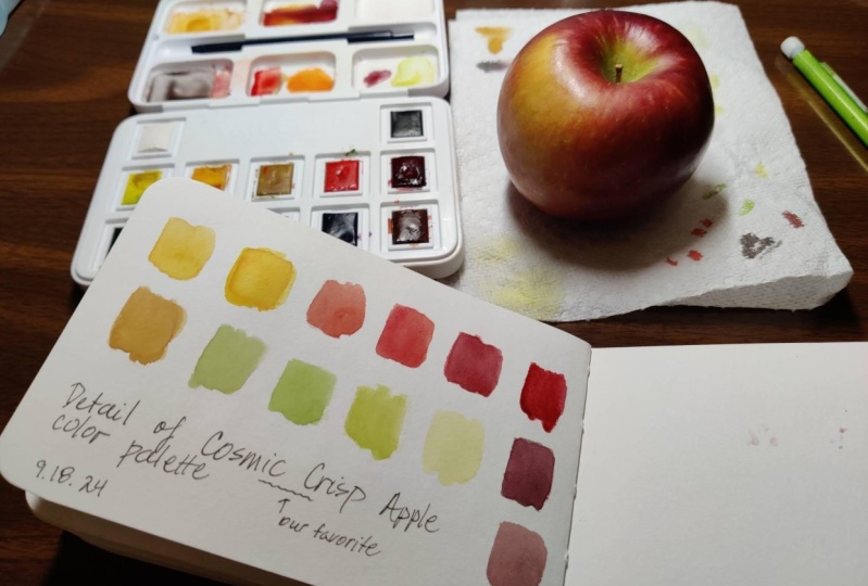
match colors from real life. I'm going to swatch
all these colors out again for practice and for fun. You don't have to, but remember, it's like practicing scales. Doing this will make you better. One thing you might notice in doing this is there
is no orange. Since yellow is a weak color, I'm gonna clean my
palette really well before I start mixing
any of these colors. Since this watercolor palette doesn't come with an orange, we're going to have
to mix our own. First, let's try with
the cool warm color. So lemon yellow hue and alizarin crimson doesn't make
that great of an orange. Now let's try with cadmium
red and cadmium yellow, which are the warm warm colors. And you'll see we get
a much better orange. That's why a lot of
palettes will have multiple versions
of these colors, a warmer one, and a cooler one. Now that we practice those
oranges a little bit, we're going to
practice warm colors from real life citrus. I'm going to start with this
regular orange right here. There's some color
variation on it, but let's see if
we can match it. First thing to try would
be to clean the brush. Now I'm going to
take a little bit of this cadmium yellow, which I just polluted slightly, clean it up there, tiny bit. And let's see how close
that looks to our orange. It's close, but it's
not quite right. So let's use some of our skills to modify
this color a little bit. And what do you
think I should try? Maybe I could try it
similar to what we used here where we added a
little bit of cadmium red. So I will go ahead and take some cadmium
yellow, put it here, and then now I'm going to get clean my brush and
get some cadmium red, not a ton, just a little bit. And let's see what
we can do with that. It's not quite strong enough, but it looks like a
pretty close match. So let's mix up a
little bit more, starting with the
cadmium yellow. Clean off the brush again, get some more cadmium
red, but not a ton. I think mostly cadmium yellow. I would say that is pretty close to the color
of this orange. But just for fun,
I'm going to try a cadmium yellow mixed with
one of the other reds. Let's see what happens if
we take cadmium yellow. And this is the kind of
thing that I would be doing in the field
if I were doing watercolor painting in
the field and having to match colors that
I see out there. And now let's try it
with alizarin crimson. Let's see what kind of
orange we get there. Hey, you know what? That
actually looks pretty good. It's less saturated. I think it actually matches
a little bit better. Y. So let's pretend we're gonna paint like
a full orange here. Let's call that good, but
let's make some notes there. So this was Cadmium
yellow by itself, Cadmium yellow plus cadmium red, and this was cadmium yellow
plus alizarin crimson. And everything was fine until
a few minutes later when the watercolor finally dried
showed its true color. Now this orange is no longer a very good match
for that orange. So that's a really good lesson. Is that watercolor changes
its color as it dries. I would definitely go back
and alter this next time. Next, I'm going to match
the color of this limon. But let's be serious here and
specific with our colors. It's very easy to do the
kindergarten cran error and just grab the yellow, whichever yellow because
you know this is yellow. But we're getting more sophisticated in our
understanding of color. So is this a cooler yellow
or a warmer yellow? And does the color change at all on different parts of it? So, I would say this
is a cooler yellow, and it's probably pretty
close to our primary yellow, which means we don't have to
actually mix a color for it, but let's not get lazy. Let's test it out. And see if this limon, yellow hue actually
matches our limon. I think ours is probably a
little bit less saturated. We could try putting
a little bit of cadmium yellow in there
and seeing how that works. But if you put that side
by side with that limon, that doesn't totally
match that color, and that's why you're taking this class because
you want to have a more sophisticated
understanding of color and an ability to actually
match things from real life. So we're not going
to stick with this. That's not good
enough. We're going to try limon yellow hue. And maybe do like 20% cadmium yellow to start
and see what that looks like. Get my brush really clean and then go into this
cadmium yellow, not a ton, and let's see
what that looks like. And I would say that
already looks a lot better. So don't be complacent with your colors when it looks like
you have a perfect match. Try to be precise and exact, and what this will
do is it will train your brain to pay
more attention, train your brain and your
eyes to pay more attention to colors way more than
the average person. This lemon was a perfect
example of a cool warm color, and the orange, a
warm warm color. This lesson you learned how
to keep your yellow pure, how to mix oranges from
the primaries and how to match citruss in real life. Your extra credit
homework is to make a spectrum going
all the way from green to orange or oranges red with all of the
colors in between. Sort of like the
spectrum we did in one of our first color wheels.
8. Kindergarten Green?: Did you know that green is the most dangerous color
right out of your palette? In this lesson, we're going to learn how to ruin
a painting with kindergarten green
versus how to look carefully and accurately mix colors that match
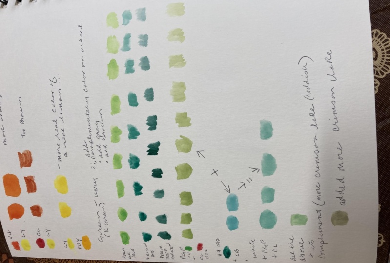
green in real life. First, let's swatch out the greens that we already
have in our palette. So I'll start with
this Vidian green. As you can see, that's a
relatively blue green. Next, I'm going to do sap green. As you can see, that's
a yellow green, not very saturated, and it's
a relatively weak color. Neither of these greens
in our palette look like the kindergarten green
that I'm talking about. Here's my other
watercolor palette. You can see that it's called Hooker's green is a good example
of a kindergarten green. It's a very saturated
secondary color. This is a common color
in many palettes, markers, crayons or
colored pencil sets. It is basically a
pure secondary green. I call it kindergarten green because when you are 5-years-old
and want to draw a tree, you grab this color and
use it indiscriminately. Unfortunately, many
people who are no longer in
kindergarten continue to use this color almost as a
symbol to represent any plant. That is unacceptable. Despite being dangerous,
when used directly, this color is very helpful
for mixing other colors, and it appears that this color is missing
from our cotton palette. We're going to have
to try to mix it. This color wheel that we made earlier actually already
showed us that there was a gap here in our greens in addition to the
gap in our purple. We already knew we were missing
that kindergarten green. First, I will try to mix
it from our primaries. I'll Make sure my brush
is very clean and get a portion of
lemon yellow hue in the mixing area that I
can use without having to go into the pan with the
water color each time. I'll get a bunch of the lemon
yellow hue all ready to go. Now I'm going to do the
same with Serlian blue hue, which is our primary blue. Try not to drip it on your
yellows and oranges like that. Now in a separate mixing area, I'm going to take
some of the yellow and some of the blue
and mix them together. I'm trying to clean my
brush each time so I don't contaminate my sources
of the pure colors. Then I'm just going
to swatch them out. I'm not super impressed
by the color that I got, the green I got by
mixing those primaries. It's okay, but it's definitely not like that
kindergarten green, so I'm going to experiment
with it a little bit. Since mixing from our primaries didn't create a
kindergarten green. What I'm going to
do instead is I'm going to take the
green that's in our palette already that's
closest to kindergarten green. In this case, V, and I'm
going to add our yellow lemon yellow hue to that and see if that makes more of
a primary green. That is a much more convincing
green and we got it just by adjusting our Vidian hue with some of our
lemon yellow hue. Next, we're going to make
more of that color and then practice toning it down
or controlling it. Knowing how to tone down a kindergarten
green is going to be a super helpful watercolor
skill for you in the future. First, I'm going to
take some of this kindergarten green
and put it in here. Then I'm going to
clean my brush. The first thing we're going
to do to tone it down is we're going to
use panes gray. That's this gray right here in the bottom
of your palette. It's supposed to be a
pretty neutral gray. We're going to take that. We're going to take
a little bit of that and mix it into this kindergarten green right here
and this is what we get. This color is something you're much more likely
to see in nature. You could do all
different variations of how toned down it is. I could even take some of this and add it back to
my original one there and just tone the kindergarten green down
a little bit less that time. Those are all versions
toned down with panes gray. Another way to
tone down a green. We've got our kindergarten
green mixed right here. Another way to
tone it down is to use a complimentary color. Across the color wheel
across the color wheel from our green is
basically going to be this permanent rose
or a lizard crimson. You can see straight across. It's a complimentary or
close complimentary, and we'll grab that one. Let's try a permanent rose and see how that works
for toning it down. Here's a permanent
rose in my palette. I'm going to take a little
bit of that, not too much. And put it here next to
my kindergarten green. I'm going to mix that in. If you do too much, it
will turn to brown. Once again, we get
a more interesting, sophisticated and
natural looking green. This one's even
more interesting, I think, than the last one, probably because a lot of
times you get cool colors or interesting colors when
you mix the complimentary, when you tone down with
the complimentary color. Let me just take some
notes here and put some of this permanent rows. And do I have any pure
Kindergarten green left? Kindergarten green? That was perfect preparation for
what we're going to do now, which is try to accurately
match and pay attention to the greens on a house plant or a leaf that you
can find near you. If you have to, you can work
from this one, ideally, you can find a house plant at home or a leaf near
where you live. Got my plant right here,
and the first thing I'm going to do is clean my
palette really well. Then I'm going to clean
my brush really well. And then I'm going
to create areas in my palette in mixing
areas with my main color. So got my yellow, and then I'm also going to get my main greens un mixed green, so Sap green and Verdian hue and just test those out
and get ready for using them. First thing I'm
going to try is just adding some yellow
to Vraian hue, and let's see if that
matches my main color. It's pretty close,
but not quite. So now I'm going to
try adjusting that by adding a little bit
more Verdian hue. Now I'm going to try to mix
a yellow green that matches the more yellow green parts of this plant. And
that's pretty easy. So I'm going to see if I can get a little bit
of a leaf painting that shows how the color varies
from one area to another, and this is a variegated leaf, so there's also white spots. Was that as hard for
you as it was for me? I feel like I didn't quite
capture the color right, but I did learn a lot. In this lesson, we got practice matching
greens from real life, and we got practice
mixing lots of different greens
using our palette. Era credit homework for this lesson is to take
all of the greens in your palette and modify
them by using grays, complimentary or closest
complimentary colors and browns. And see how those turn out.
9. Mint Chocolate Chip is a Tint!: Do you know what the definition
of the word tint is? Well, the true definition
in color theory is a color that has white mixed
into it, such as this. And that's what we're going
to try to match right now is the mint
chocolate chip color. Attes we use the
word tint to talk about dark windshields and
stuff like that on cars, but this is the color
theory definition. Making a tint is sometimes necessary to achieve
certain colors. It would be really
hard for us to get this mint chocolate chip color without using a little
bit of white wash. This is a controversial
topic and some water colorists
are very dogmatic about never using
any white gouache with their water colors. That's because it affects the transparency and the
saturation of those colors. There are purists who never
use any gouache at all. We're going to use white
gah because it can be really helpful when
matching colors in nature. Certain succulents,
lichen, tropical oceans, pink colors, purple colors, and turquoise colors in general are some of the
colors that are really hard to match without making
a tint using white gah. The danger of white
is it's not the same as using the
white from your paper. It tones down the saturation. It is also weak, so you have to be careful
not to pollute it, but it can also pollute
your other colors, so you don't want to get white mixed in with your other colors because it makes them less transparent and less saturated. So one of the things
I like to do in my usual watercolor palette is I have an area just
for mixing tints. That's my white
gash right there. And you can see these are the
two main colors that I mix, O turquoise colors
and pink colors. So right now, we're
going to dive in, and we're going to try to match this mint chocolate chip color. There's only one problem. The ice cream that I bought isn't actually mint
chocolate chip color. Shoot. Maybe this other
one that I bought will be. It has colors added to it. This one's barely green at all. But instead of just going out
and buying more ice cream, and instead of just
crying about it, I'm going to try to match the
color of the lid instead. But first, I'm going to eat this mint chocolate chocolate. And that was good. But here's the color we're
going to try to match, and it is a perfect tint. So let's try to match this mint chocolate
chip color right now. The first thing I'm going
to do is get a bunch of Vidian hue here all ready to go. As we know, that's already
a sort of blue green. And in this case, I didn't clean the area completely first. That is more common with intermediate and
advanced water colors to work with the colors that are already in
your mixing areas. Now I'm going to add more blue. I'm going to use Seran blue, which is the main blue
we've been using so far. And now that I've mixed those, it's a nice blue green. So let's swatch that out and
see what that looks like. I think I want a little bit
more blue in this color, so I'm going to get
a little bit of that Serlian blue hue. Remember, one of the things we learned about this
color is it's not that powerful compared
to the Vidian. That looks more like
what I'm shooting for, so let's swatch that out. Now that my brush
is really clean, I'm going to get the white gah. So let's get a bunch of this on the brush and put it into
one of the mixing areas, so we don't have to go
back and forth into the white gah potentially
polluting our precious white. So I just go back and
forth from the pan of the color containing the
gouache to the mixing area, and you can see
squeezing the brush and getting out a lot of
white ready to be used. Now that I have it there, I can just mix it in little by little. Sometimes it's best to mix the color into the white so that you don't weaken
it as quickly. So let's swatch that out. And this is our first try, and it looks pretty good, but I think it has a
little bit too much blue. It's a little bit too
much of a blue green. Yep, a little bit too blue. So what we can do is we
can take some of this. I already had some yellow green mixed from the previous lesson. I'm going to add a
little bit of that here. I should also take notes, but see how I'm
starting a new line with my swatches so that I'll
know which one was which. Mixing it back
into the original, a little bit less yellow green. And that's starting
to look pretty close. So let's just make a few
notes here about what we did. More yellow, more blue green, and that original was
plus white guash, Seran blue hue and Vidian. And that was basically our
kindergarten green mixture that we added white to. You can see that wasn't that
difficult of a color to mix, but it wouldn't
have been possible if we hadn't made it a tent. I think that color is
a pretty close match. The only thing that is missing
are the chocolate chips. In this lesson, we learned what is the
definition of a tint. When tints are helpful, how to mix a tint to match
a color in real life, and we also learned that color mixing gives you
an excuse to eat ice cream. For your ex credit, find the complimentary color of this mint chocolate chip
color that you just mixed. You may have to mix it
yourself and then make a tint of that color
and swatch it out. Hint, I might have already showed you what that
color would be.
10. Yay! Conclusion: You did it. If you
made it this far, you are the master
of this palette, and you really deserve a
reward for all your hard work. Some leftover ice
cream, perhaps. It's been a journey through
the world of color, and there's definitely
been some ups and downs. We learned a lot in this class, such as the basics
of color theory and the definition of terms such
as complimentary colors, saturation, tint, and more. We also made close to
1,000 little squares of color and practice
the ability of mixing and matching
colors from real life. I can't wait to see your
projects from this class. So be sure to upload them in the project resources
section down below. Just scroll down
below this video. You'll see it we'll say about
projects and resources. Click on projects and
resources because I can't wait to see how
your pages turned out. No to continue on your
learning journey. Do you want to paint landscapes or test your new skills on a virtual nature
journaling adventure and check out my other
classes on skill share. Do you want some final extra
credit for this class? Review your palette
and eliminate two of the colors that
you didn't find useful and try replacing them
with two new colors from the store that you think would give
you better options. Once you do that, repeat all the exercises
from this class? All the exercises
from this class?
 Marley Peifer, Journal for Life