Transcripts
1. Introduction: Just another photo. What if you could create
something far more meaningful and far more
unique than a photo? To remember a special
place like this. This class is your opportunity
to learn how to use quick and easy
watercolor landscapes to capture the beauty
and essence of a place. By the end of the class, you will have the skills to create personal and meaningful works of art that you will
be proud to share. My name is Marley Piper and I am an artist nature
journaler and Youtuber. With over ten years
of experience of teaching drawing and
nature journaling, I have helped thousands of people unlock their creativity. I specialize in sketching and painting on location
in extreme places. I have painted close to 1,000 watercolor landscapes
in the last ten years. I have painted on the cliffs, on kayaks balanced on waterfalls and while dangling from
rainforest trees in the canopy. This class is great
for anyone that likes nature hiking and travel, who wants something to
remember these places. The class is good for
nature journalers who want to improve their
landscape painting skills. Finally, this class
is perfect for anyone that wants to take
a skillshare class that takes the outside the walls of the studio and into real nature.
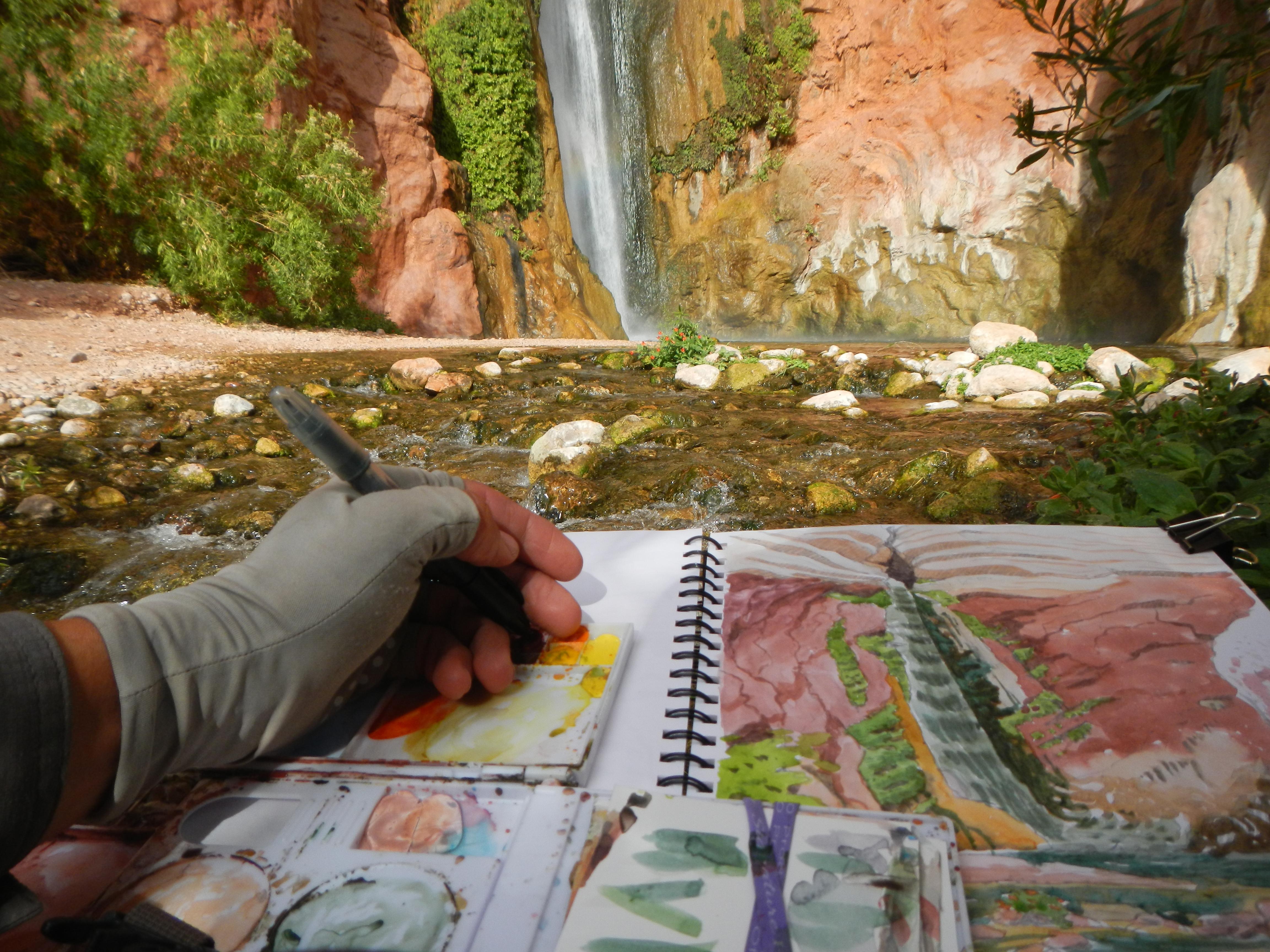
4. Supplies for Painting Outside: First, let's talk about supplies a little
bit and I'll start talking about the philosophy behind the supplies
that you use. First of all, it's
important that your supplies are easy to use, fault tolerant and durable ease of use can be broken
down into portability. How easy are they to
carry into the field? This is one of the
main reasons why I use those water brushes because I don't want to
carry a container of water into the field. Next is reducing friction. How many different zippers do you have to open and pouches? Do you have to get to flaps? Do you have to un
flap and velcro? Do you have to go
through and lids? Do you have to open before you get to your drawing
or painting tool? Each one of those levels is a bit of effort, a
bit more friction, and it makes it harder
for you to get to the actual painting part
after reducing friction. The other one is
one hand ability. Is it something that you
can use with one hand? Can you pull it out of
your bag with one hand? Because sometimes, for example, you might have your watercolor
palette in one hand, your sketchbook in
your other hand. And you need to be
able to do things with one hand to make it more
easy to use in the field. Anything you can do with
one hand, the better. Next, after ease of use, those three aspects
of ease of use. Next is fault tolerance. How likely is that supply, or that tool or that paintbrush or whatever to fail on you? Is it capable of sustaining some problems without
failing completely? And what would happen if it did? Would it leak paint into
your entire backpack, potentially ruining
a session and maybe preventing you from
going out a second time. Fault tolerance is
an engineering term that refers to the ability of something to withstand a couple small problems
without failing completely. Last but not least. And also related to fault
tolerance is durability. These water brushes,
for example, can last for a surprisingly
long amount of time, especially relative to
how much they cost. Mine usually lasts me for more than a year and I
use them quite heavily. That is, good durability. Durability is also a
really important factor with any of your drawing tools and also with
whatever bag you're using to carry your supplies. Now let's talk about
the actual supplies. First off, I'm going to talk about bags for
carrying your stuff. You might be tempted to use
a backpack because that's what most of us are used to
when we're going outside, when we need to carry stuff, when we go on hikes, and
when we're traveling. However, backpacks
can be really hard because it makes it so much harder for you to get
your supplies out. That's why I recommend a
shoulder bag or a purse. It could even be a
canvas shopping bag that you can swing around to the
front of your body easily, pull out your stuff
and start painting. I used to wear a backpack and carry my art
supplies in there. And I would walk around and walk around looking for a
better place to paint. And a lot of times, I would never even take my supplies out. The next most important
thing that I'm going to talk about
is sketch books. I like to get a sketchbook
that is pretty big. This is 9 " by 11 " and
it is spiral bound. Spiral bound is going
to be way better for watercolor painting
because you can open it up completely
and fold it back. And with one of these
nifty clips right here, you can clip the
whole thing down in case it's windy
like it is today. So you use one of these
clips and look at that, you can just clip
the whole thing down so your pages don't blow in the wind and
you have a really easy painting surface to use. I definitely don't recommend anything that has
perforated paper. Keeping all of your
paintings in one spot is really going to help you
focus on the learning part, focus on the cumulative part. And I guarantee your paintings will get better if
you do it this way. If you get one of those expensive
watercolor paper blocks where you have to use a
palette knife to cut them out. It's a pain in the
butt that arches. Watercolor paper is really
expensive and I guarantee with a sketchbook with some
decent mixed media paper or watercolor paper in it, you're going to
learn a lot faster. And you can check out
the resource sheet in the resources
section where I talk about my entire shopping
list of art supplies. If you need more
information about watercolor paper and
what sketchbooks to use, but most importantly get
one that is hard cover, spiral bound, medium
paper like I use 150 GSM, it's basically a
mixed media paper and a large size I
think is better. I do carry a small
portable sketch book as well that uses
basically the same paper. But I find doing watercolor in here is much
more challenging. It's possible you can do
landscapes in these small books, but it's much more
difficult to even hold this while
doing my watercolor. And it's not going to be as
easy to use in the field. The spiral bound,
the fact that it doesn't have spiral bound
makes it a lot harder to open. And just see how easy this one is to use with my
watercolor palette. I can open it up like this, even without the clip. Notice how I can do all of
this while standing up. Because I'm using
a shoulder bag. I can take out my
watercolor palette, which we're going
to talk about next. Open up my watercolor
palette, hold it right here. And notice how I can hold my entire sketchbook and
my watercolor palette, and I'm not blocking
that much of my page. I get out my water brush, which we'll talk
about in a moment. I get out my little
paper towel, er, rag and I'm ready to paint. So, look how easy
that is to hold. I would not be able to do that with that smaller sketchbook. Next, most important piece of equipment is that
watercolor palette, which I mentioned before. I do have one listed in the supply list that you can buy that is a good starter set. The one that I use is a
little bit more expensive and harder to get because
they're custom made. But you could also get this palette and put
your own colors into it. It's a really good
palette for using into the field for a
variety of reasons. It looks sort of big, but you could actually
even fit this in your back pocket
if you needed to. And there are so many colors in here that you're
going to be able to do almost any color
that you find in nature. This is the John Muir
Laws watercolor palette. He custom makes them
and mails them out. I think they're about $150
The one that I put in the supply list
is the one that I recommend for the class.
It's a lot cheaper. It's not the best for
working in the field. And we'll get into those
details right now. So some of the things that
I like about this one for painting in the field are the
way that you can hold it, so it has a thumb
hole right here and I can easily put my thumb
into there and keep it open. I've used this in the field in a lot of really
extreme conditions, and so I think it is
quite dependable, quite stable even in wind. I've used it in a lot of places. I can walk and move with it. I have a mixing
area if I need to. I can also put scrap pieces of paper here to test my colors. And it works in conjunction with my sketchbook,
as I just showed you, Combined with my sketchbook
braced against my body, it creates a really
great working space. So I don't need to
be sitting down. And I think a lot of you might need to sit down while you're
painting in the field. But if possible, try to learn
how to paint standing up. And it'll give you a
lot more flexibility, especially if you're
a nature journal er, and want to nature journal, it's going to be really helpful if you can do it standing up. So this watercolor
palette allows for that. If you can find a
watercolor field palette that's not too complicated, that is also beneficial. And with this type
of thumb loop, it's the kind of
thing you might need to test out to see what works with the size of your hand and your
style and all of that. But this is the one that
I use and I recommend it for more advanced or
intermediate nature journals. The one that I have listed, the Windsor and Newton Cotman is a really good beginner
watercolor set and for use in the field what you can do is you can
add a pop socket. It's one of those things that people put on the
backs of their phones. You can clip one of
those onto the back of that cotton
watercolor palette and then you could hold it easily in your hand while you are
painting in the field. I have tried a variety of chairs for painting outside
and for nature journal. This one is my current favorite. I'm on rugged volcanic rock
in the Galapagos right now and I didn't even have to spend that much
time setting it up. It also works perfectly well in really soft substrate sand. I can probably sit down
there in the water with it. It's really a great chair for landscape painting
and nature journaling.
5. Extra Tips for Painting Outside: Right now, I'm going to give you a smorgasboard of pro tips
for painting outside. First pro tip is how
to paint standing up. If you can figure out and
practice painting standing up, it's going to give you
a lot more options to paint in awkward
places such as this. Even though that chair
that I just showed you would be possible
to set up here, it would be a lot easier if
you could paint standing up. The first most important
thing, of course, like I already mentioned, is to get a shoulder bag. A shoulder bag allows for me to bring this
around to the front of me and put it back behind me when I need to move
and crawl around. This is an extremely
awkward place, but since I've been practicing
painting standing up, I can actually work here. Having a shoulder bag
is the first thing. Having a large sketchbook
that has spiral binding is the second thing that allows for you to
open it up super easily. The more one handle your
supplies are, the better. And that's something
that I already mentioned in the supply section. Having the right
watercolor palette is going to help as well. Knowing what that
position is for you that is comfortable, and voila, I'm ready to go painting standing up, practicing
your balance, practicing some
different exercises to get used to standing
in awkward positions. All of those things are going
to help you next pro tip, and this is going to
make it easier to paint. Standing up to do
small paintings, keep your landscape
paintings small. And you're going to have
a myriad of benefits that come as a result to keeping your landscape
paintings small. For example, if you're
painting standing up, your legs won't get as tired because you're doing
a shorter painting. A smaller painting is going to allow for you to
learn a lot more. And that repetition is going to provide a lot of lessons and a lot less frustration than if you just did fewer
larger paintings. The next tips are
a little bit more psychological because
a lot of times the psychological
obstacles are what keep you from learning
and getting better, or even starting in
the first place. The first tip that is more psychological is buddy
up or find a club. If you can find another person to go outside painting with, or if you can find a plain
air watercolor club near you, you're more likely
to stay committed. You're going to have more fun. You're going to keep
learning and you're going to keep practicing a lot more than if you just try
to do it by yourself. Even if all you can
find is one friend to go with and you set a
date to go every weekend. That's just going
to help you build a habit so much better and you're going to learn a
lot faster. All right. The next tip for
painting outside that is more on the
psychological end, is to depend more on habits
then on inspiration. A lot of times when
it comes to art, people think that we
need inspiration. We need the muses
to come down to us before we can go out
and make a painting. But I've found that
it's much more reliable to build habits, to build consistency,
and just to get into a regularity of
going out and painting. And that is much more dependable then waiting for
inspiration to strike. Most great artists had similar practices where
they did it like work, they got in a habit, and it just happened every day. Inspiration can come after that. In addition, one of the ways
that I like to think about it for building habits
is piggyback habits. There's probably a lot of
habits that you have already. Certain things that you
do every single day, every single weekend,
or something like that. If you can connect your landscape
painting habit to that, it would be a great way to
make it easier to get started. I call those habits
piggyback habits. So if you drink coffee every morning or have a
cocktail every evening, those would be perfect
habits to connect a watercolor
landscape session to. Another great thing would be if your partner goes
golfing every Saturday, you could go as well and
find a place to do outside landscape painting
while your partner is practicing that boring sport. So there's a lot of
ways you can connect your watercolor painting
to an existing habit. And by building a habit, you're not going to
have to wait for inspiration to strike. The last tip that is more psychological is to be
careful of your phone. We all carry them around
in our pockets and purses these days,
they're very distracting. They are useful tools, as I describe in future lessons, for taking photos
and for framing and cropping your subject matter for your landscape paintings. Despite being a great tool, they are a very addictive and dangerous and
distracting tool that can take you outside
of your flow state. So if one of the reasons
why you want to do art is to get away from
that sort of technology, get away from that sort
of addiction dependence, and create something
of your own instead of just mindlessly
consuming content. If those are some of your goals, I highly recommend you
create some regulations for yourself about how
you use your phone when you go out to do
landscape painting. It's really easy for your
phone to end up being a crutch and something that you use instead of doing your
actual painting. So maybe create a way
that you turn off the Wi Fi and put it on airplane mode when
you're going painting. Or somehow reduce the way that you use your phone when you
go out and go painting. Because you might
tell yourself, oh, I'm taking photos and
I'll paint them later. But it's really
easy to sometimes just end up using your
phone and never painting.
6. Drawing Warmups: Why do people do all kinds of warm ups for athletics
and even singing? But we rarely do warm ups
for drawing or painting. Do you ever struggle
with procrastination, perfectionism, or artists block? Right now, we're going
to do three warm ups that help us with all
of those problems. The first warm up
I'm going to do is called blind contour drawing. Blind contour drawing is a great way to get
your page broken in, deal with procrastination,
deal with perfectionism and warm up your hand eye
coordination all at once. It is also a really
good exercise to do at any time
during your art career, when you're feeling stale,
when you're feeling stuck, when you're feeling stiff, or as a practice for
people who are a little bit too perfectionist or
timid with their lines. So let's do it right now, and I'll explain as we go, the classic subject to draw
for this is your hand. So what I'm going
to do is I'm going to hold my hand over here. You could do this exercise on a separate sheet of
paper if you want. I'm going to hold my hand over
here and I'm going to draw a little bit far away
from my subject, because the whole
idea is that I'm only looking at my subject and I'm not really looking
at my drawing. So for example, and these
are just quick sketches, I can still kind
of see my drawing, but I'm going to pretend like I don't, I'm not looking at it, I'm going to just eyes
completely on the hand. And I'm going to start drawing. And I'm not going to, I'm not going to pick up
the pin as I go. There you can see an example
of a blind contour drawing. They're supposed to look weird, but they take the pressure off. You can also do a blind
contour drawing with plants. Just hold it far away
from your drawing so you can't see your drawing
while you're doing it. It's best to do at least five or six blind contour drawings, maybe even ten or 20
to get warmed up. I'm going to try to
do at least ten, and that's what I
recommend you do. Remember, this is a great
warm up for whatever you're going to be doing, landscape
painting included. Now it is your turn to do
a blind contour drawing. Trust me, it's going
to help you later. One fun thing you
can try also is adding water color to your
blind contour drawings. Afterwards, this will get
your water color warmed up. The next warm up exercise is practicing ellipses
in perspective. An ellipse is just what a circle looks like when you
lean it on its side. In perspective, this is
a great exercise for any times that you
have to deal with curvy shapes or round
shapes in nature. Because instead of just
being simple half circles, they form these weird ellipses. Anytime there's shadows or
bushes on the hillside, all of those things will form
these interesting ellipses. We're going to practice
drawing those right now. This is a good drawing
exercise in general. One thing I like to do is
just create these rings. And try to imagine
that you're going from a flat circle to
a tilted eclipse. All the way to a flat circle. Again, like if this were a
frisbee or a plate in the air. When it's completely
sideways to us, it's a perfect circle. And then as it tilts away, it becomes less and less of a perfect circle and starts
to flat in this way. This can be a little
tricky at first. The more you practice
it, the better you get. You can see here I'm going
from a completely flat circle, Tilting it in my mind, tilting it in my mind until
it's completely flat, and then tilting it
back the other way. The important thing is just to observe these kinds
of shapes more carefully when you're looking at nature and whether that's
drawing a still life, drawing a flower, or drawing the shadow under a
tree in a landscape. Getting these ellipses
right can be super, super helpful and make the difference
between a drawing or a painting that looks convincing
and one that looks fake. The final warm up exercise is to just draw a
simplified landscape. And this simplified landscape
is a reminder to us of how simple landscapes can look and you can innovate
with these in your doodles. But I recommend you
getting sort of some basic landscape invented landscape doodle that you
can easily do on your own. So here, for example, is just three lines, one to three lines
in a rectangle. And you can see
that already there, there's the suggestion
of a landscape. And while this is just
a doodle or a warm up, I think it starts to make it
so that your imagination is more literate in these shapes that make up basic landscapes. And it's also just a reminder of how much information can be contained in such a
short phrase of lines. There's another really,
really basic one, but just play around
with a little bit. I'm probably going to
do about four or five of them and see what
you can come up with, what works, what looks
good, and what doesn't. I think doing warm ups like this with imaginary landscapes, as controversial as
that might sound, can actually help you when
it comes time to looking at the real world
landscapes and choosing the best ones for convincing, compelling, simple
landscape paintings.
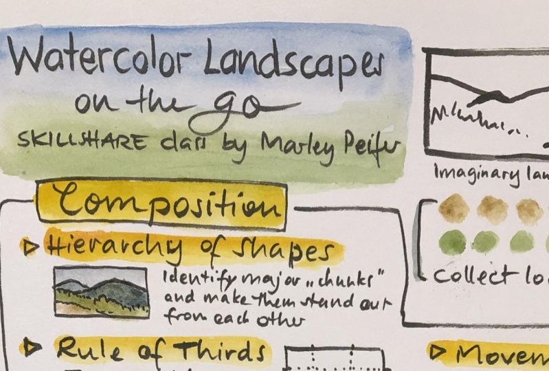
7. Composition in Landscape Paintings: The great things about
landscape painting is that you start to see
the world differently. Everything becomes more magical, the world around you becomes art before you even pick
up your paint brush. The way to achieve
this mindset is to train yourself to
see like an artist. People think that making art is something you
do with a paint brush, but it's actually something
you do with your eyeballs. Making good art is
mostly about seeing. And right now we're
going to learn how to see like an artist. Seeing like an artist
is not just about going around and making a square while you look at things. Seeing like an artist is
thinking about composition and making a square is
one way to do that. So right now we're
going to talk about the most important
elements of composition. Looking at real life examples. Because choosing good
composition and understanding composition is going to make your landscape painting
way, way better. We're actually going
to break this down into composition and depth. Composition and depth are the two most important things to capture in a landscape
painting to make it look good. And right now, I'm about to
give away all of my tricks. I probably shouldn't tell you
all these things right now, but it's going to
seem like a lot. So don't get overwhelmed. Take notes if you can. I've tried to simplify
it as much as possible, but you might get that
feeling like your brain is filling up with a lot of
information and a lot of words. But don't worry,
you'll get better at it little by little. These concepts that I'm about to share with you are
going to make all of this turn into better painting so much easier and make so
much more sense in your mind. But we need to learn
some vocabulary. So let's get into
these principles when it comes to composition. We're going to talk about
the hierarchy of shapes, the rule of thirds and
movement. All right? So hierarchy of shapes is
super important and you'll understand it very easily looking at the
background behind me. So starting with
the sky, we have, the sky is all sort
of one variable gray. But one of the most important things that we're
going to want to remember is we want this
shape, that is the sky, to stand out in contrast to the other shapes around it more than there is
contrast within it. So that's really important that this sky and also be
the lightest shape. It's almost always going
to be the lightest shape. But then you can see
that the shape of this next for this mountain
is pretty uniform too. And there's a nice
edge between it and these bushes and it all, there is contrast on it, but the contrast
within that shape is less than the contrast
between it and the sky. Then if we move forward, there's another
relatively simple shape, starting here and going
and getting wider to here. See how this one comes and narrows in and overlaps
slightly with that one, and then that one overlaps
slightly with the sky. So this is another
relatively simple shape. The vegetation here
behind me starts like this and kind of
moves up this way. Pretty simple. And
then one swath of pale dry vegetation
that is pretty simple. That is 12345 shapes. That principle is called
hierarchy of shapes because within one
shape such as the sky, the differences are
less important than the difference between the
sky and the next shape. So these are the major chunks. Within the chunks,
there's less contrast. Or there should be, now that we talked about the
hierarchy of shapes, we're going to talk about
the rule of thirds. You might have heard
of this one before, and there's a really easy grid that you can use on your phone. So what I'm going
to do is if this is my frame right here for
my landscape painting, I would simply divide
this shape into third. For example, in
this orientation, that would probably be almost a third and that would
be the next third, and that would be the
third third. I have 123. You can also divide
it the other way. It'd be approximately
something like this. Creating this or thinking
about this is going to help you make more
aesthetic decisions about where you position things. Because you want
to position things on these lines or at their axes. You don't want to put
things right in the middle. That is the basic rule
for the rule of thirds. For example here, this
is close to one third, this is close to the next 13, and this is close to one third. When we think about
our composition, like right now
where for example, the ridge right here, this
is one third across here, and this is the next
third down here. I positioned it so that
this vegetation would go right through the middle
there, and you can do that. When you make your choices about what landscape
you're going to paint. And that's why making choices is so important and
how you crop it, you probably don't want to put your horizon
right in the middle. That's the most boring thing. But to put your
horizon at one of these third lines would be
more aesthetically appealing. That could be my
horizon right there. Putting it right
through the middle of the frame doesn't look as good. This applies to taking
photos as well. Then we also want to
put elements at those. Third, for example, if we have something that is a focus point, we want it to be in one of those lines or on one of those axes where
the lines intersect. For example, for example, if I have a plant
in the foreground, which I like to do, instead of putting it
right in the middle, which is the most boring
thing you can do, I'm going to put it at one of these spots because this is
my most contrasting shape. See that composition now. It also intersects
at the axis there. And it almost finishes
at this other line that shows you how to
use the rule of thirds. So go ahead and turn on
the grid on your phone. That will be very
helpful for iphone. Just go to your phone
Settings In Settings, find camera, choose camera. Scroll down and you should
see an option for grid. Make sure you turn that on and you're ready to go and voila, you have a powerful rule of
thirds grid on your camera. Now you know about
the hierarchy of shapes and you know about
the rule of thirds. So the next thing we're going
to talk about is movement. And we're going to use
the example behind me, because I think
it's really cool. And I think that right here, you can feel movement
because of the shapes. So this is sort of a
subjective concept, but everybody seems to notice
it when they look at art. When they look at
shapes and nature. When they look at
beauty and creating a piece that has movement
that moves people's eyes. The human eyes will follow a path when they look
at a piece of art. When they look at a landscape. And what we're going for right here is we
have this shape. That is the vegetation
behind me coming from big and coming from two thirds
of the way up the frame. And then it comes all
the way across and it moves down and gets
narrower that way. Then we have this
contrasting swath of dry grass that
comes up this way, so there's this long
flow through the bottom. And then up here we have a
little bit more interest. And that interest
intersects right here, which is two thirds of
the way into the screen. Also just one third of the way down from the
top of the frame, and that is one of the
other axes right there, we have an intersection between the smaller hill which is in the distance and
these nearer hills. Also notice that these
nearer hills have these little shapes on them from the way the
erosion has occurred. All of those things
are pointing back in this way and there's movement
coming back in this way, which contrasts
with the movement going that way from
the vegetation. The sky not being completely even gives you this
nice dip right here, which also happens right about two thirds of the
way onto the screen. Up here you just have a
little skinny piece of sky. And then down here it
gets bigger so you get that contrasting flow. Again, it's almost like it's zigzagging the viewer's
eyes back and forth through the composition and
zigzagging nicely the viewer's eyes through the composition is one
of our main goals. And if you can get the viewer to move their eyes in
the way you want, then you can make a
successful painting. All right, so right now we have this sort tight
movement here. It's about, I would say, close to one third
of the way in. And then we have this,
which moves out this way. And then we have a lot of
open space here, right? So right now this might kind of shoot your eyes off this
way a little bit too much. It might shoot your eyes off that way a
little bit too much. So just one little
thing back here, such as like a mountain
going into it from behind would bring the eyes
back towards the middle. And I think this composition has a much better sort of zigzagging of the eyes
through the composition.
8. Depth in Landscape Paintings: Now that we talked about the three aspects of composition, we're going to talk about
the three aspects of depth. Because getting a
sense of depth into your landscapes is one of the top things that's going
to make it look good. And so there are three
aspects to getting depth. The first one is
going to be overlap, the most obvious one, what object is in front
of the next object and making that
really that overlap. And then after that is going
to be linear perspective. Even though this
is more important in the built environment, linear perspective is still
important to understand. And then the last one is going to be atmospheric perspective. The way that the
colors change and the light changes from
distant objects compared to close objects overlap is a cool way to show the viewer
what is in front of what. And it is the way that we can tell how far something is
from us, the easiest way. So having multiple
overlapping shapes, including sometimes
intense foreground, ones really close
foreground ones. Those overlaps
automatically tell the viewer that there is depth in the landscape
that you're painting. So how can we use
them in a good way? Look at the way these
ones all overlap here in a way that is easy to tell where one ends and
the next begins. Even this green layer down here, the sort of a mid ground of the bush covered
hill back there, the salvia stocks right here. Then we have two
distant mountains back there and then
we have the sky. But if, for example, we change the angle and look
what happens here, if we bring the salvas
right to the edge of not overlapping and then only leave one overlapping,
that just looks weird. See how the tops of these are no longer overlapping
in a good way? For example, a weird overlap might look something like this. What happens there is, even though this is
the closest object and this is the most
distant object, because those two lines
intersect right there, it confuses the eye. That's the thing
you want to avoid. If you can change the angle slightly or choose
a different view, you can fix that problem. You no longer have
that confusion there of what's overlapping
and it's really clear what's in front
or even better would be if the very front one
goes over everything. And that's why sometimes I like to have these extreme
foreground plants in the landscape because they automatically set up a
really good overlap. It's really clear that this
is overlapping on that, and that is overlapping on that, and that is overlapping on that. Right now we're going
to look quickly at linear perspective and talk
about how shapes like this. And understanding
how the brain sees these is going to make your
landscapes look either flat or it's going to
make them look like they have actual depth and that the viewer
could walk into them. You want the viewer to feel like they can walk
into your drawing. And speaking of walking in, one of my huge
tricks for creating better landscape
paintings is to look for trails and include those. A lot of people think that
landscapes need to show only the natural environment and not the human environment. But when it comes to trails, human built trails
or natural trails, they really help
show the sense of depth in your
landscape paintings. So right there, for example, look how simple, how
few lines I made, but just by including
this trail, it gives this illusion of
going into the distance. This is all about
linear perspective. Right here, there's
almost no overlap. I mean, you could
imagine overlap in this, but there's basically
no overlap except for this shape and the sky. You can't tell which of these
is in front of each other. All of the depth is created
by this road right here. And another example would be rivers or streams,
or any lakes. If there is a lake and the edge of the lake
has shapes like this, you need to get
those curves right. Getting these curves right. The curve of linear perspective goes back to
understanding ellipses. Remember we did a
warm up where we drew ellipses also on the landscape. Anywhere that you have
a tree or a bush, the bottom of that shape
is going to be a curl. In curvilinear perspective,
it's going to be an ellipse, for example, if you have
a hillside right here, and there's going to
be some that come up over the edge
of the hillside. If you have a
hillside right here, all of these little
bushes need to have a curved shape at the bottom of them, if
you don't make that. Curve correctly, it's
going to look weird. It's not going to look like those bushes are
actually on the hill. Then as they come more this way, that curve is going
to get rounder. See up here, they're
closer to flat. This just goes back to that
same exercise that we did. Remember, here is an ellipse. Here is a totally flat shape. Here is an ellipse going
back the other direction. These are all in
perspective of what this land form is doing
right here. This is a hill. As we get closer this way, the ellipse is going to
get under and rounder. Here's my bush there down here. It's going to look even more round where it hits the ground. The shape of the shadow is
going to be in perspective. I'm not sure about that part. And also right now, this is
all being made up, right? But this is important
principles to understand. Then when you're in the
field you will see these. Those are all practices
of linear perspective. And we can look for them
in the built environment. If we ever see a road or if
we ever see fence posts, the fence post will get
shorter as they go away. That can be a really
helpful indicator of depth in a
landscape painting. All of that is a form
of linear perspective. Now that you know about overlap
and linear perspective, we can talk about
atmospheric perspective. And you can see
atmospheric perspective happening right in front
of your very eyes. That distant mountain
has things about its color to it that look very different from this
closer mountain, which is probably covered with the exact same
colors as that one. It's the distance that
filters those things out, and your brain
automatically knows that. But learning about them and
what they actually are is going to make it even
easier for you to apply it, even when you're just
using a made up landscape. You can use atmospheric
perspective and the viewer automatically
translates that into distance. In real depth, there
are four things that disappear as light
travels through distance. There's four things that
we're going to lose. We're going to lose contrast. So we see less contrast
on that distant hill. We see less contrast, we see less saturation, we see less warmth, and we see less details. So right now I can't see
very many details on there. I'm losing warmth. So it has less of it. Probably has this
warm colored grass growing on that hill,
that distant mountain. But we can't see it because
this is a warm color. It's lost with
distance contrast, like the visual contrast is lost and details and saturation. So we have less
saturated colors. Even if it's a blue, that color will be less, less saturated as it has
to travel that distance. So knowing those rules of
Atmospheric perspective, we can remember to apply
them in our paintings. So we want our foreground
elements to be more contrast D, more detailed, more
saturated, and warmer. I added one in there, I think. But as it goes backwards to get less
saturated, less detailed, less contrast, those are the elements of
atmospheric perspective. We'll be talking about them more later when we do our painting.
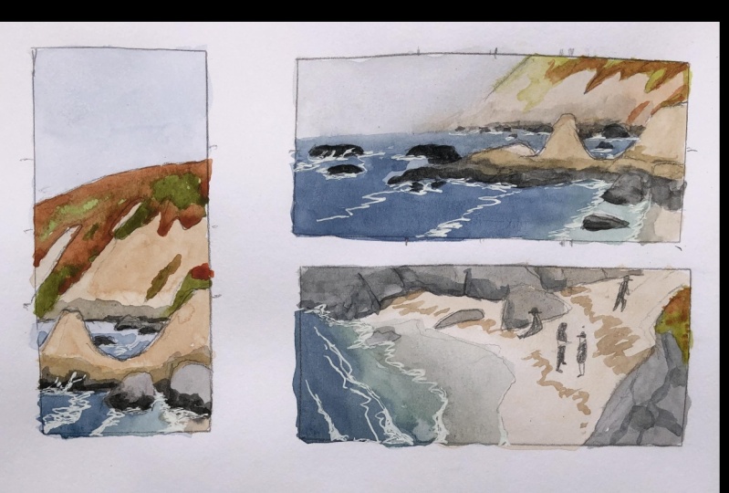
9. Landscape Thumbnails : Small landscape sketches
aren't only cute, they are a time tested
way to learn faster. Because they are smaller,
they take less time. Because they take less time, you can do more of them and because you can do more of them, you can learn faster. You will make lots
of mistakes with these small thumbnails
and you will learn what compositions
are not great. It's better to make
these mistakes in a small drawing like this than a huge six hour composition that you've already
committed to. The most important things
about the thumbnail are one that is small and two, that it crops what you see. The whole reason why we
put a frame around it is because we are limiting what we're going to be
seeing to that frame. So there's a couple
ways you can do this. You can use your hands. That is the reason
why artists and photographers have traditionally held their hands like this. It's to create a frame
around what you see, because otherwise you see
such a wide angle of reality or perceive such a wide angle
of the world around you, that is an impossible angle to fit on a flat piece of paper. Cropping that into something reasonable and forcing yourself to stick to that
is very important. And it requires visual and
mental discipline because that's not how you experience
the world. So there's that. And then keeping it small, there's a couple of
things we can do. We can use our hands.
We can also use a viewfinder to help us. This can be really
good at first and that is what I'm going
to use right now. See the materials list for more information about
making your own viewfinder. So I'm going to hold this up in front of me and hopefully I draw a similar ratio frame. You can also trace
the frame of these. This isn't super small, but this is just a
very rough frame and a rough estimate of a size. I'm not even that worried about making it a
perfect rectangle. Let's hold this up now. And I'm going to draw the
scene in front of me. Remember this is
just a thumbnail. I'm trying to ask questions in this drawing and
figure out problems in this drawing and see if this is something that would be worth
investing more time into. Here you can see
that I stuck with just basic shapes and it has some interesting
elements to it. But one of the things
I'm noticing is it, it has an interesting
composition, but the value composition
is not super simple. It's not simple,
or it's not bold. It's not that compelling. I just drew that composition
of a landscape out there. Now I want to do something
with the salvia in it, or at least see if
there's something I could do with these plants
in the foreground. Maybe I could
compose it this way. But it looks like I already have a frame drawn on my
page for this way. Why don't we just try something
like in this area here, let's get that horizon
line in right at 13. I'm going to get the foreground
elements in as well, because they really framed the composition on
this thumbnail. Once I get those
foreground elements in, I'm going to get this
ellipse in the background because it's really helpful and some of the
lights and darks, because understanding
the values and figuring that out
in your thumbnail is going to help a lot. As you'll soon find out looks
like a beautiful landscape, right? Let's frame it. We're going to look at
that part right there. Looks pretty cool. Okay, We'll try to set it up with the
rule of thirds, right? Okay. All right, let's go ahead and
draw a thumbnail of it because that looks like
a pretty good landscape. Wait a second. That looks terrible. This is a great example of doing a thumbnail and running
into a problem that I'd rather have here than in a larger painting or a painting where I'm already starting to dedicate a lot of time to it. So what can we learn from this thumbnail
that doesn't work? Let's go back to the principles
that we talked about in the section on seeing like
an artist and composition. Because all of these things that are happening here
relate to that. Basically, we
probably don't have enough interesting overlap
in the foreground. We probably don't have enough interesting
value composition. So let's. Write a couple of
those things down, hierarchy of shapes
seems to be messed up. Movement may overlap, there's nothing going on
in this whole front area, which creates this
weird, awkward movement. It would be way better if there was some overlap
in the foreground. Let's see if there's a
way we can find a plant growing out here and use it
to frame the foreground. Maybe I could put something
like one of these plants in the foreground and help
the composition that way. This is blurry and
that actually helps you see the composition
a lot better. Using your phone to create
a blurry image like this can actually help
you see the composition. For example, the flowers
in the foreground are really contrasting value. They're blowing in
the wind right now. They were really contrasting value to the dark
brush on the hillside. And notice how light
the sky is and that the furthest mountain is a
little bit paler already. This could be a better
composition with these flowers in the
front of our painting. Unfortunately, that
better perspective was somewhere lying on the ground looking up through the
flowers at the landscape. And I'm feeling a little
bit lazy right now. The other option is
to just take one of those foreground plant elements that you've observed in another place and make it up and add it here into the
front of this other painting. You can cut and paste elements
of landscape painting. And it's good to maybe you
put a couple notes there saying that this is not exactly what it looked like if
you're worried about that. But otherwise taking
a few liberties and moving a few things around, I think can be a really good, a good ability to have. So I'm just going to
add in a little bit in the foreground with a
plant that I made up. So I'm going to go in and add
this fictionalized plant. I mean, the plant is real. I see one growing nearby, but I'm just cutting and
pasting it into my drawing. I'm going to add these
bushes in the background, and as soon as I start making them dark to
match the values, I realize something is way off. So I'm going to go in
with this gray ink and start adding that value. Oh no. Did I just
ruin this drawing? It may look like, in some
ways I just ruined the aesthetic of that thumbnail by putting in all that
gray in the background. But I'm trying to reflect the reality of the values that I'm seeing
on the landscape. And as you can see, there
is no way that the sky and that furthest hill are anywhere close to
each other in value. But like for example here on one of my
previous thumbnails, I left that as white. Now our eyes can read
this and make sense of this because there's
enough other elements that are telling us what's what. But there's no way that these values are
close to accurate. And here I'm trying to exaggerate
them a little bit more, or I should say get
them closer to reality. And to also show the contrast of these pale flowers that I got in that alternative
composition with the pale flowers
in the foreground. You saw how I did
these four thumbnails. Now it's your turn. Go ahead and go outside, or look out your window and
use a framing tool such as this to do some
thumbnail sketches. You can also use your hands
or a phone as a framing tool or check out the
reference section where I have the
landscape images, and you could draw
thumbnails based on those.
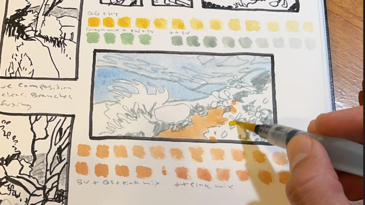
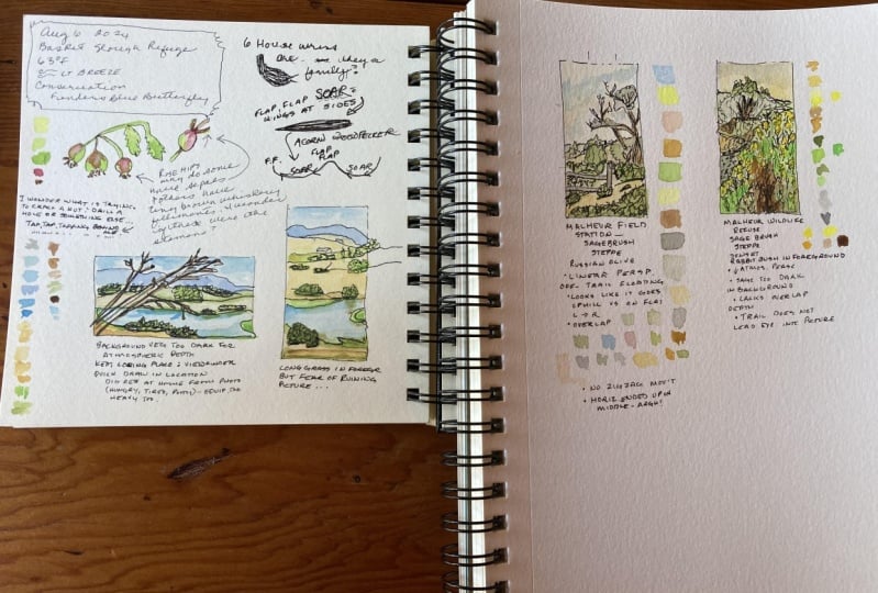
10. Watercolor Swatches: I'm pretty sure which of
these landscapes I'm going to choose for my final
landscape, for my painting. But before I start painting it, before I commit to
this composition, I'm going to eat a little
bit of chocolate and I'm going to do some
color swatches. It is exponentially
harder to learn about two new processes at the same time than to
learn about one at a time. That is why we are going to talk about
color and play with color a little bit before we
get into our main painting. What I'm actually going
to do right now is I'm going to try to get a
palette of the place. So I'm just going to try
to find colors that match the colors I'm seeing out here so that I can use
them in my painting. Everybody's watercolor kit
is going to be different unless you got the
exact same kit as me, which is the John Muir Laws
custom watercolor palette. It's mostly Daniel Smith colors. But regardless of
what kit you have, let's just take some time to try to match some of the
colors that we see. I'm seeing this sort of really common color in the
Southern California palette, which I'm going to try to capture mostly with a
diluted Quinacridone gold. This Quinacridone gold is one of the colors
that I use the most, especially when
I'm in California. It is a warm yellowish color, yellowish orange color
that's not very saturated. It's definitely not
a primary yellow. See that one there?
All I do is I make these swatches and you can
make them get lighter. I do multiple ones because
they do get lighter as you go, especially if you clean
your brush a little bit. And that way you can test all of these different shades of that color and understand
the value of it. That's all about value. I got that one, and I'll
put a note next to it. So go ahead and start making
some swatches of your own and trying to match some of the colors in the landscape
that you will be painting. So some of these colors are just straight out of my
watercolor palette. Because I do have quite a
few colors in here already. A lot of you are going to
be mixing more of these. Here is an example of a
color swatch that I did where I mixed
ultramarine blue Hookers green and permanent white
to create this sort of blue green color that I'm trying to find for some of
these sage plants, the white sage growing out here. And I'll also do a few
experiments where I even put some purple onto
that while it's still wet. These are all ways to try
to match your colors. Blend colors, and
test colors for what's going to turn into
your final painting. Doing it here before
you do it here is going to make it
easier to improve. Try things out, experiment,
and learn faster. It also starts creating a larger aesthetic that is going to take pressure off of our
final painting.
11. Final Painting: Underdrawing: We played with the
principals, we learned a lot, we started to build up a page, we tested a lot of
different compositions. And now we're going
to put everything together into our
final painting. You can follow along with me. I'm going to go through
this painting step by step from the beginning. You can use a reference from
the reference photo sheet, or you can use this
one right here. This is the one I
will be painting or the more advanced
option is to use a photo reference
that you have located in a landscape near you. Let's go, I'm not going to be super precise in matching
the proportions here. I'm just going to freehand draw a frame for this drawing,
for this landscape. I'm just going to freehand
it to emphasize that it's not going to be
overly perfectionist. I'd rather do something and make mistakes and learn than to freak out about perfection too early
and never make anything. I'm not even going
to measure this. Sometimes measuring things
slows me down and then I don't try or I start stressing
out and I stop doing it. So I'm just going to
freehand this like that. You can feel free to do
it however you want. Then I'm going to re examine this and look at
using this frame. I'm going to look
through this frame, at my subject again to reimagine it and remember how it works. I also have this
thumbnail sketch here which is really
useful as a reference. The other thing I'm
just remembering, which is a really good point, is that this is water
soluble and I actually want to be using one that's not water soluble for
the drawing here. If you use a water soluble one when you do
the painting part, it's going to get moved
around by the water. Unfortunately, the pin
that I really like for this has been discontinued. But it is this pilot Fuyao
double sided brush pin. It has gray and black,
just like that other one, but these are both water proof. Really great pin. Now I am going to actually
draw with the gray ink. This is what I do when I have
more protracted drawing. Usually I want to be a little
bit more precise and I'm going to start putting in these major features I'm
going to start with, I'm probably going to start with sketching in the
foreground here, the extreme foreground
which is the plants, just because they
are a pale color, I want to make sure that I can show them with a dark
background, which is tricky. This is partly just
to reserve the space. It's a little bit too close to the center for an
ideal composition, but I'm not going to think
about that too much right now. I'll put the other one just going straight up through here. About a third of the way
through the painting. Hopefully not in a weird
place on that other mountain. Okay, Now that I got
those main ones, I am going to put in one more. Another aspect of
the Rule of Thirds is having three things. Looks better than
having two things. These plants are moving around, so it's a little bit tricky. Okay, now I'm going
to do the back. The closest background
which comes up through here at about
a third of the way, I should have marked
all my thirds on this and halfs like I
did on the other one. You can do these in pencil if you don't
want them to show up. This comes through, this hill, comes through and
goes all the way up, close to about the
halfway one, I'd say. It's got some major
bushes on it. This is where those
eclipses come in. Remember we did a
practice just like this with these bushes
in perspective. Okay, so the next I have the big mountain. So let me try to get
that correct here. It looks like it wants
to go right behind this exact same plant. But I think I'll put
it more to the side. I'll put it more to the side. I'm trying to avoid
those overlap problems that we talked about. All right? So those are
my basic shapes right there to add some values. I have my basic shapes, but now I'm going to add
some value with my pen, with my drawing tool
before I get to painting. Sometimes I think figuring
out the values a little bit with your drawing tool first
can be really helpful. At least some of these things that I know are going
to be really dark. I want to push those in already, so I know that these
are all going to be red, these are the bushes. And it's up to you how
much of this you want to do with your drawing tool and
how much you want to paint. But I find that, especially
at the beginning, for most people,
drawing the values in is easier than
painting them in. If you are pressed
for time or if your drawing tool
is running out of ink or being
discontinued forever, then using watercolor is probably the most
economical and fastest way to get the values in.
12. Final Painting: Watercolor Time!: We have already tested
our colors and should know what colors we need for a painting and how
light to make them. Right up here, you
can barely see them. Is this really pale gray? That's my closest approximation
for the sky today. It's overcast, but it
is still the palest of all of my basic chunks, of all of the shapes
in my painting. The palest should
really be the sky. There's very few
exceptions to that. So make sure that you
tested that color out and it was pale enough. So I'm going to get ready
to put that in right now. One thing you can
do, if you have a blue sky or even if
you have a gray sky, is you can bring that color. Oops, look how it's
making that frame bleed. You can pull that color
down into your furthest, oh, listen to those
cicadas going, wow, you can pull this down into your furthest mountain here and makes that
look more distant. So if we're doing this in
glazes and not all prima, which is what my plan is, I'm going to let that dry before I move on to my next wash. I'm building my colors up, starting with the things
that are the palest in the composition and working
my way towards the darkest. That is how you always
do with water color. The more layers you create, the darker it will be. I'm looking for what
my lightest things are first and those are
pretty much always the sky. And then the next
is there's probably a surface on the ground that is pointing up towards the sun. That is the next palest
thing in this composition. I also have this white sage in the foreground that I'm
trying to make pale. The best compositions are
going to be ones where the colors are pretty simple and the values are
pretty simple. That is not the strong
point of this composition. The overall shapes and the movement and the rule of thirds are the strong
point in this composition. But we can work with it. I'm now going to
use some of this, mostly just serpentine genuine, but I will probably mix in some other colors
to make it a little bit more complicated or complex. So I'm actually going to take some of the same
color that I was just using, the Monte Miata, natural sienna, and I'm
going to mix that in to the serpentine genuine to get a little bit more
of a brown green. Serpentine genuine is not a very saturated
green to begin with, but now it's even less so. Make a big wash of it. And I'm going to try to do this almost this whole foreground. I'm going to leave some patches. If I squint my eyes
and look at this, everything is the same darkness and we need to change that now. So let's go through and start
darkening some of these. I have to be really
careful not to make this too dark on the get go, but I do want to
contrast enough with the sky that it looks
like actual land. So one trick that I use is I use purple even if you don't
actually see purple. I think that adding
some purple to these distant hills can make them look like
they're far away. You can see it did make
a value difference, especially compared to the sky. And that little bit of purple, I think gives a distant effect. Moving forward with
this painting, one of the problems that we have is that there's variation in how light those
distant hills are. How light and how dark. That's the type of thing that is hard to show in your painting, which is supposed to be a
simplified version of it. We want to try to simplify that, but our brains also see that
these rocks, for example, and that vegetation
there in the middle is all a pale color
or it seems pale, but it still should be
darker than the sky. The this one here, this closer here
with all the bushes on it, that's even darker. But it also has all these
local colors like the yellow. We already knew with this painting that that was
going to be a problem when we started and that's
what we have to deal with now as we try to
create a sense of depth. Next, I'm going to bring
the second furthest hill a little bit further forward. At least just in comparison
to the one right behind it. So I'm going to make it
darker and I'm going to skip. I'm going to fictionalize the colors that I
actually see over there. And I'm not going
to put green on it. I'm going to make
this sort of purple. Gray mixture using a granulating color
Bloods stone genuine. That just means
it separates into little granules and
I'm going to mix that in to tone down my purple. I also put in a
little bit of a pink, so making it a little bit
warmer than the one behind it, and hopefully that this
is a good enough value, this would have been a
good thing to test up here, but I still can. It looks dark. Let me lighten it a little bit here and warm it up
a little bit there. Okay, I think that
looks pretty close. Let's go with that.
There's always some risk to all of
these stages and steps. I'm going to paint in a
slightly opaque color with some pink to suggest the
rocks that are on this hill. This is a place where I
could get a little bit off because I'm not following
the basic rules of depth, but I do want to try
to get a little bit of a representation of
that local color that I know is over there. And I so badly want to paint, even though I know it doesn't match some of the principles that will make this
a good composition. This is a slightly risky step, but understanding
what you're doing and understanding the principles behind these different things, and being able to make
decisions about them. And then seeing the results
and analyzing the results, that's the way to speed up your learning process
and get better faster. Otherwise you'll,
sometimes you'll have paintings that look
good and you won't know why it's better to have
bad paintings and know why they're bad than to have good paintings and not
know how you got there. Now I'm getting into
risky territory, adding details already, Okay, to sound like a rattlesnake. I'm also going to add a
little bit of pink in here, while it's still slightly wet. Another dangerous flashy move, but these are the things
that just with experience, you know how to use it
enough and not overdo it. I think that actually worked out well now while I'm at it. Maybe I'll even put in some
of the hillside bush spots on that distant hill because it's actually
all bushes on top. You can't make them
too saturated. Can't add too many details because this is
not my foreground. Okay, I think I got
lucky with that. Now it is time to darken
everything in the foreground. But remember, even in a
meadow like this where you can see lots of
differences in details, don't paint the details, it's a little bit weird,
Maybe it's too much yellow. But I'm going to let that dry before I go on
to the next step. Because my next steps are going to be
touching these ones. And if I do it
while they're wet, it'll be wet on wet. But I want clean lines. I'm actually mixing
a little bit of go to get this the
right color for these white sage stems there. You can see the little bit of color on the sage
in the foreground. Now I'm going to let that dry before I paint
those dark bushes. Okay, so now I'm going to
add the darkest element. And I'm not just going
to use a plain green, I'm going to use this
really dark peralin green. But if you don't have
something like that, just take whatever green you
have and mix in a really dark gray or even a
really dark blue. Getting that value control
is super important. You could test it here on top of your other one that's
straight from the. Well. I probably want to dilute that a little bit with
water before putting it on. And it also feels I want
some gray in there. I'm going to take a
dark gray here and mix that in a saturated, I want a more
complex green here. You can mix a brown in as well. That would be another
strategy. Test it out there. It's also looking
like it's going to blow away the rest of my values, which is probably fine. I'm realizing I
probably need to make this a two tone bush. I'm going to come
through and I'm going to have to do two
passes on these bushes, All right? I feel like
that looks pretty good. And you can see that
even just the way I ended the brush at the bottom end of these
bushes creates a little bit of a shadow effect
because of the way the water pulled up there and created an
area with more pigment. But I'm still going
to wait for it to dry and make that even darker so that it stands out
now that the bushes are dry, the darkest dark in my
entire composition. Now that they're dry, I'm going to put in a
little bit more dark, a little bit of
shadows around them. And when you do this,
you can be creative. You can use different colors. You should have like a
warm gray and a cool gray. They can use a shadows. You can also use the
complimentary colors as shadows. You can be a little bit more creative with how
you use shadows. I'm going to
personally, right now, use this bloods
stone genuine color, which isn't super, super dark
and it's warm, it's a gray. I'm going to come in here
and I'm going to start first with the ones that
are in my foreground. And I'm going to try to observe
them in the field and see how these shadows are molded by the shapes of the
bushes themselves. This probably could have
been also done wet on wet, but you don't want to
overdo wet on wet. Now that we're done
with it, we can look at our painting
objectively, the same way we looked
at our thumbnails, objectively, what
worked, what didn't, How can we improve next time? Let's not get too emotionally
attached to the product. I feel pretty good about
how this one turned out. There were some parts about
it that were difficult. But regardless of
whether you like your product or we
learned through this process and if
you do this enough and you keep practicing
all of these steps, your landscapes will just
keep getting better.
13. Bonus Lesson: Watercolor Brush Lettering!: One way you can easily
add visually to your page is by
putting in some title. So I'm going to just
add to the aesthetic, overall aesthetic of my
landscape painting page by adding some words, and the words contain
important information as well. I'm actually going to mix up sort of a pink
orange mixture here, maybe a little bit
more on the pink side. And I'm going to use my
same water brush often. I like the really juicy ones
for doing this lettering. So think of something
that would be a good title for your page. I'm going to use the
word canyon here. I wish I had made that
a little bit darker. As you can see, the
water brush works really nice for some
creative lettering there. Creative watercolor lettering. Now I'm going to change
color for the next word. Oh, I should be describing
these cicadas like how can we capture more of the essence
of this place on our page? Protip, use the most granulating watercolor
for lettering. Here is a bonus on
how to just write a quick descriptive poem
here using your senses. I'm going to start
up here, actually, and fill in these gaps there. And then move down, starting with just descriptions of
things that you see here. Feel or smell is a really
great way to start a poem. So all I wrote is over 30
plants in bloom, be sworn. Passes buzzing by
me as I paint film. Enjoy the most lush
mission trails. Cicadas, buzz, distant
cars were trail runners, stomp, overcast gray,
breaking to sun. That's as easy as it
is to make poetry. It's not rocket science. Adding a little bit of
poetry onto your page is a great way to compliment
your landscape painting.
14. Conclusion: It was great to have
you on this adventure. I'm glad you made it to the end. The sun just came out here
as I finished up my page, which is a perfect way to end. So it's really easy to
just take a picture of your finished page and post it in the projects so
I can check it out, give feedback comment on it. I can't wait to see what
your page looks like. Just quickly take a photo of
it and post the projects. And while you're
taking a photo of it, go ahead and post one on
your favorite social media. And tag skillshare and
watercolor painting. Also at me, at Marley Piper. And I'll check it out
and share it too. So before I say a final goodbye, what are the main
things that we learned? We learned how the choice of subject and seeing like
an artist can make a huge impact on how your landscape
painting looks before you even start drawing. We also learned how
multiple elements can be combined to create
an aesthetic page. And last, we learned that doing warm ups and exercises can take pressure off
the pretty picture and help us get over
procrastination, perfectionism, and
artists block a.
 Marley Peifer, Journal for Life