Transcripts
1. Welcome to the Canva for Social Media Intermediate Masterclass!: Welcome to the Canva Professional
Design Master Class. If you already
know the basics of Canva and want to create
more professional, polished and consistent
designs, this class is for you. My name is Kinte Borska
and I'm a designer with over six years of experience
creating branding, social media content, marketing materials,
and digital products. The years, I have used Canva
not just for quick designs, but as a complete
creative workflow tool. In this course, we will move beyond simple social
media posts and focus on creating
cohesive branding systems and more advanced layouts. We'll start by setting
up a brand kit, building logo
variations and creating visual consistency across different platforms and formats. Then we will explore more
advanced design principles like font pairing, grid systems, white space balance, and editorial style layouts to help your designs feel more
cleaner and more intentional. Also learn how to work more efficiently using
reusable templates, content patching workflows, and Canvas AI tools like background
remover and Magic Expand. Finally, you'll apply everything through practical projects, including designing a
multi page workbook, a print ready flyer, and a branded business card. By the end of this
course, you'll be able to create more
professional designs in Canva while building a stronger and more
organized workflow. Let's get started. Mm hm
2. Brand Kit Setup: Mm. Let's start with
talking about a brand kit. First, I want to talk
about what is a brand kit because it's a very useful
tool inside of Canva. A brand kit is pretty
much a single source on Canva for all your logos, fonts, color palettes, icons,
graphics, photos, anything that
visually represents your brand and you
use consistently. Tool is made to remove friction when it comes to
creating things for your brand, so you don't have
to scramble around and search for the
right hex code or guess the right shade of
blue or even re upload your images or
even your logo on Canva. You just have this one
place where you can consistently go back
to it and reuse it. Now, let's jump
into Canva and let me show you around
on how it looks. Then we're going to make
one Banket for you. Now, first things first
is you want to open canva.com and make sure
you're on the homepage. Then you're going
to scoot over to the left side of the
screen and click on brand. Now, this is going to land you in the brand templates page, which this might be
completely deep for you. It's all fine. All good. But we're going to go
to the left side and zoom in a little bit on
this menu right here. As you can see, I have a
brand selection down here. I have a couple of
brands created. So let's just click
through the first one. Let me show you how this works. So I've selected my brand, and over here we
have all assets. So these are all the categories where your assets are organized. So we just saw the
brand templates, right? Next, if you click on Logos, this is where your
logos would live. So you can upload all
the variations you have. I'll start with the primary when we're going to
make a blanket for you, but you can upload many different kinds of files just so they are handy and you can reuse
them all the time. Next slot is the color. So this is where your color
palettes are going to live. Now, for most brands, they have a primary, a secondary, and a
neutral color palette. For this one, I only have one, but if you have a free account, you can upload, I believe, up to three different color
palettes and organize your colors by their categories
and make it really easy. Can also rename your
color palettes up here. And I'm going to show
you how to do this, but this is essentially how you would add your colors
with the color picker. So next is the fonts. This is where your
fonts will live. You see there's many different
types of categories. You have the title,
subtitle, heading, subheading, section header,
body, crow and caption. And one cool thing
is that if you don't use a font from
Canva for your brand, which if you do, you can just select from their font
library like that. But if you have a separate font from somewhere else and
it's on your computer, you can just simply
upload it onto here, and Canva will allow you to use that all
throughout your design. Then we have the
brand voice section, which this is a really
handy tool if you're working with a team or
maybe even with a client, and you want to be very clear about what your brand stands for and how you want your
brand to come across. This is where you would
put it in writing. It's like small little kind of instruction on the vibe of your brand, if
that makes sense. You have your photos. So this is a really
good place to collect all the photos that you use the most when it comes to
designing for your brand. For example, as you can see, I have a couple that
I have uploaded. And for example, this
one, right here, this beautiful nebuloPhoto,
I use this one very, very often for my
Instagram stories. So instead of me
needing to go to my computer and look for it
in my files or my phone, I just have it saved here so
I can reuse it all the time. I would just flip it obviously. I find this particular spot
to be very useful because I do consistently
reuse the same kind of photo for backgrounds. So it's very useful. Next, you have your components,
your graphics, if you have some
designed for your brand, your icons, your custom
icons, and even charts. But now to create
a new brand kit, what you're going
to do is click on the selector and click
on Cre brand kit. Also, I do want to mention that this create
personal Bankit. This is useful if
you work in a team, and you'll probably
get that as an option, but we're going to just
create a regular brand kit. I'm going to create a kit for the brand that
I have worked on, which is a hypothetical
coffee shop. It's called Osmico. So we're going to put the name right here and click Create. And now, as you can
see at the very top, if you do have a website where you have your
brand all designed out, you have everything you
need, your fonts, logos, colors, your icons,
and everything else, you can just drop
your link right here, and Canvas AI system, which is actually this feature, particularly, is relatively new. So it's not perfect.
However, it does do quite a good job pulling out color palettes and other
things from your website. You do have to go
back clean things up. But this is a good way to begin. Also, if you do
have a document of your brand guidelines
already made, you can just upload it here, and the idea is
kind of the same. The AI would just
pull out the colors and images and overall kind
of look of your brand. But since we're going to
just make it from scratch, we're going to ignore this
and go straight for first, I want to start with the logos. So I'm going to click
on this little Window, and since this is
a brand new kit, it is completely blank, so I'm just going to click
on Add brand assets. From here, I'm going
to go to Upload Files. And now I have a
folder on my desktop, so I'm just going to go
there, and from here, I will select this folder right here and upload this main, my primary logo that
I have made for this. So I'm just going to hit Upload. What you want to do
is make sure that your file is in PNG
because this way, you can actually put it
over different kinds of colors and backgrounds and it doesn't have a square background and
doesn't look awkward. So make sure it's in PNG. From here, I'm just
going to maybe name it. Main logo for now. So now we have our logos done. Also, you can upload
different kinds of variations and
styles of your logo. We're going to
talk about that in the next lesson a little
bit more in detail. But now you have the logo. Let's move on to the next bar, which is colors. I
click on colors. And from here, you see the Ken has pulled out some colors from the logo that
I have uploaded, which is nice and it
can be very handy. However, I do have a pre
prepared color palette for this. So what I'm going to do is I'm just going to
remove this for now. Just to make sure all the
hex codes are on point. So I'm going to click
on the color picker, and this is where I would start either if you don't
have a color palette, you would just kind of
choose your colors. I do suggest preparing this before time and
really working on your color scheme because brand color does say a
lot about your brand, so make sure you put a
lot of thought into it. But what I'm going to do here, since I have a palette, I'm going to minimize the
screen right here. I'm going to open this
color palette that I have prepared for this
particular task. So instead of trying to match the color to all of
these in the color picker, what I'm going to do
is just copy paste this from the photo to
this area right here. I am on Mac, and I know that this feature is
available on Mac. I'm not sure about any
other operating systems. So if you can't copy paste it, feel free to just double click and start typing
your color code. The reason why I'm doing this instead of actually trying to match the colors is
because it might take me a very long time to
actually get the color right. So we want to make sure that
all numbers make sense, and it's exactly the
right shade of blue. You know what I mean? You know, sometimes when you begin a brand new brand and you're not very well versed in this
kind of color palette magic, it is easy to divert when you're designing from
the right shade of blue. And then eventually that
diversion kind of compounds, and it just looks off.
It's starting to look off. And, you know, when it comes
to having your own brand, you want to make sure
that you're on point, you're consistent
because eventually, it does build trust from your
audience or your clients. Oh, okay. That's okay. Just going to copy
this yet again. I'm pressing Kancy
on my keyboard. Okay, so we have all the
colors put in, and from here, I could, of course, also
rename this palette. And what I could also do is just take this palette
and kind of break it up if I did want to break it up into primary, secondary,
and neutrals. But for the sake of this lesson, being to the point, I'm just going to
leave it as is. And when it comes to actually
the designing process, if you do find it necessary when you're designing
your backgrounds, your elements and your
graphics and your designs, and you find yourself trying to decide what color goes
better as a primary, what color goes better
as a secondary, then you can
definitely go back and rearrange and reorganize. But now that we have our
color palette in here, let's move on to fonts. So here you see you have all the different kinds of
fonts you can actually import. Again, if you do have a font
that is from another source, what you would do is click on this plus sign and
upload a font. You can also just drag and drop your folder or wherever
your font lives on your computer onto Cana
and it will automatically upload and then you just
would select it here. But since for this brand, I did make it on Canva, I am using a font from it, and it was actually this one because I
recently did use it. So for the title, I'm just going to select this, and then I can change
this if I need to, change the size, which depends
on each of your designs. So don't worry about that. If you're mainly
using it in bold, select that or italics. Is
that how you pronounce it? Anyways, let's move
on to subtitle. And for subtitle, again, I do use one from Cana, which I believe was
the open source, and I will leave it as is. And then, of course, if you do have all your
other fonts selected, I'm not going to bother
with that right now. I just wanted to show
you how it goes. So now that we have this done, I'm going to click
this checkmark. I have the main things, which
is title subtitle, saved. Let's move on to brand voice. Now, here you have 500 characters to explain
what is your brand voice. Let me show you an example. Again, minimizing the screen
and I have it pre prepared, and I'm just going to copy
and paste it for my notes, so Command C and Command V. Let me read you
the brand voice just so you understand
more or less what a brand voice is and how
it looks in real life. So cosmic a brand voice. Warm but unhurried, poetic
without being pretentious. We speak like a friend who
happens to know the stars, grounded, curious,
quietly inspiring. Every cup is an innovation
to slow down and look up. We don't shout. We draw you in. Think late nights,
constellation maps and coffee that taste like it
was brewed with intention. Coffee for the Cosmos. This is supposed to be
the kind of tagline. Of the brand, okay? I'll
just hit and to separate it. But this is more or less what
your brand voice can be. You just kind of explain
the energy of it almost. Then into the photos, here is where you can upload. It can be photos
that you frequently use for your stories. For example, like I showed you before with the other brand, or they can be your
product photos if you do post your products and
you're selling something. This is where you can
upload all of them, since this is a
hypothetical coffee shop. I don't really have
photos for this, but it's pretty
self explanatory. You would click on Ad brand
assets, and from here, you can upload a folder if you have a folder
created on Canva, or you can just upload
from your computer. Go the same way like before. I'll just going to
leave this blank, and the same goes
for your components. You can upload those here, your graphics, your icons, or your charts,
and that is pretty much how you can create your
brand kit from scratch. Now, let me show you how it works in real
life when you're actually designing
and you're trying to be consistent
with your brand. Going to hit Create, and I am going to just grab any kind of size
canvas because this is going to be a pure example. So let's say you're here, you're creating something
for your brand, and you want to make sure that you are on point with every single asset
that you have. So what you would
do is, for example, background background, if you have your
background selected, you go up to the
color section here, and you see the color menu
opened and from here, you would click and select the brand kit that
you want to use. So we just created Cosmica you click on that and you
hit Select brand. And as you can see, we have our beautiful color palette all locked and loaded
and ready to use. So let's say my background is going to be this dark green, very beautiful
blue, bluish green. It has a tint to it.
Okay, let's move on. Next, let's say you
are adding your text. So you will go to the side
menu and cover over text. And as you can see, you have the fonts
that you selected in your brand kit already saved
and ready for you to use. So I clicked on the title. And. And there you go. You have the font
already in use. So if you wouldn't
have your brand kit, what you would do is you would probably get a very
default kind of font, and you would go up here and you would hunt for the right one. Oh, my God. And look
at the library. It's so long, and you could actually waste a lot
of time doing that. So instead of doing this, just create a brankit and
life is much more simpler. And now mowing away from
the texts and colors, if you click on the
brand button here, as you can see, you have your
brand kit laid out here. Now, this is looking just a little bit empty just because, you know, it was an example, but this is where your
logos would be, right? So my logo is uploaded as a PNG, and you see that it
dropped on my canvas, transparent background,
and it looks very, very beautiful and ready to use. Now, for this kind of
background is a little dark, so the logo doesn't
stand out much. But in the next lesson, I'll show you how we can create some different
kinds of logo variations. So in this situation, you don't have to be sad that your logo is too
dark for your background, and you don't have to
change the backup color. But yeah, so from here, if you want to use your photos, let's say this is where
your photos would be. Same thing with all the
other brand assets, everything in one place. And if you do have
more brands than that, this is where you would
select them and change. So to wrap this lesson up, a brand kit pretty
much is designed to completely remove all friction
from your design process, and you can really
stay on point and stay really consistent with how
your brand comes across, so you can build that
trust with your audience.
3. Logo System (Variations): Okay, so now that we have set up your brand kit and
uploaded your logo, it's time to talk about
the different kinds of logo versions or
the logo system. So what is the logo system? It's basically a way to rework your logo to fit all kinds
of different scenarios. So, for example, these days, we have different
sizes of screens and different platforms and different ways you
can use your logo. And you want to make sure
that your logo is visible and recognizable on each
platform and each size. So mainly, there are
four types of logos. We have your primary logo, which is the most detailed and
full version of your logo. Then there's the secondary type, which is a slightly
simplified or stacked. Then you have your sub mark or other people call it the icon, and then you have the word mark. Now, let's zoom in and really analyze all of
these different types. So first things first, you have the Nike air primary logo. I have noticed
recently they've been using the secondary
logo more often, but this is a
simplified version. If for example, you scale this down and you
scale this down, this one's a little bit
more understandable just because it doesn't have
the air word in it, right? When it comes to primary
versus secondary logo, the main difference is usually either slightly
simplified or stacked, like I said before, because a lot of times your
secondary logo is going to be a little bit more
vertical than horizontal. Why I say that is because
if you take a look at the monday.com and Nord VPN, their primary logo and
what we are used to seeing the most is
very horizontal. So in a situation where
they would, for example, make their profile
picture on Instagram, remember that most of us
use Instagram on our phone, so the little icon of your profile picture
is very, very tiny. If you scale this down, you lose a lot of detail and
it's not as recognizable. For instance, they could
use their secondary, which is a stacked version with their submark or icon
being much larger, but still with the
textmnday.com. Then they have also their
submark which is perfect for scaling down or even just
simplifying the overall look. Same thing with VPN. Their primary logo
is horizontal, and so if they
would, for example, want to fit this into a circular
or even a square frame, it would not take as much space. Therefore, also wouldn't be big enough where it
could be visible fully. That's why they have
their secondary logo, where they have
their icon much more larger with still the
name Nord BPN under it. And they do the same thing with their icon or their
submark being isolated. And this is also
very recognizable and perfect for for example, if you have a design and you want to put your
logo in the corner, you probably would want to
go something that's more visible and recognizable
without losing a lot of detail. So therefore, you have
the sub mark isolated. Then you have your
word marks for Nike, which Nike is very
distinguishable because they do use their own font, which we all are familiar with, I assume, very
similar with Chanel. Monday.com can get a little bit more lost just
because of the.com. At the end is very small, and Nord VPN is also, I think, fairly recognizable. Now, with Chanel, for example, their primary logo is
already stacked, right? So it's not very horizontal, but they have
included this circle. Lately, also I have noticed
they've been using a lot more their secondary logo,
but much more often. Perhaps it's just a
modernization of their logo. This definitely fits with
different kinds of formats, and of course, their
submarks very recognizable. Even without it saying Chanel, you already know
that it is Chanel. So when it comes to your logo, you want to make
sure that you can adapt your logo to at least
three of these types. I would say the most
important is your primary, your secondary,
and your submark. The word mark isn't
as necessary, I don't think, but of course, you can find instances where
it can come in useful. But I would say if
you could adapt your logo to these three
versions, that's ideal. Now, when it comes to actually getting this done on Canva, if you have made
your logo on Canva, you can open up
your logo in Canva, and I will show you exactly how to make all of these
versions of your logo. So let's say I have this
example right here, a very standard kind
of coffee shop. Logo with two main elements. We have the submark and
we have the text, right? So this would be
the primary logo with all the colors included, and it is, again,
mainly horizontal. Now, if we would
want to go ahead and make a secondary logo, what I would do with
this is do what chanelmnday.com and Nord
BPN is doing, right? So let's go back. Here, what I'm going to do is
duplicate this page, and it's going to
make an exact copy of this page up here, and now I'm going to start just adjusting the placement
of these elements. So the text is
aligned to one side. So what I'm going to do
is ungroup quickly and center both text using
Canvas guidelines, which are very useful to make sure everything is
aligned perfectly, just like so, and here you can make it bigger depending on what you think looks good. I think this is pretty balanced. I highlighted all of it, so
I can move it all together. And here we have
the secondary logo. So we went from this to this, and it was really,
really simple. If you want to do a submark
version of this logo, I'm going to
duplicate this again. I'm going to get
rid of the text. I'm just going to
center the actual icon. Like so, you can do
this or you can even go one step further and
get rid of the circle, for example, like
Chanel did here. In their primary logo,
they have the circle. In their sub mark they don't. So we can do that as well, make it a little
bit more simple. So I'm going to go to
positions and layers. Okay, so it's a grouped element, so I'm going to ungroup it. No, I had selected it. Okay, so I have the elements
selected positions layers. And here we have all the layers. Okay. And we're looking for the green circle. I'm just
going to delete that. And here you have the submark or your icon completely isolated, very
simplified version. So let's imagine that this
is going to be for, like, a Pinterest or a TikTok or an
Instagram profile picture. Let me show an example
why this is so important. I'm going to get a circle. Get a circle, go to
make it large because mainly all profile
pictures go in a circle frame these days. I'm going to make sure to put
it all the way in the back. I go to make the
background black. So you can see, okay? Increase the size. Now here, this would be
your profile picture. It's much more distinguishable
if we do this instead of, let's say, this, I have pasted the circle on
the primary logo. I'm going to move
it down, change the background to black. And also for the sake of
showing going to group these. Okay, so this would
be the primary logo as a small circular
profile picture, right? Now, this one is much more
distinguishable and visible, right, if you zoom out. And obviously, since we all
use Instagram, for example, on our phones, we would see these as way smaller
than we see them now. So we could technically
increase the size of this, which isn't the worst idea. However, there is still a lot of empty space on the
top and the bottom. And to avoid that is just
to go with your sub mark. So I'm just going to go
back, undo the damage. Okay. So here we have three different versions of this logo of your
primary or secondary, and the submark and of course, we can go ahead and
make the word mark. So what I would do is duplicate
this one with the text. I would move it
down on the bottom, delete the actual icon, increase the size of the text. And here you have
your word mark. So we went from one logo
to four different types, and these are adaptable to many different platforms and
different kinds of prints. Let's say you would want to
put your logo on a billboard, you could definitely go with your primary or even
your secondary. Depending also on the aesthetic that you're trying to achieve, maybe if you want to look a
little bit more minimalistic, you could go ahead and
just use your submark. However, if you are scaling down your logo to fit a design, you definitely want to make sure that you're
adapting your logo and using either your
wordmark submark or even your secondary. Not always the
primary will work. You want to make sure
that people recognize and can actually see your logo. Of course, not all logos will have the same kind of
looking components. Not all of them
are automatically two element, horizontal logo. Sometimes you do have logos
like the one that I made, which is automatically already. First of all, the text is curved and it's a stacked
kind of look, right? So in this case, what I would do personally is this would
be my primary, right? My secondary, I would think that it would just
be this cup without the words because there's
really no necessity to make a secondary if this already works for both primary
and secondary, correct? So, for that reason, what I would do
is, first of all, the way I made this logo in Canva was I did a
little bit of magic, and I'll show you
what I mean by that. Normally, I would just
take and remove this text. But since there is a little bit of a problem
here, I'll show you. Let me change the background. You see, there's this
bar which cuts off essentially the bottom of
the little cup, like so. So what I'm going to do
here, also the stars, the stars are meant to be transparent and I just
added elements to them. So what I would do here
is I would download this as is with the colored background by
just clicking Share Download. Selecting PNG is
usually the best. Do not select a
transparent background and download your
image of your logo. I have it already downloaded. So what I did here, you see, it's transparent. What I did here was upload
this downloaded from my computer onto Canva and
let me add another page. Here, I just drop it into Canvas and go to
background remover, which is a wonderful
tool, very useful. I just got rid of the background with
the bar and the stars. It made me transparent file where my logo now can go
on any kind of background. This is actually
a pretty good way to start playing with colors. This is my color palette. So this is pretty
much how it would look on each of
these backgrounds. And also, next thing we're going to talk
about is color and how your logo can work on different kinds of
colors and backgrounds. As you can see the kind
of disappeared here. But it mostly works
on all of them. However, going back to
the logo system here, I have my primary
slash secondary. Here, I have the PNG. I have these two
separate in parts of it. So what I would do is
I would get rid of the text by cropping it here, but then also going up to
eraser and pixel eraser. And it just, I guess, it'll make me erase
the entire thing. So here I can just
erase the text, like so, and bam. I have my sub icon
ready, and I hit X. And here, let me just crop it in so there is
no extra space. And here I have my sub icon. Perfect. When it comes
to the word mark, version of this logo, what I would do is just copy this commands
on my keyboard. I would add another
page, paste it. And since this is
made again on Canva, I added a curved effect. So I would just remove
this effect and have my submark like this. So for the sake of making
everything look consistent, let me just change
the color background. So here, I have my primary, I have my logo, my submark and my
text ready to use. And I can go ahead
and download these and then upload them
to the brand kit. But before we download our logo, let's talk about
the color because another important
thing for a logo to do is to adapt to
different kinds of environments in a
sense of color. Usually, you have, of course, it depends on the variety and diversity of your color
palette, of your brand. However, the main three kinds of logos you need is
your primary color, which is for me, it's
dark background, it's dark blue slash green with beige cup and yellow
burnt yellow. Text. However, if, for example, I would be collaborating with
someone or someone would be using my logo or I would want to use my logo
in a different style. So putting it on a
light background, my cup is going to disappear. What I need to do is
make sure that I have a variation of this logo
in different colors. So primary, which would be this one and then
light and dark. So this kind of already serves as a light
version of the logo. But before I am going to start adjusting things, let
me show you an example. I found this really good
article 0N rabbit logo.com. And here you can see, you have, for example,
the Netflix logo. The Netflix very
distinct color is red. We all are familiar
with the Netflix red. And here you can see it works
both on light and dark. Same thing with their
actual icon, right? However, there are brands. Instacards going to
be almost the same. So the icon looks good
on both dark and light. But the primary logo, they have switched the
text of Insta card from dark green to this beige color so it can
fit on a dark background. Same thing with Mastercard, icon fits, but the text has been switched
from black to white. And in Dropbox, they
have opted for a monochrome white to be
their light version, because originally the box is
blue and the text is black. The icons also are
switching colors. You have white on blue
and blue and white. Nike's pretty simple.
It's black and white. Same thing with Adidas. And Amazon is
somewhat similar to the CosmicaO with
yellow element here. One interesting thing
about this logo, I do want to say that
some people don't know, but this logo actually is
hiding a little Easter egg. This arrow, which a lot of
us see as a smiley face or a smile is actually pointing out the A to Z thing about Amazon, meaning they are
selling everything from A to Z. I just thought
it was very clever, and I wanted to point that out. But yeah, they have not switched the color of
their distinguished arrow, however the text is changing and same
thing with the icon. So you want to make sure you have a light and a dark
version, at least. So I'm going to go back
to my cosmicalogo. And here, this is all
wonderful and great. However, I would need
a different version. So let's say I need to put
this logo on something light. So, for example, white. I'm
going to duplicate this. Let's change the
background color to one of my colors in the
cosmic color palette. As you can see, the brand
kit come in in handy. Here you go. Everything kind of the cup itself disappeared. So first things first, what I want to do
here is actually change the color of all
these little elements. I'm going to do the same to beige so it looks transparent. Let me change the color
of all of these quickly. And to access this, let me just do it, so. And then now that I have all the elements changed to
the color of the background, I'm going to go back to
the cup and change cup. However, this element, particularly in
Canva, has two tones, and a lot of times this is just kind of the color
is pulled out with the AI kind of
system of Canva and a lot of times it does
have a problem changing. So let's say if I wanted
to change the color, it doesn't necessarily
do it's bringing out two tones of this graphic
and it not always works. So what you can do if you come across these kinds of
graphics on Canva, a very useful tool is
make sure you have your element selected and
then you click on Ask Canva. This is where the AI
think comes in real handy because I'm just going to ask Canva to change
the color for me. But first, I need
the color code. So let me go and grab that. I want it to be this dark green or perhaps
this blue instead. I'm going to make
sure to copy my code. Instead I'm gonna
go with this color perhaps maybe that's gonna be easier for it to understand. Change the color of this
cup to pasting the code, I think it's the right
one. Yes, it is. Okay. So I removed
the white background. Apparently, I wanted
to add a background. Well, now it seems like
there's a little bit of a gap here under this. Also, this doesn't
show up very well. But let's worry about
that line first. I'm just going to copy
this line at the bottom. Move it down so it
can block all of it. And let's change the color of the text to the same dark green. So now we have a darker
version of this same logo. We can also, of
course, make it white or whatever, and now this way, this logo is adapted to any kind of different background colors. So same thing we go for this. I will duplicate
this and go ahead. Actually, let me change the
background color first. Let's go to Beige, select this element,
and again, ask Canva. And put the same prompt in. Just got to make sure
I have the color code. I clicked on this from
before and it pasted it in. How handy is that? So
I'll do the same thing. And while that's generating, I can do this with
the text itself, so I'm going to
duplicate it changing. And of course, with text,
it's pretty simple. I can go either blue or dark green or really pick any of
the colors from your palette. I really like the contrast between this beige
and this dark green. So Okay, so it has
created a dark version. However, it did
include the thing that I was, I had deleted. What I'm going to do is
just go back to erase, pixel erase and just get rid, get rid of this. Like that. And interestingly enough,
this process of changing the color of the logo
has added a background, which I find interesting. Oh, good golly. Let me
do that again, I guess. Alright. You See, sometimes
this AI works perfectly, and it just changes the
color of the element, sometimes it doesn't it works out every single time,
so I'm not complaining. What, but it changed up the Oh, no, I didn't just looks
bigger because it's dark. Okay. I don't know why
I added these stars. That's a little bizarre. Okay. So now we have a light and a dark
version for the primary, for the icon, and for the text. So from here to download
all of this and upload to your brand
kit, just hit. I think I guess I would. Since I have the primary
already uploaded, I'm just going to delete. Oh, that's what it
has to do here. Okay. So I'm going to start
from the bottom, I guess. I'm just going to
delete the background from these last four. Is it increase the size
of this one a little bit. There. I'm going to
download these last four. I'm going to select them here, and PNG is selected and select
transparent background. If you do want to, of course, print your logo on something or maybe even with embroidery or something that you need your logo to be higher quality, I suggest going with the SVG. But most times PNG
works just as well. I have everything selected.
Now I'm just going to download this like that. And while we wait, I'm going to download this as a regular without transparent
background just because I want to
remove this in Canva. So I'm going to have
that selected instead. Done, uncheck this download. Okay, now it's time
to start uploading. I'm just going to create
a quick another canvas here and I'm going to
upload the one that I just got with the background. So this one Dragon drop
from your downloads, going to your uploads. Bam, bam, and now just
remove the background. And like that, you
have your PNG. So now I'm going to download it with the transparent
background. It seems like a
lot, but trust me, it's quite simple once
you get the hang of it. Okay. Now, that is downloading. We can go ahead. We can go
ahead and go to the brand kit. And from here, Can I just
drag and drop from here? Open my downloads. Now I have the dark version. I have not uploaded
this version, so I guess I'm going
to do the same thing. With that, I didn't even notice. And now I have these different colored ones I'm gonna upload on my
brand kit. That's done. And from here, no, from here, I'm going to go to
upload and drag my primary here so I can make a completely
transparent one. Like that. Background
remover, share download. Let's select I don't
have well, I guess. I think it's W one is it? It's one, two instead of one. And now download. Okay, now
I have my primary as a PNG. Perfect. So going back
to the brand kit, logos, and I'm going to drag
and drop my primary here. And now I have all of these different kinds of
versions, different colors, and different styles
of my cosmica logo. And all of it was done in Canva. So to wrap up this lesson, make sure that your logo is able to adapt to different
kinds of platforms, so it needs to be able
to scale down and scale up with different kinds of
ways logo is laid out, and, of course, the color
variation of your logo, and always stick to your color palette of your
brand to stay consistent.
4. Brand Consistency Across Platforms: So you know how we put all of that hard work into
creating our brand kit. This lesson is going to
be all about staying consistent across
different platforms. Now, before we get into
actually the visual part of it, I do want to talk more about the importance
of consistency. Like, what is the reason
behind the brand kit? Because if you kind of have a vague idea of
what kind of look you're trying to achieve and then the colors
that you you know, technically, you shouldn't need a whole color palette to constantly use over and
over and over again. However, that is where
the consistency issue comes in because let's
think about this. So your brand kit that's
how you present, right? So you have all of the elements that represent your brand, whether it's a personal brand or a business, doesn't matter. The colors are like the language that
you speak in, right? So if someone's going
to be scrolling on Instagram and they're going
to see a post by you, and you're using the colors that you usually use that
your brand is known for, they're going to know immediately
that that is your post. Without even reading,
without even seeing any logos or who posted
it, they're going to know. And that is exactly what you want as a creator
of any kind, right? You want your brand
to speak by itself. Where you don't
have to convince. Oh, yeah, yeah,
this is who I am. This is me. This is solid. Now, you want your
aesthetic to do it for you, and that's why we
locked everything in before in our brand kit. So this way, there's no
room for error, right? There is no chance
of miscommunication. Of course, if you choose to completely switch
around your look, that's a different question. But staying consistent is what will build that
credibility, right? It's going to build that trust from your audience and from your clients because
they see that you're consistent
with your look. They'll be like, Okay, so
that's a trustworthy person, trustworthy brand to
go to a business. I can trust. I can give
them my money or my time. So for that reason, you want
to stay consistent if you post under the name
of your own brand. Now, when it comes to
actually doing it, first step we already did. So we made the kit. We don't have to scramble for hex codes. We don't have to
match from the top of our head and try to remember. Everything's already solid and there's no room for
any kind of deviation. Because these types of,
you know, little mistakes, they do end up adding
up at the end, and you end up looking
all the way different. So you have your brand
kit locked and loaded. You're ready to design. And let's say you
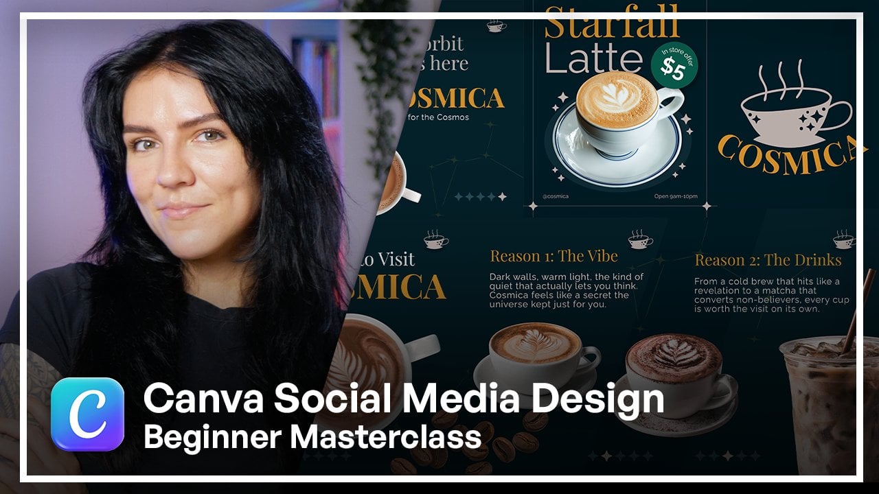
want to make a post, an Instagram story, let's say. You have some sort of promotion. I have an example
here on the screen, you can see, and you might
be confused on, Why? Hold on. That does not
look like cosmica. Something fails off. Why? Well, let's just ignore the fact that it
says a different name. However, what is it that makes this post not look
like my brand? It's the colors. Number one. Number two, are the fonts. Those aren't my fonts. That is not my website. My logo is nowhere near this design. So this belongs to
someone else, right? And if I'm a fan of, let's say, I'm a random person, I'm a fan of Cosmica and Cosmic
will end up posting this. He'll be like, yeah, that's not it.
Scrolling by, right? Even though I didn't even
look at who posted it. So that's why you want to make sure that you
include your brand. I've pulled this template from
a Canvas template library, and it's a beautiful
template, now, and I'll show you
exactly how easy it is, and it really
doesn't take a lot, especially if you have
your brand kit all set up. To take something that looks good but could
look better with your branding and turn
it into something very recognizable because you look at it and you
immediately Yep, that I know who that is. Oh, they're having
an offer. Let's go. Cool. Let's pay a
visit. All I did. The difference from
here to here is I really mainly just changed
three things, the background. So we have the very recognizable
color at this point, which is my favorite
one, I think, also. We have our dark background. Then, of course, I
changed the font. I changed the fonts to my own. So we have the fonts
that we saved, both the headline and
subheading, right? So those are two things
that are changed. And then, of course, I changed up the text. That's like a given. I included, even though this cup of coffee,
didn't look bad at all. And in fact, I do have
brown in my color palette. I just thought that Cosmica is known to use some
white elements, especially when it comes to
actual product photography. So I included something that I'm known to have
used in the past. And, of course, I've included my logo to make it super,
super clear that it's me. If I remove it, it still
looks like me, right? It still looks like cosmic. It's very, very characteristic. So even without the
logo, it works. Now you have a whole
complete template that you pulled from Kema,
you made it your own. And even though it's
a send template, it almost looks like
completely something else. Because also, if you notice, as I'm clicking through, the way the back and
color interacts with the element of the
coffee beans, almost, like, pulls you in
a little bit more, and the element
almost looks bigger. But that's, like, another topic. So let's say that you have made this beautiful Instagram story and you're about to post it, you're about to download
it and post it. And that's great. However, you know, you're
proud of this design, and you would like to spread the word of this special
offer that you're going on, for example, across
your platforms. One way of doing it
is, first of all, consider what this format of content, where
else could it fit? So, another thing that comes
to mind is Tik Tok stories. And this is a little
slight deviation from the main topic
which is design. This is mainly like
social media world. But Tik Tok stories are very, very underused feature that can help you build a
community around your brand. And I suggest looking into it and try using
it more. You'll see. It's more like a personal
behind the scenes kind of space for you to pretty much post the same thing that
you're posting on Instagram. Format, the aspect
ratio is already there. It's the same format. And you would also give, like, a little behind the scenes or
an extra piece of content, even though it's
going to expire in 24 hours to your TikTok
audience if you have a Tik Tok. So this design, I just took me literally 5 minutes
to make this even less, I think, because it
came from a template. I can now post it
on two platforms. Another thing that you can do is that if you really
like this design, you want to stay
consistent with it and another great way
of staying true to your brand is reforming this piece of content
for another platform. So you could
technically, of course, post it as a Instagram post, and just go to the
resize button up here. And from here, you
can actually choose. So we have a reel, which is the same size. However, you know,
reels are videos, and this is a static image. But here, you can resize this particular design
into really anything. You have so many options
here. Oh, my God. But without overwhelming us, let's go to, for
example, Instagram post, right, like I mentioned before. I have selected the
Instagram post, and now we have a new canvas
with the same elements. The canvas itself
has been expanded, so all you have to do now is just readjust
your elements to fit so I'm going to do these both at the same time because they
kind of fit together. I'm going to increase the
size here because, you know, there's a little bit
more real estate area. I'm gonna bring this down. I'm going to increase
the size of my beans, probably the text as well to
optimize it for Instagram. Ma'am. And that's it. Now you have the
exact same post. You're using your branding, you're staying true to yourself. Your viewers and your audience will recognize you immediately, and you have another
whole piece of content. Now, from here,
believe it or not, you can actually already take this and post it
on Threads, right? If you have a
Threads page, which is also another great
platform, by the way, it's similar to X for
those who don't know, it's kind of like kind
of like Twitter, right? So you just tweet or
write your posts. And you can post this
on there because the aspect ratio also
works for threads. For threads, it's four by five. So exactly the aspect ratio. Let's refresh my memory on
the exact measurements. So let's make sure to select. Second page. Exact
numbers for this would be 1080 by 1920, right? So the average Instagram
portrait post. And of course, if you
have also a YouTube page where you maybe post shorts or full horizontal
landscape videos, you can also post
on the community. And that way, you would also use the same
branding without going the extra mile to create a whole new
piece of content. All you would have to
do is just resize this to one by one. That is the best size for
a YouTube community post. And now we go to the next one
and we have a square one. And again, you just
rearrange your elements. In this case, I would
increase the size here a little bit more just
so it's more visible. You can write yourself
a beautiful message to go with the post, and you have a whole post
for your YouTube community. This really just goes on and on and on for every
single platform. From Canva, by having all
of your hex codes in place, by having your font pre
selected and your logos uploaded so you can just
choose your favorite and see whichever fits the
occasion best, there's really no way for you to be inconsistent
with your branding across platforms because
not only can you reuse the same design
for so many platforms, you have all the right tools. So you really have to
go out of your way. To throw people off
with your branding. This is what happens
if you start guessing the colors and
you get inconsistent. So, for example, the
background color. Instead of me using a hexco, I'd be like, I think it was
this one, but I'm not sure. What about the font? It was something pretty, but I can't remember
which one was it? I think it was this one, for
sure. Oh, yeah, that is it. So now it's starting to look like a completely
different brand, and this is why being
consistent is so important. You don't want to kind
of repeat yourself too much when it comes to
the layout, of course. So being consistent
doesn't necessarily mean looking the
same all the time. You can introduce new elements, new graphics, textures, layouts. But as long as you keep
the basics the same, there's really no
room for error. By you resizing the
same design you have made with the information, the assets that you have
locked in in your brand kit, it is really, really super
easy to stay consistent and also do explore different kinds of
avenues on social media, like I mentioned before, with TikTok Stories
and YouTube community. Really great places to post, brings in your audience closer, and they feel like they see
you more, they know you more. And that is definitely
good if you want to be a content
creator of any kind, or even just a business owner
with social media presence.
5. Platform Sizes & Formats: Now it is time for us
to talk about one of the most important
things when it comes to being a
content creator, which is platform sizes and format because when
it's done wrong, it is painfully obvious and it can cost you serious reach. However, when it's done right, it is absolutely invisible, but that is exactly
what you want. Now, in 2026, we all
know that we are in a vertical content
craze, I will say. Most platforms optimize
for vertical content, including YouTube
with their shorts. They're definitely prioritizing
shorts these days. Same thing with Pinterest and even Facebook
and their Reels, and of course, Instagram
and the Reels. I think platform like TikTok
has definitely set a trend, and most platforms
are converting to the vertical type of content. Also, it is very
important to know your sizes and not only your
types and your formats. So let's get into anda. I have prepared a couple of things for us to
look at just to get a good visual aid for how different kinds of formats work for
what platforms. So first things first, we have the Instagram
page it has, again, as I said, Instagram these days prioritizes more of a
vertical type of content. They even they recently actually
switched out from their traditional very
well known one by one format for their
regular square posts. Now they prioritize this one, which is 1080 by 13 50
pixels or three by four. Ironically enough, it
also goes for carousels. You technically can
still upload one by one square posts and carousels and your
regular feed posts. But the grid system is
almost optimized for the portrait type of
post or portrait type of format because the little
thumbnails are elongated. So if you are still posting
squares, unfortunately, the grid of Instagram
will either Zoom in or gaps in between
the other thumbnails. And overall, it's
just not a good look, so you definitely want to make sure to pay attention to that and optimize your own
content to each platform. And here we have the
stories and Reels, which is the traditional
1080 by 1920 or nine by 16. One thing I do want to note, and it's very
important to know is that Instagram compresses posts. So what you want to make sure is to keep your most
important information as close to the center
as possible and don't leave it on the sides
of your design. Let's mobile on to Tik Tok. As we know, Tik Tok is
mainly a vertical platform. There's not much diversity. So you have the traditional
vertical format, which is 1080 by 1920, which is the same for Instagram reals and Instagram stories. And then you have
the other type, which is just the profile pick, 200 by 200 pixels, very simple. And it goes in a circle frame. So really designing
any other aspect ratio for TikTok is not only, I think, a waste
of time, but also genuinely just going
against its own format. And eventually, it's just really not
setting you up for success. So when it comes to Tik Tok, you definitely want to adapt to the vertical type of content. Then we have YouTube, as I did mention before, YouTube is very big on
the short feature now, and it's definitely pushing it. And the formats exactly the
same as on Instagram reels. And on TikTok,
it's 1080 by 1920. However, the thumbnail size, definitely, if you are
posting YouTube videos, you want to make sure to make your thumbnails high quality and optimized for this size, and it is the traditional
12 80 by 720. That is going to be a for your
YouTube landscape videos, and here comes the fun
part when it comes to YouTube, the channel banner. It is one of those things that I personally don't find
it to be very fun to design the banners
for YouTube just because you see these dots
over here that I have placed. When it comes to
the YouTube banner, the overall size is 25
60 by 14 40 pixels. However, it depends
on what device you are looking at this full
rectangle will be visible. I believe it was on TV. It all boils down to
this center rectangle is visible on the phone. The longer one, I
believe is iPad and this full from end to
end is on computer. So what you want to do
when you design yourself a YouTube banner is keep all of your most
important information, of course, in that center
square where it's going to be visible on every single
screen on any device. However, that does invite a lot of problems
when it comes to actually making the rest
of it aesthetically. Beautiful or just
overall looking good. So this is a bit of
a tricky situation, but I've seen many
people get very creative and designed some really
nice YouTube banners, but you definitely want to keep all your important things, your logo, your contacts or whatever else
you want to put on. Here in the center. Last but
not least, we have Linktn. For Linktn, it differs
definitely in the sizes. It's not as straightforward as as we saw with Instagram
TikTok and YouTube. For Linktn, the sizes differ
in a way where you have two types or three types
of posts, feed posts. You have your landscape, which is 1,200 by 627 pixels. And then you have your square, which is 1,200 by 1,200, and you have your
portrait 1080 by 13 50. They do have two different
types of banners. For Linktn, you have
your profile banner and they need a
company page banner. Now, I have laid all
of this out just so you could see
visually how all of these formats and aspect
ratios differ and also what platforms have these
aspect ratios in common. And as I said, vertical
content is where it's at. Now, lucky for you, you do not need to memorize
all these numbers. I do understand this
looks like a lot, and honestly, I don't even
remember all of them. I mainly just remember for social media and
definitely not Linktn. I Googled most of these. However, the cool
thing about Canva is that you don't need
to know all of this from the top of
your head because when the time comes for
you to design anything, you go to the Create
button and if you do remember
particular number, size or aspect
ratio that you need to use if you click
on Custom Size. This is where you would
put in your specs, right? And here you can
change from pixels to inches to millimeters
to centimeters. Now, pixels and inches are
the most commonly used. I think when it comes to
millimeters and centimeters, they're mostly used when
it comes to actual prints. But here, this is
where you would be putting in your numbers, and under that, you would
see your most recent ones. And when I previously said that you don't have to remember all the specific numbers and sizes is because when
you design on Canva, you can actually just select what kind of
size Canvas you need, and CNA will automatically
give you the correct size. And the cool thing is that
Cannava stays very updated with all of the other platforms in terms of them changing up. So for example, back in
the day when Instagram didn't prioritize the
portrait type of feed post, they only were
allowing one by one. Canva offered one by one. Now you'll see that the first
thing is the portrait post. So for that reason,
I say that you could definitely rely on Canada being updated with rest of the social media
world and the sizes. So but when it comes to you actually creating the correct
size for your design, you can either go from
this little shortcut menu here or you can go back
to the Create button and you'll get the same
menu here on the side. And here you would
just select what it is that you want to design. You have some already here
waiting, Canvas suggesting. You have your frequently used popular and try something new. But let's say, let's
focus on social media. Here, it's actually
organized by platform. So first one is
underpopular is Instagram. So you see Instagram
post four by five, so that's going to
be the portrait Canvas size if you click on it, it will immediately take you to a blank Canvas
where you can start designing whatever
is it that you need. Same thing with Instagram story, so it already has the exact
numbers locked in and ready. Same thing with YouTube and even a YouTube with thumbnail. Then you have some Facebook
options here in LinkedIn. Oh, these are just popular, but if you do want to go in depth with other kinds of posts, you can go under the
**** platforms and see, look what is it that you need? And if you can't find
it for whatever reason, you always have
the search bar up here where you can type
in whatever you want. So let's say I need TikTok. So I type in TikTok and it will open everything
that it has for it. And there's only really
two distinct sizes because TikTok story and TikTok video is pretty much the
same the size of it, and you have the
profile picture. But besides that, it's very well organized and all the
sizes are preset, so you don't have to remember. And when it comes
to the file format, you definitely want to
export for these platforms, mainly in PNG or JPEG. And I'll explain to you why. So when it comes to designs that need to have a
transparent background, like we spoke about
in the logo systems, you need a transparent background for
something like that. So you would download
it in a PNG. Here, this drop menu will
suggest it most likely. And then here you can adjust
the size if it's necessary. And if you do have a
subscription, pardon me. If you do have a subscription
or if you have a paid plan, then you can adjust this. If you do not, then
unfortunately, you only have the pre
selected size available. But from here, you would just tick the transparent
background and hit Download, and that's how you would get the transparent background
for your design. But other than that,
if it's not for something that needs to have
a transparent background, P&G is also good for designs
with text or sharp edges in general because PNG
oftentimes prioritizes quality. So when it comes to the
other most common type, which is JPG, this is mainly used for
photography heavy design. So if you have some actual
pictures in your design, either from the Canva
library or your own, you want to use the JPG. That's going to be the
best choice for you. And the same thing also, you can adjust the size, and here you can
also adjust quality, which I always suggest just
go the biggest you can. So large is going
to be 100 here. And now, you know, the best types of formats for your
designs to be exported in. But to make a long story short, make sure that your designs are adjusted to each platform. Make sure you select the
correct size Canvas on Canva. If for some reason
you cannot find it, you can always go
into Google and find the size for whatever it
is that you need on Google, and then just copy based numbers into and make it a custom size. But definitely make sure to
utilize and take advantage of these most popular sizes because the algorithms will oftentimes prioritize that type of content. So on YouTube, for example, your shorts might do a little bit better than
your landscape or regular videos
because YouTube is definitely pushing for
shorts these days. And on Instagram reals
is the exact same thing. So take advantage
of the algorithm, make sure that your designs
are adjusted and have fun.
6. Creating Reusable Templates: Now that you have your
brand kit in place, you have different
variations for your logo, Let's talk about how
Canva can help you stay consistent
across all platforms. CNA offers this tool called brand templates. So
what does that mean? This means that you can create
your own templates with the designs that you use the
most across your platforms, save them, and then
reuse them and stay consistent with whatever
it is that you post. This could be anything
from Instagram posts to LinkedIn
posts to emails, to presentations, really anything that
you design on Canva. As I've said before, small
deviations compound over time, and at the end, things don't
necessarily look wrong, but they just look off. So you want to make sure to
eliminate the possibility of changing things
without you knowing. So essentially, we are
creating an environment for your brand where
your easiest choice, your easiest design choice ends up being the
correct choice. Now let's jump over
to Canva and let me show you how to create
one of these templates. On the home screen, going back to the left
side of the screen, I'm just going to
click on brand, and it automatically drops
into the brand templates page. As you can see, I have a
couple of templates saved, and let me show you how
overall this looks. I'm going to go over to this brand right here and
go to brand templates. I have two saved for now. For example, this
one I have saved because these are
essentially cover photos for my articles on
my website and I really like the look that
I have created here. And I have different kinds
of layouts already made. And in a case where a new
article is being written, I can just come over here, drag and drop and replace
these same images, whichever design I like best or whichever one fits that
article in particular. And I have a whole cover ready, and I don't have to readjust
or think of anything. I have everything pre made. Ah, and here on this side, this is a template for video. So whenever I make videos and I lay out information
on the screen, I really like the kind
of look that I have developed so far and not
wanting to deviate from that, I have saved all of these
designs in one folder, and I've saved it under
the templates page. Because whenever time comes and I have to create a new
kind of informational video, I go back to this folder, and whichever kind
of design fits best, I go back into it and
I alter the text, I change out the graphics
or the background, and I have a whole
design already without needing to
spend a lot of time creating everything from
scratch every single time and worrying if it's going
to look the same as before. If you do have
something that you have created and you would like
to stick to that look, you can make it into a template. Now, smartest way is to actually distinguish that design as
a template and fill in, for example, text and the
elements as placeholders, just so you know
what goes where. Or if you are working
with a team or with a client or with
anyone that isn't you. This is also great guide for
them to see what goes where. It's like instruction
manual almost. So it really leaves little
to no room for error. Now, let's show you how to
actually create a template. I'm going to go back
to my cosmica brand, and from here, I'm going to
click on brand templates. I have a couple of suggested, and it's definitely great. However, could click
on one of these, but I'm going to instead
click on the homepage. I'm going to select
a design that I have made previously just because I really do like
the way it looks, and I would like to stick
to that I know that on any other day I might
not feel as motivated or maybe as creative or
maybe I could just get a whole other fresh idea that
seems good at that moment, but maybe isn't in the long run. I'll just stick to the design that I have
already come up with that I'm satisfied with
and I know that matches the brand and I'm just going to make it
into a template. Um, now, you can, of course, create it from scratch, but that does require some
time and some planning. If you do have a
very clear vision on what is it that you want
and the look that you need, and you know how to
achieve it, of course, by all means, go for it, create your templates
from scratch. The more original, the
better, of course. However, if you do have already some
creations under your belt, you can just make a previous
design into a template. So that's exactly what I'm
going to do now also for the sake of keeping the
lesson relatively short. I'm going to click on this pre made design that I have made for this particular brand
conveniently enough. I am going to go into
the work window, and we're going to
start adjusting things and actually
making this look like a legit template I can send to other
people if necessary. Now, the main objective here is to clearly indicate
what goes where and take away the
specifics and lock in the things that I would
want to stay with. So first things first, I really, of course, like the background. It is the straight from the color palette of
the cosmica brand. Same thing goes for these little graphic
elements in the back, the lines in the stars.
That's very cosmica. I can definitely
go ahead and also save these in the brand kit. But let's just focus on
these templates first. So I'm just going to stick
with this kind of look. What I'm going to do
is highlight these. Let's go to positions and layers and make sure we have the right
things highlighted. So let's highlight all of
the stars in the corners. And if you hover
over the element, it shows you on the screen which one it is that
you are hovering over. And by holding Command
on your keyboard, just click on each element
that you want to highlight. Here we go. We have
all four stars, and let's make sure we
have all the lines. Okay? Everything
seems to be in place. And now I'm just
going to go ahead. First of all, I'm going
to group them, right? And then I'm going to lock them. Now, this locking locking
feature is actually very useful because this pretty much freezes
these elements in place. I cannot change them. I cannot delete them. I cannot move them unless I unlock them. I'm going to do the
same thing with the logo because I
like the placement, and this color variation
fits this background, so I'm going to lock
this in place as well. And this is a useful
thing to do if you are sending this design to someone
else to your team member. They're going to see
the locked elements and they'll be
like, Okay, got it. So I'm not changing this, I'm changing whatever
else is unlocked. Right? And also, not
everyone's very well versed with Canada and
accidents can happen. But the locking feature
is very useful. Now, going to the actual
elements that I want to change, first, I'm going to change this. So not always the post is going to be about
limited edition. So instead, I'm just
going to put in info. So I know that info goes there. Then you have the main title, which is Sir fo latte. Here I'm going to put in I want the name to be first
then in yellow, and latte is the
name of the drink, so I'm just going
to put in drink. So that's how I know
whether to put latte, macha T, whatever else I would want to promote with
a post like this. And of course, I'm going to line up the text
like I had before. I like this whole
lined up to the side. And here we have the
clear indication of what goes where when it comes to the text and the main title. Going down to this
price in store offer. Here I'm going to
put in offer type. And instead of five, I'm going to put zero
for now because, of course, this is
going to change. And next, of course, this is not going to be staying here. So I'm first of all,
going to delete this. There are different ways I can go about indicating
what goes there. But how I like to do it this time is just to put
in a frame of an image, which will point to the
needing to be an image. So what you can do is
go to elements and go down here to frames and
select really any frame. Let's go with the circle just
for the sake of why not? So here I put the
circle in place. Let's find the
middle. In the right click it Align center. No, let's align it to the text. That makes sense because
this circles coming on here. So it is technically off center, but visually it looks
better this way. Now, I have this frame here. So now if I need to, I can go to photos and
really insert any kind of photo from the photo
library from Canva. Right, I can do that. Not
the best choice, I guess. Any kind of photo can go here. In the frame, however, I would usually go for a cutout, but the frame kind indicates that's where it
essentially goes. Well, it's not going
to go in the frame, but you get my point. It's just kind of
like a indicator. You can also put some
instructions if necessary, photo or cut out. And let's put an arrow and just let's give it
some background, just so it actually looks like
make it red. Why not? And Perhaps if I'm
working with someone who doesn't really
know how I do things. This would be how I would
go about it, right. And then from here, I like the stars. I like the background
little circle. This I like the fact that
there is text there, but not always it's going
to be operating hours. Again, I'm going to put info
here, and this can stay. In fact, I'm going to lock
it because it's my handle. Here we have a teplate that is ready to be
used and reused. I also can go from here and
make a different version of this by just
switching some things out like the background color, going to the layer section
and selecting the background, I'll change it to a
lighter blue, for example. Going back to position. Now the circle, I want it to be darker, so it
stands out, right? For the stars, let's see, things are a little not
visible enough for my taste. So since I have these
elements kind of locked, I'm going to unlock them
so I can now adjust them. Let me do that. So this
let me make sure I highlight and make
everything unlocked. So I really did lock
everything in place. Let's change the color to white. A Is everything
changed? I think so. Okay, so that is all changed. This the text, also, I'm gonna change to
white current page, and this one is locked, as well. So unlocking it. Come on. Okay. Change this to white. What else do I need to change? That's changed This one. I wonder if I can
do it from here. Okay, well, that's as light as it's going to get,
but it's pretty good. So here I have
another version of this template ready
also to be used. Should I go with
this? No, that's too plain. That's not bad. Okay. Go with that for
the color of the text, let's make sure it's
the correct yellow. And here we have another
version with the same layout, but different kind of
color combination. And now that
everything is ready, what I can do now is hit Share and click on
the brand template. And from here, I'm
going to choose the folder where
it's going to go. I'm going to go to
Cosmica right here, click on that, click ad
and publish and close. And if you are
working on a team, it does give you an
option to change the permission of
your team members if you have some added. Also, you can copy the link of this template
and send it to people. Of course, that's
the whole point of collaboration on CNN yeah, from here, you just go back
to your brand templates. Of course, your correct brand. Brand templates, and from here, we're going to start actually adding that template
that I just made. You can do it either
here from the suggested. If you don't see here,
click on the Plus button, and it should be up here. Make sure you check
that and add. And now you have a
template ready to be used. You can also create, of course, anything for any
kind of platform, whatever you use most. I'm not sure if I
mentioned this or not, but you can create some variations for
Instagram story design. You can create some email
designs, LinkedIn posts. You can be presentations. You can really be
anything as long as make the design beforehand
when it comes to the text, indicate what goes
where, and just add it to your brand kit
and you're ready to go. So this whole process takes
out all the friction, and it leaves you
in a place where your correct choice for your design is the
only choice because the environment is shaped that all the sources
available to you are according to your brand
down to the last detail. I love this whole brand thing,
especially the templates. It really does cut time
in half when it comes to designing things
because you do need to post a lot if you are very active on your socials. So use your brand templates. You can create
them from scratch. You can go to actually
Canva templates and adjust the pre made
templates if you want to, but make sure that you make something really
cool and something that you see yourself
posting over and over again, and that's something that
will make you look good. And I think this
wraps up this lesson. Get creative with your
templates and have fun.
7. Content Batching Strategy: Okay, now that you know
how Brian Templates work, it is time to put that
knowledge into practice. I'm going to teach you how to batch create a bunch of content. In this lesson,
we're going to be creating five pieces
of content to post. So if you post
throughout the weekdays, this is an entire week's
worth of content. Now, batch working
is something that marketing teams and creators
have been doing forever. And honestly, it works. The reason why it works is
because when you need to create large amounts of content in a short period of time, it is very easy to get
overwhelmed and creatively drained because not only do you have to design all the time, but you also have
to kind of step back from a business
point of view and do your planning and your captions and the information that
you want to put out there. So so batch creating actually helps out
with this process, and it makes the whole
thing much easier. Now we're here on Cava in
our brand templates page, and I have some
templates here created. So as you can see, like we created the brand
template before, which was this one over here, we replaced all the
specific information with pretty much directions
or instructions, right? So we know what goes where. I have created four
more templates to create for this lesson, and they are different kinds. So what you want to is
create your templates of the post that you want to post more or that you
need more, right? So I have a quote. I have a promo
first, then quote, then new item, tips and
tricks and community CTA. So these two are very
amazing when it comes to interacting with your
audience and not looking like a cold brand. So let's just get
in to the fun part. So first things first, once you have created your templates, the design work is over.
That's it. You're done. And actually focus on planning. And this is actually a
very crucial step of this whole process because
it does help out a lot, and you can create a lot
all at the same time. Here I have created a list
that I also suggest to you do you can really use
your notes application. You can write good old paper, wherever you want to write
it down, it's whatever. Here, since we're on Canva, I thought it was appropriate. So plan before you
design, right? You have your templates.
The heavy lifting is done. Now, ask yourself
these questions. How many posts? For me, it's five. So I
have written down five. Next question is,
for which platform. So since Cosmic seems to
have its primary platform, Instagram, I decided to go
with an Instagram portrait. Then what are the content types? So, you want to decide make
these decisions beforehand, so you go into your templates and prepared and not
scrambling around. So I have decided that I want a mood post, a padded spotlight, an educational tip,
promotional offer, and a community question. And then, last but not least, of course, plan out your copy. So what is the information
you want to put out there? What is it that you're going
to put on your design? Write it down. So I have
written out all five posts, and now I know exactly
what to put on. I don't have to now look at my template and wonder,
Oh, what is best. I have taken a separate time, not exhausted myself,
and planned it out. And now I just got to put
those two things together. And down here, I have
made some more notes for my I believe it
was the third post, yes, it's the best spices. So since we're staying on theme, we're going to
create for Cosmic, of course, it's a brand that
we have built together. So let's go for it. So first post, let's see. Clicked away too quickly. So first post is the quote. So what I'm going
to do from here, since I have written it down, I'm just going to
copy it, right? So come and see on my keyboard. Let's go over to
our brand templates and pick out the correct one. So since this is a quote post, I'm going to go for
my quote template. Click on it, and let's click
on use this brand template. Alright, so we have
our template already. I have all of my
elements set in place, and all I have to do is put in the quote and just choose
a background picture. That's it. And my post is ready. So from here, what
I'm going to do is I'm going to
duplicate this page just so the actual template stays here and I
can then reuse it. So now I have it duplicated. I have made some
creative decisions here and placed some layers over this frame that will allow me to log in a
photo, a background photo. As you can see, I have
a group of elements, which is this frame and then a transparent square,
somewhat transparent. So what I'm going to do, I'm
just going to move them to the side so I can interact
with this layer, right? So the background.
Now I'm going to find myself a background picture.
Let's go to photos. I'm going to type in copy. Oh. Search and let's look
for the right image. This one's a good
one. I can tell. This one also, I like the Okay. So I like how the
colors play out, but the logo, I mean, I could switch it out for
the darker one always. But I really like
the aesthetic of the dark image. Oh,
this sounds good. Okay, so for now, I'm just going to
keep this here. I'm going to get my
elements back in place. Click on it, and then move. Yes. And I'm just going to
paste my quote. I like that. I think that's exactly
what I'm going to go for. Perhaps I'm going to go back to my little transparent square, and I'm just going to increase the transparency
just a little so, you know, the logo and
all the other elements really stand out. I think this looks
beautiful. Post one is done. So now I'm just going to
go to share, hit Download. Make sure I have the
second page selected. Have it as PNG, of course. And I'm just going to
keep the size as is because it's pretty good and
just gonna hit Download. And that is post number one. Now it's time for
post number two. Let's go back to the
brand templates. I exited from that window, and let's see what is my next post post two
Product spotlight. Our oat milk latte
smooth cosmic Yours. So product spotlight. Let's go to our brand templates. Product Spotlight is
going to be a new item. Yes. So I'm going to click
on this brand template. So now that we are
in our template, let's just start working on it, start copy pasting and
get this post going. I'm going to
duplicate this layer again like we did before. And now just going to
this premade um list. Just start copy pasting.
Easiest thing in the world. And I believe that's This is latte, so I'm just
going to type it in. I'm gonna take off the
caps, increase the size, maybe decrease the
size of this so it's a little bit more a little more. Now if it's better.
Okay. Now, back here, let's take this copy. I'm going to replace this. And now just gonna in
effexs tab, adjust a curve. Bam. Oh, here. So we have either
a photo or cutout. So in the case where I have the actual real product photo, I would go to my uploads and
put in my photo, however, since I don't have an
actual real product on hand or a picture of it. I'm just going to
go to photos and search for latte and use that. So we should we let's
maybe it's ist. Uh huh, but then it
wouldn't be curd. Okay? So I'm just
gonna get rid of this. I could also technically jag and drop and, like,
pull one of these. Oh, that actually
doesn't look bad at all. But it looks too similar
to carousel post. So what I'm gonna do, perhaps,
maybe just take this. I'm gonna remove the background. Center it. Take this, twist it. Place it. I got to bring
this down a little bit. Perhaps I'll even
increase the size, so it's more of a
statement, you know? On here, we just
kind of play around. You know, I'm gonna flip it. So I can put that text. Actually, I can get rid
of this little thing. So I can put that text
on the other side because it feels like this is, like, little empty, you know? Okay. I see it. Should it be, I got to
go back to the curve. Ah. You see? Okay. Okay. I think that's where I'm going
to put it for now. Perfect. Okay. Let's bring those beans to the front so
they can overlap the cup. Which beans are they?
Those are these beans. So I'm just putting them
above this layer there. Okay. Perfect. I think I'm going to increase
the size of the text. So I'm going to just highlight both so I can pull one of these. Make sure that you stay
within your safe zone, right? And there another post is ready. Now, same thing.
Download it. Same way. Done. Download. Let's
go to the next one. And one thing after you are done creating from
your template, what you can do
is you can delete this or you can keep it here. It really is up to you. I personally usually just would delete because if I'm already
I already had the template. There's no need for me to
hold on to this file, right? So I would just hit the
garbage can and move on. But I'm just gonna
keep you here for now. Now moving on to our third
post tips and tricks. This should be This should
be also pretty quick. So since I have made
another little note, I'm gonna go ahead and
copy that right away. Tips and Tricks, this
template right here. Okay, copy tips and tricks. Let's go. Use this brand
template. Title goes here. Now, it's a little bit
overpowering. That's okay. Five best coffee spices
for flavored coffee. Got it. Bam. So we
have a list of five. So we have cinnamon nutmeg,
lavender, Cinnamon. What was the I already forgot. Good thing I have everything
written down. You see? I would be scrambling.
I'd be like, What What was it that I wanted
to put on there? I forgot. Why do I always
forget Ginger and lavender. Gonna type it. And delete this. So
now we have these. I'm just going to
arrange them quickly. First of all, take
of the extra space because it just kind
of gets in the way. Okay. So let's
start placing them. I would want it to look kind
of like this, right? Bam. Perhaps something like this,
but I want to put, like, little images under it, just so for visual kind of let's just start
working on it. Okay, so we have cinnamon. If we go with, like,
kind of, like, outline, I think that could be very clever. Could look good. Or should we just
go with the Now, when you're kind of working
with this kind of stuff, you want to make sure that
all of your graphics match. So let's see if we
can pull that off. No me. That kind of
match is, right? This match is better,
I think. Yeah. It's too large, too
large. Center it. Clove. No, it's a different style. That's okay. Oh, that's
a very different style. I didn't click this already. There we go. Clothes. Ginger. Let's just put down
the thing and see. Okay. So yeah, so this is
going to go to positions and start grouping them just so they all could
stick together. So we have cinnamon,
lock that in. Then we have nutmeg,
group, close, group. I'm holding down my command
key on my keyboard. And this way, it selects
both of these layers. Lavender. Group. Okay. So now we can move them
all together, like so. Okay, yeah, I weigh 100%, so they should be placed
definitely like this. Yeah, there's more of a
balance, like a visual balance, and lavender being in the middle being the only purple element, I think, also works. Let me decrease the size
of cinnamon a little bit. Make sure it is
positioned properly. Nothing needs a
little adjusting to Let's increase the size of
lavender. Not that much. Okay. Let's adjust the
ginger. There we go. Okay. Now it's a little
bit more balanced. So what I'm gonna do now is really just export
because I have it done. So third post is done. Hiccups do happen, and I have forgotten to add
the actual title, which this was
recooki with a latte, I think. Or a cartato. Anyway, so let's just go for it. What we have is a promotion of a free
cookie if you buy a latte. So that's the whole idea. This should be as, like, a little add on. So I can definitely
get rid of this, and that's where
the text would go. Let's start typing free Cookie. I did, I should have written
down this, but it's okay. It's just a line that there. Okay. I'm gonna get rid of this. And here I want to go and
get another actually, let's go to photos, and let's
search for another latte. But maybe perhaps this time it should I guess I should
include both hot and cold. So let's go with this. Oh, no. Okay, let's get rid of that. No. So what we do need is them to
match kind of sizes, so it makes sense, you know? So we have a lot to here. Perfect, perfect. Very good. And now we need a cookie. So let's search for a cookie. Now, in real life, we would have a pile of cookies. No. We're not giving
away a pile of cookies. In real life, no, we need a normal classic one. Okay, good. So in real life, of
course, as I said before, we would probably have
product photography, you know, of a real product. But since this is imaginary, ideally you would want to put your actual photo of
your product on these, right, to be completely
transparent and such. But let's put that latte behind. It's kind of, there we go. Okay, that makes more sense. And these cookies,
they look large. Let's decrease the
size a little bit. Okay. Maybe perhaps
should be way bigger, and it should be bigger, too. I like big text. Okay. So now we have the main
kind of stuff is laid out, the products are
out, the title is. And now, since we
have this instore only this Friday will stop last. So what we want to do is take the instore and
put it at the top, in store only, like, as like and perhaps actually that could go down there, right? There. Or you should
go here. Let's see. I feel like this should be
the operating hours instead, let's say, 8:00 A.M.
To what 9:00 P.M. Right? And that should go here. So I'm going to do is
just duplicate this. Put that text over here. Like, so make sure
it's aligned. Alright. There we go. And
now this is done, as well. Let's export that. So I only need this. And now we have our final post, which I have come up
with this or that, these kinds of posts
do really well, especially if you're trying
to build a community because it pretty much asks for
the person to interact. And everybody everybody has an opinion if you give them choices to choose
one or the other, coffee or tea, hot or
cold, stuff like that. So let's just so this is going to be this or
that iced or hot latte. What I'm going to
do is go on and get the community
CTA template going. So I have this or that, drink
edition, Latte edition. It looks like I really like
latte, but ironically, I don't really even
drink lattes on my everyday basis.
That's so funny. So iced to cold. I guess
here it would be ice? Iced. Hot. You see, and there it is. It says, tell us your pig
in the comments below. So here you get interaction. And here I just drop
in some photos. Um, oh, I need an actual photo. Which one looks most optimal. Everything looks
like a frappuccino. Isn't that funny? Okay, this is. It's gonna increase
the size. There we go. And hot. Oh, look at that. Or should go here. I think that's actually
better. I like the cup. Okay, and that is done. It edition, iced hot, tell us, Okay, we're done. Alright, let's just
download this one. And now you have five
posts for the entire week. And took you just a
little bit of effort, spread out throughout perhaps
days, it's up to you. But this is how
you batch create. So when you do have high volume of content that
needs to be created, make sure to divide your
process into sections and preferably do
them on separate days because when it comes to the
creative side of things, you know, when you want
to create your templates, sure you do that beforehand, prepare, lay everything out. And then when it comes to
planning you actually have to turn on your logical thinking more than your
creative thinking, do that on a separate
day, just so you don't exhaust yourself, don't
overwhelm yourself. And this way, creating
a bunch of content beforehand is super easy with batch creating because
now you have five posts. You can sit back and relax. You can schedule these out on Instagram or whatever you're
posting, and you're done. I'll see you in the next lesson.
8. Font Pairing Systems: So, typography is one
of those things that most people think they
don't need to learn. And it's just, you know, pick a nice font,
and you move on. That is not quite the case. And in this lesson,
I intend to close that gap for you by
giving you a system, kind of like principles
of font pairing, just so you understand and your choice at the
end becomes obvious. Now, first things first is
use two fonts and not five. I cannot stress this enough. I understand not being able to choose the
right font when you have so much choices and so many different
kinds of cool options. However, you do definitely
want to stick to mainly two because when you
use too many fonts, start to get confusing. It looks off balance, and I have included
an example here. If you take a look at
one with two fonts, it looks clean and put
together, and it makes sense. So it's not very difficult
to look at as a reader. However, if you start
looking at this one, we have three very
different fonts. It just looks all
over the place, and I can't really tell the
character or the message that this text is supposed to give me or
the vibe of the brand. It's confusing. So by using two fonts, you also will build that
trust in your audience or even your clients because you're not
all over the place. You have chosen two
fonts that work for you. They speak for your brand
or for your creations, for your designs, and they
get a clear message across. Next up, what you want to do is pair contrast with harmony. Now, I have taken two fonts that are different,
but simple enough. We have PT serif on the top and Rhodes Sun
serif on the bottom. Now, these two fonts, as I said, are different,
but similar enough, and they create this kind of contrast without fighting
each other too much. And that's essentially
what your font pairing should feel like where the differences are there
and they're visible, but they end up complementing each other's style and look. And also, of course, again, get the right
message across. Next up, you want to make sure
to give each of your fonts its job and stick to it because when you start
switching things up, it throws off balance, right? So let's take a look
at these examples. We have our headline in a
very bold and large font, and the body text is smaller,
much lighter in weight, and this kind of hierarchy guides the reader's
eye very clearly, right? It's very easy to look at, and I know exactly where the headline is and
where the body is. And the actual font for the
body is also very clear. However, when you start
switching things up, I have switched these two fonts, put the body font as a
headline and vice versa. And as you can see, it is not, first of all, aesthetically, not very great looking. But also, this body font is too heavy to
be a body, right? So it starts competing
with the headline, and it's not as clear and easy to read and see as a viewer. So you definitely want
to make sure that you keep the jobs that
you have assigned to each font all throughout
your creations and just stay consistent with it and make sure that everything looks balanced. Then to get more into
the hierarchy topic, you want to build your
hierarchy through size, weight, and space, right? So you have three very
distinct layers here. You have your headline, you have your subheading and your body. And all of these three
sections should be distinct from one
another and they should be separate
from one another. So your headline is always
large, it's always bald. And when it comes to designing, you also want to
make sure to leave some space around it,
for it to breathe. Then your subheading
should be just a little bit less heavy
than your heading. And so this one has a
little bit less weight, and it is a clear step down
as maybe a clarification or maybe some additional
information that adds value to your headline. And then your body text
should be the smallest. As you can see, it's
very light in a way, very easy to read because the font itself is very
minimal and it's very clear. And also, you want to make sure to choose your body
font so it's readable. So you don't want to
go for something that is like something
in cursive, right? So this would be
bad, technically, as a body font because
it's very decorative. It comands a lot of attention. So worst comes to worse, just use it as your
headline if you must. And last but not least, what I'm going to
leave you with is lock in your font and
just keep it, right? So this requires you to make a very wise decision
for the future. Well, you want to make sure when you're choosing your font is to choose something that you can tell will work
for the future. It's not something
that you kind of chose because it looks
pretty. Think about it. Will it work? Will
I get tired of it? Will my style
change drastically? So, you want to make sure to
make a good decision when it comes to choosing your font and your font pairings
and your system. Then when you have
made your decision and chosen a good font
that works for your brand, for yourself, and
for your aesthetic, lock it into your
brand kit on Cava. Because as we saw before, when you actually have
something locked and loaded, it's very easy to continue
creating without making any unnecessary decisions
or even looking for the right font in the long list of fonts that Canva does offer. Lock it in and that way, you get to keep
being consistent and being recognizable for your
audience or for your clients. And once that decision
has been made, then you're all happy
like this little hamster holding your font being consistent and being
on brand for yourself. And, of course, thank you for sitting through
my presentation. However, I do also
want to point you to a very good resource that
Canva offers itself. So we have this wonderful
article where Canva actually provides you some
principles on typography, more information, but
most importantly, what I find most value in here is that you
actually get to see how Canvas fonts that they already have offered
on their platform, how they work with each other. So in a case where you want to use the fonts
that Canva has, you already have a
very good spread, and you know what works
together, what looks right, what doesn't you don't have to go to outside sources
to look for your font. However, if you must do that, I will make a personal
recommendation towards Adobe font
and Google font. I find those two sources
to be very, very good. And they stay very up to date
with trends and aesthetics, and overall, their fonts
are very good quality. But besides that,
when it comes to C they actually show you, as I said, how fonts that they have on their
platform work together. So you have lots of great examples that you
can scroll through. Maybe you find something
that catches your eye. And they also show how it works in different kind of
scenarios, right? So you can scroll through, find your style,
maybe read up on it, and get really familiar on the whole source and the
whole world of fonts, just so at the end, you can make the best decision for yourself. Is absolutely gorgeous.
I love this font. My personal favorite
one, though, if it's of any value is actually this league
Spartan favorite one. It works great on
so many occasions. And this pairing is
actually very good. That looks very nice
and modern, actually. But, yeah, you can
scroll through and see for yourself,
take your time. Explore. But also, besides that, I do want to remind you, I know I have said this
before in this course, that Canva does offer font
pairings on the actual editor. So if you go to the text section and you would end up
here at the top, right? But you start
scrolling down and you see different kinds
of paired fonts, and also they're
very much stylized. There's a lot of
different kind of you see retro and bubble. You have more serious ones. But this is also a
very good source for someone who's
finding their footing. And maybe just need
some inspiration. There's many cool different
kinds of examples. And again, you can, of
course, get one of these. It was a bad choice to put
it on my presentation. But let's say you like this kind of font
that says mystic. That's pretty cool. You
can still, you know, alter it if you want to adjust
it more to your liking, change your colors, or
even what we have here, you can change the sizes. Just about anything. So all of these are
still editable, and you can still make
it your own without just going with the default
option that they do offer. But overall, to recap, you want to make sure
to use two fonts, assign each of these fonts
a job and stick with it. Do not switch. Do not put your body text with your title font
and vice versa. You also want to make sure that the fonts that you have
paired are different enough, and I know this sounds
kind of confusing, but they are different enough, however, similar enough where they kind of create a
little bit of tension. But not enough where
it contrasts too much. So the best example that I
can give you is these two. So this is a big no, right? You have blue wood in
this kind of Western, I want to say, cowboy style, and then you have the
craftsman, which is, like, handwritten, very
decor kind of font. It's beautiful, but they
just do not go together. If anything, I'd say the
authentic leather font. So this is special elite, go with the blue wood,
which is ry, right? So these two would work better, but bluewood with
craftsman would not. So make sure that they are
different but similar enough. And then, of course, when you have made
your wise decision, just lock it in
and stick with it. Trust me, it will definitely
eliminate a lot of headache, and it will build a lot of
trust with your audience. Thank you for your attention, and I will see you
in the next lesson, which is all about
grades and alignment.
9. Grid & Alignment: In the last lesson, we
spoke about typography and font pairings and how to
create hierarchy with size, alignment, and how to guide your viewers' eyes
on your design. In this lesson, we're
going to be talking about grid and alignment, which is the structure
underneath all of that. And if this doesn't work, then it is painfully obvious. And it serves almost
as a distraction of some way or discomfort to some because you can't really
tell what is off, but something is off and it's not a pleasant
experience for anyone. Thankfully, Canva
has plenty of tools that can help you out with your alignment,
and with your grid, you can create your own
custom grid or you can just go with the
standard but I'm going to show you around
how grid and alignment can really improve a design because when that stuff is off, even if your elements are nice, your text is nice, your font is nice, everything is great. If the alignment is off, it can make your design
look a little bit more amateur than it should.
So let's get into it. We're looking at a
beautiful design here. But there's some things
that are off, right? So you have these images on the bottom that are
different sizes. They're not really
spaced out properly. You have your body text that's
a little bit off center, so it makes me personally
feel a little uneasy. And then you have the title, which is also a little bit off, not quite giving me balance. So, how we can fix
this is quite easy. First things first, when
you start designing, right? What you want to do is make sure to understand
how to center. Or align your elements. One great thing is
to drag your element over the canvas and just kind of see what
these lines are doing, because this is the built
in alignment system. So once this line
is solid purple, it means it's smacked down in the middle of your
canvas, right? Once it's interrupted line, it's aligning to
another element, which in this case, you
can see the line ends at the middle image at
the bottom design. That's what this text
is aligning to, right? So if you want it in the middle, make sure to have the solid
purple line going all throughout from top of your canvas to the very
bottom of it, right? So let's just align or actually, you can also do right click on your element and then
scoot down to a line page. And here you have a list of
things like align to left, line to center, line to right, top, middle, and bottom. So what would happen if I
would click through these? So let's try the left. Now it has aligned
my text to the left, of course, and that's the same thing that's going
to happen if I do right. And this is very, very handy, and it's very quick, so you don't have to drag
the element yourself. Now, what would happen
if I would go top? My element went all
the way to the top. Same thing with bottom, and same thing with middle. However, my main priority with this design is to align
the text in the middle. I still want it under
the word green, right? So what I will do
is do center here. So now the elements in the center should
have the purple line. There it is. And
I'm just going to press it again and do middle. And now it is smacked
down in the middle. I can drag it down, drag it
up if I wanted to overlap. I actually kind of
like the look of that. Think I'm going to leave
it there. And now it is perfectly aligned
and nothing is off. There's not even a
millimeter of chance that something is off center
about these two words. Next thing is, of
course, the body. So you see how weird it is. You definitely want
to make sure it is also in the middle. And you see these little
numbers start appearing. So that's kind of showing how far it is from
other elements. Wherever it appears, you
see another extra line that says 3.021 kind of shows
you how far it is. So that also helps you
out with your alignment because if you want to
let's say this line. I want it to be in
the middle between my body text and my
images at the bottom. As you can see, it
is both say 1.106. So that means it's
in the middle. But before we align that, we
have to fix these images. That's weird. That's
a little bit off. So this is what I'm saying when I'm talking
about alignment, and the nicest elements can just completely
lose their impact, their value if they are
out of whack like this. So first of all, I want to increase the size
of this, right? Hu. I want it to match. Because if you overall
look at the design, everything seems to
be very geometrical, very aligned and I want
to say in order, right? So I'm just going to drag it up by whichever element I want
it to be in the same size of. I can see there's this
purple interrupted line. So now I'm just going to drag the bottom so it matches, boom. And now I can do the same
thing with the width, not only the height, so there. Now this is the same size as both of the images beside it. So again, I want to align. I'm just going to go
quickly. Align to page. Oh, so it is in center. So when your element is aligned
to whichever choice here, it's just going to go gray and you won't be able
to click on it. So that's a good sign, right? Now I just got to fix
these other ones. And again, I want to
make sure that they are at a proper distance
from each other. And what I'm seeing
here is I also want to align it with the line
that I have here on top. And again, following the purple
line that's interrupted. There. And if you will notice, I know I touched
upon this before, but if you start
dragging your elements, you will see this
purple frame in the middle that's kind of
like considered a safe zone. So it depends on what kind of design you make for
what kind of platform. Or maybe it's a poster, which we will get into more detail about margins
and all that stuff. But here, a lot of platforms
will display all kinds of buttons or maybe your profile
picture here at the top. So each platform is different. However, I want to make
sure to focus most of your important information or your important elements
in this safe zone. So it's okay if these
three images go beyond it. It still is aligned, and I'm not going to lose any necessarily big value
from this if, like, there's some sort of, like,
cut off at the bottom, the majority is still
in the safe zone. Anyway, it's moving
on. Some people find the ruler
feature very helpful, and I'll show you
how to first of all, get it on your canvas
and how to use it. So you want to do is go up
to File and go to settings. And here you want to click
on Show Rulers and Guide. And once you click
on, you see you have this ruler up on top. And on the left side
of your canvas. And from here, you can
start dragging and create your own alignment and your own kind of grid
and margins, right? So if you just grab from
here and you hold it down and you just grab on
to drag it to your canvas, place it wherever you want. Let's say, let's just
put it here for now. I want another one
on the other side. The cool thing is
that it locks on. It has locked onto the element, which is another really
great feature of Canva. There's the element lock on. For example, you'll see how if I start dragging
this element out, it's starts interrupting
stopping at many different
points because it's locking onto other elements. Since like I said, I want it all to be
aligned with the rest of the images I want to make
sure it's locked onto them, and this is also a very
helpful tool because I don't have to zoom in
and see pixel by pixel. That might sound a little
bit crazy for some, but when you design
a lot of stuff, you start getting
very nitpicky about the finest detail and you want
everything to be in place, and it's completely
understandable, right? So if I even do zoom in, I see how well it locks on. There is not even a single
pixel of error here, right? So it's completely aligned. That's the benefit
of the lock on. I don't have to think about it and spend time to make
sure it's aligned. So when it comes to
the ruler feature, I have dragged out
my sides and I would do the same thing
here from the top. I can go as far down or
as high up as I want to. I'll align it to this
frame that I have going on here for aesthetic purposes. But this, for example, if I didn't have this frame. Let me make sure to copy
this before I delete it, but let's say I have it out, and I have my lines in
place, my grid, right? So what I would do I would
want to make sure I have a frame added to this design
kind of looking like this, that's exactly what I would do. I would go to elements, and
I would type in line search. And under shapes, I would
grab this simple line, and I would put here
by where I just put the ruler lines from. Oh, pardon me. Here you want to zoom in
because it's quite thin. So grab this when it
kind of turns purple, that's when you have grabbed it. And here you have a perfectly
straight line across. Change your color.
I'll do white. And now, it's very dangerously
close to the grid. So let me zoom in just a wee bit more just so I could
grab the actual element. Okay, I have a
grab and I'll just duplicate it once,
once is enough. And here I would grab it. So also, when it comes to tiny
little elements like this, you can use this button
instead when it shows up. So it's easier to grab it because to get your
mouse to click on here, that always works out the best, so I'm just going to rotate it. And yet here's another
cool feature about Canva. The rotating tool
is very precise, and you saw that it locks At 180 and 90, which is also helpful because nobody wants a crooked line, especially in a symmetrical type of design like this, right? So again, I would
just put it here. I think it was a little bit off. Bam. Perfect. And now
I just duplicate this, and I have a beautiful
frame feature added to this design,
and it's all straight. And if I don't like
these purple lines, I just go back to file
and I turn it off, right? Let's pay Oh, I lost that. Okay, never mind. Okay. And another interesting
thing is that you can also use some grid features
that Kenva has built in. So they're like grid templates,
I want to call them. So again, back to
file and settings, you will go to add guides. And here you have three
pre made by Canvas. So you have 12 column three
and three times three. And you can see it shows up on your Canvas as
interrupted lines. Let me zoom out guides. Okay. And you can
click through and see whichever one works if you want to work
with any of these. You can also build
your own custom one, but this one will involve
putting in numbers and, um actual margins that you
would have to go by the ruler. So if you are up for that, that's something that
is also possible. And you can save it then, right? So, hold on. There's something else
I wanted to show. Okay, so when it comes to this ruler and the
lines that you can add, so this is a good tool if you are planning out your let's say, poster in this case, right? And you know that
you kind of you want to leave some
space for your title. So what you're going to
do is just kind of give that title a distinct area
by creating your lines. Let's just imagine. Well, I suppose, I don't
have to imagine. I'll just go to a brand new
a brand new page, right? Wrong one? Okay. And then
here, as you can see, I'm dragging these lines, and I'm kind of designating
space for elements. So I would want my
overall design to be more like I have
a centerpiece, so center text with some
elements up here and up here. And some maybe
smaller designs here. This is how I would plan it
out by creating this kind of blueprint of the
layout of my design. And again, if you want
all of this to you said, let's say you have
put the line not where you necessarily want to
or you have an extra line, you just drag it out
and it will disappear. And you can turn off this
whole roller system by just clicking on turn it off
in the files and settings. So the snap on to
elements is think the number one useful
alignment tool in Canva because you don't have to go into settings or
necessarily turn it on. I think it's automatically
implemented. I do believe you can
turn it off if you don't like saving time and like
to zoom in pixel by pixel, make sure to have
your things aligned. But that's the quickest and the most easiest way to
make sure that everything's cohesive and there is
good breathing space between your text and your
pictures, your element. Besides that, the
right click as I said, I do also find very useful
and I use it very often, so feel free to utilize that. A lot of times it makes things
go on a little bit faster, and I don't have to necessarily drag it because there are
some times where I'm like, Oh, I can't find it in a situation where I have too
many elements on my screen. And it's like aligning
to everything, but not to the canvas, and
I can't figure it out. I just go right click Center. That's it. I'm done. Right? So there you go. Canva has definitely
made alignment and balance an intuitive
thing in their interface, and the tools are wonderful. They are user
friendly, and really, there is no excuse to have your elements and
your text misaligned. In the next lesson, we're
going to be talking about intentional empty space
on your design and not overloading it with
a bunch of elements. Thank you for your attention, and I'll see you in the next.
10. Whitespace & Balance: When it comes to
designing on a canva, it is important to know how to properly balance your design, how to not overdo it. And I understand how easy it is because if you
look at your design, oftentimes, if you look
at it long enough, it feels like it's
missing something. So you add a little bit more. You add another element. You maybe increase the
size of something. You add things in the
corners in the background. Oftentimes it is not necessary. On pro tip, I suggest
when designing, if you've been looking
at a design for too long and it's not
working, step away. Just for, you know, an hour, take an hour to breathe, maybe even a day, who knows? But that I find very helpful. Besides that, a very
common mistake that is completely understandable and mistakes are great because
that's how we learn. But if I could help you with learning before you make those mistakes, that
would be really good. But a common mistake
is that people add way too much to their design
because it looks too empty. Now, I'm referring to
something that is called white space or also
known as negative space. Now, what is white space?
There's two types. You have macro white space
and micro white space. Macro white space is the
space of your margin. So at the edge of
your design, right? Also, macro white space counts as the space between your
title and your body, the space around your logo, and the space around
your elements. Microwhit space,
on the other hand, is the actual space between
the letters in your text. So here where I have my cursor, that is micro white space. Same thing goes for the space
between the lines of text. So between freshly
baked and addition, that is micro white space. It's very useful to now, let's move on to talk about why leaving that space
and making sure it's there with intention
can actually pull your whole design together and make it look balanced in weight. I say weight in the
sense of think of your elements on your design as having visual weight because that's essentially
what is happening. If you take a look at this, it's kind of like a product catalog for bread.
Looks very delicious. But all the elements
are different sizes. There's so much free room, and some might think, Oh, maybe I could add another
line here, right? Or maybe I could
add something here because there's nothing,
nothing, nothing. However, the design
still looks very balanced and it's very
light to look at. It doesn't have
much weight to it, but everything looks
very intentional. So for example, if we take a
look at this piece of piece, no, a loaf of bread. It's a big element, so it has a lot
of visual weight. And in fact, they've also
decided to I say this loosely, break the rules of margin. So this element goes way
beyond outside of the canvas. However, it still looks good
because look what would happen if I would decrease
the size of the element, therefore, in increasing the
size of the white space. So I decrease it. Technically, you know, okay, let's not go crazy. Let's align it, okay? Now the elements aligned. Technically, it is correct, but it's not it doesn't have the same power that
it did before, right? So visually, it
looks a little off. And in fact, since this
elements horizontal, the white space
between the body and the loaf of bread is
much, much smaller. So it looks a little
bit more cramped and now there's too
much going on here. Now I would want to technically put something there to
distribute the weight. But instead, what
is wiser to do, and also it gives the
design a lot of character, it's just increased the
size of the element itself, and there's still plenty
of white space around it, but now it looks intentional. Let's say that instead of me
wanting to add something, I would want to fill the space with increasing
the size of everything, trying to pull
everything together. So let's do that. I'll do this. So again, you see how the
space between the line of texts here and the title
decreased. Same thing here. There's really little
to no space left. I don't know, man. I think I want to increase this, too, man. There's too much too much
space. I don't like that. Let's just kind of start
toying around with this. Okay, so, okay, that's bigger. Okay, okay. There's still
a lot of room here. I don't like that room
it looks out of balance. I increase this. It's
looking a little off, right? So the white space is decreased. There's technically less, but
it's not easy to look at. It's not as aesthetically beautiful as it was before because everything was balanced, and the space there was intentional. So I'm
going to go back. I think that's where we started. And even though it
is very minimal, there's still so much
room to breathe, it looks way better than what I did when I tried to fill
out the white space. It looks balanced.
It's intentional. So if I would also
go for the same kind of panic mode here and try to make it bigger,
it has to make sense. There is no room around. Also, the text is hitting
dangerously close to the edge. So it is in a bad way
breaking the margins, which the safe zone, again, I mentioned this in
the last lesson, I believe, about the safe zone. So you don't want the white
space to be so small between important information
like this description or name of this loaf. In this case, this
would be wrong. So let's go back. And there.
That looks way better. So the main takeaway from this is let your elements breathe, give your elements
room around them, and you will see very
quickly how less is more. I know that saying
is very overused. But in design, it
truly does work because if you look at
this design itself, the style, of course, it's
intentionally minimal. But everything it needs is here. There is no extra little to
no extra design elements, like these lines would
be the only ones that this design would still
work without these lines. Potentially not as much
here, for example. Like, if I would take this away, it's kind of looking empty, but still look balanced just
because the space between the body and this loaf kind of mirrors the same space between
this loaf and the logo. So it still doesn't
look bad at all. This is just purely
a stylistic choice that the designer has made, and I'm not completely
mad about it. This line also not
very necessary. But it serves here more as a way to separate sections
of this design. So you have your other loaves, and then you have your
website and your number, which is, like, a
separate little. So that line kind of divides it. But overall, make sure to let your elements breathe
and don't cram them. I will leave you with
a couple of tips on how to avoid overloading
your design. Unless, of course,
you're going for a very maximalist type of look, then sure go ahead. But still in a maximalist
kind of style, you do want to make sure that
your design has balance. So it has that visual
weight balance where the heaviness of this loaf is balanced out by the big title and the copy
being right under it. Right. So make sure
you even balance out your maximalist designs. Another good method is to
use padding within, like, square elements
that you have here, for example, that
serve as backgrounds. So let's zoom in
and take a look. So you have a lot of
padding between the edge of this container and the
actual picture of the bread. Same thing goes around the text. So there is a lot of padding. And it's all equal.
Have you noticed that? So the white space is
equal in each of these. The only kind of difference
is here in the middle where you have a background
on top of a background. But again, I think
that is more of a stylistic choice
than anything else. And it doesn't look bad,
and it still is using that padding room here between the white square
and the square behind it. So there is a lot of padding between the actual
bread and the edge. So this is what I'm
saying. This empty space is very intentional because this would lose its kind of balance
if I would make it fit, let's say, a little bigger. Like, it's not as nice
because the weight all of a sudden goes up here
instead of the text, right? So it's unbalanced. I would usually suggest to scale your elements
and your text down. To fit within the safe
zone that I spoke about, I'll refresh your memory. You see this kind
of purple line. The text, you notice all of it from top to bottom is a line. Let me zoom out, make sure that the bottom
is lined, as well. So let me move to There
you go. Okay, yeah. So it hits exactly
the edge of it. Everything all the
informations within the safe zone and
everything is line. And there's space between them. But still, there is
what was I saying? So you have the text
within the safe zone, however, it still has the room. So if I would put it up here, the white space is gone, and it feels like it's
crammed and it's not as easy to guide my eye. Like, there's
something off, right? So you definitely want to
make sure to leave spaces. And another great tip is
remove before you add. So instead adding
things to your design. See what you can remove
because if there's even a single single
element in your design, it's not necessary, it's not
really serving a purpose. It's not providing
any information. It's just there to fill that, I can throw off the
rest of your design. So instead of you trying to add something to complement
that, just remove it. And you'll see the overall
look will balance out, and the design look will
improve drastically. So always remove before you add. So now you know all about
white space or negative space, and now you have the
tools in your toolbox to make sure that your
elements breathe. Everything has visual weight has been distributed properly. And each of your elements and your text
complement each other. They work well together, and everything is balanced.
11. Editorial Layouts: We have spoken about typography, alignment, grid,
balance, whitespace. All of these are tools
in design by themselves. Now, editorial design
is what happens when you use these
tools with intention. The reason why I'm bringing up editorial design in this
course is because actually recently editorial has had kind of a moment in the limelight in the
social media world. Editorial style design
has been very popular, especially on visual platforms mainly around photos
such as Instagram. If you go around Instagram, and you kind of
just scroll around. I can guarantee you you will find your friend
from high school who posted a carusel of all the images she took
when she went to Mexico, and they all are assembled
in editorial style. I bet you $5 on that. 100%. But besides that, it is actually a very
beautiful way to make designs. However, editorial style
has a very couple of distinct features and distinct
rules that it follows. The word editorial comes
actually from publishing, such as newspapers,
magazines and books. And I think, as you
can guess, editorial, the word actually does come from publishing,
shocker, I know, from things like newspapers,
magazines and books. And most people when
they think of editorial, they think of vogue. Coincidentally. The
Vogue magazine does a wonderful job showing how editorial design
is done right. Instead of showing
you vogue today, I'm going to show
you this template on Canva that is in the style
of editorial design. It is quite minimal, however, it does have very
distinct features like big stylistic text, of course, centering a purse. And the purse, as you can see, is overlapping the text, which is very, very common. And it's a great way to
kind of break those rules. You know, those whitespace
rules we were just talking about in the
previous lesson, yeah. So when it comes to breaking
any kind of design rule, when you do it, you do it
with intention, right? So if sometimes happy mistakes happen or happy
accidents happen, how Bob Brass used to say. But you always want to
do it intentionally, where when you do
break these rules, it still looks good, and it's still giving the
correct message. And it's not hard to look at. So in this case, this is a
beautiful example of that. And when it comes to
actually magazines, like, for example, Vogue, you'll notice that a lot
of times how they design their cover is the
model the person on the cover will oftentimes kind of stand in front
of the title Vogue. That's a very, very
popular way to go. Honestly, I do it, too, in my design work very often. And when also it comes to editorial design trending and mixing in with the
world of social media, it is not as if every
single person is designing their work directly or specifically in
editorial kind of style, they're implementing
a lot of elements. And so the editorial style has seeped into other kinds
of design styles, which I find to be very cool. And that's how you end up
having finding new trends, finding new styles,
creating new styles. But besides that, it's trending. Canada is also very
well aware of this, and they have made
sure that they have plenty of templates
on their platform, so you could take
part in the trend. Now, I'm going to go
over and show you a couple of the editorial
kind of designs, and we'll talk about
what is it that makes editorial distinct from
regular social media design. So let's search in.
Let's go to templates, and let's search torial We very distinct thing about
editorial design is that it creates very
intentional hierarchy. So it almost works as a
guide, right, for your eye. So it choreographs what you should look at
first and then what you should look at second and third
and however more elements there is on a design. But it's almost like a dance. Intentionally guiding you to what to see first and
what to see second. For example, this reminds me
of a fashion magazine that oftentimes old fashion magazines mostly use editorial
kind of style. And as you can see,
there's a lot, but first things
first, my eye goes to, I can't decide whether it's the girl or the text because
they both are in red, but it looks beautiful, right? And then for example, you have let's say this. This is a very good example. So first thing, I see the
text. So that's where I read. Then I look at the
girl, the model. Beautiful, gorgeous. And then I start looking
at the subheading. Okay. Even something small
can change the atmosphere. And that's when my eyes kind of trickle off onto the corners, but it's kind of like a
predesigned dance, right? An instruction, if you will. Okay. Another
interesting thing about editorial design is that they use type as a visual element. So in regular design, text is mostly for reading, just to give you the information
on what am I looking at? What are you trying to tell me? In editorial, type, the text
is its own piece of art. It is its own kind
of visual element. So in this example, you see, the text it almost
lives its own life. And the background image, which is a background, can you imagine? A background. Is just kind of like a
second thought, right? It's not as visually
intriguing as the text. And I apologize, of course,
to the picture itself. The picture is
beautiful, but the text is just doing what
it's supposed to do, meaning it's being its
own visual element. And you'll see this
very often with editorial kind of style, right? This is another good
example. That text. There's so much going on. It's very creative, and
this is exactly what you'll see a lot in editorial design. Next up, I want to look at this. Another very distinct
thing is that this kind of style uses
intentional tension. And what I mean by that is overlapping images
or overlapping text. So for example, you'll see here, this image is placed
on top of this image that is seeping through and
it's touching the edge, and technically, this
would be considered wrong. But Again, I'll say it again and again and again
as many times as I need to. When you break these
rules intentionally, it actually helps you out. So this is the tension
that's created. It's kind of making pulling
the visual weight here. However, it looks
almost with taste, obviously, but it kind of
creates a statement, right? Same thing with this
kind of design, you have the text overlaying a picture that
is also going out of frame, and then you have a
tiny little image here. So this kind of
intentional tension is on purpose and is very distinct characteristic
of editorial design. Another good example
of this tension is adding elements and
overlapping elements. So this overlapping the
image that is technically, if you look at this, this is
nice and centered, right? The white space is perfect. The text is breathing,
it's readable. The picture is straight, aligned, and then you have
Bam something overlapping. And you'll notice that
a lot in editorial. There's elements that
you don't expect. And we actually saw this
in the previous one, which was this example that
I showed you here, like, the color of this element
is very unexpected, right? Because what you're looking at is an advertisement of a purse. It's classy, right? You have
beautiful type, minimal. The background is beige
with light texture, and then you have neon green
container for the text. And even though it seems logically out of
place, it looks good. It gives it that editorial
edge, that character. If you want to start making
your designs into this style, this is going to be a good
practice to take a lot of risks and to kind of
push the boundaries. And just add things that
normally you wouldn't expect, and it will spice up your
design at an instant, but do it tastefully. So another very distinct thing
about editorial design is that it is very
minimal oftentimes. For example, this, the image, it's not a very
typical frame, size, or position that one would use, right? But it works. And that's a very,
very editorial thing. Same thing with the
text and the title. Everything is so minimal, and this kind of style emphasizes the point
that less is more. So it's a very, very
common practice to just make sure to make your creations
as minimal as possible. So all you want to include is things that actually
serve a purpose. Another great example for the unexpectedness
or the boundary pushing is the layover of the text over an
image that is blurred. So logically, we always want to include a very clear
and high quality image. However, here it is blurred, and that is a very
I don't want to say typical because that, I think, could be the greatest insult to this kind of design style. However, you do see this kind
of boundary pushing a lot. It's very fun. And
especially nowadays when everyone and their mom is making designs that
are kind of a mash up between regular fun
design of a t shirt design, but somehow they end up
including editorial style, and all of a sudden, it almost looks more
luxurious, I want to say. Maybe it's just me, but just morphing
styles together, I think is a very fun and
creative way to go about it. So now when it comes to the different kinds
of editorial design, there's like there's like four different kinds
of editorial design. There is the text dominant one. So this would be a
good example where the text is the main act almost, if I may say that. It is what the whole
canvas is about. You're meant to
look at the text, you're meant to read it. However, it is designed in a way where you see it
before you read it. And it's very interesting
because this kind of comes in with the
same point that I made before of
oftentimes you see the text being its
own visual element. So its own graphic almost. This one, I would say is also text heavy. Let's
see. Let's see. Do we have another good
example? This one's also. However, about half
of the canvas is by an image taken up by an
image, which beautiful. So when I say text dominant, it's mostly a design
where if there is image, it's very small and oftentimes
somewhere to the side, on this example, it's
very text dominant. So the image is almost
like a secondary thought. You immediately go to the title, and then you start
reading about, Oh, what is that, right? Same thing here. So
it's text heavy. That is the main act
of the whole design. Of course, you have the
other end of the spectrum, which is the image is dominant. So something like this, the image is the main act
of the overall design, and that is where your
attention is supposed to go to. Let's see if we can find
another good example. Now in this kind of
image dominant design, you'll see that there is sometimes the image will
touch the edges and break those margin rules
like this one because it's more to the side and then there's more
whitespace here, but they will never overlap. So this overall is the image dominant
editorial design way. So the main act is the image, then you go to the title
and then the body. And same thing actually here. The whole page isn't
taken by the image. That's like a whole no ballgame, but it's image dominant. So again, minimalistic,
all you need is a photo or an
image of some kind, your title and your body text. And you have editorial
design on your hands. Another way that
editorial design works is that they tend to
use a lot of grids. So images organized either in asymmetrical grid or
a symmetrical grid. For example, here,
this is asymmetrical, right, because all the
images are different sizes. So that could be it's more
of a collage type of thing. But if we look here you
have a grid of images, you'll see that
very, very often. And I think that comes
mainly from fashion. Because if you look at a
lot of fashion magazines, you'll notice that it's
mostly image dominant, right? Because, you know, they're
showing off the clothes. And so you need a lot of
images in your design. So you see, again, you have a whole collage
asymmetrical, however, still is. And that's how most
of these designs work with a lot of imagery. Like here, that's straight
out of runway, right? So you oh, this is
another good example. Okay. So again, if you're
trying to do editorial design, make sure to include
a lot of images and organize them in
a way where they tell a story like this one. I also immediately
noticed this one. They have included some just plain color squares
to their grid, which adds a big editorial
vibe, I will say. Then you have the
final ish category of the editorial
kind of design way. Hold on, I saw this. This
one's going to be edge to edge image with a
overlay of a lot of texts. You don't have a lot of other
visual elements besides your photo be the
main background and then your text
and nothing else. There's no circles, no dots, no little hearts, no squares, nothing. It's just this. And that is straight up a magazine cover pretty much because you start
scrolling down here, and those are all just
magazine covers, right? So that would be a very, very easy way to kind shift
into an editorial style. Just make sure you
put your image, corner to corner, overlay your text in an interesting way. As you can see, this lady is standing in front
of this text here. Oops, that was not
what I wanted to do. And then she has text over her, which gives it layers. To recap this lesson, just in case you want to
start creating in this way. You don't really necessarily
need an extra set of tools. What you need is a vision. Willingness to break some
rules with intention. And push boundaries. And it's mainly text and
image dominant area. And I think it is
very beautiful. And if you can mash it up with another style, even better.
12. AI Tools (Background Remover, Magic Expand, etc.): So Kana AA Editing Suite is actually a remarkable tool
because something that used to take hours in separate editing softwares now takes a couple of
clicks all on Canva. I cannot tell you how many
hours have I spent on Photoshop trying to expand
an image by a millimeter. And now in Canva, you can create whole images, but
that's another story. So first things first, I would like to show you
how this background remover works because you
have seen me use it quite a lot
throughout this course. And that's why I
keep saying that the background remover on Canva is one of my
favorite tools, and I use it all the time. So here in front of us, we have two images
of a coffee cup. Now, the reason why there
are two is because one is really good for a
background remover and the other one isn't
as great, right? So if you have an image
with a background that is very detailed and it's not
blurred and it's very busy, then Canvas AI system might have some problems removing it. Sometimes it does a very
choppy job around the edges. At worst moments, it
will just tell you, Oh, we cannot detect
the background. So therefore, I would
always suggest to go for an image more
similar to this one, as you can see the
background in this image isn't too busy, it's
not very detailed, half of it is blurred, and this is the perfect example when the background remover is actually going to do a good job. And let me show
you how this goes. So first, I'm going to
go with a good picture, and background remover is
going to be right up here. I'm just going to click
and literally took it a split second to
remove the background, and it did a very,
very, very good job. Now, if I go up
here to the image with not an ideal background, it's going to have issues.
Well, there you go. I pressed background remover and it gave me an error message saying we couldn't detect the
background in that image. Please try another image. So that's why I say, choose your photos very,
very carefully. And end in a situation
where, for example, it has left some sort of
parts of the background, what you can do is click
background remover again, and now you're going to be in this kind of pixel pixel eraser, literally, that's
what it's called. And you can adjust
by deleting more, or you can restore
by just kind of dragging around where you want the background or any detail
in the photo to come back. And technically,
you can use this also here for this image. So instead of
background remover, what you would do is
go to the eraser tool. Can do magic eraser, which in this context wouldn't really solve the
problem that we have, which is removing
the background. We would go to Pixel eraser. And now you can start just
erasing the background. But why do you need that
if you could just choose a better photo and just do it one click and
you're done, right? Now, the next thing have
another example photo here to access the rest of
the Canvas AI tools, you're going to hit
the edit button. And here on the top,
you see all the tools. So we have magic layers,
magic edit, upscale, background remover, eraser, image video, and
background generator. Now, let's try with the magic layers because this is actually
quite impressive. What this tool does is
it scans the photo, and it will literally separate elements that it can detect in the photo away
from the background, meaning you can move, adjust, increase, decrease the size, you can do all kinds of things. So let me show you. So now I have this
photo selected, and I'm just going to
click on Magic Cares. As you can see, it is scanning the photo and recognizing
what is the background? What are all
elements and things. So it's just going to do that
for just a little longer. So you see, I have a bunch of
squares on the screen now, so these are the elements
that Canva has recognized. So what does this mean? I'm going to click
off the Canvas for now because it
was all highlighted. And now when I help her
over these elements, they highlight, so
I can move them. That's a little wonky, but
that's okay. That happens. Well, lucky, for me, I don't want to move
these cushions, but what I can do here
is move this cup. So an instance
where, for example, you have a product photo of
your own product, right? And you want to just
move, let's say, any kind of object you have
slightly more to the middle. What if it's, like,
a little off center, and you want to make
sure it's centered? This is the tool
that you would use because now I have the
background generated, so I can move it literally
anywhere if I wanted to. So what I'm gonna do
increase the size or might look a little
unnatural, decrease the size. But this is the main
idea of this tool. You see, also has
highlighted the table, which is very, very cool. And this tool really allows
you to take any kind of photos even from the
CabelaPhoto library to edit. There's a furniture one.
I want to try that. Let's do that right now. You can take any photo, whether you took the photo yourself. Oh, where did it go?
Let's try this one. And you can adjust every
single detail in the photo. I think it's very
impressive because not even Photoshop or
Illustrator does that. And in a case where you're
creating a bunch of content and you really want
to make sure that everything looks on point and
everything looks straight, this is absolute magic. Still skinning. Okay, so now
we have a bunch of elements, even the text. That is so cool. I could literally remove it and put something
else over this. I could remove this or the cup. Or the book or that. So my point is that every single detail in the photo becomes an adjustable element. The next step, we have a very cool tool that
is called Magic Edit. So here I have an
example of an open sign. I'm going to click
on Magic Edit, and here I can change anything about
the photo with a prompt. So what I can do here is put in, let's say, change the
color of the sign. To green and click Generate. So now I have given
a general prompt, what I want the AI to
adjust in the photo. As you can see, it
looks exactly the same. Just now the sign is green. What you can also do is you
can brush over any kind of area and then put in a prompt and change
that little detail. So let's say I
brushed over this. What I could Let's try to
remove it and see what it does. So interesting that it's
suggesting magic eraser. That is cool. So even the AI system is kind of looking at
what you're trying to do, and they're like, Hey, maybe this tool might be better
for that. That's very cool. So then you have the
click option where you just take your mouse
and you hover over. So in this photo, there's
only this one sign, so there isn't
much to work with. But here I can highlight this sign particularly
and then go in with the prompt and do any kind of adjustment,
any kind of edit. So here I will just click back, and that is how you can easily change anything
with a prompt. Okay, now, since we
are on this image, I'm going to show you
another really cool feature, but going back to magic layers. So we have an image with
a text on it, right? And magic layers actually allows you to change that
text in the image. So it's a photograph of a sign, and the AI is allowing you to change that text
that is photographed. I love this feature because,
for example, right now, we have a sign that says
come in, we're open. So it has recognized the font, and it has separated each of these words
into separate elements. So what I can do here is
start adjusting the sign. So let's say says come in. Don't. Come in. We're closed. Now, that's funny.
Now, the elements are a little bit a little
bit different sizes, unlike the elements are smaller, of course, than they were on the original, but
we can adjust that. So place this here, this here, this here, and here we're
just going to increase. Why not? Quickly? Now we
have a sign that says, instead of come in. We're open, don't come
in. We're closed. And it looks exactly like it
did on the original photo. And this feature actually allows you to get
really creative, and at this point, not even a photograph
solifies anything. You can change anything,
any kind of detail. So I just thought
it was really fun, and I wanted to show you that. Alright, now that we are
done with this photo, let's move on to this one
and our next AI tool. So for this one, I have a beautiful photo of
a coffee shop that looks out the window with two beautiful coffee cups
sitting in the foreground. However, let's say if I wanted
to post this on Instagram, there's two people in the
background that I'm not liking. What can I do? I could open up photoshop and start
erasing them. By hand, or I could be
a little bit smarter, and I could stay here on Canva and just go to
the Magic eraser tool. This is a tool that
was suggested just recently by Canva with the previous photo
that we worked on. So here, it's the same idea, gives you a brush tool. And with this brush tool, what you do is just highlight
whatever you want going. So this is a really
great tool to clean up the background of your
photos, remove some people. Maybe there's some stains on the wall or gum on
the floor or whatever it is that you do not want
to um have in your photo. This will allow you to remove
it without much effort. So here, these two people thanks for being here,
but no, thank you. I do not need you here, so I'm just going to
click erase after I've highlighted them,
and they're gone. Now, I'm looking. There's
this little spot here. Also, I'm not
really liking this. I don't know what that is. But also, there's
something on the table. And just like that,
I erase everything. And now, as you can see the photo is up to my
standard. It is clean. It's exactly how I
want it to look, and now it's ready to post. So definitely, if
you need to clean up background of your
photos or anything, really, the magic eraser
is definitely your friend. Of course, you also can
use the click feature, which allows you to click
on any kind of area that it recognizes and
then just erase that. So let's see if I
could erase this cup. For some reason, I want it go. And the little plate is sitting there
lonely now. You see? Of course, then you
have foreground, which will recognize the
foreground of your photo. So kind of similar to
you see it highlighted. It's similar to the click tool, so it highlights itself. And then you have if I
had text in this photo, I could remove that as well
by just clicking on the text, but since there is none,
this might not even happen. If for some reason thought that the coffee cups and
flowers were text, which is Oh, no,
it didn't. Okay. So yeah, since there is no text, there is nothing to
highlight. Moving on. And now we have this
gorgeous photo of a latte with some latte art. Since I would want to expand the background
of this photo, what I will do is
double click on the photo itself as I
would crop it, right? And here, I can do that. I could crop and do
whatever it is that I need and select
my aspect ratio, or I could just go in with Expand and choose one
of these three options. We have free form, which
will allow me to play around with the actual
amount I want to generate. Or also I can do whole page, which will expand
the white areas of this and then one by one. I'll just go with the
whole, click Expand, and now it's going to
generate me a couple of options that I
can choose from. And there we have a few options. So we went from this
tiny little rectangle in the middle to
having a full photo. So here we have our
half eaten cookie, what it seems the
table is continuing, and then we got some plant. We also have this
option, this option. Or this option. I think I
like this one the most. And then I just click Done, or I can generate some
more results from there. And here I have an
expanded photo. So now let's say
I want to change the background altogether.
I'm not vibing with this. What I will do is remove the
background from this photo. And now I'm going to go into the edit and click on the
Background generator. And here I'll put in my prompt. I'll say something
like Cafe in Paris. Of course, the more detailed
you go with your prompt, the better for the
sake of this lesson. Being an example,
I'm just going to quickly put in that little prom. You should do a good job. Of course, if you have
a specific vision, feel free to expand on that. But here we have a
couple of options. So this is kind of
interesting looking. That's kind of cute.
I like this a lot. And here I can't really
tell what that is. But of course, you
can regenerate it. You can change your prompt. But overall, we just went
from the organic kind of rectangle photo with very limited background
originally to an expanded to a completely
changed background. And all of that took
me like minutes, ten out of ten for me. Now, going back to the AI tools, there's also a feature
called image to video, and I have used this, and it's very impressive
on how it works. So what you can is
take any image. Actually, in fact, I
think I'm going to select a new one just 'cause let's
just put in anything. Okay, so we have
this gorgeous photo, staying on them with coffee, of course, image to video. So it's going to generate
a five second video, so it's going to be like it can be amazing for an
Instagram story. But there's gonna be some
movement in the photo. Sometimes it, like,
zooms in on items. Sometimes it lets the
light kind of move around. And you have here two options. You have the smart option, which is make your images
move like a video. This setting works well for
most photos and the graphics. And then you have custom. So here, you can actually put in your prompt if you have
a very specific vision. I'm just going to go
with the smart one and see what Canva does on its own. And to make a photo into
a video is brilliant. I remember doing it once with my own afternoon coffee at home, and I had made the inside, as you can see, there you go. You see it's zooming in.
That's exactly what it did. In my previous experiment, I had generated a spinning
galaxy inside of a coffee cup, and then I made it into a video, and it was zooming into
a spinning galaxy in a coffee cup. It's wonderful. And this little clip can be very handy for something like Instagram
story, like I said. Another very useful
tool is the upscale. So generally K Width never has a bad quality photo
on their photo library. I've never come across one. However, if you do have a
photo with low resolution, this tool is amazing. I have used it on people
on photos of people, and it has worked great, where it has upscale the photo tremendously and I
can actually put it on a big thumbnail and it looks professional
and gorgeous. So I definitely do
recommend this, and as you can see,
does have the new tag. So feel free to play around
with that tool as well. But overall, that
is a quick guide through all the
AI editing tools, and they all work very well, and they all have saved
me a bunch of time, and I do strongly
encourage giving it a try. You don't have to use them
on every single design that you have or every
single creation. However, with certain things, it definitely helps out with speeding up process
when it comes to, you know, making or editing things that take a
long time. All right? I hope you have fun with
the KNvA AI editing suite, and I'll see you in
the next lesson.
13. Frames & Grids: Now let's talk about one of the most underrated
tools in Canva, which are frames and grids. And we did see a lot
of use of grids, especially in editorial design. We went through
plenty of examples. I don't even think I
should bother with it in this lesson because I
think you've seen enough. However, they are
very underused, and it's either because people don't know they exist or they don't really understand
how useful they can be. So what is a frame on
Canada? I'm glad you asked. A frame is pretty much a
container that defines the crop, the size of an image, and you can find
them by clicking on your elements and
going down to frames. In this section, as you can see, you have so many
different options. It goes from basic shapes to already kind of
collaged out film. You have photo frames
and things like that. You also have devices, which this is very,
very, very useful. I have used a computer
and the iPhone one. I cannot tell you
how many times. Then you have paper ones which are more decorative, flowers, blobs, retro letters, numbers, and so on and so forth, the
different kinds of shapes. And it really gets very, very diverse, very quickly. Like for example, this
one, that's crazy. But these kinds of frames can actually really
improve a design. Let me tell you, it
is way easier to grab yourself one of
these goats photos. Let's say I want it
to be like this. But also, I wanted to
have curved corners, so I can do that. And what I can do now is
grab my photo, drag it in, and the photo now
becomes the exact shape, size, and crop as the frame. What I see a lot of
people do, instead, just take their photos and kind of play around with
them like this. Ah. Okay, yeah, you can do that. Sure. But then when you want
to change the size, you're kind of losing
control a little bit, right? So the frame actually makes this process way easier
because this way, by inserting your frame
into your design, before you can plan out
your design way better. For example, I have this post
that we worked on before, right? I already have a frame. I did not use it in that lesson, but this also kind of indicates that that's
where the photo will go, whether it's in a frame or not. But if I did want to, I could drop a photo real quick in here. Should
I even bother? Before example, there.
Now I have a photo, and it's pre size, it's
predetermined, and I can move on. So the heavy lifting
has been done. So this way, you can plan out exactly where your
photos are going to be. You can make grids out of them. Like, so let's say, you made one perfect one
and you want to keep it. So now what you're
going to do is use the handy dandy tool that
I showed you before, which is the Canvas built in alignment tool that helps you align your
elements properly. You copy it. BAM. Let's
make sure up 16. Perfect. Now center it the
locks in place, staying within the
safe zone and BAM. And now you can just,
like, switch it out. Like so. And your photos come out perfectly aligned and
identical in size and in crop. Now, what can you do
with these frames? So first of all, of
course, editorial design. That is one, and that is one of the most popular
ones, for sure. But you could also just play around and make a
fun Instagram post. And because of these frames, you can do it very quickly. So here I have a
grid of four frames. What I will do here is drop
in some photos that I like. Let's just go with these, maybe. I'm now going to edit, and I'm just going to
give them a filter. Here, I'm going to go in, and I'm going to search in
the photo library nebula. And I'm just going
to choose a photo. This one's cool. That is the horsehead
nebula, by the way. And the Corina
nebula, of course. I'm going to add the same filter just to tie in the photos. Look how they all
just come together. That is not the correct filter. Which one is it Astro? Astro is the one. There you go. Okay, so now we have a grid
of four aligned photos. Now I can go and I'm like, Okay, I want to
spice it up somehow. My most searched word on Canva
is coffee at this point. So that happens.
Sometimes, that's okay. I'm just gonna zoom out. Okay, make sure
you don't overlap. But from here, I can just go and utilize the
tool that I told you about before center,
right, and middle. However, because there is a
little handle of the cup, I can also use my keyboard. So I have this
element selected and clicking the air out to the right because I want
the cup to be centered, not the lid, but the handle. So right now it is centered. Perfect. Just go to twist it. Twist it like s, move
it up just to weave it. Then back to edit, back to adding a filter. Then I'm going to go and
go away from filters, add maybe a drop shadow
that's beautiful. And from here, I can go and add a shape for my text because
I want there to be text. I'll put it where do I want it. Put it like here, maybe. Change the color. Just make sure you have the
correct brand selected. Change the color to one
of the brand colors. Double click and
the thing and say, zip the un first. Why not? Highlight. I guess I
don't even have to do that. And choose one of my brand
fonts, increase the size. And I have a whole post writing. Of course, other things
that can be done and what I would do in this situation since the background's very busy, I would just kind of do
one of my little tricks, which is putting an
extra buffer layer between the foreground
and the background, play with the transparency. Now I have a whole
Instagram post that is quite quite gorgeous.
I really like that. And this is what grid
allows you to do. Another cool thing about
these kinds of frames is that you can also
use them as mockups. So what you would do
is go into elements. And here you can search mockup. In my case, coffee,
of course, it is. So here, they have a
whole mockup section, and you're just going to
click on CA and see what is something that speaks
to you. I like this one. Okay, I'm just going to make
sure that it is filling the entire Canvas
center it, like so. And from here, you see, I have the same kind of picture, right, the little cloud
with the grass on the cup. While it is a frame,
it's also a mockup. And what a mockup
is is pretty much a way for you to
put your branding, your logo, any kind of imagery onto objects because
they are predesigned. So from here, I have
the image on my canvas, and I'm just going
to grab my logo, and I'm going to
drag it over here. There we go. Okay, so now I have my logo on
the coffee cup. So in a case where I don't
have product photography, I can utilize the mock up way, and it looks very realistic. As you can see, the light is sitting just right and it
looks like a real cup. Now, there are some
white edges around here, but that's easily fixable. So make sure you select
the image itself. And here, when you click at it, here is where you can
start adjusting things, so you can increase, decrease the size, make
it fit or fill it. You have Smart crop. But here, what I would do is just
change the background color to the color of the actual
image background. Right? So here, I'm going
to apply changes, and now I have a realistic
coffee cup image. And from here, I just
download it and I have a whole product image that I didn't even
take. I just made it. But besides that, how these
frames and frames adjusted into grids can
actually also help you is to plan out
your Instagram. I have a template here, and you can find these
templates all over Canva. You just go into the template section on
your home screen. Type in Instagram feed, and this is what you will get. Here, what I can do is I can start dropping in any kind of images that I want to add
or I would duplicate, let's say, I have
planning out three posts, and I want to know
how they would look what order
should they go in. So what I would do is, first of all, make sure
to fill out the grid. Now, let's just start
dropping some things here. First, let's do this cover from the carousel that
we have made before. Let's drop in the little
product photo that I made, maybe this, some promo. Then oh, I guess I can
go with the same with the same kind of photos and start kind of filling it in
and seeing how it looks. B, there we go. So now let's say, these are the photos that I
have posted already, and this is my grid so far. However, I have a video
that I'm going to post. I have a product photo and some more photos
that I need to post. So from here, I just
drop them in in the order that I would post them and I see
if they look good. Do they look good?
No. I think what I would do instead is just have this one be the next post and then make sure to have
the product here. Now I think it looks a
little bit more balanced. So from here, that's how I would just also my posting schedule. And of course, if it's
your own photos that you're dropping in
here and not using, like, stock photos
like I am just now, what you would do is go to
your uploads and upload the photos that
you would want to post on Canva and
then from there, just drop them in here. But this allows you to
plan out your grid. This is particularly six frames. However, you can go as
detailed as you want. You can create your
own so either way, adjusting your
frames into a grid allows you to plan
out your Instagram, even your Tik Tok, if necessary, it allows you to create some
editorial style designs. It allows you to place your branding onto
products and make some beautiful Instagram or really any kind of
design or post. And remember, use
your frames because, again, you can adjust
the curve, right? You can also add some
border if you want to, you can change the
color of your border. And you can add different
kinds of effects. So you have your
drop shot I glow, you have Echo and so many that
you can play around with. But definitely consider
using the frame feature on Canva because it does make the design process much
more organized and easy. In the next liston,
we're going to be working with a tool that allows you to be fully creative and
create things from scratch. I'll see you on the next one.
14. Canva Draw: M. So, so far we've been working with things that already
exist in ana, like photos, elements, frames. But now I think it's
time to show you how you can actually create
your own element. And Kana has this nifty little
thing called the drawTol. So you can find it by going to your side menu here
and click on Tools. What we'll open is
this extra little menu that will give you a
couple of options. So first one is
your mouse, right? But the second one is
where the fun starts. You have all of your pens. So Kana will allow you to
draw on your canvas by hand. First one you have
is the pen tool, which looks like this. Of course, from here, you
can change the color and the thickness of your pen
or for every tool here. But next one is going to
be the marker, I believe. Oh, it's a bite. No wonder. And let's do some squiggles, just to show you how it
comes out. There we go. Then you have your marker, which this is a highlighter. I guess I would call it
instead of a marker. So you can highlight
text on your designs. For example, I suppose this would not be
the best example, but I could highlight
it like this. This is much more useful
for things like documents and even on some designs
where this could come in as an aesthetic feature. Then you have your eraser
tool, which is very easy. You just kind of click on
whatever it is that you drew and it will get
rid of it immediately. And under that, you
have your shapes. So you can get your
shapes like this, as well, and you have
a couple of options, you know, all your basic shapes. You have stars, circles, arrows, so on and so forth. However, if you would like
to create your own shape, you would go to your
pen tool, for example, or your marker, which
everyone works, and you can draw
your own, right? It does look hand drawn and sometimes that is
exactly what you want. However, if you don't want
it to look hand drawn, what you do is draw your shape
and hold it down and Canva will immediately turn it into a proper clean line even shape. Now this is very similar feature that another software has, which is called Procreate, Theillustrators will know that
if you hold down your pen, then your shape
will become whole. But Canva also offers that. You can do that with
triangles with squares, no matter how crooked
and weird they come out with your circles, and this way, you can create your own shapes in
whichever manner you want. Then you have your line tool which allows you to
have straight lines, or it also allows you
to have curve lines. So this I have used personally. But for infographics,
for example, that show a timeline or
a path, and you can, of course, change all of the
sides here however you want. And then you also
have the curve tool. With these lines and the shapes, you can create patterns and custom patterns
for your designs. You can connect
them, and they will also interlock if you do. Then you have your sticky notes, so if there is something that you
would like to point out about a design and
you're working with someone, for example, a team
member or a client, you can also besides adding a common like I
mentioned before, to a design, you can add your
sticky notes and sign it. Also, it can be as a
decorative feature as well. And then, of course,
you your text tool. And if you're
feeling really well, this is where you can also
get your tables from. Now, these are very simple, so you wouldn't be putting in any information
from here, right? If you are trying to
create a legitimate table, that would be in elements. Your tables where
you can actually, lock in information
and put in, like, so would be from
your elements tab. So how do these draw tools
come in handy on canva? So what you can do is use it as decorative feature,
like I mentioned. For example, I'll
grab this marker. I'll change the color
to Let's go with white. And from here, also
change the thickness. So the weight, that's
a little bit too much. So I can add a little my hand isn't as steady today
as I would want it to be. These little specs, don't
be afraid they're not going to stick around.
Tiny little lag. Can do this or you can even
use a hand drawn highlight, not a highlight, but an
underline on your designs. You can also add decorative
elements like little stars. I could do that a little better. Right? Let's go up to this one. Let's see if we could add. Perhaps the Pentl would be best. And I can add some stories
here to make sure that I do it a little
bit slower. Okay. Alright, we have
some stories here. We have what else could we add? A little heart. Why not? Let's put it here.
Like a little moment. So, yes, you definitely
want to have a steady hand with this. But, you know, once
you put effort in it, it can actually look very cute. Let's put some
swirls. There we go. There we go. Oh, but
definitely this kind of use of the drawing tools definitely add a very personal
touch to your design. So also, speaking of
working in a team, if you are collaborating on a design with someone
else, you can also, if it's a design like this one, and let's say you're like, Hey, I don't like the fact
that there is a second cup. Could we move? Could we remove that? And this is another good way to take notes and give these notes to your other team members.
I'm going to remove that. I really like that up there.
Another cool thing is that besides also you making your own shapes
with the pen tool, you can also generate them. So what you would do is go to
elements and go to shapes. Here, instead of searching for shape where you
would, you know, put in what you want to
search for and clicking here, you would go to generate. I'm going to drop down the menu. And from here, I can select whatever it is that
I want to generate, and I would go for shapes. Now, let me describe. Let's
say I want something simple. Like a crescent moon.
And now I clicked on the Generate button and now it's gonna generate
me some options. Okay, so here we have a
couple. I like this one. This one's nice. You
can put it here. We can change the color of it. And now we have a crescent moon. We can also go a little
bit more detailed with our prompt, like geometric. Dang it Range. With three peaks and
minimalist style. So this is a little
bit more descriptive, and that's also a
good thing because, of course, with any AI, any kind of prompt
driven generation, you want to be as detailed as you possibly can
with your prompt, just to avoid a lot
of regenerations and you're trying to give the
AI less wiggle room, right? So as much instruction as you can cause this kind of prompt, I'm specifying that
I wanted geometric. I want it to be mountains, and I wanted to have three
peaks and a minimalist style. This prompt is way better
than just mountains, because if I would
just put in mountains, I would definitely not get
specifically three peaks. So I'm liking these two so far. I actually really like this
one, so let's use this one. I put it here. For some reason, mountains are relevant
on this design. But yeah, this is how you can generate your
own shapes using AI, and using a good prompt. So definitely you can go ahead
and explore the draw tool, get really creative
and really personalize your designs because you
are at liberty to do that. Just have a steady
hand and a good idea, and you're good to go.
15. Advanced Elements: In the last lesson we saw
that we can actually generate our own shapes thanks to
the AI feature on Canva. In this lesson, I
will show you how you can generate not
only your shapes, but your own photos, videos, graphics, and even
three D models. This is where Canva
actually starts feeling very different from
where it was two years ago, because back in the
day, all you had was a library of premade graphics, a library of premade
images and videos. And you would scroll on and
scroll on trying to find the one where you
would end up with just finding something
that is close enough. Now, today, you actually
have the power to make your own without
leaving the Canva platform. All you need is a good idea and a prompt, and
you're good to go. Now, here in Canva, I have a blank Canvas, and let me show
you how this goes. So we're going to start
with generating an image. So this is actually one
of those things that I think most people
are familiar with, which is AI Image generation because there's so many
tools that do this. However, it comes real handy. When image generation
enters your design tool. Now I'm going to go to the side here and click on Magic Media. So this is where you
can see that you can start generating
not only images, but graphics, videos,
and three D models. And we'll get into that, which is a very, very
impressive feature. For now, let's stick with this. So here, what you
need is a prompt, or you can just go
with Inspire M option, which we think of
something for you. Most of the time you want
to go in with intention. Here is where you would
put in your prompt. As I said before,
when it comes to AI, you want to be as
specific as possible, so include as many details and make sure that you're
giving good direction. You can simplify your prompt with just a cup of
coffee, hit enter. However, you will get
a very generic result. Here in the prompt section, I'm going to start
typing in my prompt, and then we'll do some
more adjustments. So let's go with a single cup of espresso on a ark surface. Soft. Lighting.
Actually soft side. Lighting. Yes, because I want to
be specific, you know, Moody and atmospheric minimal. Dark. Canty Mia
aesthetic. There we go. Okay, so we have our
prompt in place. The vision is clear. However, I have not
included the style, right? So we could go any
possible direction. It could be a photo. It could be like a three D kind of look. It could be a cartoon.
It could be anything. But to avoid gambling, I will go to the style
section and start kind of looking through and seeing if I find the style that I want. And there's plenty of options. We have the photography, which comes in different
kinds of forms. You have Nia on a minimal list. High flash and soft
focus, everything, right? Then you also have the
digital art section, which is mostly just illustrations
in different styles. Anime one, for example,
is really good. Usually, it comes out
looking very nice. Then you have this gradient, which looks very, very pretty. Psychedelic, looks
fun, mid century, retro wave and so on. And finally, you have
the fine art section. So if you're trying to generate
yourself a Van go peace, go ahead, might not end
up as good as his work, but, you know, you can try. Besides that, if you do not
find the style that you find appealing or that fits your vision or doesn't
fit your vision, you can upload your
own reference photo. So if there is a particular style that you would like to mimic
in your generation, just upload a photo of it. I do have something
prepared here. So I have this photo, which is a screen grab of one of my favorite
animated shows, and I really like
the animation style. So I'm just going
to select that. Next is layouts. We
have three options, square, landscape or portrait. Since my canvas
naturally already comes in kind of a portrait layout,
I'm going to go with that. And now I'm just going
to hit generate image, and let's see how well it mimics the reference photo
that I gave. I'm very excited. I already like the
results so far. So we have four
different options. Let's click through
them, and let's see. But once you click, it
drops on your Canvas. You can take a
closer look. Okay. Okay, that's cool. That's cool. Okay, good. Uh huh. I like that they
included the books, and there's kind of, like,
pillars in the back. Oh, this is cute, but I'm not really sure what this part is. I kind of like
this one the most. I think it has the
most characters. So let's go with that. And now, let me just center or I could just right click
and set Images background. Double clicking, I can adjust the position of it in the
frame. That's beautiful. I think that is wonderful,
and it does match exactly my reference
image, which is wonderful. So from here, what you can also do is start generating
your graphics. So let's generate a graphic. Let's do can we do? A dragonfly. Let's
just put in dragonfly. Let's see what
happens. So I have some outline situation
here, which isn't bad, and the best part is that it actually matches my
generated image, which is amazing,
because I can include it immediately if I
wanted to, right? Let's get rid of this one. So it's between these two. I think this one's
definitely the winner here. But, you know, it's a
straight up dragonfly. So that was my mistake. I didn't include enough detail. So what I'm going to do is
go back to my prompt and dragonfly mid flight
from the side. So it's starting to get
a little bit better. Little bit better. This
one's a little bit curve, so it could be okay. Okay. I think this one works.
I can just, like, add it to my And now
we have a dragonfly, part of our generated image. That's beautiful. Okay,
so as you can see, generating images and the
graphics is super easy, but make sure that your
prompts do you justice because my second prompt here or my first prompt with the
dragonfly was not the best. And you saw exactly what
happens when your prompts are too vague and simplistic. Now let's move on to
the video section. So this is exactly
the same idea. As generating an image
just for a video. So, it does give you
a disclaimer that it is an experimental
technology. So it might not be perfect. So for that reason, I'm just
going to go with Inspire Me. Extreme close up of a
daisy in a field with even exposure in a
cinematography style with steady Zoom and
camera movement. Sounds good to me. Let's go. One thing I'm noticing
is that you're not able to choose
your style here. So I would have to include
it in my prompt so you don't have the same kind of
dropdown menu for your style. Alright, so here is
our generated image. Take a look. Okay. And the interesting part, it's actually very high quality. Sometimes even the images do
come out in poor quality. So that is when you can
actually start using this tool, which is upscale. I had done it with
an anime generation, but let's try it
with the upscale on this and see if it
can get better, even though I'm surprised
at how good this one is. Okay, so it's smooth. It definitely made it look
way smoother than before. And as I said before, this video did come out
quite in a good quality. The style is more
like a three D. I could see this being almost it doesn't look as realistic as definitely a filmed
video, that's for sure. It's giving me, new age Pixar vibes. Nothing wrong with that. It looks very good.
For a new technology, Ken's do an amazing job. Now is the fun part
when it comes to the AI generation
because we're going to get into the three D models. We have a fresh canvas ready for us to drop some
three D magic on here. This is very interesting. And this is also in Beta, so keep that in mind. However, it is very impressive
for what it is capable of doing now as Beta
in the Beta stage. One thing I do want to make
clear is that this is not a replacement for advanced three D kind
of creation software. This is more like a creator
friendly version of it, but still can be very fun because what you can
do with these is actually interact with them
by rotating the actual model, which you don't see a lot in such a platform like cava.com. Okay, so now let's get into
actually making something. Of course, you can
go with Inspire Me, but I do have a specific idea that I want to see how it goes. I have a prompt, and I will
start typing it here again, making it fairly detailed, just so there isn't
much space for error. We're going with Espresso again. I have my prompt.
It's fairly specific. Let's generate.
It's going to give me four options again
I can choose from. Also, remember that it is fun and cool to play around
with these AI features, but I do want to remind
that they do count as your AI credit spending. So you want to be
mindful of that, you know, don't go
completely nuts. Make sure you don't run out
of your credits before you actually make something good
that you can use, of course. So again, this kind
of leads you back to making sure every
single prompt counts. You don't want to
mess around too much. So we have something
brewing here. Just one more moment. Okay. So our generations
seem to be ready. They're just taking a little longer to appear
here in the side. But here, I clicked on one
and they drop on my canvas. So we have a couple
of options here. So far, so good. Okay, so these might
be still generating. But here you can see
in the middle you have the button to drag. So this is what allows
you to interact with it as a real three D object. So I can twist around. Look on the bottom,
look on the top, the side from both
sides, mind you. I like this one. This one
looks very nice and clean. Look at that. That's beautiful. I know this might not exactly be I suppose it
kind of is navy blue. I see the navy color here on the handle up itself
looks matte black. The gold rim is there, so
that's true to my prompt. And the other two seem to
be taking a little longer. But besides that, you see
how this process goes. So you put in your prompt. Make it detailed, as much
detail as you can include. And then you get these
beautiful three D models. I just noticed one cup is filled with coffee, and
the other one isn't. So, this can really elevate your design and really
make it custom by you including an element that
is so customized by you, even the slightest
angle is made by you. And I think this can
definitely elevate a design. Once you zoom in, it still is staying very
sharp, which is cool. So these are also good quality. Not too many pixels. And really fun to play with. And last but not least, what I want to mention is
the most obvious AI tool, which is the actual
canna assistant. So this is like a chat
situation. So up here. So once you have your
canvas selected, you have your upper menu here and you just click on Ask Canva and it gives you a whole chat. Here, I've selected shape. Not really. That's not
what I want to talk about. If there's something
specific you need help with or any kind of assistance
with from the AI, select the element, as you
can see, and it changes, and you can directly talk about that in the chat,
which is really cool. However, I'm not trying to
talk about anything specific. Here, it gives you
some examples. You can redesign this page, add a background, change stuff. However, you can also
just ask for feedback. So if you're designing something and you're not sure
if it's like, Oh, is this cohesive, or is this balanced or is this too dark, or how could I improve this? You can ask that in the chat, and the AI can give you
legitimate, good feedback. So treat this as a
colleague almost. So let's just ask it. How can I improve this design? Let's see if it has
great suggestions for me to change my game. It comes out with not a single
suggestion. It has four. Let's see. Remove the
placeholder text, right? That's valid. Very valid. It's talking about this.
Okay. Next is replace name with your actual drink
name for a polished look. So you see how coherent
this AI bot is. It actually sees
what is missing. What is like, Hey, good design, but, why does it say name? It should actually
have the name, so it's pointing
that out, very good. Simply the layout. The scattered coffee beans and multiple decorative
octagon shapes feel busy. So it's telling me
that there's something too much going on and it's
too busy. That's fair. Valid. Align the
new menu item text, the rotated angle makes
it harder to read. Okay, okay. As you can see, you can ask for legitimate
feedback like you are talking to another
graphic designer, and you're like, Hey,
don't insult me, but what am I doing wrong? Something's feeling off or help me with this or how
could I do that? Or really any kind of question, you would ask your
design teacher or any kind of
teacher, I suppose. And then it's asking me
a follow up question. Would you like me to
clean this up for you or focus on a
specific change? Can you clean it
up for me? On it. I will remove the clutter and give this a
polished, cohesive look. Okay. So it's removing
the clutter. Okay. I see the vision. It's going for a minimalistic vibe,
looking better. The text is overlapping
awkwardly, though. Iced caramel, and drink
are Oh, so it's okay. So it is judging itself. It is critiquing its own work, which is what you
always want to do, and it's continuing to
work on this design. Wonderful. So not only
do you get feedback, but you see in real time
how it's being worked on. Okay, so our AI assistant or our design colleague
is done adjusting. It's not necessarily the look that I would personally
go for, but it's, you know, it's definitely
a way to go about it. I do appreciate the feedback
section that it gave me. So if you are stuck on a
design, you utilize this. I wouldn't I wouldn't go
as far as letting the AI, like, do all the
adjustments on your custom. Design because, you know,
when we design things, we do put our own ideas and
creativity in our own vision. And a lot of times
AI, it is a bot. It doesn't see the vision. What it sees is data.
So remember that. But this is a wonderful thing to use as just pure feedback. So this will conclude
our deep dive into the advanced elements of Cava and the wonders that
AI can help us with. I'll see you in the
next lesson where we start working on
our class projects.
16. Project 1: Design a Multi-Page Workbook / PDF: Since we have spent this entire course creating
Cosmic as a brand, almost from ground up, I mean, we have locked in
its brand kit with its color palettes
and logos and fonts. We have created multiple
different kinds of posts for social media. We have created brand templates. Now, I think it is the time
that we create something that can live in the real world and something that goes
beyond social media. We're going to be starting with a multi page printable PDF, kind of like a workbook. I'm going to call it
Coffee Ritual Guide, and it's going to be good
for both digital viewing, something people can
find on our website. But also, it will be a downloadable PDF and
printable, as well. So first things first, before we start to do anything, like I mentioned
before about planning, do you remember yes. Plan your content. So I have prepared a
document where I have made what I want this
workbook to have. What is the actual
substance of it, right? So I have my title and my pages and even a little
table here at the bottom. So I'm just going to be able to go into that document, copy, paste the information just so I'm not stuck there
in front of my screen, creating this workbook, not
knowing what to put in. You want to make those
decisions prior. That is out of the way.
Next is we need a canvas. So you can of course, go ahead and find the Canvas on Canva,
that kind of rhymed. What I'm going to do instead, since this is going
to be both for printable and digital viewing, I am going to go, first of all, with a custom size. But this specifically Canvas, the doc is very good
for just printing. So instead, I'm going
to go to custom size. Going to click here,
and this is where we start adjusting everything. I want this PDF to
be an A four format. So we have specific sizes
and numbers for that. The width to be 210 by 297, and this is going to be
in millimeters, right? So I'm going to click
on Create New Design. And here we have the layout. And we have also some
margins going on. I'm going to turn them off for this just because it's not necessarily what
I'm looking for. I am looking to focus mostly
on the aesthetics of it, but also with this design
that I have planned out, I'm trying to break some rules and make a statement visually. So for that reason, I
need a blank canvas, and let me just remove the
ruler as well that I added. Okay. First things
first, we have a cover. So a cover needs to be beautiful and it needs
to catch the eye. However, I do want to name
this before we start, so we have cosmica,
coffee, ritual guide. Just so we're very organized. I'm going to start
with the background and going to the color palette, I'm going to make it dark, obviously. That's
how Cosmica goes. It seems to be working
really well so far. Next, I think I want to add a frame because there's going to be
a beautiful picture. So I'm going to go to
elements and add a frame. For this, I need just
a regular square one. And I'm going to
put it like now, I'm going to put it here. Then I'm going to
adjust as I go. And so I'm building
this from ground up. So I'm building the base first. It really depends on your
style and how you see things. I've seen designers go
they start with text, and then they go
from there, they start with elements, and
then they go from there. It really depends on your style. This is just what I
prefer because it feels like I'm building a house, you know, layer by layer. Next thing, I'm
going to have text. So what I need is some sort of a background for the text
because there is a lot. I want to include the logo, obviously, and I don't
want the text too high, so I'm going to go
into shapes and just really designate a whole
area for the text. Aligned and snapped into
place beautifully. Love that. I'm going to change
the color right away. Let's go with this. Okay, let's drop in
our photo just so we just so we know what
we're working with. Okay, now I can align
the frame, as well. I'm going to go
into photos and I'm going to type in Coffee. Again, reoccurring theme here. Let's start looking for some
beautiful pigs that we can add. I like this one. This is, you know, this is since this is a coffee ritual guide, you know, making coffee. This is pouring in
the steamed milk. I think it fits perfectly. However, the picture is a little bit too warm
for my liking, so I'm going to go ahead
and add my favorite filter, Astro, and it just ties
everything together. All of a sudden, look
how good it looks. Already. Okay, text time. So I do want to enter
and include Woo. I want to include the
title, obviously. And the title is well, first of all, let's just
tone down the size of it. Gonna center that.
And coffee Ritual. Okay, beautiful, beautiful. I'm just going to
bring Z Ritual guide on the second line here. Now, you see there's
quite the gap here. Let me make the decision
on whether I want it to be this font or whether I want
to be using the other Sorry. That's not what I
wanted. So brand kit, that's where we need.
Brian's up here. Okay, cool. Do I want it to be in
that? I'm not sure. Let's go with this one.
Let's make it all caps. Okay. Okay. I see it. I see it. Starting to come together. There's still quite the big gap, so I'm gonna go up here
and just the line spacing. That's way better. Way
way better. Alright. I do also want to maybe perhaps increase the size
just a little bit and change the color just so it fits the black looks
a little bit intense. Let's go with the
classic dark color. I think this is a
little bit toothick perhaps. Let's adjust that. No, it's looking a little empty. I'm gonna go into elements, and what could go
on there, beans. Perhaps using the same
beans as used before. Oh. But I kind of have a vision of the beans
coming from the side, so that's the kind of
element we're looking for. Should we go into graphics and see if they have
better options? These are all animated,
no, but illustrated. I do want to go for the
realistic kind of photo look. They're too loose. Loose
beans, loose beans. Need something a little
bit more tighter. Okay. This could work. Beans. Okay. Well, let's duplicate
the same element, but this time, we'll flip it. Let's flip it vertically, too, so it's kind of like opposite
doesn't look copy pasted, you know, like it's going
the same direction. Perhaps less of a tilt. Okay, now it's making sense. Let's pull that in. Okay,
that's looking good. So far so good,
let's add the logo. So going to the brand, this logo could go, I think
the full light version of it, I think is a good idea. Et's put it spank
down in the middle. Okay, that's good.
Now, these sides are looking a little empty. But also since we do have some
visual elements going on, and there's a whole theme now with cosmic and
those little stars, I want to add those
because I have a feeling I'm going to add
them throughout the page. Let's get a head start
on that with a cover. And I'm going to go to
shapes because that seems to be the one
that fits the most. And there's already, as I said, the theme with this.
Let's keep it here. In the same zone, just
maybe a little bit smaller. Let's change the
color to the beige. Duplicate that and
the other side. Okay. It's kind of giving me like a look of,
you know what? Notebook paper or I
suppose it's like notebook paper where
they have, like, holes. That's kind of like the
vibes that this is giving, but I like the way
this looks so far. Maybe if I change the color
of this, it's not as heavy. Should we do brown? I think I'd like
this one better. Okay, let's leave
it there. Make sure everything is centered. Alright. We have our first page done. Looks gorgeous, let's move
on to the second page. So I'm going to
click on Add Page. Okay, so this is where
the fun stuff starts. What I'm going to do is change the background color of
this to beige because we're trying to kind
of move away from the dark aesthetic
just because I want, you know, the cover
to be distinctively different from the actual
inside of the book. However, still, you know, there's going to be dark
elements because that seems to be the overall
aesthetic of this brand. What I need is another frame. Let's go and grab
one of those frames. Again, simple square
one. Put it down here. Perfect. And here I
want to put actually, I need another frame. I could do another
square, but smaller. And this time I'm going
to add a border just to give it kind of like a picture
frame, look, you know? Let's do white. It
seems to work the best. Okay, so here I'm planning
on us this next page Here in document, you can see, we have the philosophy
of Cosmica. So this is kind of
like a personal page. Let me just copy the
title right away, go back to here and start adding the text.
Title, obviously. Let's decrease the
size immediately just so it doesn't
go crazy. Paste it. And I'm kind of
feeling the whole, like, all caps Look, I'm going to go back and adjust line spacing
because this is where I'm trying to break a couple of rules and make it look a
little bit almost editorial. So I'm going to align it, and I'm going to
touch the letters to the very side, right? So they kind of bleed
into the actual edge. I'm going to change the color. Let's go with this for now because let's see
how those images will start to contrast the text. And now I need a body. I'm going to go
with obviously this this font because it is very
simple and minimalistic. So let me go on and
copy paste this. So now it's looking
a little busy, but that's okay 'cause
move it down here. And so the alignment for this
is going to be this one. That's what most magazines do. Now it's looking real good. Okay, let's drop
in those images. So for the photos, I'm thinking, since we created a really
cool product with a mockup, I might just do this
and add the filter. And here, since I think
there's, like, so much copy, let's invite some space
into our space. I got puns. So let's search for oran ebulo. Gorgeous. I really
like this one. Let's drop that one in.
Not overthink it too much. Ooh, I like that. Ooh. I do need that little pizzazz. Okay. Okay, it's coming
together, for sure. Okay, and I think
it's time to invite our little star
elements here just to start tying things together and kind of create the opposite. Like more punch
holes. There we go. Okay, that's beautiful.
I like that. So the next page is going to have the same kind
of background. And from here, I can just start copy pasting these
elements just so I don't have to redo the process, and it is quite quicker. So since we started
with the whole, like, touching the edges, I'm
gonna continue with that. How to taste coffee
is the next Okay. That's better. Oh, to
taste coffee. Alright. Now, here we do
need a subheading. So let's go with this. Go to paste it in to
looking a little drab. That's okay. Whoa. Okay. So first, I'm going
to align it, drag it out. Perhaps a little smaller. Of course, as I said before, let it breathe, give
it some white space. Speaking of white space, perhaps I should make the text white because kind of is
bleeding into the title. Should I have it pulled? Maybe. Okay, let's keep it for now. Now we need the body. So I'm going to copy the
body from here down here. And I'm going to keep it
within the safe zone. Going back to my document and here I do want to give
some more space between these numbered lines
just because it's easier to read and you see that there are different
sections, right? Okay, for now, I'm
going to keep it as is. I will add another frame. So let's just grab that
from the previous. And since we have the filter already applied to this frame, all I need to do is
just add the picture. I do want this bigger, though. And perhaps this too too close. Maybe it's too big.
Now, it's too small. Now, it's perfect. Okay,
let's get the better picture. So again, going back to coffee. Hey, let's find a
suitable suitable image. Now baa baa bad. We use that. Oh, this
one's kind of cute. Okay. Perhaps I would
want something different. Like a community? No.
Not for this. Hold on. This image that we used
in oh, that's gorgeous. Those cups fit.
The color of them. They fit so well. Let's drag it up a little bit. Oh, I just remembered
I forgot to add something to the cover page. So what I want to add here
is actually the slogan, because I just think it would
add a lot of good value. So the slogan for Cosmica
was for the cosmos. And I'll make it all
bald bald, bold. I'll put it down here. Let's change the color of it. So it's visible. No. No. Should I do white? Then let's increase the size just so we have a
little bit more of a plainer
background for this. Oh, you see how it's now
coming out all of a sudden. This should be no. I think I will put it
here, and now it works. Okay, let's move on. So we have this gorgeous photo. We have the text all laid out. I will go ahead and
this little guy. At this point, it just feels
like a rule, you know? If I skip it, it feels like I'm doing it injustice,
so it should be like this. Okay. Keep that here, perhaps move
the subheading a little bit closer to the main
title, and there we go. We have page number two. Hold on. Let me add
another star down here. Just this time it's going to
be Beige. Okay. Moving on. Next page, we have How to Brew. So this is gonna
be a how to cool. Let's start. Let's copy
both title, the subtitle. I did not do it, right? I
should not have done that. Okay. So we're gonna copy
this instead onto here. And since we kind
of did one side, I think it's time to
do the other to go back and get the title
from the document. Okay. I think that's way better. Alright. Okay. And now we need a this line of text
to include this. Perfect. But I'm kind of bothered by the
heaviness of this. So maybe that's
not the best idea. I think, yeah, we
do it like that, put it here for now. And then we need the body. Okay, so this needs to align, and this needs to shrink
a little bit. Okay, okay. We're getting places. So the body is, again, section. So copy paste that. And I'm going to
make sure to make the titles stand out a
little bit more, you know? Okay. And now we need
another picture frame. But this time here. Okay. Okay. So do we
definitely need another photo. Uh, Brewing Coffee, 'cause
it is about brewing, so let's just find a good one. Do you like this? It almost feels like it's a
little bit too light. Oh, Moody. Let's go with that.
Perfect. Now, last thing, of course, of course. We got to keep the
theme going and add some little star stars. Then this needs to
be the same line. So it's about here. This can come up here. This can come up here and this
can come a little higher. Alright, right, right. And change the color. Beautiful. All right.
Onto the next one. Okay, so this time,
I'm going to go for this vertical title
again on here because this page is going to be mostly for the table, right? So the title doesn't
necessarily need to, like, sit at the top.
We can switch it up. I would like it to extend
almost all the way, but perhaps not as large. Okay, we have that. Let's make it this big for now. Well, place it, no. Place it fairly. Okay.
We'll go with that for now. Let's grab the
subtitle, drop it in. Start creating some sort of a kind of like a
frame situation. You know, it's all
about balance. Oh, that's not the right one. Almost I think I copied the
wrong title. That's okay. Yes, I definitely. Yes. Get to fix that right away. This is the title that I need. Okay. We're back in the game. Okay, so our journal. We'll keep the
title here for now. Now it is time for
the actual Hold on. Before we add anything, I need to establish the
place for the picture. So obviously, we can also place this properly.
Okay, that's good. Alright, let's keep
it there for now. Now I need the table itself. Um, did I paste that? Yes, I did. Okay, let's just
Okay, so it's Monday. What I'm going to do instead, because I don't want to
make a traditional table, I'm going to do one of these
where I'll just write it down because there
aren't as many. What do we have next? Coffee, tasting notes
and rating. So. We can shorten it to notes
just for convenience. It's pretty clear. If we're talking about notes and coffee, it's for tasting and rating. Now, I'm going to
highlight all of these and just kind of space
them out evenly. So so far so good. Let's make sure it's
okay, it's all good. Now I'm going to do the
Monday, Tuesday, Wednesday. I'm feeling like this text
should actually be dark. So let's go back to the green. Got to love the spell
check, I will say. Thursday Okay, so we have all of the days. I will bring this up here
just so I could bring these together,
create more room. And now we'll just kind of put them and we'll even
them out, definitely. Let's see how far
do I want it to go. Okay, so first of all, what I will do align them,
highlight all of them, make them just a little bit
smaller because I feel like they're too large and just
kind of drag them out. Then when I even out the space with the
right click feature. This is going to be
the starting point, this is going to
be the end point. So this way you can tell, where do you want it to start, where do you want it hence, but everything in
the middle must must be with even distance, right? There we go. Okay. I
think so far so good. I am thinking that maybe
they should be even smaller. Okay. I think that's good. All right. Now, let's take a look at the
table real quick. And then we have stars. So we have five
stars for each day. Let's grab one of these, make them hollow and use those. So the filler is going
to be invisible. The outline is going to be one, and the color is going
to be this, yes. And now just five
in a simple row, three, four and five. And after a while,
you start seeing that Canva kind of sees why
you're going with it, and they kind of
help you align them. And now we're just going to
duplicate this for each day, making sure that everything
aligns perfectly, and Canva will help
you with that. Easy, easy. Okay, we have
five stars for each day, and now I just need some lines. So no. Perhaps these
should be dark, as well. But then I want this to be light because I need it to stand out. So let's go with white. See if we can go 0.5. Okay. Yeah, way better,
way, way, way better. So now that we have the table, all information laid out, let's just add some lines. So going to shapes, searching a line, and
we'll add a line. Now, make sure that it is
centered between the elements. Bring down the weight
to be one, the color. Should we do white, maybe? And then bring down
the transparency? I think that's a good idea. Okay, now I'm just going
to duplicate it and repeat the process by positioning
it in the middle. And as I do that, you see that Cava also kind of helps
out a little bit. However, it's not quite aligned. This one, as well, needs to
be aligned. There we go. All right. No, not quite. And repeat that repeat repeat. I'll do one on the bottom. Okay. I think I'm going
to bring this down just to smidge lower. And then these or actually, I'm going to bring up the
entire thing. Like so. And what we have left to
do with this page is, I think change out
the photo, right? Because we just
used this. So here, let's go back to
the photo library. Let's put in Espresso. Type in shot 'cause
you got to specify. This one also kind
of and here we go. I think that's what
I'm going to go with. I will, however,
increase the size just a little bit and go
back for the stars. So come in, see. Duplicate that and bring it
to the other side. All right. Let's see. Let's see. I
think this looks good, and I actually will leave it. I will bring this in just a bit. Okay. And now all we need is the very last
page of our book. So this kind of needs to match the cover. That's
what I'm feeling. I'm going to go back
to the brand and I will make sure to include
the logo this time again. I will add the stars. That is not what I want it. All right, here so we can
put some info down there. So let's go copy this. Change the color
immediately just so the text doesn't get lost. So and for the info, I have not written it down. That's okay, but we will
put the typical stuff that is the website, right? And I think another
appropriate thing to add is the Instagram or I suppose
the Instagram handle, yeah, 'cause that seems
to be the way to go. And you know what? I actually
want to add the slogan. So I'm gonna copy this
text again and do coffee for the Cosmos. Center the text.
Perhaps increase. I think these two are a
little bit too large. So highlighting both of them, brought them down
from 4.4 to not 3.4, but perhaps just okay, three? No. Four. I think that's better. Chris says just a
little bit of the logo. Center it. Make this
a little bit smaller. There we have the back
cover. It's already. So now we have our workbook or our coffee
ritual guide already, and now we can export. So what you would
want to do now. So since this is going
to be, as I said, for digital viewing and also for downloading
and printing, we're going to export it
a little bit differently. So we're not going to do PNG. We're not going to do JPG. What we're going to
do is hit Share. Hit the download button. And from here, we are going to actually go to PDF per rent. Why? Because it is
optimized for printing. So it's not going to affect
the digital viewing, but it will give you a better
result when you print it. If you would go to PDF standard, that's mainly only to be seen on a digital screen and it
might affect the printing. So PDF print is the
way we want to go. Then from here, we have a
couple of more options. But since this is for both
printing and for online, we're not going to get into
this too much just because we're going to talk
about it a little bit more in our next lesson, we're going to create an actual poster that needs to be printed. So for now, I'm just
going to hit Download. And now we have our
beautiful coffee guide already and ready to be
sent out to customers. I think it came out pretty good. It captures the cosmic is vibe and aesthetic from
cover to cover, and this is a
wonderful way to also practice your PDF
creating skills. Without. So without being
said, I will see you in our next project.
17. Project 2: Design A Flyer / Poster / Print-Ready File: Our next project,
we're going to be making a whole event poster. So I have this vision of a winter solstice get together at one of
Cosmic's locations. Let's imagine there's many. Unlike our previous project, where our PDF book was mainly
meant for digital viewing. However, it also had an option to download it and
perhaps even print it. This, on the other hand, is meant to be primarily
printed, right? So we want to print
out this poster, put it in our shop window, and secondary use would
be posted on Instagram. But that's not the main thing. So what we want to focus
in this lesson is, first of all, poster design. So posters usually don't contain too much
information, right? They are meant to
catch attention. So we need to make sure to place our elements big
enough so they are able to be visible from across the street and
also not overloaded, right, with information and text and all kinds of elements. So first things first,
we are here on Canada, and we're going to go back
to custom size canvass. So I'm going to click on that. This time we need is
an A three format. So in numbers, that
would be 297 by 420 20 millimeters,
that is correct. And we're just going
to hit Create. And here we have a
poster ready to be made. However, first things first, we do want to add things like margins because when it
comes to printing posters, there is that little
bleed section that printers tend to cut off, so we have to be
mindful of that. And with this specific design, we're going to be paying a big attention to the safe zone. However, not to
make any mistakes, we are going to place
some guidelines. So what we're going to do is
go to File and hit settings. First, show margins. Here it highlights
the save zone. So anything beyond
this is almost up for grabs when it
comes to being cut off. Next, we need print bleed, which is this section, which is you see at the very, very edge all around the canvas, this is 100% going to go. Right? So imagine that that is like a buffer zone where your elements still
should go into elements, I'm talking as background color and some texture
because this is, for sure, going to go. Do not put let anything touch
these edges because you don't want your text or your graphics to be half cut off. It's
just going to look. And for the margins, so the general guideline
usually is about 3 millimeters, but Canva does that
calculating for you. Okay, so now we
have our margins. We have our bleed sections, our print bleed section. Sounds weird if I don't
include the word print. Now sense to get to designing. So this is a poster. This is supposed to represent
cosmica in the best way. So again, you know, we're going back to
our darkest color. Next thing, I do want
to So, of course, I'm going to work
from the ground up. So we have our background color. We need our background texture. So I'm going to go to elements, and I'm going to
include something that we've included before
in our designs for cosmica seems to be
working really well and seems to be kind of like a
character thing at this point. So I'm going to type
in Consolations? Let's go then. Okay. And for other graphics, we're
just going to view all, and this is the one that we particularly use. I
do remember that. Now I'm just going to start
placing it and I will, however, bring down the
transparency quite a bit, just so we can actually serve as a background
kind of texture, something that doesn't catch
your eyes immediately, but serve as a supporting act
for the background color. Now, I'm just going to
double it a couple of times and just kind of play around with the
placement of it. Rotate it. Perhaps I should go more here. I think that's good, okay? Duplicate it yet again. Twist that around. Ooh. And then as we keep
designing, of course, we can change up the
location of these, but this is gonna be
kind of showing us what's going on and what we
have to work with, you know? Okay, for now, that's good.
Let's just keep it there. We'll work our way up. Now we need our text. So, of course, the
first text should be, what do you want to catch
people's attention with, right? Using, of course,
our brand fonts. I'm just gonna write what it is, so I will go with
all caps though. For a poster,
that's a good idea. Winter souls this. Okay, so far so good,
let's align that. Let's align all the
text to the left side. But also get rid of this bald effect and also bring down the
white space between. Okay, so that looks
pretty darn good. Just go to bring it up here
and also I'm going to change the color to Cosmic is yellow. From here, I'm going
to add a subtitle, which is going to be
saying the evening, so it's implying
that it is an event. Right? Event. Evening, this should not
be the same color, though, because we want this, you know, to separate and
not look the same. I think I'm gonna
go with all caps, as well, line it. Perfect. So for
now, let's keep it. I feel like this is a
little bit too high. For now, I'm just
gonna keep it here. Mmm. For now, that's good. Okay. Next thing we need
our center element. So since this is
winter solstice, I'm thinking coffee cup
that has winter vibes. So maybe something
with cinnamon. Okay. What could we Coffee
with cinnamon. Enter. And we're probably gonna go
to photos because I so far, I've been using realistic
photography elements rather than
illustrations of coffee. So I think we should just
keep the streak going. Perhaps if I search more
specifically cinnamon coffee, that could be way better
for search results. Okay. Okay, I see it. I like
this style of cup already. There's this cinnamon
stick, which love that. Let's flip it the
other way, though. As whipped cream and everything. Mm I don't know. Let's see if we have
better options. I really like this type of cup. It would be great if it had
a cinnamon stick in it, 'cause I do like how this plays. Like, it fills in
the space there, and it makes the text
a little bit more balanced and it ties in
with the title, you know? I guess the previous search
was a little bit better. So coffee with cinnamon instead. I think I guess
it's a little bit more specific 'cause yeah, there's more coffee
this time around. Let me just check my
previously used elements. Maybe there's something better. Okay. Okay. Ooh. Okay. I think I found the
one. Let's do that. Yeah, this is, like,
the perfect size, and the image itself is much
more clear and high quality, and the tilt of the sinon stick actually works way better. So let's go with that. I'm gonna bring up this just a wee bit. So I can block it, but
it's still readable. Okay, so far, I like it. Let's add that filter to really tie it together with
the background. There you go. Now I see it. And I do want to
add some cinnamon. So conveniently, let's add
another filter to this. Okay, there we go.
We're getting please. Now, got to place
it right there, 'cause there's something
a little bit off about that the
bottom of that cup. So I think I think that's good. Okay. I'm going to add some
drop shadow just to give a little bit of depth to this element and
overall the design. And same thing for this. So dropshadowF cinnamon. I think it's dramatic
enough. Yes, it looks good. This might be a little bit
too large. Okay, that's good. So again, of course, since it is opposed
to representing, we have to add the logo. But this time, I
think I'm going to go with an icon instead, just so it's not too much. Or do I actually know? Do I might want to go
with this instead. Okay. Okay. Yeah, definitely
works way better. And now I need just
some information to guide people and give them a little bit more
context on what's going on. So I think a good place
to start is the location. So that's pretty clear. It's going to be in the
restaurant from 7:00 P.M. And date. Obviously, it has
to be in December. So now let's make this
text a little bit lighter, line it to the right, bring
it down in size with a bit. Should I go with this? Okay. Okay, I think I
like the way that looks. And now we can start
playing around with these elements to properly place them
according to what we have on the canvas. Just like so. I think that's
pretty good. All right. And I think this is actually a good place to leave this
poster, because as I said, you never want to
overload your poster with too much information
and make it too busy and too hard
to read because there's too much people are just gonna be like, Oh, no, I can't. No today. But this is very,
very straight to the point. Winter Solstice evening Cool. Cosmicaoh I know.
That's a coffee shop. Where? Okay, CosmicaF 7:00
P.M. December 21. All right. So, if anything,
they see this in the window or they see
it somewhere online and they can either reach
out and see if there's more information
on the website or maybe ask the person behind
the counter either way. This creates intrigue. It is very on brand and
printed as a poster, this definitely will
catch some eyes. So now we have our poster ready. I think it is time to export it. So when it comes to exporting, we are going to go
and download it. And from here, we're going
to go PDF print yet again. This, we are going to check
this crop marks and bleed. So as I said, do not count this space
around it as it exists. Imagine it doesn't, right? It's a buffer zone, so it's
going to be sliced off. So we want to make sure to check this off because when you're designing and you're not counting
that as space, a lot of times, there could be some gaps and
things like that, and if it's going to be cut off, might as well just have
it cropped in, right? Then when it comes to
this, so RGB, sorry. So RGB says here, best for digital use. So this RGB is the light
that digital screens use. RGB stands for red, green, and blue, right? And then you have the CMYK, which is for printing, and printers usually
use the CMYK. This is going to be for printing specifically because
printers use the CMYK. Meaning cyan, magenta,
yellow and black ink. And this way, if
you select this, when you print it, the overall
colors, the color quality, and the overall look of
your poster is going to be way better than if you
would have selected RGB, which isn't optimized
for printers. So now you have those
settings in place. Everything is done and
just hit Download, and you have your poster done. So this concludes
our second project. I hope you had fun creating
your first poster. Very happy the way
this turned out. And I wish you the best of
luck with creating your own. I truly suggest you get creative and create something
that fits your brand. I'll see you in our
last and final project.
18. Project 3: Design a Business Card / Branded Stationery: Alright, so we have built
pretty much an entire brand, and this is so
exciting because I think it is time
for us to really solify our brand by building a beautiful
design for business cards. And luckily, Cama
makes it super easy. And not only do
they make it easy to create the design
for these cards, but also they do offer
printing services, which we will get into
later when the time. Of course, by now, you should have your
brand kit all assembled and everything should
be relatively clear. However, if you're still kind of lost with the aesthetic and the overall direction of
your brand, it's okay. It will happen in the beginning, but you do have the option to go to the template section
of Canva and look through, I want to say thousands, maybe millions might
be exaggerating here, but there's so many
different kinds of templates that can
genuinely give you inspiration and also give
you a very good head start with your
business card design. However, what I
will do from here is go and click on Create, or you can also do Custom Size, but I'm just going
to click on here. And from here, I
am going to go and maybe type in business,
and it should get boo. That's too many Ss. And here, it's going to give me the exact size for
business cards, and the canvas is optimized exactly for
your business cards. So we have a couple of options. Here, we have the very
standard square horizontal. We also have vertical, which they tend to
be very popular as. Well, sorry, these
are rectangle. This is square. A actual
square business card. I haven't seen many
of those in the wild. Then you have rounded with rounded tips and
rounded vertical. Going to go for the classic
rectangle horizontal. However, feel free
to select any of the ones that you see that might appeal to
you a little bit more. So from here, we're going
to get a blank canvas, and we're just going
to start building. Again, if you're lacking
on your ideas, it's Ak, just go onto the template
section and here it can keep scrolling until you find something that
speaks to you. But since we are
creating four Cosmica which has its brand identity
fairly established, we're going to go with things
that we've done so far, which first, we need to create the front of
the business card. So unlike our previous designs
that are usually just, you know, one design, or you have the book, which
we just created. But for business card,
you have both sides. So you have two sides to design. They are fairly
different because one oftentimes just
shows a logo, right? And then the other side will
give you more information. Here you have two sides. One will have the logo, so the front and the back
will have the information. Sometimes people
like business cards that have only one side. The front side will
show the logo and the information and the backside will be completely blank, but I'm feeling a
little adventure, so we're going to go for both. I'm going to start with, of
course, dark background. And from here, we
need our main act, which is going to be the logo. So back to the brand section, we're just going to
choose the logo. Since this is the front, it wouldn't be wise to go with only the wordmark or the icon. We want to go for
the full thing. So I'm going to select
this one, center it. And from here, you can
leave it like this. There's nothing wrong with that. Absolutely nothing. Of course, make sure it's centered, though. I don't want to kind of decrease it in size just a little bit. And from here, there's a couple of different ways we can go. I'm really liking the
constellation kind of texture. I'm liking the stars
in the corners. So let's just see
what works, okay? Going to the elements, I have let's see. Since I just used them,
and since you use them, you should have them
in your recently used. And now you notice that I have an element that's starting
to touch the edges. So this is the danger
zone, meaning, might be chopped off,
so you don't want to put anything imported there. Let's just place this here
and just like before, decrease, copy, do one of these. Maybe it's too vibrate. Maybe it's too small. Maybe we should I think I
like that better. So we can go this way, for sure. The transparency should
definitely go down. So ten, making sure it matches. Okay, that is a start. We can definitely keep
building from here. Oh, let's just adjust
this a little bit. Maybe increase the
size a little bit of the logo so it's more vocal. Decrease the transparency
to six here. Let's duplicate that and be kind of create a little
bit of framing here. Okay, okay, okay. I see the vision now. Something like this, this isn't too bad
because we don't want to overload it with stuff because the purpose of a business card is to give information, right? So let's keep the
front, like so. I think that's the best
that it could go for now, and I'm going to
add another page so this is going to be the back. And for this, I actually
want to switch things up, and I want to keep
the back light. So I want the back to
be a complete contrast, almost the opposite
of the front. Front here, it's
dark, it's moody. It is the front window of
the cosmic coffee shop. But I want the back
to be the opposite because I think in my mind
and in my design and brain, it tells you that, oh, this is what happens when you see what's happening
on the inside, right? This is the other side
of it. Anyway, it might not be as important, but I just think it's
a brilliant idea. With the back, this is where we lay down all the information, and I have more or
less a vision for it, and there are many ways to go about it when it comes to the
layout of the information. So all the main things
what you need is, first of all, you know,
your name, your role, your contact information,
which includes phone number, email, and then you can also include the business
itself, right? So the business logo and the information
for the business. So the website, phone number, and location, preferably.
That's what we're going to do. So we're going to go
over to the brand, and we have the font locked and loaded and
ready for us to use. I'm going to put in my
name because I am going to pose as the barista of
this establishment. Change the color, like, so make sure it's
aligned to the left. And also, of course, playing around with
the microspace. Do you remember from previous one of the
previous lessons? There you go. You see, these things are very important
and very useful to know. So I'm just going to
place it here for now and add a subheading. This is where I'm going to
say that I am the parista. This I might bring down
to not be as dark. I'll zoom in a little bit
just so it's easier to see. There we go. Okay. This
goes under my name, right? So, as you can see,
I'm going for, like, the same kind of
invisible frame layout that we've had so far with many, many other designs for this. So I want to bring it
down just a little bit. Okay, I'm going to
leave it there for now. Now I'm going to start
adding my information. So main thing, you know, you want probably
phone plus one, two, three, four, 8891. Let's I don't know, an example. Why. So let's pretend
this is my phone number, which will go under my name. Then I want my email also. So let's just say I am
KirtaParista at cosmica.com. This would be my work email. Okay, okay, so so far so
good. Go to keep it there. We're going to line
everything later when the final elements come in. So next, I want to repeat
the logo on this side. I could go with just an icon. I could. That's actually not
the worst idea I've had. But it's not No, we
need visual balance. So I'm going to include just the dark
version of the icon, but I will make sure
to crop the very top quite close just so I
could align it perfectly. Okay. Let's crop this. This I'm not too
concerned about, but I really want
to make sure I'm hitting those edges. You see? Like, so the top of
this logo is hitting the very edge of that line. So I'm going to bring the text here for now. We
might adjust that. This is just I actually
might not work because of the balance of the illustration. So let's just bring it down. Cause it almost almost serves as the dots on top
of I and J, right? So there's a little bit of an empty space there. So this
could have worked for now. Let's keep it there. Not
complicated too much. I'm going to group
these elements just to make sure that
they are the same. Let's align them to the right, highlight them and just put
them right under there. Okay. So this is where the
cosmica information would go. So number we'll put
here, duplicate this. And now let's put it in
a make believe address. Mm, one, two, three, four, North, coffee, Drive. Press, so City? New York. Why not? And let's put in some very realistic
zip code. Perfect. And now, we just need
I think for this, it would be wise to
include the website. So cosmica.com. This actually might
have to go here, maybe. Let's just see how
this works out. Okay, so my name needs to go down in size,
that's for sure. No, the website needs to go on the bottom. Where's
the safe zone? There it is. Let's
bring that down. Yeah, so something here
is heavily off center. Let's zoom out. Okay, so I
see what the problem is. The problem is
everything seems to be dragged a little bit
too much towards the very edges leaving the space between everything very empty. So I'm just going to bring
everything in a little bit. I think that's good. Not going to overdo it. Not
going overdo it. Okay. Now, let's highlight everything and
center that again. Okay, now it looks a
little bit better, but still, there's
a lot of weight. Perhaps it should go a little higher. Now, it makes sense. I will add a couple
of those little stars that we have going on here,
constellations, I mean, just to add the same look that we have going
on in the front, so I'm going to color them. And up the transparency
just a bit. It divides some
visual interest here. Okay, okay, I see it. Okay, now it's coming together. Duplicate this. And
since you see how the space between the
edge here and the logo, the white space here is way larger than it is
on the opposite end, which is down here, between my contact information
and the edge. So what we can do is add some little elements here
to break that space. Um, by not necessarily
fluttering, but we're kind of making
things balanced, right? Let me duplicate
this and put one on the bottom here
for some balance. Let's twist that. Okay, that's, like, really cool.
I really like that. Should we bring down the
opacity? I think so. Transparency. Let's go to I think 35 could
be a good point. On all of them, so
they match. Like so. That's way better. There you go. I think this part is
pretty much done. What I need to do, though, is make sure that the right elements are
in the forefront, so there aren't any mix
ups with the background. There we go. Okay,
now we can bring up the Brest a little
bit more to signal that. That's where the text belongs. Let me just zoom in so I
have more flexibility. I still think that the
space between my name here, like the micro space is
still a little large, and I think the conflict
comes in with the J and the K because they both
extend very, very far. The K on the top and
J on the bottom, creating so much
negative space here. Should I see if maybe
the other font. Still the problem
kind of remains, and I think that visually
this font looks better. Let me try to see if
line spacing could be. I don't want it to touch. I think that's as
far as I can go. Okay, I think this is
the best that it can be. So without fiddling, even more, because it's very easy to adjust and readjust and all that, from here, I'm happy
with the design. I'm going to move forward.
So we have the front. The front represents
the brand very well. It is very consistent
with our brand colors. Our previous elements
we've used at this point, might as well put them right
here in the graphics folder. I wasn't quite sure
in the beginning, but these constellation graphics really have come in handy, and I love that they
really bring out the character of the brand
that we've created so far. But besides that, the front
is a good representation. It's very consistent with
what we've built so far. The back is a beautiful
contrast to the front, yet it still is very on a brand, even though it's contrasting. And I think that this design
came out wonderfully, and I really couldn't
be happier with it. So I'm going to go
ahead and export it. So there's two ways
you can go about it. You hit your Share button
and you hit Download. Here, you either
want to print it yourself with some
other print survey. So what you would do is
up here by the file tag, you would select
PDF print, right? Make sure you have
both sides selected because this is the file
you would hand over, so they would put this one on one side and this page
on the other side. From here, since it's going
to be for printing purposes, mainly and only, make sure
you select CMYK, right? This is for printing. Better for printing, it's going to look way
better, trust me. You would hit your
download button and now you have your PDF file in your hand and you
can go on and find the service that
you like the most. Another way to go about
it is going to share, and you have an
option to print with Canva and Canva does
offer printing services. I have personally used their printing service
for a T shirt, and the print came out
in very high quality. I haven't tried the
business cards yet. However, they do give you a beautiful preview on
what they would look like. So from here, you
can, of course, be like, Oh, okay, so
that's what it looks like. Maybe I would like to change some things and
go back and adjust. This is magical.
Right. Look at that. That's beautiful. Yes.
Mm hmm. I can see that. I would hand out this
card in a heartbeat. So after reviewing the
previews from here, of course, you have your
front and your back, print all pages, and then you
can select your paper type. You have all kinds
of types here. You can select your finish. So you have mats and gloss, and then you have corners so you can have rounded
and sharp corners, even though they did give
us the option to pre select that when we were creating the blank
canvas for this project. And then you have the amount. There's different, of course, amounts and prices
for each of them. Review that if you want, and yeah they have
happiness guarantee, and then you just continue
with that process and they'll get delivered to whichever
address you stop submit. But overall, by creating
a whole business card, we have created an empire, and you should be very
proud of yourself because not only do you
have a whole brand kit, you have a color palette, you have beautiful font,
and you have a logo. Now you know how to create
beautiful Instagram posts. PDFs, promotions. You know how to bulk create. And at this point, you're ready to take
the Internet by storm or open your own
business. Either way, it works. But Canva really does
make designing very fun, very available to everyone. And it genuinely is a good time, and I absolutely love this tool. Anyways, thank you so much
for hanging out with me. It's been an absolute pleasure designing and
showing you around. And I do wish you the
best of luck with your creative endeavors
and your future designs, and I'll see you on Canva.
19. Class Project: Create Your Own Brand Design: Now, it's send to apply
everything you have learned and create your own
branded design project. For your class project, you will be creating one or more professional
canva designs using the techniques covered
throughout the course. You can choose to create a
multi page workbook or PDF, a flyer or poster or branded business card
and stationary set. Start by defining a simple visual identity
for your project. So choose your fonts, your colors, and overall style. Then build your layout
using grids, spacing, hierarchy, and alignment to create a clean and
professional result. You're encouraged,
of course, to use Canvas advanced
features as well, including templates, AI tools, frames or reusable systems
to improve your workflow. Your project is complete, export your final design and upload them to the
project gallery. You can also include
a short explanation on your branding choices, layout decisions, and
creative process. This project is all about moving beyond beginner design and creating work that feels more polished, intentional,
and professional.
20. Congratulations! What’s Next?: Congratulations on
finishing the course. You have now gone
beyond the basics of Canva and explored more
advanced workflows, venting systems,
layout techniques, and professional
design practices. That is a major step forward, not only in learning Canva, but becoming a more
confident designer overall. The most important thing
now is to just keep practicing and refining
your visual style. Try building more projects, experiment with
layouts and create complete branding systems to strengthen your
skills even further. And if you haven't
already, make sure to upload your projects
to the gallery. I would love to see
what you have created. And if you enjoy this class,
feel free to leave a review. It helps us improve and create even better courses for you. Thanks again for joining, and I'll see you
in the next class.
 Skillademia Academy, Creative Skills for the Future