Transcripts
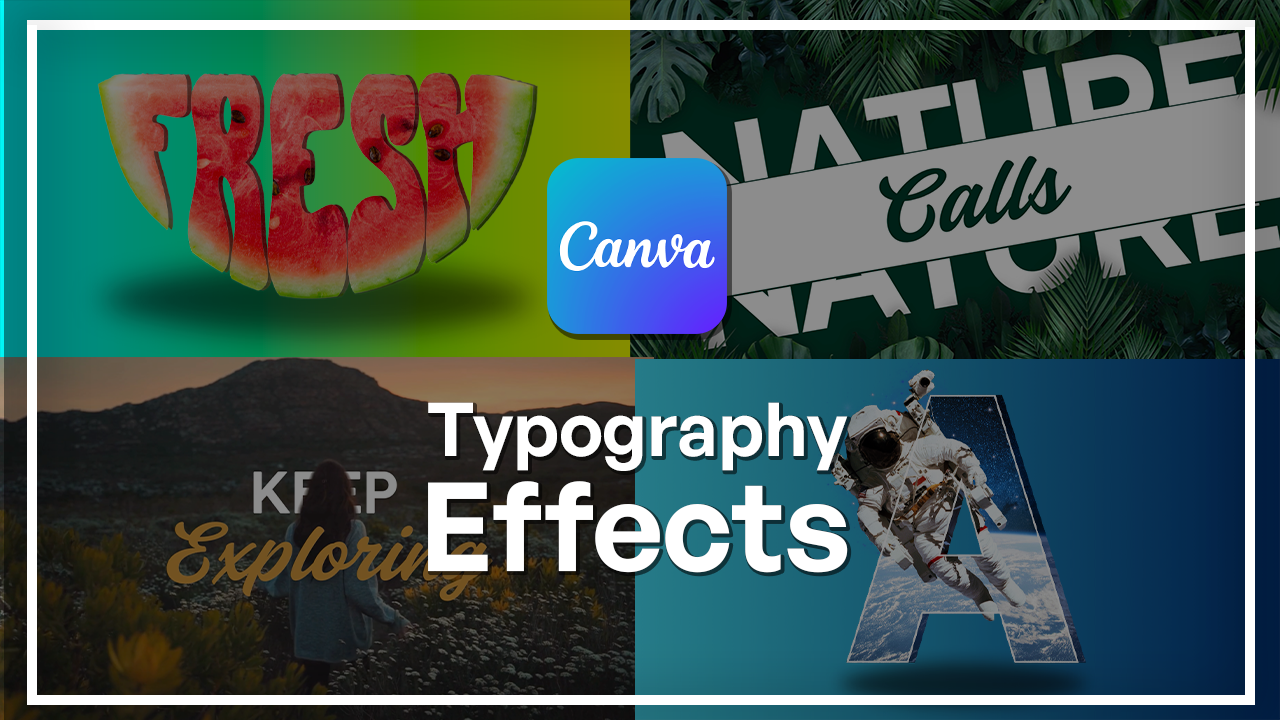
1. Welcome to the Canva Creative Typography Masterclass: Typography is more than
letters on a screen. It's a design
language of its own. With a few smart choices, text can become an illustration, a poster centerpiece, or
even a moving visual story. And Canva makes this more
accessible than ever. Hi, I'm Kim Tiborska, a designer and instructor
with Skiladmia. I have spent years
creating digital artwork, posters, motion graphics,
and branded content. And one thing I have
learned is that expressive typography is one of the fastest ways to make
your design stand out. In this class, I'm
going to show you exactly how to do
that using Canva. Will start with two fun text
effects projects where you will learn how to transform simple letters into
both visual elements. Then we'll jump into poster
style letter composition where you will build two
striking layouts from scratch, using imagery, color,
and type integration. After that, we will move into motion design using canvas
built in video tools. You will learn how to
animate typography behind objects, create
dynamics animations, layer texts with visuals
and even produce transparent text motion effects that feel polished
and professional. The end of this class, you will understand how to
bring texts to life, whether you're
designing posters, social content or
short animated clips. You don't need any
prior experience. All you need is Canva
and the willingness to experiment with shapes,
colors, and motion. If you're ready to
turn simple words into captivating visual
design, let's begin.
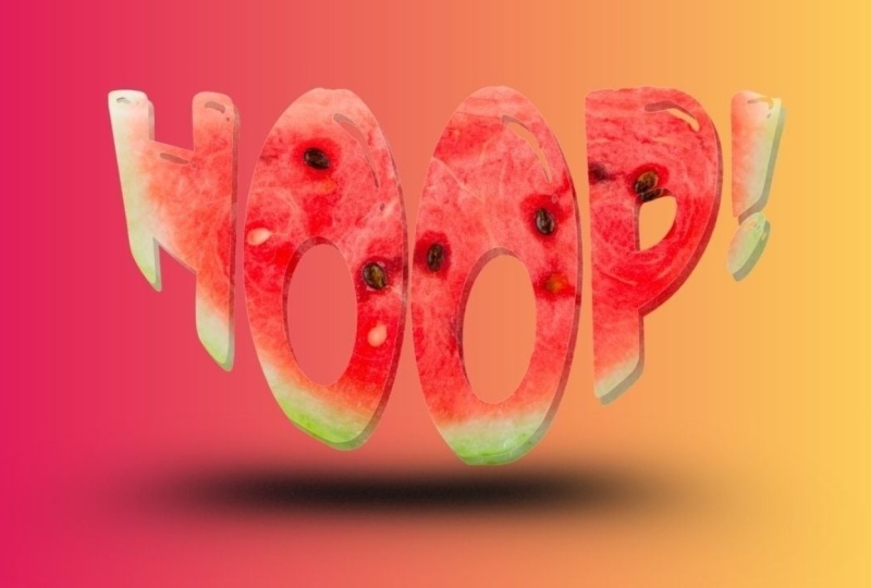
2. Design Text Effects Project 1: Watermelon Slice: To make this effect,
I'm going to start with a canvas on Cava. Isn't that funny? I'm
going to click on social media and go to
YouTube thumbnails. I really like to
work with this size just because it's
very convenient. But you can make
this type of design on any kind of size or
aspect ratio that you need. I'm going to start with
going into elements here on the side and search
for watermelon. I'm gonna make sure the
photos are selected. I think this is
the perfect slice that would make this kind of
lettering look really cool. Very simple and very good
quality image, as well. So I'm just going to
center it like that. I get a tiny bit bigger. Next step is getting
our text to go over. So I'm going to go
and click on Apps. Here is where you
can search for Type, and this should
pop up Type Craft. This is the app that
we want to work with because it's really easy to make letters fit any kind of object that you
have on your canvas. So I'm going to click on this. And here is where all
the magic happens. Up here is where you
would put in the text. So I'm going to go
with something that is associated with watermelons, which would be Fresh. Now we have the text. We can search for the font. You can see the text
be reflected here. But let's search for that font that would fit a watermelon. From all of these fonts, I
see this one's pretty cool, and I think it fits
the vibe, very good. So I'm just going
to click on that, make sure it's selected. And here you can select
any kind of effect, but I think the classic
look fits best. Gonna keep the color to
be this for now just because it doesn't
really matter as long as we can see what's happening. So I'm going to start dragging these little
dots and start shaping this text
and the shape of the watermelon slice
roughly per now. This seems good for now. I'm just going to hit on
add element to design, and this is where you can start
seeing things take shape. G increase size. Like that. Actually, I did it
pretty accurately. A lot of times it's
okay for it to take a little bit longer for you
to go back and forth. But this already
looks pretty good. Let me just tweak a
couple of things. So I'm going to grab
this, make it a little higher in the corners, make this fit a little bit better and track down
this just a tiny bit. Update. And now we can see. Okay, I overdid it
with the corners. That's okay. Like
Bob Ross once said, there are no mistakes,
happy accidents. Okay. So if it's
overlapping a little bit, that's okay because it will
make sense at the end. So I see that H is overlapping a little bit
more than I would want. So bring down the whole
thing a little bit lower. So we're not losing a
lot of the letters. Okay, I'm going to
keep it at this. Now I'm going to
duplicate this page by hitting this button up here, duplicate page, and I'm going to delete the watermelon itself. So click on it and
hit either delete on your keyboard or right
click hit the leap. Don't move this for now. Make sure you have it
selected and change the color to white and make
sure you hit Update element. Now I'm just going to
go up to elements. I'm going to scroll
up here and click on elements and search for shape. Scroll down here
and select shapes. I'm going to click on this one and just make it a
little bit bigger. Make sure you have it selected, go to positions to layers, and put it behind your text. Now I'm going to
match up the edges. Like that. Make it as
tight as you possibly can. I'm going to make it a
solid jet black color. And now I'm going to
download this as a PNG. So hit Share and Download. Make sure you have
transparent background selected, PNG here, and select the page that
you want to download, hit De and download. So now when you have it
downloaded on your computer, go to yours folder, scroll to the first canvas
and drag this here. Now you have it in
your Canvas lineup, the corners exactly
how it was before. I'm going to drag this to
the side. Just delete it. At this point, we
don't need it anymore. Make sure you center this. And now I'm just going to hit
background remover on this. Alright, the letters are cut out. You can
see the watermelon. Next step would be go to edit, and you are going to want to hit Duotone and select Cherry. And this one go onto the
color that is primary in the image and go on to the
white as white as you can. Now, click off, and now
we're just going to adjust the sides of this PNG. I'm going to drag the
side and make it blend into the watermelon
itself, just like that. You can see there's a
little bit of a line. That's okay. Trim it off. Like that. But I'm going
to download this again and then make sure that the
background is cut out again. So going back to
share, Download, Transparent Background
is selected, and select page one,
done and download. Alright, now I'm going to add
a new page to the Canvas. Go to my downloads and drag
on the downloaded image. I'm going to make it
a little bit bigger. And hit background
remover again. And now this should be a completely cut out
image of the watermelon. Now we can start playing
around with the background. So this is super easy. I'm going to trim
off the sides just so the background
is more clickable. Just like that, I am going
to select background color, go on to My favor
thing in the world. I'm going to play around
with the background just a little bit more. So click on it and go
to the color picker. Gajus the colors to be a
little bit more brighter. There we go. This
looks pretty good. I would want this
to be a little bit less orange and more
greenish. There we go. And it looks great, but I definitely want to make
this design stand out more, so I'm going to click on the
watermelon, duplicate it. Drag it off to the side a
little bit, go to positions, put it in the back, and go to edit and just
adjust the brightness. This way, it creates like a shadow moment where you can see the watermelon a
little bit better. Also gives a three D effect. I do want to go back
to the background and make the blue part a
little bit more greenish. So I'm just going to
drag it. There we go. That looks way better. Now, let's just add a shadow. So go to elements and search for shadow and make sure you
have graphics selected. Pick your favorite one, put it at the bottom and go to positions and put it
behind your element, drag over every single element
here and select them all. And now just center it in
your image. And there you go. I would want the shadow to be just a little bit
lower like that. Alright. And now you have
the watermelon design ready. This looks really, really cool.
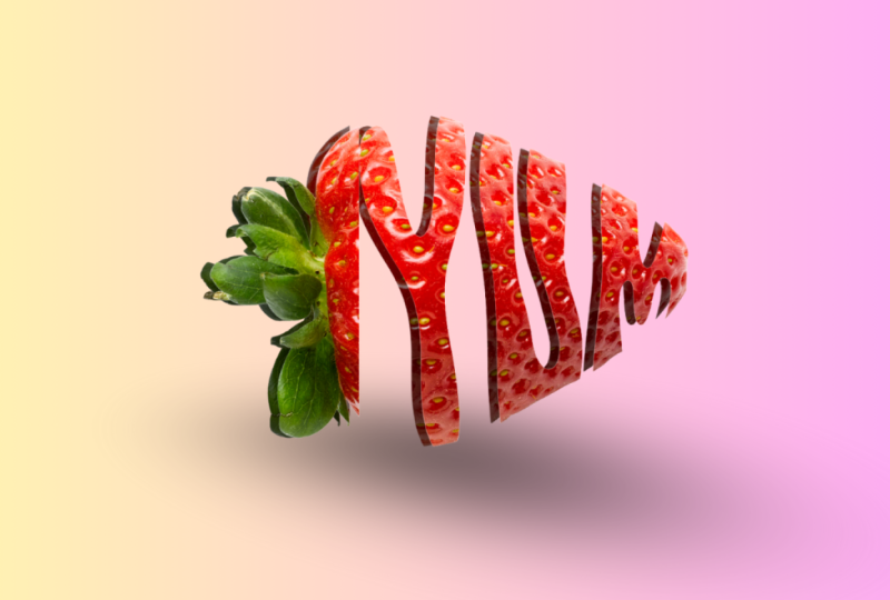
3. Design Text Effects Project 2: Plant Leaf: Now, let's work on the leaf one. So I'm going to add a page and just take off
this background. So I'm going to select it, right click it and
delete background. Now I'm going to go back to
elements and search for leaf. Go on to photos and pick
your favorite leaf. There are so many choices,
but I really like this one. This one looks very lively. I'm going to have it lay
horizontally just like that. I think that looks
good. Now I'm just going to repeat the process
that I did for this. So going back to apps, we have the type craft ready. Let's change the text to grow. I'm going to change the
bond to be the same one as the watermelon one
just because I think it really does
fit pretty well. And let's start shaping. Let's go for this. I'm going to change the color for this one just so I
can see it better. And like this little by little, you'll get the letters to fit
into your image very well. So I'm going to
bring down the top. Let's change the color and
see how much is cut off. Okay, so there's a lot of O
on the bottom in the top. Let's fix that. Okay, that looks a little bit better. All right. I think this is as good
as it's gonna get. So now, again, let's
duplicate this page. I'm going to delete the leaf. Change this to white,
add a background. Let's change that to black, and again, download this page. It's gonna be page five. So now going back to the other canvas that we
were just working on. I'm going to select the
text and delete it for now. I'm going to go to my downloads and get my downloaded
image and drag it on, make sure the corners fit. Now go to background
remover and go on to edit. Let's go back to Duotone
and select the cherry. Now, the purple color is
gonna turn into white. I'm going to drag it down
just a little bit here just so you could see the G a little
bit better. There we go. Just like cell. And going
to make sure that we cut off the white corners
here from the sides. Okay, so we have a little bit of a problem here. That's okay. What I'm going to do
is select it again, increase the size
just a little bit. There we go. That looks a little
better. And now we have this beautiful
thing which we again, have to download and make sure that the background
is completely deleted because we can see
some residue from the letters. So going to hit Download.
Select page four. Now going back to downloads, I'm going to grab my downloaded
image, drag it on here. Beforehand, of course, make sure you delete all of this.
You don't need that. We make this fit
the entire Canvas and click on
background I'm over. And there we go. Now
we can start playing around with the
background itself. So, again, this time I'm going
to do something different. I'm gonna go for solid color. That's a little bit more
than I would want to. I'm going to go
for a solid green, but I'm going to go
to the color picker and adjust it just a little bit. It a little bit more blue. I really like this between
blue and green tone. I think that looks
pretty good for now. Not bad. Let's
keep it like this. But I'm going to
spice this up by adding a pattern
in the background. So let's go to elements. And one cool thing about Canva is that they have
really cool patterns, and I don't see a lot
of people using them, but that's why I'm
here telling you. So you want to go into
elements and search for leaf. Pattern. Make sure you
have graphics selected, and here you have a bunch of
different patterns to use. I actually see this
one's pretty neat. Maybe let's go with
that. So the funny thing is that this looks
like a solid image, which it is, but with
a couple of tweaks, we'll make this look seamless. So as you can see, it doesn't
fit the entire image, but if you duplicate this, put it here, it should match. You see, it's
absolutely seamless. You cannot tell that these
are two different images. Make sure you have one selected. Go to layers and just put
it behind everything. Now, it looks gray, but it's a little
bit too strong. Let's just make sure that
they are perfectly filling in the entire image. I'm going to drag
from this side, hold down my mouse, and drag
it all the way to this one. Now I have both
of them selected, I'm going to group them
together, so it's easier. I'm going to drag
it out the corner. Just make sure it's
all filled in. Now you have this selected. Go on to transparency, and this is where you can bring down the transparency and make it look more like a pattern and a little bit less strong.
I think this looks good. And there we go. Now, let's just add a shadow like we did before. So go back to elements. Search for shadow. That's right. And let's put it under the leaf. I go to positions
and put it behind. However, I would want this
leaf to stand out a bit more. So let's do the
shadow effect again. I'm going to click on
it and duplicate it. Put it a little bit
off to the side and just put it
behind the first one. That might be a
little bit too much, though. There we go. Go to edit and adjust
the brightness. I would, however, want to
edit this a little bit. So I'm going to select edit
and go to adjustments, increase the brightness,
increase the contrast, just a tiny bit and go on to
the saturation and vibrance. Give me a little bit
more saturation. There we go. Alright. So
now we have that all done. I do want to adjust
this a little bit more. Let's zoom out for
some perspective. You see, perspectives good. Now, I'm looking at it. Let me just adjust the background
leaf a little bit more. I think it's a little bit
too much I'm thinking. Okay, that's good. I'm gonna bring down to brightness
just a little bit more. Okay, there we go. Perfect. And there you have it.
You have a leaf that says grow and a pineapple
that says that it's fresh. That was very, fairly easy, and really anybody
could do this. All you need is a Cam count and willingness to click your
mouse a couple of times. Now let's just
download both of these and start using them because
it would be a sin not to. You have both of them selected. Hit done. Do not
have this selected because we do want to keep
our backgrounds intact. Hit download, and you're done.
4. Create Poster Letter Designs Project 1: Planet : To start this process, I'm going to start on a canvas. You can make this
type of design on any kind of size you want, anything that fits your needs. What I think personally
works the best for me is the classic
YouTube thumbnail size. So how to get it is click on social media right here and
select YouTube thumbnail. It's 12 80 by 720 pixels. Here we have the canvas
ready for us to work on. First things first, I
need the image that I would want to
be in the letter. I'm going to go on
photos right here, click on it and
search for a planet. You have many different
beautiful options, but I'm going to
go with this one. This is a beautiful planet
called uranus by the way, if you didn't know, it is very cold and very far
away from the sun. So, now that we know fun facts, we can continue
with this design. Now I need the letter that I would want
the design to have. So I'm going to go
on to the elements. And here you can
either search for it or you might already
have this button here, which is frame. Click on that. And here by frames, just select C A. And now, if you go
to the search bar, you can search for whatever
kind of frame you need. I'm going to go for a letter. Got many different options
in different fonts, so many options to choose from, but I'm going to go with this
one and particularly you. Why is because it is
planet called uranus. Also, you can stand
for the universe. So I think that's pretty cool. I'm just going to center
this element in the middle. And now I'm going to take the image itself
and first of all, click on positions, layers, bring it in the front. I'm going to turn down the
transparency up here just so I could see where this planet
would sit in the frame. So I don't really like how
it's, I think, too big, so I'm going to drag the corners and make it a tiny bit smaller. Okay, I think I can
do a little bit more. Okay. I think this
looks pretty good. So now when we have the planet
lined up with the letter, going to make sure that
the layers selected, go up to transparency, bring it up, again, go to layers and make sure that this is going
to be in the background. So now it all looks great. However, we need to get
this image in here. So select the image and
click on duplicate. And that's going to be on top. And if you select it and
move it towards the letter, it's going to go into the frame. And now all we need
to do is line it up. So double click on
the letter itself. Now, when you have
the image selected, make sure you line
up the corners with the background image. There we go. And now click
off of it, and there you go. You cannot see the
letter, but that's okay. Next, I'm going to select the background image and going to click on
Background remover. Now we have the planet
perfectly cut out. I however, do see a little bit of pixels here that
haven't been removed. So I'm just going to click
on Background Remover again and going to select erase, bring down the brush size, and just click on these pixels
that didn't get erased. Make sure that
they're not there. Alright. That looks good. I'm going to click on X, and here we have a great cutout. Next step would be duplicating
this letter for it to act as kind of like a shadow or
just depth of the letter, make it look three
D. So I'm going to select the letter itself,
click on Duplicate. And now by dragging it, I'm just going to make
sure it's aligned with it, but a little bit off to the
side, going to positions, and I'm going to drag
this letter that's in the front all the
way to the back. For now. So now we need this letter
to kind of stand out. So the first one, I'm going to make sure to click on
it and click on Edit. Here's where I'm going
to play around with a couple of settings and
even filters to make this look a little
bit more brighter and fit the aesthetic
that I'm going for. First, I'm going to
go for the filters. So let's scroll through
and see what they have. That doesn't look too bad. I really like the shade. That's cool. Let's see
what else? What else? That one looks pretty
cool. It really brightens up the background. But what I'll also
do is play around with the settings
themselves, right? So I'm going to click
on this letter again, click on Edit and go to adjust. And here you can
play around with a couple of more things
like brightness, contrast, highlight and so on. That can really help out. I'm going to increase
the brightness just for it to stand
out a little bit more. I think that looks good.
Can increase the contrast, definitely makes it look a
little bit more stronger. I think that's pretty good, too. Let's increase the highlight
just a little bit. And the shadows. I'll keep it at 17. So now the first
letter definitely stands out from the
letter behind it. But I also need to
apply the same settings to the planet that is
right here in the middle. So going to positions,
clicking on the planet, click on Edit and go
apply the same settings that you had that you just
made on the first image. So back to the same
filter. There we go. And going back, we're
going to go to adjust, again, increase the
brightness, the contrast. It doesn't have to
be exactly the same, because we're going
to change the position of it very soon. But right now it looks very
actually fairly similar. One thing I noticed was that this planet doesn't
really line up. You can see the lines are off and the planet peaks through, which does not look good. I'm going to take this
planet in the middle, drag it to the back, just
so it's easier to see it. Now we have the second
letter selected, I'm going to double click on it, and I'm just going to move it because the size is
the same, right? Need to make sure it's lined up with both of the other ones. I think this is a good point. I'm gonna release
it, deselect it. And now, so far so good. I like the way this looks, but we can make the first letter stand
out a little bit more. So click on the first letter
and go up here to border. I'm going to create a little
bit of a border effect here. Three doesn't look too
bad. Let's do four. And let's change the color of
the border to maybe white, or maybe I can just go to the colors that have
been matched to the image itself and
select one of these. This isn't bad, but let me
make it a little bit brighter. Just so it still
has that blue tint. There we go. Okay, this
looks pretty cool. So now, what I'm going to
do is create some sort of a glow effect to the planet
that is behind the letters, just to make it stand
out a little bit more. So I'm going to click on in
the layers, select Edit. And here down by the effects, I'm going to click on Shadows. I'm going to select
the glow effect here and change the color, first of all, to something a little bit less dark, for sure. So I'm going to go to the blues. You probably noticed that
selecting this effect actually made the size of the planet a little bit
smaller, but that's okay. We can fix that by just
dragging the corners out again and make it match
the other ones, you know? To us, like that. There we go. Alright, now it
matches pretty good. Now, let's give
this whole design a little bit of a
background just so you can also
see how the rings are glowing. Going to zoom out. I'm going to click
on the background, go to background color, and scroll down here
to the gradients. So first, I'm going
to select this one. This isn't too bad. Actually, I like this blue
moment that's going on here. But what I'm going to do is
maybe match the colors a little better to what we
have with the planet itself. So clicking on the
color picker up here, here's where we can
start adjusting. So this one needs to
be a little brighter and a little bit
less green, perhaps. Okay, I think
that's pretty good. Next one is going
to be this one. All right. I think that
looks pretty good. We can also play around with how the gradient sits.
Actually I like this. I think I'm going
to keep this here. Let me play around with
this blue a little bit more. Go for something darker. There we go. I think
that looks good. Alright. So now we
have the background. The rings have a good glow. I think we can definitely spice it up with a couple
of more elements. So I'm going to go to elements. Click on that. Click
here on the X, and I'm going to
search for stars. Go to graphics and look for something that
might match this image. Actually, this already stands
out, so that's pretty good. I'm going to take this make the size a
little bit smaller. So I'm going to
zoom out just so I have this little
handle right here, because if I would drag this, it wants to go into the frame, and it could be quite difficult. So I'm just going to
take the little handle and move it freely. That's
actually pretty cool. Okay. I'm going to click on the star and
duplicate it and just put it in places that I think would improve
the overall look, decrease the size, twist
it around a little bit, just so it doesn't look
copy pasted, you know? Copy it again. I'm
going to put one here. How does that look there?
That doesn't look too bad. I'm gonna keep this one
here, duplicate it again. Make it a little
smaller, duplicate it. G scatter the stars around in random places like that
would look in real life. Alright. Done. Alright,
so far so good. Let me zoom in and make
sure everything looks fine. So first thing that I'm seeing
is that the planet doesn't these lines don't align with what we have going
on in the letters. So let me fix that. Click on this ring right here just so I have a
handle to move it, and let me just change up the
size, make it match better. Another way to do this
is double click on that and move the image itself. Okay, that matches. Let
me correct this, as well. Alright, now everything
seems to be lining up and doing pretty well.
Now, let's zoom out. And here you have the letter U ready to be exported and
used in any kind of design.
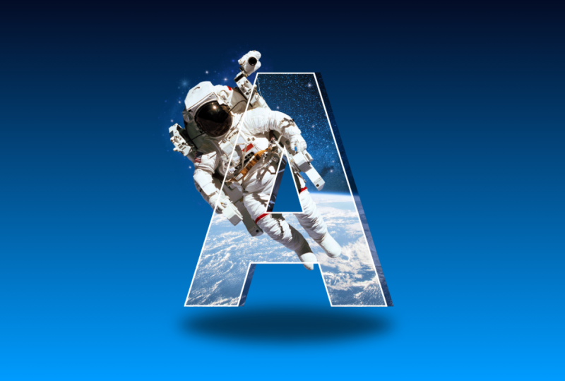
5. Create Poster Letter Designs Project 2: Astronaut: I'm going to click on ad page. I'm going to take this, select the background and delete it. Now we are going to do the same thing that we
did for the planet. I'm going to go into photos. G to search for astronaut. And here we have already
a couple of cool images. Let me go with this one. This one's a little
bit better quality. So let's center that. Again, go for the letter. And for this one, I'm going
to take the letter A, clearly, just because, you
know, it's an astronaut. So I'm going to make
sure I center it, maybe not make it
as big this time. Now I'm going to
take this image, change the position,
put it forward. I do want to flip this
image to the other side, so going up here, select
flip and flip horizontal. Now I'm going to change the
transparency and position the astronaut how I would want it to look in
the letter more or less. All right. I think
that's pretty good. I go to bring up
the transparency. I'm going to put this image
back behind the letter, duplicate it, and drag
it into the letter. Double click and line it up
with the background image. Perfect. Now, selecting
the background, we're going to remove the
background from the astronaut. This is what we're left with. Already it looks pretty cool. Let's take the astronaut and make the window a
little bit smaller. Just so it's easier to manage. I'm going to tap on the
letter, duplicate that again, and put it off to
the side a little bit creating the same
effect that we just did. Gonna go to positions and
put it behind everything. So, so you can see it right now. I'm going to make the
adjustment right away. So going on to edit, adjust, bring down the
brightness immediately. So there it is. There's the effect that we want. So for this one, once I
lowered the brightness, it did kind of make it a little bit more yellow
than I would want. I'm going to take the temperature and
bring it down as well, just to keep that blue. Tint. So, there we
go. So far so good. We're going to go back and adjust a couple
of things, maybe. Next, I'm going to apply
a little bit of contrast to the astronaut because I wanted to stand out
just a little bit more. So I'm going to
go to adjustments and bring up the contrast. I'm gonna do the same thing for the cutout, just so it matches. But before you do
that, make sure you remember what amount of
contrast you applied, 35. Otherwise it's gonna end
up looking different. 35. There we go now. It looks seamless. I'm going to go ahead and apply the border around
the letter itself. I'm gonna go for four
again, change the color. I could actually go
for white now just because the Astrons wearing
a suit that's white, so that will match pretty good. I do want to bring down
the thickness just a bit, so it's not as intense. I think three actually is best. I also want to make sure that the background letter
creates more depth, so I'm going to go on to
positions and layers, select this, bring it down, bring it out a little bit. A tiny bit. There we go. I think it would look best if
this astronaut wouldn't be showing in this triangle here just so we could see the
letter a little bit better. So I'm going to click
on the astronaut, go back to background remover, and again, erase a
little part of him. So first, let's make sure
we know what we're erasing. So it goes from one leg
to the other. Okay. If anything, we can go back and forth and make sure
that we get that done. So remember that it is flipped. So I believe it was
here somewhere. Let's see how this
looks. Select the X. Okay, so I didn't
do a horrible job, but it can definitely improve. So I need to take
off a little bit more of his knee and go back All right, let's
take away the knee. He doesn't need it. There we go. Now it looks pretty cool. So now we definitely
want to make sure that the background image in the background letter is
lined up with the front. So we'll just make sure that the astronaut's really not
in the way at all. So I'm going to
shorten him like that. Double click on the
background. There we go. And now let's just line up with the front as
much as we can. There we go. That's perfect.
And release. There we go. Now it lines up perfectly. And let's just create some
background here so we can add other elements and spice this design up
a little bit more. So going back to click
on background and then background
color, scroll down. And I'm going to do a gradient again just because I think gradients look really
cool with these. This not bad, but this is
pretty strong. Let's see. I'll go up to the color picker and adjust a couple
of things here. Maybe, first of all,
do this one instead. The black one, we don't
need to have it as intense. So let's go for something
blue a little bit. Okay, before I do that, let's just keep it
here and adjust the light color just so it matches the image itself
a little bit better. And just going in between and
playing around with colors, I do want something a little bit more intense for this one. Yeah, I want something a
little bit more juicier. So let's go here. There we go. Now we have the background is
a little bit stronger. So now I want to add something to the astronaut
because this isn't bad, but I think it could
look a little better. I'm going to go on to elements
and search for a nebula. I'm going to see all
of the graphics, and let's see what they have. I actually like this one a lot, so I'm going to work with this. We're going to change up the
colors and everything else. So first of all, I am going to position this behind everything. So going to positions
and dragging this down, I'm just going to put it
behind the astronaut, like so, and let's start
editing the colors of this. A really easy way,
especially with these kinds of graphics
is to do filters. A lot of times they have
things that already fit. Alright. I think this
works pretty well. I'm going to go on to
do some adjustments, so increasing the brightness. And that's really about it
for this because my goal here is for it to be not as in
your face but still visible. So I like the way it's
behind the astronaut, but I'm not a big fan on how it peeks through
the other side. So what I'm going to do here is just by grabbing this side, I'm going to make it kind
of crop it, actually. But also, it does peek through
the middle of the letter, so maybe that has to go too. Alright, I think this is
a good place to start. There we go. Since we have
this in the background, I actually would like the background to be a
little bit darker for it to stand out a little
more and maybe even change up the
position of it. It's not that bad. Okay.
I'm going to bring it back here just because I
saw the cut off line here, and that's not cute at all. Okay, so I think so far so good, let's just add a
couple of stars, and we're going to be done. Go back to elements. I'm going to search for stars I think I'm going
to use the same one I was just using on the
other one just because it proves that it looks good. So let's go for that. I put
one here, duplicate that. Maybe put it over
this one. Maybe not. And let's just scatter them
around in random spots. Okay, that's better. I'm
gonna put up a couple of those stars on the letter itself just to make it match, you know. So now we have the letter. I'm going to select all of
the elements together by just holding down my
mouse and dragging over. Now I'm going to increase
the size of everything like this and just make sure
that it is centered, like so, and now I think
that looks pretty good. The only thing left to
do is add some shadows, which I did not do for this, so let's do that as
well on the bottom. I'm going to go
back to elements, search for shadow, and I'm going to select this
one, decrease the size. Make sure it is aligned, and I'm going to
make sure to put it behind every other element, just so it looks real. There we go. That
looks much better. Gonna go onto this one, as well. Go back to elements and take that same shadow and
put it under the U, go to positions
and bring it down. And now let's zoom out and
see overall how this looks. I think this looks pretty cool. Let's center and bring up this design itself just
to bring in some balance. There we go. And here you
have everything is ready.
6. Text Behind Object Video Effect: So to get our first
design started, I'm going to click
on this video button right here and I'm going
to choose my size. You can do just about
anything you would like, but I'm going to go
with the landscape. Now, first thing we
need is to choose the video that's going to
be featured in the video. So I'm going to go on to the video section
right here and I'm going to search for woman
walking and Nature. And I'm going to
go with this one. Size it up to fill the
entire canvas. Center it. There we go. So now
we need the text. I'm going to go over to the side and select text
and add a heading. I'm going to write
in all caps, keep. And now I'm going to
duplicate this and go to change this
text to exploring. So now I'm going to rearrange the text on where it should be. So we're going to have the word keep behind her and
exploring in the front. First thing, I want to increase the size of this word for sure. If the white screen appears, just toggle this little line on the timeline, and
it should come back. Now I'm going to increase
the size of Keep and start adjusting the look
of the text itself. So first, I'm going to
change the font on keep. So I'm going to click
on it and go up here where we can
find different fonts. Coco Gothic, I believe is. There we go. I think I'm going
to keep the text in white. The second word is going to be a different font to something a little bit more handwritten
or something like that. Actually, this one. I recently used this, and it's pretty cool. So, this one, I think, fits the vibe very well. I'm gonna position it here. Let's change the color of it to something that
maybe match the flowers. I think that could
look really cool. So I'm going to go onto the yellow it's a little
bit too bright. Me orangy and maybe not
as bright. There we go. I'm going to add some shadow
to exploring effects shadow. And let's do a lift. Bring down the intensity. And here we go. That
looks pretty good. Now I just need to take the girl and position her
in front of this word. So I'm going to select
the video in the back, click on Duplicate, center it, and now click on
Background remover. Now, this mainly what we're concerned about is
this part right here, which looks like it
cut out pretty well. So I'm going to go to positions layers and just
position the girl above keep. And now going back
to the timeline. Now, it looks like
it doesn't work, but it's still kind of
rendering in Canada, so just going to have
to wait a little bit. And there you go. This
is the first effect, and it was super simple
and very fast to make. Now, you can just download
it by clicking on Share. Download. Choose your quality and hit Download. And
there you have it.
7. Text Overlay Video Effect: For this next effect, I'm going to again click
on video and on Landscape. Now again, I'm going to choose the video that goes
onto the canvas. So back to the video section and I'm going to type in Aurora. And there's many
different beautiful kinds of videos of auroras, unlike this one. So
let's go with that. Again, make it fit
the entire screen. And the magic starts
is when we go to elements section and
search for frames. And down here, you have
the letters section C all, and this is where we're
going to put in the letters. So I'm going to make
it spell out light. So by clicking all the letters, it will drop in on your canvas. And just like that, we
have the entire word. I'm going to select
all of these letters together by dragging
my mouse over them and resizing them
together, so they all match. I'm just going to center it, go down to the timeline,
kind of scroll through. I think that looks pretty good. Cool. Now going back
to the video section, I'm going to take the same
video and drag it into each of these frames one by one. Just make sure you don't have
it all selected at once. By double clicking
on each letter, I'm just going to
take this video and match it to the background. It's slightly transparent. You can see where it fits. There we go. That's one. Let's do the second
one and just repeat this process over and over again until you have
all the letters. There we go. And now let's just scroll through so it
looks pretty good. Now I'm just gonna take
the background video, click on Edit, and
click on adjust. And here, I'm just going to
bring down the brightness. I'm going to bring down
the brightness too. I want to say like
here, maybe. Like -58. I'm gonna go back and
see how it looks. Doesn't look too bad. That's a little
too dark, though. That looks cool. That's how simple it is to make this
kind of letter effect.
8. Split Text Animation Effect: For this next design, I'm going to go back
to the video tab and choose landscape. So for this, it's going to
be a little bit different, or we're going to
begin with the text. So I'm going to go
to the text tab right here and select
add a heading. The word that I would
like to split is nature. I'm going to write it
in all caps. Like so. I'm going to select the text, go up to the font
button up here, and choose a font that would
fit this kind of design. I'm going to go
with TT norms just because it's nice and
bold, and it always works. Gonna center it, like so, make it a little bit bigger, just so it could make
an impact. Like that. Now, I would like this text to be actually a
little bit more put together. I think it has big gaps. So selecting the entire text and going up here to spacing, I am going to be dragging this slider
which says line spacing. I'm just going to
gather the letters together just a little bit. So now we have the
main text ready. I'm going to change the background to something
a little bit darker. This is going to be
in the green theme, so I'm just going to go
with something like this. For now, we're going
to change it later. I'm going to change
the text color to white just so it can
stand out. Just like so. And now I'm going to
add some elements. I'm going to go down to
photos and search for leaves. And here you have a bunch of different options from
cutouts to even images, but I really like this bunch. It's like everything I need. I'm going to increase the size, position it up here. And I think I do want the
leaves to not be as green. So I'm going to go up to
it and just go through the filters and see what
filter might look better. Let's go with this.
You can adjust the intensity by playing around with the slider.
So that's pretty cool. But we have this ready. I'm also going to be
adding some shadow. I'm going to go up to edit and just select this shadow
under the effects. You can choose
whichever one you like, but I think this one
will work the best. Let's decrease the size,
just a little bit, blur amount, a tiny bit, and maybe the intensity
not as intense. Gonna size it back up. I want this leaf to kind of be here but not be as intense
in covering the text. So I think this is
a good position. Let's zoom out a bit. Now I'm going to duplicate this same element with all
of the effects intact. So hit duplicate and
going up here to flip, I'm going to flip it
horizontally and vertically. And now we have almost a
mirror effect of this le here. So this is looking pretty good, but I still want to change
the background color, so I'm going to go to positions, select layers and click
on the background. Here, I'm going to click on the background color and play
around in the color picker. So something that
will make the text stand out and will
match the leaves. So we definitely
have to go a little bit more to the blue side, not too much and
definitely darker. There we go. I
like that already. You want to increase
the size of the letters just a little bit center it. These leaves are still
kind of covering a lot. So let's just play around a
little bit. That looks good. Same thing with this
one. This one's covering the first letter. I
think that's good. And the effect of the letters or the word
coming out of the bottom, just because the leaves are covering the
bottom, not the top, I think it fits pretty well, and I'm going to
keep it like that. Next, I'm just going to
go down to the timeline, right click on the first
scene and hit Duplicate page. On the next one, on this
second duplicated scene, I'm going to delete
the elements, which are the leaves,
and I'm just going to download this as an
image onto my computer. So hitting Share Download, make sure you have the
correct page selected. Transparent Background
is not selected because we do need the background,
and you'll see why. So I'm going to hit Download. So now I'm back I have the image downloaded onto my computer. I'm just going to go and delete this second scene
that I created. So delete page, right click on the scene and hit very easy. Now we have this scene, first one again alone, but I'm going to
duplicate it again, just because I need the elements to be
in the right place. So I'm going to hit
Duplicate page. And the second scene, we do have to get
rid of the letters. So I'm going to go up
to positions layers and hit the text element
and just delete it. Now what I'm going
to do is go to my downloads and just drag and drop the image I just downloaded and size
it up. There we go. And in the positions,
I'm just going to place it behind
all the elements. So far, it looks pretty good. Make sure you have the image selected and you go up
here and hit Duplicate. Now you have two of them. What I'm going to do is again, drag it down behind
all the elements. And by dragging this
little side here, I'm going to cut
this one in half. So I'm going to drag the
bottom up so we have the top of the word visible, and I'm going to do the same
thing to the second one, but from top down. So you see, we need
to cut off the top. Now we have two
images cut in half, and this is what's going
to do the split effect. The only thing is that I
still would like the top of the word to be in
front of the leaves. So what I'm going to do is
make sure I have it selected. Go up here and select
background remover. This way, it has gotten rid
of the green background, and I'm just going
to drag it up so the letters aren't behind
the leaves on the top. Right. So now we have that going on, and it
looks pretty good, but we have to make
sure that we have the same exact situation
going on in the first scene. So what I'm going to do is here, I'm going to hold
Command on my computer, and I'm going to select both of these text elements, right? Now I have both
of them selected, and I'm going to hit Command
C, which is to copy. On my keyboard, I'm going
to go to the first scene. Delete the text, and now Command V on my
keyboard, and it has pasted. The elements from
the second scene. Now we just have to adjust
them in the layer section. So we have the bottom leaves. They need to be in
front of the letter. So I'm just going to drag it up, make sure that all the
leaves are covering, okay? And the top leaves stay behind. Now we have this going on, but now going on to
the second scene, I'm going to start splitting. So going back to positions, I'm going to select
the correct elements that I would want to go up. Have the top of the word, and I'm going to
hold command key on my keyboard and make sure I have the top leaves
selected as well. So I'm holding the command key, I'm going to click
on that element. I have both of them selected. Now I can move them both up. Make sure that they're
still lined up. Could be a little bit tricky. I think this is good for now. I'm going to do the
same thing with the bottom of the word
and the bottom leaves. So bottom, hold command, and bottom leaves and drag
it down. There we go. I think that looks good so far. So now we have it went
from this to this. To start seeing the effect, I'm just going to
add the transition, which just hover in between both scenes and click on the
second little button here. Add transition, and you want
to go to match and move. And here you can already see
the effect taking place. It looks awesome. I
really love this effect. But the only thing I'm
seeing here is that these leaves are hiding behind
here, which I do not like. So I'm going to go to
the second scene and go up to positions and layers and see what's
going on. There we go. I just drag down the bottom of the word under the top leaves. Now it looks a little
better. There we go. Looks very smooth. So
now I'm just going to add a word in the middle. And before I do that, I'm going to go up to elements
and search for shape, select this square right
here and just size it to the canvas, make sure that it lines up
with the letters like so, go and change the
color to white. And now we have background
for the second word. Go to text and add
another heading, and here you can put
in your second word. I'm just going to go with
nature. What does nature do? Nature calls select the text, go to the colors, and here we already have the color of the
background saved, so I'm just going to
make sure that it fits the whole design. So now we have the color
the same as background, and also I'm going
to change the font. So going up to fonts, I'm going to go with
something that's handwritten. I think that would
compliment this a lot. I think this one's, there we go. That looks good. No need to go searching for stuff.
Just line it up. And again, if you're not sure, right click on the element
that you're working with. And if you're not sure that
it's properly lined up, just align the page. This has helped me out so much. Now, technically, lined it up, but I still kind of
see it a little off, so I'm just going
to line it with the background
that I just added. So now we have this
element added, and I do want this to be
popping out of the background. So I'm going to
select both of these. So the background
and the second word going to go to positions. And again, going to
hold the command key on my keyboard and click on
both of these elements. Command S on my
keyboard to copy it, go to the first scene
and paste it in. Since they both
are now selected, I'm just going to
make sure that they are as small as possible. I'm gonna line it in the middle, and I'm going to hide it
just because, remember, the first top of the
background is gone, so I do want this to
be hiding behind. Now it's tiny. I'm
going to go to layers, and I'm just going
to hide both of these elements behind
the first word. So now we cannot see them, but it should be
popping out. Like so. Tara, Tata, tada. So now, it looks pretty cool. I really like this
kind of effect. What I will do, though, is I'm going to rearrange
the order of these elements, so I'm going to go
up to positions. And in the second scene, I'm going to drag both
of these elements down, so the white background and
the second word just so the leaves could pop out over, you know, I think that
looks a little bit better. Looks really cool. So now, just to add some flare to this whole thing. I'm
going to tilt it. So second scene,
select everything, so drag your mouse over
the entire canvas, make sure everything
is selected. And now just gonna
tilt it a little bit. I think ten is good. Now we have this square cut
off a little bit, but easy fix, go to position, select and drag the
sides. Like so. And now you have a really cool text reveal,
split text effect. This is really, really cool, especially for social media. So again, you can download
this, just hit Share. And download. Make
sure you have it selected as a video,
and you're done.
9. Transparent Text Video Effect: For the last effect, again, I'm going to click on
video and Landscape. For this, again, we're going
to go to the video section and we're going to search
for the video itself. But let's go for a turtle. There we go. Again, make sure
it fits the entire Canvas. Now we have our turtle ready. Next step is adding the text. So again, go to text
and add heading. For this one, I'm going to say, again, in all caps,
nature heels. You want to know why?
Because it's true. I'm going to make
this in two lines, size it up a little bit. Actually a lot a bit. Gonna center it.
Okay? Scroll back on the video, see how it looks. Not bad, but we can
do much better. Make sure you have
your text selected. And I'm just going to adjust some line spacing here. I'm
not going to touch that. I think that doesn't
look too bad. But we also definitely
want to change the font. So going up two fonts, let's go with this one because
we were just using it, and this font just
works for most things. I do want to decrease the
space a little bit more. There we go. That's pretty cool. So since we want this message to make a statement
because it's true, I'm just going to
change the color, made it a little bigger. G to change it to white. And I am going to duplicate
the same text twice. I'm going to layer this over. But for this one,
I'm going to go to effects and get
the hollow effect. It's going to click
on that. So now we have the text ready. Going to line it. Going
back to the video, I'm going to duplicate it again. Make sure that the copy
is completely centered, and you want to hit
background remover because that's
what's going to give the effect that the turtle is swimming through the letters. Now it looks a little wonky. That's okay. It's
going to catch up. It just needs to
render a little bit. But while it's rendering, I'm going to go to
positions layers and place this turtle cut out behind
the hollow letters. Like, so it's looking better. I will, however, decrease the transparency of the
background letters. So go to Layers section again, select the filled
letters and go up to transparency here and just
decrease it a little bit. Since it's still rendering, I'm just going to play
around with this. Doesn't look bad,
but it's a little bit too faint for my taste. 73 maybe. And here we have the video pretty much
ready for downloading. I don't think there's anything
else that can be added. It does still kind of glitch a little bit, but no worries. I'll download it and
it will look fresh. So I'm gonna go up to share. Again, download and finally
download the Turtle.
10. Congratulations! What’s next?: That's a wrap. You
have learned how to take typography far
beyond the basics. Shaping text and illustrations, building expressive
poster designs, and animating type with motion effects that stop the
scroll. Now it's your turn. For your class project, create your own typography piece using any of the techniques
from the lessons. It can be text
effects illustration, a poster letter design, or a short animated video. Whatever inspires you most. Upload your project to the
gallery once it's ready. You can also share
your inspiration, process shots or
alternate versions. I'll be checking the gallery
and giving feedback, and I cannot wait to see how you make these
techniques your own. For designing with me today. Keep experimenting. Stay
curious and I'll see you soon.
 Skillademia Academy, Creative Skills for the Future