Transcripts
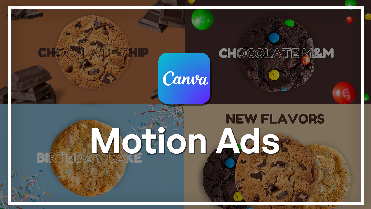
1. Welcome to the Canva Motion Ads Class: Product ads are everywhere
in social media, online shops, marketing
campaigns, and brand promotions. And the ones that stand out
all have one thing in common, strong visual design and smooth engaging
motion. The good news? You don't need complex
software to create them. With CNVa, you can design clean, professional animated product
ads faster than ever. Hi, I'm Kintibk. Graphic designer and creative
instructor at Sciladmia. I have worked on branding,
product promotions, digital campaigns,
and motion graphics for clients and creators. One of the tools that
I rely on most for fast and high quality
visuals is Canva. It's powerful, simple,
and incredibly versatile. In this class, we will
work step by step through the full workflow of designing a modern animated product ad. We'll start by setting up your workspace and placing
your product correctly. Create a unified
monochrome color scheme to give the ad a
cohesive, branded feel. You'll learn how to apply typography and
PlayPoPop animations, adjust timeline timing, and use transitions to create
smooth professional motion. As we build multiple scenes, you will learn how to isolate
elements efficiently, keep your layout consistent, refine your pacing and tie everything together with
branding and sound design. The end of this
class, you will have a complete animated product
ad that looks clean, modern and ready to publish. No advanced experience
is required. If you can drag, drop, and type, you can
follow this class. So if you're ready to create
professional animated ad using Kims design and motion
tools, let's jump right in.
2. Course Setup, Workspace, and Initial Product Placement: So to get this party started, you're going to need
a Canva account. So whether it is a free account or an account with a
subscription, both work. The only thing is that
with the free account, there's gonna be a lot
of elements that you cannot use that I'm
using in this video, but it's okay
because you can find greater alternatives
all for free on Canada. So I'm going to start with clicking on this video
button right here. There's many ways you can go, and this is also a
really great way to make product ads
for social media. But for this video, I'm just going to go
with the landscape. Here we have our workspace and our timeline on the bottom. This is where all the
badge is going to happen. To begin, I'm going to start
creating my first scene. So first of all, I need
some products, right? I'm going to go on to this
photos area right here, and here is where we can
search all kinds of things. This is going to be a cookie ad, so let's go and
search for a cookie. And as you can see, we
already have some cutouts, but even if you would like
to use something like this, you can always remove the
background within Canada. Anyways, I'm going to
select a couple of cookies. Let's go with a classic
chocolate chip. Everybody loves a
chocolate chip cookie. Now I'm going to do this
M&M's one because why not? And let's go for the
birthday cake one. So next step would be rearranging the order
of these elements, of course, to make it look
a little bit more cohesive. So I'm going to click on
this position button, and over here we see our layers and what is in front and
what is in the back. So I would like the chocolate chip cookie to be in the front. And also, I'm going to make sure that these two cookies in
the back are the same size, just so it looks a little
bit more cohesive. And you can do that by just dragging the corners.
It's super simple. I'm gonna be putting
these cookies behind the big one
in the middle. Also, this gives it a little bit more
dimension, which is cool.
3. Establishing Monochromatic Color and Visual Consistency: Now we have our products. I would like to change the
background color, of course, because we want to make this a little bit more
interesting looking. And when I think of product ads, especially these days, I'm thinking of something
minimal but chic. So I want this to be more
of a monochromatic look. I'm going to select on this
button says background color. And over here on the left side, you have all kinds of
color palettes, of course, you've used before and
other colors you can use. But the best part is that
Canada actually has picked out the colors that you already have on your elements
in your scene. This makes it super easy to make everything
look very cohesive. So I'm going to go and just click through a couple of these and see which one fits best. I think I'm going to
go with this, but I'm going to make it a
little bit more lighter. I'm going to go up here, select the color picker and
just drag it a little bit more towards the left side to make it a little
bit more neutral. Cool. Now we have our background color. We
have our elements in. However, I am seeing
that these two cookies have a very slight drop
shadow, and this one doesn't. But that is also
easily adjustable. I'm going to select
this element, go up here to edit, and I'm going to select shadows. This is where I can add
all kinds of shadows. I'm just going to
go with this and make some adjustments here. So increase the size
a bit, blur amount. Yes, sir, intensity.
Gonna bring that down. That looks pretty good. So it did become a little bit
smaller. That's okay. I can increase the size just
like that and center it. Another cool tip, actually, if you don't have these lines appear when you're trying to
center an element, it's okay because what you can also do is click
on your element, right click it, and then select Align to page and choose
your necessary alignment. I have found this
personally very useful sometimes sometimes those lines don't appear. So
that's pretty cool. So I'm just going
to make sure that these are all in line with each other and make this cookie
a little bigger because, you know, that's the center
piece, definitely, for sure. There we go. So now I'm just going to select
all three elements, so I can move them
at the same time. And like that, I can move their position and size
altogether without breaking these elements up and just starting to
realign them Wie Lilly. G make sure they're in
the middle like that.
4. Applying Typography, Pop Animations, and Timeline Timing: And now that looks pretty good, but I also want some text. How I'm going to get
that is just click on this text tab here,
and add a heading. I'm going to move it
up here and change the text to new flavors. And to make it a little
bit more cohesive, I'm just going to change
the font and the color. So again, when it
comes to the color, I'm going to choose
something from the pre picked color palette that Canada already
has provided. Very useful. Thank you so much. And I'm going to select a color. I want something dark
but not too dark. I think this is pretty
good. Let's go with this. And now let's select a different font because
this is not bad but doesn't look very cohesive with the organic lines
of the cookies. So let's go with something
a little bit more playful like this one.
I really like this one. And it also will match
the overall brand look. You'll see at the end, I have a whole logo and everything. It's going to be
great, trust me. So now we have text
and some elements. Since this is the first scene, we want to make it pop and make a statement
and make it stand out. So super easy. Click on your element,
select animate. And there's all kinds of different animations
that you can apply to your element without needing to animate
anything yourself. I find this very, very useful. So this one's one of
my favorites for sure. Literally makes a pop.
So let's go with this. And since this is popping, we got to make them
cookies pop, you know? So again, selecting the element, and it's going to keep us in
this animations tab open. So I'm just going to
select the same thing. Go to make sure that
it is only on Enter. So it only does the animation when when the scene
starts on exit, it would also kind
of take it off with the same effect. So
let's go with that. I'm going to keep
the speed as is. You can also play
around with it. Next, of course, we have to make all of our elements
pop. So same thing. Click on your element,
click on the effect, make sure it's on Enter and
do it for all elements. So now we have everything popping out, which
is pretty cool. And that doesn't look too bad. I do want to adjust
the timing of the birthday cake cookie to be popping in at the same time
as the chocolate chip one. So what I'm going to do
is click on my element. And you can also see
it in the timeline. But if it doesn't show up, just make sure that you
right click on it, and here it should say show
element timing, right? So if I would not have it, I would just do that
and it will appear. So what I'm going
to do is just kind of take off a couple of seconds. So it appears after the
chocolate chip one. So since we have that
delayed a little bit, I also want to do the same thing on my birthday cake cookie. So doing the same thing,
here it is in the timeline. I'm just going to match it
up with the M&M's cookie. So now let's just select this and drag it over just
to see how it looks. Cool. Alright. So that's our first sen. It
looks pretty good. But now let's get into the actual flavors and the
actual juice of this ad.
5. Implementing the Match and Move Transition: Now let's move on to
the next scene where all the flavors
start showing off. I am going to duplicate this
layer, but before I do that, make sure that your text element has extra space above and below. And you can do that by just
clicking in the beginning and hitting Enter and doing the
same thing at the very end. So let's just duplicate. Now we have the
exact same scene, but here is where we're going to start
to move things around. I'm just going to make sure
that these cookies are here the whole time in the text. And also, I will take
off the animation. Sorry, remove. Remove.
Remove, remove, remove. Just gonna remove from all elements just
so they're static. Good. We have all the animations taken off from all
of our elements. So this is where we're going to start to move things around. First things first, I want
the text to go up, right? So I'm going to grab
this and just drag it up out of sight, but
still accessible. So you can there's a couple of pixels that are not visible
with the naked eye, but you need to have them just for this
animation to work. So we have our first
element dragged out. I'm going to add the
transition that's going to allow for the
flowing animation. You want to hover in between
your scenes and click on this second circle
that says add transition. These are all of
your transitions. For this particular one, I use this match in so I'm
going to select that. I'm going to keep this at 0.5, and let's just go
over and see how the texting works. There you go. So this animation
allows these elements to move in the direction
that you move them. It's kind of like key framing, but a very, very, very
simplified version of it. So next, I want
these two cookies to also move out of the way, and I want the chocolate chip
one to go in the center. So, same thing. I'm going to take
these elements, and I'm going to move
them out of the way, make sure that you're working
with the correct scene. Selecting my element and
moving it out of the way. I do want to move
it to the sides, though, make it a little
bit more dynamic, you know? Just like that. So now we have those cookies moved
out. Let's check again. Bam. That's cool. Now let's work with
the centerpiece. I'm just going to grab it and
move it to the very center. I'm going to decrease the size, just smidge just to make
space for more fun elements. And now, again, I'm going to test this
animation real quick. Bam. Looks good. I want this to be a
little bit more dynamic. So I'm going to add a effect. So this is the effect
that I was talking about. There's many different
ones you can use. I'm going to go
with this because it just makes sense, you know? Also, this isn't bad, but this one's pretty good. So let's go with that.
Again, you can adjust the speed and even
direction. Let's do that. We have the rotating Cookie
taking center stage. Let's change the
background color. Clicking on the
color here again, and I'm going to go back to this palette. Let's
go with this. So now, also, it includes
in the animation, it's kind of going to fade into that very
smoothly. I love that.
6. Advanced Text Effects and Layering: Now let's add some text. With this, again, going back to the text and add a heading. So this is what is this? This is the infamous, the
one and only chocolate chip. So let's go. This looks great. However, again, let's change that font for it to
fit and make sense. Gorgeous. Increase the size, just a smidge, center it. And now I'm going to do
something really cool. I'm going to take
this and I'm going to duplicate this text itself. I'm going to have the
second one selected, go on to Effts and
select the outline. Well, before I'm going to
start placing these elements, let's change the color
quickly to something a little bit more juicy. And same thing for
the second one. So first up, I'm going to
select this solid text. I'm going to go to positions, and I'm going to position this
behind the cookie itself. This one is going to stay put and I'm going
to put it over, matching with the text behind, and now it will create this
really cool effect where it looks like the cookies spinning
through the text, right? That's cool. For this
text to animate, I'm going to make sure
that it has extra space, again, at the top and bottom. So now that I have the extra
text on both of the layers, I am going to copy them
into the first scene. So I'm going to go
back to the layers, and I'm going to make sure I
have both of these selected, I'm going to go on
to the first scene. Come on. Copy them here. Make sure I have both
of them selected, and I'm just going to
drag it out of the scene. And again, make
sure that they are centered just like that. So now it should do the coming up from the bottom of
the screen right there. There you go. You
see, that's cool.
7. Adding Detail with Blur and Background Elements: Okay. So all of that
is pretty neat. However, I would like
more elements around it. So let's go on and look for some chocolate because this
is a chocolate chip cookie. Let's represent that visually. So chocolate piece. And here we have a bunch of different elements
we can choose from. I'm going to go
with something that makes sense and is
similar to each other. So these aren't bad but not really giving the
vibe, you know? Let's see what else we got. Mm hmm. So I like this,
and it looks like these pieces are very similar
to this, are the same. So let's just insert these, start positioning them
where we would want them. Okay, so this is
kind of like a pile, so I'm going to move this one. Maybe leave it a little bigger. Since it is kind of blurred, it's giving me the idea of
perhaps having it blurred, but even more because it
is so close to the shot. So I'm going to select this, go to Edit and select this blur whole image and
just increase the intensity. Just like that. Perfect.
And now it's blurred. Alright. I like
that. I like that. I'm going to decrease
the size of these. These actually should be here. Let's see if we have any other variation of this kind of chocolate
here we got, actually. Let's go with this. This
is also a good big chunk. So maybe this could also
be a blur situation here. Again, going back to edit, blur whole image,
and let's increase. There we go. Maybe
a little bit more. Maybe that's Let's increase this one a little
bit, too, why not? Alright, so we have that. We need another kind of piece, but what I'm going to do is I'm just going to
duplicate this one, place it here, but I'm
gonna flip it horizontally, so it looks kind of different. Also, decrease the size, move this one around. Or there you go. And in motion, it's going
to make a lot of sense. So this is all good, but
they kind of just appear. I also would want them to be
a little bit more dynamic. So I'm just going to
select the entire scene, go over to positions and
deselect the elements that I do not need to copy into the first scene again for
that animation to work. So I'm going to deselect
the cookie, the text, both of these, and these.
Now I have this selector. I'm just going to hold command and hit C. Now I have it copied, and going on to the
first scene here, I'm just going to select these. What I'm doing now is going to be allowing for that
animation to happen. So again, I'm going to
take these elements. I'm just going to drag them. Drag them out out of sight, just like we did with the text, just like we did
with the cookies. Alright. Now, let's just go through and just make
sure this works. Bam. That's cool. But let's introduce a little bit more
movement by adding the same kind of rotation
we have on the cookie. Selecting my chocolate, hitting animate and going back
to the animations, selecting a rotate
and doing that for every single piece
of chocolate we have. Let's change the direction
maybe for a couple, perhaps. And also the speed could also change just to give a little bit more of a variety
and dimension. I think that looks pretty good. I actually would want
these to be a little bit smaller to give more dimension. So let's go back and bam. And now we're just
going to repeat this process for the
next two cookies, and then I'm going to show you how to do
the ending scene.
8. Efficient Scene Creation and Element Isolation: Let's continue moving these
elements so we can start with an other kind of flavor and incorporating the next cookie. Let's make sure to
add that transition. Otherwise, I'm gonna be here for hours not understanding why
my animation isn't working. We have the chocolates
out of the way, pretty cool and now going on and just doing it for the
rest of elements. And here we have the clean
transition to the next flavor, which is going to be
let's do this one. So I'm going to
select this, copy it, go over actually
to first of all, I'm going to position it here. But before I want to
match the size, though. So I'm going to copy it over the chocolate chip one just to make sure it's the same size. Like so. And now let's just drag
this bad boy out of sight. This one goes in the middle. Make sure the cookie
transitions good. Okay, we're going to take
off the animation from here, apply this motion. With these, I'm going to
take off the rotation from our chocolates just so
they don't get in the way. Okay, so we have this
spinning cookie. Let's just change the
background color here. This is perfect.
Let's go with that. And let's make sure
that this cookie comes in also from the bottom. So I'm going to
copy it from here, go on to the previous scene, paste it, and I'm
going to drag it down. Just like that. So
now, this should work. There we go. Going back
to the previous scene, I'm going to make sure to copy the same text so I could
use it in my next one. Let's change the color
to something better. Alright, we'll go with
this one, but also we'll take it a
little bit lighter. There we go, a little bit more visible on the
dark background. Okay. Copy it from the
previous scene going on here and changing the color to something that would
make more sense for this. There we go. Again, I will change
the position of them so they give us
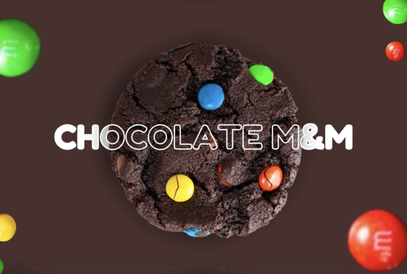
the same kind of effect and make sure that
this text also does the same thing that this chocolate chip one
did from here, right? So again, selecting my text, copy it going here. So change the text
to chocolate M&M. However, I'm not really
liking the color. I think I'm just going
to go with full on white for both just so we can stand out
a little bit more. Since this is a very
dark background, I think that's way better.
So let's go with white. Next, we're going to
bring in our M&Ms. Just like we did
with the chocolates, I'm going to go down to photos. Let's search for M&Ms. Since we don't have any
loose M&Ms, PNGs of them, I can take this photo, and I can do my can
of magic on it. So first things first, let's
remove that background. By hitting that button, we have the entire PNG
already prepared very handy. So what I'm going
to do is I'm just going to duplicate
this three times. I'm going to move two of them to the side and start
cropping them. So we have the green
one individually, the red one and the yellow one. Okay. And so from here, we can start placing them and copying them wherever
it is that we want. First up, I would want
one red one here. Now I'm going to duplicate this one and make a smaller
version of the same one here. Let's add another M&M to
this side and rotate them to give some form of variation since we are working
with copies of each candy. I'm going to take this
green one, place it bigger. Let's say here. And
go to copy this, make it bit smaller. Let's do another green
one by the red one. Make it even smaller. So this technique will
give the illusion that there are many different kinds
of M&Ms floating around. With the yellow one, let's put it here. Gonna copy this and
place one by the edge. Copy it more another time
and put it over there. Let's include the green one here as well. Just to fill it in. So first, I'm going
to start applying some blur effects on these
ones that are up close, going again to edit
and blur whole image. G start blurring them out. That's a little bit too much. Let's do 15. Pretty good. And I'm going to do the
same one with the red one. There we go. Cool. And same goes for this. Let's add some motion. So go again to animate, rotate. Which one is that? That one's this
one. Let's rotate this one and rotate this one. Since these are a
little bit smaller, I'm just going to keep
it at the same pace, maybe switch up the
direction a bit. Okay, let's just play it
through a little bit. So we have our M&Ms rotating, but they also need to come in. Before I do that,
let me just turn off the animation for all
of these candies. So let's start mowing
these out of the way. Okay. Cool. Cool,
so far so good. Now, just gonna
zoom in, I suppose, on every single one and make sure that there
are a couple pixels leftover just so
the thing works. Okay, so far so good. Lost, let's do this corner. You really do got to leave
some pixels to spare. I think that's pretty good. Yeah, I can get away with it. And there we have
the chocolate M&M. Now let's move on to
our last cookie scene. So again, I am gonna duplicate this layer
and start working here. This works perfectly good. First things first,
let's start moving our elements out of
the frame again. I got to make sure I
add that transition. Otherwise I'm gonna
lose my mind here. Okay. Let's go see here. I don't need these chocolates
anymore. So these can go. Now, let's add our last cookie. From this scene, this
particular cookie can go. I don't need this, and
I don't need that. So got rid of the elements
that are necessary, so I'm going to go back
to the first scene and copy this cookie right here, paste it, match it. Cool. I'm just gonna copy it, go back to the previous scene
and move this bad boy out. Got to lock in the animation. What was that? Because this
one's here. There we go. Again, let's change
the background too. This time, since
it is chocolate, let's go with something a
little bit more happier. So I like this blue, but I'm gonna tone it down just a bit. So something that says
birthday, for sure. Like that. It kind of matches
these blue sprinkles. Blue sprinkles. Try saying
that five times fast. And now we got our cookie. Let's make it a little bit
more paler. There we go. And now, again,
we need the text. Going back to this
scene, pasting the text. Gonna separate these
two a little bit, and this is gonna
be birthday cake. I'm going to put this behind it, this one in front of it. Like that. There we go. Let's change the
color of these too. I think the white
wasn't actually bad. Let's keep it white. So so far so good, I'm going to take the text, copy it, go back again,
repeat the process. Mow it down. Okay. That looks good. Let's add the rotating animation to this. Let's take off the pop. Okay. And now, all we
need is some sprinkles. So again, so we have
some sprinkle options. I think we are going to do
something like this and just positioning them like so. I'm gonna copy this
one. Rotate it. Since we don't have
many sprinkle, it's kind of difficult to work individually
with sprinkles. So for the sake of
this being easy, I'm just gonna keep it
to these two corners. I'm gonna copy these, add them to the previous
scene, and hide them. There we go. I'm going to add that
same rotation like that. And here we have the
next scene ready. So now let's get down
to the very last scene, which is where we're going to
be putting the branding and enhancing it with also some movement without
making it too tacky. So I'm going to again
duplicate this last scene we have and just start moving all the elements out
of the way, right? And also turning
off the rotation on these because we
don't want them to interfere with the last screen, which is gonna be mainly for the brand to appear
and show off. Let's move everything
out of the way. Okay. Let's. Let's make sure that
does not happen. Let's turn off the
animation on this as well. Transition. Don't forget
your transition, kids. Otherwise, you're gonna
get some gray hairs.
9. Finalizing Branding, Timing, and Sound Design: Now we have a
perfectly link scene to advertise the brand itself. So I'm going to just
add the brand logo. I have it uploaded right here, so I'm just going to select this and position the
smackdown in the middle. I'm going to change
the background to something a little
bit more neutral. I really like the scene here, which I believe is
that color, actually. And I think it's a
nice combination here. So we have this scene ready. Everything moves out of the way, but I would want this to
move from the bottom. So again, I'm going
to copy this, go into the previous one, paste it, and do the same thing I've
been doing for the past couple of minutes. And here we have
the brand comes in. The logo comes into the scene. I would like to add a
little bit of spice, which is a little bite because
it's his cosmo cookie. This is clearly a cookie
and also a plant. Fabulous. But I want to add a little bite because that's
what we do with cookies. I am going to split this scene I'm not going
to add any animation here. I'm just going to add something
that takes 2 seconds. So I'm going to
go over to tools, and I'm going to
select the draw. I'm going to get this
little marker tool, make the color be exactly like the background,
which should be here. And I'm gonna zoom in, and I'm going to draw a little bite. So I'm just going to draw
in little bite marks. Like that. I think
that's pretty cool. Let's just leave it at that. And here we have a little. In this scene, I'm just going to clean it up in
the background, Liville, there's a lot
of lot that's happening. This cookie has
the animation on, which I'll take off. This one has it on, as well. Animate. Just take off this. So it's not
bothersome, like that. And here, it's still rotating. There we go. Cool. So now we have the
entire ad ready. However, the scenes
are very long. So what I'm gonna do I could
trim them down a little bit. So the scenes are
a little bit long, so I'm just going to trim
down the length of them. So we have this one. This one should be
like, let's see. This is where it should end. About there. This
is where this one should end. About here. Right now, I am doing it kind of willy nilly
just because I'm gonna be showing you another
trick that you can do in Canada that is
kind of AI powered, and it has helped me create
some really cool ads. So give me 1 second. This is where the
bite should be, the bite should last like
a couple of seconds, too. Maybe even less, but
right now we have a rough cut of the entire video. But what I'm going to do
is I'm going to be adding some music to spice
it up, right? I'm going to click on this music button here and
start searching for something. So this is where you can search for anything you would like. All of these audios
are perfectly usable in your creations, and they have some really
good stuff in their library. Now, I have used this one
before, and I really, really like it, and I
think this is going to fit this kind of vibe very well. Let's take a listen. That definitely is giving me modern
cookie shop vibes. So let's just put it down here. I'm going to drag it, so it starts in the beginning. And the cool part is that
I can sink this to beat. So these scenes would be synced with the
beat of the song. And that only takes one
click, which is up here. Beat sync. And here we have the same thing synced to beat. Let's take a quick look.
So this is where actually, I would want the little
bite to occur 1 second. There. Let me zoom in a little
bit more and adjust that. It's a tiny millisecond, but I think it makes a
world of a difference. Okay, let's keep it there for now because I have another idea. But you see how well it sinced the sens to the bee.
I really like it. It seems very organic. So I'm just going to
add a fade to the end. Let's do like 2.5. For now, let's see
how that goes. Okay. Let me straighten
out that end. So this is where it should end, I think, about here. Yes, perfect. So
it is fading out. I would like the fade to be a little bit stronger.
Let's do five. Perfect. And this gives me a
really good wiggle room for another thing that
I want to implement, which is sound effect. Something very important to know about this type
of digital media, especially when it
comes to videos. Sound design can take your
creation so much further. So, what I'm going to do is add a little bite effect since we have the animation
going already. I think this is going to make
it really tied together and really make it improve
the overall feel of it. So let's search in for Byte
and see what Canva has. These are all songs. I'm
just going to scroll down, see what sound effects
they got. Here we go. So we got Byte Chip.
This one's pretty good. Let's drop it in here. And I'm going to zoom into the timeline to adjust
the position of this. When's that bite happening? It's here, and it seems like that's in the
audio where it takes off, or the crunch is
actually happening. So Okay, that's not bad. I think I'm just going to
turn down the volume of this so it's not as intense. Maybe a little bit more.
Okay, that's a little better. And now let's just do
overall last checks. That's perfect.
And there you go. Now we can export this file and post it wherever we need to. So you can do that by just hitting the Share
button, hit Download. And here you can
increase the quality, make it four K super
high definition. Here you can change. Of course, your file, but since
this is a video, it's suggested, all pages are selected and
just hit Download. And now you got the best
product commercial for your brand anyone has ever
seen. Congratulations.
10. Congratulations! Class Project & Next Steps: Just like that, your
product ad is complete. You have built a clean animated branded
piece from ground up, and you have learned some of Canada's most
powerful techniques for creating engaging
marketing visuals. Now you know how to set up your layout and place
your product correctly. Use color for
visual consistency, apply typography,
animations and time motion. Elements for depth and style, refine scenes for clarity
and pacing and add branding, final timing and sound design. These skills allow you to create professional ads
for social media, e commerce, branding, or
portfolio work all inside Canva. Now it is your turn. For your class project, create your own product ad using the
techniques from this class. It can be the same
structure we built together or a completely
new idea of your own. Upload your finished video to the class project
gallery and include a note about the product you chose and the animation
style you used. I'll be checking your projects
and leaving feedback. Thank you so much for
joining me in this class. Keep designing,
keep experimenting and keep pushing
your creativity. I'll see you in the next one.
 Skillademia Academy, Creative Skills for the Future