Transcripts
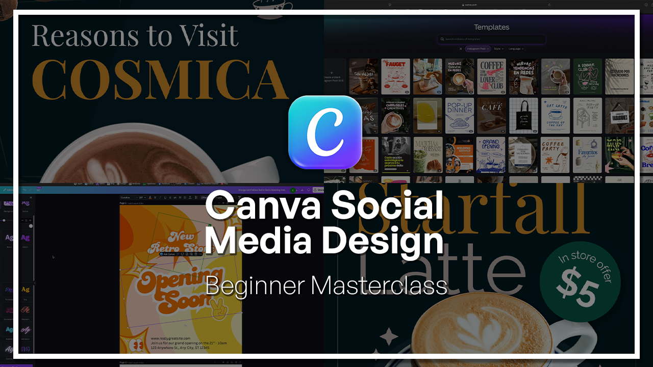
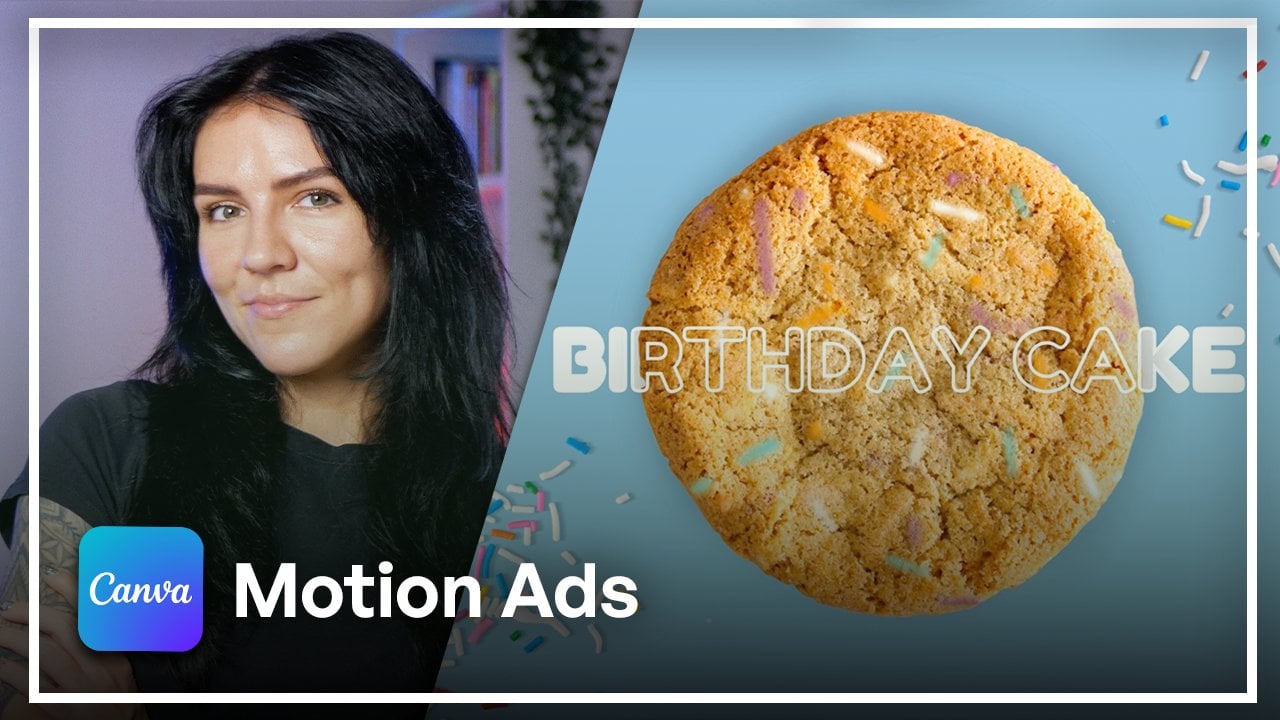
1. Welcome to the Canva for Social Media Beginners Masterclass!: Welcome to the Canva for social media
concentration class. Have you ever wanted to create professional looking
social media content, but didn't know where to start? Whether it is Instagram
posts, carousels, or simple branding visuals, Canva makes it easier than ever, and that's what you will
learn in this class. My name is Kindiaborska, and I'm a designer
with six years of experience creating
content for social media, branding and digital platforms. I have worked on everything from simple posts to full
content systems. This class, I will show
you how to create clean, effective designs even if
you're just getting started. We will begin by
exploring Canva itself. What is it, how it works, and how to navigate
the interface. You'll learn the
difference between the pro and free versions just so you can make the best
choice for your needs. Next, we will cover core
design foundations, how to work with templates, choose fonts, use
color effectively, and create visually
balanced designs. Then you will start
creating real projects. You will design an
Instagram post, a logo, and a KarasL which will give you practical experience
with the types of content most creators need. Finally, we'll go over
essential workflows like exporting your designs, resizing for
different platforms, organizing your files, and
collaborating with others. By the end of this class,
you'll be able to create social media content that
not only looks professional, but also works effectively.
Let's get started.
2. Welcome & Course Structure : Welcome to this Canva course. If you have ever
opened up Canva, looked at its interface,
and felt lost. No worries. That's
exactly how I started. But also, we're
about to fix that. By the time we're done,
you're going to be familiar with Canva
and you're going to know how to create beautiful social media posts
all by yourself. This is how we're
going to do it. First, we're going to start with talking about what is Canva, how it works, and
what do you to begin. Next, we're going
to move on to some design foundations
just so you feel very comfortable creating and your creations will
look intentional. Then we're going to move
on to our actual projects. In total, we're going to have
three separate projects. One is going to be
an Instagram post. Then we're going to create a simple logo and a five
slide carousel post. All of this is going to be
done from scratch by hand. Of course, I'm going to show
you how to export your work, how to organize it, and even share it if you're working
with someone else. You can take this
course straight through or even take
a chapter by chapter. If it's necessary, you
can pause or even rewind. There's no rush here. Best part about this
is that you don't need any design experience. You can come in as
a complete beginner and I'll show you the ropes. Let's get into it.
3. What Canva Is + Use Cases: Let me show you
everything that you can design on Canva because
there's so many things. Now, we're going to
be focusing mainly on social media
for our projects, but I just wanted to show you all the different kinds of things that you can
actually work on. So right now, I am on canva.com, and I'm in the
templates section. Now, we're going to be
looking at a few examples just so you get the idea
of the variety of things. Now, over here,
Explore templates is where we're going to
be paying attention to. In this lesson, so let's first click on the
Instagram post. Now, as you can
see, these are all templates that you can actually
customize to your liking. So if you see a design
that fits your needs, for example, this one, you can customize
this template by clicking on this
button and change up just about every single
element that you can see here to fit what
you want to make. When it comes to the social
media posts, for example, in this case, the
Instagram post, there are so many
things that you can do. So, for example, if you have
a business and you want to promote your services
or a specific product, you can create a beautiful
Instagram post for that. For example, we have
this example here. They are promoting coffee with their logo and all the
information laid out here. Now, that is one way to go. But you can also
create things for your personal Instagram account. Let's say you are a
fashion influencer, you can create things
like these, for example, with a grid layout as a collage and apply
all kinds of effects. Like, for example, here,
we have black and white, and I think it's
super cool looking. So you can get very creative
and once you scroll down from the template
that you liked, there's many more
templates that are similar to that kind of look that
you can also scroll through. For example, this
one's really cool, so they got a little
bit more artistic. So if it's like a personal page, you have so many options. If you have a business, you
have even more options. So, for example, this one,
this one's also a good one. Now, besides Instagram posts, you can also create
Instagram stories, which by the way, is one of my favorite things
to use Canva for. I make most of my stories for my own brand
on canva.com just because it offers many more ways to customize the story to
actually fit my brand. Also with all the fonts
that are available, the graphics, the music, and everything else
that you can integrate, it's much more versatile than the actual Instagram
app because you only get a few fonts and the stickers aren't
always what you want. So Cava is a really good
way to go about it. Let's look at some
Instagram story ideas here. We have a daily log. This is a really great way to make your Instagram
stories pop, to make them stand out and to actually get super creative. You see, there's three
videos not layered, but organized organized
in a collage, which is one of my favorite things also to
do for my own Instagram. So this is a really great way to make your Instagram
stories pop out. Now let's look at other things. So, for example, you can also create resumes here on Canva. You can add all
kinds of graphics, the layouts vary the fonts. You can really make
your resume stand out because I know a lot of
people just make a document, and it works a lot of times. But if you want to spice it up, Canva is a really good
way to go about it. You can get a little bit
creative like this one. We have some graphics
and some color here, or you can be a little
bit more tone down, a little bit more
professional perhaps, and go for something like this. So again, you have
many templates that you can look at or you can
also create them from scratch. Another cool thing is that
you can design emails on Caba and I'm not sure if
I forgot to mention this, but mostly it's drag and drop. So let's say you are promoting some sort of product of yours, you can import your
own photos from your computer or any kind
of device that you have on to Canva and use that for your let's say emails or any kind of design that
you're working on. Another cool thing is that you
can create logos on Canva. So if you have, let's
say, a small business, and you're not necessarily in a place where you
can get a designer, you can make it self. And it's super easy because you can go with graphics like these. We have the cherries here
and then add a fun font, or you can just go
with some text. Text logos also go very well if you have an
idea of what you want. You can alter the
style of the text, the color, ski for example,
this one's really fun. As you can see with logos, there's so many directions
that you can go in. Besides that, of course, you
also have the presentations, which also can be your, for example, portfolio, like
we have some examples here. If you hover on some of these, it will show you all the
slides that are there and you can really see if
it fits what you want. But you see the
variety that Canva offers with its
animations and styles. So you can really get creative with presentations as well. Also, another thing
I really love Canva for is to create
business cards. I have done a few, and every single one always
turns out really cool. There are if you, let's say, have a
logo already created, again, you can just upload
it onto Canva and use it for your business card design
to represent your brand. Or you can create it from
scratch, like we just saw. But, for example, these, I actually really
love this design. It's very creative,
and it's not what you see very often,
so that's cool. As I said before,
we're going to be focusing on social media
posts in this course, but when you get the
basics of Canva down, you can really implement
that knowledge and create just about
anything that we just saw.
4. Free Vs Pro (Practical Decision-Making): Now, let's talk about Canva
P versus Canva free version because I do see a lot
of people that want to start with Canva,
ask this question. Should they get the
subscription or should they just use
the free version? And it's a valid question. And my personal
answer to that is, if you're just starting out,
go with the free version. That's my personal opinion. The reason for that
is because today, Canvas free version
actually offers a very decent selection of all kinds of
elements like graphics. Stock images, stock videos, fonts, and even
some AI features. Let's jump over to Canada.
Let's click around. Let me show you what you get
in the free version and how to distinguish a element that is for the paid
and for the free. So, I have a blank Canvas
right here in front of us, and let's start with templates. So first, if you look at the side of the
screen, right here, you have two different kinds of templates for the same
thing, which is Earth day. And one of them has a
little crown in the corner. If you hover it, it says, This premium template
is included with your Canada Teams plan.
So what does that mean? That means that this
one is going to be for the users with a paid plan, which I personally
have the Teams one. If you try to use
it as a free user, then all of this is going to
be covered in a watermark, which is not great
if you're trying to create an original design. So what you can do is go back and look for templates
that don't have that crown. So the one next to it actually is completely free.
So what does that mean? Every single element in
this design, every font, and everything else is
absolutely free to use, which is amazing, because
this is gorgeous. And let's take a look at the side of the
screen here and see what you have available as
a free user, for example. So this one up here
doesn't have the crown. So does this, this
one down here. The ones with the
crown and the ones without they really
so as you can see, even the free templates
are gorgeous, and they are
absolutely beautiful. And there's a lot
of potential for different kinds of
customizations. So this is what I meant. When I said that, you do have a very decent selection of things that you
can already use. When I started, everything
was fairly limited, and there's only a few
templates that I could use, and that was the reason why I eventually upgraded
to the Teams one. But just scrolling through, I see so many options
for both free and the paid and they all look high quality and are
different styles. So you can really get
super creative here. Now let's move on to
the stock images. I'm going to click
on the photos. And here, let's just type
in nature, for example. And again, you have some
with the ones that are for a paid subscription
and some that are free, and they are just as
gorgeous and you can really make your
designs look beautiful, even without paying
a single penny. You can just keep scrolling and you don't really
have to spend a lot of time looking for good resources because
there's a mixture of both. Same thing. We'll go for videos. So if we put in something
like mountains, again, you have actually a lot of different kinds of videos
that you can use for free, and they're all
high quality, too. Let's take a look at this one. It's like a drone shot.
That's beautiful. So again, remember, all of this, these are all free resources. So that's amazing. So the same thing
will go for audios. I personally don't use a lot of Canva audios just
because I already have some pre prepared
for the kind of brand videos and stories and posts that I do
for social media. So I kind of reuse a
lot of my own stuff. You're free to look
for any kind of song, and even Canva does
have sound effects. And if we just put in
something like guitar, you see, some of them have
crowds and some of them don't. And there's a lot of amazing
options that you can utilize to make your videos,
for example, stand out. Now let's move on to graphics. So graphics is a great way
to elevate your design. For example, you see, we have
these flowers and leaves, also this earth cut out. And if we would search up for something like,
let's go with birds. And under the graphics section, there's many different kinds of styles and a good
mixture of both, but you can also
just filter through, just so you don't have to really pay much attention to
what you're clicking on. That was another reason
why I personally upgraded because at some point
when I hit that ceiling, I just was tired of
scrolling constantly and looking for things because the resources were
much more limited back then. But here, you have all
the free resources and graphics that you can use. For example, these
birds, have this one. You have more cartoony
ones. They're really cute. These ones are So,
as you can see, you do have a decent
selection in the graphics. Now, of course, also,
as a free user, you do get a good
amount of AI features, like you get copywriting, animation, and even
some image generation. Now, the amount of times you can use them per day
is quite limited. As a teams member, for example, you would be able to use
those tools way more. I personally haven't
hit the ceiling yet. As I did mention before, you do get a lot of AI features, for example, copywriting, image
generation and animation. However, as a free user, the amount of times you can use those features per
day is limited. As a teams member, you get
a higher limit every day. But I haven't hit the ceiling yet just because I don't use, especially image
generation that often. Oh, one more thing that
I do want to mention, something to consider and
something that I value very much is background
removal on Cava. In Canva, it is under a paid
plan, so let me show you. I do use that
feature quite a lot. For example, let's get this deer on the canvas,
and I'll show you. Up here, it says BG remover, which means background remover
and does have that crown, meaning it is only
for paid users, but it does a very
good job when it comes to cutting out
things from images. It does save a lot of time because with this feature alone, I don't have to go to an other software like Photoshop to get a
PNG of something. I can just get the
image and remove the background with
a simple click and it does a very clean job, and it saves a lot of time. And I use this feature every single time I design
something on Canvas, so that is something
to consider. So yes, that is definitely
something to consider. But again, if you're
just starting out, I think it is quite enough to begin with
the free version. You do get a lot of cool
things to work with, and the main thing
is to just get a good grasp of what
Canva is capable of. And the more you get
comfortable with it, the more you want to maybe
elevate your designs. If eventually you do use
Cava very often and you find yourself starting to get limited with the resources
that are available to you, I definitely recommend
upgrading because once I got the subscription a couple of years ago,
I've never looked back. I use Canva every single day. I design a lot, and all the
extra little things that the paid plan offers,
is very beneficial. Oh. Now, let me show you what exactly Canva
Team's plan includes, just so you have a good
picture of everything. So here we have the plan. So what I get is 140 million premium photos,
videos, and elements. I do get 1,000 brand kits. AI usage limit is high. I do want to mention
that I have not hit the limit on the
AI features yet. Looking forward to
that, let's see. But even with the team's plan, it feels unlimited to me. But here, it says that the
business plan has it higher. Exactly what it means, how many times or
what is the limit. It's interesting that
they don't mention here, but that's something
to consider. It comes to the Cloud storage, I get 1 terabyte with Teams. As a free user, you
would get 5 gigabytes. So that means anything that
you upload that you want to use on your designs
like images or videos, logos or anything else that
you're uploading onto Canva, you get 5 gigabytes
of storage for free. So this should give you a very good idea on what is it that you get as a paid user
versus a free user.
5. Interface Walkthrough (Homepage, Editor, Brand Kit): Now, let me take you a quick
tour on the Canva interface. Now, before we
start, make sure you have created a Canva account. You can easily do that
using your email. The sign up will take
you a couple of minutes. Now that you have your account, you will probably end up on
a homepage of canva.com. Now, it might look a little bit different than it
looks for me because the first thing
you should see is all the recs and designs
that you've worked on. For me, it's quite the list. For you, it's probably
completely empty. If it's a new account, no worries, we'll fill
it up really quick. Now, I can also change
the way this list looks because I understand if I'm trying to find
a previous design, it's kind of hard to tell
from the little thumbnails. I can change that by
clicking on Views Grid. This way I can find
the previous designs much easier because
they're way bigger. Besides that, up here, you see there is a whole row
of different kinds of icons. Now, these are shortcuts to
different kinds of canvases. Let's say you want to
create a social media. Let's say Instagram post, you would click on social media and this is where
you would find it. Now, these are all pre sized, already pre measured canvases. So you don't really have to
go onto Google or know from the top of your head
exactly the aspect ratio of an Instagram post. It is already pre sized here and you can
just start creating. This is where you
would click for that. A good way to also
filter through the different kinds
of social medias are up here. So you have a list. You have Facebook,
Instagram, LinkedIn, Pints, Tik Tok,
Twitter, and YouTube. Also, here on the side, there's a list of the previous icons that
we were just looking at, and you can also create your custom size Canvas by
clicking on Custom Size. Here you would put in
here you would put in your custom measurements for whatever kind
of design you want. Here you have your width,
your height, and the units. You can go with either pixels, inches, millimeters
or centimeters. Down here you see are my recent ones that I've used and that I
use consistently. This is a good way to
get to them quickly. But also, I can just go over here on the side menu and
just click on Create. Before we get into
the side menu up here is search bar
where I can search if I know the name of a
previous design or a folder or project or anything
that is on my account. This is where I can search
it by typing it here. Now let's move on
to the side menu. So you can see this
is the Create button. This is usually what
I click on when I start to create
anything brand new. So once I clicked on
it, I have, again, precise different kinds of canvases that I can
start working from. Here we have, again, a couple of more shortcuts we
have frequently used. So these are the ones
that I use most. Then you have popular on Cava, which these are kind of
like very commonly used. And then try something new. These are kind of suggestions
that Canva is making. Again, if you have
something specific in mind and you
cannot find it here, you can type into
this search bar. Now, moving away
from that, next up, you have the home, which is where we are right now. Then next button is projects. So this is where you can organize and
categorize your work, putting it in folders and organizing your workspace
a little bit better. Then you have templates. Now, if you have something
specific in mind, but you don't really
know where to start, this is a good place
to begin because here, this is what you saw actually previously when we were talking about free version of Canva
versus the pro version, and here you can
select any kind of design canvases
that you would like to go for presentations, documents, website, sheets,
and so on and so forth. Or you can scroll down here
and see the different kinds of premade templates they have like meet AI video effects. So these are all made with AI. Then inspired by your design. So once you start
creating more on Canva, this is probably
going to look very different for you
and these are going to be similar templates to
what you have used before. Then you have Discover. These are some brand new
Explore page trending near you. Then you have Canvas top picks and more templates for you. Again, more based on what
you have created before. This might look very
different for you. Again, you can
search specifically for what is it that you want
up here in the search bar. But then moving on
on the side here, you have the brand area where
if you do have a brand, this is where you
can actually collect all your brand assets
into one place. Then all of your creations
can look cohesive and are according to your brand
colors and fonts. This is where you would
upload everything. You can even create
some new categories. Then you have the
Canva AI section, and this is really
cool because this is directly where you can start
talking to the AI chat bot. So think something like
Chat GPT or Cloud or any kind of chat any kind of
other AI chat that you use. So how this works is I can
put in any kind of prompt. Let's say, create a
logo for a coffee shop. So this would be my prompt. And from here, I would click on, for example, Design
and then logo. But as you can see, it offers social media
presentation, marketing. So the AI would help you
create a template, right? So I'm going to select a logo. I'm going to send it
into the chat and see what Canva AI does. It's going to start generating a couple of different ideas, and I can either keep on
chatting with it to adjust it or maybe get really specific and adjust
it to my liking, or I can even select some
of the ideas that it will generate for me and then further edit them
in the workspace. Now, you can see there's
already a couple of things okay, so
they're already. That was very, very quick. And they all look
actually very beautiful. So this is created
by the Canva AI. It's quite impressive. So let's say that I
really like this. But there's a couple
of things that I would like to change and I would
want to do it myself. So what I would do is
click on this little pen, and here I can change
the text only. But if I click on
us Canva Editor, it would open up the
actual workspace, and from here, I can
adjust every single thing. So going from the
actual little graphic itself to the text and
then even the font, the color, and the background,
everything, right? So I find this to be very useful because a lot
of times, you know, when you're scrolling
through the templates, if you can't think of
anything yourself, you're going through the
templates to get inspired. But it's just not you're not finding exactly what it is
that you're looking for. Canva is a really
good place to start. Now, moving on from here, is the print shop. So this is where you would go. If you would want to put
your design, your creation, your logo, anything, even just simple text on
any kind of merchandise. So you see you have invitations, flyers, business cards, posters, t shirts, mugs, really
anything you can think to print on,
you can find it here. You can scroll through, and there's even more
options in this catalog. Now, I personally have
tried the T shirt printing. So I put my own
design on a T shirt, and I was actually very surprised by the
quality of the print. Be little Sino, I
used to work in a kind of t shirt
printing business, and I could tell a good
print from a bad print, and what Canva sent me was
actually very high quality. So that surprised me. And if it's something
you're looking for, I definitely recommend
Canva for that. But yeah, this is
where you would go for your printing needs. And then last but not least, you have the approvals
area where if you would be working with a team with other people that are
added to your account, this is where you would
be working with them. Now. You see, it's empty for me because I am working solo. So there's nothing
really to show here. Now that you're
familiar with what is on the homepage and what
are your options here, let's take a quick look
at the actual workspace, and let me show you around. Let's say I want to
create an Instagram post. So clicking on the social
media Instagram post. Here we have the
pre sized Canvas. Very convenient. I
don't have to type in my own numbers,
which is great. Saves a couple of seconds. But from here, I
can start creating. So this is the blank Canvas,
and by clicking on it, I can change the color of the background if
I wanted to here. You see, there's a couple of color palettes that I've
worked with before. It might look different for you. There might be some
canva created palettes that you can start using or you can create
your own palette. Actually, it's
very, very simple. I'll show you that a
little bit later though. We have some basic colors, and we also have some gradients. We also have the color picker. Be very handy if
you're trying to find the correct shade of green, you would just click on
it and drag it all over this area to find the correct
shade that you would want. From here, you can also
create a custom gradient, which I find to be very useful. You have some style
options here, and this is where you
would change the color, and here is the color picker. Now, I find myself using a lot the default gradient
colors on Canva because I think they complement
a lot of designs. Now, this looks
amazing how it is. But again, I can go up here and customize it by clicking
on this little circle. And customize it just like
I just showed you before. Let's say I want the blue
to be a different blue. I can just go in
the color picker, drag it here, and bam,
different kind of blue. Now, from here, you have a
couple of options on the side. So up here, we have
the templates. If I would want to go for that, I can start searching by typing in what
is it that I want, or I can just scroll
through and see what is Canva given me today because this can change
every single day, and it actually does change. So it is very wise to kind of look for specific things just to save yourself some time. You can also generate with AI. This is another way to do it, just like we just saw
it in the AI chatbot. I would have to describe
what is it that I want. Let's just select Earth Day and let the AI
generate something. And the cool thing is that
these AI generated templates are completely unique. So if you are looking
for a template, but aren't really finding
anything that fits you or fits your needs, it's a good way to go. This might take a
little bit of time. Alright. Now, it has
finished generating, and this is what it came
up with. It's pretty cool. If I click on it, it
drops on my canvas, and all the elements are absolutely movable
and adjustable. And not only can you move them around by clicking and dragging. You can also change the color. As you can see, the
moment I clicked on it, it showed me two
little color circles. Now this is where you
would change the color. So if this screen maybe needs to be another
type of green. This is how I would do
it just like we just changed the color of the gradients or the
background before. It's very simple.
Again, the same thing goes for the text, I can customize either the font by clicking on the font area, long list of fonts can
change the size of it, the color, and other things. We'll get into that later when we actually start to make stuff. So this is how that would go. Besides the template, you
have the elements section. This is where all the little
stickers or graphics live. Let's search for some birds, and from here, I would
specify that it's graphic. But you can go with photos, audio, video, and so on. These are, again, a bunch of shortcuts that you
can use because here I can also go to photos and get a photo of
a bird from here, but it's like a little
shortcut if I click on. Here we also have
some AI options, but we'll get into
that a little later. Another cool thing
is that all of the elements are organized
and categorized. You have your shapes which
are completely customizable. You have your graphics,
your three D, your frames, your
animations photos, and so on and so forth. So every single time
you click on somewhere, it's going to make sure to know exactly what it
is that you're looking for. Then let's move on to the text. This is the text area where you can add a brand new text box, so it will give you a
blink text on your design. I just clicked on it and it
dropped it on my canvas. From here, I can again, go
further and customize it. Or, of course, if I would
have a font in my brand kit, this is where it would appear, or I could either go for
something a little bit more stylized and
already pre designed. So these are some fonts that have been
paired up by Canada, and I can select one of these. This is your upload section. So if you upload
media like photos, videos, designs, whatever,
this is where you would live. This is where you
would also choose what is it that you
want to include. Then you have your tools
which are you have your draw, your shapes, your lines, sticky notes, text, and so on. I personally don't use this
part too much just because I think that these tools can
be found in a better way, and they usually live either
up here or I just select my text or whatever other tools from here rather than
this specific area. Then you have your
projects, which again, your previous work or
your organized folders, your apps, which
we'll get into later in take a brief look
on what Canada has. Next, you have your magic media, where, again, it
goes back to AI. This is where you can
find your photos, your audios, videos, and
it goes really the same. This is where you
would search up, and this is where the
results would come up. Background you can
also create in bulk. Then you have your charts, and you can caption if it's a video. But for the most part, this is a brief overview of the Canva interface when
it comes to the menu bar. Up here, you can
resize your design, you can also go back if
you did a boo boo and you don't really know how to recover from that.
I've been there. Then you have other options in the editing and in
the file section. This up here, this is
where you would export, which we'll get into later, a little bit more detailed, but share button, very simple. And when it comes to the
actual Canvas itself, there's a couple of options
you can lock your design. So let's say that you're designing something
else next to this. So let's add a page down here. Lock this and I can't really alter anything this
will stay as is, right? Then I can hide my page. I can also duplicate this. So if I would want
the same version of this, but slightly different. Instead of recreating
it, I can just click on Duplicate page and bam. Next, I have Delete page, which, of course,
deletes the page, and then I can also
add another blank one, which is the same
button. Under here. Then down here is where you
can zoom in or zoom out to your Canvas just to see some
details a little bit better. Here, you would
change the way you would see your canvases. So again, you see,
I clicked on it, and now it's showing me
all the ones under here. Some people prefer
to work this way. Some people prefer this. I personally usually go for this because it's easier
to just scroll through. Then this will kind of zoom out of all of your
designs on this page, and you can see if you have
a long list of things, this is an easy way
to kind of go from page to page and jump
from design to design. This is, of course, full screen, and here you have
some assistance if you need a came to
help you with something, you can't find
something or whatever. This is where you
would type it in. Other very crucial
thing that I do want to mention is this position tab. So this would be showing
you all the layers, all the elements
that you have in your design and
the order of them. So if you can, for example, there's something
overlapping this and you can customize it, you can find it in this list, click on it, and then
further work with it. Now, this was a brief overview
of the interface of Canva. We're going to get
more detailed once we start actually
creating some designs, but this should give
you a good idea of actually how intuitive
the interface is. Because most things,
if you take a look, for example, at the
menu on the side, you can pretty much tell what it does by just looking
at the little icon. So it is very user friendly, beginner friendly, and it's just a very simple
and easy tool to use. And I'll see you in
the next lesson.
6. Templates vs Starting from Scratch: O Now, when it comes to
actually designing on Canva, there is two different
ways you can go about it. First way is to start
with a pre made template, and the second one is
to start from scratch. Now, I want to
talk about what is the difference between
these two options and which option should you go with while you're still
learning about Canva. Now, what is a template? A template is a
pre design layout. So someone has already figured
out the colors, the fonts, and the spacing of the design, and all you have to do is go in, switch out the elements
and make your own. This is a wonderful way to go if you are just
starting with design or if you need a design done quickly and you might
be short on ideas. Let's jump over to Canada and take a look
at some examples. Now, here I am in the
template section. You can access it by clicking
on this template button, which is third option
down in your sidebar. I'm here in the Instagram
post templates, and as you can see, there is a lot that you
can scroll through. I have spent my fair
share of hours here. So let's take a look at
this template, for example. This caught my attention. Now, let's say that you
like this kind of look and aesthetic and you would want to use this particular
template. What would you do? In this case, you
would click on it and then customize
this template. It will drop you into a new
window into your workspace, and this is where all
the magic happens. So by hovering your
mouse over all of these elements is how you
can change them for eggs. I would want to change this image to something else
if I'm promoting, let's say. Instead of Macha, I would
like it to be a coffee. So I would go over
to the photos, and here in the search bar, I would type in iced latte. Here we have some
beautiful options. I'll go with this one. This one seems to
be cool looking. The moment I clicked
on it, it dropped it into my workspace. I'm going to click
on the Macha one and hit delete on my keyboard. Now, when that is gone, I can replace it with
my selected image. And now, okay, we
have the image there. Since this is a Macha, I will change the text that
says Macha and say latte. Or ice latte, I suppose. Now, there is I wonder why is the sea looking
like that? That's okay. So this is how easy it would be to change the elements from already
a pre made template. So let's say that I like
this outcome and it fits whatever it is that I
would want to post, I'm ready. I already have a design, and it took me literally
a couple of minutes. Now, this is the advantage that I personally absolutely
adore about Canada, that you don't
necessarily need to have brilliant ideas
every single day. You do have some options
with templates, and again, it is a wonderful way to
if you're a beginner, and you don't necessarily
feel very comfortable with coming up with your own designs or even with
just the layout of Canva. So I'm going to
close this for now, close this now here. Okay. And now let's talk
about what would it mean for you to
start from scratch. What you need is a
completely blank canvas. And this would require for you to build the design
from scratch. And this is why I
said before that the template way is a great way to go if
you're a beginner, but let me show you
what it takes to build a quick design on
Canva from scratch. So I'm going to go over to
the Create button right here. I'm just going to select
the exact same kind of designs that we were looking at in terms of the aspect ratio, which is going to be
the Instagram post. So I'm going to click
on that. And since we have a completely
blank canvas here, I got nothing to work with. I have to come up with
everything myself. First, of course, would
be the background. So let me just select a color. I'll go with green.
Everybody loves a green. So if I am making a similar kind of post
that we were just looking at in the template section and it took me 2
minutes to make it, this would take me a lot longer. I would have to go
and find my cut out. I can use the same one I
just used just for the sake of u saving some time here. Let me put it in the middle. Not trying to
completely recreate. And then I would need
some text, obviously. So I'm going to go over to the text section and
click at a heading. Here, I'll type in iced late. I'm holding down the I'm holding down
the Shift button to make the letters all caps. And here, now I got
to change the font. So I need something that
would aesthetically fit the kind of idea that
I might have in my head. I'm going to go with this
font. I like this one. This one always goes
good with coffee posts, increase the size.
Change the color. And of course, this
kind of design still requires a lot more
elements for it to look decent and presentable and cover all the information
that I would want to, of course, included
in my design. But the point is that with
a completely blank canvas, you would have to know
exactly what you want, and you would have
to be completely comfortable with
the interface of canvas so you can actually get a beautiful design and
not get too frustrated. So when it comes to starting from a template or
starting from scratch, it really depends on
your skill level, how comfortable you feel. And also, you can
start, of course, building completely from scratch if you're feeling adventurous, and that is a great
way for you to learn. But you need a specific idea
of what is it that you want, because it can take a long time for someone who's
not as familiar with designing to actually figure out a design that you would
be happy with at the end. I would suggest
going with templates just for now because
it's also going to be a great way for you
to learn and notice patterns about the
basics of design. Like, for example, how
other designers have used color palettes or hierarchy
or images and elements. It's not only a quick
way to make a design, but also you can learn a lot about the
process of designing. Now that you know
exactly the differences between working from a
template or from scratch, you can make the best
decision for yourself, and I'll see you in
the next lesson. Oh
7. Text Basics (Fonts, Hierarchy, Spacing): Okay, let's talk about text, and I don't mean
just picking out your favorite font and
using it on your design. I'm talking about actually understanding what
text does in a design because text alone can make your design look either
homemade or intentional. Now we're going to be
talking about three main things font, hierarchy,
and spacing. I'm going to show you a
real design as an example, and you will see how the
balance changes once we start messing with the
already established order. Now, let's take a look.
I have a design here, and as you can see, it's already looking very balanced and
everything is in order. However, the first thing I want you to look
at are the fonts. As you can see, there
are only two fonts in this overall design. First one is the main heading, which is the font named Antonio. And then we have the subheading
with open sons, right? And generally, I see this
as a common mistake. For especially beginners,
that they tend to use many different fonts
on a single design, and that can make a
design look a little bit more chaotic and
not as balanced. A good rule of thumb is to
only go with two fonts. I know it is very tempting, especially on Can but to start
scrolling through all of these fonts and pick out the most fun and creative
and unique looking. However, you do have to take into account that when
you're creating a design, you want everything
to look cohesive, everything to make sense. So for example, in this case, you see, we have
some computers here, and the overall look
is, first of all, very modern and very sleek. So if I would start changing these fonts that
are already look good, it would change the overall look and it
wouldn't make sense. For example, let's change
the main text here. Now, this is very big and bold, which is a great way
to go if you're trying to get the person's
eye to go there first. So if I'm going to change
this font to something a little bit more decorative and not as readable as this one, for example, let's go
with something like this. Now, it looks like a mess. Let me adjust this real quick. Now, this is all in caps. I'm going to take that off. Now, there's nothing wrong
with this kind of font, of course, it's beautiful. However, it doesn't really look balanced in this
specific design style. Also, it doesn't really go well with this kind
of subheading, right? It's also not as readable. I can see this
kind of font being used in another style of design. For example, if this post
was about maybe fashion, maybe some DIY
projects or really anything that's a little
bit more creative perhaps. The font that you choose also is kind of like a way to
send a message, right? What kind of vibe do you want
your design to give off? Now, when it comes
to pairing fonts, let me go back to the previous
font that this design had. I'm just hitting Coman
z on my keyboard here. Now, when it comes to
the pairing of fonts, you see we have the bold Antonio with slightly lighter font, and this is a very
great pairing. And you want to choose fonts
that contrast each other, yet they kind of look
cohesive, right? So again, if I would
start changing the subheading here
to a different style, it would not look as balanced. For example, this one. This font alone, let me increase the size
just so we can see. This is a good font,
and I love this font. I've used it many times. However, it's very unique. So it's not really good for as a subheading because
it's so unique looking, you would want something
a little bit more simpler to complement
the main text, right? Another cool thing
to know about Canva, when it comes to
actually pairing fonts, if you go to the sidebar
here and click on text, you would probably end up here. And if you scroll down,
you see there is already some prepared font combinations that Canada is suggesting. So if you are lacking some ideas or you want
some inspiration, or maybe even you want to find something a little
bit more unique, this is a really
good place to go. Now let's talk about hierarchy. Hierarchy is pretty much
a fancy way of saying, Where do you want people's
eye to go first, right? So again, going back to
this design example, we have the main text. So that's why the designer
wants the eye to go first. And that is hierarchy
in play, right? The subtext is slightly smaller, so it's not as important
piece of information, but it's still crucial
to be on the design. When it comes to hierarchy, you as a designer, are in the control, so you are the one
you as a designer, you're in control of the hierarchy and
directing people's eyes. Whatever you're going to put as the bigger text is the first thing that's going
to catch people's attention. So since all of this is already organized in
the correct order, let me show you what happens
when I start messing with that order and changing the
hierarchy of this text. So let's take the main text, and I will make all of this be the same size as the subheading and also
the text above it. So this is 246, and this is 40 41. Let's make everything,
let's say 100, just so it's visible. Just going to change
the size up here, bam, highlight. 100 Enter. Let's make this in a single row, and this will be 100 too. 100 and Enter. Okay. So you see what happens when I make
all of the text, the same exact size. Now, you don't know
where to look first. As intentional, it looks a little even though it
is all the same size, it looks more disorganized. You don't know what
to look at first, what to think, and overall, it's just not looking good. So the attention is completely away from the main message, which is get your freebies, which is supposed
to be bigger to actually get people's attention. So this is what I mean
when I say that hierarchy is a great tool to
enhance your design, get your message across, and also and also improve the overall look of
the aesthetic of your design. So when it comes to hierarchy, also another way to go
is not only the size, but you can also play
with effects and colors. Let me go back to
the original size of all this text,
and let me show you. So if I would take this
main text and I would go to effects Effects
tab right here, here are a couple of
things that I could change up and make this text look
different and stand out. Maybe I would want it
to look more animated. Now, this color
doesn't really quite fit now let's go to
cosmic. Maybe this. I'll take off the all caps. And then, of course, I would
have to change the font back to something a little
bit more clean. So if I would go
back to upper case. Now, it kind of
gives the same vibe. It doesn't it doesn't
play as well. This font doesn't
play as well like the previous one does
with this subtext. But you see what I mean
when it comes to effects. You can also change the color of the main text or
even the subtext to kind of play
with the hierarchy, but a very simple way to go
is just changing up the size. Now let's talk about spacing. Now, spacing can actually balance your design
and improve it. Right now, we are looking at
this design where everything is centered and well balanced
when it comes to spacing. Now, there's two
types of spacing. There's the line spacing, which is the lines of text
and the spacing between it, or there's the letter spacing. So again, I will go to this
main heading right here, and by clicking this
T button right here, which is advanced settings, this is where you would
play with the spacing. Have line spacing, which changes the space between
these two lines of text. I'll just go back to what it was originally
because it's very good. This one will change the
spaces between the letters. Now, the more crammed it is, the less readable it is
and more claustrophobic. Again, it does not
look balanced, so you want to be very intentional with
your letter spacing. But also, same thing goes for the main title and
the subtext under it. So if I would
change this spacing between all of these
text elements, now it looks cramped. It doesn't look horrible, but it just doesn't look
as balanced as it did before because we have a
lot going on down here, and this just looks
too claustrophobic. So if I go back,
all of a sudden, this looks better and you immediately know where
to put your eyes first. Other thing to know
is how you space your text when it comes to
the edges of your design. For example, right now, the spacing between the top of the design and the
bottom is pretty good. But what would happen
if I would take this text and I would
move it higher? Now it looks awkward and
it's too close to the edge. Again, the balance
is completely lost. If I would move all of it
too close to the elements, now the top looks too empty. So again, balance is off. Now, a good rule of thumb, especially on Canva is to highlight all of
your text elements, especially in kind of like this kind of design where
you have text and elements, and to find the perfect middle, which Kano will give
you these purple lines. You see they appear
as I start moving these text elements
to kind of fit into a good area and make
it look well centered. Another thing to know is not to put text too close
to the edge because, again, it throws off balance, and it messes with the
overall kind of direction. So since we have
elements that are all centered and there is the main computer
in the center, it would not be wise for me to put the text closer to this edge because that would throw off the balance of everything.
Now it's centered. The spaces between
the words are good. And the reason why
these two, for example, the get your freebies
organization templates are a little bit
closer together than, for example, this text is
because these are really meant to work together
more separate from this.
8. Images & Elements: Now that we cover the text,
spacing and hierarchy, it is time to talk about the next thing that can
make or break your design, which are images and elements. Why I say that is because if your design has great text
and great text design, but bad visuals, your design
can fall flat on its face. I have a fresh example
for us to look at. So let's dig in. First things first, you
will notice that we have two separate images
on this design. And one thing to know is that when it comes
to these images, there are two ways to
actually work with them. First one would be just
clicking on it and moving it around and make sure
it's in the same position, or you can double click it. And adjust it this way. If you would have an image that is not in this aspect ratio, by double clicking,
that's how you would change what is
visible in the frame. Most images on a Canva are in this frame system and you
can add your own frames. But once you drop an
image from Canva, that's mostly how you're
going to work with it. I'm just going to press
Command Z on my keyboard. And when it comes
to images on Canva, where do they come from? You can find photos
on Canva by going to your sidebar and clicking
on photos right here. Now, there's a very wide variety of different images you can use. They all are very high quality. For the most part, there's
only once or twice, I think I've come across an
image in bad resolution, but for the most part, they
are very high quality, and again, paying attention to this little crown
icon on the corners, that's going to
determine whether it is an image that you can use
on a free account or not. The library is very,
very wide here. You can go up here in the
search bar and search for just about anything that you need and you'll
definitely find something. Let's put in fashion. Here, as you can see, there
are so many different kinds of photos all related to
that keyword fashion. Now replace this image with, for example, this one. I am choosing this one
because it looks to be about the same color
scheme and style. What I'm going to do is just
going to click on it and drag it over here or here, but I want to replace this one. I'm just going to
drop it in this. As you can see, it replaced that image and the locked
it into the frame. Now if I double click it, I can now play with
how much we can see. Let's say, we'll change
it to this. All right. Now, when it comes to using
your own images on Canva, you can upload your own
from your device and you would go up here
where it says upload. You click on that and
this is your library, how you can upload is
either dragon drop from your desktop if you
are on a desktop, but otherwise you would hit this button that
says upload files. And it will drop you off into a folder or
desktop or wherever, and this is how you can do it. Let's say I want to upload this. I'll just hit Select and
here it's done uploading. Now, again, talking about the resolution of images that
you use in your designs, they always should be the highest quality you can
get just because overall, it will uplift your
design and make it look way better and
way more professional. When it comes to other
visuals like elements, they are also very
crucial to your design because they can take
a design like this, which isn't bad at
all whatsoever. However, we can
make it better by adding some playful
little graphics. Now, what I'm going to do is go up here and select elements. I think elements, I think I
clicked on it. All right. In the graphic section, this is where you can find
all the fun little stickers and illustrations of
all kinds of things. For example, you have whole
sticker packages down here, so these are really good for situations where
you need many of them, but different kinds, but you still want them to look
similar to each other. So it looks cohesive. This is where you would
find that kind of graphic. You can also search for whatever pattern or shape or
illustration that you want. Now, what I would do is go
into shapes and this is what I also would suggest for beginners to work
with purely shapes. You can actually get creative with these instead of taking a pre illustrated
element and then just putting it in your design and not always they
work very well. In this case, we can definitely elevate the
whole look of this design. What I'm going to do is
I'm going to take some of these basic little square
shapes and I'm going to place them strategically
about let's put one here. Now, what I'm going to do
is duplicate this one, and I'm going to
put it right here. Now I'm going to duplicate it again and put it at this corner. Now to lock them all in place, I'm going to go to positions
up here and click on layers. I'm going to move
this one up a couple of layers so they
can all be together. By holding the command
key on my keyboard, I'm going to click on all
of them and this will select all of them at the same time and I'm going
to group them together, just so it's easier to work
with them because this way, I can change the size all
at the same time and I don't have to bother wasting time making sure they all match. So what I'm going to do next is take this
and just drag it down at the very bottom of this design and
maybe place it here. From here, I would like
to change the color. Now, when it comes to the color, of course, you can
do a color pop. But in this case, since the overall style of this
design is very minimal, sleek and neutral colors, what I'm going to do is I'm just going to match
those colors. I'm going to click make sure I have this element selected. I'm going to go up here
to the color picker. And if you scroll down
here in the color section, you notice that Canada has extracted the colors
from the images, which I do find this
feature to be very, very useful because
this way you can actually make your
elements match in color, which makes everything tied together way more beautifully. What I'm going to do
is, well, first of all, ungroup the elements
again just so I could color them
all individually. Again, clicking on the
square that I want to change the color
to and I'm going to go down here and start just
choosing picking colors. For this one, I'm
probably going to try to match it to this image because
the squares are closer. Now next one is going to be this one, perhaps
something like that. I like the way that looks. This should be something. No, no, maybe like that. Let's go with the darker. Now what I'm going
to do is again, go to the layers, the positions area and select them by holding
the command key, group them, and now I will go to the transparency tab and I'm just going
to play with it. To make it a little
bit less bold just because I don't want those elements to take
away the attention. I think 58 should be good. Now, just trying to play around with the placement of
these little squares. I actually think
I want to change the color of this middle
square just because it's not playing well with the
color of the picture. I'm going to group select
that and go down here. That might be too pale. I might have to go darker, start tapping into
the other palette. I like that. That's a little bit better. I can't go darker. I think that's good. Now,
I see there's a gap. What I can do is go
down here to this Zoom in little bar and zoom in here so I could
get rid of this gap. It's bothering me. I'm just going to get the
image itself and extend it. There. Now it completely matches fully with the
element in the back. You see how that already
looks way better. It adds a little interest to the whole design and makes it a little bit more intricate, but not too much because
we don't want to take away the attention from these
two beautiful pictures. Now I'm going to go
to positions again, select all of the
squares, group them, and now I'm just
going to duplicate them with that one click duplicate button and I'm going to place the
other one down here. Now just playing around.
I'm going to zoom in again, scroll down and place
it just about here. Now, going back to positions, I'm going to drag this down under this image because that's how it's
going to be layered, I'm just going to zoom
back out in there. Now this is looking a
little bit too dark, so what I can do is
play with the colors. There's something that isn't working very well in my opinion, let's change the
color of this one. That's a little bit better. These might need to be a little
bit differently colored. If I go dark here, I can go lighter here
and there you go. Now there is good contrast. It looks way more fun. Let me just position these a
little bit more similarly, how the squares
behind this image, I'm going to do the same here just so it could
be a good mirror. Man. Now it's not completely aligned the way
I would like it to be. That's okay. It happens. I guess I will do the same
thing that I did before. I'm just going to take
the image itself and extend it so the
lien could be there. This way, I added just a
couple of simple squares. I matched the colors, I position them strategically and here we have
the overall design, I think looks a little
bit more interesting and I think it stands out
just a little bit more. I really didn't take
me that long.This is genuinely the power
of images and elements that you can implement
into your design to really tie everything together and just make it pop
a little bit more. To wrap this up,
when you use images, make sure they are high quality. Remember, you can always
upload your own or you can use the ones that are
on Canva because again, their library is
very, very extensive. You can use fun frames
like other shapes. Let me show you how to find them if you go here to elements. Go to frames and click on it. This is where you can
find all kinds of fun shapes and even
different kinds of overall designs of frames
to include into your design. To include it onto your design. For example, this is
how you would use it. You would select
your desired frame, go to images or uploads, and you would just
drag and drop into that frame and just place
it wherever you would like. But frames are a really cool way to also elevate your design, but make sure you use
high quality images. When it comes to actual graphics like the squares that I added, you really don't
need to overload your design with
them because they can take away the attention, just like I also adjusted
transparency of them, just so they could be a
little element just to add a little intrigue to the overall look and not take
the whole attention away. You can play around with shapes
with lines, with colors, with transparencies and with just the right amount
of strategic placing, you can really take
a simple design and make it look amazing.
9. Color Basics (Palettes, Contrast, Readability): Now, before we start to work
on our actual projects, let's talk about some of the most important things when it comes to
making a good design, which is everything about color. Now, I understand how this
can seem a little bit intimidating to
someone who's starting out because often it feels like, Oh, you either have the
eye for it or you don't. But I promise you, once you understand the basics of color, you'll understand how
systematic it actually is. I have chosen this
design for the example in this lesson because
it is very colorful. It looks very loud and
very in your face, but that is on purpose because
even though it might look very maximalist and
even a little crazy, it plays with
colors beautifully. Now, if you take a look at it, it only really uses four colors, and every single color
placement is very intentional. Let's take a look at this
and break this down. So the color palette for
this design is orange, which is the dominant color. Then you have yellow, which is a secondary color. So the yellow is here to not compete with the
orange, but compliment it. And then you have the
very soft pink and the beige as the neutral
background colors. And of course, the white fortex. So that's the color palette. And what is a color palette? A color palettes
pretty much a set of colors that works well in
a design. Very simple. When it comes to actually
using a color palette on Cava, it is very simple and Canvas interface actually
makes it very easy. Now, what you want to
do is first of all, choose your color palette. Then when you're starting to add your elements and your
text and everything else, you want to make sure to
follow that color palette because if you're using
different kinds of, for example, orange, it can
look very chaotic very quick. This is how you
would go about it. Let's say, for example, I would want to
change the color of this background star
behind this text. What I can do here,
is, first of all, select the element that I
want to change the color to and then go up
here to the color. On the side here, you
see the color section. So here in the first slot is going to be the
document colors where Canva has saved all the colors that you are using
in this design. And from here, you
should generally be able to find
the color that you would want to change it to because you have all
the colors saved. However, if by any miracle, you cannot find the
exact color for example, I would want the start
to be this yellow. Since I see it here, I
can just click on it, and it would change to
that yellow, right? But sometimes when you
can't necessarily find it, what you can do is go
to this color wheel, click on it, and this is where you're going
to see the gradient. Here you see is the color code. So this sequence of
letters and numbers is the exact code of that
particular color. What you can do here if
you're on Safari, by the way, is go to the element where you want to
take the color from, select the color up here. Open the color wheel and
copy this color code. You can do that by pressing Command C on your keyboard
if you're on Mac, or you can just
right click it and copy it with your mouse. Then you would go
over to the element that you want to
change the color to. Again, go to the color, open the color wheel
and Command B, and you paste your color code. Now, interesting thing I want to mention I don't know why, but Canva does not
offer the color picker or the eye drop tool on
Safari for some reason. Cannot explain it. I'm
not happy about it, but that just is what it is. Now, if you're on something
like Google Chrome, you actually have that. Here I have Google Chrome
open with the same design, and if I was going to do that, I select my element, go up to the color and open the color wheel and you see this is the tool that
we're looking for now. This Eyedrop tool is what
allows you if you click on to graze over every single pixel on your design where you can now select the color that you want. And you don't have to bother
playing in this gradi and trying to match the
exact shade of yellow, right? So that's very handy. And I'm not quite sure why Canva doesn't just put this
also available in Safari, but it just is what it is. I just thought it was important
to know let's move on. Now let's talk about contrast because that's another
very important thing. Contrast is important,
especially if you have text and you wanted to
stand down and be readable. So for example, this where
it says New Retro store, this is a very beautiful
example on how contrast works very well because the text is white and the
backgrounds quite busy, right? You have orange letter, then you have the pink, and there's a lot going on, especially with this
element in the back. Why it actually works so well
is because the designer has used something that is a very great tool for
this kind of situation, which is an outline to text. So if I would select my text element and I would
go up to effects here, I see they have
added an outline. And this outline is
that darker orange, which is used often
in this design, and it ends up not only
bringing out the text, but complementing
the overall look. Now, watch what happens
when I take off the outline. It's
not as readable. It's not bad, but it's not as good as it was
with the outline. So you see how powerful such a small little
detail can be. Now let's take a look
at opening soon text. This is also readable, however, the outline,
in this case, is white, which kind of doesn't
contrast very well, in my opinion, with
the background here, you have the soft pink and
the beige and the yellow. So this would work way better if the colors were inverted just
like this text over here. So let's see what happens
if I switch and I make the text white and the outline orange
just like we just saw. So I would go up to effx
and start switching. So this would be orange, and then I go up
here with the A, and I would change
that to white. You see, all of a
sudden, it's way more readable
because the contrast between the outline and the background is
much, much better. I think the reason why the
designer chose to go with the previous combination is because it's probably
a stylistic, a creative choice, and it fits the kind of retro
feel of this design. As I said, it's not bad, but it could be better. So the general rule of contrast is go with light on
dark or dark on light. That always works very well. Now let's talk
about readability. Now, readability actually goes hand in hand with contrast, but it's a little
bit more broader. For example, when it comes
to this text body over here, it is way smaller font, and also it is in black letters. Since this text are the details of whatever
the message is, this actually works
very well because the main because the main thing that is supposed to
catch your attention is the new retro store
opening soon, right? And if the person is like, Oh, that's cool, where is it? Oh, there it is, right, and they start
looking more into it. So this doesn't
compromise the design, but it gives the
essential details and information necessary. And the reason why this works is because it's black letters,
even though they're small. But the background,
as you can see, is very light, and
it's not as busy. So let's see what
would happen if this background here would be something like this up here. So darker orange, and you see the contrast
isn't as good anymore. It's not as readable. So you definitely want to
keep that in mind that readability and contrast
are very, very similar. But with readability, you can also not only
play with colors, but the size of your text. So this is the detailed
information that's not as crucial to the overall design, so they can be put a little
lower in smaller font. So now over here, I have made a little example on low contrast
versus high contrast. So as you can see, you have the darker background
and if you would like to play around with
colorful fonts like here, you can go with the color, but just make sure
that it is bright. Because what happens,
for example, in this situation where
you have the background is dark color and the text is d
the visibility is way lower. As I said, white text
always goes well, even on some lighter colors. You can start
playing around with not only the size of the font, but also with different
kinds of effects. So if you had a background color that's
light and you would still want to use white letters,
this is what you could do. Let's say I have a square
that is lighter blue. Let me change to lighter blue, and I'll add a text box over it. Of course, you could go
with darker text, right? Or if you do want to
go with white text, you can start adding
things like effects. For example, up here, you have all kinds of effects, so you can add a drop
shadow and play around with the settings a little bit. There are other things like echo you see how much more
it makes the text pop out. That's just an example. But as I said, you generally can always trust white text
on a darker background. In this case, you have a light green background
and light text, which again, gives low contrast, poor visibility, and unless it's a creative choice and your main goal is in readability,
you can go with this. But generally, if you're
using text, you're China, convey a message,
higher contrast would probably be
a better choice. To wrap up this lesson, stick to around three or
four colors per design. Make sure that the main text is in a place where
it's readable, so it's also a larger size
and give your text and background enough contrast
so it's actually visible.
10. Project 1: Make an Instagram Post: To start this process, what
you need is a blank Canvas. We can get that by
clicking either here on the social media
button right here, which is the shortcut, or you can click on this plus
button that says Create. From here, you can either find it on this side
menu right here, which we would go
to social media. And for the Instagram post, we need to use this one. You can also do one by one. But recently I've been seeing
a lot of four by fives. So let's go with that. Now we have a brand
new window open, and this is where all the
magic starts to happen. Now, again, if you do want to
play around with canvases, all you got to do
is just make sure. Again, if you want to play
around with templates, all you got to do is open up your canvas and on
the side menu here, the first button that says templates is where you
would find all kinds of things by just clicking on it and clicking on the elements that you
would want to change, for example, the book
click on the text, you can start adjusting
and switching out elements and
making it your own. Now since we are doing
a design from scratch, we're just going to start
with the background. Now with the background, you can go so many different ways. You can either click on this
background button and find all kinds of fun
images and textures, gradients and everything else. But for this kind of design,
what I have in mind, I have a very specific
particular vision, which I also recommend. When you start designing, make sure you have an
idea, a direction, an overall aesthetic or the more specific your
idea is the better because that will
definitely cut out the time of you just randomly putting things together
and feeling lost. Make sure you have a
vision for your creation. Now, I need the background. I have created a color
palette, you can see here. It was a quick little
palette I threw together. These are all my
favorite colors and I think this post is going
to come out really good. For the background,
I would like to go a little bit more
dark and moody. I'm going to go with
the darkest color that I have in my palette, which is this beautiful, very deep blue ish. That's not a great
description of a color, but that's what it looks like. This is going to
be my background. To start bringing
out life in this, I'm going to start by
adding some elements. Now, I have this idea for a coffee shop that has the aesthetic of an old
astronomy book in a way. What I'm going to
do is I'm going to click on the elements and I in the search bar
going to type in line. Hit Enter and here I
have the shapes open, which I definitely recommend starting to work with shapes and not particular stickers or other graphics that Canva has because let me show you why. For example, if I pick out a
line from the shape section, and then I'll pick out a line
from the graphics section. Now we go to graphics, and let's click on
this one, for example. You see this is from shapes. With this one, I
can make it longer, I can twist and turn it. It also has all of
these settings up here, which gives me way more room for all kinds of adjustments. When it comes to the line from the graphic section,
as you can see, I've clicked on it
and it doesn't have the same liberties and the same adjustments
that I can make. I can increase the length. However, you notice that the
width increases as well, which isn't the greatest thing. What, I'm just going to
get rid of this one and I'm going to work
with purely shapes. Now we have a line. What I would like to
do is start to create somewhat of a frame in a way. I'm going to move it,
and these two tools, which is this one
will rotate it. The cool thing is
when you rotate it, it shows you the
degrees so you can actually get it to be straight. With this one, you would
move it back and forth. By dragging these ends here, I'm just going to
connect it to the top and the bottom and I would like the line to be a
little bit thinner, so I'm going to go up here in the lines settings and I'm
going to bring it down to one. Now, I'm just going to repeat
this for this side as well. What I can do is instead
of getting another line, I'm actually going to
just duplicate this one. Once you have selected it, this little menu will
either appear on the top or the bottom and you want to click on
this duplicate button. Now you have the
exact same element. Place it about here
and you see how these purple guidelines
start appear. These little purple guidelines that appear as you can see, they actually are
here to help you and show you if
your elements are placed correctly or with reasonable distance from
other things in your design, you'll see Okay, so for now, I have these lines placed here, but I would want one top
and one on the bottom. Again, I'm going to
duplicate one of them. This time, I'm going
to bring it to the middle, rotate
it horizontally. You see, minus 180,
that was so easy. On other design tools, actually, this can
become a hassle. That's why I really appreciate
Canva for this because the that was not correct. Command Z. These little guidelines
really do help out. I'm going to play Z here. I think that's good. Next, I want some sort of flare to this. What I'm going to do is again, go into the search bar
and search up star because the coffee shop is
going to be cosmic themed. So again, going into shapes and these elements
are completely adjustable, unlike the ones in
the graphic section. I'm going to select
this star because it's giving me that vibe of an older astronomy
book rather than this star because this is
giving me wizard vibes, which is not really the look
I'm trying to go for here, so I'm just going to
place four little stars on each of these corners
to bring it together. When it comes to the color, I'm going to select this
one and make sure that my lines are also matching that same
color, how silly of me. Should have done that before.
Now, really cool thing is that you'll
notice at the bottom of the color section you
see there's change all. So we're going to
go from white to this beige and I'm just
going to select that. That saves me a lot of time. Now, I'm just going to again, duplicate this little star, make sure I have all four
corners to keep it consistent. I'm liking this so far. I will make them. No, actually, that was actually a good size. All right. Now what do we need? We need the main
act of the design, which is going to be coffee. I'm going to go to the search bar again
and type in coffee. From here, I'm thinking
going to go into photos. I'm going to start
looking for a little cup that will complement
the overall look. I'm looking for almost
a specific kind of cup, something that is, first of all, I would love to use
a free element, just in case you have a free account so you
can use the same thing. Also, it doesn't
look too modern, it shouldn't be a to go cup. It should be a proper
cup of coffee. Okay. So to save some time, I'm just going to go up here to this little button here
and it says show filters. We're just going to filter out the pro elements from
free ones and this should help out with finding
a element that is for free. I really like this
one. I really like it. This one's beautiful
and the little blue rim around the plate
and the cup itself, it really actually
matches the overall look. We're just going to use
this. So I clicked on it. It appeared on my canvas. Now let me just adjust the size so it's not
too overwhelming. Again, by holding down my
mouse on the actual cup, you see this little purple line indicates that it is
perfectly centered. Love that. Let's leave it there. Now I need some text. Going to the text tab
on the side menu, I have some fonts picked out, which I think would also
look good in this post. What do I want to say? This will be let's say store fall Starfall
seems like a good idea. I would drink coffee like that. Now, increase the size and this is how you
would generally do it. I prefer it this way,
drag the corners. Or you can also just
have it selected. You can go up here to
the number section and just either type it in by double clicking or just play
with the plus and minus. Now, let's change the
color of this text, which is going to be here, text color, and I'm
going to go with this. I love this because we definitely
want this to stand out. So from here, I'm going to
duplicate this text yet again. However, this should say latte. Again, you see these little
purple lines start appearing. Everything's perfectly
centered. Okay, cool. I'm going to change
the font of this text, so I've double clicked it. And perhaps railway.
I think that's good. Also, I'll change the color
just so it doesn't take away the attention from
Star fall because you don't see a lot of lattes
that are named that, so I think that's a
good selling point. Okay. And all of a sudden, this course turned
into marketing course. Okay, so far so good, I think, what I want is a circle
with a price tag, Because we're advertising a latte and we need a price tag. So going back to elements, I'm going to do type in circle. And from shapes, I'm
going to grab this. Put the circle here
because there's some empty space and it's a good way to not only get in more information on your design, but I also fill in
an empty block. Why not? From here, I see this
is a little bit, this doesn't match the
letters are too far. I'm just going to
bring everything in a little bit to
pull it together. This maybe can come
down in the size and I'm going to change
the color to green. It's not bad. Yellow
would be way too much. It's not a bad option. I think I'm going to
go with the green. The green is better. And from here, let me grab this text. I'm
going to duplicate it. By duplicating the text, not only do you stay
consistent with the font from your design that
you've already picked out, but also it saves
you some time from, you know, going to the
other side of the screen. Now, I'm going to change
this text to let's say this is in store offer. Wow, the text is very big. I'm just going to bring
it into a single line, and these little nubs
on the sides will do that for you if your text
is in three different rows. Now I'm going to
change the size. I think what I should do here
is perhaps make it all cap, which this is a very
convenient button up here. Let's see. Let's see.
I'm going to bring it out again, change the size. Perhaps if we add
the bold effect, let me put it over and
let me see how it looks. Also, I'm going to
change the color of it. Okay. What I would want to do is actually curve it to
fit into this circle. Again, let's decrease the size. I'm going to place here and I'm going to go over to
the Effects button. And here you'll find
all kinds of fun things like glows and then
outlines and things. But I want to use
the curve effect, which is wonderful and
it makes it so simple. I'm just going to curve
it a little bit more so it fits the curve of the actual circle with
twist it a little bit. Okay. All right. I think the bold effect
might be too much. I think that's good. Yes. Or should I take off the caps? Actually, that looks way better. And in store, capital
letter. Let's do that. Okay. Now I'm going
to copy this or duplicate this text again
and just set a price. Let me do $5? I think $5 is good. Let's change the color to white and we'll bring in
that bold effect. And place it in the circle. Tilt it just so it matches, and bam. We have a price tag. Again, you see those little
dotted lines appeared. This shows me if I'm
centered in the circle, which I won't be because
I have this text here, so maybe I should
move it a little bit. Okay. There we go. Now
it's making sense. Actually, I could go a little. Let's do that, let's do that. That's perfect. $5. Do
you remember when coffee was $5? I missed those days. Now, I think we're almost done. What I want is add
some more information. Again, I'm going to
copy this or duplicate this text and I'm just going
to put in some more info. Let's say it's limited edition. Again, bring it to one
row, decrease the size. Whoa. I'm going to use this little trusty little
tool here. Limited edition. I'm going to start moving
everything aligned because otherwise it's
very easy to get chaotic. Same thing we'll go here. Latte, Latte, we can increase
the size here. Okay. Now we're looking way better. Okay. I'm going to
duplicate this one again. And here, let's
say, new menu item. Whoa. That was not
supposed to happen. That's okay. New menu item. So when you change your text, make sure you have the actual
text itself highlighted when you change it because
you can start doing things when you don't even know
what you're doing when you're typing on your keyboard. I think this text is
getting a bit too large, I think if we decrease the size and maybe change the alignment, which is this handy
dandy button up here, would actually start
balancing everything out. Where is that guideline?
The guidelines right here. Okay. I want to bring it up higher,
but at the same time, bring up this because I'm feeling like it's a
little bit too low there we go out now
we're getting places. I'm going to remember the size of these letters, which is 23. I'm going to make sure
that this matches it. I'm going to go down to 23, align it to write. And bam. Okay. Beautiful, beautiful. Now, I think I want some
more information, so I'm going to
duplicate this layer yet again, bring it down here. Here I'm just going
to create, let's say, I have an Instagram account
and this is Cosmico. The name of my
imaginary coffee shop. One day, maybe I'll
open it for real. I'm going to
duplicate this again, realign the text to the
left side or right side. To the right. This is
left, that is right. Let's put some opening hours. Open. Let's say 9:00
A.M. To 10:00 P.M. There we go. Okay. Now what I would want to do to spice it up a little bit more, I'm going to take the
biggest selling point of this whole thing,
this whole post, and bring this one
above the latte, and this is how you can do it. You make sure you
have it selected, you go up to positions,
go to layers, and this is where you
see all the layout of all your elements and the
order of what they are in. So what I'm going to do
is I got to make sure that this circle with the
price tag is together, but also not below the
coffee little coffee cup. I'm just going to take
the cup and bring it right below the green
circle, but above the latte. This way, it creates
more dimension. So we have the cup covering. But to actually make it
stand out a little bit more, what I'm going to do is
have the cup selected, I'm going to go up to edit. And here, I'm going to add a little effect that's
called a drop shadow. Now, love using drop shadow. And I use it in most of
my designs because this starts separating the elements from the background
a little bit more. I'm going to click
on this yet again to start adjusting it. I'm going to just angle for
sure. I think this is good. I'm going to decrease the
intensity just a little bit and decrease the distance. Okay. Now it's giving a very
subtle shadow, which I love. I think I'm going to
add the same effect to my circle because it
is covering the cup. So for the circle,
since it's an element, what you want to do
is go to effects instead of edit and this
is where you'll find that. You have the drop
shadow, you see. And let me see how that looks. That actually looks
good already. So I'm just going to leave. And now let's just add
some little stars, maybe. I'm going to copy the stars that I've already used
in this design, cutting my time in half. I'm just going to add it
around the cup a little bit, just to add that magic,
that space wonder. I think that should
be good for now here, maybe to balance out, could do one of these bigger ones and the
little one under it here. That's too close.
Okay. I like that. I like that a lot actually. And there's a lot of
empty space here, so I might just with more stars because I can't have
too many stars. These ones I don't want too big. Something like that perhaps and the same on the other side. This is looking real good. That's cute. Yeah. I like
that. That's really sweet. I think as the last touch, I'm just going to
add a little bit of another circle because I'm
looking at the plate itself and it's giving me vibes of
a ring of saturn almost. I'm just going to take one
of these circle elements and take advantage of the fact that I can
actually change the shape. I'm matching it to the plate, making it just a
little bit bigger. Now, since it's
covering everything, I want to put it behind. What I'm going to do, go back to positions and make sure
I have layers selected. I'm going to grab this
and drag it under. Actually, in fact, I'm going
to put it under everything. That's cool. I like that. But I do want to change the color. Going up here, perhaps
this blue. That's not bad. But if we change
the transparency, which is also up here,
I like that a lot. Okay. Yeah, it's giving me
Saturn ring vibe. I'll stick with that. I think our design is ready, and I think it turned
out really well. As you can see, it wasn't
really complicated. I was just intentionally using the elements that
are available to you and I used shapes that Canva has for free and
they're all editable. I used a color palette
that I had thought about beforehand and I had an idea of the vibe that
I wanted to present, which honestly, I did achieve and I'm very happy
with this design. I hope that you get
creative because feel free to change it up and make your
own and most importantly, have fun designing. O
11. Project 2: Create a Profile Graphic / Logo: For our second project,
we're going to be creating a logo on Canva. The cool part is
that you don't need any design experience
to create a whole logo. This time, instead
of using shapes, what I'm going to be using is an actual graphic
from Canvas library. It's actually going
to surprise you how quick and simple this
is. Let's get into it. Now, we're back here on
Canva, and what I need is, again, a blank Canvas
to start working. What I'm going to do is click
on this Create Plus button. Up here, we are
going to just type in what is it that we
need, which is logo. And here we have a couple
of different options, but the one that we
need is this one. This is 200 by 200. This is 2000 by 2000 pixels, which is a very good size. We're going to click on it and get the party started. Okay. Now since we are again, no really utilizing one
of their templates, which, of course, feel free to. There's so many and they're
all beautiful, really. Again, starting from scratch, what we need is a background
where to start working. Since this kind of design can also be used not
only just as a logo, but also as a profile picture for your social
media, for example, your TikTok or your Instagram, you definitely want to make
sure that it looks put together and that it would
stand out on a feed. So I really liked
the idea that I went with the Instagram
post project. I'm going to use the
same color palette, and I think I'm going to go
again with this dark blue. Now that we have our background, we can start brainstorming.
I know the name. The name of this company that I came up with is
going to be Cosmica. It's a play on words. It's like aerobica
cosmica cosmic coffee. It sounded better in my head. I'm going to go on and
click on this text. I have also picked
out some fonts. I just did some preparation
right before the lesson. I have this big
text element here. This is where I'm going
to put in the name, which is going to be Cs
that's a good start. Very good start. Now, we're probably going to be working on this
a little bit more, but I want to lay down the overall blueprint
for this design. I'm going to go ahead and start already picking out the element just because once
you start working with the actual graphic of it, you start feeling the
vibe and you start changing the text and the
color and everything else. Let's just start with that. Going to the elements section, this is where I'm
going to be typing in coffee, I suppose. Yeah, let's go with coffee. This time let's go to graphics. The cool part about this is
that they're already pre illustrated little graphics that you can start working with. You don't have to draw
anything yourself, which people that
either don't draw or they just need
something quick and beautiful, this
is a great resource. What I'm looking for is a coffee cup. That
would make sense. It could be a coffee bean, but I think a coffee
cup would be a little bit self better
explanatory, I think. What about this
one? No, the hearts aren't the right look. I'm thinking about
something simple, but still something that
has character. Okay. This is really cute. I really like these
kinds of graphics. I like them a lot, actually.
Let's take a quick look. That's cute. I feel like this
is already used a lot and I would like to go
a little bit more creative and also a
little bit more distinct. You see something like
this would actually be perfect because it already
includes the stars, which I was just using stars in the Instagram
post design. This is giving the right vibes, but it's not really necessarily exactly
what I'm looking for. I need something a little bit more more creative than that. I think if I specify coffee cup, that would help with
finding the right one. I'm already seeing way
better options now. Be specific when you type in your keywords. I like this one. But you see it doesn't
really fit the look of the text in a way where
this looks more sketched. Because of the little
specs in the mug, doesn't really fit what
I'm trying to go for. Actually I really like the idea of a mocha pot.
That could be cool. Before I change my mind, I'm just going to stick
to the idea that I had. I like this style a lot. I still looks hand drawn, but it's not as sketchy. You know what I mean? I'm just going to place
it here for now just in case and see if I
have better options. But there are so many options. Honestly, I could
scroll here forever. There's another contestant here. I am noticing the pattern of style that I'm going for here. I just going to keep
dropping them in. I think I'm just going
to go for one more. And then start
working from there, and choose Oh, I think
I found the winner. I think this one's it. That definitely has way more
character than these two. We're just going to highlight both of these and delete them. Now we're getting places.
Okay. I like that this illustration has a lot of character just
because it's slanted. What I'm going to do
here is first of all, change the color to
this beige that I have. Going to do the same with
the text to start tying in. I'm starting to see
it come together. Let's center everything. However, what I'm not
liking is that this plate, there's no break between the
plate and the coffee cup. So I could either add a line, which would add more detail, which generally in logos, you don't want to
be too detailed. What I'm going to do instead
perhaps is add a break here, erase the bottom of this cup. Now, you can do that
two ways, actually. One way would be to
go up here to edit, if you have a pro account, then what you can do is, in this case, would be brush. Now it drops you
into this editor and you would just brush what
you would want to erase. I'm just doing it
quickly because this is not going to be the way
I'm going to go about it, but this is one way. From here, you would
select magic eraser and it will take away that area
that I had just highlighted. Definitely need a
steady hand for that, but since everybody has
an account that is pro, what I'll do instead
is go back to shapes, back to elements and
shapes right here. I'm just going to select
the line and from here, first of all, I'm
going to change the color to something a little bit more visible
so I see what I'm doing. Then next one is stroke style. I'm going to increase
the thickness maximum, and then I'm going to go here to line type and I'm going
to choose curved. This way, you see, I can start creating a
little moment like that. Now what I'm going
to do is change the color to the color of the background so it blends in and it looks like
it's not there. There you go. Now to
move it together, I'm going to go to positions, make sure you have
the layers selected. I'm going to highlight
both of these layers. I'm going to hold Command
key on my keyboard and click on the cup and make sure both of
them are selected. Now I'm going to group them. Bam. Now when I'm
changing the size of it, I'm actually changing both
elements at the same time. That's a really good way to go about that. G to center here. Now I'm going to bring the text all the way above everything, so now I can bring it closer. Now, so far so good, however, I would like the text to
stand out a little more. What I'm going to do
is, first of all, perhaps make all of
the letters capital. But also I'm going to
make them all bold. Now, from here I think to tie in together this
element with the text, I'm going to go to the
effect section and select again the curve tool. From here, instead
of curving down, I'm just actually
going to curve up. I think it will add and match the vibe of the little illustration
because it's slanted, the letters also slant in a way. I think it makes sense. I also looks like a plate. That's not bad. I like that. Let's zoom out a little bit. I think I'm going to
decrease the size of it just so that's good. Now, I'm just going to
click on some area of the canvas and start dragging by holding down my mouse
over both elements. Now I have them both highlighted and I
can wound together. I'm going to center both of them, smack
down in the middle. I think I'm going to change the color of the
text because I want the text to There you go. Maybe no, it's too dark. No, it's actually not bad. I like the yellow for now.
Let's keep it yellow. What I want is add the
space cosmic magic. I'm going to actually use one of the stars that I have
here recently used. We just used them
for the Instagram. And yeah, when that happens when you
cannot grab your element, go to positions and click on the element that
you want to use. I'm going to drag it all
the way to the top so I can start moving in. I'm
going to zoom in. Now I'm just going to I think
place a couple of stars just to really make sure
that the message is there, this is cosmic coffee. Let me change the
color of the star. There you go. Now
we're getting there. I think that's a good size. Let me duplicate the same
star, perhaps place it here, but decrease the size to give it a little bit more character,
maybe another star. Okay. I think that's good.
Maybe one more star. But here. I want to add another
element, maybe a circle. I'm going to color it the
same as the background. Circle looks like a little either another
star or a planet. I'm going to put one here. I'm going to duplicate
that, put one here, maybe. I think that's I'm just going
to keep it the same size. Whoa. Command Z on my keyboard. I don't like when that happens. But it happens. Let me
make this one smaller. I think I'm going to make
another little circle here just to balance it out. I think our logo is ready. I think this is a very
creative and a fun take on a hypothetical
coffee shop that is called Cosmico. It took me one graphic
from their library. It took me a couple of shapes, some fun with colors and texts, and we have a whole logo. This could be beautiful
for marketing, for an Instagram
profile picture or really anywhere you would
use an icon or a logo for. Okay. I hope you had fun. I hope you now see
how simple it is to make these kinds
of graphics on Canva and I hope you go and get creative and create something
of your own. All right.
12. Project 3: Make a 5-slide Carousel: All right, it is time
for yet another project. This time we're
going to be creating a really cool five slide
Instagram carousel post. I'm going to show
you a few tips and tricks on how to
make it seamless, and it's actually very easy. So here we're on Canvas
homepage yet again. And for this, we pretty
much need the same kind of Canvas that we just did
for the Instagram post. So I'll go to social media yet again and click on
Instagram post. So now we have a blank
Canvas yet again. What I will do is start creating the basics
of overall layout. To make this kind
of design seamless, what you want to do
first is establish the background
graphics so you can then continue with your text and elements and you don't have to bother readjusting
the background. I'm going to again go
with a darker blue color. Want this carousel post to have continuous shapes all
throughout as you scroll. I'm going to go on
to the element side and I'm going to go to shapes. Where you would find it
is under basic shapes, and this is the one
that I'm using. So now I'm just going
to make it really big and cover the entire canvas. I know this looks a
little crazy right now, but trust me, I'm going
to move it to the side. What this does is I'm trying
to find the perfect middle. You see how here on the side, there's this purple guideline yet again. That's what we want. This is the exact
middle of this shape. I'm going to release it
and leave it there to make it a little
bit more aesthetic. I would go with this color, but perhaps play around
with the color of it, maybe just make it a little a little darker
or what I can also do is go with this color that I have in my
color palette and from here, just decrease the transparency. I think that's a
better way to go. I'm going to go to 17.
I think that's good. Next is I would want some constellations
because it is space them, so I'm going to go
to elements and I'm just going to put
in constellations. And open graphics. From here, you have many different kinds of options that you can go with. Let me see which
one I like most. I think I'm going to
go with this one. Yeah, I think I like it. But again, I'm going to decrease the transparency
just so it's not as intense and it does serve exactly like
a background graphic. I'm going to decrease the
size of it just a little bit and half here. All right. Now, another thing that
I would want to include, but I also want
this one element to be consistent all throughout
every single slide. I want to add the
logo that we created. Now, I have prepared
something for this. I have a cutout of
the logo that we created and I took off the text which said cosmica just because this is going
to be our icon. So what I'm going to do is I
have this other documents. I'm just going to command
C. I'm going to copy this once I go
back to my Canvas, I just press Command V, and I paste it in here. I decrease the size of it
and place it about here. I think that's a good size, maybe let's keep it
like that for now. Next, I'm going
to take this page and I'm going to
duplicate it once, and now everything's
absolutely the same. Now if you think about it, this shape goes into the next
slide which should be here. What I will do since I have
it here in the middle, I'm just going to move it to the other side and
find the middle again. The moment that little
purple line appears, that's how you know
it's the middle. I'm going to zoom out. Do
you see that? There you go. I'm going to take my consolation
and I'm going to move it here or maybe even here for now. Next, I'm going
to duplicate this yet again because we
do have five slides, so I'm going to repeat
this process without touching the logo that
I just put on there. Just like that,
I'm just going to repeat this process
all over again. I just realized I had this
constellation on the bottom, so I should do the
exact same thing here. This way, it will connect
once you start sliding. Okay. Now, that's the third one. Now we need the
fourth slide, again, going back with the shape, finding the middle, and with the constellation,
same thing. We might need to move the
constellation, I think. Might be possibility
because there's going to be other elements in text
that's going to come in and this might be in the
way, so I might remove it. But for now, I'm just going
to keep it like this. Now one last time.
Again, the shape, find the middle,
perfect, constellation. There. For now, this will do. Now that we have
the basic pattern going, let me show you. If you click on the grid
view, you can start seeing. Do you see how everything
starts lining up? This is actually a little hack. I'm not sure if other
people do this, but this is how I make sure that my slides line up by just
changing the view of it. Okay. Now going back
to the first one, let's now start actually styling it and adding
text and other things. First, I want this to
be the title page, so I'm going to go to the text and I'm going to select title. I'm going to use the same font that we use for the
other Instagram post. I'm going to increase the size. And this slide, this
carousel post is going to be reasons to visit my
hypothetical coffee shop. Let's just start typing. Reasons to visit. There we go, perfect. Now, just going to make it all one row. Change the size of it. And I'm going to align it to the left side just like that. I'm going to keep this text. Should I do white or
should I do the beige? Let's keep a beige for now. If not, can always change it. I'm going to duplicate
this layer again and here I'm going to
put in the name, highlighting the text and making everything upper case
and also bold and also changing the color because
the signature color is this dusty orange, no yellow. I'm just going to increase
the size of it, so. Perhaps move it up here. I
think that's good for now. Also, another thing
that I want to implement into these slides is like a marker to show you
on what slide you are on. What I'm going to
actually use is the same element we used
before, which are the stars. Star in the shape. No, that was not what I
meant, but thank you. Then going to shape, selecting the star, and I'm
going to make it smaller. And I'm going to put it in the corner and just
make five of them. How many do we have? Okay, cool. But also, I'm going
to go to positions and already group them together because if they're
going to be worked on, they're going to be
worked on together. Holding down the command key
and selecting all the stars, we have it all
highlighted, group, and now I'm going to
change the the color, which is going to be this color. However, this is
the first slide. I'm going to change
this one to this beige. This way marks on which
slide you are on. I will decrease the
size just a little bit, just so it's not as intense. Now what we need is some visual, should be probably coffee. Typing in coffee. Let's pick something good. I have a feeling we're going to be hanging out here a lot. I like that, but
I'm going to no, but now it's facing down. Actually, not that bad. Is there something about else? I like the overlay view over the cup instead of
from the side of it. Oh, that's cool. That reminds me of a galaxy. Okay. Let's go with this one. Not as big, though.
I'm going to try. Actually, if I twist it, Hey, now it looks better. I'm going to place it here
for now. I think I like that. Do I like that? Let's see if
we have other options here. Or maybe the
previous coffee with the little latte art was
better because I don't think there was much of under plate which takes
up a lot of space and makes it it gives a lot of negative space where you can't really put anything. That might have been
a better choice. Where did it go? There it is. Then latest I'm going
to use this one. But instead, I think I'm
just going to flip it. There you go. All
that's way better. Should we do something like that perhaps because I want
to put another element here. I'm going to leave it here. Actually, something that I
do a lot on Canada to match the visuals and the
color scheme of them, I will often go and
apply a filter, and I'm going to show you how. For this one, it's very
warm toned and it's great. However, the background is
more blue and it's cooler. What I'm going to do is
go to Edit and filters, C, under Cool, there are these two that
I really love to use. There's the Nordic
one and Astro one. I think I'm going
to go with Astro. It's more prominent. Now I want to add more
elements, maybe some beans. Everybody loves a
good coffee bean. We got beans. That's actually pretty good. Perhaps smaller. Again, let's find the middle
just to make life easier. Actually, in this
case, I will also duplicate this and
maybe add the beans up here just to balance out
because the stars here, then the logo, beans and beans. Makes sense. Okay. So now
that we have this one, first things first,
we want to make sure that the elements
are seamless. Again, I'm going to
copy these beans, and I'm going to paste
them in the second slide and place them on the other
side, find the middle. Seamless beans.
Perfect. Love that. Another thing we want to make sure to include here is this. Since there are elements here, I'm just going to put
it on the other side. And then change the
color change the color of the second star and the
first one back to blue. Like that. I have also
prepared some text, let me just copy this
text from here to here, shortcut on my keyboard commands to copy and command V to paste. Now, let's go to the text
that I have prepared. Reason one, the vibe. This is my way of manifesting
my business, by the way. I'm just saying. Okay.
I think that's good. Is it aligned perfectly? It is. Let's change the color of the text just to make it
pop a little bit more. I'm going to duplicate this, put it under, and
then paste this. Command C, and
highlight Command B. Now that's a little too much. That's okay. Can fix that. Back to this color and also
heavily decrease the size. How are we doing on
the margins here? Good. For now, I'm
liking this look. Perhaps this color of
the text should be white just so it's more
readable. Perfect. Now I would like to
use more visuals. Let's take a look at
some coffee cups to add. I like this one.
Totally do that one. We have some beans here. No. C makes two types
of beans. Let's see. Okay. Let's just type in
coffee cup. Oh, that's cute. Isn't that the
same thing? It is. Okay. I need some
promising looking coffee. Oki doke. Oh, I like this one.
This one's cool. Is this too dark? Oh,
that's really cool, too. If I flip this one,
I can place it. It's not giving me
the vibe that I want or the look that I want. What I'm going to do instead is just to go
through my recently used and start using these because there are
a lot of good ones here. First, there should
be there you go. That's good. Let's
go it this one. This one is a little
less intense. Now I have a position here. I also want to apply that
filter that I used before. Under cool, Astro Perfect. Going to positions, I'm
going to grab this layer and just drag it under the beans. There you go. Let's just
maybe use this one. Why not? It is pretty cool. Decrease the size, just so
this one fits a little better. This one also needs a filter. Let's do that quickly. Under cool and Astro. Something happened here,
cut off, that's okay. Double clicked it
and moved it down. All right. So far so good. I'm just going to grab
all of the elements, the stars, the coffee
cups, not the beans. I don't need the beans on moe. I'm going to select
highlight all of them. Come in see Command V. This way, it actually
is in the same place. This is how this will play out. I'm going to take this away. I'm going to grab this one since this cup is going this way, it should come out here, so I'm going to cut off just so I know exactly
where it cuts off. Let me duplicate
that and then do it. That way you can stay
in the same line. You see, there's a
guideline up here above. That's exactly what we want. There we go. Now I delete this. I'm going to change the
color of this star. Again, beige, this one's
going back to blue. Now we're on the third. Now
going back to the text, we have reason two is the
drinks. I'll remember that. Just copy this text from here. This two drinks Paste. What I would do, actually, I'm now thinking about perhaps
I need more of this cup in here just because
it's starting to look a little There we go. Now I'm going to copy it, so I dragged it in
a little bit more. Paste it in here,
again, duplicate it. Make sure to align it. There. Now we have more of
that coffee that I like best. Now we can place actually,
I like this drink. Let's put it here. However, it's
blocking the stars. Let me move the stars out
of the way, perhaps here. The stars will go here. Okay. Now let me
just cut this so. Now moving on to the third one. Again, I'm going to grab
all of these elements. The text, not this cup, this. Actually, I'm going to
also grab the logo. No, I don't need it. Command C here, page four, perfection. Now again, copying
or duplicating this. This time, what I'm
going to do is go back. I really didn't have to crop it like that because I didn't realize I was going to do this. Now I'm going to crop it the
other way and place it here. Got to remember to change
the stars. Get rid of this. We got one, two, this will be three, and
the three is the people. Let me paste this here and
change the text and three, maybe move it down just
a little bit this time. Te going back to some of these, these two are good.
Let's do this. But actually, I'm going to tilt them because I want this to have a little bit
more of a fun Look. But what I'm going to do
here is Zoom in just to make sure I'm going
to keep it here. This way, again, you see we
have another element that is a continuation.
So now we have that. All we really need
is this element to continue here and then
we can put something fresh on this side and then
it's going to be done. Again, I'm going to go back to the third slide
clicking positions. I'm going to copy the text, not the cup anymore, the stars. Come see, and there we go. Now, what I'm going to do
here is something trickier. Let me zoom in here just so
I know where I'm cropping. Smack down on the corner. That's where I should land. And this one. Oh, no,
no, no, no, no, no. Let me zoom out.
Now, let me move it. That's where it should
be. Let me make sure it's cut off a little
bit. There we go. Perfect. Okay. The stars
will come on this side now, coloring in the last one. We're almost done, and this
should be the last page. So let's go with this. Your orbit is here. However, this is going
to be more of a ending, so I would want to make
this a bit more prominent. But I also want to
change the line spacing. Up here on the T, going to play around with this, decrease the space there
just so it looks a little bit more tied together. I'm going to change the color actually to this
beige that we have. Let me see. I need
some more text. Okay, I'm just going to
copy the slogan part. Slogan is going to be here. I'm going to copy this
text again just to put the the name of the coffee shop, all caps and bald and let's
change the color again. But this time, I want a bigger, highlighting and
increasing the font. I like that. I think
that looks pretty cool. But I also want
this constellation. Let me get this constellation
on the other side, I copied and pasted
it maybe here. Yeah. That looks cool. Maybe I'm going to twice
it a little bit just because since there isn't
going to be a continuation, I can actually just place
it wherever I want. Okay. I think I like
that. Let me see. Maybe this should
be a little higher. Nope. Okay, perfect. And now we have created this
five slide Instagram post. Let's check it out
in the Grid view to see how well it lines up. From here, I can
see it's actually pretty nice, pretty seamless. It looks like one giant design,
which it pretty much is. So that's how your slide
should be looking like. I'm very happy with
the way it turned out, and I really hope
you had fun learning about this because when
things like these, they might come across a little intimidating
to beginners, but really it's just attention to detail. That's all it is.
13. Exporting (Formats Explained): It's time for us to talk about exporting your work because
what is the point of creating beautiful
graphics and designs on Kana if you don't
know how to export them? Now, there are a couple
of different ways you can go about it with different
kind of file types. So in this lesson,
we're going to go over all of the ones
that Canva offers, and I'm going to explain
to you briefly what they all mean so you can
make the best choice. Let's say you would want to
export your Instagram post. I have the Instagram post pulled up right here and the
first thing that you'll need to do is click on the
share button in the corner. From here, click on Download. Now you see you have a couple of different options with
different things going on. Now, first, we want to
talk about file types. Now I'm going to click on
this and this is everything that you can export
your work into. First things first, you
have the JPG or JPEG. This Fletap is very, very popular when it comes to actually exporting your
work for social media, especially for
Facebook, Instagram, Threats, Twitter,
X, even Pinterest. If you are exporting your design and you
want it to upload it on social media and it's not like this big giant thing that
you want to later print, you can go ahead and use JPG. Now, JPG saves on the size of the file by compressing
your design a little bit. It's not as noticeable
on your phone screen. If you would zoom in very, very much, you would notice it, but it's not as bad. For a regular social
media posting, you can definitely use JPG. Next thing, you have the PNG, which this is actually suggested
to be downloaded in PNG. Now, PNG usually is used for graphics that have
transparent background. Let's say we want to export the logo that we made with
a transparent background, we would use the PNG file type because what it would do is take away this green
square around it and just give this little
cup with the text. However, very
particular situation here because remember
when we made this, I was actually using
another shape to conceal the bottom of this graphic because there
is a lot of negative space. In this case, if
you would download this particular design in PNG, let me show you what happens. You have PNG selected
transparent background. Also if you're using it, make sure that you select the
transparent background. I'm just going to hit
Download and you'll see. You see the background
is transparent. However, there's that bar at the bottom and it
doesn't look great. What I would personally
do in this case, if you do have that
Pro account, hold on. Also another thing
about the PNG format, you do need to have Canva Pro. Unfortunately, it is not
available to free users. But if you do have
the Canva Pro, what you can do is just
download this with PNG, but without the
transparent background just to improve resolution. I'll show you exactly
what to do next. Now you have it downloaded, you open another page. You go to your downloads. And you drop in the
downloaded logo. I'm just going to scale it up, make sure to cover
corner to corner. From here, I would just press
the background remover, which is also a pro feature, but this way, it would
remove the background. I didn't remove the
background from there. We go. You see how it took away
all the green space and now you have just
a very good cutout, mind you, for your logo. Now when you download it, you have a beautiful
transparent logo ready to be put over
absolutely anything. Here I'm just going to
make sure to select the second page because since we are on the second
page, it says up here. I'm going to download
this in PNG. Since I also have a Pro account, I can scale it up and
make it even bigger. So if you really want to get the best resolution
you can possibly get from a PNG, you can
definitely do this. I'm just going to keep
it at 2000 by 2000. There you go. I
have the logo ready and I can layer
this over anything. So for example, if
I had some sort of any kind of image, wait, no. Let's say I would have any
kind of background here image, I would go to Layers, put my logo, and there you go. I can put this logo
over anything now. One thing PNG doesn't
do is save space, so it will prioritize
resolution over the file size. Unlike JPEG that prioritizes
file size over resolution. So the size of the file is going to be smaller with a JPEG, but for PNG, the file size
is going to be larger, so it's going to take
up more storage. Now let's go through the
rest of this file types. We have the PDF
standard and PDF print. So PDF standard goes for
your regular documents, your CV or your resume and sometimes even
for presentations. PDF print, for example, is for particularly if you
have a design that you want to put on a poster or a
T shirt or a calendar, any kind of
merchandise printing. Use PDF print. SVG, on the other hand, is actually a PNG, but a little bit more serious. SVG is scalable vector
graphic, meaning, let's say I have a PNG and
I zoom in really close, I'm going to start
to see some pixels. Let's try that real quick. I have this downloaded here. Well, that's not the best
example, but you see, if I zoom in really, really close, you
see these pixels. Now, this wouldn't happen with
an SVG because SVG uses a different almost like a
mathematical calculation to pull the image together. I can't really explain it
to you in the best way, so I'm just going
to keep it at that, but SVG is heavier
in PNG version. Then you have the MP four video, which is for your video. If you're creating videos for
TikTok or Instagram stories or reels or any kind
of animated action, you can use MP four and then
you have also GIF or JIF, I'm not sure which one is the correct way to pronounce it, but JIF is the little
tiny animation. If you want a
little sticker that moves every three or
5 seconds it was, then you can use this one. Then last but not
least is the PPTX, which is your PowerPoint
presentations. Now, last thing that I want to point out is that, for example, when you would
download this one, it would download
a regular image in your downloads folder. However, if you would
want to download a whole thing like we made
a five slide carousel post, how you're going to
download it is you're going to go to share Download. From here, of course,
select either JPG or PNG. If you're doing PNG,
make sure this is not selected because we
want that background. But then you are
going to go down here and make sure that
all of these pages are selected because that's going to determine what
you're downloading. Let's say you don't
want the first one, just deselect the first one. But since I want it, I'm just
going to keep it selected. Now, press Done
and hit Download. And unlike the other one, it's not going to download
it as four separate images. It's actually going to
download it in a folder. And this folder is going to
have everything organized. You have all the
slides numbered 1-5, and now you can start using
them or just admiring them. Isn't that beautiful? We did
a good job with this one. And that's That's pretty
much your exporting basics. For regular social media posts, use JPG for elements
that you would want them to have a
transparent background like logos or even cut out, for example, of coffee. Use PNG and make sure to select the
transparent background. You also have options to
download your documents as PDFs, your designs for printing, your videos, and your gifts, and of course, your
presentations.
14. Magic Resize: Now, let's talk about a really, really cool feature
that Canva offers, which has saved me so much time. Let me tell you.
It's called Resize. So with the help of AI, Canva actually allows you
to resize your design. So let's go back to
our Instagram post, and let's say I would want to post it on Instagram
story instead. Instead of me just
sitting here and spending time to completely
recomposition everything, open up a completely new canvas and copy, paste everything, or even recreate it even worse, all I need to do is just
do a couple of clicks. You can find the resize in the upper left corner
of your screen, and here you can see
you have suggested. These are actually the
resize options you have. One thing to know this
is a pro feature, meaning it does use AI. Also, in this case, it does count towards your
AI usage for the month. Now, most users, if you're
doing one or twice per day, it doesn't really affect much and doesn't
run out of credits, but if you're doing a giant
scale thing every single day, then you might run
into some problems because the usage
is quite limited. And also another
thing I want to point out is that this feature, since it does use AI, AI does make mistakes
like we all know. But sometimes it does
need a little tweaking. I just want to save
you frustration because if you do run into that problem and you think
you're doing something wrong, you're not, it's the AI. Okay. Now let's
imagine I want to post this beautiful thing that
we made to Instagram Story. What I would do is just click on Instagram Story and you see the actual size
of this one was, I believe, four by five. Let me check. It's 1080
by 13 50 in pixels, and it would resize
it to 1080 by 1920, which is the vertical
Instagram story size, not story but real, pardon me, but also
that can work for TikTok and stories and reels. But other than that, if you would want to be a little bit more
particular, of course, you can select the social media, which then if you
click on the pen, this is where it will specify
what kind of size you want. What exactly is the aspect
ratio you're looking for? You have the post,
which is a square, so you can make it into
a complete one by one. Then 1080 by 13 50, which this is
actually what it is. 1080 by 1920. That's the story and also happens to be
the real, same size. Facebook post 940
times 788 and so on. And also you have
the mobile video. Let me check that. Mobile video version
which similar sizes, but it's just the titles
that really change. For this, let me
select not all of it, but let me select the Instagram
story one, particularly. Oh, I can't. Okay.
Sorry. Pardon me. Okay. So from here, what I would do is just
click on the Instagram Reel, which it will also work
for Instagram story. Since I have that
selected, next thing is, I have two options, copy and resize and resize this design. Now, be very careful
here because if you want this particular project that you have going on with all
the elements intact, do not select Resize
this design because that will scrap this and just turn this canvas into
Instagram story, meaning you're going
to lose all of this. What you want to do
is copy and resize. This way, you will just create another canvas and copy
all the elements into it. Let's press that and
see what happens. Okay. And it's good.
That's very quick. It's going to open a new window, and here I have my design on a correct sized canvas
in a video form also. So this is where I can
start adding all kinds of little moving graphics or stickers or even start
animating things. But this is what I said when I was mentioning that
it needs tweaking. For example, you see
it's still like that. Square almost size, right? From here, I would have to
do a little bit of tweaking, move some of these
things, like so. But also, when you're making a square post or rectangle post, I suppose, in this
case, into a story, remember that there's such thing as your profile picture on your Instagram story
is going to go up here, your name, then there's going to be some comment
section down here, not a comment section,
but you can comment. There's going to be
buttons and things, so keep that in mind. But yeah, this is
the kind of tweaking that sometimes it
needs, and it's okay. It does still save
a tons of time. I mean, this already
looks better. For two clicks, not that bad. Another interesting
thing is that Canva does offer the magic
switch feature, which is something else. They can translate all of this
information that I have on here into another language and transform this
into a document, which means it would
just take all of the information on here and
just put in written document. So copy paste, you can copy
paste from there and so on. Let's try to translate one. Let's try Spanish. Espagnol, professional friendly,
conversational original. Let's do original
without creating a copy. Oh, no, I need a copy. Okay. Okay, so there's some tweaking is
necessary, of course, because each language
does change when it comes to the amount of words and
how things are worded, change and sentence structure. So yes, it is looking a
little chaotic, however, everything's adjustable
and I still have every element here
ready to be fixed up. That's pretty good. That's
pretty good, very impressive. Again, for a single click. Pretty good. This is basically
how I have saved a ton of time when it comes to resizing one design
because let me tell you, I've spent so long
opening a new canvas, grabbing all the elements, trying to figure out the
composition of things, and it's such repetitive
and tedious work that with the help of AI, you don't need to do that
anymore and I love that. Because the best part of designing things is
actually getting creative and getting to do cool stuff like this and think
of new concepts, not repeating the
same thing over and over again when it
just becomes tiring. Go ahead and resize your new Instagram post and post it everywhere.
Show off your work.
15. Folders & Organization: Once you start working on Keno, you will notice how your
design starts to pile up. Your homepage starts
to fill up with all kinds of designs and
different thumbnails. And for example, like you see, my homepage looks a little
chaotic with all kinds of folders that are all kinds of projects that have
the same thumbnail. And this can get very messy, very, very quickly.
Believe me, I know. So one way to combat this chaos is to actually
organize your work, and that's exactly what
this lesson is about. Let's talk about folders and organizing them
and creating them, naming them, and some ideas on how you could
organize your work. I understand that folders aren't the most exciting thing when it comes to designing on Canva, but it does keep
the headache away. Okay, so folders are an
amazing way to organize your work because
when you design something and then
you exit from Canva, if you don't name your designs, Canva will automatically
save it as untitled design. And when you need to find
that particular design, you can go into the
search bar up here, search designs,
folders, and uploads. But if you haven't named it, you're not going to find it. First things first, always name your design
after you're done, and this is how you would do it. For example, I have a post here. Let's say I'm ready to exit, I would go up here on the upper right corner and hover over this text over here. Now I'm going to double click
on it and highlight it, and this is where I would be putting in the
name of my design. In this case, Star fall
at Ig Post and click Off. Now it has renamed. You can also see it on
your window up here. So now when you go home
to the home screen, let me reload it just
in case. There you go. This is the design
I just renamed. Before it was just Star fall. Here, ACM actually has renamed it because we did the resize. But for example, this
one also isn't named. This is another way to do it. So if you click
on the little pen on your home screen,
by your design, cosmic logo, and
now it is renamed. Make sure you organize it at least by naming your designs. Next way is to actually
categorize your work. Now you can do that by going
to the side of your screen, the left side and here you will find a button named Projects. This is going to open up a page where you can start
creating folders. Let me create a folder, organize all the work
that we've done so far and let me show you how
actually useful this can be. So first things first,
I would press on this plus button by Add New, and I'm going to
select new folder. I'm going to name that folder. Let's start with Cosmica. Let's just name it that for now. Of course, I can
select some people, but don't really want anyone
to have access to this. I'm just going to
create this folder. Now, as you can see, I
have a whole new folder. So now I just have to start
adding my projects to this. So now when we have
the folder created, what I'm going to do is just
select the projects that I want to go in that folder. I'm going to select every
single cosmic project we made. Now from here, I have everything selected, I'm going
to go down here. I can download it. Great, but that's not what I'm here to do. Let's press on this
folder button right here and select the
folder I just created. And move, there you go. Now I have a folder
that's only holding the particular designs
we made only for cosmic. Now, I don't have
to scroll through my crazy homepage because
let's face it, it's not great. I know. I have to be a
little bit more organized, but that's not what
the story is about. The story is about
the fact that now I have it organized at least
in one single folder. From here, I can actually go even further and
create subfolders, which can be also incredible
because for example, if you're a content creator or maybe a small business owner, you can go and just put everything in a folder
according to your business, or you can also go a
little bit more detail. Let's say you create a
folder for social media, name it social media. Then in that folder, you can create more folders. So maybe one folder can
be for Facebook ads, the other one for Instagram ads. Then it can be for email
designs and stuff like that. You can really narrow down and categorize every single
design so you don't have to frantically scroll through
millions of them on your home screen with a lot of them having
the same thumbnail. So from here, I can
add another one. Let's add a folder and name it. Let's do Instagram posts. This is only going
to be for posts, not stories, not
reals, just posts. Two things should
go in that folder. Should be the
regular post that we made and it also should
be the carousel one. Or I can make another
folder for that. But for now, I'm just
going to put it in there. I'm not crazy. There you go. Now I have everything
organized in there. So once I click on it,
it's more narrowed down. Then you can create
for assets, as I said, for emails or documents, really anything
that you keep on, really anything that
you design on Canva. But besides designing,
you can also categorize and organize by folders
you all of your uploads. So going back to the
project section, you have the upload folder, which is usually already
automatically created, so I'm just going to open it. Again, I have a lot and
none of this makes sense. So how I can help it is by creating a folder
within my uploads. And you can do this with
your uploaded images, your uploaded videos,
what else? Kind of type. So designs, brand
templates, and files, pretty much anything
you upload on Kenman So what I should do is
probably create a folder. Let's do particularly
space stuff because I see there's
a lot of space images. I'm just going to create
a folder named space, select cornea and nebula, pillars of creation.
This one I forgot. What was it named Deep Field. Let's go. For now, let's keep it to six.
Move it to space. There's probably going to
be way more to add there. But I'm not going to
do that right now. It's going to take me
forever. Here we go. Now I have all my space uploads. When I would go and start
designing something, and let's say I have
to add something. Oh my God, I can't find it. Where is it? Oh, no. Wait. Oh, I will click on the folders and I have all
of my uploads categorized. So here we go.
Yay. That's great. Amazing. So organizing your
work is definitely a really, really good way to stay
on top of everything. Be a little bit more
clear headed about your process and overall, just keep you organized and
keep your work efficient.
16. Sharing & Collaboration: Now you know the entire
interface of CNA. You know how to create
Instagram posts, you know how to create
a beautiful logo and even some really cool
carousel posts for Instagram. You also know how to
export your work. I think it is very important to also know how to
share it because KNA offers some amazing features for anyone that
uses the platform. Of course, some users get
more features than others. So if you have a pro or
Teams account, even better. But for free users, we have plenty of options. First of all, if you would
want to share, for example, going back to our
Instagram post design, you would click on the
Share button and from here, besides downloading, you
also have more options. First of all, you can share
your work with a link, which is the most
popular way that creators and people in
general share their design. First, what you want to do is change the access
and you can do that by selecting the level here and you have three options. First one is only
you can access, meaning no one else can. Then you have Teams, which I do have a
Team's account. That's why this appears for me. But if you also have
a Team's account, you can then share this
design with the rest of the people that are added
to your team on Canva. Last is anyone with a link. This is what people
usually go for. Now, if you press this button, copy the link anyone you send this link to will get
access to this design. However, there are
levels to access. Now let's look at that next. Here, next to anyone with link, this is where you can
choose anything you want. First of all, can
edit mean and how you change the access level is by clicking on this
section right here. You have three
different options here. First one is can edit, meaning whoever gets this
link can move every element, change text, change colors, everything that you just
did on this design. They can do as well. Be very careful when it comes to
sharing with this kind of access because sometimes people unintentionally switch
something around and don't know how
to put it back, so just be careful. Next one is can comment. This one's a great
option if you are a little nervous that someone's
going to change something. This allows people to
give you feedback with a really cool a little
window next to your design. Let me demonstrate this. I'm not going to send this
design to anyone else, but I will open it on another browser
with the same account. Now, as you can see, there is this border around this
design from this browser, meaning that my other
account has clicked on it. Now, watch what happens. Let me just as you can see, as I start moving from
one browser to the other, it actually changes
on the other browser, so the other account,
meaning that it shows in real time what is being touched, which I find very cool
and this feature will actually come in handy with another feature which
I'll tell you about. But for now, what's going to happen is that I'm
going to add a comment. For example, I want
to give feedback to, let's say, the
color of this font. What I will do is right click on the element and press comment. Here I'll be like, let's
give good feedback. Great color choice. Smile face. Slightly smiley. Let's do it. Here I
have added a comment. Now I'm going to go back
to my other account, and here I see this
little bubble. Oh, I have a comment
from someone, and it says, A,
great color choice. This allows the person to give feedback without having the
access to change anything. This can be with your
coworkers and your friends. Like this is one of my favorite features about
this kind of sharing. So last but not
least, you have view. This means that this only allows the other person to see
the design on Canva. Now, they don't need an account. Also for the comment,
can comment access. They also don't necessarily
need an account. It's going to be named as guest, I believe, but these two don't need an account.
This one definitely does. But with the view, it only shows the design to the
other person with the link. They can't do anything about it, but this is also a great way to get update someone else on
the progress of your design. Then lower you see there's
for all team members, only for members with the link. This again is only for
the team's subscription. One thing I did want to
mention is that with KNEdit, Canva offers this
amazing feature that you and someone else with the link and this access
can actually work on the same design at the
same time remotely. If back in the day this activity required
some serious software, now, you can do that
online on Canva. However, you do need
a pro account for the other person to collaborate. This is how we would
go. Let's see. I want to move around the $5. You see how on the other
screen it changes. Same thing with this. If I wanted to
duplicate another star, I can see the change
happen in real time. That's absolutely incredible. So if you have someone else that you would
like to work with, but you guys aren't in the same room or even
in the same country, just share the link,
give them access, and you guys can work on the same design at the same
time. I absolutely love this. Another cool way you can share your work is by presenting. Let's say that you make this beautiful presentation on Canva, you can present it
directly from the browser, so you don't need to use PowerPoint or any
other software. You can just click on
Share then click on Me and here you have
the present option. If you click on that it will
give you choice full screen, presenter view, and then
present and record. You can also record as
you're presenting it. It's awesome. For
example, here, well, I do only have one page, but from here, I could be
pointing at stuff, talking, and then down here, there would be probably more pages and
I would click through, and this is a really cool
quick way to present your work without needing any kind
of exporting or saving. Last but not least, something I want to mention
is that from Canva, you can actually connect
your Instagram account to Canva and if you
have a pro account, you can actually schedule publishing from
Canada to Instagram. It's a really cool workflow
hack if you're a creator of big scale and you create a lot of posts on
Canva for that. This can definitely
come in handy to make your life easier
when it comes to posting. That wraps up this lesson. You have learned a lot
throughout this journey. You've learned how to
create beautiful stuff. You've learned how Canva works about all of
its cool features, how to export, how to share, and I think you're ready to go and create some cool stuff. I hope you have
fun. Don't forget to get creative
and best of luck.
17. Class Project: Create Your Own Social Media Content: Now, it is your turn to create your own social media content. For your class project, you will design a small set of social media visuals
using Canva. You can follow the projects from the class or create
your own version. But ideally, your project should include either an
Instagram post, a carusel with multiple slides, or optionally a profile
graphic or logo. Start by choosing a
theme, brand or idea. This could be for a business, a personal page, or just
something creative. Then apply what you've learned. Use templates or
start from scratch, work with texts, colors, and images, and keep
your design clean, readable and visually balanced. Once you're done, export your designs and upload them
to the project gallery. You can also include a short explanation of your
concept and design choices. This is your chance
to practice and build something you
can actually use, keep it simple but
make it your own.
18. Congratulations! What’s Next?: O Congratulations on
finishing the class. You have now learned how to
use Canva to create clean, effective social media content. The most important thing now
is to just keep creating. The more you practice, the better your
designs will become. Try experimenting with
different styles, colors, and layouts and continue building your own
visual identity. If you haven't
already, make sure you upload your projects
to the gallery. I would love to see
what you have created. And if you enjoy this course, feel free to leave a review. It really helps us improve and create even better
content for you. Thanks again for joining, and I'll see you in the next class.
 Skillademia Academy, Creative Skills for the Future