Transcripts
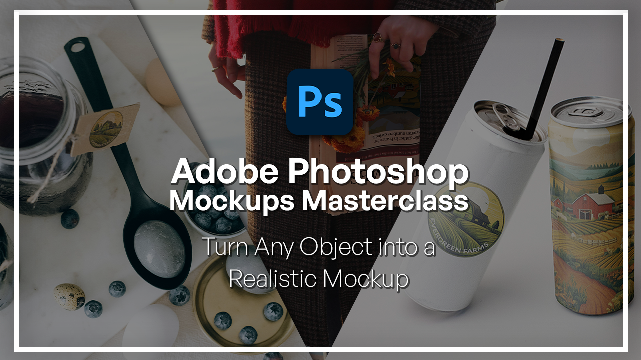
1. Welcome to the Adobe Photoshop Mockups Masterclass: Ups are one of the most
powerful tools in design. With them, you can
visualize ideas, present your work
professionally, and even sell an idea before
it even comes into life. The best part with Photoshop, you can just about turn
anything into a mockup. In this class, we're going
to be doing exactly that. So no matter what shape
you're dealing with, by the end of this class, you'll know exactly how
to put a mockup onto it. Hi, I'm Hose Kuchii, a graphic designer and digital instructor
here at Scladamia. I have built various brand
identities, packaging, mockups, designs, and many more for clients
all over the world. So here I'm really excited to show you some of the
tricks that I've learned and allow you to do the same thing with your brand. Going to be looking at some real world examples in this class. We'll always begin by
setting up a smart object, but then we'll dive
into various scenarios, such as a cylindrical
can where you get to learn how to work
things around that object. A cardboard surface
where we remove tags that existed and replace
it with our own design. Then finally, a newspaper
mockup where we isolate complex elements and then apply advanced warping for the
folds and the curves. You will also learn how to apply advanced lighting techniques to your mockups so that
they look all natural. By the end, you will
have the skills to apply these
mockup techniques to just about any objects for your own ads and
your own brands. Do not need any advanced
Photoshop skills for this class because I'll be walking you through
everything step by step. All of the resources will be available for you to download. So all you really need is your computer and a
willingness to learn. So if you're ready to take your presentations to the next level, then let's jump right in.
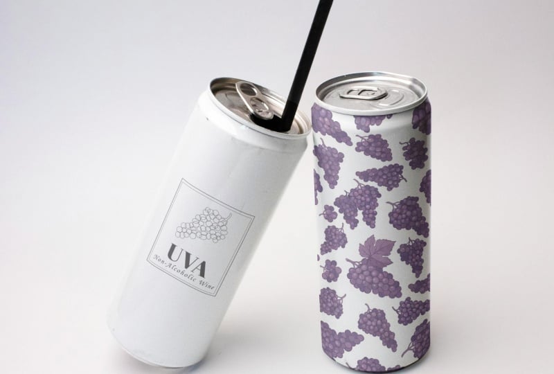
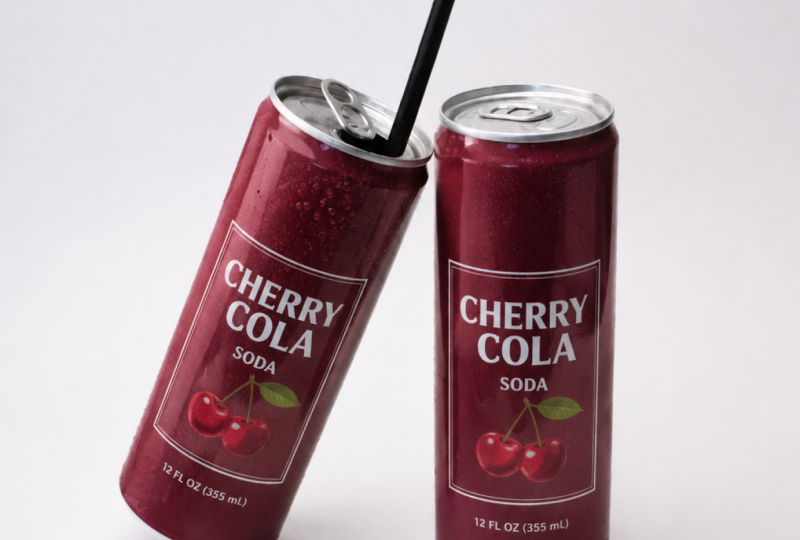
2. Creating Your Mockup Object: So here we have two cans, and I'm going to be putting
two types of designs onto each one to give you a better idea of what
that will look like. So our first design is a
logo without a background, and the second one
is a full pattern. I made both of these
on Adobe firefly. Feel free to make your own
or add your own designs. Let's go right here and the
first thing we're going to do is to just
duplicate our layer. I'm going to call this main. It's always a good idea to have the original file untouched in case you need to go
back and start over. First, we're going to
select the two objects. I'm going to grab the object selection tool
right over here and then just click and drag both
of our cans. There we go. What I'm going to do
now is simply exclude the straw since we're not going to be putting
a design on there. Hit Q on your keyboard, using the spacebar to move
your canvas around, zoom in. Grab your brush by hitting B on your keyboard or
grabbing it from here. Using the color black and white, we're going to exclude the
straw from the selection. White is going to
bring stuff from the original image while
black is going to remove. Down here, you can
see whether you have white on top or black, and I'm just hitting X on
my keyboard to colors. Once I have the color
black selected, right click, hard round, adjuster size and
simply remove straw. It needs to be all red and we're not going to consider that
when we're doing our mockup. There you go. And if you see any part of the original
bottle excluded, just go ahead and
hit X again to get the color white and
just bring those back. Now, don't worry too much. If it's not perfect,
we're going to feather out the selection in the future. But for now, just try to get
a good base to start with. And this part is
not that important since the design is going
to go on the main body. All right. Same thing
here. All right. Command or Control
Zero to zoom out. Then you can hit Q again to get your selection and then
just hit this mask icon. Now we have the two separated.
3. Mockup 1 (Can): Detailed Warp Transformation: What I'm going to do now is make my smart objects that are going
to be holding my designs. Let's start with
our upright can, which is the easiest one
and then we'll just have to rotate it and fit it
to our second can. Using the rectangle
tool right here, I'm going to grab a color that's vibrant so that I
could see the edges, click and drag over
your object and make sure it's relatively
sized properly. Once we have our rectangle, I'm going to call this
R C. Right click, Convert to Smart Object. Is basically going
to be keeping track of all the changes
you're making and allows you to go back to those adjustments to
make some final tweaks. Once we have this, I'm going
to hit grab the layer, Command or Control team, right click and select
the warp option. Lower the opacity so you can see the outline of your bottle and simply begin wrapping your
object around the bottle. But because we have
a straight line here and then a curve here, we're going to start
with the exterior and then make our way in. What that means is
to grab the corner. And simply align it with this edge and not the
inner edge at the moment. We're going to come
back to this later. Same thing here,
click and drag, go. Again, using the spacebar, I'm going to move
around my canvas and I'm just using my scroll wheel on my mouse to zoom in and out. You should have a bloated object like this to make it a
little bit more slim, grab these sliders here and fit it to the
edge of your can. Let's zoom in and make sure
all of that looks good. Try to mimic this as
much as possible. If you see something like this, simply move corner and
that should fix it. Let's check the other side, have the same problem,
extend this a little bit, and then use the bar to
fit it perfectly. Okay. Once we have this, we're
now going to focus on let me just extend this real quick on the corners
here that we talked about. Let's start from up here. What we're going to do is
hold down Command on Mac or Control on Windows until you
see this horizontal line. When I hold it,
the line is there. When I let go, it's not there. Hold the key and place
one of these lines right on the area where the curve begins. That would
be around here. As you saw it created
three more rows and this will allow me to make changes here without affecting
the things down there. That's why it's
important to start from the outside and
make your way in. Now we're going to
align the corner with the edge here and then use these guys to match
the curve that we see. Same thing here, click and drag. And work with these two until
you have the thing covered. Now the arch is upwards, even though the rim
is arched downwards. We're going to hold down
Commander control again, it's going to create
more lines for us to click and drag over. You see these three dots, we're actually going to start bringing these down and then use the higher ones to do some fine tuning.
Something like that. Let's bring this here,
put it on the side. Try not to distort
the entire thing. So something like that
should be fine. There we go. Now for the top parts, you can just click
and drag it like so until you have a
nice flow going on. Now, don't worry too much
if it's not perfect. As we said, we're not going
to have a design on this rim, but rather on the main body. But to mimic that
curve situation, we do have to consider the edge. Just fixing this up a bit. I want to make sure there's
no weird shapes going on. Okay. Repeat the same
process down here, pull this up here,
Commander control, click, move this guy, somewhere like that, use the
bars to align it perfectly. If you expand it, it's going
to increase the curve. And if you don't going to be
a sharp situation like this. So just expand these bars and try to make everything
as smooth as you can. Here we don't have
to worry about the extra vertical lines since there's no
rim at the bottom. One thing I don't like is how this line is a
little bit tilted. So because the bottle, the can is facing forward, we want to make sure
that these lines are somewhat straight and
not something like that. Okay, I'm going to also move this one a little bit
here, there we have it. Once we're done, hit the check mark and
bring back the opacity.
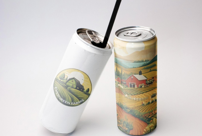
4. Creating Dynamic Lighting and Shadows with Blend Modes: So let's call this can design. And then what we're
going to do is make three duplicates
of the main copy or let's just call
it can outlines. Command or Control
J three times. And we can just apply these layer masks so that
it's not awkward like that. You only need one layer mask. Call this shadows. Midtones. And highlights. Go to hold down Shift, grab all three, bring
it above our design, and change their blend mode. Shadows needs to be multiply. Midtones, linear Dodge
ad, highlights, screen. Things are going to
look a little intense, but we're going to work
with the blending mode and ensure that we do have that
gloss over our design. Hide all three of those layers. Bring back your
design, dabble click, and then you should be
brought into a PSB file. Here I'm going to
add this design. Let's just copy it, Command or Control C, and paste it here with
Command or Control V. I move this around
once I'm done, Command or Control S to save
the file, then go back here. As you can see, the design
is curved like the cans. I am going to change
the blend mode so that it looks more natural.
Go with multiply. Now you can see
that we can still see the shine
through the design. We do have to remove
the edges here later, but for now, let's
focus on the lighting. Bring back shadows on top,
midtones and highlights, and you're going to start to see how those act on
top of the design.
5. Advanced Lighting: Using Blend If Sliders: What I'm going to do is hide mid tones and highlights first, go to shadows, go to
FX lending options. Using alter option,
we're going to break this bar here
because as you can see, it's very harsh when we
grab the entire thing. Clicking on with alter option is going to make
it more gradual. As you can see, we're
removing these shadows from the place where
there's light direction, the direction of light
is from the left side, and so we don't want shadows on that end because that's not
where it's supposed to be. Let's just go somewhere
around here, click Okay. You can see we have the shadows, but they're not going over where the highlights
are supposed to be. Let's bring back the mid tones. Same thing, ending options. Going to bring it again, lower with mid tones, you don't want to go
all the way to the end because you want some
parts of it to go over the highlights and then
highlights the brightest, we're going to do the opposite. Instead of going
from the whites, we're going to go
from the blacks. You can see that it's moving
away from the right side, which is where the
shadows are supposed to. This one, I can bring these two a little bit
closer because I want the highlights to be
concentrated on this one edge. We see this line, click Okay. Now what you can do
is remove some of the fill to make them a
little bit more natural. Using the fill bar up here, bring back some of that. Highlights, 83%, reduce
some of that mid tone. I think shadows are okay, and there is our first design. Now, if you want, you can
go into the right can design at the mask and simply using a brush
with a black color. Remove the design from the rim. This is completely up to you. You can keep it. Maybe using your colors make the
rim a different color. But I'm just going
to keep it very simple and just have
the rim be white. If you messed up the
edges, just hit X, bring back the color white to make the edges a bit better. There we go. Little area. Now, the edges are very rough. I'm sure you can see,
especially down here, you can see it's not
exactly the cleanest thing. What you can do
is dab a click on the mask and simply feather
the edges by a couple pixels, and then using your black brush, go over the edges. You can see the
bottle decant itself has a line for you to follow. I'm just going to follow
that with my brush. You could use the pen tool if you want to keep
it really precise, but it's very subtle change. All right. Command
or Control zero, bring back the background, and there is our first bottle. You can look at D
before and after, and group these before after.
6. Mockup 2 (Tilted Can): Handling Rotational Transformations: Now, for object two,
which is the left side, it's the exact same procedure, but there's one key element that you have to keep in mind, and that is when you
should be rotating. So let's just make
our rectangle. You might want to
rotate it right now before we convert it
into a smart object, but that's a bad idea. So let's call this left can. You need to immediately
convert it, and that way, whatever transformation
you do will be surrounding the
object as it is, and not the outline of
that transformed object. So right now if I hit Control T, you can see that the points are surrounding the real shape, but had I done it before. So now that it's a shape,
I'm going to rotate it, hit Enter, convert it
into a smart object, and then move it,
you can see that the points are not actually
around our rectangle, but the outline of the entire. That's why it's important
to follow the step, which is to make your shape, have it as it is, make
it into a smart object, and then do your
transformations. Let's go ahead and
lower the opacity, Control T or command and just begin doing
anything you wanted to do. First, we need to rotate it, have it right over there. Without clicking the checkmark, do everything else
you want to do. Distort the edges
so that you can make it a little
bit SNUG like that, a little shorter if you
need to put it over here. Now again, before
hitting the checkmark, we're going to be
wrapping the object. Right click click and drag the edges like we did
with the first shape. It's hard to see the actual edge because the background is white, but try to get something decent. Once we're done, we're
going to go ahead and do our other step, which is to make
that separation. Once we have the outline
of our shape, again, zoom out to make
sure you don't have any sort of bumps in the middle. If you do simply move the middle parts and
using the handles, try to get a straight line from the top of the
can to the bottom. Now we're going to hit
Command or Control on the layer mask and simply make another
mask on our left can. Okay, now we can dabble
click, and this time, I'm going to get my logo, which had no background. Put it in the middle, hide the black rectangle
Command or Control S, and there is the logo. If it's too small, be sure to make the adjustment on this
layer and not the original. Make it bigger. There we go. Again, if you want to bring
it to the top to the bottom, every adjustment needs to
be done in this layer. I think the middle looks best. Turn this to multiply
and bring this below the right can layer which had all of our
other adjustments. You can see the
highlights are definitely working well on that
and so are the shadows. If you see that the shape
is a little wiggly, just go ahead and work
with the war's unlink the mask Commander Control Go to Warp and you can see
because it's a smart object, it brought back our adjustments. I can see there's a little
bit of a hiccup right here. It's distorting my circle. I can try to fix that up a bit and get an
actually good circle. Because I don't
have a background, I don't really need to go up there and fix things there too. I can just focus on
the bottom part. Then I can link this back and
there are my two bottles. So we went from no
design onto this. Pretty easy. We just need to
work with some warp tools. Now let's go ahead and move
on to our second odd object.
7. Mockup 3 (Cardboard): Removing Existing Text and Matching Perspective: Our second mockup involves
the cards that are like this. We have a text going on, but we're going to remove it, put our logo instead
and make sure that it blends in seamlessly as if
it was the original image. We can do the same thing here, but for the purpose
of the tutorial, I'm going to focus on
this cardboard only. So again, the
procedure is the same. We're going to make a copy, but the one thing that's
different is that we have something we
need to get rid of. So grab the Lasso tool and
just go around that text. Right click and hit
content aware fill. This way, I can make
sure that if needed, I can exclude or include part of the image
for it to sample. We didn't have to do any
of that. Figured it out. Command or Control
D to deselect. Just now, we removed
the blueberry text. Now, the procedure for
mockups is still the same. We're going to make our
rectangle and then make it into a smart object before transforming it into
our background shape. Commander control T,
we're going to hit distort because we have
a different shape and make sure that you're
meeting the edges of the cardboard and
not just the part you want your logo on. Doing that will allow you to copy the perspective in
the best way possible. Once you're done, hit Okay,
bring back the opacity. To click. Let's grab our logo, go back to the
rectangle, paste it, resize, and it's pretty
much the same thing. Just put it in the center. You can use these
guys to make it perfect, hide your rectangle. Go back here and
you can see that the perspective is
perfectly mimicked. Close this off,
turn to multiply. Don't worry too much
about the lighting being odd because we're going to blend it like
we did last time. Let's grab the highlights. Again, alter option to make
this a little bit gradual. So lower this until
it doesn't look back grainy. And there we have it. Now I have my logo
on top of this. One last thing I am
going to do because if we look at the
original image, it had a blur going on, and this is where we get to
see the text in full focus. Bring it all back, make a group
with all of your changes, Commander Control G, and just
merge everything together. So we're going to hit
Commander Control E to make this into one layer. Then what I'm going
to do is make a quick selection with
our polygonal asotom, something very simple mimicking what we did with our first mask. There we go. Make your mask. Now it's only going to be this area that we're
concerned with. Turn this into a smart object. Now what I did was duplicate our blur layer and just
remove the filter. We basically have one layer
that's just our design, the exact copy with
our caution blur. Now we can limit this
blur to certain parts of our cardboard
using some mask. Click on the blur layer
using black to white. And our gradient tool, going to click and drag
something like this, trying to mimic what
we had initially. You can see that the image gets blurrier as we
approach the left, and that's exactly what we're doing with our black
to white gradient. You can use the middle
point here to adjust it. So this is our design layer, our blur layer, and
there is our logo. This is what we had
before, this is after. Now let's move on
to our next shape.
8. Mockup 4 (Newspaper): Isolating Complex Foreground Elements & Advanced Warping: So what we're going to do
is replace this picture on the newspaper with our
design. So let's get started. Make a copy of your
original layer as always. And what we're
going to do is make a selection of our paper
and then the flower itself. So what I'm going to do is
grab this tool right here, click and drag the
newspaper, let go. And then then using shift, we're going to add this
part because I forgot it. So I try to make sure that it
has all parts of the paper. If you saw it's not grasping everything just Q using
your white brush, just like we did, bring
back those areas. We really only care
about this part. Art isn't really that important. We just want the paper. Hit Q, Commander Control
J, call this paper. Now we're going to separate
the hands from that paper. I'm going to grab our perhaps quick selection
tool to grab the fingers, the flower from that paper, so it won't really
care about the rest. Using alter option, you can exclude something
from your selection. Just go at it until you have a pretty decent selection of the flowers because we
already removed the fingers. I like to go in with my brush
just because it's easier and it allows me to be
more free hand with it. I'm going to focus on this
part and just clean things up. Make your rectangle and change
it into a smart object, lower the opacity and
begin transforming. First, I'm going to grab
the distort option to match the corners
to the newspaper. We only have three corners here, so for the fourth one, you have to estimate
where that's going to be. Once you have your corners, you can just zoom in and
make sure it's pretty accurate because we do
have a full frame image, so it's going to be needing
really accurate edges. Let's double check up here, missed it a bit and here we
don't know where it ends. Once we have that,
we can go ahead and warp it using vertical lines. Again, command or
control and click on that area where you want
that extra support. Same thing on the other side. Use the bars here to make it a really good
and smooth wave. Because on the top, we are dealing with
a lot of squeezing, we have to make
additional changes here. That's something we
have to estimate. If we were to clutch the
paper from this area, it would be more
concentrated here. We're going to need smaller
rectangles compared to here. All I did was move the
center line so that things look a little bit distorted as though
this was a real paper. You may need to do some of that create additional lines
via control or command, but try to make
this area very fine as though we are mimicking
that squeeze that she's doing. So let's hit the checkmark, bring back the opacity, Dale click and paste our design. Save it with Command
or Control S and go back to our
design our image. Change the blend
mode to multiply, and then we're going to hit Commander control on paper and create a mask
on top of design. That's going to remove the
fingers from the paper. We do have to
consider the design on the newspaper already, so just hit Commander
control on the design. What I'm going to do is fill in this area with a rather
light blue color, which I'm not going to
worry too much for it to be accurate because we have
a design going on top. Perhaps grab the heel
tool right here. Make your brush bicker, alter option and
go over the areas. Now I have the paper
layer selected, so command and control on top of design to get the outline of the square we're
working with and then go on the paper layer to
make your adjustments. Sample a new color and
just start painting away. So once we have that cleaned up, we can bring back our design, and now it's going to be
a lot more cleaner as the Ben mode does not go
over the previous design. So we're going to do
command shift I or Control Shift I on Windows to
revert mask selection. Now I'm going to get everything
but my initial selection. Just go over it with
the erase tool, and now the fingers are
no longer that color. So now what I'm going to
do is duplicate the paper, go over the steps we did
before, multiply screen. Again, we don't need
midtones since there isn't much contrast in the
object to begin with. I'm going to call this
shadows and highlights. If you're dealing
with something like the can from the beginning
of the tutorial, that is something
where you're going to need mid tones because there's a clear contrast between the
highlights and the shadows. I And if you wanted to make adjustments
to your design, just go ahead and flip this because she is
holding it the other way. So when I hit safe, this
one's a little blurry now, and that wraps up this tutorial.
9. Congratulations! Class Project & Next Steps: That's a wrap. You
now know how to apply mockup techniques to
just about any objects. Doesn't matter if
they're shaped weird, if they're just not fun to use. You just know how to use
the right techniques to get your design on there and then sell it as an idea.
Now it's your turn. For the class project, I want you guys to build your own mockups using new techniques that
we've learned so far. I want you guys to
take an object, apply your designs onto it, edit it to make it look natural. And then when you're
happy with it, you can upload it to the
class project gallery folder where I will be looking
at your work and your classmates from time
to time to provide you with some feedback and further support you in your
learning journey. You so much for joining
me in this class. And remember, with the
right fundamentals, anything can be turned
into a mock up. I'll see you guys
in the next course.
 Skillademia Academy, Creative Skills for the Future